chapter 04 describing bivariate numerical data · 4.1: scatterplot 1: (i) yes, (ii) yes, (iii)...
TRANSCRIPT

1
©2014 Cengage Learning. All Rights Reserved. May not be scanned, copied, or duplicated, or posted to a publicly accessible website, in whole or in part.
AP* SOLUTIONS
Chapter 4 Describing Bivariate Numerical Data
Section 4.1 Exercise Set 1
4.1: Scatterplot 1: (i) Yes, (ii) Yes, (iii) Negative
Scatterplot 2: (i) Yes, (ii) No, (iii) –
Scatterplot 3: (i) Yes, (ii) Yes, (iii) Positive
Scatterplot 4: (i) Yes, (ii) Yes, (iii) Positive
4.2: (a) Negative correlation, because as interest rates rise, the number of loan applications might decrease. (b) Close to zero, because there is no reason to believe that height and IQ should be related. (c) Positive correlation, because taller people tend to have larger feet. (d) Positive correlation, because as the minimum daily temperature increases, the cooling cost would also increase.
4.3: (a) There is a moderately strong positive association between school achievement test score and midlife IQ. (b) r = 0.6, because the article says that r = 0.64 indicated a very strong relationship, higher than the correlation between height and weight in adults. Therefore, a correlation that is moderately strong (r = 0.6) with a positive association (taller people tend to weigh more) is consistent with the statement.
4.4: (a) r = 0.335. The correlation indicates that there is a weak, positive linear relationship between number of acres burned and timber sales. (b) The conclusion that “heavier logging led to large forest fires” cannot be justified because correlation does not imply causation; the correlation only measures the strength and direction of the association between two quantitative variables.
*AP and Advanced Placement Program are registered trademarks of the College Entrance Examination Board, which was not involved in the production of, and does not endorse, this product.
2
©2014 Cengage Learning. All Rights Reserved. May not be scanned, copied, or duplicated, or posted to a publicly accessible website, in whole or in part.
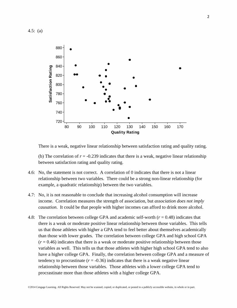
4.5: (a)
1701601501401301201101009080
880
860
840
820
800
780
760
740
720
Quality Rating
Sat
isfa
ctio
n R
atin
g
There is a weak, negative linear relationship between satisfaction rating and quality rating.
(b) The correlation of r = -0.239 indicates that there is a weak, negative linear relationship between satisfaction rating and quality rating.
4.6: No, the statement is not correct. A correlation of 0 indicates that there is not a linear relationship between two variables. There could be a strong non-linear relationship (for example, a quadratic relationship) between the two variables.
4.7: No, it is not reasonable to conclude that increasing alcohol consumption will increase income. Correlation measures the strength of association, but association does not imply causation. It could be that people with higher incomes can afford to drink more alcohol.
4.8: The correlation between college GPA and academic self-worth (r = 0.48) indicates that there is a weak or moderate positive linear relationship between those variables. This tells us that those athletes with higher a GPA tend to feel better about themselves academically than those with lower grades. The correlation between college GPA and high school GPA (r = 0.46) indicates that there is a weak or moderate positive relationship between those variables as well. This tells us that those athletes with higher high school GPA tend to also have a higher college GPA. Finally, the correlation between college GPA and a measure of tendency to procrastinate (r = -0.36) indicates that there is a weak negative linear relationship between those variables. Those athletes with a lower college GPA tend to procrastinate more than those athletes with a higher college GPA.

3
©2014 Cengage Learning. All Rights Reserved. May not be scanned, copied, or duplicated, or posted to a publicly accessible website, in whole or in part.
Section 4.1 Exercise Set 2
4.9: Scatterplot 1: (i) Yes, (ii) Yes, (iii) Positive
Scatterplot 2: (i) Yes, (ii) Yes, (iii) Negative
Scatterplot 3: (i) Yes, (ii) No, (iii) –
Scatterplot 4: (i) Yes, (ii) Yes, (iii) Negative
4.10: (a) Negative correlation, because larger cars tend to get lower gas mileage.
(b) Positive correlation, because larger houses tent to be more expensive.
(c) Positive correlation, because taller people tend to be heavier.
(d) Correlation close to zero, because there is no reason to believe that height and number of siblings are related to each other.
4.11: No; this value of r indicates a weak linear relationship, because this value of r lies between -0.5 and 0.5.
4.12: Graph 1: r = 1:
43210-1-2-3-4
10
5
0
-5
-10
x
y

4
©2014 Cengage Learning. All Rights Reserved. May not be scanned, copied, or duplicated, or posted to a publicly accessible website, in whole or in part.
Graph 2: r = –1:
43210-1-2-3-4
2
1
0
-1
-2
x
y
4.13: (a) r = 0.118
(b) Yes, it is reasonable to conclude that there is no strong relationship, linear or otherwise, between household debt and consumer debt. The correlation coefficient of r = 0.118 indicates that there is no strong linear relationship, and the scatterplot below confirms this observation.
6.36.26.16.05.95.85.7
8.0
7.5
7.0
6.5
6.0
Household Debt
Con
sum
er D
ebt

5
©2014 Cengage Learning. All Rights Reserved. May not be scanned, copied, or duplicated, or posted to a publicly accessible website, in whole or in part.
4.14: (a)
656055504540353025
70
60
50
40
30
20
10
Religiosity Score
Teen
Bir
th R
ate
There is a moderately strong, positively associated, linear relationship between teen birth rate and religiosity score. The scatterplot supports the statement that “teen birth rate is very highly correlated with religiosity at the state level, with more religious states having a higher rate of teen birth” because states with higher religiosity scores tend to have higher teen birth rates.
(b) The correlation of r = 0.730 indicates that there is a moderately strong, linear relationship with a positive association between teen birth rate and religiosity score.
6
©2014 Cengage Learning. All Rights Reserved. May not be scanned, copied, or duplicated, or posted to a publicly accessible website, in whole or in part.
Additional Exercises for Section 4.1
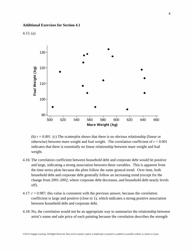
4.15: (a)
660640620600580560540520500
130
120
110
100
90
Mare Weight (kg)
Foal
Wei
ght
(kg)
(b) r = 0.001 (c) The scatterplot shows that there is no obvious relationship (linear or otherwise) between mare weight and foal weight. The correlation coefficient of r = 0.001 indicates that there is essentially no linear relationship between mare weight and foal weight.
4.16: The correlation coefficient between household debt and corporate debt would be positive and large, indicating a strong association between these variables. This is apparent from the time series plots because the plots follow the same general trend. Over time, both household debt and corporate debt generally follow an increasing trend (except for the change from 2001-2002, where corporate debt decreases, and household debt nearly levels off).
4.17: r = 0.987; this value is consistent with the previous answer, because the correlation coefficient is large and positive (close to 1), which indicates a strong positive association between household debt and corporate debt.
4.18: No, the correlation would not be an appropriate way to summarize the relationship between artist’s name and sale price of each painting because the correlation describes the strength

7
©2014 Cengage Learning. All Rights Reserved. May not be scanned, copied, or duplicated, or posted to a publicly accessible website, in whole or in part.
of the relationship between two quantitative variables. In this case, artist’s name is categorical, not quantitative.
4.19: The sample correlation coefficient would be closest to -0.9. Cars traveling at a faster rate of speed will travel the length of the highway segment more quickly than those who are traveling more slowly, and we can expect this relationship to be strong.
4.20:
2 2 2 2
2 2
88.8 86.1281.1
39 0.93588.8 86.1
288.0 286.639 39
x yxy
nrx y
x yn n
There is a strong positive linear relationship between pigment concentration in the right eye and pigment concentration in the left eye.
Section 4.2 Exercise Set 1
4.21: It makes sense to use the least squares regression line to summarize the relationship between x and y for Scatterplot 1, but not for Scatterplot 2. Scatterplot 1 shows a linear relationship between x and y, but Scatterplot 2 shows a curved relationship between x and y.
4.22: The sum of the squared vertical deviations from the line 12.5 0.5y x would be larger
than the sum of the squared vertical deviations from the least squares regression line ˆ 12 0.36y x because, by definition, the least squares regression line is the line with the
minimum value for the sum of the squared vertical deviations from the line. All other lines would have larger values for the sum of the squared vertical deviations.
4.23: (a) ˆ 5.0 0.017y x , where y represents the predicted amount of natural gas used and x
represents the size of a house. (b) ˆ 5.0 0.017(2100) 30.7y therms. (c) This is the
slope of the line, 0.017. (d) No, because the regression line was determined based on house sizes between 1000 and 3000 square feet. There is no guarantee that the linear relationship will continue outside this range of house sizes. This is the danger with extrapolation.
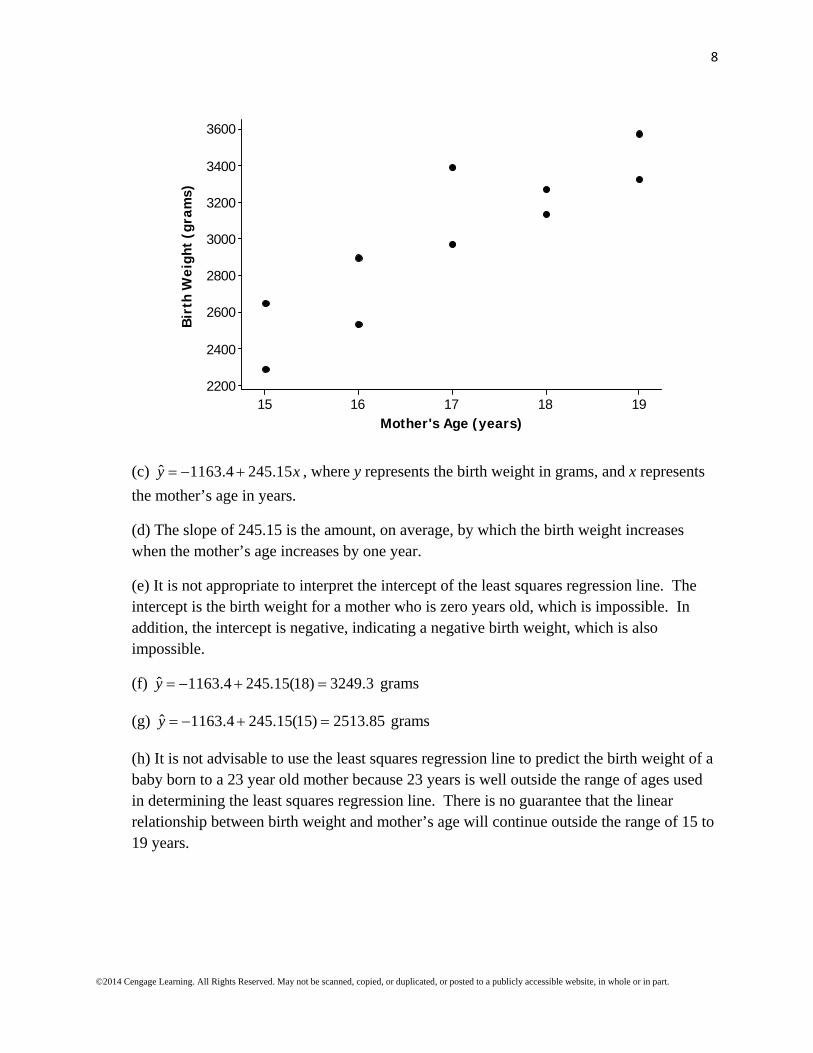
4.24: (a) The response variable (y) is birth weight, and the predictor variable (x) is mother’s age.
(b) It is reasonable to use a line to summarize the relationship between birth weight and mother’s age. There is a clear linear relationship between birth weight and mother’s age.
8
©2014 Cengage Learning. All Rights Reserved. May not be scanned, copied, or duplicated, or posted to a publicly accessible website, in whole or in part.
1918171615
3600
3400
3200
3000
2800
2600
2400
2200
Mother's Age (years)
Bir
th W
eigh
t (g
ram
s)
(c) ˆ 1163.4 245.15y x , where y represents the birth weight in grams, and x represents
the mother’s age in years.
(d) The slope of 245.15 is the amount, on average, by which the birth weight increases when the mother’s age increases by one year.
(e) It is not appropriate to interpret the intercept of the least squares regression line. The intercept is the birth weight for a mother who is zero years old, which is impossible. In addition, the intercept is negative, indicating a negative birth weight, which is also impossible.
(f) ˆ 1163.4 245.15(18) 3249.3y grams
(g) ˆ 1163.4 245.15(15) 2513.85y grams
(h) It is not advisable to use the least squares regression line to predict the birth weight of a baby born to a 23 year old mother because 23 years is well outside the range of ages used in determining the least squares regression line. There is no guarantee that the linear relationship between birth weight and mother’s age will continue outside the range of 15 to 19 years.

9
©2014 Cengage Learning. All Rights Reserved. May not be scanned, copied, or duplicated, or posted to a publicly accessible website, in whole or in part.
4.25: (a) The response variable is the cost of medical care, and the predictor variable is the measure of pollution.
(b)
40.037.535.032.530.027.525.0
980
970
960
950
940
930
920
910
900
890
Pollution (micrograms/cubic meter of air)
Cos
t of
Med
ical
Car
e P
er P
erso
n
There is a moderate, negative association (r = –0.581) between pollution and cost of medical care per person.
(c) ˆ 1082.2 4.691y x , where y is the cost of medical care per person, and x is the
pollution measure.
(d) The slope is negative, and it is consistent with the observed negative association in the scatterplot, as well as with the negative correlation coefficient.
(e) No, the scatterplot and least squares regression line equation do not support the researcher’s conclusion that people over the age of 65 who live in more polluted areas have higher medical costs. The association between medical cost and pollution level is negative, which indicates that people over the age of 65 in more polluted areas tend to have lower medical costs.
(f) ˆ 1082.2 4.691 35 $918.02y
(g) No, I would not use the least squares regression equation to predict the cost of medical care for a region that has a pollution measure of 60. The data set that was used to create the least squares regression line was based on pollution measures that vary between 26.8 and

10
©2014 Cengage Learning. All Rights Reserved. May not be scanned, copied, or duplicated, or posted to a publicly accessible website, in whole or in part.
40; the value 60 is far outside that range of values. There is no guarantee that the observed trend will continue as far as 60. This is a danger of extrapolation.
4.26: (a) The scatterplot (shown below) shows a strong linear relationship between the air flow readings from the mini-Wright and Wright meters. The correlation coefficient (r = 0.943) supports the observation made from the scatterplot. Therefore, we can confidently use the data to find the equation of the least squares regression line. That equation is ˆ 11.48 0.970y x , where y is the predicted Wright meter reading and x is the mini-
Wright meter reading.
700600500400300200
700
600
500
400
300
200
Mini-Wright Meter
Wri
ght
Met
er
(b) The predicted Wright meter reading for a mini-Wright meter reading of 500 is ˆ 11.48 0.970(500) 496.48y .
(c) The predicted Wright meter reading for a mini-Wright meter reading of 300 is ˆ 11.48 0.970(300) 302.48y .
Section 4.2 Exercise Set 2
4.27: It makes sense to use the least squares regression line to summarize the relationship between x and y in scatterplot 1 but not for scatterplot 2. Scatterplot 1 shows an approximately linear relationship between x and y, whereas scatterplot 2 shows a clearly nonlinear relationship between x and y.
4.28: The regression line is called the least squares line because the equation of the line is found by minimizing the sum of the squared vertical deviations from the line, hence the phrase least squares.
11
©2014 Cengage Learning. All Rights Reserved. May not be scanned, copied, or duplicated, or posted to a publicly accessible website, in whole or in part.
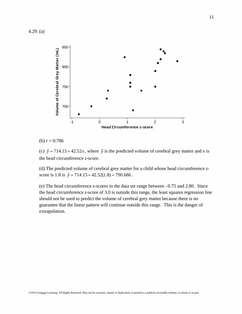
4.29: (a)
3210-1
850
800
750
700
Head Circumference z-score
Vol
ume
of C
ereb
ral G
rey
Mat
ter
(mL)
(b) r = 0.786
(c) ˆ 714.15 42.52y x , where y is the predicted volume of cerebral grey matter and x is
the head circumference z-score.
(d) The predicted volume of cerebral grey matter for a child whose head circumference z-score is 1.8 is ˆ 714.15 42.52(1.8) 790.686y .
(e) The head circumference z-scores in the data set range between –0.75 and 2.80. Since the head circumference z-score of 3.0 is outside this range, the least squares regression line should not be used to predict the volume of cerebral grey matter because there is no guarantee that the linear pattern will continue outside this range. This is the danger of extrapolation.

12
©2014 Cengage Learning. All Rights Reserved. May not be scanned, copied, or duplicated, or posted to a publicly accessible website, in whole or in part.
4.30: (a) Net directionality is the response variable (y), and mean temperature is the predictor variable (x).
(b)
20.017.515.012.510.07.55.0
0.3
0.2
0.1
0.0
-0.1
-0.2
Mean Temperature
Net
Dir
ecti
onal
ity
There is a moderately strong, positive linear relationship between net directionality and mean temperature. It should be noted that there is one point, (8.06, 0.25), that appears to be an outlier that does not follow the general trend of the data. If that point is removed, the strength of the relationship gets stronger.
(c) ˆ 0.14282 0.016141y x , where y is the predicted net directionality and x is the
mean temperature.
(d) For a 1ºC increase in mean temperature, the predicted net directionality increases by 0.0161.
(e) The intercept of the least squares regression line is the estimated net directionality at a mean temperature of 0ºC. Since the mean temperatures in the data set used to compute the least squares regression line range between 6.17 ºC and 20.25ºC, and 0ºC is outside this range, it would not be wise to interpret the intercept as the predicted net directionality when the mean temperature is 0ºC.
(f) The predicted net directionality for a mean water temperature of 15ºC is ˆ 0.14282 0.016141(15) 0.099295y .
(g) Yes, the scatterplot and least squares regression line both support this statement. Because the scatterplot has a positive association, higher values of mean temperature tend to be associated with higher values for net directionality. The slope of the regression line is

13
©2014 Cengage Learning. All Rights Reserved. May not be scanned, copied, or duplicated, or posted to a publicly accessible website, in whole or in part.
positive, which also indicates that larger values for mean temperature tend to be associated with higher values for net directionality.
4.31: (a)
1600014000120001000080006000400020000
110
100
90
80
70
60
50
40
30
20
Number of Visitors (thousands)
Per
cent
age
of O
pera
ting
Cos
ts C
over
ed
There is a moderately strong positive relationship between number of visitors and percentage of operating costs covered by park revenues.
(b) ˆ 28.723 0.00000422y x , where y is the predicted percentage of operating costs
covered, and x is the number of visitors.
(c) The slope is positive, which is consistent with the description in part (a).
(d) The correlation coefficient would be greater than 0.5, because the relationship is moderately strong.
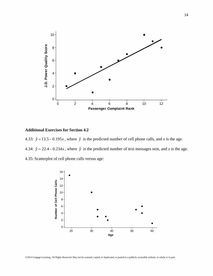
4.32: The scatterplot (shown below) indicates that there is a linear relationship between the J.D. Power Quality Score and the Passenger Complaint Rank. Therefore, it is appropriate to find the least squares regression equation and use it to predict the J.D. Power Quality Scores for the two airlines not scored by J.D. Power. The least squares regression equation is ˆ 0.884 0.6994y x , where y is the predicted J.D. Power Quality Score, and x is the
Passenger Complaint Rank. The least squares regression line is also shown on the scatterplot. The predicted J.D. Power Quality Score for Hawaiian airlines, which has a passenger complaint rank of 3, is ˆ 0.884 0.6994(3) 2.9822y . The predicted J.D.
Power Quality Score for Northwest Airlines, which has a passenger complaint rank of 9, is ˆ 0.884 0.6994(9) 7.1786y .
14
©2014 Cengage Learning. All Rights Reserved. May not be scanned, copied, or duplicated, or posted to a publicly accessible website, in whole or in part.
121086420
10
8
6
4
2
0
Passenger Complaint Rank
J.D
. Pow
er Q
uali
ty S
core
Additional Exercises for Section 4.2
4.33: ˆ 13.5 0.195y x , where y is the predicted number of cell phone calls, and x is the age.
4.34: ˆ 22.4 0.234y x , where y is the predicted number of text messages sent, and x is the age.
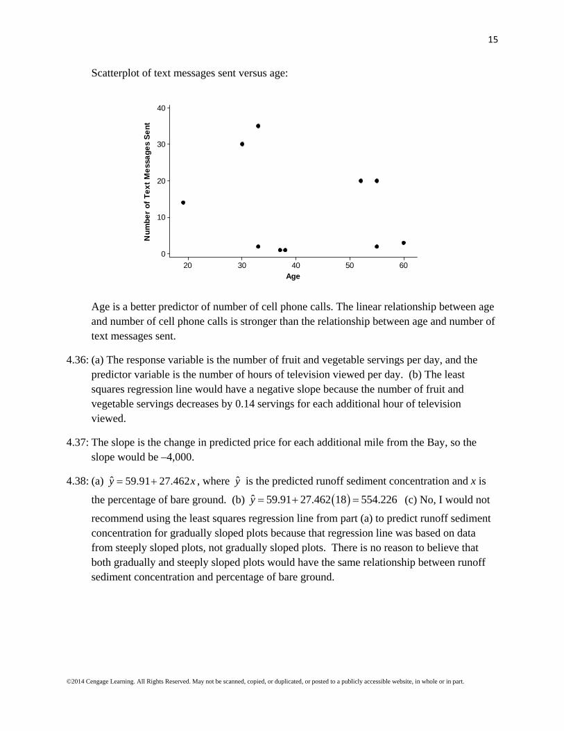
4.35: Scatterplot of cell phone calls versus age:
6050403020
16
14
12
10
8
6
4
2
0
Age
Num
ber
of C
ell P
hone
Cal
ls
15
©2014 Cengage Learning. All Rights Reserved. May not be scanned, copied, or duplicated, or posted to a publicly accessible website, in whole or in part.
Scatterplot of text messages sent versus age:
6050403020
40
30
20
10
0
Age
Num
ber
of T
ext
Mes
sage
s S
ent
Age is a better predictor of number of cell phone calls. The linear relationship between age and number of cell phone calls is stronger than the relationship between age and number of text messages sent.
4.36: (a) The response variable is the number of fruit and vegetable servings per day, and the predictor variable is the number of hours of television viewed per day. (b) The least squares regression line would have a negative slope because the number of fruit and vegetable servings decreases by 0.14 servings for each additional hour of television viewed.
4.37: The slope is the change in predicted price for each additional mile from the Bay, so the slope would be –4,000.
4.38: (a) ˆ 59.91 27.462y x , where y is the predicted runoff sediment concentration and x is
the percentage of bare ground. (b) ˆ 59.91 27.462 18 554.226y (c) No, I would not
recommend using the least squares regression line from part (a) to predict runoff sediment concentration for gradually sloped plots because that regression line was based on data from steeply sloped plots, not gradually sloped plots. There is no reason to believe that both gradually and steeply sloped plots would have the same relationship between runoff sediment concentration and percentage of bare ground.
16
©2014 Cengage Learning. All Rights Reserved. May not be scanned, copied, or duplicated, or posted to a publicly accessible website, in whole or in part.
Section 4.3 Exercise Set 1
4.39: (a) ˆ 1.33878 0.007661y x , where y is the predicted telomere length, and x is the
perceived stress. (b) 2 0.099r ; Approximately 9.9% of the variability in telomere length can be explained by the linear relationship between telomere length and perceived stress.
(c) 0.159119es (obtained using software); es tells us that telomere length will deviate
from the least squares regression line by 0.159119, on average. (d) The relationship between perceived stress and telomere length is weak and negative. It is negative because the slope of the least squares regression line is negative, and it is weak because the correlation coefficient (which has the same sign as the slope) is
2 0.099 0.315r r .
4.40: A small value of es indicates that residuals tend to be small. Because residuals represent the
difference between an observed y value and a predicted y value, the value of es tells us
how much accuracy we can expect when using the least squares regression line to make predictions.
4.41: It is important to consider both r2 and es when evaluating the usefulness of the least
squares regression line because a large r2 (which indicates the proportion of variability in y that can be explained by the linear relationship between x and y) tells us that knowing the
value of x is helpful in predicting y, and a small es indicates that residuals tend to be small,
thus the data points tend to be relatively close to the regression line. These are both desirable when assessing the usefulness of the regression line.
17
©2014 Cengage Learning. All Rights Reserved. May not be scanned, copied, or duplicated, or posted to a publicly accessible website, in whole or in part.
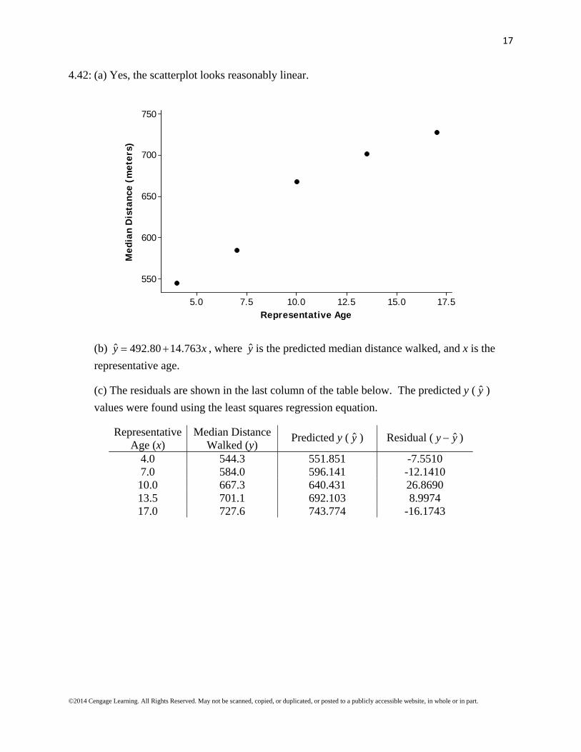
4.42: (a) Yes, the scatterplot looks reasonably linear.
17.515.012.510.07.55.0
750
700
650
600
550
Representative Age
Med
ian
Dis
tanc
e (m
eter
s)
(b) ˆ 492.80 14.763y x , where y is the predicted median distance walked, and x is the
representative age.
(c) The residuals are shown in the last column of the table below. The predicted y ( y )
values were found using the least squares regression equation.
Representative Age (x)
Median Distance Walked (y)
Predicted y ( y ) Residual ( ˆy y )
4.0 544.3 551.851 -7.5510 7.0 584.0 596.141 -12.1410 10.0 667.3 640.431 26.8690 13.5 701.1 692.103 8.9974 17.0 727.6 743.774 -16.1743

18
©2014 Cengage Learning. All Rights Reserved. May not be scanned, copied, or duplicated, or posted to a publicly accessible website, in whole or in part.
17.515.012.510.07.55.0
30
20
10
0
-10
-20
Representative Age
Res
idua
l
Yes, there is an unusual feature in the plot, namely, there is a curved pattern in the residual plot. The curvature indicates that the relationship between median distance walked and representative age is not linear.
4.43: (a)
17.515.012.510.07.55.0
680
660
640
620
600
580
560
540
520
500
Representative Age
Med
ian
Dis
tanc
e (m
eter
s)
The pattern for girls differs from boys in that the girls’ scatterplot shows more apparent nonlinearity in the pattern.
19
©2014 Cengage Learning. All Rights Reserved. May not be scanned, copied, or duplicated, or posted to a publicly accessible website, in whole or in part.
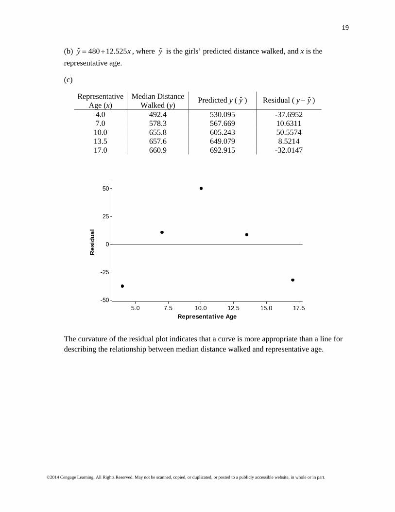
(b) ˆ 480 12.525y x , where y is the girls’ predicted distance walked, and x is the
representative age.
(c)
Representative Age (x)
Median Distance Walked (y)
Predicted y ( y ) Residual ( ˆy y )
4.0 492.4 530.095 -37.6952 7.0 578.3 567.669 10.6311 10.0 655.8 605.243 50.5574 13.5 657.6 649.079 8.5214 17.0 660.9 692.915 -32.0147
17.515.012.510.07.55.0
50
25
0
-25
-50
Representative Age
Res
idua
l
The curvature of the residual plot indicates that a curve is more appropriate than a line for describing the relationship between median distance walked and representative age.

20
©2014 Cengage Learning. All Rights Reserved. May not be scanned, copied, or duplicated, or posted to a publicly accessible website, in whole or in part.
4.44: (a)
0.250.200.150.100.050.00
0.125
0.100
0.075
0.050
0.025
0.000
-0.025
-0.050
Nitrogen Intake (grams)
Nit
roge
n R
eten
tion
(gr
ams)
(b) ˆ 0.03443 0.5803y x , where y is the predicted nitrogen retention, and x is the
nitrogen intake (both in grams). The predicted nitrogen retention for a flying squirrel whose nitrogen intake is 0.06 grams is ˆ 0.03443 0.5803(0.06) 0.000388y grams.
The residual associated with the observation (0.06, 0.01) is ˆ 0.01 0.000388 0.009612y y .
(c) The observation (0.25, 0.11) is potentially influential because that point has an x value that is far away from the rest of the data set.
(d) ˆ 0.037 0.627(0.06) 0.00062y ; This prediction is larger than the prediction made
in part (b).
21
©2014 Cengage Learning. All Rights Reserved. May not be scanned, copied, or duplicated, or posted to a publicly accessible website, in whole or in part.
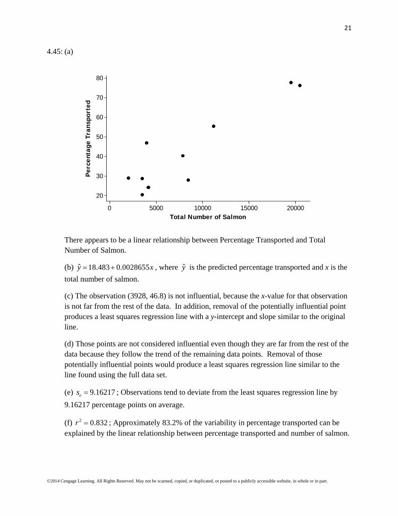
4.45: (a)
20000150001000050000
80
70
60
50
40
30
20
Total Number of Salmon
Per
cent
age
Tran
spor
ted
There appears to be a linear relationship between Percentage Transported and Total Number of Salmon.
(b) ˆ 18.483 0.0028655y x , where y is the predicted percentage transported and x is the
total number of salmon.
(c) The observation (3928, 46.8) is not influential, because the x-value for that observation is not far from the rest of the data. In addition, removal of the potentially influential point produces a least squares regression line with a y-intercept and slope similar to the original line.
(d) Those points are not considered influential even though they are far from the rest of the data because they follow the trend of the remaining data points. Removal of those potentially influential points would produce a least squares regression line similar to the line found using the full data set.
(e) 9.16217es ; Observations tend to deviate from the least squares regression line by
9.16217 percentage points on average.
(f) 2 0.832r ; Approximately 83.2% of the variability in percentage transported can be explained by the linear relationship between percentage transported and number of salmon.
22
©2014 Cengage Learning. All Rights Reserved. May not be scanned, copied, or duplicated, or posted to a publicly accessible website, in whole or in part.
Section 4.3 Exercise Set 2
4.46: (a) ˆ 232.26 2.926y x , where y is the predicted algae colony density and x is the rock
surface area.
(b) 2 0.300r ; 30.0% of the variability in algae colony density can be explained by the approximate linear relationship between algae colony density and rock surface area.
(c) 63.3153es ; Observations of algae colony density tend to deviate from the values
predicted by the least squares regression line by 63.3153, on average.
(d) The relationship between rock surface area and algae colony density is negative because the slope of the regression line is negative. The relationship is moderate because
2 0.30 0.548r r .
4.47: A large value of r2 indicates that a large proportion of the variability in y can be explained by the approximate linear relationship between x and y, which is desirable. This tells us that knowing the value of x is helpful for predicting y.
4.48: It is important to consider both r2 and es when evaluating the usefulness of the least
squares regression line because a large r2 (which indicates the proportion of variability in y that can be explained by the linear relationship between x and y) tells us that knowing the
value of x is helpful in predicting y, and a small es indicates that residuals tend to be small,
thus the data points tend to be relatively close to the regression line. These are both desirable when assessing the usefulness of the regression line.
23
©2014 Cengage Learning. All Rights Reserved. May not be scanned, copied, or duplicated, or posted to a publicly accessible website, in whole or in part.
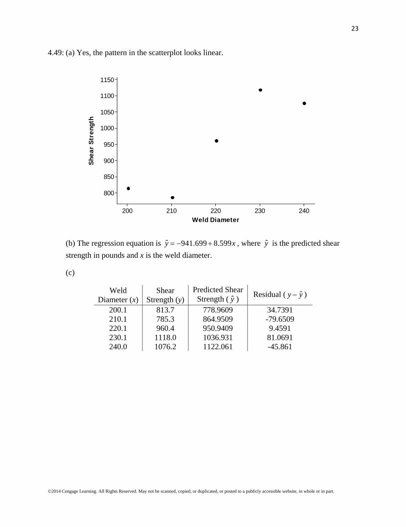
4.49: (a) Yes, the pattern in the scatterplot looks linear.
240230220210200
1150
1100
1050
1000
950
900
850
800
Weld Diameter
She
ar S
tren
gth
(b) The regression equation is ˆ 941.699 8.599y x , where y is the predicted shear
strength in pounds and x is the weld diameter.
(c)
Weld Diameter (x)
Shear Strength (y)
Predicted Shear Strength ( y )
Residual ( ˆy y )
200.1 813.7 778.9609 34.7391 210.1 785.3 864.9509 -79.6509 220.1 960.4 950.9409 9.4591 230.1 1118.0 1036.931 81.0691 240.0 1076.2 1122.061 -45.861
24
©2014 Cengage Learning. All Rights Reserved. May not be scanned, copied, or duplicated, or posted to a publicly accessible website, in whole or in part.
240230220210200
100
50
0
-50
-100
Weld Diameter
Res
idua
ls
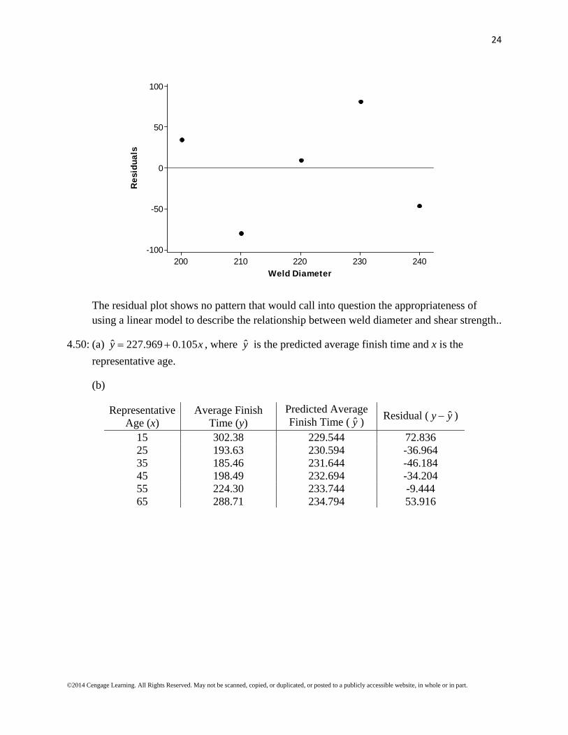
The residual plot shows no pattern that would call into question the appropriateness of using a linear model to describe the relationship between weld diameter and shear strength..
4.50: (a) ˆ 227.969 0.105y x , where y is the predicted average finish time and x is the
representative age.
(b)
Representative Age (x)
Average Finish Time (y)
Predicted Average Finish Time ( y )
Residual ( ˆy y )
15 302.38 229.544 72.836 25 193.63 230.594 -36.964 35 185.46 231.644 -46.184 45 198.49 232.694 -34.204 55 224.30 233.744 -9.444 65 288.71 234.794 53.916
25
©2014 Cengage Learning. All Rights Reserved. May not be scanned, copied, or duplicated, or posted to a publicly accessible website, in whole or in part.
655545352515
75
50
25
0
-25
-50
Representative Age
Res
idua
l
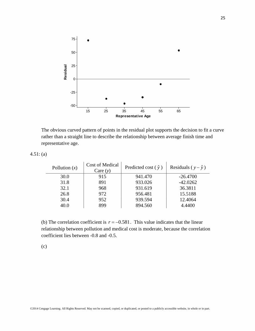
The obvious curved pattern of points in the residual plot supports the decision to fit a curve rather than a straight line to describe the relationship between average finish time and representative age.
4.51: (a)
Pollution (x) Cost of Medical
Care (y) Predicted cost ( y ) Residuals ( ˆy y )
30.0 915 941.470 -26.4700 31.8 891 933.026 -42.0262 32.1 968 931.619 36.3811 26.8 972 956.481 15.5188 30.4 952 939.594 12.4064 40.0 899 894.560 4.4400
(b) The correlation coefficient is 0.581r . This value indicates that the linear relationship between pollution and medical cost is moderate, because the correlation coefficient lies between -0.8 and -0.5.
(c)
26
©2014 Cengage Learning. All Rights Reserved. May not be scanned, copied, or duplicated, or posted to a publicly accessible website, in whole or in part.
40.037.535.032.530.027.525.0
40
30
20
10
0
-10
-20
-30
-40
-50
Pollution
Res
idua
l
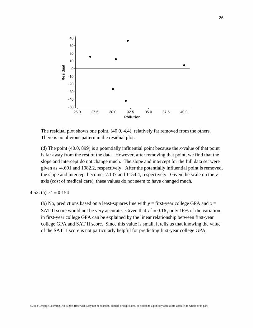
The residual plot shows one point, (40.0, 4.4), relatively far removed from the others. There is no obvious pattern in the residual plot.
(d) The point (40.0, 899) is a potentially influential point because the x-value of that point is far away from the rest of the data. However, after removing that point, we find that the slope and intercept do not change much. The slope and intercept for the full data set were given as -4.691 and 1082.2, respectively. After the potentially influential point is removed, the slope and intercept become -7.107 and 1154.4, respectively. Given the scale on the y-axis (cost of medical care), these values do not seem to have changed much.
4.52: (a) 2 0.154r
(b) No, predictions based on a least-squares line with y = first-year college GPA and x =
SAT II score would not be very accurate. Given that 2 0.16r , only 16% of the variation in first-year college GPA can be explained by the linear relationship between first-year college GPA and SAT II score. Since this value is small, it tells us that knowing the value of the SAT II score is not particularly helpful for predicting first-year college GPA.
27
©2014 Cengage Learning. All Rights Reserved. May not be scanned, copied, or duplicated, or posted to a publicly accessible website, in whole or in part.
4.53: (a) ˆ 4788.84 29.015y x , where y is the predicted average swim distance and x is the
representative age.
(b)
Representative Age (x)
Average Swim Distance (y)
Predicted Average Swim Distance ( y )
Residual ( ˆy y )
25 3913.5 4063.47 -149.965 35 3728.8 3773.32 -44.515 45 3579.4 3483.17 96.235 55 3361.9 3193.02 168.885 65 3000.1 2902.86 97.235 75 2649.0 2612.72 36.285 85 2118.4 2322.57 -204.165
85756555453525
200
100
0
-100
-200
Representative Age
Res
idua
l
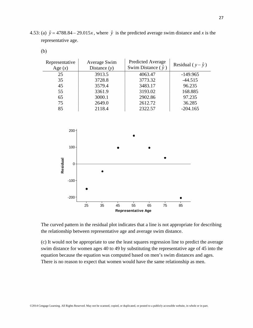
The curved pattern in the residual plot indicates that a line is not appropriate for describing the relationship between representative age and average swim distance.
(c) It would not be appropriate to use the least squares regression line to predict the average swim distance for women ages 40 to 49 by substituting the representative age of 45 into the equation because the equation was computed based on men’s swim distances and ages. There is no reason to expect that women would have the same relationship as men.

28
©2014 Cengage Learning. All Rights Reserved. May not be scanned, copied, or duplicated, or posted to a publicly accessible website, in whole or in part.
4.54: (a)
7000006000005000004000003000002000001000000
150
125
100
75
50
Park Size (acres)
Num
ber
of E
mpl
oyee
s
(b) The equation of the least squares regression line is ˆ 85.3345 0.00002589y x , where
y is the predicted number of employees and x is the park size. This line would not give
accurate predictions because the value of r2 is 0.016. This r2 tells us that only 1.6% of the variation in number of employees can be explained by the linear relationship between park size and number of employees.
(c) Yes, the observation (620,231, 67) does have a big effect on the equation of the line. After deleting the observation, the least squares regression equation becomes ˆ 83.4018 0.0000387y x . Note that the slope of the regression equation changed from
negative to positive.
4.55: (a) ˆ 27.7092 0.2011y x , where y is the predicted percent of operating cost covered by
revenues and x is the number of employees.
(b) Using software, we find that 2 0.053r and 24.1475es . Therefore, only 5.3% of the
variation in percent of operating cost covered by revenues can be explained by the linear relationship between these variables. In addition, the value of se is nearly the same size as many of the y values, so the prediction errors are nearly as large as the values themselves. The values of r2 and se indicate that the least squares regression line does not do a good job describing the relationship between these two variables.
(c) The points (69,80), (87, 97), and (112, 108) are outliers. No, the observations with the largest residuals do not correspond to the parks with the largest number of employees.

29
©2014 Cengage Learning. All Rights Reserved. May not be scanned, copied, or duplicated, or posted to a publicly accessible website, in whole or in part.
4.56:
6050403020100
18
16
14
12
10
8
6
4
2
0
Frying Time (seconds)
Moi
stur
e C
onte
nt (
%)
The scatterplot shows an obvious nonlinear relationship between moisture content and frying time, so the least squares regression line would not be appropriate to summarize the relationship between these variables.
Section 4.5: Exercise Set 1
4.57: (a)
6050403020100
18
16
14
12
10
8
6
4
2
0
Frying Time (seconds)
Moi
stur
e C
onte
nt (
%)

30
©2014 Cengage Learning. All Rights Reserved. May not be scanned, copied, or duplicated, or posted to a publicly accessible website, in whole or in part.
The scatterplot shows an obvious nonlinear relationship between moisture content and frying time, therefore a straight line would not provide an effective summary of the relationship between these variables.
(b)
1.81.61.41.21.00.80.6
1.2
1.0
0.8
0.6
0.4
0.2
0.0
log(Frying Time)
log(
Moi
stur
e C
onte
nt)
The scatterplot of the transformed data shows a strong linear relationship between log(Frying Time) and log(Moisture Content).
(c) Yes, the least squares line effectively summarizes the linear relationship between 'x and 'y due to the high r2 value.
(d) The equation of the least squares regression line is ˆ ' 2.02 1.05 'y x , where 'y
represents the log(Moisture Content) and 'x is the log(Frying Time). Therefore, the predicted log(Moisture Content) when the frying time is 35 seconds is
ˆ ' 2.02 1.05(log(35)) 0.3987y , which yields a Moisture Content of 0.398710 2.50 %.

31
©2014 Cengage Learning. All Rights Reserved. May not be scanned, copied, or duplicated, or posted to a publicly accessible website, in whole or in part.
4.58: (a)
76543210
70
60
50
40
30
20
10
0
Salmon Availability
Per
cent
age
of E
agle
s in
the
Air
There is a curved relationship between salmon availability and percentage of eagles in the air.
(b)
2.52.01.51.00.50.0
9
8
7
6
5
4
3
2
sqrt(Salmon Availability)
sqrt
(Per
cent
age
of E
agle
s in
the
Air
)
Yes, it appears that the pattern in the scatterplot is straighter than the pattern in the scatterplot in Part (a).

32
©2014 Cengage Learning. All Rights Reserved. May not be scanned, copied, or duplicated, or posted to a publicly accessible website, in whole or in part.
(c) Taking the square root of both variables provides a more linear relationship that still has some residual curvature. It is possible that taking the cube roots of both variables might straighten the pattern in the scatterplot even more.
2.01.51.00.50.0
4.0
3.5
3.0
2.5
2.0
cube root of Salmon Availability
cube
roo
t of
Per
cent
age
of E
agle
s in
Air
The cube root transformation seems to result in a more linear relationship.
4.59: The reciprocal transformation in scatterplot (c) seems to capture the overall trend of the data better than the other transformation.
33
©2014 Cengage Learning. All Rights Reserved. May not be scanned, copied, or duplicated, or posted to a publicly accessible website, in whole or in part.
Section 4.5: Exercise Set 2
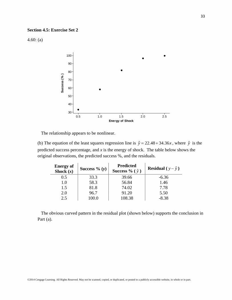
4.60: (a)
2.52.01.51.00.5
100
90
80
70
60
50
40
30
Energy of Shock
Suc
cess
(%
)
The relationship appears to be nonlinear.
(b) The equation of the least squares regression line is ˆ 22.48 34.36y x , where y is the
predicted success percentage, and x is the energy of shock. The table below shows the original observations, the predicted success %, and the residuals.
Energy of Shock (x)
Success % (y)Predicted
Success % ( y ) Residual ( ˆy y )
0.5 33.3 39.66 -6.36 1.0 58.3 56.84 1.46 1.5 81.8 74.02 7.78 2.0 96.7 91.20 5.50 2.5 100.0 108.38 -8.38
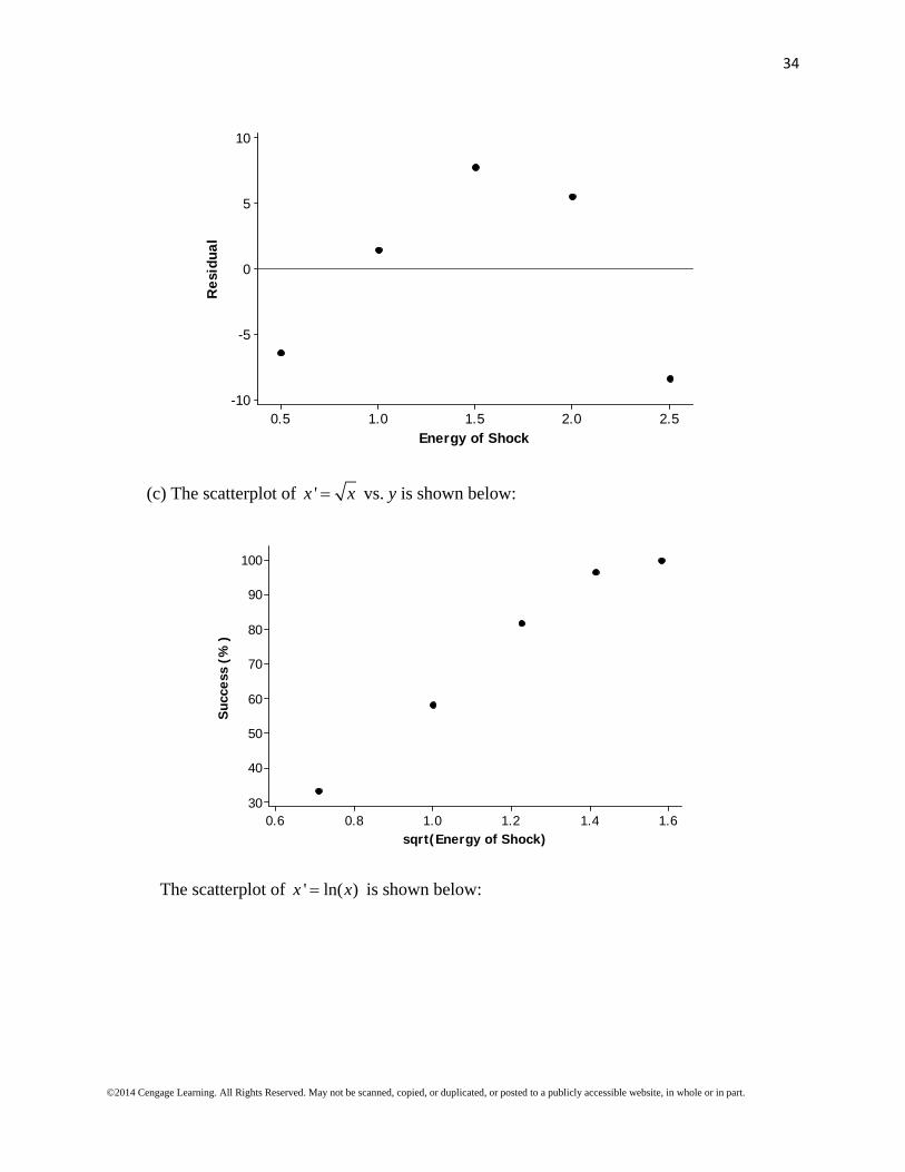
The obvious curved pattern in the residual plot (shown below) supports the conclusion in Part (a).
34
©2014 Cengage Learning. All Rights Reserved. May not be scanned, copied, or duplicated, or posted to a publicly accessible website, in whole or in part.
2.52.01.51.00.5
10
5
0
-5
-10
Energy of Shock
Res
idua
l
(c) The scatterplot of 'x x vs. y is shown below:
1.61.41.21.00.80.6
100
90
80
70
60
50
40
30
sqrt(Energy of Shock)
Suc
cess
(%
)
The scatterplot of ' ln( )x x is shown below:
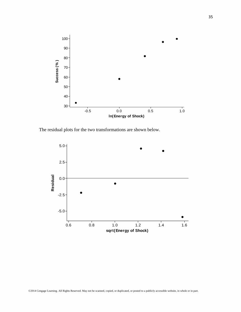
35
©2014 Cengage Learning. All Rights Reserved. May not be scanned, copied, or duplicated, or posted to a publicly accessible website, in whole or in part.
1.00.50.0-0.5
100
90
80
70
60
50
40
30
ln(Energy of Shock)
Suc
cess
(%
)
The residual plots for the two transformations are shown below.
1.61.41.21.00.80.6
5.0
2.5
0.0
-2.5
-5.0
sqrt(Energy of Shock)
Res
idua
l

36
©2014 Cengage Learning. All Rights Reserved. May not be scanned, copied, or duplicated, or posted to a publicly accessible website, in whole or in part.
1.00.50.0-0.5
4
3
2
1
0
-1
-2
-3
-4
-5
ln(Energy of Shock)
Res
idua
l
Both transformations seem to create linear patterns in the scatterplots. The residual plot for the square root transformation still shows a curved pattern, but the residual plot for the log transformation does not have as pronounced a pattern. Therefore, the second transformation (ln(x) vs. y) seems to be somewhat more successful in straightening the data.
(d) The equation of the least squares regression line is ˆ 62.42 43.81y x , where y is the
predicted success %, and x is the natural logarithm of the energy of shock.
(e) When x = 1.75, ˆ 62.42 43.81(ln(1.75)) 86.94%y
When x = 0.8, ˆ 62.42 43.81(ln(0.8)) 52.64%y

37
©2014 Cengage Learning. All Rights Reserved. May not be scanned, copied, or duplicated, or posted to a publicly accessible website, in whole or in part.
4.61: (a)
109876543210
70
60
50
40
30
20
Year
Num
ber
wai
ting
for
tra
nspl
ants
(th
ousa
nds)
The number of people waiting for transplants increased at a nonlinear rate from 1990 to 1999 (the number of people waiting for transplants increased by greater amounts each year).
(b) A transformation that straightens the scatterplot is (year, log(number waiting)). The scatterplot is shown below.
109876543210
1.9
1.8
1.7
1.6
1.5
1.4
1.3
Year
log(
Num
ber
Wai
ting
)
38
©2014 Cengage Learning. All Rights Reserved. May not be scanned, copied, or duplicated, or posted to a publicly accessible website, in whole or in part.
(c) The least squares regression equation is ˆ 1.287 0.05797y x , where y is the predicted
log of the number waiting, and x is the year (where 1 = 1990, 2 = 1991, etc.). In 2000, the predicted log of the number waiting is ˆ 1.287 0.05797(11) 1.92467y , so the predicted
number of people waiting in 2000 is 1.9246710 84.076 thousand, or approximately 84,076.
(d) We must be confident that the pattern observed from 1990 to 1999 continues into 2000. Given that 2000 is just one year outside the range of years used to develop the least squares regression model, and that the linear relationship is strong (r = 0.999), the coefficient of determination is very close to 100% (r 2 = 99.9%), and the standard deviation of the residuals is quite small (se = 0.0058), we can reasonably extrapolate to the year 2000 (year = 11 in the model). However, there is no guarantee that the relationship will continue to the year 2010, so it is unwise to use the least squares regression model to predict the number waiting for a transplant in 2010.
Section 4.5: Additional Exercises
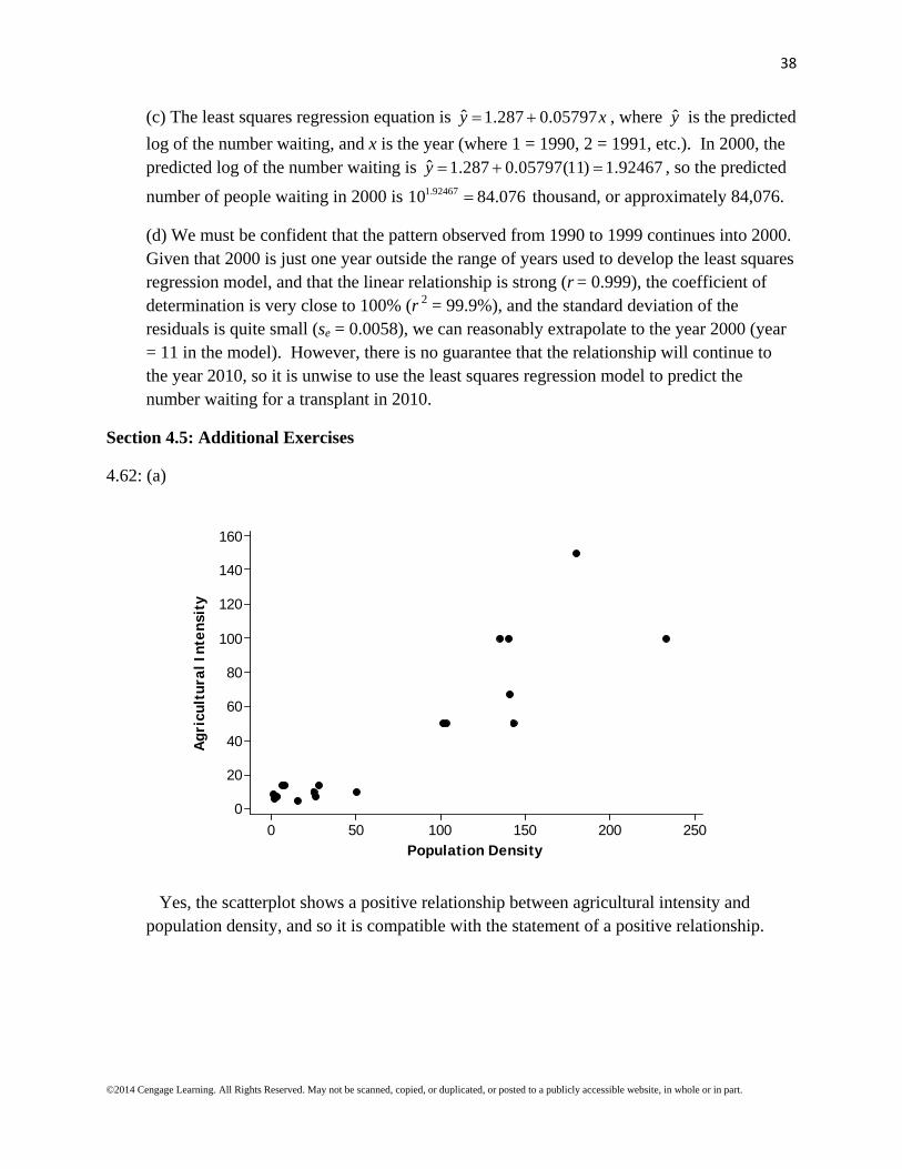
4.62: (a)
250200150100500
160
140
120
100
80
60
40
20
0
Population Density
Agr
icul
tura
l Int
ensi
ty
Yes, the scatterplot shows a positive relationship between agricultural intensity and population density, and so it is compatible with the statement of a positive relationship.
39
©2014 Cengage Learning. All Rights Reserved. May not be scanned, copied, or duplicated, or posted to a publicly accessible website, in whole or in part.
(b)
6000050000400003000020000100000
160
140
120
100
80
60
40
20
0
(Population Density)^2
Agr
icul
tura
l Int
ensi
ty
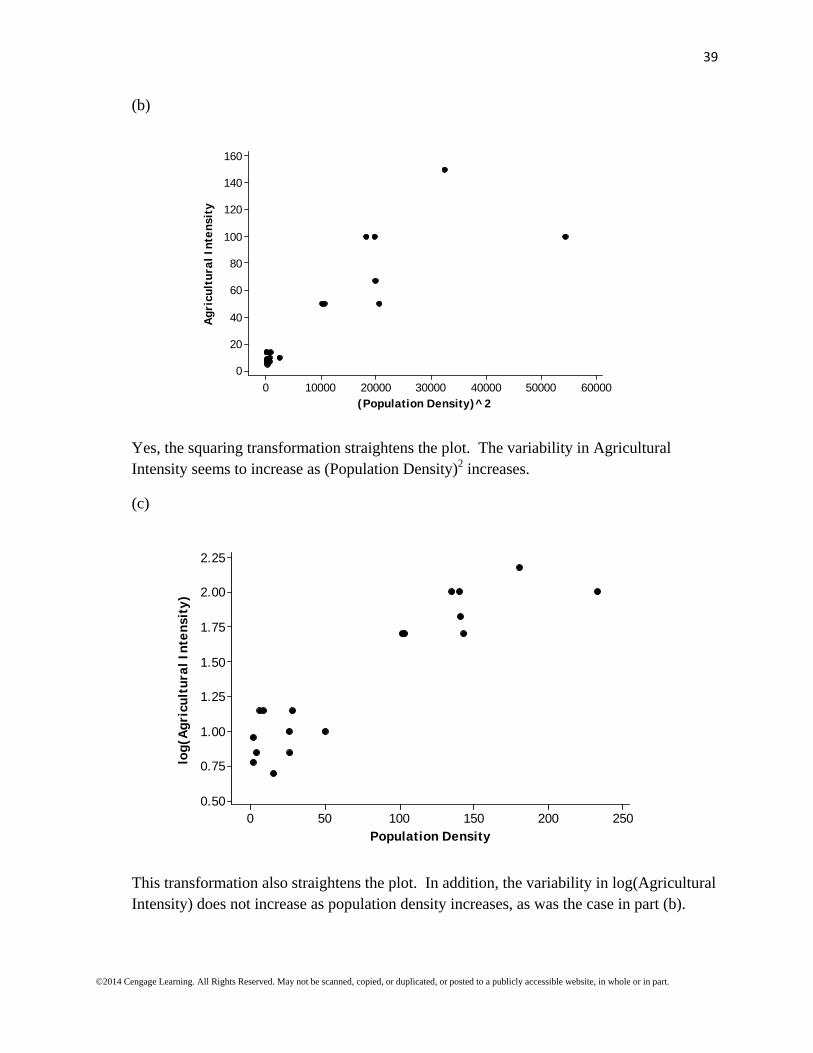
Yes, the squaring transformation straightens the plot. The variability in Agricultural Intensity seems to increase as (Population Density)2 increases.
(c)
250200150100500
2.25
2.00
1.75
1.50
1.25
1.00
0.75
0.50
Population Density
log(
Agr
icul
tura
l Int
ensi
ty)
This transformation also straightens the plot. In addition, the variability in log(Agricultural Intensity) does not increase as population density increases, as was the case in part (b).

40
©2014 Cengage Learning. All Rights Reserved. May not be scanned, copied, or duplicated, or posted to a publicly accessible website, in whole or in part.
(d)
6000050000400003000020000100000
2.25
2.00
1.75
1.50
1.25
1.00
0.75
0.50
(Population Density)^2
log(
Agr
icul
tura
l Int
ensi
ty)
These transformations were not effective in straightening the plot. There is obvious curvature in the scatterplot.
4.63:
6543210
700
600
500
400
300
200
100
0
age (years)
cana
l len
gth
(mil
lim
eter
s)
The relationship between canal length and age is not linear. The transformations ' log(canal length)y and ' log(age)x help to straighten the pattern in the scatterplot.

41
©2014 Cengage Learning. All Rights Reserved. May not be scanned, copied, or duplicated, or posted to a publicly accessible website, in whole or in part.
0.750.500.250.00-0.25-0.50
3.0
2.5
2.0
1.5
1.0
log(age)
log(
cana
l len
gth)
The residual plot shown below shows no obvious pattern, and therefore supports the assertion that the transformation succeeded in straightening the pattern in the plot.
0.750.500.250.00-0.25-0.50
0.50
0.25
0.00
-0.25
-0.50
log(age)
Res
idua
l
Chapter 4: Are You Ready to Move On?
4.64: Scatterplot 1: (i) Yes, (ii) Yes, (iii) Negative
Scatterplot 2: (i) Yes, (ii) No, (iii) –

42
©2014 Cengage Learning. All Rights Reserved. May not be scanned, copied, or duplicated, or posted to a publicly accessible website, in whole or in part.
Scatterplot 3: (i) Yes, (ii) Yes, (iii) Positive
Scatterplot 4: (i) Yes, (ii) Yes, (iii) Positive
4.65: (a) Positive, because the cost of produce is determined by its weight, so a heavier apple would cost more. (b) Close to zero, because there is no reason to believe that the height of a person would be at all associated with the number of pets a person has. (c) Positive, because, in general, the more time spent studying for an exam the higher the score will be. (d) Positive, because, in general, the heavier a person is the longer it will take to run 1 mile.
43
©2014 Cengage Learning. All Rights Reserved. May not be scanned, copied, or duplicated, or posted to a publicly accessible website, in whole or in part.
4.66: (a) r = -0.10; there is a weak, negative linear relationship. Because the relationship is negative, larger arch heights tend to be paired with smaller average hopping heights.
(b) The correlation coefficients support the conclusion since they are all fairly close to 0.
4.67: (a)
80706050403020
14
13
12
11
10
9
8
7
Cost (cents per serving)
Fibe
r (g
ram
s pe
r se
rvin
g)
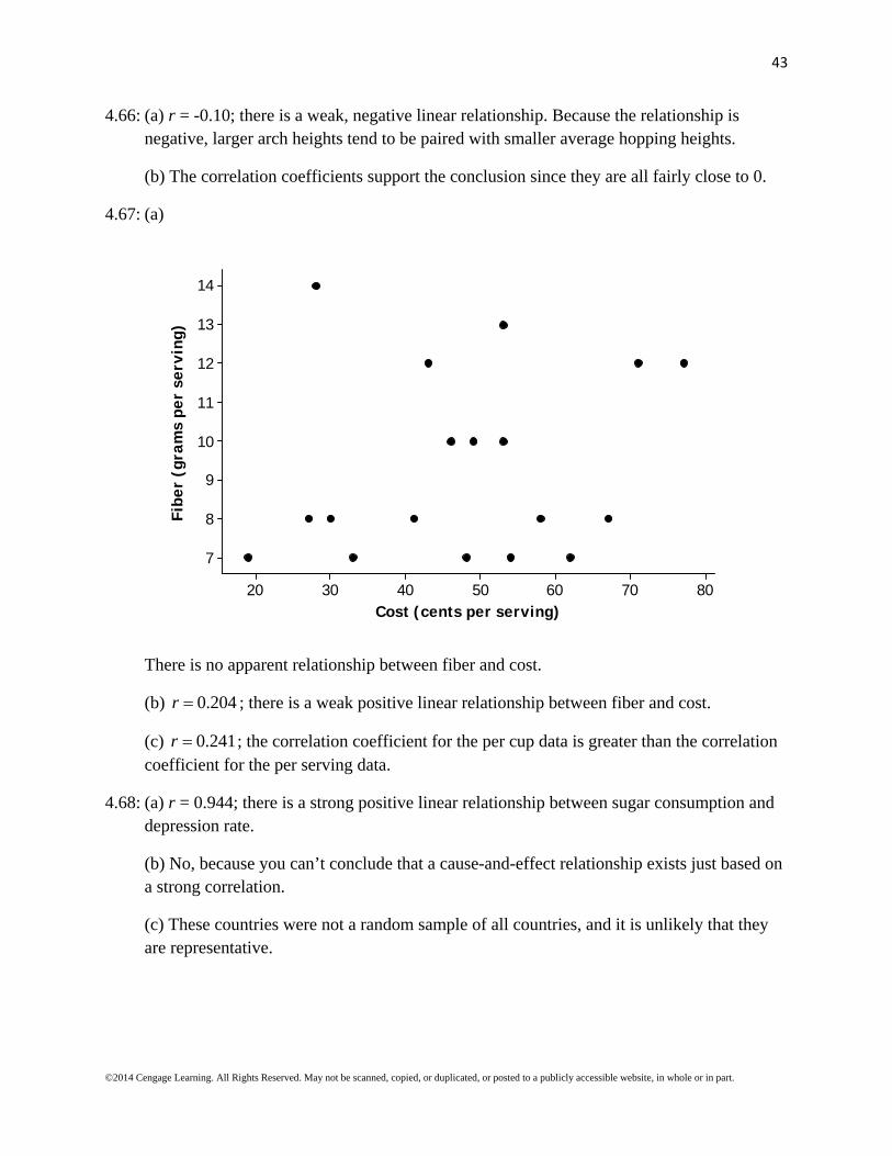
There is no apparent relationship between fiber and cost.
(b) 0.204r ; there is a weak positive linear relationship between fiber and cost.
(c) 0.241r ; the correlation coefficient for the per cup data is greater than the correlation coefficient for the per serving data.
4.68: (a) r = 0.944; there is a strong positive linear relationship between sugar consumption and depression rate.
(b) No, because you can’t conclude that a cause-and-effect relationship exists just based on a strong correlation.
(c) These countries were not a random sample of all countries, and it is unlikely that they are representative.

44
©2014 Cengage Learning. All Rights Reserved. May not be scanned, copied, or duplicated, or posted to a publicly accessible website, in whole or in part.
4.69: (a)
40.037.535.032.530.027.525.0
980
970
960
950
940
930
920
910
900
890
Pollution (micrograms/cubic meter of air)
Cos
t of
Med
ical
Car
e P
er P
erso
n
(b) There is a moderate, negative association (r = –0.581) between pollution and cost of medical care per person.
(c) The scatterplot shows a negative association between cost of medical care per person and pollution level. The sign of the correlation coefficient supports the negative association between the variables. Both the scatterplot and correlation coefficient tell us that people over the age of 65 living in more polluted areas tend to have lower medical costs.
4.70: (a) Negative, because it is likely that the work is more stressful and less enjoyable for nurses with high patient-to-nurse ratios.
(b) Negative, because it is likely that the patients at hospitals where the patient-to-nurse ratio is high will not get as much individual attention and will be less satisfied with their care.
(c) Negative, because it is likely that the quality of patient care suffers when patient-to-nurse ratio is high.
4.71: The least squares regression line is the line found by minimizing the sum of the squared vertical deviations from the line. Therefore, the least squares regression line will have the smallest sum of the squared vertical deviations compared to any other line, making choice (i) (308.6) the correct choice.
45
©2014 Cengage Learning. All Rights Reserved. May not be scanned, copied, or duplicated, or posted to a publicly accessible website, in whole or in part.
4.72: There is no evidence that the form of the relationship between x and y remains the same outside the range of the data.
4.73: (a) ˆ 101.33 9.296y x , where y is the predicted survival rate, and x is the mean call-to-
shock time. (b) The slope of –9.296 is the amount, on average, by which the survival rate percentage decreases when the mean call-to-shock time increases by one minute. (c) No, it does not make sense to interpret the intercept because the y-values represent survival rate as a percent, and the intercept is greater than 100%. (d) The predicted survival rate for a community with a mean call-to-shock time of 10 minutes is ˆ 101.33 9.296(10) 8.37%y .
4.74: (a) Size, because the relationship between price and size (r = 0.700) is stronger than the relationship between price and land-to-building ratio (r = -0.332).
(b) ˆ 1.33 0.00525y x , where y is the predicted sale price and x is the size in thousands
of square feet.
4.75: (a) Use the least squares regression line to predict the median hourly wage gain for the 15th year of schooling. ˆ 9.0714 1.57143y x , where y is the predicted median hourly wage
gain and x is the number of years of schooling. Therefore, the predicted median hourly wage gain for the 15th year of schooling is ˆ 9.0714 1.57143(15) 14.5%y . (b) The
residual for the 15th year of schooling is ˆ 14 14.5 0.5%y y . The prediction was
0.5% too high.
4.76: (a)
10987654321
22
21
20
19
18
17
16
15
Year (1 = 1990, 2 = 1991, etc.)
Num
ber
of t
rans
plan
ts (
thou
sand
s)

46
©2014 Cengage Learning. All Rights Reserved. May not be scanned, copied, or duplicated, or posted to a publicly accessible website, in whole or in part.
ˆ 14.2 0.790y x , where y is the predicted number of transplants and x is the year (using
1, 2, …, 10 to represent the years). The number of transplants has increased steadily over time, with a predicted increase of about 790 per year.
47
©2014 Cengage Learning. All Rights Reserved. May not be scanned, copied, or duplicated, or posted to a publicly accessible website, in whole or in part.
(b)
Year (x) Number of
Transplants (y) Predicted Number of Transplants ( y )
Residuals ( ˆy y )
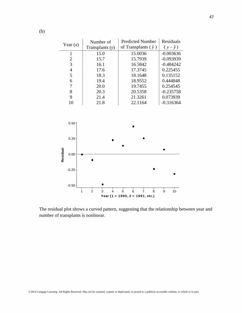
1 15.0 15.0036 -0.003636 2 15.7 15.7939 -0.093939 3 16.1 16.5842 -0.484242 4 17.6 17.3745 0.225455 5 18.3 18.1648 0.135152 6 19.4 18.9552 0.444848 7 20.0 19.7455 0.254545 8 20.3 20.5358 -0.235758 9 21.4 21.3261 0.073939 10 21.8 22.1164 -0.316364
10987654321
0.50
0.25
0.00
-0.25
-0.50
Year (1 = 1990, 2 = 1991, etc.)
Res
idua
l
The residual plot shows a curved pattern, suggesting that the relationship between year and number of transplants is nonlinear.

48
©2014 Cengage Learning. All Rights Reserved. May not be scanned, copied, or duplicated, or posted to a publicly accessible website, in whole or in part.
4.77: (a)
1501251007550
4.5
4.0
3.5
3.0
2.5
2.0
1.5
1.0
Carapace Length (mm)
Age
(ye
ars)
ˆ 1.0755 0.029105y x , where y is the predicted age (in years) and x is the carapace
length (in mm). There is a positive nonlinear association between age and carapace length.
49
©2014 Cengage Learning. All Rights Reserved. May not be scanned, copied, or duplicated, or posted to a publicly accessible website, in whole or in part.
(b)
1501251007550
0.75
0.50
0.25
0.00
-0.25
-0.50
Carapace Length (mm)
Res
idua
l
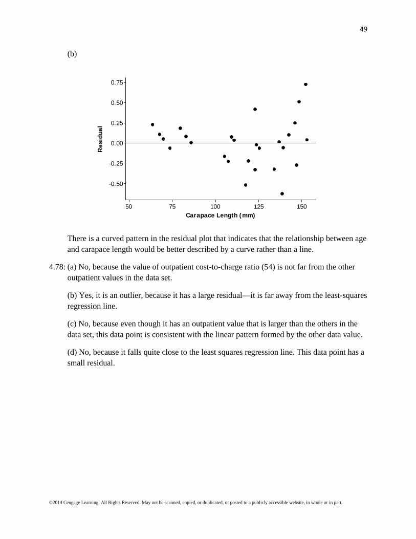
There is a curved pattern in the residual plot that indicates that the relationship between age and carapace length would be better described by a curve rather than a line.
4.78: (a) No, because the value of outpatient cost-to-charge ratio (54) is not far from the other outpatient values in the data set.
(b) Yes, it is an outlier, because it has a large residual—it is far away from the least-squares regression line.
(c) No, because even though it has an outpatient value that is larger than the others in the data set, this data point is consistent with the linear pattern formed by the other data value.
(d) No, because it falls quite close to the least squares regression line. This data point has a small residual.
50
©2014 Cengage Learning. All Rights Reserved. May not be scanned, copied, or duplicated, or posted to a publicly accessible website, in whole or in part.
4.79: (a)
40035030025020015010050
0.50
0.45
0.40
0.35
0.30
Average Energy Density (calories per 100 grams)
Ave
rage
Cos
t (d
olla
rs)
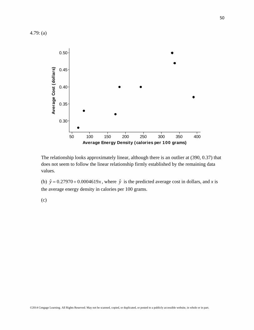
The relationship looks approximately linear, although there is an outlier at (390, 0.37) that does not seem to follow the linear relationship firmly established by the remaining data values.
(b) ˆ 0.27970 0.0004619y x , where y is the predicted average cost in dollars, and x is
the average energy density in calories per 100 grams.
(c)
51
©2014 Cengage Learning. All Rights Reserved. May not be scanned, copied, or duplicated, or posted to a publicly accessible website, in whole or in part.
40035030025020015010050
0.05
0.00
-0.05
-0.10
Average Energy Density
Res
idua
l
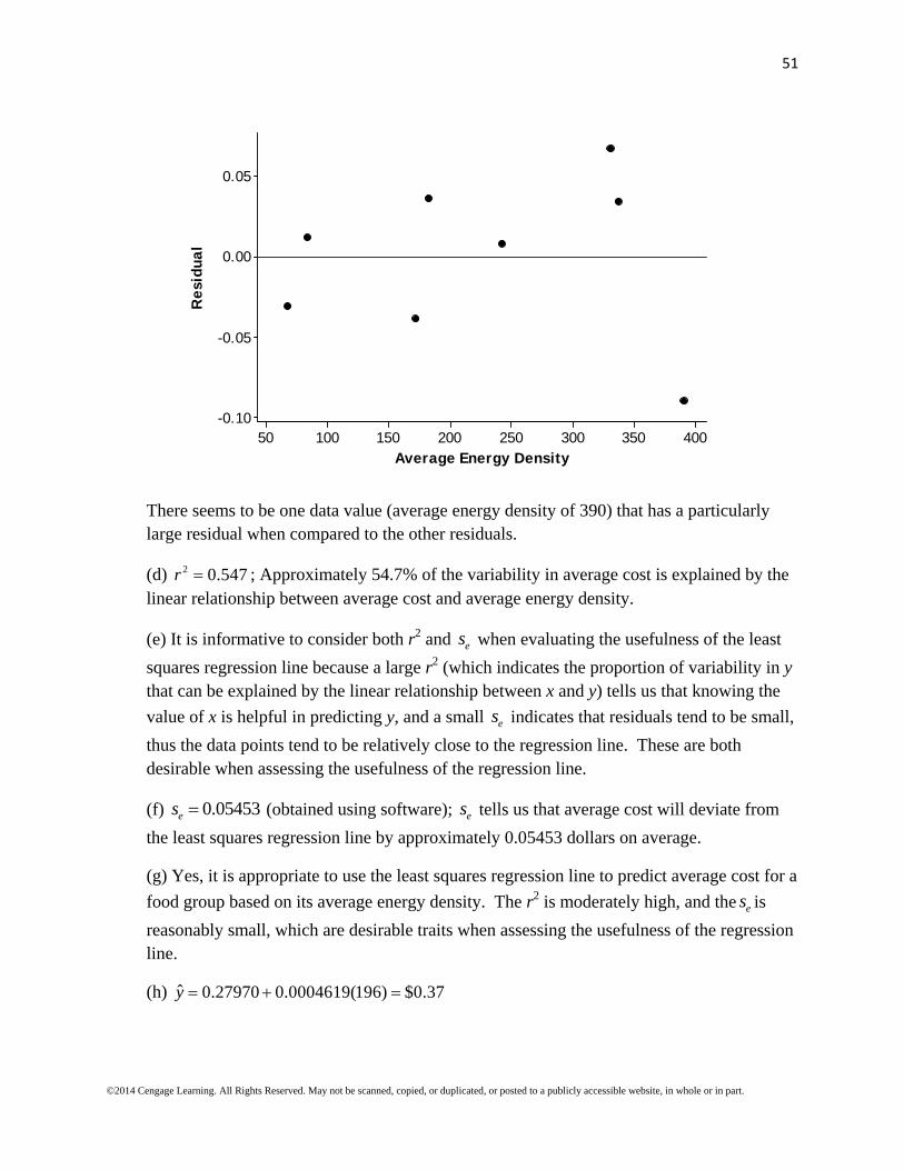
There seems to be one data value (average energy density of 390) that has a particularly large residual when compared to the other residuals.
(d) 2 0.547r ; Approximately 54.7% of the variability in average cost is explained by the linear relationship between average cost and average energy density.
(e) It is informative to consider both r2 and es when evaluating the usefulness of the least
squares regression line because a large r2 (which indicates the proportion of variability in y that can be explained by the linear relationship between x and y) tells us that knowing the
value of x is helpful in predicting y, and a small es indicates that residuals tend to be small,
thus the data points tend to be relatively close to the regression line. These are both desirable when assessing the usefulness of the regression line.
(f) 0.05453es (obtained using software); es tells us that average cost will deviate from
the least squares regression line by approximately 0.05453 dollars on average.
(g) Yes, it is appropriate to use the least squares regression line to predict average cost for a
food group based on its average energy density. The r2 is moderately high, and the es is
reasonably small, which are desirable traits when assessing the usefulness of the regression line.
(h) ˆ 0.27970 0.0004619(196) $0.37y
52
©2014 Cengage Learning. All Rights Reserved. May not be scanned, copied, or duplicated, or posted to a publicly accessible website, in whole or in part.
4.80: (a)
9080706050403020
3.5
3.0
2.5
2.0
1.5
1.0
Driver Age
Fata
lity
Rat
e
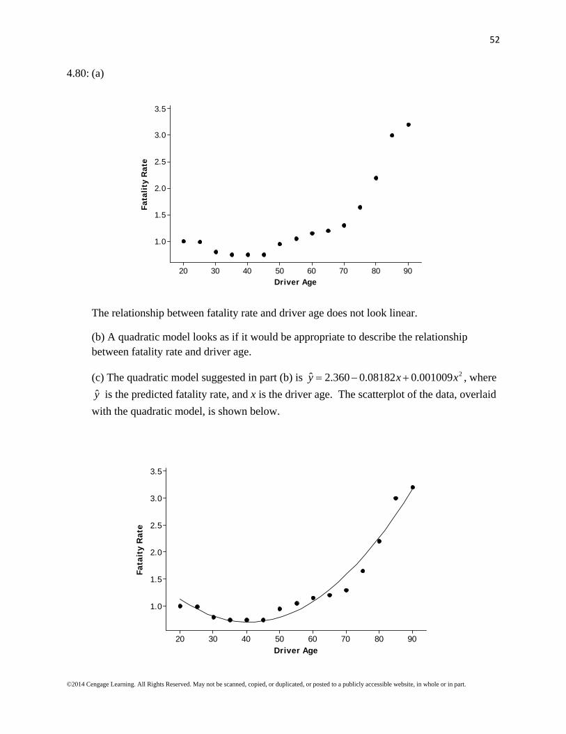
The relationship between fatality rate and driver age does not look linear.
(b) A quadratic model looks as if it would be appropriate to describe the relationship between fatality rate and driver age.
(c) The quadratic model suggested in part (b) is 2ˆ 2.360 0.08182 0.001009y x x , where
y is the predicted fatality rate, and x is the driver age. The scatterplot of the data, overlaid
with the quadratic model, is shown below.
9080706050403020
3.5
3.0
2.5
2.0
1.5
1.0
Driver Age
Fata
ity
Rat
e

53
©2014 Cengage Learning. All Rights Reserved. May not be scanned, copied, or duplicated, or posted to a publicly accessible website, in whole or in part.
(d) Yes, this model is useful for predicting the fatality rate because 2 96.4%R and
0.163es . The large R2 combined with a relatively small se support the statement that the
model is useful for prediction.
(e) The predicted fatality rate is 2ˆ 2.360 0.08182 78 0.001009 78 2.12%y .