center for family & demographic research
TRANSCRIPT
CENTER FOR FAMILY & DEMOGRAPHIC RESEARCH
Making Graphs with Excel Summer 2014 Workshop Series
Krista Payne, PhD.
1
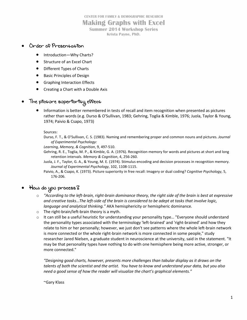
• Order of Presentation • Introduction—Why Charts? • Structure of an Excel Chart • Different Types of Charts • Basic Principles of Design • Graphing Interaction Effects • Creating a Chart with a Double Axis
• The picture superiority effect
• Information is better remembered in tests of recall and item recognition when presented as pictures rather than words (e.g. Durso & O'Sullivan, 1983; Gehring, Toglia & Kimble, 1976; Juola, Taylor & Young, 1974; Paivio & Csapo, 1973)
Sources: Durso, F. T., & O’Sullivan, C. S. (1983). Naming and remembering proper and common nouns and pictures. Journal
of Experimental Psychology: Learning, Memory, & Cognition, 9, 497-510. Gehring, R. E., Toglia, M. P., & Kimble, G. A. (1976). Recognition memory for words and pictures at short and long
retention intervals. Memory & Cognition, 4, 256-260. Juola, J. F., Taylor, G. A., & Young, M. E. (1974). Stimulus encoding and decision processes in recognition memory.
Journal of Experimental Psychology, 102, 1108-1115. Paivio, A., & Csapo, K. (1973). Picture superiority in free recall: Imagery or dual coding? Cognitive Psychology, 5,
176-206.
• How do you process? o “According to the left-brain, right-brain dominance theory, the right side of the brain is best at expressive
and creative tasks…The left-side of the brain is considered to be adept at tasks that involve logic, language and analytical thinking.” AKA hemisphericity or hemispheric dominance.
o The right-brain/left-brain theory is a myth. o It can still be a useful heuristic for understanding your personality type… "Everyone should understand
the personality types associated with the terminology 'left-brained' and 'right-brained' and how they relate to him or her personally; however, we just don't see patterns where the whole left-brain network is more connected or the whole right-brain network is more connected in some people," study researcher Jared Nielsen, a graduate student in neuroscience at the university, said in the statement. "It may be that personality types have nothing to do with one hemisphere being more active, stronger, or more connected."
“Designing good charts, however, presents more challenges than tabular display as it draws on the talents of both the scientist and the artist. You have to know and understand your data, but you also need a good sense of how the reader will visualize the chart’s graphical elements.” ~Gary Klass

CENTER FOR FAMILY & DEMOGRAPHIC RESEARCH
Making Graphs with Excel Summer 2014 Workshop Series
Krista Payne, PhD.
2
Sources: http://psychology.about.com/od/cognitivepsychology/a/left-brain-right-brain.htm http://www.oecd.org/edu/ceri/neuromyth6.htm http://www.huffingtonpost.com/2013/08/19/right-brain-left-brain-debunked_n_3762322.html Nielsen JA, Zielinski BA, Ferguson MA, Lainhart JE, Anderson JS (2013) An Evaluation of the Left-Brain vs. Right-
Brain Hypothesis with Resting State Functional Connectivity Magnetic Resonance Imaging. PLoS ONE 8(8): e71275. doi:10.1371/journal.pone.0071275
• The structure of an Excel chart:
• Title: In academic writing, the title should be used to define the data series, without imposing a data interpretation on the reader. Often, the units of measurement are specified at the end of the title after a colon or in parentheses in a subtitle (e.g. “constant dollars”, “% of GDP”, or “billions of US dollars”).
• Legends: used in charts with more than one data series. Placement is key—they should not be placed on the outside of the chart in a way than reduces the plot area, the amount of space given to represent the data.
1. I will at times place the legend to the right of the figure—typically when using vertically stacked bars, b/c I feel they help the reader decipher the information more quickly.
• Axis: The scale of the axis represents the value or magnitude of the main graphical elements of the chart. Try to make the scale consistent across charts within your single document.
• Axis Titles: Axis titles should be brief and should not be used at all if the information repeats what is clear from the title and/and axis labels.
• Data Labels: Be sure they are a clear representation of your data. For example, if the dependent variable is hourly wage, I advise using two decimal points. However, if it is yearly income, round to whole dollars.
• Gridlines: If used, they should use as little ink as possible. You don’t want to distract from the main graphical elements in your chart.
• Source: Specifying the source of the data is important for proper academic citation, and can also give those “readers in the know” important insights into the reliability and validity of the data. For example, knowing that crime statistics come from the FBI rather than The National Criminal Victimization Survey can be a crucial bit of information.
Sources: http://lilt.ilstu.edu/gmklass/pos138/datadisplay/sections/goodcharts.htm http://cas.illinoisstate.edu/jpda/index.shtml Companion website for the book: Just Plain Data Analysis: Finding, Presenting, and Interpreting Social Science Data, written by: Gary Klass. (New York: Rowman and Littlefield Publishers, 2012). Second Edition. ISBN: 978-1-4422-1508-5
• The different types of charts
• Histograms: A vertical bar chart that depicts the distribution of a set of data 1. The bars represent the frequency of occurrence by classes of data. 2. Similar to a bar chart, but a histogram groups numbers into ranges. 3. The horizontal axis is continuous like a number line (no gaps between the “columns”). 4. Great way to show results of continuous data: weight, height, how much time, etc…

CENTER FOR FAMILY & DEMOGRAPHIC RESEARCH
Making Graphs with Excel Summer 2014 Workshop Series
Krista Payne, PhD.
3
5. A frequency histogram uses vertical columns to show how many times each score occurs.
Source: http://www.mathsisfun.com/data/histograms.html
• Pie Charts: Generally used to show percentage or proportional data classified into nominal or ordinal
categories. 1. Data that is arranged in one column or row only on a worksheet. Pie charts show the size of
items in one data series, proportional to the sum of the items. The data points in a pie chart are displayed as a percentage of the whole pie (Excel 2010 help).
2. Pie charts have the following chart subtypes: a. Pie or pie and bar of pie: display pie charts with user-defined values that are extracted
from the main pie chart and combined into a secondary pie chart or into a stacked bar chart. These chart types are useful when you want to make small slices in the main pie chart easier to distinguish.
b. Exploded pie: display the contribution of each value to a total while emphasizing individual values. You can change the pie explosion setting for all slices and individual slices, but you cannot move the slices of an exploded pie manually.
3. Rules/Tips for using pie charts: a. Do NOT use pie charts if possible—it is more difficult for the eye to discern the relative
size of pie slices than it is to assess relative bar length. If you MUST use one…
b. ONLY use for data that add up to a meaningful total c. If there is no other meaningful order, order the slices from maximum to minimum d. 5-6 categories or fewer e. Put “other” in a gray slice f. Don’t use a legend, just label the slices g. Avoid forcing comparisons across more than one pie chart
Sources: Excel 2010 help http://libweb.surrey.ac.uk/library/skills/Number%20Skills%20Leicester/page_53.htm http://lilt.ilstu.edu/gmklass/pos138/datadisplay/sections/goodcharts.htm http://www.excelcharts.com/blog/10-x-10-tips-to-improve-your-excel-charts-pie-charts/
• Column & Bar Charts: Useful for showing data changes over a period of time or for illustrating
comparisons among items. In column charts, categories are typically organized along the horizontal axis and values along the vertical axis.
1. There are chart subtypes: a. Clustered column: Allows user to compare values across categories. Use when you have
categories that represent: i. Ranges of values (e.g. item counts)
ii. Specific scale arrangements (e.g. a Likert scale) iii. Names that are not in any specific order (e.g. item names, geographic names,
names of people).

CENTER FOR FAMILY & DEMOGRAPHIC RESEARCH
Making Graphs with Excel Summer 2014 Workshop Series
Krista Payne, PhD.
4
b. Stacked column: show the relationship of individual items to the whole, comparing the contribution of each value to a total across categories.
c. 100% stacked column: compare the percentage that each value contributes to a total across categories.
Source: Excel 2010 help
• Line Charts: Ideal for showing trends over time. Line charts can display continuous data over time, set
against a common scale when category data is distributed evenly among the horizontal axis, and all value data is distributed evenly along the vertical axis. Considered one of the most efficient ways of displaying large amounts of data in ways that provide for meaningful analysis.
1. There are subtypes—“line with markers, staked, 100% stacked”—but I don’t find these to be very useful.
2. You can also create them with a double-axis. Good for showing time trends of two different types of variables over the same time point (e.g. marriage rates and state spending on marriage programs). The second axis doesn’t have to be another line-chart (e.g. age at first marriage and proportion unmarried births).
3. Rules/Tips for Line Charts: a. Almost ALWAYS, time is displayed on the X-axis from left to right b. Be sure your audience can easily distinguish the lines for separate data series c. Beware of scaling effects—when two variables with numbers of different magnitudes
are graphed on the same chart, the variable with the large scale will generally appear to have a greater degree of variation; the smaller-scale variable will appear relatively “flat” even though the percentage change is the same.
d. If displaying monetary data over-time, use inflation-adjusted data e. Don’t use a legend—directly label the series f. If you can’t easily see the pattern of each series you may have too many
Sources: Excel 201 help http://lilt.ilstu.edu/gmklass/pos138/datadisplay/sections/goodcharts.htm http://office.microsoft.com/en-us/excel-help/creating-xy-scatter-and-line-charts-HA001054840.aspx http://www.excelcharts.com/blog/10-x-10-tips-to-improve-your-excel-or-not-charts-line-charts/
• Scatter Plots: Commonly used to show the relationship between two variables e.g. correlation (from
Excel help). 1. A scatter chart has two value axes, showing one set of numeric data along the horizontal axis (x-
axis) and another along the vertical axis (y-axis). It combines these values into single data points and displays them in irregular intervals, or clusters.
2. Consider using a scatter chart when: a. You want to change the scale of the horizontal axis b. You want to make the axis a logarithmic scale c. Values for horizontal axis are NOT evenly spaced d. There are many data points on the horizontal axis

CENTER FOR FAMILY & DEMOGRAPHIC RESEARCH
Making Graphs with Excel Summer 2014 Workshop Series
Krista Payne, PhD.
5
e. You want to compare many data points without regard to time—the more data you include, the better the comparisons you can make. You want to show similarities between large sets of data instead of differences between data points.
3. Rules/Tips for Scatterplots: a. Use two interval-level variables b. Fully define the variables with the axis titles c. If there is an implied causal relationship between the variables, place the independent
variable (the one that causes the other) on the X-axis and the dependent variable (the one that may be caused by the other) on the Y-axis
d. Use empty circles as markers to let the reader see the overlapping points
Sources: Excel 2010 help http://lilt.ilstu.edu/gmklass/pos138/datadisplay/sections/goodcharts.htm http://www.excelcharts.com/blog/10-x-10-tips-to-improve-your-excel-or-not-charts-the-scatter-plot/
• Area Charts: Show percentage or proportional data classified into nominal or ordinal categories over time. Area charts emphasize the magnitude of change over time, and can be used to draw attention to the total value across a trend.
Source: Excel 2010 help
• Basic Principles of Chart Design • There are two classic texts referenced often regarding data presentation:
1. Darrell Huff’s How to Lie with Statistics (1994) 2. Edward Tufte’s The Visual Display of Quantitative Information (1983)
a. I found these helpful when convincing UGs the importance of taking a sociology course.
• Simplify 1. Minimize ink-to-data ratio
a. The most basic and fundamental rule for Tufte—minimiz or eliminate anything from a chart that does not help the viewer understand what the numbers mean.
“Just as the purpose of any statistic is to simplify, to represent in one number a larger set of numbers, the purpose of a chart is to simplify numerical comparisons: to represent several numerical comparisons in a single graphic. “
2. Remove unneeded chart elements a. Gridlines b. Chart borders c. Axis titles—if you have a good title, might not need d. Legends—can you directly label your chart? If you use a legend, placement is key e. Markers & data labels—you don’t need for ALL data points. Use the last, lowest, highest,
or other relevant data points, only. f. Decimal points (in axis & data labels)

CENTER FOR FAMILY & DEMOGRAPHIC RESEARCH
Making Graphs with Excel Summer 2014 Workshop Series
Krista Payne, PhD.
6
g. Trend lines h. NO 3D charts!!!
3. Sort data in a meaningful way • Color vs. Black & White
1. When in doubt black & white—use different line types and pattern fill, but be careful with the pattern fill. It can make data labels hard to see.
2. Color can help tell a story 3. Color = branding (e.g. CFDR, NSFMR, BGSU)
a. Use a cohesive and consistent color palette b. Be mindful of how audience will view
i. Excel vs. Word vs. PDF ii. Color vs. B&W print copy
• Do NOT Use Distorted Charts 1. Do NOT misrepresent your data! 2. Use appropriate and consistent axis and scales
• Present Related Charts Simultaneously 1. One-after-another or side-by-side if possible 2. Emphasizes importance of appropriate axis and scales
• Know your Audience 1. Academic vs. lay folks 2. Undergraduate students vs. graduate students 3. Graduate students vs. professors 4. PAA presentation vs. job talk
• TMC = TMI 1. Too many charts (TMC) is as bad as too much information (TMI) do NOT overload your
audience! • Ask yourself—do you need a chart?
With respect to the field of data visualization, keep this following quote in mind…
“Data visualization is about data management, statistics and perception. Design is a nice, but optional, addition. It adds consistency, an emotional touch and grabs user’s attention but if it substantially improves insights that’s because something is wrong with the other components. Graphic designers could be great data visualization experts (some are), but above all they love beauty, not data. Under graphic design, data visualization will become a useless bimbo.”
Sources: http://lilt.ilstu.edu/gmklass/pos138/datadisplay/sections/goodcharts.htm http://peltiertech.com/WordPress/ten-chart-design-principles-guest-post/ http://www.excelcharts.com/blog/design-principles-for-better-charts-simplicity/ http://www.excelcharts.com/blog/10-x-10-tips-to-improve-your-excel-charts-general-tips/

CENTER FOR FAMILY & DEMOGRAPHIC RESEARCH
Making Graphs with Excel Summer 2014 Workshop Series
Krista Payne, PhD.
7
• Charting Interaction Effects • Logistic Regression Predicting Ever Marrying
1. An interaction between a categorical and continuous predictor (DeMaris 2004, p 143) E(Y) = β0 + δ1Black + β1Parity + ϒ1Black*Parity i. The subpop consists of only White and Black women
ii. Black is a dummy variable iii. Parity indicates number of live births, range 0-15 iv. Analyses is weighted
2. Stata Output: . svy, subpop(blkwht): logistic evermar black PARITY PARITYblk, coef Number of strata = 56 Number of obs = 12279 Number of PSUs = 152 Population size = 61754741 Subpop. no. of obs = 8568 Subpop. size = 45835139 Design df = 96 F( 3, 94) = 186.25 Prob > F = 0.0000 ------------------------------------------------------------------------------ | Linearized evermar | Coef. Std. Err. t P>|t| [95% Conf. Interval] -------------+---------------------------------------------------------------- black | -.4698438 .1172022 -4.01 0.000 -.7024885 -.2371992 PARITY | 1.458909 .0707637 20.62 0.000 1.318444 1.599374 PARITYblk | -.9253343 .0978554 -9.46 0.000 -1.119576 -.7310928 _cons | -.8652098 .0616793 -14.03 0.000 -.9876423 -.7427772 ------------------------------------------------------------------------------
3. Table of Results:
Logistic Regression Predicting Ever Marrying
Model 1 (Zero-Order)
Model 2
Model 3 (Full)
Coef. SE Coef. SE Coef. SE Black -0.854 0.325 ***
-1.589 0.1 ***
-0.470 0.117 ***
Parity 1.040 0.054 ***
1.150 0.1 ***
1.459 0.071 *** Black X Parity
-0.925 0.098 ***
Constant -0.679 0.1 *** -0.865 0.062 ***
4. Equation for Black Women E(Y) = β0 + δ1 + β1Parity + ϒ1*Parity
5. Equation for White Women E(Y) = β0 + β1Parity
6. Now, Plug and Play in Excel! Source: DeMaris, A. (2004). Regression with Social Data: Modeling Continuous and Limited Response Variables.
John Wiley & Sons, Inc., Hoboken, NJ

CENTER FOR FAMILY & DEMOGRAPHIC RESEARCH
Making Graphs with Excel Summer 2014 Workshop Series
Krista Payne, PhD.
8
• Create Your Initial Chart 1. Highlight the values you want displayed in your chart—AKA your
data series.
2. On the Insert tab click on Line in the Charts section. Choose the first 2-D Line option.
3. Excel will produce the following line chart for you…
-5.000
0.000
5.000
10.000
15.000
20.000
25.000
1 2 3 4 5 6 7 8 9 10 11 12 13 14 15 16
Black Women
White Women

CENTER FOR FAMILY & DEMOGRAPHIC RESEARCH
Making Graphs with Excel Summer 2014 Workshop Series
Krista Payne, PhD.
9
• Formatting Your Chart 1. Click on the Design tab (under Chart Tools)
I typically choose the Chart Layout on the far left as my starting point.
-5.000
0.000
5.000
10.000
15.000
20.000
25.000
1 2 3 4 5 6 7 8 9 10 11 12 13 14 15 16
Axis
Titl
e
Chart Title
Black Women
White Women

CENTER FOR FAMILY & DEMOGRAPHIC RESEARCH
Making Graphs with Excel Summer 2014 Workshop Series
Krista Payne, PhD.
10
2. Add a horizontal axis title a. Click on the Layout tab (under Chart Tools) Click Axis Titles, hover over Primary
Axis Title, click Title Below Axis Go into your chart and provide an appropriate title
-5.000
0.000
5.000
10.000
15.000
20.000
25.000
1 2 3 4 5 6 7 8 9 10 11 12 13 14 15 16
Axis
Titl
e
Axis Title
Chart Title
Black Women
White Women

CENTER FOR FAMILY & DEMOGRAPHIC RESEARCH
Making Graphs with Excel Summer 2014 Workshop Series
Krista Payne, PhD.
11
3. Reposition Legend a. Click Legend, click Show Legend at Top
-5.000
0.000
5.000
10.000
15.000
20.000
25.000
1 2 3 4 5 6 7 8 9 10 11 12 13 14 15 16
Axis
Titl
e
Axis Title
Chart Title Black Women White Women

CENTER FOR FAMILY & DEMOGRAPHIC RESEARCH
Making Graphs with Excel Summer 2014 Workshop Series
Krista Payne, PhD.
12
4. Remove unwanted elements a. Vertical Axis Title Click on title and hit delete b. Chart Border Left click on your chart and then right click to bring up formatting box,
click on Format Chart Area…(at the very bottom). This will bring up a Format Chart Area box.
i. Click on Border Color, select No line, click Close (button on bottom left of box)
-5.000
0.000
5.000
10.000
15.000
20.000
25.000
1 2 3 4 5 6 7 8 9 10 11 12 13 14 15 16
Axis Title
Chart Title Black Women White Women

CENTER FOR FAMILY & DEMOGRAPHIC RESEARCH
Making Graphs with Excel Summer 2014 Workshop Series
Krista Payne, PhD.
13
5. Format axis a. Vertical Right click and select Format Axis… (at the very bottom). With Axis Options
highlighted, select Fixed for all values. Now click Number (second from the top on left side of box) and change Decimal places to “0” and hit enter or click Close.
-505
10152025
1 2 3 4 5 6 7 8 9 10 11 12 13 14 15 16Axis Title
Chart Title Black Women White Women

CENTER FOR FAMILY & DEMOGRAPHIC RESEARCH
Making Graphs with Excel Summer 2014 Workshop Series
Krista Payne, PhD.
14
b. Horizontal Click on your chart (this will highlight the Chart Tools ribbon), and click on the Design tab. Click Select Data and a Select Data Source box will open…
i. Click Edit under Horizontal (Category) Axis Labels. An Axis Labels box will open.
ii. Highlight values in Excel for your axis range…
iii. Click OK. New Horizontal (Category) Axis Labels should appear, click OK.

CENTER FOR FAMILY & DEMOGRAPHIC RESEARCH
Making Graphs with Excel Summer 2014 Workshop Series
Krista Payne, PhD.
15
6. Format data lines a. Rick click and select Format Data Series… (at the very bottom). Click Line Color (left
side of box) and select Solid Line. Be sure black is your chosen color. b. Click Line Style (left side of box) and click on the drop down box beside Dash type and
choose Long Dash Dot, click Close (button on bottom left of box). Do the same for Black Women, but choose a different Dash type.
-505
10152025
0 1 2 3 4 5 6 7 8 9 10 11 12 13 14 15Axis Title
Chart Title Black Women White Women

CENTER FOR FAMILY & DEMOGRAPHIC RESEARCH
Making Graphs with Excel Summer 2014 Workshop Series
Krista Payne, PhD.
16
• Creating a Chart with a Double Axis • Create Your Initial Chart
1. Highlight the values you want displayed in your chart—AKA your data series.
2. On the Insert tab click on Line in the Charts section. Choose the first 2-D Line option.
3. Excel will produce the following char for you with all 3 data series plotted on the left axis…
0.0
20.0
40.0
60.0
80.0
100.0
120.0
140.0
160.0
Marriage Rate
Divorce Rate
HMI Spending

CENTER FOR FAMILY & DEMOGRAPHIC RESEARCH
Making Graphs with Excel Summer 2014 Workshop Series
Krista Payne, PhD.
17
4. Click on the data series you wish to plot on the right axis.
5. Click on Format Data Series at the bottom of the drop down box. Once you do, a dialogue box will appear. Click on Series Options (first option in the left side menu). Select Secondary Axis.

CENTER FOR FAMILY & DEMOGRAPHIC RESEARCH
Making Graphs with Excel Summer 2014 Workshop Series
Krista Payne, PhD.
18
6. Now you have the dollar amounts plotted on the right axis. Continue with formatting your chart.
$0
$20
$40
$60
$80
$100
$120
$140
$160
0.0
5.0
10.0
15.0
20.0
25.0
30.0
35.0
40.0
45.0
50.0
Marriage Rate
Divorce Rate
HMI Spending