case examples from innovator facilities - segd
TRANSCRIPT
Universal Symbols in Health Care
Innovator FacilitiesPost Audit Report


3U N I V E R S A L S Y M B O L S I N H E A L T H C A R E | P O S T - A U D I T R E P O R T
Table of ContentsExecutive Summary. . . . . . . . . . . . . . . . . . . . . . . . . . . . . . . . . . . . . . . . . . . . . . . . . . . . . . 5
Project Overview . . . . . . . . . . . . . . . . . . . . . . . . . . . . . . . . . . . . . . . . . . . . . . . . . . . . . . . . 9
Key Lessons Learned. . . . . . . . . . . . . . . . . . . . . . . . . . . . . . . . . . . . . . . . . . . . . . . . . . . . 17
Overview of Designed Solutions . . . . . . . . . . . . . . . . . . . . . . . . . . . . . . . . . . . . . . . . .25
Case Examples from Innovator Facilities . . . . . . . . . . . . . . . . . . . . . . . . . . . . . . . . . .29
Children’s Mercy Hospital, Kansas City, Missouri . . . . . . . . . . . . . . . . . . . . . . . .30
Grady Memorial Hospital, Atlanta, Georgia . . . . . . . . . . . . . . . . . . . . . . . . . . . . . .38
International Community Health Services, Seattle, Washington . . . . . . . . . . .46
Women & Infants Hospital, Providence, Rhode Island . . . . . . . . . . . . . . . . . . . .52
Appendix 1
User Satisfaction Research Results – Baseline and Post Implementation. . .58
Editor:Sherwood Smith, Avenue ISR
With technical and editing support byCraig Berger, SEGDYolanda Partida, Hablamos JuntosMark VanderKlipp, Corbin Design


5U N I V E R S A L S Y M B O L S I N H E A L T H C A R E | P O S T - A U D I T R E P O R T
Executive SummaryThis report details findings, implications and lessons learned from Phase II of
Signs That Work an initiative of Hablamos Juntos, a national program funded
by the Robert Wood Johnson Foundation (RWJF) to develop easy-to-understand
universal graphic symbols for health care facilities, working in partnership with
the Society for Environmental Graphic Design (SEGD).
The UHCS system was developed primarily with limited English proficiency
(LEP) populations in mind, but is also effective for those who are challenged by
literacy issues, visual impairment, brain injury, etc.
Phase II of the project aimed to help four innovator health facilities develop
prototype signage and wayfinding* programs using graphic symbols, with the
help of a team of leading national experts in symbols and wayfinding. The
project also served to advance understanding of how symbols can be effectively
used in healthcare wayfinding.
In parallel, the project established a consortium of design schools, initially
to develop and test 22 new symbols to meet the symbol needs of the
demonstration sites, and long term to promote on-going development and
testing of symbols for wayfinding in healthcare facilities.
The main focus of this report is the experience of the innovator site
implementation experience.
* Note: For these purposes, ‘wayfinding’ is the method for providing consistent information in overt and obvious ways to guide a person to their destination. In practical application, this information can include maps and signs; overt clues in the architecture and interior design of a facility; use of color, pattern and texture; or other systems of information that patients, visitors and staff use to navigate to and among destinations.

6 P O S T - A U D I T R E P O R T | U N I V E R S A L S Y M B O L S I N H E A L T H C A R E
The methods used to conduct this work are detailed in the Project Overview
section of this report. In brief, however, the approach used is as follows:
for testing and implementating symbols based wayfinding
innovator facilities participated in general training that covered the
development of effective wayfinding systems. They then developed
prototype systems
the before-and-after signage program in the innovator facilities* and
participated in development and testing of symbols based prototype
wayfinding systems
developed and implemented testing methodologies to evaluate certain key
questions related to symbols based wayfinding
* Note: Results of incremental research into documented changes in the user experiences of patients, visitors and staff is being appended to this document as Appendix 1 – User Satisfaction Research Results – Baseline and Post Implementation, scheduled for completion by September 30, 2010.
The following high level findings are detailed in the Key Lessons Learned,
Overview of Designed Solutions, and Case Examples from Innovator
Facilities:
systems can be powerful and effective at addressing the needs of LEP
patients and visitors and indeed all users of healthcare facilities
of a variety of healthcare institutions

7U N I V E R S A L S Y M B O L S I N H E A L T H C A R E | P O S T - A U D I T R E P O R T
prototype and final wayfinding programs helped innovator facilities
develop successful systems
single symbol to each primary destination within the facility, produces
systems which are more easily accessed and used
paid to size, legibility and unobstructed visibility
helps produce more effective solutions
tools can help users to recognize symbols in wayfinding and to associate
a symbol with a destination
These findings are important because they showcase the success of symbols in
healthcare wayfinding and they show a path forward for other decision makers
who seek to develop systems for their facilities. Each finding is explained in the
following sections.
Through the experiences of the four innovator facilities who participated in this
project, the reader of this report will gain a deep understanding of how symbols
can be implemented in healthcare wayfinding systems, the processes by which
symbols based wayfinding systems can be developed and implemented, and
the impacts that use of symbols in wayfinding can have on the patient/visitor
experience of LEP populations and others.

8 P O S T - A U D I T R E P O R T | U N I V E R S A L S Y M B O L S I N H E A L T H C A R E

9U N I V E R S A L S Y M B O L S I N H E A L T H C A R E | P O S T - A U D I T R E P O R T
Project OverviewFour innovator facilities were selected to implement symbols in new wayfinding
systems and to share practical implementation experiences and results. These
healthcare facilities represent diverse areas of the country as well as diverse
with detail on the choices they made and the outcomes, appears in the section
“Case Examples from Innovator Facilities.”
Facilities selected designers, either in-house employees or contracted outside
consultants, to develop designed wayfinding solutions. These designers
participated in a six part web-based training, designed and facilitated by the
SEGD, which walked them through the steps of a wayfinding program design
process.*
Experience design experts from Corbin Design were selected to work with a
technical expert panel to provide assistance to the innovator facilities and
to document pre-audit and post-audit conditions with respect to wayfinding
systems and LEP populations.
based on best practices in the development and use of graphic symbols in
healthcare environments.
Project Objectives
1 Support implementation of symbols based wayfinding systems using
evidence-based practices in the four innovator facilities.
2 Document the implementation experience and results, with special
attention to limited English proficiency users.
4 Promote awareness of how symbols based wayfinding can be a solution
for multilingual environments.
* Note: This training is the focus of the project report “Universal Symbols in Healthcare Workbook: Developing a Symbols Based Wayfinding Program”

10 P O S T - A U D I T R E P O R T | U N I V E R S A L S Y M B O L S I N H E A L T H C A R E
Symbol and Referent Library
Symbols developed and tested by the broader Signs That Work Initiative are
available at: www.hablamosjuntos.org.
To learn about relevant symbol development and testing activities, go to:
www.hablamosjuntos.org.
Site Visit Teams
Corbin Design
Mark VanderKlipp, President, Principal-In-Charge
Sherwood Smith, Research Manager
Hablamos Juntos
Yolanda Partida, Director
Society for Environmental Graphic Design
Penn State University

11U N I V E R S A L S Y M B O L S I N H E A L T H C A R E | P O S T - A U D I T R E P O R T
Participating Facilities and Primary Contacts
Stephanie Dietrich, Environmental Graphic Designer,
Children’s Mercy Hospital, Kansas City, MO
Susan Cain, Director of Facilities Planning and Design
Donald “Scribe” Ross, Paint Specialist
Dr. John Cowden
Women & Infants Hospital, Providence, RI
Tatyana Shabalina, Media Center
Raymond Texeira, Texeira Design, Signage and Wayfinding Consultant

12 P O S T - A U D I T R E P O R T | U N I V E R S A L S Y M B O L S I N H E A L T H C A R E
Project Phases
gallery of existing signage in the innovator facilities and post implementation
signage solutions are reported separately.
The project team conducted two-day site visits at each of the four innovator
facilities consisting of:
community affairs representatives, administration, clinical care managers,
translators, security guards, volunteers, patient advocates, and others
with the ability to comment on current systems in place to address the
needs of LEP populations
wayfinding systems
designed to assist with wayfinding
In two of four cases the local facility designers responsible for developing
prototype systems participated in focus groups with healthcare staff
(see above) to gain an understanding of user needs and how symbols
development can integrate with a visitor-oriented wayfinding approach.
Hearing this feedback firsthand informed the designers’ design process
and outcomes.
The pre-audit evaluation established the baseline state of each facility and
helped create a framework for recommendations and technical assistance on
prototype design development.

13U N I V E R S A L S Y M B O L S I N H E A L T H C A R E | P O S T - A U D I T R E P O R T
The Corbin team worked with volunteers and staff from the facilities to:
English proficiency
staff. This information was used to document existing patterns of use and
highlight general wayfinding challenges and opportunities. These data were
also used to set a baseline against which post-installation research can be
compared to determine whether or not there has been measurable improvement
in the LEP patient/visitor experience and/or in operating efficiencies and
profitability associated with fewer patients becoming lost.
* Note: Results of incremental research into documented changes in the user experiences of patients, visitors and staff is being appended to this document as Appendix 1 – User Satisfaction Research Results – Baseline and Post Implementation, scheduled for completion by September 30, 2010.
Designers employed by each facility (either in-house or contracted externally),
by the design steps recommended in the SEGD web-based training, developed
schematic designs based on their understanding of specific conditions at
each facility.
The project team provided design review and consultation to innovator facility
designers in the following areas:
service lines, clarification was provided
facility designers and the project team discussed symbol location relative to
arrows, text, color fields and other graphic elements such as building zone or
level indicators

14 P O S T - A U D I T R E P O R T | U N I V E R S A L S Y M B O L S I N H E A L T H C A R E
determine which type of sign would be appropriate for a given
informational use
reviewed and recommended optimal locations for certain sign types given
size, sight lines, etc.
signage elements for optimal legibility
based on type size, viewing distance,
sign location, contrast and other physical
factors
Using this input, designers finalized
designs and created prototype sets of
signs. Prototypes were produced on
temporary materials and installed.
The site visit team then returned to the innovator facilities to document,
evaluate, and test the effectiveness of the installed prototype systems.
The team was able to assess the extent to which prototype signage
was effectively executed, consistent with design recommendations and
developed plans.
to the facility in which they completed several specific tests. Two tests
which are of particular importance to this report:
symbols within a larger field of symbols under three test conditions:
from a starting point to a sequence of three primary destinations within
the facility using temporary signage under three test conditions:
- symbol only
Temporary signage was produced on foam core or paper.

15U N I V E R S A L S Y M B O L S I N H E A L T H C A R E | P O S T - A U D I T R E P O R T
- symbol with English referent
- symbol with English and a secondary language
(Spanish or Chinese, depending on facility
populations).
* Note: Each participant was shown a printed version of the relevant symbol before setting out to find a given destination.
Participants recruited to test prototype systems
included primary speakers of English, Spanish, Chinese
(Mandarin), Vietnamese, Khmer, and Somali. While
completing the wayfinding task, participants provided
qualitative feedback about ease of the wayfinding
task, their comprehension of the signs, and sign placement.
The post audit studies and evaluation showed the overall effectiveness
of the systems in place. The project team was able to observe the extent
to which users from a variety of backgrounds were able to use different
elements of the systems. The project team was also able to note any
shortcomings manifested by areas where visitors were consistently confused
or delayed (See Testing Universal Symbols to Support Implementation in
Healthcare Facilities Signage for details of this testing process and results).
4. Post-Implementation User Satisfaction Research
Once each facility has completed final installation of final wayfinding
ratings of the effectiveness and efficiency of the new wayfinding systems
relative to the pre-audit conditions, the project teams will be able to
measure institutional impacts of effective symbols based wayfinding.
user experiences of patients, visitors and staff is being appended to
this document as “Appendix 1 – User Satisfaction Research Results –
Baseline and Post Implementation.”
Research participants completed pen and paper tests as well as
accompanied wayfinding tests.

16 P O S T - A U D I T R E P O R T | U N I V E R S A L S Y M B O L S I N H E A L T H C A R E

17U N I V E R S A L S Y M B O L S I N H E A L T H C A R E | P O S T - A U D I T R E P O R T
Key Lessons LearnedOverall findings from the Phase II prototype installations; these findings arise
from the case examples detailed below.
General Results
Universal health care symbols were used in wayfinding systems
designed by the innovator facilities. These systems appear to be
effective overall.
that they could “easily” find their destination using the symbols based
wayfinding systems.
Within the four innovator facilities, LEP populations from a variety
of cultural backgrounds were able to effectively use the symbols.
Participants in the post-audit research consisted of primary speakers of
English, Spanish, Khmer, Vietnamese, Chinese (Mandarin), Somali, and
Korean. Overall, all populations were able to navigate health care facilities
using symbols. This is important because it confirms that symbols can
cross cultural and linguistic boundaries.
Low literacy populations were able to use symbols for navigation.
participants were unable to read either English or their primary spoken
language. They were, however, able to find their way to destinations
within the facility using symbols.
Although the focus of the symbol development initiative was LEP
populations, all users, including those with strong English proficiency,
were able to navigate using symbols. These results are presented in
the Testing Universal Symbols to Support Implementation in Healthcare
Facilities Signage, a project report written by Philip Garvey. This result
suggests that implementation of symbols in healthcare wayfinding may
cause overall improvement in patient and visitor wayfinding, across
subgroups of the patient and visitor population.

18 P O S T - A U D I T R E P O R T | U N I V E R S A L S Y M B O L S I N H E A L T H C A R E
Symbols were effectively used in diverse, health care environments,
from a large public hospital to a medical clinic building. The innovator
facilities that participated in this study are diverse and each developed
not such that we can say that symbols will be effective in all health care
environments, they do imply that symbols can be useful if implemented in
many different kinds of health care settings.
Appendix 1 – User Satisfaction Research Results – Baseline and Post
Implementation,
additional research findings and implications regarding the relative impact the
four symbols based wayfinding systems are having on wayfinding and on the
patient experience within these facilities. These findings examine the extent to
which the new systems are “making a difference,” from the perspective of both
users and facility staff.
Formulating a Symbols Wayfinding Strategy
developing their prototype and final wayfinding programs. It is the judgment
of the project team that the processes encapsulated in this assessment helped
produce better designed solutions than would otherwise have been created.
These processes uncovered how key constituent groups (end users, front line
staff, decision makers, etc) perceived the strengths and weaknesses of the
existing system, informed design criteria, and pointed to ancillary changes to
facilities and policy that would be needed to maximize success. Key elements of
the assessment are detailed below.
Detailed facility reviews identified shortcomings of existing systems.
was able to identify several challenges with existing systems that
with photographic documentation and evaluation, helped create
successful design criteria.

19U N I V E R S A L S Y M B O L S I N H E A L T H C A R E | P O S T - A U D I T R E P O R T
Involving front line employees and patient advocates in the planning
phase appears to be an important step to ensure that designed
solutions fit the needs of multiple users.
have pathways by which patients and visitors are intended to receive
information and guidance, many patients and visitors receive wayfinding
direction from front line staff such as security guards, custodial staff,
and retail employees with no official responsibility (or training or tools)
for wayfinding. Involving some of these employees showed the need for
supporting systems such as tear sheets, brochures, posters, etc. which
would allow these individuals to help patients and visitors engage with
the symbols based wayfinding system.
Determining responsibility for ongoing maintenance of wayfinding
systems is an important decision to be addressed in the planning
phase.
did observe that when facilities had clear lines of accountability for
development and maintenance of wayfinding systems, they were more
likely to arrive quickly at effective symbols based wayfinding systems.
A rollout and communications plan can help speed effectiveness of
the wayfinding system and should be anticipated during the planning
phase. Some facilities developed very specific approaches to introducing
symbols based wayfinding to staff. These facilities were generally able to
generate a great deal of positive enthusiasm for the system by doing this,
and were able to successfully position the launch of the new system as
an “event.”

20 P O S T - A U D I T R E P O R T | U N I V E R S A L S Y M B O L S I N H E A L T H C A R E
Destination Criteria and Assignment
be represented by symbols, which symbols will be used to represent which
destinations, and at which decision points or touch points symbols will be used.
Key lessons learned from the design process of the four innovator facilities:
Symbols may be most effective when a single symbol is used to
represent a single primary destination. Early in the conceptual design
process, some innovator facilities questioned whether or not one symbol
could be used to modify or qualify another, e.g. using the Pediatrics
participants appeared to understand a given system well when it was
explained that a single symbol indicated one specific destination.
Increasing the number of symbols at any given decision point may
start to increase the amount of time that a given user needs to spend
in order to find and use symbols in navigation. On average across
all sites and groups, it took participants 15 per cent longer to find two
may be obvious that more symbols means more complexity, it is a first
order concern for system design. It is important that symbols be used to
represent primary destinations only and that systems not be burdened
with extra symbols which are not primary.
When there is not a perfect match between a primary destination
and a symbol available in the current Universal Health Care Symbol
library, facilities should follow a disciplined approach if they wish to
supplement with other symbols. It is clear, based on the experience of
some of the innovator facilities in this initiative, that some health care

21U N I V E R S A L S Y M B O L S I N H E A L T H C A R E | P O S T - A U D I T R E P O R T
institutions will have primary destinations for which there is no perfect
match from the established symbol set. Hablamos Juntos intends to
provide tools for development, testing and validation of new symbols,
which will be available www.hablamosjuntos.org.
Symbols may be an efficient and effective
alternative to bilingual translations in signage.
In three of four facilities, LEP users were able to
navigate to destinations faster when wayfinding was
presented with only a symbol and English referent
for the destination than when a translation into
a second language (primary for the participants)
results indicate that when symbols are successfully
implemented in wayfinding systems and are
understood by users, bilingual translation into
a secondary language for wayfinding may not be
necessary.
* Note: This does not in any way diminish the importance of effective translated information for clinical information, policies and procedures, key services, etc.
Design and Development Using Symbols
(see section below on Symbol Support and Education), it is a central element
in the systems designed by the four innovator facilities. The project team
recognizes that individual facilities have unique constraints and considerations
that may inform a variety of successful designed solutions. This was certainly
true for the four innovator facilities. However, though a variety of designed
solutions may be effective, some overall lessons learned follow:
Even when symbols were presented without any English or
bilingual referent, symbols in signage could be used for wayfinding.

22 P O S T - A U D I T R E P O R T | U N I V E R S A L S Y M B O L S I N H E A L T H C A R E
Symbols may be most effective when they are developed as part of
a system, with symbols treated consistently throughout. Since each
of the four facilities developed systems in which symbols were presented
with consistent color, size and placement relative to other information
within any given sign type or wayfinding element, it appears that
consistency plays an important role in symbols based wayfinding, with
size, shape and contrast being key to symbol effectiveness.
Specific applications which have been shown to be effective within
the four facilities, and for which there are examples provided, are:
- Entry Directory
- Overhead
- Guide Sign
- Elevator Directory
- Flag/Plate Identification Sign
These applications were effective when applied to
provide for maximum legibility in the environment
for symbol based information. Symbols should be of
a sufficient size and contrast/resolution to be visible
from the decision point for which they are designed,
bearing in mind that some users will be visually impaired.
finding relevant symbols in wayfinding elements when
these symbols were of insufficient size, contrast or
based on observation, wayfinding elements using symbols should be at
eye level and should be unobstructed.
The Children’s Mercy prototype system ensured that symbols
were of sufficient size to be legible.

23U N I V E R S A L S Y M B O L S I N H E A L T H C A R E | P O S T - A U D I T R E P O R T
Removing nonessential information, clutter, and non-wayfinding
uses of symbols from the physical environment appears to enhance
the effectiveness of symbols based wayfinding systems. The pre-
audit phase of the project showed that in some facilities, wayfinding
information was impacted by a clutter of other types of information. In
addition, some facilities were using Universal Health Care Symbols in
posted policy statements, which detracted from their utility in wayfinding.
Eliminating these types of uses appeared to make the symbols based
wayfinding systems more accessible to users.
Design Testing and Analysis
The process used in this project involved a prototype phase, in which temporary
signage and materials could be tested with prototypical users, both LEP and
non-LEP. In all cases, this process led to refinements in the designs used for
final implementation. Therefore, it seems to be an important step to take for
other facilities contemplating use of symbols in wayfinding.
Designing and implementing a prototype system made of
lightweight, low cost materials can be a useful way to test the
efficacy of a system before beginning full production. Each of the
four facilities in this study took this approach, posting paper or foam
core temporary signage. This allowed them to test the system without
making substantial financial investments in permanent signage.
Testing with typical end-users may increase the effectiveness
of systems. In this study, when systems were tested by a variety of
participants who were unfamiliar with the facilities, including multiple
groups of LEP participants, potential shortcomings and problem areas
were revealed. This can be a powerful step in ensuring the efficacy of
the overall system, provided potential problems are recognized and
addressed.

24 P O S T - A U D I T R E P O R T | U N I V E R S A L S Y M B O L S I N H E A L T H C A R E
Symbol Support and Education
The efficacy of prototype systems reported throughout this report ultimately
depends on end-users first learning which symbol relates to the destination
they are seeking and then finding the symbol in the wayfinding elements they
encounter on their journeys. The process of learning which symbol to look for
can be supported by a variety of communication tools, many of which are being
implemented by the innovator facilities.
Success of a symbols based wayfinding system may be assisted by
implementation of one or all of the following.
screen, positioned close to primary points of entry
- Print collateral such as brochures and posters, which can allow users
and staff to both become accustomed conceptually to symbols in
healthcare wayfinding and find specific destinations
- Integration with scheduling and patient communication activities
(e.g. appointment letters) so that patients and visitors are made aware
of the symbol and destination they are seeking before they arrive on
site at a facility
- Integration with electronic media designed to assist with wayfinding
announces the introduction of symbols, explains the rationale, and
provides some tools for learning (see section on Overall Planning and
Strategy Development)
These findings are based on both observation of prototype systems and staff
input offered during the pre-audit and post-audit phases of the project.
Data and observations to support all findings are provided in the remaining
sections of the report.

25U N I V E R S A L S Y M B O L S I N H E A L T H C A R E | P O S T - A U D I T R E P O R T
Overview of Designed SolutionsDetailed case examples documenting the facility design and implementation
experience appear in the following section.
The grid on the following pages is intended to summarize the facility experience:

Woman & Infants HospitalFacility Description: A facility for neonatal and pediatric care, Woman and Infants Hospital is a building that is part of a larger healthcare campus. The facility is undergoing an extensive renovation with a large new addition expanding facilities and public space.
Stakeholders: An extensive team led by a wayfinding consultant working with the medical system coordinating the work of marketing staff and the facilities department.
Mission Statement:
as our illiterate patients.
and be a model for future expansion into the health system.
Destination Hierarchy:
Designer Strategy: An owners representative working with a designer who is also updating guidelines for other facilities in the health system.
Pre-Design Recommendations:
point of contact.
Symbol Strategy:
Design Concept: Large directory/wayfinding signs oriented around the three main section identities and followed up with symbol oriented directional and identification signs in each section.
Design Component Parts:
Prototype Review and Recommendations:
palette and a primary focus on legibility rather than decoration.
information desk.
help desk.
International Community Health ServicesFacility Description: With two clinics serving over 16,000 patients yearly,
common languages being Cantonese and Vietnamese.
Stakeholders: A small staff with one planner and one facilities manager handles all sign planning issues.
Mission Statement:
brand that can be adapted to future clinic sites.
Destination Hierarchy:
Designer Strategy: Facilities planner working with a sign consultant, managing a set of simple sign guidelines.
Pre-Design Recommendations:
Symbol Strategy:identify the sections of the clinics.
Design Concept: One standard size wall mounted sign module for all interior
Design Component Parts:
Prototype Review and Recommendations:
print materials.
Wayfinding
Identification
Wayfinding
Identification

Grady Memorial HospitalFacility Description: One of the ten largest hospitals in the country, most of this facility is located in one 22-story, 1.8-million-square-foot building. 12% of all visitors are LEP. Over 90% of these are Spanish-speaking. Because Grady has been operating for nearly 100 years, there are many legacy wayfinding systems.
Stakeholders: A leadership team led by Facilities and the Department of Multicultural Affairs reporting to a senior executive group.
Mission Statement:
cultural and linguistic backgrounds to locate their desired destinations with the fewest number of decision points.
that can be expanded to the rest of health system facilities throughout our service area.
Destination Hierarchy:
Designer Strategy: A modular design, fabrication and installation firm hired to implement and adapt existing sign guidelines around healthcare symbols.
Pre-Design Recommendations:
on new signage.
the outside modular sign firm.
Symbol Strategy:cores with symbols used primarily on directory signs at the entrance, elevators and floors.
Design Concept:to elevators. Symbol oriented directional signs at the elevators and on each floor landing.
Design Component Parts:
Prototype Review and Recommendations:
-ness of the system and ensure consistent wayfinding direction for patients and visitors.
Children’s Mercy Hospital
includes 21 clinics, offers diverse pediatric services including in-patient care, outpatient care, diagnostic testing, and research. 7-10% of all patients are Spanish-speaking; other LEP populations are diverse and on the rise.
Stakeholders: Led by Facilities with the Department of Pediatrics providing input.
Mission Statement:
Destination Hierarchy:
Designer Strategy:tasked with redeveloping overall wayfinding standards while incorporating symbols.
Pre-Design Recommendations:
rather than blend in.
destinations.
Symbol Strategy: All symbols treated equally and consistently on signs.
Design Concept: One main directory/wayfinding sign and one ceiling wayfinding sign used at all major decision points and serving all destinations equally. Multiple identification signs used at destinations.
Design Component Parts:
Prototype Review and Recommendations:
consider adding more information as needed.
Wall Directory/WayfindingWayfinding
Directory
Elevator Wayfinding
Elevator Directory Elevator Landing Wayfinding
Primary Destination Wayfinding

28 P O S T - A U D I T R E P O R T | U N I V E R S A L S Y M B O L S I N H E A L T H C A R E

29U N I V E R S A L S Y M B O L S I N H E A L T H C A R E | P O S T - A U D I T R E P O R T
Case Examples from Innovator FacilitiesEach health care facility is unique, with unique patient populations, physical
plant, resources, services provided, etc. For this reason, there cannot be a “one
size fits all” approach to symbols based wayfinding. The four innovator facilities
that participated in this study provide four practical (and different) examples
of the many permutations of successful wayfinding systems which might be
possible. These case examples are provided for reference only. They are not
meant to imply any prescriptive set of constraints or requirements on any other
facility which embarks on an effort to incorporate symbols into wayfinding.
Children’s Mercy Hospital, Kansas City, Missouri
International Community Health Services, Seattle, Washington
Grady Memorial Hospital, Atlanta, Georgia
Women & Infants Hospital, Providence, Rhode Island

30 P O S T - A U D I T R E P O R T | U N I V E R S A L S Y M B O L S I N H E A L T H C A R E
Children’s Mercy Hospital, Kansas City, Missouri
This large medical campus, anchoring a system that
includes 21 clinics, offers diverse pediatric services
including in-patient care, outpatient care, diagnostic
testing, and research. The campus also includes
Spanish-speaking, with some departments having
much higher percentages of Spanish-speaking
patient populations. Other LEP populations comprise
a growing portion of Children’s Mercy’s patient
population.
Children’s Mercy has a highly capable in-house design
staff, as well as equipment and technology capable of significant production of
signage and materials. This in-house staff was responsible for wayfinding system
design and execution.
Hospital set out to accomplish the following goals with respect to symbols
based wayfinding:
pilots we have attempted over the last year (at security checkpoint, a
universal symbol chart, a few symbols added to existing signs).
for Hablamos Juntos, and for the larger way-finding effort.
31U N I V E R S A L S Y M B O L S I N H E A L T H C A R E | P O S T - A U D I T R E P O R T
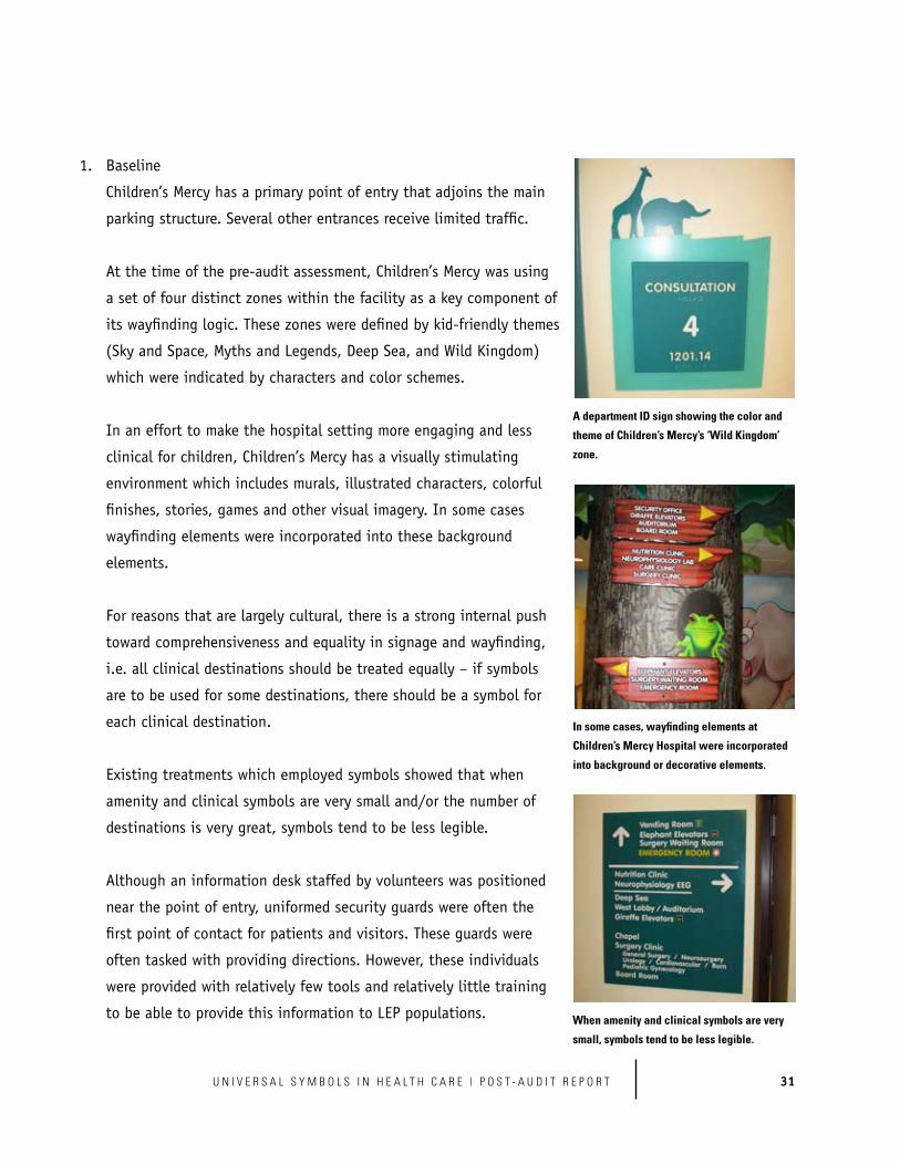
Children’s Mercy has a primary point of entry that adjoins the main
parking structure. Several other entrances receive limited traffic.
a set of four distinct zones within the facility as a key component of
its wayfinding logic. These zones were defined by kid-friendly themes
(Sky and Space, Myths and Legends, Deep Sea, and Wild Kingdom)
which were indicated by characters and color schemes.
In an effort to make the hospital setting more engaging and less
clinical for children, Children’s Mercy has a visually stimulating
environment which includes murals, illustrated characters, colorful
finishes, stories, games and other visual imagery. In some cases
wayfinding elements were incorporated into these background
elements.
For reasons that are largely cultural, there is a strong internal push
toward comprehensiveness and equality in signage and wayfinding,
i.e. all clinical destinations should be treated equally – if symbols
are to be used for some destinations, there should be a symbol for
each clinical destination.
Existing treatments which employed symbols showed that when
amenity and clinical symbols are very small and/or the number of
destinations is very great, symbols tend to be less legible.
near the point of entry, uniformed security guards were often the
first point of contact for patients and visitors. These guards were
often tasked with providing directions. However, these individuals
were provided with relatively few tools and relatively little training
to be able to provide this information to LEP populations.
A department ID sign showing the color and
theme of Children’s Mercy’s ‘Wild Kingdom’
zone.
In some cases, wayfinding elements at
Children’s Mercy Hospital were incorporated
into background or decorative elements.
When amenity and clinical symbols are very
small, symbols tend to be less legible.

32 P O S T - A U D I T R E P O R T | U N I V E R S A L S Y M B O L S I N H E A L T H C A R E
Components of the wayfinding system include:
Each of these components contains universal health care symbols, presented
as white symbols on a black background with a colored border to correspond
with the zone referenced by the symbol.
Children’s Mercy did not develop lobby directory signage within the
prototype set.
Designers also made the decision to design wayfinding information to be
more visually distinct within this complex environment.
Children’s Mercy followed a self-defined “highway and exit” approach to
wayfinding within the prototype system in which they first direct users to
zones and then, within zones, direct them to specific destinations. For this
reason, a user would generally not see a symbol or related referent name
until he or she is in the appropriate zone (Emergency is the exception and is
on all directional signs within the system).
For consistency and brevity, Children’s Mercy Facilities Management
determined that no more than eight (8) unique “slots” of information would
appear on given wall signs.
a symbol to match each clinical destination. In the prototype signage, a

33U N I V E R S A L S Y M B O L S I N H E A L T H C A R E | P O S T - A U D I T R E P O R T
symbol was chosen for a very non-typical referent
because it was the “best fit” from the existing
symbol library. Other destinations in the prototype
signage were accommodated using acronyms,
placed on the same sign location and treated
with the same graphical treatment as approved
Universal Health Care Symbols.
* Note: Original wayfinding systems were obscured during the post-audit assessment.
Overall, the Children’s Mercy prototype design
system was consistent with recommendations made during the pre-audit
phase.
The prototype system appeared to be effective overall at guiding potential
easy to understand across all test conditions.
confidence. They made use of each of the elements of the system,
including wall-mounted directional signs, wall-mounted elevator
directories, overhead hanging directional signs, and overhead
hanging department ID signs.
The symbols appeared to the site visit team to be very legible within
all of the prototype signage elements. The symbols were of sufficient
size to be successfully viewed at a distance by research participants.
In general, participants found their way to destinations almost
as quickly when using “symbols only” signs as they did using
signs with English and Spanish referents. Participants with Spanish as
The use of the “Genetics” symbol for the Diagnostic & Treatment Center
is a non-traditional use for this symbol, but represented the ‘best fit’ of
available options.
The symbols used in Children’s Mercy
prototype signage were of sufficient size to be
successfully viewed at a distance; Note: As
part of the post-audit testing, some elements
of the signage were intentionally obscured or
replaced with bi-lingual translations.

34 P O S T - A U D I T R E P O R T | U N I V E R S A L S Y M B O L S I N H E A L T H C A R E
their primary language navigated to their destinations more quickly when
symbols with English referents were used than with symbols, English and
Spanish. Remember, though, that participants were shown the symbol for
the destination they were seeking before they began their journey. The
implication may be that if a given LEP patient or visitor is aware of the
symbol they are seeking, then they may not require bi-lingual translation
into Spanish or any other language to find a destination. However,
establishing this awareness for the patient/visitor will be a critical
consideration.
In the symbol matching test, participants overall took 12.2 seconds to
complete the exercise with 8 symbols and 12.7 seconds to complete the
data suggest that increasing the number of symbols that a given user
must evaluate at any one time may reach a threshold level beyond which
complexity and time required may increase dramatically.
Testing
Universal Symbols to Support Implementation in Healthcare Facilities Signage
associated with this phase of work. These data should be useful in assigning
specific symbols to referents and vice versa.
project team is not able to directly comment on the efficacy of the new
zone system.
4. Lessons Learned
effective use of symbols may obviate the need for bilingual translation
into Spanish in wayfinding. Note: this does not in any way diminish
the importance of effective spoken or translated information for clinical
information, policies and procedures, key services, etc.

35U N I V E R S A L S Y M B O L S I N H E A L T H C A R E | P O S T - A U D I T R E P O R T
In order for users to seamlessly find their way to a given destination using
this symbols based wayfinding system, they must, using the “highway and
exit” concept, know both the symbol that represents their destination and
the zone in which this destination is located. There may be multiple ways
a building directory at the entrance, although other solutions, including
printed tear sheets, interactive touch screen kiosks, a patient/visitor
badging system using these symbols, web-based solutions, etc. may also
be effective.
The project team believes that the system will be more effective if users
can have a physical piece of information “in hand” which communicates
both the destination they are seeking as well as the symbol representing it.
In this case, the information users have in hand will allow Children’s Mercy
staff to help users find their destinations quickly,
while teaching staff how to use the system.
The project team is not certain that the constraint
to use no more than eight (8) unique “slots” of
information on given wall signs is appropriate.
While this does bring consistency to the system,
it does appear that this may put pressure in some
locations to remove some primary destinations or
combine destinations. In some cases this may be
detrimental to effective pedestrian wayfinding.
Regarding the strong internal push for a symbol
to match each clinical destination, the project
team considers this to be an issue that should be handled with care. While
the research findings around number of symbols were rather narrow in focus,
it seems likely that introducing large numbers of non-standard symbols
into the system may reduce the usability of the system, both for users and
for the staff who attempt to assist them with wayfinding. Furthermore, the
The constraint to allow no more than eight unique slots of information
caused some destinations to be combined on directional signs.

36 P O S T - A U D I T R E P O R T | U N I V E R S A L S Y M B O L S I N H E A L T H C A R E
symbols within the universal health care symbols set have all been validated
through careful research and documented data. While they may be excellent,
we cannot speak to the efficacy of self-generated or derived symbols. It
should be reiterated that symbols should be used within the facility for
primary destinations only.
The project team believes that the overall effectiveness of wayfinding at
Children’s Mercy Hospital will be improved if all staff who have official or
unofficial responsibilities for providing directions and assistance to patients
and visitors both receive training on the new symbols based wayfinding
system and, if possible, practical tools (such as printed materials)
to enable them to help users engage with the system. Cultural training for
front line staff would also be recommended.

37U N I V E R S A L S Y M B O L S I N H E A L T H C A R E | P O S T - A U D I T R E P O R T

38 P O S T - A U D I T R E P O R T | U N I V E R S A L S Y M B O L S I N H E A L T H C A R E
Grady Memorial Hospital, Atlanta, Georgia
One of the ten largest hospitals in the country, most
of this facility is located in one 22-story, 1.8-million-
Manager who provided overall design leadership.
Wayfinding system design and prototype fabrication
were provided by a signage and wayfinding
consultant.
Grady’s goals for implementing symbols based
wayfinding were as follows:
from different cultural and linguistic backgrounds to locate their desired
destinations with the fewest number of decision points.
wide that can be expanded to the rest of the health system facilities
throughout our service area.
Grady has four entrances which receive a significant amount of public
traffic, though two of these, the Main Lobby and the Clinic Lobby, are
more primary.
Grady is complex because of its size and diversity. There are a great many
destinations within the facility. In addition, the facility has eight distinct
groups of elevators, designated by letter. Unique wings and sub-areas of
the hospital are also designated by letters. These do not correspond to the
elevator letters.

39U N I V E R S A L S Y M B O L S I N H E A L T H C A R E | P O S T - A U D I T R E P O R T
To a greater extent than
any of the other innovator
facilities Grady has specific
destinations, both amenities
and service lines, which exist in
multiple locations. For example,
mammography is performed both
at a primary Imaging Services
center as well as within an
outpatient clinic in a different
part of the hospital.
system of zones similar to a cardinal system (Central, South, East and West)
to provide an initial frame of reference for wayfinding. It was anticipated
that elevator banks would be re-named to fit within this system and serve
as the foundational physical features of the wayfinding system.
least 5 legacy wayfinding systems, some of which provide redundant and
non-current information.
Some existing systems and
individual signs have typography
which is too small to be legible
from a distance, which reduces
its efficacy in wayfinding.
Grady is challenged by limited
resources. The facility has also
had significant turnover in
leadership in the past ten years.
Grady Memorial uses letters to designate elevators as well as wings/sub-areas.
Some of Grady Memorial’s legacy wayfinding systems.

40 P O S T - A U D I T R E P O R T | U N I V E R S A L S Y M B O L S I N H E A L T H C A R E
The Main Lobby and Clinic Lobby are both serviced by help/information
desks which are manned during principal hours of operation. Directions are
generally provided using turn-by-turn verbal directions only.
More than any of the other innovator facilities in this study, the staff
at Grady use considerable time providing directions to lost patients and
visitors. This includes many staff positions without primary responsibility
for guiding patients (e.g. clinical staff vs. information desk staff).
physical escorting.
Components of the wayfinding system include:
Each of these components contained universal health care symbols
presented as reversed out blue symbols on a white background.
The prototype set contains references to Central Tower, South Tower, West
Tower, and East Tower. These towers have associated colors.
The prototype set references new elevator designations: East Lobby
Directories indicate the tower in which they are placed with a header
marked, e.g. “South Tower”. Individual destinations are listed with universal

41U N I V E R S A L S Y M B O L S I N H E A L T H C A R E | P O S T - A U D I T R E P O R T
health care symbol, referent name, floor number and tower reference with
the relevant color treatment, e.g. “S” for “South”.
* Note: Legacy wayfinding systems were partially obscured during the post-audit assessment. Some legacy systems were still visible.
Overall, the Grady prototype design system
was consistent with recommendations made
during the pre-audit phase.
The prototype system appeared to be
effective overall at guiding potential users
research participants agreed that the signs were easy to understand across
all test conditions.
confidence. They made use of each of the elements of the system, including
the lobby directory, wall-mounted directional signs, wall-mounted elevator
directories, overhead soffit mounted directional signs, and wall-mounted
department ID signs.
The symbols appeared to the project team to be legible within many of the
prototype signage elements. On overhead directional signs and department
ID signs, the symbols were of sufficient size to be viewed from distance by
research participants.
An example of a prototype directory developed by Grady Memorial with
symbols, elevator references, tower references, floor numbers, and symbols.

42 P O S T - A U D I T R E P O R T | U N I V E R S A L S Y M B O L S I N H E A L T H C A R E
for their destination within the lobby directory. This may relate either
to the large number of destinations presented here or to the relatively
small size of the symbols on the directory.
wall mounted and elevator directories to find the symbols they were
seeking. From a short distance, the symbols were easily recognized.
or the elevator references indicated on the entry directory.
In general, participants found their way to destinations almost as
quickly when using “symbols only” signs as they did using signs with
English and Spanish referents. Participants with Spanish as their primary
language navigated to their destinations more quickly when symbols
with English referents were used than with symbols, English and
Spanish. Remember, though, that participants were shown the symbol
for the destination they were seeking before they began their journey.
complete the exercise with 8 symbols, 11.4 seconds to complete the
a given user must evaluate at any one time increases, complexity and
time required will increase as well.
Testing
Universal Symbols to Support Implementation in Healthcare Facilities
Signage associated with this phase of work. These data should be useful
in assigning specific symbols to referents and vice versa.
4. Lessons Learned
Symbols were of sufficient size to be viewed
from a distance on overhead directional signs
and department ID signs.
Size of symbols and/or number of destinations
made the lobby directory difficult to use for
some users.
Participants generally needed to get within
a few feet of wall mounted and elevator
directories to find the symbols they were
seeking.

43U N I V E R S A L S Y M B O L S I N H E A L T H C A R E | P O S T - A U D I T R E P O R T
effective use of symbols may obviate the need for bilingual translation into
Spanish in wayfinding. Note: this does in any way diminish the importance
of effective translated or spoken information for clinical direction, policies
and procedures, key services, etc.
The lobby directory was an effective component of the Grady wayfinding
system. However, a large number of destinations were presented on this
directory. While the project team observed that it appeared easier for LEP
populations to find symbols on this directory than it would have been for
them to find words, the number of primary destinations should be carefully
considered. If possible, the number of destinations would be reduced and
the symbols would be larger and more legible.
Overall, symbols on surface-mounted signage elements must be of sufficient
size to be viewed from a distance, bearing in mind that some LEP users are
also visually challenged.
Regarding multiple clinical destinations of the same type, it seems
possible that presenting multiple service line symbols at a point of entry
or orientation (such as a lobby directory) risks sending users to the wrong
part of the hospital. For example, if a user has been given an appointment
letter directing them to receive a mammography within Imaging Services,
it would be counter-productive for them to see a symbol associated with
mammography located within an outpatient clinic in a different part of the
hospital. Under these circumstances, it would seem to be appropriate to use
the mammography symbol only on wall mounted directional signage and
department ID signage within a given clinic. In this case, it would be best
to identify the building sector first (e.g. “4 North Imaging Services”)
Multiple wayfinding systems can be confusing. It appears to the project

44 P O S T - A U D I T R E P O R T | U N I V E R S A L S Y M B O L S I N H E A L T H C A R E
team that a new symbols based wayfinding system will be most effective if
legacy systems are removed or obscured.
The project team believes that the overall effectiveness of wayfinding
at Grady will be improved if all staff who have official or unofficial
responsibilities for providing directions and assistance to patients and
visitors both receive training on the new symbols based wayfinding system
and, if possible, receive practical tools (such as printed materials) to enable
them to help users engage with the system.

45U N I V E R S A L S Y M B O L S I N H E A L T H C A R E | P O S T - A U D I T R E P O R T

46 P O S T - A U D I T R E P O R T | U N I V E R S A L S Y M B O L S I N H E A L T H C A R E
International Community Health Services, Seattle, Washington
ICHS offers services including medical, dental,
behavioral health, Chinese medicine, acupuncture,
health education, laboratory, WIC, and pharmacy.
The vast majority of patients are LEP, with the most
common languages being Cantonese and Vietnamese.
Otherwise, the patient population is diverse and
Wayfinding at ICHS is overseen by a Planning,
Development and Evaluation Manager with multiple
other responsibilities. Wayfinding system design and
prototype fabrication were provided by a signage and wayfinding consultant,
and fabrication was provided by the Society for Environmental Graphic Design.
ICHS set out to accomplish the following goals with symbols based wayfinding:
brand that can be adapted to future clinic sites
ICHS maintains two separate clinic buildings, one in Seattle’s International
District and the other in the Holly Park neighborhood. In the International
District location, clinical destinations are primarily on the ground floor;
in the Holly Park location, clinical destinations are on the ground and first
floors. Each facility has a single primary entrance.
The number of primary destinations at each of the ICHS locations is
relatively few, but these locations are generally in distinctly separate areas

47U N I V E R S A L S Y M B O L S I N H E A L T H C A R E | P O S T - A U D I T R E P O R T
facility was to provide appropriate guidance to
patients and visitors at the main points of entry.
Within each of the clinical areas of ICHS, there are
multiple secondary destinations. Some patients
and visitors become lost finding their way to,
among, and back from these destinations. Since
staff work stations, conference rooms and offices
adjoin many of the corridors linking secondary
destinations to public waiting rooms, staff are
regularly asked to provide directions.
Hablamos Juntos symbols within its facilities.
However, in some cases these symbols were being
used to convey policy messages or for other
purposes other
than wayfinding.
ICHS was generally using flush, wall-mounted
department ID signs for primary and
secondary destinations.
Public areas within ICHS contain a great deal
of information on policies, programs, etc. This
amount of information made some wayfinding
information difficult to discern.
ICHS is challenged by limited resources.
An ICHS clinic corridor – though an overhead sign is intended to guide
patients back to Intake, most often patients stop and ask staff people.
In some cases, Universal Health Care Symbols were being used to
convey policy messages.

48 P O S T - A U D I T R E P O R T | U N I V E R S A L S Y M B O L S I N H E A L T H C A R E
Components of the wayfinding system include:
ID signs
Each of these components contained universal health
care symbols presented as white symbols on a black
background.
efficiency of design and production.
ICHS replaced some wall-mounted ID signs with flag-
mounted ID signs.
ICHS removed informational postings and other non-
wayfinding treatments of Hablamos Juntos symbols.
* Note: legacy wayfinding systems were obscured during the post-audit assessment.
Overall, the ICHS prototype design system was
consistent with recommendations made during the
pre-audit phase.
The prototype system appeared to be effective (though somewhat less
effective overall than other prototype systems) at guiding potential users
Prototype signage was produced on paper, presented as white symbols
on a black background.

49U N I V E R S A L S Y M B O L S I N H E A L T H C A R E | P O S T - A U D I T R E P O R T
participants agreed that the signs were easy to
understand across all test conditions.
the system with some confidence. They made
use of each of the internal elements of the
system, including the lobby directory, wall-
mounted directional signs, and department
ID signs.
The symbols appeared to the project team to be
legible within all of the prototype signage elements.
In general, participants found their way to destinations almost as quickly
when using “symbols only” signs than they did using signs with both
English and Chinese characters. Participants
with Chinese (Mandarin) as their primary
language navigated to their destinations more
quickly when symbols with English referents
and Chinese characters were used, than when
only symbols and English were used. This is the
only one of the four innovator facilities where
providing bilingual translation appeared to have
a strong positive effect for a particular language
group.
In the symbol matching test, participants
A prototype lobby directory used by ICHS.
ICHS was the only innovator facility in which bilingual translation (in
this case Chinese characters) was associated with faster navigation
times for LEP (Mandarin) participants.

50 P O S T - A U D I T R E P O R T | U N I V E R S A L S Y M B O L S I N H E A L T H C A R E
that as the number of symbols that a given user must evaluate at any one
time increases, complexity and time required will increase as well.
Testing
Universal Symbols to Support Implementation in Healthcare Facilities Signage
associated with this phase of work. These data should be useful in assigning
specific symbols to referents and vice versa.
4. Lessons Learned
though translation into Chinese characters may help Chinese-literate users
with navigation, effective use of symbols may obviate the need for bilingual
translation into the many languages understood by ICHS patients. Note:
this does not in any way diminish the importance of effective translated
or spoken information for clinical direction, policies and procedures, key
services, etc.
The research team believes that the effectiveness of symbols in wayfinding
is improved when symbols are not used in posted policy statements or other
posted information. That is, since a given symbol is meant to communicate
a destination, seeing this symbol in a posted policy statement may make a
user believe that they have arrived at this destination.

51U N I V E R S A L S Y M B O L S I N H E A L T H C A R E | P O S T - A U D I T R E P O R T

52 P O S T - A U D I T R E P O R T | U N I V E R S A L S Y M B O L S I N H E A L T H C A R E
Women & Infants Hospital, Providence, Rhode Island
This healthcare system consists of one central hospital
a diverse population including Spanish and Chinese
conference rooms, and auditoriums was completed
during the pre-audit phase of the project. Women
the city of Providence is Spanish-speaking. Other LEP
populations are also growing.
Wayfinding at Women & Infants was provided by a
team of signage and wayfinding consultants working
in cooperation with Facilities staff.
to accomplish the following overall goal with symbols based wayfinding: to
improve wayfinding for our limited English proficiency patients, as well as our
illiterate patients.
The existing Women & Infants building consisted of a single tower with
was to direct patients and visitors to the correct floor and then to the
correct destination.
The creation of the new addition introduced a new level of complexity

53U N I V E R S A L S Y M B O L S I N H E A L T H C A R E | P O S T - A U D I T R E P O R T
within the wayfinding hierarchy, with the additional task of directing
patients and visitors first to the correct building/tower, then to the
correct floor, etc. This building
addition also created a new
main entrance to the hospital.
Existing signage, some of which
employed universal healthcare
symbols, used light gray metallic
vinyl on a gray background.
In many viewing situations,
contrast was insufficient.
obscured by exit signs and other elements in the physical environment.
Security guards at Women & Infants are stationed outside of clinical areas.
However, an initial point of contact is typically a staff member or volunteer
tasked with providing assistance at the new entrance.
Women & Infants is co-located on a larger healthcare campus containing
a number of Women & Infants clinic buildings and other health care
institutions. There is some foot traffic which travels between the
Women & Infants building and nearby Rhode Island Hospital in a below-
ground tunnel.
Components of the wayfinding system include:
columns) directional signs
Although Women & Infants was using some symbols, contrast was insufficient and some signs
were partially obscured.

54 P O S T - A U D I T R E P O R T | U N I V E R S A L S Y M B O L S I N H E A L T H C A R E
Each of these components contained universal health care symbols
presented as white symbols on a blue background.
Women & Infants did not develop lobby directory signage within the
prototype set.
Signs were generally visible and unobstructed.
The Women & Infants design team was unable to match each primary
develop two other symbols to incorporate within the final installed system.
* Note: Legacy wayfinding systems were obscured during the post- audit assessment.
Overall, the Women & Infants prototype design system was consistent with
recommendations made during the pre-audit phase.
The prototype system appeared to be effective overall at guiding potential
per cent of LEP research participants agreed that the signs were easy to
understand across all test conditions.
They made use of each of the elements of the system, including the wall-
mounted and column-mounted directional signs, wall-mounted elevator
directories, overhead soffit mounted directional signs, and wall-mounted
department ID signs.
The symbols appeared to the project team to be legible within almost all
of the prototype signage elements. Contrast, resolution and size of symbols
appeared appropriate.

55U N I V E R S A L S Y M B O L S I N H E A L T H C A R E | P O S T - A U D I T R E P O R T
From the main entrance of the new lobby,
directional signage leading to the original
building was obscured, and the project team
judges that legibility was relatively lower.
the new main lobby, which may speak to the need
for a static directory, interactive touch screen
kiosk, or other point of reference which allows
users to engage with the wayfinding system prior
to navigating a hallway.
In general, participants found their way to
destinations almost as quickly when using
“symbol only” signs, with no English or Spanish
referent, than they did when text was provided.
Participants with Spanish as their primary
language navigated to their destinations more
quickly when symbols appeared with English
referents only compared to when symbols appeared with both English and
Spanish. Remember, though, that participants were shown the symbol for
the destination they were seeking before they began their journey.
complete the exercise with 8 symbols, 11.1 seconds to complete the
user must evaluate at any one time increases, complexity and time required
will increase as well.
Testing
Universal Symbols to Support Implementation in Healthcare Facilities Signage
associated with this phase of work. These data should be useful in assigning
specific symbols to referents and vice versa.
Contrast, resolution and size of symbols appeared appropriate in all
signage elements.

56 P O S T - A U D I T R E P O R T | U N I V E R S A L S Y M B O L S I N H E A L T H C A R E
4. Lessons Learned
effective use of symbols may obviate the need for bilingual translation into
Spanish in wayfinding. Note: this does in any way diminish the importance
of effective translated or spoken information for clinical direction, policies
and procedures, key services, etc.
The project team observes that the Women & Infants solution appears to
the facility is not nearly so large or complex as some of the other facilities.
However, there are some solid examples here.
Women & Infants based their wayfinding system strictly on primary
destinations. The number of elements in any given sign was therefore
relatively small and the symbols were relatively large and legible from a
distance.
Designs were clean and uncomplicated. The design team created a
visible difference between Hablamos Juntos-related symbology and
aided in comprehension and differentiation.
Directional signage was generally placed to be visible and unobscured.
team surmises that some starting point of reference would improve the
directory within the main lobby, although other solutions, including
tear sheets, touch screens, web-based solutions, etc. may also
be effective.
Designs were clean and uncomplicated.

57U N I V E R S A L S Y M B O L S I N H E A L T H C A R E | P O S T - A U D I T R E P O R T

58 P O S T - A U D I T R E P O R T | U N I V E R S A L S Y M B O L S I N H E A L T H C A R E
Appendix 1 – User Satisfaction Research Results – Baseline and Post
Implementation
* Note: results of incremental research into documented changes in the user experiences of patients, visitors and staff is being appended to this document as Appendix 1 - User Satisfaction Research Results - Baseline and Post Implementation, scheduled for completion by September 30, 2010.