cartographic design cartographic design for gis (geog. 340) prof. hugh howard american river college
TRANSCRIPT
CARTOGRAPHIC DESIGN
Cartographic Design for GIS (Geog. 340)Prof. Hugh HowardAmerican River College
INTRODUCTION to CARTOGRAPHIC
DESIGN

CARTOGRAPHIC DESIGN• Is a partly mental, partly physical
process in which maps are conceived and created (a verb)
– The word design can also be a noun– A map can have a particular design, but
design in this sense is only the end result of the design process

CARTOGRAPHIC DESIGN• Successful cartographic design
– Results in maps that effectively communicate geographic information
An ineffective communicator
An effective communicator

CARTOGRAPHIC DESIGN• Cartographic design involves
– Conceptualization of the map– Visualization of the map– Construction of the map
• A partly mental, partly physical process

CARTOGRAPHIC DESIGN• Is driven by two goals
– To create a map that appropriately serves the map user and the map’s intended use
– To create a map that communicates efficiently, with simplicity and clarity

CARTOGRAPHIC DESIGN• Is directed by rules, guidelines, and
conventions, but is relatively unstructured
– A single, optimal solution to a given mapping problem generally does not exist
– Several acceptable solutions are possible– “Good design is simply the best solution
among many, given a set of constraints imposed by the problem” (Dent 1999)
CARTOGRAPHIC DESIGN• Cartographic design is difficult!
– If it were easy, expert systems would be used to design most maps
– Expert systems are applications that make decisions based on rules and guidelines obtained from cartographic experts
– Cartographic expert systems are currently limited to narrow aspects of cartographic design, and lack the ability to completely and consistently design top-quality maps

CARTOGRAPHIC DESIGN• Build a foundation of cartographic
design skills by following the specific rules and guidelines presented here
– Consider alternative approaches once you master these rules and guidelines
– Always be prepared to explain or defend your design decisions

MAP DESIGN RESEARCH
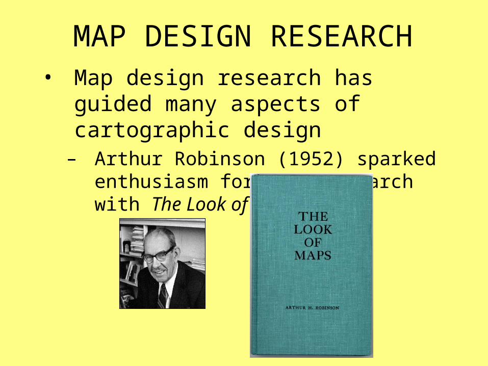
MAP DESIGN RESEARCH• Map design research has guided many
aspects of cartographic design– Arthur Robinson (1952) sparked
enthusiasm for this research with The Look of Maps
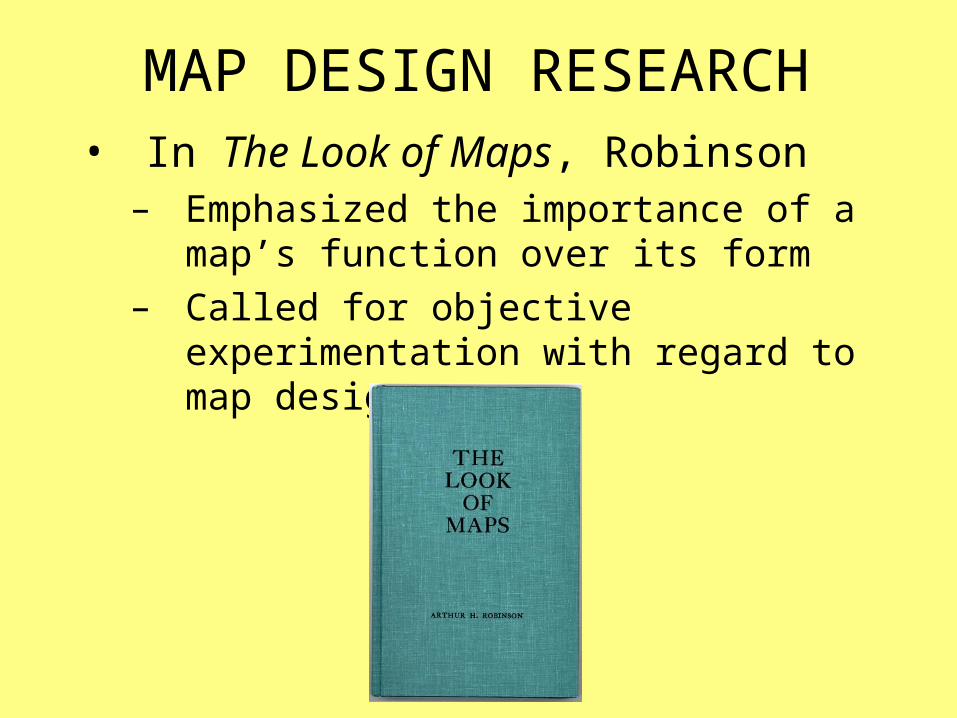
MAP DESIGN RESEARCH• In The Look of Maps, Robinson
– Emphasized the importance of a map’s function over its form
– Called for objective experimentation with regard to map design

MAP DESIGN RESEARCH• Two schools of though emerged
• The “behaviorist” view– Focused on determining which mapping
techniques are most effective, without regard for why they are effective
• The “cognitive” view– Focused on why certain techniques are
effective by applying knowledge structures to the ways that people perceive maps
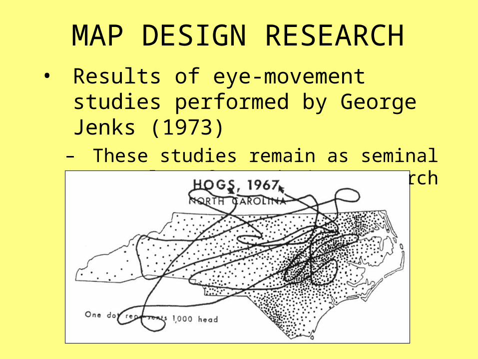
MAP DESIGN RESEARCH• Results of eye-movement studies
performed by George Jenks (1973)– These studies remain as seminal
examples of map design research

MAP DESIGN RESEARCH• Results of eye-movement studies
performed by Sarah Fabrikant (2005)– Modern eye-movement study
Circle sizes indicate the amount of time the map user’s eye was fixated
at a given location
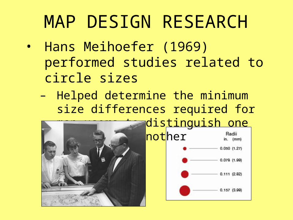
MAP DESIGN RESEARCH• Hans Meihoefer (1969) performed
studies related to circle sizes– Helped determine the minimum size
differences required for map users to distinguish one circle from another
ART andGRAPHIC DESIGN

ART• The “art” of maps plays an important
role in cartographic communication– The artistic aspect of maps is guided less
by experimentation, and more by intuition– A map that embodies an artistic sensibility
has a greater chance of communicating information than a “non-artistic” map

ART• The overt aspect of art
– Maps can be beautiful
• The less obvious aspect of art– There is an “art” to good map design– The cartographer synthesizes a wide
variety of factors and produces a map– Human artistic abilities make this
synthesis possible
GRAPHIC DESIGN• The link between cartographic design
and graphic design is strong– Graphic design emphasizes
communication through graphical means, but is oriented toward advertisements and packaging, as opposed to maps
– Graphic designers are responsible for a significant proportion of maps produced for print and on-line publication

GESTALT PRINCIPLES of PERCEPTUAL
ORGANIZATION
GESTALT PRINCIPLES• Gestalt is a theory of visual perception
developed in the 1920s– It attempts to describe how humans see
the individual components of a graphical image, and organize them into a unified whole
– These principles represent the theoretical underpinning for many cartographic design rules, guidelines, and conventions
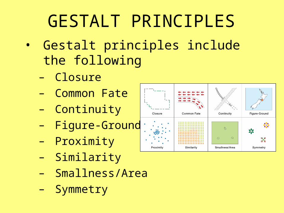
GESTALT PRINCIPLES• Gestalt principles include the following
– Closure– Common Fate– Continuity– Figure-Ground– Proximity– Similarity– Smallness/Area– Symmetry

GESTALT PRINCIPLES• Closure
– Allows us to complete an image even when parts are missing

GESTALT PRINCIPLES• Common Fate
– Allows us to group elements that share the same moving direction

GESTALT PRINCIPLES• Continuity
– Allows us to move our eyes from one object to another

GESTALT PRINCIPLES• Figure-Ground
– Allows us to perceive certain objects as being closer to us (and more important)
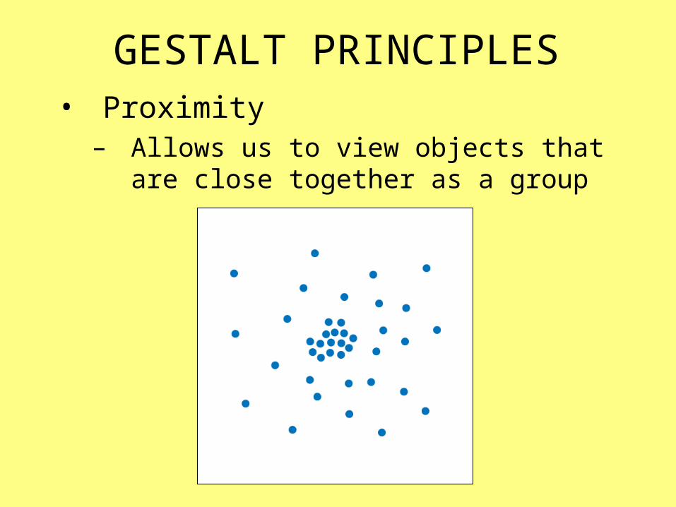
GESTALT PRINCIPLES• Proximity
– Allows us to view objects that are close together as a group
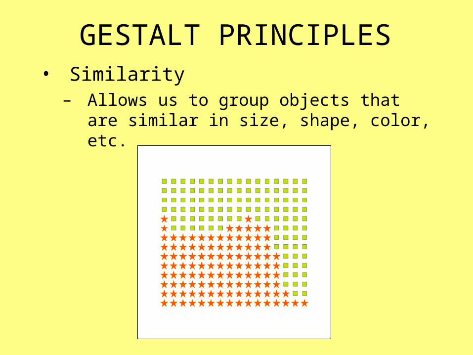
GESTALT PRINCIPLES• Similarity
– Allows us to group objects that are similar in size, shape, color, etc.
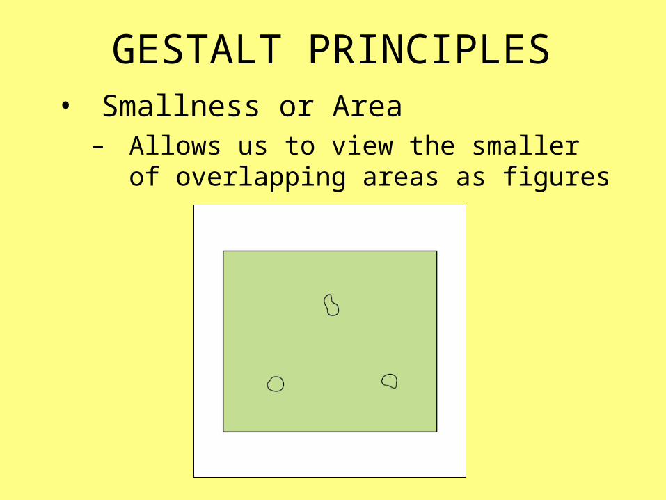
GESTALT PRINCIPLES• Smallness or Area
– Allows us to view the smaller of overlapping areas as figures
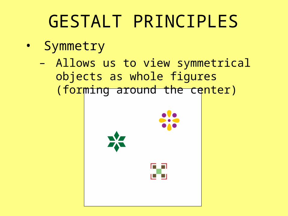
GESTALT PRINCIPLES• Symmetry
– Allows us to view symmetrical objects as whole figures (forming around the center)

THE IMAGE POOL

IMAGE POOL• Is a mental inventory of designs and
design possibilities– Taken from maps, graphics, and images
• Build it by critically viewing art, graphic design, and maps
• Many examples of well-designed maps appear in the lectures and textbook
– Use these to help build your image pool
THE DESIGN PROCESS
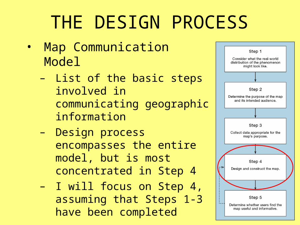
THE DESIGN PROCESS• Map Communication Model
– List of the basic steps involved in communicating geographic information
– Design process encompasses the entire model, but is most concentrated in Step 4
– I will focus on Step 4, assuming that Steps 1-3 have been completed
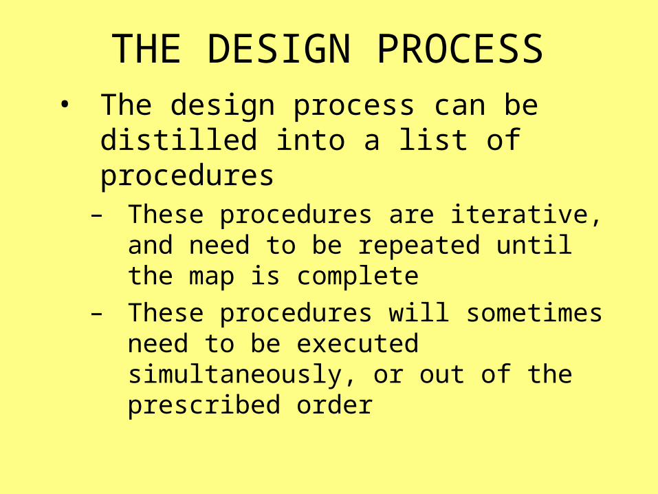
THE DESIGN PROCESS• The design process can be distilled
into a list of procedures– These procedures are iterative, and need
to be repeated until the map is complete– These procedures will sometimes need to
be executed simultaneously, or out of the prescribed order
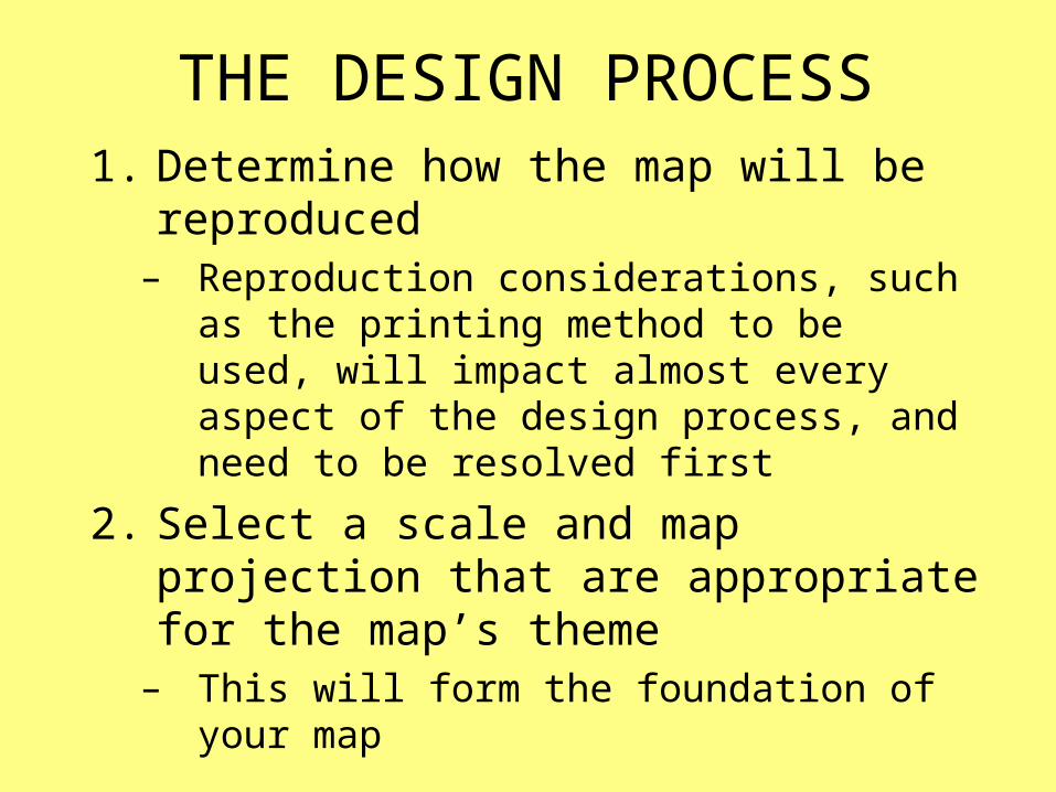
THE DESIGN PROCESS1. Determine how the map will be
reproduced– Reproduction considerations, such as the
printing method to be used, will impact almost every aspect of the design process, and need to be resolved first
2. Select a scale and map projection that are appropriate for the map’s theme
– This will form the foundation of your map
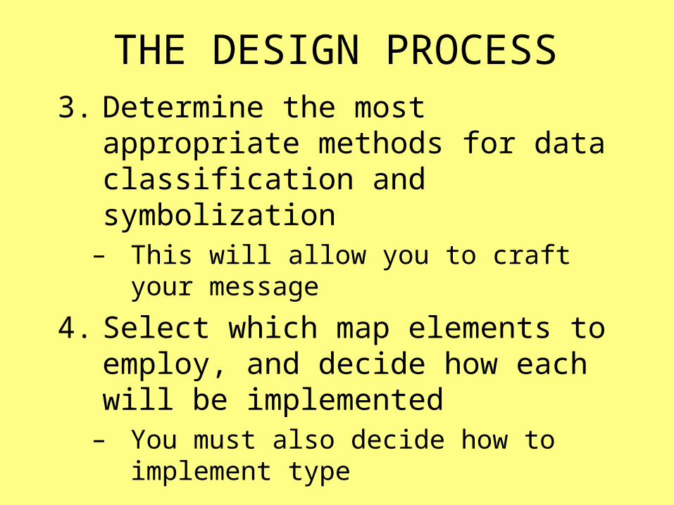
THE DESIGN PROCESS3. Determine the most appropriate
methods for data classification and symbolization
– This will allow you to craft your message
4. Select which map elements to employ, and decide how each will be implemented
– You must also decide how to implement type
• Thematic symbols and type labels
• Title, subtitle, and legend
• Base information (boundaries, roads, etc.)
• Scale and north arrow
• Data source and notes
• Frame and neat lines
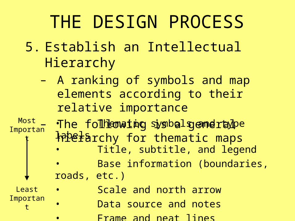
THE DESIGN PROCESS5. Establish an Intellectual Hierarchy
– A ranking of symbols and map elements according to their relative importance
– The following is a general hierarchy for thematic maps
Most Important
Least Important
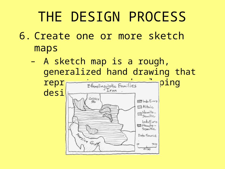
THE DESIGN PROCESS6. Create one or more sketch maps
– A sketch map is a rough, generalized hand drawing that represents your developing design
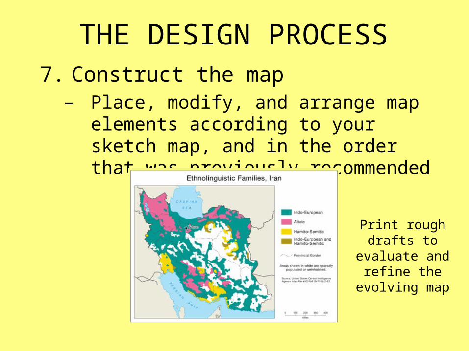
THE DESIGN PROCESS7. Construct the map
– Place, modify, and arrange map elements according to your sketch map, and in the order that was previously recommended
Print rough drafts to evaluate and
refine the evolving map

VISUAL HIERARCHY
VISUAL HIERARCHY• Graphical representation of the
intellectual hierarchy– Thematic symbols are graphically
emphasized and base information is deemphasized
– More important map elements (title, legend, etc.) are graphically emphasized, and less important elements (bar scale, data source, etc.) are deemphasized
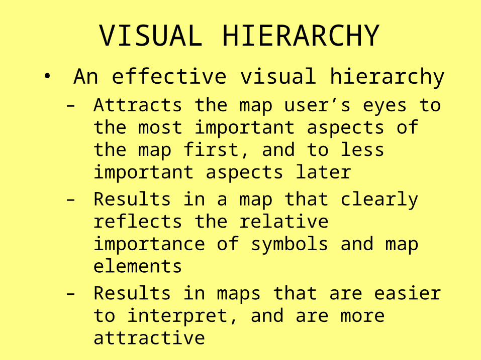
VISUAL HIERARCHY• An effective visual hierarchy
– Attracts the map user’s eyes to the most important aspects of the map first, and to less important aspects later
– Results in a map that clearly reflects the relative importance of symbols and map elements
– Results in maps that are easier to interpret, and are more attractive

VISUAL HIERARCHY• Implemented by altering the visual
weight of map features– The visual weight refers to the relative
amount of attention that things attract– Visual weight can be manipulated to
emphasize or deemphasize features

VISUAL HIERARCHY
Inverted (incorrect)
Visual Hierarchy
Based on an InvertedIntellectual Hierarchy• Frame and neat lines
• Data source and notes • Scale and north arrow
• Base information • Title, subtitle, and legend
• Thematic symbols and type
VISUAL HIERARCHY
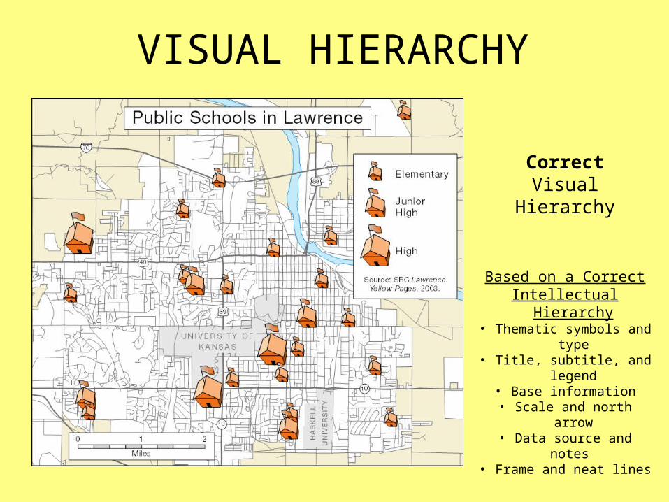
CorrectVisual Hierarchy
Based on a CorrectIntellectual Hierarchy
• Thematic symbols and type
• Title, subtitle, and legend• Base information
• Scale and north arrow• Data source and notes • Frame and neat lines
CONTRAST
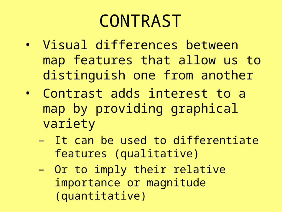
CONTRAST• Visual differences between map
features that allow us to distinguish one from another
• Contrast adds interest to a map by providing graphical variety
– It can be used to differentiate features (qualitative)
– Or to imply their relative importance or magnitude (quantitative)

CONTRAST• Can be achieved through manipulation
of the visual variables– Qualitative Contrast can be used to
differentiate features
Qualitative Visual Variables

CONTRAST• Can be achieved through manipulation
of the visual variables (cont.)– Quantitative Contrast can be used to imply
relative importance or magnitude
Quantitative Visual Variables
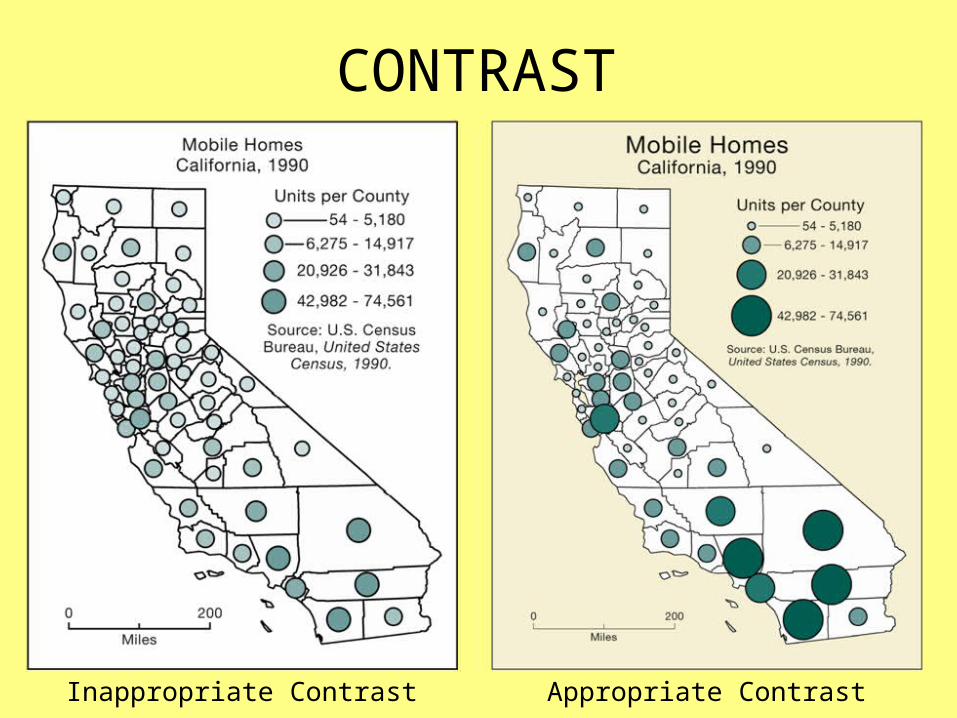
CONTRAST• Map on the right represents
appropriate contrast
• Map on the left lacks appropriate contrast in four respects
– Lightness and size of thematic symbols– Size of lines (line width)– Type size– Difference between the mapped area and
the background
CONTRAST
Inappropriate Contrast Appropriate Contrast
FIGURE-GROUND
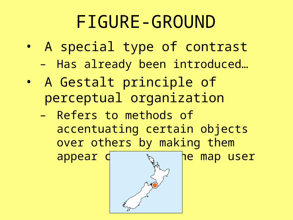
FIGURE-GROUND• A special type of contrast
– Has already been introduced…
• A Gestalt principle of perceptual organization
– Refers to methods of accentuating certain objects over others by making them appear closer to the map user

FIGURE-GROUND• Map design research has not produced
guidelines for figure-ground that are guaranteed to work in every situation
– The following guidelines work well in most cases
• Separate approaches– To accentuate points and/or lines– To accentuate areas
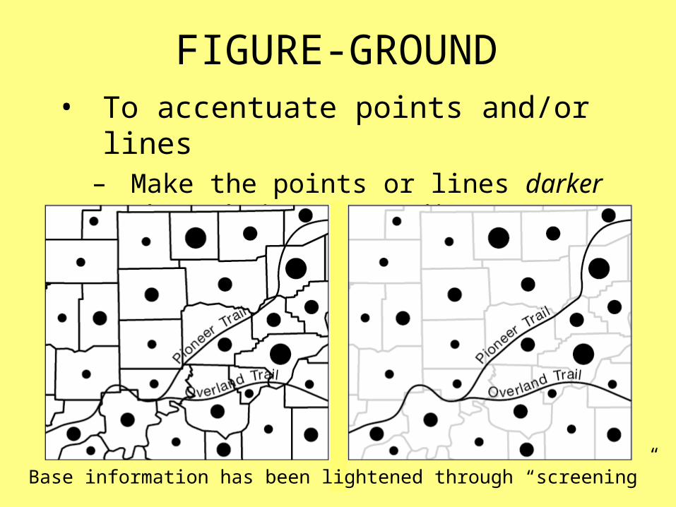
FIGURE-GROUND• To accentuate points and/or lines
– Make the points or lines darker than their surroundings
Base information has been lightened through “screening”

FIGURE-GROUND• To accentuate areas
– Make the area lighter than its surroundings
The surrounding area has been darkened
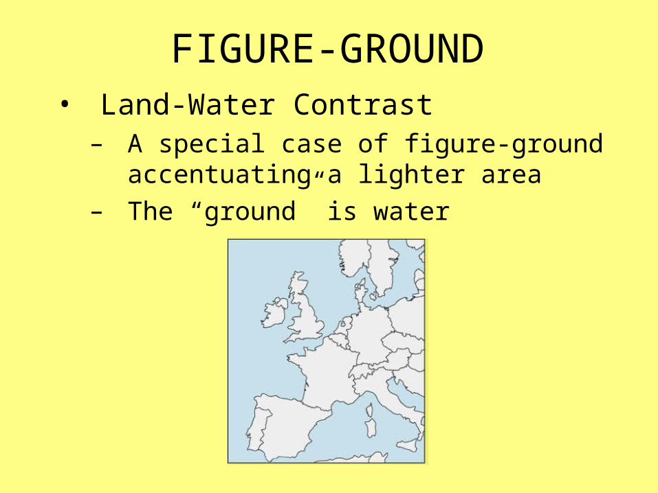
FIGURE-GROUND• Land-Water Contrast
– A special case of figure-ground accentuating a lighter area
– The “ground” is water

FIGURE-GROUND• Making an area lighter than its
surroundings is not always appropriate– When the mapped area is dense with
areal thematic symbols (esp. when color is limited to shades of gray)
Areal thematic symbols provide enough contrast between the mapped
area and its surroundings
Gray background might be confused with thematic symbols

FIGURE-GROUND• Multiple layers of importance can be
represented– Features can be assigned relative
importance, based on relative proximity to the map user
Circles act as figures in relation to countries (which act as ground)
Countries, while subordinate to circles, act as figures in relation to
water (which acts as ground)
Countries appear further away than circles, yet closer than water
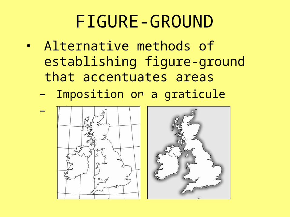
FIGURE-GROUND• Alternative methods of establishing
figure-ground that accentuates areas – Imposition on a graticule– Vignette

BALANCE

BALANCE• The organization of map elements and
available space, resulting in visual harmony and equilibrium
• The map elements in a well-designed map tend to complement one another
– Those in a poorly-designed map appear to compete for space, resulting in visual disharmony

BALANCE• Before attempting to achieve balance,
the initial available space needs to be identified
– Initial available space is the area the map will occupy—as defined by the frame line
Frame Line

BALANCE• Identify the initial available space
Initial available space is defined by the frame line

BALANCE• Place larger map elements
Mapped area is as large as possible
Mapped area isvisually centered
(horizontally and vertically)
Title is placedat top center
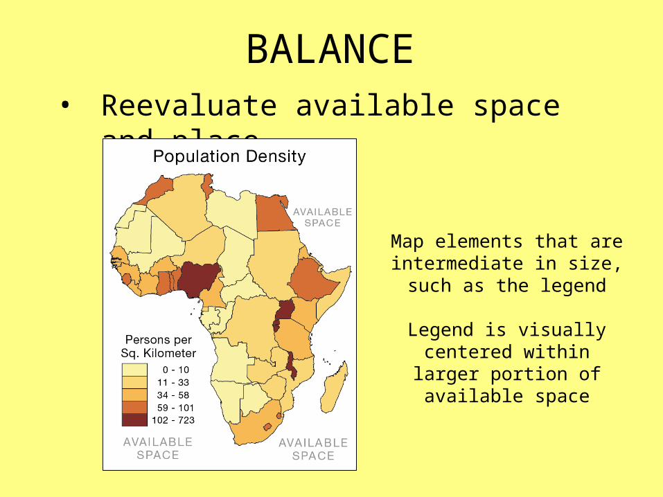
BALANCE• Reevaluate available space and place
Map elements that are intermediate in size, such as
the legend
Legend is visually centered within larger portion of
available space
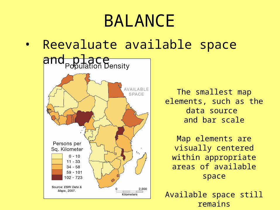
BALANCE• Reevaluate available space and place
The smallest map elements, such as the data source
and bar scale
Map elements are visually centered within appropriate
areas of available space
Available space still remains

BALANCE• The addition of each map element
alters the preexisting balance and available space
– Map elements typically need to be rearranged several times to achieve good balance
– Certain individuals are intrinsically better at judging balance, but experience improves one’s skills

BALANCE• Evaluating balance
• Does the map look left-heavy, right-heavy, top-heavy, bottom-heavy?
– Top-heavy designs are of particular concern
• Do certain areas appear cramped or barren?
– Are map elements competing for space?– Are too many “heavy” objects
concentrated in one area?

BALANCE• Evaluating balance (cont.)
Poorly Balanced
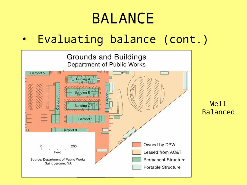
BALANCE• Evaluating balance (cont.)
Well Balanced

BALANCE• Evaluating balance (cont.)
Do the best you can, given the
constraints!

CARTOGRAPHIC DESIGN
Cartographic Design for GIS (Geog. 340)Prof. Hugh HowardAmerican River College