california regional center report: central valley · chooses how to spend free time ..... 19 graph...
TRANSCRIPT

i | P a g e
California Regional Center Report: Central Valley 2011
National Association of State Directors of Developmental Disabilities Services Human Services Research Institute
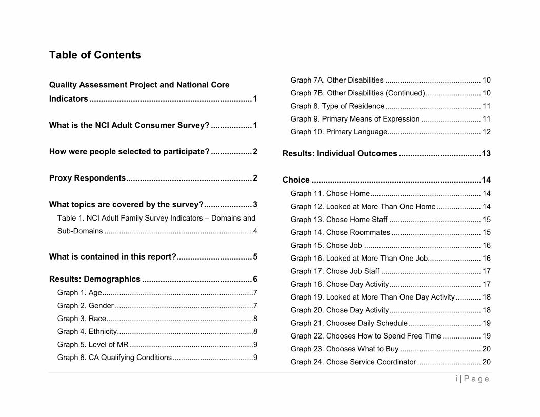
Table of Contents
Quality Assessment Project and National Core Indicators .......................................................................1
What is the NCI Adult Consumer Survey? ..................1
How were people selected to participate? ..................2
Proxy Respondents.......................................................2
What topics are covered by the survey?.....................3
Table 1. NCI Adult Family Survey Indicators – Domains and
Sub-Domains ......................................................................4
What is contained in this report?.................................5
Results: Demographics ................................................6
Graph 1. Age.......................................................................7
Graph 2. Gender .................................................................7
Graph 3. Race.....................................................................8
Graph 4. Ethnicity................................................................8
Graph 5. Level of MR ..........................................................9
Graph 6. CA Qualifying Conditions......................................9
Graph 7A. Other Disabilities ............................................. 10
Graph 7B. Other Disabilities (Continued).......................... 10
Graph 8. Type of Residence............................................. 11
Graph 9. Primary Means of Expression ............................ 11
Graph 10. Primary Language............................................ 12
Results: Individual Outcomes ....................................13
Choice ..........................................................................14
Graph 11. Chose Home.................................................... 14
Graph 12. Looked at More Than One Home..................... 14
Graph 13. Chose Home Staff ........................................... 15
Graph 14. Chose Roommates .......................................... 15
Graph 15. Chose Job ....................................................... 16
Graph 16. Looked at More Than One Job......................... 16
Graph 17. Chose Job Staff ............................................... 17
Graph 18. Chose Day Activity........................................... 17
Graph 19. Looked at More Than One Day Activity............ 18
Graph 20. Chose Day Activity........................................... 18
Graph 21. Chooses Daily Schedule .................................. 19
Graph 22. Chooses How to Spend Free Time .................. 19
Graph 23. Chooses What to Buy ...................................... 20
Graph 24. Chose Service Coordinator .............................. 20
i | P a g e

Work .............................................................................21
Graph 25. Has a Job in the Community.............................21
Graph 26. Type of Job in the Community ..........................21
Graph 27. Worked 10 Out of Last 12 Months in a
Community Job .................................................................22
Graph 28. Average Months at Current Community Job .....22
Graph 29. Received Benefits at Community Job ...............23
Graph 30. Wants a Job in the Community .........................23
Graph 31. Has Integrated Employment as a Goal in IPP...24
Graph 32. Does Volunteer Work .......................................24
Community Inclusion..................................................25
Graph 33. Went Shopping in the Past Month ....................25
..........................................................................................25
Graph 34. Average Times Went Shopping in the Past Month
Graph 35. Went Out on Errands in the Past Month ...........26
Graph 36. Average Times Went on Errands in the Past
Month................................................................................26
Graph 37. Went Out for Entertainment in the Past Month..27
Graph 38. Average Times Went Out for Entertainment in the
Past Month........................................................................27
Graph 39. Went Out to Eat in the Past Month ...................28
Graph 40. Average Times Went Out to Eat in the Past
Month................................................................................28
Graph 41. Went Out for Exercise in the Past Month ......... 29
Graph 42. Average Times Went Out for Exercise in the Past
Month ............................................................................... 29
......................................................................................... 30
Graph 43. Went Out to Religious Services in the Past Month
Graph 44. Average Times Went to Religious Services in the
Past Month ....................................................................... 30
Graph 45. Went on Vacation in the Past Year .................. 31
Graph 46. Average Times Went on Vacation in the Past
Year.................................................................................. 31
Relationships...............................................................32
Graph 47. Has Friends ..................................................... 32
Graph 48. Has a Best Friend ............................................ 32
Graph 49. Able to See Friends ......................................... 33
Graph 50. Able to See Family........................................... 33
Graph 51. Can Go On a Date ........................................... 34
Graph 52. Feels Lonely .................................................... 34
Graph 53. Gets to Help Others ......................................... 35
Satisfaction ..................................................................36
Graph 54. Likes Home...................................................... 36
Graph 55. Likes Neighborhood ......................................... 36
Graph 56. Wants to Live Somewhere Else ....................... 37
ii | P a g e

Graph 57. Likes Home ......................................................37
Graph 58. Wants to Work Somewhere Else ......................38
Graph 59. Likes Day Activity .............................................38
Graph 60. Wants to Go Somewhere Else During the Day .39
Service Coordination ..................................................40
Graph 61. Has Met Service Coordinator............................40
Graph 62. Service Coordinator Asks What Person Wants.40
Graph 63. Service Coordinator Helps Get What Person
Needs ...............................................................................41
Graph 64. Service Coordinator Calls Back Right Away .....41
Graph 65. Helped Make IPP .............................................42
Health ...........................................................................43
Graph 66. Has a Primary Doctor .......................................43
Graph 67. In Poor Health ..................................................43
Graph 68. Had an Annual Physical Exam in the Past Year44
Graph 69. Had a Dental Exam in the Past Year ................44
Graph 70. Had a Vision Screening in the Past Year ..........45
Graph 71. Had a Hearing Test in the Past Five Years .......45
Graph 72. Had a Pap Test in the Past Three Years for
Women .............................................................................46
Graph 73. Had a Mammogram in the Past Two Years for
Women Over 40................................................................46
Graph 74. Had a PSA Test in Past Year for Men Over 50 47
Graph 75. Had a Colorectal Cancer Screening in the Past
Year for Those Over 50 .................................................... 47
Graph 76. Had a Flu Vaccination in the Past Year............ 48
Graph 77. Had a Vaccination for Pneumonia.................... 48
Medications..................................................................49
Graph 78. Takes Medication for Mood, Behavior, Anxiety, or
Physchotic Disorder.......................................................... 49
Wellness.......................................................................50
Graph 79. Engages in Moderate Physical Activity............. 50
Graph 80. Uses Tobacco.................................................. 50
Respect and Rights .....................................................51
Graph 81. Has Enough Privacy at Home .......................... 51
Graph 82. Bedroom is Entered Without Permission.......... 51
Graph 83. Home is Entered Without Permission............... 52
Graph 84. Can Be Alone With Visitors At Home ............... 52
Graph 85. Mail or Email is Opened Without Permission.... 53
......................................................................................... 53
Graph 86. Can Use Phone and Internet Without Restrictions
Graph 87. Staff at Home are Nice and Polite .................... 54
Graph 88. Staff at Work are Nice and Polite ..................... 54
iii | P a g e

Graph 89. Staff at Day Activity are Nice and Polite............55
Graph 90. Has Participated in a Self-Advocacy Event .......55
Safety ...........................................................................56
Graph 91. Never Feels Scared at Home ...........................56
Graph 92. Never Feels Scared in Neighborhood...............56
Graph 93. Never Feels Scared at Work or Day Activity .....57
Graph 94. Has Someone to Go to for Help if Scared.........57
Access..........................................................................58
Graph 95. Has Adequate Transportation...........................58
Graph 96. Gets Needed Services......................................58
Graph 97. Staff Have Adequate Training...........................59
iv | P a g e

Quality Assessment Project and National Core Indicators This report contains regional center level results from California’s first statewide National Core Indicators (NCI) Adult
Consumer Survey, in accordance with Welfare and Institutions Code (WIC) 4571. WIC 4571 directs the Department of
Developmental Services (DDS) to collect accurate, reliable, and valid consumer and family satisfaction measures as well
as consumer outcome data. In California, data from this project will be used to review and benchmark statewide and
regional center developmental disability service system performance1
1 Refer to the California Adult Consumer Survey Report for detailed information about Quality Assessment Project implementation, the NCI, and
. This first year of data collection will serve as a
basis for regional centers to monitor changes and guide strategic planning.
California’s statewide results.
What is the NCI Adult Consumer Survey? The NCI Adult Consumer Survey is an interview conducted with a person who is receiving services from DDS. The NCI
Survey is used to gather data on approximately 100 consumer outcomes and is regularly refined and tested to ensure it is
valid and reliable. In California, interviewers hired by the area boards met with individuals and asked them questions
about where they live and work, the kinds of choices they make, the activities they do in the community, their relationships
with friends and family, and their health and well-being. Interviews were conducted between May 2010 and January 2011.
1 | P a g e

How were people selected to participate? Based on the total number of adults (age 18 and over) who are receiving DDS services, it was determined that a target
number of 400 surveys per regional center would provide a valid sample for this analysis.2
2 A randomly selected group of 400 people meets the accepted standard for a representative sample with a +/-5% margin of error and a 95% confidence level. For additional details on sampling and administration methods, please see the California Adult Consumer Survey Report.
People who were presently
living in a developmental center were not part of the sample.
An additional group of people who had moved from developmental centers to the community in the past five years was
selected so that their results could be looked at separately3
3 Refer to the Movers section in the California Adult Consumer Survey Report.
. Overall, the total number of surveys completed across the
State of California was 8,726.
Proxy Respondents Across the State, proxy respondents were used only where the individual surveyed either could not effectively
communicate with the interviewer or chose to have a proxy respondent. Only people who knew the individual well (such
as family, friends, or staff) were acceptable respondents, and to avoid conflict, service coordinators are not allowed to
respond for individuals. Proxy respondents were only viable respondents to a particular set of questions in Section II,
which were based on objective and/ or measurable behaviors: Community Inclusion, Choices, Rights, and Access to
Needed Services. As well, some background information may have been collected from the Regional Center.
The percentages of proxy respondents ranged depending on the particular section. The Choice questions had the lowest
number of proxy responses (39%), and the other sections had about the same rates: Community Inclusion (48%), Rights
(48%), and Services Received (50%).
2 | P a g e
The issue of the validity of proxy responses is an important consideration in the interpretation of survey responses among
individuals with intellectual and developmental disabilities. While it is generally accepted that proxy responses are not fully
in concordance with individual responses, this acknowledgement does not mean proxies are unreliable or their answers
unimportant.
What topics are covered by the survey? The National Core Indicators are organized by “domains” or topics. These domains are further broken down into sub-
domains, each of which has a statement that indicates what concerns are being measured. Each sub-domain includes
one or more “indicators” of how the State or regional center is doing in this area. The following table lists the domains and
sub-domains covered by the NCI Adult Consumer Survey indicators.
3 | P a g e

TABLE 1. NCI ADULT FAMILY SURVEY INDICATORS – DOMAINS AND SUB-DOMAINS
Domain Sub-Domain Description of Sub-Domain
Individual Outcomes
Work People have support to find and maintain community integrated employment.
Community Inclusion People have support to participate in everyday community activities.
Choice and Decision-Making
People make choices about their lives and are actively engaged in planning their services and supports.
Self Determination People have authority and are supported to direct and manage their own services.
Relationships People have friends and relationships.
Satisfaction People are satisfied with the services and supports they receive.
Health, Welfare, and Rights
Safety People are safe from abuse, neglect, and injury.
Health People secure needed health services.
Medications Medications are managed effectively and appropriately.
Wellness People are supported to maintain healthy habits.
Respect/Rights People receive the same respect and protections as others in the community.
Staff Stability and Competence
Staff Competence Direct contact staff are competent to provide services and support.
System Performance
Service Coordination Service coordinators are accessible, responsive, and support the person's participation in service planning.
Access Publicly-funded services are readily available to individuals who need and qualify for them.
4 | P a g e

What is contained in this report? This report illustrates all demographic and individual outcome results from Central Valley regional center’s 2010 NCI data
collection cycle. All results are shown in chart form along with descriptive text to the right of each chart.
A California Adult Consumer Survey Report is available on the DDS website. This report includes results for the entire
state by regional center, separate results for people who moved from developmental centers to the community (“movers”),
and breakouts by qualifying condition. Additional reports of NCI Family Survey data collected during the second year of
the project will be produced and made available on the website.
5 | P a g e

Results: Demographics
6 | P a g e

GRAPH 1. AGE
The average age of people surveyed was 40.9 years
old.
GRAPH 2. GENDER
The graph illustrates that of the people surveyed, 56%
were Male and 44% were Female.
7 | P a g e

GRAPH 3. RACE
The graph illustrates that of the people surveyed, 0%
were American Indian/Alaska Native, 6% were Asian, 9%
were Black or African American, 0% were Pacific
Islander, and 53% White.
GRAPH 4. ETHNICITY
The graph illustrates that of the people surveyed, 30%
were Hispanic, and 70% were not.
8 | P a g e

GRAPH 5. LEVEL OF MR
The graph illustrates the Level of MR of the people
surveyed, 22% had no MR label, 31% were diagnosed
with mild MR, 19% with moderate MR, 10% with severe
MR, and 9% had profound MR.
GRAPH 6. CA QUALIFYING CONDITIONS
The graph illustrates that of the people surveyed, 69%
had a diagnosis of mental retardation (MR), 8% were
diagnosed with autism, 15% with cerebral palsy, and
33% had epilepsy.
9 | P a g e

GRAPH 7A. OTHER DISABILITIES
The graph illustrates that of the people surveyed, 1%
had Alzheimer's or Dementia, 1% had a brain injury, 0%
had a chemical dependency, 6% were diagnosed with
Down Syndrome, 9% had severe hearing loss, and 31%
had a mental illness diagnosis.
GRAPH 7B. OTHER DISABILITIES (CONTINUED)
The graph illustrates that of the people surveyed, 0%
had Prader-Willi Syndrome, 10% had vision impairment,
7% had other disabilities not listed, and 9% had no
other disabilities.
10 | P a g e

GRAPH 8. TYPE OF RESIDENCE
The graph illustrates that of the people surveyed, 13% live in an
Intermediate Care Facility (DD-N and DD-H), 33% in a
Community Care Facility, 15% in an Independent Living
Setting/Supported Living Setting (ILS/SLS), 35% lived with their
parent's or a relative's home, 2% in a Family Home Agency,
and 1% in a Skilled Nursing Facility (SNF).
GRAPH 9. PRIMARY MEANS OF EXPRESSION
The graph illustrates the primary means of expression of the
people surveyed: 64% is spoken, 30% use gestures or body
language, and 6% other.
11 | P a g e

GRAPH 10. PRIMARY LANGUAGE
The graph illustrates the primary language of 89% of
the people surveyed is English and 11% speak a
language other than English.
12 | P a g e

Results: Individual Outcomes
13 | P a g e

Choice GRAPH 11. CHOSE HOME
The graph illustrates 41% of the people surveyed chose
or had some input in choosing their home, and 59% did
not.
GRAPH 12. LOOKED AT MORE THAN ONE HOME
The graph illustrates 26% of the people surveyed
looked at more than one home, and 74% did not.
14 | P a g e

GRAPH 13. CHOSE HOME STAFF
The graph illustrates 78% of the people surveyed chose
or reported being aware they could choose their home
staff, and 22% did not.
GRAPH 14. CHOSE ROOMMATES
The graph illustrates 43% of the people surveyed chose
or had some input in choosing their roommates, and
57% did not.
15 | P a g e

GRAPH 15. CHOSE JOB
The graph illustrates 80% of the people surveyed chose
or had some input in choosing their job, and 20% did
not.
GRAPH 16. LOOKED AT MORE THAN ONE JOB
The graph illustrates 43% of the people surveyed
looked at more than one job, and 57% did not.
16 | P a g e

GRAPH 17. CHOSE JOB STAFF
The graph illustrates 71% of the people surveyed chose
or reported being aware they could choose their job
staff, and 29% did not.
GRAPH 18. CHOSE DAY ACTIVITY
The graph illustrates 69% of the people surveyed chose
or had some input in choosing their day activity, and
31% did not.
17 | P a g e

GRAPH 19. LOOKED AT MORE THAN ONE DAY ACTIVITY
The graph illustrates 38% of the people surveyed
looked at more than one day activity, and 62% did not.
GRAPH 20. CHOSE DAY ACTIVITY
The graph illustrates 71% of the people surveyed chose
or reported being aware they could choose their day
activity staff, and 29% did not.
18 | P a g e

GRAPH 21. CHOOSES DAILY SCHEDULE
The graph illustrates 76% of the people surveyed
choose their daily schedule, and 24% do not.
GRAPH 22. CHOOSES HOW TO SPEND FREE TIME
The graph illustrates 90% of the people surveyed
choose or have some input in choosing how to spend
their free time, and 10% do not.
19 | P a g e

GRAPH 23. CHOOSES WHAT TO BUY
The graph illustrates 88% of the people surveyed
choose what to buy, and 12% do not.
GRAPH 24. CHOSE SERVICE COORDINATOR
The graph illustrates 54% of the people surveyed chose
their service coordinator or are aware they can request
a change, and 46% did not.
20 | P a g e

Work GRAPH 25. HAS A JOB IN THE COMMUNITY
The graph illustrates 5% of the people surveyed have a
job in the community, and 95% do not.
GRAPH 26. TYPE OF JOB IN THE COMMUNITY
The graph illustrates of those with jobs in the
community, 10% are in individually-supported
employment, 5% are in competitive employment, and
85% work in group-supported employment.
21 | P a g e

GRAPH 27. WORKED 10 OUT OF LAST 12 MONTHS IN A COMMUNITY JOB
The graph illustrates 65% of the people surveyed
worked 10 of the last 12 months in community
employment, and 35% did not.
GRAPH 28. AVERAGE MONTHS AT CURRENT COMMUNITY JOB
The graph illustrates on average, the people surveyed
have been at their current community job for 35.1
months.
22 | P a g e

GRAPH 29. RECEIVED BENEFITS AT COMMUNITY JOB
The graph illustrates 9% of the people surveyed
received benefits from their community employment,
and 91% did not.
GRAPH 30. WANTS A JOB IN THE COMMUNITY
The graph illustrates 41% of the people want a job in
the community, and 59% do not.
23 | P a g e

GRAPH 31. HAS INTEGRATED EMPLOYMENT AS A GOAL IN IPP
The graph illustrates 11% of the people surveyed have
integrated employment as a goal in their Individual Program
Plan (IPP), and 89% do not.
GRAPH 32. DOES VOLUNTEER WORK
The graph illustrates 12% of the people surveyed do volunteer
work, and 88% do not.
24 | P a g e

Community Inclusion GRAPH 33. WENT SHOPPING IN THE PAST MONTH
The graph illustrates 85% of the people surveyed went
shopping in the community in the past month, and 15%
did not.
GRAPH 34. AVERAGE TIMES WENT SHOPPING IN THE PAST MONTH
The graph illustrates on average, the people surveyed
went out shopping 3.9 times in the past month.
25 | P a g e

The graph illustrates 70% of the people surveyed went
out on errands in the past month, and 30% did not.
GRAPH 35. WENT OUT ON ERRANDS IN THE PAST MONTH
GRAPH 36. AVERAGE TIMES WENT ON ERRANDS IN THE PAST MONTH
The graph illustrates on average, the people surveyed
went out on errands 2.0 times in the past month.
26 | P a g e

GRAPH 37. WENT OUT FOR ENTERTAINMENT IN THE PAST MONTH
The graph illustrates 64% of the people surveyed went
out for entertainment in the past month, and 36% did
not.
GRAPH 38. AVERAGE TIMES WENT OUT FOR ENTERTAINMENT IN THE PAST
MONTH
The graph illustrates on average, the people surveyed
went out for entertainment 1.9 times in the past month.
27 | P a g e

GRAPH 39. WENT OUT TO EAT IN THE PAST MONTH
The graph illustrates 79% of the people surveyed went
out to eat in the past month, and 21% did not.
GRAPH 40. AVERAGE TIMES WENT OUT TO EAT IN THE PAST MONTH
The graph illustrates on average, the people surveyed
went out to eat 3.3 times in the past month.
28 | P a g e

GRAPH 41. WENT OUT FOR EXERCISE IN THE PAST MONTH
The graph illustrates 34% of the people surveyed went
out for exercise in the past month, and 66% did not.
GRAPH 42. AVERAGE TIMES WENT OUT FOR EXERCISE IN THE PAST MONTH
The graph illustrates on average, the people surveyed
went out for exercise 4.1 times in the past month.
29 | P a g e

GRAPH 43. WENT OUT TO RELIGIOUS SERVICES IN THE PAST MONTH
The graph illustrates 37% of the people surveyed went
out to religious services in the past month, and 63% did
not.
GRAPH 44. AVERAGE TIMES WENT TO RELIGIOUS SERVICES IN THE PAST MONTH
The graph illustrates on average, the people surveyed
went out to religious services 1.4 times in the past
month.
30 | P a g e

GRAPH 45. WENT ON VACATION IN THE PAST YEAR
The graph illustrates 51% of the people surveyed went
on vacation in the past year, and 49% did not.
GRAPH 46. AVERAGE TIMES WENT ON VACATION IN THE PAST YEAR
The graph illustrates on average, the people surveyed
went on vacation 0.8 times in the past year.
31 | P a g e

Relationships GRAPH 47. HAS FRIENDS
The graph illustrates 73% of the people surveyed have
friends, and 27% do not.
GRAPH 48. HAS A BEST FRIEND
The graph illustrates 84% of the people surveyed have
a best friend, and 16% do not.
32 | P a g e

GRAPH 49. ABLE TO SEE FRIENDS
The graph illustrates 84% of the people surveyed are
able to see friends when they want, and 16% are not.
GRAPH 50. ABLE TO SEE FAMILY
The graph illustrates 80% of the people surveyed are
able to see their family when they want, and 20% are
not.
33 | P a g e

GRAPH 51. CAN GO ON A DATE
The graph illustrates 93% of the people surveyed are
able to go on a date if they choose, and 7% are not.
GRAPH 52. FEELS LONELY
The graph illustrates 36% of the people surveyed feel
lonely at least some of the time, and 64% do not.
34 | P a g e
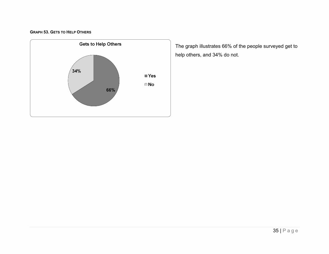
GRAPH 53. GETS TO HELP OTHERS
The graph illustrates 66% of the people surveyed get to
help others, and 34% do not.
35 | P a g e

Satisfaction GRAPH 54. LIKES HOME
The graph illustrates 89% of the people surveyed like
their home, and 11% do not.
GRAPH 55. LIKES NEIGHBORHOOD
The graph illustrates 85% of the people surveyed like
their neighborhood, and 15% do not.
36 | P a g e

GRAPH 56. WANTS TO LIVE SOMEWHERE ELSE
The graph illustrates 21% of the people surveyed want
to live somewhere else, and 79% do not.
GRAPH 57. LIKES HOME
The graph illustrates 88% of the people surveyed like
their job, and 12% do not.
37 | P a g e

GRAPH 58. WANTS TO WORK SOMEWHERE ELSE
The graph illustrates 35% of the people surveyed want
to work somewhere else, and 65% do not.
GRAPH 59. LIKES DAY ACTIVITY
The graph illustrates 92% of the people surveyed like
their day activity, and 8% do not.
38 | P a g e

GRAPH 60. WANTS TO GO SOMEWHERE ELSE DURING THE DAY
The graph illustrates 29% of the people surveyed want
to go somewhere else during the day, and 71% do not.
39 | P a g e

Service Coordination GRAPH 61. HAS MET SERVICE COORDINATOR
The graph illustrates 96% of the people surveyed have
met their service coordinator, and 4% have not.
GRAPH 62. SERVICE COORDINATOR ASKS WHAT PERSON WANTS
The graph illustrates 83% of the people surveyed have
a service coordinator who asks them what they want,
and 17% do not.
40 | P a g e

GRAPH 63. SERVICE COORDINATOR HELPS GET WHAT PERSON NEEDS
The graph illustrates 83% of the people surveyed have
a service coordinator who helps get them what they
need, and 17% do not.
GRAPH 64. SERVICE COORDINATOR CALLS BACK RIGHT AWAY
The graph illustrates 68% of the people surveyed have
a service coordinator who calls back right away, and
32% do not.
41 | P a g e

GRAPH 65. HELPED MAKE IPP
The graph illustrates 83% of the people surveyed helped make
their Individual Program Plan (IPP), and 17% did not.
42 | P a g e

Health GRAPH 66. HAS A PRIMARY DOCTOR
The graph illustrates 97% of the people surveyed have
a primary doctor, and 3% do not.
GRAPH 67. IN POOR HEALTH
The graph illustrates 4% of the people surveyed are in
poor health, and 96% are not.
43 | P a g e

GRAPH 68. HAD AN ANNUAL PHYSICAL EXAM IN THE PAST YEAR
The graph illustrates 86% of the people surveyed had
an annual physical exam in the past year, and 14% did
not.
GRAPH 69. HAD A DENTAL EXAM IN THE PAST YEAR
The graph illustrates 60% of the people surveyed had a
dental exam in the past year, and 40% did not.
44 | P a g e

GRAPH 70. HAD A VISION SCREENING IN THE PAST YEAR
The graph illustrates 52% of the people surveyed had a
vision screening in the past year, and 48% did not.
GRAPH 71. HAD A HEARING TEST IN THE PAST FIVE YEARS
The graph illustrates 50% of the people surveyed had a
hearing test in the past 5 years, and 50% did not.
45 | P a g e

GRAPH 72. HAD A PAP TEST IN THE PAST THREE YEARS FOR WOMEN
The graph illustrates 61% of the women surveyed had a
pap test in the past 3 years, and 39% did not.
GRAPH 73. HAD A MAMMOGRAM IN THE PAST TWO YEARS FOR WOMEN OVER 40
The graph illustrates 70% of the women over 40
surveyed had a mammogram in the past 2 years, and
30% did not.
46 | P a g e

GRAPH 74. HAD A PSA TEST IN PAST YEAR FOR MEN OVER 50
The graph illustrates 42% of the males over 50
surveyed had a PSA test in the past year, and 58% did
not.
GRAPH 75. HAD A COLORECTAL CANCER SCREENING IN THE PAST YEAR FOR
THOSE OVER 50
The graph illustrates 9% of the people over 50 surveyed
had a colorectal cancer screening in the past year, and
91% did not.
47 | P a g e

GRAPH 76. HAD A FLU VACCINATION IN THE PAST YEAR
The graph illustrates 70% of the people surveyed had a
flu vaccination in the past year, and 30% did not.
GRAPH 77. HAD A VACCINATION FOR PNEUMONIA
The graph illustrates 31% of the people surveyed had a
vaccination for pneumonia, and 69% did not.
48 | P a g e

Medications GRAPH 78. TAKES MEDICATION FOR MOOD, BEHAVIOR, ANXIETY, OR
PHYSCHOTIC DISORDER
The graph illustrates 38% of the people surveyed take
medication for a mood, behavior, or anxiety disorder,
and 62% do not.
49 | P a g e

Wellness GRAPH 79. ENGAGES IN MODERATE PHYSICAL ACTIVITY
The graph illustrates 29% of the people surveyed
engage in moderate physical activity (at least 30
minutes, 3 times a week), and 71% do not.
GRAPH 80. USES TOBACCO
The graph illustrates 7% of the people surveyed use
tobacco, and 93% do not.
50 | P a g e
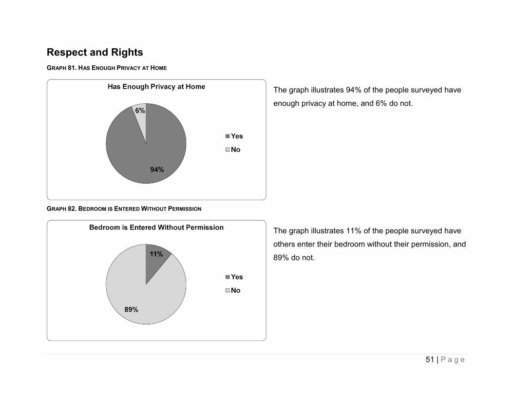
Respect and Rights GRAPH 81. HAS ENOUGH PRIVACY AT HOME
The graph illustrates 94% of the people surveyed have
enough privacy at home, and 6% do not.
GRAPH 82. BEDROOM IS ENTERED WITHOUT PERMISSION
The graph illustrates 11% of the people surveyed have
others enter their bedroom without their permission, and
89% do not.
51 | P a g e

GRAPH 83. HOME IS ENTERED WITHOUT PERMISSION
The graph illustrates 4% of the people surveyed have
others enter their home without their permission, and
96% do not.
GRAPH 84. CAN BE ALONE WITH VISITORS AT HOME
The graph illustrates 88% of the people surveyed can
be alone with visitors at home, and 12% cannot.
52 | P a g e

GRAPH 85. MAIL OR EMAIL IS OPENED WITHOUT PERMISSION
The graph illustrates 14% of the people surveyed have
their mail or email opened without their permission, and
86% do not.
GRAPH 86. CAN USE PHONE AND INTERNET WITHOUT RESTRICTIONS
The graph illustrates 95% of the people surveyed can
use the phone and internet without restrictions, and 5%
cannot.
53 | P a g e

GRAPH 87. STAFF AT HOME ARE NICE AND POLITE
The graph illustrates 97% of the people surveyed
reported their staff at home are nice and polite, and 3%
did not.
GRAPH 88. STAFF AT WORK ARE NICE AND POLITE
The graph illustrates 100% of the people surveyed
reported their staff at work are nice and polite, and 0%
did not.
54 | P a g e

GRAPH 89. STAFF AT DAY ACTIVITY ARE NICE AND POLITE
The graph illustrates 96% of the people surveyed
reported their staff at day activity are nice and polite,
and 4% did not.
GRAPH 90. HAS PARTICIPATED IN A SELF-ADVOCACY EVENT
The graph illustrates 12% of the people surveyed
participated in a self-advocacy event, and 88% have
not.
55 | P a g e

Safety GRAPH 91. NEVER FEELS SCARED AT HOME
The graph illustrates 87% of the people surveyed never
feel scared at home, and 13% do feel scared at home.
GRAPH 92. NEVER FEELS SCARED IN NEIGHBORHOOD
The graph illustrates 84% of the people surveyed never
feel scared in their neighborhood, and 16% do feel
scared in their neighborhood.
56 | P a g e
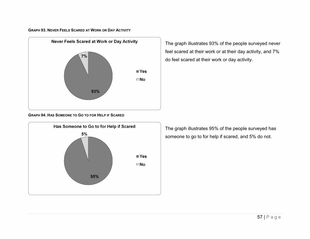
GRAPH 93. NEVER FEELS SCARED AT WORK OR DAY ACTIVITY
The graph illustrates 93% of the people surveyed never
feel scared at their work or at their day activity, and 7%
do feel scared at their work or day activity.
GRAPH 94. HAS SOMEONE TO GO TO FOR HELP IF SCARED
The graph illustrates 95% of the people surveyed has
someone to go to for help if scared, and 5% do not.
57 | P a g e

Access GRAPH 95. HAS ADEQUATE TRANSPORTATION
The graph illustrates 80% of the people surveyed have
adequate transportation, and 20% do not.
GRAPH 96. GETS NEEDED SERVICES
The graph illustrates 75% of the people surveyed get
needed services, and 25% do not.
58 | P a g e

GRAPH 97. STAFF HAVE ADEQUATE TRAINING
The graph illustrates 93% of the people surveyed have
adequately trained staff, and 7% do not.
59 | P a g e