c1: from weather to climate - globe.gov® 2011 c1: from weather to climate – looking at air...
TRANSCRIPT

GLOBE® 2011 C1: From Weather to Climate – Looking at Air Temperature Data Earth System Science
Learning Activity
Protocols A
ppendix Introduction
Welcom
e
Page 1
!?
PurposeStudents will work with short- and long-term air temperature data in order to better understand the differences between weather and climate.
OverviewStudents will look at air temperature data starting from the individual measurements (taken during the course of a day) to averages of many measurements over a daily, monthly, or annual time period. Students will also make observations about variations and trends in the data on daily, monthly, and annual scales.
Student OutcomesStudents will be able to:
• Explain the differences between weather and climate.
• Interpret graphed air temperature data.
• Understand the value of averaging daily, monthly and yearly air temperature data.
Science ConceptsGeneral
• Visual models help us analyze and interpret data.
Scientific Inquiry Abilities• Identify answerable questions.• Use appropriate tools and
techniques.• Use appropriate mathematics to
analyze data.• Communicate procedures and
explanations.
Climate Literacy Principles • Climate is determined by the long-
term pattern of temperature and precipitation averages and extremes at a location. (Climate Literacy Principle 4A).
• Climate is not the same thing as weather. (Climate Literacy Principle 4B)
Time: Two class periods (not including extensions)
Level: Upper Primary, Secondary (Grades 6–12); some components may be applicable to lower grades. Extensions may be more appropriate for Secondary.
Materials• Student Worksheets (Appendix).• Calculators or computer-based
spreadsheet programs. • Graph paper or computer-based
graphing programs. Note: Teachers may wish to use their own school’s GLOBE data from the GLOBE database rather than sample graphs and data in the student worksheets. (See In Search of GLOBE Data activity at: http://classic.globe.gov/docs/gsfc/docs/UnderstandingGLOBEStudentData.pdf).
Preparation• Print student worksheets (Note:
student worksheets can be completed as either paper copies or electronic documents) or
• Create graphs and tables of data from own school’s measurements (See In Search of GLOBE Data).
Prerequisites:Basic understanding of calculating mathematical averages.
C1: From Weather to Climate – Looking at Air Temperature Data

GLOBE® 2011 C1: From Weather to Climate – Looking at Air Temperature Data Earth System SciencePage 2
Background
Weather and ClimateWeather and climate are often confused, although they are both important in the understanding of each other. Weather is the minute-by-minute variable condition of the atmosphere on a local scale, while climate is a conceptual description of an area’s average weather conditions and the extent to which those conditions vary over a longer time frame. Climate is determined by the long-term pattern of temperature and precipitation averages and extremes at a location. Climate descriptions can refer to areas that are local, regional, or global in extent. Climate can be described for different time intervals, such as decades, years, seasons, months, or specific dates of the year. This set of activities will guide students to analyze graphs of mean daily air temperature data over daily, monthly and annual time periods in order to better understand the difference.
Data CollectionScientists often create measurement protocols for specific research or they will evaluate existing data collection methods prior to including a data set in their research. Understanding the implications of the chosen methods for collecting data and citing them in research investigations is important in any scientific research report.
Similarly, the GLOBE Program has detailed measurement protocols for data collection in order to ensure that participating schools from all over the world are collecting data in
the same manner using similar instruments. The protocols that relate to this learning activity are:
• Digital Multi-Day Max/Min/Current Air and Soil Temperatures Protocol
• Automated Soil and Air Temperature Monitoring Protocol (Data logger)
Based on the air temperature protocol, GLOBE schools collect current temperature, as well as minimum and maximum air temperature data over the previous 24 hours, on a daily basis at local solar noon. These data are entered into the GLOBE database and the mean daily air temperature is then calculated by taking the average of the maximum and the minimum air temperature measurements. Data loggers and automated weather stations, however, collect data over a 24 hour period and the values are averaged. So which method is the most accurate? Part 1 of “Understanding Mean Daily Air Temperature” will lead students through this question using data from the Mittelschule Elsterberg data set for 22 April 2010.
Mathematical conceptsAverage – mean, median and mode are three “kinds” of average. The word “average” is commonly used to describe the mean.Mean – is the sum of all the numbers divided by the number of numbers.Median – is the middle value of a list of numbers.Mode – is the value that occurs most often. Teachers may wish to extend students’ learning by building the use of median or mode where relevant into the activities.
Assessment Opportunities:On-going (formative) assessment:
• Successful interpretation of graphs to be able to proceed through Activities• Contributions to class discussion
Final (summative) assessment:• Individual written evidence explaining differences between weather and climate.
GLOBE® 2011 C1: From Weather to Climate – Looking at Air Temperature Data Earth System Science
Learning Activity
Protocols A
ppendix Introduction
Welcom
e
Page 3
Activity 1 - Understanding Mean Daily Air Temperature
During this activity, students will work with graphs and tables of mean daily air temperature over a variety of time scales.
What To Do and How To Do ItPart 1 - Temperature variation during the course of a day
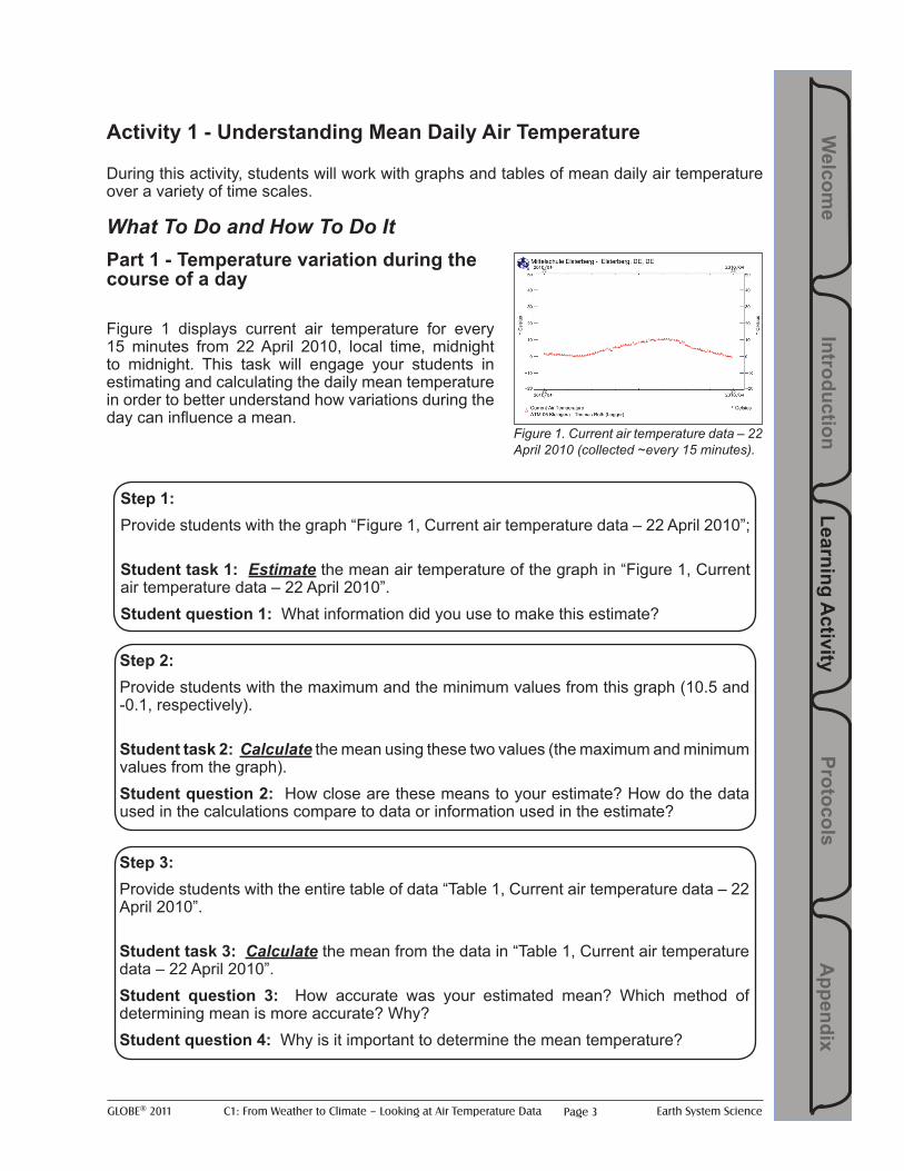
Figure 1 displays current air temperature for every 15 minutes from 22 April 2010, local time, midnight to midnight. This task will engage your students in estimating and calculating the daily mean temperature in order to better understand how variations during the day can influence a mean.
Figure 1. Current air temperature data – 22 April 2010 (collected ~every 15 minutes).
Step 1: Provide students with the graph “Figure 1, Current air temperature data – 22 April 2010”;
Student task 1: Estimate the mean air temperature of the graph in “Figure 1, Current air temperature data – 22 April 2010”. Student question 1: What information did you use to make this estimate?
Step 2: Provide students with the maximum and the minimum values from this graph (10.5 and -0.1, respectively).
Student task 2: Calculate the mean using these two values (the maximum and minimum values from the graph). Student question 2: How close are these means to your estimate? How do the data used in the calculations compare to data or information used in the estimate?
Step 3: Provide students with the entire table of data “Table 1, Current air temperature data – 22 April 2010”.
Student task 3: Calculate the mean from the data in “Table 1, Current air temperature data – 22 April 2010”. Student question 3: How accurate was your estimated mean? Which method of determining mean is more accurate? Why? Student question 4: Why is it important to determine the mean temperature?

GLOBE® 2011 C1: From Weather to Climate – Looking at Air Temperature Data Earth System SciencePage 4
Teacher notes• Mean temperature is the average temperature of the air during a given time period,
usually a day, a month, or a year. Using more data, rather than less, is always better in determining the mean daily air temperature as long as the data are accurate.
• The daily mean from Mittelschule Elsterberg is 4.7 as calculated from the entire table and 5.2 by averaging only the maximum and the minimum values.
• Mittelschule Elsterberg, in Elsterberg, Germany, uses a data logger at the Atmosphere site used in this activity. Data loggers and automatic weather stations collect data 24 hours per day at several minute intervals. The mean daily air temperature is calculated by averaging all data throughout the day, from midnight to midnight. Zakladni Skola, in Bystrice Nad Perstejnem, Czech Republic, (used in the remainder of these activities) collects air temperature once a day using the standard GLOBE air temperature protocol and has a consistent data record of 13 years. The mean daily air temperature is calculated by averaging the daily maximum and minimum air temperature.
• Knowing what instrumentation is used by a school, as well as the length of the data record, will help determine how best to use the data. The more data used in determining the mean daily air temperature, the more accurate the calculated mean. However, when more frequent data are not available, averaging the maximum and minimum daily air temperature serves as a good estimate for the daily mean air temperature. It’s important to note here that stations throughout the United States which input data into the Global Historical Climatology Network (GHCN) also utilize a similar methodology as is used in the GLOBE database in determining the mean daily (and therefore monthly mean) air temperature, which is based off of averaging the daily maximum and minimum temperatures.
• Understanding the importance of instrumentation and data accuracy will be useful for those students who move on to careers in science – or even those working on a science fair project. Establishing instrument standards and utilizing the best methodology for calculating data is key to a successful investigation. Furthermore, understanding the implications of the chosen methods and citing those methods used for calculating data in an investigation is also a crucial component of any scientific research paper or report.

GLOBE® 2011 C1: From Weather to Climate – Looking at Air Temperature Data Earth System Science
Learning Activity
Protocols A
ppendix Introduction
Welcom
e
Page 5
Part 2 - Weekly, monthly and yearly Temperature Variation and Trends
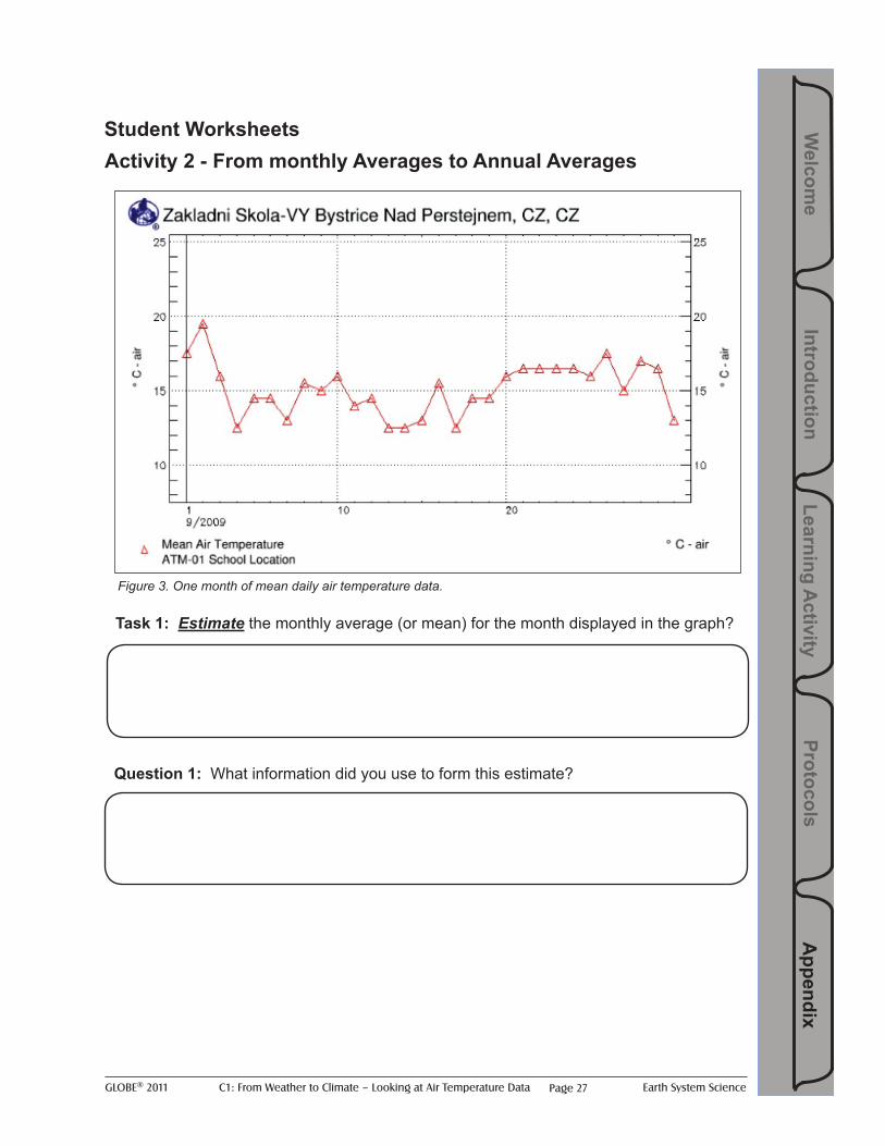
Figure 3. One month of mean daily air temperature data.
Figure 4. Six months of mean daily air temperature data.
Figure 5. One year of mean daily air temperature data.
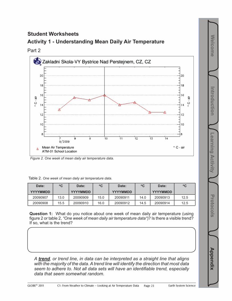
Figure 2. One week of mean daily air temperature data.
Step 1: Provide students with mean daily air temperature for one week (Figure 2). Or use visualizations of school’s own data. Students can also be instructed to use Table 2 in order to construct their own graph.
Student question 1: What do you notice about one week of mean daily air temperature? Is there a visible trend? If so, what is the trend?
Step 2: Provide students with mean daily air temperature for one month (Figure 3).
Student question 2: What do you notice about one month of mean daily air temperature data? Is there a visible trend? If so, what is the trend?
Step 3: Provide students with mean daily air temperature data for six months (Figure 4).
Student question 3: What do you notice about six months of mean daily air temperature data? Is there a visible trend? If so, what is the trend and why might it exist?
Step 4: Provide students with mean daily air temperature data for one year (Figure 5).
Student question 4: What do you notice about one year of mean daily air temperature data? Is there a visible trend? If so, what is the trend and why might it exist?
GLOBE® 2011 C1: From Weather to Climate – Looking at Air Temperature Data Earth System SciencePage 6
Teacher notes• Students should see seasonal trends in the six month and one year data sets and
graphs (steps 3 and 4). • A trend, or trend line, in data can be interpreted as a straight line that aligns with the
majority of the data. A trend line will identify the direction that most data seem to adhere to. Not all data sets will have an identifiable trend, especially data that seem somewhat random.
• Spreadsheet programs often have tools to calculate trend lines as an option.

GLOBE® 2011 C1: From Weather to Climate – Looking at Air Temperature Data Earth System Science
Learning Activity
Protocols A
ppendix Introduction
Welcom
e
Page 7
Activity 2 - From Monthly Means to Annual Means
This activity builds on students’ understanding of mean daily air temperature from Activity 1 and will explore daily to annual cycles.
What To Do and How To Do It
Teacher notes• Data from individual days are visualized in the graph and each day doesn’t necessarily
have the same air temperature as the preceding or following day. • This day to day variability is known as weather.• Climate scientists often look at monthly means when discussing air temperature, since
the day-to-day fluctuations in longer-term data can get quite messy and hard to work with.
Figure 3. One month of mean daily air temperature data.
Review observations from Activity 1.
Ask students to describe: What was the overall pattern of data? Why was the overall pattern of data not represented by a smooth line?
Step 1: Estimate monthly mean
Student task 1: Estimate the monthly mean for the month displayed in the graph (Figure 3).Student question 1: What information did you use to construct this estimate?
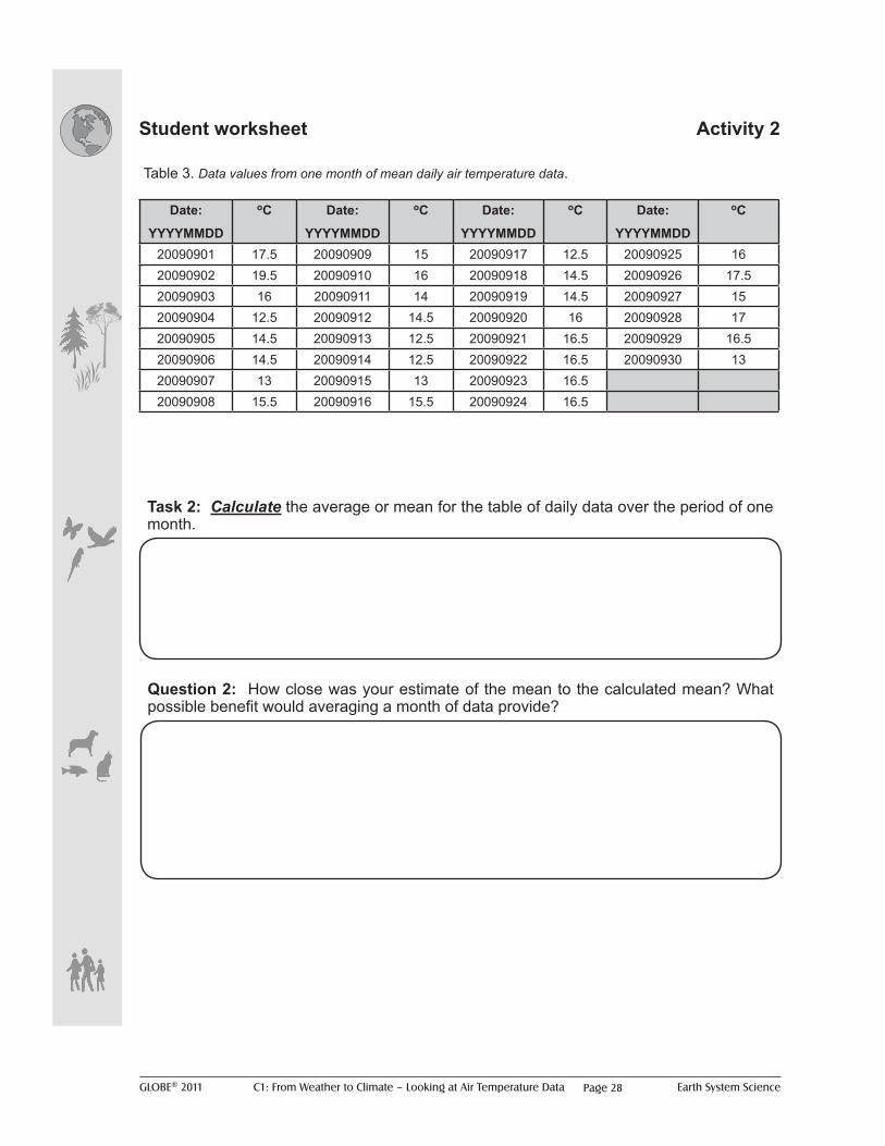
Step 2:Provide the data to students to calculate the monthly mean. (Student worksheet Activity 2, Table 3).
Student task 2: Calculate the mean for the table of daily data over the period of one month. Student question 2: How close was your estimate of the mean to the calculated mean? What possible benefit would averaging a month of data provide?
GLOBE® 2011 C1: From Weather to Climate – Looking at Air Temperature Data Earth System SciencePage 8
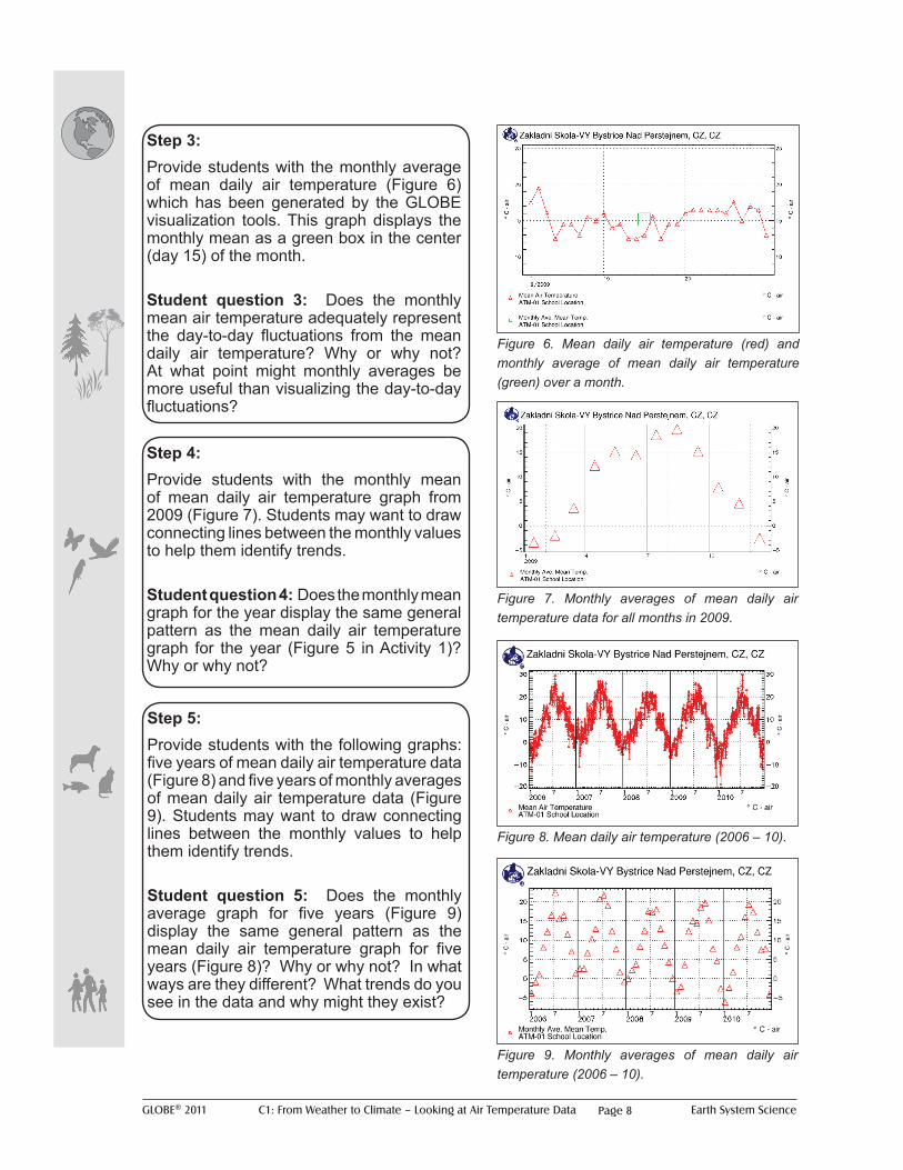
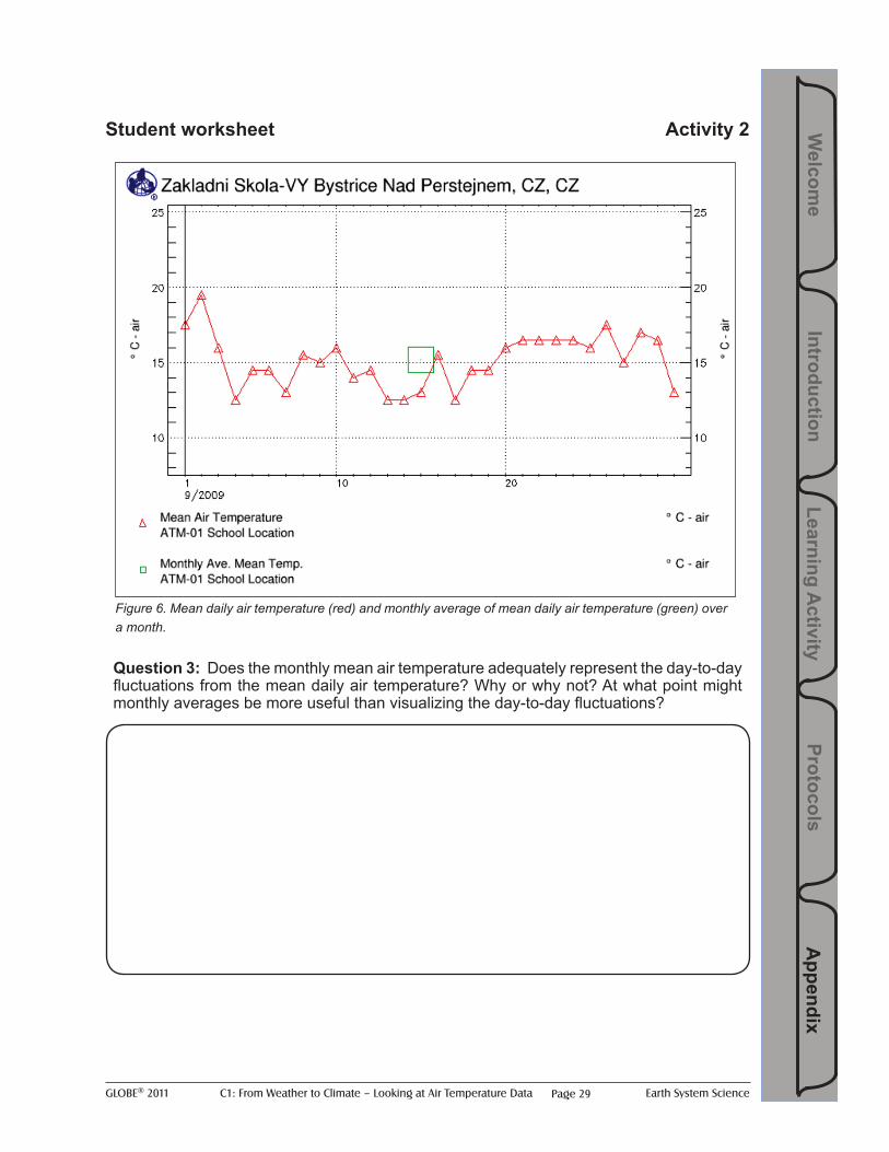
Step 3: Provide students with the monthly average of mean daily air temperature (Figure 6) which has been generated by the GLOBE visualization tools. This graph displays the monthly mean as a green box in the center (day 15) of the month.
Student question 3: Does the monthly mean air temperature adequately represent the day-to-day fluctuations from the mean daily air temperature? Why or why not? At what point might monthly averages be more useful than visualizing the day-to-day fluctuations?
Figure 6. Mean daily air temperature (red) and monthly average of mean daily air temperature (green) over a month.
Step 4: Provide students with the monthly mean of mean daily air temperature graph from 2009 (Figure 7). Students may want to draw connecting lines between the monthly values to help them identify trends.
Student question 4: Does the monthly mean graph for the year display the same general pattern as the mean daily air temperature graph for the year (Figure 5 in Activity 1)? Why or why not?
Figure 7. Monthly averages of mean daily air temperature data for all months in 2009.
Step 5: Provide students with the following graphs: five years of mean daily air temperature data (Figure 8) and five years of monthly averages of mean daily air temperature data (Figure 9). Students may want to draw connecting lines between the monthly values to help them identify trends.
Student question 5: Does the monthly average graph for five years (Figure 9) display the same general pattern as the mean daily air temperature graph for five years (Figure 8)? Why or why not? In what ways are they different? What trends do you see in the data and why might they exist?
Figure 8. Mean daily air temperature (2006 – 10).
Figure 9. Monthly averages of mean daily air temperature (2006 – 10).

GLOBE® 2011 C1: From Weather to Climate – Looking at Air Temperature Data Earth System Science
Learning Activity
Protocols A
ppendix Introduction
Welcom
e
Page 9
Teacher notes:• Point out temperature extremes, or “spikes”, in some of the mean daily air temperature
graphs. For instance, in mid-year 1998 there was a drop in the temperature to nearly 0o C. In mid-year 2000 there was a peak in air temperature to more than 30o C. 2010 is also quite interesting in that the year begins with air temperature near -20o C and by mid-year (approximately July) air temperature reaches approximately 30o C.
• “Spikes”, or outliers, in the mean daily air temperature are weather extremes and not necessarily connected to climate (unless there was a longer-term trend of such extremes).
• Extension – see Extension A
Figure 10. Mean daily air temperature (1998 – 2010).
Figure 11. Monthly averages of mean daily air temperature (1998 – 2010).
Step 6: The school in this activity has something that only a small number of GLOBE schools have: a complete data record spanning more than 13 years. Provide students with the following graphs:
• all complete years of mean daily air temperature data (Figure 10) and
• all complete years of monthly averages of mean daily air temperature data (Figure 11).
Note: An Excel graph has been included for Figure 11 in order for students to more easily follow the seasonal trends in the data.
Student question 6: Is the monthly averages graph (Figure 11) more useful in identifying trends than the mean daily air temperature graph (Figure 10)? Why or why not? How are they similar? Are possible outliers more or less easily identified?
Step 7:Sum up that the students have experienced looking at monthly averages over a range of years (from 5 to 13) and have seen the complexity of these graphs (especially Figures 10 and 11). Provide students with the following background information:
“Scientists who look at decades or even centuries of air temperature data replace monthly averages with yearly averages in order to reduce the seasonal fluctuations to help make annual trends more noticeable. This requires averaging monthly mean data into annual mean data.”
GLOBE® 2011 C1: From Weather to Climate – Looking at Air Temperature Data Earth System SciencePage 10
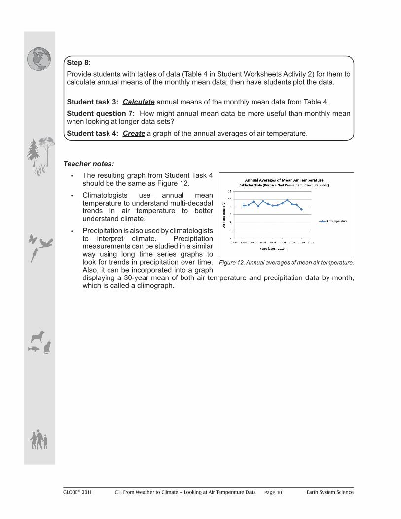
Teacher notes:• The resulting graph from Student Task 4
should be the same as Figure 12. • Climatologists use annual mean
temperature to understand multi-decadal trends in air temperature to better understand climate.
• Precipitation is also used by climatologists to interpret climate. Precipitation measurements can be studied in a similar way using long time series graphs to look for trends in precipitation over time. Also, it can be incorporated into a graph displaying a 30-year mean of both air temperature and precipitation data by month, which is called a climograph.
Figure 12. Annual averages of mean air temperature.
Step 8:Provide students with tables of data (Table 4 in Student Worksheets Activity 2) for them to calculate annual means of the monthly mean data; then have students plot the data.
Student task 3: Calculate annual means of the monthly mean data from Table 4. Student question 7: How might annual mean data be more useful than monthly mean when looking at longer data sets? Student task 4: Create a graph of the annual averages of air temperature.

GLOBE® 2011 C1: From Weather to Climate – Looking at Air Temperature Data Earth System Science
Learning Activity
Protocols A
ppendix Introduction
Welcom
e
Page 11
Activity 3 - Introducing climographs
During this activity students will identify similarities and differences between graphs of daily, monthly and yearly mean air temperature and climographs of mean monthly air temperature and precipitation to help them understand weather and climate.
What To Do and How To Do It
Teacher notes:• Students should note the lack of
day-to-day variability or weather displayed in the climograph.
Figure 13. Climograph displaying mean monthly air temperature and precipitation for Zakladni Skola in Bystrice Nad Paerstejnem in the Czech Republic.
BackgroundProvide students with the following information:
“A climograph (also know as a climatograph) is a graph displaying the basic climatic parameters: monthly average temperature and precipitation, for a certain location. It can be used as a snapshot of the climate of that particular location. Climatologists typically use an average of 30 years of monthly data to construct a climograph. While GLOBE data are not available for this length of time to construct a 30-year climograph, GLOBE data sets that span multiple years and have consistent data can be displayed in a climograph format.”
Step 1: Provide students with Figures 13 and 14 in Activity 3 Student Worksheets:
Student question 1: Does the climograph display a similar pattern as you have seen throughout the graphs in this activity; if so which one?Student question 2: Compare figures 5 and 7 to the climograph in Figure 13. What are some of the similarities and differences?Student question 3: Compare the annual cycles in figures 9 and 11 to the climograph in Figure 13. What are some of the similarities and differences? Student question 4: Assessment Based on what you’ve learned in these activities, how would you define weather versus climate?
Figure 14. How to read a GLOBE climograph
A Air temperature (monthly mean of mean daily); red/ blue vertical lines provide maximum (red)/minimum (blue) means by month
B Precipitation (monthly mean); blue/green bars provide data on snow (blue)/rain (green) means by month
C Vertical lines (red, green and blue) provide the average number of data submission days by month over the entire schools’ data record: temperature (red), rainfall (green) and snow (blue).
D Months of the year (J=January through D=December)
A
B
C
D
GLOBE® 2011 C1: From Weather to Climate – Looking at Air Temperature Data Earth System SciencePage 12
Extension Activities for Further Exploration
Learning Extension A1 – What other statistics could be studied besides means of mean daily air temperature?
What To Do and How To Do It
Teacher notes:• Other statistics to consider may be (but are not limited to) maximum values, minimum
values, ranges of values (e.g. maximum minus the minimum or standard deviation, etc.).
• An example of a different metric to use in Step 2 could be maximum air temperature.
BackgroundProvide students with the following information:
“Statistical “metrics” are single values calculated from a set of many data points that are used to analyze and explain a data set (like the mean daily air temperature was calculated from many data points throughout the day, or the mean monthly temperature was calculated from the many mean daily temperatures throughout the month).”
Student question: What other statistics besides the mean could be studied?
Step 1: Refer back to Activity 1 using daily average air temperature data. Have students decide on a different statistical metric.
Student task 1: Plot this new metric over time (e.g. one week or one month) on a graph. Student question 1: How does this new metric look on a time series graph compared to the mean daily air temperature time series graph in the first activity?Student question 2: What might we do if we wanted to look at a long time series (e.g. a year or longer) of this new daily data metric?

GLOBE® 2011 C1: From Weather to Climate – Looking at Air Temperature Data Earth System Science
Learning Activity
Protocols A
ppendix Introduction
Welcom
e
Page 13
Learning Extension A2 – How might you use these different statistical metrics over longer periods of time?
What To Do and How To Do It
Teacher notes:• In general, neither metric is more accurate than the other. Either of these metrics could
be studied over long time periods to look for long-term trends in the climate of your location.
• It is very important to always explain how you calculated the metrics that you are studying so that when you interpret them you do so correctly.
• For really long time periods (e.g. many years), create metrics on an annual scale rather than a monthly scale as in Activity 2. In this way you still have the option of studying combined metrics (e.g. annual mean of daily maximum temperature, annual mean of monthly mean daily maximum temperature) or just the single metric scaled to the full year (e.g. daily maximum temperature over the entire year).
• For studies of very long time periods see Learning Extension C: Using long-term data.
BackgroundProvide students with the following background information and data sets using two new types of metrics:
“Occasionally scientists need to combine several types of statistical metrics to help reduce the number of data points for analysis over longer time periods . For example:
• both a maximum and mean statistical metric can be used to calculate a monthly mean of maximum daily values). Or
• use the new metric scaled over a longer time period such as the maximum daily temperature per month. This would still give you just one data point per month to analyze).”
Step 1: Using the new metricsStudent task 1: Calculate these two types of new metrics for a data set provided by your teacher and plot them on a time series graph. Student question 1: How do these two metrics compare (e.g. monthly mean of daily maximum air temperature compared to the maximum daily temperature per month)?Student question 2: How is the combined new statistical metric (e.g. a monthly mean of the daily maximum air temperature) different from the monthly mean of the daily mean air temperature calculated in Activity 2, “From Monthly Averages to Annual Averages”? Student question 3: How might you interpret these new metrics compared to the means calculated in the second activity? Which is more accurate to use?

GLOBE® 2011 C1: From Weather to Climate – Looking at Air Temperature Data Earth System SciencePage 14
Further study questions for a range of temperature measurements
Student question 1: What might the daily range of temperature tell us about the weather on a given day?Student question 2: What factors contribute to the daily range of temperature? Can these factors be identified with other GLOBE data measurements?Student question 3: What if we looked at temperature range trends over longer periods of time – what might it tell us about the climate? Note: to look at very long periods, the number of data points may need to be reduced by taking a mean of the daily range values (e.g. over a month or a year).
Questions to consider when looking at data When analyzing data it’s important to ask yourself or your colleagues if the data are reasonable. How accurate are the data and how were they collected? What instrumentation was used in collecting data and were instruments calibrated? Discuss with your colleagues how best to work with outliers and other questionable data.

GLOBE® 2011 C1: From Weather to Climate – Looking at Air Temperature Data Earth System Science
Learning Activity
Protocols A
ppendix Introduction
Welcom
e
Page 15
Learning Extension B – How do scientists study global climate trends?
What To Do and How To Do It
BackgroundProvide students with the following background information:
“For scientists to study data on a global scale (such as for global warming studies), they can plot the data onto maps – or analyze the data with statistics in a spatial manner. The focus of Activities 1 and 2, “Understanding Mean Daily Air Temperature” and “From Monthly Averages to Annual Averages” was on taking means over time. However you can also average multiple data points from different locations to get a mean value over that area (e.g. for a global mean, you would need to average points from all over the globe!).”
Step 1: How to spatially average dataProvide students with mean daily air temperature over the same given time period from a number of schools (e.g. from your own country or from a geographical region defined by latitude and longitude). Note: each school location needs to have daily measurements for a full month for a time series of daily data or sufficient monthly data for a monthly time series over a year or longer time series. Visit the GLOBE Visualizations page or use the In Search of GLOBE Data Activities to locate schools in the selected geographic region. Several factors affect climate (such as latitude, elevation, proximity to large bodies of water, and topography); therefore select locations to eliminate differences (e.g. locations with approximately the same latitude and elevation).
Student task 1: For a given time (e.g. a mean daily air temperature for MMDDYY), average together the data for that same time from multiple locations. This becomes your spatially averaged data point for that particular time.
Student task 2: Repeat this process for multiple times (days, months, whatever time frame you want to study) to build up a time series of the spatially averaged data. Note: examples are: a one-month time series of the spatially-averaged daily mean temperatures; a one-year time series of the spatially-averaged monthly mean temperatures; a 10-year time series of the spatially-averaged annual mean temperature data.
Student task 3: Plot the time series of this spatial averaged data on a graph.
Student task 4: Plot the time series of each individual school’s data on a graph. Student question 1: How does the regionally averaged time series compare to the time series of just one school?Student question 2: What happens to the data from each individual location when it’s spatially averaged over a larger region? What do you think happens then if data are averaged over the entire globe?Student question 3: Do you think the global average represents the climate of a smaller region or an individual location perfectly? Why might it be important to study local and regional climate trends in addition to global trends?

GLOBE® 2011 C1: From Weather to Climate – Looking at Air Temperature Data Earth System SciencePage 16
Teacher notes:• GLOBE schools can have a huge impact in the Student Climate Research Campaign
(SCRC) by studying climate trends that are locally relevant to the school. • Climate is more than just air temperature; it also includes precipitation trends and other
factors such as land cover changes and plant and animal phenology (e.g. green up and green down, animal migration, emergence of insects, etc.).
• Study those factors that are important in your local region.

GLOBE® 2011 C1: From Weather to Climate – Looking at Air Temperature Data Earth System Science
Learning Activity
Protocols A
ppendix Introduction
Welcom
e
Page 17
Learning Extension C – Looking at Long-term Climate Trends Beyond the Length of the GLOBE Database Using Other Data Sets
What To Do and How To Do It
Teacher notes:GHCN (Global Historical Climatology Network) is a database of air temperature, precipitation, and pressure records managed in part by NCDC (National Climatic Data Center).
Examples and sources of other data sets include:• Physical data sets such as land cover data, phenology data, paleo-climate records,
satellite observation records, etc.• Newspaper story archives• Interviews with community elders
Limitations with using real data include: missing data, incomplete time series, etc. These issues are common in any scientific database and faced by nearly every scientist. It is important to cite any such limitations found in your research reports as well as any assumptions made in data analysis (e.g. when there are missing data or the data you want are not explicitly available), and justify why those assumptions are valid.
Using long-term dataProvide students access to the long-term GHCN data provided by NCDC through GLOBE using the Google Earth plug in at http://globe.gov/scrc/pilots/data.
Student task 1: Use the same methods you used in Learning Extension B to:• Create a full 30-year period to create a climograph for a location of your choosing;• Look at long-term time series trends in air temperature or precipitation for a location
of your choosing;• Calculate regionally averaged climate trends using long-term data (30 years or
longer);• Discuss, agree and find what other (long-term) data sets are of interest to your
location/region which could be used in a research project to study other trends over time.
Student question 1: What could be limitations or problems of using real data? How would you overcome these issues?

GLOBE® 2011 C1: From Weather to Climate – Looking at Air Temperature Data Earth System SciencePage 18
Additional Climate and Weather-Related Resources
NASA (National Aeronautics and Space Administration) • Global Climate Change http://climate.nasa.gov/
NOAA (National Oceanic and Atmospheric Administration) • Climate Services http://www.climate.gov/#climateWatch
WMO (World Meteorological Organization) • Weather, Climate and Water Science for Youth http://www.wmo.int/youth/index_
en.html
European Space Agency • Atmosphere http://www.esa.int/esaEO/SEMJEX2VQUD_planet_0.html
MetOffice • Education http://www.metoffice.gov.uk/education

GLOBE® 2011 C1: From Weather to Climate – Looking at Air Temperature Data Earth System Science
Learning Activity
Protocols A
ppendix Introduction
Welcom
e
Page 19
Appendix: Student Worksheets
Figure 1. Current air temperature data – 22 April 2010 (collected ~every 15 minutes).
Task 1: Estimate the mean of the graph in “Figure 1, Current air temperature data – 22 April 2010”.
Question 1: What information did you use to make this estimate?
Activity 1 - Understanding Mean Daily Air TemperaturePart 1

GLOBE® 2011 C1: From Weather to Climate – Looking at Air Temperature Data Earth System SciencePage 20
Student worksheet Activity 1, Part 1
Question 2: How close is this mean to your estimate? How do the data used in the calculation compare to data or information used in the estimate?
Task 2: Your teacher will provide you with the maximum and minimum values from “Figure 1, Current air temperature data – 22 April 2010”. Calculate the mean using these two values (the maximum and minimum values from the graph).

GLOBE® 2011 C1: From Weather to Climate – Looking at Air Temperature Data Earth System Science
Learning Activity
Protocols A
ppendix Introduction
Welcom
e
Page 21
Student worksheet Activity 1, Part 1
Date/Time oC Date/Time oC Date/Time oC20100422/0000 1.6 20100422/0800 4.9 20100422/1600 10.020100422/0015 1.4 20100422/0814 4.5 20100422/1614 10.120100422/0029 1.3 20100422/0830 3.7 20100422/1629 9.920100422/0045 1.9 20100422/0844 4.8 20100422/1645 9.720100422/0100 1.5 20100422/0900 5.7 20100422/1700 9.520100422/0114 1.2 20100422/0915 5.5 20100422/1715 8.520100422/0129 0.9 20100422/0929 5.7 20100422/1730 8.920100422/0145 1.5 20100422/0945 6.5 20100422/1744 8.220100422/0200 1.3 20100422/1000 6.8 20100422/1800 7.120100422/0214 1.1 20100422/1014 7.2 20100422/1815 6.520100422/0230 1.0 20100422/1030 7.0 20100422/1829 6.020100422/0244 0.8 20100422/1045 7.0 20100422/1845 5.320100422/0300 0.8 20100422/1100 7.0 20100422/1900 4.920100422/0315 0.7 20100422/1114 8.3 20100422/1914 4.820100422/0329 0.7 20100422/1130 7.5 20100422/1929 4.620100422/0345 0.4 20100422/1144 8.1 20100422/1945 4.420100422/0400 0.5 20100422/1200 8.7 20100422/2000 3.820100422/0414 0.5 20100422/1215 8.3 20100422/2015 3.420100422/0429 0.6 20100422/1229 9.2 20100422/2030 2.920100422/0445 0.6 20100422/1245 8.8 20100422/2044 3.420100422/0500 0.6 20100422/1300 9.2 20100422/2100 3.120100422/0515 0.7 20100422/1314 10.1 20100422/2115 2.920100422/0530 0.9 20100422/1329 9.9 20100422/2129 2.220100422/0544 1.2 20100422/1345 10.3 20100422/2145 1.720100422/0600 1.6 20100422/1400 9.8 20100422/2200 1.720100422/0615 1.9 20100422/1415 10.2 20100422/2214 1.520100422/0629 2.4 20100422/1430 10.4 20100422/2229 1.920100422/0645 2.7 20100422/1444 10.1 20100422/2245 0.720100422/0700 3.2 20100422/1500 10.4 20100422/2300 0.720100422/0714 3.4 20100422/1515 10.5 20100422/2315 0.420100422/0730 3.8 20100422/1529 10.5 20100422/2330 0.420100422/0745 4.1 20100422/1545 10.5 20100422/2344 -0.1
Table 1. Current air temperature data – 22 April 2010 (collected ~every 15 minutes).
Task 3: Calculate the mean from the data in “Table 1, Current air temperature data – 22 April 2010”.

GLOBE® 2011 C1: From Weather to Climate – Looking at Air Temperature Data Earth System SciencePage 22
Student worksheet Activity 1, Part 1
Question 3: How accurate was your estimated mean? Which method of determining mean is more accurate? Why?
Question 4: Why is it important to determine the mean temperature?
GLOBE® 2011 C1: From Weather to Climate – Looking at Air Temperature Data Earth System Science
Learning Activity
Protocols A
ppendix Introduction
Welcom
e
Page 23
Student Worksheets
Date:
YYYYMMDD
oC Date:
YYYYMMDD
oC Date:
YYYYMMDD
oC Date:
YYYYMMDD
oC
20090907 13.0 20090909 15.0 20090911 14.0 20090913 12.520090908 15.5 20090910 16.0 20090912 14.5 20090914 12.5
Activity 1 - Understanding Mean Daily Air TemperaturePart 2
Figure 2. One week of mean daily air temperature data.
Question 1: What do you notice about one week of mean daily air temperature (using figure 2 or table 2, “One week of mean daily air temperature data“)? Is there a visible trend? If so, what is the trend?
A trend, or trend line, in data can be interpreted as a straight line that aligns with the majority of the data. A trend line will identify the direction that most data seem to adhere to. Not all data sets will have an identifiable trend, especially data that seem somewhat random.
Table 2. One week of mean daily air temperature data.

GLOBE® 2011 C1: From Weather to Climate – Looking at Air Temperature Data Earth System SciencePage 24
Student worksheet Activity 1, Part 2
Figure 3. One month of mean daily air temperature data.
Question 2: What do you notice about one month of mean daily air temperature (figure 3)? Is there a visible trend? If so, what is the trend?

GLOBE® 2011 C1: From Weather to Climate – Looking at Air Temperature Data Earth System Science
Learning Activity
Protocols A
ppendix Introduction
Welcom
e
Page 25
Student worksheet Activity 1, Part 2
Question 3: What do you notice about six months of mean daily air temperature data? Is there a visible trend? If so, what is the trend and why might it exist?
Figure 4. Six months of mean daily air temperature data.

GLOBE® 2011 C1: From Weather to Climate – Looking at Air Temperature Data Earth System SciencePage 26
Student worksheet Activity 1, Part 2
Figure 5. One year of mean daily air temperature data.
Question 4: What do you notice about one year of mean daily air temperature data? Is there a visible trend? If so, what is the trend and why might it exist?
GLOBE® 2011 C1: From Weather to Climate – Looking at Air Temperature Data Earth System Science
Learning Activity
Protocols A
ppendix Introduction
Welcom
e
Page 27
Student WorksheetsActivity 2 - From monthly Averages to Annual Averages
Figure 3. One month of mean daily air temperature data.
Task 1: Estimate the monthly average (or mean) for the month displayed in the graph?
Question 1: What information did you use to form this estimate?
GLOBE® 2011 C1: From Weather to Climate – Looking at Air Temperature Data Earth System SciencePage 28
Student worksheet Activity 2
Date:
YYYYMMDD
oC Date:
YYYYMMDD
oC Date:
YYYYMMDD
oC Date:
YYYYMMDD
oC
20090901 17.5 20090909 15 20090917 12.5 20090925 1620090902 19.5 20090910 16 20090918 14.5 20090926 17.520090903 16 20090911 14 20090919 14.5 20090927 1520090904 12.5 20090912 14.5 20090920 16 20090928 1720090905 14.5 20090913 12.5 20090921 16.5 20090929 16.520090906 14.5 20090914 12.5 20090922 16.5 20090930 1320090907 13 20090915 13 20090923 16.520090908 15.5 20090916 15.5 20090924 16.5
Task 2: Calculate the average or mean for the table of daily data over the period of one month.
Table 3. Data values from one month of mean daily air temperature data.
Question 2: How close was your estimate of the mean to the calculated mean? What possible benefit would averaging a month of data provide?
GLOBE® 2011 C1: From Weather to Climate – Looking at Air Temperature Data Earth System Science
Learning Activity
Protocols A
ppendix Introduction
Welcom
e
Page 29
Student worksheet Activity 2
Figure 6. Mean daily air temperature (red) and monthly average of mean daily air temperature (green) over a month.
Question 3: Does the monthly mean air temperature adequately represent the day-to-day fluctuations from the mean daily air temperature? Why or why not? At what point might monthly averages be more useful than visualizing the day-to-day fluctuations?

GLOBE® 2011 C1: From Weather to Climate – Looking at Air Temperature Data Earth System SciencePage 30
Student worksheet Activity 2
Figure 7. Monthly averages of mean daily air temperature data for all months in 2009.
Question 4: Does the monthly mean graph for the year display the same general pattern as the mean daily air temperature graph for the year (Figure 5 in Activity 1)? Why or why not?

GLOBE® 2011 C1: From Weather to Climate – Looking at Air Temperature Data Earth System Science
Learning Activity
Protocols A
ppendix Introduction
Welcom
e
Page 31
Student worksheet Activity 2
Figure 8. Mean daily air temperature (2006 – 10).
Figure 9. Monthly averages of mean daily air temperature (2006 – 10).
GLOBE® 2011 C1: From Weather to Climate – Looking at Air Temperature Data Earth System SciencePage 32
Student worksheet Activity 2
Question 5: Does the monthly average graph for five years (Figure 9) display the same general pattern as the mean daily air temperature graph for five years (Figure 8)? Why or why not? In what ways are they different? What trends do you see in the data and why might they exist?

GLOBE® 2011 C1: From Weather to Climate – Looking at Air Temperature Data Earth System Science
Learning Activity
Protocols A
ppendix Introduction
Welcom
e
Page 33
Student worksheet Activity 2
Figure 10. Mean daily air temperature (1998 – 2010).
Figure 11. Monthly averages of mean daily air temperature (1998 – 2010).

GLOBE® 2011 C1: From Weather to Climate – Looking at Air Temperature Data Earth System SciencePage 34
Student worksheet Activity 2
Question 6: Is the monthly averages graph (Figure 11) more useful in identifying trends than the mean daily air temperature graph (Figure 10)? Why or why not? How are they similar? Are possible outliers more or less easily identified?

GLOBE® 2011 C1: From Weather to Climate – Looking at Air Temperature Data Earth System Science
Learning Activity
Protocols A
ppendix Introduction
Welcom
e
Page 35
Student worksheet Activity 2
Date (YYYY/MM) oC Date (YYYY/MM) oC Date (YYYY/MM) oC1998/01 0.8 1999/01 -0.7 2000/01 -2.51998/02 4 1999/02 -1.1 2000/02 2.21998/03 2.8 1999/03 5.1 2000/03 2.01998/04 9.4 1999/04 8.5 2000/04 9.51998/05 12.9 1999/05 13.5 2000/05 15.51998/06 16.3 1999/06 16 2000/06 18.61998/07 16.1 1999/07 18.8 2000/07 14.61998/08 17.4 1999/08 16.6 2000/08 22.11998/09 13.1 1999/09 16 2000/09 12.51998/10 8.5 1999/10 8.8 2000/10 11.51998/11 1.3 1999/11 2.4 2000/11 6.01998/12 -2.1 1999/12 -1.2 2000/12 1.3
Annual Average Annual Average Annual AverageDate (YYYY/MM) oC Date (YYYY/MM) oC Date (YYYY/MM) oC
2001/01 -1.0 2002/01 -0.1 2003/01 -1.22001/02 0.4 2002/02 3.9 2003/02 -2.82001/03 4.5 2002/03 5.6 2003/03 4.82001/04 7.1 2002/04 8.1 2003/04 7.52001/05 13.8 2002/05 16.2 2003/05 15.42001/06 14.1 2002/06 17.1 2003/06 18.92001/07 19.5 2002/07 19.7 2003/07 18.42001/08 21.6 2002/08 19.2 2003/08 20.22001/09 10.4 2002/09 13.5 2003/09 13.02001/10 11.5 2002/10 7.1 2003/10 6.02001/11 2.4 2002/11 5.9 2003/11 5.82001/12 -4.3 2002/12 -2.7 2003/12 -0.3
Annual Average Annual Average Annual Average
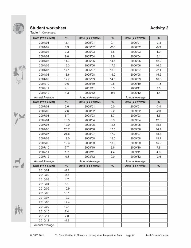
Table 4. Monthly averages of mean daily air temperature.
Task 8: Calculate annual means of the monthly mean data (Table 4).
Table 4 Continued on next page
GLOBE® 2011 C1: From Weather to Climate – Looking at Air Temperature Data Earth System SciencePage 36
Date (YYYY/MM) oC Date (YYYY/MM) oC Date (YYYY/MM) oC2004/01 -3.4 2005/01 0.1 2006/01 -3.82004/02 1.3 2005/02 -2.6 2006/02 -0.92004/03 3.3 2005/03 1.5 2006/03 1.02004/04 9.0 2005/04 9.9 2006/04 8.12004/05 11.3 2005/05 14.1 2006/05 12.22004/06 15.3 2005/06 17.2 2006/06 16.52004/07 17.1 2005/07 18.6 2006/07 22.42004/08 18.6 2005/08 16.0 2006/08 15.52004/09 12.7 2005/09 14.5 2006/09 16.52004/10 9.6 2005/10 9.8 2006/10 11.52004/11 4.1 2005/11 3.3 2006/11 7.02004/12 1.3 2005/12 -0.6 2006/12 1.4
Annual Average Annual Average Annual AverageDate (YYYY/MM) oC Date (YYYY/MM) oC Date (YYYY/MM) oC
2007/01 2.6 2008/01 0.0 2009/01 -3.42007/02 2.6 2008/02 2.2 2009/02 -2.02007/03 6.7 2008/03 3.7 2009/03 3.62007/04 10.3 2008/04 8.3 2009/04 12.32007/05 12.9 2008/05 12.5 2009/05 15.12007/06 20.7 2008/06 17.5 2009/06 14.42007/07 21.8 2008/07 17.2 2009/07 18.62007/08 19.0 2008/08 18.0 2009/08 19.72007/09 12.3 2008/09 13.0 2009/09 15.22007/10 7.7 2008/10 8.6 2009/10 7.82007/11 1.7 2008/11 4.4 2009/11 4.62007/12 -0.8 2008/12 0.0 2009/12 -2.6
Annual Average Annual Average Annual AverageDate (YYYY/MM) oC Date (YYYY/MM) oC Date (YYYY/MM) oC
2010/01 -6.12010/02 -2.42010/03 1.72010/04 8.12010/05 10.92010/06 16.12010/07 19.32010/08 17.42010/09 12.12010/10 7.42010/11 7.82010/12 -4.2
Annual Average
Student worksheet Activity 2Table 4. Continued.

GLOBE® 2011 C1: From Weather to Climate – Looking at Air Temperature Data Earth System Science
Learning Activity
Protocols A
ppendix Introduction
Welcom
e
Page 37
Student worksheet Activity 2
Question 8: How might annual mean data be more useful than monthly mean when looking at longer data sets?
Task 9: Create a graph of the annual averages of air temperature (on graph paper, in a computer-based spreadsheet program or in the space below).

GLOBE® 2011 C1: From Weather to Climate – Looking at Air Temperature Data Earth System SciencePage 38
Student WorksheetsActivity 3 - Introducing Climographs
A climograph (also know as a climatograph) is a graph displaying the basic climatic parameters: monthly average air temperature and precipitation, for a certain location. It can be used as a snapshot of the climate of that particular location.
Climatologists typically use an average of 30 years of monthly data to construct a climograph.
While GLOBE data are not available for this length of time to construct a 30-year climograph, GLOBE data sets that span multiple years and have consistent data can be displayed in a climograph format.
Air temperature (monthly mean of mean daily); red/ blue vertical lines provide maximum (red)/minimum (blue) means by month
Precipitation (monthly mean); blue/green bars provide data on snow (blue)/rain (green) means by month
Vertical lines (red, green and blue) provide the average number of data submission days by month over the entire schools’ data record: temperature (red), rainfall (green) and snow (blue).
Months of the year (J=January through D=December)
Figure 14. How to read a GLOBE climograph.

GLOBE® 2011 C1: From Weather to Climate – Looking at Air Temperature Data Earth System Science
Learning Activity
Protocols A
ppendix Introduction
Welcom
e
Page 39
Student worksheet Activity 3
Figure 13. Climograph displaying mean monthly air temperature and precipitation for Zakladni Skola in Bystrice Nad Paerstejnem in the Czech Republic.
Question 1: Does the air temperature line within the climograph display a similar pattern as any of the graphs you have seen throughout these activities? If so, which one(s)?
Question 2: Compare figures 5 and 7 (from Activity 2) to the climograph in Figure 13. What are some of the similarities and differences?
GLOBE® 2011 C1: From Weather to Climate – Looking at Air Temperature Data Earth System SciencePage 40
Student worksheet Activity 3
Question 3: Compare the annual cycles in figures 9 and 11 (Activity 2) to the climograph in Figure 13. What are some of the similarities and differences?
Question 4: Based on what you’ve learned in these activities, how would you define weather versus climate?
GLOBE® 2011 C1: From Weather to Climate – Looking at Air Temperature Data Earth System Science
Learning Activity
Protocols A
ppendix Introduction
Welcom
e
Page 41
Student Worksheets
Part 1 Learning Extension A
Statistical “metrics” are single values calculated from a set of many data points that are used to analyze and explain a data set (like the mean daily air temperature was calculated from many data points throughout the day, or the mean monthly temperature was calculated from the many mean daily temperatures throughout the month).
Question 1: What other statistics besides the mean could be studied? Decide as a class on a new statistical metric.
Possible metrics: Metrics to be used:
Task 1: Plot this new metric over time (e.g. one week or one month) on a graph.
Question 2: How does this new metric look on a time series graph compared to the mean daily air temperature time series graph in the first activity?
Question 3: What might we do if we wanted to look at a long time series (e.g. a year or longer) of this new daily data metric?
What other statistics could be studied besides averages of mean daily air temperature?
GLOBE® 2011 C1: From Weather to Climate – Looking at Air Temperature Data Earth System SciencePage 42
Student worksheet Extension A, Part 2
How might you use these different statistical metrics over longer periods of time?
Occasionally scientists need to combine several types of statistical metrics to help reduce the number of data points for analysis over longer time periods. For example:
• both a maximum and mean statistical metric can be used to calculate a monthly mean of maximum daily values). Or
• use the new metric scaled over a longer time period such as the maximum daily temperature per month. This would still give you just one data point per month to analyze).
Task 1: Calculate these two types of new metrics for a data set provided by your teacher and plot them on a time series graph.
Question 1: How do these two metrics compare (e.g. monthly mean of daily maximum air temperature compared to the maximum daily air temperature per month)?
Question 2: How is the combined new statistical metric (e.g. a monthly mean of the daily maximum air temperature) different from the monthly mean of the daily mean air temperature calculated in Activity 2, “From Monthly Averages to Annual Averages”?
Question 3: How might you interpret these new metrics compared to the means calculated in the second activity? Which is more accurate to use?

GLOBE® 2011 C1: From Weather to Climate – Looking at Air Temperature Data Earth System Science
Learning Activity
Protocols A
ppendix Introduction
Welcom
e
Page 43
Student worksheet Extension B
How do scientists study global climate trends?
For scientists to study data on a global scale (such as for global warming studies), they can plot the data onto maps – or analyze the data with statistics in a spatial manner. The focus of Activities 1 and 2, “Understanding Mean Daily Air Temperature” and “From Monthly Averages to Annual Averages” was on taking means over time, however you can also average multiple data points from different locations to get a mean value over that area (e.g. for a global mean, you would need to average points from all over the globe!).
Task 1: For a given time (e.g. a mean daily air temperature for MMDDYY), average together the data for that same time from multiple locations. This becomes your spatially averaged data point for that particular time.
Task 2: Repeat this process for multiple times (days, months, whatever time frame you want to study) to build up a time series of the spatially averaged data.
Task 3: Plot the time series of this spatial averaged data on a graph.
Task 4: Plot the time series of each individual school’s data on a graph.
Question 1: How does the regionally averaged time series compare to the time series of just one school?
Question 2: What happens to the data from each individual location when it’s spatially averaged over a larger region? What do you think happens then if data are averaged over the entire globe?
Question 3: Do you think the global average represents the climate of a smaller region or an individual location perfectly? Why might it be important to study local and regional climate trends in addition to global trends?
GLOBE® 2011 C1: From Weather to Climate – Looking at Air Temperature Data Earth System SciencePage 44
Student worksheet Extension C
Looking at long-term climate trends beyond the length of the GLOBE database using other data sets?
Task 1: With the sets of data that you have been given, use the same methods you used in Learning Extension B to:
• Create a full 30-year period to create a climograph for a location of your choosing
• Look at long-term time series trends in air temperature or precipitation for a location of your choosing
• Calculate regionally averaged climate trends using long-term data (30 years or longer)
• Discuss, agree and find what other (long-term) data sets are of interest to your location/region which could be used in a research project to study other trends over time.
Question 1: What could be limitations or problems of using real data? How would you overcome these issues?