brief 5. the nature and pattern of jobs - …traveltrends.transportation.org/documents/b5_nature and...
TRANSCRIPT

Brief 5. The Nature and Pattern of Jobs
JaNuary 2015
Commuting in america 2013The National Report on Commuting Patterns and Trends

About the AASHTO Census Transportation Planning Products ProgramEstablished by the American Association of State Highway and Transportation Officials (AASHTO) and the U.S. Department of Transportation (U.S. DOT), the AASHTO Census Transportation Planning Products Program (CTPP) compiles census data on demographic characteristics, home and work locations, and journey-to-work travel flows to assist with a variety of state, regional, and local transportation policy and planning efforts. CTPP also supports corridor and project studies, environmental analyses, and emergency operations management.
In 1990, 2000, and again in 2006, AASHTO partnered with all of the states on pooled-fund projects to sup-port the development of special census products and data tabulations for transportation. These census transpor-tation data packages have proved invaluable in understanding characteristics about where people live and work, their journey-to-work commuting patterns, and the modes they use for getting to work. In 2012, the CTPP was established as an ongoing technical service program of AASHTO.
CTPP provides a number of primary services:
• Special Data Tabulation from the U.S. Census Bureau—CTPP oversees the specification, purchase, and delivery of this special tabulation designed by and for transportation planners.
• Outreach and Training—The CTPP team provides training on data and data issues in many formats, from live briefings and presentations to hands-on, full-day courses. The team has also created a number of electronic sources of training, from e-learning to recorded webinars to downloadable presentations.
• Technical Support—CTPP provides limited direct technical support for solving data issues; the pro-gram also maintains a robust listserv where many issues are discussed, dissected, and resolved by the CTPP community.
• Research—CTPP staff and board members routinely generate problem statements to solicit research on data issues; additionally, CTPP has funded its own research efforts. Total research generated or funded by the current CTPP since 2006 is in excess of $1 million.
Staff• Penelope Weinberger, CTPP Program Manager• Matt Hardy, Program Director, Policy and Planning• Jim Tymon, Chief Operating Officer/Director of Policy and Management
Project Team• Steven E. Polzin, Co-Author, Center for Urban Transportation Research, University of South Florida• Alan E. Pisarski, Co-Author, Consultant, Falls Church, Virginia• Bruce Spear, Data Expert, Cambridge Systematics, Inc.• Liang Long, Data Expert, Cambridge Systematics, Inc.• Nancy McGuckin, Data Expert, Travel Behavior Analyst
ContactPenelope Weinberger, e-mail: [email protected], phone: 202-624-3556; or [email protected]
© 2015 by the American Association of State Highway and Transportation Officials. All rights reserved. Duplication is a violation of applicable law.
Pub Code: CA05-4 ISBN: 978-1-56051-575-3

Commuting in America 2013: The National Report on Commuting Patterns and Trends
Brief 5. The Nature and Pattern of Jobs
This brief is the fifth in a series describing commuting in America. This body of work, sponsored by the American Association of State Highway and Transportation Officials (AASHTO) and carried out in conjunction with a National Cooperative Highway Research Program (NCHRP) project that provided supporting data, builds on three prior Commut-ing in America documents that were issued over the past three decades. Unlike the prior reports that were single volumes, this effort consists of a series of briefs, each of which addresses a critical aspect of commuting in America. These briefs, taken together, comprise a comprehensive summary of American commuting. The briefs are disseminated through the AASHTO website (traveltrends.transportation.org). Accompanying data tables and an Executive Summary complete the body of information known as Commuting in America 2013 (CIA 2013).
Brief 5 describes the changes taking place in employment patterns in the U.S. from the perspective of how this might influence commuting. This brief completes the information about the work force and employment presented in Briefs 3, 4, and 6.
Jobs Versus WorkersBrief 3 described workers as a component of the population and provided a comprehensive overview of changes in the workforce as they relate to the demographic characteristics of the population. Brief 4 provided more detailed descriptive data covering the geographic location of workers. Not surprisingly, there is a strong inherent relationship between jobs and workers—neither can exist without the other, at least not for any length of time. At the national level, aggregate disparities between jobs and workers can be explained by measures of vacant positions and unemployed workers. These measures do not add particular insight when trying to understand commuting trends. However, at more detailed levels of geogra-phy, there can be significant variations between the nature and counts of jobs and counts of appropriately-credentialed workers, and these disparities can influence commuting patterns as workers travel to fill available positions. Brief 15 discusses the flow of workers between geographies; this brief provides summary information on the location of jobs by geography.
The geographic location of jobs is influenced by a host of considerations. The top factors include access to markets or customers for retail and service activities, access to labor force, and access to materials/resources for jobs that involve working with physical commodities. The location of some employment types is constrained by the need to be in proximity to certain locations. For example, rapid growth in employment in energy extraction in North Dakota is driven by and dependent on being in proximity to the state’s oil- and gas-bearing formations. Other jobs, such as healthcare, materialize in proximity to populations that

4 Commuting in America 2013: The National Report on Commuting Patterns and Trends
need services. In some situations, the growth of jobs (e.g., North Dakota energy extraction) attracts workers and, subsequently, generates more jobs to provide services to the growing population. In other cases, the growth of population is associated with the appeal or ame-nities in a given area, which then creates new employment (e.g., retirees moving to mild Southern climates, creating service and healthcare jobs to serve that population). Attractive, amenity-rich areas can also attract employment whose location is not constrained by access to natural resources or local markets (i.e., software, pharmaceuticals, some technologies, and some services that are dependent upon national or international markets), which subse-quently attracts population and supporting employment. Commuting patterns are created as the various factors that influence the location of jobs and households play themselves out.
Brief 4, in a series of tables1, described current population levels and their geographic dis-tribution patterns and further traced population trends for the main national geographic units from 1990–2010. These tables establish the framework for examining worker and job trends.
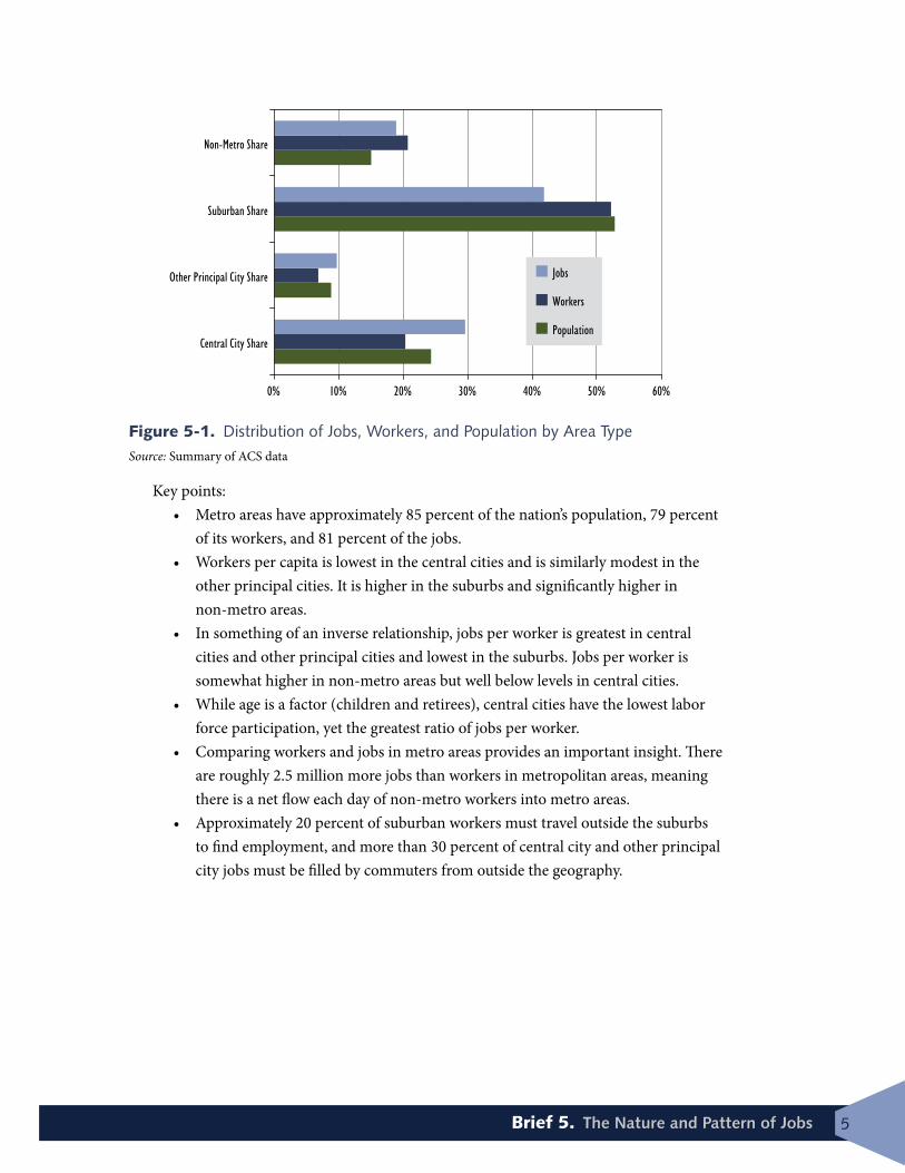
Table 5-1 provides a national-level summary for 2010 for population and the associated worker and jobs levels within those geographic categories for metropolitan areas. Figure 5-1 presents the distribution of workers, population, and jobs by area type graphically.
Table 5-1. Geographic Distribution of Population, Workers, and Jobs, 2010
Geography Population WorkersWorkers
per Capita
JobsJobs per
Worker
Metro–Central Cities 75,283,196 27,899,370 0.37 40,536,506 1.45
Metro–Other Principal Cities 24,065,670 9,340,785 0.39 13,267,941 1.42
Metro–Suburbs 163,103,266 71,420,007 0.43 57,306,197 0.80
Metro–All 262,452,132 108,660,162 0.41 111,110,644 1.02
Non-Metro (by Subtraction) 46,293,406 28,280,848 0.61 25,830,366 0.91
Total U.S. 308,745,538 136,941,010 0.44 136,941,010* 1.00
Central City Share 24.3% 20.3% 29.6%
Other Principal City Share 8.8% 6.8% 9.7%
Suburban Share 52.8% 52.2% 41.8%
Non-Metro Share 15.0% 20.7% 18.9%
*For purposes of analysis, total U.S. jobs set to equal workers.
Source: Summary of ACS data
1 Commuting in America 2013, Brief 4, “Population and Worker Dynamics,” Tables 4-7, 4-8, 4-9.
5Brief 5. The Nature and Pattern of Jobs
Figure 5-1. Distribution of Jobs, Workers, and Population by Area Type Source: Summary of ACS data
Key points:• Metro areas have approximately 85 percent of the nation’s population, 79 percent
of its workers, and 81 percent of the jobs.• Workers per capita is lowest in the central cities and is similarly modest in the
other principal cities. It is higher in the suburbs and significantly higher in non-metro areas.
• In something of an inverse relationship, jobs per worker is greatest in central cities and other principal cities and lowest in the suburbs. Jobs per worker is somewhat higher in non-metro areas but well below levels in central cities.
• While age is a factor (children and retirees), central cities have the lowest labor force participation, yet the greatest ratio of jobs per worker.
• Comparing workers and jobs in metro areas provides an important insight. There are roughly 2.5 million more jobs than workers in metropolitan areas, meaning there is a net flow each day of non-metro workers into metro areas.
• Approximately 20 percent of suburban workers must travel outside the suburbs to find employment, and more than 30 percent of central city and other principal city jobs must be filled by commuters from outside the geography.
0% 10% 20% 30% 40% 50% 60%
Central City Share
Other Principal City Share
Suburban Share
Non-Metro Share
Jobs
Workers
Population

6 Commuting in America 2013: The National Report on Commuting Patterns and Trends
Table 5-2 itemizes population, workers, and jobs by Metro area size for all Metropoli-tan Statistical Areas (MSAs) and Consolidated Statistical Areas (CSAs) of over one million population. This encompasses 130 MSAs, with some CSAs, such as New York, comprising up to seven separate MSAs. The far right-hand column in this table summarizes “surplus jobs,” which is the difference between total MSA workers and total MSA jobs. A positive surplus jobs number means that workers from surrounding areas travel to the respective MSA to fill the available positions. Of the 54 CSAs included in the Table 5-2, all but 11 import workers.
Table 5-3 itemizes population, workers, and jobs for the central cities within the respective CSAs. As defined for the purposes of this series of briefs, each MSA has one—and only one—central city, representing the Prin-cipal City with the largest population. CSAs are shown in italics in the tables.
Core cities remain relatively worker-poor and job-rich, relying on suburbs and, to some extent, non-metro areas to provide workers.

7Brief 5. The Nature and Pattern of Jobs
Table 5-2. Population, Workers, and Jobs by Metro Area Size, 2010
Source: Cambridge Systematics, summary of ACS data
CSA/MSA NameNumber of MSAs
Population Size Group
MSA Population
(2010)
Total MSA Workers (2010)
Total MSA Jobs (2010)
Surplus Jobs in
MSA (2010) New York CSA 7 Over 5M 22,886,737 9,672,282 9,657,479 (14,803)Los Angeles-Riverside CSA 3 Over 5M 17,877,006 6,968,876 7,036,843 67,967 Chicago CSA 3 Over 5M 9,686,021 4,159,124 4,244,251 85,127 Washington-Baltimore CSA 6 Over 5M 8,981,561 4,103,105 4,246,093 142,988 San Francisco-San Jose CSA 7 Over 5M 8,153,696 3,371,058 3,463,350 92,292 Boston-Providence CSA 5 Over 5M 7,686,843 3,746,882 3,761,760 14,878 Philadelphia CSA 6 Over 5M 7,067,807 3,082,013 3,033,987 (48,026)Dallas CSA 2 Over 5M 6,547,091 2,836,239 2,925,743 89,504 Miami CSA 3 Over 5M 6,126,770 2,279,074 2,277,159 (1,915)Houston-The Woodlands-Sugar Land, TX 1 Over 5M 5,920,416 2,457,177 2,528,846 71,669 Atlanta CSA 3 Over 5M 5,658,953 2,266,993 2,355,493 88,500 Detroit CSA 4 Over 5M 5,218,852 2,005,783 2,003,676 (2,107)Phoenix-Mesa-Scottsdale, AZ 1 2.5–5M 4,192,887 1,622,185 1,661,476 39,291 Seattle CSA 4 2.5–5M 4,060,107 1,730,685 1,803,498 72,813 Minneapolis CSA 2 2.5–5M 3,537,952 1,735,516 1,788,768 53,252 Cleveland-Akron CSA 3 2.5–5M 3,184,862 1,362,394 1,414,028 51,634 San Diego-Carlsbad, CA 1 2.5–5M 3,095,313 1,253,748 1,230,279 (23,469)Denver CSA 3 2.5–5M 3,090,874 1,392,312 1,435,097 42,785 Portland-Salem CSA 5 2.5–5M 2,921,408 1,225,938 1,227,612 1,674 Orlando-Daytona CSA 3 2.5–5M 2,818,120 1,138,371 1,169,678 31,307 St. Louis, MO-IL 1 2.5–5M 2,787,701 1,228,715 1,256,692 27,977 Tampa-St. Petersburg-Clearwater, FL 1 2.5–5M 2,783,243 1,066,064 1,046,561 (19,503)Pittsburgh CSA 2 1–2.5M 2,480,739 1,115,507 1,134,900 19,393 Sacramento CSA 2 1–2.5M 2,316,019 893,921 880,252 (13,669)Kansas City CSA 3 1–2.5M 2,247,497 1,014,911 1,034,639 19,728 Charlotte-Concord-Gastonia, NC-SC 1 1–2.5M 2,217,012 888,779 910,853 22,074 Salt Lake City CSA 3 1–2.5M 2,211,842 909,632 931,095 21,463 Las Vegas CSA 2 1–2.5M 2,151,455 852,167 857,108 4,941 San Antonio-New Braunfels, TX 1 1–2.5M 2,142,508 835,629 801,317 (34,312)Cincinnati, OH-KY-IN 1 1–2.5M 2,114,580 931,060 941,995 10,935 Indianapolis-Muncie CSA 3 1–2.5M 2,082,342 911,722 988,169 76,447 Columbus, OH 1 1–2.5M 1,901,974 827,727 877,731 50,004 Milwaukee CSA 2 1–2.5M 1,751,316 811,299 864,872 53,573 Austin-Round Rock, TX 1 1–2.5M 1,716,289 753,790 800,514 46,724 Virginia Beach-Norfolk-Newport News, VA-NC 1 1–2.5M 1,676,822 676,349 674,008 (2,341)Nashville-Davidson—Murfreesboro—Franklin, TN 1 1–2.5M 1,670,890 712,750 767,209 54,459 Raleigh-Durham CSA 2 1–2.5M 1,634,847 709,566 812,046 102,480 Greensboro-Winston-Salem CSA 3 1–2.5M 1,515,527 615,083 628,035 12,952 Hartford-New London CSA 2 1–2.5M 1,486,436 663,581 719,182 55,601 Louisville CSA 2 1–2.5M 1,384,046 599,192 617,510 18,318 Jacksonville, FL 1 1–2.5M 1,345,596 569,775 653,161 83,386 Memphis, TN-MS-AR 1 1–2.5M 1,324,829 543,898 570,953 27,055 New Orleans CSA 2 1–2.5M 1,310,963 507,643 540,521 32,878 Oklahoma City, OK 1 1–2.5M 1,252,987 515,376 546,958 31,582 Harrisburg-York CSA 4 1–2.5M 1,219,422 564,795 563,204 (1,591)Richmond, VA 1 1–2.5M 1,208,101 546,349 561,928 15,579 Grand Rapids CSA 2 1–2.5M 1,161,126 475,217 506,137 30,920 Greenville-Spartanburg CSA 2 1–2.5M 1,137,380 453,015 466,390 13,375 Buffalo-Cheektowaga-Niagara Falls, NY 1 1–2.5M 1,135,509 519,051 542,353 23,302 Birmingham-Hoover, AL 1 1–2.5M 1,128,047 452,892 477,549 24,657 Fresno CSA 2 1–2.5M 1,081,315 368,395 361,801 (6,594)Rochester, NY 1 1–2.5M 1,079,671 479,388 494,018 14,630 Albuquerque-Santa Fe CSA 2 1–2.5M 1,031,247 406,137 421,520 15,383 El Paso CSA 2 1–2.5M 1,013,356 369,045 383,861 14,816 Total 130 195,415,910 82,198,175 83,900,158 1,701,983

8 Commuting in America 2013: The National Report on Commuting Patterns and Trends
Table 5-3. Population, Workers, and Jobs for Central Cities in CSAs, 2010
Source: Cambridge Systematics, summary of ACS data
Central City Name(s)
Cen
tral
Cit
y Po
pula
tion
(20
10)
Perc
ent
of T
otal
M
Sa P
opul
atio
n
Wor
kers
Liv
ing
in
Cen
tral
Cit
y (2
010)
Perc
ent
of T
otal
M
Sa W
orke
rs
Cen
tral
Cit
y Jo
bs
(201
0)
Perc
ent
of T
otal
M
Sa J
obs
Surp
lus
Jobs
in
Cen
tral
Cit
ies
(201
0)
New York, Stamford, New Haven, Allentown, Ewing, Kingston, East Stroudsburg 8,615,027 37.6% 3,341,374 34.5% 3,786,427 39.2% 445,053
Los Angeles, Riverside, Thousand Oaks 4,223,175 23.6% 1,596,411 22.9% 1,794,718 25.5% 198,307 Chicago, Kankakee, Michigan City 2,754,614 28.4% 1,077,989 25.9% 1,280,290 30.2% 202,301 Washington, Baltimore, Hagerstown, Chambersburg, Winchester, Lexington Park 1,320,443 14.7% 549,721 13.4% 1,022,843 24.1% 473,122
San Francisco, San Jose, Stockton, Santa Rosa, Vallejo, Santa Cruz, Napa 2,463,502 30.2% 965,331 28.6% 1,141,901 33.0% 176,570
Boston, Providence, Worchester, Manchester, Barnstable 1,131,439 14.7% 377,723 10.1% 852,587 22.7% 474,864 Philadelphia, Reading, Atlantic City, Dover, Vineland, Ocean City 1,762,118 24.9% 618,383 20.1% 766,485 25.3% 148,102
Dallas, Sherman 1,236,337 18.9% 509,923 18.0% 802,791 27.4% 292,868 Miami, Port St. Lucie, Vero Beach 579,280 9.5% 184,690 8.1% 285,191 12.5% 100,501 Houston 2,099,451 35.5% 799,308 32.5% 1,437,414 56.8% 638,106 Atlanta, Athens-Clark County, Gainesville 569,259 10.1% 209,690 9.2% 458,446 19.5% 248,756 Detroit, Flint, Ann Arbor, Monroe 950,878 18.2% 258,108 12.9% 400,238 20.0% 142,130 Phoenix 1,445,632 34.5% 550,026 33.9% 802,516 48.3% 252,490 Seattle, Olympia, Bremerton, Mount Vernon 724,610 17.8% 337,076 19.5% 579,115 32.1% 242,039 Minneapolis, St. Cloud 448,420 12.7% 193,906 11.2% 328,494 18.4% 134,588 Cleveland, Akron, Canton 668,932 21.0% 249,921 18.3% 411,401 29.1% 161,480 San Diego 1,307,402 42.2% 550,528 43.9% 693,107 56.3% 142,579 Denver, Boulder, Greeley 790,432 25.6% 319,058 22.9% 511,534 35.6% 192,476 Portland, Salem, Albany, Longview, Corvallis 879,681 30.1% 365,720 29.8% 512,613 41.8% 146,893 Orlando, Daytona Beach, The Villages 350,747 12.4% 120,003 10.5% 270,410 23.1% 150,407 St. Louis 319,294 11.5% 132,307 10.8% 231,227 18.4% 98,920 Tampa 335,709 12.1% 128,901 12.1% 274,327 26.2% 145,426 Pittsburgh, Steubenville 324,363 13.1% 133,413 12.0% 288,223 25.4% 154,810 Sacramento, Yuba City 531,413 22.9% 174,172 19.5% 289,185 32.9% 115,013 Kansas City, St. Joseph, Lawrence 624,210 27.8% 258,425 25.5% 350,284 33.9% 91,859 Charlotte 731,424 33.0% 248,805 28.0% 390,126 42.8% 141,321 Salt Lake City, Ogden, Provo 381,753 17.3% 145,877 16.0% 329,727 35.4% 183,850 Paradise, Lake Havasu City 275,694 12.8% 108,900 12.8% 347,871 40.6% 238,971 San Antonio 1,327,407 62.0% 518,071 62.0% 606,820 75.7% 88,749 Cincinnati 296,943 14.0% 118,190 12.7% 218,461 23.2% 100,271 Indianapolis, Muncie, Columbus 934,591 44.9% 389,599 42.7% 592,199 59.9% 202,600 Columbus 787,033 41.4% 289,343 35.0% 439,763 50.1% 150,420 Milwaukee, Racine 673,693 38.5% 265,422 32.7% 311,088 36.0% 45,666 Austin 790,390 46.1% 327,212 43.4% 534,717 66.8% 207,505 Virginia Beach 437,994 26.1% 189,210 28.0% 165,447 24.5% (23,763)Nashville-Davidson 601,222 36.0% 264,462 37.1% 389,861 50.8% 125,399 Raleigh, Durham 632,222 38.7% 207,756 29.3% 418,833 51.6% 211,077 Greensboro, Winston-Salem, Burlington 549,246 36.2% 189,779 30.9% 331,061 52.7% 141,282 Hatford, Norwich 165,268 11.1% 60,325 9.1% 133,669 18.6% 73,344 Louisville-Jefferson County, Elizabethtown 625,868 45.2% 105,453 17.6% 207,396 33.6% 101,943 Jacksonville 821,784 61.1% 366,524 64.3% 489,372 74.9% 122,848 Memphis 646,889 48.8% 228,462 42.0% 335,945 58.8% 107,483 New Orleans, Hammond 363,848 27.8% 127,131 25.0% 176,817 32.7% 49,686 Oklahoma City 579,999 46.3% 237,779 46.1% 349,098 63.8% 111,319 Harrisburg, York, Lebanon, Gettysburg 126,343 10.4% 50,704 9.0% 97,838 17.4% 47,134 Richmond 204,214 16.9% 83,068 15.2% 143,937 25.6% 60,869 Grand Rapids, Muskegon 226,441 19.5% 82,865 17.4% 135,525 26.8% 52,660 Greenville, Spartanburg 95,422 8.4% 35,825 7.9% 89,437 19.2% 53,612 Buffalo 261,310 23.0% 98,702 19.0% 147,040 27.1% 48,338 Birmingham 212,237 18.8% 78,103 17.2% 162,688 34.1% 84,585 Fresno, Madera 556,081 51.4% 166,241 45.1% 192,990 53.3% 26,749 Rochester 210,565 19.5% 80,937 16.9% 150,255 30.4% 69,318 Albuquerque, Santa Fe 613,799 59.5% 229,502 56.5% 324,821 77.1% 95,319 El Paso, Las Cruces 746,739 73.7% 275,214 74.6% 328,112 85.5% 52,898
51,332,787 26.3% 19,571,568 23.8% 28,112,681 33.5% 8,541,113

9Brief 5. The Nature and Pattern of Jobs
All but one of the CSAs (Virginia Beach) has a surplus of central city jobs. The average surplus is 30 percent, indicating that at least 1/3 of central city jobs are filled by workers from outlying areas. In actuality, as some city residents work in outlying areas, the share of city jobs filled by workers from outlying areas is higher. An understanding of these geo-graphic flows of commuters is presented in Brief 15.
Today’s complex and dynamic urban form, at a minimum, makes it challenging to fully understand what’s going on in terms of job location trends when relying on the traditional Metro area classifications. The geographic pattern of job growth trends cannot be described meaningfully at the national level. One reason is that jurisdictional boundaries change over time; another is that the growth and development of employment and activity nodes beyond traditional central cities result in changing geographies for MSAs. In the absence of an ability to quantify relative trends in the orientation of job locations and change, this brief defaults to using descriptive trend data at the county level. County boundaries remain fixed, and data are available to quantify employment growth trends at the county level.
The following maps are used to communicate conditions and trends as they relate to jobs and workers. These maps are based on census-produced estimates of daytime pop-ulation. The 2000 data are based on the 2000 census long-form information on work trip commuting. The 2010 estimates are based on 2006–2010 American Community Survey five-year estimates of commuting flows applied to 2010 demographic estimates to derive estimates of 2010 daytime population.
Figure 5-2 presents the change in daytime population due to commuting for 2000. This change represents the net effect on the reference county’s population associated with workers being assigned to their county of employment for enumeration. Expressed as a percent, positive numbers indicate a net inflow of workers to the county.
As indicated by the blue- and green-shaded counties, the vast majority of counties have lower daytime population, and their workers commute to generally urban jobs in adjacent counties. Yellow, orange, and red-shaded counties are net importers of workers. In 2000, approximately 2/3 of counties had lower daytime population due to commuters leaving the county.

10 Commuting in America 2013: The National Report on Commuting Patterns and Trends
Figure 5-2. Daytime Population Change Due to Commuting, 2000Source: Census
Figure 5-3 is this same map for estimated 2010 conditions. Due to the lack of a long-form 2010 census, 2006–2010 American Community Survey commuting flow data were applied to 2010 demographics.
Figure 5-3 is similar to Figure 5-2, but shows a slight increase in the number of counties that are net importers of workers—887 in 2000 and 931 in 2010.

11Brief 5. The Nature and Pattern of Jobs
Figure 5-3. Daytime Population Due to Commuting, 2010Source: Census
Figure 5-4 is a county map of the percent of workers who lived and worked in the same county based on 2000 census data. Higher shares indicate counties whose eco-nomic activities are more self-contained, with residents providing a higher share of the workforce.
A number of considerations, including the geograph-ic size of the county and its proximity to adjacent employment and labor force resources, influence the extent to which there is mobility in the workforce between adjacent coun-ties. In Figure 5-4, counties shaded in the blue are least autonomous in terms of residents living and working in the same county. These counties tend to be located in areas that have physically smaller counties near or in large metropolitan areas. At the other end of the spectrum, those counties shaded red have the vast majority of their workers working in the same county. This tends to reflect areas that are economically self-contained, with workers
Approximately 2/3 of counties have lower daytime population as workers commute to adjacent counties.

12 Commuting in America 2013: The National Report on Commuting Patterns and Trends
and jobs resident in the same county and areas where there may not be adjacent employ-ment opportunities. Counties shaded orange and red may also be importing workers from adjacent counties in addition to retaining their own workers. For example, residents in Mi-ami-Dade County in Southeast Florida tend to work in their home county, with geographic constraints on their ability to find nearby employment, but it also imports workers from adjacent counties.
Figure 5-4. Percent of Workers Who Lived and Worked in the Same County, 2000Source: Census
Figure 5-5 is a companion map with the same information estimated for 2010 based on 2006–2010 American Community Survey data on commuting flows.
Data on the percent of population who live and work in the same county for 2010 indi-cate that the counties were more interdependent in 2010—that is, fewer counties had high levels of population living and working in the same county, and more counties had a lower

13Brief 5. The Nature and Pattern of Jobs
percent of the population living and working in the same county. There are 661 counties that have 50 percent or less of the population who live and work in the same county, indi-cating that “bedroom” suburban counties are still plentiful.
Figure 5-5. Percent of Workers Who Lived and Worked in the Same County, 2010Source: Census
Figure 5-6 is a county map of the net flow of workers to or from the respective coun-ty for 2010. Positive numbers indicate the net percent of workers coming into the county relative to the workers working in the county. A negative number indicates an outflow of workers.

14 Commuting in America 2013: The National Report on Commuting Patterns and Trends
Figure 5-6. Net Flow of Workers to or from the Respective County, 2010Source: Census
Counties with blue, green, and yellow shading export workers to adjacent counties, some of which are typically net importers of workers and shaded orange or red. One third of counties are net importers of workers. Rural counties that have a major employment site can also be significant importers of workers from low-density surrounding areas.
Figure 5-7 is a county map that displays the ratio of job growth to population growth between 2000 and 2010 as a percent. The counties are further categorized by whether or not there is job and population growth. Blue shading indicates counties with declining jobs. Green shading indicates counties that had job growth but declining population; this may be locations where natural resources or other conditions have created jobs, but the area’s attractiveness has not resulted in natural growth or migration offsetting deaths in the population. Yellow shading indicates jobs growing slightly more quickly than population up to a 2 percent job/population growth ratio; these are emerging employment areas where

15Brief 5. The Nature and Pattern of Jobs
population growth may not have kept pace with job growth. Orange and red shading indi-cate areas with dramatically more job growth than population growth; these may be unique situations, such as exploration for natural resources or a major new factory/facility in a small market that creates large percentage increases in employment relative to short-term population growth.
Figure 5-7. Ratio of Job Growth to Population Growth, 2000–2010Source: Census
Figure 5-8 is a similar map that shows the ratio of job growth to worker growth (as opposed to population growth in Figure 5-7) for the same 2000–2010 period. The coun-ties are further categorized by whether or not there is job growth. Blue shading indicates counties with declining jobs. Green shading indicates counties with job growth but declin-ing resident workers. Yellow shading indicates jobs growing relatively more quickly than resident worker growth up to a 50 percent job/worker growth ratio; these are emerging

16 Commuting in America 2013: The National Report on Commuting Patterns and Trends
employment areas where resident worker growth may not have kept pace with job growth. Orange and red shading indicate areas with dramatically more job growth than worker growth; these may be unique situations, such as exploration for natural resources or major new factories/facilities in a small market that creates large percentage increases in employ-ment relative to resident worker growth.
Figure 5-8 is similar to Figure 5-7. More than 1/3 of counties had no job growth in the decade. In approximately half of the counties, jobs grew faster than workers, indicat-ing that these counties would need to draw workforce from adjacent counties and or may be attracting population in the future based on job prospects. A handful of counties had dramatically faster growth in jobs than workers, indicating unique circumstances where job growth outpaced worker growth.
Figure 5-8. Ratio of Job Growth to Worker Growth, 2010Source: Census
Approximately 1/3 of counties had no job growth between 2000 and 2010.

17Brief 5. The Nature and Pattern of Jobs
Job DynamicsWhile net changes in employment and workers in a given geography are relatively modest due to the fixed location of housing and employment infrastructure, the actual opportunity for changes in commuting flows is impacted by the dynamics of employment and residen-tial location turnover. Figure 5-9 illustrates the significant opportunity for redistribution of the workforce based on the pace of changes in employment. The graphic presents gross job gains, consisting of new business formations (openings) and companies expanding their workforce, and gross job losses, consisting of companies going out of business (clos-ings) or simply contracting. The key point in the figure is how much activity goes on that is masked by the relatively small net changes in jobs. In the relatively stable period before the recession, the typical quarterly pattern was a gross change on the order of roughly 7.5 million job losses and a similar level of gains each quarter. The gross impact could be as much as 10 percent of the total job complement. In addition, there is additional turnover of employment within stable firms and turnover in housing locations independent of employ-ment conditions. Collectively, these dynamics create significant opportunity for changes in the home-to-work commute patterns. The reality, however, is that these patterns remain relatively stable over time. Understanding the dynamics in employment is relevant to the extent that it signals the presence of an opportunity for more dramatic commute pattern changes if, for example, a dramatic increase in travel costs ($10/gallon for gasoline) resulted in stronger motivations to leverage workforce dynamics to minimize commute travel by having commuting consequences play a more important part of job location and housing location decisions.
Figure 5-9. Business Job Gains and Losses in Fourth Quarter by Year, 2002–2012Source: Business Employment Dynamics, Bureau of Labor Statistics, based on 4th quarter statistics in each
annual period.
-4,000
-2,000
0
2,000
4,000
6,000
8,000
10,000
2002 2003 2004 2005 2006 2007 2008 2009 2010 2011 2012
Thou
sand
s
net change
gross gains
expanded
opening
gross losses
contracted
closed

18 Commuting in America 2013: The National Report on Commuting Patterns and Trends
SummaryData availability and changing urban geographies complicate consistent analysis of trends in workers and jobs. Available data do allow analysis by metropolitan area classification and by county. The fundamental, now centuries-old, tradition of employment being clustered in activity centers with residents and workers more dispersed and commuting to these activ-ity centers remains intact. Core cities remain relatively job-rich and worker-poor. Suburbs remain a significant source of workers, and rural areas have high labor force participation, with some of those workers commuting to metropolitan areas. Core cities are not the only concentration of employment, as additional principal cities have become employment activity centers, perhaps transitioning from more traditional suburbs into emerging em-ployment nodes.
The dynamics of employment, with its obvious implications to commuting, become clear when recognizing that approximately 1/3 of counties in the U.S. had declining employ-ment from 2000–2010. The dynamics of urban growth and development are compounded by broader demographic and economic trends that are resulting in employment and popu-lation changes. Some of these include the historical trends in migration to the South; oth-ers, such as the surge in employment in North Dakota resulting from energy exploration, are more context-specific. These macro trends, coupled with the firm-level employment dynamics of growth and decline of individual companies and job turnover within employ-ers, results in significant opportunities for changes in commute patterns. However, overall commuting patterns have shown only modest change over time. The long-established inventory of housing and employment site assets and the relative consistency in the home and work location choice preferences of individuals have mitigated against rapid change in commuting patterns.

1. Overview—establishes institutional context, objectives, importance, data sources, and products to be produced.
2. The Role of Commuting in Overall Travel—presents national trend data on the relative role of commuting in overall person travel; explores commuting as a share of trips, miles of travel, and travel time at the national level.
3. Population and Worker Trends—provides very basic and key national demographic data.4. Population and Worker Dynamics—focuses on the dynamics of the population and work-
force, including data on migration, immigration, and differential rates of growth.
5. The Nature and Pattern of Jobs—defines employment and describes it in terms of its temporal, geographic, and other features.
6. Job Dynamics—looks at trends as they relate to jobs, including work at home, full-time versus part-time, job mobility, and changes in the nature and distribution of job types.
7. Vehicle and Transit Availability—reports on vehicle ownership and licensure levels and the availability of transit services. It also references factors influencing the availability of bike, walk, and carpool commute options.
8. Consumer Spending on Transportation—reports on various trends related to household spending on transportation.
9. How Commuting Influences Travel—explores how commuting travel influences overall travel trends temporally and geographically.
10. Commuting Mode Choice—provides a summary of mode choice for commuting (including work at home).
11. Commuting Departure Time and Trip Time—reports descriptive information on travel time and time left home, including national and selected additional data for metro area sizes.
12. Auto Commuting—addresses trends in privately-owned vehicle (POV) and shared-ride commuting.
13. Transit Commuting—addresses transit commuting.14. Bicycling and Walking Commuting—addresses bicycling and walking as commuting modes.15. Commuting Flow Patterns—addresses commuting flow patterns for metro area geographic
classifications.
16. The Evolving Role of Commuting—synthesizes and interprets materials developed in the prior briefs to paint a picture of the current role of commuting in overall travel and evolving trends to watch going forward.
ES. CIA 2013 Executive Summary
Commuting in America 2013 Briefs Series The CIA 2013 series will include the briefs listed below as well as a CIA 2013 Executive Summary and supporting data files, all available at the CIA 2013 website traveltrends.transportation.org. The website also includes a glossary of terms, documentation of data sources, and additional resources. The series of briefs included in CIA 2013 are:

Pub Code: CA05-4 ISBN: 978-1-56051-575-3
American Association of State Highway and Transportation Officials444 North Capitol Street, N.W.; Suite 249
Washington, DC 20001
www.transportation.orgctpp.transportation.org
traveltrends.transportation.org