branded app theme guide - guidebook · branded app theme guide theme details for branded ... these...
TRANSCRIPT

Branded App Theme GuideTheme details for branded apps.

(650) 319-7233 | [email protected] 01
We’ve outlined the specific design elements we will
need to create your app. While this document shows the
iPhone view of an app, we use the same elements to design
for the iPad and Android versions of your app (which will
have a different layout to conform to screensize and
hardware specs).
Thank you for choosing Guidebook!
We’re excited to work with you to create a great app.
On the next page is a checklist of items you’ll need to
submit to us so we can get started building your app. You
can find detailed specifications about each item on the
following pages. If you have any questions, let us know and
we would be happy to assist you!
App submission notes:
It is important that you finalize these elements prior to app store submission.
lf you need to change any elements while the app is awaiting approval, we will need to cancel the submission and reset the process (4-5 weeks from when you inform us of the change).
Once your app is live, updates to any of the specificationson this checklist can take 2-3 weeks to appear in all stores.
For more information, please see page 12.

02(650) 319-7233 | [email protected]
Optional: Background color (hex color code)
For private standalone apps: Passphrase
Splash screen logo (.AI or .EPS format; 1500w x 900h px)01 Splash screen
Icon (Square-aspect; .AI or .EPS format; 1024w x 1024h px)
App store promotion image (JPEG or 24-bit PNG, 1920w x 1186h px)
Short Name (11 characters max, including spaces)
Long name (30 characters max, including spaces)
Preview description (50 characters max)
Full description (3,000 characters max)
Product feature bullets (3 to 5 points)
Keywords (up to 10 words, 100 characters total)
Optional: Specific screenshots
05 App store listing
02 Homepage For multiguide apps only: Logo for the homepage (.AI or .EPS format; 440w x 148h px)
Background color (hex color code)
Optional: Divider color (hex color code)
Optional: Button color (hex color code)
03 Navigation header bar
Optional: Drawer background color (hex color code)04 Navigational
drawerChoose cover photo overlay theme (light or dark)
Standalone apps only: Navigation bar logo (.AI or .EPS format, 440w x 148h px)

03(650) 319-7233 | [email protected]
01 Splash screen
This is the screen which appears as the app is loading, usually for 2-5 seconds.
iOS & Android
Background color (hex color code, e.g. #731A1A). If no color is given, we will default to white.
Logo for splash screen.
The logo should be horizontal. It will usually match your navigation bar logo.
Images with transparent backgrounds look best.
Format: .AI/.EPS (vector)
We will scale to fit all device screens.
The maximum ratio is 27w, 27h.
Ideal size: 1500w x 900h px
Standalone app
You have the option of using a passphrase-protected log-in screen before anyone can view your guide contents.
If you would like to use this option, please provide a passphrase.
Multiguide app
Guide privacy is done on a per-guide basis, and you can assign each guide their own passphrase through the Guidebook Builder.

04(650) 319-7233 | [email protected]
02 Homepage(For multiguide apps only)
This is the screen that appears directly after the splash page. From here you can search for and download individual guides.
iOS & Android
Logo
This asset is only needed for multiguide apps (apps with more than one guide included).
Dimensions: 440w x 148h px for Android and iOS
Format: .AI/.EPS (vector)
Multiguide app homepage logo
05(650) 319-7233 | [email protected]
03 Navigation header bar
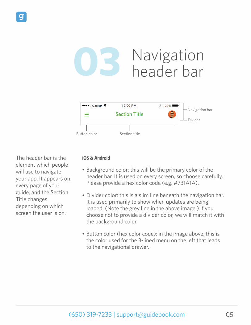
The header bar is the element which people will use to navigate your app. It appears on every page of your guide, and the Section Title changes depending on which screen the user is on.
iOS & Android
Background color: this will be the primary color of the header bar. It is used on every screen, so choose carefully. Please provide a hex color code (e.g. #731A1A).
Divider color: this is a slim line beneath the navigation bar. It is used primarily to show when updates are being loaded. (Note the grey line in the above image.) If you choose not to provide a divider color, we will match it with the background color.
Button color (hex color code): in the image above, this is the color used for the 3-lined menu on the left that leads to the navigational drawer.
Button color Section title
Navigation bar
Divider

06(650) 319-7233 | [email protected]
04 Navigational drawer
The navigational drawer appears when you tap the navigation bar. It is used to display all of the different modules in your guide.
iOS & Android
In Standalone apps only, this logo will appear at the top left of the screen when users click open the drawer. Please submit as 440w x 148h px in .AI or .EPS vector format.
The background color of the drawer defaults to white. If you prefer a different color, please provide the background color hex code.
The drawer header background (where your guide information is displayed) uses the cover photo you upload and applies a blurred overlay. You may choose either a light or dark theme for the overlay.
Note: the icon (the square image in the left side of the header bar), text, and details that appear here are all set within the Guidebook Builder, via the Edit Details section.

07(650) 319-7233 | [email protected]
05 App icon
This is the icon which represents your app on the home screen of a user’s phone.
iOS & Android
Square-aspect icon
.AI/.EPS format (vector).
Your icon should include background color, or specify a background color (in hex color code format) that you would like us to use.
Do not round corners.
Ideal size: 1024w x 1024h px
08(650) 319-7233 | [email protected]
06 App store listing
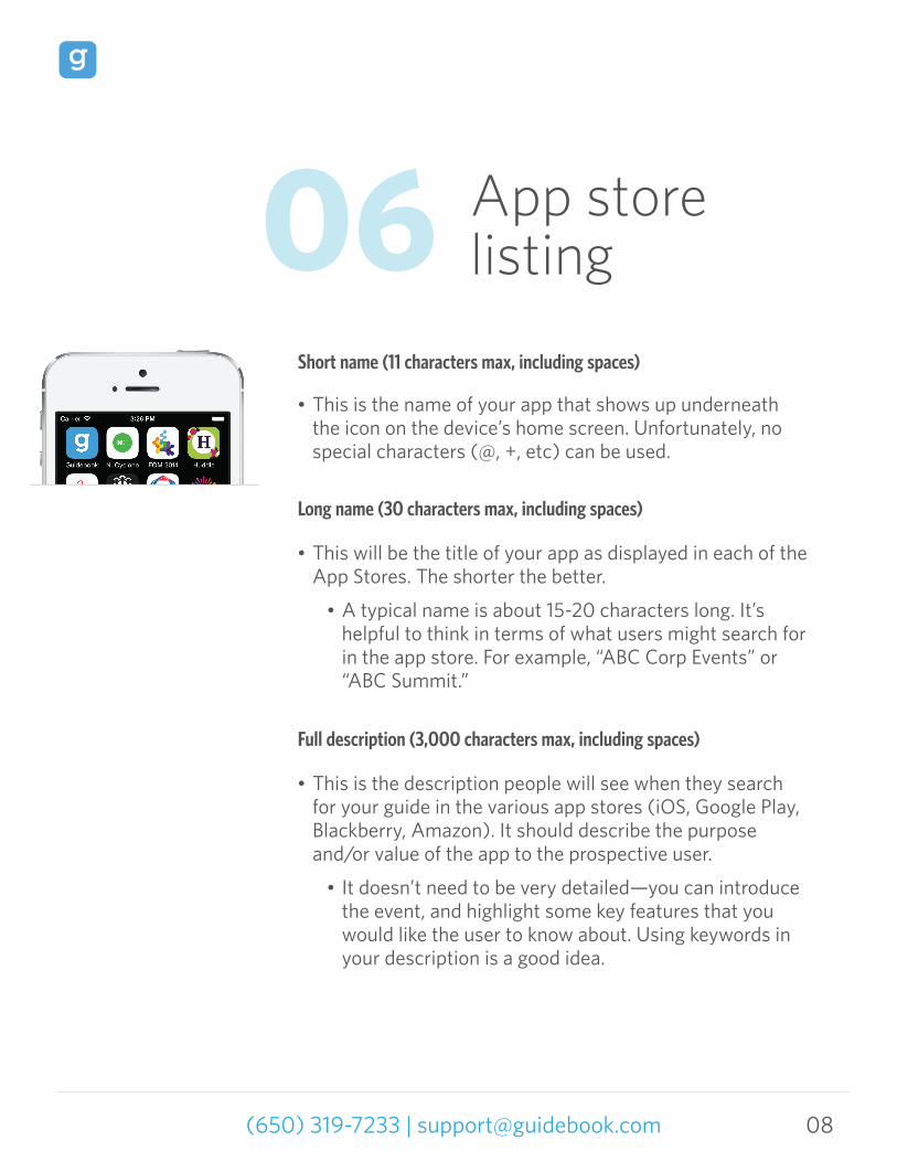
Short name (11 characters max, including spaces)
This is the name of your app that shows up underneath the icon on the device’s home screen. Unfortunately, no special characters (@, +, etc) can be used.
Long name (30 characters max, including spaces)
This will be the title of your app as displayed in each of the App Stores. The shorter the better.
A typical name is about 15-20 characters long. It’s helpful to think in terms of what users might search for in the app store. For example, “ABC Corp Events” or “ABC Summit.”
Full description (3,000 characters max, including spaces)
This is the description people will see when they search for your guide in the various app stores (iOS, Google Play, Blackberry, Amazon). It should describe the purpose and/or value of the app to the prospective user.
It doesn’t need to be very detailed—you can introduce the event, and highlight some key features that you would like the user to know about. Using keywords in your description is a good idea.

09(650) 319-7233 | [email protected]
Preview description (50 characters max, including spaces)
In addition to the Full Description above, the Amazon, Google Play, and Blackberry app stores require a shorter app description. This serves as a preview to users viewing your app in the app stores. After seeing this they can click for more information.
A preview description is very brief, e.g. This is the official app for XYZ’s Events.
Full description
Long name

10(650) 319-7233 | [email protected]
07 App store
Product feature bullets (3 to 5 points)
These bullet points are displayed in the Amazon App Store under the heading “Product Features.” The following are some commonly used examples:
Keywords (up to 10 words, 100 characters max)
Pick up to ten words that you think people will most likely use to look for your app. This is for search purposes.
Example: XYZ Meetings, XYZ Events, YourCompanyName, YourIndustry
Note: Google Play does not use the submitted keywords; instead, it has its own algorithms for determining keywords relevant to the app. To ensure that your app ranks as highly as possible, please use the keywords in your app description.
The words in total, including commas and spaces, cannot exceed 100 characters.
Easy access to full schedule of events.
Lists and descriptions of speakers and exhibitors
Integration with Twitter, Facebook, YouTube
My Schedule and To-Do List

11(650) 319-7233 | [email protected]
App store promotion image
This image is used for promotion in the Google, Amazon, and Blackberry app stores. You can use your company logo or any other representative image.
Size: 1920w x 1186h px
Format: JPEG or 24-bit PNG (no alpha)
App store promotion image

12(650) 319-7233 | [email protected]
Guide information In order to submit your newly created app to the app
stores, there must be content inside the app. Guide content
is added in through Guidebook Builder—our content
management system. We also use the guide content to
take screenshots of your app that appear in the app stores
for users to reference.
Standalone apps have only one guide each (and this guide
must be published at the time of submission). Note that the
Standalone guide at the time of submission will be visible
for a few moments when users first download the app,
while the updates you have added in after submission are
loaded. Enterprise apps must have at least one published
guide included in it during the time of submission.
Guidebuilding and app building are parallel processes.
You can start creating your guide as soon as the contract is
in place.
Screenshots We are required to submit a minimum of three screenshots
of your app to each app store. By default, our system takes
screenshots of your navigation screen, the schedule, maps,
08 Additional information
and exhibitors. If you wish to specify which screens you want to
appear in the app store (ex. due to privacy reasons you want to
show only the splash screen; for design you want a particular
module shown), please let your guidebuilding expert know.

We are required to submit a minimum of three screenshots
of your app to each app store. By default, our system takes
screenshots of your navigation screen, the schedule, maps,
13(650) 319-7233 | [email protected]
and exhibitors. If you wish to specify which screens you want to
appear in the app store (ex. due to privacy reasons you want to
show only the splash screen; for design you want a particular
module shown), please let your guidebuilding expert know.
Making changes to the app branding specs
If you need to make any changes to the branding
specifications after the app is live, please inform your
guidebuilding expert. You can change any of the elements on
page 2. Changing any branding specifications can take up to
2-3 weeks to go live. If it is a design change and mock-ups are
required, or if the changes are sent in the wrong format, it
may take significantly longer.
Custom Icons (Optional)
Custom icons can be used for all Enterprise or Standalone
apps. We recommend using lighter colors that will work well
on both a white and dark grey background. Event icons
typically include the following:
General info/About
Calendar
My schedule
Directory
Maps
To-do list
Feedback
Custom lists
Social media
Exhibitors
The best icons are those that are simple, clear, and match your color scheme. You must also have rights to use the given icons. We ask for icons to be 180 x 180 px (square) in size and saved as PNG files on transparent backgrounds.

14(650) 319-7233 | [email protected]
Timeline of eventsThe sooner you get these to us, the better! Here’s how it works:
Thank you for choosing Guidebook! We are excited to work with you to make the best possible app for your event.
For any other questions you may have, feel free to take a look at our
support forums, or contact our support team. We’re always happy to help!