brand standards guide - a kid again
TRANSCRIPT

A Kid Again | Brand Standards Guide 1
BrandStandardsGuide
®
Revised: 07/02/2018

INTRODUCTION .............................1
WHAT MAKES A BRAND ...............2
OUR BRAND ..................................3
Protecting our Brand...................................... 4
Our Brand Attributes ...................................... 5
Our Promise ..................................................... 6
Vision, Mission, and Impact ........................... 7
Values .............................................................. 8
OUR TONE .....................................9
Persona & Tone............................................... 10
What to use ..................................................... 11
Glossary, Taglines and Slogans ..................... 12
COMMUNICATING WITH OUR AUDIENCES ..................13
Families and Kids ............................................ 14
Volunteers ....................................................... 16
Donors ............................................................. 18
Staff Members ................................................ 20
Board Members .............................................. 21
OUR SIGNATURE ...........................22
Brand Management ...................................... 23
Our Signature Anatomy ................................ 24
Secondary Signatures .................................... 25
Our Symbol ..................................................... 26
Clear Space .................................................... 27
Minimum Sizes ................................................. 28
Correct Use ..................................................... 30
Incorrect Use ................................................... 31
OUR TYPOGRAPHIC SYSTEM ........32
Primary Font .................................................... 33
Secondary Font .............................................. 34
Suggested Type Sizes ..................................... 35
OUR COLORS ................................36
Full Color Palette ............................................ 37
Core Colors ..................................................... 38
Accent Colors ................................................. 39
OUR STATIONERY SYSTEM ............40
Primary Elements ............................................ 41
Letterhead ...................................................... 42
Envelope ......................................................... 43
Business Card .................................................. 44
Email Signature ............................................... 45
OUR IMAGE SYSTEM .....................46
Photographic Style......................................... 47
Image content ............................................... 49
Lighting ............................................................ 50
Resolution ........................................................ 51
Saturation Levels ............................................ 52
Duotone Images ............................................ 52
Color Overlays ................................................ 53
Creative Cropping ......................................... 54
Focal Point ...................................................... 55
Point of View ................................................... 55
Icons ................................................................ 56
EVENT BRANDING .........................58
A Kid Again Representation ......................... 59
Event Logos ..................................................... 60
CONTACT ................................................... 61
TABLE OF CONTENTS

11
INTRODUCTION
Our brand identity system is merely a symbol for
A Kid Again products, services, people, behavior,
interactions and beliefs. Which is not to say that
visual identifiers are not important or that they don’t
play an implicit role in any organization’s success.
Nevertheless, it is our actions and credibility that will
ultimately define our brand. Successful branding
programs unite employees, build loyalty with
customers and establish an emotional connection
beyond the typical product or service experience.
WHAT MAKES A BRAND
A brand is a collection
of perceptions about a
product, service, experience
or organization in the mind
of the consumer. Perceptions
of A Kid Again are formed
early and at every level of
interaction, from how we
answer the phone to how
a viewer feels the first time
they visit our website.

2OUR BRAND
A Kid Again | Brand Standards Guide 4
PROTECTING OUR BRAND
Proper application of our new brand identity
system to both internal and marketing
communications materials is central to the
success of the new A Kid Again brand. Our
system includes elements which have been
designed to create consistent, relevant and
distinctive representations of our organization,
services, events, and team.
Once our new brand identity system has been
launched, we must protect it from dilution as it
continues to be applied, shared and reproduced.
Protecting our investment in the A Kid Again
identity is an important mission because it
provides several significant events.
• Strengthens the consistency of messages
presented to our audiences
• Creates a focal point for all marketing
communications development
• Prevents mixed messages and signals from
reaching audiences
• Saves money by eliminating redundancies
in communication and printed matter
• Builds equity in our brands by defining
our visual property
Our Brand:
Protecting Our Brand

A Kid Again | Brand Standards Guide 5
OUR BRAND ATTRIBUTES
Brand Attributes are characteristics or qualities
possessed by your brand that establish the grounds
on which benefits are obtained. This is also called
“brand personality” because the attributes used
are easily equated to human traits.
Compassionate
Supportive
Inclusive
Fun-loving
Exuberant
Our Brand:
Our Brand Attributes
Elements of our brand strategy are the
foundation on which brand identity and almost
every conceivable kind of communications
material can be created. They help us clarify
our long-term goals, frame our brand personality
and core values, and articulate the premise
that A Kid Again makes to its constituents.

A Kid Again | Brand Standards Guide 6
BRAND RATIONALE
Families thrust into the situation of having to
care for a child with a life-threatening illness are
unprepared and usually unequipped to deal with
what follows, often feeling they have lost their
hold on the situation and their own lives. A Kid
Again helps to restore a sense of normal for their
child and themselves.
Our Brand:
Our Promise
BRAND PROMISE
A Kid Again strives to make life for families caring
for a child with a life-threatening illness “normal”
again by helping them gain back moments of
positive family shared experiences and memories.

A Kid Again | Brand Standards Guide 7
MISSION
We exist to foster hope, happiness and healing
for children with life threatening illnesses and
their families.
VISION
Every child in America with a life-threatening
illness can be a kid again.
Our Brand:
Vision, Mission, and Impact
IMPACT
We know from research completed by Dr. Cynthia
Gerhardt at Nationwide Children’s Hospital with our
families that A Kid Again:
• Brings joy and happiness to the families with an
experience that would not otherwise be possible.
• Provides an opportunity for parents, who may not
see their child live to adulthood, be as close to a
normal child as possible and be a kid again.
• Provides hope and anticipation for families
racing the ongoing battle with medical care
and special circumstances.
• Encourages parents to give back and
help others.

A Kid Again | Brand Standards Guide 8
TEAMWORK
We are all in. We share, we support,
we encourage, we inspire and
we serve.
FAMILY
We are one family together creating a
caring and supportive community of
families, volunteers, donors and staff.
PLAY
We embrace fun. Our goal is smiles,
laughter, and memories.
KINDNESS
We aspire to be gracious, empathetic
and inclusive in our interactions.
INTEGRITY
We are truthful, transparent, and
accountable to our mission, families
and supporters in all our endeavors.
WHAT WE VALUE
Our Brand:
Values

A Kid Again | Brand Standards Guide 93OUR TONE

A Kid Again | Brand Standards Guide 10
PERSONA
A Kid Again’s Persona is “Exuberant Nurturer.”
Exuberant = Joyful, energetic, positive
Nurturer = Caring, helpful, facilitating
• A Kid Again’s communicating style is warm, easy-going, and informal.
• Use words and phrases that convey emotional warmth.
• It’s okay to use contractions.
• Sentences should be relatively short (1-2 lines).
• Be sure to keep vocabulary at a level that will be understood
by the general population (typically high school level).
TONE
A Kid Again’s Tone is compassionate, supportive, inclusive and
fun-loving. Use words and phrases that convey these characteristics.
Examples are:
Compassionate:
• We know what you’re going through.
• A Kid Again kids warm our heart.
• We feel happy/excited/blessed/understood.
Supportive:
• We’re here for you.
• We’ll do whatever it takes.
• The families had a great time just being together.
Inclusive:
• The whole family is invited.
• Everyone deserves to be A Kid Again.
• No kid was left out.
Fun-loving:
• The kids were laughing and joking with each other.
• Mary cracked up the group.
• The whole family was smiling.
Our Tone:
Persona & Tone

A Kid Again | Brand Standards Guide 11
PHRASES TO USE
• An opportunity to feel normal.
• A Kid Again families are simply normal people in abnormal situations.
• A Kid Again is a club you hope to never be a part of, but if you need it, you are deeply
grateful the club is here.
• An opportunity to feel support from other families who are going through the same things.
• A Kid Again brings smiles to kids and families who are dealing with life threatening illnesses.
• Everyone is included—Kids, siblings, moms and dads.
• Illness doesn’t discriminate, and neither does A Kid Again. Everyone is invited.
• An opportunity for the whole family to be together, having family-oriented adventures
• Going on an A Kid Again Adventure is a way to give illness a giant time out.
WORDS TO USE
Bonding
Family-oriented
Friendships
Happy, happiness
Impact
Inclusive
Joy, joyous
Laugh, laughing
Togetherness
Smile, smiling
Supportive, support
WORDS TO AVOID
Exclusive
Celebration
Make-A-Wish
Wish
Party
Respite
Special
Terminal
Vacation
Our Tone:
What to Use
A Kid Again | Brand Standards Guide 12
GLOSSARY
Adventure
The activity/outing/event that A Kid Again hosts for kids with life-threatening illnesses and
their families.
Time Out
The concept that, through participating in A Kid Again Adventures, kids with life-threatening
illnesses, as well as their families, enjoy a break from the day-to-day realities of dealing with
their illnesses.
Stories
To tell about the journey of A Kid Again families and children, what they have been through,
and how A Kid Again has supported them in their journey.
Our Tone:
Glossary, Taglines and Slogans
TAGLINES AND SLOGANS
“Giving illness a time out.”
“Fostering hope, happiness
and healing for families
raising kids with life-
threatening illnesses.”

A Kid Again | Brand Standards Guide 134AUDIENCE MESSAGING

A Kid Again | Brand Standards Guide 14
FAMILIES AND KIDS
These are the recipients/participants of A Kid
Again’s programs and mission. Kids and Family
Members feel like A Kid Again gives their entire
family something to look forward to when much
of their usual life is focused on dealing with their
child’s illness. The opportunity to be around
other kids and families who are also dealing
with a life-threatening illness, and to participate
in fun-filled adventures as a community, allows
each child and each family member to feel
and be ‘normal’ for a period of time, which they
find priceless. They are deeply appreciative of
the non-judgmental, inclusive and supportive
environment that A Kid Again provides.
Audience Messaging:
Families and Kids
PROSPECTIVE FAMILIES
Prospective families are families that may not know
who A Kid Again is, or families who know about
the organization but have not participated in an
event. People who would spread the word about
A Kid Again to families with an ill child could also
fall into this category.
Needs To be reached through shared content and introduced to the organization. To find an
organization that can help give them a break from hospital visits and procedures. To feel relief
and connection to other families like theirs.
A KID AGAIN FAMILIES
A Kid Again families are families that have
participated in A Kid Again events in the past.
Needs
To be celebrated and supported by A Kid Again and to feel as though they are a part
of a close support system.

A Kid Again | Brand Standards Guide 15
WORDS MOST USED BY FAMILIES & KIDS:
Accepted
Blessed
Community
Grateful
Joyful
Positive
Supportive
Togetherness
Welcomed
Audience Messaging:
Families and Kids
KEEP FAMILY-RELATED MESSAGING EMOTIONAL & SUPPORTIVE
• The families who participate in A Kid Again give back as much as they
receive by connecting with each other and sharing their own stories of
strength and encouragement.
• We are there for your family throughout the illness—long past any single event.
• A Kid Again was designed with the entire family in mind. Everyone is invited to
experience the joy of a family outing.
• Having a child with a life-threatening illness is difficult. With A Kid Again, let the family
take a day off and enjoy an adventure full of fun times and memories made.

A Kid Again | Brand Standards Guide 16
VOLUNTEERS
Volunteers donate their time and talent to
support A Kid Again because they feel that what
they do has a positive impact on the lives of kids
and families affected by life-threatening illnesses.
They derive satisfaction in seeing the kids and
family members smile and have fun together.
They love that, as volunteers, they actively
participate in the adventures they organize.
Audience Messaging:
Volunteers
PROSPECTIVE VOLUNTEERS
People who may not know who A Kid Again is, but
are looking to volunteer for an organization. Also,
people who know about A Kid Again, but aren’t
sure how to get started as a volunteer.
Needs
To be introduced to an organization in need of volunteers that is passionate about their cause.
To see the benefit and value of volunteering for life-changing events. To be made aware of the
opportunities for volunteering for A Kid Again.
CURRENT VOLUNTEERS
Volunteers who currently volunteer or have
volunteered in the past for A Kid Again.
Needs
To be celebrated and thanked by A Kid Again and encouraged to continue to volunteer.

A Kid Again | Brand Standards Guide 17
WORDS MOST USED BY VOLUNTEERS:
Appreciative
Belonging
Blessed
Committed
Enthusiastic
Giving
Kind
Optimistic
Rewarding
Selfless
Supportive
Grateful
Helpful
Humbled
Inclusive
Joy
Audience Messaging:
Volunteers
KEEP VOLUNTEER-RELATED MESSAGING APPRECIATIVE AND THANKFUL.
• At its heart, A Kid Again is a volunteer-based organization and is successful because
of the people who give their time to work with our families.
• Our volunteers see the impact that their time and effort have on the entire family,
which makes all of our efforts deeply satisfying.
• Having dedicated volunteers at our events allows parents time to recharge and
interact with other parents, knowing their children are having fun and are taken
care of.
• We could not function without the support of our volunteers. Thank you to everyone
who has stepped up to help our families take a time-out from illness.

A Kid Again | Brand Standards Guide 18
DONORS
Donors contribute money to support the A
Kid Again mission. They are moved to donate
money to the organization as a direct result of
participating in or viewing a video or photos of
kids and families partaking in an A Kid Again
Adventure. Most donors learn about A Kid Again
through other donors. Donors understand and
appreciate that the money they donate to A Kid
Again has a meaningful and far-reaching positive
impact on the lives of others.
Audience Messaging:
Donors
PROSPECTIVE DONORS
People or companies who may not know who A Kid
Again is, but are willing to donate to a passionate
organization. People who know about A Kid Again,
but aren’t sure how their money would be utilized.
Needs
To be introduced to an organization that is passionate about their cause. To see the impact and
necessity of donations for A Kid Again to function. To see where their money would be utilized.
CURRENT DONORS
People or companies that are current donors
of A Kid Again.
Needs
To be celebrated and thanked by A Kid Again and encouraged to continue to donate.
To see how their money is contributing to the organization and the kids/families.

A Kid Again | Brand Standards Guide 19
KEEP DONOR-RELATED MESSAGING APPRECIATIVE AND IMPACT-DRIVEN.
• Every dollar you donate to A Kid Again is multiplied by the impact it has on each
member of the family struggling to care for a child with a life-threatening illness.
• Your commitment to sponsor A Kid Again family allows us to help provide support
throughout the child’s illness, not just one day’s events.
• 86% of each dollar donated to A Kid Again goes directly to fund the program
activities and events for our families.
• Because our program is built around a year-long roster of activities and events,
A Kid Again families benefit from consistent in-kind product and services.
Audience Messaging:
Donors
WORDS MOST USED BY DONORS:
Community
Compassion
Empathy
Family
Fun
Generosity
Perspective
Resilience
Support
Thankful
Time Out
Happy
Hope
Love
Normalcy
Proud

A Kid Again | Brand Standards Guide 20
Audience Messaging:
Staff Members
STAFF MEMBERS
Staff members are employees of A Kid Again. They love their jobs; they especially enjoy knowing
that the work they do has a significant positive impact on the kids and families A Kid Again
serves. They are attracted to A Kid Again by other passionate people who are already affiliated
with the organization.
KEEP STAFF-RELATED MESSAGING APPRECIATIVE AND ENCOURAGING.
• The positive impact you make on this
organization is invaluable and irreplaceable.
• A Kid Again families depend on our staff to give
them the break that they need from the difficult
journey of childhood illnesses.
• Without the teamwork of our staff, A Kid Again
could not thrive to be the great organization
that it is today.
WORDS MOST USED BY STAFF MEMBERS:
Caring
Community
Compassion
Empathy
Friendly
Thankful
Uplifted
Friendships
Smiles
Hopeful
Humbled
Inspired
Joyful
Patience
A Kid Again | Brand Standards Guide 21
Audience Messaging:
Board Members
BOARD MEMBERS
Board members are community leaders who volunteer time and/or money to provide
resources, guidance and governance to A Kid Again. They are inspired by the power of A Kid
Again’s mission to feel passionate about the success of the organization. They are particularly
appreciative of the perspective they gain about their own lives and what is important, by being
a part of A Kid Again.
KEEP BOARD-RELATED MESSAGING THANKFUL AND REASSURING.
• Every minute and dollar you spend supporting
A Kid Again impacts countless children and
families across Ohio.
• Your commitment to A Kid Again allows us
to provide support and exciting events to ill
children and their families.
• A Kid Again’s mission would not be possible
without your support and leadership.
• Families appreciation for the support that
A Kid Again provides is the reason that the
organization is so successful, and we couldn’t
do it without you.
WORDS MOST USED BY BOARD MEMBERS:
Appreciation
Hopeful
Impact
Inspired
Passion
Perspective
Understanding

A Kid Again | Brand Standards Guide 225OUR SIGNATURE

A Kid Again | Brand Standards Guide 23
BRAND MANAGEMENT
Our visual identifier is A Kid Again’s brand signature. Just like a personal signature, the identifier
should be distinctive and consistently displayed. Our identifier is designed to reflect our brand
attributes and values.
The cornerstone of the A Kid Again identity is our brand signature. Modifications have
been made to the original balloon symbol and identifier to strengthen the readability and
reproduction quality of the A Kid Again brand. Only through consistent, unvarying reproduction
can our signature realize its potential.
Our Signature:
Brand Management
APPROVAL PROCESS
It will be the responsibility
of each A Kid Again staff
member to ensure that all
materials produced are
designed in accordance
with these A Kid Again
Brand Guidelines.
®
®

A Kid Again | Brand Standards Guide 24
OUR SIGNATURE ANATOMY
Our signature is made up of three elements:
the wordmark, the symbol, and the tagline.
The wordmark is a custom version of our brand
typeface Century Gothic Bold. Our symbol is
three balloons that form the shape of the heart.
The tagline supports the A Kid Again mission and
helps to communicate the brand rationale.
Both the wordmark and symbol are in a fixed
relationship which must never be modified or
repositioned in any way.
Our Signature:
Our Signature Anatomy
Wordmark
Signature
Symbol
Tagline
®
®
®
®
Artwork Reference
AKA_Primary_FC_C.eps

A Kid Again | Brand Standards Guide 25
SECONDARY SIGNATURES
There are two versions of our signature
other than the primary stacked version.
The horizontal signature should be
used when a stacked (vertical) is
not applicable.
The square signature should primarily be
used for profile avatars or when a square
logo is absolutely the only option.
Our Signature:
Secondary Signatures
®
Artwork Reference
AKA_Secondary_FC_C.eps
AKA_Secondary_Square_FC_C.eps
®

A Kid Again | Brand Standards Guide 26
OUR SYMBOL
The symbol for A Kid Again is made up of three
different colored balloons that form the shape
of a heart. When using the symbol in reverse,
it is important to use the appropriate file. The
balloons may be used as a graphic element
separate from the A Kid Again identity, but
the following must be considered:
• Do not partner the balloons with any type
other than the A Kid Again wordmark in its
official lockup.
• Do not use any color other than the approved
orange, teal and green, white, or black.
• Do not fill the balloons with an image.
• Do keep the registered mark with the balloons
at all times.
Our Signature:
Our Symbol
®
Black Reversed
Artwork Reference
AKA_Symbol_FC_C.eps
AKA_Symbol_1C_BLACK.eps
AKA_Symbol_1C_WHITE.eps
A Kid Again | Brand Standards Guide 27
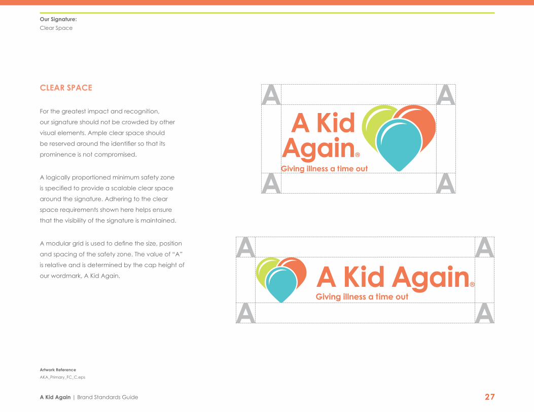
CLEAR SPACE
For the greatest impact and recognition,
our signature should not be crowded by other
visual elements. Ample clear space should
be reserved around the identifier so that its
prominence is not compromised.
A logically proportioned minimum safety zone
is specified to provide a scalable clear space
around the signature. Adhering to the clear
space requirements shown here helps ensure
that the visibility of the signature is maintained.
A modular grid is used to define the size, position
and spacing of the safety zone. The value of “A”
is relative and is determined by the cap height of
our wordmark, A Kid Again.
Our Signature:
Clear Space
®
Artwork Reference
AKA_Primary_FC_C.eps
®

A Kid Again | Brand Standards Guide 28
MINIMUM SIZES
The legibility of the wordmark determines
the minimum size of the signature. Being able
to easily discern the image or read the text,
especially the tagline, is critical to the success
of our visual identity.
It is important to use this version of the logo
as often as possible. Limit the use of different
logo versions on one item to 2. Using too many
different versions of the logo creates confusion
and inconsistency.
Shown here are the minimum sizes for each
signature version. In each one, the largest text
should be no smaller than .25”. If the primary
logo must be smaller than 2” x 1”, the primary
logo with the adjusted tagline size is appropriate.
If the secondary logo must be smaller than
2.8” x .6”, the secondary logo with the adjusted
tagline size is appropriate. See next page for
logos with adjusted taglines.
Our Signature:
Minimum Sizes
2” 2.8”
®
Artwork Reference
AKA_Primary_FC_C.eps
AKA_Secondary_FC_C.eps
®
A Kid Again | Brand Standards Guide 29
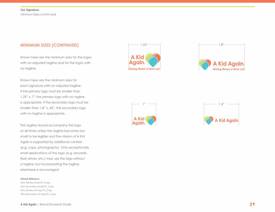
MINIMUM SIZES (CONTINUED)
Shown here are the minimum sizes for the logos
with an adjusted tagline and for the logos with
no tagline.
Shown here are the minimum sizes for
each signature with an adjusted tagline.
If the primary logo must be smaller than
1.25” x .7”, the primary logo with no tagline
is appropriate. If the secondary logo must be
smaller than 1.8” x .45”, the secondary logo
with no tagline is appropriate.
The tagline should accompany the logo
at all times unless the tagline becomes too
small to be legible and the mission of A Kid
Again is supported by additional context
(e.g. copy, photography). Only exceptionally
small applications of the logo (e.g. lanyards,
flash drives, etc.) may use the logo without
a tagline, but incorporating the tagline
elsewhere is encouraged.
1.25”
1”
1.8”
1.4”
®®
Artwork Reference
AKA_Primary_Small_FC_C.eps
AKA_Secondary_Small_FC_C.eps
AKA_Primary_No-Tag_FC_C.eps
AKA_Secondary_No-Tag_FC_C.eps
®
®
Our Signature:
Minimum Sizes (continued)

A Kid Again | Brand Standards Guide 30
CORRECT USE
The signature must always be used correctly
and consistently. Deviation from proper usage
diminishes the strength of the brand.
Three Color
This is the full trade dress version of the signature.
The A Kid Again logo can ONLY be used
on Primary Orange and Bold Teal colors.
Bold Teal is preferred.
One Color
When color is available but the three-color
version is not appropriate, the one-color
signature can be applied.
High Contrast Black and White
The high contrast versions are the best signatures
to be sent “out of house” when we are not able
to proof or approve the final art.
Our Signature:
Correct Use
Three Color
One color
High Contrast Black and White
® ® ®
® ® ®
®®
Artwork Reference
AKA_Primary_FC_C.eps
AKA_Primary_FC_C_One-color.eps
AKA_Primary_1C.eps
AKA_Primary_1C_WHITE.eps
AKA_Primary_BLACK.eps

A Kid Again | Brand Standards Guide 31
A Kid Again
® ®®
®
®
®®
®
INCORRECT USE
Consistent presentation of our signature is
essential to building and preserving brand equity.
On this page are just a few examples of incorrect
uses of our signature.
Our Signature:
Incorrect Use
APPROVAL AND QUESTIONS
The signature should be used only in
approved configurations and should
not be recreated or distributed without
written permission from the Brand
Standards Manager.
Furthermore, no typography or other
elements should be added to the
signature to create secondary brands
or associated taglines.
Do not distort the forms. Do not distort the forms. Do not apply 3-D effects.
Do not use alternate fonts. Do not apply incorrect colors. Do not apply incorrect colors.
Do not add graphic elements of any kind. Do not add, subtract, or rearrange
any elements in any way.
Do not add typography.
Do not apply color treatments. Do not apply to active backgrounds. Do not use inadequate
quality artwork.
®
®
Visit akidagain.com

A Kid Again | Brand Standards Guide 326OUR TYPOGRAPHIC SYSTEM

A Kid Again | Brand Standards Guide 33
PRIMARY FONT
Our primary typographic family is the serif font
Century Gothic. While Century Gothic is available
in several weights, our primary weights are
Regular and Bold. Century Gothic’s preferred
use is for headline and titles.
Century Gothic is a Web Safe font.
This font can be used for headlines
and titles in both print and web.
Our Typographic System:
Primary Font
WHAT IS A WEB SAFE FONT?
Some older web browsers and email clients
can only display the fonts installed in each
individual computer, so every visitor of
your web page needs to have all of the
fonts you use installed on his or her own.
As different people have different fonts
installed, there is a standard set of fonts
known as “web safe” that are available
on every computer.
Aa Bb Cc Dd Ee Ff Gg Hh Ii Jj Kk Ll Mm Nn Oo Pp Qq Rr Ss Tt Uu Vv Ww Xx Yy Zz1 2 3 4 5 6 7 8 9 0
Aa Bb Cc Dd Ee Ff Gg Hh Ii Jj Kk Ll Mm Nn Oo Pp Qq Rr Ss Tt Uu Vv Ww Xx Yy Zz1 2 3 4 5 6 7 8 9 0
Century Gothic Regular
Century Gothic Bold

A Kid Again | Brand Standards Guide 34
SECONDARY FONT
Our secondary typographic family is the
serif typeface Clarendon. While Clarendon is
available in several weights, our primary weights
are Bold. While Century Gothic is preferred for
headlines and body copy, Clarendon’s preferred
use is for numbers and some subheadings.
Clarendon is a Web Safe font.
This font can be used for subheadings
and numbers in both print and web.
Our Typographic System:
Secondary Font
Aa Bb Cc Dd Ee Ff Gg Hh Ii Jj Kk Ll Mm Nn Oo Pp Qq Rr Ss Tt Uu Vv Ww Xx Yy Zz1 2 3 4 5 6 7 8 9 0
Clarendon Bold
WHAT IS A WEB SAFE FONT?
Some older web browsers and email clients
can only display the fonts installed in each
individual computer, so every visitor of
your web page needs to have all of the
fonts you use installed on his or her own.
As different people have different fonts
installed, there is a standard set of fonts
known as “web safe” that are available
on every computer.
A Kid Again | Brand Standards Guide 35
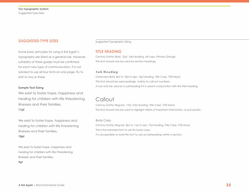
SUGGESTED TYPE SIZES
Some basic principles for using A Kid Again’s
typography are listed as a general rule. However,
suitability of these guides must be confirmed
for each new type of communication. It is not
advised to use all four fonts on one page. Try to
limit to two or three.
Sample Text Sizing
We exist to foster hope, happiness and
healing for children with life threatening
illnesses and their families. 11pt
We exist to foster hope, happiness and
healing for children with life threatening
illnesses and their families.
10pt
We exist to foster hope, happiness and
healing for children with life threatening
illnesses and their families.
9pt
Our Typographic System:
Suggested Type Sizes
Suggested Typography Sizing
TITLE HEADING Century Gothic Bold, 12pt, 16pt leading, All caps, Primary Orange
This font should only be used for section headings.
Sub Heading Clarendon Bold, 8pt to 10pt in size, 16pt leading, Title Case, 75% black
This font should be used sparingly, mainly to call out numbers.
It can only be used as a subheading if it is used in conjunction with the title heading.
Callout Century Gothic Regular, 17pt, 27pt leading, Title Case, 75% black
This font should only be used to highlight tidbits of important information, or pull quotes.
Body Copy Century Gothic Regular, 8pt to 11pt in size, 17pt leading, Title Case, 75% black
This is the standard font to use for body copy.
It is acceptable to bold this font to use as subheadings within a section.

A Kid Again | Brand Standards Guide 367OUR COLORS

A Kid Again | Brand Standards Guide 37
Our Colors:
Full Color Palette
OUR PALETTE
The A Kid Again color palette is defined by a
series of numbers:
Pantone: The Pantone matching system, or PMS,
is for offset printing, and the value is determined
by the material you are printing on (coated or
uncoated, C or U).
Process: Four color printing is based upon the
CMYK values of a color, or Cyan, Magenta,
Yellow & Key (black).
Screen: For screen applications, colors are based
upon their RGB values, or Red, Green & Blue.
HTML: The web has its own color value system.
For web applications, use the HTML color value.
CORE COLORS
ACCENT COLORS

A Kid Again | Brand Standards Guide 38
CORE COLORS
Our core colors were selected to support and
ground the colors in our brand color palette.
Our core colors should not be used as feature
or accent colors. Our core colors were created
with enough contrast to function behind our
secondary colors as a background or as text
or a duotone image on top of the other tones
in our color system.
Our Colors:
Core Colors
Pantone 1645 C1655 U
C 0M 63Y 75K 0
R 244G 126B 77
# F47E4D
PRIMARY ORANGE
Pantone 319 C638 U
C 59M 0Y 22K 0
R 91G 198B 204
# 5BC6CC
BOLD TEAL
Pantone 389 C381 U
C 21M 0Y 85K 0
R 211G 223B 78
# D3DF4E
BRIGHT GREEN
A Kid Again | Brand Standards Guide 39
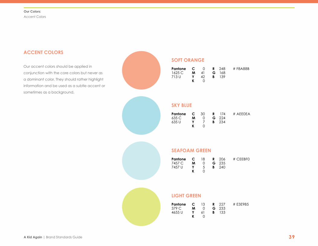
ACCENT COLORS
Our accent colors should be applied in
conjunction with the core colors but never as
a dominant color. They should rather highlight
information and be used as a subtle accent or
sometimes as a background.
Our Colors:
Accent Colors
Pantone 1625 C713 U
C 0M 41Y 42K 0
R 248G 168B 139
# F8A88B
SOFT ORANGE
Pantone 7457 C7457 U
C 18M 0Y 5K 0
R 206G 235B 240
# CEEBF0
SEAFOAM GREEN
Pantone 635 C635 U
C 30M 0Y 7K 0
R 174G 224B 234
# AEE0EA
SKY BLUE
Pantone 379 C4655 U
C 13M 0Y 61K 0
R 227G 233B 133
# E3E985
LIGHT GREEN

A Kid Again | Brand Standards Guide 408OUR STATIONERY SYSTEM

A Kid Again | Brand Standards Guide 41
®
Central Ohio Chapter777-G Dearborn Park LnColumbus, Ohio 43085
AKidAgain.org
®
The A Kid Again stationery system works together
as a unit to consistently present the brand
and preserve equity. The elements have been
carefully constructed using related proportions
to visually connect individual pieces.
PRIMARY ELEMENTS
Letterhead
1-sided, recommended paper
stock (8.5” x 11”)
Business Envelope
1-sided No.10 envelope
(4.125” x 9.5”)
Business Card
2- sided standard card
(2” x 3.5”)
Our Stationery System:
Primary Elements
Letterhead
Envelope
Business Card (front & back)
777-G Dearborn Park Ln. Columbus, OH 43085 800-543-9735 AKidAgain.org
Dear Lacey,
Lorem ipsum dolor sit amet, consectetur adipiscing elit. Nam sapien metus,
tincidunt eu iaculis ut, blandit sit amet odio. In hendrerit eget massa a
suscipit. Sed tortor orci, faucibus sed tincidunt ut, rutrum a est. Duis at
mauris laoreet, aliquet nibh a, sodales mauris. Curabitur vehicula elit risus,
sed molestie dolor venenatis nec. Maecenas gravida felis diam, sed
blandit ipsum imperdiet eget. In ultricies ornare elit ut feugiat. Nulla egestas
augue nec justo vehicula finibus. Curabitur ut ligula aliquet, fermentum orci
nec, ullamcorper nunc. Proin molestie urna odio, eu malesuada enim
fermentum ut. Aliquam nec nisi faucibus, placerat elit nec, sodales lorem.
Proin vel nunc magna. Donec rutrum tellus at mi auctor ultrices. Sed sit
amet tincidunt eros. Sed hendrerit odio turpis, ut feugiat felis finibus sit
amet. Vivamus eget neque blandit, egestas est nec, dapibus magna.
Class aptent taciti sociosqu ad litora torquent per conubia nostra, per
inceptos himenaeos. Maecenas a dapibus ipsum. Aliquam erat volutpat.
Ut consequat interdum neque, eget placerat lectus semper nec. Sed
blandit mollis eleifend.
Curabitur egestas suscipit justo. Nam pulvinar, mi sed vestibulum ornare,
magna ex iaculis ex, et tincidunt ligula neque vel lorem. Ut eget rhoncus
ex. In eget ligula et massa maximus efficitur ac at libero. Mauris posuere
massa ante. Donec fermentum nisl nibh. Pellentesque habitant morbi
tristique senectus et netus et malesuada fames ac turpis egestas. Phasellus
ultrices mi non turpis mollis facilisis. Nullam a nisl erat.
Wishing you and your family the very best,
Stacey Fronczak
STACEY FRONCZAKDirector of DevelopmentNorthwest Chapter
[email protected]: 614-797-9500C: 614-561-1807F: 614-797-9600
AKidAgain.org
BOARD MEMBERS
John F. Kelley, ChairWhite Castle
Matt Monnin, Vice ChairMesser Construction Co.
John A. Price, SecretaryPerio Inc. - Barbasol Brands
Poe Timmons, TreasurerThe Columbus Dispatch
Brian DiMasi, GovernanceSafelite AutoGlass
Mike CrottySpirit Services
Tom DiMarcoInterim HealthCare
Cindy HilsheimerBeecherHill
Jennifer MarshalekNationwide
Carrie Maun-SmithGrange Insurance
Bridget McAuliffeBarnes & Thornburg, LLP
Michael McCurdyKimball Midwest
J. Brent Thomas Associated Bank
Barbara B. MattaHonorary Board Member
®
STACEY FRONCZAKDirector of DevelopmentCentral Ohio Chapter
[email protected]: 614-797-9500C: 614-561-1807F: 614-797-9600
AKidAgain.org

A Kid Again | Brand Standards Guide 42
777-G Dearborn Park Ln. Columbus, OH 43085 800-543-9735 AKidAgain.org
Dear Lacey,
Lorem ipsum dolor sit amet, consectetur adipiscing elit. Nam sapien metus,
tincidunt eu iaculis ut, blandit sit amet odio. In hendrerit eget massa a
suscipit. Sed tortor orci, faucibus sed tincidunt ut, rutrum a est. Duis at
mauris laoreet, aliquet nibh a, sodales mauris. Curabitur vehicula elit risus,
sed molestie dolor venenatis nec. Maecenas gravida felis diam, sed
blandit ipsum imperdiet eget. In ultricies ornare elit ut feugiat. Nulla egestas
augue nec justo vehicula finibus. Curabitur ut ligula aliquet, fermentum orci
nec, ullamcorper nunc. Proin molestie urna odio, eu malesuada enim
fermentum ut. Aliquam nec nisi faucibus, placerat elit nec, sodales lorem.
Proin vel nunc magna. Donec rutrum tellus at mi auctor ultrices. Sed sit
amet tincidunt eros. Sed hendrerit odio turpis, ut feugiat felis finibus sit
amet. Vivamus eget neque blandit, egestas est nec, dapibus magna.
Class aptent taciti sociosqu ad litora torquent per conubia nostra, per
inceptos himenaeos. Maecenas a dapibus ipsum. Aliquam erat volutpat.
Ut consequat interdum neque, eget placerat lectus semper nec. Sed
blandit mollis eleifend.
Curabitur egestas suscipit justo. Nam pulvinar, mi sed vestibulum ornare,
magna ex iaculis ex, et tincidunt ligula neque vel lorem. Ut eget rhoncus
ex. In eget ligula et massa maximus efficitur ac at libero. Mauris posuere
massa ante. Donec fermentum nisl nibh. Pellentesque habitant morbi
tristique senectus et netus et malesuada fames ac turpis egestas. Phasellus
ultrices mi non turpis mollis facilisis. Nullam a nisl erat.
Wishing you and your family the very best,
Stacey Fronczak
STACEY FRONCZAKDirector of DevelopmentNorthwest Chapter
[email protected]: 614-797-9500C: 614-561-1807F: 614-797-9600
AKidAgain.org
BOARD MEMBERS
John F. Kelley, ChairWhite Castle
Matt Monnin, Vice ChairMesser Construction Co.
John A. Price, SecretaryPerio Inc. - Barbasol Brands
Poe Timmons, TreasurerThe Columbus Dispatch
Brian DiMasi, GovernanceSafelite AutoGlass
Mike CrottySpirit Services
Tom DiMarcoInterim HealthCare
Cindy HilsheimerBeecherHill
Jennifer MarshalekNationwide
Carrie Maun-SmithGrange Insurance
Bridget McAuliffeBarnes & Thornburg, LLP
Michael McCurdyKimball Midwest
J. Brent Thomas Associated Bank
Barbara B. MattaHonorary Board Member
®
LETTERHEAD
The A Kid Again stationery system works together
as a unit to consistently present the brand
and preserve equity. The elements have been
carefully constructed using related proportions
to visually connect individual pieces.
1-sided 8.5” x 11” sheet
Shown at 55%
The body text on an A Kid Again letter should be
in our typeface, Century Gothic.
Specifically:
Century Gothic Regular, 10pt, 17pt of leading
The A Kid Again identity is locked into the header
and must not be moved or modified. The contact
info is locked into the footer and should not be
moved or modified.
Our Stationery System:
Letterhead
2.5"
2.85"
.45"
.5”
.75”
.5”Fold top third backwards to meet backside of letter.
.5”

A Kid Again | Brand Standards Guide 43
Central Ohio Chapter777-G Dearborn Park LnColumbus, Ohio 43085
AKidAgain.org
®
ENVELOPE
1-sided No.10 envelope (4.125” x 9.5”)
Shown at 65%
Text to the addressee should be in our
typeface, Century Gothic Regular.
Specifically:
Century Gothic Regular, 8pt,
10pt leading
The text should not be wider than 2.5”
and should not be longer than 6 lines.
Our Stationery System:
Envelope
Mr. Firstname Lastname
123 Streetname Dr.
Cityname, ST 12345
4"
777-G Dearborn Park Ln. Columbus, OH 43085 800-543-9735 AKidAgain.org
Dear Lacey,
Lorem ipsum dolor sit amet, consectetur adipiscing elit. Nam sapien metus,
tincidunt eu iaculis ut, blandit sit amet odio. In hendrerit eget massa a
suscipit. Sed tortor orci, faucibus sed tincidunt ut, rutrum a est. Duis at
mauris laoreet, aliquet nibh a, sodales mauris. Curabitur vehicula elit risus,
sed molestie dolor venenatis nec. Maecenas gravida felis diam, sed
blandit ipsum imperdiet eget. In ultricies ornare elit ut feugiat. Nulla egestas
augue nec justo vehicula finibus. Curabitur ut ligula aliquet, fermentum orci
nec, ullamcorper nunc. Proin molestie urna odio, eu malesuada enim
fermentum ut. Aliquam nec nisi faucibus, placerat elit nec, sodales lorem.
Proin vel nunc magna. Donec rutrum tellus at mi auctor ultrices. Sed sit
amet tincidunt eros. Sed hendrerit odio turpis, ut feugiat felis finibus sit
amet. Vivamus eget neque blandit, egestas est nec, dapibus magna.
Class aptent taciti sociosqu ad litora torquent per conubia nostra, per
inceptos himenaeos. Maecenas a dapibus ipsum. Aliquam erat volutpat.
Ut consequat interdum neque, eget placerat lectus semper nec. Sed
blandit mollis eleifend.
Curabitur egestas suscipit justo. Nam pulvinar, mi sed vestibulum ornare,
magna ex iaculis ex, et tincidunt ligula neque vel lorem. Ut eget rhoncus
ex. In eget ligula et massa maximus efficitur ac at libero. Mauris posuere
massa ante. Donec fermentum nisl nibh. Pellentesque habitant morbi
tristique senectus et netus et malesuada fames ac turpis egestas. Phasellus
ultrices mi non turpis mollis facilisis. Nullam a nisl erat.
Wishing you and your family the very best,
Stacey Fronczak
STACEY FRONCZAKDirector of DevelopmentNorthwest Chapter
[email protected]: 614-797-9500C: 614-561-1807F: 614-797-9600
AKidAgain.org
BOARD MEMBERS
John F. Kelley, ChairWhite Castle
Matt Monnin, Vice ChairMesser Construction Co.
John A. Price, SecretaryPerio Inc. - Barbasol Brands
Poe Timmons, TreasurerThe Columbus Dispatch
Brian DiMasi, GovernanceSafelite AutoGlass
Mike CrottySpirit Services
Tom DiMarcoInterim HealthCare
Cindy HilsheimerBeecherHill
Jennifer MarshalekNationwide
Carrie Maun-SmithGrange Insurance
Bridget McAuliffeBarnes & Thornburg, LLP
Michael McCurdyKimball Midwest
J. Brent Thomas Associated Bank
Barbara B. MattaHonorary Board Member
®
Letter Placement
The z-folded letter should be placed
into the envelope with the A Kid Again
logo and heading facing up and out.
This ensures that the identity will be the
first thing that the recipient sees when
opening correspondence.
.2”
.38”
.6”
.4”

A Kid Again | Brand Standards Guide 44
STACEY FRONCZAKDirector of DevelopmentCentral Ohio Chapter
[email protected]: 614-797-9500C: 614-561-1807F: 614-797-9600
AKidAgain.org
®
BUSINESS CARD
2- sided standard card
(2” x 3.5”)
Shown at 100%
Type Specifications
Name
Century Gothic Bold, All caps, 13pt,
Pantone 1645 C
Title & Chapter
Century Gothic Regular, 9pt, 11pt leading,
Pantone 319 C
Email/Address/Phone Numbers
Century Gothic Regular, 8pt, 9pt leading,
Pantone 417 C
Web Address
Century Gothic Bold, 8pt
Pantone 417 C
Our Stationery System:
Business Card
.7"
.4"
1.27"
.4"
.37"
.65"
.7"
.5"
.4"

A Kid Again | Brand Standards Guide 45
Our Stationery System:
Email Signature
EMAIL SIGNATURE
Representation of the A Kid Again identity is
key in all print or electronic communications,
including email signatures. Information may
only be added or deleted after obtaining
approval from the Brand Manager within the
organization. Standards are based on Gmail
terms. Standards include:
Name
Verdana Bold, ‘Large’
Dark Grey
Title/Chapter Address/Email/Phone Numbers
Verdana Regular, ‘Small’
Light Grey
Chapter Name
Verdana Bold, ‘Small’
Dark Grey
Web Address
Verdana Bold, ‘Small’
Orange

A Kid Again | Brand Standards Guide 469OUR IMAGE SYSTEM

A Kid Again | Brand Standards Guide 47
PHOTOGRAPHIC STYLE
Branded photography
is essential to building
consistency and equity
for the A Kid Again Brand.
By utilizing a specific
photographic style,
the images become our
own, and truly represent
A Kid Again.
Our Image System:
Photographic Style
GUIDELINES FOR PHOTOGRAPHY STYLE INCLUDE:
• Primary photos should be of happy children with an illness to avoid looking
like stock photography and capture the heart of A Kid Again.
• Images must capture context of where the event is taking place in the
background (Kings Island sign, rides, Zoombezi Bay sign, water slides, etc.)
• Images must be used in full color or in duotone or monotone
with the approved colors.
• Full color images must be moderate in their saturation.
• Photography should emphasize creative cropping.
• Photography should have a specific focal point.
• Photography should emphasize an Impactful point of view
(Portrait closeup, interesting family photos, etc.).
• When typography or a logo is to be overlaid, images must have a clear,
even space for legibility.
It is important that our photography style is
consistent. To achieve this, please provide
any A Kid Again photographers this style
guide with enough time before the event
that they are photographing so that they
can learn and follow our guidelines.

A Kid Again | Brand Standards Guide 48
Our Image System:
Photographic Style

A Kid Again | Brand Standards Guide 49
IMAGE CONTENT
Use candid shots whenever possible.
They are much more powerful and interesting.
Try to avoid using too many posed photos. It is
important to capture the location of an event in
the background of the photo so that it is obvious
where the event is taking place.
Images should relate to the content of the
document as much as possible. For example,
if you’re posting on social media about finding
volunteers, include images of volunteering.
Our Image System:
Image Content
Preferred
Example image for volunteering
Not preferred
Example image for Time Out event

A Kid Again | Brand Standards Guide 50
LIGHTING
Lighting should be bright, even, and color
balanced. Images that are under exposed
(too dark) or overexposed (too light) should
be corrected before use.
Our Image System:
Lighting
Properly exposed
Over exposed
Under exposed

A Kid Again | Brand Standards Guide 51
RESOLUTION
Images should be the proper resolution for the
medium. Web and mobile images should be
72 points per inch (PPI). Print images should be
300 PPI.
For example, if you are trying to print an image
at 4”x6”, your image file must be 1200x1800 pixels
(4”x300 PPI, 6”x300 PPI). Increasing the size of a
photo from the original size will make it appear
fuzzy and pixelated.
REMEMBER: You can always decrease
image resolution, so start with the highest
resolution possible.
High resolution and crisp
Poor resolution and fuzzy
Our Image System:
Resolution
It is important that our photography style is
consistent. To achieve this, please provide
any A Kid Again photographers this style
guide with enough time before the event
that they are photographing so that they
can learn and follow our guidelines.

A Kid Again | Brand Standards Guide 52
SATURATION LEVELS
Color correcting photos consist of four steps:
contrast, exposure, saturation, and warming.
Our photos have moderate contrast, slight
overexposure and oversaturation. Images
should be used at full color saturation for all
applications (except when limited by printing,
then use black & white).
DUOTONE IMAGES
If needed, select colors can be used as a
duotone over some photography. Do not use
duotone images in colors that are not from the
A Kid Again brand or with gradients.
For this color interaction, you may use Bold Teal
and Bright Green. These are the only brand colors
that may be used in duotone. Make sure that
monotone images have sufficient contrast and
simple backgrounds without a lot of activity.
Our Image System:
Saturation Levels | Duotone Images
Bold Teal
Color 1: #51c4cd
Color 2: #aacacd
Color 1: #cedf57
Color 2: #d0d5af
Bright Green
Underexposed and desaturated Bright and evenly saturated
A Kid Again | Brand Standards Guide 53
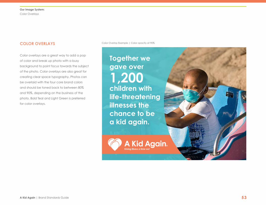
COLOR OVERLAYS
Color overlays are a great way to add a pop
of color and break up photo with a busy
background to point focus towards the subject
of the photo. Color overlays are also great for
creating clear space typography. Photos can
be overlaid with the four core brand colors
and should be toned back to between 80%
and 90%, depending on the business of the
photo. Bold Teal and Light Green is preferred
for color overlays.
Our Image System:
Color Overlays
Color Overlay Example | Color opacity at 90%
Together we gave over
1,200 children with life-threatening illnesses the chance to be a kid again.
®
A Kid Again | Brand Standards Guide 54
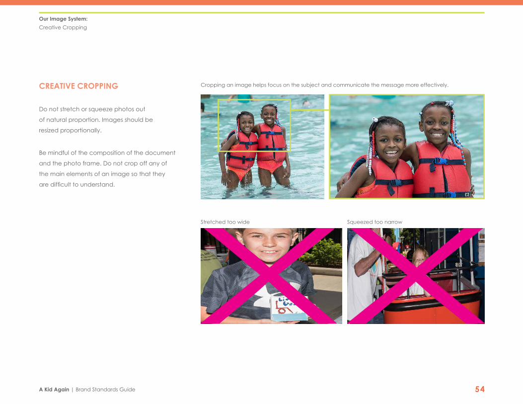
CREATIVE CROPPING
Do not stretch or squeeze photos out
of natural proportion. Images should be
resized proportionally.
Be mindful of the composition of the document
and the photo frame. Do not crop off any of
the main elements of an image so that they
are difficult to understand.
Our Image System:
Creative Cropping
Stretched too wide
Cropping an image helps focus on the subject and communicate the message more effectively.
Squeezed too narrow

A Kid Again | Brand Standards Guide 55
FOCAL POINT
Use a mixture of focal points in each document.
An easy way to think about this is to use the rule
of thirds by aligning the subject with gridlines.
You can also use a mixture of close-ups, portrait,
and full body images.
POINT OF VIEW
Use a mixture of point of views in each
document. A birds eye view is great for settings
while a straight-on image is fantastic for creating
a relatable image.
Our Image System:
Focal Point | Point of View
Rule of Thirds
High angle images are great for settings and providing context
Close up
Straight-on images create an intimacy with the subject

A Kid Again | Brand Standards Guide 56
Our Image System:
Iconography
ICONOGRAPHY
Icons are important visual aids that help
people quickly navigate through A Kid
Again’s media. Users can easily look for the
icon that’s important to them. Additionally,
icons work across language barriers and
provide an international reference guide.
The A Kid Again icons are lined and smooth
with rounded edges. Icons will typically be
used in one color, but also have a multicolor
option. Icons should relate to the context of
the photo or document.
Photography should be used as the dominant
element in every design, but documents can
be enhanced with the use of the A Kid Again
icons to supplement the main content.
Give Fundraise Volunteer Enroll a Child Family
Heart
Central Ohio
Child
Snail Mail Email
Shop with Purpose Sponsorship Donate a Birthday Create Your Own
Special Events Events Spread the News New Market
Northeast Ohio Southwest Ohio Indiana
Bowling
Holiday Party Amusement Park
Hockey
Zoo
Soccer
Picnic
FootballBaseball
GolfBasketball
Sporting Events
Other Adventures

A Kid Again | Brand Standards Guide 57
Our Image System:
Iconography—Proper Usage
DO NOT SCALE DISPROPORTIONATELY
When using the icons, always make sure to scale
them proportionally to maintain consistency
and avoid skewing. Proportional scaling can be
ensured by holding down the “shift” key on your
keyboard while shrinking or expanding the icon.
DO NOT ALTER
Do not alter the shape of the icon itself or
change the fills, stroke weights, or orientation.
CORRECT COLOR USAGE
Dark Background
Orange Background Blue Background Green Background
White Background

A Kid Again | Brand Standards Guide 5810EVENT BRANDING

A Kid Again | Brand Standards Guide 59
A KID AGAIN REPRESENTATION
Well-executed, integrated event materials and communications create a memorable
experience and contribute to the overall engagement by our families, donors and volunteers.
On all official A Kid Again event materials, it is essential to make sure the A Kid Again logo is
properly and prominently displayed on all promotion materials and during the event. Participants
should walk away from the event associating all the new information, contacts and the overall
feel of the event with A Kid Again.
Be sure to take some time to become familiar with the organization’s brand standards and feel
confident that the event, whether it be big or small, reflects the proper messaging and look-and-
feel of A Kid Again. This can be achieved by correctly displaying the event logo in conjunction
with the A Kid Again logo, using the approved brand colors and typefaces, and aligning the
branding with the A Kid Again style.
Event Branding:
A Kid Again Representation
A Kid Again | Brand Standards Guide 60
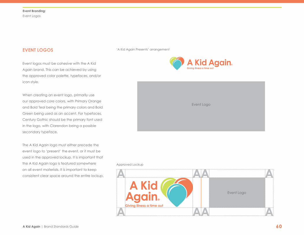
EVENT LOGOS
Event logos must be cohesive with the A Kid
Again brand. This can be achieved by using
the approved color palette, typefaces, and/or
icon style.
When creating an event logo, primarily use
our approved core colors, with Primary Orange
and Bold Teal being the primary colors and Bold
Green being used as an accent. For typefaces,
Century Gothic should be the primary font used
in the logo, with Clarendon being a possible
secondary typeface.
The A Kid Again logo must either precede the
event logo to ‘present’ the event, or it must be
used in the approved lockup. It is important that
the A Kid Again logo is featured somewhere
on all event materials. It is important to keep
consistent clear space around the entire lockup.
Event Branding:
Event Logos
®
Event Logo
Event Logo
Approved Lockup
‘A Kid Again Presents’ arrangement
®

CONTACT
The strength and power of the A Kid Again brand relies on our ability to work
together as one team. Any application of the identity system must be reviewed
and approved by the individual acting as the Brand Standards Manager.
For ordering stationery items, please contact Lacey Picazo
at ZoCo Design at 419.346.4648 or by email at [email protected].
BRANDING AGENCY
1269 Grandview Avenue
Columbus, Ohio 43212
T 419.346.4648
zocodesign.com