book of vaadin
TRANSCRIPT

Book of VaadinVaadin 7 Preview Edition

Book of Vaadin: Vaadin 7 Preview EditionVaadin LtdMarko Grönroos
Vaadin 7 Preview Edition EditionVaadin Framework 7.0.0
Published: 2013-02-01Copyright © 2000-2013 Vaadin Ltd
Abstract
Vaadin is an AJAX web application development framework that enables developers to build high-qualityuser interfaces with Java, both on the server- and client-side. It provides a set of libraries of ready-to-useuser interface components and a clean framework for creating your own components.The focus is on ease-of-use, re-usability, extensibility, and meeting the requirements of large enterprise applications.All rights reserved. This work is licensed under the Creative Commons CC-BY-ND License Version 2.0[http://creativecommons.org/licenses/by-nd/2.0/legalcode].

Table of ContentsPreface .......................................................................................................................... xiii
Part I. Introduction ........................................................................................................... 19
Chapter 1. Introduction ......................................................................................... 211.1. Overview .................................................................................................. 211.2. Example Application Walkthrough .............................................................. 231.3. Support for the Eclipse IDE ....................................................................... 241.4. Goals and Philosophy ............................................................................... 251.5. Background .............................................................................................. 25
Chapter 2. Getting Started with Vaadin .................................................................. 272.1. Overview .................................................................................................. 272.2. Setting up the Development Environment ................................................... 28
2.2.1. Installing Java SDK ........................................................................ 292.2.2. Installing Eclipse IDE ...................................................................... 302.2.3. Installing Apache Tomcat ................................................................ 312.2.4. Firefox and Firebug ........................................................................ 31
2.3. Overview of Vaadin Libraries ..................................................................... 322.4. Installing Vaadin Plugin for Eclipse ............................................................. 33
2.4.1. Installing the IvyDE Plugin .............................................................. 332.4.2. Installing the Vaadin Plugin ............................................................. 342.4.3. Updating the Plugins ...................................................................... 362.4.4. Updating the Vaadin Libraries ......................................................... 36
2.5. Creating and Running a Project with Eclipse ............................................... 372.5.1. Creating the Project ....................................................................... 372.5.2. Exploring the Project ...................................................................... 412.5.3. Coding Tips for Eclipse ................................................................... 422.5.4. Setting Up and Starting the Web Server .......................................... 442.5.5. Running and Debugging ................................................................. 45
2.6. Using Vaadin with Maven ........................................................................... 462.6.1. Working from Command-Line .......................................................... 462.6.2. Compiling and Running the Application ........................................... 482.6.3. Using Add-ons and Custom Widget Sets ......................................... 48
2.7. Creating a Project with NetBeans IDE ........................................................ 482.7.1. Regular Web Application Project ..................................................... 482.7.2. Maven Project from Vaadin Archetype ............................................. 49
2.8. Vaadin Installation Package ....................................................................... 502.8.1. Package Contents .......................................................................... 502.8.2. Installing the Libraries .................................................................... 50
Chapter 3. Architecture ......................................................................................... 533.1. Overview .................................................................................................. 533.2. Technological Background ......................................................................... 56
3.2.1. HTML and JavaScript ..................................................................... 563.2.2. Styling with CSS and Sass ............................................................. 563.2.3. AJAX ............................................................................................. 563.2.4. Google Web Toolkit ........................................................................ 573.2.5. Java Servlets ................................................................................. 57
3.3. Client-Side Engine .................................................................................... 583.4. Events and Listeners ................................................................................. 59
Part II. Server-Side Framework ........................................................................................ 61
iBook of Vaadin

Chapter 4. Writing a Server-Side Web Application ................................................. 634.1. Overview .................................................................................................. 634.2. Building the UI .......................................................................................... 66
4.2.1. Application Architecture .................................................................. 674.2.2. Compositing Components ............................................................... 684.2.3. View Navigation ............................................................................. 694.2.4. Layered Architectures ..................................................................... 694.2.5. Accessing UI, Page, Session, and Service ....................................... 70
4.3. Handling Events with Listeners .................................................................. 704.3.1. Implementing a Listener in a Regular Class ..................................... 714.3.2. Differentiating Between Event Sources ............................................ 714.3.3. The Easy Way: Using Anonymous Classes ...................................... 72
4.4. Images and Other Resources .................................................................... 724.4.1. Resource Interfaces and Classes .................................................... 734.4.2. File Resources ............................................................................... 734.4.3. Class Loader Resources ................................................................ 744.4.4. Theme Resources .......................................................................... 744.4.5. Stream Resources ......................................................................... 74
4.5. Handling Errors ......................................................................................... 764.5.1. Error Indicator and message ........................................................... 764.5.2. Customizing System Messages ...................................................... 764.5.3. Handling Uncaught Exceptions ...................................................... 77
4.6. Notifications .............................................................................................. 794.6.1. Notification Type ............................................................................. 794.6.2. Customizing Notifications ............................................................... 804.6.3. Styling with CSS ............................................................................ 81
4.7. Application Lifecycle .................................................................................. 814.7.1. Deployment ................................................................................... 824.7.2. Vaadin Servlet, Portlet, and Service ................................................ 824.7.3. User Session ................................................................................. 834.7.4. Loading an UI ................................................................................ 834.7.5. UI Expiration .................................................................................. 844.7.6. Session Expiration ......................................................................... 844.7.7. Closing a Session .......................................................................... 84
4.8. Deploying an Application ........................................................................... 854.8.1. Creating Deployable WAR in Eclipse ............................................... 854.8.2. Web Application Contents ............................................................... 854.8.3. Deployment Descriptor web.xml .................................................... 864.8.4. Other Deployment Parameters ........................................................ 874.8.5. Deployment Configuration .............................................................. 89
Chapter 5. User Interface Components ................................................................. 915.1. Overview .................................................................................................. 925.2. Interfaces and Abstractions ....................................................................... 93
5.2.1. Component Interface ..................................................................... 945.2.2. AbstractComponent ..................................................................... 955.2.3. Field Components (Field and AbstractField) .................................. 95
5.3. Common Component Features .................................................................. 985.3.1. Caption ......................................................................................... 985.3.2. Description and Tooltips .................................................................. 995.3.3. Enabled ....................................................................................... 1005.3.4. Icon ............................................................................................. 1015.3.5. Locale ......................................................................................... 102
ii
Book of Vaadin

5.3.6. Read-Only ................................................................................... 1045.3.7. Style Name .................................................................................. 1055.3.8. Visible ......................................................................................... 1065.3.9. Sizing Components ...................................................................... 1065.3.10. Managing Input Focus ................................................................ 108
5.4. Component Extensions ........................................................................... 1095.5. Label ..................................................................................................... 109
5.5.1. Content Mode .............................................................................. 1105.5.2. Making Use of the HTML Mode ..................................................... 1115.5.3. Spacing with a Label .................................................................... 1115.5.4. CSS Style Rules .......................................................................... 112
5.6. Link ....................................................................................................... 1125.7. TextField ............................................................................................... 114
5.7.1. Data Binding ................................................................................ 1155.7.2. String Length ............................................................................... 1165.7.3. Handling Null Values .................................................................... 1165.7.4. Text Change Events ...................................................................... 1175.7.5. CSS Style Rules .......................................................................... 118
5.8. TextArea ................................................................................................ 1185.9. PasswordField ....................................................................................... 1205.10. RichTextArea ....................................................................................... 1205.11. Date and Time Input with DateField ....................................................... 122
5.11.1. PopupDateField ........................................................................ 1225.11.2. InlineDateField ......................................................................... 1255.11.3. Time Resolution ......................................................................... 1265.11.4. DateField Locale ........................................................................ 127
5.12. Button ................................................................................................. 1275.13. CheckBox ............................................................................................ 1285.14. Selecting Items ..................................................................................... 129
5.14.1. Binding Selection Components to Data ........................................ 1295.14.2. Basic Select Component ............................................................ 1335.14.3. ListSelect ................................................................................. 1355.14.4. Native Selection Component NativeSelect .................................. 1355.14.5. Radio Button and Check Box Groups with OptionGroup .............. 1365.14.6. Twin Column Selection with TwinColSelect ................................. 1385.14.7. Allowing Adding New Items ......................................................... 1395.14.8. Multiple Selection Mode .............................................................. 1405.14.9. Other Common Features ............................................................ 141
5.15. Table .................................................................................................... 1415.15.1. Selecting Items in a Table ........................................................... 1435.15.2. Table Features ........................................................................... 1445.15.3. Editing the Values in a Table ........................................................ 1475.15.4. Column Headers and Footers ...................................................... 1505.15.5. Generated Table Columns ........................................................... 1525.15.6. Formatting Table Columns ........................................................... 1555.15.7. CSS Style Rules ......................................................................... 156
5.16. Tree ..................................................................................................... 1595.17. MenuBar .............................................................................................. 1605.18. Embedded ........................................................................................... 162
5.18.1. Embedded Objects ..................................................................... 1625.18.2. Embedded Images ..................................................................... 1635.18.3. Browser Frames ......................................................................... 164
5.19. Upload ................................................................................................. 1645.20. ProgressIndicator ............................................................................... 166
iii
Book of Vaadin
5.20.1. Doing Heavy Computation .......................................................... 1675.21. Slider ................................................................................................... 1685.22. Component Composition with CustomComponent ................................. 170
Chapter 6. Managing Layout ................................................................................ 1716.1. Overview ................................................................................................ 1726.2. Window and Panel Content ...................................................................... 1746.3. VerticalLayout and HorizontalLayout ..................................................... 174
6.3.1. Sizing Contained Components ...................................................... 1756.4. GridLayout ............................................................................................ 179
6.4.1. Sizing Grid Cells .......................................................................... 1806.5. FormLayout ........................................................................................... 1826.6. Panel ..................................................................................................... 184
6.6.1. Scrolling the Panel Content ........................................................... 1846.7. Sub-Windows ......................................................................................... 186
6.7.1. Opening and Closing a Sub-Window ............................................. 1866.7.2. Window Positioning ...................................................................... 1896.7.3. Scrolling Sub-Window Content ...................................................... 1896.7.4. Modal Windows ............................................................................ 189
6.8. HorizontalSplitPanel and VerticalSplitPanel .......................................... 1906.9. TabSheet ............................................................................................... 1926.10. Accordion ............................................................................................ 1956.11. AbsoluteLayout ................................................................................... 1976.12. CssLayout ........................................................................................... 1996.13. Layout Formatting ................................................................................. 202
6.13.1. Layout Size ................................................................................ 2026.13.2. Layout Cell Alignment ................................................................. 2036.13.3. Layout Cell Spacing .................................................................... 2056.13.4. Layout Margins ........................................................................... 207
6.14. Custom Layouts .................................................................................... 209
Chapter 7. Visual User Interface Design with Eclipse .......................................... 2117.1. Overview ................................................................................................ 2117.2. Creating a New Composite ...................................................................... 2127.3. Using The Visual Designer ....................................................................... 214
7.3.1. Adding New Components ............................................................. 2157.3.2. Setting Component Properties ...................................................... 2167.3.3. Editing an AbsoluteLayout .......................................................... 218
7.4. Structure of a Visually Editable Component .............................................. 2207.4.1. Sub-Component References ......................................................... 2207.4.2. Sub-Component Builders .............................................................. 2217.4.3. The Constructor ........................................................................... 221
Chapter 8. Themes ............................................................................................... 2238.1. Overview ................................................................................................ 2238.2. Introduction to Cascading Style Sheets .................................................... 225
8.2.1. Basic CSS Rules .......................................................................... 2258.2.2. Matching by Element Class ........................................................... 2268.2.3. Matching by Descendant Relationship ........................................... 2278.2.4. Notes on Compatibility .................................................................. 230
8.3. Syntactically Awesome Stylesheets (Sass) ............................................... 2308.3.1. Sass Overview ............................................................................. 2318.3.2. Sass Basics with Vaadin ............................................................... 2318.3.3. Compiling On the Fly .................................................................... 2328.3.4. Compiling Sass to CSS ................................................................ 232
iv
Book of Vaadin
8.4. Creating and Using Themes .................................................................... 2328.4.1. Sass Themes ............................................................................... 2328.4.2. Plain Old CSS Themes ................................................................. 2338.4.3. Styling Standard Components ....................................................... 2338.4.4. Built-in Themes ............................................................................ 2358.4.5. Using Themes in an UI ................................................................. 2368.4.6. Theme Inheritance ....................................................................... 236
8.5. Creating a Theme in Eclipse .................................................................... 236
Chapter 9. Binding Components to Data ............................................................. 2399.1. Overview ................................................................................................ 2399.2. Properties .............................................................................................. 241
9.2.1. Property Viewers and Editors ........................................................ 2429.2.2. ObjectProperty Implementation ................................................... 2439.2.3. Converting Between Property Type and Representation .................. 2439.2.4. Implementing the Property Interface ............................................. 245
9.3. Holding properties in Items ...................................................................... 2469.3.1. The PropertysetItem Implementation ........................................... 2479.3.2. Wrapping a Bean in a BeanItem ................................................... 247
9.4. Creating Forms by Binding Fields to Items ................................................ 2499.4.1. Simple Binding ............................................................................. 2499.4.2. Using a FieldFactory to Build and Bind Fields ........................... 2509.4.3. Binding Member Fields ................................................................. 2509.4.4. Buffering Forms ........................................................................... 2519.4.5. Binding Fields to a Bean ............................................................... 2529.4.6. Bean Validation ............................................................................ 252
9.5. Collecting Items in Containers .................................................................. 2549.5.1. BeanContainer ........................................................................... 2549.5.2. BeanItemContainer .................................................................... 2579.5.3. Iterating Over a Container ............................................................. 2589.5.4. Filterable Containers ................................................................... 258
Chapter 10. Vaadin SQLContainer ....................................................................... 26110.1. Architecture .......................................................................................... 26210.2. Getting Started with SQLContainer ........................................................ 262
10.2.1. Creating a connection pool .......................................................... 26210.2.2. Creating the TableQuery Query Delegate .................................... 26310.2.3. Creating the Container ................................................................ 263
10.3. Filtering and Sorting .............................................................................. 26310.3.1. Filtering ..................................................................................... 26310.3.2. Sorting ...................................................................................... 264
10.4. Editing .................................................................................................. 26410.4.1. Adding items .............................................................................. 26410.4.2. Fetching generated row keys ....................................................... 26410.4.3. Version column requirement ........................................................ 26510.4.4. Auto-commit mode ..................................................................... 26510.4.5. Modified state ............................................................................ 265
10.5. Caching, Paging and Refreshing ............................................................ 26610.5.1. Container Size ........................................................................... 26610.5.2. Page Length and Cache Size ...................................................... 26610.5.3. Refreshing the Container ............................................................ 26610.5.4. Cache Flush Notification Mechanism ........................................... 267
10.6. Referencing Another SQLContainer ...................................................... 26710.7. Using FreeformQuery and FreeformStatementDelegate ....................... 268
v
Book of Vaadin

10.8. Non-implemented methods of Vaadin container interfaces ....................... 26910.9. Known Issues and Limitations ................................................................ 270
Chapter 11. Advanced Web Application Topics .................................................... 27311.1. Handling Browser Windows ................................................................... 274
11.1.1. Opening Popup Windows ............................................................ 27411.1.2. Caveats in Using Multiple Windows ............................................. 276
11.2. Embedding UIs in Web Pages ................................................................ 27711.2.1. Embedding Inside a div Element ................................................ 27711.2.2. Embedding Inside an iframe Element ........................................ 28211.2.3. Cross-Site Embedding with the Vaadin XS Add-on ....................... 283
11.3. Debug and Production Mode .................................................................. 28411.3.1. Debug Mode .............................................................................. 28411.3.2. Analyzing Layouts ...................................................................... 28511.3.3. Custom Layouts ......................................................................... 28611.3.4. Debug Functions for Component Developers ................................ 286
11.4. Request Handlers ................................................................................. 28611.5. Shortcut Keys ....................................................................................... 287
11.5.1. Click Shortcuts for Default Buttons ............................................... 28711.5.2. Field Focus Shortcuts ................................................................. 28811.5.3. Generic Shortcut Actions ............................................................ 28811.5.4. Supported Key Codes and Modifier Keys ..................................... 290
11.6. Printing ................................................................................................. 29111.7. Google App Engine Integration .............................................................. 29211.8. Common Security Issues ....................................................................... 293
11.8.1. Sanitizing User Input to Prevent Cross-Site Scripting .................... 29311.9. URI Fragment and History Management with UriFragmentUtility ............ 29411.10. Navigating in an Application ................................................................. 295
11.10.1. Setting Up for Navigation .......................................................... 29511.10.2. Implementing a View ................................................................. 29611.10.3. Handling URI Fragment Path ..................................................... 297
11.11. Drag and Drop .................................................................................... 29911.11.1. Handling Drops ........................................................................ 30011.11.2. Dropping Items On a Tree ......................................................... 30011.11.3. Dropping Items On a Table ....................................................... 30211.11.4. Accepting Drops ....................................................................... 30211.11.5. Dragging Components .............................................................. 30511.11.6. Dropping on a Component ........................................................ 30611.11.7. Dragging Files from Outside the Browser ................................... 307
11.12. Logging .............................................................................................. 30711.13. JavaScript Interaction .......................................................................... 309
11.13.1. Calling JavaScript ..................................................................... 30911.13.2. Handling JavaScript Callbacks ................................................... 309
11.14. Accessing Session-Global Data ........................................................... 31011.14.1. Passing References Around ...................................................... 31111.14.2. Overriding attach() ............................................................... 31211.14.3. ThreadLocal Pattern ................................................................. 312
Chapter 12. Portal Integration .............................................................................. 31712.1. Deploying to a Portal ............................................................................. 31812.2. Creating a Portal Application Project in Eclipse ....................................... 31812.3. Portlet Deployment Descriptors .............................................................. 32012.4. Portlet Hello World ................................................................................ 32512.5. Installing Vaadin in Liferay ...................................................................... 325
vi
Book of Vaadin

12.5.1. Removing the Bundled Installation ............................................... 32612.5.2. Installing Vaadin ......................................................................... 326
12.6. Handling Portlet Requests ..................................................................... 32712.7. Handling Portlet Mode Changes ............................................................. 32812.8. Non-Vaadin Portlet Modes ..................................................................... 33112.9. Vaadin Control Panel for Liferay .............................................................. 333
12.9.1. Installing .................................................................................... 33412.9.2. Using the Control Panel .............................................................. 334
12.10. Vaadin IPC for Liferay .......................................................................... 33512.10.1. Installing the Add-on ................................................................. 33712.10.2. Basic Communication ............................................................... 33812.10.3. Considerations ......................................................................... 33812.10.4. Communication Through Session Attributes ............................... 33912.10.5. Serializing and Encoding Data ................................................... 34012.10.6. Communicating with Non-Vaadin Portlets ................................... 341
Part III. Client-Side Framework ....................................................................................... 343
Chapter 13. Client-Side Vaadin Development ....................................................... 34513.1. Overview .............................................................................................. 34513.2. Installing the Client-Side Development Environment ................................ 34613.3. Client-Side Module Descriptor ................................................................ 346
13.3.1. Specifying a Stylesheet ............................................................... 34713.3.2. Limiting Compilation Targets ........................................................ 347
13.4. Compiling a Client-Side Module ............................................................. 34713.4.1. Vaadin Compiler Overview .......................................................... 34713.4.2. Compiling in Eclipse ................................................................... 34813.4.3. Compiling with Ant ...................................................................... 34813.4.4. Compiling with Maven ................................................................. 348
13.5. Creating a Custom Widget ..................................................................... 34813.5.1. A Basic Widget ........................................................................... 34813.5.2. Using the Widget ........................................................................ 349
13.6. Debugging Client-Side Code .................................................................. 34913.6.1. Launching Development Mode .................................................... 35013.6.2. Launching SuperDevMode .......................................................... 350
Chapter 14. Client-Side Applications ................................................................... 35314.1. Overview .............................................................................................. 35314.2. Client-Side Module Entry-Point .............................................................. 355
14.2.1. Module Descriptor ...................................................................... 35514.3. Compiling a Client-Side Application ........................................................ 35614.4. Loading a Client-Side Application ........................................................... 356
Chapter 15. Client-Side Widgets .......................................................................... 35715.1. Overview .............................................................................................. 35715.2. GWT Widgets ....................................................................................... 35815.3. Vaadin Widgets ..................................................................................... 358
Chapter 16. Integrating with the Server-Side ....................................................... 35916.1. Overview .............................................................................................. 35916.2. Starting It Simple With Eclipse ............................................................... 361
16.2.1. Creating a Widget ....................................................................... 36116.2.2. Compiling the Widget Set ............................................................ 363
16.3. Creating a Server-Side Component ........................................................ 36416.3.1. Basic Server-Side Component .................................................... 364
16.4. Integrating the Two Sides with a Connector ............................................. 364
vii
Book of Vaadin

16.4.1. A Basic Connector ...................................................................... 36516.4.2. Communication with the Server-Side ........................................... 366
16.5. Shared State ........................................................................................ 36616.5.1. Accessing Shared State on Server-Side ...................................... 36616.5.2. Handing Shared State in a Connector .......................................... 36716.5.3. Referring to Components in Shared State .................................... 36716.5.4. Sharing Resources ..................................................................... 368
16.6. RPC Calls Between Client- and Server-Side ........................................... 36816.6.1. RPC Calls to the Server-Side ...................................................... 369
16.7. Component and UI Extensions ............................................................... 37016.7.1. Server-Side Extension API .......................................................... 37016.7.2. Extension Connectors ................................................................. 370
16.8. Styling a Widget .................................................................................... 37116.8.1. Determining the CSS Class ......................................................... 37116.8.2. Default Stylesheet ...................................................................... 372
16.9. Component Containers .......................................................................... 37216.10. Creating Add-ons ................................................................................ 373
16.10.1. Exporting Add-on in Eclipse ...................................................... 37316.10.2. Building Add-on with Ant ........................................................... 375
16.11. Migrating from Vaadin 6 ....................................................................... 37816.11.1. Quick (and Dirty) Migration ........................................................ 378
16.12. Integrating JavaScript Components ...................................................... 37816.12.1. Example JavaScript Library ....................................................... 37916.12.2. A Server-Side API for a JavaScript Component .......................... 38016.12.3. Defining a JavaScript Connector ................................................ 38116.12.4. RPC from JavaScript to Server-Side .......................................... 381
Part IV. Vaadin Add-ons ................................................................................................. 383
Chapter 17. Using Vaadin Add-ons ...................................................................... 38517.1. Overview .............................................................................................. 38517.2. Downloading Add-ons from Vaadin Directory ........................................... 38517.3. Compiling Add-on Widget Sets ............................................................... 386
17.3.1. Compiling Widget Sets in Eclipse ................................................ 38617.3.2. Compiling Widget Sets with an Ant Script ..................................... 38717.3.3. Troubleshooting .......................................................................... 387
17.4. Removing Add-ons ................................................................................ 38817.5. Using Add-ons in a Maven Project .......................................................... 388
17.5.1. Adding a Dependency ................................................................ 38817.5.2. Enabling Widget Set Compilation ................................................. 38917.5.3. Updating and Compiling the Project Widget Set ............................ 391
Chapter 18. Vaadin Calendar ............................................................................... 39318.1. Overview .............................................................................................. 39318.2. Installing Calendar ................................................................................ 39618.3. Basic Use ............................................................................................. 396
18.3.1. Setting the Date Range ............................................................... 39618.3.2. Adding and Managing Events ...................................................... 39718.3.3. Getting Events from a Container .................................................. 397
18.4. Implementing an Event Provider ............................................................. 39918.4.1. Custom Events ........................................................................... 39918.4.2. Implementing the Event Provider ................................................. 401
18.5. Configuring the Appearance .................................................................. 40118.5.1. Sizing ........................................................................................ 40118.5.2. Styling ....................................................................................... 401
viii
Book of Vaadin

18.5.3. Visible Hours and Days ............................................................... 40318.6. Drag and Drop ...................................................................................... 40318.7. Using the Context Menu ........................................................................ 40418.8. Localization and Formatting ................................................................... 405
18.8.1. Setting the Locale and Time Zone ............................................... 40518.8.2. Time and Date Caption Format .................................................... 405
18.9. Customizing the Calendar ...................................................................... 40518.9.1. Overview of Handlers ................................................................. 40618.9.2. Creating a Calendar ................................................................... 40618.9.3. Backward and Forward Navigation ............................................... 40718.9.4. Date Click Handling .................................................................... 40718.9.5. Handling Week Clicks ................................................................. 40718.9.6. Handling Event Clicks ................................................................. 40818.9.7. Event Dragging .......................................................................... 40818.9.8. Handling Drag Selection ............................................................. 40918.9.9. Resizing Events ......................................................................... 410
Chapter 19. Vaadin Charts ................................................................................... 41119.1. Overview .............................................................................................. 41119.2. Installing Vaadin Charts ......................................................................... 41319.3. Basic Use ............................................................................................. 413
19.3.1. Displaying Multiple Series ........................................................... 41519.3.2. Mixed Type Charts ...................................................................... 41619.3.3. Chart Themes ............................................................................ 417
19.4. Chart Types .......................................................................................... 41719.4.1. Line and Spline Charts ............................................................... 41719.4.2. Area Charts ............................................................................... 41719.4.3. Column and Bar Charts .............................................................. 41819.4.4. Scatter Charts ............................................................................ 41919.4.5. Pie Charts ................................................................................. 42119.4.6. Gauges ..................................................................................... 42319.4.7. Area and Column Range Charts .................................................. 42419.4.8. Polar, Wind Rose, and Spiderweb Charts ..................................... 425
19.5. Chart Configuration ............................................................................... 42719.5.1. Plot Options ............................................................................... 42719.5.2. Axes .......................................................................................... 42719.5.3. Legend ...................................................................................... 428
19.6. Chart Data ............................................................................................ 42919.6.1. List Series .................................................................................. 42919.6.2. Generic Data Series ................................................................... 42919.6.3. Range Series ............................................................................. 43019.6.4. Container Data Series ................................................................ 431
Chapter 20. Vaadin Timeline ................................................................................. 43320.1. Overview .............................................................................................. 43320.2. Using Timeline ...................................................................................... 437
20.2.1. Data Source Requirements ......................................................... 43720.2.2. Events and Listeners .................................................................. 43920.2.3. Configurability ............................................................................ 43920.2.4. Localization ................................................................................ 440
20.3. Code example ....................................................................................... 44020.3.1. Prerequisites .............................................................................. 44020.3.2. Create the data sources .............................................................. 44220.3.3. Create the Vaadin Timeline ......................................................... 445
ix
Book of Vaadin

20.3.4. Final Touches ............................................................................. 446
Chapter 21. Vaadin JPAContainer ........................................................................ 44921.1. Overview .............................................................................................. 44921.2. Installing ............................................................................................... 451
21.2.1. Downloading the Package ........................................................... 45221.2.2. Installation Package Content ....................................................... 45221.2.3. Downloading with Maven ............................................................ 45321.2.4. Including Libraries in Your Project ................................................ 45321.2.5. Persistence Configuration ........................................................... 45421.2.6. Troubleshooting .......................................................................... 456
21.3. Defining a Domain Model ....................................................................... 45621.3.1. Persistence Metadata ................................................................. 457
21.4. Basic Use of JPAContainer .................................................................... 45921.4.1. Creating JPAContainer with JPAContainerFactory ..................... 45921.4.2. Creating and Accessing Entities .................................................. 46121.4.3. Nested Properties ...................................................................... 46221.4.4. Hierarchical Container ................................................................ 463
21.5. Entity Providers ..................................................................................... 46421.5.1. Built-In Entity Providers ............................................................... 46421.5.2. Using JNDI Entity Providers in JEE6 Environment ........................ 46621.5.3. Entity Providers as Enterprise Beans ........................................... 466
21.6. Filtering JPAContainer .......................................................................... 46721.7. Querying with the Criteria API ................................................................ 468
21.7.1. Filtering the Query ...................................................................... 46821.7.2. Compatibility .............................................................................. 469
21.8. Automatic Form Generation ................................................................... 46921.8.1. Configuring the Field Factory ...................................................... 46921.8.2. Using the Field Factory ............................................................... 47021.8.3. Master-Detail Editor .................................................................... 471
21.9. Using JPAContainer with Hibernate ........................................................ 47121.9.1. Lazy loading .............................................................................. 47121.9.2. The EntityManager-Per-Request pattern ...................................... 47221.9.3. Joins in Hibernate vs EclipseLink ................................................ 472
Chapter 22. Mobile Applications with TouchKit ................................................... 47322.1. Overview .............................................................................................. 47322.2. Considerations Regarding Mobile Browsing ............................................ 476
22.2.1. Mobile Human Interface .............................................................. 47622.2.2. Bandwidth .................................................................................. 47622.2.3. Mobile Features ......................................................................... 47722.2.4. Compatibility .............................................................................. 477
22.3. Installing Vaadin TouchKit ...................................................................... 47722.3.1. Installing the Zip Package ........................................................... 47722.3.2. Installing in Maven ...................................................................... 47822.3.3. Importing the Vornitologist Demo ................................................. 479
22.4. Elements of a TouchKit Application ......................................................... 47922.4.1. Deployment Descriptor ............................................................... 47922.4.2. Creating a Custom Servlet .......................................................... 48022.4.3. TouchKit Settings ........................................................................ 48022.4.4. The UI ....................................................................................... 482
22.5. Mobile User Interface Components ......................................................... 48222.5.1. NavigationView ......................................................................... 48222.5.2. Toolbar ..................................................................................... 484
x
Book of Vaadin

22.5.3. NavigationManager .................................................................. 48422.5.4. NavigationButton ..................................................................... 48622.5.5. Popover .................................................................................... 48622.5.6. Switch ...................................................................................... 48822.5.7. VerticalComponentGroup ......................................................... 48922.5.8. HorizontalComponentGroup .................................................... 48922.5.9. TabBarView .............................................................................. 48922.5.10. EmailField ............................................................................... 49022.5.11. NumberField ........................................................................... 49022.5.12. UrlField ................................................................................... 490
22.6. Advanced Mobile Features .................................................................... 49022.6.1. Providing a Fallback UI ............................................................... 49022.6.2. Geolocation ............................................................................... 491
22.7. Offline Mode ......................................................................................... 49222.7.1. Enabling the Cache Manifest ....................................................... 49322.7.2. Enabling Offline Mode ................................................................ 49422.7.3. The Offline User Interface ........................................................... 49422.7.4. Sending Data to Server ............................................................... 49422.7.5. The Offline Theme ...................................................................... 494
22.8. Building an Optimized Widget Set .......................................................... 49522.9. Testing and Debugging on Mobile Devices .............................................. 496
22.9.1. Debugging ................................................................................. 496
Chapter 23. Vaadin TestBench ............................................................................. 49723.1. Overview .............................................................................................. 49723.2. Installing Vaadin TestBench .................................................................... 500
23.2.1. Test Development Installation ...................................................... 50123.2.2. A Distributed Testing Environment ............................................... 50123.2.3. Downloading and Unpacking the Installation Package ................... 50223.2.4. Installation Package Contents ..................................................... 50223.2.5. Example Contents ...................................................................... 50323.2.6. Installing the Recorder ................................................................ 50423.2.7. Installing Browser Drivers ........................................................... 50523.2.8. Test Node Configuration .............................................................. 505
23.3. Preparing an Application for Testing ........................................................ 50623.4. Using Vaadin TestBench Recorder .......................................................... 507
23.4.1. Starting the Recorder ................................................................. 50723.4.2. Recording .................................................................................. 50923.4.3. Selectors ................................................................................... 51023.4.4. Playing Back Tests ...................................................................... 51123.4.5. Editing Tests .............................................................................. 51123.4.6. Exporting Tests .......................................................................... 51223.4.7. Saving Tests ............................................................................... 513
23.5. Developing JUnit Tests .......................................................................... 51323.5.1. Starting From a Stub .................................................................. 51423.5.2. Finding Elements by Selectors .................................................... 51523.5.3. Running JUnit Tests in Eclipse ..................................................... 51723.5.4. Executing Tests with Ant ............................................................. 51823.5.5. Executing Tests with Maven ........................................................ 51923.5.6. Test Setup .................................................................................. 52023.5.7. Creating and Closing a Web Driver .............................................. 52023.5.8. Basic Test Case Structure ........................................................... 52123.5.9. Waiting for Vaadin ....................................................................... 52223.5.10. Testing Tooltips ......................................................................... 523
xi
Book of Vaadin

23.5.11. Scrolling ................................................................................... 52323.5.12. Testing Notifications .................................................................. 52323.5.13. Testing Context Menus .............................................................. 52423.5.14. Profiling Test Execution Time ..................................................... 524
23.6. Taking and Comparing Screenshots ....................................................... 52623.6.1. Screenshot Parameters .............................................................. 52623.6.2. Taking Screenshots on Failure ..................................................... 52723.6.3. Taking Screenshots for Comparison ............................................. 52723.6.4. Practices for Handling Screenshots ............................................. 52923.6.5. Known Compatibility Problems .................................................... 529
23.7. Running Tests in an Distributed Environment .......................................... 52923.7.1. Running Tests Remotely ............................................................. 53023.7.2. Starting the Hub ......................................................................... 53023.7.3. Node Service Configuration ........................................................ 53123.7.4. Starting a Grid Node ................................................................... 53323.7.5. Mobile Testing ............................................................................ 533
23.8. Known Issues ....................................................................................... 53423.8.1. Using assertTextPresent and assertTextNotPresent ...... 53423.8.2. Exporting Recordings of the Upload Component .......................... 53423.8.3. Running Firefox Tests on Mac OS X ............................................. 534
A. Songs of Vaadin ...................................................................................................... 535
xii
Book of Vaadin

PrefaceThis book provides an overview of the Vaadin Framework and covers the most important topicsthat you might encounter while developing applications with it. A more detailed documentationof the individual classes, interfaces, and methods is given in the Vaadin API Reference.
This edition covers Vaadin 7 released in early 2013. Vaadin 7 changes the basic architecture ofVaadin applications significantly, more than it did in the previous major revisions. Hence, thebook has also evolved significantly. For add-on components, a chapter on the new Vaadin Chartsadd-on has been added.
This is a preview edition, which is mostly updated for Vaadin 7, but still contains some outdatedcontent related to Vaadin 6.
Writing this manual is ongoing work and it is rarely completely up-to-date with the quick-evolvingproduct. This version is a snapshot taken soon after the first Release Candidate of Vaadin 7. Forthe most current version, please see the on-line edition available at http://vaadin.com/book.
You can also find PDF and EPUB versions of the book there. You may find the other versionsmore easily searchable than this printed book, but the content is the same.
Also, many Vaadin 7 features are showcased as mini-tutorials, which are available in the VaadinWiki at https://vaadin.com/wiki/-/wiki/Main/Vaadin+7.
Who is This Book For?
This book is intended for software developers who use, or are considering to use, Vaadin to de-velop web applications.
The book assumes that you have some experience with programming in Java, but if not, it is atleast as easy to begin learning Java with Vaadin as with any other UI framework. No knowledgeof AJAX is needed as it is well hidden from the developer.
You may have used some desktop-oriented user interface frameworks for Java, such as AWT,Swing, or SWT. Or a library such as Qt for C++. Such knowledge is useful for understanding thescope of Vaadin, the event-driven programming model, and other common concepts of UIframeworks, but not necessary.
If you do not have a web graphics designer at hand, knowing the basics of HTML and CSS canhelp so that you can develop presentation themes for your application. A brief introduction toCSS is provided. Knowledge of Google Web Toolkit (GWT) may be useful if you develop or integ-rate new client-side components.
Organization of This Book
The Book of Vaadin gives an introduction to what Vaadin is and how you use it to develop webapplications.
Part I: Introduction
Chapter 1, IntroductionThe chapter gives introduction to the application architecture supported by Vaadin,the core design ideas behind the framework, and some historical background.
xiiiBook of Vaadin

Chapter 2, Getting Started with VaadinThis chapter gives practical instructions for installing Vaadin and the reference toolchain,including the Vaadin Plugin for Eclipse, how to run and debug the demos, and how tocreate your own application project in the Eclipse IDE.
Chapter 3, ArchitectureThis chapter gives an introduction to the architecture of Vaadin and its major techno-logies, including AJAX, Google Web Toolkit, and event-driven programming.
Part II: Server-Side Framework
Chapter 4, Writing a Server-Side Web ApplicationThis chapter gives all the practical knowledge required for creating applications withVaadin, such as window management, application lifecycle, deployment in a servletcontainer, and handling events, errors, and resources.
Chapter 5, User Interface ComponentsThis chapter essentially gives the reference documentation for all the core user interfacecomponents in Vaadin and their most significant features. The text gives examples forusing each of the components.
Chapter 6, Managing LayoutThis chapter describes the layout components, which are used for managing the layoutof the user interface, just like in any desktop application frameworks.
Chapter 7, Visual User Interface Design with EclipseThis chapter gives instructions for using the visual editor for Eclipse, which is includedin the Vaadin Plugin for the Eclipse IDE.
Chapter 8, ThemesThis chapter gives an introduction to Cascading Style Sheets (CSS) and explains howyou can use them to build custom visual themes for your application.
Chapter 9, Binding Components to DataThis chapter gives an overview of the built-in data model of Vaadin, consisting ofproperties, items, and containers.
Chapter 10, Vaadin SQLContainerThis chapter gives documentation for the SQLContainer, which allows binding Vaadincomponents to SQL queries.
Chapter 11, Advanced Web Application TopicsThis chapter provides many special topics that are commonly needed in applications,such as opening new browser windows, embedding applications in regular web pages,low-level management of resources, shortcut keys, debugging, etc.
Chapter 12, Portal IntegrationThis chapter is describes the development of Vaadin applications as portlets whichyou can deploy to any portal supporting Java Portlet API 2.0 (JSR-286). The chapteralso describes the special support for Liferay and the Control Panel, IPC, and WSRPadd-ons.
Part III: Client-Side Framework
Organization of This Bookxiv
Preface
Chapter 13, Client-Side Vaadin DevelopmentThis chapter gives an introduction to creating and developing client-side applicationsand widgets, including installation, compilation, and debugging.
Chapter 14, Client-Side ApplicationsThis chapter describes how to develop client-side applications and how to integratethem with a back-end service.
Chapter 15, Client-Side WidgetsThis chapter describes the built-in widgets (client-side components) available for client-side development. The built-in widgets include Google Web Toolkit widgets as well asVaadin widgets.
Chapter 16, Integrating with the Server-SideThis chapter describes how to integrate client-side widgets with their server-sidecounterparts for the purpose of creating new server-side components. The chapteralso covers integrating JavaScript components.
Part IV: Vaadin Add-ons
Chapter 17, Using Vaadin Add-onsThis chapter gives a instructions for downloading and installing add-on componentsfrom the Vaadin Directory.
Chapter 18, Vaadin CalendarThis chapter gives the developer documentation for the Calendar add-on component.
Chapter 19, Vaadin ChartsThis chapter documents the use of the Vaadin Charts add-on component for interactivecharting with many diagram types. The add-on includes the Chart and Timeline com-ponents.
Chapter 20, Vaadin TimelineThis chapter documents the use of the Timeline component part of the Vaadin Chartsadd-on.
Chapter 21, Vaadin JPAContainerThis chapter gives documentation for the JPAContainer add-on, which allows bindingVaadin components directly to relational and other databases using Java PersistenceAPI (JPA).
Chapter 22, Mobile Applications with TouchKitThis chapter gives examples and reference documentation for using the VaadinTouchKit add-on for developing mobile applications.
Chapter 23, Vaadin TestBenchThis chapter gives the complete documentation for using the Vaadin TestBench toolfor recording and executing user interface regression tests for Vaadin applications.
Appendix A, Songs of VaadinMythological background of the name Vaadin.
xvOrganization of This Book
Preface

Supplementary Material
The Vaadin websites offer plenty of material that can help you understand what Vaadin is, whatyou can do with it, and how you can do it.
Demo ApplicationsThe most important demo application for Vaadin is the Sampler, which demonstratesthe use of all basic components and features.You can run it on-line at http://demo.vaad-in.com/ or download it as a WAR from the Vaadin download page[http://vaadin.com/download/].
Most of the code examples in this book and many others can be found online at ht-tp://demo.vaadin.com/book-examples-vaadin7/book/.
Cheat SheetThe two-page cheat sheet illustrates the basic relationship hierarchy of the user inter-face and data binding classes and interfaces. You can download it at http://vaad-in.com/book.
RefcardThe six-page DZone Refcard gives an overview to application development withVaadin. It includes a diagram of the user interface and data binding classes and inter-faces.You can find more information about it at https://vaadin.com/refcard.
Address Book TutorialThe Address Book is a sample application accompanied with a tutorial that gives de-tailed step-by-step instructions for creating a real-life web application with Vaadin.Youcan find the tutorial from the product website.
Developer's WebsiteVaadin Developer's Site at http://dev.vaadin.com/ provides various online resources,such as the ticket system, a development wiki, source repositories, activity timeline,development milestones, and so on.
The wiki provides instructions for developers, especially for those who wish to check-out and compile Vaadin itself from the source repository. The technical articles dealwith integration of Vaadin applications with various systems, such as JSP, Maven,Spring, Hibernate, and portals. The wiki also provides answers to Frequently AskedQuestions.
Online DocumentationYou can read this book online at http://vaadin.com/book. Lots of additional material,including technical HOWTOs, answers to Frequently Asked Questions and otherdocumentation is also available on Vaadin web-site [http://dev.vaadin.com/].
Support
Stuck with a problem? No need to lose your hair over it, the Vaadin Framework developer com-munity and the Vaadin company offer support for all of your needs.
Community Support ForumYou can find the user and developer community forum for Vaadin at http://vaad-in.com/forum. Please use the forum to discuss any problems you might encounter,
Supplementary Materialxvi
Preface

wishes for features, and so on. The answer for your problems may already lie in theforum archives, so searching the discussions is always the best way to begin.
Report BugsIf you have found a possible bug in Vaadin, the demo applications, or the documenta-tion, please report it by filing a ticket at the Vaadin developer's site at http://dev.vaad-in.com/. You may want to check the existing tickets before filing a new one. You canmake a ticket to make a request for a new feature as well, or to suggest modificationsto an existing feature.
Commercial SupportVaadin offers full commercial support and training services for the Vaadin Frameworkand related products. Read more about the commercial products at http://vaad-in.com/pro for details.
About the Author
Marko Grönroos is a professional writer and software developer working at Vaadin Ltd in Turku,Finland. He has been involved in web application development since 1994 and has worked onseveral application development frameworks in C, C++, and Java. He has been active in manyopen source software projects and holds an M.Sc. degree in Computer Science from the Universityof Turku.
Acknowledgements
Much of the book is the result of close work within the development team at Vaadin Ltd. JoonasLehtinen, CEO of Vaadin Ltd, wrote the first outline of the book, which became the basis for thefirst two chapters. Since then, Marko Grönroos has become the primary author and editor. Thedevelopment team has contributed several passages, answered numerous technical questions,reviewed the manual, and made many corrections.
The contributors are (in rough chronological order):
Joonas LehtinenJani LaaksoMarko GrönroosJouni KoivuviitaMatti TahvonenArtur SignellMarc EnglundHenri SaraJonatan KronqvistMikael Grankvist (TestBench)Teppo Kurki (SQLContainer)Tomi Virtanen (Calendar)Risto Yrjänä (Calendar)John Ahlroos (Timeline)Petter Holmström (JPAContainer)Leif Åstrand
About Vaadin Ltd
Vaadin Ltd is a Finnish software company specializing in the design and development of RichInternet Applications. The company offers planning, implementation, and support services for
xviiAbout the Author
Preface

the software projects of its customers, as well as sub-contract software development. VaadinFramework, previously known as IT Mill Toolkit, is the flagship open source product of the com-pany, for which it provides commercial development and support services.
About Vaadin Ltdxviii
Preface

Part I. IntroductionThis part comes in three chapters, which present the basic ideas behind Vaadin and its two programmingmodels, server-side and client-side, describe its installation, and give an overview of its architecture.


Chapter 1
Introduction
1.1. Overview .................................................................................................. 211.2. Example Application Walkthrough ........................................................... 231.3. Support for the Eclipse IDE ..................................................................... 241.4. Goals and Philosophy .............................................................................. 251.5. Background .............................................................................................. 25
This chapter gives a brief introduction to software development with Vaadin. We also try to givesome insight about the design philosophy behind Vaadin and its history.
1.1. Overview
Vaadin Framework is a Java web application development framework that is designed to makecreation and maintenance of high quality web-based user interfaces easy. Vaadin supports twodifferent programming models: server-side and client-side. The server-driven programmingmodel is the more powerful one, and essentially lets you forget the web and program user inter-faces much like you would program any Java desktop application with conventional toolkits suchas AWT, Swing, or SWT. But easier.
While traditional web programming is a fun way to spend your time learning new web technologies,you probably want to be productive and concentrate on the application logic. The server-sideVaadin framework takes care of managing the user interface in the browser and the AJAX com-munications between the browser and the server. With the Vaadin approach, you do not needto learn and debug browser technologies, such as HTML or JavaScript.
21Book of Vaadin

Figure 1.1. Server-Side Vaadin Application Architecture
Figure 1.1, “Server-Side Vaadin Application Architecture” illustrates the basic architecture ofserver-side web applications made with Vaadin. This architecture consists of the server-sideframework and a client-side engine that runs in the browser, rendering the user interface anddelivering user interaction to the server. The user interface of the application runs as a JavaServlet session in a Java application server, and the client-side engine as JavaScript.
As the client-side engine is executed as JavaScript in the browser, no browser plugins are neededfor using applications made with Vaadin. This gives it an edge over frameworks based on Flash,Java Applets, or other plugins. Vaadin relies on the support of Google Web Toolkit for a widerange of browsers, so that the developer does not need to worry about browser support.
Because HTML, JavaScript, and other browser technologies are essentially invisible to the ap-plication logic, you can think of the web browser as only a thin client platform. A thin client displaysthe user interface and communicates user events to the server at a low level. The control logicof the user interface runs on a Java-based web server, together with your business logic. Bycontrast, a normal client-server architecture with a dedicated client application would include alot of application specific communications between the client and the server. Essentially removingthe user interface tier from the application architecture makes our approach a very effective one.
Behind the server-driven development model, Vaadin makes the best use of AJAX (AsynchronousJavaScript and XML, see Section 3.2.3, “AJAX” for a description) techniques that make it possibleto create Rich Internet Applications (RIA) that are as responsive and interactive as desktop ap-plications.
In addition to the server-side Java application development, you can develop on the client-sideby making new widgets in Java, and even pure client-side applications that run solely in thebrowser. The Vaadin client-side framework includes Google Web Toolkit (GWT), which providesa compiler from Java to the JavaScript that runs in the browser, as well a full-featured user interfaceframework. With this approach, Vaadin is pure Java on both sides.
Vaadin uses a client-side engine for rendering the user interface of a server-side application inthe browser. All the client-server communications are hidden well under the hood. Vaadin isdesigned to be extensible, and you can indeed use any 3rd-party widgets easily, in addition tothe component repertoire offered in Vaadin. If fact, you can find hundreds of add-ons from theVaadin Directory.
Vaadin Framework defines a clear separation between thestructure of the user interface and its appearance and allowsyou to develop them separately. Our approach to this isthemes, which control the appearance by CSS and (optional)HTML page templates. As Vaadin provides excellent defaultthemes, you do not usually need to make much customization,but you can if you need to. For more about themes, seeChapter 8, Themes.
We hope that this is enough about the basic architecture andfeatures of Vaadin for now. You can read more about it later
Overview22
Introduction
in Chapter 3, Architecture, or jump straight to more practical things in Chapter 4, Writing a Server-Side Web Application.
1.2. Example Application Walkthrough
Let us follow the long tradition of first saying "Hello World!" when learning a new programmingframework. First, using the primary server-side API.
import com.vaadin.server.VaadinRequest;import com.vaadin.ui.Label;import com.vaadin.ui.UI;
public class HelloWorld extends UI { @Override protected void init(VaadinRequest request) { // Set the window or tab title getPage().setTitle("Hello window");
// Create the content root layout for the UI VerticalLayout content = new VerticalLayout(); setContent(content);
// Display the greeting content.addComponent(new Label("Hello World!")); }}
Every Vaadin application has a UI that extends the com.vaadin.ui.UI class. A UI is a part of theweb page in which the Vaadin application runs. An application can, in fact, have multiple pages(windows) and UIs in the same page, especially in portals. A Vaadin application is essentially auser session, and a session is created for each user who uses the application. In the context ofour HelloWorld application, it is sufficient to know that the underlying session is created whenthe user first accesses the application by opening the page, and init() method is invoked atthat time.
In the above example, the initialization of the UI first accesses the web page object in which theapplication runs and sets the page title, which is used in the caption of the browser window ortab.
The example uses a layout component as the root component of the UI, as that is the case withmost Vaadin applications, which normally have more than one component. It then creates a newLabel user interface component, which displays simple text, and sets the text to "Hello World!".The label is added to the layout.
The result of the Hello World application, when it is opened in a browser, is shown in Figure 1.2,“Hello World Application”.
23Example Application Walkthrough
Introduction

Figure 1.2. Hello World Application
To run the program, you can just package it as a web application WAR package and deploy it toa server, as explained in Section 4.8, “Deploying an Application”.
Developing a pure client-side application, you could write a Hello World just as easily, and alsoin Java:
public class HelloWorld implements EntryPoint { @Override public void onModuleLoad() { RootPanel.get().add(new Label("Hello, world!")); }}
We do not set the title here, because it is usually defined in the HTML page in which the code isexecuted. The application would be compiled into JavaScript with the Vaadin Client Compiler (orGWT Compiler). It is more typical, however, to write client-side widgets, which you can then usefrom a server-side Vaadin application. For more information regarding client-side development,see Chapter 13, Client-Side Vaadin Development.
1.3. Support for the Eclipse IDE
While Vaadin is not bound to any specific IDE, and you can in fact easily use it without any IDEaltogether, we provide special support for the Eclipse IDE, which has become the most usedenvironment for Java development. The support is provided in the Vaadin Plugin for Eclipse,which helps you in:
• Creating new Vaadin projects
• Creating custom themes
• Creating custom widgets
• Creating composite components with a visual designer
• Easily upgrading to a newer version of the Vaadin library
Using the Vaadin Plugin for Eclipse is the recommended way of installing Vaadin for development.Downloading the installation package that contains the JARs or defining Vaadin as a Maven de-pendency is also possible.
Installing and updating the Eclipse plugin is covered in Section 2.4, “Installing Vaadin Plugin forEclipse” and the creation of a new Vaadin project using the plugin in Section 2.5.1, “Creating theProject”. See Section 8.5, “Creating a Theme in Eclipse”, Section 16.2, “Starting It Simple With
Support for the Eclipse IDE24
Introduction

Eclipse”, and Chapter 7, Visual User Interface Design with Eclipse for instructions on using thedifferent features of the plugin.
1.4. Goals and Philosophy
Simply put, Vaadin's ambition is to be the best possible tool when it comes to creating web userinterfaces for business applications. It is easy to adopt, as it is designed to support both entry-level and advanced programmers, as well as usability experts and graphical designers.
When designing Vaadin, we have followed the philosophy inscribed in the following rules.
Right tool for the right purpose
Because our goals are high, the focus must be clear. Vaadin is designed for creating web applic-ations. It is not designed for creating websites or advertisement demos. For such purposes, youmay find, for example, JSP/JSF or Flash more suitable.
Simplicity and maintainability
We have chosen to emphasize robustness, simplicity, and maintainability. This involves followingthe well-established best practices in user interface frameworks and ensuring that our implement-ation represents an ideal solution for its purpose without clutter or bloat.
XML is not designed for programming
The Web is inherently document-centered and very much bound to the declarative presentationof user interfaces. The Vaadin framework frees the programmer from these limitations. It is farmore natural to create user interfaces by programming them than by defining them in declarativetemplates, which are not flexible enough for complex and dynamic user interaction.
Tools should not limit your work
There should not be any limits on what you can do with the framework: if for some reason theuser interface components do not support what you need to achieve, it must be easy to add newones to your application. When you need to create new components, the role of the frameworkis critical: it makes it easy to create re-usable components that are easy to maintain.
1.5. Background
The Vaadin Framework was not written overnight. After working with web user interfaces sincethe beginning of the Web, a group of developers got together in 2000 to form IT Mill. The teamhad a desire to develop a new programming paradigm that would support the creation of realuser interfaces for real applications using a real programming language.
The library was originally called Millstone Library.The first version was used in a large productionapplication that IT Mill designed and implemented for an international pharmaceutical company.IT Mill made the application already in the year 2001 and it is still in use. Since then, the companyhas produced dozens of large business applications with the library and it has proven its abilityto solve hard problems easily.
The next generation of the library, IT Mill Toolkit Release 4, was released in 2006. It introducedan entirely new AJAX-based presentation engine. This allowed the development of AJAX applic-ations without the need to worry about communications between the client and the server.
25Goals and Philosophy
Introduction

Release 5 Into the Open
IT Mill Toolkit 5, released initially at the end of 2007, took a significant step further into AJAX.The client-side rendering of the user interface was completely rewritten using GWT, the GoogleWeb Toolkit.
IT Mill Toolkit 5 introduced many significant improvements both in the server-side API and in thefunctionality. Rewriting the Client-Side Engine with GWT allowed the use of Java both on theclient and the server-side. The transition from JavaScript to GWT made the development andintegration of custom components and customization of existing components much easier thanbefore, and it also allows easy integration of existing GWT components. The adoption of GWTon the client-side did not, by itself, cause any changes in the server-side API, because GWT isa browser technology that is hidden well behind the API. Also themeing was completely revisedin IT Mill Toolkit 5.
The Release 5 was published under the Apache License 2, an unrestrictive open source license,to create faster expansion of the user base and make the formation of a developer communitypossible.
Birth of Vaadin Release 6
IT Mill Toolkit was renamed as Vaadin Framework, or Vaadin in short, in spring 2009. Later ITMill, the company, was also renamed as Vaadin Ltd.Vaadin means an adult female semi-domest-icated mountain reindeer in Finnish.
Together with the Vaadin 6 was released the Vaadin Plugin for Eclipse. The initially experimentalversion of the visual editor, which was included with the plugin, has since then grown into tostable development tool.
With Vaadin 6, the number of developers using the framework exploded. The introduction ofVaadin Directory in early 2010 gave it a further boost, as the number of available componentsmultiplied almost overnight. Many of the originally experimental components have since thenmatured and are now used by thousands of developers. In 2013, we are seeing tremendousgrowth in the ecosystem around Vaadin. The size of the user community, at least if measuredby forum activity, has already gone past the competing server-side frameworks and even GWT.Whether Vaadin is already past the tipping point can be seen soon.
The Major Revision with Vaadin 7
Vaadin 7 is a major revision that changes the Vaadin API much more than Vaadin 6 did. It iscertainly more web-oriented than Vaadin 6 was. We are doing everything we can to help Vaadinrise high in the web universe. Some of this work is easy and almost routine - fixing bugs andimplementing features. But going higher also requires standing firmer. That was one of the aimsof Vaadin 7 - redesign the product so that the new architecture enables Vaadin to reach overmany long-standing challenges. Many of the changes required breaking API compatibility withVaadin 6, especially in the cliend-side, but they are made with a strong desire to avoid carryingunnecessary legacy burden far into the future. Vaadin 7 includes a compatibility layer for makingadoption of Vaadin 7 in existing applications easier.
Inclusion of the Google Web Toolkit in Vaadin 7 is a significant development, as it means thatwe now provide support for GWT as well.When Google opened the GWT development in summer2012, Vaadin (the company) also joined the new GWT steering committee. As a member of thecommittee, Vaadin can work towards the success of GWT as a foundation of the Java web de-velopment community.
Release 5 Into the Open26
Introduction

Chapter 2
Getting Startedwith Vaadin
2.1. Overview .................................................................................................. 272.2. Setting up the Development Environment ............................................... 282.3. Overview of Vaadin Libraries ................................................................... 322.4. Installing Vaadin Plugin for Eclipse .......................................................... 332.5. Creating and Running a Project with Eclipse .......................................... 372.6. Using Vaadin with Maven ......................................................................... 462.7. Creating a Project with NetBeans IDE ..................................................... 482.8. Vaadin Installation Package ..................................................................... 50
This chapter gives practical instructions for installing the recommended toolchain, the Vaadinlibraries and its dependencies, and creating a new Vaadin project.
2.1. Overview
You can develop Vaadin applications in essentially any development environment that has theJava SDK and a Java Servlet container. Vaadin has special support for the Eclipse IDE, butcommunity support exists also for the NetBeans IDE and IntelliJ IDEA, and you can use it withany Java IDE or no IDE at all.
Managing Vaadin and other Java libraries can get tedious to do manually, so using a build systemthat manages dependencies automatically is adviced. Vaadin is distributed in the Maven central
27Book of Vaadin

repository, and can be used with any build or dependency management system that can accessMaven repository, such as Ivy or Gradle, in addition to Maven.
Vaadin has a multitude of installation options for different IDEs, dependency managers, and youcan also install it from an installation package:
• With the Eclipse IDE, use the Vaadin Plugin for Eclipse, as described in Section 2.4,“Installing Vaadin Plugin for Eclipse”
• With the Vaadin plugin for NetBeans IDE (Section 2.7, “Creating a Project with NetBeansIDE”) or IntelliJ IDEA
• With Maven, Ivy, Gradle, or other Maven-compatible dependency manager, under Eclipse,NetBeans, IDEA, or using command-line, as described in Section 2.6, “Using Vaadinwith Maven”
• From installation package without dependency management, as described in Section 2.8,“Vaadin Installation Package”
2.2. Setting up the Development Environment
This section gives a step-by-step guide for setting up a reference development environment.Vaadin supports a wide variety of tools, so you can use any IDE for writing the code, almost anyJava web server for deploying the application, most web browsers for using it, and any operatingsystem platform supported by Java.
In this example, we use the following toolchain:
• Windows XP [http://www.microsoft.com/windowsxp/], Linux, or Mac OS X
• Sun Java 2 Standard Edition 6.0 [http://java.sun.com/javase/downloads/index.jsp] (JDK1.6 or newer is required)
• Eclipse IDE for Java EE Developers [http://www.eclipse.org/downloads/]
• Apache Tomcat 7.0 (Core) or newer [http://tomcat.apache.org/]
• Mozilla Firefox [http://www.getfirefox.com/] browser
• Firebug [http://www.getfirebug.com/] debug tool (optional)
• Vaadin Framework [http://vaadin.com/download/]
The above reference toolchain is a good choice of tools, but you can use almost any tools youare comfortable with.
Setting up the Development Environment28
Getting Started with Vaadin
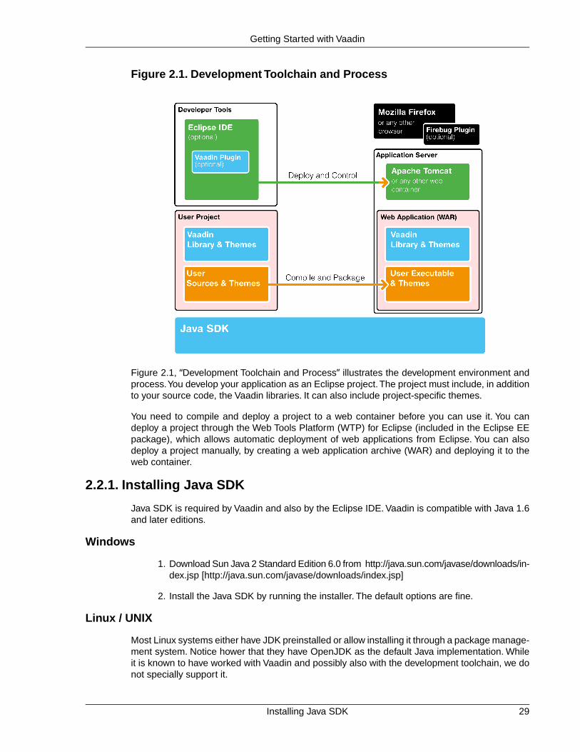
Figure 2.1. Development Toolchain and Process
Figure 2.1, “Development Toolchain and Process” illustrates the development environment andprocess.You develop your application as an Eclipse project.The project must include, in additionto your source code, the Vaadin libraries. It can also include project-specific themes.
You need to compile and deploy a project to a web container before you can use it. You candeploy a project through the Web Tools Platform (WTP) for Eclipse (included in the Eclipse EEpackage), which allows automatic deployment of web applications from Eclipse. You can alsodeploy a project manually, by creating a web application archive (WAR) and deploying it to theweb container.
2.2.1. Installing Java SDK
Java SDK is required by Vaadin and also by the Eclipse IDE. Vaadin is compatible with Java 1.6and later editions.
Windows
1. Download Sun Java 2 Standard Edition 6.0 from http://java.sun.com/javase/downloads/in-dex.jsp [http://java.sun.com/javase/downloads/index.jsp]
2. Install the Java SDK by running the installer. The default options are fine.
Linux / UNIX
Most Linux systems either have JDK preinstalled or allow installing it through a package manage-ment system. Notice hower that they have OpenJDK as the default Java implementation. Whileit is known to have worked with Vaadin and possibly also with the development toolchain, we donot specially support it.
29Installing Java SDK
Getting Started with Vaadin

Regarding OS X, notice that JDK 1.6 or newer is included in OS X 10.6 and newer.
Otherwise:
1. Download Sun Java 2 Standard Edition 6.0 from http://java.sun.com/javase/downloads/in-dex.jsp [http://java.sun.com/javase/downloads/index.jsp]
2. Decompress it under a suitable base directory, such as /opt. For example, for JavaSDK, enter (either as root or with sudo in Linux):
# cd /opt# sh (path-to-installation-package)/jdk-6u1-linux-i586.bin
and follow the instructions in the installer.
3. Set up the JAVA_HOME environment variable to point to the Java installation directory.Also, include the $JAVA_HOME/bin in the PATH. How you do that varies by the UNIXvariant. For example, in Linux and using the Bash shell, you would add lines such asthe following to the .bashrc or .profile script in your home directory:
export JAVA_HOME=/opt/jdk1.6.0_29export PATH=$PATH:$HOME/bin:$JAVA_HOME/bin
You could also make the setting system-wide in a file such as /etc/bash.bashrc,/etc/profile, or an equivalent file. If you install Apache Ant or Maven, you may alsowant to set up those in the path.
Settings done in a bashrc file require that you open a new shell window. Settings donein a profile file require that you log in into the system. You can, of course, also givethe commands in the current shell.
2.2.2. Installing Eclipse IDE
Windows
1. Download the Eclipse IDE for Java EE Developers from http://www.eclipse.org/down-loads/ [http://www.eclipse.org/downloads/]
2. Decompress the Eclipse IDE package to a suitable directory.You are free to select anydirectory and to use any ZIP decompressor, but in this example we decompress theZIP file by just double-clicking it and selecting "Extract all files" task from Windowscompressed folder task. In our installation example, we use C:\dev as the target dir-ectory.
Eclipse is now installed in C:\dev\eclipse and can be started from there (by double clickingeclipse.exe).
Linux / OS X / UNIX
We recommend that you install Eclipse manually in Linux and other UNIX variants as follows.
1. Download Eclipse IDE for Java EE Developers from http://www.eclipse.org/downloads/[http://www.eclipse.org/downloads/]
2. Decompress the Eclipse package into a suitable base directory. It is important to makesure that there is no old Eclipse installation in the target directory. Installing a new versionon top of an old one probably renders Eclipse unusable.
Installing Eclipse IDE30
Getting Started with Vaadin
3. Eclipse should normally be installed as a regular user, as this makes installation ofplugins easier. Eclipse also stores some user settings in the installation directory. Toinstall the package, enter:
$ tar zxf (path-to-installation-package)/eclipse-jee-ganymede-SR2-linux-gtk.tar.gz
This will extract the package to a subdirectory with the name eclipse.
4. You may wish to add the Eclipse installation directory and the bin subdirectory in theinstallation directory of Java SDK to your system or user PATH.
An alternative to the above procedure would be to use an Eclipse version available through thepackage management system of your operating system. It is, however, not recommended, becauseyou will need write access to the Eclipse installation directory to install Eclipse plugins, and youmay face incompatibility issues with Eclipse plugins installed by the package management of theoperating system.
2.2.3. Installing Apache Tomcat
Apache Tomcat is a lightweight Java web server suitable for both development and production.There are many ways to install it, but here we simply decompress the installation package.
Apache Tomcat should be installed with user permissions. During development, you will be runningEclipse or some other IDE with user permissions, but deploying web applications to a Tomcatserver that is installed system-wide requires administrator or root permissions.
1. Download the installation package:
Apache Tomcat 7.0 (Core Binary Distribution) from http://tomcat.apache.org/
2. Decompress Apache Tomcat package to a suitable target directory, such as C:\dev(Windows) or /opt (Linux or Mac OS X). The Apache Tomcat home directory will beC:\dev\apache-tomcat-7.0.x or /opt/apache-tomcat-7.0.x, respectively.
2.2.4. Firefox and Firebug
Vaadin supports many web browsers and you can use any of them for development. If you planto create a custom theme, customized layouts, or create new components, we recommend thatyou use Firefox together with Firebug.
If you do not have Firefox installed already, go to www.getfirefox.com [http://www.getfirefox.com/]and download and run the installer. In Linux, you can install it also with a package manager.
Using Firebug with Vaadin
After installing Firefox, use it to open http://www.getfirebug.com/ [http://www.getfirebug.com/].Follow the instructions on the site to install the latest stable version of Firebug available for thebrowser.You may need to allow Firefox to install the plugin by clicking the yellow warning bar atthe top of the browser window.
After Firebug is installed, it can be enabled at any time from the Firefox toolbar. Figure 2.2,“Firebug Debugger for Firefox” shows Firebug in action.
31Installing Apache Tomcat
Getting Started with Vaadin

Figure 2.2. Firebug Debugger for Firefox
2.3. Overview of Vaadin Libraries
Vaadin comes as a set of library JARs, of which some are optional or alternative ones, dependingon whether you are developing server-side or client-side applications, whether you use add-oncomponents, or use CSS or SASS themes.
vaadin-server-7.x.x.jarThe main library for developing server-side Vaadin applications, as described inChapter 4, Writing a Server-Side Web Application. It requires the vaadin-sharedand the vaadin-themes libraries. You can use the prebuiltvaadin-client-compiled for server-side development, unless you need add-oncomponents or custom widgets.
vaadin-shared-7.x.x.jarA shared library for server-side and client-side development. It is always needed.
vaadin-client-7.x.x.jarThe client-side Vaadin framework, including the basic GWT API and Vaadin-specificwidgets and other additions. It is required when using the vaadin-client-compilerto compile client-side modules. It is not needed if you just use the server-side frameworkwith the precompiled Client-Side Engine.
vaadin-client-compiler-7.x.x.jarThe Vaadin Client Compiler is a Java-to-JavaScript compiler that allows building client-side modules, such as the Client-Side Engine (widget set) required for server-sideapplications. The compiler is needed, for example, for compiling add-on componentsto the application widget set, as described in Section 17.3, “Compiling Add-on Widget
Overview of Vaadin Libraries32
Getting Started with Vaadin

Sets”. For detailed information regarding the compiler, see Section 13.4, “Compilinga Client-Side Module”.
vaadin-client-compiled-7.x.x.jarA precompiled Vaadin Client-Side Engine (widget set) that includes all the basic built-in widgets in Vaadin. This library is not needed if you compile the application widgetset with the Vaadin Client Compiler.
vaadin-themes-7.x.x.jarVaadin built-in themes both as SCSS source files and precompiled CSS files. Thelibrary is required both for basic use with CSS themes and for compiling custom SASSthemes.
vaadin-theme-compiler7.x.x.jarThe Vaadin Theme Compiler compiles SASS themes to CSS, as described in Sec-tion 8.3, “Syntactically Awesome Stylesheets (Sass)”. It requires thevaadin-themes-7.x.x.jar library, which contains the SCSS sources for the built-in themes.
Some of the libraries depend on each other as well as on the dependency libraries provided inthe lib folder of the installation package, especially the lib/vaadin-shared-deps.jar.
The different ways to install the libraries are described in the subsequent sections.
2.4. Installing Vaadin Plugin for Eclipse
If you are using the Eclipse IDE, using the Vaadin Plugin for Eclipse helps greatly. Notice thatyou can also create Vaadin projects as Maven projects in Eclipse.
The plugin includes:
• An integration plugin with wizards for creating new Vaadin-based projects, themes, andclient-side widgets and widget sets.
• A visual editor for editing custom composite user interface components in a WYSIWYGfashion. With full round-trip support from source code to visual model and back, the ed-itor integrates seamlessly with your development process.
• A version of Book of Vaadin that you can browse in the Eclipse Help system.
2.4.1. Installing the IvyDE Plugin
The Vaadin Plugin for Eclipse requires the Apache IvyDE plugin, which needs to be installedmanually in Eclipse before the Vaadin plugin.
1. Select Help Install New Software....
2. Add the IvyDE update site by clicking the Add... button.
Enter a name such as "Apache Ivy Update Site" and the URL of the update site:
http://www.apache.org/dist/ant/ivyde/updatesite
Then click OK. The Vaadin site should now appear in the Available Software window.
3. Select the new "Apache Ivy Update Site" from the Work with list.
33Installing Vaadin Plugin for Eclipse
Getting Started with Vaadin

4. Select the Apache Ivy, Apache Ivy Ant Tasks, and Apache IvyDE plugins.
The Apache IvyDE Resolve Visualizer is optional, and would require additional de-pendency plugins to be installed.
Then, click Next.
5. Review the installation details and click Next.
6. Accept or unaccept the license. Finally, click Finish.
7. Eclipse may warn about unsigned content. If you feel safe, click OK.
8. After the plugin is installed, Eclipse will ask to restart itself. You can proceed to installthe Vaadin plugin before the restart, as described in the following section, so you cananswer Apply Changes Now.
2.4.2. Installing the Vaadin Plugin
You can install the plugin as follows:
1. Select Help Install New Software....
2. Add the Vaadin plugin update site by clicking Add... button.
Installing the Vaadin Plugin34
Getting Started with Vaadin

Enter a name such as "Vaadin Update Site" and the URL of the update site:http://vaadin.com/eclipse. If you want or need to use the latest unstable plugin,which is usually more compatible with development and beta releases of Vaadin, youcan use http://vaadin.com/eclipse/experimental. Then click OK. TheVaadin site should now appear in the Available Software window.
3. Select all the Vaadin plugins in the tree.
Then, click Next.
4. Review the installation details and click Next.
5. Accept or unaccept the license. Finally, click Finish.
6. After the plugin is installed, Eclipse will ask to restart itself. Click Restart.
More installation instructions for the Eclipse plugin can be found at http://vaadin.com/eclipse.
35Installing the Vaadin Plugin
Getting Started with Vaadin

2.4.3. Updating the Plugins
If you have automatic updates enabled in Eclipse (see Window Preferences Install/Update Automatic Updates), the Vaadin plugin will be updated automatically along with other plugins.Otherwise, you can update the Vaadin plugin manually as follows:
1. Select Help Check for Updates. Eclipse will contact the update sites for the installedsoftware.
2. After the updates are installed, Eclipse will ask to restart itself. Click Restart.
Notice that updating the Vaadin plugin updates only the plugin and not the Vaadin libraries, whichis project specific. See below for instructions for updating the libraries.
2.4.4. Updating the Vaadin Libraries
Updating the Vaadin plugin does not update Vaadin libraries. The libraries are project specific,as a different version might be required for different projects, so you have to update them separ-ately for each project. To change the libraries to a newer (or some other) version, do as follows:
1. Select the project in the Project Explorer and select Project Preferences or pressAlt+Enter.
2. In the project preferences window that opens, select Vaadin Vaadin Version.
3. If the version that you want to use is not included in the Vaadin version drop-down list,click Download to open the download window.
If you want to use a development version, select Show pre-release versions andnightly builds. Select the version that you want to download and click OK.
4. Select the version that you want to use from the Vaadin version down-down list andclick Apply.
The Ivy configuration files are updated and the new library versions and their dependencies aredownloaded by Ivy.
Updating the Plugins36
Getting Started with Vaadin

2.5. Creating and Running a Project with Eclipse
This section gives instructions for creating a new Eclipse project using the Vaadin Plugin. Thetask will include the following steps:
1. Create a new project
2. Write the source code
3. Configure and start Tomcat (or some other web server)
4. Open a web browser to use the web application
We also show how you can debug the application in the debug mode in Eclipse.
This walkthrough assumes that you have already installed the Vaadin Plugin for Eclipse and setup your development environment, as instructed in Section 2.2, “Setting up the DevelopmentEnvironment”.
2.5.1. Creating the Project
Let us create the first application project with the tools installed in the previous section. First,launch Eclipse and follow the following steps:
1. Start creating a new project by selecting from the menu File New Project....
2. In the New Project window that opens, select Web Vaadin 7 Project and click Next.
If you choose to go the Vaadin 6 way, please use the latest Vaadin 6 version of thisbook for further instructions.
37Creating and Running a Project with Eclipse
Getting Started with Vaadin

3. In the Vaadin Project step, you need to set the basic web project settings. You needto give at least the project name and the runtime; the default values should be good forthe other settings.
Project nameGive the project a name.The name should be a valid identifier usable cross-platformas a filename and inside a URL, so using only lower-case alphanumerics, under-score, and minus sign is recommended.
Use default locationDefines the directory under which the project is created.You should normally leaveit as it is. You may need to set the directory, for example, if you are creating anEclipse project on top of a version-controlled source tree.
Target runtimeDefines the application server to use for deploying the application. The server thatyou have installed, for example Apache Tomcat, should be selected automatically.If not, click New to configure a new server under Eclipse.
ConfigurationSelect the configuration to use; you should normally use the default configurationfor the application server. If you need to modify the project facets, click Modify.
Creating the Project38
Getting Started with Vaadin

Deployment configurationThis setting defines the environment to which the application will be deployed, togenerate the appropriate project directory layout and configuration files.The choisesare:
• Servlet (default)
• Google App Engine Servlet
• Generic Portlet (Portlet 2.0)
The further steps in the New Project Wizard depend on the selected deploymentconfiguration; the steps listed in this section are for the default servlet configuration.See Section 11.7, “Google App Engine Integration” and Chapter 12, Portal Integrationfor instructions regarding the use of Vaadin in the alternative environments.
Vaadin versionSelect the Vaadin version to use. The drop-down list shows, by default, the latestavailable version of Vaadin. If you want to use another version, click Download.The dialog that opens lists all official releases of Vaadin.
If you want to use a pre-release version or a nightly development build, select Showpre-release versions and nightly builds. Select a version and click Ok to downloadit. It will appear as a choise in the drop-down list.
If you want to change the project to use another version of Vaadin, for example toupgrade to a newer one, you can go to project settings and download and selectthe other version.
Use latest nightly buildTicking this option will cause using the latest (unstable) nightly build in the samebranch. The builds are downloaded automatically and you will be notified about theupdates.
You can click Finish here to use the defaults for the rest of the settings, or click Next.
39Creating the Project
Getting Started with Vaadin

4. The settings in the Web Module step define the basic web application (WAR) deploymentsettings and the structure of the web application project. All the settings are pre-filled,and you should normally accept them as they are.
Context RootThe context root (of the application) identifies the application in the URL used foraccessing it. For example, if the project has a myproject context and a single UIat the context root, the URL would be http://example.com/myproject. Thewizard will suggest the project name given in the first step for the context name.You can change the context root later in the Eclipse project properties.
Content DirectoryThe directory containing all the content to be included in the web application (WAR)that is deployed to the web server. The directory is relative to the root directory ofthe project.
You can just accept the defaults and click Next.
5. The Vaadin project step page has various Vaadin-specific application settings. If youare trying Vaadin out for the first time, you should not need to change anything. Youcan set most of the settings afterwards, except the creation of the portlet configuration.
Creating the Project40
Getting Started with Vaadin

Create project templateMake the wizard create an application class stub.
Application NameA name for the servlet or portlet.
Base package nameThe name of the Java package under which the UI class of the application is to beplaced.
Application/UI class nameThe name of the UI class for the application, in which the user interface is developed.
Portlet versionWhen a portlet version is selected (only Portlet 2.0 is supported), the wizard willcreate the files needed for running the application in a portal. See Chapter 12, PortalIntegration for more information on portlets.
Finally, click Finish to create the project.
2.5.2. Exploring the Project
After the New Project wizard exists, it has done all the work for us: an UI class skeleton hasbeen written to src directory and the WebContent/WEB-INF/web.xml contains a deploymentdescriptor. The project hierarchy shown in the Project Explorer is shown in Figure 2.3, “A NewVaadin Project”.
The Vaadin libraries and other dependencies are managed by Ivy. Notice that the libraries arenot stored under the project folder, even though they are listed in the Java Resources Libraries ivy.xml virtual folder.
The UI Class
The UI class created by the plugin contains the following code:
package com.example.myproject;import com.vaadin.server.VaadinRequest;import com.vaadin.ui.Label;import com.vaadin.ui.UI;
public class MyprojectUI extends UI { @Override public void init(VaadinRequest request) { // Create the content root layout for the UI VerticalLayout content = new VerticalLayout(); setContent(content);
Label label = new Label("Hello Vaadin user"); content.addComponent(label); }}
Deployment Descriptor (web.xml)
The deployment descriptor WebContent/WEB-INF/web.xml defines Vaadin framework servlet,the application class, and servlet mapping. Below is a deployment descriptor for the Hello Worldapplication.
41Exploring the Project
Getting Started with Vaadin

Figure 2.3. A New Vaadin Project
<?xml version="1.0" encoding="UTF-8"?><web-app xmlns:xsi="http://www.w3.org/2001/XMLSchema-instance" xmlns="http://java.sun.com/xml/ns/javaee" xmlns:web="http://java.sun.com/xml/ns/javaee/web-app_2_5.xsd" id="WebApp_ID" version="2.5">
<display-name>myproject</display-name>
<context-param> <description>Vaadin production mode</description> <param-name>productionMode</param-name> <param-value>false</param-value> </context-param>
<servlet> <servlet-name>Myproject UI</servlet-name> <servlet-class>com.vaadin.server.VaadinServlet</servlet-class> <init-param> <description>Vaadin UI class to use</description> <param-name>UI</param-name> <param-value> com.example.myproject.MyprojectUI </param-value> </init-param> </servlet>
<servlet-mapping> <servlet-name>Myproject UI</servlet-name> <url-pattern>/*</url-pattern> </servlet-mapping></web-app>
For a more detailed treatment of the web.xml file, see Section 4.8.3, “Deployment Descriptorweb.xml”.
2.5.3. Coding Tips for Eclipse
Let us add a button to the application to make it a bit more interesting. The resulting init()method could look something like:
@Overridepublic void init(VaadinRequest request) {
Coding Tips for Eclipse42
Getting Started with Vaadin

// Create the content root layout for the UI VerticalLayout content = new VerticalLayout(); setContent(content);
// Add a simple component Label label = new Label("Hello Vaadin user"); content.addComponent(label);
// Add a component with user interaction content.addComponent(new Button("What is the time?", new ClickListener() { public void buttonClick(ClickEvent event) { Notification.show("The time is " + new Date()); } }));}
One of the most useful features in Eclipse is code completion. Pressing Ctrl+Space in the editorwill display a popup list of possible class name and method name completions, as shown inFigure 2.4, “Java Code Completion in Eclipse”, depending on the context of the cursor position.
Figure 2.4. Java Code Completion in Eclipse
To add an import statement for a class, such as Button, simply press Ctrl+Shift+O or clickthe red error indicator on the left side of the editor window. If the class is available in multiplepackages, a list of the alternatives is displayed, as shown in Figure 2.5, “Importing ClassesAutomatically”. For server-side Vaadin development, you should normally use the classes underthe com.vaadin.server package.
Figure 2.5. Importing Classes Automatically
43Coding Tips for Eclipse
Getting Started with Vaadin

2.5.4. Setting Up and Starting the Web Server
Eclipse IDE for Java EE Developers has the Web Standard Tools package installed, which sup-ports control of various web servers and automatic deployment of web content to the server whenchanges are made to a project.
Make sure that Tomcat was installed with user permissions. Configuration of the web server inEclipse will fail if the user does not have write permissions to the configuration and deploymentdirectories under the Tomcat installation directory.
Follow the following steps.
1. Switch to the Servers tab in the lower panel in Eclipse. List of servers should be emptyafter Eclipse is installed. Right-click on the empty area in the panel and select New Server.
2. Select Apache Tomcat v7.0 Server and set Server's host name as localhost,which should be the default. If you have only one Tomcat installed, Server runtime hasonly one choice. Click Next.
3. Add your project to the server by selecting it on the left and clicking Add to add it to theconfigured projects on the right. Click Finish.
Setting Up and Starting the Web Server44
Getting Started with Vaadin

4. The server and the project are now installed in Eclipse and are shown in the Serverstab. To start the server, right-click on the server and select Debug. To start the serverin non-debug mode, select Start.
5. The server starts and the WebContent directory of the project is published to the serveron http://localhost:8080/myproject/.
2.5.5. Running and Debugging
Starting your application is as easy as selecting myproject from the Project Explorer and thenRun Debug As Debug on Server. Eclipse then opens the application in built-in web browser.
Figure 2.6. Running a Vaadin Application
You can insert break points in the Java code by double-clicking on the left margin bar of thesource code window. For example, if you insert a breakpoint in the buttonClick() methodand click the What is the time? button, Eclipse will ask to switch to the Debug perspective. Debugperspective will show where the execution stopped at the breakpoint. You can examine andchange the state of the application. To continue execution, select Resume from Run menu.
45Running and Debugging
Getting Started with Vaadin

Figure 2.7. Debugging a Vaadin Application
Above, we described how to debug a server-side application. Debugging client-side applicationsand widgets is described in Section 13.6, “Debugging Client-Side Code”.
2.6. Using Vaadin with Maven
Maven is a commonly used build and dependency management system. The Vaadin core libraryand all Vaadin add-ons are available through Maven.You can use a Maven with a front-end fromEclipse or NetBeans, or by using the command-line as described in this section.
In addition to regular Maven, you can use any Maven-compatible build or dependency managementsystem, such as Ivy or Gradle. For Gradle, see the Gradle Vaadin Plugin[https://github.com/johndevs/gradle-vaadin-plugin]. Vaadin Plugin for Eclipse uses Ivy forresolving dependencies in Vaadin projects, and it should provide you with the basic Ivy configur-ation.
2.6.1. Working from Command-Line
You can create a new Maven project with the following command (given in one line):
$ mvn archetype:generate -DarchetypeGroupId=com.vaadin -DarchetypeArtifactId=vaadin-archetype-application -DarchetypeVersion=7.x.x -DgroupId=your.company -DartifactId=project-name -Dversion=1.0 -Dpackaging=war
The parameters are as follows:
archetypeGroupIdThe group ID of the archetype is com.vaadin for Vaadin archetypes.
Using Vaadin with Maven46
Getting Started with Vaadin

archetypeArtifactIdThe archetype ID. Vaadin currently supports the following archetypes:
• vaadin-archetype-clean is a new project with a barebone skeleton for a regularVaadin application.The pom.xml includes out-commented definitions for additionalwidgets.
• vaadin-archetype-widget is a skeleton for a project with custom widgets.
• vaadin-archetype-sample is also for project with custom widgets, but theskeleton includes the Color Picker example used in Chapter 16, Integrating with theServer-Side.
• vaadin-archetype-addon is for Vaadin add-on projects. It packages the add-on so that it can be published in Vaadin Directory. The archetype is for server-sideadd-ons and does not include definitions needed for building a widget set. If youradd-on includes or requires other than the widgets in the Vaadin core library, youneed to copy the required definitions from a POM of a vaadin-archetype-cleanproject.
• vaadin-archetype-touchkit is for projects using Vaadin TouchKit, describedin Chapter 22, Mobile Applications with TouchKit. Notice that this archetype usesthe AGPL-licensed version of TouchKit, which requires that your project must alsobe licensed under the AGPL license.
archetypeVersionVersion of the archetype to use. This should be LATEST for normal Vaadin releases.For prerelease versions it should be the exact version number, such as 7.0.0.beta3.
groupIdA Maven group ID for your project. It is used for the Java package name and shouldnormally be your domain name reversed, such as com.example.myproject. Thegroup ID is used also for the Java source package name of your project, so it shouldbe Java compatible - only alphanumerics and an underscore.
artifactIdIdentifier of the artifact, that is, your project.The identifier may contain alphanumerics,minus, and underscore.
versionInitial version number of your application. The number must obey the Maven versionnumbering format.
packagingHow will the project be packaged. It is normally war.
Creating a project can take a while as Maven fetches all the dependencies. The created projectstructure is shown in Figure 2.8, “A New Vaadin Project with vaadin-archetype-clean”.
47Working from Command-Line
Getting Started with Vaadin

Figure 2.8. A New Vaadin Project with vaadin-archetype-clean
2.6.2. Compiling and Running the Application
Before the application can be deployed, it must be compiled and packaged as a WAR package.You can do this with the package goal as follows:
$ mvn package
The location of the resulting WAR package should be displayed in the command output.You canthen deploy it to your favorite application server.
The easiest way to run Vaadin applications with Maven is to use the light-weight Jetty webserver. After compiling the package, all you need to do is type:
$ mvn jetty:run
The special goal starts the Jetty server in port 8080 and deploys the application. You can thenopen it in a web browser at http://localhost:8080/project-name.
2.6.3. Using Add-ons and Custom Widget Sets
If you use Vaadin add-ons that include a widget set or make your custom widgets, you need toenable widget set compilation in the POM.The required configuration is described in Section 17.5,“Using Add-ons in a Maven Project”.
2.7. Creating a Project with NetBeans IDE
You have two choices to create a Vaadin project in NetBeans: as a regular web application projector as a Maven project. We cover these both ways in the following sections.
2.7.1. Regular Web Application Project
This section describes the basic way of creating a Vaadin application project in NetBeans. Thisapproach is useful if you do not wish to use Maven, but requires more manual work.
1. Open File New Project.
2. Select Java Web Web Application and click Next.
Compiling and Running the Application48
Getting Started with Vaadin

3. Give a project name, such as myproject. As the project name is by default also usedas the context path, it should contain only alphanumerics, underscore and minus sign.Click Next.
4. Select a server.The reference toolchain recommends Apache Tomcat, as many instruc-tions in this book are given specifically for Tomcat, but any other server should workjust as fine. Click Next.
5. Click Finish.
The project is created. However, it is a simple skeleton for a JSP-based web application project.To make it a proper Vaadin project, you need to include the Vaadin libraries in the WEB-INF/libfolder, create the application class, and define the web.xml deployment descriptor.
2.7.2. Maven Project from Vaadin Archetype
Creating a Maven project with the Vaadin archetype is simpler than as a normal web applicationproject in NetBeans. It creates an application skeleton, defines the web.xml deploymentdescriptor, and also retrieves the latest Vaadin library automatically.
1. Select File New Project.
2. Select Maven Project from Archetype and click Next.
3. Select an archetype from a repository:
• If you have used Vaadin with Maven before, you might already have the archetypein local repository - select Archetypes from Local Repository.
• Add a new archetype by clicking Add. For Group Id, given com.vaadin. For ArtifactId, give vaadin-archetype-clean for a normal project,vaadin-archetype-widget for a custom GWT widget project, orvaadin-archetype-sample for a more advanced application skeleton. For Version,give LATEST or a specific version number. Then, click OK.
Figure 2.9. Adding a New Maven Archetype in NetBeans
Then select the Custom archetype - vaadin-archetype-clean (LATEST) from theselection tree.
Click Next.
4. In the Name and Location step, enter Project Name, which is recommended to beonly lower-case alphabetics, as it is used also as a suggestion for the Java packagename of the project. Modify the other parameters for your project and click Finish.
49Maven Project from Vaadin Archetype
Getting Started with Vaadin

Figure 2.10. Adding a New Maven Project in NetBeans
Creating the project can take a while as Maven loads all the needed dependencies. Once created,you can run it by right-clicking on the project in the Projects view and selecting Run. In the Selectdeployment server window that opens, select Apache Tomcat and click OK. If all goes well,NetBeans starts the server and launches the default browser to display the web application.
2.8. Vaadin Installation Package
While the recommended way to install Vaadin is to use the Eclipse plugin, one of the other IDEplugins, or a dependency management system, such as Maven, Vaadin is also available as aZIP distribution package.
You can download the newest Vaadin installation package from the download page at http://vaad-in.com/download/. Please use a ZIP decompression utility available in your operating system toextract the files from the ZIP package.
2.8.1. Package Contents
README.TXTThis Readme file gives simple instructions for installing Vaadin in your project.
release-notes.htmlThe Release Notes contain information about the new features in the particular release,give upgrade instructions, describe compatibility, etc. Please open the HTML file witha web browser.
license.htmlApache License version 2.0. Please open the HTML file with a web browser.
lib folderAll dependency libraries required by Vaadin are contained within the lib folder.
*.jarVaadin libraries, as described in Section 2.3, “Overview of Vaadin Libraries”.
2.8.2. Installing the Libraries
You can install the Vaadin ZIP package in a few simple steps:
Vaadin Installation Package50
Getting Started with Vaadin

1. Copy the JAR files at the package root folder to the WEB-APP/lib web library folderin the project. Some of the libraries are optional, as explained in Section 2.3, “Overviewof Vaadin Libraries”.
2. Also copy the dependency JAR files in the lib folder to the WEB-APP/lib web libraryfolder in the project.
The location of the WEB-APP/lib folder depends on the project organization, which dependson the development environment.
• In Eclipse Dynamic Web Application projects: WebContent/WEB-INF/lib.
• In Maven projects: src/main/webapp/WEB-INF/lib.
51Installing the Libraries
Getting Started with Vaadin

52

Chapter 3
Architecture
3.1. Overview .................................................................................................. 533.2. Technological Background ....................................................................... 563.3. Client-Side Engine ................................................................................... 583.4. Events and Listeners ............................................................................... 59
In Chapter 1, Introduction, we gave a short introduction to the general architecture of Vaadin.This chapter looks deeper into the architecture at a more technical level.
3.1. Overview
Vaadin provides two development models for web applications: for the client-side (the browser)and for the server-side.The server-driven development model is the more powerful one, allowingapplication development solely on the server-side, by utilizing an AJAX-based Vaadin Client-SideEngine that renders the user interface in the browser. The client-side model allows developingwidgets and applications in Java, which are compiled to JavaScript and executed in the browser.The two models can share their UI widgets, themes, and back-end code and services, and canbe mixed together easily.
Figure 3.1, “Vaadin Runtime Architecture” gives a basic illustration of the client-side and server-side communications, in a running situation where the page with the client-side code (engine orapplication) has been intially loaded in the browser.
Vaadin Framework consists of a server-side API, a client-side API, a horde of user interfacecomponents/widgets on the both sides, themes for controlling the appearance, and a data modelthat allows binding the server-side components directly to data. For client-side development, itincludes the Vaadin Compiler, which allows compiling Java to JavaScript.
53Book of Vaadin
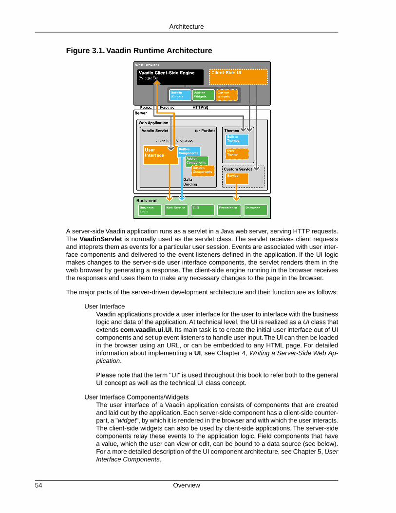
Figure 3.1. Vaadin Runtime Architecture
A server-side Vaadin application runs as a servlet in a Java web server, serving HTTP requests.The VaadinServlet is normally used as the servlet class. The servlet receives client requestsand inteprets them as events for a particular user session. Events are associated with user inter-face components and delivered to the event listeners defined in the application. If the UI logicmakes changes to the server-side user interface components, the servlet renders them in theweb browser by generating a response. The client-side engine running in the browser receivesthe responses and uses them to make any necessary changes to the page in the browser.
The major parts of the server-driven development architecture and their function are as follows:
User InterfaceVaadin applications provide a user interface for the user to interface with the businesslogic and data of the application. At technical level, the UI is realized as a UI class thatextends com.vaadin.ui.UI. Its main task is to create the initial user interface out of UIcomponents and set up event listeners to handle user input.The UI can then be loadedin the browser using an URL, or can be embedded to any HTML page. For detailedinformation about implementing a UI, see Chapter 4, Writing a Server-Side Web Ap-plication.
Please note that the term "UI" is used throughout this book to refer both to the generalUI concept as well as the technical UI class concept.
User Interface Components/WidgetsThe user interface of a Vaadin application consists of components that are createdand laid out by the application. Each server-side component has a client-side counter-part, a "widget", by which it is rendered in the browser and with which the user interacts.The client-side widgets can also be used by client-side applications. The server-sidecomponents relay these events to the application logic. Field components that havea value, which the user can view or edit, can be bound to a data source (see below).For a more detailed description of the UI component architecture, see Chapter 5, UserInterface Components.
Overview54
Architecture

Client-Side EngineThe Client-Side Engine of Vaadin manages the rendering of ther UI in the web browserby employing various client-side widgets, counterparts of the server-side components.It communicates user interaction to the server-side, and then again renders the changesin the UI.The communications are made using asynchronous HTTP or HTTPS requests.See Section 3.3, “Client-Side Engine”.
Vaadin ServletServer-side Vaadin applications work on top of the Java Servlet API (see Section 3.2.5,“Java Servlets”.The Vaadin servlet, or more exactly the VaadinServlet class, receivesrequests from different clients, determines which user session they belong to bytracking the sessions with cookies, and delegates the requests to their correspondingsessions.You can customize the Vaadin servlet by extending it.
ThemesVaadin makes a separation between the appearance and component structure of theuser interface. While the UI logic is handled as Java code, the presentation is definedin themes as CSS or Sass. Vaadin provides a number of default themes. User themescan, in addition to style sheets, include HTML templates that define custom layoutsand other resources, such as images. Themes are discussed in detail in Chapter 8,Themes.
EventsInteraction with user interfafce components creates events, which are first processedon the client-side by the widgets, then passed all the way through the HTTP server,Vaadin servlet, and the user interface components to the event listeners defined inthe application. See Section 3.4, “Events and Listeners”.
Data BindingIn addition to the user interface model, Vaadin provides a data model for binding datapresented in field components, such as text fields, check boxes and selection compon-ents, to a data source. Using the data model, the user interface components can updatethe application data directly, often without the need for any control code. All the fieldcomponents in Vaadin use this data model internally, but any of them can be boundto a separate data source as well. For example, you can bind a table component toan SQL query response. For a complete overview of the Vaadin Data Model, pleaserefer to Chapter 9, Binding Components to Data.
Client-Side ApplicationsIn addition to server-side web applications, Vaadin supports client-side applicationmodules, which run in the browser. Client-side modules can use the same widgets,themes, and back-end services as server-side Vaadin applications. They are usefulwhen you have a need for highly responsive UI logic, such as for games or for servinga large number of clients with possibly stateless server-side code, and for variousother purposes, such as offering an off-line mode for server-side applications. Pleasesee Chapter 14, Client-Side Applications for further details.
Back-endVaadin is meant for building user interfaces, and it is recommended that other applic-ation layers should be kept separate from the UI. The business logic can run in thesame servlet as the UI code, usually separated at least by a Java API, possibly asEJBs, or distributed to a remote back-end service. The data storage is usually distrib-uted to a database management system, and is typically accessed through a persist-ence solution, such as JPA.
55Overview
Architecture

3.2.Technological Background
This section provides an introduction to the various technologies and designs on which Vaadinis based. This knowledge is not necessary for using Vaadin, but provides some background ifyou need to make low-level extensions to Vaadin.
3.2.1. HTML and JavaScript
The World Wide Web, with all its websites and most of the web applications, is based on the useof the Hypertext Markup Language (HTML). HTML defines the structure and formatting of webpages, and allows inclusion of graphics and other resources. It is based on a hierarchy of elementsmarked with start and end tags, such as <div> ... </div>.Vaadin specifically uses XHTML,which is syntactically stricter than regular HTML. Vaadin uses HTML version 5, although conser-vatively, to the extent supported by the major browsers, and their currently most widely usedversions.
JavaScript, on the other hand, is a programming language for embedding programs in HTMLpages. JavaScript programs can manipulate a HTML page through the Document Object Model(DOM) of the page. They can also handle user interaction events. The Client-Side Engine ofVaadin and its client-side widgets do exactly this, although it is actually programmed in Java,which is compiled to JavaScript with the Vaadin Client Compiler.
Vaadin largely hides the use of HTML, allowing you to concentrate on the UI component structureand logic. In server-side development, the UI is developed in Java using UI components andrendered by the client-side engine as HTML, but it is possible to use HTML templates for definingthe layout, as well as HTML formatting in many text elements. Also when developing client-sidewidgets and UIs, the built-in widgets in the framework hide most of HTML DOM manipulation.
3.2.2. Styling with CSS and Sass
While HTML defines the content and structure of a web page, Cascading Style Sheet (CSS) isa language for defining the visual style, such as colors, text sizes, and margins. CSS is basedon rules that are matched with the HTML structure by the browser. The properties defined in therules determine the visual appearance of the matching HTML elements.
Sass, or Syntactically Awesome Stylesheets, is an extension of the CSS language, which allowsthe use of variables, nesting, and many other syntactic features that make the use of CSS easierand clearer. Sass has two alternative formats, SCSS, which is a superset of the syntax of CSS3,and an older indented syntax, which is a more concise.
Vaadin handles styling with themes defined with CSS or Sass, and associated images and otherresources. Vaadin themes are specifically written in SCSS. In development mode, Sass files arecompiled automatically to CSS. For production use, you compile the Sass files to CSS with theincluded compiler. The use of themes is documented in detail in Chapter 8, Themes, which alsogives an introduction to CSS and Sass.
3.2.3. AJAX
AJAX, short for Asynchronous JavaScript and XML, is a technique for developing web applicationswith responsive user interaction, similar to traditional desktop applications. Conventional webapplications, be they JavaScript-enabled or not, can get new page content from the server onlyby loading an entire new page. AJAX-enabled pages, on the other hand, handle the user interactionin JavaScript, send a request to the server asynchronously (without reloading the page), receiveupdated content in the response, and modify the page accordingly. This way, only small parts of
Technological Background56
Architecture
the page data need to be loaded.This goal is archieved by the use of a certain set of technologies:XHTML, CSS, DOM, JavaScript, and the XMLHttpRequest API in JavaScript. XML is just oneway to serialize data between the client and the server, and in Vaadin it is serialized with themore efficient JSON.
The asynchronous requests used in AJAX are made possible by the XMLHttpRequest class inJavaScript.The API feature is available in all major browsers and is under way to become a W3Cstandard.
Communication of complex data between the browser and the server require some sort of serial-ization (or marshalling) of data objects. The Vaadin servlet and the client-side engine handle theserialization of shared state objects from the server-side components to the client-side widgets,as well as serialization of RPC calls between the widgets and the server-side components.
3.2.4. Google Web Toolkit
The client-side framework of Vaadin is based on the Google Web Toolkit (GWT). Its purpose isto make it possible to develop web user interfaces that run in the browser easily with Java insteadof JavaScript. Client-side modules are developed with Java and compiled into JavaScript withthe Vaadin Compiler, which is an extension of the GWT Compiler.The client-side framework alsohides much of the HTML DOM manipulation and enables handling browser events in Java.
GWT is essentially a client-side technology, normally used to develop user interface logic in theweb browser. Pure client-side modules still need to communicate with a server using RPC callsand by serializing any data. The server-driven development mode in Vaadin effectively hides allthe client-server communications and allows handling user interaction logic in a server-side ap-plication. This makes the architecture of an AJAX-based web application much simpler. Never-theless, Vaadin also allows developing pure client-side applications, as described in Chapter 14,Client-Side Applications.
See Section 3.3, “Client-Side Engine” for a description of how the client-side framework basedon GWT is used in the Client-Side Engine of Vaadin. Chapter 13, Client-Side Vaadin Developmentprovides information about the client-side development, and Chapter 16, Integrating with theServer-Side about the integration of client-side widgets with the server-side components.
3.2.5. Java Servlets
A Java Servlet is a class that is executed in a Java web server (a Servlet container) to extendthe capabilities of the server. In practice, it is normally part of a web application, which can containHTML pages to provide static content, and JavaServer Pages (JSP) and Java Servlets to providedynamic content. This is illustrated in Figure 3.2, “Java Web Applications and Servlets”.
57Google Web Toolkit
Architecture

Figure 3.2. Java Web Applications and Servlets
Web applications are usually packaged and deployed to a server as WAR (Web applicationARchive) files, which are Java JAR packages, which in turn are ZIP compressed packages. Theweb application is defined in a WEB-INF/web.xml deployment descriptor, which defines theservlet classes and also the mappings from request URL paths to the servlets. This is describedin more detail in Section 4.8.3, “Deployment Descriptor web.xml”.The class path for the servletsand their dependencies includes the WEB-INF/classes and WEB-INF/lib folders. TheWEB-INF is a special hidden folder that can not be accessed by its URL path.
The servlets are Java classes that handle HTTP requests passed to them by the server throughthe Java Servlet API. They can generate HTML or other content as a response. JSP pages, onthe other hand, are HTML pages, which allow including Java source code embedded in the pages.They are actually translated to Java source files by the container and then compiled to servlets.
The UIs of server-side Vaadin applications run as servlets. They are wrapped inside a Vaadin-Servlet servlet class, which handles session tracking and other tasks. On the initial request, itreturns a HTML loader page and then mostly JSON responses to synchronize the widgets andtheir server-side counterparts. It also serves various resources, such as themes.The server-sideUIs are implemented as classes extending the UI class, as described in Chapter 4, Writing aServer-Side Web Application. The class is given as a parameter to the Vaadin Servlet in theweb.xml deployment descriptor.
The Vaadin Client-Side Engine as well as client-side Vaadin applications are loaded to the browseras static JavaScript files. The client-side engine, or widget set in technical terms, needs to belocated under the VAADIN/widgetsets path in the web application. The precompiled defaultwidget set is served from the vaadin-client-compiled JAR by the Vaadin Servlet.
3.3. Client-Side Engine
The user interface of a server-side Vaadin application is rendered in the browser by the VaadinClient-Side Engine. It is loaded in the browser when the page with the Vaadin UI is opened. Theserver-side UI components are rendered using widgets (as they are called in Google Web Toolkit)on the client-side. The client-side engine illustrated in Figure 3.3, “Vaadin Client-Side Engine”.
Client-Side Engine58
Architecture

Figure 3.3. Vaadin Client-Side Engine
The client-side framework includes two kinds of built-in widgets: GWT widgets and Vaadin-spe-cific widgets. The two widget collections have significant overlap, where the Vaadin widgetsprovide a bit different features than the GWT widgets. In addition, many add-on widgets and theirserver-side counterparts exists, and you can easily download and install them, as described inChapter 17, Using Vaadin Add-ons. You can also develop your own widgets, as described inChapter 13, Client-Side Vaadin Development.
The rendering with widgets as well as the communication to the server-side is handled in theApplicationConnection. Connecting the widgets with their server-side counterparts is done inconnectors, and there is one for each widget that has a server-side counterpart. The frameworkhandles serialization of component state transparently, and includes an RPC mechanism betweenthe two sides. Integration of widgets with their server-side counterpart components is describedin Chapter 16, Integrating with the Server-Side.
3.4. Events and Listeners
Vaadin offers an event-driven programming model for handling user interaction. When a userdoes something in the user interface, such as clicks a button or selects an item, the applicationneeds to know about it. Many Java-based user interface frameworks follow the Event-Listenerpattern (also known as the Observer design pattern) to communicate user input to the applicationlogic. So does Vaadin.The design pattern involves two kinds of elements: an object that generates("fires" or "emits") events and a number of listeners that listen for the events.When such an eventoccurs, the object sends a notification about it to all the listeners. In a typical case, there is onlyone listener.
Events can serve many kinds of purposes. In Vaadin, the usual purpose of events is handlinguser interaction in a user interface. Session management can require special events, such asfor time-out, in which case the event would actually be the lack of user interaction. Time-out is aspecial case of timed or scheduled events, where an event occurs at a specific date and time orwhen a set time has passed.
59Events and Listeners
Architecture

To receive events of a particular type, an application must register a listener object with the eventsource. The listeners are registered in the components with an add*Listener() method (witha method name specific to the listener).
Most components that have related events define their own event class and the correspondinglistener class. For example, the Button has Button.ClickEvent events, which can be listenedto through the Button.ClickListener interface.
In the following, we handle button clicks with a listener implemented as an anonymous class:
final Button button = new Button("Push it!");
button.addClickListener(new Button.ClickListener() { public void buttonClick(ClickEvent event) { button.setCaption("You pushed it!"); }});
Figure 3.4, “Class Diagram of a Button Click Listener” illustrates the case where an application-specific class inherits the Button.ClickListener interface to be able to listen for button clickevents. The application must instantiate the listener class and register it withaddClickListener(). It can be an anonymous class, such as the one above. When an eventoccurs, an event object is instantiated, in this case a Button.ClickEvent.The event object knowsthe related UI component, in this case the Button.
Figure 3.4. Class Diagram of a Button Click Listener
In the ancient times of C programming, callback functions filled largely the same need as listenersdo now. In object-oriented languages, we usually only have classes and methods, not functions,so the application has to give a class interface instead of a callback function pointer to theframework.
Section 4.3, “Handling Events with Listeners” goes into details of handling events in practice.
Events and Listeners60
Architecture

Part II. Server-Side FrameworkOf the two sides of Vaadin, the server-side code runs in a Java web server as a servlet, or a portlet in aportal. It offers a server-side API with dozens of user interface components for developing user interfaces,and employs a client-side engine to render them in the browser. User interaction is communicated transpar-ently to the server-side application.The user interface can be styled with themes, and bound to data throughthe Vaadin Data Model.


Chapter 4
Writing aServer-Side Web
Application
4.1. Overview .................................................................................................. 634.2. Building the UI ......................................................................................... 664.3. Handling Events with Listeners ................................................................ 704.4. Images and Other Resources .................................................................. 724.5. Handling Errors ........................................................................................ 764.6. Notifications ............................................................................................. 794.7. Application Lifecycle ................................................................................ 814.8. Deploying an Application ......................................................................... 85
This chapter provides the fundamentals of server-side web application development with Vaadin,concentrating on the basic elements of an application from a practical point-of-view.
4.1. Overview
A server-side Vaadin application runs as a Java Servlet in a servlet container. The Java ServletAPI is, however, hidden behind the framework.The user interface of the application is implementedas a UI class, which needs to create and manage the user interface components that make up
63Book of Vaadin

the user interface. User input is handled with event listeners, although it is also possible to bindthe user interface components directly to data. The visual style of the application is defined inthemes as CSS and SCSS files. Icons, other images, and downloadable files are handled asresources, which can be external or served by the application server or the application itself.
Figure 4.1. Server-Side Application Architecture
Figure 4.1, “Server-Side Application Architecture” illustrates the basic architecture of an applicationmade with the Vaadin Framework, with all the major elements, which are introduced below anddiscussed in detail in this chapter.
First of all, a Vaadin application must have one or more UI classes that extend the abstractcom.vaadin.ui.UI class and implement the init() method. A custom theme can be defined asan annotation for the UI.
@Theme("hellotheme")public class HelloWorld extends UI { protected void init(VaadinRequest request) { ... initialization code goes here ... }}
A UI is a viewport to a Vaadin application running in a web page. A web page can actually havemultiple such UIs within it. Such situation is typical especially with portlets in a portal. An applic-ation can run in multiple browser windows, each having a distinct UI instance. The UIs can bethe same UI class or different.
Overview64
Writing a Server-Side Web Application

The UI API may seem similar to Java Servlet API, but that is only superficial. Vaadin frameworkhandles servlet requests internally and associates the requests with user sessions and an UIstate. Because of this, you can develop Vaadin applications much like you would develop desktopapplications.
The most important task in the initialization is the creation of the initial user interface. This, andthe deployment of an UI as a Java Servlet in the Servlet container, as described in Section 4.8,“Deploying an Application”, are the minimal requirements for an application.
Below is a short overview of the other basic elements of an application besides UI:
UIA UI represents an HTML fragment in which a Vaadin application runs in a web page.It typically fills the entire page, but can also be just a part of a page.You normally de-velop a Vaadin application by extending UI and adding content to it. A UI is essentiallya viewport connected to a user session of an application, and you can have many suchviews, especially in a multi-window application. Normally, when the user opens a newpage with the URL of the Vaadin UI, a new UI (and the associated Page object) isautomatically created for it. All of them share the same user session.
The current UI object can be globally accessed with UI.getCurrent(). The staticmethod returns the thread-local UI instance for the currently processed request (seeSection 11.14.3, “ThreadLocal Pattern”).
PageA UI is associated with a Page object that represents the web page as well as thebrowser window in which the UI runs.
The Page object for the currently processed request can be globally accessed from aVaadin application with Page.getCurrent(). This is equivalent to callingUI.getCurrent().getPage().
Vaadin SessionA VaadinSession object represents a user session with one or more UIs open in theapplication. A session starts when a user first opens a UI of a Vaadin application, andcloses when the session expires in the server or when it is closed explicitly.
User Interface ComponentsThe user interface consists of components that are created by the application. Theyare laid out hierarchically using special layout components, with a content root layoutat the top of the hierarchy. User interaction with the components causes events relatedto the component, which the application can handle. Field components are intendedfor inputting values and can be directly bound to data using the Vaadin Data Model.You can make your own user interface components through either inheritance orcomposition. For a thorough reference of user interface components, see Chapter 5,User Interface Components, for layout components, see Chapter 6, Managing Layout,and for compositing components, see Section 5.22, “Component Composition withCustomComponent”.
Events and ListenersVaadin follows an event-driven programming paradigm, in which events, and listenersthat handle the events, are the basis of handling user interaction in an application.Section 3.4, “Events and Listeners” gave an introduction to events and listeners froman architectural point-of-view, while Section 4.3, “Handling Events with Listeners” laterin this chapter takes a more practical view.
65Overview
Writing a Server-Side Web Application

ResourcesA user interface can display images or have links to web pages or downloadabledocuments. These are handled as resources, which can be external or provided bythe web server or the application itself. Section 4.4, “Images and Other Resources”gives a practical overview of the different types of resources.
ThemesThe presentation and logic of the user interface are separated. While the UI logic ishandled as Java code, the presentation is defined in themes as CSS or SCSS.Vaadinincludes some built-in themes. User-defined themes can, in addition to style sheets,include HTML templates that define custom layouts and other theme resources, suchas images. Themes are discussed in detail in Chapter 8, Themes, custom layouts inSection 6.14, “Custom Layouts”, and theme resources in Section 4.4.4, “Theme Re-sources”.
Data BindingField components are essentially views to data, represented in the Vaadin Data Model.Using the data model, the components can get their values from and update user inputto the data model directly, without the need for any control code. A field component isalways bound to a property and a group a fields to an item that holds the properties.Items can be collected in a container, which can act as a data source for some com-ponents such as tables or lists. While all the components have a default data model,they can be bound to a user-defined data source. For example, you can bind a Tablecomponent to an SQL query response. For a complete overview of data binding inVaadin, please refer to Chapter 9, Binding Components to Data.
4.2. Building the UI
Vaadin user interfaces are built hierarchically from components, so that the leaf components arecontained within layout components and other component containers. Building the hierarchystarts from the top (or bottom - whichever way you like to think about it), from the UI class of theapplication. You normally set a layout component as the content of the UI and fill it with othercomponents.
public class MyHierarchicalUI extends UI { @Override protected void init(VaadinRequest request) { // The root of the component hierarchy VerticalLayout content = new VerticalLayout(); content.setSizeFull(); // Use entire window setContent(content); // Attach to the UI
// Add some component content.addComponent(new Label("Hello!"));
// Layout inside layout HorizontalLayout hor = new HorizontalLayout(); hor.setSizeFull(); // Use all available space
// Couple of horizontally laid out components Tree tree = new Tree("My Tree", TreeExample.createTreeContent()); hor.addComponent(tree);
Table table = new Table("My Table", TableExample.generateContent()); table.setSizeFull(); hor.addComponent(table); hor.setExpandRatio(table, 1); // Expand to fill
Building the UI66
Writing a Server-Side Web Application

content.addComponent(hor); content.setExpandRatio(hor, 1); // Expand to fill }}
The component hierarchy could be illustrated with a tree as follows:
UI `-- VerticalLayout |-- Label `-- HorizontalLayout |-- Tree `-- Table
The result is shown in Figure 4.2, “Simple Hierarchical UI”.
Figure 4.2. Simple Hierarchical UI
The built-in components are described in Chapter 5, User Interface Components and the layoutcomponents in Chapter 6, Managing Layout.
The example application described above just is, it does not do anything. User interaction ishandled with event listeners, as described a bit later in Section 4.3, “Handling Events withListeners”.
4.2.1. Application Architecture
Once your application grows beyond a dozen or so lines, which is usually quite soon, you needto start considering the application architecture more closely.You are free to use any object-ori-ented techniques available in Java to organize your code in methods, classes, packages, andlibraries. An architecture defines how these modules communicate together and what sort ofdependencies they have between them. It also defines the scope of the application. The scopeof this book, however, only gives a possibility to mention some of the most common architecturalpatterns in Vaadin applications.
The subsequent sections describe some basic application patterns.The Section 11.14, “AccessingSession-Global Data” discusses the problem of passing essentially global references around, acommon problem which is also visited in Section 4.2.5, “Accessing UI, Page, Session, and Ser-vice”.
67Application Architecture
Writing a Server-Side Web Application
4.2.2. Compositing Components
User interfaces typically contain many user interface components in a layout hierarchy. Vaadinprovides many layout components for laying contained components vertically, horizontally, in agrid, and in many other ways.You can extend layout components to create composite components.
class MyView extends VerticalLayout { TextField entry = new TextField("Enter this"); Label display = new Label("See this"); Button click = new Button("Click This");
public MyView() { addComponent(entry); addComponent(display); addComponent(click);
// Configure it a bit setSizeFull(); addStyleName("myview"); }}
// Use itLayout myview = new MyView();
This composition pattern is especially supported for creating forms, as described in Section 9.4.3,“Binding Member Fields”.
While extending layouts is an easy way to make component composition, it is a good practice toencapsulate implementation details, such as the exact layout component used. Otherwise, theusers of such a composite could begin to rely on such implementation details, which would makechanges harder. For this purpose, Vaadin has a special CustomComponent wrapper, whichhides the content representation.
class MyView extends CustomComponent { TextField entry = new TextField("Enter this"); Label display = new Label("See this"); Button click = new Button("Click This");
public MyView() { Layout layout = new VerticalLayout();
layout.addComponent(entry); layout.addComponent(display); layout.addComponent(click);
setCompositionRoot(layout);
setSizeFull(); }}
// Use itMyView myview = new MyView();
For a more detailed description of the CustomComponent, see Section 5.22, “ComponentComposition with CustomComponent”. The Vaadin Plugin for Eclipse also includes a visualeditor for composite components, as described in Chapter 7, Visual User Interface Design withEclipse.
Compositing Components68
Writing a Server-Side Web Application

4.2.3. View Navigation
While the most simple applications have just a single view (or screen), perhaps most have many.Even in a single view, you often want to have sub-views, for example to display different content.Figure 4.3, “Navigation Between Views” illustrates a typical navigation between different top-levelviews of an application, and a main view with sub-views.
Figure 4.3. Navigation Between Views
The Navigator described in Section 11.10, “Navigating in an Application” is a view manager thatprovides a flexible way to navigate between views and sub-views, while managing the URI frag-ment in the page URL to allow bookmarking, linking, and going back in browser history.
Often Vaadin application views are part of something bigger. In such cases, you may need tointegrate the Vaadin applications with the other website.You can use the embedding techniquesdescribed in Section 11.2, “Embedding UIs in Web Pages”.
4.2.4. Layered Architectures
Layered architectures, where each layer has a clearly distinct responsibility, are probably themost common architectures. Typically, applications follow at least a three-layer architecture:
• User interface (or presentation) layer
• Domain layer
• Data store layer
Such an architecture starts from a domain model, which defines the data model and the "businesslogic" of the application, typically as POJOs. A user interface is built on top of the domain model,in our context with the Vaadin Framework. The Vaadin user interface could be bound directly tothe data model through the Vaadin Data Model, described in Chapter 9, Binding Components toData. Beneath the domain model lies a data store, such as a relational database.The dependen-cies between the layers are restricted so that a higher layer may depend on a lower one, butnever the other way around.
69View Navigation
Writing a Server-Side Web Application

Figure 4.4.Three-Layer Architecture
An application layer (or service layer) is often distinguished from the domain layer, offering thedomain logic as a service, which can be used by the user interface layer, as well as for otheruses. In Java EE development, Enterprise JavaBeans (EJBs) are typically used for building thislayer.
An infrastructure layer (or data access layer) is often distinguished from the data store layer, witha purpose to abstract the data store. For example, it could involve a persistence solution suchas JPA and an EJB container. This layer becomes relevant with Vaadin when binding Vaadincomponents to data with the JPAContainer, as described in Chapter 21, Vaadin JPAContainer.
4.2.5. Accessing UI, Page, Session, and Service
You can get the UI and page to which a component is attached with getUI() and getPage().
However, the values are null until the component is attached to the UI, and typically when youneed it in constructors it is not. It is therefore preferable to access the current UI, page, session,and service objects from anywhere in the application using the static getCurrent() methodsin the respective UI, Page, VaadinSession, and VaadinService classes.
// Set the default locale of the UIUI.getCurrent().setLocale(new Locale("en"));
// Set the page title (window or tab caption)Page.getCurrent().setTitle("My Page");
// Set a session attributeVaadinSession.getCurrent().setAttribute("myattrib", "hello");
// Access the HTTP service parametersFile baseDir = VaadinService.getCurrent().getBaseDirectory();
You can get the page and the session also from a UI with getPage() and getSession() andthe service from VaadinSession with getService().
The static methods use the built-in ThreadLocal support in the classes. The pattern is describedin Section 11.14.3, “ThreadLocal Pattern”.
4.3. Handling Events with Listeners
Let us put into practice what we learned of event handling in Section 3.4, “Events and Listeners”.You can implement a listener interfaces in regular class, but it brings the problem with differenti-ating between different event sources. Using anonymous class for listeners is recommended inmost cases.
Accessing UI, Page, Session, and Service70
Writing a Server-Side Web Application

4.3.1. Implementing a Listener in a Regular Class
The following example follows a typical pattern where you have a Button component and alistener that handles user interaction (clicks) communicated to the application as events. Herewe define a class that listens to click events.
public class MyComposite extends CustomComponent implements Button.ClickListener { Button button; // Defined here for access
public MyComposite() { Layout layout = new HorizontalLayout();
// Just a single component in this composition button = new Button("Do not push this"); button.addClickListener(this); layout.addComponent(button);
setCompositionRoot(layout); }
// The listener method implementation public void buttonClick(ClickEvent event) { button.setCaption("Do not push this again"); }}
4.3.2. Differentiating Between Event Sources
If an application receives events of the same type from multiple sources, such as multiple buttons,it has to be able to distinguish between the sources. If using a regular class listener, distinguishingbetween the components can be done by comparing the source of the event with each of thecomponents. The method for identifying the source depends on the event type.
public class TheButtons extends CustomComponent implements Button.ClickListener { Button onebutton; Button toobutton;
public TheButtons() { onebutton = new Button("Button One", this); toobutton = new Button("A Button Too", this);
// Put them in some layout Layout root = new HorizontalLayout(); root.addComponent(onebutton); root.addComponent(toobutton); setCompositionRoot(root); }
@Override public void buttonClick(ClickEvent event) { // Differentiate targets by event source if (event.getButton() == onebutton) onebutton.setCaption ("Pushed one"); else if (event.getButton() == toobutton) toobutton.setCaption ("Pushed too"); }}
Other techniques exist for separating between event sources, such as using object properties,names, or captions to separate between them. Using captions or any other visible text is generally
71Implementing a Listener in a Regular Class
Writing a Server-Side Web Application
discouraged, as it may create problems for internationalization. Using other symbolic strings canalso be dangerous, because the syntax of such strings is checked only runtime.
4.3.3.The Easy Way: Using Anonymous Classes
By far the easiest and the most common way to handle events is to use anonymous local classes.It encapsulates the handling of events to where the component is defined and does not requirecumbering the managing class with interface implementations. The following example definesan anonymous class that inherits the Button.ClickListener interface.
// Have a component that fires click eventsfinal Button button = new Button("Click Me!");
// Handle the events with an anonymous classbutton.addClickListener(new Button.ClickListener() { public void buttonClick(ClickEvent event) { button.setCaption("You made me click!"); }});
Local objects referenced from within an anonymous class, such as the Button object in the aboveexample, must be declared final.
Most components allow passing a listener to the constructor, thereby losing a line or two. However,notice that if accessing the component being constructed from an anonymous class, you mustuse a reference that is declared before the constructor is executed, for example as a membervariable in the outer class. If it is declared in the same expression where the constructor is called,it doesn't yet exist. In such cases, you need to get use a reference to the component acquiredfrom the event object.
final Button button = new Button("Click It!", new Button.ClickListener() { @Override public void buttonClick(ClickEvent event) { event.getButton().setCaption("Done!"); } });
4.4. Images and Other Resources
Web applications can display various resources, such as images or downloadable files, that thebrowser has to load from the server. Image resources are typically displayed in the Embeddedcomponent or as component icons. Downloadable files are usually provided by clicking a Link.
There are several ways how such resources can be provided by the web server. Static resourcescan be provided without having to ask them from the application. For dynamic resources, theuser application must be able to create them dynamically. The resource request interfaces inVaadin allow applications to both refer to static resources as well as dynamically create them.The dynamic creation includes the StreamResource class and the RequestHandler describedin Section 11.4, “Request Handlers”.
Vaadin provides also low-level facilities for retrieving the URI and other parameters of a HTTPrequest. We will first look into how applications can provide various kinds of resources and thenlook into low-level interfaces for handling URIs and parameters to provide resources and func-tionalities.
Notice that using request handlers to create "pages" is not normally meaningful in Vaadin or inAJAX applications generally. Please see Section 3.2.3, “AJAX” for a detailed explanation.
The Easy Way: Using Anonymous Classes72
Writing a Server-Side Web Application

4.4.1. Resource Interfaces and Classes
The resource classes in Vaadin are grouped under two interfaces: a generic Resource interfaceand a more specific ConnectorResource interface for resources provided by the servlet.
Figure 4.5. Resource Interface and Class Diagram
4.4.2. File Resources
File resources are files stored anywhere in the file system. As such, they can not be retrieved bya regular URL from the server, but need to be requested through the Vaadin servlet. The use offile resources is typically necessary for persistent user data that is not packaged in the web ap-plication, which would not be persistent over redeployments.
A file object that can be accessed as a file resource is defined with the standard java.io.Fileclass. You can create the file either with an absolute or relative path, but the base path of therelative path depends on the installation of the web server. For example, with Apache Tomcat,the default current directory would be the installation path of Tomcat.
In the following example, we provide an image resource from a file stored in the web application.Notice that the image is stored under the WEB-INF folder, which is a special folder that is neveraccessible using an URL, unlike the other folders of a web application. This is a security solution- another would be to store the resource elsewhere in the filesystem.
// Find the application directoryString basepath = VaadinService.getCurrent() .getBaseDirectory().getAbsolutePath();
// Image as a file resourceFileResource resource = new FileResource(new File(basepath + "/WEB-INF/images/image.png"));
// Show the image in the applicationEmbedded image = new Embedded("Image from file", resource);
// Let the user view the file in browser or download itLink link = new Link("Link to the image file", resource);
The result, as well as the folder structure where the file is stored under a regular Eclipse Vaadinproject, is shown in Figure 4.6, “File Resource”.
Figure 4.6. File Resource
73Resource Interfaces and Classes
Writing a Server-Side Web Application

4.4.3. Class Loader Resources
The ClassResource allows resources to be loaded from the class path using Java Class Loader.Normally, the relevant class path entry is the WEB-INF/classes folder under the web application,where the Java compilation should compile the Java classes and copy other files from the sourcetree.
The one-line example below loads an image resource from the application package and displaysit in an Embedded component.
mainwindow.addComponent(new Embedded ("", new ClassResource("smiley.jpg")));
4.4.4.Theme Resources
Theme resources of ThemeResource class are files, typically images, included in a theme. Atheme is located with path VAADIN/themes/themename in a web application. Name of a themeresource is given as the parameter for the constructor, with a path relative to the theme folder.
// A theme resource in the current theme ("book-examples")// Located in: VAADIN/themes/book-examples/img/themeimage.pngThemeResource resource = new ThemeResource("img/themeimage.png");
// Use the resourceEmbedded image = new Embedded("My Theme Image", resource);
The result is shown in Figure 4.7, “Theme Resources”, illustrating also the folder structure forthe theme resource file in an Eclipse project.
Figure 4.7.Theme Resources
To use theme resources, you must set the theme for the UI. See Chapter 8, Themes for moreinformation regarding themes.
4.4.5. Stream Resources
Stream resources allow creating dynamic resource content. Charts are typical examples of dy-namic images.To define a stream resource, you need to implement the StreamResource.Stream-Source interface and its getStream method.The method needs to return an InputStream fromwhich the stream can be read.
Class Loader Resources74
Writing a Server-Side Web Application
The following example demonstrates the creation of a simple image in PNG image format.
import java.awt.image.*;
public class MyImageSource implements StreamResource.StreamSource { ByteArrayOutputStream imagebuffer = null; int reloads = 0;
/* We need to implement this method that returns * the resource as a stream. */ public InputStream getStream () { /* Create an image and draw something on it. */ BufferedImage image = new BufferedImage (200, 200, BufferedImage.TYPE_INT_RGB); Graphics drawable = image.getGraphics(); drawable.setColor(Color.lightGray); drawable.fillRect(0,0,200,200); drawable.setColor(Color.yellow); drawable.fillOval(25,25,150,150); drawable.setColor(Color.blue); drawable.drawRect(0,0,199,199); drawable.setColor(Color.black); drawable.drawString("Reloads="+reloads, 75, 100); reloads++;
try { /* Write the image to a buffer. */ imagebuffer = new ByteArrayOutputStream(); ImageIO.write(image, "png", imagebuffer);
/* Return a stream from the buffer. */ return new ByteArrayInputStream( imagebuffer.toByteArray()); } catch (IOException e) { return null; } }}
The content of the generated image is dynamic, as it updates the reloads counter with every call.The ImageIO.write() method writes the image to an output stream, while we had to return aninput stream, so we stored the image contents to a temporary buffer.
Below we display the image with the Embedded component.
// Create an instance of our stream source.StreamResource.StreamSource imagesource = new MyImageSource ();
// Create a resource that uses the stream source and give it a name.// The constructor will automatically register the resource in// the application.StreamResource resource = new StreamResource(imagesource, "myimage.png");
// Create an embedded component that gets its contents// from the resource.layout.addComponent(new Embedded("Image title", resource));
The resulting image is shown in Figure 4.8, “A Stream Resource”.
75Stream Resources
Writing a Server-Side Web Application

Figure 4.8. A Stream Resource
Another way to create dynamic content is a request handler, described in Section 11.4, “RequestHandlers”.
4.5. Handling Errors
4.5.1. Error Indicator and message
All components have a built-in error indicator that is turned on if validating the component fails,and can be set explicitly with setComponentError(). Usually, the error indicator is placedright of the component caption. The error indicator is part of the component caption, so itsplacement is usually managed by the layout in which the component is contained, but somecomponents handle it themselves. Hovering the mouse pointer over the field displays the errormessage.
textfield.setComponentError(new UserError("Bad value"));button.setComponentError(new UserError("Bad click"));
The result is shown in Figure 4.9, “Error Indicator Active”.
Figure 4.9. Error Indicator Active
4.5.2. Customizing System Messages
System messages are notifications that indicate a major invalid state in an application that usuallyrequires restarting the application. Session timeout is perhaps the most typical such state.
System messages are strings managed in SystemMessages class.
sessionExpiredApplication servlet session expired. A session expires if no server requests are madeduring the session timeout period. The session timeout can be configured with thesession-timeout parameter in web.xml, as described in Section 4.8.3, “DeploymentDescriptor web.xml”.
Handling Errors76
Writing a Server-Side Web Application

communicationErrorURLAn unspecified communication problem between the Vaadin Client-Side Engine andthe application server. The server may be unavailable or there is some other problem.
authenticationErrorThis error occurs if 401 (Unauthorized) response to a request is received from theserver.
internalErrorA serious internal problem, possibly indicating a bug in Vaadin Client-Side Engine orin some custom client-side code.
outOfSyncThe client-side state is invalid with respect to server-side state.
cookiesDisabledInforms the user that cookies are disabled in the browser and the application does notwork without them.
Each message has four properties: a short caption, the actual message, a URL to which to redirectafter displaying the message, and property indicating whether the notification is enabled.
Additional details may be written (in English) to the debug console window described in Sec-tion 11.3, “Debug and Production Mode”.
You can override the default system messages by implementing the getSystemMessages()method in the UI class. The method should return a SystemMessages object. The easiest wayto customize the messages is to use a CustomizedSystemMessages object as follows:
// Override the default implementationpublic static SystemMessages getSystemMessages() { CustomizedSystemMessages messages = new CustomizedSystemMessages(); messages.setSessionExpiredCaption("Ohno, session expired!"); messages.setSessionExpiredMessage("Don't idle!"); messages.setSessionExpiredNotificationEnabled(true); messages.setSessionExpiredURL("http://vaadin.com/"); return messages;}
Notice that the special getSystemMessages() method is executed using reflection - it is notdefined in an interface nor does it exist in the UI superclass.
4.5.3. Handling Uncaught Exceptions
Handling events can result in exceptions either in the application logic or in the framework itself,but some of them may not be caught properly by the application. Any such exceptions areeventually caught in VaadinSession.
For example, in the following, we throw an error in an event listener but do not catch it, so it fallsto the framework.
final Button button = new Button ("Fail Me");
button.addClickListener(new Button.ClickListener() { public void buttonClick(ClickEvent event) { // Throw some exception. throw new RuntimeException("You can't catch this.");
77Handling Uncaught Exceptions
Writing a Server-Side Web Application

}});
The uncaught exceptions are by default delegated to the DefaultErrorHandler, which displaysthe error as a component error, that is, with a small red "!" -sign (depending on the theme). If theuser hovers the mouse pointer over it, the entire backtrace of the exception is shown in a largetooltip box, as illustrated in Figure 4.10, “Uncaught Exception in Component Error Indicator” forthe above code example.
Figure 4.10. Uncaught Exception in Component Error Indicator
You can customize the default error handling by implementing a custom ErrorHandler andenabling it with setErrorHandler() in the UI or in the VaadinSession object.You can eitherimplement the ErrorHandler or extend the DefaultErrorHandler. In the following example,we modify the behavior of the default handler.
// Here's some code that produces an uncaught exception final VerticalLayout layout = new VerticalLayout();final Button button = new Button("Click Me!", new Button.ClickListener() { public void buttonClick(ClickEvent event) { ((String)null).length(); // Null-pointer exception }});layout.addComponent(button);
// Configure the error handler for the UIUI.getCurrent().setErrorHandler(new DefaultErrorHandler() { @Override public void error(com.vaadin.server.ErrorEvent event) { // Find the final cause String cause = "<b>The click failed because:</b><br/>"; for (Throwable t = event.getThrowable(); t != null; t = t.getCause()) if (t.getCause() == null) // We're at final cause cause += t.getClass().getName() + "<br/>";
// Display the error message in a custom fashion layout.addComponent(new Label(cause, ContentMode.HTML));
// Do the default error handling (optional) doDefault(event); } });
Handling Uncaught Exceptions78
Writing a Server-Side Web Application

4.6. Notifications
Notifications are error or information boxes that appear briefly, typically at the center of the screen.A notification box has a caption and an optional description and icon.The box stays on the screeneither for a preset time or until the user clicks it. The notification type defines the default appear-ance and behaviour of a notification.
There are two ways to create a notification. The easiest is to use a static shorthandNotification.show() method, which takes the caption of the notification as a parameter anddisplays it in the current page.
Notification.show("This is a warning");
Figure 4.11. Notification
For more control, you can create a Notification object. Different constructors exist for taking justthe caption, or also the description, notification type, and whether HTML is allowed or not. Noti-fications are shown in a Page, typically the current page.
new Notification("This is a warning", "<br/>This is the <i>last</i> warning", Notification.TYPE_WARNING_MESSAGE, true) .show(Page.getCurrent());
The caption and description are by default written on the same line. If you want to have a linebreak between them, use the XHTML line break markup "<br/>" if HTML is enabled, or "\n" ifnot. When HTML is enabled (it is by default), you can use any XHTML markup in the caption anddescription of a notification. If it is possible to get the notification content from user input, youshould either disallow HTML with setHtmlContentAllowed(false) or sanitize the contentcarefully, as noted in Section 11.8.1, “Sanitizing User Input to Prevent Cross-Site Scripting”.
Figure 4.12. Notification with HTML Formatting
4.6.1. Notification Type
The notification type defines the overall default style and behaviour of a notification. If no notific-ation type is given, the "humanized" type is used as the default. The notification types, listedbelow, are defined in the Notification class.
79Notifications
Writing a Server-Side Web Application

TYPE_HUMANIZED_MESSAGEA user-friendly message that does not annoy too much: it does not require confirmationby clicking and disappears quickly. It is centered and has a neutral gray color.
TYPE_WARNING_MESSAGEWarnings are messages of medium importance. They are displayed with colors thatare neither neutral nor too distractive. A warning is displayed for 1.5 seconds, but theuser can click the message box to dismiss it. The user can continue to interact withthe application while the warning is displayed.
TYPE_ERROR_MESSAGEError messages are notifications that require the highest user attention, with alert colorsand by requiring the user to click the message to dismiss it. The error message boxdoes not itself include an instruction to click the message, although the close box inthe upper right corner indicates it visually. Unlike with other notifications, the user cannot interact with the application while the error message is displayed.
TYPE_TRAY_NOTIFICATIONTray notifications are displayed in the "system tray" area, that is, in the lower-rightcorner of the browser view. As they do not usually obsure any user interface, they aredisplayed longer than humanized or warning messages, 3 seconds by default. Theuser can continue to interact with the application normally while the tray notification isdisplayed.
4.6.2. Customizing Notifications
All of the features of specific notification types can be controlled with the Notification properties.Once configured, you need to show it in the current page.
// Notification with default settings for a warningNotification notif = new Notification( "Warning", "<br/>Area of reindeer husbandry", Notification.TYPE_WARNING_MESSAGE);
// Customize itnotif.setDelayMsec(20000);notif.setPosition(Notification.POSITION_BOTTOM_RIGHT);notif.setStyleName("mystyle");notif.setIcon(new ThemeResource("img/reindeer.png"));
// Show it in the pagenotif.show(Page.getCurrent());
The setPosition() method allows setting the positioning of the notification.The method takesas its parameter any of the constants:
Notification.POSITION_CENTERED
Customizing Notifications80
Writing a Server-Side Web Application

Notification.POSITION_CENTERED_TOP
Notification.POSITION_CENTERED_BOTTOM
Notification.POSITION_TOP_LEFT
Notification.POSITION_TOP_RIGHT
Notification.POSITION_BOTTOM_LEFT
Notification.POSITION_BOTTOM_RIGHT
The setDelayMSec() allows you to set the time in milliseconds for how long the notification isdisplayed. Parameter value -1 means that the message is displayed until the user clicks themessage box. It also prevents interaction with other parts of the application window, as is defaultbehaviour for error messages. It does not, however, add a close box that the error notificationhas.
4.6.3. Styling with CSS.v-Notification {} .popupContent {} .gwt-HTML {} h1 {} p {}
The notification box is a floating div element under the body element of the page. It has anoverall v-Notification style.The content is wrapped inside an element with popupContentstyle. The caption is enclosed within an h1 element and the description in a p element.
To customize it, add a style for the Notification object with setStyleName("mystyle"), andmake the settings in the theme, for example as follows:
.v-Notification.mystyle { background: #FFFF00; border: 10px solid #C00000; color: black;}
The result is shown, with the icon set earlier in the customization example, in Figure 4.13, “StyledNotification”.
Figure 4.13. Styled Notification
4.7. Application Lifecycle
In this section, we look into more technical details of application deployment, user sessions, andUI instance lifecycle. These details are not generally needed for writing Vaadin applications, butmay be useful for understanding how they actually work and, especially, in what circumstancestheir execution ends.
81Styling with CSS
Writing a Server-Side Web Application

4.7.1. Deployment
Before a Vaadin application can be used, it has to be deployed to a Java web server, as describedin Section 4.8, “Deploying an Application”. Deploying reads the web.xml deployment descriptorin the application to register servlets for specific URL paths and loads the classes. Deploymentdoes not yet run any code in the application, although static blocks in classes are executed whenthey are loaded.
Undeploying and Redeploying
Applications are undeployed when the server shuts down, during redeployment, and when theyare explicitly undeployed. Undeploying a server-side Vaadin application ends its execution, allapplication classes are unloaded, and the heap space allocated by the application is freed forgarbage-collection.
If any user sessions are open at this point, the client-side state of the UIs is left hanging and anOut of Sync error is displayed on the next server request.
Redeployment and Serialization
Some servers, such as Tomcat, support hot deployment, where the classes are reloaded whilepreserving the memory state of the application. This is done by serializing the application stateand then deserializing it after the classes are reloaded.This is, in fact, done with the basic Eclipsesetup with Tomcat and you may actually need to give the ?restartApplication parameterto an UI marked as @PreserveOnRefresh to force it to restart when you reload the page. Toolssuch as JRebel go even further by reloading the code in place without need for serialization.Theserver can also serialize the application state when shutting down and restarting, thereby pre-serving sessions over restarts.
Serialization requires that the applications are serializable, that is, all classes implement theSerializable interface. All Vaadin classes do, and if you extend them or implement interfaces,you usually just need to provide the serialization key, which is automatically generated by Eclipseif you use it. Serialization is also used for clustering and cloud computing, such as with GoogleApp Engine, as described in Section 11.7, “Google App Engine Integration”.
4.7.2. Vaadin Servlet, Portlet, and Service
The VaadinServlet, or VaadinPortlet in a portal, receives all server requests mapped to it byits URL, as defined in the deployment configuration, and associates them with sessions. Thesessions further associate the requests with particular UIs.
When servicing requests, the Vaadin servlet or portlet handles all tasks common to both servletsand portlets in a VaadinService. It manages sessions, gives access to the deployment configur-ation information, handles system messages, and does various other tasks. Any servlet typespecific tasks are handled in the corresponding VaadinServletService or VaadinPortletService.The service acts as the primary low-level customization layer for processing requests.
Customization
To customize VaadinService, you first need to extend the VaadinServlet or -Portlet class andoverride the createServletService() to create a custom service object.
Deployment82
Writing a Server-Side Web Application

4.7.3. User Session
A user session begins when a user first makes a request to a Vaadin servlet or portlet by openingthe URL for a particular UI. All server requests belonging to a particular UI class are processedby the VaadinServlet or VaadinPortlet class. When a new client connects, it creates a new usersession, represented by an instance of VaadinSession. Sessions are tracked using cookiesstored in the browser.
You can obtain the VaadinSession of an UI with getSession() or globally withVaadinSession.getCurrent(). It provides access also to the lower-level session objects,HttpSession and PortletSession, through a SessionWrapper.You can also access to thedeployment configuration through VaadinSession, as described in Section 4.8.5, “DeploymentConfiguration”.
A session ends after the last UI instance expires or is closed, as described later.
4.7.4. Loading an UI
A UI instance is created by the Vaadin servlet when a browser accesses a URL mapped to theservlet of the particular UI. The servlet creates the UIs using a UIProvider registered in theVaadinSession instance. A session has at least a DefaultUIProvider for managing UIs openedby the user. If the application lets the user open popup windows with a BrowserWindowOpener,each of them has a dedicated special UI provider.
The init() method for a UI is called during the initial request, which the method gets as aVaadinRequest.
After initialization of the UI instance, the servlet generates the loader page for the application.The HTML content of the page is generated as an HTML DOM object, which can be customizedby implementing a BootstrapListener that modifies the DOM object.You can also use entirelycustom loader code, such as in a static HTML page, as described in Section 11.2, “EmbeddingUIs in Web Pages”. The loader page loads the client-side engine, which in turn loads the pagecontent in a separate request.
Custom UI Providers
You can create UI objects dynamically according to their request parameters, such as the URLpath, by defining a custom UIProvider. You need to add custom UI providers to the sessionobject which calls them. The providers are chained so that they are requested starting from theone added last, until one returns an UI (otherwise they return null).You can add a UI provider toa session most conveniently by implementing a custom servlet and adding the UI provider tosessions in a SessionInitListener, or by implementing a custom session class.
You can find an example of custom UI providers in Section 22.6.1, “Providing a Fallback UI”.
Preserving UI on Refresh
Reloading a page in the browser normally spawns a new UI instance and the old UI is left hanging,until cleaned up after a while. This can be undesired as it resets the UI state for the user. Topreserve the UI, you can use the @PreserveOnRefresh annotation for the UI class. You canalso use a UIProvider with a custom implementation of isUiPreserved().
@PreserveOnRefreshpublic class MyUI extends UI {
83User Session
Writing a Server-Side Web Application
Adding the ?restartApplication parameter in the URL tells the Vaadin servlet to create anew UI instance when loading the page, even when the @PreserveOnRefresh is enabled. Thisis often necessary when developing such an UI in Eclipse, when you need to restart it after re-deploying, because Eclipse likes to persist the application state between redeployments. If youalso include a URI fragment, the parameter should be given before the fragment.
4.7.5. UI Expiration
UI instances are cleaned up if no communication is received from them after some time. If noother server requests are made, the client-side sends keep-alive heartbeat requests. A UI is keptalive as long as requests or heartbeats are received from it. It expires if three consecutiveheartbeats are missed.
The heartbeats occur at an interval of 5 minutes, which can be changed with theheartbeatInterval parameter for the servlet. You can configure the parameter in web.xmlas described in Section 4.8.4, “Other Deployment Parameters”.
When the UI cleanup happens, a CleanupEvent is sent to all CleanupListeners added to theUI. When the UI is detached from the session, detach() is called for it.
4.7.6. Session Expiration
A session is kept alive by server requests caused by user interaction with the application as wellas the heartbeat monitoring of the UIs. Once all UIs have expired, the session still remains. It iscleaned up from the server when the session timeout configured in the web application expires.
If there are active UIs in an application, their heartbeat keeps the session alive indefinitely. Youmay want to have the sessions timeout if the user is inactive long enough, which is the originalpurpose of the session timeout setting. If the closeIdleSessions parameter for the servlet isset to true in the web.xml, as described in Section 4.8.3, “Deployment Descriptor web.xml”,the session and all of its UIs are closed when the timeout specified by the session-timeoutparameter for the servlet expires after the last non-heartbeat request. Once the session is gone,the browser will show an Out Of Sync error on the next server request.To avoid the ugly message,you may want to set a redirect URL for the UIs as described in Section 4.5.2, “Customizing SystemMessages”.
The related configuration parameters are described in Section 4.8.4, “Other Deployment Para-meters”.
4.7.7. Closing a Session
You can call the close() method in the VaadinSession to shut down the session and cleanup any the resources allocated for it. The session is closed immediately and any objects relatedto it are not available after calling the method. The UI still visible in the browser has no sessionto communicate with, but will still receive the response from the final request.You typically wantto redirect the user to another URL at this point, using the setLocation() method in Page.You just have to call it before closing the session.
In the following example, we display a logout button, which closes the user session.
Button logout = new Button("Logout");logout.addClickListener(new Button.ClickListener() { @Override public void buttonClick(ClickEvent event) { // Redirect from the page getUI().getPage().setLocation(
UI Expiration84
Writing a Server-Side Web Application

"/myapp/logoutpage.html");
// Close the VaadinSession getSession().close(); }});
4.8. Deploying an Application
Vaadin applications are deployed as Java web applications, which can contain a number of ser-vlets, each of which can be a Vaadin application or some other servlet, and static resources suchas HTML files. Such a web application is normally packaged as WAR (Web application ARchive)file, which can be deployed to a Java application server (or a servlet container to be exact).
For a detailed tutorial on how web applications are packaged, please refer to any Java book thatdiscusses Java Servlets. Sun has an excellent reference online at http://java.sun.com/j2ee/tutori-al/1_3-fcs/doc/WCC3.html [http://java.sun.com/j2ee/tutorial/1_3-fcs/doc/WCC3.html].
In the Java Servlet parlance, a "web application" means a collection of Java servlets or portlets,JSP and static HTML pages, and various other resources that form an application. Such a Javaweb application is typically packaged as a WAR package for deployment. Server-side VaadinUIs run as servlets within such a Java web application. There exists also other kinds of web ap-plications. To avoid confusion with the general meaning of "web application", we often refer toJava web application with the slight misnomer "WAR" in this book.
4.8.1. Creating Deployable WAR in Eclipse
To deploy an application to a web server, you need to create a WAR package. Here we give theinstructions for Eclipse.
1. Select File Export and then Web WAR File. Or, right-click the project in the ProjectExplorer and select Web WAR File.
2. Select the Web project to export. Enter Destination file name (.war).
3. Make any other settings in the dialog, and click Finish.
4.8.2. Web Application Contents
The following files are required in a web application in order to run it.
Web application organization
WEB-INF/web.xmlThis is the standard web application descriptor that defines how the application is or-ganized. You can refer to any Java book about the contents of this file. Also see anexample in Section 1.2, “Example Application Walkthrough”.
WEB-INF/lib/*.jarThese are the Vaadin libraries and their dependencies. They can be found from theinstallation package or as loaded by a dependency management system such asMaven or Ivy.
85Deploying an Application
Writing a Server-Side Web Application

Your application classesYou must include your application classes either in a JAR file in WEB-INF/lib or asclasses in WEB-INF/classes
Your own theme files (OPTIONAL)If your application uses a special theme (look and feel), you must include it inVAADIN/themes/themename directory.
Widget sets (OPTIONAL)If your application uses a project-specific widget set, it must be compiled in theVAADIN/widgetset/ directory.
4.8.3. Deployment Descriptor web.xml
The deployment descriptor is an XML file with the name web.xml in the WEB-INF directory ofa web application. It is a standard component in Java EE describing how a web application shouldbe deployed. The structure of the deployment descriptor is illustrated by the following example.You simply deploy UIs wrapped in servlets using the com.vaadin.server.VaadinServletclass.
You simply specify the UI class with the UI parameter to the servlet. The servlet is then mappedto a URL path in a standard way for Java Servlets.
<?xml version="1.0" encoding="UTF-8"?><web-app id="WebApp_ID" version="2.4" xmlns="http://java.sun.com/xml/ns/j2ee" xmlns:xsi="http://www.w3.org/2001/XMLSchema-instance" xsi:schemaLocation="http://java.sun.com/xml/ns/j2ee http://java.sun.com/xml/ns/j2ee/web-app_2_4.xsd">
<servlet> <servlet-name>myservlet</servlet-name> <servlet-class> com.vaadin.server.VaadinServlet </servlet-class>
<init-param> <param-name>UI</param-name> <param-value>com.ex.myprj.MyUI</param-value> </init-param>
<!-- If not using the default widget set--> <init-param> <param-name>widgetset</param-name> <param-value>com.ex.myprj.MyWidgetSet</param-value> </init-param> </servlet>
<servlet-mapping> <servlet-name>myservlet</servlet-name> <url-pattern>/*</url-pattern> </servlet-mapping></web-app>
The descriptor defines a servlet with name myservlet. The servlet class, com.vaadin.serv-er.VaadinServlet, is provided by Vaadin framework and is normally the same for all Vaadinprojects. For some purposes, you may need to use a custom servlet class, as described earlier.
Deployment Descriptor web.xml86
Writing a Server-Side Web Application

Widget Set
If the UI uses add-on components or custom widgets, it needs a custom widget set, which isspecified with the widgetset parameter for the servlet. The parameter is a class name with thesame path but without the .gwt.xml extension as the widget set definition file. If the parameteris not given, the com.vaadin.DefaultWidgetSet is used, which contains all the widgets for thebuilt-in Vaadin components.
If you use the Vaadin Plugin for Eclipse for creating the project and compiling the widget set, itautomatically generates the project widget set definition file, which includes all other widget setsit finds from the class path, and sets the parameter.
The widget set must be compiled and deployed with the application, as described in Section 17.3,“Compiling Add-on Widget Sets” or Section 13.4, “Compiling a Client-Side Module”.
Servlet Mapping with URL Patterns
The url-pattern is defined above as /*. This matches to any URL under the project context.We defined above the project context as myproject so the URL for the page of the UI will behttp://localhost:8080/myproject/. If the project were to have multiple UIs or servlets,they would have to be given different names to distinguish them. For example, url-pattern/myUI/* would match a URL such as http://localhost:8080/myproject/myUI/. Noticethat the slash and the asterisk must be included at the end of the pattern.
Notice also that if the URL pattern is other than /* (such as /myUI/*), you will also need tomake a servlet mapping to /VAADIN/* (unless you are serving it statically as noted below). Forexample:
... <servlet-mapping> <servlet-name>myservlet</servlet-name> <url-pattern>/myurl/*</url-pattern> </servlet-mapping>
<servlet-mapping> <servlet-name>myservlet</servlet-name> <url-pattern>/VAADIN/*</url-pattern> </servlet-mapping>
If you have multiple servlets, you should specify only one /VAADIN/* mapping. It does notmatter which servlet you map the pattern to, as long as it is a Vaadin servlet.
You do not have to provide the above /VAADIN/* mapping if you serve both the widget setsand (custom and default) themes statically in the WebContent/VAADIN/ directory.The mappingsimply allows serving them dynamically from the Vaadin JAR. Serving them statically is recom-mended for production environments as it is faster. If you serve the content from within the sameweb application, you may not have the root pattern /* for the Vaadin servlet, as then all the re-quests would be mapped to the servlet.
4.8.4. Other Deployment Parameters
A deployment descriptor can have many parameters and options that control the execution of aservlet. You can find a complete documentation of the deployment descriptor in Java ServletSpecification at http://java.sun.com/products/servlet/.
87Other Deployment Parameters
Writing a Server-Side Web Application

You can set most parameters either as a <context-param> for the entire web application, inwhich case they apply to all Vaadin servlets, or as an <init-param> for an individual servlet.If both are defined, servlet parameters override context parameters.
Production Mode
By default, Vaadin applications run in debug mode (or development mode), which should be usedduring development. This enables various debugging features. For production use, you shouldhave put in your web.xml the following parameter:
<context-param> <param-name>productionMode</param-name> <param-value>true</param-value> <description>Vaadin production mode</description></context-param>
The parameter and the debug and production modes are described in detail in Section 11.3,“Debug and Production Mode”.
Custom UI Provider
Vaadin normally uses the DefaultUIProvider for creating UI class instances. If you need to usea custom UI provider, you can define its class with the UIProvider parameter. The provider isregistered in the VaadinSession.
<servlet> ... <init-param> <param-name>UIProvider</param-name> <param-value>com.ex.my.MyUIProvider</param-value> </init-param>
The parameter is logically associated with a particular servlet, but can be defined in the contextas well.
UI Heartbeat
Vaadin follows UIs using a heartbeat, as explained in Section 4.7.5, “UI Expiration”. If the usercloses the browser window of a Vaadin application or navigates to another page, the Client-SideEngine running in the page stops sending heartbeat to the server, and the server cleans up theUI instance.
The interval of the heartbeat requests can be specified in seconds with the heartbeatIntervalparameter either as a context parameter for the entire web application or an init parameter forthe individual servlet. The default value is 300 seconds (5 minutes).
<context-param> <param-name>heartbeatInterval</param-name> <param-value>300</param-value></context-param>
Session Timeout After User Inactivity
Normally, the session timeout defines the time after the last server request after which the servercleans up the session. Different servlet containers use varying defaults for timeouts, such as 30minutes for Apache Tomcat.You can set the timeout under <web-app> with:
Other Deployment Parameters88
Writing a Server-Side Web Application

<session-config> <session-timeout>30</session-timeout></session-config>
The session timeout should be longer than the heartbeat interval or otherwise sessions are closedbefore the heartbeat can keep them alive. As the session expiration leaves the UIs in a statewhere they assume that the session still exists, this would cause an Out Of Sync error notificationin the browser.
However, having a shorter heartbeat interval than the session timeout, which is the normal case,prevents the sessions from expiring. If the closeIdleSessions parameter for the servlet isenabled (disabled by default), Vaadin closes the UIs and the session after the time specified inthe session-timeout parameter expires after the last non-heartbeat request.
The closeIdleSessions parameter can be given to a servlet (not the web application) as fol-lows:
<servlet> ... <init-param> <param-name>closeIdleSessions</param-name> <param-value>true</param-value> </init-param>
Cross-Site Request Forgery Prevention
Vaadin uses a protection mechanism to prevent malicious cross-site request forgery (XSRF orCSRF), also called one-click attacks or session riding, which is a security exploit for executingunauthorized commands in a web server.This protection is normally enabled. However, it preventssome forms of testing of Vaadin applications, such as with JMeter. In such cases, you can disablethe protection by setting the disable-xsrf-protection parameter to true.
<context-param> <param-name>disable-xsrf-protection</param-name> <param-value>true</param-value></context-param>
4.8.5. Deployment Configuration
The Vaadin-specific parameters defined in the deployment configuration are available from theDeploymentConfiguration object managed by the VaadinSession.
DeploymentConfiguration conf = getSession().getConfiguration();
// Heartbeat interval in secondsint heartbeatInterval = conf.getHeartbeatInterval();
Parameters defined in the Java Servlet definition, such as the session timeout, are available fromthe low-level HttpSession or PortletSession object, which are wrapped in a WrappedSessionin Vaadin.You can access the low-level session wrapper with getSession() of the VaadinSes-sion.
WrappedSession session = getSession().getSession();int sessionTimeout = session.getMaxInactiveInterval();
You can access also other HttpSession and PortletSession session properties through the in-terface, such as set and read session attributes that are shared by all servlets belonging to aparticular servlet or portlet session.
89Deployment Configuration
Writing a Server-Side Web Application

90
Chapter 5
User InterfaceComponents
5.1. Overview .................................................................................................. 925.2. Interfaces and Abstractions ..................................................................... 935.3. Common Component Features ............................................................... 985.4. Component Extensions ......................................................................... 1095.5. Label ..................................................................................................... 1095.6. Link ....................................................................................................... 1125.7. TextField ............................................................................................... 1145.8. TextArea ............................................................................................... 1185.9. PasswordField ...................................................................................... 1205.10. RichTextArea ...................................................................................... 1205.11. Date and Time Input with DateField .................................................... 1225.12. Button ................................................................................................. 1275.13. CheckBox ........................................................................................... 1285.14. Selecting Items .................................................................................... 1295.15. Table .................................................................................................... 1415.16. Tree ..................................................................................................... 1595.17. MenuBar ............................................................................................. 1605.18. Embedded .......................................................................................... 1625.19. Upload ................................................................................................ 1645.20. ProgressIndicator .............................................................................. 166
91Book of Vaadin

5.21. Slider ................................................................................................... 1685.22. Component Composition with CustomComponent ........................... 170
This chapter provides an overview and a detailed description of all non-layout components inVaadin.
5.1. Overview
Vaadin provides a comprehensive set of user interface components and allows you to definecustom components. Figure 5.1, “UI Component Inheritance Diagram” illustrates the inheritancehierarchy of the UI component classes and interfaces. Interfaces are displayed in gray, abstractclasses in orange, and regular classes in blue. An annotated version of the diagram is featuredin the Vaadin Cheat Sheet.
Figure 5.1. UI Component Inheritance Diagram
At the top of the interface hierarchy, we have the Component interface. At the top of the classhierarchy, we have the AbstractComponent class. It is inherited by two other abstract classes:AbstractField, inherited further by field components, and AbstractComponentContainer, inher-
Overview92
User Interface Components

ited by various container and layout components. Components that are not bound to a contentdata model, such as labels and links, inherit AbstractComponent directly.
The layout of the various components in a window is controlled, logically, by layout components,just like in conventional Java UI toolkits for desktop applications. In addition, with the Custom-Layout component, you can write a custom layout as an XHTML template that includes the loc-ations of any contained components. Looking at the inheritance diagram, we can see that layoutcomponents inherit the AbstractComponentContainer and the Layout interface. Layout com-ponents are described in detail in Chapter 6, Managing Layout.
Looking at it from the perspective of an object hierarchy, we would have a Window object, whichcontains a hierachy of layout components, which again contain other layout components, fieldcomponents, and other visible components.
You can browse the built-in UI components of Vaadin library in the Sampler application of theVaadin Demo. The Sampler shows a description, JavaDoc documentation, and a code samplesfor each of the components.
In addition to the built-in components, many components are available as add-ons, either fromthe Vaadin Directory or from independent sources. Both commercial and free components exist.The installation of add-ons is described in Chapter 17, Using Vaadin Add-ons.
Vaadin Cheat Sheet and Refcard
Figure 5.1, “UI Component Inheritance Diagram” is included in the Vaadin CheatSheet that illustrates the basic relationship hierarchy of the user interface componentsand data binding classes and interfaces. You can download it at http://vaad-in.com/book.
The diagram is also included in the six-page DZone Refcard, which you can find athttps://vaadin.com/refcard.
5.2. Interfaces and Abstractions
Vaadin user interface components are built on a skeleton of interfaces and abstract classes thatdefine and implement the features common to all components and the basic logic how the com-ponent states are serialized between the server and the client.
This section gives details on the basic component interfaces and abstractions. The layout andother component container abstractions are described in Chapter 6, Managing Layout.The inter-faces that define the Vaadin data model are described in Chapter 9, Binding Components toData.
93Interfaces and Abstractions
User Interface Components

Figure 5.2. Component Interfaces and Abstractions
All components also implement the Paintable interface, which is used for serializing ("painting")the components to the client, and the reverse VariableOwner interface, which is needed fordeserializing component state or user interaction from the client.
In addition to the interfaces defined within the Vaadin framework, all components implement thejava.io.Serializable interface to allow serialization. Serialization is needed in many clusteringand cloud computing solutions.
5.2.1. Component Interface
The Component interface is paired with the AbstractComponent class, which implements allthe methods defined in the interface.
Component Tree Management
Components are laid out in the user interface hierarchically. The layout is managed by layoutcomponents, or more generally components that implement the ComponentContainer interface.Such a container is the parent of the contained components.
The getParent() method allows retrieving the parent component of a component. While thereis a setParent(), you rarely need it as you usually add components with the addComponent()method of the ComponentContainer interface, which automatically sets the parent.
A component does not know its parent when the component is created, so you can not refer tothe parent in the constructor with getParent(). Also, it is not possible to fetch a reference tothe application object with getApplication() before having a parent. For example, the followingis invalid:
public class AttachExample extends CustomComponent { public AttachExample() { // ERROR: We can't access the application object yet. ClassResource r = new ClassResource("smiley.jpg");
Component Interface94
User Interface Components

Embedded image = new Embedded("Image:", r); setCompositionRoot(image); }}
Adding a component to an application triggers calling the attach() method for the component.Correspondingly, removing a component from a container triggers calling the detach() method.If the parent of an added component is already connected to the application, the attach() iscalled immediately from setParent().
public class AttachExample extends CustomComponent { public AttachExample() { }
@Override public void attach() { super.attach(); // Must call.
// Now we know who ultimately owns us. ClassResource r = new ClassResource("smiley.jpg"); Embedded image = new Embedded("Image:", r); setCompositionRoot(image); }}
The attachment logic is implemented in AbstractComponent, as described in Section 5.2.2,“AbstractComponent”.
5.2.2. AbstractComponent
AbstractComponent is the base class for all user interface components. It is the (only) imple-mentation of the Component interface, implementing all the methods defined in the interface.
AbstractComponent has a single abstract method, getTag(), which returns the serializationidentifier of a particular component class. It needs to be implemented when (and only when)creating entirely new components. AbstractComponent manages much of the serialization ofcomponent states between the client and the server. Creation of new components and serializationis described in Chapter 16, Integrating with the Server-Side.
5.2.3. Field Components (Field and AbstractField)
Fields are components that have a value that the user can change through the user interface.Figure 5.3, “Field Components” illustrates the inheritance relationships and the important interfacesand base classes.
95AbstractComponent
User Interface Components

Figure 5.3. Field Components
Field components are built upon the framework defined in the Field interface and the Abstract-Field base class.
The description of the field interfaces and base classes is broken down in the following sections.
Field Interface
The Field interface inherits the Component superinterface and also the Property interface tohave a value for the field. AbstractField is the only class implementing the Field interface directly.The relationships are illustrated in Figure 5.4, “Field Interface Inheritance Diagram”.
Field Components (Field and AbstractField)96
User Interface Components
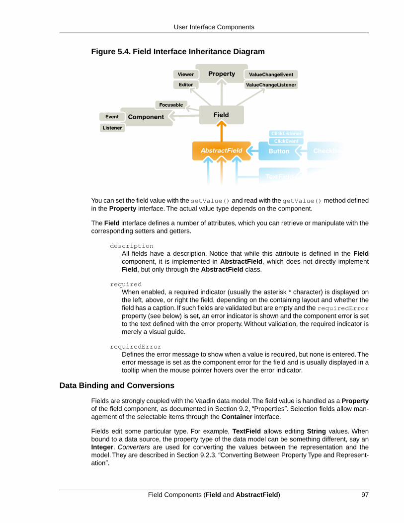
Figure 5.4. Field Interface Inheritance Diagram
You can set the field value with the setValue() and read with the getValue() method definedin the Property interface. The actual value type depends on the component.
The Field interface defines a number of attributes, which you can retrieve or manipulate with thecorresponding setters and getters.
descriptionAll fields have a description. Notice that while this attribute is defined in the Fieldcomponent, it is implemented in AbstractField, which does not directly implementField, but only through the AbstractField class.
requiredWhen enabled, a required indicator (usually the asterisk * character) is displayed onthe left, above, or right the field, depending on the containing layout and whether thefield has a caption. If such fields are validated but are empty and the requiredErrorproperty (see below) is set, an error indicator is shown and the component error is setto the text defined with the error property. Without validation, the required indicator ismerely a visual guide.
requiredErrorDefines the error message to show when a value is required, but none is entered.Theerror message is set as the component error for the field and is usually displayed in atooltip when the mouse pointer hovers over the error indicator.
Data Binding and Conversions
Fields are strongly coupled with the Vaadin data model.The field value is handled as a Propertyof the field component, as documented in Section 9.2, “Properties”. Selection fields allow man-agement of the selectable items through the Container interface.
Fields edit some particular type. For example, TextField allows editing String values. Whenbound to a data source, the property type of the data model can be something different, say anInteger. Converters are used for converting the values between the representation and themodel. They are described in Section 9.2.3, “Converting Between Property Type and Represent-ation”.
97Field Components (Field and AbstractField)
User Interface Components

Handling Field Value Changes
Field inherits Property.ValueChangeListener to allow listening for field value changes andProperty.Editor to allow editing values.
When the value of a field changes, a Property.ValueChangeEvent is triggered for the field.Youshould not implement the valueChange() method in a class inheriting AbstractField, as it isalready implemented in AbstractField. You should instead implement the method explicitly byadding the implementing object as a listener.
AbstractField Base Class
AbstractField is the base class for all field components. In addition to the component featuresinherited from AbstractComponent, it implements a number of features defined in Property,Buffered, Validatable, and Component.Focusable interfaces.
5.3. Common Component Features
The component base classes and interfaces provide a large number of features. Let us look atsome of the most commonly needed features. Features not documented here can be found fromthe Java API Reference.
The interface defines a number of properties, which you can retrieve or manipulate with the cor-responding setters and getters.
5.3.1. Caption
A caption is an explanatory textual label accompanying a user interface component, usuallyshown above, left of, or inside the component.The contents of a caption are automatically quoted,so no raw XHTML can be rendered in a caption.
The caption text can usually be given as the first parameter of a constructor of a component orwith setCaption().
// New text field with caption "Name"TextField name = new TextField("Name");layout.addComponent(name);
The caption of a component is, by default, managed and displayed by the layout component orcomponent container inside which the component is placed. For example, the VerticalLayoutcomponent shows the captions left-aligned above the contained components, while the Form-Layout component shows the captions on the left side of the vertically laid components, with thecaptions and their associated components left-aligned in their own columns. The CustomCom-ponent does not manage the caption of its composition root, so if the root component has acaption, it will not be rendered.
Common Component Features98
User Interface Components

Figure 5.5. Caption Management by VerticalLayout and FormLayoutcomponents.
Some components, such as Button and Panel, manage the caption themselves and display itinside the component.
Icon (see Section 5.3.4, “Icon”) is closely related to caption and is usually displayed horizontallybefore or after it, depending on the component and the containing layout. Also the required indic-ator in field components is usually shown before or after the caption.
An alternative way to implement a caption is to use another component as the caption, typicallya Label, a TextField, or a Panel. A Label, for example, allows highlighting a shortcut key withXHTML markup or to bind the caption to a data source. The Panel provides an easy way to addboth a caption and a border around a component.
CSS Style Rules
.v-caption {} .v-captiontext {} .v-caption-clearelem {} .v-required-field-indicator {}
A caption is be rendered inside an HTML element that has the v-caption CSS style class.Thecontaining layout may enclose a caption inside other caption-related elements.
Some layouts put the caption text in a v-captiontext element. A v-caption-clearelemis used in some layouts to clear a CSS float property in captions. An optional required indicatorin field components is contained in a separate element with v-required-field-indicatorstyle.
5.3.2. Description and Tooltips
All components (that inherit AbstractComponent) have a description separate from their caption.The description is usually shown as a tooltip that appears when the mouse pointer hovers overthe component for a short time.
You can set the description with setDescription() and retrieve with getDescription().
Button button = new Button("A Button");button.setDescription("This is the tooltip");
The tooltip is shown in Figure 5.6, “Component Description as a Tooltip”.
99Description and Tooltips
User Interface Components
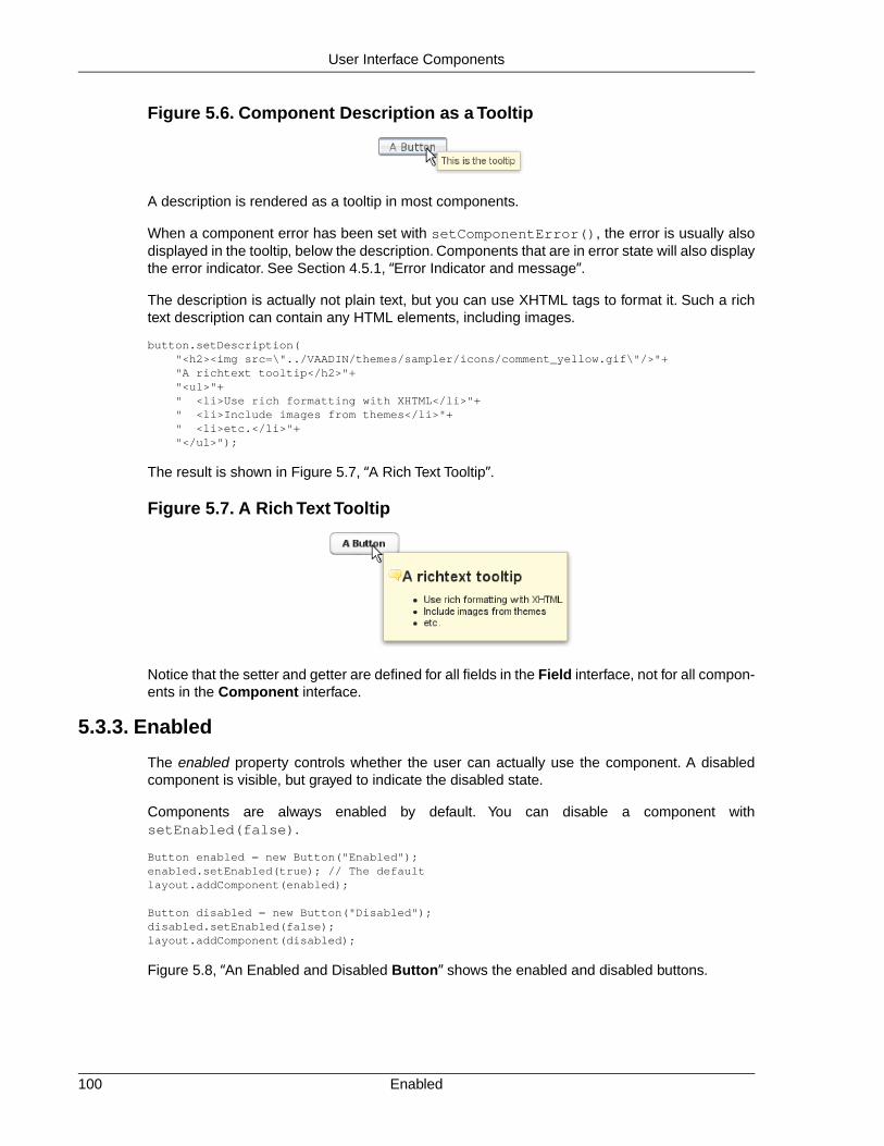
Figure 5.6. Component Description as a Tooltip
A description is rendered as a tooltip in most components.
When a component error has been set with setComponentError(), the error is usually alsodisplayed in the tooltip, below the description. Components that are in error state will also displaythe error indicator. See Section 4.5.1, “Error Indicator and message”.
The description is actually not plain text, but you can use XHTML tags to format it. Such a richtext description can contain any HTML elements, including images.
button.setDescription( "<h2><img src=\"../VAADIN/themes/sampler/icons/comment_yellow.gif\"/>"+ "A richtext tooltip</h2>"+ "<ul>"+ " <li>Use rich formatting with XHTML</li>"+ " <li>Include images from themes</li>"+ " <li>etc.</li>"+ "</ul>");
The result is shown in Figure 5.7, “A Rich Text Tooltip”.
Figure 5.7. A Rich Text Tooltip
Notice that the setter and getter are defined for all fields in the Field interface, not for all compon-ents in the Component interface.
5.3.3. Enabled
The enabled property controls whether the user can actually use the component. A disabledcomponent is visible, but grayed to indicate the disabled state.
Components are always enabled by default. You can disable a component withsetEnabled(false).
Button enabled = new Button("Enabled");enabled.setEnabled(true); // The defaultlayout.addComponent(enabled);
Button disabled = new Button("Disabled");disabled.setEnabled(false);layout.addComponent(disabled);
Figure 5.8, “An Enabled and Disabled Button” shows the enabled and disabled buttons.
Enabled100
User Interface Components

Figure 5.8. An Enabled and Disabled Button
A disabled component is automatically put in read-only state. No client interaction with such acomponent is sent to the server and, as an important security feature, the server-side componentsdo not receive state updates from the client in the read-only state. This feature exists in all built-in components in Vaadin and is automatically handled for all Field components for the fieldproperty value. For custom widgets, you need to make sure that the read-only state is checkedon the server-side for all safety-critical variables.
CSS Style Rules
Disabled components have the v-disabled CSS style in addition to the component-specificstyle. To match a component with both the styles, you have to join the style class names with adot as done in the example below.
.v-textfield.v-disabled { border: dotted;}
This would make the border of all disabled text fields dotted.
TextField disabled = new TextField("Disabled");disabled.setValue("Read-only value");disabled.setEnabled(false);layout.addComponent(disabled);
The result is illustrated in Figure 5.9, “Styling Disabled Components”.
Figure 5.9. Styling Disabled Components
5.3.4. Icon
An icon is an explanatory graphical label accompanying a user interface component, usuallyshown above, left of, or inside the component. Icon is closely related to caption (see Section 5.3.1,“Caption”) and is usually displayed horizontally before or after it, depending on the componentand the containing layout.
The icon of a component can be set with the setIcon() method. The image is provided as aresource, perhaps most typically a ThemeResource.
// Component with an icon from a custom themeTextField name = new TextField("Name");name.setIcon(new ThemeResource("icons/user.png"));layout.addComponent(name);
// Component with an icon from another theme ('runo')Button ok = new Button("OK");ok.setIcon(new ThemeResource("../runo/icons/16/ok.png"));layout.addComponent(ok);
The icon of a component is, by default, managed and displayed by the layout component orcomponent container in which the component is placed. For example, the VerticalLayout com-ponent shows the icons left-aligned above the contained components, while the FormLayout
101Icon
User Interface Components

component shows the icons on the left side of the vertically laid components, with the icons andtheir associated components left-aligned in their own columns. The CustomComponent doesnot manage the icon of its composition root, so if the root component has an icon, it will not berendered.
Figure 5.10. Displaying an Icon from a Theme Resource.
Some components, such as Button and Panel, manage the icon themselves and display it insidethe component.
CSS Style Rules
An icon will be rendered inside an HTML element that has the v-icon CSS style class. Thecontaining layout may enclose an icon and a caption inside elements related to the caption, suchas v-caption.
5.3.5. Locale
The locale property defines the country and language used in a component. You can use thelocale information in conjunction with an internationalization scheme to acquire localized resources.Some components, such as DateField, use the locale for component localization.
You can set the locale of a component (or the application) with setLocale().
// Component for which the locale is meaningfulInlineDateField date = new InlineDateField("Datum");
// German language specified with ISO 639-1 language// code and ISO 3166-1 alpha-2 country code. date.setLocale(new Locale("de", "DE"));
date.setResolution(DateField.Resolution.DAY);layout.addComponent(date);
The resulting date field is shown in Figure 5.11, “Set Locale for InlineDateField”.
Figure 5.11. Set Locale for InlineDateField
You can get the locale of a component with getLocale(). If the locale is undefined for a com-ponent, that is, not explicitly set, the locale of the parent component is used. If none of the parentcomponents have a locale set, the locale of the application is used, and if that is not set, the defaultsystem locale is set, as given by Locale.getDefault().
Because of the requirement that the component must be attached to the application, it is awkwardto use getLocale() for internationalization.You can not use it in the constructor, so you wouldhave to get the locale in attach() as shown in the following example:
Locale102
User Interface Components

Button cancel = new Button() { @Override public void attach() { ResourceBundle bundle = ResourceBundle.getBundle( MyAppCaptions.class.getName(), getLocale()); setCaption(bundle.getString("CancelKey")); }};layout.addComponent(cancel);
It is normally a better practice to get the locale from an application-global parameter and use itto get the localized resource right when the component is created.
// Captions are stored in MyAppCaptions resource bundle// and the application object is known in this context.ResourceBundle bundle = ResourceBundle.getBundle(MyAppCaptions.class.getName(), getApplication().getLocale());
// Get a localized resource from the bundleButton cancel = new Button(bundle.getString("CancelKey"));layout.addComponent(cancel);
Selecting a Locale
A common task in many applications is selecting a locale. This is done in the following examplewith a Select component.
// The locale in which we want to have the language// selection listLocale displayLocale = Locale.ENGLISH;
// All known localesfinal Locale[] locales = Locale.getAvailableLocales();
// Allow selecting a language. We are in a constructor of a// CustomComponent, so preselecting the current// language of the application can not be done before// this (and the selection) component are attached to// the application.final Select select = new Select("Select a language") { @Override public void attach() { setValue(getLocale()); }};for (int i=0; i<locales.length; i++) { select.addItem(locales[i]); select.setItemCaption(locales[i], locales[i].getDisplayName(displayLocale));
// Automatically select the current locale if (locales[i].equals(getLocale())) select.setValue(locales[i]);}layout.addComponent(select);
// Locale code of the selected localefinal Label localeCode = new Label("");layout.addComponent(localeCode);
// A date field which language the selection will changefinal InlineDateField date = new InlineDateField("Calendar in the selected language");date.setResolution(DateField.Resolution.DAY);layout.addComponent(date);
103Locale
User Interface Components
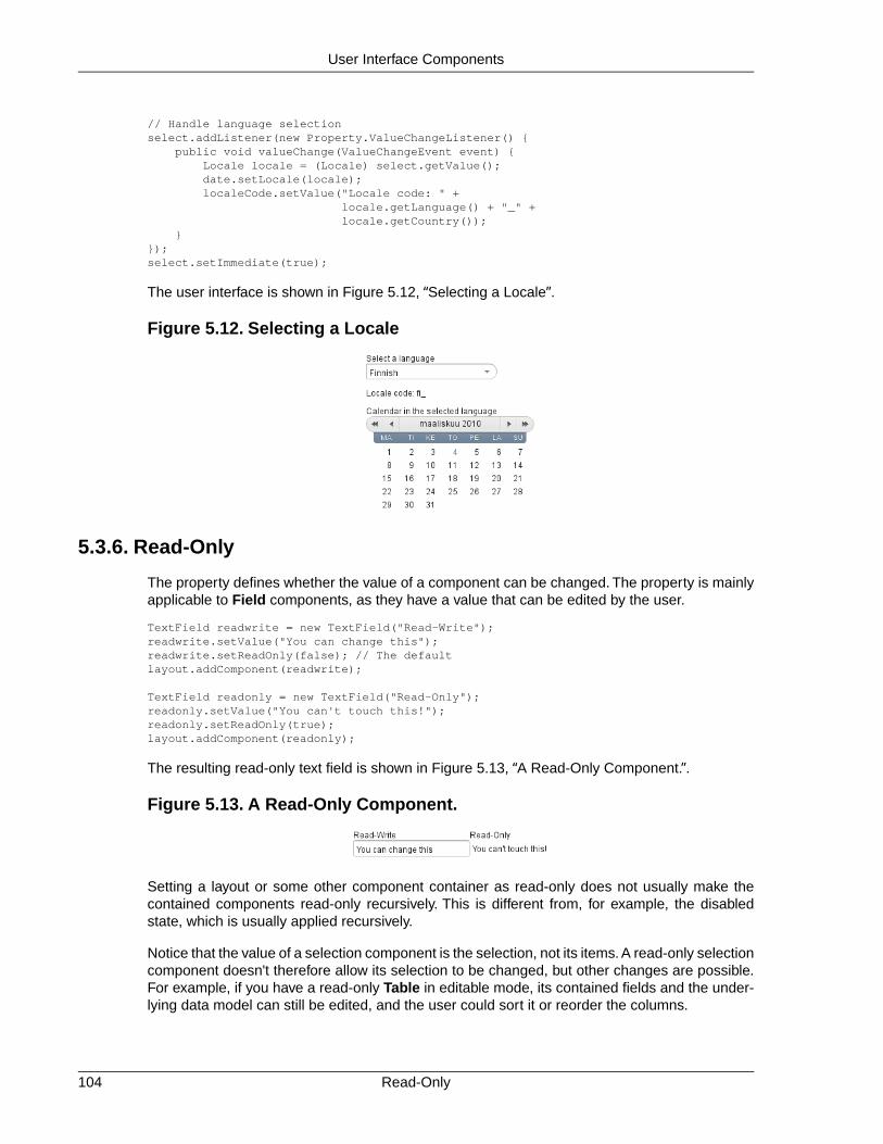
// Handle language selectionselect.addListener(new Property.ValueChangeListener() { public void valueChange(ValueChangeEvent event) { Locale locale = (Locale) select.getValue(); date.setLocale(locale); localeCode.setValue("Locale code: " + locale.getLanguage() + "_" + locale.getCountry()); }});select.setImmediate(true);
The user interface is shown in Figure 5.12, “Selecting a Locale”.
Figure 5.12. Selecting a Locale
5.3.6. Read-Only
The property defines whether the value of a component can be changed. The property is mainlyapplicable to Field components, as they have a value that can be edited by the user.
TextField readwrite = new TextField("Read-Write");readwrite.setValue("You can change this");readwrite.setReadOnly(false); // The defaultlayout.addComponent(readwrite);
TextField readonly = new TextField("Read-Only");readonly.setValue("You can't touch this!");readonly.setReadOnly(true);layout.addComponent(readonly);
The resulting read-only text field is shown in Figure 5.13, “A Read-Only Component.”.
Figure 5.13. A Read-Only Component.
Setting a layout or some other component container as read-only does not usually make thecontained components read-only recursively. This is different from, for example, the disabledstate, which is usually applied recursively.
Notice that the value of a selection component is the selection, not its items. A read-only selectioncomponent doesn't therefore allow its selection to be changed, but other changes are possible.For example, if you have a read-only Table in editable mode, its contained fields and the under-lying data model can still be edited, and the user could sort it or reorder the columns.
Read-Only104
User Interface Components

Client-side state modifications will not be communicated to the server-side and, more importantly,server-side field components will not accept changes to the value of a read-only Field component.The latter is an important security feature, because a malicious user can not fabricate statechanges in a read-only field. This is handled at the level of AbstractField in setValue(), soyou can not change the value programmatically either. Calling setValue() on a read-only fieldresults in Property.ReadOnlyException.
Also notice that while the read-only status applies automatically to the property value of a field,it does not apply to other component variables. A read-only component can accept some othervariable changes from the client-side and some of such changes could be acceptable, such aschange in the scroll bar position of a Table. Custom widgets should check the read-only statefor variables bound to business data.
CSS Style Rules
Setting a normally editable component to read-only state can change its appearance to disallowediting the value. In addition to CSS styling, also the HTML structure can change. For example,TextField loses the edit box and appears much like a Label.
A read-only component will have the v-readonly style. The following CSS rule would makethe text in all read-only TextField components appear in italic.
.v-textfield.v-readonly { font-style: italic;}
5.3.7. Style Name
The style name property defines one or more custom CSS style class names for the component.The getStyleName() returns the current style names as a space-separated list. ThesetStyleName() replaces all the styles with the given style name or a space-separated list ofstyle names. You can also add and remove individual style names with addStylename() andremoveStyleName(). A style name must be a valid CSS style name.
Label label = new Label("This text has a lot of style");label.addStyleName("mystyle");layout.addComponent(label);
The style name will appear in the component's HTML element in two forms: literally as given andprefixed with the component class specific style name. For example, if you add a style namemystyle to a Button, the component would get both mystyle and v-button-mystyle styles.Neither form may conflict with built-in style names of Vaadin. For example, focus style wouldconflict with a built-in style of the same name, and an option style for a Select component wouldconflict with the built-in v-select-option style.
The following CSS rule would apply the style to any component that has the mystyle style.
.mystyle { font-family: fantasy; font-style: italic; font-size: 25px; font-weight: bolder; line-height: 30px;}
The resulting styled component is shown in Figure 5.14, “Component with a Custom Style”
105Style Name
User Interface Components

Figure 5.14. Component with a Custom Style
5.3.8. Visible
Components can be hidden by setting the visible property to false. Also the caption, icon andany other component features are made hidden. Hidden components are not just invisible, buttheir content is not communicated to the browser at all. That is, they are not made invisible cos-metically with only CSS rules. This feature is important for security if you have components thatcontain security-critical information that must only be shown in specific application states.
TextField invisible = new TextField("No-see-um");invisible.setValue("You can't see this!");invisible.setVisible(false);layout.addComponent(invisible);
The resulting invisible component is shown in Figure 5.15, “An Invisible Component.”.
Figure 5.15. An Invisible Component.
Beware that invisible beings can leave footprints.The containing layout cell that holds the invisiblecomponent will not go away, but will show in the layout as extra empty space. Also expand ratioswork just like if the component was visible - it is the layout cell that expands, not the component.
If you need to make a component only cosmetically invisible, you should use a custom theme toset it display: none style. This is mainly useful for certain special components such as Pro-gressIndicator, which have effects even when made invisible in CSS. If the hidden componenthas undefined size and is enclosed in a layout that also has undefined size, the containing layoutwill collapse when the component disappears. If you want to have the component keep its size,you have to make it invisible by setting all its font and other attributes to be transparent. In suchcases, the invisible content of the component can be made visible easily in the browser.
A component made invisible with the visible property has no particular CSS style class to indicatethat it is hidden.The element does exist though, but has display: none style, which overridesany CSS styling.
5.3.9. Sizing Components
Vaadin components are sizeable; not in the sense that they were fairly large or that the numberof the components and their features are sizeable, but in the sense that you can make them fairlylarge on the screen if you like, or small or whatever size.
The Sizeable interface, shared by all components, provides a number of manipulation methodsand constants for setting the height and width of a component in absolute or relative units, or forleaving the size undefined.
The size of a component can be set with setWidth() and setHeight() methods.The methodstake the size as a floating-point value. You need to give the unit of the measure as the secondparameter for the above methods. The available units are listed in Table 5.1, “Size Units” below.
mycomponent.setWidth(100, Sizeable.UNITS_PERCENTAGE);mycomponent.setWidth(400, Sizeable.UNITS_PIXELS);
Visible106
User Interface Components

Alternatively, you can speficy the size as a string. The format of such a string must follow theHTML/CSS standards for specifying measures.
mycomponent.setWidth("100%");mycomponent.setHeight("400px");
The "100%" percentage value makes the component take all available size in the particular direction(see the description of Sizeable.UNITS_PERCENTAGE in the table below). You can also usethe shorthand method setSizeFull() to set the size to 100% in both directions.
The size can be undefined in either or both dimensions, which means that the component willtake the minimum necessary space. Most components have undefined size by default, but somelayouts have full size in horizontal direction. You can set the height or width as undefined withSizeable.SIZE_UNDEFINED parameter for setWidth() and setHeight().
You always need to keep in mind that a layout with undefined size may not contain componentswith defined relative size, such as "full size". See Section 6.13.1, “Layout Size” for details.
The Table 5.1, “Size Units” lists the available units and their codes defined in the Sizeable inter-face.
Table 5.1. Size Units
The pixel is the basic hardware-specific measure of one physic-al display pixel.
pxUNITS_PIXELS
The point is a typographicalunit, which is usually defined as
ptUNITS_POINTS
1/72 inches or about 0.35 mm.However, on displays the sizecan vary significantly dependingon display metrics.
The pica is a typographical unit,defined as 12 points, or 1/7
pcUNITS_PICAS
inches or about 4.233 mm. Ondisplays, the size can vary de-pending on display metrics.
A unit relative to the used font,the width of the upper-case "M"letter.
emUNITS_EM
A unit relative to the used font,the height of the lower-case "x"letter.
exUNITS_EX
A physical length unit, milli-meters on the surface of a dis-
mmUNITS_MM
play device. However, the actu-al size depends on the display,its metrics in the operating sys-tem, and the browser.
A physical length unit, centi-meters on the surface of a dis-
cmUNITS_CM
play device. However, the actu-al size depends on the display,
107Sizing Components
User Interface Components

its metrics in the operating sys-tem, and the browser.
A physical length unit, incheson the surface of a display
inUNITS_INCH
device. However, the actualsize depends on the display, itsmetrics in the operating system,and the browser.
A relative percentage of theavailable size. For example, for
%UNITS_PERCENTAGE
the top-level layout 100% wouldbe the full width or height of thebrowser window. The percent-age value must be between 0and 100.
If a component inside HorizontalLayout or VerticalLayout has full size in the namesake directionof the layout, the component will expand to take all available space not needed by the othercomponents. See Section 6.13.1, “Layout Size” for details.
5.3.10. Managing Input Focus
When the user clicks on a component, the component gets the input focus, which is indicated byhighlighting according to style definitions. If the component allows inputting text, the focus andinsertion point are indicated by a cursor. Pressing the Tab key moves the focus to the componentnext in the focus order.
Focusing is supported by all Field components and also by Upload.
The focus order or tab index of a component is defined as a positive integer value, which youcan set with setTabIndex() and get with getTabIndex(). The tab index is managed in thecontext of the application-level Window in which the components are contained.The focus ordercan therefore jump between two any lower-level component containers, such as sub-windowsor panels.
The default focus order is determined by the natural hierarchical order of components in the orderin which they were added under their parents. The default tab index is 0 (zero).
Giving a negative integer as the tab index removes the component from the focus order entirely.
CSS Style Rules
The component having the focus will have an additional style class with the -focus suffix. Forexample, a TextField, which normally has the v-textfield style, would additionally have thev-textfield-focus style.
For example, the following would make a text field blue when it has focus.
.v-textfield-focus { background: lightblue;}
Managing Input Focus108
User Interface Components

5.4. Component Extensions
Components can have extensions which are attached to a component dynamically. Especiallymany add-on features are extensions.
To add an extension to a component, call the extend() method in the extension.
TextField tf = new TextField("Hello");layout.addComponent(tf);
// Add a simple extensionnew CapsLockWarning().extend(tf);
// Add an extension that requires some parametersCSValidator validator = new CSValidator();validator.setRegExp("[0-9]*");validator.setErrorMessage("Must be a number");validator.extend(tf);
5.5. Label
Label is a text component that displays non-editable text. In addition to regular text, you can alsodisplay preformatted text and HTML, depending on the content mode of the label.
// A container that is 100% wide by defaultVerticalLayout layout = new VerticalLayout();
Label label = new Label("Labeling can be dangerous");layout.addComponent(label);
The text will wrap around and continue on the next line if it exceeds the width of the Label. Thedefault width is 100%, so the containing layout must also have a defined width. Some layoutcomponents have undefined width by default, such as HorizontalLayout, so you need to payspecial care with them.
// A container with a defined width. The default content layout// of Panel is VerticalLayout, which has 100% default width.Panel panel = new Panel("Panel Containing a Label");panel.setWidth("300px");
panel.addComponent( new Label("This is a Label inside a Panel. There is " + "enough text in the label to make the text " + "wrap when it exceeds the width of the panel."));
As the size of the Panel in the above example is fixed and the width of Label is the default 100%,the text in the Label will wrap to fit the panel, as shown in Figure 5.16, “The Label Component”.
Figure 5.16.The Label Component
109Component Extensions
User Interface Components

Setting Label to undefined width will cause it to not wrap at the end of the line, as the width ofthe content defines the width. If placed inside a layout with defined width, the Label will overflowthe layout horizontally and, normally, be truncated.
Even though Label is text and often used as a caption, it also has a caption, just like any othercomponent. As with other components, the caption is managed by the containing layout.
5.5.1. Content Mode
The contents of a label are formatted depending on the content mode. By default, the text is as-sumed to be plain text and any contained XML-specific characters will be quoted appropriatelyto allow rendering the contents of a label in HTML in a web browser. The content mode can beset in the constructor or with setContentMode(), and can have the values defined in theContentMode enumeration type in com.vaadin.shared.ui.label package:
TEXTThe default content mode where the label contains only plain text. All characters areallowed, including the special <, >, and & characters in XML or HTML, which are quotedproperly in HTML while rendering the component. This is the default mode.
PREFORMATTEDContent mode where the label contains preformatted text. It will be, by default, renderedwith a fixed-width typewriter font. Preformatted text can contain line breaks, written inJava with the \n escape sequence for a newline character (ASCII 0x0a), or tabulatorcharacters written with \t (ASCII 0x08).
HTMLContent mode where the label contains (X)HTML. The content will be enclosed in aD I V e l e m e n t h a v i n g t h e n a m e s p a c e"http://www.w3.org/TR/xhtml1/DTD/xhtml1-strict.dtd".
Please note the following security and validity warnings regarding the HTML contentmode.
Cross-Site Scripting Warning
Having Label in HTML content mode allows pure HTML content. If the content comesfrom user input, you should always carefully sanitize it to prevent cross-site scripting(XSS) attacks. Please see Section 11.8.1, “Sanitizing User Input to Prevent Cross-Site Scripting”.
Also, the validity of the HTML content is not checked when rendering the componentand any errors can result in an error in the browser. If the content comes from anuncertain source, you should always validate it before displaying it in the component.
The following example demonstrates the use of Label in different modes.
GridLayout labelgrid = new GridLayout (2,1);
labelgrid.addComponent (new Label ("PREFORMATTED"));labelgrid.addComponent ( new Label ("This is a preformatted label.\n"+ "The newline character \\n breaks the line.", Label.ContentMode.PREFORMATTED));
labelgrid.addComponent (new Label ("TEXT"));labelgrid.addComponent (
Content Mode110
User Interface Components
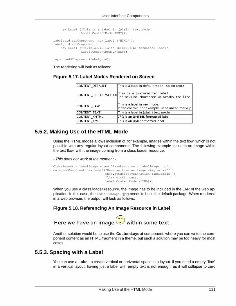
new Label ("This is a label in (plain) text mode", Label.ContentMode.TEXT));
labelgrid.addComponent (new Label ("HTML"));labelgrid.addComponent ( new Label ("<i>This</i> is an <b>HTML</b> formatted label", Label.ContentMode.HTML));
layout.addComponent(labelgrid);
The rendering will look as follows:
Figure 5.17. Label Modes Rendered on Screen
5.5.2. Making Use of the HTML Mode
Using the HTML modes allows inclusion of, for example, images within the text flow, which is notpossible with any regular layout components. The following example includes an image withinthe text flow, with the image coming from a class loader resource.
- This does not work at the moment -
ClassResource labelimage = new ClassResource ("labelimage.jpg");main.addComponent(new Label("Here we have an image <img src=\"" + this.getRelativeLocation(labelimage) + "\"/> within text.", Label.ContentMode.XHTML));
When you use a class loader resource, the image has to be included in the JAR of the web ap-plication. In this case, the labelimage.jpg needs to be in the default package.When renderedin a web browser, the output will look as follows:
Figure 5.18. Referencing An Image Resource in Label
Another solution would be to use the CustomLayout component, where you can write the com-ponent content as an HTML fragment in a theme, but such a solution may be too heavy for mostcases.
5.5.3. Spacing with a Label
You can use a Label to create vertical or horizontal space in a layout. If you need a empty "line"in a vertical layout, having just a label with empty text is not enough, as it will collapse to zero
111Making Use of the HTML Mode
User Interface Components

height. The same goes for a label with only whitespace as the label text.You need to use a non-breaking space character, either or  :
layout.addComponent(new Label(" ", Label.ContentMode.XHTML));
Using the Label.ContentMode.PREFORMATTED mode has the same effect; preformattedspaces do not collapse in a vertical layout. In a HorizontalLayout, the width of a space charactermay be unpredictable if the label font is proportional, so you can use the preformatted mode toadd em-width wide spaces.
If you want a gap that has adjustable width or height, you can use an empty label if you specifya height or width for it. For example, to create vertical space in a VerticalLayout:
Label gap = new Label();gap.setHeight("1em");verticalLayout.addComponent(gap);
You can make a flexible expanding spacer by having a relatively sized empty label with 100%height or width and setting the label as expanding in the layout.
// A wide component barHorizontalLayout horizontal = new HorizontalLayout();horizontal.setWidth("100%");
// Have a component before the gap (a collapsing cell)Button button1 = new Button("I'm on the left");horizontal.addComponent(button1);
// An expanding gap spacerLabel expandingGap = new Label();expandingGap.setWidth("100%");horizontal.addComponent(expandingGap);horizontal.setExpandRatio(expandingGap, 1.0f);
// A component after the gap (a collapsing cell)Button button2 = new Button("I'm on the right");horizontal.addComponent(button2);
5.5.4. CSS Style Rules
The Label component has a v-label overall style.
The Reindeer theme includes a number of predefined styles for typical formatting cases. Theseinclude "h1" (Reindeer.LABEL_H1) and "h2" (Reindeer.LABEL_H2) heading styles and"light" (Reindeer.LABEL_SMALL) style.
5.6. Link
The Link component allows making hyperlinks. References to locations are represented as re-source objects, explained in Section 4.4, “Images and Other Resources”. The Link is a regularHTML hyperlink, that is, an <a href> anchor element that is handled natively by the browser.Unlike when clicking a Button, clicking a Link does not cause an event on the server-side.
Links to an arbitrary URL can be made by using an ExternalResource as follows:
// Textual linkLink link = new Link("Click Me!", new ExternalResource("http://vaadin.com/"));
You can use setIcon() to make image links as follows:
CSS Style Rules112
User Interface Components

// Image linkLink iconic = new Link(null, new ExternalResource("http://vaadin.com/"));iconic.setIcon(new ThemeResource("img/nicubunu_Chain.png"));
// Image + captionLink combo = new Link("To appease both literal and visual", new ExternalResource("http://vaadin.com/"));combo.setIcon(new ThemeResource("img/nicubunu_Chain.png"));
The resulting links are shown in Figure 5.19, “Link Example”. You could add a "display:block" style for the icon element to place the caption below it.
Figure 5.19. Link Example
With the simple constructor used in the above example, the resource is opened in the currentwindow. Using the constructor that takes the target window as a parameter, or by setting thetarget window with setTargetName(), you can open the resource in another window, such asa popup browser window/tab. As the target name is an HTML target string managed by thebrowser, the target can be any window, including windows not managed by the application itself.You can use the special underscored target names, such as _blank to open the link to a newbrowser window or tab.
// Hyperlink to a given URLLink link = new Link("Take me a away to a faraway land", new ExternalResource("http://vaadin.com/"));
// Open the URL in a new window/tablink.setTargetName("_blank");
// Indicate visually that it opens in a new window/tablink.setIcon(new ThemeResource("icons/external-link.png"));link.addStyleName("icon-after-caption");
Normally, the link icon is before the caption.You can have it right of the caption by reversing thetext direction in the containing element.
/* Position icon right of the link caption. */.icon-after-caption { direction: rtl;}/* Add some padding around the icon. */.icon-after-caption .v-icon { padding: 0 3px;}
The resulting link is shown in Figure 5.20, “Link That Opens a New Window”.
Figure 5.20. Link That Opens a New Window
113Link
User Interface Components

With the _blank target, a normal new browser window is opened. If you wish to open it in apopup window (or tab), you need to give a size for the window with setTargetWidth() andsetTargetHeight(). You can control the window border style with setTargetBorder(),which takes any of the defined border styles TARGET_BORDER_DEFAULT,TARGET_BORDER_MINIMAL, and TARGET_BORDER_NONE. The exact result depends on thebrowser.
// Open the URL in a popuplink.setTargetName("_blank");link.setTargetBorder(Link.TARGET_BORDER_NONE);link.setTargetHeight(300);link.setTargetWidth(400);
In addition to the Link component, Vaadin allows alternative ways to make hyperlinks.The Buttoncomponent has a Reindeer.BUTTON_LINK style name that makes it look like a hyperlink, whilehandling clicks in a server-side click listener instead of in the browser. Also, you can make hyper-links (or any other HTML) in a Label in XHTML content mode.
CSS Style Rules.v-link { } a { } .v-icon {} span {}
The overall style for the Link component is v-link. The root element contains the <a href>hyperlink anchor. Inside the anchor are the icon, with v-icon style, and the caption in a textspan.
Hyperlink anchors have a number of pseudo-classes that are active at different times. An unvisitedlink has a:link class and a visited link a:visited. When the mouse pointer hovers over thelink, it will have a:hover, and when the mouse button is being pressed over the link, thea:active class.When combining the pseudo-classes in a selector, please notice that a:hovermust come after an a:link and a:visited, and a:active after the a:hover.
5.7. TextField
TextField is one of the most commonly used user interface components. It is a Field componentthat allows entering textual values using keyboard.
The following example creates a simple text field:
// Create a text fieldTextField tf = new TextField("A Field");
// Put some initial content in ittf.setValue("Stuff in the field");
See the result in Figure 5.21, “TextField Example”.
Figure 5.21. TextField Example
CSS Style Rules114
User Interface Components

Value changes are handled with a Property.ValueChangeListener, as in most other fields. Thevalue can be acquired with getValue() directly from the text field, as is done in the examplebelow, or from the property reference of the event.
// Handle changes in the valuetf.addListener(new Property.ValueChangeListener() { public void valueChange(ValueChangeEvent event) { // Assuming that the value type is a String String value = (String) tf.getValue();
// Do something with the value Notification.show("Value is:", value); }});
// Fire value changes immediately when the field loses focustf.setImmediate(true);
Much of the API of TextField is defined in AbstractTextField, which allows different kinds oftext input fields, such as rich text editors, which do not share all the features of the single-linetext fields.
Figure 5.22.Text Field Class Relationships
5.7.1. Data Binding
TextField edits String values, but you can bind it to any property type that has a proper converter,as described in Section 9.2.3, “Converting Between Property Type and Representation”.
// Have an initial data model. As Double is unmodificable and// doesn't support assignment from String, the object is// reconstructed in the wrapper when the value is changed.Double trouble = 42.0;
// Wrap it in a property data sourcefinal ObjectProperty<Double> property = new ObjectProperty<Double>(trouble);
// Create a text field bound to it// (StringToDoubleConverter is used automatically)TextField tf = new TextField("The Answer", property);tf.setImmediate(true);
// Show that the value is really written back to the// data source when edited by user.
115Data Binding
User Interface Components

Label feedback = new Label(property);feedback.setCaption("The Value");
When you put a Table in editable mode or create fields with a FieldGroup, the DefaultFieldFact-ory creates a TextField for almost every property type by default. You often need to make acustom factory to customize the creation and to set the field tooltip, validation, formatting, andso on.
See Chapter 9, Binding Components to Data for more details on data binding, field factories forTable in Section 5.15.3, “Editing the Values in a Table”, and Section 9.4, “Creating Forms byBinding Fields to Items” regarding forms.
5.7.2. String Length
The setMaxLength() method sets the maximum length of the input string so that the browserprevents the user from entering a longer one. As a security feature, the input value is automaticallytruncated on the server-side, as the maximum length setting could be bypassed on the client-side. The maximum length property is defined at AbstractTextField level.
Notice that the maximum length setting does not affect the width of the field. You can set thewidth with setWidth(), as with other components. Using em widths is recommended to betterapproximate the proper width in relation to the size of the used font. There is no standard wayin HTML for setting the width exactly to a number of letters (in a monospaced font).You can trickyour way around this restriction by putting the text field in an undefined-width VerticalLayouttogether with an undefined-width Label that contains a sample text, and setting the width of thetext field as 100%. The layout will get its width from the label, and the text field will use that.
5.7.3. Handling Null Values
As with any field, the value of a TextField can be set as null.This occurs most commonly whenyou create a new field without setting a value for it or bind the field value to a data source thatallows null values. In such case, you might want to show a special value that stands for the nullvalue.You can set the null representation with the setNullRepresentation() method. Mosttypically, you use an empty string for the null representation, unless you want to differentiate froma string that is explicitly empty.The default null representation is "null", which essentially warnsthat you may have forgotten to initialize your data objects properly.
The setNullSettingAllowed() controls whether the user can actually input a null value byusing the null value representation. If the setting is false, which is the default, inputting the nullvalue representation string sets the value as the literal value of the string, not null. This defaultassumption is a safeguard for data sources that may not allow null values.
// Create a text field without setting its valueTextField tf = new TextField("Field Energy (J)");tf.setNullRepresentation("-- null-point energy --");
// The null value is actually the defaulttf.setValue(null);
// Allow user to input the null value by// its representationtf.setNullSettingAllowed(true);
// Feedback to see the valueLabel value = new Label(tf);value.setCaption("Current Value:");
String Length116
User Interface Components

The Label, which is bound to the value of the TextField, displays a null value as empty. Theresulting user interface is shown in Figure 5.23, “Null Value Representation”.
Figure 5.23. Null Value Representation
5.7.4.Text Change Events
Often you want to receive a change event immediately when the text field value changes. Theimmediate mode is not literally immediate, as the changes are transmitted only after the fieldloses focus. In the other extreme, using keyboard events for every keypress would make typingunbearably slow and also processing the keypresses is too complicated for most purposes. Textchange events are transmitted asynchronously soon after typing and do not block typing whilean event is being processed.
Text change events are received with a TextChangeListener, as is done in the following examplethat demonstrates how to create a text length counter:
// Text field with maximum lengthfinal TextField tf = new TextField("My Eventful Field");tf.setValue("Initial content");tf.setMaxLength(20);
// Counter for input lengthfinal Label counter = new Label();counter.setValue(tf.toString().length() + " of " + tf.getMaxLength());
// Display the current length interactively in the countertf.addListener(new TextChangeListener() { public void textChange(TextChangeEvent event) { int len = event.getText().length(); counter.setValue(len + " of " + tf.getMaxLength()); }});
// This is actually the defaulttf.setTextChangeEventMode(TextChangeEventMode.LAZY);
The result is shown in Figure 5.24, “Text Change Events”.
Figure 5.24.Text Change Events
The text change event mode defines how quickly the changes are transmitted to the server andcause a server-side event. Lazier change events allow sending larger changes in one event ifthe user is typing fast, thereby reducing server requests.
You can set the text change event mode of a TextField with setTextChangeEventMode().The allowed modes are defined in TextChangeEventMode class and are the following:
117Text Change Events
User Interface Components

TextChangeEventMode.LAZY (default)An event is triggered when there is a pause in editing the text.The length of the pausecan be modified with setInputEventTimeout(). As with the TIMEOUT mode, atext change event is forced before a possible ValueChangeEvent, even if the userdid not keep a pause while entering the text.
This is the default mode.
TextChangeEventMode.TIMEOUTA text change in the user interface causes the event to be communicated to the applic-ation after a timeout period. If more changes are made during this period, the eventsent to the server-side includes the changes made up to the last change. The lengthof the timeout can be set with setInputEventTimeout().
If a ValueChangeEvent would occur before the timeout period, a TextChangeEventis triggered before it, on the condition that the text content has changed since theprevious TextChangeEvent.
TextChangeEventMode.EAGERAn event is triggered immediately for every change in the text content, typically causedby a key press. The requests are separate and are processed sequentially one afteranother. Change events are nevertheless communicated asynchronously to the server,so further input can be typed while event requests are being processed.
5.7.5. CSS Style Rules.v-textfield { }
The HTML structure of TextField is extremely simple, consisting only of an element withv-textfield style.
For example, the following custom style uses dashed border:
.v-textfield-dashing { border: thin dashed; background: white; /* Has shading image by default */}
The result is shown in Figure 5.25, “Styling TextField with CSS”.
Figure 5.25. Styling TextField with CSS
The style name for TextField is also used in several components that contain a text input field,even if the text input is not an actual TextField. This ensures that the style of different text inputboxes is similar.
5.8. TextArea
TextArea is a multi-line version of the TextField component described in Section 5.7, “TextField”.
The following example creates a simple text area:
CSS Style Rules118
User Interface Components
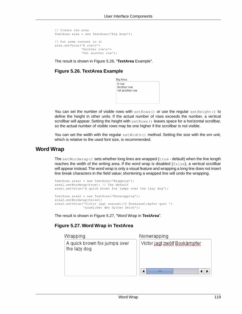
// Create the areaTextArea area = new TextArea("Big Area");
// Put some content in itarea.setValue("A row\n"+ "Another row\n"+ "Yet another row");
The result is shown in Figure 5.26, “TextArea Example”.
Figure 5.26. TextArea Example
You can set the number of visible rows with setRows() or use the regular setHeight() todefine the height in other units. If the actual number of rows exceeds the number, a verticalscrollbar will appear. Setting the height with setRows() leaves space for a horizontal scrollbar,so the actual number of visible rows may be one higher if the scrollbar is not visible.
You can set the width with the regular setWidth() method. Setting the size with the em unit,which is relative to the used font size, is recommended.
Word Wrap
The setWordwrap() sets whether long lines are wrapped (true - default) when the line lengthreaches the width of the writing area. If the word wrap is disabled (false), a vertical scrollbarwill appear instead.The word wrap is only a visual feature and wrapping a long line does not insertline break characters in the field value; shortening a wrapped line will undo the wrapping.
TextArea area1 = new TextArea("Wrapping");area1.setWordwrap(true); // The defaultarea1.setValue("A quick brown fox jumps over the lazy dog");
TextArea area2 = new TextArea("Nonwrapping");area2.setWordwrap(false);area2.setValue("Victor jagt zwölf Boxkämpfer quer "+ "über den Sylter Deich");
The result is shown in Figure 5.27, “Word Wrap in TextArea”.
Figure 5.27. Word Wrap in TextArea
119Word Wrap
User Interface Components

CSS Style Rules.v-textarea { }
The HTML structure of TextArea is extremely simple, consisting only of an element withv-textarea style.
5.9. PasswordField
The PasswordField is a variant of TextField that hides the typed input from visual inspection.
PasswordField tf = new PasswordField("Keep it secret");
The result is shown in Figure 5.28, “PasswordField”.
Figure 5.28. PasswordField
You should note that the PasswordField hides the input only from "over the shoulder" visualobservation. Unless the server connection is encrypted with a secure connection, such as HTTPS,the input is transmitted in clear text and may be intercepted by anyone with low-level access tothe network. Also phishing attacks that intercept the input in the browser may be possible byexploiting JavaScript execution security holes in the browser.
CSS Style Rules.v-textfield { }
The PasswordField does not have its own CSS style name but uses the same v-textfieldstyle as the regular TextField. See Section 5.7.5, “CSS Style Rules” for information on stylingit.
5.10. RichTextArea
The RichTextArea field allows entering or editing formatted text. The toolbar provides all basicediting functionalities. The text content of RichTextArea is represented in HTML format. Rich-TextArea inherits TextField and does not add any API functionality over it. You can add newfunctionality by extending the client-side components VRichTextArea and VRichTextToolbar.
As with TextField, the textual content of the rich text area is the Property of the field and canbe set with setValue() and read with getValue().
// Create a rich text areafinal RichTextArea rtarea = new RichTextArea();rtarea.setCaption("My Rich Text Area");
// Set initial content as HTMLrtarea.setValue("<h1>Hello</h1>\n" + "<p>This rich text area contains some text.</p>");
CSS Style Rules120
User Interface Components

Figure 5.29. Rich Text Area Component
Above, we used context-specific tags such as <h1> in the initial HTML content. The rich textarea component does not allow creating such tags, only formatting tags, but it does preservethem unless the user edits them away. Any non-visible whitespace such as the new line character(\n) are removed from the content. For example, the value set above will be as follows whenread from the field with getValue():
<h1>Hello</h1> <p>This rich text area contains some text.</p>
The rich text area is one of the few components in Vaadin that contain textual labels.The selectionboxes in the toolbar are in English and currently can not be localized in any other way than byinheriting or reimplementing the client-side VRichTextToolbar widget.The buttons can be localizedsimply with CSS by downloading a copy of the toolbar background image, editing it, and replacingthe default toolbar. The toolbar is a single image file from which the individual button icons arepicked, so the order of the icons is different from the rendered. The image file depends on theclient-side implementation of the toolbar.
.v-richtextarea-richtextexample .gwt-ToggleButton
.gwt-Image { background-image: url(img/richtextarea-toolbar-fi.png) !important;}
Figure 5.30. Regular English and a Localized Rich Text Area Toolbar
Cross-Site Scripting with RichTextArea
The user input from a RichTextArea is transmitted as XHTML from the browser to server-sideand is not sanitized. As the entire purpose of the RichTextArea component is to allow input offormatted text, you can not sanitize it just by removing all HTML tags. Also many attributes, suchas style, should pass through the sanitization.
See Section 11.8.1, “Sanitizing User Input to Prevent Cross-Site Scripting” for more details onCross-Site scripting vulnerabilities and sanitization of user input.
121Cross-Site Scripting with RichTextArea
User Interface Components

CSS Style Rules.v-richtextarea { }.v-richtextarea .gwt-RichTextToolbar { }.v-richtextarea .gwt-RichTextArea { }
The rich text area consists of two main parts: the toolbar with overall style.gwt-RichTextToolbar and the editor area with style .gwt-RichTextArea.The editor areaobviously contains all the elements and their styles that the HTML content contains. The toolbarcontains buttons and drop-down list boxes with the following respective style names:
.gwt-ToggleButton { }
.gwt-ListBox { }
5.11. Date and Time Input with DateField
The DateField component provides the means to display and input date and time. The fieldcomes in two variations: PopupDateField, with a numeric input box and a popup calendar view,and InlineDateField, with the calendar view always visible. The DateField base class defaultsto the popup variation.
The example below illustrates the use of the DateField baseclass, which is equivalent to thePopupDateField. We set the initial time of the date field to current time by using the defaultconstructor of the java.util.Date class.
// Create a DateField with the default styleDateField date = new DateField();
// Set the date and time to presentdate.setValue(new Date());
The result is shown in Figure 5.31, “DateField (PopupDateField) for Selecting Date and Time”.
Figure 5.31. DateField (PopupDateField) for Selecting Date and Time
5.11.1. PopupDateField
The PopupDateField provides date input using a text box for the date and time. As the DateFielddefaults to this component, the use is exactly the same as described earlier. Clicking the handleright of the date opens a popup view for selecting the year, month, and day, as well as time. Alsothe Down key opens the popup. Once opened, the user can navigate the calendar using thecursor keys.
CSS Style Rules122
User Interface Components

The date and time selected from the popup are displayed in the text box according to the defaultdate and time format of the current locale, or as specified with setDateFormat(). The sameformat definitions are used for parsing user input.
Date and Time Format
The date and time are normally displayed according to the default format for the current locale(see Section 5.3.5, “Locale”).You can specify a custom format with setDateFormat(). It takesa format string that follows the format of the SimpleDateFormat in Java.
// Display only year, month, and day in ISO formatdate.setDateFormat("yyyy-MM-dd");
The result is shown in Figure 5.32, “Custom Date Format for PopupDateField”.
Figure 5.32. Custom Date Format for PopupDateField
The same format specification is also used for parsing user-input date and time, as describedlater.
Handling Malformed User Input
A user can easily input a malformed or otherwise invalid date or time. DateField has two validationlayers: first on the client-side and then on the server-side.
The validity of the entered date is first validated on the client-side, immediately when the inputbox loses focus. If the date format is invalid, the v-datefield-parseerror style is set.Whether this causes a visible indication of a problem depends on the theme.The built-in reindeertheme does not shown any indication by default, making server-side handling of the problemmore convenient.
.mydate.v-datefield-parseerror .v-textfield { background: pink;}
The setLenient(true) setting enables relaxed interpretation of dates, so that invalid dates,such as February 30th or March 0th, are wrapped to the next or previous month, for example.
The server-side validation phase occurs when the date value is sent to the server. If the datefield is set in immediate state, it occurs immediately after the field loses focus. Once this is doneand if the status is still invalid, an error indicator is displayed beside the component. Hoveringthe mouse pointer over the indicator shows the error message.
You can handle the errors by overriding the handleUnparsableDateString() method. Themethod gets the user input as a string parameter and can provide a custom parsing mechanism,as shown in the following example.
// Create a date field with a custom parsing and a// custom error message for invalid formatPopupDateField date = new PopupDateField("My Date") { @Override protected Date handleUnparsableDateString(String dateString) throws Property.ConversionException { // Try custom parsing String fields[] = dateString.split("/");
123PopupDateField
User Interface Components

if (fields.length >= 3) { try { int year = Integer.parseInt(fields[0]); int month = Integer.parseInt(fields[1])-1; int day = Integer.parseInt(fields[2]); GregorianCalendar c = new GregorianCalendar(year, month, day); return c.getTime(); } catch (NumberFormatException e) { throw new Property. ConversionException("Not a number"); } }
// Bad date throw new Property. ConversionException("Your date needs two slashes"); }};
// Display only year, month, and day in slash-delimited formatdate.setDateFormat("yyyy/MM/dd");
// Don't be too tight about the validity of dates// on the client-sidedate.setLenient(true);
The handler method must either return a parsed Date object or throw a ConversionException.Returning null will set the field value to null and clear the input box.
Customizing the Error Message
In addition to customized parsing, overriding the handler method for unparseable input is usefulfor internationalization and other customization of the error message. You can also use it foranother way for reporting the errors, as is done in the example below:
// Create a date field with a custom error message for invalid formatPopupDateField date = new PopupDateField("My Date") { @Override protected Date handleUnparsableDateString(String dateString) throws Property.ConversionException { // Have a notification for the error Notification.show( "Your date needs two slashes", Notification.TYPE_WARNING_MESSAGE);
// A failure must always also throw an exception throw new Property.ConversionException("Bad date"); }};
If the input is invalid, you should always throw the exception; returning a null value would makethe input field empty, which is probably undesired.
Input Prompt
Like other fields that have a text box, PopupDateField allows an input prompt that is visible untilthe user has input a value.You can set the prompt with setInputPrompt.
PopupDateField date = new PopupDateField();
// Set the promptdate.setInputPrompt("Select a date");
PopupDateField124
User Interface Components

// Set width explicitly to accommodate the promptdate.setWidth("10em");
The date field doesn't automatically scale to accommodate the prompt, so you need to set it ex-plicitly with setWidth().
The input prompt is not available in the DateField superclass.
CSS Style Rules
.v-datefield, v-datefield-popupcalendar {} .v-textfield, v-datefield-textfield {} .v-datefield-button {}
The top-level element of DateField and all its variants have v-datefield style.The base classand the PopupDateField also have the v-datefield-popupcalendar style.
In addition, the top-level element has a style that indicates the resolution, with v-datefield-basename and an extension, which is one of full, day, month, or year. The -full style isenabled when the resolution is smaller than a day. These styles are used mainly for controllingthe appearance of the popup calendar.
The text box has v-textfield and v-datefield-textfield styles, and the calendar buttonv-datefield-button.
Once opened, the calendar popup has the following styles at the top level:
.v-datefield-popup {} .v-popupcontent {} .v-datefield-calendarpanel {}
The top-level element of the floating popup calendar has .v-datefield-popup style. Observethat the popup frame is outside the HTML structure of the component, hence it is not enclosedin the v-datefield element and does not include any custom styles. The content in thev-datefield-calendarpanel is the same as in InlineDateField, as described in Sec-tion 5.11.2, “InlineDateField”.
5.11.2. InlineDateField
The InlineDateField provides a date picker component with a month view.The user can navigatemonths and years by clicking the appropriate arrows. Unlike with the popup variant, the monthview is always visible in the inline field.
// Create a DateField with the default styleInlineDateField date = new InlineDateField();
// Set the date and time to presentdate.setValue(new java.util.Date());
The result is shown in Figure 5.33, “Example of the InlineDateField”.
125InlineDateField
User Interface Components

Figure 5.33. Example of the InlineDateField
The user can also navigate the calendar using the cursor keys.
CSS Style Rules
.v-datefield {} .v-datefield-calendarpanel {} .v-datefield-calendarpanel-header {} .v-datefield-calendarpanel-prevyear {} .v-datefield-calendarpanel-prevmonth {} .v-datefield-calendarpanel-month {} .v-datefield-calendarpanel-nextmonth {} .v-datefield-calendarpanel-nextyear {} .v-datefield-calendarpanel-body {} .v-datefield-calendarpanel-weekdays, .v-datefield-calendarpanel-weeknumbers {} .v-first {} .v-last {} .v-datefield-calendarpanel-weeknumber {} .v-datefield-calendarpanel-day {} .v-datefield-calendarpanel-time {} .v-datefield-time {} .v-select {} .v-label {}
The top-level element has the v-datefield style. In addition, the top-level element has a stylename that indicates the resolution of the calendar, with v-datefield- basename and an exten-sion, which is one of full, day, month, or year.The -full style is enabled when the resolutionis smaller than a day.
The v-datefield-calendarpanel-weeknumbers andv-datefield-calendarpanel-weeknumber styles are enabled when the week numbersare enabled.The former controls the appearance of the weekday header and the latter the actualweek numbers.
The other style names should be self-explanatory. For weekdays, the v-first and v-laststyles allow making rounded endings for the weekday bar.
5.11.3.Time Resolution
The DateField displays dates by default. It can also display the time in hours and minutes, orjust the month or year. The visibility of the input components is controlled by time resolution,which can be set with setResolution() method. The method takes as its parameters thelowest visible component, typically DateField.Resolution.DAY for just dates andDateField.Resolution.MIN for dates with time in hours and minutes. Please see the APIReference for the complete list of resolution parameters.
Time Resolution126
User Interface Components

5.11.4. DateField Locale
The date and time are displayed according to the locale of the user, as reported by the browser.You can set a custom locale with the setLocale() method of AbstractComponent, as describedin Section 5.3.5, “Locale”. Only Gregorian calendar is supported.
5.12. Button
The Button is a user interface component that is normally used for finalizing input and initiatingsome action. When the user clicks a button, a Button.ClickEvent is emitted. A listener that in-herits the Button.ClickListener interface can handle clicks with the buttonClick() method.
public class TheButton extends CustomComponent implements Button.ClickListener { Button thebutton;
public TheButton() { // Create a Button with the given caption. thebutton = new Button ("Do not push this button");
// Listen for ClickEvents. thebutton.addListener(this);
setCompositionRoot(thebutton); }
/** Handle click events for the button. */ public void buttonClick (Button.ClickEvent event) { thebutton.setCaption ("Do not push this button again"); }}
Figure 5.34. An Example of a Button
As a user interface often has several buttons, you can differentiate between them either bycomparing the Button object reference returned by the getButton() method of Button.Click-Event to a kept reference or by using a separate listener method for each button. The listeningobject and method can be given to the constructor. For a detailed description of these patternstogether with some examples, please see Section 3.4, “Events and Listeners”.
CSS Style Rules.v-button { }
The exact CSS style name can be different if a Button has the switchMode attribute enabled.See the alternative CSS styles below.
Adding the "small" style name enables a smaller style for the Button. You can also use theBUTTON_SMALL constant in Runo and Reindeer theme classes as well. The BaseTheme classalso has a BUTTON_LINK style, with "link" style name, which makes the button look like a hy-perlink.
127DateField Locale
User Interface Components

5.13. CheckBox
CheckBox is a two-state selection component that can be either checked or unchecked. Thecaption of the check box will be placed right of the actual check box. Vaadin provides two waysto create check boxes: individual check boxes with the CheckBox component described in thissection and check box groups with the OptionGroup component in multiple selection mode, asdescribed in Section 5.14.5, “Radio Button and Check Box Groups with OptionGroup”.
Clicking on a check box will change its state. The state is a Boolean property that you can setwith the setValue() method and obtain with the getValue() method of the Property interface.Changing the value of a check box will cause a ValueChangeEvent, which can be handled bya ValueChangeListener.
// A check box with default state (not checked, false).final CheckBox checkbox1 = new CheckBox("My CheckBox");main.addComponent(checkbox1);
// Another check box with explicitly set checked state.final CheckBox checkbox2 = new CheckBox("Checked CheckBox");checkbox2.setValue(true);main.addComponent(checkbox2);
// Make some application logic. We use anonymous listener// classes here. The above references were defined as final// to allow accessing them from inside anonymous classes.checkbox1.addListener(new ValueChangeListener() { public void valueChange(ValueChangeEvent event) { // Copy the value to the other checkbox. checkbox2.setValue(checkbox1.getValue()); }});checkbox2.addListener(new ValueChangeListener() { public void valueChange(ValueChangeEvent event) { // Copy the value to the other checkbox. checkbox1.setValue(checkbox2.getValue()); }});
Figure 5.35. An Example of a Check Box
For an example on the use of check boxes in a table, see Section 5.15, “Table”.
CSS Style Rules.v-checkbox { } .v-checkbox > input { } .v-checkbox > label { }
The top-level element of a CheckBox has the v-checkbox style. It contains two sub-elements:the actual check box input element and the label element. If you want to have the label onthe left, you can change the positions with "direction: rtl" for the top element.
CheckBox128
User Interface Components

5.14. Selecting Items
Vaadin gives many alternatives for selecting one or more items from a list, using drop-down andregular lists, radio button and check box groups, tables, trees, and so on.
The core library includes the following selection components, all based on the AbstractSelectclass:
SelectIn single selection mode, a drop-down list with a text input area, which the user canuse to filter the displayed items. In multiselect mode, a list box equivalent to ListSelect.
ComboBoxA drop-down list for single selection. Otherwise as Select, but the user can also enternew items. The component also provides an input prompt.
ListSelectA vertical list box for selecting items in either single or multiple selection mode.
NativeSelectProvides selection using the native selection component of the browser, typically adrop-down list for single selection and a multi-line list in multiselect mode. This usesthe <select> element in HTML.
OptionGroupShows the items as a vertically arranged group of radio buttons in the single selectionmode and of check boxes in multiple selection mode.
TwinColSelectShows two list boxes side by side where the user can select items from a list of availableitems and move them to a list of selected items using control buttons.
In addition, the Tree and Table components allow special forms of selection. They also inheritthe AbstractSelect.
5.14.1. Binding Selection Components to Data
The selection components are strongly coupled with the Vaadin Data Model.The selectable itemsin all selection components are objects that implement the Item interface and are contained ina Container. The current selection is bound to the Property interface.
Even though the data model is used, the selection components allow simple use in the mostcommon cases. Each selection component is bound to a default container type, which supportsmanagement of items without need to implement a container.
See Chapter 9, Binding Components to Data for a detailed description of the data model, its in-terfaces, and built-in implementations.
Adding New Items
New items are added with the addItem() method defined in the Container interface.
// Create a selection componentSelect select = new Select ("Select something here");
// Add some items and give each an item ID
129Selecting Items
User Interface Components

select.addItem("Mercury");select.addItem("Venus");select.addItem("Earth");
The addItem() method creates an empty Item, which is identified by its item identifier (IID)object, given as the parameter. This item ID is by default used also as the caption of the item,as explained in the next section. The identifier is typically a String. The item is of a type specificto the container and has itself little relevance for most selection components, as the propertiesof an item may not be used in any way (except in Table), only the item ID.
The item identifier can be of any object type. We could as well have given integers for the itemidentifiers and set the captions explicitly with setItemCaption(). You could also add an itemwith the parameterless addItem(), which returns an automatically generated item ID.
// Create a selection componentSelect select = new Select("My Select");
// Add an item with a generated IDObject itemId = select.addItem();select.setItemCaption(itemId, "The Sun");
// Select the itemselect.setValue(itemId);
Some container types may support passing the actual data object to the add method. For example,you can add items to a BeanItemContainer with addBean(). Such implementations can use aseparate item ID object, or the data object itself as the item ID, as is done in addBean(). In thelatter case you can not depend on the default way of acquiring the item caption; see the descriptionof the different caption modes later.
The following section describes the different options for determining the item captions.
Item Captions
The displayed captions of items in a selection component can be set explicitly withsetItemCaption() or determined from the item IDs or item properties. This behaviour isdefined with the caption mode, which you can set with setItemCaptionMode(). The defaultmode is ITEM_CAPTION_MODE_EXPLICIT_DEFAULTS_ID, which uses the item identifiers forthe captions, unless given explicitly.
In addition to a caption, an item can have an icon. The icon is set with setItemIcon().
Caption Modes for Selection Components
ITEM_CAPTION_MODE_EXPLICIT_DEFAULTS_IDThis is the default caption mode and its flexibility allows using it in most cases. Bydefault, the item identifier will be used as the caption. The identifier object does notnecessarily have to be a string; the caption is retrieved with toString() method. Ifthe caption is specified explicitly with setItemCaption(), it overrides the itemidentifier.
Select select = new Select("Moons of Mars");
// Use the item ID also as the caption of this itemselect.addItem(new Integer(1));
// Set item caption for this item explicitlyselect.addItem(2); // same as "new Integer(2)"select.setItemCaption(2, "Deimos");
Binding Selection Components to Data130
User Interface Components

ITEM_CAPTION_MODE_EXPLICITCaptions must be explicitly specified with setItemCaption(). If they are not, thecaption will be empty. Such items with empty captions will nevertheless be displayedin the Select component as empty items. If they have an icon, they will be visible.
ITEM_CAPTION_MODE_ICON_ONLYOnly icons are shown, captions are hidden.
ITEM_CAPTION_MODE_IDString representation of the item identifier object is used as caption. This is usefulwhen the identifier is a string, and also when the identifier is an complex object thathas a string representation. For example:
Select select = new Select("Inner Planets");select.setItemCaptionMode(Select.ITEM_CAPTION_MODE_ID);
// A class that implements toString()class PlanetId extends Object implements Serializable { String planetName; PlanetId (String name) { planetName = name; } public String toString () { return "The Planet " + planetName; }}
// Use such objects as item identifiersString planets[] = {"Mercury", "Venus", "Earth", "Mars"};for (int i=0; i<planets.length; i++) select.addItem(new PlanetId(planets[i]));
ITEM_CAPTION_MODE_INDEXIndex number of item is used as caption. This caption mode is applicable only to datasources that implement the Container.Indexed interface. If the interface is not available,the component will throw a ClassCastException. The Select component itself doesnot implement this interface, so the mode is not usable without a separate data source.An IndexedContainer, for example, would work.
ITEM_CAPTION_MODE_ITEMString representation of item, acquired with toString(), is used as the caption.Thisis applicable mainly when using a custom Item class, which also requires using acustom Container that is used as a data source for the Select component.
ITEM_CAPTION_MODE_PROPERTYItem captions are read from the String representation of the property with the identifierspecified with setItemCaptionPropertyId(). This is useful, for example, whenyou have a container that you use as the data source for a Select, and you want touse a specific property for caption.
In the example below, we bind a selection component to a bean container and use aproperty of the bean as the caption.
/* A bean with a "name" property. */public class Planet implements Serializable { String name;
public Planet(String name) { this.name = name; }
131Binding Selection Components to Data
User Interface Components

public void setName(String name) { this.name = name; }
public String getName() { return name; }}
void propertyModeExample() { VerticalLayout layout = new VerticalLayout();
// Have a bean container to put the beans in BeanItemContainer<Planet> container = new BeanItemContainer<Planet>(Planet.class);
// Put some example data in it container.addItem(new Planet("Mercury")); container.addItem(new Planet("Venus")); container.addItem(new Planet("Earth")); container.addItem(new Planet("Mars"));
// Create a selection component bound to the container Select select = new Select("Planets", container);
// Set the caption mode to read the caption directly // from the 'name' property of the bean select.setItemCaptionMode( Select.ITEM_CAPTION_MODE_PROPERTY); select.setItemCaptionPropertyId("name");
layout.addComponent(select);
Getting and Setting Selection
A selection component provides the current selection as the property of the component (with theProperty interface). The property value is an item identifier object that identifies the selecteditem.You can get the identifier with getValue() of the Property interface.
You can select an item with the corresponding setValue() method. In multiselect mode, theproperty will be an unmodifiable set of item identifiers. If no item is selected, the property will benull in single selection mode or an empty collection in multiselect mode.
The Select and NativeSelect components will show "-" selection when no actual item is selected.This is the null selection item identifier. You can set an alternative ID withsetNullSelectionItemId(). Setting the alternative null ID is merely a visual text; thegetValue() will still return null value if no item is selected, or an empty set in multiselectmode.
The item identifier of the currently selected item will be set as the property of the Select object.You can access it with the getValue() method of the Property interface of the component.Also, when handling changes in a Select component with the Property.ValueChangeListenerinterface, the Property.ValueChangeEvent will have the selected item as the property of theevent, accessible with the getProperty() method.
Binding Selection Components to Data132
User Interface Components

Figure 5.36. Selected Item
5.14.2. Basic Select Component
The Select component allows, in single selection mode, selecting an item from a drop-down list.The component also has a text field area, which allows entering search text by which the itemsshown in the drop-down list are filtered.
In multiple selection mode, the component shows the items in a vertical list box, identical toListSelect.
Figure 5.37.The Select Component
Filtered Selection
The Select component allows filtering the items available for selection. The component showsas an input box for entering text.The text entered in the input box is used for filtering the availableitems shown in a drop-down list. Pressing Enter will complete the item in the input box. PressingUp- and Down-arrows can be used for selecting an item from the drop-down list. The drop-downlist is paged and clicking on the scroll buttons will change to the next or previous page. The listselection can also be done with the arrow keys on the keyboard. The shown items are loadedfrom the server as needed, so the number of items held in the component can be quite large.
Vaadin provides two filtering modes:FILTERINGMODE_CONTAINS matches any item that containsthe string given in the text field part of the component and FILTERINGMODE_STARTSWITHmatches only items that begin with the given string. The filtering mode is set withsetFilteringMode(). Setting the filtering mode to the default value FILTERINGMODE_OFFdisables filtering.
Select select = new Select("Enter containing substring");
select.setFilteringMode(AbstractSelect.Filtering.FILTERINGMODE_CONTAINS);
133Basic Select Component
User Interface Components

/* Fill the component with some items. */final String[] planets = new String[] { "Mercury", "Venus", "Earth", "Mars", "Jupiter", "Saturn", "Uranus", "Neptune" };
for (int i = 0; i < planets.length; i++) for (int j = 0; j < planets.length; j++) { select.addItem(planets[j] + " to " + planets[i]);
The above example uses the containment filter that matches to all items containing the inputstring. As shown in Figure 5.38, “Filtered Selection” below, when we type some text in the inputarea, the drop-down list will show all the matching items.
Figure 5.38. Filtered Selection
CSS Style Rules
.v-filterselect { }
.v-filterselect-input { }
.v-filterselect-button { }
.v-filterselect-suggestpopup { }
.v-filterselect-prefpage-off { }
.v-filterselect-suggestmenu { }
.v-filterselect-status { }
.v-select { }
.v-select-select { }
In its default state, only the input field of the Select component is visible. The entire componentis enclosed in v-filterselect style, the input field has v-filterselect-input style andthe button in the right end that opens and closes the drop-down result list hasv-filterselect-button style.
The drop-down result list has an overall v-filterselect-suggestpopup style. It containsthe list of suggestions with v-filterselect-suggestmenu style and a status bar in the bottomwith v-filterselect-status style. The list of suggestions is padded with an area withv-filterselect-prefpage-off style above and below the list.
In multiselect-mode, the styles of the component aere identical to ListSelect component, withv-select overall style and v-select-select for the native selection element.
Basic Select Component134
User Interface Components

5.14.3. ListSelect
The ListSelect component is list box that shows the selectable items in a vertical list. If thenumber of items exceeds the height of the component, a scrollbar is shown.The component allowsboth single and multiple selection modes, which you can set with setMultiSelect(). It isvisually identical in both modes.
// Create the selection componentListSelect select = new ListSelect("My Selection");
// Add some itemsselect.addItem("Mercury");select.addItem("Venus");select.addItem("Earth");...
select.setNullSelectionAllowed(false);
// Show 5 items and a scrollbar if there are moreselect.setRows(5);
The number of visible items is set with setRows().
Figure 5.39.The ListSelect Component
CSS Style Rules
.v-select {}
.v-select-select {}
The component has a v-select overall style. The native select element hasv-select-select style.
5.14.4. Native Selection Component NativeSelect
NativeSelect offers the native selection component of web browsers, using the HTML <select>element. The component is shown as a drop-down list.
// Create the selection componentfinal NativeSelect select = new NativeSelect("Native Selection");
// Add some itemsselect.addItem("Mercury");select.addItem("Venus");...
// Set the width in "columns" as in TextFieldselect.setColumns(10);
select.setNullSelectionAllowed(false);
135ListSelect
User Interface Components

The setColumns() allows setting the width of the list as "columns", which is a measure thatdepends on the browser.
Figure 5.40.The NativeSelect Component
Multiple selection mode is not allowed; you should use the ListSelect component instead. Alsoadding new items, which would be enabled with setNewItemsAllowed(), is not allowed.
CSS Style Rules
.v-select {}
.v-select-select {}
The component has a v-select overall style. The native select element hasv-select-select style.
5.14.5. Radio Button and Check Box Groups with OptionGroup
The OptionGroup class provides selection from alternatives using a group of radio buttons insingle selection mode. In multiple selection mode, the items show up as check boxes.
OptionGroup optiongroup = new OptionGroup("My Option Group");
// Use the multiple selection mode.myselect.setMultiSelect(true);
Figure 5.41, “Option Button Group in Single and Multiple Selection Mode” shows the OptionGroupin both single and multiple selection mode.
Figure 5.41. Option Button Group in Single and Multiple Selection Mode
Radio Button and Check Box Groups with OptionGroup136
User Interface Components

You can create check boxes individually using the CheckBox class, as described in Section 5.13,“CheckBox”. The advantages of the OptionGroup component are that as it maintains the indi-vidual check box objects, you can get an array of the currently selected items easily, and thatyou can easily change the appearance of a single component.
Disabling Items
You can disable individual items in an OptionGroup with setItemEnabled(). The user cannot select or deselect disabled items in multi-select mode, but in single-select mode the use canchange the selection from a disabled to an enabled item. The selections can be changed pro-grammatically regardless of whether an item is enabled or disabled. You can find out whetheran item is enabled with isItemEnabled().
The setItemEnabled() identifies the item to be disabled by its item ID.
// Have an option groupOptionGroup group = new OptionGroup("My Disabled Group");group.addItem("One");group.addItem("Two");group.addItem("Three");
// Disable one itemgroup.setItemEnabled("Two", false);
The item IDs are also used for the captions in this example. The result is shown in Figure 5.42,“OptionGroup with a Disabled Item”.
Figure 5.42. OptionGroup with a Disabled Item
Setting an item as disabled turns on the v-disabled style for it.
CSS Style Rules
.v-select-optiongroup {}
.v-select-option.v-checkbox {}
.v-select-option.v-radiobutton {}
The v-select-optiongroup is the overall style for the component. Each check box will havethe v-checkbox style, borrowed from the CheckBox component, and each radio button thev-radiobutton style. Both the radio buttons and check boxes will also have thev-select-option style that allows styling regardless of the option type. Disabled items haveadditionally the v-disabled style.
The options are normally laid out vertically. You can use horizontal layout by setting display:inline-block for the options. The nowrap setting for the overall element prevents wrappingif there is not enough horizontal space in the layout, or if the horizontal width is undefined.
/* Lay the options horizontally */.v-select-optiongroup-horizontal .v-select-option { display: inline-block;}
/* Avoid wrapping if the layout is too tight */.v-select-optiongroup-horizontal {
137Radio Button and Check Box Groups with OptionGroup
User Interface Components

white-space: nowrap;}
/* Some extra spacing is needed */.v-select-optiongroup-horizontal .v-select-option.v-radiobutton { padding-right: 10px;}
Use of the above rules requires setting a custom horizontal style name for the component.The result is shown in Figure 5.43, “Horizontal OptionGroup”.
Figure 5.43. Horizontal OptionGroup
5.14.6.Twin Column Selection with TwinColSelect
The TwinColSelect field provides a multiple selection component that shows two lists side byside, with the left column containing unselected items and the right column the selected items.The user can select items from the list on the left and click on the ">>" button to move them tothe list on the right. Items can be deselected by selecting them in the right list and clicking on the"<<" button.
TwinColSelect is always in multi-select mode, so its property value is always a collection of theitem IDs of the selected items, that is, the items in the right column.
The selection columns can have their own captions, separate from the overall component caption,which is managed by the containing layout. You can set the column captions withsetLeftColumnCaption() and setRightColumnCaption().
final TwinColSelect select = new TwinColSelect("Select Targets to Destroy");
// Set the column captions (optional)select.setLeftColumnCaption("These are left");select.setRightColumnCaption("These are done for");
// Put some data in the selectString planets[] = {"Mercury", "Venus", "Earth", "Mars", "Jupiter", "Saturn", "Uranus", "Neptune"};for (int pl=0; pl<planets.length; pl++) select.addItem(planets[pl]);
// Set the number of visible itemsselect.setRows(planets.length);
The resulting component is shown in Figure 5.44, “Twin Column Selection”.
Twin Column Selection with TwinColSelect138
User Interface Components

Figure 5.44.Twin Column Selection
The setRows() method sets the height of the component by the number of visible items in theselection boxes. Setting the height with setHeight() to a defined value overrides the rowssetting.
CSS Style Rules
.v-select-twincol {} .v-select-twincol-options-caption {} .v-select-twincol-selections-caption {} .v-select-twincol-options {} .v-select-twincol-buttons {} .v-button {} .v-button-wrap {} .v-button-caption {} .v-select-twincol-deco {} .v-select-twincol-selections {}
The TwinColSelect component has an overall v-select-twincol style. If set, the left andright column captions have v-select-twincol-options-caption andv-select-twincol-options-caption style names, respectively.The left box, which displaysthe unselected items, has v-select-twincol-options-caption style and the right box,which displays the selected items, has v-select-twincol-options-selections style.Between them is the button area, which has overall v-select-twincol-buttons style; theactual buttons reuse the styles for the Button component. Between the buttons is a divider elementwith v-select-twincol-deco style.
5.14.7. Allowing Adding New Items
The selection components allow the user to add new items, with a user interface similar to comboboxes in desktop user interfaces. You need to enable the newItemsAllowed mode with thesetNewItemsAllowed() method.
myselect.setNewItemsAllowed(true);
The user interface for adding new items depends on the selection component and the selectionmode. The regular Select component in single selection mode, which appears as a combo box,allows you to simply type the new item in the combo box and hit Enter to add it. In most otherselection components, as well as in the multiple selection mode of the regular Select component,a text field that allows entering new items is shown below the selection list, and clicking the +button will add the item in the list, as illustrated in Figure 5.45, “Select Component with AddingNew Items Allowed”.
139Allowing Adding New Items
User Interface Components

Figure 5.45. Select Component with Adding New Items Allowed
The identifier of an item added by the user will be a String object identical to the caption of theitem.You should consider this if the item identifier of automatically filled items is some other typeor otherwise not identical to the caption.
Adding new items is possible in both single and multiple selection modes and in all styles. Addingnew items may not be possible if the Select is bound to an external Container that does not allowadding new items.
5.14.8. Multiple Selection Mode
Setting the Select, NativeSelect, or OptionGroup components to multiple selection mode withthe setMultiSelect() method changes their appearance to allow selecting multiple items.
Select and NativeSelectThese components appear as a native HTML selection list, as shown in Figure 5.45,“Select Component with Adding New Items Allowed”. By holding the Ctrl or Shift keypressed, the user can select multiple items.
OptionGroupThe option group, which is a radio button group in single selection mode, will show asa check box group in multiple selection mode. See Section 5.14.5, “Radio Button andCheck Box Groups with OptionGroup”.
The TwinColSelect, described in Section 5.14.6, “Twin Column Selection with TwinColSelect”,is a special multiple selection mode that is not meaningful for single selection.
myselect.setMultiSelect(true);
As in single selection mode, the selected items are set as the property of the Select object. Inmultiple selection mode, the property is a Collection of currently selected items. You can getand set the property with the getValue() and setValue() methods as usual.
A change in the selection will trigger a ValueChangeEvent, which you can handle with aPropery.ValueChangeListener. As usual, you should use setImmediate(true) to triggerthe event immediately when the user changes the selection. The following example shows howto handle selection changes with a listener.
public class SelectExample extends CustomComponent implements Property.ValueChangeListener { // Create a Select object with a caption. Select select = new Select("This is a Select component");
Multiple Selection Mode140
User Interface Components

VerticalLayout layout = new VerticalLayout(); Label status = new Label("-");
SelectExample () { setCompositionRoot (layout); layout.addComponent(select);
// Fill the component with some items. final String[] planets = new String[] { "Mercury", "Venus", "Earth", "Mars", "Jupiter", "Saturn", "Uranus", "Neptune"}; for (int i=0; i<planets.length; i++) select.addItem(planets[i]);
// By default, the change event is not triggered // immediately when the selection changes. // This enables the immediate events. select.setImmediate(true);
// Listen for changes in the selection. select.addListener(this);
layout.addComponent(status); }
/* Respond to change in the selection. */ public void valueChange(Property.ValueChangeEvent event) { // The event.getProperty() returns the Item ID (IID) // of the currently selected item in the component. status.setValue("Currently selected item ID: " + event.getProperty()); }}
5.14.9. Other Common Features
Item Icons
You can set an icon for each item with setItemIcon(), or define an item property that providesthe icon resource with setItemIconPropertyId(), in a fashion similar to captions. Notice,however, that icons are not supported in NativeSelect, TwinColSelect, and some other selectioncomponents and modes.This is because HTML does not support images inside the native selectelements. Icons are also not really visually applicable.
5.15. Table
The Table component is intended for presenting tabular data organized in rows and columns.The Table is one of the most versatile components in Vaadin. Table cells can include text or ar-bitrary UI components. You can easily implement editing of the table data, for example clickingon a cell could change it to a text field for editing.
The data contained in a Table is managed using the Data Model of Vaadin (see Chapter 9,Binding Components to Data), through the Container interface of the Table.This makes it possibleto bind a table directly to a data source, such as a database query. Only the visible part of thetable is loaded into the browser and moving the visible window with the scrollbar loads contentfrom the server. While the data is being loaded, a tooltip will be displayed that shows the currentrange and total number of items in the table. The rows of the table are items in the container andthe columns are properties. Each table row (item) is identified with an item identifier (IID), andeach column (property) with a property identifier (PID).
141Other Common Features
User Interface Components

When creating a table, you first need to define columns with addContainerProperty(). Thismethod comes in two flavors. The simpler one takes the property ID of the column and uses italso as the caption of the column. The more complex one allows differing PID and header for thecolumn. This may make, for example, internationalization of table headers easier, because if aPID is internationalized, the internationalization has to be used everywhere where the PID isused.The complex form of the method also allows defining an icon for the column from a resource.The "default value" parameter is used when new properties (columns) are added to the table, tofill in the missing values. (This default has no meaning in the usual case, such as below, wherewe add items after defining the properties.)
/* Create the table with a caption. */Table table = new Table("This is my Table");
/* Define the names and data types of columns. * The "default value" parameter is meaningless here. */table.addContainerProperty("First Name", String.class, null);table.addContainerProperty("Last Name", String.class, null);table.addContainerProperty("Year", Integer.class, null);
/* Add a few items in the table. */table.addItem(new Object[] { "Nicolaus","Copernicus",new Integer(1473)}, new Integer(1));table.addItem(new Object[] { "Tycho", "Brahe", new Integer(1546)}, new Integer(2));table.addItem(new Object[] { "Giordano","Bruno", new Integer(1548)}, new Integer(3));table.addItem(new Object[] { "Galileo", "Galilei", new Integer(1564)}, new Integer(4));table.addItem(new Object[] { "Johannes","Kepler", new Integer(1571)}, new Integer(5));table.addItem(new Object[] { "Isaac", "Newton", new Integer(1643)}, new Integer(6));
In this example, we used an increasing Integer object as the Item Identifier, given as the secondparameter to addItem(). The actual rows are given simply as object arrays, in the same orderin which the properties were added. The objects must be of the correct class, as defined in theaddContainerProperty() calls.
Figure 5.46. Basic Table Example
Scalability of the Table is largely dictated by the container. The default IndexedContainer isrelatively heavy and can cause scalability problems, for example, when updating the values. Useof an optimized application-specific container is recommended. Table does not have a limit forthe number of items and is just as fast with hundreds of thousands of items as with just a few.With the current implementation of scrolling, there is a limit of around 500 000 rows, dependingon the browser and the pixel height of rows.
Table142
User Interface Components

5.15.1. Selecting Items in a Table
The Table allows selecting one or more items by clicking them with the mouse. When the userselects an item, the IID of the item will be set as the property of the table and a ValueChangeEventis triggered. To enable selection, you need to set the table selectable. You will also need to setit as immediate in most cases, as we do below, because without it, the change in the propertywill not be communicated immediately to the server.
The following example shows how to enable the selection of items in a Table and how to handleValueChangeEvent events that are caused by changes in selection. You need to handle theevent with the valueChange() method of the Property.ValueChangeListener interface.
// Allow selecting items from the table.table.setSelectable(true);
// Send changes in selection immediately to server.table.setImmediate(true);
// Shows feedback from selection.final Label current = new Label("Selected: -");
// Handle selection change.table.addListener(new Property.ValueChangeListener() { public void valueChange(ValueChangeEvent event) { current.setValue("Selected: " + table.getValue()); }});
Figure 5.47.Table Selection Example
If the user clicks on an already selected item, the selection will deselected and the table propertywill have null value. You can disable this behaviour by settingsetNullSelectionAllowed(false) for the table.
The selection is the value of the table's property, so you can get it with getValue(). You canget it also from a reference to the table itself. In single selection mode, the value is the itemidentifier of the selected item or null if no item is selected. In multiple selection mode (see below),the value is a Set of item identifiers. Notice that the set is unmodifiable, so you can not simplychange it to change the selection.
Multiple Selection Mode
A table can also be in multiselect mode, where a user can select multiple items by clicking themwith left mouse button while holding the Ctrl key (or Meta key) pressed. If Ctrl is not held, clickingan item will select it and other selected items are deselected. The user can select a range byselecting an item, holding the Shift key pressed, and clicking another item, in which case all theitems between the two are also selected. Multiple ranges can be selected by first selecting a
143Selecting Items in a Table
User Interface Components

range, then selecting an item while holding Ctrl, and then selecting another item with both Ctrland Shift pressed.
The multiselect mode is enabled with the setMultiSelect() method of the Select interfaceof Table. Setting table in multiselect mode does not implicitly set it as selectable, so it must beset separately.
The setMultiSelectMode() property affects the control of multiple selection:MultiSelectMode.DEFAULT is the default behaviour, which requires holding the Ctrl (or Meta)key pressed while selecting items, while in MultiSelectMode.SIMPLE holding the Ctrl key isnot needed. In the simple mode, items can only be deselected by clicking them.
5.15.2.Table Features
Page Length and Scrollbar
The default style for Table provides a table with a scrollbar. The scrollbar is located at the rightside of the table and becomes visible when the number of items in the table exceeds the pagelength, that is, the number of visible items.You can set the page length with setPageLength().
Setting the page length to zero makes all the rows in a table visible, no matter how many rowsthere are. Notice that this also effectively disables buffering, as all the entire table is loaded tothe browser at once. Using such tables to generate reports does not scale up very well, as thereis some inevitable overhead in rendering a table with Ajax. For very large reports, generatingHTML directly is a more scalable solution.
Resizing Columns
You can set the width of a column programmatically from the server-side withsetColumnWidth().The column is identified by the property ID and the width is given in pixels.
The user can resize table columns by dragging the resize handle between two columns. Resizinga table column causes a ColumnResizeEvent, which you can handle with a Table.ColumnRes-izeListener. The table must be set in immediate mode if you want to receive the resize eventsimmediately, which is typical.
table.addListener(new Table.ColumnResizeListener() { public void columnResize(ColumnResizeEvent event) { // Get the new width of the resized column int width = event.getCurrentWidth();
// Get the property ID of the resized column String column = (String) event.getPropertyId();
// Do something with the information table.setColumnFooter(column, String.valueOf(width) + "px"); }});
// Must be immediate to send the resize events immediatelytable.setImmediate(true);
See Figure 5.48, “Resizing Columns” for a result after the columns of a table has been resized.
Table Features144
User Interface Components

Figure 5.48. Resizing Columns
Reordering Columns
If setColumnReorderingAllowed(true) is set, the user can reorder table columns bydragging them with the mouse from the column header,
Collapsing Columns
When setColumnCollapsingAllowed(true) is set, the right side of the table header showsa drop-down list that allows selecting which columns are shown. Collapsing columns is differentthan hiding columns with setVisibleColumns(), which hides the columns completely so thatthey can not be made visible (uncollapsed) from the user interface.
You can collapse columns programmatically with setColumnCollapsed(). Collapsing mustbe enabled before collapsing columns with the method or it will throw an IllegalAccessException.
// Allow the user to collapse and uncollapse columnstable.setColumnCollapsingAllowed(true);
// Collapse this column programmaticallytry { table.setColumnCollapsed("born", true);} catch (IllegalAccessException e) { // Can't occur - collapsing was allowed above System.err.println("Something horrible occurred");}
// Give enough width for the table to accommodate the// initially collapsed column latertable.setWidth("250px");
See Figure 5.49, “Collapsing Columns”.
Figure 5.49. Collapsing Columns
If the table has undefined width, it minimizes its width to fit the width of the visible columns. Ifsome columns are initially collapsed, the width of the table may not be enough to accomodatethem later, which will result in an ugly horizontal scrollbar. You should consider giving the tableenough width to accomodate columns uncollapsed by the user.
145Table Features
User Interface Components

Components Inside a Table
The cells of a Table can contain any user interface components, not just strings. If the rows arehigher than the row height defined in the default theme, you have to define the proper row heightin a custom theme.
When handling events for components inside a Table, such as for the Button in the examplebelow, you usually need to know the item the component belongs to. Components do not them-selves know about the table or the specific item in which a component is contained. Therefore,the handling method must use some other means for finding out the Item ID of the item. Thereare a few possibilities. Usually the easiest way is to use the setData() method to attach anarbitrary object to a component.You can subclass the component and include the identity inform-ation there.You can also simply search the entire table for the item with the component, althoughthat solution may not be so scalable.
The example below includes table rows with a Label in XHTML formatting mode, a multilineTextField, a CheckBox, and a Button that shows as a link.
// Create a table and add a style to allow setting the row height in theme.final Table table = new Table();table.addStyleName("components-inside");
/* Define the names and data types of columns. * The "default value" parameter is meaningless here. */table.addContainerProperty("Sum", Label.class, null);table.addContainerProperty("Is Transferred", CheckBox.class, null);table.addContainerProperty("Comments", TextField.class, null);table.addContainerProperty("Details", Button.class, null);
/* Add a few items in the table. */for (int i=0; i<100; i++) { // Create the fields for the current table row Label sumField = new Label(String.format( "Sum is <b>$%04.2f</b><br/><i>(VAT incl.)</i>", new Object[] {new Double(Math.random()*1000)}), Label.CONTENT_XHTML); CheckBox transferredField = new CheckBox("is transferred");
// Multiline text field. This required modifying the // height of the table row. TextField commentsField = new TextField(); commentsField.setRows(3);
// The Table item identifier for the row. Integer itemId = new Integer(i);
// Create a button and handle its click. A Button does not // know the item it is contained in, so we have to store the // item ID as user-defined data. Button detailsField = new Button("show details"); detailsField.setData(itemId); detailsField.addListener(new Button.ClickListener() { public void buttonClick(ClickEvent event) { // Get the item identifier from the user-defined data. Integer iid = (Integer)event.getButton().getData(); Notification.show("Link " + iid.intValue() + " clicked."); } }); detailsField.addStyleName("link");
// Create the table row. table.addItem(new Object[] {sumField, transferredField,
Table Features146
User Interface Components
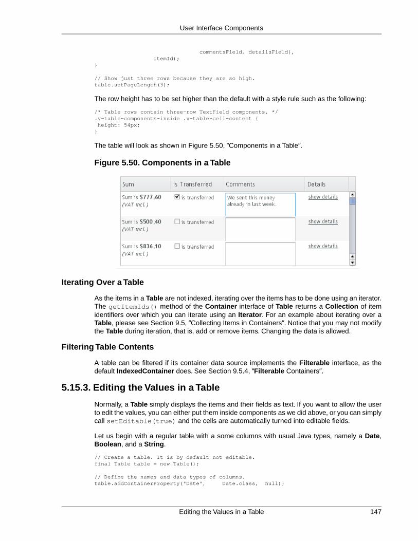
commentsField, detailsField}, itemId);}
// Show just three rows because they are so high.table.setPageLength(3);
The row height has to be set higher than the default with a style rule such as the following:
/* Table rows contain three-row TextField components. */.v-table-components-inside .v-table-cell-content { height: 54px;}
The table will look as shown in Figure 5.50, “Components in a Table”.
Figure 5.50. Components in a Table
Iterating Over a Table
As the items in a Table are not indexed, iterating over the items has to be done using an iterator.The getItemIds() method of the Container interface of Table returns a Collection of itemidentifiers over which you can iterate using an Iterator. For an example about iterating over aTable, please see Section 9.5, “Collecting Items in Containers”. Notice that you may not modifythe Table during iteration, that is, add or remove items. Changing the data is allowed.
Filtering Table Contents
A table can be filtered if its container data source implements the Filterable interface, as thedefault IndexedContainer does. See Section 9.5.4, “Filterable Containers”.
5.15.3. Editing the Values in a Table
Normally, a Table simply displays the items and their fields as text. If you want to allow the userto edit the values, you can either put them inside components as we did above, or you can simplycall setEditable(true) and the cells are automatically turned into editable fields.
Let us begin with a regular table with a some columns with usual Java types, namely a Date,Boolean, and a String.
// Create a table. It is by default not editable.final Table table = new Table();
// Define the names and data types of columns.table.addContainerProperty("Date", Date.class, null);
147Editing the Values in a Table
User Interface Components

table.addContainerProperty("Work", Boolean.class, null);table.addContainerProperty("Comments", String.class, null);
// Add a few items in the table.for (int i=0; i<100; i++) { Calendar calendar = new GregorianCalendar(2008,0,1); calendar.add(Calendar.DAY_OF_YEAR, i);
// Create the table row. table.addItem(new Object[] {calendar.getTime(), new Boolean(false), ""}, new Integer(i)); // Item identifier}
table.setPageLength(8);layout.addComponent(table);
You could put the table in editable mode right away if you need to. We'll continue the exampleby adding a mechanism to switch the Table from and to the editable mode.
final CheckBox switchEditable = new CheckBox("Editable");switchEditable.addListener(new Property.ValueChangeListener() { public void valueChange(ValueChangeEvent event) { table.setEditable(((Boolean)event.getProperty() .getValue()).booleanValue()); }});switchEditable.setImmediate(true);layout.addComponent(switchEditable);
Now, when you check to checkbox, the components in the table turn into editable fields, as shownin Figure 5.51, “A Table in Normal and Editable Mode”.
Figure 5.51. A Table in Normal and Editable Mode
Field Factories
The field components that allow editing the values of particular types in a table are defined in afield factory that implements the TableFieldFactory interface. The default implementation isDefaultFieldFactory, which offers the following crude mappings:
Table 5.2.Type to Field Mappings in DefaultFieldFactory
Mapped to Field ClassProperty Type
A DateField.Date
A CheckBox.Boolean
Editing the Values in a Table148
User Interface Components

Mapped to Field ClassProperty Type
A Form (deprecated in Vaadin 7). The fields ofthe form are automatically created from the
Item
item's properties using a FormFieldFactory.The normal use for this property type is insidea Form and is less useful inside a Table.
A TextField.The text field manages conversionsfrom the basic types, if possible.
other
Field factories are covered with more detail in Section 9.4, “Creating Forms by Binding Fields toItems”. You could just implement the TableFieldFactory interface, but we recommend that youextend the DefaultFieldFactory according to your needs. In the default implementation, themappings are defined in the createFieldByPropertyType() method (you might want tolook at the source code) both for tables and forms.
Navigation in Editable Mode
In the editable mode, the editor fields can have focus. Pressing Tab moves the focus to nextcolumn or, at the last column, to the first column of the next item. Respectively, pressing Shift+Tabmoves the focus backward. If the focus is in the last column of the last visible item, the pressingTab moves the focus outside the table. Moving backward from the first column of the first itemmoves the focus to the table itself. Some updates to the table, such as changing the headers orfooters or regenerating a column, can move the focus from an editor component to the table itself.
The default behaviour may be undesirable in many cases. For example, the focus also goesthrough any read-only editor fields and can move out of the table inappropriately.You can providebetter navigation is to use event handler for shortcut keys such as Tab, Arrow Up, Arrow Down,and Enter.
// Keyboard navigationclass KbdHandler implements Handler { Action tab_next = new ShortcutAction("Tab", ShortcutAction.KeyCode.TAB, null); Action tab_prev = new ShortcutAction("Shift+Tab", ShortcutAction.KeyCode.TAB, new int[] {ShortcutAction.ModifierKey.SHIFT}); Action cur_down = new ShortcutAction("Down", ShortcutAction.KeyCode.ARROW_DOWN, null); Action cur_up = new ShortcutAction("Up", ShortcutAction.KeyCode.ARROW_UP, null); Action enter = new ShortcutAction("Enter", ShortcutAction.KeyCode.ENTER, null); public Action[] getActions(Object target, Object sender) { return new Action[] {tab_next, tab_prev, cur_down, cur_up, enter}; }
public void handleAction(Action action, Object sender, Object target) { if (target instanceof TextField) { // Move according to keypress int itemid = (Integer) ((TextField) target).getData(); if (action == tab_next || action == cur_down) itemid++; else if (action == tab_prev || action == cur_up) itemid--; // On enter, just stay where you were. If we did // not catch the enter action, the focus would be // moved to wrong place.
149Editing the Values in a Table
User Interface Components

if (itemid >= 0 && itemid < table.size()) { TextField newTF = valueFields.get(itemid); if (newTF != null) newTF.focus(); } } }}
// Panel that handles keyboard navigationPanel navigator = new Panel();navigator.addStyleName(Reindeer.PANEL_LIGHT);navigator.addComponent(table);navigator.addActionHandler(new KbdHandler());
The main issue in implementing keyboard navigation in an editable table is that the editor fieldsdo not know the table they are in.To find the parent table, you can either look up in the componentcontainer hierarchy or simply store a reference to the table with setData() in the field component.The other issue is that you can not acquire a reference to an editor field from the Table component.One solution is to use some external collection, such as a HashMap, to map item IDs to the ed-itor fields.
// Can't access the editable components from the table so// must store the informationfinal HashMap<Integer,TextField> valueFields = new HashMap<Integer,TextField>();
The map has to be filled in a TableFieldFactory, such as in the following. You also need to setthe reference to the table there and you can also set the initial focus there.
table.setTableFieldFactory(new TableFieldFactory () { public Field createField(Container container, Object itemId, Object propertyId, Component uiContext) { TextField field = new TextField((String) propertyId);
// User can only edit the numeric column if ("Source of Fear".equals(propertyId)) field.setReadOnly(true); else { // The numeric column // The field needs to know the item it is in field.setData(itemId);
// Remember the field valueFields.put((Integer) itemId, field);
// Focus the first editable value if (((Integer)itemId) == 0) field.focus(); } return field; }});
The issues are complicated by the fact that the editor fields are not generated for the entire table,but only for a cache window that includes the visible items and some items above and below it.For example, if the beginning of a big scrollable table is visible, the editor component for the lastitem does not exist. This issue is relevant mostly if you want to have wrap-around navigation thatjumps from the last to first item and vice versa.
5.15.4. Column Headers and Footers
Table supports both column headers and footers; the headers are enabled by default.
Column Headers and Footers150
User Interface Components
Headers
The table header displays the column headers at the top of the table. You can use the columnheaders to reorder or resize the columns, as described earlier. By default, the header of a columnis the property ID of the column, unless given explicitly with setColumnHeader().
// Define the propertiestable.addContainerProperty("lastname", String.class, null);table.addContainerProperty("born", Integer.class, null);table.addContainerProperty("died", Integer.class, null);
// Set nicer header namestable.setColumnHeader("lastname", "Name");table.setColumnHeader("born", "Born");table.setColumnHeader("died", "Died");
The text of the column headers and the visibility of the header depends on the column headermode. The header is visible by default, but you can disable it withsetColumnHeaderMode(Table.COLUMN_HEADER_MODE_HIDDEN).
Footers
The table footer can be useful for displaying sums or averages of values in a column, and so on.The footer is not visible by default; you can enable it with setFooterVisible(true). Unlikein the header, the column headers are empty by default. You can set their value withsetColumnFooter(). The columns are identified by their property ID.
The following example shows how to calculate average of the values in a column:
// Have a table with a numeric columnTable table = new Table("Custom Table Footer");table.addContainerProperty("Name", String.class, null);table.addContainerProperty("Died At Age", Integer.class, null);
// Insert some dataObject people[][] = {{"Galileo", 77}, {"Monnier", 83}, {"Vaisala", 79}, {"Oterma", 86}};for (int i=0; i<people.length; i++) table.addItem(people[i], new Integer(i));
// Calculate the average of the numeric columndouble avgAge = 0;for (int i=0; i<people.length; i++) avgAge += (Integer) people[i][1];avgAge /= people.length;
// Set the footerstable.setFooterVisible(true);table.setColumnFooter("Name", "Average");table.setColumnFooter("Died At Age", String.valueOf(avgAge));
// Adjust the table height a bittable.setPageLength(table.size());
The resulting table is shown in Figure 5.52, “A Table with a Footer”.
151Column Headers and Footers
User Interface Components

Figure 5.52. A Table with a Footer
Handling Mouse Clicks on Headers and Footers
Normally, when the user clicks a column header, the table will be sorted by the column, assumingthat the data source is Sortable and sorting is not disabled. In some cases, you might want someother functionality when the user clicks the column header, such as selecting the column in someway.
Clicks in the header cause a HeaderClickEvent, which you can handle with a Table.Header-ClickListener. Click events on the table header (and footer) are, like button clicks, sent immedi-ately to server, so there is no need to set setImmediate().
// Handle the header clickstable.addListener(new Table.HeaderClickListener() { public void headerClick(HeaderClickEvent event) { String column = (String) event.getPropertyId(); Notification.show("Clicked " + column + "with " + event.getButtonName()); }});
// Disable the default sorting behaviortable.setSortDisabled(true);
Setting a click handler does not automatically disable the sorting behavior of the header; youneed to disable it explicitly with setSortDisabled(true). Header click events are not sentwhen the user clicks the column resize handlers to drag them.
The HeaderClickEvent object provides the identity of the clicked column with getPropertyId().The getButton() reports the mouse button with which the click was made: BUTTON_LEFT,BUTTON_RIGHT, or BUTTON_MIDDLE.The getButtonName() a human-readable button namein English: "left", "right", or "middle". The isShiftKey(), isCtrlKey(), etc., methodsindicate if the Shift, Ctrl, Alt or other modifier keys were pressed during the click.
Clicks in the footer cause a FooterClickEvent, which you can handle with a Table.FooterClick-Listener. Footers do not have any default click behavior, like the sorting in the header. Otherwise,handling clicks in the footer is equivalent to handling clicks in the header.
5.15.5. Generated Table Columns
You might want to have a column that has values calculated from other columns. Or you mightwant to format table columns in some way, for example if you have columns that display currencies.The ColumnGenerator interface allows defining custom generators for such columns.
You add new generated columns to a Table with addGeneratedColumn(). It takes the columnidentifier as its parameters. Usually you want to have a more user-friendly and possibly interna-
Generated Table Columns152
User Interface Components
tionalized column header. You can set the header and a possible icon by callingaddContainerProperty() before adding the generated column.
// Define table columns. table.addContainerProperty( "date", Date.class, null, "Date", null, null);table.addContainerProperty( "quantity", Double.class, null, "Quantity (l)", null, null);table.addContainerProperty( "price", Double.class, null, "Price (e/l)", null, null);table.addContainerProperty( "total", Double.class, null, "Total (e)", null, null);
// Define the generated columns and their generators.table.addGeneratedColumn("date", new DateColumnGenerator());table.addGeneratedColumn("quantity", new ValueColumnGenerator("%.2f l"));table.addGeneratedColumn("price", new PriceColumnGenerator());table.addGeneratedColumn("total", new ValueColumnGenerator("%.2f e"));
Notice that the addGeneratedColumn() always places the generated columns as the lastcolumn, even if you defined some other order previously. You will have to set the proper orderwith setVisibleColumns().
table.setVisibleColumns(new Object[] {"date", "quantity", "price", "total"});
The generators are objects that implement the Table.ColumnGenerator interface and itsgenerateCell() method.The method gets the identity of the item and column as its parameters,in addition to the table object. It has to return a component object.
The following example defines a generator for formatting Double valued fields according to aformat string (as in java.util.Formatter).
/** Formats the value in a column containing Double objects. */class ValueColumnGenerator implements Table.ColumnGenerator { String format; /* Format string for the Double values. */
/** * Creates double value column formatter with the given * format string. */ public ValueColumnGenerator(String format) { this.format = format; }
/** * Generates the cell containing the Double value. * The column is irrelevant in this use case. */ public Component generateCell(Table source, Object itemId, Object columnId) { // Get the object stored in the cell as a property Property prop = source.getItem(itemId).getItemProperty(columnId); if (prop.getType().equals(Double.class)) { Label label = new Label(String.format(format, new Object[] { (Double) prop.getValue() }));
// Set styles for the column: one indicating that it's // a value and a more specific one with the column // name in it. This assumes that the column name // is proper for CSS.
153Generated Table Columns
User Interface Components

label.addStyleName("column-type-value"); label.addStyleName("column-" + (String) columnId); return label; } return null; }}
The generator is called for all the visible (or more accurately cached) items in a table. If the userscrolls the table to another position in the table, the columns of the new visible rows are generateddynamically. The columns in the visible (cached) rows are also generated always when an itemhas a value change. It is therefore usually safe to calculate the value of generated cells from thevalues of different rows (items).
When you set a table as editable, regular fields will change to editing fields. When the userchanges the values in the fields, the generated columns will be updated automatically. Putting atable with generated columns in editable mode has a few quirks. The editable mode of Tabledoes not affect generated columns. You have two alternatives: either you generate the editingfields in the generator or, in case of formatter generators, remove the generator in the editablemode. The example below uses the latter approach.
// Have a check box that allows the user// to make the quantity and total columns editable.final CheckBox editable = new CheckBox( "Edit the input values - calculated columns are regenerated");
editable.setImmediate(true);editable.addListener(new ClickListener() { public void buttonClick(ClickEvent event) { table.setEditable(editable.booleanValue());
// The columns may not be generated when we want to // have them editable. if (editable.booleanValue()) { table.removeGeneratedColumn("quantity"); table.removeGeneratedColumn("total"); } else { // Not editable // Show the formatted values. table.addGeneratedColumn("quantity", new ValueColumnGenerator("%.2f l")); table.addGeneratedColumn("total", new ValueColumnGenerator("%.2f e")); } // The visible columns are affected by removal // and addition of generated columns so we have // to redefine them. table.setVisibleColumns(new Object[] {"date", "quantity", "price", "total", "consumption", "dailycost"}); }});
You will also have to set the editing fields in immediate mode to have the update occur imme-diately when an edit field loses the focus. You can set the fields in immediate mode with the acustom TableFieldFactory, such as the one given below, that just extends the default implement-ation to set the mode:
public class ImmediateFieldFactory extends DefaultFieldFactory { public Field createField(Container container, Object itemId, Object propertyId, Component uiContext) { // Let the DefaultFieldFactory create the fields... Field field = super.createField(container, itemId,
Generated Table Columns154
User Interface Components

propertyId, uiContext);
// ...and just set them as immediate. ((AbstractField)field).setImmediate(true);
return field; }}...table.setTableFieldFactory(new ImmediateFieldFactory());
If you generate the editing fields with the column generator, you avoid having to use such a fieldfactory, but of course have to generate the fields for both normal and editable modes.
Figure 5.53, “Table with Generated Columns in Normal and Editable Mode” shows a table withcolumns calculated (blue) and simply formatted (black) with column generators.
Figure 5.53.Table with Generated Columns in Normal and Editable Mode
5.15.6. Formatting Table Columns
The displayed values of properties shown in a table are normally formatted using the toString()method of each property. Customizing the format of a column can be done in several ways:
• Using ColumnGenerator to generate a second column that is formatted. The originalcolumn needs to be set invisible. See Section 5.15.5, “Generated Table Columns”.
• Using a PropertyFormatter as a proxy between the table and the data property. Thisalso normally requires using an mediate container in the table.
• Overriding the default formatPropertyValue() in Table.
155Formatting Table Columns
User Interface Components

As using a PropertyFormatter is generally much more awkward than overriding theformatPropertyValue(), its use is not described here.
You can override formatPropertyValue() as is done in the following example:
// Create a table that overrides the default// property (column) formatfinal Table table = new Table("Formatted Table") { @Override protected String formatPropertyValue(Object rowId, Object colId, Property property) { // Format by property type if (property.getType() == Date.class) { SimpleDateFormat df = new SimpleDateFormat("yyyy-MM-dd hh:mm:ss"); return df.format((Date)property.getValue()); }
return super.formatPropertyValue(rowId, colId, property); }};
// The table has some columnstable.addContainerProperty("Time", Date.class, null);
... Fill the table with data ...
You can also distinguish between columns by the colId parameter, which is the property ID ofthe column. DecimalFormat is useful for formatting decimal values.
... in formatPropertyValue() ...} else if ("Value".equals(pid)) { // Format a decimal value for a specific locale DecimalFormat df = new DecimalFormat("#.00", new DecimalFormatSymbols(locale)); return df.format((Double) property.getValue());}...table.addContainerProperty("Value", Double.class, null);
A table with the formatted date and decimal value columns is shown in Figure 5.54, “FormattedTable Columns”.
Figure 5.54. Formatted Table Columns
You can use CSS for further styling of table rows, columns, and individual cells by using a Cell-StyleGenerator. It is described in Section 5.15.7, “CSS Style Rules”.
5.15.7. CSS Style Rules
Styling the overall style of a Table can be done with the following CSS rules.
CSS Style Rules156
User Interface Components

.v-table {} .v-table-header-wrap {} .v-table-header {} .v-table-header-cell {} .v-table-resizer {} /* Column resizer handle. */ .v-table-caption-container {} .v-table-body {} .v-table-row-spacer {} .v-table-table {} .v-table-row {} .v-table-cell-content {}
Notice that some of the widths and heights in a table are calculated dynamically and can not beset in CSS.
Setting Individual Cell Styles
The Table.CellStyleGenerator interface allows you to set the CSS style for each individual cellin a table. You need to implement the getStyle(), which gets the row (item) and column(property) identifiers as parameters and can return a style name for the cell. The returned stylename will be concatenated to prefix "v-table-cell-content-".
The getStyle() is called also for each row, so that the propertyId parameter is null. Thisallows setting a row style.
Alternatively, you can use a Table.ColumnGenerator (see Section 5.15.5, “Generated TableColumns”) to generate the actual UI components of the cells and add style names to them.
Table table = new Table("Table with Cell Styles");table.addStyleName("checkerboard");
// Add some columns in the table. In this example, the property// IDs of the container are integers so we can determine the// column number easily.table.addContainerProperty("0", String.class, null, "", null, null);for (int i=0; i<8; i++) table.addContainerProperty(""+(i+1), String.class, null, String.valueOf((char) (65+i)), null, null);
// Add some items in the table.table.addItem(new Object[]{ "1", "R", "N", "B", "Q", "K", "B", "N", "R"}, new Integer(0));table.addItem(new Object[]{ "2", "P", "P", "P", "P", "P", "P", "P", "P"}, new Integer(1));for (int i=2; i<6; i++) table.addItem(new Object[]{String.valueOf(i+1), "", "", "", "", "", "", "", ""}, new Integer(i));table.addItem(new Object[]{ "7", "P", "P", "P", "P", "P", "P", "P", "P"}, new Integer(6));table.addItem(new Object[]{ "8", "R", "N", "B", "Q", "K", "B", "N", "R"}, new Integer(7));table.setPageLength(8);
// Set cell style generatortable.setCellStyleGenerator(new Table.CellStyleGenerator() { public String getStyle(Object itemId, Object propertyId) { // Row style setting, not relevant in this example. if (propertyId == null) return "green"; // Will not actually be visible
int row = ((Integer)itemId).intValue(); int col = Integer.parseInt((String)propertyId);
// The first column.
157CSS Style Rules
User Interface Components
if (col == 0) return "rowheader";
// Other cells. if ((row+col)%2 == 0) return "black"; else return "white"; }});
You can then style the cells, for example, as follows:
/* Center the text in header. */.v-table-header-cell { text-align: center;}
/* Basic style for all cells. */.v-table-checkerboard .v-table-cell-content { text-align: center; vertical-align: middle; padding-top: 12px; width: 20px; height: 28px;}
/* Style specifically for the row header cells. */.v-table-cell-content-rowheader { background: #E7EDF3 url(../default/table/img/header-bg.png) repeat-x scroll 0 0;}
/* Style specifically for the "white" cells. */.v-table-cell-content-white { background: white; color: black;}
/* Style specifically for the "black" cells. */.v-table-cell-content-black { background: black; color: white;}
The table will look as shown in Figure 5.55, “Cell Style Generator for a Table”.
CSS Style Rules158
User Interface Components

Figure 5.55. Cell Style Generator for a Table
5.16. Tree
The Tree component allows a natural way to represent data that has hierarchical relationships,such as filesystems or message threads. The Tree component in Vaadin works much like thetree components of most modern desktop user interface toolkits, for example in directorybrowsing.
The typical use of the Tree component is for displaying a hierachical menu, like a menu on theleft side of the screen, as in Figure 5.56, “A Tree Component as a Menu”, or for displayingfilesystems or other hierarchical datasets. The menu style makes the appearance of the treemore suitable for this purpose.
final Object[][] planets = new Object[][]{ new Object[]{"Mercury"}, new Object[]{"Venus"}, new Object[]{"Earth", "The Moon"}, new Object[]{"Mars", "Phobos", "Deimos"}, new Object[]{"Jupiter", "Io", "Europa", "Ganymedes", "Callisto"}, new Object[]{"Saturn", "Titan", "Tethys", "Dione", "Rhea", "Iapetus"}, new Object[]{"Uranus", "Miranda", "Ariel", "Umbriel", "Titania", "Oberon"}, new Object[]{"Neptune", "Triton", "Proteus", "Nereid", "Larissa"}};
Tree tree = new Tree("The Planets and Major Moons");
/* Add planets as root items in the tree. */for (int i=0; i<planets.length; i++) { String planet = (String) (planets[i][0]); tree.addItem(planet);
if (planets[i].length == 1) { // The planet has no moons so make it a leaf. tree.setChildrenAllowed(planet, false); } else { // Add children (moons) under the planets. for (int j=1; j<planets[i].length; j++) { String moon = (String) planets[i][j];
// Add the item as a regular item.
159Tree
User Interface Components

tree.addItem(moon);
// Set it to be a child. tree.setParent(moon, planet);
// Make the moons look like leaves. tree.setChildrenAllowed(moon, false); }
// Expand the subtree. tree.expandItemsRecursively(planet); }}
main.addComponent(tree);
Figure 5.56, “A Tree Component as a Menu” below shows the tree from the code example in apractical situation.
You can read or set the currently selected item by the value property of the Tree component,that is, with getValue() and setValue(). When the user clicks an item on a tree, the tree willreceive an ValueChangeEvent, which you can catch with a ValueChangeListener. To receivethe event immediately after the click, you need to set the tree as setImmediate(true).
The Tree component uses Container data sources much like the Table component, with theaddition that it also utilizes hierarchy information maintained by a HierarchicalContainer. Thecontained items can be of any item type supported by the container. The default container andits addItem() assume that the items are strings and the string value is used as the item ID.
5.17. MenuBar
The MenuBar component allows creating horizontal dropdown menus, much like the main menuin desktop applications.
// Create a menu barfinal MenuBar menubar = new MenuBar();main.addComponent(menubar);
You insert the top-level menu items to a MenuBar object with the addItem() method. It takesa string label, an icon resource, and a command as its parameters. The icon and command arenot required and can be null.
MenuBar.MenuItem beverages = menubar.addItem("Beverages", null, null);
The command is called when the user clicks the item. A menu command is a class that implementsthe MenuBar.Command interface.
// A feedback componentfinal Label selection = new Label("-");main.addComponent(selection);
// Define a common menu command for all the menu items.MenuBar.Command mycommand = new MenuBar.Command() { public void menuSelected(MenuItem selectedItem) { selection.setValue("Ordered a " + selectedItem.getText() + " from menu."); } };
MenuBar160
User Interface Components

Figure 5.56. A Tree Component as a Menu
The addItem() method returns a MenuBar.MenuItem object, which you can use to add sub-menu items. The MenuItem has an identical addItem() method.
// Put some items in the menu hierarchicallyMenuBar.MenuItem beverages = menubar.addItem("Beverages", null, null);MenuBar.MenuItem hot_beverages = beverages.addItem("Hot", null, null);hot_beverages.addItem("Tea", null, mycommand);hot_beverages.addItem("Coffee", null, mycommand);MenuBar.MenuItem cold_beverages = beverages.addItem("Cold", null, null);cold_beverages.addItem("Milk", null, mycommand);
// Another top-level itemMenuBar.MenuItem snacks = menubar.addItem("Snacks", null, null);snacks.addItem("Weisswurst", null, mycommand);snacks.addItem("Salami", null, mycommand);
// Yet another top-level itemMenuBar.MenuItem services = menubar.addItem("Services", null, null);services.addItem("Car Service", null, mycommand);
The menu will look as follows:
Figure 5.57. Menu Bar
CSS Style Rules.v-menubar { }.gwt-MenuItem {}.gwt-MenuItem-selected {}
161CSS Style Rules
User Interface Components

The menu bar has the overall style name .v-menubar. Each menu item has .gwt-MenuItemstyle normally and .gwt-MenuItem-selected when the item is selected.
5.18. Embedded
The Embedded component allows displaying embedded media objects, such as images, anim-ations, or any embeddable media type supported by the browser.The contents of an Embeddedcomponent are managed as resources. For documentation on resources, see Section 4.4, “Imagesand Other Resources”.
The following example displays an image from the same Java package as the class itself usingthe class loader.
Embedded image = new Embedded("Yes, logo:", new ClassResource("vaadin-logo.png"));main.addComponent(image);
Figure 5.58. Embedded Image
The Embedded component supports several different content types, which are rendered differentlyin HTML. You can set the content type with setType(), although for images, as in the aboveexample, the type is determined automatically.
Embedded.TYPE_OBJECTThe default embedded type, allows embedding certain file types inside HTML <object>and <embed> elements.
Embedded.TYPE_IMAGEEmbeds an image inside a HTML <img> element.
Embedded.TYPE_BROWSEREmbeds a browser frame inside a HTML <iframe> element.
5.18.1. Embedded Objects
The Embedded.TYPE_OBJECT is the default and most generic embedded type, which allowsembedding media objects inside HTML <object> and <embed> elements.You need define theMIME type for the object type.
Currently, only Shockwave Flash animations are supported (MIME typeapplication/x-shockwave-flash).
// Create a Shockware Flash resourcefinal ClassResource flashResource = new ClassResource("itmill_spin.swf");
Embedded162
User Interface Components

// Display the resource in a Embedded compoantfinal Embedded embedded = new Embedded("Embedded Caption", flashResource);
// This is the default type, but we set it anyway.embedded.setType(Embedded.TYPE_OBJECT);
// This is recorgnized automatically, but set it anyway.embedded.setMimeType("application/x-shockwave-flash");
You can set object parameters with setParameter(), which takes a parameter's name andvalue as strings. The object parameters are included in the HTML as <param> elements.
5.18.2. Embedded Images
Images are embedded with the type Embedded.TYPE_IMAGE, although you do not normallyneed to set the type explicitly, as it is recognized automatically from the MIME type of the resource,as in the example above.
Embedded component has by default undefined size in both directions, so it will automaticallyfit the size of the embedded image. If you want scrolling with scroll bars, you can put the Embed-ded inside a Panel that has a defined size to enable scrolling, as described in Section 6.6.1,“Scrolling the Panel Content”.You can also give it a defined size and set the overflow: autoCSS property for it in a theme.
You can find another example of displaying an image from FileResource in Section 5.19, “Up-load”. Another example, in Section 4.4.5, “Stream Resources”, shows how you can generate thecontent of an Embedded component dynamically using a StreamResource.
If you have a dynamically generated image, for example with a StreamResource, and the datachanges, you need to reload the image in the browser. Because of how caching is handled insome browsers, you are best off by renaming the filename of the resource with a unique name,such as one including a timestamp. You should set cache time to zero with setCacheTime()for the resource object when you create it.
// Create the stream resource with some initial filename.StreamResource imageResource = new StreamResource(imageSource, "initial-filename.png");
// Instruct browser not to cache the image.imageResource.setCacheTime(0);
// Display the image in an Embedded component.Embedded embedded = new Embedded("", imageResource);
When refreshing, you also need to call requestRepaint() for the Embedded object.
// This needs to be done, but is not sufficient.embedded.requestRepaint();
// Generate a filename with a timestamp.SimpleDateFormat df = new SimpleDateFormat("yyyyMMddHHmmssSSS");String filename = "myfilename-" + df.format(new Date()) + ".png";
// Replace the filename in the resource.imageResource.setFilename(makeImageFilename());
You can find more detailed information about the StreamResource in Section 4.4.5, “StreamResources”.
163Embedded Images
User Interface Components

5.18.3. Browser Frames
The browser frame type allows you to embed external content inside an HTML <iframe> element.You can refer to a URL with an ExternalResource object. URLs are given with the standardJava URL class.
URL url = new URL("http://dev.vaadin.com/");Embedded browser = new Embedded("", new ExternalResource(url));browser.setType(Embedded.TYPE_BROWSER);main.addComponent(browser);
5.19. Upload
The Upload component allows a user to upload files to the server. It displays a file name entrybox, a file selection button, and an upload submit button. The user can either write the filenamein the text area or click the Browse button to select a file. After the file is selected, the user sendsthe file by pressing the upload submit button.
// Create the Upload component.Upload upload = new Upload("Upload the file here", this);
Figure 5.59. Upload Component
You can set the text of the upload button with setButtonCaption(), as in the example above,but it is difficult to change the look of the Browse button.This is a security feature of web browsers.The language of the Browse button is determined by the browser, so if you wish to have thelanguage of the Upload component consistent, you will have to use the same language in yourapplication.
upload.setButtonCaption("Upload Now");
The uploaded files are typically stored as files in a file system, in a database, or as temporaryobjects in memory.The upload component writes the received data to an java.io.OutputStreamso you have plenty of freedom in how you can process the upload content.
To use the Upload component, you need to define a class that implements the Upload.Receiverinterface. The receiveUpload() method is called when the user clicks the submit button. Themethod must return an OutputStream. To do this, it typically creates a File or a memory bufferwhere the stream is written.The method gets the file name and MIME type of the file, as reportedby the browser.
When an upload is finished, successfully or unsuccessfully, the Upload component will emit theUpload.FinishedEvent event.To receive it, you need to implement the Upload.FinishedListenerinterface, and register the listening object in the Upload component. The event object will alsoinclude the file name, MIME type, and length of the file. Notice that the more specific Upload.Faile-dEvent and Upload.SucceededEvent events will be called in the cases where the upload failedor succeeded, respectively.
The following example allows uploading images to /tmp/uploads directory in (UNIX) filesystem(the directory must exist or the upload fails). The component displays the last uploaded imagein an Embedded component.
// Create the upload with a caption and set receiver laterUpload upload = new Upload("Upload Image Here", null);
Browser Frames164
User Interface Components

upload.setButtonCaption("Start Upload");
// Put the upload component in a panelPanel panel = new Panel("Cool Image Storage");panel.addComponent(upload);
// Show uploaded file in this placeholderfinal Embedded image = new Embedded("Uploaded Image");image.setVisible(false);panel.addComponent(image);
// Implement both receiver that saves upload in a file and// listener for successful uploadclass ImageUploader implements Receiver, SucceededListener { public File file;
public OutputStream receiveUpload(String filename, String mimeType) { // Create upload stream FileOutputStream fos = null; // Stream to write to try { // Open the file for writing. file = new File("/tmp/uploads/" + filename); fos = new FileOutputStream(file); } catch (final java.io.FileNotFoundException e) { Notification.show( "Could not open file<br/>", e.getMessage(), Notification.TYPE_ERROR_MESSAGE); return null; } return fos; // Return the output stream to write to }
public void uploadSucceeded(SucceededEvent event) { // Show the uploaded file in the image viewer image.setVisible(true); image.setSource(new FileResource(file)); }};final ImageUploader uploader = new ImageUploader(); upload.setReceiver(uploader);upload.addListener(uploader);
The example does not check the type of the uploaded files in any way, which will cause an errorif the content is anything else but an image. The program also assumes that the MIME type ofthe file is resolved correctly based on the file name extension. After uploading an image, thecomponent will look as show in Figure 5.60, “Image Upload Example” below.
165Upload
User Interface Components

Figure 5.60. Image Upload Example
5.20. ProgressIndicator
The ProgressIndicator component allows displaying the progress of a task graphically. Theprogress is given as a floating-point value between 0.0 and 1.0.
Figure 5.61.The Progress Indicator Component
The progress indicator polls the server for updates for its value. If the value has changed, theprogress is updated. Notice that the user application does not have to handle any polling event,but updating the component is done automatically.
Creating a progress indicator is just like with any other component.You can give the initial progressvalue as a parameter for the constructor. The default polling frequency is 1000 milliseconds (onesecond), but you can set some other interval with the setPollingInterval() method.
// Create the indicatorfinal ProgressIndicator indicator = new ProgressIndicator(new Float(0.0));main.addComponent(indicator);
// Set polling frequency to 0.5 seconds.indicator.setPollingInterval(500);
ProgressIndicator166
User Interface Components

CSS Style Rules/* Base element. */.v-progressindicator {}
/* Progress indication element on top of the base. */.v-progressindicator div {}
The default style for the progress indicator uses an animated GIF image (img/base.gif) asthe base background for the component.The progress is a <div> element inside the base.Whenthe progress element grows, it covers more and more of the base background. By default, thegraphic of the progress element is defined in img/progress.png under the default style directory.S e ecom.vaadin.terminal.gwt/public/default/progressindicator/progressindicator.css.
5.20.1. Doing Heavy Computation
The progress indicator is often used to display the progress of a heavy server-side computationtask. In the following example, we create a thread in the server to do some "heavy work". All thethread needs to do is to set the value of the progress indicator with setValue() and the currentprogress is displayed automatically when the browser polls the server.
// Create an indicator that makes you look busyfinal ProgressIndicator indicator = new ProgressIndicator(new Float(0.0));main.addComponent(indicator);
// Set polling frequency to 0.5 seconds.indicator.setPollingInterval(500);
// Add a button to start workingfinal Button button = new Button("Click to start");main.addComponent(button);
// Another thread to do some workclass WorkThread extends Thread { public void run () { double current = 0.0; while (true) { // Do some "heavy work" try { sleep(50); // Sleep for 50 milliseconds } catch (InterruptedException) {}
// Show that you have made some progress: // grow the progress value until it reaches 1.0. current += 0.01; if (current>1.0) indicator.setValue(new Float(1.0)); else indicator.setValue(new Float(current));
// After all the "work" has been done for a while, // take a break. if (current > 1.2) { // Restore the state to initial. indicator.setValue(new Float(0.0)); button.setVisible(true); break; } } }}
167CSS Style Rules
User Interface Components

// Clicking the button creates and runs a work threadbutton.addListener(new Button.ClickListener() { public void buttonClick(ClickEvent event) { final WorkThread thread = new WorkThread(); thread.start();
// The button hides until the work is done. button.setVisible(false); }});
Figure 5.62. Starting Heavy Work
5.21. Slider
The Slider is a vertical or horizontal bar that allows setting a numeric value within a defined rangeby dragging a bar handle with the mouse. The value is shown when dragging the handle.
Slider has a number of different constructors that take a combination of the caption, minimumand maximum value, resolution, and the orientation of the slider.
// Create a vertical sliderfinal Slider vertslider = new Slider(1, 100);vertslider.setOrientation(SliderOrientation.VERTICAL);
Slider Properties
minMinimum value of the slider range. The default is 0.0.
maxMaximum value of the slider range. The default is 100.0.
resolutionThe number of digits after the decimal point. The default is 0.
orientationThe orientation can be either horizontal (SliderOrientation.HORIZONTAL) orvertical (SliderOrientation.VERTICAL). The default is horizontal.
As the Slider is a field component, you can handle value changes with a ValueChangeListener.The value of the Slider field is a Double object.
// Shows the value of the vertical sliderfinal Label vertvalue = new Label();vertvalue.setSizeUndefined();
// Handle changes in slider value.vertslider.addValueChangeListener( new Property.ValueChangeListener() { public void valueChange(ValueChangeEvent event) { double value = (Double) vertslider.getValue();
// Use the value box.setHeight((float) value, Sizeable.UNITS_PERCENTAGE); vertvalue.setValue(String.valueOf(value));
Slider168
User Interface Components

}});
// The slider has to be immediate to send the changes// immediately after the user drags the handle.vertslider.setImmediate(true);
You can set the value with the setValue() method defined in Slider that takes the value as anative double value. The setter can throw a ValueOutOfBoundsException, which you musthandle.
// Set the initial value. This has to be set after the// listener is added if we want the listener to handle// also this value change.try { vertslider.setValue(50.0);} catch (ValueOutOfBoundsException e) {}
Alternatively, you can use the regular setValue(Object), which does not do bounds checking.
Figure 5.63, “The Slider Component” shows both vertical (from the code examples) and horizontalsliders that control the size of a box. The slider values are displayed also in separate labels.
Figure 5.63.The Slider Component
CSS Style Rules.v-slider {}.v-slider-base {}.v-slider-handle {}
The enclosing style for the Slider is v-slider. The slider bar has style v-slider-base. Eventhough the handle is higher (for horizontal slider) or wider (for vertical slider) than the bar, thehandle element is nevertheless contained within the slider bar element. The appearance of thehandle comes from a background image defined in the background CSS property.
169CSS Style Rules
User Interface Components

5.22. Component Composition with CustomComponent
The ease of making new user interface components is one of the core features of Vaadin.Typically,you simply combine existing built-in components to produce composite components. In manyapplications, such composite components make up the majority of the user interface.
To create a composite component, you need to inherit the CustomComponent and call thesetCompositionRoot() in the constructor to set the composition root component. The rootcomponent is typically a layout component that contains multiple components.
For example:
class MyComposite extends CustomComponent { public MyComposite(String message) { // A layout structure used for composition Panel panel = new Panel("My Custom Component"); panel.setContent(new VerticalLayout());
// Compose from multiple components Label label = new Label(message); label.setSizeUndefined(); // Shrink panel.addComponent(label); panel.addComponent(new Button("Ok"));
// Set the size as undefined at all levels panel.getContent().setSizeUndefined(); panel.setSizeUndefined(); setSizeUndefined();
// The composition root MUST be set setCompositionRoot(panel); }}
Take note of the sizing when trying to make a customcomponent that shrinks to fit the containedcomponents. You have to set the size as undefined at all levels; the sizing of the compositecomponent and the composition root are separate.
You can use the component as follows:
MyComposite mycomposite = new MyComposite("Hello");
The rendered component is shown in Figure 5.64, “A Custom Composite Component”.
Figure 5.64. A Custom Composite Component
You can also inherit any other components, such as layouts, to attain similar composition. Evenfurther, you can create entirely new low-level components, by integrating pure client-side com-ponents or by extending the client-side functionality of built-in components. Development of newcomponents is covered in Chapter 16, Integrating with the Server-Side.
Component Composition with CustomComponent170
User Interface Components

Chapter 6
Managing Layout
6.1. Overview ................................................................................................ 1726.2. Window and Panel Content ................................................................... 1746.3. VerticalLayout and HorizontalLayout ................................................. 1746.4. GridLayout ............................................................................................ 1796.5. FormLayout .......................................................................................... 1826.6. Panel ..................................................................................................... 1846.7. Sub-Windows ........................................................................................ 1866.8. HorizontalSplitPanel and VerticalSplitPanel ...................................... 1906.9. TabSheet ............................................................................................... 1926.10. Accordion ........................................................................................... 1956.11. AbsoluteLayout .................................................................................. 1976.12. CssLayout .......................................................................................... 1996.13. Layout Formatting ................................................................................ 2026.14. Custom Layouts ................................................................................... 209
Ever since the ancient xeroxians invented graphical user interfaces, programmers have wantedto make GUI programming ever easier for themselves. Solutions started simple. When GUIsappeared on PC desktops, practically all screens were of the VGA type and fixed into 640x480size. Mac or X Window System on UNIX were not much different. Everyone was so happy withsuch awesome graphics resolutions that they never thought that an application would have towork on a radically different screen size. At worst, screens could only grow, they thought, givingmore space for more windows. In the 80s, the idea of having a computer screen in your pocketwas simply not realistic. Hence, the GUI APIs allowed placing UI components using screen co-ordinates. Visual Basic and some other systems provided an easy way for the designer to dragand drop components on a fixed-sized window. One would have thought that at least translatorswould have complained about the awkwardness of such a solution, but apparently they were not,
171Book of Vaadin
as non-engineers, heard or at least cared about. At best, engineers could throw at them a resourceeditor that would allow them to resize the UI components by hand. Such was the spirit back then.
After the web was born, layout design was doomed to change for ever. At first, layout didn'tmatter much, as everyone was happy with plain headings, paragraphs, and a few hyperlinks hereand there. Designers of HTML wanted the pages to run on any screen size. The screen size wasactually not pixels but rows and columns of characters, as the baby web was really just hypertext,not graphics.That was soon to be changed.The first GUI-based browser, NCSA Mosaic, launcheda revolution that culminated in Netscape Navigator. Suddenly, people who had previously beendoing advertisement brochures started writing HTML. This meant that layout design had to beeasy not just for programmers, but also allow the graphics designer to do his or her job withouthaving to know a thing about programming.The W3C committee designing web standards cameup with the CSS (Cascading Style Sheet) specification, which allowed trivial separation of appear-ance from content. Later versions of HTML followed, XHTML appeared, as did countless otherstandards.
Page description and markup languages are a wonderful solution for static presentations, suchas books and most web pages. Real applications, however, need to have more control. Theyneed to be able to change the state of user interface components and even their layout on therun. This creates a need to separate the presentation from content on exactly the right level.
Thanks to the attack of graphics designers, desktop applications were, when it comes to appear-ance, far behind web design. Sun Microsystems had come in 1995 with a new programminglanguage, Java, for writing cross-platform desktop applications. Java's original graphical userinterface toolkit, AWT (Abstract Windowing Toolkit), was designed to work on multiple operatingsystems as well as embedded in web browsers. One of the special aspects of AWT was thelayout manager, which allowed user interface components to be flexible, growing and shrinkingas needed. This made it possible for the user to resize the windows of an application flexibly andalso served the needs of localization, as text strings were not limited to some fixed size in pixels.It became even possible to resize the pixel size of fonts, and the rest of the layout adapted to thenew size.
Layout management of Vaadin is a direct successor of the web-based concept for separation ofcontent and appearance and of the Java AWT solution for binding the layout and user interfacecomponents into objects in programs. Vaadin layout components allow you to position your UIcomponents on the screen in a hierarchical fashion, much like in conventional Java UI toolkitssuch as AWT, Swing, or SWT. In addition, you can approach the layout from the direction of theweb with the CustomLayout component, which you can use to write your layout as a templatein XHTML that provides locations of any contained components.
The moral of the story is that, because Vaadin is intended for web applications, appearance isof high importance. The solutions have to be the best of both worlds and satisfy artists of bothkind: code and graphics. On the API side, the layout is controlled by UI components, particularlythe layout components. On the visual side, it is controlled by themes. Themes can contain anyHTML, CSS, and JavaScript that you or your web artists create to make people feel good aboutyour software.
6.1. Overview
The user interface components in Vaadin can roughly be divided in two groups: components thatthe user can interact with and layout components for placing the other components to specificplaces in the user interface. The layout components are identical in their purpose to layoutmanagers in regular desktop frameworks for Java and you can use plain Java to accomplishsophisticated component layouting.
Overview172
Managing Layout
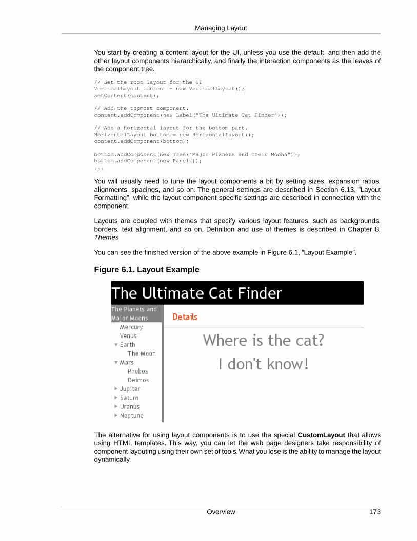
You start by creating a content layout for the UI, unless you use the default, and then add theother layout components hierarchically, and finally the interaction components as the leaves ofthe component tree.
// Set the root layout for the UIVerticalLayout content = new VerticalLayout();setContent(content);
// Add the topmost component.content.addComponent(new Label("The Ultimate Cat Finder"));
// Add a horizontal layout for the bottom part.HorizontalLayout bottom = new HorizontalLayout();content.addComponent(bottom);
bottom.addComponent(new Tree("Major Planets and Their Moons"));bottom.addComponent(new Panel());...
You will usually need to tune the layout components a bit by setting sizes, expansion ratios,alignments, spacings, and so on. The general settings are described in Section 6.13, “LayoutFormatting”, while the layout component specific settings are described in connection with thecomponent.
Layouts are coupled with themes that specify various layout features, such as backgrounds,borders, text alignment, and so on. Definition and use of themes is described in Chapter 8,Themes
You can see the finished version of the above example in Figure 6.1, “Layout Example”.
Figure 6.1. Layout Example
The alternative for using layout components is to use the special CustomLayout that allowsusing HTML templates. This way, you can let the web page designers take responsibility ofcomponent layouting using their own set of tools.What you lose is the ability to manage the layoutdynamically.
173Overview
Managing Layout

The Visual Editor
While you can always program the layout by hand, the Vaadin plugin for the EclipseIDE includes a visual (WYSIWYG) editor that you can use to create user interfacesvisually. The editor generates the code that creates the user interface and is usefulfor rapid application development and prototyping. It is especially helpful when youare still learning the framework, as the generated code, which is designed to be asreusable as possible, also works as an example of how you create user interfaceswith Vaadin. You can find more about the editor in Chapter 7, Visual User InterfaceDesign with Eclipse.
6.2. Window and Panel Content
The Window and its superclass Panel have a single content component. The content is usuallya layout component, but any component is allowed.
// Set the root content for the UITabSheet tabsheet = new TabSheet();setContent(tabsheet);
The size of the root layout is the default size of the particular layout component, for example, aVerticalLayout has 100% width and undefined height by default. In many applications, you wantto use the full area of the browser view. Setting the components contained inside the root layoutto full size is not enough, and would actually lead to an invalid state if the height of the root layoutis undefined.
// This is actually the default.main.setContent(new VerticalLayout());
// Set the size of the root layout to full width and height.main.getContent().setSizeFull();
// Add a title area on top of the screen. This takes just the// vertical space it needs.main.addComponent(new Label("My Application"));
// Add a menu-view area that takes rest of the vertical space.HorizontalLayout menuview = new HorizontalLayout();menuview.setSizeFull();main.addComponent(menuview);
See Section 6.13.1, “Layout Size” for more information about setting layout sizes.
6.3. VerticalLayout and HorizontalLayout
VerticalLayout and HorizontalLayout are containers for laying components out either verticallyor horizontally, respectively. These are the two most important layout components in Vaadin andsome components, such as Window and Panel, have a VerticalLayout as the root layout, whichyou can set with setContent().
Typical use of the layouts goes as follows:
VerticalLayout vertical = new VerticalLayout ();vertical.addComponent(new TextField("Name"));vertical.addComponent(new TextField("Street address"));vertical.addComponent(new TextField("Postal code"));main.addComponent(vertical);
Window and Panel Content174
Managing Layout

In these layouts, component captions are placed above the component. The layout will look onscreen as follows:
Using HorizontalLayout gives the following layout:
The layouts can have spacing between the horizontal or vertical cells, defined withsetSpacing(), as described in Section 6.13.3, “Layout Cell Spacing”.The contained componentscan be aligned within their cells with setComponentAlignment(), as described in Sec-tion 6.13.2, “Layout Cell Alignment”.
6.3.1. Sizing Contained Components
The components contained within an ordered layout can be laid out in a number of different waysdepending on how you specify their height or width in the primary direction of the layout component.
Figure 6.2. Component Widths in HorizontalLayout
Figure 6.2, “Component Widths in HorizontalLayout” above gives a summary of the sizing optionsfor a HorizontalLayout. The figure is broken down in the following subsections.
Layout with Undefined Size
If a VerticalLayout has undefined height or HorizontalLayout undefined width, the layout willshrink to fit the contained components so that there is no extra space between them.
HorizontalLayout fittingLayout = new HorizontalLayout();fittingLayout.setWidth(Sizeable.SIZE_UNDEFINED, 0); // DefaultfittingLayout.addComponent(new Button("Small"));fittingLayout.addComponent(new Button("Medium-sized"));fittingLayout.addComponent(new Button("Quite a big component"));parentLayout.addComponent(fittingLayout);
175Sizing Contained Components
Managing Layout

The both layouts actually have undefined height by default and HorizontalLayout has also un-defined width, while VerticalLayout has 100% relative width.
If such a vertical layout with undefined height continues below the bottom of a window (a Windowobject), the window will pop up a vertical scroll bar on the right side of the window area.This way,you get a "web page". The same applies to Panel.
A layout that contains components with percentual size must have a definedsize!
If a layout has undefined size and a contained component has, say, 100% size, thecomponent would fill the space given by the layout, while the layout would shrink tofit the space taken by the component, which would be a paradox. This requirementholds for height and width separately.The debug mode allows detecting such invalidcases; see Section 11.3.1, “Debug Mode”.
An exception to the above rule is a case where you have a layout with undefined size that containsa component with a fixed or undefined size together with one or more components with relativesize. In this case, the contained component with fixed (or undefined) size in a sense defines thesize of the containing layout, removing the paradox.That size is then used for the relatively sizedcomponents.
The technique can be used to define the width of a VerticalLayout or the height of a Horizont-alLayout.
// Vertical layout would normally have 100% widthVerticalLayout vertical = new VerticalLayout();
// Shrink to fit the width of contained componentsvertical.setWidth(Sizeable.SIZE_UNDEFINED, 0);
// Label has normally 100% width, but we set it as// undefined so that it will take only the needed spaceLabel label = new Label("\u2190 The VerticalLayout shrinks to fit "+ "the width of this Label \u2192");label.setWidth(Sizeable.SIZE_UNDEFINED, 0);vertical.addComponent(label);
// Button has undefined width by defaultButton butt = new Button("\u2190 This Button takes 100% "+ "of the width \u2192");butt.setWidth("100%");vertical.addComponent(butt);
Figure 6.3. Defining the Size with a Component
Sizing Contained Components176
Managing Layout

Layout with Defined Size
If you set a HorizontalLayout to a defined size horizontally or a VerticalLayout vertically, andthere is space left over from the contained components, the extra space is distributed equallybetween the component cells. The components are aligned within these cells according to theiralignment setting, top left by default, as in the example below.
fixedLayout.setWidth("400px");
Using percentual sizes for components contained in a layout requires answering the question,"Percentage of what?" There is no sensible default answer for this question in the current imple-mentation of the layouts, so in practice, you may not define "100%" size alone.
Expanding Components
Often, you want to have one component that takes all the available space left over from othercomponents.You need to set its size as 100% and set it as expanding with setExpandRatio().The second parameter for the method is an expansion ratio, which is relevant if there are morethan one expanding component, but its value is irrelevant for a single expanding component.
HorizontalLayout layout = new HorizontalLayout();layout.setWidth("400px");
// These buttons take the minimum size.layout.addComponent(new Button("Small"));layout.addComponent(new Button("Medium-sized"));
// This button will expand.Button expandButton = new Button("Expanding component");
// Use 100% of the expansion cell's width.expandButton.setWidth("100%");
// The component must be added to layout before setting the ratio.layout.addComponent(expandButton);
// Set the component's cell to expand.layout.setExpandRatio(expandButton, 1.0f);
parentLayout.addComponent(layout);
Notice that you must call setExpandRatio() after addComponent(), because the layout cannot operate on an component that it doesn't (yet) include.
Expand Ratios
If you specify an expand ratio for multiple components, they will all try to use the available spaceaccording to the ratio.
HorizontalLayout layout = new HorizontalLayout();layout.setWidth("400px");
// Create three equally expanding components.String[] captions = { "Small", "Medium-sized", "Quite a big component" };for (int i = 1; i <= 3; i++) {
177Sizing Contained Components
Managing Layout

Button button = new Button(captions[i-1]); button.setWidth("100%"); layout.addComponent(button);
// Have uniform 1:1:1 expand ratio. layout.setExpandRatio(button, 1.0f);}
As the example used the same ratio for all components, the ones with more content may havethe content cut. Below, we use differing ratios:
// Expand ratios for the components are 1:2:3.layout.setExpandRatio(button, i * 1.0f);
If the size of the expanding components is defined as a percentage (typically "100%"), the ratiois calculated from the overall space available for the relatively sized components. For example,if you have a 100 pixels wide layout with two cells with 1.0 and 4.0 respective expansion ratios,and both the components in the layout are set as setWidth("100%"), the cells will have re-spective widths of 20 and 80 pixels, regardless of the minimum size of the components.
However, if the size of the contained components is undefined or fixed, the expansion ratio is ofthe excess available space. In this case, it is the excess space that expands, not the components.
for (int i = 1; i <= 3; i++) { // Button with undefined size. Button button = new Button(captions[i - 1]);
layout4.addComponent(button);
// Expand ratios are 1:2:3. layout4.setExpandRatio(button, i * 1.0f);}
It is not meaningful to combine expanding components with percentually defined size and com-ponents with fixed or undefined size. Such combination can lead to a very unexpected size forthe percentually sized components.
Percentage of Cells
A percentual size of a component defines the size of the component within its cell. Usually, youuse "100%", but a smaller percentage or a fixed size (smaller than the cell size) will leave anempty space in the cell and align the component within the cell according to its alignment setting,top left by default.
HorizontalLayout layout50 = new HorizontalLayout();layout50.setWidth("400px");
String[] captions1 = { "Small 50%", "Medium 50%", "Quite a big 50%" };for (int i = 1; i <= 3; i++) { Button button = new Button(captions1[i-1]); button.setWidth("50%"); layout50.addComponent(button);
Sizing Contained Components178
Managing Layout

// Expand ratios for the components are 1:2:3. layout50.setExpandRatio(button, i * 1.0f);}parentLayout.addComponent(layout50);
6.4. GridLayout
GridLayout container lays components out on a grid, defined by the number of columns androws. The columns and rows of the grid serve as coordinates that are used for laying out com-ponents on the grid. Each component can use multiple cells from the grid, defined as an area(x1,y1,x2,y2), although they typically take up only a single grid cell.
The grid layout maintains a cursor for adding components in left-to-right, top-to-bottom order. Ifthe cursor goes past the bottom-right corner, it will automatically extend the grid downwards byadding a new row.
The following example demonstrates the use of GridLayout. The addComponent takes a com-ponent and optional coordinates. The coordinates can be given for a single cell or for an area inx,y (column,row) order. The coordinate values have a base value of 0. If coordinates are notgiven, the cursor will be used.
// Create a 4 by 4 grid layout.GridLayout grid = new GridLayout(4, 4);grid.addStyleName("example-gridlayout");
// Fill out the first row using the cursor.grid.addComponent(new Button("R/C 1"));for (int i = 0; i < 3; i++) { grid.addComponent(new Button("Col " + (grid.getCursorX() + 1)));}
// Fill out the first column using coordinates.for (int i = 1; i < 4; i++) { grid.addComponent(new Button("Row " + i), 0, i);}
// Add some components of various shapes.grid.addComponent(new Button("3x1 button"), 1, 1, 3, 1);grid.addComponent(new Label("1x2 cell"), 1, 2, 1, 3);InlineDateField date = new InlineDateField("A 2x2 date field");date.setResolution(DateField.RESOLUTION_DAY);grid.addComponent(date, 2, 2, 3, 3);
The resulting layout will look as follows. The borders have been made visible to illustrate thelayout cells.
179GridLayout
Managing Layout

Figure 6.4.The Grid Layout Component
A component to be placed on the grid must not overlap with existing components. A conflictcauses throwing a GridLayout.OverlapsException.
6.4.1. Sizing Grid Cells
You can define the size of both a grid layout and its components in either fixed or percentualunits, or leave the size undefined altogether, as described in Section 5.3.9, “Sizing Components”.Section 6.13.1, “Layout Size” gives an introduction to sizing of layouts.
The size of the GridLayout component is undefined by default, so it will shrink to fit the size ofthe components placed inside it. In most cases, especially if you set a defined size for the layoutbut do not set the contained components to full size, there will be some unused space. The pos-ition of the non-full components within the grid cells will be determined by their alignment. SeeSection 6.13.2, “Layout Cell Alignment” for details on how to align the components inside thecells.
The components contained within a GridLayout layout can be laid out in a number of differentways depending on how you specify their height or width. The layout options are similar to Hori-zontalLayout and VerticalLayout, as described in Section 6.3, “VerticalLayout and Horizont-alLayout”.
A layout that contains components with percentual size must have a definedsize!
If a layout has undefined size and a contained component has, say, 100% size, thecomponent would fill the space given by the layout, while the layout would shrink tofit the space taken by the component, which is a paradox. This requirement holdsfor height and width separately.The debug mode allows detecting such invalid cases;see Section 11.3.1, “Debug Mode”.
Often, you want to have one or more rows or columns that take all the available space left overfrom non-expanding rows or columns. You need to set the rows or columns as expanding withsetRowExpandRatio() and setColumnExpandRatio(). The first parameter for thesemethods is the index of the row or column to set as expanding. The second parameter for themethods is an expansion ratio, which is relevant if there are more than one expanding row orcolumn, but its value is irrelevant if there is only one. With multiple expanding rows or columns,
Sizing Grid Cells180
Managing Layout

the ratio parameter sets the relative portion how much a specific row/column will take in relationwith the other expanding rows/columns.
GridLayout grid = new GridLayout(3,2);
// Layout containing relatively sized components must have// a defined size, here is fixed size.grid.setWidth("600px");grid.setHeight("200px");
// Add some contentString labels [] = { "Shrinking column<br/>Shrinking row", "Expanding column (1:)<br/>Shrinking row", "Expanding column (5:)<br/>Shrinking row", "Shrinking column<br/>Expanding row", "Expanding column (1:)<br/>Expanding row", "Expanding column (5:)<br/>Expanding row"};for (int i=0; i<labels.length; i++) { Label label = new Label(labels[i], Label.CONTENT_XHTML); label.setWidth(null); // Set width as undefined grid.addComponent(label);}
// Set different expansion ratios for the two columnsgrid.setColumnExpandRatio(1, 1);grid.setColumnExpandRatio(2, 5);
// Set the bottom row to expandgrid.setRowExpandRatio(1, 1);
// Align and size the labels.for (int col=0; col<grid.getColumns(); col++) { for (int row=0; row<grid.getRows(); row++) { Component c = grid.getComponent(col, row); grid.setComponentAlignment(c, Alignment.TOP_CENTER);
// Make the labels high to illustrate the empty // horizontal space. if (col != 0 || row != 0) c.setHeight("100%"); }}
Figure 6.5. Expanding Rows and Columns in GridLayout
If the size of the contained components is undefined or fixed, the expansion ratio is of the excessspace, as in Figure 6.5, “Expanding Rows and Columns in GridLayout” (excess horizontal spaceis shown in white). However, if the size of the all the contained components in the expandingrows or columns is defined as a percentage, the ratio is calculated from the overall space available
181Sizing Grid Cells
Managing Layout

for the percentually sized components. For example, if we had a 100 pixels wide grid layout withtwo columns with 1.0 and 4.0 respective expansion ratios, and all the components in the gridwere set as setWidth("100%"), the columns would have respective widths of 20 and 80 pixels,regardless of the minimum size of their contained components.
CSS Style Rules.v-gridlayout {}.v-gridlayout-margin {}
The v-gridlayout is the root element of the GridLayout component. The v-gridlayout-margin is asimple element inside it that allows setting a padding between the outer element and the cells.
For styling the individual grid cells, you should style the components inserted in the cells. Theimplementation structure of the grid can change, so depending on it, as is done in the examplebelow, is not generally recommended. Normally, if you want to have, for example, a differentcolor for a certain cell, just make set the component inside it setSizeFull(), and add a stylename for it. Sometimes you may need to use a layout component between a cell and its actualcomponent just for styling.
The following example shows how to make the grid borders visible, as in Figure 6.5, “ExpandingRows and Columns in GridLayout”.
.v-gridlayout-gridexpandratio { background: blue; /* Creates a "border" around the grid. */ margin: 10px; /* Empty space around the layout. */}
/* Add padding through which the background color shows. */.v-gridlayout-gridexpandratio .v-gridlayout-margin { padding: 2px; }
/* Add cell borders and make the cell backgrounds white. * Warning: This depends heavily on the HTML structure. */.v-gridlayout-gridexpandratio > div > div > div { padding: 2px; /* Layout background will show through. */ background: white; /* The cells will be colored white. */}
/* Components inside the layout are a safe way to style cells. */.v-gridlayout-gridexpandratio .v-label { text-align: left; background: #ffffc0; /* Pale yellow */}
You should beware of margin, padding, and border settings in CSS as they can mess up thelayout. The dimensions of layouts are calculated in the Client-Side Engine of Vaadin and somesettings can interfere with these calculations. For more information, on margins and spacing, seeSection 6.13.3, “Layout Cell Spacing” and Section 6.13.4, “Layout Margins”
6.5. FormLayout
FormLayout lays the components and their captions out in two columns, with optional indicatorsfor required fields and errors that can be shown for each field. The field captions can have anicon in addition to the text.
// A FormLayout used outside the context of a FormFormLayout fl = new FormLayout();
CSS Style Rules182
Managing Layout

// Make the FormLayout shrink to its contents fl.setSizeUndefined();
TextField tf = new TextField("A Field");fl.addComponent(tf);
// Mark the first field as requiredtf.setRequired(true);tf.setRequiredError("The Field may not be empty.");
TextField tf2 = new TextField("Another Field");fl.addComponent(tf2);
// Set the second field straing to error state with a message.tf2.setComponentError( new UserError("This is the error indicator of a Field."));
The resulting layout will look as follows. The error message shows in a tooptip when you hoverthe mouse pointer over the error indicator.
Figure 6.6. A FormLayout Layout for Forms
CSS Style Rules.v-formlayout {}.v-formlayout .v-caption {}
/* Columns in a field row. */.v-formlayout-contentcell {} /* Field content. */.v-formlayout-captioncell {} /* Field caption. */.v-formlayout-errorcell {} /* Field error indicator. */
/* Overall style of field rows. */.v-formlayout-row {}.v-formlayout-firstrow {}.v-formlayout-lastrow {}
/* Required field indicator. */.v-formlayout .v-required-field-indicator {}.v-formlayout-captioncell .v-caption .v-required-field-indicator {}
/* Error indicator. */.v-formlayout-cell .v-errorindicator {}.v-formlayout-error-indicator .v-errorindicator {}
The top-level element of FormLayout has the v-formlayout style. The layout is tabular withthree columns: the caption column, the error indicator column, and the field column. These canbe styled with v-formlayout-captioncell, v-formlayout-errorcell, andv-formlayout-contentcell, respectively. While the error indicator is shown as a dedicatedcolumn, the indicator for required fields is currently shown as a part of the caption column.
183CSS Style Rules
Managing Layout

For information on setting margins and spacing, see also Section 6.13.3, “Layout Cell Spacing”and Section 6.13.4, “Layout Margins”.
6.6. Panel
Panel is a single-component container with a frame around the content. It has an optional captionand an icon which are handled by the panel itself, not its containing layout. The panel itself doesnot manage the caption of its contained component. You need to set the content withsetContent().
Panel has 100% width and undefined height by default. This corresponds with the default sizingof VerticalLayout, which is perhaps most commonly used as the content of a Panel. If the widthor height of a panel is undefined, the content must have a corresponding undefined or fixed sizein the same direction to avoid a sizing paradox.
Panel panel = new Panel("Astronomy Panel");panel.addStyleName("mypanelexample");panel.setSizeUndefined(); // Shrink to fit contentlayout.addComponent(panel);
// Create the contentFormLayout content = new FormLayout();content.addStyleName("mypanelcontent");content.addComponent(new TextField("Participant"));content.addComponent(new TextField("Organization"));content.setSizeUndefined(); // Shrink to fitcontent.setMargin(true);panel.setContent(content);
The resulting layout is shown in Figure 6.7, “A Panel”.
Figure 6.7. A Panel
6.6.1. Scrolling the Panel Content
Normally, if a panel has undefined size in a direction, as it has by default vertically, it will fit thesize of the content and grow as the content grows. However, if it has a fixed or percentual sizeand its content becomes too big to fit in the content area, a scroll bar will appear for the particulardirection. Scroll bars in a Panel are handled natively by the browser with the overflow: autoproperty in CSS.
In the following example, the Embedded component has undefined size in both dimensions bydefault, but we also have to set undefined size for the root layout of the panel as the defaultVerticalLayout only has undefined height by default.
// Serve the image from the themeResource rsrc = new ThemeResource("img/embedded-journalist.jpg");
// Display the image without captionEmbedded image = new Embedded(null, rsrc);
Panel184
Managing Layout
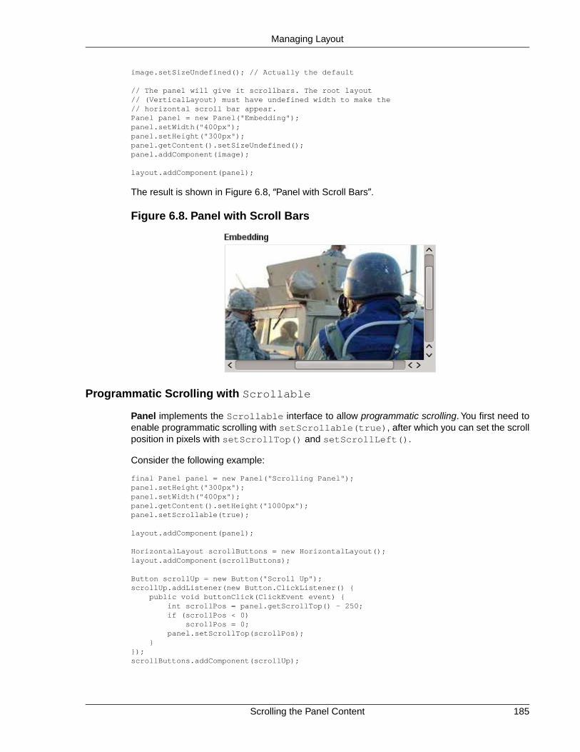
image.setSizeUndefined(); // Actually the default
// The panel will give it scrollbars. The root layout// (VerticalLayout) must have undefined width to make the// horizontal scroll bar appear.Panel panel = new Panel("Embedding");panel.setWidth("400px");panel.setHeight("300px");panel.getContent().setSizeUndefined();panel.addComponent(image);
layout.addComponent(panel);
The result is shown in Figure 6.8, “Panel with Scroll Bars”.
Figure 6.8. Panel with Scroll Bars
Programmatic Scrolling with Scrollable
Panel implements the Scrollable interface to allow programmatic scrolling. You first need toenable programmatic scrolling with setScrollable(true), after which you can set the scrollposition in pixels with setScrollTop() and setScrollLeft().
Consider the following example:
final Panel panel = new Panel("Scrolling Panel");panel.setHeight("300px");panel.setWidth("400px");panel.getContent().setHeight("1000px");panel.setScrollable(true);
layout.addComponent(panel);
HorizontalLayout scrollButtons = new HorizontalLayout();layout.addComponent(scrollButtons);
Button scrollUp = new Button("Scroll Up");scrollUp.addListener(new Button.ClickListener() { public void buttonClick(ClickEvent event) { int scrollPos = panel.getScrollTop() - 250; if (scrollPos < 0) scrollPos = 0; panel.setScrollTop(scrollPos); }});scrollButtons.addComponent(scrollUp);
185Scrolling the Panel Content
Managing Layout
Button scrollDown = new Button("Scroll Down");scrollDown.addListener(new Button.ClickListener() { public void buttonClick(ClickEvent event) { int scrollPos = panel.getScrollTop(); if (scrollPos > 1000) scrollPos = 1000; panel.setScrollTop(scrollPos + 250); }});scrollButtons.addComponent(scrollDown);
CSS Style Rules.v-panel {}.v-panel-caption {}.v-panel-nocaption {}.v-panel-content {}.v-panel-deco {}
The entire panel has v-panel style. A panel consists of three parts: the caption, content, andbottom decorations (shadow).These can be styled with v-panel-caption, v-panel-content,and v-panel-deco, respectively. If the panel has no caption, the caption element will have thestyle v-panel-nocaption.
The built-in light style in the Reindeer and Runo themes has no borders or border decorationsfor the Panel. You can use the Reindeer.PANEL_LIGHT and Runo.PANEL_LIGHT constantsto add the style to a panel. Other themes may also provide the light and other styles for Panelas well.
6.7. Sub-Windows
Sub-windows are floating panels within a native browser window. Unlike native browser windows,they are managed by the client-side runtime of Vaadin using HTML features. Vaadin allowsopening and closing sub-windows, refreshing one window from another, resizing windows, andscrolling the window content. Sub-windows are typically used for Dialog Windows and MultipleDocument Interface applications. Sub-windows are by default not modal; you can set themmodal as described in Section 6.7.4, “Modal Windows”.
As with all user interface components, the appearance of a window and its contents is definedwith themes.
User control of a sub-window is limited to moving, resizing, and closing the window. Maximizingor minimizing are not yet supported.
6.7.1. Opening and Closing a Sub-Window
You can open a new window by creating a new Window object and adding it to the main windowwith addWindow() method of the Application class.
mywindow = new Window("My Window");mainwindow.addWindow(mywindow);
You close the window in a similar fashion, by calling the removeWindow() of the Applicationclass:
myapplication.removeWindow (mywindow);
CSS Style Rules186
Managing Layout

The user can, by default, close a sub-window by clicking the close button in the upper-right cornerof the window. You can disable the button by setting the window as read-only withsetReadOnly(true). Notice that you could disable the button also by making it invisible inCSS with a "display: none" formatting. The problem with such a cosmetic disabling is that amalicious user might re-enable the button and close the window, which might cause problemsand possibly be a security hole. Setting the window as read-only not only disables the closebutton on the client side, but also prevents processing the close event on the server side.
The following example demonstrates the use of a sub-window in an application. The examplemanages the window using a custom component that contains a button for opening and closingthe window.
/** Component contains a button that allows opening a window. */public class WindowOpener extends CustomComponent implements Window.CloseListener { Window mainwindow; // Reference to main window Window mywindow; // The window to be opened Button openbutton; // Button for opening the window Button closebutton; // A button in the window Label explanation; // A descriptive text
public WindowOpener(String label, Window main) { mainwindow = main;
// The component contains a button that opens the window. final VerticalLayout layout = new VerticalLayout();
openbutton = new Button("Open Window", this, "openButtonClick"); explanation = new Label("Explanation"); layout.addComponent(openbutton); layout.addComponent(explanation);
setCompositionRoot(layout); }
/** Handle the clicks for the two buttons. */ public void openButtonClick(Button.ClickEvent event) { /* Create a new window. */ mywindow = new Window("My Dialog"); mywindow.setPositionX(200); mywindow.setPositionY(100);
/* Add the window inside the main window. */ mainwindow.addWindow(mywindow);
/* Listen for close events for the window. */ mywindow.addListener(this);
/* Add components in the window. */ mywindow.addComponent( new Label("A text label in the window.")); closebutton = new Button("Close", this, "closeButtonClick"); mywindow.addComponent(closebutton);
/* Allow opening only one window at a time. */ openbutton.setEnabled(false);
explanation.setValue("Window opened"); }
/** Handle Close button click and close the window. */ public void closeButtonClick(Button.ClickEvent event) { /* Windows are managed by the application object. */ mainwindow.removeWindow(mywindow);
187Opening and Closing a Sub-Window
Managing Layout

/* Return to initial state. */ openbutton.setEnabled(true);
explanation.setValue("Closed with button"); }
/** In case the window is closed otherwise. */ public void windowClose(CloseEvent e) { /* Return to initial state. */ openbutton.setEnabled(true);
explanation.setValue("Closed with window controls"); }}
The example implements a custom component that inherits the CustomComponent class. Itconsists of a Button that it uses to open a window and a Label to describe the state of the window.When the window is open, the button is disabled.When the window is closed, the button is enabledagain.
You can use the above custom component in the application class with:
public void init() { Window main = new Window("The Main Window"); setMainWindow(main);
main.addComponent(new WindowOpener("Window Opener", main));}
When added to an application, the screen will look as illustrated in the following screenshot:
Figure 6.9. Opening a Sub-Window
Opening and Closing a Sub-Window188
Managing Layout

6.7.2. Window Positioning
When created, a window will have a default size and position.You can specify the size of a windowwith setHeight() and setWidth() methods. You can set the position of the window withsetPositionX() and setPositionY() methods.
/* Create a new window. */mywindow = new Window("My Dialog");
/* Set window size. */mywindow.setHeight("200px");mywindow.setWidth("400px");
/* Set window position. */mywindow.setPositionX(200);mywindow.setPositionY(50);
Notice that the size of the main window is unknown and the getHeight and getWidth methodswill return -1.
6.7.3. Scrolling Sub-Window Content
If a sub-window has a fixed or percentual size and its content becomes too big to fit in the contentarea, a scroll bar will appear for the particular direction. On the other hand, if the sub-windowhas undefined size in the direction, it will fit the size of the content and never get a scroll bar.Scroll bars in sub-windows are handled with regular HTML features, namely overflow: autoproperty in CSS.
As Window extends Panel, windows are also Scrollable. Note that the interface definesprogrammatic scrolling, not scrolling by the user. Please see Section 6.6, “Panel”.
6.7.4. Modal Windows
A modal window is a child window that has to be closed by the user before the use of the parentwindow can continue. Dialog windows are typically modal. The advantage of modal windows isthe simplification of user interaction, which may contribute to the clarity of the user interface.Modal windows are also easy to use from a development perspective, because as user interactionis isolated to them, changes in application state are more limited while the modal window is open.The disadvantage of modal windows is that they can restrict workflow too much.
189Window Positioning
Managing Layout

Figure 6.10. Screenshot of the Modal Window Demo Application
Depending on theme settings, the parent window may be grayed while the modal window is open.
The demo application of Vaadin includes an example of using modal windows. Figure 6.10,“Screenshot of the Modal Window Demo Application” above is from the demo application. Theexample includes the source code.
Security Warning
Modality of child windows is purely a client-side feature and can be circumventedwith client-side attack code. You should not trust in the modality of child windows insecurity-critical situations such as login windows.
6.8. HorizontalSplitPanel and VerticalSplitPanel
HorizontalSplitPanel and VerticalSplitPanel are a two-component containers that divide theavailable space into two areas to accomodate the two components. HorizontalSplitPanel makesthe split horizontally with a vertical splitter bar, and VerticalSplitPanel vertically with a horizontalsplitter bar. The user can drag the bar to adjust its position.
You can set the two components with the setFirstComponent() andsetSecondComponent() methods, or with the regular addComponent() method.
// Have a panel to put stuff inPanel panel = new Panel("Split Panels Inside This Panel");
// Have a horizontal split panel as its root layoutHorizontalSplitPanel hsplit = new HorizontalSplitPanel();panel.setContent(hsplit);
// Put a component in the left panelTree tree = new Tree("Menu", TreeExample.createTreeContent());hsplit.setFirstComponent(tree);
HorizontalSplitPanel and VerticalSplitPanel190
Managing Layout

// Put a vertical split panel in the right panelVerticalSplitPanel vsplit = new VerticalSplitPanel();hsplit.setSecondComponent(vsplit);
// Put other components in the right panelvsplit.addComponent(new Label("Here's the upper panel"));vsplit.addComponent(new Label("Here's the lower panel"));
The result is shown in Figure 6.11, “HorizontalSplitPanel and VerticalSplitPanel”. Observethat the tree is cut horizontally as it can not fit in the layout. If its height exceeds the height of thepanel, a vertical scroll bar will appear automatically. If horizontal scroll bar is necessary, youcould put the content in a Panel, which can have scroll bars in both directions.
Figure 6.11. HorizontalSplitPanel and VerticalSplitPanel
You can set the split position with setSplitPosition(). It accepts any units defined in theSizeable interface, with percentual size relative to the size of the component.
// Have a horizontal split panelHorizontalSplitPanel hsplit = new HorizontalSplitPanel();hsplit.setFirstComponent(new Label("75% wide panel"));hsplit.setSecondComponent(new Label("25% wide panel"));
// Set the position of the splitter as percentagehsplit.setSplitPosition(75, Sizeable.UNITS_PERCENTAGE);
Another version of the setSplitPosition() method allows leaving out the unit, using thesame unit as previously.The method also has versions take take a boolean parameter, reverse,which allows defining the size of the right or bottom panel instead of the left or top panel.
The split bar allows the user to adjust the split position by dragging the bar with mouse. To lockthe split bar, use setLocked(true). When locked, the move handle in the middle of the bar isdisabled.
// Lock the splitterhsplit.setLocked(true);
Setting the split position programmatically and locking the split bar is illustrated in Figure 6.12,“A Layout With Nested SplitPanels”.
191HorizontalSplitPanel and VerticalSplitPanel
Managing Layout

Figure 6.12. A Layout With Nested SplitPanels
Notice that the size of a split panel must not be undefined in the split direction.
CSS Style Rules/* For a horizontal SplitPanel. */.v-splitpanel-horizontal {}.v-splitpanel-hsplitter {}.v-splitpanel-hsplitter-locked {}
/* For a vertical SplitPanel. */.v-splitpanel-vertical {}.v-splitpanel-vsplitter {}.v-splitpanel-vsplitter-locked {}
/* The two container panels. */.v-splitpanel-first-container {} /* Top or left panel. */.v-splitpanel-second-container {} /* Bottom or right panel. */
The entire split panel has the style v-splitpanel-horizontal or v-splitpanel-vertical,depending on the panel direction. The split bar or splitter between the two content panels haseither the ...-splitter or ...-splitter-locked style, depending on whether its positionis locked or not.
6.9. TabSheet
The TabSheet is a multicomponent container that allows switching between the componentswith "tabs". The tabs are organized as a tab bar at the top of the tab sheet. Clicking on a tabopens its contained component in the main display area of the layout.
You add new tabs to a tab sheet with the addTab() method. The simple version of the methodtakes as its parameter the root component of the tab.You can use the root component to retrieveits corresponding Tab object. Typically, you put a layout component as the root component.
// Create an empty tab sheet.TabSheet tabsheet = new TabSheet();
// Create a component to put in a tab and put// some content in it.VerticalLayout myTabRoot = new VerticalLayout();myTabRoot.addComponent(new Label("Hello, I am a Tab!"));
// Add the component to the tab sheet as a new tab.
CSS Style Rules192
Managing Layout

tabsheet.addTab(myTabRoot);
// Get the Tab holding the component and set its caption.tabsheet.getTab(myTabRoot).setCaption("My Tab");
Each tab in a tab sheet is represented as a Tab object, which manages the tab caption, icon,and attributes such as hidden and visible.You can set the caption with setCaption() and theicon with setIcon(). If the component added with addTab() has a caption or icon, it is usedas the default for the Tab object. However, changing the attributes of the root component laterdoes not affect the tab, but you must make the setting through the Tab object. The addTab()returns the new Tab object, so you can easily set an attribute using the reference.
// Set an attribute using the returned referencetabsheet.addTab(myTab).setCaption("My Tab");
You can also give the caption and the icon as parameters for the addTab() method.The followingexample demonstrates the creation of a simple tab sheet, where each tab shows a different Labelcomponent. The tabs have an icon, which are (in this example) loaded as Java class loader re-sources from the application.
TabSheet tabsheet = new TabSheet();
// Make the tabsheet shrink to fit the contents.tabsheet.setSizeUndefined();
tabsheet.addTab(new Label("Contents of the first tab"), "First Tab", new ClassResource("images/Mercury_small.png"));tabsheet.addTab(new Label("Contents of the second tab"), "Second Tab", new ClassResource("images/Venus_small.png"));tabsheet.addTab(new Label("Contents of the third tab"), "Third tab", new ClassResource("images/Earth_small.png"));
Figure 6.13. A Simple TabSheet Layout
The hideTabs() method allows hiding the tab bar entirely.This can be useful in tabbed documentinterfaces (TDI) when there is only one tab. An individual tab can be made invisible by settingsetVisible(false) for the Tab object. A tab can be disabled by setting setEnabled(false).
Clicking on a tab selects it. This fires a TabSheet.SelectedTabChangeEvent, which you canhandle by implementing the TabSheet.SelectedTabChangeListener interface. The sourcecomponent of the event, which you can retrieve with getSource() method of the event, will bethe TabSheet component. You can find the currently selected tab with getSelectedTab()and select (open) a particular tab programmatically with setSelectedTab(). Notice that alsoadding the first tab fires the SelectedTabChangeEvent, which may cause problems in yourhandler if you assume that everything is initialized before the first change event.
The example below demonstrates handling TabSheet related events and enabling and disablingtabs. The sort of logic used in the example is useful in sequential user interfaces, often calledwizards, where the user goes through the tabs one by one, but can return back if needed.
193TabSheet
Managing Layout

import com.vaadin.ui.*;import com.vaadin.ui.Button.ClickEvent;import com.vaadin.ui.TabSheet.SelectedTabChangeEvent;
public class TabSheetExample extends CustomComponent implements Button.ClickListener, TabSheet.SelectedTabChangeListener { TabSheet tabsheet = new TabSheet(); Button tab1 = new Button("Push this button"); Label tab2 = new Label("Contents of Second Tab"); Label tab3 = new Label("Contents of Third Tab");
TabSheetExample() { setCompositionRoot(tabsheet);
// Listen for changes in tab selection. tabsheet.addListener(this);
// First tab contains a button, for which we // listen button click events. tab1.addListener(this);
// This will cause a selectedTabChange() call. tabsheet.addTab(tab1, "First Tab", null);
// A tab that is initially invisible. tabsheet.addTab(tab2, "Second Tab", null); tabsheet.getTab(tab2).setVisible(false);
// A tab that is initially disabled. tabsheet.addTab(tab3, "Third tab", null); tabsheet.getTab(tab3).setEnabled(false); }
public void buttonClick(ClickEvent event) { // Enable the invisible and disabled tabs. tabsheet.getTab(tab2).setVisible(true); tabsheet.getTab(tab3).setEnabled(true);
// Change selection automatically to second tab. tabsheet.setSelectedTab(tab2); }
public void selectedTabChange(SelectedTabChangeEvent event) { // Cast to a TabSheet. This isn't really necessary in // this example, as we have only one TabSheet component, // but would be useful if there were multiple TabSheets. final TabSheet source = (TabSheet) event.getSource();
if (source == tabsheet) { // If the first tab was selected. if (source.getSelectedTab() == tab1) { // The 2. and 3. tabs may not have been set yet. if (tabsheet.getTab(tab2) != null && tabsheet.getTab(tab3) != null) { tabsheet.getTab(tab2).setVisible(false); tabsheet.getTab(tab3).setEnabled(false); } } } }}
TabSheet194
Managing Layout

Figure 6.14. A TabSheet with Hidden and Disabled Tabs
CSS Style Rules.v-tabsheet {}.v-tabsheet-tabs {}.v-tabsheet-content {}.v-tabsheet-deco {}.v-tabsheet-tabcontainer {}.v-tabsheet-tabsheetpanel {}.v-tabsheet-hidetabs {}
.v-tabsheet-scroller {}
.v-tabsheet-scrollerPrev {}
.v-tabsheet-scrollerNext {}
.v-tabsheet-scrollerPrev-disabled{}
.v-tabsheet-scrollerNext-disabled{}
.v-tabsheet-tabitem {}
.v-tabsheet-tabitem-selected {}
.v-tabsheet-tabitemcell {}
.v-tabsheet-tabitemcell-first {}
.v-tabsheet-tabs td {}
.v-tabsheet-spacertd {}
The entire tabsheet has the v-tabsheet style. A tabsheet consists of three main parts: the tabson the top, the main content pane, and decorations around the tabsheet.
The tabs area at the top can be styled with v-tabsheet-tabs, v-tabsheet-tabcontainerand v-tabsheet-tabitem*.
The style v-tabsheet-spacertd is used for any empty space after the tabs. If the tabsheethas too little space to show all tabs, scroller buttons enable browsing the full tab list. These usethe styles v-tabsheet-scroller*.
The content area where the tab contents are shown can be styled with v-tabsheet-content,and the surrounding decoration with v-tabsheet-deco.
6.10. Accordion
Accordion is a multicomponent container similar to TabSheet, except that the "tabs" are arrangedvertically. Clicking on a tab opens its contained component in the space between the tab and thenext one. You can use an Accordion identically to a TabSheet, which it actually inherits. SeeSection 6.9, “TabSheet” for more information.
The following example shows how you can create a simple accordion. As the Accordion is rathernaked alone, we put it inside a Panel that acts as its caption and provides it a border.
// Create the Accordion.Accordion accordion = new Accordion();
// Have it take all space available in the layout.accordion.setSizeFull();
195CSS Style Rules
Managing Layout

// Some components to put in the Accordion.Label l1 = new Label("There are no previously saved actions.");Label l2 = new Label("There are no saved notes.");Label l3 = new Label("There are currently no issues.");
// Add the components as tabs in the Accordion.accordion.addTab(l1, "Saved actions", null);accordion.addTab(l2, "Notes", null);accordion.addTab(l3, "Issues", null);
// A container for the Accordion.Panel panel = new Panel("Tasks");panel.setWidth("300px");panel.setHeight("300px");panel.addComponent(accordion);
// Trim its layout to allow the Accordion take all space.panel.getLayout().setSizeFull();panel.getLayout().setMargin(false);
Figure 6.15, “An Accordion” shows what the example would look like with the default theme.
Figure 6.15. An Accordion
CSS Style Rules.v-accordion {}.v-accordion-item {}.v-accordion-item-open {}.v-accordion-item-first {}.v-accordion-item-caption {}.v-accordion-item-caption .v-caption {}.v-accordion-item-content {}
The top-level element of Accordion has the v-accordion style. An Accordion consists of asequence of item elements, each of which has a caption element (the tab) and a content areaelement.
The selected item (tab) has also the v-accordion-open style. The content area is not shownfor the closed items.
CSS Style Rules196
Managing Layout
6.11. AbsoluteLayout
AbsoluteLayout allows placing components in arbitrary positions in the layout area.The positionsare specified in the addComponent() method with horizontal and vertical coordinates relativeto an edge of the layout area. The positions can include a third depth dimension, the z-index,which specifies which components are displayed in front and which behind other components.
The positions are specified by a CSS absolute position string, using the left, right, top,bottom, and z-index properties known from CSS. In the following example, we have a 300 by150 pixels large layout and position a text field 50 pixels from both the left and the top edge:
// A 400x250 pixels size layoutAbsoluteLayout layout = new AbsoluteLayout();layout.setWidth("400px");layout.setHeight("250px");
// A component with coordinates for its top-left cornerTextField text = new TextField("Somewhere someplace");layout.addComponent(text, "left: 50px; top: 50px;");
The left and top specify the distance from the left and top edge, respectively. The right andbottom specify the distances from the right and top edge.
// At the top-left cornerButton button = new Button( "left: 0px; top: 0px;");layout.addComponent(button, "left: 0px; top: 0px;");
// At the bottom-right cornerButton buttCorner = new Button( "right: 0px; bottom: 0px;");layout.addComponent(buttCorner, "right: 0px; bottom: 0px;");
// Relative to the bottom-right cornerButton buttBrRelative = new Button( "right: 50px; bottom: 50px;");layout.addComponent(buttBrRelative, "right: 50px; bottom: 50px;");
// On the bottom, relative to the left sideButton buttBottom = new Button( "left: 50px; bottom: 0px;");layout.addComponent(buttBottom, "left: 50px; bottom: 0px;");
// On the right side, up from the bottomButton buttRight = new Button( "right: 0px; bottom: 100px;");layout.addComponent(buttRight, "right: 0px; bottom: 100px;");
The result of the above code examples is shown in Figure 6.16, “Components Positioned Relativeto Various Edges”.
197AbsoluteLayout
Managing Layout

Figure 6.16. Components Positioned Relative to Various Edges
In the above examples, we had components of undefined size and specified the positions ofcomponents by a single pair of coordinates. The other possibility is to specify an area and let thecomponent fill the area by specifying a proportinal size for the component, such as "100%". Nor-mally, you use setSizeFull() to take the entire area given by the layout.
// Specify an area that a component should fillPanel panel = new Panel("A Panel filling an area");panel.setSizeFull(); // Fill the entire given arealayout.addComponent(panel, "left: 25px; right: 50px; "+ "top: 100px; bottom: 50px;");
The result is shown in Figure 6.17, “Component Filling an Area Specified by Coordinates”
Figure 6.17. Component Filling an Area Specified by Coordinates
You can also use proportional coordinates to specify the coordinates:
// A panel that takes 30% to 90% horizontally and// 20% to 80% verticallyPanel panel = new Panel("A Panel");panel.setSizeFull(); // Fill the specified arealayout.addComponent(panel, "left: 30%; right: 10%;" + "top: 20%; bottom: 20%;");
The result is shown in Figure 6.18, “Specifying an Area by Proportional Coordinates”
AbsoluteLayout198
Managing Layout

Figure 6.18. Specifying an Area by Proportional Coordinates
Drag and drop is very useful for moving the components contained in an AbsoluteLayout. Checkout the example in Section 11.11.6, “Dropping on a Component”.
Styling with CSS.v-absolutelayout {}.v-absolutelayout-wrapper {}
The AbsoluteLayout component has v-absolutelayout root style. Each component in thelayout is contained within an element that has the v-absolutelayout-wrapper.The componentcaptions are outside the wrapper elements, in a separate element with the usual v-captionstyle.
6.12. CssLayout
CssLayout allows strong control over styling of the components contained inside the layout.Thecomponents are contained in a simple DOM structure consisting of <div> elements. By default,the contained components are laid out horizontally and wrap naturally when they reach the widthof the layout, but you can control this and most other behaviour with CSS. You can also injectcustom CSS for each contained component. As CssLayout has a very simple DOM structureand no dynamic rendering logic, relying purely on the built-in rendering logic of the browsers, itis the fastest of the layout components.
The basic use of CssLayout is just like with any other layout component:
CssLayout layout = new CssLayout();
// Component with a layout-managed caption and iconTextField tf = new TextField("A TextField");tf.setIcon(new ThemeResource("icons/user.png"));layout.addComponent(tf);
// Labels are 100% wide by default so must unset widthLabel label = new Label("A Label");label.setWidth(Sizeable.SIZE_UNDEFINED, 0);layout.addComponent(label);
layout.addComponent(new Button("A Button"));
199Styling with CSS
Managing Layout

The result is shown in Figure 6.19, “Basic Use of CssLayout”. Notice that the default spacingand alignment of the layout is quite crude and CSS styling is nearly always needed.
Figure 6.19. Basic Use of CssLayout
The display attribute of CssLayout is inline-block by default, so the components are laidout horizontally following another. CssLayout has 100% width by default. If the componentsreach the width of the layout, they are wrapped to the next "line" just as text would be. If you adda component with 100% width, it will take an entire line by wrapping before and after the compon-ent.
Overriding the getCss() method allows injecting custom CSS for each component. The CSSreturned by the method is inserted in the style attribute of the <div> element of the component,so it will override any style definitions made in CSS files.
CssLayout layout = new CssLayout() { @Override protected String getCss(Component c) { if (c instanceof Label) { // Color the boxes with random colors int rgb = (int) (Math.random()*(1<<24)); return "background: #" + Integer.toHexString(rgb); } return null; }};layout.setWidth("400px"); // Causes to wrap the contents
// Add boxes of various sizesfor (int i=0; i<40; i++) { Label box = new Label(" ", Label.CONTENT_XHTML); box.addStyleName("flowbox"); box.setWidth((float) Math.random()*50, Sizeable.UNITS_PIXELS); box.setHeight((float) Math.random()*50, Sizeable.UNITS_PIXELS); layout.addComponent(box);}
The style name added to the components allows making common styling in a CSS file:
.v-label-flowbox { border: thin black solid;}
Figure 6.20, “Use of getCss() and line wrap” shows the rendered result.
CssLayout200
Managing Layout

Figure 6.20. Use of getCss() and line wrap
The stregth of the CssLayout is also its weakness. Much of the logic behind the other layoutcomponents is there to give nice default behaviour and to handle the differences in differentbrowsers. Some browsers, no need to say which, are notoriously incompatible with the CSSstandards, so they require a lot of custom CSS.You may need to make use of the browser-spe-cific style classes in the root element of the application. Some features in the other layouts arenot even solvable in pure CSS, at least in all browsers.
Styling with CSS.v-csslayout {}.v-csslayout-margin {}.v-csslayout-container {}
The CssLayout component has v-csslayout root style. The margin element withv-csslayout-margin style is always enabled. The components are contained in an elementwith v-csslayout-container style.
For example, we could style the basic CssLayout example shown earlier as follows:
/* Have the caption right of the text box, bottom-aligned */.csslayoutexample .mylayout .v-csslayout-container { direction: rtl; line-height: 24px; vertical-align: bottom;}
/* Have some space before and after the caption */.csslayoutexample .mylayout .v-csslayout-container .v-caption { padding-left: 3px; padding-right: 10px;}
The example would now be rendered as shown in Figure 6.21, “Styling CssLayout”.
Figure 6.21. Styling CssLayout
Captions and icons that are managed by the layout are contained in an element with v-captionstyle. These caption elements are contained flat at the same level as the actual component ele-ments.This may cause problems with wrapping in inline-block mode, as wrapping can occurbetween the caption and its corresponding component element just as well as between compon-ents. Such use case is therefore not feasible.
201Styling with CSS
Managing Layout
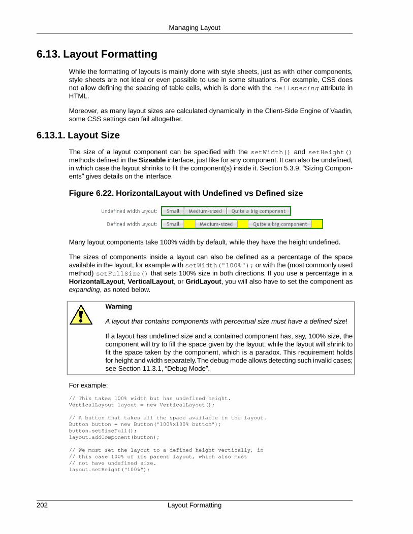
6.13. Layout Formatting
While the formatting of layouts is mainly done with style sheets, just as with other components,style sheets are not ideal or even possible to use in some situations. For example, CSS doesnot allow defining the spacing of table cells, which is done with the cellspacing attribute inHTML.
Moreover, as many layout sizes are calculated dynamically in the Client-Side Engine of Vaadin,some CSS settings can fail altogether.
6.13.1. Layout Size
The size of a layout component can be specified with the setWidth() and setHeight()methods defined in the Sizeable interface, just like for any component. It can also be undefined,in which case the layout shrinks to fit the component(s) inside it. Section 5.3.9, “Sizing Compon-ents” gives details on the interface.
Figure 6.22. HorizontalLayout with Undefined vs Defined size
Many layout components take 100% width by default, while they have the height undefined.
The sizes of components inside a layout can also be defined as a percentage of the spaceavailable in the layout, for example with setWidth("100%"); or with the (most commonly usedmethod) setFullSize() that sets 100% size in both directions. If you use a percentage in aHorizontalLayout, VerticalLayout, or GridLayout, you will also have to set the component asexpanding, as noted below.
Warning
A layout that contains components with percentual size must have a defined size!
If a layout has undefined size and a contained component has, say, 100% size, thecomponent will try to fill the space given by the layout, while the layout will shrink tofit the space taken by the component, which is a paradox. This requirement holdsfor height and width separately.The debug mode allows detecting such invalid cases;see Section 11.3.1, “Debug Mode”.
For example:
// This takes 100% width but has undefined height.VerticalLayout layout = new VerticalLayout();
// A button that takes all the space available in the layout.Button button = new Button("100%x100% button");button.setSizeFull();layout.addComponent(button);
// We must set the layout to a defined height vertically, in// this case 100% of its parent layout, which also must// not have undefined size.layout.setHeight("100%");
Layout Formatting202
Managing Layout

The default layout of Window and Panel is VerticalLayout with undefined height. If you insertenough components in such a layout, it will grow outside the bottom of the view area and scrollbarswill appear in the browser. If you want your application to use all the browser view, nothing moreor less, you should use setFullSize() for the root layout.
// Create the main window.Window main = new Window("Main Window");setMainWindow(main);
// Use full size.main.getLayout().setSizeFull();
Expanding Components
If you set a HorizontalLayout to a defined size horizontally or a VerticalLayout vertically, andthere is space left over from the contained components, the extra space is distributed equallybetween the component cells. The components are aligned within these cells, according to theiralignment setting, top left by default, as in the example below.
Often, you don't want such empty space, but want one or more components to take all the leftoverspace. You need to set such a component to 100% size and use setExpandRatio(). If thereis just one such expanding component in the layout, the ratio parameter is irrelevant.
If you set multiple components as expanding, the expand ratio dictates how large proportion ofthe available space (overall or excess depending on whether the components are sized as apercentage or not) each component takes. In the example below, the buttons have 1:2:3 ratiofor the expansion.
GridLayout has corresponding method for both of its directions, setRowExpandRatio() andsetColumnExpandRatio().
Expansion is dealt in detail in the documentation of the layout components that support it. SeeSection 6.3, “VerticalLayout and HorizontalLayout” and Section 6.4, “GridLayout” for detailson components with relative sizes.
6.13.2. Layout Cell Alignment
You can set the alignment of the component inside a specific layout cell with thesetComponentAlignment() method. The method takes as its parameters the componentcontained in the cell to be formatted, and the horizontal and vertical alignment.
Figure 6.23, “Cell Alignments” illustrates the alignment of components within a GridLayout.
203Layout Cell Alignment
Managing Layout

Figure 6.23. Cell Alignments
The easiest way to set alignments is to use the constants defined in the Alignment class. Letus look how the buttons in the top row of the above GridLayout are aligned with constants:
// Create a grid layoutfinal GridLayout grid = new GridLayout(3, 3);
grid.setWidth(400, Sizeable.UNITS_PIXELS);grid.setHeight(200, Sizeable.UNITS_PIXELS);
Button topleft = new Button("Top Left");grid.addComponent(topleft, 0, 0);grid.setComponentAlignment(topleft, Alignment.TOP_LEFT);
Button topcenter = new Button("Top Center");grid.addComponent(topcenter, 1, 0);grid.setComponentAlignment(topcenter, Alignment.TOP_CENTER);
Button topright = new Button("Top Right");grid.addComponent(topright, 2, 0);grid.setComponentAlignment(topright, Alignment.TOP_RIGHT);...
The following table lists all the Alignment constants by their respective locations:
Table 6.1. Alignment Constants
TOP_RIGHTTOP_CENTERTOP_LEFT
MIDDLE_RIGHTMIDDLE_CENTERMIDDLE_LEFT
BOTTOM_RIGHTBOTTOM_CENTERBOTTOM_LEFT
Another way to specify the alignments is to create an Alignment object and specify the horizontaland vertical alignment with separate constants.You can specify either of the directions, in whichcase the other alignment direction is not modified, or both with a bitmask operation between thetwo directions.
Button middleleft = new Button("Middle Left");grid.addComponent(middleleft, 0, 1);grid.setComponentAlignment(middleleft, new Alignment(Bits.ALIGNMENT_VERTICAL_CENTER | Bits.ALIGNMENT_LEFT));
Button middlecenter = new Button("Middle Center");grid.addComponent(middlecenter, 1, 1);grid.setComponentAlignment(middlecenter, new Alignment(Bits.ALIGNMENT_VERTICAL_CENTER | Bits.ALIGNMENT_HORIZONTAL_CENTER));
Button middleright = new Button("Middle Right");grid.addComponent(middleright, 2, 1);
Layout Cell Alignment204
Managing Layout

grid.setComponentAlignment(middleright, new Alignment(Bits.ALIGNMENT_VERTICAL_CENTER | Bits.ALIGNMENT_RIGHT));
Obviously, you may combine only one vertical bitmask with one horizontal bitmask, though youmay leave either one out. The following table lists the available alignment bitmask constants:
Table 6.2. Alignment Bitmasks
Bits.ALIGNMENT_LEFTHorizontal
Bits.ALIGNMENT_HORIZONTAL_CENTER
Bits.ALIGNMENT_RIGHT
Bits.ALIGNMENT_TOPVertical
Bits.ALIGNMENT_VERTICAL_CENTER
Bits.ALIGNMENT_BOTTOM
You can determine the current alignment of a component with getComponentAlignment(),which returns an Alignment object.The class provides a number of getter methods for decodingthe alignment, which you can also get as a bitmask value.
Size of Aligned Components
You can only align a component that is smaller than its containing cell in the direction of alignment.If a component has 100% width, as many components have by default, horizontal alignment doesnot have any effect. For example, Label is 100% wide by default and can not therefore be hori-zontally aligned as such. The problem can be hard to notice, as the text inside a Label is left-aligned.
You usually need to set either a fixed size, undefined size, or less than a 100% relative size forthe component to be aligned - a size that is smaller than the containing layout has.
For example, assuming that a Label has short content that is less wide than the containing Ver-ticalLayout, you could center it as follows:
VerticalLayout layout = new VerticalLayout(); // 100% default widthLabel label = new Label("Hello"); // 100% default widthlabel.setSizeUndefined();layout.addComponent(label);layout.setComponentAlignment(label, Alignment.MIDDLE_CENTER);
If you set the size as undefined and the component itself contains components, make sure thatthe contained components also have either undefined or fixed size. For example, if you set thesize of a Form as undefined, its containing layout FormLayout has 100% default width, whichyou also need to set as undefined. But then, any components inside the FormLayout must haveeither undefined or fixed size.
6.13.3. Layout Cell Spacing
The VerticalLayout, HorizontalLayout, and GridLayout layouts offer a setSpacing() methodfor enabling space between the cells in the layout. Enabling the spacing adds a spacing style forall cells except the first so that, by setting the left or top padding, you can specify the amount ofspacing.
To enable spacing, simply call setSpacing(true) for the layout as follows:
205Layout Cell Spacing
Managing Layout

HorizontalLayout layout2 = new HorizontalLayout();layout2.addStyleName("spacingexample");layout2.setSpacing(true);layout2.addComponent(new Button("Component 1"));layout2.addComponent(new Button("Component 2"));layout2.addComponent(new Button("Component 3"));
VerticalLayout layout4 = new VerticalLayout();layout4.addStyleName("spacingexample");layout4.setSpacing(true);layout4.addComponent(new Button("Component 1"));layout4.addComponent(new Button("Component 2"));layout4.addComponent(new Button("Component 3"));
In practise, the setSpacing() method toggles between the"v-COMPONENTCLASSNAME-spacing-on" and "-off" CSS class names in the cell elements.Elements having those class names can be used to define the spacing metrics in a theme.
The layouts have a spacing style name to define spacing also when spacing is off. This allowsyou to define a small default spacing between components by default and a larger one when thespacing is actually enabled.
Spacing can be horizontal (for HorizontalLayout), vertical (for VerticalLayout), or both (forGridLayout).The name of the spacing style for horizontal and vertical spacing is the base nameof the component style name plus the "-spacing-on" suffix, as shown in the following table:
Table 6.3. Spacing Style Names
v-verticallayout-spacing-onVerticalLayout
v-horizontallayout-spacing-onHorizontalLayout
v-gridlayout-spacing-onGridLayout
In the CSS example below, we specify the exact amount of spacing for the code example givenabove, for the layouts with the custom "spacingexample" style:
/* Set the amount of horizontal cell spacing in a * specific element with the "-spacingexample" style. */.v-horizontallayout-spacingexample .v-horizontallayout-spacing-on { padding-left: 30px;}
/* Set the amount of vertical cell spacing in a * specific element with the "-spacingexample" style. */.v-verticallayout-spacingexample .v-verticallayout-spacing-on { padding-top: 30px;}
/* Set the amount of both vertical and horizontal cell spacing * in a specific element with the "-spacingexample" style. */.v-gridlayout-spacingexample .v-gridlayout-spacing-on { padding-top: 30px; padding-left: 50px;}
The resulting layouts will look as shown in Figure 6.24, “Layout Spacings”, which also shows thelayouts with no spacing.
Layout Cell Spacing206
Managing Layout

Figure 6.24. Layout Spacings
Note
Spacing is unrelated to "cell spacing" in HTML tables.While many layout componentsare implemented with HTML tables in the browser, this implementation is not guar-anteed to stay the same and at least Vertical-/HorizontalLayout could be implemen-ted with <div> elements as well. In fact, as GWT compiles widgets separately fordifferent browsers, the implementation could even vary between browsers.
Also note that HTML elements with spacing classnames don't necessarily exist in acomponent after rendering, because the Client-Side Engine of Vaadin processesthem.
6.13.4. Layout Margins
By default, layout components do not have any margin around them. You can add margin withCSS directly to the layout component. Below we set margins for a specific layout component(here a horizontallayout):
layout1.addStyleName("marginexample1");
.v-horizontallayout-marginexample1 .v-horizontallayout-margin { padding-left: 200px; padding-right: 100px; padding-top: 50px; padding-bottom: 25px;}
Similar settings exist for other layouts such as verticallayout.
The layout size calculations require the margins to be defined as CSS padding rather than asCSS margin.
As an alternative to the pure CSS method, you can set up a margin around the layout that canbe enabled with setMargin(true). The margin element has some default margin widths, butyou can adjust the widths in CSS if you need to.
Let us consider the following example, where we enable the margin on all sides of the layout:
// Create a layoutHorizontalLayout layout2 = new HorizontalLayout();containinglayout.addComponent( new Label("Layout with margin on all sides:"));containinglayout.addComponent(layout2);
// Set style name for the layout to allow styling itlayout2.addStyleName("marginexample");
207Layout Margins
Managing Layout

// Have margin on all sides around the layoutlayout2.setMargin(true);
// Put something inside the layoutlayout2.addComponent(new Label("Cell 1"));layout2.addComponent(new Label("Cell 2"));layout2.addComponent(new Label("Cell 3"));
You can enable the margins only for specific sides. The margins are specified for thesetMargin() method in clockwise order for top, right, bottom, and left margin. The followingwould enable the top and left margins:
layout2.setMargin(true, false, false, true);
You can specify the actual margin widths in the CSS if you are not satisfied with the default widths(in this example for a HorizontalLayout):
.v-horizontallayout-marginexample .v-horizontallayout-margin-left {padding-left: 200px;}.v-horizontallayout-marginexample .v-horizontallayout-margin-right {padding-right: 100px;}.v-horizontallayout-marginexample .v-horizontallayout-margin-top {padding-top: 50px; }.v-horizontallayout-marginexample .v-horizontallayout-margin-bottom {padding-bottom: 25px; }
The resulting margins are shown in Figure 6.25, “Layout Margins” below. The two ways produceidentical margins.
Figure 6.25. Layout Margins
CSS Style Rules
The CSS style names for the margin widths for setMargin() consist of the specific layout nameplus -margin-left and so on. The CSS style names for CSS-only margins consist of thespecific layout name plus -margin. Below, the style rules are given for VerticalLayout:
/* Alternative 1: CSS only style */.v-verticallayout-margin { padding-left: ___px; padding-right: ___px; padding-top: ___px; padding-bottom: ___px;}
Layout Margins208
Managing Layout

/* Alternative 2: CSS rules to be enabled in code */.v-verticallayout-margin-left {padding-left: ___px;}.v-verticallayout-margin-right {padding-right: ___px;}.v-verticallayout-margin-top {padding-top: ___px;}.v-verticallayout-margin-bottom {padding-bottom: ___px;}
6.14. Custom Layouts
While it is possible to create almost any typical layout with the standard layout components, it issometimes best to separate the layout completely from code.With the CustomLayout component,you can write your layout as a template in XHTML that provides locations of any containedcomponents. The layout template is included in a theme. This separation allows the layout to bedesigned separately from code, for example using WYSIWYG web designer tools such as AdobeDreamweaver.
A template is a HTML file located under layouts folder under a theme folder under theWebContent/VAADIN/themes/ f o l d e r , f o r e x a m p l e ,WebContent/VAADIN/themes/themename/layouts/mylayout.html. (Notice that theroot path WebContent/VAADIN/themes/ for themes is fixed.) A template can also be provideddynamically from an InputStream, as explained below. A template includes <div> elementswith a location attribute that defines the location identifier. All custom layout HTML-files mustbe saved using UTF-8 character encoding.
<table width="100%" height="100%"> <tr height="100%"> <td> <table align="center"> <tr> <td align="right">User name:</td> <td><div location="username"></div></td> </tr> <tr> <td align="right">Password:</td> <td><div location="password"></div></td> </tr> </table> </td> </tr> <tr> <td align="right" colspan="2">
<div location="okbutton"></div> </td> </tr></table>
The client-side engine of Vaadin will replace contents of the location elements with the compon-ents. The components are bound to the location elements by the location identifier given toaddComponent(), as shown in the example below.
// Have a Panel where to put the custom layout.Panel panel = new Panel("Login");panel.setSizeUndefined();main.addComponent(panel);
// Create custom layout from "layoutname.html" template.CustomLayout custom = new CustomLayout("layoutname");custom.addStyleName("customlayoutexample");
// Use it as the layout of the Panel.panel.setContent(custom);
// Create a few components and bind them to the location tags
209Custom Layouts
Managing Layout

// in the custom layout.TextField username = new TextField();custom.addComponent(username, "username");
TextField password = new TextField();custom.addComponent(password, "password");
Button ok = new Button("Login");custom.addComponent(ok, "okbutton");
The resulting layout is shown below in Figure 6.26, “Example of a Custom Layout Component”.
Figure 6.26. Example of a Custom Layout Component
You can use addComponent() also to replace an existing component in the location given inthe second parameter.
In addition to a static template file, you can provide a template dynamically with the CustomLayoutconstructor that accepts an InputStream as the template source. For example:
new CustomLayout(new ByteArrayInputStream("<b>Template</b>".getBytes()));
or
new CustomLayout(new FileInputStream(file));
Custom Layouts210
Managing Layout

Chapter 7
Visual UserInterface Design
with Eclipse
7.1. Overview ................................................................................................ 2117.2. Creating a New Composite .................................................................... 2127.3. Using The Visual Designer .................................................................... 2147.4. Structure of a Visually Editable Component .......................................... 220
This chapter provides instructions for developing the graphical user interface of Vaadin componentswith the Vaadin Plugin for the Eclipse IDE.
7.1. Overview
The visual designer feature in the Vaadin Plugin for Eclipse allows you to design the user interfaceof an entire application or of specific composite components. The plugin generates the actualJava code, which is designed to be reusable, so you can design the basic layout of the user in-terface with the visual designer and build the user interaction logic on top of the generated code.You can use inheritance and composition to modify the components further.
The designer works with classes that extend the CustomComponent class, which is the basictechnique in Vaadin for creating composite components. Component composition is described
211Book of Vaadin

in Section 5.22, “Component Composition with CustomComponent”. Any CustomComponentwill not do for the visual designer; you need to create a new one as instructed below.
For instructions on installing the Eclipse plugin, see Section 2.4, “Installing Vaadin Plugin forEclipse”.
Using a Composite Component
You can use a composite component as you would use any Vaadin component. Just rememberthat the component as well as its root layout, which is an AbsoluteLayout, are 100% wide andhigh by default. A component with full size (expand-to-fit container) may not be inside a layoutwith undefined size (shrink-to-fit content).The default root layout for Window is a VerticalLayout,which by default has undefined height, so you have to set it explicitly to a defined size, usuallyto full (100%) height.
public class MyApplication extends Application { public void init() { Window mainWindow = new Window("My Application"); setMainWindow(mainWindow);
// Needed because composites are full size mainWindow.getContent().setSizeFull();
MyComposite myComposite = new MyComposite(); mainWindow.addComponent(myComposite); }}
You could also set the size of the root layout of the composite to a fixed height (in componentproperties in the visual editor). An AbsoluteLayout may not have undefined size.
7.2. Creating a New Composite
If the Vaadin Plugin is installed in Eclipse, you can create a new composite component as follows.
1. Select File New Other... in the main menu or right-click the Project Explorer andselect New Other... to open the New window.
2. In the first, Select a wizard step, select Vaadin Vaadin Composite and click Next.
Using a Composite Component212
Visual User Interface Design with Eclipse
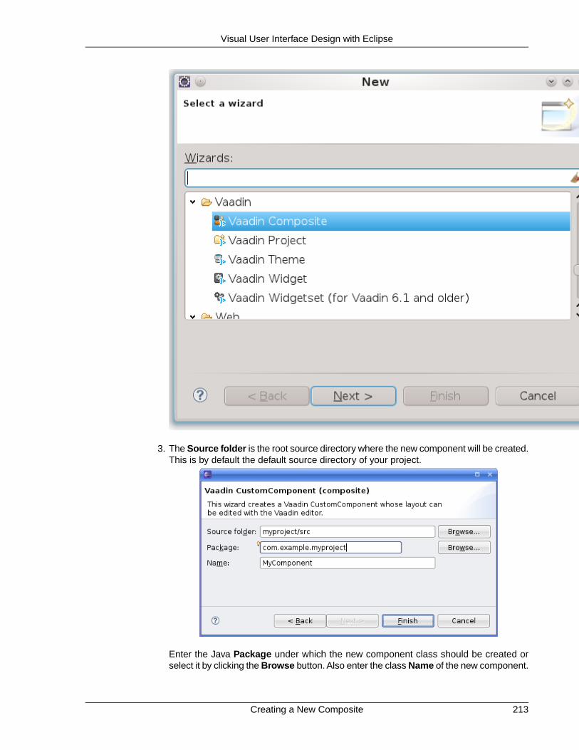
3. The Source folder is the root source directory where the new component will be created.This is by default the default source directory of your project.
Enter the Java Package under which the new component class should be created orselect it by clicking the Browse button. Also enter the class Name of the new component.
213Creating a New Composite
Visual User Interface Design with Eclipse

Finally, click Finish to create the component.
A newly created composite component is opened in the Design window, as shown in Figure 7.1,“New Composite Component”.
Figure 7.1. New Composite Component
You can observe that a component that you can edit with the visual designer has two tabs at thebottom of the view: Source and Design. These tabs allow switching between the source viewand the visual design view.
If you later open the source file for editing, the Source and Design tabs should appear belowthe source editor. If they do not, right-click the file in the Project Explorer and select Open With.
7.3. Using The Visual Designer
The visual editor view consists of, on the left side, an editing area that displays the current layoutand, on the right side, a control panel that contains a component list for selecting new componentsto add, the current component tree, and a component property panel.
Using The Visual Designer214
Visual User Interface Design with Eclipse

7.3.1. Adding New Components
Adding new components to the user interface is done as follows by dragging them from thecomponent list to either the editing area or to the component tree. If you drag the componentsto the tree,
1. Select which components are shown in the component list by entering a search stringor by expanding the filters and selecting only the desired component categories.
2. Drag a component from the component list to either:
a. Editing area, where you can easily move and resize the component. Dragging acomponent onto a layout component will add it in it and you can also position com-ponents within a layout by dragging them.
b. Component tree. Remember that you can only add components under a layoutcomponent or other component container.
3. Edit the component properties
a. In the editing area, you can move and resize the components, and set their alignmentin the containing layout.
b. In the property panel, you can set the component name, size, position and otherproperties.
Figure 7.2. Adding a New Component Node
You can delete a component by right-clicking it in the component tree and selecting Remove.The context menu also allows copying and pasting components.
A composite component created by the plugin must have a AbsoluteLayout as its root layout.While it is suitable for the visual designer, absolute layouts are rarely used otherwise in Vaadinapplications. If you want to use another root layout, you can add another layout inside themainLayout and set that as the root with setCompositionRoot() in the source view. It willbe used as the root when the component is actually used in an application.
215Adding New Components
Visual User Interface Design with Eclipse

7.3.2. Setting Component Properties
The property setting sub-panel of the control panel allows setting component properties. Thepanel has two tabs: Layout and Properties, where the latter defines the various basic properties.
Basic Properties
The top section of the property panel, shown in Figure 7.3, “Basic Component Properties”, allowssetting basic component properties. The panel also includes properties such as field propertiesfor field components.
Figure 7.3. Basic Component Properties
The properties are as follows:
NameThe name of the component, which is used for the reference to the component, so itmust obey Java notation for variable names.
Style NameA space-separated list of CSS style class names for the component. See Chapter 8,Themes for information on component styles in themes.
CaptionThe caption of a component is usually displayed above the component. Some compon-ents, such as Button, display the caption inside the component. For Label text, youshould set the value of the label instead of the caption, which should be left empty.
Setting Component Properties216
Visual User Interface Design with Eclipse

Description (tooltip)The description is usually displayed as a tooltip when the mouse pointer hovers overthe component for a while. Some components, such as Form have their own way ofdisplaying the description.
IconThe icon of a component is usually displayed above the component, left of the caption.Some components, such as Button, display the icon inside the component.
Formatting typeSome components allow different formatting types, such as Label, which allowformatting either as Text, XHTML, Preformatted, and Raw.
ValueThe component value.The value type and how it is displayed by the component variesbetween different component types and each value type has its own editor. The editoropens by clicking on the ... button.
Most of the basic component properties are defined in the Component interface; see Section 5.2.1,“Component Interface” for further details.
Layout Properties
The size of a component is determined by its width and height, which you can give in the twoedit boxes in the control panel. You can use any unit specifiers for components, as described inSection 5.3.9, “Sizing Components”. Emptying a size box will make the size "automatic", whichmeans setting the size as undefined. In the generated code, the undefined value will be expressedas "-1px".
Setting width of "100px" and auto (undefined or empty) height would result in the following gen-erated settings for a button:
// myButtonmyButton = new Button();...myButton.setHeight("-1px");myButton.setWidth("100px");...
Figure 7.4, “Layout Properties” shows the control panel area for the size and position.
217Setting Component Properties
Visual User Interface Design with Eclipse
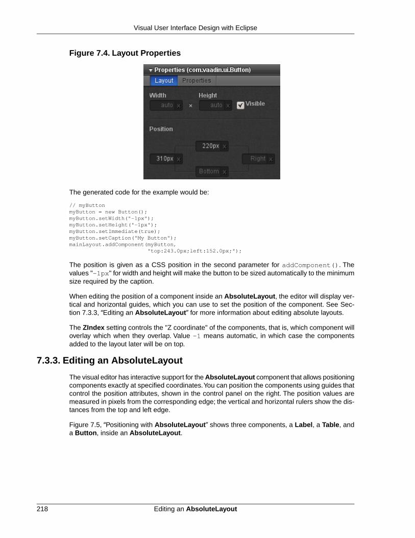
Figure 7.4. Layout Properties
The generated code for the example would be:
// myButtonmyButton = new Button();myButton.setWidth("-1px");myButton.setHeight("-1px");myButton.setImmediate(true);myButton.setCaption("My Button");mainLayout.addComponent(myButton, "top:243.0px;left:152.0px;");
The position is given as a CSS position in the second parameter for addComponent(). Thevalues "-1px" for width and height will make the button to be sized automatically to the minimumsize required by the caption.
When editing the position of a component inside an AbsoluteLayout, the editor will display ver-tical and horizontal guides, which you can use to set the position of the component. See Sec-tion 7.3.3, “Editing an AbsoluteLayout” for more information about editing absolute layouts.
The ZIndex setting controls the "Z coordinate" of the components, that is, which component willoverlay which when they overlap. Value -1 means automatic, in which case the componentsadded to the layout later will be on top.
7.3.3. Editing an AbsoluteLayout
The visual editor has interactive support for the AbsoluteLayout component that allows positioningcomponents exactly at specified coordinates.You can position the components using guides thatcontrol the position attributes, shown in the control panel on the right. The position values aremeasured in pixels from the corresponding edge; the vertical and horizontal rulers show the dis-tances from the top and left edge.
Figure 7.5, “Positioning with AbsoluteLayout” shows three components, a Label, a Table, anda Button, inside an AbsoluteLayout.
Editing an AbsoluteLayout218
Visual User Interface Design with Eclipse

Figure 7.5. Positioning with AbsoluteLayout
Position attributes that are empty are automatic and can be either zero (at the edge) or dynamicto make it shrink to fit the size of the component, depending on the component. Guides are shownalso for the automatic position attributes and move automatically; in Figure 7.5, “Positioning withAbsoluteLayout” the right and bottom edges of the Button are automatic.
Moving an automatic guide manually makes the guide and the corresponding the position attributenon-automatic. To make a manually set attribute automatic, empty it in the control panel. Fig-ure 7.6, “Manually positioned Label” shows a Label component with all the four edges setmanually. Notice that if an automatic position is 0, the guide is at the edge of the ruler.
Figure 7.6. Manually positioned Label
219Editing an AbsoluteLayout
Visual User Interface Design with Eclipse

7.4. Structure of a Visually Editable Component
A component created by the wizard and later managed by the visual editor has a very specificstructure that allows you to insert your user interface logic in the component while keeping aminimal amount of code off-limits.You need to know what you can edit yourself and what exactlyis managed by the editor. The managed member variables and methods are marked with theAutoGenerated annotation, as you can see later.
A visually editable component consists of:
• Member variables containing sub-component references
• Sub-component builder methods
• The constructor
The structure of a composite component is hierarchical, a nested hierarchy of layout componentscontaining other layout components as well as regular components. The root layout of the com-ponent tree, or the composition root of the CustomComponent, is named mainLayout. SeeSection 5.22, “Component Composition with CustomComponent” for a detailed description ofthe structure of custom (composite) components.
7.4.1. Sub-Component References
The CustomComponent class will include a reference to each contained component as amember variable. The most important of these is the mainLayout reference to the compositionroot layout. Such automatically generated member variables are marked with the@AutoGenerated annotation. They are managed by the editor, so you should not edit themmanually, unless you know what you are doing.
A composite component with an AbsoluteLayout as the composition root, containing a Buttonand a Table would have the references as follows:
public class MyComponent extends CustomComponent {
@AutoGenerated private AbsoluteLayout mainLayout; @AutoGenerated private Button myButton; @AutoGenerated private Table myTable; ...
The names of the member variables are defined in the component properties panel of the visualeditor, in the Component name field, as described in the section called “Basic Properties”.Whileyou can change the name of any other components, the name of the root layout is alwaysmainLayout. It is fixed because the editor does not make changes to the constructor, as notedin Section 7.4.3, “The Constructor”.You can, however, change the type of the root layout, whichis an AbsoluteLayout by default.
Certain typically static components, such as the Label label component, will not have a referenceas a member variable. See the description of the builder methods below for details.
Structure of a Visually Editable Component220
Visual User Interface Design with Eclipse

7.4.2. Sub-Component Builders
Every managed layout component will have a builder method that creates the layout and all itscontained components. The builder puts references to the created components in their corres-ponding member variables, and it also returns a reference to the created layout component.
Below is an example of an initial main layout:
@AutoGeneratedprivate AbsoluteLayout buildMainLayout() { // common part: create layout mainLayout = new AbsoluteLayout();
// top-level component properties setHeight("100.0%"); setWidth("100.0%");
return mainLayout;}
Notice that while the builder methods return a reference to the created component, they alsowrite the reference directly to the member variable. The returned reference might not be usedby the generated code at all (in the constructor or in the builder methods), but you can use it foryour purposes.
The builder of the main layout is called in the constructor, as explained in Section 7.4.3, “TheConstructor”.When you have a layout with nested layout components, the builders of each layoutwill call the appropriate builder methods of their contained layouts to create their contents.
7.4.3.The Constructor
When you create a new composite component using the wizard, it will create a constructor forthe component and fill its basic content.
public MyComponent() { buildMainLayout(); setCompositionRoot(mainLayout);
// TODO add user code here }
The most important thing to do in the constructor is to set the composition root of the Custom-Component with the setCompositionRoot() (see Section 5.22, “Component Compositionwith CustomComponent” for more details on the composition root). The generated constructorfirst builds the root layout of the composite component with buildMainLayout() and then usesthe mainLayout reference.
The editor will not change the constructor afterwards, so you can safely change it as you want.The editor does not allow changing the member variable holding a reference to the root layout,so it is always named mainLayout.
221Sub-Component Builders
Visual User Interface Design with Eclipse
222
Chapter 8
Themes
8.1. Overview ................................................................................................ 2238.2. Introduction to Cascading Style Sheets ................................................. 2258.3. Syntactically Awesome Stylesheets (Sass) ........................................... 2308.4. Creating and Using Themes .................................................................. 2328.5. Creating a Theme in Eclipse .................................................................. 236
This chapter provides details about using and creating themes that control the visual look of webapplications. Themes are created using Sass, which is an extension of CSS (Cascading StyleSheets), or with plain CSS. We provide an introduction to CSS, especially concerning the stylingof HTML by element classes.
8.1. Overview
Vaadin separates the appearance of the user interface from its logic using themes. Themes caninclude Sass or CSS style sheets, custom HTML layouts, and any necessary graphics. Themeresources can also be accessed from application code as ThemeResource objects.
Custom themes are placed under the VAADIN/themes/ folder of the web application (underWebContent in Eclipse). This location is fixed -- the VAADIN folder contains static resourcesthat are served by the Vaadin servlet. The servlet augments the files stored in the folder by re-sources found from corresponding VAADIN folders contained in JARs in the class path. For ex-ample, the built-in themes are stored in the vaadin-themes.jar.
Figure 8.1, “Contents of a Theme” illustrates the contents of a theme.
223Book of Vaadin

Figure 8.1. Contents of a Theme
The name of a theme folder defines the name of the theme. The name is used in the @Themeannotation that sets the theme. A theme must contain either a styles.scss for Sass themes,or styles.css stylesheet for plain CSS themes, but other contents have free naming. We re-commend that you have the actual theme content in a SCSS file named after the theme, suchas mytheme.scss, to make the names more unique.
We also suggest a convention for naming the folders as img for images, layouts for customlayouts, and css for additional stylesheets.
Custom themes that use an existing complete theme need to inherit the theme. See Section 8.4.4,“Built-in Themes” and Section 8.4.6, “Theme Inheritance” for details on inheriting a theme.Copying and modifying a complete theme is also possible, but it may need more work to maintainif the modifications are small.
You use a theme by specifying it with the @Theme annotation for the UI class of the applicationas follows:
@Theme("mytheme")public class MyUI extends UI { @Override protected void init(VaadinRequest request) { ... }}
A theme can contain alternate styles for user interface components, which can be changed asneeded.
In addition to style sheets, a theme can contain HTML templates for custom layouts used withCustomLayout. See Section 6.14, “Custom Layouts” for details.
Overview224
Themes

Resources provided in a theme can also be accessed using the ThemeResource class, as de-scribed in Section 4.4.4, “Theme Resources”.This allows using theme resources, such as images,for example in Embedded objects and other objects that allow inclusion of images using resources.
8.2. Introduction to Cascading Style Sheets
Cascading Style Sheets or CSS is a technique to separate the appearance of a web page fromthe content represented in HTML or XHTML. Let us give a short introduction to Cascading StyleSheets and look how they are relevant to software development with Vaadin.
8.2.1. Basic CSS Rules
A style sheet is a file that contains a set of rules. Each rule consists of one or more selectors,separated with commas, and a declaration block enclosed in curly braces. A declaration blockcontains a list of property statements. Each property has a label and a value, separated with acolon. A property statement ends with a semicolon.
Let us look at an example:
p, td { color: blue;}
td { background: yellow; font-weight: bold;}
In the example above, p and td are element type selectors that match with <p> and <td> ele-ments in HTML, respectively.The first rule matches with both elements, while the second matchesonly with <td> elements. Let us assume that you have saved the above style sheet with thename mystylesheet.css and consider the following HTML file located in the same folder.
<html> <head> <link rel="stylesheet" type="text/css" href="mystylesheet.css"/> </head> <body>
<p>This is a paragraph</p><p>This is another paragraph</p>
<table> <tr>
<td>This is a table cell</td><td>This is another table cell</td>
</tr> </table> </body></html>
The <link> element defines the style sheet to use. The HTML elements that match the aboverules are emphasized. When the page is displayed in the browser, it will look as shown in thefigure below.
225Introduction to Cascading Style Sheets
Themes
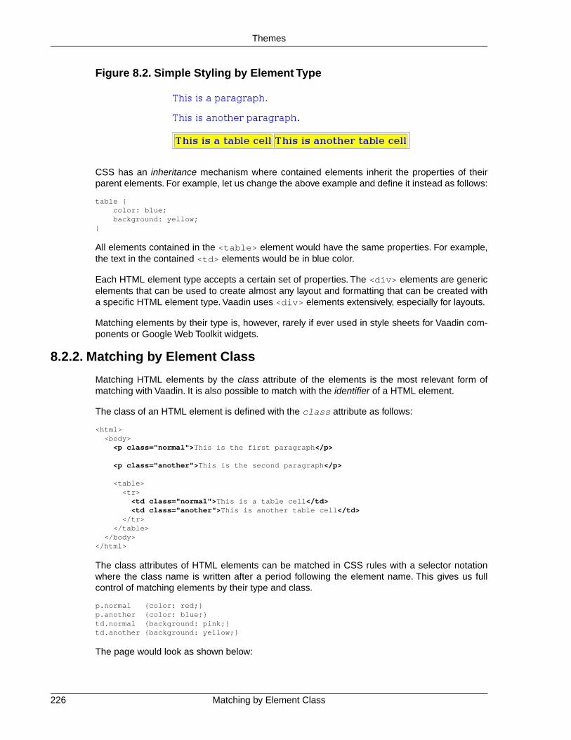
Figure 8.2. Simple Styling by Element Type
CSS has an inheritance mechanism where contained elements inherit the properties of theirparent elements. For example, let us change the above example and define it instead as follows:
table { color: blue; background: yellow;}
All elements contained in the <table> element would have the same properties. For example,the text in the contained <td> elements would be in blue color.
Each HTML element type accepts a certain set of properties. The <div> elements are genericelements that can be used to create almost any layout and formatting that can be created witha specific HTML element type. Vaadin uses <div> elements extensively, especially for layouts.
Matching elements by their type is, however, rarely if ever used in style sheets for Vaadin com-ponents or Google Web Toolkit widgets.
8.2.2. Matching by Element Class
Matching HTML elements by the class attribute of the elements is the most relevant form ofmatching with Vaadin. It is also possible to match with the identifier of a HTML element.
The class of an HTML element is defined with the class attribute as follows:
<html> <body>
<p class="normal">This is the first paragraph</p>
<p class="another">This is the second paragraph</p>
<table> <tr>
<td class="normal">This is a table cell</td><td class="another">This is another table cell</td>
</tr> </table> </body></html>
The class attributes of HTML elements can be matched in CSS rules with a selector notationwhere the class name is written after a period following the element name. This gives us fullcontrol of matching elements by their type and class.
p.normal {color: red;}p.another {color: blue;}td.normal {background: pink;}td.another {background: yellow;}
The page would look as shown below:
Matching by Element Class226
Themes

Figure 8.3. Matching HTML Element Type and Class
We can also match solely by the class by using the universal selector * for the element name,for example *.normal. The universal selector can also be left out altogether so that we use justthe class name following the period, for example .normal.
.normal { color: red;}
.another { blackground: yellow;}
In this case, the rule will match with all elements of the same class regardless of the elementtype. The result is shown in Figure 8.4, “Matching Only HTML Element Class”. This example il-lustrates a technique to make style sheets compatible regardless of the exact HTML elementused in drawing a component.
Figure 8.4. Matching Only HTML Element Class
To assure compatibility, we recommend that you use only matching based on the element classesand do not match for specific HTML element types in CSS rules, because either Vaadin or GWTmay use different HTML elements to render some components in the future. For example, IT MillToolkit Release 4 used <div> elements extensively for layout components. However, IT MillToolkit Release 5 and Vaadin use GWT to render the components, and GWT uses the <table>element to implement most layouts. Similarly, IT Mill Toolkit Release 4 used <div> element alsofor buttons, but in Release 5, GWT uses the <button> element. Vaadin has little control overhow GWT renders its components, so we can not guarantee compatibility in different versionsof GWT. However, both <div> and <table> as well as <tr> and <td> elements accept mostof the same properties, so matching only the class hierarchy of the elements should be compatiblein most cases.
8.2.3. Matching by Descendant Relationship
CSS allows matching HTML by their containment relationship. For example, consider the followingHTML fragment:
<body> <p class="mytext">Here is some text inside a paragraph element</p> <table class="mytable"> <tr> <td class="mytext">Here is text inside a table and inside a td element.</td> </tr>
227Matching by Descendant Relationship
Themes

</table></body>
Matching by the class name .mytext alone would match both the <p> and <td> elements. Ifwe want to match only the table cell, we could use the following selector:
.mytable .mytext {color: blue;}
To match, a class listed in a rule does not have to be an immediate descendant of the previousclass, but just a descendant. For example, the selector ".v-panel .v-button" would matchall elements with class .v-button somewhere inside an element with class .v-panel.
Let us give an example with a real case. Consider the following Vaadin component.
public class LoginBox extends CustomComponent { Panel panel = new Panel("Log In");
public LoginBox () { setCompositionRoot(panel);
panel.addComponent(new TextField("Username:")); panel.addComponent(new TextField("Password:")); panel.addComponent(new Button("Login")); }}
The component will look by default as shown in the following figure.
Figure 8.5.Themeing Login Box Example with 'runo' theme.
Now, let us look at the HTML structure of the component. The following listing assumes that theapplication contains only the above component in the main window of the application.
<body> <div id="v-app"> <div> <div class="v-orderedlayout"> <div> <div class="v-panel"> <div class="v-panel-caption">Log In</div> <div class="v-panel-content"> <div class="v-orderedlayout"> <div> <div> <div class="v-caption"> <span>Username:</span> </div> </div> <input type="text" class="v-textfield"/> </div> <div> <div>
Matching by Descendant Relationship228
Themes

<div class="v-caption"> <span>Password:</span> </div> </div> <input type="password" class="v-textfield"/> </div> <div> <button type="button" class="v-button">Login</button> </div> </div> </div> <div class="v-panel-deco"/> </div> </div> </div> </div> </div></body>
Now, consider the following theme where we set the backgrounds of various elements.
.v-panel .v-panel-caption { background: #80ff80; /* pale green */}
.v-panel .v-panel-content { background: yellow;}
.v-panel .v-textfield { background: #e0e0ff; /* pale blue */}
.v-panel .v-button { background: pink;}
The coloring has changed as shown in the following figure.
Figure 8.6.Themeing Login Box Example with Custom Theme
An element can have multiple classes separated with a space. With multiple classes, a CSS rulematches an element if any of the classes match.This feature is used in many Vaadin componentsto allow matching based on the state of the component. For example, when the mouse is overa Link component, over class is added to the component. Most of such styling is a feature ofGoogle Web Toolkit.
229Matching by Descendant Relationship
Themes

8.2.4. Notes on Compatibility
CSS was first proposed in 1994. The specification of CSS is maintained by the CSS WorkingGroup of World Wide Web Consortium (W3C). Its versions are specified as levels that build uponthe earlier version. CSS Level 1 was published in 1996, Level 2 in 1998. Development of CSSLevel 3 was started in 1998 and is still under way.
While the support for CSS has been universal in all graphical web browsers since at least 1995,the support has been very incomplete at times and there still exists an unfortunate number ofincompatibilities between browsers.While we have tried to take these incompatibilities into accountin the built-in themes in Vaadin, you need to consider them while developing custom themes.
Compatibility issues are detailed in various CSS handbooks.
8.3. Syntactically Awesome Stylesheets (Sass)
Vaadin uses Sass for stylesheets. Sass is an extension of CSS3 that adds nested rules, variables,mixins, selector inheritance, and other features to CSS. Sass supports two formats for stylesheet:Vaadin themes are written in SCSS (.scss), which is a superset of CSS3, but Sass also allowsa more concise indented format (.sass).
Sass can be used in two basic ways in Vaadin applications, either by compiling SCSS files toCSS or by doing the compilation on the fly. The latter way is possible if the development modeis enabled in the deployment descriptor for the Vaadin servlet.
8.3.1. Sass Overview
Variables
Sass allows defining variables that can be used in the rules.
$textcolor: blue;
.v-button-caption { color: $textcolor;}
The above rule would be compiled to CSS as:
.v-button-caption { color: blue;}
Also mixins can have variables as parameters, as explained later.
Nesting
Sass supports nested rules, which are compiled into inside-selectors. For example:
.v-app { background: yellow;
.mybutton { font-style: italic;
.v-button-caption { color: blue; }
Notes on Compatibility230
Themes

}}
is compiled as:
.v-app { background: yellow;}
.v-app .mybutton { font-style: italic;}
.v-app .mybutton .v-button-caption { color: blue;}
Mixins
Mixins are rules that can be included in other rules. You define a mixin rule by prefixing it withthe @mixin keyword and the name of the mixin. You can then use @include to apply it to an-other rule.You can also pass parameters to it, which are handled as local variables in the mixin.
For example:
@mixin mymixin { background: yellow;}
@mixin othermixin($param) { margin: $param;}
.v-button-caption { @include mymixin; @include othermixin(10px);}
The above SCSS would translated to the following CSS:
.v-button-caption { background: yellow; margin: 10px;}
You can also have nested rules in a mixin, which makes them especially powerful.
Vaadin themes are defined as mixins to allow use of multiple themes.
8.3.2. Sass Basics with Vaadin
We are not going to give in-depth documentation of Sass and refer you to its excellent document-ation at http://sass-lang.com/. In the following, we give just basic introduction to using it withVaadin.
You can create a new Sass-based theme with the Eclipse plugin, as described in Section 8.5,“Creating a Theme in Eclipse”.
231Sass Basics with Vaadin
Themes

8.3.3. Compiling On the Fly
The easiest way to use Sass themes is to let the Vaadin servlet compile them on the run. In thiscase, the SCSS source files are placed in the theme folder.
The on-the-fly compilation takes a bit time, so it is only available when the Vaadin servlet is inthe development mode, as described in Section 4.8.4, “Other Deployment Parameters”. Forproduction, you should compile the theme to CSS.
8.3.4. Compiling Sass to CSS
Sass style sheets can be compiled to CSS, with the styles.css of a custom theme as thecompilation target. When compiled before deployment, the source files do not need to be in thetheme folder.
java -cp '../../../WEB-INF/lib/*' com.vaadin.sass.SassCompiler styles.scss styles.css
The -cp parameter should point to the class path where the Vaadin JARs are located. In theabove example, they are assumed to be locate in the WEB-INF/lib folder of the web application.
If you have loaded the Vaadin libraries using Ivy, as is the case with projects created with theVaadin Plugin for Eclipse, the Vaadin libraries are stored in Ivy's local repository. Its folder hierarchyis somewhat scattered, so we recommend that you retrieve the libraries to a single folder. WithApache Ant, you can do that with an Ivy task as shown in the following example:
<project xmlns:ivy="antlib:org.apache.ivy.ant"> ... <target name="resolve" depends="init"> <ivy:retrieve pattern="${result-dir}/lib/[module]-[type]-[artifact]-[revision].[ext]"/> </target></project>
8.4. Creating and Using Themes
Custom themes are placed in the VAADIN/themes folder of the web application (in an Eclipseproject under the WebContent folder), as was illustrated in Figure 8.1, “Contents of a Theme”.This location is fixed.You need to have a theme folder for each theme you use in your application,although applications rarely need more than a single theme.
8.4.1. Sass Themes
You can use Sass themes in Vaadin in two ways, either by compiling them to CSS by yourselfor by letting the Vaadin servlet compile them for you on-the-fly when the theme CSS is requestedby the browser.
To define a Sass theme with the name mytheme, you must place a file with name styles.scssin the theme folder VAADIN/themes/mytheme. If no styles.css exists in the folder, the Sassfile is compiled on-the-fly when the theme is requested by a browser.
We recommend that you organize the theme in at least two SCSS files so that you import theactual theme from a Sass file that is named more uniquely than the styles.scss, to make itmore distinquishable in the editor. This is also how the Vaadin Plugin for Eclipse creates a newtheme.
Compiling On the Fly232
Themes

All rules in a theme should be prefixed with a selector for the theme name. You can do that inSass by enclosing the rules in a nested rule with a selector for the theme name. Themes aredefined as mixins, so after you import them mixin definition, you can include them in the themerule as follows:
@import "mytheme.scss";
.mytheme { @include mytheme;}
The actual theme mixin should be defined as follows:
@import "../reindeer/reindeer.scss";
@mixin mytheme { @include reindeer;
/* An actual theme rule */ .v-button { color: blue; }}
Built-in Themes
Vaadin includes three built-in themes:
• reindeer, the primary theme in Vaadin 6 and 7
• runo, the default theme in IT Mill Toolkit 5
• chameleon, an easily customizable alternative theme
You can find more themes as add-ons from the Vaadin Directory [http://vaadin.com/directory].
8.4.2. Plain Old CSS Themes
In addition to Sass themes, you can create plain old CSS themes. CSS theme are more restrictedthan Sass styles - an application can only have one CSS theme while you can have multipleSass themes.
A CSS theme is defined in a styles.css file in the VAADIN/themes/mytheme folder. Youneed to import the legacy-styles.css of the built-in theme as follows:
@import "../reindeer/legacy-styles.css";
.v-app { background: yellow;}
8.4.3. Styling Standard Components
Each user interface component in Vaadin has a CSS style class that you can use to control theappearance of the component. Some components have additional sub-elements that also allowstyling.
Table 8.1, “Default CSS Style Names of Vaadin Components” lists the style classes of all Vaadincomponents, together with their client-side widgets. Notice that a single server-side componentcan have multiple client-side implementations. For example, a Button can be rendered on the
233Plain Old CSS Themes
Themes

client side either as a regular button or a check box, depending on the switchMode attribute ofthe button. For details regarding the mapping to client-side components, see Section 13.3.1,“Specifying a Stylesheet”. Each client-side component type has its own style class and a numberof additional classes that depend on the client-side state of the component. For example, a textfield will have v-textfield-focus class when mouse pointer hovers over the component.This state is purely on the client-side and is not passed to the server.
Table 8.1. Default CSS Style Names of Vaadin Components
CSS Class NameClient-Side WidgetServer-Side Component
v-absolutelayoutVAbsoluteLayoutAbsoluteLayout
v-accordionVAccordionAccordion
v-buttonVButtonButton
v-checkboxVCheckBoxCheckBox
v-csslayoutVCssLayoutCssLayout
v-customcomponentVCustomComponentCustomComponent
v-customlayoutVCustomLayoutCustomLayout
v-datefieldVDateFieldDateField
v-datefield-entrycalendarVCalendar
v-datefield-calendarVDateFieldCalendar
v-datefield-calendarVPopupCalendar
VTextualDate
-VEmbeddedEmbedded
v-formVFormForm
-VFormLayoutFormLayout
-VGridLayoutGridLayout
v-labelVLabelLabel
v-linkVLinkLink
v-select-optiongroupVOptionGroupOptionGroup
v-horizontallayoutVHorizontalLayoutHorizontalLayout
v-verticallayoutVVerticalLayoutVerticalLayout
v-panelVPanelPanel
Select
v-listselectVListSelect
v-filterselectVFilterSelect
v-sliderVSliderSlider
-VSplitPanelSplitPanel
-VSplitPanelHorizontal
-VSplitPanelVertical
v-tableVScrollTableTable
v-tableVTablePaging
v-tabsheetVTabSheetTabSheet
Styling Standard Components234
Themes

CSS Class NameClient-Side WidgetServer-Side Component
v-textfieldVTextFieldTextField
VTextArea
VPasswordField
v-treeVTreeTree
v-select-twincolVTwinColSelectTwinColSelect
-VUploadUpload
v-windowVWindowWindow
-CalendarEntry-
v-datefield-calendarpanelCalendarPanel-
v-contextmenuContextMenu-
vaadin-unknownVUnknownComponent-
-VView-
gwt-MenuBarMenubar-
gwt-MenuItemMenuItem-
v-datefield-timeTime-
Please see the documentation of the particular components for a listing of possible sub-componentstyles.
Some client-side components can be shared by different server-side components. There is alsothe VUnknownComponent, which is a component that indicates an internal error in a situationwhere the server asked to render a component which is not available on the client-side.
8.4.4. Built-in Themes
Vaadin currently includes two built-in themes: reindeer and runo. The default theme inVaadin 6 and 7 is reindeer. The runo was the default theme for IT Mill Toolkit 5 (where itsname was "default").
The built-in themes are provided in the respective VAADIN/themes/reindeer/styles.cssand VAADIN/themes/runo/styles.css stylesheets in the Vaadin library JAR. Thesestylesheets are compilations of the separate stylesheets for each component in the correspondingsubdirectory. The stylesheets are compiled to a single file for efficiency: the browser needs toload just a single file.
Various constants related to the built-in themes are defined in the theme classes in com.vaad-in.ui.themes package. These are mostly special style names for specific components.
@Theme("runo")public class MyRoot extends Root { @Override protected void init(WrappedRequest request) { ... Panel panel = new Panel("Regular Panel in the Runo Theme"); panel.addComponent(new Button("Regular Runo Button"));
// A button with the "small" style Button smallButton = new Button("Small Runo Button"); smallButton.addStyleName(Runo.BUTTON_SMALL);
235Built-in Themes
Themes
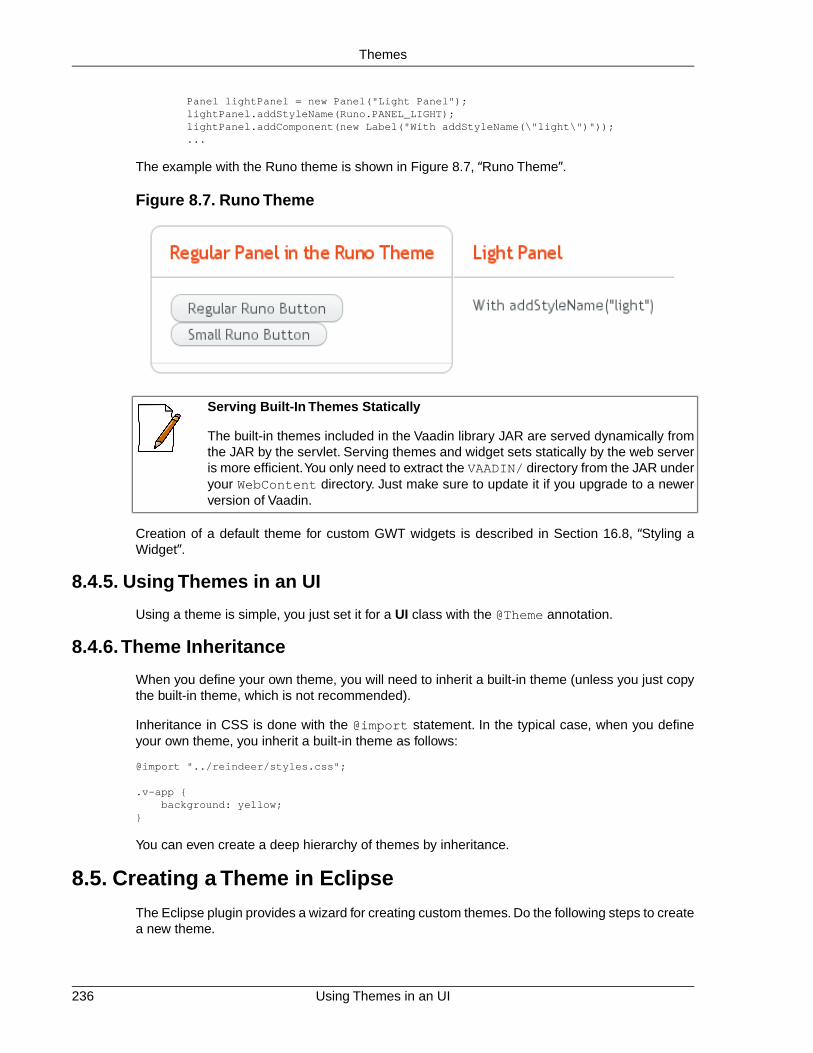
Panel lightPanel = new Panel("Light Panel"); lightPanel.addStyleName(Runo.PANEL_LIGHT); lightPanel.addComponent(new Label("With addStyleName(\"light\")")); ...
The example with the Runo theme is shown in Figure 8.7, “Runo Theme”.
Figure 8.7. Runo Theme
Serving Built-In Themes Statically
The built-in themes included in the Vaadin library JAR are served dynamically fromthe JAR by the servlet. Serving themes and widget sets statically by the web serveris more efficient.You only need to extract the VAADIN/ directory from the JAR underyour WebContent directory. Just make sure to update it if you upgrade to a newerversion of Vaadin.
Creation of a default theme for custom GWT widgets is described in Section 16.8, “Styling aWidget”.
8.4.5. Using Themes in an UI
Using a theme is simple, you just set it for a UI class with the @Theme annotation.
8.4.6.Theme Inheritance
When you define your own theme, you will need to inherit a built-in theme (unless you just copythe built-in theme, which is not recommended).
Inheritance in CSS is done with the @import statement. In the typical case, when you defineyour own theme, you inherit a built-in theme as follows:
@import "../reindeer/styles.css";
.v-app { background: yellow;}
You can even create a deep hierarchy of themes by inheritance.
8.5. Creating a Theme in Eclipse
The Eclipse plugin provides a wizard for creating custom themes. Do the following steps to createa new theme.
Using Themes in an UI236
Themes

1. Select File New Other... in the main menu or right-click the Project Explorer andselect New Other.... A window will open.
2. In the Select a wizard step, select the Vaadin Vaadin Theme wizard.
Click Next to proceed to the next step.
3. In the Create a new Vaadin theme step, you have the following settings:
Project (mandatory)The project in which the theme should be created.
Theme name (mandatory)The theme name is used as the name of the theme folder and in a CSS tag (prefixedwith "v-theme-"), so it must be a proper identifier. Only latin alphanumerics, under-score, and minus sign are allowed.
Modify application classes to use theme (optional)The setting allows the wizard to write a code statement that enables the theme inthe constructor of the selected application (UI) class(es). If you need to control thetheme with dynamic logic, you can leave the setting unchecked or change thegenerated line later.
Click Finish to create the theme.
The wizard creates the theme folder under the WebContent/VAADIN/themes folder and theactual style sheet as mytheme.scss and styles.scss files, as illustrated in Figure 8.8, “NewlyCreated Theme”.
237Creating a Theme in Eclipse
Themes

Figure 8.8. Newly Created Theme
The created theme inherits a built-in base theme with an @import statement. See the explanationof theme inheritance in Section 8.4, “Creating and Using Themes”. Notice that the reindeertheme is not located in the widgetsets folder, but in the Vaadin JAR. See Section 8.4.4, “Built-in Themes” for information for serving the built-in themes.
If you selected an application class or classes in the Modify application classes to use themein the theme wizard, the wizard will add the @Theme annotation to the application UI class.
If you later rename the theme in Eclipse, notice that changing the name of the folder will notautomatically change the @Theme annotation. You need to change such references to themenames in the calls manually.
Creating a Theme in Eclipse238
Themes

Chapter 9
BindingComponents to
Data
9.1. Overview ................................................................................................ 2399.2. Properties .............................................................................................. 2419.3. Holding properties in Items .................................................................... 2469.4. Creating Forms by Binding Fields to Items ............................................ 2499.5. Collecting Items in Containers ............................................................... 254
This chapter describes the Vaadin Data Model and shows how you can use it to bind componentsdirectly to data sources, such as database queries.
9.1. Overview
The Vaadin Data Model is one of the core concepts of the library.To allow the view (user interfacecomponents) to access the data model of an application directly, we have introduced a standarddata interface.
The model allows binding user interface components directly to the data that they display andpossibly allow to edit. There are three nested levels of hierarchy in the data model: property,
239Book of Vaadin

item, and container. Using a spreadsheet application as an analogy, these would correspond toa cell, a row, and a table, respectively.
Figure 9.1. Vaadin Data Model
The Data Model is realized as a set of interfaces in the com.vaadin.data package. The packagecontains the Property, Item, and Container interfaces, along with a number of more specializedinterfaces and classes.
Notice that the Data Model does not define data representation, but only interfaces. This leavesthe representation fully to the implementation of the containers.The representation can be almostanything, such as a plain old Java object (POJO) structure, a filesystem, or a database query.
The Data Model is used heavily in the core user interface components of Vaadin, especially thefield components, that is, components that implement the Field interface or more typically extendAbstractField, which defines many common features. A key feature of all the built-in field com-ponents is that they can either maintain their data by themselves or be bound to an external datasource. The value of a field is always available through the Property interface. As more thanone component can be bound to the same data source, it is easy to implement various viewer-editor patterns.
The relationships of the various interfaces are shown in Figure 9.2, “Interface Relationships inVaadin Data Model”; the value change event and listener interfaces are shown only for theProperty interface, while the notifier interfaces are omitted altogether.
Overview240
Binding Components to Data
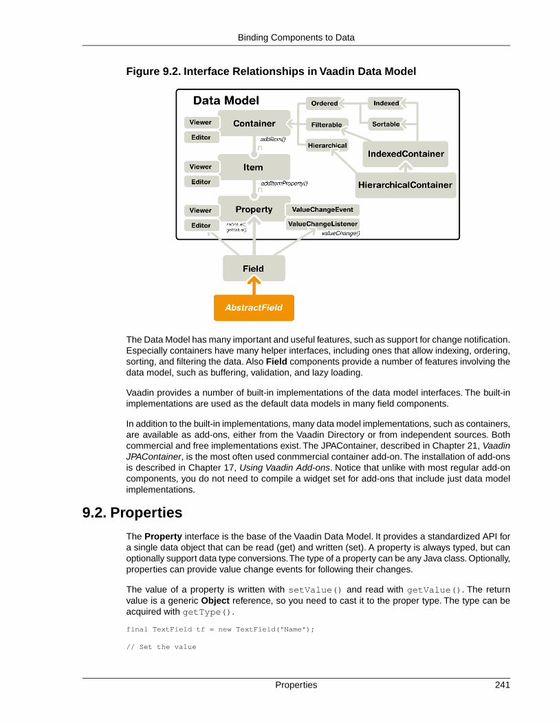
Figure 9.2. Interface Relationships in Vaadin Data Model
The Data Model has many important and useful features, such as support for change notification.Especially containers have many helper interfaces, including ones that allow indexing, ordering,sorting, and filtering the data. Also Field components provide a number of features involving thedata model, such as buffering, validation, and lazy loading.
Vaadin provides a number of built-in implementations of the data model interfaces. The built-inimplementations are used as the default data models in many field components.
In addition to the built-in implementations, many data model implementations, such as containers,are available as add-ons, either from the Vaadin Directory or from independent sources. Bothcommercial and free implementations exist. The JPAContainer, described in Chapter 21, VaadinJPAContainer, is the most often used conmmercial container add-on. The installation of add-onsis described in Chapter 17, Using Vaadin Add-ons. Notice that unlike with most regular add-oncomponents, you do not need to compile a widget set for add-ons that include just data modelimplementations.
9.2. Properties
The Property interface is the base of the Vaadin Data Model. It provides a standardized API fora single data object that can be read (get) and written (set). A property is always typed, but canoptionally support data type conversions.The type of a property can be any Java class. Optionally,properties can provide value change events for following their changes.
The value of a property is written with setValue() and read with getValue(). The returnvalue is a generic Object reference, so you need to cast it to the proper type. The type can beacquired with getType().
final TextField tf = new TextField("Name");
// Set the value
241Properties
Binding Components to Data

tf.setValue("The text field value");
// When the field value is edited by the usertf.addListener(new Property.ValueChangeListener() { public void valueChange(ValueChangeEvent event) { // Get the value and cast it to proper type String value = (String) tf.getValue();
// Do something with it layout.addComponent(new Label(value)); }});
Changes in the property value usually emit a ValueChangeEvent, which can be handled with aValueChangeListener.The event object provides reference to the property with getProperty().
Properties are in themselves unnamed.They are collected in items, which associate the propertieswith names: the Property Identifiers or PIDs. Items can be further contained in containers andare identified with Item Identifiers or IIDs. In the spreadsheet analogy, Property Identifiers wouldcorrespond to column names and Item Identifiers to row names. The identifiers can be arbitraryobjects, but must implement the equals(Object) and hashCode() methods so that they canbe used in any standard Java Collection.
The Property interface can be utilized either by implementing the interface or by using some ofthe built-in property implementations. Vaadin includes a Property interface implementation forarbitrary function pairs and bean properties, with the MethodProperty class, and for simple objectproperties, with the ObjectProperty class, as described later.
In addition to the simple components, many selection components such as Select, Table, andTree provide their current selection through the Property property. In single selection mode, theproperty is a single item identifier, while in multiple selection mode it is a set of item identifiers.Please see the documentation of the selection components for further details.
Components that can be bound to a property have an internal default data source object, typicallya ObjectProperty, which is described later. As all such components are viewers or editors, alsodescribed later, so you can rebind a component to any data source withsetPropertyDataSource().
9.2.1. Property Viewers and Editors
The most important function of the Property as well as of the other data model interfaces is toconnect classes implementing the interface directly to editor and viewer classes. This meansconnecting a data source (model) to a user interface component (views) to allow editing orviewing the data model.
A property can be bound to a component implementing the Viewer interface withsetPropertyDataSource().
// Have a data modelObjectProperty property = new ObjectProperty("Hello", String.class);
// Have a component that implements ViewerLabel viewer = new Label();
// Bind it to the dataviewer.setPropertyDataSource(property);
Property Viewers and Editors242
Binding Components to Data

You can use the same method in the Editor interface to bind a component that allows editing aparticular property type to a property.
// Have a data modelObjectProperty property = new ObjectProperty("Hello", String.class);
// Have a component that implements ViewerTextField editor = new TextField("Edit Greeting");
// Bind it to the dataeditor.setPropertyDataSource(property);
As all field components implement the Property interface, you can bind any component imple-menting the Viewer interface to any field, assuming that the viewer is able the view the objecttype of the field. Continuing from the above example, we can bind a Label to the TextField value:
Label viewer = new Label();viewer.setPropertyDataSource(editor);
// The value shown in the viewer is updated immediately// after editing the value in the editor (once it// loses the focus)editor.setImmediate(true);
9.2.2. ObjectProperty Implementation
The ObjectProperty class is a simple implementation of the Property interface that allowsstoring an arbitrary Java object.
// Have a component that implements Viewer interfacefinal TextField tf = new TextField("Name");
// Have a data model with some dataString myObject = "Hello";
// Wrap it in an ObjectPropertyObjectProperty property = new ObjectProperty(myObject, String.class);
// Bind the property to the componenttf.setPropertyDataSource(property);
9.2.3. Converting Between Property Type and Representation
Fields allow editing a certain type, such as a String or Date. The bound property, on the otherhand, could have some entirely different type. Conversion between a representation edited bythe field and the model defined in the property is handler with a converter that implements theConverter interface.
Most common type conversions, such as between string and integer, are handled by the defaultconverters. They are created in a converter factory global in the application.
Basic Use of Converters
The setConverter(Converter) method sets the converter for a field. The method is definedin AbstractField.
// Have an integer propertyfinal ObjectProperty<Integer> property = new ObjectProperty<Integer>(42);
243ObjectProperty Implementation
Binding Components to Data

// Create a TextField, which edits Stringsfinal TextField tf = new TextField("Name");
// Use a converter between String and Integertf.setConverter(new StringToIntegerConverter());
// And bind the fieldtf.setPropertyDataSource(property);
The built-in converters are the following:
Table 9.1. Built-in Converters
IntegerStringStringToIntegerConverter
DoubleStringStringToDoubleConverter
NumberStringStringToNumberConverter
BooleanStringStringToBooleanConverter
DateStringStringToDateConverter
LongDateDateToLongConverter
In addition, there is a ReverseConverter that takes a converter as a parameter and reversesthe conversion direction.
If a converter already exists for a type, the setConverter(Class) retrieves the converter forthe given type from the converter factory, and then sets it for the field.This method is used implicitlywhen binding field to a property data source.
Implementing a Converter
A conversion always occurs between a representation type, edited by the field component, anda model type, that is, the type of the property data source. Converters implement the Converterinterface defined in the com.vaadin.data.util.converter package.
For example, let us assume that we have a simple Complex type for storing complex values.
public class ComplexConverter implements Converter<String, Complex> { @Override public Complex convertToModel(String value, Locale locale) throws ConversionException { String parts[] = value.replaceAll("[\\(\\)]", "").split(","); if (parts.length != 2) throw new ConversionException( "Unable to parse String to Complex"); return new Complex(Double.parseDouble(parts[0]), Double.parseDouble(parts[1])); }
@Override public String convertToPresentation(Complex value, Locale locale) throws ConversionException { return "("+value.getReal()+","+value.getImag()+")"; }
@Override public Class<Complex> getModelType() { return Complex.class;
Converting Between Property Type and Representation244
Binding Components to Data

}
@Override public Class<String> getPresentationType() { return String.class; }}
The conversion methods get the locale for the conversion as a parameter.
Converter Factory
If a field does not directly allow editing a property type, a default converter is attempted to createusing an application-global converter factory. If you define your own converters that you wish toinclude in the converter factory, you need to implement one yourself. While you could implementthe ConverterFactory interface, it is usually easier to just extend DefaultConverterFactory.
class MyConverterFactory extends DefaultConverterFactory { @Override public <PRESENTATION, MODEL> Converter<PRESENTATION, MODEL> createConverter(Class<PRESENTATION> presentationType, Class<MODEL> modelType) { // Handle one particular type conversion if (String.class == presentationType && Complex.class == modelType) return (Converter<PRESENTATION, MODEL>) new ComplexConverter();
// Default to the supertype return super.createConverter(presentationType, modelType); }}
// Use the factory globally in the applicationApplication.getCurrentApplication().setConverterFactory( new MyConverterFactory());
9.2.4. Implementing the Property Interface
Implementation of the Property interface requires defining setters and getters for the value andthe read-only mode. Only a getter is needed for the property type, as the type is often fixed inproperty implementations.
The following example shows a simple implementation of the Property interface:
class MyProperty implements Property { Integer data = 0; boolean readOnly = false;
// Return the data type of the model public Class<?> getType() { return Integer.class; }
public Object getValue() { return data; }
// Override the default implementation in Object @Override public String toString() { return Integer.toHexString(data); }
245Implementing the Property Interface
Binding Components to Data

public boolean isReadOnly() { return readOnly; }
public void setReadOnly(boolean newStatus) { readOnly = newStatus; }
public void setValue(Object newValue) throws ReadOnlyException, ConversionException { if (readOnly) throw new ReadOnlyException();
// Already the same type as the internal representation if (newValue instanceof Integer) data = (Integer) newValue;
// Conversion from a string is required else if (newValue instanceof String) try { data = Integer.parseInt((String) newValue, 16); } catch (NumberFormatException e) { throw new ConversionException(); } else // Don't know how to convert any other types throw new ConversionException();
// Reverse decode the hexadecimal value }}
// Instantiate the property and set its dataMyProperty property = new MyProperty();property.setValue(42);
// Bind it to a componentfinal TextField tf = new TextField("Name", property);
The components get the displayed value by the toString() method, so it is necessary tooverride it. To allow editing the value, value returned in the toString() must be in a formatthat is accepted by the setValue() method, unless the property is read-only.The toString()can perform any type conversion necessary to make the internal type a string, and thesetValue() must be able to make a reverse conversion.
The implementation example does not notify about changes in the property value or in the read-only mode. You should normally also implement at least the Property.ValueChangeNotifierand Property.ReadOnlyStatusChangeNotifier. See the ObjectProperty class for an exampleof the implementation.
9.3. Holding properties in Items
The Item interface provides access to a set of named properties. Each property is identified bya property identifier (PID) and a reference to such a property can be queried from an Item withgetItemProperty() using the identifier.
Examples on the use of items include rows in a Table, with the properties corresponding to tablecolumns, nodes in a Tree, and the the data bound to a Form, with item's properties bound to in-dividual form fields.
Holding properties in Items246
Binding Components to Data

Items are generally equivalent to objects in the object-oriented model, but with the exception thatthey are configurable and provide an event handling mechanism.The simplest way to utilize Iteminterface is to use existing implementations. Provided utility classes include a configurableproperty set (PropertysetItem) and a bean-to-item adapter (BeanItem). Also, a Form implementsthe interface and can therefore be used directly as an item.
In addition to being used indirectly by many user interface components, items provide the basicdata model underlying the Form component. In simple cases, forms can even be generatedautomatically from items. The properties of the item correspond to the fields of the form.
The Item interface defines inner interfaces for maintaining the item property set and listeningchanges made to it. PropertySetChangeEvent events can be emitted by a class implementingthe PropertySetChangeNotifier interface. They can be received through the Proper-tySetChangeListener interface.
9.3.1.The PropertysetItem Implementation
The PropertysetItem is a generic implementation of the Item interface that allows storing prop-erties. The properties are added with addItemProperty(), which takes a name and theproperty as parameters.
The following example demonstrates a typical case of collecting ObjectProperty properties inan item:
PropertysetItem item = new PropertysetItem();item.addItemProperty("name", new ObjectProperty("Zaphod"));item.addItemProperty("age", new ObjectProperty(42));
// Bind it to a componentForm form = new Form();form.setItemDataSource(item);
9.3.2. Wrapping a Bean in a BeanItem
The BeanItem implementation of the Item interface is a wrapper for Java Bean objects. In fact,only the setters and getters are required while serialization and other bean features are not, soyou can wrap almost any POJOs with minimal requirements.
// Here is a bean (or more exactly a POJO)class Person { String name; int age;
public String getName() { return name; }
public void setName(String name) { this.name = name; }
public Integer getAge() { return age; }
public void setAge(Integer age) { this.age = age.intValue(); }}
// Create an instance of the bean
247The PropertysetItem Implementation
Binding Components to Data

Person bean = new Person();
// Wrap it in a BeanItemBeanItem<Person> item = new BeanItem<Person>(bean);
// Bind it to a componentForm form = new Form();form.setItemDataSource(item);
You can use the getBean() method to get a reference to the underlying bean.
Nested Beans
You may often have composite classes where one class "has a" another class. For example,consider the following Planet class which "has a" discoverer:
// Here is a bean with two nested beanspublic class Planet implements Serializable { String name; Person discoverer;
public Planet(String name, Person discoverer) { this.name = name; this.discoverer = discoverer; }
... getters and setters ...}
...// Create an instance of the beanPlanet planet = new Planet("Uranus", new Person("William Herschel", 1738));
When shown in a Form, for example, you would want to list the properties of the nested beanalong the properties of the composite bean. You can do that by binding the properties of thenested bean individually with a MethodProperty or NestedMethodProperty.You should usuallyhide the nested bean from binding as a property by listing only the bound properties in the con-structor.
// Wrap it in a BeanItem and hide the nested bean propertyBeanItem<Planet> item = new BeanItem<Planet>(planet, new String[]{"name"});
// Bind the nested properties.// Use NestedMethodProperty to bind using dot notation.item.addItemProperty("discoverername", new NestedMethodProperty(planet, "discoverer.name"));
// The other way is to use regular MethodProperty.item.addItemProperty("discovererborn", new MethodProperty<Person>(planet.getDiscoverer(), "born"));
The difference is that NestedMethodProperty does not access the nested bean immediatelybut only when accessing the property values, while when using MethodProperty the nestedbean is accessed when creating the method property. The difference is only significant if thenested bean can be null or be changed later.
You can use such a bean item for example in a Form as follows:
// Bind it to a componentForm form = new Form();
Wrapping a Bean in a BeanItem248
Binding Components to Data
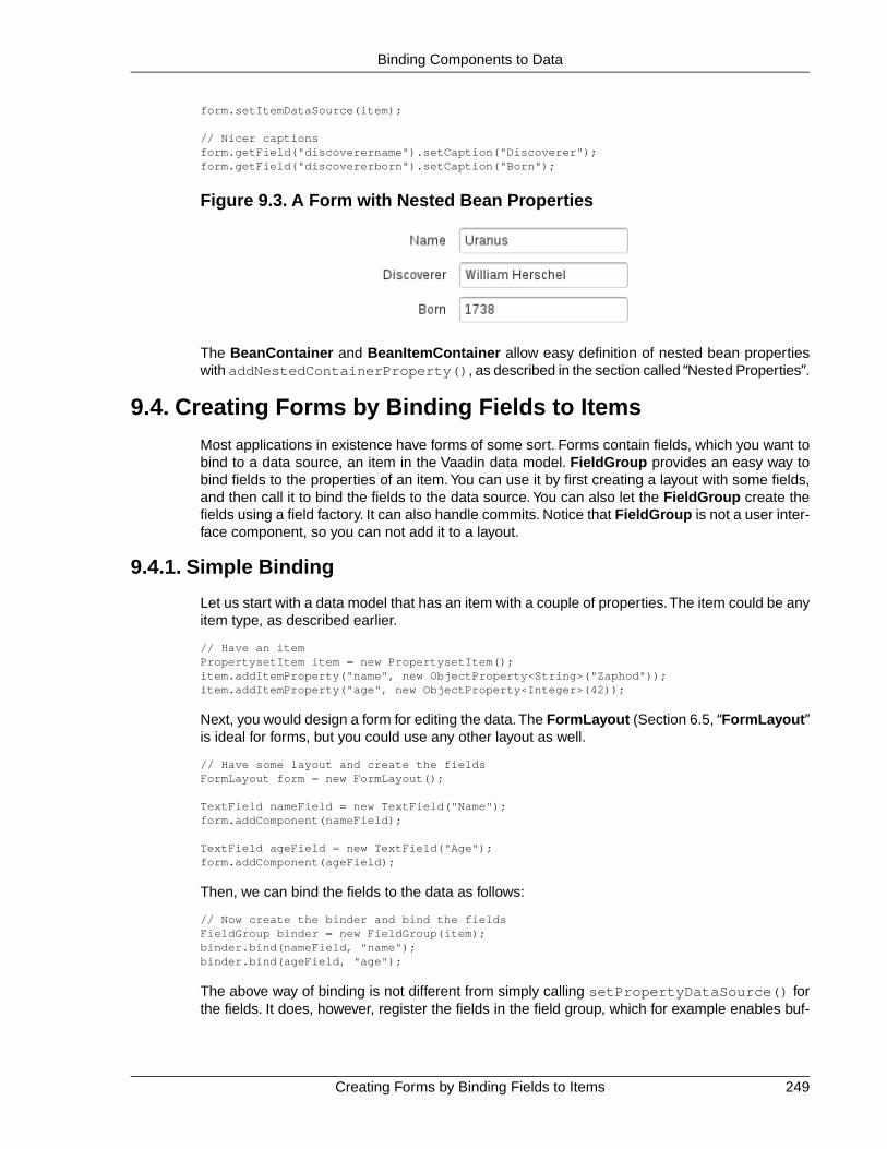
form.setItemDataSource(item);
// Nicer captionsform.getField("discoverername").setCaption("Discoverer");form.getField("discovererborn").setCaption("Born");
Figure 9.3. A Form with Nested Bean Properties
The BeanContainer and BeanItemContainer allow easy definition of nested bean propertieswith addNestedContainerProperty(), as described in the section called “Nested Properties”.
9.4. Creating Forms by Binding Fields to Items
Most applications in existence have forms of some sort. Forms contain fields, which you want tobind to a data source, an item in the Vaadin data model. FieldGroup provides an easy way tobind fields to the properties of an item. You can use it by first creating a layout with some fields,and then call it to bind the fields to the data source. You can also let the FieldGroup create thefields using a field factory. It can also handle commits. Notice that FieldGroup is not a user inter-face component, so you can not add it to a layout.
9.4.1. Simple Binding
Let us start with a data model that has an item with a couple of properties.The item could be anyitem type, as described earlier.
// Have an itemPropertysetItem item = new PropertysetItem();item.addItemProperty("name", new ObjectProperty<String>("Zaphod"));item.addItemProperty("age", new ObjectProperty<Integer>(42));
Next, you would design a form for editing the data.The FormLayout (Section 6.5, “FormLayout”is ideal for forms, but you could use any other layout as well.
// Have some layout and create the fieldsFormLayout form = new FormLayout();
TextField nameField = new TextField("Name");form.addComponent(nameField);
TextField ageField = new TextField("Age");form.addComponent(ageField);
Then, we can bind the fields to the data as follows:
// Now create the binder and bind the fieldsFieldGroup binder = new FieldGroup(item);binder.bind(nameField, "name");binder.bind(ageField, "age");
The above way of binding is not different from simply calling setPropertyDataSource() forthe fields. It does, however, register the fields in the field group, which for example enables buf-
249Creating Forms by Binding Fields to Items
Binding Components to Data

fering or validation of the fields using the field group, as described in Section 9.4.4, “BufferingForms”.
Next, we consider more practical uses for a FieldGroup.
9.4.2. Using a FieldFactory to Build and Bind Fields
Using the buildAndBind() methods, FieldGroup can create fields for you using aFieldGroupFieldFactory, but you still have to add them to the correct position in your layout.
// Have some layoutFormLayout form = new FormLayout();
// Now create a binder that can also create the fields// using the default field factoryFieldGroup binder = new FieldGroup(item);form.addComponent(binder.buildAndBind("Name", "name"));form.addComponent(binder.buildAndBind("Age", "age"));
9.4.3. Binding Member Fields
The bindMemberFields() method in FieldGroup uses reflection to bind the properties of anitem to field components that are member variables of a class. Hence, if you implement a formas a class with the fields stored as member variables, you can use this method to bind them super-easy.
The item properties are mapped to the members by the property ID and the name of the membervariable. If you want to map a property with a different ID to a member, you can use the@PropertyId annotation for the member, with the property ID as the parameter.
For example:
// Have an itemPropertysetItem item = new PropertysetItem();item.addItemProperty("name", new ObjectProperty<String>("Zaphod"));item.addItemProperty("age", new ObjectProperty<Integer>(42));
// Define a form as a class that extends some layoutclass MyForm extends FormLayout { // Member that will bind to the "name" property TextField name = new TextField("Name");
// Member that will bind to the "age" property @PropertyId("age") TextField ageField = new TextField("Age");
public MyForm() { // Customize the layout a bit setSpacing(true);
// Add the fields addComponent(name); addComponent(ageField); }}
// Create oneMyForm form = new MyForm();
// Now create a binder that can also creates the fields// using the default field factoryFieldGroup binder = new FieldGroup(item);
Using a FieldFactory to Build and Bind Fields250
Binding Components to Data

binder.bindMemberFields(form);
// And the form can be used in an higher-level layoutlayout.addComponent(form);
Encapsulating in CustomComponent
Using a CustomComponent can be better for hiding the implementation details than extendinga layout. Also, the use of the FieldGroup can be encapsulated in the form class.
Consider the following as an alternative for the form implementation presented earlier:
// A form component that allows editing an itemclass MyForm extends CustomComponent { // Member that will bind to the "name" property TextField name = new TextField("Name");
// Member that will bind to the "age" property @PropertyId("age") TextField ageField = new TextField("Age");
public MyForm(Item item) { FormLayout layout = new FormLayout(); layout.addComponent(name); layout.addComponent(ageField);
// Now use a binder to bind the members FieldGroup binder = new FieldGroup(item); binder.bindMemberFields(this);
setCompositionRoot(layout); }}
// And the form can be used as a componentlayout.addComponent(new MyForm(item));
9.4.4. Buffering Forms
A FieldGroup handles buffering the form content so that it is written to the data model only whenthe commit() is called for the FieldGroup. Edits can be discarded, so that the underlyingproperty value is reloaded, by calling discard(). Buffering is enabled by default, but can beset with the setBuffered() method in FieldGroup.
// Have an item of some sortfinal PropertysetItem item = new PropertysetItem();item.addItemProperty("name", new ObjectProperty<String>("Q"));item.addItemProperty("age", new ObjectProperty<Integer>(42));
// Have some layout and create the fieldsPanel form = new Panel("Buffered Form");form.setContent(new FormLayout());
// Build and bind the fields using the default field factoryfinal FieldGroup binder = new FieldGroup(item);form.addComponent(binder.buildAndBind("Name", "name"));form.addComponent(binder.buildAndBind("Age", "age"));
// Enable buffering (actually enabled by default)binder.setBuffered(true);
// A button to commit the bufferform.addComponent(new Button("OK", new ClickListener() { @Override
251Buffering Forms
Binding Components to Data
public void buttonClick(ClickEvent event) { try { binder.commit(); Notification.show("Thanks!"); } catch (CommitException e) { Notification.show("You fail!"); } }}));
// A button to discard the bufferform.addComponent(new Button("Discard", new ClickListener() { @Override public void buttonClick(ClickEvent event) { binder.discard(); Notification.show("Discarded!"); }}));
9.4.5. Binding Fields to a Bean
The BeanFieldGroup makes it easier to bind fields to a bean. It also handles binding to nestedbeans properties. The build a field bound to a nested bean property, identify the property withdot notation. For example, if a Person bean has a address property with an Address type,which in turn has a street property, you could build a field bound to the property withbuildAndBind("Street", "address.street").
The input to fields bound to a bean can be validated using the Java Bean Validation API, as de-scribed in Section 9.4.6, “Bean Validation”.The BeanFieldGroup automatically adds a BeanVal-idator to every field if a bean validation implementation is included in the classpath.
9.4.6. Bean Validation
Vaadin allows using the Java Bean Validation API 1.0 (JSR-303) for validating input from fieldsbound to bean properties before the values are committed to the bean. The validation is donebased on annotations on the bean properties.
Using bean validation requires an implementation of the Bean Validation API, such as HibernateValidator (hibernate-validator-4.2.0.Final.jar or later) or Apache Bean Validation.The implementation JAR must be included in the project classpath when using the bean validation,or otherwise an internal error is thrown.
Bean validation is especially useful when persisting entity beans with the Vaadin JPAContainer,described in Chapter 21, Vaadin JPAContainer.
Annotations
The validation constraints are defined as annotations. For example, consider the following bean:
// Here is a beanpublic class Person implements Serializable { @NotNull @javax.validation.constraints.Size(min=2, max=10) String name;
@Min(1) @Max(130) int age;
Binding Fields to a Bean252
Binding Components to Data

// ... setters and getters ...}
For a complete list of allowed constraints for different data types, please see the Bean ValidationAPI documentation [http://docs.oracle.com/javaee/6/tutorial/doc/gircz.html].
Validating the Beans
Validating a bean is done with a BeanValidator, which you initialize with the name of the beanproperty it should validate and add it the the editor field.
In the following example, we validate a single unbuffered field:
Person bean = new Person("Mung bean", 100);BeanItem<Person> item = new BeanItem<Person> (bean);
// Create an editor bound to a bean fieldTextField firstName = new TextField("First Name", item.getItemProperty("name"));
// Add the bean validatorfirstName.addValidator(new BeanValidator(Person.class, "name"));
firstName.setImmediate(true);layout.addComponent(firstName);
In this case, the validation is done immediately after focus leaves the field. You could do thesame for the other field as well.
Bean validators are automatically created when using a BeanFieldGroup.
// Have a beanPerson bean = new Person("Mung bean", 100);
// Form for editing the beanfinal BeanFieldGroup<Person> binder = new BeanFieldGroup<Person>(Person.class);binder.setItemDataSource(bean);layout.addComponent(binder.buildAndBind("Name", "name"));layout.addComponent(binder.buildAndBind("Age", "age"));
// Buffer the form contentbinder.setBuffered(true);layout.addComponent(new Button("OK", new ClickListener() { @Override public void buttonClick(ClickEvent event) { try { binder.commit(); } catch (CommitException e) { } }}));
Locale Setting for Bean Validation
The validation error messages are defined in the bean validation implementation, in aValidationMessages.properties file. The message is shown in the language specifiedwith the locale setting for the form. The default language is English, but for example HibernateValidator contains translations of the messages for a number of languages. If other languagesare needed, you need to provide a translation of the properties file.
253Bean Validation
Binding Components to Data
9.5. Collecting Items in Containers
Container is the highest-level of the data model interfaces supported by Vaadin. It provides avery flexible way of managing a set of items that share common properties. Contained items areidentified by an item identifier or IID.
Items can be added to a container with the addItem() method. Notice that the actual item isnot passed as a parameter to the method, only the item ID, as the interface assumes that thecontainer implementation knows how to create the item. The parameterless version of themethod uses an automatically generated item ID. Implementations can provide methods to addexternally created items, or they can assume that the item ID is also the item itself.
Properties can be requested from container by first requesting an item with getItem() and thengetting the properties from the item with getItemProperty(). You can also get a propertydirectly by the item and property ids with getContainerProperty().
The Container interface was designed with flexibility and efficiency in mind. It contains inner in-terfaces that containers can optionally implement for ordering the items sequentially, indexingthe items, and accessing them hierarchically. Such ordering models provide the basis for theTable, Tree, and Select components. As with other data model interfaces, the Container supportsevents for notifying about changes made to their contents.
As containers can be unordered, ordered, indexed, or hierarchical, they can interface practicallyany kind of data representation.Vaadin includes data connectors for some common data sources,such as the simple tabular data, with IndexedContainer, and the filesystem, with Filesystem-Container.
In addition to generic container implementations, also many user interface components arecontainers as themselves, in addition to being properties. This is especially true for selectioncomponents, that is, those that implement Select, because they are containers that contain se-lectable items. Their property is the currently selected item. This is useful as it allows bindingcomponents to view and updating each others' data directly, and makes it easy to reuse alreadyconstructed data models, for example, a form could edit a row (item) of a table directly, and thetable could use a database container as its underlying container. The fields of the form wouldcorrespond to the properties of the item, that is, the cells of the table row.
The library contains a set of utilities for converting between different container implementationsby adding external ordering or hierarchy into existing containers. In-memory containers imple-menting indexed and hierarchical models provide easy-to-use tools for setting up in-memory datastorages. Such default container implementations include IndexedContainer, which can bethought of as a generalization of a two-dimensional data table, and BeanItemContainer, whichmaps standard Java objects (beans) to items of an indexed container. In addition, the built-incontainers include a hierarchical container for direct file system browsing.
9.5.1. BeanContainer
The BeanContainer is an in-memory container for JavaBean objects. Each contained bean iswrapped inside a BeanItem wrapper. The item properties are determined automatically by in-specting the getter and setter methods of the class. This requires that the bean class has publicvisibility, local classes for example are not allowed. Only beans of the same type can be addedto the container.
The generic has two parameters: a bean type and an item identifier type.The item identifiers canbe obtained by defining a custom resolver, using a specific item property for the IDs, or by giving
Collecting Items in Containers254
Binding Components to Data

item IDs explicitly. As such, it is more general than the BeanItemContainer, which uses the beanobject itself as the item identifier, making the use usually simpler. Managing the item IDs makesBeanContainer more complex to use, but it is necessary in some cases where the equals()or hashCode() methods have been reimplemented in the bean.
// Here is a JavaBeanpublic class Bean implements Serializable { String name; double energy; // Energy content in kJ/100g
public Bean(String name, double energy) { this.name = name; this.energy = energy; }
public String getName() { return name; }
public void setName(String name) { this.name = name; }
public double getEnergy() { return energy; }
public void setEnergy(double energy) { this.energy = energy; }}
void basic(VerticalLayout layout) { // Create a container for such beans with // strings as item IDs. BeanContainer<String, Bean> beans = new BeanContainer<String, Bean>(Bean.class);
// Use the name property as the item ID of the bean beans.setBeanIdProperty("name");
// Add some beans to it beans.addBean(new Bean("Mung bean", 1452.0)); beans.addBean(new Bean("Chickpea", 686.0)); beans.addBean(new Bean("Lentil", 1477.0)); beans.addBean(new Bean("Common bean", 129.0)); beans.addBean(new Bean("Soybean", 1866.0));
// Bind a table to it Table table = new Table("Beans of All Sorts", beans); layout.addComponent(table);}
To use explicit item IDs, use the methods addItem(Object, Object),addItemAfter(Object, Object, Object), and addItemAt(int, Object, Object).
It is not possible to add additional properties to the container, except properties in a nested bean.
Nested Properties
If you have a nested bean with a 1:1 relationship inside a bean type contained in a BeanContaineror BeanItemContainer, you can add its properties to the container by specifying them withaddNestedContainerProperty(). The feature is defined at the level of AbstractBeanCon-tainer.
255BeanContainer
Binding Components to Data

As with a top-level bean in a bean container, also a nested bean must have public visibility orotherwise an access exception is thrown. Intermediary getters returning a nested bean must alwaysreturn a non-null value.
For example, assume that we have the following two beans with the first one nested inside thesecond one.
/** Bean to be nested */public class EqCoord implements Serializable { double rightAscension; /* In angle hours */ double declination; /* In degrees */
... constructor and setters and getters for the properties ...}
/** Bean containing a nested bean */public class Star implements Serializable { String name; EqCoord equatorial; /* Nested bean */
... constructor and setters and getters for the properties ...}
After creating the container, you can declare the nested properties by specifying their propertyidentifiers with the addNestedContainerProperty() in dot notation.
// Create a container for beansfinal BeanItemContainer<Star> stars = new BeanItemContainer<Star>(Star.class);
// Declare the nested properties to be used in the containerstars.addNestedContainerProperty("equatorial.rightAscension");stars.addNestedContainerProperty("equatorial.declination");
// Add some itemsstars.addBean(new Star("Sirius", new EqCoord(6.75, 16.71611)));stars.addBean(new Star("Polaris", new EqCoord(2.52, 89.26417)));
If you bind such a container to a Table, you probably also need to set the column headers. Noticethat the entire nested bean itself is still a property in the container and would be displayed in itsown column. The toString() method is used for obtaining the displayed value, which is bydefault an object reference. You normally do not want this, so you can hide the column withsetVisibleColumns().
// Put them in a tableTable table = new Table("Stars", stars);table.setColumnHeader("equatorial.rightAscension", "RA");table.setColumnHeader("equatorial.declination", "Decl");table.setPageLength(table.size());
// Have to set explicitly to hide the "equatorial" propertytable.setVisibleColumns(new Object[]{"name", "equatorial.rightAscension", "equatorial.declination"});
The resulting table is shown in Figure 9.4, “Table Bound to a BeanContainer with NestedProperties”.
BeanContainer256
Binding Components to Data

Figure 9.4. Table Bound to a BeanContainer with Nested Properties
The bean binding in AbstractBeanContainer normally uses the MethodProperty implementationof the Property interface to access the bean properties using the setter and getter methods. Fornested properties, the NestedMethodProperty implementation is used.
Defining a Bean ID Resolver
If a bean ID resolver is set using setBeanIdResolver() or setBeanIdProperty(), themethods addBean(), addBeanAfter(), addBeanAt() and addAll() can be used to additems to the container. If one of these methods is called, the resolver is used to generate anidentifier for the item (must not return null).
Note that explicit item identifiers can also be used when a resolver has been set by calling theaddItem*() methods - the resolver is only used when adding beans using the addBean*()or addAll(Collection) methods.
9.5.2. BeanItemContainer
BeanItemContainer is a container for JavaBean objects where each bean is wrapped inside aBeanItem wrapper. The item properties are determined automatically by inspecting the getterand setter methods of the class.This requires that the bean class has public visibility, local classesfor example are not allowed. Only beans of the same type can be added to the container.
BeanItemContainer is a specialized version of the BeanContainer described in Section 9.5.1,“BeanContainer”. It uses the bean itself as the item identifier, which makes it a bit easier to usethan BeanContainer in many cases.The latter is, however, needed if the bean has reimplementedthe equals() or hashCode() methods.
Let us revisit the example given in Section 9.5.1, “BeanContainer” using the BeanItemContainer.
// Create a container for the beansBeanItemContainer<Bean> beans = new BeanItemContainer<Bean>(Bean.class);
// Add some beans to itbeans.addBean(new Bean("Mung bean", 1452.0));beans.addBean(new Bean("Chickpea", 686.0));beans.addBean(new Bean("Lentil", 1477.0));beans.addBean(new Bean("Common bean", 129.0));beans.addBean(new Bean("Soybean", 1866.0));
// Bind a table to itTable table = new Table("Beans of All Sorts", beans);
It is not possible to add additional properties to a BeanItemContainer, except properties in anested bean, as described in Section 9.5.1, “BeanContainer”.
257BeanItemContainer
Binding Components to Data

9.5.3. Iterating Over a Container
As the items in a Container are not necessarily indexed, iterating over the items has to be doneusing an Iterator.The getItemIds() method of Container returns a Collection of item identi-fiers over which you can iterate. The following example demonstrates a typical case where youiterate over the values of check boxes in a column of a Table component. The context of theexample is the example used in Section 5.15, “Table”.
// Collect the results of the iteration into this string.String items = "";
// Iterate over the item identifiers of the table.for (Iterator i = table.getItemIds().iterator(); i.hasNext();) { // Get the current item identifier, which is an integer. int iid = (Integer) i.next();
// Now get the actual item from the table. Item item = table.getItem(iid);
// And now we can get to the actual checkbox object. Button button = (Button) (item.getItemProperty("ismember").getValue());
// If the checkbox is selected. if ((Boolean)button.getValue() == true) { // Do something with the selected item; collect the // first names in a string. items += item.getItemProperty("First Name") .getValue() + " "; }}
// Do something with the results; display the selected items.layout.addComponent (new Label("Selected items: " + items));
Notice that the getItemIds() returns an unmodifiable collection, so the Container may not bemodified during iteration. You can not, for example, remove items from the Container during it-eration. The modification includes modification in another thread. If the Container is modifiedduring iteration, a ConcurrentModificationException is thrown and the iterator may be left inan undefined state.
9.5.4. Filterable Containers
Containers that implement the Container.Filterable interface can be filtered. For example, thebuilt-in IndexedContainer and the bean item containers implement it. Filtering is typically usedfor filtering the content of a Table.
Filters implement the Filter interface and you add them to a filterable container with theaddContainerFilter() method. Container items that pass the filter condition are kept andshown in the filterable component.
Filter filter = new SimpleStringFilter("name", "Douglas", true, false);table.addContainerFilter(filter);
If multiple filters are added to a container, they are evaluated using the logical AND operator sothat only items that are passed by all the filters are kept.
Iterating Over a Container258
Binding Components to Data

Atomic and Composite Filters
Filters can be classified as atomic and composite. Atomic filters, such as SimpleStringFilter,define a single condition, usually for a specific container property. Composite filters make filteringdecisions based on the result of one or more other filters.The built-in composite filters implementthe logical operators AND, OR, or NOT.
For example, the following composite filter would filter out items where the name property containsthe name "Douglas" somewhere and where the age property has value less than 42. The prop-erties must have String and Integer types, respectively.
filter = new Or(new SimpleStringFilter("name", "Douglas", true, false), new Compare.Less("age", 42));
Built-In Filter Types
The built-in filter types are the following:
SimpleStringFilter
Passes items where the specified property, that must be of String type, contains thegiven filterString as a substring. If ignoreCase is true, the search is case in-sensitive. If the onlyMatchPrefix is true, the substring may only be in the beginningof the string, otherwise it may be elsewhere as well.
IsNull
Passes items where the specified property has null value. For in-memory filtering, asimple == check is performed. For other containers, the comparison implementationis container dependent, but should correspond to the in-memory null check.
Equal, Greater, Less, GreaterOrEqual, and LessOrEqual
The comparison filter implementations compare the specified property value to thegiven constant and pass items for which the comparison result is true.The comparisonoperators are included in the abstract Compare class.
For the Equal filter, the equals() method for the property is used in built-in in-memorycontainers. In other types of containers, the comparison is container dependent andmay use, for example, database comparison operations.
For the other filters, the property value type must implement the Comparable interfaceto work with the built-in in-memory containers. Again for the other types of containers,the comparison is container dependent.
And and Or
These logical operator filters are composite filters that combine multiple other filters.
Not
The logical unary operator filter negates which items are passed by the filter given asthe parameter.
259Filterable Containers
Binding Components to Data

Implementing Custom Filters
A custom filter needs to implement the Container.Filter interface.
A filter can use a single or multiple properties for the filtering logic. The properties used by thefilter must be returned with the appliesToProperty() method. If the filter applies to a user-defined property or properties, it is customary to give the properties as the first argument for theconstructor of the filter.
class MyCustomFilter implements Container.Filter { protected String propertyId; protected String regex;
public MyCustomFilter(String propertyId, String regex) { this.propertyId = propertyId; this.regex = regex; }
/** Tells if this filter works on the given property. */ @Override public boolean appliesToProperty(Object propertyId) { return propertyId != null && propertyId.equals(this.propertyId); }
The actual filtering logic is done in the passesFilter() method, which simply returns true ifthe item should pass the filter and false if it should be filtered out.
/** Apply the filter on an item to check if it passes. */ @Override public boolean passesFilter(Object itemId, Item item) throws UnsupportedOperationException { // Acquire the relevant property from the item object Property p = item.getItemProperty(propertyId);
// Should always check validity if (p == null || !p.getType().equals(String.class)) return false; String value = (String) p.getValue();
// The actual filter logic return value.matches(regex); }}
You can use such a custom filter just like any other:
c.addContainerFilter( new MyCustomFilter("Name", (String) tf.getValue()));
Filterable Containers260
Binding Components to Data

Chapter 10
VaadinSQLContainer
10.1. Architecture ......................................................................................... 26210.2. Getting Started with SQLContainer ..................................................... 26210.3. Filtering and Sorting ............................................................................ 26310.4. Editing .................................................................................................. 26410.5. Caching, Paging and Refreshing ......................................................... 26610.6. Referencing Another SQLContainer ................................................... 26710.7. Using FreeformQuery and FreeformStatementDelegate ................. 26810.8. Non-implemented methods of Vaadin container interfaces ................. 26910.9. Known Issues and Limitations ............................................................. 270
Vaadin SQLContainer is a container implementation that allows easy and customizable accessto data stored in various SQL-speaking databases.
SQLContainer supports two types of database access. Using TableQuery, the pre-made querygenerators will enable fetching, updating, and inserting data directly from the container into adatabase table - automatically, whereas FreeformQuery allows the developer to use their own,probably more complex query for fetching data and their own optional implementations for writing,filtering and sorting support - item and property handling as well as lazy loading will still be handledautomatically.
In addition to the customizable database connection options, SQLContainer also extends theVaadin Container interface to implement more advanced and more database-oriented filtering
261Book of Vaadin

rules. Finally, the add-on also offers connection pool implementations for JDBC connectionpooling and JEE connection pooling, as well as integrated transaction support; auto-commit modeis also provided.
The purpose of this section is to briefly explain the architecture and some of the inner workingsof SQLContainer. It will also give the readers some examples on how to use SQLContainer intheir own applications. The requirements, limitations and further development ideas are alsodiscussed.
SQLContainer is available from the Vaadin Directory under the same unrestrictive Apache License2.0 as the Vaadin Framework itself.
10.1. Architecture
The architecture of SQLContainer is relatively simple. SQLContainer is the class implementingthe Vaadin Container interfaces and providing access to most of the functionality of this add-on.The standard Vaadin Property and Item interfaces have been implementd as the ColumnPropertyand RowItem classes. Item IDs are represented by RowId and TemporaryRowId classes. TheRowId class is built based on the primary key columns of the connected database table or queryresult.
In the connection package, the JDBCConnectionPool interface defines the requirements for aconnection pool implementation. Two implementations of this interface are provided: SimpleJD-BCConnectionPool provides a simple yet very usable implementation to pool and access JDBCconnections. J2EEConnectionPool provides means to access J2EE DataSources.
The query package contains the QueryDelegate interface, which defines everything the SQL-Container needs to enable reading and writing data to and from a database. As discussed earlier,two implementations of this interface are provided: TableQuery for automatic read-write supportfor a database table, and FreeformQuery for customizing the query, sorting, filtering and writing;this is done by implementing relevant methods of the FreeformStatementDelegate interface.
The query package also contains Filter and OrderBy classes which have been written to providean alternative to the standard Vaadin container filtering and make sorting non-String propertiesa bit more user friendly.
Finally, the generator package contains a SQLGenerator interface, which defines the kind ofqueries that are required by the TableQuery class.The provided implementations include supportfor HSQLDB, MySQL, PostgreSQL (DefaultSQLGenerator), Oracle (OracleGenerator) andMicrosoft SQL Server (MSSQLGenerator). A new or modified implementations may be providedto gain compatibility with older versions or other database servers.
For further details, please refer to the SQLContainer API documentation.
10.2. Getting Started with SQLContainer
Getting development going with the SQLContainer is easy and quite straight-forward.The purposeof this section is to describe how to create the required resources and how to fetch data fromand write data to a database table attached to the container.
10.2.1. Creating a connection pool
First, we need to create a connection pool to allow the SQLContainer to connect to a database.Here we will use the SimpleJDBCConnectionPool, which is a basic implementation of connection
Architecture262
Vaadin SQLContainer

pooling with JDBC data sources. In the following code, we create a connection pool that usesthe HSQLDB driver together with an in-memory database. The initial amount of connections is2 and the maximum amount is set at 5. Note that the database driver, connection url, username,and password parameters will vary depending on the database you are using.
JDBCConnectionPool pool = new SimpleJDBCConnectionPool( "org.hsqldb.jdbc.JDBCDriver", "jdbc:hsqldb:mem:sqlcontainer", "SA", "", 2, 5);
10.2.2. Creating the TableQuery Query Delegate
After the connection pool is created, we'll need a query delegate for the SQLContainer. Thesimplest way to create one is by using the built-in TableQuery class. The TableQuery delegateprovides access to a defined database table and supports reading and writing data out-of-the-box.The primary key(s) of the table may be anything that the database engine supports, and arefound automatically by querying the database when a new TableQuery is instantiated.We createthe TableQuery with the following statement:
TableQuery tq = new TableQuery("tablename", connectionPool);
In order to allow writes from several user sessions concurrently, we must set a version columnto the TableQuery as well. The version column is an integer- or timestamp-typed column whichwill either be incremented or set to the current time on each modification of the row. TableQueryassumes that the database will take care of updating the version column; it just makes sure thecolumn value is correct before updating a row. If another user has changed the row and theversion number in the database does not match the version number in memory, an Optimist-icLockException is thrown and you can recover by refreshing the container and allow the userto merge the data. The following code will set the version column:
tq.setVersionColumn("OPTLOCK");
10.2.3. Creating the Container
Finally, we may create the container itself. This is as simple as stating:
SQLContainer container = new SQLContainer(tq);
After this statement, the SQLContainer is connected to the table tablename and is ready to usefor example as a data source for a Vaadin Table or a Vaadin Form.
10.3. Filtering and Sorting
Filtering and sorting the items contained in an SQLContainer is, by design, always performed inthe database. In practice this means that whenever the filtering or sorting rules are modified, atleast some amount of database communication will take place (the minimum is to fetch the updatedrow count using the new filtering/sorting rules).
10.3.1. Filtering
Filtering is performed using the filtering API in Vaadin, which allows for very complex filtering tobe easily applied. More information about the filtering API can be found in .
In addition to the filters provided by Vaadin, SQLContainer also implements the Like filter as wellas the Between filter. Both of these map to the equally named WHERE-operators in SQL. Thefilters can also be applied on items that reside in memory, for example, new items that have notyet been stored in the database or rows that have been loaded and updated, but not yet stored.
263Creating the TableQuery Query Delegate
Vaadin SQLContainer

The following is an example of the types of complex filtering that are possible with the new filteringAPI. We want to find all people named Paul Johnson that are either younger than 18 years orolder than 65 years and all Johnsons whose first name starts with the letter "A":
mySQLContainer.addContainerFilter( new Or(new And(new Equal("NAME", "Paul"), new Or(new Less("AGE", 18), new Greater("AGE", 65))), new Like("NAME", "A%")));mySQLContainer.addContainerFilter( new Equal("LASTNAME", "Johnson"));
This will produce the following WHERE clause:
WHERE (("NAME" = "Paul" AND ("AGE" < 18 OR "AGE" > 65)) OR "NAME" LIKE "A%") AND "LASTNAME" = "Johnson"
10.3.2. Sorting
Sorting can be performed using standard Vaadin, that is, using the sort method from the Contain-er.Sortable interface. The propertyId parameter refers to column names.
public void sort(Object[] propertyId, boolean[] ascending)
In addition to the standard method, it is also possible to directly add an OrderBy to the containervia the addOrderBy() method. This enables the developer to insert sorters one by one withoutproviding the whole array of them at once.
All sorting rules can be cleared by calling the sort method with null or an empty array as the firstargument.
10.4. Editing
Editing the items (RowItems) of SQLContainer can be done similarly to editing the items of anyVaadin container. ColumnProperties of a RowItem will automatically notify SQLContainer tomake sure that changes to the items are recorded and will be applied to the database immediatelyor on commit, depending on the state of the auto-commit mode.
10.4.1. Adding items
Adding items to an SQLContainer object can only be done via the addItem() method. Thismethod will create a new Item based on the connected database table column properties. Thenew item will either be buffered by the container or committed to the database through the querydelegate depending on whether the auto commit mode (see the next section) has been enabled.
When an item is added to the container it is impossible to precisely know what the primary keysof the row will be, or will the row insertion succeed at all.This is why the SQLContainer will assignan instance of TemporaryRowId as a RowId for the new item. We will later describe how tofetch the actual key after the row insertion has succeeded.
If auto-commit mode is enabled in the SQLContainer, the addItem() methot will return the finalRowId of the new item.
10.4.2. Fetching generated row keys
Since it is a common need to fetch the generated key of a row right after insertion, a listener/no-tifier has been added into the QueryDelegate interface. Currently only the TableQuery class
Sorting264
Vaadin SQLContainer
implements the RowIdChangeNotifier interface, and thus can notify interested objects of changedrow IDs.The events fill be fired after commit() in TableQuery has finished; this method is calledby SQLContainer when necessary.
To receive updates on the row IDs, you might use the following code (assuming container is aninstance of SQLContainer). Note that these events are not fired if auto commit mode is enabled.
app.getDbHelp().getCityContainer().addListener( new QueryDelegate.RowIdChangeListener() { public void rowIdChange(RowIdChangeEvent event) { System.err.println("Old ID: " + event.getOldRowId()); System.err.println("New ID: " + event.getNewRowId()); } });
10.4.3. Version column requirement
If you are using the TableQuery class as the query delegate to the SQLContainer and need toenable write support, there is an enforced requirement of specifying a version column name tothe TableQuery instance. The column name can be set to the TableQuery using the followingstatement:
tq.setVersionColumn("OPTLOCK");
The version column is preferrably an integer or timestamp typed column in the table that is attachedto the TableQuery. This column will be used for optimistic locking; before a row modification theTableQuery will check before that the version column value is the same as it was when the datawas read into the container. This should ensure that no one has modified the row inbetween thecurrent user's reads and writes.
Note! TableQuery assumes that the database will take care of updating the version column byeither using an actual VERSION column (if supported by the database in question) or by a triggeror a similar mechanism.
If you are certain that you do not need optimistic locking, but do want to enable write support,you may point the version column to, for example, a primary key column of the table.
10.4.4. Auto-commit mode
SQLContainer is by default in transaction mode, which means that actions that edit, add or removeitems are recorded internally by the container. These actions can be either committed to thedatabase by calling commit() or discarded by calling rollback().
The container can also be set to auto-commit mode. When this mode is enabled, all changes willbe committed to the database immediately. To enable or disable the auto-commit mode, call thefollowing method:
public void setAutoCommit(boolean autoCommitEnabled)
It is recommended to leave the auto-commit mode disabled, as it ensures that the changes canbe rolled back if any problems are noticed within the container items. Using the auto-commitmode will also lead to failure in item addition if the database table contains non-nullable columns.
10.4.5. Modified state
When used in the transaction mode it may be useful to determine whether the contents of theSQLContainer have been modified or not. For this purpose the container provides an
265Version column requirement
Vaadin SQLContainer

isModified() method, which will tell the state of the container to the developer. This methodwill return true if any items have been added to or removed from the container, as well as if anyvalue of an existing item has been modified.
Additionally, each RowItem and each ColumnProperty have isModified() methods to allowfor a more detailed view over the modification status. Do note that the modification statuses ofRowItem and ColumnProperty objects only depend on whether or not the actual Propertyvalues have been modified. That is, they do not reflect situations where the whole RowItem hasbeen marked for removal or has just been added to the container.
10.5. Caching, Paging and Refreshing
To decrease the amount of queries made to the database, SQLContainer uses internal cachingfor database contents.The caching is implemented with a size-limited LinkedHashMap containinga mapping from RowIds to RowItems.Typically developers do not need to modify caching options,although some fine-tuning can be done if required.
10.5.1. Container Size
The SQLContainer keeps continuously checking the amount of rows in the connected databasetable in order to detect external addition or removal of rows. By default, the table row count isassumed to remain valid for 10 seconds. This value can be altered from code; withsetSizeValidMilliSeconds() in SQLContainer.
If the size validity time has expired, the row count will be automatically updated on:
• A call to getItemIds() method
• A call to size() method
• Some calls to indexOfId(Object itemId) method
• A call to firstItemId() method
• When the container is fetching a set of rows to the item cache (lazy loading)
10.5.2. Page Length and Cache Size
The page length of the SQLContainer dictates the amount of rows fetched from the databasein one query. The default value is 100, and it can be modified with the setPageLength()method. To avoid constant queries it is recommended to set the page length value to at least 5times the amount of rows displayed in a Vaadin Table; obviously, this is also dependent on thecache ratio set for the Table component.
The size of the internal item cache of the SQLContainer is calculated by multiplying the pagelenght with the cache ratio set for the container. The cache ratio can only be set from the code,and the default value for it is 2. Hence with the default page length of 100 the internal cache sizebecomes 200 items. This should be enough even for larger Tables while ensuring that no hugeamounts of memory will be used on the cache.
10.5.3. Refreshing the Container
Normally, the SQLContainer will handle refreshing automatically when required. However, theremay be situations where an implicit refresh is needed, for example, to make sure that the version
Caching, Paging and Refreshing266
Vaadin SQLContainer

column is up-to-date prior to opening the item for editing in a form. For this purpose a refresh()method is provided. This method simply clears all caches, resets the current item fetching offsetand sets the container size dirty. Any item-related call after this will inevitably result into row countand item cache update.
Note that a call to the refresh method will not affect or reset the following properties of the con-tainer:
• The QueryDelegate of the container
• Auto-commit mode
• Page length
• Filters
• Sorting
10.5.4. Cache Flush Notification Mechanism
Cache usage with databases in multiuser applications always results in some kind of a compromisebetween the amount of queries we want to execute on the database and the amount of memorywe want to use on caching the data; and most importantly, risking the cached data becomingstale.
SQLContainer provides an experimental remedy to this problem by implementing a simple cacheflush notification mechanism. Due to its nature these notifications are disabled by default but canbe easily enabled for a container instance by calling enableCacheFlushNotifications()at any time during the lifetime of the container.
The notification mechanism functions by storing a weak reference to all registered containers ina static list structure. To minimize the risk of memory leaks and to avoid unlimited growing of thereference list, dead weak references are collected to a reference queue and removed from thelist every time a SQLContainer is added to the notification reference list or a container calls thenotification method.
When a SQLContainer has its cache notifications set enabled, it will call the staticnotifyOfCacheFlush() method giving itself as a parameter. This method will compare thenotifier-container to all the others present in the reference list. To fire a cache flush event, thetarget container must have the same type of QueryDelegate (either TableQuery or Freeform-Query) and the table name or query string must match with the container that fired the notification.If a match is found the refresh() method of the matching container is called, resulting in cacheflushing in the target container.
Note: Standard Vaadin issues apply; even if the SQLContainer is refreshed on the server side,the changes will not be reflected to the UI until a server round-trip is performed, or unless a pushmechanism is used.
10.6. Referencing Another SQLContainer
When developing a database-connected application, there is usually a need to retrieve data relatedto one table from one or more other tables. In most cases, this relation is achieved with a foreignkey reference, where a column of the first table contains a primary key or candidate key of a rowin another table.
267Cache Flush Notification Mechanism
Vaadin SQLContainer

SQLContainer offers limited support for this kind of referencing relation, although all referencingis currently done on the Java side so no constraints need to be made in the database. A newreference can be created by calling the following method:
public void addReference(SQLContainer refdCont, String refingCol, String refdCol);
This method should be called on the source container of the reference. The target containershould be given as the first parameter. The refingCol is the name of the 'foreign key' columnin the source container, and the refdCol is the name of the referenced key column in the targetcontainer.
Note: For any SQLContainer, all the referenced target containers must be different.You can notreference the same container from the same source twice.
Handling the referenced item can be done through the three provided set/get methods, and thereference can be completely removed with the removeReference() method. Signatures ofthese methods are listed below:
public boolean setReferencedItem(Object itemId, Object refdItemId, SQLContainer refdCont)public Object getReferencedItemId(Object itemId, SQLContainer refdCont)public Item getReferencedItem(Object itemId, SQLContainer refdCont)public boolean removeReference(SQLContainer refdCont)
The setter method should be given three parameters: itemId is the ID of the referencing item(from the source container), refdItemId is the referenced itemID (from the target container)and refdCont is a reference to the target container that identifies the reference. This methodreturns true if the setting of the referenced item was successful. After setting the referenced itemyou must normally call commit() on the source container to persist the changes to the database.
The getReferencedItemId() method will return the item ID of the referenced item. As para-meters this method needs the item ID of the referencing item and a reference to the target con-tainer as an identifier. SQLContainer also provides a convenience methodgetReferencedItem(), which directly returns the referenced item from the target container.
Finally, the referencing can be removed from the source container by calling theremoveReference() method with the target container as parameter. Note that this does notactually change anything in the database; it merely removes the logical relation that exists onlyon the Java-side.
10.7. Using FreeformQuery and FreeformStatementDelegate
In most cases, the provided TableQuery will be enough to allow a developer to gain effortlessaccess to an SQL data source. However there may arise situations when a more complex querywith, for example, join expressions is needed. Or perhaps you need to redefine how the writingor filtering should be done.The FreeformQuery query delegate is provided for this exact purpose.Out of the box the FreeformQuery supports read-only access to a database, but it can be exten-ded to allow writing also.
Getting started
Getting started with the FreeformQuery may be done as shown in the following.The connectionpool initialization is similar to the TableQuery example so it is omitted here. Note that the name(s)
Using FreeformQuery and FreeformStatementDelegate268
Vaadin SQLContainer
of the primary key column(s) must be provided to the FreeformQuery manually. This is requiredbecause depending on the query the result set may or may not contain data about primary keycolumns. In this example, there is one primary key column with a name 'ID'.
FreeformQuery query = new FreeformQuery( "SELECT * FROM SAMPLE", pool, "ID");SQLContainer container = new SQLContainer(query);
Limitations
While this looks just as easy as with the TableQuery, do note that there are some importantcaveats here. Using FreeformQuery like this (without providing FreeformQueryDelegate orFreeformStatementDelegate implementation) it can only be used as a read-only window to theresultset of the query. Additionally filtering, sorting and lazy loading features will not be supported,and the row count will be fetched in quite an inefficient manner. Bearing these limitations in mind,it becomes quite obvious that the developer is in reality meant to implement the FreeformQuery-Delegate or FreeformStatementDelegate interface.
The FreeformStatementDelegate interface is an extension of the FreeformQueryDelegate in-terface, which returns StatementHelper objects instead of pure query Strings. This enables thedeveloper to use prepared statetemens instead of regular statements. It is highly recommendedto use the FreeformStatementDelegate in all implementations. From this chapter onwards, wewill only refer to the FreeformStatementDelegate in cases where FreeformQueryDelegatecould also be applied.
Creating your own FreeformStatementDelegate
To create your own delegate for FreeformQuery you must implement some or all of the methodsfrom the FreeformStatementDelegate interface, depending on which ones your use case requires.The interface contains eight methods which are shown below. For more detailed requirements,see the JavaDoc documentation of the interface.
// Read-only queriespublic StatementHelper getCountStatement()public StatementHelper getQueryStatement(int offset, int limit)public StatementHelper getContainsRowQueryStatement(Object... keys)
// Filtering and sortingpublic void setFilters(List<Filter> filters)public void setFilters(List<Filter> filters, FilteringMode filteringMode)public void setOrderBy(List<OrderBy> orderBys)
// Write supportpublic int storeRow(Connection conn, RowItem row)public boolean removeRow(Connection conn, RowItem row)
A simple demo implementation of this interface can be found in the SQLContainer package, morespecifically in the class com.vaadin.addon.sqlcontainer.demo.DemoFreeformQueryDelegate.
10.8. Non-implemented methods of Vaadin container interfaces
Due to the database connection inherent to the SQLContainer, some of the methods from thecontainer interfaces of Vaadin can not (or would not make sense to) be implemented. Thesemethods are listed below, and they will throw an UnsupportedOperationException on invocation.
public boolean addContainerProperty(Object propertyId, Class<?> type,
269Limitations
Vaadin SQLContainer

Object defaultValue)public boolean removeContainerProperty(Object propertyId)public Item addItem(Object itemId)public Object addItemAt(int index)public Item addItemAt(int index, Object newItemId)public Object addItemAfter(Object previousItemId)public Item addItemAfter(Object previousItemId, Object newItemId)
Additionally, the following methods of the Item interface are not supported in the RowItem class:
public boolean addItemProperty(Object id, Property property)public boolean removeItemProperty(Object id)
About the getItemIds() method
To properly implement the Vaadin Container interface, a getItemIds() method has been im-plented in the SQLContainer. By definition, this method returns a collection of all the item IDspresent in the container. What this means in the SQLContainer case is that the container hasto query the database for the primary key columns of all the rows present in the connecteddatabase table.
It is obvious that this could potentially lead to fetching tens or even hundreds of thousands ofrows in an effort to satisfy the method caller. This will effectively kill the lazy loading propertiesof SQLContainer and therefore the following warning is expressed here:
Warning
It is highly recommended not to call the getitemIds() method, unless it is knownthat in the use case in question the item ID set will always be of reasonable size.
10.9. Known Issues and Limitations
At this point, there are still some known issues and limitations affecting the use of SQLContainerin certain situations. The known issues and brief explanations are listed below:
• Some SQL data types do not have write support when using TableQuery:
• All binary types
• All custom types
• CLOB (if not converted automatically to a String by the JDBC driver in use)
• See com.vaadin.addon.sqlcontainer.query.generator.StatementHelper for details.
• When using Oracle or MS SQL database, the column name "rownum" can not be usedas a column name in a table connected to SQLContainer.
This limitation exists because the databases in question do not support limit/offset clausesrequired for paging. Instead, a generated column named 'rownum' is used to implementpaging support.
The permanent limitations are listed below. These can not or most probably will not be fixed infuture versions of SQLContainer.
• The getItemIds() method is very inefficient - avoid calling it unless absolutely required!
About the getItemIds() method270
Vaadin SQLContainer

• When using FreeformQuery without providing a FreeformStatementDelegate, the rowcount query is very inefficient - avoid using FreeformQuery without implementing atleast the count query properly.
• When using FreeformQuery without providing a FreeformStatementDelegate, writing,sorting and filtering will not be supported.
• When using Oracle database most or all of the numeric types are converted tojava.math.BigDecimal by the Oracle JDBC Driver.
This is a feature of how Oracle DB and the Oracle JDBC Driver handles data types.
271Known Issues and Limitations
Vaadin SQLContainer

272

Chapter 11
Advanced WebApplication Topics
11.1. Handling Browser Windows ................................................................. 27411.2. Embedding UIs in Web Pages ............................................................. 27711.3. Debug and Production Mode ............................................................... 28411.4. Request Handlers ................................................................................ 28611.5. Shortcut Keys ...................................................................................... 28711.6. Printing ................................................................................................ 29111.7. Google App Engine Integration ........................................................... 29211.8. Common Security Issues ..................................................................... 29311.9. URI Fragment and History Management with UriFragmentUtility ..... 29411.10. Navigating in an Application .............................................................. 29511.11. Drag and Drop ................................................................................... 29911.12. Logging .............................................................................................. 30711.13. JavaScript Interaction ........................................................................ 30911.14. Accessing Session-Global Data ........................................................ 310
This chapter covers various features and topics often needed in applications.
273Book of Vaadin

11.1. Handling Browser Windows
The UI of a Vaadin application runs in a web page displayed in a browser window or tab. An ap-plication can be used from multiple UIs in different windows or tabs, either opened by the userusing an URL or by the Vaadin application.
In addition to native browser windows, Vaadin has a Window component, which is a floatingpanel or sub-window inside a page, as described in Section 6.7, “Sub-Windows”.
• Native popup windows. An application can open popup windows for sub-tasks.
• Page-based browsing. The application can allow the user to open certain content todifferent windows. For example, in a messaging application, it can be useful to opendifferent messages to different windows so that the user can browse through them whilewriting a new message.
• Bookmarking. Bookmarks in the web browser can provide an entry-point to some contentprovided by an application.
• Embedding UIs. UIs can be embedded in web pages, thus making it possible to providedifferent views to an application from different pages or even from the same page, whilekeeping the same session. See Section 11.2, “Embedding UIs in Web Pages”.
Use of multiple windows in an application may require defining and providing different UIs for thedifferent windows.The UIs of an application share the same user session, that is, the VaadinSes-sion object, as described in Section 4.7.3, “User Session”. Each UI is identified by a URL that isused to access it, which makes it possible to bookmark application UIs. UI instances can evenbe created dynamically based on the URLs or other request parameters, such as browser inform-ation, as described in Section 4.7.4, “Loading an UI”.
Because of the special nature of AJAX applications, use of multiple windows uses require somecaveats. We will go through them later in Section 11.1.2, “Caveats in Using Multiple Windows”.
11.1.1. Opening Popup Windows
Popup windows are native browser windows or tabs opened by user interaction with an existingwindow. Due to browser security reasons, it is made incovenient for a web page to open popupwindows using JavaScript commands. At the least, the browser will ask for a permission to openthe popup, if it is possible at all. This limitation can be circumvented by letting the browser openthe new window or tab directly by its URL when the user clicks some target. This is realized inVaadin with the BrowserWindowOpener component extension, which causes the browser toopen a window or tab when the component is clicked.
The Popup Window UI
A popup Window displays an UI. The UI of a popup window is defined just like a main UI in aVaadin application, and it can have a theme, title, and so forth.
For example:
@Theme("book-examples")public static class MyPopupUI extends UI { @Override protected void init(VaadinRequest request) { getPage().setTitle("Popup Window");
Handling Browser Windows274
Advanced Web Application Topics

// Have some content for it VerticalLayout content = new VerticalLayout(); Label label = new Label("I just popped up to say hi!"); label.setSizeUndefined(); content.addComponent(label); content.setComponentAlignment(label, Alignment.MIDDLE_CENTER); content.setSizeFull(); setContent(content); }}
Popping It Up
A popup window is opened using the BrowserWindowOpener extension, which you can attachto any component. The constructor of the extension takes the class object of the UI class to beopened as a parameter.
You can configure the features of the popup window with setFeatures(). It takes as its para-meter a semicolon-separated list of window features, as defined in the HTML specification.
status=0|1Whether the status bar at the bottom of the window should be enabled.
scrollbarsEnables scrollbars in the window if the document area is bigger than the view area ofthe window.
resizableAllows the user to resize the browser window (no effect for tabs).
menubarEnables the browser menu bar.
locationEnables the location bar.
toolbarEnables the browser toolbar.
height=valueSpecifies the height of the window in pixels.
width=valueSpecifies the width of the window in pixels.
For example:
// Create an opener extensionBrowserWindowOpener opener = new BrowserWindowOpener(MyPopupUI.class);opener.setFeatures("height=200,width=300,resizable");
// Attach it to a buttonButton button = new Button("Pop It Up");opener.extend(button);
The resulting popup window is shown in Figure 11.1, “A Popup Window”.
275Opening Popup Windows
Advanced Web Application Topics
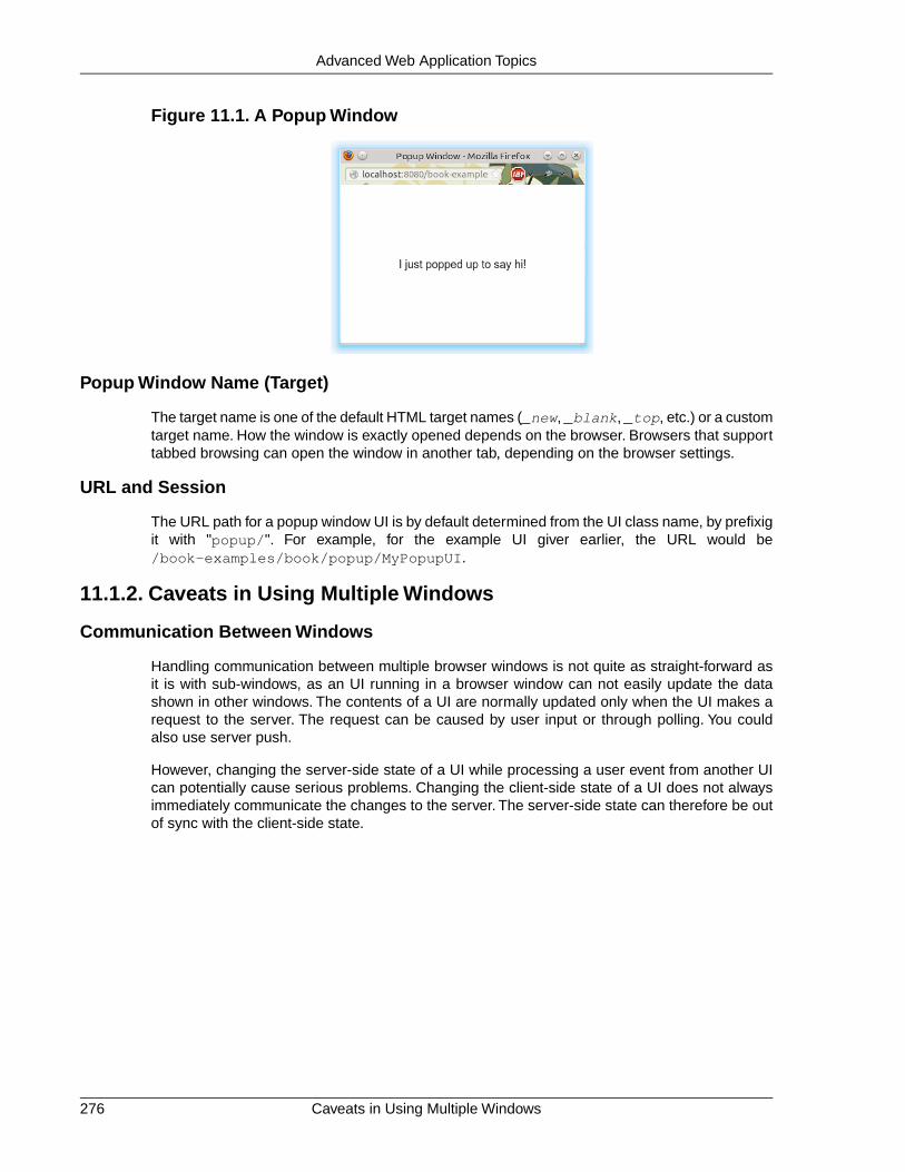
Figure 11.1. A Popup Window
Popup Window Name (Target)
The target name is one of the default HTML target names (_new, _blank, _top, etc.) or a customtarget name. How the window is exactly opened depends on the browser. Browsers that supporttabbed browsing can open the window in another tab, depending on the browser settings.
URL and Session
The URL path for a popup window UI is by default determined from the UI class name, by prefixigit with "popup/". For example, for the example UI giver earlier, the URL would be/book-examples/book/popup/MyPopupUI.
11.1.2. Caveats in Using Multiple Windows
Communication Between Windows
Handling communication between multiple browser windows is not quite as straight-forward asit is with sub-windows, as an UI running in a browser window can not easily update the datashown in other windows. The contents of a UI are normally updated only when the UI makes arequest to the server. The request can be caused by user input or through polling. You couldalso use server push.
However, changing the server-side state of a UI while processing a user event from another UIcan potentially cause serious problems. Changing the client-side state of a UI does not alwaysimmediately communicate the changes to the server. The server-side state can therefore be outof sync with the client-side state.
Caveats in Using Multiple Windows276
Advanced Web Application Topics

Figure 11.2. Communication Between Two Browser Windows
11.2. Embedding UIs in Web Pages
Many web sites are not all Vaadin, but Vaadin UIs are used only for specific functionalities. Inpractice, many web applications are a mixture of dynamic web pages, such as JSP, and VaadinUIs embedded in such pages.
Embedding Vaadin UIs in web pages is easy and there are several different ways to embed them.One is to have a <div> placeholder for the UI and load the Vaadin Client-Side Engine with asimple JavaScript code. Another method is even easier, which is to simply use the <iframe>element. Both of these methods have advantages and disadvantages. One disadvantage of the<iframe> method is that the size of the <iframe> element is not flexible according to thecontent while the <div> method allows such flexibility. The following sections look closer intothese two embedding methods. Additionally, the Vaadin XS add-on allows embedding VaadinUIs in websites running in another server.
11.2.1. Embedding Inside a div Element
You can embed one or more Vaadin UIs inside a web page with a method that is equivalent toloading the initial page content from the Vaadin servlet in a non-embedded UI. Normally, theVaadinServlet generates an initial page that contains the correct parameters for the specific UI.You can easily configure it to load multiple Vaadin UIs in the same page. They can have differentwidget sets and different themes.
Embedding an UI requires the following basic tasks:
• Set up the page header
• Include a GWT history frame in the page
• Call the vaadinBootstrap.js file
• Define the <div> element for the UI
• Configure and initialize the UI
Notice that you can view the loader page for the UI easily by opening the UI in a web browserand viewing the HTML source code of the page. You could just copy and paste the embeddingcode from the page, but some modifications and additional settings are required, mainly relatedto the URLs that have to be made relative to the page instead of the servlet URL.
277Embedding UIs in Web Pages
Advanced Web Application Topics

The Head Matter
The HTML page in which the Vaadin UI is embedded should be a valid XHTML document, asdefined in the document type.The content of the head element is largely up to you.The characterencoding must be UTF-8. Some meta declarations are necessary for compatibility.You can alsoset the page favicon in the head element.
<?xml version="1.0" encoding="UTF-8" ?><!DOCTYPE html PUBLIC "-//W3C//DTD XHTML 1.0 Strict//EN" "http://www.w3.org/TR/xhtml1/DTD/xhtml1-strict.dtd"><head> <meta http-equiv="Content-Type" content="text/html; charset=UTF-8" /> <meta http-equiv="X-UA-Compatible" content="IE=9;chrome=1" />
<title>This is my Embedding Page</title>
<!-- Set up the favicon from the Vaadin theme --> <link rel="shortcut icon" type="image/vnd.microsoft.icon" href="/VAADIN/themes/reindeer/favicon.ico" /> <link rel="icon" type="image/vnd.microsoft.icon" href="/VAADIN/themes/reindeer/favicon.ico" /> </head>
The Body Matter
The page content must include some Vaadin-related definitions before you can embed VaadinUIs in it.
The vaadinBootstrap.js script makes definitions for starting up the UI. It must be calledbefore initializing the UI. The source path must be relative to the path of the embedding page.
<body> <script type="text/javascript" src="./VAADIN/vaadinBootstrap.js"></script>
The bootstrap script is served by the Vaadin servlet from inside the vaadin-server JAR.
Vaadin, or more exactly GWT, requires an invisible history frame, which is used for tracking thepage or fragment history in the browser.
<iframe tabindex="-1" id="__gwt_historyFrame" style="position: absolute; width: 0; height: 0; border: 0; overflow: hidden" src="javascript:false"></iframe>
UI Placeholder Element
A Vaadin UI is embedded in a placeholder <div> element. It should have the following features:
• The <div> element must have an id attribute, which must be a unique ID in the page,normally something that identifies the servlet of the UI uniquely.
• It must have at least the v-app style class.
• it should have a nested <div> element with v-app-loading style class. This is aplaceholder for the loading indicator that is displayed while the UI is being loaded.
Embedding Inside a div Element278
Advanced Web Application Topics

• It should also contain a <noscript> element that is shown if the browser does notsupport JavaScript or it has been disabled. The content of the element should instructthe use to enable JavaScript in the browser.
The placeholder element can include style settings, typically a width and height. If the sizes arenot defined, the UI will have an undefined size in the particular dimension, which must be in ac-cordance with the sizing of the UI components.
For example:
<div style="width: 300px; border: 2px solid green;" id="helloworldui" class="v-app"> <div class="v-app-loading"></div> <noscript>You have to enable javascript in your browser to
use an application built with Vaadin.</noscript></div>
Initializing the UI
The UI is loaded by calling the initApplication() method for the vaadin object defined inthe bootstrap script. Before calling it, you should check that the bootstrap script was loadedproperly.
<script type="text/javascript">//<
heartbeatIntervalThe hearbeatInterval parameter defines the frequency of the keep-alive hearbeatfor the UI in seconds, as described in Section 4.7.5, “UI Expiration”.
debugThe parameter defines whether the debug window, as described in Section 11.3,“Debug and Production Mode”, is enabled.
standaloneThe parameter defines whether the UI is rendered on its own in the browser windowor in some context. A standalone UI may do things that might interfere with other partsof the page, such as change the page title and request focus when it is loaded. Whenembedding, the UI is not standalone, so you may want to set the parameter as false.
authErrMsg, comErrMsg, and sessExpMsgThese three parameters define the client-side error messages for authentication error,communication error, and session expiration, respectively. The parameters are asso-ciative maps themselves and must contain two key-value pairs:message, which shouldcontain the error text in HTML, and caption, which should be the error caption.
For example:
vaadin.initApplication("helloworldui", { "browserDetailsUrl": "helloworld", "widgetset": "com.example.MyWidgetSet", "theme": "mytheme", "versionInfo": {"vaadinVersion": "7.0.0"}, "vaadinDir": "VAADIN/", "heartbeatInterval": 300, "debug": true, "standalone": false, "authErrMsg": { "message": "Take note of any unsaved data, "+ "and <u>click here<\/u> to continue.", "caption": "Authentication problem" }, "comErrMsg": { "message": "Take note of any unsaved data, "+ "and <u>click here<\/u> to continue.", "caption": "Communication problem" }, "sessExpMsg": { "message": "Take note of any unsaved data, "+ "and <u>click here<\/u> to continue.", "caption": "Session Expired" } });//]]></script>
Notice that many of the parameters are normally deployment parameters, specified in the deploy-ment descriptor, as described in Section 4.8.4, “Other Deployment Parameters”.
Summary of Div Embedding
Below is a complete example of embedding an UI in a <div> element.
<?xml version="1.0" encoding="UTF-8" ?><!DOCTYPE html PUBLIC "-//W3C//DTD XHTML 1.0 Strict//EN" "http://www.w3.org/TR/xhtml1/DTD/xhtml1-strict.dtd"><html xmlns="http://www.w3.org/1999/xhtml"><head>
Embedding Inside a div Element280
Advanced Web Application Topics

<meta http-equiv="Content-Type" content="text/html; charset=UTF-8" /> <meta http-equiv="X-UA-Compatible" content="IE=9;chrome=1" />
<title>Embedding a Vaadin Application in HTML Page</title>
<!-- Set up the favicon from the Vaadin theme --> <link rel="shortcut icon" type="image/vnd.microsoft.icon" href="/VAADIN/themes/reindeer/favicon.ico" /> <link rel="icon" type="image/vnd.microsoft.icon" href="/VAADIN/themes/reindeer/favicon.ico" /> </head>
<body> <!-- Loads the Vaadin widget set, etc. --> <script type="text/javascript" src="VAADIN/vaadinBootstrap.js"></script>
<!-- GWT requires an invisible history frame. It is --> <!-- needed for page/fragment history in the browser. --> <iframe tabindex="-1" id="__gwt_historyFrame" style="position: absolute; width: 0; height: 0; border: 0; overflow: hidden" src="javascript:false"></iframe>
<h1>Embedding a Vaadin UI</h1>
<p>This is a static web page that contains an embedded Vaadin application. It's here:</p>
<!-- So here comes the div element in which the Vaadin --> <!-- application is embedded. --> <div style="width: 300px; border: 2px solid green;" id="helloworld" class="v-app">
<!-- Optional placeholder for the loading indicator --> <div class=" v-app-loading"></div>
<!-- Alternative fallback text --> <noscript>You have to enable javascript in your browser to use an application built with Vaadin.</noscript> </div>
<script type="text/javascript">//<
"caption": "Communication problem" }, "sessExpMsg": { "message": "Take note of any unsaved data, "+ "and <u>click here<\/u> to continue.", "caption": "Session Expired" } });//]] > </script>
<p>Please view the page source to see how embedding works.</p></body></html>
11.2.2. Embedding Inside an iframe Element
Embedding a Vaadin UI inside an <iframe> element is even easier than the method describedabove, as it does not require definition of any Vaadin specific definitions.
You can embed an UI with an element such as the following:
<iframe src="/myapp/myui"></iframe>
The <iframe> elements have several downsides for embedding. One is that their size of is notflexible depending on the content of the frame, but the content must be flexible to accommodatein the frame. You can set the size of an <iframe> element with height and width attributes.Other issues arise from themeing and communication with the frame content and the rest of thepage.
Below is a complete example of using the <iframe> to embed two applications in a web page.
<!DOCTYPE html PUBLIC "-//W3C//DTD XHTML 1.0 Transitional//EN" "http://www.w3.org/TR/xhtml1/DTD/xhtml1-transitional.dtd"><html xmlns="http://www.w3.org/1999/xhtml" > <head> <title>Embedding in IFrame</title> </head>
<body style="background: #d0ffd0;"> <h1>This is a HTML page</h1> <p>Below are two Vaadin applications embedded inside a table:</p>
<table align="center" border="3"> <tr> <th>The Calculator</th> <th>The Color Picker</th> </tr> <tr valign="top"> <td> <iframe src="/vaadin-examples/Calc" height="200" width="150" frameborder="0"></iframe> </td> <td> <iframe src="/vaadin-examples/colorpicker" height="330" width="400" frameborder="0"></iframe> </td> </tr> </table> </body></html>
Embedding Inside an iframe Element282
Advanced Web Application Topics
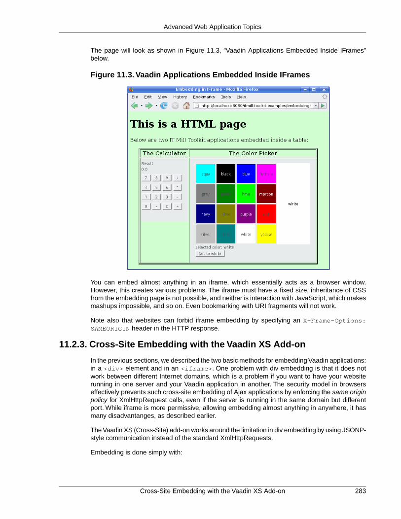
The page will look as shown in Figure 11.3, “Vaadin Applications Embedded Inside IFrames”below.
Figure 11.3. Vaadin Applications Embedded Inside IFrames
You can embed almost anything in an iframe, which essentially acts as a browser window.However, this creates various problems. The iframe must have a fixed size, inheritance of CSSfrom the embedding page is not possible, and neither is interaction with JavaScript, which makesmashups impossible, and so on. Even bookmarking with URI fragments will not work.
Note also that websites can forbid iframe embedding by specifying an X-Frame-Options:SAMEORIGIN header in the HTTP response.
11.2.3. Cross-Site Embedding with the Vaadin XS Add-on
In the previous sections, we described the two basic methods for embedding Vaadin applications:in a <div> element and in an <iframe>. One problem with div embedding is that it does notwork between different Internet domains, which is a problem if you want to have your websiterunning in one server and your Vaadin application in another. The security model in browserseffectively prevents such cross-site embedding of Ajax applications by enforcing the same originpolicy for XmlHttpRequest calls, even if the server is running in the same domain but differentport. While iframe is more permissive, allowing embedding almost anything in anywhere, it hasmany disadvantanges, as described earlier.
The Vaadin XS (Cross-Site) add-on works around the limitation in div embedding by using JSONP-style communication instead of the standard XmlHttpRequests.
Embedding is done simply with:
283Cross-Site Embedding with the Vaadin XS Add-on
Advanced Web Application Topics

<script src="http://demo.vaadin.com/xsembed/getEmbedJs" type="text/javascript"></script>
This includes an automatically generated embedding script in the page, thereby making embeddingeffortless.
This assumes that the main layout of the application has undefined height. If the height is 100%,you have to wrap it inside an element with a defined height. For example:
<div style="height: 500px;"> <script src="http://demo.vaadin.com/xsembed/getEmbedJs" type="text/javascript"></script></div>
It is possible to restrict where the application can be embedded by using a whitelist. The add-onalso encrypts the client-server communication, which is more important for embedded applicationsthan usual.
You can get the Vaadin XS add-on from Vaadin Directory. It is provided as a Zip package.Download and extract the installation package to a local folder. Instructions for installation andfurther information is given in the README.html file in the package.
Some restrictions apply. You can have only one embedded application in one page. Also, somethird-party libraries may interfere with the communication. Other notes are given in the README.
11.3. Debug and Production Mode
Vaadin applications can be run in two modes: debug mode and production mode. The debugmode, which is on by default, enables a number of built-in debug features for the developers.The features include:
• Debug Window for accessing debug functionalities
• Display debug information in the Debug Window and server console.
• Analyze layouting button that analyzes the layout for possible problems.
All applications are run in the debug mode by default (since IT Mill Toolkit version 5.3.0). Theproduction mode can be enabled, and debug mode thereby disabled, by adding aproductionMode=true parameter to the servlet context in the web.xml deployment descriptor:
<context-param> <description>Vaadin production mode</description> <param-name>productionMode</param-name> <param-value>true</param-value></context-param>
Enabling the production mode disables the debug features, thereby preventing users from easilyinspecting the inner workings of the application from the browser.
11.3.1. Debug Mode
Running an application in the debug mode enables the client-side Debug Window in the browser.You can open the Debug Window by adding "?debug" to the application URL, for example,http://localhost:8080/myapp/?debug.The Debug Window, shown in Figure 11.4, “DebugWindow”, consists of buttons controlling the debugging features and a scrollable log of debugmessages.
Debug and Production Mode284
Advanced Web Application Topics

Figure 11.4. Debug Window
Clear consoleClears the log in the Debug Window.
Restart appRestarts the application.
Force layoutCauses all currently visible layouts to recalculate their appearance. Layout componentscalculate the space required by all child components, so the layout appearance mustbe recalculated whenever the size of a child component is changed. In normal applic-ations, this is done automatically, but when you do themeing or alter the CSS withFirebug, you may need to force all layouts to recalculate themselves, taking into accountthe recently made changes.
Analyze layoutsThis is described in the following section.
If you use the Firebug plugin in Mozilla Firefox, the log messages will also be printed to theFirebug console. In such a case, you may want to enable client-side debugging without showingthe Debug Window with "?debug=quiet" in the URL. In the quiet debug mode, log messageswill only be printed to the Firebug console.
11.3.2. Analyzing Layouts
The Analyze layouts button analyzes the currently visible layouts and makes a report of possiblelayout related problems. All detected layout problems are displayed in the log and also printedto the console.
The most common layout problem is caused by placing a component that has a relative size insidea container (layout) that has undefined size, for example, adding a 100% wide Panel inside aHorizontalLayout with no width specification. In such a case, the error will look as shown below:
Vaadin DEBUG- Window/1a8bd74 "My window" (width: MAIN WINDOW) - HorizontalLayout/1cf243b (width: UNDEFINED) - Panel/12e43f1 "My panel" (width: RELATIVE, 100.0 %)Layout problem detected: Component with relative width inside a HorizontalLayout with no width definedRelative sizes were replaced by undefined sizes, components may not render as expected.
285Analyzing Layouts
Advanced Web Application Topics

This particular error tells that the Panel "My panel" is 100% wide while the width of the containingHorizontalLayout is undefined. The components will be rendered as if the the width of the con-tained Panel was undefined, which might not be what the developer wanted. There are twopossible fixes for this case: if the Panel should fill the main window horizontally, set a width forthe HorizontalLayout (for example 100% wide), or set the width of the Panel to "undefined" torender the it as it is currently rendered but avoiding the warning message.
The same error is shown in the Debug Window in a slightly different form and with an additionalfeature (see Figure 11.5, “Debug Window Showing the Result of Analyze layouts.”). Checkingthe Emphasize component in UI box will turn red the background of the component that causeda warning, making it easy for the developer to figure out which component each warning relatesto.The messages will also be displayed hierarchically, as a warning from a containing componentoften causes more warnings from its child components. A good rule of thumb is to work on theupper-level problems first and only after that worry about the warnings from the children.
Figure 11.5. Debug Window Showing the Result of Analyze layouts.
11.3.3. Custom Layouts
CustomLayout components can not be analyzed in the same way as other layouts. For customlayouts, the Analyze layouts button analyzes all contained relative-sized components and checksif any relative dimension is calculated to zero so that the component will be invisible. The errorlog will display a warning for each of these invisible components. It would not be meaningful toemphasize the component itself as it is not visible, so when you select such an error, the parentlayout of the component is emphasized if possible.
11.3.4. Debug Functions for Component Developers
You can take advantage of the debug mode when developing client-side components. The staticfunction ApplicationConnection.getConsole() will return a reference to a Console objectwhich contains logging methods such as log(String msg) and error(String msg).Thesefunctions will print messages to the Debug Window and Firebug console in the same way asother debugging functionalities of Vaadin do. No messages will be printed if the Debug Windowis not open or if the application is running in production mode.
11.4. Request Handlers
Request handlers are useful for catching request parameters or generating dynamic content,such as HTML, images, PDF, or other content. You can provide HTTP content easily also withstream resources, as described in Section 4.4.5, “Stream Resources”. The stream resources,however, are only usable from within a Vaadin application, such as in the Embedded component.Request handlers allow responding to HTTP requests made with the application URL, includingGET or POST parameters. You could also use a separate servlet to generate dynamic content,
Custom Layouts286
Advanced Web Application Topics

but a request handler is associated with the Vaadin session and it can easily access all the sessiondata.
To handle requests, you need to implement the RequestHandler interface. ThehandleRequest() method gets the session, request, and response objects as parameters.
If the handler writes a response, it must return true. This stops running other possible requesthandlers. Otherwise, it should return false so that another handler could return a response.Eventually, if no other handler writes a response, a UI will be created and initialized.
In the following example, we catch requests for a sub-path in the URL for the servlet and writea plain text response. The servlet path consists of the context path and the servlet (sub-)path.Any additional path is passed to the request handler in the pathInfo of the request. For example,if the full path is /myapp/myui/rhexample, the path info will be /rhexample. Also, requestparameters are available.
VaadinSession.getCurrent().addRequestHandler( new RequestHandler() { @Override public boolean handleRequest(VaadinSession session, VaadinRequest request, VaadinResponse response) throws IOException { if ("/rhexample".equals(request.getPathInfo())) { response.setContentType("text/plain"); response.getWriter().append( "Here's some dynamically generated content.\n"+ "Time: " + (new Date()).toString()); return true; // We wrote a response } else return false; // No response was written }});
// Find out the base bath for the servletString servletPath = VaadinServlet.getCurrent() .getServletContext().getContextPath() + VaadinServletService .getCurrentServletRequest().getServletPath();
// Display the page in a popup windowLink open = new Link("Click to Show the Page", new ExternalResource(servletPath + "/rhexample"), "_blank", 500, 350, BorderStyle.DEFAULT);layout.addComponent(open);
11.5. Shortcut Keys
Vaadin provides simple ways for defining shortcut keys for field components and a default button,and a lower-level generic shortcut key binding API based on actions.
11.5.1. Click Shortcuts for Default Buttons
You can add or set a click shortcut to a button to set it as "default" button; pressing the definedkey, typically Enter, in any component in the window causes a click event for the button.
You can define a click shortcut with the setClickShortcut() shorthand method:
// Have an OK button and set it as the default buttonButton ok = new Button("OK");ok.setClickShortcut(KeyCode.ENTER);ok.addStyleName("primary");
287Shortcut Keys
Advanced Web Application Topics

The primary style name highlights a button to show the default button status; usually with abolder font than usual, depending on the theme. The result can be seen in Figure 11.6, “DefaultButton with Click Shortcut”.
Figure 11.6. Default Button with Click Shortcut
11.5.2. Field Focus Shortcuts
You can define a shortcut key that sets the focus to a field component (any component that in-herits AbstractField) by adding a FocusShortcut as a shortcut listener to the field.
// A field with Alt+N bound to itTextField name = new TextField("Name (Alt+N)");name.addShortcutListener( new AbstractField.FocusShortcut(name, KeyCode.N, ModifierKey.ALT));layout.addComponent(name);
// A field with Alt+A bound to itTextField address = new TextField("Address (Alt+A)");address.addShortcutListener( new AbstractField.FocusShortcut(address, KeyCode.A, ModifierKey.ALT));layout.addComponent(address);
The constructor of the FocusShortcut takes the field component as its first parameter, followedby the key code, and an optional list of modifier keys, as listed in Section 11.5.4, “Supported KeyCodes and Modifier Keys”.
11.5.3. Generic Shortcut Actions
Shortcut keys can be defined as actions using the ShortcutAction class. ShortcutAction extendsthe generic Action class that is used for example in Tree and Table for context menus. Currently,the only classes that accept ShortcutActions are Window and Panel.
To handle key presses, you need to define an action handler by implementing the Handler inter-face. The interface has two methods that you need to implement: getActions() andhandleAction().
The getActions() method must return an array of Action objects for the component, specifiedwith the second parameter for the method, the sender of an action. For a keyboard shortcut,you use a ShortcutAction. The implementation of the method could be following:
// Have the unmodified Enter key cause an eventAction action_ok = new ShortcutAction("Default key", ShortcutAction.KeyCode.ENTER, null);
// Have the C key modified with Alt cause an eventAction action_cancel = new ShortcutAction("Alt+C", ShortcutAction.KeyCode.C, new int[] { ShortcutAction.ModifierKey.ALT });
Action[] actions = new Action[] {action_cancel, action_ok};
public Action[] getActions(Object target, Object sender) { if (sender == myPanel)
Field Focus Shortcuts288
Advanced Web Application Topics

return actions;
return null;}
The returned Action array may be static or you can create it dynamically for different sendersaccording to your needs.
The constructor of ShortcutAction takes a symbolic caption for the action; this is largely irrelevantfor shortcut actions in their current implementation, but might be used later if implementors usethem both in menus and as shortcut actions.The second parameter is the key code and the thirda list of modifier keys, which are listed in Section 11.5.4, “Supported Key Codes and ModifierKeys”.
The following example demonstrates the definition of a default button for a user interface, as wellas a normal shortcut key, Alt+C for clicking the Cancel button.
public class DefaultButtonExample extends CustomComponent implements Handler { // Define and create user interface components Panel panel = new Panel("Login"); FormLayout formlayout = new FormLayout(); TextField username = new TextField("Username"); TextField password = new TextField("Password"); HorizontalLayout buttons = new HorizontalLayout();
// Create buttons and define their listener methods. Button ok = new Button("OK", this, "okHandler"); Button cancel = new Button("Cancel", this, "cancelHandler");
// Have the unmodified Enter key cause an event Action action_ok = new ShortcutAction("Default key", ShortcutAction.KeyCode.ENTER, null);
// Have the C key modified with Alt cause an event Action action_cancel = new ShortcutAction("Alt+C", ShortcutAction.KeyCode.C, new int[] { ShortcutAction.ModifierKey.ALT });
public DefaultButtonExample() { // Set up the user interface setCompositionRoot(panel); panel.addComponent(formlayout); formlayout.addComponent(username); formlayout.addComponent(password); formlayout.addComponent(buttons); buttons.addComponent(ok); buttons.addComponent(cancel);
// Set focus to username username.focus();
// Set this object as the action handler System.out.println("adding ah"); panel.addActionHandler(this);
System.out.println("start done."); }
/** * Retrieve actions for a specific component. This method * will be called for each object that has a handler; in * this example just for login panel. The returned action * list might as well be static list. */
289Generic Shortcut Actions
Advanced Web Application Topics

public Action[] getActions(Object target, Object sender) { System.out.println("getActions()"); return new Action[] { action_ok, action_cancel }; }
/** * Handle actions received from keyboard. This simply directs * the actions to the same listener methods that are called * with ButtonClick events. */ public void handleAction(Action action, Object sender, Object target) { if (action == action_ok) { okHandler(); } if (action == action_cancel) { cancelHandler(); } }
public void okHandler() { // Do something: report the click formlayout.addComponent(new Label("OK clicked. " + "User=" + username.getValue() + ", password=" + password.getValue())); }
public void cancelHandler() { // Do something: report the click formlayout.addComponent(new Label("Cancel clicked. User=" + username.getValue() + ", password=" + password.getValue())); }}
Notice that the keyboard actions can currently be attached only to Panels and Windows. Thiscan cause problems if you have components that require a certain key. For example, multi-lineTextField requires the Enter key.There is currently no way to filter the shortcut actions out whilethe focus is inside some specific component, so you need to avoid such conflicts.
11.5.4. Supported Key Codes and Modifier Keys
The shortcut key definitions require a key code to identify the pressed key and modifier keys,such as Shift, Alt, or Ctrl, to specify a key combination.
The key codes are defined in the ShortcutAction.KeyCode interface and are:
Keys A to ZNormal letter keys
F1 to F12Function keys
BACKSPACE, DELETE, ENTER, ESCAPE, INSERT, TABControl keys
NUM0 to NUM9Number pad keys
ARROW_DOWN, ARROW_UP, ARROW_LEFT, ARROW_RIGHTArrow keys
Supported Key Codes and Modifier Keys290
Advanced Web Application Topics

HOME, END, PAGE_UP, PAGE_DOWNOther movement keys
Modifier keys are defined in ShortcutAction.ModifierKey and are:
ModifierKey.ALTAlt key
ModifierKey.CTRLCtrl key
ModifierKey.SHIFTShift key
All constructors and methods accepting modifier keys take them as a variable argument list fol-lowing the key code, separated with commas. For example, the following defines a Ctrl+Shift+Nkey combination for a shortcut.
TextField name = new TextField("Name (Ctrl+Shift+N)");name.addShortcutListener( new AbstractField.FocusShortcut(name, KeyCode.N, ModifierKey.CTRL, ModifierKey.SHIFT));
Supported Key Combinations
The actual possible key combinations vary greatly between browsers, as most browsers have anumber of built-in shortcut keys, which can not be used in web applications. For example, MozillaFirefox allows binding almost any key combination, while Opera does not even allow binding Altshortcuts. Other browsers are generally in between these two. Also, the operating system canreserve some key combinations and some computer manufacturers define their own system keycombinations.
11.6. Printing
Vaadin does not currently have any special support for printing. Printing on the server-side is, inany case, largely independent from the web UI of an application.You just have to take care thatthe printing does not block server requests, possibly by running printing in another thread.
For client-side printing, most browsers support printing the web page. Vaadin does not explicitlysupport launching the printing in browser, but you can easily use the JavaScript print()method that opens the print window of the browser.
final Button print = new Button("Print This Page");print.addListener(new ClickListener() { public void buttonClick(ClickEvent event) { print.getWindow().executeJavaScript("print();"); }});
This button would print the current page, including the button itself. Often, you want to be ableto print a report or receipt and it should not have any visible UI components. In such a case, youcould offer it as a PDF resource, or you could open a new window, as is done below, and auto-matically launch printing.
// A button to open the printer-friendly page.Button print = new Button("Click to Print");
291Printing
Advanced Web Application Topics
print.addListener(new Button.ClickListener() { public void buttonClick(ClickEvent event) { // Create a window that contains what you want to print Window window = new Window("Window to Print");
// Have some content to print window.addComponent(new Label( "<h1>Here's some dynamic content</h1>\n" + "<p>This is to be printed to the printer.</p>", Label.CONTENT_XHTML));
// Add the printing window as a new application-level // window getApplication().addWindow(window);
// Open it as a popup window with no decorations getWindow().open(new ExternalResource(window.getURL()), "_blank", 500, 200, // Width and height Window.BORDER_NONE); // No decorations
// Print automatically when the window opens. // This call will block until the print dialog exits! window.executeJavaScript("print();");
// Close the window automatically after printing window.executeJavaScript("self.close();"); }});
How the browser opens the window, as an actual (popup) window or just a tab, depends on thebrowser. Notice that calling the print() method in the window will block the entire applicationuntil the print dialog exits. After printing, we automatically close the window with anotherJavaScript call, as there is no close() method in Window.
Printing as PDF would not require creating a Window object, but you would need to provide thecontent as a static or a dynamic resource for the open() method. Printing a PDF file would ob-viously require a PDF viewer cabability (such as Adobe Reader) in the browser.
11.7. Google App Engine Integration
Vaadin includes support to run Vaadin applications in the Google App Engine (GAE). The mostessential requirement for GAE is the ability to serialize the application state. Vaadin applicationsare serializable through the java.io.Serializable interface.
To run as a GAE application, an application must use GAEApplicationServlet instead of Applic-ationServlet in web.xml, and of course implement the java.io.Serializable interface for allpersistent classes.You also need to enable session support in appengine-web.xml with:
<sessions-enabled>true</sessions-enabled>
The Vaadin Project wizard can create the configuration files needed for GAE deployment. SeeSection 2.5.1, “Creating the Project”. When the Google App Engine deployment configuration isselected, the wizard will create the project structure following the GAE Servlet convention insteadof the regular Servlet convention. The main differences are:
• Source directory: src/main/java
• Output directory: war/WEB-INF/classes
• Content directory: war
Google App Engine Integration292
Advanced Web Application Topics

Rules and Limitations
Running Vaadin applications in Google App Engine has the following rules and limitations:
• Avoid using the session for storage, usual App Engine limitations apply (no synchroniz-ation, that is, it is unreliable).
• Vaadin uses memcache for mutex, the key is of the form _vmutex<sessionid>.
• The Vaadin WebApplicationContext class is serialized separately into memcache anddatastore; the memcache key is _vac<sessionid> and the datastore entity kind is_vac with identifiers of the type _vac<sessionid>.
• Do not update the application state when serving an ApplicationResource (such asClassResource.getStream()).
• Avoid (or be very careful when) updating application state in a TransactionListener -it is called even when the application is not locked and won't be serialized (such as withApplicationResource), and changes can therefore be lost (it should be safe to updatethings that can be safely discarded later, that is, valid only for the current request).
• The application remains locked during uploads - a progress bar is not possible.
11.8. Common Security Issues
11.8.1. Sanitizing User Input to Prevent Cross-Site Scripting
You can put raw XHTML content in many components, such as the Label and CustomLayout,as well as in tooltips and notifications. In such cases, you should make sure that if the contenthas any possibility to come from user input, the input is well sanitized before displaying it. Other-wise, a malicious user can easily make a cross-site scripting attack by injecting offensiveJavaScript code in such components.
Offensive code can easily be injected with <script> markup or in tag attributes as events, suchas onLoad. Cross-site scripting vulnerabilities are browser dependent, depending on the situationsin which different browsers execute scripting markup.
There is no generic way to sanitize user input as different applications can allow different kindsof input. Pruning (X)HTML tags out is somewhat simple, but some applications may need to allow(X)HTML. It is therefore the responsibility of the application to sanitize the input.
Character encoding can make sanitization more difficult, as offensive tags can be encoded sothat they are not recognized by a sanitizer. This can be done, for example, with HTML characterentities and with variable-width encodings such as UTF-8 or various CJK encodings, by abusingmultiple representations of a character. Most trivially, you could input < and > with < and>, respectively.The input could also be malformed and the sanitizer must be able to interpretit exactly as the browser would, and different browsers can interpret malformed HTML and variable-width character encodings differently.
Notice that the problem applies also to user input from a RichTextArea is transmitted as XHTMLfrom the browser to server-side and is not sanitized. As the entire purpose of the RichTextAreacomponent is to allow input of formatted text, you can not just remove all HTML tags. Also manyattributes, such as style, should pass through the sanitization.
293Rules and Limitations
Advanced Web Application Topics

11.9. URI Fragment and History Management with UriFragmen-tUtility
This section is not yet updated for Vaadin 7. The UriFragmentUtility is obsolete in Vaadin 7 andURI fragment changes are handled with a FragmentChangedListener and setFragment()in the Page class, for example: Page.getCurrent().setFragment("foo").
A major issue in AJAX applications is that as they run in a single web page, bookmarking theapplication URL (or more generally the URI) can only bookmark the application, not an applicationstate. This is a problem for many applications such as product catalogs and forums, in which itwould be good to provide links to specific products or messages. Consequently, as browsersremember the browsing history by URI, the history and the Back button do not normally work.The solution is to use the fragment part of the URI, which is separated from the primary part(address + path + optional query parameters) of the URI with the hash (#) character. For example:
http://example.com/path#myfragment
The exact syntax of the fragment part is defined in RFC 3986 (Internet standard STD 66) thatdefines the URI syntax. A fragment may only contain the regular URI path characters (see thestandard) and additionally the slash and the question mark.
The UriFragmentUtility is a special-purpose component that manages the URI fragment; it allowssetting the fragment and to handle user-made changes to it. As it is a regular component, thoughinvisible, you must add it to a layout in an application window with the addComponent(), asusual.
public void init() { Window main = new Window("URI Fragment Example"); setMainWindow(main);
// Create the URI fragment utility final UriFragmentUtility urifu = new UriFragmentUtility(); main.addComponent(urifu);
Notice that the utility component can work only when it is attached to the window, so in practiceit must be added in the init() method of the application and must afterwards always remainin the application's user interface.
You can set the URI fragment with the setFragment() method of the UriFragmentUtility object.The method takes the fragment as a string parameter. In the following example, we have a menu,from which the user can select the URI fragment.
// Application state menufinal ListSelect menu = new ListSelect("Select a URI Fragment");menu.addItem("mercury");menu.addItem("venus");menu.addItem("earth");menu.addItem("mars");menu.setImmediate(true);main.addComponent(menu);
// Set the URI Fragment when menu selection changesmenu.addListener(new Property.ValueChangeListener() { public void valueChange(ValueChangeEvent event) { String itemid = (String) event.getProperty().getValue(); urifu.setFragment(itemid); }});
URI Fragment and History Management with UriFragmentUtility294
Advanced Web Application Topics

The URI fragment and any changes to it are passed to an application as Frag-mentChangedEvents, which you can handle with a FragmentChangedListener. You can getthe new fragment value with the getFragment() method from the URI fragment utility component.
// When the URI fragment is given, use it to set menu selection urifu.addListener(new FragmentChangedListener() { public void fragmentChanged(FragmentChangedEvent source) { String fragment = source.getUriFragmentUtility().getFragment(); if (fragment != null) menu.setValue(fragment); }});
Figure 11.7, “Application State Management with URI Fragment Utility” shows an application thatallows specifying the menu selection with a URI fragment and correspondingly sets the fragmentwhen the user selects a menu item, as done in the code examples above.
Figure 11.7. Application State Management with URI Fragment Utility
11.10. Navigating in an Application
Plain Vaadin applications do not have normal web page navigation as they usually run on a singlepage, as all Ajax applications do. Quite commonly, however, applications have different viewsbetween which the user should be able to navigate. The Navigator in Vaadin can be used formost cases of navigation. Views managed by the navigator automatically get a distinct URIfragment, which can be used to be able to bookmark the views and their states and to go backand forward in the browser history.
11.10.1. Setting Up for Navigation
The Navigator class manages a collection of views that implement the View interface.The viewscan be either registered beforehand or acquired from a view provider.When registering, the viewsmust have a name identifier and be added to a navigator with addView().You can register newviews at any point. Once registered, you can navigate to them with navigateTo().
The views managed by the Navigator are displayed in a ViewDisplay.The framework includesa SimpleViewDisplay component, which can be used in most cases to display views.
Let us consider the following application with two views: start and main. Here, we define theirnames with enums to be typesafe.
public class NavigatorRoot extends Root { Navigator navigator;
enum Views {START, MAIN};
295Navigating in an Application
Advanced Web Application Topics

@Override protected void init(WrappedRequest request) { getPage().setTitle("Navigation Example");
// Fill the page with a view display SimpleViewDisplay viewDisplay = new SimpleViewDisplay(); viewDisplay.setSizeFull(); setContent(viewDisplay);
// Create the navigator to control the page navigator = new Navigator(Page.getCurrent(), viewDisplay);
// Create and register the views navigator.addView(Views.START.name(), new StartView()); navigator.addView(Views.MAIN.name(), new MainView());
// Navigate to the start view navigator.navigateTo(Views.START.name()); }}
The Navigator automatically sets the URI fragment of the application URL. It also registers aFragmentChangeListener in the page (see Section 11.9, “URI Fragment and History Man-agement with UriFragmentUtility”) to show the view identified by the URI fragment if entered ornavigated to in the browser. This also enables browser navigation history in the application.
View Providers
You can create new views dynamically using a view provider that implement the ViewProviderinterface. A provider is registered in Navigator with registerProvider().
The ClassBasedViewProvider is a view provider that can dynamically create new instancesof a specified view class based on the view name.
The StaticViewProvider returns an existing view instance based on the view name. TheaddView() in Navigator is actually just a shorthand for creating a static view provider for eachregistered view.
View Change Listeners
You can handle view changes also by implementing a ViewChangeListener and adding it toa Navigator.When a view change occurs, a listener receives a ViewChangeEvent object, whichhas references to the old and the activated view, the name of the activated view, as well as thefragment parameters.
11.10.2. Implementing a View
Views can be any objects that implement the View interface.When the navigateTo() is calledfor the navigator, or the application is opened with the URI fragment associated with the view, itswitches to the view and calls its navigateTo() method.
To continue with the example, consider the following simple view just lets the user to navigateto the other view. It doesn't do anything special when the user navigates to it.
/** A start view for navigating to the main view */public class StartView extends VerticalLayout implements View { public StartView() { setSizeFull();
Implementing a View296
Advanced Web Application Topics

Button button = new Button("Go to Main View", new Button.ClickListener() { @Override public void buttonClick(ClickEvent event) { navigator.navigateTo(Views.MAIN.name()); } }); addComponent(button); setComponentAlignment(button, Alignment.MIDDLE_CENTER); }
@Override public void navigateTo(String fragmentParameters) { // Nothing to do here really }}
11.10.3. Handling URI Fragment Path
URI fragments can be used with Navigator in two ways: for navigating to a specific view and fornavigating to a state within the view. The URI fragment accepted by navigateTo() can havethe view name at the root, followed by fragment parameters after a slash ("/").These parametersare passed to the navigateTo() method in the View.
In the following example, we implement within-view navigation.
/** Main view with a menu */public class MainView extends VerticalLayout implements View {
// Menu navigation button listener class ButtonListener implements Button.ClickListener { String menuitem; public ButtonListener(String menuitem) { this.menuitem = menuitem; }
@Override public void buttonClick(ClickEvent event) { // Navigate to a specific state navigator.navigateTo(Views.MAIN.name() + "/" + menuitem); } }
public MainView() { setSizeFull();
// Layout with menu on left and view area on right HorizontalLayout hLayout = new HorizontalLayout(); hLayout.setSizeFull();
// Have a menu on the left side of the screen Panel menu = new Panel("Menu"); menu.addComponent(new Button("Cat", new ButtonListener("cat"))); menu.addComponent(new Button("Dog", new ButtonListener("dog"))); menu.addComponent(new Button("Reindeer", new ButtonListener("reindeer"))); menu.addComponent(new Button("Penguin", new ButtonListener("penguin"))); menu.addComponent(new Button("Sheep", new ButtonListener("sheep"))); menu.setHeight("100%");
297Handling URI Fragment Path
Advanced Web Application Topics

menu.setWidth(null); menu.getContent().setWidth(null); hLayout.addComponent(menu);
// Have a panel that contains a content area on the right panel = new Panel("Content Panel"); panel.setSizeFull(); hLayout.addComponent(panel); hLayout.setExpandRatio(panel, 1.0f);
addComponent(hLayout); setExpandRatio(hLayout, 1.0f);
// Allow going back to the start Button logout = new Button("Logout", new Button.ClickListener() { @Override public void buttonClick(ClickEvent event) { navigator.navigateTo(Views.START.name()); } }); addComponent(logout); }
@Override public void navigateTo(String fragmentParameters) { panel.removeAllComponents();
if (fragmentParameters == null) { panel.addComponent( new Label("Nothing to see here, " + "just pass along.")); return; }
// Display some content panel.addComponent( new Label("You are currently watching a " + fragmentParameters)); panel.addComponent(new Embedded(null, new ThemeResource("img/" + fragmentParameters + "-128px.png"))); }}
The main view is shown in Figure 11.8, “Navigator Main View”. At this point, the URL would behttp://localhost:8080/myapp#MAIN/reindeer.
Handling URI Fragment Path298
Advanced Web Application Topics

Figure 11.8. Navigator Main View
11.11. Drag and Drop
Dragging an object from one location to another by grabbing it with mouse, holding the mousebutton pressed, and then releasing the button to "drop" it to the other location is a common wayto move, copy, or associate objects. For example, most operating systems allow dragging anddropping files between folders or dragging a document on a program to open it. In Vaadin, it ispossible to drag and drop components and parts of certain components.
Dragged objects, or transferables, are essentially data objects. You can drag and drop rows inTable and nodes in Tree components, either within or between the components. You can alsodrag entire components by wrapping them inside DragAndDropWrapper.
Dragging starts from a drag source, which defines the transferable. Transferables implement theTransferable interfaces. For trees and tables, which are bound to Container data sources, anode or row transferable is a reference to an Item in the Vaadin Data Model. Dragged componentsare referenced with a WrapperTransferable. Starting dragging does not require any client-server communication, you only need to enable dragging. All drag and drop logic occurs in twooperations: determining (accepting) where dropping is allowed and actually dropping. Drops canbe done on a drop target, which implements the DropTarget interface.Three components imple-ment the interface: Tree, Table, and DragAndDropWrapper. These accept and drop operationsneed to be provided in a drop handler. Essentially all you need to do to enable drag and drop isto enable dragging in the drag source and implement the getAcceptCriterion() and drop()methods in the DropHandler interface.
The client-server architecture of Vaadin causes special requirements for the drag and dropfunctionality.The logic for determining where a dragged object can be dropped, that is, accepting
299Drag and Drop
Advanced Web Application Topics
a drop, should normally be done on the client-side, in the browser. Server communications aretoo slow to have much of such logic on the server-side.The drag and drop feature therefore offersa number of ways to avoid the server communications to ensure a good user experience.
11.11.1. Handling Drops
Most of the user-defined drag and drop logic occurs in a drop handler, which is provided by im-plementing the drop() method in the DropHandler interface. A closely related definition is thedrop accept criterion, which is defined in the getAcceptCriterion() method in the same in-terface. It is described in Section 11.11.4, “Accepting Drops” later.
The drop() method gets a DragAndDropEvent as its parameters. The event object providesreferences to two important object: Transferable and TargetDetails.
A Transferable contains a reference to the object (component or data item) that is being dragged.A tree or table item is represented as a TreeTransferable or TableTransferable object, whichcarries the item identifier of the dragged tree or table item. These special transferables, whichare bound to some data in a container, are DataBoundTransferable. Dragged components arerepresented as WrapperTransferable objects, as the components are wrapped in a DragAnd-DropWrapper.
The TargetDetails object provides information about the exact location where the transferableobject is being dropped. The exact class of the details object depends on the drop target andyou need to cast it to the proper subclass to get more detailed information. If the target is selectioncomponent, essentially a tree or a table, the AbstractSelectTargetDetails object tells the itemon which the drop is being made. For trees, the TreeTargetDetails gives some more details. Forwrapped components, the information is provided in a WrapperDropDetails object. In additionto the target item or component, the details objects provide a drop location. For selection com-ponents, the location can be obtained with the getDropLocation() and for wrapped componentswith verticalDropLocation() and horizontalDropLocation(). The locations are spe-cified as either VerticalDropLocation or HorizontalDropLocation objects. The drop locationobjects specify whether the transferable is being dropped above, below, or directly on (at themiddle of) a component or item.
Dropping on a Tree, Table, and a wrapped component is explained further in the following sections.
11.11.2. Dropping Items On a Tree
You can drag items from, to, or within a Tree. Making tree a drag source requires simply settingthe drag mode with setDragMode(). Tree currently supports only one drag mode,TreeDragMode.NODE, which allows dragging single tree nodes. While dragging, the draggednode is referenced with a TreeTransferable object, which is a DataBoundTransferable. Thetree node is identified by the item ID of the container item.
When a transferable is dropped on a tree, the drop location is stored in a TreeTargetDetailsobject, which identifies the target location by item ID of the tree node on which the drop is made.You can get the item ID with getItemIdOver() method in AbstractSelectTargetDetails, whichthe TreeTargetDetails inherits. A drop can occur directly on or above or below a node; the exactlocation is a VerticalDropLocation, which you can get with the getDropLocation() method.
In the example below, we have a Tree and we allow reordering the tree items by drag and drop.
final Tree tree = new Tree("Inventory");tree.setContainerDataSource(TreeExample.createTreeContent());layout.addComponent(tree);
Handling Drops300
Advanced Web Application Topics
// Expand all itemsfor (Iterator<?> it = tree.rootItemIds().iterator(); it.hasNext();) tree.expandItemsRecursively(it.next());
// Set the tree in drag source modetree.setDragMode(TreeDragMode.NODE);
// Allow the tree to receive drag drops and handle themtree.setDropHandler(new DropHandler() { public AcceptCriterion getAcceptCriterion() { return AcceptAll.get(); }
public void drop(DragAndDropEvent event) { // Wrapper for the object that is dragged Transferable t = event.getTransferable();
// Make sure the drag source is the same tree if (t.getSourceComponent() != tree) return;
TreeTargetDetails target = (TreeTargetDetails) event.getTargetDetails();
// Get ids of the dragged item and the target item Object sourceItemId = t.getData("itemId"); Object targetItemId = target.getItemIdOver();
// On which side of the target the item was dropped VerticalDropLocation location = target.getDropLocation();
HierarchicalContainer container = (HierarchicalContainer) tree.getContainerDataSource();
// Drop right on an item -> make it a child if (location == VerticalDropLocation.MIDDLE) tree.setParent(sourceItemId, targetItemId);
// Drop at the top of a subtree -> make it previous else if (location == VerticalDropLocation.TOP) { Object parentId = container.getParent(targetItemId); container.setParent(sourceItemId, parentId); container.moveAfterSibling(sourceItemId, targetItemId); container.moveAfterSibling(targetItemId, sourceItemId); }
// Drop below another item -> make it next else if (location == VerticalDropLocation.BOTTOM) { Object parentId = container.getParent(targetItemId); container.setParent(sourceItemId, parentId); container.moveAfterSibling(sourceItemId, targetItemId); } }});
Accept Criteria for Trees
Tree defines some specialized accept criteria for trees.
TargetInSubtree (client-side)Accepts if the target item is in the specified sub-tree. The sub-tree is specified by theitem ID of the root of the sub-tree in the constructor. The second constructor includesa depth parameter, which specifies how deep from the given root node are drops ac-
301Dropping Items On a Tree
Advanced Web Application Topics

cepted. Value -1 means infinite, that is, the entire sub-tree, and is therefore the sameas the simpler constructor.
TargetItemAllowsChildren (client-side)Accepts a drop if the tree has setChildrenAllowed() enabled for the target item.The criterion does not require parameters, so the class is a singleton and can be ac-quired with Tree.TargetItemAllowsChildren.get(). For example, the followingcomposite criterion accepts drops only on nodes that allow children, but between allnodes:
return new Or (Tree.TargetItemAllowsChildren.get(), new Not(VerticalLocationIs.MIDDLE));
TreeDropCriterion (server-side)Accepts drops on only some items, which as specified by a set of item IDs. You mustextend the abstract class and implement the getAllowedItemIds() to return theset. While the criterion is server-side, it is lazy-loading, so that the list of acceptedtarget nodes is loaded only once from the server for each drag operation. See Sec-tion 11.11.4, “Accepting Drops” for an example.
In addition, the accept criteria defined in AbstractSelect are available for a Tree, as listed inSection 11.11.4, “Accepting Drops”.
11.11.3. Dropping Items On a Table
You can drag items from, to, or within a Table. Making table a drag source requires simply settingthe drag mode with setDragMode(). Table supports dragging both single rows, withTableDragMode.ROW, and multiple rows, with TableDragMode.MULTIROW. While dragging,the dragged node or nodes are referenced with a TreeTransferable object, which is aDataBoundTransferable. Tree nodes are identified by the item IDs of the container items.
When a transferable is dropped on a table, the drop location is stored in a AbstractSelectTar-getDetails object, which identifies the target row by its item ID. You can get the item ID withgetItemIdOver() method. A drop can occur directly on or above or below a row; the exactlocation is a VerticalDropLocation, which you can get with the getDropLocation() methodfrom the details object.
Accept Criteria for Tables
Table defines one specialized accept criterion for tables.
TableDropCriterion (server-side)Accepts drops only on (or above or below) items that are specified by a set of itemIDs.You must extend the abstract class and implement the getAllowedItemIds()to return the set. While the criterion is server-side, it is lazy-loading, so that the list ofaccepted target items is loaded only once from the server for each drag operation.
11.11.4. Accepting Drops
You can not drop the objects you are dragging around just anywhere. Before a drop is possible,the specific drop location on which the mouse hovers must be accepted. Hovering a draggedobject over an accepted location displays an accept indicator, which allows the user to positionthe drop properly. As such checks have to be done all the time when the mouse pointer movesaround the drop targets, it is not feasible to send the accept requests to the server-side, so dropson a target are normally accepted by a client-side accept criterion.
Dropping Items On a Table302
Advanced Web Application Topics

A drop handler must define the criterion on the objects which it accepts to be dropped on thetarget.The criterion needs to be provided in the getAcceptCriterion() method of the DropHandlerinterface. A criterion is represented in an AcceptCriterion object, which can be a composite ofmultiple criteria that are evaluated using logical operations. There are two basic types of criteria:client-side and server-side criteria. The various built-in criteria allow accepting drops based onthe identity of the source and target components, and on the data flavor of the dragged objects.
To allow dropping any transferable objects, you can return a universal accept criterion, whichyou can get with AcceptAll.get().
tree.setDropHandler(new DropHandler() { public AcceptCriterion getAcceptCriterion() { return AcceptAll.get(); } ...
Client-Side Criteria
The client-side criteria, which inherit the ClientSideCriterion, are verified on the client-side, soserver requests are not needed for verifying whether each component on which the mousepointer hovers would accept a certain object.
The following client-side criteria are define in com.vaadin.event.dd.acceptcriterion:
AcceptAllAccepts all transferables and targets.
AndLogical AND operation on two client-side criterion; accepts the transferable if all thedefined sub-criteria accept it.
ContainsDataFlavourThe transferable must contain the defined data flavour.
NotLogical NOT operation on two client-side criterion; accepts the transferable if and onlyif the sub-criterion does not accept it.
OrLogical OR operation on two client-side criterion; accepts the transferable if any of thedefined sub-criteria accept it.
SourceIsAccepts all transferables from any of the given source components
SourceIsTargetAccepts the transferable only if the source component is the same as the target. Thiscriterion is useful for ensuring that items are dragged only within a tree or a table, andnot from outside it.
TargetDetailIsAccepts any transferable if the target detail, such as the item of a tree node or tablerow, is of the given data flavor and has the given value.
In addition, target components such as Tree and Table define some component-specific client-side accept criteria. See Section 11.11.2, “Dropping Items On a Tree” for more details.
303Accepting Drops
Advanced Web Application Topics
AbstractSelect defines the following criteria for all selection components, including Tree andTable.
AcceptItemAccepts only specific items from a specific selection component. The selection com-ponent, which must inherit AbstractSelect, is given as the first parameter for theconstructor. It is followed by a list of allowed item identifiers in the drag source.
AcceptItem.ALLAccepts all transferables as long as they are items.
TargetItemIsAccepts all drops on the specified target items. The constructor requires the targetcomponent (AbstractSelect) followed by a list of allowed item identifiers.
VerticalLocationIs.MIDDLE, TOP, and BOTTOMThe three static criteria accepts drops on, above, or below an item. For example, youcould accept drops only in between items with the following:
public AcceptCriterion getAcceptCriterion() { return new Not(VerticalLocationIs.MIDDLE);}
Server-Side Criteria
The server-side criteria are verified on the server-side with the accept() method of theServerSideCriterion class. This allows fully programmable logic for accepting drops, but thenegative side is that it causes a very large amount of server requests. A request is made forevery target position on which the pointer hovers. This problem is eased in many cases by thecomponent-specific lazy loading criteria TableDropCriterion and TreeDropCriterion. They dothe server visit once for each drag and drop operation and return all accepted rows or nodes forcurrent Transferable at once.
The accept() method gets the drag event as a parameter so it can perform its logic much likein drop().
public AcceptCriterion getAcceptCriterion() { // Server-side accept criterion that allows drops on any other // location except on nodes that may not have children ServerSideCriterion criterion = new ServerSideCriterion() { public boolean accept(DragAndDropEvent dragEvent) { TreeTargetDetails target = (TreeTargetDetails) dragEvent.getTargetDetails();
// The tree item on which the load hovers Object targetItemId = target.getItemIdOver();
// On which side of the target the item is hovered VerticalDropLocation location = target.getDropLocation(); if (location == VerticalDropLocation.MIDDLE) if (! tree.areChildrenAllowed(targetItemId)) return false; // Not accepted
return true; // Accept everything else } }; return criterion;}
Accepting Drops304
Advanced Web Application Topics

The server-side criteria base class ServerSideCriterion provides a generic accept() method.The more specific TableDropCriterion and TreeDropCriterion are conveniency extensions thatallow definiting allowed drop targets as a set of items. They also provide some optimization bylazy loading, which reduces server communications significantly.
public AcceptCriterion getAcceptCriterion() { // Server-side accept criterion that allows drops on any // other tree node except on node that may not have children TreeDropCriterion criterion = new TreeDropCriterion() { @Override protected Set<Object> getAllowedItemIds( DragAndDropEvent dragEvent, Tree tree) { HashSet<Object> allowed = new HashSet<Object>(); for (Iterator<Object> i = tree.getItemIds().iterator(); i.hasNext();) { Object itemId = i.next(); if (tree.hasChildren(itemId)) allowed.add(itemId); } return allowed; } }; return criterion;}
Accept Indicators
When a dragged object hovers on a drop target, an accept indicator is displayed to showwhether or not the location is accepted. For MIDDLE location, the indicator is a box around thetarget (tree node, table row, or component). For vertical drop locations, the accepted locationsare shown as horizontal lines, and for horizontal drop locations as vertical lines.
For DragAndDropWrapper drop targets, you can disable the accept indicators or drag hints withthe no-vertical-drag-hints, no-horizontal-drag-hints, and no-box-drag-hintsstyles.You need to add the styles to the layout that contains the wrapper, not to the wrapper itself.
// Have a wrapperDragAndDropWrapper wrapper = new DragAndDropWrapper(c);layout.addComponent(wrapper);
// Disable the hintslayout.addStyleName("no-vertical-drag-hints");layout.addStyleName("no-horizontal-drag-hints");layout.addStyleName("no-box-drag-hints");
11.11.5. Dragging Components
Dragging a component requires wrapping the source component within a DragAndDropWrapper.You can then allow dragging by putting the wrapper (and the component) in drag mode withsetDragStartMode(). The method supports two drag modes: DragStartMode.WRAPPERand DragStartMode.COMPONENT, which defines whether the entire wrapper is shown as thedrag image while dragging or just the wrapped component.
// Have a component to dragfinal Button button = new Button("An Absolute Button");
// Put the component in a D&D wrapper and allow dragging itfinal DragAndDropWrapper buttonWrap = new DragAndDropWrapper(button);buttonWrap.setDragStartMode(DragStartMode.COMPONENT);
// Set the wrapper to wrap tightly around the componentbuttonWrap.setSizeUndefined();
305Dragging Components
Advanced Web Application Topics

// Add the wrapper, not the component, to the layoutlayout.addComponent(buttonWrap, "left: 50px; top: 50px;");
The default height of DragAndDropWrapper is undefined, but the default width is 100%. If youwant to ensure that the wrapper fits tightly around the wrapped component, you should callsetSizeUndefined() for the wrapper. Doing so, you should make sure that the wrappedcomponent does not have a relative size, which would cause a paradox.
Dragged components are referenced in the WrapperTransferable. You can get the referenceto the dragged component with getDraggedComponent(). The method will return null if thetransferable is not a component. Also HTML 5 drags (see later) are held in wrapper transferables.
11.11.6. Dropping on a Component
Drops on a component are enabled by wrapping the component in a DragAndDropWrapper.The wrapper is an ordinary component; the constructor takes the wrapped component as aparameter.You just need to define the DropHandler for the wrapper with setDropHandler().
In the following example, we allow moving components in an absolute layout. Details on the drophandler are given later.
// A layout that allows moving its contained components// by dragging and dropping themfinal AbsoluteLayout absLayout = new AbsoluteLayout();absLayout.setWidth("100%");absLayout.setHeight("400px");
... put some (wrapped) components in the layout ...
// Wrap the layout to allow handling dropsDragAndDropWrapper layoutWrapper = new DragAndDropWrapper(absLayout);
// Handle moving components within the AbsoluteLayoutlayoutWrapper.setDropHandler(new DropHandler() { public AcceptCriterion getAcceptCriterion() { return AcceptAll.get(); }
public void drop(DragAndDropEvent event) { ... }});
Target Details for Wrapped Components
The drop handler receives the drop target details in a WrapperTargetDetails object, which im-plements the TargetDetails interface.
public void drop(DragAndDropEvent event) { WrapperTransferable t = (WrapperTransferable) event.getTransferable(); WrapperTargetDetails details = (WrapperTargetDetails) event.getTargetDetails();
The wrapper target details include a MouseEventDetails object, which you can get withgetMouseEvent(). You can use it to get the mouse coordinates for the position where themouse button was released and the drag ended. Similarly, you can find out the drag start positionfrom the transferable object (if it is a WrapperTransferable) with getMouseDownEvent().
Dropping on a Component306
Advanced Web Application Topics

// Calculate the drag coordinate differenceint xChange = details.getMouseEvent().getClientX() - t.getMouseDownEvent().getClientX();int yChange = details.getMouseEvent().getClientY() - t.getMouseDownEvent().getClientY();
// Move the component in the absolute layoutComponentPosition pos = absLayout.getPosition(t.getSourceComponent());pos.setLeftValue(pos.getLeftValue() + xChange);pos.setTopValue(pos.getTopValue() + yChange);
You can get the absolute x and y coordinates of the target wrapper with getAbsoluteLeft()and getAbsoluteTop(), which allows you to translate the absolute mouse coordinates to co-ordinates relative to the wrapper. Notice that the coordinates are really the position of the wrapper,not the wrapped component; the wrapper reserves some space for the accept indicators.
The verticalDropLocation() and horizontalDropLocation() return the more detaileddrop location in the target.
11.11.7. Dragging Files from Outside the Browser
The DragAndDropWrapper allows dragging files from outside the browser and dropping themon a component wrapped in the wrapper. Dropped files are automatically uploaded to the applic-ation and can be acquired from the wrapper with getFiles(). The files are represented asHtml5File objects as defined in the inner class. You can define an upload Receiver to receivethe content of a file to an OutputStream.
Dragging and dropping files to browser is supported in HTML 5 and requires a compatible browser,such as Mozilla Firefox 3.6 or newer.
11.12. Logging
You can do logging in Vaadin application using the standard java.util.logging facilities. Configuringlogging is as easy as putting a file named logging.properties in the default package of yourVaadin application (src in an Eclipse project or src/main/java or src/main/resources ina Maven project). This file is read by the Logger class when a new instance of it is initialize.
Logging in Apache Tomcat
For logging Vaadin applications deployed in Apache Tomcat, you do not need to do anythingspecial to log to the same place as Tomcat itself. If you need to write the Vaadin application relatedmessages elsewhere, just add a custom logging.properties file to the default package ofyour Vaadin application.
If you would like to pipe the log messages through another logging solution, see the section called“Piping to Log4j using SLF4J” below.
Logging in Liferay
Liferay mutes logging through java.util.logging by default. In order to enable logging, you needto add a logging.properties file of your own to the default package of your Vaadin application.This file should define at least one destination where to save the log messages.
You can also log through SLF4J, which is used in and bundled with Liferay. Follow the instructionsin the section called “Piping to Log4j using SLF4J”.
307Dragging Files from Outside the Browser
Advanced Web Application Topics

Piping to Log4j using SLF4J
Piping output from java.util.logging to Log4j is easy with SLF4J (http://slf4j.org/). The basic wayto go about this is to add the SLF4J JAR file as well as the jul-to-slf4j.jar file, which im-plements the bridge from java.util.logging, to SLF4J. You will also need to add a third loggingimplementation JAR file, that is, slf4j-log4j12-x.x.x.jar, to log the actual messages usingLog4j. For more info on this, please visit the SLF4J site.
In order to get the java.util.logging to SLF4J bridge installed, you need to add the followingsnippet of code to your Application class at the very top:
static { SLF4JBridgeHandler.install(); }
This will make sure that the bridge handler is installed and working before Vaadin starts to processany logging calls.
Please note!
This can seriously impact on the cost of disabled logging statements (60-fold increase)and a measurable impact on enabled log statements (20% overall increase). However,Vaadin doesn't log very much, so the effect on performance will be negligible.
Using Logger
You can do logging with a simple pattern where you register a static logger instance in each classthat needs logging, and use this logger wherever logging is needed in the class. For example:
public class MyClass { private final static Logger logger = Logger.getLogger(MyClass.class.getName());
public void myMethod() { try { // do something that might fail } catch (Exception e) { logger.log(Level.SEVERE, "FAILED CATASTROPHICALLY!", e); } }}
Having a static logger instance for each class needing logging saves a bit of memory and timecompared to having a logger for every logging class instance. However, it could cause the applic-ation to leak PermGen memory with some application servers when redeploying the application.The problem is that the Logger may maintain hard references to its instances. As the Loggerclass is loaded with a classloader shared between different web applications, references toclasses loaded with a per-application classloader would prevent garbage-collecting the classesafter redeploying, hence leaking memory. As the size of the PermGen memory where class objectare stored is fixed, the leakage will lead to a server crash after many redeployments. The issuedepends on the way how the server manages classloaders, on the hardness of the back-refer-ences, and may also be different between Java 6 and 7. So, if you experience PermGen issues,or want to play it on the safe side, you should consider using non-static Logger instances.
Piping to Log4j using SLF4J308
Advanced Web Application Topics

11.13. JavaScript Interaction
Vaadin supports two-direction JavaScript calls from and to the server-side.This allows interfacingwith JavaScript code without writing client-side integration code.
11.13.1. Calling JavaScript
You can make JavaScript calls from the server-side with the execute() method in the JavaScriptclass.You can get a JavaScript instance from the current Page object with getJavaScript().
// Execute JavaScript in the currently processed pagePage.getCurrent().getJavaScript().execute("alert('Hello')");
The JavaScript class itself has a static shorthand method getCurrent() to get the instancefor the currently processed page.
// ShorthandJavaScript.getCurrent().execute("alert('Hello')");
The JavaScript is executed after the server request that is currently processed returns. If multipleJavaScript calls are made during the processing of the request, they are all executed sequentiallyafter the request is done. Hence, the JavaScript execution does not pause the execution of theserver-side application and you can not return values from the JavaScript.
11.13.2. Handling JavaScript Callbacks
You can make calls with JavaScript from the client-side to the server-side. This requires that youregister JavaScript call-back methods from the server-side. You need to implement and registera JavaScriptCallback with addCallback() in the current JavaScript object. A callback requiresa method name, with an optional package path, given for the addCallback(). You only needto implement the call() method to handle calls from the client-side JavaScript.
JavaScript.getCurrent().addCallback("com.example.foo.myfunc", new JavaScriptCallback() { @Override public void call(JSONArray arguments) throws JSONException { Notification.show("Received call"); }});
Link link = new Link("Send Message", new ExternalResource( "javascript:com.example.foo.myfunc()"));
Parameters passed to the JavaScript method on the client-side are provided in a JSONArraypassed to the call() method. The parameter values can be acquired with the get() methodby the index of the parameter, or any of the type-casting getters. The getter must match the typeof the passed parameter, or a JSONException is thrown.
JavaScript.getCurrent().addCallback("com.example.foo.myfunc", new JavaScriptCallback() { @Override public void call(JSONArray arguments) throws JSONException { try { String message = arguments.getString(0); int value = arguments.getInt(1); Notification.show("Message: " + message + ", value: " + value); } catch (JSONException e) { Notification.show("Error: " + e.getMessage()); }
309JavaScript Interaction
Advanced Web Application Topics

}});
Link link = new Link("Send Message", new ExternalResource( "javascript:com.example.foo.myfunc(prompt('Message'), 42)"));
The callback mechanism is the same as the RPC mechanism used with JavaScript componentintegration, as described in Section 16.12.4, “RPC from JavaScript to Server-Side”.
11.14. Accessing Session-Global Data
Applications typically need to access some objects from practically all user interface code, suchas a user object, a business data model, or a database connection.This data is typically initializedand managed in the UI class of the application, or in the session or servlet.
For example, you could hold it in the UI class as follows:
class MyUI extends UI { UserData userData;
public void init() { userData = new UserData(); }
public UserData getUserData() { return userData; }}
Vaadin offers two ways to access the UI object: with getUI() method from any component andthe global UI.getCurrent() method.
The getUI() works as follows:
data = ((MyUI)component.getUI()).getUserData();
This does not, however work in many cases, because it requires that the components are attachedto the UI.That is not the case most of the time when the UI is still being built, such as in construct-ors.
class MyComponent extends CustomComponent { public MyComponent() { // This fails with NullPointerException Label label = new Label("Country: " + getApplication().getLocale().getCountry());
setCompositionRoot(label); }}
The global access methods for the currently served servlet, session, and UI allow an easy wayto access the data:
data = ((MyUI) UI.getCurrent()).getUserData();
The Problem
The basic problem in accessing session-global data is that the getUI() method works only afterthe component has been attached to the application. Before that, it returns null.This is the casein constructors of components, such as a CustomComponent:
Accessing Session-Global Data310
Advanced Web Application Topics

Using a static variable or a singleton implemented with such to give a global access to usersession data is not possible, because static variables are global in the entire web application,not just the user session. This can be handy for communicating data between the concurrentsessions, but creates a problem within a session.
The data would be shared by all users and be reinitialized every time a new user opens the ap-plication.
Overview of Solutions
To get the application object or any other global data, you have the following solutions:
• Pass a reference to the global data as a parameter.
• Initialize components in attach() method.
• Store a reference to global data using the ThreadLocal Pattern.
Each solution is described in the following sections.
11.14.1. Passing References Around
You can pass references to objects as parameters. This is the normal way in object-orientedprogramming.
class MyApplication extends Application { UserData userData;
public void init() { Window mainWindow = new Window("My Window"); setMainWindow(mainWindow);
userData = new UserData();
mainWindow.addComponent(new MyComponent(this)); }
public UserData getUserData() { return userData; }}
class MyComponent extends CustomComponent { public MyComponent(MyApplication app) { Label label = new Label("Name: " + app.getUserData().getName());
setCompositionRoot(label); }}
If you need the reference in other methods, you either have to pass it again as a parameter orstore it in a member variable.
The problem with this solution is that practically all constructors in the application need to get areference to the application object, and passing it further around in the classes is another hardtask.
311Overview of Solutions
Advanced Web Application Topics

11.14.2. Overriding attach()
The attach() method is called when the component is attached to the application componentthrough containment hierarchy. The getApplication() method always works.
class MyComponent extends CustomComponent { public MyComponent() { // Must set a dummy root in constructor setCompositionRoot(new Label("")); }
@Override public void attach() { Label label = new Label("Name: " + ((MyApplication)component.getApplication()) .getUserData().getName());
setCompositionRoot(label); }}
While this solution works, it is slightly messy. You may need to do some initialization in the con-structor, but any construction requiring the global data must be done in the attach() method.Especially, CustomComponent requires that the setCompositionRoot() method is calledin the constructor. If you can't create the actual composition root component in the constructor,you need to use a temporary dummy root, as is done in the example above.
Using getApplication() also needs casting if you want to use methods defined in your ap-plication class.
11.14.3.ThreadLocal Pattern
Vaadin uses the ThreadLocal pattern for allowing global access to the Application, UI, and Pageobjects of the currently processed server request with a static getCurrent() method in all therespective classes. This section explains why the pattern is used in Vaadin and how it works.The explanation is given as an implementation, if you find a need to reimplement the pattern forsome reason.
The ThreadLocal pattern gives a solution to the global access problem by solving two sub-problemsof static variables.
As the first problem, assume that the servlet container processes requests for many users (ses-sions) sequentially. If a static variable is set in a request belonging one user, it could be read orre-set by the next incoming request belonging to another user. This can be solved by setting theglobal reference at the beginning of each HTTP request to point to data of the current user, asillustrated in Figure 11.9.
Overriding attach()312
Advanced Web Application Topics

Figure 11.9. Switching a static (or ThreadLocal) reference during sequentialprocessing of requests
It is possible to implement such switching either with the TransactionListener or HttpServletRe-questListener interface by setting the reference in transactionStart() oronRequestStart(), respectively. We use the former interface in the example code in thissection, as the latter interface has to be implemented in the application class.
The second problem is that servlet containers typically do thread pooling with multiple workerthreads that process requests.Therefore, setting a static reference would change it in all threadsrunning concurrently, possibly just when another thread is processing a request for another user.The solution is to store the reference in a thread-local variable instead of a static.You can do soby using the ThreadLocal class in Java for the switch reference.
Figure 11.10. Switching ThreadLocal references during concurrentprocessing of requests
Notice that if you use a TransactionListener, the listeners are attached to the web applicationcontext (in practice a user session), not the application instance.The problem is that an applicationcontext can have multiple different Vaadin applications that share the same user session. If twoof these applications add a transaction listener to the context to listen for requests, both are called
313ThreadLocal Pattern
Advanced Web Application Topics

and without any checks they would both set the reference to themselves.Therefore, the applicationdata object needs to know which application it belongs to and check that when the transactionbegins and ends. Using the HttpServletRequestListener frees you from these checks.
While you may not absolutely need to clear the reference in transactionEnd(), you areprobably on the safer side if you do. Setting such unneeded references to null can help avoidmemory leaks and it could also be a good security precaution not to leave a reference to sessiondata so that it could be seen by another user session in the next request.
We end up with the following code. As we put the application data to a class separate from theapplication class, we have to make it a TransactionListener.
/** Holds data for one user session. */public class AppData implements TransactionListener, Serializable { private ResourceBundle bundle; private Locale locale; // Current locale private String userData; // Trivial data model for the user
private Application app; // For distinguishing between apps
private static ThreadLocal<AppData> instance = new ThreadLocal<AppData>();
public AppData(Application app) { this.app = app;
// It's usable from now on in the current request instance.set(this); }
@Override public void transactionStart(Application application, Object transactionData) { // Set this data instance of this application // as the one active in the current thread. if (this.app == application) instance.set(this); }
@Override public void transactionEnd(Application application, Object transactionData) { // Clear the reference to avoid potential problems if (this.app == application) instance.set(null); }
public static void initLocale(Locale locale, String bundleName) { instance.get().locale = locale; instance.get().bundle = ResourceBundle.getBundle(bundleName, locale); }
public static Locale getLocale() { return instance.get().locale; }
public static String getMessage(String msgId) { return instance.get().bundle.getString(msgId); }
public static String getUserData() { return instance.get().userData;
ThreadLocal Pattern314
Advanced Web Application Topics

}
public static void setUserData(String userData) { instance.get().userData = userData; }}
We can then use it in the application as follows. Observe that we do not have a reference to theapplication object in the constructor of the MyComponent class.
/** * We can now nicely access the session-global data * in the constuctor of this class. */class MyComponent extends CustomComponent { public MyComponent() { VerticalLayout layout = new VerticalLayout();
// Get stuff from the application data object layout.addComponent(new Label("Hello, " + AppData.getUserData()));
layout.addComponent(new Label("Your locale is " + AppData.getLocale().getDisplayLanguage()));
layout.addComponent(new Button( AppData.getMessage(MyAppCaptions.CancelKey)));
setCompositionRoot(layout); }}
/** The application class. */public class ThreadLocalApplication extends Application { public void init() { Window main = new Window("Hello window"); setMainWindow(main);
// Create the application data instance AppData sessionData = new AppData(this);
// Register it as a listener in the application context getContext().addTransactionListener(sessionData);
// Initialize the session-global data AppData.initLocale(getLocale(), MyAppCaptions.class.getName());
// Also set the user data model AppData.setUserData("Billy");
// Now, we do not pass this application object // in the constructor, so it couldn't access the // app data otherwise. main.addComponent(new MyComponent()); }}
315ThreadLocal Pattern
Advanced Web Application Topics

316

Chapter 12
Portal Integration
12.1. Deploying to a Portal ........................................................................... 31812.2. Creating a Portal Application Project in Eclipse .................................. 31812.3. Portlet Deployment Descriptors ........................................................... 32012.4. Portlet Hello World ............................................................................... 32512.5. Installing Vaadin in Liferay ................................................................... 32512.6. Handling Portlet Requests ................................................................... 32712.7. Handling Portlet Mode Changes .......................................................... 32812.8. Non-Vaadin Portlet Modes ................................................................... 33112.9. Vaadin Control Panel for Liferay ........................................................... 33312.10. Vaadin IPC for Liferay ........................................................................ 335
Vaadin supports running applications as portlets, as defined in the JSR-168 (Java Portlet API)and JSR-286 (Java Portlet API 2.0) standards. While providing generic support for all portalsimplementing the standards, Vaadin especially supports the Liferay portal and the needed portal-specific configuration is given below for Liferay.
You can deploy the Vaadin demo package WAR (available from the download site) directly to aportal such as Liferay. It contains all the necessary portlet configuration files. For optimal perform-ance with Liferay, you can install the Vaadin library and other needed resources in Liferay asdescribed later in this section.
Vaadin 7 support for portlets and Liferay is still preliminary at the time of publication of this edition,so some content in this chapter still reflects the use with Vaadin 6.
317Book of Vaadin

12.1. Deploying to a Portal
Deploying a Vaadin application as a portlet is essentially just as easy as deploying a regular ap-plication to an application server.You do not need to make any changes to the application itself,but only the following:
• Application packaged as a WAR• WEB-INF/portlet.xml descriptor• WEB-INF/web.xml descriptor for Portlet 1.0 portlets• WEB-INF/liferay-portlet.xml descriptor for Liferay• WEB-INF/liferay-display.xml descriptor for Liferay• WEB-INF/liferay-plugin-package.properties for Liferay
• Widget set installed to portal (optional)• Themes installed to portal (optional)• Vaadin library installed to portal (optional)• Portal configuration settings (optional)
Installing the widget set and themes to the portal is required for running two or more Vaadinportlets simultaneously in a single portal page. As this situation occurs quite easily, we recommendinstalling them in any case.
In addition to the Vaadin library, you will need to copy the portlet.jar to your project. Noticethat you must not put the portlet.jar in the same WebContent/WEB-INF/lib directory asthe Vaadin JAR or otherwise include it in the WAR to be deployed, because it would create aconflict with the internal portlet library of the portal. The conflict would cause errors such as"ClassCastException: ...VaadinPortlet cannot be cast tojavax.portlet.Portlet".
How you actually deploy a WAR package depends on the portal. In Liferay, you simply drop it tothe deploy subdirectory under the Liferay installation directory. The deployment depends onthe application server under which Liferay runs; for example, if you use Liferay bundled withTomcat, you will find the extracted package in the webapps directory under the Tomcat installationdirectory included in Liferay.
12.2. Creating a Portal Application Project in Eclipse
While you can create the needed deployment descriptors manually for any existing Vaadin ap-plication, as described in subsequent sections, the Vaadin Plugin for Eclipse provides a wizardfor easy creation of portal application projects.
Creation of a portal application project is almost identical to the creation of a regular applicationproject. For a full treatment of the New Project Wizard and the possible options, please seeSection 2.5.1, “Creating the Project”.
1. Start creating a new project by selecting from the menu File New Project....
Deploying to a Portal318
Portal Integration

2. In the New Project window that opens, select Web Vaadin Project and click Next.
3. In the Vaadin Project step, you need to set the basic web project settings. You needto give at least the project name, the runtime, and select Generic Portlet for the deploy-ment configuration; the default values should be good for the other settings.
You can click Finish here to use the defaults for the rest of the settings, or click Next.
4. The settings in the Web Module step define the basic servlet-related settings and thestructure of the web application project. All the settings are pre-filled, and you shouldnormally accept them as they are and click Next.
5. The Vaadin project step page has various Vaadin-specific application settings. Theseare largely the same as for regular applications.You should not need to change anythingas you can change the application titles and other details afterwards.The Create portlettemplate option should be automatically selected. You can give another portlet title ofyou want.You can change most of the settings afterward.
319Creating a Portal Application Project in Eclipse
Portal Integration

Create project templateCreates an application class and all the needed portlet deployment descriptors.
Application nameThe application name is used in the title of the main window (which is usually invisiblein portlets) and as an identifier, either as is or with a suffix, in various deploymentdescriptors.
Base package nameJava package for the application class.
Application class nameName of the application class. The default is derived from the project name.
Portlet versionSame as in the project settings.
Portlet titleThe portlet title, defined in portlet.xml, can be used as the display name of theportlet (at least in Liferay). The default value is the project name. The title is alsoused as a short description in liferay-plugin-package.properties.
Vaadin versionSame as in the project settings.
Finally, click Finish to create the project.
6. Eclipse may ask you to switch to J2EE perspective. A Dynamic Web Project uses anexternal web server and the J2EE perspective provides tools to control the server andmanage application deployment. Click Yes.
12.3. Portlet Deployment Descriptors
To deploy a portlet WAR in a portal, you need to provide the basic portlet.xml descriptorspecified in the Java Portlet standard. In addition, you may need to include possible portal vendorspecific deployment descriptors. The ones required by Liferay are described below.
Portlet 2.0 Deployment Descriptor
The por tlet WAR must include a por tlet descr iptor located atWebContent/WEB-INF/portlet.xml. A portlet definition includes the portlet name, mappingto a servlet in web.xml, modes supported by the portlet, and other configuration. Below is anexample of a simple portlet definition in portlet.xml descriptor.
<?xml version="1.0" encoding="UTF-8" standalone="no"?><portlet-app xmlns="http://java.sun.com/xml/ns/portlet/portlet-app_2_0.xsd" xmlns:xsi="http://www.w3.org/2001/XMLSchema-instance" version="2.0" xsi:schemaLocation= "http://java.sun.com/xml/ns/portlet/portlet-app_2_0.xsd http://java.sun.com/xml/ns/portlet/portlet-app_2_0.xsd">
<portlet> <portlet-name>Portlet Example portlet</portlet-name> <display-name>Vaadin Portlet Example</display-name>
<!-- Map portlet to a servlet. -->
Portlet Deployment Descriptors320
Portal Integration
<portlet-class> com.vaadin.server.VaadinPortlet </portlet-class> <init-param> <name>application</name>
<!-- The application class with package name. --> <value>com.example.myportlet.MyportletUI</value> </init-param>
<!-- Supported portlet modes and content types. --> <supports> <mime-type>text/html</mime-type> <portlet-mode>view</portlet-mode> <portlet-mode>edit</portlet-mode> <portlet-mode>help</portlet-mode> </supports>
<!-- Not always required but Liferay requires these. --> <portlet-info> <title>Vaadin Portlet Example</title> <short-title>Portlet Example</short-title> </portlet-info> </portlet></portlet-app>
Listing supported portlet modes in portlet.xml enables the corresponding portlet controls inthe portal user interface that allow changing the mode, as described later.
Portlet 1.0 Deployment Descriptor
The portlet deployment descriptor for Portlet 1.0 API is largely the same as for Portlet 2.0. Themain differences are:
1. XML namespace and schema names
2. The ui parameter is a name of the servlet (defined in web.xml in Portlet 1.0, but nameof the UI class in Portlet 2.0. There is no longer a separate web.xml file in Servlet 2.0.
3. The portlet-name must not be same as the servlet name in Portlet 1.0; in Portlet 2.0this does not matter.
Below is an example of a complete deployment descriptor for Portlet 1.0:
<?xml version="1.0" encoding="UTF-8"?><portlet-app version="1.0" xmlns="http://java.sun.com/xml/ns/portlet/portlet-app_1_0.xsd" xmlns:xsi="http://www.w3.org/2001/XMLSchema-instance" xsi:schemaLocation= "http://java.sun.com/xml/ns/portlet/portlet-app_1_0.xsd http://java.sun.com/xml/ns/portlet/portlet-app_1_0.xsd">
<portlet> <!-- Must not be the same as servlet name. --> <portlet-name>Portlet Example portlet</portlet-name> <display-name>Vaadin Portlet Example</display-name>
<!-- Map portlet to a servlet. --> <portlet-class> com.vaadin.server.VaadinPortlet </portlet-class> <init-param> <name>ui</name>
321Portlet 1.0 Deployment Descriptor
Portal Integration

<!-- Must match the servlet URL mapping in web.xml. --> <value>portletexample</value> </init-param>
<!-- Supported portlet modes and content types. --> <supports> <mime-type>text/html</mime-type> <portlet-mode>view</portlet-mode> <portlet-mode>edit</portlet-mode> <portlet-mode>help</portlet-mode> </supports>
<!-- Not always required but Liferay requires these. --> <portlet-info> <title>Vaadin Portlet Example</title> <short-title>Portlet Example</short-title> </portlet-info> </portlet></portlet-app>
The value of the application parameter must match the context in the <url-pattern> elementin the <servlet-mapping> in the web.xml deployment descriptor, without the path qualifiersin the pattern. The above example would match the following servlet mapping in web.xml:
<servlet-mapping> <servlet-name>Portlet Example</servlet-name> <url-pattern>/portletexample/*</url-pattern> </servlet-mapping>
In fact, it would also match the /* mapping.
Using a Single Widget Set
If you have just one Vaadin application that you ever need to run in your portal, you can just deploythe WAR as described above and that's it. However, if you have multiple applications, especiallyones that use different custom widget sets, you run into problems, because a portal window canload only a single Vaadin widget set at a time. You can solve this problem by combining all thedifferent widget sets in your different applications into a single widget set using inheritance orcomposition.
For example, the portal demos defined in the portlet.xml in the demo WAR have the followingsetting for all portlets so that they will all use the same widget set:
<portlet> ... <!-- Use the portal default widget set for all portal demos. --> <init-param> <name>widgetset</name> <value>com.vaadin.portal.gwt.PortalDefaultWidgetSet</value> </init-param> ...
The PortalDefaultWidgetSet extends SamplerWidgetSet, which extends the DefaultWidgetSet.The DefaultWidgetSet is therefore essentially a subset of PortalDefaultWidgetSet, whichcontains also the widgets required by the Sampler demo. Other applications that would otherwiserequire only the regular DefaultWidgetSet, and do not define their own widgets, can just as welluse the larger set, making them compatible with the demos. The PortalDefaultWidgetSet willalso be the default Vaadin widgetset bundled in Liferay 5.3 and later.
Using a Single Widget Set322
Portal Integration
If your portlets are contained in multiple WARs, which can happen quite typically, you need toinstall the widget set and theme portal-wide so that all the portlets can use them. See Section 12.5,“Installing Vaadin in Liferay” on configuring the widget sets in the portal itself.
Liferay Portlet Descriptor
Liferay requires a special liferay-portlet.xml descriptor file that defines Liferay-specificparameters. Especially, Vaadin portlets must be defined as "instanceable", but not "ajaxable".
Below is an example descriptor for the earlier portlet example:
<?xml version="1.0" encoding="UTF-8"?><!DOCTYPE liferay-portlet-app PUBLIC "-//Liferay//DTD Portlet Application 4.3.0//EN" "http://www.liferay.com/dtd/liferay-portlet-app_4_3_0.dtd">
<liferay-portlet-app> <portlet> <!-- Matches definition in portlet.xml. --> <!-- Note: Must not be the same as servlet name. --> <portlet-name>Portlet Example portlet</portlet-name>
<instanceable>true</instanceable> <ajaxable>false</ajaxable> </portlet></liferay-portlet-app>
See Liferay documentation for further details on the liferay-portlet.xml deploymentdescriptor.
Liferay Display Descriptor
The WEB-INF/liferay-display.xml file defines the portlet category under which portletsare located in the Add Application window in Liferay. Without this definition, portlets will be or-ganized under the "Undefined" category.
The following display configuration, which is included in the demo WAR, puts the Vaadin portletsunder the "Vaadin" category, as shown in Figure 12.1, “Portlet Categories in Add ApplicationWindow”.
<?xml version="1.0"?><!DOCTYPE display PUBLIC "-//Liferay//DTD Display 4.0.0//EN" "http://www.liferay.com/dtd/liferay-display_4_0_0.dtd">
<display> <category name="Vaadin"> <portlet id="Portlet Example portlet" /> </category></display>
323Liferay Portlet Descriptor
Portal Integration

Figure 12.1. Portlet Categories in Add Application Window
See Liferay documentation for further details on how to configure the categories in theliferay-display.xml deployment descriptor.
Liferay Plugin Package Properties
The liferay-plugin-package.properties file defines a number of settings for the portlet,most importantly the Vaadin JAR to be used.
name=Portlet Example portletshort-description=myportletmodule-group-id=Vaadinmodule-incremental-version=1#change-log=#page-uri=#author=license=Proprietaryportal-dependency-jars=\
vaadin.jar
nameThe plugin name must match the portlet name.
short-descriptionA short description of the plugin. This is by default the project name.
module-group-idThe application group, same as the category id defined in liferay-display.xml.
licenseThe plugin license type; "proprietary" by default.
Liferay Plugin Package Properties324
Portal Integration
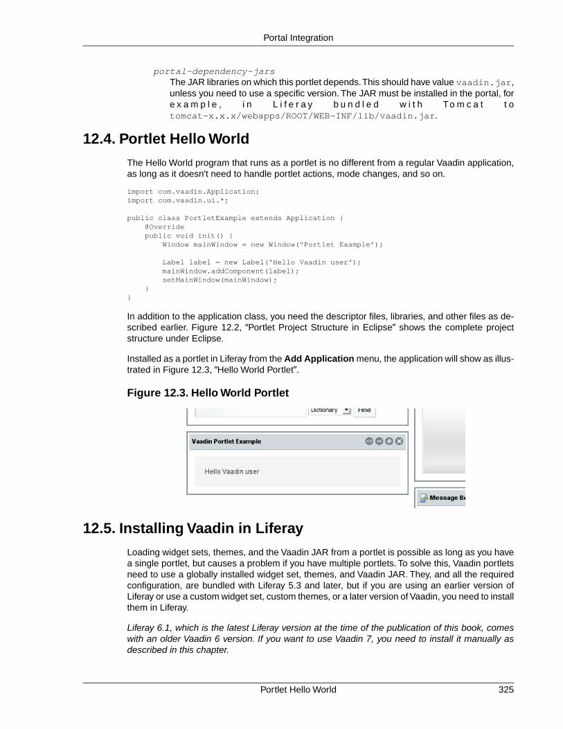
portal-dependency-jarsThe JAR libraries on which this portlet depends.This should have value vaadin.jar,unless you need to use a specific version. The JAR must be installed in the portal, fore x a m p l e , i n L i f e r a y b u n d l e d w i t h To m c a t t otomcat-x.x.x/webapps/ROOT/WEB-INF/lib/vaadin.jar.
12.4. Portlet Hello World
The Hello World program that runs as a portlet is no different from a regular Vaadin application,as long as it doesn't need to handle portlet actions, mode changes, and so on.
import com.vaadin.Application;import com.vaadin.ui.*;
public class PortletExample extends Application { @Override public void init() { Window mainWindow = new Window("Portlet Example");
Label label = new Label("Hello Vaadin user"); mainWindow.addComponent(label); setMainWindow(mainWindow); }}
In addition to the application class, you need the descriptor files, libraries, and other files as de-scribed earlier. Figure 12.2, “Portlet Project Structure in Eclipse” shows the complete projectstructure under Eclipse.
Installed as a portlet in Liferay from the Add Application menu, the application will show as illus-trated in Figure 12.3, “Hello World Portlet”.
Figure 12.3. Hello World Portlet
12.5. Installing Vaadin in Liferay
Loading widget sets, themes, and the Vaadin JAR from a portlet is possible as long as you havea single portlet, but causes a problem if you have multiple portlets. To solve this, Vaadin portletsneed to use a globally installed widget set, themes, and Vaadin JAR. They, and all the requiredconfiguration, are bundled with Liferay 5.3 and later, but if you are using an earlier version ofLiferay or use a custom widget set, custom themes, or a later version of Vaadin, you need to installthem in Liferay.
Liferay 6.1, which is the latest Liferay version at the time of the publication of this book, comeswith an older Vaadin 6 version. If you want to use Vaadin 7, you need to install it manually asdescribed in this chapter.
325Portlet Hello World
Portal Integration

Figure 12.2. Portlet Project Structure in Eclipse
The easiest way to install or upgrade Vaadin or compile the widget set in Liferay is to use theVaadin Control Panel for Liferay, as described in Section 12.9, “Vaadin Control Panel for Liferay”.If you need to make the installation or compilation manually, read ahead.
In these instructions, we assume that you use Liferay bundled with Apache Tomcat, althoughyou can use almost any other application server with Liferay just as well. The Tomcat installationis included in the Liferay installation package, under the tomcat-x.x.x directory.
12.5.1. Removing the Bundled Installation
Before installing a new Vaadin version, you need to remove the version bundled with Liferay.You need to remove the Vaadin library JAR from the library directory of the portal and the VAADINdirectory from under the root context. For example, with Tomcat, they are usually located as fol-lows:
• tomcat-x.x.x/webapps/ROOT/html/VAADIN
• tomcat-x.x.x/webapps/ROOT/WEB-INF/lib/vaadin.jar
12.5.2. Installing Vaadin
1. Get the Vaadin installation package from the Vaadin download page
Removing the Bundled Installation326
Portal Integration
2. Extract the following Vaadin JARs from the installation package:vaadin-server.jarand vaadin-shared.jar, as well as the vaadin-shared-deps.jar and jsoup.jardependencies from the lib folder
3. Rename the JAR files as they were listed above, without the version number
4. Put the libraries in tomcat-x.x.x/webapps/ROOT/WEB-INF/lib/
5. Extract the VAADIN folders from vaadin-server.jar, vaadin-themes.jar, andvaadin-client-compiled.jar and copy their contents totomcat-x.x.x/webapps/ROOT/html/VAADIN
You need to define the widget set, the theme, and the JAR in the portal-ext.propertiesconfiguration file for Liferay, as described earlier.The file should normally be placed in the Liferayinstallation directory. See Liferay documentation for details on the configuration file.
Below is an example of a portal-ext.properties file:
# Path under which the VAADIN directory is located.# (/html is the default so it is not needed.)# vaadin.resources.path=/html
# Portal-wide widget setvaadin.widgetset=com.vaadin.portal.gwt.PortalDefaultWidgetSet
# Theme to usevaadin.theme=reindeer
The allowed parameters are:
vaadin.resources.pathSpecifies the resource root path under the portal context. This is /html by default. Itsactual location depends on the portal and the application server; in Liferay with Tomcatit would be located at webapps/ROOT/html under the Tomcat installation directory.
vaadin.widgetsetThe widget set class to use. Give the full path to the class name in the dot notation. Ifthe parameter is not given, the default widget set is used.
vaadin.themeName of the theme to use. If the parameter is not given, the default theme is used,which is reindeer in Vaadin 6.
You will need to restart Liferay after creating or modifying the portal-ext.properties file.
12.6. Handling Portlet Requests
Portals such as Liferay are not AJAX applications, but reload the page every time a user interactionrequires data from the server. They consider a Vaadin UI to be a regular web application thatworks by HTTP requests. All the AJAX communications required by the Vaadin UI are done bythe Vaadin Client-Side Engine (the widget set) past the portal, so that the portal is unaware ofthe communications.
The only way a portal can interact with a UI is to load it with a HTTP request; reloading does notreset the UI. The Portlet 2.0 API supports four types of requests: render, action, resource, andevent requests. The old Portlet 1.0 API supports only the render and action requests. Requestscan be caused by user interaction with the portal controls or by clicking action URLs displayed
327Handling Portlet Requests
Portal Integration

by the portlet. You can handle portlet requests by implementing the PortletListener interfaceand the handler methods for each of the request types. You can use the request object passedto the handler to access certain portal data, such as user information, the portlet mode, etc.
The PortletListener interface is defined in the PortletApplicationContext2 for Portlet 2.0 APIand com.vaadin.terminal.gwt.server.PortletApplicationContext class for the old Portlet 1.0API. You can get the portlet application context with getContext() method of the applicationclass.
You need to have the portlet.jar in your class path during development. However, you mustnot deploy the portlet.jar with the portlet, because it would create a conflict with the internalportlet library of the portal. You should put it in a directory that is not deployed with the portlet,for example, if you are using Eclipse, under the lib directory under the project root, not underWebContent/WEB-INF/lib, for example.
You can also define portal actions that you can handle in the handleActionRequest()method of the interface.
You add your portlet request listener to the application context of your application, which is aPortletApplicationContext when (and only when) the application is being run as a portlet.
// Check that we are running as a portlet.if (getContext() instanceof PortletApplicationContext2) { PortletApplicationContext2 ctx = (PortletApplicationContext2) getContext();
// Add a custom listener to handle action and // render requests. ctx.addPortletListener(this, new MyPortletListener());} else { Notification.show("Not initialized via Portal!", Notification.TYPE_ERROR_MESSAGE);}
The handler methods receive references to request and response objects, which are defined inthe Java Servlet API. Please refer to the Servlet API documentation for further details.
The PortletDemo application included in the demo WAR package includes examples of processingmode and portlet window state changes in a portlet request listener.
12.7. Handling Portlet Mode Changes
Portals support three portlet modes defined in the Portlet API: view, edit, and help modes. Theview mode is the default and the portal can have buttons to switch the portlet to the other modes.In addition to the three predefined modes, the Portlet API standards allow custom portlet modes,although portals may support custom modes to a varying degree.
You need to define which portlet modes are enabled in the portlet.xml deployment descriptoras follows.
<!-- Supported portlet modes and content types. --><supports> <mime-type>text/html</mime-type> <portlet-mode>view</portlet-mode> <portlet-mode>edit</portlet-mode> <portlet-mode>help</portlet-mode></supports>
Handling Portlet Mode Changes328
Portal Integration
Changes in the portlet mode are received as resource requests, which you can handle with ahandleResourceRequest(), defined in the PortletListener interface. The current portletmode can be acquired with getPortletMode() from the request object.
The following complete example (for Portlet 2.0) shows how to handle the three built-modes ina portlet application.
// Use Portlet 2.0 APIimport com.vaadin.terminal.gwt.server.PortletApplicationContext2;import com.vaadin.terminal.gwt.server.PortletApplicationContext2.PortletListener;
public class PortletModeExample extends Application implements PortletListener { Window mainWindow; ObjectProperty data; // Data to view and edit VerticalLayout viewContent = new VerticalLayout(); VerticalLayout editContent = new VerticalLayout(); VerticalLayout helpContent = new VerticalLayout();
@Override public void init() { mainWindow = new Window("Myportlet Application"); setMainWindow(mainWindow);
// Data model data = new ObjectProperty("<h1>Heading</h1>"+ "<p>Some example content</p>");
// Prepare views for the three modes (view, edit, help) // Prepare View mode content Label viewText = new Label(data, Label.CONTENT_XHTML); viewContent.addComponent(viewText);
// Prepare Edit mode content RichTextArea editText = new RichTextArea(); editText.setCaption("Edit the value:"); editText.setPropertyDataSource(data); editContent.addComponent(editText);
// Prepare Help mode content Label helpText = new Label("<h1>Help</h1>" + "<p>This helps you!</p>", Label.CONTENT_XHTML); helpContent.addComponent(helpText);
// Start in the view mode mainWindow.setContent(viewContent);
// Check that we are running as a portlet. if (getContext() instanceof PortletApplicationContext2) { PortletApplicationContext2 ctx = (PortletApplicationContext2) getContext();
// Add a custom listener to handle action and // render requests. ctx.addPortletListener(this, this); } else { Notification.show("Not running in portal", Notification.TYPE_ERROR_MESSAGE); } }
// Dummy implementations for the irrelevant request types public void handleActionRequest(ActionRequest request, ActionResponse response, Window window) {
329Handling Portlet Mode Changes
Portal Integration

} public void handleRenderRequest(RenderRequest request, RenderResponse response, Window window) { } public void handleEventRequest(EventRequest request, EventResponse response, Window window) { }
public void handleResourceRequest(ResourceRequest request, ResourceResponse response, Window window) { // Switch the view according to the portlet mode if (request.getPortletMode() == PortletMode.EDIT) window.setContent(editContent); else if (request.getPortletMode() == PortletMode.VIEW) window.setContent(viewContent); else if (request.getPortletMode() == PortletMode.HELP) window.setContent(helpContent); }}
Figure 12.4, “Portlet Modes in Action” shows the resulting portlet in the three modes: view, edit,and help. In Liferay, the edit mode is shown in the popup menu as a Preferences item.
Handling Portlet Mode Changes330
Portal Integration

Figure 12.4. Portlet Modes in Action
12.8. Non-Vaadin Portlet Modes
This section is not yet updated for Vaadin 7.
In some cases, it can be useful to implement certain modes of a portlet as pure HTML or JSPpages instead of running the full Vaadin application user interface in them. Common reasons forthis are static pages (for example, a simple help mode), integrating legacy content to a portlet(for example, a JSP configuration interface), and providing an ultra-lightweight initial view for aportlet (for users behind slow connections).
Fully static modes that do not require the Vaadin server side application to be running can beimplemented by subclassing the portlet class VaadinPortlet. The subclass can either create theHTML content directly or dispatch the request to, for example, a HTML or JSP page via the portal.When using this approach, any Vaadin portlet and portlet request listeners are not called.
Customizing the content for the standard modes (view, edit, and help) can be performed byoverriding the methods doView, doEdit and doHelp, respectively. Custom modes can behandled by implementing similar methods with the @javax.portlet.RenderMode(name = "my-mode") annotation.
331Non-Vaadin Portlet Modes
Portal Integration

You need to define which portlet modes are enabled in the portlet.xml deployment descriptoras described in Section 12.7, “Handling Portlet Mode Changes”. Also, the portlet class inportlet.xml should point to the customized subclass of VaadinPortlet.
The following example (for Portlet 2.0) shows how to create a static help page for the portlet.
portlet.xml:
<!-- Supported portlet modes and content types. --><supports> <mime-type>text/html</mime-type> <portlet-mode>view</portlet-mode> <portlet-mode>help</portlet-mode></supports>
HtmlHelpPortlet.java::
// Use Portlet 2.0 APIimport com.vaadin.server.VaadinPortlet;
public class HtmlHelpPortlet extends VaadinPortlet { // Override the help mode, let the Vaadin // application handle the view mode @Override protected void doHelp(RenderRequest request, RenderResponse response) throws PortletException, IOException { // Bypass the Vaadin application entirely response.setContentType("text/html"); response.getWriter().println( "This is the help text as plain HTML.");
// Alternatively, you could use the dispatcher for, // for example, JSP help pages as follows: // PortletRequestDispatcher dispatcher = getPortletContext() // .getRequestDispatcher("/html/myhelp.jsp"); // dispatcher.include(request, response); }}
To produce pure HTML portlet content from a running Vaadin application instead of staticallyoutside an application, the writeAjaxPage() method VaadinPortlet should be overridden.This approach allows using the application state in HTML content generation, and all relevantVaadin portlet request and portlet listeners are called around the portlet content generation.However, the client side engine (widgetset) is not loaded by the browser, which can shorten theinitial page display time.
<portlet-class>com.vaadin.demo.portlet.HtmlModePortlet</portlet-class><supports> <mime-type>text/html</mime-type> <portlet-mode>view</portlet-mode> <portlet-mode>help</portlet-mode></supports>
public class CountUI extends UI { private int count = 0;
public void init() { Window w = new Window("Portlet mode example"); w.addComponent(new Label("This is the Vaadin app.")); w.addComponent(new Label("Try opening the help mode.")); setMainWindow(w); }
Non-Vaadin Portlet Modes332
Portal Integration

public int incrementCount() { return ++count; }}
// Use Portlet 2.0 APIpublic class HtmlModePortlet extends AbstractVaadinPortlet {
@Override protected void writeAjaxPage(RenderRequest request, RenderResponse response, Window window, UI app) throws PortletException, IOException { if (PortletMode.HELP.equals(request.getPortletMode())) { CountApplication capp = (CountApplication) app; response.setContentType("text/html"); response.getWriter().println( "This is the HTML help, shown " + capp.incrementCount() + " times so far."); } else { super.writeAjaxPage(request, response, window, app); } }
@Override protected Class<? extends Application> getApplicationClass(){ return CountApplication.class; }}
The user can freely move between Vaadin and non-Vaadin portlet modes with the user interfaceprovided by the portal (for standard modes) or the portlet (for example, action links). Once theserver side application has been started, it continues to run as long as the session is alive. Ifnecessary, specific portlet mode transitions can be disallowed in portlet.xml.
In the case of Portlet 1.0, both a portlet and a servlet are involved. A render request is receivedby ApplicationPortlet when the portlet mode is changed, and serving pure HTML in some modescan be achieved by overriding the method render and handling the modes of interest separatelywhile calling super.render() for other modes. As always, when extending the portlet, thereference to the portlet class in portlet.xml needs to be updated.
To serve HTML-only content in the Portlet 1.0 case after starting the server side application andcalling the relevant listeners, the servlet class ApplicationServlet should be subclassed insteadof the portlet.The method writeAjaxPage can be overridden to produce custom HTML contentfor certain modes. However, it should be noted that some HTML content (for example, loadingthe portal-wide Vaadin theme) is created by the portlet and not the servlet.
12.9. Vaadin Control Panel for Liferay
The Vaadin Control Panel for Liferay is not yet updated for Vaadin 7 at the time of publication ofthis edition of the book. The information given here is for Vaadin 6. The basic functionality shouldbe similar, however.
Vaadin portlets, just as all Vaadin applications, use a widget set to render the user interface inthe browser and to handle the Ajax communication with the server-side application.While regularVaadin applications use a widget set for each application, in portals the widget set is shared byall Vaadin portlets running in the portal. Liferay actually comes preinstalled with a precompiledversion of the default portal widget set. However, many add-on components come with their ownwidget set, which needs to be compiled into the portal widget set. The Vaadin Control Panel for
333Vaadin Control Panel for Liferay
Portal Integration

Liferay automates this compilation.You can also use it to just install a new version of the Vaadinlibrary.
12.9.1. Installing
Vaadin Control Panel for Liferay is available for download from Vaadin Directory. It is a WARpackage, which you need to simply drop into Liferay's deploy folder. Once the deployment isdone, the Vaadin Control Panel should show up in the Liferay Control Panel.
12.9.2. Using the Control Panel
Open the Vaadin section in the Liferay Control Panel. The initial state with is illustrated in Fig-ure 12.5, “Initial State of Vaadin Control Panel for Liferay”.
Figure 12.5. Initial State of Vaadin Control Panel for Liferay
Upgrading Vaadin
Liferay comes with Vaadin preinstalled.To upgrade the preinstalled version to a newer one, followthe following steps. Notice that the Vaadin library is upgraded for all Vaadin portlets, so they mustall be compatible with the new version.
1. Click Upgrade in the Vaadin Jar Version.
2. In the warning dialog that appears, read the message and if you want to go on with theupgrade, click Change version to proceed.
3. Recompile the widget set as instructed below.
4. Redeploy all Vaadin portlets in Liferay, that is, copy the WARs to the deploy folder inLiferay.
Installing334
Portal Integration

The Google Web Toolkit (GWT) libraries required for the widget set compilation are also upgradedautomatically.
Compiling Widget Set
When you need to compile the widget set, follow the following steps:
1. Place any add-on Jars containing widget sets, such as add-on Jars, in the WEB-INF/libfolder of Liferay. Its exact location depends on the used server; for example in Tomcatit is under the webapps/ROOT folder.
2. Click re-scan in the Add-on Directory to detect any new add-on libraries.
3. Select the add-ons which you wish to compile into the widget set.
4. Click Manage Additional Dependencies if the libraries require any special librariesand add them.
5. Click Compile Widget Set to compile the widget set. The compilation can take severalminutes.
The compiled widget set is copied automatically to the proper folder and taken into use.
12.10. Vaadin IPC for Liferay
Portlets rarely live alone. A page can contain multiple portlets and when the user interacts withone portlet, you may need to have the other portlets react to the change immediately. This is notnormally possible with Vaadin portlets, as Vaadin applications need to get an Ajax request fromthe client-side to change their user interface. On the other hand, the regular inter-portlet commu-nication (IPC) mechanism in Portlet 2.0 Specification requires a complete page reload, but thatis not appropriate with Vaadin or in general Ajax applications, which do not require a page reload.One solution is to communicate between the portlets on the server-side and then use a server-push mechanism to update the client-side.
The Vaadin IPC for Liferay Add-on takes another approach by communicating between theportlets through the client-side. Events (messages) are sent through the LiferayIPC componentand the client-side widget relays them to the other portlets, as illustrated in Figure 12.6, “VaadinIPC for Liferay Architecture”.
335Vaadin IPC for Liferay
Portal Integration

Figure 12.6. Vaadin IPC for Liferay Architecture
Vaadin IPC for Liferay uses the Liferay JavaScript event API for client-side inter-portlet commu-nication, so you can communicate just as easily with other Liferay portlets.
Notice that you can use this communication only between portlets on the same page.
Figure 12.7, “Vaadin IPC Add-on Demo with Two Portlets” shows Vaadin IPC for Liferay in action.Entering a new item in one portlet is updated interactively in the other.
Vaadin IPC for Liferay336
Portal Integration

Figure 12.7. Vaadin IPC Add-on Demo with Two Portlets
12.10.1. Installing the Add-on
The Vaadin IPC for Liferay add-on is available from the Vaadin Directory as well as from a Mavenrepository, as described in Chapter 17, Using Vaadin Add-ons.
The contents of the installation package are as follows:
vaadin-ipc-for-liferay-x.x.x.jarThe add-on JAR in the installation package must be installed in the WEB-INF/libdirectory under the root context. The location depends on the server - for example inLiferay running in Tomcat it is located under the webapps/ROOT folder of the server.
docThe documentation folder includes a README.TXT file that describes the contents ofthe installation package briefly, and licensing.txt and license-asl-2.0.txt,which describe the licensing under the Apache License 2.0. Under the doc/api folderis included the complete JavaDoc API documentation for the add-on.
vaadin-ipc-for-liferay-x.x.x-demo.warA WAR containing demo portlets. After installing the add-on library and compiling thewidget set, as described below, you can deploy the WAR to Liferay and add the twodemo portlets to a page, as shown in Figure 12.7, “Vaadin IPC Add-on Demo with TwoPortlets”. The source of the demo is available at dev.vaadin.com/svn/addons/IP-C f o r L i f e r a y / t r u n k /[http://dev.vaadin.com/svn/addons/IPCforLiferay/trunk/demo/src/com/vaadin/addon/ipcforliferay/demo/].
Compiling the Widget Set
The add-on contains a widget set, which you must compile into the Vaadin widget set installedin the portal. The easiest way you can do this is to use the Vaadin Control Panel for Liferay[http://vaadin.com/directory#addon/vaadin-control-panel-for-liferay] add-on (also available from
337Installing the Add-on
Portal Integration

Vaadin Directory) to compile the portal widget set, as described in Section 12.9, “Vaadin ControlPanel for Liferay”.
12.10.2. Basic Communication
LiferayIPC is an invisible user interface component that can be used to send messages betweentwo or more Vaadin portlets. You add it to an application layout as you would any regular userinterface component.
LiferayIPC liferayipc = new LiferayIPC();layout.addComponent(liferayipc);
You should be careful not to remove the invisible component from the portlet later if you modifythe layout of the portlet.
The component can be used both for sending and receiving messages, as described next.
Sending Events
You can send an event (a message) with the sendEvent() method, which takes an event IDand the message data as parameters. The event is broadcast to all listening portlets. The eventID is a string that can be used to identify the recipient of an event or the event type.
liferayipc.sendEvent("hello", "This is Data");
If you need to send more complex data, you need to format or serialize it to a string representationas described in Section 12.10.5, “Serializing and Encoding Data”.
Receiving Events
A portlet wishing to receive events (messages) from other portlets needs to register a listener inthe component with addListener().The listener receives the messages in a LiferayIPCEventobject. Filtering events by the ID is built in into the listener handler, you give the listened eventID as the first parameter for the addListener(). The actual message data is held in the dataproperty, which you can read with getData().
liferayipc.addListener("hello", new LiferayIPCEventListener() { public void eventReceived(LiferayIPCEvent event) { // Do something with the message data String data = event.getData(); Notification.show("Received hello: " + data); }});
A listener added to a LiferayIPC can be removed with removeListener().
12.10.3. Considerations
Both security and efficiency should be considered with inter-portlet communications when usingthe Vaadin IPC for Liferay.
Browser Security
As the message data is passed through the client-side (browser), any code running in the browserhas access to the data. You should be careful not to expose any security-critical data in client-side messaging. Also, malicious code running in the browser could alter or fake messages.Sanitization can help with the latter problem and encryption to solve the both issues. You can
Basic Communication338
Portal Integration

also share the sensitive data through session attributes or a database and use the client-sideIPC only to notify that the data is available.
Efficiency
Sending data through the browser requires loading and sending it in HTTP requests. The datais held in the memory space of the browser, and handling large data in the client-side JavaScriptcode can take time. Noticeably large message data can therefore reduce the responsiveness ofthe application and could, in extreme cases, go over browser limits for memory consumption orJavaScript execution time.
12.10.4. Communication Through Session Attributes
In many cases, such as when considering security or efficiency, it is better to pass the bulk dataon the server-side and use the client-side IPC only for notifying the other portlet(s) that the datais available. Session attributes are a conveninent way of sharing data on the server-side. Youcan also share objects through them, not just strings.
The session variables have a scope, which should be APPLICATION_SCOPE. The "application"refers to the scope of the Java web application (WAR) that contains the portlets.
If the communicating portlets are in the same Java web application (WAR), no special configurationis needed. You can also communicate between portlets in different WARs, in which case youneed to disable the private-session-attributes parameter in liferay-portlet.xmlby setting it to false. Please see Liferay documentation for more information regarding theconfiguration.
You can also share Java objects between the portlets in the same WAR, not just strings. If theportlets are in different WARs, they normally have different class loaders, which could cause in-compatibilities, so you can only communicate with strings and any object data needs to be seri-alized.
Session attributes are accessible through the PortletSession object, which you can accessthrough the portlet context from the Vaadin Application class.
Person person = new Person(firstname, lastname, age);...
PortletSession session = ((PortletApplicationContext2)getContext()). getPortletSession();
// Share the objectString key = "IPCDEMO_person";session.setAttribute(key, person, PortletSession.APPLICATION_SCOPE);
// Notify that it's availableliferayipc.sendEvent("ipc_demodata_available", key);
You can then receive the attribute in a LiferayIPCEventListener as follows:
public void eventReceived(LiferayIPCEvent event) { String key = event.getData();
PortletSession session = ((PortletApplicationContext2)getContext()). getPortletSession();
339Communication Through Session Attributes
Portal Integration

// Get the object reference Person person = (Person) session.getAttribute(key);
// We can now use the object in our application BeanItem<Person> item = new BeanItem<Person> (person); form.setItemDataSource(item);}
Notice that changes to a shared object bound to a user interface component are not updatedautomatically if it is changed in another portlet. The issue is the same as with double-binding ingeneral.
12.10.5. Serializing and Encoding Data
The IPC events support transmitting only plain strings, so if you have object or other non-stringdata, you need to format or serialize it to a string representation. For example, the demo applic-ation formats the trivial data model as a semicolon-separated list as follows:
private void sendPersonViaClient(String firstName, String lastName, int age) { liferayIPC_1.sendEvent("newPerson", firstName + ";" + lastName + ";" + age);}
You can use standard Java serialization for any classes that implement the Serializable in-terface.The transmitted data may not include any control characters, so you also need to encodethe string, for example by using Base64 encoding.
// Some serializable objectMyBean mybean = new MyBean();...
// SerializeByteArrayOutputStream baostr = new ByteArrayOutputStream();ObjectOutputStream oostr;try { oostr = new ObjectOutputStream(baostr); oostr.writeObject(mybean); // Serialize the object oostr.close();} catch (IOException e) { Notification.show("IO PAN!"); // Complain}
// EncodeBASE64Encoder encoder = new BASE64Encoder();String encoded = encoder.encode(baostr.toByteArray());
// Send the IPC event to other portlet(s)liferayipc.sendEvent("mybeanforyou", encoded);
You can then deserialize such a message at the receiving end as follows:
public void eventReceived(LiferayIPCEvent event) { String encoded = event.getData();
// Decode and deserialize it BASE64Decoder decoder = new BASE64Decoder(); try { byte[] data = decoder.decodeBuffer(encoded); ObjectInputStream ois = new ObjectInputStream( new ByteArrayInputStream(data));
// The deserialized bean
Serializing and Encoding Data340
Portal Integration
MyBean deserialized = (MyBean) ois.readObject(); ois.close();
... do something with the bean ...
} catch (IOException e) { e.printStackTrace(); // Handle somehow } catch (ClassNotFoundException e) { e.printStackTrace(); // Handle somehow }}
12.10.6. Communicating with Non-Vaadin Portlets
You can use the Vaadin IPC for Liferay to communicate also between a Vaadin application andother portlets, such as JSP portlets. The add-on passes the events as regular Liferay JavaScriptevents. The demo WAR includes two JSP portlets that demonstrate the communication.
When sending events from non-Vaadin portlet, fire the event using the JavaScriptLiferay.fire() method with an event ID and message. For example, in JSP you could have:
<%@ taglib uri="http://java.sun.com/portlet_2_0" prefix="portlet" %><portlet:defineObjects />
<script>function send_message() { Liferay.fire('hello', "Hello, I'm here!");}</script>
<input type="button" value="Send message" onclick="send_message()" />
You can receive events using a Liferay JavaScript event handler. You define the handler withthe on() method in the Liferay object. It takes the event ID and a callback function as its para-meters. Again in JSP you could have:
<%@ taglib uri="http://java.sun.com/portlet_2_0" prefix="portlet" %><portlet:defineObjects />
<script>Liferay.on('hello', function(event, data) { alert("Hello: " + data);});</script>
341Communicating with Non-Vaadin Portlets
Portal Integration

342

Part III. Client-Side FrameworkOf the two sides of Vaadin, the client-side code runs as JavaScript in the web browser.You can create pureclient-side applications and widgets in Java, which you compile to JavaScript that runs in the browser. Youcan integrate the client-side widgets with server-side components using connectors, and hence enable usingthem in pure server-side applications.

Chapter 13
Client-Side VaadinDevelopment
13.1. Overview .............................................................................................. 34513.2. Installing the Client-Side Development Environment ........................... 34613.3. Client-Side Module Descriptor ............................................................. 34613.4. Compiling a Client-Side Module .......................................................... 34713.5. Creating a Custom Widget ................................................................... 34813.6. Debugging Client-Side Code ............................................................... 349
This chapter gives an overview of the Vaadin client-side framework, it's architecture, and devel-opment tools.
13.1. Overview
As noted in the introduction, Vaadin supports two development models: server-side and client-side. Client-side Vaadin code is executed in the web browser as JavaScript code. The code iswritten in Java, like all Vaadin code, and then compiled to JavaScript with the Vaadin ClientCompiler. You can create pure client-side applications and widgets, which you can simply loadin the browser and use even without a server-side application. Going further, you can integratethe client-side widgets with their server-side counterpart components using connectors, andhence enable using them in server-side Vaadin applications. That is actually how most Vaadinadd-on components are done.
The client-side framework is based on the Google Web Toolkit (GWT), with added features andbug fixes. For example, in addition to the basic GWT widgets, Vaadin provides the Vaadin-spe-
345Book of Vaadin

cific implementations of most of the common user interface widgets. Vaadin is compatible withGWT to the extent of the basic GWT feature set. Vaadin Ltd is a member of the GWT SteeringCommittee, working on the future direction of GWT together with Google and other supportersof GWT.
Widgets and Components
Google Web Toolkit uses the term widget for user interface components. In this book,we use the term widget to refer to client-side components, while using the termcomponent in a general sense and also in the special sense for server-side compon-ents.
The main idea in server-side Vaadin development is to render the server-side components in thebrowser with the Client-Side Engine. The engine is essentially a set of widgets paired with con-nectors that serialize their state and events with the server-side counterpart components. Theclient-side engine is technically called a widget set, to describe the practice of combining differentwidget sets using inheritance.
13.2. Installing the Client-Side Development Environment
The installation of the client-side development libraries is described in Chapter 2, Getting Startedwith Vaadin. You especially need the vaadin-client library, which contains the client-sideJava API, and vaadin-client-compiler, which contains the Vaadin Client Compiler forcompiling Java to JavaScript.
13.3. Client-Side Module Descriptor
Client-side Vaadin modules, such as the Vaadin Client-Side Engine (widget set) or pure client-side applications, that are to be compiled to JavaScript, are defined in a module descriptor(.gwt.xml) file.
When defining a widget sets to build the Vaadin client-side engine, the only necessary task is toinherit a base widget set. If you are developing a regular widget set, you should normally inheritthe DefaultWidgetSet.
<?xml version="1.0" encoding="UTF-8"?><!DOCTYPE module PUBLIC "-//Google Inc.//DTD Google Web Toolkit 1.7.0//EN"
"http://google-web-toolkit.googlecode.com/svn/tags/1.7.0/distro-source/core/src/gwt-module.dtd">
<module> <!-- Inherit the default widget set --> <inherits name="com.vaadin.terminal.gwt.DefaultWidgetSet" /></module>
If you are developing a pure client-side application, you should instead inherit com.vaadin.Vaadin,as described in Chapter 14, Client-Side Applications. In that case, the module descriptor alsoneeds an entry-point.
If you are using the Eclipse IDE, the New Vaadin Widget wizard will automatically create theGWT module descriptor. See Section 16.2.1, “Creating a Widget” for detailed instructions.
Installing the Client-Side Development Environment346
Client-Side Vaadin Development
13.3.1. Specifying a Stylesheet
A client-side module can include CSS stylesheets.When the module is compiled, these stylesheetsare copied to the output target. In the module descriptor, define a stylesheet element.
For example, if you are developing a custom widget and want to have a default stylesheet for it,you could define it as follows:
<stylesheet src="mywidget/styles.css"/>
The specified path is relative to the public folder under the folder of the module descriptor.
13.3.2. Limiting Compilation Targets
Compiling widget sets takes considerable time.You can reduce the compilation time significantlyby compiling the widget sets only for your browser, which is useful during development.You cando this by setting the user.agent property in the module descriptor.
<set-property name="user.agent" value="gecko1_8"/>
The value attribute should match your browser. The browsers supported by GWT depend onthe GWT version, below is a list of browser identifiers supported by GWT 2.0.
Table 13.1. GWT User Agents
NameIdentifier
Mozilla Firefox 1.5 and latergecko1_8
Mozilla Firefox 1.0 (obsolete)gecko
Internet Explorer 6ie6
Internet Explorer 8ie8
Apple Safari and other Webkit-based browsersincluding Google Chrome
safari
Operaopera
For more information about the GWT Module XML Format, please see Google Web Toolkit De-veloper Guide.
13.4. Compiling a Client-Side Module
A client-side module, either a widget set or a pure client-side module, must be compiled toJavaScript using the Vaadin Client Compiler.
As most Vaadin add-ons include widgets, widget set compilation is usually needed when usingadd-ons. In that case, the widget sets from different add-ons are compiled into a project widgetset, as described in Section 17.3, “Compiling Add-on Widget Sets”.
13.4.1. Vaadin Compiler Overview
The Vaadin Client Compiler compiles Java to JavaScript. It is provided as thevaadin-client-compiler JAR, which you can execute with the -jar parameter for the Javaruntime. It requires the vaadin-client JAR, which contains the Vaadin client-side framework.
347Specifying a Stylesheet
Client-Side Vaadin Development

The compiler compiles a client module, which can be either a pure client-side module or aVaadin widget set, that is, the Vaadin Client-Side Engine that includes the widgets used in theapplication. The client module is defined with a module descriptor, which was described in Sec-tion 13.3, “Client-Side Module Descriptor”.
The compiler writes the compilation result to a target folder that will include the compiledJavaScript with any static resources included in the module.
13.4.2. Compiling in Eclipse
When the Vaadin Plugin is installed in Eclipse, you can simply click the Compile Vaadin widgetsbutton in the toolbar. It will compile the widget set it finds from the project. If the project hasmultiple widget sets, such as one for custom widgets and another one for the project, you needto select the module descriptor of the widget set to compile before clicking the button.
13.4.3. Compiling with Ant
You can find a script template for compiling widget sets with Ant at the URL https://vaad-in.com/download/misc/build-widgetset-vaadin7.xml.You can copy the build script to your projectand, once configured, use it by entering:
$ ant -f build-widgetset-vaadin7.xml
13.4.4. Compiling with Maven
You can compile the widget set with the gwt:compile goal as follows:
$ mvn gwt:compile
13.5. Creating a Custom Widget
Creating a new Vaadin component begins from a client-side widget, which is later integrated witha server-side counterpart to enable server-side development. In addition, you can also chooseto make pure client-side widgets, a possibility which we also describe later in this section.
13.5.1. A Basic Widget
All widgets extend the Widget class or some of its subclasses. You can extend any core GWTor supplementary Vaadin widgets. The basic GWT widget component hierarchy is illustrated inFigure 13.1, “GWT Widget Base Class Hierarchy” .
Compiling in Eclipse348
Client-Side Vaadin Development

Figure 13.1. GWT Widget Base Class Hierarchy
For example, we could extend the Label widget to display some custom text.
package com.example.myapp.client;
import com.google.clientside.user.client.ui.Label;
public class MyWidget extends Label { public static final String CLASSNAME = "mywidget";
public MyWidget() { setStyleName(CLASSNAME); setText("This is MyWidget"); }}
The above example is largely what the Eclipse plugin generates as a widget stub. It is a goodpractice to set a style class for the widget, to allow styling it with CSS.
The client-side source code must be contained in a client package under the package of thedescriptor file, which is covered later.
13.5.2. Using the Widget
You can use a custom widget just like you would use any widget.
public class MyEntryPoint implements EntryPoint { @Override public void onModuleLoad() { // Use the custom widget final MyWidget mywidget = new MyWidget(); RootPanel.get().add(mywidget); }}
13.6. Debugging Client-Side Code
Vaadin includes two application execution modes for debugging client-side code.The DevelopmentMode compiles the client-side module and runs it in the browser, using a browser plugin tocommunicate with the debugger. The "SuperDevMode" allows debugging the code right in thebrowser, without even need to install a plugin.
349Using the Widget
Client-Side Vaadin Development

13.6.1. Launching Development Mode
The Development Mode compiles the client-side module (or widget set), launches the applicationin the browser, and allows debugging the client-side code in Eclipse. You can launch the Devel-opment Mode by running the com.google.clientside.dev.DevMode class. It requires someparameters, as described later.
The Vaadin Plugin for Eclipse can create a launch configuration for the Development Mode. Inthe Vaadin section of project properties, click the Create development mode launch button.This creates a new launch configuration in the project. You can edit the launch configuration inRun Run Configurations.
-noserver -war WebContent/VAADIN/widgetsets com.example.myproject.widgetset.MyWidgetSet -startupUrl http://localhost:8080/myproject -bindAddress 127.0.0.1
The parameters are as follows:
-noserverNormally, the Development Mode launches its own server for hosting the content. Aswe are developing the application under an IDE that deploys it to a server, we candisable the Development Mode server with this option.
-warSpecifies path to the location where the JavaScript is to be compiled.When developingpure client-side widgets, this could be the WebContent folder, or some other folder.When compiling widget sets, it must be WebContent/VAADIN/widgetsets.
-startupUrlSpecifies the address of the loader page for the application. For server-side Vaadinapplications, this should be the path to the Vaadin application servlet, as defined inthe deployment. For pure client-side widgets, it should be the page where the applicationis included.
-bindAddressThis is the IP address of the host in which the Development Mode runs. Normally it isthe local host, that is, 127.0.0.1.
13.6.2. Launching SuperDevMode
The SuperDevMode is much like the regular Development Mode, except that it does not requirea browser plugin. Compilation from Java to JavaScript is done incrementally, reducing the com-pilation time significantly. It also allows debugging JavaScript and even Java right in the browser(currently only supported in Chrome).
You can enable SuperDevMode as follows:
1. You need to set a redirect property in the .clientside.xml module descriptor asfollows:
<set-configuration-property name="devModeRedirectEnabled" value="true" />
In addition, you need the xsiframe linker. It is included in the com.vaadin.terminal.cli-entside.DefaultWidgetSet as well as in the com.vaadin.Vaadin module. Otherwise,you need to include it with:
<add-linker name="xsiframe" />
Launching Development Mode350
Client-Side Vaadin Development

2. Compile the module (that is, the widget set), for example by clicking the button in Eclipse.
3. If you are using Eclipse, create a launch configuration for the SuperDevMode by clickingthe Create SuperDevMode launch in the Vaadin section of the project properties.
a. The main class to execute should be com.google.clientside.dev.codeserv-er.CodeServer.
b. The application takes the fully-qualified class name of the module (or widget set) asparameter, for example, com.example.myproject.widgetset.MyprojectWidgetset.
c. Add project sources to the class path of the launch if they are not in the project classpath.
The above configuration only needs to be once to enable the SuperDevMode. After that, you canlaunch the mode as follows:
1. Run the SuperDevMode Code Server with the launch configuration that you createdabove. This perfoms the initial compilation of your module or widget set.
2. Launch the servlet container for your application, for example, Tomcat.
3. Open your browser with the application URL and add ?superdevmode parameter tothe URL (see the notice below if you are not extending DefaultWidgetSet).This recom-piles the code, after which the page is reloaded with the SuperDevMode.You can alsouse the ?debug parameter and then click the SDev button in the debug console.
If you make changes to the client-side code and refresh the page in the browser, the client-sideis recompiled and you see the results immediately.
The Step 3 above assumes that you extend DefaultWidgetSet in your module. If that is not thecase, you need to add the following at the start of the onModuleLoad() method of the module:
if (SuperDevMode.enableBasedOnParameter()) { return; }
Alternatively, you can use the bookmarklets provided by the code server. Go tohttp://localhost:9876/ and drag the bookmarklets "Dev Mode On" and "Dev Mode Off"to the bookmarks bar
Debugging Java Code in Chrome
Chrome supports source maps, which allow debugging Java source code from which theJavaScript was compiled.
Open the Chrome Inspector by right-clicking and selecting Inspect Element. Click the settingsicon in the lower corner of the window and check the Scripts Enable source maps option.Refresh the page with the Inspector open, and you will see Java code instead of JavaScript inthe scripts tab.
351Launching SuperDevMode
Client-Side Vaadin Development

352

Chapter 14
Client-SideApplications
14.1. Overview .............................................................................................. 35314.2. Client-Side Module Entry-Point ............................................................ 35514.3. Compiling a Client-Side Application .................................................... 35614.4. Loading a Client-Side Application ........................................................ 356
This chapter describes how to develop client-side Vaadin applications.
This edition is a draft. Many new features that will be included in Vaadin 7 are not yet coveredin the draft and some of the content may in fact be outdated. For the most current version, pleasesee the on-line edition available at http://vaadin.com/book.
14.1. Overview
Vaadin allows developing client-side modules that run in the browser. Client-side modules canuse the same widgets, themes, and back-end services as server-side Vaadin applications. Client-side applications can run in the browser, even with no further server communications. Whenpaired with a server-side service to gain access to data storage and server-side business logic,client-side applications can be considered "fat clients", in comparison to the "thin client" approachof the server-side Vaadin applications. Fat clients are useful for a range of purposes when youhave a need for highly responsive UI logic, such as for games or for serving a huge number ofclients with possibly stateless server-side code.
353Book of Vaadin
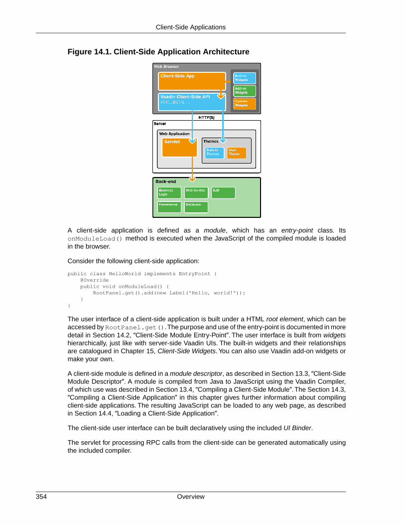
Figure 14.1. Client-Side Application Architecture
A client-side application is defined as a module, which has an entry-point class. ItsonModuleLoad() method is executed when the JavaScript of the compiled module is loadedin the browser.
Consider the following client-side application:
public class HelloWorld implements EntryPoint { @Override public void onModuleLoad() { RootPanel.get().add(new Label("Hello, world!")); }}
The user interface of a client-side application is built under a HTML root element, which can beaccessed by RootPanel.get().The purpose and use of the entry-point is documented in moredetail in Section 14.2, “Client-Side Module Entry-Point”. The user interface is built from widgetshierarchically, just like with server-side Vaadin UIs. The built-in widgets and their relationshipsare catalogued in Chapter 15, Client-Side Widgets. You can also use Vaadin add-on widgets ormake your own.
A client-side module is defined in a module descriptor, as described in Section 13.3, “Client-SideModule Descriptor”. A module is compiled from Java to JavaScript using the Vaadin Compiler,of which use was described in Section 13.4, “Compiling a Client-Side Module”.The Section 14.3,“Compiling a Client-Side Application” in this chapter gives further information about compilingclient-side applications. The resulting JavaScript can be loaded to any web page, as describedin Section 14.4, “Loading a Client-Side Application”.
The client-side user interface can be built declaratively using the included UI Binder.
The servlet for processing RPC calls from the client-side can be generated automatically usingthe included compiler.
Overview354
Client-Side Applications
Even with regular server-side Vaadin applications, it may be useful to provide an off-line modeif the connection is closed. An off-line mode can persist data in a local store in the browser,thereby avoiding the need for server-side storage, and transmit the data to the server when theconnection is again available. Such a pattern is commonly used with Vaadin TouchKit..
14.2. Client-Side Module Entry-Point
A client-side application requires an entry-point where the execution starts, much like the init()method in server-side Vaadin UIs.
Consider the following application:
package com.example.myapp.client;
import com.google.clientside.core.client.EntryPoint;import com.google.clientside.event.dom.client.ClickEvent;import com.google.clientside.event.dom.client.ClickHandler;import com.google.clientside.user.client.ui.RootPanel;import com.vaadin.terminal.clientside.client.ui.button.VButton;
public class MyEntryPoint implements EntryPoint { @Override public void onModuleLoad() { // Create a button widget Button button = new Button(); button.setText("Click me!"); button.addClickHandler(new ClickHandler() { @Override public void onClick(ClickEvent event) { mywidget.setText("Hello, world!"); } }); RootPanel.get().add(button); }}
Before compiling, the entry-point needs to be defined in a module descriptor, as described in thenext section.
14.2.1. Module Descriptor
The entry-point of a client-side application is defined, along with any other configuration, in a client-side module descriptor, described in Section 13.3, “Client-Side Module Descriptor”.The descriptoris an XML file with suffix .gwt.xml.
<?xml version="1.0" encoding="UTF-8"?><!DOCTYPE module PUBLIC "-//Google Inc.//DTD Google Web Toolkit 1.7.0//EN"
"http://google-web-toolkit.googlecode.com/svn/tags/1.7.0/distro-source/core/src/gwt-module.dtd"><module> <!-- The entry-point for the client-side application --> <entry-point class="com.example.myapp.client.MyEntryPoint"/></module>
Any static resources, such as images or CSS stylesheets, must be contained in a public folder(not a Java package) under the folder of the descriptor file. When the module is compiled, theresources are copied to the output folder.
355Client-Side Module Entry-Point
Client-Side Applications

14.3. Compiling a Client-Side Application
The application needs to be compiled with the Vaadin Compiler into JavaScript. We covered thebasics of the client-side module compilation in Section 13.4, “Compiling a Client-Side Module”.In the following, we see how to compile client-side applications.
Probably the easiest way to compile a client-side application is to use the Vaadin DevelopmentMode, which also allows debugging. You need to execute the com.google.clientside.dev.Dev-Mode class in the Vaadin JAR with the following parameters:
-noserver -war warname com.example.myapp.MyModule-startupUrl http://localhost:8080/myprojectwarname -bindAddress 127.0.0.1
14.4. Loading a Client-Side Application
You can load the JavaScript code of a client-side application in a HTML page by including it witha <script> tag, for example as follows:
<html xmlns="http://www.w3.org/1999/xhtml"> <head> <meta http-equiv="Content-Type" content="text/html; charset=UTF-8" />
<title>Embedding a Vaadin Application in HTML Page</title>
<!-- Load the Vaadin style sheet --> <link rel="stylesheet" type="text/css" href="/myproject/VAADIN/themes/reindeer/styles.css"/> </head>
<body> <h1>A Pure Client-Side Application</h1>
<script type="text/javascript" language="javascript" src="com.example.myapp.MyModule/com.example.myapp.MyM odule.nocache.js"></script> </body></html>
The JavaScript module is loaded in a <script> element.The src parameter should be a relativelink from the page to the compiled JavaScript module.
If the application uses any supplementary Vaadin widgets, and not just core GWT widgets, youneed to include the Vaadin theme as was done in the example. The exact path to the style filedepends on your project structure - the example is given for a regular Vaadin application wherethemes are contained in the VAADIN folder in the WAR.
Compiling a Client-Side Application356
Client-Side Applications

Chapter 15
Client-SideWidgets
15.1. Overview .............................................................................................. 35715.2. GWT Widgets ...................................................................................... 35815.3. Vaadin Widgets .................................................................................... 358
This chapter gives basic documentation on the use of the Vaadin client-side framework for thepurposes of creating client-side applications and writing your own widgets.
This edition is a draft. Many new features that will be included in Vaadin 7 are not yet coveredin the draft and some of the content may in fact be outdated. For the most current version, pleasesee the on-line edition available at http://vaadin.com/book.
15.1. Overview
The Vaadin client-side API is based on the Google Web Toolkit. It involves widgets for representingthe user interface as Java objects, which are rendered as a HTML DOM in the browser. Eventscaused by user interaction with the page are delegated to event handlers, where you can imple-ment your UI logic.
In general, the client-side widgets come in two categories - basic GWT widgets and Vaadin-specific widgets. The library includes connectors for integrating the Vaadin-specific widgets withthe server-side components, thereby enabling the server-side development model of Vaadin.The integration is described in Chapter 16, Integrating with the Server-Side.
357Book of Vaadin

The layout of the client-side UI is managed with panel widgets, which correspond in their functionwith layout components in the Vaadin server-side API.
In addition to the rendering API, the client-side API includes facilities for making HTTP requests,logging, accessibility, internationalization, and testing.
For information about the basic GWT framework, please refer to https://de-velopers.google.com/web-toolkit/overview.
15.2. GWT Widgets
GWT widgets are user interface elements that are rendered as HTML. Rendering is done bymanipulating the HTML Document Object Model (DOM) through the lower-level DOM API. Thelayout of the user interface is managed using special panel widgets.
For information about the basic GWT widgets, please refer to the GWT Developer's Guide at ht-tps://developers.google.com/web-toolkit/doc/latest/DevGuideUi.
15.3. Vaadin Widgets
Vaadin comes with a number of Vaadin-specific widgets in addition to the GWT widgets. TheVaadin widgets have somewhat different feature set from the GWT widgets and are foremostintended for integration with the server-side components.
public class MyEntryPoint implements EntryPoint { @Override public void onModuleLoad() { // Add a Vaadin button VButton button = new VButton(); button.setText("Click me!"); button.addClickHandler(new ClickHandler() { @Override public void onClick(ClickEvent event) { mywidget.setText("Clicked!"); } });
RootPanel.get().add(button); }}
GWT Widgets358
Client-Side Widgets

Chapter 16
Integrating withthe Server-Side
16.1. Overview .............................................................................................. 35916.2. Starting It Simple With Eclipse ............................................................ 36116.3. Creating a Server-Side Component .................................................... 36416.4. Integrating the Two Sides with a Connector ......................................... 36416.5. Shared State ........................................................................................ 36616.6. RPC Calls Between Client- and Server-Side ....................................... 36816.7. Component and UI Extensions ............................................................ 37016.8. Styling a Widget ................................................................................... 37116.9. Component Containers ........................................................................ 37216.10. Creating Add-ons ............................................................................... 37316.11. Migrating from Vaadin 6 ..................................................................... 37816.12. Integrating JavaScript Components ................................................... 378
This chapter describes how you can integrate client-side widgets or JavaScript components witha server-side component.The client-side implementations of all standard server-side componentsin Vaadin use the same client-side interfaces and patterns.
16.1. Overview
Vaadin components consist of two parts: a server-side and a client-side component. The latterare also called widgets in Google Web Toolkit (GWT) parlance. A Vaadin application uses the
359Book of Vaadin

API of the server-side component, which is "painted" as a client-side widget in the browser. Ason the server-side, the client-side widgets form a hierarchy of layout widgets and regular widgetsas the leaves.
Figure 16.1. Integration of Client-Side Widgets
Overview360
Integrating with the Server-Side

The communication between a client-side widget and a server-side component is managed witha connector that handles syncronizing the widget state and events to and from the server-side.
When painting the user interface, a client-side widget is created for each server-side component.This mapping is defined in the connector class with a @Connect annotation.
The state of a server-side component is synchronized automatically to the client-side widget andback using a shared state object. A shared state object implements the ComponentState inter-face and it is used both in the server-side and the client-side component. On the client-side, aconnector always has access to its state instance, as well to the state of its parent componentstate and the states of its children.
The state sharing assumes that state is defined with standard Java types, such as integers,doubles, ...
In addition to state, both server- and client-side can make remote procedure calls (RPC) on theother side. RPC is used foremost for event notifications. For example, when a client-side connectorof a button receives a click, it sends the event to the server-side using RPC.
Integrating JavaScript Components
In addition to the GWT widget integration, Vaadin offers a simplified way to integrate pureJavaScript components. The JavaScript connector code is published from the server-side. Asthe JavaScript integration does not involve GWT programming, no widget set compilation isneeded.
16.2. Starting It Simple With Eclipse
Let us first take the easy way and create a simple component with Eclipse.While you can developnew widgets with any IDE or even without, you may find Eclipse and the Vaadin Plugin for ituseful, as it automates all the basic routines of widget development, most importantly the creationof new widgets.
16.2.1. Creating a Widget
1. Right-click the project in the Project Explorer and select New Other....
2. In the wizard selection, select Vaadin Vaadin Widget and click Next.
361Integrating JavaScript Components
Integrating with the Server-Side
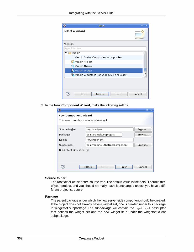
3. In the New Component Wizard, make the following settins.
Source folderThe root folder of the entire source tree. The default value is the default source treeof your project, and you should normally leave it unchanged unless you have a dif-ferent project structure.
PackageThe parent package under which the new server-side component should be created.If the project does not already have a widget set, one is created under this packagein widgetset subpackage. The subpackage will contain the .gwt.xml descriptorthat defines the widget set and the new widget stub under the widgetset.clientsubpackage.
Creating a Widget362
Integrating with the Server-Side

NameThe class name of the new server-side component. The name of the client-sidewidget stub will be the same but with "-Widget" suffix, for example, Mycompon-entWidget.You can rename the classes afterwards.
SuperclassThe superclass of the server-side component. It is AbstractComponent by default,but com.vaadin.ui.AbstractField or com.vaadin.ui.AbstractSelect are othercommonly used superclasses. If you are extending an existing component, youshould select it as the superclass.You can easily change the superclass later.
TemplateSelect which template to use.The default is Full fledged, which creates the server-side component, the client-side widget, the connector, a shared state object, andan RPC object. The Connector only leaves the shared state and RPC objects out.
Finally, click Finish to create the new component.
The wizard will:
• Create a server-side component stub in the base package
• If the project does not already have a widget set, the wizard creates a GWT moduledescriptor file (.gwt.xml) in the base package and modifies the web.xml deploymentdescriptor to specify the widget set class name parameter for the application
• Create a client-side widget stub (along with the connector and shared state and RPCstubs) in the client.componentname package under the base package
The structure of the server-side component and the client-side widget, and the serialization ofcomponent state between them, is explained in the subsequent sections of this chapter.
To compile the widget set, click the Compile widget set button in the Eclipse toolbar. See Sec-tion 16.2.2, “Compiling the Widget Set” for details. After the compilation finishes, you should beable to run your application as before, but using the new widget set. The compilation result iswritten under the WebContent/VAADIN/widgetsets folder. When you need to recompile thewidget set in Eclipse, see Section 16.2.2, “Compiling the Widget Set”. For detailed informationon compiling widget sets, see Section 13.4, “Compiling a Client-Side Module”.
The following setting is inserted in the web.xml deployment descriptor to enable the widget set:
<init-param> <description>Application widgetset</description> <param-name>widgetset</param-name>
<param-value>com.example.myproject.widgetset.MyprojectApplicationWidgetset</param-value></init-param>
You can refactor the package structure if you find need for it, but GWT compiler requires that theclient-side code must always be stored under a package named "client".
16.2.2. Compiling the Widget Set
After you edit a widget, you need to compile the widget set. The Vaadin Plugin for Eclipse auto-matically suggests to compile the widget set in various situations, such as when you save a client-side source file. If this gets annoying, you can disable the automatic recompilation in the Vaadincategory in project settings, by selecting the Suspend automatic widgetset builds option.
363Compiling the Widget Set
Integrating with the Server-Side

You can compile the widget set manually by clicking the Compile widgetset button in the Eclipsetoolbar, shown in Figure 16.2, “The Compile Widgetset Button in Eclipse Toolbar”, while theproject is open and selected. If the project has multiple widget set definition files, you need toselect the one to compile in the Project Explorer.
Figure 16.2.The Compile Widgetset Button in Eclipse Toolbar
The compilation progress is shown in the Console panel in Eclipse, illustrated in Figure 16.3,“Compiling a Widget Set”. You should note especially the list of widget sets found in the classpath.
The compilation output is written under the WebContent/VAADIN/widgetsets folder, in awidget set specific folder.
You can speed up the compilation significantly by compiling the widget set only for your browserduring development. The generated .gwt.xml descriptor stub includes a disabled element thatspecifies the target browser. See Section 13.3.2, “Limiting Compilation Targets” for more detailson setting the user-agent property.
For more information on compiling widget sets, see Section 13.4, “Compiling a Client-SideModule”. Should you compile a widget set outside Eclipse, you need to refresh the project byselecting it in Project Explorer and pressing F5.
16.3. Creating a Server-Side Component
Normal server-side Vaadin applications interface with a server-side component that is renderedon the client-side using the widget counterpart. A server-side component must manage statesynchronization between the widget on the client-side, in addition to any server-side logic.
16.3.1. Basic Server-Side Component
The component state is usually managed by a shared state, described later in Section 16.5,“Shared State”.
public class MyComponent extends AbstractComponent { public MyComponent() { getState().setText("This is MyComponent"); }
@Override public MyComponentState getState() { return (MyComponentState) super.getState(); }}
16.4. Integrating the Two Sides with a Connector
A client-side widget is integrated with a server-side component with a connector. A connector isa client-side class that communicates changes to the widget state and events to the server-side.
Creating a Server-Side Component364
Integrating with the Server-Side

Figure 16.3. Compiling a Widget Set
16.4.1. A Basic Connector
The basic tasks of a connector is to hook up to the widget and handle events from user interactionand changes received from the server. A connector also has a number of routine infrastructuremethods which need to be implemented.
@Connect(MyComponent.class)public class MyComponentConnector extends AbstractComponentConnector { public MyComponentConnector() { }
@Override protected Widget createWidget() { return GWT.create(MyComponentWidget.class); }
@Override public MyComponentWidget getWidget() { return (MyComponentWidget) super.getWidget(); }
@Override public MyComponentState getState() { return (MyComponentState) super.getState(); }
@Override public void onStateChanged(StateChangeEvent stateChangeEvent) { super.onStateChanged(stateChangeEvent);
// Do something useful final String text = getState().getText(); getWidget().setText(text); }}
365A Basic Connector
Integrating with the Server-Side

16.4.2. Communication with the Server-Side
The main task of a connector is to communicate user interaction with the widget to the server-side and receive state changes from the server-side and relay them to the widget.
Server-to-client communication is normally done using a shared state, as described in Section 16.5,“Shared State”. The serialization of the state data is handled completely transparently.
For client-to-server communication, a connector can make remote procedure calls (RPC) to theserver-side. Also, the server-side component can make RPC calls to the connector. For a thoroughdescription of the RPC mechanism, refer to Section 16.6, “RPC Calls Between Client- andServer-Side”.
16.5. Shared State
The basic communication from a server-side component to its the client-side widget counterpartis handled using a shared state. The shared state is serialized transparently. It is read-only onthe client-side.
A shared state object simply needs to extend the ComponentState. It should contain settersand getters for the properties that are to be synchronized.
public class MyComponentState extends ComponentState { private String text;
public String getText() { return text; }
public void setText(String text) { this.text = text; }}
You can also use public member variables and access them directly. However, if you do havesetters and getters, as in the above example, the corresponding member variables may not bepublic or they will create a name conflict during serialization.
16.5.1. Accessing Shared State on Server-Side
A server-side component can access the shared state with the getState() method, which returnsthe ComponentState object of the shared state type of the component.
To prevent casting the shared state object every time, it is recommended that you override thebase implementation with one that returns the proper shared state type, as follows:
@Overridepublic MyComponentState getState() { return (MyComponentState) super.getState();}
You can then use the getState() to access the shared state object with the proper type.
public MyComponent() { getState().setText("This is the initial state"); ....}
Communication with the Server-Side366
Integrating with the Server-Side
After you make changes to the shared state object in the server-side component, you need tocall requestRepaint() to inform the framework that the state has changed and the client-sidewidget needs to be repainted by synchronizing the state.
For example, the server-side component could offer a setter for a component property, whichdelegates the property to the shared state object and requests the repaint:
void setText(String text) { // update shared state getState().setText(text); requestRepaint();}
16.5.2. Handing Shared State in a Connector
A connector can access a shared state with the getState() method. The access should beread-only. To prevent casting the shared state object every time, it is recommended that youoverride the base implementation with one that returns the proper shared state type, as follows:
@Overridepublic MyComponentState getState() { return (MyComponentState) super.getState();}
State changes made on the server-side are communicated transparently to the client-side.Whena state change occurs, the onStateChanged() method in the connector is called. You shouldshould always call the superclass method before anything else to handle changes to commoncomponent properties.
@Overridepublic void onStateChanged(StateChangeEvent stateChangeEvent) { super.onStateChanged(stateChangeEvent);
// Do something useful with the data final String text = getState().getText(); getWidget().setText(text);}
16.5.3. Referring to Components in Shared State
While you can pass any regular Java objects through a shared state, referring to another com-ponent requires special handling because on the server-side you can only refer to a server-sidecomponent, while on the client-side you only have widgets. References to components can bemade by referring to their connectors, which are shared.
public class MyComponentState extends ComponentState { private Connector otherComponent;
public Connector getOtherComponent() { return otherComponent; }
public void setOtherComponent(Connector otherComponent) { this.otherComponent = otherComponent; }}
You could then access the component on the server-side as follows:
public class MyComponent { public void MyComponent(Component otherComponent) { getState().setOtherComponent(otherComponent);
367Handing Shared State in a Connector
Integrating with the Server-Side

}
public Component getOtherComponent() { return (Component)getState().getOtherComponent(); }
// And the cast method @Override public MyComponentState getState() { return (MyComponentState) super.getState(); }}
On the client-side, you should cast it in a similar fashion to a ComponentConnector, or possiblyto the specific connector type if it is known.
16.5.4. Sharing Resources
Resources, which commonly are references to icons or other images, are another case of objectsthat require special handling in sharing. A Resource object exists only on the server-side andon the client-side you have an URL to the resource. The shared state object needs to pass thereference as a URLReference object.
public class MyState extends ComponentState { private URLReference myIcon;
public URLReference getMyIcon() { return icon; }
public void setMyIcon(URLReference myIcon) { this.myIcon = myIcon; }}
On the server-side, you can set the reference as a ResourceReference object, which createsthe URL for the resource object given to the constructor as follows:
getState().setMyIcon(new ResourceReference(myResource));
It is normally meaningful only to set the resource on the server-side and then access it on theclient-side. If you for some reason need to access it on the server-side, you need to cast theURLReference to the ResourceReference that exists on the server-side, and get the Resourceobject with getResource().
ResourceReference ref = ((ResourceReference) getState().getMyIcon());if (ref != null) { Resource resource = ref.getResource(); ...}
The URL for the resource can be accessed on the client-side with the getURL() method.
String url = getState().getMyIcon().getURL();
16.6. RPC Calls Between Client- and Server-Side
Vaadin supports making Remote Procedure Calls (RPC) between a server-side component andits client-side widget counterpart. RPC calls are normally used for communicating statelessevents, such as button clicks or other user interaction, in contrast to changing the shared state.
Sharing Resources368
Integrating with the Server-Side

Either party can make an RPC call to the other side. When a client-side widget makes a call, aserver request is made. Calls made from the server-side to the client-side are communicated inthe response of the server request during which the call was made.
If you use Eclipse and enable the "Full-Fledged" widget in the New Vaadin Widget wizard, itautomatically creates a component with an RPC stub.
16.6.1. RPC Calls to the Server-Side
RPC calls from the client-side to the server-side are made through an RPC interface that extendsthe ServerRpc interface. A server RPC interface simply defines any methods that can be calledthrough the interface.
For example:
public interface MyComponentServerRpc extends ServerRpc { public void clicked(MouseEventDetails mouseDetails);}
The above example defines a single clicks() RPC call, which takes a MouseEventDetailsobject as the parameter. You can pass any serializable Java objects in RPC calls and Vaadinhandles the serialization.
Making a Call
Before making a call, you need to instantiate the server RPC object with RpcProxy.create().After that, you can make calls through the server RPC interface that you defined, for example asfollows:
@Connect(MyComponent.class)public class MyComponentConnector extends AbstractComponentConnector {
MyComponentServerRpc rpc = RpcProxy .create(MyComponentServerRpc.class, this);
public MyComponentConnector() { getWidget().addClickHandler(new ClickHandler() { public void onClick(ClickEvent event) { final MouseEventDetails mouseDetails = MouseEventDetailsBuilder .buildMouseEventDetails( event.getNativeEvent(), getWidget().getElement());
// Make the call rpc.clicked(mouseDetails); } }); }}
Handling a Call
RPC calls are handled in a server-side implementation of the server RPC interface. The call andits parameters are serialized and passed to the server in an RPC request transparently.
public class MyComponent extends AbstractComponent { private MyComponentServerRpc rpc = new MyComponentServerRpc() { private int clickCount = 0;
369RPC Calls to the Server-Side
Integrating with the Server-Side
public void clicked(MouseEventDetails mouseDetails) { Notification.show("Click from the client!"); } };
public MyComponent() { ... registerRpc(rpc); }}
16.7. Component and UI Extensions
Adding features to existing components by extending them by inheritance creates a problemwhen you want to combine such features. For example, one add-on could add spell-check to aTextField, while another could add client-side validation. Combining such add-on features wouldbe difficult if not impossible. You might also want to add a feature to several or even to all com-ponents, but extending all of them by inheritance is not really an option. Vaadin includes a com-ponent plug-in mechanism for these purposes. Such plug-ins are simply called extensions.
Also a UI can be extended in a similar fashion. In fact, some Vaadin features such as notificationsare UI extensions.
Implementing an extension requires defining a server-side extension class and a client-sideconnector. An extension can have a shared state with the connector and use RPC, just like acomponent could.
16.7.1. Server-Side Extension API
The server-side API for an extension consists of class that extends (in the Java sense) the Ab-stractExtension class. It needs to have an extend() method that takes the extended componentor UI as a parameter and passes it to the super.extend().
For example, let us have a trivial example with an extension that takes no special parameters:
public class CapsLockWarning extends AbstractExtension { public void extend(PasswordField field) { super.extend(field); }}
The extension can then be added to a component as follows:
PasswordField password = new PasswordField("Give it");new CapsLockWarning().extend(password);layout.addComponent(password);
Adding a feature in such a "reverse" way is a bit unusual in the Vaadin API, but allows type safetyfor extensions, as the method can limit the target type to which the extension can be applied,and whether it is a component or UI.
16.7.2. Extension Connectors
An extension does not have a corresponding widget on the client-side, but only an extensionconnector that extends the AbstractExtensionConnector class.The server-side extension classis specified with a @Connect annotation, just like in component connectors.
Component and UI Extensions370
Integrating with the Server-Side

An extension connector needs to implement the extend() method, which allows hooking to theextended component. The normal extension mechanism is to modify the extended componentas needed and add event handlers to it to handle user interaction. A connector can share a statewith the server-side extension as well as make RPC calls just like with normal components.
In the following example, we implement a "Caps Lock warning" extension. It listens for changesin the Caps Lock state and displays a floating warning element over the extended component ifthe Caps Lock is on.
@Connect(CapsLockWarning.class)public class CapsLockWarningConnector extends AbstractExtensionConnector {
@Override protected void extend(ServerConnector target) { // Get the extended widget final Widget passwordWidget = ((ComponentConnector) target).getWidget();
// Preparations for the added feature final VOverlay warning = new VOverlay(); warning.add(new HTML("Caps Lock is enabled!"));
// Add an event handler pw.addDomHandler(new KeyPressHandler() { public void onKeyPress(KeyPressEvent event) { if (isEnabled() && isCapsLockOn(event)) { warning.showRelativeTo(passwordWidget); } else { warning.hide(); } } }, KeyPressEvent.getType()); }
private boolean isCapsLockOn(KeyPressEvent e) { return e.isShiftKeyDown() ^ Character.isUpperCase(e.getCharCode()); }}
The extend() method gets the connector of the extended component as the parameter, in theabove example a PasswordFieldConnector. It can access the widget with the getWidget().
An extension connector needs to be included in a widget set.The class must therefore be definedunder the client package of a widget set, just like with component connectors.
16.8. Styling a Widget
To make your widget look stylish, you need to style it. There are two basic ways to define CSSstyles for a component: in the widget sources and in a theme. A default style should be definedin the widget sources, and different themes can then modify the style.
16.8.1. Determining the CSS Class
The CSS class of a widget element is normally defined in the widget class and set withsetStyleName(). A widget should set the styles for its sub-elements as it desires.
For example, you could style a composite widget with an overall style and with separate stylesfor the sub-widgets as follows:
371Styling a Widget
Integrating with the Server-Side
public class MyPickerWidget extends ComplexPanel { public static final String CLASSNAME = "mypicker";
private final TextBox textBox = new TextBox(); private final PushButton button = new PushButton("...");
public MyPickerWidget() { setElement(Document.get().createDivElement()); setStylePrimaryName(CLASSNAME);
textBox.setStylePrimaryName(CLASSNAME + "-field"); button.setStylePrimaryName(CLASSNAME + "-button");
add(textBox, getElement()); add(button, getElement());
button.addClickHandler(new ClickHandler() { public void onClick(ClickEvent event) { Window.alert("Calendar picker not yet supported!"); } }); }}
In addition, all Vaadin components get the v-connector class. If it extends an existing Vaadinor GWT widget, it will inherit CSS classes from that as well.
16.8.2. Default Stylesheet
A client-side module, which is normally a widget set, can include stylesheets. They must beplaced under the public folder under the folder of the widget set, a described in Section 13.3.1,“Specifying a Stylesheet”.
For example, you could style the widget described above as follows:
.mypicker { white-space: nowrap;}
.mypicker-button { display: inline-block; border: 1px solid black; padding: 3px; width: 15px; text-align: center;}
Notice that some size settings may require more complex handling and calculating the sizes dy-namically.
16.9. Component Containers
Component containers, such as layout components, are a special group of components that requiresome consideration. In addition to handling state, they need to manage the serialization of theircontained components to the other side.
The easiest way to implement a component container is extend the AbstractComponentCon-tainer, which handles the serialization of the container server-side components to the client-side.
Default Stylesheet372
Integrating with the Server-Side

16.10. Creating Add-ons
Add-ons are the most convenient way to reuse Vaadin code, either commercially or free. VaadinDirectory serves as the store for the add-ons. You can distribute add-ons both as JAR librariesand Zip packages.
Creating a typical add-on package involves the following tasks:
• Compile server-side classes
• Compile JavaDoc (optional)
• Build the JAR
• Include Vaadin add-on manifest
• Include the compiled server-side classes
• Include the compiled JavaDoc (optional)
• Include sources of client-side classes for widget set compilation (optional)
• Include any JavaScript dependency libraries (optional)
• Exclude any test or demo code in the project
The exact contents depend on the add-on type. Component add-ons often include a widget set,but also JavaScript components and pure server-side components are possible, which do nothave a widget set. You can also have data container add-ons and theme add-ons, which do nothave a widget set, as well as various tools.
It is common to distribute the JavaDoc in a separate JAR, but you can also include it in the sameJAR.
16.10.1. Exporting Add-on in Eclipse
If you use the Vaadin Plugin for Eclipse for your add-on project, you can simply export the add-on from Eclipse.
1. Select the project and then File Export from the menu
2. In the export wizard that opens, select Vaadin Vaadin Add-on Package, and clickNext
3. In the Select the resources to export panel, select the content that should be includedin the add-on package. In general, you should include sources in src folder (at leastfor the client-side package), compiled server-side classes, themes inWebContent/VAADIN/themes. These are all included automatically. You probablywant to leave out any demo or example code.
If you are submitting the add-on to Vaadin Directory, the Implementation title shouldbe exactly the name of the add-on in Directory.The name may contain spaces and mostother letters. Notice that it is not possible to change the name later.
The Implementation version is the version of your add-on. Typically experimental orbeta releases start from 0.1.0, and stable releases from 1.0.0.
373Creating Add-ons
Integrating with the Server-Side

Figure 16.4. Exporting a Vaadin Add-on
The Widgetsets field should list the widget sets included in the add-on, separated bycommas. The widget sets should be listed by their class name, that is, without the.gwt.xml extension.
Exporting Add-on in Eclipse374
Integrating with the Server-Side

The JAR file is the file name of the exported JAR file. It should normally include theversion number of the add-on. You should follow the Maven format for the name, suchas myaddon-1.0.0.jar.
Finally, click Finish.
16.10.2. Building Add-on with Ant
Building an add-on with Ant is similar to building Vaadin applications. Vaadin libraries and otherdependencies are retrieved and included in the classpath using Apache Ivy.
In the following, we assume the Eclipse project structure. Let us put the build script in the buildfolder under the project. We begin the Ant script as follows:
<?xml version="1.0"?>
<project xmlns:ivy="antlib:org.apache.ivy.ant" name="My Own add-on" basedir=".." default="package-jar">
The namespace declaration is all you need to do to enable Ivy in Ant 1.6 and later. For earlierAnt versions, please see the Ivy documentation.
Configuration and Initialization
In the example script, we organize most settings in a configure target and then initialize thebuild in init target.
<target name="configure"> <!-- Where project source files are located --> <property name="src-location" value="src" />
<!-- Name of the widget set. --> <property name="widgetset" value="com.example.myaddon.widgetset.MyAddonWidgetset"/>
<!-- Addon version --> <property name="version" value="0.1.0"/>
<!-- Compilation result directory --> <property name="result-dir" value="build/result"/>
<!-- The target name of the built add-on JAR --> <property name="target-jar" value="${result-dir}/myaddon-${version}.jar"/></target>
<target name="init" depends="configure"> <!-- Construct and check classpath --> <path id="compile.classpath"> <pathelement path="build/classes" /> <pathelement path="${src-location}" /> <fileset dir="${result-dir}/lib"> <include name="*.jar"/> </fileset> </path>
375Building Add-on with Ant
Integrating with the Server-Side
<mkdir dir="${result-dir}"/></target>
You will need to make some configuration also in the package-jar target in addition to theconfigure target.
Compiling the Server-Side
Compiling the add-on requires the Vaadin libraries and any dependencies. We use Apache Ivyfor resolving the dependencies and retrieving the library JARs.
<!-- Retrieve dependencies with Ivy --><target name="resolve" depends="init"> <ivy:retrieve pattern="${result-dir}/lib/[artifact].[ext]"/></target>
The pattern attribute for the <retrieve> task specifies where the dependencies are stored,in the above case in the build/result/lib directory.
Compiling the server-side classes is then straight-forward:
<!-- Compile server-side --><target name="compile-server-side" depends="init, resolve"> <delete dir="${result-dir}/classes"/> <mkdir dir="${result-dir}/classes"/>
<javac srcdir="${src-location}" destdir="${result-dir}/classes"> <classpath> <path refid="compile.classpath"/> </classpath> </javac></target>
Compiling the JavaDoc
You may want to include API documentation for the add-on in the same or in a different JAR file.You can do it as follows, using the configuration we defined earlier.You may want to exclude theclient-side classes and any test and demo classes from the JavaDoc, as is done in this example,if they are in the same source tree.
<!-- Compile JavaDoc --><target name="compile-javadoc" depends="init"> <delete dir="${result-dir}/javadoc"/> <mkdir dir="${result-dir}/javadoc"/>
<javadoc destdir="${result-dir}/javadoc"> <sourcefiles> <fileset dir="${src-location}" id="src"> <include name="**/*.java"/>
<!-- Excluded stuff from the package --> <exclude name="**/client/**/*"/> <exclude name="**/demo/**/*"/> <exclude name="**/MyDemoUI.java"/> </fileset> </sourcefiles> <classpath> <path refid="compile.classpath"/> </classpath>
Building Add-on with Ant376
Integrating with the Server-Side

</javadoc></target>
Packaging the JAR
An add-on JAR typically includes the following:
• Vaadin add-on manifest
• The compiled server-side classes
• The compiled JavaDoc (optional)
• Sources of client-side classes (optional)
• Any JavaScript dependency libraries (optional)
Let us begin crafting the target. The JAR requires the compiled server-side classes and the op-tional API documentation.
<!-- Build the JAR --><target name="package-jar" depends="compile-server-side, compile-javadoc"> <jar jarfile="${target-jar}" compress="true">
First, you need to include a manifest that defines basic information about the add-on. The imple-mentation title must be the exact title of the add-on, as shown in the Vaadin Directory title. Thevendor is you. The manifest also includes the license title and file reference for the add-on.
<!-- Manifest required by Vaadin Directory --><manifest> <attribute name="Vaadin-Package-Version" value="1" /> <attribute name="Vaadin-Widgetsets" value="${widgetset}" /> <attribute name="Implementation-Title" value="My Own Addon" /> <attribute name="Implementation-Version" value="${version}" /> <attribute name="Implementation-Vendor" value="Me Myself" /> <attribute name="Vaadin-License-Title" value="Apache2" /> <attribute name="Vaadin-License-File" value="http://www.apache.org/licenses/LICENSE-2.0" /></manifest>
The rest of the package-jar target goes as follows. As was done in the JavaDoc compilation,you also need to exclude any test or demo code in the project here.You need to modify at leastthe emphasized parts for your project.
<!-- Include built server-side classes --> <fileset dir="build/result/classes"> <patternset> <include name="com/example/myaddon/**/*"/> <exclude name="**/client/**/*"/> <exclude name="**/demo/**/*"/> <exclude name="**/test/**/*"/> <exclude name="**/MyDemoUI*"/> </patternset> </fileset>
<!-- Include widget set sources -->
377Building Add-on with Ant
Integrating with the Server-Side
<fileset dir="src"> <patternset> <include name="com/exaple/myaddon/**/*"/> </patternset> </fileset>
<!-- Include JavaDoc in the JAR --> <fileset dir="${result-dir}/javadoc" includes="**/*"/> </jar></target>
You should now be ready to run the build script with Ant.
16.11. Migrating from Vaadin 6
The client-side architecture was redesigned almost entirely in Vaadin 7. In Vaadin 6, state syn-chronization was done explicitly by serializing and deserializing the state on the server- and client-side. In Vaadin 7, the serialization is handled automatically by the framework using state objects.
In Vaadin 6, a server-side component serialized its state to the client-side using the Paintableinterface and deserialized the state through the VariableOwner interface. In Vaadin 7, theseare done through the ClientConnector interface.
On the client-side, a widget deserialized its state through the Paintable interface and sentstate changes through the ApplicationConnection object. In Vaadin 7, these are replacedwith the ServerConnector.
In addition to state synchronization, Vaadin 7 has an RPC mechanism that can be used forcommunicating events. They are especially useful for events that are not associated with a statechange, such as a button click.
The framework ensures that the connector hierarchy and states are up-to-date when listenersare called.
16.11.1. Quick (and Dirty) Migration
Vaadin 7 has a compatibility layer that allows quick conversion of a widget.
1. Create a connector class, such as MyConnector, that extends Vaadin6Connector.Implement the createWidget() method as GWT.create(MyWidget.class).
2. Move the @ClientWidget(MyWidget.class) from the server-side component, sayMyComponent, to the MyConnector class and make it@Connect(MyComponent.class).
3. Have the server-side component implement the Vaadin6Component interface to enablecompatibility handling.
4. Remove any calls to super.paintContent()
16.12. Integrating JavaScript Components
Vaadin allows simplified integration of pure JavaScript components. The JavaScript connectorcode is published from the server-side. As the JavaScript integration does not involve GWTprogramming, no widget set compilation is needed.
Migrating from Vaadin 6378
Integrating with the Server-Side

16.12.1. Example JavaScript Library
There are many kinds of component libraries for JavaScript. In the following, we present a simplelibrary that provides one object-oriented JavaScript component. We use this example later toshow how to integrate it with a server-side Vaadin component.
The example library includes a single MyComponent component, defined in mylibrary.js.
// Define the namespacevar mylibrary = mylibrary || {};
mylibrary.MyComponent = function (element) { this.element = element; this.element.innerHTML = "<div class='caption'>Hello, world!</div>" + "<div class='textinput'>Enter a value: " + "<input type='text' name='value'/>" + "<input type='button' value='Click'/>" + "</div>";
// Style it this.element.style.border = "thin solid red"; this.element.style.display = "inline-block";
// Getter and setter for the value property this.getValue = function () { return this.element. getElementsByTagName("input")[0].value; }; this.setValue = function (value) { this.element.getElementsByTagName("input")[0].value = value; };
// Default implementation of the click handler this.click = function () { alert("Error: Must implement click() method"); };
// Set up button click var button = this.element.getElementsByTagName("input")[1]; var component = this; // Can't use this inside the function button.onclick = function () { component.click(); };};
When used in an HTML page, the library would be included with the following definition:
<script language="javascript" type="text/javascript" src="mylibrary.js"></script>
You could then use it anywhere in the HTML document as follows:
<!-- Placeholder for the component --> <div id="foo"></div>
<!-- Create the component and bind it to the placeholder --><script language="javascript" type="text/javascript"> foo = new mylibrary.MyComponent( document.getElementById("foo")); foo.click = function () { alert("Value is " + this.getValue()); }</script>
379Example JavaScript Library
Integrating with the Server-Side

Figure 16.5. A JavaScript Component Example
You could interact with the component with JavaScript for example as follows:
<a href="javascript:foo.setValue('New value')">Click here</a>
16.12.2. A Server-Side API for a JavaScript Component
To begin integrating such a JavaScript component, you would need to sketch a bit how it wouldbe used from a server-side Vaadin application. The component should support writing the valueas well as listening for changes to it.
final MyComponent mycomponent = new MyComponent();
// Set the value from server-sidemycomponent.setValue("Server-side value");
// Process a value input by the user from the client-sidemycomponent.addListener(new MyComponent.ValueChangeListener() { @Override public void valueChange() { Notification.show("Value: " + mycomponent.getValue()); }});
layout.addComponent(mycomponent);
Basic Server-Side Component
A JavaScript component extends the AbstractJavaScriptComponent, which handles the sharedstate and RPC for the component.
package com.vaadin.book.examples.client.js;
@JavaScript({"mylibrary.js", "mycomponent-connector.js"})public class MyComponent extends AbstractJavaScriptComponent { public interface ValueChangeListener extends Serializable { void valueChange(); } ArrayList<ValueChangeListener> listeners = new ArrayList<ValueChangeListener>(); void addListener(ValueChangeListener listener) { listeners.add(listener); }
public void setValue(String value) { getState().setValue(value); }
public String getValue() { return getState().getValue(); }
@Override public MyComponentState getState() { return (MyComponentState) super.getState(); }}
A Server-Side API for a JavaScript Component380
Integrating with the Server-Side

Notice later when creating the JavaScript connector that its name must match the package nameof this server-side class.
The shared state of the component is as follows:
public class MyComponentState extends JavaScriptComponentState { private String value;
public String getValue() { return value; }
public void setValue(String value) { this.value = value; }}
You can also have just public member variables, but if you do have setters and getters, as above,the member variables may not be public.
16.12.3. Defining a JavaScript Connector
A JavaScript connector is an class that initializes the JavaScript component and handles commu-nication between the server-side code and the integrated JavaScript code.
A connector is defined as a constructor function that is added to the window object. The nameof the function must match the server-side class name, with the full package path. Instead of theJava dot notation for the package name, underscores need to be used as separators.
The Vaadin client-side framework adds a number of methods to the connector class. Thethis.getElement() method returns the HTML DOM element of the component. Thethis.getState() returns a shared state object with the current state as synchronized fromthe server-side.
window.com_vaadin_book_examples_client_js_MyComponent =function() { // Create the component var mycomponent = new mylibrary.MyComponent(this.getElement());
// Handle changes from the server-side this.onStateChange = function() { mycomponent.setValue(this.getState().value); };
// Pass user interaction to the server-side var connector = this; mycomponent.click = function() { connector.onClick(mycomponent.getValue()); };};
In the above example, we pass user interaction using the JavaScript RPC mechanism, as de-scribed later in Section 16.12.4, “RPC from JavaScript to Server-Side”.
16.12.4. RPC from JavaScript to Server-Side
User interaction with the JavaScript component has to be passed to the server-side using anRPC (Remote Procedure Call) mechanism. The JavaScript RPC mechanism is almost equal to
381Defining a JavaScript Connector
Integrating with the Server-Side
regular client-side widgets, as described in Section 16.6, “RPC Calls Between Client- and Server-Side”.
Handling RPC Calls on the Server-Side
Let us begin with the RPC function registration on the server-side. RPC calls are handled on theserver-side in function handlers that implement the JavaScriptFunction interface. A server-side function handler is registered with the addFunction() method in AbstractJavaScriptCom-ponent. The server-side registration actually defines a JavaScript method that is available in theclient-side connector object.
Continuing from the server-side MyComponent example we defined earlier, we add a constructorto it that registers the function.
public MyComponent() { addFunction("onClick", new JavaScriptFunction() { @Override public void call(JSONArray arguments) throws JSONException { getState().setValue(arguments.getString(0)); for (ValueChangeListener listener: listeners) listener.valueChange(); } });}
Making an RPC Call from JavaScript
An RPC call is made simply by calling the RPC method in the connector. In the constructorfunction of the JavaScript connector, you could write as follows (the complete connector codewas given earlier):
window.com_vaadin_book_examples_gwt_js_MyComponent = function() { ... var connector = this; mycomponent.click = function() { connector.onClick(mycomponent.getValue()); }; };
Here, the mycomponent.click is a function in the example JavaScript library, as described inSection 16.12.1, “Example JavaScript Library”. The onClick() is the method we defined onthe server-side. We pass a simple string parameter in the call.
You can pass any native types in the parameters.
RPC from JavaScript to Server-Side382
Integrating with the Server-Side

Part IV. Vaadin Add-onsThe Vaadin core library is just the beginning. Vaadin is designed to be highly extendable with third-partycomponents, themes, data binding implementations, and tools. The add-ons are an important part of theVaadin ecosystem, supporting also different business models for different needs.


Chapter 17
Using VaadinAdd-ons
17.1. Overview .............................................................................................. 38517.2. Downloading Add-ons from Vaadin Directory ...................................... 38517.3. Compiling Add-on Widget Sets ............................................................ 38617.4. Removing Add-ons .............................................................................. 38817.5. Using Add-ons in a Maven Project ...................................................... 388
This chapter describes the installation of add-on components, themes, containers, and othertools from the Vaadin Directory and the use of commercial add-ons offered by Vaadin.
17.1. Overview
In addition to the components, layouts, themes, and data sources built in into the core Vaadinlibrary, many others are available as add-ons, either from the Vaadin Directory or from independentsources. Both commercial and free components exist under various licenses.
Installation of themes, data sources, and components built with server-side component compos-ition is simple, just dropping a JAR package in a project and, usually, compiling the includedwidget set (the client-side implementation).
17.2. Downloading Add-ons from Vaadin Directory
Vaadin Directory at http://vaadin.com/directory/ provides a rich collection of add-onsfor Vaadin.You can download Directory add-on packages from the details page of an add-on.
385Book of Vaadin

1. Select the version; some add-ons have several versions available. The latest is shownby default, but you can choose another the version to download from the dropdownmenu in the header of the details page.
2. Click Download Now and save the JAR or Zip file on your computer.
3. If the add-on is packaged in a Zip package, unzip the package and follow any instructionsprovided inside the package. Typically, you just need to copy a JAR file to your webproject under the WEB-INF/lib directory.
4. Update and recompile your project. In Eclipse, select the project and press F5.
5. You need to compile the client-side implementations of the add-on components, thatis, a widget set. This is the case for majority of add-ons, except for pure server-side,theme, or data binding add-ons. You must recompile the widget set if you install a newversion of the add-on or the Vaadin library. See the subsequent sections for detailedinstructions for compiling widget sets.
6. Update the project in web server and possibly restart the server.
After trying out an add-on, you can give some feedback to the author of the add-on by rating theadd-on with one to five stars and optionally leaving a comment.
Please note the add-on license. While most commercial add-ons can be downloaded directly,you should note their license and other terms and conditions. Many are offered under a dual li-censing agreement so that they can be used in open source projects for free, and many have atrial period for closed-source development.
17.3. Compiling Add-on Widget Sets
17.3.1. Compiling Widget Sets in Eclipse
To be able to compile widget sets in Eclipse, you need to have the Vaadin Plugin for Eclipse in-stalled, as instructed in Section 2.4, “Installing Vaadin Plugin for Eclipse”.
An application UI can only have one widget set, so if you use multiple add-ons and possibly yourown custom widgets, they need to be combined to a single widget set that inherits them. Youcan create the combining widget set manually and the Eclipse plugin simply update it when youadd new add-ons. Otherwise, the Eclipse plugin automatically creates a project-specific widgetset under the project root source folder.
The Eclipse plugin compiles widget sets automatically by default. They do not normally need tobe recompiled after changes to server-side classes, so if the automatic recompilation get annoying,disable it from the project settings.
To compile the widget set(s) manually, click the Compile Vaadin widgets button in Eclipsetoolbar or press Ctrl+6. You must recompile the widget set(s) always when you install a newversion of the add-on or of the Vaadin library.
Figure 17.1.The Compile Vaadin widgets Button in Eclipse Toolbar
Compiling Add-on Widget Sets386
Using Vaadin Add-ons

Further information on defining and compiling widget sets is given in Section 13.4, “Compiling aClient-Side Module”.
17.3.2. Compiling Widget Sets with an Ant Script
If you need to compile the widget set with an Ant script, you can find a script template at the URLhttps://vaadin.com/download/misc/build-widgetset-vaadin7.xml. You can copy the build script toyour project and, once configured, use it by entering:
$ ant -f build-widgetset-vaadin7.xml
See Section 13.4, “Compiling a Client-Side Module” for details on configuring the build script andthe available build targets, and Section 13.3, “Client-Side Module Descriptor” for information re-garding the widget set definition file.
If you are using an IDE such as Eclipse, always remember to refresh the project to synchronizeit with the filesystem after compiling the widget set outside Eclipse.
17.3.3.Troubleshooting
If you experience problems, do the following:
• Check the .gwt.xml descriptor file under the widget set folder in the project rootpackage. For example, if the project root package is com.example.myproject, thew i d g e t s e t d e f i n i t i o n f i l e w o u l d b ecom.example.myproject.widgetset.MyprojectWidgetset.gwt.xml. SeeSection 13.3, “Client-Side Module Descriptor” for details on the contents of the client-side module descriptor, which is used to define a widget set.
• Check the WEB-INF/web.xml deployment descriptor and see that the servlet for yourUI has a widget set parameter, such as the following:
<init-param> <description>UI widgetset</description> <param-name>widgetset</param-name> <param-value>com.example.myproject.widgetset.MyprojectWidgetset</param-value></init-param>
• See the VAADIN/widgetsets directory and check that the widget set appears there.You can remove it and recompile to see that compilation works properly.
• Use the Net tab in Firebug to see that the widget set (and theme) is loaded properly.
• Use the ?debug parameter for the application to see if there is any version conflictbetween the widget set and the Vaadin library, or the themes. See Section 11.3.1, “DebugMode” for details.
• Refresh and recompile the project. In Eclipse, select the project and press F5, stop theserver, clean the server temporary directories, and restart it.
• Check the Error Log view in Eclipse (or the IDE you use).
387Compiling Widget Sets with an Ant Script
Using Vaadin Add-ons
17.4. Removing Add-ons
Version mismatch problems with custom widget sets are a common source of grief for manybeginners in Vaadin. If you need add-ons or your own custom components that include widgetsets, you of course need to compile them, but otherwise it is unnecessary.
If you do not use any such add-ons or your own custom components, do the following:
1. If you are using the Eclipse plugin, disable automatic widget set compilation from projectpreferences, in the Vaadin category, by selecting Suspend automatic widgetsetbuilds. This prevents accidental compilation of the unnecessary widget sets. You maywant to do this anyhow as the automatic builds can be annoying. You can still alwaysbuild the widget set with the button in the toolbar.
2. Remove all widget set folders from under the VAADIN/widgetsets folder.
3. Edit the WEB-INF/web.xml file and remove the widgetset init parameter from theservlet. It looks as follows:
<init-param> <description>UI widgetset</description> <param-name>widgetset</param-name>
<param-value>com.vaadin.demo.colorpicker.widgetset.ColorPickerWidgetSet</param-value></init-param>
4. Refresh the project. In Eclipse, select the project and press F5, stop the server, cleanthe server temporary directories, and restart it.
At least in development environments, if you have extracted Vaadin themes to theVAADIN/themes folder, you should remove them and let them be loaded dynamically from theVaadin JAR.
17.5. Using Add-ons in a Maven Project
To use add-ons in a project that uses Maven, you simply have to add them as dependencies inthe POM. If the add-ons includes widget sets, as at least most component add-ons do, you alsoneed to define and compile a project widget set.
Creating, compiling, and packaging a Vaadin project using Maven was described in Section 2.6,“Using Vaadin with Maven”.
17.5.1. Adding a Dependency
Vaadin Directory provides a Maven repository for all the add-ons in the Directory. You can viewneeded Maven dependency definitions by clicking the Maven POM button at the right side of theadd-on view, as illustrated in Figure 17.2, “Maven POM Definitions in Vaadin Directory”.
Removing Add-ons388
Using Vaadin Add-ons

Figure 17.2. Maven POM Definitions in Vaadin Directory
You need to copy the dependency declaration to the pom.xml file in your project, under the/project/dependencies element.
... <dependencies> <dependency> <groupId>com.vaadin</groupId> <artifactId>vaadin</artifactId> <version>${vaadin.version}</version> </dependency> <dependency> <groupId>org.vaadin.addons</groupId> <artifactId>vaadin-sqlcontainer</artifactId> <version>1.1.0</version> </dependency> ...
You can use the exact version number, as is done in the example above, or LATEST to alwaysuse the latest version of the add-on.
The POM excerpt given in Directory includes also a repository definition, but if you have usedthe vaadin-archetype-clean archetype when creating your project, it should already includethe definition.
17.5.2. Enabling Widget Set Compilation
Most add-on components in Vaadin Directory include a widget set which must be compiled beforeusing the add-on. Some add-ons, such as data binding add-ons or themes, do not include awidget set.
Configuring the POM
The configuration needed for compiling widget sets is included in the pom.xml created with thevaadin-archetype-clean archetype, but the elements are commented out. You just needto enable the configuration.
<!-- Compile custom GWT components or widget dependencies with the GWT compiler --><!--<plugin> <groupId>org.codehaus.mojo</groupId> ...
389Enabling Widget Set Compilation
Using Vaadin Add-ons
</plugin>-->
...
<!--<pluginRepositories></pluginRepositories>-->
...
<dependencies>...<!--
<dependency> ... </dependency>-->
</dependencies>
Creating a Widget Set Definition File
Your project needs a widget set that combines the default widget set in the Vaadin core librarywith any widget sets from add-ons. This requires creating an empty widget set definition file (ormodule file in GWT terminology). The actual content of the file is generated automatically bysearching the class path for widget sets (with the vaadin:update-widgetset as explainedlater), but you need to create an empty file.
Create a widget set directory in your project source directory.
$ mkdir project-name/src/main/java/your/company/gwt
Then create a ProjectNameWidgetSet.gwt.xml file in the directory with an empty <module>element as follows:
<module></module>
Enabling the Widget Set in the UI
The project widget set needs to be enabled in the web.xml deployment descriptor in the applic-ation. Edit the src/main/webapp/WEB-INF/web.xml file and add or modify the widgetsetparameter for the servlet as follows.
<servlet> ... <init-param> <description>Widget Set to Use</description> <param-name>widgetset</param-name> <param-value>your.company.gwt.ProjectNameWidgetSet</param-value> </init-param></servlet>
The parameter is the class name of the widget set, that is, without the .gwt.xml extension andwith the Java dot notation for class names that include the package name.
This should complete the task of enabling a widget set compilation and use in your project. Next,you need to update the project widget set, as described in the next section.
Enabling Widget Set Compilation390
Using Vaadin Add-ons

17.5.3. Updating and Compiling the Project Widget Set
If you have enabled widget set compilation as described earlier and created the project widgetset, you need to update the widget set to include the default widget set and any widget sets in-cluded in add-ons.You can do this simply by running the vaadin:update-widgetset goal inthe project directory.
$ mvn vaadin:update-widgetset...[INFO] auto discovered modules [your.company.gwt.ProjectNameWidgetSet][INFO] Updating widgetset your.company.gwt.ProjectNameWidgetSet[ERROR] 27.10.2011 19:22:34 com.vaadin.terminal.gwt.widgetsetutils.ClassPathExplorer getAvailableWidgetSets[ERROR] INFO: Widgetsets found from classpath:[ERROR] your.company.gwt.ProjectNameWidgetSet in file:/home/magi/itmill/maventest/project-name/src/main/java[ERROR] com.vaadin.terminal.gwt.DefaultWidgetSet in jar:file:/home/magi/.m2/repository/com/vaadin/vaadin/6.7.1/vaadin-6.7.1.jar!/[ERROR] [ERROR] 27.10.2011 19:22:34 com.vaadin.terminal.gwt.widgetsetutils.ClassPathExplorer getAvailableWidgetSets[ERROR] INFO: Search took 8ms...
Do not mind the "ERROR" labels, they are just an issue with the Vaadin Plugin for Maven.
If you later add other add-ons in the project, or remove some, you need to run the widget setupdate again.
The project widget set also needs to be compiled using the GWT Compiler. We enabled theMaven add-ons for GWT compilation in the previous section. You can compile the widget setwith the gwt:compile goal as follows:
$ mvn gwt:compile
You need to recompile the widget set if you upgrade to a new version of Vaadin or any of theincluded widget sets. It is not done automatically by the package goal. If you have added or re-moved add-ons, you also need to run the vaadin:update-widgetset goal before the compil-ation.
This concludes the compilation of add-on widget sets.You still need to compile and package theapplication with the package goal, as described in Section 2.6, “Using Vaadin with Maven”.
391Updating and Compiling the Project Widget Set
Using Vaadin Add-ons

392

Chapter 18
Vaadin Calendar
18.1. Overview .............................................................................................. 39318.2. Installing Calendar ............................................................................... 39618.3. Basic Use ............................................................................................ 39618.4. Implementing an Event Provider .......................................................... 39918.5. Configuring the Appearance ................................................................ 40118.6. Drag and Drop ..................................................................................... 40318.7. Using the Context Menu ...................................................................... 40418.8. Localization and Formatting ................................................................ 40518.9. Customizing the Calendar ................................................................... 405
The Vaadin Calendar is a commercial add-on component for organizing and displaying calendarevents. It can be used to view and manage events in monthly, weekly, and daily views.
18.1. Overview
The main features of the Vaadin Calendar include:
• Monthly, weekly, and daily views
• Two types of events: all-day events and events with a time range
• Add events directly, from a Container, or with an event provider
• Control the range of the visible dates
• Selecting and editing date or time range by dragging
• Drag and drop events to calendar
393Book of Vaadin

• Support for localization and timezones
The data source of the calendar can be practically anything, as its events are queried dynamicallyby the component.You can bind the calendar to a Vaadin container, or to any other data sourceby implementing an event provider.
Monthly and Weekly Views
The Vaadin Calendar has two types of views that are shown depending on the date range of thecalendar. The weekly view displays a week by default. It can show anything between one toseven days a week, and is also used as a single-day view. The view mode is determined fromthe date range of the calendar, defined by a start and an end date. Calendar will be shown in amonthly view when the date range is over than one week (seven days) long. The date range isalways calculated in an accuracy of one millisecond.
The monthly view, shown in Figure 18.1, “Monthly view with All-Day and Normal Events”, caneasily be used to control all types of events, but it is best suited for events that last for one ormore days. You can drag the events to move them. In the figure, you can see two longer eventsthat are highlighted with a blue and green background color. Other markings are shorter dayevents that last less than a 24 hours. These events can not be moved by dragging in the monthlyview.
In Figure 18.2, “Weekly View”, you can see four normal day events and also all-day events atthe top of the time line grid.
Calendar Events
All occurrences in a calendar are represented as events. You have three ways to manage thecalendar events: add them to the calendar and manage them by its API, from a VaadinContainer, or with an event provider.
Events are handled though the CalendarEvent interface. The concrete class of the event de-pends on the specific CalendarEventProvider used in the calendar. By default, Calendar usesa BasicEventProvider to provide events, which uses BasicEvent instances.
Vaadin Calendar does not depend on any particular data source implementation. Events arequeried by the Calendar from the provider that just has to implement theCalendarEventProvider interface. It is up to the event provider that Calendar gets the correctevents.
You can bind any Vaadin Container to a calendar, in which case a ContainerEventProvider isused transparently. The container must be ordered by start date and time of the events. SeeSection 9.5, “Collecting Items in Containers” for basic information about containers.
A calendar event requires a start time and an end time.These are the only mandatory properties.In addition, an event can also be set as an all-day event by setting the all-day property of theevent.You can also set the description of an event, which is displayed as a tooltip in the userinterface.
If the all-day field of the event is true, then the event is always rendered as an all-day event.In the monthly view, this means that no start time is displayed in the user interface and the eventhas an colored background. In the weekly view, all-day events are displayed in the upper part ofthe screen, and rendered similarly to the monthly view. In addition, when the time range of anevent is 24 hours or longer, it is rendered as an all-day event in the monthly view.
Monthly and Weekly Views394
Vaadin Calendar

Figure 18.1. Monthly view with All-Day and Normal Events
Figure 18.2. Weekly View
When the time range of an event is equal or less than 24 hours, with the accuracy of one milli-second, the event is considered as a normal day event. Normal event has a start and end timesthat may be on different days.
395Calendar Events
Vaadin Calendar

Interaction
The date and week captions, as well as events, are clickable and the clicks can be listened forby the server. Also date/time range selections, event dragging, and event resizing can be listenedby the server. Using the API, you have full control over the events caused by user interaction.
The weekly view has navigation buttons to navigate forward and backward in time.These actionsare also listened by the server. Custom navigation can be implemented using event handlers,as described in Section 18.9, “Customizing the Calendar”.
18.2. Installing Calendar
Vaadin Calendar is available for download from Vaadin Directory and from a Maven repository.Installing the add-on is the same as with Vaadin add-ons in general, so please refer to Chapter 17,Using Vaadin Add-ons. Vaadin Calendar includes a widget set, which you need to compile toyour project widget set.
Licensing
When downloading the Vaadin Calendar add-on from Vaadin Directory, you need to choose thelicense.
Vaadin Calendar is a commercial product licensed under a dual-licensing scheme. The AGPL(GNU Affero General Public License) allows open-source development, while the CVAL (Com-mercial Vaadin Add-On License) needs to be purchased for closed-source use, including webdeployments and internal use. With the CVAL license, you have a free 30-day trial period forevaluating the product.
Commercial licenses can be purchased from the Vaadin Directory, where you can also find thelicense details and download the Vaadin Calendar.
18.3. Basic Use
A Calendar is created just like any other Vaadin component. The component has undefined sizeby default and you usually want to give it a fixed or relative size, for example as follows.
Calendar cal = new Calendar("My Calendar");cal.setWidth("600px");cal.setHeight("300px");
You need to define a time range for the calendar, as described in the following subsection. Thetime range also controls the view mode of the calendar; whether it is a daily, weekly, or monthlyview.You also need to provide events for the calendar, for which there are several ways.
18.3.1. Setting the Date Range
The view mode is controlled by the date range of the calendar. The weekly view is the defaultview mode.You can change the range by setting start and end dates for the calendar. The rangemust be between one and 60 days.
In the following, we set the calendar to show only one day, which is the current day.
cal.setStartDate(new Date());cal.setEndDate(new Date());
Interaction396
Vaadin Calendar

Notice that although the range we set above is actually zero time long, the calendar still rendersthe time from 00:00 to 23:59. This is normal, as the Vaadin Calendar is guaranteed to render atleast the date range provided, but may expand it. This behaviour is important to notice when weimplement our own event providers.
18.3.2. Adding and Managing Events
The first thing the you will probably notice about the Calendar is that it is rather empty at first.The Calendar allows three different ways to add events:
• Add events directly to the Calendar object using the addEvent()
• Use a Container as a data source
• Use the event provider mechanism
The easiest way to add and manage events in a calendar is to use the basic event managementAPI in the Calendar. You can add events with addEvent() and remove them with theremoveEvent().These methods will use the underlying event provider to write the modificationsto the data source.
For example, the following adds a two-hour event starting from the current time. The standardJava GregorianCalendar provides various ways to manipulate date and time.
// Add a short eventGregorianCalendar start = new GregorianCalendar();GregorianCalendar end = new GregorianCalendar();end.add(java.util.Calendar.HOUR, 2);calendar.addEvent(new BasicEvent("Calendar study", "Learning how to use Vaadin Calendar", start.getTime(), end.getTime()));
Calendar uses by default a BasicEventProvider, which keeps the events in memory in an internalreprensetation.
This adds a new event that lasts for 3 hours. As the BasicEventProvider and BasicEvent implementsome optional event interfaces provided by the calendar package, there is no need to refreshthe calendar. Just create events, set their properties and add them to the Event Provider.
18.3.3. Getting Events from a Container
You can use any Vaadin Container that implements the Indexed interface as the data sourcefor calendar events.The Calendar will listen to change events from the container as well as writechanges to the container. You can attach a container to a Calendar withsetContainerDataSource().
In the following example, we bind a BeanItemContainer that contains built-in BasicEvent eventsto a calendar.
// Create the calendarCalendar calendar = new Calendar("Bound Calendar");
// Use a container of built-in BasicEventsfinal BeanItemContainer<BasicEvent> container = new BeanItemContainer<BasicEvent>(BasicEvent.class);
// Create a meeting in the containercontainer.addBean(new BasicEvent("The Event", "Single Event", new GregorianCalendar(2012,1,14,12,00).getTime(),
397Adding and Managing Events
Vaadin Calendar

new GregorianCalendar(2012,1,14,14,00).getTime()));
// The container must be ordered by the start time. You// have to sort the BIC every time after you have added// or modified events.container.sort(new Object[]{"start"}, new boolean[]{true});
calendar.setContainerDataSource(container, "caption", "description", "start", "end", "styleName");
The container must either use the default property IDs for event data, as defined in theCalendarEvent interface, or provide them as parameters for the setContainerDataSource()method, as we did in the example above.
Keeping the Container Ordered
The events in the container must be kept ordered by their start date/time. Failing to do so mayand will result in the events not showing in the calendar properly.
Ordering depends on the container. With some containers, such as BeanItemContainer, youhave to sort the container explicitly every time after you have added or modified events, usuallywith the sort() method, as we did in the example above. Some container, such as JPACon-tainer, keep the in container automatically order if you provide a sorting rule.
For example, you could order a JPAContainer by the following rule, assuming that the startdate/time is held in the startDate property:
// The container must be ordered by start date. For JPAContainer// we can just set up sorting once and it will stay ordered.container.sort(new String[]{"startDate"}, new boolean[]{true});
Delegation of Event Management
Setting a container as the calendar data source with setContainerDataSource() automaticallyswitches to ContainerEventProvider. You can manipulate the event data through the API inCalendar and the user can move and resize event through the user interface.The event providerdelegates all such calendar operations to the container.
If you add events through the Calendar API, notice that you may be unable to create events ofthe type held in the container or adding them requires some container-specific operations. Insuch case, you may need to customize the addEvent() method.
For example, JPAContainer requires adding new items with addEntity().You could first addthe entity to the container or entity manager directly and then pass it to the addEvent(). Thatdoes not, however, work if the entity class does not implement CalendarEvent. This is actuallythe case always if the property names differ from the ones defined in the interface. You couldhandle creating the underlying entity objects in the addEvent() as follows:
// Create a JPAContainerfinal JPAContainer<MyCalendarEvent> container = JPAContainerFactory.make(MyCalendarEvent.class, "book-examples");
// Customize the event provider for adding events// as entitiesContainerEventProvider cep = new ContainerEventProvider(container) { @Override public void addEvent(CalendarEvent event) { MyCalendarEvent entity = new MyCalendarEvent(
Getting Events from a Container398
Vaadin Calendar

event.getCaption(), event.getDescription(), event.getStart(), event.getEnd(), event.getStyleName()); container.addEntity(entity); }}
// Set the container as the data sourcecalendar.setEventProvider(cep);
// Now we can add events to the database through the calendarBasicEvent event = new BasicEvent("The Event", "Single Event", new GregorianCalendar(2012,1,15,12,00).getTime(), new GregorianCalendar(2012,1,15,14,00).getTime());calendar.addEvent(event);
18.4. Implementing an Event Provider
If the two simple ways of storing and managing events for a calendar are not enough, you mayneed to implement a custom event provider. It is the most flexible way of providing events. Youneed to attach the event provider to the Calendar using the setEventProvider() method.
Event queries are done by asking the event provider for all the events between two given dates.The range of these dates is guaranteed to be at least as long as the start and end dates set forthe component.The component can, however, ask for a longer range to ensure correct rendering.In particular, all start dates are expanded to the start of the day, and all end dates are expandedto the end of the day.
18.4.1. Custom Events
An event provider could use the built-in BasicEvent, but it is usually more proper to define acustom event type that is bound directly to the data source. Custom events may be useful forsome other purposes as well, such as when you need to add extra information to an event orcustomize how it is acquired.
Custom events must implement the CalendarEvent interface or extend an existing event class.The built-in BasicEvent class should serve as a good example of implementing simple events.It keeps the data in member variables.
public class BasicEvent implements CalendarEventEditor, EventChangeNotifier { ...
public String getCaption() { return caption; }
public String getDescription() { return description; }
public Date getEnd() { return end; }
public Date getStart() { return start; }
public String getStyleName() { return styleName;
399Implementing an Event Provider
Vaadin Calendar

}
public boolean isAllDay() { return isAllDay; }
public void setCaption(String caption) { this.caption = caption; fireEventChange(); }
public void setDescription(String description) { this.description = description; fireEventChange(); }
public void setEnd(Date end) { this.end = end; fireEventChange(); }
public void setStart(Date start) { this.start = start; fireEventChange(); }
public void setStyleName(String styleName) { this.styleName = styleName; fireEventChange(); }
public void setAllDay(boolean isAllDay) { this.isAllDay = isAllDay; fireEventChange(); }
public void addListener(EventChangeListener listener) { ... }
public void removeListener(EventChangeListener listener) { ... }
protected void fireEventChange() {...}}
You may have noticed that there was some additional code in the BasicEvent that was not inthe CalendarEvent interface. Namely BasicEvent also implements two additional interfaces:
CalendarEditorThis interface defines setters for all the fields, and is required for some of the defaulthandlers to work.
EventChangeNotifierThis interface adds the possibility to listen for changes in the event, and enables theCalendar to render the changes immediately.
The start time and end time are mandatory, but caption, description, and style name are not.Thestyle name is used as a part of the CSS class name for the HTML DOM element of the event.
In addition to the basic event interfaces, you can enhance the functionality of your event andevent provider classes by using the EventChange and EventSetChange events. They let the
Custom Events400
Vaadin Calendar

Calendar component to know about changes in events and update itself accordingly. The Ba-sicEvent and BasicEventProvider examples given earlier include a simple implementation ofthese interfaces.
18.4.2. Implementing the Event Provider
An event provider needs to implement the CalendarEventProvider interface. It has only onemethod to be implemented. Whenever the calendar is painted, getEvents(Date, Date)method is called and it must return a list of events between the given start and end time.
The following example implementation returns only one example event. The event starts fromthe current time and is five hours long.
public class MyEventProvider implements CalendarEventProvider{ public List<Event> getEvents(Date startDate, Date endDate){ List<Event> events = new ArrayList<Event>(); GregorianCalendar cal = new GregorianCalendar(); cal.setTime(new Date());
Date start = cal.getTime(); cal.add(GregorianCalendar.HOUR, 5); Date end = cal.getTime(); BasicEvent event = new BasicEvent(); event.setCaption("My Event"); event.setDescription("My Event Description"); event.setStart(start); event.setEnd(end); events.add(event);
return events; }}
It is important to notice that the Calendar may query for dates beyond the range defined by startdate and end date. Particularly, it may expand the date range to make sure the user interface isrendered correctly.
18.5. Configuring the Appearance
Configuring the appearance of the Vaadin Calendar component is one of the basic tasks. At theleast, you need to consider its sizing in your user interface. You also quite probably want to usesome color or colors for events.
18.5.1. Sizing
The Vaadin Calendar supports the dynamic size system of Vaadin, with both defined and undefinedsizes. When using defined sizes, the Calendar calculates the correct height for the cells so thatit fits to the size given.
When using an undefined size for the calendar, all the sizes come from CSS. In addition, whenthe height is undefined, a scrollbar is displayed in the weekly view to better fit the cells to theuser interface. See the section called “Style for Undefined Size” for information about customizingthe undefined sizes.
18.5.2. Styling
The Calendar has a default theme defined in the widget set. You may choose to overwrite thestyle names from the default theme file calendar.css. The file is located in a folder named
401Implementing the Event Provider
Vaadin Calendar

public under the src folder in the JAR file. Vaadin will find the CSS from inside the JARpackage.
Style for Undefined Size
Usually, you do not need to overwrite any of the default styles, but a Calendar with undefinedsize is a exception. Below is a list of style names that define the size of a Calendar with undefinedsize (these are the defaults from calendar.css):
.v-calendar-month-sizedheight .v-calendar-month-day { height: 100px;}
.v-calendar-month-sizedwidth .v-calendar-month-day { width: 100px;}
.v-calendar-header-month-Hsized .v-calendar-header-day { width: 101px;}
/* for IE */.v-ie6 .v-calendar-header-month-Hsized .v-calendar-header-day { width: 104px;}
/* for others */.v-calendar-header-month-Hsized td:first-child { padding-left: 21px;}
.v-calendar-header-day-Hsized { width: 200px;}
.v-calendar-week-numbers-Vsized .v-calendar-week-number { height: 100px; line-height: 100px;}
.v-calendar-week-wrapper-Vsized { height: 400px; overflow-x: hidden !important;}
.v-calendar-times-Vsized .v-calendar-time { height: 38px;}
.v-calendar-times-Hsized .v-calendar-time { width: 42px;}
.v-calendar-day-times-Vsized .v-slot,.v-calendar-day-times-Vsized .v-slot-even { height: 18px;}
.v-calendar-day-times-Hsized, .v-calendar-day-times-Hsized
.v-slot,.v-calendar-day-times-Hsized .v-slot-even { width: 200px;}
Styling402
Vaadin Calendar
Event Style
Events can be styled with CSS by setting them a style name suffix. The suffix is retrieved withthe getStyleName() method in CalendarEvent. If you use BasicEvent events, you can setthe suffix with setStyleName().
BasicEvent event = new BasicEvent("Wednesday Wonder", ... );event.setStyleName("mycolor");calendar.addEvent(event);
Suffix mycolor would create v-calendar-event-mycolor class for regular events andv-calendar-event-mycolor-add-day for all-day events. You could style the events withthe following rules:
.v-calendar .v-calendar-event-mycolor {}
.v-calendar .v-calendar-event-mycolor-all-day {}
.v-calendar .v-calendar-event-mycolor .v-calendar-event-caption {}
.v-calendar .v-calendar-event-mycolor .v-calendar-event-content {}
18.5.3. Visible Hours and Days
As we saw in Section 18.3.1, “Setting the Date Range”, you can set the range of dates that areshown by the Calendar. But what if you wanted to show the entire month but hide the weekends?Or show only hours from 8 to 16 in the weekly view? The setVisibleDays() andsetVisibleHours() methods allow you to do that.
calendar.setVisibleDays(1,5); // Monday to Fridaycalendar.setVisibleHours(0,15); // Midnight until 4 pm
After the above settings, only weekdays from Monday to Friday would be shown. And when thecalendar is in the weekly view, only the time range from 00:00 to 16:00 would be shown.
Note that the excluded times are never shown so you should take care when setting the daterange. If the date range contains only dates / times that are excluded, nothing will be displayed.Also note that even if a date is not rendered because these settings, the event provider may stillbe queried for events for that date.
18.6. Drag and Drop
Vaadin Calendar can act as a drop target for drag and drop, described in Section 11.11, “Dragand Drop”. With the functionality, the user could drag events, for example, from a table to a cal-endar.
To support dropping, a Calendar must have a drop handler. When the drop handler is set, thedays in the monthly view and the time slots in the weekly view can receive drops. Other locations,such as day names in the weekly view, can not currently receive drops.
Calendar uses its own implementation of TargetDetails: CalendarTargetdetails. It holds in-formation about the the drop location, which in the context of Calendar means the date and time.The drop target location can be retrieved via the getDropTime() method. If the drop is donein the monthly view, the returned date does not have exact time information. If the drop happenedin the weekly view, the returned date also contains the start time of the slot.
Below is a short example of creating a drop handler and using the drop information to create anew event:
private Calendar createDDCalendar() { Calendar calendar = new Calendar();
403Visible Hours and Days
Vaadin Calendar

calendar.setDropHandler(new DropHandler() { public void drop(DragAndDropEvent event) { CalendarTargetDetails details = (CalendarTargetDetails) event.getTargetDetails();
TableTransferable transferable = (TableTransferable) event.getTransferable();
createEvent(details, transferable); removeTableRow(transferable); }
public AcceptCriterion getAcceptCriterion() { return AcceptAll.get(); }
});
return calendar;}
protected void createEvent(CalendarTargetDetails details, TableTransferable transferable) { Date dropTime = details.getDropTime(); java.util.Calendar timeCalendar = details.getTargetCalendar() .getInternalCalendar(); timeCalendar.setTime(dropTime); timeCalendar.add(java.util.Calendar.MINUTE, 120); Date endTime = timeCalendar.getTime();
Item draggedItem = transferable.getSourceComponent(). getItem(transferable.getItemId());
String eventType = (String)draggedItem. getItemProperty("type").getValue();
String eventDescription = "Attending: " + getParticipantString( (String[]) draggedItem. getItemProperty("participants").getValue());
BasicEvent newEvent = new BasicEvent(); newEvent.setAllDay(!details.hasDropTime()); newEvent.setCaption(eventType); newEvent.setDescription(eventDescription); newEvent.setStart(dropTime); newEvent.setEnd(endTime);
BasicEventProvider ep = (BasicEventProvider) details .getTargetCalendar().getEventProvider(); ep.addEvent(newEvent);}
18.7. Using the Context Menu
Vaadin Calendar allows the use of context menu (mouse right-click) to manage events. As inother context menus in Vaadin, the menu items are handled in Vaadin as actions by an actionhandler. To enable a context menu, you have to implement a Vaadin Action.Handler andadd it to the calendar with addActionHandler().
An action handler must implement two methods: getActions() and handleAction(). ThegetActions() is called for each day displayed in the calendar view. It should return a list ofallowed actions for that day, that is, the items of the context menu. The target parameter is the
Using the Context Menu404
Vaadin Calendar

context of the click - a CalendarDateRange that spans over the day.The sender is the Calendarobject.
The handleActions() receives the target context in the target. If the context menu wasopened on an event, the target is the Event object, otherwise it is a CalendarDateRange.
18.8. Localization and Formatting
18.8.1. Setting the Locale and Time Zone
Month and weekday names are shown in the language of the locale setting of the Calendar.Thetranslations are acquired from the standard Java locale data. By default, Calendar uses thesystem default locale for its internal calendar, but you can change it with setLocale(Localelocale). Setting the locale will update also other location specific date and time settings, suchas the first day of the week, time zone, and time format. However, time zone and time format canbe overridden by settings in the Calendar.
For example, the following would set the language to US English:
cal.setLocale(Locale.US);
The locale defines the default time zone. You can change it with the setTimeZone() method,which takes a java.util.TimeZone object as its parameter. Setting timezone to null will resettimezone to the locale default.
For example, the following would set the Finnish time zone, which is EET
cal.setTimeZone(TimeZone.getTimeZone("Europe/Helsinki"));
18.8.2.Time and Date Caption Format
The time may be shown either in 24 or 12 hour format.The default format is defined by the locale,but you can change it with the setTimeFormat() method. Giving a null setting will reset thetime format to the locale default.
cal.setTimeFormat(TimeFormat.Format12H);
You can change the format of the date captions in the week view with thesetWeeklyCaptionFormat(String dateFormatPattern) method.The date format patternshould follow the format of the standard Java java.text.SimpleDateFormat class.
For example:
cal.setWeeklyCaptionFormat("dd-MM-yyyy");
18.9. Customizing the Calendar
In this section, we give a tutorial for how to make various basic customizations of the VaadinCalendar. The event provider and styling was described earlier, so now we concentrate on otherfeatures of the Calendar API.
We use example code to demonstrate the customizations. You can find the source code of theexample application on-line with the name CustomizedCalendarDemo athttp://dev.vaadin.com/svn/addons/Calendar. Some of the less important code for thisdocument has been left out to make the code more readable and shorter.
405Localization and Formatting
Vaadin Calendar

18.9.1. Overview of Handlers
Most of the handlers related to calendar events have sensible default handlers. These are foundin the com.vaadin.ui.handler package.The default handlers and their functionalities are describedbelow.
• BasicBackwardHandler. Handles clicking the back-button of the weekly view so thatthe viewed month is changed to the previous one.
• BasicForwardHandler. Handles clicking the forward-button of the weekly view so thatthe viewed month is changed to the next one.
• BasicWeekClickHandler. Handles clicking the week numbers int the monthly view sothat the viewable date range is changed to the clicked week.
• BasicDateClickHandler. Handles clicking the dates on both the monthly view and theweekly view. Changes the viewable date range so that only the clicked day is visible.
• BasicEventMoveHandler. Handles moving the events in both monthly view and theweekly view. Events can be moved and their start and end dates are changed correctly,but only if the event implements CalendarEventEditor (implemented by BasicEvent).
• BasicEventResizeHandler. Handles resizing the events in the weekly view. Events canbe resized and their start and end dates are changed correctly, but only if the event im-plements CalendarEventEditor (implemented by the BasicEvent).
All of these handlers are automatically set when creating a new Calendar. If you wish to disablesome of the default functionality, you can simply set the corresponding handler to null. This willprevent the functionality from ever appearing on the user interface. For example, if you set theEventMoveHandler to null, the user will be unable to move events in the browser.
18.9.2. Creating a Calendar
Let us first create a new Calendar instance. Here we use our own event provider, the MyEvent-Provider described in Section 18.4.2, “Implementing the Event Provider”.
Calendar cal = new Calendar(new MyEventProvider());
This initializes the Calendar. To customize the viewable date range, we must set a start and enddate to it.
There is only one visible event in the timeline, starting from the current time. That is what ourevent provider passes to the client.
It would be nice to also be able to control the navigation forward and backward. The defaultnavigation is provided by the default handlers, but perhaps we want to restrict the users so theycan only navigate dates in the current year. Maybe we also want to pose some other restrictionsto the clicking week numbers and dates.
These restrictions and other custom logic can be defined with custom handlers.You can find thehandlers in the com.vaadin.addon.calendar.ui.handler package and they can be easily extended.Note that if you don not want to extend the default handlers, you are free to implement your own.The interfaces are described in CalendarComponentEvents.
Overview of Handlers406
Vaadin Calendar

18.9.3. Backward and Forward Navigation
Vaadin Calendar has only limited built-in navigation support. The weekly view has navigationbuttons in the top left and top right corners.
You can handle backward and forward navigation with a BackwardListener andForwardListener.
cal.setHandler(new BasicBackwardHandler() { protected void setDates(BackwardEvent event, Date start, Date end) {
java.util.Calendar calendar = event.getComponent() .getInternalCalendar(); if (isThisYear(calendar, end) && isThisYear(calendar, start)) { super.setDates(event, start, end); } }});
The forward navigation handler can be implemented in the same way. The example handler re-stricts the dates to the current year.
18.9.4. Date Click Handling
By default, clicking a date either in month or week view switches single-day view. The date clickevent is handled by a DateClickHandler.
The following example handles click events so that when the user clicks the date header in theweekly view, it will switch to single-day view, and in the single-day view switch back to the weeklyview.
cal.setHandler(new BasicDateClickHandler() { public void dateClick(DateClickEvent event) { Calendar cal = event.getComponent(); long currentCalDateRange = cal.getEndDate().getTime() - cal.getStartDate().getTime();
if (currentCalDateRange < VCalendar.DAYINMILLIS) { // Change the date range to the current week cal.setStartDate(cal.getFirstDateForWeek(event.getDate())); cal.setEndDate(cal.getLastDateForWeek(event.getDate()));
} else { // Default behaviour, change date range to one day super.dateClick(event); } }});
18.9.5. Handling Week Clicks
The monthly view displays week numbers for each week row on the left side of the date grid.Theweek number are clickable and you can handle the click events by setting a WeekClickHandlerfor the Calendar object. The default handler changes the date range to be the clicked week.
In the following example, we add a week click handler that changes the date range of the calendarto one week only if the start and end dates of the week are in the current month.
cal.setHandler(new BasicWeekClickHandler() { protected void setDates(WeekClick event,
407Backward and Forward Navigation
Vaadin Calendar

Date start, Date end) { java.util.Calendar calendar = event.getComponent() .getInternalCalendar(); if (isThisMonth(calendar, start) && isThisMonth(calendar, end)) { super.setDates(event, start, end); } }});
18.9.6. Handling Event Clicks
The calendar events in all views are are clickable. There is no default handler. Just like the dateand week click handlers, event click handling is enabled by setting an EventClickHandlerfor the Calendar object.
You can get hold of the clicked event by the getCalendarEvent() method in the EventClickobject passed to the handler, as shown in the following example.
cal.addListener(new EventClickListener() { public void eventClick(EventClick event) { BasicEvent e = (BasicEvent) event.getCalendarEvent();
// Do something with it new Notification("Event clicked: " + e.getCaption(), e.getDescription()).show(Page.getCurrent()); }});
18.9.7. Event Dragging
The user can drag an event to change its position in time. The default handler sets the start andend time of the event accordingly. You can do many things with a custom move handler, suchas restrict moving events.
In the following example, we add a EventMoveHandler to a Calendar. The event handler up-dates the new position to the datasource, but only if the new dates are in the current month. Thisrequires making some changes to the event provider class.
cal.setHandler(new BasicEventMoveHandler() { private java.util.Calendar javaCalendar;
public void eventMove(MoveEvent event) { javaCalendar = event.getComponent().getInternalCalendar(); super.eventMove(event); }
protected void setDates(CalendarEventEditor event, Date start, Date end) { if (isThisMonth(javaCalendar, start) && isThisMonth(javaCalendar, end)) { super.setDates(event, start, end); } }});
For the above example to work, the example event provider presented earlier needs to be changedslightly so that it doesn't always create a new event when getEvents() is called.
public static class MyEventProvider implements CalendarEventProvider { private List<CalendarEvent> events =
Handling Event Clicks408
Vaadin Calendar

new ArrayList<CalendarEvent>();
public MyEventProvider() { events = new ArrayList<CalendarEvent>(); GregorianCalendar cal = new GregorianCalendar(); cal.setTime(new Date());
Date start = cal.getTime(); cal.add(GregorianCalendar.HOUR, 5); Date end = cal.getTime(); BasicEvent event = new BasicEvent(); event.setCaption("My Event"); event.setDescription("My Event Description"); event.setStart(start); event.setEnd(end); events.add(event); }
public void addEvent(CalendarEvent BasicEvent) { events.add(BasicEvent); }
public List<CalendarEvent> getEvents(Date startDate, Date endDate) { return events; }}
After these changes, the user can move events around as earlier, but dropping an event, thestart and end dates are checked by the server. Note that as the server-side must move the eventin order for it to render to the place it was dropped.The server can also reject moves by not doinganything when the event is received.
18.9.8. Handling Drag Selection
Drag selection works both in the monthly and weekly views. To listen for drag selection, you canadd a RangeSelectListener to the Calendar. There is no default handler for range select.
In the code example below, we create an new event when any date range is selected. Drag se-lection opens a window where the user is asked for a caption for the new event. After confirming,the new event is be passed to the event provider and calendar is updated. Note that as our ex-ample event provider and event classes do not implement the event change interface, we mustrefresh the Calendar manually after changing the events.
cal.setHandler(new RangeSelectHandler() { public void rangeSelect(RangeSelectEvent event) { BasicEvent calendarEvent = new BasicEvent(); calendarEvent.setStart(event.getStart()); calendarEvent.setEnd(event.getEnd());
// Create popup window and add a form in it. VerticalLayout layout = new VerticalLayout(); layout.setMargin(true); layout.setSpacing(true);
final Window w = new Window(null, layout); ...
// Wrap the calendar event to a BeanItem // and pass it to the form final BeanItem<CalendarEvent> item = new BeanItem<CalendarEvent>(myEvent);
409Handling Drag Selection
Vaadin Calendar

final Form form = new Form(); form.setItemDataSource(item); ...
layout.addComponent(form);
HorizontalLayout buttons = new HorizontalLayout(); buttons.setSpacing(true); buttons.addComponent(new Button("OK", new ClickListener() {
public void buttonClick(ClickEvent event) { form.commit(); // Update event provider's data source provider.addEvent(item.getBean()); // Calendar needs to be repainted cal.requestRepaint(); getMainWindow().removeWindow(w); } }));
... }});
18.9.9. Resizing Events
The user can resize an event by dragging from both ends to change its start or end time. Thisoffers a convenient way to change event times without the need to type anything. The defaultresize handler sets the start and end time of the event according to the resize.
In the example below, we set a custom handler for resize events.The handler prevents any eventto be resized over 12 hours in length. Note that this does not prevent the user from resizing anevent over 12 hours in the client. The resize will just be corrected by the server.
cal.setHandler(new BasicEventResizeHandler() { private static final long twelveHoursInMs = 12*60*60*1000;
protected void setDates(CalendarEventEditor event, Date start, Date end) { long eventLength = end.getTime() - start.getTime(); if (eventLength <= twelveHoursInMs) { super.setDates(event, start, end); } }});
Resizing Events410
Vaadin Calendar

Chapter 19
Vaadin Charts
19.1. Overview .............................................................................................. 41119.2. Installing Vaadin Charts ....................................................................... 41319.3. Basic Use ............................................................................................ 41319.4. Chart Types ......................................................................................... 41719.5. Chart Configuration ............................................................................. 42719.6. Chart Data ........................................................................................... 429
This chapter provides the documentation of Vaadin Charts version 1.0. Some changes may applyto the final version.
19.1. Overview
Vaadin Charts is a feature-rich interactive charting library for Vaadin. It provides a Chart and aTimeline component. The Chart can visualize one- and two dimensional numeric data in manyavailable chart types. The charts allow flexible configuration of all the chart elements as well asthe visual style. The library includes a number of built-in visual themes, which you can extendfurther.The basic functionalities allow the user to interact with the chart elements in various ways,and you can define custom interaction with click events.The Timeline is a specialized componentfor visualizing time series, and is described in Chapter 20, Vaadin Timeline.
The data displayed in a chart can be one- or two dimensional tabular data, or scatter data withfree X and Y values. Data displayed in range charts has minimum and maximum values insteadof singular values.
This chapter covers the basic use of Vaadin Charts and the chart configuration. For detaileddocumentation of the configuration parameters and classes, please refer to the JavaDoc APIdocumentation of the library.
411Book of Vaadin

Figure 19.1. Vaadin Charts with Bar, Column, Area, and Pie Charts
In the following basic example, which we study further in Section 19.3, “Basic Use”, we demon-strate how to display one-dimensional data in a column graph and customize the X and Y axislabels and titles.
Chart chart = new Chart(ChartType.BAR);chart.setWidth("400px");chart.setHeight("300px");
// Modify the default configuration a bitConfiguration conf = chart.getConfiguration();conf.setTitle("Planets");conf.setSubTitle("The bigger they are the harder they pull");conf.getLegend().setEnabled(false); // Disable legend
// The dataListSeries series = new ListSeries("Diameter");series.setData(4900, 12100, 12800, 6800, 143000, 125000, 51100, 49500);conf.addSeries(series);
// Set the category labels on the axis correspondinglyXAxis xaxis = new XAxis();xaxis.setCategories("Mercury", "Venus", "Earth", "Mars", "Jupiter", "Saturn", "Uranus", "Neptune");xaxis.setTitle("Planet");conf.addxAxis(xaxis);
Overview412
Vaadin Charts

// Set the Y axis titleYAxis yaxis = new YAxis();yaxis.setTitle("Diameter");yaxis.getLabels().setFormatter( "function() {return Math.floor(this.value/1000) + \'Mm\';}");yaxis.getLabels().setStep(2);conf.addyAxis(yaxis);
layout.addComponent(chart);
The resulting chart is shown in Figure 19.2, “Basic Chart Example”.
Figure 19.2. Basic Chart Example
Vaadin Charts is based on Highcharts JS, a charting library written in JavaScript.
Licensing
Vaadin Charts is a commercial product licensed under the CVAL License (Commercial VaadinAdd-On License). A license needs to be purchased for all use, including web deployments aswell as intranet use. The Vaadin Charts license includes the license for Highcharts JS.
The commercial licenses can be purchased from the Vaadin Directory[https://vaadin.com/directory], where you can also find the license details and download theVaadin Charts.
19.2. Installing Vaadin Charts
Vaadin Charts can be installed either from an installation package, which you can download fromthe Vaadin Directory, or as a Maven dependency. For detailed instructions, please see Chapter 17,Using Vaadin Add-ons.
Once you have installed the library in your project, you need to compile the widget set.
19.3. Basic Use
The Chart is a regular Vaadin component, which you can add to a layout.You can give the charttype in the constructor or set it later in the chart model. A chart has a height of 400 pixels andtakes full width by default, which settings you may often need to customize.
413Licensing
Vaadin Charts
Chart chart = new Chart(ChartType.COLUMN);chart.setWidth("400px"); // 100% by defaultchart.setHeight("300px"); // 400px by default
The chart types are described in Section 19.4, “Chart Types”.
Configuration
After creating a chart, you need to configure it further. At the least, you need to specify the dataseries to be displayed in the configuration.
Most methods available in the Chart object handle its basic Vaadin component properties. Allthe chart-specific properties are in a separate Configuration object, which you can access withthe getConfiguration() method.
Configuration conf = chart.getConfiguration();conf.setTitle("Reindeer Kills by Predators");conf.setSubTitle("Kills Grouped by Counties");
The configuration properties are described in more detail in Section 19.5, “Chart Configuration”.
Plot Options
Many chart settings can be configured in the plot options of the chart or data series. Some of theoptions are chart type specific, as described later for each chart type, while many are shared.
For example, for line charts, you could disable the point markers as follows:
// Disable markers from linesPlotOptionsLine plotOptions = new PlotOptionsLine();plotOptions.setMarker(new Marker(false));conf.setPlotOptions(plotOptions);
You can set the plot options for the entire chart or for each data series separately, allowing alsomixed-type charts, as described in Section 19.3.2, “Mixed Type Charts”.
The shared plot options are described in Section 19.5.1, “Plot Options”.
Chart Data
The data displayed in a chart is stored in the chart configuration as a list of Series objects. Anew data series is added in a chart with the addSeries() method.
ListSeries series = new ListSeries("Diameter");series.setData(4900, 12100, 12800, 6800, 143000, 125000, 51100, 49500);conf.addSeries(series);
The data can be specified with a number of different series types DataSeries, ListSeries,AreaListSeries, and RangeSeries. The data configuration is described in more detail in Sec-tion 19.6, “Chart Data”.
Axis Configuration
One of the most common tasks for charts is customizing its axes. At the least, you usually wantto set the axis titles. Usually you also want to specify labels for data values in the axes.
Configuration414
Vaadin Charts

When an axis is categorical rather than numeric, you can define category labels for the items.They must be in the same order and the same number as you have values in your data series.
XAxis xaxis = new XAxis();xaxis.setCategories("Mercury", "Venus", "Earth", "Mars", "Jupiter", "Saturn", "Uranus", "Neptune");xaxis.setTitle("Planet");conf.addxAxis(xaxis);
Formatting of numeric labels can be done with JavaScript expressions, for example as follows:
// Set the Y axis titleYAxis yaxis = new YAxis();yaxis.setTitle("Diameter");yaxis.getLabels().setFormatter( "function() {return Math.floor(this.value/1000) + \'Mm\';}");yaxis.getLabels().setStep(2);conf.addyAxis(yaxis);
19.3.1. Displaying Multiple Series
The simplest data, which we saw in the examples earlier in this chapter, is one-dimensional andcan be represented with a single data series. Most chart types support multiple data series, whichare used for representing two-dimensional data. For example, in line charts, you can have multiplelines and in column charts the columns for different series are grouped by category. Differentchart types can offer alternative display modes, such as stacked columns. The legend displaysthe symbols for each series.
// The data// Source: V. Maijala, H. Norberg, J. Kumpula, M. Nieminen// Calf production and mortality in the Finnish// reindeer herding area. 2002.String predators[] = {"Bear", "Wolf", "Wolverine", "Lynx"};int kills[][] = { // Location: {8, 0, 7, 0}, // Muddusjarvi {30, 1, 30, 2}, // Ivalo {37, 0, 22, 2}, // Oraniemi {13, 23, 4, 1}, // Salla {3, 10, 9, 0}, // Alakitka};
// Create a data series for each numeric column in the tablefor (int predator = 0; predator < 4; predator++) { ListSeries series = new ListSeries(); series.setName(predators[predator]);
// The rows of the table for (int location = 0; location < kills.length; location++) series.addData(kills[location][predator]); conf.addSeries(series);}
The result for both regular and stacked column chart is shown in Figure 19.3, “Multiple Series ina Chart”. Stacking is enabled with setStacking() in PlotOptionsColumn.
415Displaying Multiple Series
Vaadin Charts
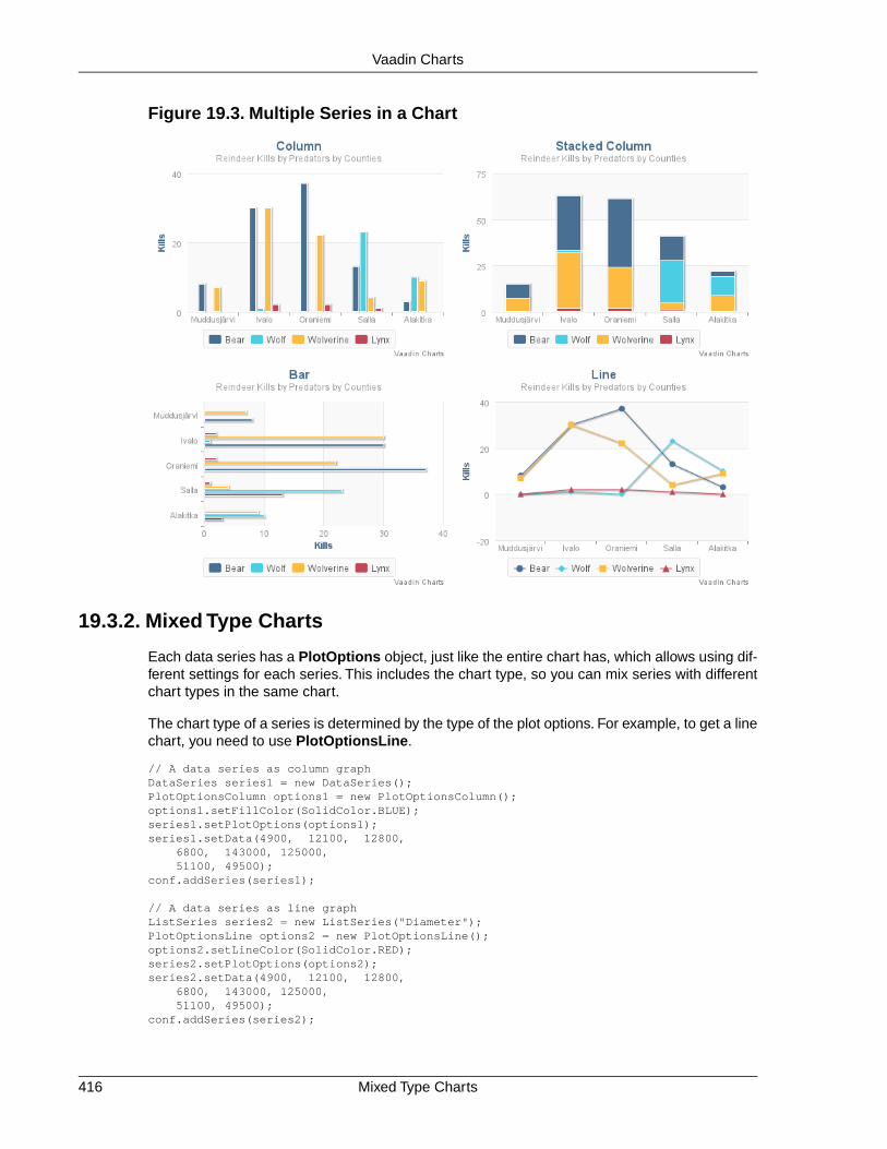
Figure 19.3. Multiple Series in a Chart
19.3.2. Mixed Type Charts
Each data series has a PlotOptions object, just like the entire chart has, which allows using dif-ferent settings for each series. This includes the chart type, so you can mix series with differentchart types in the same chart.
The chart type of a series is determined by the type of the plot options. For example, to get a linechart, you need to use PlotOptionsLine.
// A data series as column graphDataSeries series1 = new DataSeries();PlotOptionsColumn options1 = new PlotOptionsColumn();options1.setFillColor(SolidColor.BLUE);series1.setPlotOptions(options1);series1.setData(4900, 12100, 12800, 6800, 143000, 125000, 51100, 49500);conf.addSeries(series1);
// A data series as line graphListSeries series2 = new ListSeries("Diameter");PlotOptionsLine options2 = new PlotOptionsLine();options2.setLineColor(SolidColor.RED);series2.setPlotOptions(options2);series2.setData(4900, 12100, 12800, 6800, 143000, 125000, 51100, 49500);conf.addSeries(series2);
Mixed Type Charts416
Vaadin Charts

19.3.3. Chart Themes
The visual style and essentially any other chart configuration can be defined in a theme. Thetheme is global in the UI and can be set with the setTheme() in the thread-local ChartThemesingleton.
ChartTheme.get().setTheme(new SkiesTheme());
The VaadinTheme is the default chart theme in Vaadin Charts. Other available themes areGrayTheme, GridTheme, and SkiesTheme. The default theme in Highcharts can be set withthe HighChartsDefaultTheme.
A theme is a Vaadin Charts configuration that is used as a template for the configuration whenrendering the chart.
19.4. Chart Types
Vaadin Charts comes with over a dozen different chart types.You normally specify the chart typein the constructor of the Chart object. The available chart types are defined in the ChartTypeenum.You can later read or set the chart type with the chartType property of the chart model,which you can get with getConfiguration().getChart().
Each chart type has its specific plot options and support its specific collection of chart features.They also have specific requirements for the data series.
The basic chart types and their variants are covered in the following subsections.
19.4.1. Line and Spline Charts
Line charts connect the series of data points with lines. In the basic line charts the lines arestraight, while in spline charts the lines are smooth polynomial interpolations between the datapoints.
Table 19.1. Line Chart Subtypes
Plot Options ClassChartType
PlotOptionsLineLINE
PlotOptionsSplineSPLINE
Plot Options
The color property in the line plot options defines the line color, lineWidth the line width, anddashStyle the dash pattern for the lines.
See Section 19.4.4, “Scatter Charts” for plot options regarding markers and other data pointproperties. The markers can also be configured for each data point.
19.4.2. Area Charts
Area charts are like line charts, except that the area between the line and the Y axis is paintedwith a transparent color. In addition to the base type, chart type combinations for spline interpol-ation and ranges are supported.
417Chart Themes
Vaadin Charts

Table 19.2. Area Chart Subtypes
Plot Options ClassChartType
PlotOptionsAreaAREA
PlotOptionsAreaSplineAREASPLINE
PlotOptionsAreaRangeAREARANGE
PlotOptionsAreaSplineRangeAREASPLINERANGE
In area range charts, the area between a lower and upper value is painted with a transparentcolor. The data series must specify the minimum and maximum values for the Y coordinates,defined either with RangeSeries, as described in Section 19.6.3, “Range Series”, or with Data-Series, described in Section 19.6.2, “Generic Data Series”.
Plot Options
Area charts support stacking, so that multiple series are piled on top of each other. You enablestacking from the plot options with setStacking(). The Stacking.NORMAL stacking modedoes a normal summative stacking, while the Stacking.PERCENT handles them as proportions.
The fill color for the area is defined with the fillColor property and its transparency withfillOpacity (the opposite of transparency) with a value between 0.0 and 1.0.
The color property in the line plot options defines the line color, lineWidth the line width, anddashStyle the dash pattern for the lines.
See Section 19.4.4, “Scatter Charts” for plot options regarding markers and other data pointproperties. The markers can also be configured for each data point.
19.4.3. Column and Bar Charts
Column and bar charts illustrate values as vertical or horizontal bars, respectively. The two charttypes are essentially equivalent, just as if the orientation of the axes was inverted.
Multiple data series, that is, two-dimensional data, are shown with thinner bars or columns groupedby their category, as described in Section 19.3.1, “Displaying Multiple Series”. Enabling stackingwith setStacking() in plot options stacks the columns or bars of different series on top of eachother.
You can also have COLUMNRANGE charts that illustrate a range between a lower and an uppervalue, as described in Section 19.4.7, “Area and Column Range Charts”. They require the useof RangeSeries for defining the lower and upper values.
Table 19.3. Column and Bar Chart Subtypes
Plot Options ClassChartType
PlotOptionsColumnCOLUMN
PlotOptionsColumnRangeCOLUMNRANGE
PlotOptionsBarBAR
See the API documentation for details regarding the plot options.
Column and Bar Charts418
Vaadin Charts

19.4.4. Scatter Charts
Scatter charts display a set of unconnected data points. The name refers to freely given X andY coordinates, so the DataSeries or ContainerSeries are usually the most meaningful dataseries types for scatter charts.
Figure 19.4. Scatter Chart
The chart type of a scatter chart is ChartType.SCATTER. Its options can be configured in aPlotOptionsScatter object, although it does not have any chart-type specific options.
Chart chart = new Chart(ChartType.SCATTER);chart.setWidth("500px");chart.setHeight("500px");
// Modify the default configuration a bitConfiguration conf = chart.getConfiguration();conf.setTitle("Random Sphere");conf.getLegend().setEnabled(false); // Disable legend
PlotOptionsScatter options = new PlotOptionsScatter();// ... Give overall plot options here ...conf.setPlotOptions(options);
DataSeries series = new DataSeries();for (int i=0; i<300; i++) { double lng = Math.random() * 2 * Math.PI; double lat = Math.random() * Math.PI - Math.PI/2; double x = Math.cos(lat) * Math.sin(lng); double y = Math.sin(lat); double z = Math.cos(lng) * Math.cos(lat);
DataSeriesItem point = new DataSeriesItem(x,y); Marker marker = new Marker(); // Make settings as described later point.setMarker(marker); series.add(point);}conf.addSeries(series);
419Scatter Charts
Vaadin Charts

The result was shown in Figure 19.4, “Scatter Chart”.
Data Point Markers
Scatter charts and other charts that display data points, such as line and spline charts, visualizethe points with markers.The markers can be configured with the Marker property objects availablefrom the plot options of the relevant chart types, as well as at the level of each data point, in theDataSeriesItem. You need to create the marker and apply it with the setMarker() method inthe plot options or the data series item.
For example, to set the marker for an individual data point:
DataSeriesItem point = new DataSeriesItem(x,y);Marker marker = new Marker();// ... Make any settings ...point.setMarker(marker);series.add(point);
Marker Shape Properties
A marker has a lineColor and a fillColor, which are set using a Color object. Both solidcolors and gradients are supported.You can use a SolidColor to specify a solid fill color by RGBvalues or choose from a selection of predefined colors in the class.
// Set line width and colormarker.setLineWidth(1); // Normally zero widthmarker.setLineColor(SolidColor.BLACK);
// Set RGB fill colorint level = (int) Math.round((1-z)*127);marker.setFillColor( new SolidColor(255-level, 0, level));point.setMarker(marker);series.add(point);
You can also use a color gradient with GradientColor. Both linear and radial gradients are sup-ported, with multiple color stops.
Marker size is determined by the radius parameter, which is given in pixels. The actual visualradius includes also the line width.
marker.setRadius((z+1)*5);
Marker Symbols
Markers are visualized either with a shape or an image symbol.You can choose the shape froma number of built-in shapes defined in the MarkerSymbolEnum enum (CIRCLE, SQUARE,DIAMOND, TRIANGLE, or TRIANGLE_DOWN). These shapes are drawn with a line and fill, whichyou can set as described above.
marker.setSymbol(MarkerSymbolEnum.DIAMOND);
You can also use any image accessible by a URL by using a MarkerSymbolUrl symbol. If theimage is deployed with your application, such as in a theme folder, you can determine its URLas follows:
String url = VaadinServlet.getCurrent().getServletContext() .getContextPath() + "/VAADIN/themes/mytheme/img/smiley.png";marker.setSymbol(new MarkerSymbolUrl(url));
Scatter Charts420
Vaadin Charts

The line, radius, and color properties are not applicable to image symbols.
19.4.5. Pie Charts
A pie chart illustrates data values as sectors of size proportionate to the sum of all values. Thepie chart is enabled with ChartType.PIE and you can make type-specific settings in the Plo-tOptionsPie object as described later.
Chart chart = new Chart(ChartType.PIE);Configuration conf = chart.getConfiguration();...
A ready pie chart is shown in Figure 19.5, “Pie Chart”.
Figure 19.5. Pie Chart
Plot Options
The chart-specific options of a pie chart are configured with a PlotOptionsPie.
PlotOptionsPie options = new PlotOptionsPie();options.setInnerSize(0); // Non-0 results in a donutoptions.setSize("75%"); // Defaultoptions.setCenter("50%", "50%"); // Defaultconf.setPlotOptions(options);
innerSizeA pie with inner size greater than zero is a "donut". The inner size can be expressedeither as number of pixels or as a relative percentage of the chart area with a string(such as "60%") See the section later on donuts.
sizeThe size of the pie can be expressed either as number of pixels or as a relative per-centage of the chart area with a string (such as "80%"). The default size is 75%, toleave space for the labels.
421Pie Charts
Vaadin Charts

centerThe X and Y coordinates of the center of the pie can be expressed either as numbersof pixels or as a relative percentage of the chart sizes with a string. The default is"50%", "50%".
Data Model
The labels for the pie sectors are determined from the labels of the data points. The DataSeriesor ContainerSeries, which allow labeling the data points, should be used for pie charts.
DataSeries series = new DataSeries();series.add(new DataSeriesItem("Mercury", 4900));series.add(new DataSeriesItem("Venus", 12100));...conf.addSeries(series);
If a data point, as defined as a DataSeriesItem in a DataSeries, has the sliced property enabled,it is shown as slightly cut away from the pie.
// Slice one sector outDataSeriesItem earth = new DataSeriesItem("Earth", 12800);earth.setSliced(true);series.add(earth);
Donut Charts
Setting the innerSize of the plot options of a pie chart to a larger than zero value results in anempty hole at the center of the pie.
PlotOptionsPie options = new PlotOptionsPie();options.setInnerSize("60%");conf.setPlotOptions(options);
As you can set the plot options also for each data series, you can put two pie charts on top ofeach other, with a smaller one fitted in the "hole" of the donut. This way, you can make pie chartswith more details on the outer rim, as done in the example below:
// The inner pieDataSeries innerSeries = new DataSeries();innerSeries.setName("Browsers");PlotOptionsPie innerOptions = new PlotOptionsPie();innerPieOptions.setSize("60%");innerSeries.setPlotOptions(innerPieOptions);...
DataSeries outerSeries = new DataSeries();outerSeries.setName("Versions");PlotOptionsPie outerOptions = new PlotOptionsPie();outerOptions.setInnerSize("60%");outerSeries.setPlotOptions(outerSeriesOptions);...
The result is illustrated in Figure 19.6, “Overlaid Pie and Donut Chart”.
Pie Charts422
Vaadin Charts

Figure 19.6. Overlaid Pie and Donut Chart
19.4.6. Gauges
A gauge is an one-dimensional chart with a circular Y-axis, where a rotating pointer points to avalue on the axis. A gauge can, in fact, have multiple Y-axes to display multiple scales.
Let us consider the following gauge:
Chart chart = new Chart(ChartType.GAUGE);chart.setWidth("400px");chart.setHeight("400px");
After the settings done in the subsequent sections, it will show as in Figure 19.7, “A Gauge”.
Figure 19.7. A Gauge
Gauge Configuration
The start and end angles of the gauge can be configured in the Pane object of the chart config-uration. The angles can be given as -360 to 360 degrees, with 0 at the top of the circle.
423Gauges
Vaadin Charts

Configuration conf = chart.getConfiguration();conf.setTitle("Speedometer");conf.getPane().setStartAngle(-135);conf.getPane().setEndAngle(135);
Axis Configuration
A gauge has only an Y-axis.You need to provide both a minimum and maximum value for it.
YAxis yaxis = new YAxis();yaxis.setTitle("km/h");
// The limits are mandatoryyaxis.setMin(0);yaxis.setMax(100);
// Other configurationyaxis.getLabels().setStep(1);yaxis.setTickInterval(10);yaxis.setPlotBands(new PlotBand[]{ new PlotBand(0, 60, SolidColor.GREEN), new PlotBand(60, 80, SolidColor.YELLOW), new PlotBand(80, 100, SolidColor.RED)});
conf.addyAxis(yaxis);
You can do all kinds of other configuration to the axis - please see the API documentation for allthe available parameters.
Setting and Updating Gauge Data
A gauge only displays a single value, which you can define as a data series of length one, suchas as follows:
ListSeries series = new ListSeries("Speed", 80);conf.addSeries(series);
Gauges are especially meaningful for displaying changing values. You can use theupdatePoint() method in the data series to update the single value.
final TextField tf = new TextField("Enter a new value");layout.addComponent(tf);
Button update = new Button("Update", new ClickListener() { @Override public void buttonClick(ClickEvent event) { Integer newValue = new Integer((String)tf.getValue()); series.updatePoint(0, newValue); }}); layout.addComponent(update);
19.4.7. Area and Column Range Charts
Ranged charts display an area or column between a minimum and maximum value, instead ofa singular data point. They require the use of RangeSeries, as described in Section 19.6.3,“Range Series”. An area range is created with AREARANGE chart type, and a column range withCOLUMNRANGE chart type.
Consider the following example:
Area and Column Range Charts424
Vaadin Charts

Chart chart = new Chart(ChartType.AREARANGE);chart.setWidth("400px");chart.setHeight("300px");
// Modify the default configuration a bitConfiguration conf = chart.getConfiguration();conf.setTitle("Extreme Temperature Range in Finland");...
// Create the range series// Source: http://ilmatieteenlaitos.fi/lampotilaennatyksiaRangeSeries series = new RangeSeries("Temperature Extremes", new Double[]{-51.5,10.9}, new Double[]{-49.0,11.8}, ... new Double[]{-47.0,10.8});//conf.addSeries(series);
The resulting chart, as well as the same chart with a column range, is shown in Figure 19.8, “Areaand Column Range Chart”.
Figure 19.8. Area and Column Range Chart
19.4.8. Polar, Wind Rose, and Spiderweb Charts
Most chart types having two axes can be displayed in polar coordinates, where the X axis iscurved on a circle and Y axis from the center of the circle to its rim. Polar chart is not a chart typein itself, but can be enabled for most chart types with setPolar(true) in the chart modelparameters. Therefore all chart type specific features are usable with polar charts.
Vaadin Charts allows many sorts of typical polar chart types, such as wind rose, a polar columngraph, or spiderweb, a polar chart with categorical data and a more polygonal visual style.
// Create a chart of some typeChart char = new Chart(ChartType.LINE);
// Enable the polar projectionConfiguration conf = chart.getConfiguration();conf.getChart().setPolar(true);
You need to define the sector of the polar projection with a Pane object in the configuration. Thesector is defined as degrees from the north direction. You also need to define the value rangefor the X axis with setMin() and setMax().
// Define the sector of the polar projectionPane pane = new Pane(0, 360); // Full circle
425Polar, Wind Rose, and Spiderweb Charts
Vaadin Charts

conf.addPane(pane);
// Define the X axis and set its value rangeXAxis axis = new XAxis();axis.setMin(0);axis.setMax(360);
The polar and spiderweb charts are illustrated in Figure 19.9, “Wind Rose and Spiderweb Charts”.
Figure 19.9. Wind Rose and Spiderweb Charts
Spiderweb Charts
A spiderweb chart is a commonly used visual style of a polar chart with a polygonal shape ratherthan a circle. The data and the X axis should be categorical to make the polygonal interpolationmeaningful.The sector is assumed to be full circle, so no angles for the pane need to be specified.Note the style settings done in the axis in the example below:
Chart chart = new Chart(ChartType.LINE);...
// Modify the default configuration a bitConfiguration conf = chart.getConfiguration();conf.getChart().setPolar(true);...
// Create the range series// Source: http://ilmatieteenlaitos.fi/lampotilaennatyksiaListSeries series = new ListSeries("Temperature Extremes", 10.9, 11.8, 17.5, 25.5, 31.0, 33.8, 37.2, 33.8, 28.8, 19.4, 14.1, 10.8);conf.addSeries(series);
// Set the category labels on the X axis correspondinglyXAxis xaxis = new XAxis();xaxis.setCategories("Jan", "Feb", "Mar", "Apr", "May", "Jun", "Jul", "Aug", "Sep", "Oct", "Nov", "Dec");xaxis.setTickmarkPlacement(TickmarkPlacement.ON);xaxis.setLineWidth(0);conf.addxAxis(xaxis);
// Configure the Y axisYAxis yaxis = new YAxis();yaxis.setGridLineInterpolation("polygon"); // Webby lookyaxis.setMin(0);yaxis.setTickInterval(10);yaxis.getLabels().setStep(1);conf.addyAxis(yaxis);
Polar, Wind Rose, and Spiderweb Charts426
Vaadin Charts

19.5. Chart Configuration
All the chart content configuration of charts is defined in a chart model in a Configuration object.You can access the model with the getConfiguration() method.
The configuration properties in the Configuration class are summarized in the following:
• credits: Credits (text, position, href, enabled)
• labels: HTMLLabels (html, style)
• lang: Lang (decimalPoint, thousandsSep, loading)
• legend: Legend (see Section 19.5.3, “Legend”)
• pane: Pane
• plotoptions: PlotOptions (see Section 19.5.1, “Plot Options”
• series: Series
• subTitle: SubTitle
• title: Title
• tooltip: Tooltip
• xAxis: XAxis (see Section 19.5.2, “Axes”
• yAxis: YAxis (see Section 19.5.2, “Axes”
For data configuration, see Section 19.6, “Chart Data”.
19.5.1. Plot Options
The plot options can be set in the configuration of the entire chart or for each data series separ-ately. Some of the plot options are chart type specific, defined in type-specific options classes,which all extend AbstractPlotOptions.
You need to create the plot options object and set them either for the entire chart or for a dataseries with setPlotOptions().
For example, the following enables stacking in column charts:
PlotOptionsColumn plotOptions = new PlotOptionsColumn();plotOptions.setStacking(Stacking.NORMAL);conf.setPlotOptions(plotOptions);
See the API documentation of each chart type and its plot options class for more informationabout the chart-specific options, and the AbstractPlotOptions for the shared plot options.
19.5.2. Axes
Many chart types have two axes, X and Y, which are represented by XAxis and YAxis classes.The X axis is usually horizontal, representing the iteration over the data series, and Y vertical,representing the values in the data series. Some chart types invert the axes and they can be
427Chart Configuration
Vaadin Charts

explicitly inverted with getChart().setInverted() in the chart configuration. An axis has acaption and tick marks at intervals indicating either numeric values or symbolic categories. Somechart types, such as gauge, have only Y-axis, which is circular in the gauge, and some such asa pie chart have none.
Axis objects are created and added to the configuration object with addxAxis() andaddyAxis().
XAxis xaxis = new XAxis();xaxis.setTitle("Axis title");conf.addxAxis(xaxis);
A chart can have more than one Y-axis, usually when different series displayed in a graph havedifferent units or scales. The association of a data series with an axis is done in the data seriesobject with setyAxis().
For a complete reference of the many configuration parameters for the axes, please refer to theJavaDoc API documentation of Vaadin Charts.
Categories
The X axis displays, in most chart types, tick marks and labels at some numeric interval by default.If the items in a data series have a symbolic meaning rather than numeric, you can associatecategories with the data items. The category label is displayed between two axis tick marks andaligned with the data point. In certain charts, such as column chart, where the correspondingvalues in different data series are grouped under the same category. You can set the categorylabels with setCategories(), which takes the categories as (an ellipsis) parameter list, or asan iterable. The list should match the items in the data series.
XAxis xaxis = new XAxis();xaxis.setCategories("Mercury", "Venus", "Earth", "Mars", "Jupiter", "Saturn", "Uranus", "Neptune");
Labels
The axes display, in most chart types, tick marks and labels at some numeric interval by default.The format and style of labels in an axis is defined in a Labels object, which you can get withgetLabels() from the axis.
For a complete reference of the many configuration parameters for the labels, please refer to theJavaDoc API documentation of Vaadin Charts.
Axis Range
The axis range is normally set automatically to fit the data, but can also be set explicitly. Theextremes property in the axis configuration defines the minimum and maximum values of theaxis range.You can set them either individually with setMin() and setMax(), or together withsetExtremes(). Changing the extremes programmatically requires redrawing the chart withdrawChart().
19.5.3. Legend
The legend is a box that describes the data series shown in the chart. It is enabled by defaultand is automatically populated with the names of the data series as defined in the series objects,and the corresponding color symbol of the series.
Legend428
Vaadin Charts

19.6. Chart Data
Chart data is stored in data series model, which contains visual representation information aboutthe data points in addition to their values. There are a number of different types of series -DataSeries, ListSeries, AreaListSeries, and RangeSeries.
19.6.1. List Series
The ListSeries is essentially a helper type that makes the handling of simple sequential dataeasier than with DataSeries. The data points are assumed to be at a constant interval on the Xaxis, starting from the value specified with the pointStart property (default is 0) at intervalsspecified with the pointInterval property (default is 1.0). The two properties are defined inthe PlotOptions for the series.
The Y axis values are given in a List<Number>, or with ellipsis or an array.
ListSeries series = new ListSeries( "Total Reindeer Population", 181091, 201485, 188105, ...);series.getPlotOptions().setPointStart(1959);conf.addSeries(series);
You can also add them one by one with the addData() method, which is typical when convertingfrom some other representation.
// Original representationint data[][] = reindeerData();
// Create a list series with X values starting from 1959ListSeries series = new ListSeries("Reindeer Population");series.getPlotOptions().setPointStart(1959);
// Add the data pointsfor (int row[]: data) series.addData(data[1]);
conf.addSeries(series);
If the chart has multiple Y axes, you can specify the axis for the series by its index number withsetyAxis().
19.6.2. Generic Data Series
The DataSeries can represent a sequence of data points at an interval as well as scatter data.Data points are represented with the DataSeriesItem class, which has x and y properties forrepresenting the data value. Each item can be given a category name.
DataSeries series = new DataSeries();series.setName("Total Reindeer Population");series.add(new DataSeriesItem(1959, 181091));series.add(new DataSeriesItem(1960, 201485));series.add(new DataSeriesItem(1961, 188105));series.add(new DataSeriesItem(1962, 177206));
// Modify the color of one pointseries.get(1960, 201485) .getMarker().setFillColor(SolidColor.RED);conf.addSeries(series);
429Chart Data
Vaadin Charts

Data points are associated with some visual representation parameters: marker style, selectedstate, legend index, and dial style (for gauges). Most of them can be configured at the level ofindividual data series items, the series, or in the overall plot options for the chart.The configurationoptions are described in Section 19.5, “Chart Configuration”. Some parameters, such as thesliced option for pie charts is only meaningful to configure at item level.
Adding and Removing Data Items
New DataSeriesItem items are added to a series with the add() method. The basic methodtakes just the data item, but the other method takes also two boolean parameters. If theupdateChart parameter is false, the chart is not updated immediately. This is useful if youare adding many points in the same request.
The shift parameter, when true, causes removal of the first data point in the series in an op-timized manner, thereby allowing an animated chart that moves to left as new points are added.This is most meaningful with data with even intervals.
You can remove data points with the remove() method in the series. Removal is generally notanimated, unless a data point is added in the same change, as is caused by the shift parameterfor the add().
Updating Data Items
If you update the properties of a DataSeriesItem object, you need to call update() method forthe series with the item as the parameter. Changing the coordinates of a data point in this waycauses animation of the change.
Range Data
Range charts expect the Y values to be specified as minimum-maximum value pairs. The Data-SeriesItem provides setLow() and setHigh() methods to set the minimum and maximumvalues of a data point, as well as a number of constructors that accept the values.
RangeSeries series = new RangeSeries("Temperature Extremes");
// Give low-high values in constructorseries2.add(new DataSeriesItem(0, -51.5, 10.9));series2.add(new DataSeriesItem(1, -49.0, 11.8));
// Set low-high values with settersDataSeriesItem point2 = new DataSeriesItem();point2.setX(2);point2.setLow(-44.3);point2.setHigh(17.5);series2.add(point2);
The RangeSeries offers a slightly simplified way of adding ranged data points, as described inSection 19.6.3, “Range Series”.
19.6.3. Range Series
The RangeSeries is a helper class that extends DataSeries to allow specifying interval data abit easier, with a list of minimum-maximum value ranges in the Y axis.You can use the series inrange charts, as described in Section 19.4.7, “Area and Column Range Charts”.
Range Series430
Vaadin Charts

For X axis, the coordinates are generated at fixed intervals starting from the value specified withthe pointStart property (default is 0) at intervals specified with the pointInterval property(default is 1.0).
Setting the Data
The data in a RangeSeries is given as an array of minimum-maximum value pairs for the Y valueaxis. The pairs are also represented as arrays. You can pass the data using the ellipsis in theconstructor or the setData():
RangeSeries series = new RangeSeries("Temperature Ranges", new Double[]{-51.5,10.9}, new Double[]{-49.0,11.8}, ... new Double[]{-47.0,10.8});conf.addSeries(series);
Or, as always with variable arguments, you can also pass them in an array, in the following forthe setData():
series.setData(new Double[][] { new Double[]{-51.5,10.9}, new Double[]{-49.0,11.8}, ... new Double[]{-47.0,10.8}});
19.6.4. Container Data Series
The ContainerDataSeries is an adapter for binding Vaadin Container data sources to charts.The container needs to have properties that define the name, X-value, and Y-value of a datapoint. The default property IDs of the three properties are "name", "x", and "y", respectively.Youcan set the property IDs with setNamePropertyId(), setYPropertyId(), andsetXPropertyId(), respectively. If the container has no x property, the data is assumed tobe categorical.
In the following example, we have a BeanItemContainer with Planet items, which have a nameand diameter property. We display the container data both in a Vaadin Table and a chart.
// The dataBeanItemContainer<Planet> container = new BeanItemContainer<Planet>(Planet.class);container.addBean(new Planet("Mercury", 4900));container.addBean(new Planet("Venus", 12100));container.addBean(new Planet("Earth", 12800));...
// Display it in a tableTable table = new Table("Planets", container);table.setPageLength(container.size());table.setVisibleColumns(new String[]{"name","diameter"});layout.addComponent(table);
// Display it in a chartChart chart = new Chart(ChartType.COLUMN);... Configure it ...
// Wrap the container in a data seriesContainerDataSeries series = new ContainerDataSeries(container);
// Set up the name and Y properties
431Container Data Series
Vaadin Charts

series.setNamePropertyId("name");series.setYPropertyId("diameter");
conf.addSeries(series);
As the X axis holds categories rather than numeric values, we need to set up the category labelswith an array of string. There are a few ways to do that, some more efficient than others, belowis one way:
// Set the category labels on the axis correspondinglyXAxis xaxis = new XAxis();String names[] = new String[container.size()];List<Planet> planets = container.getItemIds();for (int i=0; i<planets.size(); i++) names[i] = planets.get(i).getName();xaxis.setCategories(names);xaxis.setTitle("Planet");conf.addxAxis(xaxis);
The result can be seen in Figure 19.10, “Table and Chart Bound to a Container”.
Figure 19.10.Table and Chart Bound to a Container
Container Data Series432
Vaadin Charts

Chapter 20
Vaadin Timeline
20.1. Overview .............................................................................................. 43320.2. Using Timeline ..................................................................................... 43720.3. Code example ...................................................................................... 440
20.1. Overview
The Timeline is a charting component included in the Vaadin Charts add-on, separate from theChart component. Its purpose is to give the user an intuitive understanding of events and trendson a horizontal timeline axis.
Timeline uses its own representation for the data series, different from the Chart and more op-timized for updating. You can represent almost any time-related statistical data that has a time-value mapping. Multiple data sources can be used to allow comparison between data.
433Book of Vaadin

Figure 20.1. Vaadin Timeline Add-On Component
A timeline allows representing time-related data visually as graphs instead of numerical values.They are used commonly in almost all fields of business, science, and technology, such as inproject management to map out milestones and goals, in geology to map out historical events,and perhaps most prominently in the stock market.
With Vaadin Timeline, you can represent almost any time-related statistical data that has a time-value mapping. Even several data sources can be used for comparison between data.This allowsthe user to better grasp of changes in the data and antipate forthcoming trends and problems.
Vaadin Timeline can be easily included in a Vaadin application and is highly customizable to suitalmost any purpose. Timeline supports multiple graph types as well as events and markers. Theuser interaction with the Timeline is straight-forward and simple.
Book of Vaadin currently includes only an introduction to Vaadin Timeline. Please refer to theproduct documentation included in the installation package for further details.
Licensing
Vaadin Timeline is a commercial product licensed under a dual-licensing scheme. The AGPL(GNU Affero General Public License) allows open-source development. CVAL (CommercialVaadin Add-On License) needs to be purchased for closed-source use, including web deploymentsas well as intranet use.
Commercial licenses can be purchased from the Vaadin Directory, where you can also find thelicense details and download the Vaadin Timeline.
Graph types
The Vaadin Timeline supports three graph types:
Licensing434
Vaadin Timeline
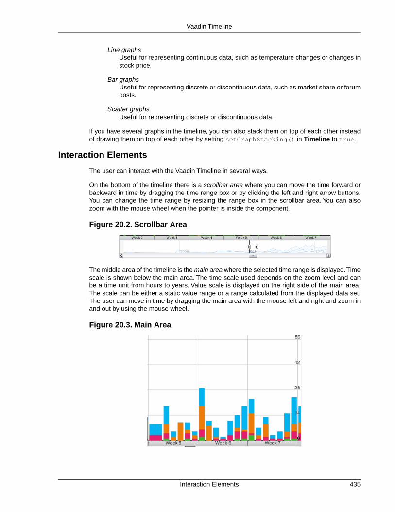
Line graphsUseful for representing continuous data, such as temperature changes or changes instock price.
Bar graphsUseful for representing discrete or discontinuous data, such as market share or forumposts.
Scatter graphsUseful for representing discrete or discontinuous data.
If you have several graphs in the timeline, you can also stack them on top of each other insteadof drawing them on top of each other by setting setGraphStacking() in Timeline to true.
Interaction Elements
The user can interact with the Vaadin Timeline in several ways.
On the bottom of the timeline there is a scrollbar area where you can move the time forward orbackward in time by dragging the time range box or by clicking the left and right arrow buttons.You can change the time range by resizing the range box in the scrollbar area. You can alsozoom with the mouse wheel when the pointer is inside the component.
Figure 20.2. Scrollbar Area
The middle area of the timeline is the main area where the selected time range is displayed.Timescale is shown below the main area. The time scale used depends on the zoom level and canbe a time unit from hours to years. Value scale is displayed on the right side of the main area.The scale can be either a static value range or a range calculated from the displayed data set.The user can move in time by dragging the main area with the mouse left and right and zoom inand out by using the mouse wheel.
Figure 20.3. Main Area
435Interaction Elements
Vaadin Timeline
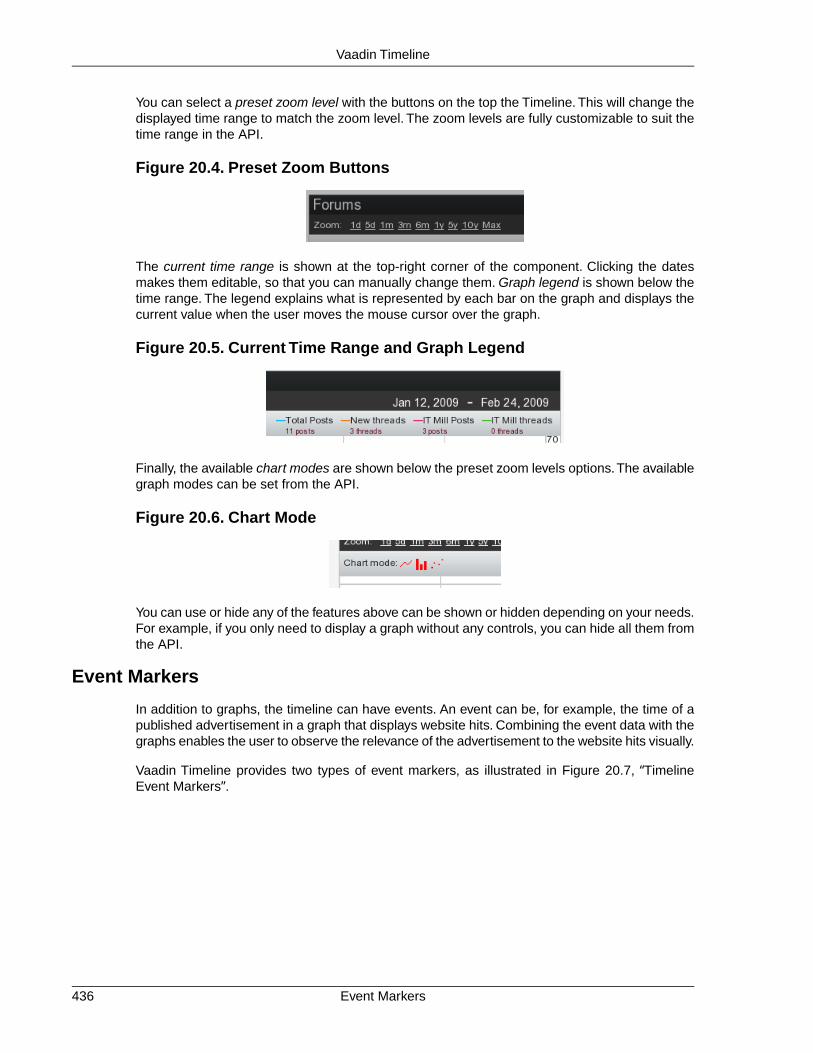
You can select a preset zoom level with the buttons on the top the Timeline. This will change thedisplayed time range to match the zoom level. The zoom levels are fully customizable to suit thetime range in the API.
Figure 20.4. Preset Zoom Buttons
The current time range is shown at the top-right corner of the component. Clicking the datesmakes them editable, so that you can manually change them. Graph legend is shown below thetime range. The legend explains what is represented by each bar on the graph and displays thecurrent value when the user moves the mouse cursor over the graph.
Figure 20.5. Current Time Range and Graph Legend
Finally, the available chart modes are shown below the preset zoom levels options.The availablegraph modes can be set from the API.
Figure 20.6. Chart Mode
You can use or hide any of the features above can be shown or hidden depending on your needs.For example, if you only need to display a graph without any controls, you can hide all them fromthe API.
Event Markers
In addition to graphs, the timeline can have events. An event can be, for example, the time of apublished advertisement in a graph that displays website hits. Combining the event data with thegraphs enables the user to observe the relevance of the advertisement to the website hits visually.
Vaadin Timeline provides two types of event markers, as illustrated in Figure 20.7, “TimelineEvent Markers”.
Event Markers436
Vaadin Timeline

Figure 20.7.Timeline Event Markers
(On left) Marker with a customizable marker sign, for example, letter 'E'. The marker displays acaption which appears when the user hovers the pointer over the event.
(On right) Marker with button-like appearance with a marker sign and a caption.
Efficiency
Vaadin Timeline reduces the traffic between the server and the client by using two methods.
First of all, all the data that is presented in the component is dynamically fetched from the serveras needed.This means that when the user scrolls the timeline view, the component continuouslyfetches data from the server. Also, only data that is visible to the user is transferred to the client.For example, if the timeline has data that has been measured once a second for an entire year,not all the data will be sent to the client. Only the data which can be rendered on the screenwithout overlapping is sent. This ensures that, even for large data sets, the loading time is smalland only the necessary data is actually transferred over the network.
Second, Vaadin Timeline caches the data received from the server in the browser, so that thedata is transferred over the network only once, if possible. This speeds up the time-rangebrowsing when data can be fetched from the cache instead of reloading it over the network.
20.2. Using Timeline
20.2.1. Data Source Requirements
Vaadin Timeline uses Vaadin containers as data sources for both the graphs and the events.There are, however, some requirements for the containers to make them compatible with theVaadin Timeline.
The containers have to implement Container.Indexed for the Vaadin Timeline to be able touse them. This is because the Vaadin Timeline dynamically fetches the data from the serverwhen needed. This way large data sets can be used without having to load all data to the client-side at once and it brings a huge performance increase.
Another requirement is that the container has one property of type java.util.Date (or a class thatcan be cast to it), which contains the timestamp when a data point or event occurred.This propertyhas to be set by using the setGraphTimestampPropertyId() in Timeline. The defaultproperty ID timeline.PropertyId.TIMESTAMP is used if no timestamp-property ID has beenset.
437Efficiency
Vaadin Timeline

A graph container also needs to have a value property that defines the value of the data point.This value can be any numerical value. The value property can be set withsetGraphValuePropertyId() in Timeline. The default property IDTimeline.PropertyId.VALUE is used if no value property is given.
Below is an example of how a graph container could be constructed:
// Construct a container which implements Container.Indexed IndexedContainer container = new IndexedContainer();
// Add the Timestamp property to the containerObject timestampProperty = "Our timestamp property";container.addContainerProperty(timestampProperty, java.util.Date.class, null);
// Add the value propertyObject valueProperty = "Our value property";container.addContainerProperty(valueProperty, Float.class, null);
// Our timelineTimeline timeline = new Timeline();
// Add the container as a graph containertimeline.addGraphDataSource(container, timestampProperty, valueProperty);
The event and marker containers are similar. They both need the timestamp property whichshould be of type java.util.Date and the caption property which should be a string.The markercontainer additionally needs a value property which is displayed in the marker popup.
Below is an example on how a marker or event container can be constructed:
// Create the containerIndexedContainer container = new IndexedContainer();
// Add the timestamp propertycontainer.addContainerProperty(Timeline.PropertyId.TIMESTAMP, Date.class, null);
// Add the caption propertycontainer.addContainerProperty(Timeline.PropertyId.CAPTION, String.class, "");
// Add the marker specific value property.// Not needed for a event containers.container.addContainerProperty(Timeline.PropertyId.VALUE, String.class, "");
// Create the timeline with the container as both the marker// and event data sourceTimeline timeline = new Timeline();timeline.setMarkerDataSource(container, Timeline.PropertyId.TIMESTAMP, Timeline.PropertyId.CAPTION, Timeline.PropertyId.VALUE);
timeline.setEventDataSource(container, Timeline.PropertyId.TIMESTAMP, Timeline.PropertyId.CAPTION);
The above example uses the default property IDs.You can change them to suit your needs.
The Timeline listens for changes in the containers and updates the graph accordingly. When itupdates the graph and items are added or removed from the container, the currently selected
Data Source Requirements438
Vaadin Timeline
date range will remain selected.The selection bar in the browser area moves to keep the currentselection selected. If you want the selection to change when the contents of the container changesand keep the selection area stationary, you can disable the selection lock by settingsetBrowserSelectionLock() to false.
20.2.2. Events and Listeners
Two types of events are available when using the Vaadin Timeline.
When the user modifies the selected date range by moving the date range selector, dragging thetimeline, or by manually entering new dates, an event will be sent to the server with the informationof what the current displayed date range is. To listen to these events you can attach a DateRan-geListener which will receive the start and end dates of the current selection.
If you are using events in your graph then you can attach an EventClickListener to listen forclicks on the events. The listener will receive a list of itemIds from the event data source whichare related to the click event. Since the events can be gathered into a single event icon if spaceis not sufficient for displaying them all, many item ids can be returned.
20.2.3. Configurability
The Vaadin Timeline is highly customizable and its outlook can be easily changed to suit yourneeds. The default view of the Timeline contains all the controls available but often all of themare not needed and can be hidden.
The following list contains the components that can be shown or hidden at your preference:
• Chart modes
• Textual date select
• Browser area (bottom part of the Timeline)
• Legend
• Zoom levels
• Caption
The outlook of the graphs themselves can also be changed for both the browser area and themain view. The following settings are available through the API:
• Graph outline color
• Graph outline width
• Graph caps (in line graphs only)
• Graph fill color
• Graph visibility
• Graph shadows
Other changes to the outlook of the component can easily be done by CSS.
439Events and Listeners
Vaadin Timeline

Zoom levels are also fully customizable. Zoom levels are defined as milliseconds and can beadded by calling the addZoomLevel() method. A zoom level always has a caption, which isthe visible part in the zoom panel, and a millisecond amount.
By default the grid divides the graph into five equally spaced parts with a gray color. However,you can fully customize how the grid is drawn by using setGridColor() andsetVerticalGridLines().
20.2.4. Localization
By default the Vaadin Timeline uses English as its primary language for the captions and thedefault locale for the application to display the dates in the timeline.
You can change the different captions in the Timeline by using their corresponding setters:
• setZoomLevelsCaption() -- The caption appearing before the zoom levels
• setChartModesCaption() -- The caption appearing before the chart modes
Furthermore, you can also change the locale in which the Timeline shows the dates in the hori-zontal scale by specifying a valid locale using the setLocale() method of the timeline.
You can also configure in what format the dates appear in the horizontal scale or in the date selectin the top-right corner by using the getDateFormats()-method which will return a DateForm-atInfo object. By using its setters you can set specific formats for each date range in the scale.Please note that if you are using long date formats they might get clipped if the scale does notfit the whole formatted date.
20.3. Code example
20.3.1. Prerequisites
To get started using the Vaadin Timeline component you should first download the Vaadin eclipseplugin and install it. More information on getting it can be found at http://vaadin.com/eclipse.
Once you got the plugin installed create an example project by selecting File New Other andselect Vaadin Project. Lets call it MyTimelineDemo.
Localization440
Vaadin Timeline

Figure 20.8. New Timeline Project
When the project is created you should add the Vaadin Timeline library to your project. This canbe done by copying the timeline-*.jar to the projects WebContent/WEB-INF/lib directory.When you copy the library into the folder you might get the message shown in Figure 20.9,“Widget set compilation”.
Figure 20.9. Widget set compilation
You should answer Yes and let the widgetset get compiled. If you do not get the above messageor you answer No then you have to compile the widgetset manually by selecting the icon. It mighttake a while until the widgetset gets compiled depending of how much resources your computerhave.
Once the compilation is done the project file structure should look something as shown in Fig-ure 20.10, “Timeline Example Project”.
441Prerequisites
Vaadin Timeline

Figure 20.10.Timeline Example Project
Now you are ready to start developing with the Vaadin Timeline!
20.3.2. Create the data sources
To use the Vaadin Timeline you need to create some data sources for it. The Vaadin Timelineuses Container.Indexed containers as data sources for both the graphs and the markers andevents. So lets start by creating a datasource which represents the graph we want to draw in thetimeline.
For the Vaadin Timeline to understand how the data is constructed in the container we need touse specific property ids which describe what kind of data each property represents. For theVaadin Timeline to work properly we will need to add two property ids, one for when the valuewas acquired and one for the value itself. The Vaadin Timeline has these both properties pre-defined as Timeline.PropertyId.TIMESTAMP and Timeline.PropertyId.VALUE. Youcan use the predefined ones or create your own if you wish.
So, lets create a container which meets the above stated specification. Open the main applicationclass which was automatically created when we created the project (in our caseMytimelinedemoApplication.java) and add the following method.
/** * Creates a graph container with a month of random data */public Container.Indexed createGraphDataSource(){
// Create the container Container.Indexed container = new IndexedContainer();
// Add the required property ids (use the default ones here) container.addContainerProperty(Timeline.PropertyId.TIMESTAMP, Date.class, null);
Create the data sources442
Vaadin Timeline

container.addContainerProperty(Timeline.PropertyId.VALUE, Float.class, 0f);
// Add some random data to the container Calendar cal = Calendar.getInstance(); cal.add(Calendar.MONTH, -1); Date today = new Date(); Random generator = new Random();
while(cal.getTime().before(today)){ // Create a point in time Item item = container.addItem(cal.getTime());
// Set the timestamp property item.getItemProperty(Timeline.PropertyId.TIMESTAMP) .setValue(cal.getTime());
// Set the value property item.getItemProperty(Timeline.PropertyId.VALUE) .setValue(generator.nextFloat());
cal.add(Calendar.DAY_OF_MONTH, 1); }
return container; }
This method will create an indexed container with some random points. As you can see we areusing an IndexedContainer and define two properties to it which was discussed earlier. Thenwe just generate some random data in the container. Here we are using the default property idsfor the timestamp and value but you could use your own if you wished. We'll see later how youwould tell the Timeline which property ids to use if you used your own.
Next, lets add some markers to our graph. Markers are arrow like shapes in the bottom of thetimeline with which you can mark some occurrence that happened at that time.To create markersyou again have to create a data source for them. I'll first show you how the code to create themand then explain what it all means. Add the following method to the main Application class:
/** * Creates a marker container with a marker for each seven days */public Container.Indexed createMarkerDataSource(){
// Create the container Container.Indexed container = new IndexedContainer();
// Add the required property IDs (use the default ones here) container.addContainerProperty(Timeline.PropertyId.TIMESTAMP, Date.class, null); container.addContainerProperty(Timeline.PropertyId.CAPTION, String.class, "Our marker symbol"); container.addContainerProperty(Timeline.PropertyId.VALUE, String.class, "Our description");
// Add a marker for every seven days Calendar cal = Calendar.getInstance(); cal.add(Calendar.MONTH, -1); Date today = new Date(); SimpleDateFormat formatter = new SimpleDateFormat("EEE, MMM d, ''yy"); while(cal.getTime().before(today)){ // Create a point in time Item item = container.addItem(cal.getTime());
// Set the timestamp property
443Create the data sources
Vaadin Timeline

item.getItemProperty(Timeline.PropertyId.TIMESTAMP) .setValue(cal.getTime());
// Set the caption property item.getItemProperty(Timeline.PropertyId.CAPTION) .setValue("M");
// Set the value property item.getItemProperty(Timeline.PropertyId.VALUE). setValue("Today is "+formatter.format(cal.getTime()));
cal.add(Calendar.DAY_OF_MONTH, 7); }
return container; }
Here we start the same as in the example with the graph container by creating an indexed con-tainer. Remember, all containers must be indexed containers when using the graph component.
We then add the timestamp property, caption property and value property.
The timestamp property is the same as in the graph container but the caption and value propertydiffer. The caption property describes what kind of marker it is. The caption is displayed on topof the arrow shape in the Timeline so it should be a short symbol, preferably only one characterlong. The class of the caption property must be String.
The value property should also be a string and is displayed when the user hovers the mouseover the marker. This string can be arbitrarily long and normally should represent some kind ofdescription of the marker.
The third kind of data sources are the event data sources. The events are displayed on top ofthe timeline and supports grouping and are clickable. They are represented as button like iconsin the Timeline.
The event data sources are almost identical the to marker data sources except the value propertyis missing. Lets create an event data source and add events for each Sunday in out graph:
/** * Creates a event container with a marker for each sunday */public Container.Indexed createEventDataSource(){
// Create the container Container.Indexed container = new IndexedContainer();
// Add the required property IDs (use the default ones here) container.addContainerProperty(Timeline.PropertyId.TIMESTAMP, Date.class, null); container.addContainerProperty(Timeline.PropertyId.CAPTION, String.class, "Our marker symbol");
// Add a marker for every seven days Calendar cal = Calendar.getInstance(); cal.add(Calendar.MONTH, -1); Date today = new Date(); while(cal.getTime().before(today)){ if(cal.get(Calendar.DAY_OF_WEEK) == Calendar.SUNDAY){ // Create a point in time Item item = container.addItem(cal.getTime());
// Set the timestamp property item.getItemProperty(Timeline.PropertyId.TIMESTAMP)
Create the data sources444
Vaadin Timeline

.setValue(cal.getTime());
// Set the caption property item.getItemProperty(Timeline.PropertyId.CAPTION) .setValue("Sunday"); } cal.add(Calendar.DAY_OF_MONTH, 1); }
return container; }
As you can see the event container does not differ a whole lot from the marker containers. In usehowever they differ since they are groupable they can be closely put together and still be usableand you can add click listeners to them so you can catch user events. More on the click listenerslater.
So now we have our three data sources ready to be displayed in our application. In the nextchapter we will use them with our Timeline and see how they integrate with it.
20.3.3. Create the Vaadin Timeline
Okay, now that we have out data sources lets look at the init-method in our Vaadin Application.Lets start by creating our timeline, so add the following line to the end of the init-method in My-timelinedemoApplication:
Timeline timeline = new Timeline("Our timeline");timeline.setWidth("100%");
This will create the timeline we want with a 100 percent width. Now lets add our data sources tothe timeline:
timeline.addGraphDataSource(createGraphDataSource(), Timeline.PropertyId.TIMESTAMP, Timeline.PropertyId.VALUE);
timeline.setMarkerDataSource(createMarkerDataSource(), Timeline.PropertyId.TIMESTAMP, Timeline.PropertyId.CAPTION, Timeline.PropertyId.VALUE);
timeline.setEventDataSource(createEventDataSource(), Timeline.PropertyId.TIMESTAMP, Timeline.PropertyId.CAPTION);
And finally add the timeline to the window. Here is the complete init-method:
@Overridepublic void init() { Window mainWindow = new Window("Mytimelinedemo Application"); Label label = new Label("Hello Vaadin user"); mainWindow.addComponent(label); setMainWindow(mainWindow);
// Create the timeline Timeline timeline = new Timeline("Our timeline");
// Create the data sources Container.Indexed graphDS = createGraphDataSource(); Container.Indexed markerDS = createMarkerDataSource(); Container.Indexed eventDS = createEventDataSource();
// Add our data sources timeline.addGraphDataSource(graphDS,
445Create the Vaadin Timeline
Vaadin Timeline
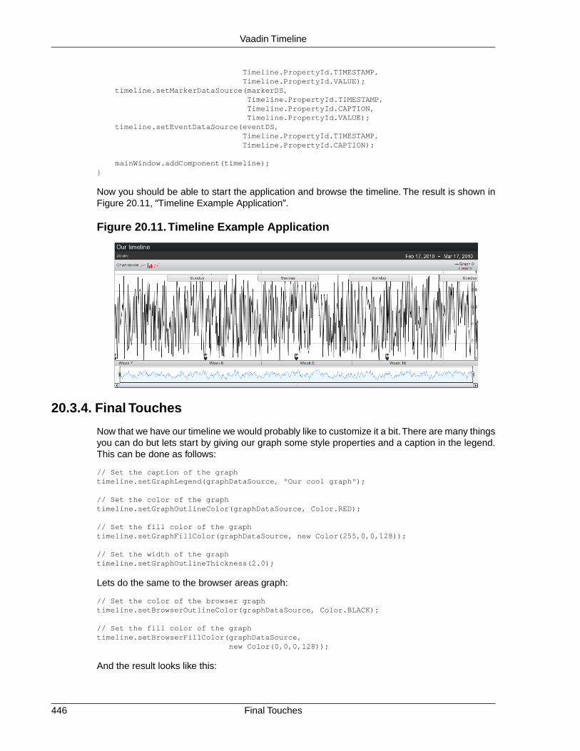
Timeline.PropertyId.TIMESTAMP, Timeline.PropertyId.VALUE); timeline.setMarkerDataSource(markerDS, Timeline.PropertyId.TIMESTAMP, Timeline.PropertyId.CAPTION, Timeline.PropertyId.VALUE); timeline.setEventDataSource(eventDS, Timeline.PropertyId.TIMESTAMP, Timeline.PropertyId.CAPTION);
mainWindow.addComponent(timeline); }
Now you should be able to start the application and browse the timeline. The result is shown inFigure 20.11, “Timeline Example Application”.
Figure 20.11.Timeline Example Application
20.3.4. Final Touches
Now that we have our timeline we would probably like to customize it a bit.There are many thingsyou can do but lets start by giving our graph some style properties and a caption in the legend.This can be done as follows:
// Set the caption of the graphtimeline.setGraphLegend(graphDataSource, "Our cool graph");
// Set the color of the graphtimeline.setGraphOutlineColor(graphDataSource, Color.RED);
// Set the fill color of the graphtimeline.setGraphFillColor(graphDataSource, new Color(255,0,0,128));
// Set the width of the graphtimeline.setGraphOutlineThickness(2.0);
Lets do the same to the browser areas graph:
// Set the color of the browser graphtimeline.setBrowserOutlineColor(graphDataSource, Color.BLACK);
// Set the fill color of the graphtimeline.setBrowserFillColor(graphDataSource, new Color(0,0,0,128));
And the result looks like this:
Final Touches446
Vaadin Timeline
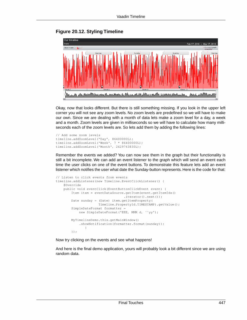
Figure 20.12. Styling Timeline
Okay, now that looks different. But there is still something missing. If you look in the upper leftcorner you will not see any zoom levels. No zoom levels are predefined so we will have to makeour own. Since we are dealing with a month of data lets make a zoom level for a day, a weekand a month. Zoom levels are given in milliseconds so we will have to calculate how many milli-seconds each of the zoom levels are. So lets add them by adding the following lines:
// Add some zoom levelstimeline.addZoomLevel("Day", 86400000L);timeline.addZoomLevel("Week", 7 * 86400000L);timeline.addZoomLevel("Month", 2629743830L);
Remember the events we added? You can now see them in the graph but their functionality isstill a bit incomplete. We can add an event listener to the graph which will send an event eachtime the user clicks on one of the event buttons. To demonstrate this feature lets add an eventlistener which notifies the user what date the Sunday-button represents. Here is the code for that:
// Listen to click events from eventstimeline.addListener(new Timeline.EventClickListener() { @Override public void eventClick(EventButtonClickEvent event) { Item item = eventDataSource.getItem(event.getItemIds() .iterator().next()); Date sunday = (Date) item.getItemProperty( Timeline.PropertyId.TIMESTAMP).getValue(); SimpleDateFormat formatter = new SimpleDateFormat("EEE, MMM d, ''yy");
MyTimelineDemo.this.getMainWindow() .showNotification(formatter.format(sunday)); } });
Now try clicking on the events and see what happens!
And here is the final demo application, yours will probably look a bit different since we are usingrandom data.
447Final Touches
Vaadin Timeline
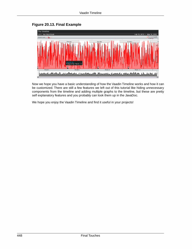
Figure 20.13. Final Example
Now we hope you have a basic understanding of how the Vaadin Timeline works and how it canbe customized. There are still a few features we left out of this tutorial like hiding unnecessarycomponents from the timeline and adding multiple graphs to the timeline, but these are prettyself explanatory features and you probably can look them up in the JavaDoc.
We hope you enjoy the Vaadin Timeline and find it useful in your projects!
Final Touches448
Vaadin Timeline
Chapter 21
VaadinJPAContainer
21.1. Overview .............................................................................................. 44921.2. Installing .............................................................................................. 45121.3. Defining a Domain Model .................................................................... 45621.4. Basic Use of JPAContainer .................................................................. 45921.5. Entity Providers ................................................................................... 46421.6. Filtering JPAContainer ....................................................................... 46721.7. Querying with the Criteria API ............................................................. 46821.8. Automatic Form Generation ................................................................. 46921.9. Using JPAContainer with Hibernate ..................................................... 471
This chapter describes the use of the Vaadin JPAContainer add-on.
21.1. Overview
Vaadin JPAContainer add-on makes it possible to bind user interface components to a databaseeasily using the Java Persistence API (JPA). It is an implementation of the Container interfacedescribed in Section 9.5, “Collecting Items in Containers”. It supports a typical three-layer applic-ation architecture with an intermediate domain model between the user interface and the dataaccess layer.
449Book of Vaadin

Figure 21.1.Three-Layer Architecture Using JPAContainer And JPA
The role of Java Persistence API is to handle persisting the domain model in the database. Thedatabase is typically a relational database. Vaadin JPAContainer binds the user interface com-ponents to the domain model and handles database access with JPA transparently.
JPA is really just an API definition and has many alternative implementations. Vaadin JPACon-tainer supports especially EclipseLink, which is the reference implementation of JPA, and Hibern-ate. Any other compliant implementation should work just as well. The architecture of an applic-ation using JPAContainer is shown in Figure 21.2, “JPAContainer Architecture”.
Figure 21.2. JPAContainer Architecture
Vaadin JPAContainer also plays together with the Vaadin Bean Validation add-on, which bringsJava Bean Validation (JSR 303) to Vaadin applications.
Java Persistence API
Java Persistence API (JPA) is an API for object-relational mapping (ORM) of Java objects to arelational database. In JPA and entity-relationship modeling in general, a Java class is consideredan entity. Class (or entity) instances correspond with a row in a database table and membervariables of a class with columns. Entities can also have relationships with other entities.
The object-relational mapping is illustrated in Figure 21.3, “Object-Relational Mapping” with twoentities with a one-to-many relationship.
Java Persistence API450
Vaadin JPAContainer

Figure 21.3. Object-Relational Mapping
The entity relationships are declared with metadata. With Vaadin JPAContainer, you provide themetadata with annotations in the entity classes. The JPA implementation uses reflection to readthe annotations and defines a database model automatically from the class definitions. Definitionof the domain model and the annotations are described in Section 21.3.1, “Persistence Metadata”.
The main interface in JPA is the EntityManager, which allows making different kinds of querieseither with the Java Persistence Query Language (JPQL), native SQL, or the Criteria API in JPA2.0.You can always use the interface directly as well, using Vaadin JPAContainer only for bindingthe data to the user interface.
Vaadin JPAContainer supports JPA 2.0 (JSR 317).
JPAContainer Concepts
The JPAContainer is an implementation of the Vaadin Container interface that you can bindto user interface components such as Table, Select, etc.
The data access to the persistent entities is handled with a entity provider, as defined in theEntityProvider interface. JPAContainer provides a number of different entity providers fordifferent use cases and optimizations.The built-in providers are described in Section 21.5, “EntityProviders”.
Documentation and Support
In addition to this chapter in the book, the installation package includes the following document-ation about JPAContainer:
• API Documentation
• JPAContainer Tutorial
• JPAContainer AddressBook Demo
• JPAContainer Demo
21.2. Installing
Vaadin JPAContainer can be installed either as an installation package, downloaded from theVaadin Directory, or as a Maven dependency.You can also create a new JPAContainer-enabledVaadin project using a Maven archetype.
451JPAContainer Concepts
Vaadin JPAContainer

21.2.1. Downloading the Package
Vaadin JPAContainer is available for download from the Vaadin Directory[http://vaadin.com/directory]. Please see Section 17.2, “Downloading Add-ons from Vaadin Dir-ectory” for basic instructions for downloading from Directory. The download page also gives thedependency declaration needed for retrieving the library with Maven.
JPAContainer is a purely server-side component, so it does not include a widget set that youwould need to compile.
Choosing the License
Vaadin JPAContainer is available under two licenses: Affero General Public License (AGPL) andCommercial Vaadin Add-on License (CVAL). If your project is compatible with the open-sourceAGPL, you can use the add-on for free. Otherwise you must acquire a sufficient number of CVALlicenses before the 30-day trial period ends. Vaadin JPAContainer is distributed as a separateinstallation package for each license.
Use of Vaadin JPAContainer with the CVAL license is included in the Vaadin PRO subscription.
21.2.2. Installation Package Content
Once extracted to a local folder, the contents of the installation directory are as follows:
READMEA readme file describing the package contents.
licensing.txtGeneral information about licensing of JPAContainer.
license-xxxx-y.y.txtThe full license text for the library.
vaadin-jpacontainer-xxxx-y.y-z.z.z.jarThe actual Vaadin JPAContainer library.The xxxx is the license name and y.y its versionnumber. The final z.z.z is the version number of the Vaadin JPAContainer.
vaadin-jpacontainer-xxxx-y.y-z.z.z-javadoc.jarJavaDoc documentation JAR for the library. You can use it for example in Eclipse byassociating the JavaDoc JAR with the JPAContainer JAR in the build path settings ofyour project.
apidocsA folder containing the JavaDoc API documentation in plain HTML.
jpacontainer-tutorial.pdfThe tutorial in PDF format.
jpacontainer-tutorialThe tutorial in HTML format. The online version of the tutorial is always available atv a a d i n . c o m / d o w n l o a d / j p a c o n t a i n e r - t u t o r i a l /[http://vaadin.com/download/jpacontainer-tutorial/].
Downloading the Package452
Vaadin JPAContainer
jpacontainer-addressbook-demoThe JPAContainer AddressBook Demo project covered in this tutorial.You can compileand package the application as a WAR with "mvn package" or launch it in the Jettyweb browser with "mvn jetty:run".You can also import the demo project in Eclipseas described in the tutorial.
jpacontainer-demo-z.z.z.warThe basic JPAContainer demo. It is somewhat more extensive than the AddressBookDemo.
21.2.3. Downloading with Maven
The download page in Vaadin Directory [http://vaadin.com/directory] gives the dependency de-claration needed for retrieving the Vaadin JPAContainer library with Maven. A separate depend-ency declaration is given for both available licenses for Vaadin JPAContainer.
For the CVAL License:
<dependency> <groupId>com.vaadin.addon</groupId> <artifactId>jpacontainer-addon-cval-2.0</artifactId> <version>2.0.0</version></dependency>
For the AGPL License:
<dependency> <groupId>com.vaadin.addon</groupId> <artifactId>jpacontainer-addon-agpl-3.0</artifactId> <version>2.0.0</version></dependency>
Use the LATEST version tag to automatically download the latest stable release or use a specificversion number as done above.
See Section 17.5, “Using Add-ons in a Maven Project” for detailed instructions for using aVaadin add-on with Maven.
Using the Maven Archetype
If you wish to create a new JPAContainer-enabled Vaadin project with Maven, you can use thevaadin-archetype-jpacontainer archetype. Please see Section 2.6, “Using Vaadin withMaven” for details on creating a Vaadin project with a Maven archetype.
21.2.4. Including Libraries in Your Project
The Vaadin JPAContainer JAR must be included in the library folder of the web application. It islocated in WEB-INF/lib path in a web application. In a normal Eclipse web projects the path isWebContent/WEB-INF/lib. In Maven projects the JARs are automatically included in thefolder, as long as the dependencies are defined correctly.
You will need the following JARs:
• Vaadin Framework Library
• Vaadin JPAContainer
• Java Persistence API 2.0 (javax.persistence package)
453Downloading with Maven
Vaadin JPAContainer

• JPA implementation (EclipseLink, Hibernate, ...)
• Database driver or embedded engine (H2, HSQLDB, MySQL, PostgreSQL, ...)
If you use Eclipse, the Vaadin Framework library is automatically downloaded and updated bythe Vaadin Plugin for Eclipse.
Optionally, you may need to also install the Vaadin BeanValidation add-on. If you do so, you alsoneed an implementation of the Bean Validation, such as Hibernate Validator.
21.2.5. Persistence Configuration
Persistence configuration is done in a persistence.xml file. In a regular Eclipse project, itshould be located in WebContent/WEB-INF/classes/META-INF. In a Maven project, it shouldbe in src/main/resources/META-INF. The configuration includes the following:
• The persistence unit
• The persistence provider
• The database driver and connection
• Logging
The persistence.xml file is packaged as WEB-INF/classes/META-INF/persistence.xmlin the WAR. This is done automatically in a Maven build at the package phase.
Persistence XML Schema
The beginning of a persistence.xml file defines the used schema and namespaces:
<?xml version="1.0" encoding="UTF-8"?><persistence xmlns="http://java.sun.com/xml/ns/persistence" xmlns:xsi="http://www.w3.org/2001/XMLSchema-instance" xsi:schemaLocation=" http://java.sun.com/xml/ns/persistence http://java.sun.com/xml/ns/persistence/persistence_2_0.xsd" version="2.0">
Defining the Persistence Unit
The root element of the persistence definition is persistence-unit. The name of the persistenceunit is needed for creating JPAContainer instances from a JPAContainerFactory, as describedin Section 21.4.1, “Creating JPAContainer with JPAContainerFactory” or when creating a JPAentity manager.
<persistence-unit name="addressbook">
Persistence provider is the JPA provider implementation used. For example, the JPAContainerAddressBook demo uses the EclipseLink JPA, which is defined as follows:
<provider> org.eclipse.persistence.jpa.PersistenceProvider</provider>
Persistence Configuration454
Vaadin JPAContainer

The persistent classes need to be listed with a <class> element. Alternatively, you can allowincluding unlisted classes for persistence by overriding the exclude-unlisted-classes defaultas follows:
<exclude-unlisted-classes>false</exclude-unlisted-classes>
JPA provider specific parameters are given under the properties element.
<properties> ...
In the following section we give parameters for the EclipseLink JPA and H2 database used inthe JPAContainer AddressBook Demo. Please refer to the documentation of the JPA provideryou use for a complete reference of parameters.
Database Connection
EclipseLink allows using JDBC for database connection. For example, if we use the the H2database, we define its driver here as follows:
<property name="eclipselink.jdbc.platform" value="org.eclipse.persistence.platform.database.H2Platform"/><property name="eclipselink.jdbc.driver" value="org.h2.Driver" />
Database connection is specified with a URL. For example, using an embedded H2 databasestored in the home directory it would be as follows:
<property name="eclipselink.jdbc.url" value="jdbc:h2:~/my-app-h2db"/>
A hint: when using an embedded H2 database while developing a Vaadin application in Eclipse,you may want to add ;FILE_LOCK=NO to the URL to avoid locking issues when redeploying.
We can just use the default user name and password for the H2 database:
<property name="eclipselink.jdbc.user" value="sa"/><property name="eclipselink.jdbc.password" value="sa"/>
Logging Configuration
JPA implementations as well as database engines like to produce logs and they should be con-figured in the persistence configuration. For example, if using EclipseLink JPA, you can get logthat includes all SQL statements with the FINE logging level:
<property name="eclipselink.logging.level" value="FINE" />
Other Settings
The rest is some Data Definition Language settings for EclipseLink. During development, whenwe use generated example data, we want EclipseLink to drop tables before trying to create them.In production environments, you should use create-tables.
<property name="eclipselink.ddl-generation" value="drop-and-create-tables" />
And there is no need to generate SQL files, just execute them directly to the database.
<property name="eclipselink.ddl-generation.output-mode" value="database"/>
455Persistence Configuration
Vaadin JPAContainer

</properties> </persistence-unit></persistence>
21.2.6.Troubleshooting
Below are some typical errors that you might get when using JPA. These are not specific toJPAContainer.
javax.persistence.PersistenceException: No Persistence provider for EntityManagerThe most typical cases for this error are that the persistence unit name is wrong in thesource code or in the persistence.xml file, or that the persistence.xml is at awrong place or has some other problem. Make sure that the persistence unit namematches and the persistence.xml is in WEB-INF/classes/META-INF folder inthe deployment.
java.lang.IllegalArgumentException: The class is not an entityThe class is missing from the set of persistent entities. If the persistence.xml doesnot have exclude-unlisted-classes defined as false, the persistent entityclasses should be listed with <class> elements.
21.3. Defining a Domain Model
Developing a persistent application begins with defining a domain model. A domain model consistsof a number of entities (classes) and relationships between them.
Figure 21.4, “A Domain Model” illustrates a simple domain model as a UML class diagram. It hastwo entities: Country and Person. They have a "country has persons" relationship. This is aone-to-many relationship with one country having many persons, each of which belongs to justone country.
Figure 21.4. A Domain Model
Realized in Java, the classes are as follows:
public class Country { private Long id; private String name; private Set<Person> persons;
... setters and getters ...}
public class Person { private Long id; private String name; private Integer age; private Country country;
... setters and getters ...}
Troubleshooting456
Vaadin JPAContainer
You should make the classes proper beans by defining a default constructor and implementingthe Serializable interface. A default constructor is required by the JPA entity manager forinstantiating entities. Having the classes serializable is not required but often useful for otherreasons.
After you have a basic domain model, you need to define the entity relationship metadata byannotating the classes.
21.3.1. Persistence Metadata
The entity relationships are defined with metadata. The metadata can be defined in an XMLmetadata file or with Java annotations defined in the javax.persistence package. With VaadinJPAContainer, you need to provide the metadata as annotations.
For example, if we look at the Person class in the JPAContainer AddressBook Demo, we definevarious database-related metadata for the member variables of a class:
@Entitypublic class Person { @Id @GeneratedValue(strategy = GenerationType.AUTO) private Long id;
private String name; private Integer age;
@ManyToOne private Country country;
The JPA implementation uses reflection to read the annotations and defines a database modelautomatically from the class definitions.
Let us look at some of the basic JPA metadata annotations. The annotations are defined in thejavax.persistence package. Please refer to JPA reference documentation for the complete list ofpossible annotations.
Annotation: @Entity
Each class that is enabled as a persistent entity must have the @Entity annotation.
@Entitypublic class Country {
Annotation: @Id
Entities must have an identifier that is used as the primary key for the table. It is used for variouspurposes in database queries, most commonly for joining tables.
@Id@GeneratedValue(strategy = GenerationType.AUTO)private Long id;
The identifier is generated automatically in the database.The strategy for generating the identifieris defined with the @GeneratedValue annotation. Any generation type should work.
457Persistence Metadata
Vaadin JPAContainer

Annotation: @OneToOne
The @OneToOne annotation describes a one-to-one relationship where each entity of one typeis associated with exactly one entity of another type. For example, the postal address of a personcould be given as such.
@OneToOneprivate Address address;
When using the JPAContainer FieldFactory to automatically create fields for a form, the@OneToOne relationship generates a nested Form to edit the data. See Section 21.8, “AutomaticForm Generation” for more details.
Annotation: @Embedded
Just as with the @OneToOne annotation, @Embedded describes a one-to-one relationship, butsays that the referenced entity should be stored as columns in the same table as the referencingentity.
@Embeddedprivate Address address;
The referenced entity class must have @Embeddable annotation.
The JPAContainer FieldFactory generates a nested Form for @Embedded, just as with@OneToOne.
Annotation: @OneToMany
The Country entity in the domain model has a one-to-many relationship with the Person entity("country has persons"). This relationship is represented with the @OneToMany annotation. ThemappedBy parameter names the corresponding back-reference in the Person entity.
@OneToMany(mappedBy = "country")private Set<Person> persons;
When using the JPAContainer FieldFactory to automatically create fields for a form, the@OneToMany relationship generates a MasterDetailEditor for editing the items. See Section 21.8,“Automatic Form Generation” for more details.
Annotation: @ElementCollection
The @ElementCollection annotation can be used for one-to-many relationships to a collectionof basic values such as String or Integer, or to entities annotated as @Embeddable. The refer-enced entities are stored in a separate table defined with a @CollectionTable annotation.
@ElementCollection@CollectionTable( name="OLDPEOPLE", joinColumns=@JoinColumn(name="COUNTRY_ID"))private Set<Person> persons;
JPAContainer FieldFactory generates a MasterDetailEditor for the @ElementCollectionrelationship, just as with @OneToMany.
Persistence Metadata458
Vaadin JPAContainer

Annotation: @ManyToOne
Many people can live in the same country. This would be represented with the @ManyToOneannotation in the Person class.
@ManyToOneprivate Country country;
JPAContainer FieldFactory generates a NativeSelect for selecting an item from the collection.You can do so yourself as well in a custom field factory. Doing so you need to pay notice not toconfuse the container between the referenced entity and its ID, which could even result in insertionof false entities in the database in some cases.You can translate between an entity and the entityID using the SingleSelectTranslator as follows:
@Overridepublic Field createField(Item item, Object propertyId, Component uiContext) { if (propertyId.equals("station")) { ComboBox box = new ComboBox("Station");
// Translate between referenced entity and its ID box.setPropertyDataSource( new SingleSelectTranslator(box));
box.setContainerDataSource(stationContainer); ...
The JPAContainer FieldFactory uses the translator internally, so using it also avoids the problem.
Annotation: @Transient
JPA assumes that all entity properties are persisted. Properties that should not be persistedshould be marked as transient with the @Transient annotation.
@Transientprivate Boolean superDepartment;...@Transientpublic String getHierarchicalName() {...
21.4. Basic Use of JPAContainer
Vaadin JPAContainer offers a highly flexible API that makes things easy in simple cases whileallowing extensive flexibility in demanding cases. To begin with, it is a Container, as describedin Section 9.5, “Collecting Items in Containers”.
In this section, we look how to create and use JPAContainer instances. We assume that youhave defined a domain model with JPA annotations, as described in the previous section.
21.4.1. Creating JPAContainer with JPAContainerFactory
The JPAContainerFactory is the easy way to create JPAContainers. It provides a set of make...()factory methods for most cases that you will likely meet. Each factory method uses a differenttype of entity provider, which are described in Section 21.5, “Entity Providers”.
The factory methods take the class type of the entity class as the first parameter. The secondparameter is either a persistence unit name (persistence context) or an EntityManager instance.
459Basic Use of JPAContainer
Vaadin JPAContainer

// Create a persistent person containerJPAContainer<Person> persons = JPAContainerFactory.make(Person.class, "book-examples");
// You can add entities to the container as wellpersons.addEntity(new Person("Marie-Louise Meilleur", 117));
// Set up sorting if the natural order is not appropriatepersons.sort(new String[]{"age", "name"}, new boolean[]{false, false});
// Bind it to a componentTable personTable = new Table("The Persistent People", persons);personTable.setVisibleColumns(new String[]{"id","name","age"});layout.addComponent(personTable);
It's that easy. In fact, if you run the above code multiple times, you'll be annoyed by getting a newset of persons for each run - that's how persistent the container is. The basic make() uses aCachedMutableLocalEntityProvider, which allows modifying the container and its entities, aswe do above by adding new entities.
When using just the persistence unit name, the factory creates an instance of EntityManager-Factory for the persistence unit and uses it to build entity managers. You can also create theentity managers yourself, as described later.
The entity providers associated with the different factory methods are as follows:
Table 21.1. JPAContainerFactory Methods
CachingMutableLocalEntityProvidermake()
CachingLocalEntityProvidermakeReadOnly()
BatchableLocalEntityProvidermakeBatchable()
MutableLocalEntityProvidermakeNonCached()
LocalEntityProvidermakeNonCachedReadOnly()
JPAContainerFactory holds a cache of entity manager factories for the different persistenceunits, making sure that any entity manager factory is created only once, as it is a heavy operation.You can access the cache to get a new entity manager with thecreateEntityManagerForPersistenceUnit() method.
// Get an entity managerEntityManager em = JPAContainerFactory. createEntityManagerForPersistenceUnit("book-examples");
// Do a queryem.getTransaction().begin();em.createQuery("DELETE FROM Person p").executeUpdate();em.persist(new Person("Jeanne Calment", 122));em.persist(new Person("Sarah Knauss", 119));em.persist(new Person("Lucy Hannah", 117));em.getTransaction().commit();
...
Notice that if you use update the persistent data with an entity manager outside a JPAContainerbound to the data, you need to refresh the container as described in Section 21.4.2, “Creatingand Accessing Entities”.
Creating JPAContainer with JPAContainerFactory460
Vaadin JPAContainer

Creating JPAContainer Manually
While it is normally easiest to use a JPAContainerFactory to create JPAContainer instances,you may need to create them manually. It is necessary, for example, when you need to use acustom entity provider or extend JPAContainer.
First, we need to create an entity manager and then the entity provider, which we bind to aJPAContainer.
// We need a factory to create entity managerEntityManagerFactory emf = Persistence.createEntityManagerFactory("book-examples");
// We need an entity manager to create entity providerEntityManager em = emf.createEntityManager();
// We need an entity provider to create a container CachingMutableLocalEntityProvider<Person> entityProvider = new CachingMutableLocalEntityProvider<Person>(Person.class, em);
// And there we have itJPAContainer<Person> persons = new JPAContainer<Person> (Person.class);persons.setEntityProvider(entityProvider);
You could save the first step by asking the entity manager from the JPAContainerFactory.
21.4.2. Creating and Accessing Entities
JPAContainer integrates with the JPA entity manager, which you would normally use to createand access entities with JPA. You can use the entity manager for any purposes you may have,and then JPAContainer to bind entities to user interface components such as Table, Tree, anyselection components, or a Form.
You can add new entities to a JPAContainer with the addEntity() method. It returns the itemID of the new entity.
Country france = new Country("France");Object itemId = countries.addEntity(france);
The item ID used by JPAContainer is the value of the ID property (column) defined with the @Idannotation. In our Country entity, it would have Long type. It is generated by the entity managerwhen the entity is persisted and set with the setter for the ID proeprty.
Notice that the addEntity() method does not attach the entity instance given as the parameter.Instead, it creates a new instance. If you need to use the entity for some purpose, you need toget the actual managed entity from the container. You can get it with the item ID returned byaddEntity().
// Create a new entity and add it to a containerCountry france = new Country("France");Object itemId = countries.addEntity(france);
// Get the managed entityfrance = countries.getItem(itemId).getEntity();
// Use the managed entity in entity referencespersons.addEntity(new Person("Jeanne Calment", 122, france));
461Creating and Accessing Entities
Vaadin JPAContainer

Entity Items
The getItem() method is defined in the normal Vaadin Container interface. It returns anEntityItem, which is a wrapper over the actual entity object. You can get the entity object withgetEntity().
An EntityItem can have a number of states: persistent, modified, dirty, and deleted. The dirtyand deleted states are meaningful when using container buffering, while the modified state ismeaningful when using item buffering. Both levels of buffering can be used together - user inputis first written to the item buffer, then to the entity instance, and finally to the database.
The isPersistent() method tells if the item is actually persistent, that is, fetched from a per-sistent storage, or if it is just a transient entity created and buffered by the container.
The isModified() method checks whether the EntityItem has changes that are not yet com-mitted to the entity instance. It is only relevant if the item buffering is enabled withsetWriteThrough(false) for the item.
The isDirty() method checks whether the entity object has been modified after it was fetchedfrom the entity provider.The dirty state is possible only when buffering is enabled for the container.
The isDeleted() method checks whether the item has been marked for deletion withremoveItem() in a buffered container.
Refreshing JPAContainer
In cases where you change JPAContainer items outside the container, for example by throughan EntityManager, or when they change in the database, you need to refresh the container.
The EntityContainer interface implemented by JPAContainer provides two methods to refresha container. The refresh() discards all container caches and buffers and refreshes all loadeditems in the container. All changes made to items provided by the container are discarded. TherefreshItem() refreshes a single item.
21.4.3. Nested Properties
If you have a one-to-one or many-to-one relationship, you can define the properties of the refer-enced entity as nested in a JPAContainer. This way, you can access the properties directlythrough the container of the first entity type as if they were its properties. The interface is thesame as with BeanContainer described in Section 9.5.1, “BeanContainer”. You just need toadd each nested property with addNestedContainerProperty() using dot-separated pathto the property.
// Have a persistent containerJPAContainer<Person> persons = JPAContainerFactory.make(Person.class, "book-examples");
// Add a nested property to a many-to-one propertypersons.addNestedContainerProperty("country.name");
// Show the persons in a table, except the "country" column,// which is an object - show the nested property insteadTable personTable = new Table("The Persistent People", persons);personTable.setVisibleColumns(new String[]{"name","age", "country.name"});
// Have a nicer caption for the country.name columnpersonTable.setColumnHeader("country.name", "Nationality");
Nested Properties462
Vaadin JPAContainer

The result is shown in Figure 21.5, “Nested Properties”. Notice that the country property in thecontainer remains after adding the nested property, so we had to make that column invisible.Alternatively, we could have redefined the toString() method in the country object to showthe name instead of an object reference.
Figure 21.5. Nested Properties
You can use the * wildcard to add all properties in a nested item, for example, "country.*".
21.4.4. Hierarchical Container
JPAContainer implements the Container.Hierarchical interface and can be bound tohierarchical components such as a Tree or TreeTable. The feature requires that the hierarchyis represented with a parent property that refers to the parent item. At database level, this wouldbe a column with IDs.
The representation would be as follows:
@Entitypublic class CelestialBody implements Serializable { @Id @GeneratedValue(strategy = GenerationType.IDENTITY) private Long id;
private String name;
@ManyToOne private CelestialBody parent; ...} ...
// Create some entitiesCelestialBody sun = new CelestialBody("The Sun", null);CelestialBody mercury = new CelestialBody("Mercury", sun);CelestialBody venus = new CelestialBody("Venus", sun); CelestialBody earth = new CelestialBody("Earth", sun);CelestialBody moon = new CelestialBody("The Moon", earth);CelestialBody mars = new CelestialBody("Mars", sun);...
You set up a JPAContainer to have hierarchy by calling setParentProperty() with the nameof the property that refers to the parent. Coincidentally, it is named "parent" in the example:
// Create the containerJPAContainer<CelestialBody> bodies = JPAContainerFactory.make(CelestialBody.class, "my-unit");
// Set it up for hierarchical representationbodies.setParentProperty("parent");
// Bind it to a hierarhical component
463Hierarchical Container
Vaadin JPAContainer
Tree tree = new Tree("Celestial Bodies", bodies);tree.setItemCaptionMode(Tree.ITEM_CAPTION_MODE_PROPERTY);tree.setItemCaptionPropertyId("name");
You can use the rootItemIds() to acquire the item IDs of the root elements with no parent.
// Expand the treefor (Object rootId: bodies.rootItemIds()) tree.expandItemsRecursively(rootId);
Unsupported Hierarchical Features
Using setParent() in the container to define parenthood is not supported.
Also, the current implementation does not support setChildrenAllowed(), which controls whetherthe user can expand a node by clicking a toggle. The toggle is by default visible for all nodes,even if they have no children. The method is not supported because it would require storing theinformation outside the entities. You can override areChildrenAllowed() to implement thefunctionality using a custom logic.
// Customize JPAContainer to define the logic for// displaying the node expansion indicatorJPAContainer<CelestialBody> bodies = new JPAContainer<CelestialBody>(CelestialBody.class) { @Override public boolean areChildrenAllowed(Object itemId) { // Some simple logic return getChildren(itemId).size() > 0; }};bodies.setEntityProvider( new CachingLocalEntityProvider<CelestialBody>( CelestialBody.class, em));
21.5. Entity Providers
Entity providers provide access to entities persisted in a data store.They are essentially wrappersover a JPA entity manager with optimizations and other features important when binding persistentdata to a user interface.
The choise and use of entity providers is largely invisible if you create your JPAContainer in-stances with the JPAContainerFactory, which hides such details.
JPAContainer entity providers can be customized, which is necessary for some purposes. Entityproviders can be Enterprise JavaBeans (EJBs), which is useful when you use them in a Java EEapplication server.
21.5.1. Built-In Entity Providers
JPAContainer includes various kinds of built-in entity providers: caching and non-caching, read-write and read-only, and batchable.
Caching is useful for performance, but takes some memory for the cache and makes the providerstateful. Batching, that is, running updates in larger batches, can also enhance performance andbe used together with caching. It is stateless, but doing updates is a bit more complex than oth-erwise.
Using a read-only container is preferable if read-write capability is not needed.
Entity Providers464
Vaadin JPAContainer

All built-in providers as local in the sense that they provide access to entities using a local JPAentity manager.
The CachingMutableLocalEntityProvider is usually recommended as the first choise for read-write access and CachingLocalEntityProvider for read-only access.
LocalEntityProvider
A read-only, lazy loading entity provider that does not perform caching and reads its data directlyfrom an entity manager.
You can create the provider with makeNonCachedReadOnly() method in JPAContainerFactory.
MutableLocalEntityProvider
Extends LocalEntityProvider with write support. All changes are directly sent to the entitymanager.
Transactions can be handled either internally by the provider, which is the default, or by thecontainer. In the latter case, you can extend the class and annotate it, for example, as describedin Section 21.5.1, “Built-In Entity Providers”.
The provider can notify about updates to entities through the EntityProviderChangeNotifierinterface.
BatchableLocalEntityProvider
A simple non-caching implementation of the BatchableEntityProvider interface. It extendsMutableLocalEntityProvider and simply passes itself to the batchUpdate() callback method.This will work properly if the entities do not contain any references to other entities that aremanaged by the same container.
CachingLocalEntityProvider
A read-only, lazy loading entity provider that caches both entities and query results for differentfilter/sortBy combinations.When the cache gets full, the oldest entries in the cache are removed.The maximum number of entities and entity IDs to cache for each filter/sortBy combination canbe configured in the provider. The cache can also be manually flushed. When the cache growsfull, the oldest items are removed.
You can create the provider with makeReadOnly() method in JPAContainerFactory.
CachingMutableLocalEntityProvider
Just like CachingLocalEntityProvider, but with read-write access. For read access, cachingworks just like in the read-only provider.When an entity is added or updated, the cache is flushedin order to make sure the added or updated entity shows up correctly when using filters and/orsorting. When an entity is removed, only the filter/sortBy-caches that actually contain the itemare flushed.
This is perhaps the most commonly entity provider that you should consider using for most tasks.You can create it with the make() method in JPAContainerFactory.
465Built-In Entity Providers
Vaadin JPAContainer

CachingBatchableLocalEntityProvider
This provider supports making updates in batches. You need to implement aBatchUpdateCallback that does all the updates and execute the batch by callingbatchUpdate() on the provider.
The provider is an extension of the CachingMutableLocalEntityProvider that implements theBatchableEntityProvider interface.This will work properly if the entities do not contain anyreferences to other entities that are managed by the same container.
You can create the provider with makeBatchable() method in JPAContainerFactory.
21.5.2. Using JNDI Entity Providers in JEE6 Environment
JPAContainer 2.0 introduced a new set of entity providers specifically for working in a JEE6 en-vironment. In a JEE environment, you should use an entity manager provided by the applicationserver and, usually, JTA transactions instead of transactions provided by JPA. Entity providersin com.vaadin.addon.jpacontainer.provider.jndijta package work mostly the same way as thenormal providers discussed earlier, but use JNDI lookups to get reference to an EntityManagerand to a JTA transaction.
The JNDI providers work with almost no special configuration at all. The JPAContainerFactoryhas factory methods for creating various JNDI provider types. The only thing that you commonlyneed to do is to expose the EntityManager to a JNDI address. By default, the JNDI providerslook for the EntityManager from "java:comp/env/persistence/em". This can be donewith the following snippet in web.xml or with similar configuration with annotations.
<persistence-context-ref> <persistence-context-ref-name> persistence/em </persistence-context-ref-name> <persistence-unit-name>MYPU</persistence-unit-name></persistence-context-ref>
The "MYPU" is the identifier of your persistence unit defined in your persistence.xml file.
If you choose to annotate your servlets (instead of using the web.xml file as described above),you can simply add the following annotation to your servlet.
@PersistenceContext(name="persistence/em",unitName="MYPU")
If you wish to use another address for the persistence context, you can define them with thesetJndiAddresses() method.You can also define the location for the JTA UserTransaction,but that should be always accessible from "java:comp/UserTransaction" by the JEE6specification.
21.5.3. Entity Providers as Enterprise Beans
Entity providers can be Enterprise JavaBeans (EJB).This may be useful if you use JPAContainerin a Java EE application server. In such case, you need to implement a custom entity providerthat allows the server to inject the entity manager.
For example, if you need to use Java Transaction API (JTA) for JPA transactions, you can imple-ment such entity provider as follows. Just extend a built-in entity provider of your choise and an-notate the entity manager member as @PersistenceContext. Entity providers can be eitherstateless or stateful session beans. If you extend a caching entity provider, it has to be stateful.
Using JNDI Entity Providers in JEE6 Environment466
Vaadin JPAContainer

@Stateless@TransactionManagementpublic class MyEntityProviderBean extends MutableLocalEntityProvider<MyEntity> {
@PersistenceContext private EntityManager em;
protected LocalEntityProviderBean() { super(MyEntity.class); setTransactionsHandledByProvider(false); }
@Override @TransactionAttribute(TransactionAttributeType.REQUIRED) protected void runInTransaction(Runnable operation) { super.runInTransaction(operation); }
@PostConstruct public void init() { setEntityManager(em); /* * The entity manager is transaction-scoped, which means * that the entities will be automatically detached when * the transaction is closed. Therefore, we do not need * to explicitly detach them. */ setEntitiesDetached(false); }}
If you have more than one EJB provider, you might want to create an abstract super class of theabove and only define the entity type in implementations. You can implement an entity provideras a managed bean in Spring Framefork the same way.
21.6. Filtering JPAContainer
Normally, a JPAContainer contains all instances of a particular entity type in the persistencecontext. Hence, it is equivalent to a database table or query. Just like with database queries, youoften want to narrow the results down. JPAContainer implements the Filterable interface inVaadin containers, described in Section 9.5.4, “Filterable Containers”. All filtering is done at thedatabase level with queries, not in the container.
For example, let us filter all the people older than 117:
Filter filter = new Compare.Greater("age", 117);persons.addContainerFilter(filter);
This would create a JPQL query somewhat as follows:
SELECT id FROM Person WHERE (AGE > 117)
The filtering implementation uses the JPA 2.0 Criteria API transparently. As the filtering is doneat the database-level, custom filters that use the Filterable API do not work.
When using Hibernate, note that it does not support implicit joins. See Section 21.9.3, “Joins inHibernate vs EclipseLink” for more details.
467Filtering JPAContainer
Vaadin JPAContainer
21.7. Querying with the Criteria API
When the Filterable API is not enough and you need to have more control, you can makequeries directly with the JPA Criteria API. You may also need to customize sorting or joins, orotherwise modify the query in some way. To do so, you need to implement aQueryModifierDelegate that the JPAContainer entity provider calls when making a query.The easiest way to do this is to extend DefaultQueryModifierDelegate, which has empty imple-mentations of all the methods so that you can only override the ones you need.
The entity provider calls specific QueryModifierDelegate methods at different stages whilemaking a query. The stages are:
1. Start building a query
2. Add "ORDER BY" expression
3. Add "WHERE" expression (filter)
4. Finish building a query
Methods where you can modify the query are called before and after each stage as listed in thefollowing table:
Table 21.2. QueryModifierDelegate Methods
queryWillBeBuilt()
orderByWillBeAdded()
orderByWasAdded()
filtersWillBeAdded()
filtersWereAdded()
queryHasBeenBuilt()
All the methods get two parameters. The CriteriaBuilder is a builder that you can use tobuild queries. The CriteriaQuery is the query being built.
You can use the getRoots().iterator().next() in CriteriaQuery to get the "root" thatis queried, for example, the PERSON table, etc.
21.7.1. Filtering the Query
Let us consider a case where we modify the query for a Person container so that it includes onlypeople over 116. This trivial example is identical to the one given earlier using the Filterable in-terface.
persons.getEntityProvider().setQueryModifierDelegate( new DefaultQueryModifierDelegate () { @Override public void filtersWillBeAdded( CriteriaBuilder criteriaBuilder, CriteriaQuery<?> query, List<Predicate> predicates) { Root<?> fromPerson = query.getRoots().iterator().next();
// Add a "WHERE age > 116" expression
Querying with the Criteria API468
Vaadin JPAContainer

Path<Integer> age = fromPerson.<Integer>get("age"); predicates.add(criteriaBuilder.gt(age, 116)); }});
21.7.2. Compatibility
When building queries, you should consider the capabilities of the different JPA implementations.Regarding Hibernate, see Section 21.9.3, “Joins in Hibernate vs EclipseLink”.
21.8. Automatic Form Generation
The JPAContainer FieldFactory is an implementation of the FormFieldFactory andTableFieldFactory interfaces that can generate fields based on JPA annotations in a POJO.It goes further than the DefaultFieldFactory, which only creates simple fields for the basic datatypes. This way, you can easily create forms to input entities or enable editing in tables.
The generated defaults are as follows:
Class MappingAnnotation
NativeSelect@ManyToOne
Nested Form@OneToOne, @Embedded
MasterDetailEditor (see below)@OneToMany, @ElementCollection
Selectable Table@ManyToMany
The field factory is recusive, so that you can edit a complex object tree with one form.
21.8.1. Configuring the Field Factory
The FieldFactory is highly configurable with various configuration settings and by extending.You need to make the configuration before
The setMultiSelectType() and setSingleSelectType() allow you to specify a selectioncomponent that is used instead of the default for a field with @ManyToMany and @ManyToOneannotation, respectively. The first parameter is the class type of the field, and the second para-meter is the class type of a selection component. It must be a sub-class of AbstractSelect.
The setVisibleProperties() controls which properties (fields) are visible in generatedforms, subforms, and tables. The first paramater is the class type for which the setting should bemade, followed by the IDs of the visible properties.
The configuration should be done before binding the form to a data source as that is when thefield generation is done.
Further configuration must be done by extending the many protected methods. Please see theAPI documentation for the complete list.
469Compatibility
Vaadin JPAContainer

21.8.2. Using the Field Factory
The most basic use case for the JPAContainer FieldFactory is with a Form bound to a containeritem:
// Have a persistent containerfinal JPAContainer<Country> countries = JPAContainerFactory.make(Country.class, "book-examples");
// For selecting an item to editfinal Select countrySelect = new Select("Select a Country", countries);countrySelect.setItemCaptionMode(Select.ITEM_CAPTION_MODE_PROPERTY);countrySelect.setItemCaptionPropertyId("name");
// Country Editorfinal Form countryForm = new Form();countryForm.setCaption("Country Editor");countryForm.addStyleName("bordered"); // Custom stylecountryForm.setWidth("420px");countryForm.setWriteThrough(false); // Enable bufferingcountryForm.setEnabled(false);
// When an item is selected from the list...countrySelect.addListener(new ValueChangeListener() { @Override public void valueChange(ValueChangeEvent event) { // Get the item to edit in the form Item countryItem = countries.getItem(event.getProperty().getValue());
// Use a JPAContainer field factory // - no configuration is needed here final FieldFactory fieldFactory = new FieldFactory(); countryForm.setFormFieldFactory(fieldFactory);
// Edit the item in the form countryForm.setItemDataSource(countryItem); countryForm.setEnabled(true);
// Handle saves on the form final Button save = new Button("Save"); countryForm.getFooter().removeAllComponents(); countryForm.getFooter().addComponent(save); save.addListener(new ClickListener() { @Override public void buttonClick(ClickEvent event) { try { countryForm.commit(); countryForm.setEnabled(false); } catch (InvalidValueException e) { } } }); }});countrySelect.setImmediate(true);countrySelect.setNullSelectionAllowed(false);
This would create a form shown in Figure 21.6, “Using FieldFactory with One-to-Many Relation-ship”.
Using the Field Factory470
Vaadin JPAContainer
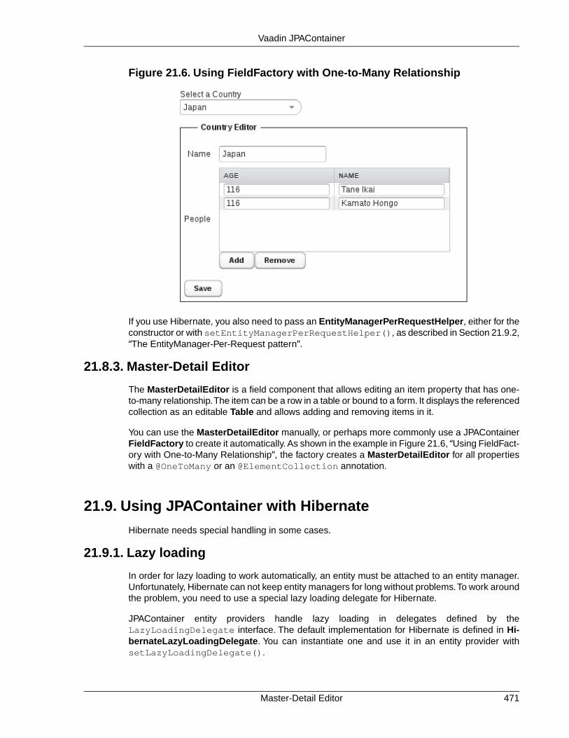
Figure 21.6. Using FieldFactory with One-to-Many Relationship
If you use Hibernate, you also need to pass an EntityManagerPerRequestHelper, either for theconstructor or with setEntityManagerPerRequestHelper(), as described in Section 21.9.2,“The EntityManager-Per-Request pattern”.
21.8.3. Master-Detail Editor
The MasterDetailEditor is a field component that allows editing an item property that has one-to-many relationship.The item can be a row in a table or bound to a form. It displays the referencedcollection as an editable Table and allows adding and removing items in it.
You can use the MasterDetailEditor manually, or perhaps more commonly use a JPAContainerFieldFactory to create it automatically. As shown in the example in Figure 21.6, “Using FieldFact-ory with One-to-Many Relationship”, the factory creates a MasterDetailEditor for all propertieswith a @OneToMany or an @ElementCollection annotation.
21.9. Using JPAContainer with Hibernate
Hibernate needs special handling in some cases.
21.9.1. Lazy loading
In order for lazy loading to work automatically, an entity must be attached to an entity manager.Unfortunately, Hibernate can not keep entity managers for long without problems.To work aroundthe problem, you need to use a special lazy loading delegate for Hibernate.
JPAContainer entity providers handle lazy loading in delegates defined by theLazyLoadingDelegate interface. The default implementation for Hibernate is defined in Hi-bernateLazyLoadingDelegate. You can instantiate one and use it in an entity provider withsetLazyLoadingDelegate().
471Master-Detail Editor
Vaadin JPAContainer

The default implementation works so that whenever a lazy property is accessed through theVaadin Property interface, the value is retrieved with a separate (JPA Criteria API) query usingthe currently active entity manager. The value is then manually attached to the entity instance,which is detached from the entity manager. If this default implementation is not good enough,you may need to make your own implementation.
21.9.2.The EntityManager-Per-Request pattern
One issue with Hibernate is that it is designed for short-lived sessions. The lifetime of an entitymanager is roughly that of a session. However, if an error occurs in a session or entity manager,the manager becomes unuseable. This causes big problems with long-lived sessions that wouldwork fine with EclipseLink.
The recommended solution is to the EntityManager-per-Request pattern. It is highly recommendedalways when using Hibernate.
An entity manager can only be open during the request-response cycle of the Vaadin applicationservlet, so that one is created at the beginning of the request and closed at the end.
You can use the EntityManagerPerRequestHelper as follows:
1. Create a new instance in the constructor or init() method of your Vaadin applicationclass.
2. Override onRequestStart() in the application class and call requestStart() inthe helper instance.
3. Override onRequestEnd() in the application class and call requestEnd() in thehelper.
4. Whenever a new JPAContainer instance is created in the application, register it in thehelper by calling addContainer() with the container.
5. If you use the JPAContainer FieldFactory, as described in Section 21.8, “AutomaticForm Generation”, you need to set the helper for the factory either by passing it in theconstructor (new FieldFactory(myEMPRH)) or withsetEntityManagerPerRequestHelper().The FieldFactory creates JPAContainersinternally and these instances need to be updated with the entity manager instanceswhen they change between requests.
21.9.3. Joins in Hibernate vs EclipseLink
EclipseLink supports implicit joins, while Hibernate requires explicit joins. In SQL terms, an explicitjoin is a "FROM a INNER JOIN b ON a.bid = b.id" expression, while an implicit join isdone in a WHERE clause, such as: "FROM a,b WHERE a.bid = b.id".
In a JPAContainer filter with EclipseLink, an implicit join would have form:
new Equal("skills.skill", s)
In Hibernate you would need to use JoinFilter for the explicit join:
new JoinFilter("skills", new Equal("skill", s))
The EntityManager-Per-Request pattern472
Vaadin JPAContainer
Chapter 22
MobileApplications with
TouchKit
22.1. Overview .............................................................................................. 47322.2. Considerations Regarding Mobile Browsing ........................................ 47622.3. Installing Vaadin TouchKit .................................................................... 47722.4. Elements of a TouchKit Application ..................................................... 47922.5. Mobile User Interface Components ..................................................... 48222.6. Advanced Mobile Features .................................................................. 49022.7. Offline Mode ........................................................................................ 49222.8. Building an Optimized Widget Set ....................................................... 49522.9. Testing and Debugging on Mobile Devices .......................................... 496
This chapter describes how to write mobile applications using the Vaadin TouchKit.
22.1. Overview
Web browsing is becoming ever increasingly mobile and web applications need to satisfy userswith both desktop computers and mobile devices, such as phones and tablets. While the mobilebrowsers can show the pages just like in regular browsers, the screen size, finger accuracy, and
473Book of Vaadin

mobile browser features need to be considered to make the experience more pleasant. VaadinTouchKit gives the power of Vaadin for creating mobile user interfaces that complement theregular web user interfaces of your applications. Just like the purpose of the Vaadin Frameworkis to make desktop-like web applications, the purpose of TouchKit is to allow creation of webapplications that give the look and feel of native mobile applications.
Figure 22.1.The Vornitologist Demo for Vaadin TouchKit
Creating a mobile UI is much like a regular Vaadin UI. You can use all the regular Vaadin com-ponents and add-ons available from Vaadin Directory, but most importantly the special TouchKitcomponents.
@Theme("mobiletheme")public class SimplePhoneUI extends UI { @Override protected void init(VaadinRequest request) { // Set the window or tab title getPage().setTitle("Hello Phone!");
// Use the TouchKit TabBarView for content TabBarView mainView = new TabBarView(); setContent(mainView);
// Create a view - usually a regular class class MyView extends VerticalLayout { Table table = new Table("Planets", planetData());
public MyView() { addComponent(new Label("This is a view")); table.setWidth("100%"); table.setPageLength(table.size()); addComponent(table); addComponent(new Button("Go")); setSpacing(true); } } mainView.addTab(new MyView(), "Planets");
// Add some more sub-views mainView.addTab(new Label("Dummy"), "Map"); mainView.addTab(new Label("Dummy"), "Settings"); } ...}
The resulting UI is shown in Figure 22.2, “Simple TouchKit UI”.
Overview474
Mobile Applications with TouchKit

Figure 22.2. Simple TouchKit UI
TouchKit supports many special mobile browser features, such as geolocation, home screenlaunching, splash screen, and web app mode, especially in iOS.
In addition to developing regular server-side UIs, TouchKit allows a special offline mode, whichis a client-side Vaadin UI that is stored in the browser cache and switched to automatically whenthe network connection is not available, either when starting the application or while using it. Formore information, see Section 22.7, “Offline Mode”.
In this chapter, we first consider some special aspects of mobile browsing. Then, we look howto create a project that uses TouchKit.TouchKit offers a number of specialized mobile components,
475Overview
Mobile Applications with TouchKit

which are described in a dedicated section. We treat phone and tablet applications separately,and discuss testing briefly.
Vornitologist and Mobile Mail Demos
The Vornitologist is a demo application that showcases most of the features in TouchKit. Youcan try it out at http://demo.vaadin.com/vornitologist with your iOS or Android device. You canread the sources on-line or check them out from the repository and import them in Eclipse asdescribed in Section 22.3.3, “Importing the Vornitologist Demo”.
The Mobile Mail is another demo application, which shows how to implement browsing of deepcategory trees and make forms.
Licensing
Vaadin TouchKit is a commercial product licensed under a dual-licensing scheme. The AGPL li-cense allows open-source development, while the CVAL license needs to be purchased forclosed-source use, including web deployments and internal use. Commercial licenses can bepurchased from the Vaadin Directory, where you can also find the license details and downloadVaadin TouchKit.
22.2. Considerations Regarding Mobile Browsing
When developing web applications that support mobile browsing, you need to consider variousissues that are different from non-mobile use. TouchKit is designed to help with these issues.
22.2.1. Mobile Human Interface
Mobile devices use very different human interfaces than regular computers. For example, thescreen can be rotated easily to switch between portrait and landscape views. This does not justchange the dimensions of the display, but also affects the most useful layout.
The user interface is used with a finger instead of a mouse, so there are no features such as"right-finger-button". Double-tap is not normally used in mobile user interfaces, unlike the double-click with a mouse. Instead, a "long tap" usually has the same meaning as the double click. Fingergestures also play a large role, such as using a vertical swipe gesture for scrolling instead of ascroll bar.
There is normally no physical but a virtual keyboard, and the keyboard can change dependingon the context. You also need to ensure that it does not hide the input field to which the user istrying to enter data when it pops up. This should be handled by the browser, but is among theissues that requires special testing.
22.2.2. Bandwidth
Mobile Internet connections are often significantly slower than with fixed lines. With a low-endmobile connection, such as 384 kbps, just loading the Vaadin client-side engine can take severalseconds.This can be helped by compiling a widget set that includes only the widgets for the usedcomponents, as described in Section 22.8, “Building an Optimized Widget Set”.
Even with mobile broadband, the latency can be significant factor, especially with highly interactiverich applications. The latency is usually almost unnoticeable in fixed lines, typically less than 100ms, while mobile Edge connections typically have latency around 500 ms, and sometimes much
Vornitologist and Mobile Mail Demos476
Mobile Applications with TouchKit

higher during hiccups.You may need to limit the use of the immediate mode, text change events,and polling.
22.2.3. Mobile Features
Phones and tablets have many integrated features that are often available in the browser interfaceas well. Location-awareness is one of the most recent features. And of course, you can alsomake phone calls.
22.2.4. Compatibility
The mobile browsing field is currently evolving at fast pace and the special conventions that areintroduced by leading manufacturers may, in the next few years, stabilize as new web standards.The browser support in TouchKit concentrates on WebKit, which appears to be emerging as theleading mobile browser core. In addition to Apple's products, also the default browser in Androiduses WebKit as the layout engine.Yet they have differences, as the Android's JavaScript engine,which is highly relevant for Vaadin, is the Google Chrome's V8 engine.
Vaadin TouchKit aims to follow the quickly evolving APIs of these major platforms, with the as-sumption that other browsers will follow their lead in standardization. Other platforms will besupported if they rise in popularity.
Back Button
Some mobile devices, especially Android devices, have a dedicated back button, while iOSdevices in particular do not. TouchKit does not provide any particular support for the button, butas it is a regular browser back button, you can handle it with URI fragments, as described inSection 11.9, “URI Fragment and History Management with UriFragmentUtility”. For iOS, thebrowser back button is hidden if the user adds the application to the home screen, in which caseyou need to implement application-specific logic for the back-navigation.
22.3. Installing Vaadin TouchKit
You can download and install TouchKit from the Vaadin Directory at https://vaadin.com/addon/vaad-in-touchkit as an installation package or get it with Maven. If your project requires the use of theCVAL license, they can be purchased from the Directory.
See Chapter 17, Using Vaadin Add-ons for details regarding add-on installation. The add-on in-cludes a widget set, so you need to compile the widget set for your project.
22.3.1. Installing the Zip Package
Vaadin TouchKit is distributed as a Zip package that contains the TouchKit JAR, a JavaDoc JAR,license texts, and other documentation. You can download the Zip package from the VaadinDirectory. A different package is provided for the two licenses, and the Directory asks for yourchoice.
The JAR should be put in the WEB-INF/lib folder of the web application.
Please see the README.html for more information about the package contents.
477Mobile Features
Mobile Applications with TouchKit

Library Dependencies
TouchKit requires the Reflections library for compiling the widget set. You can get the JAR fromhttp://code.google.com/p/reflections/.
If you use the Vaadin Plugin for Eclipse and manage the Vaadin library dependencies with Ivy,you can get the Reflections library by adding the following dependency:
<dependency org="org.reflections" name="reflections" rev="0.9.8" />
22.3.2. Installing in Maven
You can install Vaadin TouchKit in a Maven project by adding it a dependency, as described firstbelow. If you are creating a new project, you can use the TouchKit Maven archetype to create aproject skeleton.
Defining as a Dependency
To use TouchKit in a Vaadin project, you need to include the following dependency in the POM.The artifactId should be vaadin-touchkit-agpl or vaadin-touchkit-cval, dependingon your choise for the license.
<dependency> <groupId>com.vaadin.addon</groupId> <artifactId>vaadin-touchkit-agpl</artifactId> <version>LATEST</version></dependency>
You can use the LATEST version as shown above or a specific version by its version number.
You also need to define the repository for the Vaadin add-ons under the <repositories>element:
<repository> <id>vaadin-addons</id> <url>http://maven.vaadin.com/vaadin-addons</url></repository>
You also need to enable the widget set compilation in the POM, as described in Section 17.5.2,“Enabling Widget Set Compilation”, and compile it.
Using the Archetype
You can create a new TouchKit application project using the Mavenvaadin-archetype-touchkit archetype, as described in Section 2.6, “Using Vaadin withMaven”.
For example, from command-line, you could do:
$ mvn archetype:generate \ -DarchetypeGroupId=com.vaadin \ -DarchetypeArtifactId=vaadin-archetype-touchkit \ -DgroupId=example.com -DartifactId=myproject \ -Dversion=0.1.0 -Dpackaging=war
Installing in Maven478
Mobile Applications with TouchKit

22.3.3. Importing the Vornitologist Demo
The Vornitologist demo, illustrated in Figure 22.1, “The Vornitologist Demo for Vaadin TouchKit”in the overview, showcases most of the functionality in Vaadin TouchKit. You can try the demoon-line with a TouchKit-compatible browser at http://demo.vaadin.com/vornitologist/.
You can browse the sources on-line or, more conveniently, import the project in Eclipse (or otherIDE). As the project is Maven-based, eclipse users need to install the m2e (or m2eclipse for olderversions) plugin to be able to import Maven projects, as well as Subclipse for making SVN accesseasier. Once they are installed, you should be able to import Vornitologist as follows.
1. Select File Import
2. Select Maven Check out Maven Project from SCM, and click Next.
3. In SCM URL, select svn and enter URL for the repository. You can find the current re-pository URL from the TouchKit add-on page at http://vaadin.com/addon/vaadin-touchkit.
4. Click Finish.
Instead of using Subclipse, you can check out the project with another Subversion tool and thenimport it in Eclipse as a Maven project.
22.4. Elements of a TouchKit Application
At minimum, a TouchKit application requires a UI class, which is defined in a deploymentdescriptor, as usual for Vaadin applications. You usually also need to have a custom theme. Toenable various other features, you may need to provide a custom servlet. These and other tasksare described in the following subsections.
22.4.1. Deployment Descriptor
The deployment descriptor of a TouchKit application is much like for any Vaadin application.However, you need to use the special TouchKitServlet class instead of the regular VaadinServletin the web.xml deployment descriptor.
If you need to add special logic in the servlet, such as to provide different UIs for different devicesor to make certain configuration, you can extend the TouchKit servlet to implement the logic.
As TouchKit comes with a custom widget set, you need to use a combining widget set for yourproject. The combining widget set descriptor is automatically generated by the Vaadin Plugin forEclipse and in Maven when you install or define the TouchKit add-on.
<servlet> <servlet-name>Vaadin Application Servlet</servlet-name>
<servlet-class>com.vaadin.addon.touchkit.server.TouchKitApplicationServlet</servlet-class>
<init-param> <description>Vaadin application class to start</description> <param-name>application</param-name> <param-value>com.vaadin.demo.mobilemail.MobileMailApplication</param-value> </init-param> <init-param> <param-name>widgetset</param-name> <param-value>com.vaadin.demo.mobilemail.gwt.MobileMailWidgetSet</param-value> </init-param></servlet>
479Importing the Vornitologist Demo
Mobile Applications with TouchKit

22.4.2. Creating a Custom Servlet
Some tasks can only be done in the initial request to the server, before the UI is created. Youneed to make a custom servlet class if you want to use the following TouchKit features:
• Customize bookmark or home screen icon
• Customize splash screen image
• Customize status bar in iOS
• Use special web app mode in iOS
• Provide a fallback UI (Section 22.6.1, “Providing a Fallback UI”)
• Enable offline mode
A custom servlet should normally extend the TouchKitServlet. You should place your code inservletInitialized() and call the super method in the beginning.
public class MyServlet extends TouchKitServlet { @Override protected void servletInitialized() throws ServletException { super.servletInitialized();
... customization ... }}
If you need to rather extend some other servlet, possibly in another add-on, it should be trivial toreimplement the functionality of TouchKitServlet, which is just to manage the TouchKit settingsobject.
22.4.3.TouchKit Settings
TouchKit has a number of settings that you can customize for your needs.The TouchKitSettingsconfiguration object is managed by TouchKitServlet, so if you make any modifications to it, youneed to implement a custom servlet, as described earlier.
public class MyServlet extends TouchKitServlet { @Override protected void servletInitialized() throws ServletException { super.servletInitialized();
TouchKitSettings s = getTouchKitSettings(); ... }}
The settings include special settings for iOS devices, which are contained in a separateIosWebAppSettings object, available from the TouchKit settings withgetIosWebAppSettings().
Application Icons
The location bar, bookmarks, and other places can display an icon for the web application. Youcan set the icon, or more exactly icons, in an ApplicationIcons object, which manages icons fordifferent resolutions. The most properly sized icon for the context is used. iOS devices prefer
Creating a Custom Servlet480
Mobile Applications with TouchKit

icons with 57×57, 72×72, and 144×144 pixels, and Android devices 36×36, 48×48, 72×72, and96×96 pixels.
You can add an icon to the application icons collection with addApplicationIcon().You canacquire the base URL for your application from the servlet context, as shown in the followingexample.
TouchKitSettings s = getTouchKitSettings();String contextPath = getServletConfig() .getServletContext().getContextPath();s.getApplicationIcons().addApplicationIcon( contextPath + "VAADIN/themes/mytheme/icon.png");
The basic method just takes the icon name, while the other one lets you define its size. It alsohas a preComposed parameter, which when true, instructs Safari from adding effects to the iconin iOS.
Viewport Settings
The ViewPortSettings object, which you can get from the TouchKit settings withgetViewPortSettings(), manages settings related to the display, most importantly thescaling limitations.
TouchKitSettings s = getTouchKitSettings();ViewPortSettings vp = s.getViewPortSettings();vp.setViewPortUserScalable(true);...
See the Safari Development Library [http://developer.apple.com/library/safari/] at the Apple de-veloper's site for more details regarding the functionality in the iOS browser.
Startup Image for iOS
iOS browser supports a startup (splash) image that is shown while the application is loading.Youcan set it in the IosWebAppSettings object with setStartupImage(). You can acquire thebase URL for your application from the servlet context, as shown in the following example.
TouchKitSettings s = getTouchKitSettings();String contextPath = getServletConfig().getServletContext() .getContextPath();s.getIosWebAppSettings().setStartupImage( contextPath + "VAADIN/themes/mytheme/startup.png");
Web App Capability for iOS
iOS supports a special web app mode for bookmarks added and started from the home screen.With the mode enabled, the client may, among other things, hide the browser's own UI to givemore space for the web application. The mode is enabled by a header that tells the browserwhether the application is designed to be used as a web application rather than a web page.
TouchKitSettings s = getTouchKitSettings();s.getIosWebAppSettings().setWebAppCapable(true);
See the Safari Development Library [http://developer.apple.com/library/safari/] at the Apple de-veloper's site for more details regarding the functionality in the iOS browser.
481TouchKit Settings
Mobile Applications with TouchKit

Cache Manifest
The ApplicationCacheSettings object manages the cache manifest, which is used to configurehow the browser caches the page and other resources for the web app. See Section 22.7, “OfflineMode” for more details about its use.
22.4.4.The UI
Mobile UIs extend the UI class as usual and construct the user interface from components.
@Theme("mobiletheme")public class SimplePhoneUI extends UI { @Override protected void init(VaadinRequest request) { // Set the window or tab title getPage().setTitle("Hello Phone!");
// Create the content root layout for the UI TabBarView mainView = new TabBarView(); setContent(mainView);
... }}
Most commonly, you will use a combination of the major three TouchKit components as the basisof the UI: TabBarView, NavigationView, or NavigationManager.
If a offline UI is provided, it needs to be enabled in the initialization of the UI, as described inSection 22.7, “Offline Mode”.
22.5. Mobile User Interface Components
TouchKit introduces a number of components special to mobile user interfaces to give betteruser interaction and to utilize the special features in mobile devices.
22.5.1. NavigationView
The NavigationView is a layout component that consists of a navigation bar and a content area.The content area is scrollable, so there is no need to use an inner panel component. In addition,there can be an optional toolbar component at the bottom of the view. A NavigationView is oftenused inside a NavigationManager to get view change animations.
The UI482
Mobile Applications with TouchKit

Figure 22.3. Layout of the NavigationView
NavigationView has a full size by default. The content area is expanding, so that it takes all thespace left over from the navigation bar and toolbar.
Navigation Bar
The navigation bar at the top of NavigationView is a NavigationBar component. It has twocomponent slots, with one on the left and one on the right.The caption is displayed in the middle.The NavigationBar can be used elsewhere as well, such as for a view containing a form withsave and cancel buttons in the upper right and left corners.
When the NavigationBar is used for navigation and you set the previous component withsetPreviousComponent(), the left slot is automatically filled with a Back button.This is doneautomatically if you use the NavigationView inside a NavigationManager.
You can get access to the navigation bar component with getNavigationBar() to use itsmanipulator methods directly, but NavigationView also offers some shorthand methods:setLeftComponent(), setRightComponent(), and a setter and a getter for the caption.
Toolbar
A slot for an optional toolbar is located at the bottom of the NavigationView. The toolbar can beany component, but a Toolbar component made for this purpose is included in TouchKit. It isdescribed in Section 22.5.2, “Toolbar”.You could also use a HorizontalLayout or CssLayout.
483NavigationView
Mobile Applications with TouchKit
You usually fill the tool bar with Button components with an icon and no textual caption.You setthe toolbar with setToolbar().
Styling with CSS
.v-touchkit-navview { } .v-touchkit-navview-wrapper {} .v-touchkit-navview-toolbar {}.v-touchkit-navview .v-touchkit-navview-notoolbar {}
The root element has the v-touchkit-navview class. The content area is wrapped inside av-touchkit-navview-wrapper element. If the view has a toolbar, the toolbar slot has thev-touchkit-navview-toolbar style, but if not, the top-level element has thev-touchkit-navview-notoolbar style.
22.5.2. Toolbar
The Toolbar is a layout component that extends CssLayout, usually containing Button compon-ents. The toolbar has by default 100% horizontal width and a fixed height. The components arespread evenly in the horizontal direction. Toolbar is typically used in a NavigationView, as de-scribed in Section 22.5.1.
For a description of the inherited features, please refer to Section 6.3, “VerticalLayout and Ho-rizontalLayout”.
Styling with CSS
.v-touchkit-toolbar { }
The component has an overall v-touchkit-toolbar style in addition to the v-csslayoutstyle of the superclass. Other style names are as for CssLayout.
22.5.3. NavigationManager
The NavigationManager is a visual effect component that gives sliding animation when switchingbetween views. You can register three components: the currently displayed component, theprevious one on the left, and the next component on the right. You can set these componentswith setCurrentComponent(), setPreviousComponent(), and setNextComponent(),respectively.
The NavigationManager component is illustrated in Figure 22.4, “NavigationManager withThree NavigationViews”.
Toolbar484
Mobile Applications with TouchKit

Figure 22.4. NavigationManager with Three NavigationViews
The navigation manager is important for responsiveness, because the previous and next com-ponents are cached and the slide animation started before server is contacted to load the newnext or previous views.
Switching between the views is done programmatically according to user interaction; swipegestures are not supported at the moment.
Handling View Changes
While you can put any components in the manager, some special features are enabled whenusing the NavigationView.When a view becomes visible, the onBecomingVisible() methodin the view is called.You can override it, just remember to call the superclass method.
@Overrideprotected void onBecomingVisible() { super.onBecomingVisible();
...}
Tracking Breadcrumbs
NavigationManager also handles breadcrumb tracking.The navigateTo() pushes the currentview on the top of the breadcrumb stack and navigateBack() can be called to return to theprevious breadcrumb level.
Notice that calling navigateTo() with the "previous" component is equivalent to callingnavigateBack().
485NavigationManager
Mobile Applications with TouchKit

22.5.4. NavigationButton
The NavigationButton is a special version of the regular Button designed for navigation insidea NavigationManager, as described in Section 22.5.3. Clicking the button will automaticallynavigate to the defined target view. The view change animation does not need to make a serverrequest first, but starts immediately after clicking the button. If you leave the target view empty,an empty placeholder view is shown in the animation. The view is filled after it gets the contentfrom the server.
You can give the target view either in the constructor or with setTargetView().
NavigationView view = new NavigationView("A View");...NavigationButton button = new NavigationButton("Click");button.setTargetView(view);...
Notice that the automatic navigation will only work if the button is inside a NavigationManager(in a view inside it). If you just want to use the button as a visual element, you can use it like aregular Button and handle the click events with a ClickListener.
Styling with CSS
.v-touchkit-navbutton { } .v-touchkit-navbutton-desc { }
The component has an overall v-touchkit-navbutton style. If the component description isset with setDescription(), it is shown in a separate <span> element with thev-touchkit-navbutton-desc style.
22.5.5. Popover
Popover is much like a regular Vaadin sub-window, useful for quickly displaying some optionsor a small form related to an action. Unlike regular sub-windows, it does not support dragging orresizing by the user. It can have a caption, but usually does not. As sub-windows usually requirea rather large screen size, the Popover is mainly applicable to tablet devices. When used onsmaller devices, such as phones, the Popover automatically fills the entire screen.
NavigationButton486
Mobile Applications with TouchKit

Figure 22.5. Popover in a Phone
In the following example, we extend Popover to use it. It is modal by default. Notice that thescreen size is not available in the constructor, so we have to postpone using it to the attach()method.
Popover windows are added to an application-level Window object with addWindow(), just likesub-windows in a regular Vaadin application.
if (event.getButton() == emailButton) { ComposeView composeView = new ComposeView(smartphone); getWindow().addWindow(composeView); return;}
The resulting user interface in a tablet device is shown in Figure 22.6, “Popover in a TabletDevice”.
487Popover
Mobile Applications with TouchKit

Figure 22.6. Popover in a Tablet Device
Alternatively, you can call the showRelativeTo(), which displays the sub-window relative toan existing component in the user interface.
Popover popover = new Popover();popover.setContent(mailboxHierarchyView);popover.setClosable(true);popover.showRelativeTo(showMailboxHierarchyButton);popover.setHeight(getParent().getHeight() - 100, UNITS_PIXELS);
In this case, you should not call addWindow() explicitly.
Styling with CSS
.v-touchkit-popover .v-touchkit-fullscreen { } .v-touchkit-popover .v-touchkit-relative { } .v-touchkit-popover .v-touchkit-plain { }
The component has an overall v-touchkit-popover style. If full-screen, it also has thev-touchkit-fullscreen style, if positioned relatively it has v-touchkit-relative, andif not, the v-touchkit-plain style.
22.5.6. Switch
The Switch component is a CheckBox that looks like the switch button in Apple iOS.
Switch switch = new Switch();switch.setCaption("Do I look like iOS?");layout.addComponent(switch);
Styling with CSS
.v-touchkit-switch { } .v-touchkit-switch-slider { }
The component has an overall v-touchkit-switch style. The slider element hasv-touchkit-switch-slider style.
Switch488
Mobile Applications with TouchKit
22.5.7. VerticalComponentGroup
The VerticalComponentGroup is a layout component for grouping components in the verticalstack. The most typical use of the VerticalComponentGroup is to make vertical navigationmenus containing NavigationButtons for the mobile application.The VerticalComponentGroupand HorizontalComponentGroup both extend AbstractComponentGroup which is inheritedfrom the AbstractComponentContainer. In the client side both component group widgets areextending the lightweigth FlowPanel.
Styling with CSS
.v-touchkit-verticalcomponentgroup { }
The component has an overall v-touchkit-verticalcomponentgroup style. If the componenthas a caption, the v-touchkit-has-caption style is added.
22.5.8. HorizontalComponentGroup
The HorizontalComponentGroup is mainly intended to group buttons inside the VerticalCom-ponentGroup slots.
HorizontalComponentGroup horizontalCGroup = new HorizontalComponentGroup();horizontalCGroup.addComponent(new Button("First"));horizontalCGroup.addComponent(new Button("Another"));
NavigationButton navButton = new NavigationButton();button.setIcon(new ThemeResource("../runo/icons/32/ok.png"));
VerticalComponentGroup verticalCGroup = new VerticalComponentGroup();verticalCGroup.setMargin(true);
verticalCGroup.addComponent(horizontalCGroup);verticalCGroup.addComponent(new Button("Button"));verticalCGroup.addComponent(new TextField("TF's caption"));verticalCGroup.addComponent(navButton);
22.5.9. TabBarView
The TabBarView is a layout component that consist of a tab bar and content area. Each tab willhave it's own content area which will be displayed when a correspoding tab is selected. TabBar-View is inherited from the ComponentContainer but uses it's own specialized API for monipu-lating tabs. removeComponent() and addComponent() will throw an UnsupportedOpera-tionException if used.
TabBarView bar = new TabBarView();
//Create some Vaadin Component to use as contentLabel content = new Label("Really simple content");
//Create a tab for itTab tab = bar.addTab(label);
//Set tab name and/or icontab.setCaption("tab name");tab.setIcon(new ThemeResource(...));
//Programmatically modify tab barTab selectedTab = bar.getSelectedTab();bar.setSelectedTab(selectedTab); //same as user clicking the tabbar.removeTab(selectedTab);
489VerticalComponentGroup
Mobile Applications with TouchKit

Styling with CSS
.v-touchkit-tabbar {}
.v-touchkit-tabbar-wrapper {}
.v-touchkit-tabbar-toolbar {}
The component has overall v-touchkit-tabbar style. Content area is wrapped inside av-touchkit-tabbar-wrapper element. Tab bar control area itself has thev-touchkit-tabbar-toolbar style.
22.5.10. EmailField
The EmailField is just like the regular TextField, except that it has automatic capitalization andcorrection turned off. Mobile devices also recognize the field as an email field and can offer avirtual keyboard for the purpose, so that it includes the at (@) and period (.) characters, andpossibly a shorthand for .com.
22.5.11. NumberField
The NumberField is just like the regular TextField, except that it is marked as a numeric inputfield for mobile devices, so that they will show a numeric virtual keyboard rather than the defaultalphanumeric.
22.5.12. UrlField
The UrlField is just like the regular TextField, except that it is marked as a URL input field formobile devices, so that they will show a URL input virtual keyboard rather than the default alpha-numeric. It has convenience methods getUrl() and setUrl(URL url) for converting inputvalue from and to java.net.URL.
22.6. Advanced Mobile Features
22.6.1. Providing a Fallback UI
You may need to use the same URL and hence the same servlet for both the mobile TouchKitUI and for regular browsers. In this case, you need to recognize the mobile browsers compatiblewith Vaadin TouchKit and provide a fallback UI for any other browsers. The fallback UI can be aregular Vaadin UI, a "Sorry!" message, or a redirection to an alternate user interface.
You can handle the fallback logic in a custom UIProvider that creates the UIs in the servlet. AsTouchKit supports only WebKit-based browsers, you can do the recognition by checking if theuser-agent string contains the sub-string "webkit" as follows:
public class MyUIProvider extends UIProvider { @Override public Class<? extends UI> getUIClass( UIClassSelectionEvent event) { String userAgent = event.getRequest() .getHeader("user-agent").toLowerCase(); if(userAgent.contains("webkit")) { return MyMobileUI.class; } else { return MyFallbackUI.class; } }}
EmailField490
Mobile Applications with TouchKit

The custom UI provider has to be added in a custom servlet class, which you need to define inthe web.xml, as described in Section 22.4.3, “TouchKit Settings”. For example, as follows:
public class MyServlet extends TouchKitServlet { private MyUIProvider uiProvider = new MyUIProvider();
@Override protected void servletInitialized() throws ServletException { super.servletInitialized();
getService().addSessionInitListener( new SessionInitListener() { @Override public void sessionInit(SessionInitEvent event) throws ServiceException { event.getSession().addUIProvider(uiProvider); } });
... other custom servlet settings ... }}
See the Vornitologist demo for a working example.
22.6.2. Geolocation
The geolocation feature in TouchKit allows receiving the geographical location from the mobiledevice. The browser will ask the user to confirm that the web site is allowed to get the locationinformation. Tapping Share Location gives the permission. The browser will give the positionacquired by GPS, cellular positioning, or Wi-Fi positioning, as enabled in the device.
Geolocation is requested by calling the static Geolocator.detect() method. You need toprovide a PositionCallback handler that is called when the device has an answer for your request.If the geolocation request succeeded, onSuccess() is called. Otherwise, e.g . if the user didn'tallow sharing of his location, onFailure is called.The geolocation data is provided in a Positionobject.
Geolocator.detect(new PositionCallback() { public void onSuccess(Position position) { double latitude = position.getLatitude(); double longitude = position.getLongitude(); double accuracy = position.getAccuracy();
... }
public void onFailure(int errorCode) { ... }});
The position is given as degrees with fractions. The longitude is positive to East and negative toWest of the Prime Meridian passing through Greenwich, following the convention for coordinatesystems. The accuracy is given in meters. In addition to the above data, the following are alsoprovided:
1. Altitude
2. Altitude accuracy
491Geolocation
Mobile Applications with TouchKit

3. Heading
4. Speed
If any of the position data is unavailable, its value will be zero.
The onFailure() is called if the positioning fails for some reason. The errorCode explainsthe reason. Error 1 is returned if the permission was denied, 2 if the position is unavailable, 3 onpositioning timeout, and 0 on an unknown error.
Notice that geolocation can take significant time, depending on the location method used by thedevice. With Wi-Fi and cellular positioning, the time is usually less than 30 seconds. With GPS,it can reach minutes or longer, especially if the reception is bad. However, once a location fixhas been made, updates to the location will be faster. If you are making navigation software, youneed to update the position data fairly frequently by calling Geolocator.detect() multipletimes.
22.7. Offline Mode
While regular Vaadin TouchKit applications are server-side applications, it allows a special offlinemode, which is a client-side Vaadin UI that switched to automatically when the network connectionis not available.The offline UI is included in the widget set of the regular server-side UI and storedin the browser cache. By providing a special cache manifest, the browser caches the page sostrongly that it persists even after browser restart.
Offline Mode492
Mobile Applications with TouchKit
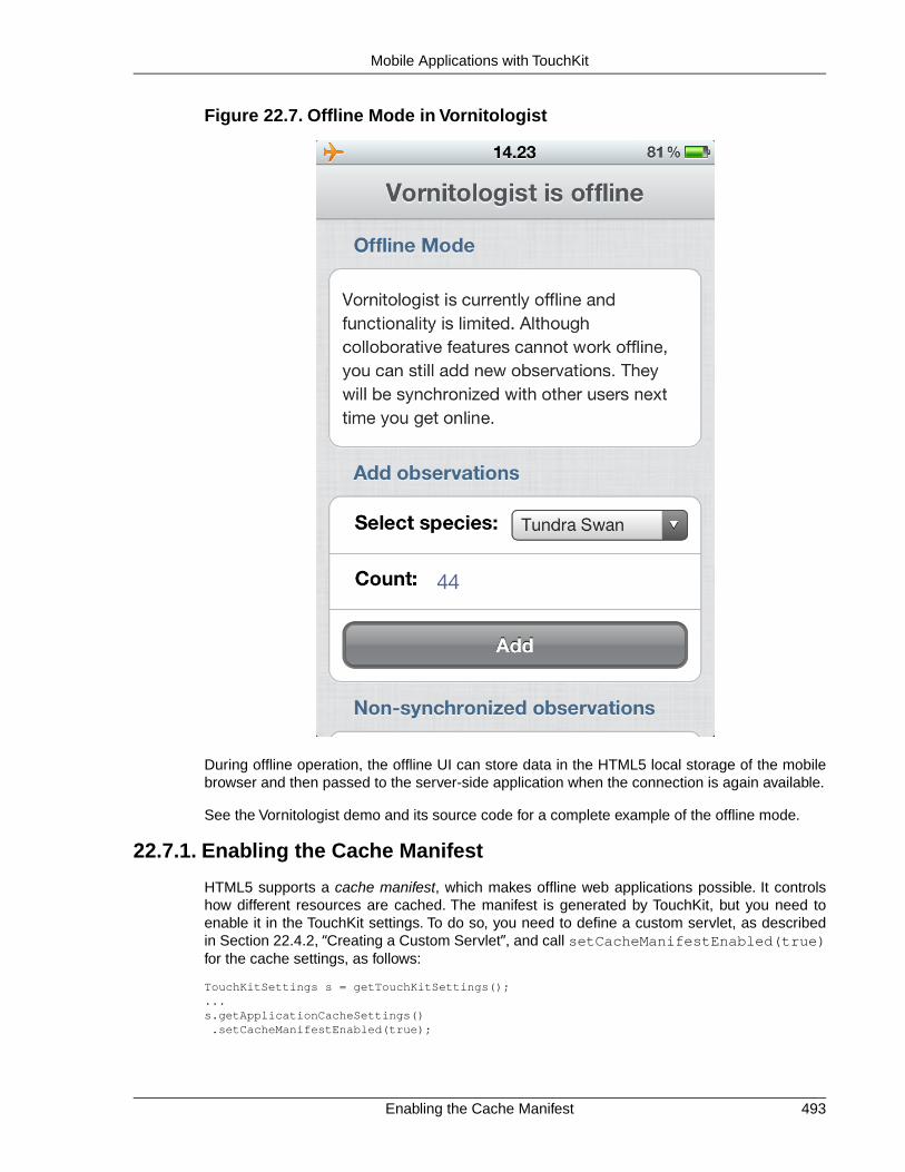
Figure 22.7. Offline Mode in Vornitologist
During offline operation, the offline UI can store data in the HTML5 local storage of the mobilebrowser and then passed to the server-side application when the connection is again available.
See the Vornitologist demo and its source code for a complete example of the offline mode.
22.7.1. Enabling the Cache Manifest
HTML5 supports a cache manifest, which makes offline web applications possible. It controlshow different resources are cached. The manifest is generated by TouchKit, but you need toenable it in the TouchKit settings. To do so, you need to define a custom servlet, as describedin Section 22.4.2, “Creating a Custom Servlet”, and call setCacheManifestEnabled(true)for the cache settings, as follows:
TouchKitSettings s = getTouchKitSettings();...s.getApplicationCacheSettings() .setCacheManifestEnabled(true);
493Enabling the Cache Manifest
Mobile Applications with TouchKit

You also need to define a MIME type for the manifest in the web.xml deployment descriptor asfollows:
<mime-mapping> <extension>manifest</extension> <mime-type>text/cache-manifest</mime-type></mime-mapping>
22.7.2. Enabling Offline Mode
To enable the offline mode, you need to add the OfflineModeSettings extension to the UI.
OfflineModeSettings offline = new OfflineModeSettings();...offline.extend(this);
You can extend the OfflineModeSettings extension to to transfer data conveniently from theoffline UI to the server-side, as described in Section 22.7.4, “Sending Data to Server”.
22.7.3.The Offline User Interface
An offline mode is built like any other client-side module, as described in Chapter 13, Client-SideVaadin Development. You can use any GWT, Vaadin, add-on, and also TouchKit widgets in theoffline user interface.
Most typically, a client-side application builds a simplified UI for data browsing and entry. It storesthe data in the HTML5 local storage. It watches if the server connection is restored, and if it is,it sends any collected data to the server and suggests to return to the online mode.
Please see the Vornitologist source code for an example implementation of an offline mode useri n t e r f a c e . T h ecom.vornitologist.widgetset.client.VornitologistOfflineMode.java is themain module of the offline application.
22.7.4. Sending Data to Server
Once the connection is available, the offline UI can send any collected data to the server-side.You can send the data from the offline UI, for example, by making a server RPC call to a server-side UI extension, as described in Section 16.6, “RPC Calls Between Client- and Server-Side”.
22.7.5.The Offline Theme
Normally, client-side modules have their own stylesheets in the public folder that is compiledinto the client-side target, as described in Section 16.8, “Styling a Widget” and Section 13.3.1,“Specifying a Stylesheet”. However, you may want to have the offline mode have the samevisual style as the online mode. To use the same theme as the server-side application, you needto define the theme path in the widget set definition file as follows.
<set-configuration-property name='touchkit.manifestlinker.additionalCacheRoot' value='src/main/webapp/VAADIN/themes/mytheme:../../../VAADIN/themes/mytheme />
You need to follow a CSS style structure required by the Vaadin theme in your offline application.If you use any Vaadin widgets, as described in Section 15.3, “Vaadin Widgets”, they will use theVaadin theme.
Enabling Offline Mode494
Mobile Applications with TouchKit

22.8. Building an Optimized Widget Set
Mobile networks are generally somewhat slower than DSL Internet connections. When startinga Vaadin application, the widget set is the biggest resource that needs to be loaded in the browser.As most of the Vaadin components are not used by most applications, especially mobile ones,it is beneficial to create an optimized version of the widget set.
Vaadin supports lazy loading of individual widget implementations when they are needed. TheTouchKitWidgetSet used in TouchKit applications optimizes the widgetset to only download themost essential widgets first and then load other widget implementation lazily. This is a goodcompromise for most TouchKit applications. Nevertheless, because of the high latency of mostmobile networks, loading the widget set in small pieces might not be the best solution for everycase.With custom optimization, you can create a monolithic widget set stripped off all unnecessarywidgets. Together with proper GZip compression, is should be quite light-weight for mobilebrowsers.
However, if the application has big components which are rarely used or not on the initial views,it may be best to load those widgets eagerly or lazily.
You can fine-tune a widget set by using a custom WidgetMapGenerator implementation. It needsto be defined in the .gwt.xml widget set definition file as follows:
<generate-with class="com.myprj.WidgetLoaderFactory"> <when-type-assignable class="com.vaadin.client.metadata.ConnectorBundleLoader" /></generate-with>
The WidgetMapGenerator should override TouchKitWidgetMapGenerator and itsgetUsedPaintables() method. The method returns an array of user interface componentclasses used by the application. Many largeish component implementations can be left out. Thelist of used components can be built manuall. You can also, for example, use a debugger to diginto the CommunicationManager class in Vaadin, which opens all the views of the application.It contains a set of all components that have been used.
public class WidgetLoaderFactory extends TouchKitBundleLoaderFactory { private final ArrayList<Class<? extends ServerConnector>> eagerWidgets;
public WidgetLoaderFactory() { eagerWidgets = new ArrayList<Class<? extends ServerConnector>>(); eagerWidgets.add(SwitchConnector.class); eagerWidgets.add(EmbeddedConnector.class); eagerWidgets.add(NumberFieldConnector.class); ...
The getLoadStyle() method should return the widget loading style, which should be EAGERto get a monolithic widgetset.
@Override protected LoadStyle getLoadStyle(JClassType connectorType) { if (eagerWidgets.contains(connectorType)) { return LoadStyle.EAGER; } else { return super.getLoadStyle(connectorType); } }}
495Building an Optimized Widget Set
Mobile Applications with TouchKit

You can find a working example in the VornitologistWidgetset.gwt.xml andWidgetMapGenerator.java in the Vornitologist sources.
Note that you need to enable GZip compression for your deployment if you wish to optimize thestartup time and minimize the amount of transferred data. The best method for doing that highlydepends on your hosting setup, so we do not cover it here.
22.9.Testing and Debugging on Mobile Devices
Testing places special challenges for mobile devices. The mobile browsers may not have muchdebugging features and you may not be able to install third-party debugging add-ons, such asFirebug.
22.9.1. Debugging
The debug mode, as described in Section 11.3, “Debug and Production Mode”, works on mobilebrowsers as well, even if it is a bit harder to use.
The lack of FireBug and similar tools can be helped with simple client-side coding. For example,you can dump the HTML content of the page with the innerHTML property in the HTML DOM.
TouchKit supports especially WebKit-based browsers, which are used in iOS and Android devices.You can therefore reach a good compatibility by using a desktop browser based on WebKit.Features such as geolocation are also supported by desktop browsers. If you make yourphone/tablet-detection and orientation detection using screen size, you can easily emulate themodes by resizing the browser.
Testing and Debugging on Mobile Devices496
Mobile Applications with TouchKit

Chapter 23
Vaadin TestBench
23.1. Overview .............................................................................................. 49723.2. Installing Vaadin TestBench ................................................................. 50023.3. Preparing an Application for Testing .................................................... 50623.4. Using Vaadin TestBench Recorder ...................................................... 50723.5. Developing JUnit Tests ........................................................................ 51323.6. Taking and Comparing Screenshots .................................................... 52623.7. Running Tests in an Distributed Environment ...................................... 52923.8. Known Issues ...................................................................................... 534
This chapter describes the installation and use of the Vaadin TestBench.
23.1. Overview
Quality assurance is one of the cornerstones of modern software development. Extendingthroughout the entire development process, quality assurance is the thread that binds the endproduct to the requirements. In iterative development processes, with ever shorter release cyclesand continuous integration, the role of regression testing is central. The special nature of webapplications creates many unique requirements for regression testing.
In a typical situation, you are developing a web application with Vaadin and want to ensure thatonly intended changes occur in its behaviour after modifying the code, without testing the applic-ation manually every time. There are two basic ways of detecting such regressions. Screenshotsare the strictest way, but often just checking the displayed values in the HTML is better if youwant to allow some flexibility for themeing, for example. You may also want to generate manydifferent kinds of inputs to the application and check that they produce the desired outputs.
497Book of Vaadin

Figure 23.1. Controlling the Browser with WebDriver
Vaadin TestBench utilizes the Selenium WebDriver to control the browser from Java code, as il-lustrated in Figure 23.1, “Controlling the Browser with WebDriver”. It can open a new browserwindow to start the application, interact with the components for example by clicking them, andthen get the HTML element values.
You can develop such WebDriver unit tests along your application code, for example with JUnit,which is a widely used Java unit testing framework.You can also use a recorder that runs in thebrowser to create JUnit test case stubs, which you can then refine further with Java.You can runthe tests as many times as you want in your workstation or in a distributed grid setup.
Figure 23.2.TestBench Workflow
The main features of Vaadin TestBench are:
• Record JUnit test case stubs in browser
• Develop tests in Java with the WebDriver
• Validate UI state by assertions and screen capture comparison
• Screen capture comparison with difference highlighting
• Distributed test grid for running tests
• Integration with unit testing
• Test with browsers on mobile devices
Execution of tests can be distributed over a grid of test nodes, which speeds up testing. The gridnodes can run different operating systems and have different browsers installed. In a minimalsetup, such as for developing the tests, you can use Vaadin TestBench on just a single computer.
Overview498
Vaadin TestBench

Based on Selenium
Vaadin TestBench is based on the Selenium web browser automation library. With the SeleniumWebDriver API, you can control browsers straight from Java code. The TestBench Recorder isbased on the Selenium IDE.
Selenium is augmented with Vaadin-specific extensions, such as:
• Proper handling of Ajax-based communications of Vaadin
• Exporting test case stubs from the Recorder
• Performance testing of Vaadin applications
• Screen capture comparison
• Finding HTML elements using a Vaadin selector
TestBench Components
The main components of Vaadin TestBench are:
• Vaadin TestBench Java Library
• Vaadin TestBench Recorder
The library includes WebDriver, which provides API to control a browser like a user would. ThisAPI can be used to build tests, for example, with JUnit. It also includes the grid hub and nodeservers, which you can use to run tests in a grid configuration.
The Vaadin TestBench Recorder is helpful for creating test case stubs. It is a Firefox extensionthat you install in your browser. It has a control panel to record test cases and play them back.You can play the test cases right in the recorder. You can then export the tests as JUnit tests,which you can edit further and then execute with the WebDriver.
Vaadin TestBench Library provides the central control logic for:
• Executing tests with the WebDriver
• Additional support for testing Vaadin-based applications
• Comparing screen captures with reference images
• Distributed testing with grid node and hub services
Requirements
Requirements for recording test cases with Vaadin TestBench Recorder:
• Mozilla Firefox
Requirements for running tests:
• Java JDK 1.6 or newer
• Browsers installed on test nodes as supported by Selenium WebDriver
499Based on Selenium
Vaadin TestBench

• Google Chrome
• Internet Explorer
• Mozilla Firefox (10.x ESR recommended)
• Opera
• Mobile browsers: Android, iPhone
• A build system, such as Ant or Maven, to automate execution of tests during build process(recommended)
Note that running tests on Firefox 10.x ESR is recommended because of the frequent releasecycle of Firefox, which often cause tests to fail. Download the ESR release of Firefox from ht-tp://www.mozilla.org/en-US/firefox/organizations/all.html. Install it alongside your normal Firefoxinstall (do not overwrite).
For Mac OS X, note the issue mentioned in Section 23.8.3, “Running Firefox Tests on Mac OSX”.
Continuous Integration Compatibility
Continuous integration means automatic compilation and testing of applications frequently, typicallyat least daily, but ideally every time when code changes are committed to the source repository.This practice allows catching integration problems early and finding the changes that first causedthem to occur.
You can make unit tests with Vaadin TestBench just like you would do any other Java unit tests,so they work seamlessly with continuous integration systems. Vaadin TestBench is tested towork with at least TeamCity and Hudson/Jenkins build management and continuous integrationservers, which all have special support for the JUnit unit testing framework.
Licensing and Trial Period
You can download Vaadin TestBench from Vaadin Directory and try it out for a free 30-day trialperiod, after which you are required to acquire the needed licenses. You can purchase licensesfrom the Directory. A license for Vaadin TestBench is also included in the Vaadin Pro Accountsubscription.
23.2. Installing Vaadin TestBench
Installation of Vaadin TestBench covers the following tasks:
• Download and unpack the Vaadin TestBench installation package
• Install Vaadin TestBench Recorder
• Install Vaadin TestBench Library
Which modules you need to install depends on whether you are developing tests or running ex-isting tests. Two basic installation types are covered in these instructions:
• Test development installation on a workstation
Continuous Integration Compatibility500
Vaadin TestBench
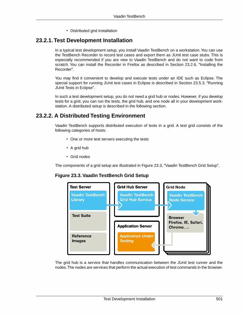
• Distributed grid installation
23.2.1.Test Development Installation
In a typical test development setup, you install Vaadin TestBench on a workstation.You can usethe TestBench Recorder to record test cases and export them as JUnit test case stubs. This isespecially recommended if you are new to Vaadin TestBench and do not want to code fromscratch. You can install the Recorder in Firefox as described in Section 23.2.6, “Installing theRecorder”.
You may find it convenient to develop and execute tests under an IDE such as Eclipse. Thespecial support for running JUnit test cases in Eclipse is described in Section 23.5.3, “RunningJUnit Tests in Eclipse”.
In such a test development setup, you do not need a grid hub or nodes. However, if you developtests for a grid, you can run the tests, the grid hub, and one node all in your development work-station. A distributed setup is described in the following section.
23.2.2. A Distributed Testing Environment
Vaadin TestBench supports distributed execution of tests in a grid. A test grid consists of thefollowing categories of hosts:
• One or more test servers executing the tests
• A grid hub
• Grid nodes
The components of a grid setup are illustrated in Figure 23.3, “Vaadin TestBench Grid Setup”.
Figure 23.3. Vaadin TestBench Grid Setup
The grid hub is a service that handles communication between the JUnit test runner and thenodes.The nodes are services that perform the actual execution of test commands in the browser.
501Test Development Installation
Vaadin TestBench

The hub requires very little resources, so you would typically run it either in the test server or onone of the nodes.You can run the tests, the hub, and one node all in one host, but in a fully dis-tributed setup, you install the Vaadin TestBench components on separate hosts.
Controlling browsers over a distributed setup requires using a remote WebDriver. Grid developmentand use of the hub and nodes is described in Section 23.7, “Running Tests in an DistributedEnvironment”.
23.2.3. Downloading and Unpacking the Installation Package
First, download the installation package vaadin-testbench-3.1.0.zip and extract the in-stallation package where you can find it.
Windows
In Windows, use the default ZIP decompression feature to extract the package into your chosendirectory, for example, C:\dev.
Windows Zip Decompression Problem
The default decompression program in Windows XP and Vista as well as some ver-sions of WinRAR cannot unpack the installation package properly in certain cases.Decompression can result in an error such as: "The system cannot find the file spe-cified." This can happen because the default decompression program is unable tohandle long file paths where the total length exceeds 256 characters.This can occur,for example, if you try to unpack the package under Desktop. You should unpackthe package directly into C:\dev or some other short path or use another decom-pression program.
Linux, MacOS X, and other UNIX
In Linux, Mac OS X, and other UNIX-like systems, you can use Info-ZIP or other ZIP softwarewith the command:
$ unzip vaadin-testbench-3.1.0.zip
The contents of the installation package will be extracted under the current directory.
In Mac OS X, you can also double-click the package to extract it under the current folder in afolder with the same name as the package.
23.2.4. Installation Package Contents
The installation package contains the following:
documentationThe documentation folder contains the TestBench library API documentation, a PDFexcerpt of this chapter of Book of Vaadin, and the license.
exampleThe example folder provides TestBench examples. An example Maven configurationPOM is given, as well as the JUnit test Java source files. For a description of thecontents, see Section 23.2.5, “Example Contents”.
Downloading and Unpacking the Installation Package502
Vaadin TestBench
mavenThe Maven folder contains version of the Vaadin TestBench libraries that you can installin your local Maven repository. Please follow the instructions in Section 23.5.5, “Ex-ecuting Tests with Maven”.
vaadin-testbench-recorderThis folder constains the Vaadin TestBench Recorder, which you can install in Firefox.Please follow the instructions in Section 23.2.6, “Installing the Recorder”.
vaadin-testbench-standalone-3.1.0.jarThis is the Vaadin TestBench library. It is a standalone library that includes the Selen-ium WebDriver and many other required libraries.
vaadin-testbench-standalone-3.1.0-javadoc.jarThis is the JavaDoc API documentation for the TestBench library. If you use Eclipse,you can associate the JAR with the TestBench JAR in the project preferences, in thebuild path library settings.
23.2.5. Example Contents
The example/maven folder provides a number of examples for using Vaadin TestBench. Thesource code for the application to be tested, a desktop calculator application, is given in thesrc/main/java subfolder.
The tests examples given under the src/test/java subfolder, in thecom/vaadin/testbenchexample package subfolder, are as follows:
SimpleCalculatorITCase.javaDemonstrates the basic use of WebDriver. Interacts with the buttons in the user inter-face by clicking them and checks the resulting value. Uses By.id() to access theelements.
LoopingCalculatorITCase.javaOtherwise as the simple example, but shows how to use looping to produce program-matic repetition to create a complex use case.
ScreenshotITCase.javaShows how to compare screenshots, as described in Section 23.6, “Taking andComparing Screenshots”. Some of the test cases include random input, so they requiremasked screenshot comparison to mask the random areas out.
The included reference images were taken with Firefox on Mac OS X, so if you useanother platform, they will fail.You will need to copy the error images to the referencescreenshot folder and mask out the areas with the alpha channel as described inSection 23.6.3, “Taking Screenshots for Comparison”.
SelectorExamplesITCase.javaThis example shows how to use different selectors:
• By.id() - selecting by identifier
• By.xpath() - selecting by an XPath expression
VerifyExecutionTimeITCase.javaShows how to time the execution of a test case and how to report it.
503Example Contents
Vaadin TestBench

AdvancedCommandsITCase.javaDemonstrates how to test tooltips (Section 23.5.10, “Testing Tooltips”) and contextmenus. Uses debug IDs, XPath expressions, as well as CSS selectors to find theelements to check.
For information about running the examples with Maven, see Section 23.5.5, “Executing Testswith Maven”.
23.2.6. Installing the Recorder
You can use the Vaadin TestBench Recorder in a test development environment to record testcases and to export them as JUnit test case stubs, which you can then develop further. Thisgives you a quick start when you are learning to use TestBench. Later you can use the Recorderto identify the HTML DOM paths of the user interface elements which you want to test.
After extracting the files from the installation package, do the following:
1. Change to the vaadin-testbench-recorder directory under the installation directory.
2. Open Mozilla Firefox
3. Either drag and drop the vaadin-testbench-recorder-3.1.0.xpi to an openFirefox window or open it from the menu with File Open File.
4. Firefox will ask if you want to install the TestBench Recorder extension. Click Install.
Figure 23.4. Installing Vaadin TestBench Recorder
5. After the installation of the add-on is finished, Firefox offers to restart. Click RestartNow.
Installation of a new version of Vaadin TestBench Recorder will overwrite an existing previousversion.
Installing the Recorder504
Vaadin TestBench

After Firefox has restarted, navigate to a Vaadin application for which you want to record testcases, such as http://demo.vaadin.com/sampler.
23.2.7. Installing Browser Drivers
Whether developing tests with the WebDriver in the workstation or running tests in a grid, usingsome browsers requires that a browser driver is installed.
1. Download the latest browser driver
• Internet Explorer (Windows only) - install IEDriverServer.exe from:
http://code.google.com/p/selenium/downloads/list
• Chrome - install ChromeDriver (a part of the Chromium project) for your platform from:
http://code.google.com/p/chromedriver/downloads/list
2. Add the driver executable to PATH or define it as a system property in the applicationusing WebDriver locally, or in distributed use give it as a command-line parameter tothe grid node service, as described in Section 23.7.4, “Starting a Grid Node”.
23.2.8.Test Node Configuration
If you are running the tests in a grid environment, you need to make some configuration to thetest nodes to get more stable results.
Further configuration is provided in command-line parameters when starting the node services,as described in Section 23.7.4, “Starting a Grid Node”.
Operating system settings
Make any operating system settings that might interfere with the browser and how it is openedor closed. Typical problems include crash handler dialogs.
On Windows, disable error reporting in case a browser crashes as follows:
1. Open Control Panel System
2. Select the Advanced tab
3. Select Error reporting
4. Check that Disable error reporting is selected
5. Check that But notify me when critical errors occur is not selected
Settings for Screenshots
The screenshot comparison feature requires that the user interface of the browser stays constant.The exact features that interfere with testing depend on the browser and the operating system.
In general:
• Disable blinking cursor
505Installing Browser Drivers
Vaadin TestBench

• Use identical operating system themeing on every host
• Turn off any software that may suddenly pop up a new window
• Turn off screen saver
If using Windows and Internet Explorer, you should give also the following setting:
• Turn on Allow active content to run in files on My Computer under Security settings
23.3. Preparing an Application for Testing
Vaadin TestBench can usually test Vaadin applications as they are, especially if just takingscreenshots. However, assertions on HTML elements require a DOM path to the element andthis path is vulnerable to even small changes in the DOM structure. They might change becauseof your layout or UI logic, or if a new Vaadin version has some small changes. To make suchproblems less common, you can use debug IDs to refer to components.
public class ApplicationToBeTested extends Application { public void init() { final Window main = new Window("Test window"); setMainWindow(main);
// Create a button Button button = new Button("Push Me!");
// Optional: give the button a unique debug ID button.setDebugId("main.button");
// Do something when the button is clicked button.addListener(new ClickListener() { @Override public void buttonClick(ClickEvent event) { // This label will not have a set debug ID main.addComponent(new Label("Thanks!")); } }); main.addComponent(button); }}
The application is shown in Figure 23.5, “A Simple Application To Be Tested”, with the buttonalready clicked.
Figure 23.5. A Simple Application To Be Tested
The button would be rendered as a HTML element: <div id="main.button"...>...</div>. The DOM element would then be accessible from the HTML page with:driver.findElement(By.id="main.button"). For the label, which doesn't have a debugID, the path would be from the page root. A recorded test case stub for the above application isgiven in Section 23.5.1, “Starting From a Stub”, which is further refined in this chapter.
Preparing an Application for Testing506
Vaadin TestBench
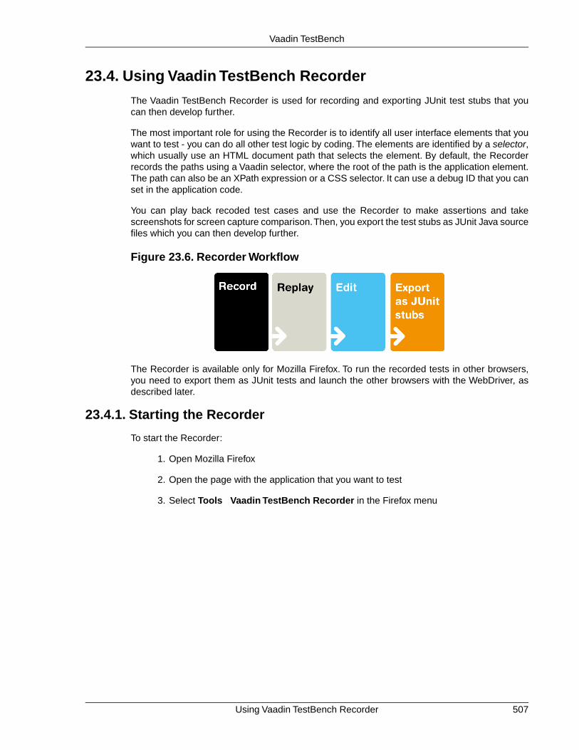
23.4. Using Vaadin TestBench Recorder
The Vaadin TestBench Recorder is used for recording and exporting JUnit test stubs that youcan then develop further.
The most important role for using the Recorder is to identify all user interface elements that youwant to test - you can do all other test logic by coding. The elements are identified by a selector,which usually use an HTML document path that selects the element. By default, the Recorderrecords the paths using a Vaadin selector, where the root of the path is the application element.The path can also be an XPath expression or a CSS selector. It can use a debug ID that you canset in the application code.
You can play back recoded test cases and use the Recorder to make assertions and takescreenshots for screen capture comparison.Then, you export the test stubs as JUnit Java sourcefiles which you can then develop further.
Figure 23.6. Recorder Workflow
The Recorder is available only for Mozilla Firefox. To run the recorded tests in other browsers,you need to export them as JUnit tests and launch the other browsers with the WebDriver, asdescribed later.
23.4.1. Starting the Recorder
To start the Recorder:
1. Open Mozilla Firefox
2. Open the page with the application that you want to test
3. Select Tools Vaadin TestBench Recorder in the Firefox menu
507Using Vaadin TestBench Recorder
Vaadin TestBench

Figure 23.7. Starting Vaadin TestBench Recorder
The Vaadin TestBench Recorder window will open, as shown in Figure 23.8, “Vaadin TestBenchRecorder Running”.
Starting the Recorder508
Vaadin TestBench

Figure 23.8. Vaadin TestBench Recorder Running
Recording is automatically enabled when the Recorder starts. This is indicated by the pressedRecord button.
23.4.2. Recording
While recording, you can interact with the application in (almost) any way you like. The Recorderrecords the interaction as commands in a test script, which is shown in tabular format in the Tabletab and as HTML source code in the Source tab.
509Recording
Vaadin TestBench

Figure 23.9. User Interaction Recorded as Commands
Please note the following:
• Changing browser tabs or opening a new browser window is not recommended, as anyclicks and other actions will be recorded
• Passwords are considered to be normal text input and are stored in plain text
While recording, you can insert various commands such as assertions or take a screenshot byselecting the command from the Command list.
When you are finished, click the Record button to stop recording.
23.4.3. Selectors
The Recorder supports various selectors that allow finding the HTML elements that are interactedupon and asserted. By default, Recorder uses the Vaadin selector, which finds the elements byan application identifier, a possible debug ID, and a component hierarchy path.
Selectors510
Vaadin TestBench

You can find elements by a plain XPath expression from the page root, an element ID, CSS styleclass, etc. The selectors are exported with the JUnit test cases as corresponding Vaadin or Sel-enium selector methods, described in Section 23.5.2, “Finding Elements by Selectors”.
Some selectors are not applicable to all elements, for example if an element does not have anID or it is outside the Vaadin application. In such case, another selector is used according to apreference order. You can change the order of the preferred selectors by selecting Options Options Locator Builders and dragging the selectors (or locators) to a preferred order. Normally,the Vaadin selector should be at top.
23.4.4. Playing Back Tests
After you have stopped recording, reset the application to the initial state and press Playcurrent test to run the test again. You can use the ?restartApplication parameter for anapplication in the URL to restart it.
You can also play back tests saved in the HTML format by first opening a test in the Recorderwith File Open.
You can use the slider to control the playback speed, click Pause to interrupt theexecution and Resume to continue. While paused, you can click Step to execute the script step-by-step.
Check that the test works as intended and no unintended or invalid commands are found; a testshould run without errors.
23.4.5. Editing Tests
While the primary purpose of using the Recorder is to identify all user interface elements to betested, you can also edit the tests at this point.You can insert various commands, such as asser-tions or taking a screenshot, in the test script during or after recording.
You insert a command by selecting an insertion point in the test script and right-clicking an elementin the browser. A context menu opens and shows a selection of Recorder commands at thebottom. Selecting Show All Available Commands shows more commands. Commands insertedfrom the sub-menu are automatically added to the top-level context menu.
Figure 23.10, “Inserting commands in a test script” shows adding an assertion after clicking thebutton in the example application.
511Playing Back Tests
Vaadin TestBench

Figure 23.10. Inserting commands in a test script
Inserting a command from the context menu automatically selects the command in the Commandfield and fills in the target and value parameters.
You can also select the command manually from the Command list. The new command orcomment will be added at the selected location, moving the selected location down. If the commandrequires a target element, click Select and then click an element in your application. A referenceto the element is shown in the Target field and you can highlight the element by clicking Show.If the command expects some value, such as for comparing the element value, give it in theValue field.
Commands in a test script can be changed by selecting a command and changing the command,target, or value.
23.4.6. Exporting Tests
Once you have are satisfied with a test case, you need to export it as a JUnit test case stub.
You can save a test by selecting File Export JUnit Test.
Exporting Tests512
Vaadin TestBench

Figure 23.11. Exporting Test Case as JUnit Test
In the dialog that opens, enter a file name for the Java source file. The file contains a Java classwith name Testcase, so you might want to name the file as Testcase.java. You can renamethe class later.
23.4.7. Saving Tests
While exporting tests as JUnit tests is the normal case, the Recorder also allows saving testcases and test suites in a HTML format that can be loaded back in the Recorder.Vaadin TestBenchdoes not support other use for these saved tests, but you may still find the feature useful if youlike to develop test cases more with the Recorder.
23.5. Developing JUnit Tests
Tests are developed using the Selenium WebDriver, which is augmented with Vaadin TestBenchAPI features useful for testing Vaadin applications.
Perhaps the easiest way to start developing tests is to use the Recorder to create a JUnit teststub, which is described in the next section. The main purpose of the recorder is to help identifythe HTML DOM paths of the user interface elements that you want to interact with and use forassertions. Once you get the hang of coding tests, you should be able to do it without using theRecorder. Working with debug IDs and using a browser debugger, such as Firebug, is usuallythe easiest way to find out the DOM paths.You can also use the Recorder just to find the paths,and copy and paste them directly to your source code without going through the export hassle.
513Saving Tests
Vaadin TestBench

While this section describes the development of JUnit tests, Vaadin TestBench and the WebDriverare in no way specific to JUnit and you can use any test execution framework, or just regularJava applications, to develop TestBench tests.
23.5.1. Starting From a Stub
Let us assume that you recorded a simple application, as described earlier, and exported it as aJUnit stub. You can add it to a project in a suitable package. You may want to keep your testclasses in a separate source tree in your application project, or in an altogether separate project,so that you do not have to include them in the web application WAR. Having them in the sameproject may be nicer for version control purposes.
You need to perform at least the following routine tasks:
• Rename the package
• Rename the class
• Check the base URL
• Clean up unnecessary code
A JUnit stub will look somewhat as follows:
package com.example.tests;
import java.util.regex.Pattern;import java.util.concurrent.TimeUnit;import org.junit.*;import static org.junit.Assert.*;import static org.hamcrest.CoreMatchers.*;import org.openqa.selenium.*;import org.openqa.selenium.firefox.FirefoxDriver;import org.openqa.selenium.support.ui.Select;import com.vaadin.testbench.By;import com.vaadin.testbench.TestBench;import com.vaadin.testbench.TestBenchTestCase;
public class Testcase1 extends TestBenchTestCase { private WebDriver driver; private String baseUrl; private StringBuffer verificationErrors = new StringBuffer(); ...
The verificationErrors is used to collect some errors in some recorded commands, butcan be removed if such commands are not used. You can also use it to collect non-fatal errors,for example screenshot comparison errors, and only fail on logic errors.
Test Setup
The set-up method, annotated with @Before, makes the basic configuration for the test. Mostimportantly, it creates the WebDriver instance, which is for Firefox by default. Drivers for differentbrowsers extend the RemoteWebDriver class - see the API type hierarchy for the complete list.
@Before public void setUp() throws Exception { driver = TestBench.createDriver(new FirefoxDriver()); baseUrl = "http://localhost:8080/myapp"; }
Starting From a Stub514
Vaadin TestBench

Check that the baseUrl is the correct URL for the application. It might not be.
Test Case Stub
The test case methods are marked with @Test annotation. They normally start by calling theget() method in the driver. This loads the URL in the browser.
Actual test commands usually call the findElement() method in the driver to get hold of anHTML element to work with. The button has the main.button ID, as we set that ID for theButton object with the setDebugId() method in the application. The HTML element is repres-ented as a WebElement object.
@Testpublic void testCase1() throws Exception { driver.get(concatUrl(baseUrl, "/myapp")); assertEquals("Push Me!", driver.findElement(By.vaadin( "bookexamplestobetested::PID_Smain.button")).getText()); driver.findElement(By.vaadin( "bookexamplestobetested::PID_Smain.button")).click(); assertEquals("Thanks!", driver.findElement(By.vaadin( "bookexamplestobetested::/VVerticalLayout[0]/"+ "ChildComponentContainer[1]/VLabel[0]")).getText());}
The get() call appends the application path to the base URL. If it is already included in the baseURL, you can remove it.
After Testing
Finally after running all the test cases, the method annotated with @After is called. Callingquit() for the driver closes the browser window.
The stub includes code for collecting verification errors. If you do not collect those, as is oftenthe case, you can remove the code.
@After public void tearDown() throws Exception { driver.quit();
String verificationErrorString = verificationErrors.toString(); if (!"".equals(verificationErrorString)) { fail(verificationErrorString); } }
23.5.2. Finding Elements by Selectors
The Selenium WebDriver API provides a number of different selectors for finding HTML DOMelements.The available selectors are defined as static methods in the org.openqa.selenium.Byclass.They create and return a By instance, which you can use for the findElement() methodin WebDriver.
The ID, CSS class, and Vaadin selectors are described below. For others, we refer to the Selen-ium WebDriver API documentation [http://seleniumhq.org/docs/03_webdriver.html].
515Finding Elements by Selectors
Vaadin TestBench

Finding by ID
Selecting elements by their HTML element id attribute is usually the easiest way to select ele-ments. It requires that you use debug IDs, as described in Section 23.3, “Preparing an Applicationfor Testing”. The debug ID is used as is for the id attribute of the top element of the component.Selecting is done by the By.id() selector.
For example, in the SimpleCalculatorITCase.java example we use the debug ID as followsto click on the calculator buttons:
@Testpublic void testOnePlusTwo() throws Exception { openCalculator();
// Click the buttons in the user interface getDriver().findElement(By.id("button_1")).click(); getDriver().findElement(By.id("button_+")).click(); getDriver().findElement(By.id("button_2")).click(); getDriver().findElement(By.id("button_=")).click();
// Get the result label value assertEquals("3.0", getDriver().findElement( By.id("display")).getText());}
The ID selectors are used extensively in the TestBench examples.
Finding by Vaadin Selector
In addition to the Selenium selectors, Vaadin TestBench provides a Vaadin selector, which allowspointing to a Vaadin component by its layout path. The JUnit test cases saved from the Recorderuse Vaadin selectors by default.
You can create a Vaadin selector with the By.vaadin() method. You need to use the VaadinBy, defined in the com.vaadin.testbench package, which extends the Selenium By.
The other way is to use the findElementByVaadinSelector() method in theTestBenchCommands interface. It returns the WebElement object.
A Vaadin selector begins with an application identifier. It is the path to application without anyslashes or other special characters. For example, /book-examples/tobetested would bebookexamplestobetested. After the identifier, comes two colons "::", followed by a slash-delimited component path to the component to be selected.The elements in the component pathare client-side classes of the Vaadin user interfacer components. For example, the server-sideVerticalLayout component has VVerticalLayout client-side counterpart. All path elements exceptthe leaves are component containers, usually layouts.The exact contained component is identifiedby its index in brackets.
A reference to a debug ID is given with a PID_S suffix to the debug ID.
For example:
// Get the button's element.// Use the debug ID given with setDebugId().WebElement button = driver.findElement(By.vaadin( "bookexamplestobetested::PID_Smain.button"));
// Get the caption textassertEquals("Push Me!", button.getText());
Finding Elements by Selectors516
Vaadin TestBench

// And click itbutton.click();
// Get the Label's element by full pathWebElement label = driver.findElement(By.vaadin( "bookexamplestobetested::/VVerticalLayout[0]/"+ "ChildComponentContainer[1]/VLabel[0]"));
// Make the assertionassertEquals("Thanks!", label.getText());
Finding by CSS Class
An element with a particular CSS style class name can be selected with the By.className()method. CSS selectors are useful for elements which have no ID, nor can be found easily fromthe component hierarchy, but do have a particular unique CSS style. Tooltips are one example,as they are floating div elements under the root element of the application. Their v-tooltipstyle makes it possible to select them as follows:
// Verify that the tooltip contains the expected textString tooltipText = driver.findElement( By.className("v-tooltip")).getText();
For a complete example, see the AdvancedCommandsITCase.java file in the examples.
23.5.3. Running JUnit Tests in Eclipse
The Eclipse IDE integrates JUnit with nice control features. To run TestBench JUnit test casesin Eclipse, you need to do the following:
1. Add the TestBench JAR to a library folder in the project, such as lib. You should notput the library in WEB-INF/lib as it is not used by the Vaadin web application. Refreshthe project by selecting it and pressing F5.
2. Right-click the project in Project Explorer and select Properties, and open the JavaBuild Path and the Libraries tab. Click Add JARs, navigate to the library folder, selectthe library, and click OK.
3. Switch to the Order and Export tab in the project properties. Make sure that the Test-Bench JAR is above the gwt-dev.jar (it may contain an old httpclient package),by selecting it and moving it with the Up and Down buttons.
4. Click OK to exit the project properties.
5. Right-click a test source file and select Run As JUnit Test.
A JUnit view should appear, and it should open the Firefox browser, launch the application, runthe test, and then close the browser window. If all goes well, you have a passed test case, whichis reported in the JUnit view area in Eclipse, as illustrated in Figure 23.12, “Running JUnit Testsin Eclipse”.
517Running JUnit Tests in Eclipse
Vaadin TestBench

Figure 23.12. Running JUnit Tests in Eclipse
If you are using some other IDE, it might support JUnit tests as well. If not, you can run the testsusing Ant or Maven.
23.5.4. Executing Tests with Ant
Apache Ant has built-in support for executing JUnit tests. To enable the support, you need tohave the JUnit library junit.jar and its Ant integration library ant-junit.jar in the Antclasspath, as described in the Ant documentation.
Once enabled, you can use the <junit> task in an Ant script. The following example assumesthat the source files are located under a src directory under the current directory and compilesthem to the classes directory. The the class path is defined with the classpath reference IDand should include the TestBench JAR and all relevant dependencies.
<project default="run-tests"> <path id="classpath"> <fileset dir="lib" includes="vaadin-testbench-standalone-*.jar" /> </path>
<!-- This target compiles the JUnit tests. --> <target name="compile-tests"> <mkdir dir="classes" /> <javac srcdir="src" destdir="classes" debug="on" encoding="utf-8"> <classpath> <path refid="classpath" /> </classpath> </javac> </target>
<!-- This target calls JUnit --> <target name="run-tests" depends="compile-tests"> <junit fork="yes"> <classpath> <path refid="classpath" /> <pathelement path="classes" /> </classpath>
<formatter type="brief" usefile="false" />
<batchtest> <fileset dir="src"> <include name="**/**.java" /> </fileset>
Executing Tests with Ant518
Vaadin TestBench

</batchtest> </junit> </target></project>
You also need to deploy the application to test, and possibly launch a dedicated server for it.
23.5.5. Executing Tests with Maven
Executing JUnit tests with Vaadin TestBench under Maven requires installing the TestBenchlibrary in the local Maven repository and defining it as a dependency in any POM that needs toexecute TestBench tests.
A complete example of a Maven test setup is given in the example/maven folder in the installationpackage. Please see the README file in the folder for further instructions.
Installing TestBench in Local Repository
You can install TestBench in the local Maven repository with the following commands:
$ cd maven$ mvn install:install-file \ -Dfile=vaadin-testbench-3.1.0-SNAPSHOT.jar \ -Djavadoc=vaadin-testbench-3.1.0-SNAPSHOT-javadoc.jar \ -DpomFile=pom.xml
The maven folder also includes an INSTALL file, which contains instructions for installing Test-Bench in Maven.
Defining TestBench as a Dependency
Once TestBench is installed in the local repository as instructed in the previous section, you candefine it as a dependency in the Maven POM of your project as follows:
<dependency> <groupId>com.vaadin</groupId> <artifactId>vaadin-testbench</artifactId> <version>&version.testbench;-SNAPSHOT</version> </dependency>
For instructions on how to create a new Vaadin project with Maven, please see Section 2.6,“Using Vaadin with Maven”.
Running the Tests
To compile and run the tests, simply execute the test lifecycle phase with Maven as follows:
$ mvn test...----------------------------------------------------- T E S T S-----------------------------------------------------Running TestBenchExampleTests run: 6, Failures: 2, Errors: 0, Skipped: 1, Time elapsed: 36.736 sec <<< FAILURE!
Results :
Failed tests: testDemo(TestBenchExample): expected:<[5/17/]12> but was:<[17.6.20]12> testScreenshot(TestBenchExample): Screenshots differ
519Executing Tests with Maven
Vaadin TestBench

Tests run: 6, Failures: 2, Errors: 0, Skipped: 1...
The example configuration starts Jetty to run the application that is tested. Error screenshotsfrom screenshot comparison are written to the target/testbench/errors folder. To enablecomparing them to "expected" screenshots, you need to copy the screenshots to thesrc/test/resources/screenshots/reference/ folder. See Section 23.6, “Taking andComparing Screenshots” for more information regarding screenshots.
23.5.6.Test Setup
Test configuration is done in a method annotated with @Before. The method is executed beforeeach test case. In a JUnit stub exported from Recorder, this is done in the setUp() method.
The basic configuration tasks are:
• Set TestBench parameters
• Create the web driver
• Do any other initialization
TestBench Parameters
TestBench parameters are defined with static methods in the com.vaadin.testbench.Parametersclass. The parameters are mainly for screenshots and documented in Section 23.6, “Taking andComparing Screenshots”.
23.5.7. Creating and Closing a Web Driver
Vaadin TestBench uses Selenium WebDriver to execute tests in a browser. The WebDriver in-stance is created with the static createDriver() method in the TestBench class. It takes thedriver as the parameter and returns it after registering it. The test cases must extend the Test-BenchTestCase class, which manages the TestBench-specific features.
The basic way is to create the driver in a method annotated with the JUnit @Before annotationand close it in a method annotated with @After.
public class AdvancedTest extends TestBenchTestCase { private WebDriver driver;
@Before public void setUp() throws Exception { ... driver = TestBench.createDriver(new FirefoxDriver()); } ... @After public void tearDown() throws Exception { driver.quit(); }}
This creates the driver for each test you have in the test class, causing a new browser instanceto be opened and closed. If you want to keep the browser open between the test, you can use@BeforeClass and @AfterClass methods to create and quit the driver. In that case, themethods as well as the driver instance have to be static.
Test Setup520
Vaadin TestBench

public class AdvancedTest extends TestBenchTestCase { static private WebDriver driver;
@BeforeClass static public void createDriver() throws Exception { driver = TestBench.createDriver(new FirefoxDriver()); } ... @AfterClass static public void tearDown() throws Exception { driver.quit(); }}
Browser Drivers
Please see the API documentation of the WebDriver interface for a complete list of supporteddrivers, that is, classes implementing the interface.
Both the Internet Explorer and Chrome require a special driver, as was noted in Section 23.2.7,“Installing Browser Drivers”. The driver executable must be included in the operating systemPATH or be given with a driver-specific system property in Java with:System.setProperty(prop, key)).
• Chrome: webdriver.chrome.driver
• IE: webdriver.ie.driver
If you use the Firefox 10.x ESR version, which is recommended because of test stability, youneed to the binary when creating the driver as follows:
FirefoxBinary binary = new FirefoxBinary(new File("/path/to/firefox_ESR_10"));driver = TestBench.createDriver( new FirefoxDriver(binary, new FirefoxProfile()));
23.5.8. Basic Test Case Structure
A typical test case does the following:
1. Open the URL
2. Navigate to desired state
a. Find a HTML element (WebElement) for navigation
b. Use click() and other commands to interact with the element
c. Repeat with different elements until desired state is reached
3. Find a HTML element (WebElement) to check
4. Get and assert the value of the HTML element
5. Get a screenshot
The WebDriver allows finding HTML elements in a page in various ways, for example, with XPathexpressions. The access methods are defined statically in the By class.
These tasks are realized in the following test code:
521Basic Test Case Structure
Vaadin TestBench

@Testpublic void testCase1() throws Exception { driver.get(baseUrl + "/book-examples/tobetested");
// Get the button's element. // (Actually the caption element inside the button.) // Use the debug ID given with setDebugId(). WebElement button = driver.findElement(By.xpath( "//div[@id='main.button']/span/span"));
// Get the caption text assertEquals("Push Me!", button.getText());
// And click it. It's OK to click the caption element. button.click();
// Get the Label's element. // Use the automatically generated ID. WebElement label = driver.findElement(By.xpath( "//div[@id='myapp-949693921']" + "/div/div[2]/div/div[2]/div/div"));
// Make the assertion assertEquals("Thanks!", label.getText());}
You can also use URI fragments in the URL to open the application at a specific state. For inform-ation about URI fragments, see Section 11.9, “URI Fragment and History Management withUriFragmentUtility”.
You should use the JUnit assertion commands. They are static methods defined in the org.ju-nit.Assert class, which you can import (for example) with:
import static org.junit.Assert.assertEquals;
P l e a s e s e e t h e S e l e n i u m A P I d o c u m e n t a t i o n[http://seleniumhq.org/docs/03_webdriver.html#selenium-webdriver-api-commands-and-operations]for a complete reference of the element search methods in the WebDriver and By classes andfor the interaction commands in the WebElement class.
TestBench has a collection of its own commands, defined in the TestBenchCommands interface.You can get a command object that you can use by calling testBench(driver) in a test case.
23.5.9. Waiting for Vaadin
Selenium is intended for regular web applications that load a page that is immediately renderedby the browser. Vaadin, on the other hand, is an Ajax framework where page is loaded just onceand rendering is done in JavaScript. This takes more time so that the rendering might not befinished when the WebDriver continues executing the test. Vaadin TestBench allows waitinguntil the rendering is finished.
The waiting is automatically enabled. You can disable waiting by callingdisableWaitForVaadin() in the TestBenchCommands interface. You can call it in a testcase as follows:
testBench(driver).disableWaitForVaadin();
When disabled, you can wait for the rendering to finish by calling waitForVaadin() explicitly.
testBench(driver).waitForVaadin();
Waiting for Vaadin522
Vaadin TestBench

You can re-enable the waiting with enableWaitForVaadin() in the same interface.
23.5.10.Testing Tooltips
Component tooltips show when you hover the mouse over a component. Events caused byhovering are not recorded by Recorder, so this interaction requires special handling when testing.
Let us assume that you have set the tooltip as follows:
// Create a button with a debug IDButton button = new Button("Push Me!");button.setDebugId("main.button");
// Set the tooltip button.setDescription("This is a tip");
The tooltip of a component is displayed with the showTooltip() method in the TestBenchEle-mentCommands interface.You should wait a little to make sure it comes up. The floating tooltipelement is not under the element of the component, but you can find it by//div[@class='v-tooltip'] XPath expression.
@Testpublic void testTooltip() throws Exception { driver.get(appUrl);
// Get the button's element. // Use the debug ID given with setDebugId(). WebElement button = driver.findElement(By.xpath( "//div[@id='main.button']/span/span"));
// Show the tooltip testBenchElement(button).showTooltip();
// Wait a little to make sure it's up Thread.sleep(1000);
// Check that the tooltip text matches assertEquals("This is a tip", driver.findElement( By.xpath("//div[@class='v-tooltip']")).getText());
// Compare a screenshot just to be sure assertTrue(testBench(driver).compareScreen("tooltip"));}
23.5.11. Scrolling
Some Vaadin components, such as Table and Panel have a scrollbar.To get hold of the scrollbar,you must first find the component element. Then, you need to get hold of theTestBenchElementCommands interface from the WebElement withtestBenchElement(WebElement). The scroll() method in the interface scrolls a verticalscrollbar down the number of pixels given as the parameter. The scrollLeft() scrolls a hori-zontal scrollbar by the given number of pixels.
23.5.12.Testing Notifications
When testing notifications, you will need to close the notification box.You need to get hold of theTestBenchElementCommands interface from the WebElement of the notification element withtestBenchElement(WebElement). The closeNotification() method in the interfacecloses the notification.
523Testing Tooltips
Vaadin TestBench

23.5.13.Testing Context Menus
Opening context menus require special handling.You need to create a Selenium Actions objectto perform a context click on a WebElement.
In the following example, we open a context menu in a Table component, find an item by itscaption text, and click it.
// Select the table body elementWebElement e = getDriver().findElement( By.className("v-table-body"));
// Perform context click action to open the context menunew Actions(getDriver()).moveToElement(e) .contextClick(e).perform();
// Select "Add Comment" from the opened menugetDriver().findElement( By.xpath("//*[text() = 'Add Comment']")).click();
The complete example is given in the AdvancedCommandsITCase.java example source file.
23.5.14. Profiling Test Execution Time
It is not just that it works, but also how long it takes. Profiling test execution times consistently isnot trivial, as a test environment can have different kinds of latency and interference. For examplein a distributed setup, timings taken on the test server would include the latencies between thetest server, the grid hub, a grid node running the browser, and the web server running the applic-ation. In such a setup, you could also expect interference between multiple test nodes, which allmight make requests to a shared application server and possibly also share virtual machine re-sources.
Furthermore, in Vaadin applications, there are two sides which need to be profiled: the server-side, on which the application logic is executed, and the client-side, where it is rendered in thebrowser. Vaadin TestBench includes methods for measuring execution time both on the server-side and the client-side.
The TestBenchCommands interface offers the following methods for profiling test executiontime:
totalTimeSpentServicingRequests()Returns the total time (in milliseconds) spent servicing requests in the application onthe server-side. The timer starts when you first navigate to the application and hencestart a new session. The time passes only when servicing requests for the particularsession.The timer is shared in the servlet session, so if you have, for example, multipleportlets in the same application (session), their execution times will be included in thesame total.
Notice that if you are also interested in the client-side performance for the last request,you must call the timeSpentRenderingLastRequest() before calling this method.This is due to the fact that this method makes an extra server request, which will causean empty response to be rendered.
timeSpentServicingLastRequest()Returns the time (in milliseconds) spent servicing the last request in the applicationon the server-side. Notice that not all user interaction through the WebDriver causeserver requests.
Testing Context Menus524
Vaadin TestBench

As with the total above, if you are also interested in the client-side performance for thelast request, you must call the timeSpentRenderingLastRequest() before callingthis method.
totalTimeSpentRendering()Returns the total time (in milliseconds) spent rendering the user interface of the applic-ation on the client-side, that is, in the browser.This time only passes when the browseris rendering after interacting with it through the WebDriver. The timer is shared in theservlet session, so if you have, for example, multiple portlets in the same application(session), their execution times will be included in the same total.
timeSpentRenderingLastRequest()Returns the time (in milliseconds) spent rendering user interface of the applicationafter the last server request. Notice that not all user interaction through the WebDrivercause server requests.
If you also call the timeSpentServicingLastRequest() ortotalTimeSpentServicingRequests(), you should do so before calling thismethod. The methods cause a server request, which will zero the rendering timemeasured by this method.
Generally, only interaction with fields in the immediate mode cause server requests.This includesbutton clicks. Some components, such as Table, also cause requests otherwise, such as whenloading data while scrolling. Some interaction could cause multiple requests, such as when imagesare loaded from the server as the result of user interaction.
The following example is given in the VerifyExecutionTimeITCase.java file under theTestBench examples.
@Testpublic void verifyServerExecutionTime() throws Exception { openCalculator();
// Get start time on the server-side long currentSessionTime = testBench(getDriver()) .totalTimeSpentServicingRequests();
// Interact with the application calculateOnePlusTwo();
// Calculate the passed processing time on the serve-side long timeSpentByServerForSimpleCalculation = testBench() .totalTimeSpentServicingRequests() - currentSessionTime;
// Report the timing System.out.println("Calculating 1+2 took about " + timeSpentByServerForSimpleCalculation + "ms in servlets service method.");
// Fail if the processing time was critically long if (timeSpentByServerForSimpleCalculation > 30) { fail("Simple calculation shouldn't take " + timeSpentByServerForSimpleCalculation + "ms!"); }
// Do the same with rendering time long totalTimeSpentRendering = testBench().totalTimeSpentRendering(); System.out.println("Rendering UI took " + totalTimeSpentRendering + "ms"); if (timeSpentByServerForSimpleCalculation > 400) {
525Profiling Test Execution Time
Vaadin TestBench

fail("Rendering UI shouldn't take " + timeSpentByServerForSimpleCalculation + "ms!"); }
// A regular assertion on the UI state assertEquals("3.0", getDriver().findElement( By.id("display")).getText());}
23.6.Taking and Comparing Screenshots
You can take and compare screenshots with reference screenshots taken earlier. If there aredifferences, you can fail the test case.
23.6.1. Screenshot Parameters
The screenshot configuration parameters are defined with static methods in the com.vaadin.test-bench.Parameters class.
screenshotErrorDirectory (default: null)Defines the directory where screenshots for failed tests or comparisons are stored.
screenshotReferenceDirectory (default: null)Defines the directory where the reference images for screenshot comparison arestored.
captureScreenshotOnFailure (default: true)Defines whether screenshots are taken whenever an assertion fails.
screenshotComparisonTolerance (default: 0.01)Screen comparison is usually not done with exact pixel values, because rendering inbrowser often has some tiny inconsistencies. Also image compression may causesmall artifacts.
screenshotComparisonCursorDetection (default: false)Some field component get a blinking cursor when they have the focus.The cursor cancause unnecessary failures depending on whether the blink happens to make thecursor visible or invisible when taking a screenshot. This parameter enables cursordetection that tries to minimize these failures.
maxScreenshotRetries (default: 2)Sometimes a screenshot comparison may fail because the screen rendering has notyet finished, or there is a blinking cursor that is different from the reference screenshot.For these reasons, Vaadin TestBench retries the screenshot comparison for a numberof times defined with this parameter.
screenshotRetryDelay (default: 500)Delay in milliseconds for making a screenshot retry when a comparison fails.
For example:
@Beforepublic void setUp() throws Exception { Parameters.setScreenshotErrorDirectory( "screenshots/errors"); Parameters.setScreenshotReferenceDirectory( "screenshots/reference"); Parameters.setMaxScreenshotRetries(2);
Taking and Comparing Screenshots526
Vaadin TestBench

Parameters.setScreenshotComparisonTolerance(1.0); Parameters.setScreenshotRetryDelay(10); Parameters.setScreenshotComparisonCursorDetection(true); Parameters.setCaptureScreenshotOnFailure(true);}
23.6.2.Taking Screenshots on Failure
Vaadin TestBench takes screenshots automatically when a test fails, if thecaptureScreenShotOnFailure is enabled in TestBench parameters. The screenshots arewritten to the error directory defined with the screenshotErrorDirectory parameter.
You need to have the following in the setup method:
@Beforepublic void setUp() throws Exception { Parameters.setScreenshotErrorDirectory("screenshots/errors"); Parameters.setCaptureScreenshotOnFailure(true); ...}
23.6.3.Taking Screenshots for Comparison
Vaadin TestBench allows taking screenshots of the web browser window with thecompareScreen() command in the TestBenchCommands interface. The method has anumber of variants.
The compareScreen(File) takes a File object pointing to the reference image. In this case,a possible error image is written to the error directory with the same file name.You can get a fileobject to a reference image with the static ImageFileUtil.getReferenceScreenshotFile()helper method.
assertTrue("Screenshots differ", testBench(driver).compareScreen( ImageFileUtil.getReferenceScreenshotFile( "myshot.png")));
The compareScreen(String) takes a base name of the screenshot. It is appended withbrowser identifier and the file extension.
assertTrue(testBench(driver).compareScreen("tooltip"));
The compareScreen(BufferedImage, String) allows keeping the reference image inmemory. An error image is written to a file with a name determined from the base name givenas the second parameter.
Screenshots taken with the compareScreen() method are compared to a reference imagestored in the reference image folder. If differences are found (or the reference image is missing),the comparison method returns false and stores the screenshot in the error folder. It also gen-erates an HTML file that highlights the differing regions.
Screenshot Comparison Error Images
Screenshots with errors are written to the error folder, which is defined with thescreenshotErrorDirectory parameter described in Section 23.6.1, “Screenshot Parameters”.
For example, the error caused by a missing reference image could be written toscreenshot/errors/tooltip_firefox_12.0.png. The image is shown in Figure 23.13,“A screenshot taken by a test run”.
527Taking Screenshots on Failure
Vaadin TestBench

Figure 23.13. A screenshot taken by a test run
Screenshots cover the visible page area in the browser. The size of the browser is therefore rel-evant for screenshot comparison. The browser is normally sized with a predefined default size.You can set the size of the browser window with, for example,driver.manage().window().setSize(new Dimension(1024, 768)); in the @Beforemethod. The size includes any browser chrome, so the actual screenshot size will be smaller.
Reference Images
Reference images are expected to be found in the reference image folder, as defined with thescreenshotReferenceDirectory parameter described in Section 23.6.1, “ScreenshotParameters”. To create a reference image, just copy a screenshot from the errors/ directoryto the reference/ directory.
For example:
$ cp screenshot/errors/tooltip_firefox_12.0.png screenshot/reference/
Now, when the proper reference image exists, rerunning the test outputs success:
$ java ...JUnit version 4.5.Time: 18.222
OK (1 test)
You can also supply multiple versions of the reference images by appending an underscore andan index to the filenames. For example:
tooltip_firefox_12.0.pngtooltip_firefox_12.0_1.pngtooltip_firefox_12.0_2.png
This can be useful in certain situations when there actually are more than one "correct" reference.
Masking Screenshots
You can make masked screenshot comparison with reference images that have non-opaqueregions. Non-opaque pixels in the reference image, that is, ones with less than 1.0 value, areignored in the screenshot comparison.
Taking Screenshots for Comparison528
Vaadin TestBench
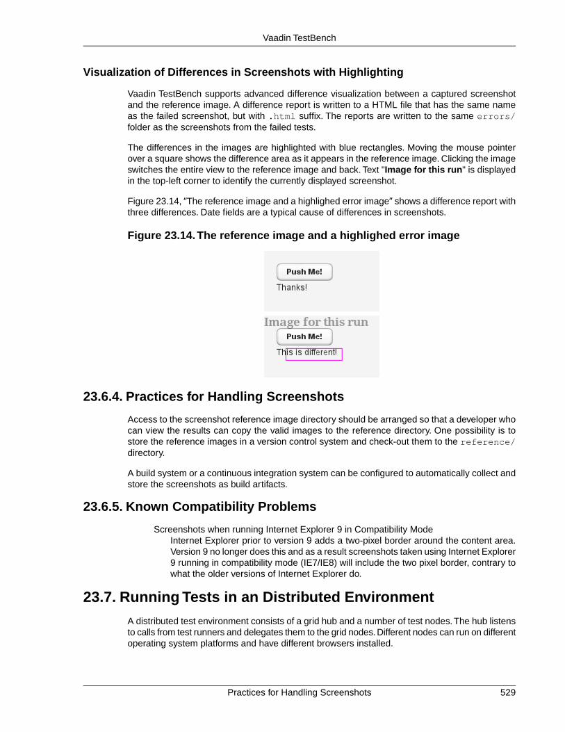
Visualization of Differences in Screenshots with Highlighting
Vaadin TestBench supports advanced difference visualization between a captured screenshotand the reference image. A difference report is written to a HTML file that has the same nameas the failed screenshot, but with .html suffix. The reports are written to the same errors/folder as the screenshots from the failed tests.
The differences in the images are highlighted with blue rectangles. Moving the mouse pointerover a square shows the difference area as it appears in the reference image. Clicking the imageswitches the entire view to the reference image and back. Text "Image for this run" is displayedin the top-left corner to identify the currently displayed screenshot.
Figure 23.14, “The reference image and a highlighed error image” shows a difference report withthree differences. Date fields are a typical cause of differences in screenshots.
Figure 23.14.The reference image and a highlighed error image
23.6.4. Practices for Handling Screenshots
Access to the screenshot reference image directory should be arranged so that a developer whocan view the results can copy the valid images to the reference directory. One possibility is tostore the reference images in a version control system and check-out them to the reference/directory.
A build system or a continuous integration system can be configured to automatically collect andstore the screenshots as build artifacts.
23.6.5. Known Compatibility Problems
Screenshots when running Internet Explorer 9 in Compatibility ModeInternet Explorer prior to version 9 adds a two-pixel border around the content area.Version 9 no longer does this and as a result screenshots taken using Internet Explorer9 running in compatibility mode (IE7/IE8) will include the two pixel border, contrary towhat the older versions of Internet Explorer do.
23.7. Running Tests in an Distributed Environment
A distributed test environment consists of a grid hub and a number of test nodes.The hub listensto calls from test runners and delegates them to the grid nodes. Different nodes can run on differentoperating system platforms and have different browsers installed.
529Practices for Handling Screenshots
Vaadin TestBench

A basic distributed installation was covered in Section 23.2.2, “A Distributed Testing Environment”.
23.7.1. Running Tests Remotely
Remote tests are just like locally executed JUnit tests, except instead of using a browser driver,you use a RemoteWebDriver that can connect to the hub. The hub delegates the connection toa grid node with the desired capabilities, that is, which browsers are installed in a suitable node.The capabilities are described with a DesiredCapabilities object.
For example, in the example tests given in the example folder, we create and use a remotedriver as follows:
@Testpublic void testRemoteWebDriver() throws MalformedURLException { // Require Firefox in the test node DesiredCapabilities capability = DesiredCapabilities.firefox();
// Create a remote web driver that connects to a hub // running in the local host WebDriver driver = TestBench.createDriver( new RemoteWebDriver(new URL( "http://localhost:4444/wd/hub"), capability));
// Then use it to run a test as you would use any web driver try { driver.navigate().to( "http://demo.vaadin.com/sampler#TreeActions"); WebElement e = driver.findElement(By.xpath( "//div[@class='v-tree-node-caption']"+ "/div[span='Desktops']")); new Actions(driver).moveToElement(e).contextClick(e) .perform(); } finally { driver.quit(); }}
Please see the API documentation of the DesiredCapabilities class for a complete list of sup-ported capabilities.
Running the example requires that the hub service and the nodes are running. Starting them isdescribed in the subsequent sections. Please refer to Selenium documentation[http://seleniumhq.org/docs/07_selenium_grid.html] for more detailed information.
23.7.2. Starting the Hub
The TestBench grid hub listens to calls from test runners and delegates them to the grid nodes.The grid hub service is included in the Vaadin TestBench JAR and you can start it with the followingcommand:
$ java -jar vaadin-testbench-standalone-3.1.0.jar \ -role hub
You can open the control interface of the hub also with a web browser. Using the default port,just open URL http://localhost:4444/. Once you have started one or more grid nodes,as instructed in the next section, the "console" page displays a list of the grid nodes with theirbrowser capabilities.
Running Tests Remotely530
Vaadin TestBench
23.7.3. Node Service Configuration
Test nodes can be configured with command-line options, as described later, or in a configurationfile in JSON format. If no configuration file is provided, a default configuration is used.
A node configuration file is specified with the -nodeConfig parameter to the node service, forexample as follows:
$ java -jar vaadin-testbench-standalone-3.1.0.jar -role node -nodeConfig nodeConfig.json
See Section 23.7.4, “Starting a Grid Node” for further details on starting the node service.
Configuration File Format
The test node configuration file follows the JSON format, which defines nested associative maps.An associative map is defined as a block enclosed in curly braces ({}). A mapping is a key-valuepair separated with a colon (:). A key is a string literal quoted with double quotes ("key"). Thevalue can be a string literal, list, or a nested associative map. A list a comma-separated sequenceenclosed within square brackets ([]).
The top-level associative map should have two associations: capabilities (to a list of associ-ative maps) and configuration (to a nested associative map).
{ "capabilities": [ { "browserName": "firefox", ... }, ... ], "configuration": { "port": 5555, ... }}
A complete example is given later.
Browser Capabilities
The browser capabilities are defined as a list of associative maps as the value of thecapabilities key.The capabilities can also be given from command-line using the -browserparameter, as described in Section 23.7.4, “Starting a Grid Node”.
The keys in the map are the following:
platformThe operating system platform of the test node. Can be WINDOWS, LINUX, or MAC.
browserNameA browser identifier, any of: android, chrome, firefox, htmlunit, internetexplorer, iphone, opera.
531Node Service Configuration
Vaadin TestBench
maxInstancesThe maximum number of browser instances of this type open at the same time forparallel testing.
versionThe major version number of the browser.
seleniumProtocolThis should be WebDriver for WebDriver use, or Selenium for tests in the HTMLformat.
firefox_binaryFull path and file name of the Firefox executable. This is typically needed if you haveFirefox ESR installed in a location that is not in the system path.
Server Configuration
The node service configuration is defined as a nested associative map as the value of theconfiguration key. The configuration parameters can also be given as command-line para-meters to the node service, as described in Section 23.7.4, “Starting a Grid Node”.
See the following example for a typical server configuration.
Example Configuration
{ "capabilities": [ { "browserName": "firefox", "maxInstances": 5, "seleniumProtocol": "WebDriver", "version": "10", "firefox_binary": "/path/to/firefox10" }, { "browserName": "firefox", "maxInstances": 5, "version": "16", "firefox_binary": "/path/to/firefox16" }, { "browserName": "chrome", "maxInstances": 5, "seleniumProtocol": "WebDriver" }, { "platform": "WINDOWS", "browserName": "internet explorer", "maxInstances": 1, "seleniumProtocol": "WebDriver" } ], "configuration": { "proxy": "org.openqa.grid.selenium.proxy.DefaultRemoteProxy", "maxSession": 5, "port": 5555, "host": ip, "register": true, "registerCycle": 5000, "hubPort": 4444
Node Service Configuration532
Vaadin TestBench

}}
23.7.4. Starting a Grid Node
A TestBench grid node listens to calls from the hub and is capable of opening a browser. Thegrid node service is included in the Vaadin TestBench JAR and you can start it with the followingcommand:
$ java -jar \ vaadin-testbench-standalone-3.1.0.jar \ -role node \ -hub http://localhost:4444/grid/register
The node registers itself in the grid hub. You need to give the address of the hub either with the-hub parameter or in the node configuration file as described in Section 23.7.3, “Node ServiceConfiguration”.
You can run one grid node in the same host as the hub, as is done in the example above withthe localhost address. In such case notice that, at least in OS X, you may need to duplicate theJAR to a separate copy to use it to run a grid node service.
Browser Capabilities
The browsers installed in the node can be defined either with a command-line parameter or witha configuration file in JSON format, as described in Section 23.7.3, “Node Service Configuration”.
On command-line, you can issue a -browser option to define the browser capabilities. It mustbe followed by a comma-separated list of property-value definitions, such as the following:
-browser "browserName=firefox,version=10,firefox_binary=/path/to/firefox10" \-browser "browserName=firefox,version=16,firefox_binary=/path/to/firefox16" \-browser "browserName=chrome,maxInstances=5" \-browser "browserName=internet explorer,maxInstances=1,platform=WINDOWS"
The configuration properties are described in Section 23.7.3, “Node Service Configuration”.
Browser Driver Parameters
If you use Chrome or Internet Explorer, their remote driver executables must be in the systempath (in the PATH environment variable) or be given with a command-line parameter to the nodeservice:
Internet Explorer-Dwebdriver.ie.driver=C:\path\to\IEDriverServer.exe
Google Chrome-Dwebdriver.chrome.driver=/path/to/ChromeDriver
23.7.5. Mobile Testing
Vaadin TestBench includes an iPhone and an Android driver, with which you can test on mobiledevices. The tests can be run either in a device or in an emulator/simulator.
The actual testing is just like with any WebDriver, using either the IPhoneDriver or the Android-Driver.The Android driver assumes that the hub (android-server) is installed in the emulatorand forwarded to port 8080 in localhost, while the iPhone driver assumes port 3001. You can
533Starting a Grid Node
Vaadin TestBench

also use the RemoteWebDriver with either the iphone() or the android() capability, andspecify the hub URI explicitly.
The mobile testing setup is covered in detail in the Selenium documentation for both theIPhoneDriver [http://code.google.com/p/selenium/wiki/IPhoneDriver] and the AndroidDriver[http://code.google.com/p/selenium/wiki/AndroidDriver].
23.8. Known Issues
This section provides information and instructions on a few features that are known to be difficultto use or need modification to work.
23.8.1. Using assertTextPresent and assertTextNotPresent
The assertTextNotPresent and assertTextNotPresent methods in TestBench Recorderare problematic in that they do not respect CSS rules that hide elements (e.g.display: none;).This means that you might have trouble confirming that text is or is not present.
This will be fixed in a future release, but until then a better, albeit more complex, strategy fortesting whether a string is present on screen is to use the assertElementPresent methodwith an XPath selector as follows:
xpath=//div[contains(@style, "display: none")]//div[contains(text(),"HIDDEN TEXT")]
23.8.2. Exporting Recordings of the Upload Component
Exporting recordings of the Upload component exports one piece of unnecessary code thatmakes replay fail. Whenever you record a file upload, remember to remove the call to clear()as upload fields are special fields that cannot be cleared. Also make sure that the replay windowis wide enough for the upload button to be visible (see driver.resizeViewPortTo()), other-wise you will get an exception when running the test.
23.8.3. Running Firefox Tests on Mac OS X
Firefox needs to have focus in the main window for any focus events to be triggered. Thissometimes causes problems if something interferes with the focus. For example, a TextFieldthat has an input prompt relies on the JavaScript onFocus() event to clear the prompt whenthe field is focused.
The problem occurs when OS X considers the Java process of an application using TestBench(or the node service) to have a native user interface capability, as with AWT or Swing, even whenthey are not used. This causes the focus to switch from Firefox to the process using TestBench,causing tests requiring focus to fail. To remedy this problem, you need to start the JVM in whichthe tests are running with the -Djava.awt.headless=true parameter to disable the user in-terface capability of the Java process.
Note that the same problem is present also when debugging tests with Firefox. We therefore re-commend using Chrome for debugging tests, unless Firefox is necessary.
Known Issues534
Vaadin TestBench

Appendix A
Songs of Vaadin
Vaadin is a mythological creature in Finnish folklore, the goddess and divine ancestor of themountain reindeer. It appears frequently in the poetic mythos, often as the trustworthy steed ofeither Seppo Ilmarinen or Väinämöinen, the two divine hero figures. In many of the stories, it isreferred to as Steed of Seppo or Seponratsu in Finnish. An artifact itself, according to most ac-counts, Vaadin helped Seppo Ilmarinen in his quests to find the knowledge necessary to forgemagical artefacts, such as Sampo.
Some of the Vaadin poems were collected by Elias Lönnrot, but he left them out of Kalevala, theFinnish epic poem, as they were somewhat detached from the main theme and would have createdinconsistencies with the poems included in the epos. Lönnrot edited Kalevala heavily and it rep-resents a selection from a much larger and more diverse body of collected poems. Many of theaccounts regarding Vaadin were sung by shamans, and still are. A shamanistic tradition, centeredon the tales of Seppo and Vaadin, still lives in South-Western Finland, around the city of Turku.Some research in the folklore suggests that the origin of Vaadin is as a shamanistic animal spiritused during trance for voyaging to Tuonela, the Land of Dead, with its mechanical constructionreflecting the shamanistic tools used for guiding the trance. While the shamanistic interpretationof the origins is disputed by a majority of the research community in a maximalist sense, it isconsidered a potentially important component in the collection of traditions that preserve thefolklore.
Origin or birth poems, synnyt in Finnish, provide the most distinct accounts of mythological artefactsin the Finnish folklore, as origin poems or songs were central in the traditional magical practices.Vaadin is no exception and its origin poems are numerous. In many of the versions, Vaadin wascreated in a mill, for which Seppo had built the millstone. After many a year, grinding the sacredacorns of the Great Oak (a version of the World Tree in Finnish mythology), the millstone hadbecome saturated with the magical juices of the acorns. Seppo found that the stone could beused to make tools. He cut it in many pieces and built a toolkit suitable for fashioning spider webinto any imaginable shape. When Seppo started making Sampo, he needed a steed that would
535Book of Vaadin

help him find the precious components and the knowledge he required.The magical tools becamethe skeleton of Vaadin.
"Lost, his mind was, gone, was his understanding, ran away, were his memories, in the vast land of hills of stone. Make a steed he had to, forge bone out of stone, flesh out of moss, and skin of bark of the birch.
The length of his hammer, he put as the spine and the hip, bellows as the lungs, tongs as the legs, paired. So woke Vaadin from the first slumber, lichen did Seppo give her for eating, mead did he give her for drinking, then mounted her for the journey."
Other versions associate the creation with Väinämöinen instead of Seppo Ilmarinen, and givedifferent accounts for the materials.This ambiguity can be largely explained through the frequentcooperation between Väinämöinen and Seppo in the mythos.
The Kalevala associates a perverted Vaadin-like creature with the evil antagonist Hiisi. Thecreature, Elk of Hiisi, is chased by Lemminkäinen, the third hero in Kalevala. While this is anti-thetical to the other accounts of Vaadin, it is noteworthy in how it blurs the distinction betweenthe mountain reindeer and elk, and how it makes clear that the steed is an artificial construct.
But the boast was heard by Hiisi,And by Juutas comprehended;And an elk was formed by Hiisi,And a reindeer formed by Juutas,With a head of rotten timber,Horns composed of willow-branches,Feet of ropes the swamps which border,Shins of sticks from out the marshes;And his back was formed of fence-stakes,Sinews formed of dryest grass-stalks,Eyes of water-lily flowers,Ears of leaves of water-lily,And his hide was formed of pine-bark,And his flesh of rotten timber.(Translation by W. F. Kirby, 1907)
Nevertheless, proper names are rarely used, so the identity of the steed or steeds remains largelyimplicit in the myths and, because of the differences in the origin myths, can not be unambiquouslyassociated with a unique identity.
The theme of animal ancestor gods is common in the Finnish myth, as we can see in the wide-spread worship of Tapio, the lord of the bear and the forest. With respect to Vaadin, the identific-ation of the animal is not completely clear. The Finnish word vaadin refers specifically to an adultfemale of the semi-domesticated mountain reindeer, which lives in the Northern Finland in Laplandas well as in the Northern Sweden and Norway. On the other hand, the Finnish folklore repres-ented in Kalevala and other collections has been collected from Southern Finland, where the
536
Songs of Vaadin

mountain reindeer does not exist. Nevertheless, Southern Finnish folklore and Kalevala do includemany other elements as well that are distinctively from Lapland, such as the hunting of the Elkof Hiisi, so we may assume that the folklore reflects a record of cultural interaction.The distinctionbetween the northern mountain reindeer and the deer species of Southern Finland, the forestreindeer and the elk, is clear in the modern language, but may have been less clear in old Finnishdialects, as is reflected in the Kalevala account. Peura, reindeer, may have been a generic wordfor a wild animal, as can be seen in jalopeura, the old Finnish word for lion. Kalevala uses theporopeura in the Lemminkäinen story to distinguish the specific sub-type of reindeer. The identi-fication is further complicated by the fact that other lines of poems included in Kalevala oftenrefer to a horse in association with Seppo and Väinämöinen. To some extent, this could be dueto the use of the word for horse as a generic name for a steed. While a mountain reindeer is notsuitable for riding, animal gods are typically portrayed as uncommonly large in mythology, evento the extremes, so the identification fits quite well in the variety of magical mounts.
The mythology related to Vaadin, especially as represented in Kalevala, locates some importantcharacters and people in Pohjola, a mythical land in the north from where all evil originates, ac-cording to most accounts. For example, Louhi or Pohjolan emäntä, Queen of Pohjola, is theprimary antagonist in the Kalevala mythos. Both Seppo Ilmarinen and Väinämöinen make servicesto Louhi to earn the hand of her daughters for marriage. Vaadin is often mentioned in connectionwith these services, such as the making of Sampo. On the other hand, as Sampo can be identifiedwith the mill mentioned in creation stories of Vaadin, its identification in the stories becomes un-clear.
While beginning its life as an artifact, Vaadin is later represented as an antropomorphic divinebeing.This is in contrast with the Bride of Gold, another creation of Seppo, which failed to becomea fully living and thinking being. Finding magical ways around fundamental problems in life arecentral in Kalevala. In some areas, magical solutions are morally acceptable, while in others theyare not and the successes and failures in the mythos reflect this ethic. Research in the folkloreregarding the Bride of Gold myth has provided support for a theory that creating a wife would goagainst very fundamental social rules of courting and mating, paralleling the disapproval of"playing god" in acts involving life and death (though "cheating death" is usually considered apositive act). The main motivation of the protagonists in Kalevala is courting young daughters,which always ends in failure, usually for similar reasons. Animals, such as Vaadin, are outsidethe social context and considered to belong in the same category with tools and machines. TheVaadin myths present a noteworthy example of this categorization of animals and tools in thesame category at an archetypal level.
The Vaadin myths parallel the Sleipnir myths in the Scandinavian mythology. This connection isespecially visible for the connection of Väinämöinen with Odin, who used Sleipnir in his journeys.The use of tongs for the legs of Vaadin actually suggests eight legs, which is the distinguishingattribute of Sleipnir.While Sleipnir is almost universally depicted as a horse, the exact identificationof the steed may have changed during the transmission between the cultures.
The Bridle of Vaadin is a special artifact itself. There is no headstall, but only the rein, detachedfrom the creature, kept in the hand of the rider. The rein is a chain or set of "gadgets" used forcontrolling the creature. The rein was built of web with special tools, with Seppo wearing magni-fying goggles to work out the small details.
The significance and cultural influence of Vaadin can be seen in its identification with a constel-lation in the traditional Finnish constellation system. The famous French astronomer PierreCharles Le Monnier (1715-99), who visited Lapland, introduced the constellation to internationalstar charts with the name Tarandus vel Rangifer. The constellation was present in many starcharts of the time, perhaps most notably in the Uranographia published in 1801 by Johann ElertBode, as shown in Figure A.1, “Constellation of Tarandus vel Rangifer in Bode's Uranographia
537
Songs of Vaadin

(1801)”. It was later removed in the unification of the constellation system towards the Greekmythology.
Figure A.1. Constellation of Tarandus vel Rangifer in Bode's Uranographia(1801)
538
Songs of Vaadin