book layout 15 final
TRANSCRIPT

S Q U I D I N K
A SOLELY BASED ONLINE SHOP OF EXCULSIVE AND GENTLY
USED COLLECTIBLE BOOKS FROM THE GENRES OF SCI-FI, MYS-
TERY, NON-FICITION, FICTION, AND FANTASY. THE CREATOR
OF THE SITE, BOB MADDOX ONCE A PROFESSOR, NOW RETIRED
AND A CONTINUING BOOK ENTHUSIAST CAME UP WITH THE
IDEA SQUID INK WHEN INSPIRED BY A ENGRAVING OF A SQUID
HIS SON ILLUSTRATED. FOR 20 YEARS SQUID INK BOOKS HAD
SUCCESSFULLY KEPT UP BUSINESS AND HAS SATISFIED MANY
CUSTOMERS WITH HIGHLY ACCLAMIED, BOOKS THAT ARE IN
BEAUTIFUL CONDITION.

S Q U I D I N KC O L L E C T I B L E B O O K S
B Y B R I A N N A G L A S S
A S T Y L E G U I D E T O A U N I Q U E B O O K
S T O R E T H AT S E L L S F I N E A N D G E N -
T LY U S E D C O L L E C T I B L E A N D F I R S T
E D I T I O N B O O K S.

“I try to make my books reflect humanity as I see it.”
- John Hillerman
T O B O B

C O N T E N T S
C H A P T E R O N E . . . . . . . . . . . . . . . . . . . . . . . . . . .
C H A P T E R T W O . . . . . . . . . . . . . . . . . . . . . . . . . . .
C H A P T E R T H R E E . . . . . . . . . . . . . . . . . . . . . . . .
C H A P T E R F O U R . . . . . . . . . . . . . . . . . . . . . . . . . 1 2
C H A P T E R F I V E . . . . . . . . . . . . . . . . . . . . . . . . . . 1 4
C H A P T E R S I X . . . . . . . . . . . . . . . . . . . . . . . . . . . . 2 2
C H A P T E R S E V E N . . . . . . . . . . . . . . . . . . . . . . . 2 6
B R A N D E S S E N C E
page
L O G O S
C O L L A T E R A L
C O L O R P A L E T T E S
T Y P O G R A P H Y
A P P L I C A T I O N
M E R C H A N D I S E
2
4
8

B R A N D E S S E N C E
Above shows the form of Squid Ink Books Logo.
I.
[ 2 ] [ 3 ]
The brand aesthetic of Squid Ink books begins with the qualities of the antique book and the details it entails and expresses. For example the fine texture of the letters, the fine quality of deckled pages, the centered layout with the the thourough use of negative space each with a delicate and careful use of type. Capital letters with a classic treatment of type usually consist of kerning that emphasizes each form of a letter. As for color, a chapter book has a very limited palette when it comes to the content within the pages, however marbled pages add a smooth texture and a multicolored brillant suprise when you first open an antique book. Not all books have
this radiance, but the book plates and covers of books usually invovles lovely illustrations and bold hues. Overall the brand essence of Squid Ink brings a few words to mind: classic, simple, quality, vintage, and narrative. Squid Ink, if exist in building form would be exquisite with many spines of books and glass cases of century old books only for looking at and the employees would be friendly and knowledgeable in what to read and find at a price that is fair. The space would be spacious and filled with rugs and many com-fortable lounging chairs to enjoy and read books that have been crafted just for that.
B R A N D E S S E N C E I N T R O D U C T I O N
1
I.
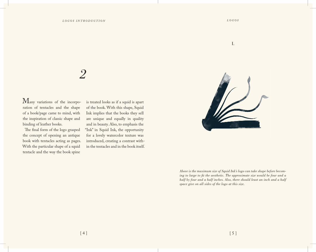
Above is the maximum size of Squid Ink’s logo can take shape before becom-ing to large to fit the aesthetic. The approximate size would be four and a half by four and a half inches. Also, there should least an inch and a half space give on all sides of the logo at this size.
[ 4 ] [ 5 ]
L O G O SL O G O S I N T R O D U C T I O N
Many variations of the incorpo-ration of tentacles and the shape of a book/page came to mind, with the inspiration of classic shape and binding of leather books. The final form of the logo grasped the concept of opening an antique book with tentacles acting as pages. With the particular shape of a squid tentacle and the way the book spine
is treated looks as if a squid is apart of the book. With this shape, Squid Ink implies that the books they sell are unique and equally in quality and in beauty. Also, to emphasis the
“Ink” in Squid Ink, the opportunity for a lovely watercolor texture was introduced, creating a contrast with-in the tentacles and in the book itself.
2

[ 6 ]
II.
III. IV.
I.
Above labeled one through four are all unacceptable placement of the logo. Also, the logo should not be stretched nor warped in any way and the color and watercolor texture should remain as in the lockup of the logo and not be replaced by another texture.
L O G O S
[ 7 ]
squid ink
II.
III.
Above labeled number two is the size of Squid Ink’s logo that is minimum size it can retain before being undreadable and unacceptable on letter-heads, business cards, etc. The approximate size would be two and a half inches with a half an inch of breathing space on all sides. Underneath, number three, is the combination mark, combining type and the mark to create a pleasing relationship between the two . This pair should not exceed five inches and follow the minimum sizes and space requirements as the mark in number two.
L O G O S

[ 8 ] [ 9 ]
S Q U I D I N K
C O L L E C T I B L E B O O K S
“...an eclectic selection
of collectible books from
First Editions, signed, and
limiteds.”
Bob Maddox [email protected]
2979 E. Placita Santa LuciaTucson, Arizona 85716
520 .344. 4742
[ I ]
I. II.
Above is the offical Squid Ink business card with number one being the front and number two being the back. Both have the quality and style of a book plate or a title page within a collectible book. These business cards are scaled to size. When creating these cards be cautious of the negative space within and the typefaces used throughout the front and back.
C O L L A T E R A LC O L L A T E R A L I N T R O D U C T I O N
When creating a letterhead, busi-ness card, or envelope for Squid Ink Books be remided of the hierarchy and the placement within the com-bination mark. The same aetsthetic applies here, however the mark is in a much larger space now and it will appear smaller, but it still needs to be
surrounded with enough space and not be crowded by the letter itself. The collateral aesthetic is inspired by the continuing simple and spacious aesthetic of book plates and title pages in those books. Also adding in page numbers and rules further indi-cates the aesthetic of book in general.
3

[ 10 ] [ 11 ]
IV.
V.
C O L L A T E R A LC O L L A T E R A L
Above, number three and four is the front and back of the Squid Ink en-velope, however not in it’s proper size, when at full size nine and a half by four inches should follow the appropiate rules and marks above.
III.
Above, number three, is the layout of the Squid Ink letterhead. However this is not the correct size, this is a reduced size. When at actual size, eight and a half by eleven follow the directions and marks above when setting your letter inside the letterhead layout.
S Q U I D I N K
2979 E. Placita Santa Lucia Tucson, Arizona 85716520 .344. 4742
2979 E. Placita Santa Lucia Tucson, Arizona 85716
[ I ]
S Q U I D I N K
-
-
- -
-
--
-
-
-
-
1 9/16 inches from top
2 1/2 inches from bottom
1 1/2 inches from left 1 1/2 inches from right
2 7/16 inches from bottom
2 7/16 inches from bottom
3/16 inches from bottom
3 3/16 inches from left
3 3/16 inches from left
1/4 inches from left
3 3/16 inches from right

[ 12 ] [ 13 ]
C O L O R I N T R O D U C T I O N C O L O R
Color on and within antique books in general have a richness and so-phistication that have a limited or great amount of palettes depending on the book’s content/author/genre. Squid Ink sells a wide variety of dif-ferent genres of books that all have a different color palette to their genre, however when reading a book, the pages remain the same color and words are usually black to be read
easily. When developing this style guide, it was necessary to have a limited color palette and let the logo of Squid Ink stand out within the space. The beginning pages, such as the inside of the cover will have the quality of a vintage book and have a marbled mulit-colored beauty to contrast the simple, content based pages of the inside of the style guide.
4
PA N T O N E 5 4 6 3 C
PA N T O N E 6 4 6 C
C : 6 7. 1 7, M : 3 8 . 9 5 , Y: 1 2 . 8 5 , K : 0 . 1 7
C : 8 9 . 0 4 , M : 6 5 . 7 2 , Y: 6 0 , K : 6 6 . 3 3
R : 9 3 , G : 1 3 7, B : 1 8 0
R : 8 , G : 3 8 , B : 4 4
These two colors are combined to create a duotone used to color the Squid Ink logo. With these specific colors the color becomes a dark sophisticated blue, that has a value range that is appealing when applied to the water-color texture. Always use these colors simultaneously, and never add other colors to the palette.

[ 14 ] [ 15 ]
T Y P O G R A P H Y I N T R O D U C T I O N
Inevitably, the cover of books rely on typography to convey what type of genre the book is and the quality of the content. When inside books however the quality of the typog-raphy increases due to readability. Hierarchy is key when setting up a book, with the cover being primary and the author being second. Every other content after those key factors can be carefully placed to create a title page, table of contents, and ul-timately where the body of text can
reside on hundred plus pages. Squid Ink Books sells collectible first edi-tions and antique books where the typography is serif based and classic typefaces accompanied by generous leading and kerning. Where the body of work begins with a chapter number of the title of that chapter. The little details, like page numbers are placed, usually centered guarded by parentheses. All of these char-acteristics of Squid Ink Books are translated into this style guide.
5
A B C D E F G H I J K L M N O P Q R S T U V W X Y Z
Adobe Cal son P roIta l i c
a b c d e f g h i j k l m n o p q r s t u v w x y z
I.
Adobe Caslon Pro in Italic appears usually in all caps with two hundred and forty kerning. You find this particular type family in the Table of Con-tents when introducing the chapter and the chapter’s name. This type is also present on the letterhead, busniess card, and envelope when spelling out “Squid Ink”, so this type is the main attraction when looking at these main components.
T Y P O G R A P H Y

T Y P O G R A P H Y
[ 16 ] [ 17 ]
T Y P O G R A P H Y
Adobe Calson Pro
Regular
A B C D E F G H I J K L M N O P Q R S T U V W X Y Z
a b c d e f g h i j k l m n o p q r s t u v w x y z
1 2 3 4 5 6 7 8 9
II.
Adobe Calson Pro set in Regular without kerning at ten point and the first letter at eighteen point, mimicing classic style of how many chapter pages begin. This typface is used for the main body text of each chapter. Each paragraph is set at fourtenn point leading. Also, the numbers in this type family are used for page numbers located at the bottom of each page, cen-tered, and safely guarded by parentheses.
Bodoni
Book I tal ic
A B C D E F G H I J K L M N O P Q R S T U V W X Y Z
a b c d e f g h i j k l m n o p q r s t u v w x y z
1 2 3 4 5 6 7 8 9
III.
Bodoni set in Book Italic is used as subtext at nine point and leading set at thirteen point two. The kerning is set at twenty to allow the subtext to be readable. Usually this text is found below a diagram, for example: a letter-head template and Squid Ink logo or the typographic section where further explaination is needed. The numbers in this type family are used for the beginning of each chapter, centered and at thirty four points.

T Y P O G R A P H Y
[ 18 ] [ 19 ]
Bodoni
Roman
A B C D E F G H I J K L M N O P Q R S T U V W X Y Z
a b c d e f g h i j k l m n o p q r s t u v w x y z
IV.
Bodoni set in Roman is used for speficially used for the title “Contents” in three hundred and twenty tracking and in all caps. This type family varies in weight and and is much thicker than much of the type that is used with Squid Ink, howecer it is a classic typeface and works well when introducing the contents of this style guide.
T Y P O G R A P H Y
Bodoni
Book
I. II. III. IV. V. VI. VII. VIII. IX. X.
V.
Bodoni Book is solely used for it’s beautiful form of roman numerals. These roman numerals are placed in the center and above a particular compo-nent. Roman numerals are formal when addressing many objects on a page of antique books or adressing a new set of body text. So, when reading the text you can easily identify what piece on the page the roman numeral is referring to. These Roman numerals are set in tweleve point.

T Y P O G R A P H Y
[ 20 ]
T Y P O G R A P H Y
Hoelfer TextRoman
A B C D E F G H I J K L M N O P Q R S T U V W X Y Z
a b c d e f g h i j k l m n o p q r s t u v w x y z
1 2 3 4 5 6 7 8 9
VI.
Hoelfer Text set in Roman is solely to match with its sister Italic when ac-companying a quote. Roman is right below the quote with the name of the person who said that quote. Also this particular family has lovely numbers that have a classic quality that fits perfectly when introduing measure-ments, and particular components set in numbers such as CYMK settings. Also these numbers appears when including the address of Squid Ink Books.
[ 21 ]
Hoelfer TextItal i c
A B C D E F G H I J K L M N O P Q R S T U V W X Y Z
a b c d e f g h i j k l m n o p q r s t u v w x y z
V.
Hoelfer Text set in italic is a perfect form for enclosing quotes on some pag-es and the title page, where this type becomes a second component within a hierarchy. Only in these specific situations is when this type family is need-ed. This unique type family has a beautiful quality where only when text is present then this type expresses a classic and timeless aesthetic. When in all caps use a hundred and eighty kerning and do not overuse this type when in an hierarchy; the maximum size of this type should not exceed twelve points. When in quote form the point size should be nine points.

[ 22 ]
[ 26 ]
[ 23 ]
A P P L I C A T I O N I N T R O D U C T I O N A P P L I C A T I O N
A home for Squid Ink Books ide-ally would be in a small space in an older shopping mall, about twenty years old, or in an older downtown area, where the retail signage would be rustic and worn down. Inside would be many shelves which stored books and some glass cases to see rare books. As for a retail bag or box to put the books in when purchased, I believe
a book cover would be appropriate when conceling a book when it has been purchased and then wrapping with tissue paper around the entire book so it can still be able to breath within the short time it is in the packaging. Then placing the book in a thin acid-free box to contain the book carefully, again so it may have proper room to breath and be shad-ed to keep out heat and sulight.
6 ................................................................................................................................................................................................................................................................................................................
S QU I D I N KS Q U I D I N KC O L L E C T I B L E B O O K S
BOOKS2979 E. Placita Santa Lucia Tucson, Arizona 85716
Thank you for your purchase.-Bob Maddox
I. II.
When purchasing a book from Squid Ink book, it would be neccessary to receive receipts that are mimicing the same antique style of a book, however receipts are not generally two-sided, but it would be appropriate to mimic a book page in this manner. Number one would be the front of the receipt and number two would be the back. Also each purchase has a different number to further create the style of a book page.

[ 24 ] [ 25 ]
S Q U I D I N KC O L L E C T I B L E B O O K S
III. IV.
Another book application specific for packaging would be boxes, to place the books in and secure with possibly cottom or silk inside. These boxes will be made with a material stronger than cardboard to keep the book sturdy when inside. Boxes, rather than paper bags would serve better as a a means to package a book, therefore the books can remain in it’s fine condition until it can be stored on a book shelf.
Along with receipts, book cover are a possible application that may be use-ful in preserving the book cover when coverting the book when purchased. The covers would protect the book from sunlight and other factors that may damage the quality of the book. The fabric for the cover will be light and durable able to stretch to cover many sizes of books. Shown in number three each cover will have a different type arrangement on the front side of the cover.
A P P L I C A T I O N A P P L I C A T I O N

M E R C H A N D I S E I N T R O D U C T I O N M E R C H A N D I S E
As far as merchandise selling along-side antique books I believe all book related items would be neccessary such as book cases, bookmarks, and book bags. These items will probably be homemade, have a vintage quality
to the items along with colors corre-sponding to the logo’s color palettes. For example a bookmark might have the quality of a title page in a book but Squid Ink Books would replace where the author’s name would be.
7
[ 26 ] [ 27 ]
S Q U I D I N K
Another book related merchandise would be a book bag, shown above under number four, however this bag will be more durable wih leather, rather than fabric, to hold more books and to keep the books stable rather than loose in the bag.
I.

M E R C H A N D I S E
[ 28 ]
II.I.
Another book related merchandise that cannot be forgotten is a bookmark, a wonderful device for holding a spot in a book. Each could have a specail element of a book such as the marble texture or the hierarchy of a title page. Number one and two are both examples of a possible bookmark layouts.
S Q U I D I N K
SQUID INK
C O L L E C T I B L E
B O O K S
“...an eclectic selection of collect-
ible books from First Editions,
signed, and limiteds.”
“...an eclectic selection of collectible books from First Editions, signed,
and limiteds.”
CO L L E C T I B L E B O O K S