bill blass colorreport - pantone fashion color... · fun and young. pantone ... tones and nudes...
TRANSCRIPT
www.pantone.comPAN
TO
NE
®
fash
ion
colo
rrep
ort
sprin
g20
08
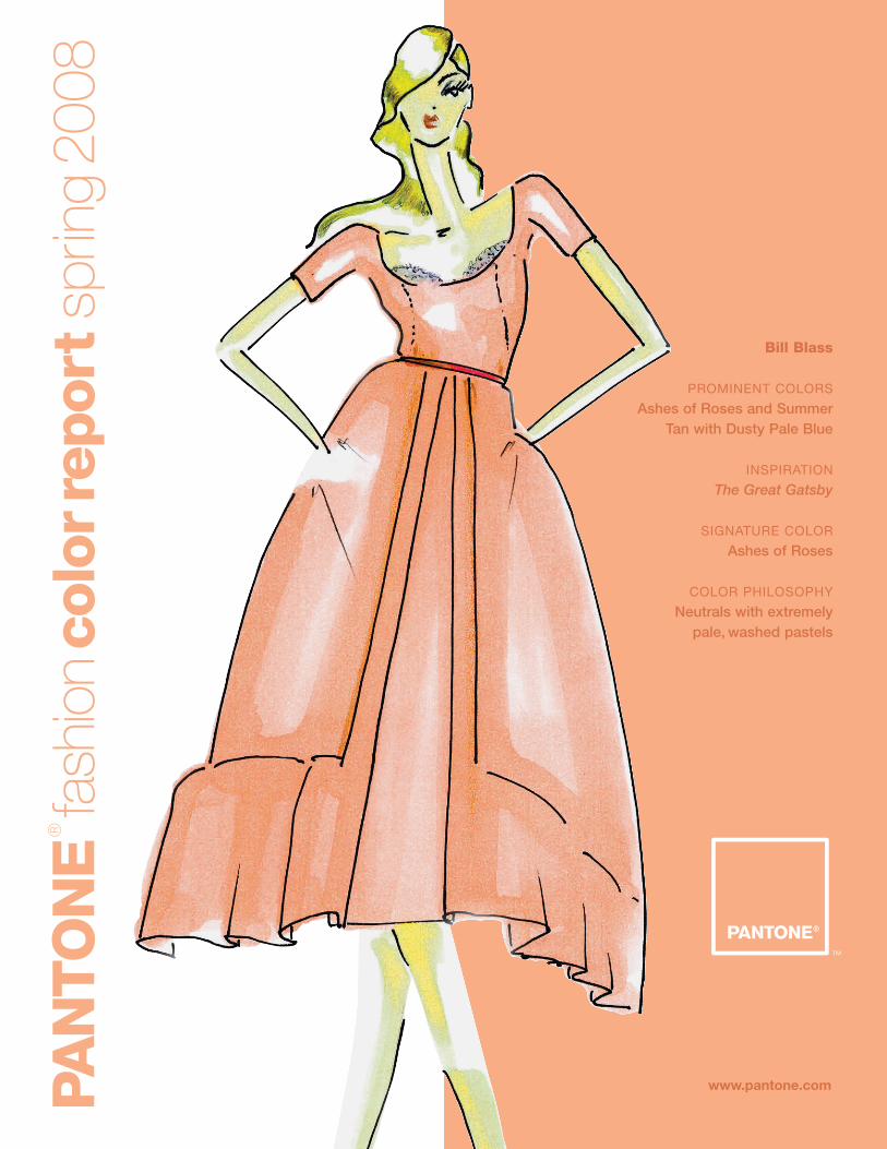
Bill Blass
PROMINENT COLORS
Ashes of Roses and SummerTan with Dusty Pale Blue
INSPIRATION
The Great Gatsby
SIGNATURE COLOR
Ashes of Roses
COLOR PHILOSOPHY
Neutrals with extremely pale, washed pastels
PAN
TO
NE
®
fash
ion
colo
rrep
ort
sprin
g20
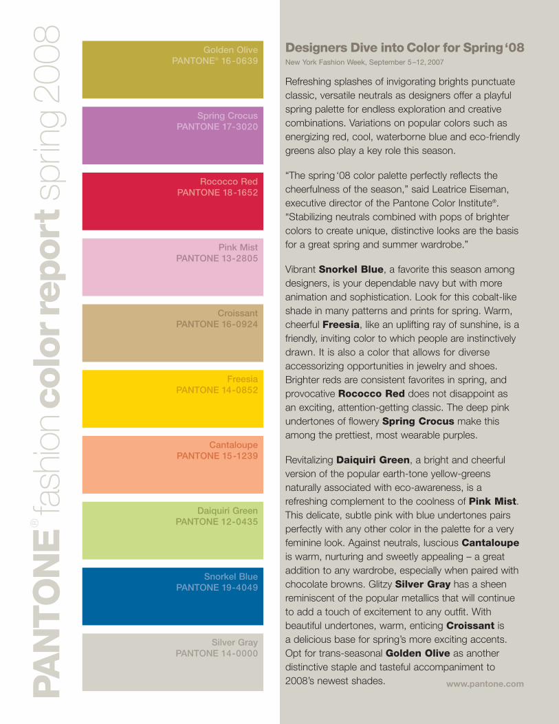
08 Designers Dive into Color for Spring‘08New York Fashion Week, September 5–12, 2007
Refreshing splashes of invigorating brights punctuate classic, versatile neutrals as designers offer a playful spring palette for endless exploration and creative combinations. Variations on popular colors such as energizing red, cool, waterborne blue and eco-friendly greens also play a key role this season.
“The spring ‘08 color palette perfectly reflects the cheerfulness of the season,” said Leatrice Eiseman, executive director of the Pantone Color Institute®. “Stabilizing neutrals combined with pops of brighter colors to create unique, distinctive looks are the basis for a great spring and summer wardrobe.”
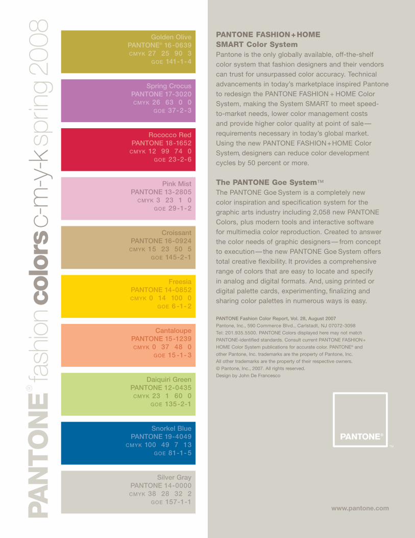
Vibrant Snorkel Blue, a favorite this season among designers, is your dependable navy but with more animation and sophistication. Look for this cobalt-like shade in many patterns and prints for spring. Warm, cheerful Freesia, like an uplifting ray of sunshine, is a friendly, inviting color to which people are instinctively drawn. It is also a color that allows for diverse accessorizing opportunities in jewelry and shoes. Brighter reds are consistent favorites in spring, and provocative Rococco Red does not disappoint as an exciting, attention-getting classic. The deep pink undertones of flowery Spring Crocus make this among the prettiest, most wearable purples.
Revitalizing Daiquiri Green, a bright and cheerful version of the popular earth-tone yellow-greens naturally associated with eco-awareness, is a refreshing complement to the coolness of Pink Mist. This delicate, subtle pink with blue undertones pairs perfectly with any other color in the palette for a very feminine look. Against neutrals, luscious Cantaloupeis warm, nurturing and sweetly appealing – a great addition to any wardrobe, especially when paired with chocolate browns. Glitzy Silver Gray has a sheen reminiscent of the popular metallics that will continue to add a touch of excitement to any outfit. With beautiful undertones, warm, enticing Croissant is a delicious base for spring’s more exciting accents. Opt for trans-seasonal Golden Olive as another distinctive staple and tasteful accompaniment to 2008’s newest shades.
Golden OlivePANTONE® 16-0639
Spring CrocusPANTONE 17-3020
Rococco RedPANTONE 18-1652
Pink MistPANTONE 13-2805
CroissantPANTONE 16-0924
FreesiaPANTONE 14-0852
CantaloupePANTONE 15-1239
Daiquiri GreenPANTONE 12-0435
Snorkel BluePANTONE 19-4049
Silver GrayPANTONE 14-0000
www.pantone.com

www.pantone.comPAN
TO
NE
®
fash
ion
colo
rrep
ort
sprin
g20
08
Michael Kors
PROMINENT COLORS
Lemon Yellow, TangerineOrange, Flamingo Pink
INSPIRATION
The Impressionist paintings ofMonet, Seurat and Van Gogh
SIGNATURE COLOR
Flamingo Pink
COLOR PHILOSOPHY
The return to color, from pastels to brights
www.pantone.comPAN
TO
NE
®
fash
ion
colo
rrep
ort
sprin
g20
08
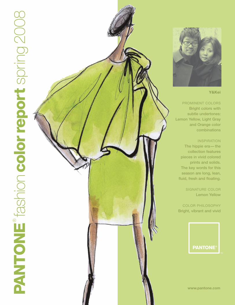
Y&Kei
PROMINENT COLORS
Bright colors with subtle undertones:
Lemon Yellow, Light Gray and Orange color
combinations
INSPIRATION
The hippie era— thecollection features
pieces in vivid colored prints and solids.
The key words for this season are long, lean,
fluid, fresh and floating.
SIGNATURE COLOR
Lemon Yellow
COLOR PHILOSOPHY
Bright, vibrant and vivid
www.pantone.comPAN
TO
NE
®
fash
ion
colo
rrep
ort
sprin
g20
08
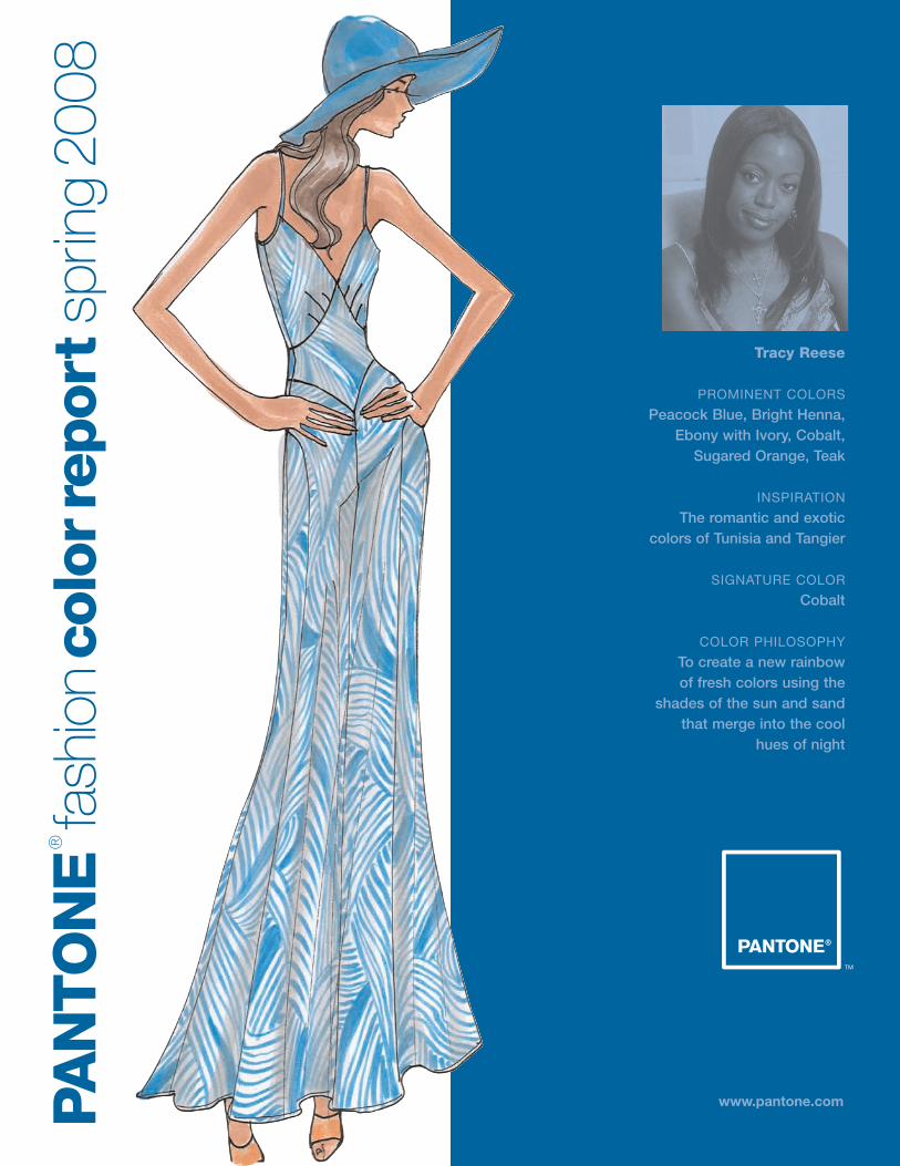
Tracy Reese
PROMINENT COLORS
Peacock Blue, Bright Henna,Ebony with Ivory, Cobalt,
Sugared Orange, Teak
INSPIRATION
The romantic and exotic colors of Tunisia and Tangier
SIGNATURE COLOR
Cobalt
COLOR PHILOSOPHY
To create a new rainbow of fresh colors using the
shades of the sun and sand that merge into the cool
hues of night
www.pantone.comPAN
TO
NE
®
fash
ion
colo
rrep
ort
sprin
g20
08
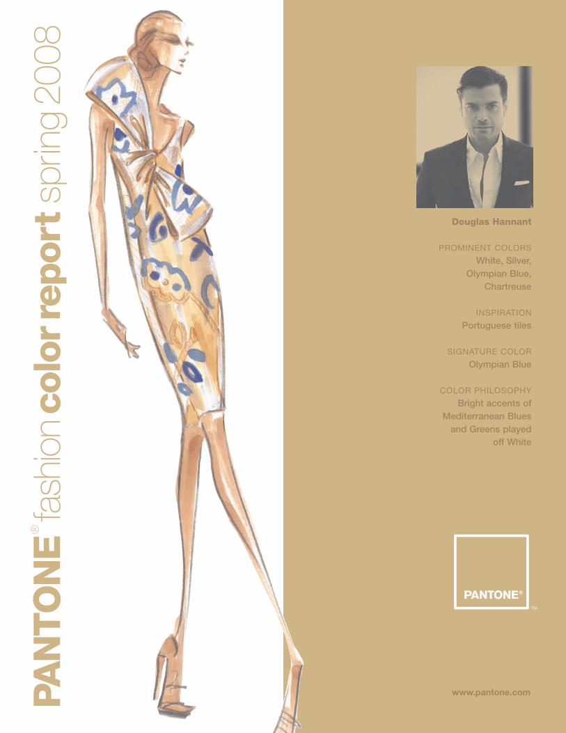
Douglas Hannant
PROMINENT COLORS
White, Silver, Olympian Blue,
Chartreuse
INSPIRATION
Portuguese tiles
SIGNATURE COLOR
Olympian Blue
COLOR PHILOSOPHY
Bright accents of Mediterranean Blues
and Greens played off White
www.pantone.comPAN
TO
NE
®
fash
ion
colo
rrep
ort
sprin
g20
08
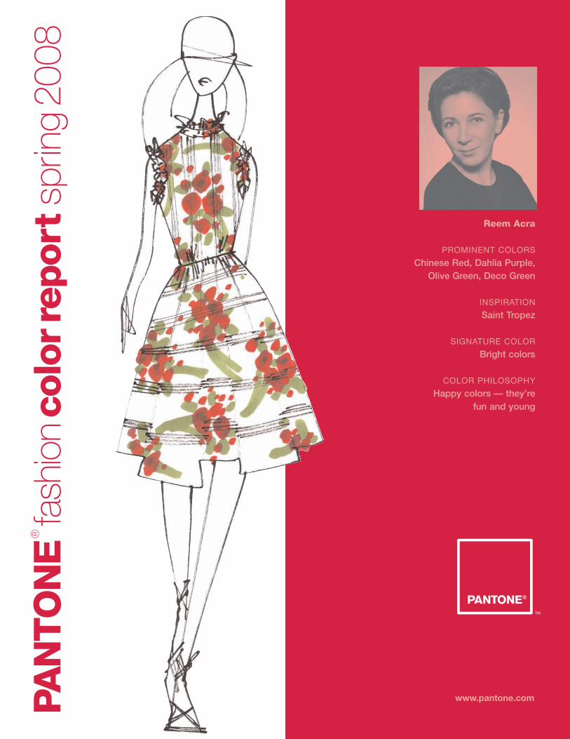
Reem Acra
PROMINENT COLORS
Chinese Red, Dahlia Purple,Olive Green, Deco Green
INSPIRATION
Saint Tropez
SIGNATURE COLOR
Bright colors
COLOR PHILOSOPHY
Happy colors — they’re fun and young
www.pantone.comPAN
TO
NE
®
fash
ion
colo
rrep
ort
sprin
g20
08
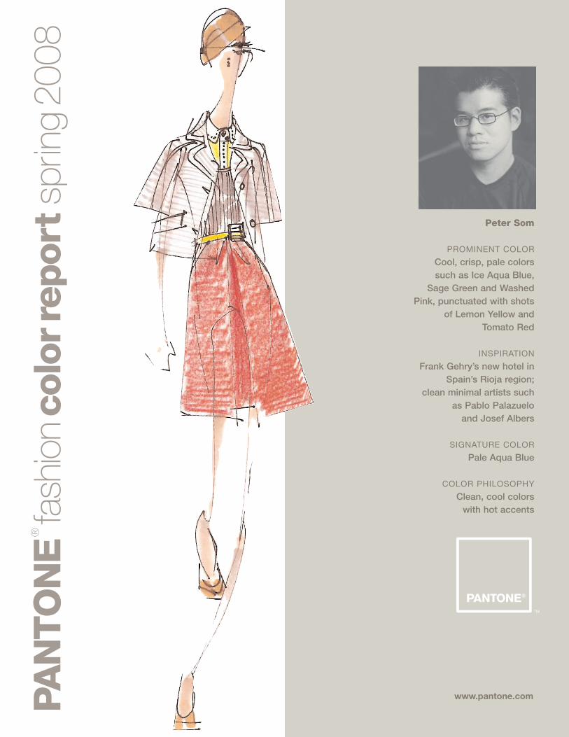
Peter Som
PROMINENT COLOR
Cool, crisp, pale colors such as Ice Aqua Blue,
Sage Green and Washed Pink, punctuated with shots
of Lemon Yellow and Tomato Red
INSPIRATION
Frank Gehry’s new hotel inSpain’s Rioja region;
clean minimal artists such as Pablo Palazuelo
and Josef Albers
SIGNATURE COLOR
Pale Aqua Blue
COLOR PHILOSOPHY
Clean, cool colors with hot accents
www.pantone.comPAN
TO
NE
®
fash
ion
colo
rrep
ort
sprin
g20
08
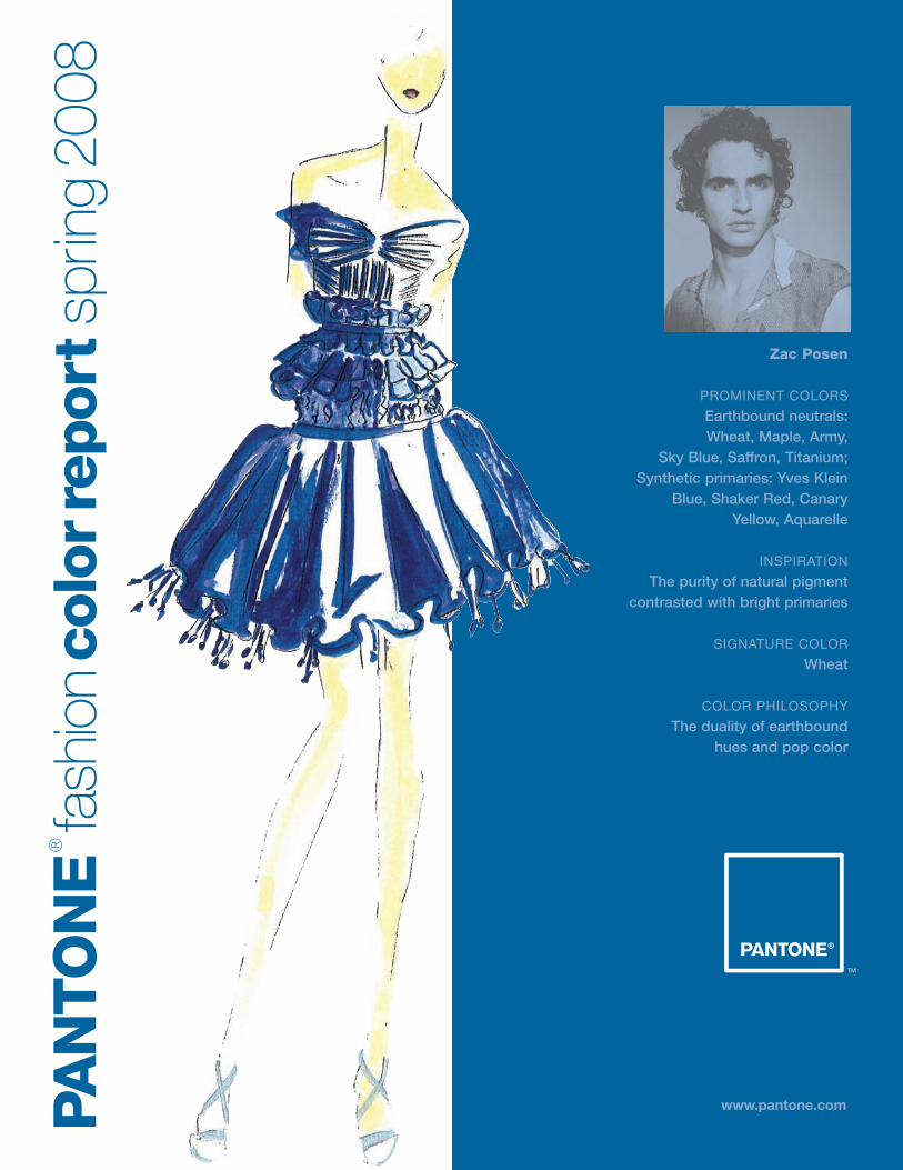
Zac Posen
PROMINENT COLORS
Earthbound neutrals: Wheat, Maple, Army,
Sky Blue, Saffron, Titanium;Synthetic primaries: Yves Klein
Blue, Shaker Red, CanaryYellow, Aquarelle
INSPIRATION
The purity of natural pigmentcontrasted with bright primaries
SIGNATURE COLOR
Wheat
COLOR PHILOSOPHY
The duality of earthbound hues and pop color
www.pantone.comPAN
TO
NE
®
fash
ion
colo
rrep
ort
sprin
g20
08
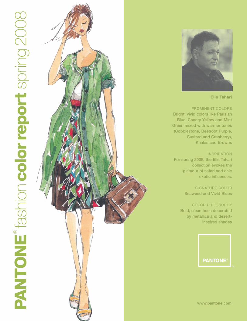
Elie Tahari
PROMINENT COLORS
Bright, vivid colors like ParisianBlue, Canary Yellow and Mint
Green mixed with warmer tones(Cobblestone, Beetroot Purple,
Custard and Cranberry), Khakis and Browns
INSPIRATION
For spring 2008, the Elie Taharicollection evokes the
glamour of safari and chic exotic influences.
SIGNATURE COLOR
Seaweed and Vivid Blues
COLOR PHILOSOPHY
Bold, clean hues decorated by metallics and desert-
inspired shades
www.pantone.comPAN
TO
NE
®
fash
ion
colo
rrep
ort
sprin
g20
08
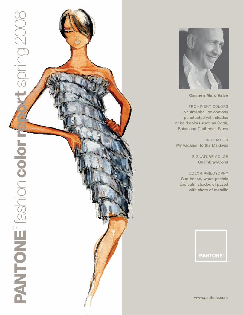
Carmen Marc Valvo
PROMINENT COLORS
Neutral shell colorationspunctuated with shades
of bold colors such as Coral,Spice and Caribbean Blues
INSPIRATION
My vacation to the Maldives
SIGNATURE COLOR
Chambray/Coral
COLOR PHILOSOPHY
Sun-baked, warm pastels and calm shades of pastel
with shots of metallic
www.pantone.comPAN
TO
NE
®
fash
ion
colo
rrep
ort
sprin
g20
08
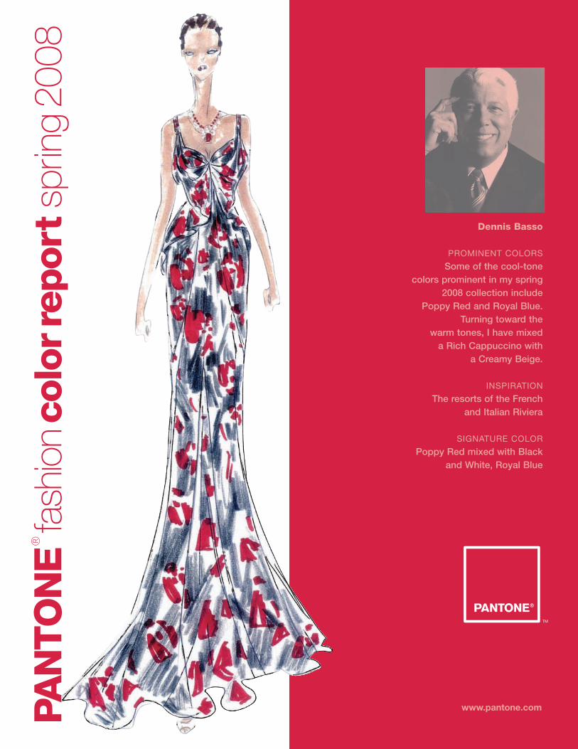
Dennis Basso
PROMINENT COLORS
Some of the cool-tone colors prominent in my spring
2008 collection include Poppy Red and Royal Blue.
Turning toward the warm tones, I have mixed
a Rich Cappuccino with a Creamy Beige.
INSPIRATION
The resorts of the French and Italian Riviera
SIGNATURE COLOR
Poppy Red mixed with Blackand White, Royal Blue
www.pantone.comPAN
TO
NE
®
fash
ion
colo
rrep
ort
sprin
g20
08
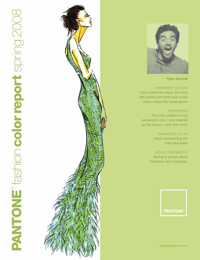
Yigal Azrouël
PROMINENT COLORS
Cool colors like Aqua, Surf andAsh mixed with fresh and acidic
citrus colors like Lemongrass
INSPIRATION
The color palette is verypersonal to me. I was inspiredby the beach — surf and sand.
SIGNATURE COLOR
Aqua representing the clear sea water
COLOR PHILOSOPHY
Spring is always about freshness and crispness.
www.pantone.comPAN
TO
NE
®
fash
ion
colo
rrep
ort
sprin
g20
08
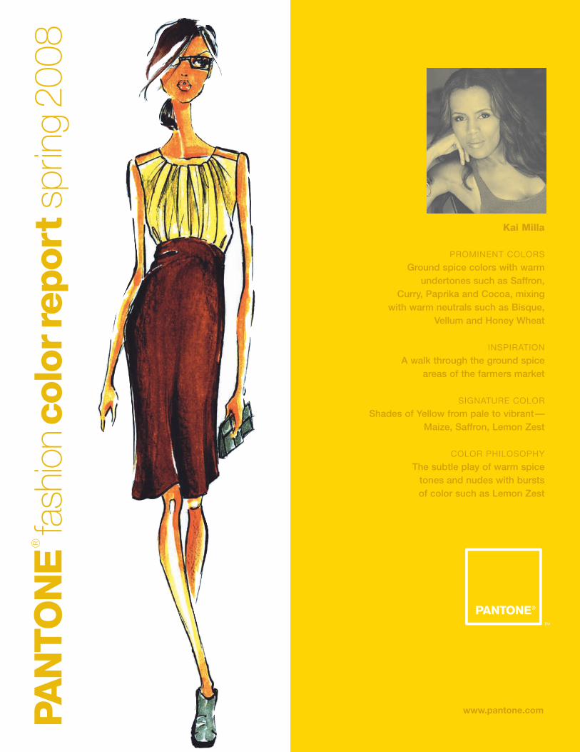
Kai Milla
PROMINENT COLORS
Ground spice colors with warmundertones such as Saffron,
Curry, Paprika and Cocoa, mixing with warm neutrals such as Bisque,
Vellum and Honey Wheat
INSPIRATION
A walk through the ground spice areas of the farmers market
SIGNATURE COLOR
Shades of Yellow from pale to vibrant—Maize, Saffron, Lemon Zest
COLOR PHILOSOPHY
The subtle play of warm spice tones and nudes with burstsof color such as Lemon Zest
www.pantone.comPAN
TO
NE
®
fash
ion
colo
rrep
ort
sprin
g20
08
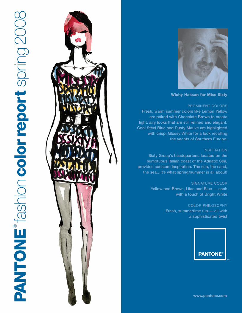
Wichy Hassan for Miss Sixty
PROMINENT COLORS
Fresh, warm summer colors like Lemon Yellow are paired with Chocolate Brown to create
light, airy looks that are still refined and elegant. Cool Steel Blue and Dusty Mauve are highlighted
with crisp, Glossy White for a look recalling the yachts of Southern Europe.
INSPIRATION
Sixty Group’s headquarters, located on the sumptuous Italian coast of the Adriatic Sea,
provides constant inspiration. The sun, the sand, the sea…it’s what spring/summer is all about!
SIGNATURE COLOR
Yellow and Brown, Lilac and Blue — each with a touch of Bright White
COLOR PHILOSOPHY
Fresh, summertime fun — all with a sophisticated twist

www.pantone.comPAN
TO
NE
®
fash
ion
colo
rrep
ort
sprin
g20
08
Nanette Lepore
PROMINENT COLORS
Eye-popping Fuchsia, Marigoldand Vibrant Orange grounded in
rich, earthy tones, includingPebble Gray and Curry
INSPIRATION
Picasso and his women
SIGNATURE COLOR
Fuchsia and Curry
COLOR PHILOSOPHY
Punch it up with brights andground them in earth tones.

www.pantone.comPAN
TO
NE
®
fash
ion
colo
rrep
ort
sprin
g20
08
Lela Rose
PROMINENT COLORS
The colors for the spring 2008 collection are quite saturated. There is a prominenceof Burnt Coral, Royal Blue, Mustard Yellow
and Persimmon Red. All of these colors arecombined to give every look a visual pop.
INSPIRATION
I am constantly inspired by New York and allof the many cultures that mix together here.
SIGNATURE COLOR
Burnt Coral
COLOR PHILOSOPHY
The philosophy behind color in mycollection is to mix bright colors in
many ways, but always to relate them back to a neutral. The neutral allows
your eye to rest and the other colors to be even more vivid.
www.pantone.comPAN
TO
NE
®
fash
ion
colo
rrep
ort
sprin
g20
08
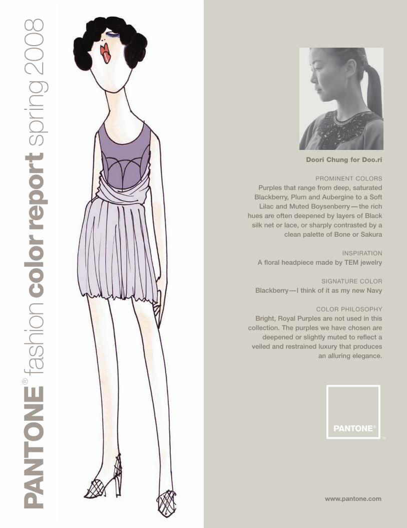
Doori Chung for Doo.ri
PROMINENT COLORS
Purples that range from deep, saturatedBlackberry, Plum and Aubergine to a Soft
Lilac and Muted Boysenberry — the richhues are often deepened by layers of Black
silk net or lace, or sharply contrasted by aclean palette of Bone or Sakura
INSPIRATION
A floral headpiece made by TEM jewelry
SIGNATURE COLOR
Blackberry—I think of it as my new Navy
COLOR PHILOSOPHY
Bright, Royal Purples are not used in thiscollection. The purples we have chosen are
deepened or slightly muted to reflect aveiled and restrained luxury that produces
an alluring elegance.
www.pantone.comPAN
TO
NE
®
fash
ion
colo
rrep
ort
sprin
g20
08
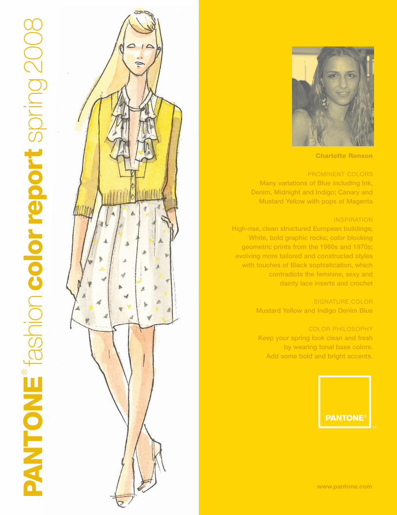
Charlotte Ronson
PROMINENT COLORS
Many variations of Blue including Ink, Denim, Midnight and Indigo; Canary and
Mustard Yellow with pops of Magenta
INSPIRATION
High-rise, clean structured European buildings; White, bold graphic rocks; color blocking
geometric prints from the 1960s and 1970s; evolving more tailored and constructed styles
with touches of Black sophistication, which contradicts the feminine, sexy and
dainty lace inserts and crochet
SIGNATURE COLOR
Mustard Yellow and Indigo Denim Blue
COLOR PHILOSOPHY
Keep your spring look clean and fresh by wearing tonal base colors.
Add some bold and bright accents.
www.pantone.comPAN
TO
NE
®
fash
ion
colo
rrep
ort
sprin
g20
08
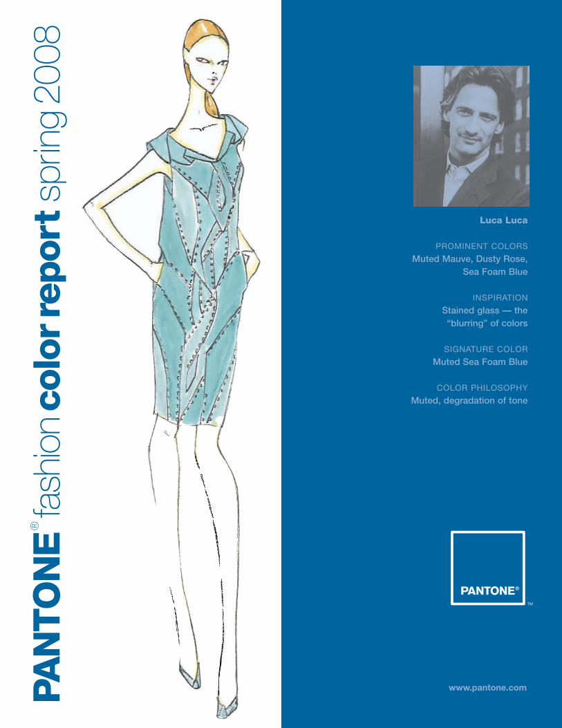
Luca Luca
PROMINENT COLORS
Muted Mauve, Dusty Rose, Sea Foam Blue
INSPIRATION
Stained glass — the “blurring” of colors
SIGNATURE COLOR
Muted Sea Foam Blue
COLOR PHILOSOPHY
Muted, degradation of tone
www.pantone.comPAN
TO
NE
®
fash
ion
colo
rrep
ort
sprin
g20
08
David Rodriguez
PROMINENT COLORS
Bougainvillea, Lime, Persimmon
INSPIRATION
Growing up in Southern California, I have a special affinity for bright,
sunny colors. I was also inspired byvintage issues of Palm Springs Life
Magazine which captured that classic,laid-back luxury of California living.
SIGNATURE COLOR
Bougainvillea, which is like a Fuchsia —in the desert where I am from there
are bougainvillea hedges everywhere,and the color is so laser sharp
COLOR PHILOSOPHY
I wanted to convey the same sense of optimism and joy I experienced
growing up in sunny California.

www.pantone.comPAN
TO
NE
®
fash
ion
colo
rrep
ort
sprin
g20
08
Tia Cibani for Ports 1961
PROMINENT COLORS
Tusk, Bone White, Kudu, Dusty Gray, Safari, Flesh
INSPIRATION
I was inspired by an Africanjourney — a joyous mass of
people and a rich landscape.
SIGNATURE COLOR
Safari
COLOR PHILOSOPHY
The colors are warm and earthywith deep jewel tones and a true
14K Gold punctuation.

www.pantone.comPAN
TO
NE
®
fash
ion
colo
rrep
ort
sprin
g20
08
Laura Poretzky for Abaeté
PROMINENT COLORS
Deco Pink, Summer Sky, OceanTeal, Miami Yellow, Sand, Light
Coral and Nautical Navy
INSPIRATION
My choice of colors was directly inspired by the colors
of Miami Art Deco.
SIGNATURE COLOR
Summer Sky
COLOR PHILOSOPHY
Pastels trimmed with Black
www.pantone.comPAN
TO
NE
®
fash
ion
colo
rrep
ort
sprin
g20
08
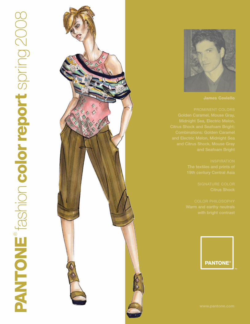
James Coviello
PROMINENT COLORS
Golden Caramel, Mouse Gray,Midnight Sea, Electric Melon,
Citrus Shock and Seafoam Bright;Combinations: Golden Caramel
and Electric Melon, Midnight Seaand Citrus Shock, Mouse Gray
and Seafoam Bright
INSPIRATION
The textiles and prints of 19th century Central Asia
SIGNATURE COLOR
Citrus Shock
COLOR PHILOSOPHY
Warm and earthy neutrals with bright contrast
www.pantone.comPAN
TO
NE
®
fash
ion
colo
rrep
ort
sprin
g20
08
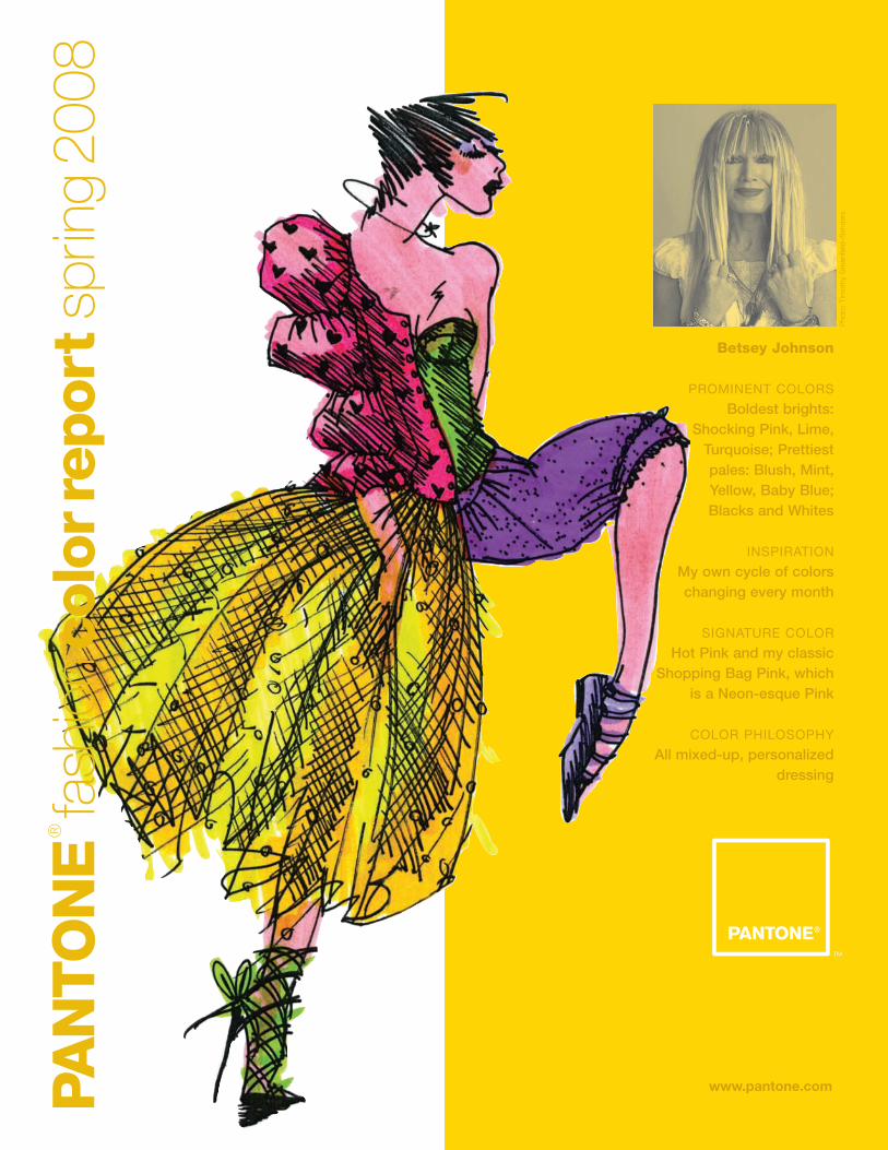
Betsey Johnson
PROMINENT COLORS
Boldest brights:Shocking Pink, Lime,
Turquoise; Prettiest pales: Blush, Mint, Yellow, Baby Blue; Blacks and Whites
INSPIRATION
My own cycle of colors changing every month
SIGNATURE COLOR
Hot Pink and my classicShopping Bag Pink, which
is a Neon-esque Pink
COLOR PHILOSOPHY
All mixed-up, personalizeddressing
Pho
to:
Tim
othy
Gre
enfie
ld–S
and
ers
www.pantone.comPAN
TO
NE
®
fash
ion
mus
t-ha
ves
sprin
g20
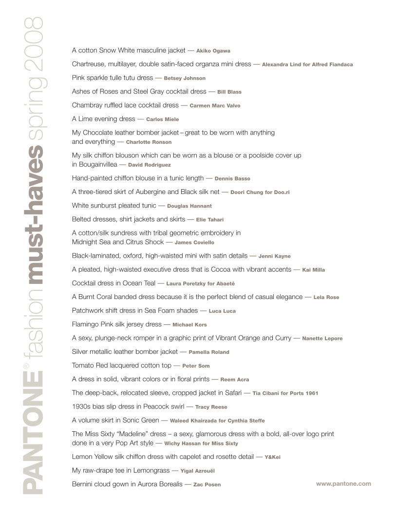
08A cotton Snow White masculine jacket — Akiko Ogawa
Chartreuse, multilayer, double satin-faced organza mini dress — Alexandra Lind for Alfred Fiandaca
Pink sparkle tulle tutu dress — Betsey Johnson
Ashes of Roses and Steel Gray cocktail dress — Bill Blass
Chambray ruffled lace cocktail dress — Carmen Marc Valvo
A Lime evening dress — Carlos Miele
My Chocolate leather bomber jacket – great to be worn with anything and everything — Charlotte Ronson
My silk chiffon blouson which can be worn as a blouse or a poolside cover up in Bougainvillea — David Rodriguez
Hand-painted chiffon blouse in a tunic length — Dennis Basso
A three-tiered skirt of Aubergine and Black silk net — Doori Chung for Doo.ri
White sunburst pleated tunic — Douglas Hannant
Belted dresses, shirt jackets and skirts — Elie Tahari
A cotton/silk sundress with tribal geometric embroidery in Midnight Sea and Citrus Shock — James Coviello
Black-laminated, oxford, high-waisted mini with satin details — Jenni Kayne
A pleated, high-waisted executive dress that is Cocoa with vibrant accents — Kai Milla
Cocktail dress in Ocean Teal — Laura Poretzky for Abaeté
A Burnt Coral banded dress because it is the perfect blend of casual elegance — Lela Rose
Patchwork shift dress in Sea Foam shades — Luca Luca
Flamingo Pink silk jersey dress — Michael Kors
A sexy, plunge-neck romper in a graphic print of Vibrant Orange and Curry — Nanette Lepore
Silver metallic leather bomber jacket — Pamella Roland
Tomato Red lacquered cotton top — Peter Som
A dress in solid, vibrant colors or in floral prints — Reem Acra
The deep-back, relocated sleeve, cropped jacket in Safari — Tia Cibani for Ports 1961
1930s bias slip dress in Peacock swirl — Tracy Reese
A volume skirt in Sonic Green — Waleed Khairzada for Cynthia Steffe
The Miss Sixty “Madeline” dress – a sexy, glamorous dress with a bold, all-over logo print done in a very Pop Art style — Wichy Hassan for Miss Sixty
Lemon Yellow silk chiffon dress with capelet and rosette detail — Y&Kei
My raw-drape tee in Lemongrass — Yigal Azrouël
Bernini cloud gown in Aurora Borealis — Zac Posen

www.pantone.comDes
igne
rsch
oose
inte
rior
pain
tcol
ors
that
bes
t ref
lect
thei
r per
sona
lity
Snow White and Brilliant Blue because the contrast of fresh and clear White with Blue makes me feel relaxed, elegant and graceful — Akiko Ogawa
Pale Dusty Pink because it is traditional, feminine and happy — Alexandra Lind for Alfred Fiandaca
Pink – it’s been my color since 1978 when we went into business and opened our first Pink retail store — Betsey Johnson
White because it gives clarity to this ever-chaotic world of ours — Bill Blass
Carmine Red – it’s rich, sophisticated and sexy — Carmen Marc Valvo
Beige and Grays because they are cozy and sophisticated — Carlos Miele
Flirt Pink – it speaks for itself — Charlotte Ronson
A Creamy Beige seems to express my personality as I like to layer different colors. Using the Beige as a base, I’m able to rearrange things and add accessories depending on my mood. — Dennis Basso
Bone – it’s a modern neutral with subtle warmth and it redefines Classic White — Doori Chung for Doo.ri
Bright, sun-drenched White that reflects light – I love sunlight and fresh ocean air! — Douglas Hannant
Light Pink (Rose Water) – it’s warm and feminine and is a great contrast color with almost anything — Erin Fetherston
Vintage Apple Green because it is tart and mellow at the same time — James Coviello
White – it is beautiful, pure, simple and classic — Jenni Kayne
Saffron – warm but a bit spicy — Kai Milla
Deco Pink because it’s feminine — Laura Poretzky for Abaeté
A deep Chocolate Brown is an interior paint color I have used in every apartment I have had in New York. It is unexpected in its depth yet allows everything to pop in the room. — Lela Rose
Muted Sea Foam – it’s calm — Luca Luca
White because it is spare, pure and classic — Michael Kors
All of my walls are White, which serves as a canvas for a collage of colors and prints. — Nanette Lepore
Citron – it is cheerful and sunny, but with a bite — Pamella Roland
Linen White semi-gloss – it’s classic and relaxed — Peter Som
Gold – when it is the right shade, it is beautiful and glamorous — Reem Acra
Mud, a deep dark Coffee Brown – it is rich and discreet — Tia Cibani for Ports 1961
Hydrangea Blue because it represents the calm and grounded side of my personality — Tracy Reese
White – it offers infinite possibilities — Waleed Khairzada for Cynthia Steffe
I love Glossy White with strong pops of bright, electric colors like Red, Fuchsia or Yellow. This combination is chic, clean and elegant, yet still fun and energetic. — Wichy Hassan for Miss Sixty
Circle White – we really like using a clean palette and then adding pieces of art or photography — Y&Kei
Steel Gray — Yigal Azrouël
Amethyst Sky because it is luxurious, sexy and glamorous — Zac Posen
www.pantone.comPAN
TO
NE
®
fash
ion
colo
rsc-
m-y
-ksp
ring
2008 Golden Olive
PANTONE® 16-0639CMYK 27 25 90 3
GOE 141-1-4
Spring CrocusPANTONE 17-3020CMYK 26 63 0 0
GOE 37-2-3
Rococco RedPANTONE 18-1652
CMYK 12 99 74 0GOE 23-2-6
Pink MistPANTONE 13-2805
CMYK 3 23 1 0GOE 29-1-2
CroissantPANTONE 16-0924
CMYK 15 23 50 5GOE 145-2-1
FreesiaPANTONE 14-0852CMYK 0 14 100 0
GOE 6 -1- 2
CantaloupePANTONE 15-1239CMYK 0 37 48 0
GOE 15 -1- 3
Daiquiri GreenPANTONE 12-0435
CMYK 23 1 60 0GOE 135-2-1
Snorkel BluePANTONE 19-4049
CMYK 100 49 7 13GOE 81-1- 5
Silver GrayPANTONE 14-0000CMYK 38 28 32 2
GOE 157-1-1
PANTONE FASHION+HOME SMART Color SystemPantone is the only globally available, off-the-shelf color system that fashion designers and their vendorscan trust for unsurpassed color accuracy. Technicaladvancements in today’s marketplace inspired Pantoneto redesign the PANTONE FASHION + HOME ColorSystem, making the System SMART to meet speed-to-market needs, lower color management costs and provide higher color quality at point of sale—requirements necessary in today’s global market. Using the new PANTONE FASHION+HOME ColorSystem, designers can reduce color development cycles by 50 percent or more.
The PANTONE Goe System™The PANTONE Goe System is a completely new color inspiration and specification system for thegraphic arts industry including 2,058 new PANTONEColors, plus modern tools and interactive software for multimedia color reproduction. Created to answer the color needs of graphic designers— from concept to execution—the new PANTONE Goe System offerstotal creative flexibility. It provides a comprehensiverange of colors that are easy to locate and specify in analog and digital formats. And, using printed or digital palette cards, experimenting, finalizing andsharing color palettes in numerous ways is easy.
PANTONE Fashion Color Report, Vol. 28, August 2007
Pantone, Inc., 590 Commerce Blvd., Carlstadt, NJ 07072-3098
Tel: 201.935.5500. PANTONE Colors displayed here may not match
PANTONE-identified standards. Consult current PANTONE FASHION+
HOME Color System publications for accurate color. PANTONE® and
other Pantone, Inc. trademarks are the property of Pantone, Inc.
All other trademarks are the property of their respective owners.
© Pantone, Inc., 2007. All rights reserved.
Design by John De Francesco