beyond responsive - paris 2014
TRANSCRIPT

Beyond the page. Beyond responsive.
@robboynes

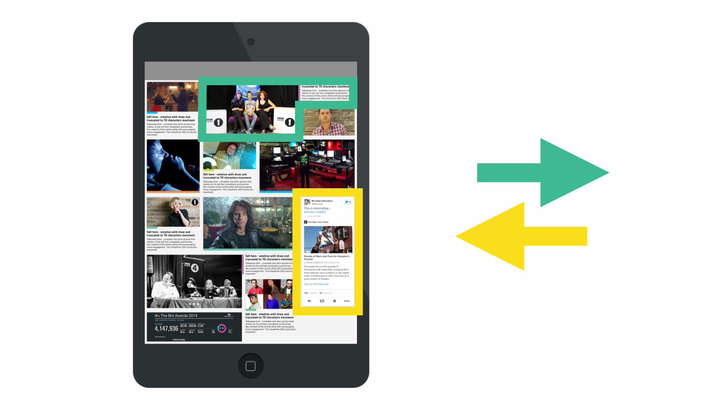
story user

story user


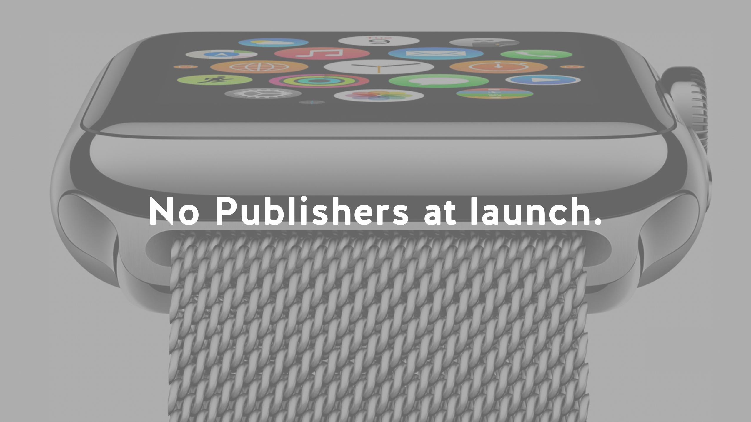
No Publishers at launch.
No Publishers at launch.


Nov 2013. Place Pins.
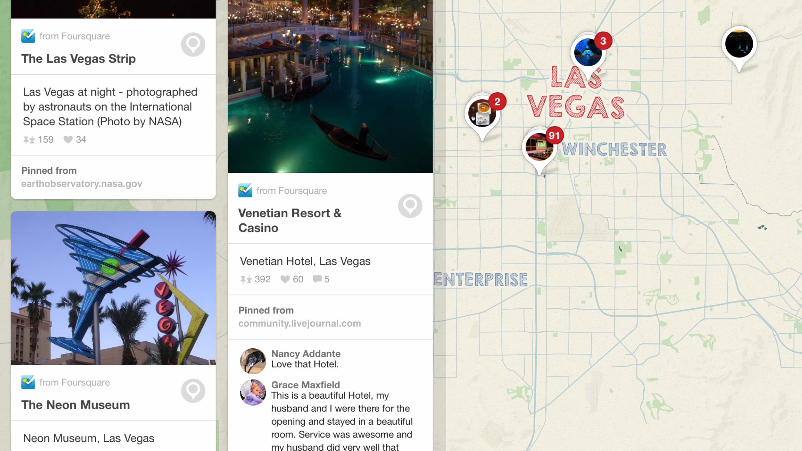
Nov 2013. Place Pins.

Apr 2014. Guided Search.

Jun 2014. 1+ Billion Place Pins.300+ territories.

World’s biggest travel publisher. Simple pivot. Big data. Big network.

I/O

INPUT. OUTPUT.

story
1. A story can exist in multiple timelines, contexts and networks at the same time.
2. A story has to communicate itself in any social network.
3. The business model is built into the individual story and the metrics tracked.


GPS

4. Content isn’t siloed by print sections. 5. Taxonomy is only by time and relevance. 6. Always a digital first product.


cura
tion

cura
tion
wtf?


Kind of.


Trust + Time = Relevance
Mobile 1st

0
150
300
450
600
2000 2001 2002 2003 2004 2005 2006 2007 2008 2009 2010 2011 2012
Consumer PCs Tablets Mobile
Source: Enders Analysis
Global annual unit sales (m)


Bootstrap

And everything looks the same.
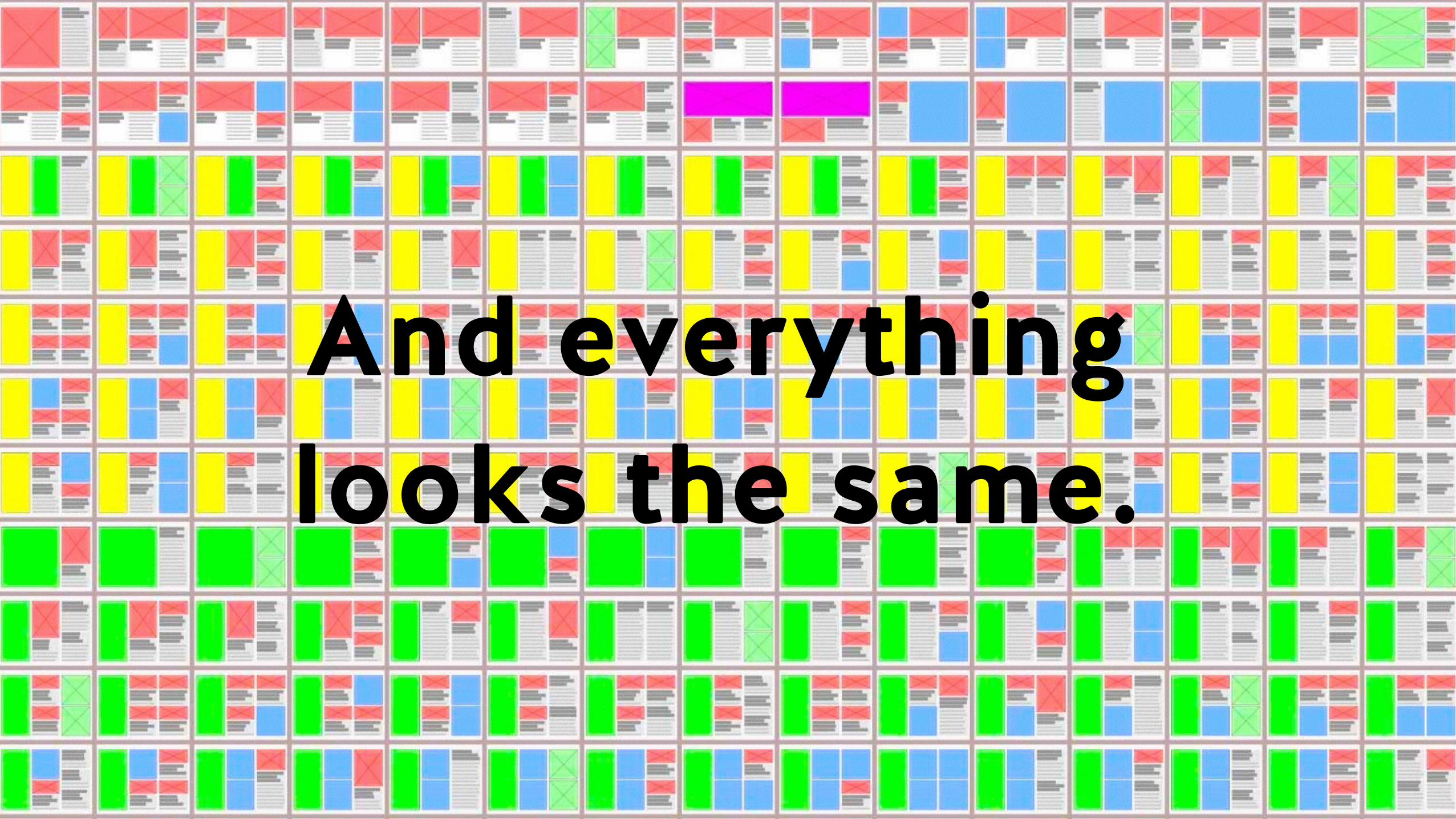
And everything looks the same.

And everything looks the same.

So…

Humanist web design.

The Responsive Elements.The Responsive Elements. A blueprint for the human web.

Technical. Platform. Breakpoint.


Ambient. Location. Time. Weather.

Opéra Passy Paris Nord

Opéra Passy Paris Nord

9.00 13.00 19.00


User metrics. Duration of visit. Frequency of visit. Desire lines of the user.

Editorial. Curation. Storytelling. Hierarchies.


Content. Content type. Medium. Mood. Time. Trust. Relevance.

time
trust

Share. Follows. Aggregations. Trending.Relationships between users. Keywords. Input / Output.


Repeat Sessions. Related content. Advertising. User accounts. On-boarding. Algorithms.
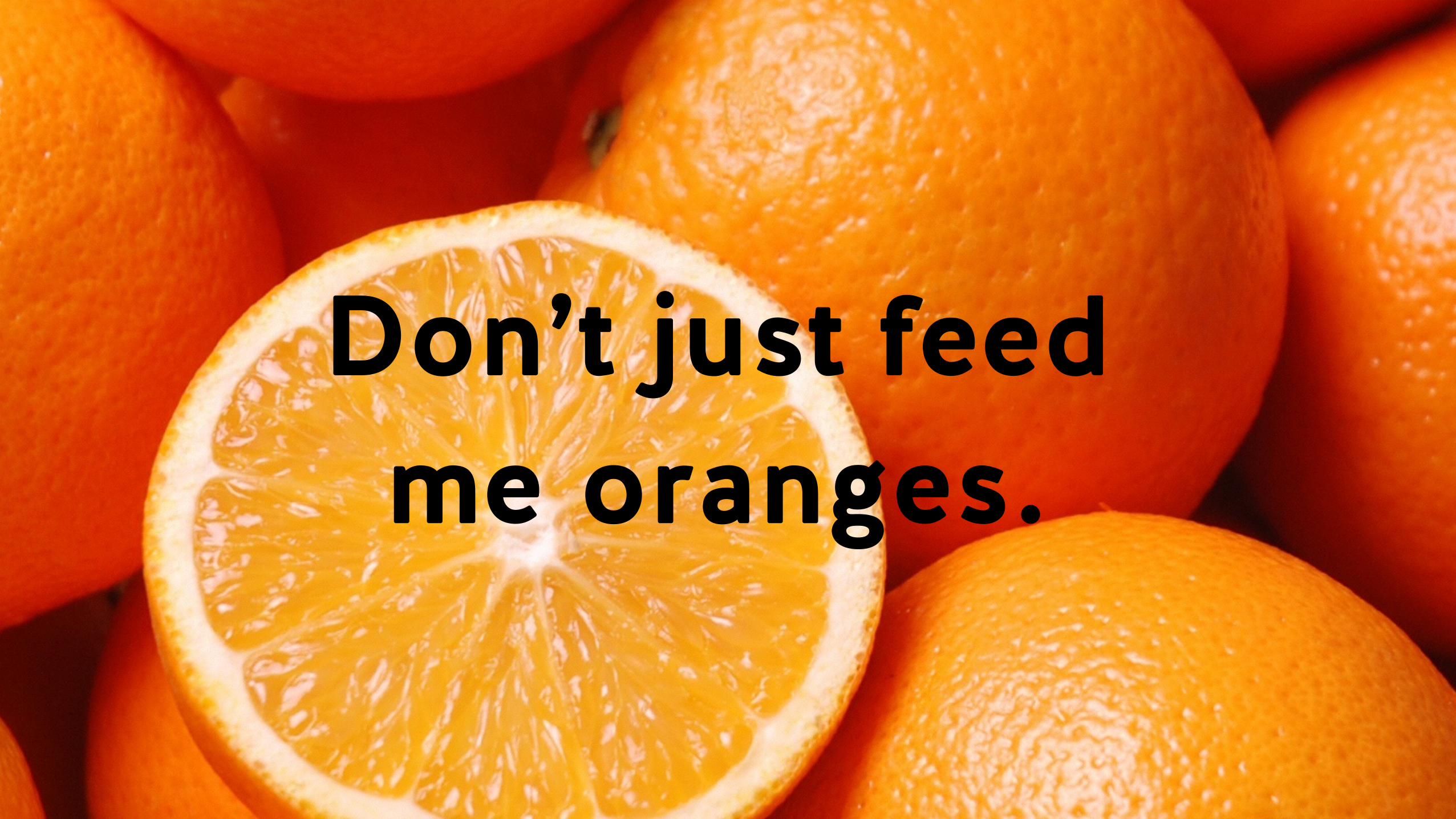
Don’t just feed me oranges.

API. Inputs. Outputs. Cards. Plugins.


So…

Responsive + Human

= ?
@robboynes
Merci