best practice guidelines operator workplace and …...to six monitors can be split between two...
TRANSCRIPT

—Best practice guidelinesOperator workplace and process graphics

2 B E S T PR AC TI CE G U I D E LI N E S O PER ATO R WO R K PL ACE A N D PR O CE SS G R A PH I C S
IntroductionThis document is a practical guide to design op-erator workplaces and process graphics. The best practices outlined in this guideline are based on ABB’s experience.
Standards and guidelines are important to ensure consistent quality in the development of Human- Machine Interfaces (HMI) for control room opera-tions. As new solutions are developed all the time, it is important for HMI designers to consider new possibilities as early as possible in the project.
The recommended HMI design process is in accordance with ISO 11064-5 - Ergonomic design of control centers - as it encompasses all aspects of the operator environment with the ambition to create an optimal solution. It includes worksta-tion design, controls and displays and their hu-man interaction, as well as control room layout and dimensions.
Collaboration between key personnel from differ-ent disciplines is essential from the start. Further reading is listed at the end of this document for more in-depth knowledge of the field.
—Putting the human first in HMI design
O PER ATO R WO R K PL ACE A N D PR O CE SS G R A PH I C S B E S T PR AC TI CE G U I D E LI N E S 3
Physical screen set-up and screen sizeDeciding on the number of screens and screen types is a delicate matter. We recommend that a task analysis of operator duties is performed first. Human factors and operations workflow need to be taken into account before making a decision. The following information gives somesimple practical advice on factors to consider. Good guidance in this area can also be found in EEMUA 201 and EN 894-2 (see further reading).
Having too little screen area at an operator’s disposal may lead to vital information not being available and increase actions needed to navigate and retrieve this. At the same time, the size of an operator’s visual field is limited, and this limits the number of displays that can be attended to at any one time.
In general, high-resolution monitors should be used and ‘the more pixels the better’. The choice of monitor brand and format need to be carefully evaluated. The quality of the monitor has a signif-icant impact on operator performance and overall control room environment. Possible expansionsalso needs to be taken into consideration to make sure that the operator environment remains con-sistent. Currently, both 16:9 and 16:10 are com-mon formats on the market, and using these for-mats in the control room istherefore practical.
Note that limitations in the operators’ visual field reduce the effective number of wide-format screens that can be used compared to traditional 4:3 screens. Designing graphics to make the most of this more horizontal format is therefore very important. Upgrading from 4:3 to 16:9 (or 16:10) monitors is not recommended unless the graph-ics are redesigned at the same time. If graphics are merely converted, operators risk a reduced overview of the process since more information is moved to the peripheral part of their field of vision.
A good set-up for most projects is to have two to four monitors dedicated for operation and one to two others available for trends, alarm lists, shift reports, status and maintenance logs or addi-tional graphics. An operator workplace with fourto six monitors can be split between two operator stations to allow additional personnel to step in during busy periods. Using an operator keyboard with a built-in keyboard switch allows a single individual to operate the two work-stations with a single keyboard and mouse during normal oper-ations. When extra help is needed, an extra key-board can be brought into action.
All tools used regularly by operators (e.g. shift log tool, maintenance records, and procedural support) should be integrated into the operator station. If operators are forced to physically move to use a tool, its use is likely to be significantlydegraded.
The Extended Operator Workplace (EOW-x) pro-vides an interactive overview display as well as smaller screens. All images can be transferred freely between the large display and the smaller screens. Part of the large screen can be config-ured to provide traditional static overview graph-ics while the operator can make free use of the remaining screen real estate.
The EOW-x functional keyboard allows the opera-tor to manage all operation and window manage-ment with one single keyboard. EOW-x also pro-vides a complete ‘packaged’ ergonomic working environment with integrated features such as lighting and sound system, integrated live video, motorized height-adjustable desks and monitors adjustable in depth as well as angle.
Research also shows that the EOW-x exceeds standard sight angle recommendations. See document 3BSE069852 Extended Operator Work-place EOW-x-Comparison with sight-angle stan-dards and related issues of operator ergonomics.
—Operator workplace

4 B E S T PR AC TI CE G U I D E LI N E S O PER ATO R WO R K PL ACE A N D PR O CE SS G R A PH I C S
Workplace layoutThe operator workplace should provide easy ac-cess to navigation features and important system functionality without compromising the space required for process graphics. A main area for process graphics is needed, as is an area for alarm information, navigation buttons, and but-tons to important system functions (Fig. 01). When setting up the workplace, keep in mind the following factors.
• In addition to the main area for process graph-ics, define a static area for navigation buttons, alarm/status information and buttons to sys-tem functionality. Define the area with alarm in-formation as a safe area where overlap windows are not allowed.
• The eye’s scan path tends to travel from the top-left towards the bottom-right of the screen. It is therefore good practice to place critical information towards the top-left part of the screen. This means that alarm information such as alarm bands or alarm lines should pref-erably be placed at the top of the screen.
• Buttons are easier to hit if they are placed along the edge of the screen. For a one-row, multi- monitor set-up, place buttons for navigation and access to important system functions, e.g. alarm and event lists, along the top or bottom of the screen. Take extra care in designing work-places with a two-row monitor set-up.
• Make sure the hit area for all buttons is large enough. This is particularly important for but-tons that are not placed along the edge of screen.
• Navigation features should reflect the hierarchi-cal display structure. This can be done, for ex-ample, by using tabs for navigation. The most important graphics should be reachable via a single mouse click (and/or operator keyboard).
• If an operator keyboard is used, the screen lay-out should as far as possible be consistent with the keyboard layout.
• Include easy access to functions such as tag search and display search, the most important alarm lists, trends, block log and shift log, alarm silence, print and next/previous in history.
• Tooltip function should be available to provide more information about elements. Typical infor-mation to display in tooltip is tag name and description.
Window managementOperator workplace should be run in full-screen mode. If access to Windows functionality is needed, make this available via system buttons in the workplace.
Keep the use of overlap windows to a minimum. We recommend defining limit for the maximum number of simultaneous overlap windows. Face-plates can be set to pop up next to the relevant object or in a set place on the workplace (e.g. bot-tom right) by using view classes functionality. The latter practice will ensure that faceplates never overlap important information.
—01 Workplace with buttons for multi-screen navigation to the primary display and tabs to secondary displays along the top of the screen, andmain area for graphics in the middle.
—01
O PER ATO R WO R K PL ACE A N D PR O CE SS G R A PH I C S B E S T PR AC TI CE G U I D E LI N E S 5
—Process graphics
GeneralProcess graphics should convey a good and repre-sentative illustration of the process flow. Their design should support pattern recognition and highlight the most important information for the operator. All information essential to monitoringand operating the process must be presented and grouped in a structured manner that supports the operators’ tasks. The following sections in-clude some practical advice for achieving this goal.
Information layeringInformation should be sorted and presented in a layered approach according to the following structure, which is described in ISO 11064-5:
• Background layer. Select backgrounds to opti-mize foreground information. Backgrounds are all large areas, including the page background and large static devices, that form the backdrop for other (more important) information.
• Static data layer. Its purpose is to provide con-text to the displayed information, thereby help-ing users interpret the meaning of information presented in the information and priority layer (e.g. showing the structure and flow of the process).
• Information layer. This layer presents dynamic data (e.g. process and status values). It should be easily distinguishable from the background and static data layers.
• Priority layer. Alarm information should be presented in a priority layer where any changes are brought immediately to the operator’s at-tention. This information should be the most eye catching of all.
The amount of information must be balanced be-tween the need for content (purpose of the single graphical page) and legibility (simplicity of pre-sentation). We recommend using compact sym-bols that emphasize the most important informa-tion and de-emphasize less important.
Using colorsCreate color palettes to reflect the layered ap-proach to the information presentation. Within each layer, vary the color mainly by differences in hue. Use lightness and saturation to differentiate between the layers and to provide and increasecontrast to the background layer for more im-portant information.See page 8 for further infor-mation.
Control rooms are usually brightly lit, and a light background color is therefore preferable (see table 1). Avoid strong contrasts between back-ground colors and the surroundings as this can cause problems with glare and eye strain. Adjust all other colors to ensure sufficient contrast to the background color. Aim to create good con-trast for the most important information; live values and alarm information.
Too light a background will reduce contrast to the yellow alarm color, while a darker background will reduce contrast to live values. If a light back-ground is chosen, show yellow alarm information with a darker colored frame.
For a darker background, show live values on a lighter background. Both solutions will add to the amount of ‘non-information’ and therefore clutter the graphics. However, as alarm information is (or should be) displayed only exceptionally, framing it with a darker color is not so disruptive.
To ensure sufficient contrast to live values, do not use a background color darker than RGB (167,167,167).
Always use logical colors in graphics. The 800xA operator workplace contains a set of predefined logical colors divided into several groups for their different purposes. A logical color is defined once, and the user of the color refers to it by itsname.
Logical colors enable change of colors with one operation for all occurrences, which ensures con-sistency. This makes it easy to adjust the colors after testing with control room operators in the correct environment. Since different screentypes may differ widely in their color presenta-tion, always verify palettes for the chosen screen type and room lighting. Figure 3 shows one exam-ple of a color palette.
The key to success when setting up a color pal-ette is to reservethe highest relative color con-trast for the most important information. More information on calculating color luminance con-trast and color difference can be found in Appen-dix A.
6 B E S T PR AC TI CE G U I D E LI N E S O PER ATO R WO R K PL ACE A N D PR O CE SS G R A PH I C S
Display hierarchyDisplays should provide different levels of details and be arranged to allow the operator to ‘drill-down’ to increased levels of details. A good prac-tice is to create a display hierarchy in the form of a tree consisting of no more than four levels:
• Level 1. Process Overview pages, typically used on a large screen.
• Level 2. Unit Overview, gives a quick overview of the most important information.
• Level 3. Unit Process pages, where the complete process control is available.
• Level 4. Detailed auxiliary and support pages, e.g. lubrication and compressor control pages.
Each display should have a unique and unambigu-ous identifying name that is presented consis-tently in the same position and that expresses the display content.
Multiple displays may be needed to cover the same equipment. These can be purpose-built to cover specific tasks such as start-up, shutdown or product transitions.
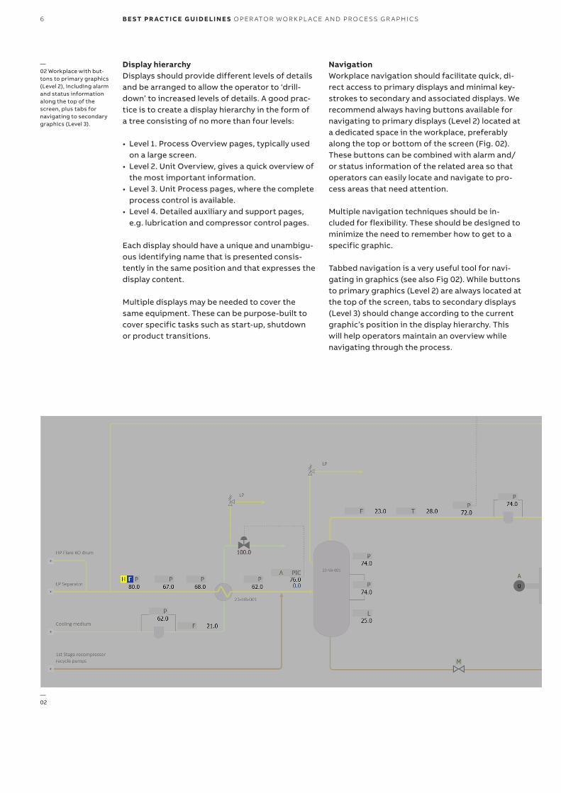
NavigationWorkplace navigation should facilitate quick, di-rect access to primary displays and minimal key-strokes to secondary and associated displays. We recommend always having buttons available for navigating to primary displays (Level 2) located ata dedicated space in the workplace, preferably along the top or bottom of the screen (Fig. 02). These buttons can be combined with alarm and/or status information of the related area so that operators can easily locate and navigate to pro-cess areas that need attention.
Multiple navigation techniques should be in-cluded for flexibility. These should be designed to minimize the need to remember how to get to a specific graphic.
Tabbed navigation is a very useful tool for navi-gating in graphics (see also Fig 02). While buttons to primary graphics (Level 2) are always located at the top of the screen, tabs to secondary displays (Level 3) should change according to the current graphic’s position in the display hierarchy. This will help operators maintain an overview while navigating through the process.
—02 Workplace with but-tons to primary graphics (Level 2), including alarm and status information along the top of the screen, plus tabs fornavigating to secondary graphics (Level 3).
—02
O PER ATO R WO R K PL ACE A N D PR O CE SS G R A PH I C S B E S T PR AC TI CE G U I D E LI N E S 7
As far as possible, navigation techniques should be designed for a multi-screen set-up. This allows the operator to redirect a graphic to another screen (Fig. 03). When a large screen is available, it can also be helpful for the operator to send agraphic from the operator station to the large screen without needing to move to another work-station.
—03 Navigation button for a two-screen set-up. Clicking the right ofCondensate the button (as shown) will open the display on the rightscreen. Clicking the left will open it on the left. Clear indications ofwhich screen will be used are provided on mouse-over.—04 Context-sensitive navigation makes accessing information efficient and intuitive.
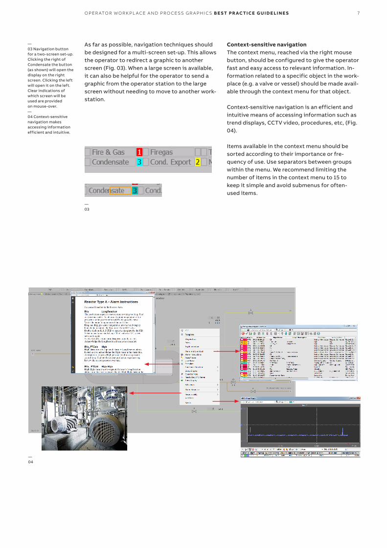
Context-sensitive navigationThe context menu, reached via the right mouse button, should be configured to give the operator fast and easy access to relevant information. In-formation related to a specific object in the work-place (e.g. a valve or vessel) should be made avail-able through the context menu for that object.
Context-sensitive navigation is an efficient and intuitive means of accessing information such as trend displays, CCTV video, procedures, etc, (Fig. 04).
Items available in the context menu should be sorted according to their importance or fre-quency of use. Use separators between groups within the menu. We recommend limiting thenumber of items in the context menu to 15 to keep it simple and avoid submenus for often- used items.
—04
—03

8 B E S T PR AC TI CE G U I D E LI N E S O PER ATO R WO R K PL ACE A N D PR O CE SS G R A PH I C S
—Recommended colors
RGB Example
Default 191, 191, 191
Filling devices 180, 180, 180
Embedded trend background 221, 221, 221
Bar graph background 116, 116, 116
RGB Example
Live values, embedded trendlines 0, 0, 0 (black) 45.4
Set point value 0, 35, 145 45.0
Contour color of dynamicelements 150, 150, 150
Filling color if using gray scale for dynamic elements to indicate ‘active’ state (open valve, running pump/motor, etc. ) 150, 150, 150
Bar graph fill color 221, 221, 221
RGB Example
Static labels 77, 77, 77 21XY3203
Major labels, page headings,units and letters for function(T, P..) 58, 58, 58 Reformer
Device contours and dividinglines 163, 163, 163
RGB Example
Priority 1: Red 204, 0, 0
Priority 2: Yelllow 255, 213, 0
Priority 3: Orange 255, 140, 51
Priority 4: Medium purple 113, 232, 223
Status fields for blocked/shelved or hidden alarms 150, 100, 236
—Example colors recommended as default background color
—Example colors for the information layer. Gray is good for indicating process flow
—Colors suitable for static data layer with application examples
—Example colors for the priority layer
Gray colors can indicate process flow. However, on large sites where operators need to navigate through a substantial amount of process graph-ics, more subtle colors help to effectively identify the various graphics.
Different guidelines have different opinions about the alarm priority colors yellow and orange. This best practice guideline recommends yellow as priority 2 and orange as priority 3. Humans re-gard green as a ‘safe color’ and its use for alarmsshould therefore be avoided.
Higher contrast versions of medium colors can also be used as filling for equipment or for em-bedded trends and bar graphs. Using medium color in embedded trends can, for example,make it easier to quickly identify different measurements.

O PER ATO R WO R K PL ACE A N D PR O CE SS G R A PH I C S B E S T PR AC TI CE G U I D E LI N E S 9
—Static display elements
LineWeight
LinePattern Example
Main process pipes 4 pt Solid
Less important processflows 3 pt Solid
Small pipes into more important pipes, chemical injection, etc. 2 pt Solid
Instrumentation lines, controller/transmitter input andoutput lines 1 pt Stippled
Fonts and sizesUse a single font for all displays. Tahoma or Cal-ibri are recommended types. Calibri, a Clear Type font, is now the default font in all Microsoft Office applications. Clear Type uses antialiasing at the sub-pixel level to reduce visible artifacts whentext is rendered, making the text ‘smoother’ and less jagged. In Windows Presentation Foundation (WPF), which is the basis for System 800xA graphics, all fonts are rendered as Clear Type.
For a typical viewing angle, ANSI/HFS standards recommend a preferred font size of 3.5 mm with 2.8 mm as minimum and 4.1 mm maximum. ISO recommends a text height between 2.9 mm and 3.2 mm. To achieve this, font sizes must be ad-justed according to screen resolution and size. For a default 23” screen, 1920x1080 resolution and font sizes 11 pt. and 12 pt. can be used for labels and numbers.
Lines and arrowsSimple guidelines for presenting process lines and arrows include:• Make main process lines easily distinguishable
from minor flows. Use line weight to indicate the relative importance of the lines. See Table 1.
• Process lines should be solid, instrument lines dotted.
• Give process lines rounded corners when they turn +/- 90°. Instrumentation lines should not have rounded corners.
• Keep the number of bends and turns to a mini-mum.
• When lines of the same size (importance) cross horizontal lines are continuous, and vertical lines split (Fig. 06).
• When lines of different size (importance) cross, primary lines are continuous, secondary lines split.
• For horizontal lines, locate text describing the process line above the line (Fig. 07).
• For vertical lines, center the text before or after the line (Fig. 07).
When lines that exit or enter the picture continue in another picture, place a button at the end of the line by which operators can call up the next picture. Add an arrow to the button to indicate the flow direction. If a line existing in the pictureis not continued in another, simply place an arrow at the end (Fig. 08).
VesselsDepict vessels as 2D shapes similar to their physi-cal shapes. Keep details to a minimum, using them only to make it easy to identify different tank types The size of the elements should reflect their importance in the process and/or physical size. Dynamic elements such as bar graphs and embedded trends can be located inside the vesselshape.
—05 Examples of vessel shapes.—Table 1. Process lines showing different weights and patterns.—06 How to split process lines.—07 Positioning text describingprocess lines.—08 End-of-line navigationbutton.
—05
—06
—07
—08
—Table. 1
10 B E S T PR AC TI CE G U I D E LI N E S O PER ATO R WO R K PL ACE A N D PR O CE SS G R A PH I C S
—Dynamic display elements
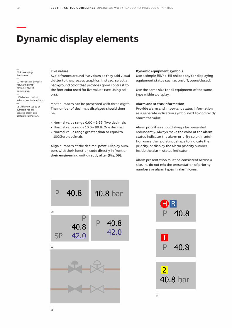
Live valuesAvoid frames around live values as they add visual clutter to the process graphics. Instead, select a background color that provides good contrast to the font color used for live values (see Using col-ors).
Most numbers can be presented with three digits.The number of decimals displayed should then be:
• Normal value range 0.00 – 9.99: Two decimals• Normal value range 10.0 – 99.9: One decimal• Normal value range greater than or equal to
100:Zero decimals
Align numbers at the decimal point. Display num-bers with their function code directly in front or their engineering unit directly after (Fig. 09).
Dynamic equipment symbolsUse a simple fill/no-fill philosophy for displaying equipment status such as on/off, open/closed.
Use the same size for all equipment of the same type within a display.
Alarm and status informationProvide alarm and important status information as a separate indication symbol next to or directly above the value.
Alarm priorities should always be presented redundantly. Always make the color of the alarm status indicator the alarm priority color. In addi-tion use either a distinct shape to indicate the priority, or display the alarm priority number inside the alarm status indicator.
Alarm presentation must be consistent across a site, i.e. do not mix the presentation of priority numbers or alarm types in alarm icons.
—09 Presenting live values.—10 Presenting process values in combi-nation with setpoint value.—11 Valve and on/off valve-state indications.—12 Different types of symbols for pre-senting alarm andstatus information.
—09
—10
—11
—12
O PER ATO R WO R K PL ACE A N D PR O CE SS G R A PH I C S B E S T PR AC TI CE G U I D E LI N E S 11
—14
—13
—Embedded trends
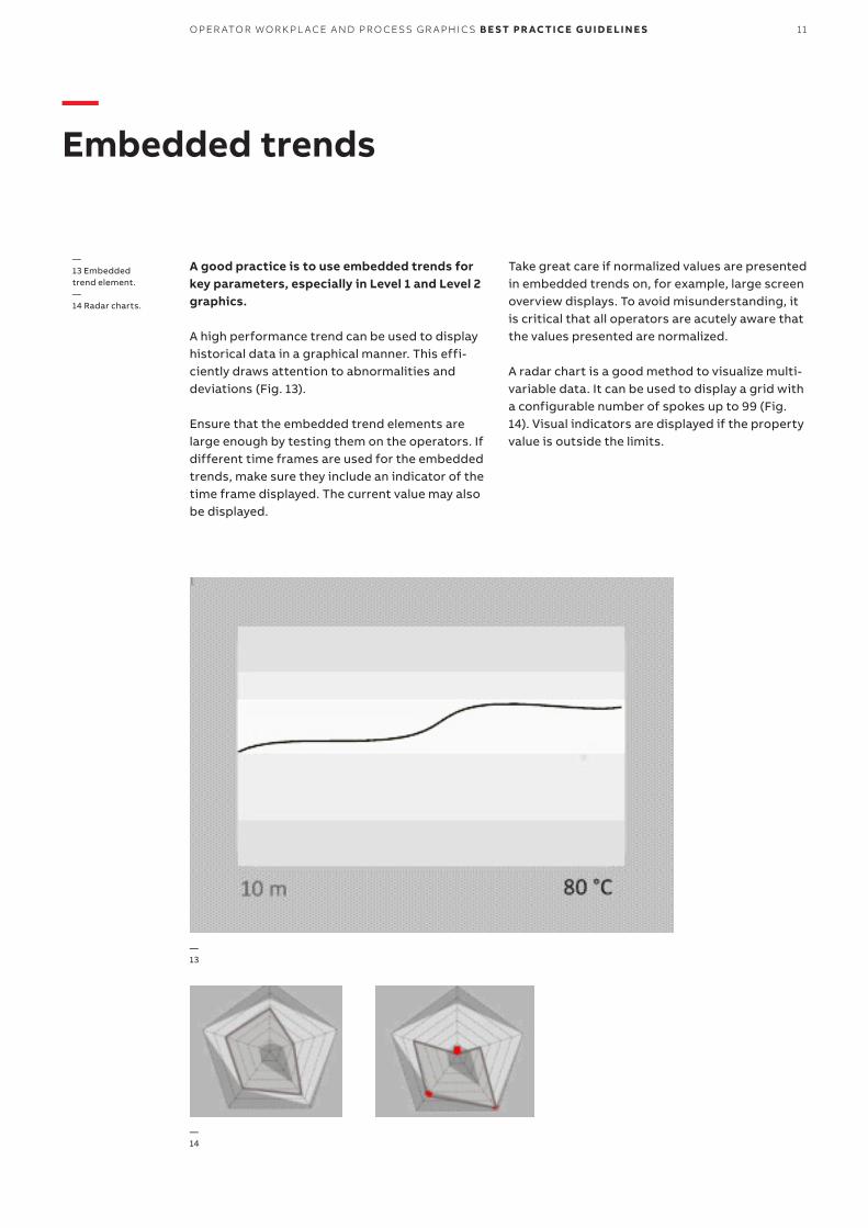
A good practice is to use embedded trends for key parameters, especially in Level 1 and Level 2 graphics.
A high performance trend can be used to display historical data in a graphical manner. This effi-ciently draws attention to abnormalities and deviations (Fig. 13).
Ensure that the embedded trend elements are large enough by testing them on the operators. If different time frames are used for the embedded trends, make sure they include an indicator of the time frame displayed. The current value may also be displayed.
Take great care if normalized values are presented in embedded trends on, for example, large screen overview displays. To avoid misunderstanding, it is critical that all operators are acutely aware that the values presented are normalized.
A radar chart is a good method to visualize multi- variable data. It can be used to display a grid with a configurable number of spokes up to 99 (Fig. 14). Visual indicators are displayed if the property value is outside the limits.
—13 Embedded trend element.—14 Radar charts.

12 B E S T PR AC TI CE G U I D E LI N E S O PER ATO R WO R K PL ACE A N D PR O CE SS G R A PH I C S
The legibility and prominence of a symbol is morestrongly influenced by the relationship between its luminance and that of its immediate back-ground than by its own absolute luminance. A good guide is therefore to calculate the relative luminance contrast between colors in the color palette to ensure that important information(alarms and dynamic information) has a greater contrast against the background than static in-formation.
The luminance contrast ratio can be calculated with the formula (L1 + 0.05)/(L2 + 0.05), where L1 the relative luminance of the lighter color and L2 is the luminance of the darker.
More information on measuring contrast can be found at: www.w3.org/TR/WCAG20-TECHS/
A contrast ratio of 3:1 is the minimum level recom-mended by ISO-9241-3 and ANSI-HFES-100-1988 for standard text and vision. For text on web pages, WCAG 2.0 guidelines recommend a mini-mum contrast ratio of 7:1 for text that is smaller
that 18 pt (if not bold) and 14 pt (if bold). Note, however, that these recommendations focus on text legibility. For symbols, a smaller contrast ratio will be acceptable.
Luminance contrast is not the only factor that in-fluences the prominence of objects in a graphic. Color difference strongly influences the ability of objects to ‘pop-out’ of a page. This is why highly saturated colors should be used only for alarm in-formation. To make it easy to discriminate alarm colors, keep the number of saturated colors to a minimum.
The w3 also has a formula for calculating color difference: dR + dG + dB, where dR, dG and dB are the differences in the Red, Blue and Green com-ponent of the two colors.
The NASA Color Usage Research Lab provides more useful guidance on color use in display graphics. http://colorusage.arc.nasa.gov/
—Appendix AColor use in operator graphics

O PER ATO R WO R K PL ACE A N D PR O CE SS G R A PH I C S B E S T PR AC TI CE G U I D E LI N E S 13
—Further reading
Bullemer, P., Reising, D. V., Burns, C., Haj-dukiewicz, J., & Andrzejewski, J. (2008). ASM Con-sortium Guidelines. Effective Operator Display Design. ASM.
EEMUA – The Engineering Equipment and Materi-als Users’ Association. (2007). EEMUA Publication 191, Alarm Systems – A Guide to Design, Manage-ment and Procurement (2nd Edition ed.). EEMUA.
EEMUA – The Engineering Equipment and Materi-als Users’ Association. (2002). Process Plant Con-trol Desks Utilising Human-Computer Interfaces. Publication No 201, A Guide to Design, Opera-tional and Human-Interface Issues. EEMUA.
EN 894-2+A1:2008, Safety of Machinery – Ergo-nomics requirements for the design of displays and control actuators, 2008.
Hollifield, B., Oliver, D., Nimmo, I., & Habibi, E. (2008). The High Performance HMI Handbook. A Comprehensive Guide to Designing, Implement-ing and Maintaining Effective HMIs for Industrial Plant Operations. PAS.
ISO 11064-1. Ergonomic Design of control centres – Part 1: Principles for Design of Control Centres.
ISO 11064-5. (2008). Ergonomic Design of Control Centres – Part 5: Displays and Controls.
ISO 9241-12. Ergonomic requirements for office work with visual display terminals (VDTs) – Part 12: Presentation of information.
Statoil. (2009, 10 12). StatoilHydro Governing Doc-ument, SAS Operator Station HMI. Technical and professional requirement, TR1212, Final Ver. 2. Statoil.
US Nuclear Regulatory Commission, Office of Nuclear Regulatory Research. (2002). NUREG- 0700 Rev. 2, Human-System Interface Design Review Guidelines.
Gallimore, J. & Shinkle, J.A., Color Usage in Graphic Displays for Process Control, Report writ-ten for the Center for Operator Performance, Nov. 2008.

3BS
E0
68
129
en B
—800xA is a registered or pending trademark of ABB. All rights to other trademarks reside with their respective owners
We reserve the right to make technical changes to the products or modify the contents of this document without prior notice. With regard to purchase orders, the agreed particulars shall prevail. ABB does not assume any responsibility for any errors or incomplete information in this document.
—abb.com/800xAabb.com/controlsystems
We reserve all rights to this document and the items and images it contains. The reproduction, disclosure to third parties or the use of the content of this document –including parts thereof – are prohibited without ABB’s prior written permission.
Copyright© 2018 ABBAll rights reserved