basic excel competencies below is a list of basic ...mullins/excelstuff/introtoexcel.pdf · basic...
TRANSCRIPT

Basic Excel Page 1
Basic Excel CompetenciesBelow is a list of basic spreadsheet tasks which you shouldfeel comfortable with.
• Select a range of cells, by “click and drag” or by usingthe Shift and “Arrow” keys.
• Enter text or numerical data into a cell.• Move the contents of a cell into another location.• Correct incorrect information in a cell.• Erase the contents of a cell.• Erase a whole set of cells at once.• Use the Undo command as needed.• Discard a worksheet.• Open a new worksheet.• Save a worksheet.• Retrieve a worksheet.• Use the fill handle to create a sequence of months, days,
dates, times, or numbers.• Centre text across more than one column.• Use the alignment icons to align text and/or numeric
information in a cell.• Build a formula to add, subtract, multiply or divide into
a cell. Use absolute and relative addresses.• Use the Autosum icon to sum a contiguous range of
cells.• Use basic statistical functions: average, maximum,
minimum, count, standard deviation.• Copy the structure of a formula in one cell to another
cell or a set of cells.• Use the “Esc” key to remove the flashing dotted line
around a cell, or to halt editing a cell and return to theoriginal cell contents.

Basic Excel Page 2
• Cut and paste, or Copy and Paste cell contents into othersections of the worksheet.
• Adjust column widths or row heights.• Enable text entries to wrap around in a cell.• Insert and delete rows and columns.• Use the Chart Wizard tool to create charts• Sort rows of data on one or more keys.
Most users who have already mastered the items on this listwill also know a little about Pivot tables. Some of these itemsare covered in the following pages.
Basic Excel Page 3
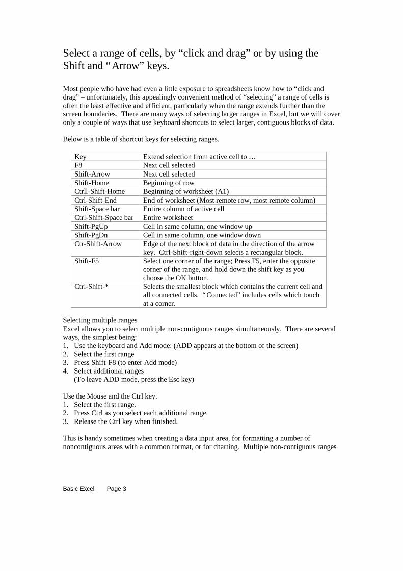
Select a range of cells, by “click and drag” or by using theShift and “Arrow” keys.
Most people who have had even a little exposure to spreadsheets know how to “click anddrag” – unfortunately, this appealingly convenient method of “selecting” a range of cells isoften the least effective and efficient, particularly when the range extends further than thescreen boundaries. There are many ways of selecting larger ranges in Excel, but we will coveronly a couple of ways that use keyboard shortcuts to select larger, contiguous blocks of data.
Below is a table of shortcut keys for selecting ranges.
Key Extend selection from active cell to …F8 Next cell selectedShift-Arrow Next cell selectedShift-Home Beginning of rowCtrll-Shift-Home Beginning of worksheet (A1)Ctrl-Shift-End End of worksheet (Most remote row, most remote column)Shift-Space bar Entire column of active cellCtrl-Shift-Space bar Entire worksheetShift-PgUp Cell in same column, one window upShift-PgDn Cell in same column, one window downCtr-Shift-Arrow Edge of the next block of data in the direction of the arrow
key. Ctrl-Shift-right-down selects a rectangular block.Shift-F5 Select one corner of the range; Press F5, enter the opposite
corner of the range, and hold down the shift key as youchoose the OK button.
Ctrl-Shift-* Selects the smallest block which contains the current cell andall connected cells. “Connected” includes cells which touchat a corner.
Selecting multiple rangesExcel allows you to select multiple non-contiguous ranges simultaneously. There are severalways, the simplest being:1. Use the keyboard and Add mode: (ADD appears at the bottom of the screen)2. Select the first range3. Press Shift-F8 (to enter Add mode)4. Select additional ranges
(To leave ADD mode, press the Esc key)
Use the Mouse and the Ctrl key.1. Select the first range.2. Press Ctrl as you select each additional range.3. Release the Ctrl key when finished.
This is handy sometimes when creating a data input area, for formatting a number ofnoncontiguous areas with a common format, or for charting. Multiple non-contiguous ranges

Basic Excel Page 4
can be copied and pasted, provided they are aligned in the same rows or columns. Whenpasted, the gaps (rows or columns) disappear.
Basic Excel Page 5
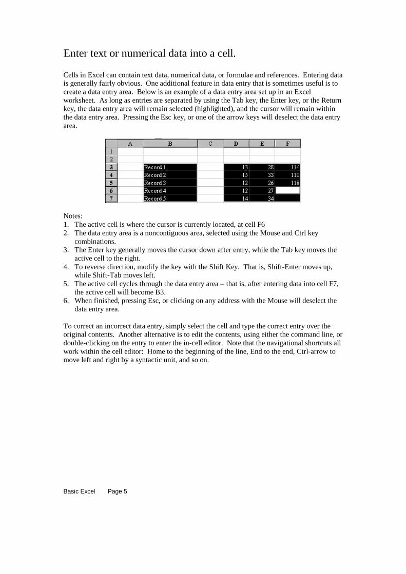
Enter text or numerical data into a cell.
Cells in Excel can contain text data, numerical data, or formulae and references. Entering datais generally fairly obvious. One additional feature in data entry that is sometimes useful is tocreate a data entry area. Below is an example of a data entry area set up in an Excelworksheet. As long as entries are separated by using the Tab key, the Enter key, or the Returnkey, the data entry area will remain selected (highlighted), and the cursor will remain withinthe data entry area. Pressing the Esc key, or one of the arrow keys will deselect the data entryarea.
Notes:1. The active cell is where the cursor is currently located, at cell F62. The data entry area is a noncontiguous area, selected using the Mouse and Ctrl key
combinations.3. The Enter key generally moves the cursor down after entry, while the Tab key moves the
active cell to the right.4. To reverse direction, modify the key with the Shift Key. That is, Shift-Enter moves up,
while Shift-Tab moves left.5. The active cell cycles through the data entry area – that is, after entering data into cell F7,
the active cell will become B3.6. When finished, pressing Esc, or clicking on any address with the Mouse will deselect the
data entry area.
To correct an incorrect data entry, simply select the cell and type the correct entry over theoriginal contents. Another alternative is to edit the contents, using either the command line, ordouble-clicking on the entry to enter the in-cell editor. Note that the navigational shortcuts allwork within the cell editor: Home to the beginning of the line, End to the end, Ctrl-arrow tomove left and right by a syntactic unit, and so on.
Basic Excel Page 6
Move the contents of a cell into another location.
The easiest and most intuitive way to move a cell or range is to drag the cell or range to thenew location and drop it. Under these circumstances, Excel moves the cell contents and theformat. Alternatives may be to copy and paste, or to cut and paste. Copy, Cut, and Paste allappear as icons on the usual toolbar. However, it is usually faster to use keyboard shortcuts:Ctrl-X cuts, Ctrl-C copies, and Ctrl-V pastes. Note, however, that Ctrl-V pastes contents andformat. A wider range of alternatives is offered by Paste Special, available from the Editmenu. (It is possible also to add a Paste Special icon to the toolbar).
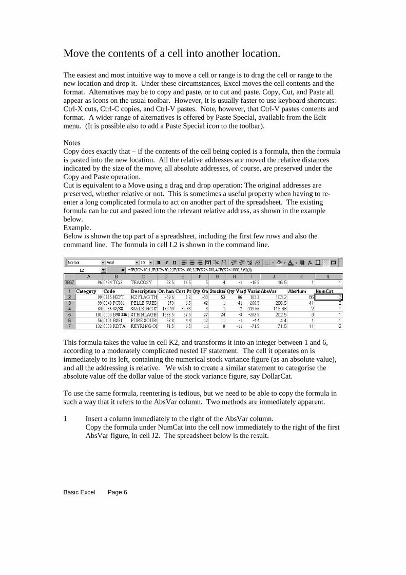
NotesCopy does exactly that – if the contents of the cell being copied is a formula, then the formulais pasted into the new location. All the relative addresses are moved the relative distancesindicated by the size of the move; all absolute addresses, of course, are preserved under theCopy and Paste operation.Cut is equivalent to a Move using a drag and drop operation: The original addresses arepreserved, whether relative or not. This is sometimes a useful property when having to re-enter a long complicated formula to act on another part of the spreadsheet. The existingformula can be cut and pasted into the relevant relative address, as shown in the examplebelow.Example.Below is shown the top part of a spreadsheet, including the first few rows and also thecommand line. The formula in cell L2 is shown in the command line.
This formula takes the value in cell K2, and transforms it into an integer between 1 and 6,according to a moderately complicated nested IF statement. The cell it operates on isimmediately to its left, containing the numerical stock variance figure (as an absolute value),and all the addressing is relative. We wish to create a similar statement to categorise theabsolute value off the dollar value of the stock variance figure, say DollarCat.
To use the same formula, reentering is tedious, but we need to be able to copy the formula insuch a way that it refers to the AbsVar column. Two methods are immediately apparent.
1 Insert a column immediately to the right of the AbsVar column.Copy the formula under NumCat into the cell now immediately to the right of the firstAbsVar figure, in cell J2. The spreadsheet below is the result.

Basic Excel Page 7
Note that the formula in cell K2 is exactly the formula we wanted. We can now entera title above it, and duplicate the formula down the column. We might also want tomove this column to a position alongside the NumCat variable. (Use drag and drop, orCut and Paste)
2 Alternatively, we can Cut and Paste (or Move) the original formula one column to theright, as shown in the picture below:
Note the formula now in cell M2 refers to the cell two columns to its left. If we copythis and paste it into L2, we will have the appropriate formula for creating theDollarCat category. Again, placing a heading in L1, and then duplicating the formuladown the column completes the task. The result is shown below:
Final note: While the nested IF() statement is perfectly adequate for recoding these values toa 1-6 category, there are several other alternatives available for this, among them being theVLOOKUP() function, which might be a more attractive alternative here.

Basic Excel Page 8
Erase the contents of a cell; Erase a whole set of cells at once.
To erase a range, including a single cell, or a multiple range, select the range and press the Delkey. Note that pressing the BkSp key will erase the contents of a single cell, but will eraseonly the highlighted cell of a selected range. (Usually the top left cell)
You should try this in a spreadsheet, and remember to use the Undo command to restore thespreadsheet to its former condition. The keyboard shortcut for the Undo command is Ctrl-Z.

Basic Excel Page 9
Use the fill handle to create a sequence of months, days, dates,times, or numbers.
You can use the fill commands on the edit menu to fill formulae or data into contiguousranges. It is possible to fill Up, Down, Left or Right.
Here’s what Excel’s HELP file has to say about Fill:
Fill in a series of numbers, dates, or other items
1 Select the first cell in the range you want to fill, and enterthe starting value for the series.
To increment the series by a specified amount, select thenext cell in the range and enter the next item in the series.The difference between the two starting items determinesthe amount by which the series is incremented.
2 Select the cell or cells that contain the starting values.3 Drag the fill handle over the range you want to fill.
To fill in increasing order, drag down or to the right.
To fill in decreasing order, drag up or to the left.
Tip To specify the type of series, hold down the right mousebutton as you drag the fill handle over the range. Release themouse button, and then click the appropriate command on theshortcut menu. For example, if the starting value is the date JAN-96, click Fill Months for the series FEB-96, MAR-96, and so on;or click Fill Years for the series JAN-96, JAN-97, and so on.
The Fill Handle is handy also for filling a row or column with a formula. The principle is thesame: position the mouse pointer on the fill handle, and drag over the range you want to copythe formula through. Absolute and relative addresses in the formula behave exactly as youmight suppose.
Double clicking.Double clicking on the fill handle fills the formula down (not to the right) as far as theadjacent contiguous block of cells.ExampleHere is a fragment of a spreadsheet, with a formula entered into cell B2, as shown in thecommand line. The arrow in the picture identifies the fill handle.
Double-clicking on the fill handle in this situation will fill in Column B as far as cell B8, theend of the adjacent contiguous block. Notice that it does not fill to the furthest or nearest, butto the end of the contiguous block on the left.

Basic Excel Page 10
Double-clicking on the fill handle to replicate a formula down a column is an enormouslyuseful feature of Excel, particularly when working with large worksheets.
Below is the result of double-clicking on the fill handle.

Basic Excel Page 11
Building formulae to add, subtract, multiply etc.Use basic statistical functions: average, maximum, minimum,count, standard deviation.
Provided we have the correct formulae in place, it is generally wiser to let the computer do thework, rather than enter values that have been computed on a calculator. To illustrate the useof simple formulae, and how relative and absolute addresses can be used, consider a simpleexample, a two-way table of data.
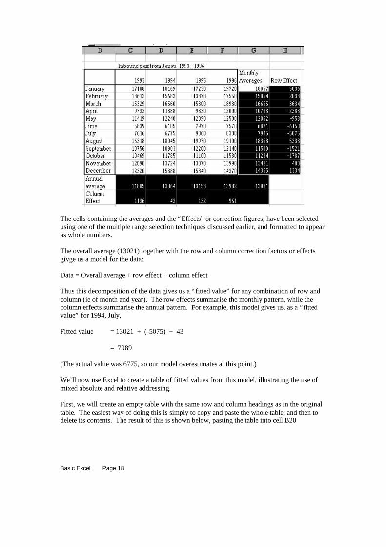
ExampleThe data in the table below represent monthly tourist arrivals from Japan over a four-yearperiod.
______________________________________________1993 1994 1995 1996January 17108 18169 17230 19720February 13613 15683 13370 17550March 15329 16560 15800 18930April 9733 11388 9830 12000May 11419 12240 12090 12500June 5839 6105 7970 7570July 7616 6775 9060 8330August 16318 18045 19970 19100September 10756 10903 12200 12140October 10469 11785 11100 11580November 12098 13724 13870 13990December 12320 15388 15340 14370
Inbound pax from Japan: 1993 - 1996
Our interest is finding the patterns in the table, using simple functions available in Excel.
What is the typical number of tourists arriving in New Zealand, from this table? This issimply the overall average, or arithmetic mean. The Excel function for calculating this is:
=AVERAGE()
All Excel functions have this form:
= <function name> ( <list of arguments>)
Notice the opening and closing brackets. The <list of arguments> may be as simple as asingle number, or may be several ranges within the worksheet. When Excel displays aformula, it displays all the function names in capital letters. This is quite handy: if you make ahabit of always entering function names in lowercase, Excel will let you know when you mis-spell the function by continuing to display it in lowercase. Below is the fragment ofspreadsheet above, with the average formula below and one cell to the right of the table.

Basic Excel Page 12
(Note that the function has been mis-spelled.) The range to be averaged is rectangular, fromC4 to F15. This the way that ranges are specified, as a cell address followed by a colon, thenfollowed by a second cell address. Below is the result of entering the formula as shown in thedisplay above. Note that an error message is displayed (#NAME?), and the function (shownin the command line) is shown in lowercase, demonstrating that Excel has failed to find it inits dictionary of functions and named ranges.
The next display shows the result after the spelling mistake has been rectified. We now seethat over this four-year period, an average of 13021 tourists has arrived in New Zealand fromJapan each month.

Basic Excel Page 13
______________________________________________1993 1994 1995 1996January 17108 18169 17230 19720February 13613 15683 13370 17550March 15329 16560 15800 18930April 9733 11388 9830 12000May 11419 12240 12090 12500June 5839 6105 7970 7570July 7616 6775 9060 8330August 16318 18045 19970 19100September 10756 10903 12200 12140October 10469 11785 11100 11580November 12098 13724 13870 13990December 12320 15388 15340 14370
13021
Inbound pax from Japan: 1993 - 1996
The easiest way to enter range addresses like this is to select the range, using either the mouseor the keyboard. The techniques discussed earlier, under “Select a range of cells, … ” can beused here. In this example, following the steps below will create this formula.1. In cell G16, type =average(2. Press the left arrow, then the up arrow. This places the “marquee” or dotted outline,
around cell F15. The screen looks like this:
3. Now hold the Ctrl key down, and the Shift key, and press the left arrow, then the up arrow.This places the marquee around the whole of the table. (Remember, Ctrl-Arrow movesover a contiguous block of cells. Holding down the Shift key continues to select.) Theresult of this selects both the left column of the table, where the months are entered, andthe headings at the tops of the columns, where the years are entered. Since we don’t wantto include the top row and the left column, we want to “come back” one column, and onerow.
4. Press the Shift key (and NOT the Ctrl key), and press the right arrow, then the downarrow. The result of this is to select the body of the table, including just the data we areinterested in. Now enter a right bracket to create the formula for the average as required,as shown in the next display.

Basic Excel Page 14
The value that results when the Enter key is pressed is 13021. Clearly, however, these datahave significant monthly differences, and it appears that there is a year-to-year difference inthe data. We will proceed with this example, and fit a model to the data to extract thyeseyearly and monthly effects, to create a table of “expected” values using the fitted model.
In the same way that we have used the overall average to represent the “typical” value for thewhole table, we can use the average of all the January values to get a typical value forJanuary. Similarly, for all the other months, a typical value will simply be the appropriatearithmetic average. We will create a column of Monthly averages immediately to the right ofthe table, as follows:
1. In cell G3, enter a heading for the column, say Monthly Averages.2. In cell G4, immediately below the heading, enter the formula for the average of the
January figures. Try to use the keyboard method of selecting the range in the formula –practice makes perfect, and you will get faster at this!
3. When the averaging formula is entered, duplicate this formula down the column as far asDecember. The easiest way to do this is to use the Fill Handle – double-click on the FillHandle, and the column will automatically fill down as far as the contiguous block of dataon the left – i.e. as far as December. The display below shows the screen at the end of thisstep.

Basic Excel Page 15
Thus the January average is 18056.75, February is 15054 and so on. Similarly, we can extractcolumn averages to get the 1993 average, the 1994 average, and so on. Follow a similarprocess (remember that you can’t just double-click to Fill to the right!) to get the followingdisplay:
We can think of these “typical values” as the best guess or estimate that we might be able tomake with a limited amount of information. Thus our best guess for the monthly averageinbound pax from Japan over this whole period is 13021. If, however, we restrict ourattention to January, then our best guess would be 18056.75. If we were interested in“predicting” a value for June, we would use the June typical value, 6871. Similarly, if wewanted the best prediction for 1994, then the typical value for that year, 13063.75 would be
Basic Excel Page 16
our best guess. We need to combine these two factors in some way to get a “prediction” for agiven month in a given year.
We can approach this as a “predictor-corrector” type of problem. If our initial “model” issimply the overall average, how do we correct this value for a particular month? Clearly theresult should correct the overall average 13021 back to whatever the appropriate row averageis. The difference between the row average and the overall average is obviously the amountby which to correct the overall mean. Similarly, the difference between the column averageand the overall average is the amount by which to correct for a given year. We can put thesedifferences into our spreadsheet, using formulae that use a mixture of relative and absoluteaddressing.
Absolute addressing and relative addressing.The normal reference that is written into a formula when using the mouse pointer, or thekeyboard method, is a relative address: Copying the reference to a cell two cells to the rightwill change the reference to a cell two cells to the right of the previous reference and so on.To keep cell references from changing when you copy a formula to a new location (or use theFill tool to propagate a function through a range of cells), use absolute references. A $ signpreceding either the row or the column reference (or both) will ensure that that particular partof the cell reference is unchanged under a copy operation. For a simple cell reference such asC17, the four possible combinations of absolute and relative references and their meaningsare:
C17 Both references are relative. Both row and column will change by the relativeamount of any move in the horizontal or vertical directions.
$C$17 Both references are absolute. Neither the row nor the column reference willchange when the cell contents are copied to a new destination.
C$17 The column reference ( C ) will change by the relative amount when theformula is copied to another destination; the row reference ( $17 ) will notchange.
$C17 The row reference ( 17 ) will change by the relative amount when the formulais copied to another destination; the column reference ( $C ) will not change.
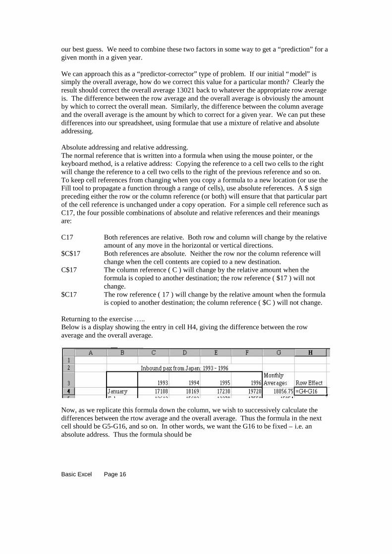
Returning to the exercise … ..Below is a display showing the entry in cell H4, giving the difference between the rowaverage and the overall average.
Now, as we replicate this formula down the column, we wish to successively calculate thedifferences between the rtow average and the overall average. Thus the formula in the nextcell should be G5-G16, and so on. In other words, we want the G16 to be fixed – i.e. anabsolute address. Thus the formula should be

Basic Excel Page 17
=G4-$G$16
We can physically edit the formula, and enter the dollar signs, or we can use the F4 function.The F4 function key on the keyboard “toggles” the addressing in the address on which thecursor rests. Thus, with the cursor (in the command line) on the address G16, pressing the F4function key will cycle through the four possible combinations of relative and absoluteaddressing. (And, on further pressing, will cycle through them again.) Pressing the F4 keyoncewill yield the formula
=G4-$G$16
as desired. This formula can then be replicated down the column using the fill handle (etc) toproduce this display:
(Note that double-clicking on the Fill Handle will fill the column down as far as cell H16,which I have deleted.)
In a similar fashion we can produce a row of Column Effects, as the differences between thecolumn means and the overall mean, as shown in the display below.
Basic Excel Page 18
The cells containing the averages and the “Effects” or correction figures, have been selectedusing one of the multiple range selection techniques discussed earlier, and formatted to appearas whole numbers.
The overall average (13021) together with the row and column correction factors or effectsgivge us a model for the data:
Data = Overall average + row effect + column effect
Thus this decomposition of the data gives us a “fitted value” for any combination of row andcolumn (ie of month and year). The row effects summarise the monthly pattern, while thecolumn effects summarise the annual pattern. For example, this model gives us, as a “fittedvalue” for 1994, July,
Fitted value = 13021 + (-5075) + 43
= 7989
(The actual value was 6775, so our model overestimates at this point.)
We’ll now use Excel to create a table of fitted values from this model, illustrating the use ofmixed absolute and relative addressing.
First, we will create an empty table with the same row and column headings as in the originaltable. The easiest way of doing this is simply to copy and paste the whole table, and then todelete its contents. The result of this is shown below, pasting the table into cell B20

Basic Excel Page 19
(The range from C21 to F32 is highlighted because this has just been selected and deleted.)
Now to fill the table with the fitted values, we will place an appropriate formula in cell C21,and replicate to the right (to cell F21) and then down (to cell F32).
In cell C21, type = (This begins formula entry)Now click the mouse on the cell containing the overall mean, G16. As the formula isreplicated right and down, we want this always to be G16, so press the F4 function key. Thischanges the entry to
=$G$16Now enter +, so the cell entry is now
=$G$16+and click the mouse on the first row effect, in cell H4. As the formula is replicated across anddown, the column must remain the same, while the row must change according to whether it isJanuary, February etc. Thus the column must be absolute, while the row must be relative.Press the F4 function key until the appropriate address is shown. (This should be threekeypresses.) Now enter +, so the cell entry is
=$G$16+$H4+and now click the mouse on the first of the column effects, in cell C17. In this case, thecolumn must change, while the row must remain fixed, so the row is absolute ($17) while thecolumn is relative. Two keypresses should accomplish this, so the final formuala is:
=$G$16+$H4+C$17
Pressing the Enter key will enter the formula and calculate the value.
Now place the cursor on cell C21, and, holding down the Shift key, press the right arrowthreetimes. This selects the range C21:F21. Ctrl-R will will this formula to the right. We can thendouble-click on the fill handle (Still with all of C21:F21 highlighted), and the formulae willfill down as far as the adjacent block of labels, the months. The resulting table is shown

Basic Excel Page 20
below.
Obviously we can now look at the residuals – the differences between the original data andour modeled values, and use these to give some idea of how good the fit is. This is reasonablystraightforward, and graphical inspection of these values is a valuable method for exploringthese data further. However, we have covered enough of absolute and relative addressing fornow.
We have shown how to use the =AVERAGE() function, and how to use the absolute andrelative addressing facilities of Excel. Other functions that might be useful in the presentexample include
=MIN() Gives the smallest value in a range=MAX() Gives the greatest (the maximum) value in a range=STDEV() Gives the standard deviation of the values in the given
range; this is a measure of the variability of the data in therange.
Clearly we can use the standard deviation function to give some idea of whether the row +column fit we have carried out is an improvement over simply using the overall average. Thestandard deviation of the original data was about 3700; the standard deviation of the residualsabout the fitted values is approximately 750. This is a marked reduction in the errorassociated with our estimate of monthly pax, so this model represents an enormous increase inour ability to predict tourist numbers. (You may wish to pursue this part of the example as anexercise!)
Basic Excel Page 21
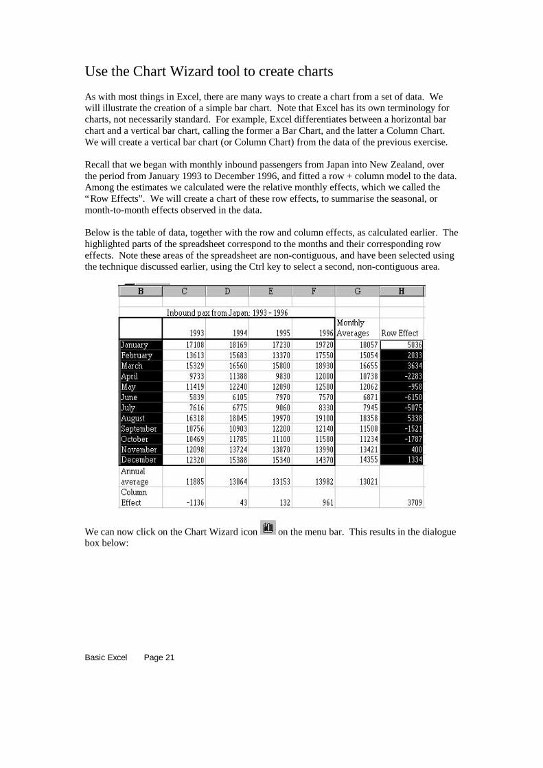
Use the Chart Wizard tool to create charts
As with most things in Excel, there are many ways to create a chart from a set of data. Wewill illustrate the creation of a simple bar chart. Note that Excel has its own terminology forcharts, not necessarily standard. For example, Excel differentiates between a horizontal barchart and a vertical bar chart, calling the former a Bar Chart, and the latter a Column Chart.We will create a vertical bar chart (or Column Chart) from the data of the previous exercise.
Recall that we began with monthly inbound passengers from Japan into New Zealand, overthe period from January 1993 to December 1996, and fitted a row + column model to the data.Among the estimates we calculated were the relative monthly effects, which we called the“Row Effects”. We will create a chart of these row effects, to summarise the seasonal, ormonth-to-month effects observed in the data.
Below is the table of data, together with the row and column effects, as calculated earlier. Thehighlighted parts of the spreadsheet correspond to the months and their corresponding roweffects. Note these areas of the spreadsheet are non-contiguous, and have been selected usingthe technique discussed earlier, using the Ctrl key to select a second, non-contiguous area.
We can now click on the Chart Wizard icon on the menu bar. This results in the dialoguebox below:
Basic Excel Page 22
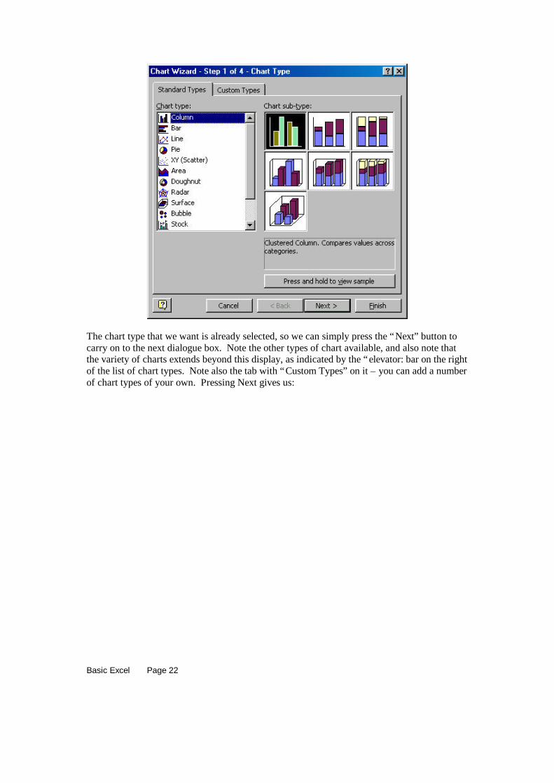
The chart type that we want is already selected, so we can simply press the “Next” button tocarry on to the next dialogue box. Note the other types of chart available, and also note thatthe variety of charts extends beyond this display, as indicated by the “elevator: bar on the rightof the list of chart types. Note also the tab with “Custom Types” on it – you can add a numberof chart types of your own. Pressing Next gives us:

Basic Excel Page 23
This gives us a preview of what the bar graph will look like. Pressing Next once more yields:
This dialogue box offers you the opportunity to customise the chart in a number of ways. Theoptions available are: titles, axes, gridlines, legend, data labels, and data table. Each of theseoptions has a number of component parts, enabling you to “tune” the appearance of the final

Basic Excel Page 24
graph. I always put a dummy title on the chart (place the cursor in the Chart Title field andjust strike a number of keys at random), remove the legend and the gridlines, and then acceptthe default values (for now!). The result of this in this case is shown below:
wqerrtyf
-8000
-6000
-4000
-2000
0
2000
4000
6000
Januar
y
There are clearly a number of aspects to this chart that need to be addressed: the shading isnot a particularly good idea for a chart to be printed in black and white; the column labels arevery intrusive within the data plotting area; the title, of course, should be made meaningful;the chart should use the space that has been made available for charting. We will address acouple of these issues and try to “clean upp” the appearance of this chart.
First the title. My preference is for the title of a chart to be taken from the contents of a cellwithin the spreadsheet. Fortunately, this is very easily achieved. Simply click on the title (thechart then looks as below)
And then type = and point (within the spreadsheet) to the cell containing the text you want touse as the title. In this case, I entered the text “Seasonal effects in Japanese Tourists” into cellH2, clicked on the title as shown above, and typed = and then clicked on cell H2. The textthen became the title of my chart.
Basic Excel Page 25
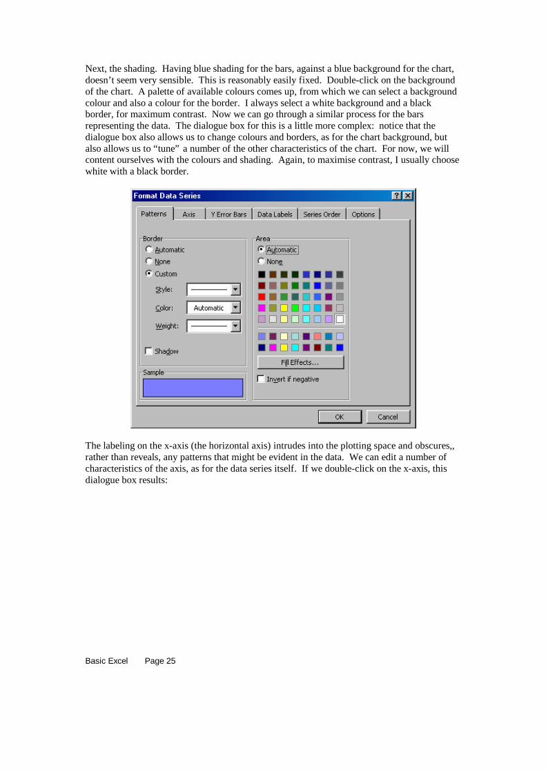
Next, the shading. Having blue shading for the bars, against a blue background for the chart,doesn’t seem very sensible. This is reasonably easily fixed. Double-click on the backgroundof the chart. A palette of available colours comes up, from which we can select a backgroundcolour and also a colour for the border. I always select a white background and a blackborder, for maximum contrast. Now we can go through a similar process for the barsrepresenting the data. The dialogue box for this is a little more complex: notice that thedialogue box also allows us to change colours and borders, as for the chart background, butalso allows us to “tune” a number of the other characteristics of the chart. For now, we willcontent ourselves with the colours and shading. Again, to maximise contrast, I usually choosewhite with a black border.
The labeling on the x-axis (the horizontal axis) intrudes into the plotting space and obscures,,rather than reveals, any patterns that might be evident in the data. We can edit a number ofcharacteristics of the axis, as for the data series itself. If we double-click on the x-axis, thisdialogue box results:

Basic Excel Page 26
The key for us here is the field called “Tick mark labels”. Within this array of choices, wewant to select “Low”, to place the labels along the bottom of the chart rather than immediatelyadjacent to the axis. We will allow the defaults on the other tabbed options within thisdialogue.
Finally, we can change the shape of the chart itself within the box allocated to it by clickingon it, and then clicking on the handles to drag the chart into a different shape. The result of allthese edits is shown below.
Seasonal effects in Japanese Tourists
-8000
-6000
-4000
-2000
0
2000
4000
6000
Januar
y
Februa
ryMarc
hApri
lMay Jun
eJul
y
August
Septem
ber
October
November
December
A final note regarding charts: the XY (Scatter) chart is the only “true” graphical tool in theChart Wizard. Only the XY plot actually plots (x,y) pairs, while all the other chart types tendto have labels on the horizontal axis. If precise plots are required, it may be better to think ofthe requirement in terms of an XY plot, and create an appropriate template for this.
Basic Excel Page 27
Pivot Tables
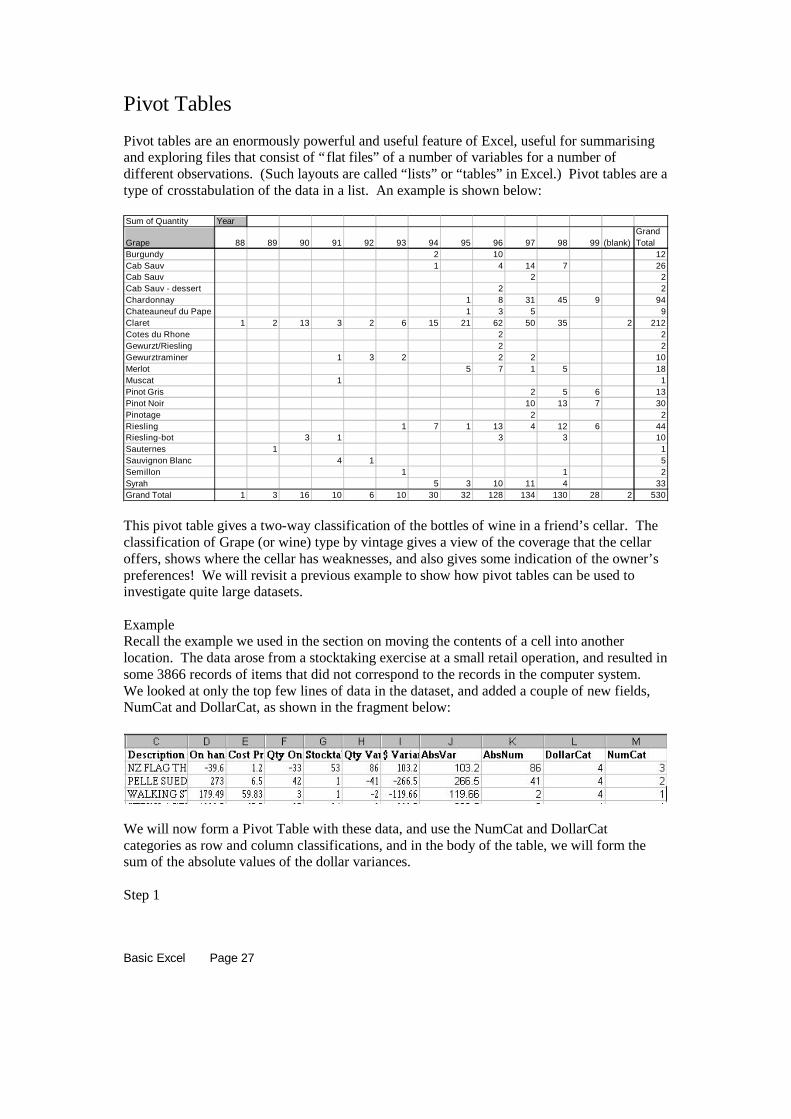
Pivot tables are an enormously powerful and useful feature of Excel, useful for summarisingand exploring files that consist of “flat files” of a number of variables for a number ofdifferent observations. (Such layouts are called “lists” or “tables” in Excel.) Pivot tables are atype of crosstabulation of the data in a list. An example is shown below:
Sum of Quantity Year
Grape 88 89 90 91 92 93 94 95 96 97 98 99 (blank)Grand Total
Burgundy 2 10 12Cab Sauv 1 4 14 7 26Cab Sauv 2 2Cab Sauv - dessert 2 2Chardonnay 1 8 31 45 9 94Chateauneuf du Pape 1 3 5 9Claret 1 2 13 3 2 6 15 21 62 50 35 2 212Cotes du Rhone 2 2Gewurzt/Riesling 2 2Gewurztraminer 1 3 2 2 2 10Merlot 5 7 1 5 18Muscat 1 1Pinot Gris 2 5 6 13Pinot Noir 10 13 7 30Pinotage 2 2Riesling 1 7 1 13 4 12 6 44Riesling-bot 3 1 3 3 10Sauternes 1 1Sauvignon Blanc 4 1 5Semillon 1 1 2Syrah 5 3 10 11 4 33Grand Total 1 3 16 10 6 10 30 32 128 134 130 28 2 530
This pivot table gives a two-way classification of the bottles of wine in a friend’s cellar. Theclassification of Grape (or wine) type by vintage gives a view of the coverage that the cellaroffers, shows where the cellar has weaknesses, and also gives some indication of the owner’spreferences! We will revisit a previous example to show how pivot tables can be used toinvestigate quite large datasets.
ExampleRecall the example we used in the section on moving the contents of a cell into anotherlocation. The data arose from a stocktaking exercise at a small retail operation, and resulted insome 3866 records of items that did not correspond to the records in the computer system.We looked at only the top few lines of data in the dataset, and added a couple of new fields,NumCat and DollarCat, as shown in the fragment below:
We will now form a Pivot Table with these data, and use the NumCat and DollarCatcategories as row and column classifications, and in the body of the table, we will form thesum of the absolute values of the dollar variances.
Step 1
Basic Excel Page 28
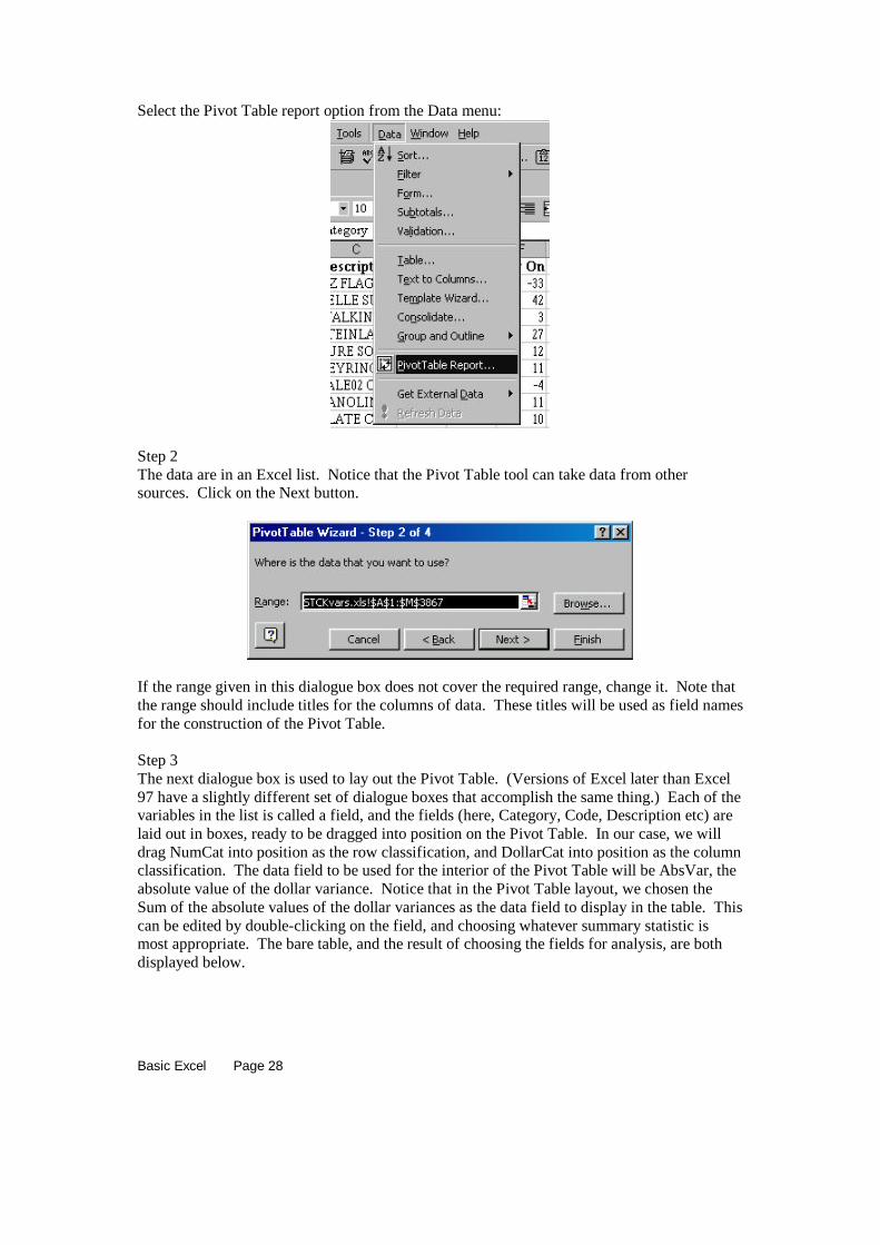
Select the Pivot Table report option from the Data menu:
Step 2The data are in an Excel list. Notice that the Pivot Table tool can take data from othersources. Click on the Next button.
If the range given in this dialogue box does not cover the required range, change it. Note thatthe range should include titles for the columns of data. These titles will be used as field namesfor the construction of the Pivot Table.
Step 3The next dialogue box is used to lay out the Pivot Table. (Versions of Excel later than Excel97 have a slightly different set of dialogue boxes that accomplish the same thing.) Each of thevariables in the list is called a field, and the fields (here, Category, Code, Description etc) arelaid out in boxes, ready to be dragged into position on the Pivot Table. In our case, we willdrag NumCat into position as the row classification, and DollarCat into position as the columnclassification. The data field to be used for the interior of the Pivot Table will be AbsVar, theabsolute value of the dollar variance. Notice that in the Pivot Table layout, we chosen theSum of the absolute values of the dollar variances as the data field to display in the table. Thiscan be edited by double-clicking on the field, and choosing whatever summary statistic ismost appropriate. The bare table, and the result of choosing the fields for analysis, are bothdisplayed below.

Basic Excel Page 29
and after laying out the table, we have:
Step 4If we now click on the Next button, we get the dialogue box below, inviting us to place theresulting Pivot Table in a sheet of its own, or in the current sheet at a specified address. Thedefault is for a new sheet, so we will run with this for now. The resulting Pivot Table is(Note that I have reformatted all the entries to be integers):
Basic Excel Page 30
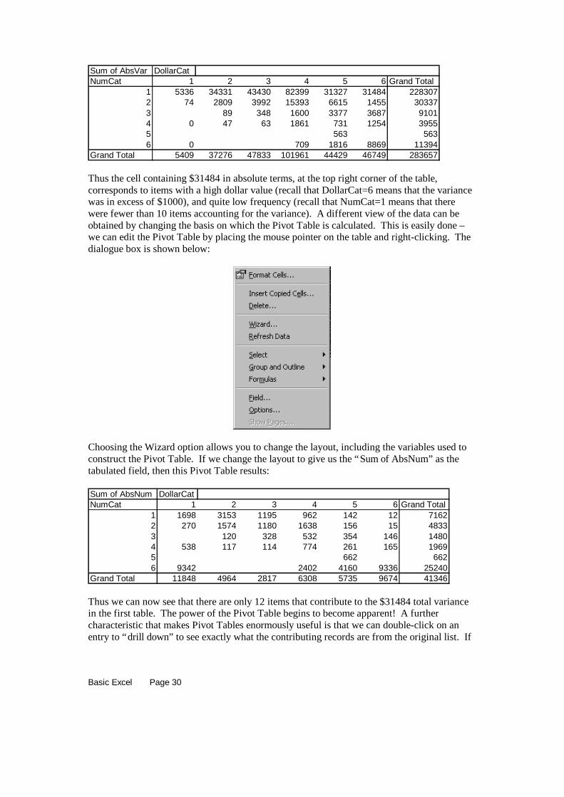
Sum of AbsVar DollarCatNumCat 1 2 3 4 5 6 Grand Total
1 5336 34331 43430 82399 31327 31484 2283072 74 2809 3992 15393 6615 1455 303373 89 348 1600 3377 3687 91014 0 47 63 1861 731 1254 39555 563 5636 0 709 1816 8869 11394
Grand Total 5409 37276 47833 101961 44429 46749 283657
Thus the cell containing $31484 in absolute terms, at the top right corner of the table,corresponds to items with a high dollar value (recall that DollarCat=6 means that the variancewas in excess of $1000), and quite low frequency (recall that NumCat=1 means that therewere fewer than 10 items accounting for the variance). A different view of the data can beobtained by changing the basis on which the Pivot Table is calculated. This is easily done –we can edit the Pivot Table by placing the mouse pointer on the table and right-clicking. Thedialogue box is shown below:
Choosing the Wizard option allows you to change the layout, including the variables used toconstruct the Pivot Table. If we change the layout to give us the “Sum of AbsNum” as thetabulated field, then this Pivot Table results:
Sum of AbsNum DollarCatNumCat 1 2 3 4 5 6 Grand Total
1 1698 3153 1195 962 142 12 71622 270 1574 1180 1638 156 15 48333 120 328 532 354 146 14804 538 117 114 774 261 165 19695 662 6626 9342 2402 4160 9336 25240
Grand Total 11848 4964 2817 6308 5735 9674 41346
Thus we can now see that there are only 12 items that contribute to the $31484 total variancein the first table. The power of the Pivot Table begins to become apparent! A furthercharacteristic that makes Pivot Tables enormously useful is that we can double-click on anentry to “drill down” to see exactly what the contributing records are from the original list. If

Basic Excel Page 31
we double-click on the 12 in the 1-6 cell, we get these records:
Category Code DescriptionOn hand @ W.av cost
Cost Price
Qty On
HandStocktake
ActualQty
Variance$
Variance AbsVar AbsNum DollarCat NumCat132 0532 TEESI S Pearl-BLAC 1400 1400 1 0 -1 -1400 1400 1 6 1154 0020 JE253 Pearl-BLAC 3000 3000 1 0 -1 -3000 3000 1 6 1156 0870 BP22 Pearl-BLAC 6000 6000 1 0 -1 -6000 6000 1 6 1152 0020 ZZ PO863 Pearl-BLAC 3000 3000 1 0 -1 -3000 3000 1 6 1167 0122 GB 003 S BLACK EARR 1012 1012 1 0 -1 -1012 1012 1 6 1152 0207 HP14 P WHITE CAB 2072 2072 1 0 -1 -2072 2072 1 6 1122 0004 SR1426 Pearl-SEMI 1800 1800 1 0 -1 -1800 1800 1 6 1154 0401 J77 JC 15.42CT WH 1400 1400 1 0 -1 -1400 1400 1 6 1149 0410 E3546 CRYSTAL CA 3200 3200 1 0 -1 -3200 3200 1 6 1150 0410 RO267118C BLACK CAB 5800 5800 1 0 -1 -5800 5800 1 6 1132 0532 TEEHA S Pearl-SEMI 1300 1300 1 0 -1 -1300 1300 1 6 1132 0532 TEEHA L Pearl-BLAC 1500 1500 1 0 -1 -1500 1500 1 6 1
The clustering of these items together is the sort of valuable information that makesstocktaking exercises worthwhile! There is obviously a great deal more useful informationthat we could extract from this Pivot Table.
There are many other valuable properties of Pivot Tables, and ways in which to use them: agreat deal of information is available in the Help files, and in reference books. Note also thatwe could have been much more clever in terms of labeling the rows and columns of the table,to make them more readable.