auburn universtiy school of architecture 5th year portfolio: casey canouse
DESCRIPTION
My 5th year Architectural Student PortfolioTRANSCRIPT
W O R K S

2
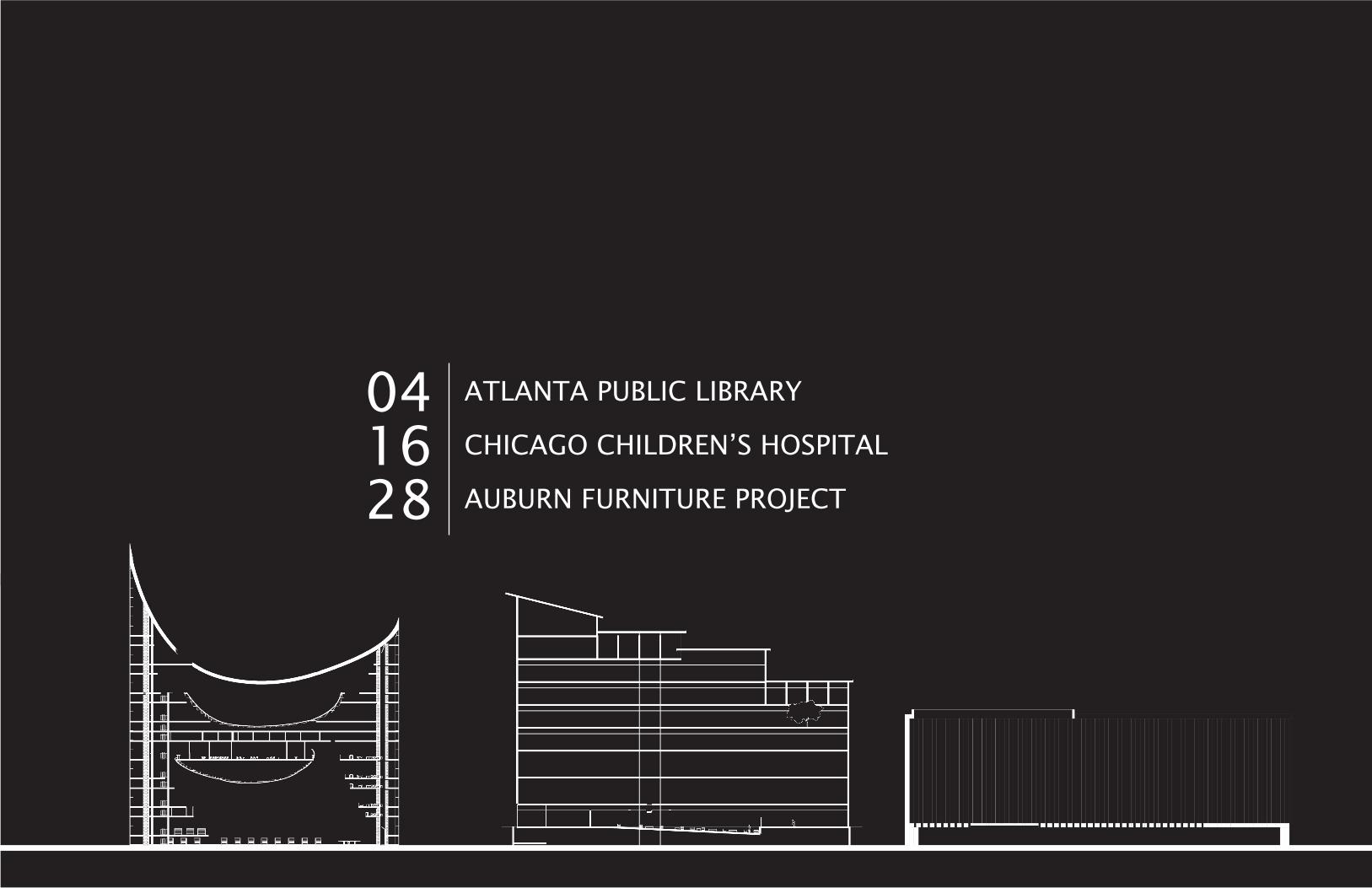
ATLANTA PUBLIC LIBRARY
CHICAGO CHILDREN’S HOSPITAL
AUBURN FURNITURE PROJECT
041628
ATLANTA PUBLIC LIBRARY | 4
ATLANTA PUBLIC LIBRARY CENTRAL BRANCH
In the heart of downtown Atlanta, a few blocks from Centennial Park and the Georgia Aquarium, the Marcel Breuer-designed public library attracts few visitors.
We were charged with treating the site as if already leveled and creating a new library for the city of Atlanta. Our goal was that it might assist in the revitalization of this former center of all downtown Atlanta, the particularly famous Margaret Mitchell Square.
The main site challenges include a sloped site and complicated
traffic intersection as well as neighboring buildings that top at 700 feet.
What arose was a series of questions about attracting everyday office-goers as well as tourists, competing with taller buildings, and the existing validity of a library in the future at all.
The points at which the roof peaks at the front entrance wall and the back of the building, seek to compete with neighboring buildings’ heights without actually reaching similar heights. It is in fact the same height as the Candler building.

ATLANTA PUBLIC LIBRARY | 5
ATLANTA PUBLIC LIBRARY | 6
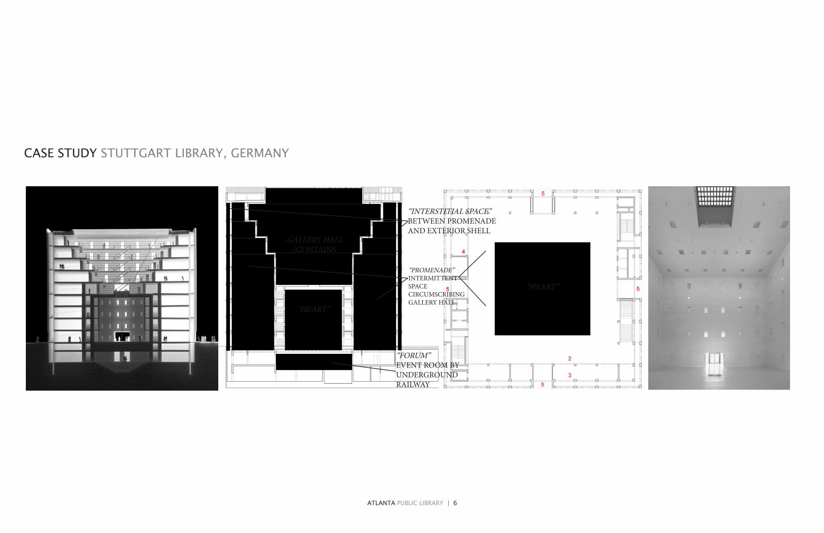
“HEART”
“FORUM” EVENT ROOM BY UNDERGROUND RAILWAY
“PROMENADE” INTERMITTENT SPACE CIRCUMSCRIBING GALLERY HALL
“INTERSTITIAL SPACE” BETWEEN PROMENADE AND EXTERIOR SHELL
GALLERY HALL (CONTAINS
CASE STUDY STUTTGART LIBRARY, GERMANY
“HEART”
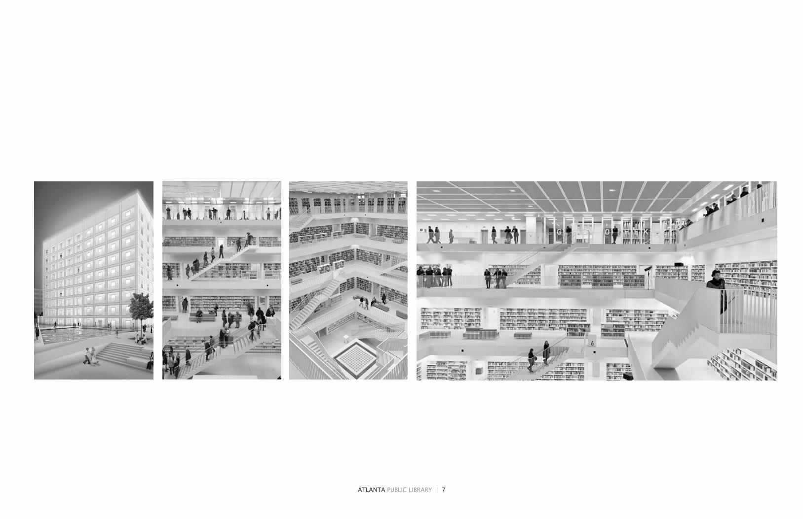
ATLANTA PUBLIC LIBRARY | 7

ATLANTA PUBLIC LIBRARY | 8
PROGRESSION TO FINAL MODEL

ATLANTA PUBLIC LIBRARY | 9
south east
north west
BASIC MASSING | ROOF CURVATURE AND ENVELOPE

ATLANTA PUBLIC LIBRARY | 10
01
05
09

ATLANTA PUBLIC LIBRARY | 11
DNUP
UPDN
UPDN
UPDN
DNUP
UPDN
UPDN
UPDN
FLOORS 1-4
contain minor floor plates, mostly laptop seating and reading areas
the first floor contains a field of bookcases.
FLOORS 5-8
contain major floor plates.
they contain the children’s library, conference rooms, auditorium & support rooms, and finally the main sets of offices.
FLOORS 9-12
complete the volumes that fill the interior space.
they contain viewing platforms and some smaller offices.
01 02 03 04
05 06 07 08
09 10 11 12

ATLANTA PUBLIC LIBRARY | 12
SOLID WALL - SECONDARY FACADE
an internal envelope is sliced away where the once conceptual curves intercept, which gives birth to a mysterious solid-void balance.
CURTAIN WALL - PRIMARY FACADE
the entire object is encased in glass that both reflects the sky from the ground, and allows a view inside to the pedestrian outside.
ASSEMBLY EXPLODED COMPONENTS

ATLANTA PUBLIC LIBRARY | 13
FLOOR PLATES & ROOF SURFACE
the introduction of floor plates slightly obscures the play with solid and void, while giving a sense of scale to the building not previously felt.
ROOF SURFACE
the complex curve of the roof allows for multiple views of the surrounding city. Also, the tallest point (seen here in back) has railings, but nothing keeps visitors from walking as high as they can.
ATLANTA PUBLIC LIBRARY | 14
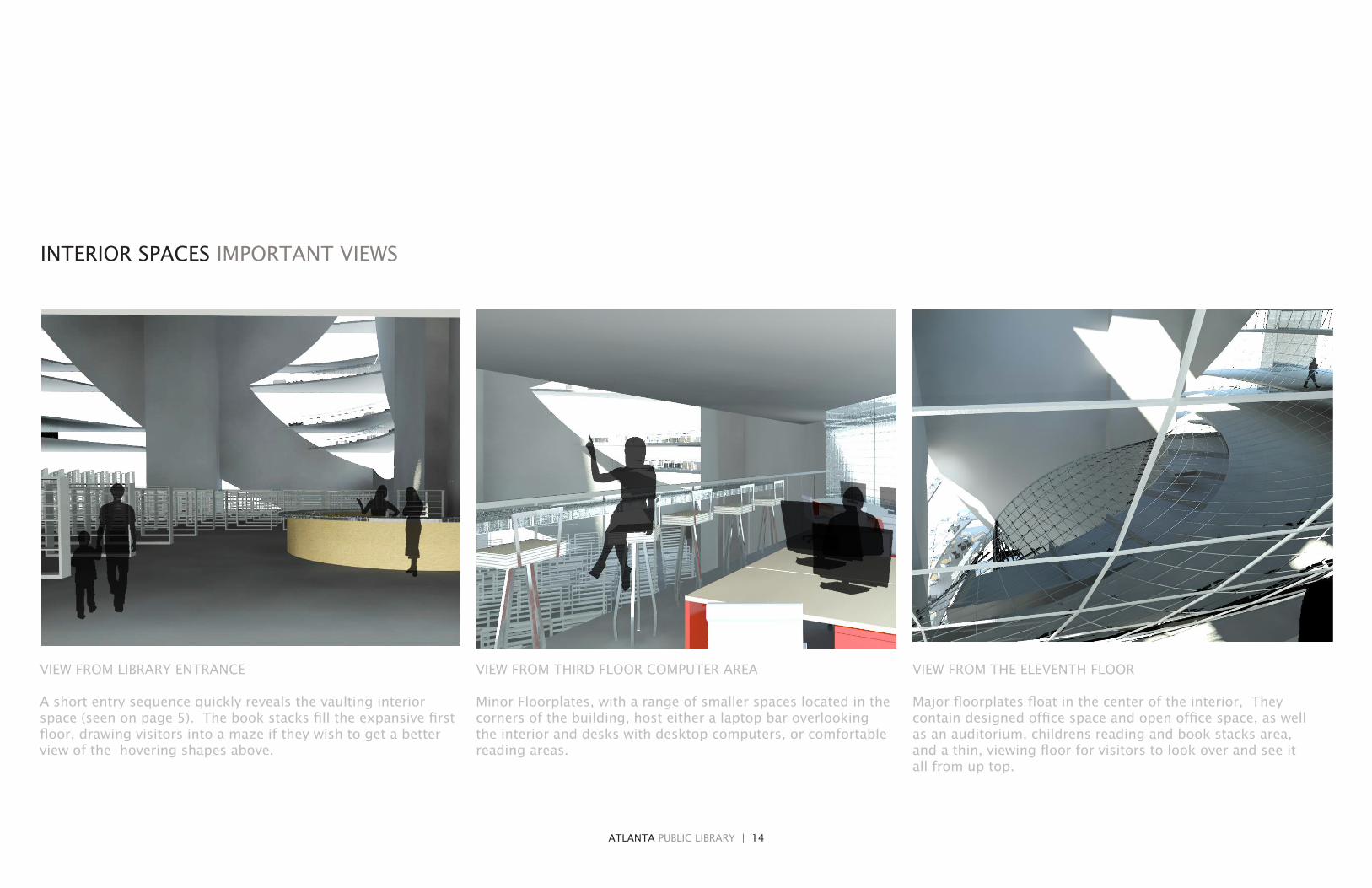
VIEW FROM LIBRARY ENTRANCE
A short entry sequence quickly reveals the vaulting interior space (seen on page 5). The book stacks fill the expansive first floor, drawing visitors into a maze if they wish to get a better view of the hovering shapes above.
VIEW FROM THIRD FLOOR COMPUTER AREA
Minor Floorplates, with a range of smaller spaces located in the corners of the building, host either a laptop bar overlooking the interior and desks with desktop computers, or comfortable reading areas.
VIEW FROM THE ELEVENTH FLOOR
Major floorplates float in the center of the interior, They contain designed office space and open office space, as well as an auditorium, childrens reading and book stacks area, and a thin, viewing floor for visitors to look over and see it all from up top.
INTERIOR SPACES IMPORTANT VIEWS

ATLANTA PUBLIC LIBRARY | 15
VIEW OF THE MAIN INTERNAL MASS
This internal view shows the Major floorplates that crate a comlex volume in the interior that seems to float above the regular, grid-like book stacks on the ground floor.
It is wrapped in a partially structural grid that separates the spaces inside from sound contamination while also allowing views in as well as out.
The auditorium space would have smart glass, allowing for privacy and a darkened space if needed.

CHICAGO CHILDREN’S HOSPITAL | 16
CHILDREN’S CARDIOVASCULAR HOSPITAL CHICAGO
Near the train tracks in the historical Printer’s District of the Loop of Chicago, sits a small suburban-style bank, complete with drive through.
It was this obvious violation of urban fabric that lead to its selection as the site for the traditional ALAGASCO competition Hospital project.
The site is approximately 250 feet long and 100 feet wide. This led to the program dictating a minimum of eight floors.
With the help of a healthcare Architect, the class received a realistic program. With the advice of an RN Nursing Professor, the adjacencies of spaces was accomplished.
Finally, the bulk of the design was aimed at the Patient Floors and the Patient Care Unit, or patient rooms.
A floor-by-floor terrace scheme provides sick children at most physical, at least visual connection with the outdoors and plants.

CHICAGO CHILDREN’S HOSPITAL | 17

CHICAGO CHILDREN’S HOSPITAL | 18
CASE STUDY MASSACHUSETTS GENERAL HOSPITAL ADDITION, BOSTON

CHICAGO CHILDREN’S HOSPITAL | 19
CHICAGO CHILDREN’S HOSPITAL | 20
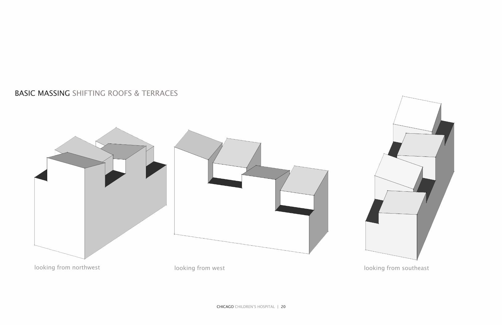
looking from northwest looking from southeastlooking from west
BASIC MASSING SHIFTING ROOFS & TERRACES

CHICAGO CHILDREN’S HOSPITAL | 21
CHICAGO CHILDREN’S HOSPITAL | 22
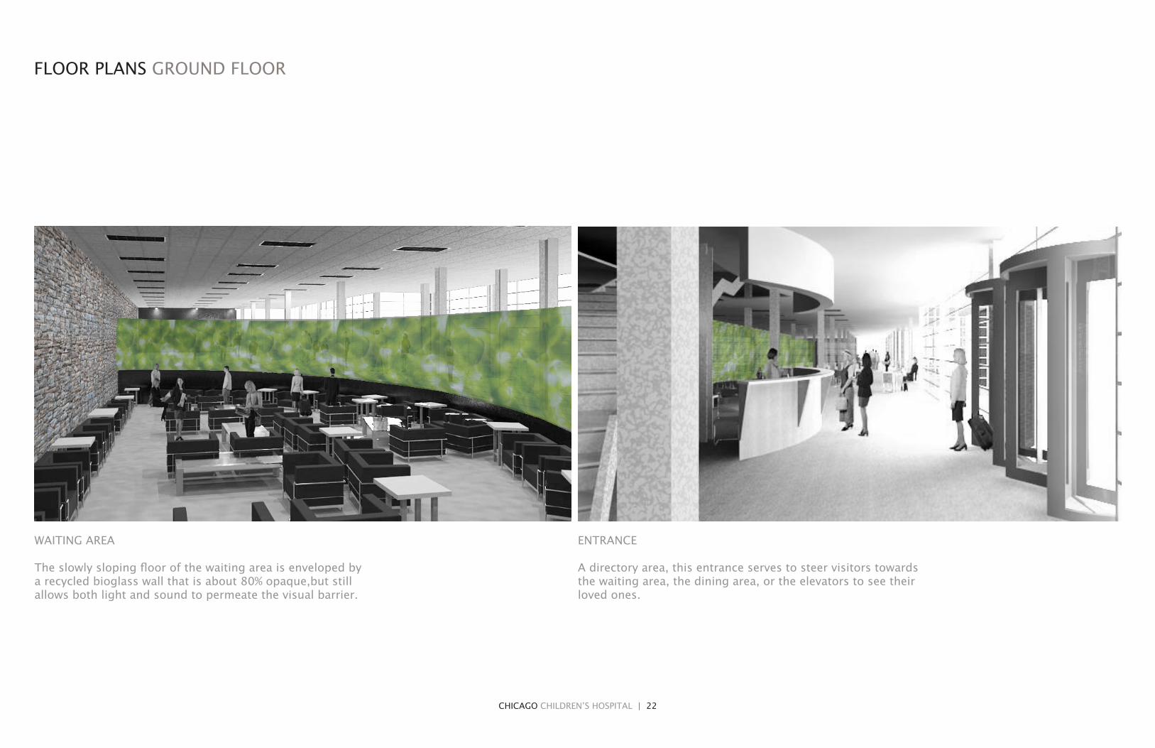
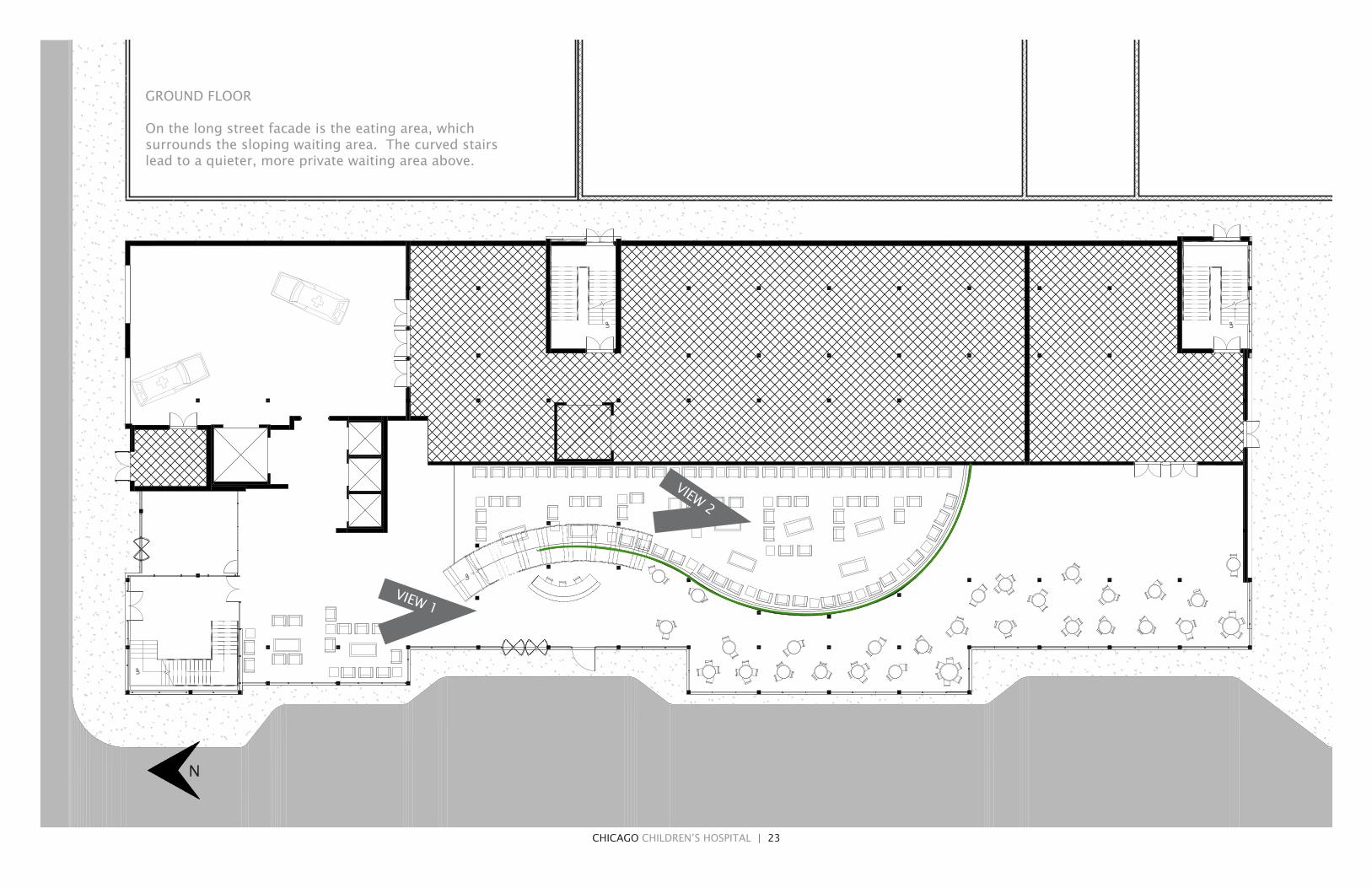
ENTRANCE
A directory area, this entrance serves to steer visitors towards the waiting area, the dining area, or the elevators to see their loved ones.
WAITING AREA
The slowly sloping floor of the waiting area is enveloped by a recycled bioglass wall that is about 80% opaque,but still allows both light and sound to permeate the visual barrier.
FLOOR PLANS GROUND FLOOR
CHICAGO CHILDREN’S HOSPITAL | 23
UP
UP
UP
UP
PRODUCED BY AN AUTODESK EDUCATIONAL PRODUCT
PRO
DU
CED
BY A
N A
UTO
DESK
EDU
CA
TION
AL PR
OD
UC
T
PRODUCED BY AN AUTODESK EDUCATIONAL PRODUCT
PRO
DU
CED
BY
AN
AU
TOD
ESK
ED
UC
ATI
ON
AL
PRO
DU
CT
GROUND FLOOR
On the long street facade is the eating area, which surrounds the sloping waiting area. The curved stairs lead to a quieter, more private waiting area above.
N
VIEW 1
VIEW 2

CHICAGO CHILDREN’S HOSPITAL | 24
FLOOR PLANS PATIENT CARE FLOOR(S)
PATIENT CARE UNIT
A variation on the patient rooms from the University of Minnesota medical center, the now squared rooms contain a stand-up shower, whose doors allow for more space, along with a Murphy bed for parents that stay. Finally, a small station outside for medical charting.
PATIENT CARE UNIT FROM THE OUTSIDE
View from the outside looking in. A series of uplights creates a night-light type of atmosphere. The parent’s murphy bed is on the left.

CHICAGO CHILDREN’S HOSPITAL | 25
DN DN
UP
UP
PATIENT CARE FLOOR
Shifting square volumes move the patient rooms as well as the service corridor in between to make room for the terraces. Each floor has a different configuration, since the arrangement loses a set of about 8 rooms each time you move upward.
N

CHICAGO CHILDREN’S HOSPITAL | 26
TERRACE 1, FACING WEST AND SOUTH
A series of native plantings form a prairie-like atmosphere with a modern arcade creating a bit of shelter against the building. The roof is made of semi-transparent Photovoltaic panels, that will assist in the watering system for all of the other terraces.
TERRACE 2, FACING EAST
Also a series of native plantings, the second terrace contains a winding path with a bench as well as a fountain. On the South facing wall, the climbing vines create a wall of vegetation.
accessible from the 1st patient floor, viewable from the 2nd patient floor accessible from the 2nd patient floor, viewable from the 3rd patient floor
TERRACES PROPERTIES AND PERSONALITIES

CHICAGO CHILDREN’S HOSPITAL | 27
TERRACE 3, FACING WEST
The only terrace that does not contain plantings, the third terrace is a sheltered area with an undulating metal skin as a wall. Circular punctures in the skin allow a clear view to the exterior. Its juncture at two sloped roofs meeting points show how it is the ideal place to collect water and cycle it through a continuous waterfall.
TERRACE 4, FACING EAST AND NORTH
The northernmost terrace, with the least direct sunlight, has the most exotic plantings. They are protected from the harshest of Chicago weather with a greenhouse-like roof.
accessible from the 3rd patient floor, viewable from the 4th patient floor accessible from the 4th patient floor, viewable from the 5th patient floor
AUBURN FURNITURE PROJECT | 28
AUBURN FURNITURE PROJECT: FLEXIBLE WOOD
The main project of first semester of Second Year in Architecture school at Auburn is typically the “House Project.” Gearing up for the project, our class was presented with a series of studying projects. The first was a facade study and redesign in Opelika, the second was a Furniture design.
The assignment was called “Mobilia Inhabitabile” since its main purpose was to design a ‘livable space.’ In this way, a home was equated to a piece of furniture.Our professors made this a group project since it lasted two weeks.
Our site was selected between three trees South of our nearby Amphitheater.
The design goals of our project were to create flexible wood pieces for maximum comfort, establish a view upward toward the treetops, and create an unusual piece that was self-explanatory and needed no supervision.
Overall, the plan was successful in achieving those goals and our surveys proved it. Group Members: Brad Greene & Ashley Williams

AUBURN FURNITURE PROJECT | 29
AUBURN FURNITURE PROJECT | 30
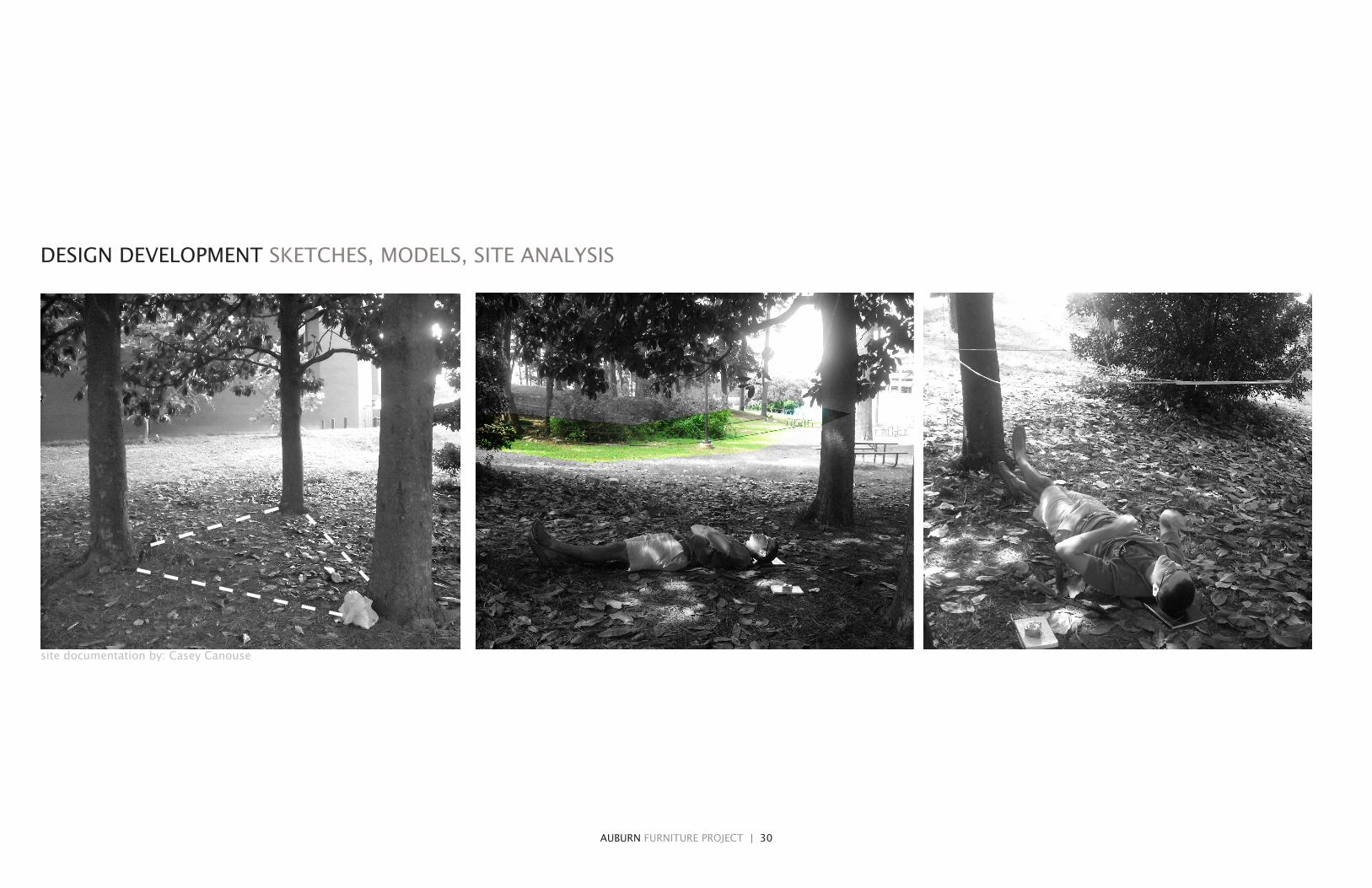
DESIGN DEVELOPMENT SKETCHES, MODELS, SITE ANALYSIS
site documentation by: Casey Canouse
AUBURN FURNITURE PROJECT | 31
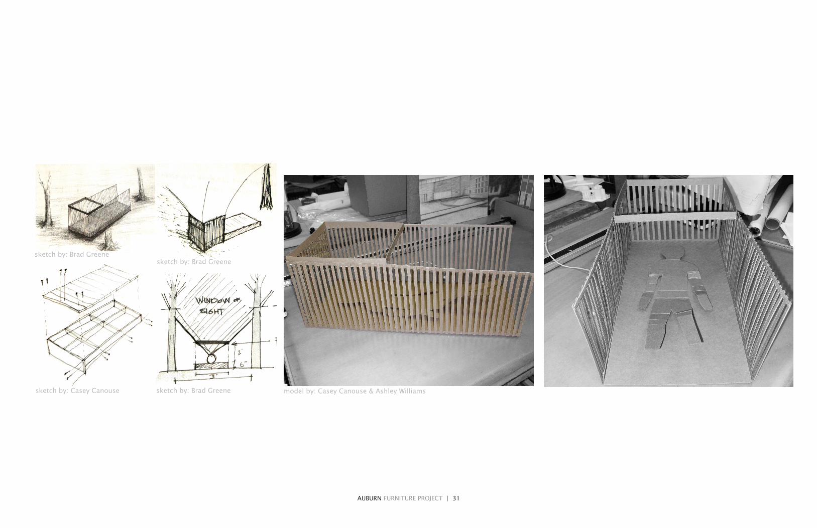
sketch by: Brad Greene
sketch by: Casey Canouse
sketch by: Brad Greene
sketch by: Brad Greene model by: Casey Canouse & Ashley Williams

AUBURN FURNITURE PROJECT | 32
FINAL MODEL DIGITAL
BODYmedium flexibility
full strength wide spacing
HEADhigh flexibility half strength
closest spacing
FEET & WALKINGmedium flexibility
full strength closest spacing

AUBURN FURNITURE PROJECT | 33
SCREEN field of 1” x 1” sticks that shielded views inward and obstructed the outward views; also allowed wind to enter
BED varying distribution and thickness for flexibility of wooden plane, designed for comfort of occupant
BASE light touch on the ground and allowed for flexing of the wooden bed
STABILITY FRAMING kept the screen from racking, provided stability for entrance
SKYFRAME to frame the view and direct the gaze upward
EXPLODED MODEL DESIGN ELEMENTS

AUBURN FURNITURE PROJECT | 34
TESTING & SURVEYING OVER FIFTY SATISFIED CUSTOMERS
50% entered by crawling
95% knew to lay down
without any direction
50% thought manipulating “view” was the main concept
of all of the senses affected, 48% said
sight was most prom-inent while 22% said
touch (comfort)

AUBURN FURNITURE PROJECT | 35
84% had confidence in the design’s sturdiness
87% believed the material choice was
successful in highlight-ing the piece while still
blending in to surroundings
some even jumped up and down on the flexible bed just to
make sure; it didn’t break

AUBURN FURNITURE PROJECT | 36
FINAL MODEL PHYSICAL
WOOD TYPEcedar
METHODcut with University Shop facilities, hand-stained, nail gun and hand-screwed
DIFFERENCES IN COLORhand applied stain

AUBURN FURNITURE PROJECT | 37

ARTWORK WATERCOLORS | 38
ARTWORK WATERCOLORS
REPRODUCTION TURKISH ARCHITECT - SEDAT CETINTAS
location: Bursa Hudavendigar Mosque . Minaret balcony. ITU Faculty of Architecture Archive.

ARTWORK WATERCOLORS | 39
REPRODUCTION WATERCOLORIST - MICHAEL REARDON
Orvieto, Italy
ARTWORK PHOTOGRAPHY | 40
ARTWORK PHOTOGRAPHY
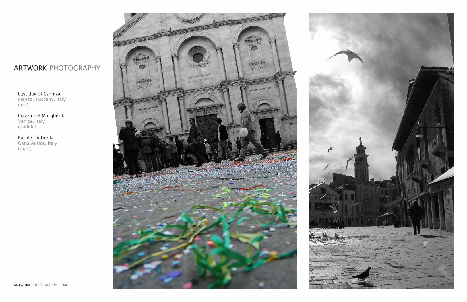
Last day of CarnivalPienza, Tuscany, Italy (left)
Piazza del Margherita Venice, Italy (middle)
Purple Umbrella Ostia Antica, Italy (right)

ARTWORK PHOTOGRAPHY | 41

ARTWORK SKETCHES | 42
ARTWORK SKETCHES
ARTWORK SKETCHES | 43
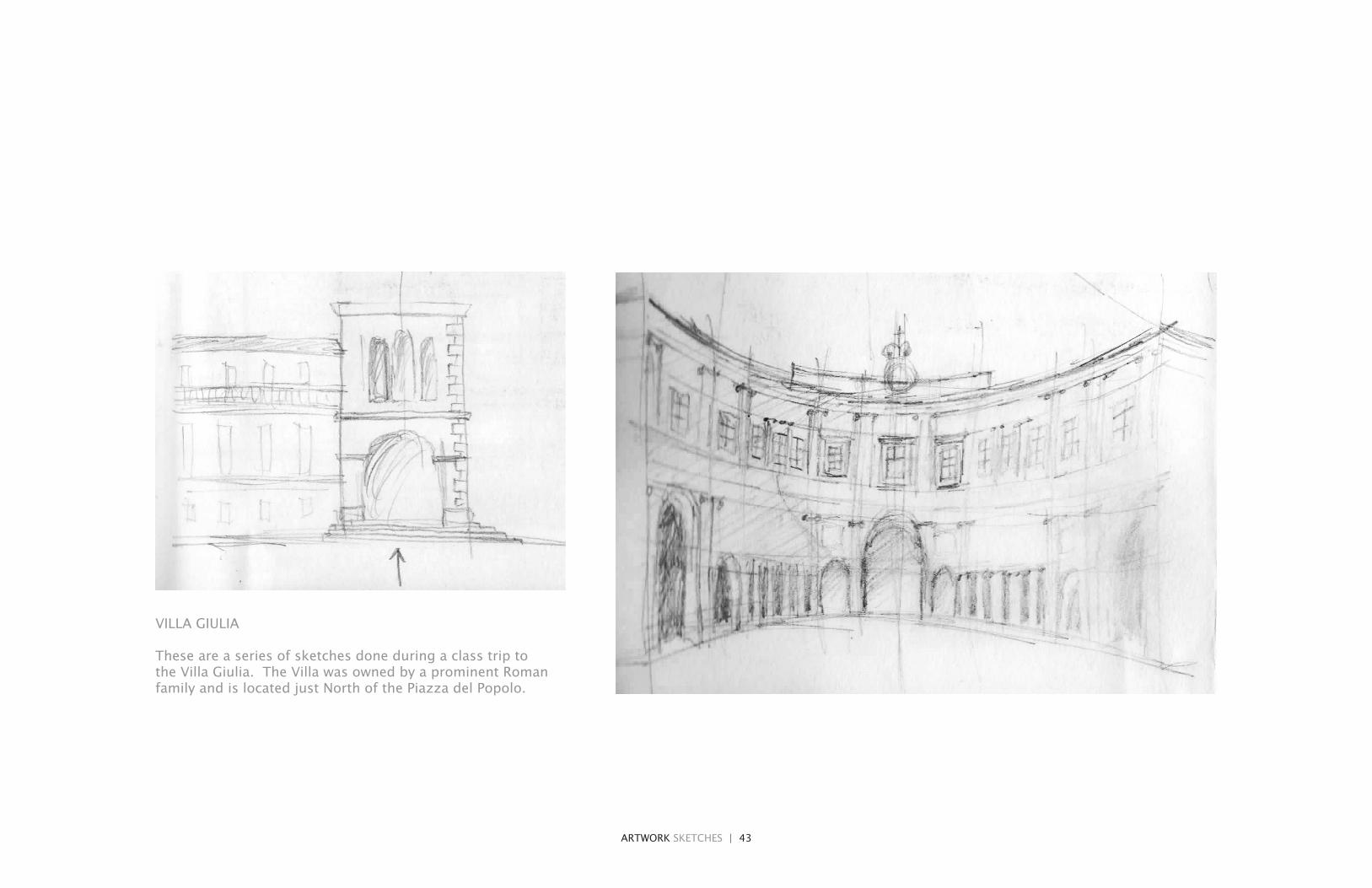
VILLA GIULIA
These are a series of sketches done during a class trip to the Villa Giulia. The Villa was owned by a prominent Roman family and is located just North of the Piazza del Popolo.

ARTWORK SKETCHES | 44
ARTWORK SKETCHES

ARTWORK SKETCHES | 45
THE SPANISH STEPS
These are a series of sketches done during a class trip to the Spanish Steps. This was a period during which most of my sketches were highlighting one specific aspect, usually with a singular color within an otherwise graphite-stick drawn sketch.

46
47
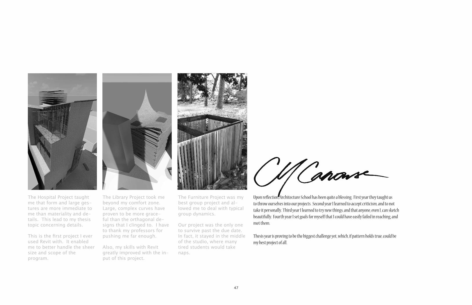
The Hospital Project taught me that form and large ges-tures are more immediate to me than materiality and de-tails. This lead to my thesis topic concerning details.
This is the first project I ever used Revit with. It enabled me to better handle the sheer size and scope of the program.
The Library Project took me beyond my comfort zone. Large, complex curves have proven to be more grace-ful than the orthagonal de-signs that I clinged to. I have to thank my professors for pushing me far enough.
Also, my skills with Revit greatly improved with the in-put of this project.
The Furniture Project was my best group project and al-lowed me to deal with typical group dynamics.
Our project was the only one to survive past the due date. In fact, it stayed in the middle of the studio, where many tired students would take naps.
Upon reflection, Architecture School has been quite a blessing. First year they taught us to throw ourselves into our projects. Second year I learned to accept criticism, and to not take it personally. Third year I learned to try new things, and that anyone, even I, can sketch beautifully. Fourth year I set goals for myself that I could have easily failed in reaching, and met them.
Thesis year is proving to be the biggest challenge yet, which, if pattern holds true, could be my best project of all.