as the community college of rhode island · the community college of rhode island ... cartoons or...
TRANSCRIPT

INTRODUCTION
As the Community College of Rhode Islandcontinues to improve and expand, itbecomes increasingly important tocommunicate one clear and unifying publicidentity to our diverse audiences. To ensureconsistency, a system of new visual identityelements and standards has been developed.This system will reinforce a strong anddefinitive impression of CCRI’s quality,professionalism and commitment to academic excellence.
This new set of standards introduces refinedversions of the official CCRI Logo andSeal, official Signatures, individualized UnitSignatures, as well as usage guidelines,typographic guidelines and the approvedstationery and publication templates.Consistency in the way these elements arepresented will strengthen all facets of this institution by projecting one visual look tothe public.
This manual serves as a framework for theproper use of this new system. The materialprovided enables easy access to a wide variety of resources and information andattempts to answer as many questions as possible.
To be successful in communicating ouridentity, it is essential that everyone adheresto the standards outlined as closely as possible. By doing so, you will help us project a clear, unifying image for CCRI.
Ray Di PasqualeCCRI President

CONTENTS
The standards presented in this guide applyto all communication pieces created orreprinted after July 31, 2005. Materials produced before that date should be revisedto conform to these standards when they arereprinted.
This Graphic Identity System Manual isintended to assist you in the proper use ofthe Community College of Rhode Island’sGraphic Identity System. If you have questions about the proper use of the CCRILogo or Signatures as presented here, pleasecontact the CCRI Office of Public Relationsand Publications.
1 Official CCRI Logo
1.1 CCRI Logo Colors
1.2 CCRI Logo Dark Backgrounds
2 Official CCRI Seal
3 Official CCRI Signatures
3.1 CCRI Signatures/Clear Space/Color
3.2 CCRI Signatures/Backgrounds
3.3 Individual Unit Identifiers (Entities)
3.4 Individual Unit Identifiers (Campus)
4 Incorrect Uses of the Logo, Signature
and Seal
5 Typography
6 Stationery System
6.1 Letterhead
6.2 Letterhead Typing Format
6.3 Envelopes
6.4 Business Cards
7 Collateral Materials
7 Fax Sheet
7.1 News Release (print)
7.2 News Release (email)
8 Publications
8.1 Official Publication Signature
8.2 Grids
8.3 Format Examples
9 Secondary Logos/Identifiers

1
OFFICIAL CCRI LOGO
The Community College of Rhode IslandLogo is the primary identifying element ofthe graphic identity system. It has beenupdated in 2005 to ensure its high qualityreproduction. The updates to the logo aredeliberately subtle in an effort to seamlesslyintegrate it without a perceptible visualchange to outside viewers. On all materialsfrom this point forward, please use only theupdated logo as shown here.
CCRI Logo Reproduction:
Camera-ready reproduction files for theCCRI logo are available through the Officeof Public Relations and Publications oronline at www.CCRI.edu/publicrelations.These files are provided in the followingsizes: 6 in., 3 in. and 1 in. eps files, 6 in.and 3 in. tiff files. Always use the sizeclosest to that meeting your needs. For in-between sizes always select and reduce thenext larger size. Do not reduce any of thecamera-ready art more than 50% and do not reproduce the CCRI logo smaller than1/2 in. wide.
Clear Zone:
For maximum clarity and visibility, a “clearzone” equal to the distance between thebaseline of “i” and the baseline of thelargest “C” must be maintained around theLogo on any design piece.
This logo is a registered trademark of TheCommunity College of Rhode Island andmay not be altered in any way. It has beenspecially drawn and thicknesses, spacingand proportions have been carefullydetermined. Please do not try to recreate ormanipulate this design in any way. Pleasedo not co-mingle this logo with any otherdesign elements other than those provided.
X
X
X
minimum clear space
minimum size
1/2 in.
X


2
OFFICIAL CCRI SEAL
In order to strengthen the recognition of theCCRI Logo and Signatures as main identifiers for The College, the CCRI Seal isreserved for limited official use. It is mainlyused on documents and ceremonial materials such as certificates, diplomas, formal invitations and official flags. Theseal also appears as a watermark on the college’s general letterhead and other corporate identity materials. The seal hasbeen specially drawn for maximum clarityand line weights; spacing and proportionshave been carefully determined. Please donot try to recreate or manipulate this designin any way.
The seal is provided in two variations toaccommodate most reproduction situations.It should never be reversed out of a solidbackground to white.
The minimum reproduced size for the sealis 3/4 in. in diameter.
A minimum clear space equal to the widthof the seal’s outside band should always bemaintained.
Official CCRI Seal Colors
The preferred color for the seal is GreenPMS 349 (process color formula on page1.1), or Black. The Office of PublicRelations and Publications must approveany other print and/or color techniques.
solid seal
open seal
Black Green PMS 349
Black Green PMS 349
minimum size
3/4 in.
3/4 in.
minimum size
minimum clear space

3
OFFICIAL CCRI SIGNATURES
The official CCRI Logo, combined
with the logotype consisting of the words
Community College of Rhode Island, form
the official CCRI Signature. To allow
maximum versatility in a wide variety of
applications, the system provides five
(5) different signature configurations.
Choose the version that best accommodates
your needs.
Each of these signatures is a registeredtrademark of the Community College ofRhode Island and may not be altered in anyway. The typeface, word spacing, lineweights and graphic proportions for thesesignatures have all been carefully determinedto establish a consistent rhythm andpresentation. Each signature is to be treatedas a single design unit. When a signature isenlarged or reduced, all elements should besized proportionately. A signature should never bereproduced to a size where the CCRI logo issmaller than 1/2in. wide. To ensureconsistency in the identity of The College, we ask that you do not try to combine,manipulate, or create your own CCRIsignature.
CCRI signature 1
CCRI signature 2
CCRI signature 3
CCRI signature 4
CCRI signature 5


3.2
OFFICIAL CCRI SIGNATURES
Light Backgrounds
The CCRI Signatures may be printed on any
solid color, screen of color, illustration or
photographic background light enough to
provide sufficient contrast.
Dark Backgrounds
To provide sufficient contrast on dark
backgrounds, the Signature in its entirety
should be reversed out of the background in
white.
Although the Signature may be printed onany background, its integrity demands that nowords or images overlap or merge with it. Itshould never be integrated into illustrations,cartoons or other symbols or logos.
NOTE: Although only one signature is usedfor demonstration purposes, all signatures aresubject to these parameters.


4
INCORRECT USES OF THELOGO, SIGNATURE AND SEAL
The following are examples of improper useof CCRI’s graphic elements. Distortions ofthe logo, logotype and seal undermine aconsistent presentation of printed materialsfrom The College.
Distortion: The logo, logotype and seal should not be distorted by stretching, slanting, twisting, curving,etc.
INCORRECT INCORRECT
Improper color: The CCRI logo, logotype and seal should be presented only in the approved colors detailed in this manual.
INCORRECT INCORRECT INCORRECT
Enclosure or framing: The logo, signature and seal should not be framed or contained by other visual elements.
INCORRECT INCORRECT INCORRECT
Attaching type or visual elements: Other graphics and or type should not be added to the logo, logotype or seal.
INCORRECT INCORRECT INCORRECT
Open HouseProject Green 1 years

Improper typeface: The logotype should bepresented only in the approved typefaces as outlinedin this guide.
Improper alignment of logo: The CCRI logoshould be aligned with the logotype in one of the fiveformats specified in this manual.
Improper placement of logo: The placement ofthe logo relative to the logotype should not bealtered from one of the five formats specified in this
INCORRECT INCORRECT INCORRECT
Community Collegeof Rhode Island
Improper proportion: the proportionalrelationship between the logo and word mark shouldnot be altered.
Use of the logotype without the logo: Thelogotype must always be presented in conjunctionwith the CCRI logo in one of the five formats specified inthis guide.
INCORRECT INCORRECT
INCORRECT USES OF THELOGO, SIGNATURE AND SEAL
4
Legibility: Take care not to place the logo, logotype or seal on a distracting background. Reverse out the logotype when it is placed on a very darkbackground.
INCORRECT INCORRECT INCORRECT
5
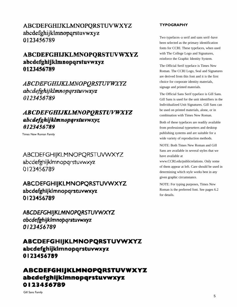
TYPOGRAPHY
Two typefaces–a serif and sans serif–havebeen selected as the primary identificationfonts for CCRI. These typefaces, when usedwith The College Logo and Signatures, reinforce the Graphic Identity System.
The Official Serif typeface is Times NewRoman. The CCRI Logo, Seal and Signaturesare derived from this font and it is the firstchoice for corporate identity materials, signage and printed materials.
The Official Sans Serif typeface is Gill Sans.Gill Sans is used for the unit identifiers in theIndividualized Unit Signatures. Gill Sans canbe used on printed materials, alone, or incombination with Times New Roman.
Both of these typefaces are readily availablefrom professional typesetters and desktoppublishing systems and are suitable for awide variety of reproduction methods.
NOTE: Both Times New Roman and GillSans are available in several styles that wehave available atwww.CCRI.edu/publicrelations. Only someof them appear at left. Care should be used indetermining which style works best in anygiven graphic circumstance.
NOTE: For typing purposes, Times NewRoman is the preferred font. See pages 6.2 for details.
Times New Roman Family
Gill Sans Family

STATIONERY SYSTEM
As the stationery system is a primary form of communication between CCRI and thepublic, it is important that it reflect the visualidentity of The College. For this reason, allstationery components are designed with theuse of an official CCRI Signature as the mainidentifier.
Guidelines are provided for the keycomponents of the stationery system whichinclude letterheads, envelopes, businesscards, and mailing labels. Standardsaddressed include signature and secondarytypeface location, size, color, paper, andrecommended typing format.
The stationery system is printed offset in onecolor (PMS 349) with the exception of thePresident’s stationery, which may beengraved, stamped and/or offset printed.
To maintain consistency, print quality, andcost efficiencies all stationery must beordered directly through the Office of PublicRelations and Publications. Flanagan Campus
1762 Louisquisset Pike, Lincoln, RI 02865-4585
Division for Lifelong Learning
6
Letterhead
Envelope
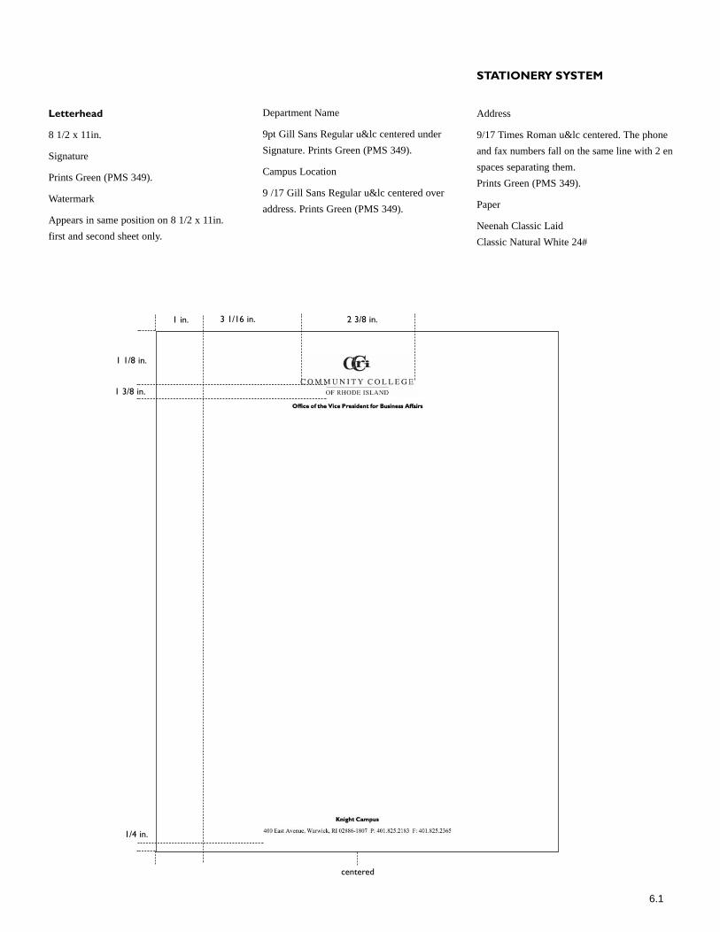
Letterhead
8 1/2 x 11in.
Signature
Prints Green (PMS 349).
Watermark
Appears in same position on 8 1/2 x 11in. first and second sheet only.
Department Name
9pt Gill Sans Regular u&lc centered underSignature. Prints Green (PMS 349).
Campus Location
9 /17 Gill Sans Regular u&lc centered overaddress. Prints Green (PMS 349).
STATIONERY SYSTEM
Address
9/17 Times Roman u&lc centered. The phoneand fax numbers fall on the same line with 2 enspaces separating them. Prints Green (PMS 349).
Paper
Neenah Classic LaidClassic Natural White 24#
3 1/16 in. 2 3/8 in.
1 1/8 in.
1 3/8 in.
1/4 in.
centered
6.1
1 in.

6.2
Letterhead Typing Format
To reinforce a strong and consistent visualidentity for CCRI, a typing style has beendeveloped.
The typeface chosen for all correspondence is10/12 point Times New Roman. This font doesn’tcompete with the signature or other letterheadinformation and also reproduces well on laserprints, copies and faxes.
The left margin is at 1 in. off the left edge. Theright margin may vary; however it should notbe any less than 1 in., or any more than
1 3/4 in. off the right edge. Text should alwaysbe typed ragged right, not justified.
The date base line should be a minimum of 3/4 in. below the campus or department nameattached to the signature, or a minimum of 2 1/8in. from the top of the page.
Use double spaces between the date and thefirst line of address, between the last line ofaddress and the salutation, and between thesalutation and first line of text.
Text should be typed single space betweenlines; double space between paragraphs.
STATIONERY SYSTEM
Do not indent.
Double space between the last line of text andthe complimentary close, and insert at leastfour returns between the complimentary closeand the typed signature. Allow for a minimum3/4 in. between the typed signature, or lasttyped line on the page and the address block atthe bottom of the page.
On second sheets, begin typing 2 in. off the topof the page.
1 in.
1 in.
1 3/4 in.
2 1/8 in.
3/4 in. min

Envelope
#10 Regular and Window
Signature
Prints Green (PMS 349).
Campus Location
7/11 Gill Sans Regular u&lc centered underSignature.Prints Green (PMS 349).
Address
7/11 Times Roman u&lc centered underSignature.
Prints Green (PMS 349).
Address Correction Requested
8.5/10 Times Roman Italics u&lc centeredunder Signature.
Green (PMS 349).
STATIONERY SYSTEM
Indicia
Various postal indicias are available for use inenvelope stamp areas. Please contact theOffice of Public Relations and Publications formore information.
Paper
Neenah Classic Laid
Classic Natural White 24#
Flanagan Campus
1762 Louisquisset Pike, Lincoln, RI 02865-4585
Division for Lifelong Learning
Flanagan Campus
1762 Louisquisset Pike, Lincoln, RI 02865-4585
Division for Lifelong Learning
5/16 in.
3/16 in.
1 3/16in.
watermark2 1/16 in.
1/4 in.
6.3
Typing Format
3 1/2 in.
2 in.
Name of RecipientTitle of RecipientStreet AddressCity, State Zip

STATIONERY SYSTEM
Business Cards
2 x 3 1/2in.
Examples show two situations that may occur with business cards. Example “a”shows name and title on two lines and is thepreferred configuration. Example “b” showsa three line name and title configuration. In this configuration, the title baseline movesdown 1/16 in.. from its normal position(example a). Please keep card informationbrief; use only one address, phone numberand fax number; use abbreviations only whenspace is limited.
Signature
Prints Green (PMS 349).
Name/Title
8/9 Times New Roman, u&lc. Name alwaysappears in bold. Title in Roman Italics. Prints Green (PMS 349).
Campus Location
8/9 Gill Sans, u&lc centered.Prints Green (PMS 349).
Address
8/9 Times New Roman, u&lc centered.Phone, Fax and Email fall on the same linewith 2 en space separating them.Prints Green (PMS 349).
Paper
Neenah Classic Laid
Classic Natural White 80#C
centered
centered
7/8 in.
1 9/32 in.
1 11/32 in.
1/8 in.
example a
example b
6.4

2 7/16 in. 2 7/16 in.2 3/8 in.
1 1/8 in.
centered
5/8 in. 5/8 in.
Fax Transmittal Sheet
8 1/2 x 11 in.
Signature
Prints Black.
Fax
42 Gill Sans Regular u&lc over hairline. Flushleft. Black.
Text and Rules
8/27 Gill Sans Regular u&lc over hairlinerules. Rules are 3/8 in. apart. Black.
Checkboxes are Wingdings 8/27. Black.
COLLATERAL MATERIALS
Paper
White 20# copy paper.
2 7/16 in.
1/16 in.
3/8 in.
1/8 in.
1/4 in.
7

2 7/16 in. 2 7/16 in.2 3/8 in.
1 1/8 in.
centered
5/8 in. 5/8 in.
2 7/16 in.
1/16 in.
Press Releases
8 1/2 x 11 in.
Signature
Prints Black.
News
42 Gill Sans Regular u&lc over hairline. Flushleft. Black.
Text and Rules
8/27 Gill Sans Regular u&lc over hairlinerules. Rules are 3/8 in. apart. Black.
COLLATERAL MATERIALS
Paper
White 20# copy paper.
7.1

148 pixels 148 pixels172 pixels
79 pixels
centered
72 pixels
72 pixels
100 pixels
4 pixels
Email Press Releases
612 pixels x article depth
Signature
Use web safe RGB formula.See page 1.1.
News
36 Gill Sans Regular u&lc over hairline.Centered. Green (PMS 349).
Contact Information
9/12 Gill Sans Regular u&lc. Centered.Green (PMS 349).
COLLATERAL MATERIALS
Format
HTML
7.2

PUBLICATIONS
The publications produced by CCRIrepresent its most significant outreach andtherefore are an important component of thevisual communications system. Publicationsare defined by CCRI as including any or allbrochures, catalogs, flyers, posters, postcards, web sites or other materials representingThe College or program within The College.The guidelines that follow establish acommon design framework for publicationsand offer standards for typography, color,formats, and grids. They are kept purposelybroad to encourage individual creativesolutions. At the same time they provideoutside contractors and in-house designerswith a common template intended to ensureconsistency and standardization of materialsrepresenting The College.
Consistent use of the guidelines here willensure coordinated publications which arecreatively distinctive yet identifiable as partof the CCRI family.
8


PUBLICATIONS
Flyer Grids
8.5 x 11 in. trifold format (this page)
8.5 x 11 in. booklet format (next page)
The grids have been established as a guidelinefor CCRI publications for both the cover andinterior page layouts.
The grids are used to organize areas of typeand photography and can be used in differentways depending on the material.
Although the overall format of the gridsshould not be modified, subsections of thegrids can be either combined or furthersubdivided depending on the page layout.
Examples of uses of the grids can be foundon subsequent pages in this manual.
Space is provided over at the bottom of the document to display the Official PublicationSignature.
3/8 in. 2 7/8 in.
1/4 in.
1 in.
3/8 in.
3 1/4 in.
8.2

PUBLICATIONS
8.5 x 11 in. Grid
5/8 in. 1 3/4 in. 2 9/16 in. 2 9/16 in.3/16 in.
3/8 in.
1 1/2 in.
3/16 in. 5/8 in.
7 1/4 in.
8.2
II II

PUBLICATIONS
Format Examples Flyer (bleed)
8.3
Student Sen ices
SPRING2006
Headline Goes Here
S bheild Loran ipsum dolor sit ID1d. OJOS«'lctU«
adipi..<cio& ctil Sed \'<l;.. SU-•patclt!•< placcnl, m<tus impcnJict porta di<IUm, lignb est
uUane«pa es,. id vestibulum wtsi dll ville
eros. Sed \itac: cnim. NuUatri~quc danmt1.1m
m~a. Proin id sapic:n in msl fcugiat maltRIIda. Sod impc:rdict.. libc:ro vd votul]nl. pharetra, tmpt!! mc:tus clcmenwm lectus, ac eletfmd odio artll ~it amet.lCUus. NulJa pl=Kcm.. OUts fad lisis. O~'ri c::u
tc.Uus. Acnc:an moncus ltQ sit amct leo loran.
Subhead CurabiWI' g1't1Vida, ~am ct dapibus iutcr<bm. wisi ligula vivetra lortcn, ut adipi~iug wisi scm
ut telb.Js. Duis tiber-.>. !vtorbi at massa. Macootas
viverra viverrapede. Donee metus occ.i. aliCJ.Id 11, eui~nod id, venenatis non, IOt'em. Plu~ellus t!CL uat fucilisis pede t.inci<llnt varius. Aliqumn
metus lacus. rttoncus eu, lacinia at, tristiCJ.Ie vel, dol(lf. Sw:pendisse in tOI'I.Oc' egel sapietl uUarn<.'tll'pel' tleifen<l Vestibulunl sed eros.
Aliqu:run ritoncus interdtun unw.. · Sed vilai:! mim • ,\1/orbi at mas:sa • Dwis fad/isis • MJ/a plonm»


