art&&illusions& rods& cones -...
TRANSCRIPT

7/30/13
1
Art & Illusions
How do we perceive art?
• Begins when light enters lens of eye and passes through to the re@na
• There the light strikes two types of cells: • Rods
– 1 Type; more sensi@ve; important for dim light
• Cones – 3 Types maximally sensi@ve to different wavelengths (short=blue; medium=green; long=red, yellow, orange)
• Electrical signals from photoreceptors get transmiPed to ganglion cells
• Informa@on then passes to the LGN
How do we perceive art? • Visual signals processed by two pathways in LGN
• Magnocellular (magno=large) – Sensi@ve to brightness contrast, responds faster, has lower acuity
• Parvocellular (parvo=small) – Sensi@ve to color & fine detail
• Visual effects created by ar@sts succeed because light informa@on is processed this way
How do we perceive art?

7/30/13
2
Luminance
Equiluminance
• Luminance: describes the amount of light that passes through or is emiPed from a par@cular area
• For any pair of colors there is a par@cular brightness ra@o at which in a black & white photo the colors would appear the same shade of gray
• At some brightness level the two colors will appear iden@cal to the magno system
Equiluminance
• Color combina@ons chosen that are strong ac@vators of the parvo system but weakly s@mulate magno system
• Objects that are equiluminant with their background look vibrant & unstable
• Parvo system signals object’s shape but magno system cannot see its borders and therefore can’t signal the movement or posi@on of the object so object appears to jump around, dri_ or vibrate
Modern Art
• Early example is Larry Poons’ Sunnyside Switch

7/30/13
3
Mondrian & Equiluminance • Mondrian’s Broadway Boogie Woogie, 1942-‐43
• Gray and yellow in lines are equiluminant
Equiluminance in Impressionism • Claude Monet’s Poppies Near Argenteuil, 1873
• Poppies are equiluminant with field • Taking color out makes it impossible to see the difference between poppies & field
Equiluminance in Adver@sing
• Adver@sements o_en contain key words in a color that is equiluminant with background
• These condi@ons make it harder to read the text, but the weird/ jumpy appearance created may draw the viewer’s aPen@on
• This results in the reader spending more @me with those words
7/30/13
4
Equiluminance in Fashion
• Similar in fashion-‐ lines in a garment must have luminance contrast to be effec@ve: higher the luminance contrast, the greater the effect
• Horizontal stripes will not make the wearer appear shorter and wider if they are close to equiluminant or very narrow
Equiluminance in Fashion
• Different color combina@ons have a different effect:
• A kelly green shirt with royal blue pants produces a vibrant horizontal border that will not conr@bute much to overall impression of shape
• If the same royal blue pants are worn with a shirt of a similar hue (sky blue vs. navy) the eye is drawn to the border and the effect is less ver@cal
Form & Color
Juxtaposi@on of Color
• Two colors can have opposite effects on each other depending on spa@al arrangement
• Juxtaposing two colors causes them to oppose each other
• i.e. each tends toward the complement of the other
• When the two colors are interdigitated in a fine paPern they start to look more like each other
• i.e. they start to blend or “bleed” • Occurs when the paPern is too fine for the color system to resolve

7/30/13
5
Juxtaposi@on of Color
• Occurs in magazine illustra@ons • the microscopic dots that form the image blend together because a neither a human’s color or form system cannot discriminate the small dots
• Becomes no@ceable when the paPern is too small to be resolved by the color system but is large enough to be resolved by the form system
• Brush strokes in Impressionist pain@ng • Dots in poin@llist pain@ng • Can see brushstrokes/dots but colors blend away
Monet, The Water-‐Lily Pond, 1899
Impressionist Pain@ng
Seurat, Un dimanche apres-‐midi a l’lle de la Grand JaPe, 1884-‐1886
Poin@llism

7/30/13
6
Seurat, The Circus, 1890-‐1891
Poin@llism
The Watercolor Illusion
• Where is informa@on about shape and color mostly located?
• Info placed on the contour & boundaries • Concept is highlighted in the water color illusion
• Bright color seems to spread out from one side of a contour as a pale @nt across the figure
• Dependent on luminance and color contrast

7/30/13
7
The Watercolor Illusion The Watercolor Illusion
• Subjects’ descrip@on of “wiggly orange object” does not men@on the color of the boundary contour
• Even though the purple line is likely clearly perceived, it doesn’t appear as a color of the object, but rather like the boundary belonging to the orange object
• However, the adjacent orange contour defines the color of the object, but not the boundary
• The contour with the highest luminance contrast in rela@on to the surrounding regions tends to appear as the outermost boundary of the figure
Examples in Art
• Picasso’s drawing of a rooster highlights the effects of the watercolor illusion
Examples in Art

7/30/13
8
Examples in Art
• How does the contour become color?
Experimental Evidence • A: two shi_ed contours elicit an effect of blur; both contours perceived as boundaries
• B: an orange woman is perceived
• C: replacing the black contour with a purple one produces the same effect
• D: ver@cal rather than horizontal shi_ gives the same effect
• What happens when the contours are equiluminant? – Unable to assign color and boundary contours
– When contrast of the contours is adjusted assignments can then be made (B)
• Can produce a reversal of the contour assignment by altering the background change in highest contrast (C-‐E)

7/30/13
9
What role does line thickness play?
Experimental Evidence
• SUMMARY: – Informa@on about shape & color is placed along the contours
– The contour with the highest luminance contrast is perceived as the boundary contour
– If one contour takes on a role (i.e. boundary) then the adjacent contour takes on the other role (i.e. color)
– Typically there is only one boundary contour whereas there can be mul@ple color contours
– Line thickness influences contour assignment
The Mona Lisa

7/30/13
10
Mona Lisa • Why is Mona Lisa’s smile so mysterious? • Expression appears to change depending on where the observer looks
• Sfumato Technique • Described by DaVinci as “without lines or borders, in the manner of smoke or beyond the focus plane”
• In periphery of vision have more gradual changes in luminance
• Smile is less prominent in fine details perceived at center of gaze
• See her smiling when looking at her eyes (mouth is blurred) but smile vanishes when one tries to verify by looking at mouth
• “You can’t catch her smile by looking at her mouth. She smiles un@l you look at her mouth” (Livingstone, 2000)
BLURRED • Simulates percep@on in
our periphery • global info (downward curved eyes, upward
curved mouth, shadows in her cheekbones), the features that convey her
smile
DETAILED • Simulates percep@on
in our fovea • fine, local details (wrinkles, pupils)
• These local details do not convey the happiness in her
expression
Experimental Evidence
• Mona Lisa Condi?on • Faces alternated between a smiling mouth and a neutral mouth
• Smiling mouth displayed only as long as par@cipants gazed toward a region around the eyes
• As soon as the mouth was examined directly , it displayed a neutral expression
7/30/13
11
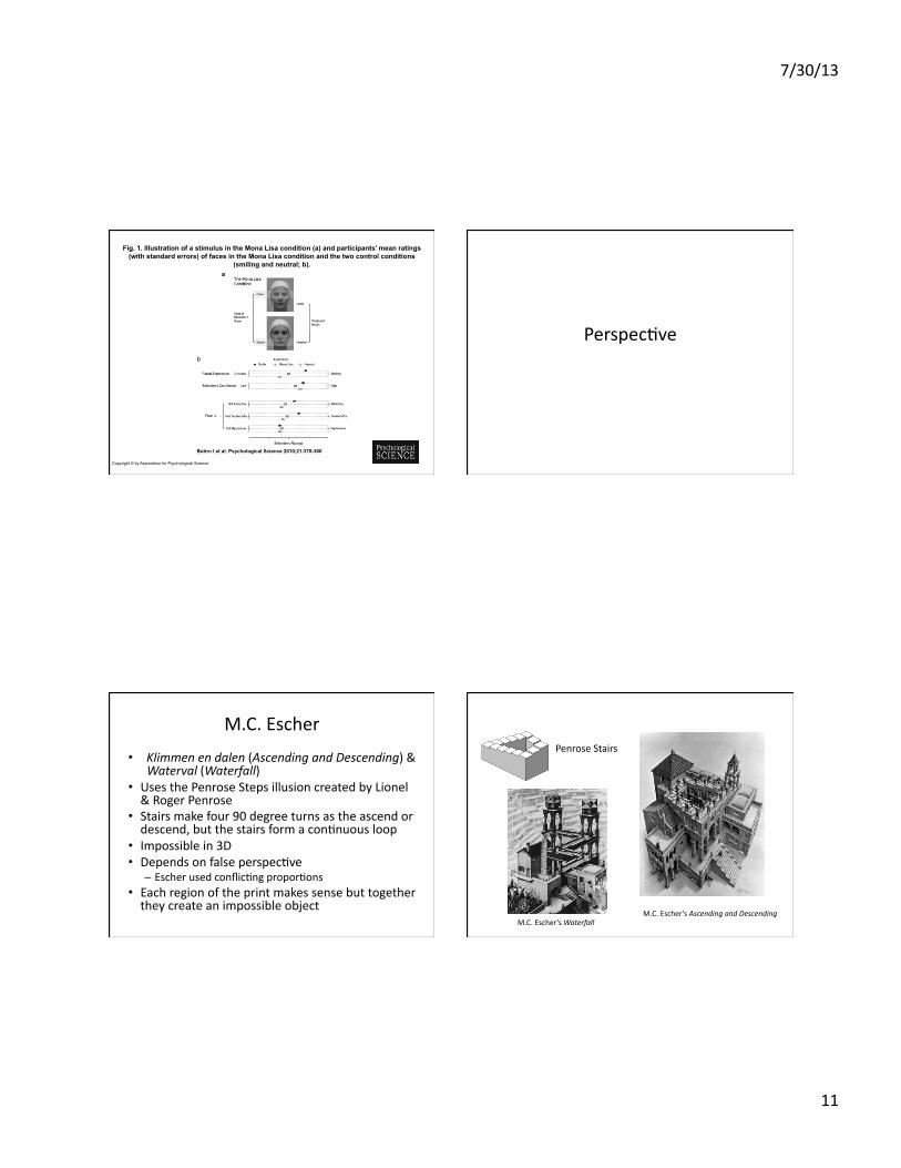
Fig. 1. Illustration of a stimulus in the Mona Lisa condition (a) and participants’ mean ratings (with standard errors) of faces in the Mona Lisa condition and the two control conditions
(smiling and neutral; b).
Bohrn I et al. Psychological Science 2010;21:378-380
Copyright © by Association for Psychological Science
Perspec@ve
M.C. Escher
• Klimmen en dalen (Ascending and Descending) & Waterval (Waterfall)
• Uses the Penrose Steps illusion created by Lionel & Roger Penrose
• Stairs make four 90 degree turns as the ascend or descend, but the stairs form a con@nuous loop
• Impossible in 3D • Depends on false perspec@ve
– Escher used conflic@ng propor@ons • Each region of the print makes sense but together they create an impossible object
Penrose Stairs
M.C. Escher’s Ascending and Descending M.C. Escher’s Waterfall

7/30/13
12
Reverspec@ve • Patrick Hughes • Creates illusions on 3D surfaces where the parts of the picture that seem farthest away are actually the closest physically
Patrick Hughes’ Vanishing Venice

7/30/13
13
Patrick Hughes
• Takes how our brain processes perspec@ve and inverts it
• far= small re@nal image, close=large re@nal image
• He inverts both the 3D geometry of perspec@ve and the painted cues
• Draws far objects as large and further complements this reverse perspec@ve by pain@ng it on a reverse surface
• i.e. the surface is literally smaller in size when it is closer to you
Anamorphosis
• Distorted projec@on or perspec@ve • Requires viewer to look from a par@cular vantage point or use a special device to reconstruct the image
• Two types: • Perspec@ve Anamorphosis
• Mirror Anamorphosis
• Used in Renaissance art
Leonardo’s Eye The Ambassadors

7/30/13
14
3D Sidewalk Ar@sts
• Use perspec@ve to create what looks 3D on a 2D surface
• When viewed from the wrong angle the pictures appear smeared & distorted
• But, when standing at the correct viewing point the illusions are perfect & very convincing
• Ar@st chooses a viewing point and then plots how everything in that person’s viewpoint needs to recde/ elongate as it gets further away
• Use the idea that the further the objects are the smaller they should appear
Leon Keer’s TerracoPa Lego Army Leon Keer’s TerracoPa Lego Army

7/30/13
15
Leon Keer’s TerracoPa Lego Army Leon Keer’s TerracoPa Lego Army

7/30/13
16
Face Processing

7/30/13
17
Holis@c vs. Feature-‐Based Percep@on
• Humans are experts at recognizing faces
• Two opposite views proposed: – Ability to extract local
feature-‐by-‐feature info – Ability to process all
features at once over the whole face
• Prosopagnosia: face blindness – Damage to the fusiform
gyrus
Giuseppe Arcimboldo
• Famous for crea@ng portrait heads made out of objects like fruits, vegetables, flowers...
• Vertumnus typical example: appears to be both fruit & a face
• Prosopagnosics can’t really see the face here!
Brangelina Illusion

7/30/13
18
Mo@on & Adapta@on
Why don’t we see the blood vessels in our eye?

7/30/13
19
Akiyoshi Kitaoka’s Rota@ng Snakes

7/30/13
20
Adapta@on
• We adapt to lower contrasts faster than higher contrast so the neurons that get adapted first reduce their responses to the low contrast and you get an apparent mo@on in the direc@on of the low contrast to the high contrast
• Making small eye movements (microsaccades) causes the neurons to “un-‐adapt” and it happens all over again
• These illusions work poorly when you don’t blink or move your eyes
Preferences In Art
Peak Shi_ Principle • Basic idea that animals (and humans) will respond more strongly to exaggerated shapes than to the original shape they are trained on
Niko Tinbergen, 1953
Baby gull response: + ++ +++ ++++
Peak Shi_ Principle in Art
• Ar@sts try to extract the “essence” of what they are conveying
• Hindu ar@sts talk of capturing the rasa, or essence, of an emo@on in their artwork
• Think of obvious examples like caricatures
• “May not be a coincidence that the ability of the ar@st to abstract the ‘essen@al features’ of an image and discard redundant informa@on is essen@ally iden@cal to what the visual areas themselves have evolved to do” – Semir Zeki
7/30/13
21
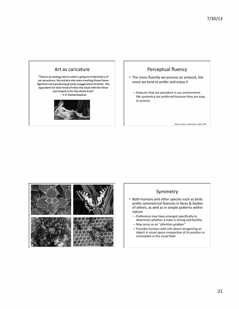
Art as caricature “There’s an analogy here in what’s going on in the brain’s of our ancestors, the artists who were creating these Venus
!gurines were producing grossly exaggerated versions, the equivalent for their brain of what the stick with the three
red stripes is for the chicks brain” – V.S. Ramachandran
Perceptual fluency • The more fluently we process an artwork, the more we tend to prefer and enjoy it
– Features that are prevalent in our environment like symmetry are preferred because they are easy to process
Reber, Schwarz, Winkielman, 2004, PSPR
Symmetry • Both humans and other species such as birds prefer symmetrical features in faces & bodies of others, as well as in simple paPerns within nature – Preference may have emerged specifically to determine whether a mate is strong and healthy
– May serve as an “aPen@on grabber” – Provides humans with info about recognizing an object in visual space irrespec@ve of its posi@on or orienta@on in the visual field

7/30/13
22
Raphael, The School of Athens, ca 1509-‐1510
Zen garden at Ryoanji Temple in Kyoto, Japan
Symmetry here is implicit-‐-‐ humans have an unconscious visual sensi?vity to the axial-‐symmetry skeletons of s?mulus shapes, randomly perturbing the rocks to break the axial symmetry is not preferred.
Van Tonder, Lyons, & Ejima (2002), Nature
Perceptual fluency • The more fluently we process an artwork, the more we tend to prefer and enjoy it
– Features that are prevalent in our environment like symmetry are preferred because they are easy to process
– Mere exposure effect
– This suggests that the more familiar we become with an artwork, the more we like it
Reber, Schwarz, Winkielman, 2004, PSPR Biederman & Vessel (2006), American Scien?st
Visual areas V1-‐V4 are involved in analyzing the low to high-‐level informa@on (colors,
contours, objects, faces, scenes).
Mu-‐opioid receptors ac@vated (density of these receptors increases in higher levels)
The richer the image is in interpretability, the more memories and previous experiences will
be @ed to it
more ac@va@on of mu-‐opioid receptors

7/30/13
23
Fluency in the brain Images rich in information & ambiguity, which
we reinterpret every time we engage with them do not necessarily lower the neural
responses with repeated exposure because we activate higher levels of processing
Four elephants sniffing an orange
An early bird catches a very strong worm
A man in a mailbox signaling a le_ turn
Mu-‐op
ioid re
lease
Repeated Exposure
Images rich in information & ambiguity, which we reinterpret every time we engage with them do not necessarily lower the neural
responses with repeated exposure