android design support library
TRANSCRIPT

Android Design Support Library
Ibnu Sina Wardy Google Dev Expert: Android

About Me
Ibnu Sina Wardy Google Developer Expert, Android
CEO of PT GITS Indonesia (gits.co.id)

Ibnu Sina Wardy Google Developer Expert, Android
CEO of PT GITS Indonesia
Floating Action Button
Text Input Layout
Snackbar
Tab
Progress: 1%
Coordinator Layout
Navigation View

Floating Action Button

Floating Action Button

Floating Action Button
Floating action button redlines Mini floating action button redlines
Floa,ng Ac,on Bu1on
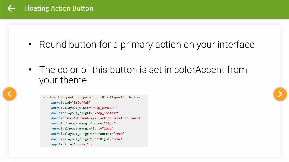
• Round button for a primary action on your interface
• The color of this button is set in colorAccent from your theme.

Floating Label

Floating Label
Hint Problem

Floating Label
When the user engages with the text input field,
the floating inline labels move to float
above the field.

Floating Label

TextInputLayout

Snackbar

Snackbar
Providing lightweight, quick feedback about an operation Snackbars are shown on the bottom of the screen and contain text with an optional single action Users can swipe them away before the timeout They automatically time out after the given time length by animating off the screen.

Snackbar

Snackbar

Tabs
Tabs
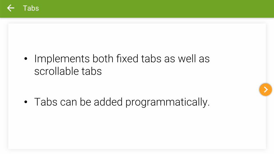
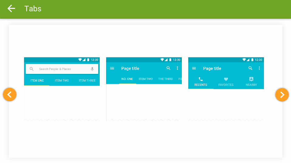
• Implements both fixed tabs as well as scrollable tabs
• Tabs can be added programmatically.
Tabs

Tab Layout

Coordinator Layout

Coordinator Layout
provides additional level of control over touch events between child views.
CoordinatorLayout with FloatingActionButton & Snackbar
• CoordinatorLayout resolve the issue of snackbar displaying over the FloatingActionButton.
• FloatingActionButton automatically moves upward as the snackbar animates in and returns to its position when the snackbar hides.
• CoordinatorLayout enables user to swipe snackbar away before the timeout.

CoordinatorLayout with FloatingActionButton & Snackbar

CoordinatorLayout with AppBarLayout
• AppBarLayout allows your Toolbar and other views (such as tabs provided by TabLayout) to react to scroll events in a sibling view.
• the AppBarLayout can respond to those events by using the children’s scroll flags.
• Toolbar reacts to scroll events in a sibling view app:layout_scrollFlags="scroll|enterAlways"
• TabLayout remains pinned to the top of the screen while Toolbar view collapses.
• includes a layout with CardView views

<android.support.design.widget.CoordinatorLayout android:layout_height="match_parent" android:layout_width="match_parent"> <android.support.design.widget.AppBarLayout android:layout_width="match_parent" android:layout_height="wrap_content”> <android.support.v7.widget.Toolbar android:layout_width="match_parent" android:layout_height="?a1r/ac,onBarSize" android:background="?a1r/colorPrimary" app:layout_scrollFlags="scroll|enterAlways"/> </android.support.design.widget.AppBarLayout> <!-‐-‐ Your Scrollable View -‐-‐> ……………… <android.support.design.widget.Floa,ngAc,onBu1on android:layout_width="wrap_content" android:layout_height="wrap_content" android:src="@drawable/ic_ac,on_loca,on_found" android:layout_marginBo1om="20dp" android:layout_marginRight="20dp" android:layout_gravity="bo1om|right" app:fabSize="normal" /> </android.support.design.widget.CoordinatorLayout>
CoordinatorLayout with FloatingActionButton & Snackbar

CoordinatorLayout with AppBarLayout & TabLayout
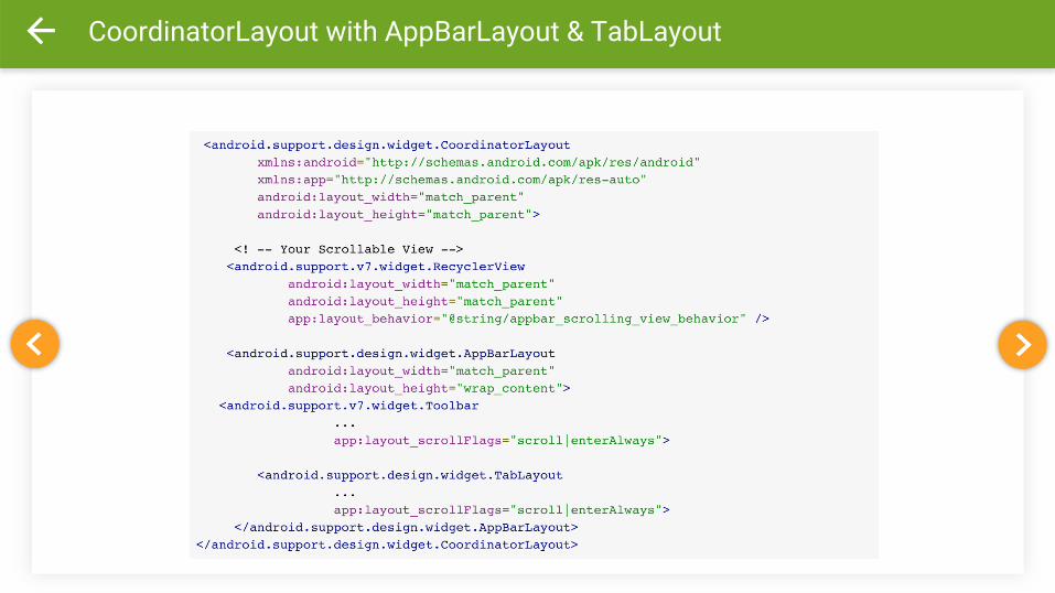
CoordinatorLayout with AppBarLayout & TabLayout

CollapsingToolbarLayout
• CollapsingToolbarLayout to ensure that the Toolbar itself remains pinned to the top of the screen while the view collapses.
• Toolbar title will automatically appear larger when the layout is fully visible, then transition to its default size as it is collapsed.

CollapsingToolbarLayout

CollapsingToolbarLayout
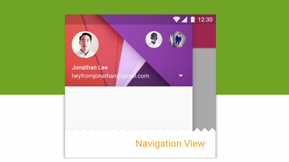
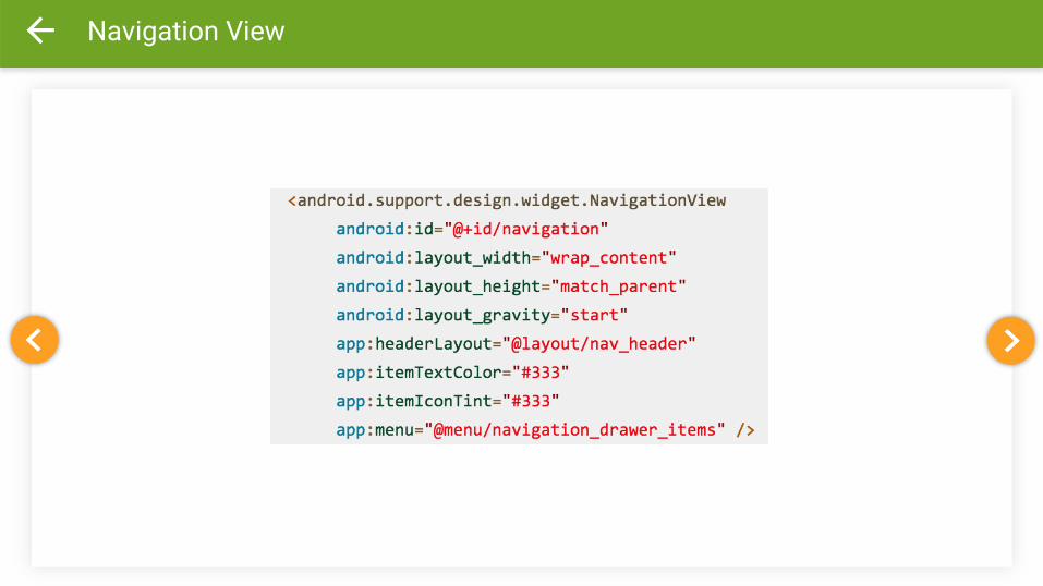
Navigation View

Navigation View
• NavigationView makes adding navigation drawer to your app easier than before.
• You can inflate your navigation items through a menu resource.
• NavigationView should go inside DrawerLayout. • app:headerLayout attribute controls the (optional) layout used for the
header.
• app:menu attribute is the menu resource for the navigation items (which can also be updated at runtime).

Navigation View
Navigation View


References
• Google Design http://www.google.com/design/
• Android Developers Blog http://android-developers.blogspot.com/2015/05/android-design-support-library.html
• HMKCode http://hmkcode.com/material-design-app-android-design-support-library-appcompat/

Topic: Android Design Support Library
Ibnu Sina Wardy Google Dev Expert (ID): Android [email protected]
Terima Kasih.