analyzing pi system data version 2016r2 -...
TRANSCRIPT

Analyzing PI System Data
Version 2016R2


Page i
How to Use this Workbook
User manuals, Learning workbooks, and other materials used in class can be downloaded from http://techsupport.osisoft.com. Login to an OSIsoft technical support account is required.
Each Main Heading describes a
high-level valuable learning topic.
New concepts are presented as
level 2 headings.
Your objectives are skills you
can expect to learn in this
segment.
Throughout the class you will be
presented with questions and
challenges to help you learn.
The majority of your time will be
spent learning new skills via
hand-son exercises, either in
small groups or on your own.
Icons help you identify themes,
like exercises, tools, tips, or
documentation references.

Analyzing PI System Data
ii
Software Versions Used in this Document
The list below describes the software versions used in this version of the course.
Software Version
PI DataLink 2016
Microsoft Office 2016
PI ODBC 2015
PI Integrator for Business Analytics 2016
Microsoft SQL 2014
Data Archive 2016 R2
Asset Framework 2016 R2
PI Coresight 2016 R2
Contents
1 Welcome ................................................................................................................... 5
1.1 Course Environment ...................................................................................... 5
1.2 Review PI System Architecture .................................................................... 6
1.3 Assets and Tags – The Basic Building Blocks in the PI System .............. 8
1.4 Directed Activity – Review of the AF structure used throughout this course ........................................................................................................... 11
1.5 Discussion .................................................................................................... 16
2 Business Intelligence ............................................................................................ 17
2.1 Directed Activity – Explore an Existing Report ........................................ 20
2.2 Discussion .................................................................................................... 23
3 Analyzing Events ................................................................................................... 24
3.1 Objectives ..................................................................................................... 24
3.2 What are PI Event Frames? ......................................................................... 24
3.3 PI Event Frames in PI System Explorer ..................................................... 26
3.4 PI Event Frames in PI DataLink .................................................................. 33
3.5 PI Event Frames in PI Coresight ................................................................. 39
3.6 Discussion .................................................................................................... 46
4 PI Integrator for Business Analytics.................................................................... 47
4.1 Architecture .................................................................................................. 47
4.2 PI Integrator Web UI ..................................................................................... 47
4.3 Directed Activity – Creating a View ............................................................ 50
4.4 Discussion .................................................................................................... 57
5 Importing PI Data for use in BI Clients ................................................................ 58
5.1 Introduction .................................................................................................. 58
5.2 Importing AF datasets ................................................................................. 58
5.3 Discussion .................................................................................................... 69
6 Creating the “Cube” and Adding Calculations ................................................... 70
6.1 Establishing table relationships ................................................................. 70
6.2 Adding calculated columns using Data Analysis Expression Language (DAX) ............................................................................................................. 75
6.3 Where to Use Formulas ............................................................................... 77
6.4 Discussion .................................................................................................... 80
7 Building the Report ............................................................................................... 81
7.1 Creating PowerPivot tables ........................................................................ 81

Analyzing PI System Data
4
7.2 Formatting tips (optional) ........................................................................... 86
7.3 PowerPivot charts ........................................................................................ 90
7.4 DAX and Spotfire Time Intelligence ........................................................... 92
7.6 Limit Data Viewed by End Users ................................................................ 95
7.7 Slicers ........................................................................................................... 96
7.8 Discussion .................................................................................................. 101
8 Exploring the Data with PowerView (optional) ................................................. 102
9 Final Exercise: Create a New Report ................................................................ 107
10 Appendix A Additional PowerPivot Resources ................................................ 108

Analyzing PI System Data
Page 5
1 Welcome
Welcome to the Analyzing PI System Data Course!
Since you are attending this class, you should have some experience with OSIsoft Client Tools (PI ProcessBook, PI DataLink, PI WebParts and PI Coresight), either using displays, reports or webpages previously created to analyze your data, or creating these displays, reports and webpages so that others in your organization have access to all the powerful data that resides in the Data Archive and data external to the PI System.
The basic tasks within these tools (as building a PI ProcessBook display or a PI DataLink report) are presumed to be understood; what you will experience here can be seen as a factory of ideas, a space for OSIsoft customers to realize how powerful existing data can be when analyzed with the advanced options of our tools and additional third party tools, and integrated with non-PI data.
Hope you enjoy!
1.1 Course Environment
The environment for this course is being hosted with Azure. The environment has 3 VM and contain the following:
PIDC – Domain Controller
PISRV01 – The server environment o Microsoft SQL Server 2012 SP1 (64-bit) o PI Data Archive 3.4.405.1198 (2016 R2) o PI AF Server 2.8.5.7759 (2016 R2)
Many example databases have been preloaded for use in this class
o PI AF Client 2.8.5.7759 (2016 R2) o PI Coresight 3.1.0.7 (2016 R2) o PI Integrator for Business Analytics – Business Intelligence 1.2.800.67
(2016)
PICLIENT01 – This is the primary working environment. o PI System Explorer 2.8.5.7759 (2016 R2) o Microsoft Office Professional Plus 2013 (64-bit) o Microsoft PowerBI Desktop 2.41.4581.361 o Tibco Spotfire Desktop 7.7.0 o Google Chrome 55.x
The userid for each student is pischool\student##, where ## is a unique number
for each of you, and the password is student.

Analyzing PI System Data
6
1.2 Review PI System Architecture
Objectives
Define the components of a PI System
Draw a diagram of the architecture of a PI System
The PI System Described
The PI System collects, stores, and manages data from your plant or process. You connect your data sources to one or more PI Interface nodes. The Interface Nodes get the data from your data sources and sends it to the Data Archive. Users get data from the Data Archive and display it with client tools.
These are generally the parts involved in a PI System:
Data is collected from the source by the PI Interface program hosted by the acquisition node. The data is sent to the Data Archive and asset data can be contained in the AF server. It is read from the Data Archive or AF Servers by the client tools, such as PI ProcessBook.
1.2.2 Architecture of a Typical PI System
Sometimes the architecture can be very simple. Some customers have as few as one or two interfaces feeding data to a single Data Archive. Access to data is through the single Data Archive.
`
Data Archive
AF
Buffer
Relational Database
Table Lookup DR
Data Source
PI Interface PI System User

Analyzing PI System Data
Page 7
In many cases there are many Data Archives in an organization, aggregating data from lower levels. Some corporations have Data Archives dedicated to servicing their clients with restricted company data.
Analyzing PI System Data
8
1.3 Assets and Tags – The Basic Building Blocks in the PI System
Objectives
Define an AF Asset with its components element and attributes.
Define four attribute types: Static (None), PI Point, Formula, and Table Lookup.
Define a Data Archive Tag with the attributes Tag Name, Descriptor, and Point Source.
Define the different data types that can be stored in Data Archive Tags.
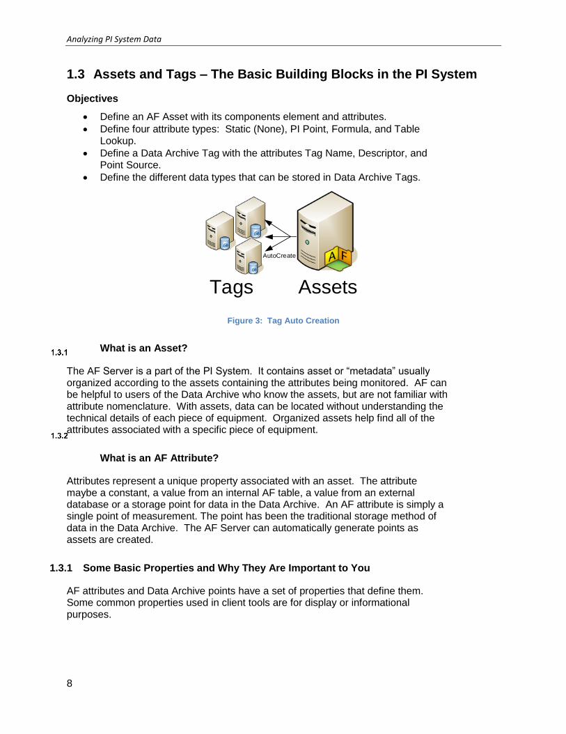
Tags Assets
AutoCreate
Figure 3: Tag Auto Creation
What is an Asset?
The AF Server is a part of the PI System. It contains asset or “metadata” usually organized according to the assets containing the attributes being monitored. AF can be helpful to users of the Data Archive who know the assets, but are not familiar with attribute nomenclature. With assets, data can be located without understanding the technical details of each piece of equipment. Organized assets help find all of the attributes associated with a specific piece of equipment.
What is an AF Attribute?
Attributes represent a unique property associated with an asset. The attribute maybe a constant, a value from an internal AF table, a value from an external database or a storage point for data in the Data Archive. An AF attribute is simply a single point of measurement. The point has been the traditional storage method of data in the Data Archive. The AF Server can automatically generate points as assets are created.
1.3.1 Some Basic Properties and Why They Are Important to You
AF attributes and Data Archive points have a set of properties that define them. Some common properties used in client tools are for display or informational purposes.

Analyzing PI System Data
Page 9
Attribute name
The attribute name is similar in concept to the point description. A detailed name for the attribute may help the user identify the source of the information.
Figure 6: Attribute Name
Tag name
Unique name is used to create points for storage in the Data Archive. Points for data attributes storage can be built through AF templates using substitution parameters for local naming convention or can be searched for on the Data Archive. Creating points through templates, lends consistency in nomenclature making searches easier for PI Administrators. For example, which might be easier to locate in a search?
Point: M03_E1P1_MOTDRV1202_RUNSTAT
Attribute: Machine3 Enclosure 1 Panel 1 Motor Drive 1202 Run Status
Substitution parameters are variables placed in attribute templates for PI point and PI point array data references representing portions of the AF hierarchy.
For example, %Element% is a substitution parameter that represents the element name. After you create an element based on that template, you tell AF to create the data reference. When AF creates the reference, it substitutes the current element name wherever %Element% is present.

Analyzing PI System Data
10
Descriptor
This is the human-friendly description of the Data Archive Point, similar to the attribute. The descriptor is often a search criterion since the point name is not always intuitive. Often the point name is some sort of abbreviated convention and the descriptor captures the “full name.”
Point source
Points can be related to their interfaces that collect the data by a point attribute called pointsource. Grouping by point source allows all of points associated with a particular device to be identified by searching for all points of a certain point source. This assumes that the user knows the point sources in use and that will not be true in most situations.
Point type
The PI point attribute that specifies the data type for the values that a point stores. The possible point types include int16, int32, float16, float32, float64, digital, string, BLOB, and timestamp.

Analyzing PI System Data
Page 11
1.4 Directed Activity – Review of the AF structure used throughout this course
In this part of the class you will perform a learning activity to explore the different concepts presented in this chapter or section. You may be invited to watch what the instructor is doing or perform the same steps at the same time. You may play a game or hold a quiz. Your instructor will have directions.
Activity Objectives
Explore the example database to be used throughout the course.
Approach
Open PI System Explorer (from the Start menu or task bar). Click the database button
and select “Feeder Voltage Monitoring Full” from the resulting list. This database
models voltage phase fluctuations between feeders and transformers.
All example kits used in this class are available on PI Square for download onto development environments
https://pisquare.osisoft.com/community/all-things-pi/af-library/asset-based-pi-example-kits
Analyzing PI System Data
12
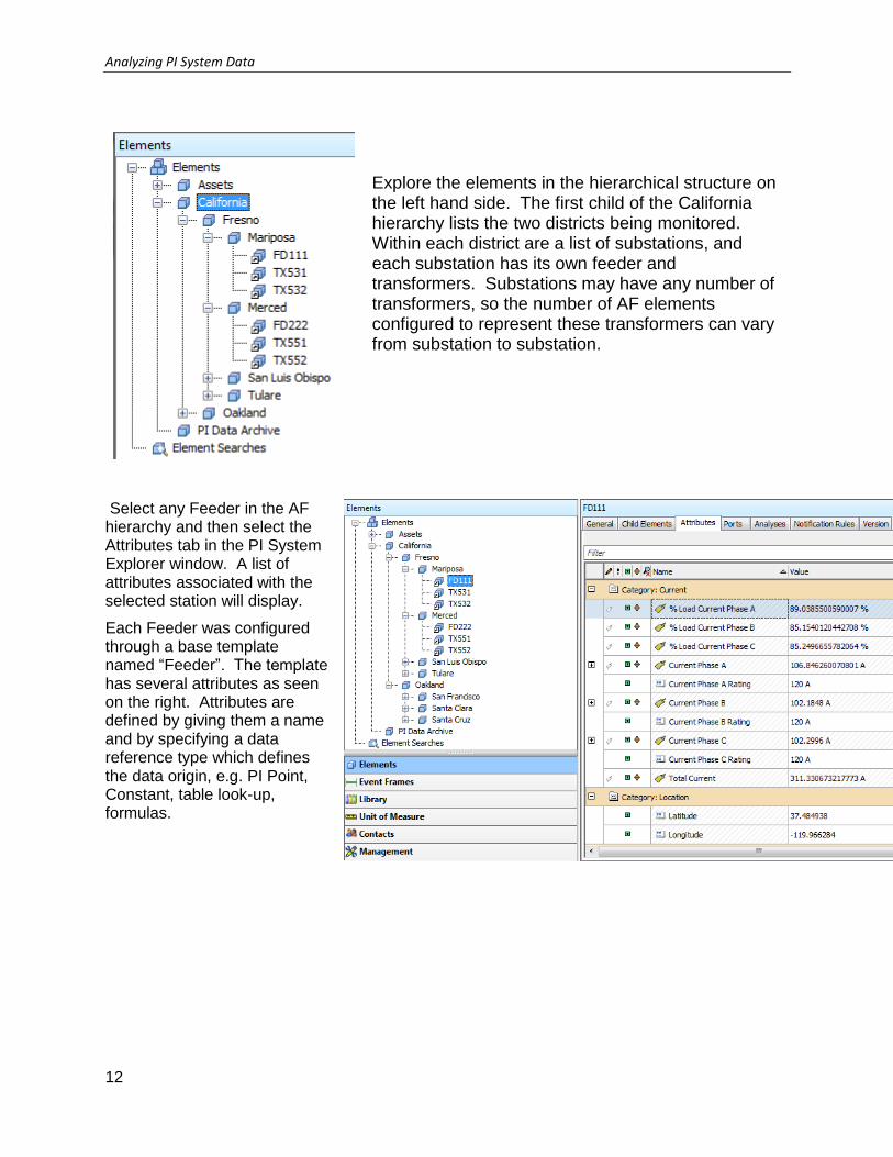
Explore the elements in the hierarchical structure on the left hand side. The first child of the California hierarchy lists the two districts being monitored. Within each district are a list of substations, and each substation has its own feeder and transformers. Substations may have any number of transformers, so the number of AF elements configured to represent these transformers can vary from substation to substation.
Select any Feeder in the AF hierarchy and then select the Attributes tab in the PI System Explorer window. A list of attributes associated with the selected station will display.
Each Feeder was configured through a base template named “Feeder”. The template has several attributes as seen on the right. Attributes are defined by giving them a name and by specifying a data reference type which defines the data origin, e.g. PI Point, Constant, table look-up, formulas.

Analyzing PI System Data
Page 13
Element hierarchy
Element hierarchy – i.e., their location in the world – is a very valuable class of metadata. This data is often very useful for Business Intelligence applications as a means to relate assets to one another. The complication, however, is that the underlying data cube in such applications is very cubic. They thrive on hierarchies being predictable and regular. Of course, it is possible to use a jagged hierarchy, but this adds a thick layer of complication. As such, it is always advisable to use a predictable hierarchy.
With the Feeder Voltage Monitoring example kit, the hierarchy is relatively boring. Our company does not have much hierarchy though what we do have is incredibly valuable:
Often analyses are performed transformer to transformer, substation by substation, or district by district.
Not every company will be this clear-cut. Some sites will have a hierarchy that matters but which cannot as easily be described by one universal diagram as above. Other sites won’t have as much of a logical hierarchy, but perhaps there is a hierarchy of organization (Research departments), function (Type of bioreactor), or location (Which building/room/benchtop/position a reactor is in). It all depends on type of analysis to be conducted. Perhaps the ambient temperature is thought to be causing growth differences in different bioreactors, in which case the latter – physical location – could help sort the reactors into rooms, proximity to a window, etc.
Template hierarchy
A good template hierarchy is the cornerstone of every AF model. This is where AF fulfills business goals by allowing “levels of similarity.”
While the “Feeder Voltage Monitoring” database does not contain template
inheritance, “Condition Monitoring” does. Click the database button and select the “Condition Monitoring” from the resulting list. This database models asset performance to assist with scheduled maintenance events.

Analyzing PI System Data
14
The Condition Monitoring database contains a simple template hierarchy. The base Condition Monitor template contains a set of attributes that define all pieces of equipment to be maintained.
In addition to the Condition Monitor base template, there are four derived templates: Pump Motor, Shell and Tube Heat Exchanger, Steam Turbine Gear Reduction Bearings, and Wind Turbine, which extend off of the Condition Monitor base template. These four derived templates inherit all the attributes of a Condition Monitor template as well as additional attributes specific to the equipment type. The hierarchy can be viewed by right clicking “Element Templates” within the library, and selecting Arrange By > Arrange By Template Inheritance.
A pump motor contains attributes that capture real-time information on pump start events as well as static threshold values. A shell and tube steam Turbine on the other hand contains attributes for tube inlet and outlet pressures, tube pressure drop, and the tube pressure drop rate of change per day.
The Pump Motor, Shell and Tube Heat Exchanger as well as the Steam Turbine Reduction Bearings and Wind Turbine all contain the inherited attributes from the Condition Monitor base template, such as the Condition Count and Condition Severity.
Building good template hierarchies is perhaps the single most important AF concept.
Condition Count, Severity, State, and the date of the most recent condition can all participle together in a report of overall asset health and maintenance requirements. The equipment physically are all very different, but functionally all have condition monitoring metrics, as this is a valuable similarity for maintenance engineers.

Analyzing PI System Data
Page 15
Element metadata (Static Table Data)
Attributes can be flexible – holding numeric values or enumeration values – and often already exist as part of the model. This can be seen under the category of specifications under the Wind Turbine template.
Static attributes (where the value is persisted directly, not coming from a data reference) can be indexed to support efficient searching and filtering by a system administrator. Creation of indices is not free, but used sparingly, bring great efficiency to queries like “Show me all of my GE-made turbines.” Categories would be a hassle here since Manufacturer is not a true or false thing; it is a value-from-a-set. However, the turbines already have an attribute-showing manufacturer, so that could be made static and indexed.
(flag set in the template)

Analyzing PI System Data
16
1.5 Discussion
This is a discussion designed to maximize learning in a specific topic area. Your instructor will have questions, and will prompt for communication within the class. This is an open ended section and the result depends on your needs.
Objective: The AF data is to be included within our Business Intelligence tools. What data do we want to see? This can be in the context of your own system, or the example AF databases available in the class.
Approach
What do we currently use our AF databases for regrading report generation?
Within the example database, what else do we want to know? What is missing?
Pros and cons of including external asset related data within the AF structure
What sort of BI tools would we want to use to view this data?
Estimated Completion time 15 minutes.

Analyzing PI System Data
Page 17
2 Business Intelligence
Business intelligence (BI) tools offer solutions to quickly analyze raw, un-normalized, multidimensional data. In concert with historical values from the Data Archive, metadata and calculations from Asset Framework, and business intelligence tools, users can quickly create interactive reports to gain insight on business and operational processes.
Throughout the rest of the class, we will explore the process of preparing the Asset Framework model to add additional dimensions of information to our AF database, extracting desired information (process data, metadata, and event frame data) from the PI System through PI Data Access tools, consuming the data inside a data cube, and constructing interactive reports that allow us to “slice and dice” our data and bring meaning to our multidimensional data cube.
The Feeder Voltage Monitoring database has a comprehensive amount of information including a hierarchy of substations, metadata for each feeder (current rating, latitude/longitude, voltage limits) and instantaneous voltage data (% Load on Phase A/B/C, Power, Voltage Phase Unbalance). The figure to the right depicts a data cube that captures metadata and real-time data of generating units.
FD111
FD222
FD333
FD555
% Load Current
Total CurrentReactive Power
Average Power
Voltage Phase Unbalance

Analyzing PI System Data
18
Inclusion of additional attributes through table lookups and analytics on existing attributes allow for the expansion of additional columns (or dimensions) to the data cube above.
Further, historical data, interpolated or compressed, add an additional dimension of information that bring more meaning in Business Intelligence reports.
In the next several chapters in the course, we will be using an example kit database to expose meaningful data that will help management and engineers make better, more informed decisions. Specifically, we will add value through the following:
1. Expose the database in a simpler structure for data processing.
2. Develop analytics within the PI Integrator for Business Analytics to perform summary calculations.
3. Import the data into our BI tools
4. Draw actionable conclusions from the resulting data sets in our reports
Currently all this data is centralized in the example kit databases, but has not been realized in a clear manner in BI reports. Few will develop queries using the PI Integrator for Business Analytics to extract pertinent data so that this information can be consumed inside of Microsoft’s Business Intelligence tools, PowerPivot and PowerView, or Tibco Spotfire. These BI tools will allow for dynamic, interactive reports.
Time
FD111
FD222
FD333
FD555
% Load Current
Total CurrentReactive Power
Average Power
Voltage Phase Unbalance

Analyzing PI System Data
Page 19

Analyzing PI System Data
20
2.1 Directed Activity – Explore an Existing Report
In this part of the class, you will perform a learning activity to explore the different concepts presented in this chapter or section. You may be invited to watch what the instructor is doing or perform the same steps at the same time. You may play a game or hold a quiz. Your instructor will have directions.
Activity Objectives
Navigate through the Transmission and Distribution Feeder Voltage Monitoring database and the generated reports. Explore how PI data has been integrated into the reporting tools
Approach
Within PI System Explorer, select the OSIDemo Feeder Voltage Monitoring database. This database models a hypothetical Transmission and Distribution of feeders and transformers into the local grid.
Explore the elements in the hierarchical structure on the left hand side. The first level of the hierarchy lists the local grid, and the lower levels contain the different districts. Each district contains a number of substations, each with their own feeders and substation transformers. Different districts can contain different substations, so the number of AF elements configured to represent the substations varies between districts.
The feeders can be compared between each other to determine which assets are underperforming relative to each other to assist deciding what action needs to be taken, using contextual information from this hierarchy. Open the Violation High.xlsx file from the desktop.
Analyzing PI System Data
Page 21
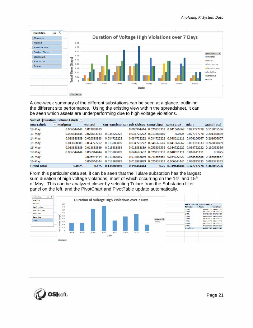
A one-week summary of the different substations can be seen at a glance, outlining the different site performance. Using the existing view within the spreadsheet, it can be seen which assets are underperforming due to high voltage violations.
From this particular data set, it can be seen that the Tulare substation has the largest sum duration of high voltage violations, most of which occurring on the 14th and 15th of May. This can be analyzed closer by selecting Tulare from the Substation filter panel on the left, and the PivotChart and PivotTable update automatically.

Analyzing PI System Data
22
Now open the Feeder Voltage Monitoring.dxp file from the desktop. This displays the same results, however now uses Tibco Spotfire as the client tool.
By clicking on different assets, the data will be highlighted in the visualizations, such as the trend and table.
This can be done on an asset scale, or for an individual data point.
Feel free to experiment with the different data visualization tools. This style of interactivity is expected from business intelligence tools, and will be utilized from our AF data models.

Analyzing PI System Data
Page 23
2.2 Discussion
This is a discussion designed to maximize learning in a specific topic area. Your instructor will have questions, and will prompt for communication within the class. This is an open ended section and the result depends on your needs.
Objective: Business Intelligence tools may already be implemented on site. What data do we already use with this? What do we want to integrate?
Approach
What non-PI data do we do this sort of analysis with?
What tools are used to perform this analysis?
How much integration is there within the non-PI data?
How much integration is there within the PI data as well?
Estimated Completion time 15 minutes.

Analyzing PI System Data
24
3 Analyzing Events
3.1 Objectives
PI Event Frames are stored in a relational database on the SQL Server hosting the AF databases. These event frames can be viewed, filtered, analyzed using PI tools such as PI System Explorer, PI Coresight, and PI DataLink.
3.2 What are PI Event Frames?
Events are important process or business time periods that represent something happening that affects your operations. In the PI System, these are recorded as event frames. With event frames, you can analyze your PI data in the context of these events rather than by continuous time periods. Instead of searching by time, event frames enable users to easily search the PI System for the events they are trying to analyze or report on.
With PI Event Frames, the PI System helps you capture, store, find, compare and analyze the important events and their related data.
PI Event frames represent occurrences in your process that you want to know about, for example:
Downtime tracking Environmental monitoring excursions
Process excursions Product tracking batches
Equipment startups and shut downs
Operator shifts
The following table presents some of the features and advantages of event frames:
Flexibility
Reference multiple elements within the same event.
Support multiple overlapping events on a AF element.
Capture any type of event.
Powerful search
Search by time range, type of event or event frame attribute.
Most common search attributes can be configures as indexed attributes to speed up end-user searches
Scalability PI Event Frames are extremely scalable.

Analyzing PI System Data
Page 25
A PI Event Frame is defined by three characteristics:
1. The event frame Name.
2. Start time and end time, to define the event time range and duration.
3. Context from event attributes and related assets.
Creating Event Frames
The example kit databases contain series of Elements representing the units or other assets. In order to monitor any process excursions, it is important that the equipment is operating within the expected bounds. We need to keep track of the events associated with the units.
Within the Feeder Voltage Monitoring database, a ‘Voltage Phase’ attribute is associated with each phase in each feeder in our hierarchy. This attribute will be used to monitor whenever a phase limit violation occurs. Each database has their own set of attributes used to define event frame start and stop conditions. This attribute monitoring and event frame generation is handled by the PI Analysis Service.

Analyzing PI System Data
26
3.3 PI Event Frames in PI System Explorer
The easiest way to view PI Event Frames is through PI System Explorer. From the Event Frames Pane, you can perform searches against all the event frames within an AF database. You can filter based on specific referenced elements, specific time ranges, and much more.
From the properties of an Event Frame Search, you can specify the following search parameters for the time of the event frame, and the properties of the event frame:
Search type: Specify how to perform an event frame search. Find all event frames
that are entirely between a start and end time? Starting or ending between a start
and end time?
Search start: Specify the start time for event frame search.
Search end: Specify the end time for event frame search.
Include descendants: Search for all child event frames in addition to parent event
frames.
Event Frame Name: Filter based on the name of an event frame. Can use
wildcards.
Element Name: Filter based on the name of the referenced element. Can use
wildcards.
Template: Filter based on the event frame type.
Additional Criteria: Ability to filter based on duration, attribute value, event frame
search root, and specify how many results to return.

Analyzing PI System Data
Page 27
The resulting search query is combined into a string within the search field. This allows for direct manipulation of the data fields without using the menu options.
The default search results bring back fields detailing the duration, start time, end time, description, category, template, and a Gantt chart. Any of these fields can be hidden by using the settings cog on the top right corner of the search results. Additionally, values from the event frame attributes can be pulled back into the search results through this same option list.

Analyzing PI System Data
28
Because PI Event Frames are essentially bookmarks that reference data from elements, tables, and itself through formulas, whenever you perform a search for event frames and their attribute values, the search can take a while. Fortunately, built into Asset Framework is the ability to capture or persist the event frame attribute values. These values are stored in a relational database on the SQL Server.
You will notice that there is a blue pin icon to the left of many event frames. That basically means that the values are persisted or captured. Any event that PI Analysis Service automatically detects will have its values captured.
If you do update the event frame template, however, you may need to recapture the values as the existing event frame attribute values will not automatically update to the new changes. To recalculate, right-click on a set of event frames and select recapture. This operation is often handled by the PI System Administrator, as this is an edit made to a production data store.

Analyzing PI System Data
Page 29
Directed Activity – Search for Events in PI System Explorer
In this part of the class, you will perform a learning activity to explore the different concepts presented in this chapter or section. You may be invited to watch what the instructor is doing or perform the same steps at the same time. You may play a game or hold a quiz. Your instructor will have directions.
Activity Objectives
Find all events for the assets over the last month in your example database. If you do not have any event frames returned, extend the search to several months. Examine the attributes that are captured in these inactive events. This example will use the Feeder Voltage Monitoring kit, however other example kits may be used.
Approach
Click on the event frame plug-in. Right-click on Event Frame Searches and select New Search.

Analyzing PI System Data
30
From the Event Frame Search screen, specify the search start to be “Entirely Between” “*-3mo”,
end to “*”, and uncheck the “All Descendants” checkbox. Select an Event Frame template. For
this example, “Voltage Phase Limit Violation Low” was used, however other templates from
other kits can also be used. Leave the other fields blank. Note with other kits, a smaller search
range may be also be applicable.
The search will return several event frames. Select all of them and click on OK. Click on the
gear icon to the right of the fields, and remove the description, category, template and severity
fields. Then click on “Select Attributes.”

Analyzing PI System Data
Page 31
Select all attribute from the Select Attributes wizard by clicking on the double chevron then click
OK.
Examine the attributes for these event frames. All columns can also be sorted to quickly find
any maximum or minimum values.

Analyzing PI System Data
32
Exercise – Search for Other Event Frames
This solo or group exercise is designed to maximize learning in a specific topic area. Your instructor will have instructions, and will coach you if you need assistance during the exercise. Please try to solve the problem presented without using the Solution Guide.
Objective: Find the Voltage Phase Unbalance violations over the last month for all the feeders. Pull back the maximum value for voltage phase unbalance.
Which feeder has had the greatest voltage phase unbalance? And when did this unbalance occur and what was the duration?
If using a different example kit, select a different Event Frame template and attribute to sort on.
Approach
Perform an event frame search with the new template. Sort and format results for the desired attributes.

Analyzing PI System Data
Page 33
3.4 PI Event Frames in PI DataLink
PI DataLink allows you to retrieve current, historical, and calculated data back into Microsoft Excel. In addition to these capabilities, PI DataLink also allows for the retrieval of event frames back into Excel for further analysis.
There are two retrieval methods for Event Frames inside of PI DataLink:
Explore: Find Event Frames that meet the specified criteria and display them in a hierarchical format, which is useful to analyze events sharing the same EF template.
Compare: Find Event Frames that meet the specified criteria and compare their attributes in a flat format. This allows a flat list of events with attributes relating to child events all within a single row.
For either the Compare or Explore Events, you can specify parameters to search for specific event frames. You can specify the following:

Analyzing PI System Data
34
Database: AF Database to search against.
Event Name: Search pattern to search for specifically named event frames.
Search Start: Search for all event frames that occurred after this time.
Search End: Search for all event frames that occurred before this time.
Event Template: Search for specific types of events.
Element Template: Search based off of the type of referenced element.
Element Name: Search pattern for the name of the event frame.
More search options: Search based on attribute values, duration, and category.
Number of child event levels: Only for “Explore Events” and allows for the
hierarchical display of events.

Analyzing PI System Data
Page 35
By selecting an Event Template and clicking “More Search Options”, searching for event frames can be based off of multiple attributes.
When searching with Explore Events, the results can be displayed hierarchically based on the relationships between child and parent event frames.

Analyzing PI System Data
36
Directed Activity – Report Events in PI Datalink
In this part of the class, you will perform a learning activity to explore the different concepts presented in this chapter or section. You may be invited to watch what the instructor is doing or perform the same steps at the same time. You may play a game or hold a quiz. Your instructor will have directions.
Activity Objectives
Frequent high voltage phase violations deviations could potentially mean damaged equipment. Engineering is interested in analyzing the Feeders. Find the average values of "maximum voltage phase" for phases A B and C over event frames for the past week to determine what a typical maximum value is, and which phase typically has the greatest maximum.
If using a different example kit, select a different Event Frame template to analyze.
Approach
From PI DataLink inside of Excel, specify the Database as “Feeder Voltage Monitoring”, and select Explore Events. Set the Search start as “*-7d”, and Event template as “Voltage Phase Limit Violation High.”
Keep attributes “Maximum Voltage Phase A”, “Maximum Voltage Phase B”, and “Maximum
Voltage Phase C” selected, and unselect the other attributes. The resulting columns should
include: Event Name, Start Time, End Time, Diration, Event Template, Primary Element,
Maximum Voltage Phase A, Maximum Voltage Phase B, and Maximum Voltage Phase C.

Analyzing PI System Data
Page 37
Set the output cell to A1.
Calculate the average of each Maximum Voltage Phase using the function
=AVERAGE(G2:G225), where G255 is the last cell containing voltage data. Repeat this for the
other two voltage phases.

Analyzing PI System Data
38
Exercise – Analyzing Other Events
This solo or group exercise is designed to maximize learning in a specific topic area. Your instructor will have instructions, and will coach you if you need assistance during the exercise. Please try to solve the problem presented without using the Solution Guide.
Objective: Voltage Phase imbalance events can be representative of an underlying control issue if they occur frequently. Analyze with PI DataLink the total duration of Phase unbalance events for a specific feeder, as well as the total number of imbalance events that have occurred over the last month.
If using a different example kit, select a different Event Frame template and attribute to sort on.
Approach
Use PI DataLink to search for PI Event Frames and specify which attributes to return. Use Excel to aggregate the events.

Analyzing PI System Data
Page 39
3.5 PI Event Frames in PI Coresight
PI Coresight is a browser- and mobile-based, ad-hoc visualization tool to help visualize and analyze assets. PI Coresight allows for easy drag and drop capabilities to add symbols onto a display canvas.
Symbols available
Trend: Add multiple attributes from assets onto a trend for easy visualization of process changes.
Value: View the current or historical value for any metric or process.
Table: Display attribute values onto a table for easy comparisons. Allows for summary statistics.
Horizontal Gauge: Horizontal gauge to view current levels within a range.
Vertical Gauge: Vertical gauge to view current levels within a range.
Radial Gauge: Radial gauge to view current levels within a range.

Analyzing PI System Data
40
Related Assets
Element templates are powerful at defining and normalizing all similarly-typed assets. Templates also allow for easier searches. With Related Assets in PI Coresight, you can create one display for a particular asset such as a turbine and reuse this display for other turbines.
Events
Found in the same section as Related Assets, the Events section displays all PI Event Frames that are associated with the asset that is visualized in the PI Coresight display, and also the time range of the display.
The events shown have a start time, end time, and name. If you right click on an event frame and select “Apply Time Range”, PI Coresight will automatically update the start and end time of the display to match those of the event frame.
When you select an event frame, you can view the list of attributes. These attributes include the captured Event Frame values, as well as access to attributes from the original element context.
If there are child event frames, they are listed as well.

Analyzing PI System Data
Page 41
Directed Activity – Displaying Event Frames in PI Coresight
In this part of the class, you will perform a learning activity to explore the different concepts presented in this chapter or section. You may be invited to watch what the instructor is doing or perform the same steps at the same time. You may play a game or hold a quiz. Your instructor will have directions.
Objective:
Visualize a voltage phase unbalance event for FD111 using PI Coresight. PI Coresight can be accessed from a shortcut on the desktop.
Approach:
Step 1: Create a new PI Coresight display. Drill
down to asset FD111 in the Feeder Voltage
Monitoring Database, and select the following
attributes:
Voltage Phase Unbalance
Voltage Phase Unbalance Violation Limit

Analyzing PI System Data
42
Step 2: Trend the attributes for the past 24 hours, and right click on the trend to set the value
scale to single scale. This will show any points where the phase balance exceeds the limit. If
no violations are seen, increase the duration to the past week or month.
Step 3: Click on Events and view the events that have occurred for FD111. Select the most
recent Voltage Phase Unbalance event, right click and select Event Details. If there are too
many other events, the Event Frames can be filters by selecting “Edit Search Criteria” and
entering in an Event Name.
Analyzing PI System Data
Page 43
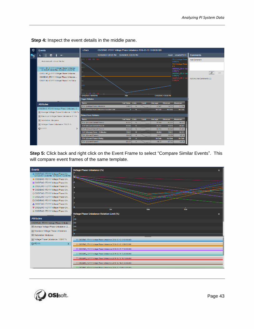
Step 4: Inspect the event details in the middle pane.
Step 5: Click back and right click on the Event Frame to select “Compare Similar Events”. This
will compare event frames of the same template.

Analyzing PI System Data
44
Step 6: Click on FD111 under the list of attributes, and drag out “Average Power – 15 Minutes”.
Other attributes can also be added to the trend comparison window.
Step 7: Select an event from the left pane to highlight the data in the trend. This also updates
the attribute pane to the current Event Frame summary values.

Analyzing PI System Data
Page 45
Exercise – Root Cause Analysis in PI Coresight
This solo or group exercise is designed to maximize learning in a specific topic area. Your instructor will have instructions, and will coach you if you need assistance during the exercise. Please try to solve the problem presented without using the Solution Guide.
Objective: Engineering is interested in analyzing other current and voltages of each phase on FD111 during a Phase Limit Violation event. Use PI Coresight to create a display to quickly analyze this data.
Approach:
Use PI Coresight to manipulate the start and end times to help analyze root cause.

Analyzing PI System Data
46
3.6 Discussion
This is a discussion designed to maximize learning in a specific topic area. Your instructor will have questions, and will prompt for communication within the class. This is an open ended section and the result depends on your needs.
Objective: Event frames can be queried by multiple clients for generating reports.
Approach
What PI data in the BI reports can be captured within event frames?
Does my site allow for Event Frames to capture the data needed for my reports?
What other Events Frames should be captured for my site?
Which event frames should be used in BI reports?
Which PI tools or BI clients would use event frames best?
Estimated Completion time 15 minutes.

Analyzing PI System Data
Page 47
4 PI Integrator for Business Analytics
Getting the data out of the AF structure and into the client tools requires the use of integration software such as the PI Integrator for Business Analytics or PI OLEDB Enterprise. This chapter will discuss the former method of extracting the data.
4.1 Architecture
The PI Integrator for Business Analytics resides on a web server between the client machines and the source AF server. As such, we are not connecting directly to the AF Server but instead to a web server that contains a cache of our desired information. The architecture within our class system however has both the AF Server and Web Server residing on the PISRV01 machine. The PI Integrator for Business Analytics site can be accessed via https://pisrv01 or from the desktop. If prompted for credentials, enter your student account, as this has been given access rights.
ClientMicrosoft Excel
Microsoft Power BI
Tibco Spotfire
Etc.
Web Server
PI Integrator for Business
Analytics
PI SQL DAS
PI AF Server
PI AF databases
4.2 PI Integrator Web UI
Views can be created within the PI Integrator portal that is hosted on the Web Server machine.
A list of previously generated views is present within the portal on the My Views page, allowing for previewing and maintenance. These existing views can also be cloned and modified, allowing for subtly different views to be created and utilized within BI client tools.
The following is a breakdown of the My Views page layout, and the different operations available.

Analyzing PI System Data
48
Note: The information regarding the My Views page layout is available within the PI Integrator for Business Analytics User Guide.
The My Views page shows details about your views.
1. All the views to which you have access are listed in the table 2. Click to create an asset view that is based on Elements and Element Templates 3. Click to create an event view that is based on Event Frames and Event Frame Templates 4. To modify a view, select the view in the table and click Modify View.
To delete it, click Remove View. Deleting a view removes data from the buffer, therefore freeing up space. However, this does not free up the available output streams allowed with your license.
5. If a view is locked (padlock icon) you cannot make changes to it because it has been published. You can make a copy of the view and then make changes to the copy.
6. For the selected view, the Overview, Log and Security tabs provide the following details about that view:
· Overview indicates whether the view has been published. This tab also summarizes information about the view, such the PI AF database it uses, when the view was last run, and the shape that it uses. If the view is currently being published, the run status bar indicates progress and you have the option to stop the publishing process.
· Log displays information from the Windows Event Viewer. You can adjust the start and end times, and you can filter the messages to display those of a certain severity, for example, critical errors.
· Security shows who has access to the view, and if you have sufficient privileges, allows

Analyzing PI System Data
Page 49
you to change the level of access 7. Click on the bars to open and close the details panel with the Overview, Log, and Security
tabs. 8. The red message counter icon at top right show the number of warning and error messages
recorded by PI Integrator for Business Analytics. Click the icon to open the message list.
9. Click the control at the right side of the list, to customize the table columns displayed. Select and deselect columns to change those displayed and then click Apply.
10. Click the gear icon at top right to see the version of PI Integrator for Business Analytics and AF you are using.

Analyzing PI System Data
50
4.3 Directed Activity – Creating a View
In this part of the class, you will perform a learning activity to explore the different concepts presented in this chapter or section. You may be invited to watch what the instructor is doing or perform the same steps at the same time. You may play a game or hold a quiz. Your instructor will have directions.
Objective:
Use the PI Integrator for Business Analytics to create a view for the Feeders in the Feeder Voltage Monitoring database.
Approach:
Within the My Views page, click the Create Asset View button to prompt the creation of a new view. The name that gets assigned will be used within the My Views table for identification, and is also used by our clients when connecting to the published PI Views using the PI ODBC driver.
Asset Shape Configuration
The next page is the PI Integrator designer. It is on this page that the definition of the data model is to be constructed. The method of constructing the model is to create a sample object, and then generalize it to include similar assets.
Within this view, select the AF Server (PISRV01) and the AF Database (Feeder Voltage Monitoring). This will populate the list of assets as an AF hierarchy.

Analyzing PI System Data
Page 51
Select the Mariposa asset, and drag it out onto the Asset Shape. Then, browse down the hierarchy to FD111 and drag onto the Asset Shape and Drop as child on the CENTRAL asset. This hierarchy in the Asset Shape allows contextual information to be exposed within the view.
By selecting an asset in the left pane, the list of attributes will populate below. Desired attributes can be dragged to the central “Asset Shape” pane. Searching for attributes can be done by typing in the filter field next to the Attributes heading, or by clicking the sorting icon and choosing to group by category, or alphabetical order. After dragging out a desired list of attributes, the “Matches” pane on the right will populate with a list of assets that match our attribute criteria. Clicking on multiple attributes allows for them all to be dragged out to the Shape pane at once.
Within this data model, the District, Latitude, Longitude, Power, and Substation Number from Mariposa will be returned. Drag these attributes onto Mariposa in the middle Shape pane and Drop as child. From the child asset FD111 Voltage A, Voltage B, Voltage C, and Voltage Phase Unbalance attributes will also be used, to allow us to see how well the feeder is performing in relation to the location. Drag these attributes onto the shape pane and Drop as child on Feeder FD111.

Analyzing PI System Data
52
Only one asset has been returned, as the search was performed against the California\Fresno\Mariposa\FD111 Feeder. This can be generalized by
clicking on the icon next to the FD111 item within the Asset Shape. Here the filters can be edited to match a certain asset name, with optional wildcard characters, or to match a specific template. Select FD111 and choose the Feeder asset template and save. The element template of the asset is automatically chosen from the list.
Repeat this process for Mariposa using the Substation template.
After setting the filters to be on Asset Template, all 7 feeders have been matched. This can be seen on the right Matches pane. Once we have confirmed that the desired attribute values are being returned and the desired assets have been matched, click Next.

Analyzing PI System Data
Page 53
Modify View
After clicking Next, a preview of the results from the Asset Shape is returned. This is the data model that will be accessed by our BI client tools, such as Microsoft PowerView, Microsoft Power BI, and Tibco Spotfire. The data can be further manipulated on this level by adding in additional calculation columns, filtering rows based on attribute values, or modifying the time context. These three options are all controlled by the three buttons on the top left. From this, we will add two calculated data columns and change the interpolation data interval for the view.
4.3.2.1 Add Column
The “Add Column” button allows both the addition of Data Columns and Time Columns. A Data Column allows an aggregation to be performed against a desired output attribute over the duration of each time step. These aggregations include Total, Average, Minimum, and other statistical information, as well as Last Recorded Value, Name and Percent Good. The column name can also be changed to be given a more appropriate title, such as “Voltage Phase Unbalance - Max” to indicate that an aggregation has been performed. Note that you cannot bring in columns with duplicate names.
Add a column to bring in the maximum Voltage Phase Unbalance Generation.

Analyzing PI System Data
54
The Time Column options allow for additional methods of representing time to also be returned within the view. This allows the bucketing or binning of data within desired time contexts to better investigate how assets perform at different times of day, or during different days of the week. Click on the desired time columns on the left pane to make your selection, and click on the right arrow to add to the data model.
Within this data model, select the “Day of Week” column to be returned to determine how the working week schedule can affect the performance of the feeders.
4.3.2.2 Edit Row Filters
The addition of Row Filters allows data to be excluded that does not match a desired input attribute filter. The available filtering options are determined by the attribute types being returned. As this data model contains asset name and numerical data, only the string and numeric row filters are available. Digital is greyed out.
The Event Frame filter allows data to be only returned when either a desired Event Frame or Event Frame template is active. This can cut down the total size of the view being manipulated by the end user, and ensures that only the desired data can be returned.
We want all the current data to be returned, so no row filters will be applied.

Analyzing PI System Data
Page 55
4.3.2.3 Edit Value Mode
The previous aggregation methods used by Add Column make use of the time step of the data model, which is at default one minute. Within this configuration, the interpolation interval can be set from one second up to one year. Alternatively, the data can be keyed to a desired output attribute. This will call the compressed data for that attribute and return other attribute values interpolated at those time stamps. Note that only PI point attributes can be used and that this will result in irregular intervals for interpolation due to the compressed data call that is executed.
Change this to interpolate values every 10 minutes.
Clicking on any column brings up the Column Details pane. The same configuration options from Add Column are available, allowing column definitions and retrieval modes to be edited or removed entirely.
The start and end times can also be set using the date fields on the page header. The time context limits the data that will be published to the data model. These time stamps can be fixed dates in time (e.g. 1/1/2000 12:00:00) or a relative window (*-1d). Any changes made to the time range can be seen by pressing “Apply” to ensure they are configured correctly.
Set the time range to span the most recent week using Start time of “*-7d” and end time of “*”. This will ensure that whenever this view is recalculated, the most recent week of information is available. Be sure to click Apply before clicking next.

Analyzing PI System Data
56
Publishing the View
Click Next to reach the publishing stage. This is the final step in creating a view to be consumed by the BI clients. The target configuration determines what method of data access will be used, and is determined by the license of the PI Integrator for Business Analytics. As the PI Integrator for Business Analytics Business Data Warehouse version has been installed, the target configurations available to us are PI Views, an MS SQL Database, and a plain text file. This edition also allows the configuration of additional targets, such as Hadoop HDFS, Hadoop HIVE, and Oracle RDBMS 11 & 12. The system administrator can create these additional targets.
Select PI View as the target configuration. This will let us use PI ODBC to call the results in our BI Client tools.
If we want data to update continuously, a schedule must be set. This is best combined with the relative time stamps from the time range. This can allow for queries such as “the week just passed” to update, instead of “The month of January, 2017”. This ensures that up to date data will always be available to the end user for processing. In this example, set the schedule to run daily, first running now. This will ensure a week of data gets published, and every day we get the latest updates.
After you click publish, you will receive a confirmation dialogue and be returned to the My Views page with the view created. The size of the data set will determine the total publishing time. Once published created, views cannot be deleted or modified, however derived views can be built using the original as a guide. Views which have been created but not published however, are free to be modified or deleted.

Analyzing PI System Data
Page 57
4.4 Discussion
This is a discussion designed to maximize learning in a specific topic area. Your instructor will have questions, and will prompt for communication within the class. This is an open ended section and the result depends on your needs.
Objective: The PI Integrator for Business Analytics can expose different attributes and filter different data sets within the AF Database for consumption by a BI client.
Approach
What format would we like the data to be in for processing by BI clients?
What should be added to the Asset Shape to improve the format?
Do these queries match what we want in our reports?
If not, what is lacking?
Estimated Completion time 15 minutes.

Analyzing PI System Data
58
5 Importing PI Data for use in BI Clients
5.1 Introduction
Business Intelligence tools are only as good as the data that fills them. This chapter centers upon the process of exposing assets and data from the PI System into data cubes. We will continue to use the database from earlier exercises.
There are two main components to tackle: preparing the PI System for the cube, and writing the queries which expose useful information. The former will be a recurring theme as we perform the latter.
The release of PI Integrator for Business Analytics, Microsoft PowerPivot for Excel and Microsoft Power View, Microsoft Power BI, and Tibco Spotfire provide an exciting combination of new technologies supporting advanced data analysis and enterprise awareness. These tools bring the power of multidimensional data analysis to the forefront for all PI user’s allowing innovated reporting within Microsoft Excel and in Microsoft SharePoint. This training session describes the steps needed to create an example report for analyzing your database in a client of your choice.
Note: Power BI is a free application from Microsoft available for system running Windows 7 or later with .NET 4.5 and is available at https://powerbi.microsoft.com/en-us/desktop
PowerPivot is standard in Excel 2013 and is a free add-in to Excel 2010 and 2007 and is available from Microsoft at http://www.microsoft.com/en-us/bi/powerpivot.aspx
5.2 Importing AF datasets
The first thing to do when using a client is to import the data you want to analyze. Importing data requires connecting to the data source holding the data, specifying the data you need from the data source (by selecting a database table, view, or writing a query), and then importing the data into the client tool. The PowerPivot input dialog also gives you the ability to preview and to specify additional filters on the data as it is imported. However, for this example, the following steps will describe how to import the complete datasets from the PI Integrator for Business Analytics views defined in the previous section of this document.
PI ODBC will be used however to make use of the PI SQL DAS to field the connections. All three clients used for testing in this course (Microsoft PowerPivot and Power BI, Tibco Spotfire) are all compatible with ODBC connections.

Analyzing PI System Data
Page 59
Directed Activity – Importing View Data Previously Created
In this part of the class, you will perform a learning activity to explore the different concepts presented in this chapter or section. You may be invited to watch what the instructor is doing or perform the same steps at the same time. You may play a game or hold a quiz. Your instructor will have directions.
Objective: All the pre-work is complete, now it is time to start building the report. Each of the three BI clients may be used to import our asset performance data.
Approach:
5.2.1.1 Tibco Spotfire
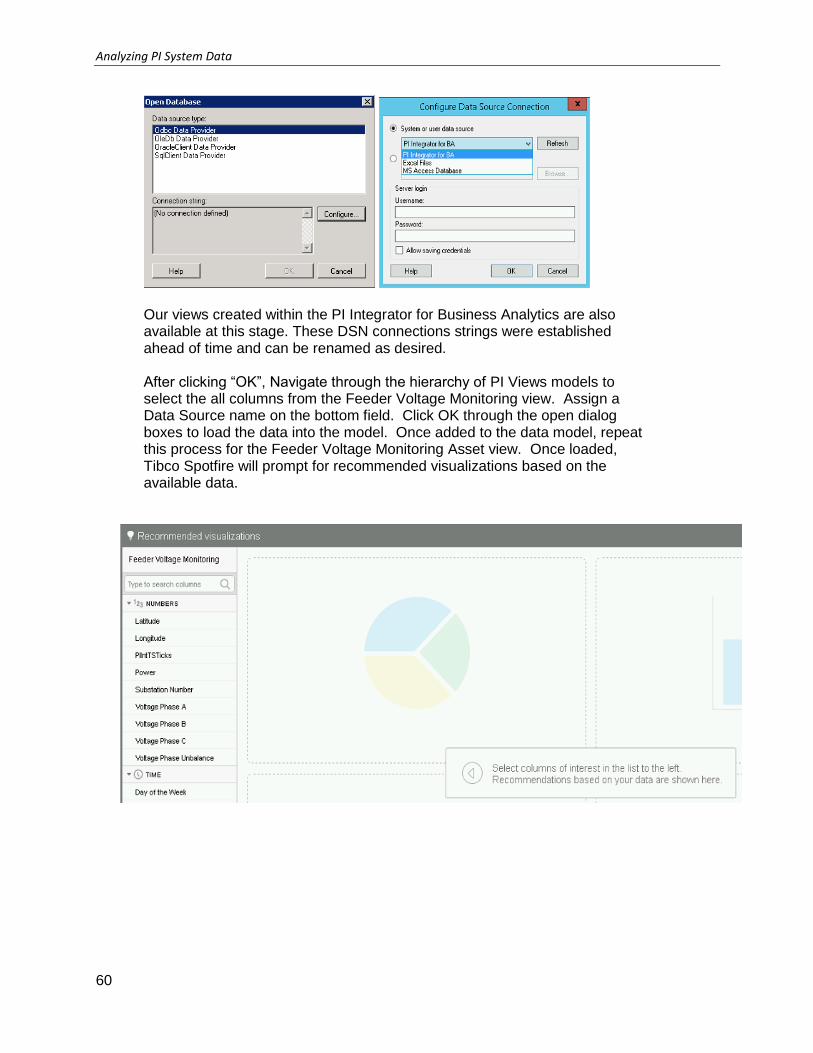
Open Tibco Spotfire and select File > Add Data Tables
Within “Add Data Tables”, scroll to the end of the Add drop down and select Other – Database. Here an ODBC connection string can be built by clicking “Configure.” Select PI Integrator for BA in the dropdown.
Analyzing PI System Data
60
Our views created within the PI Integrator for Business Analytics are also available at this stage. These DSN connections strings were established ahead of time and can be renamed as desired. After clicking “OK”, Navigate through the hierarchy of PI Views models to select the all columns from the Feeder Voltage Monitoring view. Assign a Data Source name on the bottom field. Click OK through the open dialog boxes to load the data into the model. Once added to the data model, repeat this process for the Feeder Voltage Monitoring Asset view. Once loaded, Tibco Spotfire will prompt for recommended visualizations based on the available data.

Analyzing PI System Data
Page 61
5.2.1.2 Microsoft PowerPivot
Open MS Excel
Select the PowerPivot tab to access the PowerPivot ribbon shown below. Clicking on the Manage button will launch the PowerPivot window shown in the next step.
Explore “Get External Data” The PowerPivot window is empty, waiting to import data. Exploring the “Get External Data” section of the ribbon gives a great overview of the various ways PowerPivot can access data sources.
Clicking on the icon for “From Other Sources” will start the dialog for importing data from other data sources, like PI ODBC. (“From Other
Sources” icon is in Excel 2010.)

Analyzing PI System Data
62
Select “Others(OLEDB/ODBC)
Scroll down the list of connection types until you get to the “Others (OLEDB/ODBC)”. Select it and click Next.
Name the connection “Feeder Voltage Monitoring”
Build Connection String
PowerPivot requires a connection string to access each data source. Click the Build button to construct the string for connecting to AF through PI ODBC.
Select the “Provider” tab and scroll through the providers list until you come to “Microsoft OLE DB Provider for ODBC Drivers”. This will allow the ODBC connection of our choice to come through.

Analyzing PI System Data
Page 63
Under the “Connection” tab, all existing DSNs are listed within our system. This includes Excel Files and MS Access Database files, and our “PI Integrator for BA” connections. These connections were made ahead of time and are detailed within the respective documentation for PI ODBC and PI Integrator for Business Analytics. Select “PI Integrator for BA” and once you set the data source, the catalog list will get populated in the bottom dropdown. Expand the list and select PI System
Test the connection
The connection string to the Feeder Voltage Monitoring has been configured.
Click the Test Connection button to verify your connection. Close the connection test pop-up and click Next to continue with the data import process.

Analyzing PI System Data
64
Select How to Import the Data
Now that we have defined the connection to the PI Integrator for Business Analytics, we have to specify what data we want to import into PowerPivot. Select the top option and click Next.
Select the following views:
Feeder Voltage Monitoring Example
Feeder Voltage Monitoring Assets If the example view has not been created, then Feeder Voltage Monitoring Sample View can be used instead.
As more views are created using the PI Integrator for BA, they will become visible at this step.
Click Finish to start importing data into PowerPivot.

Analyzing PI System Data
Page 65
Review importing results
At this point, PowerPivot will begin importing data from AF. When the import is complete, click Close.
The imported data will now appear in the PowerPivot window. Each PI View will have its own worksheet and can be accessed by selecting the appropriate tab at the bottom of the PowerPivot window.

Analyzing PI System Data
66
5.2.1.3 Microsoft Power BI
Open MS Power BI Desktop Select “Get Data” and browse to “other.” Select ODBC and click “Connect”. Select the PI Integrator for BA Data Source Name (DSN). No optional parameters are required. These ODBC connections strings were established ahead of time and can be renamed if desired. Information on how to configure these connections can be found within the PIODBC and the PI Integrator for Business Analytics administrator guides.
Click “OK”

Analyzing PI System Data
Page 67
If prompted, select “Windows Authentication” and “Use my Current Credentials”
Once a connection has been established, browse through the list of tables and select the views we wish to import. Navigating through the structure will generate a preview in the right pane of the selected table, to allow an initial data validation. Select the Feeder Voltage Monitoring Assets and Feeder Voltage Monitoring Example tables. If the Feeder Voltage Monitoring Example table has not been created, import the Feeder Voltage Monitoring Sample View table.

Analyzing PI System Data
68
Once loaded, the tables of information are loaded into the data model as fields and are ready for relationships to be added. The raw data vs the report view can be selected by choosing the first two tabs on the right side of the view. Any other data model joins can also be configured on the third tab.

Analyzing PI System Data
Page 69
5.3 Discussion
This is a discussion designed to maximize learning in a specific topic area. Your instructor will have questions, and will prompt for communication within the class. This is an open ended section and the result depends on your needs.
Objective: The PI Data can be viewed within a BI client (Microsoft PowerPivot), however more data is desired to be added.
Approach
Which of the three clients do you prefer using? Microsoft PowerPivot, Microsoft Power BI or Tibco Spotfire?
Can the format of the source PI data be improved?
What other PI data do we want to see in a report?
What non-PI data do we also want to see?
How can these data sets be linked together conceptually?
Estimated Completion time 10 minutes.

Analyzing PI System Data
70
6 Creating the “Cube” and Adding Calculations
Once the tables are imported into a client, the cube is almost ready to be created. In order to create a report, relationships between tables must be defined.
6.1 Establishing table relationships
At this point all we have given the clients a single independent table of data. In order for us to analyze data with further external sources, these tables must be related. These BI tools provides a very easy way to specify table relationships through a configuration dialog.
Microsoft PowerPivot and Power BI
When building Power BI or PowerPivot relationships, the order is significant. Always think “many to one”. In other words, the table having many rows with the same value goes first. The column selected in the second table must have only one row for each value.
Configuring the relationships shown above is very easy to do.
Change the view to the diagram view in PowerPivot and Power BI respectively.
The tables will appear in the display window.
Analyzing PI System Data
Page 71
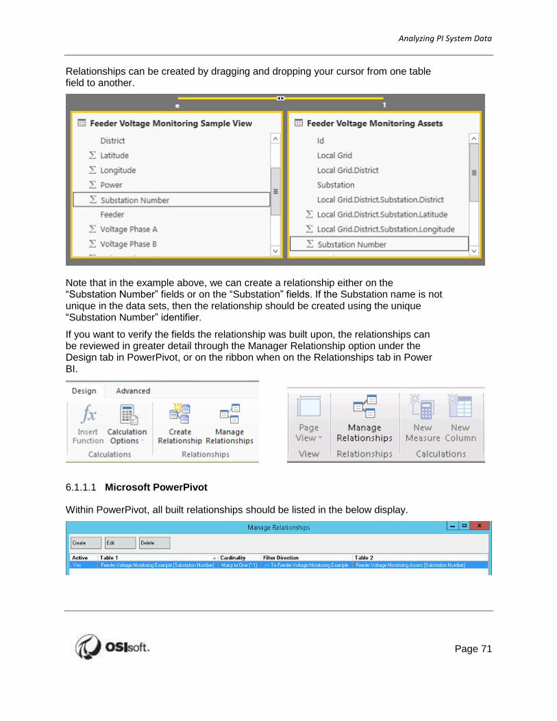
Relationships can be created by dragging and dropping your cursor from one table field to another.
Note that in the example above, we can create a relationship either on the “Substation Number” fields or on the “Substation” fields. If the Substation name is not unique in the data sets, then the relationship should be created using the unique “Substation Number” identifier.
If you want to verify the fields the relationship was built upon, the relationships can be reviewed in greater detail through the Manager Relationship option under the Design tab in PowerPivot, or on the ribbon when on the Relationships tab in Power BI.
6.1.1.1 Microsoft PowerPivot
Within PowerPivot, all built relationships should be listed in the below display.

Analyzing PI System Data
72
Select the relationship of interest and select Edit.
Relationships can also be configured directly from any PowerPivot table by right-clicking on any column header and choosing “Create Relationship” from the menu.
Upon selection, the create relationship display to allow relationship definition.

Analyzing PI System Data
Page 73
6.1.1.2 Power BI
Power BI offers an alternate view of Manage relationships however, listing both the tables and key columns within the relationships view.
Editing or creating relationships involves a preview of each data set, and selecting the columns from the tables below. Once selected, the cardinality (many to one, one to many, one to one) may be selected and confirmed.
Analyzing PI System Data
74
Tibco Spotfire
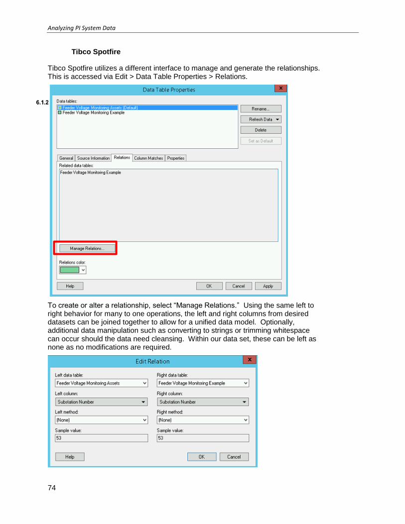
Tibco Spotfire utilizes a different interface to manage and generate the relationships. This is accessed via Edit > Data Table Properties > Relations.
To create or alter a relationship, select “Manage Relations.” Using the same left to right behavior for many to one operations, the left and right columns from desired datasets can be joined together to allow for a unified data model. Optionally, additional data manipulation such as converting to strings or trimming whitespace can occur should the data need cleansing. Within our data set, these can be left as none as no modifications are required.

Analyzing PI System Data
Page 75
6.2 Adding calculated columns using Data Analysis Expression Language (DAX)
At this point, it is necessary to begin the discussion on the Data Analysis Expression Language or DAX. As you will see, DAX provides users with the ability to extend data initially imported into PowerPivot and Power BI and is really a key differentiator between PowerPivot and traditional, server-based BI applications. DAX has two uses: it can be used to add new columns to tables and it can be used to create measures.
At the far right of every PowerPivot table is an empty column with the heading Add Column. New columns of data are entered by selecting this column and typing in DAX formulas in the formula dialog above the displayed PowerPivot table. Alternatively, you can choose any column, right-click on it, and select “Insert Column”. Within Power BI, select the table and click “New Column.”
Note: Configuring a DAX calculation is very similar to adding calculated cells in Excel, except adds calculated columns (i.e. calculations that take place on every row, or value of the dataset).

Analyzing PI System Data
76
The (DAX) language is a new formula language that allows users to define custom calculations in PowerPivot tables (calculated columns) and in Excel PivotTables (measures).
Like Excel formulas, to create a DAX formula, you type an equal sign, followed by a function name or expression, and any required values or arguments.
Some differences include:
DAX cannot reference only a few cells or a range of cells; DAX always works with complete columns or tables.
If you want to use a subset of values from a column, you can add filters.
If you want to customize calculations on a row-by-row basis, PowerPivot provides functions that let you use the current row value or a related value to perform calculations that vary by context.
DAX includes a type of function (measure) that returns a table as its result, rather than a single value. These functions can be used to provide input to other functions, thus calculating values for entire tables or columns.
Some DAX functions provide time intelligence, which lets you create calculations using meaningful ranges of dates, and compare the results across parallel periods.
Tibco Spotfire however, allows the addition of Custom Expressions to existing visualizations or data sets, utilizing its own function library. It is similar to DAX in that the calculations are on columns and not individual data cells.
This is found under Insert > Calculated Column

Analyzing PI System Data
Page 77
6.3 Where to Use Formulas
The same formula can behave differently depending on whether the formula is used in a calculated column or a measure. You can use DAX formulas either in PowerPivot or Power BI tables, or in PivotTables in Excel:
You can use formulas in calculated columns, by adding a column and then typing an expression in the formula bar. You create these formulas in the PowerPivot or Power BI window. Applied to every row in a column, but varies based on context.
You can use formulas in measures. You create these formulas in Excel, by clicking Add Measure in an existing PowerPivot PivotTable or PivotChart. The design of the PivotTable and the choice of row and column headings affects the values that are used in calculations.
Where DAX formulas differ from Excel formulas is that DAX functions work with tables and columns, not ranges, and let you do sophisticated lookups to related values and related tables.

Analyzing PI System Data
78
Directed Activity – Create an Average Voltage Calculation
In this part of the class, you will perform a learning activity to explore the different concepts presented in this chapter or section. You may be invited to watch what the instructor is doing or perform the same steps at the same time. You may play a game or hold a quiz. Your instructor will have directions.
Objective:
Calculate the average voltage of all three phases in the Feeder Voltage Monitoring table.
Approach:
PowerBI
Open the PowerBI report
Within the Feeder Voltage Monitoring Example table, Select New Column under the Modeling tab.
Enter the following equation Average Voltage Phase = ([Voltage Phase A]+[Voltage Phase B]+[Voltage Phase C])/3
PowerPivot
Open the PowerPivot report
Within the Feeder Voltage Monitoring Example table, Select New Column under the Modeling tab.
Enter the following equation = ([Voltage Phase A]+[Voltage Phase B]+[Voltage Phase C])/3
Once created, right click the column and rename to “Average Voltage Phase” Spotfire
Open the Spotfire Report
Go to Edit > Column Properties
With the Feeder Voltage Monitoring Example table, select Insert > Calculated Column
Enter the following expression: ([Voltage Phase A]+[Voltage Phase B]+[Voltage Phase C])/3
Set the column name to “Average Voltage Phase”, and press OK to confirm all dialogue boxes.
Note: Clicking the icon will give you a list of available DAX functions, many of which are identical to those offered in Excel.
Analyzing PI System Data
Page 79
Exercise – Create a maximum/minimum voltage calculation
This solo or group exercise is designed to maximize learning in a specific topic area. Your instructor will have instructions, and will coach you if you need assistance during the exercise. Please try to solve the problem presented without using the Solution Guide.
Objective: Add the maximum and minimum voltage columns to the Feeder Voltage Monitoring table or display using DAX or Custom Expressions. The RELATED function is required when you are including columns from another table in your DAX equation. It is not necessary in Custom Expressions with previously established relationships or if all data is within the same table.
Do you prefer having the calculations within AF as a formula data reference, or within the BI client tools? What are some advantages and disadvantages of each?
Approach:
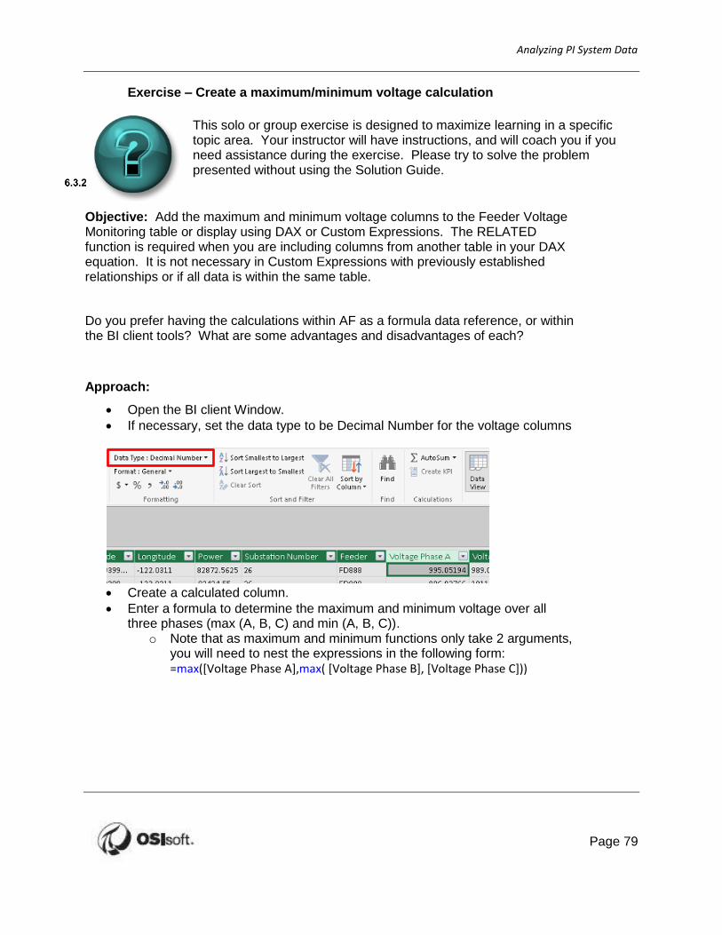
Open the BI client Window.
If necessary, set the data type to be Decimal Number for the voltage columns
Create a calculated column.
Enter a formula to determine the maximum and minimum voltage over all three phases (max (A, B, C) and min (A, B, C)).
o Note that as maximum and minimum functions only take 2 arguments, you will need to nest the expressions in the following form: =max([Voltage Phase A],max( [Voltage Phase B], [Voltage Phase C]))

Analyzing PI System Data
80
6.4 Discussion
This is a discussion designed to maximize learning in a specific topic area. Your instructor will have questions, and will prompt for communication within the class. This is an open ended section and the result depends on your needs.
Objective: A basic data model has been constructed with some client side analyses performed. How may this be extended?
Approach
What other data can be added to the data model?
Is this the best client for the task? What client tool would you prefer using?
Should the calculations be performed in AF, or using the client side calculation tools?
Estimated Completion time 15 minutes.

Analyzing PI System Data
Page 81
7 Building the Report
Designing a BI report is an ad hoc experience. This is easily done by dragging and dropping items from the field list (table columns) into the various report areas provided by the report configuration dialog. Moreover, the best part is that you can always open a new page to create additional reports for a different purpose, or to try something new, from the same data.
While the below example is utilizing PowerPivot, a very similar method is used with Power BI. Within the Tibco Spotfire environment, the reports focus on the interactivity and are built with the visualization in mind.
7.1 Creating PowerPivot tables
To create a new pivot table report in Excel, select the Insert ribbon and select the Tables dropdown menu.
You will see that there are several combinations of PowerPivot tables and charts to select from.
Select the first option “Pivot Table”. Specify “Use this workbook’s Data Model” to use the previously imported PI View then click OK.
The PowerPivot field list will be shown in your Excel worksheet and a range of the worksheet should be designated where the pivot table will be located, as shown overleaf.

Analyzing PI System Data
82
Taking a look at the Field List, at the top there is a hierarchy that shows the datasets and when they are expanded there is a list of available columns.
Down below is the dialog area where items can be dropped to configure the report.
The “Values” area, in the lower right, is the aggregation area.
Default aggregation for numeric values is SUM.
Default aggregation for non-numeric values is COUNT (number of rows).
For numeric items, you can change the aggregation method by clicking the down
arrow on and choosing “Value Field Settings” in PowerPivot. The method can be changed directly on the menu within Power BI.
Note that some numerical data may be imported as a text format. When managing the data model, the Formatting can be changed from Data Type: Text to Data Type: Decimal Number. This will allow numerical aggregations to occur.

Analyzing PI System Data
Page 83
In the Measure Setting you can pick a different aggregation or change the name for display purposes. In this example, it makes more sense to aggregate the “Power” as an average.
The “Column Labels” and “Row Labels” labels areas are for specifying which items are to be used for the column and row headers of the table, commonly known as dimensions. “Filters” allow the resulting report to be dynamically filtered on desired columns.
Drag and drop District and Substation to the Columns field, and Day of the Week to the Rows field. This will result in a table of power generation, averaged over each day.
If you place more than item into the “Rows Labels” or “Column Labels” areas, they become nested in the report as sub headings for either columns or rows. You can change the nesting order by dragging items up and down within the area to reorder them. PowerPivot will take care of changing the report.
So far, we have some numbers and locations in our report:

Analyzing PI System Data
84
The slicers consisted of a set of buttons that users can select, or multi-select to set the report filters, and they can either be oriented vertically or horizontally on the worksheet.
Slicers can be oriented vertically or horizontally. The option to insert slicers is located under the Analyze tab of the PowerPivot Tools menu. Within Power BI, one of the visualizations available is the Slicer. In Tibco Spotfire, selecting “Filter” on the ribbon produces a Filter pane to slice the data as desired.
After some dragging and dropping, we can quickly configure the report shown below to summarize generation by region and station. You will notice that the table is configured dynamically as you drop items into different areas. Feel free to play around to get things right, the way that is most useful for you. Multiple slicers can be used to apply multiple filters.

Analyzing PI System Data
Page 85
Exercise – One Version of the Truth
This solo or group exercise is designed to maximize learning in a specific topic area. Your instructor will have instructions, and will coach you if you need assistance during the exercise. Please try to solve the problem presented without using the Solution Guide.
Objective: You have been requested to generate a voltage report to ensure that all managers are referencing data in similar context. Return the maximum and minimum voltages for all 3 phases, and the maximum unbalance for all substations. The report should also be able to be filtered on each day of the week.
Which Substation has the maximum voltage for each phase, and each voltage phase unbalances? What District does this correspond to? What day was this maximum recorded?
Approach:
1. Review production management requirements.
2. Verify the required table is in the BI client.
3. Create a report that details the Districts and Substations rows against columns of Maximum Voltage Phase A, B, C; Minimum Voltage Phase A, B, C; Maximum Voltage Phase Unbalance
4. Add Slicers to the report for Day of the Week.
Estimated time 20 minutes.
Table with Slicers:

Analyzing PI System Data
86
7.2 Formatting tips (optional)
There are a few pivot table formatting tips that are worth mentioning at this point.
First, right-clicking anywhere in the pivot table will present a menu. Selecting “PivotTable Options” from this menu will open the dialog shown here.
Several useful formatting options can be found under the following tabs;
“Layout and Format” – Clearing the “Autofit” checkbox will allow you to set cell column widths the way you want. PowerPivot will resize these automatically if you leave this checked.
“Totals and Filters” – If it can, PowerPivot will always try to provide an extra column and row for grand totals. You can turn either of them off here if they are not what you want.
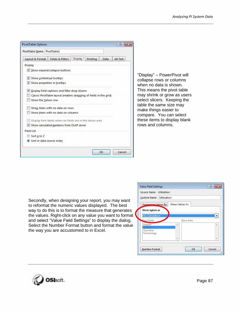
Analyzing PI System Data
Page 87
“Display” – PowerPivot will collapse rows or columns when no data is shown. This means the pivot table may shrink or grow as users select slicers. Keeping the table the same size may make things easier to compare. You can select these items to display blank rows and columns.
Secondly, when designing your report, you may want to reformat the numeric values displayed. The best way to do this is to format the measure that generates the values. Right-click on any value you want to format and select “Value Field Settings” to display the dialog. Select the Number Format button and format the value the way you are accustomed to in Excel.
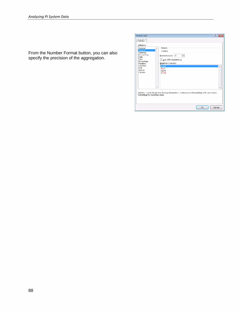
Analyzing PI System Data
88
From the Number Format button, you can also specify the precision of the aggregation.

Analyzing PI System Data
Page 89
Exercise – Consistent Table Layout
This solo or group exercise is designed to maximize learning in a specific topic area. Your instructor will have instructions, and will coach you if you need assistance during the exercise. There is no entry in the solution guide for this exercise, as the desired result is dependent on the student.
Objective: Modify the layout of the report to reduce the adjustments required by the viewers of the report.
Approach:
Review the report by selecting different slicing options – observe how the report changes. Is it visually appealing?
Modify report to reduce the adjustments the eyes have to make based on filtering, collapsing of rows and columns, number format, etc.
Estimated Time: 10 minutes

Analyzing PI System Data
90
7.3 PowerPivot charts
Now that we are familiar with tables, let us add a chart to your report. This is very similar to adding a table. From the ribbon or pane (depending on the BI client), select chart.
Pivot charts are like any other Excel chart in that they can be dragged or resized anywhere in the worksheet. The same can occur with the charts added from Power BI. Objects within Tibco Spotfire occupy set panes on the display and can be resized as desired.
To configure the pivot chart shown in this example, right click on the chart to show the “PivotChart Fields” pane, and items from the PowerPivot Field List were dragged into the appropriate dialog area, just as they were for the pivot table. The completed chart configuration is shown below. PivotCharts can be formatted using the standard Excel chart formatting tools for type of chart, color scheme, etc.
Select Substation as the axis, and use the maximums of Voltage Phase A, B, and C for the values on a column chart. The Values can be changed from Sum to Max using the drop down arrow within values, just like with the previously created PivotTable.

Analyzing PI System Data
Page 91
By right clicking on the “Day of the Week” slicer
previously created, select “Report Connections”.
Check the box next to the Chart object as well as
the PivotTable. This allows both the chart and the
table to update with the slicer selection.

Analyzing PI System Data
92
7.4 DAX and Spotfire Time Intelligence
DAX
As we saw in the last exercise, charts will sort things numerically, alphabetically, or chronologically when they are displayed in your report.
Since there is currently no field in our data cube for the day of the week, we can utilize DAX functions extract this information from the timestamp in the Feeder Voltage Monitoring table.
One particularly useful function is FORMAT, which returns a timestamp to text in a specified time format. Below are several time-based DAX formats that can be utilized in conjunction with a timestamp. The proper syntax is FORMAT([Time], [Format]).
As an example, FORMAT([Time], “mm”) will return the minute from a given timestamp.
Format Description
d Displays the day as a number without a leading zero.
dd Displays the day as a number with a leading zero.
ddd Displays the day as an abbreviation.
dddd Displays the day as a full name.
M Displays the month as a number without a leading zero.
MM Displays the month as a number with a leading zero.
MMM Displays the month as an abbreviation.
MMMM Displays the month as a full month name.
h Displays the hour as a number without leading zeros.
hh Displays the hour as a number with leading zeros.
m Displays the minute as a number without leading zeros.
mm Displays the minute as a number with leading zeros.
Other useful DAX time functions are listed below:
Function Description
Weekday Returns the number identifying the day of the week.
Weeknum Returns the week number within a year.
Date Returns the date given integer representations for the year, month, and day.
More date formats and DAX functions can be found at the link below:
http://office.microsoft.com/en-us/excel-help/custom-date-and-time-formats-for-the-format-function-dax-HA102837261.aspx

Analyzing PI System Data
Page 93
http://technet.microsoft.com/en-us/library/ee634550.aspx
Spotfire
Within Tibco Spotfire, this information can be called directly by using a Calculated Data column. The function category of “binning” allows data points to be clustered together in under defined intervals. This includes clustering over time ranges, number of values in each set, standard deviations, substrings, and more.
These filters off the advantage of allowing hierarchies to be displayed from the same data column, such as drilling down by year, month, then day to see how small changes on the daily scale can affect annual production results.
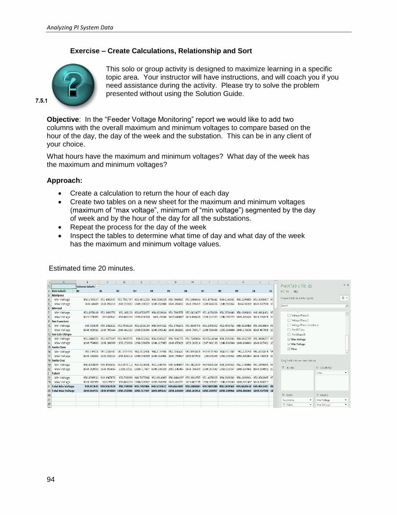
Analyzing PI System Data
94
Exercise – Create Calculations, Relationship and Sort
This solo or group activity is designed to maximize learning in a specific topic area. Your instructor will have instructions, and will coach you if you need assistance during the activity. Please try to solve the problem presented without using the Solution Guide.
Objective: In the “Feeder Voltage Monitoring” report we would like to add two columns with the overall maximum and minimum voltages to compare based on the hour of the day, the day of the week and the substation. This can be in any client of your choice.
What hours have the maximum and minimum voltages? What day of the week has the maximum and minimum voltages?
Approach:
Create a calculation to return the hour of each day
Create two tables on a new sheet for the maximum and minimum voltages (maximum of “max voltage”, minimum of “min voltage”) segmented by the day of week and by the hour of the day for all the substations.
Repeat the process for the day of the week
Inspect the tables to determine what time of day and what day of the week has the maximum and minimum voltage values.
Estimated time 20 minutes.

Analyzing PI System Data
Page 95
7.6 Limit Data Viewed by End Users
Columns from the tables in the database can be hidden from reports developed. For instance, you may want to hide columns that include things you will not need in your pivot tables or charts. Extra things may add clutter to the pivot table field list when you or other users are building reports in Excel.
Earlier, we brought the ID, PIntTSTicks, and PIntShapeID into the PowerPivot report as we imported all columns form the PI Integrator for BI output. These fields would make no sense to the end user as the values relate to the PI Integrator processing, and not the data set. To hide these fields from the end user, go to the PowerPivot Manage view or Power BI Data view, select the Feeder Voltage Monitoring sheet, right-click on the desired field, and select “Hide from Client Tools” or “Hide in Report View.”
This operation is performed on a visualization level in Tibco Spotfire by editing the display properties and removing the columns from view.

Analyzing PI System Data
96
7.7 Slicers
As previously mentioned, slicers make selecting report filters an intuitive experience for users. Slicers are created by PowerPivot whenever an item is dragged into the vertical or horizontal “Slicers” areas in the PowerPivot Field List dialog. One feature of slicers that makes them particularly useful is that they are aware of the relationships behind them. As users make their sections in one slider group, buttons on the associated slicer groups will be disabled if their selection will result in an empty dataset. This feature helps lead user to successful analytic results and avoids wasted time in making selections that result in an empty pivot table.
Slicers are always initially connected to the pivot table or chart from which they were created. However, we often need to have a combination of several pivot tables and charts within the same workbook to make our report effective. In many cases we need to have one slicer act as a filter for more than one of these charts or tables.
Within Power BI and Tibco Spotfire, slicers and filters are connected to the full page
The tables previously added with DAX expressions needs to be filtered by the Substation slicer. If we were to configure the slicers for the tables, PowerPivot would generate two additional slicers in the report. These slicers would only control one table each.
Within the Insert ribbon, select Slicer and choose the Data Model “Tables in Workbook Data Model”

Analyzing PI System Data
Page 97
Within the “Insert Slicers” menu, choose the Substation column.
Currently the Slicer is not connected to any of the PivotTables on the sheet. Selecting any filters will not update the display. This can be corrected by editing the slicer to add in new connections.
Select the slicer to edit, then right click on box. Select the “Report Connections” option to edit the items controlled by the selected slicer.
The dialog will display the options associated with the slicer and contained within the working woorkbook.

Analyzing PI System Data
98
For our report, the Substation slicer will only connect to the tables on sheet2. The slicer can then be moved to an appropriate location on the spreadsheet.
When building the relationships to join the slicer onto the PivotTables, we were using names like PivotTable1. For a small report such as this it is manageable, however if the report grows in size and number of tables then it can become difficult to know what each table represents.
Select any cell within a PivotTable, or select a PivotChart to bring up the Analyze ribbon. Here, the names of each object can be renamed.
These changes are detected automatically by any slicer connections, propagating the new name.
A good rule of practice is to give all of your pivot tables and charts meaningful names so you can locate them easily when configuring slicer connections.

Analyzing PI System Data
Page 99
For pivot charts, PowerPivot actually creates a pivot table on another worksheet to support the chart. In this example, the worksheet named “Data for Weekday Gen Chart” has been created in the spreadsheet. This is where we need to connect the slicer to filter the chart. We could select any of the other report tables, even though they are on other worksheets in the spreadsheet.
If you are not sure what the name of your pivot table is, you can access it from the “PivotTable Tools” menu, which appears anytime you select a cell in the pivot table. The table name is shown at the far left of the ribbon.

Analyzing PI System Data
100
Exercise – Add Slicers; make connections to chart/table
This solo or group activity is designed to maximize learning in a specific topic area. Your instructor will have instructions, and will coach you if you need assistance during the activity. Please try to solve the problem presented without using the Solution Guide.
Objective: Reusability and ease of interpretation is essential.
Which site has the greatest impact on the maximum and minimum voltage readings?
Approach:
1. Review the set-up of the slicers.
2. Connect the District slicer to the tables on sheet2.
Estimated time: 10 minutes

Analyzing PI System Data
Page 101
7.8 Discussion
This is a discussion designed to maximize learning in a specific topic area. Your instructor will have questions, and will prompt for communication within the class. This is an open ended section and the result depends on your needs.
Objective: The report is currently responsive to the user requests and allows for aggregations. Can this be extended further?
Approach
Is there a different client tool we would rather be using for this report?
What other data can be added to this model?
What other format would we like the data displayed in?
Estimated Completion time 10 minutes.

Analyzing PI System Data
102
8 Exploring the Data with PowerView (optional)
PowerView provides an intuitive and interactive way to perform data analysis on data stored in a PowerPivot spreadsheet.
PowerView is based on Microsoft’s Silverlight technology, which gives us auto scaling functionality to fit nicely in any size browser window.
With PowerView you can interact with data:
In the same Excel workbook as the Power View sheet.
In data models in Excel workbooks published in a PowerPivot Gallery.
In tabular models deployed to SQL Server 2012 Analysis Services (SSAS) instances.
In Excel, PowerView sheets are part of an Excel XLSX workbook.
Select the item of interest from the PowerPivot database.
Insert PowerView
All visualizations start with a table which can be started by simply dragging and dropping fields to the table area or clicking the checkboxes on the Power View Fields pane. Filters can be added by dragging Fields into the right Filters pane. Like slicers, these filters affect the data shown in the PowerView report. No relationships need to be made however, as filters automatically affect all visualizations on the report.

Analyzing PI System Data
Page 103
In PowerView, you can quickly create a variety of data visualizations, from tables and matrices to bar, column, and bubble charts, and sets of multiple charts. For every visualization you want to create, you start on a Power View sheet by creating a table, which you then easily convert to other visualizations, to find one best illustrates your data.
To create a table, click a table or field in the field list or drag a field from the field list to the view. Power View draws the table in the view, displaying your actual data and automatically adding column headings.
To convert a table to other visualizations, click a visualization type on the Design tab. Depending on the data in your table, Power View enables and disables different visualization types to give you the best visualization for that data.
NOTE: To create another visualization, start another table by clicking the blank view before selecting fields from the fields section of the field list.
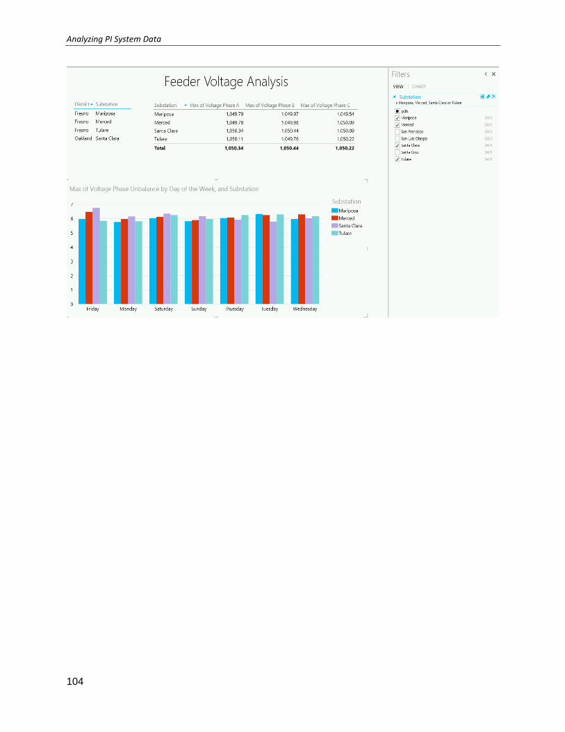
Analyzing PI System Data
104
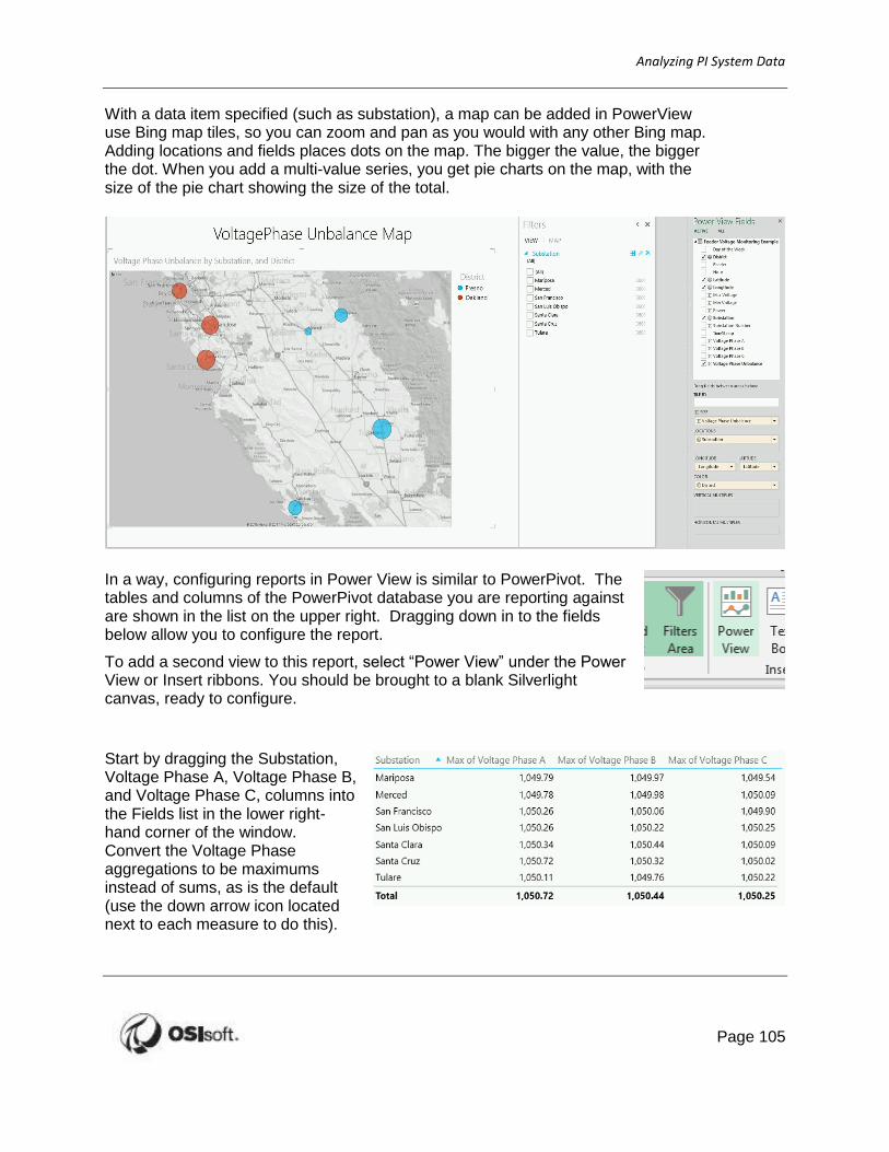
Analyzing PI System Data
Page 105
With a data item specified (such as substation), a map can be added in PowerView use Bing map tiles, so you can zoom and pan as you would with any other Bing map. Adding locations and fields places dots on the map. The bigger the value, the bigger the dot. When you add a multi-value series, you get pie charts on the map, with the size of the pie chart showing the size of the total.
In a way, configuring reports in Power View is similar to PowerPivot. The tables and columns of the PowerPivot database you are reporting against are shown in the list on the upper right. Dragging down in to the fields below allow you to configure the report.
To add a second view to this report, select “Power View” under the Power View or Insert ribbons. You should be brought to a blank Silverlight canvas, ready to configure.
Start by dragging the Substation, Voltage Phase A, Voltage Phase B, and Voltage Phase C, columns into the Fields list in the lower right-hand corner of the window. Convert the Voltage Phase aggregations to be maximums instead of sums, as is the default (use the down arrow icon located next to each measure to do this).

Analyzing PI System Data
106
As you add columns, you should see a table being built on the canvas. Don’t worry about the
order of things, it won’t matter.
All chart configurations start as tables. You can decide to
leave them that way, or you can change them to any of several different visualization objects. To make a change, choose one from the Design tab under “Switch Visualization”. Charts can be changed at any time into anything. Power View will take a look at the data types provided in your configuration and will only enable design choices that fit the data you have chosen.
Create a new table with Substation, Day of the Week, and Voltage Phase Unbalance (aggregating the values as maximum). Switch the visualization from a table to a vertical cluster column chart. This will result in a visualization like the graph shown below.

Analyzing PI System Data
Page 107
9 Final Exercise: Create a New Report
Objective: Select a new example kit from the list of available AF databases. Create a report in a client of your choice to analyze the database events.
Approach:
Select another example kit using PI System Explorer.
Determine what events have been generated within the database to be used in a report. These events may be over the past week, or extend for several months.
Hint: You may wish to analyse the events in PI System Explorer or PI
Coresight to determine what form the final report may take
Using the PI Integrator for Business Analytics, create a view for element or event data
Within the desired client tool, create a report using at least one chart and table. If geospatial data is available, add in a map object. What conclusion can be drawn from the data?
Customize the display to make it more user friendly for later use and report generation. Include dynamic objects like slicers or filters to make the report interactive.

Analyzing PI System Data
108
10 Appendix A Additional PowerPivot Resources
There are many other resources available to learn more about PowerPivot. Here are just a few.
OSIsoft Resources
• OSIsoft Users Conference www.osisoft.com
• PI Developers Club pisquare.osisoft.com/community/developers-club
• PI T&D Users Group Site extranet.osisoft.com
• For SRP Customers learning.osisoft.com
Microsoft Resources
• PowerPivot download http://www.microsoft.com/en-us/bi/powerpivot.aspx
• Windows Azure Marketplace https://datamarket.azure.com/
Helpful Books
• “PowerPivot for the Data Analyst”, Bill Jelen
• “Practical PowerPivot & DAX Formulas for Excel 2010”,
Art Tennick