analysis of ideogram and non-speech audio techniques in algorithm ... · pdf fileanalysis of...
TRANSCRIPT
ANALYSIS OF IDEOGRAM AND NON-SPEECH AUDIO TECHNIQUES IN
ALGORITHM ANIMATIONS
by
JOSEPH F. HOHENSTERN
(Under the Direction of Eileen Kraemer)
ABSTRACT
Algorithm animation (AA) involves the process of cycling through and graphically
generating a series of snapshots taken of an algorithm’s critical states over the course of its
execution. Professionals in the computing community have a strong intuition that these forms of
visualization act as powerful pedagogical tools to foster student comprehension and learning of
an algorithm’s abstract notations. However, this popular belief has left researchers wondering
about AA effectiveness due to its mixed performance in studies and underutilized in education.
Since viewers rely heavily on visual stimuli when viewing an AA, the extra burden could hinder
their performance in the comprehension of algorithms. It is the goal of this study to lessen the
burden on the visual stimuli by using non-speech audio to reinforce and/or replace some
graphical representations. Another technique we examine is the use of ideograms to make AAs
more clear and concise.
INDEX WORDS: algorithm animations, non-speech audio, ideograms
ANALYSIS OF IDEOGRAM AND NON-SPEECH AUDIO TECHNIQUES IN
ALGORITHM ANIMATIONS
by
JOSEPH F. HOHENSTERN
B.S., The University of Georgia, 2003
A Thesis Submitted to the Graduate Faculty of The University of Georgia in Partial Fulfillment
of the Requirements for the Degree
MASTER OF SCIENCE
ATHENS, GEORGIA
2009

© 2009
Joseph F. Hohenstern
All Rights Reserved
ANALYSIS OF IDEOGRAMS AND NON-SPEECH AUDIO TECHNIQUES IN
ALGORITHM ANIMATION
by
JOSEPH F. HOHENSTERN
Major Professor: Eileen Kraemer
Committee: Maria Hybinette Daniel Everett
Electronic Version Approved: Maureen Grasso Dean of the Graduate School The University of Georgia December 2009

iv
DEDICATION
To my parents, Dona and George.

v
ACKNOWLEDGEMENTS
First and foremost I would like to thank God for giving the power to inspire and pursue
my dreams. Sincere thanks to my family and friends who have given me courage and support. I
owe my deepest gratitude to my advisor, Dr. Eileen Kraemer, for her patience and guidance
throughout my research. I would like to thank my committee members, Dr. Marie Hybinette and
Dr. Daniel Everett, for their advice and expertise. I am indebted to Dr. Roger Hill and several of
the Workforce Education, Leadership, and Social Foundation professors for their support and the
opportunity to broaden my abilities. In addition, I would like to thank Dr. Beth Davis from
Georgia Institute of Technology and her Vision Lab members as well as The University of
Georgia’s VizEval group for their wisdom and advice. Thank you to all my friends of Athens
who made an impression and memories that will last a life time.
vi
TABLE OF CONTENTS
Page
ACKNOWLEDGEMENTS.............................................................................................................v
LIST OF TABLES....................................................................................................................... viii
LIST OF FIGURES ....................................................................................................................... ix
CHAPTER
1 INTRODUCTION .........................................................................................................1
2 LITERATURE REVIEW ..............................................................................................5
Empirical Studies ......................................................................................................6
Visual Design ............................................................................................................8
Auditory Design ......................................................................................................12
Working Memory ....................................................................................................16
3 METHODOLOGY ......................................................................................................19
Symbol Selection.....................................................................................................20
Sound Selection.......................................................................................................24
Experiment ..............................................................................................................28
4 DATA AND RESULTS ..............................................................................................35
Analysis of Variance ...............................................................................................35
Hierarchical Multiple Regression............................................................................44
5 CONCLUSION............................................................................................................52
Summary .................................................................................................................52
vii
Discussion ...............................................................................................................55
REFERENCES ..............................................................................................................................57
APPENDICES ...............................................................................................................................60
A PERFORMANCE HISTOGRAMS.............................................................................60
B PERFORMANCE BOXPLOTS ..................................................................................62
C STANDARD CORRELATION MATRIX..................................................................64
D HMRA TRADITIONAL CORRELATION MATRIX ...............................................66
E HMRA POSTTEST CORRELATION MATRIX .......................................................68
F ALGORITHM ANIMATION GUIDE SHEET...........................................................70
G PERFORMANCE TESTS ...........................................................................................73
H SYMBOL AND SOUND SELECTION SETS ...........................................................80

viii
LIST OF TABLES
Page
Table 3.1: 2 x 2 Factorial Design...................................................................................................32
Table 4.1: Pretest Performance Scores ..........................................................................................36
Table 4.2: Pretest Performance 2 x 2 ANOVA..............................................................................37
Table 4.3: Traditional Performance Scores ...................................................................................38
Table 4.4: Traditional Performance 2 x 2 ANOVA.......................................................................38
Table 4.5: Traditional to Pretest Ratio...........................................................................................39
Table 4.6: Traditional to Pretest Ratio 2 x 2 ANOVA ..................................................................40
Table 4.7: Posttest Performance Scores.........................................................................................41
Table 4.8: Posttest Performance 2 x 2 ANOVA............................................................................42
Table 4.9: Posttest to Pretest Ratio ................................................................................................42
Table 4.10: Posttest to Pretest Ratio 2 x 2 ANOVA......................................................................43
Table 4.11: Hierarchical Multiple Regression Design...................................................................45
Table 4.12: hMRA Traditional ANOVA.......................................................................................46
Table 4.13: hMRA Traditional Performance Summary ................................................................46
Table 4.14: hMRA Traditional Performance Coefficients ............................................................48
Table 4.15: hMRA Posttest ANOVA ............................................................................................49
Table 4.16 hMRA Posttest Performance Summary.......................................................................49
Table 4.17 hMRA Posttest Performance Coefficients...................................................................51
ix
LIST OF FIGURES
Page
Figure 2.1: Public Information Pictograms......................................................................................9
Figure 2.2: Peircean Triad for Swap Symbol.................................................................................11
Figure 3.1 : SSEA Interface............................................................................................................21
Figure 3.2: Symbol Selection Choice Set ......................................................................................22
Figure 3.3: Sound Selection Choice Set ........................................................................................26
Figure 3.4: Earcon Durations using Weber's Law .........................................................................28
Figure 4.1: Pretest Performance Scores .........................................................................................36
Figure 4.2: Traditional Performance Score....................................................................................38
Figure 4.3: Traditional to Pretest Ratio..........................................................................................39
Figure 4.4: Posttest Performance Scores .......................................................................................41
Figure 4.5: Posttest to Pretest Ratio...............................................................................................42

1
CHAPTER 1
INTRODUCTION
Algorithms are specific computational procedures for solving problems. They typically
accept inputs and generate output. Algorithms can be represented graphically in the form of
algorithm visualizations [12]. These visualizations serve several purposes, the first being analytic
and the second pedagogic. Visualizations used as analysis tools to depict a program’s execution
aid researchers and developers in debugging and performance tuning of the program’s code.
Visualizations used as pedagogical tools to abstract the program’s operations aid educators and
students in teaching and learning the program’s semantics. Over the course an algorithm’s
execution, the algorithm can go through several states. Visualizations generally capture only one
of those states and provide a limited view. However, an algorithm animation (AA) combines
succeeding states to give the viewer a clearer and more concise overview of the algorithm’s
functionality [21].
A strong belief and intuition exists among many researchers and educators in the
computing community that the dynamic nature of algorithm animations may offer a more
effective and efficient alternative to traditional textbook and lecture methods of presentation.
Though this belief that visualizations offer valuable resources for communicating information
about the state and behavior of a program is widespread, actual use of animations in classroom
and research settings is less common [13]. Kraemer, et al. offer some reasons for AA
underutilization, including the amount of effort that is required for an instructor to find, design,
2
or refine an AA system, the difficulty viewers experience in navigating and interacting with
multiple views, and questions about the actual benefits viewers receive [19].
Starting in the early 1990s, researchers began to explore the pedagogical values of AA.
Results of empirical studies testing the effectiveness of AA on viewer comprehension have been
mixed [16], which poses some interesting questions about how valuable AAs are as pedagogical
tools and in what situations they are beneficial. These questions set the basis for future studies
[13, 21, 22, 28, 33].
Before visualization developers and researchers design future AA systems that may offer
little or no benefit over traditional educational methods of presenting material, they must re-
examine current AA systems to detect any flaws that may hinder learning, so as not to repeat the
same mistakes. One common mistake in visualization design is that experts tend to develop
visualizations based on their own interpretation rather than a novice’s interpretation. Students do
not benefit from such an animation, because they do not understand the mapping from algorithm
to graphics and the underlying algorithm on which the animation is based [29].
In addition to issues of graphical element and layout, designers ought to consider a
viewer’s perception, attentional, and cognitive abilities. Only a handful of empirical studies have
been conducted that investigate the individual pedagogical impact that various common
components of popular AA systems have on a user’s comprehension [21, 28]. By knowing the
components of an AA system the user focuses on, how they are interpreted, and the thought
process behind them, researchers can begin setting guidelines for designers to apply in their
construction of an AA system that effectively enhances a user’s understanding of the algorithm
being portrayed.
3
This study is one in a series of collaborative projects from the University of Georgia’s
Computer Science VizEval and the Georgia Institute of Technology’s Psychology Vision labs
that explore, examine, and evaluate the effects of selected low-level AV attributes on viewer
comprehension and seek to establish guidelines for development of future visualizations as well
as a comprehensive, empirical method of evaluating their usefulness [14, 17, 26, 27]. One of our
initial tasks in setting up the empirical studies was to look for common features among current
AV systems and to list features that seem promising but might have been overlooked. A few of
the perceptual / attentional features we have investigated in past studies consist of various cueing
(flashing) techniques for comparison events to swapping techniques (growing/moving) used in
exchange events. In addition, we also inspected various types of interactive questioning
(predictive, responsive, feedback) which are classified as an attentional / cognitive feature [17,
26, 27].
The goal of this study is to shed some light on the usefulness of two attributes that have
not received much attention in current AA systems, the significance of symbols and sounds (non-
speech audio) to represent critical points of interest during the execution of an algorithm. What is
unique about this study and sets it apart from the others is that it represents the information both
visually and auditorily.
In the following sections, Chapter 2 provides an overview of the advances AA systems
have made over the past three decades, highlighting key empirical studies during that span,
exploring visual and auditory design, and describing the effects of multi-sensory stimuli on
viewer comprehension. Chapter 3 features the additions made to the animation toolkit and testing
environment, the selection process to determine identifiable symbols and sounds in AAs, and the
empirical study’s design and procedure. Chapter 4 presents the findings and analysis from

4
student assessment and performance tests. Chapter 5 concludes with a summary and thoughts
for future work.
5
CHAPTER 2
LITERATURE REVIEW
It was not until the early 1980s when Baecker unveiled his “Sorting Out Sorting” video
that the computing community took notice of the potential power that images depicting an
algorithm’s successive states during execution could reveal [3]. This video is seen by many in
the program visualization domain as the first successful algorithm animation (AA) to display an
algorithm’s dynamic nature and established the foundation for future research.
Throughout the 1980s, as technology for graphics AA systems became increasingly
sophisticated. Notable AA systems developed during this time include BALSA [5] and TANGO
[31]. BALSA was created so that educators could design and develop animations for lecture and
individual demonstration. BALSA provided for colored animations and offered support for
sound [5]. TANGO focused on providing more interaction, gave students an opportunity to
construct their own animations, and incorporated smoothness into its design [31]. Other popular
systems that followed included Zeus [5], which supported multi-viewing, and CAT [6], a web-
based animation framework. Starting from the early 1990s, the focus of AA systems
development shifted from technology and design to more of a pedagogical use and effectiveness
stance to answer the question, “Do algorithm animations improve viewer comprehension and in
what role?”
6
Empirical Studies
Several preliminary empirical studies were conducted based on the intuition that AA
systems are powerful mechanisms for concretizing abstract mathematical notions and algorithm
data manipulation, concepts many novice students find quite challenging. The initial findings
from several preliminary empirical studies on AA effectiveness as a pedagogical tool to promote
and enhance a student’s understanding of an algorithm have varied [8, 12, 16]. The studies
ranged from comparing numerous design elements [20, 28] to examining useful learning
strategies [29, 32, 33]. Though the animations were not found to hinder a student’s performance,
their effectiveness was often not significant over proven traditional methods, which can be seen
as a disappointment given their potential.
Lawrence conducted studies on a mixture of AA systems components, from design
enhancements and student preferences to classroom use [21]. Even though students preferred
data with labels or certain algorithm representations, Lawrence found that these had little to no
impact on the performance as measured by posttest scores. However, the labeling of algorithm
steps resulted in statistically significant posttest scores. Another study that showed significant
results examined the effects of two learning styles. Students who took a more interactive
approach and constructed their own data input outperformed on posttest scores those who were
given an instructor set and passively observed the animation. This coincides with similar results
Hansen et al. [15] experienced, but contradicts the findings of Saraiya [28]. Lawrence reasons
that self-constructed input provides a more engaging learning environment for students to
explore, however Saraiya believes students will have a difficult time constructing good test cases
given their limited knowledge of the algorithm.

7
Another study to use an interactive animation to teach an algorithm was conducted by
Stasko et al. [29]. They wanted to see if supplementing textual descriptions with an interactive
animation would aid in procedural understanding. To their dismay, the animation group only
performed slightly better on a posttest and showed no improvement over the control group on
questions that tested procedural knowledge. Their explanation for the lack of performance
benefit to the animation group was that the animation represents an expert’s understanding of the
algorithm and not a novice’s. Therefore, a mapping of visual elements to the underlying
algorithm was not established.
Similar effects were seen in a more recent study conducted by Byrne et al. [8] using
interactive animations to predict an algorithm’s behavior. Two experiments were performed, the
first on a simple depth-first search algorithm using non-computer science major participants to
predict successive vertices and a second using a more sophisticated group of upper-level
computer science students on a complex binomial heap algorithm. For both studies one group
was shown the animation whereas another received static printed graphics. Byrne et al. recorded
error rate as the number of incorrect predictions and administered a posttest to measure
performance. They concluded the use of animation and/or prediction was beneficial on
challenging questions for a simple algorithm; however it provided no significant benefit for more
complex algorithms. Interestingly, several preliminary studies suggest that interactive predictive
questioning might hinder performance [17, 27]. Rhodes attributes the degraded performance to
the questions functioning as distracters that force the user to focus on low-level, procedural
actions rather than the high-level execution [27]. Kaldate conducted studies on users’ viewing
behavior while watching an animation and noticed that users frequently looked at the source
8
code and not the animation when prompted to answer predictive questions [17].
Visual Design
In visualization design, animators have the intricate task of crafting interfaces that are
both informative and engaging. According to Gurka and Citrin, the quality of an animation
should be guided by pedagogic experience [13]. In order to accomplish this, animators often
seek the advice of professionals in their fields of expertise to gain an understanding of the critical
concepts that an animation should highlight. In the case of algorithms, it would be the key
operations, states, and semantics. They would also need to possess a rich graphical vocabulary,
which according to Price [25] typically refers to the representation of an algorithm’s data
structures. The term “representational characteristics” is used frequently to describe an
algorithm’s data representation in an AA system [16]. A few of the more common
characteristics include color, control, captions, cues, and code. These features, when used
appropriately, have been shown to improve performance and aid in viewer comprehension [21,
28]. Another feature that has been effective in other visualization settings but not used as much
in AA systems is the use of ideograms [35].
Ideograms are graphical symbols that represent an idea or concept. Whereas some
ideograms convey their meaning through pictorial resemblance to a physical object in the form
of a pictogram, others are comprehensible only by familiarity with prior convention. For
instance a frequently used ideogram of a bar across a circle over a cigarette is generally seen as a
request not to smoke in a particular area. Some of the earliest forms of ideograms included
prehistoric drawings and paintings lining cave walls to various forms of writings including
cuneiform, hieroglyphics, and Chinese. Today, ideograms are commonly used as pictograms on
9
signs seen in public areas useful to travelers by conveying information through a common
“visual language” [35].
In the 1920s Otto Neurath, an Austrian educator and philosopher, with Gerd Arntz, an
artist and illustrator, designed Isotype (International System of Typographic Picture Education),
a system of pictograms to communicate quantitative information regarding social consequences
in a simple, non-verbal way [36]. This system was very influential in the development of both
the graphic design and informational graphic fields. The graphical symbols were popularized
during the 1972 Summer Olympics in Munich when Otl Aicher employed Neurath’s stick figure,
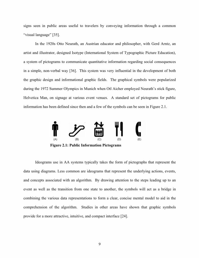
Helvetica Man, on signage at various event venues. A standard set of pictograms for public
information has been defined since then and a few of the symbols can be seen in Figure 2.1.
Ideograms use in AA systems typically takes the form of pictographs that represent the
data using diagrams. Less common are ideograms that represent the underlying actions, events,
and concepts associated with an algorithm. By drawing attention to the steps leading up to an
event as well as the transition from one state to another, the symbols will act as a bridge in
combining the various data representations to form a clear, concise mental model to aid in the
comprehension of the algorithm. Studies in other areas have shown that graphic symbols
provide for a more attractive, intuitive, and compact interface [24].
Figure 2.1: Public Information Pictograms

10
In addition, ideograms offer potential benefits over other forms of visual representations.
They are recognized more quickly and more accurately than text [24]. For instance, an “i” in a
circle accompanying text quickly indicates an informational message or an exclamation mark
represents a warning. These two symbols immediately inform the user of the purpose of the
messages without the user having to read the messages themselves. Graphical attributes (color,
shape, …) used for other representations can also apply to ideograms and be very useful for
quickly classifying objects and elements. Another advantage, due to their simplicity in design
and instruction, is that less of a cognitive effort is required for users to process these ideograms
and thus they can easily be identified and remembered [24]. This explains the success of using
the “Helvetica Man” symbols for public information.
It has also been thought that graphic representations have a tendency to be more natural,
for visual skills in humans emerge before language and the human mind has a powerful image
memory [10]. Therefore, ideograms would make a great fit into AA systems by making
substitutions for labels, pseudocode, or brief explanations. By using visualizations, we try to
form more concrete models from abstract elements, so adding ideograms to the visualization
offers the power to minimize some of the abstract thinking. Ideograms tend to be more
aesthetically pleasing than other forms of graphics and can provide for a more entertaining and
engaging interface as well as attract the viewer to various points of interest. Rather than
providing just a pictorial representation of the data, ideograms offer an idea or concept.
A few of the issues regarding ideograms involve their creation and interpretation.
Designers have a greater selection of tools and techniques now to design graphics versus the
standard shapes we have been accustomed to seeing in previous AAs. When creating an
ideogram, not only does the design need to be considered, but also functionality and usability.
11
Functionality determines the purpose of the ideogram, whereas usability is helpful in knowing its
place within the animation. The ideogram should be kept simple yet provide enough detail in the
context to aid the user in comprehending the algorithm. Too much attention to detail in the
graphic might hinder learning performance by putting more strain on the visual stimuli.
However, not enough detail will increase ambiguity and have the user misinterpret the symbol’s
meaning.
Studies of meaning evolved from semiotics, a field that seeks to understand how a sign is
interpreted and processed [37]. Signs can take on various forms, but for our purpose it will
represent a visual image or ideogram. Charles Peirce, the founder of modern semiotics, derived
a model that can be useful in making comparisons between the design intentions and perceived
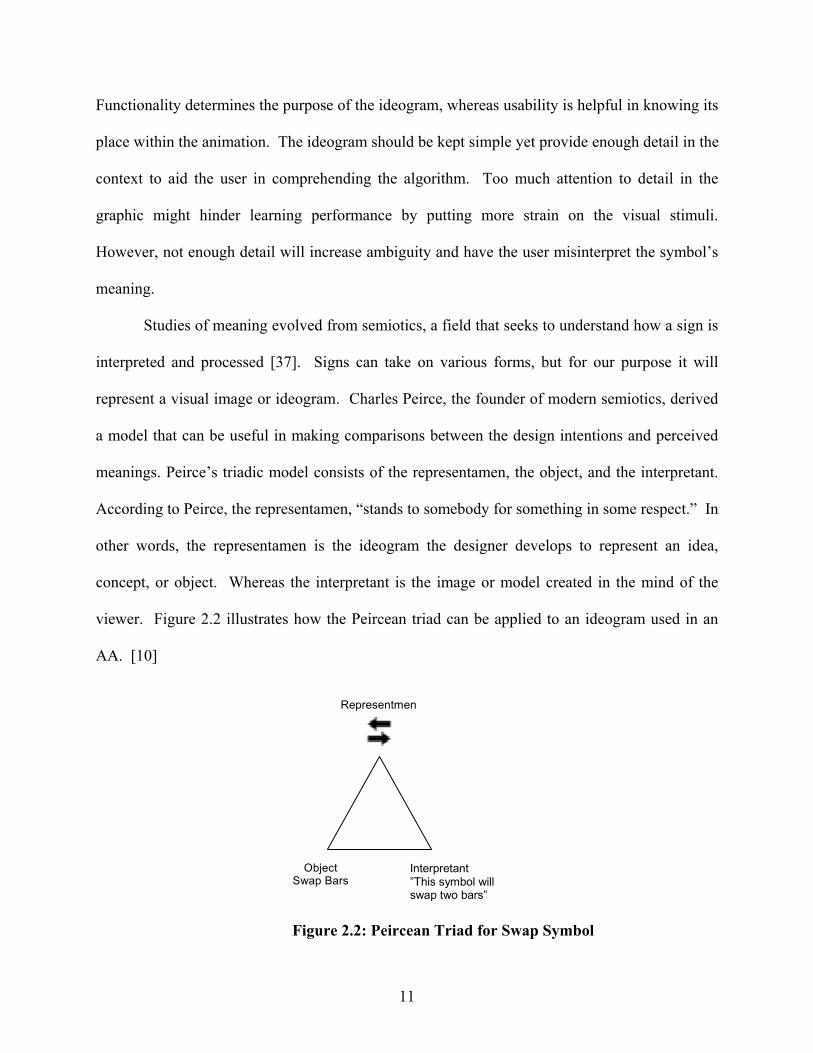
meanings. Peirce’s triadic model consists of the representamen, the object, and the interpretant.
According to Peirce, the representamen, “stands to somebody for something in some respect.” In
other words, the representamen is the ideogram the designer develops to represent an idea,
concept, or object. Whereas the interpretant is the image or model created in the mind of the
viewer. Figure 2.2 illustrates how the Peircean triad can be applied to an ideogram used in an
AA. [10]
Representmen
Object Swap Bars
Interpretant ”This symbol will swap two bars”
Figure 2.2: Peircean Triad for Swap Symbol
12
Even the most well crafted symbol will have to be learned, since identical ideograms can
have different functions depending on the context in which they are presented. For instance, in
everyday use the symbol “X” could denote no longer counts, is wrong, is forbidden, or is
cancelled. In mathematics the ideogram is used to represent an unknown number or the
multiplication operator. However in some beliefs, the diagonal cross is used as a symbol for
Christ [37]. A tutorial and/or training session is helpful in familiarizing users with an AA and
its various graphical representations.
Another factor to consider when incorporating ideograms into an animation is the load it
has on human cognition. Studies have shown the number of different symbols a person can
differentiate is more restricted than text [24]. This limit is analogous to the cognitive load theory
which states that most people can only retain a certain set of information in their short term
memory. Generally, the set is seen as 7±2 “chunks” of data [33]. Thus, ideograms ought to be
used sparingly with other forms of visual representation in order to reduce the load on the
cognitive system and increase the amount of information shown for a more efficient and
effective learning environment.
Auditory Design
As displays become more visually intensive, the visual channel becomes increasingly
overtaxed. In order to lessen this burden, interface designers have developed applications that
utilize other modalities, such as auditory, for processing the information. With technological
advances in digital sound production, designers can easily generate and alter the audio to meet
their needs. As a result there has been interest among researchers in computing regarding the
utilization and effectiveness of sound in various software visualizations.
13
The use of software visualization through sound is commonly known as program
auralization [5]. It is denoted as the process of forming mental images of the behavior, structure,
and function of computer programs by listening to acoustical representations of their execution.
This form of representation provides another medium for users to gain insight into the
information being presented [5].
Pioneer work in program auralization focused on developing tools that could debug code
or act as performance aides during the execution of the programs. Francioni, Albright, and
Jackson were some of the first researchers to apply this technique to distributed memory parallel
programs [11]. Their visualization was designed to play a unique note when a key event was
generated while the parallel program ran. The events they were interested in were processor
communication, processor load, and processor event flows. The design confirmed the usefulness
of auralization and sparked interest among other researchers in computing.
Even in our day-to-day tasks, non-speech audio plays a significant role. Various non-
speech audios from beeps to alarms inform us of events that generally are not in our direct visual
field, from receiving a phone call to letting us know when the clothes are dry. Gamers also
benefit and tend to have higher scores when sound accompanies the graphics. However, while
some noises can be informative others can impede and act as distracters. Researchers seek to
design and develop applications that explore the benefits of using auditory interfaces and to
identify and eliminate those that hinder performance [7].
Some of the issues researchers face is what sounds to use [7] and what information is best
presented in the different sounds [5]. Early non-speech audio used for data representation and
audio cues were categorized as being earcons which are musical notes created by specifying
pitch, loudness, and duration [4]. These types of sounds capture the information but bear little

14
relation to the graphic counterparts and tend to be abstract. Buxton et al. [7] proposed auditory
icons, sounds that mimic everyday noises from a piece of paper crumpling to represent a file
being deleted or an audience clapping to indicate the approval of an action.
A few of the advantages of using auditory icons, according to Buxton et al. [7], is the
richness of everyday sounds, the ease of comprehension, and their ability to help create a virtual
world. We are surrounded by sound and each has the potential to convey a great deal of
information. Since several visualization interfaces contain graphical representations of real
world objects, making auditory icons to reinforce them is a relatively easy task. This extra
redundancy can help users learn and remember the system which aids in their interpretation and
understanding. Also by creating a virtual environment similar to the real world, the user’s
feeling of direct engagement is increased [7].
The SonicFinder, an extension to the Finder application used to organize, manipulate,
create, and delete files on the early Macintoshes, is considered the first interface to utilize
auditory icons [7]. It was developed by William Gaver, a professor of Design at Goldsmiths
University, for Apple Computers. He advocated that audio information be used redundantly with
visual information so each mode’s strengths can be exploited and mutually reinforced.
SonicFinder provided useful feedback about basic events and properties. A variety of actions
from selecting, scrolling, resizing windows, and dropping files into the trashcan would make
sounds. The file’s type and size would even affect the sound associated with it [7]. Even though
the interface was fairly simple, SonicFinder showed that sounds can be incorporated in an
intuitive and informative way.
More complex systems, SoundShark a virtual physics laboratory and ARKola a bottling
plant simulation, were developed to demonstrate auditory icons used in large scale, multi-
15
processing, collaborative systems [7]. SoundShark was useful in providing information about
user interaction, ongoing processes, as well as other users’ events. On the other hand ARKola
provided an environment in which there were simultaneous sounds. Gaver and Smith explored
various ways for each sound to be heard and identified [7]. They concluded that having
continuous and repetitive sound used as background information allowed users to concentrate on
their own tasks, while still being able to coordinate with others.
Brown and Hershberger’s research focused on algorithm visualization and is seen as the
first to apply program auralization on algorithm animations. They had positive preliminary
experiences using audio for reinforcing visual views, conveying patterns, replacing visual views,
and signaling exceptional conditions [5]. Taking the same approach as Gaver and perhaps its
most obvious use, Brown and Hershberger first used sound to reinforce what is being displayed
visually. For a hashing animation, they associated a pitch to each table, so when an element was
inserted into the table, it produced a tone corresponding to the pitch. And for a sorting
animation, when elements were compared or moved a tone was produced in which the pitch
corresponding to the element’s value.
As a result of reinforcing elements with audio in various AAs, it became apparent to
Brown and Hershberger that sorting animations produce auditory signatures. Similar to how
graphics form visual patterns, auditory signatures are distinct patterns users detect by hearing
relationships in the data. According to Francioni, humans have remarkable abilities to detect and
remember patterns in sound and could explain why most people remember melody of a song
much sooner than they learn the words [11]. Brown and Hershberger concluded that since sound
intrinsically depends on the passage of time to be perceived, it is very effective for displaying
dynamic phenomena, such as running algorithms.

16
While some visual views benefit from having audio reinforcing them, there are others
that could be replaced in order to allow the user to focus their full visual attention elsewhere.
Brown and Hershberger demonstrated this using a parallel quicksort algorithm by producing a
tone whose pitch rose with the number of active threads. Instead of having printed text or a bar
chart indicting the number of threads, the user could focus on the algorithm animation. This
places less of a burden on the visual stimuli and creates a more efficient learning environment for
the user [5].
Another effective technique used in other visualizations and experienced similar success
in algorithm animations was having the audio signal exceptional conditions. Brown and
Hershberger note this is useful since there are long periods of using AA when the user is
passively watching the algorithm and the visual input channel can easily be turned off by looking
away, looking at the wrong part of a display, or being lulled into complacency by the normal
case [5]. On the other hand, the audio input channel is harder to turn off. Brown and
Hershberger extended the hashing algorithm for reinforcing views to include auditory icons that
resembled a car crashing when a new element collides with old elements in all tables. They
chose the car crash to underline the idea of a collision.
Brown and Hershberger’s experimentation with sound in AA has proven to be very
successful and practical. However, more studies ought to be conducted to determine the
effectiveness of audio in the comprehension and learning of an AA.
Working Memory
The comprehension of program visualization relies largely on the visual stimuli to form
mental images, however as we introduce other modalities our mental models might be become
distorted due to cognitive limitations. By knowing how we process multiple stimuli, we can

17
design more efficient and effective visualizations. Cognitive psychology provides several
theories on how our brains receive, interpret, and store input. A few of the more prominent
theories are highlighted below.
The first such model was proposed in 1968 by Atkinson and Shiffrin to include sensory
memory, short-term memory, and long-term memory [1]. The information enters through a
variety of sensory channels, however according to Atkinson and Shiffrin we attend only to
certain information that arrives in short-term memory (working memory) and the information not
immediately attended to is held in a brief buffer memory known as sensor memory, with one
sensory memory system associated with each sense. While the information is in working
memory, it can be used for processing however this memory has a limited capacity and the
information fades when it is no longer attended to. In order to hold information in working
memory, the information is often encoded verbally through rehearsal [1].
Alan Baddeley and Graham Hitch in 1974 proposed an alternative model to working
memory, which became the most popular view [2]. Their model is comprised of four main
components. The first is the central executive which controls the flow of information to the
phonological loop (verbal domain), visuo-spatial sketchpad (visual spatial domain), and episodic
buffer. The phonological loop deals with sound while the visuo-spatial sketchpad handles visual
and spatial information. The fourth component, the episodic buffer, links information across
domains to form integrated units of visual, spatial, and verbal information. Their findings are
derived from dual-task studies in which the performance of two simultaneous tasks requiring the
use of separate domains is nearly as efficient as performing the tasks individually. However,
when the simultaneous tasks require the same domain then the performance is less efficient as
opposed to doing the same tasks separately [2].

18
Alan Baddely and Graham Hitch’s model can be mapped closely to Paivo’s dual code
theory. The theory states that both visual (non-verbal) and verbal information are processed and
represented along different channels [23]. Since the information does not compete for the same
resource, it has the potential to improve learning. For instance, users would have an easier time
comprehending an algorithm animation that provided narration of key events over the same
animation that offered a textual description of key events since the user does not have to attend
to two images [23].
Another theory is the Multiple Resource Theory proposed by Christopher Wickens,
which extends the previous models to include several different pools of resources that can be
tapped simultaneously [34]. Wicken’s model differentiates each of the input stimuli as its own
information processing source. However, in the previous models, non-audio sounds were
considered as non-verbal and processed in a similar fashion to visual information. In all the
theories, cognitive resources are limited and performance is hindered when the individual
performs two or more tasks that require a single resource [34].

19
CHAPTER 3
METHODOLOGY
This study is one in a series of several collaborative projects between the University of
Georgia’s Computer Science VizEval group and the Georgia Institute of Technology’s
Psychology Vision lab that explore, examine, and evaluate the effects of selected low-level AV
attributes on viewer comprehension and seek to establish guidelines for development of future
visualizations and a comprehensive, empirical method of evaluating their usefulness [17, 26, 27].
One of our initial tasks in setting up the empirical studies was to look for common features
among current AV systems and to select features that seem promising but might have been
overlooked. A few of the perceptual / attentional features we have investigated in past studies
include cueing (flashing) techniques for comparison events and swapping techniques
(growing/moving) used in exchange events. In addition, we have evaluated various types of
interactive questioning (predictive, responsive, feedback) which are classified as an attentional /
cognitive feature [17, 26, 27]. The goal of this study is to evaluate the usefulness of symbols and
sounds representing critical points of interest throughout the execution of an algorithm
animation.
To facilitate comparisons between this study and studies conducted in our lab, the System
to Study the Effectiveness of Animations (SSEA) was used as the testing environment for
evaluating a viewer’s comprehension of an algorithm as it executed and visualized [19, 26].
SSEA creates an engaging atmosphere in which the viewer does not passively watch the
20
animation but interacts with it by selecting input, replaying steps, and answering questions. The
Support Kit for Animation, SKA, functions as the data structure library and animation engine
[14]. It allows the animation designers to easily create visual and auditory features used in an
animation by specifying them in a project file.
Symbol Selection
A major criterion in designing an algorithm animation is the selection of the graphical
components. These visuals assist the viewer in forming more concrete models of the underlying
algorithm’s semantics. The designers have the intricate task of creating symbols that are simple
yet provide enough detail in the context to aid the user in comprehending the algorithm. Too
much attention to detail in the graphic might hinder learning performance by putting more strain
on the visual stimuli. However, not enough detail will increase its ambiguity and have the user
misinterpret the symbol’s meaning.
The graphics used in the experiment are types of symbols known as ideograms. Their
purpose is to draw the attention of the viewer to key events and states as the animation steps
through the algorithm. An alternative to labels and captions, the ideograms reduce the
complexity of the interface and provide for faster recognition. However, in order for them to be
successful, ideograms must resemble their underlying functionality. To have a better
understanding of which symbols offered a more precise representation, an ideogram intuitiveness
test was created.
For the symbol selection study we chose ideograms to represent and highlight six critical
components of a sorting algorithm. Three of the components emphasize event conditions and the
other three inform the viewer about state conditions. The three event conditions consist of when
adjacent bars are 1) compared, 2) swapped, or 3) stay in their current positions. The three state
21
conditions correspond to 1) the data variable values at i and j, 2) the text size, and 3) formatting
for each of the bars’ value. The visuals of the variables’ states prior to and after an event, along
with the visual for the event itself form a transition the viewer can observe in order to have a
greater sense of the algorithm’s abstract concepts.
The ideogram intuitiveness test consisted of presenting each condition in an isolated
animation to ten Psychology undergraduates from the Georgia Institute of Technology. The
subjects were given two tasks. In the first task, participants were asked, to choose the most and
least effective symbol from a set of eight symbols according to their ease of identification and
resemblance to their underlying functionality. The second task consisted of ranking the same set
of eight symbols for each condition on the same criteria as in the first task. The purpose of the
first test is to get the viewers initial response based on its perceptual performance whereas the
second required more time and considers the viewer’s cognitive effort. In addition to the
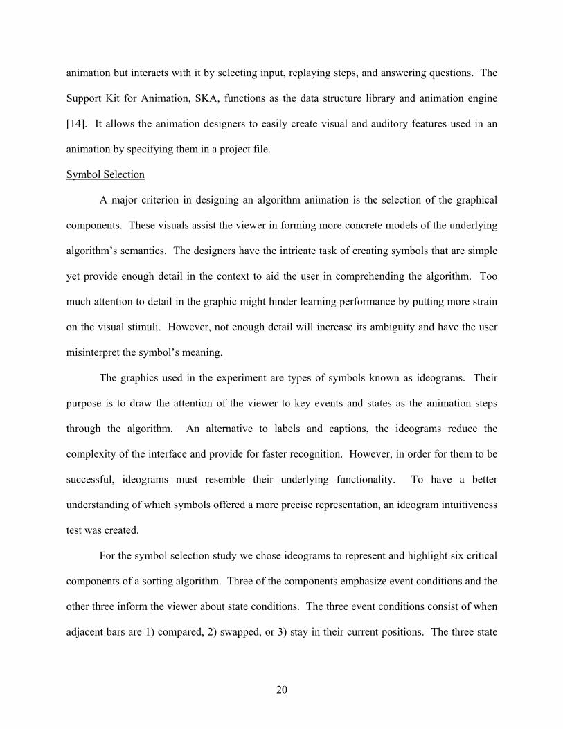
Figure 3.1: SSEA Interface
22
quantitative results, a set of qualitative responses were collected for a viewer’s selection on each
component.
SSEA provided the interface (see Figure 3.1) while SKA generated the animations. SKA
was enhanced by giving the animation designer more freedom to create visuals using a popular
graphics editing program of their choice and then importing them into the animation. The set of
ideograms the users observed and ranked are found in Appendix H. Each question in the symbol
selection study was directed to a certain condition and included a set of prospective ideograms.
After clicking the ‘Play’ button below a symbol, the user would watch a brief animation
containing the selected symbol in the same context as it would appear in the main study. Once
the user had previewed all the symbols for a question, he then chose the most and least efficient
symbol as well as rank ordered the set based on their ease of identification and resemblance to
their underlying functionality. In addition to scoring the symbols, the users provided reasons for
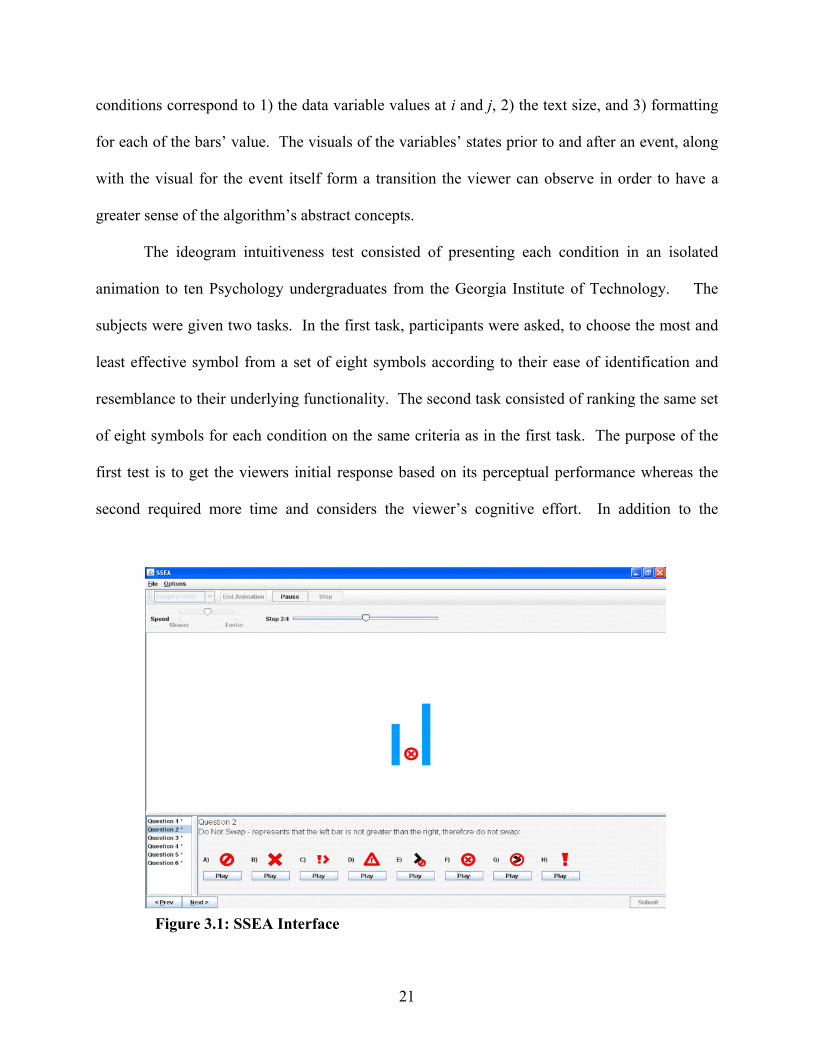
their choices and any alternatives. Figure 3.2 shows the symbols chosen as the most effective
based on the scores and comments.
The ideogram in Figure 3.2 (A) was selected as the best choice to symbolize a ‘Swap’
event and occurs when two bars in the sorting animation are to switch positions. Right before
the bars change locations, the ideogram appears between them to inform the user a switch is to
occur and it remains until both bars have swapped positions. A few reasons why the symbol in
Figure 3.2 (A) is a good choice is that 1) it uses two distinct arrows 2) the arrows point in
Figure 3.2: Symbol Selection Choice Set

23
opposite directions 3) the arrows are vertically aligned. By having two distinct arrows, the users
can assume there is more than one item involved and in the case of the sorting animation it is the
two bars. Also, pointing the arrows in opposite directions as well as having them vertically
aligned denotes that where one item begins the other one ends as in the case of when items swap
locations.
The next symbol (B) in Figure 3.2 corresponds to the ‘Stay’ condition or ‘Do Not Swap’
event and occurs when two bars in the sorting animation do not swap but stay in their current
positions. The ideogram appears after a comparison is made between the two bars and informs
the viewer the bars will not be switching locations. By referencing Appendix H, one can see that
Figure 3.2 (B) ideogram was not one of the choices during the selection process. The reason is
that the ideogram was designed after reading several comments of more effective alternatives
that better represented its functionality. The ideogram uses the standard red circle with a slash to
signify ‘Do Not’ or ‘No’ over a symbol resembling the ‘Swap’ condition, Figure 3.2 (A). The
set of symbols in Appendix H 2 is more suited for a ‘Not Greater Than’ or ‘Caution’ event.
The comparison alluded to in the previous paragraph is a ‘Greater Than’ comparison and
represented by Figure 3.2 (C). The ideogram uses the common notation in mathematics and
computer science when checking if one value is larger than another with a subtle question mark
added. The reason for the question mark is for the viewer to ask himself, “Is the bar on the left
greater than the bar on the right?” If the question mark was not present, the viewer might be
presented with the situation in which the left bar is less than the right bar, however the symbol
would imply the opposite, the left bar is greater than the right. Instead, the question mark
informs the viewer there is a decision to be made. An alternative to the ideogram would be
showing the ‘Greater Than’ symbol when the bar on the left is greater and showing the ‘Less

24
Than’ symbol when the bar on the left if less than. However, we are adding more to the visual
complexity by introducing another symbol and possibly a third if the two bars are equal.
Another reason for using one comparison is so viewers can follow and understand the same logic
as the underlying algorithm.
The last three symbols correspond to an algorithm’s state. The ideogram in Figure 3.2
(D) is known as a pointer or placeholder and informs the viewer of an algorithm’s progress.
Often a label is associated with it to denote a variable or data value; however it was suggested to
embed the label in the symbol for a more clear and concise look. In order to achieve this effect,
the number of characters for the label must be kept to a minimum. Similarly the numeral
symbols to display a bar’s value must be a certain size and format for the user to easily
comprehend. The Figure 3.2 (E) symbol depicts a numeral with a point size of 18 where as
Figure 3.2 (F) symbol’s format consist of an Arial font with a bold style.
Sound Selection
As seen in the previous chapter, sound has the potential of containing a great deal of
information and provides a perfect fit in algorithm visualizations. Brown and Hershberger’s
experimentation with sound in AA has proven to be very successful and practical however more
studies need to be conducted to determine the effectiveness of audio in the comprehension and
learning of an AA [5]. As with the case for symbols, in order to have a better understanding of
which sounds offered a more precise representation, an intuitiveness test for non-speech audio
was designed.
The non-speech audio intuitiveness test had the same format as the symbol study where
each set of sounds represented a critical component of a sorting algorithm. Half of the
components were created using auditory icons (everyday sounds) and the other half with earcons
25
(musical notes). Our goal is to exploit the benefits of each audio type in forming a more
engaging and effective learning environment. Auditory icons were used after two adjacent bars
were compared to signify if they were to swap or stay in their current positions. In addition, they
informed the viewer when the variables i and j had changed values. Each earcon represented a
bar’s value whereas two consecutive earcons denoted a ‘Greater Than’ comparison.
The same pool of subjects in the previous study from the Georgia Institute of Technology
participated in the non-speech audio intuitiveness test. Similarly they were asked to choose the
most and least effective sounds from a set of eight according to the sounds’ ease of identification
and resemblance to their underlying functionality as well as rank order the set for each condition.
In addition to the scores, we took into consideration the feedback regarding the participants’
choices and any alternatives.
Sound support was added to SKA to give the animation designer the ability to generate
MIDI tones or import WAV, AU, and AIFF audio clips into the visualization. Appendix H
describes the set of non-speech audio the users heard and scored. SSEA contained eight
questions and each one included a set of prospective non-speech audio clips based on a particular
condition. After clicking the ‘Play’ button below a symbol resembling a speaker and sound
waves to designate audio, the user would watch a brief animation containing the selected sound
clip in the same context as it would appear in the main study. In the previous study the
participants saw various graphics accompanying the bars, whereas in this study the audio
replaced the symbols. Figure 3.3 provides a description of the sounds chosen as the most
efficient based on the scores and comments.

26
The auditory icon in Figure 3.3 (A) was created to represent a ‘Swap’ event after users
chose the sound in Appendix H 7E and suggested the pitch needed to end where it had begun.
For instance, the pitch in Appendix H 7E went from high to low whereas the one in Figure 3.3
(A) goes from high to low and back to high. Several users associated the change in pitch with a
change in position or movement. While others commented it reminded them of a noise they
heard in a video game and associated it with a character or object moving across the screen. The
auditory icon in Figure 3.3 (D) received a similar response however the participants were content
with the pitch going from low to high since the pointers move in a more linear motion than when
the bars swap. This is analogous to Gaver’s work of exploiting our skills built up over a life-
time of everyday listening and using cues so the visualization will be quick to learn and not
easily forgotten [7].
The next sound (B) in Figure 3.3 corresponds to the ‘Stay’ condition or ‘Do Not Swap’
event. It informs the viewer that the bars being compared will not be switching positions. The
auditory icon resembles a buzzer noise similar to when a game show contestant answers
incorrectly. The users associated the sound as a form of negation and it helped reinforce the
notion that the bars were to remain in their locations. A few of the other sound clips left the
impression of a pleasant or positive feeling and could be used to allow something to progress
forward rather than preventing or prohibiting an action.
Figure 3.3: Sound Selection Choice Set
27
The third set of sounds consisted of earcons denoting the ‘Greater Than’ comparison.
Earcons were associated with the bars in the animation and their pitch varied based on the bar’s
height or value. This is a similar technique used by Brown and Hershberger in sorting
animations to reinforce visual views [5]. The comparison is made when two consecutive earcons
are played following one another. The earcons in the set varied in the order in which high and
low pitch ones played as well as their volume and duration. The animation consisted of two bars
where the left bar’s height was clearly taller than the right bar’s and earcons represented each
bar. The first earcon heard corresponded to the left bar and the second earcon corresponded to
the right bar. Several participants associated the taller bar on the left with a higher pitch and the
shorter right bar with a lower pitch. This is similar to how notes on a musical scale are arranged.
The further up the note is on the scale the higher its pitch. However not everyone makes this
comparison for others in the study thought the lower the tone the larger the object. For instance,
when comparing a bicycle horn to a truck horn. The bicycle horn creates a very high pitch sound
and creates the image of something tiny whereas the truck horn creates a very low pitch sound
and creates the image of something huge. Another example is the comparison of a mouse’s
squeak to a lion’s roar. A mouse makes a much higher pitch than the lion however a mouse’s
size is only a fraction of a lion’s.
The discrepancy between an earcon’s pitch and a bar’s height was also seen in questions
5 and 6 of the sound selection study. Question 5 had the participants choose the sound that
represented the shortest bar whereas question 6 had the participants choose the sound that
represented the tallest bar. The results and responses were similar to the ‘Greater Than’
comparison. So instead of associating a bar’s height with an earcon’s pitch, a separate study was
conducted that represented a bar’s height with an earcon’s duration.
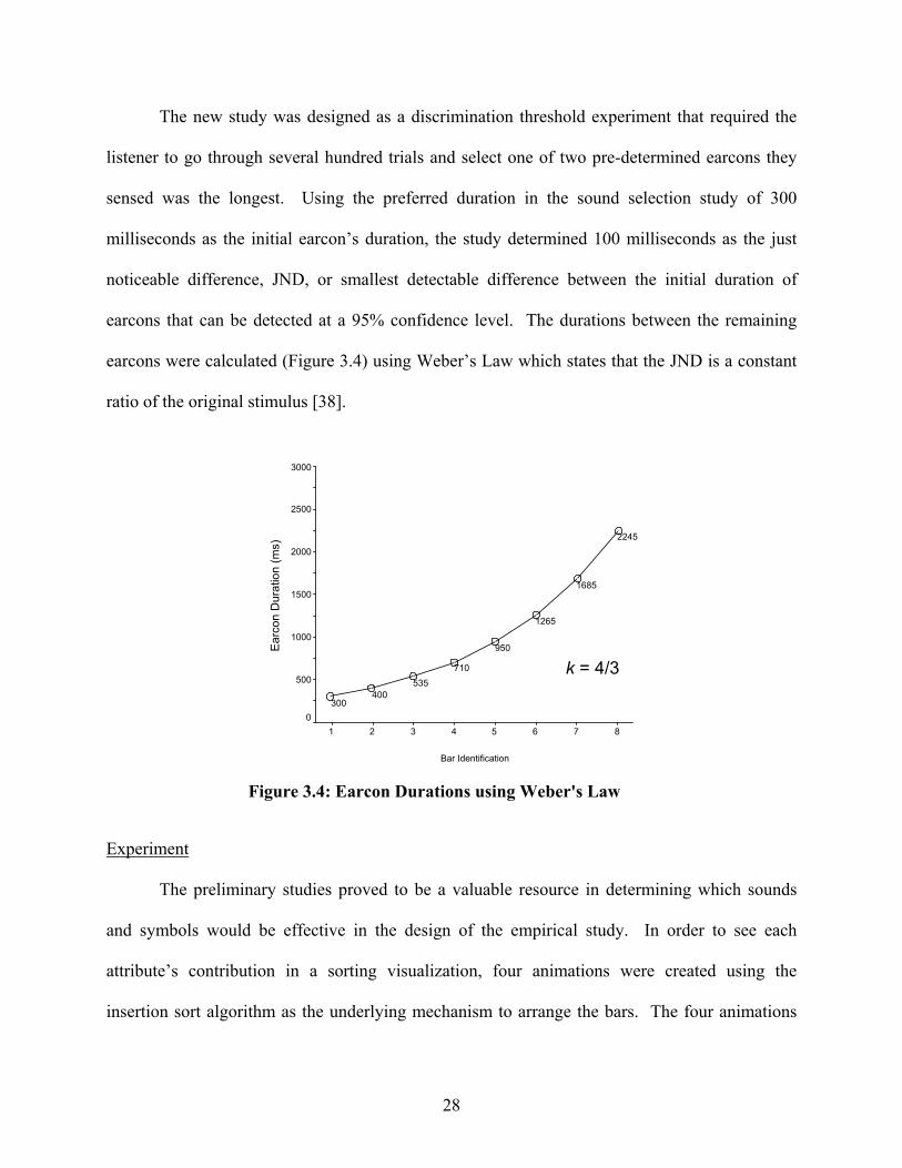
28
The new study was designed as a discrimination threshold experiment that required the
listener to go through several hundred trials and select one of two pre-determined earcons they
sensed was the longest. Using the preferred duration in the sound selection study of 300
milliseconds as the initial earcon’s duration, the study determined 100 milliseconds as the just
noticeable difference, JND, or smallest detectable difference between the initial duration of
earcons that can be detected at a 95% confidence level. The durations between the remaining
earcons were calculated (Figure 3.4) using Weber’s Law which states that the JND is a constant
ratio of the original stimulus [38].
Experiment
The preliminary studies proved to be a valuable resource in determining which sounds
and symbols would be effective in the design of the empirical study. In order to see each
attribute’s contribution in a sorting visualization, four animations were created using the
insertion sort algorithm as the underlying mechanism to arrange the bars. The four animations
Bar Identification
87654321
Ear
con
Dur
atio
n (m
s)
3000
2500
2000
1500
1000
500
0300
400535
710
950
1265
1685
2245
Figure 3.4: Earcon Durations using Weber's Law
k = 4/3

29
varied in the absence or presence of the two attributes. By designing animations that isolate each
feature as well as use them in conjunction with one another, we can gain a better understanding
of their usefulness in the comprehension of the overall algorithm and create guidelines for the
design of future visualizations.
The effectiveness of an animation is based on the participant’s performance rate, the
number of correct responses for a given set of questions. These questions covered the first four
levels of Bloom’s Taxonomy [20] and encompassed a wide range of concepts. The levels consist
of Knowledge, Comprehension, Application, and Analysis. In recent years, the classification
system terminology has changed from noun to verb form but the premise remains the same [20].
Knowledge level questions are associated with being able to recall or remember the information.
Comprehension level questions involve explaining ideas or concepts derived from the
information. Application level questions entail using the information previously learned in a
new way. Analysis level questions require breaking down the information into parts to make
generalizations and inferences. The taxonomy provides a system of analyzing participants based
on their level of expertise.
In order to gauge a participants’ performance three sets of questions were presented, a
pretest given before viewing the animation, a traditional test given during the animation, and a
posttest given after viewing the animation. The pretest consisted of 8 multiple choice questions
to determine the participant’s prior knowledge of the material being presented and served as an
initial marker for calculating the performance increase. A more extensive set of 24 multiple
choice questions was given while the participant viewed the sorting animation commonly
referred to as traditional questions. These questions determined the visualization’s usefulness as
an aid in learning the algorithm. A popular use of the visualization in this manner would be a lab

30
project or take home assignment. The last set, the post-test, consisted of 14 multiple choice
questions to determine how effective the visualization was in learning the algorithm. Each set of
questions can be found in Appendix G.
The research hypotheses being proposed:
1. A significant difference will exist in posttest performance scores between animations
containing non-speech audio and no audio.
2. A significant difference will exist in posttest performances scores between animations
containing symbols and no symbols.
3. An interaction will exist between animations featuring auditory and visual cues on
post-test performance scores.
The insertion sort algorithm was chosen because it is very natural and close to how
people sort items in real life by sorting one item at a time. It starts with the second item in an
array and moves it towards the beginning until a smaller item is found. This process is repeated
until the end of the array is reached and once the last item has been put in its place, the array is
sorted. This may seem intuitive but understanding how it works can be a bit difficult for
someone who has never programmed before and has little or no prior experience with computer
algorithms. Therefore, the participants consisted of 48 Psychology undergraduates from the
Georgia Institute of Technology. Everyone signed up on a volunteer basis through Experimetrix,
a web-based experiment scheduling and tracking system, and was awarded course credit for their
participation.
The study was administered in the Georgia Institute of Technology’s Psychology Vision
lab under the direction of Dr. Eileen Kraemer and Dr. Elizabeth Davis. Prior to the start of the
study, the participants were asked to sign in, offer consent, and perform a handful of assessment

31
and acuity tests. Everyone received a guide sheet (see Appendix F) that provided an overview of
the study as well as step-by-step instructions for each task. They had the option to leave at any
time during the study and their scores would be voided. In addition, a researcher was readily
available to answer any questions regarding the study if it did not jeopardize the validity of the
results.
An assortment of assessment and acuity tests were used to provide feedback regarding an
individual’s skill set and learning style. A brief description of each test is presented below:
• Ishihara Color Test - Consists of a number of colored plates, known as Ishihara plates,
containing a circle of dots in various colors and sizes that forms a clear number to those with
normal vision, otherwise invisible or difficult to see for those with a color deficiency.
• Audio Acuity Test - Administered with the Earscan 3, a programmable audiometer that
produces various tones ranging in intensity and frequency to evaluate hearing loss.
• Surface Development Test – Composed of flat polygon shapes and three-dimensional objects
of the cutouts when folded along specified lines. A participant’s visual-spatial ability is
determined by successfully matching corresponding edges between the two items.
• Landolt C Test – Computerized eye-chart shown at a specified distance displaying characters
of various sizes to evaluate vision acuteness.
• Index of Learning Styles – 44 two-choice questions developed by Richard M. Felder and
Barbara A. Soloman used to evaluate a student’s learning preference on four dimensions:
Active-Reflective, Sensing-Intuitive, Visual-Verbal, and Sequential-Global [9].
The series of assessment tests took approximately 30 minutes to complete. The participants
were then randomly assigned to one of four groups where each group differed based on the
animation presented (see Table 3.1). The first group had very limited resources and did not see

32
any visual or hear any auditory cues (see Table 3.1 A). The participants only saw the bars as
well as variables i and j disappear and reappear in various positions until the array was sorted.
The next group followed a more traditional visualization that relied heavily on the visual
modality in which symbols were used to highlight key events or reinforce other components.
Other minor changes included keeping the bars and variables i and j visible as they moved
locations (see Table 3.1 B). The third group consisted of those that heard auditory cues in place
of the symbol cues. It is our intuition that the sound will produce patterns and ease the cognitive
load placed on the visual stimuli by replacing graphics (see Table 3.1 C). Our fourth and final
group was provided the most resources in which they saw visual symbols and heard auditory
cues. The advantages of using multiple modalities in visualizations are that the weakness of one
can be offset by the strengths of another (see Table 3.1 D).
In order to become familiar with the SSEA interface and what was to be expected, a brief
training session was setup prior to the main study for the participants to perform. They were
asked to preview an animation that searched for a data set’s maximum value and to answer a
series of questions regarding it. The goal of the session was not necessarily to see if they
understood the animation but to make them comfortable using SSEA and its controls as well as
the order of the procedures involved. They were encouraged to ask any questions or present any
Visual Factor
Non-
Symbols Symbols
Non-Audio
A N=12
B N=12 Auditory
Factor Audio C N=12
D N=12
Table 3.1: 2 x 2 Factorial Design
33
uncertainties they had during this time to allow for a smoother process throughout the main
study.
The main study consisted of 3 sets of multiple choice questions and 2 animations. The 3
set of questions were described earlier and includes the pre-test taken before watching the first
animation, a traditional test taken during the second animation, and a post-test following the
second animation. Two animations were utilized in order for everyone to have the same amount
of exposure while providing ample amount of time to learn the algorithm. The difference
between the animations was the level of control.
In previous studies, there were too many variables that contributed to a participant’s
performance. One factor was the students were allowed to change the data set so it provided
another perspective on how efficiently the algorithm performed. A student who was unaware or
overlooked this feature would be at a great disadvantage when asked to answer a question
regarding the algorithm’s performance. Another factor is the ability to rewind an animation.
This feature allowed the participant to spend as much time replaying and watching the animation
as needed when no time constraint was enforced. Participants who spent more time previewing
the animation would more likely perform higher and not necessarily due to the variables being
observed. In addition, the more factors presented the more difficult it would be to conclude
what features of the animation attributed to the student’s performance.
In our study there was no control in the first animation of the study. The objective of the
first animation was for the participant to take a passive role learning the algorithm by watching it
fully without any interruptions. Before the first animation began, the students were allowed to
preview the traditional set of questions but not attempt to answer them in order to know what to
look for in the animations. When the participant had completed the first animation, he or she

34
proceeded to the second animation. The data set for the second animation was identical to the
first so the participant would already be comfortable with the animation; however he or she now
had the option of pausing it to answer the traditional questions. This was critical since the full
animation lasted only 5 minutes and it provided enough time for the participant to understand the
question without missing any part of the animation.
Once the traditional questions were submitted and the second animation played on
through, the participant was given the posttest. The posttest was useful in determining how
effectively the animation contributed to the participant’s comprehension and understanding of
the underlying algorithm. During the posttest, the participant was not able to watch the
animation but relied on how much of the information presented in it he could recall or infer.
After being satisfied with their post-test responses, the participants concluded the 1 hr ~ 1.5 hr
long studies by offering feedback regarding their overall experience with SSEA and the
animation. In addition, they highlighted features they felt contributed to their performance and
made suggestions to those that might have hindered it.
35
CHAPTER 4
DATA AND RESULTS
The following section describes the various techniques and procedures used to analyze
the data collected from student assessment and performance tests. The data are analyzed and
evaluated for effects that are statistically significant. An assortment of factors from a
participant’s learning style to high level skills were considered and explored to provide
guidelines for designing effective visualizations. The goal of this particular study is to shed
some light on the usefulness of two attributes, symbols and sounds, to represent critical
components of an algorithm animation.
Analysis of Variance
Analysis of variance (ANOVA) models were generated using a 2 x 2 factorial design
with random assignment to study the effect of the presence and/or absence of sounds and
symbols on participant comprehension of the insertion sort animation. Forty-eight participants
were randomly assigned to the four conditions (12 per group). The set of dependent variables for
the ANOVA models included: pretest performance scores, traditional-test performance scores,
posttest performance scores, traditional to pretest score ratio, and posttest to pretest score ratio.
In addition to the ANOVA models, hierarchical multiple regression analysis (hMRA) was used
to explore the relationship between a handful of independent variables and a dependent variable.
The independent variables consisted of a participant’s learning preferences, spatial-visual ability,
36
prior knowledge, and the experimental test conditions; whereas the dependent variables were the
traditional performance scores and posttest performance scores.
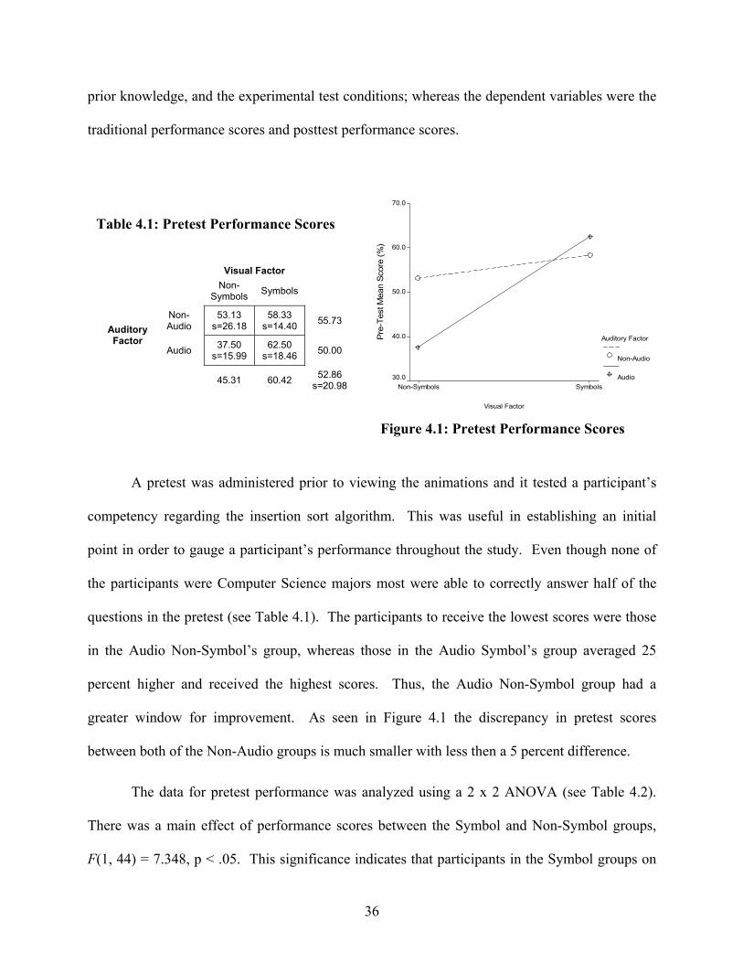
A pretest was administered prior to viewing the animations and it tested a participant’s
competency regarding the insertion sort algorithm. This was useful in establishing an initial
point in order to gauge a participant’s performance throughout the study. Even though none of
the participants were Computer Science majors most were able to correctly answer half of the
questions in the pretest (see Table 4.1). The participants to receive the lowest scores were those
in the Audio Non-Symbol’s group, whereas those in the Audio Symbol’s group averaged 25
percent higher and received the highest scores. Thus, the Audio Non-Symbol group had a
greater window for improvement. As seen in Figure 4.1 the discrepancy in pretest scores
between both of the Non-Audio groups is much smaller with less then a 5 percent difference.
The data for pretest performance was analyzed using a 2 x 2 ANOVA (see Table 4.2).
There was a main effect of performance scores between the Symbol and Non-Symbol groups,
F(1, 44) = 7.348, p < .05. This significance indicates that participants in the Symbol groups on
Visual Factor
SymbolsNon-SymbolsPr
e-Te
st M
ean
Scor
e (%
)
70.0
60.0
50.0
40.0
30.0
Auditory Factor
Non-Audio
Audio
Table 4.1: Pretest Performance Scores
Visual Factor
Non-
Symbols Symbols
Non-Audio
53.13 s=26.18
58.33 s=14.40 55.73
Auditory Factor
Audio 37.50 s=15.99
62.50 s=18.46 50.00
45.31 60.42 52.86
s=20.98
Figure 4.1: Pretest Performance Scores

37
average have a stronger foundation in sorting and algorithms than the Non-Symbol groups.
Their prior knowledge could prove to be advantageous since they might be able to form
connections between the visualization and algorithm more quickly. There was no main effect
between the two Audio groups, F(1, 44) = 1.057, p > .05. Participants in these two groups began
the study with basically the same amount of familiarity in the subject material. Finally, there
was no interaction between the Audio and Visual groups, F(1, 44) = 3.154, p > .05. Each group
contained a wide range of pretest performance scores.
Even though there were four distinct animations, one for each group, each group’s
traditional test was comprised of the same set of 24 questions (see Appendix G). This set
contained questions pertaining to insertion sort and the animation that were more specific than
the questions in the pretest. They ranged from detecting basic perceptual changes to analyzing
the performance of the algorithm on other data sets. The participant could use the visualization
as a resource tool similar to the way she might if she were taking an open book exam or
performing a lab activity. The animation provides a way for the viewer to interact with the
material as well as learn it at her own pace.
Dependent Variable: Pre-Test Mean Score (%)
4306.641a 3 1435.547 3.853 .016134143.880 1 134143.880 360.047 .000
2737.630 1 2737.630 7.348 .010393.880 1 393.880 1.057 .309
1175.130 1 1175.130 3.154 .08316393.229 44 372.573
154843.750 4820699.870 47
SourceCorrected ModelInterceptVISUALAUDITORYVISUAL * AUDITORYErrorTotalCorrected Total
Type III Sumof Squares df Mean Square F Sig.
R Squared = .208 (Adjusted R Squared = .154)a.
Table 4.2: Pretest Performance 2 x 2 ANOVA

38
Table 4.3 shows the performance score for each of the groups. All of the groups had an
improvement in performance compared to the pretest results. Similar to Stasko’s study [29], the
visualization is useful in homework or lab setting. Users can perform better on assignments
when they have the visualization available while answering questions. The average score for all
the participants was over 60 percent with the Non-Audio Symbol Group having the best
performance right above 75 percent. Interestingly, the Audio Symbol Group did not have a
higher performance score. The Audio Symbol Group was not above the average of all the
participants and 13 percent below the Non Audio Symbol Group. It seemed the audio might
have distracted the viewer rather then facilitating comprehension.
Table 4.4: Traditional Performance 2 x 2 ANOVA
Dependent Variable: Traditional Mean Score (%)
2816.840a 3 938.947 3.226 .031188543.113 1 188543.113 647.777 .000
1772.280 1 1772.280 6.089 .018522.280 1 522.280 1.794 .187522.280 1 522.280 1.794 .187
12806.713 44 291.062204166.667 4815623.553 47
SourceCorrected ModelInterceptVISUALAUDITORYVISUAL * AUDITORYErrorTotalCorrected Total
Type III Sumof Squares df Mean Square F Sig.
R Squared = .180 (Adjusted R Squared = .124)a.
Table 4.3: Traditional Performance Scores
Visual Factor
Non-
Symbols Symbols
Non-Audio
56.60 s=21.86
75.34 s=10.12 65.97
Auditory Factor
Audio 56.60 s=15.64
62.15 s=18.42 59.37
56.60 68.75 62.67
s=18.23
Visual Factor
SymbolsNon-Symbols
Trad
. Tes
t Mea
n S
core
(%)
80.0
70.0
60.0
50.0
Auditory Factor
Non-Audio
Audio
Figure 4.2: Traditional Performance Scores

39
The data for traditional test performance was analyzed using a 2 x 2 ANOVA (see Table
4.4). There was a main effect of performance scores between the Symbol and Non-Symbol
groups, F(1, 44) = 6.089, p < .05. This significance indicates that the visuals in the Audio
Symbol and Non-Audio Symbol animations influenced the increase of performance score. The
symbols functioned as links from the animation to the algorithm and aided in its comprehension.
There was no main effect between the two Audio and Non-Audio groups, F(1, 44) = 1.794, p >
.05. Participants in these two groups performed the same with or without audio in the
animations. Finally, there was no interaction between the Audio and Visual groups, F(1, 44) =
1.794, p > .05. That is the auditory and visual factors had no influence on one another.
The visualization’s effectiveness for homework and lab assignments is seen as a ratio
between a participant’s traditional test performance and his pretest performance. Table 4.5
shows the average ratios amongst all the groups. With them all being above one is indicative
that the visualization had an effect on learning. Even though the Audio Non-Symbol group’s
traditional performance score was below the performance score of the entire pool of participants,
they averaged the highest increase in performance. It was alluded to earlier that since their
Visual Factor
Non-
Symbols Symbols
Non-Audio
1.43 s=1.05
1.39 s=0.46 1.41
Auditory Factor
Audio 1.71 s=0.68
1.02 s=0.26 1.37
1.57 1.20 1.39
s=0.70
Visual Factors
SymbolsNon-Symbols
Trad
ition
al to
Pre
-Tes
t Per
form
ance
Rat
io
1.8
1.6
1.4
1.2
1.0
.8
Auditory Factors
Non-Audio
Audio
Table 4.5: Traditional to Pretest Ratio
Figure 4.3: Traditional to Pretest Ratio

40
pretest scores were the lowest on average, it would provide them with a greater window for
improvement. The Audio Symbol group received the lowest ratio between their traditional and
pretest performance scores partly because their window was a lot smaller. In addition, the Audio
Non-Symbol group’s animation did not feature any visual cues but rather only audio cues were
present and might provide some proof that audio would be more effective in replacing visuals
then reinforcing them in this context.
The data for traditional to pretest ratio were analyzed using a 2 x 2 ANOVA (see Table
4.6). There was no main effect of performance increase between the Symbol and Non-Symbol
groups, F(1, 44) = 3.523, p > .05. A significance level being of greater than 5 percent indicates
the difference in performance can not be attributed to the use of symbols in the animations. The
relatively small significance value offers some promise that symbols do have a role in algorithm
animations. However more studies would need to be conducted in order to determine which
symbols make a difference and how to use them effectively. There was also no main effect
between the Audio and Non-Audio groups, F(1, 44) = .044, p > .05. The Audio and Non-Audio
groups performed the same on the traditional test and had similar performance increases from the
pretest. Using audio to replace various visual components did not have much of an impact on a
Dependent Variable: Traditional and Pre-Test Mean Ratio
2.864a 3 .955 2.080 .11792.447 1 92.447 201.485 .0001.616 1 1.616 3.523 .067.020 1 .020 .044 .835
1.227 1 1.227 2.674 .10920.188 44 .459
115.499 4823.052 47
SourceCorrected ModelInterceptVISUALAUDITORYVISUAL * AUDITORYErrorTotalCorrected Total
Type III Sumof Squares df Mean Square F Sig.
R Squared = .124 (Adjusted R Squared = .065)a.
Table 4.6: Traditional to Pretest Ratio 2 x 2 ANOVA
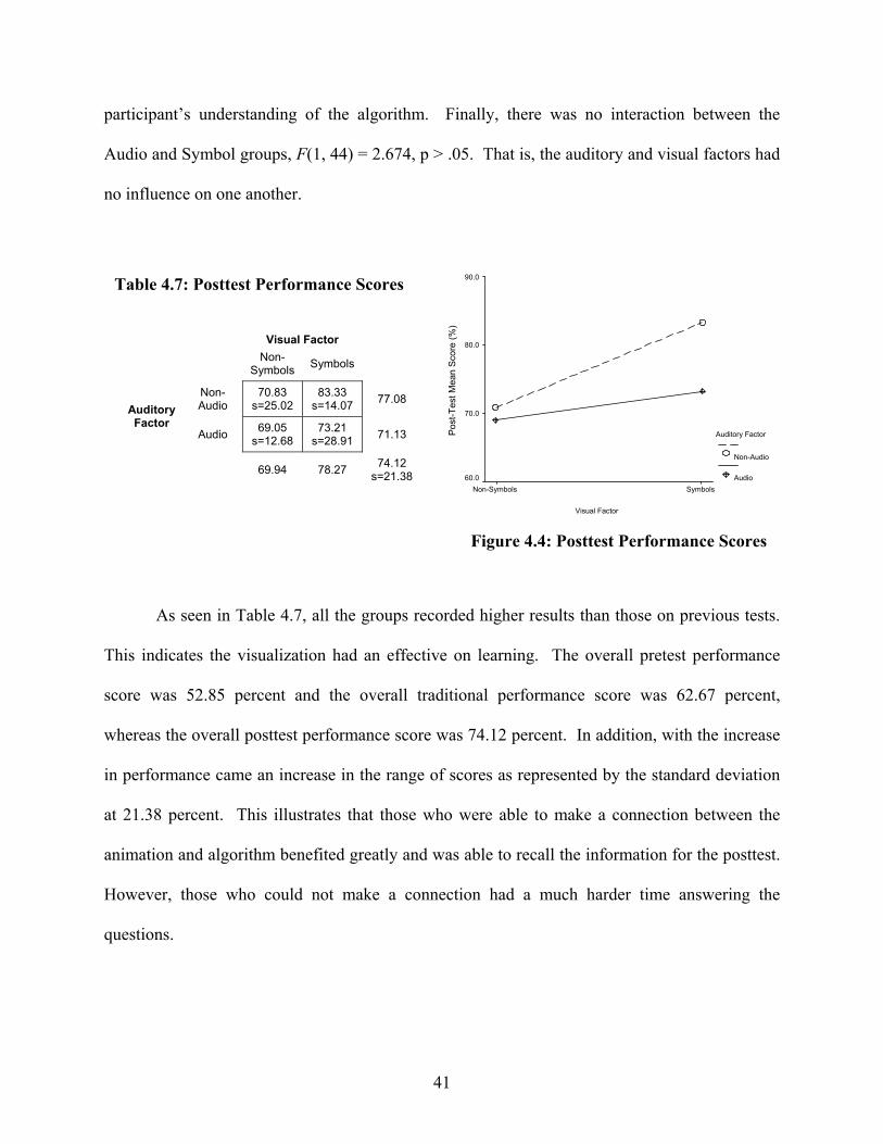
41
participant’s understanding of the algorithm. Finally, there was no interaction between the
Audio and Symbol groups, F(1, 44) = 2.674, p > .05. That is, the auditory and visual factors had
no influence on one another.
As seen in Table 4.7, all the groups recorded higher results than those on previous tests.
This indicates the visualization had an effective on learning. The overall pretest performance
score was 52.85 percent and the overall traditional performance score was 62.67 percent,
whereas the overall posttest performance score was 74.12 percent. In addition, with the increase
in performance came an increase in the range of scores as represented by the standard deviation
at 21.38 percent. This illustrates that those who were able to make a connection between the
animation and algorithm benefited greatly and was able to recall the information for the posttest.
However, those who could not make a connection had a much harder time answering the
questions.
Visual Factor
Non-
Symbols Symbols
Non-Audio
70.83 s=25.02
83.33 s=14.07 77.08
Auditory Factor
Audio 69.05 s=12.68
73.21 s=28.91 71.13
69.94 78.27 74.12
s=21.38
Visual Factor
SymbolsNon-Symbols
Post
-Tes
t Mea
n Sc
ore
(%)
90.0
80.0
70.0
60.0
Auditory Factor
Non-Audio
Audio
Table 4.7: Posttest Performance Scores
Figure 4.4: Posttest Performance Scores
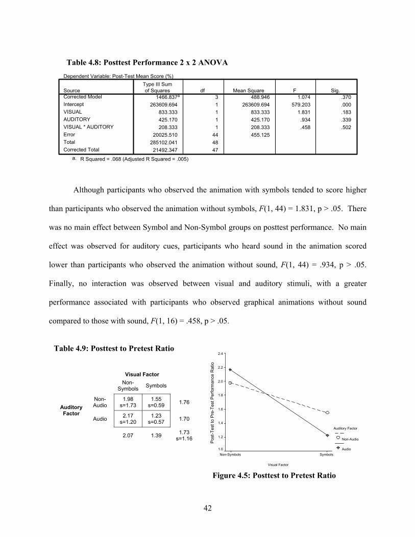
42
Although participants who observed the animation with symbols tended to score higher
than participants who observed the animation without symbols, F(1, 44) = 1.831, p > .05. There
was no main effect between Symbol and Non-Symbol groups on posttest performance. No main
effect was observed for auditory cues, participants who heard sound in the animation scored
lower than participants who observed the animation without sound, F(1, 44) = .934, p > .05.
Finally, no interaction was observed between visual and auditory stimuli, with a greater
performance associated with participants who observed graphical animations without sound
compared to those with sound, F(1, 16) = .458, p > .05.
Visual Factor
Non-
Symbols Symbols
Non-Audio
1.98 s=1.73
1.55 s=0.59 1.76
Auditory Factor
Audio 2.17 s=1.20
1.23 s=0.57 1.70
2.07 1.39 1.73
s=1.16
Visual Factor
SymbolsNon-Symbols
Pos
t-Tes
t to
Pre
-Tes
t Per
form
ance
Rat
io
2.4
2.2
2.0
1.8
1.6
1.4
1.2
1.0
Auditory Factor
Non-Audio
Audio
Table 4.9: Posttest to Pretest Ratio
Figure 4.5: Posttest to Pretest Ratio
Dependent Variable: Post-Test Mean Score (%)
1466.837a 3 488.946 1.074 .370263609.694 1 263609.694 579.203 .000
833.333 1 833.333 1.831 .183425.170 1 425.170 .934 .339208.333 1 208.333 .458 .502
20025.510 44 455.125285102.041 48
21492.347 47
SourceCorrected ModelInterceptVISUALAUDITORYVISUAL * AUDITORYErrorTotalCorrected Total
Type III Sumof Squares df Mean Square F Sig.
R Squared = .068 (Adjusted R Squared = .005)a.
Table 4.8: Posttest Performance 2 x 2 ANOVA
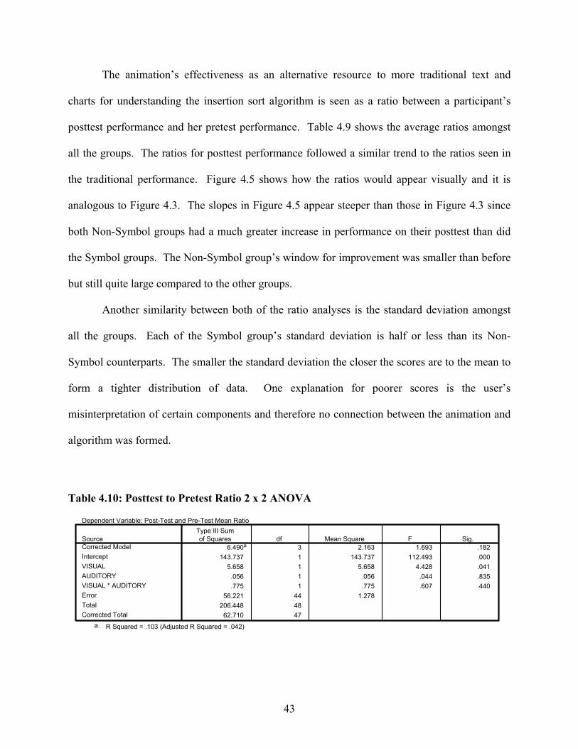
43
The animation’s effectiveness as an alternative resource to more traditional text and
charts for understanding the insertion sort algorithm is seen as a ratio between a participant’s
posttest performance and her pretest performance. Table 4.9 shows the average ratios amongst
all the groups. The ratios for posttest performance followed a similar trend to the ratios seen in
the traditional performance. Figure 4.5 shows how the ratios would appear visually and it is
analogous to Figure 4.3. The slopes in Figure 4.5 appear steeper than those in Figure 4.3 since
both Non-Symbol groups had a much greater increase in performance on their posttest than did
the Symbol groups. The Non-Symbol group’s window for improvement was smaller than before
but still quite large compared to the other groups.
Another similarity between both of the ratio analyses is the standard deviation amongst
all the groups. Each of the Symbol group’s standard deviation is half or less than its Non-
Symbol counterparts. The smaller the standard deviation the closer the scores are to the mean to
form a tighter distribution of data. One explanation for poorer scores is the user’s
misinterpretation of certain components and therefore no connection between the animation and
algorithm was formed.
Table 4.10: Posttest to Pretest Ratio 2 x 2 ANOVA
Dependent Variable: Post-Test and Pre-Test Mean Ratio
6.490a 3 2.163 1.693 .182143.737 1 143.737 112.493 .000
5.658 1 5.658 4.428 .041.056 1 .056 .044 .835.775 1 .775 .607 .440
56.221 44 1.278206.448 48
62.710 47
SourceCorrected ModelInterceptVISUALAUDITORYVISUAL * AUDITORYErrorTotalCorrected Total
Type III Sumof Squares df Mean Square F Sig.
R Squared = .103 (Adjusted R Squared = .042)a.
44
The data for postest to pretest ratio was analyzed using a 2 x 2 ANOVA (see Table 4.10).
There was a main effect of performance increase between the Symbol and Non-Symbol groups,
F(1, 44) = 4.428, p < .05. The significance level of less than 5 percent indicates that the increase
in performance can be attributed to the use of symbols in the animations. Recall in the
traditional to pretest ratio analysis (see Table 4.6) the significance level between Symbol and
Non-Symbol groups was small but still above 5 percent. One explanation for this effect is that
participants had an easier time recalling an algorithm’s key events by envisioning the symbol and
what it represented. There was no main effect between the Audio and Non-Audio groups, F(1,
44) = .044, p > .05 and the significance level was identical to that seen in the traditional to
pretest ratio analysis for the same groups. Several participants found it rather difficult to recall
the information demonstrated in the animation when audio was used to reinforce or replace
critical components of an algorithm. Finally, there was no interaction between the Audio and
Symbol groups, F(1, 44) = .607, p > .05. The group that performed the worst was the Audio
Non-Symbol whose pretest scores were the lowest and because audio’s adverse affect on a
participant’s performance. The Non-Audio Symbol group even outperformed the Audio Symbol
group.
Hierarchical Multiple Regression
The general linear models discussed previously examined whether two variables, visual
and auditory components, had an effect on a viewer’s comprehension of a sorting algorithm in
visualization. Next, hierarchical multiple regression (hMRA) models were generated to explore
the relationship between a handful of independent or predictor variables and a dependent or
criterion variable. The predictor variables consisted of a participant’s learning style
questionnaire scores, surface development score, pretest score, and the experimental conditions.

45
One hMRA used the traditional score as the criterion variable and the other used the posttest
score.
A hierarchical regression was performed over a basic regression in order to test the
effects of certain predictors independent of the influence of others. Table 4.11 specifies the
order each variable was introduced into the traditional hMRA. Each number represents a block
of variables that were considered collectively along with the significance of the previous
predictors. The first block includes the categorical scales based on a participant’s learning
preference. This will help determine the type of learner upon which the visualization had the
most influence. The next block features the surface development scores to establish if
participants with better visual-spatial ability would benefit from the visualization. The third
block controls for the pretest performance indicating prior knowledge as a potential influential
factor to a participant’s traditional or posttest performance. The final block accounts for the two
experimental conditions, auditory and visual.
The hMRA produced an ANOVA for each of the predictor blocks (see Table 4.12) when
traditional test scores were used as the criterion. This table is an indicator of how well the model
fits. The p-values are listed under the Sig. column and signify the probability the independent
variables and dependent variable relationship being observed occurred by pure chance. There
was not a significant effect in Model 1 since (p > .05). Therefore a participant with a particular
Table 4.11: Hierarchical Multiple Regression Design
Sequential Global Score, VisualVerbal Score, Active ReflectiveScore, Sensing Inuititive ScoreSurface Development ScorePre-Test Mean Score (%)Auditory Experimental Condition,Visual Experimental Condition
Model1
234
Variables Entered

46
learning style did not benefit over one with another type of style. However, Model 2 does
indicate a main effect (p < .05). A person who illustrated higher visual-spatial intelligence on the
surface development test more likely performed better on the traditional test than those with
lower surface development scores. Model 3 also indicates a main effect when pretest scores
were considered (p < .05). A participant’s prior knowledge on the material influenced the
interpretation of the visualization and his choices on the traditional test. When all the predictors
are accounted for in Model 4, there is still a main effect; however the significance level increased
when the experimental conditions were tested. The auditory and visual factors are not the most
influential variables in a participant’s traditional test performance.
Table 4.12: hMRA Traditional ANOVA
2212.531 4 553.133 1.774 .15213411.022 43 311.88415623.553 47
5611.413 5 1122.3 4.708 .00210012.140 42 238.38415623.553 47
6535.271 6 1089.2 4.914 .0019088.282 41 221.665
15623.553 476975.949 8 871.994 3.933 .0028647.604 39 221.733
15623.553 47
RegressionResidualTotalRegressionResidualTotalRegressionResidualTotalRegressionResidualTotal
Model1
2
3
4
Sum ofSquares df
MeanSquare F Sig.
Table 4.13: hMRA Traditional Performance Summary
.376 .142 .062 17.660245 .142 1.774 4 43 .152
.599 .359 .283 15.439698 .218 14.258 1 42 .000
.647 .418 .333 14.888432 .059 4.168 1 41 .048
.668 .447 .333 14.890716 .028 .994 2 39 .379
Model1234
RR
SquareAdjustedR Square
Std. Error ofthe Estimate
R SquareChange
FChange df1 df2
Sig. FChange
Change Statistics
47
In Table 4.13 we are interested in the R2 variable, the third column from the left. This
shows us the percent of variability in the dependent variable that can be accounted for by all the
predictors together. For instance, in Model 1 the R2 value is .142. This indicates that 14.2% of a
participant’s traditional score can be accounted for based on his learning style. The next model
contains a R2 value of .359, so 35.9% of a participant’s traditional score can be accounted for
based on his learning style and surface development score. The predictive power added to the
model can be calculated by taking the difference of R2 and the previous block’s percent of
variability. The block with the greatest predictive power is the surface development at 21.7%.
The experimental conditions block containing the visual and auditory factors had the least effect
at 2.9%.
The coefficients table (Table 4.14) contains betas (B) or weights to multiply each
participant’s score on the independent variables in order to obtain the person’s predicted score on
the dependent variable. Since several of the independent variables were not statistically
significant, the coefficients will not produce meaningful results. The only factor that was
statistically significant throughout the entire hMRA was a participant’s surface development
score. Interestingly, the pretest score was statistically significant in the third block but became
insignificant in the fourth block when the experimental conditions were introduced.
The constant coefficient (B) for each block represents a participant’s traditional score if
all the other predictor variables were zero. In the first block, relatively little weight is given to
each of the learning styles but it does indicate the type of learner that may benefit according to its
coefficient association with the dependent variable. The Visual Verbal and Active Reflective
predictors are negatively associated with a participant’s traditional test score. This indicates that
the animation provided a clearer model of the algorithm for the viewer with a visual active
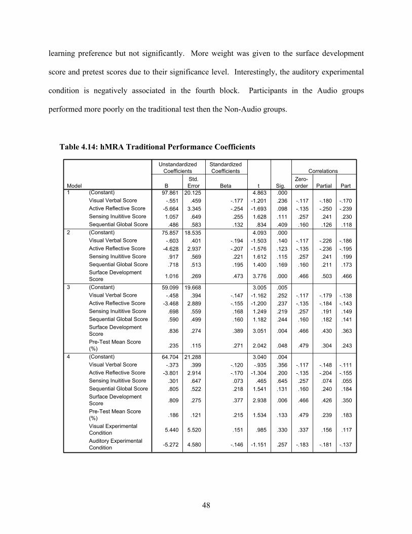
48
learning preference but not significantly. More weight was given to the surface development
score and pretest scores due to their significance level. Interestingly, the auditory experimental
condition is negatively associated in the fourth block. Participants in the Audio groups
performed more poorly on the traditional test then the Non-Audio groups.
Table 4.14: hMRA Traditional Performance Coefficients
97.861 20.125 4.863 .000-.551 .459 -.177 -1.201 .236 -.117 -.180 -.170
-5.664 3.345 -.254 -1.693 .098 -.135 -.250 -.2391.057 .649 .255 1.628 .111 .257 .241 .230.486 .583 .132 .834 .409 .160 .126 .118
75.857 18.535 4.093 .000-.603 .401 -.194 -1.503 .140 -.117 -.226 -.186
-4.628 2.937 -.207 -1.576 .123 -.135 -.236 -.195.917 .569 .221 1.612 .115 .257 .241 .199.718 .513 .195 1.400 .169 .160 .211 .173
1.016 .269 .473 3.776 .000 .466 .503 .466
59.099 19.668 3.005 .005-.458 .394 -.147 -1.162 .252 -.117 -.179 -.138
-3.468 2.889 -.155 -1.200 .237 -.135 -.184 -.143.698 .559 .168 1.249 .219 .257 .191 .149.590 .499 .160 1.182 .244 .160 .182 .141
.836 .274 .389 3.051 .004 .466 .430 .363
.235 .115 .271 2.042 .048 .479 .304 .243
64.704 21.288 3.040 .004-.373 .399 -.120 -.935 .356 -.117 -.148 -.111
-3.801 2.914 -.170 -1.304 .200 -.135 -.204 -.155.301 .647 .073 .465 .645 .257 .074 .055.805 .522 .218 1.541 .131 .160 .240 .184
.809 .275 .377 2.938 .006 .466 .426 .350
.186 .121 .215 1.534 .133 .479 .239 .183
5.440 5.520 .151 .985 .330 .337 .156 .117
-5.272 4.580 -.146 -1.151 .257 -.183 -.181 -.137
(Constant)Visual Verbal ScoreActive Reflective ScoreSensing Inuititive ScoreSequential Global Score(Constant)Visual Verbal ScoreActive Reflective ScoreSensing Inuititive ScoreSequential Global ScoreSurface DevelopmentScore(Constant)Visual Verbal ScoreActive Reflective ScoreSensing Inuititive ScoreSequential Global ScoreSurface DevelopmentScorePre-Test Mean Score(%)(Constant)Visual Verbal ScoreActive Reflective ScoreSensing Inuititive ScoreSequential Global ScoreSurface DevelopmentScorePre-Test Mean Score(%)Visual ExperimentalConditionAuditory ExperimentalCondition
Model1
2
3
4
BStd.Error
UnstandardizedCoefficients
Beta
StandardizedCoefficients
t Sig.Zero-order Partial Part
Correlations

49
The second hMRA consisted of the same design as the first hMRA (Table 4.11) but with
the posttest performance as the criterion. According to Table 4.15, each block of independent
variables had less significance in a participant’s posttest performance than on his traditional test
performance. However, Models 2, 3, and 4 still produced a significant main effect.
Each block’s percent of variability, R2, in Table 4.16 indicates that the same set of
predictors to evaluate a participant’s traditional test performance had less of an impact on
influencing a participant’s posttest performance. We observe that the predictive power for the
surface development block is slightly greater than it was in the first hMRA, signifying more
weight associated with this predicator. Also, we see that the pretest variable’s predictive power
is a mere .5% compared to 5.9% in the traditional hMRA. Participants generally performed
Table 4.16: hMRA Posttest Performance Summary
.265 .070 -.016 21.558817 .070 .810 4 43 .525
.547 .299 .216 18.939604 .229 13.716 1 42 .001
.552 .304 .203 19.095469 .005 .317 1 41 .576
.557 .311 .169 19.488640 .006 .181 2 39 .835
Model1234
RR
SquareAdjustedR Square
Std. Error ofthe Estimate
R SquareChange
FChange df1 df2
Sig. FChange
Change Statistics
Table 4.15: hMRA Posttest ANOVA
1506.695 4 376.674 .810 .52519985.652 43 464.78321492.347 47
6426.586 5 1285.317 3.58 .00915065.761 42 358.70921492.347 47
6542.232 6 1090.372 2.99 .01614950.115 41 364.63721492.347 47
6679.871 8 834.984 2.20 .04914812.476 39 379.80721492.347 47
RegressionResidualTotalRegressionResidualTotalRegressionResidualTotalRegressionResidualTotal
Model1
2
3
4
Sum ofSquares df
MeanSquare F Sig.

50
better on the traditional test when they had a greater understanding of the material prior to the
animation; however those with little to no prior knowledge were able to extract this information
from the visualization and scored similarly in the posttest.
The coefficients table (Table 4.17) illustrates a few of the same observations seen in the
previous tables. Since the learning style’s predictors had less significance in a participant’s
posttest performance, their weights were less. One subtle difference for Model 1 in both of the
hMRA’s is the Sequential Global coefficient association to the dependent variable. In the first
hMRA, the Sequential Global coefficient had a positive association with traditional performance
score suggesting the participants who had a general overview of how the algorithm performed
benefited over those who were focused on learning the algorithm’s individual steps. Whereas in
the second hMRA, the Sequential Global coefficient had a negative association with the posttest
performance score suggesting the participants benefited more when they were able recall the
critical steps of an algorithm and form links between them. The remainder of the models showed
the surface development score as the only statistically significant predicator; whereas both of the
experimental conditions soared.

51
Table 4.17: hMRA Posttest Performance Coefficients
99.343 24.568 4.044 .000-.024 .560 -.007 -.043 .966 .007 -.007 -.006
-4.534 4.083 -.173 -1.110 .273 -.127 -.167 -.1631.242 .793 .255 1.566 .125 .186 .232 .230
-.327 .711 -.076 -.459 .648 -.007 -.070 -.068
72.869 22.736 3.205 .003-.087 .492 -.024 -.177 .861 .007 -.027 -.023
-3.287 3.603 -.125 -.912 .367 -.127 -.139 -.1181.073 .698 .221 1.537 .132 .186 .231 .199
-.047 .629 -.011 -.075 .941 -.007 -.012 -.010
1.222 .330 .485 3.703 .001 .499 .496 .478
66.940 25.225 2.654 .011-.035 .505 -.010 -.070 .944 .007 -.011 -.009
-2.877 3.705 -.110 -.776 .442 -.127 -.120 -.101.996 .717 .205 1.389 .172 .186 .212 .181
-.093 .640 -.021 -.145 .886 -.007 -.023 -.019
1.159 .352 .460 3.297 .002 .499 .458 .429
.083 .148 .082 .563 .576 .279 .088 .073
72.179 27.861 2.591 .013.000 .522 .000 .000 1.000 .007 .000 .000
-2.943 3.814 -.112 -.772 .445 -.127 -.123 -.103.851 .847 .175 1.004 .321 .186 .159 .134
.024 .683 .006 .035 .972 -.007 .006 .005
1.152 .361 .457 3.195 .003 .499 .456 .425
.064 .159 .063 .403 .689 .279 .064 .054
1.401 7.225 .033 .194 .847 .197 .031 .026
-3.556 5.994 -.084 -.593 .556 -.141 -.095 -.079
(Constant)Visual Verbal ScoreActive Reflective ScoreSensing Inuititive ScoreSequential Global Score
(Constant)Visual Verbal ScoreActive Reflective ScoreSensing Inuititive ScoreSequential Global Score
Surface DevelopmentScore(Constant)Visual Verbal ScoreActive Reflective ScoreSensing Inuititive ScoreSequential Global Score
Surface DevelopmentScorePre-Test Mean Score(%)(Constant)Visual Verbal ScoreActive Reflective ScoreSensing Inuititive ScoreSequential Global Score
Surface DevelopmentScorePre-Test Mean Score(%)Visual ExperimentalConditionAuditory ExperimentalCondition
Model1
2
3
4
BStd.Error
UnstandardizedCoefficients
Beta
StandardizedCoefficients
t Sig. Zero-order Partial Part
Correlations
52
CHAPTER 5
CONCLUSION
The work conducted in this study sought to use sounds and visuals from our everyday
experiences and incorporate them into an algorithm animation. The goal is to provide the viewer
an engaging environment capable of fostering learning. We often rely on symbols and sounds
when our attention is focused elsewhere or need to reduce the load on our cognitive system. As
visualizations become more complex, designers have the intricate task of selecting which
components offer a more practical design by selecting those features with the most to offer but
without jeopardizing the benefits provided by other features. Symbols and sounds have had a
huge impact in other fields of visualization but haven’t received much attention in AA systems.
Summary
The main advantages of using symbols over other forms of visuals are their ease of
recognition and identification through a universal visual language. They produce attractive
compact pieces of information. However, when a symbol is poorly designed it is often
misinterpreted and leaves the viewer confused. A symbol intuitiveness test was conducted to
determine which visuals represented various AA components more clearly. The results of this
test were then used in the design of the main study.
Sound also has its advantages when used in visualizations effectively. Brown and
Hershberger had positive preliminary experiences using audio for reinforcing visual views,
conveying patterns, replacing visual views, and signaling exceptional conditions [5]. The most

53
common use of audio is to reinforce what is on the screen so the viewer can create a more vivid
model when both the visual and auditory channels are stimulated. This technique was
incorporated into the Audio Symbol group’s animation by representing all the graphical elements
with a unique sound. In addition, sound can create distinct patterns in the relationship of data
that might go undetected when the same data is displayed visually. The third technique tried and
tested was using sound to replace graphical components in order to lessen the burden placed on
the visual channel. The Audio Non-Symbol group participated in the use of sound in this
manner. Finally, we explored sound’s potential for alerting the observer of an algorithm’s
critical steps. In a similar procedure to visual selection, a sound intuitiveness test was conducted
to determine which sounds represented various AA components more precisely.
Several analyses of variance (ANOVA) models were generated using a 2 x 2 factorial
design to study the effects for the presence or absence of sounds and/or symbols had in the
comprehension of the insertion sort animation. The set of dependent variables for the ANOVA
models included: pretest performance scores, traditional test performance scores, posttest
performance scores, traditional to pretest score ratio, and posttest to pretest score ratio. In
addition to the ANOVA models, hierarchical multiple regression analysis (hMRA) was used to
explore the relationship between a handful of independent variables and a dependent variable.
The independent variables consisted of a participant’s learning preferences, spatial-visual ability,
prior knowledge, and the experimental test conditions; whereas the dependent variables were the
traditional performance scores and posttest performance scores.
A hierarchical regression was performed over a basic regression in order to test the
effects of certain predictors independent of the influence of others. Variables were assigned to
blocks where they were considered collectively along with the significance of the previous
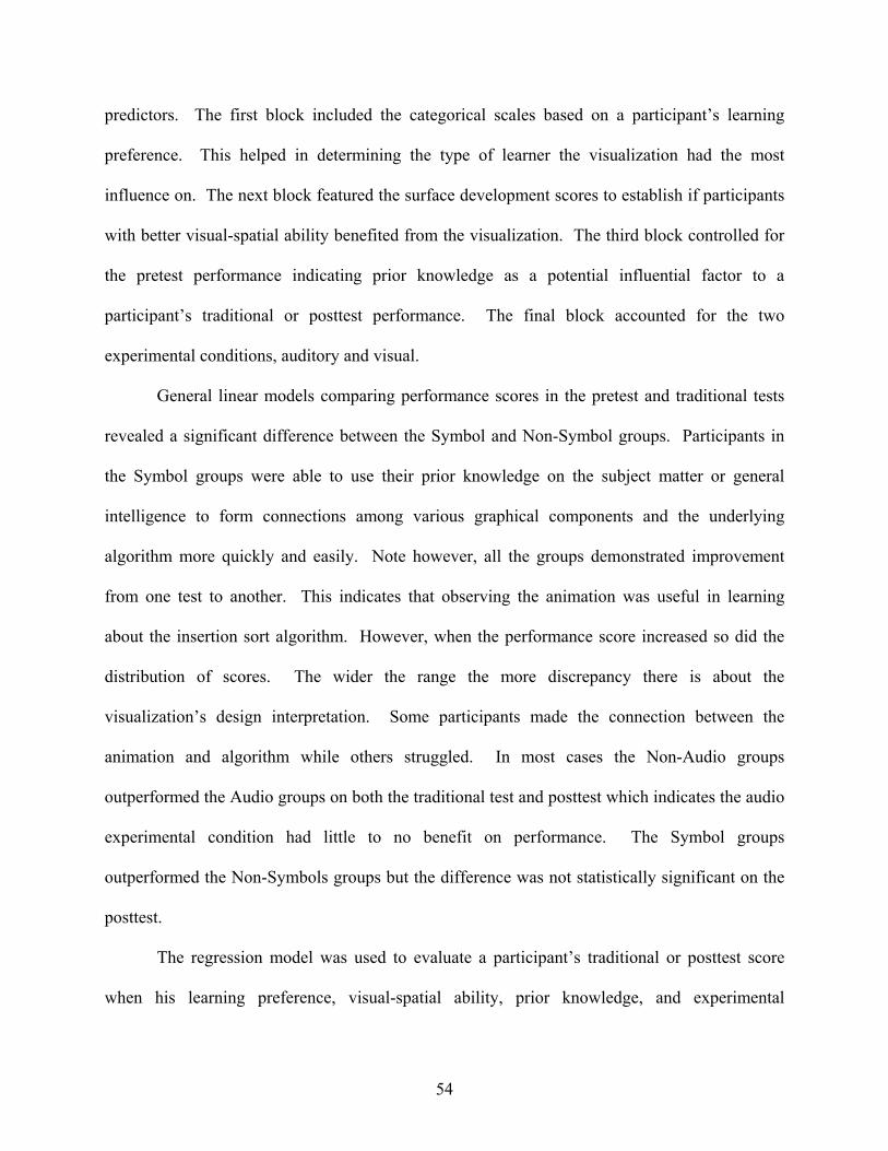
54
predictors. The first block included the categorical scales based on a participant’s learning
preference. This helped in determining the type of learner the visualization had the most
influence on. The next block featured the surface development scores to establish if participants
with better visual-spatial ability benefited from the visualization. The third block controlled for
the pretest performance indicating prior knowledge as a potential influential factor to a
participant’s traditional or posttest performance. The final block accounted for the two
experimental conditions, auditory and visual.
General linear models comparing performance scores in the pretest and traditional tests
revealed a significant difference between the Symbol and Non-Symbol groups. Participants in
the Symbol groups were able to use their prior knowledge on the subject matter or general
intelligence to form connections among various graphical components and the underlying
algorithm more quickly and easily. Note however, all the groups demonstrated improvement
from one test to another. This indicates that observing the animation was useful in learning
about the insertion sort algorithm. However, when the performance score increased so did the
distribution of scores. The wider the range the more discrepancy there is about the
visualization’s design interpretation. Some participants made the connection between the
animation and algorithm while others struggled. In most cases the Non-Audio groups
outperformed the Audio groups on both the traditional test and posttest which indicates the audio
experimental condition had little to no benefit on performance. The Symbol groups
outperformed the Non-Symbols groups but the difference was not statistically significant on the
posttest.
The regression model was used to evaluate a participant’s traditional or posttest score
when his learning preference, visual-spatial ability, prior knowledge, and experimental
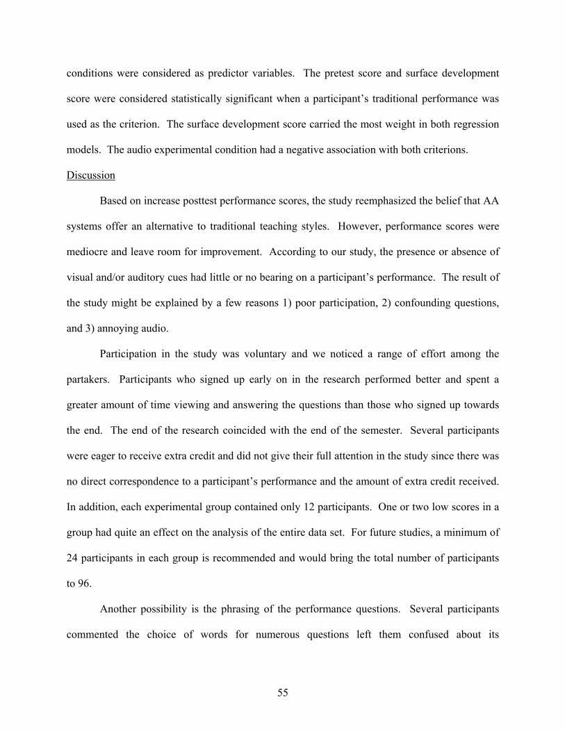
55
conditions were considered as predictor variables. The pretest score and surface development
score were considered statistically significant when a participant’s traditional performance was
used as the criterion. The surface development score carried the most weight in both regression
models. The audio experimental condition had a negative association with both criterions.
Discussion
Based on increase posttest performance scores, the study reemphasized the belief that AA
systems offer an alternative to traditional teaching styles. However, performance scores were
mediocre and leave room for improvement. According to our study, the presence or absence of
visual and/or auditory cues had little or no bearing on a participant’s performance. The result of
the study might be explained by a few reasons 1) poor participation, 2) confounding questions,
and 3) annoying audio.
Participation in the study was voluntary and we noticed a range of effort among the
partakers. Participants who signed up early on in the research performed better and spent a
greater amount of time viewing and answering the questions than those who signed up towards
the end. The end of the research coincided with the end of the semester. Several participants
were eager to receive extra credit and did not give their full attention in the study since there was
no direct correspondence to a participant’s performance and the amount of extra credit received.
In addition, each experimental group contained only 12 participants. One or two low scores in a
group had quite an effect on the analysis of the entire data set. For future studies, a minimum of
24 participants in each group is recommended and would bring the total number of participants
to 96.
Another possibility is the phrasing of the performance questions. Several participants
commented the choice of words for numerous questions left them confused about its

56
interpretation. The terminology used in each of the questions was assumed to be common
knowledge. When asked, researchers provided clarification for questions that left students
baffled about their interpretation. Several participants were reluctant to ask and merely took a
guess at the answer. A comparison of performance scores should not be the only criteria when
evaluating the effectiveness of an AA system and if it is then more thought ought to be given to
each of the questions.
The final reason is the choice and timing of audio. A handful of the participants who
heard sound commented it was pointless and bothersome. Therefore more attention ought to be
given to audio selection. Those who found sound pointless were not able to make a connection
between the animation and the algorithm. The participants did not comprehend that the sound
was there to signify a key event. Too much audio also became annoying so when to use sound
and on what events ought to be explored in future studies.
57
REFERENCES
[1] R. C. Atkinson, & R. M. Shiffrin, (1968) Human memory: A proposed system and its control processes. In K.W. Spence and J.T. Spence (Eds.), The psychology of learning and motivation, vol. 8. London: Academic Press.
[2] A. Baddeley. Is Working Memory Still Working? American Psychologist, 56, 849-864.
2001. [3] R. Baecker. Sorting out Sorting, 30 minute color/sound film, University of Toronto.
Distributed by Morgan Kaufmann, San Francisco. 1981. [4] Blattner, M.M., Sumikawa, D.A., and Greenberg, R.M., Earcons and Icons: Their
Structure and Common Design Principles. Human-Computer Interaction 4(1), 1989, 11-44.
[5] M. H. Brown and J. Hershberger. Color and Sound in Algorithm Animation. j-
COMPUTER vol. 25, pp. 52-63, 1991. [6] M. H. Brown and M. Najork. Collaborative active textbook: a web-based algorithm
animation system for an electronic classroom. IEEE Symposium on Visual Languages, pages 266–275, 1996.
[7] W. Buxton, W. Gaver, and S. Bly. Auditory Interfaces: The use of non-speech audio at
the interface. 1994. [8] M. D. Byrne, R. Catrambone, and J. T. Stasko. Evaluating animations as student aids in
learning computer algorithms. Computers & Education vol. 33, pp. 253-278, 1999. [9] R. M. Felder and L. K. Silverman. Learning and Teaching Styles in Engineering
Education. Journal of Engineering Education, vol. 78, pp. 674-681, 1988. [10] J. Ferreira, J. Noble, and R. Biddle. A case for iconic icons. In: Proceedings of the
Seventh Australasian User Interface Conference AUIC ’06, Hobart, Australia, 2006. [11] J. F. Francioni, L. Albright, and J. A. Jackson, "The sounds of parallel programs," in
Proceedings of the Sixth Distributed Memory Computing Conference, Portland, OR, April, 1991.
[12] S. Grissom, M. F. McNally, and T. Naps. Algorithm visualization in CS education: comparing levels of student engagement. In: Proceedings of the 2003 ACM symposium on Software visualization, San Diego, California: ACM Press, 2003.
[13] J. S. Gurka and W. Citrin. Testing effectiveness of algorithm animation. In: Proceedings
of IEEE Symposium on Visual Languages, Los Alamitos, CA, pp. 182-189, 1996.
58
[14] A. G. Hamilton-Taylor and E. Kraemer. SKA: Supporting Algorithm and Data Structure Discussion. In: Proceedings of 33rd SIGCSE Technical Symposium on Computer Science Education (SIGCSE '02), Cincinnati, Kentucky, pp. 58-62, 2002.
[15] S. Hansen, N. H. Narayanan, and M. Hegarty. Designing educationally effective algorithm visualizations. Journal of Visual Languages and Computing, vol. 13, pp. 291- 317, 2002.
[16] C. D. Hundhausen, S. A. Douglas, and J. T. Stasko. A Meta-Study of Algorithm Visualization Effectiveness. Journal of Visual Languages and Computing, vol. 13, pp. 259-290, 2002.
[17] S. Kaldate. Analysis of Viewing Behavior of Program Visualization and Interaction with Individual Differences. Unpublished MS Thesis, The University of Georgia, Athens, GA, 2007
[18] Khuri, S. Designing Effective Algorithm Visualizations. In Proceedings of First Program
Visualization Workshop, Porvoo, Finland, 2001. [19] E. T. Kraemer, B. Reed, P. Rhodes, and A. Taylor. SSEA: A System for Studying the
Effectiveness of Animations. In: Proceedings of Fourth Program Visualization Workshop (PVW2006), University of Florence, Italy, 2006.
[20] D. R. Krathwohl, L.W. Anderson, (2001) A taxonomy for learning, teaching, and
assessing: A revision of bloom’s taxonomy of educational objectives. (Eds.) Addison Wesley Longman, Inc.
[21] A. L. Lawrence, A. N. Badre, and J. T. Stasko. Empirically Evaluating the use of
Animations to Teach Algorithms. In: Proceedings of IEEE Symposium on Visual Languages pp. 48-54, 1994.
[22] T. L. Naps, G. Rosling , V. Almstrum, W. Dann, R. Fleischer, C. Hundhausen, A. Korhonen, L. Malmi, M. McNally, S. Rodger, and V. J. Angel, Iturbide. Exploring the role of visualization and engagement in computer science education. In Working group reports from ITiCSE on Innovation and technology in computer science education, Aarhus, Denmark: ACM Press, 2002.
[23] A. Paivio, (2007). Mind and its evolution: A dual coding theoretical approach. New Jersey : Lawrence Erlbaum Associates [24] J. Preece, Y. Rogers, H. Sharp, D. Benyon, S. Holland. & T. Carey. (1994), Human-
Computer Interaction, Addison-Wesley. [25] Price, B., R. Baecker and I. Small. "An Introduction to Software Visualization." In
Software Visualization: Programming as a Multimedia Experience, 3-27. Cambridge, MA: The MIT Press, 1998.
59
[26] B. Reed. Investigating Characteristics of Effective Program Visualizations: A Testing
Environment and the Effect of Cueing and Swapping Techniques in Algorithm Animations. Unpublished MS Thesis, University of Georgia, Athens, GA, 2006
[27] P. Rhodes. Software Visualization: Using Perceptual, Attentional, and Cognitive Concepts to Quantify Quality and Improve Effectiveness. Phd Dissertation, University of Georgia, Athens, GA, 2006
[28] P. Saraiya, C. A. Shaffer, D. S. McCrickard, and C. North. Effective Features of
Algorithm Visualizations. In: Proceedings of 2004 ACM Technical Symposium on Computer Science Education (SIGCSE), Norfolk, VA, 2004.
[29] J. Stasko, A. Badre, and C. Lewis. (1993). Do algorithm animations assist learning? An
empirical study and analysis. Proceedings of the IN¹ERCHI 193 Conference on Human Factors in Computing Systems, pp. 61-66. Amsterdam, Netherlands, April.
[30] J. Stasko. POLKA animation designer's package. Technical Report, Georgia Institute of Technology, Atlanta, GA, 1995.
[31] J. T. Stasko. TANGO: A framework and system for algorithm animation. IEEE
Computer, vol. 23, pp. 27-39, 1990. [32] J. T. Stasko. Using Student-Built Animations As Learning Aids. In: Proceedings of the
ACM Technical Symposium on Computer Science Education, pp. 25-29, 1997.
[33] M. E. Tudoreanu. Designing Effective Program Visualization Tools for Reducing User's Cognitive Effort. In: Proceedings of ACM Symposium on Software Visualization SOFTVIS ’03, San Diego, CA, 2003.
[34] C. D. Wickens. (2002) Multiple resources and performance prediction. Theorical Issues
in Ergonomics Science vol 3(2) pp. 159-177 [35] WIKIPEDIA: The Free Encyclopedia, Definition of “Ideogram” [Online]. Available at
<http://en.wikipedia.org/wiki/Ideogram> [36] WIKIPEDIA: The Free Encyclopedia, Definition of “Isotype” [Online]. Available at
<http://en.wikipedia.org/wiki/Isotype_(picture_language)> [37] WIKIPEDIA: The Free Encyclopedia, Definition of “Semiotics” [Online]. Available at
<http://en.wikipedia.org/wiki/Semiotics> [38] WIKIPEDIA: The Free Encyclopedia, Definition of “Weber-Fechner Law” [Online].
Available at http://en.wikipedia.org/wiki/Weber-Fechner_law

60
APPENDIX A
PERFORMANCE HISTOGRAMS
61

62
APPENDIX B
PERFORMANCE BOXPLOTS
63
Posttest
12121212N =
Experimental Group
BothSymbolAudioNeither
Post
-Tes
t Mea
n S
core
(%)
100.0
80.0
60.0
40.0
20.0
0.0
12121212N =
Experimental Group
BothSymbolAudioNeither
Pre-
Test
Mea
n S
core
(%)
100.0
80.0
60.0
40.0
20.0
0.0
3
Pretest
12121212N =
Experimental Group
BothSymbolAudioNeither
Trad
ition
al M
ean
Sco
re (%
)
100.0
80.0
60.0
40.0
20.0
0.0
Traditional

64
APPENDIX C
STANDARD CORRELATION MATRIX
65

66
APPENDIX D
HMRA TRADITIONAL CORRELATION MATRIX
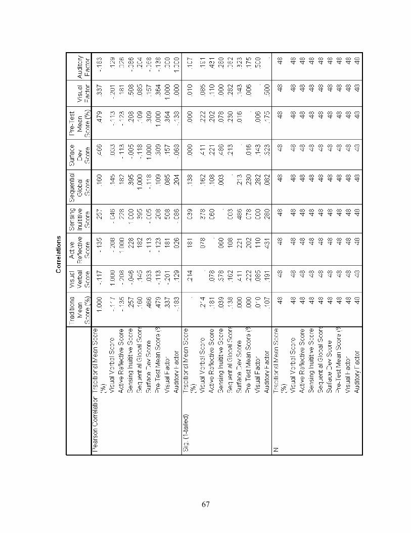
67

68
APPENDIX E
HMRA POSTTEST CORRELATION MATRIX

69

70
APPENDIX F
ALGORITHM ANIMATION GUIDE SHEET
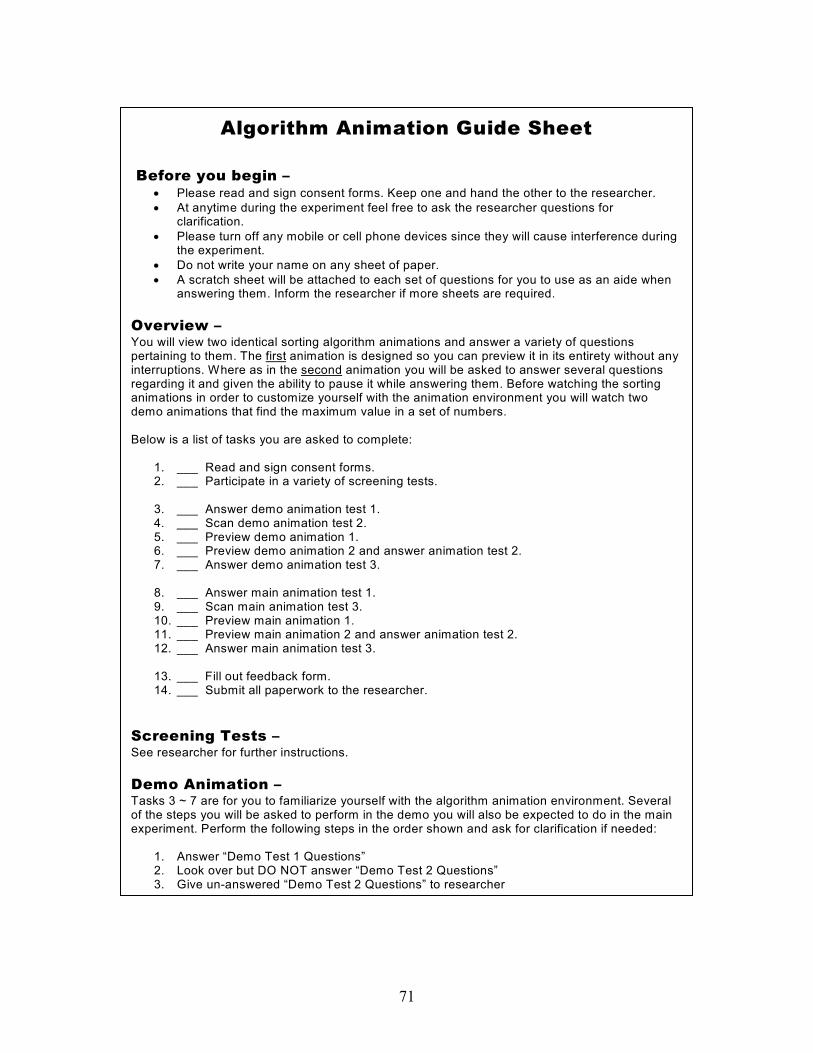
71
Algorithm Animation Guide Sheet
Before you begin – • Please read and sign consent forms. Keep one and hand the other to the researcher. • At anytime during the experiment feel free to ask the researcher questions for
clarification. • Please turn off any mobile or cell phone devices since they will cause interference during
the experiment. • Do not write your name on any sheet of paper. • A scratch sheet will be attached to each set of questions for you to use as an aide when
answering them. Inform the researcher if more sheets are required. Overview – You will view two identical sorting algorithm animations and answer a variety of questions pertaining to them. The first animation is designed so you can preview it in its entirety without any interruptions. Where as in the second animation you will be asked to answer several questions regarding it and given the ability to pause it while answering them. Before watching the sorting animations in order to customize yourself with the animation environment you will watch two demo animations that find the maximum value in a set of numbers. Below is a list of tasks you are asked to complete:
1. ___ Read and sign consent forms. 2. ___ Participate in a variety of screening tests. 3. ___ Answer demo animation test 1. 4. ___ Scan demo animation test 2. 5. ___ Preview demo animation 1. 6. ___ Preview demo animation 2 and answer animation test 2. 7. ___ Answer demo animation test 3. 8. ___ Answer main animation test 1. 9. ___ Scan main animation test 3. 10. ___ Preview main animation 1. 11. ___ Preview main animation 2 and answer animation test 2. 12. ___ Answer main animation test 3. 13. ___ Fill out feedback form. 14. ___ Submit all paperwork to the researcher.
Screening Tests – See researcher for further instructions. Demo Animation – Tasks 3 ~ 7 are for you to familiarize yourself with the algorithm animation environment. Several of the steps you will be asked to perform in the demo you will also be expected to do in the main experiment. Perform the following steps in the order shown and ask for clarification if needed:
1. Answer “Demo Test 1 Questions” 2. Look over but DO NOT answer “Demo Test 2 Questions” 3. Give un-answered “Demo Test 2 Questions” to researcher

72
1. Double click “Demo1_Animation” icon 2. Click “Begin Animation” at the top to start watching animation 3. Inform researcher when animation has completed 4. Double click “Demo2_Animation” icon 5. Click Pause when answering “Demo Test 2 Questions” and click Play to resume
animation 6. Inform researcher when animation has completed 7. Answer “Demo Test 3” Questions
Main Animation – Now that you are familiar with the algorithm animation environment, you will go through similar tasks to learn a particular sorting algorithm. Perform the following steps in the order shown and ask for clarification if needed:
1. Answer “Main Test 1 Questions” 2. Look over but DO NOT answer “Main Test 2 Questions” 3. Give un-answered “Main Test 2 Questions” to researcher 4. Double click “Main1_Animation” icon 5. Click “Begin Animation” at the top to start watching animation 6. Inform researcher when animation has completed 7. Double click “Main2_Animation” icon 8. Click Pause when answering “Main Test 2 Questions” and click Play to resume animation9. Inform researcher when animation has completed 10. Answer “Main Test 3” Questions
Feedback – Please take a minute to fill out the feedback form to give us your overall impression and thoughts of the experiment.

73
APPENDIX G
PERFORMANCE TESTS

74
Insertion Sort Pre-test Questions 1. Which best describes how insertion sort works? a. It portions the array into 2 sub-arrays and sorts the sub-arrays independently.
b. It merges sub-arrays so the resulting array is correctly sorted. c. A comparison sort in which the sorted array is built one entry at a time. d. A comparison sort in which a element is compared to every element in the array. 2. In insertion sort an element is selected for processing. This element is ________. a. the largest element of the array b. the smallest element of the array c. the first element of the unsorted portion d. the first element of the sorted portion 3. Given the sequence 2 4 8 3 7 1 5 6. If 3 is chosen as the selected element for an iteration, which of the following could be the new order after the first swap? a. 2 3 4 8 7 1 5 6 b. 1 2 4 8 3 7 5 6 c. 2 4 3 8 7 1 5 6 d. 2 3 8 4 7 1 5 6 4. When is the number of operations (compares / swaps) the greatest in insertion sort? a. When the array is already in ascending order. b. When the array is already in descending order. c. When the array is sorted except for the n-1st element. d. There is no predictor for the greatest number of operations. 5. When is the number of operations (compares / swaps) the least in insertion sort?
a. When the array is already in ascending order. b. When the array is initially in descending order. c. When the array is sorted except for the n-1st element. d. There is no predictor for the least number of operations. 6. The insertion sort algorithm can best be described as: a. selective b. recursive c. iterative d. abstract 7. During one iteration of the insertion sort, _________. a. the selected element is compared to only a fraction of the sorted portion b. the selected element is compared to all other numbers in the entire array c. the selected element is compared to all numbers in the sorted portion d. the selected element is compared to all numbers in the unsorted portion 8. The outcome for a single iteration in insertion sort is: a. to place the selected element into its final position in the array b. to place the selected element into its correct position in the sorted portion c. to move the smallest element in the unsorted portion to the sorted portion d. to move the largest element in the unsorted portion to the sorted portion
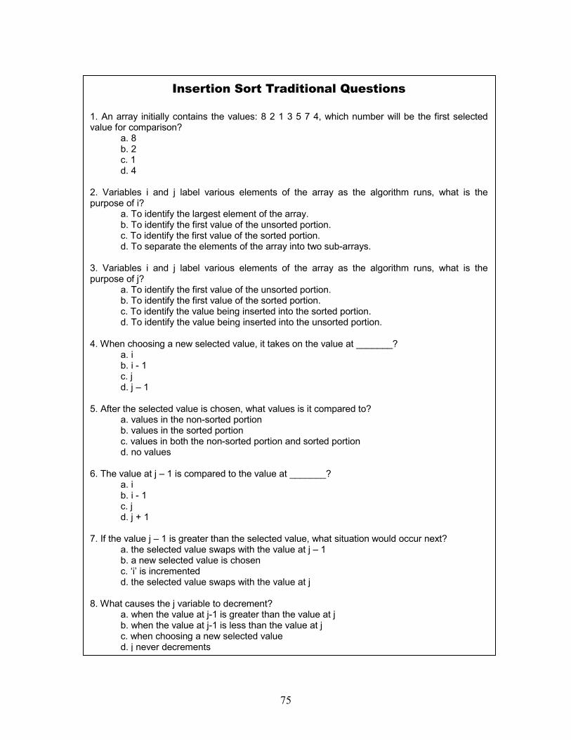
75
Insertion Sort Traditional Questions 1. An array initially contains the values: 8 2 1 3 5 7 4, which number will be the first selected value for comparison?
a. 8 b. 2
c. 1 d. 4
2. Variables i and j label various elements of the array as the algorithm runs, what is the purpose of i?
a. To identify the largest element of the array. b. To identify the first value of the unsorted portion. c. To identify the first value of the sorted portion. d. To separate the elements of the array into two sub-arrays.
3. Variables i and j label various elements of the array as the algorithm runs, what is thepurpose of j?
a. To identify the first value of the unsorted portion. b. To identify the first value of the sorted portion. c. To identify the value being inserted into the sorted portion. d. To identify the value being inserted into the unsorted portion.
4. When choosing a new selected value, it takes on the value at _______? a. i b. i - 1 c. j d. j – 1
5. After the selected value is chosen, what values is it compared to? a. values in the non-sorted portion b. values in the sorted portion c. values in both the non-sorted portion and sorted portion d. no values
6. The value at j – 1 is compared to the value at _______? a. i b. i - 1 c. j d. j + 1
7. If the value j – 1 is greater than the selected value, what situation would occur next? a. the selected value swaps with the value at j – 1 b. a new selected value is chosen c. ‘i’ is incremented d. the selected value swaps with the value at j
8. What causes the j variable to decrement? a. when the value at j-1 is greater than the value at j b. when the value at j-1 is less than the value at j c. when choosing a new selected value d. j never decrements
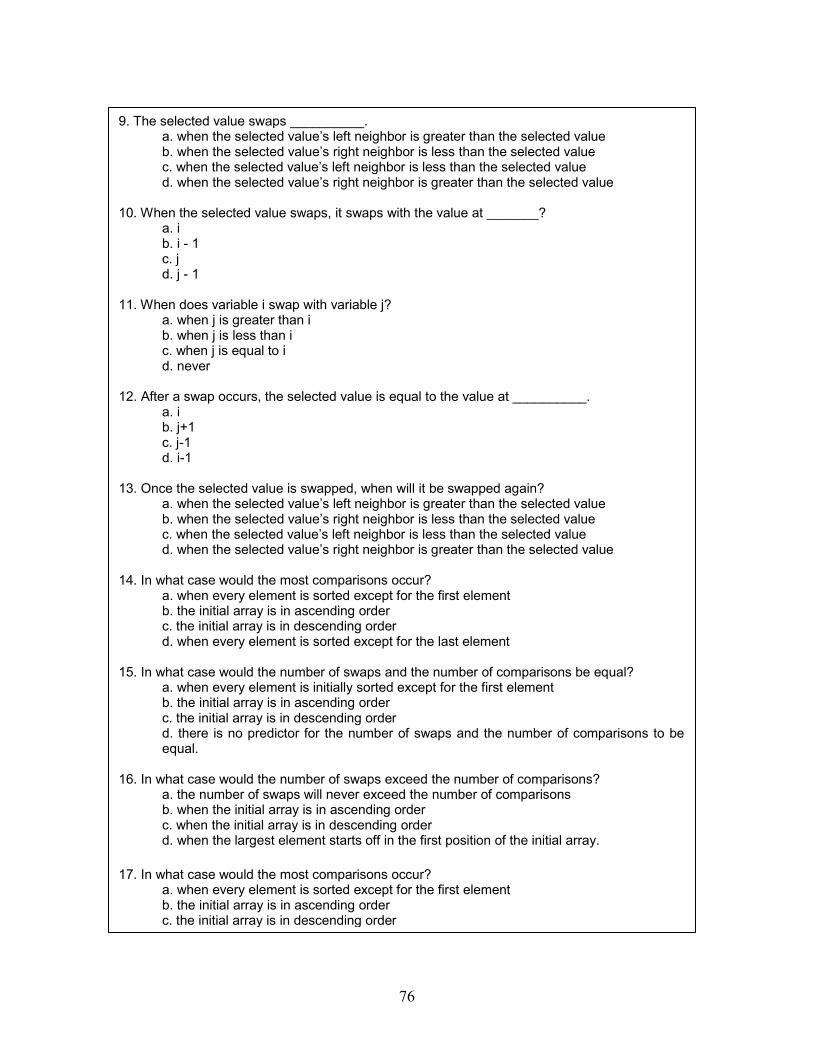
76
9. The selected value swaps __________. a. when the selected value’s left neighbor is greater than the selected value b. when the selected value’s right neighbor is less than the selected value c. when the selected value’s left neighbor is less than the selected value d. when the selected value’s right neighbor is greater than the selected value 10. When the selected value swaps, it swaps with the value at _______? a. i b. i - 1 c. j d. j - 1 11. When does variable i swap with variable j? a. when j is greater than i b. when j is less than i c. when j is equal to i d. never 12. After a swap occurs, the selected value is equal to the value at __________. a. i b. j+1 c. j-1 d. i-1 13. Once the selected value is swapped, when will it be swapped again? a. when the selected value’s left neighbor is greater than the selected value b. when the selected value’s right neighbor is less than the selected value c. when the selected value’s left neighbor is less than the selected value
d. when the selected value’s right neighbor is greater than the selected value 14. In what case would the most comparisons occur?
a. when every element is sorted except for the first element b. the initial array is in ascending order c. the initial array is in descending order
d. when every element is sorted except for the last element 15. In what case would the number of swaps and the number of comparisons be equal?
a. when every element is initially sorted except for the first element b. the initial array is in ascending order c. the initial array is in descending order
d. there is no predictor for the number of swaps and the number of comparisons to beequal.
16. In what case would the number of swaps exceed the number of comparisons?
a. the number of swaps will never exceed the number of comparisons b. when the initial array is in ascending order c. when the initial array is in descending order
d. when the largest element starts off in the first position of the initial array. 17. In what case would the most comparisons occur?
a. when every element is sorted except for the first element b. the initial array is in ascending order c. the initial array is in descending order
77
d. when every element is sorted except for the last element 18. How many swaps and comparisons would occur when the initial array 0…n-1 is sorted? a. 0 comparisons; 0 swaps b. n-1 comparisons; 0 swaps c. n comparisons; 0 swaps d. n-1 comparisons; n-1 swaps 19. How many times will i increment in the array 0…n-1? a. 0 b. n - 2 c. n - 1 d. n 20. Which case does NOT occur within insertion sort? a. i increments b. j increments c. i increments AND j decrements d. i decrements AND j increments 21. The insertion sort algorithm finishes _________.
a. after the n-1st element has been placed into its correct position in the sorted portion. b. when all values in the sorted portion are greater than all values in the non-sorted portion.
c. when the selected value does not swap with its neighbor. d. when the selected value swaps with its neighbor. 22. The lower portion (left of the selected value) contains elements that are __________. a. in ascending order b. in random order c. in descending order d. less than the selected value 23. The upper portion (right of the selected value) contains elements that are __________. a. in ascending order b. in random order c. in descending order d. greater than the selected value 24. All the elements to the left of the selected value are __________. a. in ascending order b. in random order c. in descending order d. less than the selected value

78
Insertion Sort Post-test Questions 1. Which best describes the correct order of events for the insertion sort you just viewed if one swap is required? I. Don’t swap the selected value with its neighbor II. Compare the selected value with its neighbor III. Choose the selected value IV. Swap the selected value with its neighbor
a. I, II, III, IV b. III, II, I, IV c. III, II, IV, I d. II, I, IV, II
2. Which element is chosen as the selected value? a. a random element b. the first element in the sorted portion c. the first element in the non-sorted portion d. the first element in the array 3. When is the selected value swapped? a. when the selected value’s left neighbor is greater than the selected value b. when the selected value’s right neighbor is less than the selected value c. when the selected value’s left neighbor is less than the selected value d. when the selected value’s right neighbor is greater than the selected value 4. The selected value is swapped with ______________. a. the first element in the non-sorted portion b. a random element c. it’s left neighbor d. it’s right neighbor 5. Which two objects are being compared?
a. first element in the sorted portion and the first element in the non-sorted portion b. selected value and it’s left neighbor c. selected value and the first element in the non-sorted portion d. last element in sorted portion and the first element in the non-sorted portion 6. Swaps can occur between ______________. a. selected value and the first element in the non-sorted portion b. last element in sorted portion and the first element in the non-sorted portion
c. first element in sorted portion and the first element in the non-sorted portion d. selected value and it’s left neighbor 7. Assume that the array to be sorted initially contained the following values: 4 6 7 1 5 3. Which of the following represents the contents of the new array after one swap of insertion sort? a. 1 4 6 7 5 3 b. 4 5 1 7 3 5 c. 4 6 7 1 3 5 d. 4 6 1 7 5 3

79
8. If you took a snapshot of the array at anytime using insertion sort. Which of the following representations would never occur given the array 5 8 3 2 1 4 9? a. 5 3 8 2 1 4 9 b. 3 2 5 8 1 4 9 c. 1 2 3 5 4 8 9 d. 1 5 8 3 2 4 9 9. Which best describes how insertion sort works? a. It portions the array into 2 sub-arrays and sorts the sub-arrays independently.
b. It merges sub-arrays so the resulting array is correctly sorted. c. A comparison sort in which the sorted array is built one entry at a time. d. A comparison sort in which a value is compared to every element in the array. 10. How is the selected value used? a. To identify the largest element of the array. b. To identify the value being placed into the sorted portion. c. To identify the first value of the sorted portion. d. To separate the elements of the array into two sub-arrays. 11. When is the number of operations (compares / swaps) for insertion sort of an array of 0…n-1 elements the greatest? a. When the array is already in ascending order. b. When the array is initially in descending order. c. When the array is already sorted except for the n-1st element. d. There is no predictor for the greatest number of operations. 12. When is the number of operations (compares / swaps) for insertion sort of an array of 0…n-1 elements the least?
a. When the array is already in ascending order. b. When the array is initially in descending order. c. When the array is already sorted except for the n-1st element. d. There is no predictor for the least number of operations. 13. The insertion sort algorithm can best be described as: a. selective b. recursive c. iterative d. abstract 14. The outcome for a single iteration in insertion sort is: a. to place the selected value into its final position in the array b. to place the selected value into its correct position in the sorted portion c. to move the smallest value in the unsorted portion to the sorted portion d. to move the largest value in the unsorted portion to the sorted portion

80
APPENDIX H
SYMBOL AND SOUND SELECTION SETS
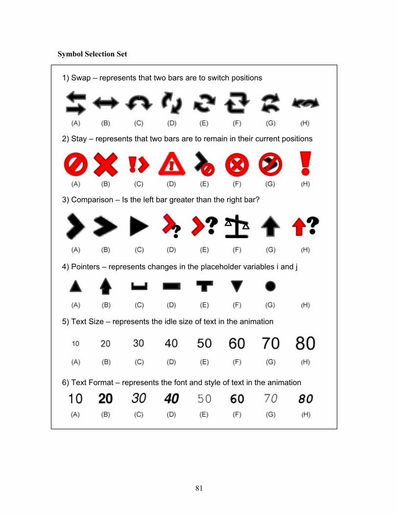
81
Symbol Selection Set
1) Swap – represents that two bars are to switch positions
2) Stay – represents that two bars are to remain in their current positions
3) Comparison – Is the left bar greater than the right bar?
4) Pointers – represents changes in the placeholder variables i and j
5) Text Size – represents the idle size of text in the animation
6) Text Format – represents the font and style of text in the animation

82
Sound Selection Set
7) Swap – represents that two bars are to switch positions
8) Stay – represents that two bars are to remain in their current positions
9) Comparison – Is the left bar greater than the right bar?
10) Pointers – represents changes in the placeholder variables i and j
11) Bar Value – represents with the shortest bar
12) Bar Value – represents the tallest bar