analysed magazines
TRANSCRIPT
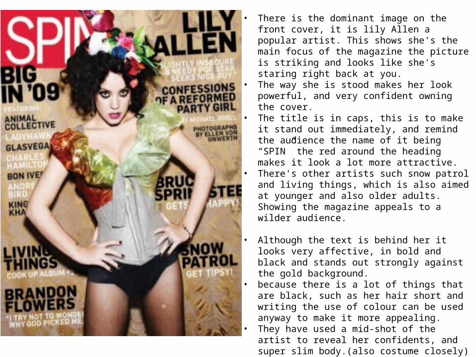
• There is the dominant image on the front cover, it is lily Allen a popular artist. This shows she's the main focus of the magazine the picture is striking and looks like she's staring right back at you.
• The way she is stood makes her look powerful, and very confident owning the cover.
• The title is in caps, this is to make it stand out immediately, and remind the audience the name of it being “SPIN” the red around the heading makes it look a lot more attractive.
• There's other artists such snow patrol and living things, which is also aimed at younger and also older adults. Showing the magazine appeals to a wilder audience.
• Although the text is behind her it looks very affective, in bold and black and stands out strongly against the gold background.
• because there is a lot of things that are black, such as her hair short and writing the use of colour can be used anyway to make it more appealing.
• They have used a mid-shot of the artist to reveal her confidents, and super slim body.(also costume closely)
• She stands sort of on a slant which relates to the title (SPIN) making her look dizzy.
• The artist face isn't all cheesy, she's serious, and looks right at the audience.
• The black and white sub heading stand clearly against the background, this shows the audience what will be in the magazines.
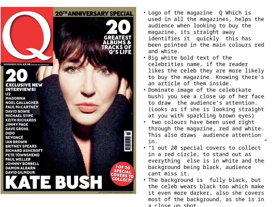
• Logo of the magazine Q Which is used in all the magazines, helps the audience when looking to buy the magazine, its straight away identifies it quickly this has been printed in the main colours red and white.
• Big white bold text of the celebrities name, if the reader likes the celeb they are more likely to buy the magazine. Knowing there's an article of them inside.
• Dominate image of the celeb(kate bush) you see a close up of her face to draw the audience’s attention. (Looks as if she is looking straight at you with sparkling brown eyes)
• two colours have been used right through the magazine, red and white. This also draws audience attention in.
• “1 out 20 special covers to collect” in a red circle, to stand out as everything else is in white and the background being black, audience cant miss it.
• The background is fully black, but the celeb wears black too which make it even more darker, also she covers most of the background, as she is in a close up shot.
• You see a really good shot of her pale, natural face and her innocent facial expression.
• There’s a gold border round the page, which brings everything in.