“an intraday trading methodology” - ultimate...
TRANSCRIPT

“An Intraday Trading Methodology”

Copyright 2010, Ultimate Scalper LLC.
All rights reserved. No part of this document may be reported or
transmitted, in any form or by any means, electronic, mechanical,
photocopying, or otherwise, without the prior written permission of the
publisher and author.
Ultimate Scalper LLC
Copyright 2010

Copyright 2010, Ultimate Scalper LLC.
Required Legal Disclaimer
Risk Disclosure Statement for System Traders:
Commission Rule 4.41(b)(1)(I) hypothetical or simulated performance results have
certain inherent limitations. Unlike an actual performance record, simulated results do not
represent actual trading. Also, since the trades have not actually been executed, the
results may have under- or over-compensated for the impact, if any, of certain market
factors, such as lack of liquidity. Simulated trading programs in general are also subject
to the fact that they are designed with the benefit of hindsight. No representation is being
made that any account will or is likely to achieve profits or losses. There have been no
promises, guarantees or warranties suggesting that any trading will result in a profit or
will not result in a loss.
Hypothetical performance results have many inherent limitations, some of which are
described below. No representation is being made that any account will or is likely to
achieve profits or losses similar to those shown. In fact, there are frequently sharp
differences between hypothetical performance results and the actual results subsequently
achieved by any particular trading program.
One of the limitations of hypothetical performance results is that they are generally
prepared with the benefit of hindsight. In addition, hypothetical trading does not involve
financial risk, and no hypothetical trading record can completely account for the impact
of financial risk in actual trading. For example, the ability to withstand losses or adhere to
a particular trading program in spite of trading losses are material points which can also
adversely affect actual trading results. There are numerous other factors related to the
markets in general or to the implementation of any specific trading program which cannot
be fully account for in the preparation of hypothetical performance results and all of
which can adversely affect actual trading results.
The methods described in this manual are for educational purposes only. Past results are
not necessarily indicative of future results. The author and publisher assume no
responsibility for your trading results. Trading involves a high degree of risk. No
recommendation is being made to buy any stock, commodity, option or other financial
instrument. Consult your financial advisor before starting any investment system.

Copyright 2010, Ultimate Scalper LLC.
Table of Contents
Introduction ......................................................................................................................... 1
Welcome, ............................................................................................................................ 2
E-mini S&P ......................................................................................................................... 2
ESH10 ................................................................................................................................. 3
ORDER TYPES .................................................................................................................. 3
Market Order ....................................................................................................................... 3
Limit Order ......................................................................................................................... 4
Stop Order ........................................................................................................................... 5
Trading Platforms Charts and Brokers ............................................................................... 7
Charts & Candlesticks....................................................................................................... 10
Trends ............................................................................................................................... 18
Trend Lines ....................................................................................................................... 21
Support and Resistance ..................................................................................................... 34
Support .............................................................................................................................. 34
Resistance ......................................................................................................................... 34
Floor Trader Pivots ........................................................................................................... 42
Indicators........................................................................................................................... 47
The 50 EMA Indicator “The Tornado” ............................................................................ 47
Volume .............................................................................................................................. 52
Volume Probability Test ................................................................................................... 54
Final Upward Push and Final Downward Push Bars ........................................................ 60
SYSTEMS......................................................................................................................... 77
THE DOUBLE TOP DOUBLE BOTTOM SYSTEM ..................................................... 80
MACD Indicator ............................................................................................................... 83
Convergence Divergence Push Pull .................................................................................. 85
Stochastic Slow Indicator ................................................................................................. 87
Double Tops and Double Bottoms .................................................................................... 90

Copyright 2010, Ultimate Scalper LLC.
System Definition & Conditions ....................................................................................... 97
1, 2, 3, GO!!!! ................................................................................................................... 98
Double Top and Double Bottom ..................................................................................... 121
Chart Examples ............................................................................................................... 121
TRIPLE TOPS AND BOTTOMS .................................................................................. 183
THE OVERBOUGHT OVERSOLD SYSTEM ............................................................. 193
Overbought Oversold Chart Examples ........................................................................... 197
HISTOGRAM SYSTEM ................................................................................................ 211
Histogram ........................................................................................................................ 211
Histogram System Chart Example .................................................................................. 214
THE SLINGSHOT SYSTEM ......................................................................................... 215
Sling Shot Chart Examples ............................................................................................. 220
TREND LINE BREAKOUT SYSTEM.......................................................................... 228
The Coffee Break ............................................................................................................ 235
Actual Coffee Break Chart Examples ............................................................................. 236
Tips for Trading Success ................................................................................................ 240
Conclusion ...................................................................................................................... 241
Videos ............................................................................................................................. 242

Page | 1
Copyright 2010, Ultimate Scalper LLC.
Introduction
First of all, I would like to thank you for purchasing my course on day-trading the
S&P E-Mini’s. I believe that anyone with the right amount of patience, discipline, desire,
and dedication can make a very nice professional-level income by day-trading the E-
minis. There is also no limit to the income you can generate. For the person who puts
forth the effort, day trading can be a very satisfying and rewarding career or hobby.
In this manual, I will show you how I trade the E-mini’s successfully, with exact
entries and stops. My methods are simple, just like trading should be. You do not need a
bunch of fancy indicators that some people are leasing or selling. You do not need to sit
in some boring trading room day after day month after month listening to some so called
expert calling trades. I know these things because I have purchased courses and sat in on
similar rooms to see if there was something worthwhile I was missing. Sadly, what I
witnesses in most cases was not worth the price. There are however some very legitimate
teachers doing a good service to traders and teaching methods with actual value. I say this
because although you will learn a very valuable tried and true trading method in this
course, you may chose to further your education. Not everyone trades the same way.
There are many successful systems and methods. Please be careful in purchasing courses.
If you find something that works for you consistently day in and day then you are already
successful.
I am not a salesperson, teacher, or writer, but I will try my best to fill this manual
with useful information and with as little fluff as possible. I started trading in the late
80’s, before computers. I would watch the real-time coffee futures price quotes from a
device that looked like a portable hand-held TV. Each day I would draw charts by hand
on graph paper, and learned to create my own trading strategies. Back then, you needed
to pick up a phone and call your broker to place an order, then wait for him to call you
back with your fill price. It was a time-consuming process to say the least, especially
when the price was still moving while you were waiting for them to answer your call. I
remember saying to myself “If there was a way I could just press a button to enter a trade
and another button to exit, this would be easy and I would be rich.”
Page | 2
Copyright 2010, Ultimate Scalper LLC.
Welcome,
Today it’s just as easy as that to place a trade, even easier. You can literally press
one button and place your entry, exit, or stop orders with just one click. This course was
written for the most novice beginners who know little or nothing about trading. It will
give them the education they need to get started, learn some important basics, and teach
them a simple yet powerful method that can lead to a successful career as a day trader.
For those who are more experienced, please be patient or skip directly to the Method.
E-mini S&P
The S&P 500 index is a basket of 500 companies stocks used as a leading
indicator for US equities. It is a common benchmark for the entire US market. In 1982
the S&P 500 futures contract began trading on the market. It was then and still is today a
very volatile investment vehicle that often requires large amounts of capital to open and
trade an account. In 1997 the E-mini S&P 500 futures contract began trading. The E is for
Electronic, because it is traded fully electronically. The mini is because it is 1/5 the size
of the original S&P 500 futures contract. This allows more players to participate in the
game and take advantage of all the benefits of the original S&P 500 with less capital
investment and risk. The E-mini S&P is our instrument of choice and is what this course
will teach you to trade. E-mini S&P futures are the world’s most actively traded stock
index futures contract. For more specific information on the E-mini S&P 500, please go
to the website www.cme.com. There you will find everything there is to know about E-
mini S&P 500 contract.
So how do you trade it? Unlike stocks, the E-mini’s are traded in contracts instead
of shares. You can enter a trade with a “buy” betting that the contract will go up in value
(going long), or you can enter a trade with a “sell” betting that the contract will go down
in value (going short).
The symbol for the E-mini S&P 500 is ES and it is traded in four specific contract
months each year: March, June, September, and December. Each contract month also
has its own symbol:
March-H June-M September-U December-Z
Page | 3
Copyright 2010, Ultimate Scalper LLC.
As an example, the March 2010 E-mini S&P contract started trading on 12/19/08 with the
last trade being 03/19/2010. This contract would look like this on your computer:
ESH10
The website www.cme.com will have all the accurate symbols, months, dates and trading
hours.
Always make sure that you are trading the right contract month. Your broker will
be able to help you with all this information. Usually, the contract to trade is the one
expiring next.
The E-mini S&P is open for trading 23.25 hours per day seven days a week.
The best times are from 9:30AM to 4:15PM Eastern Standard Time (EST). Your broker
will have more information on the hours you will be allowed to trade according to your
account.
ORDER TYPES
The following are the most common and basic order types that you will be using
in your trading. There are many more order types and combinations of orders to make
your trading simpler and more efficient. These may seem confusing at first (just by
reading through them), but once you start practicing in the simulation account, they will
become very easy to understand.
Market Order
This is the most common order to place when you just want to get in or out of a
trade right now, ASAP. A market order does not specify a price; it is executed
immediately at the best possible price available. This order is used to get in or enter a
new trade or to get out of or exit an existing trade.

Page | 4
Copyright 2010, Ultimate Scalper LLC.
Limit Order
The limit order is an order to buy or sell at a specified price or better (higher for a
sell, lower for a buy). Limit orders to buy are placed below or at the current price, while
limit orders to sell are placed above or at the current price. A Limit Order is used to enter
a new position or to exit an existing one. Be aware that, even though you see the market
traded your limit price several times, this does not guarantee a fill at that price. The
reason is that on a Limit Order you are only guaranteed to be executed if the market
trades through the Limit Price.
Example:
When buying, if the order price is lower than (below) the current market price, it
is a Buy Limit.
o As an example, with the market trading at 1135.0, Buy 1 ESH10 1135.0
Limit. The order can only be filled at the stated price (1135.0) or lower.
When selling, if the order price is higher than (above) the current market price, it
is a Sell Limit.
o As an example, with the market trading at 1135.0, Sell 1 ESH10 1135.5
Limit The order will only be filled at the stated price (1135.5) or higher.
Page | 5
Copyright 2010, Ultimate Scalper LLC.
Stop Order
Stop orders are used for several purposes:
To enter a new long or short trade.
To protect your profit on an existing long or short trade.
To minimize a loss on a short or long trade (Stop Loss).
This order becomes a “Market Order” when the specific price is reached and does not
guarantee that you are going to get in at your exact price -why? Because it becomes a
market order. A “Buy Stop” order is placed above the current market and is elected only
when the market trades at or above, or is bid at or above the stop price. A “Sell Stop”
order is placed below the current market price and is elected only when the market trades
at or below, or is offered at or below the stop price.
Example:
When buying, if the order price is higher than the current market price, it is a Buy
Stop.
o As an example, with the market trading at 1135.0, Buy 1 ESH10 1136.0
Stop. This order can only be filled at the “Market”, after the Market trades
(or is "offered") at 1136.0 or higher.
When selling, if the order price is lower than the current market price, it is a Sell
Stop.
o As an example, with the market trading at 1135.0, Sell 1 ESH10 1134.0
Stop. This order can only be filled at the “Market”, after the Market trades
(or is "bid") at 1134.0 or lower.

Page | 6
Copyright 2010, Ultimate Scalper LLC.
The E-mini S&P 500 is quoted as a number that moves up and down, just as a
stock price moves up and down. The smallest increment the equity can move up or down
is .25, or one tick. That one tick, or .25, is equal to $12.50 per contract. One point is equal
to 4 ticks or $50. per contract.
Example:
If you enter a trade by buying (going long) one ESH10 contract at 1135.0 and
then you exit the trade by selling that one contract when it reaches 1136.0 you
have made 1 point or $50.
If you enter a trade by selling (going short) one ESH10 contract at 1135.0 and you
then exit the trade by buying that one contract when the price reaches 1134.0 you
have made 1 point or $50.
In both examples above you have made a one point gain equal to $50 for the one contract
you traded. If you had traded two contracts it would have been a $100 gain, five contracts
a $250 gain and so forth.
Page | 7
Copyright 2010, Ultimate Scalper LLC.
Trading Platforms Charts and Brokers
As stated before, the E-mini is traded electronically. All trades will be placed on
your computer through a trading platform and charting software. Long gone are the days
of the phone call to the brokers trading desk, and the nail biting wait for them to call you
back with your fill price. The trading platforms available today will have fully
customizable charts and order entry windows simplifying the entire trading process.
A computer is essential in the business of trading E-mini’s. Make sure you have a
powerful enough computer to handle the software you will be running and the real-time
data it will be processing. I recommend something with at least 2 mega bytes of RAM as
an absolute minimum, but the more the better. I wouldn’t go any slower than a 3.2 GHz
processor as well. You defiantly do not want your computer running slow or crashing
while you have money on the line. A high speed internet connection is pretty much a
must. I would avoid dial up if at all possible. The extra money spent for high speed will
far outweigh the losses you will incur in your trading for slow internet or dropped
connections.
Many professional traders use multiple screens or monitors. In this way they can
view a variety of different charts and symbols, or whatever else they need to make their
trading more productive. I don’t recommend splurging on multiple monitors right away. I
personally use only one 24-inch monitor. I view either three charts at once, or one chart
and the order entry window, or two charts and shrink the order window until I need it.
Searching for the right broker can seem like an overwhelming task. Just type in
Futures Brokerage or E-mini broker in any online search engine and you will find plenty
to choose from. My advice is to select the charting software or trading platform you wish
to use first. I recommend visiting several websites and possibly trying an online demo or
watching a free video, if offered.
Once you have done all the research and selected the software you want to use for
your charts and order entry, choose the brokerage company that is compatible with that
package. Some companies combine their services to include trading platform, charts, and
brokerage service all together.

Page | 8
Copyright 2010, Ultimate Scalper LLC.
NOTE: “Ultimate Scalper LLC is not affiliated with ANY broker or trading
platform”.
Two of the most commonly used trading platforms today are NinjaTrader and
Tradestation. I have personally been using Tradestation since the early 90’s and have
been very happy with them and their products over the years. The software is easy to
learn and easy to trade with. They provide an overwhelming amount of customizable
indicators and studies. Their order entry window is also very easy to use. They also have
a great account simulator that lets you practice in real time without risking any money.
I highly recommend that you trade a simulated account for at least a month if you
are practicing every day, otherwise a longer period of time would be advisable. Make
sure that you are comfortable with the software along with placing different types of
orders. I would not go live with actual money until you see consistent profits on a daily
basis.
Although I have never used NinjaTrader, it is also a very powerful and popular
trading platform. They offer simulated trading accounts as well. There is a list of brokers
that work with NinjaTrader on their website. Below are the links to both the Tradestation
and NinjaTrader websites.
NOTE: Although there are exceptional trading platforms such as NinjaTrader and
others, I personally have not used them. I do believe their software allows you to
customize indicators and charts according to my system specific input settings,
however I cannot guarantee it.
www.Tradestation.com www.NinjaTrader.com

Page | 9
Copyright 2010, Ultimate Scalper LLC.
Please do research as many companies as you need until you find one that will
suit your needs. Just about any software package and or trading platform will work with
the method of trading that you will learn in this manual.
Brokers will charge you a fee for their service. You can expect to pay around
$2.50 per side per contract, or $5 a round turn. What that actually means is for every
contract you trade it is $2.50 to enter a position and another $2.50 to exit. This is just an
average, you can find lower fees by shopping around. Some brokers will give discounts
on volume of contracts traded. Obviously, the more contracts the lower the commission.
There will also be minor exchange fees to pay. You will be able to find all the
associated fees and fee schedules at your broker’s website.
Some brokers will advertise very low account minimums to get started trading the
E-mini. I wouldn’t recommend opening an account with less than $5000. I cannot stress
this enough:
“PRACTICE ON A SIMULATED ACCOUNT FIRST BEFORE TRADING
WITH REAL MONEY!”
Teaching you to use the trading platform and charts is beyond the scope of this
course. Once you are set up with the company of your choice, they will provide tutorials,
videos, and demos. There will most likely be a whole section dedicated to getting started
and training on their website. Remember: These companies are fighting for your
business. It is their job to teach you how to use their products, and in most cases will even
assign an account rep to handle all your questions and point you in the right direction.

Page | 10
Copyright 2010, Ultimate Scalper LLC.
Charts & Candlesticks
Since you are going to spend a lot of time looking at charts, I think now is a good
time to talk about them. Charts are your way of visually seeing what the security of your
choice is doing in a graphical format. Over time, the more you look at charts of a specific
investment instrument, the more you will begin to notice its patterns and that it actually
has a personality.
Charts come in a variety of different styles and timeframes. You can easily get
overwhelmed at all the information there is out there about charts, chart patterns,
candlesticks, and more. There are dozens of courses and books devoted to each of these
topics. Don’t worry: You don’t need to know much more than what I will teach you here
in this manual. Profitable trading does not need to be complicated, nor do methods and
systems that work.

Page | 11
Copyright 2010, Ultimate Scalper LLC.
Let’s look at an example of a chart and become familiar with it. Below we have a
drawing of what a 5 minute candlestick chart would look like for a period of 45 minutes.
This is referred to as an “Intraday Chart” because the timeframe displayed is less than
one day and represents what is going on inside that day. Each candle represents 5 minutes
of time and what the price did in those 5 minutes. There are 9 candlesticks because we
are looking at 45 minutes worth of data -45 divided by 5 equals 9.
Now let’s break it down further and look at the individual candlesticks.
Page | 12
Copyright 2010, Ultimate Scalper LLC.
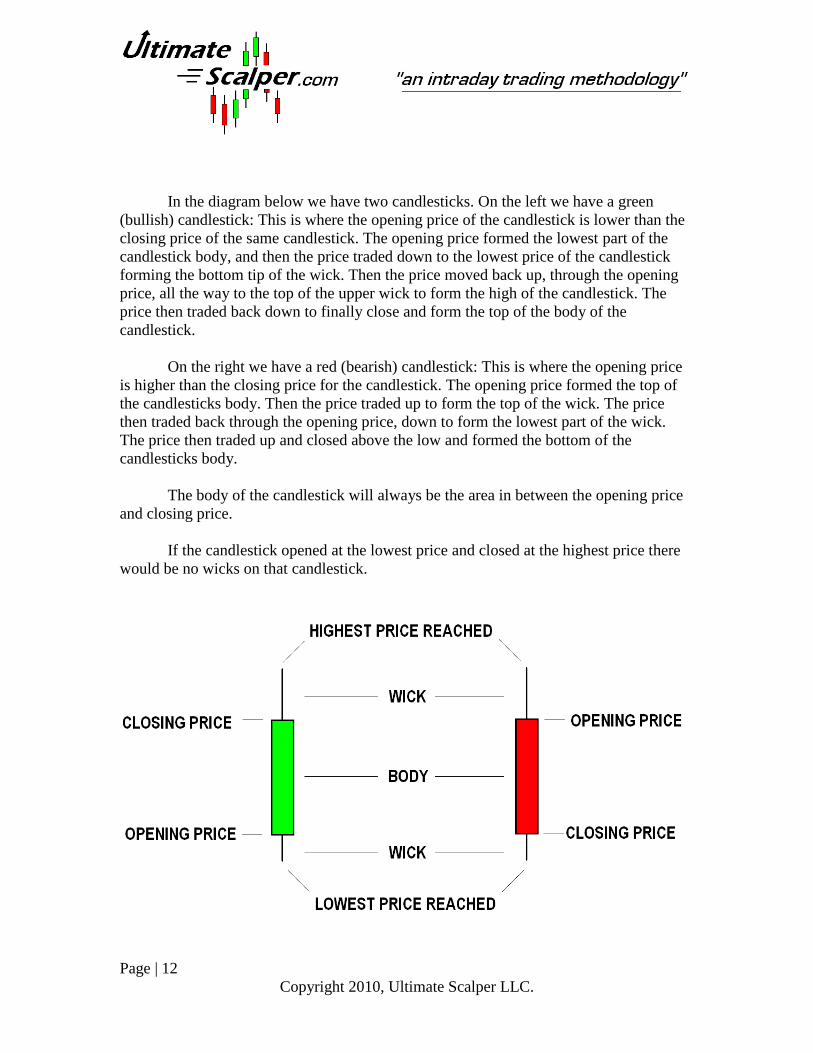
In the diagram below we have two candlesticks. On the left we have a green
(bullish) candlestick: This is where the opening price of the candlestick is lower than the
closing price of the same candlestick. The opening price formed the lowest part of the
candlestick body, and then the price traded down to the lowest price of the candlestick
forming the bottom tip of the wick. Then the price moved back up, through the opening
price, all the way to the top of the upper wick to form the high of the candlestick. The
price then traded back down to finally close and form the top of the body of the
candlestick.
On the right we have a red (bearish) candlestick: This is where the opening price
is higher than the closing price for the candlestick. The opening price formed the top of
the candlesticks body. Then the price traded up to form the top of the wick. The price
then traded back through the opening price, down to form the lowest part of the wick.
The price then traded up and closed above the low and formed the bottom of the
candlesticks body.
The body of the candlestick will always be the area in between the opening price
and closing price.
If the candlestick opened at the lowest price and closed at the highest price there
would be no wicks on that candlestick.
Page | 13
Copyright 2010, Ultimate Scalper LLC.
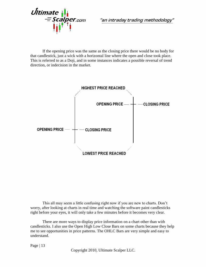
If the opening price was the same as the closing price there would be no body for
that candlestick, just a wick with a horizontal line where the open and close took place.
This is referred to as a Doji, and in some instances indicates a possible reversal of trend
direction, or indecision in the market.
This all may seem a little confusing right now if you are new to charts. Don’t
worry, after looking at charts in real time and watching the software paint candlesticks
right before your eyes, it will only take a few minutes before it becomes very clear.
There are more ways to display price information on a chart other than with
candlesticks. I also use the Open High Low Close Bars on some charts because they help
me to see opportunities in price patterns. The OHLC Bars are very simple and easy to
understand.
Page | 14
Copyright 2010, Ultimate Scalper LLC.
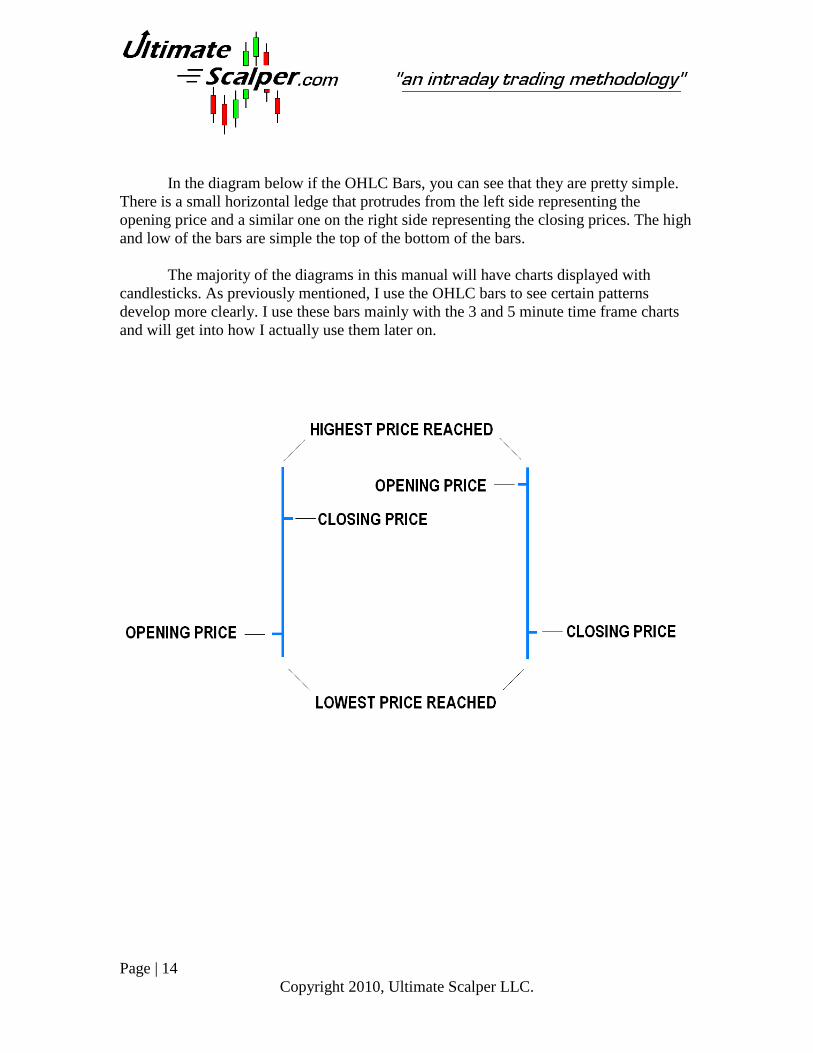
In the diagram below if the OHLC Bars, you can see that they are pretty simple.
There is a small horizontal ledge that protrudes from the left side representing the
opening price and a similar one on the right side representing the closing prices. The high
and low of the bars are simple the top of the bottom of the bars.
The majority of the diagrams in this manual will have charts displayed with
candlesticks. As previously mentioned, I use the OHLC bars to see certain patterns
develop more clearly. I use these bars mainly with the 3 and 5 minute time frame charts
and will get into how I actually use them later on.
Page | 15
Copyright 2010, Ultimate Scalper LLC.
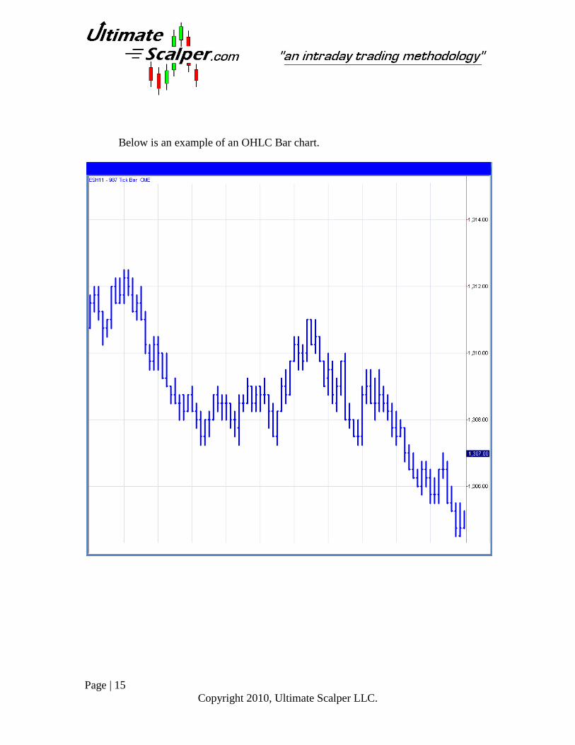
Below is an example of an OHLC Bar chart.

Page | 16
Copyright 2010, Ultimate Scalper LLC.
As previously stated, there are many different time frames that traders use to
analyze a specific equity. There are daily charts where each candlestick represents an
entire day of trading data. There are weekly, monthly, and yearly charts as well. Day
traders use a variety of different charts and timeframes. We talked about the 5 minute
time frame and gave a simple example above. Other charts that are commonly used
amongst day traders are the 1, 3, 15, 30 and 60 minute timeframe charts.
There are two other types of charts commonly used by day traders: These are the
volume charts and tick charts. Unlike the minute chart that paints each candlestick
according to the time frame specified, the volume chart is based on a specific “volume of
contracts traded” to paint a candlestick. The tick chart is similar in that it paints the
candlestick according to the amount of “ticks” specified.
In my experience over the years, I have analyzed and traded with all sorts of
different charts. In my opinion, the easiest charts for me to analyze are the tick-based as
well as time based charts. Therefore the methods I will teach in this course will be based
on those two chart types.
I will look at daily charts as well as other types of charts during the day, before
the market opens and after it closes. However, the main charts I use to make my trading
decisions and place my actual trades are on the tick and or minute time frame charts.

Page | 17
Copyright 2010, Ultimate Scalper LLC.
Below is an actual “tick” chart for the E-mini S&P March 2010 contract.
The Price Scale is displayed on the right margin of the chart from lowest on the
bottom, to highest at the top. The current candlestick is always the one furthest to the
right. As price moves up and down, tick by tick the candlestick is being formed. Once it
reaches the pre-determined amount of ticks, the candlestick is completed and another one
is started to the right of it.
You should now have a basic understanding of candlestick anatomy and how they
form price charts over a period of time. This will all be very easy for you to understand
once you actually start looking at charts for yourself.
Page | 18
Copyright 2010, Ultimate Scalper LLC.
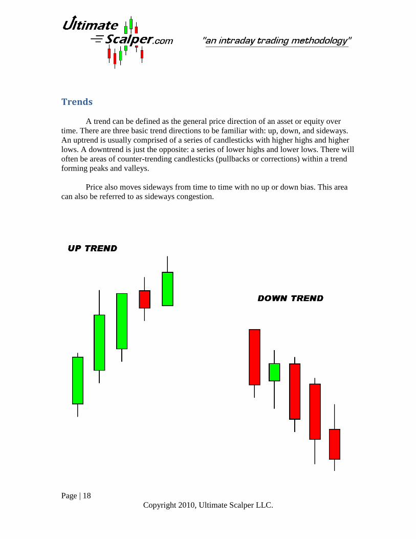
Trends
A trend can be defined as the general price direction of an asset or equity over
time. There are three basic trend directions to be familiar with: up, down, and sideways.
An uptrend is usually comprised of a series of candlesticks with higher highs and higher
lows. A downtrend is just the opposite: a series of lower highs and lower lows. There will
often be areas of counter-trending candlesticks (pullbacks or corrections) within a trend
forming peaks and valleys.
Price also moves sideways from time to time with no up or down bias. This area
can also be referred to as sideways congestion.

Page | 19
Copyright 2010, Ultimate Scalper LLC.
Trends can be classified as long term, intermediate, short term, micro and mini
trends -all depending on what timeframe you are looking at. The following is an example
of how I personally classify timeframes and is by no means the only way to classify
them. It is all subjective to the actual traders themselves. Please understand that there is
always a larger trend happening than the one you are currently looking at. Conversely,
there will almost always be a smaller one as well.
Long term trends: yearly, monthly, weekly
Intermediate trends: daily, hourly, 45, min, 30 min
Short term trends: 10, 15 min, 5000 tick, 2000 tick
Micro trends: 1, 3, 5minute, 300 tick, 500 tick, 1000 tick
When you look at different time frames, you will notice that they each tell a
different story. Different time frames may very well have trends going in different
directions. You may be looking at a daily chart and clearly see that it has been in an
uptrend for days. However, when you zoom in on an intraday chart with an hourly or 30
minute timeframe, you might notice that it is in a complete downtrend.

Page | 20
Copyright 2010, Ultimate Scalper LLC.
As a day trader, it is very important to know what the market is doing in different
time frames. I personally always have a good look at the daily chart before, after, and
during a trading session so I have a bigger picture of what is really going on.
Below is the same ESH10 tick chart we had a look at previously. Since it is a
1000 tick chart (similar to what I use as my primary trading chart in one of my methods)
the trends are Micro trends.
In position #1 we see price is in an uptrend, followed by a downtrend in position #2. In position #3 is another uptrend followed by yet another downtrend at position #4. In position #5 there is another uptrend that goes into a sideways congested area at #6.
Page | 21
Copyright 2010, Ultimate Scalper LLC.
Theses micro trends have enough of movement to generate a good size profit.
They are perfect little trends for day trading and can be good for 5 points or even more.
In the above chart you can clearly see that the micro trend direction changes 5
times, as previously noted. However, even though the micro trend changes several times,
the larger trend is still an upward (bullish) direction. You can see this by stepping back
and looking at the bigger picture of the chart, or using trend lines ( available in all
charting software) and drawing a trend channel around it.
Trend Lines
Trend lines are one of the most basic technical analysis tools available to the
trader. They are simple to use and, as previously mentioned, they are available in most all
charting software packages.
Years ago, when I first started out drawing my own charts by hand, I couldn’t
help but notice that just about all trends -no matter up or down- shared something in
common that practically jumped right out at me.
Underneath an uptrend there seemed to be an imaginary diagonal line moving
upwards with the trend. As the candlesticks would form, some of them would touch the
imaginary line but never break through it. Then other candlesticks would bounce off the
line and some would trade above the line and never come close to it. This would happen
the entire way up a trend. Over and over, price would come down and test the imaginary
line but not break it, then continue on trading higher. Ultimately, the trend would change
direction and break through the imaginary line.
The same thing would happen in a downtrend, except the imaginary line would
now be on top of the candlesticks in a diagonal line moving downwards. Just like the
uptrend, the price would bounce off the imaginary lines but this time with the highs of the
candlesticks bouncing off the line.
Back then I would just use a ruler and pencil to draw in the imaginary line on my
chart. Today it’s so easy to just click your mouse and draw perfect trend lines under all
your up-trends and above all your down-trends.

Page | 22
Copyright 2010, Ultimate Scalper LLC.
I was drawing lines on every trend I could find. What I noticed was that, when the
trend changed direction, it would on most occasions break through that trend line that I
had drawn. Now I draw trend lines all the time. Trend lines are subjective, depending on
the trader drawing them. Most likely, each trader will draw them differently. I use them
as a stand-alone trading system that I will get more into later on. I also use them as
confirmation for other trade entries and trend changes.
In the diagrams that follow you can see how I draw my trend lines. A trend needs
to be pretty well established before you are able to draw the lines.
TREND LINES MUST CONNECT IN 3 SPOTS, THE ANCHOR OR STARTING
POINT, PLUS AT LEAST 2 MORE POINTS.

Page | 23
Copyright 2010, Ultimate Scalper LLC.

Page | 24
Copyright 2010, Ultimate Scalper LLC.
Let’s take a look at some actual examples starting with the ESH10 chart that we
have already seen a number of times. Notice how each time the trend changes direction it
breaks a trend line.

Page | 25
Copyright 2010, Ultimate Scalper LLC.

Page | 26
Copyright 2010, Ultimate Scalper LLC.
Page | 27
Copyright 2010, Ultimate Scalper LLC.
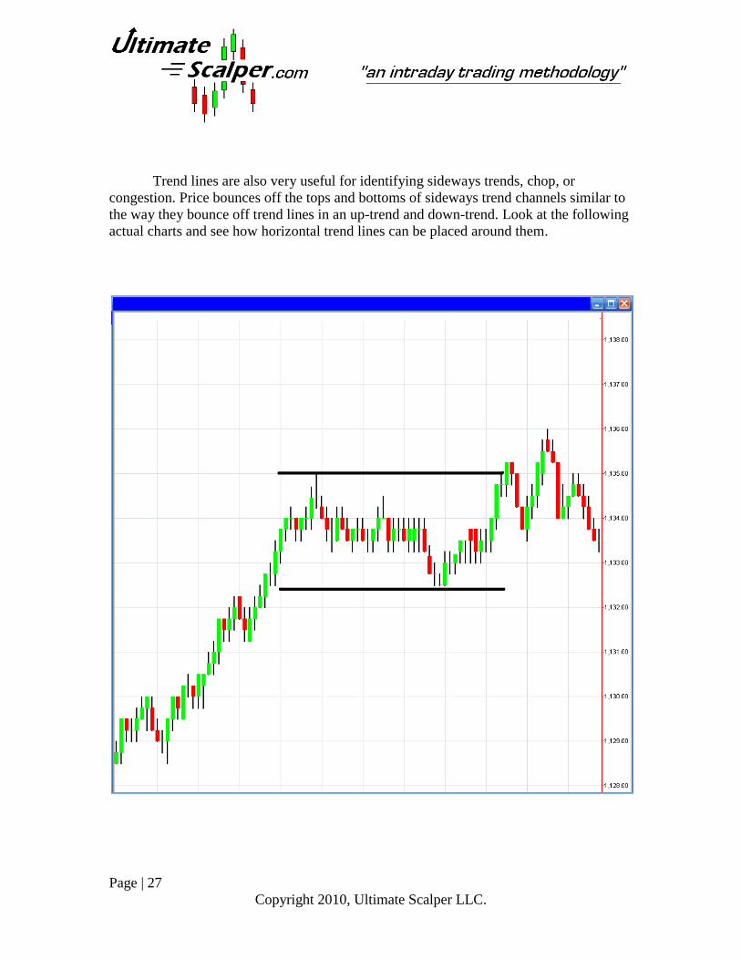
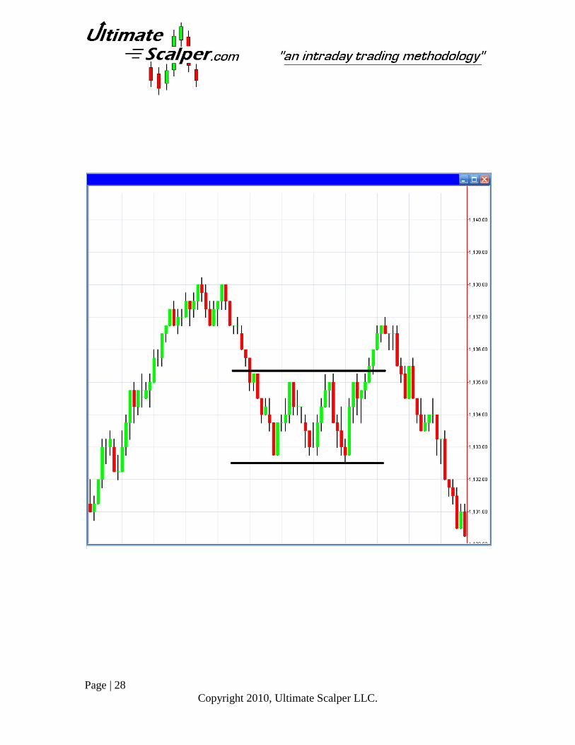
Trend lines are also very useful for identifying sideways trends, chop, or
congestion. Price bounces off the tops and bottoms of sideways trend channels similar to
the way they bounce off trend lines in an up-trend and down-trend. Look at the following
actual charts and see how horizontal trend lines can be placed around them.
Page | 28
Copyright 2010, Ultimate Scalper LLC.
Page | 29
Copyright 2010, Ultimate Scalper LLC.
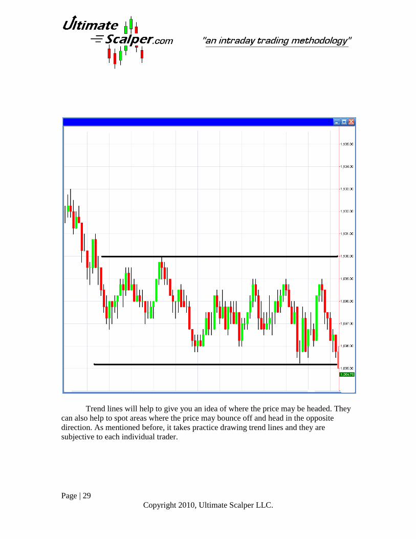
Trend lines will help to give you an idea of where the price may be headed. They
can also help to spot areas where the price may bounce off and head in the opposite
direction. As mentioned before, it takes practice drawing trend lines and they are
subjective to each individual trader.

Page | 30
Copyright 2010, Ultimate Scalper LLC.
On some days, the micro trends will form very nice upwards and downwards
trend channels. These are especially helpful in spotting price turnaround targets. Take a
look at the following actual examples. The price seems to just bounce off the trend
channel lines drawn and reverse course in the opposite direction. This can be very
helpful.

Page | 31
Copyright 2010, Ultimate Scalper LLC.

Page | 32
Copyright 2010, Ultimate Scalper LLC.

Page | 33
Copyright 2010, Ultimate Scalper LLC.

Page | 34
Copyright 2010, Ultimate Scalper LLC.
Support and Resistance
Not unlike trend lines, support and resistance is one of the most widely used
concepts or tools in a trader’s toolbox. Just like the trend lines, support and resistance is a
simple concept that will also incorporate the drawing of lines on a chart. It seems like
single individuals have their own definition of support and resistance and their own way
of computing where they are on a given chart. I will show you a simple and effective way
of drawing these lines that have worked well for me over the years. Again, every topic we
discuss in this course whether it is trend lines, candlesticks, support and resistance, or
something further on down the line, will have many different definitions and opinions by
traders around the world. There are literally dozens of books on each and every topic
discussed in this course. I will only show you useful techniques that actually work for
me, have always worked and will continue working for years in the future.
Support
Support is simply a lower price level or price area that gets touched or visited a
number of times but does not get crossed. Price tends to linger or bounce off this area but
has a hard time passing below it. When we notice this occurrence we draw a horizontal
line at that level and call it support. The trend lines we draw on the bottoms of sideways
trends or channels are a form of support.
Resistance
Resistance conversely is a higher price level or price area that gets touched or
visited a number of times but does not get crossed. The price tends to linger or bounce off
this area but has a hard time passing above it. When we notice this occurrence, we draw a
horizontal line at that level and call it resistance. The trend lines we draw on the tops of
sideways trends or channels are a form of resistance.
Our main goal in using support and resistance lines is to find key areas through
the day where price may tend to try and reach (test), pass beyond (break out), or make a
turn around.
We usually draw these lines on our chart sometime before the market opens. I
personally draw them the night before and re-check them before the market opens on the
days that I am trading. This is a very simple technique and very easy to do. You will be
amazed at the accuracy of the lines you draw.

Page | 35
Copyright 2010, Ultimate Scalper LLC.
To draw the lines, we first need to squeeze the most recent day’s data to fit on one
screen. Let’s say the marked just closed for the day so I would want to have that day’s
trading chart displayed to fit along the whole screen. If you are doing this in the morning
before the market opens, then you would want yesterday’s data. It is also possible to use
the last three days worth of trading data, if you would like. This takes a lot of scrunching
of data to fit three days worth of charts on one screen. It is really a matter of preference, I
use one to two trading sessions. Below is a chart with one entire day of trading data
scrunched to fit on one screen.
Looking at the chart below you will notice many pointy tops and pointy bottoms.
Areas where price traded upwards reached a high price (top) and then made a turn and
headed back down in the opposite direction. At the same time we are looking for areas
where the price traded down to form a low (bottom) and made a turn up. Tops and
bottoms: That’s what we are looking for.
Page | 36
Copyright 2010, Ultimate Scalper LLC.
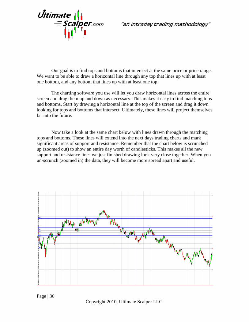
Our goal is to find tops and bottoms that intersect at the same price or price range.
We want to be able to draw a horizontal line through any top that lines up with at least
one bottom, and any bottom that lines up with at least one top.
The charting software you use will let you draw horizontal lines across the entire
screen and drag them up and down as necessary. This makes it easy to find matching tops
and bottoms. Start by drawing a horizontal line at the top of the screen and drag it down
looking for tops and bottoms that intersect. Ultimately, these lines will project themselves
far into the future.
Now take a look at the same chart below with lines drawn through the matching
tops and bottoms. These lines will extend into the next days trading charts and mark
significant areas of support and resistance. Remember that the chart below is scrunched
up (zoomed out) to show an entire day worth of candlesticks. This makes all the new
support and resistance lines we just finished drawing look very close together. When you
un-scrunch (zoomed in) the data, they will become more spread apart and useful.

Page | 37
Copyright 2010, Ultimate Scalper LLC.
The diagram below shows the same chart with the data zoomed in, just a bit. This
will help you to see how and where I place my horizontal lines. Follow the lines across
the screen and you will see that each one intersects at least one top and one bottom. Note
the blue ellipses. The bottom two lines have matching tops and bottoms as well, however
they are not visible since I have basically zoomed in and there ellipses are outside of the
current range.

Page | 38
Copyright 2010, Ultimate Scalper LLC.
This is the same chart just zoomed in a little closer to avoid any confusion on how
the lines are drawn. A few ticks above or below the line are acceptable. You will find that
just like all the other lines you draw, the more you draw them the easier it will become.
Now that we have the lines on our chart, lets take a look at how we use them. As
previously mentioned, the lines will extend far into the future on your chart until they are
deleted. The lines that are below the current price action are generally referred to as
Support. The lines above current price are Resistance. When the price breaks through a
support line to trade below it, that line then becomes a resistance line. When price breaks
out of a resistance line and trades above it, that line then becomes a support line.
The examples that follow are taken from the very next day’s price action for the
lines we have just completed. Please keep in mind that I did not go through many charts
to find perfect examples for this manual: I want it to be as real as possible. This just
happens to be the data taken from the last two days’ price action while writing this
chapter.
Page | 39
Copyright 2010, Ultimate Scalper LLC.
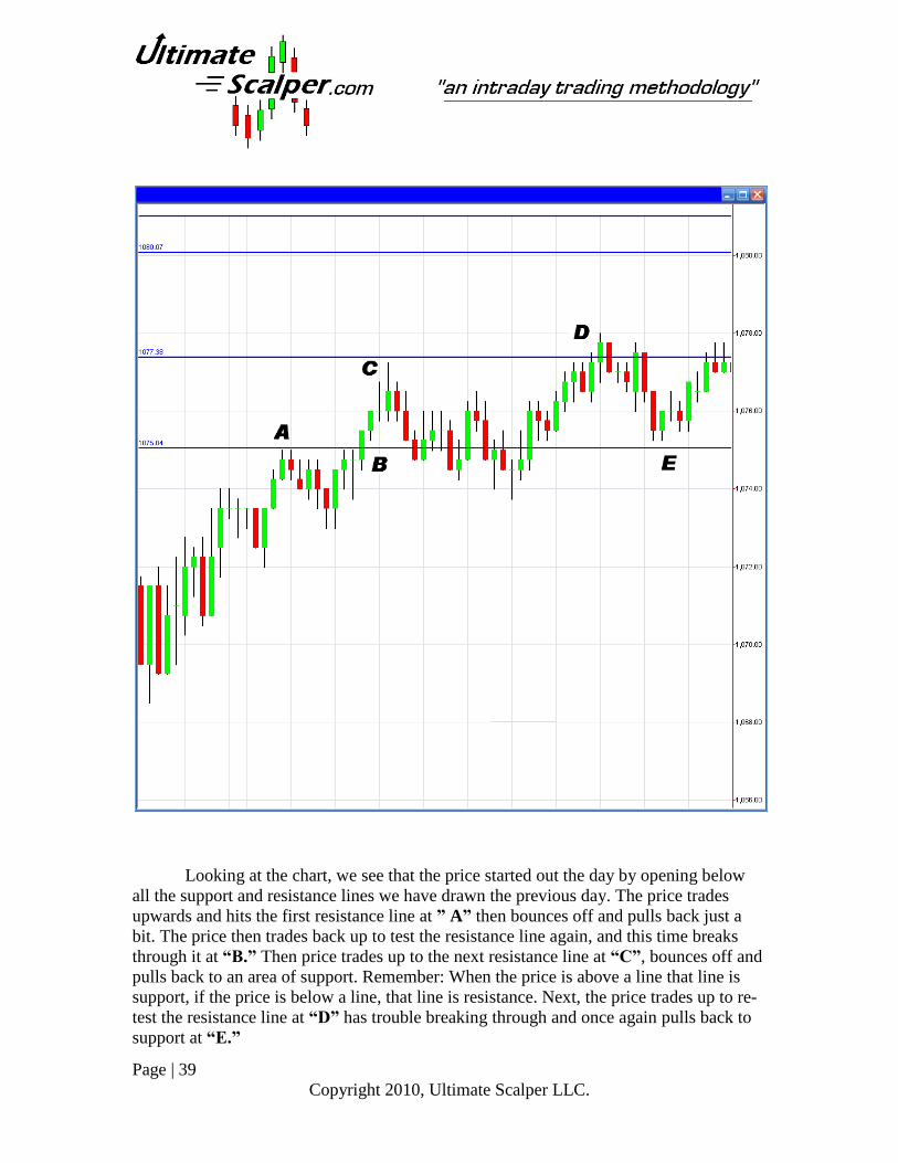
Looking at the chart, we see that the price started out the day by opening below
all the support and resistance lines we have drawn the previous day. The price trades
upwards and hits the first resistance line at ” A” then bounces off and pulls back just a
bit. The price then trades back up to test the resistance line again, and this time breaks
through it at “B.” Then price trades up to the next resistance line at “C”, bounces off and
pulls back to an area of support. Remember: When the price is above a line that line is
support, if the price is below a line, that line is resistance. Next, the price trades up to re-
test the resistance line at “D” has trouble breaking through and once again pulls back to
support at “E.”

Page | 40
Copyright 2010, Ultimate Scalper LLC.
Later in the same day, you can see the price bouncing off a resistance line several
times before trading up to the next area of resistance at “F.” The price then pulls back,
bounces off support at area “G”, shoots back up to re-test and break the resistance line at
“H,” and trade a tick or two above the next line at “I.” The price loses momentum and
pulls all the way back to support at area “J”, before shooting up and bouncing off
resistance at “K.”
Although the support and resistance lines are not perfect, they can help determine
levels where the price may be headed and when a bounce or pullback may occur.
Page | 41
Copyright 2010, Ultimate Scalper LLC.
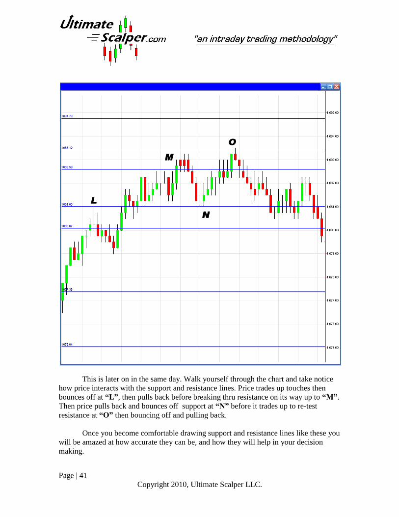
This is later on in the same day. Walk yourself through the chart and take notice
how price interacts with the support and resistance lines. Price trades up touches then
bounces off at “L”, then pulls back before breaking thru resistance on its way up to “M”.
Then price pulls back and bounces off support at “N” before it trades up to re-test
resistance at “O” then bouncing off and pulling back.
Once you become comfortable drawing support and resistance lines like these you
will be amazed at how accurate they can be, and how they will help in your decision
making.

Page | 42
Copyright 2010, Ultimate Scalper LLC.
Floor Trader Pivots
There is another form of support and resistance lines available on most trading
platforms that I would like to cover. These are called “Floor Trader Pivots”, and can be
found under the list of indicators in most charting programs. These lines are calculated
and generated by the computer so they are very easy to apply. Although they are
calculated a different way and are specific for each individual day, they work in the very
same way as the lines I just showed you how to draw. Floor Trader Pivots are usually a
set of 5 to 7 lines horizontally displayed across the chart in certain colors. The middle
line is the called the pivot. Each line above the pivot is a resistance line, while the lines
below are the support lines.
The following diagrams are actual charts with the “Floor Trader Pivots”
displayed. Take notice of how price interacts with the support and resistance lines. The
dark green line in these examples represents the Pivot line.

Page | 43
Copyright 2010, Ultimate Scalper LLC.
Page | 44
Copyright 2010, Ultimate Scalper LLC.

Page | 45
Copyright 2010, Ultimate Scalper LLC.

Page | 46
Copyright 2010, Ultimate Scalper LLC.
As you can see, the Floor Trader Pivot lines can be quite a helpful tool in your
decision making process. Just as in the support and resistance lines I showed you how to
draw earlier, price loves to test these lines, bounce off or break through them. I find when
price approaches and/or touches one of these lines, it often presents the best trading
opportunities when combined with my methods.
When you use the Floor Trader Pivot lines in conjunction with the support and
resistance lines previously discussed, together they create very powerful targets and
turning points. When you have lines overlapping or in close proximity to one another,
they become more significant.

Page | 47
Copyright 2010, Ultimate Scalper LLC.
Indicators
There are literally dozens if not hundreds of indicators included in your charting
software. Indicators are visual tools you can display on your charts. They are intended to
help determine a variety of things such as trends, momentum, over-bought and over-sold
situations, and a multitude of other trading variables. The Support and Resistance lines
you learned about in the last section are also indicators. It is far beyond the scope of this
course to teach you about all the different indicators out there. There are a multitude of
books on practically each and every one. Most charting software will have explanations
and definitions of the different types. It is easy to become overwhelmed and confused by
all the different indicators. I use very few in my trading. There is really no need to have a
bunch of indicators cluttering up your charts.
The 50 EMA Indicator “The Tornado”
I use an exponential moving average (EMA) on all my charts. I am pretty sure
that just about all charting software packages out there will have the capabilities of
displaying an EMA. Moving Averages are one of the simplest and most widely used
indicators out there. Without going into great detail about how the indicator is calculated,
it is basically a price average over the number of periods or bars specified by the user and
displayed as a line on your chart. I use the 50 period EMA. Look at the next chart: You
will notice the 50 EMA displayed as a blue line across the chart.

Page | 48
Copyright 2010, Ultimate Scalper LLC.
The EMA will give you a basic visual idea of which way the price has been
trending, or if trending at all. Notice how in the first half of the chart the price was going
up and so was the EMA. Then, about half way into the chart,the price started a decline
and so did the EMA. Since it takes the last 50 candlesticks of data to create the EMA, it
will lag the actual price movement a bit.
It’s easy to see at a quick glance what direction the market has been trending by
looking at the EMA. Although it would be great to always take trades in the direction of
the EMA, unfortunately that is not the case or it is not that simple. Since the EMA lags
price so much, it is hard to take a trade solely on the direction that it is pointing. When
you do get an entry signal that is going in the same direction with the EMA, it is usually a
good confirmation for your entry decision.

Page | 49
Copyright 2010, Ultimate Scalper LLC.
The 50 EMA is valuable to me in ways other than just the direction of the trend. I
call it the “tornado” for a reason. I envision the 50 EMA as a virtual tornado across my
chart depicted by the blue line. A tornado in real life pulls in objects that are close by or
near to it. Sometimes the objects that get pulled in go around and around inside the
tornado, before getting thrown or spit out of its hold. On my chart the candlesticks are the
objects. Over and over, the candlesticks will get pulled into the blue EMA line.
Sometimes the candles will get tangled up in the blue line before getting spit out in either
direction. Other times the candles will get pulled into the blue line then bounce off.
Maybe you will come up with your own analogy of how the price and candles interact
with the blue line, but to me the tornado works great.
Look at a couple more charts and get an idea of what I mean. Although the
candlesticks get away from the blue line, they always seem to want to come in contact
with it again.
Page | 50
Copyright 2010, Ultimate Scalper LLC.
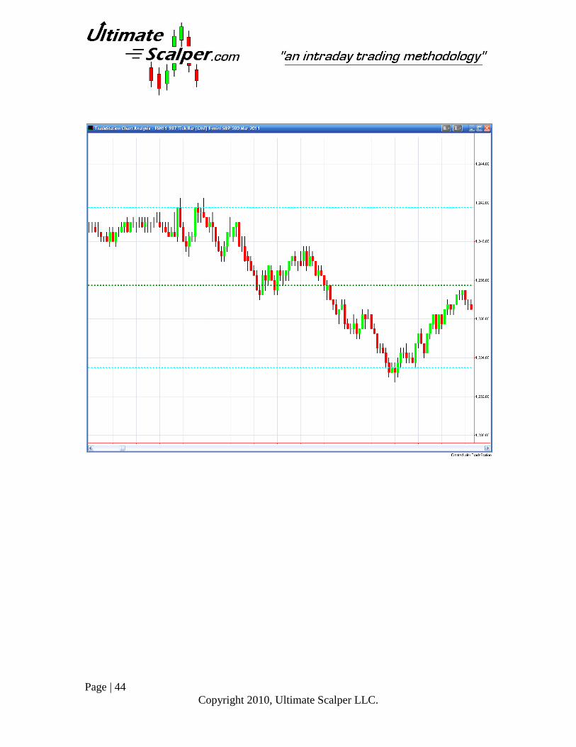
In the previous chart you will notice that, although the price goes up and down
quite a bit, there is no definite up or down trend. Notice how many times the candlesticks
touch or pass through the blue line. Even when they get far away from the EMA (blue
line) at times, they always tend to meet up again.
This helps me in my decision-making process. Let’s say, for example, that the
price is way below the blue line and I get a signal to enter with a buy or go long.
Knowing that the price is below the blue line, I would feel more confident in my decision
to enter a trade betting price will go up. The same would be true if the price was far
above the blue line and I got an entry signal to go short or sell. I would feel more
confident the trade would work in that scenario as well.

Page | 51
Copyright 2010, Ultimate Scalper LLC.
Below is one more example of the 50 EMA. Notice how the price always seems
to stray away from the blue tornado and then come back to it. Sometimes the price
bounces off the blue line, gets tangled up, or breaks right through it.
I become cautious when the price is trading just under or above the 50 EMA. If
the price is just under the blue line without more than a point or so before touching it and
I get a buy signal, I may not take the trade. In this situation, I feel that the price may
bounce off or get tangled up in it. This would be the same if the price was just above the
blue line and I got a sell signal. In either case, if the signal was really nice and I felt good
about it, I may take the trade. It’s just something to consider.

Page | 52
Copyright 2010, Ultimate Scalper LLC.
Volume
No course on trading would be complete without touching on the subject of
Volume. As with just about every indicator, there are magnitudes of different opinions,
ideas, and ways to use and benefit from each. I like to keep Volume simple, and use it in
a way that actually works for me time and time again.
It is important to pay close attention to what volume is telling you. When there are
many buyers and/or sellers participating in a rally or sell off, it is that volume of contract
transactions that can give the market the push it needs to reach new highs or lows. Many
times when the market tries to test and/or re-test previously reached levels, it is the
volume of transactions that will determine the outcome.
There are two main ways in which I use volume. The first is what I call VPT or
Volume Probability Test. This helps me determine if the price has the volume it needs to
break through previously set highs or lows. The second is what I call either a “Final
Upward Push” or a “Final Downward Push.” I will get into greater detail on both of these
methods, but first let me show you how I set up the volume indicator.
Volume works best on charts that are displaying a time frame such as a “1-
minute” chart, “daily”, or “weekly” type of charts. In my opinion, volume does not work
so well on a “tick” chart. Since the main system I trade is on a “tick” chart, I do not have
a volume indicator displayed on it. Instead, I have a separate window set up next to the
“tick” chart displaying a “1-minute” or a “3-minute” chart. Since I have a 24-inch
monitor, displaying two charts side by side is not a problem at all.
Page | 53
Copyright 2010, Ultimate Scalper LLC.
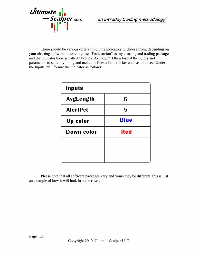
There should be various different volume indicators to choose from, depending on
your charting software. I currently use “Tradestation” as my charting and trading package
and the indicator there is called “Volume Average.” I then format the colors and
parameters to suite my liking and make the lines a little thicker and easier to see. Under
the Inputs tab I format the indicator as follows:
Please note that all software packages vary and yours may be different, this is just
an example of how it will look in some cases.

Page | 54
Copyright 2010, Ultimate Scalper LLC.
Below is an example of what the actual volume indicator looks like by itself. The
red and blue bars display the volume of the price candle associated with it. The higher up
the bars go, the more volume is associated with that particular candlestick. When the
candlestick closes at a higher price than the previous candlestick, the bar is colored blue.
Conversely, if the candle closes lower than the previous candle, the bar is red. The
magenta line that passes through all the red and blue volume bars is the plotted average
volume of the last 5 bars.
As I previously mentioned, I use the indicator on a “1-minute” chart and
sometimes a “3-minute” chart. Those are the time frames that I have noticed work best
with the “tick” chart that I follow.
Volume Probability Test
The markets are consistently striving to set new highs and/or new lows.
Previously set price levels will continually be tested and re-tested until a breakout of the
level is either successful, or fails enough times to initiate a change in direction. By using
the volume indicator, in many cases, we can predict the probability of a level test passing
or failing.
Take a look at the next example with the volume indicator displayed on a “3-
minute” chart. Notice that price makes a new high at area “A” with the ellipse around it.
The volume that corresponds to that new high is circled by the ellipse, directly below it in
the volume indicator. The price then pulls back just a bit for a few candles before re-
testing the level at area “B”. Although the price is able to reach the same level as it did in
area “A”, it has little chance of going much further due to lack of volume.

Page | 55
Copyright 2010, Ultimate Scalper LLC.
Notice the volume circled by the ellipse under area “B.” There is considerable less
volume than when the price reached that same level previously. Since the price wasn’t
able to pass through the previous top, it changed direction and started to trade lower.
Page | 56
Copyright 2010, Ultimate Scalper LLC.
The next chart shows an example of how volume plays a part in the outcome of a
price as it tests a lower level. In area “C” the price makes a new low, followed by a pull
back. The corresponding volume for that low is easily seen in the indicator directly below
it. When the price tries to test that low, as seen in area “D”, it clearly does not have the
same amount of volume as area “C” did. The test failed and the price changed direction
to trade higher.
The testing and test failures of highs and lows or tops and bottoms can create
some of the best trading opportunities out there.

Page | 57
Copyright 2010, Ultimate Scalper LLC.

Page | 58
Copyright 2010, Ultimate Scalper LLC.
The next two charts are more examples of the Volume Probability Test. Take note
of the arrows pointing out the highs, lows, tests, and their corresponding volume.
Page | 59
Copyright 2010, Ultimate Scalper LLC.

Page | 60
Copyright 2010, Ultimate Scalper LLC.
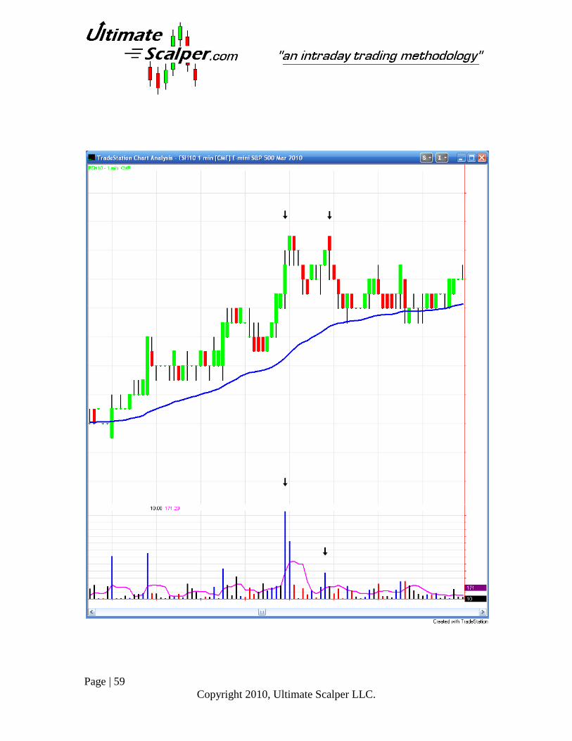
Final Upward Push and Final Downward Push Bars
The previous diagram is a “1-minute” chart showing a beautiful example of a
volume probability test where the price failed to move higher than the first top due to lack
of volume. The price made a nice move lower, immediately following the test failure.
This chart also displays a very nice example of a “Final Upward Push”. Notice in
the Volume indicator the largest blue bar with the arrow pointing down at it. In an
uptrend making new highs, a large stand out blue bar such as this one is a “Final Upwards
Push” bar. You can expect shortly after such a large blue bar like this one, that the price
will trade lower. In this example the price trades downwards on the very next candle. The
price trades even further down following the test failure.
The same holds true for the “Final Downward Push” bars, except that they will be
red. When the price is in a downward move making new lows and you see a red “Final
Downward Push” bar, you can expect that the market will soon turn upwards.
Take a look at the next chart. The down arrows are pointing to the red or blue
volume bars that identify the final up or downward push bars. The arrows pointing up are
the corresponding candlesticks that make up the push bars. Look at what happens to the
market after each final push bar.
Page | 61
Copyright 2010, Ultimate Scalper LLC.
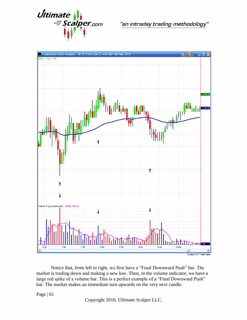
Notice that, from left to right, we first have a “Final Downward Push” bar. The
market is trading down and making a new low. Then, in the volume indicator, we have a
large red spike of a volume bar. This is a perfect example of a “Final Downward Push”
bar. The market makes an immediate turn upwards on the very next candle.

Page | 62
Copyright 2010, Ultimate Scalper LLC.
The market trades up for a while and is making new highs. Then in the Volume
Indicator you notice a blue spike. This is not as large of a volume bar, as the previous
example, but it is still larger than the other bars around it. The market makes a turn to the
downside, shortly following the final upward push of the large blue bar.
The next Volume bar to stand out is a red final downward push bar, followed
shortly after by a move upwards.
The next several charts are more examples of the “Final Upward and Downward
Push” bars. Notice that some make an almost immediate change in direction, while others
take several more candles to make a turn.

Page | 63
Copyright 2010, Ultimate Scalper LLC.

Page | 64
Copyright 2010, Ultimate Scalper LLC.

Page | 65
Copyright 2010, Ultimate Scalper LLC.

Page | 66
Copyright 2010, Ultimate Scalper LLC.
I personally do not take trades solely on Volume Probability Tests, nor do I take
them on Final Up or Downward Push bars by themselves. Instead I use these great tools
in conjunction with the other confirmation signals previously discussed in this manual.
So far in this manual we have covered many excellent confirmation signals that I
have been successfully incorporating in my trading year after year. Everything I have
shown you thus far has withstood the test of time. None of these tools are fly by night
techniques that may work for a few months then fade away. What I have shown you will
work today and far into the future for years to come.
Even though these tools and techniques are not the actual trading systems or
methods I am teaching in this manual, I use each and every one to help make my trading
decisions. This does not mean that you can’t or shouldn’t take a trade when you get more
than one confirmation signal indicating a possible move in a given direction. When used
together, these powerful tools can produce many spectacular trading opportunities.
Look at the chart that follows:
Page | 67
Copyright 2010, Ultimate Scalper LLC.
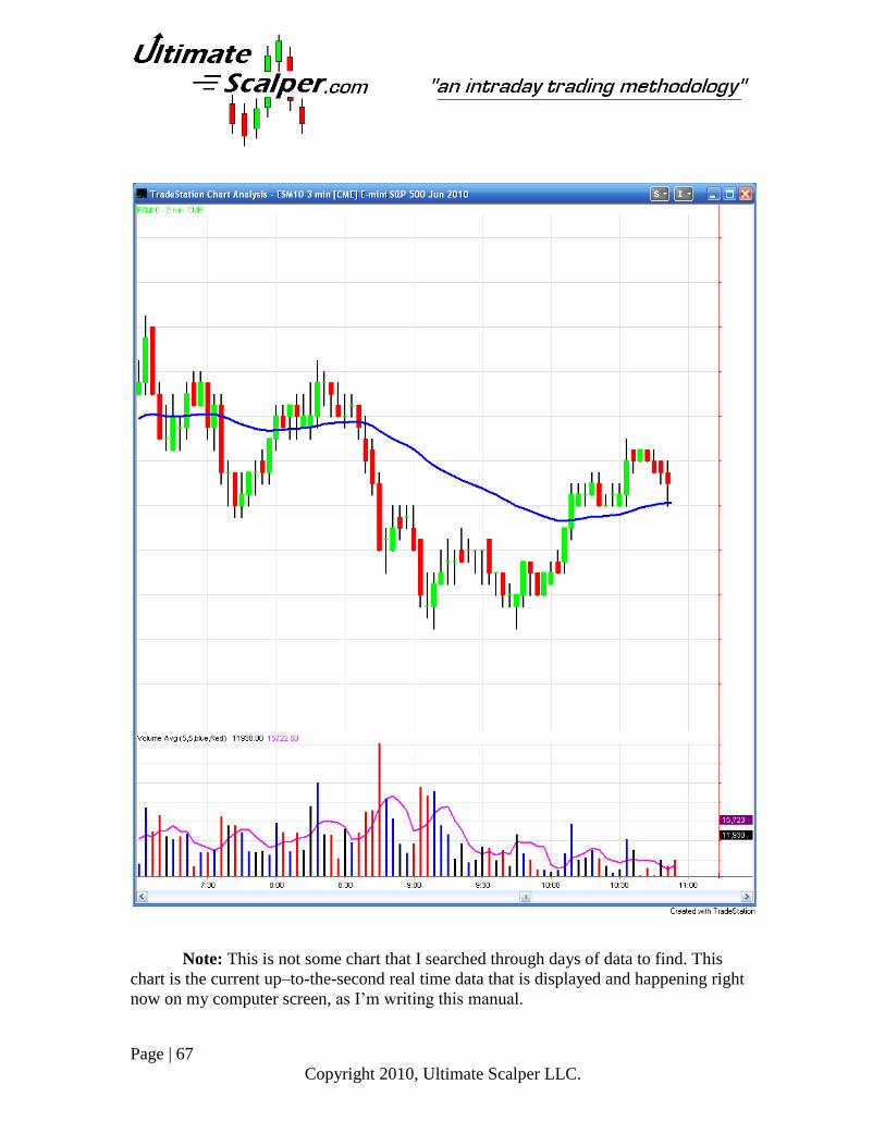
Note: This is not some chart that I searched through days of data to find. This
chart is the current up–to-the-second real time data that is displayed and happening right
now on my computer screen, as I’m writing this manual.

Page | 68
Copyright 2010, Ultimate Scalper LLC.
Hopefully, by now you should be able to spot some opportunities that could have
been taken on this chart. However, if you don’t see them jumping right out at you, don’t
worry: In time they will.
We are going to break this chart down and go over a couple of possible
opportunities. There may even be more trades on this chart than we will cover here, but I
want you to see some basics that we have already discussed.
Starting from the far left, the first thing that we notice is a “Final Upwards Push”
bar. The blue down arrow is pointing at the blue volume bar and the blue up arrow is
pointing at the corresponding candlestick.
The market starts to trade downward almost immediately following the “Final
Upwards Push.” Notice how it gets tangled up in the 50 EMA (Tornado) then makes a
break out below it. At this point I see the tops of the candles lining up in an almost
perfect diagonal line. This just screams at me to draw a trend line across the tops,
connecting them. I always say to myself, “When something is so perfect, it’s bound to get
broken,” and it usually does.
As the price breaks downward below the 50 EMA, it makes a red volume bar that
stands out from the others just a bit (red up and down arrows). I wouldn’t call it a huge
“Final Downward Push,” but something to be aware of. A few bars later, the market does
take a turn upwards. It touches and then breaks through the trend line we drew only
moments earlier. I could have made a trade to go long (buy) at this point. I had a “Final
Downward Push” followed by a trend line being broken. I would have been a little
cautious about being so close to the 50 EMA though.

Page | 69
Copyright 2010, Ultimate Scalper LLC.
The market continues a bit higher as it tangles with the 50 EMA. As I look at the
candles, I again notice how beautifully lined up the bottoms are. This prompts me to add
another trend line connecting the bottoms to form an upwards diagonal just waiting to be
broken. Shortly after a large blue volume bar appears signaling a “Final Upwards Push”.
This is a far better example than the previous “Final Downward Push.”

Page | 70
Copyright 2010, Ultimate Scalper LLC.
A few candles after the “Final Upward Push,” the price breaks below the new
trend line. Since the price didn’t get very far away from the 50 EMA to the upside after
previously breaking through it, I believe it will now trade further below and test the
previously set low. This sets up a nice opportunity to take a trade to the downside (sell) or
go short the market.

Page | 71
Copyright 2010, Ultimate Scalper LLC.
Page | 72
Copyright 2010, Ultimate Scalper LLC.
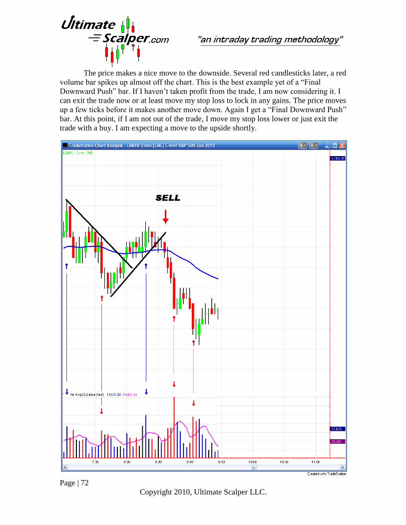
The price makes a nice move to the downside. Several red candlesticks later, a red
volume bar spikes up almost off the chart. This is the best example yet of a “Final
Downward Push” bar. If I haven’t taken profit from the trade, I am now considering it. I
can exit the trade now or at least move my stop loss to lock in any gains. The price moves
up a few ticks before it makes another move down. Again I get a “Final Downward Push”
bar. At this point, if I am not out of the trade, I move my stop loss lower or just exit the
trade with a buy. I am expecting a move to the upside shortly.

Page | 73
Copyright 2010, Ultimate Scalper LLC.
The price makes a quick jump to the upside but not without making a new low
first. In this chart I have put a circle around the new low and three downward blue arrows
pointing at its underlying volume.

Page | 74
Copyright 2010, Ultimate Scalper LLC.
With all the excitement of the short trade, I failed to notice how nicely the candle
tops had lined up at the beginning of the down move. By drawing the downward trend
line we can now see what the market was doing. After the price made a new low, the
market traded right up to the trend line, touched it, and then bounced off. Since the price
failed to break through the trend line, it would now have a new objective. TEST THE
RECENTLY SET LOW.

Page | 75
Copyright 2010, Ultimate Scalper LLC.
Sure enough, the price trades right down to test the recent low. It matches the
exact same price as previously set (noted by the circle around it). Take a look at its
volume (where the three black arrows are pointing down). Can you see the difference
from the previous lows volume? Much less volume decreases the likelihood that the
downward move will continue.

Page | 76
Copyright 2010, Ultimate Scalper LLC.
The test had failed and the market pushed upwards. Notice that at this point the
price is far enough below the 50 EMA to make the trade worthwhile. This gives me a
confirmation signal that it is probably ok to go long (buy). The price breaks the trend line
to the upside. I now feel confident to enter a trade with a buy. Since the market had a
hard time pushing lower than the previously set low, I place my stop loss one tick below
that price.
Page | 77
Copyright 2010, Ultimate Scalper LLC.
Once you begin studying charts and watching data in real time, start applying
what you have learned so far. There is no doubt that you will see profitable trading
opportunities, multiple times a day.
Go through and draw trend lines and channels, as well as support and resistance
on as many charts as you can. Soon you will be able to spot patterns and analyze charts
like a pro.
When the market is open, the simulator is the best place to learn and practice
placing entry, exit, and protective stop loss orders.
Remember, anyone can pick up and read a manual on how to fly a jet airplane.
However, without many hours of practice in a simulator and other instructional devices,
the results could be fatal. The same is true with most other valuable and worthwhile
skills. Trading is a skill that must be learned, practiced, and developed.
SYSTEMS
In this section, I will be explaining five systems and two subsystems:
1. The Double Top & Double Bottom System
The Triple Top & Triple Bottom System
2. The Overbought & Oversold System
3. The Histogram System
4. The Sling Shot System
5. The Trend Line Breakout System
The Coffee Break System
These systems, or methods, are the basis of this entire manual. I will show you
how I make a living trading these bread–and- butter systems. You will learn exactly how
I trade them on a day-to-day basis for consistent profits. I will provide many actual chart
examples of the different trade set ups with particular focus on the “Double Top Double
Bottom” system. I will explain this system first with greater detail since it is a bit more
involved than the other methods yet involves many of the same principals and indicators.
I will also include in this system how I set up my computer screen and the different time
frames and charts used. It is not complicated, and anyone with the right amount of desire,
dedication, and patience can learn to master it in time. Most of the chart examples show
entries of the “Double Top Double Bottom” method. I really want you to get a good
grasp of this system first; it will make learning the others very easy.

Page | 78
Copyright 2010, Ultimate Scalper LLC.
You can then look back over the many chart examples and see where the other systems
would have presented trading opportunities. Don’t worry; there are still actual chart
examples of the other systems as well.
If you are a current trader, starting from this section of the manual: Welcome. If
you have been reading along up until now, then welcome back.
Please bear with me, for I most likely will be repeating concepts over and over at
times. I just want to make sure that they are explained enough times for everyone at all
levels to understand.
Each of these trade setups usually occur at least two to three times a day, while
some days producing even more opportunities. Some trade setups happen more
frequently than others.
I have two categories in which I classify systems under. The trend following
systems, and the trend reversal systems.
The Trend Following Systems: In these systems the trend has already turned from
the previous direction and is in either the early stages or well established in its new
direction. These systems chose specific high probability entry points along this new
trend. The systems in this category include:
1. The Sling Shot System
2. The Histogram System
3. The Trend Line Breakout System
4. The Coffee Break
The Trend Reversal Systems: In these systems, the signals generated are
attempting to catch the precise beginning of a new trend direction. In essence, with the
trend reversal systems we are attempting to buy at the very low of a new uptrend and sell
at the very high of a new downtrend. The systems in this category include:
1. The Double Top Double Bottom System
2. The Triple Top and Bottom System
3. The Overbought Oversold System

Page | 79
Copyright 2010, Ultimate Scalper LLC.
I incorporate all of these systems in my trading. Each system has its good and bad
points. I find the Trend Following Systems to be a bit more accurate. I try to take
advantage of them as much as possible. I also love the Trend Reversal Systems, nothing
beats getting in at the beginning of a trend. I will present all these systems to you, but by
no means are you required to use them all. Once you start to practice on the simulator,
choose the systems that best suit your trading style. It may only be one system. There is
no reason why you can’t make a professional level income only trading the Sling Shot
System for example; I find it to be spectacular.
I personally try to scalp anywhere from 1.5 points to 2.5 points a day on average.
Those are not huge gains, and by no means, is that all you can capture in a day or per
trade, for that matter. That is an average. I am a very conservative trader. I like to get in,
make my money, and get out. In most cases these trade set ups will produce much greater
gain potential, sometimes catching a trend that will last for hours. Remember that 1 point
(4 ticks) in the ES equals $50 with one contract. For me 1.5 points to 2.5 points
represents $375 to $625 a day with five contracts.
I don’t trade a lot of contracts per trade, usually 1 to 10, depending on the set up
and how confident I feel about it.
I sincerely recommend trading with only one contract when you are finished with
the simulator and start using real money for the first time.
Please stay in the simulator until you are making consistent profits day after day
for a minimum of at least a month. I cannot stress this enough. Also please remember
this: although the simulator is based on real time data, it still is a bit easier to trade than
real life. Trust me on this one.
NOTE: The chart examples provided are from my actual computer screen. I have
my settings on Pacific Time zone since I am on the west coast most of the time.

Page | 80
Copyright 2010, Ultimate Scalper LLC.
The Ultimate Scalper Systems
THE DOUBLE TOP DOUBLE BOTTOM SYSTEM
The system is based on the E-mini S&P contract symbol ES. I have a computer
screen displaying two ES charts side-by-side. The chart on the left displays the ES in a
987-tick format. I use this as my main system chart. The chart on the right has the ES in
either a 3 or 5 minute Bar or Candlestick chart. Separating the two charts is the order
entry window where I place the actual trades. See diagram below. I use the chart on the
right for confirmation signals such as the Final Upward or Downward Push bars via the
Volume indicator, as well as just another time frame to be aware of and monitor. I also
use the right side chart to alert me of any Trend Line Breakout System opportunities I
will further discuss later in this manual. Since the chart on the right is more for reference
and confirmation signals I will not be showing many examples of it in this section.
Previous sections in this manual that show charts in the 1, 3 and 5-minute time frames
with a volume indicator are exactly what I have displayed on the right side chart. All
further system explanations and examples are of the chart that I have displayed on the left
side of my computer screen ONLY, until we reach the section on The Trend line
Breakout System, or unless otherwise specified.
Below are actual examples of how I may have my computer screen set up. The
chart on the right is a minute chart in either candlestick or bar format.

Page | 81
Copyright 2010, Ultimate Scalper LLC.

Page | 82
Copyright 2010, Ultimate Scalper LLC.
As previously mentioned, I have the ES displayed in 987-tick format using real
time data only. I use the 987 because it belongs to the Fibonacci sequence of numbers.
Fibonacci numbers are often used in the analysis of financial markets and there are even
systems and indicators derived from its principals. The 233-tick is a very widely used
Fibonacci format in day trading the ES. Once you become experienced, you may want to
experiment with this fast paced setting. I find that it works very well but I personally like
the 987 better because it slows things down a bit.
NOTE: When starting out you may want to experiment with a 2000 tic chart. This
setting will slow the action down and have fewer false signals on the Trend Reversal
Systems.
I also have one Exponential Moving Average on my chart, along with two
indicators displayed at the bottom. I ALWAYS have the Floor Trader Pivots and/or the
self generated support and resistance lines (that I explained how to create in a previous
section) displayed on my chart.
NOTE: I am leaving the Support and Resistance lines and Floor Trader Pivots out
of the chart examples in an effort to keep them less cluttered and easier to follow.
The Exponential Moving Average (EMA) is the same 50 EMA (Tornado) as
discussed earlier in the manual. With the 50 EMA displayed across my screen I can get
an idea of the market direction and sentiment without switching to a larger time frame.
Just look at its direction to see where the market is going: Is it up? Or is it down? I also
keep the 50 EMA displayed on my screen for all of the other benefits previously
discussed earlier in this manual.
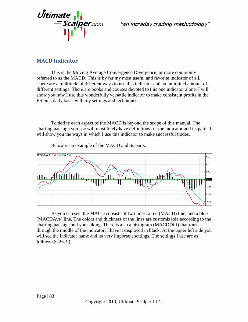
Page | 83
Copyright 2010, Ultimate Scalper LLC.
MACD Indicator
This is the Moving Average Convergence Divergence, or more commonly
referred to as the MACD. This is by far my most useful and favorite indicator of all.
There are a multitude of different ways to use this indicator and an unlimited amount of
different settings. There are books and courses devoted to this one indicator alone. I will
show you how I use this wonderfully versatile indicator to make consistent profits in the
ES on a daily basis with my settings and techniques.
To define each aspect of the MACD is beyond the scope of this manual. The
charting package you use will most likely have definitions for the indicator and its parts. I
will show you the ways in which I use this indicator to make successful trades.
Below is an example of the MACD and its parts:
As you can see, the MACD consists of two lines: a red (MACD) line, and a blue
(MACDAve) line. The colors and thickness of the lines are customizable according to the
charting package and your liking. There is also a histogram (MACDDiff) that runs
through the middle of the indicator; I have it displayed in black. At the upper left side you
will see the indicator name and its very important settings. The settings I use are as
follows (5, 26, 9).

Page | 84
Copyright 2010, Ultimate Scalper LLC.
The MACD is such a wonderful tool because it helps us to identify the
convergence and divergence, hence the name Moving Average Convergence Divergence.
Both convergence and divergence are widely used in the trading community with many
systems and techniques being based around their principals.
When two objects are coming together, they are said to be converging between
one another. Conversely, when two objects are moving apart they are said to be diverging
from one another. These concepts are very simple and basic. Now let’s apply them to our
trading.
When the price and the MACD move together, they are in sync. For example: If
the price climbs higher and makes a new high or top and the MACD also climbs higher
and makes a new high or top, they are in sync.
Let’s say that the price climbs higher, making a new top, but this time the MACD
doesn’t climb along with it, instead it makes a lower top. They are now diverging from
one another. The price top goes higher and the MACD top goes lower: This is
divergence.
Now let’s say that the price trades lower to make a new bottom, but the MACD
bottom is moving higher towards the price. They are now converging towards each other.
The price bottom moves lower and the MACD bottom moves higher, this is convergence.

Page | 85
Copyright 2010, Ultimate Scalper LLC.
Convergence Divergence Push Pull
When the price makes new highs but the MACD stops making new highs in sync
with price, and instead makes lower highs, I call this Divergence Pull. I imagine the
MACD pulling the price down along with it.
In the diagram below, you can see that the price made a top followed by an even
higher top, as noted with the line drawn above them labeled PRICE. Take a look at the
corresponding MACD below the price. The first MACD top was in sync with the price
but the second MACD top made a lower top as the price made a higher top. As you can
see by the line above the MACD tops, price and MACD are clearly diverging from one
another. When this occurs, I call it Divergence Pull. The price seems to get pulled
downwards by the MACD. If you look closely further on down the chart, you will notice
that this happens again.

Page | 86
Copyright 2010, Ultimate Scalper LLC.
When the price makes a new bottom, but the MACD stops making new bottoms
in sync with price, and instead makes higher bottoms, I call this a Convergence Push. I
imagine the MACD pushing the price upward along with it.
In the diagram below you can see that the price made a new bottom followed by
an even lower bottom, as noted with the line drawn below them labeled PRICE. Take a
look at the corresponding MACD below price. The first MACD bottom was in sync with
the price but the second MACD bottom made a higher bottom as the price made a lower
bottom. As you can see by the line below the MACD bottoms, price and MACD are
clearly converging towards one another. When this occurs, I call it Convergence Push.
The price seems to get pushed upward by the MACD.

Page | 87
Copyright 2010, Ultimate Scalper LLC.
The MACD sits at near the bottom of my chart, along with another indicator we
will be discussing next.
Stochastic Slow Indicator
The Stochastic Indicator is another excellent tool with a variety of different uses.
The indicator can be helpful in identifying turning points in a market. Not unlike our
earlier discussion on volume, when the price makes a new high without a new high in the
Stochastic it may indicate the end of that run. The Stochastic Indicator is also a very
popular tool in identifying over-bought and over-sold conditions.
Below is an example of the Stochastic Indicator and its parts:
Looking at the Stochastic slow indicator you will notice that, just like the MACD,
it also has two lines: a smooth-moving red line and a faster-moving blue line. There are
also two horizontal green lines. These two green lines represent overbought and oversold
areas. When the blue and red lines are above the upper green line the market is thought to
be overbought and should soon change direction from up to down. Conversely, when the
red and blue lines are below the lower green lines, the market is thought to be oversold
and should soon turn upwards. In the upper left hand corner of the indicator you will find
the indicator name and its settings, just like in the MACD.

Page | 88
Copyright 2010, Ultimate Scalper LLC.
The settings I use for the Stochastic Slow indicator are as follows:

Page | 89
Copyright 2010, Ultimate Scalper LLC.
I have the Stochastic Slow Indicator at the very bottom of my chart, with the
MACD indicator sitting directly above it as shown in the diagram below:
Together the MACD and Stochastic indicators provide me with powerful trading
opportunities. I can feel confident in taking advantage of them on a consistent basis.

Page | 90
Copyright 2010, Ultimate Scalper LLC.
Double Tops and Double Bottoms
Before I explain exactly how I use these indicators, I must first introduce other
key-variables in the system. These are tops and bottoms. Other common terms for tops
and bottoms are highs, lows, peaks, and pivots. For the purpose of simplicity, I will stick
to tops and bottoms and/or highs and lows.
The first thing we need in order for this system to work is to find a top in an up-
trending market, or a bottom in a down-trending market.
In the example that follows, you will see that the price continues to climb higher
and higher until it reaches a point where it stops climbing and it makes a change in
direction. That highest point or price reached is the top. In a down-trending market it
would be the same, just reversed: The price would descend lower and lower until it
reaches a point where it stops and makes a change in direction, leaving a bottom.

Page | 91
Copyright 2010, Ultimate Scalper LLC.
Next, the price must make a pull back from the recent top or bottom. Notice how
in our example the price pulled back from the highest price and left a clearly visible top
in place.
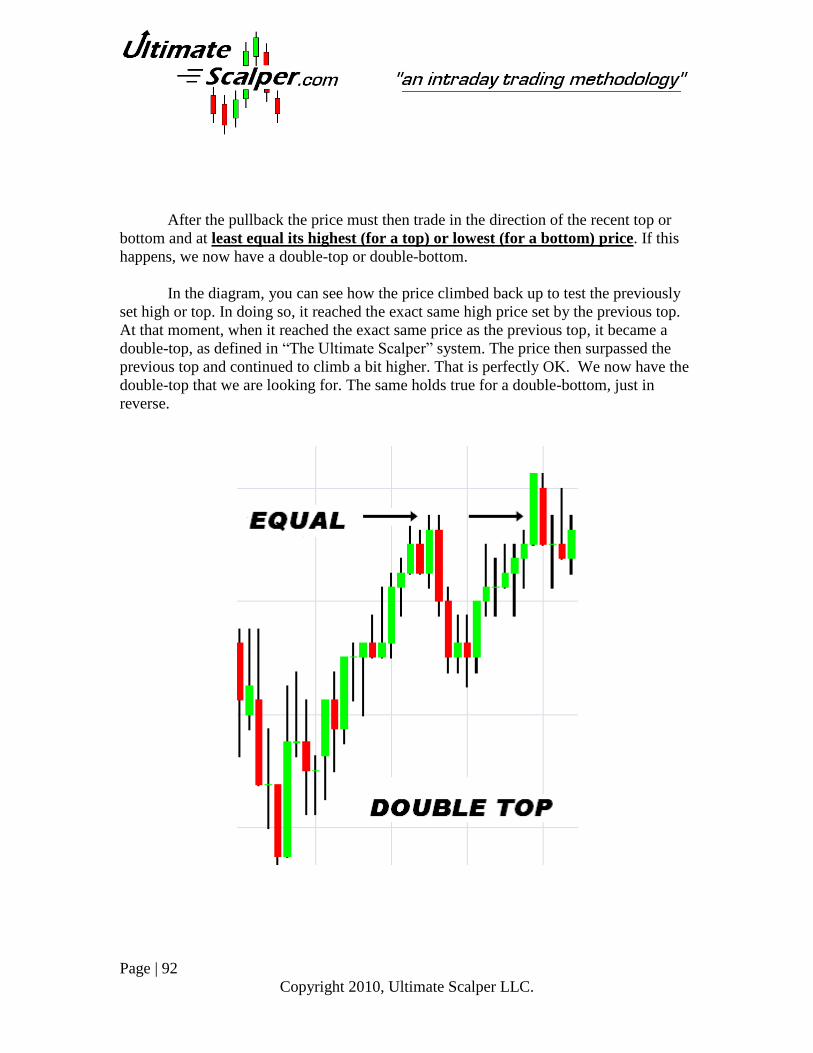
Page | 92
Copyright 2010, Ultimate Scalper LLC.
After the pullback the price must then trade in the direction of the recent top or
bottom and at least equal its highest (for a top) or lowest (for a bottom) price. If this
happens, we now have a double-top or double-bottom.
In the diagram, you can see how the price climbed back up to test the previously
set high or top. In doing so, it reached the exact same high price set by the previous top.
At that moment, when it reached the exact same price as the previous top, it became a
double-top, as defined in “The Ultimate Scalper” system. The price then surpassed the
previous top and continued to climb a bit higher. That is perfectly OK. We now have the
double-top that we are looking for. The same holds true for a double-bottom, just in
reverse.

Page | 93
Copyright 2010, Ultimate Scalper LLC.
The following diagrams are more examples of double-tops and double-bottoms.
Notice that, with just a quick glance at the 50 EMA, you can see in which direction the
market is headed or trending

Page | 94
Copyright 2010, Ultimate Scalper LLC.

Page | 95
Copyright 2010, Ultimate Scalper LLC.
In the examples that follow, you will see that the market is continually making
new tops in up-trends and new bottoms in down-trends. This is not uncommon. Highs
and lows will always be tested, leaving us with a never-ending supply of new tops and
bottoms.

Page | 96
Copyright 2010, Ultimate Scalper LLC.
In the next chart, there are multiple double-bottoms that have formed as the
market traded downward. There are also two double-top examples in the same chart that I
did not mark, can you find them?
We have now covered all of the key elements in the trading system. Next, I will
define the system and go over exactly how I use everything to make it work.

Page | 97
Copyright 2010, Ultimate Scalper LLC.
System Definition & Conditions
When a double-top is formed and the MACD and Stochastic of the second top is
and remains lower than the MACD and Stochastic of the first top, enter the market with a
SELL order at the close of the first candlestick that bends the MACD downward after it
closes. Place your stop loss order one tick higher than the highest price reached by the
second top.
Conversely:
When a double-bottom is formed and the MACD and Stochastic of the second
bottom is and remains higher than the MACD and Stochastic of the first bottom, enter the
market with a BUY order at the close of the first candlestick that bends the MACD
upwards after it closes. Place your stop-loss order one tick below the lowest price reached
by the second low.
These are my definitions of the trading system as short and sweet as possible.
Don’t worry if it sounds confusing: It really couldn’t be any easier. I will go over it step
by step and will provide you with countless examples.
In order to perform this system with the best chances of success, there are three
conditions that MUST BE MET in order to execute on the “GO SIGNAL.”
CONDITION 1
There must be a completed double-top or double-bottom pattern.
CONDITION 2
For a double-top pattern: The MACD of the second high in the double-top must
be and remain lower than the MACD level of the first top.
For a double -bottom pattern: The MACD of the second low in the double-bottom
must be and remain higher than the MACD of the first low.

Page | 98
Copyright 2010, Ultimate Scalper LLC.
CONDITION 3
For a double-top pattern: The Stochastic of the second high in the double-top
must be and remain lower than the Stochastic of the first top.
For a double-bottom pattern: The Stochastic of the second low in the double-
bottom must be and remain higher than the Stochastic of the first low.
GO SIGNAL
For a double-top pattern: The first candlestick to bend the MACD downward at its
close.
For a double-bottom pattern: The first candlestick to bend the MACD upward at
its close.
1, 2, 3, GO!!!!
While watching the market in real time, the first thing we must look for to
perform this method is the price to make a new top or bottom. For the purpose of
simplicity, I will describe my methods using a “TOP” formation first.
After noticing a top being formed, we pay special attention to where the MACD
and Stochastic were at the moment the top was created. We then watch for a pullback. A
pullback can be anywhere from just a few candlesticks that trade lower than the recent
top, to a larger U or V shaped valley being created over time.
When the price finishes with the pullback and trades back up to test the top, we,
again, pay close attention to the MACD and Stochastic levels. We are looking to see that
the MACD and Stochastic do not reach the levels they previously reached during the
formation of the first top.
When the price equals the same level as the first top creating a double-top, we
have what we need to satisfy Condition 1.

Page | 99
Copyright 2010, Ultimate Scalper LLC.
Once Condition 1 is satisfied, we can easily see if the current MACD is lower
than it was at the creation of the first top. If it is NOT lower but higher, then we leave it
alone and wait for the next opportunity. However if the MACD is lower than the previous
level, we have satisfied Condition 2.
Next, we check the Stochastic and make sure it is also lower than the previous
level. If it is not lower, we leave it alone and wait for the next opportunity. If it is lower,
we have just satisfied all three conditions and now await the GO SIGNAL.
Once all three conditions have been met and satisfied, we focus our attention on
the MACD. Depending on your platform settings, the end or tip of the MACD may be
fluctuating up and down, along with the price during the formation of the current
candlestick. What is important for us is which way the MACD is pointing at the CLOSE
of the next few candlesticks. For a GO SIGNAL, we need the MACD to be pointing
downwards at any angle. A MACD that points horizontally does not qualify. The first
candlestick that causes the MACD to turn downwards at its close is the GO SIGNAL.
Enter the market with a sell order and place your stop loss one tick above the highest
price reached by the second top of the double top.
The diagrams that follow are actual screen shots and examples of how I would
apply the system in the conditions displayed.
There may be other examples of trades and setups in the following examples that I
do not mention. I first want to get the basics across with the clearest examples possible.
In the first chart, you will notice that a double-top has formed at area “A.” Look
at the arrows pointing to each top and their respective MACD formations below. Here
you can clearly see that the MACD of the second top is higher than the MACD of the
first top. This does NOT satisfy the desired condition. We are looking for the second
MACD to be LOWER than that of the first top. We leave this possible setup alone and
wait for the next one.
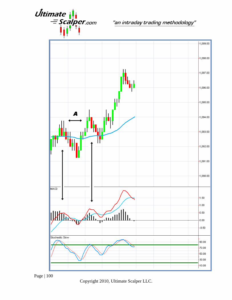
Page | 100
Copyright 2010, Ultimate Scalper LLC.

Page | 101
Copyright 2010, Ultimate Scalper LLC.
In the diagram below of the MACD and Stochastic, I would just like to clarify a
few points to make sure that you understand what you are looking at, and what to look
for. The circles in blue represent the two MACD tops for the respective price tops in the
chart above. When we are looking at tops and double-tops in price, there will usually be a
corresponding peak or top-like formation in the MACD and Stochastic. Sometimes there
will be no formation in the MACD or Stochastic at all, even though there is one in price.
What we are doing with the MACD and Stochastic is comparing their current levels with
the current price action against previous levels.
In the next chart, you will notice another double top has formed at area “B.” This
time the MACD of the second top is LOWER than that of the first top. This is exactly
what we want. We then look down at the Stochastic and notice that it too is lower at the
second top than that of the first top. This also is exactly what we are looking for. So far
we have met all three conditions needed to enter a trade. However, we do not get a “GO
SIGNAL”: There was no candlestick that caused the MACD to point down at its close.
Instead, the closest the MACD came to pointing down was to point horizontal. That is not
good enough. So, even though we had all the conditions met, we leave this setup alone
and wait for the next one.

Page | 102
Copyright 2010, Ultimate Scalper LLC.

Page | 103
Copyright 2010, Ultimate Scalper LLC.
This is a close-up of the MACD from the chart above. Notice that it did not point
down at all. There was a candlestick that caused it to close horizontal, but that just isn’t
good enough to place a trade. We need a downward pointing MACD to go short (sell).
Next, you will see that the price started to climb back upwards, creating higher
highs and higher lows until a new top was formed. Notice also that the MACD and
Stochastic climbed higher as well.

Page | 104
Copyright 2010, Ultimate Scalper LLC.
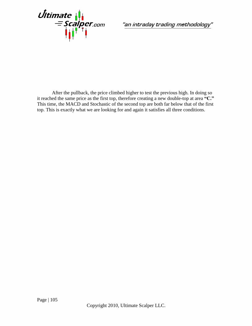
Page | 105
Copyright 2010, Ultimate Scalper LLC.
After the pullback, the price climbed higher to test the previous high. In doing so
it reached the same price as the first top, therefore creating a new double-top at area “C.”
This time, the MACD and Stochastic of the second top are both far below that of the first
top. This is exactly what we are looking for and again it satisfies all three conditions.
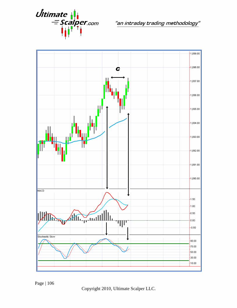
Page | 106
Copyright 2010, Ultimate Scalper LLC.

Page | 107
Copyright 2010, Ultimate Scalper LLC.
The very next candlestick closes red and bends the MACD so that it points down.
This is our “GO SIGNAL.”

Page | 108
Copyright 2010, Ultimate Scalper LLC.
We now enter the market with a sell order right after the candlestick closes. The
next diagram is a close up of the MACD pointing down at the close of the candlestick.

Page | 109
Copyright 2010, Ultimate Scalper LLC.
At the same time the sell order is placed, a stop loss order should also be placed.
You can set up the order entry panel of your platform to automatically place the stop loss
for you at a certain point spread on every trade. Then after the orders are placed and the
trade is live, you can go back and adjust the stop loss to the proper location. In the
following diagram you will see exactly where I place my stops. They should go 1 tick
above the highest price reached by the second top of the double-top. Why the second top?
In many instances the second top will be higher than the first top. Placing the stop above
the highest price reached will prevent it from being triggered or executed as easily. I have
found that if the trade is a good one and will work, the price may trade right back up to
the high on several occasions without breaking through and triggering the stop that sits
one tick above.

Page | 110
Copyright 2010, Ultimate Scalper LLC.
As you can see in the next chart, the setup worked perfectly and went on to be a
profitable trade.

Page | 111
Copyright 2010, Ultimate Scalper LLC.
The double-bottom formations work the same way as the double-tops do -just
upside down. In the next example we see that the price has just made a new low and is
now starting to pull back.

Page | 112
Copyright 2010, Ultimate Scalper LLC.

Page | 113
Copyright 2010, Ultimate Scalper LLC.
After the brief pullback the price trades down to test the previous low and, in
doing so, it creates a double-bottom formation at area “D.” Notice the MACD in the
second bottom is clearly higher than that of the first bottom. The Stochastic of the second
bottom is also just a bit higher from the first bottom. This completes all the conditions
necessary to take a “GO SIGNAL” once we get one.

Page | 114
Copyright 2010, Ultimate Scalper LLC.

Page | 115
Copyright 2010, Ultimate Scalper LLC.
At the close of the very next candlestick we get a “GO SIGNAL.” Notice that the
tip of the MACD is turned upward. Even though it is just slightly turned up, it still
qualifies as a good “GO SIGNAL.” We enter the market with a buy (long) order,
immediately following the close of the candlestick that turned the MACD upwards.

Page | 116
Copyright 2010, Ultimate Scalper LLC.
Page | 117
Copyright 2010, Ultimate Scalper LLC.
A close up of the MACD turned up. Even though it’s pointing up just slightly, it
still qualifies as a “GO SIGNAL.”
As previously mentioned, you can place a stop loss order simultaneously along
with your buy order. Once you are in the market, it is easy to move your stop loss around
if so desired. Place the stop loss 1 tick below the lowest price reached by the second
bottom as seen in the diagram below.

Page | 118
Copyright 2010, Ultimate Scalper LLC.

Page | 119
Copyright 2010, Ultimate Scalper LLC.
This turned out to be a winning trade with a beautiful setup.
Page | 120
Copyright 2010, Ultimate Scalper LLC.
The previous two examples were actual trades that took place, not something that
I just created or searched out for the purpose of this manual. The following examples are
actual charts showing this same setup in both long and short trade situations. The arrows
on the following charts point to candlesticks that have generated a “GO SIGNAL.”
Trades were taken on the close of those candlesticks. Study the setups on each chart.
Look where the MACD and Stochastic are in relationship to their corresponding price
formations. Some setups show the Stochastic of the second top or bottom to be just about
equal to that of the first; in cases like these, it is a judgment call whether or not to take the
trade. To increase your chances for success, make sure the Stochastic is LOWER on
the second top of a double top formation, and HIGHER on the second bottom of a
double bottom formation. Not two trade setups are or will ever be exactly the same. The
more you study these charts, historical data charts, and watch real time charts in the
simulator, the easier it will become spotting these setups.
There are five other systems included in the Ultimate Scalper day trading
Methodology. It is important to get a good grasp on this system first since it is the most
complicated of the seven. Most of the other systems use the exact same charts,
timeframes and indicators. There are no new settings to program or learn.

Page | 121
Copyright 2010, Ultimate Scalper LLC.
Double Top and Double Bottom Chart Examples

Page | 122
Copyright 2010, Ultimate Scalper LLC.

Page | 123
Copyright 2010, Ultimate Scalper LLC.

Page | 124
Copyright 2010, Ultimate Scalper LLC.

Page | 125
Copyright 2010, Ultimate Scalper LLC.

Page | 126
Copyright 2010, Ultimate Scalper LLC.

Page | 127
Copyright 2010, Ultimate Scalper LLC.
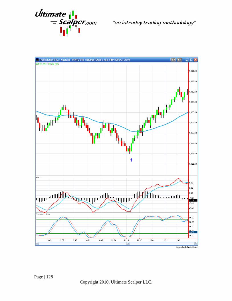
Page | 128
Copyright 2010, Ultimate Scalper LLC.

Page | 129
Copyright 2010, Ultimate Scalper LLC.
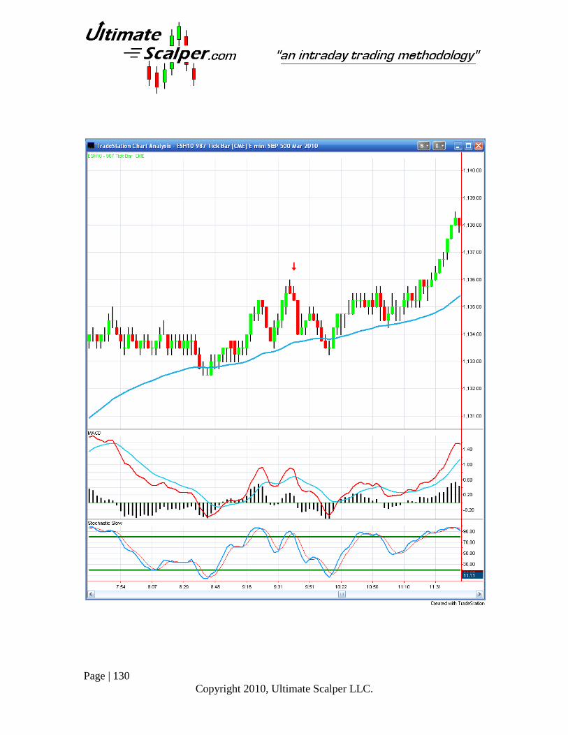
Page | 130
Copyright 2010, Ultimate Scalper LLC.

Page | 131
Copyright 2010, Ultimate Scalper LLC.

Page | 132
Copyright 2010, Ultimate Scalper LLC.

Page | 133
Copyright 2010, Ultimate Scalper LLC.
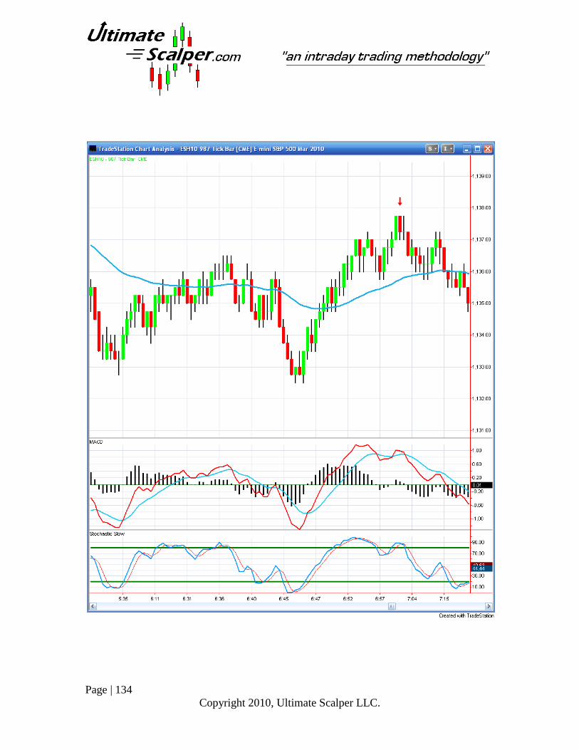
Page | 134
Copyright 2010, Ultimate Scalper LLC.

Page | 135
Copyright 2010, Ultimate Scalper LLC.

Page | 136
Copyright 2010, Ultimate Scalper LLC.

Page | 137
Copyright 2010, Ultimate Scalper LLC.

Page | 138
Copyright 2010, Ultimate Scalper LLC.
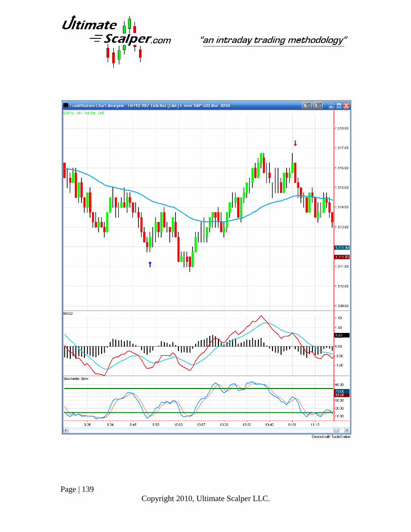
Page | 139
Copyright 2010, Ultimate Scalper LLC.

Page | 140
Copyright 2010, Ultimate Scalper LLC.

Page | 141
Copyright 2010, Ultimate Scalper LLC.

Page | 142
Copyright 2010, Ultimate Scalper LLC.

Page | 143
Copyright 2010, Ultimate Scalper LLC.

Page | 144
Copyright 2010, Ultimate Scalper LLC.

Page | 145
Copyright 2010, Ultimate Scalper LLC.

Page | 146
Copyright 2010, Ultimate Scalper LLC.

Page | 147
Copyright 2010, Ultimate Scalper LLC.

Page | 148
Copyright 2010, Ultimate Scalper LLC.

Page | 149
Copyright 2010, Ultimate Scalper LLC.
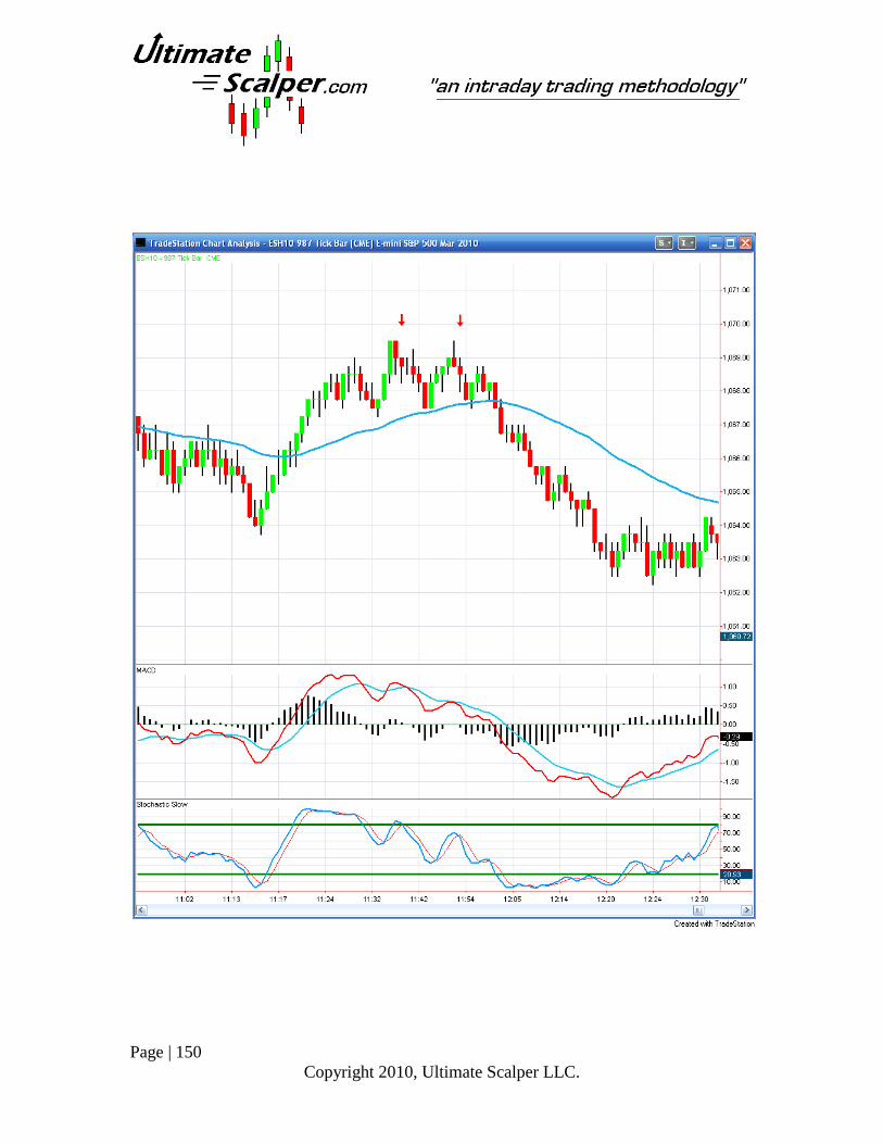
Page | 150
Copyright 2010, Ultimate Scalper LLC.

Page | 151
Copyright 2010, Ultimate Scalper LLC.

Page | 152
Copyright 2010, Ultimate Scalper LLC.
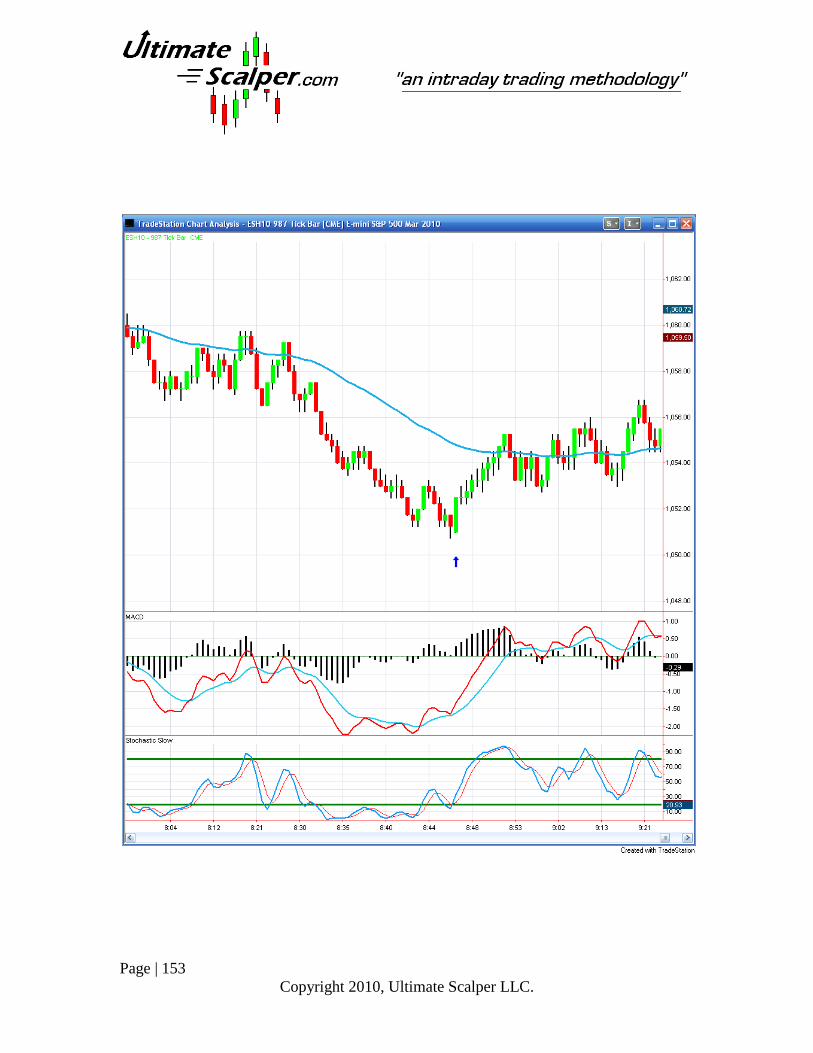
Page | 153
Copyright 2010, Ultimate Scalper LLC.

Page | 154
Copyright 2010, Ultimate Scalper LLC.

Page | 155
Copyright 2010, Ultimate Scalper LLC.

Page | 156
Copyright 2010, Ultimate Scalper LLC.

Page | 157
Copyright 2010, Ultimate Scalper LLC.

Page | 158
Copyright 2010, Ultimate Scalper LLC.

Page | 159
Copyright 2010, Ultimate Scalper LLC.

Page | 160
Copyright 2010, Ultimate Scalper LLC.

Page | 161
Copyright 2010, Ultimate Scalper LLC.
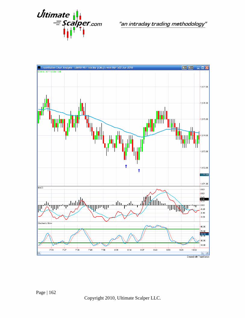
Page | 162
Copyright 2010, Ultimate Scalper LLC.

Page | 163
Copyright 2010, Ultimate Scalper LLC.

Page | 164
Copyright 2010, Ultimate Scalper LLC.

Page | 165
Copyright 2010, Ultimate Scalper LLC.
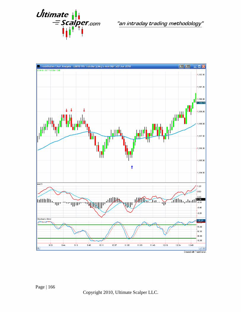
Page | 166
Copyright 2010, Ultimate Scalper LLC.

Page | 167
Copyright 2010, Ultimate Scalper LLC.

Page | 168
Copyright 2010, Ultimate Scalper LLC.

Page | 169
Copyright 2010, Ultimate Scalper LLC.

Page | 170
Copyright 2010, Ultimate Scalper LLC.

Page | 171
Copyright 2010, Ultimate Scalper LLC.

Page | 172
Copyright 2010, Ultimate Scalper LLC.

Page | 173
Copyright 2010, Ultimate Scalper LLC.

Page | 174
Copyright 2010, Ultimate Scalper LLC.

Page | 175
Copyright 2010, Ultimate Scalper LLC.

Page | 176
Copyright 2010, Ultimate Scalper LLC.

Page | 177
Copyright 2010, Ultimate Scalper LLC.

Page | 178
Copyright 2010, Ultimate Scalper LLC.

Page | 179
Copyright 2010, Ultimate Scalper LLC.

Page | 180
Copyright 2010, Ultimate Scalper LLC.

Page | 181
Copyright 2010, Ultimate Scalper LLC.

Page | 182
Copyright 2010, Ultimate Scalper LLC.

Page | 183
Copyright 2010, Ultimate Scalper LLC.
TRIPLE TOPS AND BOTTOMS
Triple Tops and Bottoms are similar enough to the Double Tops and Bottoms
System that I will include them in this sub category instead of an entire separate system.
Sometimes Double Tops and Bottoms don’t work out as planned because the
market isn’t quite ready to give up on a certain price level, and requires more testing.
Sometimes three or more tests of a level are required. Other times we don’t get all the
parameters met on a Double Top or Bottom as we would like, yet opportunities for profit
still exist. These are two situations where a Triple Top or Bottom entry can get you in on
a potentially profitable opportunity. The only criteria I like to see on a Triple top or
Bottom entry are as follows.
For Triple Tops:
1. The MACD of the third Top is lower than the MACD of either the first top or
second top or both.
2. The Stochastic of the third top is lower than the Stochastic of either the first top or
second top or both.
3. Price of the third top may be higher, lower or equal to the price reached by any of
the previous two tops.
4. Enter the market by selling at the close of the first candlestick that bends the
MACD downward on the third top.
For Triple Bottoms:
1. The MACD of the third Bottom is higher than the MACD of either the first
bottom or second bottom or both.
2. The Stochastic of the third bottom is higher than the Stochastic of either the first
bottom or second bottom or both.
3. Price of the third bottom may be higher, lower or equal to the price reached by
any of the previous two bottoms.
4. Enter the market by buying at the close of the first candlestick that bends the
MACD upward on the third bottom.
Take a look at the diagram that follows. Notice there are three tops labeled 1, 2 and 3.
The first two tops make up a Double Top that worked for a small profit. Then price
changed direction and traded higher to retest the previously made high. Price ran out of
steam before reaching the previous tops high and in the process made a nice Triple Top.

Page | 184
Copyright 2010, Ultimate Scalper LLC.

Page | 185
Copyright 2010, Ultimate Scalper LLC.
Take a look at the next diagram. It looks complicated but it’s really not. The three
tops to the left are similar to what happened in the chart above except the first two tops
did not meet the Double Top criteria. The third top didn’t equal the price of the second
top before it made a turn lower. This created a nice Triple Top opportunity. Before we
talk about the group of tops to the right, can you pick out the very nice unmarked Double
Bottom that separates the two groups of tops? Excellent! Ok, look at the group of four
tops to the right. The first three are marked in black numbers, while the last three are
marked in red. The 2nd
and 3rd
tops of the first group of Triple Tops (black numbers) are
the 1st and 2
nd tops of the second group of Triple Tops (red numbers). Sharing tops is ok.

Page | 186
Copyright 2010, Ultimate Scalper LLC.
Below are more examples.
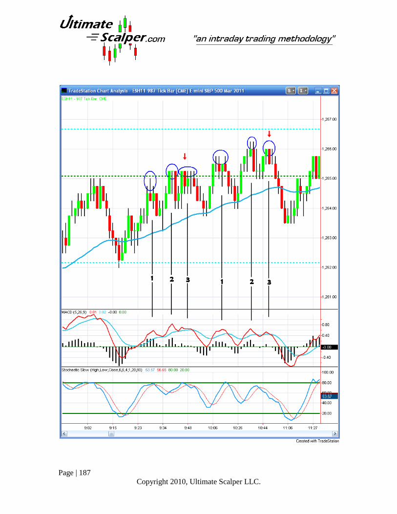
Page | 187
Copyright 2010, Ultimate Scalper LLC.

Page | 188
Copyright 2010, Ultimate Scalper LLC.
Now let’s look at a few examples of Triple Bottoms. Like the other systems, they
work the same way just in reverse.
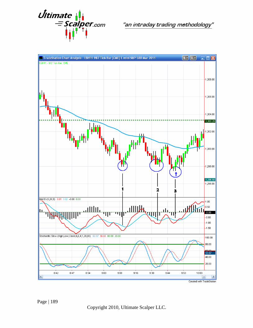
Page | 189
Copyright 2010, Ultimate Scalper LLC.

Page | 190
Copyright 2010, Ultimate Scalper LLC.

Page | 191
Copyright 2010, Ultimate Scalper LLC.

Page | 192
Copyright 2010, Ultimate Scalper LLC.

Page | 193
Copyright 2010, Ultimate Scalper LLC.
THE OVERBOUGHT OVERSOLD SYSTEM
This is one of my simplest yet most powerful entries. It uses the same indicators
and settings as my “Double Top Double Bottom” entry so there is no need to flip thru
different screens to trade it. I can stay focused on one screen and have multitude of
system entries to trade. This is a trend reversal system, and can signal some very big
moves.
System Entry Definitions:
For a long trade: When the Stochastic is in the oversold area below the 20 line, I buy at
the close of the first candlestick that bends the MACD upwards.
For a short trade: When the Stochastic is in the overbought area above the 80 line, I sell
at the close of the first candlestick that bends the MACD downwards.
I first look for the Stochastic to be in either the overbought (above the green 80
level line) or oversold (below the green 20 level line) areas of the indicator.
Note: colors are customizable and may be different depending on what charting
software you use.
Below are examples of the Stochastic in the overbought area. Notice the black
arrows pointing to the areas where the Stochastic has broken above the green 80 level
line, and is overbought while it remains up in that area.
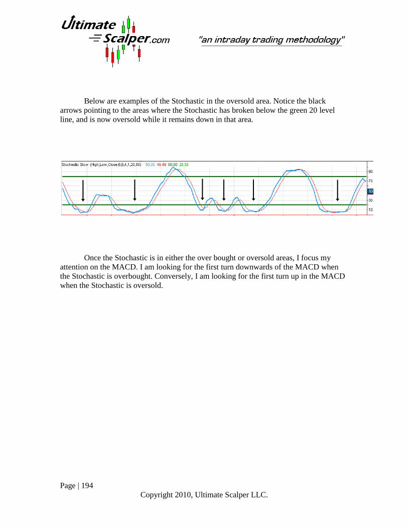
Page | 194
Copyright 2010, Ultimate Scalper LLC.
Below are examples of the Stochastic in the oversold area. Notice the black
arrows pointing to the areas where the Stochastic has broken below the green 20 level
line, and is now oversold while it remains down in that area.
Once the Stochastic is in either the over bought or oversold areas, I focus my
attention on the MACD. I am looking for the first turn downwards of the MACD when
the Stochastic is overbought. Conversely, I am looking for the first turn up in the MACD
when the Stochastic is oversold.

Page | 195
Copyright 2010, Ultimate Scalper LLC.
When the Stochastic is in the overbought area, I take a short trade or sell the
market after the first candlestick to close bending the MACD downwards. Below is an
example of where the MACD first got bent downward after the Stochastic entered the
overbought area. I enter a sell order immediately following the close of the candlestick
that did this. REMEMBER it is the FIRST downwards bending of the MACD after the
Stochastic enters the overbought area.
I place my stop loss one tick above the most recent highest high price reached.

Page | 196
Copyright 2010, Ultimate Scalper LLC.
When the Stochastic is in the oversold area, I take a long trade or buy the market
after the first candlestick to close bending the MACD upwards. Below is an example of
where the MACD first got bent upward after the Stochastic entered the oversold area. I
enter a buy order immediately following the close of the candlestick that did this.
REMEMBER it is the FIRST upwards bending of the MACD after the Stochastic enters
the oversold area.
I place my stop loss one tick below the recent lowest low price reached.
There are times when the market is not quite ready to make a reversal when you
get a signal to take a trade using this system. Try to use other confirmation signals to help
filter out those instances.

Page | 197
Copyright 2010, Ultimate Scalper LLC.
Overbought Oversold Chart Examples
Below is a chart displaying the many trades that were generated by this system in
just over a one hour period. The red down arrows represent the short trades while the blue
up arrows represent the long trades. There is one magenta up arrow that represents a
losing trade. Take notice of the circles around the overbought and oversold areas of the
Stochastic and the bending of the MACD that corresponds with each trade. These trades
can be counter trend trades as well as with the trend.

Page | 198
Copyright 2010, Ultimate Scalper LLC.
Special Considerations when Trading this Method
When trading with the Overbought and Oversold method, there are certain considerations
I take into account before taking a trade. In the four diagrams below, take a look at the
black arrow pointing to the MACD. Notice how the MACD makes an aggressive turn
creating a sharp point or 90 degree angle. These are the MACD turns I like to see when I
make a trade using this system. The system calls for the FIRST turn of the MACD when
the Stochastic is in the Overbought or Oversold areas to enter with a trade. Many times
you may get a week FIRST turn that bends the MACD just a little and turns out to be a
bad trade. Then it will be followed by a stronger pointier turn that creates a 90 degree
angle, sharp point or an aggressive turn in the direction of the trade. It is these pointier
aggressive turns or 90 degree angle turns that I take my trades on.

Page | 199
Copyright 2010, Ultimate Scalper LLC.
When the market is erratic and creating choppy or wiggly patterns in the MACD
and Stochastic indicators, I don’t trade this system. Look at the following diagram of the
MACD and Stochastic and notice the choppy zigzag behavior. Situations like these create
false signals and loosing trades.

Page | 200
Copyright 2010, Ultimate Scalper LLC.
Instead, I like to take my trades when the Stochastic is flowing smoothly. The
next two examples of the Stochastic indicator is how I like them to look, smooth and
flowing like waves. Having a smooth less choppy and erratic MACD is also preferable.

Page | 201
Copyright 2010, Ultimate Scalper LLC.
When using this method, your odds for success are increased if you take trades in
the direction of the 50EMA. However, this system will often signal a trade at the very
beginning of a new trend direction, much sooner than the 50 EMA is capable of
displaying. Getting a signal at the beginning of a new trend is the beauty of this system.
While many trades will work going against the 50 EMA, I always find the ones going in
the same direction to have a higher success rate. With that being said, I personally take
trades going with and against the 50 EMA. There are many fantastic scalping
opportunities going against the 50 EMA as well as opportunities when the trend direction
changes altogether. Just be aware that when trading against the 50 EMA, the current trend
direction indicated by the indicator may not be quite over yet.

Page | 202
Copyright 2010, Ultimate Scalper LLC.
The following 9 charts contain examples of trades taken with the “Overbought &
Oversold System”.

Page | 203
Copyright 2010, Ultimate Scalper LLC.
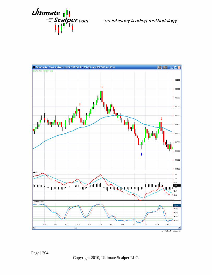
Page | 204
Copyright 2010, Ultimate Scalper LLC.

Page | 205
Copyright 2010, Ultimate Scalper LLC.

Page | 206
Copyright 2010, Ultimate Scalper LLC.
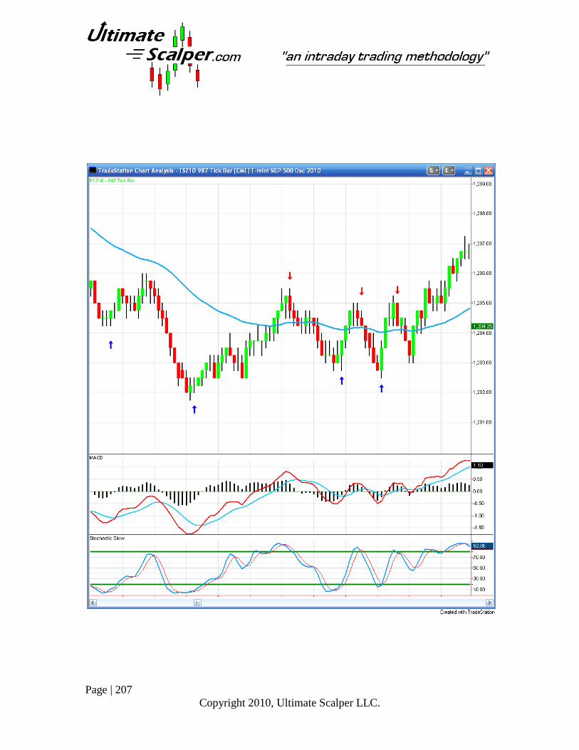
Page | 207
Copyright 2010, Ultimate Scalper LLC.

Page | 208
Copyright 2010, Ultimate Scalper LLC.

Page | 209
Copyright 2010, Ultimate Scalper LLC.
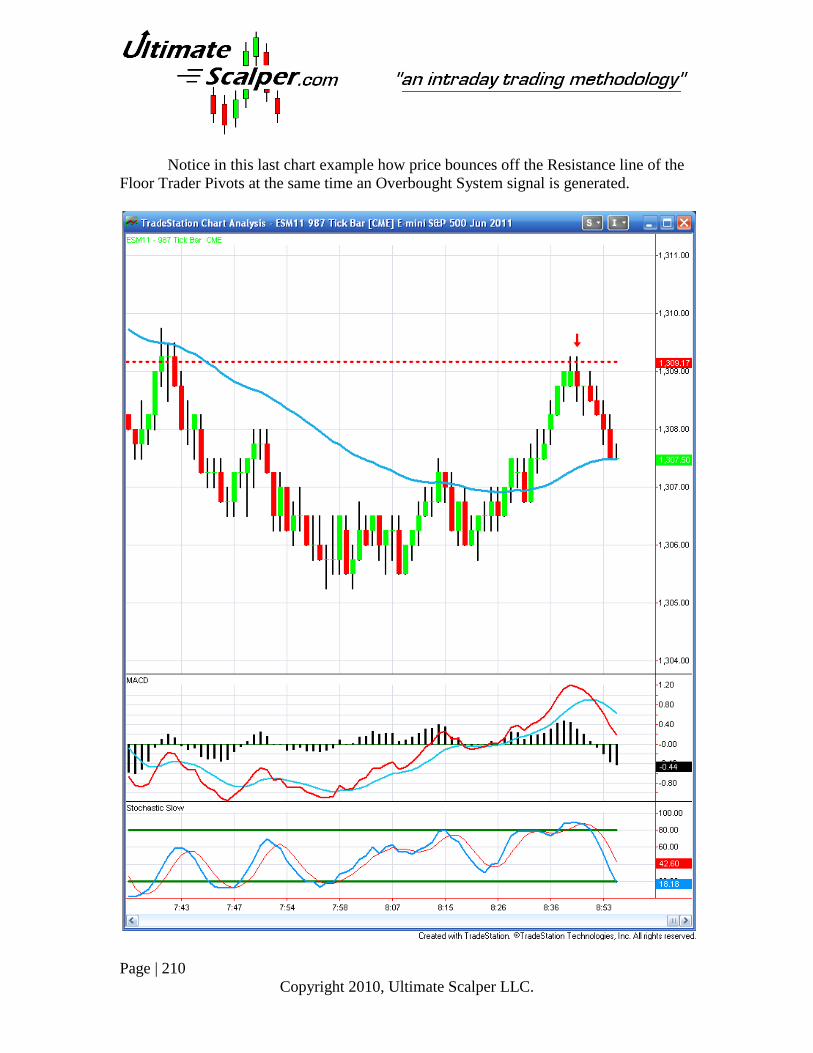
Page | 210
Copyright 2010, Ultimate Scalper LLC.
Notice in this last chart example how price bounces off the Resistance line of the
Floor Trader Pivots at the same time an Overbought System signal is generated.
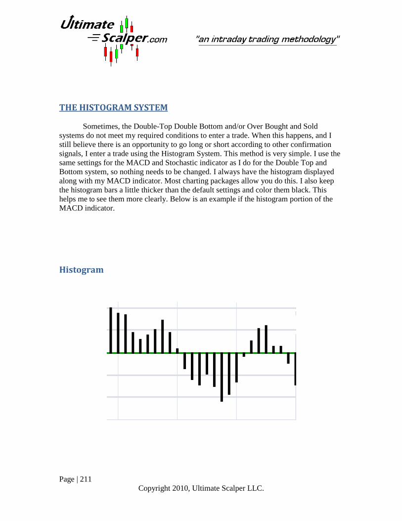
Page | 211
Copyright 2010, Ultimate Scalper LLC.
THE HISTOGRAM SYSTEM
Sometimes, the Double-Top Double Bottom and/or Over Bought and Sold
systems do not meet my required conditions to enter a trade. When this happens, and I
still believe there is an opportunity to go long or short according to other confirmation
signals, I enter a trade using the Histogram System. This method is very simple. I use the
same settings for the MACD and Stochastic indicator as I do for the Double Top and
Bottom system, so nothing needs to be changed. I always have the histogram displayed
along with my MACD indicator. Most charting packages allow you do this. I also keep
the histogram bars a little thicker than the default settings and color them black. This
helps me to see them more clearly. Below is an example if the histogram portion of the
MACD indicator.
Histogram

Page | 212
Copyright 2010, Ultimate Scalper LLC.
Notice that the histogram is comprised of vertical bars, both above and below the
horizontal line that runs thru the middle of it. Each vertical bar is formed by the
relationship between the red MACD line and the blue MACDAve line, and the price
candlestick that correlates with it. There is usually a series of vertical bars on one side of
the horizontal line before switching to a series on the other side. Trades are placed when
a series of bars on one side switch to the other side.
System Entry Definitions:
Long Trades: A long trade (buy) is entered upon the first histogram bar to form on the
top-side of the horizontal histogram line after a series on the bottom side ends. The buy
order is placed at the close of the associated candlestick of that particular histogram bar.
Short Trades: A short trade (sell) is entered upon the first histogram bar to form on the
bottom-side of the horizontal histogram line after a series on the top side ends. The sell
order is placed at the close of the associated candlestick of that particular histogram bar.
Take a look at where the red and blue arrows are placed in the histogram below.
Two short (sell) trades were placed at the close of the candlesticks that correlate to the
histogram bars with the red arrows. One long (buy) trade was placed at the close of the
candlestick that correlates to the histogram bar with the blue arrow.
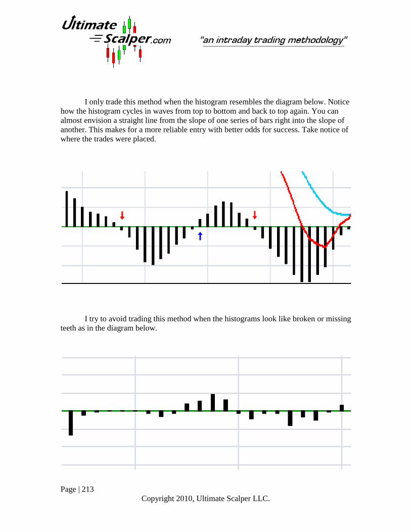
Page | 213
Copyright 2010, Ultimate Scalper LLC.
I only trade this method when the histogram resembles the diagram below. Notice
how the histogram cycles in waves from top to bottom and back to top again. You can
almost envision a straight line from the slope of one series of bars right into the slope of
another. This makes for a more reliable entry with better odds for success. Take notice of
where the trades were placed.
I try to avoid trading this method when the histograms look like broken or missing
teeth as in the diagram below.

Page | 214
Copyright 2010, Ultimate Scalper LLC.
Histogram System Chart Example
Look at the following chart: There is a red downward arrow at the short trades
and a blue upward arrow at the long trades generated by the histogram system. The
magenta colored arrows with the balls are losing trades.

Page | 215
Copyright 2010, Ultimate Scalper LLC.
THE SLINGSHOT SYSTEM
The Slingshot system is a method I use when the market has already turned and is
now trending either up or down. We can classify this as a trend following system. Since
some trends can carry on for quite a while, there may be multiple entry opportunities
within a single trend.
During a trend there are usually areas where price has pulled back just a bit before
resuming the trend direction. These pullbacks are exactly what we need to take advantage
of the slingshot opportunity.
We will use the MACD indicator and price movement to determine our entries
with this system. You may recall in the previous section describing the different parts of
the MACD indicator that there is also a blue line called the MACDAve line. This blue
line moves slower and smoother than the red MACD line we have been using up to this
point. During a trend either up or down, this blue line may remain relatively steady in the
direction of the trend. Minor pullbacks in price from the trend direction may bend the red
MACD line while having no affect on the blue MACDAve line. This is the situation we
look for. In a strong trend, the blue MACDAve line will usually continue the same
direction unaffected by small pullbacks in price.
Slingshot Entry Definitions:
Up Trends: When price pulls back while in an upward trend and the blue MACDAve line
continues unaffected in the trend direction, place a buy stop order one tick above the
highest price reached on the pullback candlestick. Continue to move the buy stop order to
one tick above the high of each consecutive lower pullback candlestick high until the
order is filled, or the blue MACDAve line starts to turn. Place stop loss order one tic
below the lowest price reached during pullback.
Down Trends: When price pulls back while in a downward trend and the blue MACDAve
line continues unaffected in the trend direction, place a sell stop order one tick below the
lowest price reached on the pullback candlestick. Continue to move the sell stop order to
one tick below the low of each consecutive higher pullback candlestick low until the
order is filled, or the blue MACDAve line starts to turn. Place stop loss order one tic
above the highest price reached during pullback.
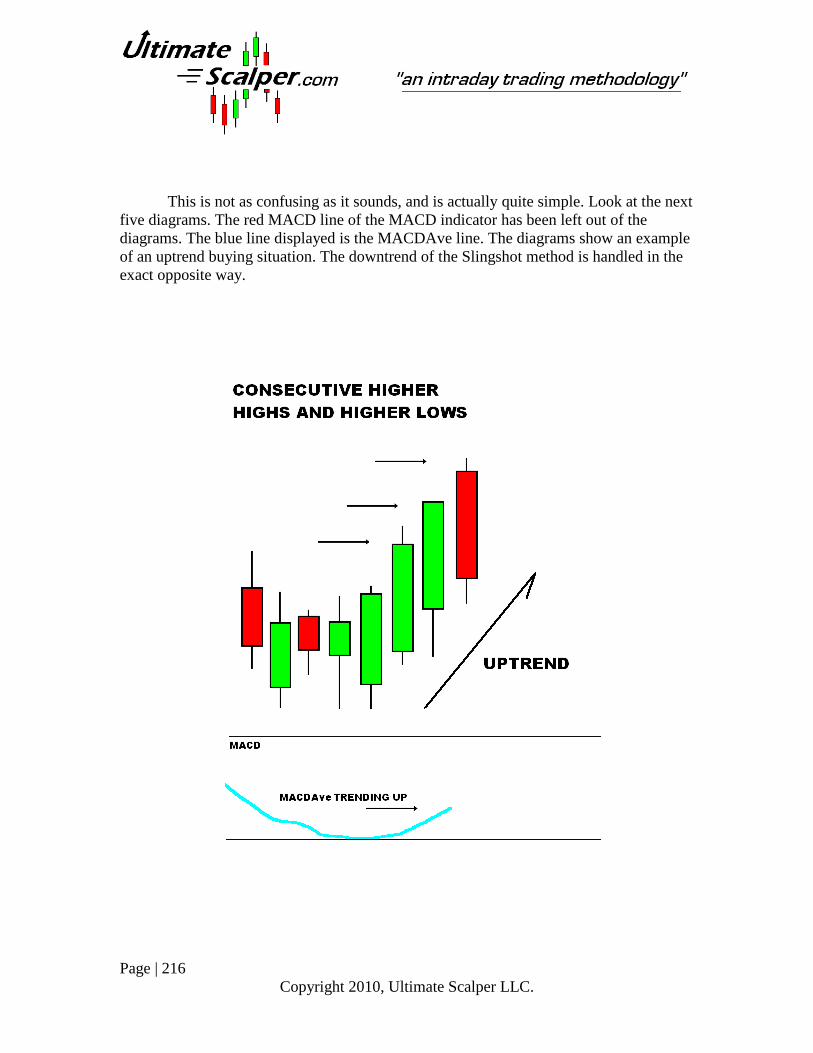
Page | 216
Copyright 2010, Ultimate Scalper LLC.
This is not as confusing as it sounds, and is actually quite simple. Look at the next
five diagrams. The red MACD line of the MACD indicator has been left out of the
diagrams. The blue line displayed is the MACDAve line. The diagrams show an example
of an uptrend buying situation. The downtrend of the Slingshot method is handled in the
exact opposite way.
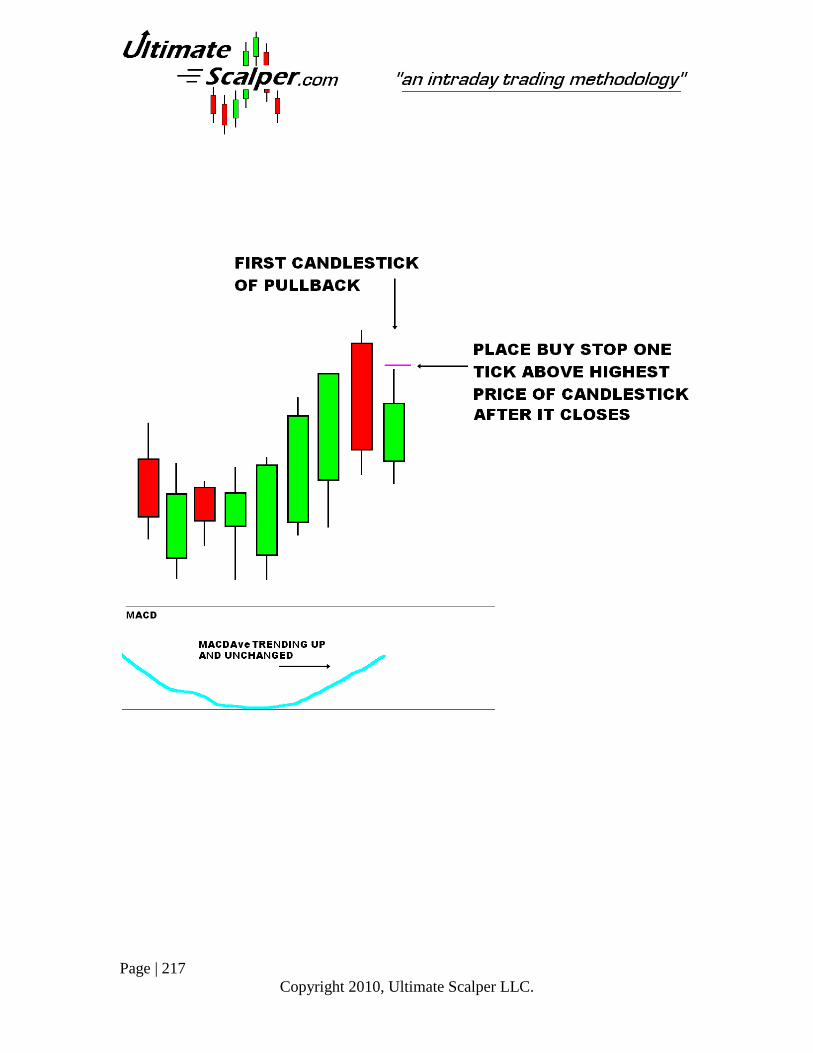
Page | 217
Copyright 2010, Ultimate Scalper LLC.

Page | 218
Copyright 2010, Ultimate Scalper LLC.

Page | 219
Copyright 2010, Ultimate Scalper LLC.
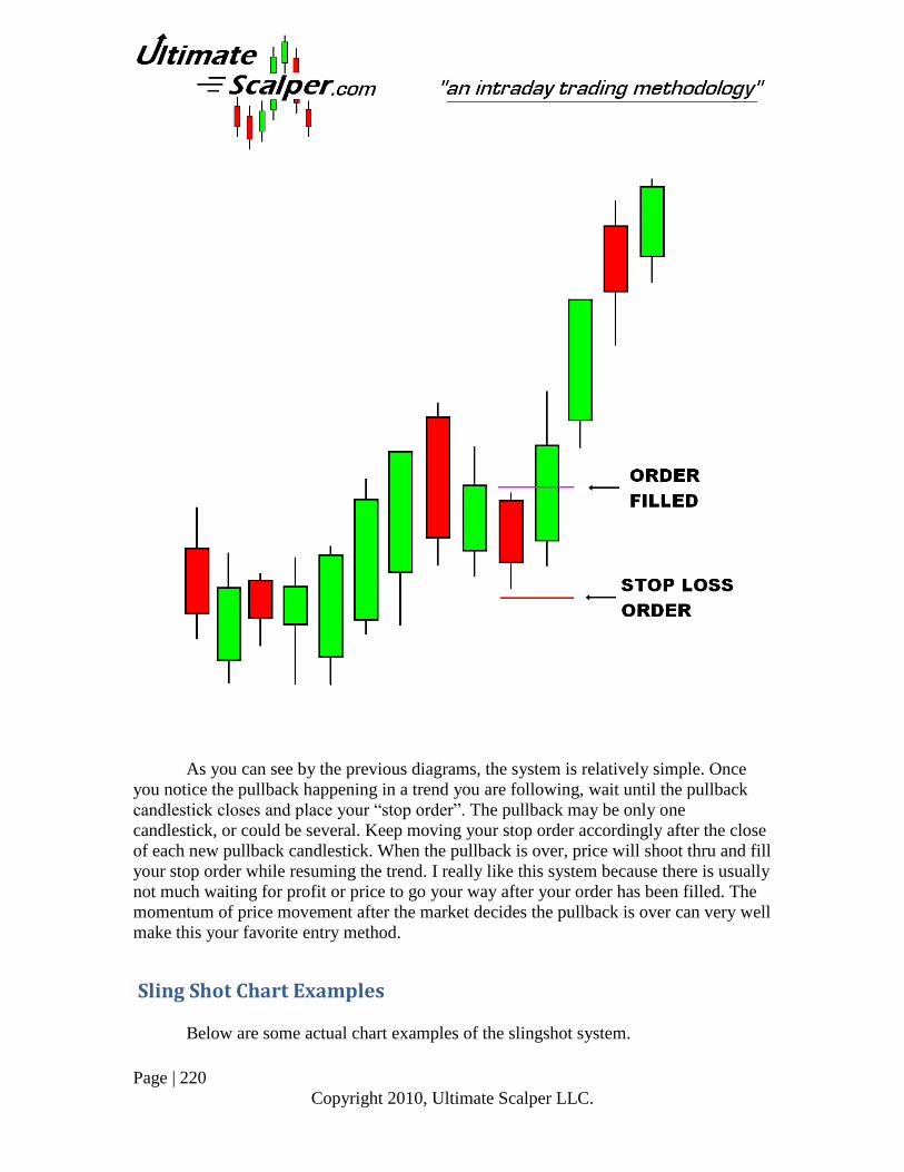
Page | 220
Copyright 2010, Ultimate Scalper LLC.
As you can see by the previous diagrams, the system is relatively simple. Once
you notice the pullback happening in a trend you are following, wait until the pullback
candlestick closes and place your “stop order”. The pullback may be only one
candlestick, or could be several. Keep moving your stop order accordingly after the close
of each new pullback candlestick. When the pullback is over, price will shoot thru and fill
your stop order while resuming the trend. I really like this system because there is usually
not much waiting for profit or price to go your way after your order has been filled. The
momentum of price movement after the market decides the pullback is over can very well
make this your favorite entry method.
Sling Shot Chart Examples
Below are some actual chart examples of the slingshot system.

Page | 221
Copyright 2010, Ultimate Scalper LLC.

Page | 222
Copyright 2010, Ultimate Scalper LLC.
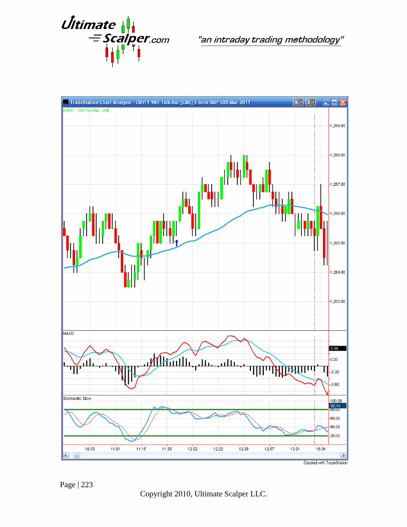
Page | 223
Copyright 2010, Ultimate Scalper LLC.

Page | 224
Copyright 2010, Ultimate Scalper LLC.

Page | 225
Copyright 2010, Ultimate Scalper LLC.

Page | 226
Copyright 2010, Ultimate Scalper LLC.

Page | 227
Copyright 2010, Ultimate Scalper LLC.

Page | 228
Copyright 2010, Ultimate Scalper LLC.
TREND LINE BREAKOUT SYSTEM
This is one of my oldest and most favorite systems. It didn’t take long after I
started studying charts of the S&P 500 futures contract to see obvious patterns
reoccurring. Previously in this manual I touched on the significance of trend lines and
how they define the diagonal support and resistance lines of trends. When these lines get
crossed or broken, it usually signifies the end of that trend and the beginning of an
opposite trend or sideways range. If this is the case, then there must be opportunity to
profit, and there is. In my previous discussion on trend lines I was using them as
confirmation signals to help support and confirm a trading strategy or entry. Trend lines
are very good at helping you see that a trend has in fact ended, or set new parameters for
itself. While this system concept is very easy to grasp, it does create certain challenges
that need to be mastered in order to succeed.
When I use the Trend Breakout method as an actual system to place trades, I
usually am looking at the 3 and or 5 minute bar charts. I find these time frames along
with the simplicity of bar charts help spot excellent Trend Breakout opportunities. With
that being said, you will still find many Trend Breakout opportunities with candlestick tic
charts. I find that it takes a bit of practice to draw trend lines on candlestick charts. The
tic charts will also provide you with many Trend Line Breakout opportunities, and if you
choose, you can also display the tic charts in bar format. As previously mentioned, I have
my computer screen displaying two different charts. On the left side of my screen is the
987 or 2000 tic chart, and on the right I have a 3 or 5 minute bar chart displayed for this
system as well as the Volume indicator.
Uptrend Breaks to the downside: During an uptrend, draw a trend line connecting a
minimum of three perfectly aligned price bar bottoms or lows. When the trend line gets
broken, place an order to sell the market. Place a stop loss order one tick above the
previous high of the trend or at your comfort level.
Downtrend Breaks to the upside: During a downtrend, draw a trend line connecting a
minimum of three perfectly aligned price bar tops or highs. When the trend line gets
broken, place an order to buy the market. Place a stop loss order one tick below the
previous low of the trend or at your comfort level.
Page | 229
Copyright 2010, Ultimate Scalper LLC.
In both cases if the breakout turns out to be a false breakout, then the trend line
must be re-drawn.
Although this system is very reliable, there are a number of factors that discourage
traders from implementing it.
1. Learning to draw accurate trend lines.
2. Where to anchor the trend line.
3. Where to place the stop loss.
4. False breakouts
Drawing accurate trend lines just takes practice, and you must stay true to yourself.
You cannot force a trend line to fit, it will either line up just right almost perfect or it will
not.
In my previous section on trend lines I touched on where to anchor the lines.
Please go back and review the short section I have on trend lines. Once you get smart on
drawing trend lines you will find other places to anchor the lines. As previously
mentioned each trader will draw lines differently. With practice you are sure to master
this wonderful trend line tool.
The stop loss placement can be tricky in this system. After your order is filled
price may take a while to actually take off in the desired direction of your trade. I always
like to place my stop loss one tic above or below a previous significant price point
depending on if I’m going long or short. Stay within your comfort zone.
Take a look at the following chart. It is an actual 5 minute bar chart of the ES
displaying the entire days trading session 6:30 to 13:00 pacific. See if you can pick out
where the trends actually changed direction. Could drawing trend lines have helped spot
trend changes or better yet have made you any profit? Do you see any invisible lines?

Page | 230
Copyright 2010, Ultimate Scalper LLC.
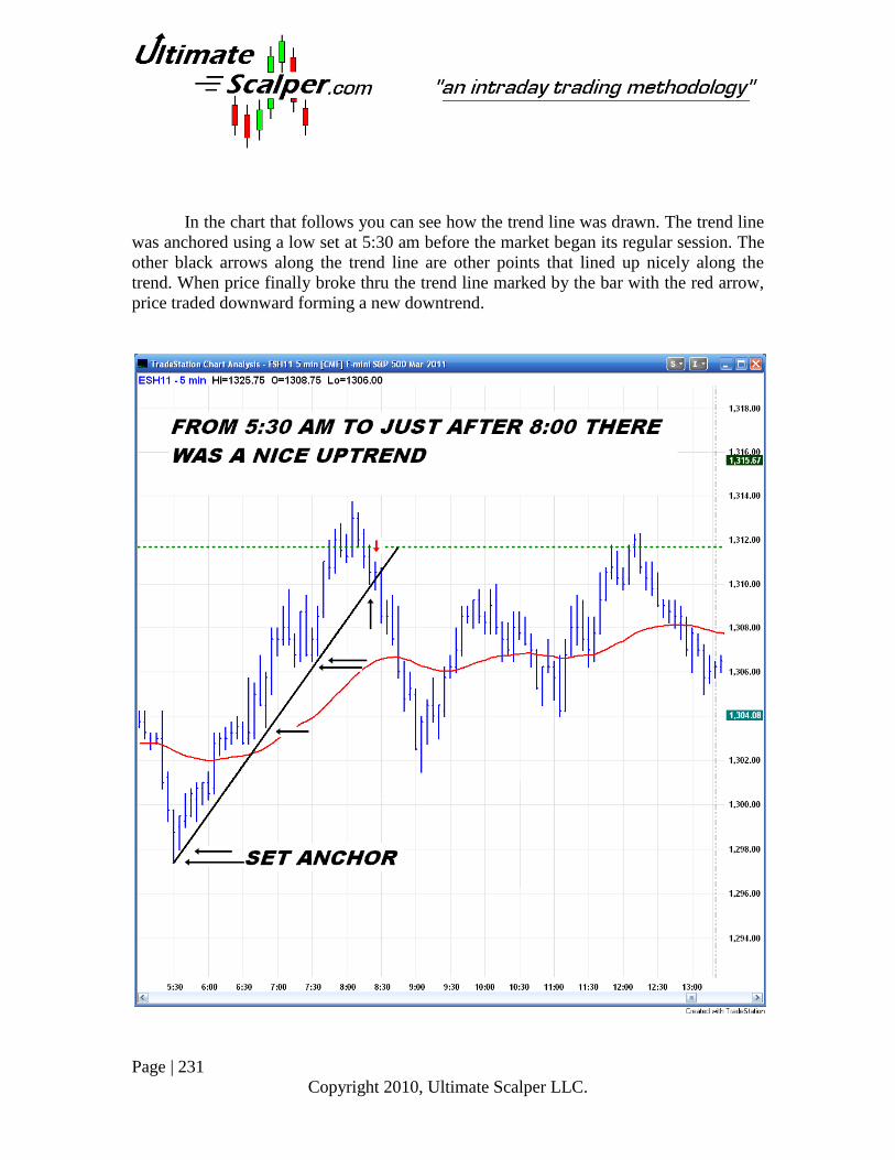
Page | 231
Copyright 2010, Ultimate Scalper LLC.
In the chart that follows you can see how the trend line was drawn. The trend line
was anchored using a low set at 5:30 am before the market began its regular session. The
other black arrows along the trend line are other points that lined up nicely along the
trend. When price finally broke thru the trend line marked by the bar with the red arrow,
price traded downward forming a new downtrend.

Page | 232
Copyright 2010, Ultimate Scalper LLC.
In the preceding chart notice the anchor was set at the high of the last trend. This
is usually where you would anchor a trend line. Sometimes there will be two bars with
the same high n price, in these situations you would chose the one furthest to the right for
a downtrend as previously stated in the prior section on trend lines. The very next bar
makes a good point along the trend line that will later on match up with a bars high to
make the 3rd
spot along the line. Both of these points are marked by a black arrow. The
very next bar after the 3rd
trend line point (black arrow) is a breakout bar. Here is where a
buy order would be placed noted by the blue up arrow.
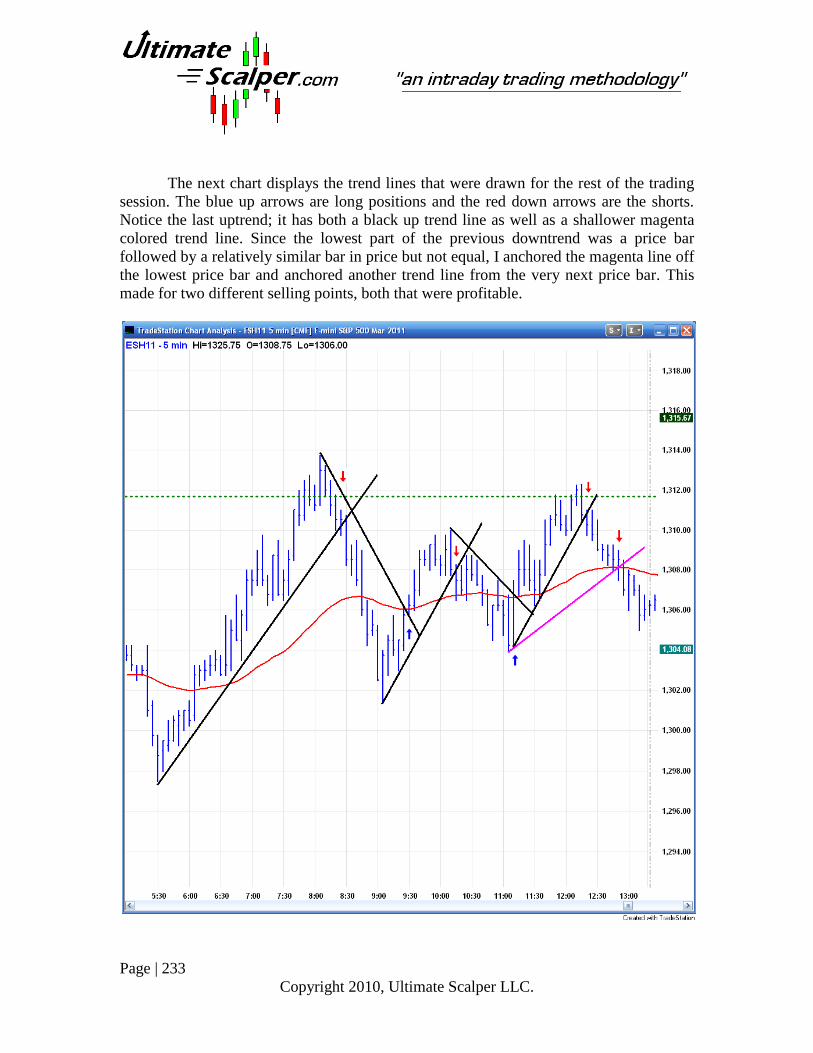
Page | 233
Copyright 2010, Ultimate Scalper LLC.
The next chart displays the trend lines that were drawn for the rest of the trading
session. The blue up arrows are long positions and the red down arrows are the shorts.
Notice the last uptrend; it has both a black up trend line as well as a shallower magenta
colored trend line. Since the lowest part of the previous downtrend was a price bar
followed by a relatively similar bar in price but not equal, I anchored the magenta line off
the lowest price bar and anchored another trend line from the very next price bar. This
made for two different selling points, both that were profitable.

Page | 234
Copyright 2010, Ultimate Scalper LLC.
Trend lines not only provide you with excellent trading opportunities throughout
the day, but they can also be used as a forward looking indicator as well. If you are able
to anchor a trend line and have a first point rather close to the anchor, this can provide
you with valuable information. When a trend line is formed, but not yet broken, it is
basically giving you a line into the future that price will eventually meet back up with.
You will notice this the more you experiment with the trend lines. To see what I mean,
look near the end of the first trend line in the previous chart. Notice how the price bars
traded away from the trend line only to meet back up with it shortly after. This is forward
looking. Take a look at the next trend line. Notice in the downtrend, price started to drop
very steeply pulling away from the trend line. Then price came back up to meet with it
before finally breaking out. This is forward looking. Use it to your advantage.
Some key points about the Trend Line Breakout System:
1. There must be at least three points (price bar highs or lows), INCLUDING the
anchor, where the trend line touches and lines up perfectly.
2. You can and should use the high of the last uptrend or low of the last downtrend
as your anchor point. You may also use the very next bar if it is equal or
somewhat close to the same high or low price.
3. Avoid drawing steep trend lines either up or down. I use roughly a 45 degree max
angle. The more shallow the trend line, the more accurate the breakout.
4. Do not force a trend line to fit, if it doesn’t line up almost to perfection it is not a
good line.

Page | 235
Copyright 2010, Ultimate Scalper LLC.
The Coffee Break
This is my early morning or market opening system. I refer to it as the Coffee
Break because when the trade is over I still have coffee in my cup to sit back and enjoy.
The system is basically the same as the Trend Line Breakout method except I look for a
trend line to form before the market opens for the regular session. This gives me some
clues to what direction the market may take off in shortly after the market opens. The
market is very active in the first part of the day especially after the market opens. This
part of the day is usually very volatile. Price may jump in one direction for a few bars
then make a drastic turn in the opposite direction. Watching the market before it opens
can give you some clues as to where it may go right from the start. I look to see if there
are any definite trend lines I can draw before the market opens and or shortly after it
does.
The next few examples are of actual 5 minute bar charts that show before market
trend lines I was able to take advantage of. I only show the trend line for the Coffee
Break method, see if you can find other good places to draw trend lines on these charts.
You may recall from earlier that I am on Pacific Time. 6:30am is when the market opens
in my time zone and I have my charts set to local time. When you get good at this you
can literally be done with your trading day before you finish your coffee. Enjoy!

Page | 236
Copyright 2010, Ultimate Scalper LLC.
Actual Coffee Break Chart Examples
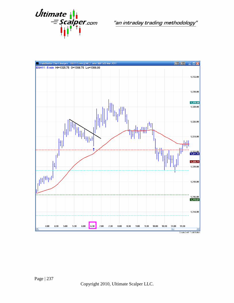
Page | 237
Copyright 2010, Ultimate Scalper LLC.

Page | 238
Copyright 2010, Ultimate Scalper LLC.
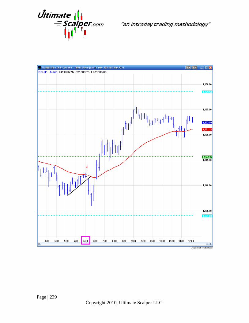
Page | 239
Copyright 2010, Ultimate Scalper LLC.

Page | 240
Copyright 2010, Ultimate Scalper LLC.
Tips for Trading Success
Always draw trend lines on your charts to help you visualize market direction
along with Support and Resistance areas. When broken they will provide you with
not only confirmation signals, but trading opportunities as well.
Use the custom Support and Resistance lines you learned to draw in the early part
of this manual. When used in conjunction with the “Floor Trader Pivot” lines they
become powerful target and turning point areas. Pay special attention when the
Support and Resistance lines are in close proximity to the “Floor Trader Pivots”
lines. When this happens, there is usually something significant about that price
level. You can expect price to test the area and possibly reverse course there.
Always have the “Floor Trader Pivot” lines displayed.
Always be aware of “Final Upward” and “Final Downward Push” bars, They will
indicate a direction change is eminent. Use them as confirmations signals with the
“Double Top” and “Double Bottom” as well as the “Over Bought” and “Over
Sold” systems.
I find that the better trades are in the first and last few hours of the trading session.
During the lunchtime hour of the exchange time zone, price sometimes finds itself
in sideways channels with lots of choppiness and false signals.
When starting out, you may want to use the 2000 tic chart. This will slow things
down just a bit with less false signals. Some students prefer this time frame to the
987 tic. Experiment with both and use what works best for you.
You do not need to trade every system in this course to be successful. Choose and
trade the ones you like. I give you all the best systems that I use to provide you
with an arsenal of trading opportunities. Some system setups are more
consistently successful than others. The list below represents a survey from
previous students of what systems they like the best and use the most.
1. Slingshot
2. Histogram
3. Double Top Double Bottoms
4. Triple Top and Triple Bottoms
5. Trend Line Break Out
6. Over Bought and Over Sold

Page | 241
Copyright 2010, Ultimate Scalper LLC.
Conclusion
I truly believe that with the right amount of dedication and practice in learning
these methods and systems, that anyone can become a successful day trader. These are
very simple and easy to implement straight forward systems that capture consistent
profits year after year.
Although I have presented a lot of valuable information in this manual, there is
still much to learn. Try not to get overwhelmed. Start slow; please use the trade simulator
of the company you chose for as long as it takes to feel completely comfortable before
risking any money. You have the opportunity to make a professional level income from
just studying this short manual. Do yourself a favor and dedicate the time to learn it right
by practicing first. The hardest part about day trading is being able to control your
emotions. You must be able to accept the fact that you will have trades that lose money.
You must be ok with that fact. You must be able to say this from the heart for every
trade:
“I am willing, and it is ok if I lose (X) amount of money in hopes of making
(XY) amount of money in return on this short term investment trade”
And
“I just lost (X) amount of money on this trade, but not because I was wrong.
I did the right thing by placing my stop loss in the proper place. I followed the
system correctly and my stop loss saved me from further losses.”
Once you are honestly ok with saying these phrases as you trade, the rest is easy.
It’s important to set goals and limits for yourself. Start with small realistic goals
like anywhere from$50 to $200 a day in profits. Then stop trading for the day. Also set a
limit on how much you can lose in a single day. For example; if you are down $200 to
$250, just stop trading for the day. The market will be there tomorrow to trade try again.
There is no reason why you should be trading when upset or not in the right state of
mind.

Page | 242
Copyright 2010, Ultimate Scalper LLC.
Videos
Originally, when I first decided to create this manual and share my trading
techniques, I was only going to disclose and teach my “Double Top Double Bottom”
method. I felt that it alone was well worth the price of the course and easy enough for
anyone to learn and become extremely successful. Then, after half way thru writing the
course and much thought, I decided to also disclose my “Histogram” method. I wanted
to make sure my students had another opportunity to get in the market if they missed the
double top or bottom. Also if they were having a hard time finding double tops and
bottoms, or there were not many forming up that particular day, they would have another
method to enter the market.
Then, after most of the manual was already written, I again decided it would not
hurt me at all to disclose one more of my favorite methods. In fact it would help my
students become even more successful and put another simple yet powerful technique in
there trading arsenal. I went ahead and disclosed my “Overbought Oversold “method
along with the others to give my students three very simple yet consistent easy to learn
and implement methods for day-trading the E-Mini S&P.
While watching the videos, you will notice I sometimes refer to a certain method
as the primary, secondary or bonus entry. These videos were produced when there was
only going to be the “Double top Double Bottom” along with the “Histogram” methods
included in the course. After adding the “Overbought Oversold” method, I decided those
videos were too good to get rid of, so I have included them.
Today there are even more systems included in this course. I have added ALL of the
systems and methods that I personally use to day trade the E-Mini S&P. If there are still
some older videos in the course, it’s because they still have learning value. Please
disregard whether I call them primary secondary or bonus systems. I add new videos all
the time and will eventually upgrade the course as needed. The important thing is for you
to learn the different trade setups, entries and exits.
Good Luck and Happy Trading!

Page | 243
Copyright 2010, Ultimate Scalper LLC.
The views and opinions in this manual are solely those of Ultimate Scalper LLC.
Charts in this manual were created using Tradestation wherever specified.
Other charts, diagrams and graphics were created by the Author.
Tradestation is a registered trademark of Tradestation Securities Inc., Tradestation
Technologies Inc and Tradestation Group.
NinjaTrader is a registered trademark of NinjaTrader LLC.