an equity profile of the los angeles region equity profile of the los angeles region policylink and...
TRANSCRIPT

An Equity Profile of the
Los Angeles Region

Demographics
Economic vitality
Neighborhoods
Implications
Readiness
Connectedness
PolicyLink and PEREAn Equity Profile of the Los Angeles Region
Summary Equity Profiles are products of a partnership
between PolicyLink and PERE, the Program
for Environmental and Regional Equity at the
University of Southern California.
The views expressed in this document are
those of PolicyLink and PERE.
2
Table of contents
Data and methods
Foreword
Introduction
26
56
85
66
76
3
14
7
8
89

An Equity Profile of the Los Angeles Region PolicyLink and PERE 3
Summary
While the nation is projected to become a people-of-color majority by the year
2044, Los Angeles reached that milestone in the 1980s. Since 1980, Los Angeles
has experienced dramatic demographic growth and transformation—driven, in
part, by an influx of immigrants from Latin American and Asia. Today,
demographic shifts—including immigration trends—have slowed.
Los Angeles’ diversity is a major asset in the global economy, but inequities and
disparities are holding the region back. Los Angeles is the seventh most unequal
among the largest 150 metro regions. Since 1990, poverty and working poverty
rates in the region have been consistently higher than the national averages.
Racial and gender wage gaps persist in the labor market. Closing racial gaps in
economic opportunity and outcomes will be key to the region’s future.
To build a more equitable Los Angeles, leaders in the private, public, nonprofit,
and philanthropic sectors must commit to putting all residents on the path to
economic security through equity-focused strategies and policies to grow good
jobs, build capabilities, remove barriers, and expand opportunities for the people
and places being left behind.

PolicyLink and PEREAn Equity Profile of the Los Angeles Region 4
List of figuresDemographics
16 1. Race/Ethnicity and Nativity, 2014
16 2. Latino and API Populations by Ancestry, 2014
17 3. Diversity Score in 2014: Largest 150 Metros Ranked
18 4. Racial/Ethnic Composition, 1980 to 2014
18 5. Composition of Net Population Growth by Decade, 1980 to 2014
19 6. Growth Rates of Major Racial/Ethnic Groups, 2000 to 2014
19 7. Net Change in Latino and API Population by Nativity, 2000 to
2014
20 8. Percent Change in Population by County, 2000 to 2014
21 9. Percent Change in People of Color by Census Block Group, 2000
to 2014
22 10. Racial/Ethnic Composition by Census Block Group, 1990 and
2014
23 11. Racial/Ethnic Composition, 1980 to 2050
24 12. Percent People of Color (POC) by Age Group, 1980 to 2014
24 13. Median Age by Race/Ethnicity, 2014
25 14. The Racial Generation Gap in 2014: Largest 150 Metros Ranked
Economic vitality
28 15. Cumulative Job Growth, 1979 to 2014
28 16. Cumulative Growth in Real GRP, 1979 to 2014
29 17. Unemployment Rate, 1990 to 2015
30 18. Cumulative Growth in Jobs-to-Population Ratio, 1979 to 2014
31 19. Labor Force Participation Rate by Race/Ethnicity, 1990 and
2014
31 20. Unemployment Rate by Race/Ethnicity, 1990 and 2014
32 21. Gini Coefficient, 1979 to 2014
33 22. Gini Coefficient in 2014: Largest 150 Metros Ranked
34 23. Real Earned Income Growth for Full-Time Wage and Salary
Workers Ages 25-64, 1979 to 2014
35 24. Median Hourly Wage by Race/Ethnicity, 2000 and 2014
36 25. Households by Income Level, 1979 and 2014
37 26. Racial Composition of Middle-Class Households and All
Households, 1979 and 2014
38 27. Poverty Rate, 1980 to 2014
38 28. Working Poverty Rate, 1980 to 2014

PolicyLink and PERE 5
List of figuresEconomic Vitality (continued)
39 29. Working Poverty Rate in 2014: Largest 150 Metros
Ranked
40 30. Poverty Rate by Race/Ethnicity, 2014
40 31. Working Poverty Rate by Race/Ethnicity, 2014
41 32. Unemployment Rate by Educational Attainment and
Race/Ethnicity, 2014
41 33. Median Hourly Wage by Educational Attainment and
Race/Ethnicity, 2014
42 34. Unemployment Rate by Educational Attainment, Race/Ethnicity,
and Gender, 2014
42 35. Median Hourly Wage by Educational Attainment, Race/Ethnicity,
and Gender, 2014
43 36. Growth in Jobs and Earnings by Industry Wage Level, 1990 to
2012
44 37. Industries by Wage-Level Category in 1990
46 38. Industry Strength Index
49 39. Occupation Opportunity Index: Occupations by Opportunity
Level for Workers with a High School Degree or Less
50 40. Occupation Opportunity Index: Occupations by Opportunity
Level for Workers with More Than a High School Degree but Less
Than a BA
51 41. Occupation Opportunity Index: Occupations by Opportunity
Level for Workers with a BA Degree or Higher
52 42. Opportunity Ranking of Occupations by Race/Ethnicity and
Nativity, All Workers
53 43. Opportunity Ranking of Occupations by Race/Ethnicity and
Nativity, Workers with Low Educational Attainment
54 44. Opportunity Ranking of Occupations by Race/Ethnicity and
Nativity, Workers with Middle Educational Attainment
55 45. Opportunity Ranking of Occupations by Race/Ethnicity and
Nativity, Workers with High Educational Attainment
Readiness
58 46. Educational Attainment by Race/Ethnicity and Nativity, 2014
59 47. Share of Working-Age Population with an Associate’s Degree or
Higher by Race/Ethnicity and Nativity, 2014 and Projected Share of
Jobs that Require an Associate’s Degree of Higher, 2020
60 48. Percent of the Population with an Associate’s Degree of Higher
in 2014: Largest 150 Metros Ranked
An Equity Profile of the Los Angeles Region

PolicyLink and PERE 6
List of figuresReadiness (continued)
61 49. Asian or Pacific Islander Immigrants, Percent with an Associate’s
Degree or Higher by Ancestry, 2014
61 50. Latino Immigrants, Percent with an Associate’s Degree or Higher
by Ancestry, 2014
62 51. Percent of 16-24-Year-Olds Not Enrolled in School and Without
a High School Diploma, 1990 to 2014
63 52. Disconnected Youth: 16-24-Year-Olds Not in Work or School,
1980 to 2014
64 53. Percent of 16-24-Year-Olds Not in Work or School, 2014:
Largest 150 Metros Ranked
65 54. Adult Overweight and Obesity Rates by Race/Ethnicity, 2012
65 55. Adult Diabetes Rates by Race/Ethnicity, 2012
65 56. Adult Asthma Rates by Race/Ethnicity, 2012
Connectedness
68 57. Residential Segregation, 1980 to 2014
69 58. Residential Segregation, 1990 and 2014, Measured by the
Dissimilarity Index
70 59. Percent Using Public Transit by Annual Earnings and
Race/Ethnicity and Nativity, 2014
70 60. Percent of Households without a Vehicle by Race/Ethnicity,
2014
71 61. Means of Transportation to Work by Annual Earnings,
2014
72 62. Share of Households that are Rent Burdened, 2014:
Largest 150 Metros Ranked
73 63. Renter Housing Burden by Race/Ethnicity, 2014
73 64. Homeowner Housing Burden by Race/Ethnicity, 2014
74 65. Low-Wage Jobs and Affordable Rental Housing by County, 2014
75 66. Low-Wage Jobs, Affordable Rental Housing, and Jobs-Housing
Ratios by County
Neighborhoods
78 67. Unemployment Rate by Census Tract, 2014
79 68. Linguistic Isolation by Census Tract, 2014
80 69. Childhood Opportunity Index by Census Tract, 2014
81 70. Percent Population Below the Poverty Level by Census Tract
82 71. Percent of Households Without a Vehicle by Census Tract, 2014
83 72. Average Travel Time to Work by Census Tract, 2014
84 73. Rent Burden by Census Tract, 2014
An Equity Profile of the Los Angeles Region
PolicyLink and PERE 7An Equity Profile of the Los Angeles Region
an annual basis. The Atlas will be an ongoing
resource for stakeholders seeking to develop
collective strategy, support advocacy, and
measure progress.
For the Weingart Foundation, advancing equity is
both a moral and economic imperative. We are
not alone in our commitment, and are encouraged
by colleagues and peers who are leading a
conversation to advance equity in philanthropy. In
order to make further progress, we will need to
bring together key stakeholders from all sectors,
including community members and nonprofit
leaders, government, philanthropy, the business
sector, and labor.
As the demographics of the United States shift to
look more like Southern California, we are
increasingly a bellwether for the nation. Our
values demand a total focus on equity, and this
moment calls for action. Our shared future rests
on our ability to work together to create a region
of inclusion and opportunity.
Fred Ali
President and CEO
Weingart Foundation
Foreword by Fred Ali, Weingart Foundation
Southern California is a place practically built on
hopes and dreams. For decades, our region has
offered the promise of education, jobs, homes,
and healthy lifestyles. People seeking opportunity
have journeyed here—from across the country
and around the world—hoping for a better future
for their families.
But many who saw Southern California as a place
of opportunity have been disappointed.
Throughout the region, people are struggling daily
for the things some take for granted—safe streets,
good jobs, access to health care, affordable
housing, and a quality education for our families.
In 2016, the Weingart Foundation announced a
full commitment to equity—a long-term decision
to base all of our policy and program decisions on
achieving the goal to advance fairness, inclusion,
and opportunity for all Southern Californians—
especially those communities hit hardest by
persistent poverty.
As part of this commitment, we understand that
our strategies need to be guided by actionable
data that can serve as a basis for dialogue about
the challenges and opportunities of creating
equity in Southern California and beyond. It is
precisely this type of data—actionable and
grounded in communities—that has been the
hallmark of work by both PolicyLink and the
University of Southern California’s Program for
Environmental and Regional Equity (PERE).
The 2017 Equity Profile of the Los Angeles Region—
prepared by PolicyLink and PERE—is an invaluable
tool for the Weingart Foundation as we develop
our grantmaking strategies. The scope of the
profile is comprehensive in terms of the indicators
it examines, reflecting both our foundation’s
broad funding interests as well as the holistic
framework the researchers have developed in
order to fully assess true inclusion and equity. In
addition, parts of the report specifically highlight
three geographic areas of special interest to the
Foundation: the South Los Angeles Transit
Empowerment Zone (SLATE-Z), the Southeast Los
Angeles County cities, and the community of
Watts and Willowbrook.
The report also represents the beginning of the
Southern California Regional Equity Atlas, a joint
project of PolicyLink and PERE that will result in
the publication of equity reports and analysis on

PolicyLink and PERE 8An Equity Profile of the Los Angeles Region
Introduction

PolicyLink and PERE 9An Equity Profile of the Los Angeles Region
Overview
Across the country, regional planning
organizations, local governments, community
organizations and residents, funders, and
policymakers are striving to put plans,
policies, and programs in place that build
healthier, more vibrant, more sustainable, and
more equitable regions.
Equity—ensuring full inclusion of the entire
region’s residents in the economic, social, and
political life of the region, regardless of race,
ethnicity, age, gender, neighborhood of
residence, or other characteristic—is an
essential element of the plans.
Knowing how a region stands in terms of
equity is a critical first step in planning for
greater equity. To assist communities with
that process, PolicyLink and the Program for
Environmental and Regional Equity (PERE)
developed an equity indicators framework
that communities can use to understand and
track the state of equity in their regions.
Introduction
This document presents an equity analysis of
the Los Angeles region. It was developed to
help the Weingart Foundation and other
funders effectively address equity issues
through its grantmaking for a more integrated
and sustainable region. PolicyLink, PERE, and
the Weingart Foundation also hope this will
be a useful tool for advocacy groups, elected
officials, planners, and others.
The data in this profile are drawn largely from
a regional equity database that includes data
for the largest 150 regions in the United
States. This database incorporates hundreds
of data points from public and private data
sources including the U.S. Census Bureau, the
U.S. Bureau of Labor Statistics, the Behavioral
Risk Factor Surveillance System (BRFSS), and
Woods & Poole Economics, Inc. See the "Data
and methods" section of this profile for a
detailed list of data sources.

PolicyLink and PERE 10An Equity Profile of the Los Angeles Region
Defining the regionIntroduction
For the purposes of the equity profile and
data analysis, the Los Angeles region is
defined as Los Angeles County.
Unless otherwise noted, all data presented in
the profile use this regional boundary. Some
exceptions due to lack of data availability are
noted beneath the relevant figures.
Information on data sources and
methodology can be found in the “Data and
methods” section beginning on page 89.

PolicyLink and PERE 11An Equity Profile of the Los Angeles Region
Why equity matters nowIntroduction
Los Angeles has an opportunity to lead.
Los Angeles experienced demographic change
and economic shocks before much of the rest
of the nation—and it has emerged with a
realization that leaving people and
communities behind is a recipe for stress not
success. Making progress on new
commitments to inclusion can inform policy
making in the rest of the nation’s metros,
many of which are playing catch-up to
changes experienced here in the last few
decades.
1 Manuel Pastor and Chris Benner, Equity, Growth, and Community: What the Nation Can Learn from America’s Metropolitan Regions (University of California Press, 2016); Randall Eberts, George Erickcek, and Jack Kleinhenz, “Dashboard Indicators for the Northeast Ohio Economy: Prepared for the Fund for Our Economic Future” (Federal Reserve Bank of Cleveland: April 2006), https://ideas.repec.org/p/fip/fedcwp/0605.html.
2 Raj Chetty, Nathaniel Hendren, Patrick Kline, and Emmanuel Saez, “Where is the Land of Economic Opportunity? The Geography of Intergenerational Mobility in the U.S.” http://obs.rc.fas.harvard.edu/chetty/website/v2/Geography%20Executive%20Summary%20and%20Memo%20January%202014.pdf
3 Vivian Hunt, Dennis Layton, and Sara Prince, “Diversity Matters,” (McKinsey & Company, 2014); Cedric Herring. “Does Diversity Pay?: Race, Gender, and the Business Case for Diversity.” American Sociological Review, 74, no. 2 (2009): 208-22; Slater, Weigand and Zwirlein. “The Business Case for Commitment to Diversity.” Business Horizons 51 (2008): 201-209.
4 U.S. Census Bureau. “Ownership Characteristics of Classifiable U.S. Exporting Firms: 2007” Survey of Business Owners Special Report, June 2012, http://www.census.gov/econ/sbo/export07/index.html.
The face of America is changing.
Our country’s population is rapidly
diversifying. Already, more than half of all
babies born in the United States are people of
color. By 2030, the majority of young workers
will be people of color. And by 2044, the
United States will be a majority people-of-
color nation.
Yet racial and income inequality is high and
persistent.
Over the past several decades, long-standing
inequities in income, wealth, health, and
opportunity have reached unprecedented
levels. And while most have been affected by
growing inequality, communities of color have
felt the greatest pains as the economy has
shifted and stagnated.
Strong communities of color are necessary
for the nation’s economic growth and
prosperity.
Equity is an economic imperative as well as a
moral one. Research shows that equity and
diversity are win-win propositions for nations,
regions, communities, and firms. For example:
• More equitable nations and regions
experience stronger, more sustained
growth.1
• Regions with less segregation (by race and
income) and lower income inequality have
more upward mobility. 2
• Companies with a diverse workforce achieve
a better bottom line.3
• A diverse population better connects to
global markets.4
The way forward is an equity-driven
growth model.
To secure America’s prosperity, the nation
must implement a new economic model
based on equity, fairness, and opportunity.
Metropolitan regions are where this new
growth model will be created.
Regions are the key competitive unit in the
global economy. Metros are also where
strategies are being incubated that foster
equitable growth: growing good jobs and new
businesses while ensuring that all—including
low-income people and people of color—can
fully participate and prosper.

An Equity Profile of the Los Angeles Region PolicyLink and PERE 12
Regions are equitable when all residents—regardless of their
race/ethnicity and nativity, gender, or neighborhood of
residence—are fully able to participate in the region’s economic
vitality, contribute to the region’s readiness for the future, and
connect to the region’s assets and resources.
What is an equitable region?
Strong, equitable regions:
• Possess economic vitality, providing high-
quality jobs to their residents and producing
new ideas, products, businesses, and
economic activity so the region remains
sustainable and competitive.
• Are ready for the future, with a skilled,
ready workforce, and a healthy population.
• Are places of connection, where residents
can access the essential ingredients to live
healthy and productive lives in their own
neighborhoods, reach opportunities located
throughout the region (and beyond) via
transportation or technology, participate in
political processes, and interact with other
diverse residents.
Introduction

PolicyLink and PERE 13An Equity Profile of the Los Angeles Region
Equity indicators framework
Demographics:
Who lives in the region and how is this
changing?
• Racial/ethnic diversity
• Demographic change
• Population growth
• Racial generation gap
Economic vitality:
How is the region doing on measures of
economic growth and well being?
• Is the region producing good jobs?
• Can all residents access good jobs?
• Is growth widely shared?
• Do all residents have enough income to
sustain their families?
• Is race/ethnicity/nativity a barrier to
economic success?
• What are the strongest industries and
occupations?
Introduction
Readiness:
How prepared are the region’s residents for the 21st
century economy?
• Does the workforce have the skills for the jobs of
the future?
• Are all youth ready to enter the workforce?
• Are residents healthy?
• Are racial gaps in education and health
decreasing?
Connectedness:
Are the region’s residents and neighborhoods
connected to one another and to the region’s assets
and opportunities?
• Do residents have transportation choices?
• Can residents access jobs and opportunities
located throughout the region?
• Can all residents access affordable, quality,
convenient housing?
• Do neighborhoods reflect the region’s diversity? Is
segregation decreasing?
• Can all residents access healthy food?
The indicators in this profile are presented in five sections. The first section describes the
region’s demographics. The next three sections present indicators of the region’s economic
vitality, readiness, and connectedness. The fifth section highlights three neighborhoods that are
priorities for Weingart. Below are the questions answered within each of the five sections.
Neighborhoods:
Are the residents of Southeast Los
Angeles County, Watts and Willowbrook,
and the South Los Angeles Transit
Empowerment Zone (SLATE-Z) prepared
for and connected to the region’s
opportunities?
• How are demographics changing?
• How are residents doing on measures of
economic opportunity and readiness?
• Are residents connected to
opportunities?

PolicyLink and PERE 14An Equity Profile of the Los Angeles Region
Demographics

PolicyLink and PERE 15An Equity Profile of the Los Angeles Region
Highlights
• Los Angeles County is the ninth most
diverse region.
• The region has experienced dramatic growth
and change over the past several decades,
with the share of people of color increasing
from 47 percent to 73 percent since 1980.
• People of color will continue to drive growth
and change in the region, but the pace of
racial/ethnic change will be slower for the
nation overall.
• There is a large racial generation gap
between the region’s White senior
population and its diverse youth population,
but Los Angeles is one of the few regions
where this gap is on the decline.
• There is growing diversity in the suburbs
with the people-of-color population
increasing most rapidly in the San Gabriel
and San Fernando Valleys, as well as other
inner-ring suburbs in the county.
People of color:
Demographics
Diversity rank (out of largest 150 regions):
73%
#9
Who lives in the region and how is this changing?
The year by which Latinos will become a demographic majority:
2020

PolicyLink and PERE 16An Equity Profile of the Los Angeles Region
22%
5%
8%
28%
20%
5%
9%
2%
22%
5%
28%
20%
5%
9%
2%
White, U.S.-bornWhite, immigrantBlack, U.S.-bornBlack, immigrantLatino, U.S.-bornLatino, immigrantAsian or Pacific Islander, U.S.-bornAsian or Pacific Islander, immigrantNative AmericanMixed/other
The people-of-color population is predominately Mexican
and the area has a diverse Asian population
One of the most diverse regions
Seventy-three percent of residents in Los
Angeles County are people of color. Latinos
(48 percent) are the single largest group
followed by non-Hispanic Whites (27 percent)
and Asians (14 percent).
The Latino population is predominately of
Mexican ancestry (65 percent) with the
second largest group being of Salvadoran
ancestry (7 percent).
The Asian American and Pacific Islander
population is diverse with Chinese/Taiwanese
(26 percent), Filipino (20 percent), and Korean
(15 percent) being the largest ethnic groups.
Los Angeles is majority people of color
Demographics
1. Race/Ethnicity and Nativity, 2014
Source: Integrated Public Use Microdata Series.
Note: Data represent a 2010 through 2014 average.
Source: Integrated Public Use Microdata Series.
Note: Data represent a 2010 through 2014 average.
2. Latino and API Populations by Ancestry, 2014
Asian or Pacific Islander (API)
Ancestry Population % Immigrant
Chinese 363,812 71%
Filipino 286,694 70%
Korean 208,971 74%
Japanese 98,189 35%
Vietnamese 85,344 68%
Indian 67,972 76%
All other Asians 289,924 63%
Total 1,400,906 67%
Latino
Ancestry Population % Immigrant
Mexican 3,125,469 39%
Salvadoran 356,970 62%
Guatemalan 230,138 64%
Honduran 45,698 64%
Nicaraguan 34,089 69%
Peruvian 30,207 67%
Puerto Rican 28,716 0%
Cuban 28,433 48%
All other Latinos 919,652 34%
Total 4,799,372 42%

PolicyLink and PERE 17An Equity Profile of the Los Angeles Region
Vallejo-Fairfield, CA: #1 (1.45)
Los Angeles County: #9 (1.29)
Portland-South Portland-Biddeford, ME: #150 (0.36)
One of the most diverse regions
Los Angeles County is the nation’s ninth most
diverse metropolitan region out of the largest
150 regions. Los Angeles has a diversity score
of 1.29; only a handful of regions throughout
the country are more diverse.
The diversity score is a measure of
racial/ethnic diversity a given area. It
measures the representation of the six major
racial/ethnic groups (White, Black, Latino,
API, Native American, and other/mixed race)
in the population. The maximum possible
diversity score (1.79) would occur if each
group were evenly represented in the
region—that is, if each group accounted for
one-sixth of the total population.
Note that the diversity score describes the
region as a whole and does not measure racial
segregation, or the extent to which different
racial/ethnic groups live in different
neighborhoods. Segregation measures can be
found on pages 68-69.
Los Angeles is the ninth most diverse region
Demographics
3. Diversity Score in 2014: Largest 150 Metros Ranked
Source: U.S. Census Bureau.
Note: Data represent a 2010 through 2014 average.
(continued)
PolicyLink and PERE 18An Equity Profile of the Los Angeles Region
-334,753
-659,236
-247,949
1,720,414
1,315,410
702,814
1980 to 1990 1990 to 2000 2000 to 201453%
41%
31%27%
12%
11%
9%
8%
28%
38%
45%48%
6% 10%12% 14%
3% 2%
1980 1990 2000 2014
-334,753
-659,236
-247,949
1,720,414
1,315,410
702,814
1980 to 1990 1990 to 2000 2000 to 2014
WhitePeople of Color
53%
41%
31%27%
12%
11%
9%
8%
28%
38%
45%48%
6% 10%12% 14%
3%
1980 1990 2000 2014
Mixed/otherNative AmericanAsian or Pacific IslanderLatinoBlackWhite
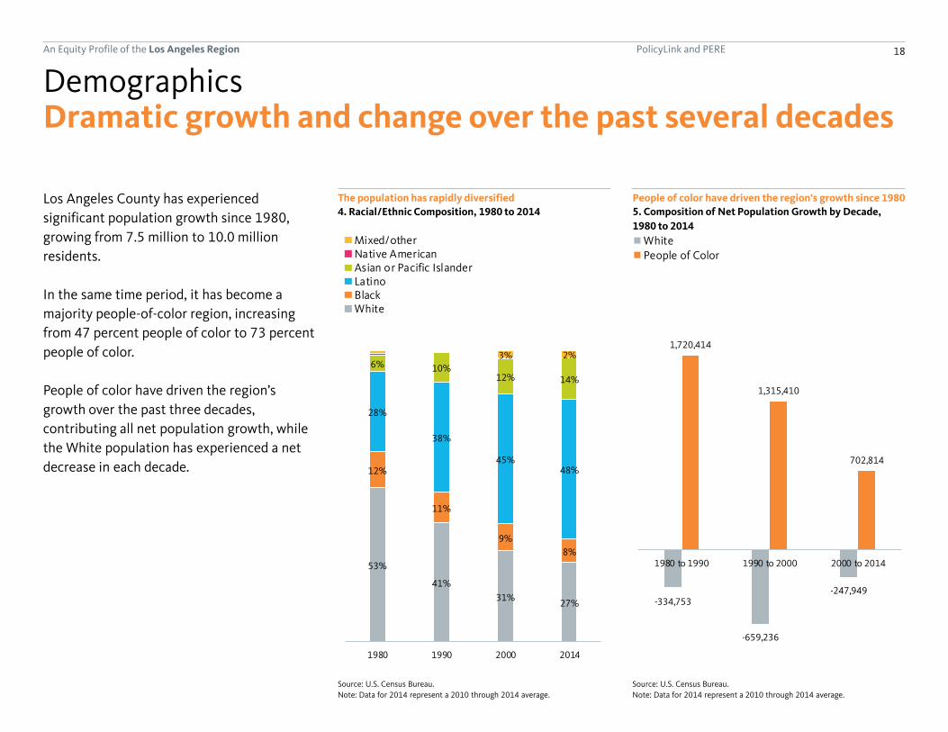
Dramatic growth and change over the past several decades
Los Angeles County has experienced
significant population growth since 1980,
growing from 7.5 million to 10.0 million
residents.
In the same time period, it has become a
majority people-of-color region, increasing
from 47 percent people of color to 73 percent
people of color.
People of color have driven the region’s
growth over the past three decades,
contributing all net population growth, while
the White population has experienced a net
decrease in each decade.
The population has rapidly diversified
Demographics
4. Racial/Ethnic Composition, 1980 to 2014
Source: U.S. Census Bureau.
Note: Data for 2014 represent a 2010 through 2014 average.
Source: U.S. Census Bureau.
Note: Data for 2014 represent a 2010 through 2014 average.
People of color have driven the region’s growth since 1980
5. Composition of Net Population Growth by Decade,
1980 to 2014
PolicyLink and PERE 19An Equity Profile of the Los Angeles Region
142,870
103,269
-1%
-29%
22%
13%
-11%
-8%
Mixed/other
Native American
Asian or Pacific Islander
Latino
Black
White
-93,564
665,104
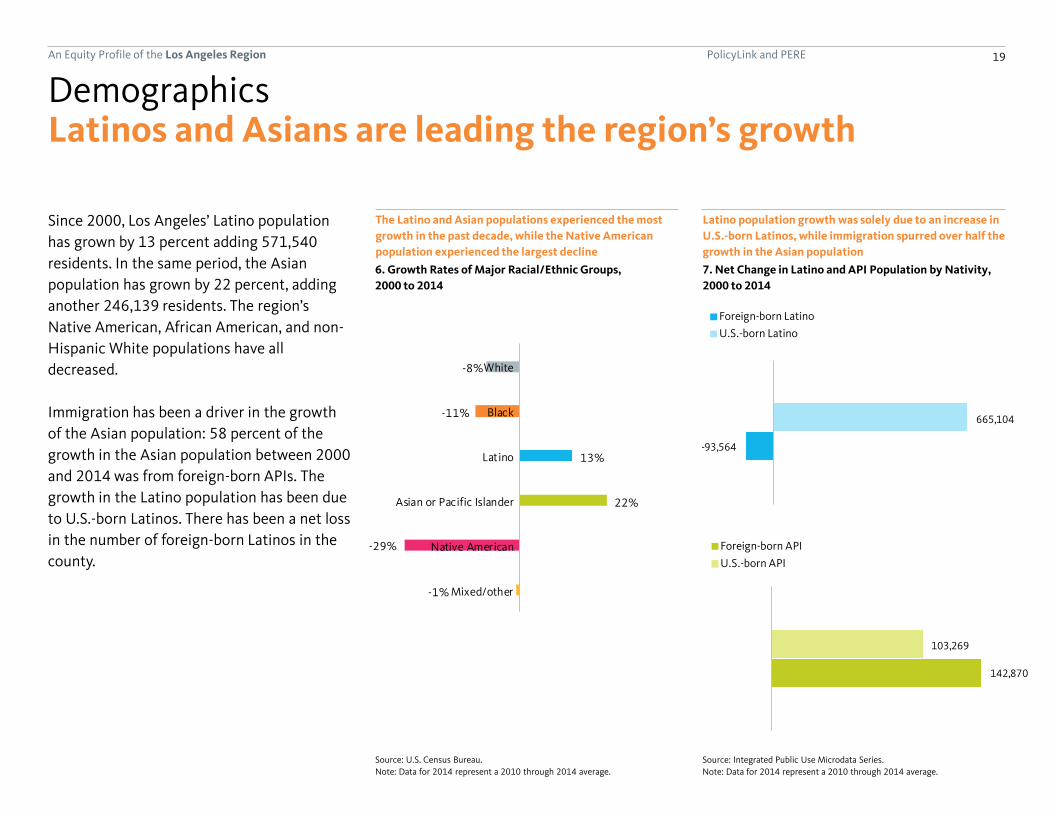
Latinos and Asians are leading the region’s growth
Since 2000, Los Angeles’ Latino population
has grown by 13 percent adding 571,540
residents. In the same period, the Asian
population has grown by 22 percent, adding
another 246,139 residents. The region’s
Native American, African American, and non-
Hispanic White populations have all
decreased.
Immigration has been a driver in the growth
of the Asian population: 58 percent of the
growth in the Asian population between 2000
and 2014 was from foreign-born APIs. The
growth in the Latino population has been due
to U.S.-born Latinos. There has been a net loss
in the number of foreign-born Latinos in the
county.
The Latino and Asian populations experienced the most
growth in the past decade, while the Native American
population experienced the largest decline
Demographics
6. Growth Rates of Major Racial/Ethnic Groups,
2000 to 2014
Source: Integrated Public Use Microdata Series.
Note: Data for 2014 represent a 2010 through 2014 average.
Source: U.S. Census Bureau.
Note: Data for 2014 represent a 2010 through 2014 average.
Latino population growth was solely due to an increase in
U.S.-born Latinos, while immigration spurred over half the
growth in the Asian population
7. Net Change in Latino and API Population by Nativity,
2000 to 2014
38%
62%
Foreign-born Latino
U.S.-born Latino
64%
36%
Foreign-born API
U.S.-born API

PolicyLink and PERE 20An Equity Profile of the Los Angeles Region
8%
5%
27%
11%
Orange
Los Angeles
8%
5%
27%
11%
Orange
Los Angeles
People of Color
Total population
People of color are driving growth throughout the Los Angeles metropolitan areaBoth Los Angeles and Orange Counties—the
two counties that form the Los Angeles
Metropolitan Statistical Area—experienced
population growth over the past decade, and
in both counties, the people-of-color
population grew at a faster rate than the
population as a whole.
While the population of color in Los Angeles
County grew at double the rate of the
population overall, it grew at more than triple
the rate of the overall population in Orange
County.
The people-of-color population is growing faster than the overall population in both Los Angeles and Orange counties
Demographics
8. Percent Change in Population by County, 2000 to 2014
Source: U.S. Census Bureau.
Note: Data for 2014 represent a 2010 through 2014 average.

PolicyLink and PERE 21An Equity Profile of the Los Angeles Region
Decline or no population growth
Less than 14% increase
14% to 31% increase
31% to 67% increase
67% increase or more
Demographic change varies by neighborhood
Mapping the growth in people of color by
census block group illustrates variation in
growth and decline in communities of color
throughout the region. The map highlights
how the population of color has declined or
experienced no growth in many
neighborhoods in the core of downtown Los
Angeles, South Los Angeles, and Northeast
Los Angeles.
Areas highlighted in the map including the
South Los Angeles Transit Empowerment
Zone (SLATE-Z) area, the Southeast Los
Angeles County cities, and the community of
Watts and Willowbrook all include
neighborhoods in which the people-of-color
population has declined or grown very slowly
over the last decade.
The largest increases in the people-of-color
population are found in the far-flung outer
suburbs of Lancaster, Palmdale, and Santa
Clarita, as well in the less remote suburbs of
the San Fernando and San Gabriel Valleys,
along with other inner-ring suburbs of the
county as well.
Significant variation in growth and decline in communities of color by neighborhood
Demographics
9. Percent Change in People of Color by Census Block Group, 2000 to 2014
Source: U.S. Census Bureau, GeoLytics, Inc.; TomTom, ESRI, HERE, DeLorme, MaymyIndia, © OpenStreetMap contributors, and the GIS user community.
Note: One should keep in mind when viewing this map and others that display a share or rate that while there is wide variation in the size (land area) of the census
block groups in the region, each has a roughly similar number of people. Thus, a large block group on the region’s periphery likely contains a similar number of
people as a seemingly tiny one in the urban core, so care should be taken not to assign an unwarranted amount of attention to large block groups just because they
are large. Data for 2014 represent a 2010 through 2014 average.

PolicyLink and PERE 22An Equity Profile of the Los Angeles Region
Suburban areas are becoming more diverse
Diversity is spreading outwards
Demographics
10. Racial/Ethnic Composition by Census Block Group, 1990 and 2014
Source: U.S. Census Bureau, GeoLytics, Inc.; TomTom, ESRI, HERE, DeLorme, MaymyIndia, © OpenStreetMap contributors, and the GIS user community.
Note: Data for 2014 represent a 2010 through 2014 average.
Since 1990, the region’s population has
grown by over one million residents. This
growth can be seen throughout the region,
but is most notable in the outer suburbs of
Lancaster, Palmdale, and Santa Clarita, as well
in the San Fernando and San Gabriel Valleys.
The Latino and API populations have been the
fastest growing groups in the region overall,
and their increasing numbers are seen in
many parts of the region. Strong increases in
the Latino population are seen virtually
throughout the whole region with the
exception of coastal cities such as Santa
Monica and Redondo Beach, as well as the
western portion of South Los Angeles in
places that are still largely African American
such as the City of Inglewood, and the
Baldwin Hills and View Park-Windsor Hills
areas. The API population has increased most
noticeably in the San Gabriel Valley as well as
in the southeast portion of the County near
Anaheim, including the suburban cities of
Lakewood and Cerritos.

PolicyLink and PERE 23An Equity Profile of the Los Angeles Region
53%
41%31% 28% 25% 23% 21% 19%
12%
11%
9%8%
8%7%
7% 7%
28%
38%
45%48% 51% 53% 56% 59%
10%12% 14% 14% 15% 15% 14%
2% 2%
2%
2% 1%
1980 1990 2000 2010 2020 2030 2040 2050
U.S. % WhiteMixed/otherNative AmericanAsian or Pacific IslanderLatinoBlackWhite
Projected
53%
41%31% 28% 25% 23% 21% 19%
12%
11%
9%8%
8%7%
7% 7%
28%
38%
45%48% 51% 53% 56% 59%
6% 10%12% 14% 14% 15% 15% 14%
3% 2% 2% 2% 2% 1%
1980 1990 2000 2010 2020 2030 2040 2050
Projected
At the forefront of the nation’s demographic shift
Los Angeles County has long been more
diverse than the nation as a whole. While the
country is projected to become majority
people of color by the year 2044, Los Angeles
passed this milestone in the 1980s. By 2050,
81 percent of the region’s residents are
projected to be people of color. This would
rank the region 11th among the 150 largest
metros in terms of the percentage people of
color.
Looking forward, the region is projected to
change demographically at a much slower
pace than the nation overall.
The share of people of color is projected to increase through 2050
Demographics
11. Racial/Ethnic Composition, 1980 to 2050
Sources: U.S. Census Bureau; Woods & Poole Economics, Inc.
65%
58%
48%
40%
34%
28%24%
18%
17%
17%
17%
16%
15%
14%
14% 21%29% 35% 41% 47% 52%
2% 3%5% 6% 7% 8% 9%
1% 1% 2% 2% 2%
1980 1990 2000 2010 2020 2030 2040
U.S. % White
Other
Native American
Asian/Pacific Islander
Latino
Black
White
Projected

PolicyLink and PERE 24An Equity Profile of the Los Angeles Region
26
29
38
41
45
45
35
Mixed/other
Latino
Black
Asian or Pacific Islander
White
Native American
All
23%
56%
62%
83%
1980 1990 2000 2014
27 percentage point gap
39 percentage point gap
25%
37%
42%
70%
1980 1990 2000 2010
Percent of seniors who are POC
Percent of youth who are POC
33 percentage point gap
17 percentage point gap
A shrinking racial generation gap
Youth are leading the demographic shift
occurring in the region. Today, 83 percent of
the Los Angeles County’s youth (under age
18) are people of color, compared with 56
percent of the region’s seniors (over age 64).
This 27 percentage point difference between
the share of people of color among young and
old can be measured as the racial generation
gap, and has actually declined since 1980
while it has grown sharply in most other parts
of the nation. This reflects the fact that Los
Angeles experienced rapid racial/ethnic
change much earlier than much of the
country.
Examining median age by race/ethnicity
reveals how the region’s fast-growing Latino
population is much more youthful than its
White population. The median age of the
Latino population is 29, which is 16 years
younger than the median age of 45 for the
White population. The region’s other/mixed
race population is also younger than average.
The racial generation gap between youth and seniors has
declined since 1980
Demographics
12. Percent People of Color (POC) by Age Group,
1980 to 2014
The region’s people of mixed racial backgrounds and
Latinos are much younger than other groups
13. Median Age by Race/Ethnicity, 2014
Source: Integrated Public Use Microdata Series.
Note: Data represent a 2010 through 2014 average.
Source: U.S. Census Bureau.
Note: Data for 2014 represent a 2010 through 2014 average.

PolicyLink and PERE 25An Equity Profile of the Los Angeles Region
Naples-Marco Island, FL: #1 (49%)
Los Angeles County: #52 (27%)
Honolulu, HI: #150 (6%)
A shrinking racial generation gap
Los Angeles County’s 27 percentage point
racial generation gap is similar to the national
average (26 percentage points), ranking the
region 52nd among the largest 150 regions on
this measure.
Los Angeles County has an average racial generation gap
Demographics
14. The Racial Generation Gap in 2014: Largest 150 Metros Ranked
Source: U.S. Census Bureau.
Note: Data represent a 2010 through 2014 average.
(continued)

PolicyLink and PERE 26An Equity Profile of the Los Angeles Region
Economic vitality

PolicyLink and PERE 27An Equity Profile of the Los Angeles Region
Decline in wages for workers at the 10th
percentile since 1979:
-25%
Highlights
• Los Angeles County’s economy was hit by
the downturn of the early 1990s and job
growth and economic output has lagged the
national average since then.
• Income inequality has sharply increased. It
is driven, in part, by a widening gap in
wages. Since 1979, the highest-paid workers
have seen their wages increase significantly,
while wages for the lowest-paid workers
have declined.
• Since 1990, poverty and working poverty
rates in the region have been consistently
higher than the national averages. Latinos
and African Americans are far more likely to
be in poverty or working poor than Whites.
• Although education can be a leveler, racial
and gender gaps persist in the labor market.
At every level of educational attainment,
there are racial and gender wage gaps.
Economic vitality
Income inequality rank
(out of largest 150 regions):
#7
Wage gap between college-educated Whites and people of color:
$6/hr
How is the region doing on measures of economic growth and well being?

PolicyLink and PERE 28An Equity Profile of the Los Angeles Region
42%
64%
0%
25%
50%
75%
1979 1984 1989 1994 1999 2004 2009 2014
62%
93%
-40%
0%
40%
80%
120%
1979 1984 1989 1994 1999 2004 2009 2014
Weak long-term economic growth
Measures of economic growth include
increases in jobs and increases in gross
regional product (GRP), the value of all goods
and services produced within the region.
By these measures, economic growth in Los
Angeles County kept pace with and surpassed
the national average in the 1980s. The
downturn of the early 1990s hit the region
more drastically than the nation as a whole
and since then economic growth in Los
Angeles County has lagged the national
average.
From 1979 to 2014, the number of jobs
increased by 64 percent in the U.S. and by
only 42 percent in Los Angeles County. Over
the same period, real GRP has increased by 93
percent in the U.S. and by only 62 percent in
Los Angeles County.
Job growth has fallen behind the national average since
the early 1990s
Economic vitality
15. Cumulative Job Growth, 1979 to 2014
Source: U.S. Bureau of Economic Analysis.Source: U.S. Bureau of Economic Analysis.
Gross regional product (GRP) growth has fallen behind the
national average since the early 1990s
16. Cumulative Growth in Real GRP, 1979 to 2014

PolicyLink and PERE 29An Equity Profile of the Los Angeles Region
6.7%
5.3%
0%
4%
8%
12%
16%
1990 1995 2000 2005 2010 2015
Downturn 2006-2010
Economic decline through the downturn
Since the 1990s, the unemployment rate in
Los Angeles County has been consistently
higher than the national average. During the
2006 to 2010 economic downturn,
unemployment increased more sharply than
the national average. Since then,
unemployment rates have fallen to 6.7
percent in Los Angeles County and 5.3
percent nationally in 2015.
Unemployment has surpassed the national average
Economic vitality
17. Unemployment Rate, 1990 to 2015
Source: U.S. Bureau of Labor Statistics. Universe includes the civilian noninstitutional population ages 16 and older.

PolicyLink and PERE 30An Equity Profile of the Los Angeles Region
16%
4%
-10.0%
0.0%
10.0%
20.0%
1979 1984 1989 1994 1999 2004 2009 2014
Job growth is not keeping up with population growth
While overall job growth is essential, the real
question is whether jobs are growing at a fast
enough pace to keep up with population
growth. Since 1979, job growth in Los
Angeles County has not kept up with
population growth and has lagged the
national average. The number of jobs per
person in Los Angeles County has increased
by only 4 percent since 1979 as compared to
an increase of 16 percent for the nation
overall.
Job growth relative to population growth has been lower than the national average since 1979
Economic vitality
18. Cumulative Growth in Jobs-to-Population Ratio, 1979 to 2014
Source: U.S. Bureau of Economic Analysis.

PolicyLink and PERE 31An Equity Profile of the Los Angeles Region
81%
71%
78%
78%
74%
80%
79%
79%
78%
76%
74%
81%
Mixed/other
Native American
Asian or Pacific Islander
Latino
Black
White
78%
78%
74%
80%
78%
76%
74%
81%
Native American
Asian or Pacific Islander
Latino
Black
19902014
8%
6%
4%
8%
10%
4%
11%
14%
7%
9%
15%
9%
Mixed/other
Native American
Asian or Pacific Islander
Latino
Black
White
Unemployment higher for people of color
Another key question is who is getting the
region’s jobs? Examining unemployment by
race over the past two decades, we find that,
despite some progress, racial employment
gaps persist in Los Angeles County. Blacks and
Native Americans have the lowest labor force
participation rates as well as the highest
unemployment rates. Since 1990, all racial
groups have experienced higher
unemployment.
African Americans and Native Americans participate in
the labor market at lower rates
Economic vitality
19. Labor Force Participation Rate by Race/Ethnicity,
1990 and 2014
Source: Integrated Public Use Microdata Series. Universe includes the civilian
noninstitutional population ages 25 through 64.
Note: Data for 2014 represent a 2010 through 2014 average.
Source: Integrated Public Use Microdata Series. Universe includes the civilian
noninstitutional population ages 25 through 64.
Note: Data for 2014 represent a 2010 through 2014 average.
Most communities of color have higher unemployment
rates than Whites
20. Unemployment Rate by Race/Ethnicity,
1990 and 2014
78%
78%
74%
80%
78%
76%
74%
81%
Native American
Asian or Pacific Islander
Latino
Black
19902014

PolicyLink and PERE 32An Equity Profile of the Los Angeles Region
0.40
0.43
0.46
0.47
0.41
0.44
0.50 0.50
0.35
0.40
0.45
0.50
0.55
1979 1989 1999 2014
Leve
l of
Ineq
ual
ity
Gini Coefficent measures income equality on a 0 to 1 scale.0 (Perfectly equal) ------> 1 (Perfectly unequal)
Increasing income inequality
Household income inequality has increased in
Los Angeles County over the past 30 years.
The sharpest increase occurred in the 1990s.
It has since leveled off but still remains higher
than for the nation as a whole.
Inequality here is measured by the Gini
coefficient, which is the most commonly used
measure of inequality. The Gini coefficient
measures the extent to which the income
distribution deviates from perfect equality,
meaning that every household has the same
income. The value of the Gini coefficient
ranges from zero (perfect equality) to one
(complete inequality, one household has all of
the income).
In Los Angeles County, the Gini coefficient
was 0.41 in 1979 and rose to 0.50 by 2014.
Household income inequality has increased steadily since 1979
Economic vitality
21. Gini Coefficient, 1979 to 2014
Source: Integrated Public Use Microdata Series. Universe includes all households (no group quarters).
Note: Data for 2014 represent a 2010 through 2014 average.

PolicyLink and PERE 33An Equity Profile of the Los Angeles Region
Bridgeport-Stamford-Norwalk, CT: #1 (0.54)
Los Angeles County: #7 (0.50)
Ogden-Clearfield, UT: #150 (0.40)
Increasing income inequality
In 1979, Los Angeles County ranked 19th out
of the largest 150 regions in terms of income
inequality. Today, it ranks 7th between New
Orleans, LA (6th) and McAllen, TX (8th).
Compared with other metro regions in
California, the level of inequality in Los
Angeles County (0.50) is higher than the Bay
Area (.48), San Diego (0.47), and San Jose
(0.46).
Los Angeles’ inequality rank is 7th compared with other regions
Economic vitality
22. Gini Coefficient in 2014: Largest 150 Metros Ranked
Source: Integrated Public Use Microdata Series. Universe includes all households (no group quarters).
Note: Data represent a 2010 through 2014 average.
(continued)
Higher Income Inequality Lower
PolicyLink and PERE 34An Equity Profile of the Los Angeles Region
-25% -23%
-11%
4%
13%
-11% -10%
-7%
6%
17%
10th Percentile 20th Percentile 50th Percentile 80th Percentile 90th Percentile
-25%-23%
-11%
4%
13%
-11%-10%
-7%
6%
17%
10th Percentile 20th Percentile 50th Percentile 80th Percentile 90th Percentile
Los Angeles CountyUnited States
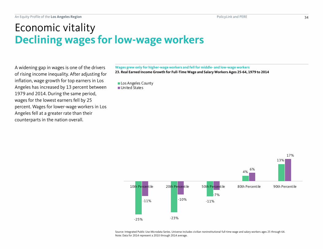
Declining wages for low-wage workers
A widening gap in wages is one of the drivers
of rising income inequality. After adjusting for
inflation, wage growth for top earners in Los
Angeles has increased by 13 percent between
1979 and 2014. During the same period,
wages for the lowest earners fell by 25
percent. Wages for lower-wage workers in Los
Angeles fell at a greater rate than their
counterparts in the nation overall.
Wages grew only for higher-wage workers and fell for middle- and low-wage workers
Economic vitality
23. Real Earned Income Growth for Full-Time Wage and Salary Workers Ages 25-64, 1979 to 2014
Source: Integrated Public Use Microdata Series. Universe includes civilian noninstitutional full-time wage and salary workers ages 25 through 64.
Note: Data for 2014 represent a 2010 through 2014 average.

PolicyLink and PERE 35An Equity Profile of the Los Angeles Region
$26.40
$20.80
$13.80
$20.90$19.30
$20.50
$27.30
$20.10
$13.60
$21.70 $22.50 $22.40
White Black Latino Asian orPacific
Islander
NativeAmerican
Mixed/other
$26.4
$20.8
$13.8
$20.9 $20.5
$27.3
$20.1
$13.6
$21.7 $22.4
White Black Latino Asian or PacificIslander
Mixed/other
20002014
Uneven wage growth by race/ethnicity
Wage growth for full-time wage and salary
workers has been uneven across racial/ethnic
groups between 2000 and 2014. African
American and Latino workers not only earn
the lowest median hourly wages but their
wages have declined.
Median hourly wages for Blacks and Latinos have declined since 2000
Economic vitality
24. Median Hourly Wage by Race/Ethnicity, 2000 and 2014 (all figures in 2010 dollars)
Source: Integrated Public Use Microdata Series. Universe includes civilian noninstitutional full-time wage and salary workers ages 25 through 64.
Note: Data for 2014 represent a 2010 through 2014 average.
PolicyLink and PERE 36An Equity Profile of the Los Angeles Region
30%37%
40%
37%
30%26%
1979 1989 1999 2014
Lower
Middle
Upper
$31,267
$78,122 $90,750
$36,321
A shrinking middle class
The share of middle-class households declined since 1979
Economic vitality
25. Households by Income Level, 1979 and 2014 (all figures in 2010 dollars)
Source: Integrated Public Use Microdata Series. Universe includes all households (no group quarters).
Note: Data for 2014 represent a 2010 through 2014 average.
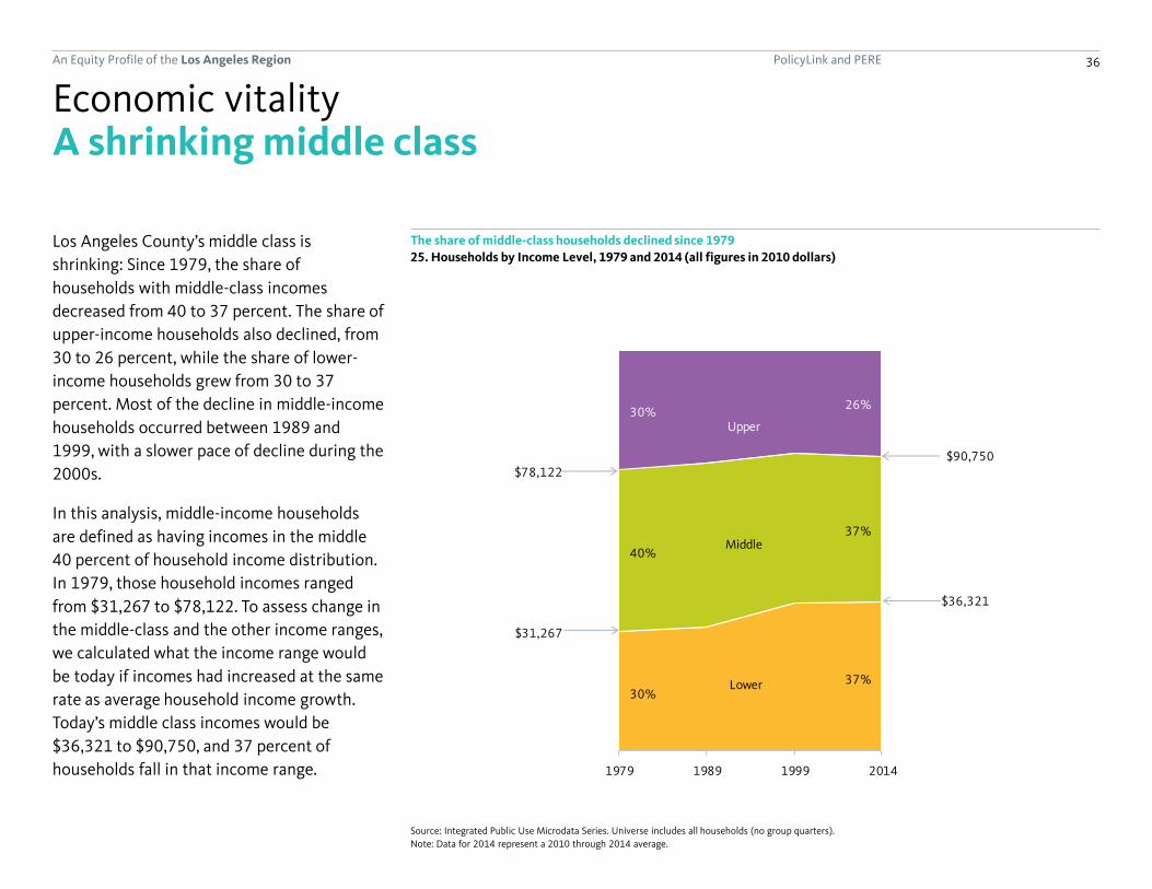
Los Angeles County’s middle class is
shrinking: Since 1979, the share of
households with middle-class incomes
decreased from 40 to 37 percent. The share of
upper-income households also declined, from
30 to 26 percent, while the share of lower-
income households grew from 30 to 37
percent. Most of the decline in middle-income
households occurred between 1989 and
1999, with a slower pace of decline during the
2000s.
In this analysis, middle-income households
are defined as having incomes in the middle
40 percent of household income distribution.
In 1979, those household incomes ranged
from $31,267 to $78,122. To assess change in
the middle-class and the other income ranges,
we calculated what the income range would
be today if incomes had increased at the same
rate as average household income growth.
Today’s middle class incomes would be
$36,321 to $90,750, and 37 percent of
households fall in that income range.

PolicyLink and PERE 37An Equity Profile of the Los Angeles Region
60% 62%
35% 37%
12% 12%
9% 10%
23% 20%40% 37%
5% 5%14% 14%
Middle-ClassHouseholds
All Households Middle-ClassHouseholds
All Households
1979 2014
60% 62%
35%37%
12%12%
9%10%
23%20%
40%37%
5% 5%14% 14%
Middle-ClassHouseholds
All Households Middle-ClassHouseholds
All Households
Native American and all otherAsian or Pacific IslanderLatinoBlackWhite
Though the middle class is shrinking, it is relatively diverse
The demographics of the middle class reflect
the region’s changing demographics. While
the share of households with middle-class
incomes has declined since 1979, middle-
class households have become more racially
and ethnically diverse as the population has
become more diverse.
The middle class reflects the region’s racial/ethnic composition
Economic vitality
26. Racial Composition of Middle-Class Households and All Households, 1979 and 2014
Source: Integrated Public Use Microdata Series. Universe includes all households (no group quarters).
Note: Data for 2014 represent a 2010 through 2014 average.
PolicyLink and PERE 38An Equity Profile of the Los Angeles Region
7.0%
4.7%
0%
1%
2%
3%
4%
5%
6%
7%
8%
1980 1990 2000 2014
18.4%
15.7%
0%
2%
4%
6%
8%
10%
12%
14%
16%
18%
20%
1980 1990 2000 2014
Comparatively high and rising poverty and working poor
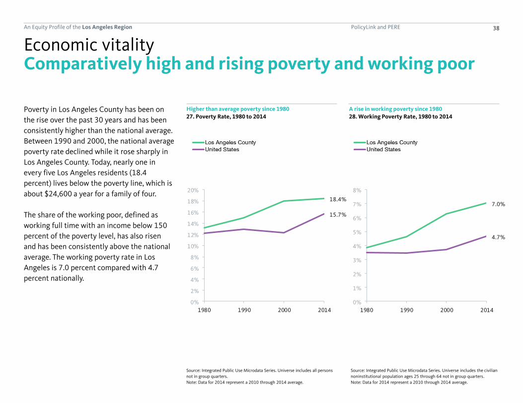
Poverty in Los Angeles County has been on
the rise over the past 30 years and has been
consistently higher than the national average.
Between 1990 and 2000, the national average
poverty rate declined while it rose sharply in
Los Angeles County. Today, nearly one in
every five Los Angeles residents (18.4
percent) lives below the poverty line, which is
about $24,600 a year for a family of four.
The share of the working poor, defined as
working full time with an income below 150
percent of the poverty level, has also risen
and has been consistently above the national
average. The working poverty rate in Los
Angeles is 7.0 percent compared with 4.7
percent nationally.
Higher than average poverty since 1980
Economic vitality
27. Poverty Rate, 1980 to 2014
Source: Integrated Public Use Microdata Series. Universe includes the civilian
noninstitutional population ages 25 through 64 not in group quarters.
Note: Data for 2014 represent a 2010 through 2014 average.
Source: Integrated Public Use Microdata Series. Universe includes all persons
not in group quarters.
Note: Data for 2014 represent a 2010 through 2014 average.
A rise in working poverty since 1980
28. Working Poverty Rate, 1980 to 2014

PolicyLink and PERE 39An Equity Profile of the Los Angeles Region
Brownsville-Harlingen, TX: #1 (14%)
Los Angeles County: #9 (7%)
Boston-Cambridge-Quincy, MA-NH: #150 (2%)
Los Angeles County has the 9th highest rate of
working poor among the largest 150 metros.
Compared with other metro regions in
California, the working poverty rate in Los
Angeles County (7 percent) is higher than in
San Diego (4 percent), the Bay Area (3
percent), and San Jose (3 percent), but lower
than in Visalia (10 percent), Bakersfield (8
percent), and Fresno (8 percent).
Los Angeles County’s poverty rate of 18
percent places it 29th among the largest 150
metros.
Los Angeles County has the 9th highest working poverty rate
Economic vitality
29. Working Poverty Rate in 2014: Largest 150 Metros Ranked
Source: Integrated Public Use Microdata Series. Universe includes the civilian noninstitutional population ages 25 through 64 not in group quarters.
Note: Data represent a 2010 through 2014 average.
Comparatively high and rising poverty and working poor(continued)
PolicyLink and PERE 40An Equity Profile of the Los Angeles Region
18.4%
10.6%
24.5%
23.7%
12.8%
18.4%
13.9%
0%
5%
10%
15%
20%
25%
7.0%
1.9%
4.3%
12.5%
3.6%
2.7%3.1%
0%
2%
4%
6%
8%
10%
12%
14%
7.0%
1.9%
4.3%
12.5%
3.6%
2.7%3.1%
0%
2%
4%
6%
8%
10%
12%
14%
AllWhiteBlackLatinoAsian or Pacific IslanderNative AmericanMixed/other
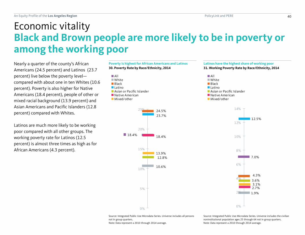
Black and Brown people are more likely to be in poverty or among the working poorNearly a quarter of the county’s African
Americans (24.5 percent) and Latinos (23.7
percent) live below the poverty level—
compared with about one in ten Whites (10.6
percent). Poverty is also higher for Native
Americans (18.4 percent), people of other or
mixed racial background (13.9 percent) and
Asian Americans and Pacific Islanders (12.8
percent) compared with Whites.
Latinos are much more likely to be working
poor compared with all other groups. The
working poverty rate for Latinos (12.5
percent) is almost three times as high as for
African Americans (4.3 percent).
Poverty is highest for African Americans and Latinos
Economic vitality
30. Poverty Rate by Race/Ethnicity, 2014
Source: Integrated Public Use Microdata Series. Universe includes the civilian
noninstitutional population ages 25 through 64 not in group quarters.
Note: Data represent a 2010 through 2014 average.
Source: Integrated Public Use Microdata Series. Universe includes all persons
not in group quarters.
Note: Data represent a 2010 through 2014 average.
Latinos have the highest share of working poor
31. Working Poverty Rate by Race/Ethnicity, 2014
7.0%
1.9%
4.3%
12.5%
3.6%
2.7%3.1%
0%
2%
4%
6%
8%
10%
12%
14%
AllWhiteBlackLatinoAsian or Pacific IslanderNative AmericanMixed/other

PolicyLink and PERE 41An Equity Profile of the Los Angeles Region
0%
5%
10%
15%
20%
25%
30%
Less than aHS
Diploma
HSDiploma,
no College
SomeCollege,
no Degree
AADegree,no BA
BA Degreeor higher
$0
$10
$20
$30
$40
Less thana
HSDiploma
HSDiploma,
noCollege
SomeCollege,
noDegree
AADegree,no BA
BADegree
or higher
0%
5%
10%
15%
20%
25%
30%
Less than aHS Diploma
HS Diploma,no College
Some College,no Degree
AA Degree,no BA
BA Degreeor higher
AllWhiteBlackLatinoAsian or Pacific Islander
Education can be a leveler, but racial economic gaps persist
In general, unemployment decreases and
wages increase with higher educational
attainment.
In Los Angeles County, African Americans face
higher rates of joblessness at all education
levels. The disparity in joblessness between
African Americans and Whites is greatest
among those who have less than a high
school diploma. The racial gap persists even
among college graduates. Interestingly, while
a relatively small share of the total White
working age population, Whites with a high
school diploma or less actually have higher
rates of jobless than all other groups except
for African Americans.
Among full-time wage and salary workers,
there are racial gaps in median hourly wages
at all education levels, with Whites earning
substantially higher wages than all other
groups. Among college graduates with a BA or
higher, Blacks and Asian Americans and
Pacific Islanders earn $6/hour less than their
White counterparts while Latinos earn
$9/hour less.
At every education level, all people of color have lower wages than Whites and Blacks have highest unemployment
Economic vitality
32. Unemployment Rate by Educational Attainment and
Race/Ethnicity, 2014
Source: Integrated Public Use Microdata Series. Universe includes civilian
noninstitutional full-time wage and salary workers ages 25 through 64.
Note: Data represent a 2010 through 2014 average.
Source: Integrated Public Use Microdata Series. Universe includes the civilian
noninstitutional population ages 25 through 64.
Note: Data represent a 2010 through 2014 average.
33. Median Hourly Wage by Educational Attainment and
Race/Ethnicity, 2014 (in 2010 dollars)
0%
5%
10%
15%
20%
25%
30%
Less than aHS Diploma
HS Diploma,no College
Some College,no Degree
AA Degree,no BA
BA Degreeor higher
AllWhiteBlackLatinoAsian or Pacific Islander

PolicyLink and PERE 42An Equity Profile of the Los Angeles Region
17.9%
12.9%
10.0%
8.5%
6.8%
16.7%
11.3%
10.3%
8.6%
6.5%
9.2%
10.2%
10.5%
8.6%
5.9%
14.4%
11.6%
10.6%
8.5%
6.1%
Less than aHS Diploma
HS Diploma,no College
Some College,no Degree
AA Degree,no BA
BA Degreeor higher
$17
$21
$25
$28
$36
$15
$18
$21
$22
$29
$11
$14
$18
$20
$28
$9
$13
$16
$18
$25
Less than aHS Diploma
HS Diploma,no College
Some College,no Degree
AA Degree,no BA
BA Degreeor higher
14.3%
8.5%
6.3%
3.0%
10.5%
6.8%
5.5%
2.9%
14.6%
11.8%
5.9%
6.1%
18.1%
10.5%
9.1%
6.8%
Less than a HS Diploma
HS Diploma, no College
More than HS Diploma, Less than BA
BA Degree or higher
Women of colorMen of colorWhite womenWhite men
14.3%
8.5%
6.3%
3.0%
10.5%
6.8%
5.5%
2.9%
14.6%
11.8%
5.9%
6.1%
18.1%
10.5%
9.1%
6.8%
Less than a HS Diploma
HS Diploma, no College
More than HS Diploma, Less than BA
BA Degree or higher
Women of colorMen of colorWhite womenWhite men
There is also a gender gap in work and pay
While unemployment rates are quite similar
by race/ethnicity and gender among those
with higher levels of education, among those
with a high school diploma or less, men of
color actually have the lowest unemployment
rates in Los Angeles County while White men
and women along with women of color have
higher rates. Of course, this finding is largely
driven by low unemployment for Latinos and
Asian Americans and Pacific Islander men and
does not reflect the experience of Black men.
Across the board, women of color have the
lowest median hourly wages. College-
educated women of color with a BA degree or
higher earn $11 an hour less than their White
male counterparts.
Women of color and White women earn less than their male counterparts at every education level
Economic vitality
34. Unemployment Rate by Educational Attainment,
Race/Ethnicity and Gender, 2014
Source: Integrated Public Use Microdata Series. Universe includes civilian
noninstitutional full-time wage and salary workers ages 25 through 64.
Note: Data represent a 2010 through 2014 average.
Source: Integrated Public Use Microdata Series. Universe includes the civilian
noninstitutional population ages 25 through 64.
Note: Data represent a 2010 through 2014 average.
35. Median Hourly Wage by Educational Attainment,
Race/Ethnicity and Gender, 2014

PolicyLink and PERE 43An Equity Profile of the Los Angeles Region
15%
-1%
-27%
12%
6%
38%
Jobs Earnings per worker
46%
15%
49%
24%
31%
45%
Jobs Earnings per worker
Low-wage
Middle-wage
High-wage
The region is losing middle-wage jobs
Similar to the U.S. economy as a whole, Los
Angeles County has experienced growth in
low-wage jobs (15 percent) and high-wage
jobs (6 percent) since 1990. Middle-wage jobs
have decreased by 27 percent.
Wages have increased by an inflation-adjusted
38 percent for high-wage workers and by 12
percent for middle-wage workers. Wages for
low-wage workers fell by 1 percent.
Low-wage jobs are growing fastest, but high-wage jobs had the most wage growth
Economic vitality
36. Growth in Jobs and Earnings by Industry Wage Level, 1990 to 2012
Sources: U.S. Bureau of Labor Statistics; Woods & Poole Economics, Inc. Universe includes all jobs covered by the federal Unemployment Insurance (UI) program.

PolicyLink and PERE 44An Equity Profile of the Los Angeles Region
Wage growth in Los Angeles County has been
uneven across industry sectors since 1990.
High-wage industries like mining, arts and
entertainment, and management have
experienced significant increases in annual
earnings.
Among middle-wage industries,
finance/insurance, real estate, and
manufacturing experienced the highest
increases in annual earnings.
Among the low-wage industries, workers in
education services, agriculture, and
administrative support have seen increases in
earnings. Those in retail trade and other
services have experienced a decline in
earnings.
Wage growth fast at the top, slow at the bottom
A widening wage gap by industry sector
Economic vitality
37. Industries by Wage-Level Category in 1990
Sources: U.S. Bureau of Labor Statistics; Woods & Poole Economics, Inc. Universe includes all jobs covered by the federal Unemployment Insurance (UI) program.
Average Annual
Earnings
Average Annual
Earnings
Percent
Change in
Earnings
Share of
Jobs
Wage Category Industry 1990 ($2012) 2012 ($2012)
1990-
2012 2012
Mining $82,891 $164,115 98%
Information $74,215 $101,056 36%
Utilities $74,210 $100,422 35%
Professional, Scientific, and Technical Services $68,579 $90,183 32%
Management of Companies and Enterprises $65,648 $99,073 51%
Arts, Entertainment, and Recreation $63,909 $104,378 63%
Finance and Insurance $62,321 $102,679 65%
Wholesale Trade $58,672 $58,540 0%
Construction $54,361 $55,764 3%
Manufacturing $51,905 $59,729 15%
Transportation and Warehousing $51,445 $52,391 2%
Health Care and Social Assistance $49,979 $51,782 4%
Real Estate and Rental and Leasing $48,933 $58,394 19%
Retail Trade $34,633 $32,084 -7%
Administrative and Support and Waste
Management and Remediation Services$31,389 $36,981 18%
Education Services $30,531 $50,174 64%
Other Services (except Public Administration) $30,178 $21,708 -28%
Agriculture, Forestry, Fishing and Hunting $25,482 $31,304 23%
Accommodation and Food Services $19,318 $20,162 4%
Low 40%
High 18%
Middle 43%

PolicyLink and PERE 45An Equity Profile of the Los Angeles Region
Identifying the region’s strong industries
Understanding which industries are strong
and competitive in the region is critical for
developing effective strategies to attract and
grow businesses. To identify strong industries
in the region, 19 industry sectors were
categorized according to an “industry
strength index” that measures four
characteristics: size, concentration, job
quality, and growth. Each characteristic was
given an equal weight (25 percent each) in
determining the index value. “Growth” was an
average of three indicators of growth (change
in the number of jobs, percent change in the
number of jobs, and wage growth). These
characteristics were examined over the last
decade to provide a current picture of how
the region’s economy is changing.
Economic vitality
Note: This industry strength index is only meant to provide general guidance on the strength of various industries in the region, and its interpretation should be
informed by an examination of individual metrics used in its calculation, which are presented in the table on the next page. Each indicator was normalized as a cross-
industry z-score before taking a weighted average to derive the index.
Size + Concentration+ Job quality + Growth(2012) (2012) (2012) (2002 to 2012)
Industry strength index =
Total Employment
The total number of jobs
in a particular industry.
Location Quotient
A measure of
employment
concentration calculated
by dividing the share of
employment for a
particular industry in the
region by its share
nationwide. A score >1
indicates higher-than-
average concentration.
Average Annual Wage
The estimated total
annual wages of an
industry divided by its
estimated total
employment.
Change in the number
of jobs
Percent change in the
number of jobs
Real wage growth
PolicyLink and PERE 46An Equity Profile of the Los Angeles Region
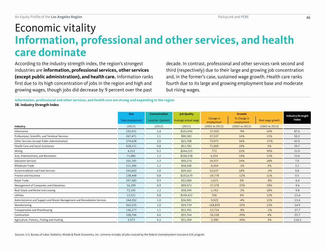
According to the industry strength index, the region’s strongest
industries are information, professional services, other services
(except public administration), and health care. Information ranks
first due to its high concentration of jobs in the region and high and
growing wages, though jobs did decrease by 9 percent over the past
Information, professional and other services, and health care dominate
Economic vitality
Sources: U.S. Bureau of Labor Statistics; Woods & Poole Economics, Inc. Universe includes all jobs covered by the federal Unemployment Insurance (UI) program.
decade. In contrast, professional and other services rank second and
third (respectively) due to their large and growing job concentration
and, in the former’s case, sustained wage growth. Health care ranks
fourth due to its large and growing employment base and moderate
but rising wages.
Information, professional and other services, and health care are strong and expanding in the region
38. Industry Strength Index
Size Concentration Job Quality
Total employment Location Quotient Average annual wageChange in
employment
% Change in
employmentReal wage growth
Industry (2012) (2012) (2012) (2002 to 2012) (2002 to 2012) (2002 to 2012)
Information 192,031 2.4 $101,056 -17,935 -9% 10% 87.6
Professional, Scientific, and Technical Services 267,471 1.1 $90,183 37,537 16% 11% 50.2
Other Services (except Public Administration) 274,628 2.0 $21,708 73,075 36% -17% 43.9
Health Care and Social Assistance 428,211 0.8 $51,782 71,009 20% 5% 39.7
Mining 4,312 0.2 $164,115 772 22% 50% 31.9
Arts, Entertainment, and Recreation 71,085 1.2 $104,378 6,354 10% 12% 23.6
Education Services 101,765 1.3 $50,174 19,557 24% 18% 7.0
Wholesale Trade 211,286 1.2 $58,540 -6,454 -3% 3% 3.2
Accommodation and Food Services 342,602 1.0 $20,162 52,637 18% -2% 0.8
Finance and Insurance 138,448 0.8 $102,679 -19,778 -12% 11% 0.5
Retail Trade 397,383 0.9 $32,084 -1,671 0% -8% -6.4
Management of Companies and Enterprises 56,299 0.9 $99,073 -27,378 -33% 29% -9.6
Real Estate and Rental and Leasing 72,195 1.2 $58,394 -1,762 -2% 18% -9.8
Utilities 12,521 0.8 $100,422 700 6% 12% -13.4
Administrative and Support and Waste Management and Remediation Services 244,302 1.0 $36,981 -9,925 -4% 11% -13.6
Manufacturing 365,525 1.0 $59,729 -168,839 -32% 12% -14.9
Transportation and Warehousing 136,177 1.1 $52,391 -13,714 -9% -1% -27.7
Construction 108,706 0.6 $55,764 -26,538 -20% 4% -55.7
Agriculture, Forestry, Fishing and Hunting 5,573 0.2 $31,304 -2,390 -30% 2% -116.3
Growth Industry Strength
Index

PolicyLink and PERE 47An Equity Profile of the Los Angeles Region
Identifying high-opportunity occupations
Understanding which occupations are strong
and competitive in the region can help
leaders develop strategies to connect and
prepare workers for good jobs. To identify
“high-opportunity” occupations in the region,
we developed an “occupation opportunity
index” based on measures of job quality and
growth, including median annual wage, wage
growth, job growth (in number and share),
and median age of workers. A high median
age of workers indicates that there will be
replacement job openings as older workers
retire.
Job quality, measured by the median annual
wage, accounted for two-thirds of the
occupation opportunity index, and growth
accounted for the other one-third. Within the
growth category, half was determined by
wage growth and the other half was divided
equally between the change in number of
jobs, percent change in the number jobs, and
median age of workers.
Economic vitality
Note: Each indicator was normalized as a cross-occupation z-score before taking a weighted average to derive the index.
+ Growth
Median age of
workers
Occupation opportunity index =
Median Annual Wage
Job quality
Real wage growth
Change in the
number of jobs
Percent change in
the number of jobs

PolicyLink and PERE 48An Equity Profile of the Los Angeles Region
Identifying high-opportunity occupations
Once the occupation opportunity index score
was calculated for each occupation,
occupations were sorted into three categories
(high-, middle-, and low-opportunity). The
average index score is zero, so an occupation
with a positive value has an above-average
score while a negative value represents a
below-average score.
Because education level plays such a large
role in determining access to jobs, we present
the occupational analysis for each of three
educational attainment levels: workers with a
high school degree or less, workers with more
than a high school degree but less than a BA,
and workers with a BA or higher.
Economic vitality
(continued)
Note: The occupation opportunity index and the three broad categories drawn from it are only meant to provide general guidance on the level of opportunity
associated with various occupations in the region, and its interpretation should be informed by an examination of individual metrics used in its calculation, which
are presented in the tables on the following pages.
High-opportunity(17 occupations)
Middle-opportunity(30 occupations)
Low-opportunity(32 occupations)
All jobs(2011)

PolicyLink and PERE 49An Equity Profile of the Los Angeles Region
High-opportunity occupations for workers with a high school degree or lessSupervisorial and construction positions are high-opportunity jobs for workers without postsecondary education
Economic vitality
39. Occupation Opportunity Index: Occupations by Opportunity Level for Workers with a High School Degree or Less
Sources: U.S. Bureau of Labor Statistics; Integrated Public Use Microdata Series. Universe includes all nonfarm wage and salary jobs for which the typical worker is estimated to have a high school degree or less.
Note: Data and analysis reflect the Los Angeles-Long Beach-Santa Ana Metropolitan Statistical Area, which includes Los Angeles and Orange counties.
Job Quality
Median Annual
WageReal Wage Growth
Change in
Employment
% Change in
EmploymentMedian Age
Occupation (2011) (2011) (2011) (2005-11) (2005-11) (2010)
Supervisors of Construction and Extraction Workers 11,740 $72,300 5.7% -5,550 -32.1% 45 0.55
Other Construction and Related Workers 8,390 $60,076 12.9% -2,340 -21.8% 44 0.37
Supervisors of Production Workers 21,720 $52,050 3.6% -7,490 -25.6% 45 0.03
Supervisors of Transportation and Material Moving Workers 17,050 $51,274 -1.3% 280 1.7% 41 -0.05
Other Installation, Maintenance, and Repair Occupations 78,740 $42,209 10.6% -390 -0.5% 42 -0.10
Supervisors of Building and Grounds Cleaning and Maintenance Workers 8,350 $41,731 -3.1% -750 -8.2% 46 -0.27
Construction Trades Workers 113,180 $48,205 5.8% -57,190 -33.6% 37 -0.34
Vehicle and Mobile Equipment Mechanics, Installers, and Repairers 40,390 $42,326 -3.2% -8,730 -17.8% 40 -0.37
Motor Vehicle Operators 113,060 $32,947 3.7% -19,520 -14.7% 42 -0.52
Nursing, Psychiatric, and Home Health Aides 64,170 $24,735 3.9% 12,120 23.3% 44 -0.52
Metal Workers and Plastic Workers 62,830 $32,492 1.6% -15,550 -19.8% 43 -0.53
Other Protective Service Workers 77,880 $26,317 4.9% -620 -0.8% 38 -0.62
Personal Appearance Workers 15,280 $23,208 6.5% 700 4.8% 41 -0.63
Woodworkers 6,030 $25,911 4.0% -5,230 -46.4% 44 -0.64
Assemblers and Fabricators 60,970 $25,371 5.1% -11,780 -16.2% 43 -0.64
Other Production Occupations 98,980 $27,659 10.4% -33,650 -25.4% 40 -0.64
Other Personal Care and Service Workers 60,010 $25,295 -3.2% 7,210 13.7% 43 -0.65
Printing Workers 12,050 $32,756 -5.6% -7,060 -36.9% 40 -0.66
Material Recording, Scheduling, Dispatching, and Distributing Workers 182,520 $31,562 -2.9% -15,190 -7.7% 37 -0.68
Animal Care and Service Workers 5,540 $22,387 3.7% 1,590 40.3% 35 -0.72
Building Cleaning and Pest Control Workers 106,260 $21,890 0.1% -1,580 -1.5% 43 -0.74
Supervisors of Food Preparation and Serving Workers 35,680 $28,353 -10.7% 3,950 12.4% 37 -0.77
Grounds Maintenance Workers 33,690 $24,127 -0.2% -6,310 -15.8% 39 -0.78
Food Processing Workers 26,340 $23,199 -2.2% 420 1.6% 38 -0.79
Helpers, Construction Trades 7,260 $27,372 -5.8% -3,320 -31.4% 35 -0.83
Material Moving Workers 181,290 $24,322 5.5% -38,080 -17.4% 36 -0.85
Textile, Apparel, and Furnishings Workers 51,320 $21,265 0.8% -23,280 -31.2% 41 -0.89
Cooks and Food Preparation Workers 126,620 $20,477 -3.1% 4,600 3.8% 34 -0.90
Food and Beverage Serving Workers 220,790 $18,874 -1.4% 12,850 6.2% 27 -0.97
Other Food Preparation and Serving Related Workers 62,430 $18,757 -1.3% 3,640 6.2% 29 -0.98
Retail Sales Workers 313,930 $21,407 -4.1% -11,000 -3.4% 29 -1.03Other Transportation Workers 17,520 $21,656 -21.4% 140 0.8% 38 -1.11
Employment
GrowthOccupation
Opportunity Index
High-
Opportunity
Middle-
Opportunity
Low-
Opportunity
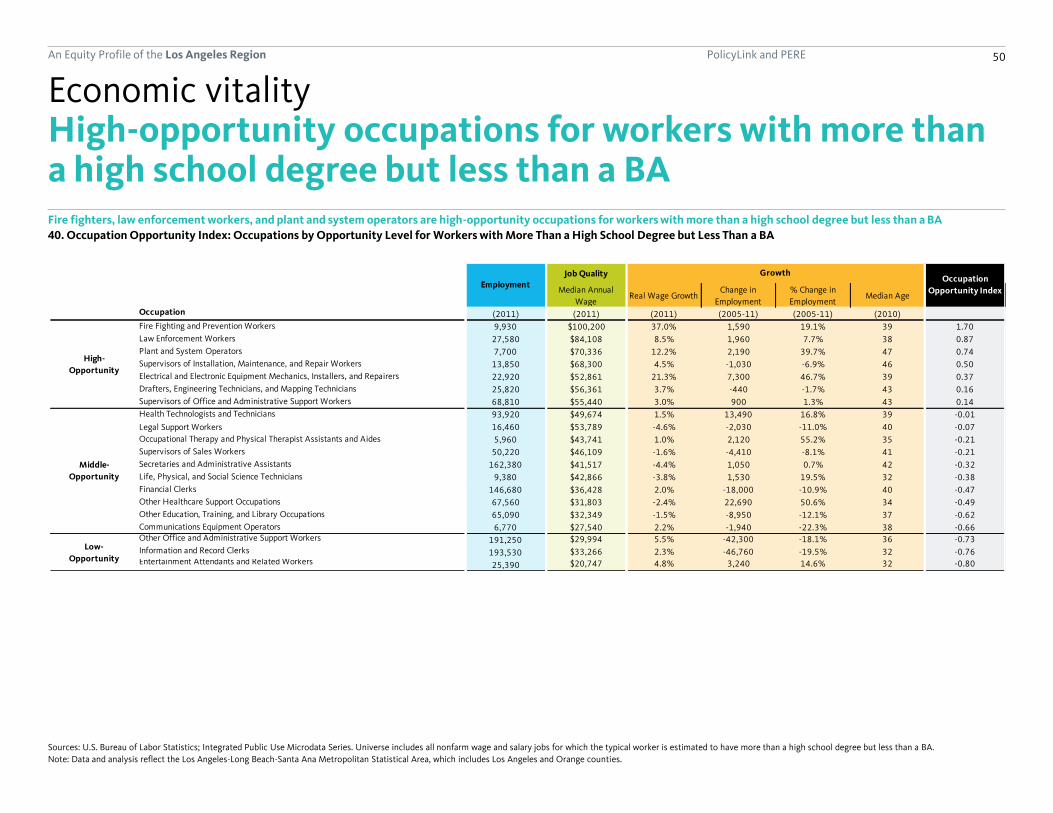
PolicyLink and PERE 50An Equity Profile of the Los Angeles Region
High-opportunity occupations for workers with more than a high school degree but less than a BAFire fighters, law enforcement workers, and plant and system operators are high-opportunity occupations for workers with more than a high school degree but less than a BA
Economic vitality
40. Occupation Opportunity Index: Occupations by Opportunity Level for Workers with More Than a High School Degree but Less Than a BA
Sources: U.S. Bureau of Labor Statistics; Integrated Public Use Microdata Series. Universe includes all nonfarm wage and salary jobs for which the typical worker is estimated to have more than a high school degree but less than a BA.
Note: Data and analysis reflect the Los Angeles-Long Beach-Santa Ana Metropolitan Statistical Area, which includes Los Angeles and Orange counties.
Job Quality
Median Annual
WageReal Wage Growth
Change in
Employment
% Change in
EmploymentMedian Age
Occupation (2011) (2011) (2011) (2005-11) (2005-11) (2010)
Fire Fighting and Prevention Workers 9,930 $100,200 37.0% 1,590 19.1% 39 1.70
Law Enforcement Workers 27,580 $84,108 8.5% 1,960 7.7% 38 0.87
Plant and System Operators 7,700 $70,336 12.2% 2,190 39.7% 47 0.74
Supervisors of Installation, Maintenance, and Repair Workers 13,850 $68,300 4.5% -1,030 -6.9% 46 0.50
Electrical and Electronic Equipment Mechanics, Installers, and Repairers 22,920 $52,861 21.3% 7,300 46.7% 39 0.37
Drafters, Engineering Technicians, and Mapping Technicians 25,820 $56,361 3.7% -440 -1.7% 43 0.16
Supervisors of Office and Administrative Support Workers 68,810 $55,440 3.0% 900 1.3% 43 0.14
Health Technologists and Technicians 93,920 $49,674 1.5% 13,490 16.8% 39 -0.01
Legal Support Workers 16,460 $53,789 -4.6% -2,030 -11.0% 40 -0.07
Occupational Therapy and Physical Therapist Assistants and Aides 5,960 $43,741 1.0% 2,120 55.2% 35 -0.21
Supervisors of Sales Workers 50,220 $46,109 -1.6% -4,410 -8.1% 41 -0.21
Secretaries and Administrative Assistants 162,380 $41,517 -4.4% 1,050 0.7% 42 -0.32
Life, Physical, and Social Science Technicians 9,380 $42,866 -3.8% 1,530 19.5% 32 -0.38
Financial Clerks 146,680 $36,428 2.0% -18,000 -10.9% 40 -0.47
Other Healthcare Support Occupations 67,560 $31,803 -2.4% 22,690 50.6% 34 -0.49
Other Education, Training, and Library Occupations 65,090 $32,349 -1.5% -8,950 -12.1% 37 -0.62
Communications Equipment Operators 6,770 $27,540 2.2% -1,940 -22.3% 38 -0.66Other Office and Administrative Support Workers 191,250 $29,994 5.5% -42,300 -18.1% 36 -0.73Information and Record Clerks 193,530 $33,266 2.3% -46,760 -19.5% 32 -0.76Entertainment Attendants and Related Workers 25,390 $20,747 4.8% 3,240 14.6% 32 -0.80
Low-
Opportunity
Employment
GrowthOccupation
Opportunity Index
High-
Opportunity
Middle-
Opportunity

PolicyLink and PERE 51An Equity Profile of the Los Angeles Region
High-opportunity occupations for workers with a BA degree or higherLegal fields, executives, and operations specialties managers are all high-opportunity occupations for workers with a BA degree or higher
Economic vitality
41. Occupation Opportunity Index: Occupations by Opportunity Level for Workers with a BA Degree or Higher
Sources: U.S. Bureau of Labor Statistics; Integrated Public Use Microdata Series. Universe includes all nonfarm wage and salary jobs for which the typical worker is estimated to have a BA degree or higher.
Note: Data and analysis reflect the Los Angeles-Long Beach-Santa Ana Metropolitan Statistical Area, which includes Los Angeles and Orange counties.
Job Quality
Median Annual
WageReal Wage Growth
Change in
Employment
% Change in
EmploymentMedian Age
Occupation (2011) (2011) (2011) (2005-11) (2005-11) (2010)
Lawyers, Judges, and Related Workers 31,540 $150,730 2.7% 4,980 18.8% 45 2.54
Top Executives 103,890 $121,794 1.7% 5,070 5.1% 46 1.81
Operations Specialties Managers 71,980 $112,066 9.6% 3,990 5.9% 42 1.63
Entertainers and Performers, Sports and Related Workers 62,380 $89,597 42.7% 17,720 39.7% 37 1.59
Advertising, Marketing, Promotions, Public Relations, and Sales Managers 37,540 $113,718 2.2% 1,620 4.5% 39 1.52
Health Diagnosing and Treating Practitioners 154,330 $99,490 10.3% 23,100 17.6% 45 1.46
Engineers 68,830 $97,233 9.2% 12,070 21.3% 45 1.35
Other Management Occupations 85,150 $93,823 16.0% 30 0.0% 44 1.28
Postsecondary Teachers 55,900 $82,649 3.5% 8,100 16.9% 44 0.88
Computer Occupations 134,380 $81,901 4.4% 12,800 10.5% 38 0.81
Architects, Surveyors, and Cartographers 5,990 $81,328 7.3% -2,230 -27.1% 44 0.81
Social Scientists and Related Workers 11,790 $78,458 9.2% -7,150 -37.8% 43 0.72
Physical Scientists 8,820 $77,037 1.5% 2,350 36.3% 40 0.66
Sales Representatives, Services 67,770 $58,289 11.2% 42,200 165.0% 41 0.65
Life Scientists 11,400 $71,764 1.2% 5,430 91.0% 40 0.60
Business Operations Specialists 174,520 $67,175 5.6% 25,430 17.1% 41 0.55
Financial Specialists 108,980 $67,022 1.7% 13,910 14.6% 42 0.46
Media and Communication Equipment Workers 21,930 $63,615 13.4% 5,300 31.9% 36 0.46
Air Transportation Workers 9,020 $69,467 -13.1% 4,610 104.5% 46 0.43
Art and Design Workers 38,550 $60,509 10.5% 5,420 16.4% 37 0.33
Media and Communication Workers 30,860 $59,304 8.6% 5,150 20.0% 38 0.29
Sales Representatives, Wholesale and Manufacturing 75,830 $60,807 5.4% -4,070 -5.1% 42 0.27
Preschool, Primary, Secondary, and Special Education School Teachers 133,110 $62,645 6.4% -15,120 -10.2% 41 0.26
Librarians, Curators, and Archivists 7,010 $54,205 3.5% -1,620 -18.8% 44 0.10
Counselors, Social Workers, and Other Community and Social Service Specialists 61,730 $47,022 5.9% 16,540 36.6% 39 0.03
Other Teachers and Instructors 47,300 $46,991 -5.9% 7,640 19.3% 35 -0.25
Other Sales and Related Workers 37,740 $40,352 -4.0% 3,640 10.7% 45 -0.29
Employment
GrowthOccupation
Opportunity Index
High-
Opportunity
Middle-
Opportunity

PolicyLink and PERE 52An Equity Profile of the Los Angeles Region
14%
24% 27%
42%
16%22% 20% 20%
27%
40%40%
45%
24%
31%39%
30%
58% 36% 33% 13% 60% 46% 40% 50%
White Black Latino, U.S.-born
Latino,Immigrant
API, U.S.-born
API,Immigrant
NativeAmerican
Other
15%
30%
26%
42%
19%
27%22%
21%
29%
35%41%
44%
21%
22% 30%31%
56%35%
33%14%
61%51%
48%47%
White Black Latino, U.S.-born
Latino, Immigrant
API, U.S.-born
API, Immigrant
Native American
Other
High-opportunity
Middle-opportunity
Low-opportunity
Latinos and African Americans have the least access to high-opportunity jobsExamining access to high-opportunity jobs by
race/ethnicity and nativity, we find that U.S.-
born Asians and Whites are most likely to be
employed in the region’s high-opportunity
occupations. Latinos, both immigrant and
U.S.-born, and African Americans are the least
likely to be in high-opportunity occupations
and most likely to be in low-opportunity
occupations.
Differences in education levels play a large
role in determining access to high-
opportunity jobs, but racial discrimination,
work experience, and social networks are also
contributing factors. For immigrants, legal
status and English language ability are
additional factors.
Latinos (both immigrant and U.S.-born) and African Americans are least likely to access high-opportunity jobs
Economic vitality
42. Opportunity Ranking of Occupations by Race/Ethnicity and Nativity, All Workers
Sources: U.S. Bureau of Labor Statistics; Integrated Public Use Microdata Series. Universe includes the employed civilian non institutional population ages 25
through 64. Note: While data on workers is from the Los Angeles County, the opportunity ranking for each worker’s occupation is based on analysis of the Los
Angeles-Long Beach-Santa Ana Metropolitan Statistical Area, which includes Los Angeles and Orange counties.

PolicyLink and PERE 53An Equity Profile of the Los Angeles Region
26%
35% 37%
47%40%
43%
29%32%
46%
51% 48%
46%
39%
43% 59%
44%
28% 14% 15% 7% 21% 13% 12% 24%
White Black Latino,U.S.-born
Latino,Immigrant
API, U.S.-born
API,Immigrant
NativeAmerican
Other
Access to high-opportunity jobs by race for workers with a high school degree or lessAmong workers with a high school degree or
less, Whites, people of other or mixed racial
backgrounds, and U.S.-born Asians are most
likely to be in high-opportunity jobs. Latino
and Asian immigrants, Blacks, U.S.-born
Latinos, and Native Americans are the least
likely to be in high-opportunity jobs. Latino
and Asian immigrants are most likely to be in
low-opportunity jobs.
Of those with lower education levels, Latinos, Asian immigrants, African Americans, and Native Americans are least likely
to access high-opportunity jobs
Economic vitality
43. Opportunity Ranking of Occupations by Race/Ethnicity and Nativity, Workers with Low Educational Attainment
Sources: U.S. Bureau of Labor Statistics; Integrated Public Use Microdata Series. Universe includes the employed civilian noninstitutional population ages 25
through 64 with a high school degree or less. Note: While data on workers is from the Los Angeles County, the opportunity ranking for each worker’s occupation is
based on analysis of the Los Angeles-Long Beach-Santa Ana Metropolitan Statistical Area, which includes Los Angeles and Orange counties.
26%
44%
34%
46% 60%
34%
45%
43%
48%
47%
28%
44%
29%13%
18% 7% 12%
23%
White Black Latino, U.S.-born Latino, Immigrant API, Immigrant Other
High-opportunity
Middle-opportunity
Low-opportunity

PolicyLink and PERE 54An Equity Profile of the Los Angeles Region
19%
28% 26%31%
26% 26%21%
25%
37%
43%42%
46%
37%41%
39% 36%
44% 29% 32% 23% 37% 33% 40% 39%
White Black Latino, U.S.-born
Latino,Immigrant
API, U.S.-born
API,Immigrant
NativeAmerican
Other
18%
30%
24%
34%28%
36% 26%
39%
41%
43%
43%
38%
37%
35%
43% 29%33% 22%
34%
27%
38%
White Black Latino, U.S.-born
Latino, Immigrant
API, U.S.-born API, Immigrant Other
High-opportunity
Middle-opportunity
Low-opportunity
Access to high-opportunity jobs by race for workers with more than a high school degree but less than a BA
Among workers with middle education levels,
Whites, Native Americans, people of other or
mixed race backgrounds, and U.S.-born Asians
are most likely to be found in high-
opportunity jobs. Latino immigrants have the
least access to high-opportunity jobs and
along with African Americans are most likely
to be concentrated in low-opportunity jobs.
Both U.S.-born and immigrant Latinos along
with African Americans are both most likely
to be in middle-opportunity jobs.
Of those with middle education levels, Latino immigrants, African Americans, Asian immigrants, and U.S.-born Latinos
are least likely to access high-opportunity jobs
Economic vitality
44. Opportunity Ranking of Occupations by Race/Ethnicity and Nativity, Workers with Middle Educational Attainment
Sources: U.S. Bureau of Labor Statistics; Integrated Public Use Microdata Series. Universe includes the employed civilian non institutional population ages 25
through 64 with more than a high school degree but less than a BA. Note: While data on workers is from the Los Angeles County, the opportunity ranking for each
worker’s occupation is based on analysis of the Los Angeles-Long Beach-Santa Ana Metropolitan Statistical Area, which includes Los Angeles and Orange counties.

PolicyLink and PERE 55An Equity Profile of the Los Angeles Region
8% 10% 9%
20%
9%12% 9% 10%
16%
25%22%
30%
16%
23%19% 18%
76% 65% 69% 50% 75% 65% 71% 72%
White Black Latino, U.S.-born
Latino,Immigrant
API, U.S.-born
API,Immigrant
NativeAmerican
Other
7%11% 8%
17%
9%9% 9%
11%
15%
14%
25%
12% 14%
19%
81%
74%
78%
58% 79% 77%72%
White Black Latino, U.S.-born
Latino, Immigrant
API, U.S.-born API, Immigrant Other
High-opportunity
Middle-opportunity
Low-opportunity
Even among college graduates, Blacks and Latinos have less access to high-opportunity jobsWhile the majority of all workers with a BA
degree or higher are in high-opportunity jobs,
substantial differences between groups by
race/ethnicity and nativity persist.
Whites and native-born Asians are most likely
to be in high-opportunity occupations,
followed by people of other or mixed race
background, Native Americans, U.S.-born
Latinos, Blacks, and immigrant Asians. Latino
immigrants with college degrees have the
least access to high-opportunity jobs and the
highest representation in both low- and
middle-opportunity occupations.
Differences in occupational opportunity by race/ethnicity and nativity persist for college-educated workers
Economic vitality
45. Opportunity Ranking of Occupations by Race/Ethnicity and Nativity, Workers with High Educational Attainment
Sources: U.S. Bureau of Labor Statistics; Integrated Public Use Microdata Series. Universe includes the employed civilian non institutional population ages 25
through 64 with a BA degree or higher. Note: While data on workers is from the Los Angeles County, the opportunity ranking for each worker’s occupation is based
on analysis of the Los Angeles-Long Beach-Santa Ana Metropolitan Statistical Area, which includes Los Angeles and Orange counties.

PolicyLink and PERE 56An Equity Profile of the Los Angeles Region
Readiness
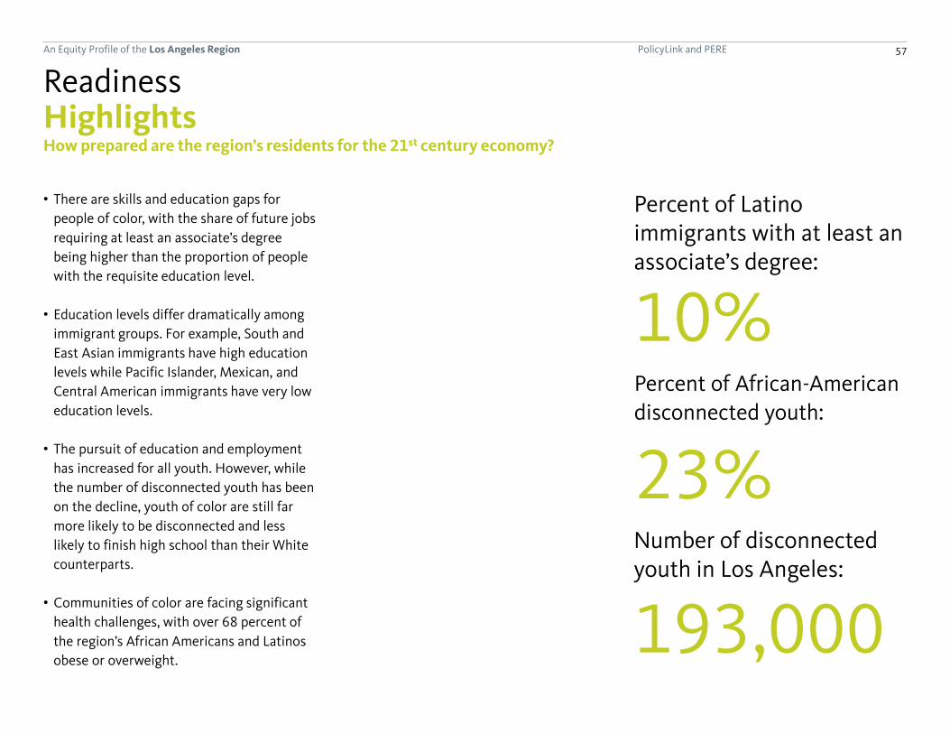
PolicyLink and PERE 57An Equity Profile of the Los Angeles Region
Percent of Latino immigrants with at least an associate’s degree:
10%
Highlights
• There are skills and education gaps for
people of color, with the share of future jobs
requiring at least an associate’s degree
being higher than the proportion of people
with the requisite education level.
• Education levels differ dramatically among
immigrant groups. For example, South and
East Asian immigrants have high education
levels while Pacific Islander, Mexican, and
Central American immigrants have very low
education levels.
• The pursuit of education and employment
has increased for all youth. However, while
the number of disconnected youth has been
on the decline, youth of color are still far
more likely to be disconnected and less
likely to finish high school than their White
counterparts.
• Communities of color are facing significant
health challenges, with over 68 percent of
the region’s African Americans and Latinos
obese or overweight.
Readiness
Number of disconnected youth in Los Angeles:
193,000
Percent of African-American
disconnected youth:
23%
How prepared are the region’s residents for the 21st century economy?
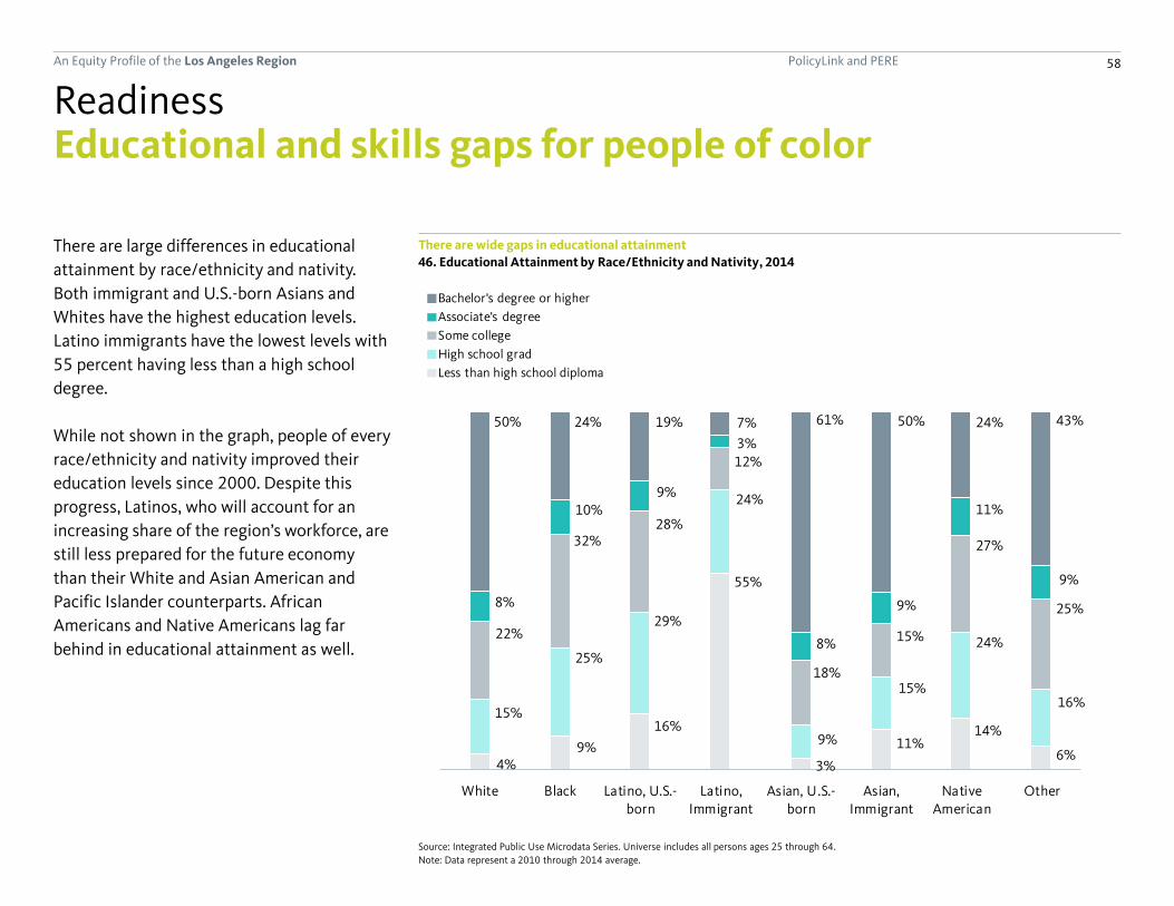
PolicyLink and PERE 58An Equity Profile of the Los Angeles Region
4%9%
16%
55%
3%
11%14%
6%
15%
25%
29%
24%
9%
15%
24%
16%
22%
32%28%
12%
18%
15%
27%
25%8%
10%9%
3%
8%
9%
11%
9%
50% 24% 19% 7% 61% 50% 24% 43%
White Black Latino, U.S.-born
Latino,Immigrant
Asian, U.S.-born
Asian,Immigrant
NativeAmerican
Other
Educational and skills gaps for people of color
There are large differences in educational
attainment by race/ethnicity and nativity.
Both immigrant and U.S.-born Asians and
Whites have the highest education levels.
Latino immigrants have the lowest levels with
55 percent having less than a high school
degree.
While not shown in the graph, people of every
race/ethnicity and nativity improved their
education levels since 2000. Despite this
progress, Latinos, who will account for an
increasing share of the region’s workforce, are
still less prepared for the future economy
than their White and Asian American and
Pacific Islander counterparts. African
Americans and Native Americans lag far
behind in educational attainment as well.
There are wide gaps in educational attainment
Readiness
46. Educational Attainment by Race/Ethnicity and Nativity, 2014
Source: Integrated Public Use Microdata Series. Universe includes all persons ages 25 through 64.
Note: Data represent a 2010 through 2014 average.
6%
11%
23%
57%
4%
13%
22%
30%
33%
23%
12%
16%
25%
29%
23%
10%
18%
12%
8%
7%
6%
2%
6%
6%
40% 22% 14% 8% 60% 53%
White Black Latino, U.S.-born Latino, Immigrant Asian, U.S.-born Asian, Immigrant
Bachelor's degree or higher
Associate's degree
Some college
High school grad
Less than high school diploma

PolicyLink and PERE 59An Equity Profile of the Los Angeles Region
10%
28%
34% 34%
52%
58% 59%
69%
44%
Latino,Immigrant
Latino, U.S.-born
Black NativeAmerican
Mixed/other White API,Immigrant
API, U.S.-born
Jobs in 2020
Educational and skills gaps for people of color
The region will face a skills gap unless
education levels increase. By 2020, 44
percent of the state's jobs will require an
associate’s degree or higher. Only 10 percent
of Latino immigrants, 28 percent of U.S.-born
Latinos, and 34 percent of Blacks and Native
Americans have reached that level of
education.
The region will face a skills gap unless education levels increase for Latinos, Native Americans, and Blacks
Readiness
47. Share of Working-Age Population with an Associate’s Degree or Higher by Race/Ethnicity and Nativity, 2014, and
Projected Share of Jobs that Require an Associate’s Degree or Higher, 2020
Sources: Georgetown Center for Education and the Workforce; Integrated Public Use Microdata Series. Universe for education levels of workers includes all persons
ages 25 through 64.
Note: Data on education levels by race/ethnicity and nativity represents a 2010 through 2014 average for Los Angeles County while data on educational
requirements for jobs in 2020 are based on statewide projections for California.
(continued)
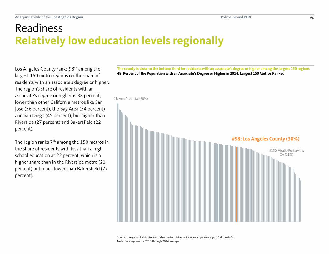
PolicyLink and PERE 60An Equity Profile of the Los Angeles Region
#1: Ann Arbor, MI (60%)
#98: Los Angeles County (38%)
#150: Visalia-Porterville, CA (21%)
The county is close to the bottom third for residents with an associate’s degree or higher among the largest 150 regions
48. Percent of the Population with an Associate’s Degree or Higher in 2014: Largest 150 Metros Ranked
Relatively low education levels regionally
Los Angeles County ranks 98th among the
largest 150 metro regions on the share of
residents with an associate’s degree or higher.
The region’s share of residents with an
associate’s degree or higher is 38 percent,
lower than other California metros like San
Jose (56 percent), the Bay Area (54 percent)
and San Diego (45 percent), but higher than
Riverside (27 percent) and Bakersfield (22
percent).
The region ranks 7th among the 150 metros in
the share of residents with less than a high
school education at 22 percent, which is a
higher share than in the Riverside metro (21
percent) but much lower than Bakersfield (27
percent).
Readiness
Source: Integrated Public Use Microdata Series. Universe includes all persons ages 25 through 64.
Note: Data represent a 2010 through 2014 average.

PolicyLink and PERE 61An Equity Profile of the Los Angeles Region
10%
7%
7%
9%
10%
20%
35%
10%
30%
33%
34%
34%
41%
44%
45%
39%
All Latino Immigrants
Mexican
Honduran
Guatemalan
Salvadoran
Nicaraguan
Costa Rican
Central American (all)
Cuban
Caribbean (all)
Ecuadorian
Peruvian
Chilean
Colombian
Argentinean
South American (all)
59%
19%
23%
37%
52%
56%
58%
68%
57%
53%
64%
66%
76%
60%
54%
65%
69%
78%
74%
All Asian or Pacific Islander Immigrants
Pacific Islander (all)
Cambodian
Vietnamese
Thai
Burmese
Indonesian
Filipino
Southeast Asian (all)
Chinese
Korean
Japanese
Taiwanese
East Asian (all)
Sri Lankan
Bengali
Pakistani
Indian
South Asian (all)
High variation in education levels among immigrants
Latino immigrants from Central America and
Mexico tend to have very low education levels
while those from South America (and to some
extent, the Caribbean) tend to have higher
education levels. For example, less than 10
percent of those from Mexico, Guatemala,
and Honduras have at least an associate’s
degree while more than 40 percent of those
from Argentina, Colombia, and Chile do.
Education levels vary among Asian American
and Pacific Islander immigrants as well: South
and East Asian immigrants tend to have
higher education levels while Southeast Asian
immigrants and Pacific Islander immigrants
have lower levels. For example, only 23
percent of Cambodian immigrants have an
associate’s degree or higher compared to 78
percent of Asian Indian immigrants.
Asian immigrants tend to have higher education levels compared with Latino immigrants, but there are major differences
in educational attainment among immigrants by ancestry
Readiness
49. Asian or Pacific Islander Immigrants, Percent with an
Associate’s Degree or Higher by Ancestry, 2014
Source: Integrated Public Use Microdata Series. Universe includes all persons
ages 25 through 64. Note: Data represent a 2010 through 2014 average.
Source: Integrated Public Use Microdata Series. Universe includes all persons
ages 25 through 64. Note: Data represent a 2010 through 2014 average.
50. Latino Immigrants, Percent with an Associate’s Degree
or Higher by Ancestry, 2014

PolicyLink and PERE 62An Equity Profile of the Los Angeles Region
9%
16%
19%
49%
5%7%
6%
14%
17%
46%
3%4%
2%
7% 8%
28%
1% 2%
White Black Latino, U.S.-born Latino, Immigrant Asian or PacificIslander, U.S.-born
Asian or PacificIslander,
Immigrant
9%
16%
19%
49%
5%7%6%
14%
17%
46%
3%4%
2%
7% 8%
28%
1% 2%
White Black Latino, U.S.-born Latino, Immigrant Asian or Pacific Islander, U.S.-born
Asian or Pacific Islander,Immigrant
199020002014
More youth are getting high school degrees, but Latino immigrants are more likely to be behindThe share of youth who do not have a high
school education and are not pursuing one
has declined considerably since 1990 for all
groups by race/ethnicity and nativity. Despite
the overall improvement, youth of color (with
the exception of Asians) are still less likely to
have finished high school or be enrolled in
school. Immigrant Latinos have particularly
high rates of dropout or non-enrollment, with
28 percent lacking and not pursuing a high
school degree.
Educational attainment and enrollment among youth has improved for all groups since 1990
Readiness
51. Percent of 16-24-Year-Olds Not Enrolled in School and Without a High School Diploma, 1990 to 2014
Source: Integrated Public Use Microdata Series.
Note: Data for 2014 represents a 2010 through 2014 average.

PolicyLink and PERE 63An Equity Profile of the Los Angeles Region
0
50,000
100,000
150,000
200,000
250,000
1980 1990 2000 2014
0
20,000
40,000
60,000
80,000
100,000
120,000
140,000
160,000
180,000
200,000
220,000
240,000
1980 1990 2000 2014
Native American and all otherAsian or Pacific IslanderLatinoBlackWhite
Many youth remain disconnected from work or school
While trends in high school completion and
pursuit of further education have been
positive for youth of color, the number of
“disconnected youth” who are neither in
school nor working remains high. Of the
region’s 193,000 disconnected youth, 64
percent are Latino, 14 percent are White, 13
percent are African American, and 7 percent
are Asian American or Pacific Islander. As a
share of the youth population of each
racial/ethnic group, African Americans have
the highest rate of disconnection (23
percent), followed by Latinos (16 percent),
those of other or mixed race (11 percent),
Whites (10 percent), and then Asian
Americans and Pacific Islanders (8 percent).
Since 2000, the number of disconnected
youth decreased slightly. This was due to
improvements among Latino youth; all other
groups saw slight increases.
There are over 193,000 disconnected youth in the region
Readiness
52. Disconnected Youth: 16-24-Year-Olds Not in Work or School, 1980 to 2014
Source: Integrated Public Use Microdata Series.
Note: Data for 2014 represent a 2010 through 2014 average.
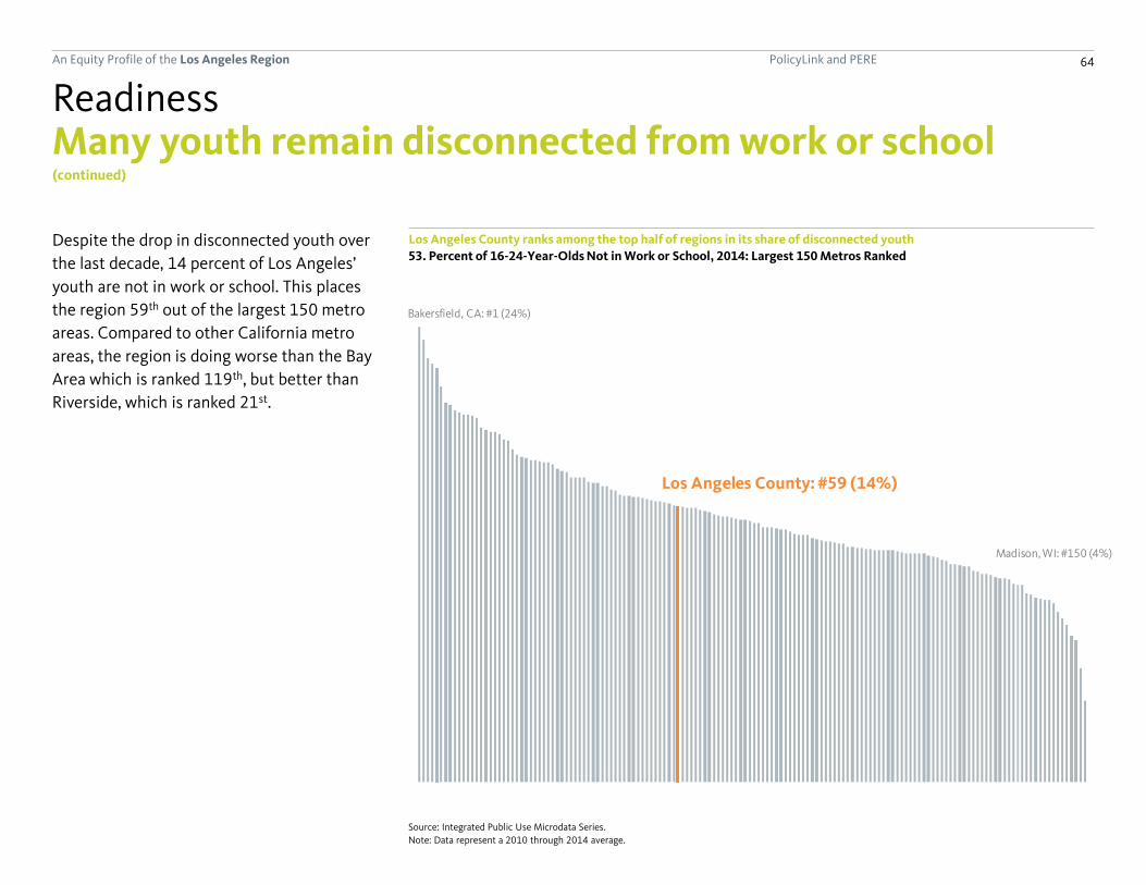
PolicyLink and PERE 64An Equity Profile of the Los Angeles Region
Bakersfield, CA: #1 (24%)
Los Angeles County: #59 (14%)
Madison, WI: #150 (4%)
Many youth remain disconnected from work or school
Despite the drop in disconnected youth over
the last decade, 14 percent of Los Angeles’
youth are not in work or school. This places
the region 59th out of the largest 150 metro
areas. Compared to other California metro
areas, the region is doing worse than the Bay
Area which is ranked 119th, but better than
Riverside, which is ranked 21st.
Los Angeles County ranks among the top half of regions in its share of disconnected youth
Readiness
53. Percent of 16-24-Year-Olds Not in Work or School, 2014: Largest 150 Metros Ranked
Source: Integrated Public Use Microdata Series.
Note: Data represent a 2010 through 2014 average.
(continued)

PolicyLink and PERE 65An Equity Profile of the Los Angeles Region
7%
8%
11%
13%
7%
10%
Mixed/other
Asian or Pacific Islander
Latino
Black
White
All
34%
27%
39%
33%
36%
36%
16%
8%
30%
37%
20%
25%
0% 20% 40% 60% 80%
Mixed/other
Asian or Pacific Islander
Latino
Black
White
All
11%
5%
5%
13%
9%
7%
Mixed/other
Asian or Pacific Islander
Latino
Black
White
All
37%
37%
32%
41%
29%
35%
27%
23%
42%
30%
8%
24%
0% 20% 40% 60% 80%
All
White
Black
Latino
Asian/Pacific Islander
Other
Overweight
Obese
Health challenges among communities of color
African Americans face above average obesity, diabetes, and asthma rates, while Latinos have high rates of being overweight and obese
Readiness
54. Adult Overweight and Obesity Rates by Race/Ethnicity,
2012
Source: Centers for Disease Control and Prevention. Universe
includes adults ages 18 and older.
Note: Data represent a 2008 through 2012 average.
55. Adult Diabetes Rates by Race/Ethnicity, 2012 56. Adult Asthma Rates by Race/Ethnicity, 2012
Source: Centers for Disease Control and Prevention. Universe
includes adults ages 18 and older.
Note: Data represent a 2008 through 2012 average.
Source: Centers for Disease Control and Prevention. Universe
includes adults ages 18 and older.
Note: Data represent a 2008 through 2012 average.
The region’s African Americans have particularly high rates of obesity,
diabetes, and asthma. Latinos are at high risk of being overweight and
obese but have average rates of diabetes and below average rates of
asthma. Whites and those of other or mixed race do better than
average on all measures except for asthma.

PolicyLink and PERE 66An Equity Profile of the Los Angeles Region
Connectedness
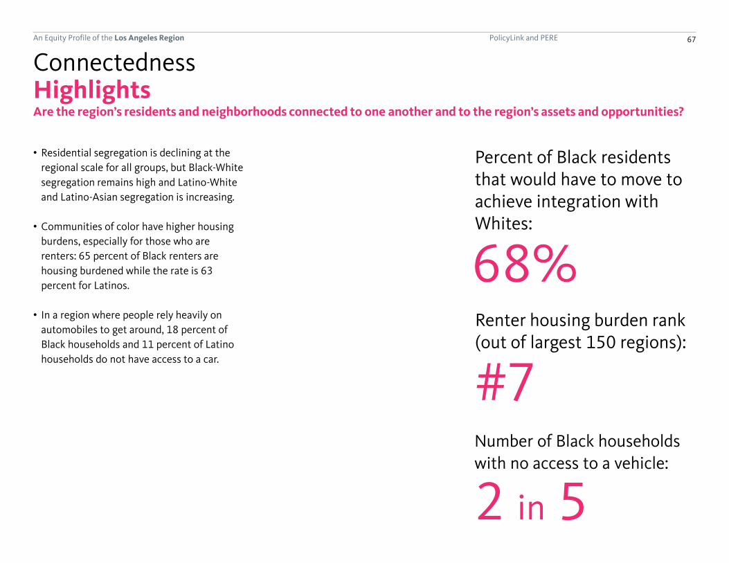
PolicyLink and PERE 67An Equity Profile of the Los Angeles Region
HighlightsConnectedness
Percent of Black residents that would have to move to achieve integration with Whites:
Renter housing burden rank(out of largest 150 regions):
68%
#7
Are the region’s residents and neighborhoods connected to one another and to the region’s assets and opportunities?
Number of Black households
with no access to a vehicle:
2 in 5
• Residential segregation is declining at the
regional scale for all groups, but Black-White
segregation remains high and Latino-White
and Latino-Asian segregation is increasing.
• Communities of color have higher housing
burdens, especially for those who are
renters: 65 percent of Black renters are
housing burdened while the rate is 63
percent for Latinos.
• In a region where people rely heavily on
automobiles to get around, 18 percent of
Black households and 11 percent of Latino
households do not have access to a car.

PolicyLink and PERE 68An Equity Profile of the Los Angeles Region
0.34
0.32
0.30 0.29
0.28 0.27
0.26 0.25
0.10
0.20
0.30
0.40
0.50
1980 1990 2000 2014
United StatesLos Angeles CountyCalifornia
Multi-Group Entropy Index0 = fully integrated | 1 = fully segregated
0.34
0.32
0.30 0.29
0.28 0.27
0.26 0.25
0.44 0.44
0.38
0.36
0.10
0.20
0.30
0.40
0.50
1980 1990 2000 2014
Multi-Group Entropy Index0 = fully integrated | 1 = fully segregated
Segregation is slowly decreasing
Los Angeles County is more segregated by
race/ethnicity than the state of California but
less than the nation, and segregation has
declined somewhat over time as the region
has become more diverse.
Segregation is measured by the entropy index,
which ranges from a value of 0, meaning that
all census tracts have the same racial/ethnic
composition as the entire region overall
(maximum integration), to a high of 1, if all
census tracts contained one group only
(maximum segregation).
Residential segregation is decreasing over time at the regional scale
Connectedness
57. Residential Segregation, 1980 to 2014
Source: U.S. Census Bureau; Geolytics.
Note: Data for 2014 represent a 2010 through 2014 average. See the "Data and methods" section for details of the residential segregation index calculations.

PolicyLink and PERE 69An Equity Profile of the Los Angeles Region
74%
61%
47%
60%
70%
52%
68%
63%
50%
54%
67%
55%
Black
Latino
API
Latino
API
API
Wh
ite
B
lack
Lati
no
74%
61%
47%
47%
60%
70%
70%
52%
55%
58%
68%
63%
50%
71%
54%
67%
78%
55%
73%
73%
Black
Latino
API
Native American
Latino
API
Native American
API
Native American
Native American
W
hit
e
Bla
ck
Lat
ino
API
19902014
Segregation remains high between some groups and White-Latino and API-Latino segregation is on the riseWhile racial segregation overall has been on
the decline in the region, it remains very high
between certain groups, and is increasing for
others.
The chart at the right displays the
dissimilarity index, which estimates the share
of a given racial/ethnic group that would need
to move to a new neighborhood to achieve
complete integration with the other group.
Using this measure, segregation between
Blacks and all other groups has decreased
though Black-White segregation remains high:
68 percent of Black residents would need to
move to achieve perfect integration with
Whites.
It also shows that segregation is increasing
between several groups. Latinos and Whites
are more segregated from each other now
than in 1990, and the same is true for Latinos
and Asian Americans and Pacific Islanders.
Segregation has decreased between Blacks and all other racial/ethnic groups, but has increased for most others
Connectedness
58. Residential Segregation, 1990 and 2014, Measured by the Dissimilarity Index
Source: U.S. Census Bureau; Geolytics.
Note: Data reported is the dissimilarity index for each combination of racial/ethnic groups. Data for 2014 represent a 2010
through 2014 average. See the "Data and methods" section for details of the residential segregation index calculations.

PolicyLink and PERE 70An Equity Profile of the Los Angeles Region
10%
7%
8%
10%
11%
15%
18%
All
White
Asian or Pacific Islander
Mixed/other
Latino
Native American
Black
0%
5%
10%
15%
20%
25%
<$15,000 $15,000-$35,000
$35,000-$65,000
>$65,000
0%
2%
4%
6%
8%
10%
12%
<$15,000 $15,000-$35,000
$35,000-$65,000
>$65,000
WhiteBlackLatino, U.S.-bornLatino, ImmigrantAPI, U.S.-bornAPI, ImmigrantOther or mixed race
Black and Latino people are more likely to rely on the region’s transit system to get to work Income and race both play a role in
determining who uses Los Angeles County’s
bus and rail systems to get to work. Very low-
income African Americans and Latino
immigrants are most likely to get to work
using public transit, but transit use declines
for these groups as incomes increase.
Households of color are much less likely to
own cars than Whites. Across the region, 93
percent of White households have at least
one car, but among households headed by a
person of color, only 89 percent do. African
American and Native American households
are the most likely to be carless.
Transit use varies by income and race
Connectedness
59. Percent Using Public Transit by Annual Earnings and
Race/Ethnicity and Nativity, 2014
Source: Integrated Public Use Microdata Series. Universe includes workers
ages 16 and older with earnings.
Note: Data represent a 2010 through 2014 average.
Households of color are less likely to own cars
60. Percent of Households without a Vehicle by
Race/Ethnicity, 2014
Source: Integrated Public Use Microdata Series. Universe includes all
households (no group quarters).
Note: Data represent a 2010 through 2014 average.

PolicyLink and PERE 71An Equity Profile of the Los Angeles Region
58%62%
67%
75%79% 81% 80% 82%
12%12%
13%
11%10% 9% 9% 8%
12%14%
11%
6% 4% 3% 3%
7%4% 3%3%
8% 6% 4% 4% 4% 4% 4% 5%
Less than$10,000
$10,000 to$14,999
$15,000 to$24,999
$25,000 to$34,999
$35,000 to$49,999
$50,000 to$64,999
$65,000 to$74,999
More than$75,000
Low-income residents are least likely to drive alone to work
The majority of residents in the region—73
percent—drive alone to work. Single-driver
commuting varies by income. Only 58 percent
of very low-income workers (earning under
$15,000 per year) drive alone to work,
compared with 82 percent of workers who
make over $75,000 a year.
Lower-income residents are less likely to drive alone to work
Connectedness
61. Means of Transportation to Work by Annual Earnings, 2014
Source: U.S. Census Bureau. Universe includes workers ages 16 and older with earnings.
Note: Data represent a 2010 through 2014 average.
67%69%
74%
81%84% 84% 85% 84%17%
18%17%
12% 10% 9% 8%7%
4%4%
3%2% 2% 2% 2%
2%3%3% 2% 1% 2%
5% 4% 3% 2% 2% 3% 3% 4%
Less than $10,000
$10,000 to $14,999
$15,000 to $24,999
$25,000 to $34,999
$35,000 to $49,999
$50,000 to $64,999
$65,000 to $74,999
More than $75,000
Worked at home
Other
Walked
Public transportation
Auto-carpool
Auto-alone
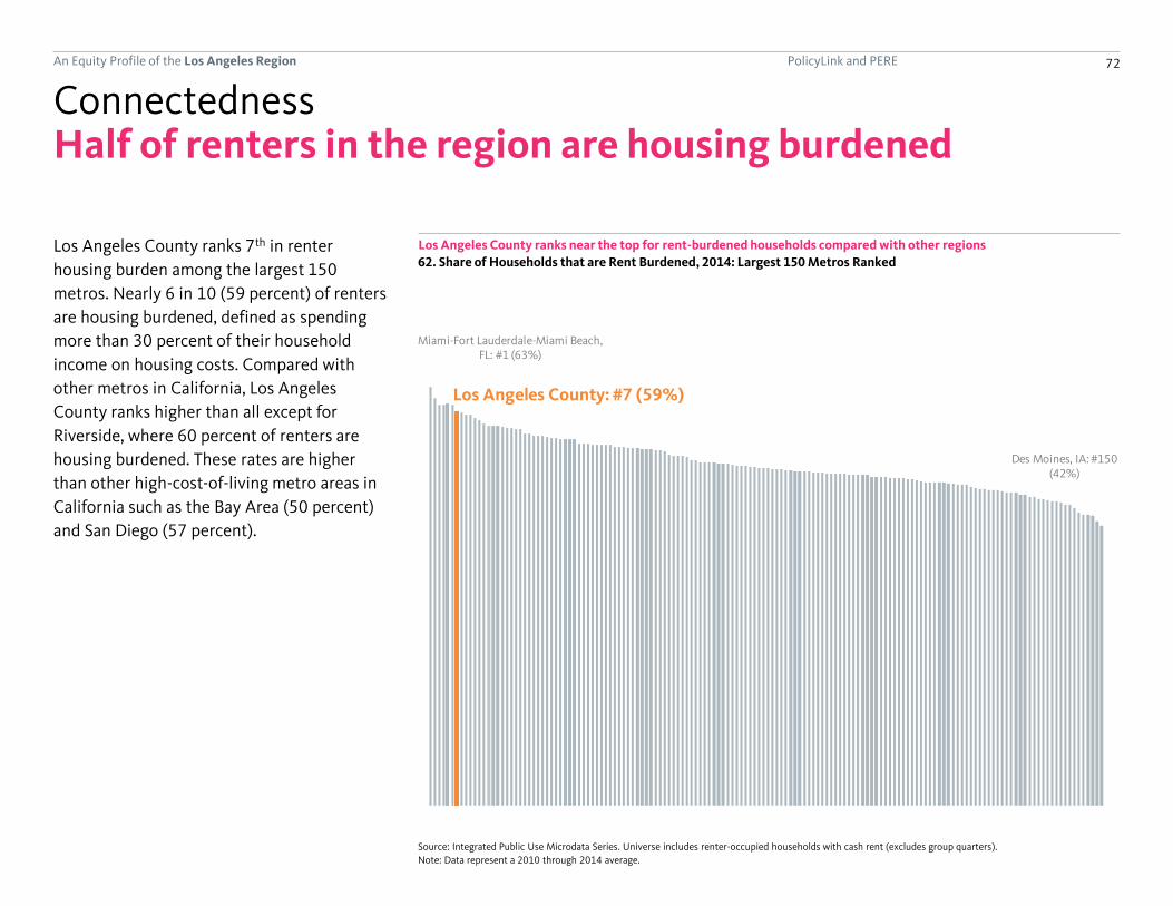
PolicyLink and PERE 72An Equity Profile of the Los Angeles Region
Miami-Fort Lauderdale-Miami Beach, FL: #1 (63%)
Los Angeles County: #7 (59%)
Des Moines, IA: #150 (42%)
Half of renters in the region are housing burdened
Los Angeles County ranks 7th in renter
housing burden among the largest 150
metros. Nearly 6 in 10 (59 percent) of renters
are housing burdened, defined as spending
more than 30 percent of their household
income on housing costs. Compared with
other metros in California, Los Angeles
County ranks higher than all except for
Riverside, where 60 percent of renters are
housing burdened. These rates are higher
than other high-cost-of-living metro areas in
California such as the Bay Area (50 percent)
and San Diego (57 percent).
Los Angeles County ranks near the top for rent-burdened households compared with other regions
Connectedness
62. Share of Households that are Rent Burdened, 2014: Largest 150 Metros Ranked
Source: Integrated Public Use Microdata Series. Universe includes renter-occupied households with cash rent (excludes group quarters).
Note: Data represent a 2010 through 2014 average.

PolicyLink and PERE 73An Equity Profile of the Los Angeles Region
41.3%
36.0%
49.5%
47.5%
40.4%
33.1%
44.6%
30%
35%
40%
45%
50%
55%
41.3%
36.0%
49.5%
47.5%
40.4%
33.1%
44.6%
15%
20%
25%
30%
35%
40%
45%
50%
55%
AllWhiteBlackLatinoAsian or Pacific IslanderNative AmericanMixed/other
59.1%
54.2%
64.7%
62.9%
53.6%
62.7%
55.4%
50%
55%
60%
65%
70%
41.3%
36.0%
49.5%
47.5%
40.4%
33.1%
44.6%
15%
20%
25%
30%
35%
40%
45%
50%
55%
AllWhiteBlackLatinoAsian or Pacific IslanderNative AmericanMixed/other
People of color face higher housing burdens
African Americans and Latinos are most likely
to spend a large share of their income on
housing, whether they rent or own. Asian
renters have a similar housing burden to
White renters, but Asian homeowners have
higher housing burdens than Whites. Native
Americans have among the highest levels of
housing burden for renters but lowest levels
for homeowners.
African Americans and Latinos have the highest renter
housing burden
Connectedness
63. Renter Housing Burden by Race/Ethnicity,
2014
Source: Integrated Public Use Microdata Series. Universe includes owner-
occupied households (excludes group quarters).
Note: Data represent a 2010 through 2014 average.
Source: Integrated Public Use Microdata Series. Universe includes renter-
occupied households with cash rent (excludes group quarters).
Note: Data represent a 2010 through 2014 average.
Latinos and African Americans have the highest
homeowner housing burden
64. Homeowner Housing Burden by Race/Ethnicity,
2014

PolicyLink and PERE 74An Equity Profile of the Los Angeles Region
26%
23%
13%
6%
Los Angeles
Orange
24%
23%
22%
24%
31%
28%
28%
20%
24%
28%
27%
25%
20%
21%
72%
58%
65%
69%
51%
58%
73%
60%
41%
38%
32%
18%
40%
40%
Colorado
Chambers
Austin
Matagorda
Waller
Liberty
Wharton
Walker
Brazoria
Galveston
Montgomery
Fort Bend
Harris
Houston-Galveston Region
Share of rental housing units that are affordable
Share of jobs that are low-wage
Jobs-housing mismatch for low-wage workers
Low-wage workers in the region are not likely
to find affordable rental housing. In Los
Angeles County, 26 percent of jobs are low-
wage (paying $1,250 per month or less) and
only 13 percent of rental units are affordable
(defined as having rent of $749 per month or
less, which would be 30 percent or less of two
low-wage workers’ incomes).
The gap in the share of low-wage jobs and
affordable rental housing is even greater in
Orange County.
Both Los Angeles and Orange counties have a low-wage jobs - affordable housing gap
Connectedness
65. Low-Wage Jobs and Affordable Rental Housing by County, 2014
Source: U.S. Census Bureau.
Note: Data on the share of affordable rental units represent a 2010 through 2014 average, while data on the share of low-wage jobs are from 2012 and are
calculated on a place-of-work basis.

PolicyLink and PERE 75An Equity Profile of the Los Angeles Region
Jobs-housing mismatch for low-wage workers
A low-wage jobs to affordable rental housing
ratio in a county with a higher than regional
average ratio indicates a lower availability of
affordable rental housing for low-wage
workers in that county relative to the region
overall.
While there is a job-housing mismatch for
low-wage workers throughout the Los
Angeles metro area (which consists of Los
Angeles and Orange counties), the challenge
of affordable housing for low-wage workers is
greater in Orange County than in Los Angeles
County.
The job-housing mismatch for low-wage workers is greater in Orange County
Connectedness
66. Low-Wage Jobs, Affordable Rental Housing, and Jobs-Housing Ratios by County
Source: U.S. Census Bureau.
Note: Data on the number of affordable rental units represent a 2010 through 2014 average, while data on the number of low-wage jobs are from 2012 and are
calculated on a place-of-work basis.
(continued)
All Low-wage All Rental*Affordable
Rental*
All Jobs:
All Housing
Low-wage Jobs-
Affordable
Rentals
Los Angeles 4,175,002 1,103,589 3,242,391 1,694,352 215,050 1.3 5.1
Orange 1,452,699 331,767 1,002,285 408,888 24,176 1.4 13.7
Los Angeles Metro Area 5,627,701 1,435,356 4,244,676 2,103,240 239,226 1.3 6.0
*Includes only those units paid for in cash rent.
Jobs
(2012)
Housing
(2010-2014)Jobs-Housing Ratios

PolicyLink and PERE 76An Equity Profile of the Los Angeles Region
Neighborhoods

PolicyLink and PERE 77An Equity Profile of the Los Angeles Region
Unemployment rate in Watts and Willowbrook:
16%
Highlights
• In South Los Angeles Transit Empowerment
Zone (SLATE-Z), 41 percent of the
population lives below the poverty level
which is more than double the poverty rate
of Los Angeles County overall.
• The average child opportunity index for the
Watts and Willowbrook community is
considerably lower (-0.86) than that for the
county as a whole (-0.12).
• A higher percentage of households in the
Southeast cities of Los Angeles County are
linguistically-isolated (26 percent) than the
county overall (14 percent).
Neighborhoods
Percent of linguistically-isolated households in Southeast L.A. County:
26%
Percent of households in SLATE-Z without access to a vehicle:
25%
Are the residents of Southeast Los Angeles County, Watts and Willowbrook, and SLATE-Z connected to the region’s opportunities?
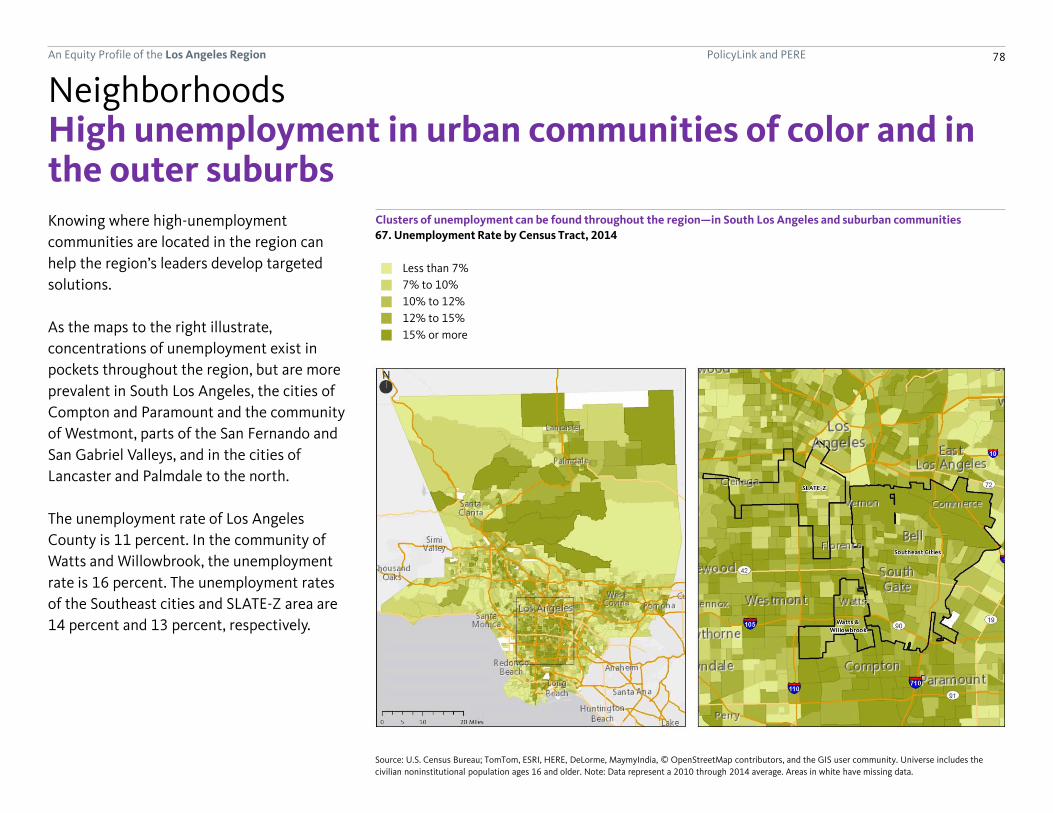
PolicyLink and PERE 78An Equity Profile of the Los Angeles Region
97% or more People of colorLess than 7%
7% to 10%
10% to 12%
12% to 15%
15% or more
High unemployment in urban communities of color and in the outer suburbsKnowing where high-unemployment
communities are located in the region can
help the region’s leaders develop targeted
solutions.
As the maps to the right illustrate,
concentrations of unemployment exist in
pockets throughout the region, but are more
prevalent in South Los Angeles, the cities of
Compton and Paramount and the community
of Westmont, parts of the San Fernando and
San Gabriel Valleys, and in the cities of
Lancaster and Palmdale to the north.
The unemployment rate of Los Angeles
County is 11 percent. In the community of
Watts and Willowbrook, the unemployment
rate is 16 percent. The unemployment rates
of the Southeast cities and SLATE-Z area are
14 percent and 13 percent, respectively.
Clusters of unemployment can be found throughout the region—in South Los Angeles and suburban communities
67. Unemployment Rate by Census Tract, 2014
Neighborhoods
Source: U.S. Census Bureau; TomTom, ESRI, HERE, DeLorme, MaymyIndia, © OpenStreetMap contributors, and the GIS user community. Universe includes the
civilian noninstitutional population ages 16 and older. Note: Data represent a 2010 through 2014 average. Areas in white have missing data.

PolicyLink and PERE 79An Equity Profile of the Los Angeles Region
7% to 15%
15% to 25%
25% to 39%
39% or more
Less than 7%
Linguistic isolation is a challenge
Linguistic isolation is a challenge in the urban core of the region and in some suburbs
Neighborhoods
68. Linguistic Isolation by Census Tract, 2014
Source: U.S. Census Bureau; TomTom, ESRI, HERE, DeLorme, MaymyIndia, © OpenStreetMap contributors, and the GIS user community. Universe includes all
households. Note: Data represent a 2010 through 2014 average. Areas in white have missing data.
Los Angeles has always been a region of
immigrants and high levels of linguistic
isolation—defined as the percentage of
households in which no member age 14 or
older speaks only English or speaks English at
least “very well.”
Not surprisingly, areas of linguistic isolation
tend to be concentrated in neighborhoods
with more immigrants—and likely more
recently-arriving immigrants. Such areas
include Koreatown, parts of South Los
Angeles, parts of the San Fernando and San
Gabriel Valleys, the city of Palmdale to the
north, and parts of Long Beach to the south.
In Los Angeles County, 14 percent of
households are linguistically isolated. In the
Southeast cities, 26 percent of households
are linguistically isolated; in SLATE-Z, that
figure is 23 percent; and in Watts and
Willowbrook, it is 15 percent.

PolicyLink and PERE 80An Equity Profile of the Los Angeles Region
Low
Moderate
High
Very High
Very Low
Child opportunities are limited
Child access to opportunity is limited in neighborhoods throughout South and Southeast Los Angeles
Neighborhoods
69. Child Opportunity Index by Census Tract
Sources: The diversitydatakids.org and the Kirwan Institute for the Study of Race and Ethnicity; TomTom, ESRI, HERE, DeLorme, MaymyIndia, © OpenStreetMap
contributors, and the GIS user community. Note: The Child Opportunity Index is a composite of indicators across three domains: educational opportunity, health and
environmental opportunity, and social and economic opportunity. The vintage of the underlying indicator data varies, ranging from years 2007 through 2013. The
map was created by ranking the census tract level Overall Child Opportunity Index Score into quintiles for the region.
The Child Opportunity Index measures
relative opportunity across neighborhoods in
the region based on indicators from three
domains: educational opportunity, health and
environmental opportunity, and social and
economic opportunity. By this measure, child
opportunities are limited in much of South
and Southeast Los Angeles, as well as some
suburban communities such as the cities of El
Monte and Pomona to the east, the Los
Angeles neighborhood of Pacoima to the
north, and Los Angeles neighborhoods near
the ports along with parts of the City of Long
Beach to the south.
In Watts and Willowbrook, the average child
opportunity index (weighted by the number
of minor children under age 18) is “very low”
(-0.86), which is considerably lower than
average for Los Angeles County overall, which
is “moderate” (-0.12). The average child
opportunity index for SLATE-Z is also “very
low” (-.50), while it is “low” for the Southeast
cities (-.40).
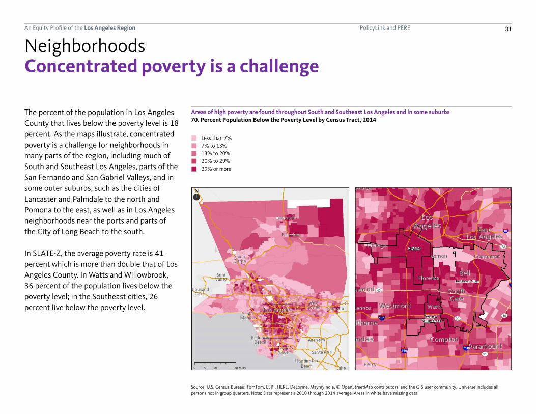
PolicyLink and PERE 81An Equity Profile of the Los Angeles Region
70. Percent Population Below the Poverty Level by Census Tract, 2014
7% to 13%
13% to 20%
20% to 29%
29% or more
Less than 7% 97% or more People of color
Concentrated poverty is a challenge
Areas of high poverty are found throughout South and Southeast Los Angeles and in some suburbs
Neighborhoods
The percent of the population in Los Angeles
County that lives below the poverty level is 18
percent. As the maps illustrate, concentrated
poverty is a challenge for neighborhoods in
many parts of the region, including much of
South and Southeast Los Angeles, parts of the
San Fernando and San Gabriel Valleys, and in
some outer suburbs, such as the cities of
Lancaster and Palmdale to the north and
Pomona to the east, as well as in Los Angeles
neighborhoods near the ports and parts of
the City of Long Beach to the south.
In SLATE-Z, the average poverty rate is 41
percent which is more than double that of Los
Angeles County. In Watts and Willowbrook,
36 percent of the population lives below the
poverty level; in the Southeast cities, 26
percent live below the poverty level.
Source: U.S. Census Bureau; TomTom, ESRI, HERE, DeLorme, MaymyIndia, © OpenStreetMap contributors, and the GIS user community. Universe includes all
persons not in group quarters. Note: Data represent a 2010 through 2014 average. Areas in white have missing data.

PolicyLink and PERE 82An Equity Profile of the Los Angeles Region
Less than 3%
3% to 6%
6% to 9%
9% to 16%
16% or more
97% or more People of color
Car access is a problem
Households without a vehicle are most concentrated in parts of South Los Angeles and Koreatown
Neighborhoods
71. Percent of Households Without a Vehicle by Census Tract, 2014In a region where people still rely heavily on
driving, the vast majority of households (90
percent) have access to at least one vehicle.
But access to a vehicle remains a challenge for
households in many areas of Los Angeles
County, with a particular concentration of
carless households in parts of South Los
Angeles and Koreatown.
In SLATE-Z, 25 percent of households do not
have access to a vehicle. In Watts and
Willowbrook, 16 percent lack access; and in
the Southeast cities, 11 percent of
households lack access.
Source: U.S. Census Bureau; TomTom, ESRI, HERE, DeLorme, MaymyIndia, © OpenStreetMap contributors, and the GIS user community. Universe includes all
households (no group quarters). Note: Data represent a 2010 through 2014 average. Areas in white have missing data.

PolicyLink and PERE 83An Equity Profile of the Los Angeles Region
Long commute times for residents
Workers throughout the region have long commute times
Neighborhoods
72. Average Travel Time to Work by Census Tract, 2014Workers throughout Los Angeles County have
long commute times, with an average travel
time of 30 minutes for workers in the county
compared with 26 minutes for the United
States overall. Workers with the longest
commute times tend to live away from the
urban core.
Workers who live in Watts and Willowbrook
travel on average 32 minutes to work. In
SLATE-Z, workers travel 30 minutes; in the
Southeast cities, workers travel 29 minutes to
work on average.
Less than 26 minutes
26 to 28 minutes
28 to 30 minutes
30 to 33 minutes
33 minutes or more
97% or more People of color
Source: U.S. Census Bureau; TomTom, ESRI, HERE, DeLorme, MaymyIndia, © OpenStreetMap contributors, and the GIS user community. Universe includes all
persons ages 16 or older who work outside of home. Note: Data represent a 2010 through 2014 average. Areas in white have missing data.

PolicyLink and PERE 84An Equity Profile of the Los Angeles Region
50% to 58%
58% to 64%
64% to 70%
70% or more
Less than 50%
Affordable housing needs
Rent is unaffordable for most renters in the region
Neighborhoods
73. Rent Burden by Census Tract, 2014Los Angeles County residents face a housing
crisis. Rent burden is one measure of the
housing crisis that is defined as spending
more than 30 percent of household income
on rent. While neighborhoods with rates of
rent burden of 70 percent or higher can be
found throughout the county, there are
particular concentrations in South Los
Angeles, the San Fernando and San Gabriel
Valleys, and even in the far-flung outer
suburban cities of Lancaster, Palmdale, and
Pomona.
In Los Angeles County, 59 percent of renter-
occupied households are rent-burdened. In
SLATE-Z, the percent rent-burdened is 73
percent. The percent rent-burdened in the
communities of Watts and Willowbrook and
the Southeast cities is 68 percent and 66
percent, respectively.
Source: U.S. Census Bureau; TomTom, ESRI, HERE, DeLorme, MaymyIndia, © OpenStreetMap contributors, and the GIS user community. Universe includes renter-
occupied households with cash rent. Note: Data represent a 2010 through 2014 average. Areas in white have missing data.

PolicyLink and PERE 85An Equity Profile of the Los Angeles Region
Implications

PolicyLink and PERE 86An Equity Profile of the Los Angeles Region
$652.3
$1,030.7
$0
$200
$400
$600
$800
$1,000
$1,200Equity Dividend: $378.5
A potential $379 billion per year GDP boost from racial equityLos Angeles stands to gain a great deal from
addressing racial inequities. The county’s
economy could have been nearly $380 billion
stronger in 2014 if its racial gaps in income
had been closed: a 58 percent increase. The
dollar value of this equity dividend is larger
than that of any metropolitan region in the
country except for New York, and ranks fourth
as a percentage of GDP.
Using data on income by race, we calculated
how much higher total economic output
would have been in 2014 if all racial groups
who currently earn less than Whites had
earned similar average incomes as their White
counterparts, controlling for age.
We also examined how much of the region’s
racial income gap was due to differences in
wages and how much was due to differences
in employment (measured by hours worked).
Nationally, 36 percent of the racial income
gap is due to differences in employment. In
Los Angeles, that share is only 24 percent,
with the remaining 76 percent due to
differences in hourly wages.
Los Angeles’ GDP would have been $379 billion higher if there were no racial gaps in income
Economic benefits of inclusion
74. Actual GDP and Estimated GDP without Racial Gaps in Income, 2014 (in 2014 dollars)
Sources: Bureau of Economic Analysis; Integrated Public Use Microdata Series.
Note: The “equity dividend” is calculated using data from IPUMS for 2010 through 2014 and is then applied to estimated GDP in 2014. See the "Data and methods"
section for details.
$652.3
$1,030.7
$0
$200
$400
$600
$800
$1,000
$1,200
GDP in 2014 (billions)
GDP if racial gaps in income were eliminated (billions)
Equity Dividend: $378.5

PolicyLink and PERE 87An Equity Profile of the Los Angeles Region
Building a more equitable Los Angeles
Los Angeles’ diversity is a major potential
asset in the global economy, but inequities
and disparities are holding the region back.
Los Angeles is the seventh most unequal
among the largest 150 metro regions. A
widening gap in wages is partly to blame.
Since 1979, the highest-paid workers have
seen their wages increase by 13 percent while
wages for the lowest-paid workers have
declined by 25 percent.
In general, unemployment decreases and
wages increase with higher educational
attainment, yet racial and gender gaps persist
in the labor market. At all education levels,
African Americans are most likely to be
unemployed and all people of color earn
lower wages than Whites.
To build a more equitable and sustainable
regional economy, Los Angeles must take
steps to better connect its communities of
color to quality education, high-opportunity
jobs, and affordable housing. To do that,
PolicyLink and PERE suggest that the region:
Implications
Choose strategies that promote equity and
growth simultaneously.
Equity and growth have traditionally been
pursued separately but both are needed to
secure Los Angeles’ future. The winning
strategies are those that maximize quality job
creation while promoting health and
economic opportunity for low-income
populations. This will require equity
advocates to take growth more seriously and
growth proponents to adopt equity at the
forefront, not as an after-thought.
Target programs and investments to the
people and places most left behind.
Focusing resources and investments on the
communities that have been left behind will
produce the greatest returns. This includes
reducing environmental burdens and
increasing services and programs in low-
income communities. Improving outcomes for
the most vulnerable populations—such as
residents in Southeast Los Angeles County,
Watts and Willowbrook, and the SLATE-Z area,
will help improve outcomes for the county as
a whole.
Leverage public investment for equitable
outcomes.
In November 2016, Los Angeles voters
approved tax measures to expand the build
out of the region’s transportation
infrastructure, increase green space, and
address homelessness. These and other public
investments provide immediate opportunities
to ensure that both the processes and
outcomes are equitable. This means policies
and practices in the implementation of these
measures must forge participation by those
communities most disconnected from the
region’s opportunities.
Make economic and social integration a
common agenda.
Closing the economic gap requires an
understanding of the particular needs of
African-American youth, Latino native-born
residents, and Asian immigrants. Yet solutions
should be pursued through multi-racial
efforts. Promoting immigrant integration and
the integration of the re-entry population
should be seen as part of a common agenda
for a more equitable Los Angeles.

PolicyLink and PERE 88An Equity Profile of the Los Angeles Region
Building a more equitable Los AngelesImplications
Ensure meaningful community
participation, voice, and leadership.
Los Angeles’ diverse populations, particularly
immigrants and low-income people, are not
only left out of opportunity but are frequently
left out of the civic conversations and
decision-making processes. Intentional
strategies are needed to build the authentic
avenues for increased participation in all
aspects of the political process—from the
basic act of voting to serving on board and
commissions to being elected as political
leaders.
Restore civic life and instill a spirt of
stewardship.
Part of what sent Los Angeles adrift has been
a sense of social disconnection—that the
problems are in other neighborhoods, that
the impact of inequality is felt just by some,
that the task is to protect the fate of just one
group, neighborhood, or sector. Spreading the
message that we are in it together is
important—and philanthropy can play a key
role in convening actors to develop multi-
sectoral commitments.
Stick with equity strategies for the long
haul.
There is often a sense that one single effort—
improve education, raise the minimum wage,
or facilitate small business start-ups—will be
the “silver bullet” that finally transforms Los
Angeles from a landscape of inequality to a
promised land of opportunity. But the
challenges we face did not emerge overnight
and they are not just driven by one factor;
leaders must be willing to stick with
comprehensive strategies over the long haul
and patient investments by philanthropy are
key.
Pioneer model equity strategies for the
nation.
Just as Los Angeles has led the nation in
demographic transformation and income
inequality so can it lead the nation in its
strategies and solutions for a more equitable
future. Doing so will require mechanisms for
documenting solutions, evaluating progress,
and for broadcasting lessons learned and
successes that can be scaled to change the
course of the nation.
Use data to inform dialogue and
deliberation.
Data can help stakeholders come together to
gain a shared understanding of the equity
challenges, to develop solutions and joint
action, and to track progress towards equity
and growth over time. Such collaborations will
not be without conflict—but such tension can
be creative and generative as all Los
Angelenos find new common ground. In an
era in which facts are often suspect,
grounding strategies in empirical realities can
build new bonds across unusual allies.
Assess equity impacts at every stage of the
policy process.
From when the policy process begins through
its implementation and evaluation, ask who
will benefit, who will pay, and who will decide
and adjust decisions and policies as needed to
ensure equitable impacts. For example, when
deciding infrastructure projects and priorities,
policymakers should examine how it will
contribute to the sustainability and
capabilities of its diverse populations.

PolicyLink and PERE
Data source summary and regional geography
Adjustments made to census summary data on race/ethnicity by age
Adjustments made to demographic projections
89
Data and methods
Broad racial/ethnic origin
Detailed racial/ethnic ancestry
Other selected terms
Selected terms and general notes
Nativity
Neighborhood definitions
About IPUMS microdata
Geography of IPUMS microdata
Summary measures from IPUMS microdata
A note on sample size
Adjustments at the state and national levels
Estimates and adjustments made to BEA data on GDP, GRP,and GSP
County and metropolitan area estimates
Middle-class analysis
Assembling a complete dataset on employment and wagesby industry
Growth in jobs and earnings by industry wage level, 1990 to 2012
Analysis of occupations by opportunity level
Health data and analysis
Measures of diversity and segregation
Estimates of GDP gains without racial gaps in income
An Equity Profile of the Los Angeles Region
General notes on analyses
90
96
91
91
91
92
91
92
94
94
94
94
95
98
98
100
98
101
102
103
106
107
108
93
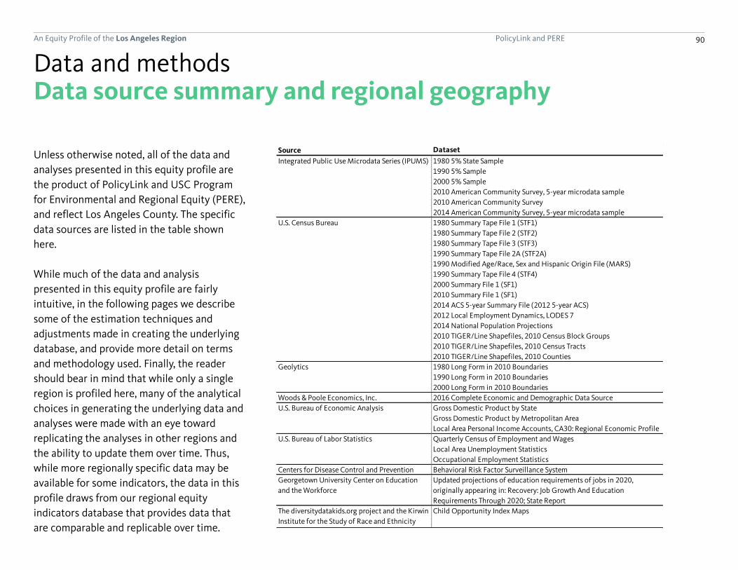
PolicyLink and PERE 90An Equity Profile of the Los Angeles Region
Data source summary and regional geography
Unless otherwise noted, all of the data and
analyses presented in this equity profile are
the product of PolicyLink and USC Program
for Environmental and Regional Equity (PERE),
and reflect Los Angeles County. The specific
data sources are listed in the table shown
here.
While much of the data and analysis
presented in this equity profile are fairly
intuitive, in the following pages we describe
some of the estimation techniques and
adjustments made in creating the underlying
database, and provide more detail on terms
and methodology used. Finally, the reader
should bear in mind that while only a single
region is profiled here, many of the analytical
choices in generating the underlying data and
analyses were made with an eye toward
replicating the analyses in other regions and
the ability to update them over time. Thus,
while more regionally specific data may be
available for some indicators, the data in this
profile draws from our regional equity
indicators database that provides data that
are comparable and replicable over time.
Data and methods
Source Dataset
Integrated Public Use Microdata Series (IPUMS) 1980 5% State Sample
1990 5% Sample
2000 5% Sample
2010 American Community Survey, 5-year microdata sample
2010 American Community Survey
2014 American Community Survey, 5-year microdata sample
U.S. Census Bureau 1980 Summary Tape File 1 (STF1)
1980 Summary Tape File 2 (STF2)
1980 Summary Tape File 3 (STF3)
1990 Summary Tape File 2A (STF2A)
1990 Modified Age/Race, Sex and Hispanic Origin File (MARS)
1990 Summary Tape File 4 (STF4)
2000 Summary File 1 (SF1)
2010 Summary File 1 (SF1)
2014 ACS 5-year Summary File (2012 5-year ACS)
2012 Local Employment Dynamics, LODES 7
2014 National Population Projections
2010 TIGER/Line Shapefiles, 2010 Census Block Groups
2010 TIGER/Line Shapefiles, 2010 Census Tracts
2010 TIGER/Line Shapefiles, 2010 Counties
Geolytics 1980 Long Form in 2010 Boundaries
1990 Long Form in 2010 Boundaries
2000 Long Form in 2010 Boundaries
Woods & Poole Economics, Inc. 2016 Complete Economic and Demographic Data Source
U.S. Bureau of Economic Analysis Gross Domestic Product by State
Gross Domestic Product by Metropolitan Area
Local Area Personal Income Accounts, CA30: Regional Economic Profile
U.S. Bureau of Labor Statistics Quarterly Census of Employment and Wages
Local Area Unemployment Statistics
Occupational Employment Statistics
Centers for Disease Control and Prevention Behavioral Risk Factor Surveillance System
Georgetown University Center on Education
and the Workforce
Updated projections of education requirements of jobs in 2020,
originally appearing in: Recovery: Job Growth And Education
Requirements Through 2020; State Report
The diversitydatakids.org project and the Kirwin
Institute for the Study of Race and Ethnicity
Child Opportunity Index Maps

PolicyLink and PERE 91An Equity Profile of the Los Angeles Region
Selected terms and general notesData and methods
Broad racial/ethnic origin
In all of the analyses presented, all
categorization of people by race/ethnicity and
nativity is based on individual responses to
various census surveys. All people included in
our analysis were first assigned to one of six
mutually exclusive racial/ethnic categories,
depending on their response to two separate
questions on race and Hispanic origin as
follows:
• “White” and “non-Hispanic White” are used
to refer to all people who identify as White
alone and do not identify as being of
Hispanic origin.
• “Black” and “African American” are used to
refer to all people who identify as Black or
African American alone and do not identify
as being of Hispanic origin.
• “Latino” refers to all people who identify as
being of Hispanic origin, regardless of racial
identification.
• “Asian American and Pacific Islander,” “Asian
or Pacific Islander,” “Asian,” and “API” are
used to refer to all people who identify as
Asian American or Pacific Islander alone and
do not identify as being of Hispanic origin.
• “Native American” and “Native American
and Alaska Native” are used to refer to all
people who identify as Native American or
Alaskan Native alone and do not identify as
being of Hispanic origin.
• “Mixed/other” and “other or mixed race” are
used to refer to all people who identify with
a single racial category not included above,
or identify with multiple racial categories,
and do not identify as being of Hispanic
origin.
• “People of color” or “POC” is used to refer
to all people who do not identify as non-
Hispanic White.
Nativity
The term “U.S.-born” refers to all people who
identify as being born in the United States
(including U.S. territories and outlying areas),
or born abroad to American parents. The term
“immigrant” refers to all people who identify
as being born abroad, outside of the United
States, to non-American parents.
Detailed racial/ethnic ancestry
Given the diversity of ethnic origin and large
presence of immigrants among the Latino and
Asian populations, we sometimes present
data for more detailed racial/ethnic
categories within these groups. In order to
maintain consistency with the broad
racial/ethnic categories, and to enable the
examination of second-and-higher generation
immigrants, these more detailed categories
(referred to as “ancestry”) are drawn from the
first response to the census question on
ancestry, recorded in the IPUMS variable
“ANCESTR1.” For example, while country-of-
origin information could have been used to
identify Filipinos among the Asian population
or Salvadorans among the Latino population,
it could only do so for immigrants, leaving
only the broad “Asian” and “Latino”
racial/ethnic categories for the U.S.-born
population. While this methodological choice
makes little difference in the numbers of
immigrants by origin we report—i.e., the vast
majority of immigrants from El Salvador mark
“Salvadoran” for their ancestry—it is an
important point of clarification.

PolicyLink and PERE 92An Equity Profile of the Los Angeles Region
Selected terms and general notesData and methods
(continued)
Neighborhood definitions
In the “neighborhoods” section of this profile
beginning on page 76, we provide a series of
maps that show key indicators of opportunity
across neighborhoods of Los Angeles County,
highlighting the Weingart Foundation’s
targeted geographic areas of focus. These
include: the the South Los Angeles Transit
Empowerment Zone (SLATE-Z), which is a
federal Promise Zone that includes parts of
Vernon-Central, South Park, Florence,
Exposition Park, Vermont Square, Leimert
Park, and the Baldwin Hills/Crenshaw
neighborhood; the Watts and Willowbrook
area, which includes the Watts neighborhood
of the city of Los Angeles and the
unincorporated area of Los Angeles County
known as Willowbrook, which is also a census-
designated place; and the Southeast Los
Angeles County cities area, which includes
the cities of Bell, Bell Gardens, Commerce,
Cudahy, Huntington Park, Lynwood,
Maywood, South Gate, Vernon, and Walnut
Park. The geographic boundaries for each of
these three areas is depicted in the outlines
shown in the maps, and averaged data for
each area reported in text accompanying the
maps is based on selecting all census tracts
that are contained, or mostly contained,
within each area’s boundaries, and taking a
weighted average across those tracts using
the universe of each variable as the weight.
Other selected terms
Below we provide some definitions and
clarification around some of the terms used in
the equity profile:
• The terms “region,” “metropolitan area,”
“metro area,” and “metro” are used
interchangeably to refer to the geographic
areas defined as Metropolitan Statistical
Areas under the OMB’s December 2003
definitions.
• The term “neighborhood” is used at various
points throughout the equity profile. While
in the introductory portion of the profile
this term is meant to be interpreted in the
colloquial sense, in relation to any data
analysis it refers to census tracts.
• The term “communities of color” generally
refers to distinct groups defined by
race/ethnicity among people of color.
• The term “full-time” workers refers to all
persons in the IPUMS microdata who
reported working at least 45 or 50 weeks
(depending on the year of the data) and
usually worked at least 35 hours per week
during the year prior to the survey. A change
in the “weeks worked” question in the 2008
ACS, as compared with prior years of the
ACS and the long form of the decennial
census, caused a dramatic rise in the share
of respondents indicating that they worked
at least 50 weeks during the year prior to
the survey. To make our data on full-time
workers more comparable over time, we
applied a slightly different definition in
2008 and later than in earlier years: in 2008
and later, the “weeks worked” cutoff is at
least 50 weeks while in 2007 and earlier it is
45 weeks. The 45-week cutoff was found to
produce a national trend in the incidence of
full-time work over the 2005-2010 period
that was most consistent with that found
using data from the March Supplement of
the Current Population Survey, which did
not experience a change to the relevant
survey questions. For more information, see:

PolicyLink and PERE 93An Equity Profile of the Los Angeles Region
Selected terms and general notes
https://www.census.gov/content/dam/Census
/library/working-papers/2012/demo/Gottsch
alck_2012FCSM_VII-B.pdf.
General notes on analyses
Below we provide some general notes about
the analysis conducted:
• At several points in the profile we present
rankings comparing the profiled region to
the “largest 150 metros” or “largest 150
regions,” and refer in the text to how the
profiled region compares with these metros.
In all such instances, we are referring to the
largest 150 metropolitan statistical areas in
terms of 2010 population, based on the
OMB’s December 2003 definitions, but
substituting Los Angeles County in for the
Los Angeles metro area (which includes
both Los Angeles and Orange Counties).
• In regard to monetary measures (income,
earnings, wages, etc.) the term “real”
indicates the data has been adjusted for
inflation. All inflation adjustments are based
on the Consumer Price Index for all Urban
Consumers (CPI-U) from the U.S. Bureau of
Labor Statistics, available at:
Data and methods
https://www.bls.gov/cpi/cpid1612.pdf (see
table 24).
• Some may wonder why the graph on page
36 indicates the years 1979, 1989, and
1999 rather than the actual survey years
from which the information is drawn (1980,
1990, and 2000, respectively). This is
because income information in the
decennial census for those years is reported
for the year prior to the survey. While
seemingly inconsistent, the actual survey
years are indicated in the graphs on page 38
depicting rates of poverty and working
poverty, as these measures are partly based
on family composition and work efforts at
the time of the survey, in addition to income
from the year prior to the survey.
(continued)

PolicyLink and PERE 94An Equity Profile of the Los Angeles Region
Summary measures from IPUMS microdata
About IPUMS microdata
Although a variety of data sources were used,
much of our analysis is based on a unique
dataset created using microdata samples (i.e.,
“individual-level” data) from the Integrated
Public Use Microdata Series (IPUMS), for four
points in time: 1980, 1990, 2000, and 2010
through 2014 pooled together. While the
1980 through 2000 files are based on the
decennial census and cover about 5 percent
of the U.S. population each, the 2010 through
2014 files are from the American Community
Survey (ACS) and cover only about 1 percent
of the U.S. population each. Five years of ACS
data were pooled together to improve the
statistical reliability and to achieve a sample
size that is comparable to that available in
previous years. Survey weights were adjusted
as necessary to produce estimates that
represent an average over the 2010 through
2014 period.
Compared with the more commonly used
census “summary files,” which includes a
limited set of summary tabulations of
population and housing characteristics, use of
Data and methods
the microdata samples allows for the
flexibility to create more illuminating metrics
of equity and inclusion, and provide a more
nuanced view of groups defined by age,
race/ethnicity, and nativity in each region of
the United States.
A note on sample size
While the IPUMS microdata allows for the
tabulation of detailed population
characteristics, it is important to keep in mind
that because such tabulations are based on
samples, they are subject to a margin of error
and should be regarded as estimates—
particularly in smaller regions and for smaller
demographic subgroups. In an effort to avoid
reporting highly unreliable estimates, we do
not report any estimates that are based on a
universe of fewer than 100 individual survey
respondents.
Geography of IPUMS microdata
A key limitation of the IPUMS microdata is
geographic detail. Each year of the data has a
particular lowest level of geography
associated with the individuals included
known as the Public Use Microdata Area
(PUMA) for years 1990 and later, or the
County Group in 1980. PUMAs are generally
drawn to contain a population of at least
100,000, and vary greatly in geographic size
from being fairly small in densely populated
urban areas, to very large in rural areas, often
with one or more counties contained in a
single PUMA.
While the geography of the IPUMS microdata
generally poses a challenge for the creation of
regional summary measures, this was not the
case for the Los Angeles region, as the
geography of Los Angeles County could be
assembled perfectly by combining entire
1980 County Groups and 1990, 2000, and
2010 PUMAs.

PolicyLink and PERE 95An Equity Profile of the Los Angeles Region
Adjustments made to census summary data on race/ethnicity by ageDemographic change and what is referred to
as the “racial generation gap” (pages 24-25)
are important elements of the equity profile.
Due to their centrality, care was taken to
generate consistent estimates of people by
race/ethnicity and age group (under 18, 18-
64, and over 64) for the years 1980, 1990,
2000, and 2014 (which reflects a 2010
through 2014 average) at the county level,
which was then aggregated to the regional
level and higher. The racial/ethnic groups
include non-Hispanic White, non-Hispanic
Black, Hispanic/Latino, non-Hispanic Asian
and Pacific Islander, non-Hispanic Native
American/Alaska Native, and non-Hispanic
Other (including other single race alone and
those identifying as multiracial). While for
2000, this information is readily available in
SF1, for 1980 and 1990, estimates had to be
made to ensure consistency over time,
drawing on two different summary files for
each year.
For 1980, while information on total
population by race/ethnicity for all ages
combined was available at the county level for
Data and methods
all the requisite groups in STF1, for
race/ethnicity by age group we had to look to
STF2, where it was only available for non-
Hispanic White, non-Hispanic Black, Hispanic,
and the remainder of the population. To
estimate the number non-Hispanic Asian and
Pacific Islanders, non-Hispanic Native
Americans/Alaska Natives, and non-Hispanic
other or mixed race among the remainder for
each age group, we applied the distribution of
these three groups from the overall county
population (of all ages) from STF1.
For 1990, population by race/ethnicity at the
county level was taken from STF2A, while
population by race/ethnicity and age was
taken from the 1990 Modified Age Race Sex
(MARS) file—a special tabulation of people by
age, race, sex, and Hispanic origin. However,
to be consistent with the way race is
categorized by the OMB’s Directive 15, the
MARS file allocates all persons identifying as
other or mixed race to a specific race. After
confirming that population totals by county
were consistent between the MARS file and
STF2A, we calculated the number of other
or mixed race people that had been added to
each racial/ethnic group in each county (for
all ages combined) by subtracting the number
that is reported in STF2A for the
corresponding group. We then derived the
share of each racial/ethnic group in the MARS
file that was made up of other or mixed race
people and applied this share to estimate the
number of people by race/ethnicity and age
group exclusive of the other or mixed race
category, and finally number of the other or
mixed race people by age group.
For 2014 (which, again, reflects a 2010
through 2014 average), population by
race/ethnicity and age was taken from the
2014 ACS 5-year summary file, which
provides counts by race/ethnicity and age for
the non-Hispanic White, Hispanic/Latino, and
total population combined. County by
race/ethnicity and age for all people of color
combined was derived by subtracting non-
Hispanic Whites from the total population.

PolicyLink and PERE 96An Equity Profile of the Los Angeles Region
Adjustments made to demographic projections
On page 23, national projections of the non-
Hispanic White share of the population are
based on the U.S. Census Bureau’s 2014
National Population Projections. However,
because these projections follow the OMB
1997 guidelines on racial classification and
essentially distribute the other single-race
alone group across the other defined
racial/ethnic categories, adjustments were
made to be consistent with the six
broad racial/ethnic groups used in our
analysis.
Specifically, we compared the percentage of
the total population composed of each
racial/ethnic group from the Census Bureau’s
Population Estimates program for 2015
(which follows the OMB 1997 guidelines) to
the percentage reported in the 2015 ACS 1-
year Summary File (which follows the 2000
Census classification). We subtracted the
percentage derived using the 2015
Population Estimates program from the
percentage derived using the 2015 ACS to
obtain an adjustment factor for each group
(all of which were negative except that for the
Data and methods
mixed/other group) and carried this
adjustment factor forward by adding it to the
projected percentage for each group in each
projection year. Finally, we applied the
resulting adjusted projected population
distribution by race/ethnicity to the total
projected population from the 2014 National
Population Projections to get the projected
number of people by race/ethnicity in each
projection year.
Similar adjustments were made in generating
county and regional projections of the
population by race/ethnicity. Initial county-
level projections were taken from Woods &
Poole Economics, Inc. Like the 1990 MARS
file described above, the Woods & Poole
projections follow the OMB Directive 15-race
categorization, assigning all persons
identifying as other or multiracial to one of
five mutually exclusive race categories: White,
Black, Latino, Asian/Pacific Islander, or Native
American. Thus, we first generated an
adjusted version of the county-level Woods &
Poole projections that removed the other or
multiracial group from each of these five
categories. This was done by comparing the
Woods & Poole projections for 2010 to the
actual results from SF1 of the 2010 Census,
figuring out the share of each racial/ethnic
group in the Woods & Poole data that was
composed of other or mixed race persons in
2010, and applying it forward to later
projection years. From these projections, we
calculated the county-level distribution by
race/ethnicity in each projection year for five
groups (White, Black, Latino, Asian/Pacific
Islander, and Native American), exclusive of
other and mixed race people.
To estimate the county-level share of
population for those classified as Other or
mixed race in each projection year, we then
generated a simple straight-line projection of
this share using information from SF1 of the
2000 and 2010 Census. Keeping the
projected other or mixed race share fixed, we
allocated the remaining population share to
each of the other five racial/ethnic groups by
applying the racial/ethnic distribution implied
by our adjusted Woods & Poole projections
for each county and projection year.
PolicyLink and PERE 97An Equity Profile of the Los Angeles Region
Adjustments made to demographic projections
The result was a set of adjusted projections at
the county level for the six broad racial/ethnic
groups included in the profile, which were
then applied to projections of the total
population by county from the Woods & Poole
data to get projections of the number of
people for each of the six racial/ethnic
groups.
Finally, an Iterative Proportional Fitting (IPF)
procedure was applied to bring the county-
level results into alignment with our adjusted
national projections by race/ethnicity
described above. The final adjusted county
results were then aggregated to produce a
final set of projections at the metro area and
state levels.
Data and methods
(continued)
PolicyLink and PERE 98An Equity Profile of the Los Angeles Region
Estimates and adjustments made to BEA data on GDP, GRP, and GSPThe data presented on page 28 on national
gross domestic product (GDP) and its
analogous regional measure, gross regional
product (GRP), is based on data from the U.S.
Bureau of Economic Analysis (BEA). However,
due to changes in the estimation procedure
used for the national (and state-level) data in
1997, a lack of metropolitan area estimates
prior to 2001, and no available county-level
estimates for any year, a variety of
adjustments and estimates were made to
produce a consistent series at the national,
state, metropolitan area, and county levels
from 1969 to 2014.
Adjustments at the state and national levels
While data on gross state product (GSP) are
not reported directly in the equity profile,
they were used in making estimates of gross
product at the county level for all years and at
the regional level prior to 2001, so we applied
the same adjustments to the data that were
applied to the national GDP data. Given a
change in BEA’s estimation of gross product
at the state and national levels from a
Standard Industrial Classification (SIC) basis
Data and methods
to a North American Industry Classification
System (NAICS) basis in 1997, data prior to
1997 were adjusted to avoid any erratic shifts
in gross product in that year. While the
change to NAICS basis occurred in 1997, BEA
also provides estimates under a SIC basis in
that year. Our adjustment involved figuring
the 1997 ratio of NAICS-based gross product
to SIC-based gross product for each state and
the nation, and multiplying it by the SIC-
based gross product in all years prior to 1997
to get our final estimate of gross product at
the state and national levels.
County and metropolitan area estimates
To generate county-level estimates for all
years, and metropolitan-area estimates prior
to 2001, a more complicated estimation
procedure was followed. First, an initial set of
county estimates for each year was generated
by taking our final state-level estimates and
allocating gross product to the counties in
each state in proportion to total earnings of
employees working in each county—a BEA
variable that is available for all counties and
years. Next, the initial county estimates were
aggregated to metropolitan-area level, and
were compared with BEA’s official
metropolitan area estimates for 2001 and
later. They were found to be very close, with a
correlation coefficient very close to one
(0.9997). Despite the near-perfect
correlation, we still used the official BEA
estimates in our final data series for 2001 and
later. However, to avoid any erratic shifts in
gross product during the years up until 2001,
we made the same sort of adjustment to our
estimates of gross product at the
metropolitan-area level that was made to the
state and national data. We figured the 2001
ratio of the official BEA estimate to our initial
estimate, and multiplied it by our initial
estimates for 2000 and earlier to get our final
estimate of gross product at the
metropolitan-area level.
We then generated a second iteration of
county-level estimates—just for counties
included in metropolitan areas—by taking the
final metropolitan-area-level estimates and
allocating gross product to the counties in
each metropolitan area in proportion to total
PolicyLink and PERE 99An Equity Profile of the Los Angeles Region
Estimates and adjustments made to BEA data on GDP, GRP, and GSPearnings of employees working in each
county. Next, we calculated the difference
between our final estimate of gross product
for each state and the sum of our second-
iteration county-level gross product estimates
for metropolitan counties contained in the
state (that is, counties contained in
metropolitan areas). This difference, total
nonmetropolitan gross product by state, was
then allocated to the nonmetropolitan
counties in each state, once again using total
earnings of employees working in each county
as the basis for allocation. Finally, one last set
of adjustments was made to the county-level
estimates to ensure that the sum of gross
product across the counties contained in each
metropolitan area agreed with our final
estimate of gross product by metropolitan
area, and that the sum of gross product across
the counties contained in state agreed with
our final estimate of gross product by state.
This was done using a simple IPF procedure.
Data and methods
(continued)

PolicyLink and PERE 100An Equity Profile of the Los Angeles Region
Middle-class analysis
Page 36 of the equity profile shows a decline
in the share of households falling in the
middle class in the region over the past four
decades, while page 37 shows the
racial/ethnic composition of middle-class
households. To analyze middle-class decline,
we began with the regional household income
distribution in 1979—the year for which
income is reported in the 1980 Census (and
the 1980 IPUMS microdata). The middle 40
percent of households were defined as
“middle class,” and the upper and lower
bounds in terms of household income
(adjusted for inflation to be in 2010 dollars)
that contained the middle 40 percent of
households were identified. We then adjusted
these bounds over time to increase (or
decrease) at the same rate as real average
household income growth, identifying the
share of households falling above, below, and
in between the adjusted bounds as the upper,
lower, and middle class, respectively, for each
year shown.
Data and methods
Thus, the analysis of the size and composition
of the middle class examines households
enjoying the same relative standard of living
in each year as the middle 40 percent of
households did in 1979.

PolicyLink and PERE 101An Equity Profile of the Los Angeles Region
Assembling a complete dataset on employment and wages by industryWe report analyses of jobs and wages by
industry on pages 43-46. These are based on
an industry-level dataset constructed using
two-digit NAICS industry data from the
Quarterly Census of Employment and Wages
(QCEW) of the U.S. Bureau of Labor Statistics
(BLS). Due to some missing (or nondisclosed)
data at the county and regional levels, we
supplemented our dataset using information
from Woods & Poole Economics, Inc., which
contains complete jobs and wages data for
broad, two-digit NAICS industries at multiple
geographic levels. (Proprietary issues barred
us from using the Woods & Poole data
directly, so we instead used it to complete the
QCEW dataset.) While we refer to counties in
describing the process for “filling in” missing
QCEW data below, the same process was used
for the metro area and state levels of
geography.
Given differences in the methodology
underlying the two data sources, it would not
be appropriate to simply “plug in”
corresponding Woods & Poole data directly to
fill in the QCEW data for nondisclosed
Data and methods
industries. Therefore, our approach was to
first calculate the number of jobs and total
wages from nondisclosed industries in each
county, and then distribute those amounts
across the nondisclosed industries in
proportion to their reported numbers in the
Woods & Poole data.
To make for a more consistent application of
the Woods & Poole data, we made some
adjustments to it to better align it with the
QCEW. One of the challenges of using the
Woods & Poole data as a “filler dataset” is that
it includes all workers, while QCEW includes
only wage and salary workers. To normalize
the Woods & Poole data universe, we applied
both a national and regional wage and salary
adjustment factor; given the strong regional
variation in the share of workers who are
wage and salary, both adjustments were
necessary. Second, while the QCEW data is
available on an annual basis, the Woods &
Poole data is available on a quinquennial basis
(once every five years) until 1995, at which
point it becomes annual. For individual years
in the 1990 to 1995 period, we estimated the
Woods & Poole jobs and wages figures using a
simple straight-line approach. We then
standardized the Woods & Poole industry
codes to match the NAICS codes used in the
QCEW.
It is important to note that not all counties
and regions were missing data at the two-
digit NAICS level in the QCEW, and the
majority of larger counties and regions with
missing data were only missing data for a
small number of industries and only in certain
years. Moreover, when data are missing it is
often for smaller industries. Thus, the
estimation procedure described is not likely
to greatly affect our analysis of industries,
particularly for larger counties and regions.

PolicyLink and PERE 102An Equity Profile of the Los Angeles Region
Growth in jobs and earnings by industry wage level, 1990 to 2012The analysis presented on pages 43-44 uses
our filled-in QCEW dataset (for more on the
creation of this dataset, see the previous
page, “Assembling a complete dataset on
employment and wages by industry”), and
seeks to track shifts in regional industrial job
composition and wage growth over time by
industry wage level.
Using 1990 as the base year, we classified
broad industries (at the two-digit NAICS level)
into three wage categories: low-, medium-,
and high-wage. An industry’s wage category
was based on its average annual wage, and
each of the three categories contained
approximately one-third of all private
industries in the region.
We applied the 1990 industry wage category
classification across all the years in the
dataset, so that the industries within each
category remained the same over time. This
way, we could track the broad trajectory of
jobs and wages in low-, medium-, and high-
wage industries.
Data and methods
This approach was adapted from a method
used in a Brookings Institution report,
Building From Strength: Creating Opportunity
in Greater Baltimore's Next Economy. For more
information, see:
https://www.brookings.edu/wp-
content/uploads/2016/06/0426_baltimore_e
conomy_vey.pdf.
While we initially sought to conduct the
analysis at a more detailed NAICS level, the
large amount of missing data at the three- to
six-digit NAICS levels (which could not be
resolved with the method that was applied to
generate our filled-in two-digit QCEW
dataset) prevented us from doing so.
PolicyLink and PERE 103An Equity Profile of the Los Angeles Region
Analysis of occupations by opportunity level
Pages 47-51 of the equity profile present an
analysis of “occupational opportunity.” The
analysis seeks to identify occupations in the
region that are of “high opportunity” for
workers, but also to associate each
occupation with a “typical" level of education
that is held by workers in that occupation, so
that specific occupations can be examined by
their associated opportunity level for workers
with different levels of educational
attainment. In addition, once each occupation
in the region is defined as being of either
high, medium, or low opportunity, based on
the “occupation opportunity index,” this
general level of opportunity associated with
jobs held by workers with different education
levels and backgrounds by race/ethnicity and
nativity is examined, in an effort to better
understand differences in access to high-
opportunity occupations in the region while
holding broad levels of educational
attainment constant. For that analysis, which
appears on pages 52-55, data on workers is
from the 2014 5-year IPUMS ACS, while data
on occupations is mostly from 2011 (as
described below).
Data and methods
There are several aspects of this analysis that
warrant further clarification. First, the
“occupation opportunity index” that is
constructed is based on a measure of job
quality and set of growth measures, with the
job quality measure weighted twice as much
as all of the growth measures combined. This
weighting scheme was applied both because
we believe pay is a more direct measure of
“opportunity” than the other available
measures, and because it is more stable than
most of the other growth measures, which are
calculated over a relatively short period
(2005-2011). For example, an increase from
$6 per hour to $12 per hour is fantastic wage
growth (100 percent), but most would not
consider a $12-per-hour job as a “high-
opportunity” occupation.
Second, all measures used to calculate the
“occupation opportunity index” are based on
data for Metropolitan Statistical Areas from
the Occupational Employment Statistics
(OES) program of the U.S. Bureau of Labor
Statistics (BLS), with one exception: median
age by occupation. This measure, included
among the growth metrics because it
indicates the potential for job openings due
to replacements as older workers retire, is
estimated for each occupation from the 2010
5-year IPUMS ACS microdata file (for the
employed civilian noninstitutional population
ages 16 and older). It is calculated at the
metropolitan statistical area level (to be
consistent with the geography of the OES
data), except in cases for which there were
fewer than 30 individual survey respondents
in an occupation; in these cases, the median
age estimate is based on national data.
Third, the level of occupational detail at which
the analysis was conducted, and at which the
lists of occupations are reported, is the three-
digit standard occupational classification
(SOC) level. While data of considerably more
detail is available in the OES, it was necessary
to aggregate the OES data to the three-digit
SOC level in order to associate education
levels with the occupations. This information
is not available in the OES data, and was
estimated using 2010 IPUMS ACS microdata.
Given differences between the two datasets

PolicyLink and PERE 104An Equity Profile of the Los Angeles Region
Analysis of occupations by opportunity level
in the way occupations are coded, the three-
digit SOC level was the most detailed level at
which a consistent crosswalk could be
established.
Fourth, while most of the data used in the
analysis are regionally specific, information on
the education level of “typical workers” in
each occupation, which is used to divide
occupations in the region into the three
groups by education level (as presented on
pages 53-55), was estimated using national
2010 IPUMS ACS microdata (for the
employed civilian noninstitutional population
ages 16 and older). Although regionally
specific data would seem to be the better
choice, given the level of occupational detail
at which the analysis is conducted, the sample
sizes for many occupations would be too
small for statistical reliability. And, while using
pooled 2006-2010 data would increase the
sample size, it would still not be sufficient for
many regions, so national 2010 data were
chosen given the balance of currency and
sample size for each occupation. The implicit
assumption in using national data is that the
Data and methods
occupations examined are of sufficient detail
that there is not great variation in the typical
educational level of workers in any given
occupation from region to region. While this
may not hold true in reality, we would note
that a similar approach was used by Jonathan
Rothwell and Alan Berube of the Brookings
Institution in Education, Demand, and
Unemployment in Metropolitan America
(Washington D.C.: Brookings Institution,
September 2011).
We should also note that the BLS does publish
national information on typical education
needed for entry by occupation. However, in
comparing these data with the typical
education levels of actual workers by
occupation that were estimated using ACS
data, there were important differences, with
the BLS levels notably lower (as expected).
The levels estimated from the ACS were
determined to be the appropriate choice for
our analysis as they provide a more realistic
measure of the level of educational
attainment necessary to be a viable job
candidate—even if the typical requirement
for entry is lower.
Fifth, it is worthwhile to clarify an important
distinction between the lists of occupations
by typical education of workers and
opportunity level, presented on pages 49-51,
and the charts depicting the opportunity level
associated with jobs held by workers with
different education levels and backgrounds by
race/ethnicity/nativity, presented on pages
53-55. While the former are based on the
national estimates of typical education levels
by occupation, with each occupation assigned
to one of the three broad education levels
described, the latter are based on actual
education levels of workers in the region (as
estimated using 2014 5-year IPUMS ACS
microdata), who may be employed in any
occupation, regardless of its associated
“typical” education level.
Lastly, it should be noted that for all of the
occupational analysis, it was an intentional
decision to keep the categorizations by
education and opportunity level fairly broad,
with three categories applied to each. For the
(continued)

PolicyLink and PERE 105An Equity Profile of the Los Angeles Region
Analysis of occupations by opportunity level
categorization of occupations, this was done
so that each occupation could be more
justifiably assigned to a single typical
education level; even with the three broad
categories some occupations had a fairly even
distribution of workers across them
nationally, but, for the most part, a large
majority fell in one of the three categories. In
regard to the three broad categories of
opportunity level, and education levels of
workers shown on pages 52-55, this was kept
broad to ensure reasonably large sample sizes
in the 2014 5-year IPUMS ACS microdata that
was used for the analysis.
Data and methods
(continued)
PolicyLink and PERE 106An Equity Profile of the Los Angeles Region
Health data and analysisData and methods
personal health characteristics, it is important
to keep in mind that because such tabulations
are based on samples, they are subject to a
margin of error and should be regarded as
estimates—particularly in smaller regions and
for smaller demographic subgroups.
To increase statistical reliability, we combined
five years of survey data, for the years 2008
through 2012. As an additional effort to avoid
reporting potentially misleading estimates,
we do not report any estimates that are based
on a universe of fewer than 100 individual
survey respondents. This is similar to, but
more stringent than, a rule indicated in the
documentation for the 2012 BRFSS data of
not reporting (or interpreting) percentages
based on a denominator of fewer than 50
respondents (see:
https://www.cdc.gov/brfss/annual_data/2012
/pdf/Compare_2012.pdf). Even with this
sample size restriction, regional estimates for
smaller demographic subgroups should be
regarded with particular care.
Health data in this study were taken from the
Behavioral Risk Factor Surveillance System
(BRFSS) database, housed in the Centers for
Disease Control and Prevention. The BRFSS
database is created from randomized
telephone surveys conducted by states, which
then incorporate their results into the
database on a monthly basis.
The results of this survey are self-reported
and the population includes all related adults,
unrelated adults, roomers, and domestic
workers who live at the residence. The survey
does not include adult family members who
are currently living elsewhere, such as at
college, a military base, a nursing home, or a
correctional facility.
The most detailed level of geography
associated with individuals in the BRFSS data
is the county. Using the county-level data as
building blocks, we created additional
estimates for the region, state, and United
States.
While the data allow for the tabulation of
For more information and access to the BRFSS
database, please visit:
http://www.cdc.gov/brfss/index.html.

PolicyLink and PERE 107An Equity Profile of the Los Angeles Region
Measures of diversity and segregation
In the equity profile we refer to a measure of
racial/ethnic diversity (the “diversity score”
on page 17) and several measures of
residential segregation by race/ethnicity (the
“multi-group entropy index” on page 68 and
the “dissimilarity index” on page 69). While
the common interpretation of these measures
is included in the text of the profile, the data
used to calculate them, and the sources of the
specific formulas that were applied, are
described below.
All of these measures are based on census-
tract-level data for 1980, 1990, and 2000
from Geolytics, and for 2014 (which reflects
and 2010 through 2014 average) from the
2014 5-year ACS. While the data for 1980,
1990, and 2000 originate from the decennial
censuses of each year, an advantage of the
Geolytics data we use is that it has been “re-
shaped” to be expressed in 2010 census tract
boundaries, and so the underlying geography
for our calculations is consistent over time;
the census tract boundaries of the original
decennial census data change with each
release, which could potentially cause a
Data and methods
change in the value of residential segregation
indices even if no actual change in residential
segregation occurred. In addition, while most
all the racial/ethnic categories for which
indices are calculated are consistent with all
other analyses presented in this profile, there
is one exception. Given limitations of the
tract-level data released in the 1980 Census,
Native Americans are combined with Asians
and Pacific Islanders in that year. For this
reason, we set 1990 as the base year (rather
than 1980) in the chart on page 69, but keep
the 1980 data in other analyses of residential
segregation as this minor inconsistency in the
data is not likely to affect the analyses.
The formulas for the diversity score and the
multi-group entropy index were drawn from a
2004 report by John Iceland of the University
of Maryland, The Multigroup Entropy Index
(Also Known as Theil’s H or the Information
Theory Index) available at:
https://www.census.gov/topics/housing/hous
ing-patterns/about/multi-group-entropy-
index.html. In that report, the formula used to
calculate the Diversity Score (referred to as
the “entropy score” in the report) appears on
page 7, while the formulas used to calculate
the multigroup entropy index (referred to as
the “entropy index” in the report) appear on
page 8.
The formula for the other measure of
residential segregation, the dissimilarity
index, is well established, and is made
available by the U.S. Census Bureau at:
https://www.census.gov/library/publications/
2002/dec/censr-3.html.

PolicyLink and PERE 108An Equity Profile of the Los Angeles Region
Estimates of GDP gains without racial gaps in incomeData and methods
Estimates of the gains in average annual
income and GDP under a hypothetical
scenario in which there is no income
inequality by race/ethnicity are based on the
2014 5-Year IPUMS ACS microdata. We
applied a methodology similar to that used by
Robert Lynch and Patrick Oakford in Chapter
Two of All-in Nation: An America that Works for
All with some modification to include income
gains from increased employment (rather
than only those from increased wages).
We first organized individuals aged 16 or
older in the IPUMS ACS into six mutually
exclusive racial/ethnic groups: non-Hispanic
White, non-Hispanic Black, Latino, non-
Hispanic Asian/Pacific Islander, non-Hispanic
Native American, and non-Hispanic other or
multiracial. Following the approach of Lynch
and Oakford in All-In Nation, we excluded
from the non-Hispanic Asian/Pacific Islander
category subgroups whose average incomes
were higher than the average for non-
Hispanic Whites. Also, to avoid excluding
subgroups based on unreliable average
income estimates due to small sample sizes,
we added the restriction that a subgroup had
to have at least 100 individual survey
respondents in order to be excluded.
We then assumed that all racial/ethnic groups
had the same average annual income and
hours of work, by income percentile and age
group, as non-Hispanic Whites, and took
those values as the new “projected” income
and hours of work for each individual. For
example, a 54-year-old non-Hispanic Black
person falling between the 85th and 86th
percentiles of the non-Hispanic Black income
distribution was assigned the average annual
income and hours of work values found for
non-Hispanic White persons in the
corresponding age bracket (51 to 55 years
old) and “slice” of the non-Hispanic White
income distribution (between the 85th and
86th percentiles), regardless of whether that
individual was working or not. The projected
individual annual incomes and work hours
were then averaged for each racial/ethnic
group (other than non-Hispanic Whites) to
get projected average incomes and work
hours for each group as a whole, and for all
groups combined.
The key difference between our approach and
that of Lynch and Oakford is that we include
in our sample all individuals ages 16 years and
older, rather than just those with positive
income values. Those with income values of
zero are largely non working, and they were
included so that income gains attributable to
increases in average annual hours of work
would reflect both an expansion of work
hours for those currently working and an
increase in the share of workers—an
important factor to consider given
measurable differences in employment rates
by race/ethnicity. One result of this choice is
that the average annual income values we
estimate are analogous to measures of per
capita income for the age 16 and older
population and are notably lower than those
reported in Lynch and Oakford; another is
that our estimated income gains are
relatively larger as they presume increased
employment rates.

PolicyLink and PERE 109An Equity Profile of the Los Angeles Region
Photo credits
Cover
https://flic.kr/p/9jpm9f Night shot
Introduction
Left photo by: USC Center for the Study of
Immigrant Integration (CSII)
Right photo by: https://flic.kr/p/fJxU2E
Economic Vitality
L: https://flic.kr/p/dkLJgs
Readiness
L: https://flic.kr/p/dMq5Xs city year
R: https://flic.kr/p/dNj87S young man
Connectedness
R: https://flic.kr/p/vbR8ti (metro platform)
Neighborhoods
Both photos by: USC Center for the Study of
Immigrant Integration (CSII)
Implications
L: https://flic.kr/p/fJxU2E
R: https://flic.kr/p/wFmfDr (affordable housing)
All other unlisted photos are courtesy of
PolicyLink (all rights reserved).
This work is licensed under Creative Commons
Attribution 4.0.

PolicyLink is a national research and action
institute advancing economic and social
equity by Lifting Up What Works®.
Headquarters:
1438 Webster Street
Suite 303
Oakland, CA 94612
t 510 663-2333
f 510 663-9684
Communications:
55 West 39th Street
11th Floor
New York, NY 10018
t 212 629-9570
f 212 763-2350
http://www.policylink.org
The USC Program for Environmental and
Regional Equity (PERE) conducts research and
facilitates discussions on issues of
environmental justice, regional inclusion, and
social movement building.
University of Southern California
950 W. Jefferson Boulevard
JEF 102
Los Angeles, CA 90089
t 213 821-1325
f 213 740-5680
http://dornsife.usc.edu/pere
©2017 by PolicyLink and PERE.
All rights reserved.