amy's individual evaluation
TRANSCRIPT
EVALUATION
AMY PICK
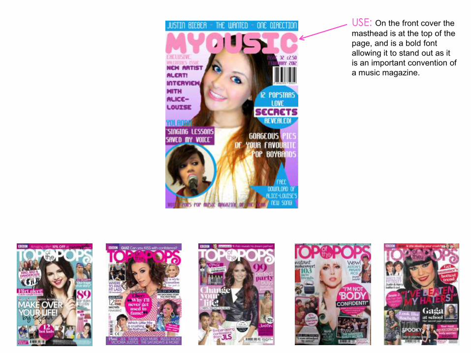
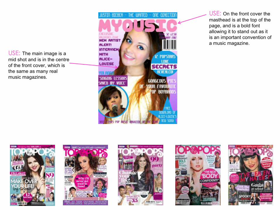
USE: On the front cover the
masthead is at the top of the
page, and is a bold font
allowing it to stand out as it
is an important convention of
a music magazine.
USE: On the front cover the
masthead is at the top of the
page, and is a bold font
allowing it to stand out as it
is an important convention of
a music magazine.
USE: The main image is a
mid shot and is in the centre
of the front cover, which is
the same as many real
music magazines.
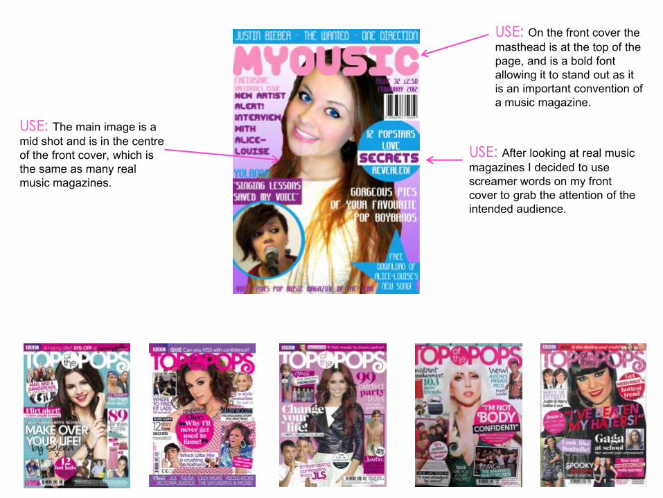
USE: On the front cover the
masthead is at the top of the
page, and is a bold font
allowing it to stand out as it
is an important convention of
a music magazine.
USE: The main image is a
mid shot and is in the centre
of the front cover, which is
the same as many real
music magazines.
USE: After looking at real music
magazines I decided to use
screamer words on my front
cover to grab the attention of the
intended audience.
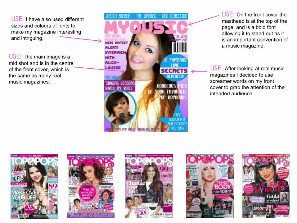
USE: I have also used different
sizes and colours of fonts to
make my magazine interesting
and intriguing.
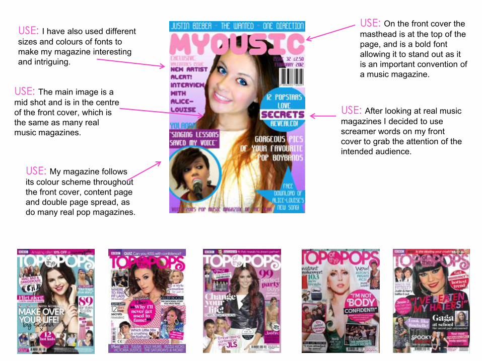
USE: On the front cover the
masthead is at the top of the
page, and is a bold font
allowing it to stand out as it
is an important convention of
a music magazine.
USE: The main image is a
mid shot and is in the centre
of the front cover, which is
the same as many real
music magazines.
USE: After looking at real music
magazines I decided to use
screamer words on my front
cover to grab the attention of the
intended audience.
USE: I have also used different
sizes and colours of fonts to
make my magazine interesting
and intriguing.
USE: My magazine follows
its colour scheme throughout
the front cover, content page
and double page spread, as
do many real pop magazines.
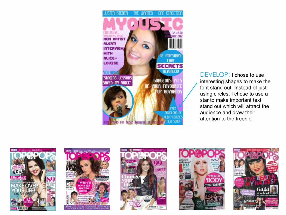
DEVELOP: I chose to use
interesting shapes to make the
font stand out. Instead of just
using circles, I chose to use a
star to make important text
stand out which will attract the
audience and draw their
attention to the freebie.
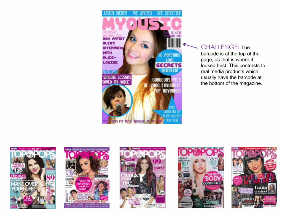
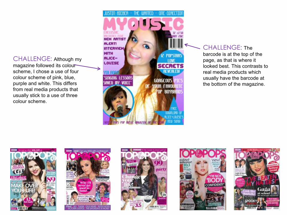
CHALLENGE: The
barcode is at the top of the
page, as that is where it
looked best. This contrasts to
real media products which
usually have the barcode at
the bottom of the magazine.
CHALLENGE: The
barcode is at the top of the
page, as that is where it
looked best. This contrasts to
real media products which
usually have the barcode at
the bottom of the magazine.
CHALLENGE: Although my
magazine followed its colour
scheme, I chose a use of four
colour scheme of pink, blue,
purple and white. This differs
from real media products that
usually stick to a use of three
colour scheme.
Real Media Product
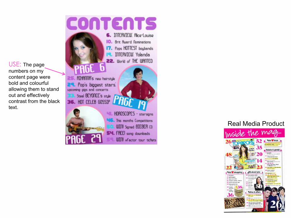
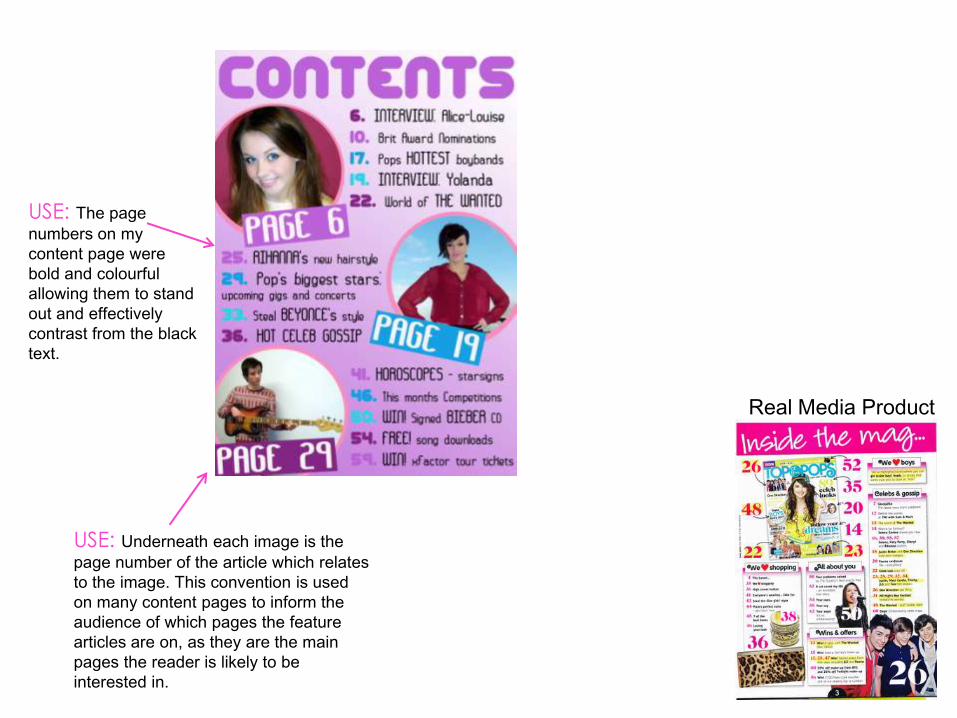
USE: The page
numbers on my
content page were
bold and colourful
allowing them to stand
out and effectively
contrast from the black
text.
Real Media Product
USE: The page
numbers on my
content page were
bold and colourful
allowing them to stand
out and effectively
contrast from the black
text.
USE: Underneath each image is the
page number of the article which relates
to the image. This convention is used
on many content pages to inform the
audience of which pages the feature
articles are on, as they are the main
pages the reader is likely to be
interested in.
Real Media Product
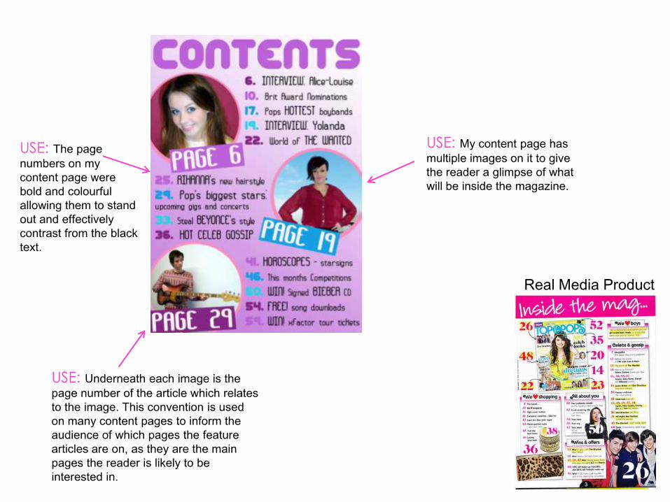
USE: The page
numbers on my
content page were
bold and colourful
allowing them to stand
out and effectively
contrast from the black
text.
USE: Underneath each image is the
page number of the article which relates
to the image. This convention is used
on many content pages to inform the
audience of which pages the feature
articles are on, as they are the main
pages the reader is likely to be
interested in.
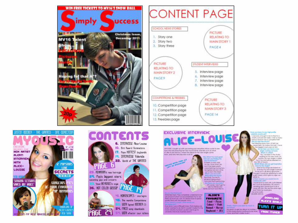
USE: My content page has
multiple images on it to give
the reader a glimpse of what
will be inside the magazine.
Real Media Product
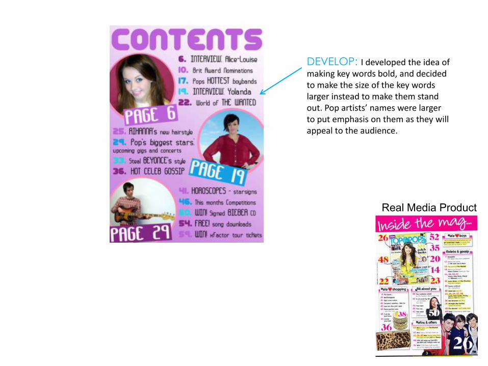
DEVELOP: I developed the idea of making key words bold, and decided to make the size of the key words larger instead to make them stand out. Pop artists’ names were larger to put emphasis on them as they will appeal to the audience.
Real Media Product
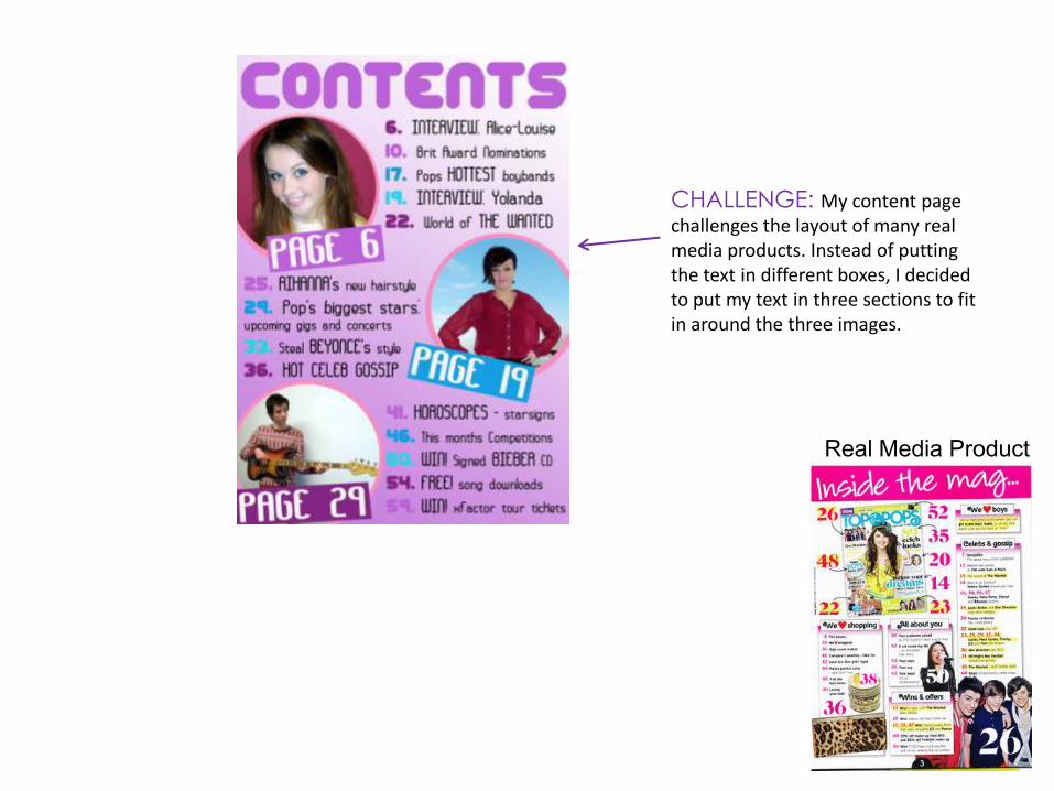
CHALLENGE: My content page challenges the layout of many real media products. Instead of putting the text in different boxes, I decided to put my text in three sections to fit in around the three images.
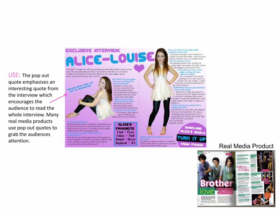
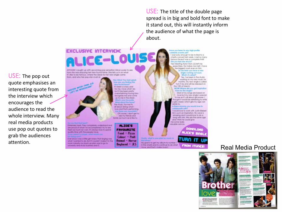
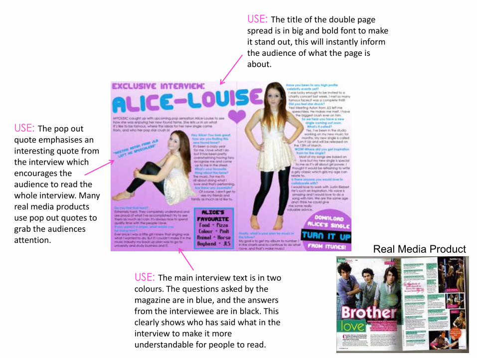
USE: The pop out quote emphasises an interesting quote from the interview which encourages the audience to read the whole interview. Many real media products use pop out quotes to grab the audiences attention.
Real Media Product
USE: The pop out quote emphasises an interesting quote from the interview which encourages the audience to read the whole interview. Many real media products use pop out quotes to grab the audiences attention.
USE: The title of the double page spread is in big and bold font to make it stand out, this will instantly inform the audience of what the page is about.
USE: The main interview text is in two colours. The questions asked by the magazine are in blue, and the answers from the interviewee are in black. This clearly shows who has said what in the interview to make it more understandable for people to read.
Real Media Product
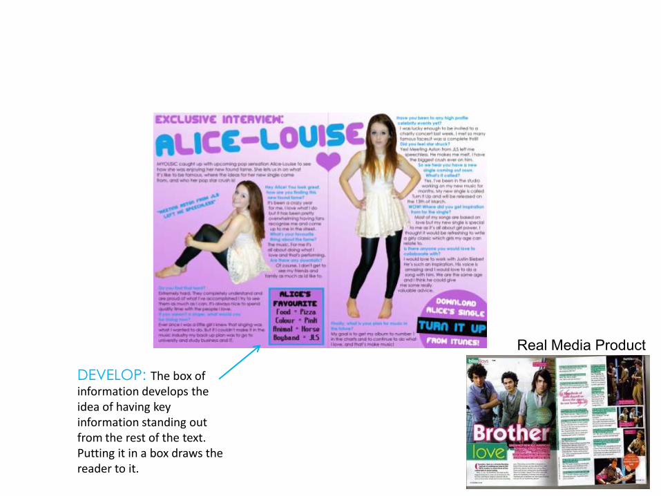
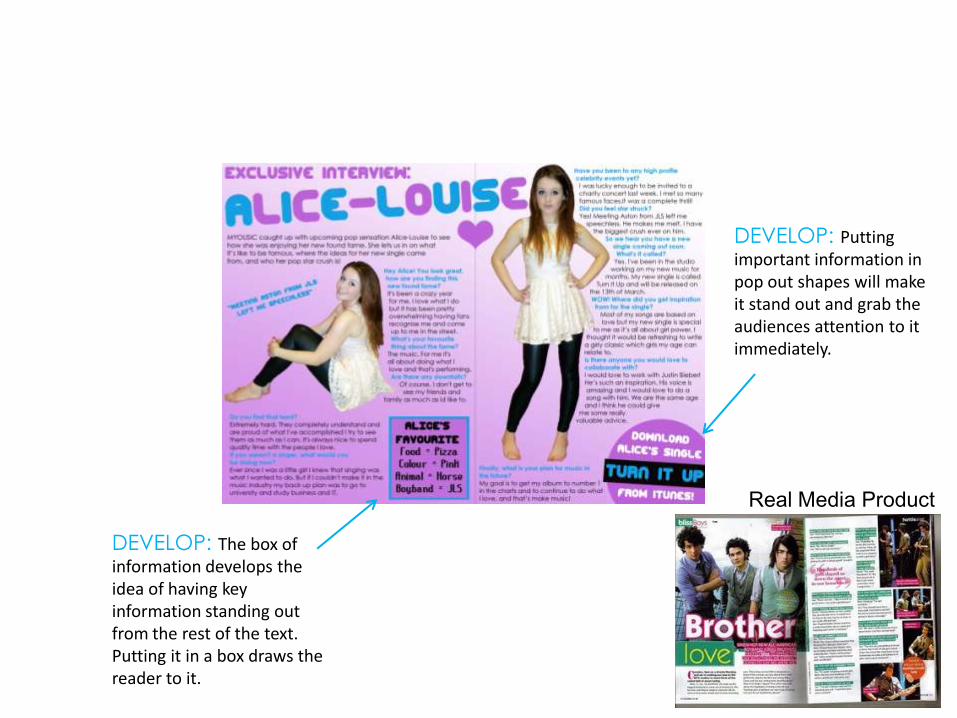
DEVELOP: The box of information develops the idea of having key information standing out from the rest of the text. Putting it in a box draws the reader to it.
Real Media Product
DEVELOP: The box of information develops the idea of having key information standing out from the rest of the text. Putting it in a box draws the reader to it.
Real Media Product
DEVELOP: Putting important information in pop out shapes will make it stand out and grab the audiences attention to it immediately.
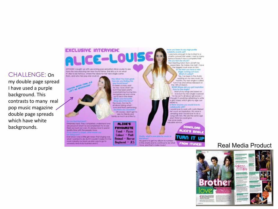
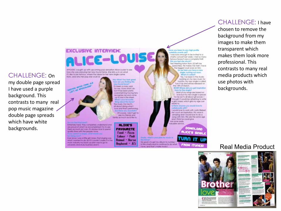
CHALLENGE: On my double page spread I have used a purple background. This contrasts to many real pop music magazine double page spreads which have white backgrounds.
Real Media Product
CHALLENGE: On my double page spread I have used a purple background. This contrasts to many real pop music magazine double page spreads which have white backgrounds.
Real Media Product
CHALLENGE: I have chosen to remove the background from my images to make them transparent which makes them look more professional. This contrasts to many real media products which use photos with backgrounds.

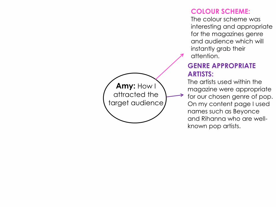
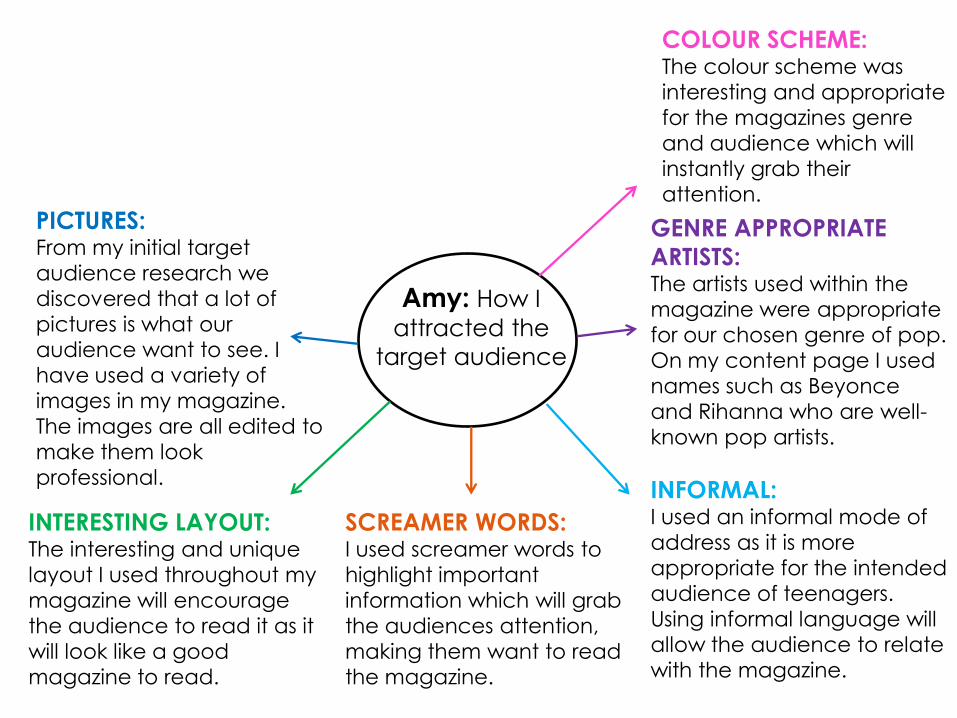
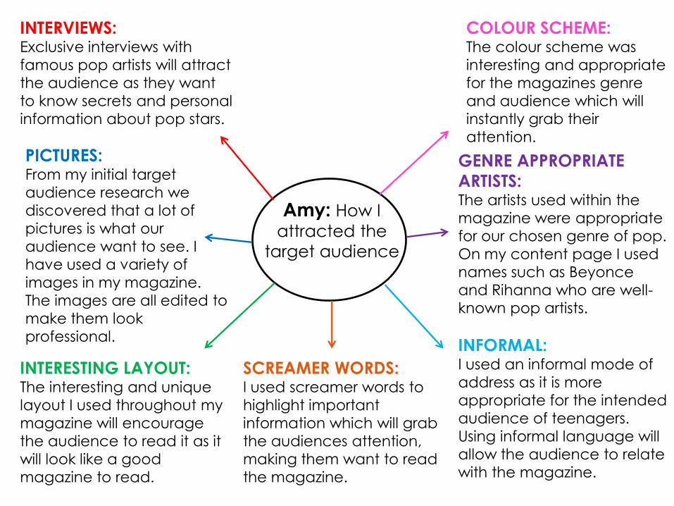
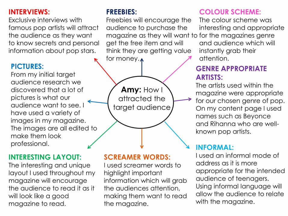
Amy: How I
attracted the
target audience
COLOUR SCHEME:The colour scheme was
interesting and appropriate
for the magazines genre
and audience which will
instantly grab their
attention.
Amy: How I
attracted the
target audience
COLOUR SCHEME:The colour scheme was
interesting and appropriate
for the magazines genre
and audience which will
instantly grab their
attention.
GENRE APPROPRIATE
ARTISTS:The artists used within the
magazine were appropriate
for our chosen genre of pop.
On my content page I used
names such as Beyonce
and Rihanna who are well-
known pop artists.
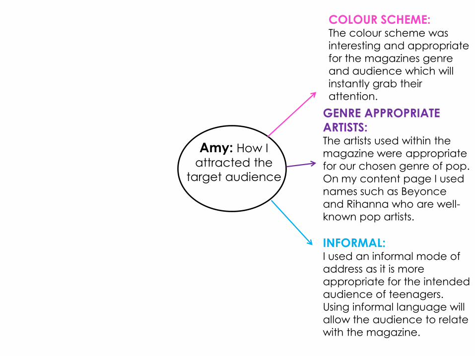
INFORMAL:I used an informal mode of
address as it is more
appropriate for the intended
audience of teenagers.
Using informal language will
allow the audience to relate
with the magazine.
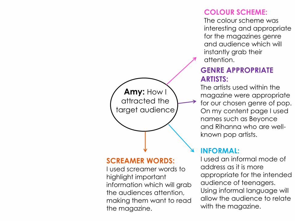
SCREAMER WORDS:I used screamer words to
highlight important
information which will grab
the audiences attention,
making them want to read
the magazine.
Amy: How I
attracted the
target audience
COLOUR SCHEME:The colour scheme was
interesting and appropriate
for the magazines genre
and audience which will
instantly grab their
attention.
GENRE APPROPRIATE
ARTISTS:The artists used within the
magazine were appropriate
for our chosen genre of pop.
On my content page I used
names such as Beyonce
and Rihanna who are well-
known pop artists.
INFORMAL:I used an informal mode of
address as it is more
appropriate for the intended
audience of teenagers.
Using informal language will
allow the audience to relate
with the magazine.
SCREAMER WORDS:I used screamer words to
highlight important
information which will grab
the audiences attention,
making them want to read
the magazine.
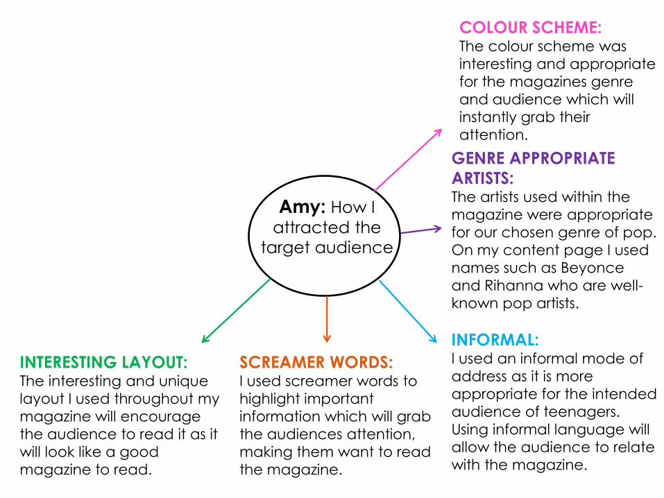
INTERESTING LAYOUT:The interesting and unique
layout I used throughout my
magazine will encourage
the audience to read it as it
will look like a good
magazine to read.
Amy: How I
attracted the
target audience
COLOUR SCHEME:The colour scheme was
interesting and appropriate
for the magazines genre
and audience which will
instantly grab their
attention.
GENRE APPROPRIATE
ARTISTS:The artists used within the
magazine were appropriate
for our chosen genre of pop.
On my content page I used
names such as Beyonce
and Rihanna who are well-
known pop artists.
INFORMAL:I used an informal mode of
address as it is more
appropriate for the intended
audience of teenagers.
Using informal language will
allow the audience to relate
with the magazine.
SCREAMER WORDS:I used screamer words to
highlight important
information which will grab
the audiences attention,
making them want to read
the magazine.
INTERESTING LAYOUT:The interesting and unique
layout I used throughout my
magazine will encourage
the audience to read it as it
will look like a good
magazine to read.
PICTURES:From my initial target
audience research we
discovered that a lot of
pictures is what our
audience want to see. I
have used a variety of
images in my magazine.
The images are all edited to
make them look
professional.
INTERVIEWS:Exclusive interviews with
famous pop artists will attract
the audience as they want
to know secrets and personal
information about pop stars.
FREEBIES:Freebies will encourage the
audience to purchase the
magazine as they will want to
get the free item and will
think they are getting value
for money.
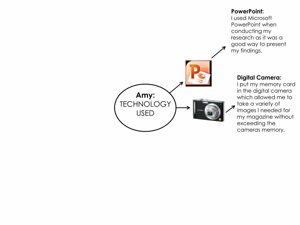
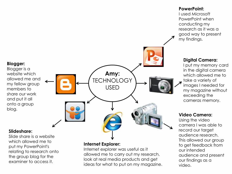
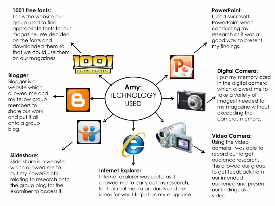
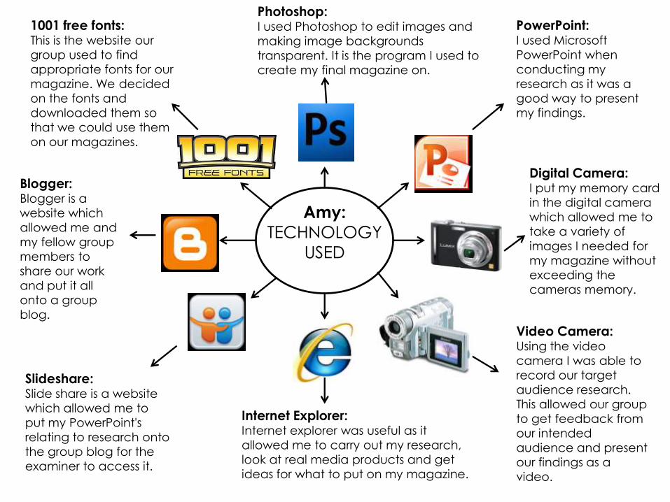
Amy:
TECHNOLOGY
USED
PowerPoint:I used Microsoft
PowerPoint when
conducting my
research as it was a
good way to present
my findings.
Amy:
TECHNOLOGY
USED
PowerPoint:I used Microsoft
PowerPoint when
conducting my
research as it was a
good way to present
my findings.
Digital Camera:I put my memory card
in the digital camera
which allowed me to
take a variety of
images I needed for
my magazine without
exceeding the
cameras memory.
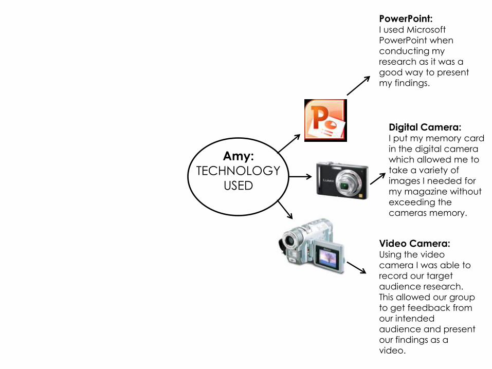
Amy:
TECHNOLOGY
USED
PowerPoint:I used Microsoft
PowerPoint when
conducting my
research as it was a
good way to present
my findings.
Digital Camera:I put my memory card
in the digital camera
which allowed me to
take a variety of
images I needed for
my magazine without
exceeding the
cameras memory.
Video Camera:Using the video
camera I was able to
record our target
audience research.
This allowed our group
to get feedback from
our intended
audience and present
our findings as a
video.
Internet Explorer:Internet explorer was useful as it
allowed me to carry out my research,
look at real media products and get
ideas for what to put on my magazine.
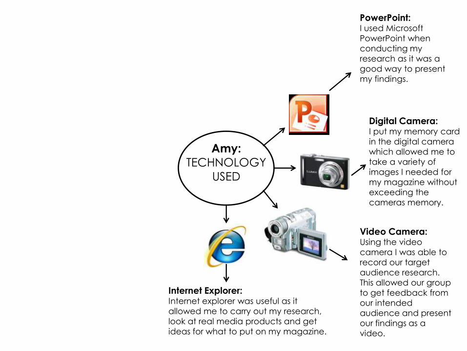
Slideshare:Slide share is a website
which allowed me to
put my PowerPoint's
relating to research onto
the group blog for the
examiner to access it.
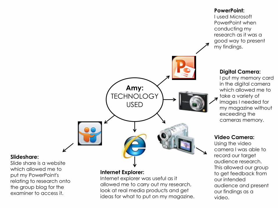
Blogger:Blogger is a
website which
allowed me and
my fellow group
members to
share our work
and put it all
onto a group
blog.
1001 free fonts:This is the website our
group used to find
appropriate fonts for our
magazine. We decided
on the fonts and
downloaded them so
that we could use them
on our magazines.
Amy:
TECHNOLOGY
USED
PowerPoint:I used Microsoft
PowerPoint when
conducting my
research as it was a
good way to present
my findings.
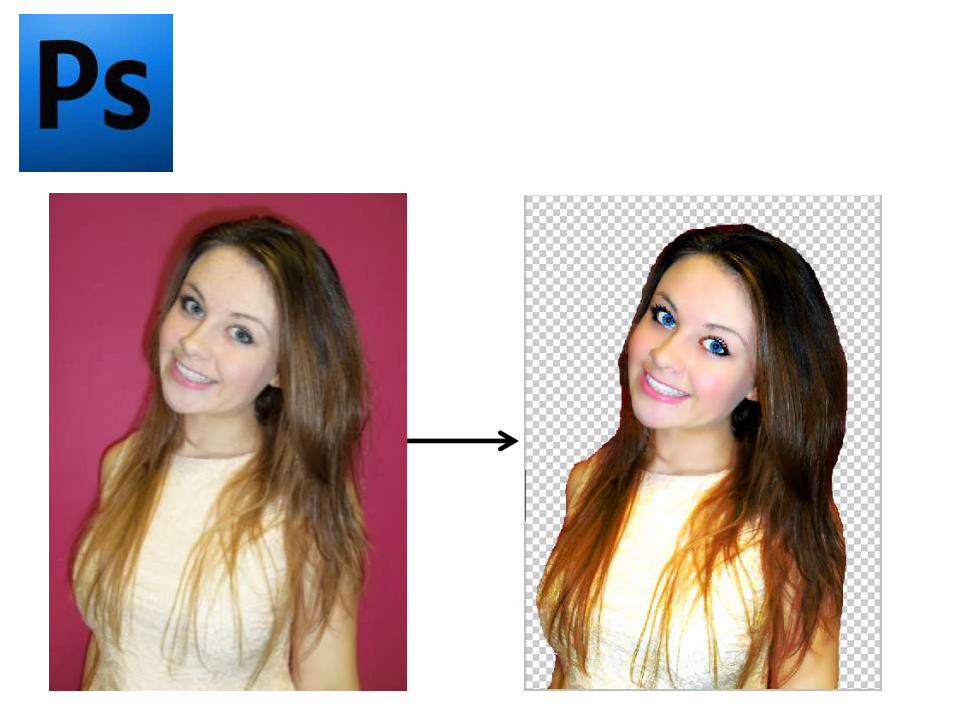
Photoshop:I used Photoshop to edit images and
making image backgrounds
transparent. It is the program I used to
create my final magazine on.
Digital Camera:I put my memory card
in the digital camera
which allowed me to
take a variety of
images I needed for
my magazine without
exceeding the
cameras memory.
Video Camera:Using the video
camera I was able to
record our target
audience research.
This allowed our group
to get feedback from
our intended
audience and present
our findings as a
video.
Internet Explorer:Internet explorer was useful as it
allowed me to carry out my research,
look at real media products and get
ideas for what to put on my magazine.
Slideshare:Slide share is a website
which allowed me to
put my PowerPoint's
relating to research onto
the group blog for the
examiner to access it.
Blogger:Blogger is a
website which
allowed me and
my fellow group
members to
share our work
and put it all
onto a group
blog.
1001 free fonts:This is the website our
group used to find
appropriate fonts for our
magazine. We decided
on the fonts and
downloaded them so
that we could use them
on our magazines.