altro css - uniroma2.itppl.eln.uniroma2.it/pw/wp-content/uploads/pw11-css-html...ment. many...
TRANSCRIPT

ALTROCSS
ProgrammazioneWeb 1

Commen-• Ilcontenutofra/*e*/viene
ignorato
• Possousareicommen9inognipuntodelfile
• Siusanoicommen9per– delimitarelesezionilogichedelfile– nasconderetemporaneamentedelle
dichiarazioni
ProgrammazioneWeb 2

dire1va@import• @importèladireBvacssperincluderealtricss– devofornirelaurlassolutaorela9va
ProgrammazioneWeb 3
Part III, CSS for Presentation302
Finally, External Style Sheets
You can include multiple link elements to different style sheets and they’ll all apply. If there are conflicts, whichever one is listed last will override previ-ous settings, due to the rule order and the cascade.
Importing with @importThe other method for attaching an external style sheet to a document is to import it with an @import rule. The @import rule is another type of rule you can add to a style sheet, either in an external .css style sheet document, or right in the style element, as shown in the following example.
<head> <style> @import url("/path/stylesheet.css"); p { font-face: Verdana;} </style> <title>Titles are required.</title></head>
In this example, a relative URL is shown, but it could also be an absolute URL (beginning with http://). The @import rule must go in the beginning of the style sheet before any selectors. You can import more than one style sheet and they all will apply, but rules from the last style sheet listed take precedence over earlier ones.
You can try both the link and @import methods in Exercise 13-8.
N OT E
You can also supply the URL without the url( ) notation:@import "/path/style.css";
Again, absolute pathnames, beginning at the root, will ensure that the .css document will always be found.
Modular Style SheetsBecause you can compile information from multiple external style sheets, modular style sheets have become a popular technique for style manage-ment. Many developers keep styles they frequently reuse, such as typogra-phy treatments, layout rules, or form-related styles, in separate style sheets, then combine them in mix-and-match fashion using @import rules. Again, the @import rules need to go before rules that use selectors.
Content of clientsite.css:
/* basic typography */@import url("type.css");
/* form inputs */@import url("forms.css");
/* navigation */@import url("list-nav.css");
exercise 13-8 | Making an external style sheetIt is OK to use an embedded style sheet while designing a page, but it is probably best moved to an external style sheet once the design is finished so it can be reused by multiple documents in the site. We’ll do just that for the bistro menu style sheet.
1. Open the latest version of bistro.html. Select and cut all of the rules within the style element, but leave the <style>...</style> tags because we’ll be using them in a moment.
2. Create a new plain ASCII text document and paste all of the style rules. Make sure that no markup got in there by accident.
3. Save this document as menustyles.css in the same directory as the bistro.html document.
4. Now, back in bistro.html, add an @import rule to attach the external style sheet:
<style>@import url(menustyles.css);</style>
Save the file and reload it in the browser. It should look exactly the same as it did when the style sheet was embedded. If not, go back and make sure that everything matches the examples.
5. Delete the whole style element, and this time we’ll add the style sheet with a link element in the head of the document.
<link rel="stylesheet" href="menustyles.css" > Again, test your work by saving the document and viewing it in the browser.
www.it-ebooks.info
Inunfilehtml
Inunfilecss

reset.css
ProgrammazioneWeb 4
Part III, CSS for Presentation428
A Clean Slate (CSS Reset)
/* http://meyerweb.com/eric/tools/css/reset/ v2.0 | 20110126 License: none (public domain)*/html, body, div, span, applet, object, iframe, h1, h2, h3, h4, h5, h6, p, blockquote, pre, a, abbr, acronym, address, big, cite, code, del, dfn, em, img, ins, kbd, q, s, samp, small, strike, strong, sub, sup, tt, var, b, u, i, center, dl, dt, dd, ol, ul, li, fieldset, form, label, legend, table, caption, tbody, tfoot, thead, tr, th, td, article, aside, canvas, details, embed, figure, figcaption, footer, header, hgroup, menu, nav, output, ruby, section, summary, time, mark, audio, video { margin: 0; padding: 0; border: 0; font-size: 100%; font: inherit; vertical-align: baseline; } /* HTML5 display-role reset for older browsers */ article, aside, details, figcaption, figure, footer, header, hgroup, menu, nav, section { display: block; } body { line-height: 1; } ol, ul { list-style: none; } blockquote, q { quotes: none; } blockquote:before, blockquote:after, q:before, q:after { content: ‘’; content: none; }table { border-collapse: collapse; border-spacing: 0; }
To use the reset, place these styles at the top of your own style sheet. You can use them exactly as you see them here or customize them as your project requires. I also recommend that you read Eric’s posts about the thinking that went into his settings (meyerweb.com/eric/tools/css/reset/ and meyerweb.com/eric/thoughts/2007/04/18/reset-reasoning/).
CSS resets aren’t for everyone. You may decide that you want to lean on the browser for some basic styling and not be required to write styles for every little thing. But if you want to be sure that all the styles showing up are yours, a reset may be the way to go.
N OT E
There is another reset made available by the developers at Yahoo!. To use it, simply paste the following line into the head of your HTML document:
<link rel="stylesheet" type="text/css" href="http://yui.yahooapis.com/3.5.1/build/cssreset/cssreset-min.css">
Before you do, however, be sure to read about what it does here: yuilibrary.com/yui/docs/cssreset/.
www.it-ebooks.info

POSIZIONEDEGLIELEMENTI
ProgrammazioneWeb 5

Posizionedeglielemen-block
ProgrammazioneWeb 6
Part III, CSS for Presentation342
Floating
a b c d e f g h i j k l m n o p q r s t u v w x y z
Inline content reflows to fit the width of the block.
a b c d e f g h i j k lm n o p q r s t u vw x y z
Blocks fill the available width.
Blocks are layed out in theorder in which they appear inthe source.
Each block starts on a new line.
<p>
<h1>
<p>
<p>
<p>
<h1>
<p>
<p>
Figure 15-1. One more example of the normal flow behavior.
Objects in the normal flow affect the layout of the objects around them. This is the behavior you’ve come to expect in web pages—elements don’t overlap or bunch up. They make room for one another.
We’ve seen all of this before, but in this chapter we’ll be paying attention to whether elements are in the flow or removed from the flow. Floating and positioning change the relationship of elements to the normal flow in dif-ferent ways. Let’s first look at the special behavior of floated elements (or “floats” for short).
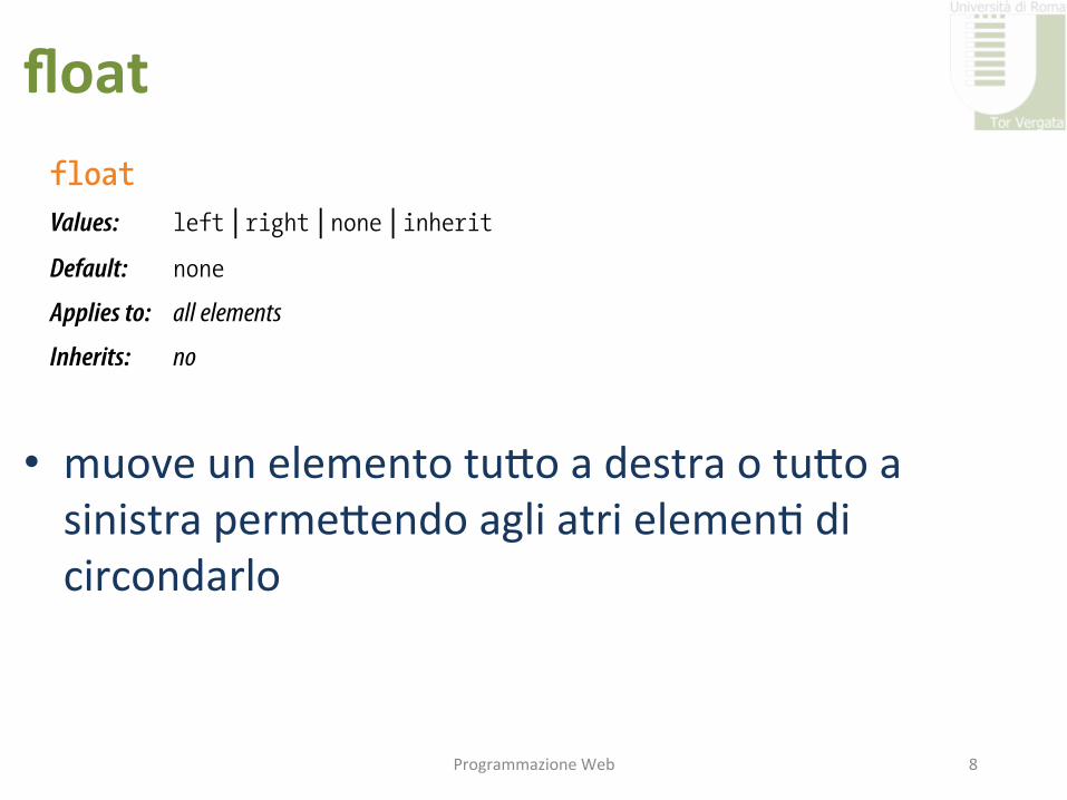
Floating Simply stated, the float property moves an element as far as possible to the left or right, allowing the following content to wrap around it. It is not a positioning scheme per se, but a unique feature built into CSS with some interesting behaviors. Floats are one of the primary tools of modern CSS-based web design, used to create multicolumn layouts, navigation toolbars from lists, and table-like alignment without tables. Let’s start with the float property itself.
floatValues: left | right | none | inheritDefault: none
Applies to: all elements
Inherits: no
The best way to explain floating is to demonstrate it. In this example, the float property is applied to an img element to float it to the right. Figure 15-2 shows how the paragraph and the contained image are rendered by default (top) and how it looks when the float property is applied (bottom).
The markup
<p><img src="crown.gif" alt="">They went down, down,...</p>
Dealing with Browser BugsThis is a good time to address the unfortunate topic of browser bugs. This book presents the way CSS is supposed to work, but in reality, desktop and mobile browsers have bugs that make some aspects of CSS layout a headache.
In the past, the main culprit was Internet Explorer 6. It had bugs so well known that we gave them cute names like the “Guillotine Bug,” the “Peekaboo Bug,” the “Double-Float Margin Bug,” and the “3-Pixel Gap Bug,” just to name a few.
These bugs have been fixed in later versions of IE and are no longer an issue. IE6 represents less than 1% of browser use in the United States as of this writing, so most developers do not jump through hoops to cater to its peculiarities. If you do need to support old IE versions, the Position Is Everything site is the place to go for fixes: positioniseverything.net/explorer.html.Before you start doing a happy dance, in some ways we may be in a worse spot today. Not only are there multitudes of browsers running on all sorts of devices, but the bugs tend to be more esoteric and less easily predicted.
I will certainly point out when a property is known to cause fussy browser behavior. By the time you are reading this, the offending browsers may already be off the radar. The best advice I can give you is to test your designs on as many browsers and devices as you can get your hands on and fix things that appear to be broken.
Web searches for particular properties or browsers plus “bugs” usually turn up posts by developers having similar problems or offering potential workarounds. You can also check the CSS-discuss Wiki (css-discuss.incutio.com), which archives known bugs for all browsers in addition to boatloads of other useful CSS information.
www.it-ebooks.info
Cambiareilflusso• float– clear
• posi9on– top,boIom,leJ,right– z-index
ProgrammazioneWeb 7
float
• muoveunelementotuIoadestraotuIoasinistrapermeIendoagliatrielemen9dicircondarlo
ProgrammazioneWeb 8
Part III, CSS for Presentation342
Floating
a b c d e f g h i j k l m n o p q r s t u v w x y z
Inline content reflows to fit the width of the block.
a b c d e f g h i j k lm n o p q r s t u vw x y z
Blocks fill the available width.
Blocks are layed out in theorder in which they appear inthe source.
Each block starts on a new line.
<p>
<h1>
<p>
<p>
<p>
<h1>
<p>
<p>
Figure 15-1. One more example of the normal flow behavior.
Objects in the normal flow affect the layout of the objects around them. This is the behavior you’ve come to expect in web pages—elements don’t overlap or bunch up. They make room for one another.
We’ve seen all of this before, but in this chapter we’ll be paying attention to whether elements are in the flow or removed from the flow. Floating and positioning change the relationship of elements to the normal flow in dif-ferent ways. Let’s first look at the special behavior of floated elements (or “floats” for short).
Floating Simply stated, the float property moves an element as far as possible to the left or right, allowing the following content to wrap around it. It is not a positioning scheme per se, but a unique feature built into CSS with some interesting behaviors. Floats are one of the primary tools of modern CSS-based web design, used to create multicolumn layouts, navigation toolbars from lists, and table-like alignment without tables. Let’s start with the float property itself.
floatValues: left | right | none | inheritDefault: none
Applies to: all elements
Inherits: no
The best way to explain floating is to demonstrate it. In this example, the float property is applied to an img element to float it to the right. Figure 15-2 shows how the paragraph and the contained image are rendered by default (top) and how it looks when the float property is applied (bottom).
The markup
<p><img src="crown.gif" alt="">They went down, down,...</p>
Dealing with Browser BugsThis is a good time to address the unfortunate topic of browser bugs. This book presents the way CSS is supposed to work, but in reality, desktop and mobile browsers have bugs that make some aspects of CSS layout a headache.
In the past, the main culprit was Internet Explorer 6. It had bugs so well known that we gave them cute names like the “Guillotine Bug,” the “Peekaboo Bug,” the “Double-Float Margin Bug,” and the “3-Pixel Gap Bug,” just to name a few.
These bugs have been fixed in later versions of IE and are no longer an issue. IE6 represents less than 1% of browser use in the United States as of this writing, so most developers do not jump through hoops to cater to its peculiarities. If you do need to support old IE versions, the Position Is Everything site is the place to go for fixes: positioniseverything.net/explorer.html.Before you start doing a happy dance, in some ways we may be in a worse spot today. Not only are there multitudes of browsers running on all sorts of devices, but the bugs tend to be more esoteric and less easily predicted.
I will certainly point out when a property is known to cause fussy browser behavior. By the time you are reading this, the offending browsers may already be off the radar. The best advice I can give you is to test your designs on as many browsers and devices as you can get your hands on and fix things that appear to be broken.
Web searches for particular properties or browsers plus “bugs” usually turn up posts by developers having similar problems or offering potential workarounds. You can also check the CSS-discuss Wiki (css-discuss.incutio.com), which archives known bugs for all browsers in addition to boatloads of other useful CSS information.
www.it-ebooks.info

Esempio
ProgrammazioneWeb 9
Floating
Chapter 15, Floating and Positioning 343
The style sheet
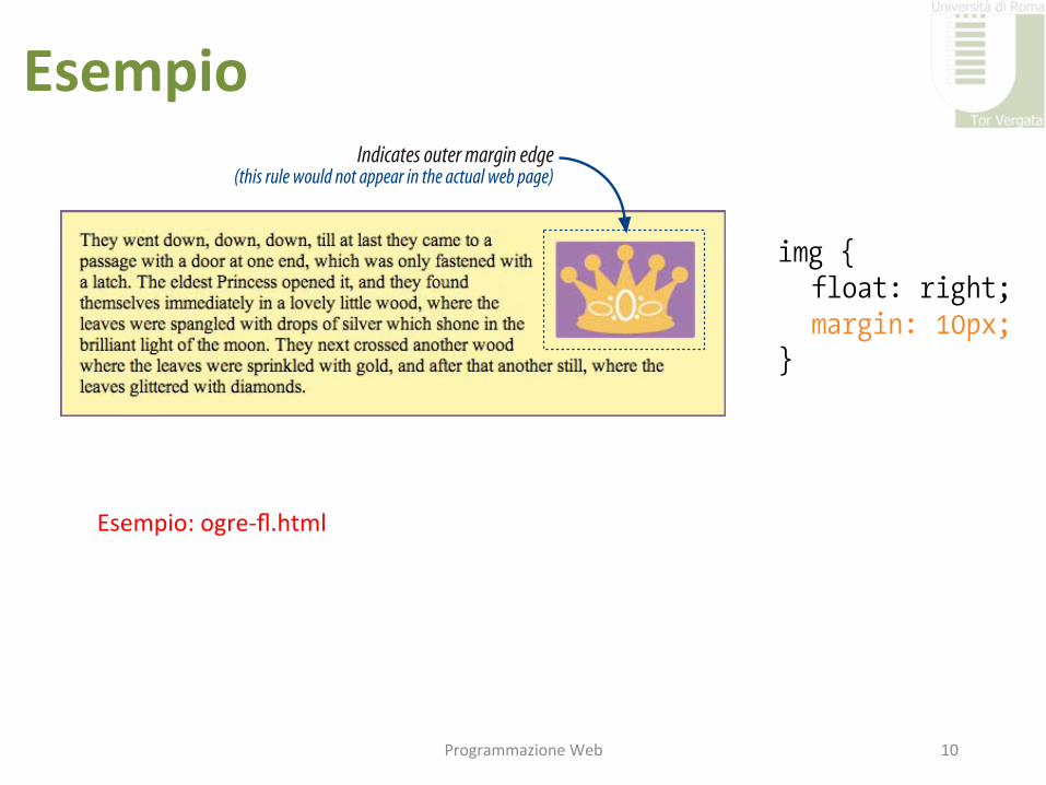
img { float: right; }p { padding: 15px; background-color: #FFF799; border: 2px solid #6C4788;}
image moves over and text wraps around it
Inline image in the normal flow
Inline image floated to the right.
space next to the image is held clear
Figure 15-2. The layout of an image in the normal flow (top), and with the float property applied (bottom).
That’s a nice effect…we’ve gotten rid of a lot of wasted space on the page, but now the text is bumping right up against the image. How do you think you would add some space between the image element and the surrounding text? If you guessed “add a margin,” you’re absolutely right. I’ll add 10 pixels of space on all sides of the image using the margin property (Figure 15-3). You can begin to see how all the box properties work together in page lay-out.
img { float: right; margin: 10px;}
Indicates outer margin edge(this rule would not appear in the actual web page)
Figure 15-3. Adding a 10-pixel margin around the floated image.
www.it-ebooks.info
Floating
Chapter 15, Floating and Positioning 343
The style sheet
img { float: right; }p { padding: 15px; background-color: #FFF799; border: 2px solid #6C4788;}
image moves over and text wraps around it
Inline image in the normal flow
Inline image floated to the right.
space next to the image is held clear
Figure 15-2. The layout of an image in the normal flow (top), and with the float property applied (bottom).
That’s a nice effect…we’ve gotten rid of a lot of wasted space on the page, but now the text is bumping right up against the image. How do you think you would add some space between the image element and the surrounding text? If you guessed “add a margin,” you’re absolutely right. I’ll add 10 pixels of space on all sides of the image using the margin property (Figure 15-3). You can begin to see how all the box properties work together in page lay-out.
img { float: right; margin: 10px;}
Indicates outer margin edge(this rule would not appear in the actual web page)
Figure 15-3. Adding a 10-pixel margin around the floated image.
www.it-ebooks.info
Esempio
ProgrammazioneWeb 10
Floating
Chapter 15, Floating and Positioning 343
The style sheet
img { float: right; }p { padding: 15px; background-color: #FFF799; border: 2px solid #6C4788;}
image moves over and text wraps around it
Inline image in the normal flow
Inline image floated to the right.
space next to the image is held clear
Figure 15-2. The layout of an image in the normal flow (top), and with the float property applied (bottom).
That’s a nice effect…we’ve gotten rid of a lot of wasted space on the page, but now the text is bumping right up against the image. How do you think you would add some space between the image element and the surrounding text? If you guessed “add a margin,” you’re absolutely right. I’ll add 10 pixels of space on all sides of the image using the margin property (Figure 15-3). You can begin to see how all the box properties work together in page lay-out.
img { float: right; margin: 10px;}
Indicates outer margin edge(this rule would not appear in the actual web page)
Figure 15-3. Adding a 10-pixel margin around the floated image.
www.it-ebooks.info
Floating
Chapter 15, Floating and Positioning 343
The style sheet
img { float: right; }p { padding: 15px; background-color: #FFF799; border: 2px solid #6C4788;}
image moves over and text wraps around it
Inline image in the normal flow
Inline image floated to the right.
space next to the image is held clear
Figure 15-2. The layout of an image in the normal flow (top), and with the float property applied (bottom).
That’s a nice effect…we’ve gotten rid of a lot of wasted space on the page, but now the text is bumping right up against the image. How do you think you would add some space between the image element and the surrounding text? If you guessed “add a margin,” you’re absolutely right. I’ll add 10 pixels of space on all sides of the image using the margin property (Figure 15-3). You can begin to see how all the box properties work together in page lay-out.
img { float: right; margin: 10px;}
Indicates outer margin edge(this rule would not appear in the actual web page)
Figure 15-3. Adding a 10-pixel margin around the floated image.
www.it-ebooks.infoEsempio:ogre-fl.html

CaraIeris-che• Sistaccanodalflussonormalemainfluenzanoilcontenutodeiblocchiintorno
• Sonocontenu9nell'areadelcontenutodell'elementochelicon9ene
• Imarginisonomantenu9
ProgrammazioneWeb 11

cleardeifloat
ProgrammazioneWeb 12
Floating
Chapter 15, Floating and Positioning 347
Elements do not float higher than their reference in the source.
A floated block will float to the left or right relative to where it occurs in the source, allowing the following elements in the flow to wrap around it. It will stay below any block elements that precede it in the flow (in effect, it is “blocked” by them). That means you can’t float an element up to the top corner of a page, even if its nearest ancestor is the body element. If you want a floated element to start at the top of the page, it must appear first in the document source.
Clearing floated elementsIf you’re going to be floating elements around, it’s important to know how to turn the text wrapping off and get back to layout as usual. This is done by clearing the element that you want to start below the float. Applying the clear property to an element prevents it from appearing next to a floated element and forces it to start against the next available “clear” space below the float.
clearValues: left | right | both | none | inheritDefault: none
Applies to: block-level elements only
Inherits: no
Keep in mind that you apply the clear property to the element you want to start below the floated element, not the floated element itself. The left value starts the element below any elements that have been floated to the left. Similarly, the right value makes the element clear all floats on the right edge of the containing block. If there are multiple floated elements, and you want to be sure an element starts below all of them, use the both value to clear floats on both sides.
In this example, the clear property has been used to make h2 elements start below left-floated elements. Figure 15-6 shows how the h2 head-ing starts at the next available clear edge below the float.
img { float: left; margin-right: 10px;}h2 { clear: left; margin-top: 2em;}
N OT E
Absolute positioning is the CSS method for placing elements on a page regard-less of how they appear in the source. We’ll get to absolute positioning in a few sections.
Figure 15-6. Clearing a left-floated element
www.it-ebooks.info
Floating
Chapter 15, Floating and Positioning 347
Elements do not float higher than their reference in the source.
A floated block will float to the left or right relative to where it occurs in the source, allowing the following elements in the flow to wrap around it. It will stay below any block elements that precede it in the flow (in effect, it is “blocked” by them). That means you can’t float an element up to the top corner of a page, even if its nearest ancestor is the body element. If you want a floated element to start at the top of the page, it must appear first in the document source.
Clearing floated elementsIf you’re going to be floating elements around, it’s important to know how to turn the text wrapping off and get back to layout as usual. This is done by clearing the element that you want to start below the float. Applying the clear property to an element prevents it from appearing next to a floated element and forces it to start against the next available “clear” space below the float.
clearValues: left | right | both | none | inheritDefault: none
Applies to: block-level elements only
Inherits: no
Keep in mind that you apply the clear property to the element you want to start below the floated element, not the floated element itself. The left value starts the element below any elements that have been floated to the left. Similarly, the right value makes the element clear all floats on the right edge of the containing block. If there are multiple floated elements, and you want to be sure an element starts below all of them, use the both value to clear floats on both sides.
In this example, the clear property has been used to make h2 elements start below left-floated elements. Figure 15-6 shows how the h2 head-ing starts at the next available clear edge below the float.
img { float: left; margin-right: 10px;}h2 { clear: left; margin-top: 2em;}
N OT E
Absolute positioning is the CSS method for placing elements on a page regard-less of how they appear in the source. We’ll get to absolute positioning in a few sections.
Figure 15-6. Clearing a left-floated element
www.it-ebooks.info

Contenereifloat
ProgrammazioneWeb 13
Floating
Chapter 15, Floating and Positioning 351
At the very least, you will want to add some padding and/or margins to the anchor elements to give the links a little breathing room, but you can add any of the styles we’ve seen so far—colors, borders, rounded corners, background images—to give the navigation the look you want. The following styles turn the earlier list example into the tab-like menu shown in Figure 15-9.
Figure 15-9. The unordered list is transformed into a tab-like menu using CSS alone and no images.
Containing floatsAs long as we’re talking about multiple floats, this is a good time to address another float quirk, and that’s float containment. By default, floats are designed to hang out of the element they are contained in. That’s just fine for allowing text to flow around a floated image, but sometimes this behavior can cause some unwanted behaviors.
For instance, take the example in Figure 15-10. Clearly, it would be nicer if the border stretched to contain all the content, but the floated image hangs right out the bottom.
Figure 15-10. The containing element does not stretch to accommodate the floated image.
And if you float all the elements in a container element—as you might do to create a multicolumn layout—there will be no elements remaining in the flow to hold the containing element open. This phenomenon is illustrated in Figure 15-11. The #container div contains two paragraphs. The view of the normal flow (left) shows that the #container has a background color and border that wraps around the content. However, when both paragraphs are floated, the element box for the #container closes up to have a height of zero, leaving the floats hanging down below (you can still see the empty border at the top). This clearly is not the effect we are after.
www.it-ebooks.info
L'elementocontenitorenonsiallungapercontenereilfloat
Part III, CSS for Presentation352
Floating
In the normal flow, the container divencloses the paragraphs.
When both paragraphs are floated, the containerdoes not stretch around them.
Fortunately, there are a few fixes to this problem, and they are pretty straightforward. One option is to float the containing element as well and give it a width of 100%.
#container { float: left; width: 100%; background-color: #GGG; padding: 1em; }
The other common solution is to take advantage of the behavior of the overflow property. Setting the overflow of the containing element to auto or hidden will also make it stretch to contain the floated elements. I’ve also added an explicit width value to address bugs in old IE versions, but note that if your container element has a border, the 100% width will make the border hang outside of the browser window.
#container { overflow: auto; width: 100%; background-color: #GGG; padding: 1em; }
Figure 15-12 shows the result of applying a contain-ment technique to the previous examples. Either one will do the trick.
Now it is time to spiff up that navigation section on the Jenware page in Exercise 15-2.
Figure 15-12. Our hanging floats are now contained.
Figure 15-11. The container box disappears entirely when all its contents are floated.
www.it-ebooks.infoPart III, CSS for Presentation352
Floating
In the normal flow, the container divencloses the paragraphs.
When both paragraphs are floated, the containerdoes not stretch around them.
Fortunately, there are a few fixes to this problem, and they are pretty straightforward. One option is to float the containing element as well and give it a width of 100%.
#container { float: left; width: 100%; background-color: #GGG; padding: 1em; }
The other common solution is to take advantage of the behavior of the overflow property. Setting the overflow of the containing element to auto or hidden will also make it stretch to contain the floated elements. I’ve also added an explicit width value to address bugs in old IE versions, but note that if your container element has a border, the 100% width will make the border hang outside of the browser window.
#container { overflow: auto; width: 100%; background-color: #GGG; padding: 1em; }
Figure 15-12 shows the result of applying a contain-ment technique to the previous examples. Either one will do the trick.
Now it is time to spiff up that navigation section on the Jenware page in Exercise 15-2.
Figure 15-12. Our hanging floats are now contained.
Figure 15-11. The container box disappears entirely when all its contents are floated.
www.it-ebooks.info
Nell'elementocontenitoredevodichiarareoverflowautoohidden
Esempio:float-test.html
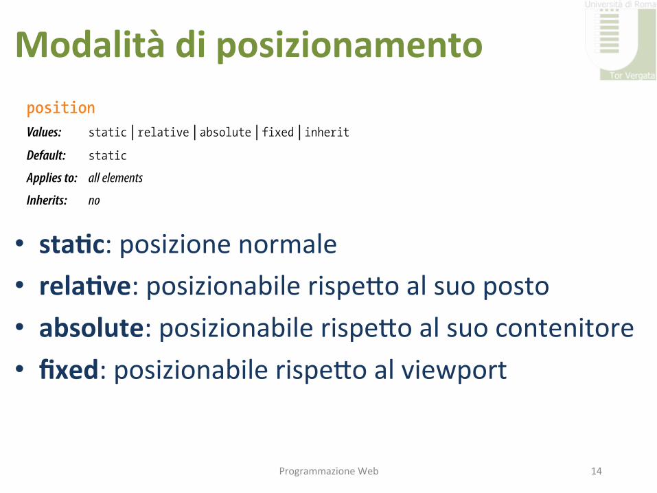
Modalitàdiposizionamento
• sta-c:posizionenormale• rela-ve:posizionabilerispeIoalsuoposto• absolute:posizionabilerispeIoalsuocontenitore• fixed:posizionabilerispeIoalviewport
ProgrammazioneWeb 14
Part III, CSS for Presentation356
Positioning Basics
Mixing % and EmsIn Exercise 15-2, we specified margins in a combination of percentage values and ems. This is actually common in contemporary web development, particularly for creating fluid layouts that respond to the size of the viewport. Some developers use percentages for all horizontal measurements so they are relative to the viewport size, but use ems for all vertical measurements because it is in keeping with the scale and the rhythm of lines of text. This technique is a preference, not a requirement, but it is something to keep in mind.
That covers the fundamentals of floating. Let’s move on to the other approach to moving elements around on the page—positioning.
Positioning BasicsCSS provides several methods for positioning elements on the page. They can be positioned relative to where they would normally appear in the flow, or removed from the flow altogether and placed at a particular spot on the page. You can also position an element relative to the browser window (technically known as the viewport in the CSS Recommendations) and it will stay put while the rest of the page scrolls.
Types of positioningpositionValues: static | relative | absolute | fixed | inheritDefault: static
Applies to: all elements
Inherits: no
The position property indicates that an element is to be positioned and specifies which positioning method to use. I’ll introduce each keyword value briefly here, and then we’ll take a more detailed look at each method in the remainder of this chapter.
static
This is the normal positioning scheme in which elements are positioned as they occur in the normal document flow.
relative
Relative positioning moves the box relative to its original position in the flow. The distinctive behavior of relative positioning is that the space the element would have occupied in the normal flow is preserved as an empty space.
WA R N I N G
Be careful mixing fluid columns with borders. It is usually best if your per-centages add up to less then 100%, to accommodate the border widths (if they are used) and to accommodate rounding errors that browsers sometimes make. If too many column widths are rounded up, the columns may be calculated as too wide for the browser and you’ll get the dreaded float drop.
www.it-ebooks.info
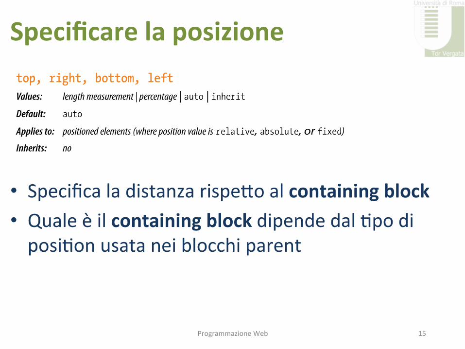
Specificarelaposizione
• SpecificaladistanzarispeIoalcontainingblock• Qualeèilcontainingblockdipendedal9podiposi9onusataneiblocchiparent
ProgrammazioneWeb 15
Positioning Basics
Chapter 15, Floating and Positioning 357
absolute
Absolutely positioned elements are removed from the document flow entirely and positioned with respect to the browser window or a contain-ing element (we’ll talk more about this later). Unlike relatively positioned elements, the space they would have occupied is closed up. In fact, they have no influence at all on the layout of surrounding elements.
fixed
The distinguishing characteristic of fixed positioning is that the element stays in one position in the window even when the document scrolls. Fixed elements are removed from the document flow and positioned relative to the browser window (or other viewport) rather than another element in the document. It currently causes some hiccups on mobile devices, as discussed later in this chapter.
Each positioning method has its purpose, but absolute positioning is the most versatile. With absolute positioning, you can place an object anywhere in the viewport or within another element. Absolute positioning can even be used to create multicolumn layouts, but it is more commonly used for small tasks, like positioning a search box in the top corner of a header. You can also use absolute positioning to break an image or chunk out of its contain-ing box, creating hanging indents or overlap effects. It’s a handy tool when used carefully and sparingly.
Specifying positionOnce you’ve established the positioning method, the actual position is speci-fied with four offset properties.
top, right, bottom, leftValues: length measurement | percentage | auto | inheritDefault: auto
Applies to: positioned elements (where position value is relative, absolute, or fixed)
Inherits: no
The values provided for each of the offset properties defines the distance the element should be moved away from that respective edge. For example, the value of top defines the distance the top outer edge of the positioned ele-ment should be offset from the top edge of the browser or other containing element. A positive value for top results in the element box moving down by that amount. Similarly, a positive value for left would move the positioned element to the right (toward the center of the containing block) by that amount.
Further explanations and examples of the offset properties will be provided in the discussions of each positioning method. We’ll start our exploration of positioning with the fairly straightforward relative method.
N OT E
Negative values are acceptable and move the element in the opposite direc-tion of positive values. For example, a negative value for top would have the effect of moving the element up.
www.it-ebooks.info

posi-on:rela-ve
• Lospaziooccupatooriginariamenteèconservato
• Causasovrapposizioni
ProgrammazioneWeb 16
Part III, CSS for Presentation358
Relative Positioning
Relative PositioningAs mentioned previously, relative positioning moves an element relative to its original spot in the flow. The space it would have occupied is preserved and continues to influence the layout of surrounding content. This is easier to understand with a simple example.
Here I’ve positioned an inline em element (a background color makes its boundaries apparent). First, I used the position property to set the method to relative, and then I used the top offset property to move the element 30 pixels down from its initial position and the left property to move it 60 pixels to the right. Remember, offset property values move the element away from the specified edge, so if you want something to move to the right, as I did here, you use the left offset property. The results are shown in Figure 15-16.
em { position: relative; top: 30px; left: 60px; background-color: fuchsia;}
30px60px
Figure 15-16. When an element is positioned with the relative method, the space it would have occupied is preserved.
I want to point out a few things that are happening here.
The original space in the document flow is preserved.
You can see that there is a blank space where the emphasized text would have been if the element had not been positioned. The surrounding con-tent is laid out as though the element were still there, and therefore we say that the element still “influences” the surrounding content.
Overlap happens.
Because this is a positioned element, it can potentially overlap other ele-ments, as shown in Figure 15-16.
The empty space left behind by relatively positioned objects can be a little awk-ward, so this method is not used as often as absolute positioning. However, relative positioning is commonly used to create a “positioning context” for an absolutely positioned element, as I’ll explain in the next section.
www.it-ebooks.info

posizion:absolute
• loposizionarispeIoalprimoparentchedefinisceuncontainingblock
ProgrammazioneWeb 17
Absolute Positioning
Chapter 15, Floating and Positioning 359
Absolute PositioningAbsolute positioning works a bit differently and is actually a more flexible method for accurately placing items on the page than relative positioning. Now that you’ve seen how relative positioning works, let’s take the same example as shown in Figure 15-l6, only this time we’ll change the value of the position property to absolute.
em { position: absolute; top: 30px; left: 60px; background-color: fuchsia;}
30px60px
Figure 15-17. When an element is absolutely positioned, it is removed from the flow and the space is closed up.
As you can see in Figure 15-17, the space once occupied by the em element is now closed up, as is the case for all absolutely positioned elements. In its new position, the element box overlaps the surrounding content. In the end, absolutely positioned elements have no influence whatsoever on the layout of surrounding elements.
The most significant difference here, however, is the location of the posi-tioned element. This time, the offset values position the em element 30 pixels down and 60 pixels to the right of the top-left corner of the browser window.
But wait. Before you start thinking that absolutely positioned elements are always placed relative to the browser window, I’m afraid that there’s more to it than that.
What actually happens in absolute positioning is that the element is posi-tioned relative to its nearest containing block. It just so happens that the nearest containing block in Figure 15-17 is the root (html) element, also known as the initial containing block, so the offset values position the em element relative to the whole document.
N OT E
Some browsers base the initial contain-ing block on the body element. The net result is the same in that it fills the browser window.
www.it-ebooks.info

Ges-resovrapposizioni• pp
ProgrammazioneWeb 18
Absolute Positioning
Chapter 15, Floating and Positioning 367
Stacking orderBefore we close the book on absolute positioning, there is one last related concept that I want to introduce. As we’ve seen, absolutely positioned elements overlap other elements, so it follows that multiple positioned ele-ments have the potential to stack up on one another.
By default, elements stack up in the order in which they appear in the document, but you can change the stacking order with the z-index property. Picture the z-axis as a line that runs perpendicular to the page, as though from the tip of your nose, through this page, and out the other side.
z-indexValues: number | auto | inheritDefault: auto
Applies to: positioned elements
Inherits: no
The value of the z-index property is a number (positive or negative). The higher the number, the higher the element will appear in the stack. Lower numbers and negative values move the element lower in the stack. Let’s look at an example to make this clear (Figure 15-25).
Here are three paragraph elements, each containing a letter image (A, B, and C, respectively) that have been positioned in a way that they overlap on the page. By default, paragraph “C” would appear on top because it appears last in the source. However, by assigning higher z-index values to paragraphs “A” and “B,” we can force them to stack in our preferred order.
Note that the values of z-index do not need to be sequential, and they do not relate to anything in particular. All that matters is that higher number values position the element higher in the stack.
The markup
<p id="A"><img src="A.gif" alt="A" /></p><p id="B"><img src="B.gif" alt="B" /></p><p id="C"><img src="C.gif" alt="C" /></p>
The style sheet
#A { z-index: 10; position: absolute; top: 200px; left: 200px;}
#B { z-index: 5; position: absolute; top: 225px; left: 175px;}
www.it-ebooks.info
Part III, CSS for Presentation368
Fixed Positioning
#C { z-index: 1; position: absolute; top: 250px; left: 225px;}
You can change the stacking order with thez-index property. Higher values stack on
top of lower values.
By default, elements later in the documentstack on top of preceding elements.
z-index: 10;
z-index: 5;
z-index: 1;
Figure 15-25. Changing the stacking order with the z-index property.
To be honest, the z-index property is not often required for most page layouts, but you should know it’s there if you need it. If you want to guar-antee that a positioned element always ends up on top, assign it a very high z-index value, such as:
img#essential { z-index: 100; position: absolute; top: 0px; left: 0px;}
Fixed PositioningWe’ve covered relative and absolute positioning, so now it’s time to take on the remaining method: fixed positioning.
For the most part, fixed positioning works just like absolute positioning. The significant difference is that the offset values for fixed elements are always relative to the viewport, which means the positioned element stays put even when the rest of the page scrolls. By contrast, you may remember that when you scrolled the Jenware page in Exercise 15-4, the award graphic scrolled along with the document—even though it was positioned relative to the ini-tial containing block (equivalent to the browser window). Not so with fixed positioning, where the position is, well, fixed.
WA R N I N G
Fixed positioning is not supported in Internet Explorer 6.
www.it-ebooks.info
Absolute Positioning
Chapter 15, Floating and Positioning 367
Stacking orderBefore we close the book on absolute positioning, there is one last related concept that I want to introduce. As we’ve seen, absolutely positioned elements overlap other elements, so it follows that multiple positioned ele-ments have the potential to stack up on one another.
By default, elements stack up in the order in which they appear in the document, but you can change the stacking order with the z-index property. Picture the z-axis as a line that runs perpendicular to the page, as though from the tip of your nose, through this page, and out the other side.
z-indexValues: number | auto | inheritDefault: auto
Applies to: positioned elements
Inherits: no
The value of the z-index property is a number (positive or negative). The higher the number, the higher the element will appear in the stack. Lower numbers and negative values move the element lower in the stack. Let’s look at an example to make this clear (Figure 15-25).
Here are three paragraph elements, each containing a letter image (A, B, and C, respectively) that have been positioned in a way that they overlap on the page. By default, paragraph “C” would appear on top because it appears last in the source. However, by assigning higher z-index values to paragraphs “A” and “B,” we can force them to stack in our preferred order.
Note that the values of z-index do not need to be sequential, and they do not relate to anything in particular. All that matters is that higher number values position the element higher in the stack.
The markup
<p id="A"><img src="A.gif" alt="A" /></p><p id="B"><img src="B.gif" alt="B" /></p><p id="C"><img src="C.gif" alt="C" /></p>
The style sheet
#A { z-index: 10; position: absolute; top: 200px; left: 200px;}
#B { z-index: 5; position: absolute; top: 225px; left: 175px;}
www.it-ebooks.info
Part III, CSS for Presentation368
Fixed Positioning
#C { z-index: 1; position: absolute; top: 250px; left: 225px;}
You can change the stacking order with thez-index property. Higher values stack on
top of lower values.
By default, elements later in the documentstack on top of preceding elements.
z-index: 10;
z-index: 5;
z-index: 1;
Figure 15-25. Changing the stacking order with the z-index property.
To be honest, the z-index property is not often required for most page layouts, but you should know it’s there if you need it. If you want to guar-antee that a positioned element always ends up on top, assign it a very high z-index value, such as:
img#essential { z-index: 100; position: absolute; top: 0px; left: 0px;}
Fixed PositioningWe’ve covered relative and absolute positioning, so now it’s time to take on the remaining method: fixed positioning.
For the most part, fixed positioning works just like absolute positioning. The significant difference is that the offset values for fixed elements are always relative to the viewport, which means the positioned element stays put even when the rest of the page scrolls. By contrast, you may remember that when you scrolled the Jenware page in Exercise 15-4, the award graphic scrolled along with the document—even though it was positioned relative to the ini-tial containing block (equivalent to the browser window). Not so with fixed positioning, where the position is, well, fixed.
WA R N I N G
Fixed positioning is not supported in Internet Explorer 6.
www.it-ebooks.info
Blocchicontenitori
• Seunelementononècontenutoinnessunbloccoconposi9onnonsta9callorailBCèbody
• Seunancestordefinisceunaposi9onnonsta9cquellodiventailBC
ProgrammazioneWeb 19
Esempio:ogre-pos.html

Dimensionieposi-on
ProgrammazioneWeb 20
Absolute Positioning
Chapter 15, Floating and Positioning 363
Specifying positionNow that you have a better feel for the containing block concept, let’s take some time to get better acquainted with the offset properties. So far, we’ve only seen an element moved a few pixels down and to the right, but that’s not all you can do, of course.
Pixel measurementsAs mentioned previously, positive offset values push the positioned element box away from the specified edge and toward the center of the containing block. If there is no value provided for a side, it is set to auto, and the brows-er adds enough space to make the layout work. In this example, I’ve used pixel lengths for all four offset properties to place the positioned element at a particular spot in its containing element (Figure 15-21).
div#a { position: relative; /* creates the containing block */ height: 120px; width: 300px; border: 1px solid; background-color: #CCC;}
div#b { position: absolute; top: 20px; right: 30px; bottom: 40px; left: 50px; border: 1px solid; background-color: teal;}
div#a (width: 300px; height: 120px;)
left: 50px; right:30px;
div#b(calculated at 220 pixels wide x 60 pixels high)
bottom: 40px;
top: 20px;
Figure 15-21. Setting offset values for all four sides of a positioned element.
www.it-ebooks.info
Menu
• Navigazionever9caleoorizzontale• 9picamentesiapplicaunos9leadunalistaul
ProgrammazioneWeb 21
Floating
Chapter 15, Floating and Positioning 351
At the very least, you will want to add some padding and/or margins to the anchor elements to give the links a little breathing room, but you can add any of the styles we’ve seen so far—colors, borders, rounded corners, background images—to give the navigation the look you want. The following styles turn the earlier list example into the tab-like menu shown in Figure 15-9.
Figure 15-9. The unordered list is transformed into a tab-like menu using CSS alone and no images.
Containing floatsAs long as we’re talking about multiple floats, this is a good time to address another float quirk, and that’s float containment. By default, floats are designed to hang out of the element they are contained in. That’s just fine for allowing text to flow around a floated image, but sometimes this behavior can cause some unwanted behaviors.
For instance, take the example in Figure 15-10. Clearly, it would be nicer if the border stretched to contain all the content, but the floated image hangs right out the bottom.
Figure 15-10. The containing element does not stretch to accommodate the floated image.
And if you float all the elements in a container element—as you might do to create a multicolumn layout—there will be no elements remaining in the flow to hold the containing element open. This phenomenon is illustrated in Figure 15-11. The #container div contains two paragraphs. The view of the normal flow (left) shows that the #container has a background color and border that wraps around the content. However, when both paragraphs are floated, the element box for the #container closes up to have a height of zero, leaving the floats hanging down below (you can still see the empty border at the top). This clearly is not the effect we are after.
www.it-ebooks.info
Esempio:test-menu.html
Esempio:test-menu-sub.html