alta risoluzione spread
DESCRIPTION
Италијански дизајнери на Степеништу ШуматовачкеTRANSCRIPT
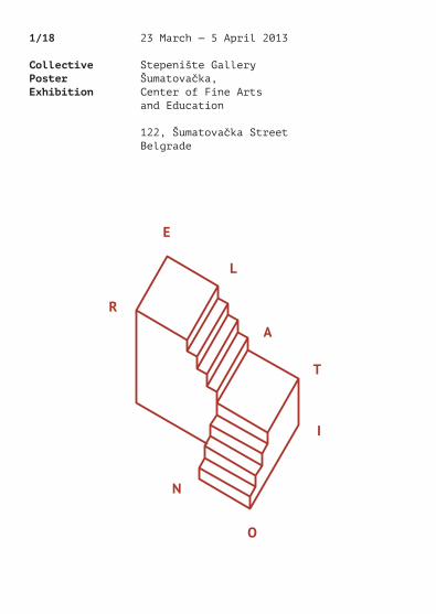
1/18
Collective PosterExhibition
23 March — 5 April 2013
Stepenište GalleryŠumatovačka, Center of Fine Arts and Education
122, Šumatovačka StreetBelgrade

Introduction text p.3
Silvia Agozzino p.6Luigi Amato p.8Federico Antonini p.10 Lorenzo Bravi p.12Giulio Cesco Bolla p.14 Federico Conti Picamus p.16Maria Roberta Cramarossa p.18 Alessio D’Ellena p.20Dario Ferrando p.22Michele Galluzzo p.24Silvio Lorusso p.26Ilaria Marengo p.28Laura Paniccià p.30Ana Radovanović p.32Marco Goran Romano p.34 Gianluca Sandrone p.36Moreno Tuttobene p.38Dario Verrengia p.40
ŠumatovačkaCenter of Fine Arts & Education122 Šumatovačka St, [email protected]
General manager: Vesna Bogunović
Program editor: Ksenija Marinković
Program coordinator: Danijela Rančić
Gallery and exhibition program committee:Vesna Bogunović MA in Theory of Art and Media; Ksenija Marinković Art historian; Koča Ognjanović MA in fine arts; Slaviša Savić Graphic designer and art director; Aleksandra Pavlović Stage and theater, film and TV technologies designer.
Art director: Ana Radovanović
Graphic design: www.s-p-e-c-t-a-c-l-e.it
Printed by:Format, Belgrade
March 2013
CIP - Каталогизација у публикацијиНародна библиотека Србије, Београд
766(4)”20”(083.824)7.038.54(4)”20”(083.824)
JEDAN kroz osamnaest1/18 : collective poster exibition : 23March - 5 April 2013, Stepenište Gallery,Šumatovačka, Center of Fine Arts andEducation. - Beograd : Centar za likovnoobrazovanje, 2013 (Beograd : Format). - 41 str. : ilustr. ; 15 cm
Tiraž 100. - Str. 3: Introduction text /Vesna Bogunović.
ISBN 978-86-88451-06-21. Gl. stv. nasl.a) Плакати - Европа - 21в - Изложбеникаталози b) Концептуална уметност - Европа- 21в - Изложбени каталозиCOBISS.SR-ID 197454604
Index
Art is in fact a product of common intentions. The mo-ment when one work of art is being created, is by final analysis a social moment and mystery. Objects, instal-lations and events are human or social products which establish or carry certain meanings which don’t belong exclusively to the artist or artwork. In the process of representation, a creative act is being initiated between reference content and meaning produced by work of art. Stepenište as a work of art itself, becomes a creator, an agent or an inspiration for another work of art which is “artistic” in regard to public metatext of culture or inter-connected with cultural metatext.
MD Vesna Bogunović — General Manager of Šumatovačka, Theoretician of Art and Media
2 — 3
Vesna Bogunović
Introduction text


The dot, the line and the plane are primitive concepts in geometry, actually, they are supposed to be intuitively comprehensible, not need-ing a specific definition. The geometric plane has only two dimensions – width and height – is deprived of depth and extends infinitely in all directions: 1. On the plane lays an infinite group of points and an infinite group of lines; 2. Through one point in the plane passes an infinite number of lines – Called a beam of lines – and between two different points in the plane there can be one and only one line; 3. For three different points that do not belong to the same line passes one and only one plane.
Relation as a rule that keeps things together even if the effective “physical” condition is denied. This condition can only be broken when the rule is denied. If the rule exists, the relation exists.
The relation between this poster and Alessio D’Ellena’s is the interpretation of a mathematical or geometric definition that usually corresponds to a graphical artefact – in this specific case the definition of the plane passing through 3 points – through which we arrive to a unique plane from another two different and separate planes.
Silvia Agozzino is 26 years old and Sicilian. She lived for 16 years in Marsala, 3 in Nicosia, 2 in Catania, 1 in Copenhagen, 3 in Urbino, 3 months in San Leonardo in Passiria and she is currently based in Florence.
Her father is a chef who now checks the weather forecast; her mother is a pastry chef selling ornaments; she hasn’t found yet a permanent place to live. She used to enjoy drawing, but she stopped right after primary school. Studying arts and graphic design in some kind of form that concerns her taste got her crazy for any kind of engraving. Interested in books and everything that involves them, a great cook, a small traveller, she’s waiting for a sign to redemption.
Silvia Agozzino
6 — 7

Ja sam sa glupakom. This poster will only be complete when it is set in the space of the exhibition, and starts engaging with it according its physical position.
Luigi Amato (born in Rome, 1984) is an Italian designer. He studied Arts and Media Criticism at the Roma Tre University (Rome), Visual Arts at the Iuav (Venice) and Visual Communication and Design at the Isia (Urbino).
He divides his time between freelance work and personal projects. Since 2012 he has also been part of the Spectacle Studio.
www.luigiamato.netwww.s-p-e-c-t-a-c-l-e.it
Luigi Amato
8 — 9

Memex, Memory Expansion. Analog hypertexts and divinatory Art. I've been raised up in a house full of collected ephemera such
as magazines, books, coins, postcards, stamps etc… I wish there's a different kind of reading all this printed matter, similar to a divinatory art, that draws new stories and histories every time I discover a new detail or a particular layout.
My grandfather's interventions with photographs he took and newspaper cutouts in his postcard collection, actually are hypertexts and they expand the meaning of the page spreads.
Rome, 1985. Per Aspera ad Aspera. Through hard times, to harder times.
Federico Antonini
10 — 11

The idea behind the poster is really simple and starts from the set theory and Eulero-Venn diagram as a diagrammatic means of repre-senting sets and their relations. The intersection and superimposition of colored modules reveals the natural relationships between the sets, playing with the perception of colors and their synthesis.
Relation poster takes part of IKEA® PRESS project: a collection of experiments with letterpress printing, where the constructive elements of Ikea products substitute the traditional wooden printing letters and become the printing die for limited editions. In this case the circular modules are the result of the impression on paper of cork pot stands, inked with various colors.
Lorenzo Bravi graduated from the Isia in Urbino in 2008, with a thesis entitled “Basic Design Procedures: Logic Pro-gramming Applied to Teaching”. He is holding workshops on the topic at the Iuav in Venice and the Isia in Urbino, where is a lecturer for the introductory course in Basic Design. As a graphic designer he has worked with several studios on projects ranging from experimental field of publishing to new media, signage systems, corporate identity and interactive installations.
At the same time he continues to experiment in crafts techniques, such as printing and production of art objects in limited production. Recently his work has been selected and exhibited at the Festival International de l’Affiche et du Graphisme de Chaumont and at the International Biennial of Graphic Design Brno.
Lorenzo Bravi
12 — 13

Relation: «Connection or correspondence that exists, so essential or accidental, between two or more entities […] individuals and groups». History has taught us that certain relations have brought humanity to the limits of its own moral conscience. Many people have had to suffer the tyranny of some powerful individuals and their ideologies, not having any tools to defend themselves; offended up in the darkest crevices of the soul.
The poster plays with the issue of “bad relationships”, the “bad friends” that mothers warn you about, who have plunged many countries into the abyss of war. The “couple” portrayed is sadly familiar and does not need any introduction, but it must remain present in the conscience and always evoke a warning:
«If you can not understand, you need to know, because what happened can return, the conscience can be seduced and obscured: even ours». (Primo Levi)
Giulio Cesco Bolla was born in Belluno in 1981. At the age of six he moved to a small village in Carnia (Friuli Venezia Giulia). After technical studies, he worked as a metalwork-er for about five years.
He began his career as a graphic designer at the Fintel Multiservizi Spa, where he worked as a creative director. At the age of 27 he began his university studies at the High Institute of Industrial Arts of Urbino, where he gradu-ated in Graphic Design and Visual Communication with a thesis Promemorie, which traces the historical events of partisan movement in Italy in the Second World War.
He is currently attending a Master in Communication and Editorial design at the same school. He lives and works between Urbino, Rome and Udine.
Giulio Cesco Bolla
14 — 15

Relation is not something predictable: at most you can predispose it through a contextual assertion, considering the whole variety of backgrounds in which relations happen. These “relative” spaces are empty containers in which it is possible to define premises and rules by which interactions may take place. We could describe them in a metaphorical way (parenthesis, frames) as well as physical (rugs, slippers, doors). They create a “suspension” of context: in here, individuals are recognized in the preservation of their alterity with a distance of respect and reverence, and should not be absorbed by the others’ world and hostility. Conviviality here becomes an essential and sacred value – and care and attention are ethical precepts.
In Latin the word hospes means both “host” and “guest”, becoming emblematic of a situation of convergence of two opposites – but when the space is “relative”, then definitions collapse and relations happen.
As an inspiration for the thinking, I referred in particular to Rela-tion Works (1976) by Marina Abramović and Ulay, in which the artists explored the bodily environment and brought to limit the reflection upon inter-dependence, spatiality and self-annihilation.
Federico Conti Picamus (Trieste, 1987) studied Industrial Design at the University IUAV in Venice and Visual Com-munication at the Isia Urbino.
He has worked mainly in the fields of graphic design and book design, while at the same time developing an interest for illustration, both as a conceptual and a narra-tive means. He’s even an occasional songwriter.
Federico Conti Picamus
16 — 17

Sharing is a controversial topic, because of the countless implications and consequences linked to it. The main problem is that people should be educated to use the internet and all its devices consciously.
Once the benefits and potential gains of sharing are recognized as truly invaluable and infinitely more important than the selfish interests and conformism, maybe “sharing” won’t be only a word associated with the internet, but a meaningful concept in our real life.
Sharing information, knowledge, and messages is an attitude that can really help people to cultivate relationships and live peacefully in our age. The elements of this poster are taken from the visual laguage of the Internet. The arrows are icons that mark the action “share” on many applications and websites. The pattern inside them is generated starting from the rainbow that means “sharing” in Dropbox®.
“Sharing isn’t immoral, it’s a moral imperative” is a statement taken from the “Guerrilla Open Access Manifesto”. It was presented in 2008 and one of his authors is Aaron Swartz, a young man who struggled for free access to scientific publications until his death. This sentence can be seen as a warning for people who live in this era.
Between the warm coasts of Bari and the veiled hills of Urbino, interests and passions don’t change, they rather grow.
The route started at the Art School and continued (with some stops and deviations) with a bachelor’s degree in Industrial Design at the Polytechnic University of Bari.
While approaching design in its different forms (products, furniture and graphics) the importance and urgency of communication design considerably emerged: thanks to that it’s possible to tell a story, reveal informa-tion, send a message, experience new tools and be in contact with different landscapes. Communicating an idea requires a knowledge that every designer should build on its own, taking and holding pieces of any situa-tion and experience. This is a never ending puzzle and I’ve just started to work on it. So, good luck with my job (and with yours).
Maria Roberta Cramarossa
18 — 19

Red hair, brown eyes, much beard usually. Born somewhere near Rome in 1985. Graduated at Isia Urbino recently, developing a research on parametric and mathematic tool for type design. Work as graphic designer, illustrator and especially type designer. Often works on a sofa. (alessiodellena.com)
Alessio D'Ellena
The dot, the line and the plane are primitive concepts in geometry, actually, they are supposed to be intuitively comprehensible, not need-ing a specific definition. The geometric plane has only two dimensions – width and height – is deprived of depth and extends infinitely in all directions: 1. On the plane lays an infinite group of points and an infinite group of lines; 2. Through one point in the plane passes an infinite number of lines – Called a beam of lines – and between two different points in the plane there can be one and only one line; 3. For three different points that do not belong to the same line passes one and only one plane.
Relation as a rule that keeps things together even if the effective “physical” condition is denied. This condition can only be broken when the rule is denied. If the rule exists, the relation exists.
The relation between this poster and Silvia Agozzino's is the interpretation of a mathematical or geometric definition that usually corresponds to a graphical artefact – in this specific case the definition of the plane passing through 3 points – through which we arrive to a unique plane from another two different and separate planes.
20 — 21

The poster aims to denounce what is going on with the relationships in the modern society. With the number of devices increasing, almost everyone has at least a smartphone or a pad in modern cities, and this is changing the way we usually relate with the known and unknown people. The direct contact between two individuals happens more and more rarely, since almost all relations are now being mediated by different screens.
The whole concept of the “screen demonizing” was born during a trip to Milan: of the eight people on a bus, seven (excluding me, of course) spent the whole bus trip playing, browsing and doingother stuff on their devices, not giving a single look at what was happening around them. I admit that it is not a new and astonishing concept, but I wanted to make sure you know that this is happening for real, so maybe take some time to ask things and talk to people, rather than chatting with them or using an app to have all the answers you need.
Dario Ferrando was born in 1988 in Genoa, Italy. He gradu-ated from the University of Genoa where he received a bachelor’s degree in Design.
After some months spent in Berlin to improve his skills and get a look at the outer world, he went back to Italy and decided to get a master’s degree in Com-munication Design, which he’s currently studying at the Politecnico di Milano. (Actually, he is not in a real hurry to finish his master’s degree, as he’s living in Berlin once again, working as a freelance and doing an internship at a communication agency).
Graphic enthusiast, interested in typography, brand-ing and publishing design. His hobbies and secondary interests include insane drawing, nonsense photos and juggling (mostly balls, chains and devilstick).
Dario Ferrando
22 — 23

The poster as a plastic curtain, as a threshold, as a passage, as a diaphragm, as a crossing, as the relationship between the user and writing, between the curtain and the hand, between the designer and the gallery, between the affiche and the wall, between “be” and “tween”.
Michele Galluzzo, a graphic designer from Apulia, starts in Milan a historical investigation about the rela-tionship between graphic and industrial design in Italy.
In 2011, in the same city, he meets Francesca Depalma, a researcher working on the role of the graphic designer in literature and book publishing. She inves-tigates the evolution of the contemporary publishing (marginalialab.wordpress.com) and performs binding experiments (ff-frankie.tumblr.com). They support each other while working on their thesis and experiment with the use of stencil rulers as a tool for designing typographic outputs.
In winter of 2011-12 Michele finally gets to meet Angelo Gramegna, an interior designer interested in the restoration of places, design methods and the craftsmen techniques (earthafterpeople.altervista.org). Together they attempt to merge and cross the boundaries of the disciplines of graphic and product design, arguing day by day, and eventually getting immersed into a (still not carried out) project of making a lamp. Gramegna is also responsible for the design of the typographic logo of the furniture enterprise Simon Gavina.
In January Michela Povoleri also arrives in Milan (michelapovoleri.com). She is another graphic designer, and she shares the studies at the Isia Urbino with Michele, as well as the interests in typography and the design processes. They spend nights in struggles, wondering about the dialogue established between the graphics and users.
In February 2013, all these relationships and argumentations led to the production of this curtain.
Michele Galluzzo
24 — 25

Sarah Connor in the Trevi Fountain. Posters are designed originally to stand out because, as urban devices, they accidentally relate to a variable context. This multilayered blending forms the cultural texture of our cities. Nowadays the role of the poster as an urban device is a bit downsized due to the spread of digital media. In this latter environment we can detect a cultural context that may seem accidental as well.
This context is algorithmically defined by such relations as tags, keywords and user’s behavior. Sarah Connor in the Trevi Fountain draws a connection between the intertwining of messages in the urban environment and the digital network of related items. The start-ing point of the process was the movie poster for “La Dolce Vita” (often part of Mimmo Rotella’s décollages) sold on Amazon. The 17 following posters were obtained choosing recursively the first related item suggested by Amazon itself.
Silvio Lorusso is an Italian artist and designer, PhD can-didate in Design Sciences at the Iuav University of Venice. He regularly collaborates with the Institute of Network Cultures of Amsterdam. In 2011 he graduated Visual and Multimedia Communications at the Iuav, University of Venice. Afterwards he spent a period of study at the Piet Zwart Institute of Rotterdam, in the context of the Networked Media course.
His work is focused on technology, interfaces, digital folklore, internet cultures, hybrid publishing.
www.silviolorusso.com
Silvio Lorusso
26 — 27

Given a group of 18 people, how high is the probability that each of them is connected to another member by at least one link or even more? Very high.
Born in Genoa in 1984. After getting the bachelor’s degree in Industrial Design in 2008, she starts a collaboration with the “Studiofluo” (Annalisa Gatto e Gaetano Cassini), focus-ing mainly on editorial projects for cultural institutions.
Since 2010 she has been attending master studies in Communication and Editorial Design at the Isia Urbino, where she got interested in endless philosophical specu-lations, historical inquiries and bibliofetish.
Ilaria Marengo
28 — 29

“Why did we become blind, I don’t know, perhaps one day we’ll find out. Do you want me to tell you what I think, Yes, do, I don’t think we did go blind, I think we are blind, Blind but seeing, Blind people who can see, but do not see.” An entire country affected by a bad: blindness. A very current metaphor.
The sentence is taken from the last page of “Blindness”; a novel by Portuguese writer Jose Saramago. A physical blindness that corre-sponds to a deeper one. Indifference and selfishness are the interpre- tation of relationships in our society. We are wrapped in a “cloud of milk”.
A poster whose apparent lack of verbal communication with its audience opens a reflection to the real indifference and blindness that we have towards the other. The elaborate is entirely created by hand with a Burin (engraving tool) and a hammer.
Laura Paniccià was born on July 17, 1988 in Fermo, Marche. She graduated from the Academy of Fine Arts in Macerata and is now attending master studies in Communication and Editorial Design at the Isia, Urbino.
She grew up in countryside, as the last one to arrive to a family of nine people. Her education has been directed initially towards scientific studies and then di-verted to the world of graphics throughout the university period. Her various experiences include the internship at the “Corraini editions Studios” in 2011 and experience as a teacher during the “Mind Project”, Academy of Fine Arts Brera (Milan) in 2010. Her interests are now turning to the publishing world in all its aspects, as well as the motion graphics and illustration.
“While the dream of the artist is to get into the Museum, the dream of the designer is to get to the local street markets.” (Bruno Munari)
Laura Paniccià
30 — 31
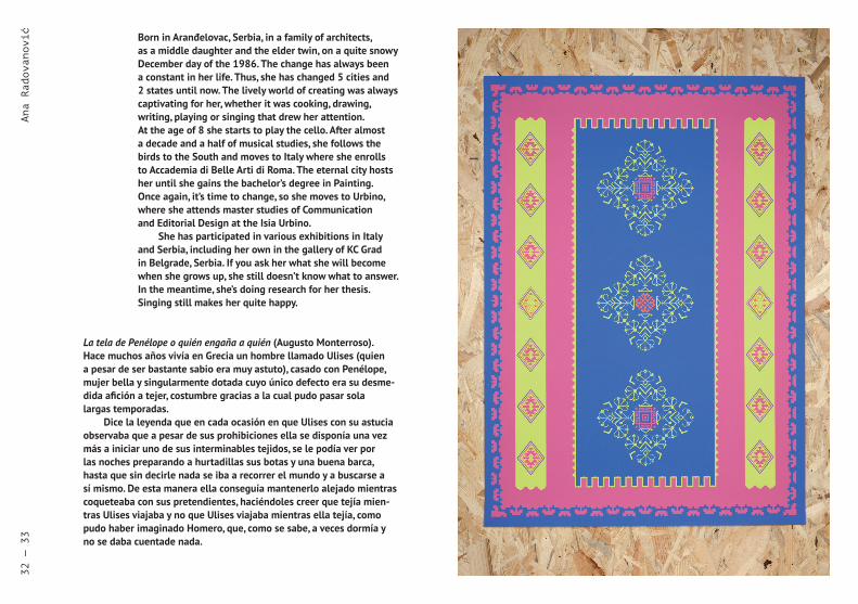
La tela de Penélope o quién engaña a quién (Augusto Monterroso). Hace muchos años vivía en Grecia un hombre llamado Ulises (quien a pesar de ser bastante sabio era muy astuto), casado con Penélope, mujer bella y singularmente dotada cuyo único defecto era su desme-dida afición a tejer, costumbre gracias a la cual pudo pasar sola largas temporadas.
Dice la leyenda que en cada ocasión en que Ulises con su astucia observaba que a pesar de sus prohibiciones ella se disponía una vez más a iniciar uno de sus interminables tejidos, se le podía ver por las noches preparando a hurtadillas sus botas y una buena barca, hasta que sin decirle nada se iba a recorrer el mundo y a buscarse a sí mismo. De esta manera ella conseguía mantenerlo alejado mientras coqueteaba con sus pretendientes, haciéndoles creer que tejía mien-tras Ulises viajaba y no que Ulises viajaba mientras ella tejía, como pudo haber imaginado Homero, que, como se sabe, a veces dormía y no se daba cuentade nada.
Born in Aranđelovac, Serbia, in a family of architects, as a middle daughter and the elder twin, on a quite snowy December day of the 1986. The change has always been a constant in her life. Thus, she has changed 5 cities and 2 states until now. The lively world of creating was always captivating for her, whether it was cooking, drawing, writing, playing or singing that drew her attention. At the age of 8 she starts to play the cello. After almost a decade and a half of musical studies, she follows the birds to the South and moves to Italy where she enrolls to Accademia di Belle Arti di Roma. The eternal city hosts her until she gains the bachelor’s degree in Painting. Once again, it’s time to change, so she moves to Urbino, where she attends master studies of Communication and Editorial Design at the Isia Urbino.
She has participated in various exhibitions in Italy and Serbia, including her own in the gallery of KC Grad in Belgrade, Serbia. If you ask her what she will become when she grows up, she still doesn’t know what to answer. In the meantime, she’s doing research for her thesis. Singing still makes her quite happy.
Ana Radovanović
32 — 33
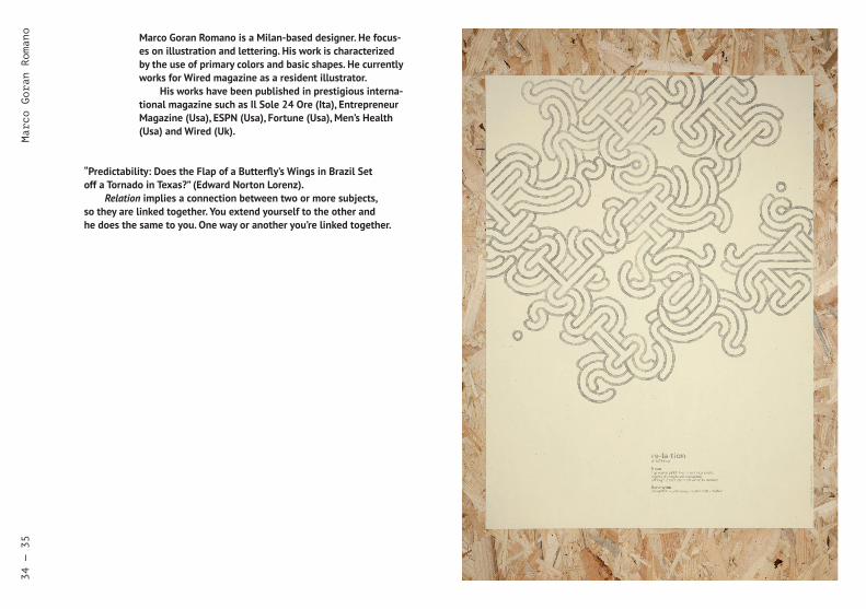
“Predictability: Does the Flap of a Butterfly’s Wings in Brazil Set off a Tornado in Texas?” (Edward Norton Lorenz).
Relation implies a connection between two or more subjects, so they are linked together. You extend yourself to the other and he does the same to you. One way or another you’re linked together.
Marco Goran Romano is a Milan-based designer. He focus-es on illustration and lettering. His work is characterized by the use of primary colors and basic shapes. He currently works for Wired magazine as a resident illustrator.
His works have been published in prestigious interna-tional magazine such as Il Sole 24 Ore (Ita), Entrepreneur Magazine (Usa), ESPN (Usa), Fortune (Usa), Men’s Health (Usa) and Wired (Uk).
Marco Goran Romano
34 — 35

Gianluca Sandrone
This Poster’s starting point was the title of the book by CharlesBukowski, “Erections, Ejaculations, Exhibitions, and General Tales of Ordinary Madness”. This title has been adapted in its content and used as a metaphor of the author’s awkwardness in face of its operations.
“Erections, ------------, Exhibitions and Self-Celebrations of Ordinary Madness” is a voluntary statement, which points out how difficult it is sometimes to justify one’s own flights of fancy.
Being able to express what you think without any restriction other than to be able to communicate and finally destroy something is an extreme moment to celebrate. If the discourse about authorial-ity must coincide more and more with the self-celebration it becomes disadvantageous to recognize the author himself in this category.
Gianluca Sandrone was born in Cuneo in 1987. He has received an education more oriented to technical drawing, only later discovering graphic design. At the beginning he learned to draw houses at the Technical Institute for Surveyors of Cuneo, then continued drawing objects at the Politecnico di Torino. After the bachelor’s degree he starts working alternate in two design studios in Turin and Reykjavìk.
Motivated to proceed with his personal research path and following his own professional vocation, he decided to apply to the Master of Communication and Editorial Design at the Isia Urbino. In Urbino he came in contact with other motivated students. Thanks to these personal and professional relations, he was invited by his colleague Ana Radovanović to take part in the Exhibition 1/18 “Collective Poster Exhibition”.
36 — 37

Moreno Tuttobene
Who is using what or who is used by what, is a reflection about the relations between objects and people. Is the relation that is estab-lished between them equal? Are we using objects or are they using us? When it comes to a relation between the object and ourselves, what we usually do is that we declare them ours. However they remain to exist even if we don't. Is it us that are separating from them or are they separating themselves from us?
The three objects represented in the poster are referring in an implicit way to three artists of the 20th century: Joseph Beuys (the hat), Joseph Kosuth (the chair) and Jeff Koons (the balloon). Objects have acquired an identity of the persons that have used them or cre-ated them. The choice that has been made is in strict relation with the place of the exhibition, the Stepenište Gallery, as a place of study and art divulgation.
All three objects are closely related to the body; the hat is worn, the chair is used for sitting and the balloon is woven by hands.
To create the poster I've used a black ink pen on a blank sheet of paper: two simple objects that are representing a complex concept of relations. I'm still not sure of one thing: Was I using them, or were they using me?
Moreno Tuttobene was born and raised in Switzerland, and moved to Italy in early adolescence. He attended the Academy of Fine Arts in Catania. Afterwards he continued his studies at the Isia Urbino (second level diploma in Communication and Editorial Design). He is currently quite busy writing the thesis about Kurt Wirth, an important Swiss graphic designer. Some of his projects were selected for exhibitions in Catania, Ravenna, Urbino and Pesaro. The most recent one was selected for the Premio Nazion-ale delle Arti per il Design della Comunicazione 2012 (The National Arts Award for the Communication Design 2012) held in Urbino.
38 — 39

Dario Verrengia
"Facebook has affected the social life and activity of people in various ways. Facebook allows users to continuously stay in touch with friends, relatives and other acquaintances wherever they are in the world, as long as there is access to the Internet. It can also unite people with common interests and/or beliefs through groups and other pages, and has been known to reunite lost family members and friends because of the widespread reach of its network.
Some argue that Facebook is beneficial to one's social life because they can continuously stay in contact with their friends and relatives, while others say that it can cause increased antisocial tendencies because people are not directly communicating with each other. Some studies have named Facebook as a source of problems in relationships. Several news stories have suggested that using Facebook can lead to higher instances of divorce and infidelity, but the claims have been questioned by other commentators." (http://en.wikipedia.org/wiki/Facebook, under "Social Impact")
My poster doesn't want to take a stand in favor or against Face-book. It rather intends to be reflective about this situation instead. The technique is inspired by Aude Oliva and Antonio Torralba's studies on Hybrid Images, at the Massachusetts Institute of Technology (Mit). A hybrid image is a picture that combines the low-spatial frequencies of one picture with the high spatial frequencies of another picture, producing an image with an interpretation that changes with viewing distance. (cvcl.mit.edu/publications/Talk_Hybrid_Siggraph06.pdf)
Born in 1989, Dario Verrengia is a student and freelance graphic designer based in Milan. In 2011 he received a BA degree in Communication Design at the Politecnico in Milan.
He is attending the last year of his master’s studies in Communication Design, currently spending a semester as an exchange student at the RMIT University in Mel-bourne. One of his projects designed during the first year of University was nominated to participate in the Targa Giovani (Young Design) — XXII Premio Compasso d’Oro Adi Award, a reward for the best designs created in Italy's design schools. During the last three years as a freelance graphic designer he has collaborated with magazines, associations, and for a short period with a graphic design studio based in Milan and NYC.
40 — 41

Relation¹:
1 — The state or condition of being related or the manner in which things are related. 2 — Connection by blood or marriage; kinship. 3 — A person who is connected by blood or marriage; relative; kinsman. 4 — Reference or regard (esp in the phrase in or with relation to). 5 — The position, association, connection, or status of one person or thing with regard to another or others. 6 — The act of relating or narrating. 7 — An account or narrative. 8 — the principle by which an act done at one time is regarded in law as having been done antecedently. 9 — An association between ordered pairs of objects, numbers, etc, such as …is greater than… 10 — The set of ordered pairs whose members have such an association.
Etymology: 14th Century: from Latin relātiō a narration, a relation (between philosophical concepts).
¹ www.wordreference.com