add beautiful charts to your applications using foxcharts
TRANSCRIPT

Add Beautiful Charts to Your Applications Using FoxCharts 21st European Visual FoxPro DevCon 2014
© 2014 Doug Hennig (Group VFP) E-GRAF • 1
Session E-GRAF
Add Beautiful Charts to Your Applications Using FoxCharts
Doug Hennig Stonefield Software Inc.
Email: [email protected] Corporate Web sites: www.stonefieldquery.com and
www.stonefieldsoftware.com Personal Web site: www.DougHennig.com
Blog: DougHennig.BlogSpot.com Twitter: DougHennig
Overview FoxCharts is a free component from VFPX that uses 100% VFP code to create beautiful modern-looking charts.
It can create many different types of charts: bar, column, pie, doughnut, line, area, and so on, and supports 3-D
effects. It makes full use of colors, including transparency, using solid, gradient and hatch brushes. This session
looks at the basics of FoxCharts and then moves on to creating more complex charts. It also shows a help utility
that allows your users to modify the chart as they desire at runtime.

21st European Visual FoxPro DevCon 2014 Add Beautiful Charts to Your Applications Using FoxCharts
2 • E-GRAF (Group VFP) © 2014 Doug Hennig
Introduction For many years, VFP developers wanting to add charts to their applications used Microsoft Chart, an ActiveX
control that’s installed with VFP. However, like the other ActiveX controls that come with VFP, MSChart is an
old-looking control, mostly because it uses GDI rather than GDI+ for rendering charts. This means it doesn’t
support things like anti-aliasing, which make text and lines smoother, or transparency, which gives interesting
color effects. As a result, VFP developers often turned to other third-party solutions. For example, my
company’s product, Stonefield Query, uses TeeChart from Steema Software.
Fortunately, you can now create beautiful charts in your VFP applications using 100% VFP code and no
ActiveX controls, thanks to FoxCharts by Cesar Chalom. FoxCharts is a VFPX project, so it’s both free and open
source. FoxCharts uses GDIPlusX, another VFPX project, to perform the actual drawing, so it takes full
advantage of all the capabilities of GDI+.
FoxCharts can create a variety of common chart types, such as bar, pie, and area charts. It can use any type of
colors, including transparency and gradients. It has customizable tooltips and supports mouse events so you can,
for example, do drilldowns from one chart to another.
FoxCharts can be a little overwhelming, mostly because of the vast number of properties available. However,
that’s true of any charting component because they usually provide full control over all aspects of the chart.
Let’s take a look at FoxCharts and see what’s involved in using it your applications.
Installing FoxCharts Since FoxCharts is part of VFPX, navigate your browser to http://vfp.codeplex.com. Find FoxCharts in the
Production Releases section of the Project List and click “FoxCharts” to go to the FoxCharts project page or the
release date in the list to go to the FoxCharts download page (don’t worry about the date shown in the list; it isn’t
always updated). As of this writing, the current production version of FoxCharts is 1.37b, released April 14,
2013, although there’s also a beta version, 1.46, released April 7, 2014. See Figure 1.
Figure 1. Download FoxCharts from the VFPX FoxCharts download page.
Unzip the download file into the folder of your choice. This creates two subdirectories: Samples, which includes
many samples that show how to use FoxCharts (run DemoStart.PRG to display a form listing all of the samples),
and Source, the source code for FoxCharts.

Add Beautiful Charts to Your Applications Using FoxCharts 21st European Visual FoxPro DevCon 2014
© 2014 Doug Hennig (Group VFP) E-GRAF • 3
Alternatively, if you use Thor (another VFPX project), you can install FoxCharts from the Thor Update dialog
(Figure 2). Choose Check for Updates from the Thor menu, turn on the check mark for FoxCharts, and click
Install Updates.
Figure 2. You can install FoxCharts using Thor.
You should also download the help for FoxCharts; this is provided as a zipped CHM file, FoxChartsHelp.CHM.
Note that you have to right-click, choose Properties, and click the Unblock button or the help won’t display
properly due to Windows security.
Other downloads are also available, including a video, a tutorial, and some add-ons tools.
To add FoxCharts to your application, add FoxCharts.VCX and GDIPlusX.VCX, both in the Source folder, to
your project. In addition, System.APP (the core component of the VFPX GDIPlusX project, which FoxCharts
uses), also in Source, needs to be distributed with your application and either placed in the application folder or
in a folder in the VFP path. There’s only one class we’ll use directly: FoxCharts in FoxCharts.VCX.
Our first chart Let’s create a simple bar chart. Do the following:
Create a form
Drop an instance of FoxCharts on it, name it oChart, and size it appropriately.
Put the code shown in Listing 1 into the Init method of the form.
Run the form. The result is shown in Figure 3.
Listing 1. Put this code into the Init of the sample form to create a chart.
* Get the data for the chart.
open database _samples + 'Northwind\Northwind'
select Categories.CategoryName, ;
sum(OrderDetails.UnitPrice * OrderDetails.Quantity) as Sales ;
from Products ;
join Categories on Products.CategoryID = Categories.CategoryID ;
join OrderDetails on Products.ProductID = OrderDetails.ProductID ;
group by 1 ;
into cursor ChartData
with This.oChart as FoxCharts of FoxCharts.vcx
* Specify the chart type and other settings.
.Anchor = 15
.ChartsCount = 1

21st European Visual FoxPro DevCon 2014 Add Beautiful Charts to Your Applications Using FoxCharts
4 • E-GRAF (Group VFP) © 2014 Doug Hennig
.ChartType = 7 && Bar
.ColorType = 0
* Specify the data for the chart.
.SourceAlias = 'ChartData'
.FieldAxis2 = 'CategoryName'
.Fields(1).FieldValue = 'Sales'
.FieldLegend = .FieldAxis2
* Specify the chart and axis captions.
.Title.Caption = 'Sales by Product Category'
.SubTitle.Caption = ''
.XAxis.Caption = 'Product Category'
.YAxis.Caption = 'Total Sales'
* Draw the chart.
.DrawChart()
endwith
Figure 3. This chart was created using the code from Listing 1.
Other than the X-axis labels being jumbled, that looks pretty good for a first effort. Fix the labels by adding these
two lines of code to Init, then run the form again to get the chart shown in Figure 4.
.AxisLegend2.Rotation = -45
.AxisLegend2.Alignment = 1 && Right

Add Beautiful Charts to Your Applications Using FoxCharts 21st European Visual FoxPro DevCon 2014
© 2014 Doug Hennig (Group VFP) E-GRAF • 5
Figure 4. Adding the two lines of code fixes the X-axis label issue.
Let’s look at the code. Setting Anchor to 15 makes the chart resize when the form does; FoxCharts automatically
redraws the chart when that happens. The ChartsCount property indicates the number of data series in the chart;
in this case, we just have one. As its name suggests, ChartType controls the type of chart: 7 means a bar chart;
we’ll look at other types later. ColorType indicates how the bars should be colored; 0 means use basic colors.
SourceAlias is the name of the cursor containing the data for the chart. FieldAxis2 specifies the name of the field
in the cursor used for the X-axis values and Fields(N).FieldValue (where N is the series number) specifies the
field used for the Y-axis values. FieldLegend contains the field used for legend values, so it’s normally the same
as FieldAxis2.
The chart has several titles: main title, subtitle, and X-axis and Y-axis titles. The code sets the Caption of these
titles. AxisLegend2 controls the X-axis labels. Setting Rotation to -45 rotates the labels so they don’t overlap and
setting Alignment to 2 right-aligns them.
Finally, the call to DrawChart does the actual rendering of the chart.
Try experimenting with some of the values. For example, if you set ColorType to 2, you’ll get a different,
random set of colors used on every run. If you set it to 3, the colors progress in a gradient from Fields(N).Color
to near white. Setting BrushType to 2 uses a gradient for bars and legend symbols. Figure 5 shows the chart
created with ColorType set to 3, Fields(1).Color to RGB(255, 0, 0) (red), and BrushType to 2.

21st European Visual FoxPro DevCon 2014 Add Beautiful Charts to Your Applications Using FoxCharts
6 • E-GRAF (Group VFP) © 2014 Doug Hennig
Figure 5. Setting ColorType to 3 and BrushType to 2 uses gradients.
Data for your charts The code in Listing 1 creates a cursor used for the chart. That isn’t necessary; if the data to chart exists in a table
and is in the proper format for the chart, you can use the table instead. Some things to note about the data for a
chart:
FoxCharts doesn’t use the original table or cursor; instead, it uses use SQL statement to create a new
cursor that it operates on. That means any filter or index order for the table or cursor is ignored.
Fields that aren’t specified for the various chart properties are ignored.
The order of the fields is irrelevant; only their names are important.
Each data series must be in a single record and each data point in a single field.
As a result of these issues, you may find it more convenient to create a cursor with the desired content than
trying to make an existing table fit FoxChart’s needs.
The last point, that each data series must be in a single record, can make creating a cursor with the desired
structure a challenge. For example, suppose you want a chart of sales by product category and year such as that
shown in Figure 6. You might think the SQL statement shown in Listing 2 would give you the data needed.
Figure 6. It can be challenging creating a cursor used for a chart with multiple series.
Listing 2. This SQL statement creates a cursor but not in the required format to chart multiple series.
select Categories.CategoryName, ;
year(Orders.OrderDate) as Year, ;
sum(OrderDetails.UnitPrice * OrderDetails.Quantity) as Sales ;
from Products ;
join Categories on Products.CategoryID = Categories.CategoryID ;
join OrderDetails on Products.ProductID = OrderDetails.ProductID ;
join Orders on OrderDetails.OrderID = Orders.OrderID ;
group by 1, 2 ;
into cursor SalesData
However, that creates the cursor shown in Figure 7. The problem with this cursor is that each series appears in
multiple records. For example, there are three records for Beverages rather than a single one. What is really
needed is a cursor with a “cross-tab” structure. A cross-tab structure means that there’s one record per series with
the row, or X-axis, values in one field and there’s one field per series value, each containing the value to chart.

Add Beautiful Charts to Your Applications Using FoxCharts 21st European Visual FoxPro DevCon 2014
© 2014 Doug Hennig (Group VFP) E-GRAF • 7
Figure 7. This cursor doesn't have the correct structure for a multi-series chart.
Although you can’t easily create the desired structure using a SQL statement, there are several ways you can
convert the cursor created by a SQL statement into a cross-tab cursor:
VFP comes with a program, VFPXTab.PRG, referenced using the _GENXTAB system variable, which
can create the desired structure. However, that program is inflexible and slow so isn’t recommended.
Val Matison created a program called MatXTab that does something similar but is much faster. It’s
available at http://www.jjtc.com/Fox/foxfiles/matxtab.zip.
Even faster is FastXTab by Alexander Golovlev, available from http://tinyurl.com/lh2rsz9.
One of the downloads on the FoxCharts downloads page is “FoxCharts Tools: VisualChartDesigner and
GetChartDataFromRows.” GetChartDataFromRows.PRG can both massage your cursor and
automatically update the FoxChart object to use it.
My examples use FastXTab. It’s easy to convert the cursor shown in Figure 7 to that in Figure 8. This cursor has
the required structure for FoxCharts: all of the values for each series are in one record.
loXTab = newobject('FastXTab', 'FastXTab.prg')
with loXTab
.lCursorOnly = .T.
.lCloseTable = .F.
.cOutFile = 'ChartData'
.RunXTab()
endwith

21st European Visual FoxPro DevCon 2014 Add Beautiful Charts to Your Applications Using FoxCharts
8 • E-GRAF (Group VFP) © 2014 Doug Hennig
Figure 8. This cursor is in the format required for charting multiple series.
If the row field isn’t the first field, the column field isn’t the second, or the data field isn’t the third in the cursor,
you can specify the field numbers for those three fields in properties of FastXTab.
Once you’ve created the cursor, you need to set ChartsCount to the number of series and set
Fields(N).FieldValue and Fields(N).Legend to the name of the field and the legend caption for the series,
respectively. The following code uses the original cursor to get the number of unique series and populates the
properties accordingly.
select distinct Year from SalesData into cursor Temp
.ChartsCount = _tally
lnSeries = 1
scan
with .Fields(lnSeries)
.FieldValue = 'N_' + transform(Year)
.Legend = transform(Year)
endwith
lnSeries = lnSeries + 1
endscan
use
Creating different chart types The ChartType property controls the type of chart drawn. FoxCharts supports five different types of charts:
Bar
Point
Line
Area
Pie/doughnut
Some of these have variations; for example, bar charts can be vertical or horizontal. Some of them are suitable
for a single series of data while others use more than one series.
Let’s look at the different chart types. Note: the figures shown in this section come from running
ChartTypes.SCX, included with the sample files for this document, and choosing different chart types from the
combo box.
Bar charts There are ten types of bar charts, shown in Figure 9 through Figure 13. The first two use a single series of data
while the rest use multiple series. Note also that for horizontal charts, FoxCharts automatically flips the X- and
Y-axis values and labels, but you have to manually set the XAxis.Caption and YAxis.Caption properties to the
appropriate values for the orientation of the chart.

Add Beautiful Charts to Your Applications Using FoxCharts 21st European Visual FoxPro DevCon 2014
© 2014 Doug Hennig (Group VFP) E-GRAF • 9
Figure 9. Bar charts, types 7 and 12.
Figure 10. Bar charts, types 8 and 13.

21st European Visual FoxPro DevCon 2014 Add Beautiful Charts to Your Applications Using FoxCharts
10 • E-GRAF (Group VFP) © 2014 Doug Hennig
Figure 11. Bar charts, types 9 and 14.
Figure 12. Bar charts, types 3 and 15.
Figure 13. Bar chart, type 11 and 17.
You can control the appearance of the chart using the following bar-specific properties:
ShowPercentages: .T. to display the values in the shapes as percentages; otherwise displays values.
Only applies if ShapeLegends is .T.
BarsSpaceBetween: the number of pixels between bars.
BarType: the type of bar used: 0 = rectangular, 1 = cylinder, and 2 = triangle.
BarsLegendType: the position of the point labels: 0 = default and 1 = centered.
BarsLegendDirection: the direction of the point labels: 0 = horizontal, 1 = vertical, top to bottom, and 2
= vertical, bottom to top.
Point and line charts There’s only one type of point (ChartType = 4) and line (ChartType = 5) chart, although they can chart either
single or multiple series. Figure 14 shows these charts with multiple series.

Add Beautiful Charts to Your Applications Using FoxCharts 21st European Visual FoxPro DevCon 2014
© 2014 Doug Hennig (Group VFP) E-GRAF • 11
Figure 14. Point and line charts, types 4 and 5.
You can control the appearance of the chart using the following point- and line-specific properties, which only
apply if Depth is 0:
PointShapeWidth: the width of the point shape in pixels.
LineCaps: .T. to display point shapes or .F. if not. Only applies to line charts.
LineCapsShape: the shape use for points. 0 means different shapes for each line and 1 to 10 means use
the same shape for each line (1 = circles, 2 = squares, 3 = triangles, etc.). Only applies to line charts.
Area charts There are three types of area charts: area (Figure 15), which can be used with single or multiple series, and
stacked and full-stacked area (Figure 16), which are used for multiple series.

21st European Visual FoxPro DevCon 2014 Add Beautiful Charts to Your Applications Using FoxCharts
12 • E-GRAF (Group VFP) © 2014 Doug Hennig
Figure 15. Area chart, type 6.
Figure 16. Area charts, types 10 and 16.
You can control the appearance of the chart using the following area-specific properties:
Area3DTop: .T. to draw a line at the top of the chart when Depth is greater than 0.
AreaDrawBorders: .T. to draw borders around each area piece.
Pie and doughnut charts Pie and doughnut charts, shown in Figure 17, are essentially the same except that with a doughnut, there’s a hole
in the middle. These charts are only suitable for a single series of data.
Figure 17. Pie and doughnut charts, types 1 and 2.
You can control the appearance of the chart using the following pie- and doughnut-specific properties:
FieldDetachSlice: the name of the field in the cursor that contains .T. if the slice should be detached.
FieldHideSlice: the name of the field in the cursor that contains .T. if the slice should be hidden.
PieCompensateAngles: .T. for a wide ellipse; if it’s .F., PieForceCircle determines the shape.
PieForceCircle: .T. for a circle, .F. for a normal ellipse.
PieLegendDistance: the relative distance of the point labels in the slices to the radius of the circle; 0 =
center of the pie and 1 = edge of the pie. Values greater than 1 are outside the pie.
PieShowPercent: .T. for point labels to be displayed as percentages. Only applies if ShapeLegends is .T.
PieDetachSliceOnClick: .T. to detach a slice when it’s clicked.
Add Beautiful Charts to Your Applications Using FoxCharts 21st European Visual FoxPro DevCon 2014
© 2014 Doug Hennig (Group VFP) E-GRAF • 13
PieDetachSliceOnLegendClick: .T. to detach a slice when its legend entry is clicked.
PieDetachPixels: the number of pixels a slice is detached.
PieDetachAnimationSteps: the number of steps taken when a slice is detached, producing an animation
effect.
PieGradCenterDistance: the relative distance of the center of point used when a gradient brush is
applied: 0 = center of the pie and 1 = edge of the pie.
PieGradCenterAngle: the angle of the center of the point used when a gradient brush is applied: 0 =
right; 90 = down, 180 = left, and 270 = up.
PieEnhancedDrawing: .T to use enhanced drawing mode, in which all edges are drawn separately. This
provides a better visual effect.
PieDirection: the direction in which slices are drawn: 0 = clockwise, 1 = counterclockwise.
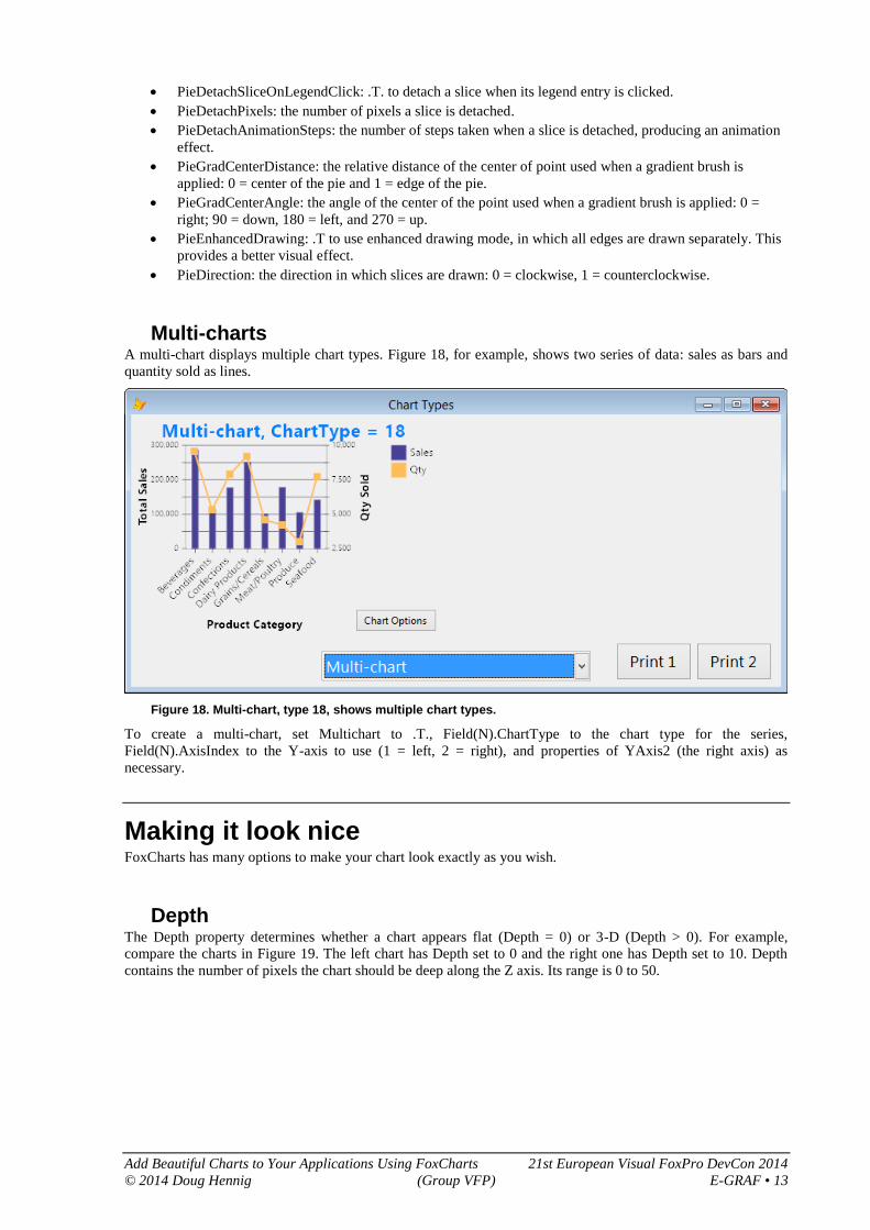
Multi-charts A multi-chart displays multiple chart types. Figure 18, for example, shows two series of data: sales as bars and
quantity sold as lines.
Figure 18. Multi-chart, type 18, shows multiple chart types.
To create a multi-chart, set Multichart to .T., Field(N).ChartType to the chart type for the series,
Field(N).AxisIndex to the Y-axis to use (1 = left, 2 = right), and properties of YAxis2 (the right axis) as
necessary.
Making it look nice FoxCharts has many options to make your chart look exactly as you wish.
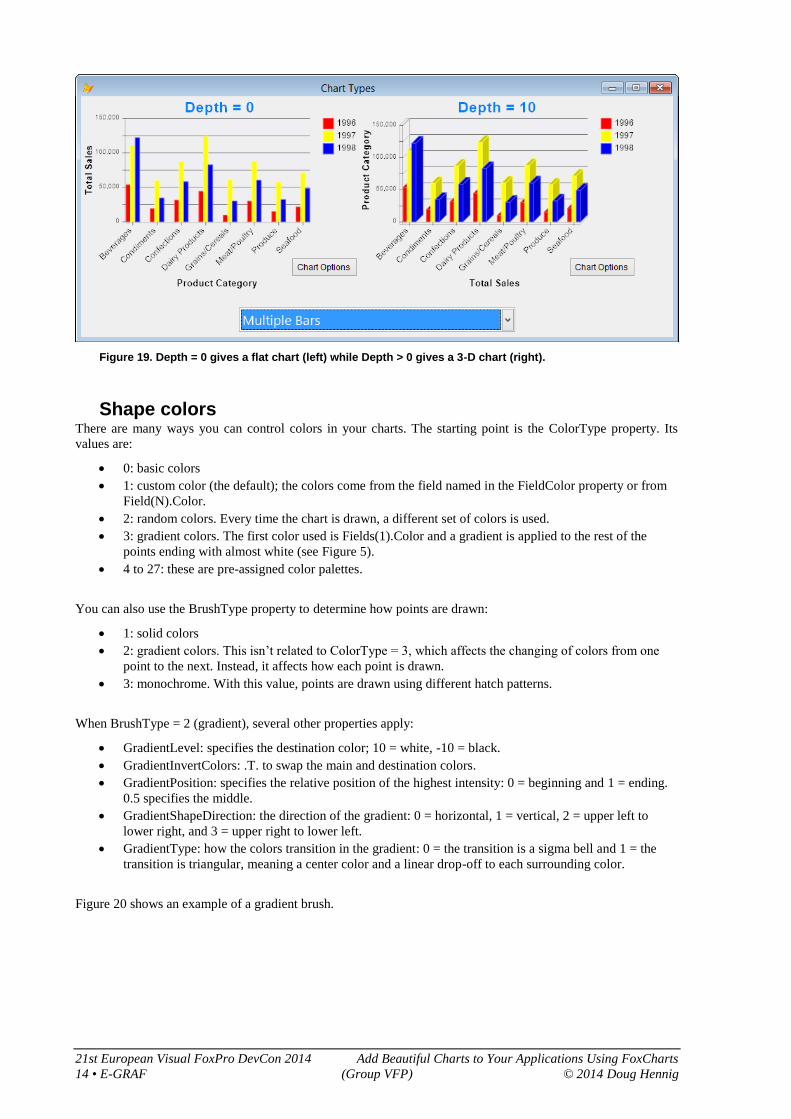
Depth The Depth property determines whether a chart appears flat (Depth = 0) or 3-D (Depth > 0). For example,
compare the charts in Figure 19. The left chart has Depth set to 0 and the right one has Depth set to 10. Depth
contains the number of pixels the chart should be deep along the Z axis. Its range is 0 to 50.
21st European Visual FoxPro DevCon 2014 Add Beautiful Charts to Your Applications Using FoxCharts
14 • E-GRAF (Group VFP) © 2014 Doug Hennig
Figure 19. Depth = 0 gives a flat chart (left) while Depth > 0 gives a 3-D chart (right).
Shape colors There are many ways you can control colors in your charts. The starting point is the ColorType property. Its
values are:
0: basic colors
1: custom color (the default); the colors come from the field named in the FieldColor property or from
Field(N).Color.
2: random colors. Every time the chart is drawn, a different set of colors is used.
3: gradient colors. The first color used is Fields(1).Color and a gradient is applied to the rest of the
points ending with almost white (see Figure 5).
4 to 27: these are pre-assigned color palettes.
You can also use the BrushType property to determine how points are drawn:
1: solid colors
2: gradient colors. This isn’t related to ColorType = 3, which affects the changing of colors from one
point to the next. Instead, it affects how each point is drawn.
3: monochrome. With this value, points are drawn using different hatch patterns.
When BrushType = 2 (gradient), several other properties apply:
GradientLevel: specifies the destination color; 10 = white, -10 = black.
GradientInvertColors: .T. to swap the main and destination colors.
GradientPosition: specifies the relative position of the highest intensity: 0 = beginning and 1 = ending.
0.5 specifies the middle.
GradientShapeDirection: the direction of the gradient: 0 = horizontal, 1 = vertical, 2 = upper left to
lower right, and 3 = upper right to lower left.
GradientType: how the colors transition in the gradient: 0 = the transition is a sigma bell and 1 = the
transition is triangular, meaning a center color and a linear drop-off to each surrounding color.
Figure 20 shows an example of a gradient brush.

Add Beautiful Charts to Your Applications Using FoxCharts 21st European Visual FoxPro DevCon 2014
© 2014 Doug Hennig (Group VFP) E-GRAF • 15
Figure 20. A gradient brush adds variation in the color of each point.
Transparency adds an interesting look to charts. The AlphaChannel property controls the transparency, with
values from 0 (transparent) to 255 (opaque). Figure 21 shows the same chart as Figure 20 but with AlphaChannel
set to 128.
Figure 21. The AlphaChannel property controls shape transparency.
Other colors You can also control the colors of other objects in the chart:
AxisColor and AxisAlpha: the color and transparency for the X and Y axes.
BackColor and BackColorAlpha: the background color and transparency for the entire chart.
BackColor2: the destination color when a gradient background is used.
BackGradientMode: if BackColor2 is specified, the direction of the gradient between BackColor and
BackColor2; see GradientShapeDirection for the values.
SelectedShapeColor: the color a shape changes to when the mouse hovers over it. This only applies if
ShowColorOnMouse is .T.
ScaleLineZeroColor: the color for the line along the X-axis (that is, where Y = 0). This only applies if
the chart has both positive and negative values and ShowValueZero is .T.
Legends There are nine types of “legends” in FoxCharts charts: the eight shown in Figure 22 and another (YAxis2) that
appears as the right Y-axis when a multi-chart is used. If you look at the FoxCharts control, you’ll see label

21st European Visual FoxPro DevCon 2014 Add Beautiful Charts to Your Applications Using FoxCharts
16 • E-GRAF (Group VFP) © 2014 Doug Hennig
objects for these but those are just placeholders so you can set properties; the actual text is drawn on the chart
using GDI+.
Figure 22. There are eight types of legends in FoxCharts.
The following properties of these objects are respected when drawing the associated text:
Alignment
BackColor
Caption
ForeColor
Format
FontName
FontSize
FontBold
FontItalic
FontStrikeThru
FontUnderline
FontCharSet
There are also four custom properties you can set:
ForeColorAlpha: the transparency of the foreground color.
BackColorAlpha: the transparency of the background color.
Rotation: the rotation angle in degrees for the text. You can either use a positive value (0 to 360) for a
clockwise rotation or a negative value (0 to -360) for a counterclockwise rotation. Rotation is from the
upper left corner of the text.
RotationCenter: similar to Rotation but specifies rotation around the center of the text.
Some legends have specific issues. XAxis, YAxis, YAxis2, and AxisLegend2 are ignored for pie and doughnut
charts. The text for AxisLegend2 comes from the field in the cursor specified in the FieldAxis2 property. Often,
you’ll want to rotate the labels so they don’t overlap, as is done in Figure 22.
There are three properties that affect ShapeLegend:
ShowValuesOnShapes: .T. to display text on shapes.
PieShowPercent: .T. to display percentage instead of values.
ShapeLegendExpression: a character expression that determines the shape text. Use the Curr*
properties discussed in the help topic for this property as necessary. For example,
“transform(round(This.CurrValue/1000, 0))” displays the value in thousands.
SideLegend is set differently for single-series and multi-series charts. For single-series, set FieldLegend to the
name of the field containing the X-axis values; this is normally the same as FieldAxis2. For multi-series, set
Field(N).Legend to the value displayed for the current series. There are three related properties:
ShowSideLegend: .T. to display the side legend.

Add Beautiful Charts to Your Applications Using FoxCharts 21st European Visual FoxPro DevCon 2014
© 2014 Doug Hennig (Group VFP) E-GRAF • 17
LegendPosition: specifies where the side legend is displayed: 0 = no legend, 1 = vertical top left, 2 =
vertical bottom left, 3 = vertical top right (the default), 4 = vertical bottom right, 5 = horizontal top left,
6 = horizontal top center, 7 = horizontal top right, 8 = horizontal bottom left, 9 = horizontal bottom
center, and 10 = horizontal bottom right.
LegendHideWhenNull: .T. to hide the legend item for a value if the value is null; only applies to single-
series charts.
FoxCharts automatically determines the values for the ScaleLegend but you can override those values if you
wish. The associated properties are:
ShowScales: .T. to display the Y-axis values.
ScaleDivider: a factor to divide values by. The default is 1 but you can use other values to display large
values, such as 1000 to display values in thousands.
ScaleAutoFormat: .T. to automatically determine the setting for ScaleLegend.Format; if .F.,
ScaleLegend.Format is used instead.
ShowValueZero: .T. to display a line along the X-axis (that is, where Y = 0).
Scale: the step size between values. 0 means the value is calculated automatically and is chosen so the
increment between successive values is a power of ten times 1, 2, 2.5, or 5.
MinNumberScaleLegends: the minimum number of values to display if Scale is calculated
automatically.
MinValue: the minimum value displayed; if .F., it’s calculated automatically. The minimum value
displayed is a multiple of the Scale property less than or equal to this value.
MaxValue: the maximum value displayed; if .F., it’s calculated automatically. The maximum value
displayed is a multiple of the Scale property greater than or equal to this value.
Axes, tick marks, lines, and bars All charts except pie and doughnut can have axes (X and Y), tick marks along the axes, and lines and bars that
extend across the axes. ShowAxis is normally .T. to display all of those; set it to .F. to turn them all off. As I
mentioned earlier, AxisColor and AxisAlpha control the color and transparency for the X and Y axes. Set
ShowAxis2Tics to .T. to display or .F. to hide tick marks on the X-axis. TicLength determines the length in
pixels for tick marks on both axes.
The properties related to lines are:
ScaleBackLinesType: specifies which lines are drawn: 0 = no lines, 1 = horizontal (the default), 2 =
vertical, and 3 = both.
ScaleLineColor: the color for the lines.
ScaleBackLinesWidth: the width of the lines in pixels.
ScaleBackLinesDash: the line style: 0 = solid line (the default), 1 = dashed line, 2 = dotted line, 3 =
dash-dot, and 4 = dash-dot-dot.
The properties related to bars are:
ScaleBackBarsType: specifies which bars are drawn: 0 = no bars, 1 = horizontal (the default), 2 =
vertical, and 3 = both.
ScaleBackColor and ScaleBackAlpha: the color and transparency for the bars.
BarsPerScale: the number of horizontal bars per legend.
Margins Use the Margin* properties to control space in pixels around the chart. Margin is the space around the entire
chart while MarginTop, MarginBottom, MarginLeft, and MarginRight control the margin for the specific side.
Tooltips By default, the ShowTips property is .T., meaning that as you move the mouse over a shape, a tooltip appears.
The appearance of the tooltip is controlled by the ToolTip object in the FoxCharts control. You can change the
font, size, color, etc. of the object as desired.

21st European Visual FoxPro DevCon 2014 Add Beautiful Charts to Your Applications Using FoxCharts
18 • E-GRAF (Group VFP) © 2014 Doug Hennig
Normally, the tooltip displays the point value and X-axis (for a single-series chart) or series (for a multi-series
chart) value. To customize the text, put code into the ShapeToolTip method. See the “Shape events” section later
in this document for an example.
If you want to implement your own tooltips, set ShowTips to .T. and put the appropriate code into the
ShapeMouseEnter and ShapeMouseLeave methods. See the help topic for those methods for details.
Printing/saving charts There are three ways you can print or save a chart:
Print the chart directly to the printer using the ToPrinter method of the oBmp property of the chart; see
the help file for the parameters of that method.
Save the chart to an image file using the SaveToFile method, specifying the file name (the extension
determines the type of file: BMP, JPEG, PNG, GIF, TIFF, or EMF) and optionally the quality
percentage for a JPEG (the default is 75%).
Add the chart to a report: drop a Picture/OLE Bound control on the report, set Control source type to
Expression or variable name, and set Control source to a variable containing a reference to an image
for the chart (Figure 23). Note that the variable must be private or public, not local.
Figure 23. Adding a chart to a report just requires setting a couple of properties of a Picture/OLE Bound control.
To run the report, use code like the following to get the image for the chart:
private oChart
oChart = Thisform.oChart.ChartCanvas
report form ChartReport preview
Alternatvely, you can get an EMF image for the chart using:
oChart = Thisform.oChart.DrawReport()
This gives a much better image as you can see in Figure 24. The top image uses the first technique and
the bottom one uses the second; the different becomes apparent at higher zoom levels.
Note that both cases require SET REPORTBEHAVIOR 90 for best results.

Add Beautiful Charts to Your Applications Using FoxCharts 21st European Visual FoxPro DevCon 2014
© 2014 Doug Hennig (Group VFP) E-GRAF • 19
Figure 24. EMF (bottom image) works better when outputting a chart.
The Visual Chart Designer Given the large number of properties FoxCharts has, it can be a pain to decide how to make a chart look best:
edit the code, change some properties, run the form, edit the code, change some properties, run the form, and so
on. Also, if you want to provide your users the ability to change the chart, you have to create a form with a lot of
controls to edit the values of the various properties. Fortunately, there’s a tool that can help both you and your
users: the Visual Chart Designer (VCD) by Jim Nelson.
VCD is available for download from the FoxCharts downloads page; choose the “FoxCharts Tools:
VisualChartDesigner and GetChartDataFromRows” link. After you unzip it into a folder of your choosing, set a
path to that folder to use it interactively or add the following files to your project to use it in your application:
ChangeFontSize.VCX
VisualChartDesigner.VCX
VisualChartDesigner.SCX

21st European Visual FoxPro DevCon 2014 Add Beautiful Charts to Your Applications Using FoxCharts
20 • E-GRAF (Group VFP) © 2014 Doug Hennig
VCD comes with a button you can add to the FoxCharts object on your form: right-click the FoxCharts object
and choose Edit, then drop a CmdChartOptions button from VisualChartDesigner.VCX onto the FoxCharts
object and position it as desired. This adds the Chart Options button you can see in Figure 19. Clicking this
button launches VCD (Figure 25).
Figure 25. The Visual Chart Designer makes it easy to set the properties of a chart visually and see the results immediately.
Most of the settings in VCD are obvious, but the Properties page is worth noting: once you’ve visually set the
properties of the chart the way you like, you can click the Save to Clipboard button on the Properties page to
save the code to set those properties and then paste that code into the form containing the chart.
See VisualChartDesigner.DOC in the Documentation folder of the folder you unzipped the download into for
more details on VCD.
Shape events FoxCharts has several events that fire in response to an action:
AfterChart fires after the chart has been drawn but before the chart image is updated. You can use this
event to modify the image such as adding a company logo. See the help topic for this event for details.
Click and DblClick fire when the user clicks or double-clicks the chart. We’ll see an example of that in
a moment.
ShapeMouseEnter, ShapeMouseMove, and ShapeMouseLeave fire as the user moves the mouse into,
over, and out of a point shape. This can be used to provide your own custom tooltips or other behavior.
ShapeToolTip fires just before a tooltip is displayed for the chart. We’ll see an example of that in a
moment.
ShapeEvents.SCX, one of the sample forms accompanying this document, shows examples of the Click and
ShapeToolTip events. The code for ShapeToolTip is shown in Listing 3. This code provides custom tooltips for
the shapes and side legend of the chart. For shapes, the tooltip shows the year, category, and sales amount as you
can see in Figure 26. For the side legend, it shows the year and total sales for that year.
Listing 3. The code in ShapeToolTip provides a custom tooltip.
lparameters tnButton, ;
tnShift, ;
tnXCoord, ;
tnYCoord, ;
tnValue, ;
tcLegend, ;
tnCoordIndex, ;
tcObjType
local lnSelect, ;
lnSales
do case
case inlist(tcObjType, 'Rect', 'Pie')
go This.CurrRecno in ChartData
This.ToolTip.Caption = tcLegend + chr(13) + ;
alltrim(ChartData.CategoryName) + ;
chr(13) + transform(tnValue, '@$ 9999,999')

Add Beautiful Charts to Your Applications Using FoxCharts 21st European Visual FoxPro DevCon 2014
© 2014 Doug Hennig (Group VFP) E-GRAF • 21
case tcObjType = 'Legend'
lnSelect = select()
select SalesData
sum Sales to lnSales for Year = val(tcLegend)
This.ToolTip.Caption = tcLegend + chr(13) + ;
transform(lnSales, '@$ 9999,999')
select (lnSelect)
endcase
Figure 26. ShapeEvents.SCX has a custom tooltip for shapes.
The code in this method uses the tcObjType parameter, which contains “Rect” or “Pie” if the mouse is over a
shape, “Legend” if the mouse is over the side legend, and blank otherwise, to determine what it should display. It
also uses the tcLegend and tnValue parameters, which contain the legend text and value of the current shape,
respectively. (See the help topic for ShapeToolTip for the purpose of the other parameters.) The CurrRecno
property contains the record number in the cursor containing the chart data that the current shape comes from;
the code positions the cursor to that record to get the category name for the current shape. For the side legend,
the code sums the sales for the selected year from the original (non-cross-tab) cursor.
The code in the Click method is shown in Listing 4. This effect of this code is that when the user clicks on a
shape, another form (DrillDownChart.SCX) is called to display the sales by product for the selected category and
year. When the user clicks on a side legend entry, DrillDownChart.SCX is also called, but this time displays
sales by month for the specified year. Feel free to examine the code in the Init method of DrillDownChart.SCX
to see how it charts the appropriate data. Figure 27 shows the result of clicking on the third bar, the one for 1998,
in the Beverages group.
Listing 4. The Click method provides a drilldown from a shape or the side legend.
local lcType
lcType = This.CurrObjType
do case
case empty(lcType)
case lcType = 'Legend'
do form DrillDownChart with Thisform, This.CurrLegend
otherwise
go This.CurrRecno in ChartData
do form DrillDownChart with Thisform, This.CurrLegend, ;
ChartData.CategoryName
endcase

21st European Visual FoxPro DevCon 2014 Add Beautiful Charts to Your Applications Using FoxCharts
22 • E-GRAF (Group VFP) © 2014 Doug Hennig
Figure 27. DrillDownChart.SCX shows sales by product for the specified category and year.
Summary FoxCharts is a free, open source component from VFPX that uses 100% VFP code to create beautiful modern-
looking charts without using any ActiveX controls. Although it has a bit of a learning curve to take full
advantage of all of its features, FoxCharts provides you with full controls over all aspects of the chart. Using
Visual Chart Designer, you can quickly set up a chart and even allow your end-users to modify a chart to suit
their needs.
Biography Doug Hennig is a partner with Stonefield Software Inc. He is the author of the award-winning Stonefield
Database Toolkit (SDT); the award-winning Stonefield Query; the MemberData Editor, Anchor Editor, and
CursorAdapter and DataEnvironment builders that come with Microsoft Visual FoxPro; and the My namespace
and updated Upsizing Wizard in Sedna.
Doug is co-author of VFPX: Open Source Treasure for the VFP Developer, Making Sense of Sedna and SP2, the
What’s New in Visual FoxPro series, Visual FoxPro Best Practices For The Next Ten Years, and The Hacker’s
Guide to Visual FoxPro 7.0. He was the technical editor of The Hacker’s Guide to Visual FoxPro 6.0 and The
Fundamentals. All of these books are from Hentzenwerke Publishing (http://www.hentzenwerke.com). He wrote
over 100 articles in 10 years for FoxTalk and has written numerous articles in FoxPro Advisor, Advisor Guide to
Visual FoxPro, and CoDe. He currently writes for FoxRockX (http://www.foxrockx.com).
Doug spoke at every Microsoft FoxPro Developers Conference (DevCon) starting in 1997 and at user groups and
developer conferences all over the world. He is one of the organizers of the annual Southwest Fox and Southwest
Xbase++ conferences (http://www.swfox.net). He is one of the administrators for the VFPX VFP community
extensions Web site (http://vfpx.codeplex.com). He was a Microsoft Most Valuable Professional (MVP) from
1996 through 2011. Doug was awarded the 2006 FoxPro Community Lifetime Achievement Award
(http://tinyurl.com/ygnk73h).

Add Beautiful Charts to Your Applications Using FoxCharts 21st European Visual FoxPro DevCon 2014
© 2014 Doug Hennig (Group VFP) E-GRAF • 23