a338535 · human computer interaction design guidelines and rules. the majority of the design rules...
TRANSCRIPT
Theater Battle Management (TBM) Human Computer Interaction (HCI) Specification
MP 94B0000036
May 1994
C. D. Bowen
Approved fat pibüc reieoagj
mM&
\ 9980309 033
MITRE Bedford, Massachusetts
^ÖSERETUmuTo.
Accession Number: 6073
Publication Date: May 01, 1994
Title: Theater Battle Management (TBM) Human Computer Interaction (HCI) Specification
Personal Author: Bowen, CD.
Corporate Author Or Publisher: MITRE, Bedford, MA Report Number: MP 94B0000036
Abstract: This document provides a standard for those characteristics of the human computer interface (HCI) that must be consistent to permit users to use Theater Battle Management (TBM) systems with minimum distractions and training. It includes both design guidance and a framework for the HCI design rule development process. The HCI specifications will be continually updated as the TBM system development progresses.
Descriptors, Keywords: TBM HCI theater battle management human computer interaction
Pages: 157
Cataloged Date: Sep26,1996
Copyrighted or ^at^^^\J^
Document Type: HC
Number of Copies In Library: 000001
Record ID: 42356
Theater Battle Management (TBM) MP94BOOOOO36 Human Computer Interaction (HCI) Mav *994 Specification
C. D. Bowen
Contract Sponsor ESC/AVB Contract No. F19628-94-C-0001 Project No. 6026N Dept. D075
Approved for Public Release; Distribution Unlimited
MITRE Bedford, Massachusetts
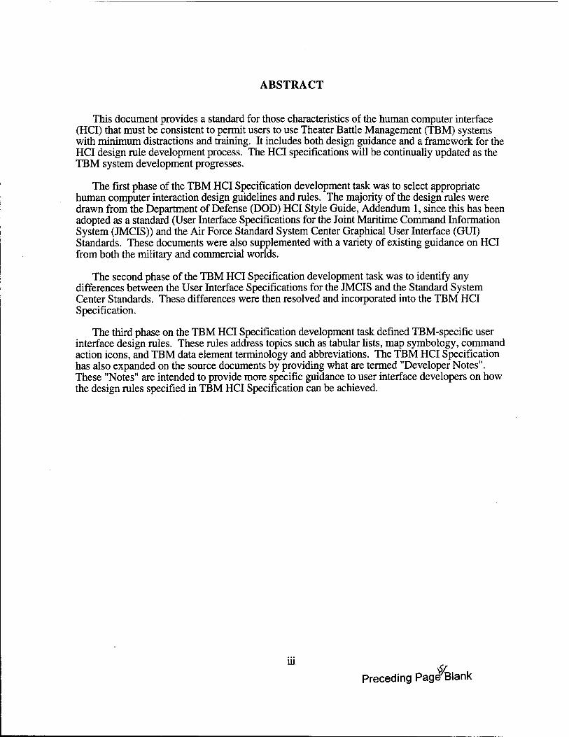
ABSTRACT
This document provides a standard for those characteristics of the human computer interface (HCI) that must be consistent to permit users to use Theater Battle Management (TBM) systems with minimum distractions and training. It includes both design guidance and a framework for the HCI design rule development process. The HCI specifications will be continually updated as the TBM system development progresses.
The first phase of the TBM HCI Specification development task was to select appropriate human computer interaction design guidelines and rules. The majority of the design rules were drawn from the Department of Defense (DOD) HCI Style Guide, Addendum 1, since this has been adopted as a standard (User Interface Specifications for the Joint Maritime Command Information System (JMCIS)) and the Air Force Standard System Center Graphical User Interface (GUI) Standards. These documents were also supplemented with a variety of existing guidance on HCI from both the military and commercial worlds.
The second phase of the TBM HCI Specification development task was to identify any differences between the User Interface Specifications for the JMCIS and the Standard System Center Standards. These differences were then resolved and incorporated into the TBM HCI Specification.
The third phase on the TBM HCI Specification development task defined TBM-specific user interface design rules. These rules address topics such as tabular lists, map symbology, command action icons, and TBM data element terminology and abbreviations. The TBM HCI Specification has also expanded on the source documents by providing what are termed "Developer Notes". These "Notes" are intended to provide more specific guidance to user interface developers on how the design rules specified in TBM HCI Specification can be achieved.
in
Preceding Page Blank
ACKNOWLEDGMENTS
I would like to acknowledge the efforts of Janet Blackwell and Ron Conti in the compilation of the TBM HCI Specification. They provided useful insight on how to use the Motif™ window manager and the Motif™ widget set to implement a consistent HCI for TBM. Additionally, Janet Blackwell provided some of die screen diagrams used in the TBM HCI Specification and helped define some of the task-specific windows included in this document.
I would like to thank Robert McGue, Robert Pancotti, and Jeanne Fandozzi for their review of this document. I would also like to thank Candy Moore, Jennifer Niebla, Donna Cuomo, Marilyn Crampton, and Kathy Doiron for their assistance in the proofreading, editing, and formatting of this document.
I would also like to thank Kathleen Femandes of the Naval Command, Control, and Ocean Surveillance Center for her many clarifications and explanations of the criteria specified in the User Interface Specificatons for the Joint Maritime Command Information System. I would also like to acknowledge Alan McFarland of Bellcore for his efforts and explanations of the Graphical User Interface Design Guidelines for Bellcore Software Products.
IV
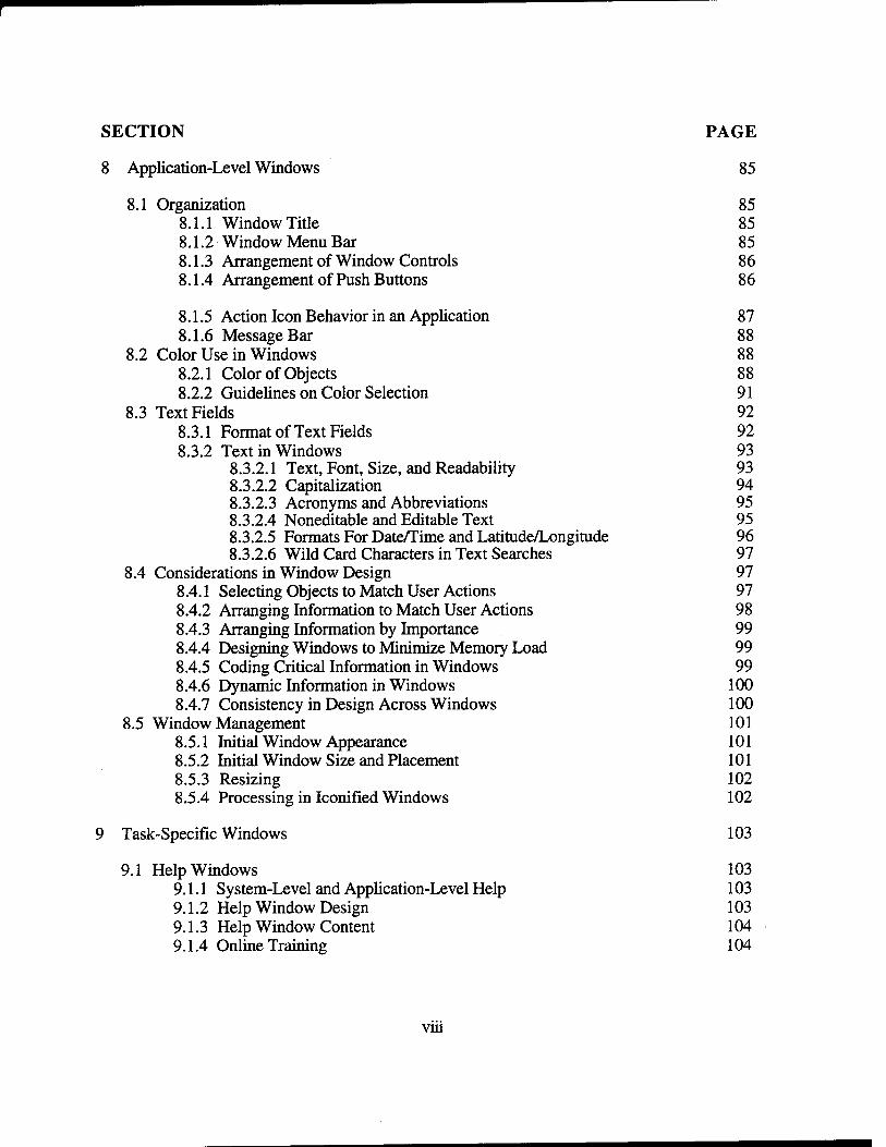
TABLE OF CONTENTS
SECTION PAGE
1 Introduction 1
1.1 General Information 1 1.1.1 HCI Design Rule Development 1 1.1.2 HCI Style Guides and HCI Specifications 2
1.2 Source Documents 2 1.3 Compliance 3 1.4 Tailoring of the Motif Style Guide and Toolkit 3 1.5 TBM HCI Specification Format and Development 4
2 Design Decision Filters 7
2.1 User Population 7 2.1.1 User Skills and Experiences 7
2.2 Physical Environment 7 2.3 Input Devices 7
2.3.1 Interchangeability Between Input Devices 7 2.3.2 Pointing Device Input . 8
2.3.2.1 The Pointer 8 2.3.2.2 Pointer Shapes 11 2.3.2.3 Pointing Device Buttons 13
2.3.3 Keyboard Input 14 2.3.3.1 The Location Cursor 14 2.3.3.2 The Text Cursor During Text Entry 15 2.3.3.3 Actions in Text Entry 16 2.3.3.4 Mapping Virtual to Actual Keys 16
2.4 Output Devices 18
3 Interaction Issues 23
3.1 Window Navigation 23 3.1.1 Input Focus Policy 23 3.1.2 Assigning Focus to a Window 23
3.2 Menu Navigation 23 3.2.1 Pointing Device Navigation 23 3.2.2 Keyboard Navigation Control 24 3.2.3 Keyboard Navigation for Graphic Objects 25
3.3 Object Selection 25 3.3.1 Pointing Device Selection Methods 25 3.3.2 Keyboard Selection Methods 25 3.3.3 Other Types of Selection 26
SECTION
3.4 Object Transfer 3.4.1 Clipboard Transfers 3.4.2 Primary Transfer 3.4.3 Quick Transfer 3.4.4 Drag Transfer (Drag and Drop)
3.5 Interactive Control 3.5.1 Object-Action Selection 3.5.2 User Control of Interaction 3.5.3 Immediate Feedback 3.5.4 System Response Time 3.5.5 Error Detection 3.5.6 General Undo Capability
4 Menus
4.1 Pull Down Menus 4.1.1 Menu Title 4.1.2 Types of Menu Options 4.1.3 Wording, Organization, and Availability 4.1.4 Mnemonics 4.1.5 Keyboard Accelerators 4.1.6 Cascading Submenus 4.1.7 Pointing Device Navigation and Selection 4.1.8 Keyboard Navigation and Selection
4.2 Tear-Off Menus 4.2.1 Appearance 4.2.2 Navigation and Selection
4.3 Pop-up Menus 4.3.1 Appearance 4.3.2 Navigation and Selection
4.4 Option Menus 4.4.1 Appearance 4.4.2 Navigation and Selection
5 Controls
5.1 Push Buttons 5.1.1 Appearance and Vocabulary 5.1.2 Selection 5.1.3 Default Push Buttons 5.1.4 Design of Action Icons
5.2 Radio Buttons 5.3 Check Buttons 5.4 List Boxes
5.4.1 Appearance
vi
PAGE
27 27 28 29 29 30 30 31 31 32 32 33
35
35 35 35 36 38 39 40 40 41 41 41 42 42 42 43 43 43 44
45
45 45 53 53 54 54 55 55 55
SECTION PAGE
5.4.2 Navigation and Selection 56 5.5 Scroll Bars 57 5.6 Scales 58 5.7 Standard and Nonstandard Controls 60
5.7.1 Modifying Push Button Behavior 60 5.7.2 Using Pop-up Lists to Support Text Entry ' 60
6 Windows 61
6.1 Types of Windows 61 6.1.1 Primary Windows 61
6.1.1.1 Application Primary Window 61 6.1.1.2 Primary Task Window 62
6.1.2 Secondary Windows 64 6.1.2.1 Menubar Style Secondary Window 64 6.1.2.2 Push Button Style Secondary Window 64
6.1.3 Dialog Windows 66 6.1.3.1 Prompt Windows 67 6.1.3.2 Message Windows 67 6.1.3.3 Error Message Windows 68 6.2.3.4 Information Message Windows 70 6.1.3.5 Question Message Windows 70 6.1.3.6 Warning Message Windows 71 6.1.3.7 Working Message Windows 71
6.2 Window States 72 6.3 Window Management Functions 73
6.3.1 Pointing Device Interaction 73 6.3.2 Keyboard Interaction 74
6.4 Window Icons 75
7 System-Level Windows 77
7.1 System Login 77 7.2 The System Window 78
7.2.1 System Window Appearance and Behavior 78 7.2.2 System Window Classification Markings 80
7.3 The System Menu 81 7.3.1 The System Menu Bar 81 7.3.2 Access to System and Application Functions 82
7.4 System Support 82 7.5 System Logout 83
Vll
SECTION PAGE
8 Application-Level Windows 85
8.1 Organization 85 8.1.1 Window Title 85 8.1.2 Window Menu Bar 85 8.1.3 Arrangement of Window Controls 86 8.1.4 Arrangement of Push Buttons 86
8.1.5 Action Icon Behavior in an Application 87 8.1.6 Message Bar 88
8.2 Color Use in Windows 88 8.2.1 Color of Objects 88 8.2.2 Guidelines on Color Selection 91
8.3 Text Fields 92 8.3.1 Format of Text Fields 92 8.3.2 Text in Windows 93
8.3.2.1 Text, Font, Size, and Readability 93 8.3.2.2 Capitalization 94 8.3.2.3 Acronyms and Abbreviations 95 8.3.2.4 Noneditable and Editable Text 95 8.3.2.5 Formats For Date/Time and Latitude/Longitude 96 8.3.2.6 Wild Card Characters in Text Searches 97
8.4 Considerations in Window Design 97 8.4.1 Selecting Objects to Match User Actions 97 8.4.2 Arranging Information to Match User Actions 98 8.4.3 Arranging Information by Importance 99 8.4.4 Designing Windows to Minimize Memory Load 99 8.4.5 Coding Critical Information in Windows 99 8.4.6 Dynamic Information in Windows 100 8.4.7 Consistency in Design Across Windows 100
8.5 Window Management 101 8.5.1 Initial Window Appearance 101 8.5.2 Initial Window Size and Placement 101 8.5.3 Resizing 102 8.5.4 Processing in Iconified Windows 102
9 Task-Specific Windows 103
9.1 Help Windows 103 9.1.1 System-Level and Application-Level Help 103 9.1.2 Help Window Design 103 9.1.3 Help Window Content 104 9.1.4 Online Training 104
vin
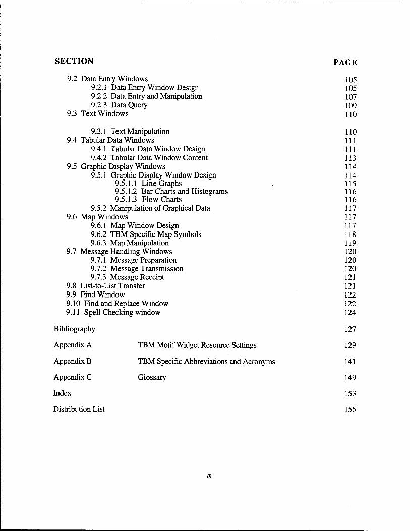
SECTION PAGE
9.2 Data Entry Windows 105 9.2.1 Data Entry Window Design 105 9.2.2 Data Entry and Manipulation 107 9.2.3 Data Query 109
9.3 Text Windows 110
9.3.1 Text Manipulation 110 9.4 Tabular Data Windows 111
9.4.1 Tabular Data Window Design 111 9.4.2 Tabular Data Window Content 113
9.5 Graphic Display Windows 114 9.5.1 Graphic Display Window Design 114
9.5.1.1 Line Graphs 115 9.5.1.2 Bar Charts and Histograms 116 9.5.1.3 Flowcharts 116
9.5.2 Manipulation of Graphical Data 117 9.6 Map Windows 117
9.6.1 Map Window Design 117 9.6.2 TBM Specific Map Symbols 118 9.6.3 Map Manipulation 119
9.7 Message Handling Windows 120 9.7.1 Message Preparation 120 9.7.2 Message Transmission 120 9.7.3 Message Receipt 121
9.8 List-to-List Transfer 121 9.9 Find Window 122 9.10 Find and Replace Window 122 9.11 Spell Checking window 124
Bibliography 127
Appendix A TBM Motif Widget Resource Settings 129
Appendix B TBM Specific Abbreviations and Acronyms 141
Appendix C Glossary 149
Index 153
Distribution List 155
IX
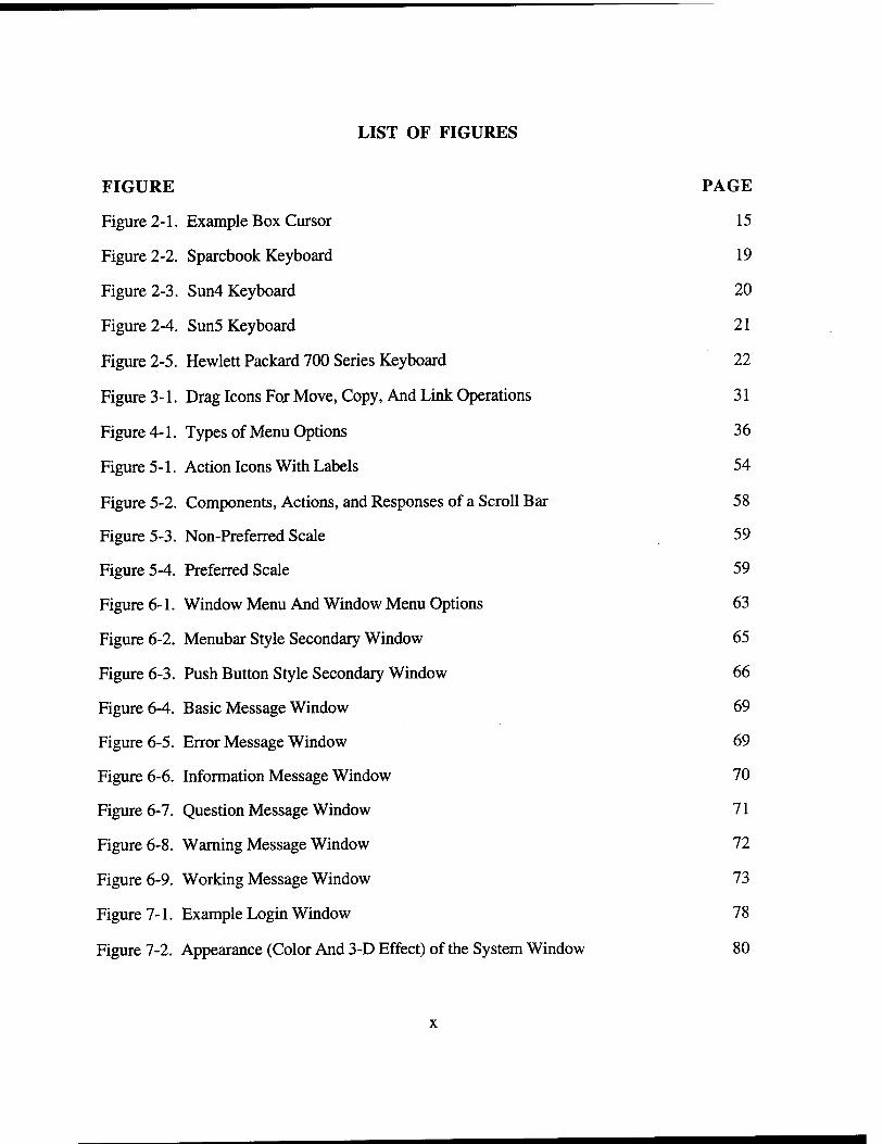
LIST OF FIGURES
FIGURE PAGE
Figure 2-1. Example Box Cursor 15
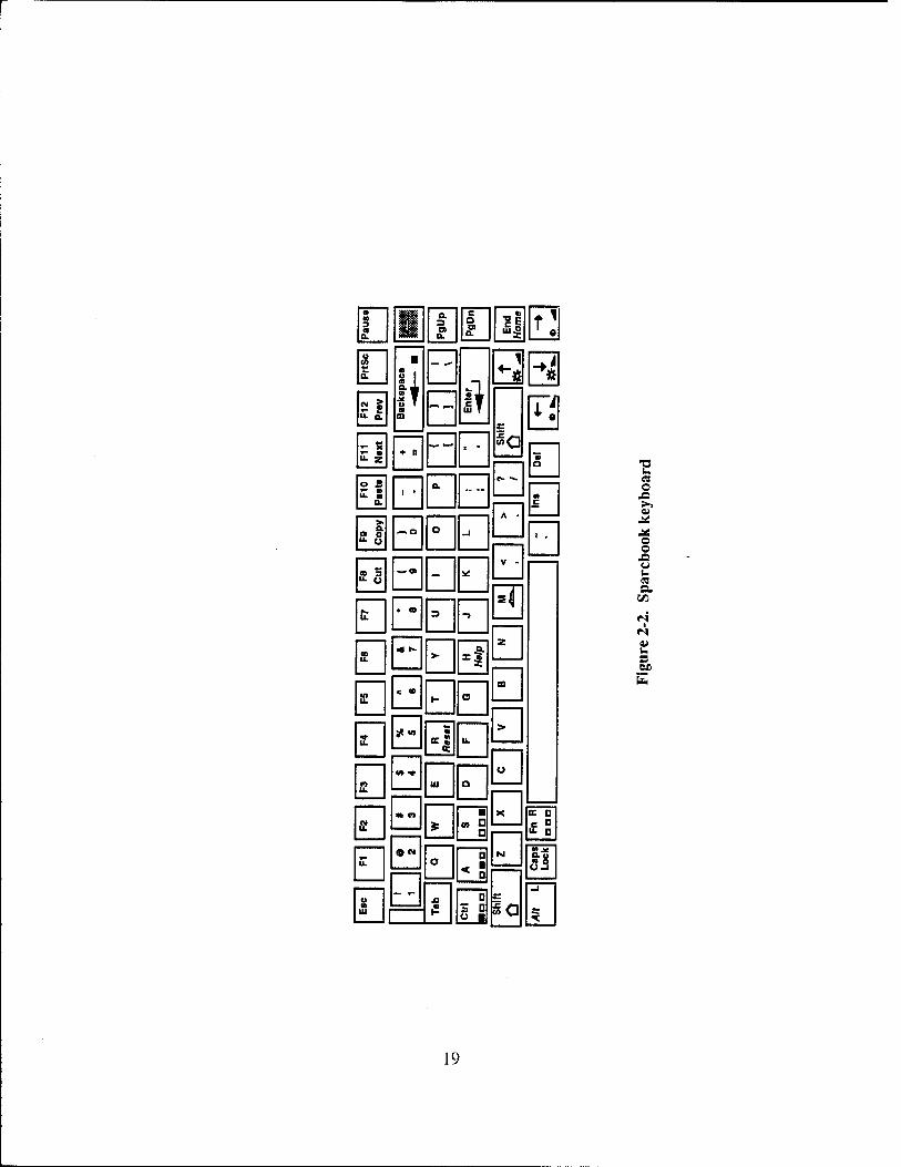
Figure 2-2. Sparebook Keyboard 19
Figure 2-3. Sun4 Keyboard 20
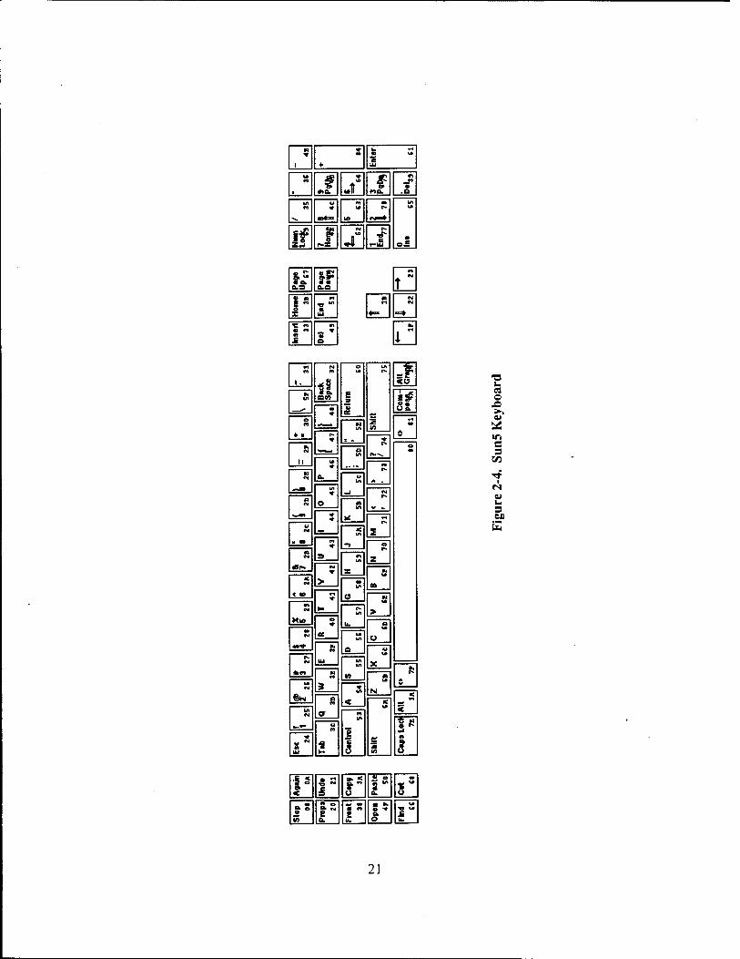
Figure 2-4. Sun5 Keyboard 21
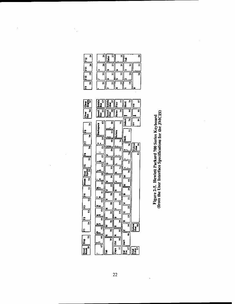
Figure 2-5. Hewlett Packard 700 Series Keyboard 22
Figure 3-1. Drag Icons For Move, Copy, And Link Operations 31
Figure 4-1. Types of Menu Options 36
Figure 5-1. Action Icons With Labels 54
Figure 5-2. Components, Actions, and Responses of a Scroll Bar 58
Figure 5-3. Non-Preferred Scale 59
Figure 5-4. Preferred Scale 59
Figure 6-1. Window Menu And Window Menu Options 63
Figure 6-2. Menubar Style Secondary Window 65
Figure 6-3. Push Button Style Secondary Window 66
Figure 6-4. Basic Message Window 69
Figure 6-5. Error Message Window 69
Figure 6-6. Information Message Window 70
Figure 6-7. Question Message Window 71
Figure 6-8. Warning Message Window 72
Figure 6-9. Working Message Window 73
Figure 7-1. Example Login Window 78
Figure 7-2. Appearance (Color And 3-D Effect) of the System Window 80
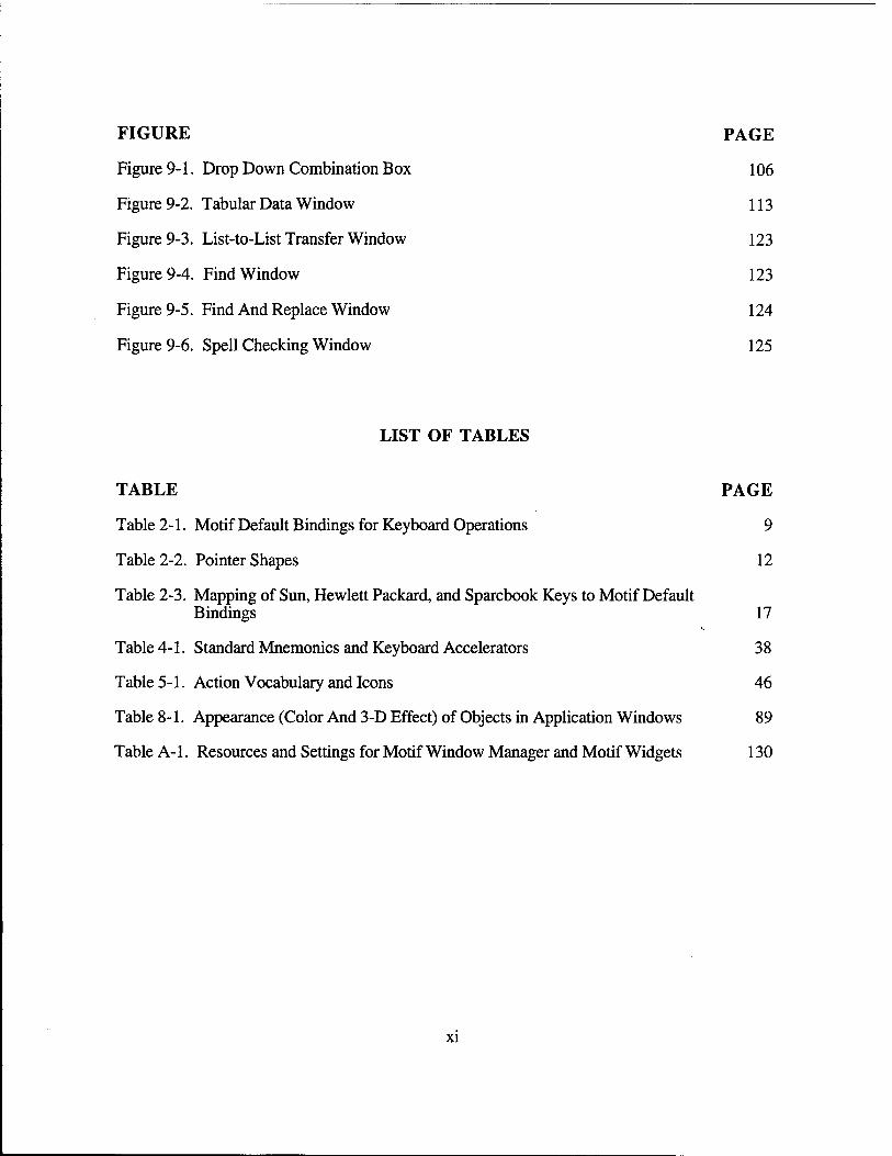
FIGURE PAGE
Figure 9-1. Drop Down Combination Box 106
Figure 9-2. Tabular Data Window 113
Figure 9-3. List-to-List Transfer Window 123
Figure 9-4. Find Window 123
Figure 9-5. Find And Replace Window 124
Figure 9-6. Spell Checking Window 125
LIST OF TABLES
TABLE PAGE
Table 2-1. Motif Default Bindings for Keyboard Operations 9
Table 2-2. Pointer Shapes 12
Table 2-3. Mapping of Sun, Hewlett Packard, and Sparebook Keys to Motif Default Bindings 17
Table 4-1. Standard Mnemonics and Keyboard Accelerators 38
Table 5-1. Action Vocabulary and Icons 46
Table 8-1. Appearance (Color And 3-D Effect) of Objects in Application Windows 89
Table A-1. Resources and Settings for Motif Window Manager and Motif Widgets 130
XI
SECTION 1
INTRODUCTION
This document provides a standard for those characteristics of the human computer interface (HCI) that must be consistent to permit users to use the Theater Battle Management (TBM) system with minimum interference. It includes both design guidance and a framework for the HCI design rule development process and library items.
1.1 GENERAL INFORMATION
The HCI deals with the aspects of a system's design that influences a user's participation in information handling tasks. The HCI is defined in terms of both the tangible and the intangible aspects of the system software. The tangible aspects include screen designs, menus, error messages, etc.; while the intangible aspects include the sequence control and the program logic of the system software. Good HCI designs incorporate needed user functionality, are easy to learn, and improve user performance. Conversely, poor HCI designs confuse cosmetic features with requirements, are difficult to use, increase user errors, and reduce user performance.
The user interface designer has a variety of technologies available for the design of a system's HCI. The challenge is to incorporate these usable technologies into a HCI design that integrates the user with the system and facilitates effective human performance.
1.1.1 HCI Design Rule Development
HCI guidelines are generally stated recommendations which are based on generally accepted practices or human performance data. Guidelines should be used by HCI designers as a resource for the development of design rules, and only specifically worded design rules should be imposed as a contractual design standard (Smith, 1986).
The definition of a human computer using HCI guidelines involves a number of steps. Designers should first identify the guidelines which are applicable to the proposed system. Not all guidelines are applicable to a HCI. Some guidelines may conflict and it is the designer's job to choose the more important guidelines. Further, budgetary and time restrictions may force a designer to apply only the most important guidelines. The appropriate design guidelines are selected from a number of sources. Smith and Mosier (1986) provide a number of general guidelines for software development and the DOD has recently compiled a HCI Style Guide. Likewise, commercial guidelines such as the Motif™ Style Guide are also available.
Once appropriate design guidelines are identified, they must be translated into specific design rules. Because guidelines are intended for use on a variety of systems, they are worded in general terms. Some guidelines can have different possible implementations. It is the designer's job to specify explicit design rules. For example, a HCI guideline may require that all display titles be placed in a consistent location. A HCI design rule would specify that each display title is centered at the top of each display in a ten-point mixed-case bolded helvetica font. The step of translating HCI guidelines into HCI rules is crucial if the HCI is to be tangible. If this is not done and coordinated with all developers, each developer will create design rules
individually. The result is an inconsistent design that may or may not be corrected through numerous iterations of reviewing displays. Not only is this approach time consuming and frustrating, it is rarely systematic.
Translating a design guideline into a specific design rule can be a difficult process. A number of tradeoffs must be addressed. Tradeoff decisions are made based on the operational situation, the skills of the users, and the mission or tasks to be accomplished by the users. What is needed is a design methodology which examines these variables.
1.1.2 HCI Style Guides and HCI Specifications
Dumas (1988) has described the need for a HCI document for every prototyping or operational software development effort. The HCI handbook or application-specific style guide provides a means for members of the software development team to understand the practices that should be followed to create an effective and consistent software product. Larger software efforts that require many software developers have the greatest need for a HCI style guide. However, even small software efforts can benefit from such a guide.
Ensuring HCI consistency within a prototype and, subsequently, a software product is the principal role of an HCI style guide. As the prototype is rapidly assembled, consistency within a single software engineer's techniques for presenting the HCI can be a problem. Establishing consistency among numerous software engineers is far more challenging.
The contents of a HCI style guide will differ for every application and a style guide will evolve throughout the design process. At the onset of the design process, a style guide will contain a collection of applicable HCI guidelines. These guidelines are often derived from guidelines that govern hardware and software choices (e.g., OSF/MOTIF™ Style Guide, Apple Style Guide, IBM's Common User Access, etc.). Guidelines are also derived from more general collections of software HCI guidelines such as the Guidelines for Designing HCI Software (Smith and Mosier, 1986). As the design process proceeds on a specific application, the USI style guide becomes more specific. At the conclusion of the design process, the style guide becomes a HCI design specification. The HCI design specification defines the HCI design in every detail. All applicable design guidelines have been translated into design rules and every aspect of the HCI can be verified.
1.2 SOURCE DOCUMENTS
This TBM HCI Specification draws from the following sources for defining the TBM user interface:
The DOD HCI Style Guide,
User Interface Specifications for the JMCIS,
The Air Force Standard System Center GUI Standards,
MIL-STD-1472D, Human Engineering Design Criteria for Military Systems, Equipment, and Facilities,
MIL-STD-1801, User Computer Interface,
2
Guidelines for Designing User Interface Software (ESD-TR-86-278),
Draft IEEE P12012 Recommended Practice for Graphical User Interface Drivability,
The OSF/MOTIF™ Style Guide,
CTAPS Software User's Manual (SUM) for the Human-Machine Interface (HMI), and
GUI Design Guidelines for Bellcore Software Products.
The Air Force Standard System Center GUI Standards and the User Interface Specifications for the JMCIS are the most specific collections of HCI interface rules and guidelines. Consequently, the TBM HCI Specification draws heavily from these documents. The TBM HCI Specification exceeds existing HCI interface guidance by specifying TBM-specific rules for common elements. These elements include map symbology, screen icons, TBM data element terminology and TBM display element abbreviations. This TBM HCI Specification also provides guidelines to be used for developing rules for new elements not covered in the specification. For example, as the need arises, the design of a new map symbol will be guided by TBM-specific guidance found in the TBM HCI Specification. TBM-specific Motif widget resource settings as well as TBM-specific examples of menus, screen diagrams, and command lists are also found in the TBM HCI Specification.
1.3 COMPLIANCE
TBM system integrators shall comply with the user interface specifications presented in this document. Application unique user interface specifications shall be identified by application developers and included as addendum to this document. User interface specifications presented in the TBM HCI Specification shall be applied in the development of all new applications and in the upgrade of existing applications.
Many guideline documents draw a distinction between mandatory or "shall" provisions, and recommended or "should" provisions. The TBM HCI Specification attempts to reduce this distinction. This is because history has shown that "should" or recommended provisions are routinely ignored by developers. However, the document must allow flexibility in the development of future applications. Consequently, some guideline-related "should" provisions are retained (e.g., Section 8.4.2, Guidelines on Color Selection). When the requirements of this document cannot be met by applications developers, acceptable reasons may exist. Application developers should submit their reasons for not complying with the TBM HCI Specification to the Electronic Systems Center for a waiver. If the waiver is approved, the waived requirements shall be documented in an application-specific addendum to this specification so that other developers can benefit from the solutions proposed.
1.4 TAILORING OF THE MOTIF STYLE GUIDE AND TOOLKIT
Tailoring the OSF/MOTIF™ Style Guide and the toolkit is required for TBM to select among choices of methods, remove functionality unsuitable for particular application areas, and improve upon Motif conventions. A tailored Motif toolkit shall result. An example of tailoring can take the form of customized widgets and gadgets created for use by developers, rules specifying settings
3
for Motif resources, or pre-set Motif resources. In all other instances, the standard Motif widget library and toolkit shall be used, and widgets and tools shall not be created to replace existing Motif standard widgets. Guidance offered in the Motif style guide shall be followed, except for the exceptions noted in the remainder of this document.
1.5 TBM HCI SPECIFICATION FORMAT AND DEVELOPMENT
The TBM HCI Specification contains the following sections: Design Decision Filters, Interaction Issues, System Concepts, Menus, Controls, and Windows. Design decision filters refer to the decisions which affect the user interface design. These decisions include: understanding the skills of users, the hardware and software chosen for the application, and the environment in which the application will be deployed. Interaction issues specify the manner in which users interact with an application. The system concepts include the meaningful concepts of the user interface. This includes the definitions of the objects, actions, and attributes of a system. Sections on the menu and control objects are provided. Also provided is a section on system-level windows as well as application-level windows. Finally, a section on task-specific windows is provided. Task-specific windows include help windows, data entry windows, text windows, tabular data windows, graphic display windows, map windows, and message handling windows.
The first phase of the TBM HCI Specification development task was to select the appropriate design guidelines and rules from the DOD HCI Style Guide, Addendum 1 (User Interface Specifications for the JMCIS), and the Air Force Standard System Center GUI Standards.
The second phase of the TBM HCI Specification development task was to identify any differences between the User Interface Specifications for the JMCIS and the Standard System Center GUI Standards. Once these differences were identified they were resolved and incorporated into the TBM HCI Specification.
The third phase of the TBM HCI Specification development task defined TBM-specific user interface design rules. These rules address topics such as tabular lists, map symbology, screen icons, and TBM data element terminology abbreviations.
When possible, design rules are followed with example figures or tables. Some examples and tables are drawn from the Air Force (AF) Standard System Center (SSC) GUI Standards or the User Interface Specifications for the JMCIS. Other examples or tables have resulted from TBM- specific tailoring of the HCI Specification.
The source of each design rule is indicated by one or more of the following abbreviations.
MS 1472 MIL-STD- 1472D, Human Engineering Design Criteria for Military Systems, Equipment, and Facilities
MS 1801 MIL-STD-1801, User/Computer Interface
ESD-TR ESD-TR-86-278, Guidelines for Designing User Interface Software
MSG Motif™ Style Guide
DODHS DODES Style Guide

DODSG Department of Defense Human Computer Interface Style Guide
AFSSC Air Force Standard System Center Graphical User Interface Standards
JMCIS User Interface Specifications for the Joint Maritime Command Information System
Bellcore Graphical User Interface Design Guidelines for Bellcore Software Products
Kobara Visual Design with OSF/Motif
Interested readers are directed to the source for more information regarding specific user interface design rules. When no source is listed, the design rule has resulted from TBM-specific tailoring.
The TBM HCI Specification has expanded on the source documents by providing what are termed "Developer Notes". These "Notes" are intended to provide more specific guidance to the user interface developers on how the design rules specified in TBM HCI Specification can be achieved.
SECTION 2
DESIGN DECISION FILTERS
Design decision filters predefine a perspective on the design of the software system. The design decision filters represent the system characteristics which determine how general HCI guidelines shall be defined for a specific system. Design decision filters include the characteristics of the user population, the physical environment, and the input and output devices chosen to access the software.
2.1 USER POPULATION
This document is geared toward application developers who develop software for operational personnel. Operational personnel are not expected to have system administrator-level software skills, nor are they expected to be familiar with the UNIX operating commands. In fact, operational personnel should be prevented from accessing the UNK shell.
2.1.1 User Skills and Experiences
The purpose of this software specification is to provide a common framework for HCI design and implementation. The intent is to promote higher productivity and less training time in acquiring user skills and experiences.
2.2 PHYSICAL ENVIRONMENT
It is expected that operators will use TBM hardware and software in normal "office" working environments. This has an impact on the screen colors chosen for core and application software. If darkened battlefield environments need to be accommodated, they will be addressed in subsequent releases of this specification.
2.3 INPUT DEVICES
Input devices shall include a keyboard and a pointing device. The pointing device shall be a mouse for the workstations and a keyboard cursor control for the Sparebook laptop.
2.3.1 Interchangeability Between Input Devices
Two main input devices shall be provided, the keyboard and a pointing device. As much as possible, users shall be able to use the keyboard and the pointing device interchangeably. The OSF/MOTIF™ Style Guide requires full interchangeability between pointing device and keyboard. The DODIIS style guide also calls for full interchangeability but only describes keyboard actions for navigation in menus. Although it is expected that the keyboard shall be used primarily for text input, it should also be available as a backup so users can continue to operate a system should a pointing device fail.
1. The pointing device is the primary means of user-computer interaction. Source: MSG, DODHS, DODSG, JMCIS
2. The keyboard is available for performing most operations primarily as a backup. Source: MSG, DODHS, DODSG, JMCIS
3. All operations in Table 2-1 except range selection in text are available from keyboard. Source: MSG, JMCIS
4. Range selection in text is included if integral to the functionality of an application. Source: MSG, JMCIS
2.3.2 Pointing Device Input
The following basic physical operations shall be supported with a pointing device: Press, Drag, Release, Click, and Double Click.
2.3.2.1 The Pointer
1. The pointing device is associated with a single pointer on the screen. Source: MSG, JMCIS
2. The hotspot of the pointer indicates the precise location where operations occur. Source: MSG, JMCIS
3. The pointer moves anywhere on the screen. Source: MSG, JMCIS
4. When users move the pointing device, the pointer moves in the corresponding direction. Source: MSG, DODHS, DODSG, JMCIS
5. The pointing device-to-pointer movement ratio is close to 1:1 for most user interactions. Source: MSG, JMCIS
6. The pointer remains in place until moved by users; it is not moved by an application. Source: MSG, DODHS, DODSG, JMCIS
7. The pointer deviates less than .05 inch in any direction; .01 inch for high stability. Source: MS 1801, JMCIS
8. When a system uses multiple physical displays, the pointer moves between multiple displays when users move the pointing device. Source: JMCIS
9. When a system uses only one physical display, the pointer does not move beyond the physical display boundary or disappear from sight. Source: JMCIS
10. The location of the hotspot does not move as the pointer changes shape. Refer to Table 2.2. Source: MSG, JMCIS
8
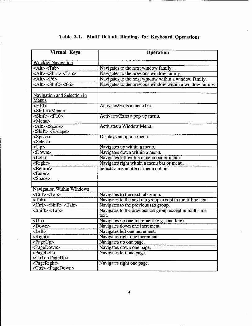
Table 2-1. Motif Default Bindings for Keyboard Operations
Virtual Keys Operation
Window Navigation <Alt> <Tab> Navigates to the next window family. <Alt> <Shirt> <Tab> Navigates to the previous window family. <Alt> <F6> Navigates to the next window within a window family. <Alt> <Shift> <F6> Navigates to the previous window within a window family.
Navigation and Selection in Menus <F10> <Shift><Menu>
Activates/Exits a menu bar.
<Shift> <F10> <Menu>
Activates/Exits a pop-up menu.
<Alt> <Space> <Shift> <Escape>
Activates a Window Menu.
<Space> <Select>
Displays an option menu.
<Up> Navigates up within a menu. <Down> Navigates down within a menu. <Left> Navigates left within a menu bar or menu. <Right> Navigates right within a menu bar or menu. <Return> <Enter> <Space>
Selects a menu title or menu option.
Navigation Within Windows <Ctrl> <Tab> Navigates to the next tab group. <Tab> Navigates to the next tab group except in multi-line text. <Ctrl> <Shift> <Tab> Navigates to the previous tab group. <Shift> <Tab> Navigates to the previous tab group except in multi-line
text. <Up> Navigates up one increment (e.g., one line). <Down> Navigates down one increment. <Left> Navigates left one increment. <Right> Navigates right one increment. <PageUp> Navigates up one page. <PageDown> Navigates down one page. <PageLeft> <Ctrl> <PageUp>
Navigates left one page.
<PageRight> <Ctrl> <PageDown>
Navigates right one page.
Table 2-1. Continued
Virtual Keys Operation
Navigation Within Windows <Ctrl> <Up> Navigates up one large increment (e.g., one paragraph). <Ctrl> <Down> Navigates down one large increment. <Ctrl> <Left> Navigates left one large increment. <Ctrl> <Right> Navigates right one large increment. <Home> Navigates to the leftmost element (e.g., the beginning of a
line). <End> Navigates to the rightmost element (e.g., the end of a line). <Ctrl> <Home> Navigates to the top leftmost element (e.g., the beginning of
data). <Ctrl> <End> Navigates to the bottom rightmost element (e.g., the end of
data).
Selection <Shift> <F8> Toggles between normal and add mode. <Ctrl> <Shift> <Space> Extends a selection to the cursor position. <Shift> <Space> <Shift> <Select>
Extends a selection to the cursor position except in text.
<Space> <Select>
Selects an element in a collection except in text.
<Ctrl> <Space> Selects an element in a text collection. <Ctrl> </> Selects an entire collection. <Ctrl> <\> Deselects an entire selection.
Other Actions <Enter> <Ctrl> <Return>
Invokes a default action.
<Return> Invokes a default action except in multi-line text. <Cancel> <Escape>
Stops or cancels the current interaction.
<Help> <F1>
Obtains help on an item.
<Shift> <Help> <Shift> <F1>
Invokes context help mode.
Text Entrv <Delete> Deletes one character to the right. <Backspace> Deletes one character to the left. Other Actions <Space> Inserts a space.
10
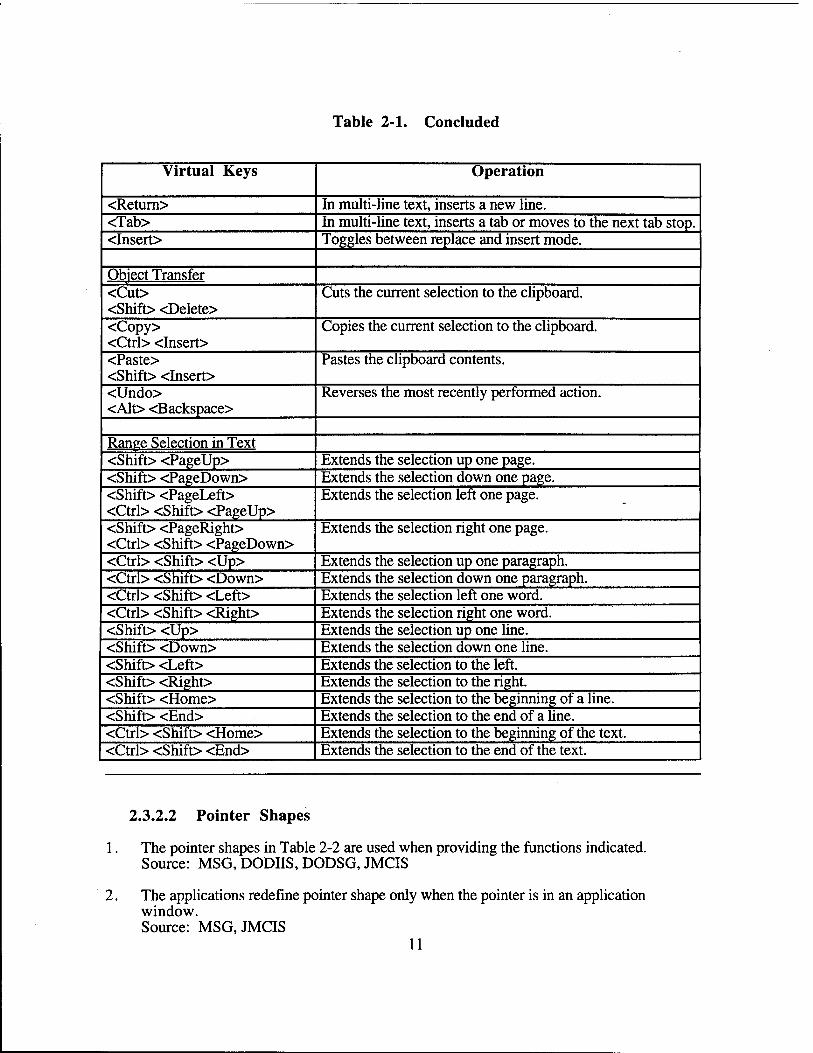
Table 2-1. Concluded
Virtual Keys Operation
<Return> In multi-line text, inserts a new line. <Tab> In multi-line text, inserts a tab or moves to the next tab stop. <Insert> Toggles between replace and insert mode.
Object Transfer <Cut> <Shift> <Delete>
Cuts the current selection to the clipboard.
<Copy> <Ctrl> <Insert>
Copies the current selection to the clipboard.
<Paste> <Shift> <Insert>
Pastes the clipboard contents.
<Undo> <Alt> <Backspace>
Reverses the most recently performed action.
Range Selection in Text <Shift> <PageUp> Extends the selection up one page. <Shift> <PageDown> Extends the selection down one page. <Shift> <PageLeft> <Ctrl> <Shift> <PageUp>
Extends the selection left one page.
<Shift> <PageRight> <Ctrl> <Shift> <PageDown>
Extends the selection right one page.
<Ctrl> <Shift> <Up> Extends the selection up one paragraph. <Ctrl> <Shift> <Down> Extends the selection down one paragraph. <Ctrl> <Shift> <Left> Extends the selection left one word. <Ctrl> <Shift> <Right> Extends the selection right one word. <Shift> <Up> Extends the selection up one line. <Shift> <Down> Extends the selection down one line. <Shift> <Left> Extends the selection to the left. <Shift> <Right> Extends the selection to the right. <Shift> <Home> Extends the selection to the beginning of a line. <Shift> <End> Extends the selection to the end of a line. <Ctrl> <Shift> <Home> Extends the selection to the beginning of the text. <Ctrl> <Shift> <End> Extends the selection to the end of the text.
2.3.2.2 Pointer Shapes
1. The pointer shapes in Table 2-2 are used when providing the functions indicated. Source: MSG, DODIIS, DODSG, JMCIS
2. The applications redefine pointer shape only when the pointer is in an application window. Source: MSG, JMCIS
11
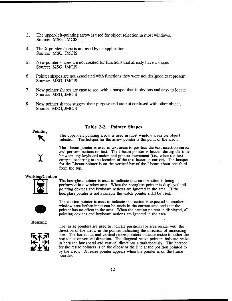
3. The upper-left-pointing arrow is used for object selection in most windows. Source: MSG,JMCIS
4. The X pointer shape is not used by an application. Source: MSG, JMCIS
5. New pointer shapes are not created for functions that already have a shape. Source: MSG, JMCIS
6. Pointer shapes are not associated with functions they were not designed to represent. Source: MSG, JMCIS
7. New pointer shapes are easy to see, with a hotspot that is obvious and easy to locate. Source: MSG, JMCIS
8. New pointer shapes suggest their purpose and are not confused with other objects. Source: MSG, JMCIS
Pointing
SI
Resizing
Table 2-2. Pointer Shapes
The upper-left pointing arrow is used in most window areas for object selection. The hotspot for the arrow pointer is the point of the arrow.
The I-beam pointer is used in text areas to position the text insertion cursor and perform actions on text. The I-beam pointer is hidden during the time between any keyboard action and pointer movement (i.e., when the text entry is occurring at the location of the text insertion cursor). The hotspot for the I-beam pointer is on the vertical bar of the I-beam about one-third from the top.
Working/Caution The hourglass pointer is used to indicate that an operation is being performed in a window area. When the hourglass pointer is displayed, all pointing devices and keyboard actions are ignored in the area. If the hourglass pointer is not available the watch pointer shall be used.
The caution pointer is used to indicate that action is expected in another window area before input can be made in the current area and that the pointer has no effect in the area. When the caution pointer is displayed, all pointing devices and keyboard actions are ignored in the area.
The resize pointers are used to indicate positions for area resize, with the direction of the arrow in the pointer indicating the direction of increasing size. The horizontal and vertical resize pointers indicate resize in either the horizontal or vertical direction. The diagonal resize pointers indicate resize in both the horizontal and vertical directions simultaneously. The hotspot for the resize pointers is on the elbow or the line at the position pointed to by the arrow. A resize pointer appears when the pointer is on the frame boarder.
12
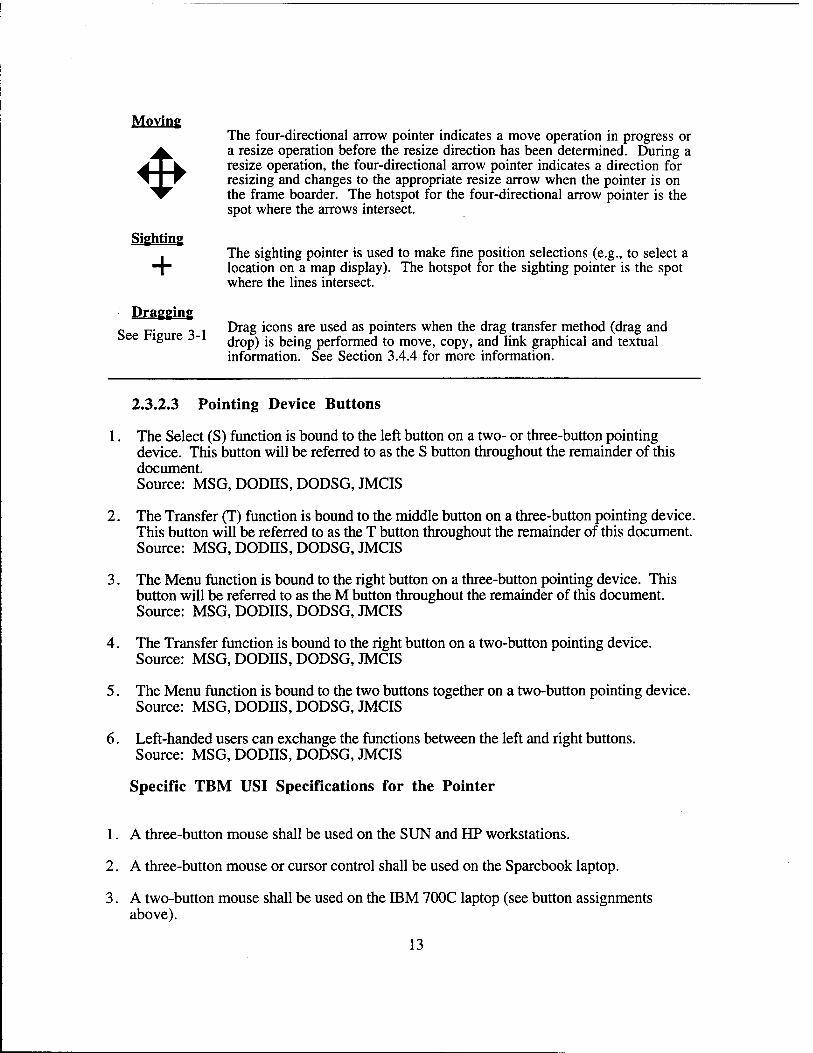
The four-directional arrow pointer indicates a move operation in progress or a resize operation before the resize direction has been determined. During a resize operation, the four-directional arrow pointer indicates a direction for resizing and changes to the appropriate resize arrow when the pointer is on the frame boarder. The hotspot for the four-directional arrow pointer is the spot where the arrows intersect.
The sighting pointer is used to make fine position selections (e.g., to select a location on a map display). The hotspot for the sighting pointer is the spot where the lines intersect.
Dragging „p. _ 1 Drag icons are used as pointers when the drag transfer method (drag and
rigure J-1 dr0p) js being performed to move, copy, and link graphical and textual information. See Section 3.4.4 for more information.
2.3.2.3 Pointing Device Buttons
1. The Select (S) function is bound to the left button on a two- or three-button pointing device. This button will be referred to as the S button throughout the remainder of this document. Source: MSG, DODJIS, DODSG, JMCIS
2. The Transfer (T) function is bound to the middle button on a three-button pointing device. This button will be referred to as the T button throughout the remainder of this document. Source: MSG, DODHS, DODSG, JMCIS
3. The Menu function is bound to the right button on a three-button pointing device. This button will be referred to as the M button throughout the remainder of this document. Source: MSG, DODIIS, DODSG, JMCIS
4. The Transfer function is bound to the right button on a two-button pointing device. Source: MSG, DODHS, DODSG, JMCIS
5. The Menu function is bound to the two buttons together on a two-button pointing device. Source: MSG, DODES, DODSG, JMCIS
6. Left-handed users can exchange the functions between the left and right buttons. Source: MSG, DODJJS, DODSG, JMCIS
Specific TBM USI Specifications for the Pointer
1. A three-button mouse shall be used on the SUN and HP workstations.
2. A three-button mouse or cursor control shall be used on the Sparebook laptop.
3. A two-button mouse shall be used on the IBM 700C laptop (see button assignments above).
13
2.3.3 Keyboard Input
2.3.3.1 The Location Cursor
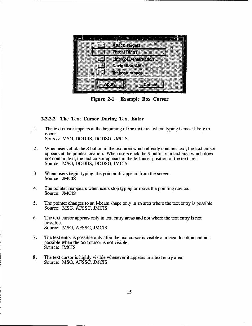
1. The object that has keyboard focus in a window is identified by a location cursor. Source: MSG,JMCIS
2. The location cursor is controlled from the keyboard. Movement of the pointing device shall be mapped to the pointer and shall not affect the position of the location cursor. Source: MSG,JMCIS
3. When a user clicks on an object, it receives focus and the location cursor moves to the object. Source: MSG,JMCIS
4. When a window is displayed, the location cursor is on the control most likely to be selected. Source: MSG,JMCIS
5. When a window regains focus, the location cursor is on the control that last had focus. Source: MSG,JMCIS
6. The box cursor (see Figure 2-1) is the default shape for the location cursor. Source: MSG, JMCIS
7. The text cursor is displayed in the text with keyboard focus and indicating where typed text appears. Source: MSG, AFSSC, JMCIS
8. The text cursor shape is a vertical bar in insert mode and a box in replace mode. Source: MSG, AFSSC, JMCIS
9. The flash rate for the text cursor is 2-5 Hz. Developer Note: The flash rate can be adjusted through XmnBlinkRate resource. Its default setting is at 500 milliseconds or 2 Hz. Source: MSG, AFSSC, JMCIS
10. When the text with the cursor loses focus, the cursor is grayed out and stops flashing. Source: MSG, JMCIS
11. When the text regains focus, the text cursor returns to normal appearance and resumes flashing. Source: MSG, JMCIS
12. If the text cursor disappears when focus is lost, it reappears at the same place when focus returns. Source: MSG, JMCIS
13. When designing a user interface, existing cursor shapes are used. New cursor shapes are created only if existing cursor shapes do not provide functions desired. Source: MSG, JMCIS
14
Attack Targets | I Threat Rings
__J Lines of Demarkation , I Navigation Aids
I "fenkerAirspace
Apply Cancel
Figure 2-1. Example Box Cursor
2.3.3.2 The Text Cursor During Text Entry
1. The text cursor appears at the beginning of the text area where typing is most likely to occur. Source: MSG, DODH.S, DODSG, JMCIS
2. When users click the S button in the text area which already contains text, the text cursor appears at the pointer location. When users click the S button in a text area which does not contain text, the text cursor appears in the left-most position of the text area. Source: MSG, DODHS, DODSG, JMCIS
3. When users begin typing, the pointer disappears from the screen. Source: JMCIS
4. The pointer reappears when users stop typing or move the pointing device. Source: JMCIS
5. The pointer changes to an I-beam shape only in an area where the text entry is possible. Source: MSG, AFSSC, JMCIS
6. The text cursor appears only in text entry areas and not where the text entry is not possible. Source: MSG, AFSSC, JMCIS
7. The text entry is possible only after the text cursor is visible at a legal location and not possible when the text cursor is not visible. Source: JMCIS
8. The text cursor is highly visible whenever it appears in a text entry area. Source: MSG, AFSSC, JMCIS
15
2.3.3.3 Actions in Text Entry
1. When a text cursor is placed into a text field, insert mode is the default for text entry. Source: MSG, AFSSC, JMCIS
2. Insert mode adds new text to the left of the text cursor and moves existing text to the right. Source: MSG, JMCIS
3. Overstrike mode replaces the character to the right of the text cursor with the new character that is typed. Source: MSG, JMCIS
4. The insert key toggles between the insert and overstrike mode for text entry. Source: JMCIS Developer Note: See also section 9.2.2 #12.
5. Backspace deletes the character to the left of the text cursor. Source: MSG, JMCIS
6. Delete, deletes the character to the right of the text cursor. Source: MSG, JMCIS
7. Double clicking on text selects and highlights the word at the location of the pointer. Source: MSG, JMCIS
8. Dragging the pointer across the text also selects and highlights the text. Source: MSG, JMCIS
9. In typing, the highlighted text disappears and the text cursor plus new text is inserted. Source: MSG, JMCIS
10. Delete, deletes highlighted text. The text cursor appears and other unhighlighted text moves to the left. Source: MSG, AFSSC, JMCIS
2.3.3.4 Mapping Virtual to Actual Keys
1. The keyboard mappings in Table 2-3 are used to perform the operations in Table 2-3. Figures 2-2,2-3, and 2-4, and 2-5 depict key locations for the target keyboards. Table 2-3 maps the keys used in the Motif default bindings to each one of the TBM target keyboards. Source: MSG, JMCIS
2. New key bindings are consistent with those used by other applications in the system. Source: MSG, JMCIS
3. The combination of the Alt key and alphanumeric characters is used only in mnemonic keyboard accelerators. Source: MSG, JMCIS
16
r
Other than the use of Shift and an alphanumeric key to denote uppercase, the use of Shift, Alt, and Ctrl with other keys is limited to keyboard accelerators. Source: MSG,JMCIS
Table 2-3. Mapping of Sun, Hewlett Packard, and Sparebook Keys to Motif Default Bindings
Virtual Key Sun4 Key Sun5 Key HP Key Sparebook Key </> / / / / <\> \ \ \ \ <Alt> Alt Alt Extendchar Alt <Backspace> Backspace Backspace Backspace Backspace <Cance > Esc Esc Del Esc Esc <Copy> Copy Copy Ctrl + Insertchar Copy <Ctr> Control Control Ctrl Ctrl <Cut> Cut Cut Shift + Delchar Cut <Delete> Delete Del Delchar Del <Down> Down Down Down Down <End> End End Extendchar +
Right End
<Enter> Enter Enter Enter Enter <Escape> Esc Esc Del Esc Esc <F1> - <F10> Fl - F10 Fl - F10 Fl - F10 Fl - F10 <Help> Help Help Fl Help <Home> Home Home Home Home <Insert> Ins Insert Insertchar Ins <Left> Left Left Left L <Menu> Shift + F10 Shift + F10 Menu Shift + Flu <PageDown> PgDn PgDn and
Page Down Next PgDn
<PageLeft> Control + PgUp
Control + PgUp
Ctrl + Prev Ctrl + PgUp
<PageRight> Control + PgDn
Control + PgDn
Ctrl + Next Ctrl + PgDown
<PageUp> PgUp PgUp and Page Up
Prev PgUp
<Paste> Paste Paste Shift + Insertline Paste <Return> Return Return Return <Right> Right Right Right R <Select> Space Space Select Space <Shift> Shift Shift Shift Shift <Space> Space Space Space Space <Tab> Tab Tab Tab Tab <Undo> Undo Undo Extendchar +
Backspace <Up> Up Up Up
17
2.4 OUTPUT DEVICES
The following output devices are planned for TBM: Sun Sparc 2 and Sun Sparc 10, Hewlett Packard 700, and Sparebook portable laptops. The Sun workstation and the Hewlett Packard 700 workstation shall support a 19 inch color cathode ray display as an output device. The Sparebook shall support an active matrix liquid crystal display as an output device. TBM shall support a variety of printer devices including the following:
Genicom Printer 1200 baud 132 columns Genicom Printer 1200 baud 80 columns Genicom Printer 9600 baud 132 columns Genicom Printer 9600 baud 80 columns Hewlett Packard II Hewlett Packard LaserJet DD Hewlett Packard LaserJet IIP Hewlett Packard JU Hewlett Packard DeskJet Plus Hewlett Packard DeskJet Korean Font Postscript Miltope Printer Postscript Postscript2
Templates shall be made available so additional printing devices can be supported.
18
Pau
se
i 1 ä? ^ T o
n 5! 5 ii a
m
1— ,**
0 0 3 0 0 0 0 0
-**
0 o £ u. S
0.
+ D
1 • a 1 .. ..
• Q
M C
1 ,
c 0 u- D
Ä a OB O
Iff s u. o
0 0 0 0 2
1=
~o O _,
*"■' " —. ^
———
0> -t
' * 1
•' l 1 1U 1 Q 1 1 _ |
0FF1
Htm
— T-
EU •o 1 °l ,2 S D
N
C
50
es o
US
o o
JZ u k. a Bu
<M i
u s u
19

«1
22
H
1 ♦ Enl
er
1-" Er W W O ttiZ
m
■ ee
•1
o na.
a in u » »ix
IA
HCC 1? e 4 e
•1
«Sl in
ä
03
E 4)
©
■1 ,s 12
1) V
IA r»
C
1 ■*
< i" Oft M
IA o
+ ■
«• A
O
M IA
r-
fau
N
ll
IA
o.
*■ r*.
*M
■J
IA
o
▼
a b.
M o o
CM
* irt
2
r>-
«I
1* U «M
■ OB -» in
3
♦
z
o m M
N
•Bf- =
■rt IA
>
tsl
ffl
m.
b.
r«. Tl
< IM
< «a O
m tA
K > <* b.
in N
Mio b.
LA
•X
e
ü
O
M b.
« tsi
«»9 a
1A
LU X
u
b.
«M
«
4A IA
3
u n
NJ u.
o «M
A
< IA
a
0
e ■s
c
u.
a i/i <M
< I B e O
IA
«•»
u. V #»
UJ
M
w
gg A O
Ä « ^ u IS
C «
Weg-
■ m
V *•>
= c
o
5!3 £2
< e» ü3
* 5 0.-1 ÜJ
X
e 55 j 12 8Z .So»
20
1 + En
ter (1
u>
«Q.
so
-t no.
•s « ■5 .a
us
10
«•
N4
in
1? e r»X
«St u>
4 r*
c r-lU
A ^
0.3 IF
IS o X e
UJ
» e
•>
«si
t A «M
fct
1 "
«SI
flaw
o
e s w
us r-
(A
4U
us I* A A Oft •a
o «•» ♦ N
«ft V
M US
* «SI
ll
o «ft Us
U> * a.
r-
«M US
-J in
o «M r- A
«SI A US
«r
2 u «si
a «0
m
3
O
Z A «s|
•Br* «A US
X CSI
> «SI
< tp
«ft us
n N
> •s «si
US
b. e
AC
A 4* «ft
«SI us
0 ft. m
IU
*> u>
«si
4km
us us
¥>
ft. V
H «•» 3
A
N «si in
< <
5 A
9 •t
e •— crt
1/1 «SI
•MV*
«•» us
1 e 3 1
u m
-9 •St
« tu
o
in c s
01 L. 3 en
IS <
«a 1* » o «»
»9 a.
«M «ft m m e a. o
« u»
21
5g
y»
u |A
u.
IA
IA
10 14.
IA
3C0
■ e O IA
IA
«M IA
b.
IA
IA
se cm
1» r-
Sä" » e
*• V Z
aa
t « s s.=
• a" =1 41 E a X
* IA M
(0 I l/l
tt >•
a a.
a E a
IA
u o
er v»
♦ II 1«
n
II
<
CL
n
r- w fM
i«
o -J «1
l#
*
■ «0
■1
e
o «■
z iSr*
> X
o m
o
00 < o
m
n IM
> Hu»
n
er u. «Nl
o «9 ■»r
4»«
o m
IU o
m m
m
X
5 in
** m
«M
N i2€ IA
a < IA
a o
e 'Z «
■a
M o
1-
n n IM
5» Q.UJ
IZ)
ü o % JS'-S >> QJ
5 0)
L.
«2 0) fi W3 o o o CS r^ u ■o ss u u es u ü a, u es
u *J es
SM 0) IN
ift ä 0> c s NN
# a> m IA ■ *J
0>
s 9»
U) s b O
22
SECTION 3
INTERACTION ISSUES
3.1 WINDOW NAVIGATION
3.1.1 Input Focus Policy
1. Only one window on the screen has input focus at any time. Source: MSG, DODHS, DODSG, AFSSC, JMCIS
2. Users assign focus explicitly and do so either with the pointing device or from the keyboard. Source: MSG, DODHS, DODSG, JMCIS Developer Note: This can be accomplished by placing the line: Mwm*keyboardFocusPolicy: Explicit into the .Xdefaults file.
3.1.2 Assigning Focus to a Window
1. Users assign focus by moving the pointer into a window and clicking the S button. Source: MSG, JMCIS
2. If users click in an empty window area, the frame highlights. Source: MSG, JMCIS
3. If users click in the title bar, the frame highlights and the window is raised to the front. Source: MSG
4. If users click on an object within a window, the window frame highlights, the window is raised, and an object is selected. Source: MSG, JMCIS
5. Alt+Tab and Alt+Shift+Tab move the focus forward and backward through window families. Source: MSG, JMCIS
6. Alt+F6 and Alt+Shift+F6 move the focus forward and backward through windows in a family. Source: MSG, JMCIS
3.2 MENU NAVIGATION
3.2.1 Pointing Device Navigation
1. Ctrl and clicking the S button on an object moves the location cursor to the object but does not select it. Source: MSG, JMCIS
23
2. Auto scrolling is available when the pointer is on a scrollable control such as a text block or a list. Source: MSG,JMCIS
3.2.2 Keyboard Navigation Control
1. Ctrl+Tab and Ctrl+Shift+Tab move the location cursor to the next and previous tab group, respectively. Source: MSG, JMCIS
2. Tab and Shift+Tab also move to the next and previous tab group except in multi-line text. Source: MSG, JMCIS
3. The location cursor is on the default or first control when it moves to a tab group. Source: MSG, JMCIS
4. The location cursor skips a tab group if none of the controls can have keyboard focus. Source: MSG, JMCIS
5. Up, Down, Left, and Right move the location cursor between controls in the tab group with focus. Source: MSG, JMCIS
6. Moving the location cursor to a control does not change the state of the control. Source: MSG, JMCIS
7. Cursor movement is upper left to lower right, with wrapping, unless control is scrollable. Source: MSG, JMCIS
8. Arrows move the location cursor one increment at a time (e.g., to the next line in text, to the next item in a list); Ctrl+arrow keys move the location cursor one large increment (e.g., move the text cursor to the next word instead of the next character). Source: MSG, JMCIS
9. Begin and End moves the cursor to the leftmost/rightmost element in a control. Source: MSG, JMCIS
10. Ctrl+Begin and Ctrl+End move the cursor to the beginning/end element in a control. Source: MSG, JMCIS
11. PageUp, PageDown, PageLeft, and PageRight scroll one page (minus one line). Source: MSG, JMCIS
12. Focus remains on an element where it was before scrolling began and may not be in view. Source: MSG, JMCIS
13. When keyboard action alters the element with focus, scrolling occurs so the element is in view. Source: MSG, JMCIS
24
3.2.3 Keyboard Navigation for Graphic Objects
1. Navigation among graphics objects uses the same key bindings as navigation in controls. Source: MSG, JMCIS
3.3 OBJECT SELECTION
3.3.1 Pointing Device Selection Methods
1. Click the S button on an object to select it. When another object is selected, previously selected objects are deselected. Source: MSG, JMCIS
2. Click the S button on multiple objects one at a time to select them. The objects are highlighted and selected. Source: MSG, JMCIS
3. Drag the pointer over contiguous objects in a range with the S button to select them. Source: MSG, JMCIS
4. Extend the range selection by pressing Shift and clicking the S button on the last object in the range. Source: MSG, JMCIS
5. Add/Remove a discontiguous object by pressing Ctrl and clicking the S button on the object. Source: MSG, JMCIS
6. Add/Remove a discontiguous range by pressing Ctrl and dragging with S button over range. Source: MSG, JMCIS
7. A bounding box appears when dragging the pointer over elements in a two dimensional collection. Source: MSG, JMCIS
8. Users can select and deselect all objects in a collection with the pointing device. Source: MSG, JMCIS
9. Users can select an object from a group of closely overlapping elements. Source: MSG, JMCIS
3.3.2 Keyboard Selection Methods
1. Add mode is used to select one element or multiple objects one at a time. Normal mode is used to select multiple contiguous objects. Source: MSG, JMCIS
25
2. Add mode and normal mode are used to select multiple discontiguous objects. Source: MSG,JMCIS
3. Space (and the virtual key Select) selects an object or multiple objects one at a time. Source: MSG,JMCIS
4. Space (and the virtual key Select) sets the anchor for selecting a range of contiguous objects. Source: MSG, JMCIS
5. Shift+Space (and Shift+Select) extends selection from anchor to last object selected. Source: MSG, JMCIS
6. Shift+F8 toggles between add mode and normal mode. Source: MSG, JMCIS
7. Ctrl+/ selects all of the objects in a collection. Source: MSG, JMCIS
8. Ctrl+\ deselects all of the objects in a collection. Source: MSG, JMCIS
9. Cancel undoes a selection action and returns the objects to their normal appearance. Source: MSG, JMCIS
3.3.3 Other Types of Selection
1. A default action in a window is executed by double clicking when making a selection. Source: MSG, JMCIS
2. Enter or Ctrl+Return invokes the default action after making a selection in a window. Source: MSG, JMCIS
3. Return invokes the default action in a window if the focus is on an object other than multi-line text. Source: MSG, JMCIS
4. Extended selection is available in text. Source: MSG, JMCIS
5. Click places the text cursor, double click selects a word, triple click selects a line. Source: MSG, JMCIS
6. Cancel, cancels the action being executed and returns the object to its state prior to action. Source: MSG, JMCIS
26
3.4 OBJECT TRANSFER
1. Individual objects or a collection of objects shall be able to be transferred in a window or to another window in the same application as well as into other applications. This shall be accomplished by one or more of the following four techniques: drag transfer or drag and drop, clipboard transfer, primary transfer, or quick transfer. Source: MSG, JMCIS
2. For each transfer technique the following operations shall be generally available: Copy, Move, and Link. Source: MSG
3.4.1 Clipboard Transfers
The clipboard transfer technique transfers an object selection from a source to the clipboard and then from the clipboard to the destination.
1. The clipboard transfers operations of Cut, Copy, and Paste are usually performed using the Edit menu of an application. Source: MSG
2. Clipboard transfer is available whenever an editable object has keyboard focus. Source: MSG, JMCIS
3. A clipboard transfer operation can be invoked from Pull Down or Pop-up Menus and have standard keyboard bindings. Access to clipboard transfer is provided in consistent fashion throughout an application. Source: MSG, JMCIS
4. Keyboard accelerators are available to perform other editing operations (e.g., Clear, Delete). Source: MSG, JMCIS
5. Users can view the clipboard contents and are informed when they cut/copy an object of excessive size for the clipboard. Source: MSG, JMCIS
6. Cut clears the clipboard, stores a copy of the object in the clipboard, and removes the object from the window. Source: MSG, JMCIS
7. Cut (and Shift+Delete) performs a cut operation. Source: MSG, JMCIS
8. If the cut object is a graphic, previous space is left blank; if text, remaining text is compressed. Source: MSG, JMCIS
27
9. Copy clears the clipboard and stores the object copy in the clipboard; object stays in its original location. Source: MSG,JMCIS
10. Copy (and Ctrl+Insert) performs a copy operation. Source: MSG, JMCIS
11. Paste copies the object in the clipboard to a new location. Source: MSG, JMCIS
12. Paste (and Shift+Insert) performs a paste operation. Source: MSG, JMCIS
13. If the clipboard contents is text, paste copies the clipboard contents to the location of text cursor and existing text appears to the left of cursor. If existing text is selected, paste copies the cupboard contents to the location of previously selected text and removes the previously selected text. Source: MSG, JMCIS
14. If the clipboard contents is graphic, paste copies the clipboard contents to the pointer location in a window with input focus. The pasted object remains in the clipboard until another object is cut/copied into it. Source: MSG, JMCIS
15. A Copy Link entry in the Edit menu can be used to place a link in the clipboard to selected elements of the target component so that the link can be placed in a destination by subsequent use of the Paste or Paste Link. Source: MSG
3.4.2 Primary Transfer
The primary transfer technique transfers the primary selection directly to a destination without using the clipboard for immediate storage of data.
1. A primary transfer, transfers operations of primary copy, primary move, and primary link are available. Source: MSG
2. A primary transfer operation can be invoked from Pull Down or Pop-up Menus and have standard keyboard bindings. Access to primary transfer is provided in consistent fashion throughout an application. Source: MSG
3. Primary transfers shall also be invoked using the T button. Source: MSG
4 The default operation for primary transfer using the T button is copy. Source: MSG
28
5. In an editable collection, a Primary Copy is performed by the following: <Shift> T button click, <Alt> <Copy> and <Alt> <Ctrl> <Insert>. Source: MSG
6. In an editable collection, a Primary Move is performed by the following: T button click, <Ctrl> T button click, <Alt> <Cut>, and <Alt> <Shift> <Delete>. Source: MSG
7. In an editable collection, a Primary Link is performed by the following: <Ctrl> <Shift> T button click. Source: MSG
3.4.3 Quick Transfer
A quick transfer technique allows the user to indicate a range of objects (called a secondary selection) that are transferred to the destination component.
1. The quick transfer, transfers operations of quick copy, quick cut, and quick link are available. Source: MSG
2. Quick transfers shall be invoked using the <Alt> T button motion. Source: MSG
3. The default operation for quick transfer using the T button is copy. Source: MSG
4. Text components must support quick transfer. Source: MSG
5. If quick transfer is supported, <Alt> T button motion or <Alt> <Ctrl> T button motion must temporarily select elements in the specified range and, on release, must copy them to the insertion position of the destination component. Source: MSG
6. If quick transfer is supported, <Alt> <Shift> T button motion must temporarily select elements in the specified range and, on release, must move them to the insertion position of the destination component. Source: MSG
7. If quick transfer is supported, <Alt> <Ctrl> <Shift> T button motion must temporarily select elements in the specified range and, on release, must place a link to them at the insertion position of the destination component. Source: MSG
3.4.4 Drag Transfer (Drag and Drop)
A drag transfer technique provides the user with the capability to drag a selection or an unselected object from a source to a destination. An unselected object can be dragged by using the T button.
29
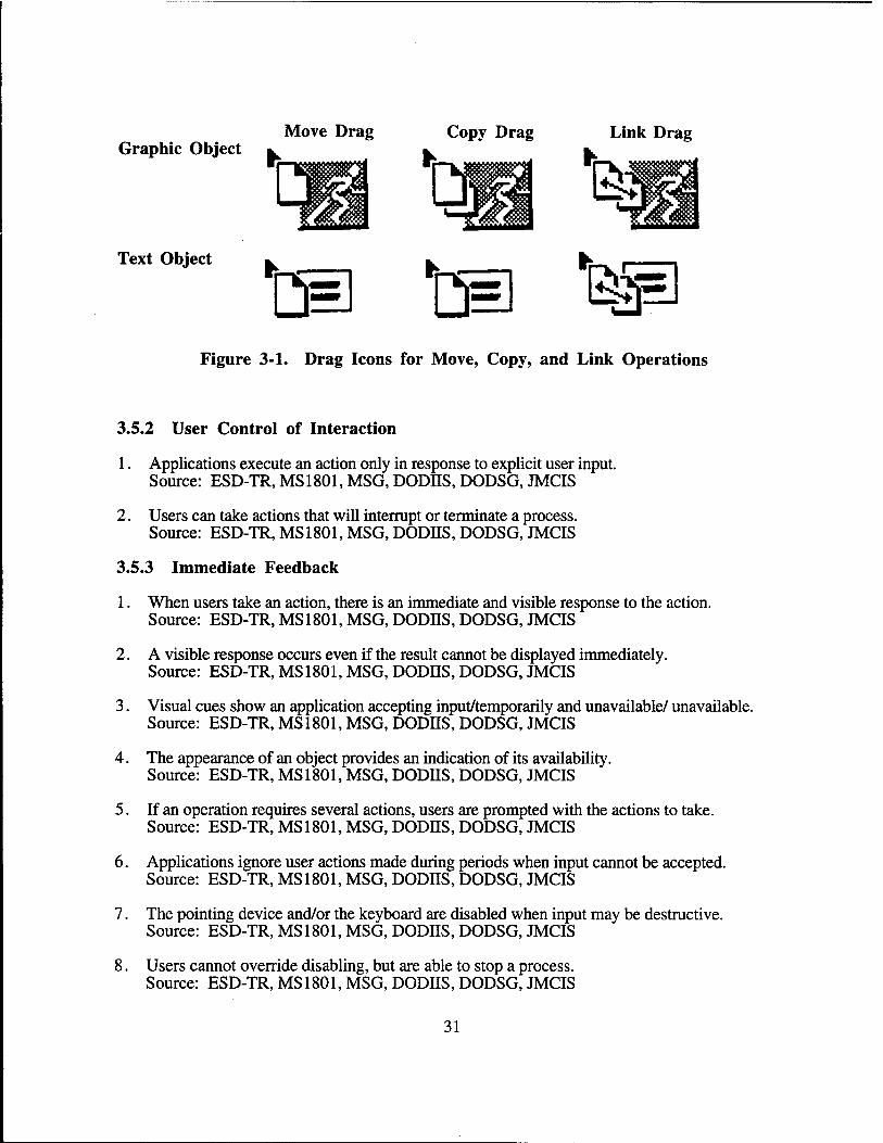
1. The drag transfer, transfers operations of primary drag copy, drag move, and drag link are available. Source: MSG
2. A drag move operation shall be executed by holding down the Shift key while dragging the object using the T button. If no modifier key is used (that is, just the T button is pressed on an object) the default operation is a move. Source: MSG,JMCIS
3. A drag copy operation shall be executed by holding down the Ctrl key while dragging the object using the T button. Source: MSG,JMCIS
4. Cancel, cancels a drag operation and returns the object being dragged to the original location. Source: MSG, JMCIS
5. Elements moved within a component remain selected after they have been moved. Source: MSG, JMCIS
6. Dragging a set of selected elements drags the entire collection. Source: MSG, JMCIS
7. Dragging an unselected element in lists and graphics affects only the element. Source: MSG, JMCIS
8. Dragging in overlapping elements occurs on the highest draggable element in the stack. Source: MSG, JMCIS
9. Pointer shape changes to a drag icon during the drag operation and then back to pointer (see Figure 3-1). Source: MSG, JMCIS
10. The drag icon contains a source indicator and may contain operations and state indicators. Source: MSG, JMCIS
11. When users must repeatedly move objects by means of a drag transfer action and the drag destination is to the same or a default location, developers shall implement redundant transfer methods. Redundant transfer methods shall include the capability to drag a set of selected objects or double-clicking on an object as a command accelerator for the drag action.
3.5 INTERACTIVE CONTROL
3.5.1 Object-Action Selection
1. Users first select an object, then select an action to perform on that object. Source: MSG, JMCIS
30
Move Drag Copy Drag Link Drag Graphic Object fc. k. fc.
™~ ~—' tea Text Object
t@ te ep Figure 3-1. Drag Icons for Move, Copy, and Link Operations
3.5.2 User Control of Interaction
1. Applications execute an action only in response to explicit user input. Source: ESD-TR, MS1801, MSG, DODHS, DODSG, JMCIS
2. Users can take actions that will interrupt or terminate a process. Source: ESD-TR, MS 1801, MSG, DODHS, DODSG, JMCIS
3.5.3 Immediate Feedback
1. When users take an action, there is an immediate and visible response to the action. Source: ESD-TR, MS1801, MSG, DODHS, DODSG, JMCIS
2. A visible response occurs even if the result cannot be displayed immediately. Source: ESD-TR, MS 1801, MSG, DODHS, DODSG, JMCIS
3. Visual cues show an application accepting input/temporarily and unavailable/ unavailable. Source: ESD-TR, MS1801, MSG, DODHS, DODSG, JMCIS
4. The appearance of an object provides an indication of its availability. Source: ESD-TR, MS 1801, MSG, DODHS, DODSG, JMCIS
5. If an operation requires several actions, users are prompted with the actions to take. Source: ESD-TR, MS 1801, MSG, DODHS, DODSG, JMCIS
6. Applications ignore user actions made during periods when input cannot be accepted. Source: ESD-TR, MS1801, MSG, DODnS, DODSG, JMCIS
7. The pointing device and/or the keyboard are disabled when input may be destructive. Source: ESD-TR, MS1801, MSG, DODHS, DODSG, JMCIS
8. Users cannot override disabling, but are able to stop a process. Source: ESD-TR, MS 1801, MSG, DODnS, DODSG, JMCIS
31

3.5.4 System Response Time
1. System response is within .2 seconds of user action; display takes no more than .5-10 seconds. Source: MS 1472, MS 1801, DODSG, JMCIS
2. Requests for new displays can take between 2-10 seconds if an operation requires extensive processing. Timing begins from the time of a user action to the time that a fully populated display is presented. Source: MS 1472, JMCIS
3. Error feedback is provided to users within 2 seconds of the time error was detected. Source: MS 1472, JMCIS
4. When a user request takes more than 2 seconds to process, pointer shape changes to a watch or hourglass. Source: MS 1472, JMCIS
5. When user request takes more than 5 seconds to process, the message window informs the user that the operation is lengthy. Source: AFSSC, JMCIS
3.5.5 Error Detection
1. The application shall not execute a user-requested action that is considered invalid. Instead an error message is displayed. Source: MS 1472, MS 1801, ESD-TR, JMCIS
2. When users make multiple errors with a single action, they are notified of each error. Source: MS 1472, MS 1801, JMCIS
3. When users make multiple errors with a single action, they will be provided with an immediate description of the error and the total number of additional errors detected, as in a word processing spell checker. There shall also be some means for the user to request and correct sequential display of error messages. Source: MS 1801
4. Feedback is immediate, is visual and/or auditory, and explains the nature of the error. Source: MS 1472, MS 1801, JMCIS
5. When an error is repeated, feedback shows that an attempted correction was processed. Source: MS 1472, MS 1801, JMCIS
6. Users are required to correct only the invalid action and not to repeat the entire sequence. Source: MS1472, MS 1801, JMCIS
7. After making a correction, users execute the same action for re-entry that was used originally. Source: MS 1472, MS 1801, JMCIS
32
3.5.6 General Undo Capability
1. Users can undo the most recent selection or action unless the selection or action was one requiring explicit destruction. Source: MS 1472, MS 1801, ESC-TR, JMCIS Developer Note: Developers may want to consider an "undo stack" in which a stack of selections or actions can be reversed. The decision to implement this functionality should be based on task analysis.
2. Undo can deselect objects, return to a prior state, and retrieve previous screen information. Source: MS1472, MS1801, ESC-TR, JMCIS
3. Irreversible actions (which cannot be undone) are labeled and clearly separated from those that are not. Source: JMCIS
4. If an action cannot be labeled as irreversible, the user shall be presented with a warning and asked to confirm the action which is irreversible.
33
SECTION 4
MENUS
4.1 PULL DOWN MENUS
4.1.1 Menu Title
1. The title of a pull down menu is displayed in a menu bar at the top of a window. Source: MSG, DODIIS, DODSG, AFSSC, JMCIS
2. A menu title describes the category or type of options and is different from other titles. Source: MSG, DODIIS, DODSG, AFSSC, JMCIS
3. The first letter of each word in the menu title is capitalized. Source: JMCIS
4. If the title contains an acronym, it is capitalized. Source: JMCIS
4.1.2 Types of Menu Options
1. On any type of menu, a menu option that displays a window is followed by an ellipsis (see Figure 4-1). Source: MSG, DODIIS, DODSG, AFSSC, JMCIS
2. A routing option that displays a cascading submenu is followed by a right-pointing arrow (see Figure 4-1). Source: MSG, DODIIS, DODSG, AFSSC, JMCIS
3. Wording of an action toggle option reflects the action implemented when the option is selected. Source: JMCIS
4. Wording of an action toggle option is semantically congruent with natural usage. Source: JMCIS
5. When an action toggle is selected, its wording changes to reflect when the action can be selected again. Source: JMCIS
6. Only one of the actions for a toggle appears in the menu at any time. Source: JMCIS
7. Wording of an undo option changes dynamically to reflect the action to be undone. Source: JMCIS
35
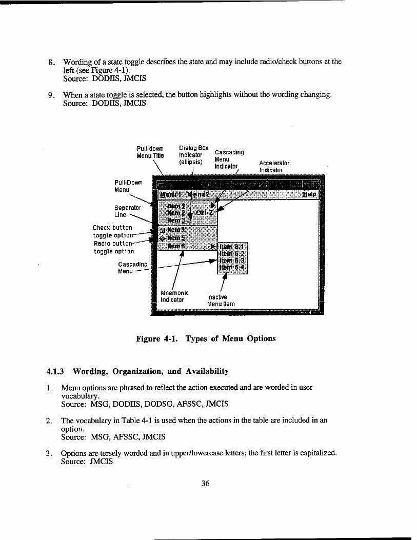
8. Wording of a state toggle describes the state and may include radio/check buttons at the left (see Figure 4-1). Source: DODJJS, JMCIS
9. When a state toggle is selected, the button highlights without the wording changing. Source: DODIIS, JMCIS
Pull-down Dialog Box ^aepaHinn Indicator Cascading (ellipsis)
Menu Title
Pull-Down Menu
Separator Line
Check button toggle option Radio button toggle option
Cascading Menu
Menu Indicator Accelerator
Indicator
Figure 4-1. Types of Menu Options
4.1.3 Wording, Organization, and Availability
1. Menu options are phrased to reflect the action executed and are worded in user vocabulary. Source: MSG, DODIIS, DODSG, AFSSC, JMCIS
2. The vocabulary in Table 4-1 is used when the actions in the table are included in an option. Source: MSG, AFSSC, JMCIS
3. Options are tersely worded and in upper/lowercase letters; the first letter is capitalized. Source: JMCIS
36
4. Acronyms are capitalized. Source: JMCIS
5. Each option is left-justified and appears on a single line. Source: JMCIS
6. The menu is wide enough for easy reading of the longest option and accelerator. Source: MSG, JMCIS
7. Menu options should be organized in logical or functional groupings. Source: MSG, DODIIS, DODSG, AFSSC, JMCIS
8. If the menus options are not in logical groups, order is by frequency of usage, with the most frequent at the top. Source: MSG, DODIIS, DODSG, AFSSC, JMCIS
9. If the menus options are not in logical groups or by frequency, options are in alphabetical/numerical order. Source: MSG, DODIIS, DODSG, AFSSC, JMCIS
10. Less frequently executed options and destructive options are at the bottom of the menu. Source: MSG, DODIIS, DODSG, AFSSC, JMCIS
11. If similar options are in different menus, the options are ordered in a consistent manner. Source: MSG, DODIIS, DODSG, AFSSC, JMCIS
12. A menu should contain no less than three options or more than ten options. Source: AFSSC, JMCIS Developer Note: In cases where many commands must be accommodated, developers should consider alternative methods such as combining menu options into a dialog window or using hierarchical menus. Other design alternatives might include the implementation of a "short" menu structure for novice users and a "long" menu structure for experienced users.
13. Menus with more than four options are divided into groups of four options. Groups of menu options are separated by a separator line. Source: JMCIS
14. If an option or set of options is never available to a user, the option(s) is/are not in a menu. Source: AFSSC, JMCIS
15. If an option is temporarily unavailable, it is displayed in the menu but dimmed. Source: MSG, DODIIS, DODSG, AFSSC, JMCIS
37
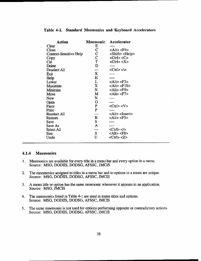
Table 4-1. Standard Mnemonics and Keyboard Accelerators
Action Mnemonic Accelerator Clear E —
Close C <Alt> <F4> Context-Sensitive Help Copy Cut
C C T
<Shift> <Help> <Ctrl> <C> <Ctrl> <X>
Delete D —
Deselect All — <Ctrl> <\> Exit X —
Help Lower
H L <Alt> <F3>
Maximize X <Alt> <F10> Minimize N <Alt> <F9> Move M <Alt><F7> New N —
Open Paste
0 P <Ctrl> <V>
Print P —
Reselect All — <Alt> <Insert> Restore R <Alt> <F5> Save S —
Save As A —
SelectAll — <Ctrl> </> Size S <Alt> <F8> Undo u <Ctrl> <Z>
4.1.4 Mnemonics
1. Mnemonics are available for every title in a menu bar and every option in a menu. Source: MSG, DODHS, DODSG, AFSSC, JMCIS
2. The mnemonics assigned to titles in a menu bar and to options in a menu are unique. Source: MSG, DODHS, DODSG, AFSSC, JMCIS
3. A menu title or option has the same mnemonic whenever it appears in an application. Source: MSG, JMCIS
4. The mnemonics listed in Table 4-1 are used in menu titles and options. Source: MSG, DODH.S, DODSG, AFSSC, JMCIS
5. The same mnemonic is not used for options performing opposite or contradictory actions. Source: MSG, DODH.S, DODSG, AFSSC, JMCIS
38
6. The similar key(s) is/are used in the mnemonic and keyboard accelerator for a menu option. Source: MSG, DODHS, DODSG, AFSSC, JMCIS
7. The character assigned as the mnemonic is underlined. Source: MSG, DODHS, DODSG, AFSSC, JMCIS
8. Whenever possible, the mnemonic is the first letter of a menu title or option. Source: MSG, DODHS, DODSG, AFSSC, JMCIS
9. If the mnemenic is not the first letter, the mnemonic is another character in a menu title or option. Source: MSG, DODHS, DODSG, AFSSC, JMCIS
10. If the mnemenic does not appear in a menu title or option, it is in parentheses after the label. Source: JMCIS
11. Mnemonics are not case-sensitive. Source: MSG, DODHS, DODSG, AFSSC, JMCIS
12. If the location cursor is in the menu bar, typing a mnemonic displays the associated menu. Source: MSG, DODIIS, DODSG, AFSSC, JMCIS
13. When a menu is displayed, typing a mnemonic selects the associated option. Source: MSG, DODIIS, DODSG, AFSSC, JMCIS
4.1.5 Keyboard Accelerators
1. Accelerators are available for frequently executed menu options. Source: MSG, DODIIS, DODSG, AFSSC, JMCIS
2. Accelerators listed in Table 4-1 are used for the actions listed. Source: MSG, AFSSC, JMCIS
3. Accelerators are right-justified, on the same line, and separate from the option label. Source: MSG, AFSSC, JMCIS
4. Users can execute keyboard accelerators available in the window with input focus. Source: MSG, DODIIS, DODSG, AFSSC, JMCIS
5. Keyboard accelerators containing an alphabetic character are not case-sensitive. Source: MSG, DODIIS, DODSG, AFSSC, JMCIS
6. The same key combinations are used for accelerators throughout the application/system. Source: MSG, DODIIS, DODSG, AFSSC, JMCIS
7. Key combinations for accelerators do not conflict with mnemonics/text entry keystrokes. Source: MSG, DODHS, DODSG, AFSSC, JMCIS
39
8. Alt+mnemonic for the menu title moves the location cursor to the menu bar. Source: MSG, JMCIS
9. Alt+mnemonic for the currently displayed option in an option menu displays the menu. Source: MSG, JMCIS
10. When an accelerator is typed, the associated menu is displayed briefly before the option is executed. Source: MSG, JMCIS
4.1.6 Cascading Submenus
1. Cascading submenus appear to the right of the parent menu and to the left if the space to the right is limited. Source: MSG, DODES, DODSG, AFSSC, JMCIS
2. Cascading submenus are limited to three levels. Source: AFSSC, JMCIS
4.1.7 Pointing Device Navigation and Selection
1. Spring-loaded and posted methods are used to display a menu and select an option. Source: MSG, JMCIS
2. When a menu is displayed, the location cursor is on the first available option in the menu. Source: MSG, JMCIS
3. Spring-loaded: Options highlight and submenus are displayed as the pointer is dragged over them. Source: MSG, JMCIS
4. Spring-loaded: Drag the location cursor to the option desired and release the S button to select. Source: MSG, JMCIS
5. Spring-loaded: Move the pointer off the menu and release the S button to not select an option. Source: MSG, JMCIS
6. Posted: Click the S button on the menu title and the menu remains displayed. Source: MSG, JMCIS
7. Posted: Click the S button on the option, the location cursor moves to the option and it is selected. Source: MSG, JMCIS
8. Posted: Move the pointer off the menu and click the S button to not select an option. Source: MSG, JMCIS
40
4.1.8 Keyboard Navigation and Selection
1. F10 (and Shift+Menu) moves the location cursor to the first available menu title in a menu bar. Source: MSG, JMCIS
2. If none of the menu titles are available, these keys do not move the location cursor.
3. Left and Right move the location cursor between available menu titles, with wrapping. Source: MSG, JMCIS
4. F10 (and Shift+Menu) exits the menu bar and returns the location cursor to the previous object with focus. Source: MSG, JMCIS
5. Down displays the menu for the title containing the location cursor. Source: MSG, JMCIS
6. The arrow keys move the location cursor between available options in the menu. Source: MSG, JMCIS Developer Note: On the Sun model 5 keyboard, the numeric keypad cursor keys are used. The "inverted T" cursor keys do not move the location cursor.
7. Right displays a cascading submenu if the option with the location cursor is parent for the menu. Source: MSG, JMCIS
8. Return, Enter, or Space (and Select) selects an option and dismisses the menu. Source: MSG, JMCIS
9. Cancel dismisses the menu without making a selection. Source: MSG, JMCIS
4.2 TEAR-OFF MENUS
4.2.1 Appearance
1. A tear-off has a dashed line graphic which is the first menu option below the title. Source: MSG, JMCIS
2. The title of a tear-off menu window is the title of the associated pull down menu which is torn-off. Source: MSG, JMCIS
3. Options in a tear-off menu window are dimmed when unavailable. Source: MSG, JMCIS
4. Options in a tear-off menu window may change as selections are made in the menu window. Source: MSG, JMCIS
41
4.2.2 Navigation and Selection
1. Users click the S button on a tear-off graphic in a menu to display a menu window. Source: MSG,JMCIS
2. Users drag tear-off graphics with the T button to display and move a menu window. Source: MSG, JMCIS
3. Users click the S button on an option in a menu window to select it and the window remains displayed. Source: MSG, JMCIS
4. Close (in Window Menu) and Cancel (on the keyboard) close a menu window. Source: MSG, JMCIS
5. When the menu is re-selected, the original menu window is dismissed and the new window appears. Source: MSG, JMCIS
6. With the cursor on the graphic, Return, Enter, or Space and Select displays the menu window. Source: MSG, JMCIS
7. Arrow keys move the location cursor between options; the same keys as above select an option. Source: MSG, JMCIS
4.3 POP-UP MENUS
4.3.1 Appearance
1. Pop-up menus should refrain from using cascading submenus so as not to further hide options from the user. Source: JMCIS
2. The options in a pop-up menu include mnemonics but not keyboard accelerators. Source: MSG, JMCIS Developer Note: The Motif™ Style Guide suggests that if pop-up menus are used they accommodate common functions. These common functions provide redundant access to actions and consequently have accelerators.
3. The options in a pop-up menu are dimmed when unavailable. Source: MSG, JMCIS
4. When a pointing device is used, the pop-up menu contents relates to the element with the pointer. Source: MSG, DODHS, DODSG, JMCIS
42
5. When a keyboard is used, the pop-up menu contents relates to the element with the location cursor. Source: MSG, JMCIS
6. A pop-up menu appears near the element with which it is associated. Source: MSG, DODIIS, DODSG, JMCIS
7. A window containing a pop-up menu provides an indication that the menu is available. Source: MSG, JMCIS
8. A pop-up menu provides redundant access to actions and does not access new actions. Source: MSG, JMCIS
4.3.2 Navigation and Selection
1. Spring-loaded and posted methods are used with the M button to display a pop-up menu. Source: MSG, JMCIS
2. When a pop-up menu is displayed, the location cursor is positioned on the first available option in the menu. Source: MSG, JMCIS
3. Spring-loaded and posted methods used with the S and M buttons are display/ select in the pop-up menu. Source: MSG, JMCIS
4. Shift+FlO (and Menu) displays a pop-up menu. Source: MSG, JMCIS
5. Arrow keys move the location cursor between available options in a pop-up menu. Source: MSG, JMCIS
6. Return, Enter, or Space (and Select) selects an option and dismisses a pop-up menu. Source: MSG, JMCIS
7. When an option is selected with a pointing device/keyboard, the pop-up menu is dismissed. Source: MSG, JMCIS
8. Cancel and Shift+FlO (and Menu) dismisses a pop-up menu without making a selection. Source: MSG, JMCIS
4.4 OPTION MENUS
4.4.1 Appearance
1. The options in an option menu include mnemonics and not keyboard accelerators. Source: JMCIS
43
4.4.2 Navigation and Selection
1. Spring-loaded and posted methods are used with the S button to display an option menu. Source: MSG, JMCIS
2. When an option menu is displayed, the location cursor is on the previously selected option. Source: MSG, JMCIS
3. Spring-loaded and posted methods used with the S button to navigate within and make selections in the option menu. Source: MSG, JMCIS
4. When an option is selected in an option menu, it appears as the label in the option menu button. Source: MSG, JMCIS
5. Space and Select displays an option menu. Source: MSG, JMCIS
6. Arrow keys move the location cursor between available options in an option menu. Source: MSG, JMCIS
7. Return, Enter, or Space and Select selects option and dismisses an option menu. Source: MSG, JMCIS
8. Cancel dismisses an option menu without making a selection. Source: MSG, JMCIS
44
SECTION 5
CONTROLS
5.1 PUSH BUTTONS
5.1.1 Appearance and Vocabulary
1. Push button labels are large enough for easy reading at normal viewing distances. There should be enough space between the label and the rectangle surrounding it so it will not restrict the legibility or visibility of the text or graphic in the push button. Source: AFSSC,JMCIS Developer Note: Kobara recommends a margin height of 2 pixels and a margin width of 8 pixels for push buttons.
2. All push buttons in a given window are the same size. This does not only provide a consistent look to a dialog window but, it provides a consistently sized target for users to select with the pointer. Source: JMCIS Developer Note: The default value of XMNminimizeButtons should be kept at False. This will insure that each Push Button has the same width as the widest one.
3. Push buttons are wide enough to display the longest button label or largest action icon. Source: MSG, AFSSC, JMCIS
4. Push button labels are short and unambiguous. Source: JMCIS
5. Action button labels describe the action, stated in active voice, taken by the application when the action button is selected. Source: MSG, JMCIS
6. When "All" is used in a push button label, there is no ambiguity as to reference. Source: JMCIS
7. Push button labels with multiple references include the name of the object/element. Source: JMCIS
8. Push buttons are located near the object(s) they affect. Source: MSG, JMCIS
9. The vocabulary in Table 5-1 is used in push button labels for the actions listed. Source: MSG, AFSSC, JMCIS
10. When new vocabulary is used, it describes actions not listed in Table 5-1. Source: MSG, AFSSC, JMCIS
11. The names of actions are congruent (e.g., save/delete, on/off, in/out). Source: MSG, AFSSC, JMCIS
45
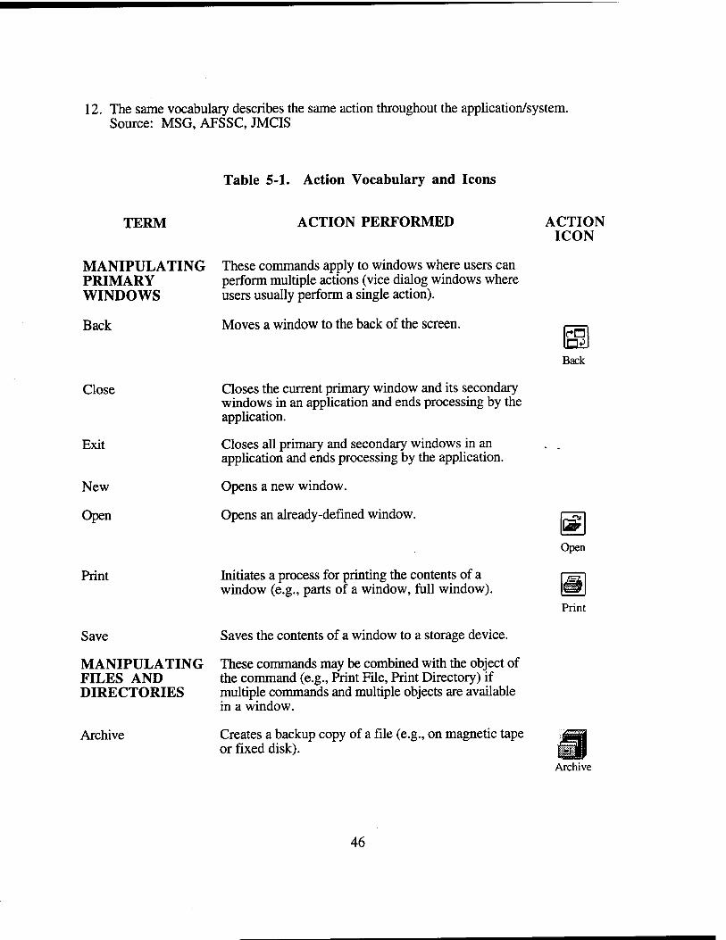
12. The same vocabulary describes the same action throughout the application/system. Source: MSG, AFSSC, JMCIS
Table 5-1. Action Vocabulary and Icons
TERM ACTION PERFORMED
MANIPULATING These commands apply to windows where users can PRIMARY perform multiple actions (vice dialog windows where WINDOWS users usually perform a single action).
Back
Close
Exit
New
Open
Save
Moves a window to the back of the screen.
Closes the current primary window and its secondary windows in an application and ends processing by the application.
Closes all primary and secondary windows in an application and ends processing by the application.
Opens a new window.
Opens an already-defined window.
Initiates a process for printing the contents of a window (e.g., parts of a window, full window).
Saves the contents of a window to a storage device.
MANIPULATING These commands may be combined with the object of FILES AND the command (e.g., Print File, Print Directory) if DIRECTORIES multiple commands and multiple objects are available
in a window.
Archive Creates a backup copy of a file (e.g., on magnetic tape or fixed disk).
ACTION ICON
at Back
|^^
Open
Archive
46
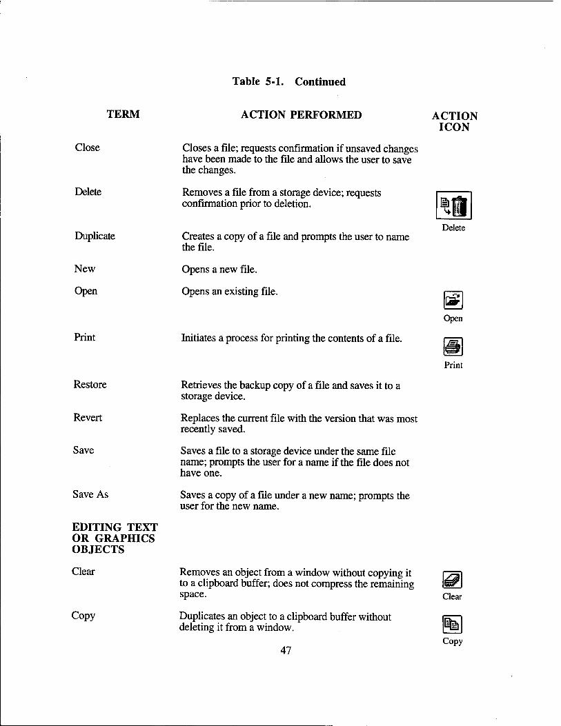
Table 5-1. Continued
TERM
Close
Delete
Duplicate
New
Open
Restore
Revert
Save
Save As
EDITING TEXT OR GRAPHICS OBJECTS
Clear
Copy
ACTION PERFORMED
Closes a file; requests confirmation if unsaved changes have been made to the file and allows the user to save the changes.
Removes a file from a storage device; requests confirmation prior to deletion.
Creates a copy of a file and prompts the user to name the file.
Opens a new file.
Opens an existing file.
Initiates a process for printing the contents of a file.
Retrieves the backup copy of a file and saves it to a storage device.
Replaces the current file with the version that was most recently saved.
Saves a file to a storage device under the same file name; prompts the user for a name if the file does not have one.
Saves a copy of a file under a new name; prompts the user for the new name.
ACTION ICON
Removes an object from a window without copying it to a clipboard buffer; does not compress the remaining space.
Duplicates an object to a clipboard buffer without deleting it from a window.
47
Delete
fi£ Open
Clear
Copy
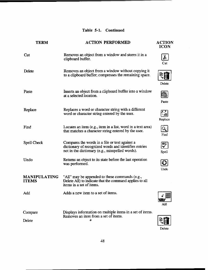
TERM
Cut
Delete
Paste
Replace
Find
Spell Check
Undo
MANIPULATING ITEMS
Add
Compare
Delete
Table 5-1. Continued
ACTION PERFORMED
Removes an object from a window and stores it in a clipboard buffer.
Removes an object from a window without copying it to a clipboard buffer; compresses the remaining space.
Inserts an object from a clipboard buffer into a window at a selected location.
Replaces a word or character string with a different word or character string entered by the user.
Locates an item (e.g., item in a list, word in a text area) that matches a character string entered by the user.
Compares the words in a file or text against a dictionary of recognized words and identifies entries not in the dictionary (e.g., misspelled words).
Returns an object to its state before the last operation was performed.
"All" may be appended to these commands (e.g., Delete All) to indicate that the command applies to all items in a set of items.
Adds a new item to a set of items.
Displays information on multiple items in a set of items. Removes an item from a set of items.
ACTION ICON
db Cut
<+!
Delete
Paste
A :" •■►B
Replace
<\ Find
y Spell
Undo
Tj^23f
Add
Delete
48
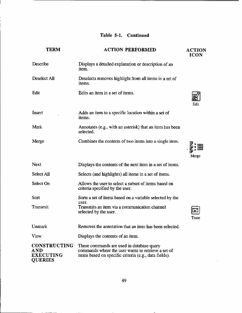
Table 5-1. Continued
TERM
Describe
Deselect All
Edit
ACTION PERFORMED
Displays a detailed explanation or description of an item.
Deselects removes highlight from all items in a set of items.
Edits an item in a set of items.
ACTION ICON
Edit
Insert
Mark
Merge
Next
Select All
Select On
Sort
Transmit
Unmark
View
Adds an item to a specific location within a set of items.
Annotates (e.g., with an asterisk) that an item has been selected.
Combines the contents of two items into a single item.
Displays the contents of the next item in a set of items.
Selects (and highlights) all items in a set of items.
Allows the user to select a subset of items based on criteria specified by the user.
Sorts a set of items based on a variable selected by the user. Transmits an item via a communication channel selected by the user.
Removes the annotation that an item has been selected.
Displays the contents of an item.
CONSTRUCTING These commands are used in database query AND commands where the user wants to retrieve a set of EXECUTING items based on specific criteria (e.g., data fields). QUERIES
Merge
Trans
49
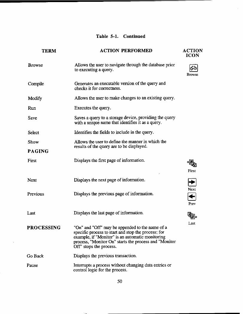
Table 5-1. Continued
TERM
Browse
Compile
Modify
Run
Save
Select
Show
PAGING
First
Next
Previous
Last
PROCESSING
Go Back
Pause
ACTION PERFORMED
Allows the user to navigate through the database prior to executing a query.
Generates an executable version of the query and checks it for correctness.
Allows the user to make changes to an existing query.
Executes the query.
Saves a query to a storage device, providing the query with a unique name that identifies it as a query.
Identifies the fields to include in the query.
Allows the user to define the manner in which the results of the query are to be displayed.
Displays the first page of information.
Displays the next page of information.
Displays the previous page of information.
Displays the last page of information.
"On" and "Off may be appended to the name of a specific process to start and stop the process; for example, if "Monitor" is an automatic monitoring process, "Monitor On" starts the process and "Monitor Off stops the process.
Displays the previous transaction.
Interrupts a process without changing data entries or control logic for the process.
ACTION ICON
Browse
First
Next s Prev
Last
50
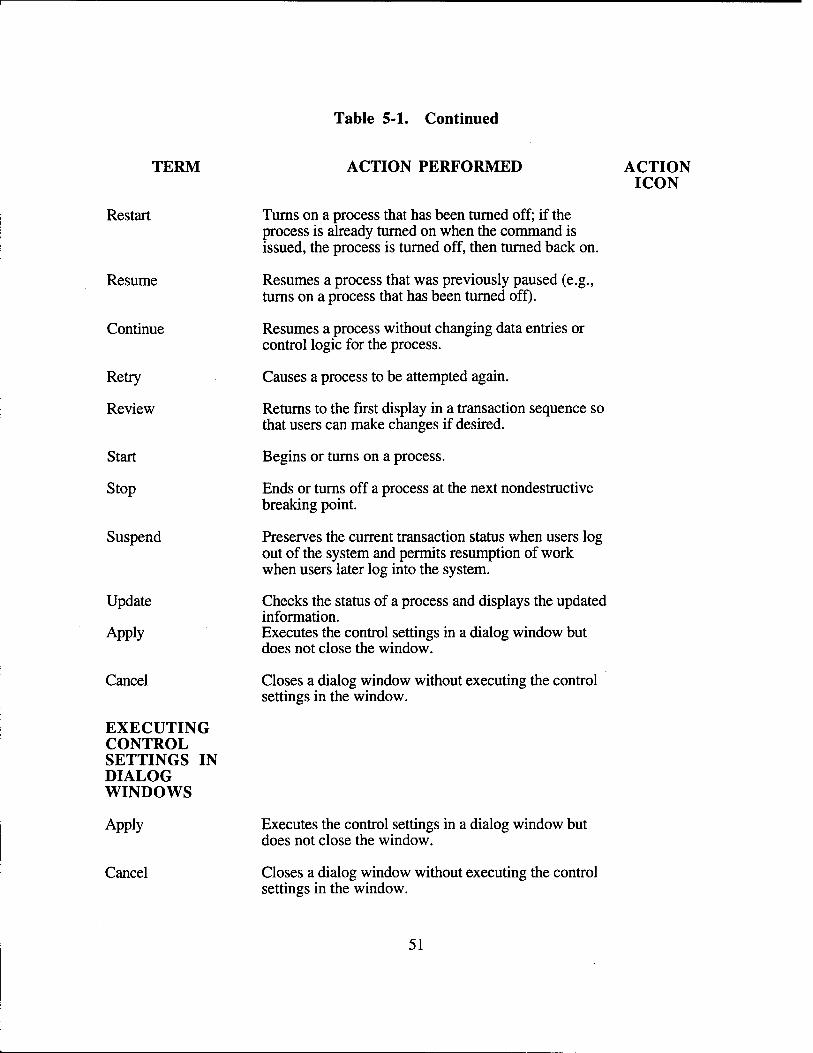
Table 5-1. Continued
TERM
Restart
Resume
Continue
Retry
Review
Start
Stop
Suspend
Update
Apply
Cancel
EXECUTING CONTROL SETTINGS IN DIALOG WINDOWS
Apply
Cancel
ACTION PERFORMED
Turns on a process that has been turned off; if the process is already turned on when the command is issued, the process is turned off, then turned back on.
Resumes a process that was previously paused (e.g., turns on a process that has been turned off).
Resumes a process without changing data entries or control logic for the process.
Causes a process to be attempted again.
Returns to the first display in a transaction sequence so that users can make changes if desired.
Begins or turns on a process.
Ends or turns off a process at the next nondestructive breaking point.
Preserves the current transaction status when users log out of the system and permits resumption of work when users later log into the system.
Checks the status of a process and displays the updated information. Executes the control settings in a dialog window but does not close the window.
Closes a dialog window without executing the control settings in the window.
ACTION ICON
Executes the control settings in a dialog window but does not close the window.
Closes a dialog window without executing the control settings in the window.
51
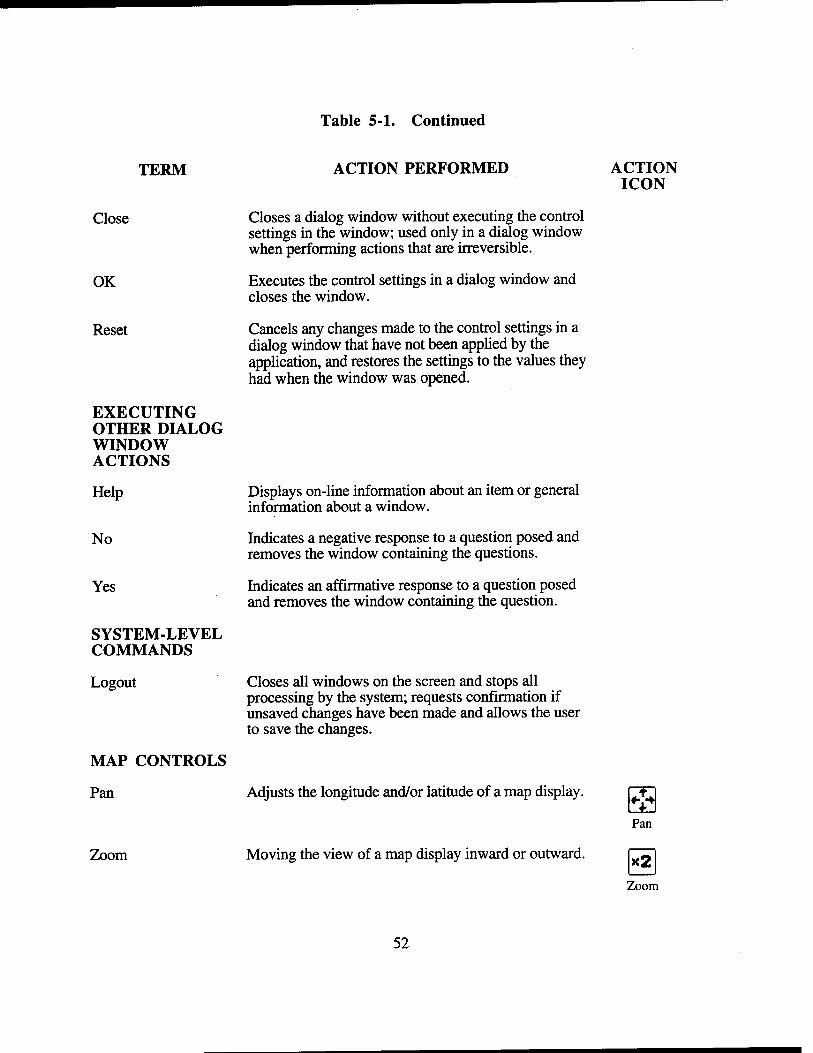
Table 5-1. Continued
TERM
Close
OK
Reset
EXECUTING OTHER DIALOG WINDOW ACTIONS
Help
No
Yes
SYSTEM-LEVEL COMMANDS
Logout
MAP CONTROLS
Pan
Zoom
ACTION PERFORMED
Closes a dialog window without executing the control settings in the window; used only in a dialog window when performing actions that are irreversible.
Executes the control settings in a dialog window and closes the window.
Cancels any changes made to the control settings in a dialog window that have not been applied by the application, and restores the settings to the values they had when the window was opened.
ACTION ICON
Displays on-line information about an item or general information about a window.
Indicates a negative response to a question posed and removes the window containing the questions.
Indicates an affirmative response to a question posed and removes the window containing the question.
Closes all windows on the screen and stops all processing by the system; requests confirmation if unsaved changes have been made and allows the user to save the changes.
Adjusts the longitude and/or latitude of a map display.
Moving the view of a map display inward or outward.
nr: Pan
x2 Zoom
52
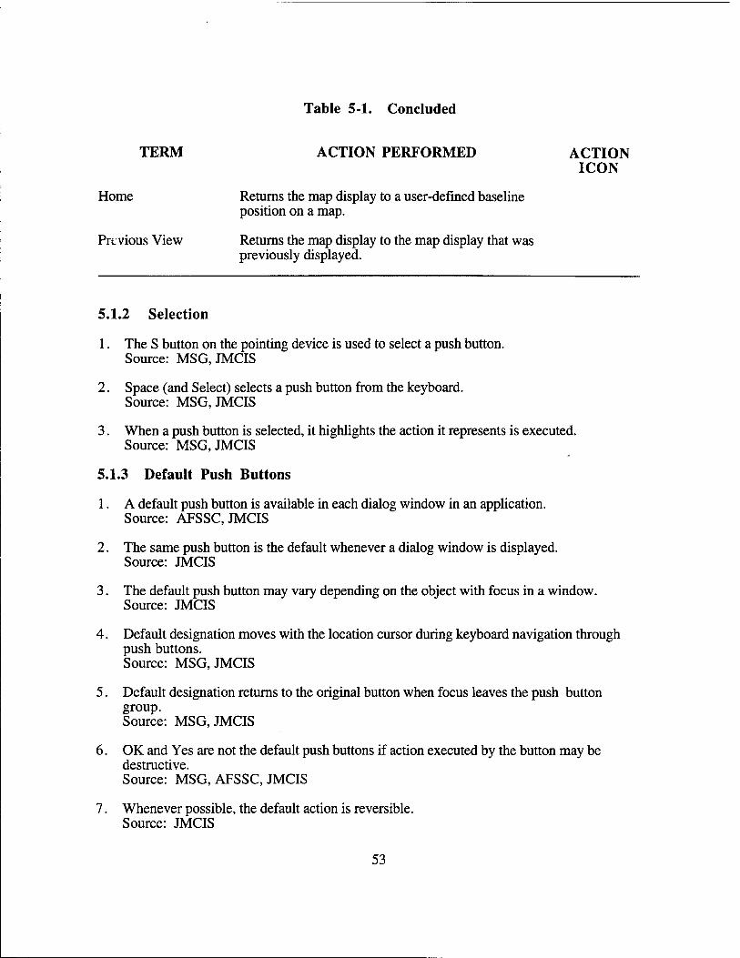
Table 5-1. Concluded
TERM ACTION PERFORMED ACTION ICON
Home Returns the map display to a user-defined baseline position on a map.
Previous View Returns the map display to the map display that was previously displayed.
5.1.2 Selection
1. The S button on the pointing device is used to select a push button. Source: MSG, JMCIS
2. Space (and Select) selects a push button from the keyboard. Source: MSG, JMCIS
3. When a push button is selected, it highlights the action it represents is executed. Source: MSG, JMCIS
5.1.3 Default Push Buttons
1. A default push button is available in each dialog window in an application. Source: AFSSC, JMCIS
2. The same push button is the default whenever a dialog window is displayed. Source: JMCIS
3. The default push button may vary depending on the object with focus in a window. Source: JMCIS
4. Default designation moves with the location cursor during keyboard navigation through push buttons. Source: MSG, JMCIS
5. Default designation returns to the original button when focus leaves the push button group. Source: MSG, JMCIS
6. OK and Yes are not the default push buttons if action executed by the button may be destructive. Source: MSG, AFSSC, JMCIS
7. Whenever possible, the default action is reversible. Source: JMCIS
53
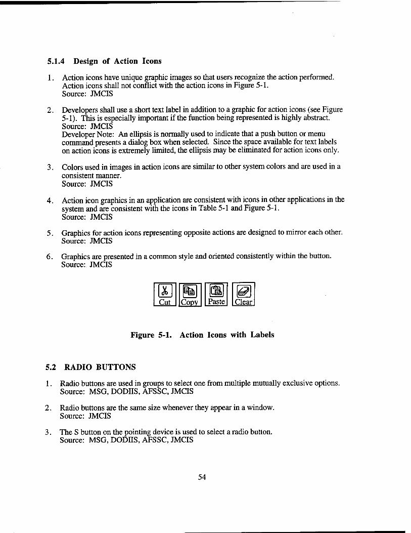
5.1.4 Design of Action Icons
1. Action icons have unique graphic images so that users recognize the action performed. Action icons shall not conflict with the action icons in Figure 5-1. Source: JMCIS
2. Developers shall use a short text label in addition to a graphic for action icons (see Figure 5-1). This is especially important if the function being represented is highly abstract. Source: JMCIS Developer Note: An ellipsis is normally used to indicate that a push button or menu command presents a dialog box when selected. Since the space available for text labels on action icons is extremely limited, the ellipsis may be eliminated for action icons only.
3. Colors used in images in action icons are similar to other system colors and are used in a consistent manner. Source: JMCIS
4. Action icon graphics in an application are consistent with icons in other applications in the system and are consistent with the icons in Table 5-1 and Figure 5-1. Source: JMCIS
5. Graphics for action icons representing opposite actions are designed to mirror each other. Source: JMCIS
6. Graphics are presented in a common style and oriented consistently within the button. Source: JMCIS
Cut Copy Paste Clear
Figure 5-1. Action Icons with Labels
5.2 RADIO BUTTONS
1. Radio buttons are used in groups to select one from multiple mutually exclusive options. Source: MSG, DODJJ.S, AFSSC, JMCIS
2. Radio buttons are the same size whenever they appear in a window. Source: JMCIS
3. The S button on the pointing device is used to select a radio button. Source: MSG, DODHS, AFSSC, JMCIS
54
4. Space (and Select) selects a radio button from the keyboard. Source: MSG,JMCIS
5. When a radio button is selected, it is highlighted and any other selected button is deselected. Source: MSG, DODIIS, AFSSC, JMCIS
6. If a radio button is in a window with a default action, Enter/Return executes the action. Source: MSG, JMCIS
5.3 CHECK BUTTONS
1. A check button is a non-exclusive setting; selecting one toggles a setting or state. Source: MSG, DODJJS, AFSSC, JMCIS
2. Check buttons are used singly or in related groups. Source: MSG, DODIIS, AFSSC, JMCIS
3. Check buttons are the same size whenever they appear in a window. Source: JMCIS
4. The S button on the pointing device is used to select a check button. Source: MSG, DODIIS, AFSSC, JMCIS
5. Space (and Select) selects a check button from the keyboard. Source: MSG, JMCIS
6. When a check button is selected, it is highlighted and any other button which has been previously selected stays selected. Source: MSG, DODJJS, AFSSC, JMCIS
7. If a check button is in a window with a default action, Enter/Return executes the action. Source: MSG, JMCIS
5.4 LIST BOXES
5.4.1 Appearance
1. The items in a list are displayed vertically, with one item per line. Source: MSG, DODIIS, DODSG, AFSSC, JMCIS
2. The title of the list describes its purpose or contents and appears above the box. Source: MSG, JMCIS
3. A vertical scroll bar appears to the right of the list when items exceed space available. Source: MSG, JMCIS
55
4. A list scrolls only in response to user action and does not scroll automatically. Source: MSG,JMCIS
5. A list is wide enough to read the items without having to scroll horizontally. Source: AFSSC, JMCIS
6. List items appear in sequential order based on the nature of items and sequence expected. Source: AFSSC, JMCIS
7. Items added to a list appear in their correct position in the list, not at the end of the list. Source: AFSSC, JMCIS
5.4.2 Navigation and Selection
1. Users search a list by moving the scroll bar slider until the item appears. Source: MSG, AFSSC, JMCIS
2. Speed search: Type first letter of item; list scrolls to first instance with that letter. Source: JMCIS Developer Note: To incorporate the speed search feature a function must be written. Capture keyboard press events on the scrolled list by writing an event handler (XtAddEvent Handler) for keypress events (KeyPressMask).
3. Incremental search: Type the first few letters; list scrolls to first match. Source: JMCIS Developer Note: To incorporate the incremental search feature a callback function must be written for the text field so that each time the user presses a key, the callback searches the list to find the closest match and highlights that match. When an incremental search is used for each keypress, the Return key is not needed to execute the function.
4. Speed search and incremental search shall not be case-sensitive. If case-sensitivity is a user requirement, then this information is provided to users. Source: JMCIS
5. If a Motif selection box is used, it behaves as in an incremental search. Source: JMCIS Developer Note: To incorporate the incremental search feature a callback function must be written for the text field so that each time the user presses a key the callback searches the list to find the closest match and highlights that match. When an incremental search is used for each keypress, the Return key is not needed to execute the function.
6. The S button on the pointing device is used to select item(s) in a list box. Source: MSG, AFSSC, JMCIS
7. Space (and Select) selects item(s) from the keyboard. Source: MSG, JMCIS
8. If a window has a default action, double clicking on an item chooses the item and executes the action. Source: MSG, JMCIS
56
5.5 SCROLL BARS
1. Users are able to scroll to the top or the bottom of the information but not beyond Scroll bar components, actions and responses shall comply with Figure 5-2. Source: MSG, DODHS, DODSG, AFSSC, JMCIS
2. Relative slider position indicates relative position of information displayed in the window. Source: MSG, DODHS, DODSG, AFSSC, JMCIS
3. Pressing the S button on a stepper arrow moves one unit in the arrow direction. Source: MSG, DODHS, DODSG, AFSSC, JMCIS
4. Pressing the S button on a trough moves one page (less one unit) in the direction indicated. Source: MSG, DODHS, DODSG, AFSSC, JMCIS
5. Dragging the slider with the S button moves the slider in the pointer direction. Source: MSG, DODHS, DODSG, AFSSC, JMCIS
6. Pressing the T button on the trough moves the slider to the pointer position. Source: MSG, DODHS, DODSG, AFSSC, JMCIS
7. Dragging the T button on the trough moves the slider to the pointer position, with pointer movement. Source: MSG, DODHS, DODSG, AFSSC, JMCIS
8. Cancel returns the slider to its position before the sliding operation began. Source: MSG, DODHS, DODSG, AFSSC, JMCIS
9. Dragging past the top/bottom of the scrollable area makes the window scroll in the pointer direction. Source: MSG, DODHS, DODSG, AFSSC, JMCIS
10. The speed of autoscrolling is the same as when the users press on a stepper arrow. Source: MSG, DODHS, DODSG, AFSSC, JMCIS
11. Autoscrolling stops when the pointer is moved into or outside the window stop drag action. Source: MSG, DODHS, DODSG, AFSSC, JMCIS
12. Arrow keys move the slider one unit (e.g., one line or column) in the arrow direction. Source: MSG, DODnS, DODSG, AFSSC, JMCIS
13. Ctrl with the arrow keys move the slider one large increment in the arrow direction. Source: MSG, DODHS, DODSG, AFSSC, JMCIS
14. PageUp, PageDown, PageRight, and PageLeft page the screen in the specified direction. Source: MSG, DODIIS, DODSG, AFSSC, JMCIS
15. Ctrl+Begin and Ctrl+End scroll to beginning/end of scrollable region. Source: MSG, DODIIS, DODSG, AFSSC, JMCIS
57
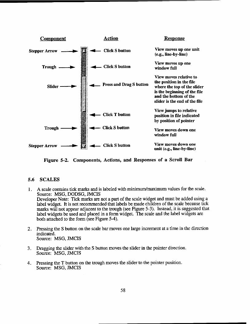
Component
Stepper Arrow —
Trough
Slider
Trough
Stepper Arrow
Action
Click S button
Click S button
Press and Drag S button
Click T button
Click S button
Click S button
Response
View moves up one unit (e.g., line-by-line)
View moves up one window full
View moves relative to the position in the file where the top of the slider is the beginning of the file and the bottom of the slider is the end of the file
View jumps to relative position in file indicated by position of pointer
View moves down one window full
View moves down one unit (e.g., Iine-by-line)
Figure 5-2. Components, Actions, and Responses of a Scroll Bar
5.6 SCALES
1. A scale contains tick marks and is labeled with minimum/maximum values for the scale. Source: MSG, DODSG, JMCIS Developer Note: Tick marks are not a part of the scale widget and must be added using a label widget. It is not recommended that labels be made children of the scale because tick marks will not appear adjacent to the trough (see Figure 5-3). Instead, it is suggested that label widgets be used and placed in a form widget. The scale and the label widgets are both attached to the form (see Figure 5-4).
2. Pressing the S button on the scale bar moves one large increment at a time in the direction indicated. Source: MSG, JMCIS
3. Dragging the slider with the S button moves the slider in the pointer direction. Source: MSG, JMCIS
4. Pressing the T button on the trough moves the slider to the pointer position. Source: MSG, JMCIS
58

5. Dragging the T button on the trough moves the slider to the pointer position with the pointer movement. Source: MSG,JMCIS
6. Cancel returns the slider to its position before the sliding operation began. Source: MSG,JMCIS
7. Arrow keys move the slider one unit in the arrow direction. Source: MSG,JMCIS
8. Ctrl with the arrow keys move the slider one large increment in the arrow direction. Source: MSG.JMCIS
9. Ctrl+Begin and Ctrl+End move the slider to minimum/maximum scale values. Source: MSG,JMCIS
I I I I I I I I I I I I
3 !
Figure 5-3. Non-Preferred Scale (Label widget is a child of the scale widget)
90
o " iii iii it 100
Figure 5-4. Preferred Scale (Label widget and scale widget are placed in a form widget)
59
5.7 STANDARD AND NONSTANDARD CONTROLS
1. All of the controls in a window are identifiable solely on the basis of their appearance. Source: JMCIS
2. All controls with the same function have the same appearance. Source: JMCIS
3. Controls that are similar in shape have distinctive visual cues. Source: JMCIS
4. Text/graphics in a window are clearly different in appearance from standard controls. Source: JMCIS
5. If a nonstandard control is used, it has as much of the standard look and feel as possible. Source: JMCIS Developer Note: Nonstandard controls should maintain a three-dimensional appearance since they can be manipulated by the user.
5.7.1 Modifying Push Button Behavior
1. When push buttons are used to execute an action and provide an indicator of the action selected, the push button can be modified so that it stays highlighted. Source: JMCIS
2. A push button palette is used to provide access to a set of frequently performed actions. Source: JMCIS
3. Push buttons in a palette represent a set of mutually exclusive options. Source: JMCIS
5.7.2 Using Pop-up Lists to Support Text Entry
1. Pop-up lists are used to fill a text field when the number of valid entries in the field is limited. Source: JMCIS Developer Note: See also Section 9.2.1 #20.
2. The availability of a pop-up list is indicated by a push button next to the text field. Source: JMCIS
3. Items in a pop-up list allow users to select from valid entries or cancel the selection. Source: JMCIS
4. Pop-up lists are wide enough to read items in the list and include scroll bars if necessary. Source: JMCIS
60
SECTION 6
WINDOWS
6.1 TYPES OF WINDOWS
The following types of windows are addressed: Primary Windows, Secondary Windows, and Dialog Windows. The Bellcore Graphical User Interface Design Guidelines for Bellcore Software Products takes the Motif definition of a primary window and further defines; an Application Primary Window and a Primary Task Window. Bellcore also divides secondary windows into Menubar Secondary Task Windows and Pushbutton Secondary Task Windows. Dialog Windows are generally defined as Prompt Windows and Message Windows.
6.1.1 Primary Windows
Applications can be designed around one primary window or one primary window and several primary task windows. When an application addresses a single top-level task, one application primary window shall be used. When an application addresses several top-level tasks an application primary window and several primary task windows shall be used. The following design rules pertaining to primary windows are derived primarily from the Bellcore Graphical User Interface Design Guidelines for Bellcore Software Products.
6.1.1.1 Application Primary Window
An application primary window shall provide application control. If only one application primary window is used, the application primary window shall provide access to the application top-level tasks. If an application primary window is used in conjunction with several primary task windows, the application primary window shall provide application control and management of primary task windows.
1. The application primary window shall be the first window displayed when an application is launched. Source: Bellcore Developer Note: An application primary window shall be implemented as type ApplicationShell.
2. An application primary window cannot be Closed but may be iconified. Close shall not appear in the window menu of an application primary window. Source: Bellcore
3. When an application primary window is iconified, all of its secondary task windows or dialog boxes are also iconified. Source: Bellcore
4. The application primary window must be the only window that contains an Exit function. The Exit function shall be located in the Application menu or the File menu of the menubar (see item 7 below). Source: Bellcore
61
5. An application primary window must contain the following elements: Window Menu Control, Title Bar, Title, Minimize Control, Maximize Control, Menubar, Resize Borders, and Standard Menus. Source: MSG, Bellcore
6. If the application primary window is the only primary window in an application then the following standard menus shall be included in a menubar: File, Edit, and Help. If the application primary window is used in conjunction with primary task windows then an Application Menu with the same name as the application and a Help menu shall be included in the menubar. Source: Bellcore
7. An application primary window must have a standard Motif window menu with the following options: Restore, Move, Size, Minimize, Maximize, and Lower. The window menu shall not have a Close item. Mnemonics are required and accelerators are optional (see Figure 6-1). Source: Bellcore
6.1.1.2 Primary Task Window
The primary task window provides primary working areas for data display and manipulation of top-level tasks.
1. A primary task window is used to display primary data and controls for a top-level task. Source: Bellcore Developer Note: A primary task window shall be implemented as a TopLevelShell.
2. A primary task window may be Closed or Iconified independently from other primary task windows and the application primary window. Source: Bellcore
3. When a primary task window is iconified, all of its secondary task windows or dialog boxes are also iconified. When a primary task window is iconified processing in the window continues. Source: MSG, DODES, JMCIS, Bellcore
4. When a primary task window is closed, processing in it stops. Source: MSG, DODES, JMCIS, Bellcore
5. A primary task window shall not contain an Exit function and the application shall not be shut down via a primary task window. Source: Bellcore
6. A primary task window must contain the following elements: Window Menu Control, Title Bar, Title, Minimize Control, Maximize Control, Menubar, Resize Borders and Standard Menus (File, Edit, Help). Source: MSG, Bellcore
62

7. A primary task window must have a standard Motif window menu with the following options: Restore, Move, Size, Minimize, Maximize, Lower, and Close. Mnemonics are required and accelerators are optional (see Figure 6-1). Source: MSG, Bellcore
Window Menu
Restore
Move
Size
Minimize
Maximize
Lower
Close
A window menu is used to display a list of window actions. The window menu button is located in the upper-left corner of every window. Pressing the window menu button activates the menu and presents the following options: Restore, Move, Size, Minimize, Maximize, Lower, and Close.
1 ■
s
_: gestore Alt + F5
Hove Alt ♦ F7
Size Alt + F8
Hifilmize Alt + F9
Magimise Alt + F10
Lower Alt + F3
£lose Alt + F4
The Restore option restores the minimized or maximized window to the previous size and location.
The Move option moves a window around the work space.
The Size option changes the height and width of the window in the direction indicated by the pointer.
The Minimize option changes a window into an icon.
The Maximize option enlarges a window to its maximum size.
The Lower option moves a window to the bottom of the window hierarchy.
The Close option closes a window and removes it from the workspace.
Figure 6-1. Window Menu and Window Menu Options
63
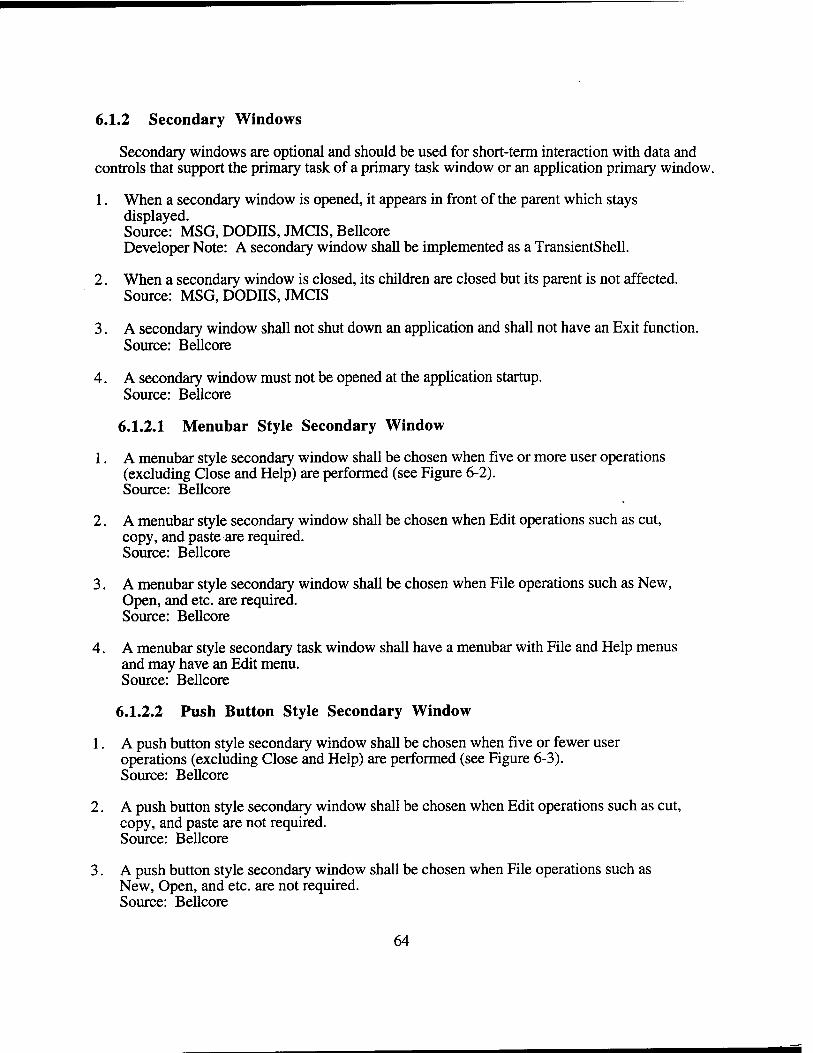
6.1.2 Secondary Windows
Secondary windows are optional and should be used for short-term interaction with data and controls that support the primary task of a primary task window or an application primary window.
1. When a secondary window is opened, it appears in front of the parent which stays displayed. Source: MSG, DODIIS, JMCIS, Bellcore Developer Note: A secondary window shall be implemented as a TransientShell.
2. When a secondary window is closed, its children are closed but its parent is not affected. Source: MSG, DODIIS, JMCIS
3. A secondary window shall not shut down an application and shall not have an Exit function. Source: Bellcore
4. A secondary window must not be opened at the application startup. Source: Bellcore
6.1.2.1 Menubar Style Secondary Window
1. A menubar style secondary window shall be chosen when five or more user operations (excluding Close and Help) are performed (see Figure 6-2). Source: Bellcore
2. A menubar style secondary window shall be chosen when Edit operations such as cut, copy, and paste are required. Source: Bellcore
3. A menubar style secondary window shall be chosen when File operations such as New, Open, and etc. are required. Source: Bellcore
4. A menubar style secondary task window shall have a menubar with File and Help menus and may have an Edit menu. Source: Bellcore
6.1.2.2 Push Button Style Secondary Window
1. A push button style secondary window shall be chosen when five or fewer user operations (excluding Close and Help) are performed (see Figure 6-3). Source: Bellcore
2. A push button style secondary window shall be chosen when Edit operations such as cut, copy, and paste are not required. Source: Bellcore
3. A push button style secondary window shall be chosen when File operations such as New, Open, and etc. are not required. Source: Bellcore
64
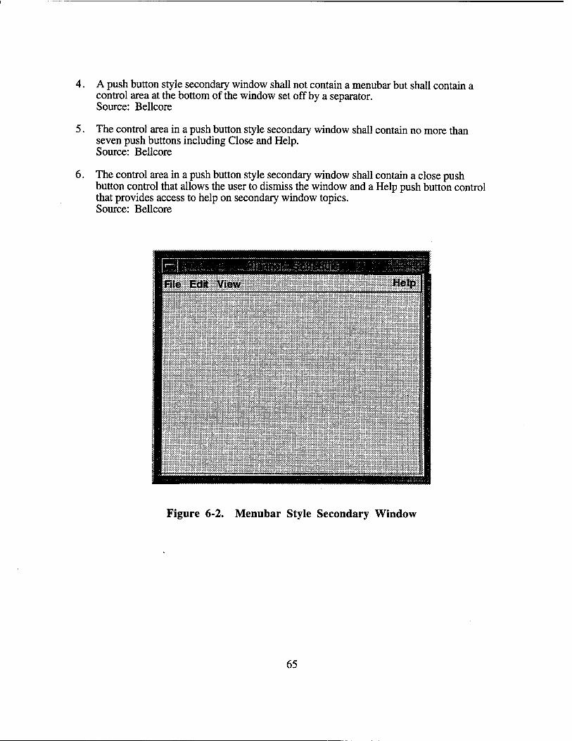
4. A push button style secondary window shall not contain a menubar but shall contain a control area at the bottom of the window set off by a separator. Source: Bellcore
5. The control area in a push button style secondary window shall contain no more than seven push buttons including Close and Help. Source: Bellcore
6. The control area in a push button style secondary window shall contain a close push button control that allows the user to dismiss the window and a Help push button control that provides access to help on secondary window topics. Source: Bellcore
Figure 6-2. Menubar Style Secondary Window
65
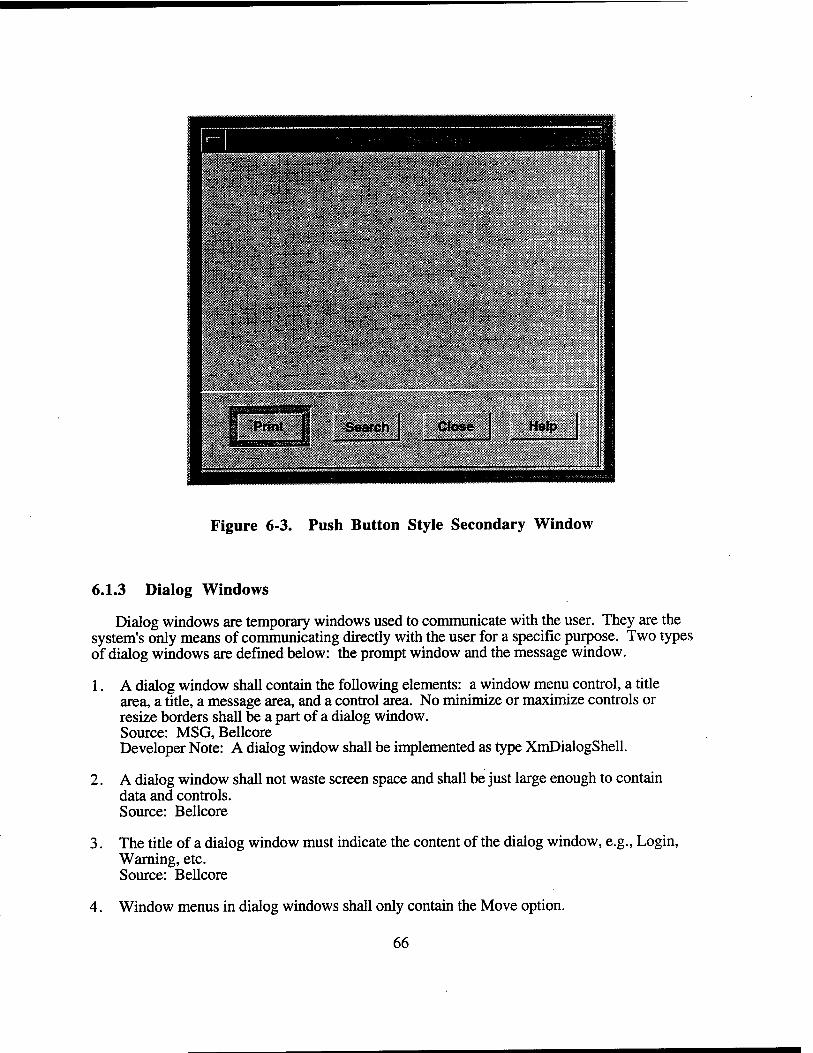
Figure 6-3. Push Button Style Secondary Window
6.1.3 Dialog Windows
Dialog windows are temporary windows used to communicate with the user. They are the system's only means of communicating directly with the user for a specific purpose. Two types of dialog windows are defined below: the prompt window and the message window.
1. A dialog window shall contain the following elements: a window menu control, a title area, a title, a message area, and a control area. No minimize or maximize controls or resize borders shall be a part of a dialog window. Source: MSG, Bellcore Developer Note: A dialog window shall be implemented as type XmDialogShell.
2. A dialog window shall not waste screen space and shall be just large enough to contain data and controls. Source: Bellcore
3. The title of a dialog window must indicate the content of the dialog window, e.g., Login, Warning, etc. Source: Bellcore
4. Window menus in dialog windows shall only contain the Move option.
66
6.1.3.1 Prompt Windows
1. An application shall present a prompt windows when requesting information to continue processing. Source: MSG, DODSG, AFSSC, JMCIS Developer Note: The Prompt Dialog is a special form of the SelectionDialog. By default, this dialog allows the user to type a text string and then enter it by selecting the OK button or by pressing .the return key. Unfortunately, the TextField widget of the predefined Motif widgets does not receive keyboard focus by default. Developers should use the XMProcessTraversal() to set the focus to the TextField widget in a prompt window. In MOTIF 1.2 the XmNinitialFocus resource was introduced and can be used on both MessageDialogs and SelectionDialogs to specify thetextfield widget that has the keyboard focus the first time the dialog window pops up.
2. A prompt window is application modal and interrupts processing by the application. Source: MSG, DODSG, AFSSC, JMCIS
3. A prompt window includes a message stating what information is needed and a text field for typing. Source: MSG, DODSG, AFSSC, JMCIS
4. The title of a prompt window indicates the process/application generating the prompt. Source: MSG, DODSG, AFSSC, JMCIS
5. The message in a prompt window is phrased in language that is meaningful to-users. Source: MSG, DODSG, AFSSC, JMCIS
6. A prompt window shall contain one of the following push button arrangements (in the order indicated):
OK Help OK Cancel Help OK Apply Cancel OK Apply Cancel Help OK Apply Reset Cancel OK Apply Reset Cancel Help Source: MSG
6.1.3.2 Message Windows
Developer Note: All message windows shall use a DialogShell widget. Using this widget will automatically enforce the behaviors defined for message windows. Using a DialogShell widget will not allow message windows to be iconified. Additionally, the DialogShell widget will always place the message window on top of the shell widget that owns the parent of the new dialog and when the parent is iconified, the message window shall also be iconified. To create a message dialog create a pop-up widget of type XmDialogShellWidgetClass using XmCreateMessageBox. A widget of type XmMessageBoxWidgetClass is created as its child. The XmNdialogType resource for the dialog should then be set to define the type of message dialog (XmDIALOG.ERROR, XmDIALOGJNFORMATION, XmDIALOG_MESSAGE, XmDIALOG_QUESTION, XmDIALOG_WARNING, or XmDIALOG.WORKING).
67
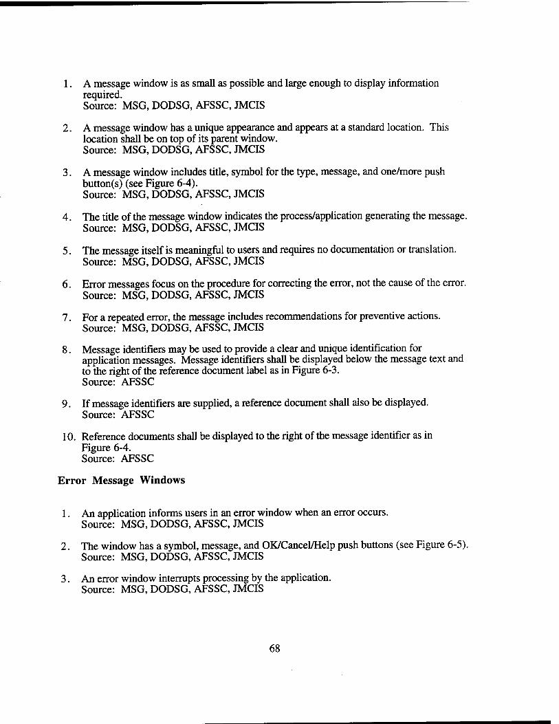
1. A message window is as small as possible and large enough to display information required. Source: MSG, DODSG, AFSSC, JMCIS
2. A message window has a unique appearance and appears at a standard location. This location shall be on top of its parent window. Source: MSG, DODSG, AFSSC, JMCIS
3. A message window includes title, symbol for the type, message, and one/more push button(s) (see Figure 6-4). Source: MSG, DODSG, AFSSC, JMCIS
4. The title of the message window indicates the process/application generating the message. Source: MSG, DODSG, AFSSC, JMCIS
5. The message itself is meaningful to users and requires no documentation or translation. Source: MSG, DODSG, AFSSC, JMCIS
6. Error messages focus on the procedure for correcting the error, not the cause of the error. Source: MSG, DODSG, AFSSC, JMCIS
7. For a repeated error, the message includes recommendations for preventive actions. Source: MSG, DODSG, AFSSC, JMCIS
8. Message identifiers may be used to provide a clear and unique identification for application messages. Message identifiers shall be displayed below the message text and to the right of the reference document label as in Figure 6-3. Source: AFSSC
9. If message identifiers are supplied, a reference document shall also be displayed. Source: AFSSC
10. Reference documents shall be displayed to the right of the message identifier as in Figure 6-4. Source: AFSSC
Error Message Windows
1. An application informs users in an error window when an error occurs. Source: MSG, DODSG, AFSSC, JMCIS
2. The window has a symbol, message, and OK/Cancel/Help push buttons (see Figure 6-5). Source: MSG, DODSG, AFSSC, JMCIS
3. An error window interrupts processing by the application. Source: MSG, DODSG, AFSSC, JMCIS
68
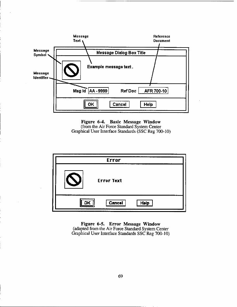
Message Text
Reference Document
Message Symbol
Message Identifier •
Message Dialog Box Title
Example message text.
Msgl d AA-9999 RefDoc AFR 700-10
1 0K 1 Cancel Help
Figure 6-4. Basic Message Window (from the Air Force Standard System Center
Graphical User Interface Standards (SSC Reg 700-10)
Error
Error Text
|| OK Cancel Hftlp
Figure 6-5. Error Message Window (adapted from the Air Force Standard System Center
Graphical User Interface Standards SSC Reg 700-10)
69
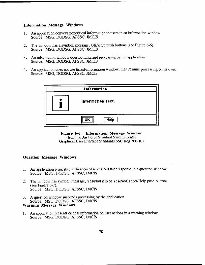
Information Message Windows
1. An application conveys noncritical information to users in an information window. Source: MSG, DODSG, AFSSC, JMCIS
2. The window has a symbol, message, OK/Help push buttons (see Figure 6-6). Source: MSG, DODSG, AFSSC, JMCIS
3. An information window does not interrupt processing by the application. Source: MSG, DODSG, AFSSC, JMCIS
4. An application does not use timed-information window, then resume processing on its own. Source: MSG, DODSG, AFSSC, JMCIS
Information
Information Text.
1 OK | Hftlp
Figure 6-6. Information Message Window (from the Air Force Standard System Center
Graphical User Interface Standards SSC Reg 700-10)
Question Message Windows
1. An application requests clarification of a previous user response in a question window. Source: MSG, DODSG, AFSSC, JMCIS
2. The window has symbol, message, Yes/No/Help or Yes/No/Cancel/Help push buttons (see Figure 6-7). Source: MSG, DODSG, AFSSC, JMCIS
3. A question window suspends processing by the application. Source: MSG, DODSG, AFSSC, JMCIS
Warning Message Windows
1. An application presents critical information on user actions in a warning window. Source: MSG, DODSG, AFSSC, JMCIS
70
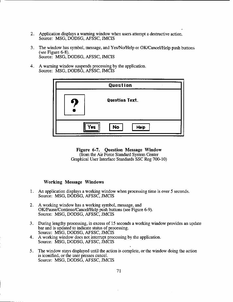
2. Application displays a warning window when users attempt a destructive action. Source: MSG, DODSG, AFSSC, JMCIS
3. The window has symbol, message, and Yes/No/Help or OK/Cancel/Help push buttons (see Figure 6-8). Source: MSG, DODSG, AFSSC, JMCIS
4. A warning window suspends processing by the application. Source: MSG, DODSG, AFSSC, JMCIS
Question
9 •
Question Text.
| Yes | | No | | Hftlp |
Figure 6-7. Question Message Window (from the Air Force Standard System Center
Graphical User Interface Standards SSC Reg 700-10)
Working Message Windows
1. An application displays a working window when processing time is over 5 seconds. Source: MSG, DODSG, AFSSC, JMCIS
2. A working window has a working symbol, message, and OK/Pause/Continue/Cancel/Help push buttons (see Figure 6-9). Source: MSG, DODSG, AFSSC, JMCIS
3. During lengthy processing, in excess of 15 seconds a working window provides an update bar and is updated to indicate status of processing. Source: MSG, DODSG, AFSSC, JMCIS
4. A working window does not interrupt processing by the application. Source: MSG, DODSG, AFSSC, JMCIS
5. The window stays displayed until the action is complete, or the window doing the action is iconified, or the user presses cancel. Source: MSG, DODSG, AFSSC, JMCIS
71
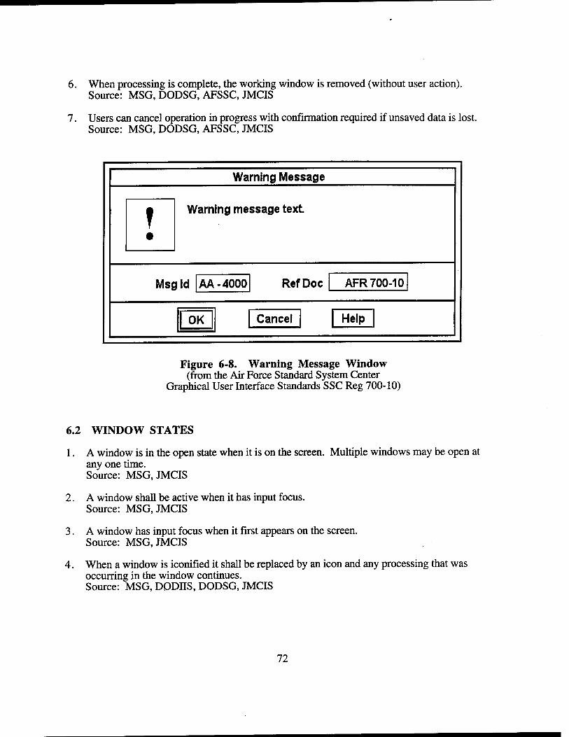
6. When processing is complete, the working window is removed (without user action). Source: MSG, DODSG, AFSSC, JMCIS
7. Users can cancel operation in progress with confirmation required if unsaved data is lost. Source: MSG, DODSG, AFSSC, JMCIS
Warning Message
? •
Warning message text.
MS£ lid |AA-4000 RefDoc AFR 700-10
| OK Cancel Help
Figure 6-8. Warning Message Window (from the Air Force Standard System Center
Graphical User Interface Standards SSC Reg 700-10)
6.2 WINDOW STATES
1. A window is in the open state when it is on the screen. Multiple windows may be open at any one time. Source: MSG, JMCIS
2. A window shall be active when it has input focus. Source: MSG, JMCIS
3. A window has input focus when it first appears on the screen. Source: MSG, JMCIS
4. When a window is iconified it shall be replaced by an icon and any processing that was occurring in the window continues. Source: MSG, DODHS, DODSG, JMCIS
72
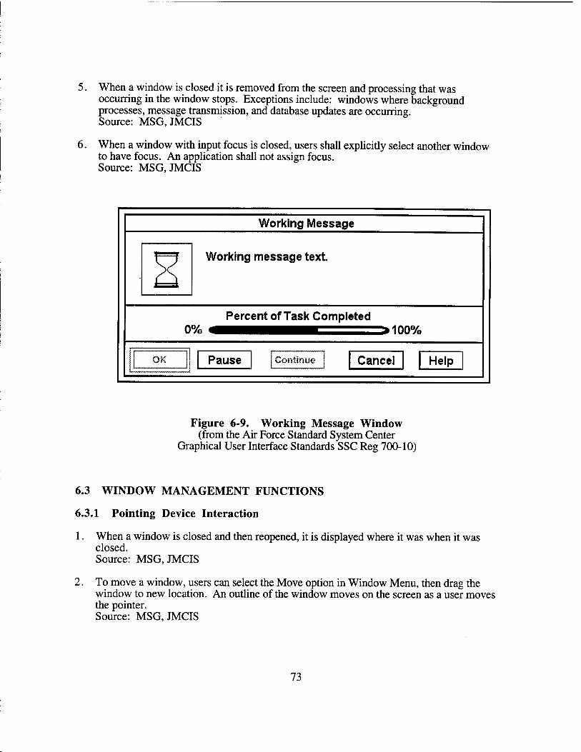
5. When a window is closed it is removed from the screen and processing that was occurring in the window stops. Exceptions include: windows where background processes, message transmission, and database updates are occurring. Source: MSG, JMCIS
6. When a window with input focus is closed, users shall explicitly select another window to have focus. An application shall not assign focus. Source: MSG, JMCIS
Working Message
Working message text.
Percent of Task Completed 0% ^HH1^^^^H==^100%
Pause Continue Cancel Help
Figure 6-9. Working Message Window (from the Air Force Standard System Center
Graphical User Interface Standards SSC Reg 700-10)
6.3 WINDOW MANAGEMENT FUNCTIONS
6.3.1 Pointing Device Interaction
1. When a window is closed and then reopened, it is displayed where it was when it was closed. Source: MSG, JMCIS
2. To move a window, users can select the Move option in Window Menu, then drag the window to new location. An outline of the window moves on the screen as a user moves the pointer. Source: MSG, JMCIS
73
3. Users press the S or T button then drag the window to the new location. An outline of the window moves on the screen as a user moves the pointer. Source: MSG,JMCIS
4. Users select the Size option in the Window Menu, then drag the frame to the new size. An outline of the window moves on the screen as a user moves the pointer. Source: MSG,JMCIS
5. Users press the S or T button when the cursor is over the window frame, then drag it to the new size. An outline of the window moves on the screen as a user moves the pointer. Source: MSG,JMCIS
6. Users select the Minimize option in the Window Menu. The window is iconified, and the icon appears in the lower left corner of the screen. Source: MSG, DODHS, DODSG, JMCIS
7. Users select the Minimize button on the title bar. The window is iconified, and the icon appears in the lower left corner of the screen. Source: MSG, DODHS, JMCIS
8. Users double click the S button on an icon to restore a window that has been iconified. Source: MSG, JMCIS
9. Users select the Maximize option in the Window Menu and the window expands to its full size. Source: MSG, DODHS, JMCIS
10. Users select the Maximize button on the title bar and the window expands to its full size. Source: MSG, DODHS, JMCIS
11. Users click on the title bar to raise the window to the front of screen and give it input focus. Source: MSG, DODHS, JMCIS
12. Users select the Lower option in the Window Menu to move the window to the bottom of the hierarchy. Source: MSG, DODnS, JMCIS
13. Users select the Close option in the Window Menu and the window is closed. Users are prompted to save any unsaved data. Source: MSG, DODHS, JMCIS
14. Users double click on the Window Menu button and the window is closed. Users are prompted to save any unsaved data. Source: MSG, DODHS, JMCIS
6.3.2 Keyboard Interaction
1. Shift+Escape or Alt+Space displays the Window Menu. Source: MSG, DODnS, JMCIS
74
2. Navigation and selection in the window menu is done as in a pull down menu. Source: MSG, DODHS, JMCIS
6.4 WINDOW ICONS
1. An icon has the same title as its corresponding window. Source: MSG, DODSG, JMCIS
2. An icon title is the same width as the icon image; the image may be truncated to fit. Source: MSG, DODSG, JMCIS
3. The location cursor appears on the icon with input focus, and the full icon title is displayed. Source: MSG, DODSG, JMCIS
4. When an icon loses input focus, the title is truncated to the same width as the icon image. Source: MSG, DODSG, JMCIS
5. The Icon Menu has the same options (except Size) as Window Menu for the corresponding window. Source: MSG, DODSG, JMCIS
6. Minimize is included in an Icon Menu but is not available for selection. Source: MSG, DODSG, JMCIS
7. Users click the S button on the icon to display the Icon Menu. Source: MSG, DODSG, JMCIS
8. Users dismiss the Icon Menu by clicking the S button anywhere outside the menu. Source: MSG, DODSG, JMCIS
9. The default location for icons is the lower left corner of the screen. An icon box may be used to organize and reduce screen clutter. Source: MSG, DODSG, JMCIS
10. If more than one window is iconified, the icons are arrayed in rows from left to right. Source: MSG, DODSG, JMCIS
11. An option to change the default icon location may be available as a user preference setting. Source: MSG, DODSG, AFSSC, JMCIS
75
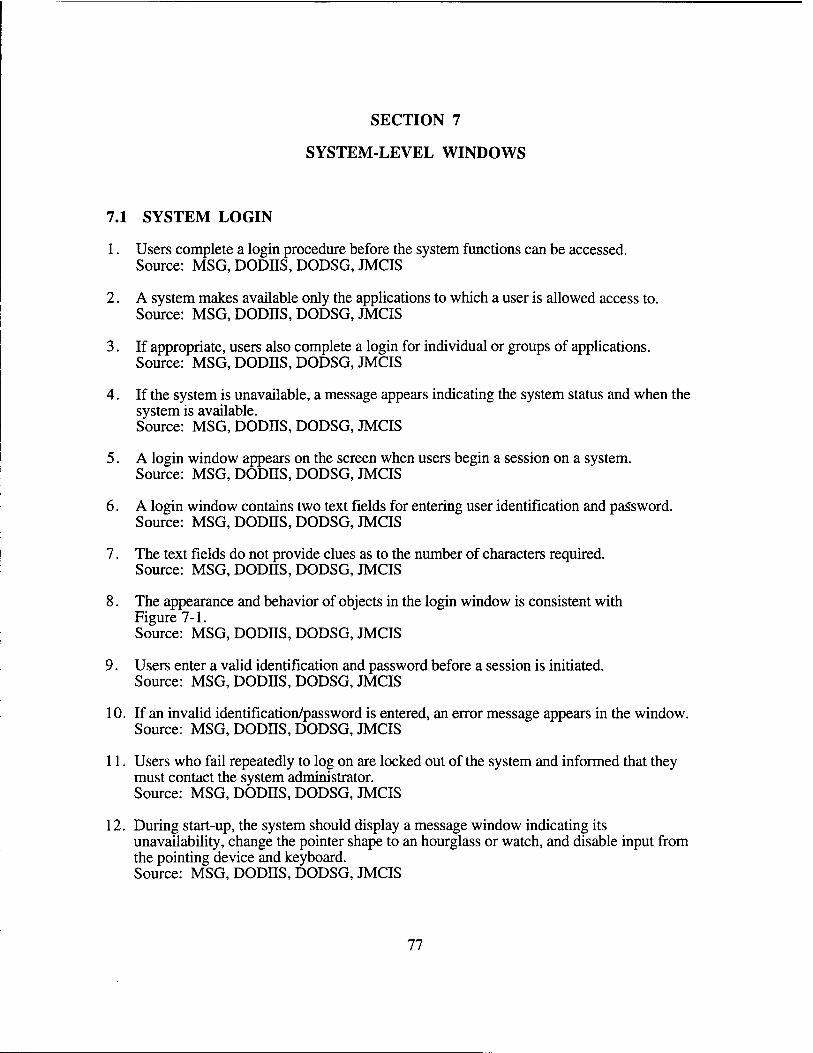
SECTION 7
SYSTEM-LEVEL WINDOWS
7.1 SYSTEM LOGIN
1. Users complete a login procedure before the system functions can be accessed. Source: MSG, DODIIS, DODSG, JMCIS
2. A system makes available only the applications to which a user is allowed access to. Source: MSG, DODIIS, DODSG, JMCIS
3. If appropriate, users also complete a login for individual or groups of applications. Source: MSG, DODIIS, DODSG, JMCIS
4. If the system is unavailable, a message appears indicating the system status and when the system is available. Source: MSG, DODJJS, DODSG, JMCIS
5. A login window appears on the screen when users begin a session on a system. Source: MSG, DODIIS, DODSG, JMCIS
6. A login window contains two text fields for entering user identification and password. Source: MSG, DODJJS, DODSG, JMCIS
7. The text fields do not provide clues as to the number of characters required. Source: MSG, DODJJS, DODSG, JMCIS
8. The appearance and behavior of objects in the login window is consistent with Figure 7-1. Source: MSG, DODIIS, DODSG, JMCIS
9. Users enter a valid identification and password before a session is initiated. Source: MSG, DODIIS, DODSG, JMCIS
10. If an invalid identification/password is entered, an error message appears in the window. Source: MSG, DODJJS, DODSG, JMCIS
11. Users who fail repeatedly to log on are locked out of the system and informed that they must contact the system administrator. Source: MSG, DODIIS, DODSG, JMCIS
12. During start-up, the system should display a message window indicating its unavailability, change the pointer shape to an hourglass or watch, and disable input from the pointing device and keyboard. Source: MSG, DODJJS, DODSG, JMCIS
77
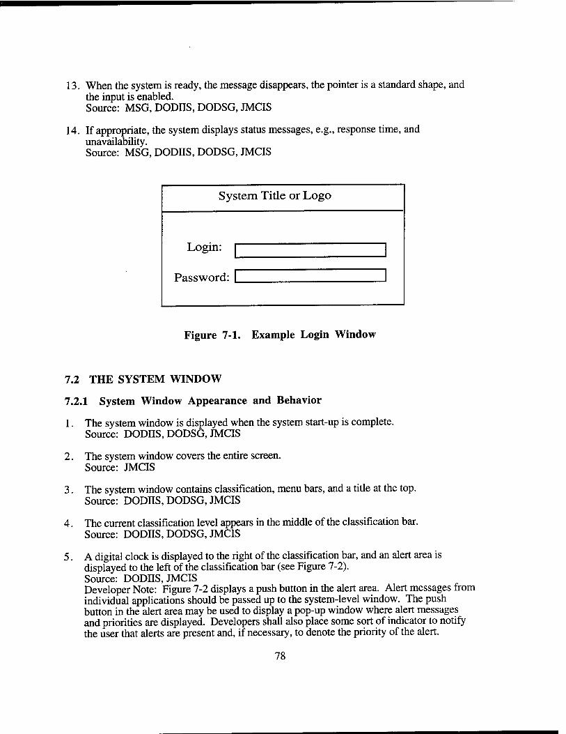
13. When the system is ready, the message disappears, the pointer is a standard shape, and the input is enabled. Source: MSG, DODHS, DODSG, JMCIS
14. If appropriate, the system displays status messages, e.g., response time, and unavailability. Source: MSG, DODHS, DODSG, JMCIS
System Title or Logo
Login:
Password:
Figure 7-1. Example Login Window
7.2 THE SYSTEM WINDOW
7.2.1 System Window Appearance and Behavior
1. The system window is displayed when the system start-up is complete. Source: DODJJS, DODSG, JMCIS
2. The system window covers the entire screen. Source: JMCIS
3. The system window contains classification, menu bars, and a title at the top. Source: DODIIS, DODSG, JMCIS
4. The current classification level appears in the middle of the classification bar. Source: DODHS, DODSG, JMCIS
5. A digital clock is displayed to the right of the classification bar, and an alert area is displayed to the left of the classification bar (see Figure 7-2). Source: DODIIS, JMCIS Developer Note: Figure 7-2 displays a push button in the alert area. Alert messages from individual applications should be passed up to the system-level window. The push button in the alert area may be used to display a pop-up window where alert messages and priorities are displayed. Developers shall also place some sort of indicator to notify the user that alerts are present and, if necessary, to denote the priority of the alert.
78
6. The system menu bar lists the titles of the menus available at the system level. Source: DODIIS, DODSG, JMCIS
7. These menus provide access to the application programs available within the system. Source: DODIIS, DODSG, JMCIS
8. Action icons common to all applications are placed along the left margin from the top down. Source: DODIIS, DODSG, JMCIS Developer Note: Users may be given the preference to display action icons common to all applications along the left margin or underneath the system-level menu bar from left to right.
9. Action icons mirror but do not replace selections in a menu. Source: AFSSC, JMCIS
10. Icons for application windows are displayed at the lower-left corner of the screen. Source: DODIIS, DODSG, JMCIS
11. The system window has the appearance and behavior per Figure 7-2. Source: JMCIS Developer Note: At present the colors chosen in the User Interface Specification for Navy Command and Control, version 1.2 have been adopted for TBM. Future versions of the TBM HCI Specification will examine additional color sets to accommodate different environments and display hardware.
12. The system window cannot be moved or resized. Source: JMCIS
13. The classification and system menu bars cannot be obscured by application windows. Source: DODJJS, DODSG, JMCIS
14. The system window is always available so users can select help and system-level menu options. Source: DODIIS, DODSG, JMCIS
15. The system window has a default initial appearance following start-up. Source: DODIIS, DODSG, JMCIS
16. The system window shall contain an alert button which is used to display a list of alerts generated from individual applications. Source: adapted from DODSG, JMCIS
17. The system window shall contain an area to display the current duty group position(s) that the user is logged in as.
79
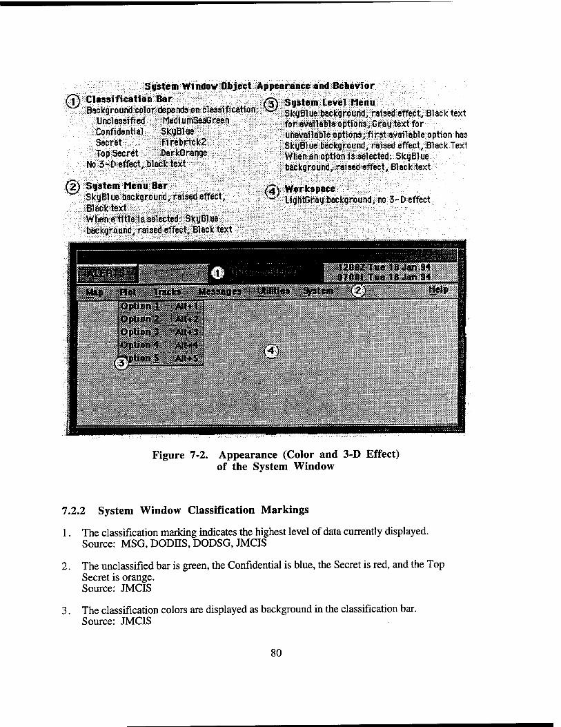
© System Windov Object Appearance and Behavior
Classification Bar Background color depends on classification:
Unclassified MediumSeaGreen Confidential SkyBlue Secret Firebrick2 Top Secret DarkOrange
No 3-D effect, black text
(2) System Menu Bar SkyBlue background, raised effect, Black text When a title is selected: SkyBlue background, raised effect, Black text
System Level Menu SkyBlue background, raised effect, Black text for available options, Gray text for unavailable options; first available option has SkyBlue background, raised effect, Black Text When an option is selected: SkyBlue background, raised effect, Black text
/4S Workspace ~ LightGray background, no 3-D effect
mimvsi mi ■ ■ • . TiWm IH I 1200ZTue 16 Jan 94 H Lj H I 0700LTue IB Jan 94 Map Rot; Tracks Messages unities System (2) Help
[Option ,1; I Option 2! Option £
I Option 4 lion 5 m
AIt+1 AIM-2 Alt+3
[AH+4! AJl+5
(4)
Figure 7-2. Appearance (Color and 3-D Effect) of the System Window
7.2.2 System Window Classification Markings
1. The classification marking indicates the highest level of data currently displayed. Source: MSG, DODHS, DODSG, JMCIS
2. The unclassified bar is green, the Confidential is blue, the Secret is red, and the Top Secret is orange. Source: JMCIS
3. The classification colors are displayed as background in the classification bar. Source: JMCIS
80

4. The classification text is in uppercase letters, at least 14-point bold font. Source: JMCIS
7.3 THE SYSTEM MENU
7.3.1 The System Menu Bar
1. The menu titles in the system menu describe the overall functionality of the system. Source: DODHS, DODSG, JMCIS
2. The menu bar contains no more than ten menu titles plus Help. Source: JMCIS
3. The menu bar must be placed beneath the alert classification and time area and on top of the Application Area. The menu bar runs from border to border across the window. Source: MSG, DODIIS, DODSG, JMCIS
4. Only menus shall be available on the Menu bar. Source: MSG, DODHS, DODSG, JMCIS
5. Menu titles begin at the left margin and extend rightward; they are spaced for easy reading. Source: MSG, DODHS, DODSG, JMCIS
6. Each menu title and menu option includes a mnemonic. Source: MSG, DODHS, DODSG, JMCIS
7. Leftmost menu titles provide functions related to system, map, and communication displays. Source: JMCIS
8. Middle menu titles provide functions that are specific to the particular system. Source: JMCIS
9. Rightmost menu titles provide support and miscellaneous functions. Source: JMCIS
10. Help appears at the far right margin of the system menu bar. Source: JMCIS
11. This system uses the same menu titles as other systems providing the same functionality. Source: JMCIS
12. An application has the same name whenever it is part of a system, and it is in same system menu. Source: JMCIS
81
7.3.2 Access to System and Application Functions
1. A system integrates common application functions so they are accessed in a single window. Source: JMCIS
2. System menu options available within an application are displayed in normal text. Source: JMCIS
3. Options that are inappropriate to execute from within the application are dimmed. Source: JMCIS
4. If all of the options in a system menu are inappropriate, the menu title is dimmed. Source: JMCIS
5. If only one instance of an application can run, the menu option is dimmed while running. Source: JMCIS
6. If multiple instances of an application can run, the menu option returns to normal to indicate it can be selected. Source: JMCIS
7. Users can select Help from the system menu bar at any time. Source: DODHS, DODSG, JMCIS
8. Users can browse all titles in the system menu bar even if all menu options are unavailable. Source: JMCIS
9. Each system includes navigational aids as an alternative to the function-oriented menus. Source: JMCIS
10. Navigational aids are accessible through Help in the system window. Source: JMCIS
11. Navigational aids provide direct access to the part of the system selected in the aid. Source: JMCIS
7.4 SYSTEM SUPPORT
1. A system includes resources and utilities needed to support overall tactical functionality. Resources include logout, print, status, preferences, alerts, peripherals, and files. Utilities include basic features, COTS software, macros, and briefing support. Source: JMCIS
2. Users can print an entire screen or a window with/without secondary windows. Source: JMCIS
82
3. Printing includes the classification marking and produces an accurate translation of color shading from the display to the paper copy. Source: JMCIS Developers Note: Black and white printers must (by use of dithering and grayscale rendition) produce paper copies where colors are translated as distinguishable from one another.
4. Users can work with files without detailed knowledge of the file structure. Source: JMCIS
5. A system includes a Screensaver and provides a means to rapidly suppress a display. Source: JMCIS
6. Users can temporarily suspend a session without logging out. Source: JMCIS
7. During suspension, processing continues but interaction is not allowed (i.e., keystrokes shall not be accepted) until the session is resumed. Source: JMCIS
8. If navigation among multiple overlapping windows is required, each system shall provide users with the ability to identify (e.g., by selecting an Active Window menu option) all open windows, obtain information about them (e.g., the associated application, date created, size, etc.), and move input focus among them. Source: JMCIS
9. A system provides the user-specified settings needed to support overall system functions. These functions might include: functions assigned to pointing device buttons, screen location for displaying action icon buttons, location for displaying active application icons, whether or not to use the icon box, criteria for alert generation, printer destination, and/or elapsed time before automatic logout. Source: JMCIS
10. A default value for each user-specified setting is set for all applications unless changed by users. Source: JMCIS
11. Users can review the user-specified settings and reset them at any time during a session. Source: JMCIS
12. When users end the session, session-specific settings revert to the default values. Source: JMCIS
7.5 SYSTEM LOGOUT
1. Users select Logout from the System menu to end a session. Source: DODIIS, DODSG, JMCIS
83
2. Users are prompted to confirm Logout if there is any unsaved data. Source: DODHS, DODSG, JMCIS
3. Users are prompted to logout of any applications that required they login to. Source: DODIIS, DODSG, JMCIS
4. During logout, all processing in application windows stops, and all windows are closed. Source: DODIIS, DODSG, JMCIS
5. When logout is complete, the initial login window is displayed. Source: DODHS, DODSG, JMCIS
6. If there is auto logout, the system has the standard length of user inactivity before logout occurs. Source: DODIIS, DODSG, JMCIS
7. Users can modify the time period before auto logout occurs. Source: DODHS, DODSG, JMCIS
8. A message is displayed during inactivity indicating the action needed to avoid auto logout. Source: DODHS, DODSG, JMCIS
9. An auditory signal is presented at intervals during the period of inactivity. Source: DODHS, DODSG, JMCIS
10. For auto logout, unsaved data is saved, with a message indicating logout and file name. Source: DODHS, DODSG, JMCIS
84
SECTION 8
APPLICATION-LEVEL WINDOWS
8.1 ORGANIZATION
1. All primary and dialog windows contain a title and a main area. Application windows should also contain a menu bar, a command area, and/or a message area. Source: AFSSC,JMCIS
2. Applications are differentiated by consistent color coding between the application menu bar and the background of the dialog windows that are spawned by the application. As an alternative, where the primary application does not have a menu bar, applications could be color coded by using distinctive colored mattes.
8.1.1 Window Title
1. A window title appears in the title bar of a window. Source: MSG, DODES, DODSG, AFSSC JMCIS
2. The title is centered in the title bar and presented in mixed-case letters. The first letter of each significant word in a title and abbreviations shall be capitalized (e.g., Office Sym). Source: AFSSC
3. Each window title in an application is unique. Source: MSG, DODIIS, DODSG, AFSSC, JMCIS
4. If an application has multiple primary windows, each title indicates the window purpose and includes the application name separated by a dash (-). Source: MSG, DODIIS, DODSG, AFSSC, JMCIS
5. The title of a dialog window matches the wording of the menu option that displayed it. Source: MSG, DODJJS, DODSG, AFSSC, JMCIS
8.1.2 Window Menu Bar
1. If a window includes a menu bar, it appears below the title bar. Source: MSG, DODIIS, DODSG, AFSSC, JMCIS
2. The menu bar contains no more than ten menu titles plus Help. Source: AFSSC, JMCIS
3. The titles begin at the left margin and extend rightward, with Help at the right margin. Source: MSG, DODIIS, DODSG, AFSSC, JMCIS
4. Each menu title includes a mnemonic. Source: MSG, DODIIS, DODSG, AFSSC, JMCIS
85
5. Options in application menus are unique and do not duplicate functions in the system menu; application menu titles are unique and do not duplicate the titles of the system menu. Source: AFSSC,JMCIS
6. A menu has the same title and contains the same options whenever it is in an application menu bar. Source: JMCIS
8.1.3 Arrangement of Window Controls
1. Controls performing similar/related functions are physically grouped together. Source: MSG, DODIIS, DODSG, AFSSC, JMCIS
2 Grouped controls have a frame and are clearly labeled to indicate the functions they perform. Source: MSG, DODIIS, DODSG, AFSSC, JMCIS
3. Controls for similar options are grouped together while controls for different options are grouped separately. Source: MSG, DODIIS, DODSG, AFSSC, JMCIS
4. If scroll bars are needed, they are located to the right or at the bottom of the area being scrolled. Source: MSG, DODIIS, DODSG, AFSSC, JMCIS
5. Controls that are temporarily unavailable are dimmed and not available for selection. Source: MSG, DODIIS, DODSG, AFSSC, JMCIS
6. Controls that are never available to users do not appear in a window. Source: MSG, DODIIS, DODSG, AFSSC, JMCIS
8.1.4 Arrangement of Push Buttons
1. The push buttons are displayed at the bottom of the window in a row that is centered. Source: AFSSC, JMCIS Developer Note: Push buttons should appear in the action area of a dialog. For custom dialogs it is easier to contain the action area in a separate widget. A Form widget can be used in order to position buttons evenly across the width of a dialog. The XmNfractionBase resource of the form widget is set to 2 times the number of push buttons +1. For example, if a dialog had 3 buttons the XmNfractionBase resource should be set to 7. This will break the Form down into equal units. Position zero is the left edge of the form and the XmNfractionBase number that was set is at the right edge of the form. Position the left and right sides of the first button at position one and two, respectively. Position the left and right sides of the next button at position 3 and 4, respectively. This will leave a space between position 2 and 3 and as a result will leave a space between the first and second button. Continue until all the buttons are placed on the Form widget. By using this layout method, developers do not have to be concerned with the width of the form of the DialogShell itself, since the placement of the buttons will always be proportional.
86
2. Push button order shall use the following common labels and actions and shall appear from left to right in the following sequence: Yes, No, OK, Close, Apply, Retry, Stop, Pause, Resume, Reset, Cancel, and Help. Source: MSG, AFSSC, JMCIS
3. Push button order in modal windows: OK/Cancel/Help. Source: MSG, JMCIS
4. Push button order in modeless windows: OK/Apply/Cancel/Help or OK/Apply/ Reset/ Cancel/Help. Source: MSG, JMCIS
5. Apply is the default in modeless windows that are displayed for multiple actions. Source: MSG, JMCIS
6. A Help button is included in every window and is the rightmost button. Source: MSG, JMCIS Developer Note: A help button shall not be required if window-specific help information is available via a help menu.
7. Application-specific push buttons are ordered left to right based on the sequence of use, with the most often used push button on the left. Source: MSG, JMCIS
8. Buttons for positive actions are on the left, and followed by negative and canceling actions. Source: MSG, JMCIS
9. Push buttons appear in the same order throughout the application. Source: MSG, JMCIS
10. If push button actions affect different objects, their labels reflect what each affects. Source: MSG, JMCIS
11. Push buttons are arranged near the object(s) to which they are related. Source: MSG, JMCIS
12. Push buttons related to overall window functionality (e.g., OK, Cancel) are at the bottom of the window. Source: JMCIS
8.1.5 Action Icon Behavior in an Application
1. An action icon palette appears along the left margin of the window or below the menu bar. Source: MSG, JMCIS
2. An action icon palette can be repositioned and removed from the window if desired. Source: JMCIS
87
3. An action icon palette contains no more than 20 action icons. If numerous and/or non- standard action icons are used, developers shall consider placing the command or an abbreviated form of the command directly beneath the icon. Source: JMCIS
4. The icons chosen as command action icons are consistent throughout an application and, if possible, across applications. Source: JMCIS
5. Action icons mirror, but do not replace, selections in a menu. Source: AFSSC
6. Action icons in a palette are spaced so that a location can be displayed. Source: JMCIS
7. An action icon palette supports navigation and selection from the keyboard. Source: MSG, JMCIS Developer Note: This shall be accomplished by the same means as any push button is activated from the keyboard.
8.1.6 Message Bar
1. A message bar at the bottom of a window margin is used for non-critical application messages. Source: MSG, AFSSC, JMCIS
2. The left side of the message bar is for routine messages, simple help, and window status. Source: MSG, AFSSC, JMCIS
3. The right side of the message bar is used for information about the window. Source: MSG, AFSSC, JMCIS
4. A message bar is part of the primary window and may also be part of a dialog window. Source: MSG, AFSSC, JMCIS
8.2 COLOR USE IN WINDOWS
8.2.1 Color of Objects
1. Interface objects have the appearance indicated in Table 8-1. Source: JMCIS Developer Note: At present the colors chosen in the User Interface Specification for Navy Command and Control, version 1.2 have been adopted for TBM. Future versions of the TBM HCI Specification will examine additional color sets to accommodate different environments and display hardware.
2. Users can select alternative color sets. However modifications in basic color appearance follow the guidelines in Section 8.2.2. Source: JMCIS
88
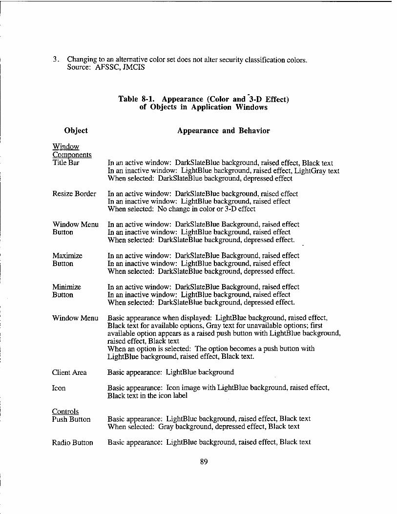
Changing to an alternative color set does not alter security classification colors. Source: AFSSC.JMCIS
Table 8-1. Appearance (Color and 3-D Effect) of Objects in Application Windows
Object
Window Components Tide Bar
Resize Border
Window Menu Button
Maximize Button
Minimize Button
Window Menu
Client Area
Icon
Controls Push Button
Appearance and Behavior
In an active window: DarkSlateBlue background, raised effect, Black text In an inactive window: LightBlue background, raised effect, LightGray text When selected: DarkSlateBlue background, depressed effect
In an active window: DarkSlateBlue background, raised effect In an inactive window: LightBlue background, raised effect When selected: No change in color or 3-D effect
In an active window: DarkSlateBlue Background, raised effect In an inactive window: LightBlue background, raised effect When selected: DarkSlateBlue background, depressed effect.
In an active window: DarkSlateBlue Background, raised effect In an inactive window: LightBlue background, raised effect When selected: DarkSlateBlue background, depressed effect.
In an active window: DarkSlateBlue Background, raised effect In an inactive window; LightBlue background, raised effect When selected: DarkSlateBlue background, depressed effect.
Basic appearance when displayed: LightBlue background, raised effect, Black text for available options, Gray text for unavailable options; first available option appears as a raised push button with LightBlue background, raised effect, Black text When an option is selected: The option becomes a push button with LightBlue background, raised effect, Black text.
Basic appearance: LightBlue background
Basic appearance: Icon image with LightBlue background, raised effect, Black text in the icon label
Basic appearance: LightBlue background, raised effect, Black text When selected: Gray background, depressed effect, Black text
Radio Button Basic appearance: LightBlue background, raised effect, Black text
89
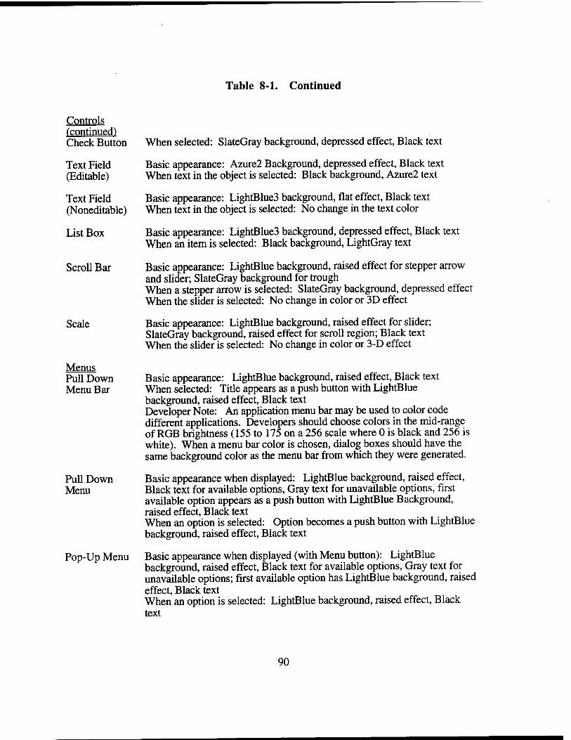
Table 8-1. Continued
Controls ("continued) Check Button
Text Field (Editable)
Text Field (Noneditable)
List Box
Scroll Bar
Scale
Menus Pull Down Menu Bar
Pull Down Menu
Pop-Up Menu
When selected: SlateGray background, depressed effect, Black text
Basic appearance: Azure2 Background, depressed effect, Black text When text in the object is selected: Black background, Azure2 text
Basic appearance: LightBlue3 background, flat effect, Black text When text in the object is selected: No change in the text color
Basic appearance: LightBlue3 background, depressed effect, Black text When an item is selected: Black background, LightGray text
Basic appearance: LightBlue background, raised effect for stepper arrow and slider; SlateGray background for trough When a stepper arrow is selected: SlateGray background, depressed effect When the slider is selected: No change in color or 3D effect
Basic appearance: LightBlue background, raised effect for slider; SlateGray background, raised effect for scroll region; Black text When the slider is selected: No change in color or 3-D effect
Basic appearance: LightBlue background, raised effect, Black text When selected: Title appears as a push button with LightBlue background, raised effect, Black text Developer Note: An application menu bar may be used to color code different applications. Developers should choose colors in the mid-range of RGB brightness (155 to 175 on a 256 scale where 0 is black and 256 is white). When a menu bar color is chosen, dialog boxes should have the same background color as the menu bar from which they were generated.
Basic appearance when displayed: LightBlue background, raised effect, Black text for available options, Gray text for unavailable options, first available option appears as a push button with LightBlue Background, raised effect, Black text When an option is selected: Option becomes a push button with LightBlue background, raised effect, Black text
Basic appearance when displayed (with Menu button): LightBlue background, raised effect, Black text for available options, Gray text for unavailable options; first available option has LightBlue background, raised effect, Black text When an option is selected: LightBlue background, raised effect, Black text
90
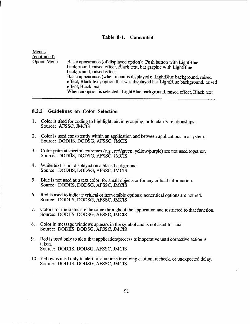
Table 8-1. Concluded
Menus (continued) Option Menu Basic appearance (of displayed option): Push button with LightBlue
background, raised effect, Black text, bar graphic with LightBlue background, raised effect Basic appearance (when menu is displayed): LightBlue background, raised effect, Black text; option that was displayed has LightBlue background, raised effect, Black text When an option is selected: LightBlue background, raised effect, Black text
8.2.2 Guidelines on Color Selection
1. Color is used for coding to highlight, aid in grouping, or to clarify relationships. Source: AFSSC, JMCIS
2. Color is used consistently within an application and between applications in a system. Source: DODIIS, DODSG, AFSSC, JMCIS
3. Color pairs at spectral extremes (e.g., red/green, yellow/purple) are not used together. Source: DODIIS, DODSG, AFSSC, JMCIS
4. White text is not displayed on a black background. Source: DODIIS, DODSG, AFSSC, JMCIS
5. Blue is not used as a text color, for small objects or for any critical information. Source: DODIIS, DODSG, AFSSC, JMCIS
6. Red is used to indicate critical or irreversible options; noncritical options are not red. Source: DODIIS, DODSG, AFSSC, JMCIS
7. Colors for the status are the same throughout the application and restricted to that function. Source: DODIIS, DODSG, AFSSC, JMCIS
8. Color in message windows appears in the symbol and is not used for text. Source: DODIIS, DODSG, AFSSC, JMCIS
9. Red is used only to alert that application/process is inoperative until corrective action is
Source: DODIIS, DODSG, AFSSC, JMCIS
10. Yellow is used only to alert to situations involving caution, recheck, or unexpected delay. Source: DODIIS, DODSG, AFSSC, JMCIS
91
11. If color is used to impart meaning, it is used redundantly and shall not be the only coding technique. Source: DODIIS, DODSG, AFSSC, JMCIS
12. If color coding is used, each color represents one category of displayed data. Source: DODIIS, DODSG, AFSSC, JMCIS
13. The number of colors for alphanumeric display do not exceed seven, only four codes at one time. Source: AFSSC
14. The number of colors for graphical displays do not exceed nine. Source: AFSSC
15. Slight shade changes in color are not used to show gradation or choice. Source: DODIIS, DODSG, AFSSC, JMCIS
16 The background color behind the text is not used to show a change in the system status. Source: DODIIS, DODSG, AFSSC, JMCIS
17. Change in the system status is signaled by changing the color of an object next to the text. Source: DODIIS, DODSG, AFSSC, JMCIS
18. Black is not used as the background for color-coded items. Source: DODIIS, DODSG, AFSSC, JMCIS
19. Background color is an unsaturated hue (e.g., tan, off-white) but not pure white. Source: DODIIS, DODSG, AFSSC, JMCIS
8.3 TEXT FIELDS
For information, see also Section 9.2 on data entry windows.
8.3.1 Format of Text Fields
1. The label appears to the left or above the text field and describes what is to be entered or what is to be displayed. Source: DODIIS, AFSSC, JMCIS
2. The label of a text field includes cues regarding format. Source: MSG, AFSSC, JMCIS
3. If a unit of measurement is always used, it is part of the label and does not have to be entered. Source: DODSG, AFSSC, JMCIS
4. The label is designed so that users can easily distinguish it from the text field. Source: DODSG, AFSSC, JMCIS
92
5. The text field indicates the basic features of the entry required. Source: AFSSC,JMCIS
6. If information being entered is a fixed length, the text field is the same length. Source: DODSG, JMCIS
7. If the length of information varies, the text field is as long as the longest information. Source: DODSG,JMCIS
8. The text field will include scroll bars if space in the window is limited. Source: MSG, DODIIS, DODSG, AFSSC, JMCIS
9. The text field includes a decimal point if numeric data are entered in decimal format. Source: DODSG, JMCIS Developer Note: The only practical way of accomplishing this is to separate the data into different text fields for each side of the decimal point. Developers should only do this when it will significantly reduce use data entry time.
10. Field format is consistent with users' expectations and presented in meaningful chunks. Source: MSG, DODIIS, DODSG, AFSSC, JMCIS
11. Strings over 5-7 characters long are entered in smaller chunks, separated by a delimiter. Source: DODSG, JMCIS
12. Data that are known or can be computed are automatically entered in a field. Source: JMCIS
13. Noneditable text is presented directly in a window and not within a frame. Source: JMCIS
14. When the pointer is on noneditable text, its shape does not change to an I-beam. Source: MSG, AFSSC, JMCIS
15. Clicking on noneditable text does not change its appearance or display a text cursor. Source: MSG, AFSSC, JMCIS
8.3.2 Text in Windows
8.3.2.1 Text, Font, Size, and Readability
1. Normal, dimmed, and highlighted text appear and behave as indicated in Table 8-1. Source: JMCIS
2. Black is used for text in windows. Source: AFSSC
3. If text is other than black, color has sufficient contrast with background to be readable. Source: DODIIS, DODSG, AFSSC, JMCIS
93
4. Sans serif fonts are used to present system fonts. Serif fonts may be used for user generated fonts.
5. Text is of sufficient size and thickness to be readable at normal viewing distance. Source: JMCIS
6. Text characters contain a minimum 7 X 9 dot matrix construction. Source: JMCIS
7. Text for a briefing presentation is readable at the normal audience viewing distance. Source: JMCIS
8. Text used for briefing presentations is a minimum of 10 X 14 dot matrix format, double stroke width. Source: JMCIS
9. Applications that do word processing provide a choice of fonts as a user-selectable option. Source: JMCIS
10. Text labels shall not be run together, nor shall they be separated by an underscore, or any delimiters other than a single space. Source: JMCIS
11. Different fonts may be used to distinguish static (titles, labels) from system/application generated data. Source: JMCIS
12. For widget labeling, variable pitch fonts are recommended because of their legibility and space efficiency. Source: Kobara
13. The character stroke width of a system font shall be at least 2 pixels in thickness. Source: Kobara
14. The selected font style shall be legible in various display resolutions from 72 pixels per inch to 120 pixels per inch. Source: Kobara
15. User font cells shall be the same height as the system fonts that will be used with them. The glyphs within the character cell for a user font shall be positioned at the same location and have the same height as those for the associated system fonts. Source: Kobara
8.3.2.2 Capitalization
1. Titles and major headings are presented in uppercase letters. Source: AFSSC, JMCIS
2. All other text uses a combination of upper- and lowercase and follows standard rules. Source: AFSSC, JMCIS
94

3. A consistent approach to capitalization is used in the application. Source: AFSSC,JMCIS
4. All uppercase letters are used only for acronyms. Source: AFSSC,JMCIS
5. Arabic rather than Roman numerals are used when information has to be numbered. Source: AFSSC, JMCIS
8.3.2.3 Acronyms and Abbreviations (See Appendix B for TBM- Specific Abbreviations)
1. Acronyms/abbreviations are used only if shorter than full name and understood by users. Source: JMCIS
2. Abbreviations are the shortest possible length that will ensure uniqueness. Source: JMCIS
3. Abbreviations are meaningful, recognizable, and used consistently. Source: JMCIS
4. Words not commonly abbreviated are not abbreviated. Source: JMCIS
5. Acronyms/abbreviations comply with MIL-STD-12, MIL-STD-411, and MIL-"STD-783. Source: JMCIS
6. New acronyms are generated following rules contained in MIL-STD-12. Source: JMCIS
7. A dictionary is available (e.g., in Help) for decoding abbreviations/acronyms. Source: AFSSC, JMCIS
8.3.2.4 Noneditable and Editable Text
1. Consistent grammatical structure is used for all noneditable text in windows. Source: MS 1472, MS 1801, ESD-TR, JMCIS
2. Wording is consistent and uses familiar terms and task-oriented language of users. Source: MS 1472, MS 1801, ESD-TR, JMCIS
3. Blocks of text are broken into smaller, meaningful groups. Source: MS 1472, MS 1801, ESD-TR, JMCIS
4. Continuous text is phrased in simple sentences, in the affirmative, and in active voice. Source: MS 1472, MS 1801, ESD-TR, JMCIS
5. A sequence of events or steps is presented in the order the steps are performed. Source: MS1472, MS1801, ESD-TR, JMCIS
95
6. The referent for "it" or "they" in a sentence is easily identified. Source: JMCIS
7. Normal punctuation rules are followed, and contractions and hyphenation are avoided. Source: MS1472, MS1801, ESD-TR, JMCIS
8. Editable text is displayed in upper/lowercase as appropriate to the task being performed. Source: JMCIS
9. Stored text is shown in standard format; text editing is converted into this format. Source: JMCIS
8.3.2.5 Formats For Date/Time and Latitude/Longitude
The following Date/Time and Latitude/Longitude formats were drawn from the DOD Style Guide and the User Interface Specifications for JMCIS. Developers should also consider providing users with the capability to enter and display alternative formats as required.
1. The format for presenting date information is YYMMDD where YY is the last two digits of the year, MM is the month with a leading zero if necessary, and DD is the day with a leading zero if necessary (e.g., The date for February 3, 1994 would appear as 940203). Source: DODSG, JMCIS
2. The format for presenting time information is HHMM[SS]Z where HH is the hour in a 24 hour day, MM is the minute with a leading zero if necessary, and SS is the second with a leading zero if necessary, and Z is the time zone with Zulu time as the default. The inclusion of seconds is optional. (The time for 1:23 P.M., Zulu would appear as 1323Z. Source: DODSG, JMCIS
3. The format for date/time group is DDHHMM[SS]Z MMM YY where DD is the day with the leading zero if necessary, HH is the hour with a leading zero if necessary, MM is the minute with a leading zero if necessary, SS is the second with a leading zero if necessary, and Z is the time zone with Zulu as the default with MMM as the abbreviated month and YY is the last two digits of the year. (The date/time group for February 3, 1994 at 1:23 p.m., Zulu would appear as 031323ZFEB94. Source: DODSG, JMCIS
4. Latitude/longitude information is displayed in separate field. Source: DODSG, JMCIS
5. The format for latitude information is D {D} H with Latitude/Longitude labels where D is one or two characters is the degrees of latitude, and H is the hemisphere with N for North and S for South or DD{MM{SS} }H where DD is the degrees of latitude, MM is the minutes of latitude and is optional, SS is the seconds of latitude and is optional and only presented if minutes are presented, and H is the hemisphere (N for North and S for South). Source: DODSG, JMCIS
96
6. The format for longitude information is D {D {D}} H where D (one, two, or three characters) is the degrees of longitude and H is the hemisphere (E for East and W for West) or DDD{MM{SS} }H where DDD is the degrees of longitude, MM is the minutes of longitude and is optional, SS is the seconds of longitude and is optional and only presented if minutes are presented, and H is the hemisphere (E for East and W for West). Source: DODSG, JMCIS
8.3.2.6 Wild Card Characters in Text Searches
1. Users can enter wild card characters to search for specific text patterns. Source: JMCIS
2. The @ searches for the occurrence of a single upper- or lowercase alphabetic character. Source: JMCIS
3. The # searches for the occurrence of a single numeric character. Source: JMCIS
4. The ? searches for the occurrence of a single alphanumeric character. Source: JMCIS
5. The * searches for the occurrence of zero or more alphanumeric characters. Source: JMCIS
8.4 CONSIDERATIONS IN WINDOW DESIGN
8.4.1 Selecting Objects to Match User Actions
1. Primary window(s) are used for primary actions and to present frequently used controls. Source: MSG, JMCIS Developer Note: See also Section 6.1.1, Primary Windows.
2. Dialog windows are used for ancillary actions and to present less-used controls. Source: MSG, JMCIS Developer Note: See also Section 6.1.3, Dialog Windows.
3. Radio buttons are used when selecting an option from up to six mutually exclusive options. Source: MSG, JMCIS Developer Note: See also Section 5.2, Radio Buttons.
4. An option menu is used when more than six options (no more than 10-12) are available. Source: MSG, JMCIS Developer Note: See also Section 4.4, Option Menus.
5. An option menu is used instead of the radio buttons when space is limited. Source: MSG, JMCIS Developer Note: See also Section 4.4, Option Menus.
97
6. A list box is used when selecting from a large group of options (more than 12). Source: MSG, JMCIS Developer Note: See also Section 5.4, List Boxes.
7. Radio buttons or an option menu is used when the set of options is not likely to change. Source: MSG, JMCIS
8. A list box is used when the options might change. Source: MSG, JMCIS
9. Check buttons are used when choosing from up to seven items in a group; otherwise a list box is used. Source: MSG, JMCIS Developer Note: See also Section 5.3, Check Boxes.
10. Push buttons shall be used for frequently used selections, and when the pointing device is already moving. Source: MSG, JMCIS
11. Use pop-up menus only when it is critical to the application that users be able to access functions without moving the pointing device. Source: JMCIS Developer Note: See also Section 4.3, Pop-up Menus.
12. Pop-up menus shall not be used as the only method available for accessing operations. Source: JMCIS
13. Option menus are used when setting values or choosing from a set of related items. Source: MSG, JMCIS
8.4.2 Arranging Information to Match User Actions
1. A window is designed so users can manipulate objects in ways that support task performance. Source: MS1472, MS1801, ESD-TR, MSG, DODHS, DODSG, AFSSC, JMCIS
2. Objects are arranged so users can move quickly and easily among them. Source: MS 1472, MS 1801, ESD-TR, MSG, DODHS, DODSG, AFSSC, JMCIS
3. Pointer movement/keystrokes needed to perform task are minimized. Source: MS 1472, MS 1801, ESD-TR, MSG, DODIIS, DODSG, AFSSC, JMCIS
4 Window layout supports natural scanning order (from left to right and top to bottom). Source: MS1472, MS1801, ESD-TR, MSG, DODIIS, DODSG, AFSSC, JMCIS
5 Window layout is logical to users and appropriate to actions executed. Source: MS1472, MS1801, ESD-TR, MSG, DODIIS, DODSG, AFSSC, JMCIS
98
8.4.3 Arranging Information by Importance
1. The most important information and controls are in the upper left part of the window. Source: MS1472, MS1801, ESD-TR, MSG, DODHS, DODSG, AFSSC, JMCIS
2. The objects in a window are arranged to accommodate users resizing the window. Source: MSG, DODIIS, DODSG, AFSSC, JMCIS
3. Task -critical information is visually set apart from other information. Source: MS 1472, MS 1801, ESD-TR, MSG, DODHS, DODSG, AFSSC, JMCIS
4. At least one space above/below and two spaces before/after separates critical information. Source: MS 1472, MS 1801, ESD-TR, MSG, DODHS, DODSG, AFSSC, JMCIS
8.4.4 Designing Windows to Minimize Memory Load
1. A window contains all of the information relevant to the task. Source: MS1472, MS1801, ESD-TR, MSG, DODIIS, DODSG, AFSSC, JMCIS
2. Users perform the task called for in a window without referring to external information. Source: MS 1472, MS 1801, ESD-TR, MSG, DODIIS, DODSG, AFSSC, JMCIS
8.4.5 Coding Critical Information in Windows
1. Capitalization is not the sole indication of critical information in a window. Source: JMCIS
2. Bolding/brightening, color coding, etc., are used to focus attention on critical information. Source: MS1472, MS1801, ESD-TR, MSG, DODHS, DODSG, AFSSC, JMCIS
3. Both color and sound shall be used for critical messages, and users shall be required to respond before an audio alarm is terminated. Source: MS 1472, MS 1801, ESD-TR, DODIIS, DODSG, AFSSC, JMCIS
4. Auditory signals are used to alert critical conditions or operations. Source: MS 1472, MS 1801, ESD-TR, JMCIS
5. For noncritical auditory alarms, a simple action acknowledges/turns off the signal. Source: MS 1472, MS 1801, ESD-TR, JMCIS
6. Auditory signals are intermittent in nature and allow sufficient time to respond. Source: MS1472, MS1801, ESD-TR, JMCIS
7. Auditory signals are distinctive in intensity and pitch and do not exceed four auditory signals. Source: JMCIS
8. Flash coding is used only to display urgent information for user attention. Source: MS 1472, MS 1801, ESD-TR, AFSSC, JMCIS
99
9. No more than two levels of blinking or flashing codes are used. Source: JMCIS
10. The flash rate is 3-5 Hz with equal on/off times. For two levels of flash rate, the second is less than 2 Hz with equal on/off times. Source: JMCIS
11. For flash coding of displayed item, a flashing symbol is used. A text item is not blinked. Source: JMCIS
12. Users can acknowledge the event causing the flashing and suppress it if desired. Source: JMCIS
8.4.6 Dynamic Information in Windows
1. For dynamically changing information, users are able to control the rate of update. Source: JMCIS
2. Users can freeze an updated display, then resume at the stoppage or the current time. Source: JMCIS
3. When displaying dynamically changing information, update values are no more than one/second. Source: JMCIS
4. When identifying rate of change or reading gross values, update values are 2-5 times/ second. Source: JMCIS
5. Users are alerted to critical information in an inactive or iconified window. Source: JMCIS
6. Users are prompted to return to auto updating after freezing a dynamic window. Source: JMCIS
7. Users are informed if significant changes in data occurred while the display was frozen. Source: JMCIS
8.4.7 Consistency in Design Across Windows
1. A consistent organizational scheme for key elements is used in all application windows. Source: JMCIS
2. The same window design is employed whenever users perform the same basic task. Source: JMCIS
3. Different or distinctive elements can appear in a window to fit the task being performed, but these elements shall be consistent across windows within an application. Source: JMCIS
100
8.5 WINDOW MANAGEMENT
8.5.1 Initial Window Appearance
1. When a scrollable window first appears on the screen, the window shall display the topmost part of the information and shall show a complete line of text. Source: MSG, DODIIS, DODSG, AFSSC, JMCIS
2. Button settings are saved or reverted to the default state as appropriate to window function. Source: MSG, JMCIS
3. When the button(s) are selected but not executed, the application shall not save the selection and the button(s) shall return to their original state when the window is displayed. Source: MSG, JMCIS
8.5.2 Initial Window Size and Placement
1. Users are able to resize an application window that covers all of the screen. Source: MSG, DODIIS, DODSG, AFSSC, JMCIS
m
2. Each window is sized so that all objects in it are visible when the window first appears. Source: MSG, DODIIS, DODSG, AFSSC, JMCIS
3. A window is wide enough to read the title and tall enough to read the title and menu bar. Source: MSG, DODIIS, DODSG, AFSSC, JMCIS
4. A window is displayed at the same location where it was when last closed or iconified. Source: MSG, DODIIS, DODSG, AFSSC, JMCIS
5. The window is placed so important information is at the center of the users' visual focus. Source: MSG, DODIIS, DODSG, AFSSC, JMCIS
6. The window is placed so important information is not obscured. Source: MSG, DODIIS, DODSG, AFSSC, JMCIS
7. The window is placed so the amount of pointer movement to execute an operation is minimized. Source: JMCIS
8. The dialog window is placed to the right of the information to which it relates. Source: MSG, JMCIS Developer Note: Kobara suggests that a gradual stepping alignment be used to display multiple non-modal dialog boxes that are spawned from an application. This will prevent new dialog boxes from appearing on top of each other. Each dialog box can be located in a position that is slightly downward and to the right.
101
8.5.3 Resizing
1. When a window is resized, only the window borders (not the size of objects) are changed/resized. Source: MSG, DODIIS, DODSG, JMCIS
2. When a window is resized, the relative position of objects in the window does not change. Source: MSG, DODIIS, DODSG, JMCIS
3. The contents of the window remains visible during resizing so users can view the effect. Source: MSG, DODIIS, DODSG, JMCIS
4. Horizontal and vertical scroll bars appear as appropriate when a window is resized. Source: MSG, DODIIS, DODSG, JMCIS
5. Resizing is limited so that objects are not obscured when the window is at the minimum size. Source: MSG, DODIIS, DODSG, JMCIS
6. The pane size/contents may change automatically during resizing based on functionality. Source: MSG, DODIIS, DODSG, JMCIS
8.5.4 Processing in Iconified Windows
1. Users are kept informed when processing is ongoing in an iconified window. Source: MSG, DODHS, DODSG, JMCIS
2. Users are informed whenever critical processing events occur in an iconified window. Source: MSG, DODJJS, DODSG, JMCIS
102
SECTION 9
TASK-SPECIFIC WINDOWS
9.1 HELP WINDOWS
9.1.1 System-Level and Application-Level Help
1. Help is available to users at the system level and within individual applications. Source: JMCIS
2. System help describes capabilities and may have tutorial and navigational aids. Source: AFSSC, JMCIS
3. Application help includes general information on functionality and may include an index. Source: MS 1472, MS 1801, ESD-TR, MSG, DODSG, AFSSC, JMCIS
4. The help push button in a dialog window provides information on actions in the window. Source: MSG, DODSG, AFSSC, JMCIS
5. The help message in the message bar of a window explains how to complete an action. Source: AFSSC, JMCIS
6. Help as a keyboard function provides information about the object with keyboard focus. Source: JMCIS
9.1.2 Help Window Design
1. A help window includes a title, a main scrollable area, and an OK push button at the bottom. Source: MSG, DODIIS, DODSG, AFSSC, JMCIS
2. The push button in a help window appears and behaves as the default action. Source: MSG, DODIIS, DODSG, AFSSC, JMCIS
3. When a help window appears, it is wide enough to read the text. Source: AFSSC, JMCIS
4. When a help window appears, it displays information at the beginning of the help description. Source: JMCIS
5. When a help window appears, it does not obscure what it is describing. Source: JMCIS
6. Users can move and resize a help window. Source: JMCIS
103
7. Users can keep the help window on the screen while working in another window. Source: JMCIS
8. Users can print any help window by selecting all or marking the beginning/end of a block of text. Source: JMCIS
9. When users are done with help, users can easily return to where they were working. Source: JMCIS
9.1.3 Help Window Content
1. Help information explains the steps required to execute the action(s) in the window. Source: DODSG, AFSSC, JMCIS
2. Help information is limited to the actions that can be performed in the window. Source: AFSSC, JMCIS
3. Help information is worded concisely, using consistent structure, phrasing, and punctuation. Source: MS 1472, MS 1801, ESD-TR, DODIIS, DODSG, AFSSC, JMCIS
4. When presenting a sequence of steps, the explanation follows the same sequence. Source: AFSSC, JMCIS
5. Help information assumes users have had previous training and only need reminding. Source: MS 1472, MS 1801, ESD-TR, AFSSC, JMCIS
6. Users can easily scan help text; steps are numbered and in separate paragraphs. Source: AFSSC, JMCIS
7. Help decodes abbreviations/acronyms and explains the behavior of user-selectable objects. Source: AFSSC, JMCIS
8. A help window is removed when the related window is iconified or closed. Source: AFSSC, JMCIS
9.1.4 Online Training
1. If implemented, online training is available at the system and application levels as a separate module. Source: DODSG, AFSSC, JMCIS
2. Online training is designed to accommodate different levels of users. Source: DODSG, JMCIS
3. Online training uses simulated data and protects real system data from change/corruption. Source: DODSG, JMCIS
4. The training mode is clearly indicated to users and kept separate from normal system use. Source: DODSG, JMCIS
104
9.2 DATA ENTRY WINDOWS
9.2.1 Data Entry Window Design
1. A data entry window includes a title that describes the contents of the window. Source: MS1472,ESD-TR, AFSSC, JMCIS
2. If there are multiple pages, each page has the same title, current page, and total pages indicator. Source: MS1472,ESD-TR, JMCIS Developer Note: With the advent of the scroll bar the page distinction has become blurred. However, data entry tasks are sometimes accomplished using "hard copy" pages. In this case, the multiple page distinction can be maintained. A combination scroll bar and scale widget can be combined so the scroll bar can be used to scroll through an individual page and the scale can be used to change pages. Using buttons to page forward, backward, the beginning and to the end can also be used but this is less efficient from a HCI point of view. See also Section 9.3 and 9.4.
3. If possible, related data fields appear on the same page. Source: MS1472,ESD-TR, JMCIS
4. The numbering of items is continuous from one page to the next. Source: MS 1472, ESD-TR, JMCIS
5. The design of each window is consistent with the task being performed by users. Source: MS 1472, ESD-TR, JMCIS
6. Data fields are organized by sequence of use, frequency of use, or importance. Source: MS 1472, ESD-TR, JMCIS
7. Data fields are organized with related fields together and unrelated fields separated. Source: MS 1472, ESD-TR, JMCIS
8. When users work from a hardcopy form, the window format has an identical format. Source: MS 1472, ESD-TR, JMCIS
9. For tabular data, entry areas are arranged in rows and columns, with each row and each column labeled. Source: MS1472, ESD-TR, DODSG, JMCIS
10. If there are multiple pages, the row and column labels remain visible along the page edses Source: MS 1472, ESD-TR, JMCIS
11. Every fifth row of data is separated by a blank line or other delimiter. Source: MS 1472, ESD-TR, JMCIS
12. Information is automatically justified; numeric data are aligned at the decimal point. Source: MS 1472, ESD-TR, JMCIS
105
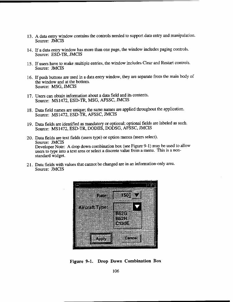
13. A data entry window contains the controls needed to support data entry and manipulation. Source: JMCIS
14. If a data entry window has more than one page, the window includes paging controls. Source: ESD-TR, JMCIS
15. If users have to make multiple entries, the window includes Clear and Restart controls. Source: JMCIS
16. If push buttons are used in a data entry window, they are separate from the main body of the window and at the bottom. Source: MSG, JMCIS
17. Users can obtain information about a data field and its contents. Source: MS 1472, ESD-TR, MSG, AFSSC, JMCIS
18 Data field names are unique; the same names are applied throughout the application. Source: MS 1472, ESD-TR, AFSSC, JMCIS
19 Data fields are identified as mandatory or optional; optional fields are labeled as such. Source: MS 1472, ESD-TR, DODIIS, DODSG, AFSSC, JMCIS
20. Data fields are text fields (users type) or option menus (users select). Source: JMCIS Developer Note: A drop down combination box (see Figure 9-1) may be used to allow users to type into a text area or select a discrete value from a menu. This is a non- standard widget.
21. Data fields with values that cannot be changed are in an information-only area. Source: JMCIS
Figure 9-1. Drop Down Combination Box
106
9.2.2 Data Entry and Manipulation
1. The same set of actions to enter/manipulate data are used throughout the application Source: MS1472,ESD-TR, JMCIS
2. The text cursor is placed with the pointing device and moved with the keyboard/pointing device. Source: MS 1472, ESD-TR, MSG, DODIIS, DODSG, AFSSC, JMCIS
3. When a window has input focus, the text cursor shall appear in the text area where the typing is most likely to occur and at the beginning of whatever text appears in the area. Source: MSG Developer Note: When a window is initially opended a textfield widget can be set to have keyboard focus by using XmProcessTraversel (). However, when an open window receives input focus the cursor should be set in the last field that had input focus before it was lost. See also Section 6.1.3.1 , Prompt Windowing.
4. When the Select button is clicked in a text area, the text cursor shall appear at the location of the pointer and the pointer shall remain displayed. Source: MSG, JMCIS
5. The pointer shall disappear from the screen when users begin typing and shall reappear when users stop typing or move the pointing device. Source: MSG, JMCIS
6. The pointer shall be an I-beam shape only when users move the pointer into an area where the text entry is possible. Source: MSG, AFSSC, JMCIS
7. The text cursor shall only be allowed to be placed in areas where the text entry is possible. Source: MSG, JMCIS
8. The text entry shall not be possible when the text cursor is not visible and shall only be possible when the text cursor is visible. Source: MSG, JMCIS
9. Applications shall ensure that the text cursor is highly visible when it appears in a text entry area. Source: JMCIS
10. Editing commands such as Cut/Copy and Paste shall be available if these commands shall facilitate the text entry process. Source: MSG, JMCIS
11. The default for text entry shall be insert mode. Source: MSG, JMCIS
107
12. The <Insert> key shall toggle between insert and replace mode in a text field. The User Interface Specifications for the JMCIS states that binding the toggle capability to the <Insert> key can be done by adding the following lines to the .Xdefaults file:
*XmText.transations: #override\n\ :<Key>osfInsert: toggle-overstrike()
*XmTextField.translations: #override\n\ :<Key>osfInsert: toggle-overstrike()
Source: MSG, JMCIS
13. When variable information is entered in a text field, it shall be automatically justified. Text shall be left-justified. Numeric data shall be right-justified. Source: MSG, AFSSC, JMCIS
14. Leading characters shall not be required to fill data entry space. Source: MSG, JMCIS
15. It shall be capable to enter numeric data via the keyboard and the numeric keypad. Source: JMCIS
16. Users shall not have to enter the unit of measurement associated with a numeric value. Source: DODSG, JMCIS
17. Users shall move the text cursor between text fields by pressing <TAB> or the arrow keys. Source: MSG Developer Note: The <RETURN> and <ENTER> keys shall not be used to move the text cursor since these keys are used to execute the default action in a window.
18. Applications shall not automatically tab to the next field. Source: MSG
19. When the text cursor is tabbed to the next field, it shall appear on the left end of the field. Source: JMCIS
20. When the text cursor is tabbed to the next field and it already contains text, the text shall be highlighted. Source: JMCIS
21. Users shall also be able to place the text cursor in any of the text in a text field by positioning the pointer and pressing the select button. Source: JMCIS
22. The size of the text cursor shall change to match the size of the text font in which it is placed. Source: JMCIS
108
23. In a multi-lined text field, the arrow keys on the keyboard shall move the text one increment (i.e., one line or one character) in the specified direction. Source: JMCIS
24. In a multi-lined text field, the <Ctrl> key in combination with the arrow keys shall move the slider one large increment (i.e., one word or one paragraph) in the specified direction. Source: JMCIS
25. In a multi-lined text field, the <Begin> and <End> keys shall move the text cursor to the beginning and end of a line. Source: JMCIS
26. In a multi-lined text field, <Ctrl> <Begin> and <Ctrl> <End> shall move the text cursor to the beginning and end of the text. Source: JMCIS
27. If multi-line text is in a window with a default action, <Enter> or <Ctrl> <Return> shall execute the default action. Source: JMCIS
28. Users can back up to any field and change it prior to entering data into the system. Source: JMCIS
29. A validity check is done on data entered, with visual and/or auditory error messages. Source: JMCIS
30. Data is entered with explicit action, e.g., Enter menu option, Apply/OK push button. Source: JMCIS
31. If appropriate, the application provides feedback to users to indicate successful data entry. Source: JMCIS
32. Users can enter data into the system at any time during data entry. Source: JMCIS
9.2.3 Data Query
1. The data query language provided to the users reflects the structure of the data as perceived by the users. Source: JMCIS
2. The language allows the users to specify the data to retrieve, then display and manipulate it. Source: JMCIS
3. Users can request data without having to tell the system how to find it. Source: JMCIS
109
4. Queries use operationally meaningful terminology and do not reflect how the data are stored. Source: JMCIS
5. Users can construct simple/complex, predefined queries and save/retrieve/execute. Source: DODSG, JMCIS
6. The language permits alternate forms of the same query using natural language. Source: DODSG, JMCIS
7. Users are prompted to confirm a query if data retrieval time will be excessive. Source: JMCIS
9.3 TEXT WINDOWS
1. A text window is wide enough to display an entire line of text without scrolling. Source: JMCIS
2. A text window includes vertical scroll bars, and indicator of the current location in the document. Source: JMCIS Developer Note: With the advent of the scroll bar the page distinction has become blurred. However, data entry tasks are sometimes accomplished using "hard copy" pages. In this case, the multiple page distinction can be maintained. A combination scroll bar and scale widget can be combined so the scroll bar can be used to scroll through an individual page and the scale can be used to change pages. Using buttons to page forward, backward, the beginning and to the end can also be used but this is less efficient from a HCI point of view. See also Section 9..2.1 and 9.4.
3. Users can save, access, retrieve, rename, and print the document. Source: JMCIS
4. Users can specify the portions of the document to be printed and the printer. Source: JMCIS
5. The system acknowledges the print command and provides the status of the printer and queue. Source: JMCIS
9.3.1 Text Manipulation
1. Users can easily specify the format of a document and the font type, size, and style. Source: JMCIS
2. Automatic line break and word-wrap at the right margin are available. Source: JMCIS
3. Automatic pagination (page numbers based on the number entered by users) is available. Source: JMCIS
110
4. The window is formatted as the printed output, or there is an option to see this format. Source: JMCIS
5. A copy of the original document is retained until users confirm that it is to be changed. Source: JMCIS
6. The original document is not modified automatically as users make each editing change. Source: JMCIS
7. Applications provide both search and search/replace capabilities for users. Source: JMCIS
8. Search: Users type the text string (not case-sensitive); the first instance is highlighted. Source: JMCIS
9. Search/replace: Users type text string to be searched, and change if desired (is case- sensitive). Source: JMCIS
9.4 \ TABULAR DATA WINDOWS
9.4.1 Tabular Data Window Design
1. Tabular data windows are used for information display only. Source: JMCIS
2. Columns in a tabular data window shall be composed of individual single-columned list boxes (see Figure 9-2). Developers Note: Using many single-columned list boxes is a tradeoff over using a multi-columned list box and should be used where columns may be of variable length, justified in different ways, or data in the table can be sorted by the user. Single-columned list boxes are used to accommodate left justification for alphanumeric data, right justification for numeric data and justification of decimal points. Single-columned list boxes also accommodate data of variable lengths.
3. Individual single-columned list boxes in a tabular data window shall be linked so that selecting an individual item in one list also selects the data in the corresponding line of all the lists.
4. Individual single-columned list boxes in a tabular data window shall be linked so that each list box shall be scrollable by means of one scroll bar which is located on the rightside of the right-most list box.
5. The width of each single-columned list box shall be the same width of the column label.
Ill
6. If the width of the longest data element in a list is unknown or is variable, horizontal scroll bars shall be used for individual columned list boxes. However, horizontal scroll bars shall only be displayed when needed. Developer Note: Individual columnar scroll bars shall be displayed under the list rather than in the list.
7. If the data covers several pages, the pages are numbered and include push buttons for paging. Source: JMCIS Developer Note: With the advent of the scroll bar the page distinction has become blurred. However, data entry tasks are sometimes accomplished using "hard copy" pages. In this case, the multiple page distinction can be maintained. A combination scroll bar and scale widget can be combined so the scroll bar can be used to scroll through an individual page and the scale can be used to change pages. Using buttons to page forward, backward, the beginning and to the end can also be used but this is less efficient from a HCI point of view. See also Section 9.2.1 and 9.3.
8. Column labels are identical for all pages; the last line on a page is the first line on the next page. Source: JMCIS
9. Users sort records in a tabular data window by selecting the check box toggle buttons in column heading. The XmNshadowThickness shall be set to two. Developer Note: The sort check box toggle buttons shall be the same width as the single- columned list box and shall touch the adjacent sort check box toggle button. The sort check box labels shall be left-justified (see Figure 9-2).
10. When selected, the check box remains highlighted to indicate the column that was sorted.
11. If multiple sorts are required in a tabular data window, a non-editable field shall be provided to display the order of the sort criteria. Column labels shall be placed in the non-editable field in the order in which the column label push buttons were chosen. When a column label check box is de-selected, the check box label shall be removed from the sort-order field.
112
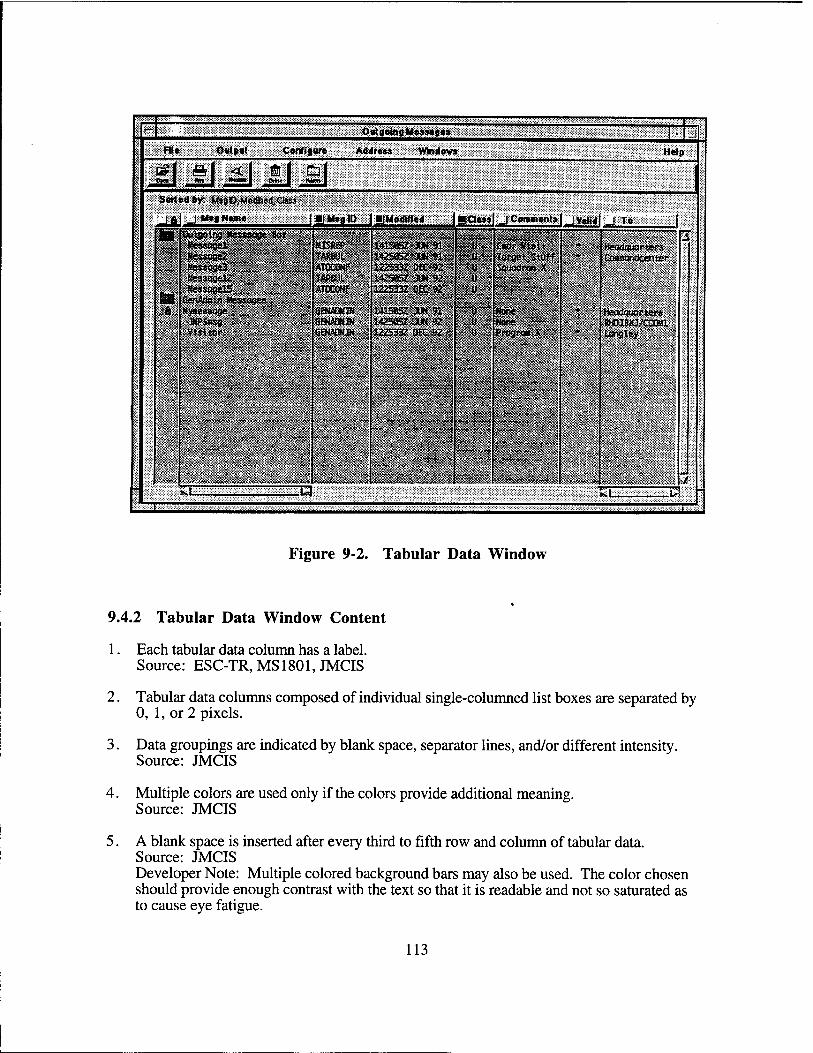
B Outgoing Messages l-L File Output Configure Address Windows i Help
c£| a| <| al Sorted by: M»glD,Modifi*<1,Class
-LA, J MsgNute | 1 M9fl ID ■{Modified ■I Class _J Comments _ Valid J To |
hi Outgoing ttesssoge 8os $#f . idi^l^^&i liliiiilliifiiiiiiiiiil Jt Nwsogel - ilip WSRBP 141505? JUN 91 • « C«dr Visit ^^•t.^^1 Headquarters Wessoge2 TAR6UU 1425BS XM91 u Target Stuff « Coamandcentfir itessoaü ATOCQNP 122S33Z Dtt 92 u Squadron X HessogelZ TÄ?BJL 14385T JUN92 u
|g| HessogelS ATOCONf 0225332 OK «2 u
tienAdsin «essoge* & Hyaessoge Ö&IÄSIW 141S85Z AM 91 . w Son« *^^^^^" Headquarter*
JMPSasg 8ÖWDS» 1425Q5Z 3UN92 ti None RHOI&JO/CCOBl Visitor OEJMJÄW 12Z533Z0EC92 u Prograi X ay
inngley
J
■
SLI w M i^l ■ L i t
Figure 9-2. Tabular Data Window
9.4.2 Tabular Data Window Content
1. Each tabular data column has a label. Source: ESC-TR, MS 1801, JMCIS
2. Tabular data columns composed of individual single-columned list boxes are separated by 0, 1, or 2 pixels.
3. Data groupings are indicated by blank space, separator lines, and/or different intensity. Source: JMCIS
4. Multiple colors are used only if the colors provide additional meaning. Source: JMCIS
5. A blank space is inserted after every third to fifth row and column of tabular data. Source: JMCIS Developer Note: Multiple colored background bars may also be used. The color chosen should provide enough contrast with the text so that it is readable and not so saturated as to cause eye fatigue.
113
6. Left-justify alphabetic data; right-justify integers; justify decimal data on decimal point. Source: JMCIS Developer Note: Data justification is simplified if the table columns are composed of individual single-columned list boxes.
7. Long strings of numbers are delimited with spaces, commas, or slashes (not leading zeros). Source: JMCIS
8. If a data record extends beyond a line, additional lines are identified as continuations. Source: JMCIS
9. Tabular data are arranged to show similarities, differences, trends, or relationships. Source: JMCIS
10. Data that are important, require immediate response, and/or are frequent at the top. Source: JMCIS
11. If the data extends across several pages, related data are placed on the same page. Source: JMCIS
12. The format for the data display is compatible with the format used for data entry. Source: JMCIS
13. The ordering and layout of corresponding fields is consistent and has the same names. Source: JMCIS
9.5 GRAPHIC DISPLAY WINDOWS
9.5.1 Graphic Display Window Design
1. The window includes a title and is sized so that the entire graphic display is visible Source: JMCIS.
2. Users do not have to scroll or resize a graphic display window to view its contents. Source: JMCIS
3. The graphic is displayed in the main drawing area with a minimum size of 640 X 480 DlXCls. Source: JMCIS
4. If the reference window area is used it has an inset of main graphic, and the minimum size is 160 X 120 pixels. Source: JMCIS
5. If used, the application information area is the same width as the main area, and the maximum is five text lines tall. Source: JMCIS
114
6. If used, the graphics information area is the same height as the reference window, and fills the area to the left. Source: JMCIS
9.5.1.1 Line Graphs
1. Line graphs shall be used for trends and for spatial, time-critical, or imprecise information. Source: JMCIS
2. The axes of the graph shall be clearly labeled and include the unit of measurement as appropriate. Source: JMCIS
3. The labels are in mixed-case letters and oriented left to right for normal reading. Source: JMCIS
4. Minimum/maximum values are shown on each axis, with up to nine intermediate markings. Source: JMCIS
5. The starting point of an axis is 0, with the gradations indicated in whole numbers unless 0 is an inappropriate starting point and whole numbers are also inappropriate. Source: JMCIS
6. Gradations are standard intervals; intervening gradations are consistent with the labeled scale. Source: JMCIS
7. Labels are used instead of legends or keys to identify the data. Source: JMCIS
8. The labels are oriented horizontally and located next to the data being referenced. Source: JMCIS
9. Each line or curve on a graph is labeled and coded and critical or abnormal data is coded. Source: JMCIS
10. Gridlines are unobtrusive and do not obscure the data presented in the graph. Source: JMCIS
11. Users can display or suppress gridlines as desired. Source: JMCIS
12. The same coding scheme is used consistently within an application. Source: JMCIS
13. Multiple trend lines are presented on a single graph. Source: JMCIS
115
14 . Users can re-draw multiple graphs using the same scale to facilitate comparison. Source: JMCIS
15 . For precise values, users can display the actual values on the graph and to zoom. Source: JMCIS
9.5.1.2 Bar Charts and Histograms
1. Bar charts are used to show several intervals; histograms are used to show a large number or intervals. Source: DODSG, JMCIS
2. Bar graphs have a consistent orientation; comparable bars are adjacent. Source: DODSG, JMCIS
3. When displayed data are compared with a critical value, a reference index is provided. Source: JMCIS
4. The design of a bar chart or histogram conforms to user expectations. Source: DODSG, JMCIS
5. Icons are not used to represent quantitative information. Source: JMCIS
6. Charts and axes are clearly labeled, and important information is highlighted. Source: JMCIS
7. When bars are presented in pairs, they are labeled as a unit and include a legend. Source: JMCIS
9.5.1.3 Flow Charts
1. Flow charts are used for a schematic representation of sequences or processes. Source: JMCIS
2. The steps in a flow chart are presented in a logical order. Source: JMCIS
3. If there is no inherent logic, the steps are ordered to minimize the size of the flow chart. Source: JMCIS
4. The path indicated in the flow chart is left-to-right, top-to-bottom, or clockwise. Source: JMCIS
5. Each decision point in the flow chart contains a single, simple decision. Source: JMCIS
6. The flow chart elements and lines are consistently coded to assist in understanding. Source: JMCIS
116
7. The flow chart provides direction indicators to indicate the sequence to be followed. Source: JMCIS
8. A legend describes each element and code; critical information and/or steps highlighted. Source: JMCIS
9.5.2 Manipulation of Graphical Data
1. Users can select/edit object attributes, change sizes, and fill areas with color/patterns. Source: JMCIS
2. Applications automatically align, complete figures, and draw between user-specified points. Source: JMCIS
3. Users can draw objects such as lines, rectangles, ovals, and arcs. Source: JMCIS
4. Objects emerge as they are drawn and are easy to reposition, duplicate, and delete. Source: JMCIS
5. Users can group separate objects into a single object. Source: JMCIS
6. Objects are displayed as they will be printed (or an option is available to see this format). Source: JMCIS
7. Original graphics are retained until users confirm that the objects are to be changed. Source: JMCIS
8. The objects are not modified automatically, users can change them. Source: JMCIS
9.6 MAP WINDOWS
9.6.1 Map Window Design
1. Map controls appear in the map window or are available in separate dialog windows. Source: JMCIS Developer Note: A tear-off menu can be used as a compromise between saving screen space and making controls readily available.
2. A map window includes identifying information about map and status information. This information includes map name, coordinates, area, and/or scale. Source: DODSG, JMCIS
3. Identifying/status information appears in the window area or along the bottom window margin. Source: JMCIS
117
4. A continuous indicator of pointer location on the map is available in the standard window area. Source: JMCIS
5. Maps are displayed throughout the application using the same orientation (e.g., north as up), and the important features are labeled. Source: DODSG, JMCIS
6. Labels are positioned consistently (next to or below) with respect to features. Labels should not obscure information and should remain legible at all map resolutions. Source: DODSG, JMCIS
7. When displaying color overlays, a color-coding key is also displayed in a sub-area of the map or in a separate dialog window. Source: DODSG, JMCIS
8. Users can display the coding key as desired without having to redisplay the overlay. Source: JMCIS
9. A dialog window displaying a coding key is the minimum size and obscures little of the overlay. Source: JMCIS
10. If appropriate, the coding key is a scale so users can interpret the coding in the overlay. Source: JMCIS
11. Symbols are placed on the map accurately or connected to the map with graphics. Source: JMCIS
12. If multiple symbol sets are available, users can select a set without losing data. Source: JMCIS
13. Symbol labels appear next to the symbol and present essential information about it. Source: JMCIS
14. The background of the symbol and label are transparent in order to not obscure other information. Source: JMCIS
9.6.2 TBM Specific Map Symbols
The following documents shall be applicable to TBM systems:
1. Workbook of Weather Maps by John J. Hidore
2. Army Field Manual FM 101-5-1, Operational Terms and Symbols Source: DODSG
3. NATO Standardization Agreement (STANAG) 2019, Military Symbols for Land-Based Systems Source: DODSG
118
4. DIA Standard Military Graphics Symbol (SMIGS) Manual Source: DODSG
9.6.3 Map Manipulation
1. Users can pan and zoom a map as desired. Source: DODSG, JMCIS
2. Position or change indicators are provided to return quickly to the normal/starting map. Source: DODSG, JMCIS
3. When a map is zoomed, size of symbols, labels, and features are adjusted to be readable. Source: DODSG, JMCIS
4. Users can define a baseline or home position on a map and return to this position quickly. Source: DODSG, JMCIS
5. Users shall be able to place a map window where desired, define the appearance of the map, select the objects which will appear on the map, and change the appearance of critical tactical information on the map. Source: JMCIS
6. Users can add, edit, reposition, delete, and determine distance/bearing between points. Source: JMCIS
7. Latitude and longitude can be entered to the level of accuracy needed. Source: JMCIS
8. Calculations (e.g. range, bearing, position) reflect accuracy appropriate to the scale. Source: JMCIS
9. Users can select and deselect symbols on the map using standard selection methods. Source: JMCIS
10. Users can view or declutter, and obtain additional information for selected symbols. Source: JMCIS
11. The intensity of the map is adjustable to fade out without losing all map features. Source: JMCIS
12. Users can distinguish coincident point symbols and obtain ambiguity information. Source: JMCIS
13. Users can select categories for automatic update, frequency, and rate of update. If appropriate, users can temporarily stop and then resume further updates. Source: JMCIS
119
9.: l MESSAGE HANDLING WINDOWS
9.7.1 Message Preparation
1. Message preparation windows follow the same design as data entry windows. Source: JMCIS
2. Users are given basic message header fields that are supported in specifying the message address. Source: JMCIS
3. Option menus are available for selecting from limited sets of frequently used terms. Source: JMCIS
4. When replying to a message, the appropriate addressee(s) are provided automatically. Source: JMCIS
5. If functionally is required by an application, users shall have the capability to build and maintain lists of common addresses and select from these lists when preparing messages. Source: JMCIS
6. If functionally is required by an application, addresses are checked prior to transmission; users can correct errors before sending. Source: JMCIS
7. Preformatted standard forms are available and format control during entry is automatic. Source: JMCIS
8. Users can specify data, incorporate data files, and save during preparation/completion. Source: JMCIS
9.7.2 Message Transmission
1. Message transmission procedures are designed to minimize the user actions required. Source: JMCIS
2. Users can initiate message transmission directly (e.g., select a transmit push button) or can set a transmission time. Source: JMCIS
3. If a message cannot be sent immediately, it is queued automatically. Source: JMCIS
4. If functionally is required by an application, users can assign message priorities and cancel or abort a transmission. Source: JMCIS
5. Status feedback is available that confirms messages sent and indicates failures. Source: JMCIS
120
6. Users can specify feedback wanted; an automatic log is maintained. Source: JMCIS
7. If functionally is required by an application, undelivered messages are saved in the event that there is transmission failure. Source: JMCIS
9.7.3 Message Receipt
1. Users are informed when high-priority messages are received. Source: JMCIS
2. Message notification does not interfere, but provides some indication of urgency. Source: JMCIS
3. If functionally is required by an application, incoming messages are automatically queued by time and priority; logs are maintained. Source: JMCIS
4. Users can review summary information, display messages, save/file, and discard. Source: JMCIS
5. A message is displayed in a text window; users can scroll, save, and print it. Source: JMCIS
6. During login, a system provides users with a list of new messages received. Source: JMCIS
7. During session, a system activates an alert indicator to inform users of priority messages. Source: JMCIS
9.8 LIST-TO-LIST TRANSFER
1. A task window used to copy items from a source list (master list) to a destination list shall provide one Add and one Remove button (Figure 9-3). Developer Note: The labels Add and Remove may be altered to more closely fit the task that the list-to-list transfer is being used.
2. The Remove button shall be enabled and the Add button shall be disabled if an item in the destination list is the only selected item.
3. The Add button shall be enabled and the Remove button shall be disabled if an item in the source list is the only selected item.
4. Items in the source list that have been added to the destination list shall be displayed with a dash to the preceding list item (Figure 9-3).
5. The user shall not be allowed to remove an item from the source list.
121
6. The user shall not be allowed to add two instances of a single item in the source list into the destination list.
7. Moving an item from the source list to the destination list in this type of dialog box shall not permanently remove the item from the source list.
9.9 FIND WINDOW
1. A task window used to find text shall allow the user to select whether the search is case- sensitive (see Figure 9-4).
2. The user shall be able to specify whether the search must match the entire word being searched on or if partial string matches are allowed.
3. The user shall be able to specify the direction of the search relative to the current position.
4. The user shall be able to cancel the find operation at any time.
9.10 FIND AND REPLACE WINDOW
1. A task window used to find and replace text shall allow the user to select whether or not the search is case-sensitive (see Figure 9-5).
2. The user shall be able to specify whether the search must match the entire word being searched on or if the partial string matches are allowed.
3. The user shall be able to specify the direction of the search relative to the current position.
4. The user shall be able to replace matches individually or globally replace all matches found.
5. The user shall be able to choose not to replace any given instance of a match.
6. The user shall be able to cancel the find and replace operation at any time.
122
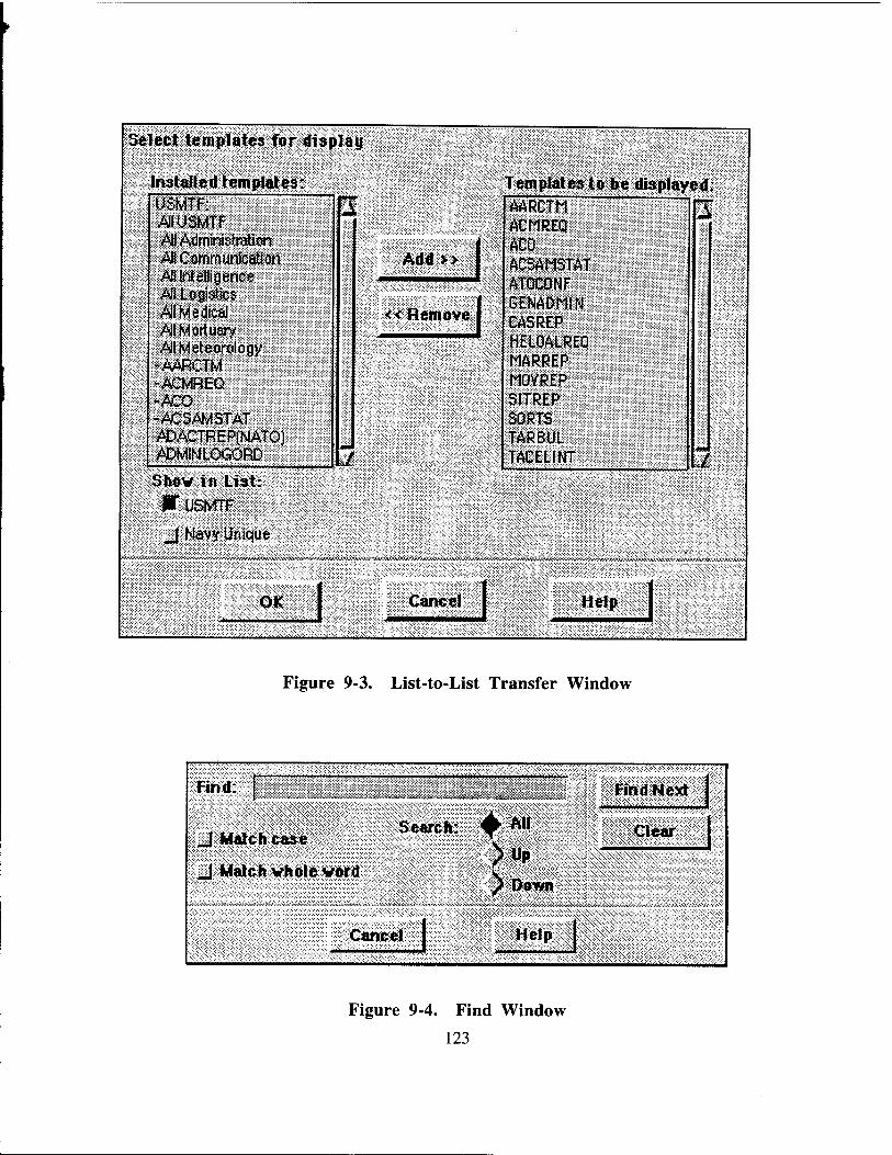
Select templates for display
Installed templates: USMTF: "I Al USMTF All Administration All Communication All Intelligence Al Logistics M Medical All Mortuary All Meteorology
-AARCTM -ACMREQ -ACÖ -ACSMAS1AT J*DACTREP(NATO) ADMINLOGORD ./ Shov in List:
W USMTF
J Navy Unique
OK
WX'Ä'^W^^'MW/i'^WW'X^
I
Add>>
<< Remove I
Templates to be displayed:
Cancel j
AARCTM ACMREQ ACO ACSAMSTAT ATOCONF GENADMIN CASREP HELOALREQ MARREP MOVREP SITREP SORTS TARBUL TACELINT
V>JV«*X*m<M*^*>X<^4v>>VÄ*&
Help
AVWWWVVAV>X*;W<<
Figure 9-3. List-to-List Transfer Window
Find: j
J| Match case |: :f
J Match whole vord
ISamsj:
■3j&*ft^&W»&M*^.'flÄÄK"&A:>£.
Find Next
Clear
, ~;\ . .v xs
Figure 9-4. Find Window
123
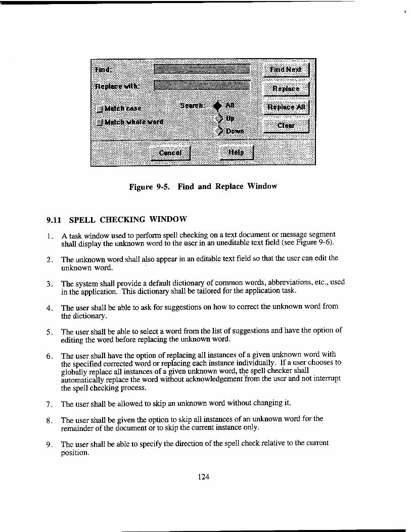
SSiSSlM Find Next ;«n*''., -|ZIZZZZ~Z7~I" Fin'
Replace with. J ._ _. .. . Replace I
S^p^>*^5S®S#
-J »
Figure 9-5. Find and Replace Window
9.11 SPELL CHECKING WINDOW
1. A task window used to perform spell checking on a text document or message segment shall display the unknown word to the user in an uneditable text field (see Figure 9-6).
2. The unknown word shall also appear in an editable text field so that the user can edit the unknown word.
3. The system shall provide a default dictionary of common words, abbreviations, etc., used in the application. This dictionary shall be tailored for the application task.
4. The user shall be able to ask for suggestions on how to correct the unknown word from the dictionary.
5. The user shall be able to select a word from the list of suggestions and have the option of editing the word before replacing the unknown word.
6. The user shall have the option of replacing all instances of a given unknown word with the specified corrected word or replacing each instance individually. If a user chooses to globally replace all instances of a given unknown word, the spell checker shall automatically replace the word without acknowledgement'from the user and not interrupt the spell checking process.
7. The user shall be allowed to skip an unknown word without changing it.
8. The user shall be given the option to skip all instances of an unknown word for the remainder of the document or to skip the current instance only.
9. The user shall be able to specify the direction of the spell check relative to the current position.
124
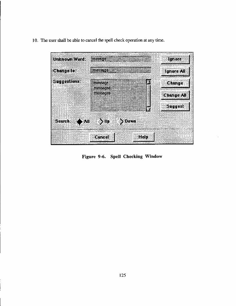
10. The user shall be able to cancel the spell check operation at any time.
xXJnfcntamWo**«;; messge ̂pw5^?$-
Ignore
'Suggestions: t M,,u,w- ! message SxXx^wiSxx-
Search: ▲ AH S Up S Down
Cancel Help
■äMÄS^s»*J»ä-S»Äi»fefe«ÄÄi
Figure 9-6. Spell Checking Window
125
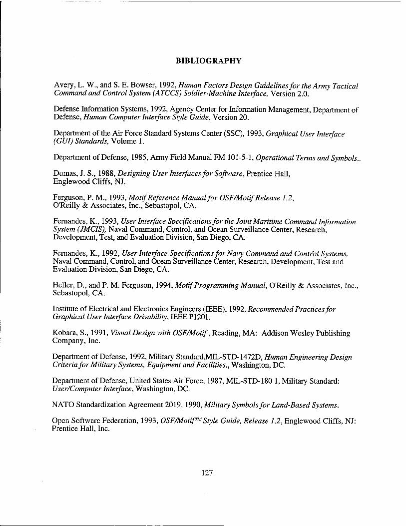
BIBLIOGRAPHY
Avery, L. W., and S. E. Bowser, 1992, Human Factors Design Guidelines for the Army Tactical Command and Control System (ATCCS) Soldier-Machine Interface, Version 2.0.
Defense Information Systems, 1992, Agency Center for Information Management, Department of Defense, Human Computer Interface Style Guide, Version 20.
Department of the Air Force Standard Systems Center (SSC), 1993, Graphical User Interface (GUI) Standards, Volume 1.
Department of Defense, 1985, Army Field Manual FM 101-5-1, Operational Terms and Symbols..
Dumas, J. S., 1988, Designing User Interfaces for Software, Prentice Hall, Englewood Cliffs, NJ.
Ferguson, P. M., 1993, Motif Reference Manual for OSF/Motif Release 1.2, O'Reilly & Associates, Inc., Sebastopol, CA.
Fernandes, K., 1993, User Interface Specifications for the Joint Maritime Command Information System (JMCIS), Naval Command, Control, and Ocean Surveillance Center, Research, Development, Test, and Evaluation Division, San Diego, CA.
Fernandes, K., 1992, User Interface Specifications for Navy Command and Control Systems, Naval Command, Control, and Ocean Surveillance Center, Research, Development, Test and Evaluation Division, San Diego, CA.
Heller, D., and P. M. Ferguson, 1994, Motif Programming Manual, O'Reilly & Associates, Inc., Sebastopol, CA.
Institute of Electrical and Electronics Engineers (IEEE), 1992, Recommended Practices for Graphical User Interface Drivability, IEEE PI201.
Kobara, S., 1991, Visual Design with OSF/Motif, Reading, MA: Addison Wesley Publishing Company, Inc.
Department of Defense, 1992, Military Standard,MIL-STD-1472D, Human Engineering Design Criteria for Military Systems, Equipment and Facilities., Washington, DC.
Department of Defense, United States Air Force, 1987, MIL-STD-180 1, Military Standard: User/Computer Interface, Washington, DC.
NATO Standardization Agreement 2019, 1990, Military Symbols for Land-Based Systems.
Open Software Federation, 1993, OSF/Motif™Style Guide, Release 1.2, Englewood Cliffs, NJ: Prentice Hall, Inc.
127
BIBLIOGRAPHY (continued)
Root, R. W., and A. D. McFarland, 1993, Graphical User Interface Design Guidelines for Bellcore Software Products, Bellcore, Bell Communications Research.
Smith, L. L., 1986, Standards versus guidelines for designing user interface software. Behaviour and Information Technology, Volume 5, pp. 47-61.
Smith, S. L., and J. N. Mosier, 1986, Guidelines for Designing User Interface Software, ESD- TR-86-278, USAF Electronic Systems Center, Hanscom AFB, MA.
128
APPENDIX A
TBM MOTIF WIDGET RESOURCE SETTINGS
The contents of this appendix are derived from version 1.2 of the User Interface Specifications for Navy Command and Control Systems. The intent is to provide the Motif resource settings that implement the "look and feel" called for by the user interface specifications presented in this document. The appearance and behavior of the Motif window manager and the appearance of the Motif primary widgets are specified. A resource setting is specified as either a unique setting, a default setting, or a setting recommended by Kobara in Visual Design with OSF/Motif. Resource files shall comply with the settings presented in this appendix.
The following colors (and RGB values) are specified in this document:
System Window Component Color RGB Background LightGray 211 211 211 Text Black 0 0 0
System Window Classification Area Classification Color RGB Unclassified MediumSeaGreen 60 179 113 Confidential SkyBlue 135 206 235 Secret Firebrick2 238 44 44 Top Secret DarkOrange 255 140 0 Text Black 0 0 0
System Window Menu Bar Component Color RGB Background SkyBlue 135 206 235 Available Options Black 0 0 0 Unavailable Options Gray 192 192 192
Application Window Title Bar Component Color RGB Active Window Background DarkSlateBlue 72 61 139 Text Black 0 0 0 Inactive Window Background LightBlue 173 216 230 Text LightGray 211 211 211
129
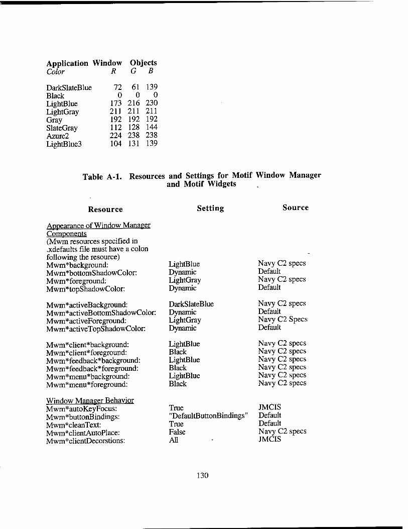
Application Window Objects Color R G B
DarkSlateBlue 72 61 139 Black 0 0 0 LightBlue 173 216 230 LightGray 211 211 211 Gray 192 192 192 SlateGray 112 128 144 Azure2 224 238 238 LightBlue3 104 131 139
Table A-l. Resources and Settings for Motif Window Manager and Motif Widgets -
Resource Setting Source
Appearance of Window Manaeer Components (Mwm resources specified in .xdefaults file must have i \ colon following the resource) Mwm*background: LightBlue Navy C2 specs Mwm*bottomShadowColor: Dynamic Default Mwm*foreground: LightGray Navy C2 specs Mwm*topShadowColor: Dynamic Default
Mwm*activeBackground: DarkSlateBlue Navy C2 specs Mwm*activeB ottomShadowColor: Dynamic Default Mwm*activeForeground: LightGray Navy C2 Specs Mwm*activeTopShadowColor: Dynamic Default
Mwm*client*background : LightBlue Navy C2 specs Mwm*client*foreground: Black Navy C2 specs Mwm*feedback*background: LightBlue Navy C2 specs Mwm*feedback*foreground: Black Navy C2 specs Mwm*menu*background LightBlue Navy C2 specs Mwm*menu*foreground: Black Navy C2 specs
Window Manager Behavior Mwm*autoKeyFocus: True JMCIS Mwm*buttonBindings: "DefaultButtonBindings" Default Mwm*cleanText: True Default Mwm*clientAutoPlace: False Navy C2 specs Mwm*clientDecorstions: All
130
JMCIS
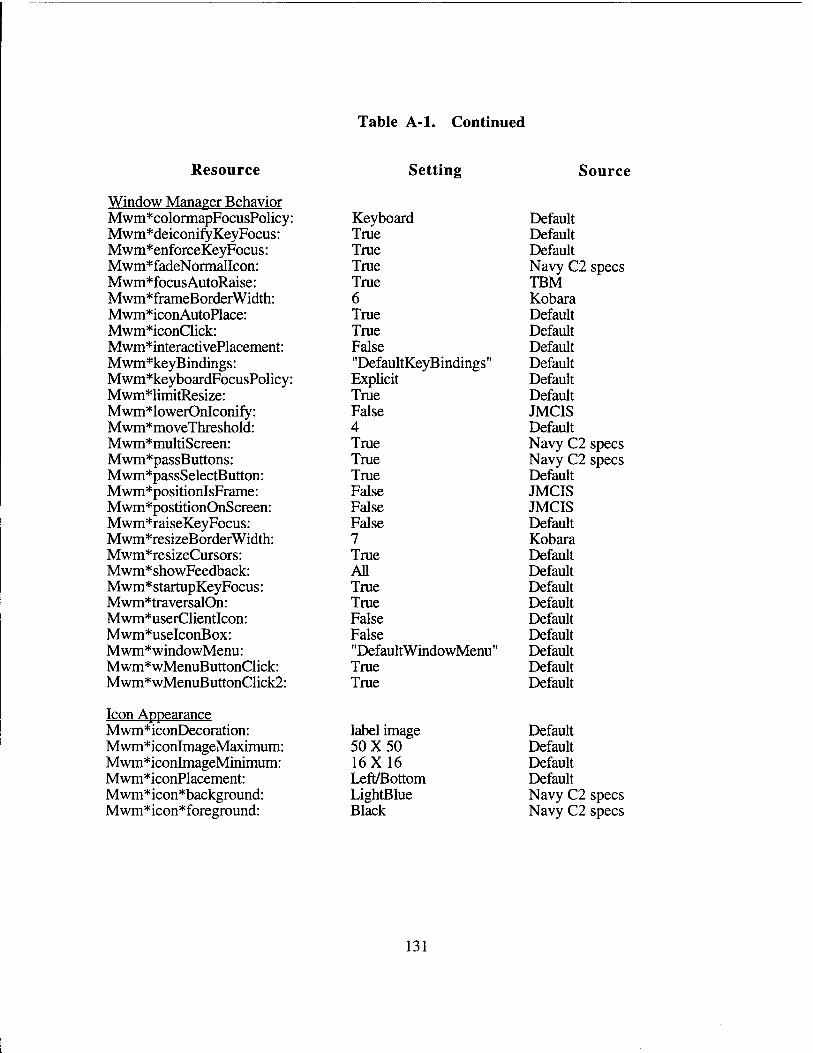
Table A-l. Continued
Resource
Window Manager Behavior Mwm*colormapFocusPolicy: Mwm*deiconifyKeyFocus: Mwm*enforceKeyFocus: Mwm*fadeNormalIcon: Mwm*focusAutoRaise: Mwm*frameBorderWidth: Mwm*iconAutoPlace: Mwm*iconClick: Mwm*interactivePlacement: Mwm*keyBindings: Mwm*keyboardFocusPolicy: Mwm*limitResize: Mwm*lowerOnIconify: Mwm*moveThreshold: Mwm*multiScreen: Mwm*passButtons: Mwm*passSelectButton: Mwm*positionIsFrame: Mwm*postitionOnScreen: Mwm*raiseKeyFocus: Mwm*resizeBorderWidth: Mwm*resizeCursors: Mwm*showFeedback: Mwm* startupKey Focus: Mwm*traversalOn: Mwm*userClientIcon: Mwm*useIconBox: Mwm*windowMenu: Mwm*wMenuButtonClick: Mwm*wMenuButtonClick2:
Setting
Keyboard True True True True 6 True True False "DefaultKeyBindings" Explicit True False 4 True True True False False False 7 True All True True False False "DefaultWindowMenu" True True
Source
Default Default Default Navy C2 specs TBM Kobara Default Default Default Default Default Default JMCIS Default Navy C2 specs Navy C2 specs Default JMCIS JMCIS Default Kobara Default Default Default Default Default Default Default Default Default
Icon Appearance Mwm*iconDecoration: Mwm*iconImageMaximum: Mwm*iconImageMinimum: Mwm*iconPlacement: Mwm*icon*background: Mwm*icon*foreground:
label image 50X50 16X16 Left/Bottom LightBlue Black
Default Default Default Default Navy C2 specs Navy C2 specs
131
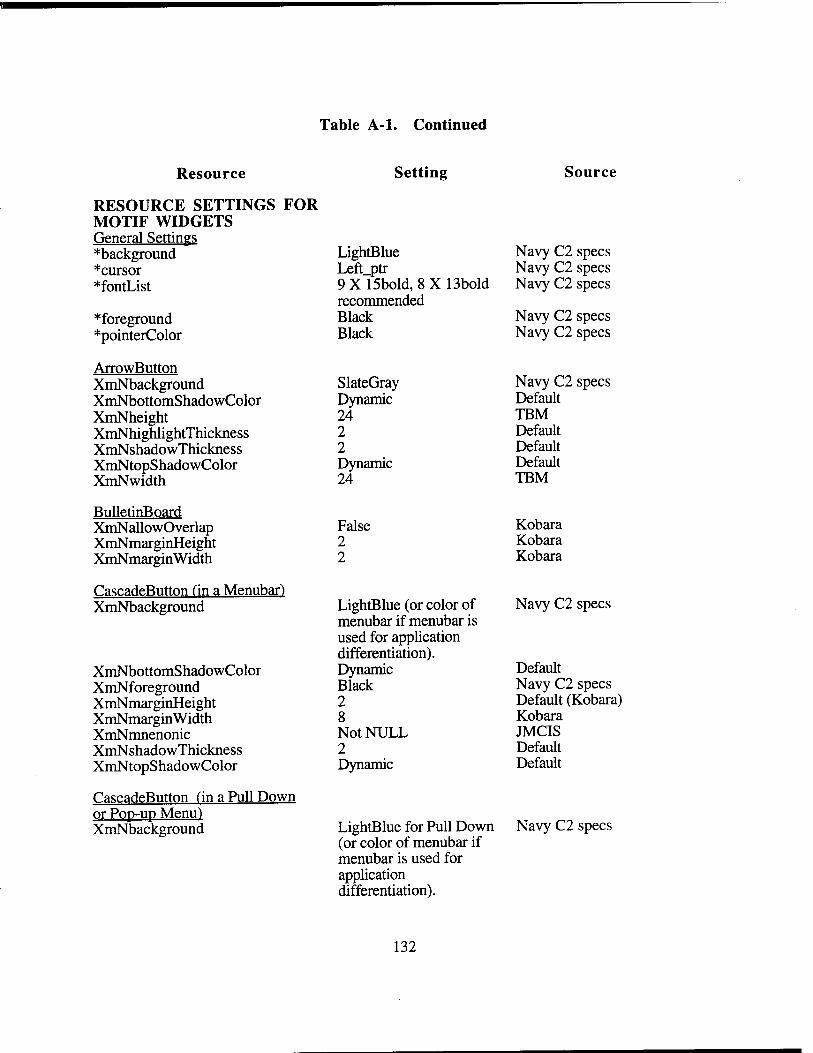
Table A-l. Continued
Resource Setting Source
RESOURCE SETTINGS FOR MOTIF WIDGETS General Settings *background LightBlue Navy C2 specs *cursor Left ptr Navy C2 specs *fontList 9 X 15bold, 8 X 13bold
recommended Navy C2 specs
*foreground Black Navy C2 specs *pointerColor Black Navy C2 specs
ArrowButton XmNbackground SlateGray Navy C2 specs XmNbottomShadowColor Dynamic Default XmNheight 24 TBM XmNhighlightThickness 2 Default XmNshadowThickness 2 Default XmNtopShadowColor Dynamic Default XmNwidth 24 TBM
BulletinBoard XmNallowOverlap False Kobara XmNmarginHeight 2 Kobara XmNmarginWidth 2 Kobara
CascadeButton fin a Menubar) XmNbackground LightBlue (or color of
menubar if menubar is used for application differentiation).
Navy C2 specs
XmNbottomShadowColor Dynamic Default XmNforeground Black Navy C2 specs XmNmarginHeight 2 Default (Kobara) XmNmarginWidth 8 Kobara XmNmnenonic Not NULL JMCIS XmNshadowThickness 2 Default XmNtopShadowColor Dynamic Default
CascadeButton fin a Pull Down or Pop-up Menu) XmNbackground LightBlue for Pull Down
(or color of menubar if menubar is used for application differentiation).
132
Navy C2 specs
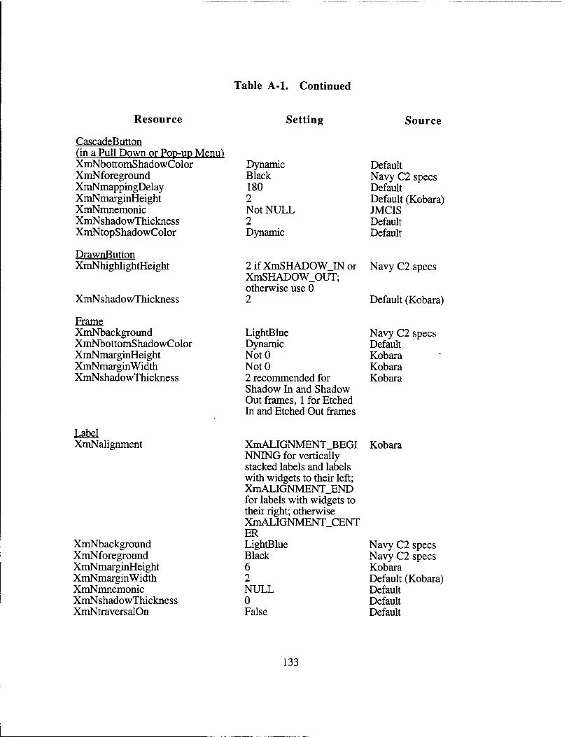
Table A-l. Continued
Resource Setting Source
CascadeButton (in a Pull Down or Pop-up Menu) XmNbottomShadowColor Dynamic Default XmNforeground Black Navy C2 specs XmNmappingDelay 180 Default XmNmarginHeight 2 Default (Kobara) XmNmnemonic Not NULL JMCIS XmNshadowThickness 2 Default XmNtopShadowColor Dynamic Default
DrawnButton XmNhighlightHeight 2ifXmSHADOW IN or
XmSHADOW_OUT; otherwise use 0
Navy C2 specs
XmNshadowThickness 2 Default (Kobara)
Frame XmNbackground LightBlue Navy C2 specs XmNbottomShadowColor Dynamic Default XmNmarginHeight NotO Kobara XmNmarginWidth NotO Kobara XmNshadowThickness 2 recommended for
Shadow In and Shadow Out frames, 1 for Etched In and Etched Out frames
Kobara
Label XmNalignment XmALIGNMENT.BEGI
NNING for vertically stacked labels and labels with widgets to their left; XmALIGNMENT_END for labels with widgets to their right; otherwise XmALIGNMENT CENT ER
Kobara
XmNbackground LightBlue Navy C2 specs XmNforeground Black Navy C2 specs XmNmarginHeight 6 Kobara XmNmarginWidth 2 Default (Kobara) XmNmnemonic NULL Default XmNshadowThickness 0 Default XmNtraversalOn False Default
133
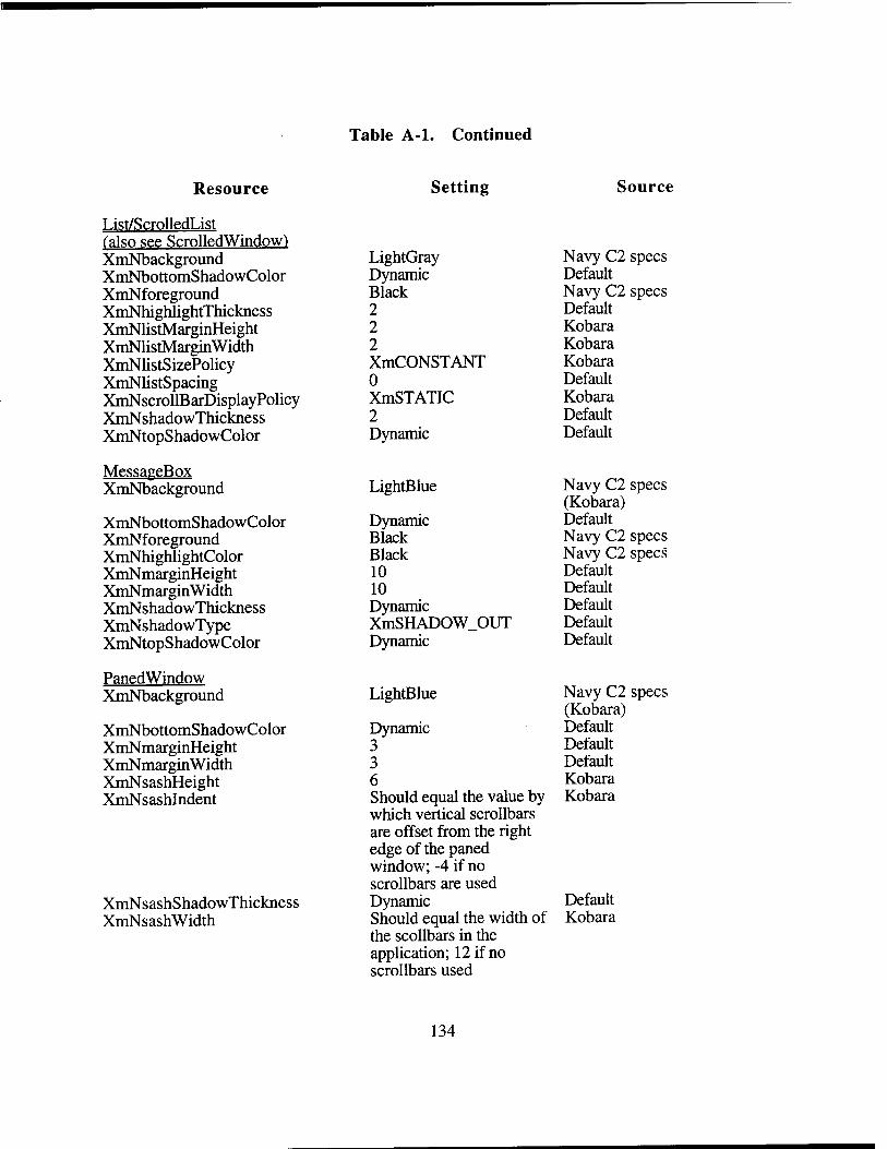
Table A-l. Continued
Resource Setting Source
List/ScrolledList (also see ScrolledWindow) XmNbackground LightGray Navy C2 specs XmNbottomShadowColor Dynamic Default XmNforeground Black Navy C2 specs XmNhighlightThickness 2 Default XmNlistMarginHeight 2 Kobara XmNlistMarginWidth 2 Kobara XmNlistSizePolicy XmCONSTANT Kobara XmNlistSpacing 0 Default XmNscrollBarDisplayPolicy XmSTATIC Kobara XmNshadowThickness 2 Default XmNtopShadowColor Dynamic Default
MessageBox XmNbackground LightBlue Navy C2 specs
(Kobara) Default XmNbottomShadowColor Dynamic
XmNforeground Black Navy C2 specs XmNhighlightColor Black Navy C2 specs XmNmarginHeight 10 Default XmNmarginWidth 10 Default XmNshadowThickness Dynamic Default XmNshadowType XmSHADOW_OUT Default XmNtopShadowColor Dynamic Default
PanedWindow XmNbackground LightBlue Navy C2 specs
(Kobara) Default XmNbottomShadowColor Dynamic
XmNmarginHeight 3 Default XmNmarginWidth 3 Default XmNsashHeight 6 Kobara XmNsashlndent Should equal the value by
which vertical scrollbars are offset from the right edgeofthepaned window; -4 if no scrollbars are used
Kobara
XmNsashShadowThickness Dynamic Default XmNsashWidth Should equal the width of
the scollbars in the application; 12 if no scrollbars used
134
Kobara
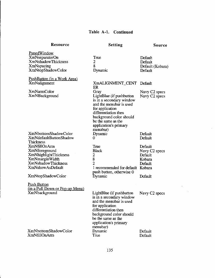
Table A-l. Continued
Resource
PanedWindow XmNseparatorOn XmNshadowThickness XmNspacing XmNtopShadowColor
PushButton (in a Work Area) XmNalignment
XmNarmColor XmNB ackground
Setting Source
XmNbottomShadowColor XmNdefaultButtonShadow Thickness XmNfillOnArm XmNforeground XmNhighlightThickness XmNmargin Width XmNshadowThickness XmNshowAsDefault
XmNtopShadowColor
Push Button (in a Pull Down or Pop-up Menu) XmNbackground
XmNbottomShadowColor XmNfillOnArm
True Default 2 Default 8 Dynamic
Default (Kobara) Default
XmALIGNMENT CENT Default ER Gray LightBlue (if pushbutton is in a secondary window and the menubar is used
Navy C2 Navy C2
specs specs
for application differentiation then background color should be the same as the application's primary menubar) Dynamic 0
Default Default
True Default Black 2
NavyC2 Default
specs
8 Kobara 2 Default 1 recommended for default Kobara push button, otherwise 0 Dynamic Default
LightBlue (if pushbutton is in a secondary window and the menubar is used
Navy C2 specs
for application differentiation then background color should be the same as the application's primary menubar) Dynamic True
Default Default
135
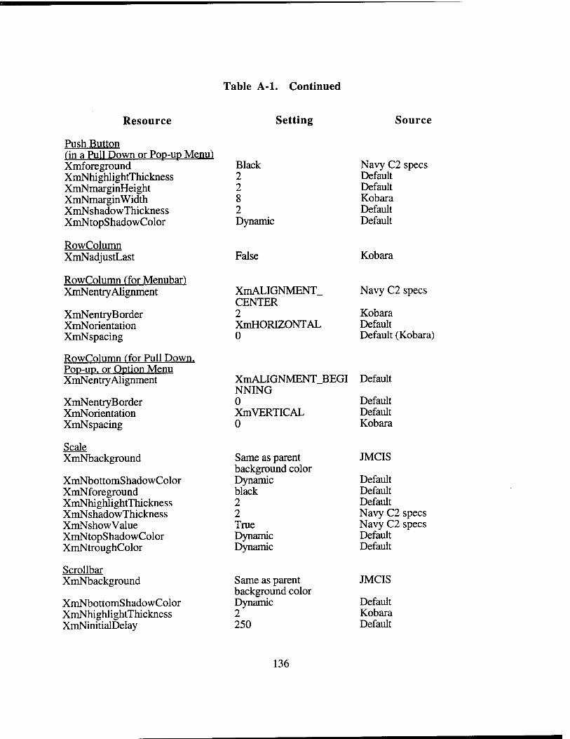
Table A-l. Continued
Resource Setting Source
Push Button (in a Pull Down or Pop-up Menu) Xmforeground XmNhighlightThickness XmNmarginHeight XmNmarginWidth XmNshadowThickness XmNtopShadowColor
RowColumn XmNadjustLast
RowColumn (for Menubar) XmNentry Alignment
XmNentryB order XmNorientation XmNspacing
RowColumn (for Pull Down. Pop-up. or Option Menu XmNentry Alignment
XmNentryB order XmNorientation XmNspacing
Scale XmNbackground
XmNbottomShadowColor XmNforeground XmNhighlightThickness XmNshadowThickness XmNshowValue XmNtopShadowColor XmNtroughColor
Scrollbar XmNbackground
XmNbottomShadowColor XmNhighlightThickness XmNinitialDelay
Black 2 2 8 2 Dynamic
False
XmALIGNMENT. CENTER 2 XmHORIZONTAL 0
XmALIGNMENT_BEGI NNING 0 XmVERTICAL 0
Same as parent background color Dynamic black 2 2 True Dynamic Dynamic
Same as parent background color Dynamic 2 250
Navy C2 specs Default Default Kobara Default Default
Kobara
Navy C2 specs
Kobara Default Default (Kobara)
Default
Default Default Kobara
JMCIS
Default Default Default Navy C2 specs Navy C2 specs Default Default
JMCIS
Default Kobara Default
136
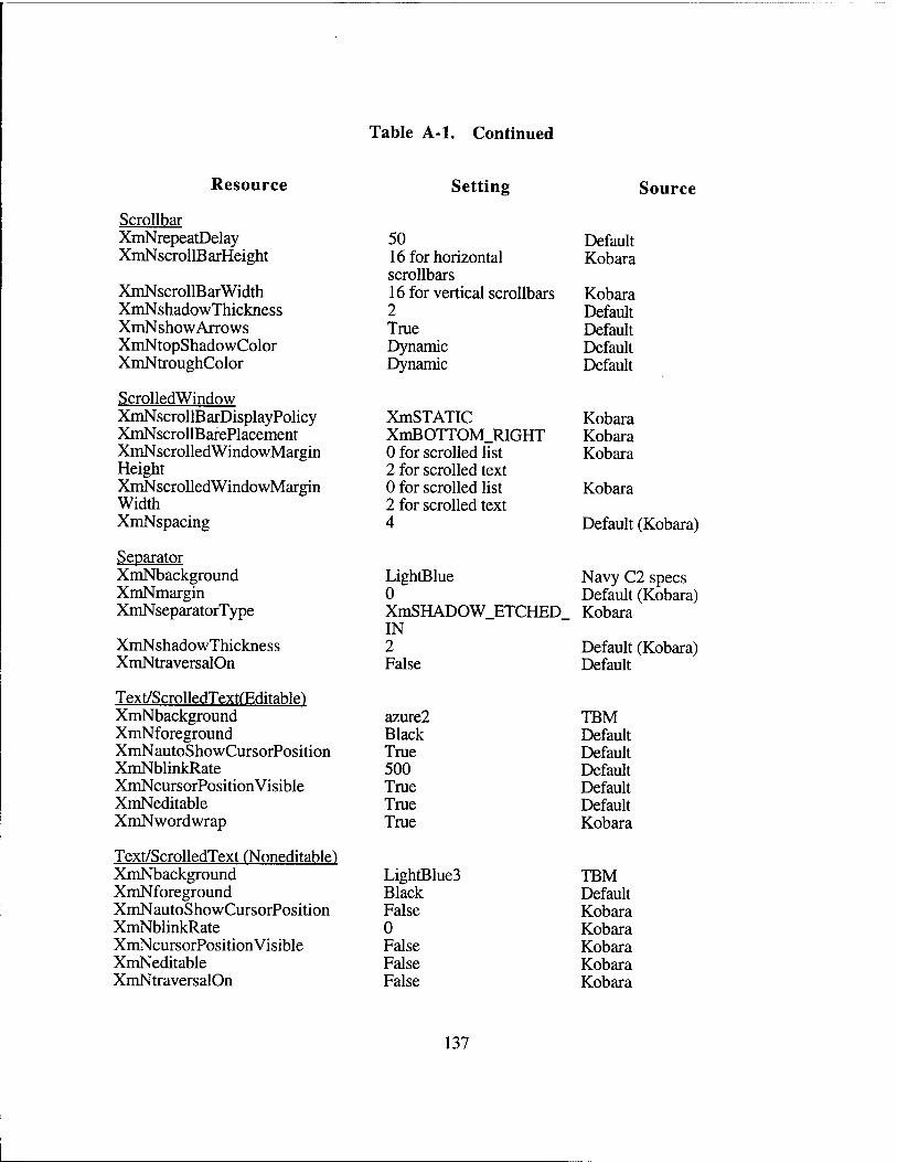
Table A-l. Continued
Resource Setting Source
Scrollbar XmNrepeatDelay 50 Default XmNscrollB arHeight 16 for horizontal
scrollbars Kobara
XmNscrollBarWidth 16 for vertical scrollbars Kobara XmNshadowThickness 2 Default XmNshow Arrows True Default XmNtopShadowColor Dynamic Default XmNtroughColor Dynamic Default
ScrolledWindow XmNscrollBarDisplayPolicy XmSTATIC Kobara XmNscrollB arePlacement XmBOTTOM_RIGHT Kobara XmNscrolledWindowMargin 0 for scrolled list Kobara Height 2 for scrolled text XmNscrolledWindowMargin 0 for scrolled list Kobara Width 2 for scrolled text XmNspacing 4 Default (Kobara)
Separator XmNbackground LightBlue Navy C2 specs XmNmargin 0 Default (Kobara) XmNseparatorType XmSHADOW ETCHED
IN 2
Kobara
XmNshadowThickness Default (Kobara) XmNtraversalOn False Default
Text/ScrolledTextfEditable) XmNbackground azure2 TBM XmNforeground Black Default XmNautoShowCursorPosition True Default XmNblinkRate 500 Default XmNcursorPosition Visible True Default XmNeditable True Default XmNwordwrap True Kobara
Text/ScrolledText (Noneditable) XmNbackground LightBlue3 TBM XmNforeground Black Default XmNautoShowCursorPosition False Kobara XmNblinkRate 0 Kobara XmNcursorPosition Visible False Kobara XmNeditable False Kobara XmNtraversalOn False Kobara
137
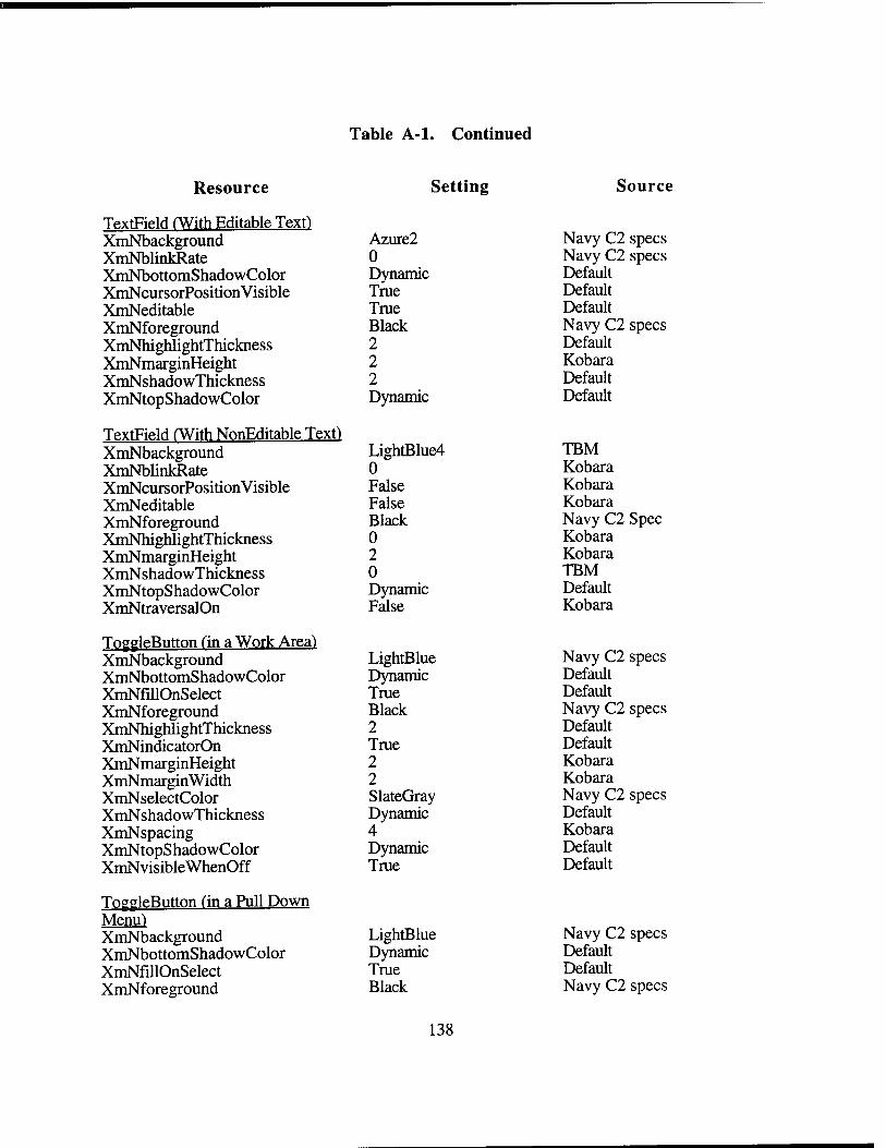
Table A-l. Continued
Resource Setting Source
TextField fWith Editable Text) XmNbackground Azure2 Navy C2 specs XmNblinkRate 0 Navy C2 specs XmNbottomShadowColor Dynamic Default XmNcursorPosition Visible True Default XmNeditable True Default XmNforeground Black Navy C2 specs XmNhighlightThickness 2 Default XmNmarginHeight 2 Kobara XmNshadowThickness 2 Default XmNtopShadowColor Dynamic Default
TextField (With NonEditable Text) XmNbackground LightBlue4 TBM XmNblinkRate 0 Kobara XmNcursorPosition Visible False Kobara XmNeditable False Kobara XmNforeground Black Navy C2 Spec XmNhighlightThickness 0 Kobara XmNmarginHeight 2 Kobara XmNshadowThickness 0 TBM XmNtopShadowColor Dynamic Default XmNtraversalOn False Kobara
ToggleButton fin a Work Area) XmNbackground LightBlue Navy C2 specs XmNbottomShadowColor Dynamic Default XmNfillOnSelect True Default XmNforeground Black Navy C2 specs XmNhighlightThickness 2 Default XmNindicatorOn True Default XmNmarginHeight 2 Kobara XmNmarginWidth 2 Kobara XmNselectColor SlateGray Navy C2 specs XmNshadowThickness Dynamic Default XmNspacing 4 Kobara XmNtopShadowColor Dynamic Default XmNvisibleWhenOff True Default
ToggleButton ("in a Pull Down Menu) XmNbackground LightBlue Navy C2 specs XmNbottomShadowColor Dynamic Default XmNfillOnSelect True Default XmNforeground Black
138
Navy C2 specs
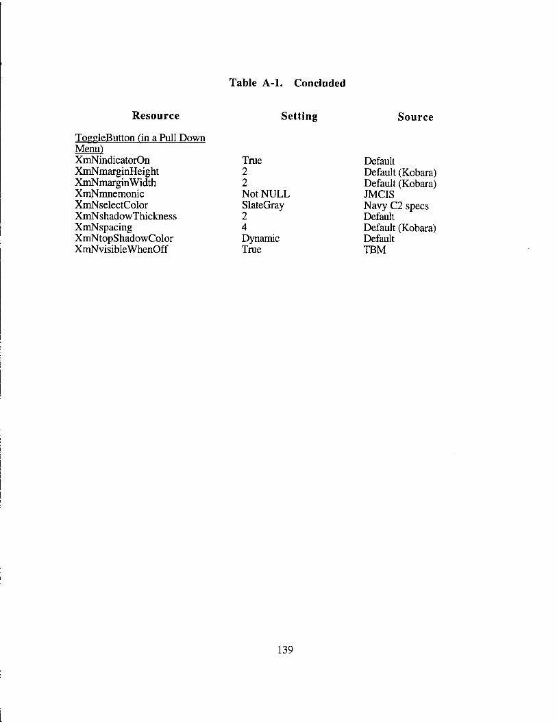
Table A-l. Concluded
Resource Setting Source
ToggleButton (in a Pull Down Menu") XmNindicatorOn True Default XmNmarginHeight XmNmarginWidth XmNmnemonic
2 2 Not NULL
Default (Kobara) Default (Kobara) JMCIS
XmNselectColor XmNshadowThickness
SlateGray 2
Navy C2 specs Default
XmNspacing XmNtopShadowColor XmNvisibleWhenOff
4 Dynamic True
Default (Kobara) Default TBM
139
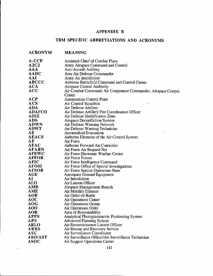
APPENDIX B
TBM SPECIFIC ABBREVIATIONS AND ACRONYMS
ACRONYM
A-CCP A2C2 AAA AADC AAI ABCCC ACA ACC
ACP ACS ADA ADAFCO ADIZ ADS ADWN ADWT AE AEACS AF AFAC AFARN AFEWC AFFOR AFIC AFOSI AFSOB AGE AI ALO AMB AME AOB AOC AOG AOO AOR APPS APS ARLO ARRS ASC ASO/AST ASOC
MEANING
Assistant Chief of Combat Plans Army Airspace Command and Control Anti-Aircraft Artillery Area Air Defense Commander Army Air Interdiction Airborne Battlefield Command and Control Center Airspace Control Authority Air Combat Command; Air Component Commander; Airspace Control Center Ammunition Control Point Air Control Squadron Air Defense Artillery Air Defense Artillery Fire Coordination Officer Air Defense Identification Zone Airspace Deconfliction System Air Defense Warning Network Air Defense Warning Technician Aeromedical Evacuation Airborne Elements of the Air Control System Air Force Airborne Forward Air Controller Air Force Air Request Net Air Force Electronic Warfare Center Air Force Forces Air Force Intelligence Command Air Force Office of Special Investigations Air Force Special Operations Base Aerospace Ground Equipment Air Interdiction Air Liaison Officer Airspace Management Branch Air Mobility Element Air Order-of-Battle Air Operations Center Air Operations Group Air Operations Order Area of Responsibility Analytical Photogrammetric Positioning System Advanced Planning System Air Reconnaissance Liaison Officer Air Rescue and Recovery Service Air Surveillance Coordinator Air Surveillance Officer/Air Surveillance Technician Air Support Operations Center
141
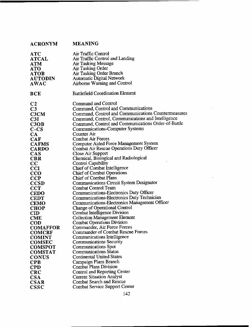
ACRONYM MEANING
ATC Air Traffic Control ATCAL Air Traffic Control and Landing ATM Air Tasking Message ATO Air Tasking Order ATOB Air Tasking Order Branch AUTODIN Automatic Digital Network AWAC Airborne Warning and Control
BCE Battlefield Coordination Element
C2 Command and Control C3 Command, Control and Communications C3CM Command, Control and Communications Countermeasures C3I Command, Control, Communications and Intelligence C30B Command, Control and Communications Order-of-Battle C-CS Communications-Computer Systems CA Counter Air CAF Combat Air Forces CAFMS Computer Aided Force Management System CARDO Combat Air Rescue Operations Duty Officer CAS Close Air Support CBR Chemical, Biological and Radiological CC Control Capability CCI Chief of Combat Intelligence CCO Chief of Combat Operations CCP Chief of Combat Plans CCSD Communications Circuit System Designator CCT Combat Control Team CEDO Communications-Electronics Duty Officer CEDT Communications-Electronics Duty Technician CEMO Communications-Electronics Management Officer CHOP Change of Operational Control CID Combat Intelligence Division CME Collection Management Element COD Combat Operations Division COMAFFOR Commander, Air Force Forces COMCRF Commander of Combat Rescue Forces COMINT Communications Intelligence COMSEC Communications Security COMSPOT Communications Spot COMSTAT Communications Status CONUS Continental United States CPB Campaign Plans Branch CPD Combat Plans Division CRC Control and Reporting Center CSA Current Situation Analyst CSAR Combat Search and Rescue CSSC Combat Service Support Center
142
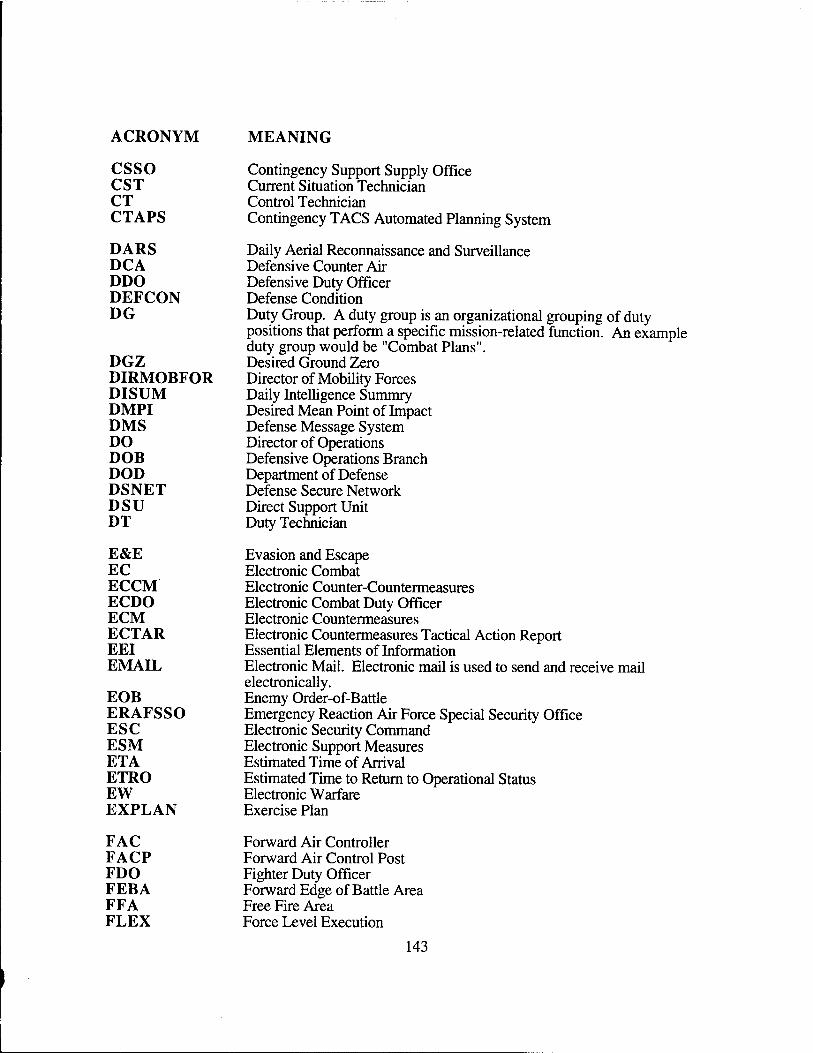
ACRONYM MEANING
csso CST CT CTAPS
DARS DCA DDO DEFCON DG
DGZ DIRMOBFOR DISUM DMPI DMS DO DOB DOD DSNET DSU DT
E&E EC ECCM ECDO ECM ECTAR EEI EMAIL
EOB ERAFSSO ESC ESM ETA ETRO EW EXPLAN
Contingency Support Supply Office Current Situation Technician Control Technician Contingency TACS Automated Planning System
Daily Aerial Reconnaissance and Surveillance Defensive Counter Air Defensive Duty Officer Defense Condition Duty Group. A duty group is an organizational grouping of duty positions that perform a specific mission-related function. An example duty group would be "Combat Plans". Desired Ground Zero Director of Mobility Forces Daily Intelligence Summry Desired Mean Point of Impact Defense Message System Director of Operations Defensive Operations Branch Department of Defense Defense Secure Network Direct Support Unit Duty Technician
Evasion and Escape Electronic Combat Electronic Counter-Countermeasures Electronic Combat Duty Officer Electronic Countermeasures Electronic Countermeasures Tactical Action Report Essential Elements of Information Electronic Mail. Electronic mail is used to send and receive mail electronically. Enemy Order-of-Battle Emergency Reaction Air Force Special Security Office Electronic Security Command Electronic Support Measures Estimated Time of Arrival Estimated Time to Return to Operational Status Electronic Warfare Exercise Plan
FAC FACP FDO FEBA FFA FLEX
Forward Air Controller Forward Air Control Post Fighter Duty Officer Forward Edge of Battle Area Free Fire Area Force Level Execution
143
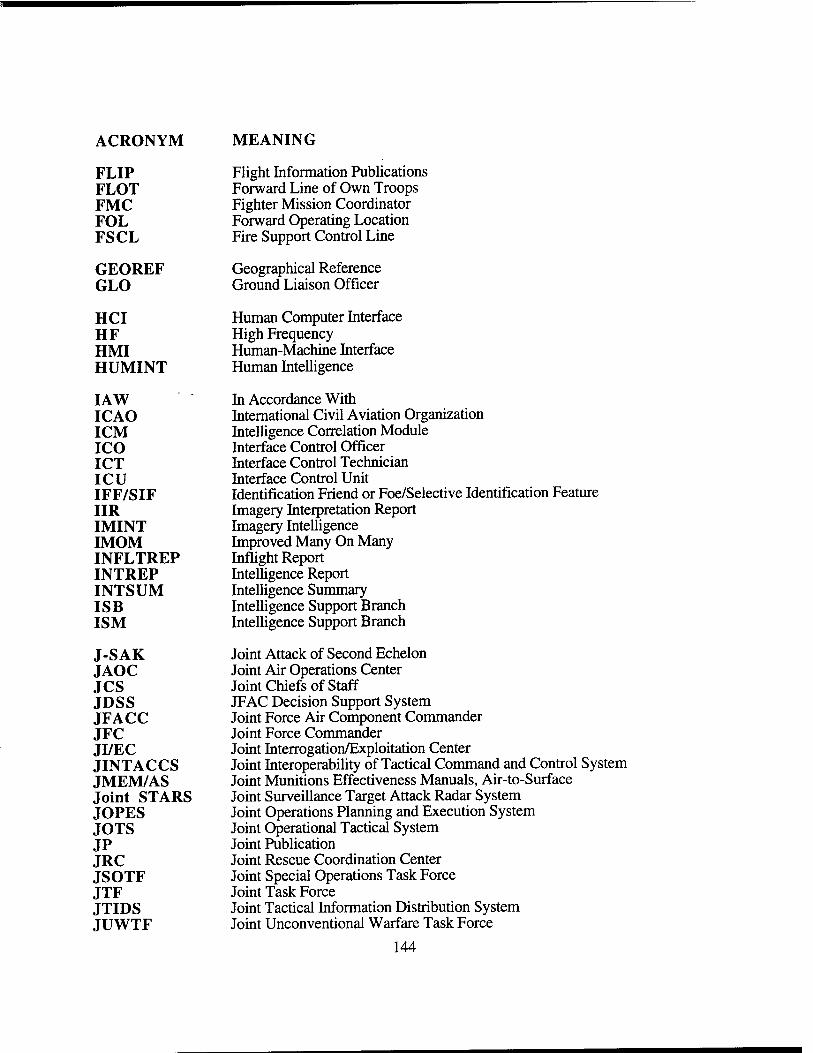
ACRONYM MEANING
FLIP Flight Information Publications FLOT Forward Line of Own Troops FMC Fighter Mission Coordinator FOL Forward Operating Location FSCL Fire Support Control Line
GEOREF Geographical Reference GLO Ground Liaison Officer
HCI Human Computer Interface HF High Frequency HMI Human-Machine Interface HUMINT Human Intelligence
IAW In Accordance With ICAO International Civil Aviation Organization ICM Intelligence Correlation Module ICO Interface Control Officer ICT Interface Control Technician ICU Interface Control Unit IFF/SIF Identification Friend or Foe/Selective Identification Feature IIR Imagery Interpretation Report IMINT Imagery Intelligence IMOM Improved Many On Many INFLTREP Inflight Report INTREP Intelligence Report INTSUM Intelligence Summary ISB Intelligence Support Branch ISM Intelligence Support Branch
J-SAK Joint Attack of Second Echelon JAOC Joint Air Operations Center JCS Joint Chiefs of Staff JDSS JFAC Decision Support System JFACC Joint Force Air Component Commander JFC Joint Force Commander JI/EC Joint Interrogation/Exploitation Center JINTACCS Joint Interoperability of Tactical Command and Control System JMEM/AS Joint Munitions Effectiveness Manuals, Air-to-Surface Joint STARS Joint Surveillance Target Attack Radar System JOPES Joint Operations Planning and Execution System JOTS Joint Operational Tactical System JP Joint Publication JRC Joint Rescue Coordination Center JSOTF Joint Special Operations Task Force JTF Joint Task Force JTIDS Joint Tactical Information Distribution System JUWTF Joint Unconventional Warfare Task Force
144
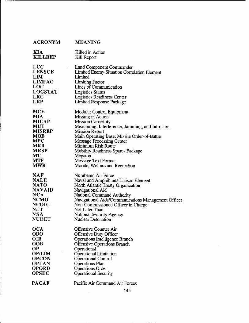
ACRONYM MEANING
KIA Killed in Action KILLREP Kill Report
LCC Land Component Commander LENSCE Limited Enemy Situation Correlation Element LIM Limited LIMFAC Limiting Factor LOC Lines of Communication LOGSTAT Logistics Status LRC Logistics Readiness Center LRP Limited Response Package
MCE Modular Control Equipment MIA Missing in Action MICAP Mission Capability MIJI Meaconing, Interference, Jamming, and Intrusion MISREP Mission Report MOB Main Operating Base; Missile Order-of-Battle MPC Message Processing Center MRR Minimum Risk Route MRSP Mobility Readiness Spares Package MT Megaton MTF Message Text Format MWR Morale, Welfare and Recreation
N A F Numbered Air Force NALE Naval and Amphibious Liaison Element NATO North Atlantic Treaty Organization NAVAID Navigational Aid N C A National Command Authority NCMO Navigational Aids/Communications Management Officer NCOIC Non-Commissioned Officer in Charge NLT Not Later Than N S A National Security Agency NUDET Nuclear Detonation
OCA Offensive Counter Air ODO Offensive Duty Officer OIB Operations Intelligence Branch OOB Offensive Operations Branch OP Operational OP/LIM Operational Limitation OPCON Operational Control OPLAN Operations Plan OPORD Operations Order OPSEC Operational Security
PACAF Pacific Air Command Air Forces
145
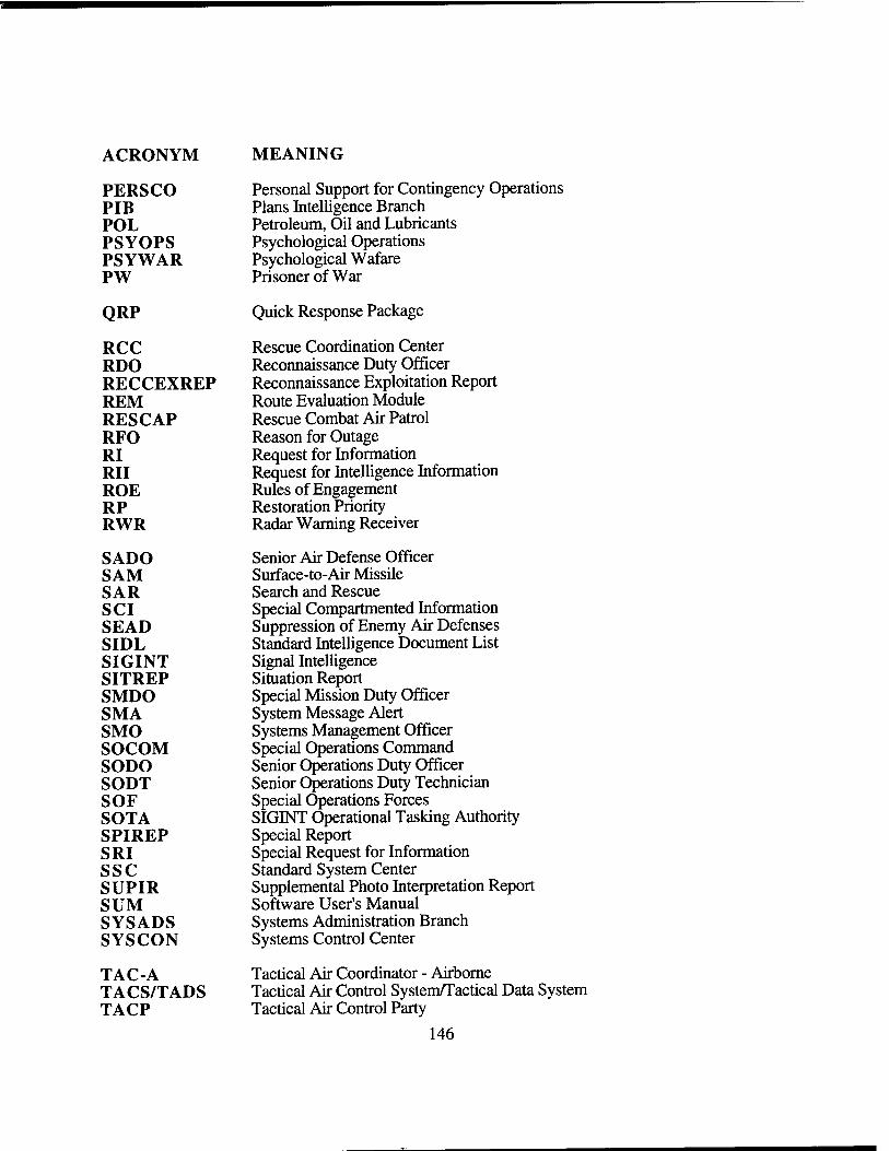
ACRONYM MEANING
PERSCO Personal Support for Contingency Operations PIB Plans Intelligence Branch POL Petroleum, Oil and Lubricants PSYOPS Psychological Operations PSYWAR Psychological Wafare PW Prisoner of War
QRP Quick Response Package
RCC Rescue Coordination Center RDO Reconnaissance Duty Officer RECCEXREP Reconnaissance Exploitation Report REM Route Evaluation Module RESCAP Rescue Combat Air Patrol RFO Reason for Outage RI Request for Information RII Request for Intelligence Information ROE Rules of Engagement RP Restoration Priority RWR Radar Warning Receiver
SADO Senior Air Defense Officer SAM Surface-to-Air Missile SAR Search and Rescue SCI Special Compartmented Information SEAD Suppression of Enemy Air Defenses SIDL Standard Intelligence Document List SIGINT Signal Intelligence SITREP Situation Report SMDO Special Mission Duty Officer SMA System Message Alert SMO Systems Management Officer SOCOM Special Operations Command SODO Senior Operations Duty Officer SODT Senior Operations Duty Technician SOF Special Operations Forces SOTA SIGINT Operational Tasking Authority SPIREP Special Report SRI Special Request for Information ssc Standard System Center SUPIR Supplemental Photo Interpretation Report SUM Software User's Manual SYSADS Systems Administration Branch SYSCON Systems Control Center
TAC-A Tactical Air Coordinator - Airborne TACS/TADS Tactical Air Control System/Tactical Data System TACP Tactical Air Control Party
146
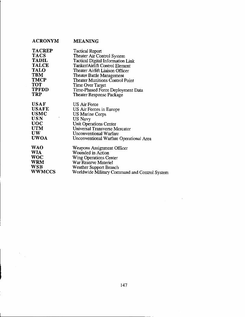
ACRONYM MEANING
TACREP Tactical Report TACS Theater Air Control System TADIL Tactical Digital Information Link TALCE Tanker/Airlift Control Element TALO Theater Airlift Liaison Officer TBM Theater Battle Management TMCP Theater Munitions Control Point TOT Time Over Target TPFDD Time-Phased Force Deployment Data TRP Theater Response Package
USAF US Air Force USAFE US Air Forces in Europe USMC US Marine Corps USN US Navy uoc Unit Operations Center UTM Universal Transverse Mercator UW Unconventional Warfare UWOA Unconventional Warfare Operational Area
WAO Weapons Assignment Officer WIA Wounded in Action woe Wing Operations Center WRM War Reserve Materiel WSB Weather Support Branch WWMCCS Worldwide Military Command and Contro
147
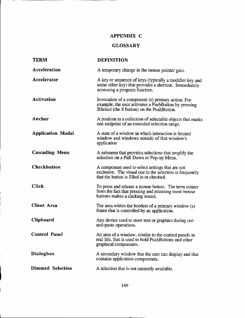
APPENDIX C
GLOSSARY
TERM
Acceleration
Accelerator
Activation
Anchor
Application Modal
Cascading Menu
Checkbutton
Click
Client Area
Clipboard
Control Panel
Dialogbox
Dimmed Selection
DEFINITION
A temporary change in the mouse pointer gain.
A key or sequence of keys (typically a modifier key and some other key) that provides a shortcut. Immediately accessing a program function.
Invocation of a component (s) primary action. For example, the user activates a PushButton by pressing BSelect (the S button) on the PushButton.
A position in a collection of selectable objects that marks one endpoint of an extended selection range.
A state of a window in which interaction is limited window and windows outside of that window's application
A submenu that provides selections that amplify the selection on a Pull Down or Pop-up Menu.
A component used to select settings that are not exclusive. The visual cue to the selection is frequently that the button is filled in or checked.
To press and release a mouse button. The term comes from the fact that pressing and releasing most mouse buttons makes a clicking sound.
The area within the borders of a primary window (s) frame that is controlled by an application.
Any device used to store text or graphics during cut- and-paste operations.
An area of a window, similar to the control panels in real life, that is used to hold PushButtons and other graphical components.
A secondary window that the user can display and that contains application components.
A selection that is not currently available.
149
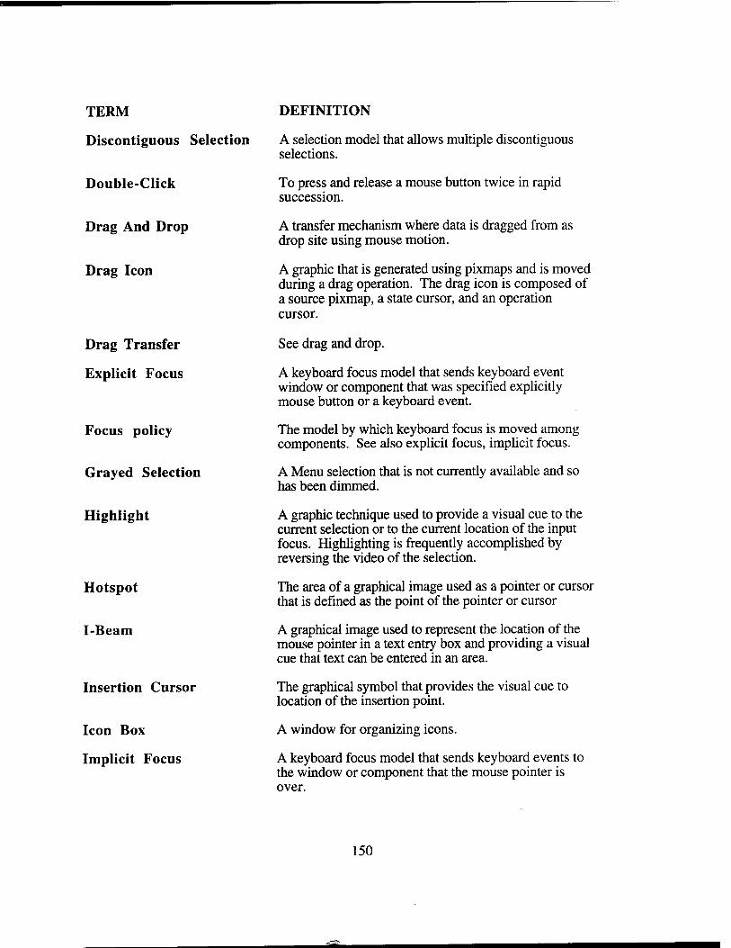
TERM
Discontiguous Selection
Double-Click
Drag And Drop
Drag Icon
Drag Transfer
Explicit Focus
Focus policy
Grayed Selection
Highlight
Hotspot
I-Beam
Insertion Cursor
Icon Box
Implicit Focus
DEFINITION
A selection model that allows multiple discontiguous selections.
To press and release a mouse button twice in rapid succession.
A transfer mechanism where data is dragged from as drop site using mouse motion.
A graphic that is generated using pixmaps and is moved during a drag operation. The drag icon is composed of a source pixmap, a state cursor, and an operation cursor.
See drag and drop.
A keyboard focus model that sends keyboard event window or component that was specified explicitly mouse button or a keyboard event.
The model by which keyboard focus is moved among components. See also explicit focus, implicit focus.
A Menu selection that is not currently available and so has been dimmed.
A graphic technique used to provide a visual cue to the current selection or to the current location of the input focus. Highlighting is frequently accomplished by reversing the video of the selection.
The area of a graphical image used as a pointer or cursor that is defined as the point of the pointer or cursor
A graphical image used to represent the location of the mouse pointer in a text entry box and providing a visual cue that text can be entered in an area.
The graphical symbol that provides the visual cue to location of the insertion point.
A window for organizing icons.
A keyboard focus model that sends keyboard events to the window or component that the mouse pointer is over.
150
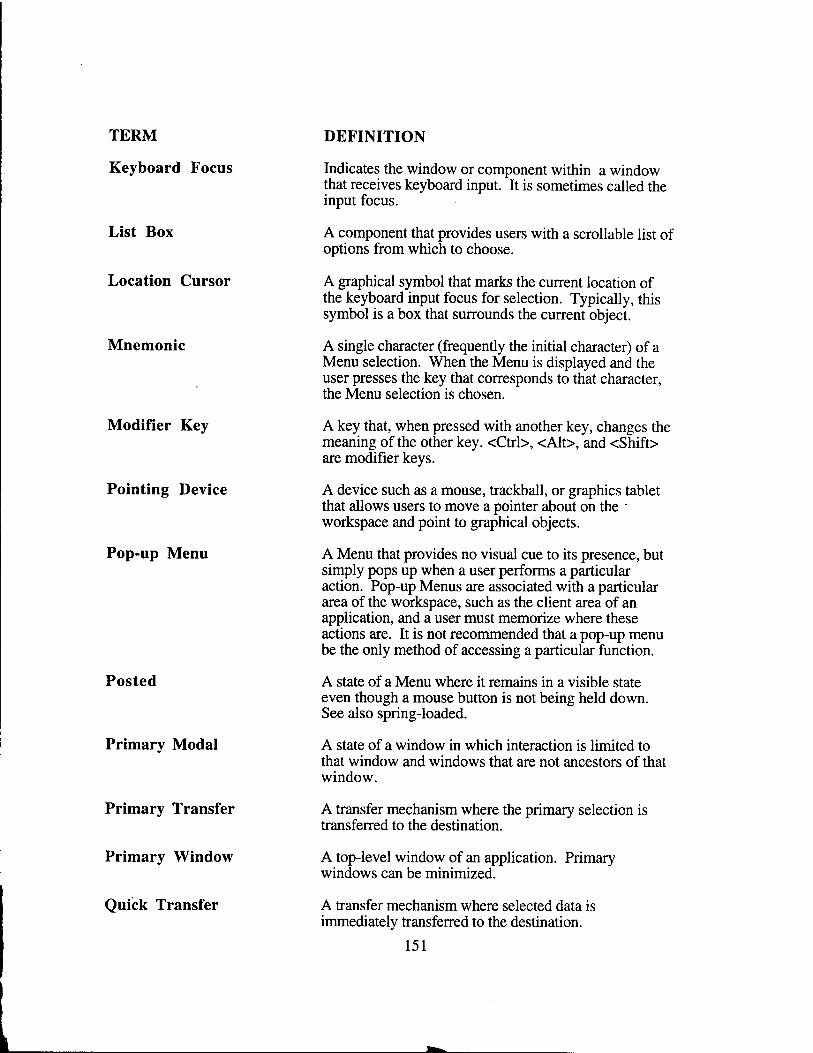
TERM
Keyboard Focus
List Box
Location Cursor
Mnemonic
Modifier Key
Pointing Device
Pop-up Menu
Posted
Primary Modal
Primary Transfer
Primary Window
Quick Transfer
DEFINITION
Indicates the window or component within a window that receives keyboard input. It is sometimes called the input focus.
A component that provides users with a scrollable list of options from which to choose.
A graphical symbol that marks the current location of the keyboard input focus for selection. Typically, this symbol is a box that surrounds the current object.
A single character (frequently the initial character) of a Menu selection. When the Menu is displayed and the user presses the key that corresponds to that character, the Menu selection is chosen.
A key that, when pressed with another key, changes the meaning of the other key. <Ctrl>, <Alt>, and <Shift> are modifier keys.
A device such as a mouse, trackball, or graphics tablet that allows users to move a pointer about on the - workspace and point to graphical objects.
A Menu that provides no visual cue to its presence, but simply pops up when a user performs a particular action. Pop-up Menus are associated with a particular area of the workspace, such as the client area of an application, and a user must memorize where these actions are. It is not recommended that a pop-up menu be the only method of accessing a particular function.
A state of a Menu where it remains in a visible state even though a mouse button is not being held down. See also spring-loaded.
A state of a window in which interaction is limited to that window and windows that are not ancestors of that window.
A transfer mechanism where the primary selection is transferred to the destination.
A top-level window of an application. Primary windows can be minimized.
A transfer mechanism where selected data is immediately transferred to the destination.
151
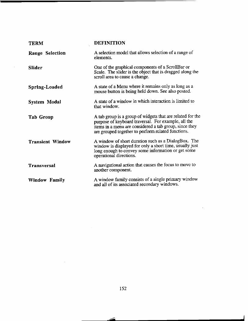
TERM
Range Selection
Slider
Spring-Loaded
System Modal
Tab Group
Transient Window
Transversal
Window Family
DEFINITION
A selection model that allows selection of a range of elements.
One of the graphical components of a ScrollBar or Scale. The slider is the object that is dragged along the scroll area to cause a change.
A state of a Menu where it remains only as long as a mouse button is being held down. See also posted.
A state of a window in which interaction is limited to that window.
A tab group is a group of widgets that are related for the purpose of keyboard traversal. For example, all the items in a menu are considered a tab group, since they are grouped together to perform related functions.
A window of short duration such as a DialogBox. The window is displayed for only a short time, usually just long enough to convey some information or get some operational directions.
A navigational action that causes the focus to move to another component.
A window family consists of a single primary window and all of its associated secondary windows.
152
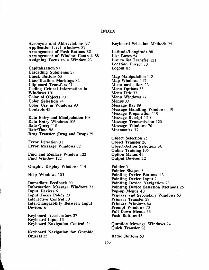
INDEX
Acronyms and Abbreviations 97 Keyboard Selection Methods 25 Application-level windows 87 Arrangement of Push Buttons 88 Latitude/Longitude 98 Arrangement of Window Controls 88 List Boxes 54 Assigning Focus to a Window 23 List to list Transfer 121
Location Cursor 13 Capitalization 97 Logout 85 Cascading Submenus 38 Check Buttons 53 Map Manipulation 118 Classification Markings 82 Map Windows 117 Clipboard Transfers 27 Menu navigation 23 Coding Critical Information in Menu Options 33 Windows 101 Menu Title 33 Color of Objects 90 Menu Windows 77 Color Selection 94 Menus 33 Color Use in Windows 90 Message Bar 89 Controls 43 Message Handling Windows 119
Message Preparation 119 Data Entry and Manipulation 108 Message Receipt 120 Data Entry Windows 106 Message Transmission 120 Data Query 110 Message Windows 70 Date/Time 98 Mnemonics 37 Drag Transfer (Drag and Drop) 29
Object Selection 25 Error Detection 31 Object Transfer 26 Error Message Windows 72 Object-Action Selection 30
Online Training 106 Find and Replace Window 122 Option Menus 41 Find Window 122 Output Devices 22
Graphic Display Windows 114 Pointer 7 Pointer Shapes 8
Help Windows 105 Pointing Device Buttons 13 Pointing Device Input 7
Immediate Feedback 30 Pointing Device Navigation 23 Information Message Windows 73 Pointing Device Selection Methods 25 Input Devices 6 Input Focus Policy 23 Interactive Control 30 Interchangeability Between Input Devices 6
Keyboard Accelerators 37 Keyboard Input 13 Keyboard Navigation Control 24
Keyboard Navigation for Graphic Objects 25
Pop-up Menus 40 Primary and Secondary Windows 63 Primary Transfer 28 Primary Windows 65 Prompt Windows 70 Pull Down Menus 33 Push Buttons 43
Question Message Windows 74 Quick Transfer 28
Radio Buttons 53
153
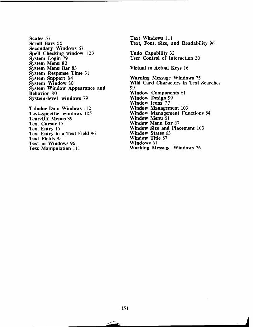
Scales 57 Scroll Bars 55 Secondary Windows 67 Spell Checking window 123 System Login 79 System Menu 83 System Menu Bar 83 System Response Time 31 System Support 84 System Window 80 System Window Appearance and Behavior 80 System-level windows 79
Tabular Data Windows 112 Task-specific windows 105 Tear-Off Menus 39 Text Cursor 15 Text Entry 15 Text Entry in a Text Field 96 Text Fields 95 Text in Windows 96 Text Manipulation 111
Text Windows 111 Text, Font, Size, and Readability 96
Undo Capability 32 User Control of Interaction 30
Virtual to Actual Keys 16
Warning Message Windows 75 Wild Card Characters in Text Searches 99 Window Components 61 Window Design 99 Window Icons 77 Window Management 103 Window Management Functions 64 Window Menu 61 Window Menu Bar 87 Window Size and Placement 103 Window States 63 Window Title 87 Windows 61 Working Message Windows 76
154
i
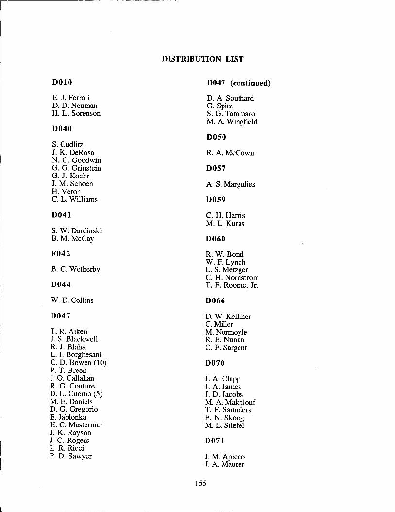
DISTRIBUTION LIST
DOIO D047 (continued)
E. J. Ferrari D. A. Southard D. D. Neuman G. Spitz H. L. Sorenson S. G. Tammaro
M. A. Wingfield D040
D050 S. Cudlitz J. K. DeRosa R. A. McCown N. C. Goodwin G. G. Grinstein D057 G. J. Koehr J. M. Schoen A. S. Margulies H. Veron C. L. Williams D059
D041 C. H. Harris M. L. Kuras
S. W. Dardinski B. M. McCay D060
F042 R. W. Bond W. F. Lynch
B. C. Wetherby L. S. Metzger C. H. Nordstrom
D044 T. F. Roome, Jr.
W. E. Collins D066
D047 D. W. Kelliher C. Miller
T. R. Aiken M. Normoyle J. S. Blackwell R. E. Nunan R. J. Blaha C. F. Sargent L. I. Borghesani C. D. Bowen (10) D070 P. T. Breen J. O. Callahan R. G. Couture D. L. Cuomo (5) M. E. Daniels D. G. Gregorio E. Jablonka H. C. Masterman J. K. Rayson J. C. Rogers L. R. Ricci P. D. Sawyer
J. A. Clapp J. A. James J. D. Jacobs M. A. Makhlouf T. F. Saunders E. N. Skoog M. L. Stiefel
D071
J. M. Apicco J. A. Maurer
155

D072
M. J. Brooks A. Sateriale S. W. Tavan
D073
J. F. Fandozzi S. R. Friedman J. R. Knobel T. J. Reale
D074
T. K. Backman J. A. Gunter C. Loizides C. W. McClure M. L. Morgillo R. S. Popp P. W. Strobel
D075
S. F. Aranyi J. Finkel S. I. Frank G. M. Friedman E. J. Green M. J. Heller J. M. Hudak P. N. Jean M. C. Krutsch I. M. Kyratzoglou K. L. Lennon T. F. Litant R. J. McGue R. W. Miller R. L. Pancotti C. D. Poindexter J. R. Roberts J. G. Scarano M. G. Wolf
D076
A. M. Bradley R. O. Doescher M. A. Francesca S. M. Jolly E. K. Kriegel R. B. Quanrud A. M. Rollins
F063
L. S. Carlson
F065
R. A. Benel
G010
V. A. DeMarines
G020
P. S. Tasker
G021
J. A. Thomas
G030
N. E. Bolen D. H. Lehman R. F. Nesbit
G033
J. B. Czulada R. W. Dix J. H. Keating J. D. McDonald
G040
H. A. Bayard J. L. Katz Dr. M. J. Prelle
G041
T. J. Brando M. P. Chase A. L. Schäfer
J072
H. W. Killam
156
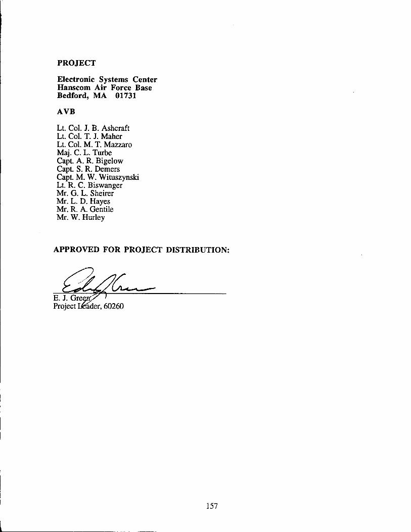
PROJECT
Electronic Systems Center Hanscom Air Force Base Bedford, MA 01731
AVB
Lt. Col. J. B. Ashcraft Lt. Col. T. J. Maher Lt. Col. M. T. Mazzaro Maj. C. L. Turbe Capt. A. R. Bigelow Capt. S. R. Demers Capt. M. W. Wituszynski Lt. R. C. Biswanger Mr. G. L. Sheirer Mr. L. D. Hayes Mr. R. A. Gentile Mr. W. Hurley
APPROVED FOR PROJECT DISTRIBUTION:
E. J. Grei Project Dfeader, 60260
157