a2 media coursework evaluation
TRANSCRIPT

A2 Media Coursework Evaluation
Matthew McMinn

Question 1: In what ways does your media product use, develop or challenge forms and conventions of real media products?Music Video: Using my previous research into music videos from similar or same bands from the same genre I can compare the use of codes and conventions in our own music video. In one of Foo Fighters original music videos ‘Walk’ the costume worn by the main character of the video is wearing a bland shirt, tie and trousers costume. This seems to be a pretty boring costume for a character in a video which is meant to attract attention but the surrounding colours make up for this. Also in the music video the character walks a lot and we have done something similar in our video.
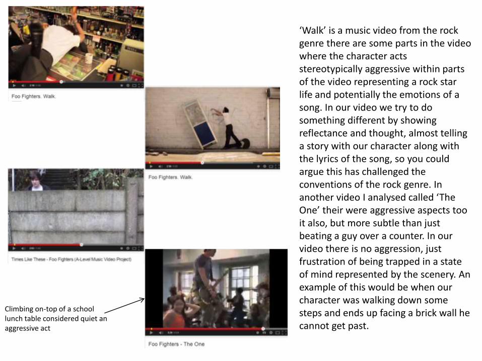
‘Walk’ is a music video from the rock genre there are some parts in the video where the character acts stereotypically aggressive within parts of the video representing a rock star life and potentially the emotions of a song. In our video we try to do something different by showing reflectance and thought, almost telling a story with our character along with the lyrics of the song, so you could argue this has challenged the conventions of the rock genre. In another video I analysed called ‘The One’ their were aggressive aspects too it also, but more subtle than just beating a guy over a counter. In our video there is no aggression, just frustration of being trapped in a state of mind represented by the scenery. An example of this would be when our character was walking down some steps and ends up facing a brick wall he cannot get past.
Climbing on-top of a school lunch table considered quiet an aggressive act
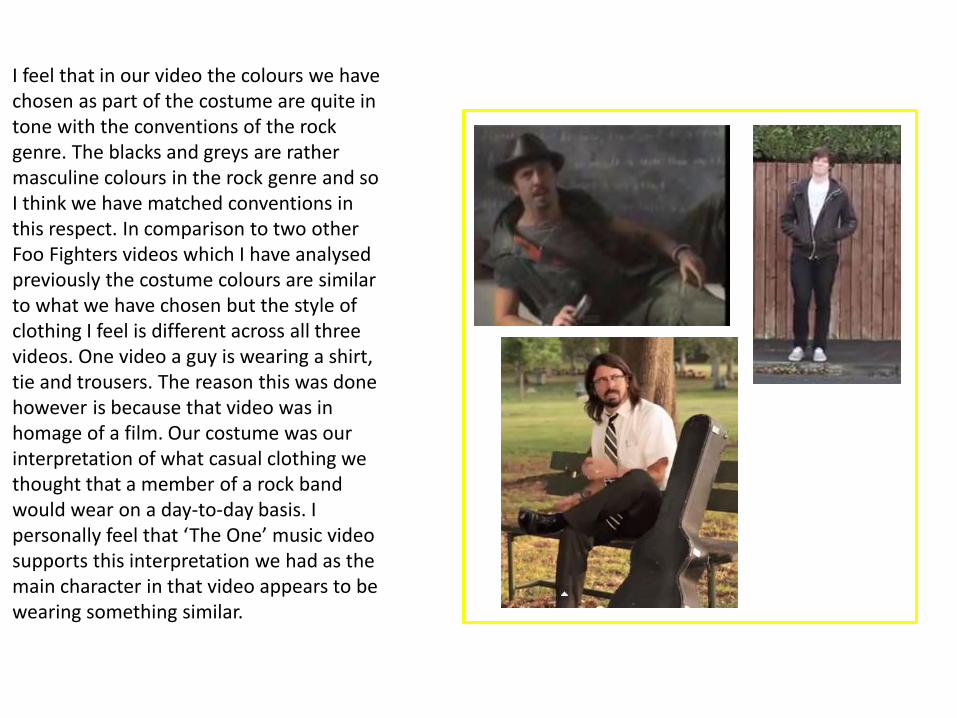
I feel that in our video the colours we have chosen as part of the costume are quite in tone with the conventions of the rock genre. The blacks and greys are rather masculine colours in the rock genre and so I think we have matched conventions in this respect. In comparison to two other Foo Fighters videos which I have analysed previously the costume colours are similar to what we have chosen but the style of clothing I feel is different across all three videos. One video a guy is wearing a shirt, tie and trousers. The reason this was done however is because that video was in homage of a film. Our costume was our interpretation of what casual clothing we thought that a member of a rock band would wear on a day-to-day basis. I personally feel that ‘The One’ music video supports this interpretation we had as the main character in that video appears to be wearing something similar.

Digipak: The digipak we have made is within the conventions of covers of the rock genre but more specifically it is within the conventions of the Foo Fighters as our cover homages 1950’s sci-fi films and represents the Foo Fighters name as a literal concept as well. Foo Fighters were names given to what pilots saw (usually considered to be what we call UFO’s) whilst flying over the pacific during the War. However in comparison to covers of Albums from the Foo Fighters the group then you may say it challenges conventions. What this means is that the digipak can be interpreted in two different ways with the conventions and the way the product is presented. I personally feel this will be what would attract a customer base for this product along with the existing fans
If we look at the covers in comparison to ours two have they have a creamy/brown background colour which make them look slightly like parchment paper, especially the one with the laser gun on the front of it. Also compared to our digipak cover the designs of 2/4 the official bands albums are plain backgrounds with nothing to pair with the colour so they look so simplistic and yet so professional. Ours differs to this by having two background colours by having stars on the black background to create a space look. This may be a convention of Foo Fighters albums/digipak covers but the most recent album cover (Sonic Highway) completely differs to recent covers and so maybe this is the Foo Fighters keeping up with modern conventions rather than times keeping with older conventions.

Something else which has been done with two of the covers in particular is that there is one simple image on the front of two of the covers. As part of our digipak our main image is very linear down the middle of the page. If you compare this with the nuke on the Foo Fighters album they look similar in placement and shape of the cover. This means we have gone with this convention the Foo Fighters seem to have adopted. This also fits in with the idea of some sort of weaponry the Foo Fighters seem to have on their albums and we have something similar in the tractor been of the U.F.O.
I don’t think that the albums follow too much of a convention on the outside if you look at it in perspective the albums do not follow any sort of similarities in the ways that they are presented as a cover. They change and adapt to changing times so in that respect the album covers fit modern day conventions. So in this way we have changed with the times and gone for a digipak cover that is different from the others and does not follow too much of the previous ideas in any ways.

Magazine Advert: The 3 professionally made advertisements (Fall Out Boys, Paramore, Foo Fighters (bottom left)) are all from the rock genre and all look different in the way of what images and colours are used. One thing that is a convention of all the advertisements is that all have the release date of what they are advertising and the name of the artist/band releasing the product. As can be seen in our magazine advert we have incorporated this into our Foo Fighters advertisement to keep with the usual conventions. Another thing that seems to be a convention of the way that the ads are displayed is that the name of the band is always positioned at the top of the page, what changes between the professional ones is the font itself and the text size. This is not necessarily a negative factor as it makes all the ads individual and distinctive of each other. In our magazine ad we have clearly followed the convention of this. The reason we have Foo Fighters as wording on our ad is because our main image of our ad is of the digipak cover. Looking at the other ads the images they have chosen to use differ from each other also and so in respect to the image we decided to go with I do not think it challenges any sort of convention for the ads as to me it does not…

look as if a conventional image is used. We have a draw image of skeletons for one image, the logo of a band for another and the picture of a band for the other image. However, the colour scheme for each ALL have something in common and that is the use of the colour black. Every ad has used the colour black as part of the page colour, this fits into the rock genre conventions of how it is perceived as dark/emotional music. The colour of black therefore represents this for me as I’m sure for many others. Black seems to be the secondary colour for only one advert and that is the bottom left Foo Fighters ad, the other adverts I feel black is used as the primary colour with the secondary colour being different on each representing different meanings of each bands music.To sum up of the ads I feel that we have kept within the conventions of what is expected of an album or digipak advertisement and I don’t think we have particularly attempted to challenge any conventions of the genre and how it is advertised.

Question 2: How effective is the combination of your main product ancillary texts?
https://www.youtube.com/watch?v=lmfq0y6wRMY
For me I feel the cross-media convergence of our promotional package is good between two of the products and not so much with the other. The advert and digipakquite clearly have the same theme of space, mainly U.F.O’s around them. The video however has no mention or even any visual reference to U.F.O’s and so the video does not converge well with the rest of the package when looking at them as singular products. However, the video is only a slither of what would be on the digipak and so in my opinion does not need to necessarily converge directly with the ad and digipak because there are other songs and
extras on the discs. However it could be argued that the DVD is part of the main package and should correspond with the other parts of the package in order to create relate ability for the audience and so they know exactly what they are buying into. This is not done because of the extreme difference between the video and the rest of the package.

https://www.youtube.com/watch?v=lmfq0y6wRMY
I do think that the advert and digipak itself are very well converged to be relatable to the audience. When someone sees the advertisement in a magazine they will know exactly what they are looking for. While designing the advert I was thinking about this the whole time, how I could get the ad and digipak to be relatable and converge. I did this by making it so the digipak itself was just a zoomed in image of the bigger picture which is the ad, this has been demonstrated and noted on the advertisement by putting the white box around the digipak cover area so that the audience know what to look for and so they are not confused by the concept. I have also kept them very similar by the choice of font. The bigger fonts are all the same font whilst the smaller fonts over the two products are the same fonts also, this creates a consistency between the two which is important for the audience to relate the two together. The fact that the colours are the same/very similar across the two means that the ancillary texts are combined very well and effectively, also the logo is consistently the same. Originally I had edited the logo on the back cover of the digipak so the red had changed from red to look like the Earth with blues and greens. This did not look very affective as it messed up the whole colour scheme and just looked out of place but I feel the idea was with the right intentions but in order for it too have worked it would have needed to continue through out the rest of the texts. One thing that combines the main text the ancillary texts is that the colours of the costume in the video (Black and White) means that it can relate to the ancillary texts, however I don not think this is the clearest or best relation.

Question 3: What have you learned from your audience feedback?
The first piece of audience feedback we got was from the survey we released using survey monkey, a website where you can create free surveys with up to 10 questions. One of most important questions was the question of our audiences favourite genre of music to listen too. This was a most important question as it would help us to decide a choice of song to use for the video and help us base all decisions around this along with peoples genders and age etc. As we found from our research Rock was the most popular genre of music, although marginally, we decided to use that genre asmost of our group/team had decent knowledge of that genre. Pop was the other option but as I was the only one who knew anything about that genre we thought it would be best for the majority to go with rock. Not surprisingly Indie was no where close to the other two, it is Indie music for a reason, it is listened too by a minority in general and that is why it is called Indie music. Looking back on this feedback from the audience we could have given the audience more options to choose from as they may have felt forced to choose their favourite just out of those three when rap may have been their favourite or another possible genre. This would have given a greater reflection on whether the audience would have actually liked us to make a rock digipak or something completely different eg Jazz.

The question of whether the majority of our audience was male or female is vitally important the colours and characters we should put into the entire digipak. The use of colours, such as black as our primary character colour, means that we used a rather masculine colour through conventions of what a masculine colour is. Just because it is a ‘masculine’ colour does not mean that women will not enjoy the music video also. One thing we did not include in our video was the male gaze. The male gaze is a theory of Laura Mulvey which suggests how men look at women, how women look at themselves and how women look at other women. These are usually shown by visuals in any visual form of media. We did not include any of this to attract the male fan base as we thought that the genre of rock would be enough to do this as the majority of audience were males and the majority vote of genre was for rock. Also through research of other rock music videos I found that not one of them used the male gaze and so did not see it fit to add into the rock genre video we were going to create. Another thing is that with the two majority age groups we found it unsuitable to add anything suggesting of women as to not add false pretences, this also helped us with the digipak design and magazine ad design as we fell the age groups will find them suitable too their age groups.
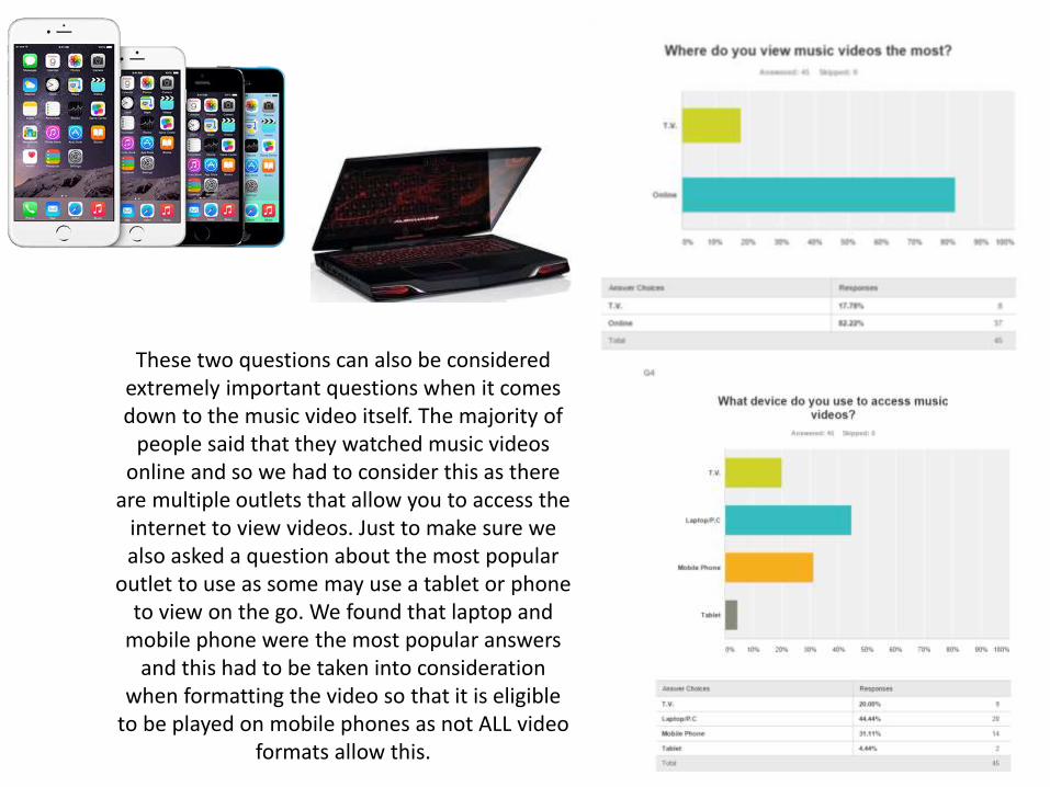
These two questions can also be considered extremely important questions when it comes down to the music video itself. The majority of
people said that they watched music videos online and so we had to consider this as there
are multiple outlets that allow you to access the internet to view videos. Just to make sure we also asked a question about the most popular
outlet to use as some may use a tablet or phone to view on the go. We found that laptop and
mobile phone were the most popular answers and this had to be taken into consideration
when formatting the video so that it is eligible to be played on mobile phones as not ALL video
formats allow this.

After about a week of being live on YouTube and sharing it to several hundred followers we have had no feedback from the music video in the comments or on the social media. We can take two things from this. One is that it was so good no one could critique it, OR two, my followers average around 12-19 year olds and so I do not think have the maturity levels to leave intelligent comments or maybe they have nothing they want to say about the video and so we cannot evaluate feedback. We could also assume that out of
the 16 people that have viewed the video not one had a google account which would also explain the lack of likes also on the video.
Question 4: How did you use media technologies in the construction and research, planning and evaluation stages?
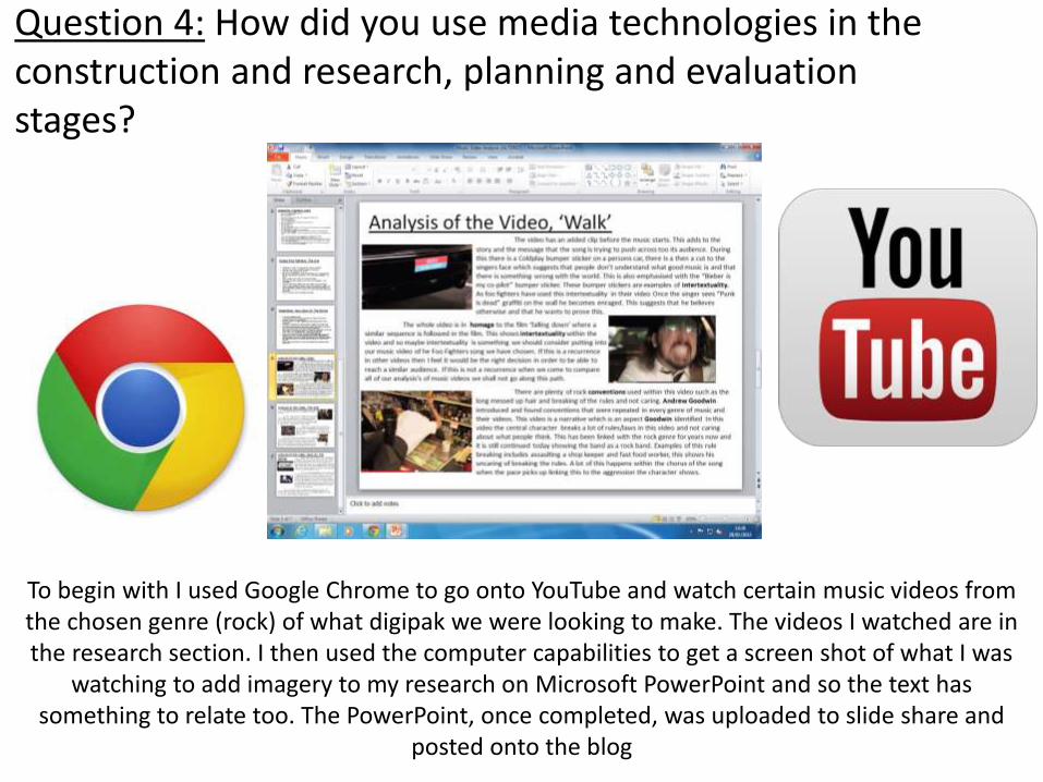
To begin with I used Google Chrome to go onto YouTube and watch certain music videos from the chosen genre (rock) of what digipak we were looking to make. The videos I watched are in the research section. I then used the computer capabilities to get a screen shot of what I was
watching to add imagery to my research on Microsoft PowerPoint and so the text has something to relate too. The PowerPoint, once completed, was uploaded to slide share and
posted onto the blog

Google Chromes image search and Microsoft PowerPoint were also used in the research of actual digipaks and magazine advertisements. These were also posted onto Slide Share and then
the blog also.
The next step to the research was using survey monkey to create a survey including 8 questions to post onto Twitter and the others used other social media as well to reach the maximum
amount of people that we could . The results we collected were shown in graphs automatically produced by survey monkey. These graphs were screenshot and analysed on PowerPoint and
uploaded to slide share and then the blog.
The final form of research that we conducted was the use of the I-Phone to video interviews with questions about the digipak in order to increase the amount of information gathered from one participant. We only got 3 participants as not a lot of people were willing to volunteer there
time. The videos were uploaded to ALL of our YouTube channels for sharing purposes.

After research we had to plan out what we were going to actually film, when and where. We put pen and pencil to paper to plan our story board which when we completed it we scanned the
story boards so they were sent as images to our E-Mails so that we could post them to our blogs.
Location planning was actually done using Google maps and street view, we took several trips abroad but then realised it would not be feasible. We stayed local to college and found several
locations in York that we wanted to use thanks to google maps. This was useful as it saved A LOT of time wandering around in York trying to find locations. We screen capped the locations we
wanted and posted them onto PowerPoint as proof of planning, these were then also uploaded on to the blog.
The risk assessment and shooting schedule were conducted on Microsoft Word as it was the most suitable programme for the job although I am sure Excel would have done the job just as
well as Word did. The final versions were saved as PDF’s and posted onto the blog.

Constructing the digipak overall has probably been the most time consuming and strenuous task, especially with the amounts of technology used to develop the products. To make sure we all kept in touch to schedule meeting times etc we had to get everyone's phone number and use facebook for one guy because he had no phone number. We texted to see where everyone was as some people (Phil) were late on one of the days we were to meet in town.
We had a Cannon DSLR camera as our piece of recording equipment. We used this camera over both of our recording days. As a lot of our shots involved needing the camera to be still as to record the actor walking. To create the image where the camera was not shaking we put it onto a tripod as to keep it still and keep the shot steady. Also in our opening shots we have the camera tracking the movement of our actor. We used an umbrella at this point also as to prevent the sun ruining the shot by adding the natural light and glare so that we would not be able to see the actor or environment.
At the very end of the video we use the cameras ability to focus on the distance and close up objects. The camera is first focused on the fence and slowly brings the focus to the distance where our actor is stood.
Video Streaming Quality at College NOT Great

In the post production phase a lot of technology was used in the full creation of the video. We used the Adobe Premiere software. We used this software to cut out sections we recorded that we did not want to include in the video. We did this using the split tool to split apart the clip to delete any unwanted scenes or sequences.
Also in the video we spent 3 minutes recording the street scene where everything is sped up and we used the post production software to achieve this where we speed up the speed of the clip so it looks as if it is being fast forwarded, this was to create the effect of being isolated, even though there are many people rushing around the streets no one cares about the one guy just stood there.
We also used another type of editing which we had intended when we filmed the clip. We have our main character walking out from behind a lamp post going in opposite directions, we did this by literally halving the video image in half and then overlapping them on each other and it looks like a complete image again. We then reversed the speed so the actor went backwards retracing his steps.

We also did the simple clip trimming and editing to get rid of any unwanted footage. This led too some jump cuts, especially around Clifford's Tower where this is clearly demonstrated.
The video was not the only piece of work that had to be constructed using technologies. What we also constructed was the magazine advertisement and the digipak itself. This was less of a challenge than editing a video so I found it manageable. For the background we wanted to go with the idea of being in space and so I used the fill bucket tool to fill the page black. To add stars what I did was get the paint brush and lower the size all the way down to 2/3 (I interchanged the size as not every star should be the same size). I then fiddled with the colour contrast to make it seem more real. The green laser beam was made by distorting a rectangle to create the thin to large shape. To get the texture we took a picture of some crumpled up tin fool and made it more transparent.
The text size and shape was altered depending on it’s font to make sure the text did not run off the page etc. Some of the images on the digipaks were screen capped from the video.
THIS ALL APLYS TO THE DIGIPAK ANDMAGAZINE
ADVERT!

Finally, my evaluation. This has been presented on powerpoint presentations by Microsoft. Some images have been collected from the internet to add colour to the slides and try and make
it as interesting to read as possible other than just words. Images are also taken from youtubeand MY twitter in order to increase information and make what I have said picture able.