a few secrets to making a presentation that doesnt suck
TRANSCRIPT

A Few Secrets for Making a Presentation That Doesn’t
Suck!
A Few Secrets To Making A
Presentation That Doesn’t Suck...

1) Built in Theme
This just
makes it
BORING.

Viewers will immediately think you haven't put any time and effort into the making of the slide.
That Guy Must Be Lazy!

Make your slide unique, and take time doing so.
Wow! That Slide is So Unique! It Must’ve Taken A Long Time To Make!

Unless you want to make a presentation faster than The Flash.

Choosing one of the default themes should be used ONLY as a last resort if all else fails.

2) Too Much InfoYou're giving a presentation, NOT a document.
Blah Blah+ Blah=Meh

Don’t vomit every bit of information out onto your slides.

Keep one main detail per slide.
De
tail

Keep the data short, and relevant. This helps your audience from skipping ahead of any important facts buried in the flood of insignificant words.
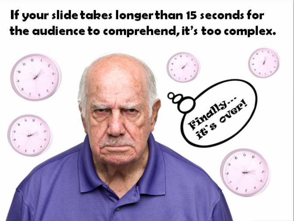
If your slide takes longer than 15 seconds for the audience to comprehend, it’s too complex.

3) ReadabilityHere, we have a really captivating image of space, but it’s laying waste to the readability of our text. Even if we make the text bold and try different color variations, it still comes up short. Outlining tends to do best in these circumstances if you don’t want to do anything better. This slide
has a lot of info.

You can create a color bar behind the text which will increase the readability by
a great deal, while still keeping a simple yet
stylish look.


4) TextThe biggest mistake that people make with fonts in presentations is assuming that the first three font styles listed above are boring. This causes them to jump to something similar to the font on the bottom because it feels more unique and interesting.

The first three aren't boring…
They're safe.
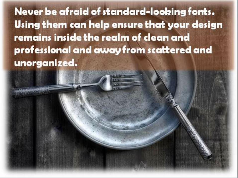
Never be afraid of standard-looking fonts. Using them can help ensure that your design remains inside the realm of clean and professional and away from scattered and unorganized.

5) Squash and Stretch Photos
NEVER squash or stretch your pictures to fill the space of your presentation.

This makes it look BAD.That’s a slug if you didn’t know.

You don’t always need to fill in every blank space on your slide.
Just don’t leave it this blank.

If you want to enlarge it or shrink the picture, do it in equal proportions.

Try not to get photos blurry either by enlarging it too much.