5 rules for infographic success
TRANSCRIPT

Copyright © 2012 by IQ Agency
5 RULES FOR INFOGRAPHIC SUCCESSA how-to guide with case samples
IQ AgencyAugust 2012iqagency.com

Copyright © 2012 by IQ Agency
OVERVIEW
2
How do you deliver a whole bunch of information in a way that’s organized, meaningful and compelling? For the last few years, one of the most popular trends on the Internet has been the implementation of infographics, transforming tedious data into graphic-rich content, designed specifically to be easier to digest, more engaging, and highly scannable.
But does it work?
This document covers what IQ considers to be the top 5 rules for using infographics successfully.
But first, let’s discuss the anatomy of an infographic.

Copyright © 2012 by IQ Agency
Infographics (“Information graphics”) are graphic visual representations of information, data or knowledge. Essentially, they make content more fun to digest.
These graphics present complex information quickly and clearly, such as in signs, maps, journalism, technical writing, and education.*
* http://en.wikipedia.org/wiki/Infographic
3

Copyright © 2012 by IQ Agency
INFOGRAPHIC EXAMPLE
4
Source: go.iqagency.com/5-best-infographics-rules

Copyright © 2012 by IQ Agency
WHY THEY WORK
Infographics are popular because they simplify concepts that would otherwise be difficult to understand or are simply overwhelming to consider. While the attention spans of Internet page visitors are diminishing, expectations for quick and compelling content are increasing.
Users not only want to be able to parse information at lightning speed—they demand an enjoyable experience doing so.
5

Copyright © 2012 by IQ Agency 6
1. Tell a story
2. Pick the right visuals
3. Keep it simple
4. Stay timely
5. Make it shareable
5 RULES FOR USING INFOGRAPHICS SUCCESSFULLY
Copyright © 2012 by IQ Agency
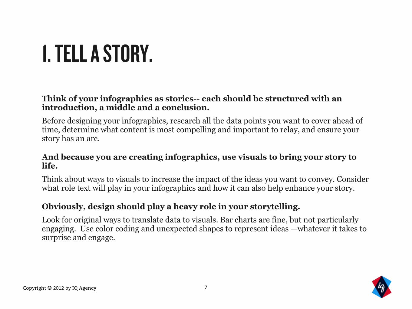
1. TELL A STORY.
Think of your infographics as stories-- each should be structured with an introduction, a middle and a conclusion.
Before designing your infographics, research all the data points you want to cover ahead of time, determine what content is most compelling and important to relay, and ensure your story has an arc.
And because you are creating infographics, use visuals to bring your story to life.
Think about ways to visuals to increase the impact of the ideas you want to convey. Consider what role text will play in your infographics and how it can also help enhance your story.
Obviously, design should play a heavy role in your storytelling.
Look for original ways to translate data to visuals. Bar charts are fine, but not particularly engaging. Use color coding and unexpected shapes to represent ideas —whatever it takes to surprise and engage.
7

Copyright © 2012 by IQ Agency
TELLING A STORY:
POOR EXAMPLE
1. This infographic represents the environmental benefits of freight rails, but offers no story or natural flow of content.
2. While the green implies being environmentally friendly, too much green causes the data to get lost.
3. The images are a good start in terms of visualizing the content, but they misrepresent the numbers that the data calls out.
3
2
1
Full Infographic:http://visual.ly/environmental-benefits-freight-rail
Copyright © 2012 by IQ Agency
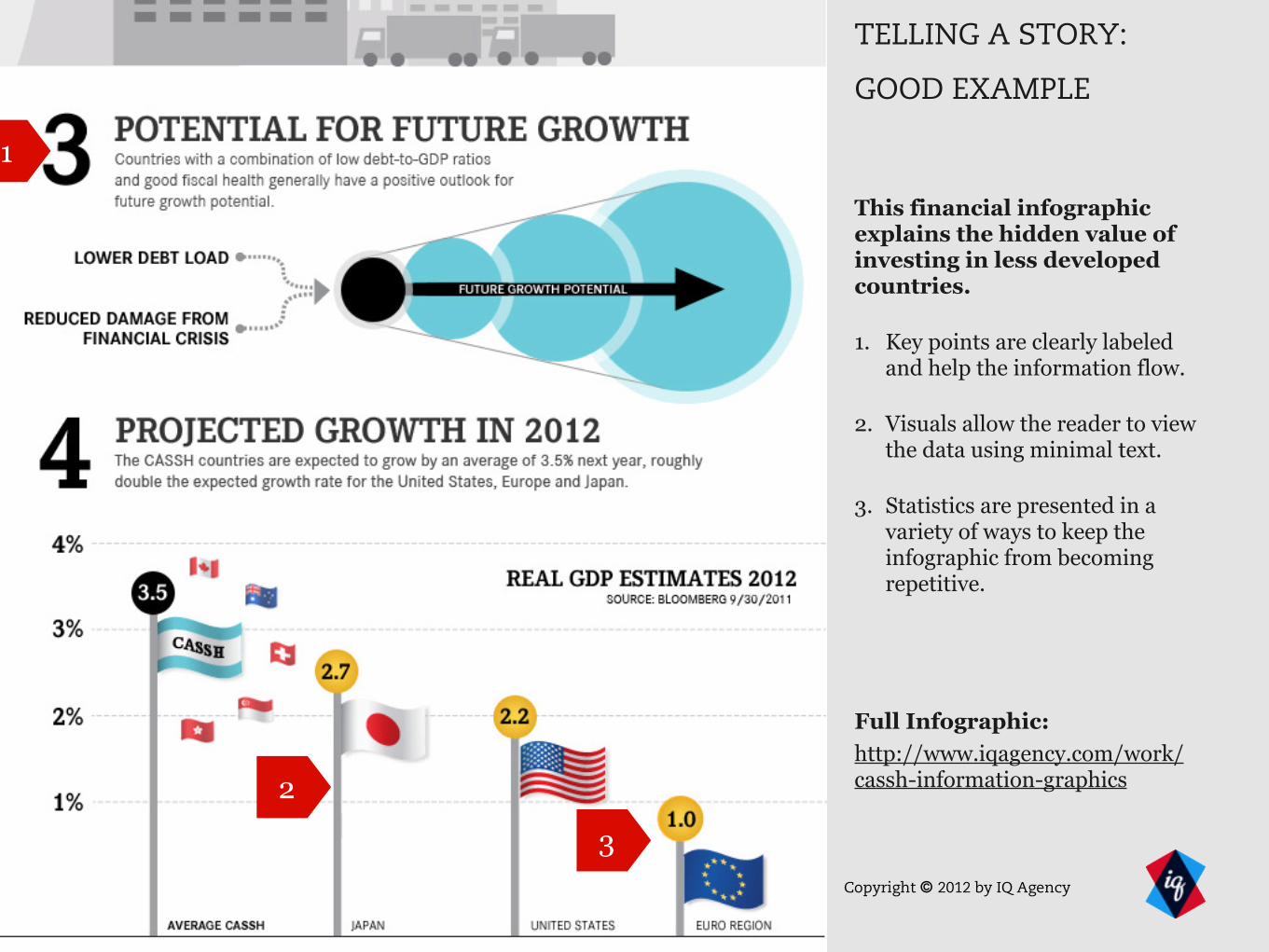
TELLING A STORY:
GOOD EXAMPLE
This financial infographic explains the hidden value of investing in less developed countries.
1. Key points are clearly labeled and help the information flow.
2. Visuals allow the reader to view the data using minimal text.
3. Statistics are presented in a variety of ways to keep the infographic from becoming repetitive.
1
2
3
Full Infographic:http://www.iqagency.com/work/cassh-information-graphics

Copyright © 2012 by IQ Agency
2. PICK THE RIGHT VISUALS.
The types of infographics you will need to create will be determined by the data you are trying to convey.
What data points do you have? Are they statistics? Timelines? Processes? Geographically organized? How you present your data will be contingent upon this point.
Begin with the data, not the design.
What may have appeared to be a process flow when you began may turn into a timeline by the time you are finished. While data visualization may seem like the most exciting step, it is important to begin and plan with a content audit before working on a conceptual wireframe.
Consider where your readers will access your infographic.
Will your users be at their desk when they see your infographic? Or will they more likely be on a mobile device? Or an iPad? If possible conduct customer research before starting to ensure it will be optimized for the appropriate audience.
Not all visualizations are created equal.
Just because you can present content through a creative visualization doesn’t mean you should. There should be connectivity between what you are trying to say and what you are visually showing. If the content you have is best presented in a pivot table, it may not lend itself to presentation as a simplified graphic.
10

Copyright © 2012 by IQ Agency
PICKING THE RIGHT VISUALIZATION:
POOR EXAMPLE
1. This infographic of the anatomy of a vegan misuses bar charts so that no numbers pop and labels are difficult to read.
2. The graphic points to illustrations that don’t seem to have any recognizable relationship with the numbers.
1
2
Full Infographic:http://www.advancedphysicalmedicine.org/anatomy-of-vegan-infographic.php

Copyright © 2012 by IQ Agency
PICKING THE RIGHT VISUALIZATION:
GOOD EXAMPLE
This infographic explains where to invest cash.
1. Playbook style illustrations complement the sports theme and clearly segment different types of investments.
2. Statistics are introduced and viewed using large, clear images and can be identified at a glance through color and placement.
1
2
2 Full Infographic:http://www.iqagency.com/work/b2c-marketing-infographic

Copyright © 2012 by IQ Agency
3. KEEP IT SIMPLE.
People should be able to understand what you are trying to convey in seconds.
Anything longer and it’s no longer simple. Even if the subject matter is advanced and might take longer to process the actual data, the basic subject matter should be clear in a matter of seconds.
Use text sparingly and graphics that enhance the subject matter.
Remember, it’s an image. The objective is to create “graphical representations of information.”
Be conservative in the use of different fonts.
The text you use should be easy to spot and read. Using more than three fonts creates clutter and degrades the illustrative nature of infographics.
Don’t make it long just for the sake of making it long.
Sometimes it makes sense to have long, scrolling infographics, as long as every piece of content has a specific reason for being there. Keep your ideas focused. It’s not a term paper. The fewer ideas you communicate the more likely they will be successfully consumed.
13

Copyright © 2012 by IQ Agency
KEEPING IT SIMPLE:
POOR EXAMPLE
This infographic highlights key dates in African-American history.
Unfortunately, it is impossible to follow any sort of flow of content due to too many words, no recognizable order, and no imagery to back up the data.
Full Infographic:http://www.wallstats.com/389yearsago/

Copyright © 2012 by IQ Agency
1
2
3
KEEPING IT SIMPLE:GOOD EXAMPLE
1. This horizontal infographic on the trustworthiness of beards demonstrates how a simple design can still be compelling.
2. Color is used subtly to show a range from very trustworthy to dangerous.
3. While each beard is labeled, providing an additional level of humor isn’t necessary: the simple beard graphic clearly demonstrates the information without words.
Full Infographic:http://visual.ly/how-much-you-can-trust-bearded-man

Copyright © 2012 by IQ Agency
4. STAY TIMELY.
Infographics are trendy
Infographics often highlight current themes in the marketplace or in a particular industry using timely data. For that reason, it is important to design your infographics to feel current and up-to-date.
Prepare to revise.
If you want to provide content that feels current, be it a trend in the stock market, a surge of interest in the social media world, or a new fad diet, be prepared to revise it to constantly stay on top of the trend.
Make sure you date your work.
If you don’t properly label data that is time-sensitive, users will discredit the information. Make sure to be upfront and clear about statistical data.
16

Copyright © 2012 by IQ Agency
STAYING TIMELY:
POOR EXAMPLE
1. This “Top 10” infographic is cleverly done in terms of making the bar chart into books on a bookshelf.
2. However, the books run the risk of becoming out of date as new popular books are added to the mix.
3. Because no date is added to the infographic, it’s difficult to determine whether the information is still valid or not.
Full Infographic:http://visual.ly/top-10-most-read-books-world

Copyright © 2012 by IQ Agency
STAYING TIMELY:
GOOD EXAMPLE
1. The infographic is dated at the top so readers know they are reading a recent version.
2. This infographic calls out key dates and investment implications of the Eurozone crisis which can be identified quickly at first glance.
3. This is a great way to keep viewers coming back to an infographic and establishing yourself as a consistent, credible source of timely information.
1
2
3
Full Infographic:http://www.iqagency.com/work/ishares-good-infographics

Copyright © 2012 by IQ Agency
5. MAKE IT SHAREABLE.
Display your infographics where your audiences congregate.
Blogger outreach is a great way of approaching this. For example, stock trading infographics will receive more impressions when posted on popular financial networks.
Use company branding sparingly to avoid the presumption of biased content.
You want your company to show what you know about a topic, rather than focusing on how your company owns that topic. Remember, these are infographics not advertisements.
Optimize so that sharing features are available.
This can be approached in multiple ways, such as social media buttons for Facebook, Twitter, and Pinterest, or using social sharing tools like ShareThis.
Use web sites optimized for sharing infographics like Visual.ly or Pinterest to create impressions outside your typical target audience.
Believe it or not, many people actually like infographics, not simply because of the subject matter they convey, but because they simply like infographics!
19

Copyright © 2012 by IQ Agency
SHARING INFOGRAPHICS
1. Some infographics offer the ability to pin, tweet, or share the graphic.
2. Others might go as far as to craft an additional data point on behalf of the user, making it even easier to pass relevant information to the masses and spread impressions.
1
2
Copyright © 2012 by IQ Agency
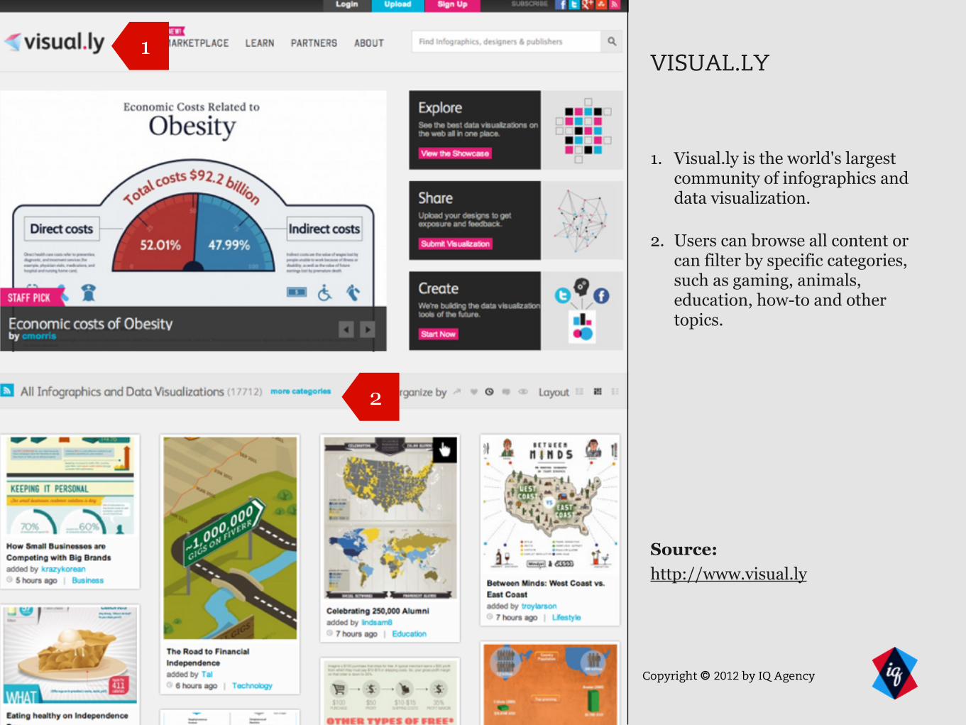
VISUAL.LY
1. Visual.ly is the world's largest community of infographics and data visualization.
2. Users can browse all content or can filter by specific categories, such as gaming, animals, education, how-to and other topics.
1
2
Source:http://www.visual.ly

Copyright © 2012 by IQ Agency
Pinterest is another location where infographic enthusiasts mine for information content, regardless of the topic.
Source:http://www.pinterest.com

Copyright © 2012 by IQ Agency 23
STORYTELLING VISUALIZATION SIMPLICITY TIMELINESS SHARABILITY
Does it have a beginning, middle, and end?
Do your visuals bring it to life?
Have you considered unusual design elements to set yourself apart?
Have you gathered and reviewed all data points?
Have you designed based on where users will view your infographic?
Is the research you’ve compiled compelling enough for an infographic?
Can your topic be identified in seconds?
Do you use text sparingly?
Do you use fonts conservatively?
Does it have a particular focal point?
Will your design withstand current trends?
Will you able to update timely information?
Is all time-sensitive data annotated and/or cited appropriately?
Is your graphic displayed where your target audience is?
Have you limited your branding?
Have you planned for sharing features?
Have you posted to infographics sites?
PUNCH LIST FOR YOUR NEXT INFOGRAPHIC

Copyright © 2012 by IQ Agency
THANK YOU
To get in touch with IQ, call us at:678-449-2021or visit: iqagency.com