3. production experiments (kr)
TRANSCRIPT

Experiments
Kelly Rodgers

Process
I started to make a fishing magazine cover. The first thing I did was find an appropriate image from Google to use as a background. I found a light image therefore I would be able to use darker coloured fonts to overlap it. The next thing I did was use the text tool to create a title of the magazine, this would have to be in a bigger font than everything else that is going to be on the page. I used the character settings to change the font and the colour to blue which represents the fishing theme. I then free transformed the title and made it horizontal so I could put things around it.
The next thing I did was add a price to the magazine, I used the shape tool to draw a spikey circle which I changed to colour of. I then used the text tool to write the price in a simple font with the colour black. I then used the shape tool again to draw 3 simple curved squares to make a strip of picture I could put into them. This is sometimes seen on magazine covers and it gives the audience an idea to what is going to be inside the magazine.

Process
Most magazine covers have text the overlaps the main picture od goes behind the main picture. To do this I used the quick select tool to cut around the fish in the middle of the background image. I then copy and pasted the fish so I had two copies. I think cut out fish will sit on top of the original image but I would be able to make it overlap other parts of the magazine cover.
I used Google to find a selection of interesting fishing images. I placed each image of the box that I was going to put them in and I then merge the box and the image together. The next thing I did was use the quick select tool to cut around the left of part of the image, this meant that I could delete it and the images wouldn’t overlap the outline square. I might use this design/idea in my final piece.

Process
I noticed that most magazine covers have included barcodes on the front cover, I did this by using a barcode image from Google. I then used an image of a circle shape for Google which I changed the contrast on the the darker red became darker. I then used the text tool again to wrote the top 10 which I placed inside the circle like I did for the price.
I stared to add text around the image of the fish. I used the text tool again to do this and change the size and colour so it stands out. I used titles that the audience would find interesting and catchy. I used my second picture of the fish to put over the original fish so if the text went behind the fish it wouldn’t be a problem. I also added a fishing sign picture to add more detail and fill in the blank space.
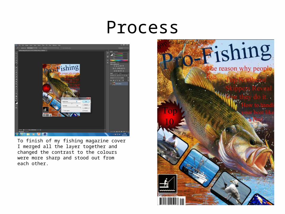
Process
To finish of my fishing magazine cover I merged all the layer together and changed the contrast to the colours were more sharp and stood out from each other.

Reflection
• What elements of your experiments will you include in your final product?
In my final product I am going to use a similar layout to the one I have used for the fishing magazine cover. I will used sans-serif fonts and simple colours. I like the collection of images I have used in a row which I might use on my final product and I might also include the same layout of text. I will also the same type of colours on my final product because I want my magazine cover to be bright and vibrant, this means that I will have to use a film that is either a comedy or family film.