2016-2 - escribiente calligraphy...
TRANSCRIPT

N E W S L E T T E RESCRIBIENTE is Albuquerque’s Calligraphic Society open to anyone interested in the fine art of beautiful lettering.
2016-2

2
A Wor d f ro m You r
Escribiente is a non-profit organization of persons dedicated to the advancement and pro-motion of calligraphy. Meetings are held at 6:30 pm on the first Wednesday of each month, except for January and July. December’s holiday meeting will be announced. We meet at Manzaño Mesa Multi-Generational Center (southwest corner of Elizabeth and Southern). Yearly dues are $30. with online newsletter and $40. with printed and mailed newsletter. Dues are not pro-rated and are payable May-June. Benefits of membership include: receiv-ing the newsletter, book, tape or DVD checkout from our lending library, discounts to attend
workshops, and a discount at Artisan’s Art Supply.Dues should be mailed to: Escribiente, P.O. Box 30166, Albuquerque, NM 87190.
Escribiente’s Newsletter is published 3 times a year, supplemented by monthly e-flyers. Articles from this newsletter are under copyright, and may not be reprinted without permis-sion from the editor. Do you want your work featured in the Newsletter? Or do you have an
article of interest you would like to publish, or an event you would like to publicize? Send information to:
Julie Gray, 29 Kiva Loop, Sandia Park, NM 87047 or email to inkster1 at juno.com
COVER ART
Our beautiful cOver art is by Pat vizzini, dOne in barry MOrentz class, Gothic Splendor at letters-califOrnia style. see MOre Of Pat’s wOrk frOM the
class On Page 6.
COMMITTEE CHAIRS 2016-2017E-NEWS • Bill Kemp • brotherbill55 at hotmail.comFUNDRAISING • Rodger Mayeda • rmayeda at cableone.netHOSPITALITY • Beth House • house.richard807 at gmail.comLIBRARY • Trish Meyer • trish at crishdesign.comMATERIALS • Janice Gabel • janice.gabel at gmail.comMEMBERSHIP • Julie Gray • inkster1 at juno.comNEWSLETTER • Julie Gray • inkster1 at juno.comMONTHLY FLYER • Lynda Lawrence • lynda33 at hotmail.comPROGRAMS •Trish Meyer • trish at crishdesign.com
Patty Hammarstedt • pattyham at me.comPUBLICITY • Miriam Simmons • mirsimmons at msn.comREFRESHMENTS • Ginger Larkin • [email protected] • Beth House • house.richard807 at gmail.comSTATE FAIR • Beth House • house.richard807 at gmail.comWORKSHOPS • Jan Florence • jsfcallig at yahoo.comMINI-WORKSHOPS • Beth McKee • alphabeth55 at gmail.com
BOARD OF DIRECTORS 2016-2017PRESIDENT • Evelyn Costello • evelyncostello at msn.comVICE PRESIDENT • Trish Meyer • trish at crishdesign.comSECRETARY • Diane Inman • inmanbecker at yahoo.comTREASURER • Catherine Hogan• chogan424 at gmail.com
ESCRIBIENTE P.O. Box 30166Albuquerque, NM 87190
2016-2 ESCRIBIENTE NEWSLETTER
Opportunities to expand your calligraphic horizons are com-ing your way with a new year of meeting programs and workshops. Nancy Culmone will be here September 24-25, 2016 and Yukimi Annand is scheduled for April 2017. Need inspiration for a piece that could end up in a show later this year? Check out our exten-sive, newly updated library. Entries for the juried show at Open Space later this year should have a nature theme, so get your typing fingers going to search the internet for appropriate quota-tions. Our members have talents in many artis-tic areas and it is always interesting to see how those talents can come together with calligraphy. So if you want to delve into something that will enhance your calligraphy, there probably will be a member to help you with your creation. I invite you to share new discoveries/projects
on our Facebook page. There are a number of other ways you can participate:
• Enter your work in the State Fair, Creative Arts Building• Make bookmarks during the State Fair• Take a class with Bill Kemp,Jan Florence or Beth House
• Letter ornaments for PresbyterianHospital
• Join the holiday card exchange• Attend the holiday pot luck• Make a valentine in January for nursinghome residents
Time to use your imagination and your skills!
Your President,
3
ESCRIBIENTE NEWSLETTER 2016-2
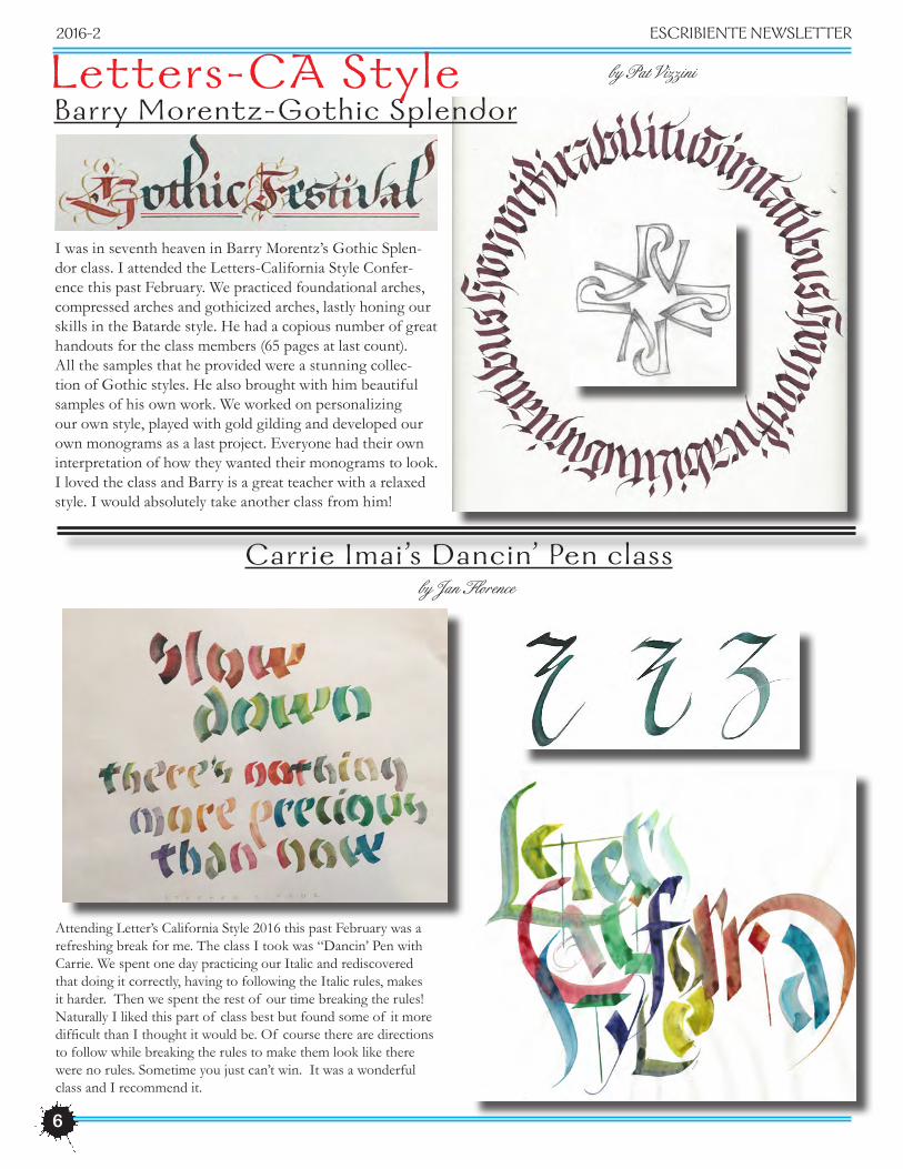
Julie Gray’s winning envelope for the Graceful Envelope Contest 2016. To see all the winning envelopes, go to: www.calligraphersguild.org and click on Graceful Enve-lope.
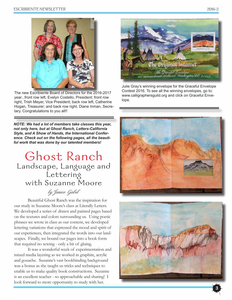
The new Escribiente Board of Directors for the 2016-2017 year...front row left, Evelyn Costello, President; front row right, Trish Meyer, Vice President; back row left, Catherine Hogan, Treasurer; and back row right, Diane Inman, Secre-tary. Congratulations to you all!!
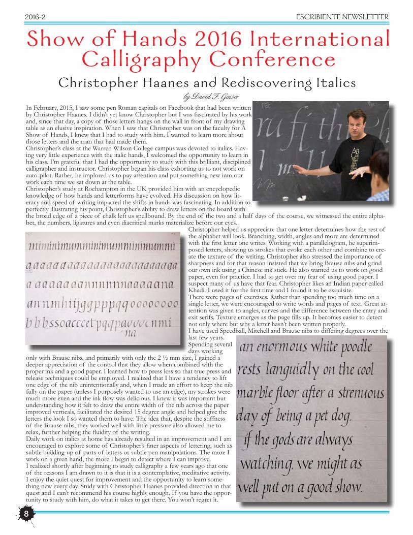
Beautiful Ghost Ranch was the inspiration for our study in Suzanne Moore’s class at Literally Letters. We developed a series of drawn and painted pages based on the textures and colors surrounding us. Using poetic phrases we wrote in class as our content, we developed lettering variations that expressed the mood and spirit of our experiences, then integrated the words into our land-scapes. Finally, we bound our pages into a book form that required no sewing - only a bit of gluing. It was a wonderful week of experimentation and mixed media layering as we worked in graphite, acrylic and gouache. Suzanne’s vast bookbinding background was a bonus as she taught us tricks and techniques to enable us to make quality book constructions. Suzanne is an excellent teacher - so approachable and sharing! I look forward to more opportunity to study with her.
Ghost RanchL andscape, L anguage and
Letteringwith Suzanne Moore
by Janice Gabel
NOTE: We had a lot of members take classes this year, not only here, but at Ghost Ranch, Letters-California Style, and A Show of Hands, the International Confer-ence. Check out on the following pages, all the beauti-ful work that was done by our talented members!

4
2016-2 ESCRIBIENTE NEWSLETTER
Bill Kemp
by Thelma Hahn
Acanthus leaves seem to be the premier ornamental scroll for the Victorian Pen that Heather Held taught in her workshop here in Albuquerque in April. The use of these leaves go back for centuries and even appear on our older paper monies. Brown McCaffery and Ziller Buffalo Brown ink was used for its waterproof qualities, plus being less harsh than black, and giving our florals more of a Victorian look.Watercolor pencils, watercolor paint, gold ink as well as gold leaf, and pastels were the main supplies used to produce these beautiful delicate florals. They were ac-cented with tiny crystals and gold.Ornate initials embellished with floral or foliate forms turned out quite nicely. The class ended with excellent work created by the students, and Heather did a won-derful job encouraging all of us!

5
ESCRIBIENTE NEWSLETTER 2016-2
Janice Gabel Julie Gray Lynda Lawrence
Ron Peterson
Trish Meyer
Rodger Mayeda
Meagan Goodenough
Heather giving Pat graphite tips.
Pat Vizzini
Ginger Larkin
6
2016-2 ESCRIBIENTE NEWSLETTER
Barry Morentz-Gothic Splendor
Carrie Imai ’s Dancin’ Pen class
Attending Letter’s California Style 2016 this past February was a refreshing break for me. The class I took was “Dancin’ Pen with Carrie. We spent one day practicing our Italic and rediscovered that doing it correctly, having to following the Italic rules, makes it harder. Then we spent the rest of our time breaking the rules! Naturally I liked this part of class best but found some of it more difficult than I thought it would be. Of course there are directions to follow while breaking the rules to make them look like there were no rules. Sometime you just can’t win. It was a wonderful class and I recommend it.
by Jan Florence
by Pat VizziniLetters-CA Style
I was in seventh heaven in Barry Morentz’s Gothic Splen-dor class. I attended the Letters-California Style Confer-ence this past February. We practiced foundational arches, compressed arches and gothicized arches, lastly honing our skills in the Batarde style. He had a copious number of great handouts for the class members (65 pages at last count). All the samples that he provided were a stunning collec-tion of Gothic styles. He also brought with him beautiful samples of his own work. We worked on personalizing our own style, played with gold gilding and developed our own monograms as a last project. Everyone had their own interpretation of how they wanted their monograms to look. I loved the class and Barry is a great teacher with a relaxed style. I would absolutely take another class from him!

7
ESCRIBIENTE NEWSLETTER 2016-2
by Ginger Larkin
This was a fun class and is a way to practice pointed pen with a modern flare. We used Higgins Eternal ink with a few drops of gum arabic and a pointed pen nib in an oblique holder. We started making marks being sure to have some contrast with pressure on the down stroke and no pressure on the upstroke. You can use a pencil to make an outline of a shape such as florals in a flower pot, faces, figures and Christmas trees. You can also use stencils for basic shapes. We used layout paper and copied our designs onto card stock then added color and bling. Linda is a high energy instructor and kept the class mov-ing. Use smaller pieces of paper and turn the paper as you are working. Everyone went home with several cards, designs and ideas for future projects. Linda does have a book available.
Doodles to Designswith Linda Schneider
Connor McHarney, grandson of member Caryl McHarney and winner of an Escribiente Youth Award several years ago, continues the family calligraphy tradition demon-strating Black Letter at the Celtic Festival in May. Connor is a student at UNM.
Celebrating Jan Florence’s 3 years being President of Escribiente, plus her two years 1997-1999. Thanks Jan for your long and loyal dedication to Escribiente!
8
2016-2 ESCRIBIENTE NEWSLETTER
Show of Hands 2016 InternationalCall igraphy Conference
In February, 2015, I saw some pen Roman capitals on Facebook that had been written by Christopher Haanes. I didn’t yet know Christopher but I was fascinated by his work and, since that day, a copy of those letters hangs on the wall in front of my drawing table as an elusive inspiration. When I saw that Christopher was on the faculty for A Show of Hands, I knew that I had to study with him. I wanted to learn more about those letters and the man that had made them.Christopher’s class at the Warren Wilson College campus was devoted to italics. Hav-ing very little experience with the italic hands, I welcomed the opportunity to learn in his class. I’m grateful that I had the opportunity to study with this brilliant, disciplined calligrapher and instructor. Christopher began his class exhorting us to not work on auto-pilot. Rather, he implored us to pay attention and put something new into our work each time we sat down at the table.Christopher’s study at Roehampton in the UK provided him with an encyclopedic knowledge of how hands and letterforms have evolved. His discussion on how lit-eracy and speed of writing impacted the shifts in hands was fascinating. In addition to perfectly illustrating his point, Christopher’s ability to draw letters on the board with the broad edge of a piece of chalk left us spellbound. By the end of the two and a half days of the course, we witnessed the entire alpha-bet, the numbers, ligatures and even diacritical marks materialize before our eyes.
Christopher helped us appreciate that one letter determines how the rest of the alphabet will look. Branching, width, angles and more are determined with the first letter one writes. Working with a parallelogram, he superim-posed letters, showing us strokes that evoke each other and combine to cre-ate the texture of the writing. Christopher also stressed the importance of sharpness and for that reason insisted that we bring Brause nibs and grind our own ink using a Chinese ink stick. He also wanted us to work on good paper, even for practice. I had to get over my fear of using good paper. I suspect many of us have that fear. Christopher likes an Indian paper called Khadi. I used it for the first time and I found it to be exquisite.There were pages of exercises. Rather than spending too much time on a single letter, we were encouraged to write words and pages of text. Great at-tention was given to angles, curves and the difference between the entry and exit serifs. Texture emerges as the page fills up. It becomes easier to detect not only where but why a letter hasn’t been written properly.I have used Speedball, Mitchell and Brause nibs to differing degrees over the last few years. Spending several days working
only with Brause nibs, and primarily with only the 2 ½ mm size, I gained a deeper appreciation of the control that they allow when combined with the proper ink and a good paper. I learned how to press less so that true press and release techniques could be employed. I realized that I have a tendency to lift one edge of the nib unintentionally and, when I made an effort to keep the nib fully on the paper (unless I purposely wanted to use an edge), my strokes were much more even and the ink flow was delicious. I knew it was important but understanding how it felt to draw the entire width of the nib across the paper improved verticals, facilitated the desired 15 degree angle and helped give the letters the look I so wanted them to have. The idea that, despite the stiffness of the Brause nibs, they worked well with little pressure also allowed me to relax, further helping the fluidity of the writing.Daily work on italics at home has already resulted in an improvement and I am encouraged to explore some of Christopher’s finer aspects of lettering, such as subtle building-up of parts of letters or subtle pen manipulations. The more I work on a given hand, the more I begin to detect where I can improve.I realized shortly after beginning to study calligraphy a few years ago that one of the reasons I am drawn to it is that it is a contemplative, meditative activity. I enjoy the quiet quest for improvement and the opportunity to learn some-thing new every day. Study with Christopher Haanes provided direction in that quest and I can’t recommend his course highly enough. If you have the oppor-tunity to study with him, do what it takes to get there. You won’t regret it.
Christopher Haanes and Rediscovering Italicsby David F. Gasser

9
ESCRIBIENTE NEWSLETTER 2016-2
Elmo van Slingerland ‘Roman Capital-From Slow to Fast’
Show of Hands 2016 InternationalCall igraphy Conference
by Julie Gray
Elmo van Sling-erland from the Netherlands,being new to teaching in the USA, was probably as nervous as all 16 of us were, but he sure isn’t new to teaching calligra-phy at all. In fact he is a mentor to many top named calligraphers in this country and all over the world. Studying the Roman alphabet is something I have always dreaded.They are difficult to learn, having to concentrate on the letterforms, the proportions, pressure and release, serif structure, pen angle, pen manipulation and spacing...all at the same time. But to know Roman Caps is to love them. And love them we did! From the very formal to the ex-citing informal to the gestural. It was a great class. Elmo’s a gentle teacher, and now all I need is the practice!

10
Beth House demoing color blending
Diane Inman demoing color pencil on mylar
Lynda Lawrence dem-oing
graphite
Lynda Lawrence
Bill Kemp with hisexquisite
Certificate of Merit

11
ESCRIBIENTE NEWSLETTER 2016-2
Ghost RanchThe versatil ity of the Versal with Gemma Black
This was a class at Ghost Ranch which is a beautiful and inspiring setting for a calligraphy class. We started by grinding stick ink and using a small Brause or Mitchell nib 20 to 23 pen widths high. We worked on formal letters that are basically drawn and filled in. The following day we progressed to more relaxed David Jones style letterforms and writing with gouache. Gem-ma recommends preparing gouache the day before. We learned to write in a spiral and we used graphite on black paper which was quite striking. Gemma Black, from Australia, is one of the best instructors I have had and provided us with a wealth of information
by Ginger Larkin
L andscape, L anguage & Letters: L andscape as In-spiration in Lettering Design with Suzanne Moore
by Beth HouseBriefly, a couple of pictures show Suzanne’s demo of letters following the landscape of Ghost Ranch.
When lettering, she mixed gouache with a few drops of matte medium. Then an acrylic wash wouldn’t reconstitute the gouache letters. We developed textures to use under various media creating additional effects. Some flimsy textures were made stable by heavily painting them with matte medium. For layering let-tering or other media over absorbent sur-faces, Suzanne has found that a mixture (4-1 or 5-1) of Golden Varnish-Palmer Varnish
with UVLS (Satin) works the best. She mixes a small amount per project (only good for 24 hours) and sprays lightly several times. We enjoyed seeing one of her handmade editions of the book: “Zero”. I’m always impressed by Suzanne’s research of subject matter, materials and process and thankful she takes the time to teach and share”

12
2016-2 ESCRIBIENTE NEWSLETTER
Ghost RanchThe versatility of the Versal
with Gemma Blackby Margie Disque
I arrived in my class at Ghost Ranch completely clueless. I thought I knew what a versal was, but I was wrong. To begin, an x-height of 20-23 pen widths? Seriously? Seriously! Gemma took us from classic Versal forms up to modern hands influenced by David Jones: 800 years in one week! She’s such an excellent tutor. Evi-dently Aussies don’t teach, they tutor. More learning! I appreciate her mastery of historical references as well. That girl knows her craft and shares her knowledge generously. All in all, a lovely week in a beautiful place.
The versatility of the Versal with Gemma Black
by Thelma Hahn
After a few moments Gemma's fascinating Australian accent was understood and the focus was on learning all we could about THE VERSATILITY OF VER-SALS. She had us go through centuries of this his-torical hand to present day applications. We practiced David Jones "style" of versals which elaborated subtle ways of manipulating upper case letters. This modern day calligrapher/artist from Wales has a book that Gemma highly recommends, THE PAINTED IN-SCRIPTIONS OF DAVID JONES.Gemma mixes her gouache one day and uses it the next. To make 1/2" in a cup, mix gouache w/distilled water to light cream consistency. Add 2 drops of gum arabic. Blend and allow to dry into dry cake. Glycerin in tube paint will evaporate off. She also showed us how to construct a spiral.Gemma had us use David Jones style writing in a block. The main text was written in a vertical block with the quote remainder added on 3 sides of the margin. The traditional show and tell on the last night of the course exhibited the many approaches to her teaching.

13
ESCRIBIENTE NEWSLETTER 2016-2
The Real Reason We Put Stamps in the Top Right Corner(Left handers are NOT going to like this one bit)
from Good Housekeeping Magazine
There’s nothing like receiving a hand written note in the mail. In the age of email, it’s an extremely romantic and thoughtful gesture. But one thing you probably don’t think a lot about. Why you place that little square stamp in the top right-hand corner--verses, oh, any-where else. “When postage stamps were first issued in this country in 1847, there appears to have been a great deal of confusion over how to use them and possibly also where to place them, at least for a time,” Daniel Piazza, Chief Curator of Philately at the Smithson-ian National Postal Museum, stated. During that time, letters were hand sorted by postal clerks, so placement wasn’t as important. But once machines were intro-duced in the 1890’s, a standard had to be chosen. Sorry left-handers, it’s believed the location was chosen based on the dominant right hand of most mail handlers. However, today letters are optically scanned so if you want to boycott right hand favoritism, you
can. Sue Brennan, a senior public relations representa-tive with the USPS, says if the stamp isn’t in it’s desig-nated spot, the letter just ends up in a pile for human eyes to evaluate. “Your letter wouldn’t be thrown out if you didn’t follow the guidelines” Brennan said, “but using them could speed up the processing and subsequent delivery.” So maybe just don’t rebel against the system when you’re sending an already late bill payment by snail mail.
Editor’s Note...I have sent many envelopes to the Graceful Envelope Contest with the stamp(s) put anywhere and everywhere on the face of the envelope, and in the 16 years I have sent them in, only one did not make it. Check out the winning envelopes over the years at: www.calligrapher-sguild.org. Click on Graceful Envelope Contest, then view winning envelopes for each year on the right in red. The stamps are put in all sorts of locations! It also helps if you hand cancel the stamp yourself when you take it to the post office.

2016-2 ESCRIBIENTE NEWSLETTER
Christopher Haanes‘ It Isn’t a Foundational ’ and ‘Rediscover Italic’
by Megan Maksimovich GoodenoughThis year just outside of Asheville, NC, I had a glorious week at the international calligraphy conference where I was in two 2.5 day classes with the wonderfully wry Christopher Haanes. We focused on the pure letter-forms to begin with in each class and then moved into more finessed pen manipulation and retouching (when or if we felt ready). Having little experience with the foundational hand, I stayed close to the basic forms; and being a bit more familiar with the italic hand, really enjoyed the evolution I could eke out with the beauti-ful, light-touch refinements he taught. CH is the only Norwegian Fellow of the SSI, having completed the Roehampton course with merit in 1989 -- and he car-ries forward a tradition of elegant, clean writing that sometimes gets overlooked in a time of so many expres-sionist possibilities. It was a perfect class for my fellow classmates and me who get a chill from learning about a letter done exquisitely. It was a lot of work and there will be more practice ahead, but we all saw improvement and encouraging signs of even better letters to come!
Show of Hands 2016 InternationalCall igraphy Conference
14

15
ESCRIBIENTE NEWSLETTER 2016-2
Now for Purchase!
Sharon Zeugin on Developing a Personal
Scriptby Evelyn Costello
At the April meeting, Sharon described her full circle journey as a calligrapher from her Girl Scout days in 1968 using the Speedball Textbook to learn let-ters, to becoming a contributor in the latest edition of the Speedball Textbook. Along the way to her current home in Austin, Texas, she also studied in England at the Roehampton Institute with Ewan Clayton. Studies there included life drawing which worked its way into her collage. She found herself us-ing the same tools for her illustrations and her calligraphy.
Sharon said it was a radical notion to begin using her own words and to develop her own script to fully express herself. As calligraphers, we do not have to be bound by the rules of typography and geometry. She has been guided by the three questions always asked by her teachers at Roehampton; what do you want to say, why do you want to say it and how do you want to say it?
One of the personal scripts that Sharon is cur-rently perfecting is based on the grackle--a black bird common in much of Texas. The script, she says, needs to be in service of the words and so she is trying to capture in words and script the obnoxious cacophony of the bird which she calls the cockroach of birds. So, taking her #5 Speedball nib, she focused on the ges-ture and motion that would help display the sound of
the raucous chatter of the bird. Sometimes, she even taps her feet to keep up with the rhythm of writing.
Sharon encourages everyone to do that which gives you joy, noting that there is a time to draw out of the lines as well as a time for formal calligraphy. Play strengthens the discipline of lettering, and Sha-ron says; “Let your life proceed with its own design.”
Contact Caryl McHarney (carylcrane007 at gmail.com) to purchase one of these glorious coloring books for $10 which includes shipping. Many Escribiente members did a page in many different and unique styles for you to color! This makes a great gift! Thanks to Caryl for the idea, organization and production of this wonderful coloring book.
14
grand TIPS FOR color...
be sure tO see yOur newsletter and Other interesting iteMs relating tO calligraPhy On
escribiente’s website: http://www.escribiente.org
We have the most amazing printer for our newsletter!
SPEEDZONEPrint and Copy
6000 Lomas NESupport them with all your copying and printing needs.
They are good...and fast! Plus they can even make rubber
stamps for you!Contact: Frank Horner or
Nanette Ely-Davies at:505-262-2679
The deadline for submissions for upcoming issues of Escribiente...2017-1 ISSUE: deadline is DECEMBER 1ST, 2016
2017-2 ISSUE: deadline is APRIL 1ST, 20172017-3 ISSUE: deadline is AUGUST 1ST, 2017
2018-1 ISSUE: deadline is DECEMBER 1ST, 20172018-2 ISSUE: deadline is APRIL 1ST, 2018
Any information and/or artwork you have is welcome! Classes you’ve attended, artwork you have done, tidbits of news, awards you’ve won, book reviews, a favorite material you can’t wait to tell everyone
about, upcoming shows, classes you are teaching, etc. etc. This is YOUR connection with thecalligraphic world in New Mexico and beyond...we always welcome your input!
IF you would like to have your monthly flyer, produced by Lynda Lawrence, mailed to you, please
contact her at:lynda33 at hotmail.com
otherwise she will e-mail it to all members.
IF you would like to receive up-to-the-minute information and news
relating to Escribiente and it’s members, send your e-mail address
to Bill Kemp at: brotherbill55 at hotmail.com
and he will add you on.
2016-2 ESCRIBIENTE NEWSLETTER
To darken a color, use its complementary color. Do not use black.Handscript, Houston Guild
For a glitter effect, put bronze powder into Gum Arabic, then add to gouache or ink. Mix and write.Harvey’s Helpful Hints
There is a simple test to determine if the colorant in an ink is a pigment or dye. With an eyedropper, place three drops of ink on a saucer, tile or any other ceramic surface. Then add three drops of laundry bleach. This will kill the color of most dye inks rather quickly. The color of pigment ink is tougher to kill.Cyberscribes
To make your signature an integral part of a calligraphic piece, brush clean water onto the paper where the signa-ture will be. Immediately pass over it with a brush loaded with one of the colors used in the artwork. Sign your name in this area with a dead ball point pen. Quickly wipe away excess paint with a paper towel. Your signature will show up nicely, blended with the rest of the work. Practice on a scrap of paper first.Nib Notes, quoting Kathy Verona
To increase ink flow, add rubbing alcohol. To slow or de-crease ink flow, add vinegar.Friends of the Alphabet, Atlanta
Place a few drops of water on the pans of Pelikan Opaque Watercolors and wait briefly for it to soften. Gradually add water, drop by drop, mix with a brush and feed into the pen. The paint flows through nicely and produces colored letters, which are more transparent than gouache or ink and less transparent than true watercolors. Feed different colors into the pen without cleaning, and the letters will gradually change color.Pen and Ink Arts
When using different colors of ink on one line, plan the words so the vowels are written in lighter colors.Timothy Botts
For a truly gorgeous red, mix equal parts of Cadmium Red Light (warm red) and Primary Red (cool red). The new red hits the middle of the spectrum.Dallas Calligraphy Guild
Look for AA on Windsor & Newton tubes of color. A, B and C indicate light fastness, C being the most fugitive. If a mixture of two colors fade, the color fades towards the more permanent. Magenta and Rose were not particularly permanent colors - until now. Look for ‘Quinacridone’ in the color name, which indicates new permanent Rose and Magenta colors.Sheila Waters
Watercolor and gouache (with white added for opacity) can be mixed together.Sheila Waters
Mix gouache 24 hours before use, to allow glycerin to evaporate; it will flow better.Waco Calligraphy Guild
Pro White combined with gouache produces a raised look when writing with a Copperplate pen.Valley Calligraphy Guild
Stark black can deaden a piece. Mix other colors used in the piece, to the black. This helps to achieve color unity.Leanna Fay
To make Higgins Eternal write blacker, remove the cap for 4 to 5 days and /or add a drop of Higgins Black Magic ink.Jersey Shore Calligraphers