2015 - nhl.compenguins.nhl.com/v2/ext/pdf/15.16 sponsor playbook...key line (white outline). do not...
TRANSCRIPT

BRAND STANDARDS
2015.16
07.24.15.1

Artwork CheCklist ...
ARTWORK SUBMISSION CHECKLIST
If your art is for Printed output:
If your art is for Digital output (website, IPTV):
If your video is for Video output (centerhung, website, television):
m Make sure your file is CMYK.
m Make sure the resolution of your file is 300dpi.
m Make sure your file includes crop marks and a 1/8” bleed area on all sides.
m Make sure your file is RGB.
m Make sure the resolution of your file is 72dpi.
m Make sure your file is 1920 x 1080.
m Our preferred Codec is Apple Pro Res 422.
m Make sure the files is formatted for QuickTime.
Please use this simple checklist as a tool to ensure all of your artwork adheres to the Pittsburgh Penguins® Brand Standards. If you have any questions or concerns, please contact [email protected] for assistance.
m Please double check your verbiage to make sure it follows the standards outlined on page 11.
m If using a Penguins logo, is it represented correctly according to the brand standards on pages 7-9?
m Is your art sized correctly to the specifications provided by the Pittsburgh Penguins for each element?
m Did you include all of the necessary register marks and/or trademarks with logos?
m If the words Pittsburgh Penguins® or Penguins® appear in text form, don’t forget to include a register mark.
m If CONSOL Energy Center is referenced in text, be sure to capitalize the word “CONSOL” and type “Energy” and “Center” with initial caps.
TEXT m Please reference pages 7-9 to make
sure the clear space, cropping and use guidelines for the Pittsburgh Penguins® logos are properly met.
m Please take a minute to ensure your art is sized correctly to the specifications provided by the Pittsburgh Penguins® for each art element. Ad templates are available for all of our publications in either CS5 or CS6 in the following programs: Photoshop, InDesign and Illustrator. These can be downloaded from pittsburghpenguins.com/adspecs.
m Please ensure the necessary register marks and/or trademarks are included with each logo.
m If you’re unsure which color variation or file format is best for your project, please refer to page 10.
LOGOS / ART
07.24.15.1

BRAND STANDARDS
inside this section: Color Palette
Our Brand Pillars
Primary vs. Alternate Logo
Logo Guidelines and Restrictions
Which Logo Do I Need?
Typography
Verbiage Standards
Who To Contact
07.24.15.1

COLOR PALETTE
COLOR PANTONE CMYK RGB WEB SAFE RGB GRAYSCALE BLACK AND WHITE
C M Y K R G B R G B
Gold 4535 C 6 8 35 12 207 196 147 CC CC 99 25% Black 0% Black
Black Black C 0 0 0 100 0 0 0 00 00 00 100% Black 100% Black
White n/a 0 0 0 0 255 255 255 FF FF FF 0% Black 0% Black
Yellow 1235 C 0 28 89 0 255 184 28 FF CC 33 n/a n/a
PMS 4535 PMS 1235PMS Black C White
07.24.15.1 PittsBUrGh PeNGUiNs COLOR PALeTTe ...

OUR BRAND PILLARS
ENERGYEnergy speaks to the speed, pace and passion that comprise the game of hockey. With a premier stable of talent, the Penguins have been able to stake a claim to this concept with more legitimacy than other teams. Energy links the team to today’s Pittsburgh and connects the Penguins’ young target demographic to the brand.
DRIVEDrive is about desire. Stanley Cup Championships are infused in the Penguins’ legacy and the passion to win is part of the brand’s DNA. The drive to win resides in the core of the players, coaches, front office and ownership. It goes beyond being tough or determined or proud. Those forces unite in pursuit of the Penguins’ goal — another Stanley Cup for the city of Pittsburgh.
Drive is also about perseverance. Over more than four decades, the franchise has endured changes in ownership, bankruptcy, and the threat of leaving Pittsburgh. The Penguins were able to navigate those obstacles and overcome difficulty to become one of the NHL’s pinnacle clubs.
CUTTING EDGECutting edge is about the Penguins bringing something new and creative to their fans. Whether it’s superstar players doing incredible things on the ice or the constantly evolving atmosphere in CONSOL Energy Center, the Penguins are continuously introducing something new. Being on the cutting edge is what makes the Penguins cool to their fans and it’s not something they would expect from other teams.
07.24.15.1 PittsBUrGh PeNGUiNs OuR BRAND PILLARS ...
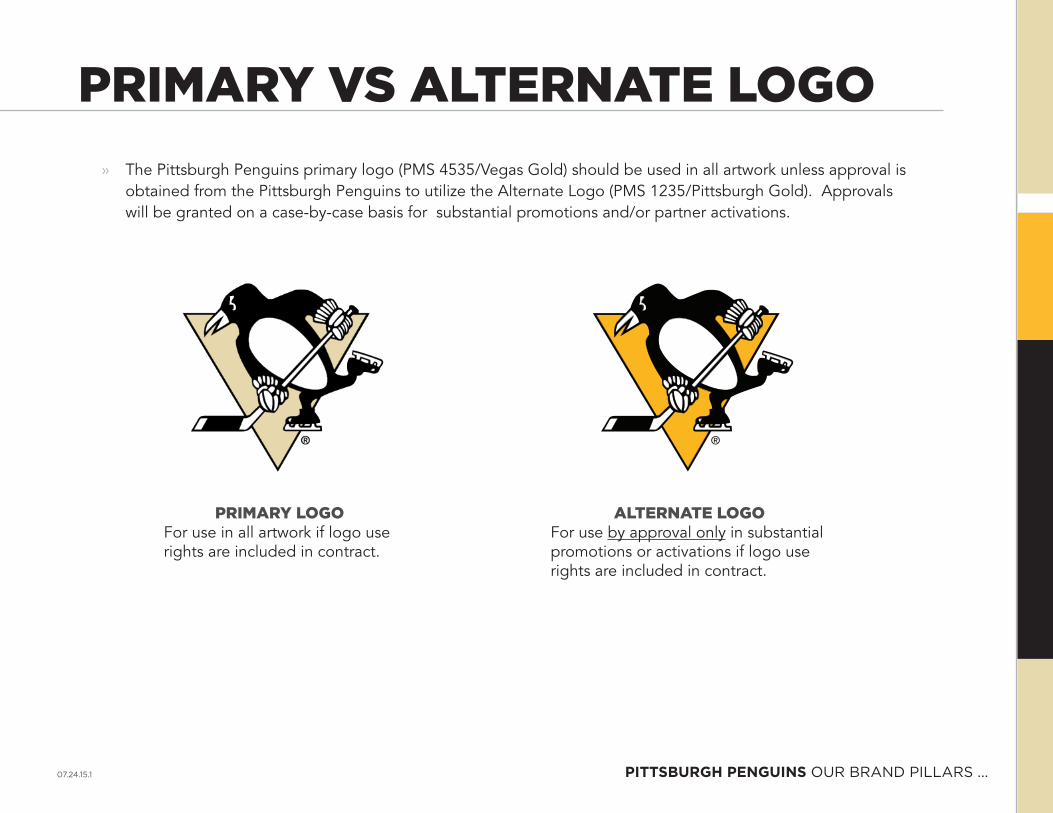
PRIMARY VS ALTERNATE LOGO » The Pittsburgh Penguins primary logo (PMS 4535/Vegas Gold) should be used in all artwork unless approval is
obtained from the Pittsburgh Penguins to utilize the Alternate Logo (PMS 1235/Pittsburgh Gold). Approvals will be granted on a case-by-case basis for substantial promotions and/or partner activations.
PRIMARY LOGOFor use in all artwork if logo use rights are included in contract.
ALTERNATE LOGOFor use by approval only in substantial promotions or activations if logo use rights are included in contract.
07.24.15.1 PittsBUrGh PeNGUiNs OuR BRAND PILLARS ...

LOGO CLEAR SPACE GUIDELINES
X=
X
X
X
X
X
X
X
X
» Never compromise the logo in any way. Don’t crowd or overwhelm it with other graphic elements. A clear space area free of text and other graphics must surround the logo. The clear space on each side of the logo is ideally equal to or greater than the cap-height of the wordmark. Allow additional clear space when possible.
» Keep the clear-space principle in mind to maintain the integrity of the our logo.
» Clear space is critical when our logo is alongside another logo (ex. third party or co-branded communications).
» The primary logo should never appear smaller than .5” high in print.
07.24.15.1 PittsBUrGh PeNGUiNs LOGO GuIDeLINeS AND ReSTRICTIONS ...
ACCEPTABLE NOT ACCEPTABLE
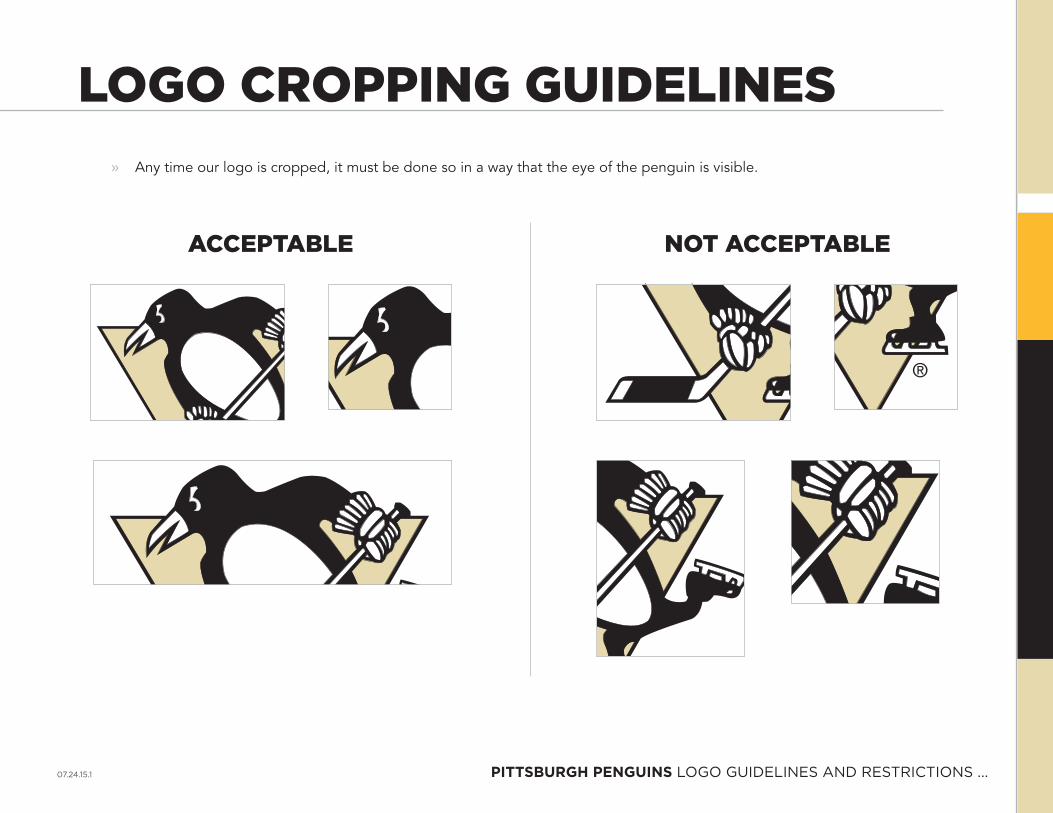
» Any time our logo is cropped, it must be done so in a way that the eye of the penguin is visible.
LOGO CROPPING GUIDELINES
07.24.15.1 PittsBUrGh PeNGUiNs LOGO GuIDeLINeS AND ReSTRICTIONS ...
PENGUINS
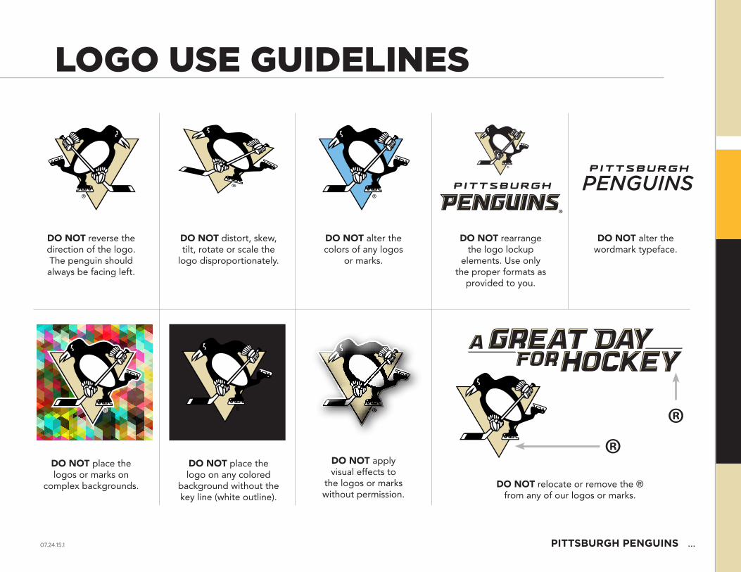
DO NOT reverse the direction of the logo. The penguin should always be facing left.
DO NOT place the logos or marks on
complex backgrounds.
DO NOT distort, skew, tilt, rotate or scale the
logo disproportionately.
DO NOT place the logo on any colored
background without the key line (white outline).
DO NOT rearrange the logo lockup
elements. Use only the proper formats as
provided to you.
DO NOT relocate or remove the ® from any of our logos or marks.
DO NOT alter the colors of any logos
or marks.
DO NOT apply visual effects to
the logos or marks without permission.
DO NOT alter the wordmark typeface.
LOGO USE GUIDELINES
07.24.15.1 PittsBUrGh PeNGUiNs ...
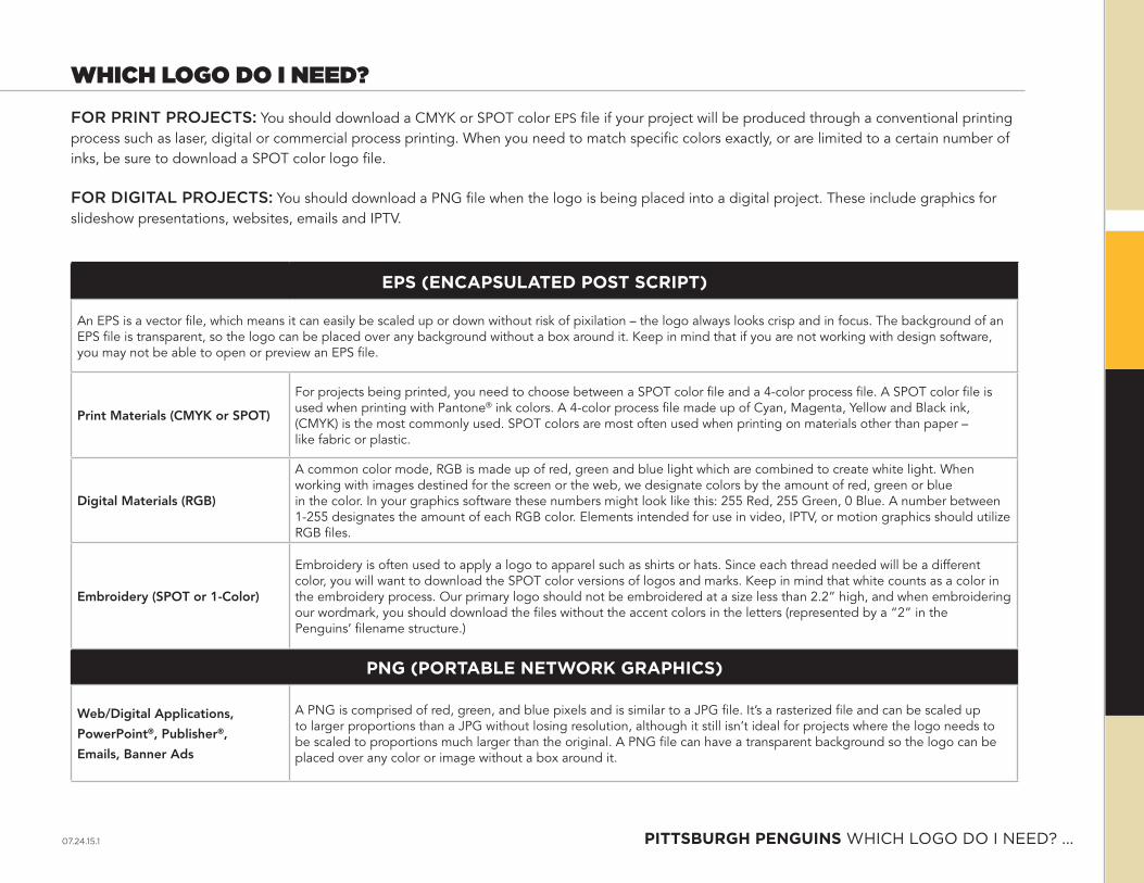
WHICH LOGO DO I NEED?FOR PRINT PROJECTS: You should download a CMYK or SPOT color EPS file if your project will be produced through a conventional printing process such as laser, digital or commercial process printing. When you need to match specific colors exactly, or are limited to a certain number of inks, be sure to download a SPOT color logo file.
FOR DIGITAL PROJECTS: You should download a PNG file when the logo is being placed into a digital project. These include graphics for slideshow presentations, websites, emails and IPTV.
ePs (eNCAPsUlAteD Post sCriPt)
An EPS is a vector file, which means it can easily be scaled up or down without risk of pixilation – the logo always looks crisp and in focus. The background of an EPS file is transparent, so the logo can be placed over any background without a box around it. Keep in mind that if you are not working with design software, you may not be able to open or preview an EPS file.
Print Materials (CMYK or SPOT)
For projects being printed, you need to choose between a SPOT color file and a 4-color process file. A SPOT color file is used when printing with Pantone® ink colors. A 4-color process file made up of Cyan, Magenta, Yellow and Black ink, (CMYK) is the most commonly used. SPOT colors are most often used when printing on materials other than paper – like fabric or plastic.
Digital Materials (RGB)
A common color mode, RGB is made up of red, green and blue light which are combined to create white light. When working with images destined for the screen or the web, we designate colors by the amount of red, green or blue in the color. In your graphics software these numbers might look like this: 255 Red, 255 Green, 0 Blue. A number between 1-255 designates the amount of each RGB color. Elements intended for use in video, IPTV, or motion graphics should utilize RGB files.
Embroidery (SPOT or 1-Color)
Embroidery is often used to apply a logo to apparel such as shirts or hats. Since each thread needed will be a different color, you will want to download the SPOT color versions of logos and marks. Keep in mind that white counts as a color in the embroidery process. Our primary logo should not be embroidered at a size less than 2.2” high, and when embroidering our wordmark, you should download the files without the accent colors in the letters (represented by a “2” in the Penguins’ filename structure.)
PNG (PortABle Network GrAPhiCs)
Web/Digital Applications,
PowerPoint®, Publisher®,
Emails, Banner Ads
A PNG is comprised of red, green, and blue pixels and is similar to a JPG file. It’s a rasterized file and can be scaled up to larger proportions than a JPG without losing resolution, although it still isn’t ideal for projects where the logo needs to be scaled to proportions much larger than the original. A PNG file can have a transparent background so the logo can be placed over any color or image without a box around it.
07.24.15.1 PittsBUrGh PeNGUiNs WhICh LOGO DO I NeeD? ...

VERBIAGE STANDARDSCoNsol energy Center
» When referencing the name of the facility, CONSOL Energy Center is to be written with the word CONSOL in all capital letters — Energy and Center are to be written with initial caps.
PeNGUiNs Vs. PeNs
» While the Penguins franchise has been affectionately referred to by fans as “Pens” for decades, the formal name of the team is Pittsburgh Penguins. “Penguins” should always be used as the primary term to reference the team. In the event the team’s name is stated more than once in the same sentence, or piece of art, Penguins should be the lead reference with Pens used secondary (ex. Penguins forward Sidney Crosby scored 2 goals, leading the Pens over the Flyers 3-2). The only time Pens should be used by itself is when part of a rally (ex. Let’s Go Pens!).
» The words Pittsburgh Penguins® must be followed by a superscripted register mark.
07.24.15.1 PittsBUrGh PeNGUiNs VeRBIAGe STANDARDS ...
WHO TO CONTACTDo you have a question or need advice regarding any of the brand guidelines outlined in this document? Please contact:
07.24.15.1 PittsBUrGh PeNGUiNs WhO TO CONTACT ...
OFFICIAL PARTNER
STANDARDS
07.24.15.1

oFFiCiAl PArtNer stANDArDs OFFICIAL ITem ...
OFFICIAL PARTNER STANDARDS
TEXT ONLY
TEXT PLUS PRIMARY LOGO
TEXT PLUS WORDMARK
07.24.15.1

oFFiCiAl PArtNer stANDArDs PROuD PARTNeR ...
PROUD PARTNER STANDARDS
TEXT ONLY
07.24.15.1
PITTSBURGH PENGUINSpittsburghpenguins.com
07.24.15.1