2 - crm students
TRANSCRIPT

93
sponsored by
Where it All BeganPhotoshop has Always Been a Video Tool
People often forget that Photoshop was developed in part by an engineer doing
motion picture work at Industrial Light and Magic. In fact these roots were lost for many
years and forced video professionals to develop their own coping strategies
and workarounds.
Tough issues like image size and pixel-aspect ratio have
plagued video professionals. Open up two owner’s manuals for
Nonlinear Editing systems and you’ll find contradicting infor-
mation about how to build graphics and prepare them for
import into a video edit session or motion graphics work.
The goal of this session is to teach you the essentials when
designing for the television screen
Reality CheckIf you design for print, web, interactive, animation, or video, you likely use Photoshop.
Because it is the tool-for-everybody, Photoshop sometimes gets a little crowded. There
are many features (distractions) that have nothing to do with video. I am not suggesting
that you write Adobe asking for a refund on unused
features. Instead, accept that all you need (and
more) is waiting for you.
Be prepared to change your viewpoint. Editors
often want to understand every bell and whistle in
a particular application. Contained on the follow-
ing pages are selections from my book Photoshop
CS for Nonlinear Editors published by CMP Books. I
have given you some of the most essential items to
get you started. However I cannot condense the
350 physical and 300+ digital pages into a single
handout. If you find this session helpful, you can
purchase the book at major resellers or find a link at
my website (http://www.rhedpixel.com).
Richard HarringtonPresident, RHED Pixel
Richard Harrington is a certified Project Management Professional, Adobe Certified Expert in Photoshop
and After Effects, and Apple-certified instructor in Final Cut Pro. Additionally, he has completed Avid’s
Master Editor Workshop and the Avid Certified Instructor Program. His visual communications consul-
tancy, RHED Pixel, creates motion graphics and produces video and multimedia projects. He is a faculty
member at The Art Institute of Washington and American University, a popular speaker at conferences,
and an instructor for Future Media Concepts. He is the author of Photoshop CS for Nonlinear Editors and as well as a moder-
ator Creative Cow’s Photoshop Forum. Richard is an accomplished video producer, having been named to AV Multimedia
Producer’s List of Top Producers for 2004 and winning a Cine Golden Eagle Award.
Photoshop for Video EditorsWith RICHARD HARRINGTON
notes
Excerpts from Photoshop CS for Nonlienar Editors, Second Edition published by CMP Books ©2004
Photoshop Pre Con.indd 93 1/20/05 11:44:55 AM

notes
94
sponsored by
Photoshop for Video EditorsWith RICHARD HARRINGTON
Video’s Unique RequirementsVideo is a unique creature; it does not enjoy the careful management that other for-
mats do. Web designers have the benefit of designing on computers, for computers. Print
designers have precise control during the printing stage, with dedicated professionals
calibrating their output devices. The general population installs $199 color televisions but
won’t even read the instruction manuals. To make things worse, there’s a standards war
going on between multiple formats, digital versus analog, standard versus widescreen.
Canvas size. This is the area in which you will work. In Photoshop, specify your work
area in pixels. It is a good idea to check with the manufacturer of your nonlinear edit sys-
tem for requirements. These can be found in your owner’s manual or on the manufactur-
er’s website.
Aspect ratio. Television is generally a 4X3 aspect ratio, while widescreen is a 16X9
aspect ratio.
Image mode. Photoshop supports eight image modes, including bitmap, grayscale,
RGB, and CMYK color spaces. For video, work in RGB mode for consistent results with
nonlinear editing systems.
Bit depth. A measurement of how much color information is available to be displayed
for each pixel in an image. Photoshop users generally work in 8-bits per channel mode
because it provides a full set of tools. These 8 bits combine to a total of 24 bits for an RGB
image or 32 bits for an RGB image with an alpha channel.
Luminance ranges. The range of colors supported by video. There are two major
color spaces in use for nonlinear edit systems, RGB mapping and 601 Mapping.
Alpha channels. An alpha channel contains information about all of the transparent
areas in your composition. All objects should be on transparent layers when creating an
alpha channel. Do not place any of your objects on the background layer.
Anti-aliasing. Anti-aliasing causes a gentle blending of the
colors along the edge of an image. It is often used to reduce
flicker. This technique is effective for straight lines and text, to
create a smoother composite of foreground and background
elements. It is most common for low-resolution output (such
as video or web). There are four types of anti-aliasing, which
can be accessed from the Options bar or Character palette.
Non-square pixels. Your own personal demon. These
cause more problems for more people than anything else
about Photoshop. In a nutshell, computers and Photoshop
traditionally work with square pixels (1.0 aspect); most digital
video works with non-square pixels (0.9 aspect). Thankfully,
Photoshop CS supports non-square pixels, but you will still
need a thorough understanding of square pixels.
Photoshop Pre Con.indd 94 1/20/05 11:44:56 AM

notes
95
sponsored by
Photoshop for Video EditorsWith RICHARD HARRINGTON
Suggested HardwarePhotoshop ish a great tool right out of the box. Here are a few things that will help
you get more work done, however. The order in which you add these items on will vary,
depending on your work environment and budget. I will not assume you have any of
these, other than access to an RGB video monitor in either NTSC or PAL (depending upon
your country).
A video card with S-Video out. These are not very expen-
sive anymore and will let you plug your system into a standard
television or NTSC monitor. These cards are useful for check-
ing interlace and flicker issues, but are not necessarily good
for checking color because they do not use an accurate video
setup. You might consider moving up to a higher-end video
card with component or digital outputs for more accurate
color monitoring.
For Mac users, a two-button mouse. Because Ctrl+clicking gets a little old after a
while. Many options are available these days, since USB became a common standard
between Mac and Windows.
An NTSC monitor. So that you can check your work before going into the edit suite.
A scanner that matches your imaging needs. I own four scanners. None of
them had a price tag of more than $400, and they all work great for video. In fact, the $99
portable one scanned several of these photos.
A Pantone color book. So that you have some
sort of reference guide for matching the PMS logo
colors that your clients give you. A Pantone
Color Cue for selecting colors from physical
objects is also a great option.
A tablet and pressure-sensitive pen. This can be for both fun and serious work. A little
bit of digital doodling can be a relaxing activity.
Moreover, a pen is often an easier input device than
a mouse or trackpad for realistic brushstrokes and
tracing activities. The newer tablets feature great
sensitivity that can be helpful in rotoscoping or
channel masking.
An optical storage device. I am a big fan of the new
generation of DVD burners. It is possible to back up 4.4GB of
project data onto a single $2 disc. A CD or DVD burner will
also allow you to burn your projects to disc for testing in a
Video CD/DVD player on consumer televisions.
Photoshop Pre Con.indd 95 1/20/05 11:44:57 AM

notes
96
sponsored by
Photoshop for Video EditorsWith RICHARD HARRINGTON
Computer and Video IssuesVideo traces its history to early pioneers such as John Logie Baird, who managed to
record a recognizable human face on video in 1925. The first microcomputer appeared
in 1960, developed by Digital Equipment. For a mere $120,000, it did include a keyboard
and mouse. These two technologies existed very independently of each other for many
years. All computer pixels are square in their native format. Professional video applica-
tions generally use pixels that are non-square.
The National Television Standards Committee, known as the NTSC, has set the stan-
dard that television fits to the 4X3 aspect ratio. This is often interpreted by video boards
as an image that is 648X486 pixels. Those countries that use the PAL format use boards
that work with images that measure 768X576 square pixels. If designing for square sys-
tems, it is easy because no conversions are necessary.
Of course, if you offer a standard, it will be broken. In an effort to pack more pixels
and increase resolution, the ITU-R BT 601 video standard was developed. It is often called
“D1” (after the D1 format invented by Sony in 1986 which was the first component digital
format available). In NTSC, the native “board” size of a D1 frame is 720X486 non-square
pixels. The PAL format uses 720X576 non-square pixels.
This format has evolved into the Digital Video (DV) standard, which is employed in
the consumer DV format, as well as DVCAM and DVCPRO tape and DVD authoring. The
native size for DV frames is 720X480 non-square pixels for NTSC, six less than the D1 for-
mat. The PAL DV format is identical to the standard PAL format and remains unchanged
at 720X576 non-square pixels. These pixels are played back on analog televisions, which
must display them as square pixels at the 4X3 aspect ratio.
Houston, we have a problem.
Pixel aspect ratioRemember, video is displayed on stan-
dard televisions at a 4X3 aspect ratio. Even
video that has a different native size must be
eventually converted. Natively, an NTSCD1/
DV pixel is taller than it is wide, approximate-
ly 0.9 to 1. PAL pixels on the other hand are
wider than tall, 1.066 to 1.
Many video edit systems, as well as Adobe After Effects, can work with square pixel
images, ensuring that they display correctly throughout the editing stage. These video
applications must resize square pixel graphics to conform to digital video’s non-square
pixel shape. To avoid this problem, however, many designers choose to manually stretch
or interpret their images within Photoshop, which offers powerful interpolation tools that
produce exceptional scaling. Before going any further, let me say three things:
• First, there are many conflicting opinions on what size to build graphics and
what application to use when resizing them.
• Second, read the manual that shipped with your editing software because differ-
ent companies have their own procedures for each editing system.
• Third, if using Photoshop CS, build your graphics with the non-square pixel pre-
sets and avoid a big headache.
With those three points cleared, I will present your options for building graphics that
will work for most users on most systems.
Photoshop Pre Con.indd 96 1/20/05 11:44:58 AM

notes
97
sponsored by
With RICHARD HARRINGTON
Photoshop for Video Editors
Step 1: Determine the native size of your video frameFrame size can be found in your NLE’s manual, or you can export out a single frame. If
you are working with a traditional analog system, the frame is likely equates to 648X486
for NTSC or 768X576 for PAL square pixels. Most hardware-dependent nonlinear systems,
such as Avid Media Composers, Media 100s, or Accelerated Premiere-based systems, use
the ITU-R BT 601 format (often referred to as D1). The native size is 720X486 non-square
pixel image for NTSC or 720X576 non-square pixel image for PAL.
Recently, many DV solutions have appeared. These use a 720X480 non-square pixel
image for NTSC and 720X576 non-square pixel image for PAL.
Step 2: Design your graphics in PhotoshopDepending on your version of Photoshop, your technique will vary. Photoshop CS
offers the monumental change of non-square pixel support. Chances are that not every
computer in your shop or that you will encounter while freelancing will have Photoshop
CS so I’ve included both methods here.
Method #1: Using Photoshop CSPhotoshop CS supports non-square pixels... Life is good!
• Create all new documents using the built
in templates that match your edit system.
This can be found in the New Image dialog
box File>New or pressing Cmd+N (Ctrl+N).
• If working with square pixel images (such
as those from scanners, stock photo collec-
tions, or digital cameras) be sure to
reinterpret the pixels. This can be done
in three ways.
− Drag the square pixel images into
a non-square document
− Paste the square pixel images into a non-square document by pressing
Cmd+V (Ctrl+V).
− Place square pixel images into a non-square document by choosing
File>Place
• If you are working with a frame grab or exported frame from a video editing
application that uses non-square pixels, you must identify it to Photoshop.
Choose Image>Pixel Aspect Ration and select the right preset for your country
and screen shape.
(Left) Original image viewed in D1 editing system such as Avid Media Composer.with Square Pixels.
(Middle) Same image viewed in Photoshop with NTSC D1/DV Pixel Aspect Ratio correction applied..
(Right) Same image viewed in Photoshop with PAL D1/DV Pixel Aspect Ratio correction applied.
Photoshop Pre Con.indd 97 1/20/05 11:44:59 AM

notes
98
sponsored by
Photoshop for Video EditorsWith RICHARD HARRINGTON
Method #2: Using Photoshop 7 (or Earlier)Design your graphics in Photoshop 7 (or earlier) using square pixels. When the design
is finished, you then need to resize your graphic for video usage and force the pixel
aspect ratio to change. There are two major camps: those who recommend stretching
horizontally and those who prefer vertically. In the spirit of Dr. Seuss’ Sneetches, I’ll call
them the ’Zontals and the Verts.
The ’Zontals argue that it is best to maintain
the same number of scan lines throughout. This
is usually done by using an image size such as
648X486 for NTSC D1. This method helps main-
tain fine details, such as text, by not compress-
ing them. Using this approach, the final image is
stretched horizontally to 720X486 (Image>Image
Size, Constrain Proportions unchecked) to fill
the video screen. Eventually this image will be
squeezed back when playing back on televisions.
The Verts counter that it is always better to shrink raster images than to blow them
up. By employing a 720X540 image in Photoshop, the files can be scaled down (as
opposed to up). Before saving the file out for video editing, the file must be resized
(Image>Image Size>Constrain Proportions unchecked). The 720X540 file is squeezed
vertically to 720X486. This vertical stretch will be counteracted by the horizontal stretch
when the image is transferred to video.
Square Pixel Graphic Sizes
Format 4 X 3 Aspect Ratio
(Square Pixels)
16 X 9 Aspect Ratio
(Square Pixels)
Native Size Non-
Square Pixel
NTSC D1648 X 486 or
720 X 540864 X 486 720 X 486
PAL D1768 X 576 or
720 X 5401024 X 576
720 X 576
NTSC DV648 X 480 or
720 X 534853 X 480
720 X 480
PAL DV768 X 576 or
720 X 5401024 X 576 720 X 576
Interlaced displaysInterlacing video is another leftover technology meant to serve as a temporary fix.
When television was invented, it was decided that 30 frames per second generated
smooth motion. However, it took 60 images per second to reduce flicker. The problem
is that the broadcast signal could not hold that much information without significant
softening, and the slow speed of phosphors produced banding.
In order to maintain a relatively crisp picture, the solution of interlacing was decided
upon by the first National Television Standards Committee in 1940. By showing half an
image 60 times per second, both goals could be met. The electron beam would scan
across the tube, painting every other line. It would then return to the top and paint the
remaining lines. These alternating lines are often identified by field dominance, and are
referred to as upper (or odd field first) or lower (or even field first). This solution solved
the problem between bandwidth, flicker, and smooth motion.
Photoshop Pre Con.indd 98 1/20/05 11:45:00 AM

notes
99
sponsored by
Photoshop for Video EditorsWith RICHARD HARRINGTON
It’s important to note that only analog televisions are interlaced. If your video is intend-
ed for traditional output, you need to keep this in mind. Standard analog televisions dis-
play interlaced video, but newer digital televisions
may show progressive scan (or noninterlaced).
If you are designing for web or CD output, you
will work with noninterlaced video. Interlacing
is not a big issue when you start your graphic in
Photoshop, but becomes very important when
importing video freeze frames or working in
Adobe After Effects. In Photoshop it is important
to avoid lines thinner than three pixels, or you will
definitely introduce flicker to the image. Be sure
to choose an anti-aliasing method for fine details
such as text as well.
If you import a freeze frame from a source
with fast motion, you will likely have visible fields
(areas where the two frames of video mixed
and a jagged result appears). If this happens,
you can choose to run the De-Interlace filter
(Filter>Video>De-Interlace). You will have the
choice of keeping the odd or even field, as well
as creating the replacement through duplication or interpolation. This step is especially
important for broadcast designers who are working with freeze frames. If your video con-
tains movement (and you didn’t remove interlacing during export from the NLE), you will
definitely see the need for this filter. Many lower-cost digital cameras will show a similar
problem because they use a similar, image-capture device. It is a good idea to run this fil-
ter on video freeze frames every time if the work is to be done in Photoshop.
When animating your graphics in After Effects, interlacing provides smoother move-
ment between frames. The render times are longer, but the quality is worth it. You need
to do nothing different inside of Photoshop; just make sure to turn on Field Rendering in
After Effects’ render settings. In fact, make it part of your presets in After Effects by modi-
fying your output settings.
Anti-aliasing Did you ever play with Lego building blocks as a child (I still do). Perhaps you noticed
how hard it was to build an arch or a curve. The best you could achieve still had notice-
able stair stepping. Guess what, pixels are just like those building blocks. Curved or
diagonal lines will not look good at low resolutions, and you must soften the edge.
By choosing to
use an Anti-aliasing
method, Photoshop
will generate smoother
results—especially
when using selection
tools (such as the magic wand or lasso tools) or vector-based type. Anti-aliasing works by
softening the color transition between edge pixels.
Since only the edge pixels are changed, you lose no detail in the image itself. Anti-
Photoshop Pre Con.indd 99 1/20/05 11:45:01 AM

notes
100
sponsored by
Photoshop for Video EditorsWith RICHARD HARRINGTON
aliasing is a useful option for creating text, making selections for filters, or copying and
pasting. It will be a recurrent topic throughout this book. You can adjust the anti-aliasing
for many tools directly in the Options bar. You must apply this option before a selection
is made.
RGB versus YCC colorAs if the non-square pixels, aspect ratios, interlacing, and anti-aliasing weren’t enough,
let me present our next problem. Photoshop works
in the RGB color space. Each pixel you see on your
monitor is comprised of light being emitted by a
red, a green, and a blue phosphor placed closely
together. Our eyes perceive that light as a single-
colored dot, or pixel. These red, green, and blue
components are referred to as channels.
So what’s the problem? Televisions use the same
red, green, and blue phosphors right? Not exactly.
Television signals are not transmitted or stored
in RGB due to our final leftover problem. Initially,
television was black and white. These images were actually a grayscale signal consisting
of only one channel that contained the brightness information (known as luminance). In
an effort to keep consumers happy, color television was made backwards compatible. An
RGB broadcast would not work on a black-and-white television, so broadcasters chose
(and still use) the YCC color space. The Y is the luminance information, while the two Cs
represented the color components (hue and saturation). These three signals would com-
bine to form the composited pixels. The YCC color space goes by many names, it is often
clarified as YCrCb, and can also be found as YUV or as YIQ.
How does this affect you? Don’t worry too much about the engineering side, but
realize that colors will look different on a television screen than they do on a computer
monitor. The color shift is minor, but present. There is no setting in Photoshop to correct
this. The best solution is to have an NTSC or PAL video monitor (or consumer television)
connected to your system. Many video cards will let you output via S-Video. If a televi-
sion monitor is not an option, periodically test your graphics by importing them into your
NLE, then outputting to tape.
Many editors choose to look at HSB sliders (hue, saturation, and brightness). This color
model is very compatible with RGB and allows you to examine color information in a
more video-like manner.
RGB versus 601Photoshop and video handle luminance values differently. When working in
A Firewire to Analog video converter can be use-
ful for previewing your graphics on a television
Photoshop Pre Con.indd 100 1/20/05 11:45:02 AM

notes
101
sponsored by
Photoshop, black is an absolute black and white is an absolute white. Photoshop assigns
a value of 0 to black and a value of 255 to white. There is no allowance for anything
beyond this range. This process is referred to as computer graphics or RGB mapping.
Adobe Photoshop and After Effects both work with RGB mapping.
RGB mapping assumes that video black (NTSC 7.5 IRE, PAL 0 mV) is assigned a value
of 0, and video white (NTSC 100 IRE, PAL 700 mV) a value of 255. If you import or export
video from your edit system as RGB, signals above or below this range will be clipped.
The ITU-R BT.601 digital video standard (commonly referred to as 601 mapping) does
not handle black and white as absolutes. It is allowable to go above “white “and below
“black.” One reason for this is superblack, which places a darker black in areas that are
meant to be luma keyed. Many hardware-based switchers will use a luma key, instead of
tying up two channels of a still store to use the fill and alpha matte. Video cameras also
allow a photographer to shoot beyond 100 IRE, giving the user some overshoot in the
captured signal, which can be corrected during editing or playback.
601 mapping specifies that video black (NTSC 7.5 IRE, PAL 0 mV) is assigned a value of
16, and video white (NTSC 100 IRE, PAL 700 mV) a value of 235. This allows for reasonable
footroom and headroom in the signal.
When importing or exporting your frames, it is important to use a consistent color
mapping method. Avid, Media 100, Sony Vegas, and many others support the 601 color
space. Currently Adobe Premiere and Apple’s Final Cut Pro do not. More support across
all edit systems is very likely as software-based NLEs improve in quality. Specifying the
color method is part of the import dialog box on these systems. To make things easier,
I suggest that you add 601 to the file name of those graphics that have been prepared
with 601 compliant levels.
When to use RGB levels. You want to use RGB for exporting frames from your NLE to be used in print, web, or
CD-ROM. You also may choose RGB if you plan to modify the image greatly with filters,
and then re-import the image.
When to use 601 levels. If you plan to create graphics that use superblack for keying, export from your NLE as
a 601 image, if it is an option. Also, if you are exporting a frame for touch up, such as to
paint out a scratch or dropout, export as 601. This will allow you to keep the full color
With RICHARD HARRINGTON
Photoshop for Video Editors
Photoshop Pre Con.indd 101 1/20/05 11:45:03 AM

notes
102
sponsored by
range of your video image, thus avoiding color shift when moving between applications.
601 is best used when you intend to export from video, do minor processing on the
image, and import the frame back into the timeline.
Luminance and SaturationThe issue of color choice has two issues, broadcast safe and good taste. Many excellent
books are available to assist you with color choice. The principles of a color wheel and
selecting harmonious colors are worth your time to study. To get you started, I suggest
Color Theory, a Photoshop plug-in from Digital Anarchy. Color Theory helps you select
color combinations that look good on video.
Unfortunately, video is a limited medium with a limited color palette. You need to
learn what colors look good on video and, even more importantly, which colors look
good on VHS tapes played back on $59 VCRs. It is a good idea to test your graphics
often on a vectorscope and waveform monitor,
especially for your first few years of working
in Photoshop.
To make things simpler, here’s a crash course
in building your own “big box of crayons.” Here
are a few color rules to keep in mind:
• Certain colors do not look good on video. Reds
have a tendency to bleed on screen; light yellows
look like a dog used your TV as a fire hydrant.
• Oversaturated colors will cause problems.
Consumer televisions ship with the saturation
and red tones turned up too high. You can’t
tell the customers that they’re wrong (even if their TVs are), so turn down the
saturation on bright colors. Muted colors will become more vibrant once they
make it out to TVs.
• Avoid extremely dark colors. On video, there is very little difference between
indigo, charcoal, and slate. Dark tones tend to gravitate towards black in the
viewer’s eyes.
• Maintain proper contrast. Some viewers will view your work on black-and-
white sets; others may be color-blind. Even those with perfect eyes will have a
hard time seeing a difference in grayscale contrast between certain color com-
binations such as blue and purple or
red and green. Print your graphics
out in grayscale, tape them on the
wall, and stand back 15 feet. Can you
read it?
• Avoid “pure” white. It will bloom on
screen, making it difficult to read.
Use off-white, especially for text. Also
stroke the text or add a drop-shadow
with a contrasting color.
• Not all graphics need to be full
chroma. Using one color—for example, a base blue—with multiple shades,
with darker and lighter accents often looks very good. Duotone effects, where
Photoshop for Video EditorsWith RICHARD HARRINGTON
Photoshop Pre Con.indd 102 1/20/05 11:45:04 AM

notes
103
sponsored by
Photoshop for Video EditorsWith RICHARD HARRINGTON
a grayscale image has a new color mapped to it, often look good as well.
• When in doubt, use the NTSC Colors filter
(Filter>Video>NTSC Colors) to check your work. But do
not rely on the NTSC color filter to fix problems as it
produces visible banding.
Working with Photoshop CS’s Presets
Photoshop CS offers nine new presets for building video
graphics. These can be picked from a dropdown menu when
you create a new document Cmd+N (Ctrl+N). You can access
templates NTSC and PAL systems, Standard or Widescreen, and
601, DV/DVD, or HDTV. These templates include non-square pixel
support, as well as safe-title
overlays. By default they are set to the proper RGB
color mode and to the more widely accepted 8-bits per
channel mode. You can of course change to 16-bits
per channel mode before clicking OK. These templates
are a well-deserved addition to Photoshop (especially
since it started its life as a tool for touching up video
and film frames).
Safe title areaIf you put a computer screen next to a television
screen, one distinction should stand out. Computer
monitors have black borders around the viewable
areas, while televisions provide edge-to-edge viewing.
On any given television set, up to 10% of the viewable
signal is lost because the tube is recessed into a case.
This viewable area is called the action safe area.
We must move all text elements in an additional 10% (or 20% from the edge.) By plac-
ing text within the safe title area, we ensure that it is readable. Unlike Adobe After Effects,
Photoshop does not have a safe title area overlay. It is necessary for us to use a template,
run an action, or manually create safe title area markers.
Several alternatives to creating a safe title area are available. Here is one method
using Photoshop’s built-in fea-
tures: create an action for this
item so that you can recall it for
later use. There are several steps
involved, so if you have a good
template, use that. I present this
so that if you are ever in a jam,
you can build your own safe area
overlay document.
We are going to build a safe
title document for a D1 system,
sized 720 — 540 square pixels.
Feel free to pick any video preset
Photoshop Pre Con.indd 103 1/20/05 11:45:05 AM

notes
104
sponsored by
as this will work for all sized documents.
.
Step 1 Create a new document, and pick the 720 X
540 Std. NTSC 601 preset from the dropdown menu.
Set the document to RGB mode.
Step 2 Choose Select All by pressing Cmd+A
(Ctrl+A). Then, choose Edit>Fill and fill with black.
Step 3 Create a new (empty) layer, and then name
it Safe Area Overlay. You should still have an
active selection.
Step 4 Scale the active selection to 90% by choosing Select>Transform Selection, and
then typing in 90% in the Options bar for width and height. Press Return (Enter).
Step 5 Load a red swatch as the foreground color. Then choose Edit>Stroke and specify
four pixels centered. This is the action safe area.
Step 6 Choose Select All by pressing Cmd+A (Ctrl+A), and scale the active selection
to 80% by choosing Select>Transform
Selection.
Step 7 Type in 80% in the Options bar for
width and height. Press Return (Enter).
Step 8 Choose Edit>Stroke and specify four
pixels centered. This is the Safe Title Area.
Step 9 Lock the Safe Area Overlay layer by
clicking on the Lock icon in the layer’s palette.
Step 10 Save your work.
Creating Lower ThirdsMost video editors choose to build their title graphics (or lower thirds) within the title
tool of their nonlinear edit system. These built-in character generators are very limited
and do not give the precise control over text and graphical elements that Photoshop pro-
vides. I recommend that you use Photoshop as a supporting player, or let it assume the
role of character generator entirely.
As a supporting player, Photoshop is quite effective at making complex gradients for
use in bars. Let’s create a lower-third bar from scratch.
Step 1 Create a new video sized document with a
safe title guide.
Step 2 Grab the corner and expand the document
so that you can see some of the empty space around
the canvas. It is a good idea to place a photo or freeze
frame in the background for reference purposes.
Step 3 With the Rectangular Marquee tool, draw a
box across the lower fifth of the screen. You may
choose to have the box extend to the bottom or
have it stop around the action safe area.
Photoshop for Video EditorsWith RICHARD HARRINGTON
Photoshop Pre Con.indd 104 1/20/05 11:45:06 AM

notes
105
sponsored by
Photoshop for Video EditorsWith RICHARD HARRINGTON
Step 4 Select the Gradient tool. Click on the gradient in the
Options bar to edit the gradient to your choice. You may
load gradients from the submenu or create your own from
scratch. You may want to adjust the opacity stops for a
ramp effect.
Step 5 Draw the gradient within the selection. Experiment
with different gradient shapes, as well as point of origin and
length of gradient.
Step 6 Deselect the gradient, and apply a Gaussian blur filter
on the layer to soften the edge.
Step 7 If you’d like to introduce some texture, place a
grayscale photo or pattern directly above the layer and
group it with the bar with Cmd+G (Ctrl+G). You may also
choose to adjust the blend mode (luminosity works well) and the opacity to achieve
the desired effect.
Step 8 Add the logo. If the
file is an Adobe Illustrator file,
choose Place from the File menu.
Otherwise, you can open the
document, and copy and paste
the logo. Or better yet, just drag it
in with the Move tool (V). You may
want to use layer styles, such as a
drop shadow or glow to offset the
logo from the bar.
Step 9 Draw the text block for
the name, I recommend using
Paragraph text so you have better
control over the characters.
Step 10 Duplicate the text layer, shift it down, and modify the text and font. Choose a
smaller point size and different font or style for the title, which is generally longer than
the name.
Step 11 Apply a contrasting edge effect such as a glow, drop shadow, or stroke.
Creating an Alpha Channel by Targeted Flattening When you are ready to save for your NLE, you must save the composition out as a flat-
tened file (generally PICT or TARGA) with an alpha channel. There are several approaches
to flattening a file. Targeted flattening, introduced in Chapter 4, is one technique that
works well.
Photoshop Pre Con.indd 105 1/20/05 11:45:08 AM

notes
106
sponsored by
Step 1 Turn off all elements you do
not want flattened (including the
background or placement image).
Create a new (empty layer) and
highlight it.
Step 2 While holding down the
Option (Alt) key, choose Merge
Visible. All layers are now flattened to
a single layer.
Step 3 Turn this layer off by clicking
on the Eye icon.
Step 4 Hold down the Cmd (Ctrl) key and click on the layer name in the layer’s palette.
The marching ants should encircle the layer.
Step 5 Switch to the Channels palette and click on the Save Selection as Channel button.
Choose Save As from the file menu and Save A Copy as a PICT or TARGA with an alpha
channel included.
Step 6 If you have multiple titles, discard the alpha channel (NLEs get confused if there
are multiple alpha channels) and repeat for each lower third.
While this process may seem time consuming, you’ll become quick at it with a little
practice. The quality you can achieve is superior to any standalone character generator or
built-in title tool. The time-savings really add up for multiple titles. Remember to always
save a layered file so that you can make changes.
Color Correction: How to Get It RightWhen working in Photoshop, the most common type of color correction you will need
to perform is scene-to-scene correction. That is to say, you will need to bring a variety of
shots, from a variety of sources, closer together. They will need to seem as if the same
photographer shot them under similar lighting conditions. This is an extremely challeng-
ing task if you consider the likelihood that you will pull images from several different
stock libraries, client-provided sources, and video frame grabs.
The key when starting out is to work
on a copy of the image. This way you
always have a copy to return to if some-
thing goes wrong. Open the image in
question, then choose File>Save As, and
give the corrected version a new name.
In fact, this is always a good idea. Image
correction is often destructive editing,
meaning that you cannot revert to the
original state at a later date. Once the
modified file is closed and saved, you lose
Photoshop for Video EditorsWith RICHARD HARRINGTON
Photoshop Pre Con.indd 106 1/20/05 11:45:09 AM

notes
107
sponsored by
Photoshop for Video EditorsWith RICHARD HARRINGTON
the ability for multiple undos. By
preserving an original version, or
employing adjustment layers, non-
destructive editing is possible.
LevelsThere’s a very good reason this
image adjustment comes first in
the menu. You will need to make a
Levels adjustment on every image.
The Levels command allows you
to correct tonal ranges and color-
balance issues. That is to say, that
you can fix poor exposure and
adjust your white and black point. If you understand the need to white balance a video
camera, the Levels command will soon make sense.
The key to understanding the Levels adjust-
ment is the histogram. If you can learn to read
this graph, it can serve as a visual guide for
adjusting the image. To illustrate this powerful
command, open up the file Ch8ImageAdjust1.
tif. Launch the Levels dialog by choosing
Image>Adjust>Levels or by pressing Cmd + L
(Ctrl + L). Be sure the Preview box is checked so
that you can see your changes update.
By adjusting the black and white input sliders,
you can set the black and white points. Move the slide to the first group of pixels on each
end. This will map the pixels to the values set for black and white in the Output levels
area. The pixels that fall in between are adjusted proportionally in order to maintain a
proper color balance. For this photo, I’ve adjusted the Input and Output levels to restore
some of the missing contrast in the image. While a separate command exists for bright-
ness and contrast, the levels adjustment lets you perform several improvements with one
adjustment, thus cutting down on quantization (loss of quality) introduced from multiple
image processing steps.
The true power lies in the middle slider.
Here you can modify the gamma setting.
Effectively, you can use the middle Input
slider to change the intensity of the midtones,
without making dramatic changes to the high-
lights and shadows. In a sense, you can bet-
ter expose the picture, adding or subtracting
“light” from the midtones.
This adjustment is critical to creating a con-
tinuous flow between images. Levels adjust-
ments do not offer as many precise adjustment points as Curves adjustments, but they
are significantly easier to perform, and they generally create very good results.
So far you have been making Levels adjustments across all channels evenly. You can
Photoshop Pre Con.indd 107 1/20/05 11:45:10 AM

notes
108
sponsored by
Photoshop for Video EditorsWith RICHARD HARRINGTON
choose to isolate your corrections to a specific
channel by clicking on the dropdown list. This can
be used to remove colorcast issues, such as spill
from a background or a photo shot under colored
lighting. In this particular example, I switched to the
Red channel to make adjustments to the skin tones.
You can automate this process a bit by using the
eyedroppers. Use the black or white eyedroppers to
click on an area to define its target color. For exam-
ple, if you have a blue cast, clicking on a white area
with the Set White Point eyedropper will remove the blue cast from the image.
Broadcast-Safe Color Concerns
Whenever you adjust an image,
you have to be concerned about
modifying its colors to the point
where they are no longer “broad-
cast safe.” Even if you have a video
frame grab that was legal, any of
the previous image adjustments
could push its white levels too
high or blacks too low.
The key is to adjust the out-
put levels to pull things into the
16–235 broadcast safe range. In
doing so, however, you don’t want to overdo it, so you must monitor the adjustment. By
placing targets using the Color Sampler tool (stored in the same well as the Eyedropper
and Measure tools), you can monitor the values of white and black.
In the example, I have placed targets on the clouds (for white) and the deepest shad-
ows (for black). In the Info palette, it is clear that these colors are out of the safe range.
Add a Levels adjustment layer and set the output levels to 16 and 235. The colors are
now in the safe range. You can leave the adjustment layer floating and modify it at any
time within Photoshop.
Converting Channels into Masks
Sculptors often say that the figures are
already in the stone; they just release them.
The same is often true with alpha channels.
Look at each channel independently until
you find the ones with highest contrast.
We will use an advanced procedure called
Calculations to combine two channels into
a new channel, which will function as the
alpha. Depending on the source photo, you
Photoshop Pre Con.indd 108 1/20/05 11:45:11 AM

notes
109
sponsored by
Photoshop for Video EditorsWith RICHARD HARRINGTON
will generate anything from a perfect mask to a great start.
Step 1 Open up the image you want to create a matte from.
Step 2 Call up the Channels palette and look for the highest contrast-
ing channels. Because
you want to remove
the background, look
for the highest contrast
between foreground
and background. The red channel should
stand out the most.
We will now use an advanced com-
mand to merge channels together. Before
Photoshop had layers, it had calculations.
The name scares most people off—math
is not a favor-
ite course at most journalism and art schools. Relax. The
computer does the math. All you have to do is enable the
Preview function and tweak a few dropdown menus. This
feature is designed to combine channels from the same
document or documents of an identical size.
Step 3 Call up the Calculations command from the Image
menu. Make sure
the Preview box
is active.
Step 4 You can
now combine the
red, blue, green, or
grayscale compos-
ite channels to form a new channel. With this
image, use the red channel as your first source.
Step 5 Combine it with the blue channel, using the Subtract
blending mode. The resulting image should show a high-
contrast image, a dark shape for the church tower, and a
gray image for the sky.
Step 6 Click OK and generate the new alpha channel.
Step 7 Now make a Levels adjustment to clean up the matte.
You want a high-contrast black-and-white matte. Adjust the
midpoint and white point until a clean matte is generated.
Photoshop Pre Con.indd 109 1/20/05 11:45:13 AM
110
sponsored by
Preserving FlexibilityWhile done is a four-letter word you like, it frequently leads to several others you may
not want your mother to hear. Thanks to nonlinear editing and the Internet, nothing is
ever done. It is always subject to tweaks, revisions, and repurposing. If you cut corners in
the design and archiving stages, you will regret it later.
Never flatten your Photoshop Design files. Create a second copy for Production pur-
poses, or use the Save A Copy feature mentioned earlier. Chances are you archive your
source tapes, project files, and EDLs for your video programs, not just the finished master.
For the same reasons, you must save your Photoshop layered files.
• Thanks to adjustment layers, several of the image adjustments and filters pre-
viously used can now be applied to the layered file.
• Additionally, you can apply effects to a layer filled with 50% gray; this can then
be blended with layers below it, providing an AE-style adjustment layer.
• Lastly, use the Copy Merged command to Flatten Visible Layers to an interme-
diate copy. This will allow several filter and blend mode combinations.
• Change the way you work, and it won’t be as much work to make changes.
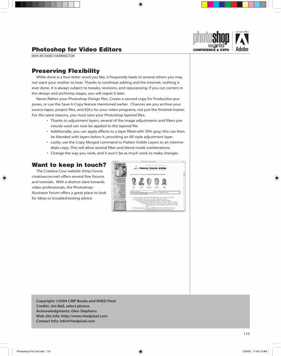
Want to keep in touch?The Creative Cow website (http://www.
creativecow.net) offers several free forums
and tutorials. With a distinct slant towards
video professionals, the Photoshop/
Illustrator forum offers a great place to look
for ideas or troubleshooting advice.
Photoshop for Video EditorsWith RICHARD HARRINGTON
Copyright: ©2004 CMP Books and RHED PixelCredits: Jim Ball, select photosAcknowledgments: Glen StephensWeb site Info: http://www.rhedpixel.comContact Info: [email protected]
Photoshop Pre Con.indd 110 1/20/05 11:45:13 AM

notes
sponsored by
Photoshop Pre Con.indd 111 1/20/05 11:45:14 AM

notes
sponsored by
Photoshop Pre Con.indd 112 1/20/05 11:45:14 AM