14. students' difficulties in practicing computer-supported data...
TRANSCRIPT

169
14. STUDENTS' DIFFICULTIES IN PRACTICINGCOMPUTER-SUPPORTED DATA ANALYSIS:
SOME HYPOTHETICAL GENERALIZATIONS FROMRESULTS OF TWO EXPLORATORY STUDIES
Rolf BiehlerUniversität Bielefeld
THE CONTEXT AND METHODOLOGY OF THE STUDIES
In this paper, I will report and summarize some preliminary results of two ongoing studies. The aim is toidentify problem areas and difficulties of students in elementary data analysis based on preliminary results fromthe two ongoing studies.
The general idea of the two projects is similar. Students took a course in data analysis where they learned touse a software tool, used the tool during the course, and worked on a data analysis project with this tool at theend of the course. The course covered elementary data analysis tools, such as variables and variable types, boxplots, frequency tables and graphs, two-way frequency tables, summary measures (median, mean, quartiles,interquartile range, range), scatterplots, and line plots. The grouping of data and the comparison of distributionsin the subgroups defined by a grouping variable was an important idea related to studying the dependence oftwo variables. The methods for analyzing dependencies differed according to the type of variables: for example,scatterplots were used in the case of two numerical variables, and two-way frequency tables and relatedvisualizations were used in the case of two categorical variables.
I have been interested in students' knowledge and competence in using the software tool for working on adata analysis task. For this purpose, students were provided with data and given related tasks. The two studiesdiffered in their basic design. In the “Barriers project,” students were directly interviewed with regard to thedata with which they were familiar from the course and which they had used as basis for a class project. Thisdesign allowed the researchers to focus on preconceived problem areas. In the "CoSta project," students wereallotted approximately one hour for working in pairs on the data and the task before interviewers entered anddiscussed the results of their inquiry with them. This design provided more room for exploration of the data bythe student pairs. However, the subsequent discussion was very dependent on the students' results. In bothstudies, the interviewers adopted a tutorial or teacher role to an extent that was not intended in the interviews'original design.
The Barriers project is a collaborative project between C. Konold (University of Massachusetts, Amherst)and H. Steinbring (University of Dortmund, Germany). The students involved were 12th graders at an Americanhigh school who had completed a statistics course that used the software DataScope (Konold & Miller, 1994)and was partly based on material with activities developed by Konold. The dataset contained more than 20variables related to a questionnaire that was administered to approximately 120 students. The questionnaireasked the students how they spend their time outside school, about their family, their attitudes, and so forth. The
Role of Technology, Spain 1996: Rolf Biehler

R. BIEHLER
170
anonymous data contained responses from the students in this class as well as from other students in theirschool. Students were interviewed at the end of the course about a project they had completed during the course,as well as about other aspects of data analysis. During the interview, the students continued to work on the data.The interviewer adopted a tutorial role by directing the students' focus and questioning their choice of methodand result interpretation. The students worked in pairs, and the process was videotaped and transcribed.
In the second project, "Cooperative statistical problem solving with computer support" (CoSta), I observedstudent teachers who had attended my statistics course where the emphasis was on descriptive and exploratorystatistics. The software BMDP New System for Windows was used in the course. As part of the courseassessment, all students were required to complete an oral and written presentation. After the course, four pairsof students volunteered for an extra session where they worked on a statistical problem. The dataset given tothese students concerned the number of traffic accidents in Germany in 1987. Frequencies were provided forevery day of the year, with differentiated information concerning the various street types and the type ofaccident (with or without injured victims). The daily number of injured or killed was also provided. The entireprocess--working on the task, presenting the results to the interviewers, the interview, and discussion--wasvideotaped.
We are currently analyzing the interviews, video tapes, and transcripts from different perspectives, including(1) the role of difficulties with elementary statistical concepts and displays, (2) the type of statistical problemsolving, and (3) how the students’ work is influenced by the computer as a thinking tool.
How the students’ work is influenced by the computer as a thinking tool can be analyzed by identifyinginterface problems with the software, by observing how students cope with the weaknesses of the software, andby analyzing how the computer influences their thinking and behavior in detail. The results with regard to thesoftware are interesting because they partly confirm but also partly contradict or add clarification to our currentunderstanding of requirements for software tools designed to support the learning and teaching in anintroductory statistics course (see Biehler, 1997). In this paper, I will not discuss results with regard to the thirdperspective, but will instead concentrate on the first two perspectives (i.e., the role of difficulties withelementary statistical concepts and displays and the type of statistical problem solving).
I will use some aspects of the videotaped episodes to demonstrate and argue for a basic problem; that is, theintrinsic difficulties of "elementary" data analysis problems that we give students or that they choose to workon. Analyzing what students do while at the same time reflecting on the possible solutions "experts" wouldconsider may bring us a step further to determining what we can reasonably expect from our students inelementary data analysis and where we can expect to encounter critical barriers to understanding. The videosfrom the Barriers project are currently being analyzed from other perspectives, such as from a psychologicalpoint of view (Konold, Pollatsek, Well, & Gagnon, 1996) and from the perspective of an epistemologically-oriented transcript analysis perspective (Steinbring, 1996). Preliminary joint discussions on the transcripts haveinfluenced the following analysis.
In the analysis, I will mainly concentrate on one task and one part of a recorded interview (episode) from theBarriers project. The generalizations I offer are also shaped by experiences and preliminary results from otherepisodes and the CoSta project. I will identify 25 problem areas related to elementary data analysis. The "expertview" on exploratory data analysis (EDA)and the task analysis are based on an analysis of important features ofEDA for school teaching (Biehler, 1992; Biehler & Steinbring, 1991; Biehler & Weber, 1995).
Role of Technology, Spain 1996: Rolf Biehler

14. STUDENTS’ DIFFICULTIES IN PRACTICING COMPUTER-SUPPORTED DATA ANALYSIS
171
CURFEW, STUDY TIME, AND GRADES IN SCHOOL: AN ANNOTATED EPISODE
The episode analyzed in this section is taken from two student pairs of the Barriers project. I shallconcentrate on one episode to provide examples for my analysis. The analysis compares elements from the workof two student pairs and compares this to what we as "statistical experts" would have considered a "good"solution to the problem. I try to identify "obstacles" that students encounter. The extent to which these obstaclesare generalizable and adequately explained is not known, although experiences and results of other studies havecontributed to shaping the formulation presented here.
One of the problems the students of the Barriers Project selected to investigate was "Does having a curfewmake you have better grades?" This formulation has a "causal flavor." The result of such an analysis may berelevant to parents' decision making or for students who want to argue about curfew with their parents. As partof their analysis, the variable hours of homework was grouped with the binary variable of having a curfew(no/yes). The students compared the distributions under the two conditions with several graphs and numericalsummaries and found no "essential" difference. They combined their statistical analysis with common-sensehypotheses about why curfews are imposed and the role curfews might play in academic achievements.
Defining the problem
The students' own formulation of this problem contains a "causal" wording (i.e., "make you"). It is notatypical for students to be interested in causal dependencies and in concrete decision making (e.g., can we argueagainst parents who want to impose a curfew?). Similarly, causal relations are present in the media where(statistical) research studies are quoted that seemingly support such claims.
It is important to study how students conceptualize and define the problem they want to analyze, before theyuse the computer to arrive at some (partial) answer. One student of the Barriers project expressed a revealingcausal-deterministic chain of reasoning to support her interest in the curfew hypothesis:
"I mean if you had a curfew, would you study more, would you have more time to sit down and like actually have an
hour. Say okay, you have two hours and in those two hours, I just do my homework and nothing else and if you didn't
have a curfew, you have more liberty, so would do more as you please and less homework, less studying. So that's kind
of what I meant like. I, so what diff--I wanted to see what happened. So, if you studied more, did you have better grades,
if you studied less, did you have--you know like, I was assuming that if ...you had a curfew, you were doing more
studying, if you didn't have a curfew, you were doing less studying."
From the research question, the students derived a plan to compare the study time of those who have acurfew with those who do not have a curfew. They expected that a difference in study time would support thehypothesis that curfew has an "effect" on study time and vice versa. A statistical expert would know that such arush to conclusions is problematic in an analysis of observational data, because other possibly interferingvariables may also be relevant. A difference would point to indications, which would increase the evidence, butdefinite conclusions cannot be drawn.
We can formulate the first problem area as:
Role of Technology, Spain 1996: Rolf Biehler

R. BIEHLER
172
(1) Students seem to expect that results of analyzing observational data can directly be interpreted in causal terms.
However, results of a statistical analysis may be much weaker, especially if we analyze observational data. A reflection
on the status of expected results should be part of defining a problem and of interpreting results.
The way of conducting data analysis in the classroom may be partly responsible for this obstacle. If studentsare given data analysis tasks with observational data the talk of "effects" of one variable on another one may benothing more than a façon de parler introduced by the teacher for group comparisons. It is likely that studentsmay interpret this as meaning "effect" in the causal sense if this is not discussed in the classroom.
The propositions stated by the female student (presented above) do not show any probabilistic or stochasticelements; that is, there are no formulations such as "will tend to," "are more likely," or "in general." She mayhave had something like that in mind, but used more common language for the sake of simplicity. Commonlanguage does not support statistical reasoning as well as it supports deterministic reasoning. However, otherinterviews show that students sometimes said "‘tend to’ do more homework.” A more elaborated way ofdescribing a possible relation is as follows: Study time is dependent on many factors, one of them could becurfew. Imposing a curfew may have very different effects on the study time of different students, however.Even if students think that imposing a curfew may increase the tendency to study and that this tendency wouldreveal itself in a different distribution of study time in the curfew group, this would also be a superficialconceptualization.
(2) Students use common language and the idea of linear causal chains acting on individual cases to make sense of the
situation. They do not use the idea of a multiplicity of influencing factors where an adequate design has to be chosen to
find out the effects of imposing a curfew. Why should a comparison of groups with and without curfew throw light on
this question at all? This critical question is not posed by the students.
It may be necessary to help students develop qualitative statistical-causal cognitive models (Biehler, 1995).Mere data analysis may only provide superficial insights. What may be required in "upgrading" students'cognitive models is a problem that has not yet been sufficiently analyzed.
In the next step, the students used the data to gather information in order to answer their question. Thestudents examined the data base that contained the two relevant variables: the binary variable curfew (yes/no)and the variable HW: hours of homework, a numerical variable that contains an estimate of the number of hoursdevoted to homework weekly. The students used several data analytical methods for studying "dependencies"(e.g., scatterplots for two numerical variables or grouped box plots or frequency displays for studying thedependence of a numerical variable on a categorial variable).
In this step, the students replaced studying the original complex question with studying the differences in thedistribution of HW grouped by the variable curfew. This replacement was probably not a conscious refinementand reduction but rather may have been suggested by the situational constraints of the experiment. The situationreduced the problem space in several ways: (1) students used the data given instead of thinking what data theywould like to collect to answer their question, and they did not notice the limitations of the observational datafor their causal question; (2) students searched the available variables in the data base for a match with theirverbally-formulated question (actually, the question was chosen with regard to the variables available); theprocess of transforming words into statistical variables was cut short; and (3) nobody questioned whether astatistical analysis was reasonable at all. Other methods such as interviewing parents or students may be bettermethods. Teachers and students should be aware of the limitations of using statistical methods. If we apply
Role of Technology, Spain 1996: Rolf Biehler
14. STUDENTS’ DIFFICULTIES IN PRACTICING COMPUTER-SUPPORTED DATA ANALYSIS
173
qualitative interpretative methods in our educational research we should also be especially aware of thesealternatives when we teach statistics to our students. Moreover, global differences between student groups withand without curfews may not matter to parents who have to decide whether to impose a curfew for their childunder very specific circumstances.
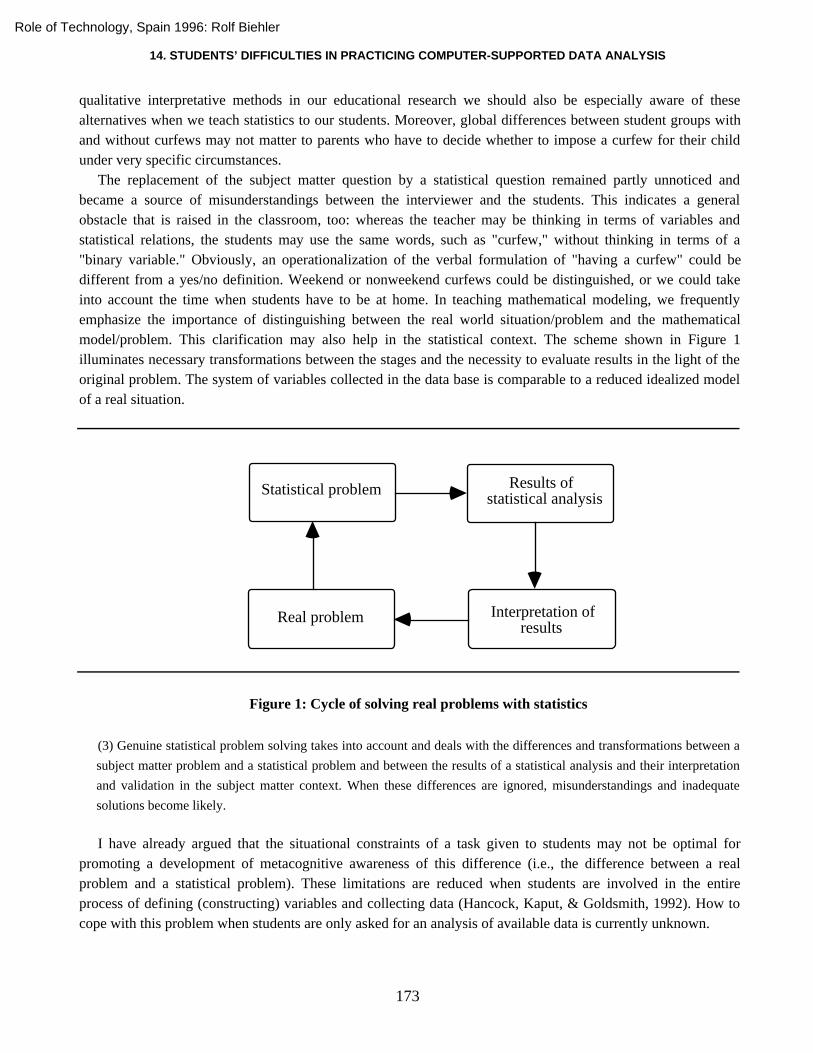
The replacement of the subject matter question by a statistical question remained partly unnoticed andbecame a source of misunderstandings between the interviewer and the students. This indicates a generalobstacle that is raised in the classroom, too: whereas the teacher may be thinking in terms of variables andstatistical relations, the students may use the same words, such as "curfew," without thinking in terms of a"binary variable." Obviously, an operationalization of the verbal formulation of "having a curfew" could bedifferent from a yes/no definition. Weekend or nonweekend curfews could be distinguished, or we could takeinto account the time when students have to be at home. In teaching mathematical modeling, we frequentlyemphasize the importance of distinguishing between the real world situation/problem and the mathematicalmodel/problem. This clarification may also help in the statistical context. The scheme shown in Figure 1illuminates necessary transformations between the stages and the necessity to evaluate results in the light of theoriginal problem. The system of variables collected in the data base is comparable to a reduced idealized modelof a real situation.
Real problem
Statistical problem Results of statistical analysis
Interpretation ofresults
Figure 1: Cycle of solving real problems with statistics
(3) Genuine statistical problem solving takes into account and deals with the differences and transformations between a
subject matter problem and a statistical problem and between the results of a statistical analysis and their interpretation
and validation in the subject matter context. When these differences are ignored, misunderstandings and inadequate
solutions become likely.
I have already argued that the situational constraints of a task given to students may not be optimal forpromoting a development of metacognitive awareness of this difference (i.e., the difference between a realproblem and a statistical problem). These limitations are reduced when students are involved in the entireprocess of defining (constructing) variables and collecting data (Hancock, Kaput, & Goldsmith, 1992). How tocope with this problem when students are only asked for an analysis of available data is currently unknown.
Role of Technology, Spain 1996: Rolf Biehler

R. BIEHLER
174
The above problem is not limited to educational situations. For instance, Hornung (1977) admonishedanalysts to distinguish between experimental and statistical hypotheses and between the level of the statisticalresult (significance) and what this may say about the original real problem. It often remains unclear whether"rejecting a hypothesis" is a proposition on the level of the statistical problem or on the level of the realproblem. More generally, we find a widespread simplistic view about the relation of formal mathematical(statistical) methods to subject matter problems (see Wille, 1995, for a critique). Some people think that formalmathematical methods can completely replace subject matter methods; however, frequently formalmathematical methods only deserve the status of a "decision support system." At one extreme, we find people inpractice who use statistical methods for solving real problems as if they were solving artificial textbookproblems in the classroom. However, the relation between subject matter knowledge and statistics is a difficultproblem. Different traditions in statistics, such as the Neyman-Pearson school versus the tradition of EDA,differ with regard to this problem; for example, EDA allows context input in a more extensive flexible way(Biehler, 1982).
Producing statistical results
During the interview segment, all the displays and tables the software DataScope offers for comparing theyes and no curfew groups were produced; that is, frequency tables, histograms (referred to as bar graphs in thisprogram), box plots, and a table with numerical summaries (these were all grouped by the variable curfew). Ourinterview and video documents show that the process of selecting the first method or display and of choosingfurther methods and displays varies among students--some superficially trying out everything, others makingreflective choices on the basis of knowledge and insight they had acquired. Most often though, students seemedto jump directly to particular methods offered by the software tool (means, box plots) without much reflection.The research problem here is the reconstruction of different patterns of software use in the context of a dataanalysis problem. Two basic problems can be summarized as follows:
(4) Superficially experimenting with given statistical methods is a first step. But how can we improve the degree of
networking in the cognitive repertoire of statistical methods? In particular, students have to overcome the belief that
using one method or graph "is enough.”
(5) Software tools with ready-made methods influence the way a subject matter problem is conceived of and is
transformed into a "statistical problem" and into a "problem for the software.” This phenomenon can be exploited for
developing students’ thinking. However, later it is also necessary to reflect on these limitations and transcend the
constraints of the tool. How can we achieve this step?
Let us think about what a good model of use would be. What would (or should) an "expert" do? The expertwill conceptualize or classify our problem as "comparing distributions." For this purpose, several comparisontools are cognitively available: box plots, frequency bar graphs with various resolutions, numerical summaries,one-dimensional scatterplots (and probably other displays such as cumulative frequency plots or QQ-plots, aswell as tools from inferential statistics). An expert will have knowledge and experience about the relation ofthese tools, especially about their relative virtues and limitations. Generally, an expert will know to experimentwith several tools because each tool shows different aspects of the data or aspects of the data in differentperspectives. Using only one tool will be not sufficient.
Role of Technology, Spain 1996: Rolf Biehler

14. STUDENTS’ DIFFICULTIES IN PRACTICING COMPUTER-SUPPORTED DATA ANALYSIS
175
Experts operate within a networked cognitive tool system and recognize the model character of a tool ordisplay. For instance, experts will know that several outliers with the same value will be shown in a box plot asonly one point and that box plots cannot directly show big gaps in the main part of the data. An expert wouldalso be aware of the differences of his/her cognitive statistical tool system and the tool system that a concretesoftware tool offers. For example, an expert may think that a jitter plot would be the best display for a certaindistribution. If this were not available, an expert would use a combination of box plot, histogram, and dot plot orgenerate a jitter plot by using the random number generator together with the scatterplot command. An expertwould also be aware that there may be differences in defining a certain concept or procedure in statistics ingeneral and in a software tool in particular [e.g., the various definitions and algorithms for quartiles that are inuse (Freund & Perles, 1987)]. Basically, we have to be aware of the subcycle shown in Figure 2.
Statistical problem
Problem for thesoftware
Results of software use
Interpretation ofresults in statistics
Figure 2: Subcycle of computer-supported statistical problem solving
Experts would probably conceptualize the situation as "comparing distributions," reflecting their cognitivetool system, and then use the computer-based tool system in a reflective way (i.e., they would understand whenthe computer tools are not adequate and understand the possible distortions and changes when progressing froma real problem to a statistical problem to a computer software problem). In contrast, we can often reconstruct inour students a direct jump from a real problem to a problem for the software without an awareness of possiblechanges. Again, students are sometimes satisfied with producing computer results that are neither interpreted instatistical nor subject matter terms. Such a degenerate use of software for problem solving, where it only countsthat the computer "does it," has also been reconstructed in other contexts (Krummheuer, 1988).
The degree of networking in some students' cognitive tool system seems to be rather low, otherwise the trialand error choice of methods that we observed quite frequently would be difficult to explain. Moreover, somestudents seem to look for one best display, when more than one display may be required.
Sometimes we can reconstruct episodes that show that students feel the need for a display not available in thesoftware; that is, they try to transcend the system of available computer-implemented tools. Students expresssuch needs fairly vaguely, probably because they have no command of a language necessary to express thedesign of new graphs. This could be due to the habit of teaching them the use of only those graphs that arealready computer implemented, without sharing with the students why and how these specific graphs have cometo be constructed.
Role of Technology, Spain 1996: Rolf Biehler

R. BIEHLER
176
Interpreting results
A characteristic feature of exploratory data analysis is the multiplicity of results.
(6) Students have to overcome the obstacle that a data analysis problem has a unique result. However, it is difficult to
cope with the multiplicity of results even at an elementary level.
Even if we compare two distributions, we can use various displays and numerical summaries, there may becontradictions, and students have to relate the various results and make some kind of synthesis. The term "datasynthesis" was introduced by Jambu (1991) to emphasize that a new phase of work begins after the productionof a multitude of results. However, even a single display such as the box plot contains an inherent multiplicity:It allows the comparison of distributions by median, quartiles, minimum, maximum, quartile range, and range.The selection and synthesis of these various aspects is not an easy task for students. An even simpler example ofdealing with multiplicity is when comparing distributions by using means and medians--Should we choose oneof them? Are both measures relevant? How can we understand differences if they occur? These questions aredifficult for students (and teachers).
The difficulties that writing statistical reports pose to students are well-known; however, it is not only thelimited verbal ability of high school students that is responsible for these problems. Not only superficial readingor writing will lead to distorted or wrong results. Our documents suggest that the description and interpretationof statistical graphs and other results is also a difficult problem for interviewers and teachers. We must be morecareful in developing a language for this purpose and becoming aware of the difficulties inherent in relatingdifferent systems of representation. Often, diagrams involve expressing relations of relations between numbers.An adequate verbalization is difficult to achieve and the precise wording of it is often critical.
(7) There are profound problems to overcome in interpreting and verbally describing statistical graphs and tables that
are related to the limited expressability of complex quantitative relations by means of common language.
I now return to our interview to show some interpretation problems with elementary graphs. In the course ofone interview in the Barriers project, the students produced a frequency bar graph (see Figure 3), but did notfind it very revealing ("It is confusing").
Some students even had difficulty "reading off" basic information. The histogram for continuous variables inFigure 3 has an underlying display scheme that is different from the categorial frequency bar chart. In thehistogram, the borders of the classes are marked, whereas in the categorial bar chart the category name (whichcould be a number) is shown in the middle below the bar. It seems that some of the students interpreted theabove graph with this "categorial frequency bar chart" scheme in mind. For example, the “5” under a bar wasinterpreted in the sense that there are only data with the value “5” in the bar. Bars with nothing written belowwere difficult to interpret. There was a similar confusion of graphical construction schemes with regard to boxplots. We may conclude that, independent of the newly taught schemes, students attempt to make sense ofgraphs by using graph construction schemes from other contexts. Thus, the notion that we must be more carefulin our instruction of distinguishing among different types of axis in elementary graphs is reinforced. Thesoftware Tabletop (Hancock, 1995) offers a carefully designed possibility here for changing among differenttypes of axis that may be very helpful for beginners.
Role of Technology, Spain 1996: Rolf Biehler

14. STUDENTS’ DIFFICULTIES IN PRACTICING COMPUTER-SUPPORTED DATA ANALYSIS
177
n=50
n=100
yes
Figure 3: Histograms with absolute frequencies of HW (in hours)
However, not only the high school students had problems here. Most of the student teachers in the CoStaproject felt more "uncomfortable" with the continuous variable histogram than with the categorial frequency barchart. The student teachers had various difficulties related to the relation between relative and absolutefrequencies, and the various resolutions when changing the interval length of the grouping system. It could be agood didactical idea to distinguish "maximum resolution bar graphs" that show the entire raw dataset from"histograms" that are based on grouping the data and are thus only a summary of the data.
The fact that the computer hid the grouping of the data from the user could be hypothesized as a source ofdifficulty. The histogram is a very simple case from the expert's view. However, the problem that users of amathematical tool forget the "meaning" of a certain display or method is a general one.
(8) Students tend to forget the meaning of statistical graphs and procedures, and, often, the software tool does not
support them in reconstructing this meaning.
Thus, perhaps the software we use needs to be improved: Some possibilities include adding hypertextexplanations including prototypical uses and pitfalls for every graph or method, offering related linked methods(e.g., showing what is inside a histogram bar by clicking on it), highlighting the data of one bar in other displaysor tables, or suggesting "related methods" to be combined with the histogram. We must, however, improveteaching and resist the temptation to take implemented statistical algorithms and displays "as given" in themachine, forgetting that students have to construct the meaning of the methods in their minds.
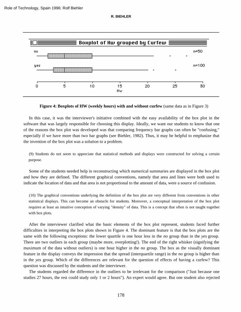
Students produced a box plot display of HW grouped by curfew (see Figure 4).
Role of Technology, Spain 1996: Rolf Biehler
R. BIEHLER
178
Figure 4: Boxplots of HW (weekly hours) with and without curfew (same data as in Figure 3)
In this case, it was the interviewer's initiative combined with the easy availability of the box plot in thesoftware that was largely responsible for choosing this display. Ideally, we want our students to know that oneof the reasons the box plot was developed was that comparing frequency bar graphs can often be "confusing,"especially if we have more than two bar graphs (see Biehler, 1982). Thus, it may be helpful to emphasize thatthe invention of the box plot was a solution to a problem.
(9) Students do not seem to appreciate that statistical methods and displays were constructed for solving a certain
purpose.
Some of the students needed help in reconstructing which numerical summaries are displayed in the box plotand how they are defined. The different graphical conventions, namely that area and lines were both used toindicate the location of data and that area is not proportional to the amount of data, were a source of confusion.
(10) The graphical conventions underlying the definition of the box plot are very different from conventions in other
statistical displays. This can become an obstacle for students. Moreover, a conceptual interpretation of the box plot
requires at least an intuitive conception of varying "density" of data. This is a concept that often is not taught together
with box plots.
After the interviewer clarified what the basic elements of the box plot represent, students faced furtherdifficulties in interpreting the box plots shown in Figure 4. The dominant feature is that the box plots are thesame with the following exceptions: the lower quartile is one hour less in the no group than in the yes group.There are two outliers in each group (maybe more, overplotting!). The end of the right whisker (signifying themaximum of the data without outliers) is one hour higher in the no group. The box as the visually dominantfeature in the display conveys the impression that the spread (interquartile range) in the no group is higher thanin the yes group. Which of the differences are relevant for the question of effects of having a curfew? Thisquestion was discussed by the students and the interviewer.
The students regarded the difference in the outliers to be irrelevant for the comparison ("Just because onestudies 27 hours, the rest could study only 1 or 2 hours"). An expert would agree. But one student also rejected
Role of Technology, Spain 1996: Rolf Biehler
14. STUDENTS’ DIFFICULTIES IN PRACTICING COMPUTER-SUPPORTED DATA ANALYSIS
179
the difference in the lower quartile as relevant, because it ignores "the rest of the data." The equality of themedian is accepted as an indication of no difference. Why? "Because, by average. You know on average, peoplestudied 5 hours on both, with a curfew or without a curfew. So that would kind of be the median. That's right,yeah. Or, if you look at the mean..." (Note that the means are 6.44 hours for no curfew and 6.995 hours forcurfew.) Reacting to the question of whether the mean uses all the data for comparison, one student said:"You're not using all the data but you're looking kind of averaging out, you know like looking at the averagetime that people spend studying, so you're using the whole data because you got to find one average."
We can see the interesting point that "comparison by average" seems to be a basic acceptable choice for thestudents; intuitive conceptions like averaging out seem to play a role in this. It would be interesting to explorethis further. The students were asked to comment on mean or median but only referred to the mean; thus, wesuspect that they may have less confidence in using medians for comparison. This observation was also madewith the CoSta students. Moreover, the possibility that box plots offer--the simultaneous comparison accordingto different criteria--is not really used and accepted by the students as a part of their tool system.
(11) Establishing the box plot as a standard tool for comparing distributions is likely to conflict with "acceptable
everyday heuristics" of comparing distributions or groups by arithmetic means (averages).
A SUPPLEMENTARY TASK ANALYSIS OF THE CURFEW EPISODEFROM AN "EXPERT" PERSPECTIVE
In this section, the inherent difficulties and obstacles in the above problem will be analyzed further. Thiscomplexity must be taken into account when designing problems and assessing students' performance and theircognitive problems.
Median or mean
In the above example, we observed no difference in the medians but a difference in the means. Can we cometo a definite decision? Which difference is more relevant?
It may be helpful to know something about the relation of the two summaries. Why (in terms of the numbers)are the means higher than the medians? It is difficult for students to understand relations between means andmedians, especially because no clear theory exists. An expert might see in this situation that the difference inlower quartiles may "numerically explain" the difference of the means as compared to the medians, if we use themetaphor that the mean is the center of gravity of the distribution. Imagine shifting the data below the median inthe upper display to the right (about 1 hour). This will produce something similar to the lower display and at thesame time result in a shift of the mean to the right (of half an hour). Obviously, this requires thinking on a veryabstract mathematical level--experts are able to change data and shift distributions conceptually in their minds.This does not correspond to any real action--we do not have the same objects in the two displays (with twodifferent variables), but rather two different groups. My point is that successfully comparing distributions mayrequire fairly abstract thinking in terms of mathematical distributions as entities. However, we know thatworking with functions as entities is difficult for students (Sfard, 1992). And this difficulty comes into playwhen students are supposed to effectively compare data distributions. The problem of distributions as entitieswill be discussed below, because it is also relevant for other respects of statistical reasoning.
Role of Technology, Spain 1996: Rolf Biehler

R. BIEHLER
180
(12) Choosing among various summaries in a concrete context requires knowledge of relations between distributional
form and summaries, and of a functional interpretation of summaries (how they will be affected by various changes).
Thinking about summaries only with regard to their value in empirical data distributions and not as properties of
distributions as abstract entities may become an obstacle in data analytical practice.
This difficulty may not be surprising because data distributions are usually not characterized as concepts incourses of elementary data analysis. Distributions are emphasized in probability theory but in an entirelydifferent context that students find difficult to apply to data analysis.
Interpreting box plots
How might experts exploit the information provided in the box plots? The diagnosis that the interquartilespread is higher in the no group than in the yes group seems to not be directly interpretable. For the box plotsshown in Figure 4, we could argue as follows. Under both conditions, we have a median of 5 and an upperquartile of 10. The distribution beyond the upper quartile looks similar. The distributions look fairly the sameabove the median (according to the box plots). But among those who do relatively little homework, namelyamong those less than or equal to 5 hours, we find a real difference: The median of weekly work of those with acurfew is one hour more than without a curfew. In other words, if we constrain the analysis to the lower halves,the median homework time is 50% higher among those who have a curfew. In this reasoning, we haveinterpreted the lower quartile as the median of the lower half of the data.
We could consider a practical recommendation. Parents should consider imposing a curfew on those studentswho do not (yet) work more than 5 hours. This practical conclusion is not completely supported by the databecause we have not strictly proved a causal influence of curfew on study time. But the conclusion is certainlyplausible. We will return to the weaknesses of this conclusion below. Let us reflect on the difficulties of theinterpretations of multiple box plots first.
(13) Even with the relatively elementary box plots, students will encounter a variety of unforeseen patterns in graphs in
open data analysis tasks. Interpretation often tends to be difficult, may depend on the specific context, and may require
substantial time before a satisfactory interpretation is achieved. Often, graphs will be confusing even to experts. The
search for interpretable patterns is natural but may not be successful, because they may not exist. The fact that many
textbooks present easily interpretable box plots (or graphs in general) may serve to mislead students to expect that all
plots are easy to interpret.
A well-selected set of examples for group comparison with box plots that includes examples in which nosatisfactory interpretation is available would be helpful for teaching purposes. This would be similar to whatBehrens (1996) suggests as a data gallery.
Although we have to face the above general problem in elementary data analysis, there are some specificproblems with box plots. In the CoSta project, we have observed that students tend to notice differences in themedians first and do not pay enough attention to differences in spread. Interpreting differences in spread is ageneral problem. There are prototypical situations with good interpretations of spread differences; for example,two different measurement devices where spread measures the "accuracy" of the instrument. In other cases, thelarger variability of an external variable may explain the larger spread of the variable in question. In the CoStadata, for example, the seasonal variation of the amount of traffic on weekends is higher than the seasonal
Role of Technology, Spain 1996: Rolf Biehler

14. STUDENTS’ DIFFICULTIES IN PRACTICING COMPUTER-SUPPORTED DATA ANALYSIS
181
variation within the week because there is additional traffic on weekends in spring and summer. However, thereare other cases where difference in spread is not easily interpretable.
An additional problem is that the box plot represents at least three global measures of spread: range,difference between the whisker ends (range without outliers), and interquartile range. Students can report allthree, but how do they handle the different conclusions these may support? Also, the expert knows that adifference of one hour in the interquartile range has to be taken more seriously than the difference of one or twohours in the range or whisker differences, except for very small sample sizes. The resistance, robustness, or"reliability" of summaries is an issue here. This is relevant not only when we think in terms of random variationin a sample, but also when we take into account that there may be individual inaccuracies or errors in the data.Obviously, this is open to interpretation, but what can students reasonably learn about this?
(14) Interpretations of summary statistics such as those represented in a box plot must take into account their different
"reliability" and "robustness.” Sample size is important even when the data do not come from a random sample.
Students generally lack the flexible knowledge and critical awareness of experts, which guides their behavior in such
situations.
A well-known advantage of the box plot is that it displays not only a global measure of spread, such as theinterquartile range, but a measure of spread left and right of center. In other words, skewness can be recognized.This advantage may not be clear to students who may have learned the box plot as a standard display withouthaving been confronted with the problem of "how to measure spread." Skewness and symmetry are betterdefined in the ideal world of mathematical distribution curves than in graphs of actual data. Experts seestructures and relations in real graphs as "symmetrical distribution plus irregular variation," but novices exposedonly to more complex but real data graphs will be unable to "see" this. Although we do not know enough aboutwhat students and experts "see" in graphs, the following problem can be formulated.
(15) Box plots can be used to see "properties of distributions" such as symmetry and skewness that cannot be well-
defined in empirical distributions. Moreover, the concepts of symmetry and skewness are related to a classification of
distribution types--the rationale of which is difficult to teach in elementary data analysis. For instance, experts will
probably expect skew distributions for the variable homework, although this expectation would not be easily
explainable.
Questioning the basis of decision making
Would an expert be satisfied with the analysis and recommendation to parents sketched above? What kind ofrefinements with regard to the subject matter problem could be considered?
To broaden the analysis, we should check other graphs and numerical summaries to see whether we mightarrive at a somewhat different conclusion. Conclusions should not be based on a single display, because any onedisplay may conceal important features.
(16) Conclusions depend on the statistical methods and displays that have been considered. Experts, aware of the
limitations inherent in many summaries and the hermeneutic circle in data interpretation, consider alternative
Role of Technology, Spain 1996: Rolf Biehler

R. BIEHLER
182
approaches. Students whose experience has consisted of well-defined textbook problems in a methods-oriented statistics
course will not be prepared to appreciate this problem.
The observational difference between the no/yes groups is not enough to support the claim of a causalinfluence. We should also explore how the with and without curfew groups differ on other variables. Expertswould want to exclude the possibility that these other variables could explain the difference in study time.
There could be common variables such as age that could influence both our variables: for example, olderstudents may tend to study less and are less likely to have curfews or parents' attitude towards education mayinduce them to impose curfews and find other ways to motivate studying. In other words, the elimination ofcurfews may not result in diminished study time, because the general attitudes of the parents would not change.This latter kind of thinking is far from being common sense; it is explicitly emphasized in statistics textbooksbecause it is known that people tend to misinterpret data. Historically, statisticians have tried to control for thirdvariables by checking whether a certain effect is true for all levels of the third variable. Generally, ourconclusion has to be considered as an uncertain hypothesis that has to be tested by further experiments and data.
(17) Studying dependencies and possible "effects" in observational data is part of the agenda in elementary data analysis
courses--but how do we cope with the problem of "lurking variables"?
Any recommendation to parents should be offered with some reservations; that is, we cannot be certain thatimposing a curfew alone will have an effect. Sophisticated parents may say that an average increase is notrelevant, because they are interested in an increase of study time of their own child, and there may be veryspecific conditions that they have to take into account. This raises the general problem that statistical effectsdetermined on groups may not be relevant for individual cases. Collective rationality and individual rationalitymay clash.
A reasonable abstract model could be: cause -> intermediate variables -> resulting change, where thevalue of the intermediate variables determine how the cause affects the result. Even if having a curfew wouldhave no "statistical effect," parents could argue that in the case of their child they have evidence that dropping acurfew would have a negative effect. They could base their argument on their experience with their child insimilar situations. Intuitively, parents may feel that a certain change (dropping a curfew) may have differenteffects on different persons so that the statistical argument is irrelevant.
(18) Statistics establish propositions about differences between "groups.” The relevance of group differences to
evaluating individual cases is often not clear. If students are not able to distinguish between the group and individual
level, they may run into problems when trying to interpret results. Statistical results and common sense judgments may
become difficult to relate and integrate.
(19) Students have difficulties in relating abstract models of linear statistical-causal chains to studying frequency
distributions under various conditions. Students conduct the data analysis study as they have learned in the classroom,
but the classroom learning has not (yet) upgraded their cognitive statistical-causal modeling capability.
Role of Technology, Spain 1996: Rolf Biehler
14. STUDENTS’ DIFFICULTIES IN PRACTICING COMPUTER-SUPPORTED DATA ANALYSIS
183
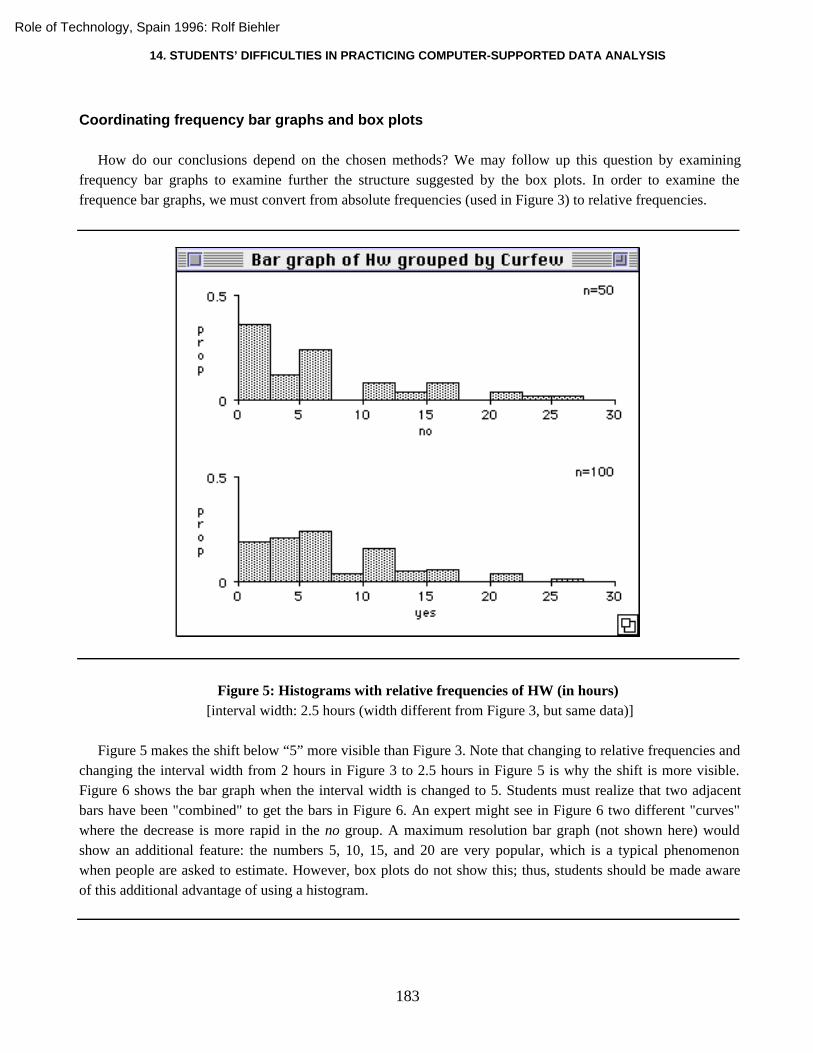
Coordinating frequency bar graphs and box plots
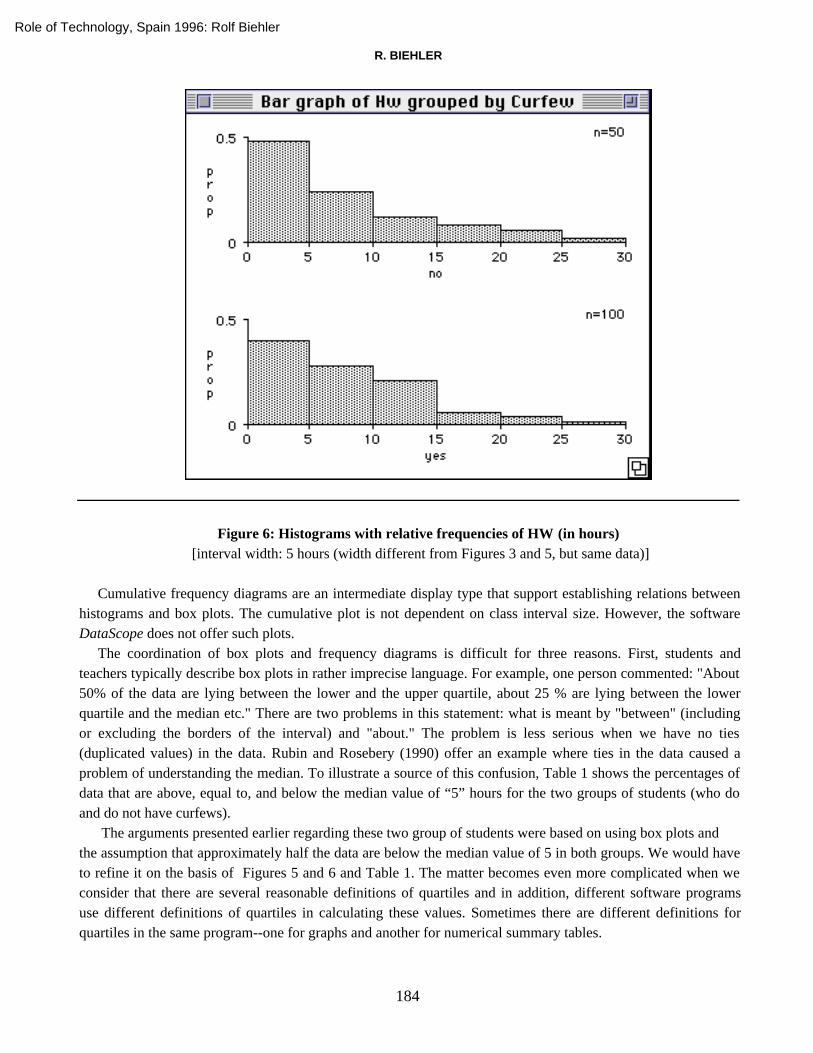
How do our conclusions depend on the chosen methods? We may follow up this question by examiningfrequency bar graphs to examine further the structure suggested by the box plots. In order to examine thefrequence bar graphs, we must convert from absolute frequencies (used in Figure 3) to relative frequencies.
Figure 5: Histograms with relative frequencies of HW (in hours) [interval width: 2.5 hours (width different from Figure 3, but same data)]
Figure 5 makes the shift below “5” more visible than Figure 3. Note that changing to relative frequencies andchanging the interval width from 2 hours in Figure 3 to 2.5 hours in Figure 5 is why the shift is more visible.Figure 6 shows the bar graph when the interval width is changed to 5. Students must realize that two adjacentbars have been "combined" to get the bars in Figure 6. An expert might see in Figure 6 two different "curves"where the decrease is more rapid in the no group. A maximum resolution bar graph (not shown here) wouldshow an additional feature: the numbers 5, 10, 15, and 20 are very popular, which is a typical phenomenonwhen people are asked to estimate. However, box plots do not show this; thus, students should be made awareof this additional advantage of using a histogram.
Role of Technology, Spain 1996: Rolf Biehler
R. BIEHLER
184
Figure 6: Histograms with relative frequencies of HW (in hours) [interval width: 5 hours (width different from Figures 3 and 5, but same data)]
Cumulative frequency diagrams are an intermediate display type that support establishing relations betweenhistograms and box plots. The cumulative plot is not dependent on class interval size. However, the softwareDataScope does not offer such plots.
The coordination of box plots and frequency diagrams is difficult for three reasons. First, students andteachers typically describe box plots in rather imprecise language. For example, one person commented: "About50% of the data are lying between the lower and the upper quartile, about 25 % are lying between the lowerquartile and the median etc." There are two problems in this statement: what is meant by "between" (includingor excluding the borders of the interval) and "about." The problem is less serious when we have no ties(duplicated values) in the data. Rubin and Rosebery (1990) offer an example where ties in the data caused aproblem of understanding the median. To illustrate a source of this confusion, Table 1 shows the percentages ofdata that are above, equal to, and below the median value of “5” hours for the two groups of students (who doand do not have curfews).
The arguments presented earlier regarding these two group of students were based on using box plots andthe assumption that approximately half the data are below the median value of 5 in both groups. We would haveto refine it on the basis of Figures 5 and 6 and Table 1. The matter becomes even more complicated when weconsider that there are several reasonable definitions of quartiles and in addition, different software programsuse different definitions of quartiles in calculating these values. Sometimes there are different definitions forquartiles in the same program--one for graphs and another for numerical summary tables.
Role of Technology, Spain 1996: Rolf Biehler

14. STUDENTS’ DIFFICULTIES IN PRACTICING COMPUTER-SUPPORTED DATA ANALYSIS
185
Table 1: Percentages of Homework Hours below and above the median (5 hours)
Interval “No ” Group “Yes” Group
< median 48 40
= median 20 13
> median 32 47
(20) The way teachers and students casually talk about box plots may come into conflict with frequency
information that students read from histograms.
The second problem of coordinating box plots and frequency bar graphs is conceptually quite difficult. Thedefinition of box plots is based on quartiles which are based on percentiles. This requires that students think interms of fixed frequencies that are spread over a certain range. The reasoning needed for the bar graph is theinverse. For the box plot in Figure 4, students (and teachers) sometimes said "About 25 % of the data arebetween 2 and 5 hours." (They looked at the range between the lower quartile and the median.) In commonlanguage, this statement would be interpreted as “if we look to the interval between 2 and 5 hours, we find afrequency of 25%.” However, the meaning of the students' proposition is really stronger--it is a proposition ofthe location of the "second 25%" of the data, a very specific subset of the data that covers about 25%. In acumulative (maximum resolution) frequency plot, it is possible to coordinate both perspectives; that is, startingfrom the frequency axis or starting from the value (quartile) axis. It is unknown whether introducing such anintermediate plot may help to link box plots and frequency bar graphs in students' minds. In any case, thisintermediate cumulative plot requires thinking in terms of functions and their inverses, which are usually noteasily understood.
(21) The reasoning between "frequency "and "range for this frequency" in the case of the box plot is inverse to the
corresponding reasoning with regard to histograms. This conceptual difficulty is exacerbated because it is difficult in
common language to express the two different numerical aspects of a proposition such as "the frequency between 5 and
7 is 30%."
The third problem concerns how to talk about multiple box plots. The median and quartiles are concepts thatare defined with regard to frequencies. However, it is often of no use to repeat these definitions when describingmultiple box plots (i.e. just redescribing differences in other terms). Students must reach a stage where theybegin to use median and quartiles as conceptual tools for describing and comparing distributions without alwaysgoing back to their definitions. That seems to be very difficult to achieve. New concepts are required to describedifferences and relations in multiple box plots. For example, when exploring the box plots that contained thetraffic data in the CoSta project, students began to characterize the development of the monthly median orspread as a function dependent on time (as measured by the month of the year).
(22) Comparing multiple graphs such as box plots or histograms requires coordinated use of the defining concepts as
well as the development of new concepts that are specifically adapted to the comparison of distributions.
Role of Technology, Spain 1996: Rolf Biehler

R. BIEHLER
186
SOME FURTHER PROBLEMS AND TASKS FOR RESEARCH
In this section, I will briefly describe additional problems that we have encountered that I prefer not tointegrate into the presentation of the curfew problem.
The varying accuracy of numbers
"The mathematical and the statistical number--two worlds" is the title of a chapter in Wagemann's (1935)book on a "statistical world view." He points to the different properties of exact mathematical numbers andempirical numbers (results of measurements) in statistics. When we use an equality sign, we most often meanonly approximate equality in statistics. We have to judge how many digits of the decimal numbers of the rawdata are meaningful. It is more difficult to decide the number of significant digits for derived statistics. Expertsoften have metaknowledge with regard to what accuracy would be considered reasonable and reliable. Studentsencounter this problem in many disguises and forms, and this is especially true in descriptive statistics. Someexamples will be provided here.
The shape of frequency distributions
Students report that a frequency distribution has five peaks so that it must be considered multimodal.Experts, however, would take into account that the number of peaks depends on the interval size and maydiagnose an overall unimodality plus "randomness" in the first attempt. This problem is well-known, and somestatisticians question the use of histograms and have more refined tools for diagnosing peaks. Density tracesoften assume some probabilistic background that is (not yet) part of the students' world view. Students maycognitively structure a histogram as a smooth curve plus irregular variation. However, we do not yet knowenough about what students see in histograms nor what kind of orientation we should teach students. Theproblem turns even more serious when students have to compare distributions using frequency diagrams(histograms). Questions such as "When are distributions practically the same, when are there "essential"differences?" are difficult to answer. Note that the students encountered this when working on the curfewproblem and were confused.
The comparison of summaries
In one of the interviews for the Barriers project, students had to compare average grades. Grades of thestudents were measured as A, AB and so forth, and then coded as numbers 1, 2, 3. Two groups had averagegrades of 6.61 and 6.85. The students argued that decimal grades are meaningless and rounded both values to 7.Thus, the conclusion was that no real difference exists between the groups. This example has several inherentdifficulties, one of which is whether we should calculate means of ordinal variables. However, the problem canbe observed for quantitative variables as well. For example, it generally does matter whether there are onaverage 10.1 or 10.3 accidents per hour in a certain region. The basic problem is that summary values like themean and median have a "scale" that is different from the "scale" of the original values (and total range has adifferent "scale" than interquartile range). A subsequent problem is what differences are really significant for acertain subject matter perspective or problem--there is no general answer. Statisticians may point to the problem
Role of Technology, Spain 1996: Rolf Biehler

14. STUDENTS’ DIFFICULTIES IN PRACTICING COMPUTER-SUPPORTED DATA ANALYSIS
187
of statistical significance; however, this does not solve the problem of evaluating subject matter significance. Asbecame evident from the curfew problem presented above, it is extremely difficult for students to judge thedifferent potential variability of different statistical measures.
A further problem arises from the fact that most numbers in statistics are measurements, and often they areestimations. In interpretation tasks, one has to take into account the reliability, validity, and accuracy of thesemeasurements (e.g., we observed several multiples of five in the estimates given by students regarding thenumber of hours they spent on homework).
(23) Statistics is concerned with empirical numbers. The question of how many digits should be taken seriously depends
on the context. Metaknowledge is necessary for guiding data analysts. However, the orientation towards exact numbers
in traditional mathematics instruction may become an obstacle for adequate behavior in statistical applications.
Visualizations of data: how and why?
Elementary graphs are more complex for students than we had expected. Difficulties may arise because ofdifferent (contradictory) conventions between discrete and continuous frequency bar graphs, and because ofdifferences between the principles underlying box plots and histograms (frequency is not always represented byarea or length). These difficulties multiply if different computer programs are used and there is a discrepancybetween the conventions used in teaching and those in the software.
These problems will grow in a computer-supported course if not enough time is devoted to the principles onwhich the construction of a new method is based and on the reasons for a new display format: Which problemscan we solve better now that we have the histogram/the box plot? The existence of ready-made methods insoftware may increase the temptation to just "give" students the methods, without creating a "need" for newmethods and without having considered possible alternatives.
Historical information could be of help here. Tukey (1977) provides a careful introduction to the box plot.He considers box plots as a "quick and easy" first step "standard summary" of data. According to Tukey,looking at box plots may provide clues and inspire the need for additional displays. For instance, one may wishto concentrate on a display of only the medians or the quartile range, or one may wish to see the original databehind the box and the whiskers in a one-dimensional scatterplot. Contrary to this flexible use, methods such asthe box plot have already become codified, and often teachers do not take enough time or have enoughawareness of the problem to help students to see the box plot from this wider perspective. Moreover, even manyprofessional tools do not easily support such a flexible approach by providing the box plot in the context ofother related methods.
Making the principles of graph construction and data visualization topical could also be valuable as a generalorientation: We have frequently observed students looking around in messy tabular data without getting thebasic idea that plotting may help to see more structure.
(24) If students have only learned a number of specific graphs, they may run into difficulties in various situations where
more general knowledge of principles of good statistical graph construction is required.
Role of Technology, Spain 1996: Rolf Biehler

R. BIEHLER
188
A conceptual orientation for interpreting and using graphs and tables
The habit of careful and thorough reading and interpreting of statistical displays is difficult to develop. Weknow from other statistics teachers that students tend to produce much uninterpreted output, and that thepossibility of using a variety of graph types may distract them from concentrating on interpreting one display.We also know that it is difficult to write a report; that is, to produce written or oral descriptions andinterpretations of graphs. Our transcripts suggest that verbalizing structure in graphs is a problem, not only forthe students but for the interviewers and teachers as well. Quantitative relations are complex and cannot beparaphrased in common language adequately without graphical means and symbolic notation. Often, theverbalization is only a summary and, thus, a partial distortion.
A deeper problem is to understand, reconstruct, and influence the conceptual means, or the cognitivestructure, that students bring to a graph or table. There are a number of studies related to the interpretation ofline graphs of empirical data and of function graphs (see Romberg, Fennema, & Carpenter, 1993). Manyconcepts are required for describing and interpreting aspects of graphs such as changing slope, local minimumand maximum, and so forth. Also, recognizing shapes and classifying functional relationships is an importantorientation. To interpret a line graph with data, students may need to switch between seeing the graph as acollection of points and as a representation of a function. We encounter similar problems in other statisticalgraphs. However, the varying accuracy of numbers problem adds a problem. A simple example for this problemis as follows: We can potentially see many different structures in a scatterplot, and we can cognitively fitmultiple functions that will pass "near" the data points. This kind of statistical ambiguity is not present in therealm of graphs of empirical and mathematical functions as they are analyzed in the above quoted research.
We can illustrate the necessity of conceptual orientation with two-way tables. The software DataScope thatthe students in the Barriers project used has the capability to display a frequency table of a categorical variablegrouped by another categorical variable, which results in a cross-tabulation with absolute and relativefrequencies. The students interviewed here analyzed the data table with regard to individual values and theircomparisons. In such a table, an expert would see marginal distributions and two types of conditionaldistributions (row and column percentages) and would compare the rows or columns (which will be independentwhen the conditional distributions are the same). In statistics, concepts such as "input flow view" and "outputflow view" have been developed for distinguishing the two views of the two-way table. The problem is relatedto the well-known problem of confusing two different conditional probabilities; for example, P (test positive ⁄man ill)and P (man ill ⁄ test positive). Experts have developed a rich conceptual structure for an analysis of suchtables.
The student teachers in the CoSta project had better conditions than the students in the Barriers project inthat much more time was devoted to the above conceptual prerequisites and the software BMDP New Systemprovided more flexibility than DataScope in swapping the variables in a two-way table, collapsing categoriesfor getting a better overview over the structure, and switching between displaying the two different conditionaldistributions (row and column percentages) and the unconditional frequency distribution. The preliminaryresults of the CoSta project shows, however, that it was also extremely difficult for these students to think interms of entire distributions (as objects) and to interpret entire rows and columns as representing conditionaldistributions.
Role of Technology, Spain 1996: Rolf Biehler

14. STUDENTS’ DIFFICULTIES IN PRACTICING COMPUTER-SUPPORTED DATA ANALYSIS
189
(25) Interpretation of graphs and tables that are more than a mere reading off of coded information requires a rich
conceptual repertoire.
Perspectives
We hope that the further analysis of our documents will contribute to a reshaping and sharpening of the 25problem areas that I have defined above. A further clarification and identification of adequate didacticalprovisions for overcoming these difficulties or for redefining goals for teaching elementary data analysis is atask for future research and development projects.
Acknowledgments
Part of the work on which this paper is based was supported by the National Science Foundation (RED-9452917) who gave a grant for the common Barriers project with Cliff Konold and Heinz Steinbring. I amgrateful to Heinz and Cliff with whom I discussed episodes of the transcripts of the Barriers project that helpedto shape my hypothetical generalizations I have presented in this paper. I wish to thank an annonymous refereefor his/her helpful suggestions. I am indebted to Cliff Konold for his detailed comments and constructivesuggestions on an earlier version that helped much to improve and revise this paper. However, I am stillresponsible for all the weaknesses and partly unwarranted speculations and hypotheses.
REFERENCES
Behrens, J. T. (1996). Using GEESC: A graphical environment for exploring statistical concepts. In J.Garfield & G. Burrill
(Eds.), Research on the Role of Technology in Teaching and Learning Statistics (pp. 113-123). Voorburg, The
Netherlands: International Statistical Institute.
Biehler, R. (1982). Explorative Datenanalyse - Eine Untersuchung aus der Perspektive einer deskriptiv - empirischen
Wissenschaftstheorie. IDM Materialien und Studien 24 [Exploratory data analysis - an analysis from the perspective of
a descriptive-empirical epistemology of science]. Bielefeld: Universität Bielefeld, Institut für Didaktik der Mathematik.
Biehler, R. (1992). Intendierte Anwendungen und didaktische Begründungen zu einem Softwarewerkzeug zur Explorativen
Datenanalyse und stochastischen Simulation für Schule und Ausbildung [Intended applications and pedagogical
rationale for a software tool for exploratory data analysis and stochastic simulation for educational purposes.]
München: Inst. f. Film und Bild in Wissenschaft und Unterricht (FWU).
Biehler, R. (1995). Probabilistic thinking, statistical reasoning, and the search for causes--Do we need a probabilistic
revolution after we have taught data analysis? In J. Garfield (Ed.), Research papers from ICOTS 4, Marrakech 1994.
Minneapolis: University of Minnesota.
Biehler, R. (1997). Software for learning and for doing statistics. International Statistical Review , 65(2), 167-189.
Biehler, R., & Steinbring, H. (1991). Entdeckende Statistik, Stengel-und-Blätter, Boxplots: Konzepte, Begründungen und
Erfahrungen eines Unterrichtsversuches [Statistics by discovery, stem-and-leaf, box plots: Basic conceptions,
pedagogical rationale and experiences from a teaching experiment]. Der Mathematikunterricht, 37(6), 5-32.
Biehler, R., & Weber, W. (Eds.). (1995). Explorative Datenanalyse. Computer + Unterricht, 17.
Freund, J. E., & Perles, B. M. (1987). A new look at quartiles of ungrouped data. The American Statistician, 41, 200-203.
Hancock, C., Kaput, J. J., & Goldsmith, L. T. (1992). Authentic inquiry with data: Critical barriers to classroom
implementation. Educational Psychologist, 27, 337-364.
Role of Technology, Spain 1996: Rolf Biehler

R. BIEHLER
190
Hancock, C. (1995). TableTop Software (Ver. 1.0) [Computer program]. Novato, CA: Brøderbund Software Direct.
Hornung, J. (1977). Kritik des Signifikanztests [Critique of significant testing]. METAMED, 1, 325-345.
Jambu, M. (1991). Exploratory and multivariate data analysis. London: Academic Press.
Konold, C., & Miller, C. D. (1994). DataScope (Ver. 1.4) [Computer program]. Santa Barbara, CA: Intellimation.
Konold, C., Pollatsek, A., Well, A., & Gagnon, A. (1997). Students analyzing data: Research of critical barriers. In J.
Garfield & G. Burrill (Eds.), Research on the role of technology in teaching and learning statistics (pp. 153-169).
Voorburg, The Netherlands: International Statistical Institute.
Krummheuer, G. (1988). Die menschliche Seite am Computer [The human side with computers]. Stuttgart: Teubner.
Romberg, T. A., Fennema, E., & Carpenter, T. P. (Eds.). (1993). Integrating research on the graphical representation of
functions. Hillsdale, NJ: Erlbaum.
Rubin, A., & Rosebery, A. S. (1990). Teachers' misunderstandings in statistical reasoning: Evidence from a field test of
innovative materials. In A. Hawkins (Ed.), Training teachers to teach statistics (pp. 72-89). Voorburg: International
Statistical Institute.
Sfard, A. (1992). Operational origins of mathematical objects and the quandary of reification--The case of function. In G.
Harel & E. Dubinsky (Eds.), The concept of function: Aspects of epistemology and pedagogy. MAA Notes # 25 (pp. 59-
84). Washington, D.C.: Mathematical Association of America.
Steinbring, H. (1996). The epistemological analysis of interactive mathematical processes of communication--theoretical
background and example of analysis. Unpublished manuscript, Universität Dortmund.
Tukey, J. W. (1977). Exploratory data analysis. Reading, MA: Addison-Wesley.
Wagemann, E. (1935). Narrenspiegel der Statistik. Hamburg: Hanseatische Verlagsanstalt.
Wille, R. (1995). Allgemeine Mathematik als Bildungskonzept für die Schule [General mathematics as a conception for
teaching mathematics in schools]. In R. Biehler, H.-W. Heymann, & B. Winkelmann (Eds.), Mathematik
allgemeinbildend unterrichten - Impulse für Lehrerbildung und Schule [Teaching mathematics with a view towards
goals of school education in general - New impacts for teacher education] (pp. 41-56). Köln: Aulis.
Role of Technology, Spain 1996: Rolf Biehler