1.2: displaying quantitative data with graphs. section 1.2 displaying quantitative data with graphs...
TRANSCRIPT
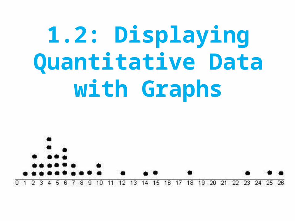
1.2: Displaying Quantitative Data with Graphs
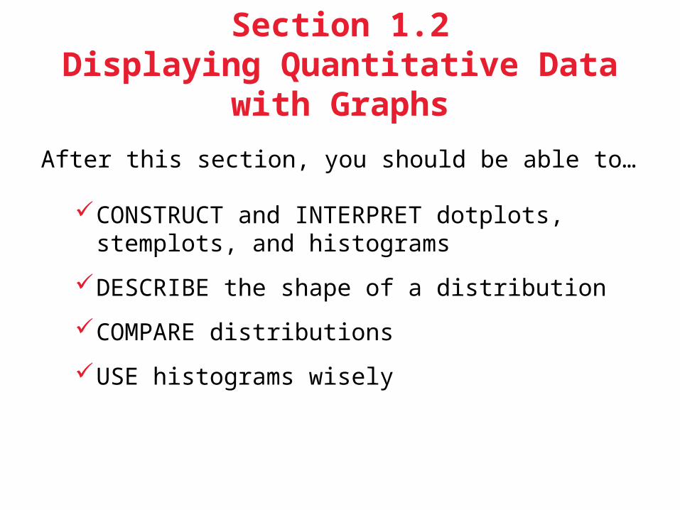
Section 1.2Displaying Quantitative Data with Graphs
After this section, you should be able to…
CONSTRUCT and INTERPRET dotplots, stemplots, and histograms
DESCRIBE the shape of a distribution
COMPARE distributions
USE histograms wisely
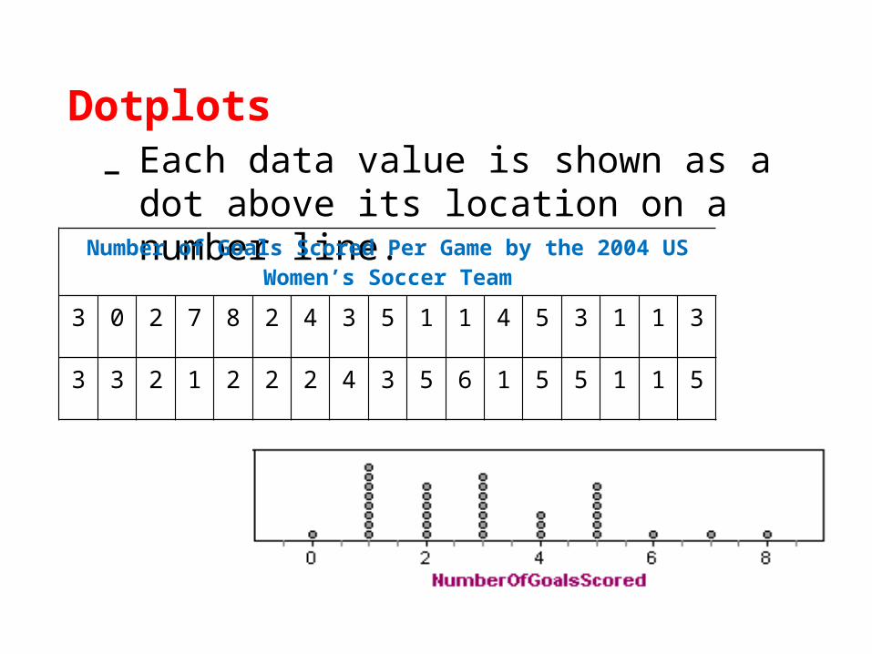
Dotplots– Each data value is shown as a dot above its
location on a number line.
Number of Goals Scored Per Game by the 2004 US Women’s Soccer Team
3 0 2 7 8 2 4 3 5 1 1 4 5 3 1 1 3
3 3 2 1 2 2 2 4 3 5 6 1 5 5 1 1 5

1. Draw a horizontal axis (a number line) and label it with the variable name.
2. Scale the axis from the minimum to the maximum value.
3. Mark a dot above the location on the horizontal axis corresponding to each data value.
How to Make a Dotplot
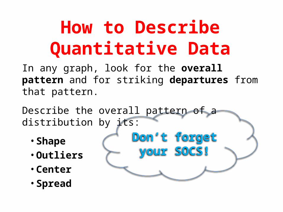
In any graph, look for the overall pattern and for striking departures from that pattern.
Describe the overall pattern of a distribution by its:
• Shape• Outliers• Center• Spread
Don’t forget your SOCS!
How to Describe Quantitative Data
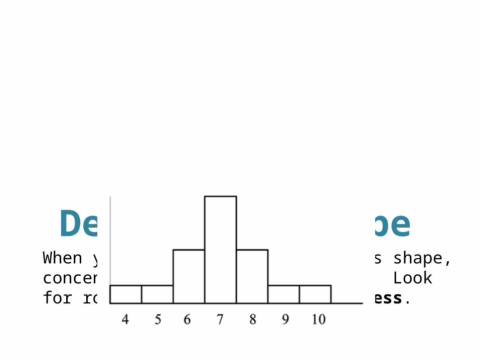
Describing ShapeWhen you describe a distribution’s shape, concentrate on the main features. Look for rough symmetry or clear skewness.
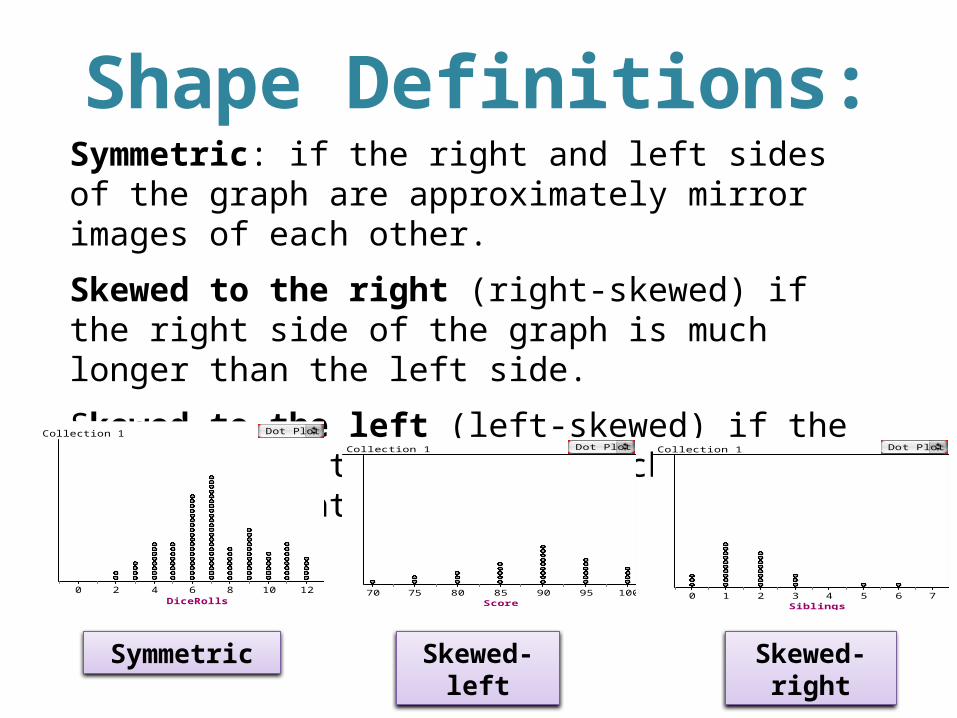
Shape Definitions:Symmetric: if the right and left sides of the graph are approximately mirror images of each other.
Skewed to the right (right-skewed) if the right side of the graph is much longer than the left side.
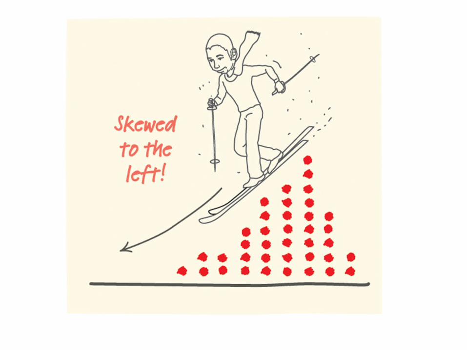
Skewed to the left (left-skewed) if the left side of the graph is much longer than the right side.
DiceRolls0 2 4 6 8 10 12
Collection 1 Dot Plot
Score70 75 80 85 90 95 100
Collection 1 Dot Plot
Siblings0 1 2 3 4 5 6 7
Collection 1 Dot Plot
Symmetric Skewed-left Skewed-right

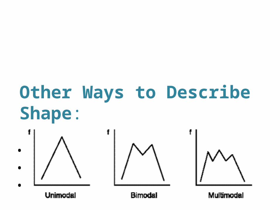
Other Ways to Describe Shape:
• Unimodal
• Bimodal
• Multimodal
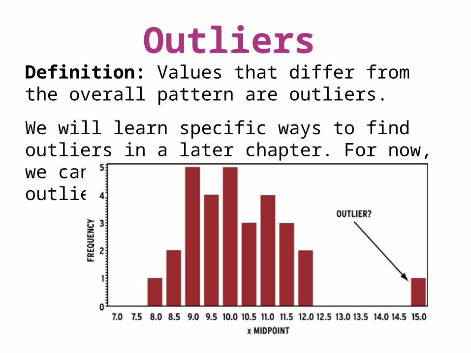
OutliersDefinition: Values that differ from the overall pattern are outliers.
We will learn specific ways to find outliers in a later chapter. For now, we can only identify “potential outliers.”
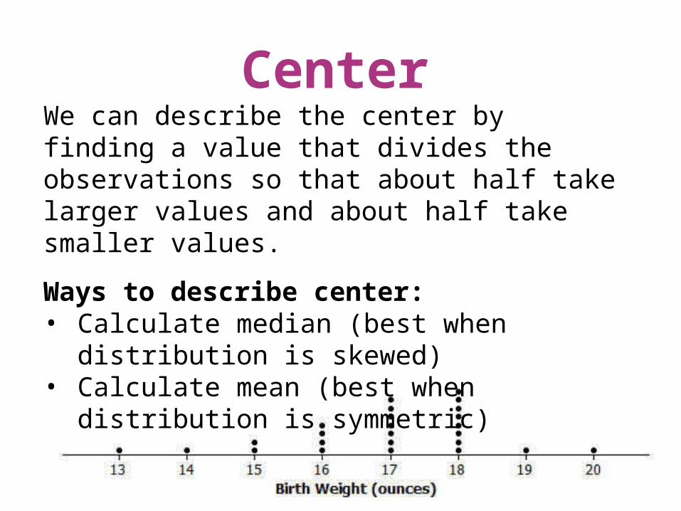
CenterWe can describe the center by finding a value that divides the observations so that about half take larger values and about half take smaller values.
Ways to describe center:• Calculate median (best when distribution is
skewed)• Calculate mean (best when distribution is
symmetric)
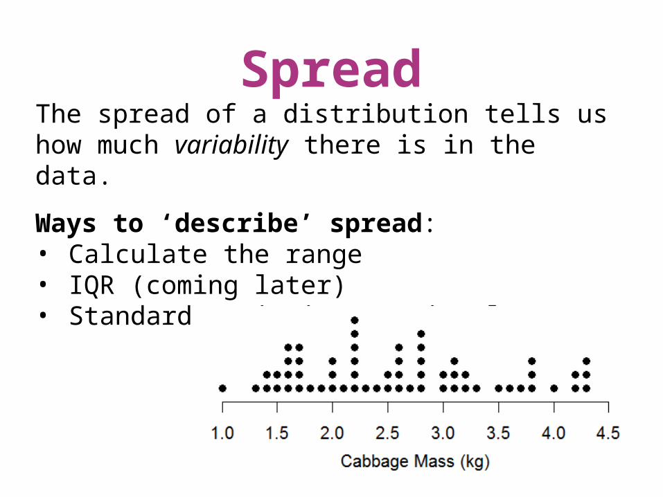
SpreadThe spread of a distribution tells us how much variability there is in the data.
Ways to ‘describe’ spread:• Calculate the range• IQR (coming later)• Standard Deviation (coming later)
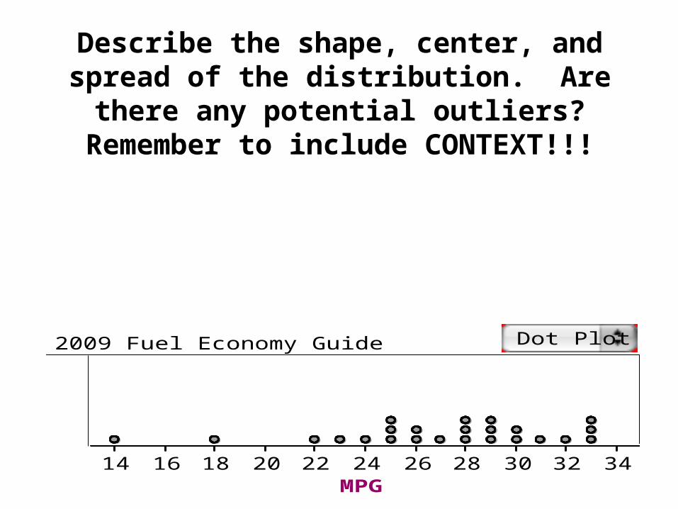
Describe the shape, center, and spread of the distribution. Are there any potential outliers?
Remember to include CONTEXT!!!
MPG14 16 18 20 22 24 26 28 30 32 34
2009 Fuel Economy Guide Dot Plot
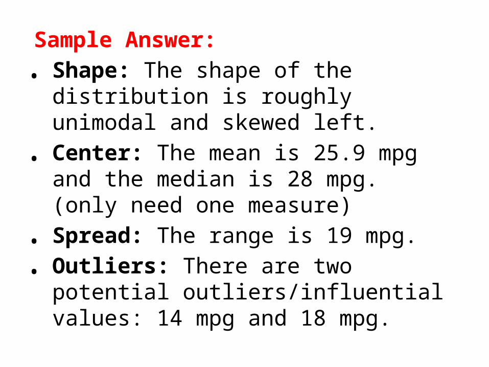
Sample Answer:
• Shape: The shape of the distribution is roughly unimodal and skewed left.
• Center: The mean is 25.9 mpg and the median is 28 mpg. (only need one measure)
• Spread: The range is 19 mpg.
• Outliers: There are two potential outliers/influential values: 14 mpg and 18 mpg.
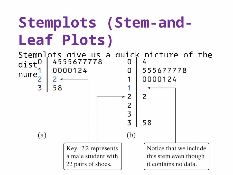
Stemplots (Stem-and-Leaf Plots)Stemplots give us a quick picture of the distribution while including the actual numerical values.
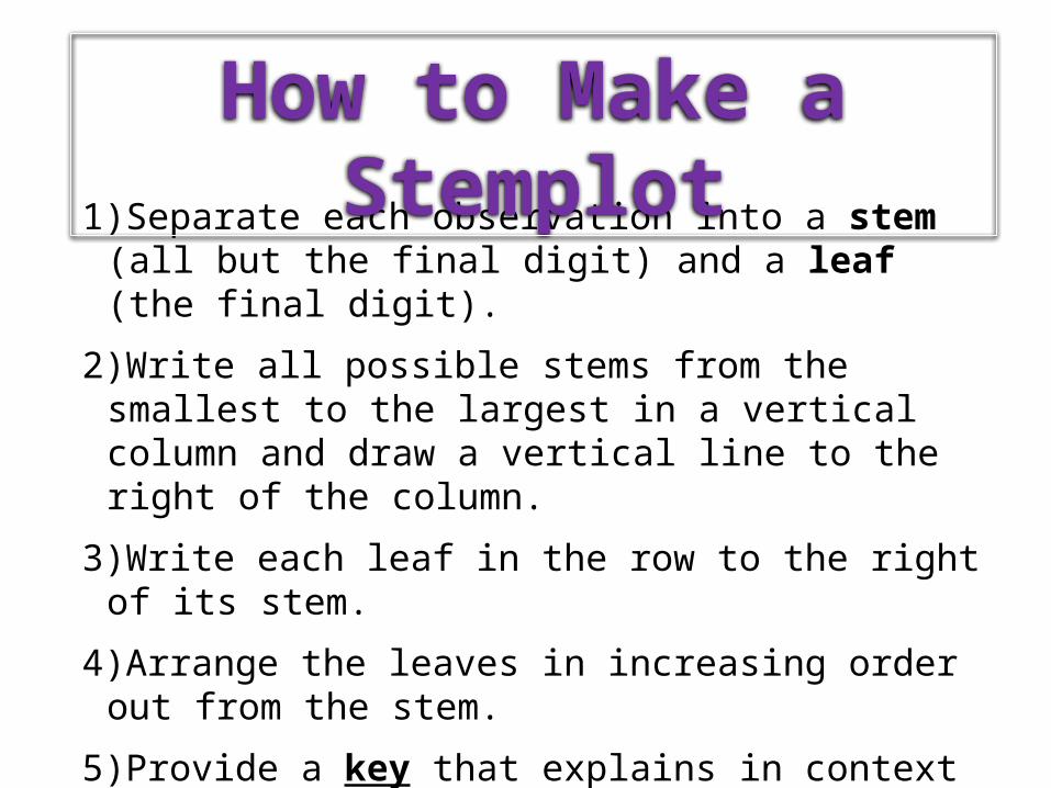
1)Separate each observation into a stem (all but the final digit) and a leaf (the final digit).
2)Write all possible stems from the smallest to the largest in a vertical column and draw a vertical line to the right of the column.
3)Write each leaf in the row to the right of its stem.
4)Arrange the leaves in increasing order out from the stem.
5)Provide a key that explains in context what the stems and leaves represent.
How to Make a Stemplot
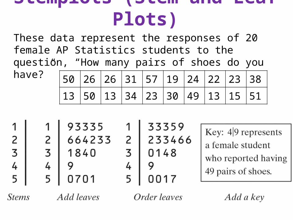
Stemplots (Stem-and-Leaf Plots)These data represent the responses of 20 female AP Statistics students to the question, “How many pairs of shoes do you have?”
50 26 26 31 57 19 24 22 23 38
13 50 13 34 23 30 49 13 15 51
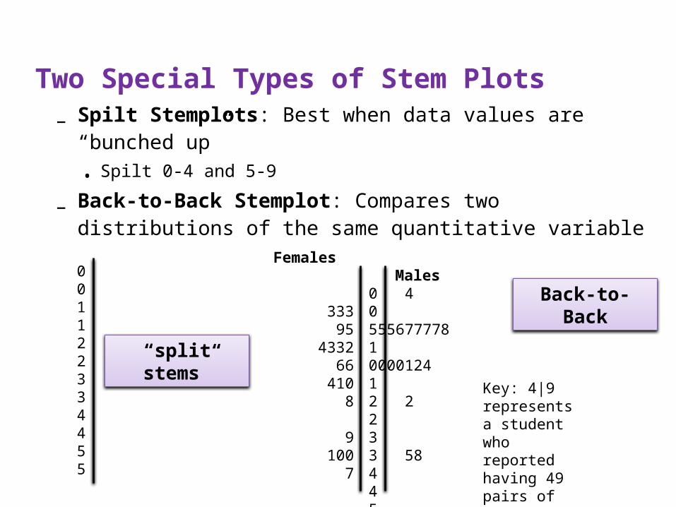
Two Special Types of Stem Plots– Spilt Stemplots: Best when data values are “bunched
up”• Spilt 0-4 and 5-9
– Back-to-Back Stemplot: Compares two distributions of the same quantitative variable
001122334455
Key: 4|9 represents a student who reported having 49 pairs of shoes.
Males0 40 5556777781 000012412 2233 584455
Females
33395
433266
4108
9100
7
“split stems”
Back-to-Back
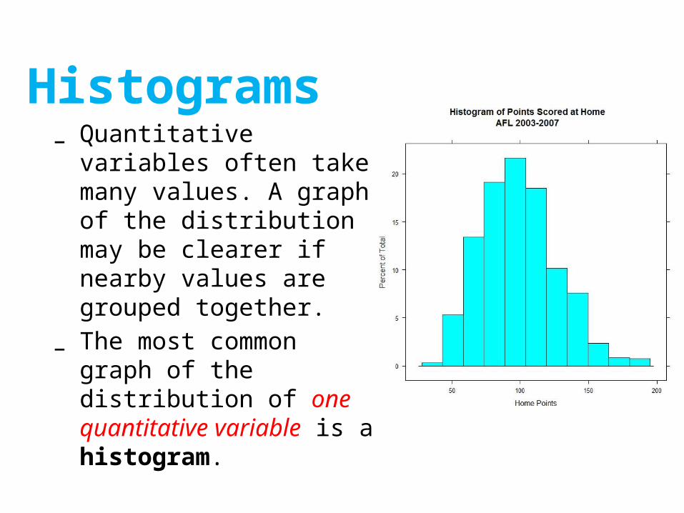
Histograms– Quantitative variables often
take many values. A graph of the distribution may be clearer if nearby values are grouped together.
– The most common graph of the distribution of one quantitative variable is a histogram.
1)Divide the range of data into classes of equal width.
2)Find the count (frequency) or percent (relative frequency) of individuals in each class.
3)Label and scale your axes and draw the histogram. The height of the bar equals its frequency. Adjacent bars should touch, unless a class contains no individuals.
How to Make a Histogram
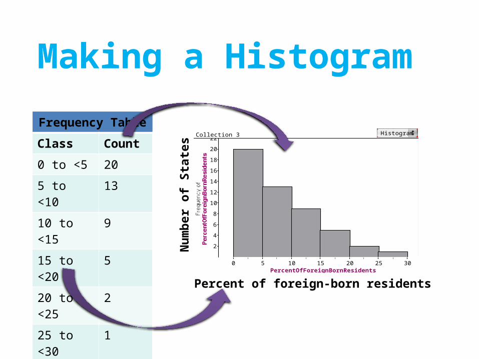
Making a Histogram
Frequency Table
Class Count
0 to <5 20
5 to <10 13
10 to <15 9
15 to <20 5
20 to <25 2
25 to <30 1
Total 50Percent of foreign-born residents
Nu
mb
er o
f S
tate
s
2
4
6
8
10
12
14
16
18
20
22
PercentOfForeignBornResidents0 5 10 15 20 25 30
Collection 3 Histogram
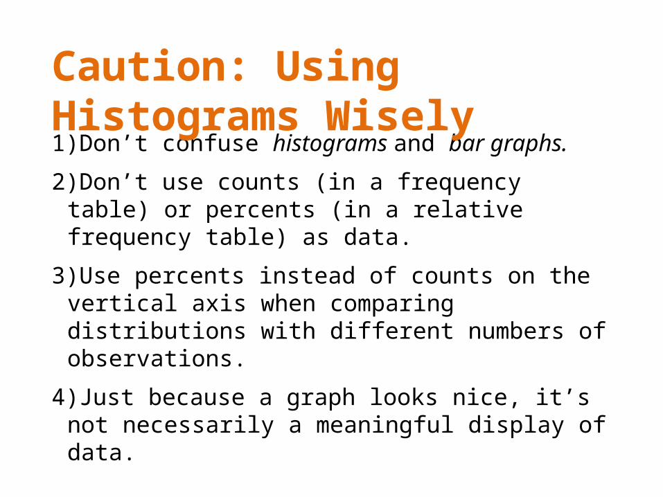
1)Don’t confuse histograms and bar graphs.
2)Don’t use counts (in a frequency table) or percents (in a relative frequency table) as data.
3)Use percents instead of counts on the vertical axis when comparing distributions with different numbers of observations.
4)Just because a graph looks nice, it’s not necessarily a meaningful display of data.
Caution: Using Histograms Wisely