11 show - management communicationmcom320.net/11show.pdfslidedocs which inspired it. resources like...
TRANSCRIPT

SHOWS H O W W H A T Y O U M E A N
CHAPTER
11

2
CONTENTS4
8
9
16
This is Chapter 11
TEN TEMPTATIONS & TECHNIQUES
DATA VISUALIZATION
THREE DESIGN CONCEPTS
SLIDE DESIGN
LINK & LEARN
ExamplesRequiredReading
Tips & Optional Activity
This work is licensed under aCreative Commons Attribute and ShareAlike 4.0 International License.
Attribute the original source at mcom320.net. Email [email protected] if you would like to adopt the curriculum.
3
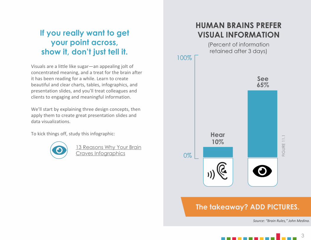
The takeaway? ADD PICTURES.
Visuals are a little like sugar—an appealing jolt of concentrated meaning, and a treat for the brain after it has been reading for a while. Learn to create beautiful and clear charts, tables, infographics, and presentation slides, and you’ll treat colleagues and clients to engaging and meaningful information.
We’ll start by explaining three design concepts, then apply them to create great presentation slides and data visualizations.
To kick things off, study this infographic:
65%
10%
100%
0%13 Reasons Why Your Brain Craves Infographics
See
Hear
FIG
URE
11.1
HUMAN BRAINS PREFER VISUAL INFORMATION
(Percent of informationretained after 3 days)
If you really want to get your point across,
show it, don’t just tell it.
Source: “Brain Rules,” John Medina.

4
SECTION ONE
Make your work more attractive and effective by practicing good design. Studying design principles and elements could be the enjoyable work of a lifetime, but we’ll focus on just three essential categories: layout, contrast, and repetition.
LAYOUT CONTRAST REPETITION
“ ”
DESIGN CONCEPTS

5
Within the layout category, three qualities will help you design your documents and slides: space, alignment, and proximity. Theseare essential to clean design, which is an indicator of credibility. It invites attention rather than punishes it.
LAYOUT
Space creates structure, guides the eye, and gives visual relief. Try to emulate the websites and fliers that use space to attract your eye and make key elements stand out.
Alignment is key to a professional look. Aligning objects and text exactly along an invisible line creates order and connection, making your content more brain-friendly.
Proximity tells the eye which things belong together. Group related items together by clustering them, then add white space between clusters. Proximity helps your audience interpret your message quickly and efficiently.
Remove the extra line after a paragraph heading to keep it close and related visually.
Use the pop-up rulers on slide software to nudge you toward alignment.
See areas of positive and negative space by squinting your eyes to create blur.
6
“ ”
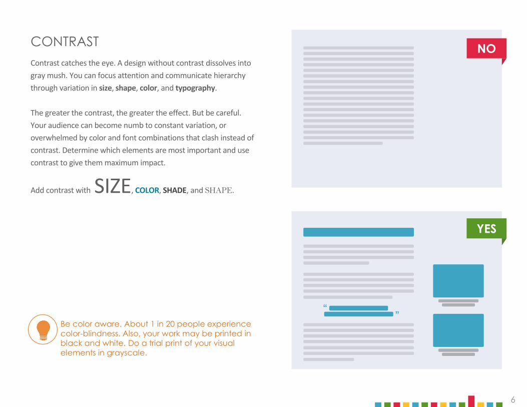
Contrast catches the eye. A design without contrast dissolves into gray mush. You can focus attention and communicate hierarchy through variation in size, shape, color, and typography.
The greater the contrast, the greater the effect. But be careful. Your audience can become numb to constant variation, or overwhelmed by color and font combinations that clash instead of contrast. Determine which elements are most important and use contrast to give them maximum impact.
Add contrast with SIZE, COLOR, SHADE, and SHAPE.
CONTRAST
Be color aware. About 1 in 20 people experience color-blindness. Also, your work may be printed in black and white. Do a trial print of your visual elements in grayscale.
YES
NO

7
Once you’ve chosen strong, contrasting design elements, stay consistent throughout your document. Repeated use of layouts, colors, shapes, and fonts helps make a design look intentional, professional, and consistent.
REPETITION
Da-da-da-DUN, da-da-da-DUN.
The recurring motif of Beethoven’s 5th Symphony is a form of repetition. Variations on the theme unify the entire symphony, making it one of the world’s most recognizable pieces of music. Use repetition for power and recall.
Using a small range of consistent colors is key to good design. Some people are great at picking color palettes, others . . . not so much. Access the expertise of great designers by using one of these sites to create a color palette for a project you’re working on. Adobe Color CC
Coolors
ColourLovers
Listen to this.
The company you work for will most likely have a style guide with an established color palette, but someday you may be asked to create one, so read this page about color theory and how colors influence mood and behavior.
Going forward, apply these design basics to all your work. You will be amazed at the difference.
Now let’s move on to best practices in presentation slides and data visualizations.
7
FIG
URE
11.2
Activity 11.1

8
Presentation slides can vary greatly depending on purpose and audience. Slides for TED talks have very low information density. They’re cinematic—dominated by simple, high-impact visuals, keeping the focus on the speaker.
Slides on the opposite end of the spectrum are information dense. They stand alone and can be viewed on demand, like this textbook, which was created using PowerPoint.
Slidedocs are a hybrid between the visual richness of presentation slides and the information density of text-based documents. This textbook is an example. Browse through the online book SlideDocswhich inspired it.
Resources like Nancy Duarte’s book slide:ology and Canva’sDesign School tutorials provide excellent guidance and insight on slide design.
Get inspiration by browsing slide decks at sites like SlideShare, Note & Point, and Slide Guru. Not all the shared slides are designed well, but the ones that are really stand out.
SECTION TWO
SLIDE DESIGN

9
TEN TEMPTATIONS& TECHNIQUES
SECTION THREE
In addition to layout, contrast, and repetition, remember the following 10 temptationsand techniques as you design your slides.
1. SLIDES ARE NOT YOUR NOTESDon’t create your slides before preparing your content. If you’re outlining your presentation on slides, you’re not really creating slides, you’re writing speaking notes. If you project these onto the screen and read them, your audience will ignore you and read ahead.
You might be falling into this temptation if your slides consist primarily of bulleted lists. Bullet points are better than blocks of text, but they quickly become overwhelming. Instead of simply listing your ideas, your slides should illustrate them. Move your speaking notes into the speaking notes panel at the bottom of the slide as a reference. 1010
TOP TEN
SLIDE TIPS

10
Don’t let your slides take over your presentation. Unless you’re creating a slidedoc, your slides are only a visual aid. Keep your slides simple so they focus attention on your message, not on themselves.
Animations and transitions can be distracting. Avoid them unless you have a clear need to illustrate movement. To communicate dense information or complex ideas, piece together a series of slides layer by layer. These are called “builds,” and they also translate well to PDF or print.
2. SLIDES ARE NOT YOUR PRESENTATION
BUILD LAYER 2 BUILD LAYER 3BUILD LAYER 1

11
3. SLIDES ARE NOTYOUR HANDOUTSlides designed to support a presentation will rarely be effective as handouts. Providing a physical reminder or summary of your presentation can be very useful, and it’s worth the effort to create a separate, standalone document. Clearly associate your handout with your slides by maintaining the theme of your design.
In PowerPoint you can customize the appearance of speaker’s notes, then print them right alongside the slide. This allows you to add more complete and interesting information to an image of each slide.
4. SLIDES ARE FREEAdding slides doesn’t cost you anything, so go ahead. Split dense content across multiple slides. Increase your font size. Add white space. Crowded slides are a barrier to communication.
Cool, uncrowded slides are a delight.
PRESENTATIONHANDOUT

12
STAY CURRENT Search ”slide design trends” every year to see what is current. For instance, Figure 11.4 shows older realistic design making way for the currently popular flat design.
VIDEO Short, punchy videos can illustrate your point quickly, wake up a crowd, or show a process. Embedding a video frees you from reliance on internet streaming; on the other hand, simply linking to it keeps your file size small.
5. SLIDES SHOULD BE VISUALAdd punch to your slides with graphics and media, but remember their quality reflects on you as a professional.
GRAPHICS Take every opportunity to present information visually rather than textually. CH 07: FORMAT describes a variety of graphics, and best practices for data visualization are explained later here in CH 11.
ICONS Avoid old-fashioned clipart like the plague. Use icons instead to symbolize objects and actions. Find them at NounProject, IconFinder, or FlatIcon.
Create a link to a short portion of a funny YouTube video in a slide. Blatti.net shows how to link to a specific piece of a longer video.
SKEUOMORPHIC OR REALISM DESIGN
FLAT DESIGNFlat design is currently popular while skeuomorphic, drop shadows, and gradients look old-fashioned.
VS.
12
FIG
URE
11.4
Activity 11.3
OLD NEW

13
Wondering whether you can legally use an image? Use this flowchart: Can I Use That Photo?
PHOTOS People love to look at beautiful photographs. Choose high-resolution photos that are meaningful, natural looking, and not cheesy. For maximum impact, use photos at “full bleed,” which means the photo fills the slide, even if it “bleeds” off the edges. Use visually interesting photos that imply several layers of meaning besides the initial obvious one, such as the examples below (lower left and lower right) of the concept of teamwork. Figure 11.5 at right lists excellent resources.
Look for a free high-resolution photo that illustrates the concept of tenacity. Place it on a slide with some text.
USE FREE QUALITY IMAGESfreeimages.com
unsplash.com
pexels.com
deathtothestockphoto.com
lifeofpix.com
13
INCLUDE NECESSARY PERMISSIONS AND CREDITS
FIG
URE
11.6
FIG
URE
11.5
Copying an image from a Google search is tempting, but never use images without permission and always credit the source. Some tools, like Flickrand Google Images , have search settings that can limit results to show only images licensed for reuse or underCreative Commons terms.
Activity 11.4
CHEESY COOL

14
6. TEMPLATES FOR FAILURE;TEMPLATES FOR SUCCESSTemplates and built-in themes are convenient, but be cautious. Their design elements won’t necessarily align with your message, and they might make your work seem lazy and unoriginal.
Don’t use the first template you see (everyone has already seen it), and customize templates by changing some colors or graphic elements. Check out Slides Carnival for template ideas. You may be better off creating your own template by setting default layouts, typography, colors, and backgrounds in master slides. Learn how in Google Slides or PowerPoint.
7. SIGNPOSTING PROVIDES NAVIGATION Especially in long presentations, your audience will appreciate visual cues that remind them how you’ve structured your content and track your progress through the presentation. Create a running agenda along the side or bottom to show where you are and where you are going.
8. WORDS ARE MEANT TO BE READCH 07: FORMAT outlines principles of good typography. In the context of slide design, also remember to:
‣ Keep it simple. Use only one or two typefaces that you bold, shade, and color for contrast.
‣ Go big. Can people in the back of the room read your text? Use a large enough font size, such as 60 point for titles, 36 for headings, and 28 for supporting text.
‣ Ensure contrast. Your text must stand out against the background. If the background is a photograph, consider putting the text in a box or ribbon that overlays the image and provides better color contrast.
A “running agenda” indicates your progress with visual elements at an edge of your slides. Highlighting the current agenda item creates context for your audience.
For example, this book’s running agenda lets you know which chapter you are viewing.

15
9. USE THE BEST TOOL FOR THE JOBDon’t call every slide deck a “PowerPoint” or limit yourself to one platform. In addition to PowerPoint and Keynote, online presentation applications may play to the strengths of your message, so click through these links to become familiar with them.
Create a set of three or four slides about sleep deprivation in college students. Include the fact that 60% of college students get insufficient sleep, and most need 8 hours a night. Finally, give your tips for getting adequate rest.
10. TECH WILL BETRAY YOUSooner or later it will happen. Always be prepared by saving copies of your slides on a flash drive and on the web. If your host or meeting organizer will be at your presentation, send him or her a copy to load in advance. If you have accompanying files, like videos, images, or fonts, keep them with your slides in a single, clearly labeled folder and compress that into a .zip file. Include a PDF version of your slides in case the right software isn’t available. Remember that colors and fonts may change with different projectors, screens, and printers. Where possible, plan some setup time to deal with any issues that might arise.
Activity 11.5
G SLIDES: Accessible from anywhere, updateable, mobile-friendly.
PREZI: Freed from a linear structure, it can be brilliant or confusing.
CANVA: Free web-based design. Tutorials, templates, and tools galore.

16
Data is money. It drives decisions and seals deals. In business, you’ll present data in slides, refer to it in written documents, post it online, and use it to create infographics. But remember: your purpose is not to communicate data. Your purpose is to communicate meaning.
BREAK IT DOWN THEN BUILD IT UPCreating a chart in Google Sheets or Microsoft Excel isn’t hard, but these tools don’t know what story you’re trying to tell with your data. Their default designs will not help you make your point, so you need to strip them away, layer by layer, then add back design elements that focus attention where you want it.
You know you’re on the right track if your audience can see the story in your chart within the first few moments of looking at it.
Cole Nussbaumer Knaflic champions this approach on her blog Storytelling with Data. And Darkhorse Analytics animated instructions in Clear off the Table. .
SECTION FOUR
DATA VISUALIZATION
“Every bit of ink on a graphic requires a reason.
And nearly always that reason should be that the
ink presents new information.”
Tufte, E. R. (1983)The Visual Display of
Quantitative Information.Cheshire, CT: Graphics Press.
Look at the dramatic BEFORE and AFTER of a sample sales report design. PrintTech.
17
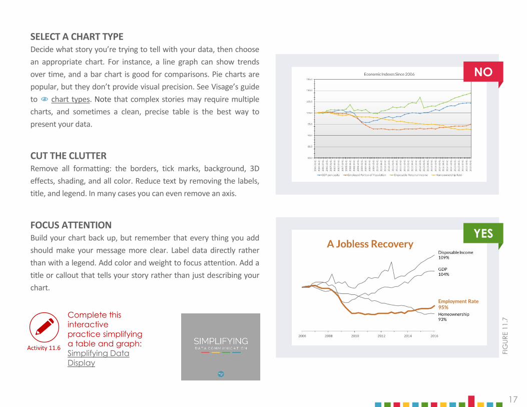
SELECT A CHART TYPEDecide what story you’re trying to tell with your data, then choosean appropriate chart. For instance, a line graph can show trendsover time, and a bar chart is good for comparisons. Pie charts arepopular, but they don’t provide visual precision. See Visage’s guideto chart types. Note that complex stories may require multiplecharts, and sometimes a clean, precise table is the best way topresent your data.
CUT THE CLUTTERRemove all formatting: the borders, tick marks, background, 3Deffects, shading, and all color. Reduce text by removing the labels,title, and legend. In many cases you can even remove an axis.
FOCUS ATTENTIONBuild your chart back up, but remember that every thing you addshould make your message more clear. Label data directly ratherthan with a legend. Add color and weight to focus attention. Add atitle or callout that tells your story rather than just describing yourchart.
FIG
URE
11.7
YES
NO
Activity 11.6
Complete this interactive practice simplifying a table and graph: Simplifying Data Display

18
INFOGRAPHICSInfographics combine text and graphics creatively to tell a larger story. See examples at visual.ly or get inspired by David McCandless’s and Chris Jordan’s TED talks.
Infographics can be memorable, but creative approaches may be more or less appropriate depending on the expectations and culture within an industry or profession (think advertising vs. accounting).
Maintain credibility by citing your sources. Remember that, in addition to numbers, abstract concepts, narratives, relationships, and processes can all be communicated visually.
How to Get Started with Infogramin 2 Minutes
How to Create an Infographic in Canva
‣ Canva‣ easel.ly‣ piktochart
‣ Infogr.am‣ Visme‣ VennGage
INFOGRAPHIC EXAMPLE
18
FIGURE 11.8
Activity 11.7
Make your own infographic about how you use your time using one of these online tools:

IN CONCLUSIONWasn’t that fun? Make understanding your visuals fun for your audience, too.
Show your message. Well-designed visual elements help you to be precise and concise. Create effective visuals to convey confidence and competence.

LEARN MORE
(Bol
d ci
tatio
ns a
re re
fere
nced
in th
e ch
apte
r tex
t.)
Cherdarchuk, Joey. “Clear Off the Table.” Dark Horse Analytics. March 27, 2014. http://www.darkhorseanalytics.com/blog/clear-off-the-table, accessed February 2017.
“Data Visualization 101: How to Design Charts and Graphs.” Visage. April 27, 2015. http://www.slideshare.net/Visage/data-visualization-101-how-to-design-chartsandgraphs, accessed February 2017.
ARTICLES
Desjardins, Jeff. “13 Scientific Reasons Explaining Why You Crave Infographics.” Visual Capitalist. September 6, 2016. http://www.visualcapitalist.com/13-scientific-reasons-infographics/, accessed February 2017.
Knaflic, Cole Nussbaumer. “How to do it in Excel.” Storytelling With Data. November 10, 2011. http://www.storytellingwithdata.com/blog/2011/11/how-to-do-it-in-excel, accessed February 2017.
“Can I Use that Picture? The Terms, Laws, and Ethics for Using Copyrighted Images” (Infographic). The Visual Communication Guy. 2014. http://thevisualcommunicationguy.com/wp-content/uploads/2014/07/Infographic_CanIUseThatPicture4-1024x662.jpg, accessed February 2017.
Hortin, Anthony. “The 5 Basic Principles Of Design.” maddisondesignsblog. March 27, 2009. http://maddisondesigns.com/2009/03/the-5-basic-principles-of-design/, accessed February 2017.
Cherdarchuk, Joey. “Data Looks Better Naked.” Dark Horse Analytics. August 20, 2013. http://www.darkhorseanalytics.com/blog/data-looks-better-naked, accessed February 2017.
Duarte, Nancy. “Do your Slides Pass the Glance Test?” Harvard Business Review. October 22, 2012. https://hbr.org/2012/10/do-your-slides-pass-the-glance-test, accessed February 2017.
Duarte, Nancy. “The Quick and Dirty on Data Visualization.” Harvard Business Review. April 16, 2014. https://hbr.org/2014/04/the-quick-and-dirty-on-data-visualization, accessed February 2017.
“The Principles of Design.” J6 Design. http://www.j6design.com.au/6-principles-of-design/, accessed February 2017.

Smith, Laurence D., Lisa A. Best, D. Alan Stubbs, Andrea BastianiArchibald, and Roxann Robertson-Nay. 2002. “Constructing knowledge: The role of graphs and tables in hard and soft psychology.” American Psychologist 57, no. 10 (2002): 749-761. http://psycnet.apa.org/journals/amp/57/10/749/, accessed February 2017.
“Youtube URL Modifiers.” blatti.net. December 11, 2012. http://blatti.net/2012/12/youtube-url-modifiers/, accessed February 2017.
Cairo, Alberto. The Functional Art: An Introduction to Information Graphics and Visualization. Berkeley, CA: New Riders, 2013.
LEARN MORE
(Bol
d ci
tatio
ns a
re re
fere
nced
in th
e ch
apte
r tex
t.)
BOOKS Adobe Color CC. “Create.” https://color.adobe.com/create/color-wheel/, accessed February 2017.
Color Matters. “Basic Color Theory.” http://www.colormatters.com/color-and-design/basic-color-theory, accessed February 2017.
Duarte, Nancy. Slidedocs: Spread ideas with effective visual documents. Duarte, Inc.: 2016. http://www.duarte.com/slidedocs/, accessed February 2017.
Medina, John. Brain rules : 12 principles for surviving and thriving at work, home, and school, Seattle, WA : Pear Press, 2008.
Coolors + Skillshare. “Home.” https://coolors.co/, accessed February 2017.
Berinato, Scott. Good Charts: The HBR Guide to Making Smarter, More Persuasive Data Visualizations. Harvard Business Review: 2016.
Duarte, Nancy. Slide:ology: The Art and Science of Creating Great Presentations. Sebastopol, CA: O'Reilly Media, 2008.
Knaflic, Cole Nussbaumer. Storytelling with Data. Hoboken, NJ: John Wiley & Sons, Inc., 2015.
Wong, Dona M. The Wall Street Journal Guide to Information Graphics: The Dos and Don’ts of Presenting Data, Facts, and Figures. New York, NY: W.W. Norton, 2010.
WEBSITES
Canva. “Home.” https://www.canva.com/, accessed February 2017.
Canva. “Tutorials.” https://designschool.canva.com/tutorials/, accessed February 2017.
Colourlovers. “Home.” http://www.colourlovers.com/, accessed February 2017.
Creative Commons. “Home.” https://creativecommons.org/, accessed February 2017.

LEARN MORE
(Bol
d ci
tatio
ns a
re re
fere
nced
in th
e ch
apte
r tex
t.)
Death to Stock. “Home.” http://deathtothestockphoto.com/, accessed February 2017.
Easelly. “Home.” https://www.easel.ly/, accessed February 2017.
Flickr. “Home.” https://www.flickr.com/, accessed February 2017.
FreeImages. “Home.” http://www.freeimages.com/, accessed February 2017.
Iconfinder. “Home.” https://www.iconfinder.com/, accessed February 2017.
Infogram. “Home.” https://infogr.am/, accessed February 2017.
Note & Point. “Home.” http://noteandpoint.com/, accessed February 2017.
The Noun Project. “Home.” https://thenounproject.com/, accessed February 2017.
Flaticon. “Home.” http://www.flaticon.com/, accessed February 2017.
Google Images. “Home.” https://images.google.com/?gws_rd=ssl, accessed February 2017.
Google Slides. “About.” https://www.google.com/slides/about/, accessed February 2017.
Life of Pix. “Home.” http://www.lifeofpix.com/, accessed February 2017.
Pexels. “Home.” https://www.pexels.com/, accessed February 2017.
Piktochart. “Home.” https://piktochart.com/, accessed February 2017.
Prezi. “Home.” https://prezi.com/, accessed February 2017.
SlideGuru. “ Gallery.” http://slideguru.com/gallery, accessed February 2017.
Unsplash. “Home.” https://unsplash.com/, accessed February 2017.
Venngage. “Templates.” https://venngage.com/templates/, accessed February 2017.
Visme. “Home.” https://www.visme.co/, accessed February 2017.
LinkedIn. “SlideShare.” http://www.slideshare.net/, accessed February 2017.
Visually. “Home.” http://visual.ly/view#feature_type=undefined&type=static&, accessed February 2017.

LEARN MORE
(Bol
d ci
tatio
ns a
re re
fere
nced
in th
e ch
apte
r tex
t.)
VIDEOS
Cole Nussbaumer YouTube Channel. YouTube. https://www.youtube.com/channel/UCjhGlILWNloXJdR2NTCBMlA, accessed February 2017.
G Suite. “Using advanced Slides features | Slides | The Apps Show,” YouTube, published June 7, 2016. https://www.youtube.com/watch?v=EooLYqDefd4&spfreload=10, accessed February 2017.
GCFLearnFree.org, “PowerPoint 2016: Slide Master View,” YouTube, published March 17, 2016. https://www.youtube.com/watch?v=h6ARCTypPTg&t=7s, accessed February 2017.
Infogram, “How to Create Charts, Reports, and Infographics with Infogram,” YouTube, published December 8, 2016. https://www.youtube.com/watch?v=vVYahWlFT9U, accessed February 2017.
Kimberly Ann Jimenez, “How To Create Infographics (The Ultra-Simple & Easy Way),” YouTube, published February 13, 2014. https://www.youtube.com/watch?v=nShmwzh879g, accessed February 2017.
Ted. “Chris Jordan: Turning powerful stats into art,” YouTube, published June 23, 2008. https://www.youtube.com/watch?v=f09lQ8Q1iKE&feature=youtu.be, accessed February 2017.
Ted-Ed. “The beauty of data visualization - David McCandless,” YouTube, published November 23, 2012. https://www.youtube.com/watch?v=5Zg-C8AAIGg&feature=youtu.be, accessed February 2017.
Infogram, “2 Minute Getting Started Video,” Infogram. https://infogram.com/tutorial/getting-started/video-how-to-use-infogram/, accessed October 2017.