dangermousemassive.files.wordpress.com · web viewthe colourful end of the spectrum is very neon...
TRANSCRIPT
Unit 13: Graphic Design Styles
Pass 1: Describe styles found in 2 separate images from different design styles.
Punk Design Style.
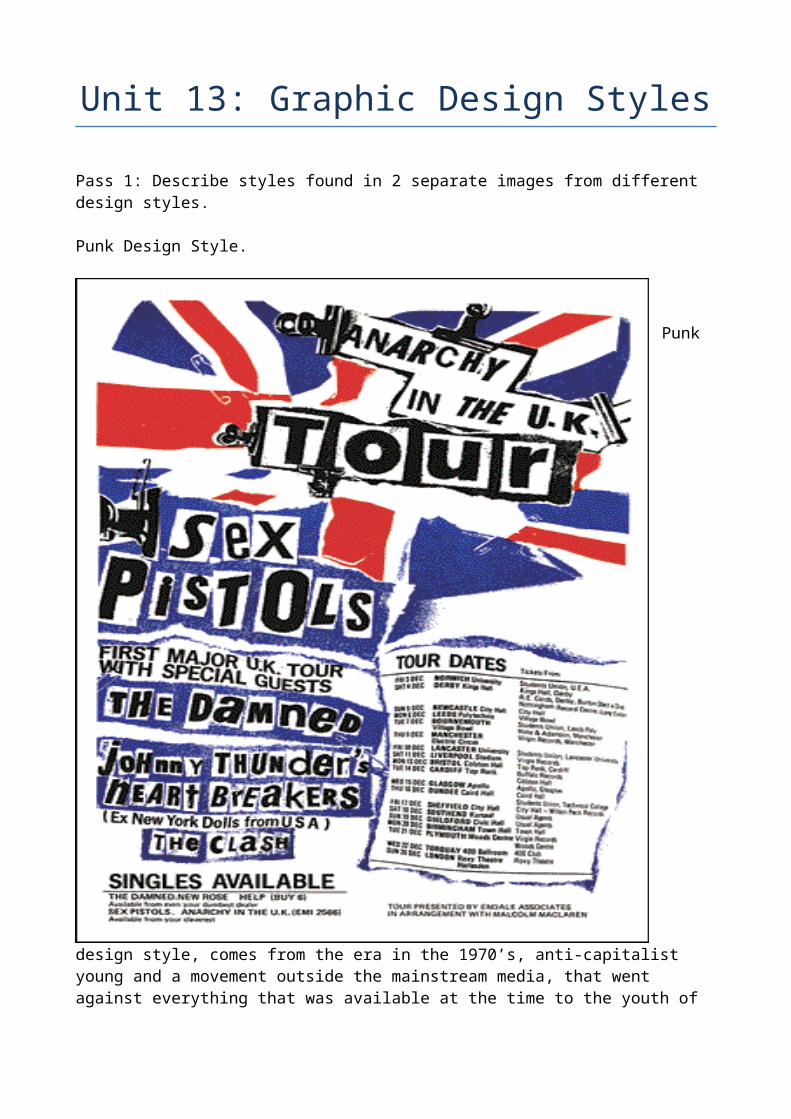
Punk design style, comes from the era in the 1970’s, anti-capitalist young and a movement outside the mainstream media, that went against everything that was available at the time to the youth of the UK. Punk went against everything available and threw out the traditional book on graphic design and changed the rules.
The style, started to be homemade mainly by the followers of the punk bands and the artists themselves. Because it was homemade and traditional equipment used in the making of graphical design and printing, was too expensive for the common man, punk took to an edgy format, where the design used paper and other materials and then ripped them up.
A lot of the punk styles used a collage effect, this was to differentiate from the normal, but also gave the punk bands a way to show they were edgy and went against the norm and the government.
The punk style uses lettering in a different way to the traditional form that was available at the time, and because typesetters were expensive, normal printing processes, were too expensive for the common man and the bands who did everything themselves. So punk as a style uses the same effect, with letters and words being made up of letters cut out and then placed together in a collage form and this was used by most of the punk bands and others.
As a style, used by the punk bands like the sex pistols, were normally shown in black and white that is mostly due to colour printing, being expensive to use in the 70’s and because of the bands not having traditional record labels behind them, the bands had to do all the work themselves.
But colours used in this style is very vibrant colours, the Sex pistols, sometimes used the colours of the union jack, but in a different way to show they were part of the “Anti Culture” of the time, sometimes when they used the union jack in colour, it would be cut up and used as colour in a collage effect, that was typical of the Sex Pistols.
Another punk band of the time, Never Mind the Buzzcocks, also used vibrant colours as their punk style, they normally used a very vibrant yellow backdrop and the have all the writing, being done in the same collage style of the sex pistols and the punk style. The collage style of using words was normally all the same and used by the culture.
The words and letters were always used like they had been cut out of a paper and then put together, like the threatening notes you see in the movies, which have been made, by cutting letters off paper and then putting them together, or as if full words have been ripped out of other publications and used for the punks.
Straight lines are never used in the punk style, everything is never straight and put in what would be considered a normal setting. This was to show that the punk bands and punk followers were against everything at the time from the government and the capitalist consumerist media of the time.
The punk styles went and still go against norm, when it comes to graphic design.
Futuristic Design Style.
Futuristic design style is an ever-changing design style used by designers for decades as a tool for designing all sorts of things. There are many similarities, in this design style. That I have found, most of the futuristic designs all seem to have very straight lines, but they can come from all angles and all have different lengths and starting points and some end on the page and some go off the page.
There are lines of different colours and vibrant colours are used if the designer wants to create a fun image and dull to create different moods and meanings. The colourful end of the spectrum is very neon colours, mainly blues reds and greens, like the neon signs of the past in movies and TV shows of the past.
The dark end of the colour spectrum, uses dark reds, purples and oranges, to give a different mood or give a different emphasise, to images made by using the more vibrant colours of the spectrum.

The dark end of the spectrum can create a different mood to one where vibrant neon lights are used, but using both end of the colour spectrum ensures that the image stands out and is noticeable to the consumer or viewer.
Another technique used in futuristic design style, is the use of shapes both geometric, like cubes, oblongs and other shapes. But they also employ the use of shapes like circles, spheres and non-geometric shapes. They also use stars and other shapes in their design, that also help their design to standout and to be noticed.
In some designs that I have seen in this design style, colours are used in a more vibrant spectrum, from yellows and light reds and pinks. In a lot of the futuristic style images that I have seen, a lot of the designers seem to use the same process, of having a star of light hitting an object, like a lens flare. This is employed in a lot of the images that I have seen and this seems to be a part of the design style.
Filmmakers and producers have employed this design style, when producing movies and TV shows to give an idea of how the future will look. The original Blade runner movie uses a lot of neon lighting in the movie, but they are mostly at the dull end of the spectrum. This gives and impression of the future not being as good as people think it will be.
Both of the Tron films used this design style, of straight lines of neon colours in their movies. In some of the movies and TV shows looking into the future all seem to use the same design style, of having straight lines of blues, greens and yellows. There is also the use of this design style, when movies use futuristic computer screens, they all seem to have straight lines and always in the same neon green colour, that is employed in this style.
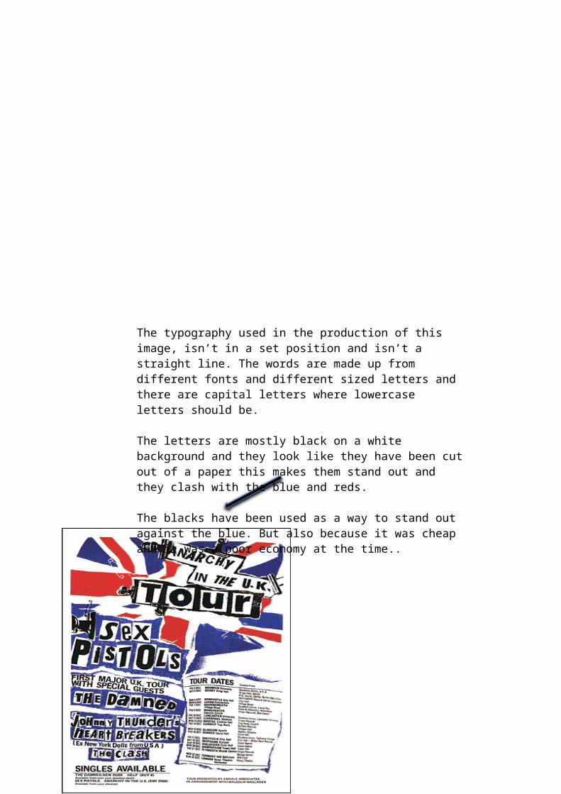
The typography used in the production of this image, isn’t in a set position and isn’t a straight line. The words are made up from different fonts and different sized letters and there are capital letters where lowercase letters should be.
The letters are mostly black on a white background and they look like they have been cut out of a paper this makes them stand out and they clash with the blue and reds.
The blacks have been used as a way to stand out against the blue. But also because it was cheap and it was a poor economy at the time..
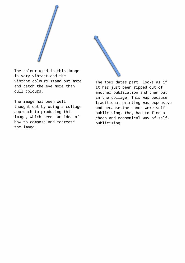
The tour dates part, looks as if it has just been ripped out of another publication and then put in the collage. This was because traditional printing was expensive and because the bands were self-publicising, they had to find a cheap and economical way of self-publicising.
So making a collage was the cheap form of publicising the bands. This part could make you think, because of the small tour, if you miss it you will never see them again.
The colour used in this image is very vibrant and the vibrant colours stand out more and catch the eye more than dull colours.
The image has been well thought out by using a collage approach to producing this image, which needs an idea of how to compose and recreate the image.
They used the flag cut up as a way of showing they were anti-government and they were against the royalty.
This image has been produced in such a way that makes it look edgy and it helps it stand out from the normally designed images using straight lines, boxes and grids.
This makes it stand out and catches the eye straight away.
Describe The Meaning and the Messages That Have Been Conveyed in Posters.
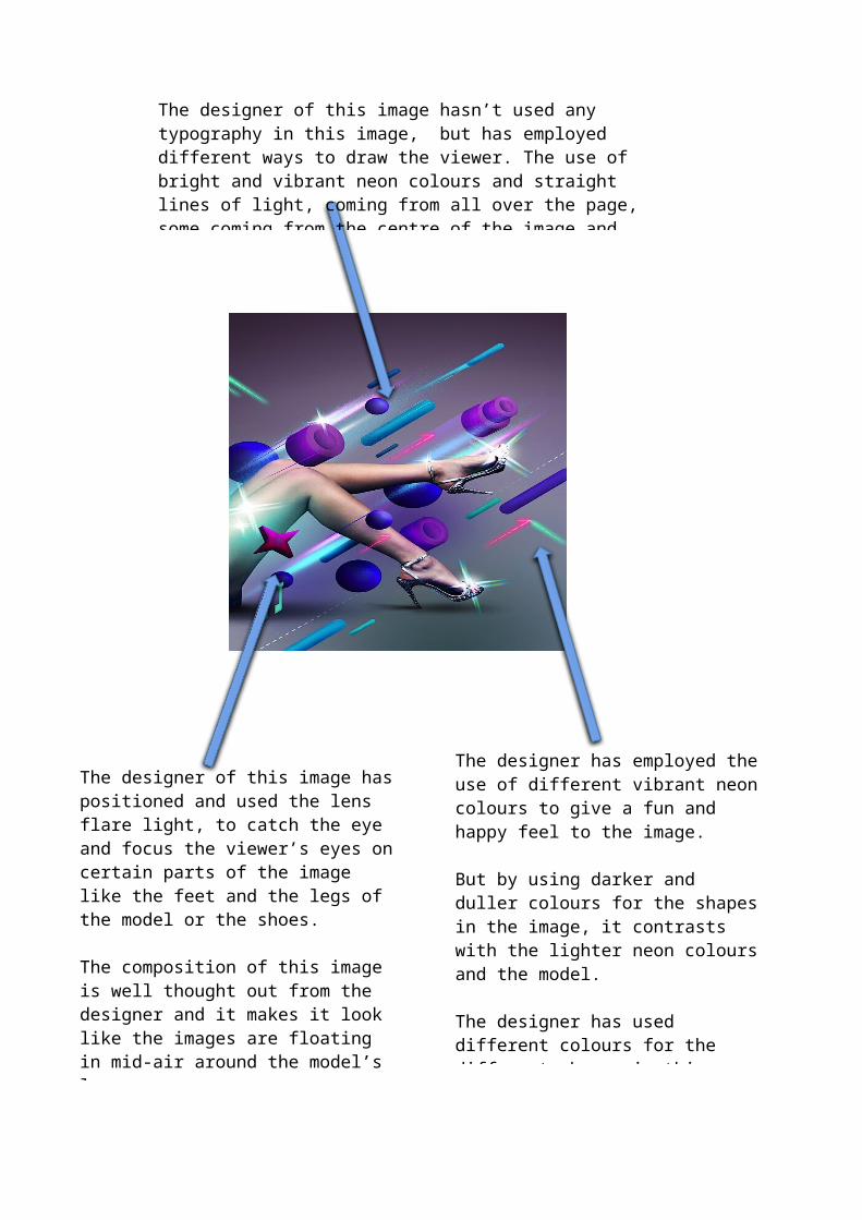
The designer of this image hasn’t used any typography in this image, but has employed different ways to draw the viewer. The use of bright and vibrant neon colours and straight lines of light, coming from all over the page, some coming from the centre of the image and some from off the image draws the eye.
The designer of this image has positioned and used the lens flare light, to catch the eye and focus the viewer’s eyes on certain parts of the image like the feet and the legs of the model or the shoes.
The composition of this image is well thought out from the designer and it makes it look like the images are floating in mid-air around the model’s legs.
There are no grids of boxes used in this image, as things crisscross the image and some things overlap each other.
The designer has employed the use of different vibrant neon colours to give a fun and happy feel to the image.
But by using darker and duller colours for the shapes in the image, it contrasts with the lighter neon colours and the model.
The designer has used different colours for the different shapes in this image. If they had used the same colour for all the shapes, it wouldn’t have the same visual impact on the viewer.
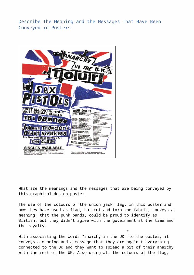
What are the meanings and the messages that are being conveyed by this graphical design poster.
The use of the colours of the union jack flag, in this poster and how they have used as flag, but cut and torn the fabric, conveys a meaning, that the punk bands, could be proud to identify as British, but they didn’t agree with the government at the time and the royalty.
With associating the words “anarchy in the UK” to the poster, it conveys a meaning and a message that they are against everything connected to the UK and they want to spread a bit of their anarchy with the rest of the UK. Also using all the colours of the flag, conveys a message that they will be visiting every part of the UK, while on tour.
Using a homemade collage style to create this poster, has a message that they are going against the normally accepted media production and that they have a style of their own. Some of the different bands of the punk era, had different associated colours. The Sex Pistols, were normally associated with red, white and blue, the band Never Mind the Buzzcocks, were normally associated with other vibrant colours, like yellows, oranges and pinks.
Does the word “Anarchy” convey a message or meaning in this poster, does adding the word to the poster, convey a meaning that the band is angry with how things are and they would like to bring a bit of anarchy to the whole of the UK. Does using the word, convey a mood of the band and how they would like to change things.
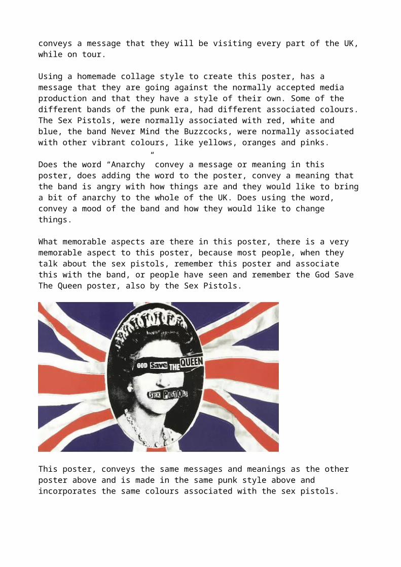
What memorable aspects are there in this poster, there is a very memorable aspect to this poster, because most people, when they talk about the sex pistols, remember this poster and associate this with the band, or people have seen and remember the God Save The Queen poster, also by the Sex Pistols.
This poster, conveys the same messages and meanings as the other poster above and is made in the same punk style above and incorporates the same colours associated with the sex pistols.
This poster above has been created in the Futuristic Style of graphic design. This style likes to focus on looking to the future and guessing how the world and people will look in the future. As a style, most designers using this style will use colours, normally found in neon lights.
This has been used in movies and TV shows, for a long time to convey a message that, what they have made is set in the future. The question, is does using neon colours in graphic design convey a message of looking into the future?
In this graphic design poster, the designer has used neon colours of blues and light greens, these convey a colourful and happy message and mood, but if the designer had used darker neon colours like reds and oranges, this would have conveyed a darker message and mood to the poster.
As a style, futuristic designs normally use the same colours to convey the different meanings and moods that they want to convey. As a style if the designer is making a hopeful or fun imagery, they will tend to use blues and light neon colours. If they want to convey a darker or moodier message they will then use dark colours like reds and blacks.
Using the different colours in this style, conveys different meanings and messages to the viewer, that the designer can alter, with just changing the colours of the style.
Like Tron, both films used blue neon lights for the players playing the games, but in the second film, they used dark red neon colours for the bad guys and they used the same colours for the machines and bikes used by the players in the games. The same is used in Star Wars, where a lot of the bad guys who have lightsabres are coloured in reds and dark oranges and the Jedi’s lightsabres are light blues and pinks.
This still is of a flying machine, the bad guys use in Tron: Legacy.
This is because people associate, reds and dark colours as an angry colour and this then conveys a message of anger, when looking at colour psychology. Using blues in this poster conveys a meaning of high quality and very masculine.
What type of mood is being conveyed? This poster conveys a message of fun, happiness and the future may not be as bad as people fear.
What makes this image memorable? There are different things in this poster that make it memorable, the colours, the shapes and using lens flares at different points in the image draw the eyes and makes it memorable, but I think the most memorable thing in this image is the introduction of the model’s legs.
What meaning does the futuristic style try to convey, in the above poster using the lighter neon colours like blues, convey a meaning of fun and happiness and you can look at the future with hope, but if the designer had used darker colours like reds and oranges, this would have then conveyed a meaning of dread or hatred for the future.