what will earth's climates be in the...
TRANSCRIPT
What will Earth's climates be in the future?
The question of Earth's future climate is one of the most important unanswered scientific
questions today. Climate affects all forms of life; it is an essential factor in determining how
ecosystems work. Scientists know that the world has warmed over the last 10,000 years; humans
have contributed to the warming of the past 100 years. How warm will Earth get? How fast will
Earth warm? What will future climates be like?
In this module, you will examine climate data and models and explore what we might be able to
predict about the future.
Click on the video below. The movie shows the changes in Earth's temperature across the globe
between 1884 and 2012, compared to the baseline temperature between 1950 and 1980.
Changes from the baseline are called anomalies. Bluer colors show places where the temperature
was lower than the 1950-1980 average, and redder colors show places where the temperature
was higher than the 1950-1980 average.
NASA Goddard Institute for Space Studies
Question #1
What do the colors indicate about the change in average temperature over time from 1884 to
2012?
Question #2
In the past 50 years, where has the temperature changed the most?
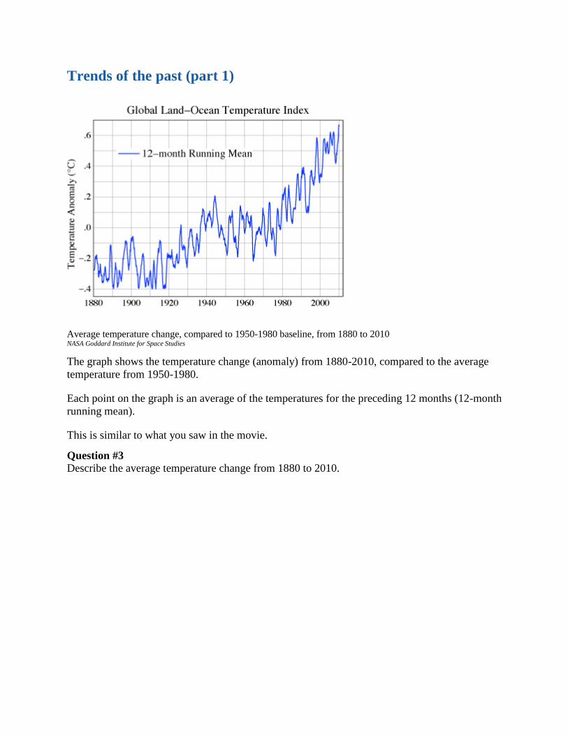
Trends of the past (part 1)
Average temperature change, compared to 1950-1980 baseline, from 1880 to 2010 NASA Goddard Institute for Space Studies
The graph shows the temperature change (anomaly) from 1880-2010, compared to the average
temperature from 1950-1980.
Each point on the graph is an average of the temperatures for the preceding 12 months (12-month
running mean).
This is similar to what you saw in the movie.
Question #3
Describe the average temperature change from 1880 to 2010.
Trends of the past (part 2)
This graph shows the global temperature changes again, this time with a little more detail.
The black points show the same data as the last graph (the annual average temperature, compared
to the 1950-1980 baseline). The red line shows the five-year average (compared to the baseline),
computed each year.
Question #4
Why is the curve between 1950 and 1980 relatively flat and centered around zero degrees
difference from the baseline? (Hint: how is the temperature change being compared over time?)
Question #5
The green bars are called "error bars." They indicate the range of uncertainty that scientists have
about the data on the graph. (Note: Not all error bars are shown.)
Why do you think these error bars are smaller near the year 2000 than in the 1890s?
Question #6
Why is the black line so much more variable than the red line?
What's the difference between the data they show?
Average temperature change,
compared to 1950-1980
baseline, from 1880 to 2010 NASA Goddard Institute for Space
Studies

Predicting the future
This graph shows the five-year running average from the previous page. It is clear that past
temperature data has a trend. Does the past trend help us to predict the future?
How could we extend this graph to show the temperature in the next 100 years?
Question #7
Draw your prediction on the graph.
Question #8
Explain why you drew the prediction curve as you did.
Question #9
How certain are you about your prediction based on your explanation?
Question #10
Explain what influenced your certainty rating.

Way, way back in time
19 cm long section of GISP 2 ice core from 1855 m showing annual layer structure illuminated from below by
a fiber optic source. Section contains 11 annual layers with summer layers (arrowed) sandwiched between
darker winter layers. NOAA
The data for the previous graphs were obtained with thermometers. What if scientists wanted to
know Earth's temperature before humans started collecting data?
Scientists have found a variety of techniques to determine the temperature before the existence of
thermometers. By studying glaciers and ice sheets, scientists have been able to infer global
temperatures over the past few hundred thousand years by studying the gases and other materials
that are trapped in the ice.
Scientists take cores of the ice by drilling holes deep into glaciers and ice sheets. Since the layers
at the bottom are older than layers at the top, scientists can see the changes in the trapped gases
over a long period of time. The picture shows a 19 cm long section of an ice core from the
Greenland ice sheet.
Question #11
Why do you think the winter layers are darker than the summer layers in the ice core?
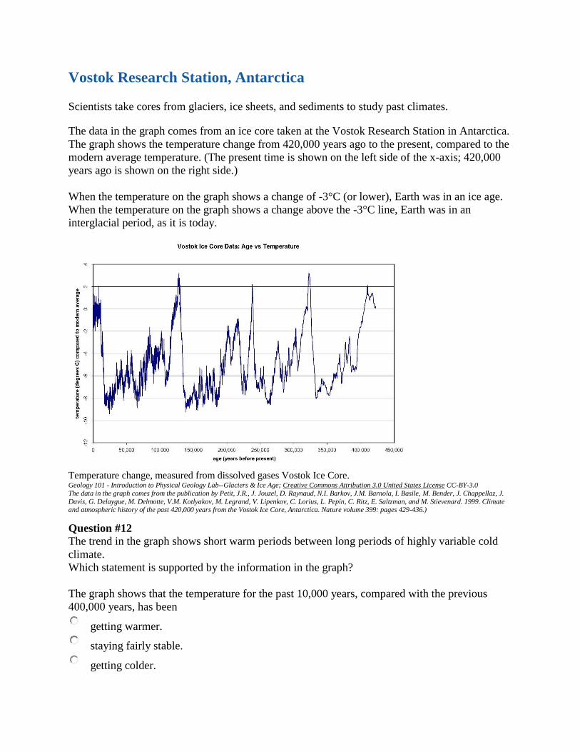
Vostok Research Station, Antarctica
Scientists take cores from glaciers, ice sheets, and sediments to study past climates.
The data in the graph comes from an ice core taken at the Vostok Research Station in Antarctica.
The graph shows the temperature change from 420,000 years ago to the present, compared to the
modern average temperature. (The present time is shown on the left side of the x-axis; 420,000
years ago is shown on the right side.)
When the temperature on the graph shows a change of -3°C (or lower), Earth was in an ice age.
When the temperature on the graph shows a change above the -3°C line, Earth was in an
interglacial period, as it is today.
Temperature change, measured from dissolved gases Vostok Ice Core. Geology 101 - Introduction to Physical Geology Lab--Glaciers & Ice Age; Creative Commons Attribution 3.0 United States License CC-BY-3.0
The data in the graph comes from the publication by Petit, J.R., J. Jouzel, D. Raynaud, N.I. Barkov, J.M. Barnola, I. Basile, M. Bender, J. Chappellaz, J.
Davis, G. Delaygue, M. Delmotte, V.M. Kotlyakov, M. Legrand, V. Lipenkov, C. Lorius, L. Pepin, C. Ritz, E. Saltzman, and M. Stievenard. 1999. Climate and atmospheric history of the past 420,000 years from the Vostok Ice Core, Antarctica. Nature volume 399: pages 429-436.)
Question #12
The trend in the graph shows short warm periods between long periods of highly variable cold
climate.
Which statement is supported by the information in the graph?
The graph shows that the temperature for the past 10,000 years, compared with the previous
400,000 years, has been
getting warmer.
staying fairly stable.
getting colder.
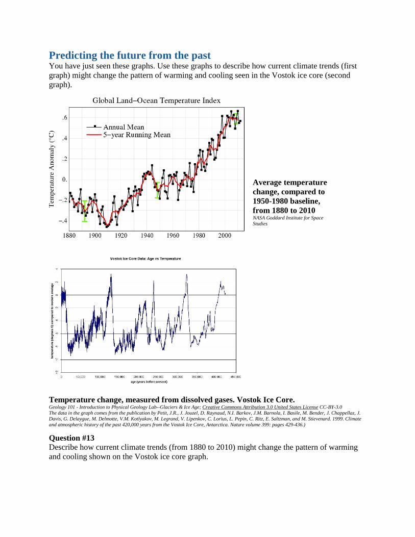
Predicting the future from the past
You have just seen these graphs. Use these graphs to describe how current climate trends (first
graph) might change the pattern of warming and cooling seen in the Vostok ice core (second
graph).
Temperature change, measured from dissolved gases. Vostok Ice Core. Geology 101 - Introduction to Physical Geology Lab--Glaciers & Ice Age; Creative Commons Attribution 3.0 United States License CC-BY-3.0 The data in the graph comes from the publication by Petit, J.R., J. Jouzel, D. Raynaud, N.I. Barkov, J.M. Barnola, I. Basile, M. Bender, J. Chappellaz, J.
Davis, G. Delaygue, M. Delmotte, V.M. Kotlyakov, M. Legrand, V. Lipenkov, C. Lorius, L. Pepin, C. Ritz, E. Saltzman, and M. Stievenard. 1999. Climate
and atmospheric history of the past 420,000 years from the Vostok Ice Core, Antarctica. Nature volume 399: pages 429-436.)
Question #13
Describe how current climate trends (from 1880 to 2010) might change the pattern of warming
and cooling shown on the Vostok ice core graph.
Average temperature
change, compared to
1950-1980 baseline,
from 1880 to 2010 NASA Goddard Institute for Space
Studies

Looking to the future
1995 IPCC report projected global mean surface temperature changes from 1990 to 2100 for the full set of
IS92 emission scenarios. A climate sensitivity of 2.5°C is assumed. Climate Change 1995 – The Science of Climate Change. Contribution of Working Group I to the Second Assessment Report of the Intergovernmental
Panel on Climate Change, Figure 18 (TS). Cambridge University Press.
We want to predict future climate, but simply looking at changes in temperature isn't enough.
The Earth is a complex system.
Scientists use mathematical climate models to try to predict what will happen to Earth's
temperature in the future. The math is very complicated, so scientists use computer programs to
do the calculations.
Still, these mathematical models are not complex enough to model the entire Earth system, so
scientists design their models to focus on just a few of the components at a time. In the next four
activities, you'll use climate models to understand how the global temperature is affected by
changes in the mix of gases in the atmosphere.
Although scientists generally agree that global warming is occurring, there are still many
unknowns about what exactly will happen to Earth's many climates as a result of global
warming.
Question #14
Explain how scientists can be both fairly certain that Earth is warming and still actively
researching the unknown factors.