visualisation of indicators in the ameli...
TRANSCRIPT

Visualisation of Indicators in the AMELI Project
Matthias Templ, Andreas Alfons, Alexander Kowarik, Bernhard Meindl,Peter Filzmoser, Beat Hulliger, Daniela Lussmann Pooda
Advanced Methodology for European Laeken Indicators
S T A T I S T I K A U S T R I A
D i e I n f o r m a t i o n s m a n a g e r
NTTS 2011, Feb 23, 2011
Templ, et al. (AMELI) Visualisation of Indicators Feb 23, 2011 1 / 41

Disclaimer
Disclaimer Statement for this presentation:
Some graphics presented at this presentation can cause eye cancer.
For complaining we refer to contact the corresponding commercialsoftware providers.
Templ, et al. (AMELI) Visualisation of Indicators Feb 23, 2011 2 / 41

Disclaimer
Disclaimer Statement for this presentation:
Some graphics presented at this presentation can cause eye cancer.
For complaining we refer to contact the corresponding commercialsoftware providers.
Templ, et al. (AMELI) Visualisation of Indicators Feb 23, 2011 2 / 41

Disclaimer
Disclaimer Statement for this presentation:
Some graphics presented at this presentation can cause eye cancer.
For complaining we refer to contact the corresponding commercialsoftware providers.
Templ, et al. (AMELI) Visualisation of Indicators Feb 23, 2011 2 / 41

How We Do NOT Want to Present Statistical Information
Templ, et al. (AMELI) Visualisation of Indicators Feb 23, 2011 3 / 41

What We Do Want To Visualise BUT NOT within theAMELI Project
Templ, et al. (AMELI) Visualisation of Indicators Feb 23, 2011 4 / 41
Visualisation in the AMELI project
Visualisation Topics in AMELI
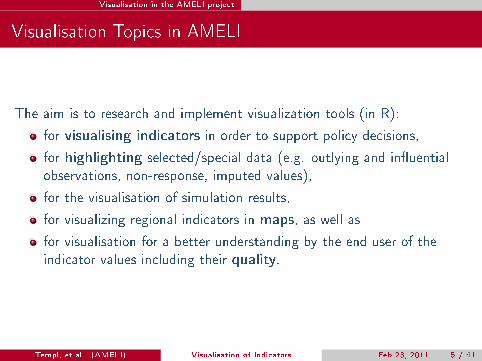
The aim is to research and implement visualization tools (in R):
for visualising indicators in order to support policy decisions,
for highlighting selected/special data (e.g. outlying and in�uentialobservations, non-response, imputed values),
for the visualisation of simulation results,
for visualizing regional indicators in maps, as well as
for visualisation for a better understanding by the end user of theindicator values including their quality.
Templ, et al. (AMELI) Visualisation of Indicators Feb 23, 2011 5 / 41

Visualisation in the AMELI project
Visualisation Topics in AMELI
The aim is to research and implement visualization tools (in R):
for visualising indicators in order to support policy decisions,
for highlighting selected/special data (e.g. outlying and in�uentialobservations, non-response, imputed values),
for the visualisation of simulation results,
for visualizing regional indicators in maps, as well as
for visualisation for a better understanding by the end user of theindicator values including their quality.
Templ, et al. (AMELI) Visualisation of Indicators Feb 23, 2011 5 / 41

Visualisation in the AMELI project
Done in AMELI but not shown
VIM Package for analysing the structure of missing values
+ many side products from our work
Templ, et al. (AMELI) Visualisation of Indicators Feb 23, 2011 6 / 41

Visualisation in the AMELI project
Done in AMELI but not shown
VIM Package for analysing the structure of missing values
+ many side products from our work
Templ, et al. (AMELI) Visualisation of Indicators Feb 23, 2011 6 / 41

Visualisation in the AMELI project
Selection of Graphics
Due to time contraints we only show certain plots, namely . . .
Checkerplots
Thematic Maps
Sparktables (Tufte 2006, Alfons, Filzmoser, Hulliger, Meindl, Schoch,and Templ 2009, Kowarik, Meindl, and Zechner 2010) extensions tomaps and sparkevals
Templ, et al. (AMELI) Visualisation of Indicators Feb 23, 2011 7 / 41

Visualisation in the AMELI project Checkerplots
Traditional Representation
. . . hard to determine a speci�c country and hard to see the trend.
Templ, et al. (AMELI) Visualisation of Indicators Feb 23, 2011 8 / 41
Visualisation in the AMELI project Checkerplots
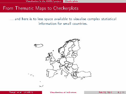
From Thematic Maps to Checkerplots
. . . and here is to less space available to visualise complex statisticalinformation for small countries.
Templ, et al. (AMELI) Visualisation of Indicators Feb 23, 2011 9 / 41
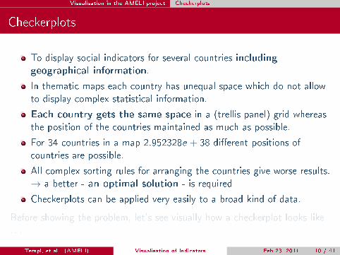
Visualisation in the AMELI project Checkerplots
Checkerplots
To display social indicators for several countries includinggeographical information.
In thematic maps each country has unequal space which do not allowto display complex statistical information.
Each country gets the same space in a (trellis panel) grid whereasthe position of the countries maintained as much as possible.
For 34 countries in a map 2.952328e + 38 di�erent positions ofcountries are possible.
All complex sorting rules for arranging the countries give worse results.→ a better - an optimal solution - is required
Checkerplots can be applied very easily to a broad kind of data.
Before showing the problem, let's see visually how a checkerplot looks like. . .
Templ, et al. (AMELI) Visualisation of Indicators Feb 23, 2011 10 / 41

Visualisation in the AMELI project Checkerplots
Checkerplot. Example: Heuristic Arrangement
Employment rate of older workers 2003 and 2008
20406080
2003 2008
● ●
● ●
PT
2003 2008
● ●
●●
MT
2003 2008
● ●
● ●
GR
2003 2008
●●
● ●
CY
2003 2008
●●
● ●
EU27
2003 2008
●●
● ●
ES
●●
● ●
IT
●
●
MK
●
●●
●
BG
● ●●
●
RO
20406080
●
●
TR
20406080
●●
● ●
CH LI
●●
●●
SI
● ●●
●
HR
●●
●
●
SK
● ●● ●
HU
● ●
● ●
UK
● ●● ●
FR
●●
● ●
BE
●●
● ●
LU
●●
● ●
CZ
20406080
●●
●●
AT
20406080
●●
● ●
IE
●●
●●
NL
● ●
● ●
DK
●
●●
●
DE
● ●
●●
PL
●●
● ●
LT
● ●● ●
IS
● ●● ●
NO
● ●● ●
SE
●
●●●
LV
●●●●
EE
20406080
●●●●
FI
men 2003women 2003
men 2008women 2008
●
●
●
●
Templ, et al. (AMELI) Visualisation of Indicators Feb 23, 2011 11 / 41

Visualisation in the AMELI project Checkerplots
Checkerplot. Example: Heuristic Arrangement
year
Une
mpl
oym
ent o
f fem
ales
510
1520
1997
1998
1999
2000
2001
2002
2003
2004
2005
2006
2007
2008
PT MT
1997
1998
1999
2000
2001
2002
2003
2004
2005
2006
2007
2008
GR CY
1997
1998
1999
2000
2001
2002
2003
2004
2005
2006
2007
2008
EU27
Error using packet 6'x' is missing
NA
ES IT MK BG RO
510
1520
TR
510
1520
CH LI SI HR SK HU
UK FR BE LU CZ
510
1520
AT
510
1520
IE NL DK DE PL LT
IS
1997
1998
1999
2000
2001
2002
2003
2004
2005
2006
2007
2008
NO SE
1997
1998
1999
2000
2001
2002
2003
2004
2005
2006
2007
2008
LV EE
1997
1998
1999
2000
2001
2002
2003
2004
2005
2006
2007
2008
510
1520
FI
Templ, et al. (AMELI) Visualisation of Indicators Feb 23, 2011 12 / 41

Visualisation in the AMELI project Checkerplots
Problem
Let both X and Y be a two-dimensional data set with n observations.The pairwise distances between X and Y are calculated by
dij = ||xi − yj ||22 . (1)
The objective function in the optimization problem is then given by thesedistances, sticked row-wise together and resulting in a vector of lengthn1 ∗ n2. Let this vector denoted by
z = (d11d12 . . . d1n2d21d22 . . . d2n2 . . . di1di2 . . . din2 . . . dn1n2) . (2)
Appropriate contraints have to be formulated (skipped in the slides) tosolve a linear program which results in one optimal solution.
Templ, et al. (AMELI) Visualisation of Indicators Feb 23, 2011 13 / 41
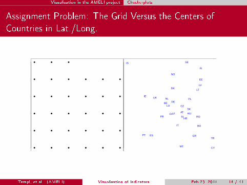
Visualisation in the AMELI project Checkerplots
Assignment Problem: The Grid Versus the Centers ofCountries in Lat./Long.
● ● ● ● ● ●
● ● ● ● ● ●
● ● ● ● ● ●
● ● ● ● ● ●
● ● ● ● ● ●
● ● ● IS
FI
NO
EE
LV
SE
DKLT
IENLUK
LU
PL
BECZ
SK
DE
LI AT HUCHSI RO
HR
BG
TR
IT
MT CY
GRPT ES
FR
Templ, et al. (AMELI) Visualisation of Indicators Feb 23, 2011 14 / 41
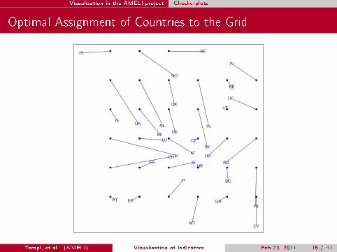
Visualisation in the AMELI project Checkerplots
Optimal Assignment of Countries to the Grid
● ● ● ● ● ●
● ● ● ● ● ●
● ● ● ● ● ●
● ● ● ● ● ●
● ● ● ● ● ●
● ● ●
AT
BE
BG
CH
CY
CZ
DE
DK
EE
ES
FI
FR
GR
HR
HU
IE
IS
IT
LI
LT
LU
LV
MT
NL
NO
PL
PT
RO
SE
SI
SK
TR
UK
Templ, et al. (AMELI) Visualisation of Indicators Feb 23, 2011 15 / 41

Visualisation in the AMELI project Checkerplots
Optimal Assignment
1:1 match (33 places in the grid) versus 36 available places to put 33countries . . .
1 2 3 4 5 6
12
34
56
PT ES IT MT GR CY
CH FR SI HR BG TR
LI LU AT CZ HU RO
IE BE DE SK LT LV
UK NL DK PL EE FI
IS NO SE
1 2 3 4 5 6
12
34
56 IS FINO EE
LV
SE
DK LT
IE
NL
UK
LU
PLBE CZ SK
DE
LI AT HUCH
SI
RO
HR BG TR
IT MT CYGR
PT
ES
FR
Templ, et al. (AMELI) Visualisation of Indicators Feb 23, 2011 16 / 41

Visualisation in the AMELI project Checkerplots
Result (1:1 Match)
Employment rate of older workers 2003 and 2008
20406080
2003 2008
● ●
● ●
PT
2003 2008
●●
● ●
ES
2003 2008
●●
● ●
IT
2003 2008
● ●
●●
MT
2003 2008
● ●
● ●
GR
2003 2008
●●
● ●
CY
●●
● ●
CH
● ●● ●
FR
●●
●●
SI
● ●●
●
HR
●
●●
●
BG
20406080
●
●
TR
20406080
LI
●●
● ●
LU
●●
●●
AT
●●
● ●
CZ
● ●● ●
HU
● ●●
●
RO
●●
● ●
IE
●●
● ●
BE
●
●●
●
DE
●●
●
●
SK
●●
● ●
LT
20406080
●
●●●
LV
20406080
● ●
● ●
UK
●●
●●
NL
● ●
● ●
DK
● ●
●●
PL
●●●●
EE
●●●●
FI
● ●● ●
IS
● ●● ●
NO
20406080
● ●● ●
SE
men 2003women 2003
men 2008women 2008
●
●
●
●
Templ, et al. (AMELI) Visualisation of Indicators Feb 23, 2011 17 / 41

Some Issues in Mapping Projections
From Distorted Maps to Thematic Maps. The ProjectionProblem.
Map of Europe from Eurostat is in long/lat. representation.
Projection to other coordinate systems is absolutely necessaryotherwise distorted maps results.
Aim: projections should be made interactively when selecting countriesfor plotting.
Problem: Every selected region needs other parameters for theprojection (solved).
Templ, et al. (AMELI) Visualisation of Indicators Feb 23, 2011 18 / 41

Some Issues in Mapping Projections
Map of Europe in Lat./Long. as we Used to it
Templ, et al. (AMELI) Visualisation of Indicators Feb 23, 2011 19 / 41

Some Issues in Mapping Projections
Long./Lat. Representation of Austria Looks Quite Distorted
Templ, et al. (AMELI) Visualisation of Indicators Feb 23, 2011 20 / 41
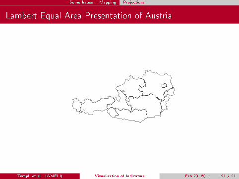
Some Issues in Mapping Projections
Lambert Equal Area Presentation of Austria
Templ, et al. (AMELI) Visualisation of Indicators Feb 23, 2011 21 / 41

Some Issues in Mapping Projections
Long./Lat. Presentation of Ireland
Templ, et al. (AMELI) Visualisation of Indicators Feb 23, 2011 22 / 41

Some Issues in Mapping Projections
Lambert Equal Area Presentation of Ireland
Templ, et al. (AMELI) Visualisation of Indicators Feb 23, 2011 23 / 41
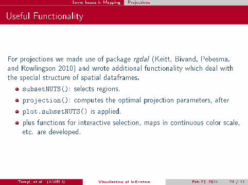
Some Issues in Mapping Projections
Useful Functionality
For projections we made use of package rgdal (Keitt, Bivand, Pebesma,and Rowlingson 2010) and wrote additional functionality which deal withthe special structure of spatial dataframes.
subsetNUTS(): selects regions.
projection(): computes the optimal projection parameters, after
plot.subsetNUTS() is applied.
plus functions for interactive selection, maps in continuous color scale,etc. are developed.
Templ, et al. (AMELI) Visualisation of Indicators Feb 23, 2011 24 / 41
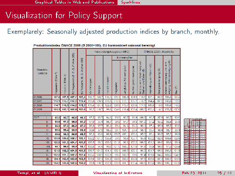
Graphical Tables in Web and Publications Sparklines
Visualization for Policy Support
Exemplarely: Seasonally adjusted production indices by branch, monthly.
Templ, et al. (AMELI) Visualisation of Indicators Feb 23, 2011 25 / 41

Graphical Tables in Web and Publications Sparklines
Example (production indices enhanced)
Templ, et al. (AMELI) Visualisation of Indicators Feb 23, 2011 26 / 41

Graphical Tables in Web and Publications Sparklines
Example (developments of the Austrian population)
Männer Frauen 0 bis 19 Jahre 20 bis 64 Jahre65 Jahre
und älter
dar.:
75 Jahre
und älter
1981 7.553.326 3.570.172 3.983.154 896 2.184.224 4.212.971 1.156.131 454.278
1982 7.584.094 3.590.286 3.993.808 899 2.159.778 4.292.823 1.131.493 465.300
1983 7.564.185 3.582.589 3.981.596 900 2.115.305 4.348.057 1.100.823 473.838
1984 7.559.635 3.583.422 3.976.213 901 2.070.767 4.415.758 1.073.110 480.749
1985 7.563.233 3.588.116 3.975.117 903 2.028.352 4.465.937 1.068.944 491.279
1986 7.566.736 3.594.380 3.972.356 905 1.988.702 4.499.348 1.078.686 500.239
1987 7.572.852 3.602.199 3.970.653 907 1.950.892 4.528.383 1.093.577 508.013
1988 7.576.319 3.608.710 3.967.609 910 1.911.761 4.553.802 1.110.756 519.409
1989 7.594.315 3.623.136 3.971.179 912 1.879.112 4.589.333 1.125.870 527.740
1990 7.644.818 3.654.915 3.989.903 916 1.862.258 4.642.719 1.139.841 534.306
1991 7.710.882 3.696.200 4.014.682 921 1.856.653 4.700.847 1.153.382 526.559
1992 7.798.899 3.746.551 4.052.348 925 1.864.333 4.770.187 1.164.379 511.086
1993 7.882.519 3.793.245 4.089.274 928 1.876.578 4.831.640 1.174.301 494.349
1994 7.928.746 3.820.889 4.107.857 930 1.880.290 4.862.793 1.185.663 479.964
1995 7.943.489 3.831.200 4.112.289 932 1.875.112 4.871.503 1.196.874 481.743
1996 7.953.067 3.836.950 4.116.117 932 1.871.831 4.873.219 1.208.017 494.972
1997 7.964.966 3.844.019 4.120.947 933 1.870.818 4.877.700 1.216.448 511.436
1998 7.971.116 3.848.305 4.122.811 933 1.866.873 4.880.028 1.224.215 528.564
1999 7.982.461 3.856.029 4.126.432 934 1.862.619 4.890.127 1.229.715 545.049
2000 8.002.186 3.868.331 4.133.855 936 1.857.356 4.911.163 1.233.667 559.914
2001 8.020.946 3.881.104 4.139.842 938 1.844.074 4.938.856 1.238.016 575.493
2002 8.063.640 3.906.734 4.156.906 940 1.827.823 4.986.599 1.249.218 593.437
2003 8.100.273 3.929.599 4.170.674 942 1.819.450 5.030.344 1.250.479 601.901
2004 8.142.573 3.952.600 4.189.973 943 1.813.186 5.068.488 1.260.899 612.140
2005 8.201.359 3.984.866 4.216.493 945 1.809.717 5.083.697 1.307.945 625.028
2006 8.254.298 4.014.344 4.239.954 947 1.803.687 5.093.024 1.357.587 638.263
2007 8.282.984 4.030.062 4.252.922 948 1.790.880 5.093.505 1.398.599 648.843
2008 8.318.592 4.048.633 4.269.959 948 1.777.869 5.115.684 1.425.039 658.531
2009 8.355.260 4.068.047 4.287.213 949 1.763.948 5.140.425 1.450.887 665.415
Bevölkerung zu Jahresbeginn seit 1981 nach Geschlecht bzw. breiten Altersgruppen (Absolutwerte)
Q: STATISTIK AUSTRIA, Statistik des Bevölkerungsstandes.- Revidierte Ergebnisse für 2002 bis 2008. Erstellt am: 27.05.2009.
Jahr Insgesamt
Nach Geschlecht Nach Altersgruppen
Männer auf
1.000 Frauen
Templ, et al. (AMELI) Visualisation of Indicators Feb 23, 2011 27 / 41

Graphical Tables in Web and Publications Sparklines
Example (developments of the Austrian population)
Bevölkerung zu Jahresbeginn seit 1981 nach Geschlecht bzw. breiten Altersgruppen (Überblick)
1981-2009 1981 2009 Minimum MaximumInsgesamt 7.5533.26 8.355.260 7.553.326 8.355.260
Männer 3.570.172 4.068.047 3.570.172 4.068.047Frauen 3.983.154 4.287.213 3.967.609 4.287.213
Männer auf 1.000 Frauen 896 949 896 9490-19 Jahre 2.184.224 1.763.948 1.763.948 2.184.224
20-64 Jahre 4.212.971 5.140.425 4.212.971 5.140.42565+ Jahre 1.156.131 1.450.887 1.068.944 1.450.88775+ Jahre 454.278 665.415 454.278 665.415
Bevölkerung zu Jahresbeginn seit 1981 nach Geschlecht bzw. breiten Altersgruppen (Absolutwerte)
Geschlecht Altersgruppen
Jahr Insgesamt Männer FrauenMänner auf
0-19 Jahre 20-64 Jahre 65+ Jahre 75+ Jahre1.000Frauen
2009 8.355.260 4.068.047 4.287.213 949 1.763.948 5.140.425 1.450.887 665.4152008 8.318.592 4.048.633 4.269.959 948 1.777.869 5.115.684 1.425.039 658.5312007 8.282.984 4.030.062 4.252.922 948 1.790.880 5.093.505 1.398.599 648.8432006 8.254.298 4.014.344 4.239.954 947 1.803.687 5.093.024 1.357.587 638.2632005 8.201.359 3.984.866 4.216.493 945 1.809.717 5.083.697 1.307.945 625.0282004 8.142.573 3.952.600 4.189.973 943 1.813.186 5.068.488 1.260.899 612.140
. . . . . . . . . . . . . . . . . . . . . . . . . . .
1
Templ, et al. (AMELI) Visualisation of Indicators Feb 23, 2011 28 / 41

Graphical Tables in Web and Publications Sparklines
Graphical representations
Creation of customized time-series, box- and barplots
Time series plots
Bar plots
Box plots
Graphical options include (among others)
Highlighting of speci�c values in time series plots
Choice of colors
Choice of boundaries
Inclusion of interquartile-range in time-series plots
Templ, et al. (AMELI) Visualisation of Indicators Feb 23, 2011 29 / 41

Correlation of Time Series
Correlation over time of one country to the others
Cross correlation between countries should only be estimated afterprewhitening. Prewhitening generally applies the following procedure:
1 First an ARIMA (autoregressive integrated moving average) model is�t on the �rst time series.
2 Transformation of the correlated input series xt to the uncorrelatedwhite noise series αt , which consists in fact of the residuals of the�tted time series.
3 The same transformation is applied on the second time series usingthe �tted parameters from modelling the �rst time series, which leadsto the second process βt .
4 Estimate the cross correlation between the two new series.
Templ, et al. (AMELI) Visualisation of Indicators Feb 23, 2011 30 / 41
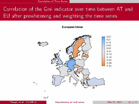
Correlation of Time Series
Correlation of the Gini indicator over time between AT andEU after prewhitening and weighting the time series
Templ, et al. (AMELI) Visualisation of Indicators Feb 23, 2011 31 / 41
Correlation of Time Series Maps and Sparklines
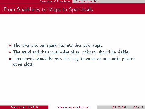
From Sparklines to Maps to Sparkevals
The idea is to put sparklines into thematic maps.
The trend and the actual value of an indicator should be visible.
Interactivity should be provided, e.g. to zoom an area or to presentother plots.
Templ, et al. (AMELI) Visualisation of Indicators Feb 23, 2011 32 / 41
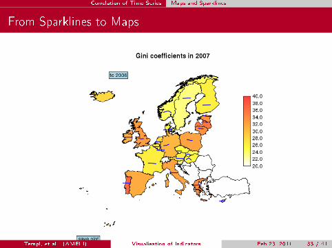
Correlation of Time Series Maps and Sparklines
From Sparklines to Maps
Templ, et al. (AMELI) Visualisation of Indicators Feb 23, 2011 33 / 41
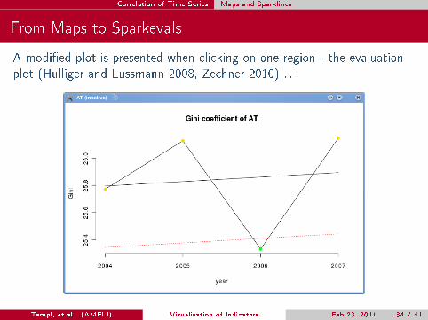
Correlation of Time Series Maps and Sparklines
From Maps to Sparkevals
A modi�ed plot is presented when clicking on one region - the evaluationplot (Hulliger and Lussmann 2008, Zechner 2010) . . .
Templ, et al. (AMELI) Visualisation of Indicators Feb 23, 2011 34 / 41
Conclusion
Conclusion
We presented only a (very) small selection of our work in visualization,namely
Checkerplots they easy to apply and we provide an optimal solutionfor the arrangement of countries in a any grid.
Scalable sparklines can be integrated almost everywhere
Correlations between short time series needs special treatment beforethey presented in maps.
A lot of aspects where not shown (automatic output for websites,visual perception, automatic selection of plot methods depending onthe input structure, . . . )
Templ, et al. (AMELI) Visualisation of Indicators Feb 23, 2011 35 / 41

Conclusion
Further Work Done in AMELI
We covered those aspects in the AMELI project:
Visualisation as diagnostic tools in the production prozess
Visualisation of indicators for policy makers
Mapping for end-users
Visualisation of simulation results
. . . should be de�nitly continued in form of other research projects! ;-)
Templ, et al. (AMELI) Visualisation of Indicators Feb 23, 2011 36 / 41
References
A. Alfons, P. Filzmoser, B. Hulliger, B. Meindl, T. Schoch, and M. Templ.State-of-the-art in visualization of indicators in survey statistics.Technical report, Vienna University of Technology, 2009.
A. Alfons, M. Templ, and P. Filzmoser. An object-oriented framework forstatistical simulation: The R Package simFrame. Journal of StatisticalSoftware, 37(3):1�36, 2010.
B. Hulliger and D. Lussmann. Bewertung der Nachhaltigkeits- undUmwelt-Indikatoren. Technical report, Institute for Competitiveness andCommunication, University of Applied Sciences, NorthwesternSwitzerland, 2008.
Timothy H. Keitt, Roger Bivand, Edzer Pebesma, and Barry Rowlingson.rgdal: Bindings for the Geospatial Data Abstraction Library, 2010. URLhttp://CRAN.R-project.org/package=rgdal. R package version0.6-25.
Alexander Kowarik, Bernhard Meindl, and Stefan Zechner. sparkTable:Sparklines and graphical tables for tex and html, 2010. URLhttp://CRAN.R-project.org/package=sparkTable. R packageversion 0.1.1.Templ, et al. (AMELI) Visualisation of Indicators Feb 23, 2011 36 / 41

Conclusion
E. Tufte. Beatiful Evidence. Graphics Press, Cheshire, 2006.
S. Zechner. Visualization of indicators. Master's thesis, Department ofStatistics and Probability Theory, Vienna University of Technology,Vienna, Austria, 2010.
Templ, et al. (AMELI) Visualisation of Indicators Feb 23, 2011 36 / 41