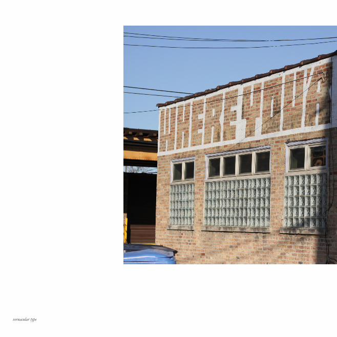
vernacular type
DESCRIPTION
2 Essays on Typography. Alex White / Erik Spiekermann, E.M. Ginger Photographs / Design by Michael Heck.TRANSCRIPT
2 ESSAYS ON TYPOGRAPHY
ALEX W. WHITE // Pg. 3ERIK SPIEKERMAN / E.M. GINGER // Pg. 15
vernacular type
ALEX W WHITE
1
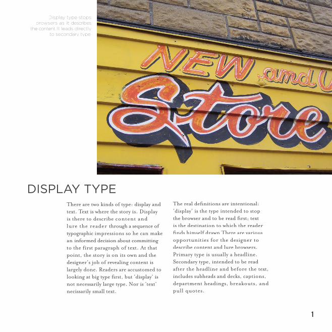
There are two kinds of type: display and text. Text is where the story is. Display is there to describe content and lure the reader through a sequence of typographic impressions so he can make an informed decision about committing to the first paragraph of text. At that point, the story is on its own and the designer’s job of revealing content is largely done. Readers are accustomed to looking at big type fi rst, but ‘display’ is not necessarily large type. Nor is ‘text’ necissarily small text.
The real defi nitions are intentional: ’display’ is the type intended to stop the browser and to be read fi rst; text is the destination to which the reader fi nds himself drawn There are various opportunities for the designer to describe content and lure browsers. Primary type is usually a headline. Secondary type, intended to be read after the headline and before the text, includes subheads and decks, captions, department headings, breakouts, and pull quotes.
Display type stops browsers as it describes
the content. It leads directly to secondary type.
DISPLAY TYPE
vernacular type
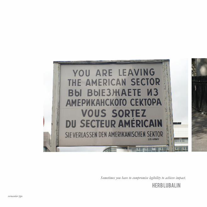
Sometimes you have to compromise legibility to achieve impact.
HERB LUBALIN
3
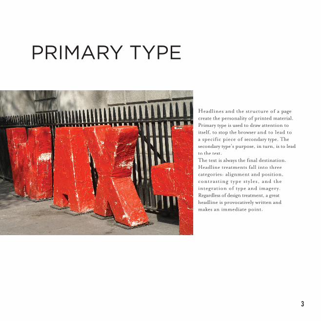
Headlines and the structure of a page create the personality of printed material. Primary type is used to draw attention to itself, to stop the browser and to lead to a specific piece of secondary type. The secondary type’s purpose, in turn, is to leadto the text.The text is always the fi nal destination.Headline treatments fall into three categories: alignment and position, contrasting type styles, and the integration of type and imagery.Regardless of design treatment, a great headline is provocatively written and makes an immediate point.
PRIMARY TYPE
vernacular type
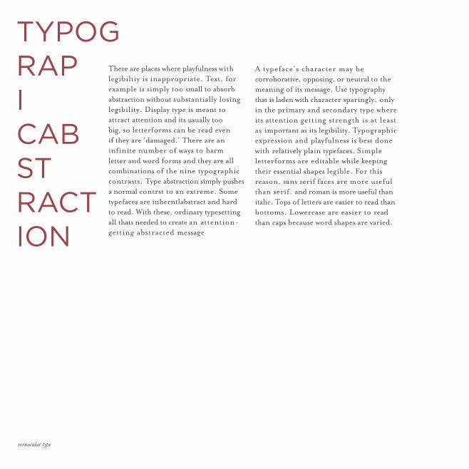
TYPOGRAPICABSTRACTION
There are places where playfulness with legibiltiy is inappropriate. Text, for example is simply too small to absorb abstraction without substantially losing legibility. Display type is meant to attract attention and its usually too big, so letterforms can be read even if they are ‘damaged.’ There are an infinite number of ways to harm letter and word forms and they are all combinations of the nine typographic contrasts. Type abstraction simply pushes a normal contrst to an extreme. Some typefaces are inherntlabstract and hard to read. With these, ordinary typesetting all thats needed to create an attention-getting abstracted message
A typeface’s character may be corroborative, opposing, or neutral to the meaning of its message. Use typography that is laden with character sparingly, only in the primary and secondary type where its attention getting strength is at least as important as its legibility. Typographic expression and playfulness is best done with relatively plain typefaces. Simple letterforms are editable while keeping their essential shapes legible. For this reason, sans serif faces are more useful than serif, and roman is more useful than italic. Tops of letters are easier to read than bottoms. Lowercase are easier to read than caps because word shapes are varied.
5
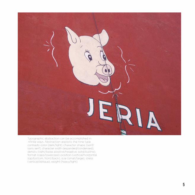
Typographic abstraction can be accomplished in infi nite ways. Abstraction exploits the nine type contrasts: color (dark/light), character shape (serif/sans serif), character width (expanded/condensed), density (tight/loose, positive/negative, solid/outline), format (caps/lowercase), position (vertical/horizontal, top/bottom, front/back), size (small/large), stress (vertical/oblique), weight (heavy/light).
vernacular type
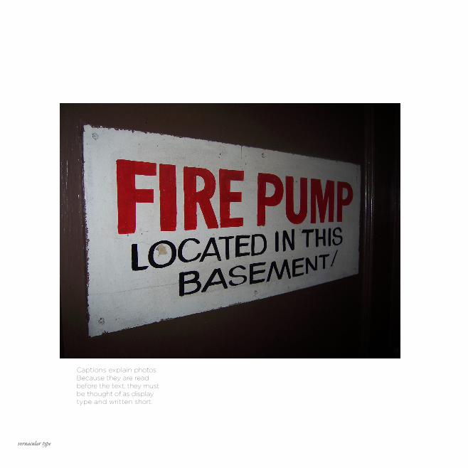
Captions explain photos. Because they are read before the text, they must be thought of as display type and written short.
7
SECONDARY TYPEIf the headline is the lure, the subhead is the readers’ payoff. Here is the opportunity to hook the reader by explaining the headline. The headline leads to one or more secondary messages, fi rst a subhead or deck, but possibly a caption, breakout, or pull quote.The messages in the headline and subhead should be two parts of a complete thought, provocatively showing why the story is important to the reader. Readers should, after a total of three or four information “hits,” have been given enough information about the story to make an informed decision about whether or not to get into the text. Actually becoming committed to the text can happen only after they have begun reading it.
A friend redesigned a magazine in the days of hot metal type, when a font was truly a single typeface in one size and weight. The foreign client had pur-chased only two fonts: 11-point Franklin Gothic Regular and Bold. The magazine could only use those two fonts, yet they had to do all that a magazine’s typog-raphy must do. The redesign, using position and emptiness to make display type visible, succeeded because of — rather than in spite of — the extremely limited typographic contrast. Use no more than two typeface families in a design, and do not use more than two weights of each face. Add italic versions of the regular weight and you have six typographic “voices,” which should be enough to convey any message. This is equivalent to hearing six people read-ing aloud.
vernacular type
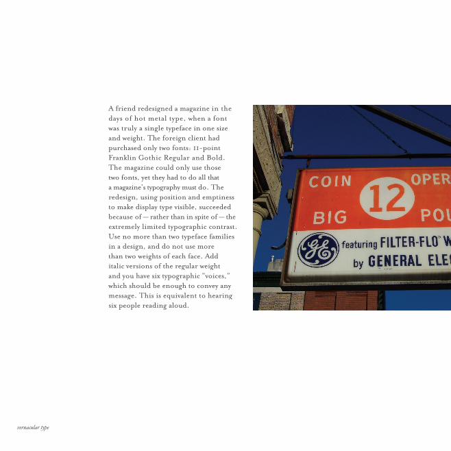
A friend redesigned a magazine in the days of hot metal type, when a font was truly a single typeface in one size and weight. The foreign client had purchased only two fonts: 11-point Franklin Gothic Regular and Bold. The magazine could only use those two fonts, yet they had to do all that a magazine’s typography must do. The redesign, using position and emptiness to make display type visible, succeeded because of — rather than in spite of — the extremely limited typographic contrast.Use no more than two typeface families in a design, and do not use more than two weights of each face. Add italic versions of the regular weight and you have six typographic “voices,” which should be enough to convey any message. This is equivalent to hearing six people reading aloud.
9
vernacular type
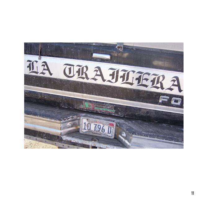
SETTING DISPLAY TYPEDisplay type shows off misspaced characters more than text simply because of its larger size, where character-to-character relationships are particularly visible. Letters are strung together into words. The space between individual letters goes unnoticed when the type is smaller than about 18 points. The optimum letterspacing is “invisible,” that is, it is un-selfconscious. The reader should not be aware that letterspacing exists when it is done well. Words are grouped into lines of type. Word spacing is the glue that holds lines of type together. The secret to good word spacing is also invisibility. The reader should not be aware of the type that is being read but should be concentrating on its meaning. Display word spacing is often too large because it is set with built-in text algorithms. In general, display type’s global word spacing can be reduced to 50 to 80 percent of normal.
Headlines are made of clusters of phrases and should be “broken for sense” into these clusters, regardless of the shape this forces on the headline. To fi nd the natural breaks, read a headline out loud. Try not to break a headline to follow a design; rather, break a headline so that it makes the most sense to the reader. Hyphenating type communicates that shape is more important than meaning. Display type should never be hyphenated, unless its meaning is to illustrate “disconnection.” The effectiveness of display typography is principally dependent on the management of the white space between and around the letterforms, not only on the letterforms themselves. Because display type is brief (to snag the reader’s attention), letterspacing, word spacing, and line breaks become more important.
11
vernacular type
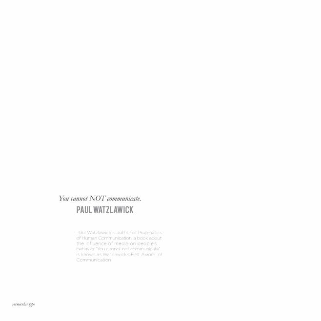
You cannot NOT communicate.
PAUL WATZLAWICK
Paul Watzlawick is author of Pragmatics of Human Communication, a book about the influence of media on people’s behavior. “You cannot not communicate” is known as Watzlawick’s First Axiom of Communication.
1
TYPE IS EVERYWHEREErik Spiekermann & E.M. Ginger
vernacular type
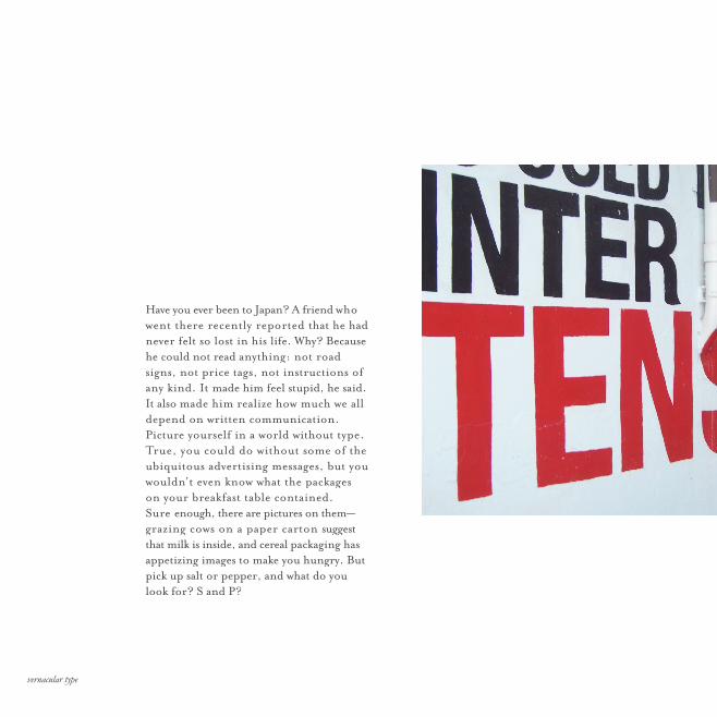
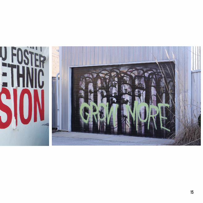
Have you ever been to Japan? A friend who went there recently reported that he had never felt so lost in his life. Why? Because he could not read anything: not road signs, not price tags, not instructions of any kind. It made him feel stupid, he said. It also made him realize how much we all depend on written communication.Picture yourself in a world without type. True, you could do without some of the ubiquitous advertising messages, but you wouldn’t even know what the packages on your breakfast table contained. Sure enough, there are pictures on them— grazing cows on a paper carton suggest that milk is inside, and cereal packaging has appetizing images to make you hungry. But pick up salt or pepper, and what do you look for? S and P?
15
vernacular type
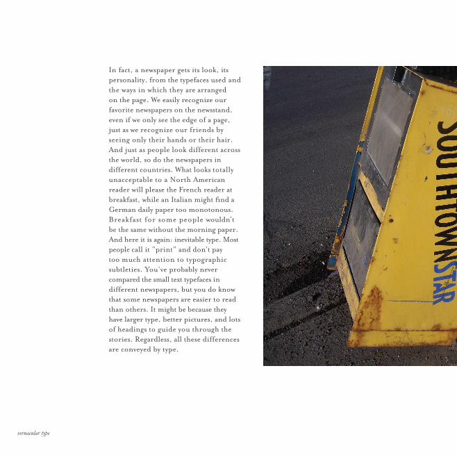
In fact, a newspaper gets its look, its personality, from the typefaces used and the ways in which they are arranged on the page. We easily recognize our favorite newspapers on the newsstand, even if we only see the edge of a page, just as we recognize our friends by seeing only their hands or their hair. And just as people look different across the world, so do the newspapers in different countries. What looks totally unacceptable to a North American reader will please the French reader at breakfast, while an Italian might fi nd a German daily paper too monotonous. Breakfast for some people wouldn’t be the same without the morning paper. And here it is again: inevitable type. Most people call it “print” and don’t pay too much attention to typographic subtleties. You’ve probably never compared the small text typefaces in different newspapers, but you do know that some newspapers are easier to read than others. It might be because they have larger type, better pictures, and lots of headings to guide you through the stories. Regardless, all these differences are conveyed by type.
17
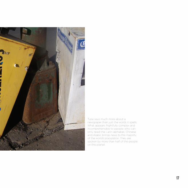
Type says much more about a newspaper than just the words it spells. What appears frightfully complex and incomprehensible to people who can only read the Latin alphabet, Chinese and Arabic brings news to the majority of the world’s population. They are spoken by more than half of the people on this planet.
vernacular type
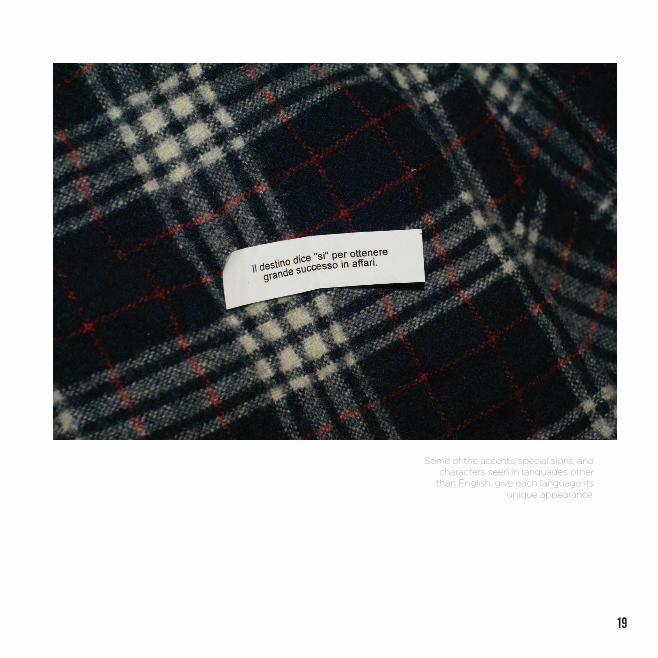
Of course, it’s not only type or layout that distinguishes newspapers, it is also the combination of words. Some languages have lots of accents, like French; some have very long words, like Dutch or Finnish; and someuse extremely short ones, as in a British tabloid. Not every typeface is suited for every language, which also explains why certain type styles are popular in certain countries but not necessarily anywhere else. This brings us back to type and newspapers. What might look quite obvious and normal to you when you read your daily paper is the result of careful planning and applied craft Even newspapers with pages that look messy are laid out following complex grids and strict hierarchies.
19
Some of the accents, special signs, andcharacters seen in languages other
than English, give each language its unique appearance.
vernacular type
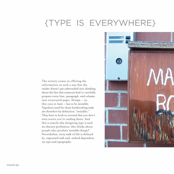
The artistry comes in offering the information in such a way that the reader doesn’t get sidetracked into thinking about the fact that someone had to carefully prepare every line, paragraph, and column into structured pages. Design — in this case at least — has to be invisible. Typefaces used for these hardworking tasks are therefore by defi nition “invisible.” They have to look so normal that you don’t even notice you’re reading them. And this is exactly why designing type is such an obscure profession; who thinks about people who produce invisible things? Nevertheless, every walk of life is defi ned by, expressed with and, indeed dependent on type and typography.
{TYPE IS EVERYWHERE}
21
More and more people read the newsnot on paper, but on TV screens orcomputer monitors. Type and layouthave to be reconsidered for theseapplications.
vernacular type
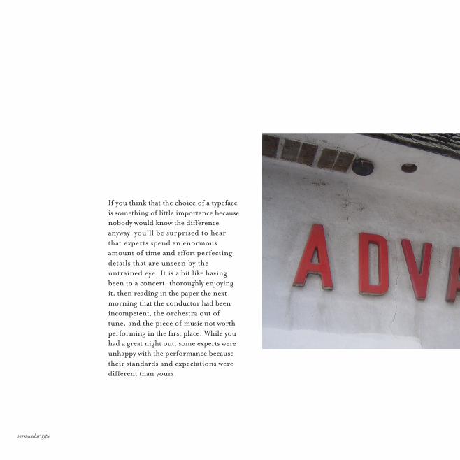
If you think that the choice of a typeface is something of little importance because nobody would know the difference anyway, you’ll be surprised to hear that experts spend an enormous amount of time and effort perfecting details that are unseen by the untrained eye. It is a bit like having been to a concert, thoroughly enjoying it, then reading in the paper the next morning that the conductor had been incompetent, the orchestra out of tune, and the piece of music not worth performing in the first place. While you had a great night out, some experts were unhappy with the performance because their standards and expectations were different than yours.

23
vernacular type
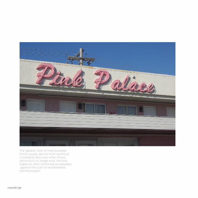
The “generic” look of most businessforms usually derives from technicalconstraints. But even when thoserestrictions no longer exist, the looklingers on, often confirming our prejudice against this sort of standardizedcommunication.
25
vernacular type
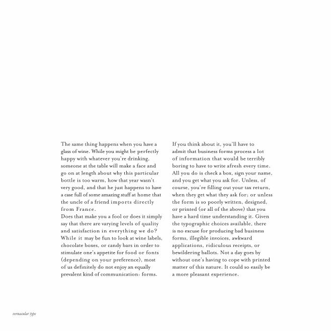
If you think about it, you’ll have to admit that business forms process a lot of information that would be terribly boring to have to write afresh every time. All you do is check a box, sign your name, and you get what you ask for. Unless, of course, you’re filling out your tax return, when they get what they ask for; or unless the form is so poorly written, designed, or printed (or all of the above) that you have a hard time understanding it. Given the typographic choices available, there is no excuse for producing bad business forms, illegible invoices, awkward applications, ridiculous receipts, or bewildering ballots. Not a day goes by without one’s having to cope with printed matter of this nature. It could so easily be a more pleasant experience.
The same thing happens when you have a glass of wine. While you might be perfectly happy with whatever you’re drinking, someone at the table will make a face and go on at length about why this particular bottle is too warm, how that year wasn’t very good, and that he just happens to have a case full of some amazing stuff at home that the uncle of a friend imports directly from France.Does that make you a fool or does it simply say that there are varying levels of quality and satisfaction in everything we do? While it may be fun to look at wine labels, chocolate boxes, or candy bars in order to stimulate one’s appetite for food or fonts (depending on your preference), most of us definitely do not enjoy an equally prevalent kind of communication: forms.
11
vernacular type
29
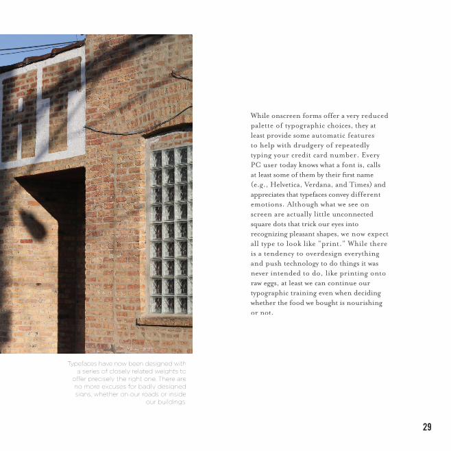
While onscreen forms offer a very reduced palette of typographic choices, they at least provide some automatic features to help with drudgery of repeatedly typing your credit card number. Every PC user today knows what a font is, calls at least some of them by their fi rst name (e.g., Helvetica, Verdana, and Times) and appreciates that typefaces convey different emotions. Although what we see on screen are actually little unconnected square dots that trick our eyes into recognizing pleasant shapes, we now expect all type to look like “print.” While there is a tendency to overdesign everything and push technology to do things it was never intended to do, like printing onto raw eggs, at least we can continue our typographic training even when deciding whether the food we bought is nourishing or not.
Typefaces have now been designed witha series of closely related weights to
off er precisely the right one. There areno more excuses for badly designedsigns, whether on our roads or inside
our buildings.
vernacular type
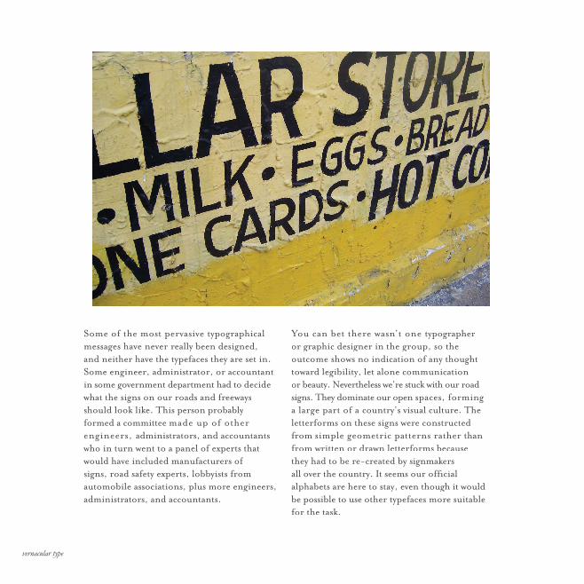
You can bet there wasn’t one typographer or graphic designer in the group, so the outcome shows no indication of any thought toward legibility, let alone communicationor beauty. Nevertheless we’re stuck with our road signs. They dominate our open spaces, forming a large part of a country’s visual culture. The letterforms on these signs were constructed from simple geometric patterns rather than from written or drawn letterforms because they had to be re-created by signmakers all over the country. It seems our offi cial alphabets are here to stay, even though it would be possible to use other typefaces more suitable for the task.
Some of the most pervasive typographical messages have never really been designed, and neither have the typefaces they are set in. Some engineer, administrator, or accountant in some government department had to decide what the signs on our roads and freeways should look like. This person probably formed a committee made up of other engineers, administrators, and accountants who in turn went to a panel of experts that would have included manufacturers of signs, road safety experts, lobbyists from automobile associations, plus more engineers, administrators, and accountants.