uts library getting started with data visualization … cricos provider code 00099f 25.10.2018 step...
TRANSCRIPT
UTS CRICOS PROVIDER CODE 00099F
25.10.2018
UTS Library Getting started with data visualization and infographics
Background
Using data to tell stories is an essential communication skill for researchers. In this beginner’s session, the Library will present on the various ways in which you can explore and visualise data, from simple web applications through to complex code driven techniques.
Following the presentation we will explore a simple Excel dataset using Microsoft Power BI, which allows you to build interactive dashboards of graphs, maps and text.
Prework for this class is to download Microsoft Power BI Desktop, which is free to all enrolled staff and students of UTS. A limited amount of laptops will be brought to the session but if you can BYO laptop then please do.
There is a spreadsheet that we'll use when we play with Power BI in class. Please download the spreadsheet from Sharepoint and then file>save to your computer. You can also find the spreadsheet at Please be aware that currently Power BI is available on PC only.
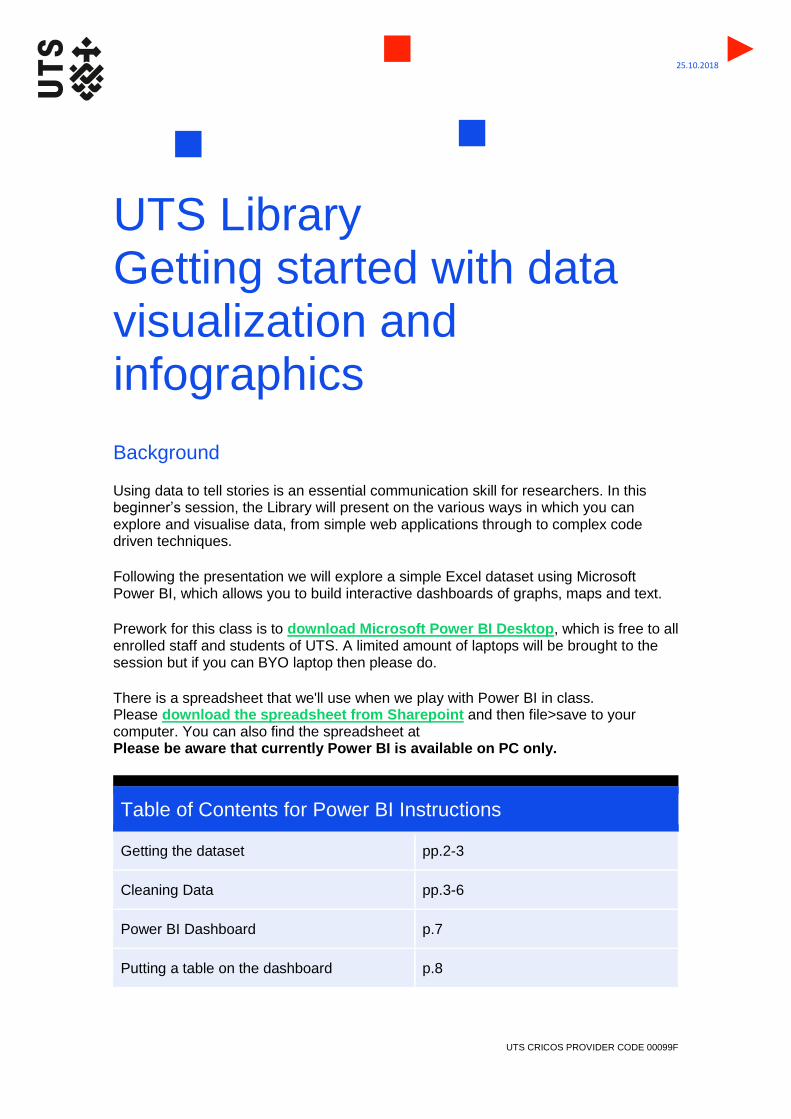
Table of Contents for Power BI Instructions
Getting the dataset pp.2-3
Cleaning Data pp.3-6
Power BI Dashboard p.7
Putting a table on the dashboard p.8
UTS CRICOS PROVIDER CODE 00099F
25.10.2018
Putting a basic visualisation on the dasboard
pp.9-11
Formatting a visualisation pp. 12-16
Mapping function in Power BI p.17
Using a slicer pp.18-22
Publishing a project pp. 23-27
Power BI Step by Step Instructions
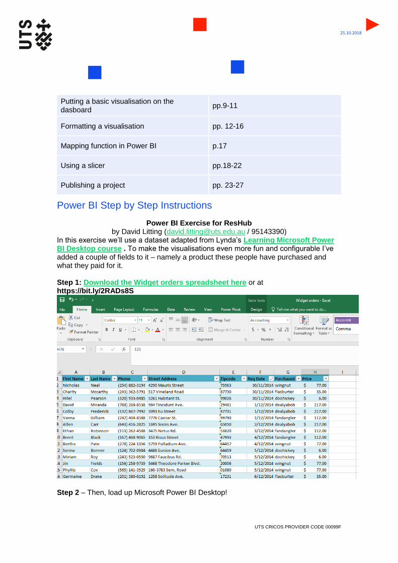
Power BI Exercise for ResHub by David Litting ([email protected] / 95143390)
In this exercise we’ll use a dataset adapted from Lynda’s Learning Microsoft Power BI Desktop course . To make the visualisations even more fun and configurable I’ve added a couple of fields to it – namely a product these people have purchased and what they paid for it. Step 1: Download the Widget orders spreadsheet here or at https://bit.ly/2RADs8S
Step 2 – Then, load up Microsoft Power BI Desktop!

UTS CRICOS PROVIDER CODE 00099F
25.10.2018
Step 3 – In Power BI desktop go to home > get data
Step 4 – Choose Excel from the drop down
Step 5 – Upload Widget Orders Step 6 – When it appears in Power BI tick Requests (or Table 1, they are the same data) from within the spreadsheet…
… and then press load
Step 7 - Once the spreadsheet uploads you’ll see the data listed as requests on the right of screen under the Fields heading
UTS CRICOS PROVIDER CODE 00099F
25.10.2018
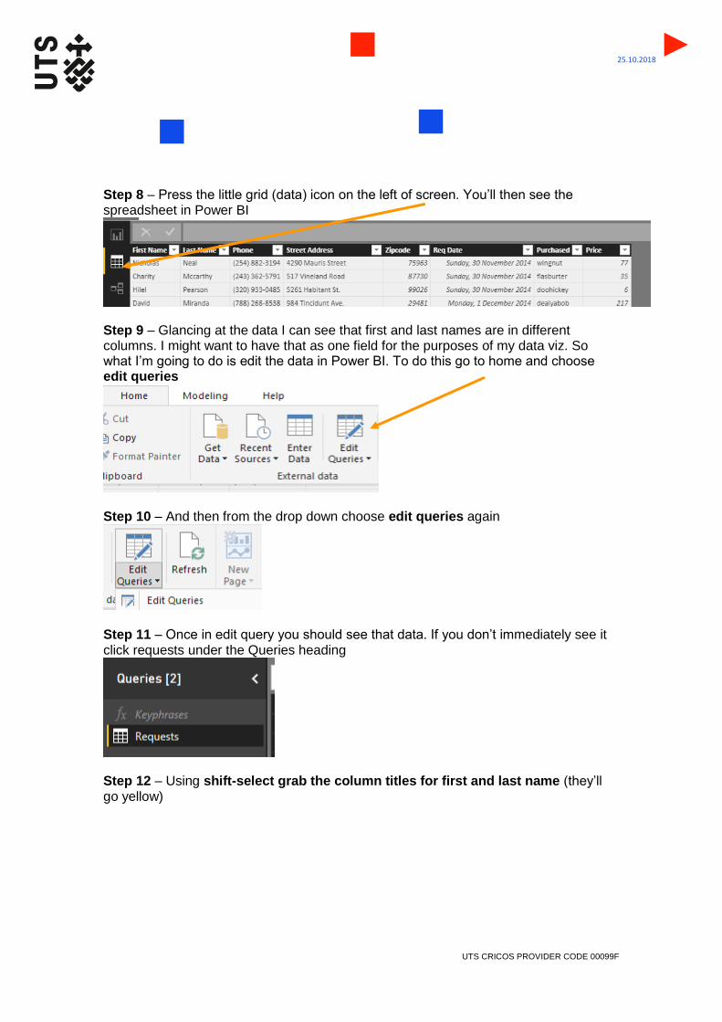
Step 8 – Press the little grid (data) icon on the left of screen. You’ll then see the spreadsheet in Power BI
Step 9 – Glancing at the data I can see that first and last names are in different columns. I might want to have that as one field for the purposes of my data viz. So what I’m going to do is edit the data in Power BI. To do this go to home and choose edit queries
Step 10 – And then from the drop down choose edit queries again
Step 11 – Once in edit query you should see that data. If you don’t immediately see it click requests under the Queries heading
Step 12 – Using shift-select grab the column titles for first and last name (they’ll go yellow)
UTS CRICOS PROVIDER CODE 00099F
25.10.2018
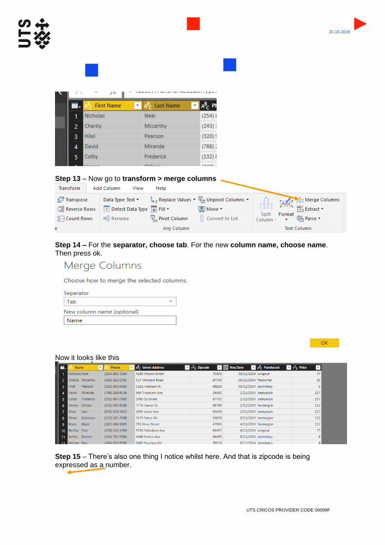
Step 13 – Now go to transform > merge columns
Step 14 – For the separator, choose tab. For the new column name, choose name. Then press ok.
Now it looks like this
Step 15 – There’s also one thing I notice whilst here. And that is zipcode is being expressed as a number.

UTS CRICOS PROVIDER CODE 00099F
25.10.2018
Whilst this sounds good in theory, expressing these digits as a number causes problems when you have a zipcode that begins with a zero – as the zero disappears. And we need that zero for Power BI to recognize zipcode and let the software use it to find locations. So, we’ll need to change the formatting of this column from numbers to text. Step 16 – Click on the column zipcode. It will go yellow. Then, press the transform tab and change the formatting from whole number …
To text…
Now it looks like this!

UTS CRICOS PROVIDER CODE 00099F
25.10.2018
Step 17 – I’m now happy with my data cleaning. So I’m going to choose Home > Close and apply
Step 18 – We are now back in the basic Power BI mode. Let’s go to the report mode
You should now see a big white space. What I’m going to do now is to bring the data onto this space and use it as the basis of my visualisation. To do this click anywhere in the big white space, and then go over to the Visualizations area on the right and choose this icon – table
This should put a blank table placeholder on the dashboard.

UTS CRICOS PROVIDER CODE 00099F
25.10.2018
Step 19 – Now go over to the right of screen and use the little triangle drop down under requests (beneath the fields heading). It should open up and show you this:
Step 20 – Click on name, price, purchased, request date street address and zipcode in that order. (Power BI will add data to the table in the order you click it) Leave out phone – it doesn’t help our visualisation today. It should then populate the table on the dashboard until you see something like this:

UTS CRICOS PROVIDER CODE 00099F
25.10.2018
Step 21: Now lets cycle through some visualisations using the grid of icons on the right. Whilst the table on the dashboard is still highlighted (eg: has a border around it – if it isn’t highlighted click inside the table once) click on the Bar chart option
We now see what every person in the table ordered
Step 22: Let’s try another visualisation. To do that we can copy this visualisation with ctrl-c and ctrl-v. When you get the duplicate use the drag bar at the top of the image to pull it away from the old one like this (see overleaf):

UTS CRICOS PROVIDER CODE 00099F
25.10.2018
Step 23 – Click on your newest bar chart and then try another visualisation – donut chart
… oh dear this isn’t all that great is it? That’s because it’s filing everything by customer..
Step 24 - So, let’s take out name from the table on the right of screen
UTS CRICOS PROVIDER CODE 00099F
25.10.2018
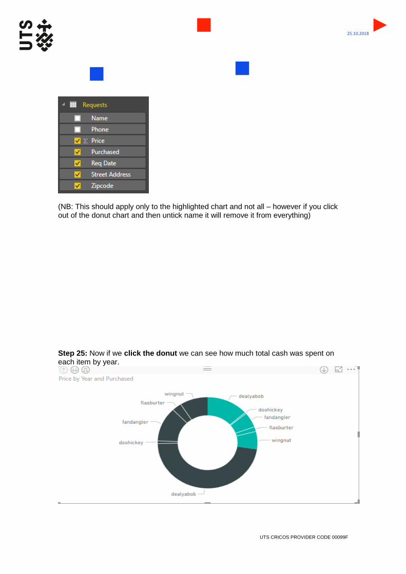
(NB: This should apply only to the highlighted chart and not all – however if you click out of the donut chart and then untick name it will remove it from everything) Step 25: Now if we click the donut we can see how much total cash was spent on each item by year.

UTS CRICOS PROVIDER CODE 00099F
25.10.2018
This is a total sales breakdown divided into 2014 and 2015 sales. But what if I wanted to know how much my widgets sold overall? What would I do? Step 26: That’s right – remove req date as well. Now we have this:
NB: If this doesn’t work untick street address and zipcode too and it should work then Step 27: Click on dealyabob and it will isolate itself – it will also isolate those orders on our original table

UTS CRICOS PROVIDER CODE 00099F
25.10.2018
Step 28 –Whilst still selecting the donut go to the format (paint roller) option on the right under the visualisation icons
Step 29 – then choose title and open up the menu for Title using the arrow. Using the title text option rename the graph ‘Breakdown of Total Revenue’
Voila!

UTS CRICOS PROVIDER CODE 00099F
25.10.2018
Step 30 – Let’s leave that on our dashboard and add another thing. How about we get a figure for the total amount of money we made selling our widgets? Click in the blank space on our dashboard to unselect all current visualisations. Then, click just price
Step 31 – Now we have a bar chart/histograph of the total amount of money we’ve made selling widgets.

UTS CRICOS PROVIDER CODE 00099F
25.10.2018
Step 32 – This is cool but we might like to know the exact number. To do this click the format icon again.
Step 33: Go down to data labels and turn them on
Step 34: We can also change the data colour if we’d like to while we’re here
I’ll choose salmon coloured. Voila

UTS CRICOS PROVIDER CODE 00099F
25.10.2018
Step 35: Use title to rename it Total Revenue

UTS CRICOS PROVIDER CODE 00099F
25.10.2018
Step 36: If you click request date to split it into two years (you will lose any colour changes you’ve made sadly)
Step 37: Use the format> title option again to change the title to Revenue by year

UTS CRICOS PROVIDER CODE 00099F
25.10.2018
Step 38: Click out on the white space of the dashboard and choose a map viz (middle of the farmost right column. There is a blue ‘ArcGIS map’ option on the bottom right that will not work unless you have ArcGIS)
Here it is as a blank
Step 39 – Now click on zipcode and purchased
Here are all the places people ordered widgets from. Cool!
UTS CRICOS PROVIDER CODE 00099F
25.10.2018
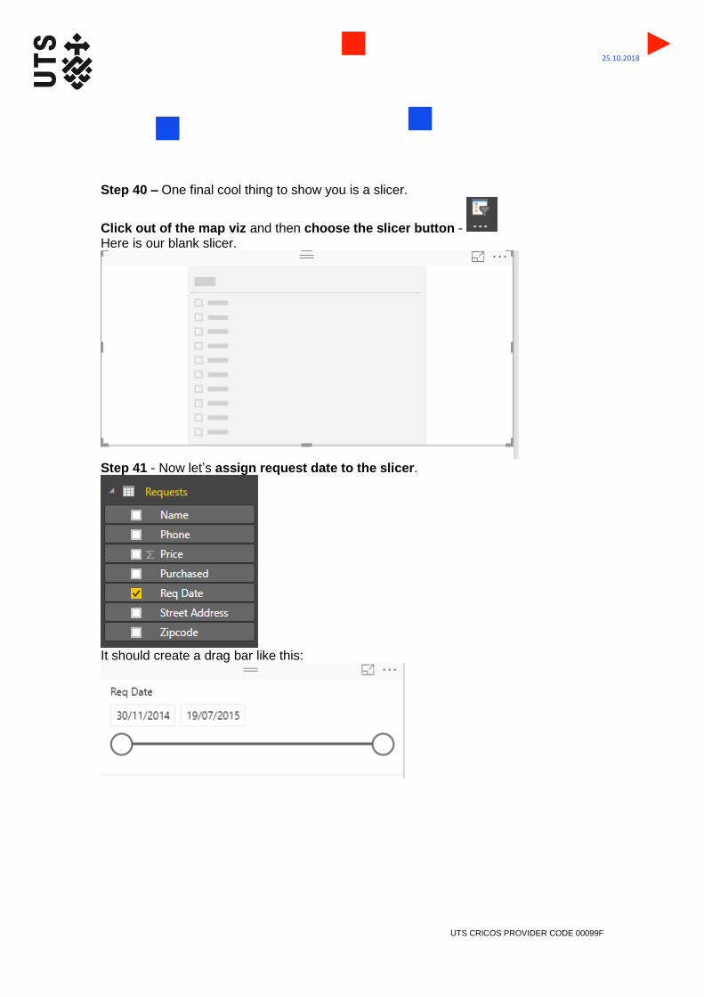
Step 40 – One final cool thing to show you is a slicer.
Click out of the map viz and then choose the slicer button - Here is our blank slicer.
Step 41 - Now let’s assign request date to the slicer.
It should create a drag bar like this:

UTS CRICOS PROVIDER CODE 00099F
25.10.2018
Step 42 – Lets make one more blank slicer. To do this click out in the white space on the dashboard and hit the slicer icon again. Then click on purchased from the right of screen.
You should see this:
Step 43: Using the drag bars around the images and also the click grab function on the windows, resize them and move them around so that every thing looks nice and in proportion (in this example I’ve moved my slicers to the top left) See how we are building a dashboard?

UTS CRICOS PROVIDER CODE 00099F
25.10.2018
Step 44: Now lets slice by date using the drag bar
Step 45: Or slice by product using the product table. eg: Doohickey
UTS CRICOS PROVIDER CODE 00099F
25.10.2018
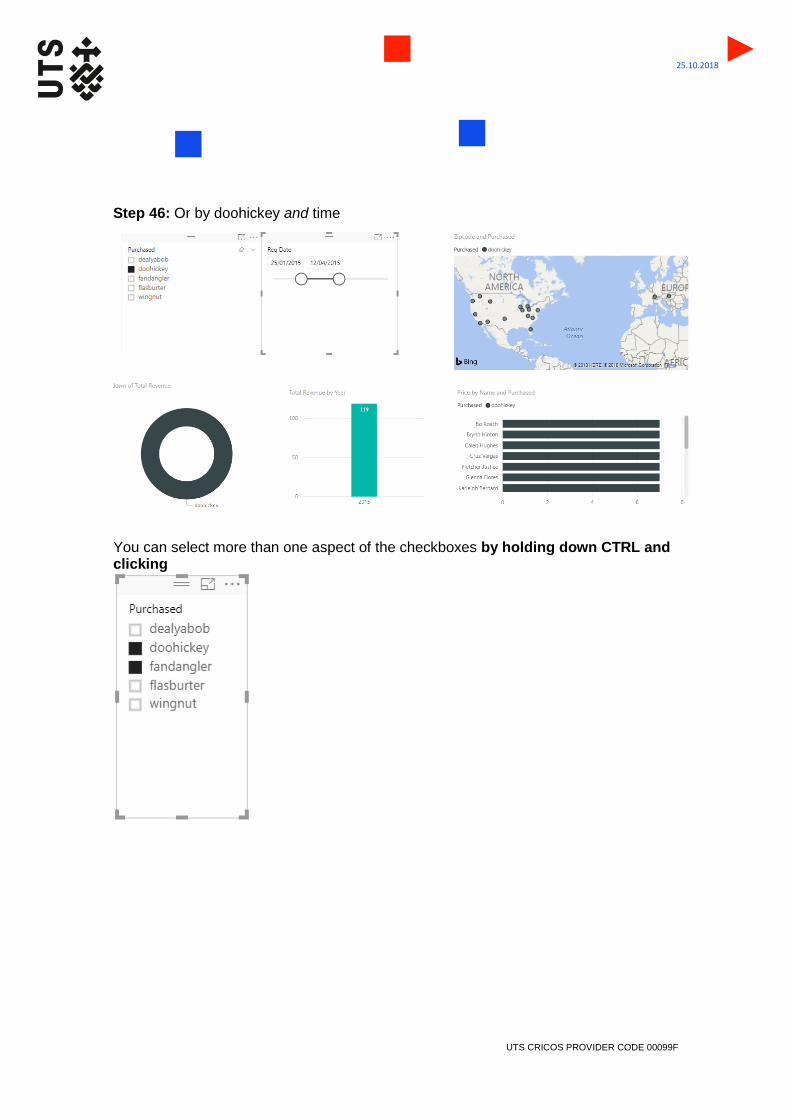
Step 46: Or by doohickey and time
You can select more than one aspect of the checkboxes by holding down CTRL and clicking
UTS CRICOS PROVIDER CODE 00099F
25.10.2018
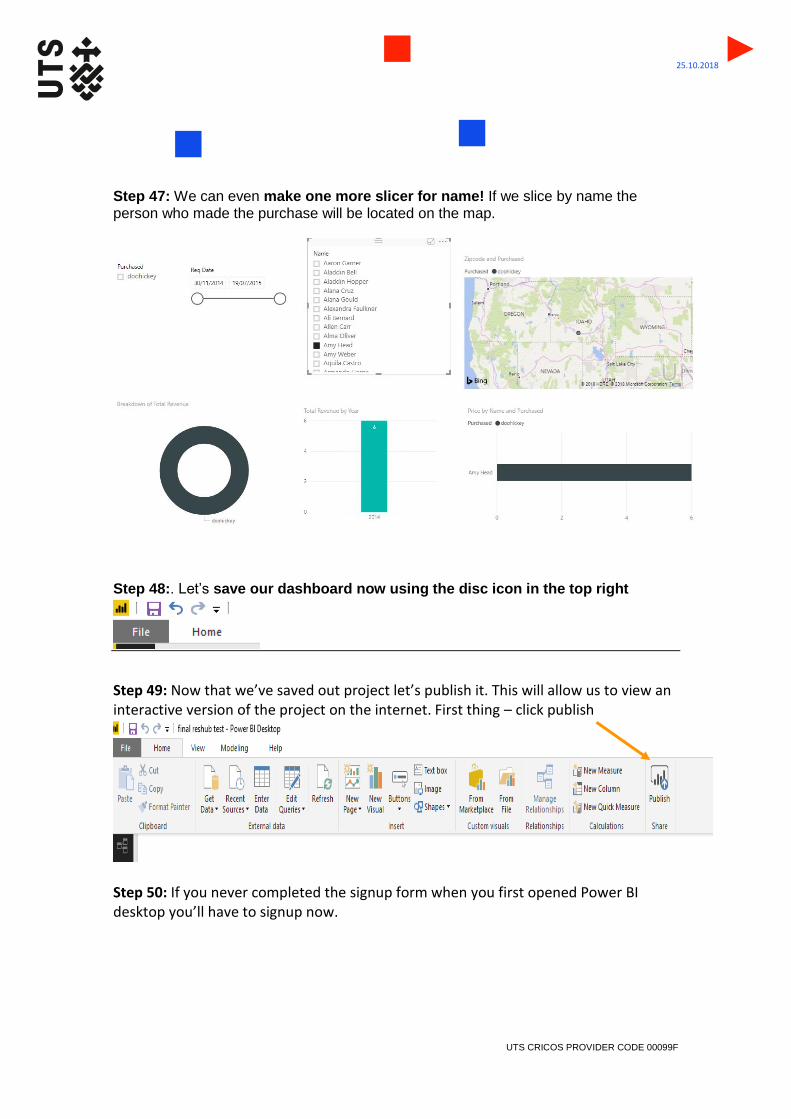
Step 47: We can even make one more slicer for name! If we slice by name the person who made the purchase will be located on the map.
Step 48:. Let’s save our dashboard now using the disc icon in the top right
Step 49: Now that we’ve saved out project let’s publish it. This will allow us to view an interactive version of the project on the internet. First thing – click publish
Step 50: If you never completed the signup form when you first opened Power BI desktop you’ll have to signup now.

UTS CRICOS PROVIDER CODE 00099F
25.10.2018
Pop in your UTS email
Step 51: Once you have signed up you should see an option called Publish to Power BI - choose My Workspace (this is the online version of Power BI)
It will then get publishing…
UTS CRICOS PROVIDER CODE 00099F
25.10.2018
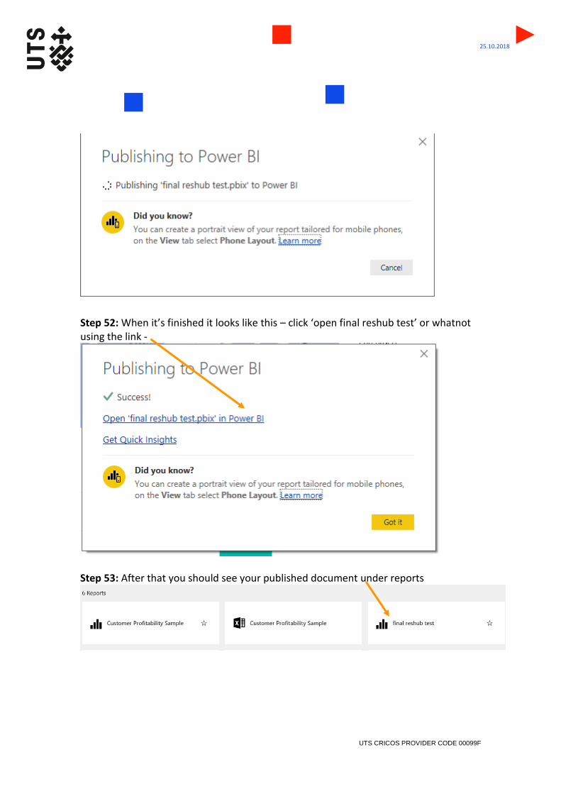
Step 52: When it’s finished it looks like this – click ‘open final reshub test’ or whatnot using the link -
Step 53: After that you should see your published document under reports

UTS CRICOS PROVIDER CODE 00099F
25.10.2018
Clicking on it brings you this loveliness
The buttons are live!

UTS CRICOS PROVIDER CODE 00099F
25.10.2018
Step 54: The maximise button will let it go full-screen
If you ever want to go straight back to this web based version of Power BI you can find it via the start window. It looks like this