using correlation to describe relationships between two quantitative variable
DESCRIPTION
Using Correlation to Describe Relationships between two Quantitative Variable. Pearson’s Correlation Coefficient. When we describe the association between two variables, we can use a scatterplot to help our description. - PowerPoint PPT PresentationTRANSCRIPT


Pearson’s Correlation CoefficientWhen we describe the association between two
variables, we can use a scatterplot to help our description.
However, words like strong, moderate, and weak to determine the strength of the relationship can be very subjective. (Remember the saying. “Beauty is in the eye of the beholder”)
So statisticians have another tool, a numeric measure, to help us clarify and be somewhat consistent when we describe these relationships.

What it MeasuresIn the lesson on scatterplots, we indicated
that a tighter oval around the data points indicated a stronger relationship. In some sense this must mean that the closer the points are to each other, the stronger the relationship.
Pearson’s Correlation Coefficient helps us to numerically measure this “spread” of our data.

So how does it Measure this “spread”?We know that in describing a distribution
that we think about both the “center” of the distribution, and the “spread” of the distribution.
When looking at the relationship between two variables, we need to consider both the “center” and the “spread” of each, and how the combination of these two distributions interact.

Properties of r“r” is unitless, which allows us to change
scales or calculate the relationship between two variables that are not the same units
“r” measures the linear relationship between two quantitative variables.
-1 ≤ r ≤ 1The sign of “r” indicates the direction of
the relationshipThe closer “r” is to either +1 or -1, the
stronger the relationship.The closer “r” is to 0, the weaker the
relationship.

Numeric GuidelinesPhysical Sciences
“Hard Sciences” ≥ .80---Strong
.50 --.80—Moderate≤ .50—Weak
Social Sciences“Soft Sciences”≥ .50---Strong
.30 --.50—Moderate≤ .30—Weak
Remember that these numbers are just guidelines. Each set of data is different and the context for the data must be considered.

The Formula
yx syy
sxx
n 11
Notice that the formula is adding terms together (we’ll talk about what those terms are shortly) and then dividing that sum by 1 less than the number of data points we have. So, it appears that we are looking for “an average” of sorts.

The Formula (cont.)
yx syy
sxx
nr
11
Now the terms that we are adding together are the product of z-scores. Remember that a z-score is the number of standard deviations a piece of data is from the mean of the distribution.So each term is the product of the z-scores in each direction (x and y) for each point. So, how can we calculate this value?

Back to the Burgers Fat Calories
19 410
31 580
34 590
35 570
39 640
39 680
43 660C
alor
ies
400
450
500
550
600
650
700
Fat18 20 22 24 26 28 30 32 34 36 38 40 42 44
Burgers Scatter Plot

Calculating “r”
yx syy
sxx
n 11
•We can calculate “r” using this formula and the lists.L1X (amount of fat)L2Y (calories)L3Zx (x-xbar)/sx
L4Zy (y-ybar)/sy
L5L3*L4
•Once these lists are created, find the sum of L5 and then divide by n-1

Another formula for “r”
yx syy
sxx
n 11
yyxxssn yx
)1(
1
yyxxyyxxssn nnyx
...)1(
111
Starting with our original formulaNow, the standard deviation of our x-values and the y-values are constants once our data has been collected, so they will be the same for each term in the summation.This means that we can factor those out of the sum leaving:Now, expanding the summation gives us:

Another formula for “r” (cont.) yyxxyyxx
ssn nnyx
...)1(
111
yxyxyxyxyxyxyxyxssn nnnnyx
...)1(
11111
yxnyxxyyxssn iiiiyx
)1(
1
Now, using the distributive property to multiply the binomials in each term gives:
Then, collapsing the sums gives:

Another formula for “r” (cont.)
yxnyxnyxnyxssn iiyx
)1(
1
yxnyxxyyxssn iiiiyx
)1(
1
yx
iiii
yx ssnyxnyxyxnyx
ssn 1)1(1
Now, the ∑xi and the ∑yi can be written as nxbar and nybar
But two of the last three terms cancel each other out, so we are left with:
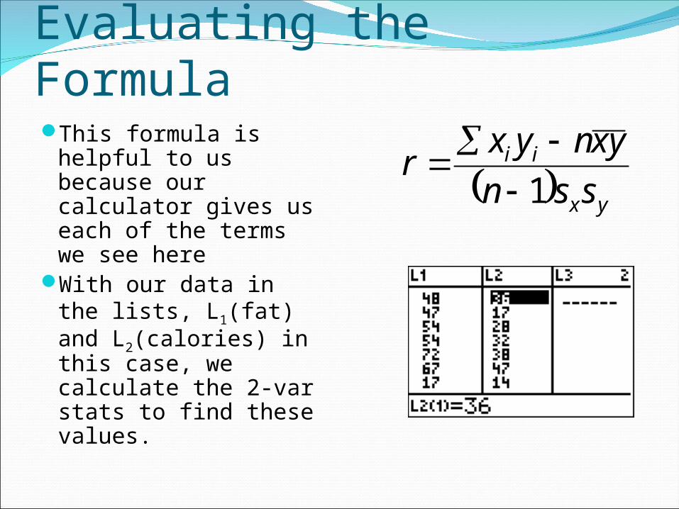
Evaluating the FormulaThis formula is
helpful to us because our calculator gives us each of the terms we see here
With our data in the lists, L1(fat) and L2(calories) in this case, we calculate the 2-var stats to find these values.
yx
ii
ssnyxnyxr
1

Calculating “r”Now, calculate the 2-
var stats for L1, L2STAT
CALC
This gives us all the values we need to calculate “r”
We can then describe numerically the relationship between amount of fat and calories in a burger.

Calculating “r”
)8146.89)(8042.7(17)590)(2857.34)(7(145640
r
yx
ii
ssnyxnyxr
1
5866.4205059.4040
r
r= .9606
Now, substituting the values for each of the variables we find that the correlation coefficient, r=.96, indicating a strong, linear correlation in which as the amount of fat in the burger increases, so does the calories

Outliers??What about the point
we determined was a long way away from the rest of our data----our possible “outlier”
Since this burger appears to be somewhat different than the rest of our data, it would be wise to report the correlation both with and without it.
Cal
orie
s
400
450
500
550
600
650
700
Fat18 20 22 24 26 28 30 32 34 36 38 40 42 44
Burgers Scatter Plot
•If we calculate the correlation coefficient without this piece of data, we find that it drops to .8367. This change indicates that this piece of data is unusual

And yet another way to find “r”In the next section, we will look at even
another way to find the value of Pearson’s correlation coefficient.
For now, either method used in this lesson is appropriate.

Additional ResourcesThe Practice of Statistics—YMM
Pg 128 – 136The Practice of Statistics—YMS
Pg 140-149The Basic Practice of Statistics—Moore
Pg 88-94