universal audit tool impact evaluation residential - … audit tool impact evaluation –...
TRANSCRIPT

Universal Audit Tool Impact Evaluation – Residential California Public Utilities Commission CALMAC ID: CPU0160.01
Date: March 31, 2017 CALMAC Study ID xxxxxx-xx

DNV GL – www.dnvgl.com March 31, 2017 Page 2
LEGAL NOTICE
This report was prepared as an account of work sponsored by the California Public Utilities Commission. It
does not necessarily represent the views of the Commission or any of its employees except to the extent, if
any, that it has formally been approved by the Commission at a public meeting. For information regarding
any such action, communicate directly with the Commission at 505 Van Ness Avenue, San Francisco,
California 94102. Neither the Commission nor the State of California, nor any officer, employee, or any of its
contractors or subcontractors makes any warranty, express or implied, or assumes any legal liability
whatsoever for the contents of this document.
DNV GL – www.dnvgl.com March 31, 2017 Page 3
1 EXECUTIVE SUMMARY ..................................................................................................... 7
1.1 Introduction 7
1.2 Purpose of the evaluation 7
1.3 Approach 9 1.3.1 Methods 9
1.4 Findings 9 1.4.1 At a glance 10
1.5 Recommendations 12
2 INTRODUCTION ............................................................................................................ 13
2.1 Background 13
2.2 Evaluation objectives 14 2.2.1 Description and status of the tool 15
3 IMPACT EVALUATION .................................................................................................... 16
3.1 Overall results 20
3.2 Data sources used 21 3.2.1 Energy consumption data 21 3.2.2 Customer information data 22 3.2.3 Weather data 22 3.2.4 Tracking data 22
3.3 Methodology 22 3.3.1 Matching 22 3.3.2 Energy consumption and impact modeling 25
3.4 Impact evaluation results 27 3.4.1 Matching framework 27 3.4.2 Matching data 28 3.4.3 Engagement level 29 3.4.4 Matching results 29 3.4.5 Savings estimates 32 3.4.6 Depth of engagement 34 3.4.7 Impact of length of engagement 36 3.4.8 Downstream rebate joint savings 38 3.4.9 UAT HER Overlap 39
4 PROCESS EVALUATION .................................................................................................. 40
4.1 Overall results 40
4.2 Survey Methodology 41 4.2.1 Survey mode and design 41 4.2.2 Sample disposition 42 4.2.3 Sample characterization 43
4.3 Survey Findings 43 4.3.1 Tool recall 44 4.3.2 Users who recall using tool 45 4.3.3 Channel through which users learned about the tool 45 4.3.4 Motivators of participation 46 4.3.5 Depth of engagement 47 4.3.6 Tool influence 51
DNV GL – www.dnvgl.com March 31, 2017 Page 4
4.3.7 Tool – Rating 55 4.3.8 Non-users of the tool 56 4.3.9 Customer profile – by tool use and engagement level 57
5 CONCLUSIONS ............................................................................................................. 60
5.1 Areas for future research 62
APPENDIX. A SCE UAT EVALUABILITY ASSESSMENT ................................................................... A-1
APPENDIX. B RECOMMENDATIONS ........................................................................................... B-1
APPENDIX. C MATCHING PROCESS ........................................................................................... C-3
APPENDIX. D CLIMATE ZONES ................................................................................................. D-6
APPENDIX. E ENERGY CONSUMPTION MODEL ............................................................................ E-7
APPENDIX. F SURVEY SAMPLE WEIGHTS .................................................................................. F-1
APPENDIX. G SURVEYS ........................................................................................................... G-1
List of figures Figure 1: Key findings ....................................................................................................................... 9 Figure 2: UAT Participation – PG&E ................................................................................................... 17 Figure 3: UAT participation - SDG&E ................................................................................................. 18 Figure 4: UAT participation - SCG ..................................................................................................... 19 Figure 5: Region of common support for matching .............................................................................. 24 Figure 6: Residential UAT ratio of comparison-to-opt-in households used in matching by IOU ................... 28 Figure 7: Distribution of electricity consumption of matched comparison and opt-in households ................ 30 Figure 8: Distribution of gas consumption of matched comparison and opt-in households ........................ 31 Figure 9: Residential total electric savings per household by engagement level and IOU .......................... 35 Figure 10: Residential total gas savings per household by engagement level and IOU ............................. 36 Figure 11 provides the estimated savings for electricity and Figure 12 provides the same for gas for each utility. The 2014 monthly estimates represent savings for customers who have engaged prior to each given month. Only by January 2015 do the results reflect the savings estimates of the full group of 2014 customers. Figure 11: Average monthly residential electric savings per household ................................. 37 Figure 12: Average monthly residential gas savings per household ....................................................... 37 Figure 13: Tool welcome screen ........................................................................................................ 44 Figure 14: Tool recall by IOU ............................................................................................................ 44 Figure 15: Tool recall ...................................................................................................................... 45 Figure 16: Channel through which users learned about the tool ............................................................ 46 Figure 17: Motivators of tool use ...................................................................................................... 46 Figure 18: Frequency of use ............................................................................................................. 47 Figure 19: Reasons why tool was not used as often ............................................................................. 48 Figure 20: Duration of visit .............................................................................................................. 49 Figure 21: Ease of finding information ............................................................................................... 49 Figure 22: Survey completion on the tool ........................................................................................... 50 Figure 23: Action plan creation ......................................................................................................... 51 Figure 24: Action plan updates ......................................................................................................... 51 Figure 25: Tool influence on energy saving habits and energy efficient purchases ................................... 52 Figure 26: Tool influence on participation in other IOU programs .......................................................... 53 Figure 27: Tool influence on bill ........................................................................................................ 54 Figure 28: Tool influence on seasonal bill reductions ........................................................................... 54 Figure 29: Usefulness of UAT features ............................................................................................... 55 Figure 30: Satisfaction and likelihood to recommend UAT .................................................................... 56 Figure 31. Reasons why non-users who knew about the tool did not use it ............................................. 57

DNV GL – www.dnvgl.com March 31, 2017 Page 5
Figure 32: Region of common support for matching ........................................................................... C-5 Figure 33: Building climate zones .................................................................................................... D-6
List of tables Table 1: Key research questions ......................................................................................................... 8 Table 2: Results at a glance ............................................................................................................. 11 Table 3: Key research questions ....................................................................................................... 14 Table 4: UAT participation by IOU ..................................................................................................... 15 Table 5: Total residential electric savings by IOU ................................................................................ 20 Table 6: Total residential gas savings by IOU ..................................................................................... 20 Table 7: Residential electric savings per household by IOU................................................................... 20 Table 8: Residential gas savings per household by IOU ........................................................................ 21 Table 9: Engagement by IOU ........................................................................................................... 21 Table 10: Residential UAT unique participant counts by IOU with billing data for study period .................. 27 Table 11: Residential UAT 2014 participant numbers used in matching .................................................. 28 Table 12: Climate zone groups for stratified matching ......................................................................... 29 Table 13: Residential UAT engagement levels and customer numbers by IOU ......................................... 29 Table 14: Statistical test of balance for matched electricity data ........................................................... 32 Table 15: Statistical test of balance for matched gas data .................................................................... 32 Table 16: Total residential electric savings by IOU .............................................................................. 32 Table 17: Total residential gas savings by IOU.................................................................................... 33 Table 18: Residential electric savings per household by IOU ................................................................. 33 Table 19: Residential gas savings per household by IOU ...................................................................... 33 Table 20: Engagement by IOU .......................................................................................................... 33 Table 21: Percent residential electric savings by engagement and IOU .................................................. 34 Table 22: Percent residential gas savings by engagement and IOU ....................................................... 35 Table 23: PG&E HER Program Participants in PG&E’s UAT Program ........................................................ 39 Table 24: SDG&E HER Program Participants in SDG&E’s UAT Program ................................................... 39 Table 25: Survey disposition ............................................................................................................ 42 Table 26: Response rates by level of consumption and climate zone ...................................................... 42 Table 27: Response rates by users and non-users ............................................................................... 42 Table 28: Sample characterization .................................................................................................... 43 Table 29: Customer profile - by tool use and engagement level ............................................................ 58 Table 30: Summary of SCE customers using Home Energy Advisor and Business Energy Advisor ............. A-1 Table 31: Summary of unavailable SCE UAT data............................................................................... A-2
DNV GL – www.dnvgl.com March 31, 2017 Page 6
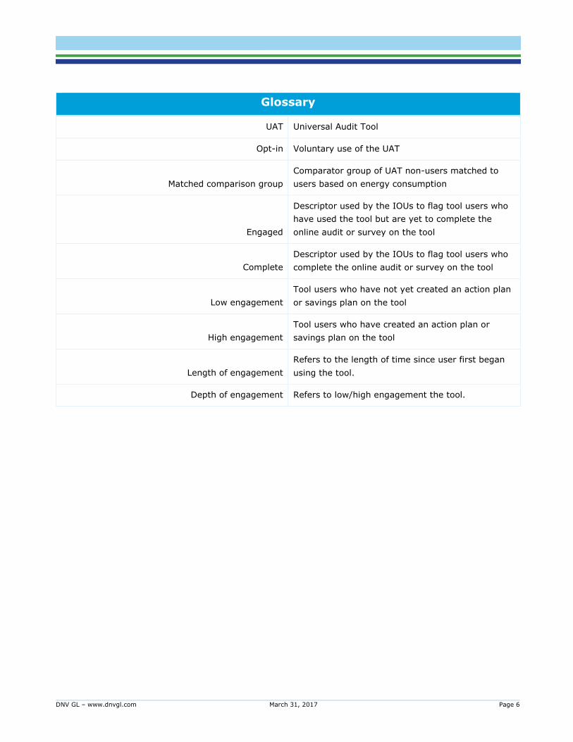
Glossary
UAT Universal Audit Tool
Opt-in Voluntary use of the UAT
Matched comparison group
Comparator group of UAT non-users matched to
users based on energy consumption
Engaged
Descriptor used by the IOUs to flag tool users who
have used the tool but are yet to complete the
online audit or survey on the tool
Complete
Descriptor used by the IOUs to flag tool users who
complete the online audit or survey on the tool
Low engagement
Tool users who have not yet created an action plan
or savings plan on the tool
High engagement
Tool users who have created an action plan or
savings plan on the tool
Length of engagement
Refers to the length of time since user first began
using the tool.
Depth of engagement Refers to low/high engagement the tool.

DNV GL – www.dnvgl.com March 31, 2017 Page 7
This section contains a summary of more detailed findings found in this report.
1.1 Introduction
This report contains findings from DNV GL’s evaluation of the Universal Audit Tool (UAT). The UAT is offered
to customers by California’s investor owned utilities (IOUs) branded under different names, such as Home
Energy Checkup by Pacific Gas and Electric Company, My Energy Survey by San Diego Gas and Electric
Company, and Ways to Save by Southern California Gas Company, but the underlying tool is broadly similar
across the IOUs. It provides residential customers with advice on energy efficiency, insight into areas of high
energy use, and tips and suggestions for saving both energy and money based on responses to an online
survey regarding household appliances, occupancy, and other dwelling characteristics. There is an analogous
version of the tool for business customers. This report focuses on the evaluation of the UAT for residential
customers.1 This report presents findings based on an evaluation of participants who first used the tool in
2014 and tracks the impact of tool use through 2014 and 2015.
1.2 Purpose of the evaluation
The program theory underlying the UAT is that customer engagement with the tool will lead to savings and
that increased engagement will translate to deeper savings. The researchable questions this evaluation
seeks to answer include those shown in Table 1, next.
1 The findings presented here pertain to the tool for residential customers of PG&E, SCG, and SDG&E. At the time of this evaluation, SCE had not
rolled out their tool widely like the other IOUs and are hence not included in this impact evaluation. See 5.1APPENDIX. A for further detail.
DNV GL – www.dnvgl.com March 31, 2017 Page 8
Table 1: Key research questions
Key Research Questions
Do the online tools capture data that can support the impact evaluation? Do the
available data provide qualitative/anecdotal evidence that can provide insight
regarding the impact results?
What are the energy savings, in kWh and therms, from residential participants
when compared to the matched-group?
What are the energy savings, in kWh and therms, from engaged vs completed
participants when compared to the matched-group?
Are there significantly different energy savings from those users that have multi-
year engagements?
Does AMI data facilitate a more accurate matched comparison group?
How does the participant group differ demographically from the general population?
How does the high engagement group differ demographically from the low
engagement group?
Do the online tools sustain online interaction over time? i.e. How many repeat visits
were made by customers? How many visits were required to complete the survey?
How often did customers update their energy plan?
Do the online tools increase participation in other IOU rebate or upstream
programs?
What marketing efforts have IOUs deployed to drive engagement to completions?
How do these efforts correlate to the levels of success observed?
DNV GL – www.dnvgl.com March 31, 2017 Page 9
1.3 Approach
The evaluation answers the above questions with an impact evaluation based on energy consumption data,
a process evaluation that includes a customer survey among tool users and non-users, and review of
information gathered from IOU program staff2.
1.3.1 Methods
We employ propensity-score matching (PSM) method to construct a comparison group for the purposes of
generating a counterfactual for the impact evaluation. We establish a group of households that are as close
as possible to the group of tool users – the “treatment” group - before any interaction with the tool. We use
a pooled fixed-effects modeling approach to estimate the potential savings realized by the treatment group
due to tool use. The pooled model combines all IOU participants and time intervals into a single regression
model specification. The fixed-effects aspect of the model will control for effects that are constant across
time within a household and effects that are constant across all households during a specific time period.
While the impact evaluation quantifies potential savings attributable to the tool, the process evaluation
employs primary research among users/participants to uncover the customer choices and behaviors that
lead to potential savings. We also include non-participants in this research. The survey gathers self reported
data on tool use, energy consumption behavior, and attitudes that reveal both the motivation to participate
and the variability in participant behavior. Information gathered from IOU program staff such as their
marketing strategy and changes made to the tool provide important context to the findings from this
evaluation.
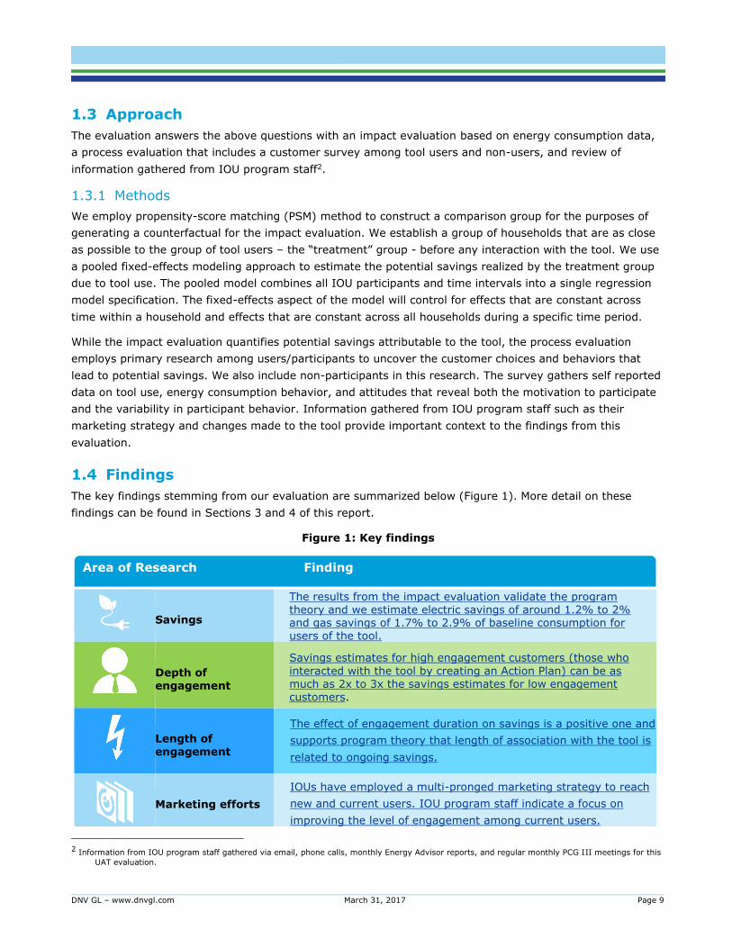
1.4 Findings
The key findings stemming from our evaluation are summarized below (Figure 1). More detail on these
findings can be found in Sections 3 and 4 of this report.
Figure 1: Key findings
2 Information from IOU program staff gathered via email, phone calls, monthly Energy Advisor reports, and regular monthly PCG III meetings for this
UAT evaluation.
Area of Research Finding
Savings
The results from the impact evaluation validate the program theory and we estimate electric savings of around 1.2% to 2% and gas savings of 1.7% to 2.9% of baseline consumption for users of the tool.
Depth of engagement
Savings estimates for high engagement customers (those who
interacted with the tool by creating an Action Plan) can be as much as 2x to 3x the savings estimates for low engagement customers.
Length of engagement
The effect of engagement duration on savings is a positive one and
supports program theory that length of association with the tool is
related to ongoing savings.
Marketing efforts
IOUs have employed a multi-pronged marketing strategy to reach
new and current users. IOU program staff indicate a focus on
improving the level of engagement among current users.
DNV GL – www.dnvgl.com March 31, 2017 Page 10
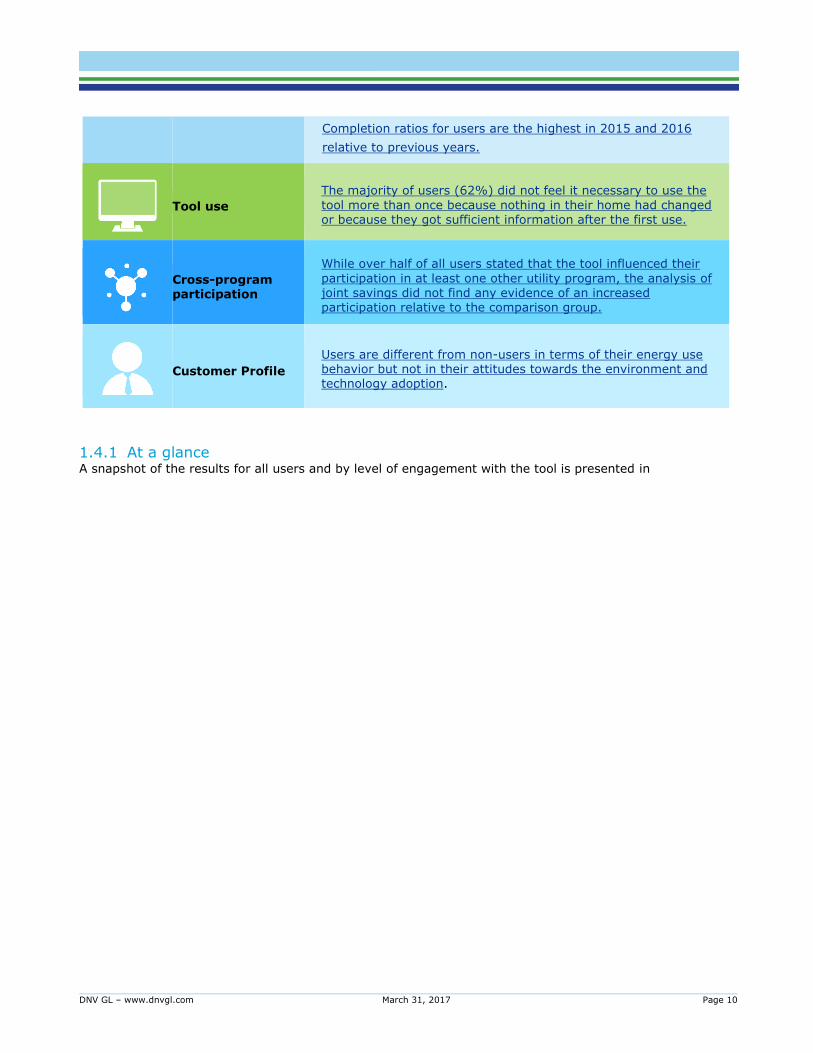
1.4.1 At a glance A snapshot of the results for all users and by level of engagement with the tool is presented in
Completion ratios for users are the highest in 2015 and 2016
relative to previous years.
Tool use
The majority of users (62%) did not feel it necessary to use the
tool more than once because nothing in their home had changed or because they got sufficient information after the first use.
Cross-program participation
While over half of all users stated that the tool influenced their
participation in at least one other utility program, the analysis of joint savings did not find any evidence of an increased participation relative to the comparison group.
Customer Profile
Users are different from non-users in terms of their energy use behavior but not in their attitudes towards the environment and technology adoption.
DNV GL – www.dnvgl.com March 31, 2017 Page 11
Table 2. The table is organized to present a picture of baseline use, estimated savings in total and by
household for both fuels, and selected indicators of depth of engagement with UAT from premise level
tracking data, aggregated monthly web metrics, and survey responses. There are significant savings for
users of the UAT across all IOUs. Savings range from 1% to 4% for electricity and 1% to 3% for gas.
SDG&E has the highest savings per household of the three IOUs for electricity and gas.
These differences could be due to the presence of more HER participants among PG&E’s UAT users. The
overlap in behavioral and conservation messaging may mean that prior HER involvement depresses UAT
savings. If we assume that both HER and UAT attempt to motivate customer action, then the prior presence
of HER participants would mean those savings are less available to the UAT program. The greater prevalence
of HER involvement among PG&E UAT participants is a possible explanation for why PG&E UAT participants
appear to save less than SDG&E. Engagement metrics indicate that SDG&E’s UAT users had a higher
frequency of tool use and also a higher creation rate for action plans.
Additionally, the spread of UAT users across the three main climate zones varies among utilities in notable
ways. As summarized in the UAT participation maps in Section 3, SDG&E's participation rates appear to be
higher inland whereas PG&E's participation rates appear to be spread out evenly throughout both inland and
mild/coastal climate zones. The relatively higher participation rates of SDG&E’s UAT users in the inland
climate zone, where higher cooling loads offer more savings opportunities, could also explain the greater
savings for SDG&E.

DNV GL – www.dnvgl.com March 31, 2017 Page 12
Table 2: Results at a glance
SDG&E SCG PG&E
Users Low High Users Low High Users Low High
N 9,989 8,165 1,824 31,611 29,679 1,932 31,185 26,875 4,310
Average annual baseline use (kWh)
7,706 7,619 8,079
N/A
7,637 7,587 7,945
Average annual baseline (therm)
283 282 288 365 363 390 371 370 375
HER in UAT 27% N/A 45%
Savings3
Electric (% savings)
1.8% 1.3% 3.6% N/A 1.2% 1.0% 2.4%
Gas (% savings)
2.6% 2.4% 3.3% 1.8% 1.8% 1.5% 1.5% 1.2% 3.0%
Electric (total kWh)
1,980,102 1,185,172 787,201 N/A 3,895,238 2,798,020 1,111,21
5
Gas (total therm)
75,056 56,717 18,453 301,939 284,005 16,589 192,820 138,967 53,864
Electric (2015 kWh savings per household)
126 93 271 N/A 86 70 185
Gas (2015 therm savings per household)
7 6 10 5 4 3 4 3 10
Engagement - Tracking Data
Created action plan
18% 6% 14%
Average number of visits per household
5 2 18 3 2 18 4 3 5
Engagement - Monthly Web Metrics
Return visit rate (RVR)
65% 19% 20%
Time on page - minutes
3.4 4.0 2.4
Engagement – Evaluation Survey
UAT recall 59% 56% 69% 29% 28% 34% 30% 29% 39%
Frequency of UAT use - at least once month
51% 43% 18%
3 Section 3.3.2.2 provides detail on formulas used to compute savings estimates
DNV GL – www.dnvgl.com March 31, 2017 Page 13
1.5 Recommendations
The key recommendations from our evaluation are summarized below. Further detail on these
recommendations can be found in Section 5 of this report.
Prioritize converting current users to a higher level of engagement. Survey and impact results in
combination indicate increased savings from moving already acquired users up into higher levels of
engagement is likely to be greater than the yield from new users with high acquisition costs.
Prioritize electronic methods of promotion and outreach for this web-based tool. When asked about
the channel where they first learned of the tool, the majority of users indicated that they followed a
link/banner ad from their utility website or received an email with a link to the tool.
Message the value of repeat visits. Messaging, possibly derived through self-learning algorithms
underlying the tool, which underscores the value of repeat visits/the next visit – such as continued,
customized and valuable information that encourage the customers to continue to engage with the
tool – will be more effective.
Target customer testimonials of successful savings through engagement to low engaged customers.
Testimonials segmented by baseline energy consumption, daily use pattern and other relevant
dimensions will provide empirical evidence of tool efficacy that they can trust and that will spur them
to action.

DNV GL – www.dnvgl.com March 31, 2017 Page 14
2.1 Background
This report presents findings from DNV GL’s evaluation of the Universal Audit Tool, referred to as UAT or
tool, which is funded by the California Public Utilities Commission (CPUC) and offered by investor-owned
utilities (IOUs). The tool provides a platform for educating and promoting residential and small business
customer engagement with their energy consumption that leads to lasting behavior change. The UAT is
dynamic; the more information the customer provides, the more customized the recommendations become.
Customers are encouraged to set up plans, update the tool, monitor changes, and then gain more
information about ways to save energy in a recursive loop.
Pacific Gas and Electric Company (PG&E), Southern California Edison (SCE), San Diego Gas and Electric
Company (SDG&E), and Southern California Gas Company (SCG) provide mailed comparative energy usage
reports to certain customers. They also provide comparative energy use feedback reports through the UAT,
which is accessible on their respective websites. Customers gain access to these UAT reports once they sign
up for online services through My Energy or Energy Advisor web portals.
These online feedback reports provide information to customers regarding how they are using energy
compared with their neighbors and with more efficient homes of similar size. Customers can also follow links
on the site that lead them to information on how they can take action to save energy and explore scenarios
with different rates that will indicate how much they could save if on a different rate. Customers can
personalize their experience by completing a home energy survey that results in an analysis of where
energy is consumed within their home. A key difference for the online comparative report versus the mailed

DNV GL – www.dnvgl.com March 31, 2017 Page 15
report is that the customers will access the online report voluntarily versus the experimental design
approach where customers would have to opt out of receiving them in the mail.4
2.2 Evaluation objectives
The key research questions and the corresponding evaluation types are summarized below (Table 3).
Table 3: Key research questions
Key Research Question Evaluation Types
Do the online tools capture data that can support the impact evaluation?
Do the available data provide qualitative/anecdotal evidence that can
provide insight regarding the impact results?
Data review
What are the energy savings, in kWh and therms, from residential
participants when compared to the matched-group?
Impact Evaluation
What are the energy savings, in kWh and therms, from engaged vs
completed participants when compared to the matched-group?
Are there significantly different energy savings from those users that
have multi-year engagements?
Does AMI data facilitate a more accurate matched comparison group?
How does the participant group differ demographically from the general
population?
Process Evaluation
How does the high engagement group differ demographically from the
low engagement group?
Do the online tools sustain online interaction over time? i.e. How many
repeat visits were made by customers? How many visits were required to
complete the survey? How often did customers update their energy plan?
Do the online tools increase participation in other IOU rebate or upstream
programs?
What marketing efforts have IOUs deployed to drive engagement to
completions? How do these efforts correlate to the levels of success
observed?
4 We discuss the HER-UAT overlap and the implications for UAT savings in Section 3.4.9.
DNV GL – www.dnvgl.com March 31, 2017 Page 16
2.2.1 Description and status of the tool
The UAT is offered to customers by IOUs branded under different names, such as Home Energy Checkup by
PG&E, My Energy Survey by SDG&E, and Ways to Save by SCG, but the underlying tool is broadly similar
across the four IOUs5. It provides residential customers with advice on energy efficiency, insight into areas
of high energy use, and tips and suggestions for saving both energy and money based on responses to an
online audit or survey regarding household appliances, occupancy, and other dwelling characteristics.
There are some differences among the IOUs’ tools. Some require logging in and others do not, but all of
them allow customers to create an action plan or energy savings plan and provide estimates of annual
savings that they can expect to see by implementing each recommended energy-saving tip.
Over the years, the IOUs have continued to make changes to improve engagement and use of the tool
through deploying various marketing strategies and adjustments to tool functionalities. The most significant
recent changes to the tool across the IOUs are:
Enabling one-click or single sign-on features to help customers be recognized by the tool if they are
already logged in to their utility account
Integrating the tool with links to other rebates and energy efficiency programs for applicable measures
Improving tips to be more helpful and drive customers to programs
Increasing co-branding with ENERGY STAR®
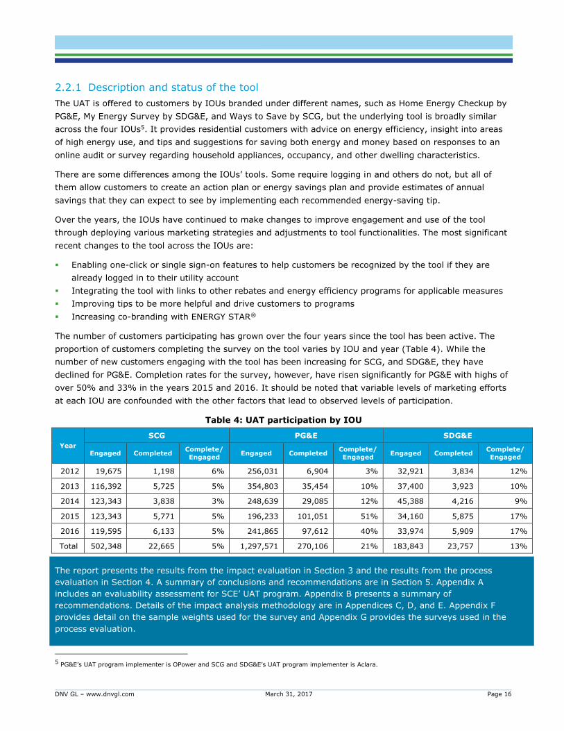
The number of customers participating has grown over the four years since the tool has been active. The
proportion of customers completing the survey on the tool varies by IOU and year (Table 4). While the
number of new customers engaging with the tool has been increasing for SCG, and SDG&E, they have
declined for PG&E. Completion rates for the survey, however, have risen significantly for PG&E with highs of
over 50% and 33% in the years 2015 and 2016. It should be noted that variable levels of marketing efforts
at each IOU are confounded with the other factors that lead to observed levels of participation.
Table 4: UAT participation by IOU
Year
SCG PG&E SDG&E
Engaged Completed Complete/
Engaged Engaged Completed
Complete/
Engaged Engaged Completed
Complete/
Engaged
2012 19,675 1,198 6% 256,031 6,904 3% 32,921 3,834 12%
2013 116,392 5,725 5% 354,803 35,454 10% 37,400 3,923 10%
2014 123,343 3,838 3% 248,639 29,085 12% 45,388 4,216 9%
2015 123,343 5,771 5% 196,233 101,051 51% 34,160 5,875 17%
2016 119,595 6,133 5% 241,865 97,612 40% 33,974 5,909 17%
Total 502,348 22,665 5% 1,297,571 270,106 21% 183,843 23,757 13%
The report presents the results from the impact evaluation in Section 3 and the results from the process
evaluation in Section 4. A summary of conclusions and recommendations are in Section 5. Appendix A
includes an evaluability assessment for SCE’ UAT program. Appendix B presents a summary of
recommendations. Details of the impact analysis methodology are in Appendices C, D, and E. Appendix F
provides detail on the sample weights used for the survey and Appendix G provides the surveys used in the
process evaluation.
5 PG&E’s UAT program implementer is OPower and SCG and SDG&E’s UAT program implementer is Aclara.
DNV GL – www.dnvgl.com March 31, 2017 Page 17
The purpose of the impact evaluation is to assess whether the UAT has a real effect on energy consumption
using data from tool users of San Diego Gas & Electric (SDG&E), Pacific Gas & Electric (PG&E), and Southern
California Gas (SCG).
For the three California IOUs, data from the tool permits the identification of the level of engagement
customers have with the tool. We focus on two levels of engagement in this study. The first level of
engagement captures a more limited interaction with the tool where participants mostly browse the website
and, in some cases, complete surveys (audits) on the tool (possibly picking up information on savings), but
do not take further action. We call this low level of engagement. The second level of engagement is where
participants create an Action Plan based on recommendations they get from the tool. We call this high
engagement level.6
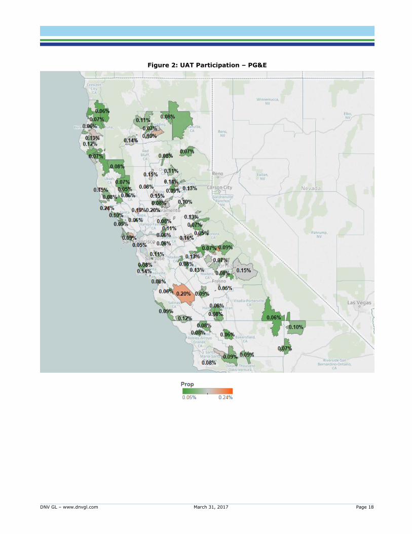
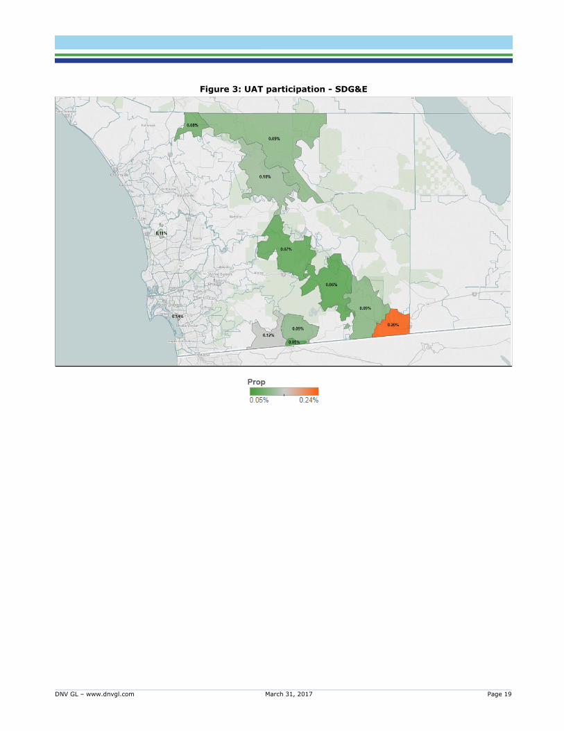
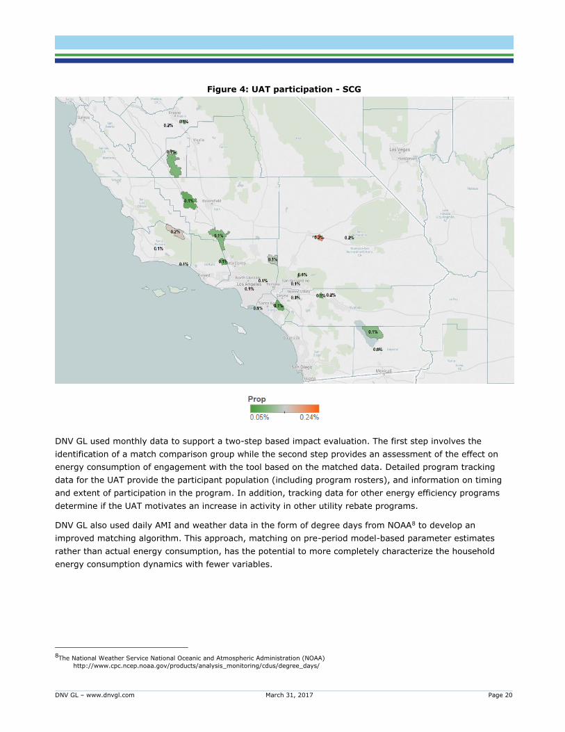
Participation in the UAT program or tool use is summarized below (Figure 2, Figure 3, and Figure 4). While
the absolute number of UAT users is clustered around areas where the population density is high, the charts
below normalize UAT use by population and display participation rate7 by zip. We observe that participation
rates above a minimum threshold are not concentrated in specific areas but diffused throughout PG&E territory.
SCG participation rate patterns are similar to PG&E. The analogous chart for SDG&E shows relatively higher
participation rates inland.
6 We have noted in the introduction that the UAT administrator for SDG&E and SCG is Aclara and that for PG&E is Opower. The definitions used to
gauge engagement level, dates of participation and other program features are defined differently by these implementers. We have, nevertheless, used concepts that are similar to define engagement level. For example, the definition of action plan creation for the UAT program
run by Aclara for SCG & SDG&E is based on data that indicates action plan creation dates. For the UAT program run by Opower for PG&E, we
rely on tip action date from the tracking data to define this high level of engagement.
7 Participation rate is computed as total number of users relative to the population in a given zipcode.
DNV GL – www.dnvgl.com March 31, 2017 Page 18
Figure 2: UAT Participation – PG&E
DNV GL – www.dnvgl.com March 31, 2017 Page 19
Figure 3: UAT participation - SDG&E
DNV GL – www.dnvgl.com March 31, 2017 Page 20
Figure 4: UAT participation - SCG
DNV GL used monthly data to support a two-step based impact evaluation. The first step involves the
identification of a match comparison group while the second step provides an assessment of the effect on
energy consumption of engagement with the tool based on the matched data. Detailed program tracking
data for the UAT provide the participant population (including program rosters), and information on timing
and extent of participation in the program. In addition, tracking data for other energy efficiency programs
determine if the UAT motivates an increase in activity in other utility rebate programs.
DNV GL also used daily AMI and weather data in the form of degree days from NOAA8 to develop an
improved matching algorithm. This approach, matching on pre-period model-based parameter estimates
rather than actual energy consumption, has the potential to more completely characterize the household
energy consumption dynamics with fewer variables.
8The National Weather Service National Oceanic and Atmospheric Administration (NOAA)
http://www.cpc.ncep.noaa.gov/products/analysis_monitoring/cdus/degree_days/
DNV GL – www.dnvgl.com March 31, 2017 Page 21
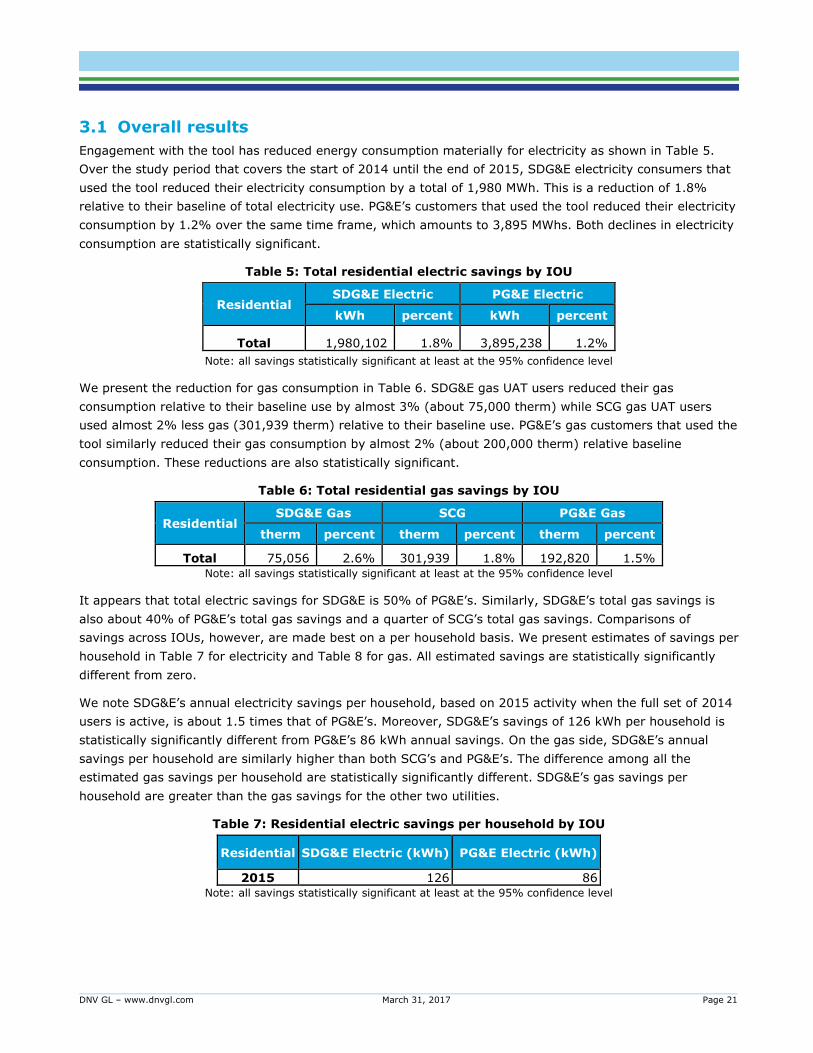
3.1 Overall results
Engagement with the tool has reduced energy consumption materially for electricity as shown in Table 5.
Over the study period that covers the start of 2014 until the end of 2015, SDG&E electricity consumers that
used the tool reduced their electricity consumption by a total of 1,980 MWh. This is a reduction of 1.8%
relative to their baseline of total electricity use. PG&E’s customers that used the tool reduced their electricity
consumption by 1.2% over the same time frame, which amounts to 3,895 MWhs. Both declines in electricity
consumption are statistically significant.
Table 5: Total residential electric savings by IOU
Residential SDG&E Electric PG&E Electric
kWh percent kWh percent
Total 1,980,102 1.8% 3,895,238 1.2%
Note: all savings statistically significant at least at the 95% confidence level
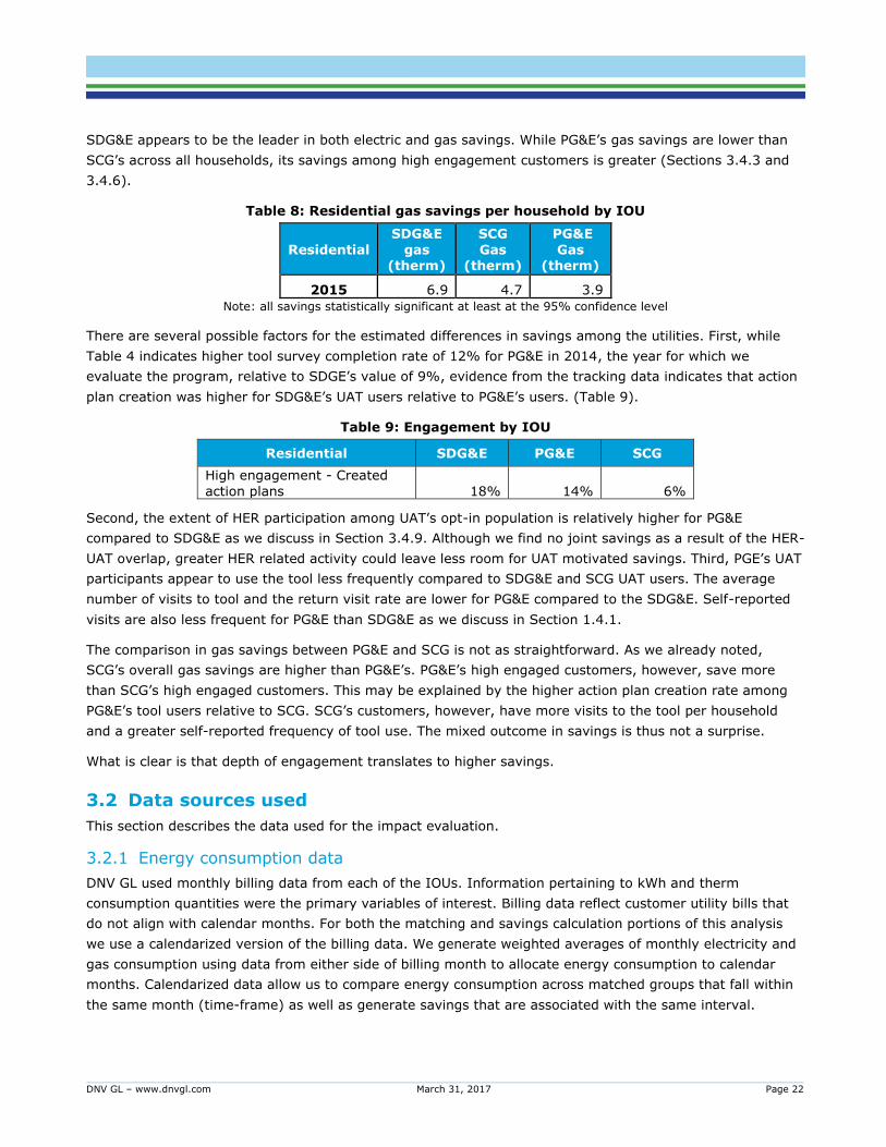
We present the reduction for gas consumption in Table 6. SDG&E gas UAT users reduced their gas
consumption relative to their baseline use by almost 3% (about 75,000 therm) while SCG gas UAT users
used almost 2% less gas (301,939 therm) relative to their baseline use. PG&E’s gas customers that used the
tool similarly reduced their gas consumption by almost 2% (about 200,000 therm) relative baseline
consumption. These reductions are also statistically significant.
Table 6: Total residential gas savings by IOU
Residential SDG&E Gas SCG PG&E Gas
therm percent therm percent therm percent
Total 75,056 2.6% 301,939 1.8% 192,820 1.5%
Note: all savings statistically significant at least at the 95% confidence level
It appears that total electric savings for SDG&E is 50% of PG&E’s. Similarly, SDG&E’s total gas savings is
also about 40% of PG&E’s total gas savings and a quarter of SCG’s total gas savings. Comparisons of
savings across IOUs, however, are made best on a per household basis. We present estimates of savings per
household in Table 7 for electricity and Table 8 for gas. All estimated savings are statistically significantly
different from zero.
We note SDG&E’s annual electricity savings per household, based on 2015 activity when the full set of 2014
users is active, is about 1.5 times that of PG&E’s. Moreover, SDG&E’s savings of 126 kWh per household is
statistically significantly different from PG&E’s 86 kWh annual savings. On the gas side, SDG&E’s annual
savings per household are similarly higher than both SCG’s and PG&E’s. The difference among all the
estimated gas savings per household are statistically significantly different. SDG&E’s gas savings per
household are greater than the gas savings for the other two utilities.
Table 7: Residential electric savings per household by IOU
Residential SDG&E Electric (kWh) PG&E Electric (kWh)
2015 126 86 Note: all savings statistically significant at least at the 95% confidence level
DNV GL – www.dnvgl.com March 31, 2017 Page 22
SDG&E appears to be the leader in both electric and gas savings. While PG&E’s gas savings are lower than
SCG’s across all households, its savings among high engagement customers is greater (Sections 3.4.3 and
3.4.6).
Table 8: Residential gas savings per household by IOU
Residential
SDG&E
gas (therm)
SCG
Gas (therm)
PG&E
Gas (therm)
2015 6.9 4.7 3.9
Note: all savings statistically significant at least at the 95% confidence level
There are several possible factors for the estimated differences in savings among the utilities. First, while
Table 4 indicates higher tool survey completion rate of 12% for PG&E in 2014, the year for which we
evaluate the program, relative to SDGE’s value of 9%, evidence from the tracking data indicates that action
plan creation was higher for SDG&E’s UAT users relative to PG&E’s users. (Table 9).
Table 9: Engagement by IOU
Residential SDG&E PG&E SCG
High engagement - Created
action plans 18% 14% 6%
Second, the extent of HER participation among UAT’s opt-in population is relatively higher for PG&E
compared to SDG&E as we discuss in Section 3.4.9. Although we find no joint savings as a result of the HER-
UAT overlap, greater HER related activity could leave less room for UAT motivated savings. Third, PGE’s UAT
participants appear to use the tool less frequently compared to SDG&E and SCG UAT users. The average
number of visits to tool and the return visit rate are lower for PG&E compared to the SDG&E. Self-reported
visits are also less frequent for PG&E than SDG&E as we discuss in Section 1.4.1.
The comparison in gas savings between PG&E and SCG is not as straightforward. As we already noted,
SCG’s overall gas savings are higher than PG&E’s. PG&E’s high engaged customers, however, save more
than SCG’s high engaged customers. This may be explained by the higher action plan creation rate among
PG&E’s tool users relative to SCG. SCG’s customers, however, have more visits to the tool per household
and a greater self-reported frequency of tool use. The mixed outcome in savings is thus not a surprise.
What is clear is that depth of engagement translates to higher savings.
3.2 Data sources used
This section describes the data used for the impact evaluation.
3.2.1 Energy consumption data
DNV GL used monthly billing data from each of the IOUs. Information pertaining to kWh and therm
consumption quantities were the primary variables of interest. Billing data reflect customer utility bills that
do not align with calendar months. For both the matching and savings calculation portions of this analysis
we use a calendarized version of the billing data. We generate weighted averages of monthly electricity and
gas consumption using data from either side of billing month to allocate energy consumption to calendar
months. Calendarized data allow us to compare energy consumption across matched groups that fall within
the same month (time-frame) as well as generate savings that are associated with the same interval.
DNV GL – www.dnvgl.com March 31, 2017 Page 23
We used average daily energy consumption in each month in statistical models to capture variation in
energy consumption during the pre-and post-periods. Estimates of savings were measured at the monthly
level of granularity.
We used AMI data, aggregated to the daily level, to support an alternative matching approach based on site-
level modeled parameters. Section 3.3.1 provides the details of the matching procedure used on monthly as
well as AMI data.
3.2.2 Customer information data
We used general customer information from the IOUs to identify basic household characteristics of
participating households and similar non-participant households. We defined comparison group households
by IOU and climate zone.
3.2.3 Weather data
We used weather data (in the form of degree days) for the alternative matching approach described in
Section 3.3. Site-level model parameters with a measure of model goodness-of-fit were used in propensity
score matching to produce AMI data and model-based 1:1 matches.
NOAA weather data were matched to premises based on Euclidean distance matching by zip code. For each
weather station, we matched hourly dry-bulb temperatures with site-level interval energy consumption data.
3.2.4 Tracking data
We obtained participant population data (including program rosters9) from the detailed UAT tracking
database. We also obtained information on the timing and extent of program participation from the
database. The tracking database also served as a resource for the process analysis and all other rebate
programs that we used to calculate joint savings.
We used the date when a participant first engaged with the UAT to identify the start of engagement and the
time when change in energy consumption could begin. For the evaluation, the period before the engagement
date serves as the pre-engagement period and data one month after the engagement period serves as the
post-period. In addition, we used survey (audit) completion or action-plan creation dates to identify the start
of a higher level of engagement. All participating households had first engagement dates and the subset of
those who went on to complete audits or create an Action Plan had dates associated with such activities that
were later than their first engagement dates.
3.3 Methodology
3.3.1 Matching
Our study aims to identify the energy consumption effect of engaging with the UAT administered by the
IOUs. We determine the effect of such engagement by comparing the consumption outcomes of those who
use the tool to a suitable comparison group of customers who do not. We use a matching procedure to
identify a suitably matched comparison group.
Under the matched comparison approach the treatment effect is estimated by comparing the difference in
outcomes before and after treatment of opt-in and comparison groups. In experimental studies, a
randomized control trial (RCT) design ensures subjects are assigned to treatment or control groups
9 We learned from IOU staff that the roster indicates unique number of participants in each month that are aggregated at the year level.
DNV GL – www.dnvgl.com March 31, 2017 Page 24
randomly. Due to this random assignment, the only differentiating factor between the two groups is
treatment. Thus, difference in outcome pre- and post-treatment can be attributed to treatment.
In observational studies, of the kind under consideration, subjects self-select into treatment. Since
treatment assignment is not random and may be tied to the intrinsic characteristics of the subjects in this
group, estimated treatment outcomes will reflect self-selection bias. Matching is a process that aims to
circumvent such bias by identifying comparison subjects whose characteristics closely match those of the
opt-in subjects. Matching methods try to replicate RCT design by selecting opt-in and comparison group
subjects that are balanced in key characteristics. Balance is indicated by identical distributions of these
characteristics of both groups.
3.3.1.1 Matching procedure
There are various matching techniques that attempt to mimic the RCT design in observational studies. In
this study, we used propensity score matching (PSM) to match opt-in and comparison subjects and reduce
selection bias. As the name indicates, PSM is based on propensity scores, which are probabilities that
subjects are assigned to the treatment group given certain characteristics they have. Subjects were
matched based on these probability scores.
The PSM process involves the following general steps that we used in this evaluation:
1. Select subjects’ characteristics that are related to treatment assignment.
2. Examine the distributions of these characteristics and exclude observations of the comparison group
where these do not overlap as a first round of identifying common support for matching.
3. Fit a logistic regression model using these variables to estimate the probability that each subject gets
assigned to the treatment group.
4. Conduct a second round of trimming or common support identification based on propensity scores.
5. Select a matching method, the number of controls in the many-to-one matching, and whether to match
with or without replacement; match opt-in subjects’ scores to non-treated (comparison) subjects based
on these selections.
6. Conduct diagnostic checks to see selected matches are well-balanced.
To avoid correlation between treatment selection and outcome, by construction, we needed to match on
variables other than the dependent variable. Such variables can include any characteristics such as
household size, heating and cooling source, and rate groups that may affect treatment assignment. They
can also include variables measured before participation, such as pre-evaluation period consumption data.
We took the latter approach, as comprehensive data on household characteristics were not readily available.
Specifically, we used monthly data from the year 2012 that pre-date any consumption data that were used
in the savings regressions. We also used climate zone information to stratify the data for matching. This
involved implementing the matching procedure within three pre-defined climate zones for California - mild
(coastal), inland, and desert.
Prior to estimating a propensity score model, we identified a first round of common support for matching by
trimming the data based on the distribution of pre-participation consumption. Variable values of the
comparison subjects that do not overlap with the values of the opt-in subjects were trimmed. In all the
cases where we undertook matching, trimming pre-participation consumption values of the comparison
DNV GL – www.dnvgl.com March 31, 2017 Page 25
subjects that are outside of the 1st and 99th percentiles resulted in the overlap of the distribution of these
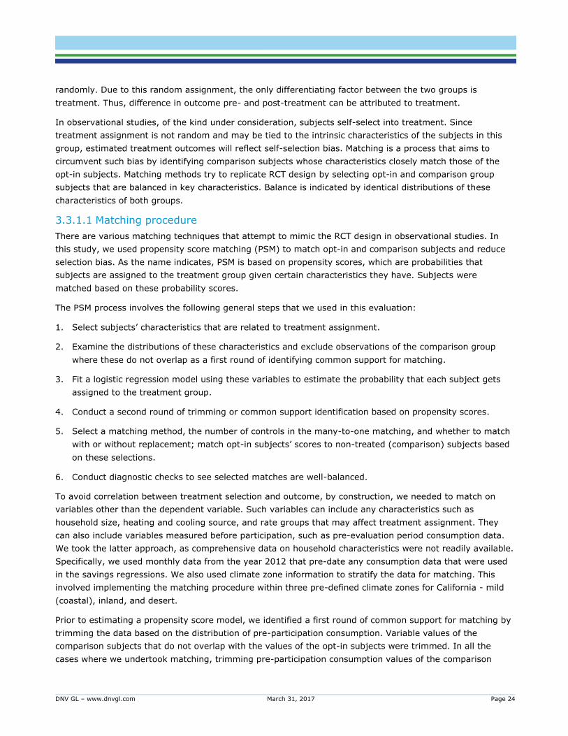
values with those of the opt-in. Figure 5 provides an example of how we established a region of common
support.
Figure 5: Region of common support for matching
We fitted a logistic regression model using data that reflects common support and used the propensity
scores from the regression to find matches for each opt-in subject based on 𝑘: 1 matches. We used the
nearest neighbor matching (NN) algorithm for this purpose. The approach produces matches for each opt-in
subject, selected in random order, by searching for 𝑘 propensity scores from the comparison group that are
nearest to those of the opt-in subject’s. We selected matches without replacement. Thus, a comparison
subject selected as a match for a given opt-in subject was not available for matching again. This sort of
matching is called ‘greedy’ because matches are made by only looking at distances of scores of randomly
selected opt-in vs. comparison subjects. Optimal matching, on the other hand, considers the overall distance
between opt-in and comparison scores to select matches. The matches generated using either, however, are
equally well-balanced.
Initially, we selected 5 best matches (𝑘 = 5) to identify an oversized matched comparison group for which to
request AMI data. Within the 5:1 matched comparison group, we identified the optimal 1:1 matched
comparison group for the purpose of final models. As with the 5:1 matched comparison group selection, the
1:1 matched group was selected by identifying a comparison subject whose propensity score is closest to
that of a opt-in subject selected randomly. Once selected, a comparison subject was not available for
matching with any other opt-in household. We also conducted a matching exercise using AMI data for five of
the selected comparison subjects that we discuss next in Section 3.3.1.2.
3.3.1.2 Model-based matching
Results from an energy-consumption model estimated using AMI data allowed us to investigate if such data
facilitate more accurate matching. The energy consumption model we estimated helped us identify baseload,
heating and cooling loads, and varying heating and cooling-degree bases that reflect the consumption-
weather dynamics of each household. We applied the PSM procedure to household-level model coefficients
generated using such a model and AMI data. The steps involved were:
DNV GL – www.dnvgl.com March 31, 2017 Page 26
1. Estimate energy consumption as a function of heating- and cooling-degree days (HDD and CDD,
respectively) using AMI data.
2. Obtain base load estimates; HDD and CDD effects; estimates of optimal HDD and CDD bases; and
model goodness-of-fit for each household.
3. Apply the PSM procedure using model coefficients to obtain 1:1 matches out of the 5:1 preliminary
match comparison group for which we requested AMI data. The two different approaches that result in
1:1 matches are each optimally matched comparison groups from the same set of 5:1 households.
As we discussed above, we requested AMI data from each IOU for five of the best matches for each
participant identified by the consumption-based approach outlined in the previous section. We received
either 15-minute or 60-minute interval kWh data and daily-interval therm data in response. After examining
the sufficiency of the data (the number of households for which non-missing data is available in the
matching year of 2012), we determined we could apply model-based matching using AMI data for electric
customers of SDG&E and PG&E. SDG&E and PG&E had at least 80% of the AMI data we requested for
electricity, whereas PG&E and SCG had no more than 20% of such data for gas in 2012.10 We aggregated
the AMI data to daily energy use and estimated a model of daily electricity consumption as a function of
weather. As we indicated above, we used coefficients from this model to conduct matching.
3.3.1.3 Test of balance
The final step in the matching process was to check the generated matches are well-balanced. This helps to
ensure that treatment outcomes are not dependent on the probability of treatment assignment
(participation). Checking matches are well-balanced involves ascertaining the distribution of the variables
(on which matching is done) of the comparison and opt-in subjects are the same.
We determined this by examining values at various percentiles of pre-participation consumption for opt-in
and comparison subjects that summarize their distributions. The difference in the values between the two
groups should be negligible.
We also tested the quality of the matches using the Kolmogorov–Smirnov test (KS test), which is a
nonparametric test that examines the equality of the (cumulative) distributions of two samples. Under the
null hypothesis of equality between the distributions, the KS test allows us to determine if the matched
samples are statistically identical or not.
3.3.2 Energy consumption and impact modeling
Using the matched data, we evaluated the effect of using the tool on energy consumption by estimating a
fixed-effects model with a difference-in-difference structure. This fixed-effects model identifies the effect of
treatment through indicator values for the opt-in in the post treatment period after considering household
and other time specific effects.
We used average daily consumption per month as the unit of analysis in the model. Our methodological
approach is based on identifying changes in this level of consumption after using the tool over the specified
pre- and post-periods for the two groups. We present the model in the next section.
10 Although SDG&E had close to 80% of the gas interval data we requested, we concentrated our efforts on matching electricity data using AMI.
DNV GL – www.dnvgl.com March 31, 2017 Page 27
3.3.2.1 Pooled fixed-effects model
We specified a fixed-effects model that estimates participation effect based on panel data, where monthly
observations for each opt-in and comparison household were stacked. In addition to estimating treatment
effect by month, we also included a term to capture the average trend in savings over the specified period
following treatment.
This model is given by:
𝐶𝑗𝑡 = 𝜇𝑗 + 𝜆𝑡 + 𝛾𝑡𝐼𝑗𝑡𝑃𝑗𝑡 + 𝛿𝑡𝜏𝑗𝑡 + 𝛼𝑡𝐼𝑗𝜏𝑗𝑡 + 휀𝑗𝑡
𝐶𝑗𝑡 = average daily consumption during interval 𝑡 for household 𝑗
𝜇𝑗 = unique intercept for each household 𝑗
𝜆𝑡 = 0/1 indicator for each time interval 𝑡 (month-year) that tracks systematic change over time
𝐼𝑗𝑡 = 0/1 dummy variable equal to 1 if household 𝑗 is a program participant in period 𝑡, 0 if household 𝑗 is
in the comparison group in period 𝑡
𝑃𝑗𝑡 = 0/1 indicator variable equal to 1 if period 𝑡 (month-year) is post opt-in for household 𝑗
𝜏𝑗𝑡 = (𝑃𝑗𝑡 − 𝑃𝑗𝑜) = time in months (𝑃𝑗𝑡) since opt-in (𝑃𝑗𝑜) for household 𝑗; comparison group households are
assigned a proxy “opt-in” date that is the matched households actual opt-in date
휀𝑗𝑡 = error term of the model
In this fixed-effects model, the coefficient on the month-year term (𝜆𝑡 ) captures marginal monthly baseline
use while the term ( 𝛾𝑗𝑡) reflects marginal effect on energy use of treatment (or savings) in the post-
treatment period. The latter reflects average daily savings per household in time-period 𝑡. We also include a
term that reflects average savings (or participation effect) changes over the time under study. The
coefficient (𝛿𝑡) measures baseline use trend since opt-in while (𝛼𝑡) reflects the average savings trend since
opt-in.
The model was estimated with errors clustered at the household level to address the fact that monthly
consumption values for a given household are not independent. This is a standard approach for behavioral
program evaluations and avoids estimated standard errors that over-estimate the precision of estimated
coefficients.
3.3.2.2 Savings Estimates
We calculated various measures of savings using parameter estimates from the fixed-effects model. One
such measure is savings per household per month over the entire post-participation period. We denote this
using:
𝑠𝑎𝑣𝑖𝑛𝑔 𝑝𝑒𝑟 ℎ𝑜𝑢𝑠𝑒ℎ𝑜𝑙𝑑 𝑝𝑒𝑟 𝑚𝑜𝑛𝑡ℎ = (𝑎𝑣𝑔 𝑠𝑎𝑣𝑖𝑛𝑔𝑠
ℎ𝑜𝑢𝑠𝑒ℎ𝑜𝑙𝑑 𝐷𝑎𝑦) ∗
𝑑𝑎𝑦𝑠
𝑚𝑜𝑛𝑡ℎ= −1 ∗ ( 𝛾𝑗𝑡 + 𝛼𝑡𝜏𝑡) ∗
𝑑𝑎𝑦𝑠
𝑚𝑜𝑛𝑡ℎ
This measure allowed us to obtain an estimate of total percent savings in the post-participation period
using:
𝑡𝑜𝑡𝑎𝑙 𝑝𝑒𝑟𝑐𝑒𝑛𝑡 𝑠𝑎𝑣𝑖𝑛𝑔𝑠 = 𝑠𝑢𝑚(𝑠𝑎𝑣𝑖𝑛𝑔𝑠 𝑝𝑒𝑟 ℎ𝑜𝑢𝑠𝑒ℎ𝑜𝑙𝑑 𝑝𝑒𝑟 𝑚𝑜𝑛𝑡ℎ)/𝑠𝑢𝑚(𝑚𝑜𝑛𝑡ℎ𝑙𝑦 𝑒𝑛𝑒𝑟𝑔𝑦 𝑢𝑠𝑒)
DNV GL – www.dnvgl.com March 31, 2017 Page 28
Each sum is taken over the months in the post opt-in period. It reflects total estimated savings as a percent
of total baseline energy use.
We also obtained total kWh or therm savings in the post-participation period by multiplying the estimated
savings per household by the total number of households that participated in the program in each month of
the post-period. This estimate is given by:
𝑡𝑜𝑡𝑎𝑙 ℎ𝑜𝑢𝑠𝑒ℎ𝑜𝑙𝑑 𝑠𝑎𝑣𝑖𝑛𝑔𝑠 = 𝑠𝑢𝑚(𝑠𝑎𝑣𝑖𝑛𝑔𝑠 𝑝𝑒𝑟 ℎ𝑜𝑢𝑠𝑒ℎ𝑜𝑙𝑑 𝑝𝑒𝑟 𝑚𝑜𝑛𝑡ℎ ∗ 𝑛𝑢𝑚𝑏𝑒𝑟 𝑜𝑓 ℎ𝑜𝑢𝑠𝑒ℎ𝑜𝑙𝑑𝑠)
3.4 Impact evaluation results
3.4.1 Matching framework
Our statistical framework relies on the comparison of energy use before and after engagement with the tool
of groups of participants and non-participants. The matching procedure that we used provides us
comparison households whose pre-study period consumption is sufficiently like that of participants or opt-in
households. The matching process was applied to electric and gas customers of the three IOUs. The
matching was done for dual-fuel (electric and gas) and electric-only households of SDG&E and PG&E, and
gas-only households of these utilities as well as SCG.
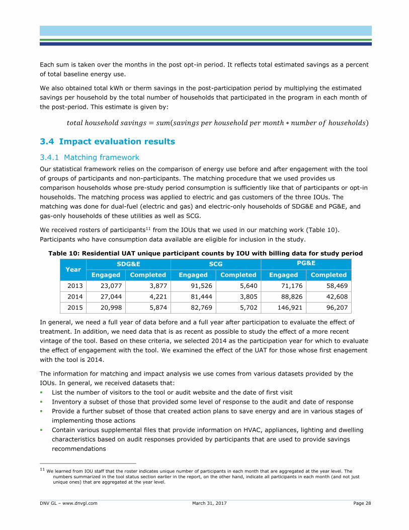
We received rosters of participants11 from the IOUs that we used in our matching work (Table 10).
Participants who have consumption data available are eligible for inclusion in the study.
Table 10: Residential UAT unique participant counts by IOU with billing data for study period
Year SDG&E SCG PG&E
Engaged Completed Engaged Completed Engaged Completed
2013 23,077 3,877 91,526 5,640 71,176 58,469
2014 27,044 4,221 81,444 3,805 88,826 42,608
2015 20,998 5,874 82,769 5,702 146,921 96,207
In general, we need a full year of data before and a full year after participation to evaluate the effect of
treatment. In addition, we need data that is as recent as possible to study the effect of a more recent
vintage of the tool. Based on these criteria, we selected 2014 as the participation year for which to evaluate
the effect of engagement with the tool. We examined the effect of the UAT for those whose first enagement
with the tool is 2014.
The information for matching and impact analysis we use comes from various datasets provided by the
IOUs. In general, we received datasets that:
List the number of visitors to the tool or audit website and the date of first visit
Inventory a subset of those that provided some level of response to the audit and date of response
Provide a further subset of those that created action plans to save energy and are in various stages of
implementing those actions
Contain various supplemental files that provide information on HVAC, appliances, lighting and dwelling
characteristics based on audit responses provided by participants that are used to provide savings
recommendations
11 We learned from IOU staff that the roster indicates unique number of participants in each month that are aggregated at the year level. The
numbers summarized in the tool status section earlier in the report, on the other hand, indicate all participants in each month (and not just
unique ones) that are aggregated at the year level.
DNV GL – www.dnvgl.com March 31, 2017 Page 29
3.4.2 Matching data
Starting with the 2014 analysis time frame, we selected household data for matching based on several
criteria. First, we restricted households for the matching exercise to those with suitable billing data from
2012-15. Since 2014 is the program period we analyzed, we needed at least 12 months of pre- and post-
participation data that required us to use data from 2013 and 2015. In addition, as we indicate in Section
3.3.1.1, the matching approach necessitates we use consumption data outside of the evaluation period of
2013-15, so data from 2012 serves this purpose. Second, suitable 2012-15 billing data were those where
consumption is non-negative, not missing, and did not come from households with net electricity metering.
After the application of these rules, we had our sample of participants for opt-in households that were used
in matching. Table 11 provides the total number of participants by utility. Roughly 40% of engaged
participant numbers were used in the matching process.
Table 11: Residential UAT 2014 participant numbers used in matching
Utility Utility Source
Participant Numbers Used in
Matching
% Utility Source
SDG&E 27,077 9,989 37%
SCG 82,323 31,611 38%
PG&E 89,307 31,185 35%
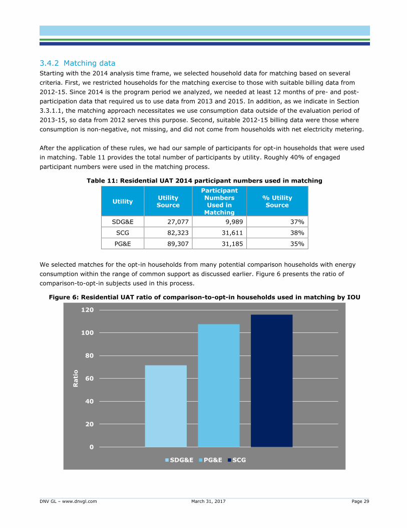
We selected matches for the opt-in households from many potential comparison households with energy
consumption within the range of common support as discussed earlier. Figure 6 presents the ratio of
comparison-to-opt-in subjects used in this process.
Figure 6: Residential UAT ratio of comparison-to-opt-in households used in matching by IOU
0
20
40
60
80
100
120
Rati
o
SDG&E PG&E SCG
DNV GL – www.dnvgl.com March 31, 2017 Page 30
Finally, matching was stratified by climate zone using information from the California Energy Commission
(CEC). The CEC provides climate zone classifications that cover all the service territories served by the IOUs.
We consolidated CEC’s classifications into three climate zones indicating desert, inland, and mild climate
conditions. Table 12 presents where CEC’s classifications fall in the three groupings and the number of
participants within each climate zone used in matching.
Table 12: Climate zone groups for stratified matching
Climate Zone Group
Title 24 Climate Zone SDG&E
Participant Counts
SCG Participant
Counts
PG&E Participant
Counts
Desert 15 12 1,124 N/A
Inland 8, 9, 10, 11, 12, 13, 14 3,634 25,949 16,249
Mild/Coastal 1, 2, 3, 4, 5, 6, 7, 16 6,343 4,538 14,936
3.4.3 Engagement level
We use data from the roster and related files to define two levels of engagement with the tool. The first level
of engagement captures a more limited interaction with the tool where participants mostly browse the
website and, in some cases, complete surveys (audits) on the tool (possibly picking up information on
savings), but do not take further action. We call this low level of engagement. The second level of
engagement is where participants create an Action Plan based on recommendations they get from the tool.
We call this high engagement level.12 The total number of participants by engagement level and IOU is
provided in Table 13.
Table 13: Residential UAT engagement levels and customer numbers by IOU
Engagement Level
Engagement Indication
Number of Participants
SDG&E SCG PG&E
Low Browsed the tool, did not create an action plan
8,165 29,679 26,875
High Browsed the tool and created an action plan
1,824 (18%)
1,932 (6%)
4,310 (14%)
3.4.4 Matching results
As we discuss in Section 3.3.1.1, we selected 1:1 comparison-to-treatment households in our matching
process out of the initial outsized 5:1 matches generated for the purpose of requesting AMI data. In other
words, we selected the best match for each opt-in household in our study frame. We ascertained balance in
12 We have noted in the introduction that the UAT administrator for SDG&E and SCG is Aclara and that for PG&E is Opower. The definitions used to
gauge engagement level, dates of participation and other program features are defined differently by these implementers. We have, nevertheless, used concepts that are similar to define engagement level. For example, the definition of action plan creation for the UAT program
run by Aclara for SCG & SDG&E is based on data that indicates action plan creation dates. For the UAT program run by Opower for PG&E, we
rely on tip action date from the tracking data to define this high level of engagement.

DNV GL – www.dnvgl.com March 31, 2017 Page 31
our resulting matches by examining how close the distribution of the pre-study period (2012) consumption
of the selected comparison-to-treatment households were. We took two approaches for this purpose.
First, we examined the level of consumption of each group using the cumulative distribution at various
percentiles presented in Figure 7 for electricity and Figure 8 for gas13. Visual inspection of the figures makes
it evident that the samples are well-balanced (matched). The values of consumption for the opt-in and
comparison group at various percentiles are very close.
Figure 7: Distribution of electricity consumption of matched comparison and opt-in households
13 Figures 7 and 8 summarize the cumulative distribution of electiricity and gas consumption for the opt-in users and matched comparison groups at
various percentiles.
0
5,000
10,000
15,000
20,000
25,000
30,000
35,000
P0
P1
P5
P1
0
P2
5
P5
0
P7
5
P9
0
P9
5
P9
9
P1
00
kWh
SDG&E kWh for Dual Fuel Households
Dual Electric Control Dual Electric Treated
0
5,000
10,000
15,000
20,000
25,000
30,000
35,000
P0
P1
P5
P1
0
P2
5
P5
0
P7
5
P9
0
P9
5
P9
9
P1
00
kWh
SDG&E kWh for Electric Only Households
Electric-Only Control Electric-Only Treated
0
5,000
10,000
15,000
20,000
25,000
30,000
35,000
P0
P1
P5
P1
0
P2
5
P5
0
P7
5
P9
0
P9
5
P9
9
P1
00
kWh
PG&E kWh for Dual Fuel Households
Dual Electric Control Dual Electric Treated
0
5,000
10,000
15,000
20,000
25,000
30,000
35,000
P0
P1
P5
P1
0
P2
5
P5
0
P7
5
P9
0
P9
5
P9
9
P1
00
kWh
PG&E kWh for Electric Only Households
Electric-Only Control Electric-Only Treated
DNV GL – www.dnvgl.com March 31, 2017 Page 32
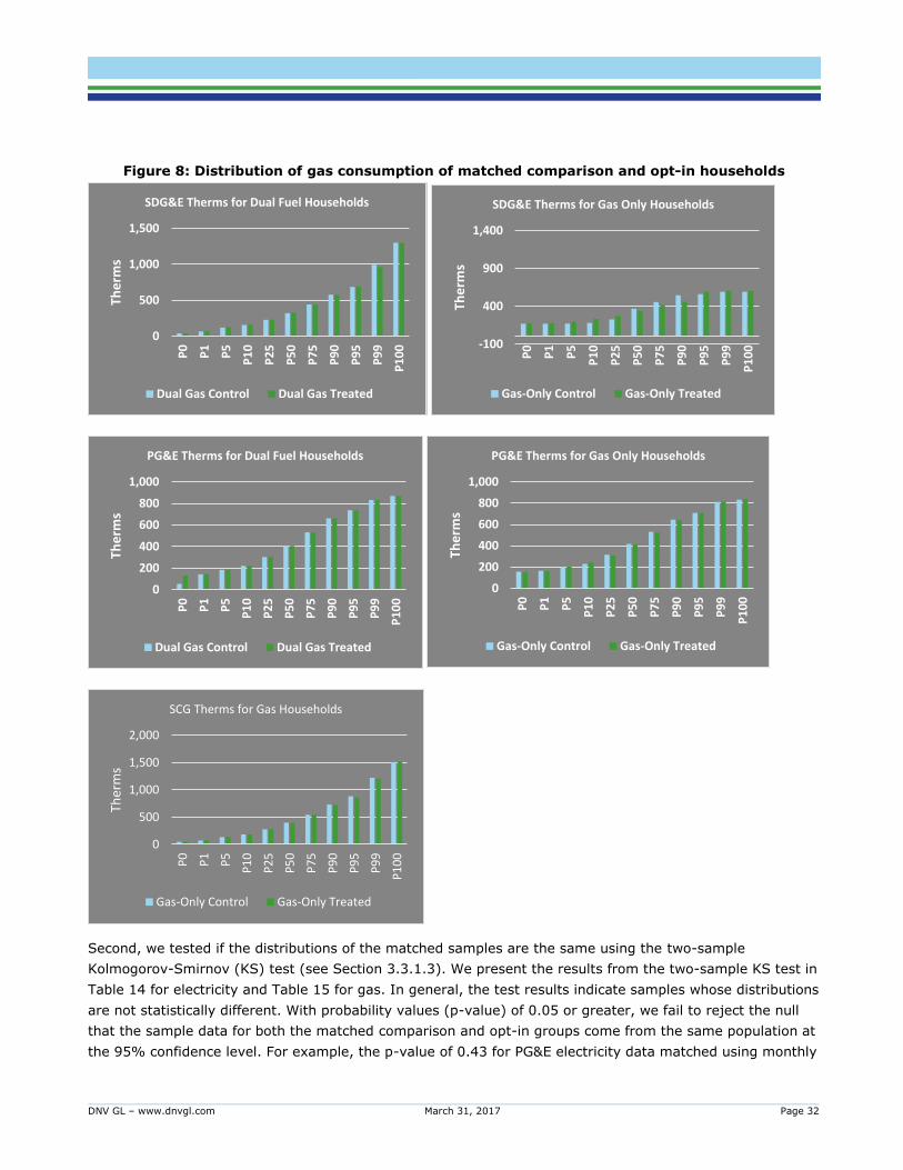
Figure 8: Distribution of gas consumption of matched comparison and opt-in households
Second, we tested if the distributions of the matched samples are the same using the two-sample
Kolmogorov-Smirnov (KS) test (see Section 3.3.1.3). We present the results from the two-sample KS test in
Table 14 for electricity and Table 15 for gas. In general, the test results indicate samples whose distributions
are not statistically different. With probability values (p-value) of 0.05 or greater, we fail to reject the null
that the sample data for both the matched comparison and opt-in groups come from the same population at
the 95% confidence level. For example, the p-value of 0.43 for PG&E electricity data matched using monthly
0
500
1,000
1,500
P0
P1
P5
P1
0
P2
5
P5
0
P7
5
P9
0
P9
5
P9
9
P1
00
The
rms
SDG&E Therms for Dual Fuel Households
Dual Gas Control Dual Gas Treated
-100
400
900
1,400
P0
P1
P5
P1
0
P2
5
P5
0
P7
5
P9
0
P9
5
P9
9
P1
00
The
rms
SDG&E Therms for Gas Only Households
Gas-Only Control Gas-Only Treated
0
200
400
600
800
1,000
P0
P1
P5
P1
0
P2
5
P5
0
P7
5
P9
0
P9
5
P9
9
P1
00
The
rms
PG&E Therms for Dual Fuel Households
Dual Gas Control Dual Gas Treated
0
200
400
600
800
1,000
P0
P1
P5
P1
0
P2
5
P5
0
P7
5
P9
0
P9
5
P9
9
P1
00
The
rms
PG&E Therms for Gas Only Households
Gas-Only Control Gas-Only Treated
0
500
1,000
1,500
2,000
P0
P1
P5
P1
0
P2
5
P5
0
P7
5
P9
0
P9
5
P9
9
P1
00
Ther
ms
SCG Therms for Gas Households
Gas-Only Control Gas-Only Treated
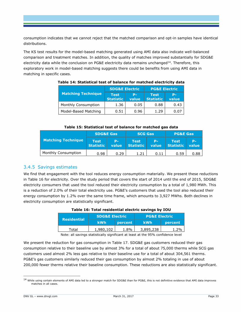
DNV GL – www.dnvgl.com March 31, 2017 Page 33
consumption indicates that we cannot reject that the matched comparison and opt-in samples have identical
distributions.
The KS test results for the model-based matching generated using AMI data also indicate well-balanced
comparison and treatment matches. In addition, the quality of matches improved substantially for SDG&E
electricity data while the conclusion on PG&E electricity data remains unchanged14. Therefore, this
exploratory work in model-based matching suggests there could be benefits from using AMI data in
matching in specific cases.
Table 14: Statistical test of balance for matched electricity data
Matching Technique
SDG&E Electric PG&E Electric
Test Statistic
P-value
Test Statistic
P-value
Monthly Consumption 1.36 0.05 0.88 0.43
Model-Based Matching 0.51 0.96 1.29 0.07
Table 15: Statistical test of balance for matched gas data
Matching Technique
SDG&E Gas SCG Gas PG&E Gas
Test Statistic
P-value
Test Statistic
P-value
Test Statistic
P-value
Monthly Consumption 0.98 0.29 1.21 0.11 0.59 0.88
3.4.5 Savings estimates
We find that engagement with the tool reduces energy consumption materially. We present these reductions
in Table 16 for electricity. Over the study period that covers the start of 2014 until the end of 2015, SDG&E
electricity consumers that used the tool reduced their electricity consumption by a total of 1,980 MWh. This
is a reduction of 2.0% of their total electricity use. PG&E’s customers that used the tool also reduced their
energy consumption by 1.2% over the same time frame, which amounts to 3,927 MWhs. Both declines in
electricity consumption are statistically significant.
Table 16: Total residential electric savings by IOU
Residential SDG&E Electric PG&E Electric
kWh percent kWh percent
Total 1,980,102 1.8% 3,895,238 1.2%
Note: all savings statistically significant at least at the 95% confidence level
We present the reduction for gas consumption in Table 17. SDG&E gas customers reduced their gas
consumption relative to their baseline use by almost 3% for a total of about 75,000 therms while SCG gas
customers used almost 2% less gas relative to their baseline use for a total of about 304,561 therms.
PG&E’s gas customers similarly reduced their gas consumption by almost 2% totaling in use of about
200,000 fewer therms relative their baseline consumption. These reductions are also statistically significant.
14 While using certain elements of AMI data led to a stronger match for SDG&E than for PG&E, this is not definitive evidence that AMI data improves
matches in all cases.

DNV GL – www.dnvgl.com March 31, 2017 Page 34
Table 17: Total residential gas savings by IOU
Residential SDG&E Gas SCG PG&E Gas
therm percent therm percent therm percent
Total 75,056 2.6% 301,939 1.8% 192,820 1.5%
Note: all savings statistically significant at least at the 95% confidence level
It appears that total electric savings for SDG&E is 50% of PG&E’s. Similarly, SDG&E’s total gas savings is
also about 40% of PG&E’s total gas savings and a quarter of SCG’s total gas savings. Comparisons of
savings across IOUs, however, are made best on a per household basis. We present estimates of savings per
household in Table 18 for electricity and Table 19 for gas. All estimated savings are statistically significantly
different from zero.
We note SDG&E’s annual electricity savings per household, based on 2015 activity when the full set of 2014
users is active, is about 1.5 times that of PG&E’s. Moreover, SDG&E’s savings of 126 kWh per household is
statistically significantly different from PG&E’s 86 kWh annual savings. On the gas side, SDG&E’s annual
savings per household are similarly higher than both SCG’s and PG&E’s. The difference among all the
estimated gas savings per household are statistically significantly different. SDG&E’s gas savings per
household are greater than the gas savings for the other two utilities.
Table 18: Residential electric savings per household by IOU
Residential SDG&E Electric (kWh) PG&E Electric (kWh)
2015 126 86
Note: all savings statistically significant at least at the 95% confidence level
SDG&E appears to be the leader in both electric and gas savings. While PG&E’s gas savings are lower than
SCG’s across all households, its savings among high engagement customers is greater (Sections 3.4.3 and
3.4.6).
Table 19: Residential gas savings per household by IOU
Residential SDG&E
gas
(therm)
SCG Gas
(therm)
PG&E Gas
(therm)
2015 6.9 4.7 3.9 Note: all savings statistically significant at least at the 95% confidence level
There are several possible factors for the estimated differences in savings among the utilities. First, while
Table 4 indicates higher tool survey completion rate of 12% for PG&E in 2014, the year for which we
evaluate the program, relative to SDGE’s value of 9%, evidence from the tracking data indicates that action
plan creation was higher for SDG&E’s UAT users relative to PG&E’s users. (Table 20).
Table 20: Engagement by IOU
Residential SDG&E PG&E SCG
High engagement - Created action plans 18% 14% 6%
Second, the extent of HER participation among UAT’s opt-in population is relatively higher for PG&E
compared to SDG&E as we discuss in 3.4.9. Although we find no joint savings as a result of the HER-UAT
overlap, greater HER related activity could leave less room for UAT motivated savings. Third, PGE’s UAT
DNV GL – www.dnvgl.com March 31, 2017 Page 35
participants appear to use the tool less frequently compared to SDG&E and SCG UAT users. The average
number of visits to tool and the return visit rate are lower for PG&E compared to the SDG&E. Self-reported
visits are also less frequent for PG&E than SDG&E as we discuss in Section 1.4.1.
The comparison in gas savings between PG&E and SCG is not as straightforward. As we already noted,
SCG’s overall gas savings are higher than PG&E’s. PG&E’s high engaged customers, however, save more
than SCG’s high engaged customers. This may be explained by the higher action plan creation rate among
PG&E’s tool users relative to SCG. SCG’s customers however, have more visits to the tool per household and
a greater self-reported frequency of tool use. The mixed outcome in savings is thus not a surprise.
What is clear is that depth of engagement translates to higher savings.
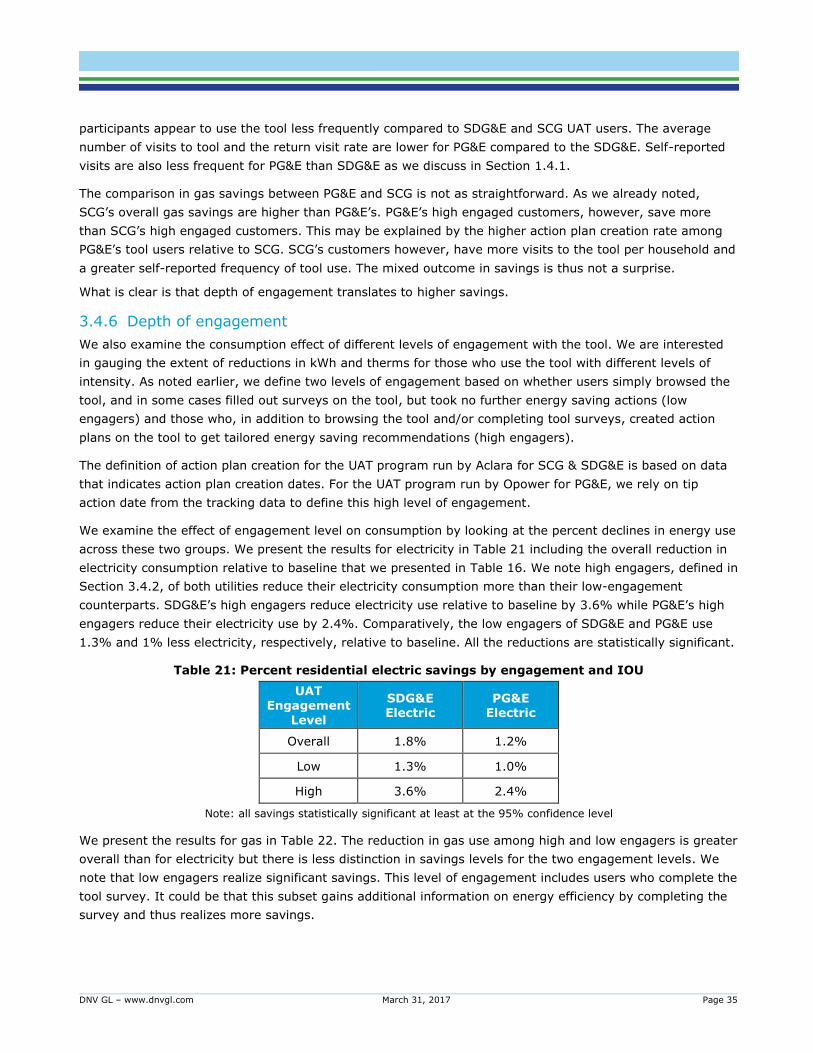
3.4.6 Depth of engagement
We also examine the consumption effect of different levels of engagement with the tool. We are interested
in gauging the extent of reductions in kWh and therms for those who use the tool with different levels of
intensity. As noted earlier, we define two levels of engagement based on whether users simply browsed the
tool, and in some cases filled out surveys on the tool, but took no further energy saving actions (low
engagers) and those who, in addition to browsing the tool and/or completing tool surveys, created action
plans on the tool to get tailored energy saving recommendations (high engagers).
The definition of action plan creation for the UAT program run by Aclara for SCG & SDG&E is based on data
that indicates action plan creation dates. For the UAT program run by Opower for PG&E, we rely on tip
action date from the tracking data to define this high level of engagement.
We examine the effect of engagement level on consumption by looking at the percent declines in energy use
across these two groups. We present the results for electricity in Table 21 including the overall reduction in
electricity consumption relative to baseline that we presented in Table 16. We note high engagers, defined in
Section 3.4.2, of both utilities reduce their electricity consumption more than their low-engagement
counterparts. SDG&E’s high engagers reduce electricity use relative to baseline by 3.6% while PG&E’s high
engagers reduce their electricity use by 2.4%. Comparatively, the low engagers of SDG&E and PG&E use
1.3% and 1% less electricity, respectively, relative to baseline. All the reductions are statistically significant.
Table 21: Percent residential electric savings by engagement and IOU
UAT Engagement
Level
SDG&E Electric
PG&E Electric
Overall 1.8% 1.2%
Low 1.3% 1.0%
High 3.6% 2.4%
Note: all savings statistically significant at least at the 95% confidence level
We present the results for gas in Table 22. The reduction in gas use among high and low engagers is greater
overall than for electricity but there is less distinction in savings levels for the two engagement levels. We
note that low engagers realize significant savings. This level of engagement includes users who complete the
tool survey. It could be that this subset gains additional information on energy efficiency by completing the
survey and thus realizes more savings.
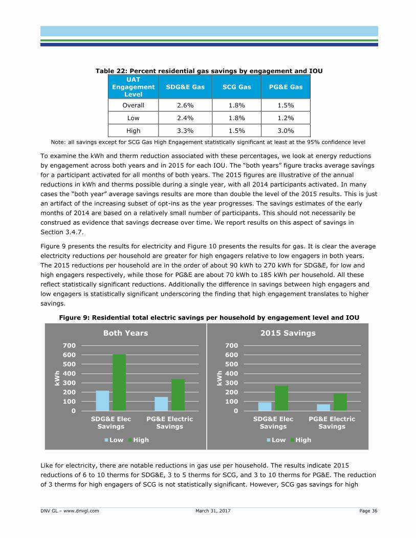
DNV GL – www.dnvgl.com March 31, 2017 Page 36
Table 22: Percent residential gas savings by engagement and IOU
UAT Engagement
Level SDG&E Gas SCG Gas PG&E Gas
Overall 2.6% 1.8% 1.5%
Low 2.4% 1.8% 1.2%
High 3.3% 1.5% 3.0%
Note: all savings except for SCG Gas High Engagement statistically significant at least at the 95% confidence level
To examine the kWh and therm reduction associated with these percentages, we look at energy reductions
by engagement across both years and in 2015 for each IOU. The “both years” figure tracks average savings
for a participant activated for all months of both years. The 2015 figures are illustrative of the annual
reductions in kWh and therms possible during a single year, with all 2014 participants activated. In many
cases the “both year” average savings results are more than double the level of the 2015 results. This is just
an artifact of the increasing subset of opt-ins as the year progresses. The savings estimates of the early
months of 2014 are based on a relatively small number of participants. This should not necessarily be
construed as evidence that savings decrease over time. We report results on this aspect of savings in
Section 3.4.7.
Figure 9 presents the results for electricity and Figure 10 presents the results for gas. It is clear the average
electricity reductions per household are greater for high engagers relative to low engagers in both years.
The 2015 reductions per household are in the order of about 90 kWh to 270 kWh for SDG&E, for low and
high engagers respectively, while those for PG&E are about 70 kWh to 185 kWh per household. All these
reflect statistically significant reductions. Additionally the difference in savings between high engagers and
low engagers is statistically significant underscoring the finding that high engagement translates to higher
savings.
Figure 9: Residential total electric savings per household by engagement level and IOU
Like for electricity, there are notable reductions in gas use per household. The results indicate 2015
reductions of 6 to 10 therms for SDG&E, 3 to 5 therms for SCG, and 3 to 10 therms for PG&E. The reduction
of 3 therms for high engagers of SCG is not statistically significant. However, SCG gas savings for high
0
100
200
300
400
500
600
700
SDG&E Elec
Savings
PG&E Electric
Savings
kW
h
Both Years
Low High
0
100
200
300
400
500
600
700
SDG&E Elec
Savings
PG&E Electric
Savings
kW
h
2015 Savings
Low High
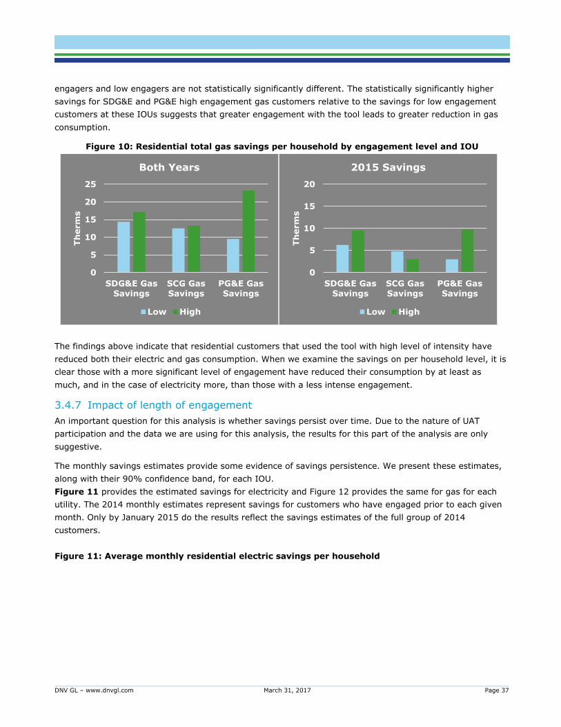
DNV GL – www.dnvgl.com March 31, 2017 Page 37
engagers and low engagers are not statistically significantly different. The statistically significantly higher
savings for SDG&E and PG&E high engagement gas customers relative to the savings for low engagement
customers at these IOUs suggests that greater engagement with the tool leads to greater reduction in gas
consumption.
Figure 10: Residential total gas savings per household by engagement level and IOU
The findings above indicate that residential customers that used the tool with high level of intensity have
reduced both their electric and gas consumption. When we examine the savings on per household level, it is
clear those with a more significant level of engagement have reduced their consumption by at least as
much, and in the case of electricity more, than those with a less intense engagement.
3.4.7 Impact of length of engagement
An important question for this analysis is whether savings persist over time. Due to the nature of UAT
participation and the data we are using for this analysis, the results for this part of the analysis are only
suggestive.
The monthly savings estimates provide some evidence of savings persistence. We present these estimates,
along with their 90% confidence band, for each IOU.
Figure 11 provides the estimated savings for electricity and Figure 12 provides the same for gas for each
utility. The 2014 monthly estimates represent savings for customers who have engaged prior to each given
month. Only by January 2015 do the results reflect the savings estimates of the full group of 2014
customers.
Figure 11: Average monthly residential electric savings per household
0
5
10
15
20
25
SDG&E GasSavings
SCG GasSavings
PG&E GasSavings
Th
erm
s
Both Years
Low High
0
5
10
15
20
SDG&E GasSavings
SCG GasSavings
PG&E GasSavings
Th
erm
s
2015 Savings
Low High
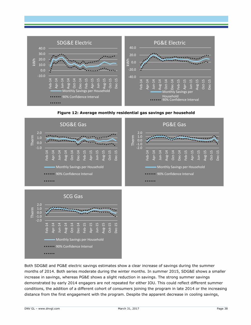
DNV GL – www.dnvgl.com March 31, 2017 Page 38
Figure 12: Average monthly residential gas savings per household
Both SDG&E and PG&E electric savings estimates show a clear increase of savings during the summer
months of 2014. Both series moderate during the winter months. In summer 2015, SDG&E shows a smaller
increase in savings, whereas PG&E shows a slight reduction in savings. The strong summer savings
demonstrated by early 2014 engagers are not repeated for either IOU. This could reflect different summer
conditions, the addition of a different cohort of consumers joining the program in late 2014 or the increasing
distance from the first engagement with the program. Despite the apparent decrease in cooling savings,
-10.0
0.0
10.0
20.0
30.0
40.0Fe
b-1
4
Ap
r-1
4
Jun
-14
Au
g-1
4
Oct
-14
Dec
-14
Feb
-15
Ap
r-1
5
Jun
-15
Au
g-1
5
Oct
-15
Dec
-15
kWh
SDG&E Electric
Monthly Savings per Household
90% Confidence Interval
-40.0
-20.0
0.0
20.0
40.0
Feb
-14
Ap
r-1
4
Jun
-14
Au
g-1
4
Oct
-14
Dec
-14
Feb
-15
Ap
r-1
5
Jun
-15
Au
g-1
5
Oct
-15
Dec
-15
kWh
PG&E Electric
Monthly Savings perHousehold90% Confidence Interval
-1.0
0.0
1.0
2.0
Feb
-14
Ap
r-1
4
Jun
-14
Au
g-1
4
Oct
-14
Dec
-14
Feb
-15
Ap
r-1
5
Jun
-15
Au
g-1
5
Oct
-15
Dec
-15
Ther
m
SDG&E Gas
Monthly Savings per Household
90% Confidence Interval
-2.0-1.00.01.02.0
Feb
-14
Ap
r-1
4
Jun
-14
Au
g-1
4
Oct
-14
Dec
-14
Feb
-15
Ap
r-1
5
Jun
-15
Au
g-1
5
Oct
-15
Dec
-15
Ther
m
PG&E Gas
Monthly Savings per Household
90% Confidence Interval
-2.0-1.00.01.02.0
Feb
-14
Ap
r-1
4
Jun
-14
Au
g-1
4
Oct
-14
Dec
-14
Feb
-15
Ap
r-1
5
Jun
-15
Au
g-1
5
Oct
-15
Dec
-15
Ther
m
SCG Gas
Monthly Savings per Household
90% Confidence Interval
DNV GL – www.dnvgl.com March 31, 2017 Page 39
savings do appear to maintain at a consistent level through the end of 2015. These findings suggest two
things: that the program may effectively promote cooling savings opportunities when they are close at hand
and that savings persist into a second year but appear to be less seasonally oriented.
The gas savings appear to be seasonal in an unexpected way. Both SDG&E and SCG savings estimates are
reduced during heating season. In contrast, savings are more consistent during the rest of the year. Across
the two years, there appears to be a slight reduction in savings. PG&E is less clearly seasonal but also
exhibits a slight decline in 2015.
Additional data will make it possible to track savings over subsequent years. Additional data may also make
it possible disentangle seasonal effects and the effect of time since engagement. It is clear from these plots
that there is some seasonality to the savings and that those seasonal effects may be strongest early in the
engagement cycle. It makes sense that attrition of savings would affect both seasonal and non-seasonal
savings.
3.4.8 Downstream rebate joint savings
One possible effect of the UAT is to increase rebate activity in other IOU energy efficiency programs. To
investigate this, we compared average savings from rebate measures installed by the treatment group with
the savings from measures installed by the comparison group. An increase in opt-in group rebate program
savings relative to the comparison group represents savings caused by the UAT engagement in conjunction
with the rebate programs. While these joint savings are an added benefit of the UAT program, it is essential
that they are only reported once.
We applied the following approach to roll up individual rebate savings and calculate overall joint savings:
Used accepted deemed savings values (those used to claim savings for the rebate program)
Started accumulating savings beginning from the installation date moving forward in time
Assigned daily savings on a load-shape weighted basis (more savings when we expect the measure to
be used more)
Maintained the load-shape weighted savings over the life of the measure
This approach takes the deemed annual savings values and transforms them into realistic day-to-day
savings. We determined the daily share of annual savings using hourly 2011 DEER load shapes for each IOU.
These load shapes indicate when a measure is used during the year and, by proxy, when efficiency savings
would occur.
Savings for each installed measure start to accrue at the time of installation (or removal for refrigerator
recycling). We calculated average monthly household rebate program savings for the treatment and
comparison groups and included zeroes for most households that do not take part in any rebate program. An
increase in average per-household tracked program savings among the treatment group versus the
comparison group indicates joint savings.
Our analysis does not provide any evidence of joint savings of either gas or electricity for any of the IOUs.
Savings estimates from rebate measures of the opt-in group relative to the comparison group are not
statistically significantly different. Thus, there is no evidence that UAT engagement has led to an increased
savings for the opt-in group members that participate in other rebate programs relative to savings achieved
by the comparison group from the same programs.

DNV GL – www.dnvgl.com March 31, 2017 Page 40
3.4.9 UAT HER Overlap
Just as the UAT and HER programs may motivate joint savings with other IOU rebate programs, there is a
similar interaction between the UAT and Home Energy Report (HER) programs run by the IOUs. Receiving a
report from the HER program could make a person more likely to opt into the UAT. For those additional
people prompted to opt-in into the UAT by the HER program, their HER-motivated savings could be conflated
with their UAT-motivated savings. As with downstream rebate joint savings, our primary concern is avoiding
claiming jointly-motivated savings for both programs. Despite some overlap in participation in the two
programs, we find no evidence of joint savings between the UAT and HER programs.
Table 23 and Table 24 show that members of the HER eligible population are more likely to be in the UAT
opt-in group for PG&E and SDG&E, respectively.15 That increase is evident, however, across both the HER
treated and HER control groups. We surmise that the slight increase of HER eligible population in the UAT
opt-in group is driven by something other than the HER reports.16 The lack of evidence of an increase in
HER treatment uplift into the UAT opt-in group due to receiving the report supports a conclusion of no joint
savings between UAT and HER.
Table 23: PG&E HER Program Participants in PG&E’s UAT Program
HER Eligible Population HER Treated HER Control
UAT Comparison 58% 44% 14%
UAT Opt-in 61% 45% 16%
Table 24: SDG&E HER Program Participants in SDG&E’s UAT Program
HER Eligible Population HER Treated HER Control
UAT Comparison 8% 6% 2%
UAT Opt-in 13% 10% 3%
In addition to the double-counting challenge, the UAT interaction with HER programs may have further
implications for understanding the overall effectiveness of the UAT program at delivering savings. The
overlap in behavioral and conservation messaging and the fact that HER recipients are approximately
equally present in the UAT opt-in and matched comparison groups, may mean that prior HER involvement
depresses UAT savings17. If we assume that both HER and UAT motivate customer action, then the prior
presence of the HER recipients in both UAT opt-in group and the UAT comparison group, would mean those
savings are less available to the UAT program. The greater prevalence of prior HER involvement among
PG&E UAT participants is a possible explanation for why PG&E UAT participants appear to save less than
SDG&E.
15 The PG&E table covers all PG&E HER program participants. The SDG&E table only covers recent waves of SDG&E participants. Earlier waves
showed no increase of HER eligible or treated populations among the UAT opt-in group. Developing a table for SCG UAT participants’ interaction
with SCE’s HER program required the assumption that electric HER reports would affect gas savings as well the additional step of matching SCG and SCE customers. Given no evidence of overlap for PG&E or SDG&E, we did not pursue this table.
16 This increase could be driven by the geographic or consumption characteristics targeted for the HER eligible population. 17 In order for there to be joint savings, the prevalence of HER treatment households needs to be greater among UAT's opt-in group than in the UAT
matched comparison group. But our examination of the prevalence of HER in UAT confirms the equal presence of HER treatment and control
households in both the UAT opt-in and matched comparison groups. As a result there is no joint savings.
DNV GL – www.dnvgl.com March 31, 2017 Page 41
The UAT is an opt-in program where only a subset of customers chooses to log on to the site and
participate. Understanding the opt-in decision is critical to expanding the program and fully understanding
the attributable savings. Additionally, the UAT leads participants through a range of processes with the goal
of encouraging customer engagement. Participation may occur at a wide range of levels, from initial sign-in
with no other activity beyond viewing energy usage data, to substantial engagement with goal-setting
behavior and follow-up, thus leading to potentially variable savings.
While the impact evaluation quantifies potential savings attributable to the tool, we employed primary
research using a survey of participants and non-participants to reveal customer choices and behaviors that
lead to these potential savings. The survey helps in discovering what motivates people to participate and
potentially explains variability in participant behavior.
4.1 Overall results
Key findings from the process evaluation are summarized below:
While overall recall of tool use is low, high engagement users are more likely to recall tool use
Perceived level of difficulty in finding information on the tool is low at 6%
Around three-fourth indicate completing the survey on the tool, but only around one-third follow
through and create an action plan
Around half of all users claimed that the tool influenced their participation in at least one of the IOU
programs they were eligible to participate in
Around one-fourth report seeing lower bills since they began tool use
DNV GL – www.dnvgl.com March 31, 2017 Page 42
Around one-fourth state that they would be likely to recommend the tool to someone they know
Only 13% of all non-users18 have heard of the tool. Of those who have not heard of tool, only 26%
expressed that they were very or extremely interested in using the tool after hearing a description of
the tool.
Results provide directional evidence that supports the findings from the impact evaluation and corroborate
program theory. High engagement customers, who are shown to realize higher savings in the aggregate
based on the impact evaluation, also report cross-program participation in higher proportions.
For any discussion related to tool use by IOU here and elsewhere in this report, we note that the differences
observed may be due to confounded impacts of different tools (program implementers), customer base,
marketing strategies, weather etc.
4.2 Survey Methodology
This section summarizes the survey mode and design, sample disposition, and sample characterization.
4.2.1 Survey mode and design
Given that the UAT is only accessible online and the fact that participant email addresses are known for
program participants and a sizeable number of non-participants, we employed a web survey. This approach
allows us to capture maximum information from a robust sample with minimal additional incremental cost
per additional survey.
The survey sought to capture data providing insight into the behaviors, attitudes, and motivations of
customers in relation to tool engagement and their energy use including:
Tool recall
Motivators of participation
Source/channel where participant learned about the tool
Frequency of use
Completion of survey on tool, number of visits taken to complete survey
Completion of energy management plan, frequency of updating plan
Usefulness of features of UAT
Satisfaction with UAT, likelihood to recommend UAT
Adoption of energy saving behavior due to UAT influence
Purchase of energy efficient equipment due to UAT influence
Participation in other IOU programs due to UAT influence
Perception on impact on bill
General attitudes and behavior (climate change, conservation, price sensitivity etc.)
Technology use
Demographics
18 Here we designate the UAT opt-in population as users and the matched comparison group as non-users.
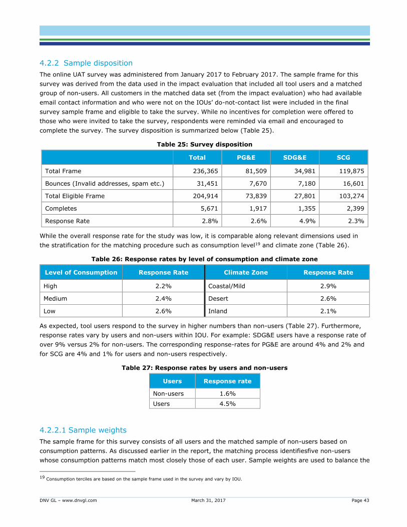
DNV GL – www.dnvgl.com March 31, 2017 Page 43
4.2.2 Sample disposition
The online UAT survey was administered from January 2017 to February 2017. The sample frame for this
survey was derived from the data used in the impact evaluation that included all tool users and a matched
group of non-users. All customers in the matched data set (from the impact evaluation) who had available
email contact information and who were not on the IOUs’ do-not-contact list were included in the final
survey sample frame and eligible to take the survey. While no incentives for completion were offered to
those who were invited to take the survey, respondents were reminded via email and encouraged to
complete the survey. The survey disposition is summarized below (Table 25).
Table 25: Survey disposition
Total PG&E SDG&E SCG
Total Frame 236,365 81,509 34,981 119,875
Bounces (Invalid addresses, spam etc.) 31,451 7,670 7,180 16,601
Total Eligible Frame 204,914 73,839 27,801 103,274
Completes 5,671 1,917 1,355 2,399
Response Rate 2.8% 2.6% 4.9% 2.3%
While the overall response rate for the study was low, it is comparable along relevant dimensions used in
the stratification for the matching procedure such as consumption level19 and climate zone (Table 26).
Table 26: Response rates by level of consumption and climate zone
Level of Consumption Response Rate Climate Zone Response Rate
High 2.2% Coastal/Mild 2.9%
Medium 2.4% Desert 2.6%
Low 2.6% Inland 2.1%
As expected, tool users respond to the survey in higher numbers than non-users (Table 27). Furthermore,
response rates vary by users and non-users within IOU. For example: SDG&E users have a response rate of
over 9% versus 2% for non-users. The corresponding response-rates for PG&E are around 4% and 2% and
for SCG are 4% and 1% for users and non-users respectively.
Table 27: Response rates by users and non-users
Users Response rate
Non-users 1.6%
Users 4.5%
4.2.2.1 Sample weights
The sample frame for this survey consists of all users and the matched sample of non-users based on
consumption patterns. As discussed earlier in the report, the matching process identifiesfive non-users
whose consumption patterns match most closely those of each user. Sample weights are used to balance the
19 Consumption terciles are based on the sample frame used in the survey and vary by IOU.
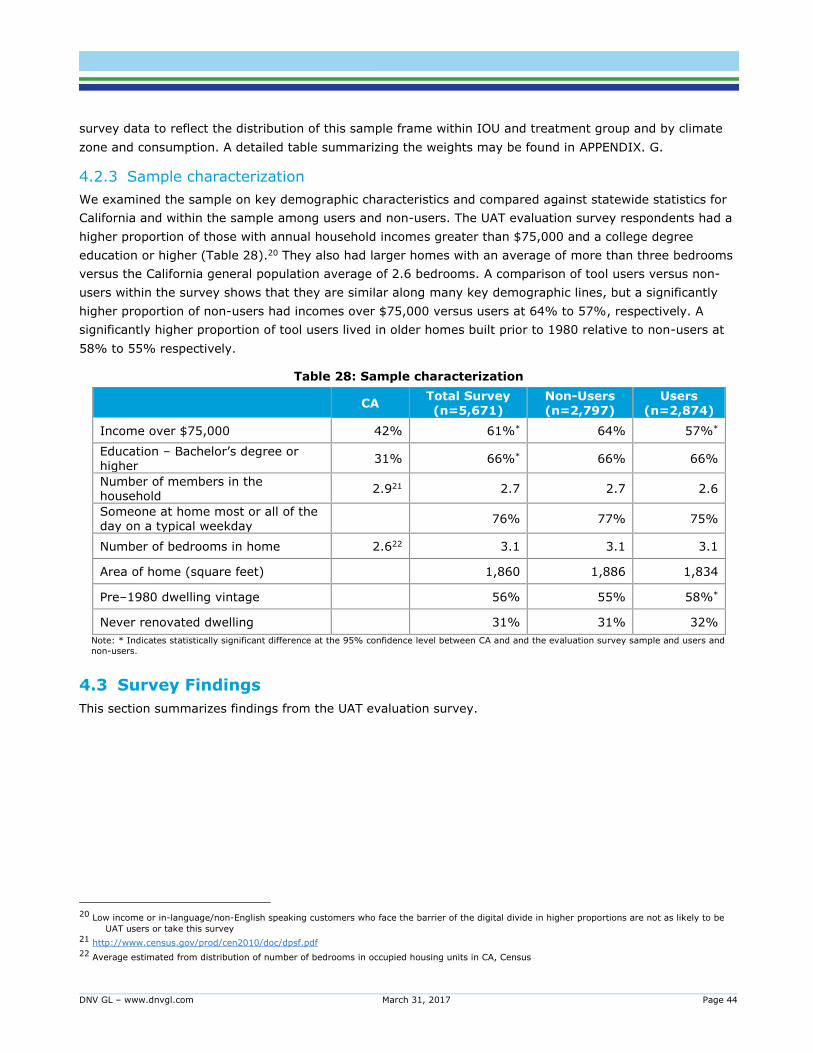
DNV GL – www.dnvgl.com March 31, 2017 Page 44
survey data to reflect the distribution of this sample frame within IOU and treatment group and by climate
zone and consumption. A detailed table summarizing the weights may be found in APPENDIX. G.
4.2.3 Sample characterization
We examined the sample on key demographic characteristics and compared against statewide statistics for
California and within the sample among users and non-users. The UAT evaluation survey respondents had a
higher proportion of those with annual household incomes greater than $75,000 and a college degree
education or higher (Table 28).20 They also had larger homes with an average of more than three bedrooms
versus the California general population average of 2.6 bedrooms. A comparison of tool users versus non-
users within the survey shows that they are similar along many key demographic lines, but a significantly
higher proportion of non-users had incomes over $75,000 versus users at 64% to 57%, respectively. A
significantly higher proportion of tool users lived in older homes built prior to 1980 relative to non-users at
58% to 55% respectively.
Table 28: Sample characterization
CA Total Survey (n=5,671)
Non-Users (n=2,797)
Users (n=2,874)
Income over $75,000 42% 61%* 64% 57%*
Education – Bachelor’s degree or higher
31% 66%* 66% 66%
Number of members in the household
2.921 2.7 2.7 2.6
Someone at home most or all of the day on a typical weekday
76% 77% 75%
Number of bedrooms in home 2.622 3.1 3.1 3.1
Area of home (square feet) 1,860 1,886 1,834
Pre–1980 dwelling vintage 56% 55% 58%*
Never renovated dwelling 31% 31% 32%
Note: * Indicates statistically significant difference at the 95% confidence level between CA and and the evaluation survey sample and users and
non-users.
4.3 Survey Findings
This section summarizes findings from the UAT evaluation survey.
20 Low income or in-language/non-English speaking customers who face the barrier of the digital divide in higher proportions are not as likely to be
UAT users or take this survey 21 http://www.census.gov/prod/cen2010/doc/dpsf.pdf
22 Average estimated from distribution of number of bedrooms in occupied housing units in CA, Census
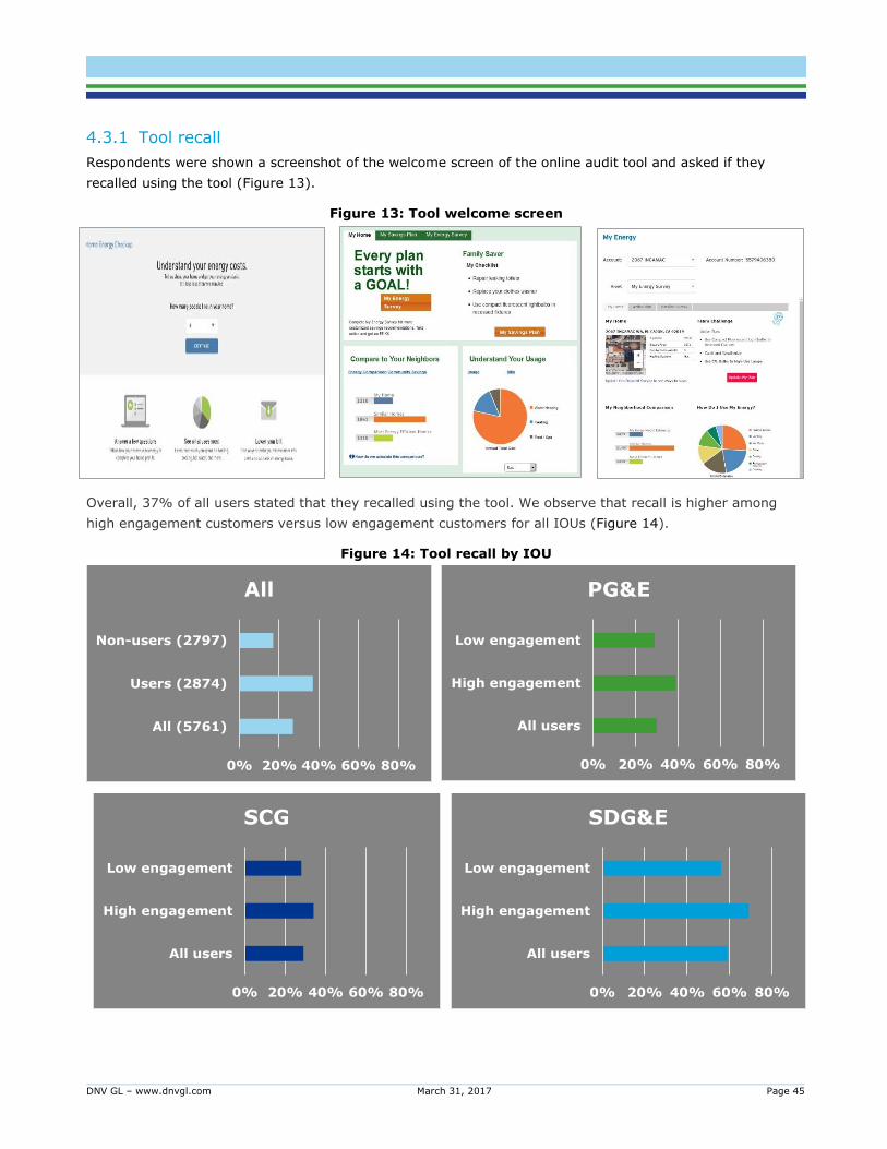
DNV GL – www.dnvgl.com March 31, 2017 Page 45
4.3.1 Tool recall
Respondents were shown a screenshot of the welcome screen of the online audit tool and asked if they
recalled using the tool (Figure 13).
Figure 13: Tool welcome screen
Overall, 37% of all users stated that they recalled using the tool. We observe that recall is higher among
high engagement customers versus low engagement customers for all IOUs (Figure 14).
Figure 14: Tool recall by IOU
0% 20% 40% 60% 80%
All (5761)
Users (2874)
Non-users (2797)
All
0% 20% 40% 60% 80%
All users
High engagement
Low engagement
PG&E
0% 20% 40% 60% 80%
All users
High engagement
Low engagement
SCG
0% 20% 40% 60% 80%
All users
High engagement
Low engagement
SDG&E
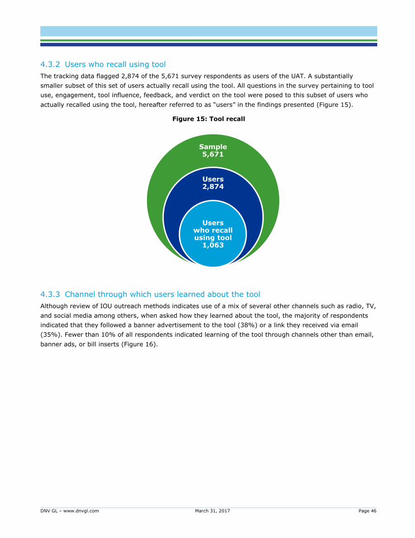
DNV GL – www.dnvgl.com March 31, 2017 Page 46
4.3.2 Users who recall using tool
The tracking data flagged 2,874 of the 5,671 survey respondents as users of the UAT. A substantially
smaller subset of this set of users actually recall using the tool. All questions in the survey pertaining to tool
use, engagement, tool influence, feedback, and verdict on the tool were posed to this subset of users who
actually recalled using the tool, hereafter referred to as “users” in the findings presented (Figure 15).
Figure 15: Tool recall
4.3.3 Channel through which users learned about the tool
Although review of IOU outreach methods indicates use of a mix of several other channels such as radio, TV,
and social media among others, when asked how they learned about the tool, the majority of respondents
indicated that they followed a banner advertisement to the tool (38%) or a link they received via email
(35%). Fewer than 10% of all respondents indicated learning of the tool through channels other than email,
banner ads, or bill inserts (Figure 16).
Sample 5,671
Users 2,874
Users who recall using tool
1,063
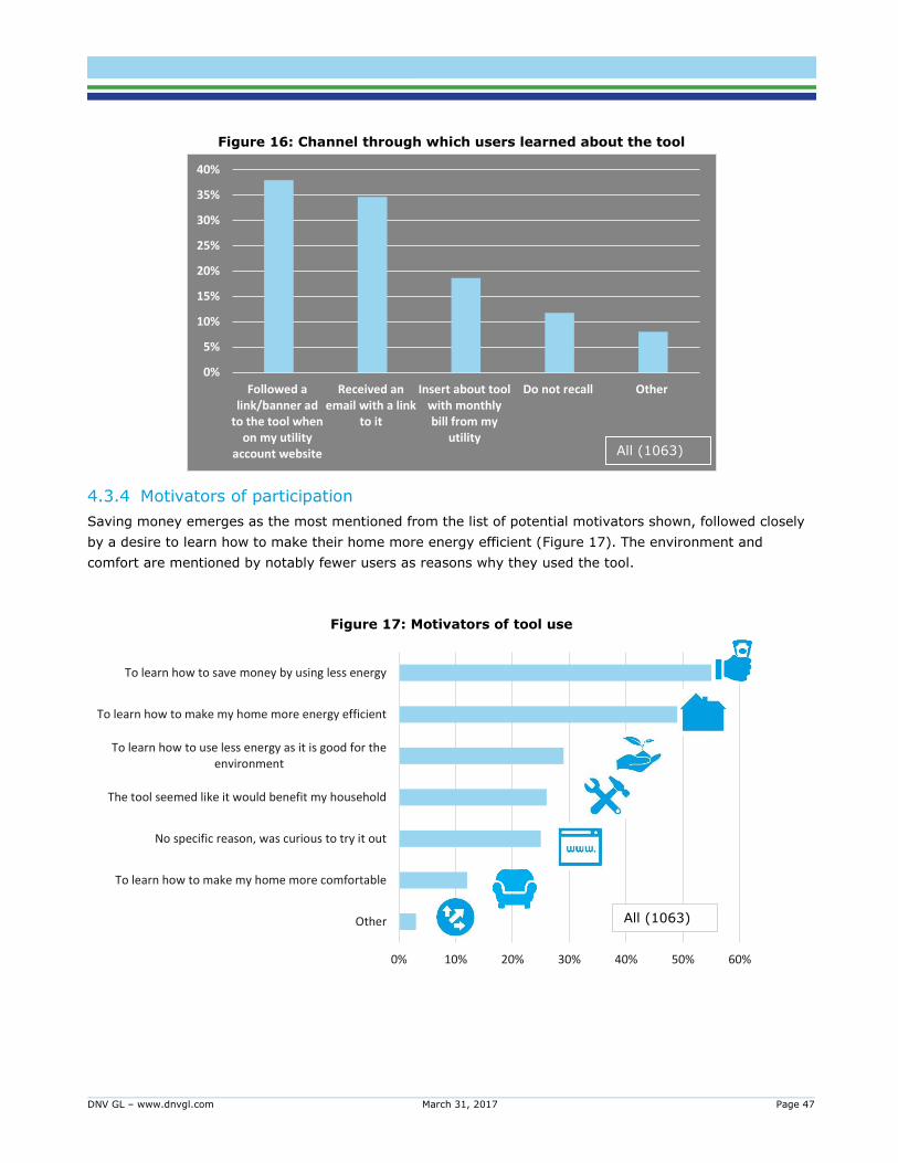
DNV GL – www.dnvgl.com March 31, 2017 Page 47
Figure 16: Channel through which users learned about the tool
4.3.4 Motivators of participation
Saving money emerges as the most mentioned from the list of potential motivators shown, followed closely
by a desire to learn how to make their home more energy efficient (Figure 17). The environment and
comfort are mentioned by notably fewer users as reasons why they used the tool.
Figure 17: Motivators of tool use
0%
5%
10%
15%
20%
25%
30%
35%
40%
Followed alink/banner ad
to the tool whenon my utility
account website
Received anemail with a link
to it
Insert about toolwith monthlybill from my
utility
Do not recall Other
All (1063)
Other
To learn how to make my home more comfortable
No specific reason, was curious to try it out
The tool seemed like it would benefit my household
To learn how to use less energy as it is good for theenvironment
To learn how to make my home more energy efficient
To learn how to save money by using less energy
0% 10% 20% 30% 40% 50% 60%
All (1063)
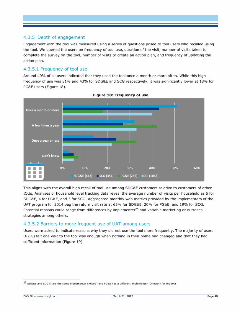
DNV GL – www.dnvgl.com March 31, 2017 Page 48
4.3.5 Depth of engagement
Engagement with the tool was measured using a series of questions posed to tool users who recalled using
the tool. We queried the users on frequency of tool use, duration of the visit, number of visits taken to
complete the survey on the tool, number of visits to create an action plan, and frequency of updating the
action plan.
4.3.5.1 Frequency of tool use
Around 40% of all users indicated that they used the tool once a month or more often. While this high
frequency of use was 51% and 43% for SDG&E and SCG respectively, it was significantly lower at 18% for
PG&E users (Figure 18).
Figure 18: Frequency of use
This aligns with the overall high recall of tool use among SDG&E customers relative to customers of other
IOUs. Analyses of household level tracking data reveal the average number of visits per household as 5 for
SDG&E, 4 for PG&E, and 3 for SCG. Aggregated monthly web metrics provided by the implementers of the
UAT program for 2014 peg the return visit rate at 65% for SDG&E, 20% for PG&E, and 19% for SCG.
Potential reasons could range from differences by implementer23 and variable marketing or outreach
strategies among others.
4.3.5.2 Barriers to more frequent use of UAT among users
Users were asked to indicate reasons why they did not use the tool more frequently. The majority of users
(62%) felt one visit to the tool was enough when nothing in their home had changed and that they had
sufficient information (Figure 19).
23 SDG&E and SCG share the same implementer (Aclara) and PG&E has a different implementer (OPower) for the UAT
0% 10% 20% 30% 40% 50% 60%
Don't know
Once a year or less
A few times a year
Once a month or more
SDG&E (443) SCG (354) PG&E (266) All (1063)
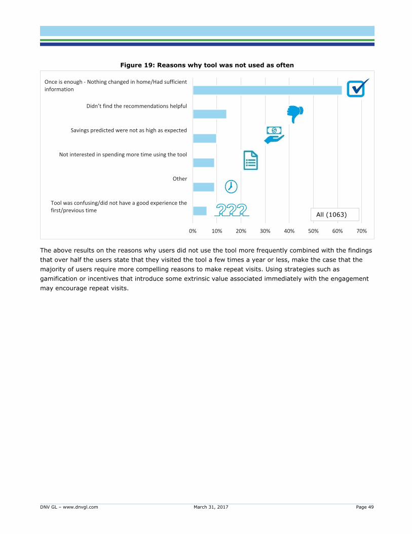
DNV GL – www.dnvgl.com March 31, 2017 Page 49
Figure 19: Reasons why tool was not used as often
The above results on the reasons why users did not use the tool more frequently combined with the findings
that over half the users state that they visited the tool a few times a year or less, make the case that the
majority of users require more compelling reasons to make repeat visits. Using strategies such as
gamification or incentives that introduce some extrinsic value associated immediately with the engagement
may encourage repeat visits.
Tool was confusing/did not have a good experience thefirst/previous time
Other
Not interested in spending more time using the tool
Savings predicted were not as high as expected
Didn’t find the recommendations helpful
Once is enough - Nothing changed in home/Had sufficientinformation
0% 10% 20% 30% 40% 50% 60% 70%
All (1063)
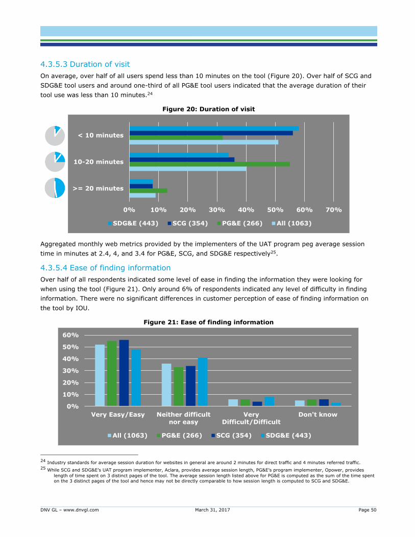
DNV GL – www.dnvgl.com March 31, 2017 Page 50
4.3.5.3 Duration of visit
On average, over half of all users spend less than 10 minutes on the tool (Figure 20). Over half of SCG and
SDG&E tool users and around one-third of all PG&E tool users indicated that the average duration of their
tool use was less than 10 minutes.24
Figure 20: Duration of visit
Aggregated monthly web metrics provided by the implementers of the UAT program peg average session
time in minutes at 2.4, 4, and 3.4 for PG&E, SCG, and SDG&E respectively25.
4.3.5.4 Ease of finding information
Over half of all respondents indicated some level of ease in finding the information they were looking for
when using the tool (Figure 21). Only around 6% of respondents indicated any level of difficulty in finding
information. There were no significant differences in customer perception of ease of finding information on
the tool by IOU.
Figure 21: Ease of finding information
24 Industry standards for average session duration for websites in general are around 2 minutes for direct traffic and 4 minutes referred traffic.
25 While SCG and SDG&E’s UAT program implementer, Aclara, provides average session length, PG&E’s program implementer, Opower, provides
length of time spent on 3 distinct pages of the tool. The average session length listed above for PG&E is computed as the sum of the time spent
on the 3 distinct pages of the tool and hence may not be directly comparable to how session length is computed to SCG and SDG&E.
0% 10% 20% 30% 40% 50% 60% 70%
>= 20 minutes
10-20 minutes
< 10 minutes
SDG&E (443) SCG (354) PG&E (266) All (1063)
0%
10%
20%
30%
40%
50%
60%
Very Easy/Easy Neither difficult
nor easy
Very
Difficult/Difficult
Don't know
All (1063) PG&E (266) SCG (354) SDG&E (443)
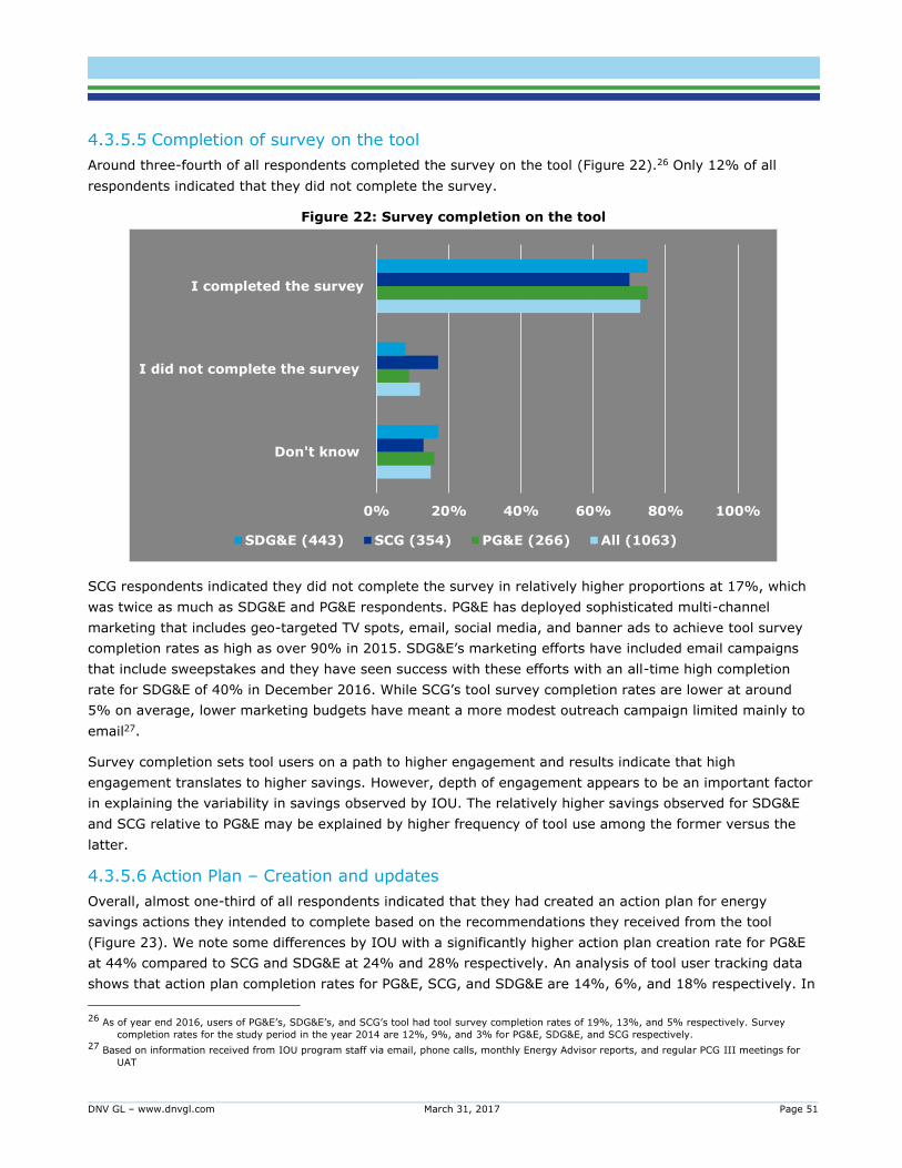
DNV GL – www.dnvgl.com March 31, 2017 Page 51
4.3.5.5 Completion of survey on the tool
Around three-fourth of all respondents completed the survey on the tool (Figure 22).26 Only 12% of all
respondents indicated that they did not complete the survey.
Figure 22: Survey completion on the tool
SCG respondents indicated they did not complete the survey in relatively higher proportions at 17%, which
was twice as much as SDG&E and PG&E respondents. PG&E has deployed sophisticated multi-channel
marketing that includes geo-targeted TV spots, email, social media, and banner ads to achieve tool survey
completion rates as high as over 90% in 2015. SDG&E’s marketing efforts have included email campaigns
that include sweepstakes and they have seen success with these efforts with an all-time high completion
rate for SDG&E of 40% in December 2016. While SCG’s tool survey completion rates are lower at around
5% on average, lower marketing budgets have meant a more modest outreach campaign limited mainly to
email27.
Survey completion sets tool users on a path to higher engagement and results indicate that high
engagement translates to higher savings. However, depth of engagement appears to be an important factor
in explaining the variability in savings observed by IOU. The relatively higher savings observed for SDG&E
and SCG relative to PG&E may be explained by higher frequency of tool use among the former versus the
latter.
4.3.5.6 Action Plan – Creation and updates
Overall, almost one-third of all respondents indicated that they had created an action plan for energy
savings actions they intended to complete based on the recommendations they received from the tool
(Figure 23). We note some differences by IOU with a significantly higher action plan creation rate for PG&E
at 44% compared to SCG and SDG&E at 24% and 28% respectively. An analysis of tool user tracking data
shows that action plan completion rates for PG&E, SCG, and SDG&E are 14%, 6%, and 18% respectively. In
26 As of year end 2016, users of PG&E’s, SDG&E’s, and SCG’s tool had tool survey completion rates of 19%, 13%, and 5% respectively. Survey
completion rates for the study period in the year 2014 are 12%, 9%, and 3% for PG&E, SDG&E, and SCG respectively. 27 Based on information received from IOU program staff via email, phone calls, monthly Energy Advisor reports, and regular PCG III meetings for
UAT
0% 20% 40% 60% 80% 100%
Don't know
I did not complete the survey
I completed the survey
SDG&E (443) SCG (354) PG&E (266) All (1063)
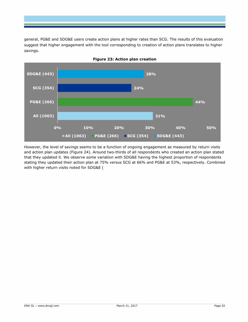
DNV GL – www.dnvgl.com March 31, 2017 Page 52
general, PG&E and SDG&E users create action plans at higher rates than SCG. The results of this evaluation
suggest that higher engagement with the tool corresponding to creation of action plans translates to higher
savings.
Figure 23: Action plan creation
However, the level of savings seems to be a function of ongoing engagement as measured by return visits
and action plan updates (Figure 24). Around two-thirds of all respondents who created an action plan stated
that they updated it. We observe some variation with SDG&E having the highest proportion of respondents
stating they updated their action plan at 75% versus SCG at 66% and PG&E at 53%, respectively. Combined
with higher return visits noted for SDG&E (
31%
44%
24%
28%
All (1063)
PG&E (266)
SCG (354)
SDG&E (443)
0% 10% 20% 30% 40% 50%
All (1063) PG&E (266) SCG (354) SDG&E (443)
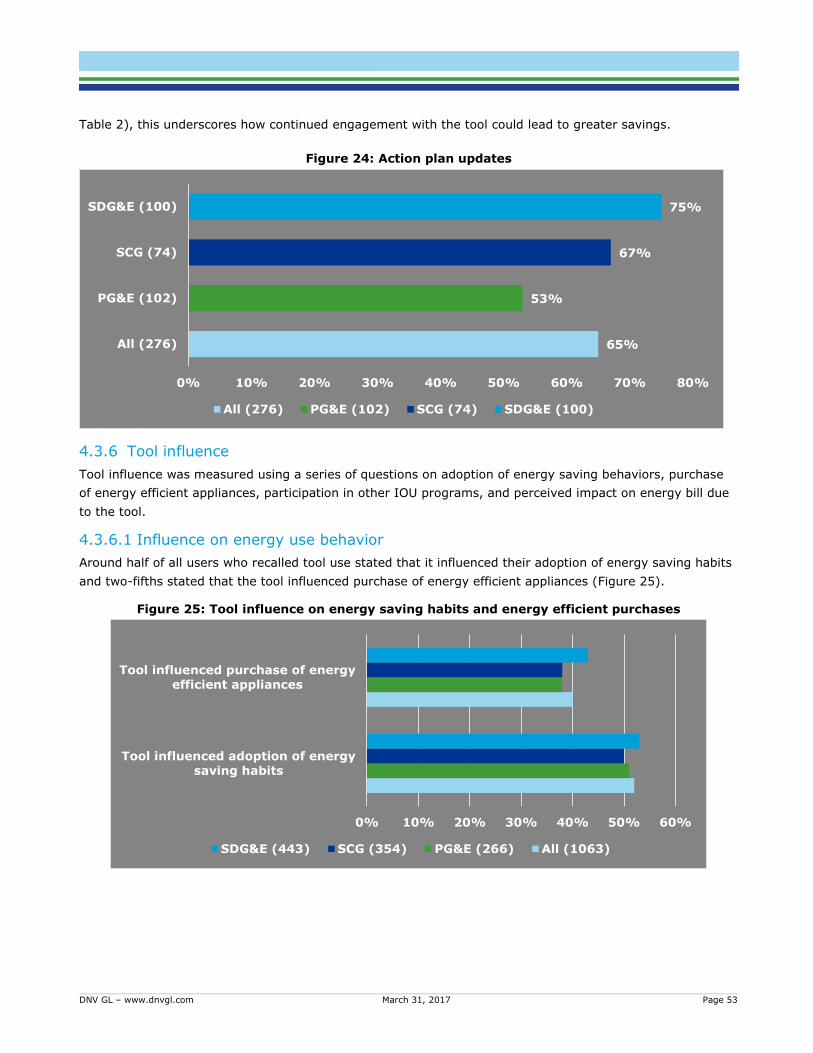
DNV GL – www.dnvgl.com March 31, 2017 Page 53
Table 2), this underscores how continued engagement with the tool could lead to greater savings.
Figure 24: Action plan updates
4.3.6 Tool influence
Tool influence was measured using a series of questions on adoption of energy saving behaviors, purchase
of energy efficient appliances, participation in other IOU programs, and perceived impact on energy bill due
to the tool.
4.3.6.1 Influence on energy use behavior
Around half of all users who recalled tool use stated that it influenced their adoption of energy saving habits
and two-fifths stated that the tool influenced purchase of energy efficient appliances (Figure 25).
Figure 25: Tool influence on energy saving habits and energy efficient purchases
65%
53%
67%
75%
All (276)
PG&E (102)
SCG (74)
SDG&E (100)
0% 10% 20% 30% 40% 50% 60% 70% 80%
All (276) PG&E (102) SCG (74) SDG&E (100)
0% 10% 20% 30% 40% 50% 60%
Tool influenced adoption of energy
saving habits
Tool influenced purchase of energy
efficient appliances
SDG&E (443) SCG (354) PG&E (266) All (1063)
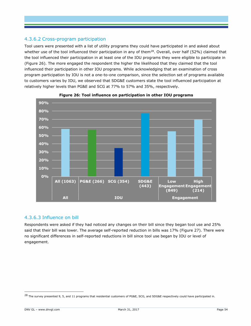
DNV GL – www.dnvgl.com March 31, 2017 Page 54
4.3.6.2 Cross-program participation
Tool users were presented with a list of utility programs they could have participated in and asked about
whether use of the tool influenced their participation in any of them28. Overall, over half (52%) claimed that
the tool influenced their participation in at least one of the IOU programs they were eligible to participate in
(Figure 26). The more engaged the respondent the higher the likelihood that they claimed that the tool
influenced their participation in other IOU programs. While acknowledging that an examination of cross
program participation by IOU is not a one-to-one comparison, since the selection set of programs available
to customers varies by IOU, we observed that SDG&E customers state the tool influenced participation at
relatively higher levels than PG&E and SCG at 77% to 57% and 35%, respectively.
Figure 26: Tool influence on participation in other IOU programs
4.3.6.3 Influence on bill
Respondents were asked if they had noticed any changes on their bill since they began tool use and 25%
said that their bill was lower. The average self-reported reduction in bills was 17% (Figure 27). There were
no significant differences in self-reported reductions in bill since tool use began by IOU or level of
engagement.
28 The survey presented 9, 5, and 11 programs that residential customers of PG&E, SCG, and SDG&E respectively could have participated in.
0%
10%
20%
30%
40%
50%
60%
70%
80%
90%
All (1063) PG&E (266) SCG (354) SDG&E
(443)
Low
Engagement
(849)
High
Engagement
(214)
All IOU Engagement
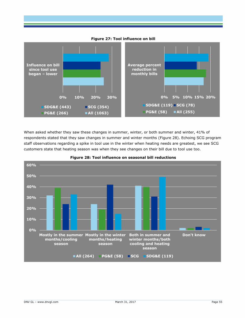
DNV GL – www.dnvgl.com March 31, 2017 Page 55
Figure 27: Tool influence on bill
When asked whether they saw these changes in summer, winter, or both summer and winter, 41% of
respondents stated that they saw changes in summer and winter months (Figure 28). Echoing SCG program
staff observations regarding a spike in tool use in the winter when heating needs are greatest, we see SCG
customers state that heating season was when they see changes on their bill due to tool use too.
Figure 28: Tool influence on seasonal bill reductions
0% 10% 20% 30%
Influence on bill
since tool use began – lower
SDG&E (443) SCG (354)
PG&E (266) All (1063)
0%
10%
20%
30%
40%
50%
60%
Mostly in the summer
months/cooling
season
Mostly in the winter
months/heating
season
Both in summer and
winter months/both
cooling and heating
season
Don't know
All (264) PG&E (58) SCG SDG&E (119)
0% 5% 10% 15% 20%
Average percent
reduction in
monthly bills
SDG&E (119) SCG (78)
PG&E (58) All (255)
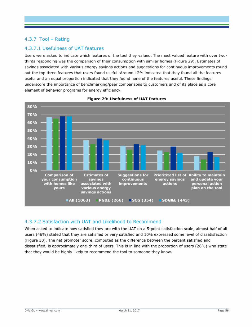
DNV GL – www.dnvgl.com March 31, 2017 Page 56
4.3.7 Tool – Rating
4.3.7.1 Usefulness of UAT features
Users were asked to indicate which features of the tool they valued. The most valued feature with over two-
thirds responding was the comparison of their consumption with similar homes (Figure 29). Estimates of
savings associated with various energy savings actions and suggestions for continuous improvements round
out the top three features that users found useful. Around 12% indicated that they found all the features
useful and an equal proportion indicated that they found none of the features useful. These findings
underscore the importance of benchmarking/peer comparisons to customers and of its place as a core
element of behavior programs for energy efficiency.
Figure 29: Usefulness of UAT features
4.3.7.2 Satisfaction with UAT and Likelihood to Recommend
When asked to indicate how satisfied they are with the UAT on a 5-point satisfaction scale, almost half of all
users (46%) stated that they are satisfied or very satisfied and 10% expressed some level of dissatisfaction
(Figure 30). The net promoter score, computed as the difference between the percent satisfied and
dissatisfied, is approximately one-third of users. This is in line with the proportion of users (28%) who state
that they would be highly likely to recommend the tool to someone they know.
0%
10%
20%
30%
40%
50%
60%
70%
80%
Comparison ofyour consumptionwith homes like
yours
Estimates ofsavings
associated withvarious energysavings actions
Suggestions forcontinuous
improvements
Prioritized list ofenergy savings
actions
Ability to maintainand update yourpersonal actionplan on the tool
All (1063) PG&E (266) SCG (354) SDG&E (443)
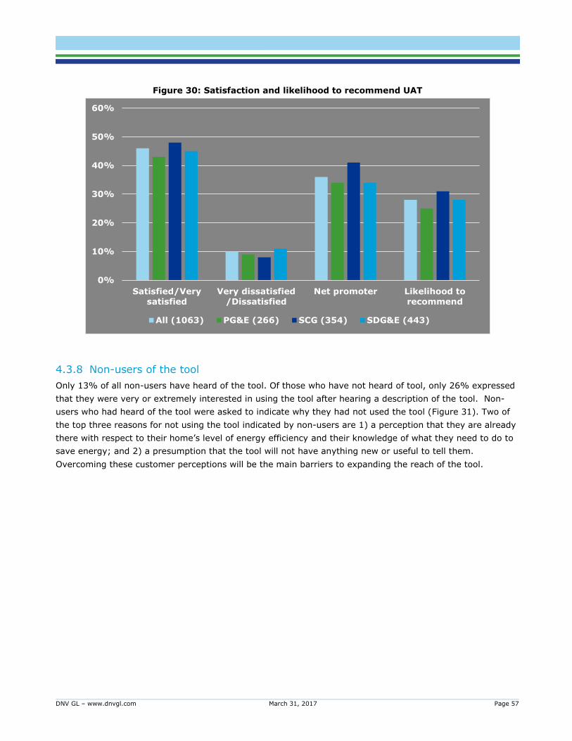
DNV GL – www.dnvgl.com March 31, 2017 Page 57
Figure 30: Satisfaction and likelihood to recommend UAT
4.3.8 Non-users of the tool
Only 13% of all non-users have heard of the tool. Of those who have not heard of tool, only 26% expressed
that they were very or extremely interested in using the tool after hearing a description of the tool. Non-
users who had heard of the tool were asked to indicate why they had not used the tool (Figure 31). Two of
the top three reasons for not using the tool indicated by non-users are 1) a perception that they are already
there with respect to their home’s level of energy efficiency and their knowledge of what they need to do to
save energy; and 2) a presumption that the tool will not have anything new or useful to tell them.
Overcoming these customer perceptions will be the main barriers to expanding the reach of the tool.
0%
10%
20%
30%
40%
50%
60%
Satisfied/Very
satisfied
Very dissatisfied
/Dissatisfied
Net promoter Likelihood to
recommend
All (1063) PG&E (266) SCG (354) SDG&E (443)
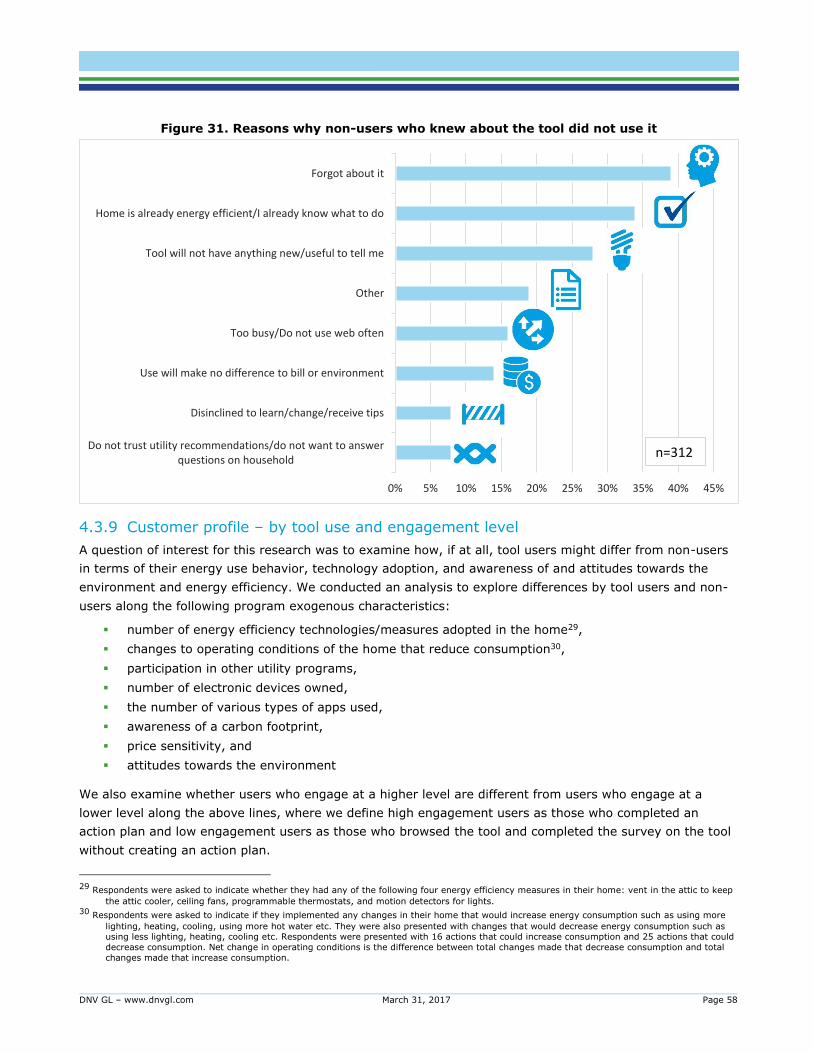
DNV GL – www.dnvgl.com March 31, 2017 Page 58
Figure 31. Reasons why non-users who knew about the tool did not use it
4.3.9 Customer profile – by tool use and engagement level
A question of interest for this research was to examine how, if at all, tool users might differ from non-users
in terms of their energy use behavior, technology adoption, and awareness of and attitudes towards the
environment and energy efficiency. We conducted an analysis to explore differences by tool users and non-
users along the following program exogenous characteristics:
number of energy efficiency technologies/measures adopted in the home29,
changes to operating conditions of the home that reduce consumption30,
participation in other utility programs,
number of electronic devices owned,
the number of various types of apps used,
awareness of a carbon footprint,
price sensitivity, and
attitudes towards the environment
We also examine whether users who engage at a higher level are different from users who engage at a
lower level along the above lines, where we define high engagement users as those who completed an
action plan and low engagement users as those who browsed the tool and completed the survey on the tool
without creating an action plan.
29 Respondents were asked to indicate whether they had any of the following four energy efficiency measures in their home: vent in the attic to keep
the attic cooler, ceiling fans, programmable thermostats, and motion detectors for lights. 30 Respondents were asked to indicate if they implemented any changes in their home that would increase energy consumption such as using more
lighting, heating, cooling, using more hot water etc. They were also presented with changes that would decrease energy consumption such as using less lighting, heating, cooling etc. Respondents were presented with 16 actions that could increase consumption and 25 actions that could
decrease consumption. Net change in operating conditions is the difference between total changes made that decrease consumption and total
changes made that increase consumption.
Do not trust utility recommendations/do not want to answerquestions on household
Disinclined to learn/change/receive tips
Use will make no difference to bill or environment
Too busy/Do not use web often
Other
Tool will not have anything new/useful to tell me
Home is already energy efficient/I already know what to do
Forgot about it
0% 5% 10% 15% 20% 25% 30% 35% 40% 45%
n=312
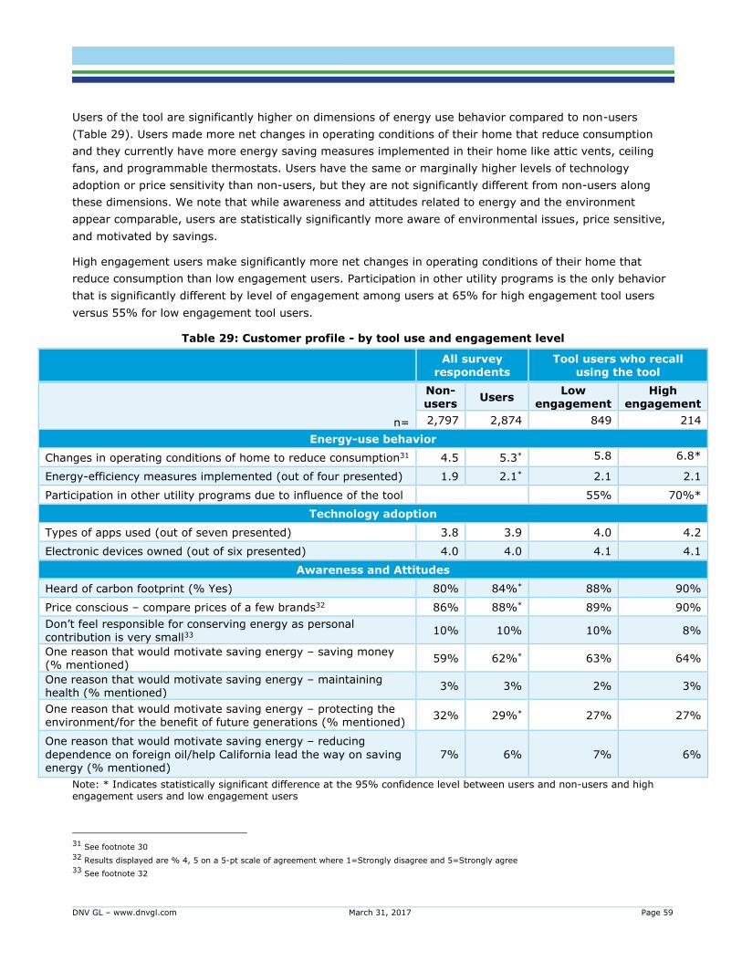
DNV GL – www.dnvgl.com March 31, 2017 Page 59
Users of the tool are significantly higher on dimensions of energy use behavior compared to non-users
(Table 29). Users made more net changes in operating conditions of their home that reduce consumption
and they currently have more energy saving measures implemented in their home like attic vents, ceiling
fans, and programmable thermostats. Users have the same or marginally higher levels of technology
adoption or price sensitivity than non-users, but they are not significantly different from non-users along
these dimensions. We note that while awareness and attitudes related to energy and the environment
appear comparable, users are statistically significantly more aware of environmental issues, price sensitive,
and motivated by savings.
High engagement users make significantly more net changes in operating conditions of their home that
reduce consumption than low engagement users. Participation in other utility programs is the only behavior
that is significantly different by level of engagement among users at 65% for high engagement tool users
versus 55% for low engagement tool users.
Table 29: Customer profile - by tool use and engagement level
All survey
respondents Tool users who recall
using the tool
n=
Non-users
Users Low
engagement High
engagement
2,797 2,874 849 214
Energy-use behavior
Changes in operating conditions of home to reduce consumption31 4.5 5.3* 5.8 6.8*
Energy-efficiency measures implemented (out of four presented) 1.9 2.1* 2.1 2.1
Participation in other utility programs due to influence of the tool 55% 70%*
Technology adoption
Types of apps used (out of seven presented) 3.8 3.9 4.0 4.2
Electronic devices owned (out of six presented) 4.0 4.0 4.1 4.1
Awareness and Attitudes
Heard of carbon footprint (% Yes) 80% 84%* 88% 90%
Price conscious – compare prices of a few brands32 86% 88%* 89% 90%
Don’t feel responsible for conserving energy as personal contribution is very small33
10% 10% 10% 8%
One reason that would motivate saving energy – saving money (% mentioned)
59% 62%* 63% 64%
One reason that would motivate saving energy – maintaining health (% mentioned)
3% 3% 2% 3%
One reason that would motivate saving energy – protecting the environment/for the benefit of future generations (% mentioned)
32% 29%* 27% 27%
One reason that would motivate saving energy – reducing
dependence on foreign oil/help California lead the way on saving energy (% mentioned)
7% 6% 7% 6%
Note: * Indicates statistically significant difference at the 95% confidence level between users and non-users and high engagement users and low engagement users
31 See footnote 30
32 Results displayed are % 4, 5 on a 5-pt scale of agreement where 1=Strongly disagree and 5=Strongly agree
33 See footnote 32

DNV GL – www.dnvgl.com March 31, 2017 Page 60
The above findings suggest that the audience the tool is trying to reach is not that divergent in terms of
their attitudes towards energy efficiency and the environment or in terms of how they use technology. Those
that do use the tool well seem better tuned in to other benefits offered by utility programs and this
manifests itself in the higher cross program participation and implementation of energy efficiency measures
we observe.
DNV GL – www.dnvgl.com March 31, 2017 Page 61
This evaluation estimates electric savings of around 1.2% to 2.0% and gas savings of 1.7% to 2.9%. These
savings are in the same magnitude as the established and much evaluated Home Energy Reports (HER)
programs. HER programs are opt-out programs, whereas the UAT is an opt-in program. This would argue
the case for expectations of higher savings from the opt-in UAT program with self-driven, motivated
participants at the outset versus the opt-out HER program that could include relatively unmotivated
customers in the treatment group.
On the other hand, while the opt-out HER program delivers a uniform “dose” of information with the same
frequency to all those in the “treatment” group, the UAT program is driven entirely by the customer’s
interaction with the tool which is highly variable. The strength and frequency of the dose in the treatment
group in the opt-in UAT program varies by each user’s level of interaction with the tool. The net treatment
effect of the tool is moderated by inactive or dormant customers resulting in savings estimates that are not
as high. We see this effect reflected in the difference in savings estimates for high engagement customers
that can be as much as 2x to 3x the savings estimates for low engagement customers.
While it is the case that the years 2015 and 2016 combined have had lower participation than the previous
two full years combined, IOU program staff indicate a focus on improving the level of engagement among
users. Completion ratios are the highest in 2015 and 2016 relative to previous years. The IOUs have
employed various marketing methods to inform customers about the tool including banners on the utility
website, email campaigns, television ads, direct mail, radio ads, and online newsletter ads. Variable
Prioritize converting current users to a higher level of engagement. Survey and impact results in
combination indicate increased savings from moving already acquired users up into higher levels of
engagement is likely to be greater than the yield from new users with high acquisition costs.
DNV GL – www.dnvgl.com March 31, 2017 Page 62
completion goals, customer base, tool implementers, marketing budgets, and strategies have meant that
completion rates have varied over time and by IOU.
PG&E has deployed sophisticated multi-channel marketing that includes geo-targeted TV spots, email, social
media, and banner ads to achieve completion rates over 90% in 2015. The highest completion rate achieved
to date has been by PG&E in December 2015 when it deployed an all-electronic marketing mix of social
media, email, digital banners, and search engine marketing (SEM) that yield a 92% completion rate.
SDG&E’s marketing efforts have included email campaigns that include sweepstakes and they have seen
success with these efforts with an all-time high completion rate for SDG&E of 40% in December 2016. While
SCG’s completion rates are lower at around 5% on average, lower marketing budgets have meant a more
modest outreach campaign limited mainly to email.
Around half of all users indicated that they used the tool a few times a year or less. The majority of users
(62%) felt one visit to the tool was enough since nothing in their home had changed or that they had
sufficient information.
Users are different from non-users in terms of their energy use behavior but not in their attitudes towards
the environment and technology adoption. High engaged users are not that different from low engaged
users. The barriers to participation then reduce to the perceived value of the tool. As our results indicate,
two of the top three reasons indicated by non-users relate to either a perception that they are already there
with respect to their home’s level of energy efficiency and their knowledge of what they need to do to save
energy or to a presumption that the tool will not have anything new or useful to tell them.
The majority of users indicated that they followed a link/banner ad to the tool when on their utility
website or that they received an email with a link to the tool. As such, we recommend prioritize using
electronic methods of promotion and outreach to help market the web-based tool.
Message the value of repeat visits. Messaging, possibly derived through self-learning algorithms
underlying the tool, that underscores the value of repeat visits/the next visit – such as continued,
customized and valuable information that encourage the customers to continue to engage with the
tool – will be more effective.
Present customer testimonials of successful savings through engagement to low engaged customers.
Match such testimonials to low engaged customers by baseline consumption, daily use pattern and
other relevant dimensions to provide empirical evidence of tool efficacy that they can trust and that
will spur them to action.
DNV GL – www.dnvgl.com March 31, 2017 Page 63
An objective of this research was to ascertain whether AMI data facilitates a more accurate matched
comparison group. Results for the model-based matching generated using AMI data indicate well-balanced
comparison and treatment matches. In addition, the quality of matches improved substantially for SDG&E
electricity data while the conclusion on PG&E electricity data remains unchanged.
5.1 Areas for future research
This evaluation indicates that California's Universal Audit Tool program realizes significant savings. In order
to improve program performance, understanding potential drivers of high performance leads to the following
areas worthy of future research:
1. Location. It is possible that location is responsible for the noted engagement depths and savings
differences. For instance, relatively high participation rates from SDG&E’s inland users could
contribute to the high savings observed. Future study would control for location to establish the
causal links more directly.
2. Marketing. Marketing efforts in 2015 resulted in higher tool survey completion rates for PG&E and
SDG&E. An interesting area of future research would be to examine how these impact depth of
engagement with the tool and, in turn, savings.
3. Consumption. Several energy efficiency behavioral programs prioritize high energy consumption
customers as targets to achieve greater savings. While this evaluation does not explore the
relationship between savings and consumption, this is an area worth future study.
The exploratory work in model-based matching suggests there could be benefits from using AMI data in
matching.
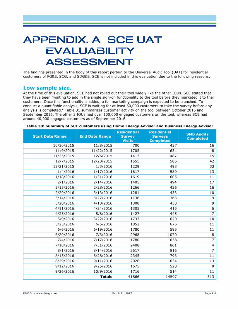
DNV GL – www.dnvgl.com March 31, 2017 Page A-1
The findings presented in the body of this report pertain to the Universal Audit Tool (UAT) for residential customers of PG&E, SCG, and SDG&E. SCE is not included in this evaluation due to the following reasons:
Low sample size. At the time of this evaluation, SCE had not rolled out their tool widely like the other IOUs. SCE stated that they have been “waiting to add in the single sign-on functionality to the tool before they marketed it to their
customers. Once this functionality is added, a full marketing campaign is expected to be launched. To conduct a quantifiable analysis, SCE is waiting for at least 60,000 customers to take the survey before any
analysis is completed." Table 31 summarizes customer activity on the tool between October 2015 and September 2016. The other 3 IOUs had over 100,000 engaged customers on the tool, whereas SCE had around 40,000 engaged customers as of September 2016.
Table 30: Summary of SCE customers using Home Energy Advisor and Business Energy Advisor
Start Date Range End Date Range Residential
Survey Visits
Residential Surveys
Completed
SMB Audits
Completed
10/30/2015 11/8/2015 700 437 16
11/9/2015 11/22/2015 1705 634 8
11/23/2015 12/6/2015 1413 487 15
12/7/2015 12/20/2015 1555 586 42
12/21/2015 1/3/2016 1229 498 33
1/4/2016 1/17/2016 1617 589 13
1/18/2016 1/31/2016 1619 605 11
2/1/2016 2/14/2016 1405 494 17
2/15/2016 2/28/2016 1266 436 16
2/29/2016 3/13/2016 1281 433 10
3/14/2016 3/27/2016 1136 363 9
3/28/2016 4/10/2016 1308 438 9
4/11/2016 4/24/2016 1305 415 6
4/25/2016 5/8/2016 1427 445 7
5/9/2016 5/22/2016 1733 620 10
5/23/2016 6/5/2016 1852 676 11
6/6/2016 6/19/2016 1780 595 11
6/20/2016 7/3/2016 2968 1070 8
7/4/2016 7/17/2016 1780 638 7
7/18/2016 7/31/2016 2408 861 4
8/1/2016 8/14/2016 2617 816 7
8/15/2016 8/28/2016 2345 793 11
8/29/2016 9/11/2016 2026 634 13
9/12/2016 9/25/2016 1675 520 8
9/26/2016 10/9/2016 1716 514 11
Totals 41866 14597 313
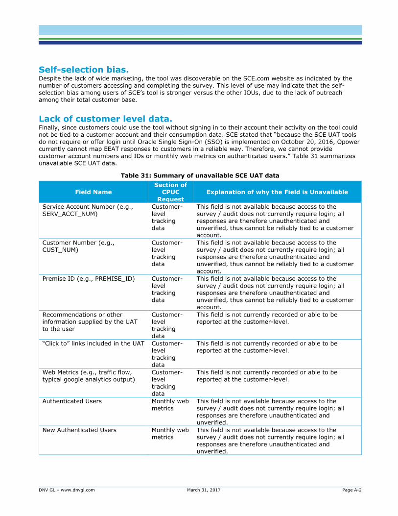
DNV GL – www.dnvgl.com March 31, 2017 Page A-2
Self-selection bias. Despite the lack of wide marketing, the tool was discoverable on the SCE.com website as indicated by the number of customers accessing and completing the survey. This level of use may indicate that the self-selection bias among users of SCE’s tool is stronger versus the other IOUs, due to the lack of outreach among their total customer base.
Lack of customer level data. Finally, since customers could use the tool without signing in to their account their activity on the tool could not be tied to a customer account and their consumption data. SCE stated that “because the SCE UAT tools do not require or offer login until Oracle Single Sign-On (SSO) is implemented on October 20, 2016, Opower currently cannot map EEAT responses to customers in a reliable way. Therefore, we cannot provide customer account numbers and IDs or monthly web metrics on authenticated users.” Table 31 summarizes
unavailable SCE UAT data.
Table 31: Summary of unavailable SCE UAT data
Field Name Section of
CPUC
Request
Explanation of why the Field is Unavailable
Service Account Number (e.g., SERV_ACCT_NUM)
Customer-level tracking data
This field is not available because access to the survey / audit does not currently require login; all responses are therefore unauthenticated and unverified, thus cannot be reliably tied to a customer account.
Customer Number (e.g., CUST_NUM)
Customer-level tracking data
This field is not available because access to the survey / audit does not currently require login; all responses are therefore unauthenticated and unverified, thus cannot be reliably tied to a customer account.
Premise ID (e.g., PREMISE_ID) Customer-
level tracking data
This field is not available because access to the
survey / audit does not currently require login; all responses are therefore unauthenticated and unverified, thus cannot be reliably tied to a customer account.
Recommendations or other information supplied by the UAT to the user
Customer-level tracking data
This field is not currently recorded or able to be reported at the customer-level.
“Click to” links included in the UAT Customer-level
tracking data
This field is not currently recorded or able to be reported at the customer-level.
Web Metrics (e.g., traffic flow, typical google analytics output)
Customer-level tracking
data
This field is not currently recorded or able to be reported at the customer-level.
Authenticated Users Monthly web metrics
This field is not available because access to the survey / audit does not currently require login; all responses are therefore unauthenticated and unverified.
New Authenticated Users Monthly web metrics
This field is not available because access to the survey / audit does not currently require login; all responses are therefore unauthenticated and unverified.
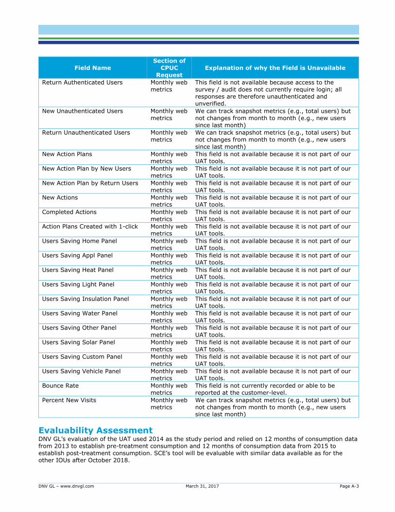
DNV GL – www.dnvgl.com March 31, 2017 Page A-3
Field Name Section of
CPUC
Request
Explanation of why the Field is Unavailable
Return Authenticated Users Monthly web metrics
This field is not available because access to the survey / audit does not currently require login; all responses are therefore unauthenticated and unverified.
New Unauthenticated Users Monthly web metrics
We can track snapshot metrics (e.g., total users) but not changes from month to month (e.g., new users since last month)
Return Unauthenticated Users Monthly web metrics
We can track snapshot metrics (e.g., total users) but not changes from month to month (e.g., new users
since last month)
New Action Plans Monthly web metrics
This field is not available because it is not part of our UAT tools.
New Action Plan by New Users Monthly web metrics
This field is not available because it is not part of our UAT tools.
New Action Plan by Return Users Monthly web metrics
This field is not available because it is not part of our UAT tools.
New Actions Monthly web metrics
This field is not available because it is not part of our UAT tools.
Completed Actions Monthly web metrics
This field is not available because it is not part of our UAT tools.
Action Plans Created with 1-click Monthly web metrics
This field is not available because it is not part of our UAT tools.
Users Saving Home Panel Monthly web metrics
This field is not available because it is not part of our UAT tools.
Users Saving Appl Panel Monthly web metrics
This field is not available because it is not part of our UAT tools.
Users Saving Heat Panel Monthly web metrics
This field is not available because it is not part of our UAT tools.
Users Saving Light Panel Monthly web metrics
This field is not available because it is not part of our UAT tools.
Users Saving Insulation Panel Monthly web metrics
This field is not available because it is not part of our UAT tools.
Users Saving Water Panel Monthly web metrics
This field is not available because it is not part of our UAT tools.
Users Saving Other Panel Monthly web
metrics
This field is not available because it is not part of our
UAT tools.
Users Saving Solar Panel Monthly web metrics
This field is not available because it is not part of our UAT tools.
Users Saving Custom Panel Monthly web
metrics
This field is not available because it is not part of our
UAT tools.
Users Saving Vehicle Panel Monthly web metrics
This field is not available because it is not part of our UAT tools.
Bounce Rate Monthly web
metrics
This field is not currently recorded or able to be
reported at the customer-level.
Percent New Visits Monthly web metrics
We can track snapshot metrics (e.g., total users) but not changes from month to month (e.g., new users since last month)
Evaluability Assessment DNV GL’s evaluation of the UAT used 2014 as the study period and relied on 12 months of consumption data from 2013 to establish pre-treatment consumption and 12 months of consumption data from 2015 to
establish post-treatment consumption. SCE’s tool will be evaluable with similar data available as for the other IOUs after October 2018.
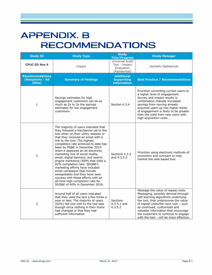
DNV GL – www.dnvgl.com March 31, 2017 Page B-1
Study ID Study Type Study
Title/Program Study Manager
CPUC ED Res 9
Impact
Universal Audit Tool - Impact
Evaluation (Residential)
Gomathi Sadhasivan
Recommendations (Recipients - All
IOUs) Summary of Findings
Additional Supporting Information
Best Practice / Recommendations
1
Savings estimates for high engagement customers can be as much as 2x to 3x the savings estimates for low engagement customers.
Section 4.3.4
Prioritize converting current users to a higher level of engagement.
Survey and impact results in combination indicate increased savings from moving already acquired users up into higher levels of engagement is likely to be greater than the yield from new users with high acquisition costs.
2
The majority of users indicated that they followed a link/banner ad to the tool when on their utility website or that they received an email with a link to the tool. The highest completion rate achieved to date has been by PG&E in December 2015 when it deployed an all-electronic marketing mix of social media, email, digital banners, and search engine marketing (SEM) that yield a 92% completion rate. SDG&E’s marketing efforts have included email campaigns that include sweepstakes and they have seen success with these efforts with an all-time high completion rate for SDG&E of 40% in December 2016.
Sections 4.3.3 and 4.3.5.5
Prioritize using electronic methods of promotion and outreach to help market the web-based tool.
3
Around half of all users indicated that they used the tool a few times a year or less. The majority of users (62%) felt one visit to the tool was enough since nothing in their home had changed or that they had sufficient information
Sections 4.3.5.1 and 4.3.5.2
Message the value of repeat visits. Messaging, possibly derived through self-learning algorithms underlying the tool, that underscores the value of repeat visits/the next visit – such as continued, customized and valuable information that encourage the customers to continue to engage with the tool – will be more effective.
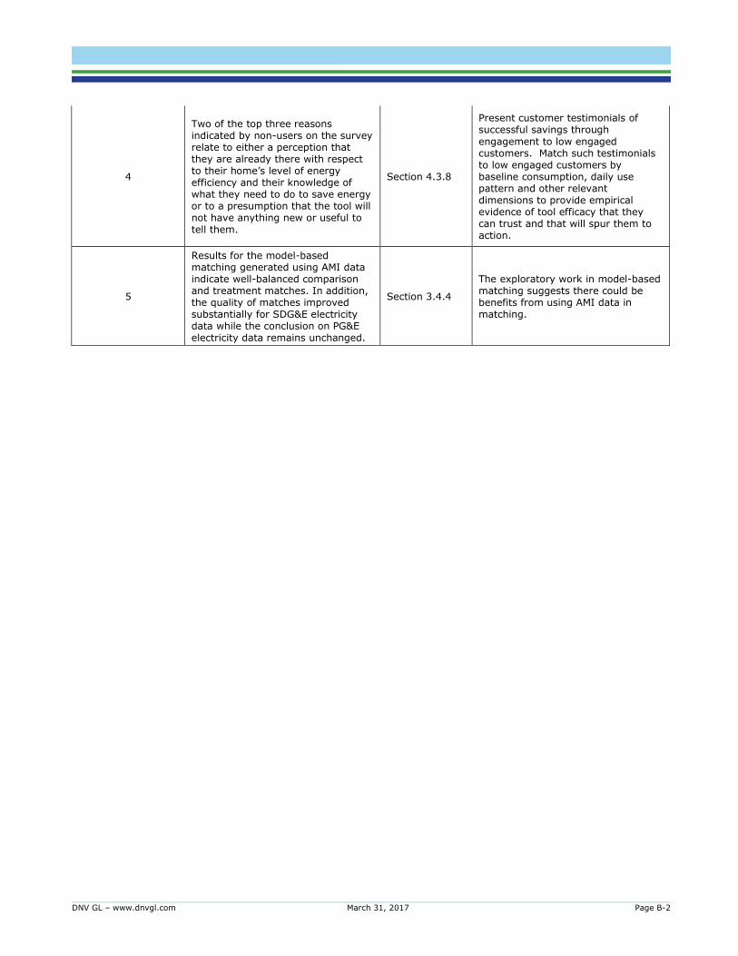
DNV GL – www.dnvgl.com March 31, 2017 Page B-2
4
Two of the top three reasons indicated by non-users on the survey relate to either a perception that they are already there with respect to their home’s level of energy efficiency and their knowledge of what they need to do to save energy or to a presumption that the tool will not have anything new or useful to tell them.
Section 4.3.8
Present customer testimonials of successful savings through
engagement to low engaged customers. Match such testimonials to low engaged customers by baseline consumption, daily use pattern and other relevant dimensions to provide empirical evidence of tool efficacy that they can trust and that will spur them to action.
5
Results for the model-based matching generated using AMI data indicate well-balanced comparison and treatment matches. In addition, the quality of matches improved substantially for SDG&E electricity data while the conclusion on PG&E electricity data remains unchanged.
Section 3.4.4
The exploratory work in model-based matching suggests there could be benefits from using AMI data in matching.
DNV GL – www.dnvgl.com March 31, 2017 Page C-3
We provide additional details about the matching process in this appendix. Under the matched comparison
approach the treatment effect is estimated by comparing the difference in outcomes before and after
treatment of opt-in and comparison groups. In experimental studies, a randomized control trial (RCT) design
ensures subjects are assigned to treatment or control groups randomly. Due to this random assignment, the
only differentiating factor between the two groups is treatment. Thus, difference in outcome pre- and post-
treatment can be attributed to treatment.
In observational studies, of the kind under consideration, subjects self-select into treatment. Since
treatment assignment is not random and may be tied to the intrinsic characteristics of the subjects in this
group, estimated treatment outcomes will reflect self-selection bias. Matching is a process that aims to
circumvent such bias by identifying comparison subjects whose characteristics match those of the opt-in
closely. Matching methods try to replicate RCT design to the extent possible with observable characteristics
by selecting opt-in and comparison group subjects that are balanced in key characteristics. Balance is
indicated by identical distributions of these characteristics of both groups.
In matched opt-in-comparison observational studies, we identify the effect of treatment assignment, 𝑇 = 1,
by evaluating average treatment effect on the opt-in (ATT) as follows:
𝐴𝑇𝑇 = 𝐸(𝑌1|𝑇 = 1) − 𝐸(𝑌0|𝑇 = 1)
Here, 𝐸(𝑌1|𝑇 = 1) is the expected outcome of treatment for the opt-in and 𝐸(𝑌0|𝑇 = 1) is the expected
outcome of no treatment for opt-in individuals. The second term, however, is unobservable. If the expected
outcome of comparison individuals is used in place of the second term, the average treatment effect on the
opt-in (µATT) becomes:
µ𝐴𝑇𝑇 = 𝐸(𝑌1|𝑇 = 1) − 𝐸(𝑌0|𝑇 = 0)
The difference between µ𝐴𝑇𝑇 and ATT captures the selection bias. For example, those who self-select into
using UAT may already be motivated to save energy even in the absence of the tool for various reasons.
Hence, the estimated treatment effect in this case reflects savings that occur, in part, because of such
reasons. Matching based on these reasons or criteria, which affect treatment assignment, provides us a
counterfactual that obviates selection bias.
Matching enables us to select opt-in and comparison groups that are highly similar along these key
dimensions. Treatment outcomes (𝑌1, 𝑌0), thus, become independent of treatment assignment conditional on
or given these key characteristics:
(𝑌1, 𝑌0) ⊥ T|X
Since treatment assignment becomes essentially random following matching, treatment outcomes no longer
reflect selection-bias. Matched opt-in-comparison, therefore, is an effective tool that helps identify the effect
of treatment and is the approach we use.

DNV GL – www.dnvgl.com March 31, 2017 Page C-4
Matching procedure
There are various matching techniques that attempt to mimic the RCT design in observational studies. In
this study, we used propensity score matching (PSM) to match opt-in and comparison subjects and reduce
selection bias. As the name indicates, PSM is based on propensity scores, which are probabilities that
subjects are assigned to the treatment group given certain characteristics they have. Subjects were
matched based on these probability scores.
The PSM process involves the following general steps that we used in this evaluation:
1. Select subjects’ characteristics that are related to treatment assignment.
2. Examine the empirical densities of these characteristics and exclude observations of the comparison
group where these do not overlap as a first round of identifying common support for matching.
3. Fit a logistic regression model using these variables to estimate the probability that each subject gets
assigned to the treatment group.
4. Conduct a second round of trimming or common support identification based on propensity scores.
5. Select a matching method, the number of comparisons in the many-to-one matching, and whether to
match with or without replacement; match opt-in subjects’ scores to comparison (comparison) subjects
based on these selections.
6. Conduct diagnostic checks to see selected matches are well-balanced.
To avoid correlation between treatment selection and outcome, by construction, we needed to match with
variables other than the dependent variable (consumption in the year prior to opting in, in our case). Such
variables can include any characteristics such as household size, heating and cooling source, and rate
groups that may affect treatment assignment. They can also include variables measured before
participation, such as pre-evaluation period consumption data. We took the latter approach, as
comprehensive data on household characteristics were not readily available. Specifically, we used monthly
data from the year 2012 which pre-dates any consumption data that were used in the savings regressions.
We also used climate zone information to stratify the data for matching. This involved implementing the
matching procedure within three pre-defined climate zones for California - mild (coastal), inland, and desert.
Prior to estimating a propensity score model, we identified a first round of common support for matching by
trimming the data based on the distribution of pre-participation consumption. Variable values of the
comparison subjects that do not overlap with the values of the opt-in subjects were trimmed. In all the
cases where we undertook matching, trimming pre-participation consumption values of the comparison
subjects that are outside of the 1st and 99th percentiles resulted in the overlap of the distribution of these
values with those of the opt-in. Figure 32 provides an example of how we established a region of common
support.
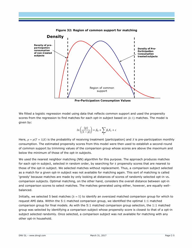
DNV GL – www.dnvgl.com March 31, 2017 Page C-5
Figure 32: Region of common support for matching
We fitted a logistic regression model using data that reflects common support and used the propensity
scores from the regression to find matches for each opt-in subject based on (𝑘: 1) matches. The model is
given by:
𝑙𝑛 ((𝑝)
(1 − 𝑝)) = 𝛽0 + ∑ 𝛽𝑡𝑋𝑡
𝑡
+ 휀
Here, 𝑝 = 𝑝(𝑇 = 1|𝑋) is the probability of receiving treatment (participation) and 𝑋 is pre-participation monthly
consumption. The estimated propensity scores from this model were then used to establish a second-round
of common support by trimming values of the comparison group whose scores are above the maximum and
below the minimum of those of the opt-in subjects.
We used the nearest neighbor matching (NN) algorithm for this purpose. The approach produces matches
for each opt-in subject, selected in random order, by searching for 𝑘 propensity scores that are nearest to
those of the opt-in subject. We selected matches without replacement. Thus, a comparison subject selected
as a match for a given opt-in subject was not available for matching again. This sort of matching is called
‘greedy’ because matches are made by only looking at distances of scores of randomly selected opt-in vs.
comparison subjects. Optimal matching, on the other hand, considers the overall distance between opt-in
and comparison scores to select matches. The matches generated using either, however, are equally well-
balanced.
Initially, we selected 5 best matches (𝑘 = 5) to identify an oversized matched comparison group for which to
request AMI data. Within the 5:1 matched comparison group, we identified the optimal 1:1 matched
comparison group for final models. As with the 5:1 matched comparison group selection, the 1:1 matched
group was selected by identifying a comparison subject whose propensity score is closest to that of a opt-in
subject selected randomly. Once selected, a comparison subject was not available for matching with any
other opt-in household.

DNV GL – www.dnvgl.com March 31, 2017 Page D-6
The California Energy Commission partitions the state of California into 16 climate zones. Climate zones with
the lower numbers 1-8 tend to be the coastal regions and represent cooler climates. Climate zones 9-16
tend to be inland and represent areas with a wide range of temperatures over the course of the year. A map
of these climate zones is provided in Figure 33.
Figure 33: Building climate zones
Source: California Energy Commission
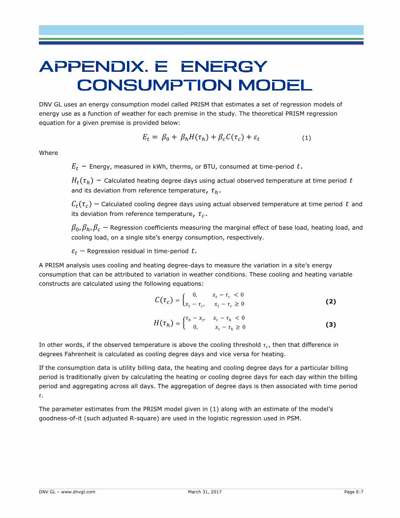
DNV GL – www.dnvgl.com March 31, 2017 Page E-7
DNV GL uses an energy consumption model called PRISM that estimates a set of regression models of
energy use as a function of weather for each premise in the study. The theoretical PRISM regression
equation for a given premise is provided below:
𝐸𝑡 = 𝛽0 + 𝛽ℎ𝐻(𝜏ℎ) + 𝛽𝑐𝐶(𝜏𝑐) + 휀𝑡 (1)
Where
𝐸𝑡 – Energy, measured in kWh, therms, or BTU, consumed at time-period 𝑡.
𝐻𝑡(𝜏ℎ) – Calculated heating degree days using actual observed temperature at time period 𝑡 and its deviation from reference temperature, 𝜏ℎ.
𝐶𝑡(𝜏𝑐) − Calculated cooling degree days using actual observed temperature at time period 𝑡 and
its deviation from reference temperature, 𝜏𝑐.
𝛽0, 𝛽ℎ, 𝛽𝑐 − Regression coefficients measuring the marginal effect of base load, heating load, and
cooling load, on a single site’s energy consumption, respectively.
휀𝑡 − Regression residual in time-period 𝑡.
A PRISM analysis uses cooling and heating degree-days to measure the variation in a site’s energy
consumption that can be attributed to variation in weather conditions. These cooling and heating variable
constructs are calculated using the following equations:
𝐶(𝜏𝑐) = {0, 𝑥𝑡 − 𝜏𝑐 < 0
𝑥𝑡 − 𝜏𝑐 , 𝑥𝑡 − 𝜏𝑐 ≥ 0 (2)
𝐻(𝜏ℎ) = {𝜏ℎ − 𝑥𝑡, 𝑥𝑡 − 𝜏ℎ < 0
0, 𝑥𝑡 − 𝜏ℎ ≥ 0 (3)
In other words, if the observed temperature is above the cooling threshold 𝜏𝑐, then that difference in
degrees Fahrenheit is calculated as cooling degree days and vice versa for heating.
If the consumption data is utility billing data, the heating and cooling degree days for a particular billing
period is traditionally given by calculating the heating or cooling degree days for each day within the billing
period and aggregating across all days. The aggregation of degree days is then associated with time period
𝑡.
The parameter estimates from the PRISM model given in (1) along with an estimate of the model’s
goodness-of-it (such adjusted R-square) are used in the logistic regression used in PSM.
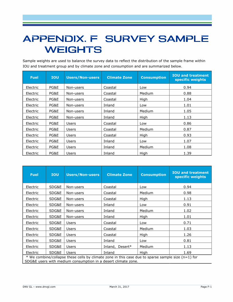
DNV GL – www.dnvgl.com March 31, 2017 Page F-1
Sample weights are used to balance the survey data to reflect the distribution of the sample frame within
IOU and treatment group and by climate zone and consumption and are summarized below.
Fuel IOU Users/Non-users Climate Zone Consumption IOU and treatment
specific weights
Electric PG&E Non-users Coastal Low 0.94
Electric PG&E Non-users Coastal Medium 0.88
Electric PG&E Non-users Coastal High 1.04
Electric PG&E Non-users Inland Low 1.01
Electric PG&E Non-users Inland Medium 1.05
Electric PG&E Non-users Inland High 1.13
Electric PG&E Users Coastal Low 0.86
Electric PG&E Users Coastal Medium 0.87
Electric PG&E Users Coastal High 0.93
Electric PG&E Users Inland Low 1.07
Electric PG&E Users Inland Medium 1.08
Electric PG&E Users Inland High 1.39
Fuel IOU Users/Non-users Climate Zone Consumption IOU and treatment
specific weights
Electric SDG&E Non-users Coastal Low 0.94
Electric SDG&E Non-users Coastal Medium 0.98
Electric SDG&E Non-users Coastal High 1.13
Electric SDG&E Non-users Inland Low 0.91
Electric SDG&E Non-users Inland Medium 1.02
Electric SDG&E Non-users Inland High 1.01
Electric SDG&E Users Coastal Low 0.71
Electric SDG&E Users Coastal Medium 1.03
Electric SDG&E Users Coastal High 1.26
Electric SDG&E Users Inland Low 0.81
Electric SDG&E Users Inland, Desert* Medium 1.13
Electric SDG&E Users Inland High 1.69
* We combine/collapse these cells by climate zone in this case due to sparse sample size (n=1) for SDG&E users with medium consumption in a desert climate zone.
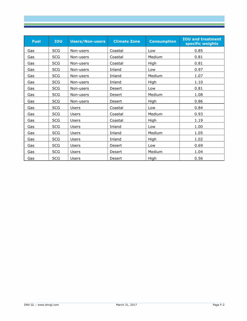
DNV GL – www.dnvgl.com March 31, 2017 Page F-2
Fuel IOU Users/Non-users Climate Zone Consumption IOU and treatment
specific weights
Gas SCG Non-users Coastal Low 0.85
Gas SCG Non-users Coastal Medium 0.81
Gas SCG Non-users Coastal High 0.81
Gas SCG Non-users Inland Low 0.97
Gas SCG Non-users Inland Medium 1.07
Gas SCG Non-users Inland High 1.10
Gas SCG Non-users Desert Low 0.81
Gas SCG Non-users Desert Medium 1.08
Gas SCG Non-users Desert High 0.86
Gas SCG Users Coastal Low 0.84
Gas SCG Users Coastal Medium 0.93
Gas SCG Users Coastal High 1.19
Gas SCG Users Inland Low 1.00
Gas SCG Users Inland Medium 1.05
Gas SCG Users Inland High 1.02
Gas SCG Users Desert Low 0.69
Gas SCG Users Desert Medium 1.04
Gas SCG Users Desert High 0.56
DNV GL – www.dnvgl.com March 31, 2017 Page G-1
E.1 INTRODUCTION
(SDG&E Introduction)
This survey is being conducted by an independent research organization on behalf of the
California Public Utilities Commission (CPUC) and San Diego Gas & Electric (SDG&E) with
households on free web-based services provided by SDG&E to receive tips and information on
actions they could take to make their home more energy efficient and realize bill savings.
The CPUC and SDG&E will use this information to help plan programs to benefit homeowners and
save energy. Responses to this survey will be kept strictly confidential and reported only in the
aggregate.
Please contact Peter Franzese at the California Public Utilities Commission, at
[email protected] if you have any questions or concerns regarding this survey.
Thank you for taking the time to participate in this survey
My Energy Survey is a free web-based service or tool provided by SDG&E that gathers basic
information from customers like you about your homes and habits to provide you with an online
energy “audit” that includes personalized recommendations for energy saving actions.
You receive energy saving tips tailored to your home and energy using appliances and can set up
an energy savings action plan on the tool. You can also update the tool with your progress,
monitor changes, and continue to engage with the tool and receive tips for ongoing energy
savings.
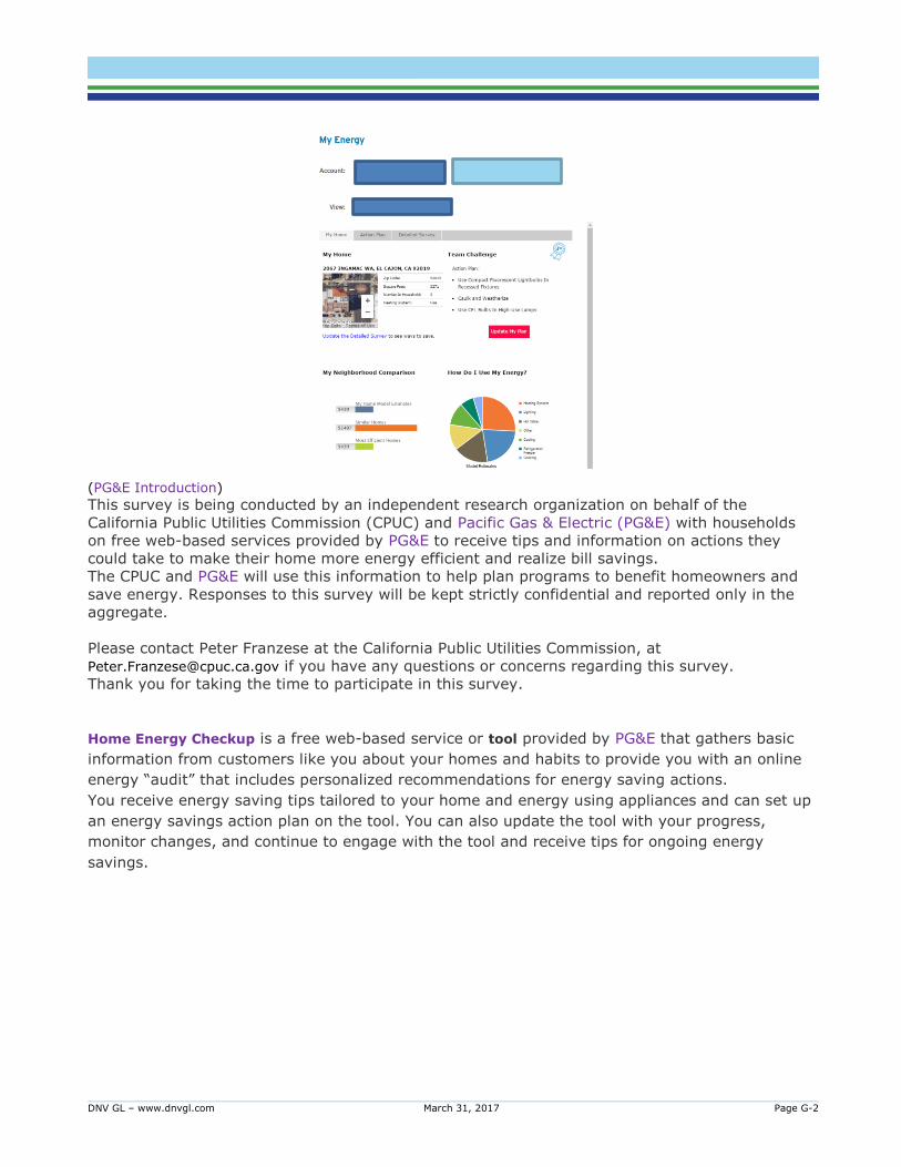
DNV GL – www.dnvgl.com March 31, 2017 Page G-2
(PG&E Introduction)
This survey is being conducted by an independent research organization on behalf of the
California Public Utilities Commission (CPUC) and Pacific Gas & Electric (PG&E) with households
on free web-based services provided by PG&E to receive tips and information on actions they
could take to make their home more energy efficient and realize bill savings.
The CPUC and PG&E will use this information to help plan programs to benefit homeowners and
save energy. Responses to this survey will be kept strictly confidential and reported only in the
aggregate.
Please contact Peter Franzese at the California Public Utilities Commission, at
[email protected] if you have any questions or concerns regarding this survey.
Thank you for taking the time to participate in this survey.
Home Energy Checkup is a free web-based service or tool provided by PG&E that gathers basic
information from customers like you about your homes and habits to provide you with an online
energy “audit” that includes personalized recommendations for energy saving actions.
You receive energy saving tips tailored to your home and energy using appliances and can set up
an energy savings action plan on the tool. You can also update the tool with your progress,
monitor changes, and continue to engage with the tool and receive tips for ongoing energy
savings.
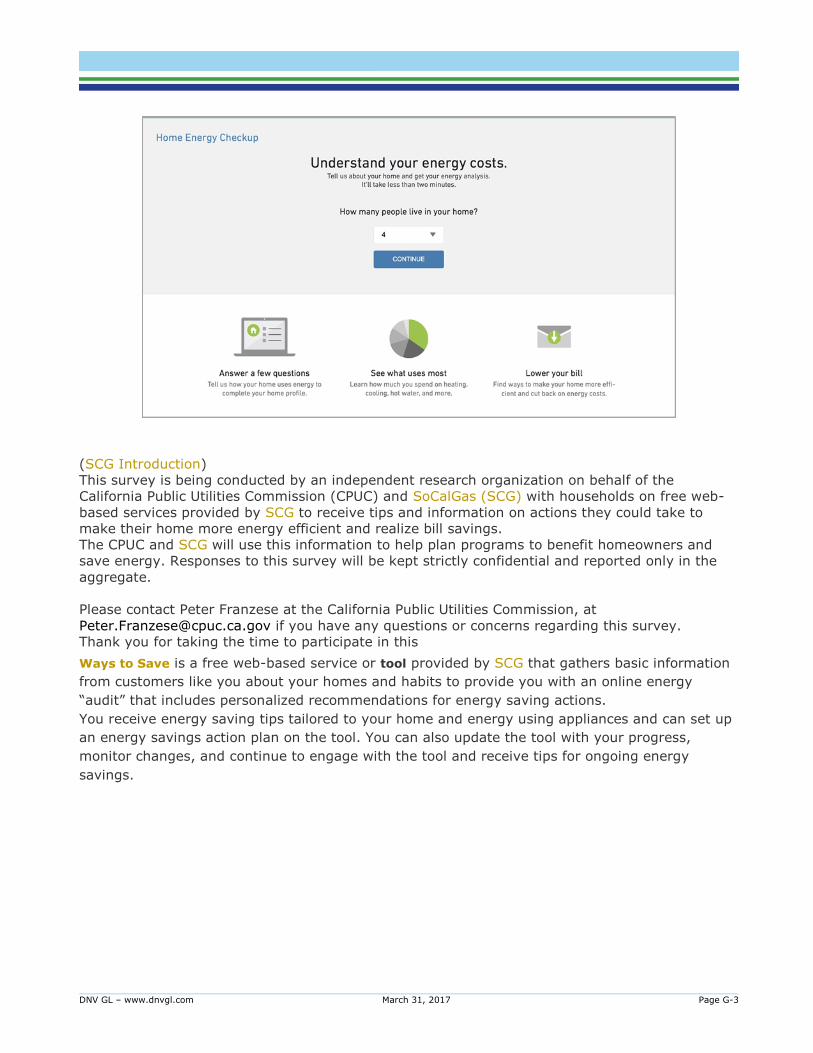
DNV GL – www.dnvgl.com March 31, 2017 Page G-3
(SCG Introduction)
This survey is being conducted by an independent research organization on behalf of the
California Public Utilities Commission (CPUC) and SoCalGas (SCG) with households on free web-
based services provided by SCG to receive tips and information on actions they could take to
make their home more energy efficient and realize bill savings.
The CPUC and SCG will use this information to help plan programs to benefit homeowners and
save energy. Responses to this survey will be kept strictly confidential and reported only in the
aggregate.
Please contact Peter Franzese at the California Public Utilities Commission, at
[email protected] if you have any questions or concerns regarding this survey.
Thank you for taking the time to participate in this
Ways to Save is a free web-based service or tool provided by SCG that gathers basic information
from customers like you about your homes and habits to provide you with an online energy
“audit” that includes personalized recommendations for energy saving actions.
You receive energy saving tips tailored to your home and energy using appliances and can set up
an energy savings action plan on the tool. You can also update the tool with your progress,
monitor changes, and continue to engage with the tool and receive tips for ongoing energy
savings.
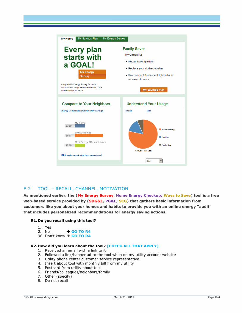
DNV GL – www.dnvgl.com March 31, 2017 Page G-4
E.2 TOOL – RECALL, CHANNEL, MOTIVATION
As mentioned earlier, the (My Energy Survey, Home Energy Checkup, Ways to Save) tool is a free
web-based service provided by (SDG&E, PG&E, SCG) that gathers basic information from
customers like you about your homes and habits to provide you with an online energy “audit”
that includes personalized recommendations for energy saving actions.
R1. Do you recall using this tool?
1. Yes 2. No GO TO R4
98. Don’t know GO TO R4
R2. How did you learn about the tool? [CHECK ALL THAT APPLY]
1. Received an email with a link to it 2. Followed a link/banner ad to the tool when on my utility account website 3. Utility phone center customer service representative 4. Insert about tool with monthly bill from my utility
5. Postcard from utility about tool 6. Friends/colleagues/neighbors/family 7. Other (specify) 8. Do not recall
DNV GL – www.dnvgl.com March 31, 2017 Page G-5
R3. What motivated you to use the tool? [CHECK ALL THAT APPLY]
1. The tool seemed like it would benefit my household 2. To learn how to make my home more comfortable 3. To learn how to make my home more energy efficient
4. To learn how to save money by using less energy 5. To learn how to use less energy as it is good for the environment 6. People I knew encouraged me to use it 7. No specific reason, was curious to try it out 8. Other (specify) 98. Don't know
R4. Do you know about/Have you heard of this tool?
1. Yes 2. No GO TO R6 98. Don’t know GO TO R6
R5. Why have you not used the tool? [RANDOMIZE, CHECK ALL THAT APPLY]
1. I was interested, but forgot about the tool 2. I’m not interested in learning how to reduce my energy use using an online tool 3. I’m too busy 4. I don't use the web that often
5. I don’t think reducing my energy consumption will significantly reduce my monthly bill
6. I don’t think reducing my energy consumption will significantly benefit the environment
7. I don’t want to answer questions about myself/my household.
8. I don’t believe the tool will give me useful recommendations
9. I don’t believe the tool will tell me something I don’t already know
10. I already know what to do to save energy
11. I’m not interested in changing the way I use energy at home
12. My home is already efficient enough
13. The savings predicted were not as high as expected
14. I’m not that interested in money-saving tips
15. I don’t trust the information or guidance (SDG&E, PG&E, SCG) would provide 16. Other (specify) __________
98. Don’t know
R6. If a free tool/web-based service as described above was available to you, how interested
would you be in using it?
1. Not at all interested 2. Slightly interested 3. Moderately interested 4. Very interested 5. Extremely interested
98. Don’t know

DNV GL – www.dnvgl.com March 31, 2017 Page G-6
E.3 TOOL – USE
U1. On average, how often did you visit the site/use the tool? [CHOOSE THE OPTION THAT
BEST DESCRIBES YOUR TOOL USE]
1. A few times a week 2. Once a week
3. Once a month/when I receive my bill 4. A few times a year 5. Once a year 6. Less than once a year 98. Don't know
U2. What were the reasons, if any, why you didn’t use the tool more frequently?
[RANDOMIZE, CHECK ALL THAT APPLY]
1. Felt the information provided was enough to act on and make changes – no need to revisit tool
2. I didn’t see the benefit of doing it more than once when nothing had changed in my home.
3. Not interested in spending more time using the tool
4. The savings predicted were not as high as expected
5. I didn’t find the recommendations helpful
6. I didn’t have a good experience the first/previous time
7. I found it confusing
8. I didn’t think reducing my energy consumption will make a difference
9. Other (specify) __________
98. Don’t know
U3. On average, what was the duration of your visit/tool use?
1. Less than 10 minutes 2. 10-20 minutes 3. 20-30 minutes 4. 30 minutes – 1 hour
5. More than 1 hour
U4. On average, about how many web pages/different screens on the tool would you click
through to get the information you were looking for when you logged in? Your best
estimate is fine.
1. 1-5 screens 2. 6-10 screens
3. 11-25 screens
4. 25-50 screens 5. Over 50 screens 98. Don't know
U5. How difficult or easy was it to find the information you were looking for when using the
tool?
1. Very difficult 2. Difficult 3. Neither difficult nor easy

DNV GL – www.dnvgl.com March 31, 2017 Page G-7
4. Easy 5. Very easy 98. Don’t know
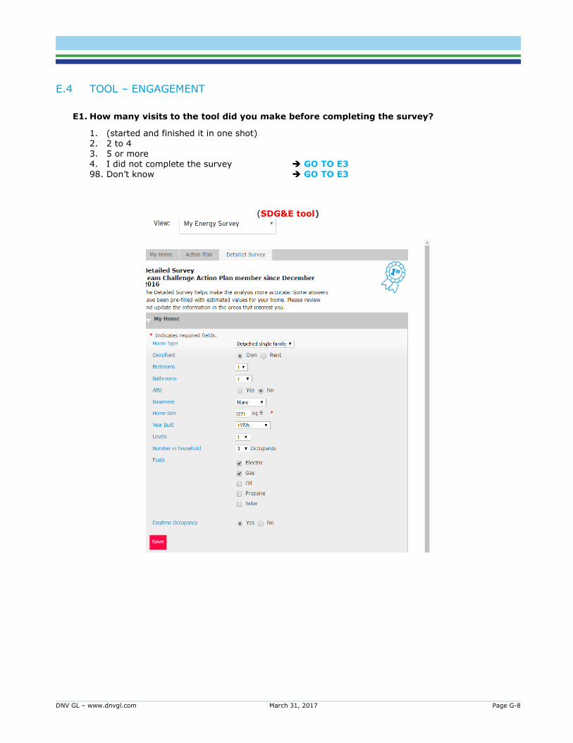
DNV GL – www.dnvgl.com March 31, 2017 Page G-8
E.4 TOOL – ENGAGEMENT
E1. How many visits to the tool did you make before completing the survey?
1. (started and finished it in one shot) 2. 2 to 4 3. 5 or more 4. I did not complete the survey GO TO E3 98. Don’t know GO TO E3
(SDG&E tool)
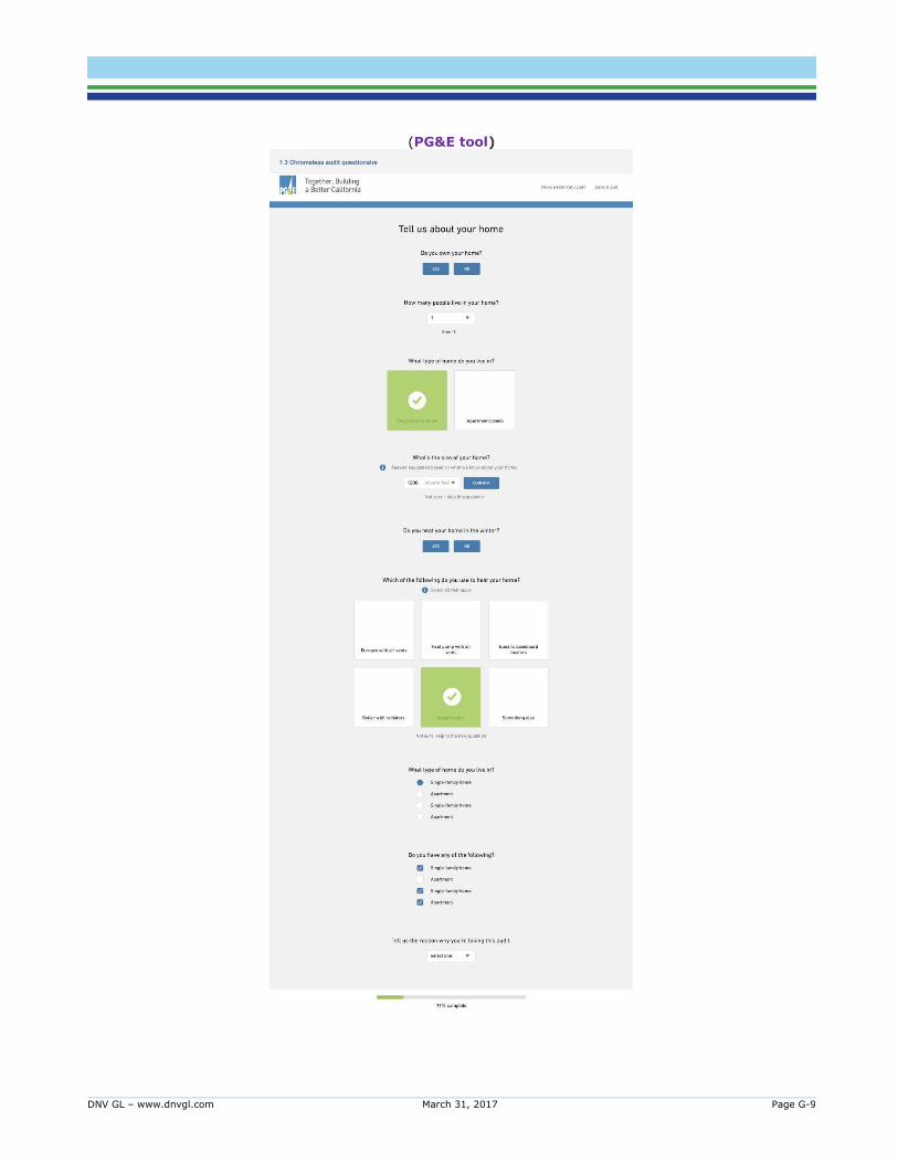
DNV GL – www.dnvgl.com March 31, 2017 Page G-9
(PG&E tool)
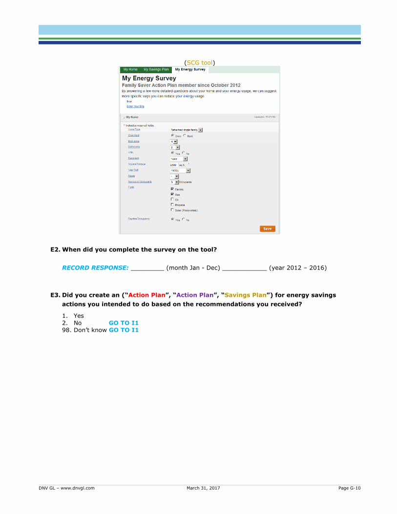
DNV GL – www.dnvgl.com March 31, 2017 Page G-10
(SCG tool)
E2. When did you complete the survey on the tool?
RECORD RESPONSE: _________ (month Jan - Dec) ____________ (year 2012 – 2016)
E3. Did you create an (“Action Plan”, “Action Plan”, “Savings Plan”) for energy savings
actions you intended to do based on the recommendations you received?
1. Yes
2. No GO TO I1 98. Don’t know GO TO I1
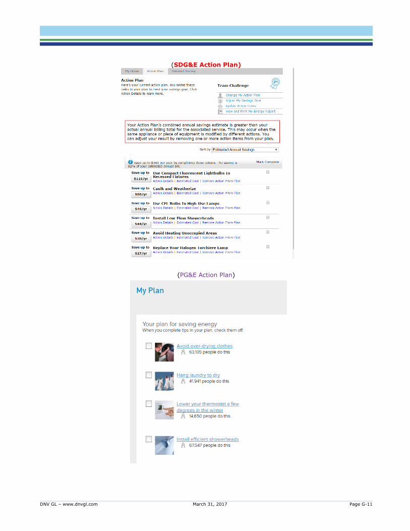
DNV GL – www.dnvgl.com March 31, 2017 Page G-11
(SDG&E Action Plan)
(PG&E Action Plan)

DNV GL – www.dnvgl.com March 31, 2017 Page G-12
(SCG Savings Plan)
E4. How many visits to the tool did you make before completing the (Action Plan, Action Plan,
Savings Plan)?
1. 1 (started and finished it in one shot) 2. 2 to 4
3. 5 or more
4. I started but have not completed my (Action Plan, Action Plan, Savings Plan) GO TO I1
5. I did not develop an (Action Plan, Action Plan, Savings Plan) GO TO I1
98. Don’t know
E5. How often did you update the (Action Plan, Action Plan, Savings Plan)? [CHOOSE THE
OPTION THAT BEST DESCRIBES YOUR TOOL USE]
1. Daily
2. A few times weekly
3. A few times monthly
4. Monthly/When you got your utility bill
5. A few times a year
6. Once a year
7. Less than once a year
8. I did not update the (Action Plan, Action Plan, Savings Plan)
9. Other (Specify)
98. Don’t know

DNV GL – www.dnvgl.com March 31, 2017 Page G-13
E.5 TOOL – INFLUENCE
I1. Did you adopt any new energy saving habits because of the tool?
1. Yes 2. No 98. Don’t know
I2. Did the tool influence your purchases of household appliances and devices?
1. Yes 2. No 98. Don’t know
I3. Which of the following utility programs and services would you say you have participated
in/availed of because of the tool? [RANDOMIZE, CHECK ALL THAT APPLY, CODE =1 if checked, =0 otherwise] (SDG&E Answers) 1. Refrigerator recycling: SDG&E offers free pick-up for refrigerators, freezers, and room air
conditioners 2. Whole House Retrofit program/Energy Upgrade California/Home Upgrade Program:
SDG&E offers rebates through Energy Upgrade California for homeowners who complete energy efficient upgrades
3. Water Heater rebate: SDG&E offers rebates on qualifying energy efficient water heaters 4. Time-of-Use rate: Be aware of your electric rates pricing plan 5. Solar calculator: If you are thinking about solar, use our Solar Calculator to evaluate the right
size for your home 6. A/C quality Care program: Receive an incentive when you get an air conditioner tune-up from
a qualifying contractor 7. Reduce Your Use program: Earn a bill credit when you participate in reduce your use days
between the hours of 11am-6pm 8. Clothes Washer rebate: SDG&E offers rebates on qualifying clothes washers 9. Insulation rebate: SDG&E offers rebates on insulation through the home energy efficiency
rebate program
10. Variable speed pool pump and motor: SDG&E offers rebates on qualifying variable speed poll pumps and motors
11. Discounted lighting: SDG&E offers discounts at certain retail locations for certain energy efficient lighting products
12. The tool did not influence my participation in any of the above utility programs and services [EXCLUSIVE]
98. Don’t know
(PG&E Answers)
1. Energy Upgrade California: PG&E offers rebates through Energy Upgrade California for homeowners who complete energy efficient upgrades
2. Water Heater rebate: PG&E offers rebates on qualifying energy efficient water heaters 3. Rate Options: Be aware of your electric rates and learn about Time-of-use pricing 4. Solar Estimator: If you are thinking about solar, use our Solar Calculator to evaluate the right
size for your home 5. SmartRate: An optional rate that reduces your summer rate except on SmartDays when
temperatures are high and an event day is called. 6. A/C Quality Care program: Receive an incentive when you get an air conditioner tune-up from
a qualifying contractor 7. Clothes Washer rebate: PG&E offers rebates on qualifying clothes washers
8. Pool pump and motor: PG&E offers rebates on qualifying variable speed poll pumps and motors

DNV GL – www.dnvgl.com March 31, 2017 Page G-14
9. Discounted lighting: PG&E offers discounts at certain retail locations for certain energy efficient lighting products
10. The tool did not influence my participation in any of the above utility programs and
services
98. Don’t know
(SCG Answers)
1. Energy Upgrade California/Home Upgrade Program: SoCalGas offers rebates through Energy Upgrade California for homeowners who complete energy efficient upgrades
2. Water Heater rebate: SoCalGas offers rebates on qualifying ENERGY STAR-certified water heaters
3. Natural gas furnace rebate: SoCalGas offers rebates on qualifying ENERGY STAR-certified furnaces
4. Clothes Washer rebate: SoCalGas offers rebates on qualifying ENERGY STAR-certified clothes washers
5. Insulation rebate: SoCalGas offers rebate on attic and wall insulation through the home energy efficiency rebate program
6. The tool did not influence my participation in any of the above utility programs and services
I4. Since you began using the tool, have you noticed any changes in your monthly bill?
1. Yes, they are lower
2. Yes, they are higher 3. No, there has been no real change GO TO V1 4. I do not check my bill regularly GO TO V1
98. Don’t know GO TO V1
I5. On average, about what percent has your monthly bill changed by? Your best estimate is
fine.
Average percent <reduction if I4=1>/<increase if I4=2> in bill ___ %
I6. Would you say you bill changed…?
1. Mostly in the summer months/cooling season
2. Mostly in the winter months/heating season
3. Both in summer and winter months/both cooling and heating season
98. Don’t know

DNV GL – www.dnvgl.com March 31, 2017 Page G-15
E.6 TOOL – VERDICT
V1. Which of the following features of the tool, if any, did you find useful [CHECK ALL THAT
APPLY]
1. Comparison of your consumption with homes like yours
2. Prioritized list of energy savings actions
3. Estimates of savings associated with various energy savings actions
4. Ability to maintain and update your personal action plan on the tool
5. Suggestions for continuous improvements
6. All of the above [EXCLUSIVE]
7. None of the above [EXCLUSIVE]
8. Other (specify)
98. Don’t know
V2. How satisfied were you with the tool?
1. Very Dissatisfied
2. Dissatisfied
3. Neutral
4. Satisfied
5. Very Satisfied
98. Don’t know
V3. How likely are you to recommend the tool to someone you know?
1. Very unlikely
2. Somewhat unlikely
3. Somewhat likely
4. Very likely
98. Don’t know
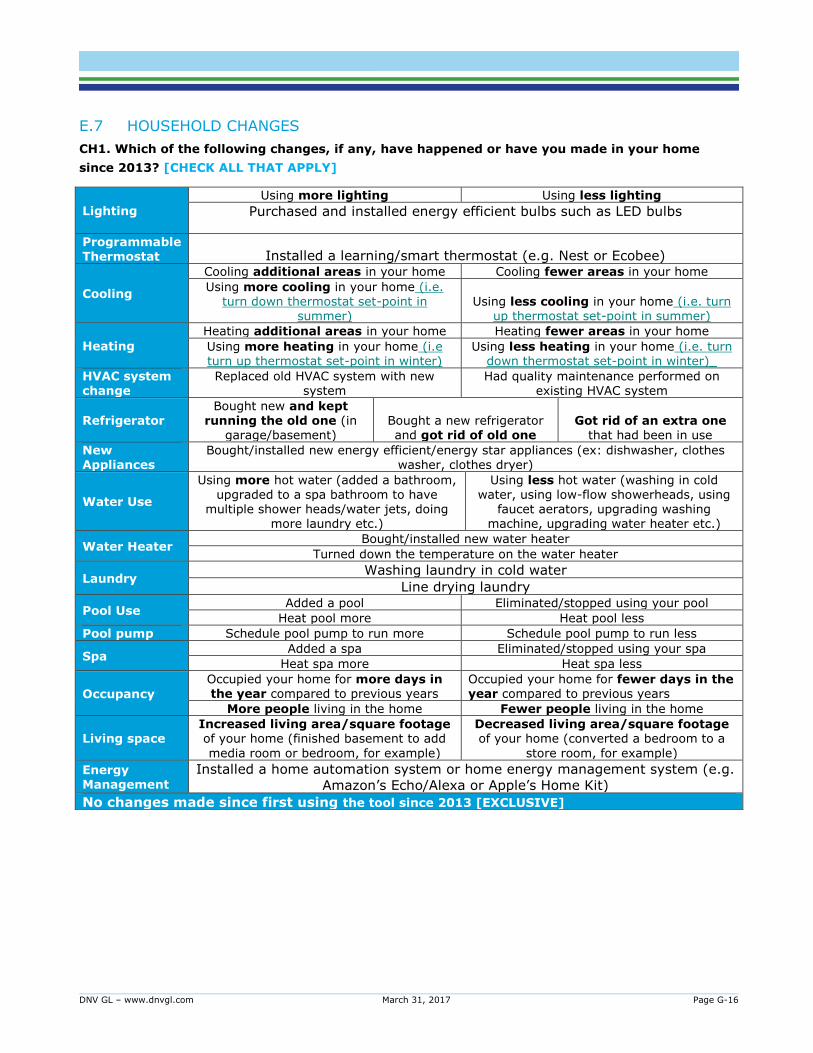
DNV GL – www.dnvgl.com March 31, 2017 Page G-16
E.7 HOUSEHOLD CHANGES
CH1. Which of the following changes, if any, have happened or have you made in your home
since 2013? [CHECK ALL THAT APPLY]
Lighting
Using more lighting Using less lighting
Purchased and installed energy efficient bulbs such as LED bulbs
Programmable Thermostat Installed a learning/smart thermostat (e.g. Nest or Ecobee)
Cooling
Cooling additional areas in your home Cooling fewer areas in your home
Using more cooling in your home (i.e. turn down thermostat set-point in
summer) Using less cooling in your home (i.e. turn
up thermostat set-point in summer)
Heating
Heating additional areas in your home Heating fewer areas in your home
Using more heating in your home (i.e turn up thermostat set-point in winter)
Using less heating in your home (i.e. turn down thermostat set-point in winter)_
HVAC system change
Replaced old HVAC system with new system
Had quality maintenance performed on existing HVAC system
Refrigerator Bought new and kept
running the old one (in garage/basement)
Bought a new refrigerator and got rid of old one
Got rid of an extra one that had been in use
New Appliances
Bought/installed new energy efficient/energy star appliances (ex: dishwasher, clothes washer, clothes dryer)
Water Use
Using more hot water (added a bathroom, upgraded to a spa bathroom to have
multiple shower heads/water jets, doing more laundry etc.)
Using less hot water (washing in cold water, using low-flow showerheads, using
faucet aerators, upgrading washing machine, upgrading water heater etc.)
Water Heater Bought/installed new water heater
Turned down the temperature on the water heater
Laundry Washing laundry in cold water
Line drying laundry
Pool Use Added a pool Eliminated/stopped using your pool
Heat pool more Heat pool less
Pool pump Schedule pool pump to run more Schedule pool pump to run less
Spa Added a spa Eliminated/stopped using your spa
Heat spa more Heat spa less
Occupancy
Occupied your home for more days in the year compared to previous years
Occupied your home for fewer days in the year compared to previous years
More people living in the home Fewer people living in the home
Living space Increased living area/square footage of your home (finished basement to add
media room or bedroom, for example)
Decreased living area/square footage of your home (converted a bedroom to a
store room, for example)
Energy Management
Installed a home automation system or home energy management system (e.g.
Amazon’s Echo/Alexa or Apple’s Home Kit)
No changes made since first using the tool since 2013 [EXCLUSIVE]

DNV GL – www.dnvgl.com March 31, 2017 Page G-17
E.8 SEGMENTATION ITEMS
HH1. Which of the following do you have in your home? [CHECK ALL THAT APPLY]
1. Programmable thermostats
2. Motion detectors for yours lights
3. Vent in your attic area to keep the attic cooler
4. Ceiling fans
5. None of the above
HH2. Have you heard of a carbon footprint? A carbon footprint is a measure of the energy you
use, either directly or indirectly. This includes but is not limited to the energy consumption
from your home, your transportation, your diet, and your purchases.
1. Yes 2. No 98. Don’t know
HH3. Please indicate your level of agreement with the following statements:
a. I compare prices of at least a few brands
b. I do not feel responsible for conserving energy because my personal contribution is very small
(record response, slider)
1. Strongly Disagree
2. Disagree.
3. No opinion.
4. Agree.
5. Strongly Agree
98. Don’t know
HH4. Which of the following is the ONE reason that would motivate you to save energy? [CHECK
ONE]
1. Saving money
2. Maintaining health
3. Protecting the environment
4. For the benefit of future generations
5. Reducing our dependence on foreign oil
6. Helping California lead the way on saving energy

DNV GL – www.dnvgl.com March 31, 2017 Page G-18
E.9 TECHNOLOGY USE
T1. Which of the following electronic devices do you own? [CHECK ALL THAT APPLY,
RANDOMIZE 01-06]
1. Cell phone
2. Tablet
3. Smartphone
4. Laptop computer
5. Desktop computer
6. eBook Reader
7. All of the above [EXCLUSIVE]
8. None of the above [EXCLUSIVE]
T2. Which of the following types of applications (apps) do you use? [CHECK ALL THAT APPLY,
RANDOMIZE 01-07]
1. Transportation (For example: Uber, Lyft, Via, etc.)
2. Navigation (For example: Waze, Google Maps, Apple Maps, etc.)
3. Social Media (For example: Facebook, Instagram, Snapchat, etc.)
4. Restaurant Reviews (For example: Yelp, Foursquare, Urbanspoon, etc.)
5. Banking and Finances (For example: Venmo, PayPal, Wells Fargo Mobile, etc.)
6. Location Sharing (For example: Swarm, Find My Friends, etc.)
7. Video Streaming (For example: Youtube, Netflix, Hulu, HBOGo, etc.)
8. None of the above [EXCLUSIVE]
9. I do not use any apps [EXCLUSIVE]

DNV GL – www.dnvgl.com March 31, 2017 Page G-19
E.10 RESPONDENT AND HOUSEHOLD CHARACTERISTICS These last questions are used for statistical purposes only. All individual information is kept completely confidential. HH1. What year was your home built?
[SINGLE RESPONSE] 1. Before the 1970s
2. 1970s 3. 1980s 4. 1990-1994 5. 1994-1999 6. 2000s 7. Don’t know
HH2. To the best of your knowledge, when was the last time this home was remodeled? 1. Never 2. Before the 1970s 3. 1970s 4. 1980s 5. 1990-1994
6. 1994-1999 7. 2000s 8. Don’t know
HH3. How many bedrooms are there in your home?
[SINGLE RESPONSE]
1. 1 2. 2
3. 3 4. 4 or more
HH4. Roughly, how large is your home (in square feet)? _______________
HH5. Which of the following best describes your education?
[SINGLE RESPONSE] 1. Some high school or less 2. Graduated high school 3. Trade or technical school 4. College graduate
5. Post graduate work or degree 98. Don’t know
HH6. How many people, including yourself, live in your household?
[SINGLE RESPONSE] 1. 1
2. 2 3. 3 4. 4 5. 5 6. 6 or more 7. Don’t know
DNV GL – www.dnvgl.com March 31, 2017 Page G-20
HH7. On a typical weekday is someone at home most or all of the day?
1. Yes
2. No 98. Don’t know
HH8. Which of the following categories best describe your family’s total household income in
2015 before taxes? [SINGLE RESPONSE]
1. Under $25,000 2. $25,000 to under $50,000 3. $50,000 to under $75,000 4. $75,000 to under $100,000 5. $100,000 to under $150,000
6. $150,000 to under $200,000 7. $200,000 or more
98. Don’t know
E.11 WRAP-UP T&T (Used when respondent completes the survey) Thank you very much for completing our survey. You are helping us improve energy conservation programs
in California.
SCREEN OUT (Used when respondent does NOT go through the entire survey and is screened out). Those are all the questions we have for you today. Thank you for your participation in our survey.

DNV GL – www.dnvgl.com March 31, 2017 Page 1
ABOUT DNV GL Driven by our purpose of safeguarding life, property and the environment, DNV GL enables organizations to advance the safety and sustainability of their business. We provide classification and technical assurance along with software and independent expert advisory services to the maritime, oil and gas, and energy
industries. We also provide certification services to customers across a wide range of industries. Operating in more than 100 countries, our 16,000 professionals are dedicated to helping our customers make the world safer, smarter and greener.
DNV GL – www.dnvgl.com March 31, 2017 Page 1
Response to Public Comments Matrix
Commenter
Page Number (as shown in
Word document
footer)
Comment DNV GL Response
Carol Yin N/A Would it be possible for the evaluation team to include an appendix with recommendations presented using the table
from the CPUC Energy Division Impact Evaluation Standard Reporting Guidelines? Thank you!
Report has been updated.
Steve Schmidt 31 From page 31: "...the quality of matches improved
substantially for SDG&E electricity data while the conclusion on PG&E electricity data remains unchanged. Therefore, this exploratory work in model-based matching suggests there are benefits from using AMI data in matching." The results in table 14 on that same page shows the significant improvement in SDG&E results but also shows a nearly identical decrease for PG&E results.
This surprising variance is not explained. A possible explanation for this variance could be the quality of the AMI data analysis performed. For example, mention is
made of weather normalization using AMI data with CDD and HDD data, but there is no discussion of the method used for selection of balance point temperatures. If this was not done on a home-by-home basis results will be
inaccurate, given the huge variation between (for example) HDD58 and HDD65 in many California locations.
1) The report has been updated to
reflect that while using certain elements of AMI data led to a stronger match for SDG&E than for PG&E, this is not definitive evidence that AMI data improves matches in all cases. 2) Our site level energy consumption model does in fact
estimate not only weather (HDD CDD) effects but also cooling- and heating- degree basis for each
household.
Steve Schmidt N/A This same issue applies to the quality of the UAT's audit results on individual homes. There appears to have been no effort to evaluate the accuracy of the UAT's results against ground truth data. Inaccurate energy audit results would obviously impact the effectiveness of
recommendations, and this issue does not appear to have been evaluated in any way.
Accuracy of savings predictions cannot be determined - it is contingent upon the customer undertaking the recommended energy saving actions. Savings lower
or higher does not necessarily mean an inaccurate prediction as it is confounded with respondent usage behavior.
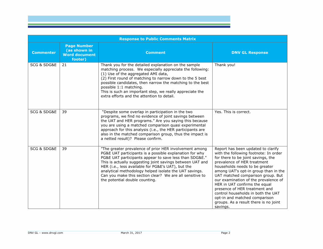
DNV GL – www.dnvgl.com March 31, 2017 Page 2
Response to Public Comments Matrix
Commenter
Page Number (as shown in
Word document
footer)
Comment DNV GL Response
SCG & SDG&E 21 Thank you for the detailed explanation on the sample matching process. We especially appreciate the following:
(1) Use of the aggregated AMI data, (2) First round of matching to narrow down to the 5 best
possible candidates, then narrow the matching to the best possible 1:1 matching. This is such an important step, we really appreciate the extra efforts and the attention to detail.
Thank you!
SCG & SDG&E 39 “Despite some overlap in participation in the two programs, we find no evidence of joint savings between the UAT and HER programs.” Are you saying this because you are using a matched comparison quasi experimental approach for this analysis (i.e., the HER participants are
also in the matched comparison group, thus the impact is
a netted result)? Please confirm.
Yes. This is correct.
SCG & SDG&E 39 "The greater prevalence of prior HER involvement among PG&E UAT participants is a possible explanation for why PG&E UAT participants appear to save less than SDG&E." This is actually suggesting joint savings between UAT and HER (i.e., less available for PG&E’s UAT), but the
analytical methodology helped isolate the UAT savings. Can you make this section clear? We are all sensitive to the potential double counting.
Report has been updated to clarify with the following footnote: In order for there to be joint savings, the prevalence of HER treatment households needs to be greater
among UAT's opt-in group than in the UAT matched comparison group. But our examination of the prevalence of HER in UAT confirms the equal
presence of HER treatment and control households in both the UAT opt-in and matched comparison
groups. As a result there is no joint savings.
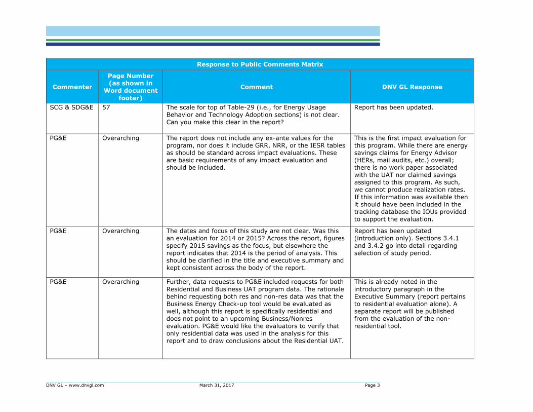
DNV GL – www.dnvgl.com March 31, 2017 Page 3
Response to Public Comments Matrix
Commenter
Page Number (as shown in
Word document
footer)
Comment DNV GL Response
SCG & SDG&E 57 The scale for top of Table-29 (i.e., for Energy Usage Behavior and Technology Adoption sections) is not clear.
Can you make this clear in the report?
Report has been updated.
PG&E Overarching The report does not include any ex-ante values for the
program, nor does it include GRR, NRR, or the IESR tables as should be standard across impact evaluations. These are basic requirements of any impact evaluation and should be included.
This is the first impact evaluation for
this program. While there are energy savings claims for Energy Advisor (HERs, mail audits, etc.) overall; there is no work paper associated with the UAT nor claimed savings assigned to this program. As such, we cannot produce realization rates.
If this information was available then it should have been included in the tracking database the IOUs provided to support the evaluation.
PG&E Overarching The dates and focus of this study are not clear. Was this an evaluation for 2014 or 2015? Across the report, figures
specify 2015 savings as the focus, but elsewhere the report indicates that 2014 is the period of analysis. This should be clarified in the title and executive summary and kept consistent across the body of the report.
Report has been updated (introduction only). Sections 3.4.1
and 3.4.2 go into detail regarding selection of study period.
PG&E Overarching Further, data requests to PG&E included requests for both
Residential and Business UAT program data. The rationale behind requesting both res and non-res data was that the Business Energy Check-up tool would be evaluated as
well, although this report is specifically residential and does not point to an upcoming Business/Nonres evaluation. PG&E would like the evaluators to verify that
only residential data was used in the analysis for this report and to draw conclusions about the Residential UAT.
This is already noted in the
introductory paragraph in the Executive Summary (report pertains to residential evaluation alone). A
separate report will be published from the evaluation of the non-residential tool.
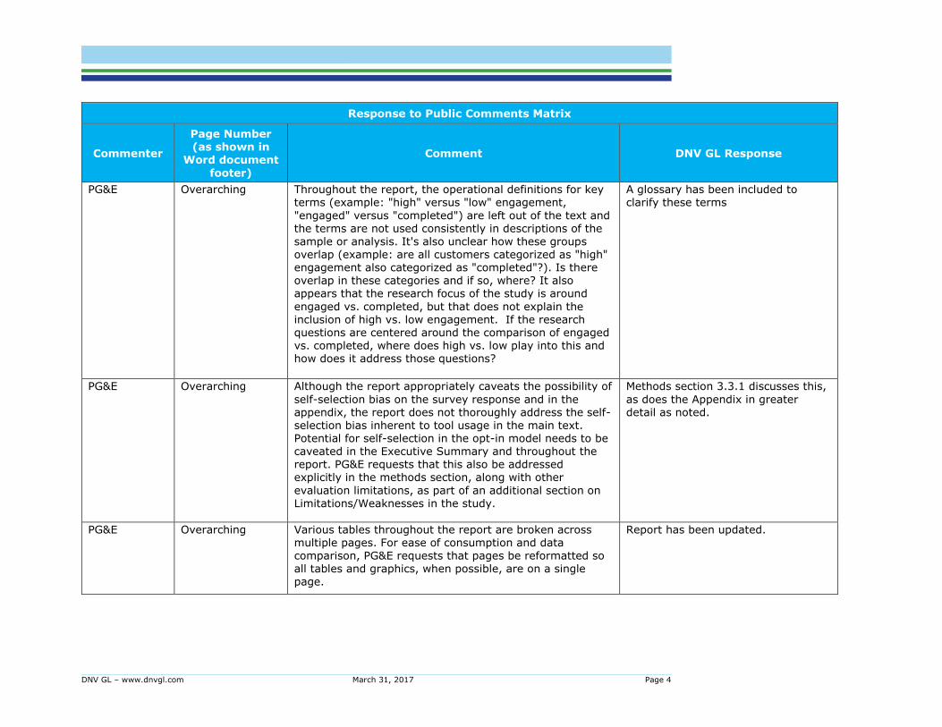
DNV GL – www.dnvgl.com March 31, 2017 Page 4
Response to Public Comments Matrix
Commenter
Page Number (as shown in
Word document
footer)
Comment DNV GL Response
PG&E Overarching Throughout the report, the operational definitions for key terms (example: "high" versus "low" engagement,
"engaged" versus "completed") are left out of the text and the terms are not used consistently in descriptions of the
sample or analysis. It's also unclear how these groups overlap (example: are all customers categorized as "high" engagement also categorized as "completed"?). Is there overlap in these categories and if so, where? It also appears that the research focus of the study is around
engaged vs. completed, but that does not explain the inclusion of high vs. low engagement. If the research questions are centered around the comparison of engaged vs. completed, where does high vs. low play into this and how does it address those questions?
A glossary has been included to clarify these terms
PG&E Overarching Although the report appropriately caveats the possibility of
self-selection bias on the survey response and in the appendix, the report does not thoroughly address the self-selection bias inherent to tool usage in the main text. Potential for self-selection in the opt-in model needs to be caveated in the Executive Summary and throughout the report. PG&E requests that this also be addressed explicitly in the methods section, along with other
evaluation limitations, as part of an additional section on Limitations/Weaknesses in the study.
Methods section 3.3.1 discusses this,
as does the Appendix in greater detail as noted.
PG&E Overarching Various tables throughout the report are broken across multiple pages. For ease of consumption and data
comparison, PG&E requests that pages be reformatted so all tables and graphics, when possible, are on a single page.
Report has been updated.
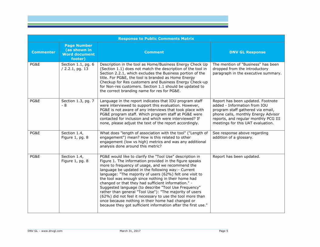
DNV GL – www.dnvgl.com March 31, 2017 Page 5
Response to Public Comments Matrix
Commenter
Page Number (as shown in
Word document
footer)
Comment DNV GL Response
PG&E Section 1.1, pg. 6 / 2.2.1, pg. 13
Description in the tool as Home/Business Energy Check Up (Section 1.1) does not match the description of the tool in
Section 2.2.1, which excludes the Business portion of the title. For PG&E, the tool is branded as Home Energy
Checkup for Res customers and Business Energy Check-up for Non-res customers. Section 1.1 should be updated to the correct branding name for res for PG&E.
The mention of "Business" has been dropped from the introductory
paragraph in the executive summary.
PG&E Section 1.3, pg. 7
- 8
Language in the report indicates that IOU program staff
were interviewed to support this evaluation. However, PG&E is not aware of any interviews that took place with PG&E program staff. Which program staff at PG&E were contacted for inclusion and which were interviewed? If none, please adjust the text of the report accordingly.
Report has been updated. Footnote
added - Information from IOU program staff gathered via email, phone calls, monthly Energy Advisor reports, and regular monthly PCG III meetings for this UAT evaluation.
PG&E Section 1.4, Figure 1, pg. 8
What does "length of association with the tool" ("Length of engagement") mean? How is this related to other engagement (low vs high) metrics and was any additional analysis done around this metric?
See response above regarding addition of a glossary.
PG&E Section 1.4, Figure 1, pg. 8
PG&E would like to clarify the "Tool Use" description in Figure 1. The information provided in the figure speaks
more to frequency of usage, and we recommend the language be updated in the following way:- Current language: "The majority of users (62%) felt one visit to the tool was enough since nothing in their home had changed or that they had sufficient information." -
Suggested language (to describe "Tool Use Frequency" rather than general "Tool Use"): "The majority of users
(62%) did not feel it necessary to use the tool more than once because nothing in their home had changed or because they got sufficient information after the first use."
Report has been updated.
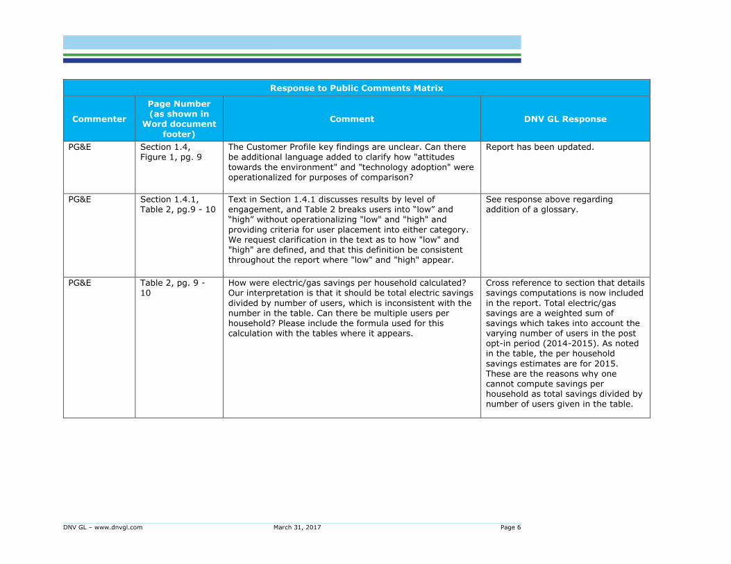
DNV GL – www.dnvgl.com March 31, 2017 Page 6
Response to Public Comments Matrix
Commenter
Page Number (as shown in
Word document
footer)
Comment DNV GL Response
PG&E Section 1.4, Figure 1, pg. 9
The Customer Profile key findings are unclear. Can there be additional language added to clarify how "attitudes
towards the environment" and "technology adoption" were operationalized for purposes of comparison?
Report has been updated.
PG&E Section 1.4.1, Table 2, pg.9 - 10
Text in Section 1.4.1 discusses results by level of engagement, and Table 2 breaks users into “low” and “high” without operationalizing "low" and "high" and
providing criteria for user placement into either category. We request clarification in the text as to how "low" and "high" are defined, and that this definition be consistent throughout the report where "low" and "high" appear.
See response above regarding addition of a glossary.
PG&E Table 2, pg. 9 - 10
How were electric/gas savings per household calculated? Our interpretation is that it should be total electric savings
divided by number of users, which is inconsistent with the number in the table. Can there be multiple users per household? Please include the formula used for this calculation with the tables where it appears.
Cross reference to section that details savings computations is now included
in the report. Total electric/gas savings are a weighted sum of savings which takes into account the varying number of users in the post opt-in period (2014-2015). As noted in the table, the per household
savings estimates are for 2015. These are the reasons why one cannot compute savings per household as total savings divided by number of users given in the table.
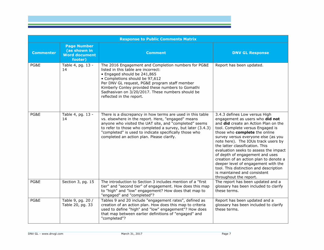
DNV GL – www.dnvgl.com March 31, 2017 Page 7
Response to Public Comments Matrix
Commenter
Page Number (as shown in
Word document
footer)
Comment DNV GL Response
PG&E Table 4, pg. 13 - 14
The 2016 Engagement and Completion numbers for PG&E listed in this table are incorrect:
• Engaged should be 241,865 • Completions should be 97,612
Per DNV GL request, PG&E program staff member Kimberly Conley provided these numbers to Gomathi Sadhasivan on 3/20/2017. These numbers should be reflected in the report.
Report has been updated.
PG&E Table 4, pg. 13 -
14
There is a discrepancy in how terms are used in this table
vs. elsewhere in the report. Here, "engaged" means anyone who visited the UAT site, and “completed” seems to refer to those who completed a survey, but later (3.4.3) "completed" is used to indicate specifically those who
completed an action plan. Please clarify.
3.4.3 defines Low versus High
engagement as users who did not and did create an Action Plan on the tool. Complete versus Engaged is those who complete the online
survey versus everyone else (as you note here). The IOUs track users by the latter classification. This
evaluation seeks to assess the impact of depth of engagement and uses creation of an action plan to denote a deeper level of engagement with the tool. This distinction and description is maintained and consistent throughout the report.
PG&E Section 3, pg. 15 The introduction to Section 3 includes mention of a "first tier" and "second tier" of engagement. How does this map
to "high" and "low" engagement? How does that map to "engaged" and "completed"?
The report has been updated and a glossary has been included to clarify
these terms.
PG&E Table 9, pg. 20 / Table 20, pg. 33
Tables 9 and 20 include "engagement rates", defined as creation of an action plan. How does this map to criteria used to define "high" and "low" engagement"? How does that map between earlier definitions of "engaged" and
"completed"?
Report has been updated and a glossary has been included to clarify these terms.
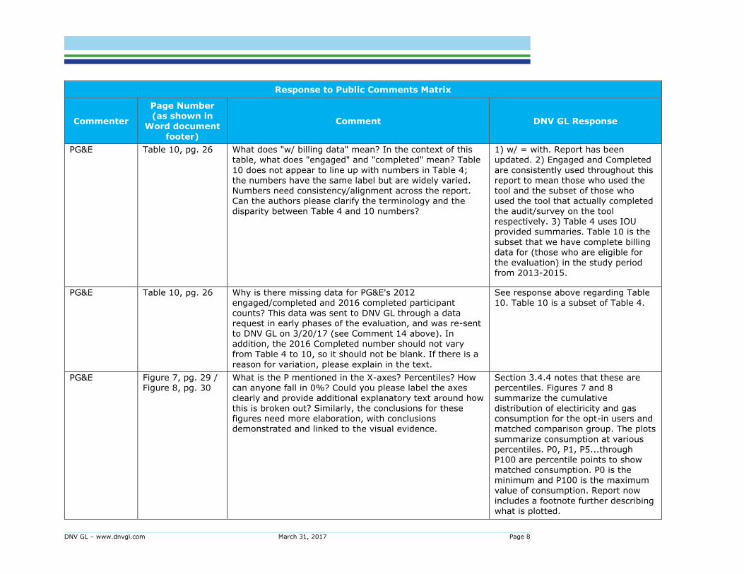
DNV GL – www.dnvgl.com March 31, 2017 Page 8
Response to Public Comments Matrix
Commenter
Page Number (as shown in
Word document
footer)
Comment DNV GL Response
PG&E Table 10, pg. 26 What does "w/ billing data" mean? In the context of this table, what does "engaged" and "completed" mean? Table
10 does not appear to line up with numbers in Table 4; the numbers have the same label but are widely varied.
Numbers need consistency/alignment across the report. Can the authors please clarify the terminology and the disparity between Table 4 and 10 numbers?
1) w/ = with. Report has been updated. 2) Engaged and Completed
are consistently used throughout this report to mean those who used the
tool and the subset of those who used the tool that actually completed the audit/survey on the tool respectively. 3) Table 4 uses IOU provided summaries. Table 10 is the
subset that we have complete billing data for (those who are eligible for the evaluation) in the study period from 2013-2015.
PG&E Table 10, pg. 26 Why is there missing data for PG&E's 2012 engaged/completed and 2016 completed participant
counts? This data was sent to DNV GL through a data request in early phases of the evaluation, and was re-sent to DNV GL on 3/20/17 (see Comment 14 above). In addition, the 2016 Completed number should not vary from Table 4 to 10, so it should not be blank. If there is a
reason for variation, please explain in the text.
See response above regarding Table 10. Table 10 is a subset of Table 4.
PG&E Figure 7, pg. 29 / Figure 8, pg. 30
What is the P mentioned in the X-axes? Percentiles? How can anyone fall in 0%? Could you please label the axes clearly and provide additional explanatory text around how this is broken out? Similarly, the conclusions for these figures need more elaboration, with conclusions demonstrated and linked to the visual evidence.
Section 3.4.4 notes that these are percentiles. Figures 7 and 8 summarize the cumulative distribution of electiricity and gas consumption for the opt-in users and matched comparison group. The plots
summarize consumption at various percentiles. P0, P1, P5...through P100 are percentile points to show matched consumption. P0 is the minimum and P100 is the maximum value of consumption. Report now
includes a footnote further describing what is plotted.
DNV GL – www.dnvgl.com March 31, 2017 Page 9
Response to Public Comments Matrix
Commenter
Page Number (as shown in
Word document
footer)
Comment DNV GL Response
PG&E Table 21, pg.34 The PG&E %s in Table 21 do not match the surrounding text.
Report has been updated.
PG&E Table 26, pg. 42 Throughout the report, "consumption" can mean either
gas or electric (ex: on page 21, "consumption" is used multiple times but in the first section of 3.3.1 is clarified as "energy consumption".) How is "consumption" being operationalized in this and other tables/figures/text throughout the report? Should be a clear definition in Executive Summary, with footnotes throughout where the term is used variably. Likewise, "high", "medium", and
"low" consumption are not defined for this table. What were the criteria for each category?
1) Consumption or energy
consumption is used when referring to both electricity and gas throughout the report. In cases where the reference is to a particular fuel, it is called out as electricity or gas accordingly. 2) High, medium, and low consumption referenced in Table
26 are consumption terciles based on the sample frame used in the survey and vary by IOU.
PG&E Figure 11, pg. 36 / Figure 12, pg.
37
Would the authors please clarify and label the y-axis variable?
Report has been updated.