ui in android - computer vision center · 3 navigation 4 launch screens 5 empty states 6 growth....
TRANSCRIPT

UI in Android
J.Serrat
102759 Software Design
November 29, 2017

Goal and Reference
Goals:
quick introduction to the basics of UI Android app structure,patterns, components and style.
setting up terminology
relevant for the project
Reference: http://developer.android.com/design whichredirects to http://material.io/guidelines
These slides are a selection of this website under patterns,layout, components.
Index
1 Material
2 App bar
3 Navigation
4 Launch screens
5 Empty states
6 Growth

Material App bar Navigation Launch screens Empty states Growth
Material style
Material is the name for the style specification of Android apps (asof ≈ 2015)
paper = planar surfaces that superimpose in 3D + ink = color,imagery, typography.
4 / 30

Material App bar Navigation Launch screens Empty states Growth
App bar
Formerly “action bar”, special kind of normally permanent toolbarused for
branding, identity by title, color, typography
indicate user’s location in the app
access to main actions
support for navigation through the app & view switching
5 / 30

Material App bar Navigation Launch screens Empty states Growth
App bar
The nav icon at the left can be:
nothing, omitted
control to open a navigation drawer
up button for navigating upward through the app’s hierarchy
6 / 30

Material App bar Navigation Launch screens Empty states Growth
App bar
Title can be
app namename of the current pagepage filter
Icons are app-related actions (buttons)
Plus overflow action which opens the overflow menu, withsecondary actions and menu items like help, settings, and feedback.
7 / 30

Material App bar Navigation Launch screens Empty states Growth
Navigation
Navigation means
decide the structure of the app as seen by the user
and how the user moves through it
Users should be able to figure out how to move through the appwith ease. The structure guides users through the different parts.
Examples:
display important destinations/parts of the app in tabs, navdrawer, side navigation
in hierarchies, denote parent-child, sibling relations
inessential content shown apart, in different locations thanimportant content
8 / 30

Material App bar Navigation Launch screens Empty states Growth
Up and back buttons
Up button
navigates within an app based on the hierarchical relationshipsbetween screens
goes to the previous screen the user has viewed
but within the app
if a screen is the app’s home, it should not present an Upbutton
9 / 30

Material App bar Navigation Launch screens Empty states Growth
Up and back buttons
Back button
navigates in reverse chronological order through recentlyviewed screens.
may take the user outside of the app
also dismisses dialogs, pop-ups, clears selected items, hideskeyboard . . .
10 / 30

Material App bar Navigation Launch screens Empty states Growth
Tabs
Use tabs
for navigating between a few groups of content
to quickly move between a small number of equally importantor sibling views
when there are parents with embedded child views
need to frequently switch between views
in apps with few top-level views
11 / 30

Material App bar Navigation Launch screens Empty states Growth
Tabs
Don’t use tabs
for carousels or pagination of content
for content of different importance
nested tabs
for content accepting sweep
12 / 30

Material App bar Navigation Launch screens Empty states Growth
Tabs
Types of tab bars
fixed scrollable
with text and icons with just icons
13 / 30

Material App bar Navigation Launch screens Empty states Growth
Bottom bar
Similarly to tabs, allows users to quickly move between asmall number of top-level views
But located in a more ergonomic location, easily reachable bythe thumb
Also for destinations requiring direct access from anywhere inthe app
3 to 6 destinations, if 2 use tabs if > 6 use nav drawer
14 / 30

Material App bar Navigation Launch screens Empty states Growth
Navigation drawer
When there many top-levelviews/destinations, insteadof tabs side navigation is agood alternative.
A drawer remains hiddenuntil invoked by the user.
The most frequentlyaccessed destinations at thetop.
Settings and support at thebottom
15 / 30

Material App bar Navigation Launch screens Empty states Growth
In-context navigation
Allows agile movementbetween related sets of data.
Appropriate for hierarchiesof parents with siblings(trees)
The up button is used toreturn to the previous level,better than back button.
16 / 30

Material App bar Navigation Launch screens Empty states Growth
Launch screens
Launching your app while displaying a blank canvas increasesits perceived loading time
The launch screen is a user’s first experience of yourapplication.
Should be used for cold launch from the home screen, not ifit’s in background
17 / 30
Material App bar Navigation Launch screens Empty states Growth
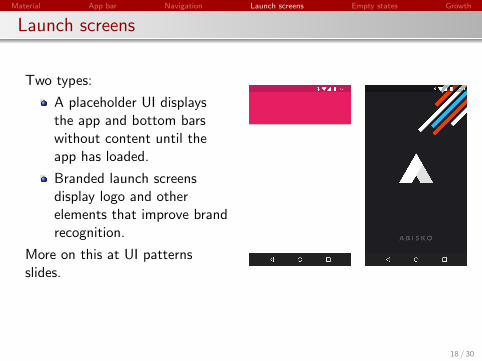
Launch screens
Two types:
A placeholder UI displaysthe app and bottom barswithout content until theapp has loaded.
Branded launch screensdisplay logo and otherelements that improve brandrecognition.
More on this at UI patternsslides.
18 / 30

Material App bar Navigation Launch screens Empty states Growth
Empty states
Empty states occur when an item’s content can’t be shown :
a list that doesn’t contain any items
a search that doesn’t display any results
Although these states aren’t typical, they should be designed toprevent user confusion.
Alternatives to empty states
Starter content
Educational content
Best match
19 / 30

Material App bar Navigation Launch screens Empty states Growth
Empty states
The most basic empty statedisplays a non-interactiveimage and a text tagline.
Use an image that is subtleand neutral with respect tothe background
Include a tagline that has apositive tone, conveys thepurpose of the app withoutappearing to be actionable
Do why don’t ?
20 / 30

Material App bar Navigation Launch screens Empty states Growth
Empty states
Starter content
The most compelling wayfor new users to learn theapp is by using it
Provide starter content thatwill allow users to explorethe app right away
Use content that has broadappeal and demonstratesprimary features
Give users the ability todelete and replace thiscontent
21 / 30

Material App bar Navigation Launch screens Empty states Growth
Empty states
Educational content
Help users understand whatthey’ll be able to do on thisscreen once it has content
Make it possible to dismissor skip this content
Keep it brief
22 / 30

Material App bar Navigation Launch screens Empty states Growth
Empty states
Best match
If nothing exactly matchesthe user’s query, are thereany results for a queryspelled slightly differently? Ifso, then show the results
way to handle a misspelledquery without explicitlyplacing blame on the user
make clear the results arenot those for the actualquery
23 / 30

Material App bar Navigation Launch screens Empty states Growth
Growth
How to help users quickly and intuitively understand what they cando with the app :
Onboarding is the first experience new users have with theapp. The goal is retaining new users by using, in the firstdays,
Self-selectQuick startTop user benefits
Feature discovery
24 / 30
Material App bar Navigation Launch screens Empty states Growth
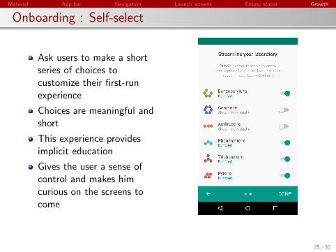
Onboarding : Self-select
Ask users to make a shortseries of choices tocustomize their first-runexperience
Choices are meaningful andshort
This experience providesimplicit education
Gives the user a sense ofcontrol and makes himcurious on the screens tocome
25 / 30

Material App bar Navigation Launch screens Empty states Growth
Onboarding : Quick start
Users land directly in the UIwithout any onboardingmodel shown
Gives users something to do,encourage action
Enables users to quickly getstarted with the corefunctionality of the app
26 / 30

Material App bar Navigation Launch screens Empty states Growth
Onboarding : Quick start
Often prioritizes the first keyaction
27 / 30

Material App bar Navigation Launch screens Empty states Growth
Onboarding : Quick start
Don’t force educationupfront
28 / 30

Material App bar Navigation Launch screens Empty states Growth
Onboarding : Top user benefits
Brief autoplay carousel/animation that highlights threeprimary benefits from using the appRelevant benefits, rather than give instructions or describefeaturesConsider problems that the app solves, everyday features
29 / 30

Material App bar Navigation Launch screens Empty states Growth
Feature discovery
Provide value and improve engagement by introducing usersto new featuresAt contextually relevant moments, at the wrong time can beintrusive and annoyingUsers may dismiss the prompt by using a swipe gesture ortapping outside of the prompt’s background area
30 / 30