ui design for wearable devices - repositório aberto · ui design for wearable devices ... products...
TRANSCRIPT

FACULTY OF ENGINEERING UNIVERSITY OF PORTO
UI Design for Wearable Devices
Vitor Mota
Master in Informatics and Computing Engineering
Supervised by:
Miguel Pimenta Monteiro (Assistant professor)
Pedro Rocha (GlinttHS)
January 2015

2
3
Abstract
Smartwatches have been around for some time now (Ranger 2015), but 2015 is the year
this wearable technology will finally get its boom in terms of popularity and growth.
Technology giants like Apple, Google and Samsung are betting on their own-line of
products such as the Apple Watch, Android Wear and Gear respectively (Apple Inc
2015a; Google Inc 2015b; SAMSUNG 2015). All of these devices are computation
capable electronics with very small touch capacitive screens, limited number of hardware
buttons with varying screen sizes and even shapes. Our research focused mainly on these
constraints and how to successfully develop user friendly GUI’s for such small screens.
The goal was to develop a model with guidelines to help developers provide easy to use
and user friendly applications at a visual and interaction level to end users. To
successfully achieve this, we first took a deep look at the available technology within
these devices, including the framework each of the major platforms provide and the
underlying hardware capabilities such as sensors like GPS, gyroscope, the use of the touch
screen or microphone for user input and whether the shape of the device (round or
squared) can have different effects on the design and usability. We also analyzed the
impact of placement and arrangement of interface components having in mind that this
technology, since it is a wearable watch, can be worn on both wrists and therefore will be
used with only one hand that may obscure a different portion of the interface depending
on which wrist the user uses it (Chandra and Raghunath 2000). Finally, to evaluate our
model we built a prototype and put it to test with end users, collecting usage metrics and
feedback on usability to further improve the original model.
4
Content
1 Introduction ........................................................................................................ 8
The Smartwatch.............................................................................................. 8
Motivations and objectives............................................................................. 8
Report structure .............................................................................................. 9
2 It’s just a watch, only ‘smarter’ ....................................................................... 11
A brief history .............................................................................................. 11
The smartwatch spectrum............................................................................. 11
The instantly-viewable paradigm ................................................................. 12
3 A deep look at the Design Space ..................................................................... 13
User interaction ............................................................................................ 13
Screen shapes and sizes ................................................................................ 14
Screen input obscuration .............................................................................. 16
User input ..................................................................................................... 17
3.4.1 Text input .................................................................................................. 18
3.4.2 Speech input ............................................................................................. 19
3.4.3 Off-device input ........................................................................................ 19
4 Our Proposed Model ........................................................................................ 21
Creative vision and guidelines ..................................................................... 21
Break down your app ................................................................................... 22
Keep it big and simple .................................................................................. 24
Five seconds interaction ............................................................................... 25
5 The Player App ................................................................................................ 26
The Concept ................................................................................................. 26
The Player App Use-Cases ........................................................................... 26
Early Mockups ............................................................................................. 27
6 Testing ............................................................................................................. 36
Test Session Guide ....................................................................................... 36
6.1.1 The tasks ................................................................................................... 36
6.1.2 The questions ............................................................................................ 36
User Selection .............................................................................................. 38
First Test Session ......................................................................................... 38
6.3.1 Results ...................................................................................................... 38
5
6.3.2 Application Improvements ....................................................................... 42
Second Test Session ..................................................................................... 46
6.4.1 Results ...................................................................................................... 46
Final Notes ................................................................................................... 49
7 Final Model and Future Work ......................................................................... 50
Model ........................................................................................................... 50
7.1.1 Concepts ................................................................................................... 50
7.1.2 The UI ....................................................................................................... 51
7.1.3 Testing ...................................................................................................... 53
Final Considerations and Future Work ........................................................ 53
Appendix A – Round Keyboard for Smartwatch ........................................................ 55
References ................................................................................................................... 65
6
Index of Figures
Figure 1 Smart wearable installed base, unit sales and device revenue, worldwide, 2013–
2020 (Velasco-castillo 2015) .......................................................................................... 10
Figure 2 Smartwatches over the years ............................................................................ 12 Figure 3 watch screen size comparison (Apple Inc 2015b) ............................................ 15 Figure 4 Smartwatches comparison (Smartwacth.me 2015) .......................................... 15 Figure 5 Control clipping on round shaped devices (Google Inc, n.d.) ......................... 16 Figure 6 Screen obscuring I (Apple Inc 2015b) ............................................................. 17
Figure 7 Screen obscuring II (Apple Inc 2015b) ............................................................ 17 Figure 8 Zoomboard (Oney et al. 2013) ......................................................................... 19 Figure 9 Six-key keyboard (Komninos 2014) ................................................................ 19
Figure 10 Skin buttons with laser projection (Laput, G., Xiao, R., Chen, X.A., Hudson,
S.E., Harrison 2014) ....................................................................................................... 20 Figure 11 gDoctor Application by GlinttHS .................................................................. 23 Figure 12 Activity diagram for gDoctor Smartphone application typical use scenario . 23
Figure 13 Possible activity diagram for gDoctor Smartwatch application ..................... 24 Figure 14 Mockup for smartwatch notification .............................................................. 24
Figure 15 Player App Use-Cases .................................................................................... 27 Figure 16 Main menu ..................................................................................................... 28 Figure 17 Measure BPM ................................................................................................ 28
Figure 18 Measure BPM notification ............................................................................. 29 Figure 19 Training plan .................................................................................................. 30
Figure 20 training plan notification ................................................................................ 31 Figure 21 PT Mode ......................................................................................................... 31
Figure 22 Sleep Quality .................................................................................................. 33 Figure 23 Sleep Quality notification .............................................................................. 34 Figure 24 Today's diet .................................................................................................... 34
Figure 25 Today's diet notification ................................................................................. 35 Figure 26 Main Menu v2 ................................................................................................ 42
Figure 27 Measure BPM v2 ........................................................................................... 43 Figure 28 Training Plan v2 ............................................................................................. 44 Figure 29 PT Mode v2 .................................................................................................... 44 Figure 30 Sleep History v2 ............................................................................................. 45
7
Index of tables
Table 1- Interactions comparison ................................................................................... 13 Table 2 - 1st Test Session question 1 results ................................................................... 39
Table 3 - 1st Test Session question 2 Results.................................................................. 39 Table 4 - 1st Test Session question 3 results ................................................................... 40 Table 5 - 1st Test Session question 4 results ................................................................... 40 Table 6 - 1st Test Session question 5 results ................................................................... 41 Table 7 - 1st Test Session question 6 results ................................................................... 41
Table 8 - 1st Test Session question 7 results ................................................................... 41 Table 9 – 2nd Test Session question 1 results ................................................................. 46 Table 10 – 2nd Test Session question 2 results ............................................................... 46
Table 11 – 2nd Test Session question 3 results ............................................................... 47 Table 12 - 2nd Test Session question 4 results ................................................................ 47 Table 13 - 2nd Test Session question 7 results ................................................................ 48 Table 14 - 2nd Test Session question 10 results .............................................................. 48
8
1 Introduction
In this chapter we briefly introduce some of the contexts of using the smartwatch along
with the context, motivation and objectives for this work. Lastly we explain a little of
what we are going to discuss on each of the report’s topics.
The Smartwatch
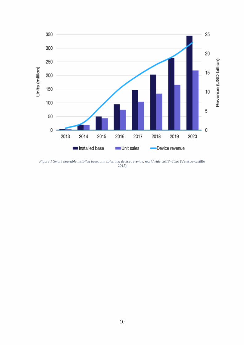
The smartwatch is expected to generate USD22.9 billion in revenue by 2020 with 2015
being the turnover year and expected sales of these devices going from 1 million in 2014
to 13.6 million in 2015, as show on Figure 1, driving the overall growth of the wearable
market (Velasco-castillo 2015). With such high market value, many technology
companies are investing on their own line of smartwatches in hope to grasp a big share
of the growing market. Consumers already have a vast array of products to choose from,
with the Gear watch from Samsung, the Apple Watch from Apple or the older Pebble
watch just to name a few. They all offer different functionality but share the same concept,
a wrist worn device that extends the functionality of a traditional watch with a different
set of features (Xu, Lyons, and Ave 2015). This concept however is not new, in fact it is
several decades old as in the 40s people started to imagine that a watch could do much
more than just tell the time (Smartwatch Group 2013). In the last decade technology
finally has made it possible to put together a small enough device to be worn on the wrist
and incorporate the hardware necessary to execute new functions never seen on a watch
before, such as the ability to run arbitrary code, connect to other devices, voice input,
among others. The possibilities for these devices are now endless, as new smartwatches
emerge. We already have from simple analog watches with ‘smart capabilities’ like a
pulsing led for various types of notifications, to watches running a fully capable
computing operative system (OS) with capacitive touch screens.
From all the available platforms for smartwatches, the most successful are Google’s
Android Wear and Apple’s watchOS, while some concrete numbers about the market
share of each competitor are hard to find, these two brands are expected to lead the market
development with the later already taking the lead on the first day of its launch, with over
1 million units sold (Price 2015).
These new platforms enable third-party developers to create their own standalone or
smartphone companion applications to run on the smartwatch, however the small form
factor poses new challenges in the design space. With screen sizes around 1.5 inches, to
successfully design interfaces for applications on these devices, is no trivial task and
therefore having a set of rules and guidelines to follow is crucial (Google Inc 2015b;
Apple Inc 2015b).
Motivations and objectives
Wearable technology is still in its infancy and the smartwatch will most definitely make
for the next great instalment in terms of mobile computing since the smartphone. This
device provides another platform for companies to leverage their products and services
with new possibilities or just enhance their position with their customers by providing yet
another interaction point, besides the standard web and smartphone application. However,
due to the user interface limitations, namely in terms of size and input, it is very important
to carefully design the user interface or even a great product may fail if the end-user finds
9
it difficult to interact with, confusing or hard to understand. Having a simple and intuitive
user interface is key for product acceptation (Miranda 2011).
The purpose of this work is to find and formulate design approaches, rules and guidelines
to create intuitive and easy to use user interfaces for smartwatches based on their
smartphone counterparts. We looked mostly at the two major platforms (Android Wear
and Apple’s watchOS) to prototype and implement, but the focus is to build interfaces for
small screen wrist wearables capable of running arbitrary code (apps) and not specific
functionality devices. By the end of the work, we have built a simple model with
guidelines on building very small user interfaces with real world applications showing
the do’s and don’ts when designing for these devices. We also tested this application with
multiple end-users to gather usage metrics such as time to complete a task, reading
information, application flow understanding and executing an action. By collecting this
data and user feedback we created a set of rules and guidelines that contribute to a better
overall user interaction experience.
Report structure
We have briefly presented the context of this work along with the goals. Over the
following section we describe in depth the smartwatch world with some interesting
concepts that emerged decades ago as the smartwatch idea began to take form. Next we
take a look at the modern smartwatch design space and variety, from the 2 most popular
platforms (Android Wear and Apple’s watchOS), describing and identifying the idea
behind the way these platforms were designed to be used and how third-party apps
integrate the system along with the controls available to create applications. After that we
briefly describe the Application we developed and present the initial UI design. Lastly,
we present our findings through iteratively testing, explain the changes made to the
prototype and our conclusions.
10
Figure 1 Smart wearable installed base, unit sales and device revenue, worldwide, 2013–2020 (Velasco-castillo
2015)
11
2 It’s just a watch, only ‘smarter’
Before we delve further in this topic it is very important to understand what a smartwatch
is in fact. Just by decomposing the word we get something like a watch that is smart. So
the real question should be: What makes a watch smart? A watch is intuitively a device
that has the ability to tell the time, and most of these are conceptually wrist worn, but the
smart part is not so straightforward. One can think of the smart part as being an extension
of the watch concept, something like a device that goes beyond than just telling the time
and have extra functionality (Xu, Lyons, and Ave 2015). A digital watch that has an
embedded calculator can be an example of such and while those have been around for a
long time a newer model would be a wearable computer with a dedicated OS capable of
running arbitrary code.
A brief history
The idea behind the smartwatch is not new, in fact it has been around for many decades
at least since the 40s when people started to formulate the idea that a watch could do
much more than just tell the time. With references in movies such as Dick Tracy or the
more famous Bond movies (Smartwatch Group 2013). However, these were only fictional
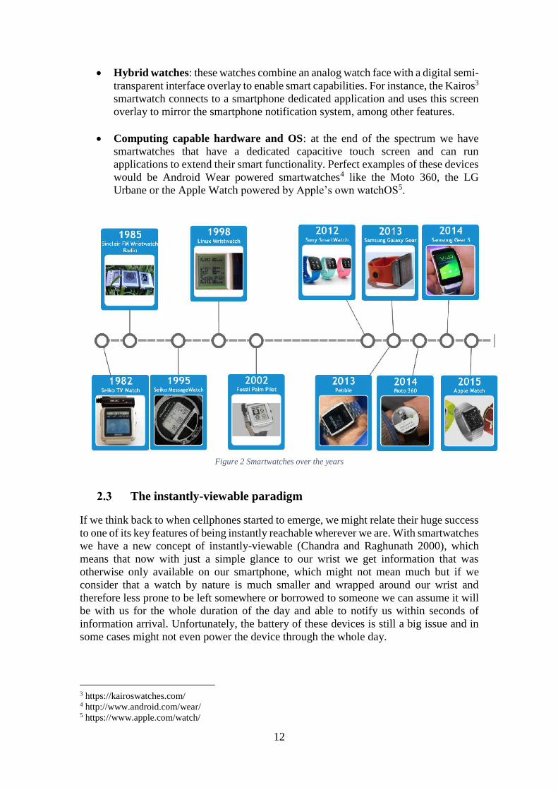
ideas very far from what was possible to build in that time. Figure 2 shows a timeline
with the most notable smartwatches over the years, the Seiko TV Watch in 1982 was one
of the very first watches to extend the concept of a traditional watch with a small digital
display capable of showing TV images, and several years after, in 1998, came the first
Linux-powered watch, designed to communicate wirelessly with pc’s, cellphones and
other wireless-enabled devices. This smartwatch was developed by Steve Mann, the
father of wearable computing, and 2 years later IBM launched a prototype, considered
the device that paved the way to modern day devices (Paul Lamkin 2015). In today’s
standards, smartwatches function either as a smartphone companion relying on the
smartphone to accomplish most of its tasks or as a standalone device with 3G connectivity
like the Samsung’s Gear S1 that can place/receive calls or send text messages without the
need of a smartphone nearby.
The smartwatch spectrum
There are many types of smartwatches commercially available. We have the simplest with
some ‘smart’ capabilities, hybrid watches that combine a digital interface with an analog
watch face and even capacitive touch screen devices running computing capable OS.
Therefore, we can define the smartwatch spectrum with at least these 3 distinct types of
smartwatches:
Analog watches with ‘smart’ capabilities: these are regular analog watches that
have smart features. The CASIO G-Shock2 is one such example, it uses Bluetooth
to connect with a smartphone application that can be used to track the phone
location, control the music playlist or even set alarms on the smartphone.
1 http://www.samsung.com/global/microsite/gears/ 2 http://world.g-shock.com/us/en/ble/
12
Hybrid watches: these watches combine an analog watch face with a digital semi-
transparent interface overlay to enable smart capabilities. For instance, the Kairos3
smartwatch connects to a smartphone dedicated application and uses this screen
overlay to mirror the smartphone notification system, among other features.
Computing capable hardware and OS: at the end of the spectrum we have
smartwatches that have a dedicated capacitive touch screen and can run
applications to extend their smart functionality. Perfect examples of these devices
would be Android Wear powered smartwatches4 like the Moto 360, the LG
Urbane or the Apple Watch powered by Apple’s own watchOS5.
Figure 2 Smartwatches over the years
The instantly-viewable paradigm
If we think back to when cellphones started to emerge, we might relate their huge success
to one of its key features of being instantly reachable wherever we are. With smartwatches
we have a new concept of instantly-viewable (Chandra and Raghunath 2000), which
means that now with just a simple glance to our wrist we get information that was
otherwise only available on our smartphone, which might not mean much but if we
consider that a watch by nature is much smaller and wrapped around our wrist and
therefore less prone to be left somewhere or borrowed to someone we can assume it will
be with us for the whole duration of the day and able to notify us within seconds of
information arrival. Unfortunately, the battery of these devices is still a big issue and in
some cases might not even power the device through the whole day.
3 https://kairoswatches.com/ 4 http://www.android.com/wear/ 5 https://www.apple.com/watch/
13
3 A deep look at the Design Space
The Design Space for smartwatches capable of running arbitrary code is the focus of this
work and should be thoroughly analyzed. In this chapter we try to understand these
devices constraints, features and research made in terms of input and output.
User interaction
There are some key differences in interaction between Android Wear and Apple’s
watchOS applications. On the Apple Watch for example, applications can only receive
single touch input from the user, while the vertical and horizontal scroll and the digital
crown, as well as the new force touch events, are handled by the OS for navigation,
scrolling content and show context menus respectively. On an Android Wear device
developers get a lot more options with multitouch, vertical or horizontal swipe and long
press support. On Table 1 we compare the interaction differences with these devices. If
we are developing an application that targets both these platforms, due to these
differences in user interaction we might have to consider redesigning the app for each
platform. The reason behind this is that both platforms were designed with slightly
different ideas on user interaction. The watchOS has a home screen with an app launcher
to start apps and was designed with a very simple idea of select an option on a screen to
advance, swipe right go back and swipe left to show the next page in respect to navigation
hierarchy (Apple 2015; Apple Watch User Guide) which might resemble navigation on
an iPod Nano 6G where to navigate to a previous screen the user would just swipe right.
On Android Wear, the user is meant to spend most of the interaction on the home screen
and interact with cards that have useful information like email or call notifications. These
cards, contents are dynamic and defined by developers, where users can scroll through
cards vertically, swipe right to dismiss them and swipe left to interact with them. For
instance, on an email notification card, the user can swipe left once to see the archive
button, swipe left again to see a reply button and clicking on either starts the appropriated
action, called a micro interaction, which might open a full-screen activity if it needs extra
functionality like replying to the email, or navigating a map. When the action is completed
or canceled the user is returned to the card stream again. Akin to the Apple Watch,
Android Wear users can start an app directly, simply by selecting it from a list. Although
the vision behind these platforms usage is quite different, both still offer a way to have
the screen dedicated to an app. While the interactions on the Apple Watch are fairly more
limited, developers can still build their user interface to display information and perform
custom actions.
Apple watchOS Android Wear
Single touch Multitouch
Force touch Free form gestures
Vertical Swipe Vertical and Horizontal Swipe
Scrolling/Zoom hardware button No guarantee of hardware buttons
Table 1- Interactions comparison
14
Screen shapes and sizes
Wearable technology isn’t only a gadget like a smartphone, it is also a fashion accessory,
so to gain acceptance from the masses it has to look good when worn (Losse 2014). For
this reason, smartwatches are presented to the public in various sizes, shapes, colors and
band configurations. Even the very first edition of the Apple watch has over 30 different
aesthetics configurations across all models. The important aspect to take into account with
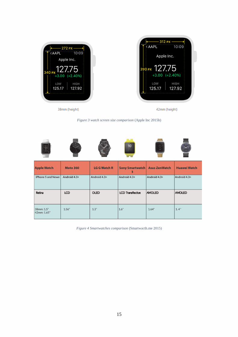
the watch is that it has 2 available screen sizes: a 38mm model with 272 pixels’ width by
340 pixels’ height and a 42mm model with 312 pixels’ width (extra 40 pixels) by 390
pixels’ height (extra 50 pixels). The difference is not much but taking this into account
early in development is good practice since it also works as a clue that future editions
might introduce new screen sizes. On Apple’s Human Interface Guidelines, it is also
suggested that developers should, and I quote: “Use relative sizing and Dynamic Type to
ensure that items expand or contract naturally to fill the available space.” (Apple Inc
2015b) suggesting that developers shouldn’t create 2 interfaces, one for each screen size,
but rather one that scales with the device’s screen. On Figure 3 we can see the differences
between the 2 Apple Watch sizes.
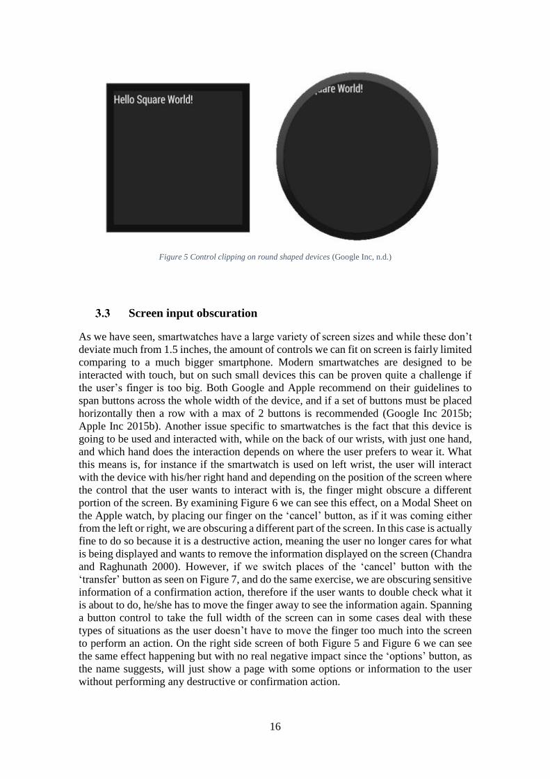
Moving along to Android Wear powered devices the amount of choice is huge, since
various OEM’s are entering the market with one or more smartwatch models running
Android Wear and not only having different screen sizes but also having different shapes
for the screen. Motorola introduced in 2014 a round screen device, the Moto 3606, LG
and Huawei soon followed with the LG Watch R7 and Huawei Watch8 respectively.
Adding these to the already existing portfolio and we have square, rectangular and round
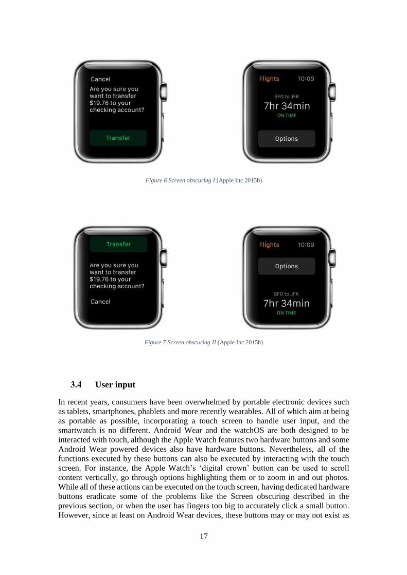
screen shapes, between the first two there is no significant difference, but on the round
shaped devices some controls might get clipped if too close to the corners. Figure 4
presents some of the available smartwatches from different OEM’s where we can see the
screen size and shape differences and Figure 5 shows a round screen getting its controls
clipped while the same layout works fine on a rectangular shape.
6 https://moto360.motorola.com/ 7 http://www.lg.com/us/smart-watches/lg-W110-g-watch-r 8 http://consumer.huawei.com/minisite/worldwide/huawei-watch/
15
Figure 3 watch screen size comparison (Apple Inc 2015b)
Figure 4 Smartwatches comparison (Smartwacth.me 2015)
16
Figure 5 Control clipping on round shaped devices (Google Inc, n.d.)
Screen input obscuration
As we have seen, smartwatches have a large variety of screen sizes and while these don’t
deviate much from 1.5 inches, the amount of controls we can fit on screen is fairly limited
comparing to a much bigger smartphone. Modern smartwatches are designed to be
interacted with touch, but on such small devices this can be proven quite a challenge if
the user’s finger is too big. Both Google and Apple recommend on their guidelines to
span buttons across the whole width of the device, and if a set of buttons must be placed
horizontally then a row with a max of 2 buttons is recommended (Google Inc 2015b;
Apple Inc 2015b). Another issue specific to smartwatches is the fact that this device is
going to be used and interacted with, while on the back of our wrists, with just one hand,
and which hand does the interaction depends on where the user prefers to wear it. What
this means is, for instance if the smartwatch is used on left wrist, the user will interact
with the device with his/her right hand and depending on the position of the screen where
the control that the user wants to interact with is, the finger might obscure a different
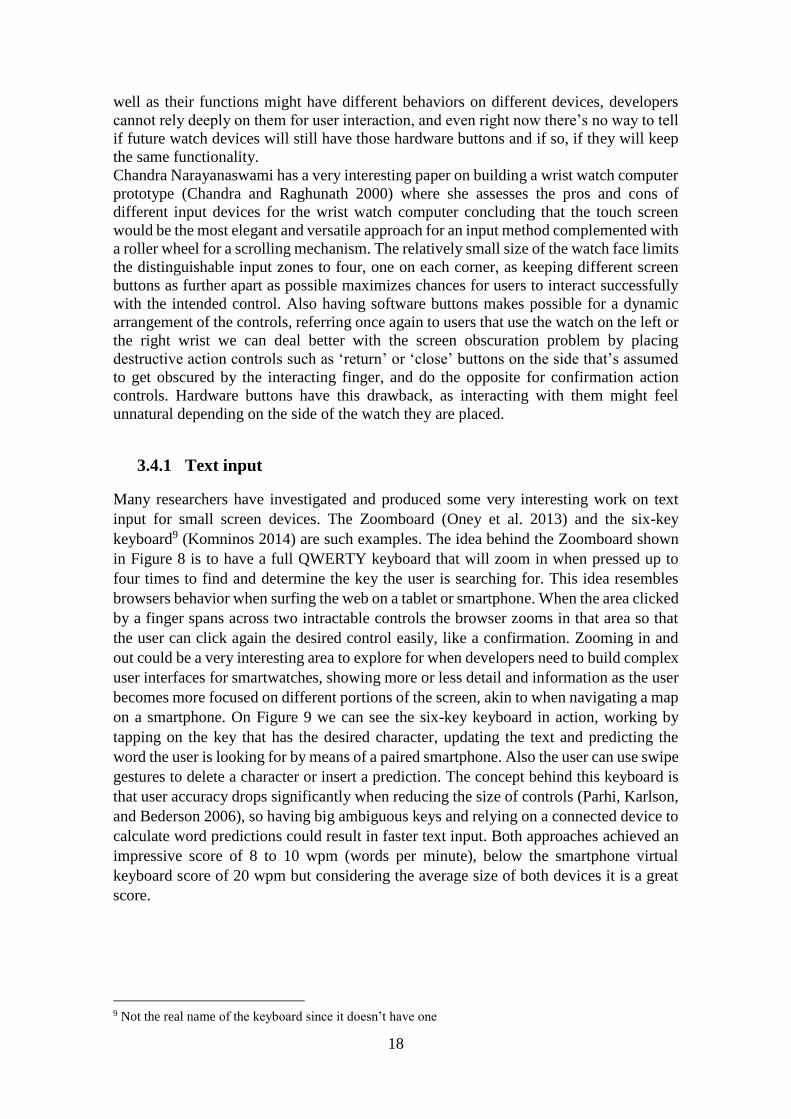
portion of the screen. By examining Figure 6 we can see this effect, on a Modal Sheet on
the Apple watch, by placing our finger on the ‘cancel’ button, as if it was coming either
from the left or right, we are obscuring a different part of the screen. In this case is actually
fine to do so because it is a destructive action, meaning the user no longer cares for what
is being displayed and wants to remove the information displayed on the screen (Chandra
and Raghunath 2000). However, if we switch places of the ‘cancel’ button with the
‘transfer’ button as seen on Figure 7, and do the same exercise, we are obscuring sensitive
information of a confirmation action, therefore if the user wants to double check what it
is about to do, he/she has to move the finger away to see the information again. Spanning
a button control to take the full width of the screen can in some cases deal with these
types of situations as the user doesn’t have to move the finger too much into the screen
to perform an action. On the right side screen of both Figure 5 and Figure 6 we can see
the same effect happening but with no real negative impact since the ‘options’ button, as
the name suggests, will just show a page with some options or information to the user
without performing any destructive or confirmation action.
17
Figure 6 Screen obscuring I (Apple Inc 2015b)
Figure 7 Screen obscuring II (Apple Inc 2015b)
User input
In recent years, consumers have been overwhelmed by portable electronic devices such
as tablets, smartphones, phablets and more recently wearables. All of which aim at being
as portable as possible, incorporating a touch screen to handle user input, and the
smartwatch is no different. Android Wear and the watchOS are both designed to be
interacted with touch, although the Apple Watch features two hardware buttons and some
Android Wear powered devices also have hardware buttons. Nevertheless, all of the
functions executed by these buttons can also be executed by interacting with the touch
screen. For instance, the Apple Watch’s ‘digital crown’ button can be used to scroll
content vertically, go through options highlighting them or to zoom in and out photos.
While all of these actions can be executed on the touch screen, having dedicated hardware
buttons eradicate some of the problems like the Screen obscuring described in the
previous section, or when the user has fingers too big to accurately click a small button.
However, since at least on Android Wear devices, these buttons may or may not exist as
18
well as their functions might have different behaviors on different devices, developers
cannot rely deeply on them for user interaction, and even right now there’s no way to tell
if future watch devices will still have those hardware buttons and if so, if they will keep
the same functionality.
Chandra Narayanaswami has a very interesting paper on building a wrist watch computer
prototype (Chandra and Raghunath 2000) where she assesses the pros and cons of
different input devices for the wrist watch computer concluding that the touch screen
would be the most elegant and versatile approach for an input method complemented with
a roller wheel for a scrolling mechanism. The relatively small size of the watch face limits
the distinguishable input zones to four, one on each corner, as keeping different screen
buttons as further apart as possible maximizes chances for users to interact successfully
with the intended control. Also having software buttons makes possible for a dynamic
arrangement of the controls, referring once again to users that use the watch on the left or
the right wrist we can deal better with the screen obscuration problem by placing
destructive action controls such as ‘return’ or ‘close’ buttons on the side that’s assumed
to get obscured by the interacting finger, and do the opposite for confirmation action
controls. Hardware buttons have this drawback, as interacting with them might feel
unnatural depending on the side of the watch they are placed.
3.4.1 Text input
Many researchers have investigated and produced some very interesting work on text
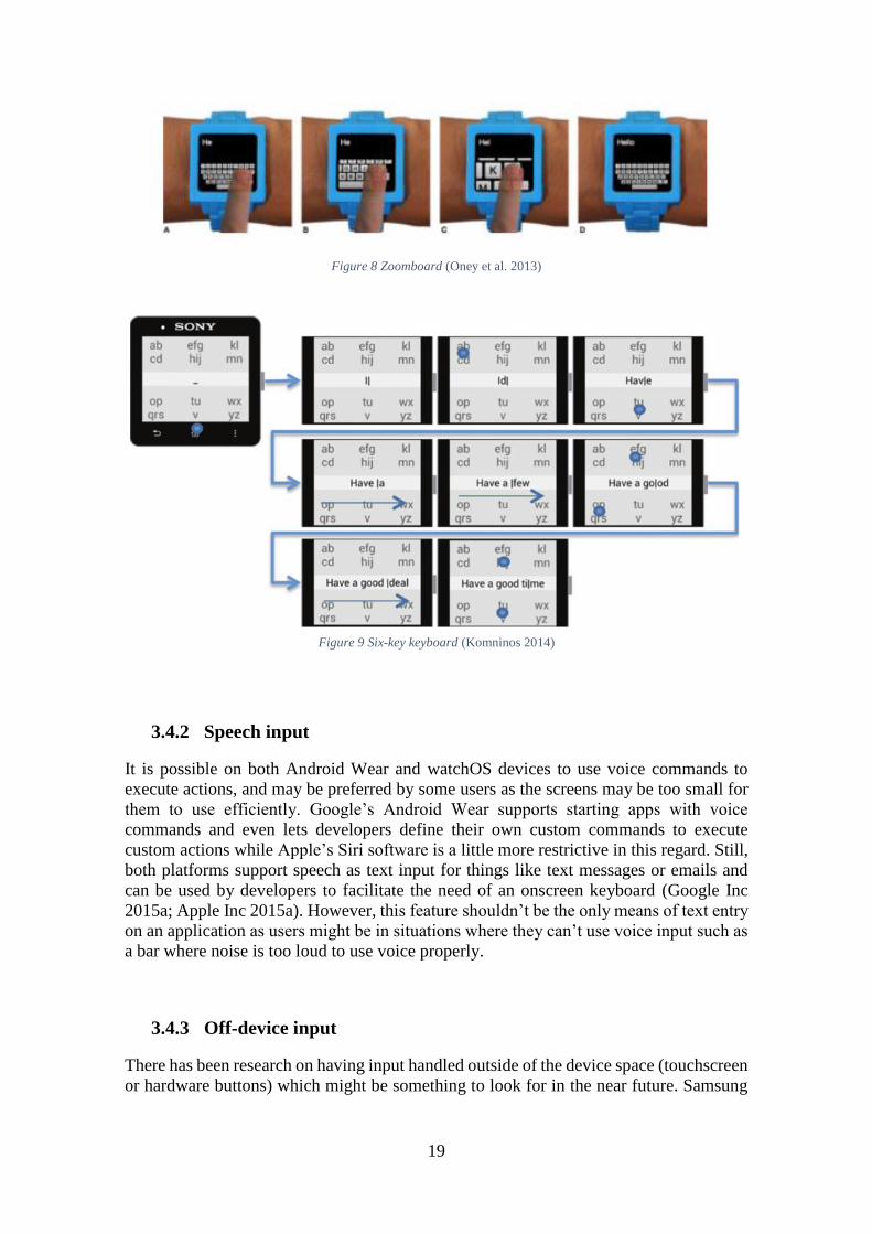
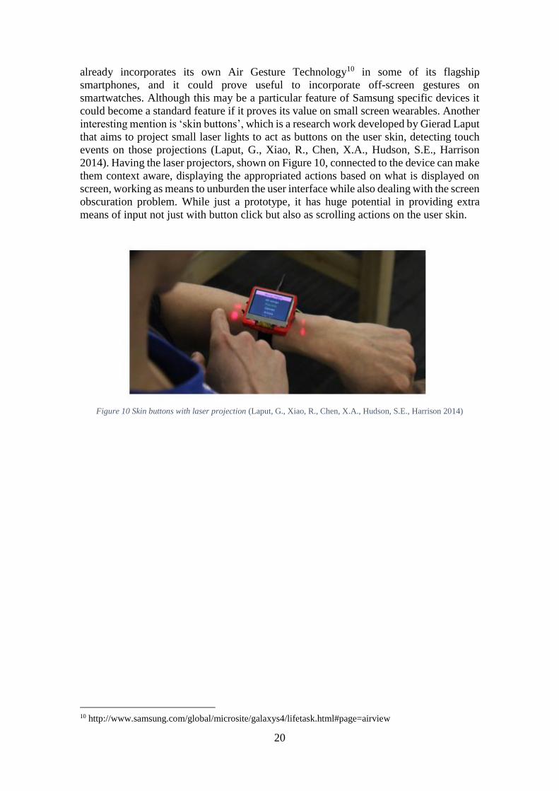
input for small screen devices. The Zoomboard (Oney et al. 2013) and the six-key
keyboard9 (Komninos 2014) are such examples. The idea behind the Zoomboard shown
in Figure 8 is to have a full QWERTY keyboard that will zoom in when pressed up to
four times to find and determine the key the user is searching for. This idea resembles
browsers behavior when surfing the web on a tablet or smartphone. When the area clicked
by a finger spans across two intractable controls the browser zooms in that area so that
the user can click again the desired control easily, like a confirmation. Zooming in and
out could be a very interesting area to explore for when developers need to build complex
user interfaces for smartwatches, showing more or less detail and information as the user
becomes more focused on different portions of the screen, akin to when navigating a map
on a smartphone. On Figure 9 we can see the six-key keyboard in action, working by
tapping on the key that has the desired character, updating the text and predicting the
word the user is looking for by means of a paired smartphone. Also the user can use swipe
gestures to delete a character or insert a prediction. The concept behind this keyboard is
that user accuracy drops significantly when reducing the size of controls (Parhi, Karlson,
and Bederson 2006), so having big ambiguous keys and relying on a connected device to
calculate word predictions could result in faster text input. Both approaches achieved an
impressive score of 8 to 10 wpm (words per minute), below the smartphone virtual
keyboard score of 20 wpm but considering the average size of both devices it is a great
score.
9 Not the real name of the keyboard since it doesn’t have one
19
Figure 8 Zoomboard (Oney et al. 2013)
Figure 9 Six-key keyboard (Komninos 2014)
3.4.2 Speech input
It is possible on both Android Wear and watchOS devices to use voice commands to
execute actions, and may be preferred by some users as the screens may be too small for
them to use efficiently. Google’s Android Wear supports starting apps with voice
commands and even lets developers define their own custom commands to execute
custom actions while Apple’s Siri software is a little more restrictive in this regard. Still,
both platforms support speech as text input for things like text messages or emails and
can be used by developers to facilitate the need of an onscreen keyboard (Google Inc
2015a; Apple Inc 2015a). However, this feature shouldn’t be the only means of text entry
on an application as users might be in situations where they can’t use voice input such as
a bar where noise is too loud to use voice properly.
3.4.3 Off-device input
There has been research on having input handled outside of the device space (touchscreen
or hardware buttons) which might be something to look for in the near future. Samsung
20
already incorporates its own Air Gesture Technology10 in some of its flagship
smartphones, and it could prove useful to incorporate off-screen gestures on
smartwatches. Although this may be a particular feature of Samsung specific devices it
could become a standard feature if it proves its value on small screen wearables. Another
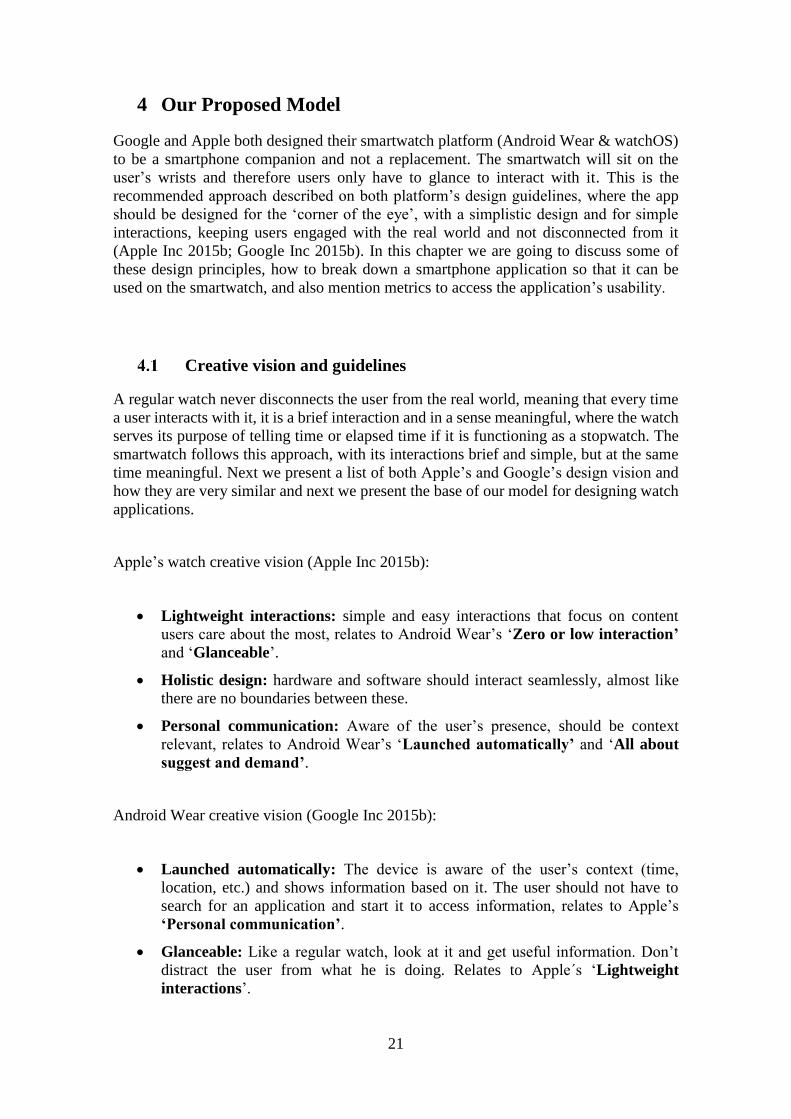
interesting mention is ‘skin buttons’, which is a research work developed by Gierad Laput
that aims to project small laser lights to act as buttons on the user skin, detecting touch
events on those projections (Laput, G., Xiao, R., Chen, X.A., Hudson, S.E., Harrison
2014). Having the laser projectors, shown on Figure 10, connected to the device can make
them context aware, displaying the appropriated actions based on what is displayed on
screen, working as means to unburden the user interface while also dealing with the screen
obscuration problem. While just a prototype, it has huge potential in providing extra
means of input not just with button click but also as scrolling actions on the user skin.
Figure 10 Skin buttons with laser projection (Laput, G., Xiao, R., Chen, X.A., Hudson, S.E., Harrison 2014)
10 http://www.samsung.com/global/microsite/galaxys4/lifetask.html#page=airview
21
4 Our Proposed Model
Google and Apple both designed their smartwatch platform (Android Wear & watchOS)
to be a smartphone companion and not a replacement. The smartwatch will sit on the
user’s wrists and therefore users only have to glance to interact with it. This is the
recommended approach described on both platform’s design guidelines, where the app
should be designed for the ‘corner of the eye’, with a simplistic design and for simple
interactions, keeping users engaged with the real world and not disconnected from it
(Apple Inc 2015b; Google Inc 2015b). In this chapter we are going to discuss some of
these design principles, how to break down a smartphone application so that it can be
used on the smartwatch, and also mention metrics to access the application’s usability.
Creative vision and guidelines
A regular watch never disconnects the user from the real world, meaning that every time
a user interacts with it, it is a brief interaction and in a sense meaningful, where the watch
serves its purpose of telling time or elapsed time if it is functioning as a stopwatch. The
smartwatch follows this approach, with its interactions brief and simple, but at the same
time meaningful. Next we present a list of both Apple’s and Google’s design vision and
how they are very similar and next we present the base of our model for designing watch
applications.
Apple’s watch creative vision (Apple Inc 2015b):
Lightweight interactions: simple and easy interactions that focus on content
users care about the most, relates to Android Wear’s ‘Zero or low interaction’
and ‘Glanceable’.
Holistic design: hardware and software should interact seamlessly, almost like
there are no boundaries between these.
Personal communication: Aware of the user’s presence, should be context
relevant, relates to Android Wear’s ‘Launched automatically’ and ‘All about
suggest and demand’.
Android Wear creative vision (Google Inc 2015b):
Launched automatically: The device is aware of the user’s context (time,
location, etc.) and shows information based on it. The user should not have to
search for an application and start it to access information, relates to Apple’s
‘Personal communication’.
Glanceable: Like a regular watch, look at it and get useful information. Don’t
distract the user from what he is doing. Relates to Apple´s ‘Lightweight
interactions’.
22
All about suggest and demand: Knowing the user’s context and preferences
could be useful as when and how to provide context relevant information the user
may need or want.
Zero or low interaction: If input is needed it should be based on gestures, swipes
or voice and never in long chains to achieve the desired action. Relates to Apple’s
‘Lightweight interactions’.
As we’ve seen both platforms were designed with very similar concepts revolving around
simplicity and meaningful interactions.
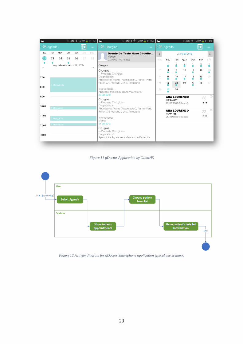
Break down your app
Being a smartphone companion and in order to simplify, working from an existing
smartphone application adapting some or all (if applicable) of its functions to the
smartwatch application is preferable. It is still possible to build one from scratch and
follow our model, but before that we must design the whole application’s concepts and
features, and then apply our model. On Figure 11 we have some screenshots taken from
gDoctor Android application, provided by Glintt HS, illustrating some of its features.
This application is meant to be used by doctors on medical care facilities, where the doctor
can see all of his scheduled appointments and patient’s info. One typical use case (UML
activity diagram for the smartphone app) is exemplified on Figure 12. Now, on the
smartwatch we will follow a different approach, as we can’t be expecting the user to do
the same steps he did on the smartphone on his smartwatch, like we have seen in the
guidelines. Instead we’ll automatically provide the information the doctor might be
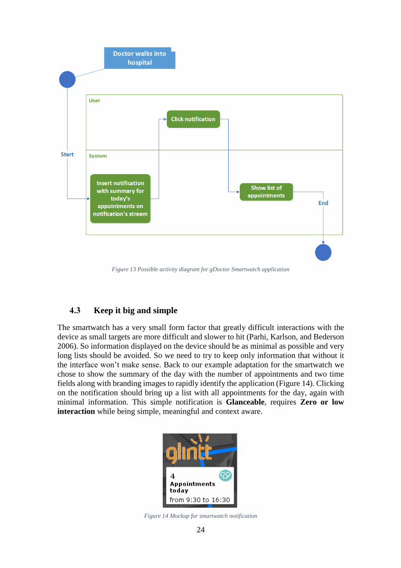
looking for, at the appropriate time. For instance, Figure 13 shows a possible activity
diagram for the same action on the smartwatch. At this time the device detects the doctor
arrived on the hospital (e.g. by Network location) and inserts a notification on the
notification’s stream. Something like the number of appointments the doctor has for the
day with start time of first appointment and end time of the last one, and on click it would
show a simple list with all appointments. Another typical use case would be to insert a
notification on the notification’s stream every half-hour before the next appointment with
some of the next patient’s relevant information. The idea is to look at the full-featured
smartphone application and divide it in small actions that are meaningful enough if used
alone, and then think about when and how that particular action or information would be
useful. This should be the key to make it relevant for the user and with simplicity in mind
it makes the interruption short. If the user needs more detail or fine-grained actions he
should use the smartphone.
23
Figure 11 gDoctor Application by GlinttHS
Figure 12 Activity diagram for gDoctor Smartphone application typical use scenario
24
Figure 13 Possible activity diagram for gDoctor Smartwatch application
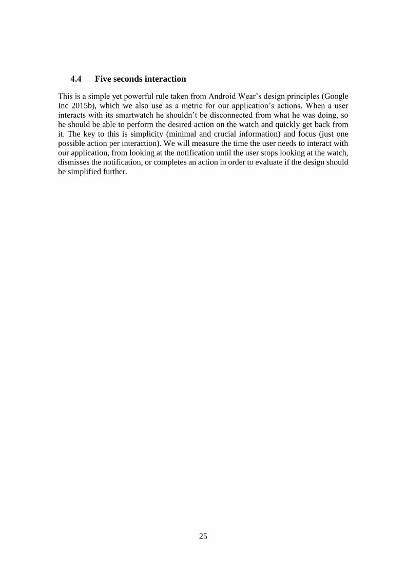
Keep it big and simple
The smartwatch has a very small form factor that greatly difficult interactions with the
device as small targets are more difficult and slower to hit (Parhi, Karlson, and Bederson
2006). So information displayed on the device should be as minimal as possible and very
long lists should be avoided. So we need to try to keep only information that without it
the interface won’t make sense. Back to our example adaptation for the smartwatch we
chose to show the summary of the day with the number of appointments and two time
fields along with branding images to rapidly identify the application (Figure 14). Clicking
on the notification should bring up a list with all appointments for the day, again with
minimal information. This simple notification is Glanceable, requires Zero or low
interaction while being simple, meaningful and context aware.
Figure 14 Mockup for smartwatch notification
25
Five seconds interaction
This is a simple yet powerful rule taken from Android Wear’s design principles (Google
Inc 2015b), which we also use as a metric for our application’s actions. When a user
interacts with its smartwatch he shouldn’t be disconnected from what he was doing, so
he should be able to perform the desired action on the watch and quickly get back from
it. The key to this is simplicity (minimal and crucial information) and focus (just one
possible action per interaction). We will measure the time the user needs to interact with
our application, from looking at the notification until the user stops looking at the watch,
dismisses the notification, or completes an action in order to evaluate if the design should
be simplified further.
26
5 The Player App
As requested by Glintt HS we developed a new application to be used by soccer players
in a health and well-being context. Two Android applications were developed, one for
the smartwatch and another for the smartphone, this last one is used to leverage the
functionality of the watch app by providing access to the internet11 and trigger location
or time based events. We also built a basic web service that we use to fetch information
from and to persist data gathered by the app on a database.
Our focus is the user interface and not if the features or specific functionality built is good
or adequate for the context it is inserted into. The requirements were designed to be the
most relevant and useful on this domain, but that’s not the scope.
The Concept
The vision behind our application was to develop something that would help soccer
players and their respective technical teams on acquiring and proving health information.
The idea is to have the user constantly providing accurate and medically relevant metrics
such as his heart’s bpm, sleep quality, training performance in terms of time or food
ingestion so that his team’s medic can make better evaluations on the players’ conditions.
The player should also be capable to track his progression in terms of physical
adaptability, by tracking training times.
The Player App Use-Cases
We devised our app to be used at very specific and diverse moments, this enables us to
test the UI approaches for different conditions and contexts. Our application is meant to
be used as a training companion during gym workouts, but also as a health tracker by
storing a sleep history (quality, duration), heart rate measurements and suggest daily diets.
During workouts the user is expected to be interacting with the application while doing
his workout for very short but many interactions. This will test our Five seconds
interactions and Glanceable rules to the limit, as the point is to don’t keep the user from
performing physically demanding activities and interacting with the application at the
same time.
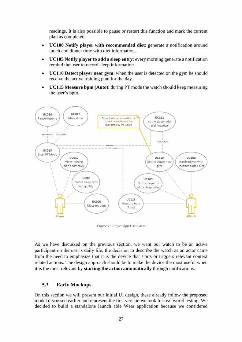
Figure 15 shows the Use-Case diagram we designed for the initial prototype:
UC000 Measure bpm: as the name suggest is possible to obtain bpm readings.
UC005 Record sleep time and quality: the user can keep a history of sleep by
entering info about sleep quality and duration.
UC010 View training plan’s summary: view a summary of the training plan
including all exercises and its completion times (if plan completed).
UC015 Start PT12 mode: start PT function for the current plan, this function
registers the time the user takes to complete an exercise and performs bpm
11 Android Wear has Wireless connectivity since SDK level 22, but when a phone is connected via
Bluetooth, the system turns Wi-Fi off to conserve battery power. This makes the device unreliable for http
requests 12 PT stands for personal trainer
27
readings. It is also possible to pause or restart this function and mark the current
plan as completed.
UC100 Notify player with recommended diet: generate a notification around
lunch and dinner time with diet information.
UC105 Notify player to add a sleep entry: every morning generate a notification
remind the user to record sleep information.
UC110 Detect player near gym: when the user is detected on the gym he should
receive the active training plan for the day.
UC115 Measure bpm (Auto): during PT mode the watch should keep measuring
the user’s bpm.
Figure 15 Player App Use-Cases
As we have discussed on the previous section, we want our watch to be an active
participant on the user’s daily life, the decision to describe the watch as an actor came
from the need to emphasize that it is the device that starts or triggers relevant context
related actions. The design approach should be to make the device the most useful when
it is the most relevant by starting the action automatically through notifications.
Early Mockups
On this section we will present our initial UI design, these already follow the proposed
model discussed earlier and represent the first version we took for real world testing. We
decided to build a standalone launch able Wear application because we considered
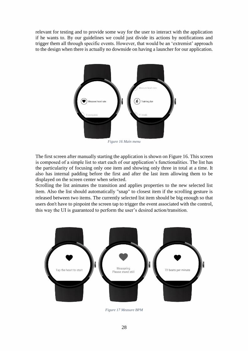
28
relevant for testing and to provide some way for the user to interact with the application
if he wants to. By our guidelines we could just divide its actions by notifications and
trigger them all through specific events. However, that would be an ‘extremist’ approach
to the design when there is actually no downside on having a launcher for our application.
Figure 16 Main menu
The first screen after manually starting the application is shown on Figure 16. This screen
is composed of a simple list to start each of our application’s functionalities. The list has
the particularity of focusing only one item and showing only three in total at a time. It
also has internal padding before the first and after the last item allowing them to be
displayed on the screen center when selected.
Scrolling the list animates the transition and applies properties to the new selected list
item. Also the list should automatically "snap" to closest item if the scrolling gesture is
released between two items. The currently selected list item should be big enough so that
users don't have to pinpoint the screen tap to trigger the event associated with the control,
this way the UI is guaranteed to perform the user’s desired action/transition.
Figure 17 Measure BPM
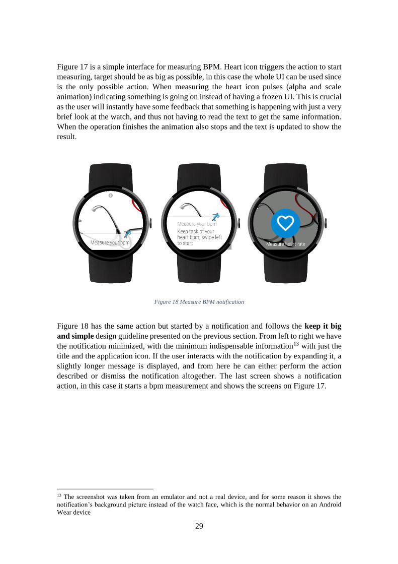
29
Figure 17 is a simple interface for measuring BPM. Heart icon triggers the action to start
measuring, target should be as big as possible, in this case the whole UI can be used since
is the only possible action. When measuring the heart icon pulses (alpha and scale
animation) indicating something is going on instead of having a frozen UI. This is crucial
as the user will instantly have some feedback that something is happening with just a very
brief look at the watch, and thus not having to read the text to get the same information.
When the operation finishes the animation also stops and the text is updated to show the
result.
Figure 18 Measure BPM notification
Figure 18 has the same action but started by a notification and follows the keep it big
and simple design guideline presented on the previous section. From left to right we have
the notification minimized, with the minimum indispensable information13 with just the
title and the application icon. If the user interacts with the notification by expanding it, a
slightly longer message is displayed, and from here he can either perform the action
described or dismiss the notification altogether. The last screen shows a notification
action, in this case it starts a bpm measurement and shows the screens on Figure 17.
13 The screenshot was taken from an emulator and not a real device, and for some reason it shows the
notification’s background picture instead of the watch face, which is the normal behavior on an Android
Wear device
30
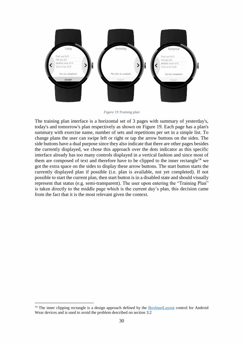
Figure 19 Training plan
The training plan interface is a horizontal set of 3 pages with summary of yesterday's,
today's and tomorrow's plan respectively as shown on Figure 19. Each page has a plan's
summary with exercise name, number of sets and repetitions per set in a simple list. To
change plans the user can swipe left or right or tap the arrow buttons on the sides. The
side buttons have a dual purpose since they also indicate that there are other pages besides
the currently displayed, we chose this approach over the dots indicator as this specific
interface already has too many controls displayed in a vertical fashion and since most of
them are composed of text and therefore have to be clipped to the inner rectangle14 we
got the extra space on the sides to display these arrow buttons. The start button starts the
currently displayed plan if possible (i.e. plan is available, not yet completed). If not
possible to start the current plan, then start button is in a disabled state and should visually
represent that status (e.g. semi-transparent). The user upon entering the “Training Plan”
is taken directly to the middle page which is the current day’s plan, this decision came
from the fact that it is the most relevant given the context.
14 The inner clipping rectangle is a design approach defined by the BoxInsetLayout control for Android
Wear devices and is used to avoid the problem described on section 3.2
31
Figure 20 training plan notification
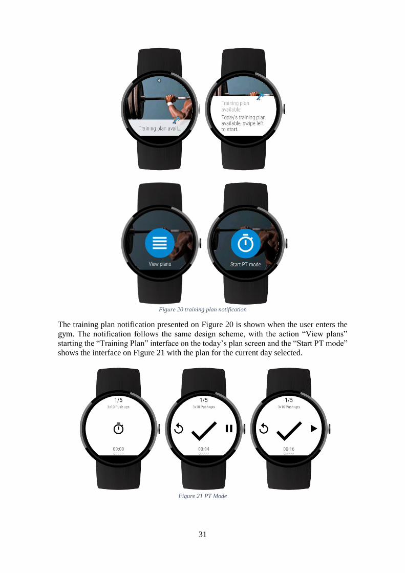
The training plan notification presented on Figure 20 is shown when the user enters the
gym. The notification follows the same design scheme, with the action “View plans”
starting the “Training Plan” interface on the today’s plan screen and the “Start PT mode”
shows the interface on Figure 21 with the plan for the current day selected.
Figure 21 PT Mode
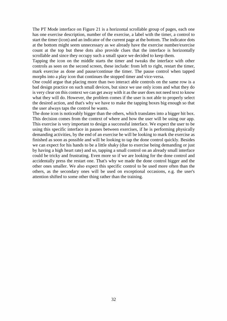
32
The PT Mode interface on Figure 21 is a horizontal scrollable group of pages, each one
has one exercise description, number of the exercise, a label with the timer, a control to
start the timer (icon) and an indicator of the current page at the bottom. The indicator dots
at the bottom might seem unnecessary as we already have the exercise number/exercise
count at the top but these dots also provide clues that the interface is horizontally
scrollable and since they occupy such a small space we decided to keep them.
Tapping the icon on the middle starts the timer and tweaks the interface with other
controls as seen on the second screen, these include: from left to right, restart the timer,
mark exercise as done and pause/continue the timer. The pause control when tapped
morphs into a play icon that continues the stopped timer and vice-versa.
One could argue that placing more than two interact able controls on the same row is a
bad design practice on such small devices, but since we use only icons and what they do
is very clear on this context we can get away with it as the user does not need text to know
what they will do. However, the problem comes if the user is not able to properly select
the desired action, and that's why we have to make the tapping boxes big enough so that
the user always taps the control he wants.
The done icon is noticeably bigger than the others, which translates into a bigger hit box.
This decision comes from the context of where and how the user will be using our app.
This exercise is very important to design a successful interface. We expect the user to be
using this specific interface in pauses between exercises, if he is performing physically
demanding activities, by the end of an exercise he will be looking to mark the exercise as
finished as soon as possible and will be looking to tap the done control quickly. Besides
we can expect for his hands to be a little shaky (due to exercise being demanding or just
by having a high heart rate) and so, tapping a small control on an already small interface
could be tricky and frustrating. Even more so if we are looking for the done control and
accidentally press the restart one. That's why we made the done control bigger and the
other ones smaller. We also expect this specific control to be used more often than the
others, as the secondary ones will be used on exceptional occasions, e.g. the user's
attention shifted to some other thing rather than the training.
33
Figure 22 Sleep Quality
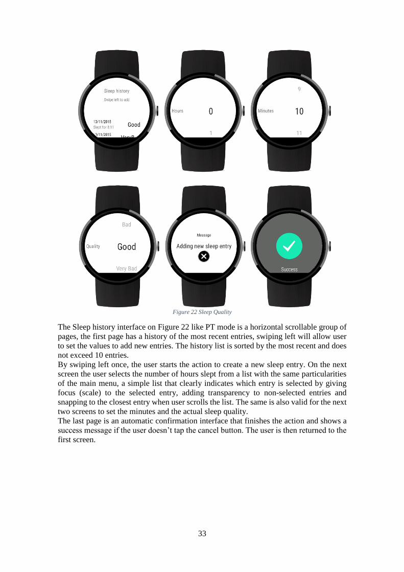
The Sleep history interface on Figure 22 like PT mode is a horizontal scrollable group of
pages, the first page has a history of the most recent entries, swiping left will allow user
to set the values to add new entries. The history list is sorted by the most recent and does
not exceed 10 entries.
By swiping left once, the user starts the action to create a new sleep entry. On the next
screen the user selects the number of hours slept from a list with the same particularities
of the main menu, a simple list that clearly indicates which entry is selected by giving
focus (scale) to the selected entry, adding transparency to non-selected entries and
snapping to the closest entry when user scrolls the list. The same is also valid for the next
two screens to set the minutes and the actual sleep quality.
The last page is an automatic confirmation interface that finishes the action and shows a
success message if the user doesn’t tap the cancel button. The user is then returned to the
first screen.
34
Figure 23 Sleep Quality notification
Figure 23 shows a sleep quality notification that follows the same design scheme. The
context for the notification is by current time, it is generated early in the morning to
prompt the user to add a new sleep entry when it's most probable that he remembers the
actual time he slept. We could also make a service to detect changes in the accelerometer
sensor during some time interval in the morning, which would mean that the user has the
watch on the wrist, and on a best case scenario the first time changes were detected would
mean that the user was putting the watch on. Tapping the “Add sleep entry” action will
launch the sleep history interface on the second screen (hours).
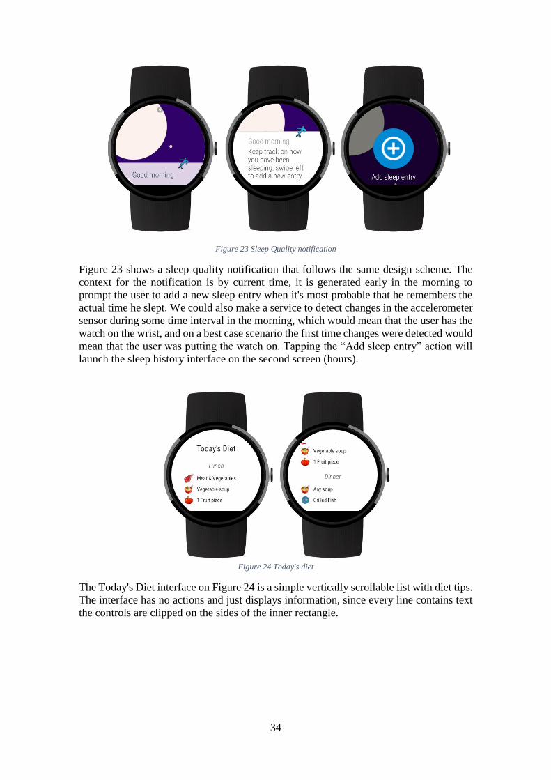
Figure 24 Today's diet
The Today's Diet interface on Figure 24 is a simple vertically scrollable list with diet tips.
The interface has no actions and just displays information, since every line contains text
the controls are clipped on the sides of the inner rectangle.
35
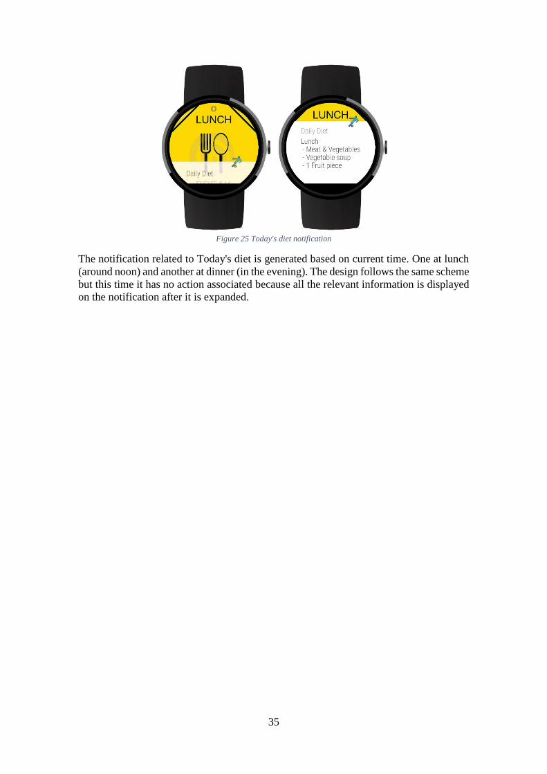
Figure 25 Today's diet notification
The notification related to Today's diet is generated based on current time. One at lunch
(around noon) and another at dinner (in the evening). The design follows the same scheme
but this time it has no action associated because all the relevant information is displayed
on the notification after it is expanded.
36
6 Testing
We conducted two separate testing sessions to gather usage metrics, identify problems or
bad design choices and get as much feedback as possible from users of our application.
The device used for development and both sessions was a Moto 360 1st gen because from
the devices available it is the one with the most particularities, with a round screen and a
“chin” at the bottom. However, all the interfaces were designed to work on other devices
with rectangular shape or round without the “chin”, but were tested on emulators and not
with users.
Test Session Guide
Each test session was composed of a small explanation on how the Android Wear system
works while letting the users play with the notification stream a little while performing
random actions. This was to provide a little context on how to interact with the device as
all of our test subjects had never used a smartwatch before. After the short training the
user was given 5 tasks to complete starting from the Main Menu interface, and after that
he would be asked 8 or 11 questions for the 1st prototype or the final version respectively.
6.1.1 The tasks
The tasks are the same for both versions of the application:
Measure bpm: the user was asked to measure his bpm using our application.
Check tomorrow plan: the user was asked to view the following day’s training
plan summary.
Complete today’s training plan: the user would activate PT mode for the today’s
plan and complete the training.
View the date of the last sleep entry: the user would go through the sleep history
to check the last entry on the list.
Add a sleep entry: add a new sleep entry
Read today’s diet: the user would see his diet for lunch and dinner
During this time, we evaluated if the user misses any tap, has trouble reading
information on screen, gets lost in-app navigation, wrong or failed swipes and does
not notice there is more content (e.g. a list that goes beyond the screen margins). More
specific to all notifications, Measure bpm and PT mode UIs we wanted to evaluate if the
user could understand or even read content on screen by the corner of the eye while
engaged in another activity, e.g. check the elapsed time without interrupting the exercise.
6.1.2 The questions
For the first prototype we had the following 8 questions:
37
In any moment did you had trouble completing the desired action? If so, which
and where?
This question evaluates the structure of the whole application and how functionality is
organized. We used a familiar approach with a main menu as the root page.
Was navigation always intuitive and did you always knew how to go back or
advance?
As explained on section 5.3 the “Training Plan” UI when opened will automatically show
the middle page, which we expect might confuse the users as on how to return to the main
menu. This question aims to evaluate this, and to assess the general swipe based
navigation that follows the OS scheme.
Was it clear when the application was processing data or expecting input?
One of our guidelines is to request the user attention for the minimal indispensable time.
Therefore, our application has to be clear when no more interaction is required so that the
user might get back to what he was doing. This question is to assess if the visual feedback
provided of what is happening on screen is clear when the user should perform some
action, or has to wait for something, e.g. for the heart sensor to provide some value.
In any moment the information displayed was hard to read or understand?
This question is self-explanatory and it aims to evaluate the size of controls like text or
buttons. Whenever relevant, we ask the user to try to visualize by the corner of the eye,
instead of looking directly. And in the PT mode case to simulate doing some physical
activity and try to read the timer.
In respect to usability which UI design you think was better, Sleep history or
Today’s diet?
Both “Sleep history” (1st screen) and “Today’s diet” UIs have the single purpose of
displaying information in form of a list. This question is to assess the design approach of
each, as on “Sleep history” we have a list that is a small part of the screen and therefore
has a small scroll area, whereas the “Today’s diet” has a scroll area with the size of the
whole screen and every control on the interface moves when the user scrolls.
On PT mode UI the actions performed by each of the controls were intuitive?
We only used icons for this interface, and so we want to assess if the lack of any text
would affect interactions with the UI.
In your opinion, define a good UI.
This question is of open answer and we aim to get clues about what a user perceives as a
good interface and what kind of characteristics he expects.
Describe what you liked the most, least and provide your feedback or suggestions
for improvement.
38
In a context of a wrist worn application we hope with this question to get an idea of what
specific functionalities the users see as most useful or they identify themselves using the
most. We also ask for feedback or improvement suggestions.
For the final version we also included:
What would you change to optimize the UI, to make it faster/easier to use?
Through this question we hope to get some ideas from users that they maybe saw on other
applications.
How did you know that you had to tap or swipe?
Even though we mostly have only these two kinds of interactions it is important to
understand how the user perceives what he has to do to proceed or navigate back.
What do you think about the new design?
We opted to keep the first prototype as simple as possible and focus on the user interaction
and visual feedback. This question is more of aesthetic nature, but we consider that it is
important to know if a more appealing design would impact user experience.
User Selection
The only trait we were looking on our users was the likeliness of the user to currently
own a smartwatch or in a near future to have one. For this reason, we turned our attention
to young adults and adults and tried to keep these the most diverse as possible. The first
test session occurred on our laboratory at Glintt on 24th and at FEUP on 25th November,
all the interviewees had an age range between 20 and 33 and all were college students or
had degrees, mostly in engineering. The second test session occurred on 16th,17th and 18th
of November at our laboratory, FEUP and Mar à Vista15. The reason to add this last place
came from the fact that all our previous interviewees had to deal with technology on a
daily basis because of their line of work (engineering students or working on a Software
company) and were used to deal with new technology, therefore we searched for users
that would be less comfortable testing our application. We had a total of 21 interviews
for the first session and 17 for the second, which 10 of these interviewees were testing
the application for second time.
First Test Session
6.3.1 Results
The first 6 questions were closed-ended but we still wrote down some comments that we
considered relevant, either by comments made by the user or by just observing their
15 Mar à Vista is a bar/restaurant in Gaia
39
behavior while testing the application. This way we hope to better understand what
motivated their answers. The last 2 were of an open-answer nature and were more oriented
to users’ taste and perception of what would be a good design.
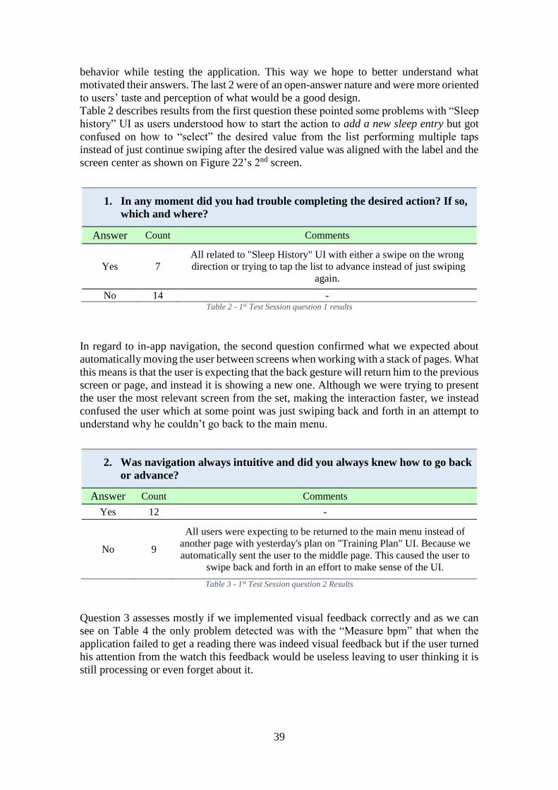
Table 2 describes results from the first question these pointed some problems with “Sleep
history” UI as users understood how to start the action to add a new sleep entry but got
confused on how to “select” the desired value from the list performing multiple taps
instead of just continue swiping after the desired value was aligned with the label and the
screen center as shown on Figure 22’s 2nd screen.
1. In any moment did you had trouble completing the desired action? If so,
which and where?
Answer Count Comments
Yes 7
All related to "Sleep History" UI with either a swipe on the wrong
direction or trying to tap the list to advance instead of just swiping
again.
No 14 - Table 2 - 1st Test Session question 1 results
In regard to in-app navigation, the second question confirmed what we expected about
automatically moving the user between screens when working with a stack of pages. What
this means is that the user is expecting that the back gesture will return him to the previous
screen or page, and instead it is showing a new one. Although we were trying to present
the user the most relevant screen from the set, making the interaction faster, we instead
confused the user which at some point was just swiping back and forth in an attempt to
understand why he couldn’t go back to the main menu.
2. Was navigation always intuitive and did you always knew how to go back
or advance?
Answer Count Comments
Yes 12 -
No 9
All users were expecting to be returned to the main menu instead of
another page with yesterday's plan on "Training Plan" UI. Because we
automatically sent the user to the middle page. This caused the user to
swipe back and forth in an effort to make sense of the UI.
Table 3 - 1st Test Session question 2 Results
Question 3 assesses mostly if we implemented visual feedback correctly and as we can
see on Table 4 the only problem detected was with the “Measure bpm” that when the
application failed to get a reading there was indeed visual feedback but if the user turned
his attention from the watch this feedback would be useless leaving to user thinking it is
still processing or even forget about it.
40
3. Was it clear when the application was processing data or expecting
input?
Answer Count Comments
Yes 17 -
No 4
On "PT Mode" UI was not clear what the user was supposed to do.
While measuring bpm in case it failed there should also be a small
vibration alerting the user, because he may have looked away from
screen. Table 4 - 1st Test Session question 3 results
We avoided to make changes to the size of text and used system definitions of small,
normal and big text size. Question 4 evaluates if these sizes are used appropriately for
primary and secondary information. Table 5 shows the results and the only problem
detected was in fact when we take the text readability to the limit by asking the user to
simulate some physically demanding activity like running and trying to read the timer at
the same time. Although almost every interviewee said they could read the time they still
had slow down or stop to do so, and agreed that it could be a little bigger. On a side note,
none of the interviewees payed attention to the exercise list on “Training Plan” UI, neither
tried to interact with it. This may be because there is too much information on the screen
at the same time.
4. In any moment the information displayed was hard to read or
understand?
Answer Count Comments
Yes 3
Complains were on "PT Mode" UI but only after we asked them to try
to read the timer while doing some physical activity like running or
doing push-ups.
No 18
Although almost every user agreed everything was readable, on "PT
Mode" UI they had stop or slow down the “simulated” physical
activity they were doing in order to read the timer.
No one noticed there was more content on the “Training Plan” UI
middle list nor did they attempt to read or interact with it. Table 5 - 1st Test Session question 4 results
The advantages of a full screen scrolling UI over a small scrolling area on a device so
small are obvious and Table 6 shows that it is also perceived by users as better in respect
to usability. However, users complained on both designs that it was not always clear that
there was more content hidden beyond the screen margins.
5. In respect to usability which UI design you think was better, Sleep
history or Today’s diet?
Answer Count Comments
Sleep history 6 No real usability arguments were presented for this preference,
only that it would look better.
Today's Diet 15 Bigger area for scrolling and could fit more content at a time.
41
Table 6 - 1st Test Session question 5 results
On “PT Mode” UI we chose to display buttons with no text and just icons to save space
and placed three buttons in a row. Table 7 shows that our choice for icons only, was well
implemented, and during testing we had no failed taps on any button which also tells us
that the size for each control was also appropriate.
6. On PT Mode UI the actions performed by each of the controls were
intuitive?
Answer Count Comments
Yes 20 -
No 1 The only complaint was about what the "done" button would do, as it
was not intuitive the first time. Table 7 - 1st Test Session question 6 results
Question 7 was of open answer and aimed at getting some information of what a user
expects from a UI, Table 8 shows the results. We tried to normalize answers that revolved
around the same concept. It is clear that users want simple UI’s. Too much content,
controls and possible interactions might turn users away from an application as it may
seem too complicated to use. Overall, users liked our design as it was simple, but some
pointed that it could have more color as they perceive good looking UI’s as good UI
design. Other opinions were that design should focus on the current action being
performed, be fast and avoid frozen screens.
7. In your opinion, define a good UI.
Answer Count Comments
Simple and Intuitive 18
Above all users like simple UI's that avoid
cluttered information. And don’t have to think
too much on how to make sense of it.
Focus on the important content or
current action 8 Relates to simple UI.
Good looking 8 Users value interfaces that have a good visual
design.
Fast 6 Don't block, have the minimum steps possible
to execute some action.
All content has to be readable and
easy to understand 3 -
Table 8 - 1st Test Session question 7 results
From question 8 we got valuable feedback and suggestions but couldn’t normalize the
answers as these were too diverse. During the test session we noticed that every time we
presented instructions about the direction of the swipe to proceed such as seen on Figure
22’s first screen, “Swipe left to add”, users would stop for a second to think about how to
perform this swipe, from left to right or from right to left. Interesting enough most of the
time users performed the wrong gesture although they clearly knew that a right swipe
would dismiss the presented interface. Almost all users reported that they couldn’t decide
42
immediately which gesture was correct and got confused by the instruction, although it
was obvious after making the mistake. Some users complained that adding a new sleep
entry takes too much time and therefore suggested that it should be simplified.
On the “Training plan” UI many users had trouble changing between days, this was
because some users interpreted correctly that they could scroll horizontally the interface
just by looking at the arrow buttons on the sides, but would start the swipe on the button
which had no swipe gesture associated, only tap and therefore nothing would happen.
The preferred features were undoubtedly Measure bpm and PT Mode as users identified
themselves using this application mostly for fitness contexts. Also, all interviewees
agreed that notification based actions both extend and make for better use than just the
standalone application. These would also make for much faster interactions since they put
the user on the relevant screen for a specific action automatically.
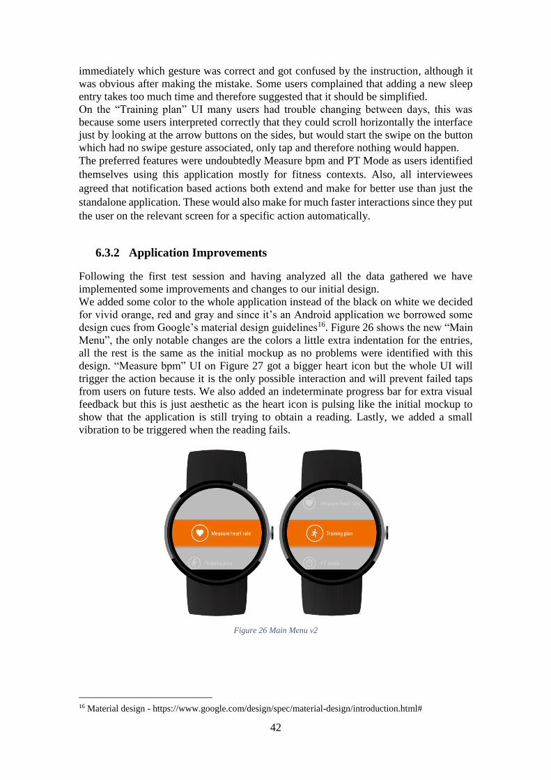
6.3.2 Application Improvements
Following the first test session and having analyzed all the data gathered we have
implemented some improvements and changes to our initial design.
We added some color to the whole application instead of the black on white we decided
for vivid orange, red and gray and since it’s an Android application we borrowed some
design cues from Google’s material design guidelines16. Figure 26 shows the new “Main
Menu”, the only notable changes are the colors a little extra indentation for the entries,
all the rest is the same as the initial mockup as no problems were identified with this
design. “Measure bpm” UI on Figure 27 got a bigger heart icon but the whole UI will
trigger the action because it is the only possible interaction and will prevent failed taps
from users on future tests. We also added an indeterminate progress bar for extra visual
feedback but this is just aesthetic as the heart icon is pulsing like the initial mockup to
show that the application is still trying to obtain a reading. Lastly, we added a small
vibration to be triggered when the reading fails.
Figure 26 Main Menu v2
16 Material design - https://www.google.com/design/spec/material-design/introduction.html#
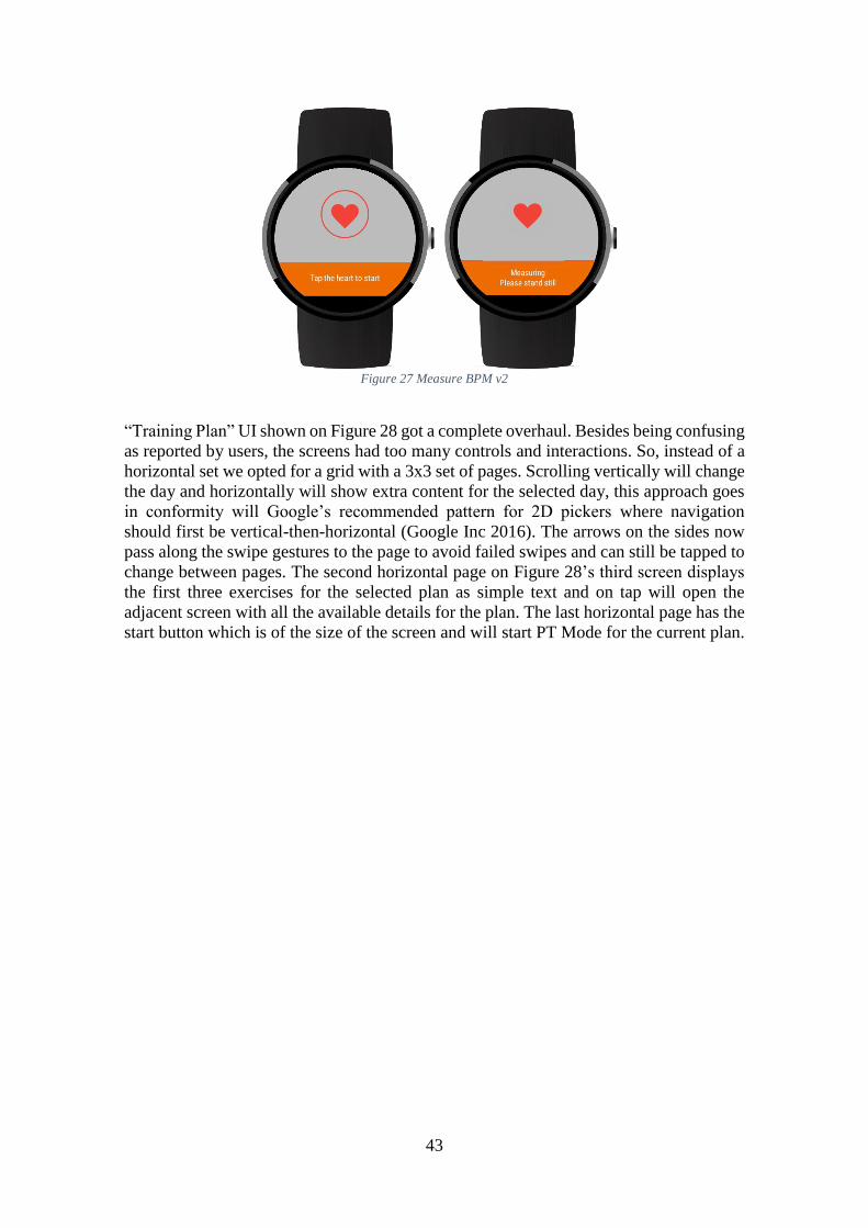
43
Figure 27 Measure BPM v2
“Training Plan” UI shown on Figure 28 got a complete overhaul. Besides being confusing
as reported by users, the screens had too many controls and interactions. So, instead of a
horizontal set we opted for a grid with a 3x3 set of pages. Scrolling vertically will change
the day and horizontally will show extra content for the selected day, this approach goes
in conformity will Google’s recommended pattern for 2D pickers where navigation
should first be vertical-then-horizontal (Google Inc 2016). The arrows on the sides now
pass along the swipe gestures to the page to avoid failed swipes and can still be tapped to
change between pages. The second horizontal page on Figure 28’s third screen displays
the first three exercises for the selected plan as simple text and on tap will open the
adjacent screen with all the available details for the plan. The last horizontal page has the
start button which is of the size of the screen and will start PT Mode for the current plan.
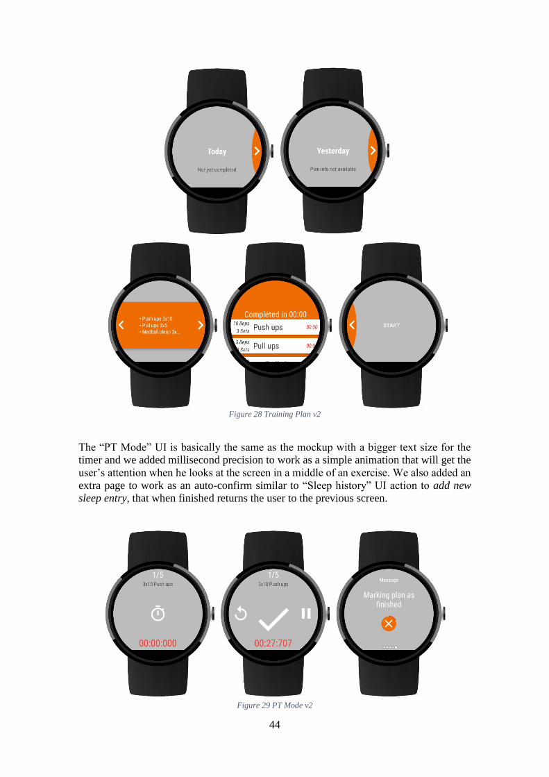
44
Figure 28 Training Plan v2
The “PT Mode” UI is basically the same as the mockup with a bigger text size for the
timer and we added millisecond precision to work as a simple animation that will get the
user’s attention when he looks at the screen in a middle of an exercise. We also added an
extra page to work as an auto-confirm similar to “Sleep history” UI action to add new
sleep entry, that when finished returns the user to the previous screen.
Figure 29 PT Mode v2
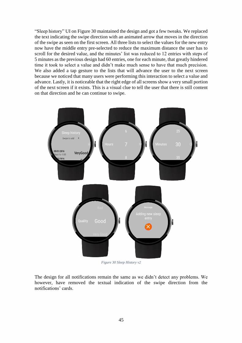
45
“Sleep history” UI on Figure 30 maintained the design and got a few tweaks. We replaced
the text indicating the swipe direction with an animated arrow that moves in the direction
of the swipe as seen on the first screen. All three lists to select the values for the new entry
now have the middle entry pre-selected to reduce the maximum distance the user has to
scroll for the desired value, and the minutes’ list was reduced to 12 entries with steps of
5 minutes as the previous design had 60 entries, one for each minute, that greatly hindered
time it took to select a value and didn’t make much sense to have that much precision.
We also added a tap gesture to the lists that will advance the user to the next screen
because we noticed that many users were performing this interaction to select a value and
advance. Lastly, it is noticeable that the right edge of all screens show a very small portion
of the next screen if it exists. This is a visual clue to tell the user that there is still content
on that direction and he can continue to swipe.
Figure 30 Sleep History v2
The design for all notifications remain the same as we didn’t detect any problems. We
however, have removed the textual indication of the swipe direction from the
notifications’ cards.
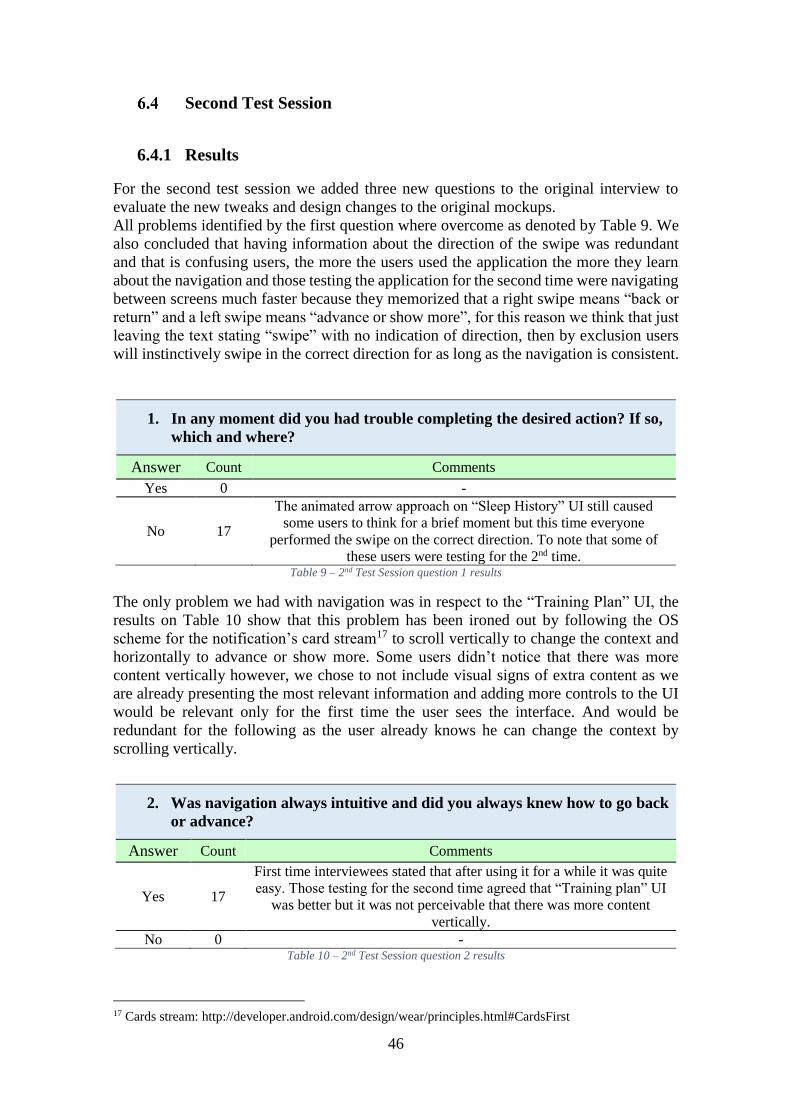
46
Second Test Session
6.4.1 Results
For the second test session we added three new questions to the original interview to
evaluate the new tweaks and design changes to the original mockups.
All problems identified by the first question where overcome as denoted by Table 9. We
also concluded that having information about the direction of the swipe was redundant
and that is confusing users, the more the users used the application the more they learn
about the navigation and those testing the application for the second time were navigating
between screens much faster because they memorized that a right swipe means “back or
return” and a left swipe means “advance or show more”, for this reason we think that just
leaving the text stating “swipe” with no indication of direction, then by exclusion users
will instinctively swipe in the correct direction for as long as the navigation is consistent.
1. In any moment did you had trouble completing the desired action? If so,
which and where?
Answer Count Comments
Yes 0 -
No 17
The animated arrow approach on “Sleep History” UI still caused
some users to think for a brief moment but this time everyone
performed the swipe on the correct direction. To note that some of
these users were testing for the 2nd time. Table 9 – 2nd Test Session question 1 results
The only problem we had with navigation was in respect to the “Training Plan” UI, the
results on Table 10 show that this problem has been ironed out by following the OS
scheme for the notification’s card stream17 to scroll vertically to change the context and
horizontally to advance or show more. Some users didn’t notice that there was more
content vertically however, we chose to not include visual signs of extra content as we
are already presenting the most relevant information and adding more controls to the UI
would be relevant only for the first time the user sees the interface. And would be
redundant for the following as the user already knows he can change the context by
scrolling vertically.
2. Was navigation always intuitive and did you always knew how to go back
or advance?
Answer Count Comments
Yes 17
First time interviewees stated that after using it for a while it was quite
easy. Those testing for the second time agreed that “Training plan” UI
was better but it was not perceivable that there was more content
vertically.
No 0 - Table 10 – 2nd Test Session question 2 results
17 Cards stream: http://developer.android.com/design/wear/principles.html#CardsFirst
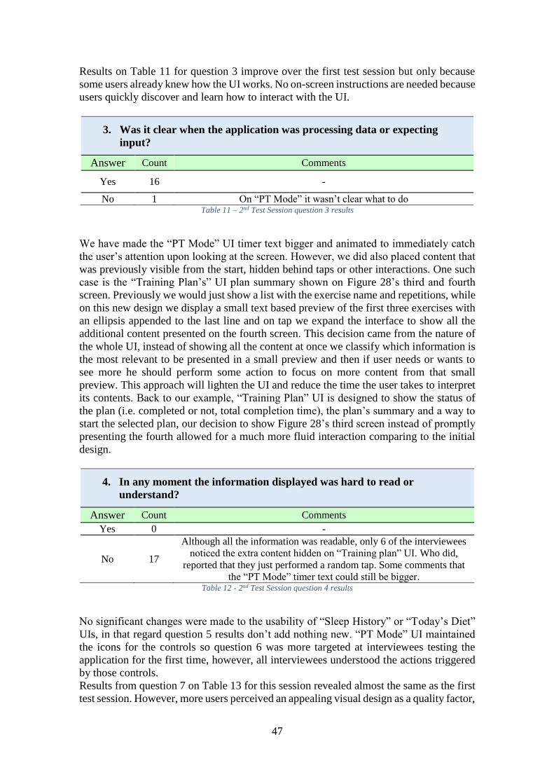
47
Results on Table 11 for question 3 improve over the first test session but only because
some users already knew how the UI works. No on-screen instructions are needed because
users quickly discover and learn how to interact with the UI.
3. Was it clear when the application was processing data or expecting
input?
Answer Count Comments
Yes 16 -
No 1 On “PT Mode” it wasn’t clear what to do Table 11 – 2nd Test Session question 3 results
We have made the “PT Mode” UI timer text bigger and animated to immediately catch
the user’s attention upon looking at the screen. However, we did also placed content that
was previously visible from the start, hidden behind taps or other interactions. One such
case is the “Training Plan’s” UI plan summary shown on Figure 28’s third and fourth
screen. Previously we would just show a list with the exercise name and repetitions, while
on this new design we display a small text based preview of the first three exercises with
an ellipsis appended to the last line and on tap we expand the interface to show all the
additional content presented on the fourth screen. This decision came from the nature of
the whole UI, instead of showing all the content at once we classify which information is
the most relevant to be presented in a small preview and then if user needs or wants to
see more he should perform some action to focus on more content from that small
preview. This approach will lighten the UI and reduce the time the user takes to interpret
its contents. Back to our example, “Training Plan” UI is designed to show the status of
the plan (i.e. completed or not, total completion time), the plan’s summary and a way to
start the selected plan, our decision to show Figure 28’s third screen instead of promptly
presenting the fourth allowed for a much more fluid interaction comparing to the initial
design.
4. In any moment the information displayed was hard to read or
understand?
Answer Count Comments
Yes 0 -
No 17
Although all the information was readable, only 6 of the interviewees
noticed the extra content hidden on “Training plan” UI. Who did,
reported that they just performed a random tap. Some comments that
the “PT Mode” timer text could still be bigger. Table 12 - 2nd Test Session question 4 results
No significant changes were made to the usability of “Sleep History” or “Today’s Diet”
UIs, in that regard question 5 results don’t add nothing new. “PT Mode” UI maintained
the icons for the controls so question 6 was more targeted at interviewees testing the
application for the first time, however, all interviewees understood the actions triggered
by those controls.
Results from question 7 on Table 13 for this session revealed almost the same as the first
test session. However, more users perceived an appealing visual design as a quality factor,
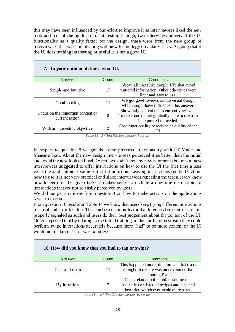
48
this may have been influenced by our effort to improve it as interviewees liked the new
look and feel of the application. Interesting enough, two interviews perceived the UI
functionality as a quality factor for the design, these were from the new group of
interviewees that were not dealing with new technology on a daily basis. Arguing that if
the UI does nothing interesting or useful it is not a good UI.
7. In your opinion, define a good UI.
Answer Count Comments
Simple and Intuitive 13
Above all users like simple UI's that avoid
cluttered information. Other adjectives were
light and easy to use.
Good looking 11 We got good reviews on the visual design
which might have influenced this answer.
Focus on the important content or
current action 8
Show only content that’s currently relevant
for the context, and gradually show more as it
is requested or needed.
With an interesting objective 2 Core functionality perceived as quality of the
UI. Table 13 - 2nd Test Session question 7 results
In respect to question 8 we got the same preferred functionality with PT Mode and
Measure bpm. About the new design interviewees perceived it as better than the initial
and loved the new look and feel. Overall we didn’t get any new comments but one of new
interviewees suggested to offer instructions on how to use the UI the first time a user
visits the application as some sort of introduction. Leaving instructions on the UI about
how to use it is not very practical and since interviewees repeating the test already knew
how to perform the given tasks it makes sense to include a one-time instruction for
interactions that are not so easily perceived by users.
We did not get any ideas from question 9 on how to make actions on the applications
faster to execute.
From question 10 results on Table 14 we know that users keep trying different interactions
in a trial and error fashion. This can be a clear indicator that interact able controls are not
properly signaled as such and users do their best judgement about the content of the UI.
Others reported that by relating to the initial training on the notification stream they could
perform swipe interactions accurately because there “had” to be more content or the UI
would not make sense, or was pointless.
10. How did you know that you had to tap or swipe?
Answer Count Comments
Trial and error 11
This happened more often on UIs that users
thought that there was more content like
“Training Plan”.
By intuition 7
Users related to the initial training that
basically consisted of swipes and taps and
then tried which ever made more sense. Table 14 - 2nd Test Session question 10 results
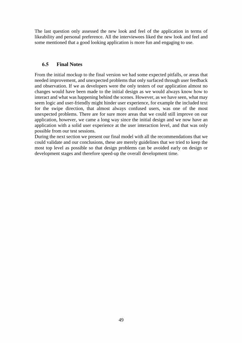
49
The last question only assessed the new look and feel of the application in terms of
likeability and personal preference. All the interviewees liked the new look and feel and
some mentioned that a good looking application is more fun and engaging to use.
Final Notes
From the initial mockup to the final version we had some expected pitfalls, or areas that
needed improvement, and unexpected problems that only surfaced through user feedback
and observation. If we as developers were the only testers of our application almost no
changes would have been made to the initial design as we would always know how to
interact and what was happening behind the scenes. However, as we have seen, what may
seem logic and user-friendly might hinder user experience, for example the included text
for the swipe direction, that almost always confused users, was one of the most
unexpected problems. There are for sure more areas that we could still improve on our
application, however, we came a long way since the initial design and we now have an
application with a solid user experience at the user interaction level, and that was only
possible from our test sessions.
During the next section we present our final model with all the recommendations that we
could validate and our conclusions, these are merely guidelines that we tried to keep the
most top level as possible so that design problems can be avoided early on design or
development stages and therefore speed-up the overall development time.
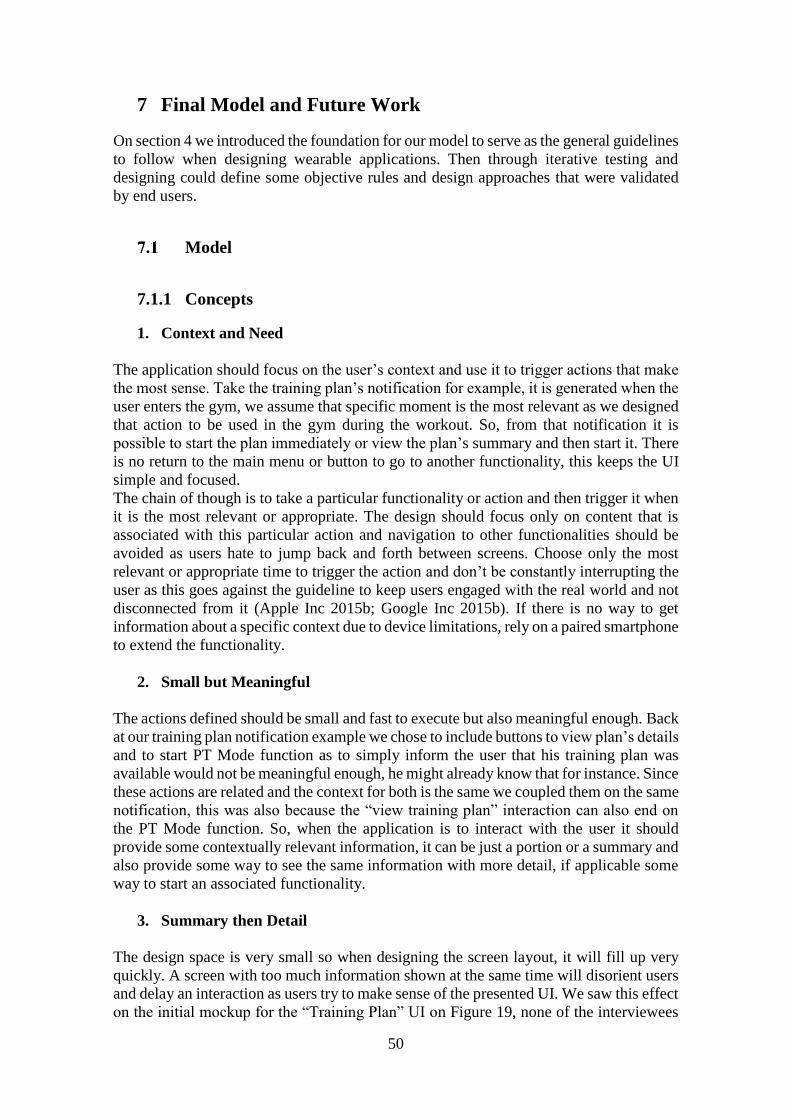
50
7 Final Model and Future Work
On section 4 we introduced the foundation for our model to serve as the general guidelines
to follow when designing wearable applications. Then through iterative testing and
designing could define some objective rules and design approaches that were validated
by end users.
Model
7.1.1 Concepts
1. Context and Need
The application should focus on the user’s context and use it to trigger actions that make
the most sense. Take the training plan’s notification for example, it is generated when the
user enters the gym, we assume that specific moment is the most relevant as we designed
that action to be used in the gym during the workout. So, from that notification it is
possible to start the plan immediately or view the plan’s summary and then start it. There
is no return to the main menu or button to go to another functionality, this keeps the UI
simple and focused.
The chain of though is to take a particular functionality or action and then trigger it when
it is the most relevant or appropriate. The design should focus only on content that is
associated with this particular action and navigation to other functionalities should be
avoided as users hate to jump back and forth between screens. Choose only the most
relevant or appropriate time to trigger the action and don’t be constantly interrupting the
user as this goes against the guideline to keep users engaged with the real world and not
disconnected from it (Apple Inc 2015b; Google Inc 2015b). If there is no way to get
information about a specific context due to device limitations, rely on a paired smartphone
to extend the functionality.
2. Small but Meaningful
The actions defined should be small and fast to execute but also meaningful enough. Back
at our training plan notification example we chose to include buttons to view plan’s details
and to start PT Mode function as to simply inform the user that his training plan was
available would not be meaningful enough, he might already know that for instance. Since
these actions are related and the context for both is the same we coupled them on the same
notification, this was also because the “view training plan” interaction can also end on
the PT Mode function. So, when the application is to interact with the user it should
provide some contextually relevant information, it can be just a portion or a summary and
also provide some way to see the same information with more detail, if applicable some
way to start an associated functionality.
3. Summary then Detail
The design space is very small so when designing the screen layout, it will fill up very
quickly. A screen with too much information shown at the same time will disorient users
and delay an interaction as users try to make sense of the presented UI. We saw this effect
on the initial mockup for the “Training Plan” UI on Figure 19, none of the interviewees
51
noticed there was a scrollable list with all the exercises names, sets and repetitions count
on the middle. No one interacted with it, not because they didn’t see it but because there
was too much on the UI to take their attention, and so, the list got dismissed. Back at our
example of the “Training Plan” UI on Figure 28, we decided to split information in 3
pages, and since the number of exercises per plan is expected to be high, the 2nd page
where we display these, only has a summary and if the user requires more information he
can just tap and get all the details available for that plan’s status and exercises.
If a UI’s objective is just to display information on some context, like “Today’s Diet” on
Figure 24, then it can be shown all at once through means of a list, but if on the same UI
we are mixing actions with information split it, show the most relevant from the set or
just a summary, then if the user wants more expand on the context he needs.
4. Follow the OS Scheme
This concept came from the failed navigation scheme on “Training Plan” UI initial
design, Figure 19. We ruined the sense the user had that the page to the left would be the
last one on the navigation stack, instead we were presenting one with new information.
For the overhaul we chose to adopt the OS scheme for the notification stream, on which
the user would swipe up or down to change the context and right to see more on the
selected context, while keeping the left intact for return to the previous screen. This
quickly proved to be the correct approach because it was how users were “trained” to use
the device, during interviews users reported that they knew how to interact because it was
either what made sense or that they knew because it was how the watch works.
In our case it was the Android Wear, but the same applies to other systems, the idea should
be to look for design patterns of the OS, and how the user is expected to use it and
incorporate those concepts on the design.
7.1.2 The UI
1. Text size
Changing text size should be avoided unless for some very specific cases like the timer
Text on “PT Mode” UI. This is because we can expect for the system’s default theme to
have appropriate text sizes already defined as we have seen. We should however, use
larger sizes consistently for relevant information as way to classify as primary or more
important, and smaller sizes for details that are not so relevant for the user.
More specific to round screens, placing text outside of the clipping rectangle to make
better use of all available space, even if the text is expected to be static, may have
undesired results. A such example of a bad design is shown on Figure 28’s fourth screen,
where we have a list of exercises and while the name of the exercise has space to grow in
size and can even span multiple lines the label for “xx Reps” and “yy Sets” doesn’t. This
is because we assume that this specific text will always have the same maximum length
of 7 characters. However, that is true only for English language, if we are translating our
application to another language we may get undesired effects and be forced to redesign
the UI. To avoid this scenario, always leave space for text strings to grow in length.
2. Lists
Lists can be used to display only information or present a group of options to select from.
If we need only to show information to the user, we only have to worry about the amount
52
of information to display per row and if needed follow the summary then detail approach.
Things get more complicated with interact able lists by means of tapping a list item. For
these cases, follow the “Main Menu” UI approach on Figure 16 and Figure 26, as these
have proven to be very easy to use by all of our users, with no failed taps and rapid entry
selection. When using lists for input like the lists on “Sleep History” UI’s add new sleep
entry function, shown on Figure 30, try to reduce the list’s set of elements to the minimum
size possible and scroll the list by default to the middle or most probable value.
3. Interact able controls
Failing to interact with the UI will translate on a bad user experience, buttons too small
or overlapping interactions should be avoided. If a UI has only one possible action, make
that action’s target area the whole screen, and in case of multiple either split the actions
between pages or make targets big enough as seen on “PT Mode” UI on Figure 21. Also,
when implementing a group of pages which can be changed through swiping like
“Training Plan” UI on Figure 28, avoid letting controls “steal” the gesture from the UI,
what this means is that in our case we have buttons on the sides that can be tapped to
change between pages, but swiping can also be used for the same effect. However, starting
the swipe gesture on those buttons would ignore the page change interaction altogether,
so instead of removing the buttons, we made those pass along the interaction to the UI.
4. Look and Feel
How the UI looks is entirely up to the developer, although we only tested how users
respond to the aesthetic nature of the UI, on a more technical note and by our follow the
OS scheme guideline, the same type of controls should look the same across all
applications. What this means is that a user should be able to immediately distinguish a
button from plain text and this can only be obtained by keeping the core look and feel of
the system’s controls.
5. Visual Feedback and smooth transitions
Animations play a big part on the look and feel of an application but they also provide
information to the user that something is happening or that an interaction was registered
successfully. They clearly distinguish a frozen UI from one that is just waiting on some
result or calculation. On the wearables’ context this becomes increasingly important as
we don’t want to keep the users interacted with the application longer than they have to,
by our Five Second Interaction guideline we should clearly state what is happening on-
screen.
It is recommended to use smooth transitions when displaying auto confirm screens such
as those seen on “PT Mode” UI on Figure 29’s last screen. When all the information is
presented at the same time with a countdown a user might react and cancel immediately
by reflex without reading the information displayed as happened during the tests. Instead,
keep giving information in phases using simple animations.
6. Multiple pages
We used multiple paged UIs to split information or user input required for a specific
action, as seen on Figure 30. This approach worked well as users easily understood and
interacted with the UI, however, an excessive number of pages side by side should be
53
avoided or we risk holding the user for too long against our Five Seconds Interaction
guideline. Also, users reported that they dislike excessive swiping so keep the number of
pages to the minimum.
When designing a multi-paged UI follow the system’s scheme for such pattern or risk
confusing users.
7. Navigation
Navigation should always feel natural and keep the same logic. Users while testing our
application perceived right and left swipes as return and advance commands respectively.
When we didn’t follow this logic on our design, users got confused as something
unexpected happened with the navigation. Users also hated having to excessively swipe
to get back to the “Main Menu” UI.
Following the notification/action approach when designing the application will deal with
most of these problems if the actions are kept simple and fast, and when finished the user
can simply dismiss the watch. However, on a standalone application jumping back and
forth between functions will eventually generate a big navigation stack which can lead
the user on having to swipe back excessively to reach the desired page or to just dismiss
the application altogether. Either clear the stack between functions’ specific UIs or
prevent the user from going from one action to another directly.
7.1.3 Testing
The best way to test the UI is to let our users “wear” it, the guidelines are just as the name
implies, guidelines. To properly validate the UI design is to watch how users interact with
it. Most problems surfaced when testing and so we have to pay attention to the time a user
is engaged with a specific function, if he doesn’t notice important content, fails
interactions, is just randomly interacting with the device or is completely lost on how to
proceed with an action. These metrics will clearly identify the pitfalls for an application
or areas that need improvement.
During our tests, we simulated contexts of usage of the application, whenever possible
this methodology should be enforced as they bring up important details about the context
that might otherwise go unnoticed.
Final Considerations and Future Work
The key point for designing for small devices is to keep it simple and familiar, the user
interface is very small and it is very easy to add too many components or information at
the same time. Sticking to the essential and using design techniques seen or common on
other applications is the recommended approach, this is because users tend to relate
similar UI designs and base their interactions on past experiences.
Interaction redundancy also proved to be useful for as long as one type of interaction does
not affect negatively another type of interaction, as explained on section 7.1.2 point 3.
Lastly, the most important aspect that should be the motor to shape all the design is to
think about the user’s context, this can be done by thinking about the Where, When and
How the user will use our application and the design should start here, as explained on
section 7.1.1 point 1.
54
The presented model is not to be seen as a strict ruleset, it is meant to be used early in
development as the bare bones and adapted to serve a specific application’s context. The
end user should be the one that validates the application design through testing and
feedback.
We have just began to study the design space for wearable devices and while this work
focused on some very common design patterns it cannot possibly cover all of them. As
the growing market of wearables keeps expanding, more devices with different
characteristics and with improved hardware will emerge, paving the way for new ideas
and patterns for the design space.
We didn’t get the chance to test our application on rectangular devices (besides the
emulator) nor did we try these design choices on other platforms such as Apple’s
watchOS or Samsung’s Tizen. However, we kept other platforms and devices in mind
from the beginning and formulated our ideas so that they make sense on a wearable’s
context and not on a specific platform’s context.
We would like to test other platforms and devices to further improve our model and study
prototypes inserted on different contexts, such as messaging or a finance. Lastly, we
believe that testing the application with the end-user is key to develop a successful UI so
in the future we hope improve our user base with more users and smartwatch owners.
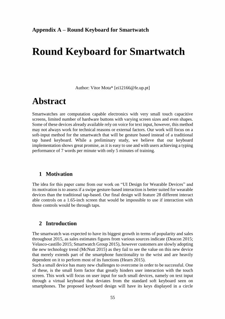
55
Appendix A – Round Keyboard for Smartwatch
Round Keyboard for Smartwatch
Author: Vitor Mota* [[email protected]]
Abstract
Smartwatches are computation capable electronics with very small touch capacitive
screens, limited number of hardware buttons with varying screen sizes and even shapes.
Some of these devices already available rely on voice for text input, however, this method
may not always work for technical reasons or external factors. Our work will focus on a
soft-input method for the smartwatch that will be gesture based instead of a traditional
tap based keyboard. While a preliminary study, we believe that our keyboard
implementation shows great promise, as it is easy to use and with users achieving a typing
performance of 7 words per minute with only 5 minutes of training.
1 Motivation
The idea for this paper came from our work on “UI Design for Wearable Devices” and
its motivation is to assess if a swipe gesture-based interaction is better suited for wearable
devices than the traditional tap-based. Our final design will feature 28 different interact
able controls on a 1.65-inch screen that would be impossible to use if interaction with
those controls would be through taps.
2 Introduction
The smartwatch was expected to have its biggest growth in terms of popularity and sales
throughout 2015, as sales estimates figures from various sources indicate (Deacon 2015;
Velasco-castillo 2015; Smartwatch Group 2015), however customers are slowly adopting
the new technology trend (McNutt 2015) as they fail to see the value on this new device
that merely extends part of the smartphone functionality to the wrist and are heavily
dependent on it to perform most of its functions (Hearn 2015).
Such a small device has many new challenges to overcome in order to be successful. One
of these, is the small form factor that greatly hinders user interaction with the touch
screen. This work will focus on user input for such small devices, namely on text input
through a virtual keyboard that deviates from the standard soft keyboard seen on
smartphones. The proposed keyboard design will have its keys displayed in a circle
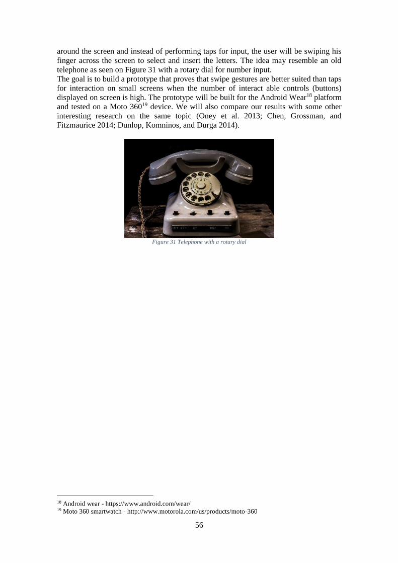
56
around the screen and instead of performing taps for input, the user will be swiping his
finger across the screen to select and insert the letters. The idea may resemble an old
telephone as seen on Figure 31 with a rotary dial for number input.
The goal is to build a prototype that proves that swipe gestures are better suited than taps
for interaction on small screens when the number of interact able controls (buttons)
displayed on screen is high. The prototype will be built for the Android Wear18 platform
and tested on a Moto 36019 device. We will also compare our results with some other
interesting research on the same topic (Oney et al. 2013; Chen, Grossman, and
Fitzmaurice 2014; Dunlop, Komninos, and Durga 2014).
Figure 31 Telephone with a rotary dial
18 Android wear - https://www.android.com/wear/ 19 Moto 360 smartwatch - http://www.motorola.com/us/products/moto-360
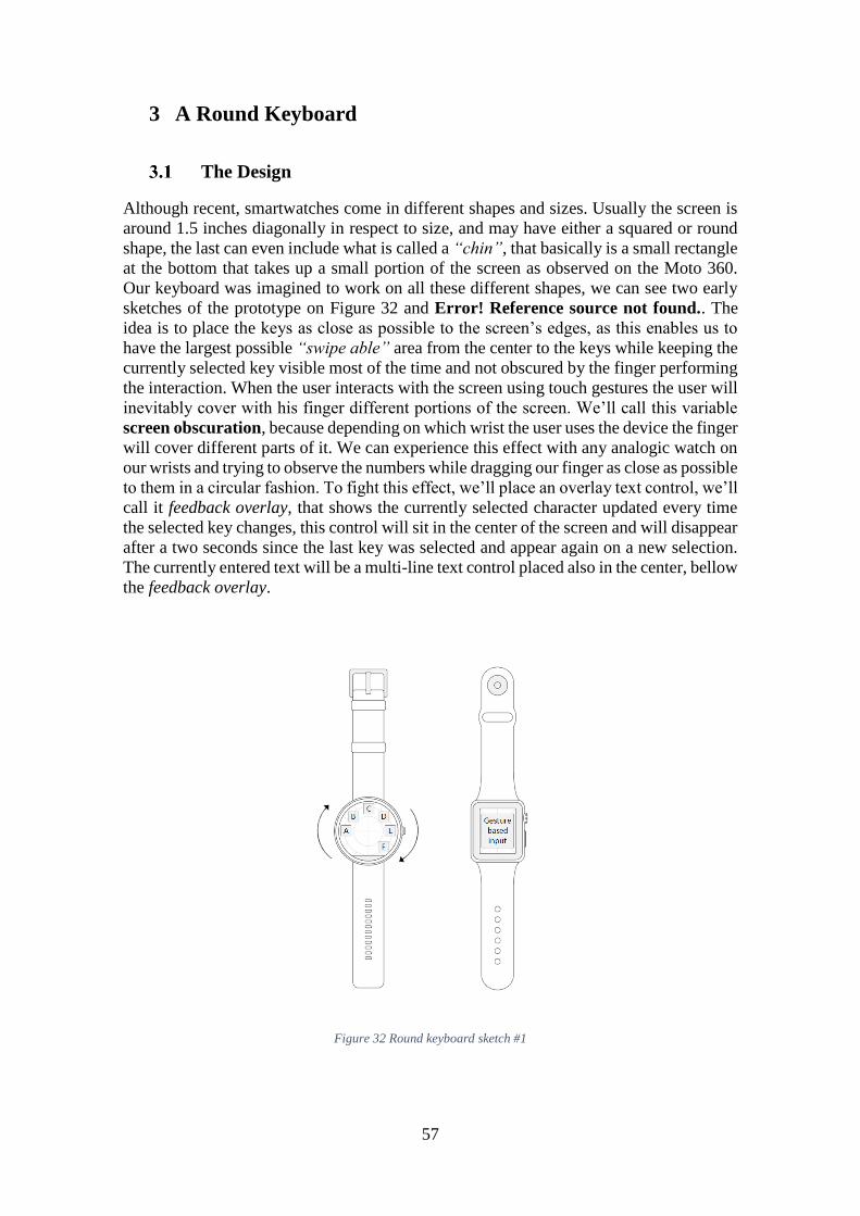
57
3 A Round Keyboard
The Design
Although recent, smartwatches come in different shapes and sizes. Usually the screen is
around 1.5 inches diagonally in respect to size, and may have either a squared or round
shape, the last can even include what is called a “chin”, that basically is a small rectangle
at the bottom that takes up a small portion of the screen as observed on the Moto 360.
Our keyboard was imagined to work on all these different shapes, we can see two early
sketches of the prototype on Figure 32 and Error! Reference source not found.. The
idea is to place the keys as close as possible to the screen’s edges, as this enables us to
have the largest possible “swipe able” area from the center to the keys while keeping the
currently selected key visible most of the time and not obscured by the finger performing
the interaction. When the user interacts with the screen using touch gestures the user will
inevitably cover with his finger different portions of the screen. We’ll call this variable
screen obscuration, because depending on which wrist the user uses the device the finger
will cover different parts of it. We can experience this effect with any analogic watch on
our wrists and trying to observe the numbers while dragging our finger as close as possible
to them in a circular fashion. To fight this effect, we’ll place an overlay text control, we’ll
call it feedback overlay, that shows the currently selected character updated every time
the selected key changes, this control will sit in the center of the screen and will disappear
after a two seconds since the last key was selected and appear again on a new selection.
The currently entered text will be a multi-line text control placed also in the center, bellow
the feedback overlay.
Figure 32 Round keyboard sketch #1
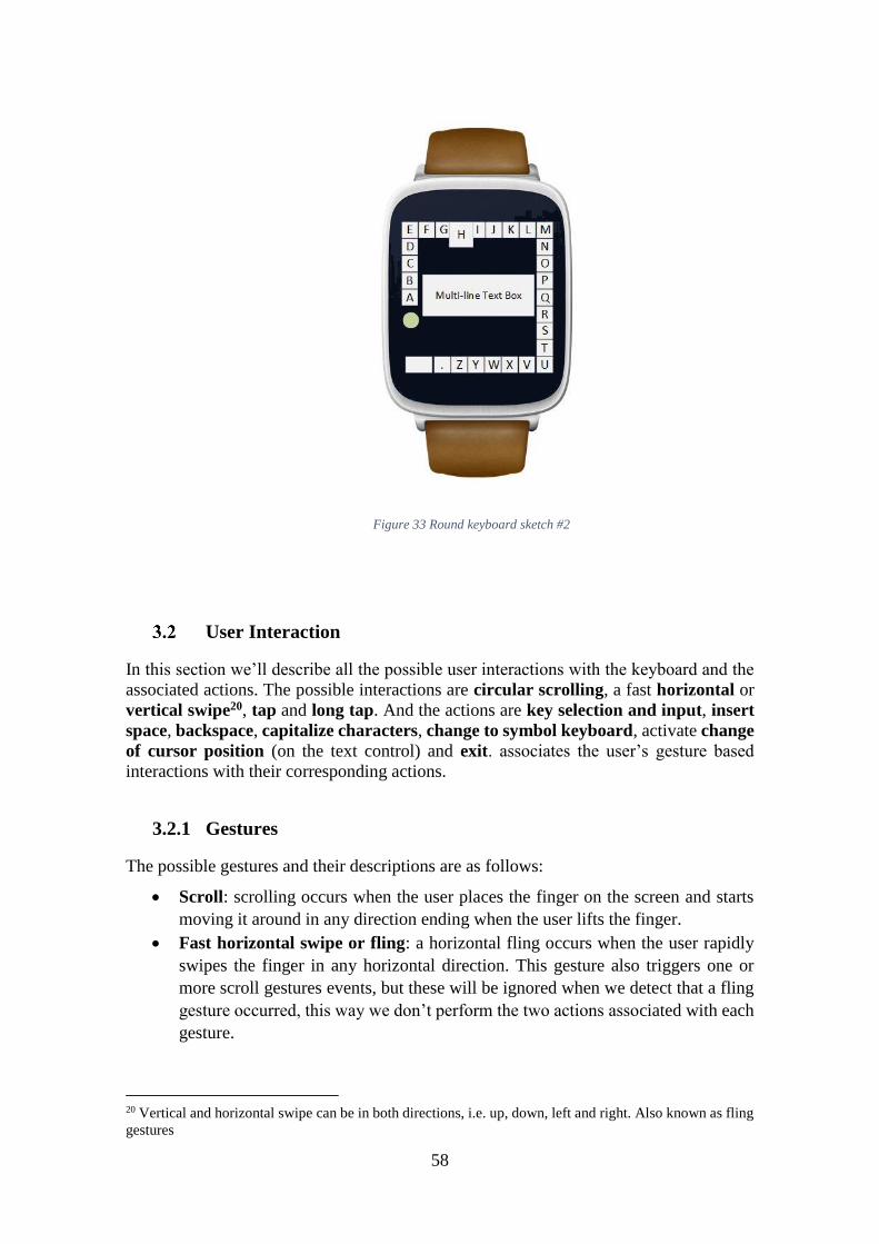
58
User Interaction
In this section we’ll describe all the possible user interactions with the keyboard and the
associated actions. The possible interactions are circular scrolling, a fast horizontal or
vertical swipe20, tap and long tap. And the actions are key selection and input, insert
space, backspace, capitalize characters, change to symbol keyboard, activate change
of cursor position (on the text control) and exit. associates the user’s gesture based
interactions with their corresponding actions.
3.2.1 Gestures
The possible gestures and their descriptions are as follows:
Scroll: scrolling occurs when the user places the finger on the screen and starts
moving it around in any direction ending when the user lifts the finger.
Fast horizontal swipe or fling: a horizontal fling occurs when the user rapidly
swipes the finger in any horizontal direction. This gesture also triggers one or
more scroll gestures events, but these will be ignored when we detect that a fling
gesture occurred, this way we don’t perform the two actions associated with each
gesture.
20 Vertical and horizontal swipe can be in both directions, i.e. up, down, left and right. Also known as fling
gestures
Figure 33 Round keyboard sketch #2
59
Fast vertical swipe or fling: the same as the horizontal counterpart but now
vertically.
Tap: a tap consists of placing the finger on the screen and immediately lift it up.
It is usually associated with a control target and not the whole screen.
Long tap: a long tap is like a normal tap, but instead of quickly lifting the finger
the user maintains contact with the screen until this event is triggered.
3.2.2 Actions
The possible actions and their descriptions are as follows:
Input character: this action is associated with the scroll gesture, the user should
drag the finger around the screen until the desired character is selected and then
after lifting the finger from the screen the selected character is inserted on the text
field and thus ending the action. If a fling gesture is detected before the user lifts
the finger, no character is inserted. Character detection is based on the finger
coordinates from which we extract the radians relative to the center of the circle
to find the button. This means that the closer the user is scrolling to the screen
edge the easier it is to select a specific key.
Insert space: performing a right fling or tapping the space button will insert the
space character21.
Toggle capitalized letters: performing an up fling will capitalize the letters like
the caps lock key on a laptop keyboard.
Toggle symbols keyboard: performing a down fling will change the letter
keyboard to the symbols keyboard that is composed of numbers, punctuation and
a few symbols. We included only the most common symbols on the alternative
keyboard, but we could as easily add another extra keyboard layout and alternate
between all 3 with the down fling in a cyclic fashion.
Backspace: performing a left fling will erase the last entered character.
Change cursor position: tapping on the text control will display a cursor that is
drag able, which the user can place to change the position where the next character
will be inserted. This is perfect for late text corrections.
Exit: to exit, i.e. the user has finished entering the desired text, long tapping the
screen will show an overlay to confirm that the user has finished the text input.
Gestures Actions Target
Tap Insert space Bottom button
Show text cursor Text input
Long Tap Finish/exit Whole screen
Scroll (any direction)22 Select and insert character Whole screen
Up Fling Toggle Capitalized characters Whole screen
21 After some testing we decided to include the extra button, more on this on section 5. 22 Only the last detected scroll will insert the character, i.e. when the user lifts the finger from the screen. If
a fling gesture is detected meanwhile, the character input is canceled. Even though character detection still
happens.
60
Down Fling Change to symbols/letters keys Whole screen
Left Fling Backspace Whole screen
Right Fling Insert space Whole screen
Table 15 - User interactions and corresponding actions
3.2.3 Visual Feedback
Visual feedback provides very useful information to the user about his interaction with
the user interface, it should clearly state if an action was successful or not. Providing clues
about what is happening on screen is very important as a frozen user interface might
confuse the user (Natoli 2014). During character selection, this becomes very important
as it requires a long or constant interaction between the user and the device. We can’t
expect the user to intuitively know which character is selected at any given time and
therefore we animate the currently selected key by scaling its size by 1.5 times to provide
visual feedback. This happens in a short linear animation of 250 milliseconds, and we
scale it back to its original size when the key is no longer selected. These small animations
also inform the user if his interactions are producing the desired effect or not.
As we discussed earlier, animating the key is not enough as the screen obscuring will
hide this animation and surrounding keys. For this reason, we also included an overlay
on the screen center that will display the selected character every time it changes for 2
seconds and then fade to full transparency.
Lastly, the text input control shows a blinking cursor that provides visual feedback about
where exactly will the next character be inserted.
4 Implementation
Platform and Tools
The prototype will be for the Android Wear platform using java and Android Studio IDE23
and will be built against the Android SDK version 21. Our testing device is a Moto 360
with a round screen and small “chin” at the bottom so our implementation will focus on
this particular shape. However, adapting the interface to a square or a perfectly round
screen is trivial.
Drawing the Keyboard
We won’t go into full detail on the algorithm to display the keys around the screen as
that’s not the scope of this work, but basically we want to fit a variable number of keys,
in this case 27, distributed evenly by 2π. Not forgetting that we have the small “chin” at
the bottom. By applying the Pythagoras theorem and some basic trigonometry we can
pinpoint the radians where the “chin” ends on both sides and then we calculate the
amplitude the “chin” occupies from 2π. After that we get how much amplitude a key may
have and then we start placing the keys in a clockwise manner. Each key will be a square
button with no background and should have the minimum possible size to fit its
23 Android Studio IDE - http://developer.android.com/sdk/index.html
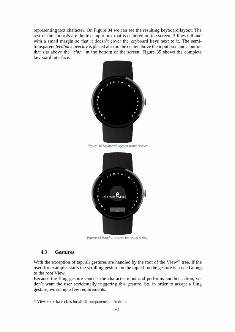
61
representing text character. On Figure 34 we can see the resulting keyboard layout. The
rest of the controls are the text input box that is centered on the screen, 3 lines tall and
with a small margin so that it doesn’t cover the keyboard keys next to it. The semi-
transparent feedback overlay is placed also on the center above the input box, and a button
that sits above the “chin” at the bottom of the screen. Figure 35 shows the complete
keyboard interface.
Figure 34 Keyboard keys on round screen
Figure 35 Final prototype on round screen
Gestures
With the exception of tap, all gestures are handled by the root of the View24 tree. If the
user, for example, starts the scrolling gesture on the input box the gesture is passed along
to the root View.
Because the fling gesture cancels the character input and performs another action, we
don’t want the user accidentally triggering this gesture. So, in order to accept a fling
gesture, we set up a few requirements:
24 View is the base class for all UI components on Android
62
Minimum distance: the user’s finger has to travel at least 1 5⁄ of the screen. In
our test device that’s 64 screen pixels.
Minimum velocity: besides the distance the user’s finger should have a velocity
of at least 200 pixels per second.
These requirements are valid for all directions.
5 Testing
Method
Before getting the prototype we are presenting, small iterative testing sessions took place
at our laboratory. These sessions were informal and their goal were merely to tweak
values for the interactions, like the fling’s minimum travel distance or the controls
placement for example, and also to get an early feedback from users. From these sessions
also came the decision to include the button at the bottom, as we noticed that the user
would intuitively look for the space character instead of performing the corresponding
fling gesture to insert it. This redundancy will also allow us to allocate the right fling
gesture or the button to another action in the future, e.g. insert a word prediction or
correction.
For our test session we will ask the user to input text on his native language, which is
most likely to be Portuguese. But in order to compare our keyboard’s performance to
other studies we decided not to consider words that should contain diacritics and that are
written without them as typos, i.e. if the word “memória”, which means memory, is
entered as “memoria” it is not considered an error, but if entered as “memria” then it will
be considered as such. The reason for this approach is that we considered that inserting
another alternative keyboard and having the user cycling through it looking for the
accented character would greatly hinder typing performance when comparing against
English tests on other studies. That wouldn’t be a fair comparison as English has very
few words with diacritics comparably to Portuguese.
Tests will be conducted on our laboratory and will be composed of two parts. First we’ll
explain how the keyboard works and provide 5 minutes of training with randomly
generated Portuguese words25, during this part we’ll be providing tips on how to better
use the keyboard, like moving the cursor by dragging instead of deleting to move the
cursor to the typo or to scroll the finger along the edges for better precision. After that if
the user is still confused on how to use the keyboard, we’ll provide up to 5 minutes of
training and explanation again. After that we will let the user enter randomly generated
words for 5 minutes with no intervention or tips from us. The number of words (including
the ones with typos) entered will then be divided by 5 so that we’ll get the ideal words
per minute, doing the same but this time ignoring words that contain typos we’ll get the
real words per minute. This distinction will allow us to measure our keyboard’s typing
efficiency, and because of that we will only allow the user to correct the word currently
being written, i.e. the user has not yet entered a space character.
25 Words are generated from http://10fastfingers.com/typing-test/portuguese
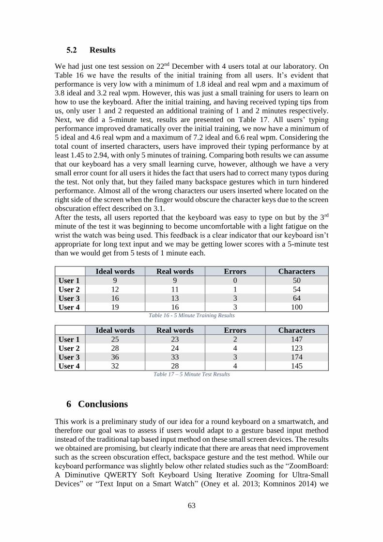
63
Results
We had just one test session on 22nd December with 4 users total at our laboratory. On
Table 16 we have the results of the initial training from all users. It’s evident that
performance is very low with a minimum of 1.8 ideal and real wpm and a maximum of
3.8 ideal and 3.2 real wpm. However, this was just a small training for users to learn on
how to use the keyboard. After the initial training, and having received typing tips from
us, only user 1 and 2 requested an additional training of 1 and 2 minutes respectively.
Next, we did a 5-minute test, results are presented on Table 17. All users’ typing
performance improved dramatically over the initial training, we now have a minimum of
5 ideal and 4.6 real wpm and a maximum of 7.2 ideal and 6.6 real wpm. Considering the
total count of inserted characters, users have improved their typing performance by at
least 1.45 to 2.94, with only 5 minutes of training. Comparing both results we can assume
that our keyboard has a very small learning curve, however, although we have a very
small error count for all users it hides the fact that users had to correct many typos during
the test. Not only that, but they failed many backspace gestures which in turn hindered
performance. Almost all of the wrong characters our users inserted where located on the
right side of the screen when the finger would obscure the character keys due to the screen
obscuration effect described on 3.1.
After the tests, all users reported that the keyboard was easy to type on but by the 3rd
minute of the test it was beginning to become uncomfortable with a light fatigue on the
wrist the watch was being used. This feedback is a clear indicator that our keyboard isn’t
appropriate for long text input and we may be getting lower scores with a 5-minute test
than we would get from 5 tests of 1 minute each.
Ideal words Real words Errors Characters
User 1 9 9 0 50
User 2 12 11 1 54
User 3 16 13 3 64
User 4 19 16 3 100 Table 16 - 5 Minute Training Results
Ideal words Real words Errors Characters
User 1 25 23 2 147
User 2 28 24 4 123
User 3 36 33 3 174
User 4 32 28 4 145 Table 17 – 5 Minute Test Results
6 Conclusions
This work is a preliminary study of our idea for a round keyboard on a smartwatch, and
therefore our goal was to assess if users would adapt to a gesture based input method
instead of the traditional tap based input method on these small screen devices. The results
we obtained are promising, but clearly indicate that there are areas that need improvement
such as the screen obscuration effect, backspace gesture and the test method. While our
keyboard performance was slightly below other related studies such as the “ZoomBoard:
A Diminutive QWERTY Soft Keyboard Using Iterative Zooming for Ultra-Small
Devices” or “Text Input on a Smart Watch” (Oney et al. 2013; Komninos 2014) we
64
believe we can increase typing performance by at least a factor of 2 if problems identified
on this preliminary work are overcome.
Future Work
We believe that the round keyboard can be greatly improved, therefore, we are planning
to improve typing efficiency by providing autocorrect and word prediction features as
seen on many smartphone keyboards. With this, we hope to overcome the problem of
excessive manual word correction identified.
We also need to better deal with screen obscuration that still is a big issue and improve
or tweak the special function gestures such as the backspace.
Our round keyboard shows great promise, while simple and easy to use there are many
aspects that can be improved towards a reliable and easy text input method on a
smartwatch.
65
References
Apple Inc. n.d. “Apple Watch User Guide.”
———. 2015a. “Apple Watch.” https://www.apple.com/watch/.
———. 2015b. “Human Interface Guidelines.”
https://developer.apple.com/watch/human-interface-guidelines/.
Chandra, Narayanaswami, and M. T. Raghunath. 2000. “Application Design for a Smart
Watch with a High Resolution Display.”
Chen, Xiang Anthony, Tovi Grossman, and George Fitzmaurice. 2014. “Swipeboard: A
Text Entry Technique for Ultra-Small Interfaces That Supports Novice to Expert
Transitions.” In 27th Annual ACM Symposium on User Interface Software and
Technology, UIST 2014, October 5, 2014 - October 8, 2014, 615–20. Honolulu, HI,
United states: Association for Computing Machinery, Inc.
doi:10.1145/2642918.2647354.
Deacon, Hugo. 2015. “Wearables Market: 2015 Is Year That Will Make or Break the
Smartwatch.” http://www.ccsinsight.com/press/company-news/2137-wearables-
market-2015-is-year-that-will-make-or-break-the-smartwatch.
Dunlop, Mark D., Andreas Komninos, and Naveen Durga. 2014. “Towards High Quality
Text Entry on Smartwatches.” Proceedings of the Extended Abstracts of the 32nd
Annual ACM Conference on Human Factors in Computing Systems - CHI EA ’14,
2365–70. doi:10.1145/2559206.2581319.
Google Inc. n.d. “Android Developer.” https://developer.android.com/.
———. 2016. “App Structure for Android Wear | Android Developers.” Accessed
January 5. http://developer.android.com/design/wear/structure.html.
———. 2015a. “Android Wear.” http://www.android.com/wear/.
———. 2015b. “Design Principles for Android Wear.”
http://developer.android.com/design/wear/creative-vision.html.
Hearn, Mark. 2015. “Failure to Launch: A Few Reasons Why Smartwatches Haven’t
Caught on.” http://www.androidauthority.com/smartwatches-havent-caught-on-
586193/.
Komninos, Andreas. 2014. “Text Input on a Smart Watch,” 50–58.
Laput, G., Xiao, R., Chen, X.A., Hudson, S.E., Harrison, C. 2014. “Skin Buttons: Cheap,
Small, Low-Powered and Clickable Fixed-Icon Laser Projectors.” Proc. UIST ’14,
to appear. doi:10.1145/2642918.2647356.
Losse, Kate. 2014. “Silicon Valley Has a Fashion Problem.”
http://www.style.com/trends/fashion/2014/fashion-tech-problem-silicon-valley.
McNutt, Cory. 2015. “New Study Shows Slow Adoption of Wearables |
Androidheadlines.com.” http://www.androidheadlines.com/2015/10/new-study-
shows-slow-adoption-wearables.html.
Miranda, M Gutierrez. 2011. “THE IMPORTANCE OF GRAPHIC USERS
INTERFACE, ANALYSIS OF GRAPHICAL USER INTERFACE DESIGN IN
THE CONTEXT OF HUMAN-COMPUTER INTERACTION.” In 3rd
International Conference on Education and New Learning Technologies, 7137–44.
66
Natoli, Joe. 2014. “Feedback: 5 Principles of Interaction Design To Supercharge Your UI
(5 of 5) | User Experience, User Interface Design Coaching, Speaking and
Workshops.” http://www.givegoodux.com/feedback-5-principles-interaction-
design-supercharge-ui-5-5/.
Oney, Stephen, Chris Harrison, Amy Ogan, and Jason Wiese. 2013. “ZoomBoard.”
Proceedings of the SIGCHI Conference on Human Factors in Computing Systems -
CHI ’13, no. C: 2799. doi:10.1145/2470654.2481387.
Parhi, Pekka, Amy K. Karlson, and Benjamin B. Bederson. 2006. “Target Size Study for
One-Handed Thumb Use on Small Touchscreen Devices.” Proceedings of the 8th
Conference on Human-Computer Interaction with Mobile Devices and Services -
MobileHCI ’06, 203. doi:10.1145/1152215.1152260.
Paul Lamkin. 2015. “Smartwatch Timeline: The Devices That Paved the Way for the
Apple Watch.” http://www.wareable.com/smartwatches/smartwatch-timeline-
history-watches.
Price, R O B. 2015. “The Apple Watch Is Already Wiping the Floor with the Entire
Smartwatch Market,” 4–6.
Ranger, Steve. 2015. “Before the Apple Watch: A History of Smartwatches, in Pictures.”
ZDNET. http://www.zdnet.com/pictures/before-the-iwatch-a-history-of-
smartwatches-in-pictures/.
SAMSUNG. 2015. “Samsung Gear.” http://www.samsung.com/us/mobile/wearable-
tech.
Smartwacth.me. 2015. “Smartwacth Spec Comparison.” http://smartwatch.me/t/2015-
smartwatch-specs-comparison-chart/979.
Smartwatch Group. 2015. “Top 10 Smartwatch Companies 2014 (Sales) - Smartwatch
Group.” Accessed December 19. http://www.smartwatchgroup.com/top-10-
smartwatch-companies-sales-2014/.
———. 2013. “The History of Smartwatches -Smartwatch Group.”
http://www.smartwatchgroup.com/history-smartwatches/.
Velasco-castillo, Enrique. 2015. “The Smart Wearables Market Will Be Worth USD22.9
Billion Worldwide by 2020,” no. September 2014.
Xu, Cheng, Kent Lyons, and First Ave. 2015. “Shimmering Smartwatches : Exploring the
Smartwatch Design Space.”