typography 101: the basics
TRANSCRIPT
Typography 101:THE BASICS
TYPOGRAPHY IS NOT JUSTTHE DESIGNING OF WORDS.
-TIMOTHY SAMARA(AUTHOR OF GRAPHIC DESIGNER’S ESSENTIAL REFERENCE)
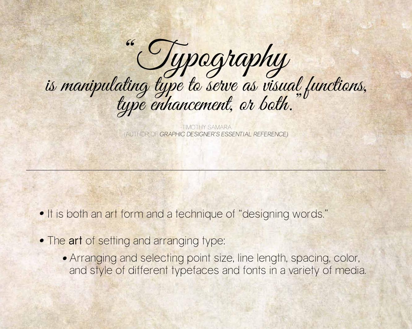
It is both an art form and a technique of “designing words.”
The art of setting and arranging type:
Arranging and selecting point size, line length, spacing, color, and style of different typefaces and fonts in a variety of media.
“Typographyis manipulating type to serve as visual functions,
type enhancement, or both.”
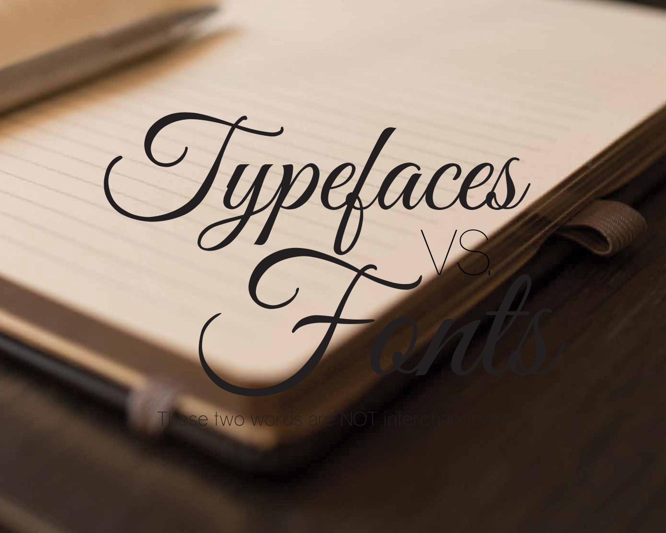
These two words are NOT interchangeable.
FontsTypefaces
VS.
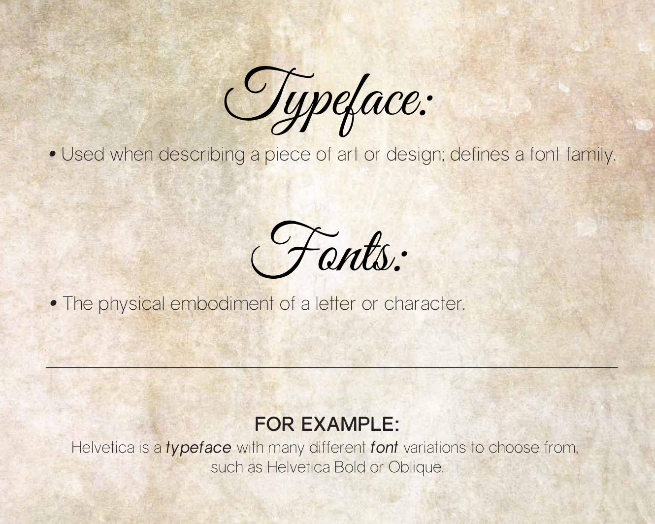
Used when describing a piece of art or design; defines a font family.
Typeface:
The physical embodiment of a letter or character.
Helvetica is a typeface with many different font variations to choose from, such as Helvetica Bold or Oblique.
Fonts:
FOR EXAMPLE:
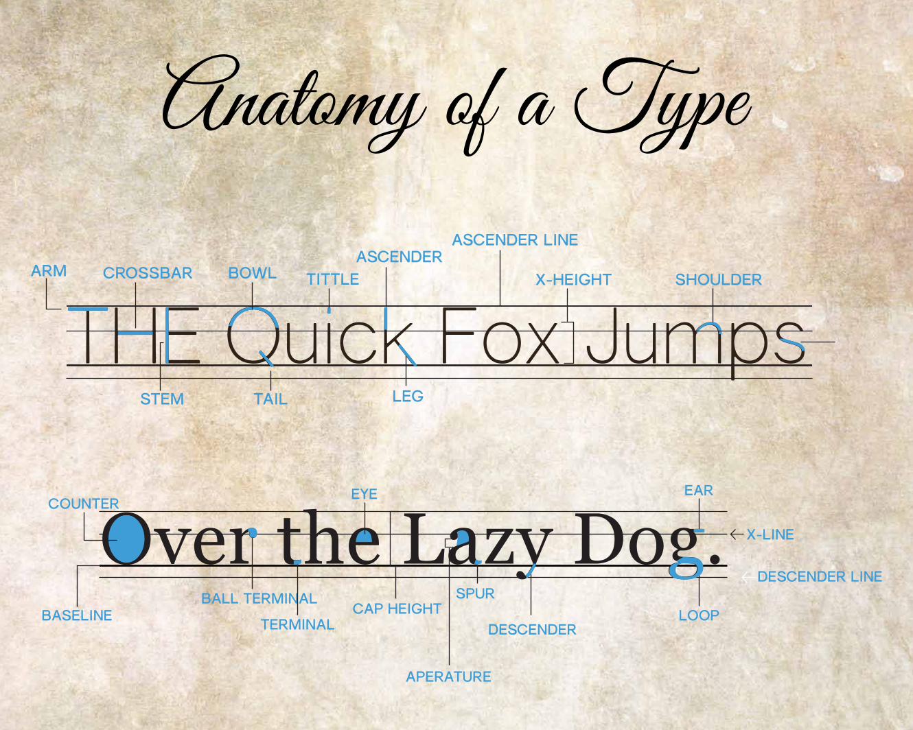
Anatomy of a Type
ARM
STEM
CROSSBAR TITTLEBOWL
TAIL
THE Quick Fox JumpsASCENDER
LEG
ASCENDER LINE
X-HEIGHT SHOULDER
COUNTER
BASELINEBALL TERMINAL
TERMINAL
EYE EAR
LOOP
DESCENDER LINE
DESCENDER
SPURCAP HEIGHT
X-LINEOver the Lazy Dog.
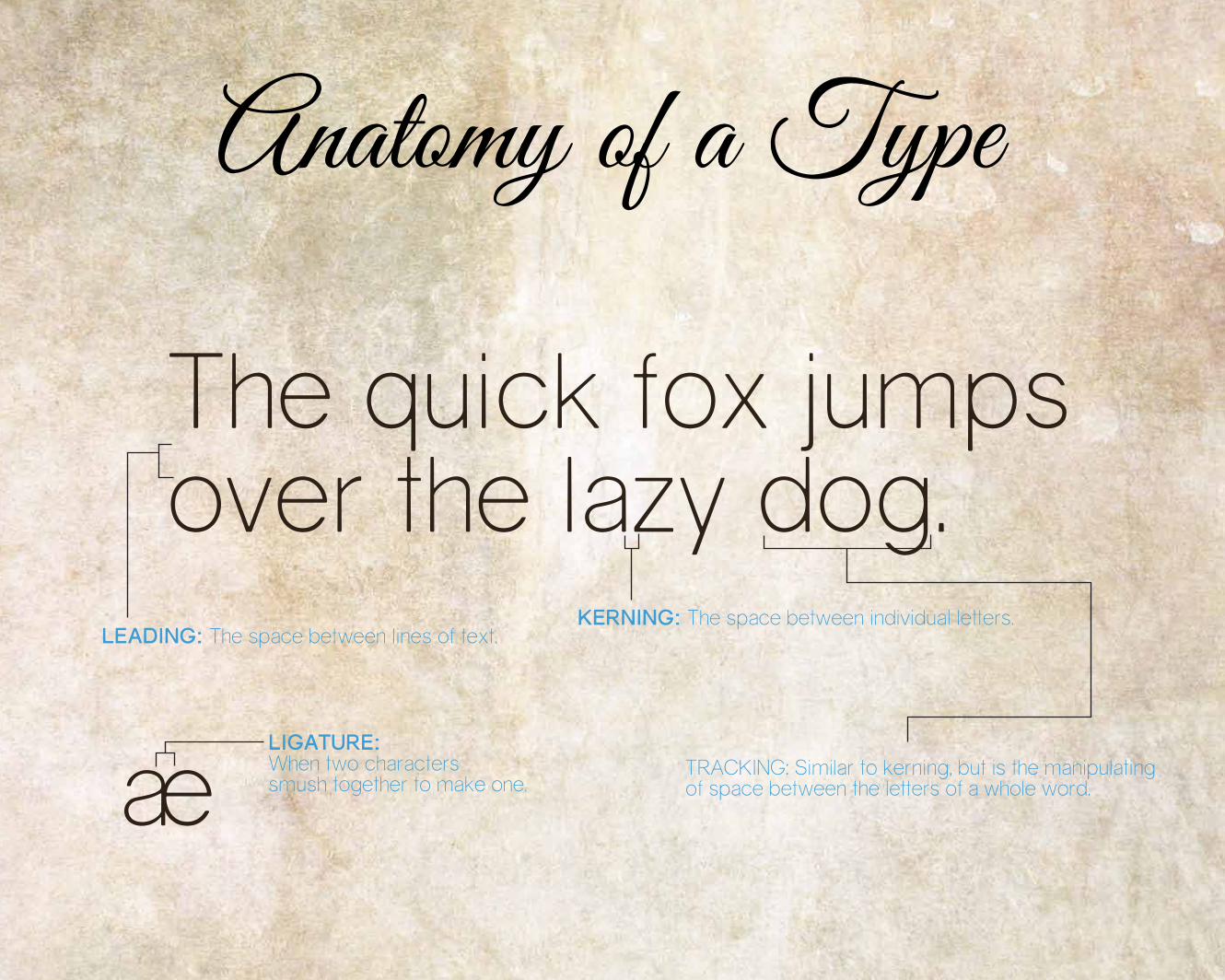
Anatomy of a Type
LEADING: The space between lines of text.
LIGATURE:When two characters smush together to make one.
KERNING: The space between individual letters.
TRACKING: Similar to kerning, but is the manipulatingof space between the letters of a whole word.ae
over the lazy dog. The quick fox jumps
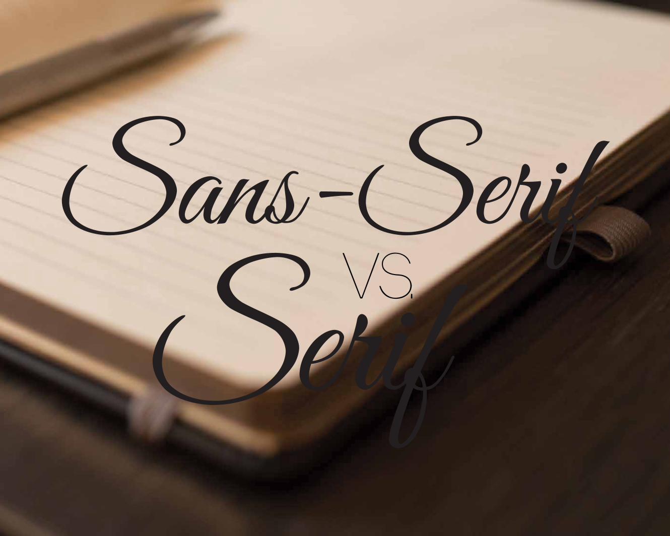
SerifSans-Serif
VS.
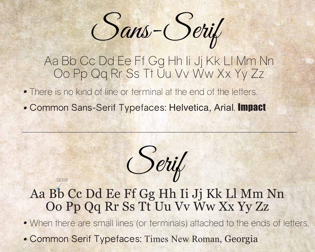
There is no kind of line or terminal at the end of the letters.
Common Sans-Serif Typefaces: Helvetica, Arial, Impact
When there are small lines (or terminals) attached to the ends of letters.
Common Serif Typefaces: Times New Roman, Georgia
SERIF
Aa Bb Cc Dd Ee Ff Gg Hh Ii Jj Kk Ll Mm NnOo Pp Qq Rr Ss Tt Uu Vv Ww Xx Yy Zz
Aa Bb Cc Dd Ee Ff Gg Hh Ii Jj Kk Ll Mm NnOo Pp Qq Rr Ss Tt Uu Vv Ww Xx Yy Zz
Sans-Serif
Serif
WHAT IS IT GOOD FOR?Typography:
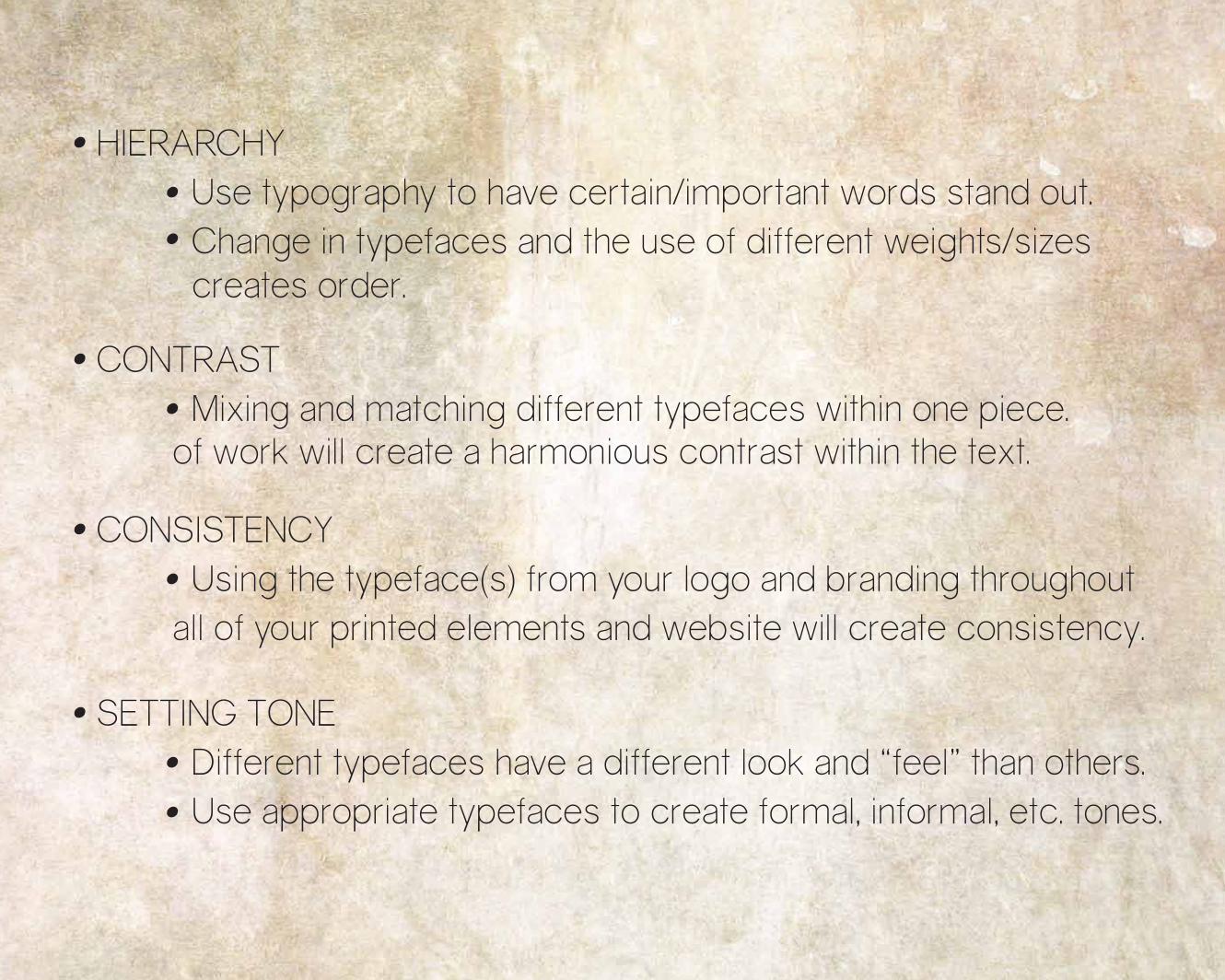
HIERARCHY Use typography to have certain/important words stand out. Change in typefaces and the use of different weights/sizes creates order.
CONSISTENCY Using the typeface(s) from your logo and branding throughout all of your printed elements and website will create consistency.
SETTING TONE Different typefaces have a different look and “feel” than others. Use appropriate typefaces to create formal, informal, etc. tones.
CONTRAST Mixing and matching different typefaces within one piece. of work will create a harmonious contrast within the text.
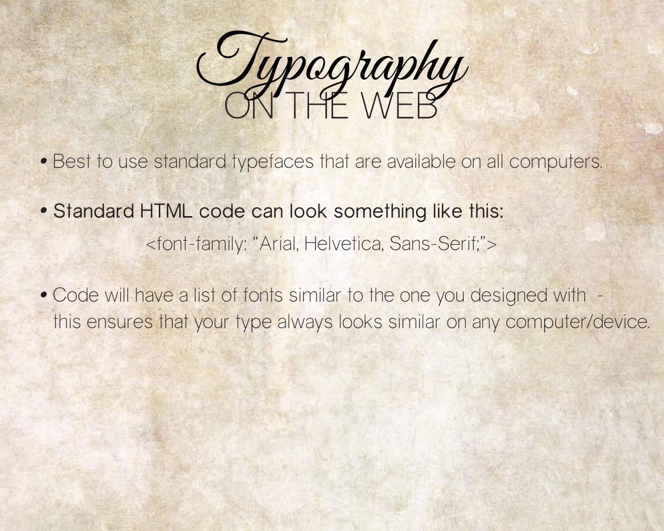
Best to use standard typefaces that are available on all computers.
Standard HTML code can look something like this::
<font-family: “Arial, Helvetica, Sans-Serif;”>
Code will have a list of fonts similar to the one you designed with -this ensures that your type always looks similar on any computer/device.
ON THE WEBTypography
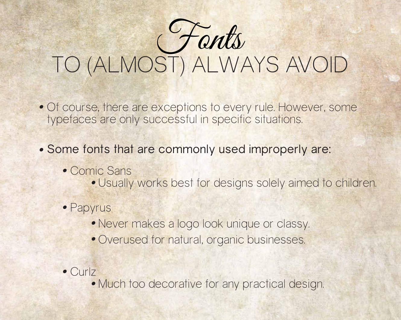
Comic Sans Usually works best for designs solely aimed to children.
Curlz Much too decorative for any practical design.
Papyrus Never makes a logo look unique or classy. Overused for natural, organic businesses.
Of course, there are exceptions to every rule. However, sometypefaces are only successful in specific situations.
Some fonts that are commonly used improperly are:
TO (ALMOST) ALWAYS AVOIDFonts
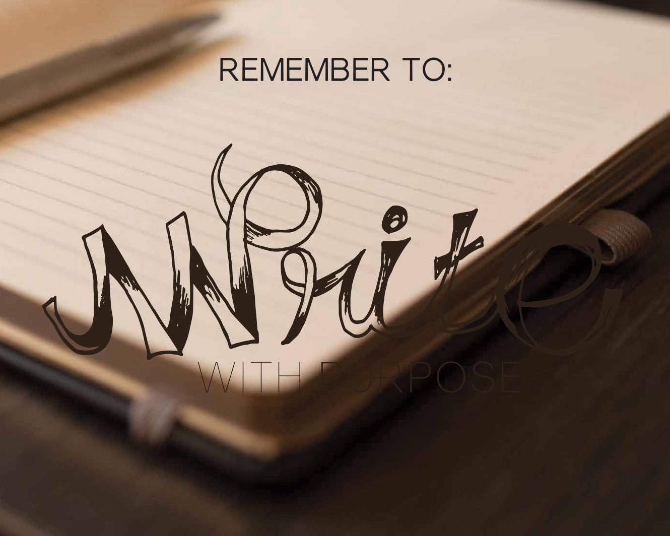
REMEMBER TO:
WITH PURPOSE

FROM, MAINSTREETHOSTwww.mainstreethost.com | 888-874-3791 | blog.mainstreethost.com
Thankyou!
Brought to you by:
http://blog.hubspot.com/marketing/typography-fonts-guide
http://blog.hubspot.com/marketing/typography-terms-introduction
http://www.practicalecommerce.com/articles/3052-Typography-101-The-Basics
https://www.americanexpress.com/us/small-business/openforum/articles/typography-101-what-small-business-owners-need-to-know/
Graphic Designer’s Essential Reference by Timothy Samara
Sources