tms fnc ui pack...tms fnc ui pack developers guide 19 adds a new ttmsfnctoolbarbutton with the...
TRANSCRIPT
TMS SOFTWARE
TMS FNC UI Pack DEVELOPERS GUIDE
1
TMS FNC UI Pack
DEVELOPERS GUIDE
December 2018 Copyright © 2016 - 2018 by tmssoftware.com bvba
Web: http://www.tmssoftware.com Email: [email protected]
TMS SOFTWARE
TMS FNC UI Pack DEVELOPERS GUIDE
2
Index
Availability ............................................................................................................................................... 5
List of available controls .......................................................................................................................... 6
TTMSFNCEdit ......................................................................................................................................... 13
TTMSFNCPopup ..................................................................................................................................... 14
TTMSFNCColorSelector / TTMSFNCColorPicker .................................................................................... 15
TTMSFNCBitmapSelector / TTMSFNCBitmapPicker .............................................................................. 15
TTMSFNCFontNamePicker / TTMSFNCFontSizePicker .......................................................................... 17
TTMSFNCToolBar ................................................................................................................................... 18
Set of components ........................................................................................................................ 18
Adding new components at designtime ........................................................................................ 19
Adding new components at runtime ............................................................................................ 20
Toolbar button .............................................................................................................................. 20
TTMSFNCTabSet / TTMSFNCPageControl ............................................................................................. 22
Adding new tabs ............................................................................................................................ 28
Removing tabs ............................................................................................................................... 28
Moving tabs ................................................................................................................................... 28
Modes ............................................................................................................................................ 29
Position .......................................................................................................................................... 29
Appearance ................................................................................................................................... 30
Interaction ..................................................................................................................................... 31
Reorder .......................................................................................................................................... 32
Editing ............................................................................................................................................ 32
Progress indication ........................................................................................................................ 33
Badges ........................................................................................................................................... 34
Custom drawing ............................................................................................................................ 34
PageControl ................................................................................................................................... 35
Performance .................................................................................................................................. 35
TTMSFNCListBox / TTMSFNCCheckedListBox ....................................................................................... 36
Adding new Items .......................................................................................................................... 39
Default Item ................................................................................................................................... 39
Appearance ................................................................................................................................... 40
Interaction ..................................................................................................................................... 40
Clipboard ....................................................................................................................................... 41
TMS SOFTWARE
TMS FNC UI Pack DEVELOPERS GUIDE
3
Reordering / Drag & Drop ............................................................................................................. 41
Filtering .......................................................................................................................................... 41
Sorting ........................................................................................................................................... 43
Customization ................................................................................................................................ 44
TTMSFNCRadioGroup / TTMSFNCRadioGroupPicker ............................................................................ 46
TTMSFNCCheckGroup / TTMSFNCCheckGroupPicker........................................................................... 46
TTMSFNCPanel ...................................................................................................................................... 47
TTMSFNCNavigationPanel ..................................................................................................................... 48
Adding new panels ........................................................................................................................ 51
Removing panels ........................................................................................................................... 51
Moving panels ............................................................................................................................... 52
Modes ............................................................................................................................................ 53
Compact Mode .............................................................................................................................. 54
Options Menu ................................................................................................................................ 54
Appearance ................................................................................................................................... 55
Badges ........................................................................................................................................... 56
TTMSFNCListEditor ................................................................................................................................ 58
Architecture ................................................................................................................................... 58
Appearance ................................................................................................................................... 58
Items .............................................................................................................................................. 59
Events ............................................................................................................................................ 59
TTMSFNCToolBarPopup ........................................................................................................................ 60
TTMSFNCHint ........................................................................................................................................ 61
TMSFNCAnalogTimeSelector / TMSFNCAnalogTimePicker ................................................................... 62
Time selection ............................................................................................................................... 62
Configuration ................................................................................................................................. 63
TMSNFCDigitalTimeSelector / TMSFNCDigitalTimePicker .................................................................... 65
Navigation ..................................................................................................................................... 65
Time selection ............................................................................................................................... 65
Configuration ................................................................................................................................. 66
TMSFNCFillKindSelector / TMSFNCFillKindPicker.................................................................................. 67
TMSFNCStrokeKindSelector / TMSFNCStrokeKindPicker ...................................................................... 68
TMSFNCColorWheel .............................................................................................................................. 69
TMS SOFTWARE
TMS FNC UI Pack DEVELOPERS GUIDE
4
Color selection ............................................................................................................................... 69
TMSFNCTaskDialog ................................................................................................................................ 71
Setting the dialog .......................................................................................................................... 71
Executing the dialog and retrieving the results ............................................................................. 73
TMSFNCStatusBar .................................................................................................................................. 76
Custom panel ................................................................................................................................. 76
Images ........................................................................................................................................... 76
Progress bar ................................................................................................................................... 76
TMSFNCSignatureCapture ..................................................................................................................... 78
Clearing the signature ................................................................................................................... 78
Saving the signature ...................................................................................................................... 78
Loading the signature .................................................................................................................... 79
Configuration ................................................................................................................................. 79
TMSFNCDateTimePicker ........................................................................................................................ 81
TMSFNCFontDialog ................................................................................................................................ 82
Executing and retrieving the results .............................................................................................. 83
TMSFNCIPEdit ........................................................................................................................................ 84
TMSFNCCheckBox ................................................................................................................................. 85
TMSFNCRadioButton ............................................................................................................................. 86
TTMSFNCTrackBar ................................................................................................................................. 87
TTMSFNCRangeSlider ............................................................................................................................ 89
TTMSFNCSpinEdit .................................................................................................................................. 90
TTMSFNCComboBox .............................................................................................................................. 91
TTMSFNCSwitch .................................................................................................................................... 93
TTMSFNCLabelEdit ................................................................................................................................ 94
Persistence ............................................................................................................................................ 95
Undo / Redo .......................................................................................................................................... 96
Styling .................................................................................................................................................. 100
TMS SOFTWARE
TMS FNC UI Pack DEVELOPERS GUIDE
5
Availability
Supported frameworks and platforms - VCL Win32/Win64 - FMX Win32/Win64, MacOS-X, iOS, Android - LCL Win32/Win64, Mac OS-X, iOS, Android, numerous Linux variants including Raspbian Supported IDE’s - Delphi XE7 and C++ Builder XE7 or newer releases - Lazarus 1.4.4 with FPC 2.6.4 or newer official releases. Important Notice: TMS FNC Blox requires TMS FNC Core (separately available at the My Products page)
TMS SOFTWARE
TMS FNC UI Pack DEVELOPERS GUIDE
6
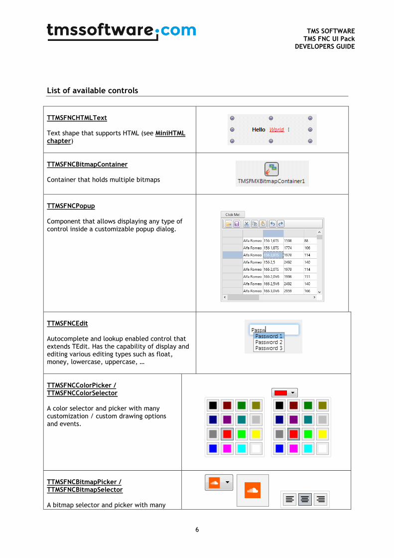
List of available controls
TTMSFNCHTMLText Text shape that supports HTML (see MiniHTML chapter)
TTMSFNCBitmapContainer Container that holds multiple bitmaps
TTMSFNCPopup Component that allows displaying any type of control inside a customizable popup dialog.
TTMSFNCEdit Autocomplete and lookup enabled control that extends TEdit. Has the capability of display and editing various editing types such as float, money, lowercase, uppercase, …
TTMSFNCColorPicker / TTMSFNCColorSelector A color selector and picker with many customization / custom drawing options and events.
TTMSFNCBitmapPicker / TTMSFNCBitmapSelector A bitmap selector and picker with many
TMS SOFTWARE
TMS FNC UI Pack DEVELOPERS GUIDE
7
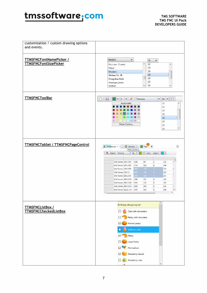
customization / custom drawing options and events.
TTMSFNCFontNamePicker / TTMSFNCFontSizePicker
TTMSFNCToolBar
TTMSFNCTabSet / TTMSFNCPageControl
TTMSFNCListBox / TTMSFNCCheckedListBox
TMS SOFTWARE
TMS FNC UI Pack DEVELOPERS GUIDE
8
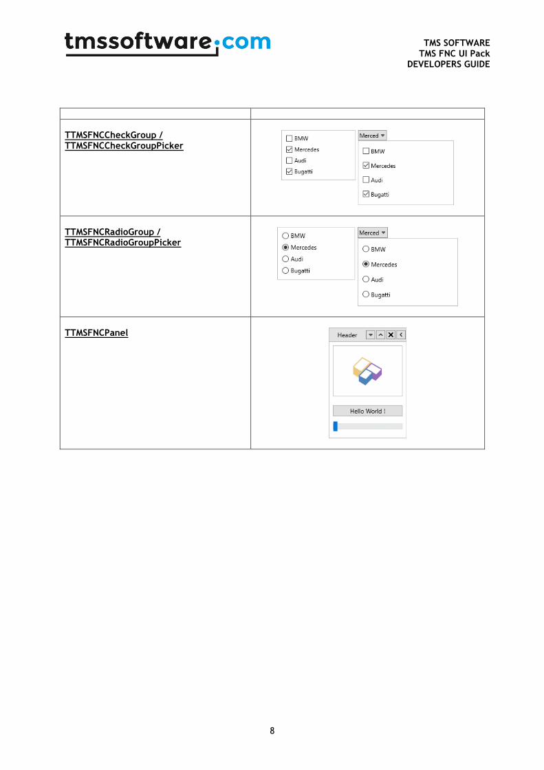
TTMSFNCCheckGroup / TTMSFNCCheckGroupPicker
TTMSFNCRadioGroup / TTMSFNCRadioGroupPicker
TTMSFNCPanel
TMS SOFTWARE
TMS FNC UI Pack DEVELOPERS GUIDE
9
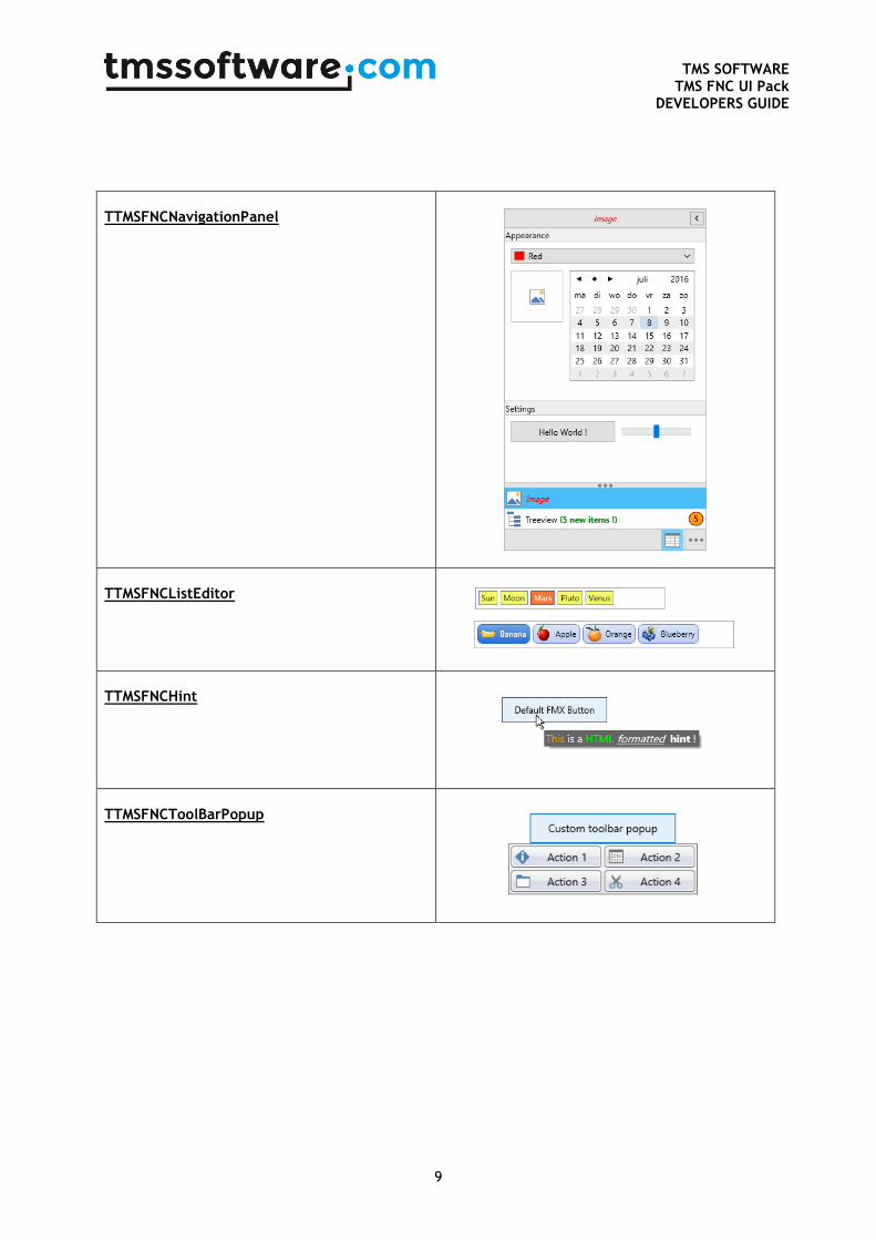
TTMSFNCNavigationPanel
TTMSFNCListEditor
TTMSFNCHint
TTMSFNCToolBarPopup
TMS SOFTWARE
TMS FNC UI Pack DEVELOPERS GUIDE
10
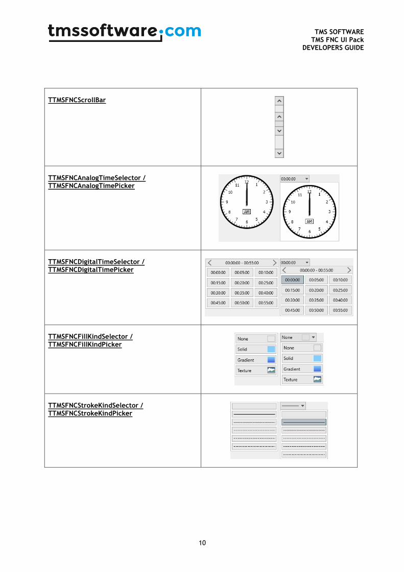
TTMSFNCScrollBar
TTMSFNCAnalogTimeSelector / TTMSFNCAnalogTimePicker
TTMSFNCDigitalTimeSelector / TTMSFNCDigitalTimePicker
TTMSFNCFillKindSelector / TTMSFNCFillKindPicker
TTMSFNCStrokeKindSelector / TTMSFNCStrokeKindPicker
TMS SOFTWARE
TMS FNC UI Pack DEVELOPERS GUIDE
11
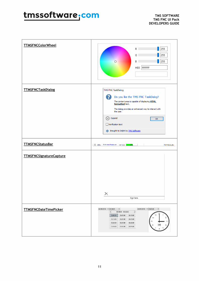
TTMSFNCColorWheel
TTMSFNCTaskDialog
TTMSFNCStatusBar
TTMSFNCSignatureCapture
TTMSFNCDateTimePicker
TMS SOFTWARE
TMS FNC UI Pack DEVELOPERS GUIDE
12
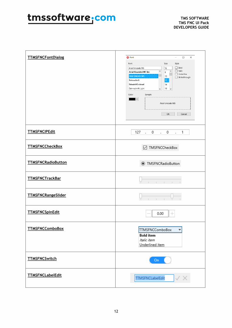
TTMSFNCFontDialog
TTMSFNCIPEdit
TTMSFNCCheckBox
TTMSFNCRadioButton
TTMSFNCTrackBar
TTMSFNCRangeSlider
TTMSFNCSpinEdit
TTMSFNCComboBox
TTMSFNCSwitch
TTMSFNCLabelEdit

TMS SOFTWARE
TMS FNC UI Pack DEVELOPERS GUIDE
13
TTMSFNCEdit
TTMSFNCEdit extends TEdit and adds several capabilities such as autocompletion, Lookup and supports edit types such as alphanumeric, numeric, float, uppercase, lowercase, money, …. The lookuplist can be enabled by setting the enabled property to true: TMSFNCEdit1.Lookup.Enabled := True;
To display the list while typing, items can be added to the displaylist. The amount of displayed
items when typing can be controlled with TMSFNCEdit1.Lookup.DisplayCount. TMSFNCEdit1.Lookup.DisplayList.Add('abs');
TMSFNCEdit1.Lookup.DisplayList.Add('Item 1');
TMSFNCEdit1.Lookup.DisplayList.Add('Hello World !');
When typing, the list shows after 2 characters, with the property
TMSFNCEdit1.Lookup.NumChars this can be modified. When typing text, the text that is typed
can also be automatically added to the list by setting TMSFNCEdit1.Lookup.History to true.
Autocompletion can be actived with TMSFNCEdit1.AutoComplete := True; The edit automatically displays the item that matches the characters typed in the edit. TMSFNCEdit1.AutoComplete := True;
TMSFNCEdit1.Lookup.DisplayList.Add('Hello World !');
The text in the edit can be displayed as password characters by setting TMSFNCEdit1.Password := True;
TMS SOFTWARE
TMS FNC UI Pack DEVELOPERS GUIDE
14
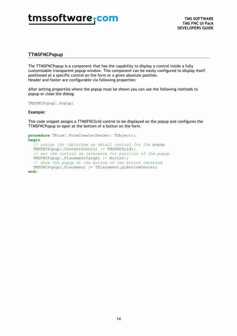
TTMSFNCPopup
The TTMSFNCPopup is a component that has the capability to display a control inside a fully customizable transparent popup window. This component can be easily configured to display itself positioned at a specific control on the form or a given absolute position. Header and footer are configurable via following properties: After setting properties where the popup must be shown you can use the following methods to popup or close the dialog: TMSFNCPopup1.Popup;
Example: This code snippet assigns a TTMSFNCGrid control to be displayed on the popup and configures the TTMSFNCPopup to open at the bottom of a button on the form. procedure TForm1.FormCreate(Sender: TObject);
begin
// assign the tableview as detail control for the popup
TMSFNCPopup1.ContentControl := TMSFNCGrid1;
// set the control as reference for position of the popup
TMSFNCPopup1.PlacementTarget := Button1;
// show the popup at the bottom of the button centered
TMSFNCPopup1.Placement := TPlacement.plBottomCenter;
end;
TMS SOFTWARE
TMS FNC UI Pack DEVELOPERS GUIDE
15
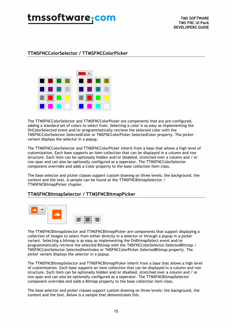
TTMSFNCColorSelector / TTMSFNCColorPicker
The TTMSFNCColorSelector and TTMSFNCColorPicker are components that are pre-configured, adding a standard set of colors to select from. Selecting a color is as easy as implementing the OnColorSelected event and/or programmatically retrieve the selected color with the TMSFNCColorSelector.SelectedColor or TMSFNCColorPicker.SelectedColor property. The picker variant displays the selector in a popup. The TTMSFNCColorSelector and TTMSFNCColorPicker inherit from a base that allows a high level of customization. Each base supports an item collection that can be displayed in a column and row structure. Each item can be optionally hidden and/or disabled, stretched over a column and / or row span and can also be optionally configured as a seperator. The TTMSFNCColorSelector component overrides and adds a Color property to the base collection item class. The base selector and picker classes support custom drawing on three levels: the background, the content and the text. A sample can be found at the TTMSFNCBitmapSelector / TTMSFNCBitmapPicker chapter.
TTMSFNCBitmapSelector / TTMSFNCBitmapPicker
The TTMSFNCBitmapSelector and TTMSFNCBitmapPicker are components that support displaying a collection of images to select from either directly in a selector or through a popup in a picker variant. Selecting a bitmap is as easy as implementing the OnBitmapSelect event and/or programmatically retrieve the selected Bitmap with the TMSFNCColorSelector.SelectedBitmap / TMSFNCColorSelector.SelectedItemIndex or TMSFNCColorPicker.SelectedBitmap property. The picker variant displays the selector in a popup. The TTMSFNCBitmapSelector and TTMSFNCBitmapPicker inherit from a base that allows a high level of customization. Each base supports an item collection that can be displayed in a column and row structure. Each item can be optionally hidden and/or disabled, stretched over a column and / or row span and can also be optionally configured as a seperator. The TTMSFNCBitmapSelector component overrides and adds a Bitmap property to the base collection item class. The base selector and picker classes support custom drawing on three levels: the background, the content and the text. Below is a sample that demonstrates this.
TMS SOFTWARE
TMS FNC UI Pack DEVELOPERS GUIDE
16
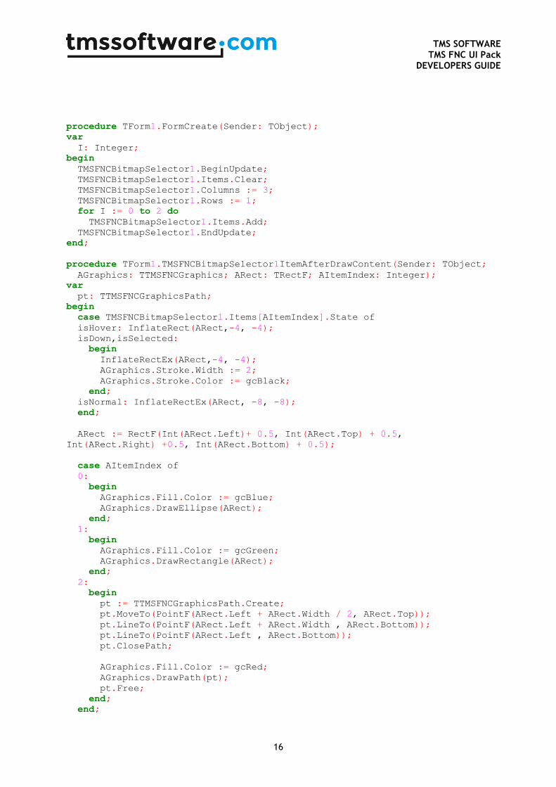
procedure TForm1.FormCreate(Sender: TObject);
var
I: Integer;
begin
TMSFNCBitmapSelector1.BeginUpdate;
TMSFNCBitmapSelector1.Items.Clear;
TMSFNCBitmapSelector1.Columns := 3;
TMSFNCBitmapSelector1.Rows := 1;
for I := 0 to 2 do
TMSFNCBitmapSelector1.Items.Add;
TMSFNCBitmapSelector1.EndUpdate;
end;
procedure TForm1.TMSFNCBitmapSelector1ItemAfterDrawContent(Sender: TObject;
AGraphics: TTMSFNCGraphics; ARect: TRectF; AItemIndex: Integer);
var
pt: TTMSFNCGraphicsPath;
begin
case TMSFNCBitmapSelector1.Items[AItemIndex].State of
isHover: InflateRect(ARect,-4, -4);
isDown,isSelected:
begin
InflateRectEx(ARect,-4, -4);
AGraphics.Stroke.Width := 2;
AGraphics.Stroke.Color := gcBlack;
end;
isNormal: InflateRectEx(ARect, -8, -8);
end;
ARect := RectF(Int(ARect.Left)+ 0.5, Int(ARect.Top) + 0.5,
Int(ARect.Right) +0.5, Int(ARect.Bottom) + 0.5);
case AItemIndex of
0:
begin
AGraphics.Fill.Color := gcBlue;
AGraphics.DrawEllipse(ARect);
end;
1:
begin
AGraphics.Fill.Color := gcGreen;
AGraphics.DrawRectangle(ARect);
end;
2:
begin
pt := TTMSFNCGraphicsPath.Create;
pt.MoveTo(PointF(ARect.Left + ARect.Width / 2, ARect.Top));
pt.LineTo(PointF(ARect.Left + ARect.Width , ARect.Bottom));
pt.LineTo(PointF(ARect.Left , ARect.Bottom));
pt.ClosePath;
AGraphics.Fill.Color := gcRed;
AGraphics.DrawPath(pt);
pt.Free;
end;
end;
TMS SOFTWARE
TMS FNC UI Pack DEVELOPERS GUIDE
17
end;
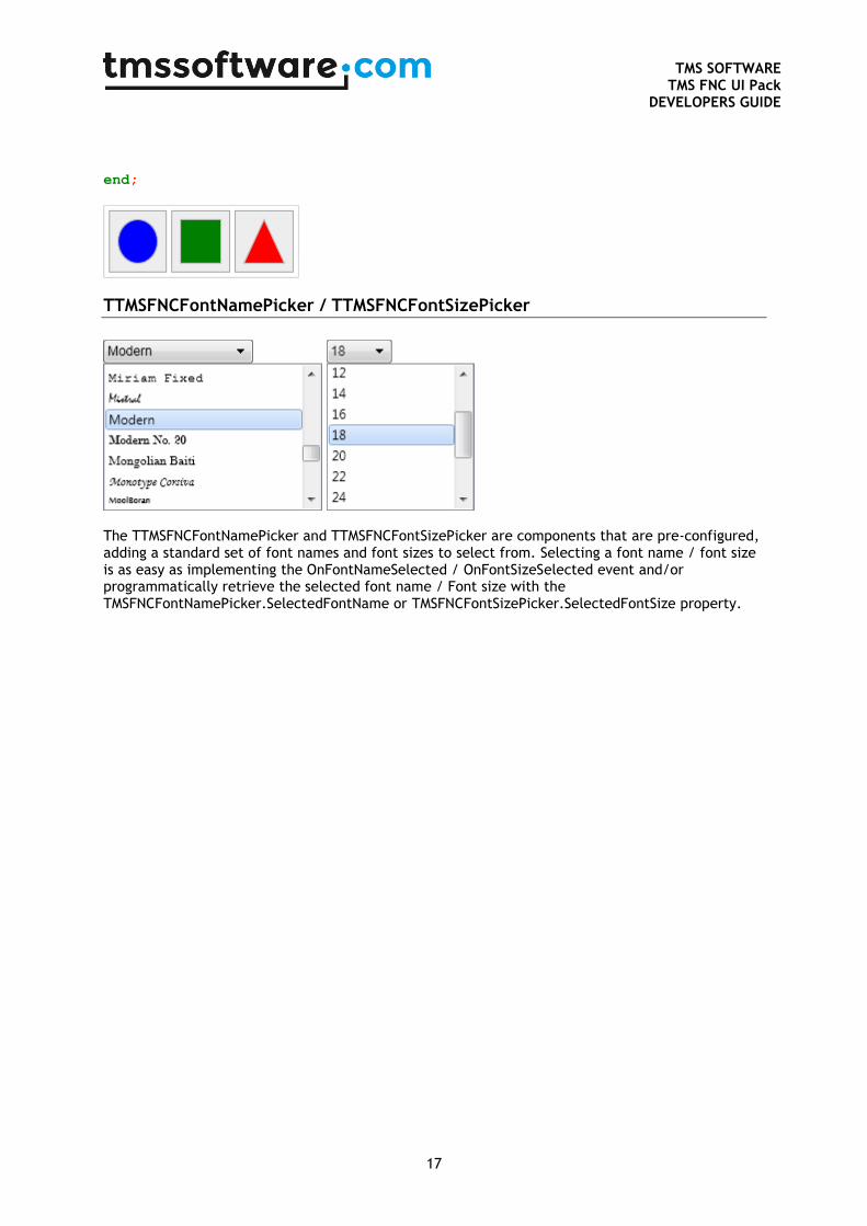
TTMSFNCFontNamePicker / TTMSFNCFontSizePicker
The TTMSFNCFontNamePicker and TTMSFNCFontSizePicker are components that are pre-configured, adding a standard set of font names and font sizes to select from. Selecting a font name / font size is as easy as implementing the OnFontNameSelected / OnFontSizeSelected event and/or programmatically retrieve the selected font name / Font size with the TMSFNCFontNamePicker.SelectedFontName or TMSFNCFontSizePicker.SelectedFontSize property.
TMS SOFTWARE
TMS FNC UI Pack DEVELOPERS GUIDE
18
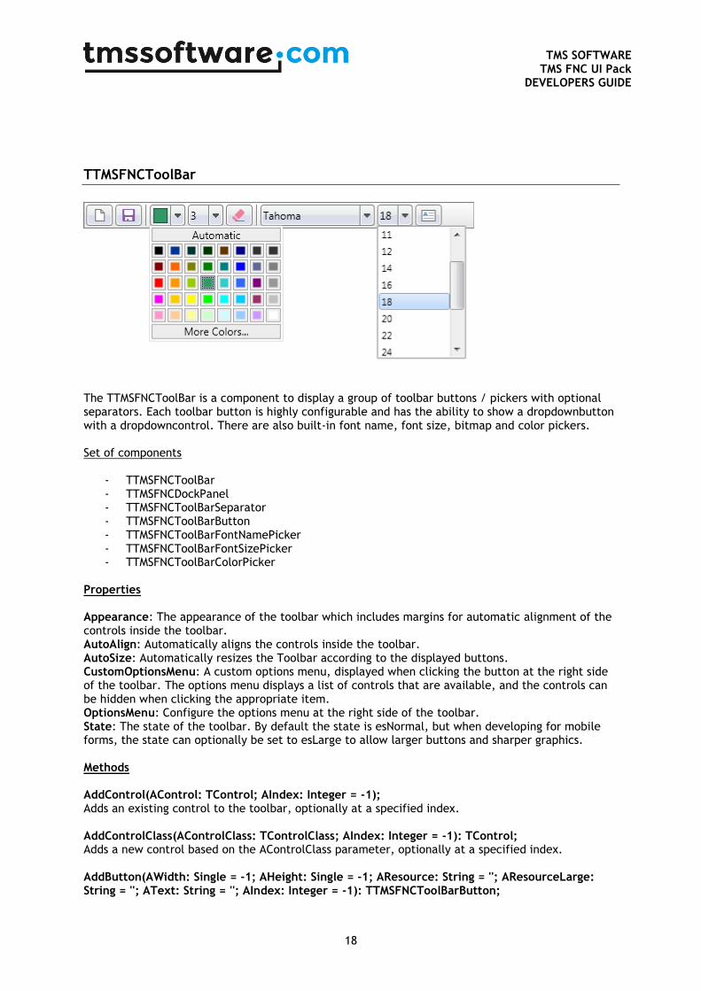
TTMSFNCToolBar
The TTMSFNCToolBar is a component to display a group of toolbar buttons / pickers with optional separators. Each toolbar button is highly configurable and has the ability to show a dropdownbutton with a dropdowncontrol. There are also built-in font name, font size, bitmap and color pickers. Set of components
- TTMSFNCToolBar - TTMSFNCDockPanel - TTMSFNCToolBarSeparator - TTMSFNCToolBarButton - TTMSFNCToolBarFontNamePicker - TTMSFNCToolBarFontSizePicker - TTMSFNCToolBarColorPicker
Properties Appearance: The appearance of the toolbar which includes margins for automatic alignment of the controls inside the toolbar. AutoAlign: Automatically aligns the controls inside the toolbar. AutoSize: Automatically resizes the Toolbar according to the displayed buttons. CustomOptionsMenu: A custom options menu, displayed when clicking the button at the right side of the toolbar. The options menu displays a list of controls that are available, and the controls can be hidden when clicking the appropriate item. OptionsMenu: Configure the options menu at the right side of the toolbar. State: The state of the toolbar. By default the state is esNormal, but when developing for mobile forms, the state can optionally be set to esLarge to allow larger buttons and sharper graphics. Methods AddControl(AControl: TControl; AIndex: Integer = -1); Adds an existing control to the toolbar, optionally at a specified index. AddControlClass(AControlClass: TControlClass; AIndex: Integer = -1): TControl; Adds a new control based on the AControlClass parameter, optionally at a specified index. AddButton(AWidth: Single = -1; AHeight: Single = -1; AResource: String = ''; AResourceLarge: String = ''; AText: String = ''; AIndex: Integer = -1): TTMSFNCToolBarButton;
TMS SOFTWARE
TMS FNC UI Pack DEVELOPERS GUIDE
19
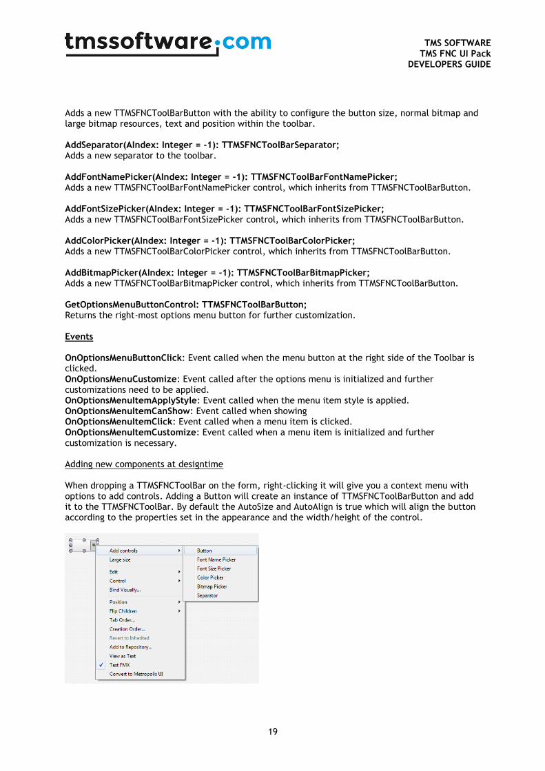
Adds a new TTMSFNCToolBarButton with the ability to configure the button size, normal bitmap and large bitmap resources, text and position within the toolbar. AddSeparator(AIndex: Integer = -1): TTMSFNCToolBarSeparator; Adds a new separator to the toolbar. AddFontNamePicker(AIndex: Integer = -1): TTMSFNCToolBarFontNamePicker; Adds a new TTMSFNCToolBarFontNamePicker control, which inherits from TTMSFNCToolBarButton. AddFontSizePicker(AIndex: Integer = -1): TTMSFNCToolBarFontSizePicker; Adds a new TTMSFNCToolBarFontSizePicker control, which inherits from TTMSFNCToolBarButton. AddColorPicker(AIndex: Integer = -1): TTMSFNCToolBarColorPicker; Adds a new TTMSFNCToolBarColorPicker control, which inherits from TTMSFNCToolBarButton. AddBitmapPicker(AIndex: Integer = -1): TTMSFNCToolBarBitmapPicker; Adds a new TTMSFNCToolBarBitmapPicker control, which inherits from TTMSFNCToolBarButton. GetOptionsMenuButtonControl: TTMSFNCToolBarButton; Returns the right-most options menu button for further customization. Events OnOptionsMenuButtonClick: Event called when the menu button at the right side of the Toolbar is clicked. OnOptionsMenuCustomize: Event called after the options menu is initialized and further customizations need to be applied. OnOptionsMenuItemApplyStyle: Event called when the menu item style is applied. OnOptionsMenuItemCanShow: Event called when showing OnOptionsMenuItemClick: Event called when a menu item is clicked. OnOptionsMenuItemCustomize: Event called when a menu item is initialized and further customization is necessary. Adding new components at designtime When dropping a TTMSFNCToolBar on the form, right-clicking it will give you a context menu with options to add controls. Adding a Button will create an instance of TTMSFNCToolBarButton and add it to the TTMSFNCToolBar. By default the AutoSize and AutoAlign is true which will align the button according to the properties set in the appearance and the width/height of the control.
TMS SOFTWARE
TMS FNC UI Pack DEVELOPERS GUIDE
20
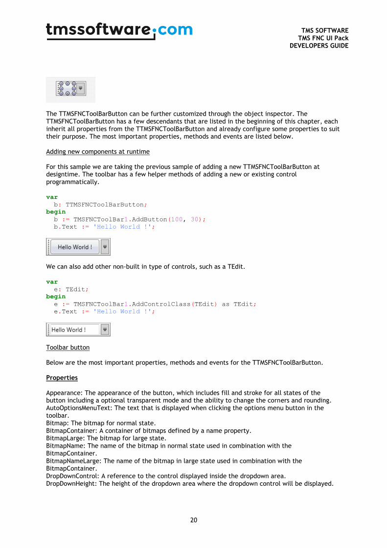
The TTMSFNCToolBarButton can be further customized through the object inspector. The TTMSFNCToolBarButton has a few descendants that are listed in the beginning of this chapter, each inherit all properties from the TTMSFNCToolBarButton and already configure some properties to suit their purpose. The most important properties, methods and events are listed below. Adding new components at runtime For this sample we are taking the previous sample of adding a new TTMSFNCToolBarButton at designtime. The toolbar has a few helper methods of adding a new or existing control programmatically. var
b: TTMSFNCToolBarButton;
begin
b := TMSFNCToolBar1.AddButton(100, 30);
b.Text := 'Hello World !';
We can also add other non-built in type of controls, such as a TEdit. var
e: TEdit;
begin
e := TMSFNCToolBar1.AddControlClass(TEdit) as TEdit;
e.Text := 'Hello World !';
Toolbar button Below are the most important properties, methods and events for the TTMSFNCToolBarButton. Properties Appearance: The appearance of the button, which includes fill and stroke for all states of the button including a optional transparent mode and the ability to change the corners and rounding. AutoOptionsMenuText: The text that is displayed when clicking the options menu button in the toolbar. Bitmap: The bitmap for normal state. BitmapContainer: A container of bitmaps defined by a name property. BitmapLarge: The bitmap for large state. BitmapName: The name of the bitmap in normal state used in combination with the BitmapContainer. BitmapNameLarge: The name of the bitmap in large state used in combination with the BitmapContainer. DropDownControl: A reference to the control displayed inside the dropdown area. DropDownHeight: The height of the dropdown area where the dropdown control will be displayed.
TMS SOFTWARE
TMS FNC UI Pack DEVELOPERS GUIDE
21
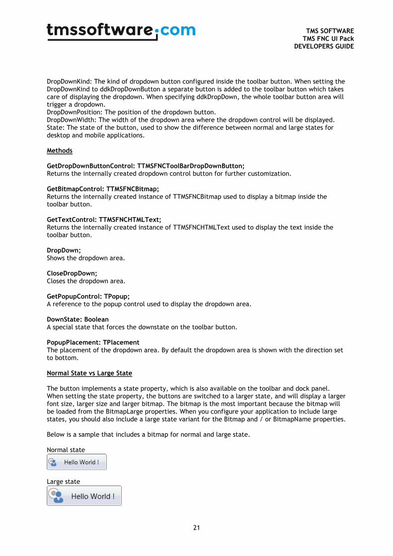
DropDownKind: The kind of dropdown button configured inside the toolbar button. When setting the DropDownKind to ddkDropDownButton a separate button is added to the toolbar button which takes care of displaying the dropdown. When specifying ddkDropDown, the whole toolbar button area will trigger a dropdown. DropDownPosition: The position of the dropdown button. DropDownWidth: The width of the dropdown area where the dropdown control will be displayed. State: The state of the button, used to show the difference between normal and large states for desktop and mobile applications. Methods GetDropDownButtonControl: TTMSFNCToolBarDropDownButton; Returns the internally created dropdown control button for further customization. GetBitmapControl: TTMSFNCBitmap; Returns the internally created instance of TTMSFNCBitmap used to display a bitmap inside the toolbar button. GetTextControl: TTMSFNCHTMLText; Returns the internally created instance of TTMSFNCHTMLText used to display the text inside the toolbar button. DropDown; Shows the dropdown area. CloseDropDown; Closes the dropdown area. GetPopupControl: TPopup; A reference to the popup control used to display the dropdown area. DownState: Boolean A special state that forces the downstate on the toolbar button. PopupPlacement: TPlacement The placement of the dropdown area. By default the dropdown area is shown with the direction set to bottom. Normal State vs Large State The button implements a state property, which is also available on the toolbar and dock panel. When setting the state property, the buttons are switched to a larger state, and will display a larger font size, larger size and larger bitmap. The bitmap is the most important because the bitmap will be loaded from the BitmapLarge properties. When you configure your application to include large states, you should also include a large state variant for the Bitmap and / or BitmapName properties. Below is a sample that includes a bitmap for normal and large state. Normal state
Large state

TMS SOFTWARE
TMS FNC UI Pack DEVELOPERS GUIDE
22
TTMSFNCTabSet / TTMSFNCPageControl
Properties
ActivePageIndex/ActiveTabIndex Property to get or set the active page/tab.
BitmapContainer Property to assign a TTMSFNCBitmapContainer instance in order to retrieve bitmaps via a name.
ButtonAppearance Appearance of the scroll, insert and close buttons in the menu.
ButtonAppearance DisabledFill The fill appearance of a button in disabled state.
ButtonAppearance DisabledStroke The stroke appearance of a button in disabled state.
ButtonAppearance DownFill The fill appearance of a button in down state.
ButtonAppearance DownStroke The stroke appearance of a button in down state.
ButtonAppearance Fill The fill appearance of a button in normal state.
ButtonAppearance HoverFill The fill appearance of a button in hover state.
ButtonAppearance HoverStroke The stroke appearance of a button in hover state.
ButtonAppearance InsertIcon The icon of the insert button when the insert button is shown in the menu or as an additional tab.
ButtonAppearance ScrollNextIcon The icon of the scroll to next tab button in the menu.
ButtonAppearance ScrollPreviousIcon The icon of the scroll to previous tab button in the menu.
TMS SOFTWARE
TMS FNC UI Pack DEVELOPERS GUIDE
23
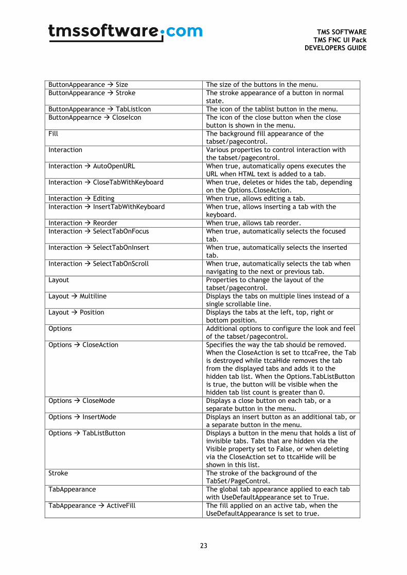
ButtonAppearance Size The size of the buttons in the menu.
ButtonAppearance Stroke The stroke appearance of a button in normal state.
ButtonAppearance TabListIcon The icon of the tablist button in the menu.
ButtonAppearnce CloseIcon The icon of the close button when the close button is shown in the menu.
Fill The background fill appearance of the tabset/pagecontrol.
Interaction Various properties to control interaction with the tabset/pagecontrol.
Interaction AutoOpenURL When true, automatically opens executes the URL when HTML text is added to a tab.
Interaction CloseTabWithKeyboard When true, deletes or hides the tab, depending on the Options.CloseAction.
Interaction Editing When true, allows editing a tab.
Interaction InsertTabWithKeyboard When true, allows inserting a tab with the keyboard.
Interaction Reorder When true, allows tab reorder.
Interaction SelectTabOnFocus When true, automatically selects the focused tab.
Interaction SelectTabOnInsert When true, automatically selects the inserted tab.
Interaction SelectTabOnScroll When true, automatically selects the tab when navigating to the next or previous tab.
Layout Properties to change the layout of the tabset/pagecontrol.
Layout Multiline Displays the tabs on multiple lines instead of a single scrollable line.
Layout Position Displays the tabs at the left, top, right or bottom position.
Options Additional options to configure the look and feel of the tabset/pagecontrol.
Options CloseAction Specifies the way the tab should be removed. When the CloseAction is set to ttcaFree, the Tab is destroyed while ttcaHide removes the tab from the displayed tabs and adds it to the hidden tab list. When the Options.TabListButton is true, the button will be visible when the hidden tab list count is greater than 0.
Options CloseMode Displays a close button on each tab, or a separate button in the menu.
Options InsertMode Displays an insert button as an additional tab, or a separate button in the menu.
Options TabListButton Displays a button in the menu that holds a list of invisible tabs. Tabs that are hidden via the Visible property set to False, or when deleting via the CloseAction set to ttcaHide will be shown in this list.
Stroke The stroke of the background of the TabSet/PageControl.
TabAppearance The global tab appearance applied to each tab with UseDefaultAppearance set to True.
TabAppearance ActiveFill The fill applied on an active tab, when the UseDefaultAppearance is set to true.

TMS SOFTWARE
TMS FNC UI Pack DEVELOPERS GUIDE
24
TabAppearance ActiveStroke The stroke applied on an active tab, when the UseDefaultAppearance is set to True.
TabAppearance ActiveTextColor The text color of an active tab, used when the UseDefaultAppearance is set to True.
TabAppearance BadgeFill The fill of the badge, used when the UseDefaultAppearance is set to True.
TabAppearance BadgeFont The font of the badge.
TabAppearance BadgeStroke The stroke of the badge, used when the UseDefaultAppearance is set to True.
TabAppearance CloseDownFill The fill of the tab close button in down state, used when the UseDefaultAppearance is set to True.
TabAppearance CloseDownStroke The stroke of the tab close button in down state, used when the UseDefaultAppearance is set to True.
TabAppearance CloseFill The fill of the tab close button in normal state, used when the UseDefaultAppearance is set to True.
TabAppearance CloseHoverFill The fill of the tab close button in hover state, used when the UseDefaultAppearance is set to True.
TabAppearance CloseHoverStroke The stroke of the tab close button in hover state, used when the UseDefaultAppearance is set to True.
TabAppearance CloseSize The size of the tab close button.
TabAppearance CloseStroke The stroke of the tab close button in normal state, used when the UseDefaultAppearance is set to True.
TabAppearance DisabledFill The fill of the tab in disabled state, used when the UseDefaultAppearance is set to True.
TabAppearance DisabledStroke The stroke of the tab in disable state, used when the UseDefaultAppearance is set to True.
TabAppearance DisabledTextColor The text color of the tab in disabled state, used when the UseDefaultAppearance is set to True.
TabAppearance DownFill The fill of the tab in down state, used when the UseDefaultAppearance is set to True.
TabAppearance DownStroke The stroke of the tab in down state, used when the UseDefaultAppearance is set to True.
TabAppearance DownTextColor The text color of the tab in disabled state, used when the UseDefaultAppearance is set to True.
TabAppearance Fill The fill of the tab in normal state, used when the UseDefaultAppearance is set to True.
TabAppearance FocusedBorderColor The border color of the rectangle drawn on a focused tab.
TabAppearance Font The font of a tab.
TabAppearance HoverFill The fill of the tab in hover state, used when the UseDefaultAppearance is set to True.
TabAppearance HoverStroke The stroke of the tab in hover state, used when the UseDefaultAppearance is set to True.
TabAppearance HoverTextColor The text color of a tab in hover state, used when the UseDefaultAppearance is set to True.
TabAppearance InsertSize The size of the insert tab button.
TabAppearance ProgressCircularSize The size of the circular progress indicator.
TabAppearance ProgressFill The fill of the progress indicator, used when the

TMS SOFTWARE
TMS FNC UI Pack DEVELOPERS GUIDE
25
UseDefaultAppearance is set to True.
TabAppearance ProgressStroke The stroke of the progress indicator, used when the UseDefaultAppearance is set to True.
TabAppearance Shape The default shape of the tab, used when the UseDefaultAppearance is set to True.
TabAppearance ShapeOverlap The tab shape overlapping.
TabAppearance ShapeRounding The tab shape rounding.
TabAppearance ShapeSlope The tab shape slope.
TabAppearance ShowFocus Shows or hides rectangle drawing on a focused tab.
TabAppearance Stroke The stroke of a tab in normal state, used when the UseDefaultAppearance is set to True.
TabAppearance TextAlign The alignment of the text of a tab, used when the UseDefaultAppearance is set to True.
TabAppearance TextColor The color of the text of a tab in normal state, used when the UseDefaultAppearance is set to True.
TabAppearance Trimming The trimming of the text of a tab, used when the UseDefaultAppearance is set to True.
TabAppearance WordWrapping The wordwrapping of the text of a tab, used when the UseDefaultAppearance is set to True.
Tabs BadgeColor The color of the badge, used when UseDefaultAppearance is set to False.
Tabs / Pages A collection used to add / remove new or existing tabs / pages.
Tabs[Index] ActiveColor The color of a tab in active state, used when UseDefaultAppearance is set to False.
Tabs[Index] ActiveTextColor The color of the text of a tab in active state, used when UseDefaultAppearance is set to False.
Tabs[Index] Badge The badge of the tab, shown in the upper right corner.
Tabs[Index] BadgeTextColor The text color of the badge, used when UseDefaultAppearance is set to False.
Tabs[Index] Bitmaps The bitmap of the badge, multiple bitmaps can be added with a different scale to support different DPI settings.
Tabs[Index] BitmapSize The size of the bitmap.
Tabs[Index] BitmapVisible Shows or hides the bitmap.
Tabs[Index] CloseButton Shows or hides the close button, when Options.CloseMode is set to tcmTab.
Tabs[Index] Color The color of a tab in normal state, used when UseDefaultAppearance is set to False.
Tabs[Index] DisabledBitmaps The bitmap of the badge in disabled state, multiple bitmaps can be added with a different scale to support different DPI settings.
Tabs[Index] DisabledColor The color of a tab in disabled state, used when UseDefaultAppearance is set to False.
Tabs[Index] DownColor The color of a tab in down state, used when UseDefaultAppearance is set to False.
Tabs[Index] DownTextColor The color of the text of a tab in down state, used when UseDefaultAppearance is set to False.
Tabs[Index] Enabled Enables or disables the tab.
TMS SOFTWARE
TMS FNC UI Pack DEVELOPERS GUIDE
26
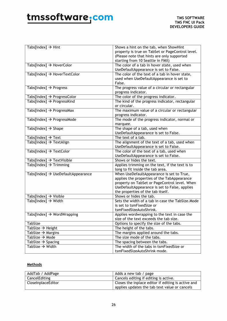
Tabs[Index] Hint Shows a hint on the tab, when ShowHint property is true on TabSet or PageControl level. (Please note that hints are only supported starting from 10 Seattle in FMX)
Tabs[Index] HoverColor The color of a tab in hover state, used when UseDefaultAppearance is set to False.
Tabs[Index] HoverTextColor The color of the text of a tab in hover state, used when UseDefaultAppearance is set to False.
Tabs[Index] Progress The progress value of a circular or rectangular progress indicator.
Tabs[Index] ProgressColor The color of the progress indicator.
Tabs[Index] ProgressKind The kind of the progress indicator, rectangular or circular.
Tabs[Index] ProgressMax The maximum value of a circular or rectangular progress indicator.
Tabs[Index] ProgressMode The mode of the progress indicator, normal or marquee.
Tabs[Index] Shape The shape of a tab, used when UseDefaultAppearance is set to False.
Tabs[Index] Text The text of a tab.
Tabs[Index] TextAlign The alignment of the text of a tab, used when UseDefaultAppearance is set to False.
Tabs[Index] TextColor The color of the text of a tab, used when UseDefaultAppearance is set to False.
Tabs[Index] TextVisible Shows or hides the text.
Tabs[Index] Trimming Applies trimming on the text, if the text is to long to fit inside the tab area.
Tabs[Index] UseDefaultAppearance When UseDefaultAppearance is set to True, applies the properties of the TabAppearance property on TabSet or PageControl level. When UseDefaultAppearance is set to False, applies the properties of the tab itself.
Tabs[Index] Visible Shows or hides the tab.
Tabs[Index] Width Sets the width of a tab in case the TabSize.Mode is set to tsmFixedSize or tsmFixedSizeAutoShrink.
Tabs[Index] WordWrapping Applies wordwrapping to the text in case the size of the text exceeds the tab size.
TabSize Options to specify the size of the tabs.
TabSize Height The height of the tabs.
TabSize Margins The margins applied around the tabs.
TabSize Mode The size mode of the tabs.
TabSize Spacing The spacing between the tabs.
TabSize Width The width of the tabs in tsmFixedSize or tsmFixedSizeAutoShrink mode.
Methods
AddTab / AddPage Adds a new tab / page
CancelEditing Cancels editing if editing is active.
CloseInplaceEditor Closes the inplace editor if editing is active and applies updates the tab text value or cancels
TMS SOFTWARE
TMS FNC UI Pack DEVELOPERS GUIDE
27
the changes.
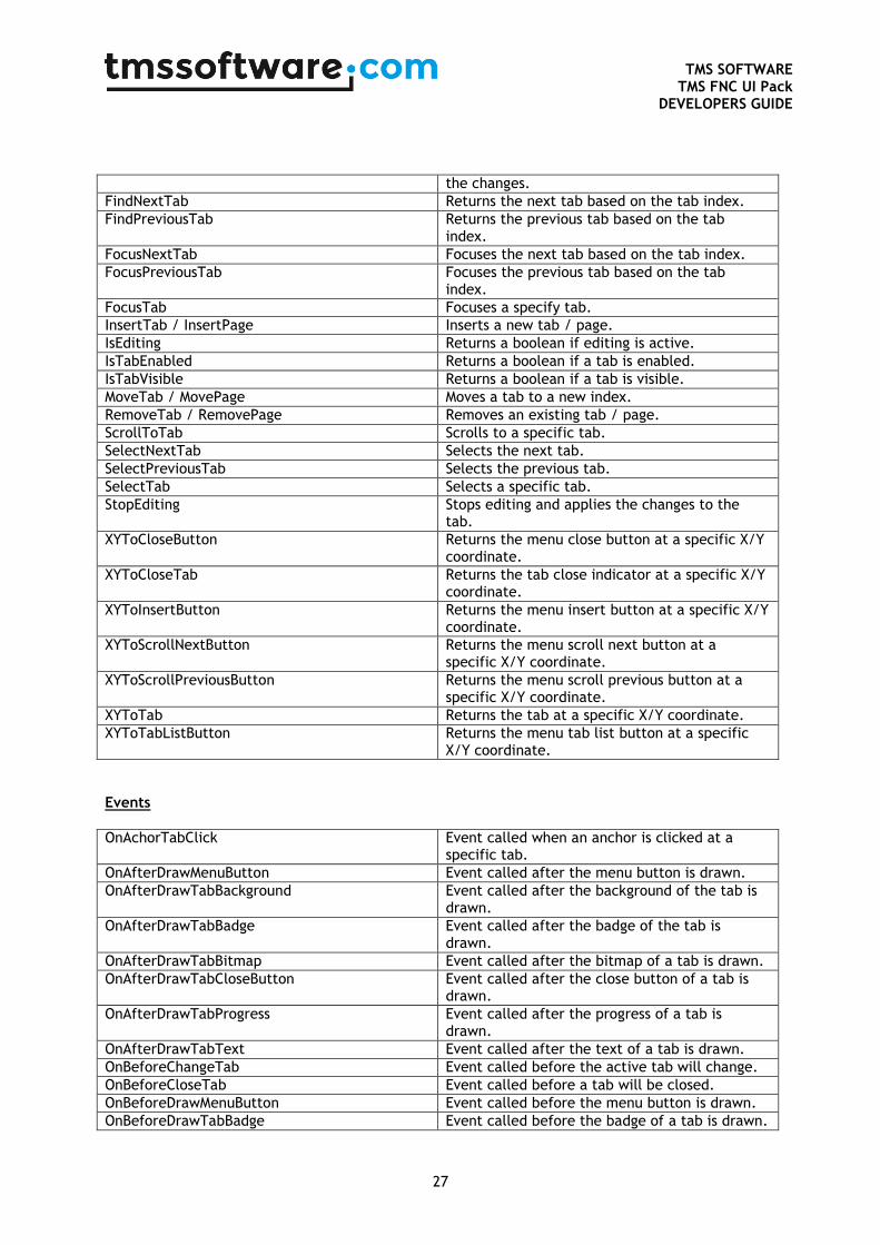
FindNextTab Returns the next tab based on the tab index.
FindPreviousTab Returns the previous tab based on the tab index.
FocusNextTab Focuses the next tab based on the tab index.
FocusPreviousTab Focuses the previous tab based on the tab index.
FocusTab Focuses a specify tab.
InsertTab / InsertPage Inserts a new tab / page.
IsEditing Returns a boolean if editing is active.
IsTabEnabled Returns a boolean if a tab is enabled.
IsTabVisible Returns a boolean if a tab is visible.
MoveTab / MovePage Moves a tab to a new index.
RemoveTab / RemovePage Removes an existing tab / page.
ScrollToTab Scrolls to a specific tab.
SelectNextTab Selects the next tab.
SelectPreviousTab Selects the previous tab.
SelectTab Selects a specific tab.
StopEditing Stops editing and applies the changes to the tab.
XYToCloseButton Returns the menu close button at a specific X/Y coordinate.
XYToCloseTab Returns the tab close indicator at a specific X/Y coordinate.
XYToInsertButton Returns the menu insert button at a specific X/Y coordinate.
XYToScrollNextButton Returns the menu scroll next button at a specific X/Y coordinate.
XYToScrollPreviousButton Returns the menu scroll previous button at a specific X/Y coordinate.
XYToTab Returns the tab at a specific X/Y coordinate.
XYToTabListButton Returns the menu tab list button at a specific X/Y coordinate.
Events
OnAchorTabClick Event called when an anchor is clicked at a specific tab.
OnAfterDrawMenuButton Event called after the menu button is drawn.
OnAfterDrawTabBackground Event called after the background of the tab is drawn.
OnAfterDrawTabBadge Event called after the badge of the tab is drawn.
OnAfterDrawTabBitmap Event called after the bitmap of a tab is drawn.
OnAfterDrawTabCloseButton Event called after the close button of a tab is drawn.
OnAfterDrawTabProgress Event called after the progress of a tab is drawn.
OnAfterDrawTabText Event called after the text of a tab is drawn.
OnBeforeChangeTab Event called before the active tab will change.
OnBeforeCloseTab Event called before a tab will be closed.
OnBeforeDrawMenuButton Event called before the menu button is drawn.
OnBeforeDrawTabBadge Event called before the badge of a tab is drawn.
TMS SOFTWARE
TMS FNC UI Pack DEVELOPERS GUIDE
28
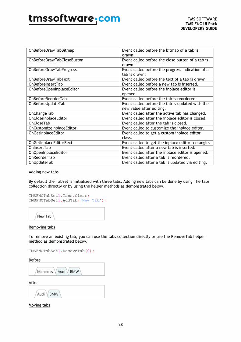
OnBeforeDrawTabBitmap Event called before the bitmap of a tab is drawn.
OnBeforeDrawTabCloseButton Event called before the close button of a tab is drawn.
OnBeforeDrawTabProgress Event called before the progress indication of a tab is drawn.
OnBeforeDrawTabText Event called before the text of a tab is drawn.
OnBeforeInsertTab Event called before a new tab is inserted.
OnBeforeOpenInplaceEditor Event called before the inplace editor is opened.
OnBeforeReorderTab Event called before the tab is reordered.
OnBeforeUpdateTab Event called before the tab is updated with the new value after editing.
OnChangeTab Event called after the active tab has changed.
OnCloseInplaceEditor Event called after the inplace editor is closed.
OnCloseTab Event called after the tab is closed.
OnCustomizeInplaceEditor Event called to customize the inplace editor.
OnGetInplaceEditor Event called to get a custom inplace editor class.
OnGetInplaceEditorRect Event called to get the inplace editor rectangle.
OnInsertTab Event called after a new tab is inserted.
OnOpenInplaceEditor Event called after the inplace editor is opened.
OnReorderTab Event called after a tab is reordered.
OnUpdateTab Event called after a tab is updated via editing.
Adding new tabs By default the TabSet is initialized with three tabs. Adding new tabs can be done by using The tabs collection directly or by using the helper methods as demonstrated below. TMSFNCTabSet1.Tabs.Clear;
TMSFNCTabSet1.AddTab('New Tab');
Removing tabs To remove an existing tab, you can use the tabs collection directly or use the RemoveTab helper method as demonstrated below. TMSFNCTabSet1.RemoveTab(0);
Before
After
Moving tabs
TMS SOFTWARE
TMS FNC UI Pack DEVELOPERS GUIDE
29
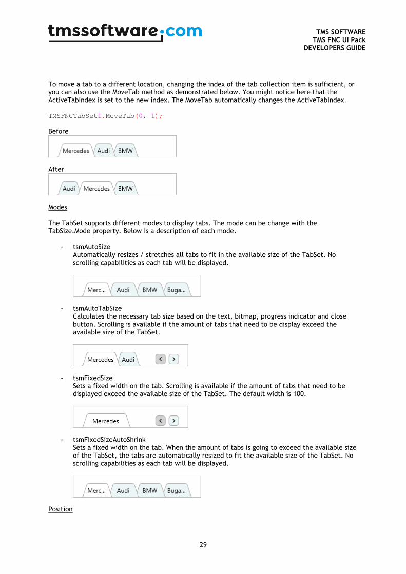
To move a tab to a different location, changing the index of the tab collection item is sufficient, or you can also use the MoveTab method as demonstrated below. You might notice here that the ActiveTabIndex is set to the new index. The MoveTab automatically changes the ActiveTabIndex. TMSFNCTabSet1.MoveTab(0, 1);
Before
After
Modes The TabSet supports different modes to display tabs. The mode can be change with the TabSize.Mode property. Below is a description of each mode.
- tsmAutoSize Automatically resizes / stretches all tabs to fit in the available size of the TabSet. No scrolling capabilities as each tab will be displayed.
- tsmAutoTabSize Calculates the necessary tab size based on the text, bitmap, progress indicator and close button. Scrolling is available if the amount of tabs that need to be display exceed the available size of the TabSet.
- tsmFixedSize Sets a fixed width on the tab. Scrolling is available if the amount of tabs that need to be displayed exceed the available size of the TabSet. The default width is 100.
- tsmFixedSizeAutoShrink
Sets a fixed width on the tab. When the amount of tabs is going to exceed the available size of the TabSet, the tabs are automatically resized to fit the available size of the TabSet. No scrolling capabilities as each tab will be displayed.
Position
TMS SOFTWARE
TMS FNC UI Pack DEVELOPERS GUIDE
30
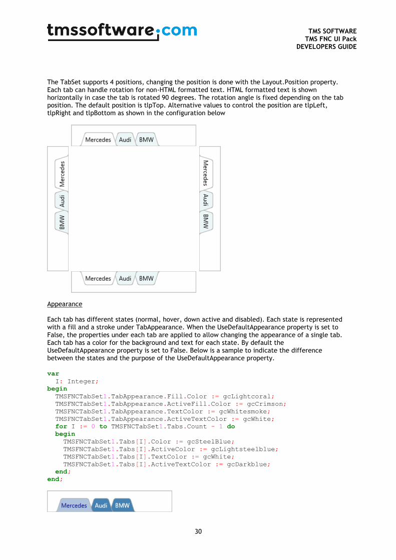
The TabSet supports 4 positions, changing the position is done with the Layout.Position property. Each tab can handle rotation for non-HTML formatted text. HTML formatted text is shown horizontally in case the tab is rotated 90 degrees. The rotation angle is fixed depending on the tab position. The default position is tlpTop. Alternative values to control the position are tlpLeft, tlpRight and tlpBottom as shown in the configuration below
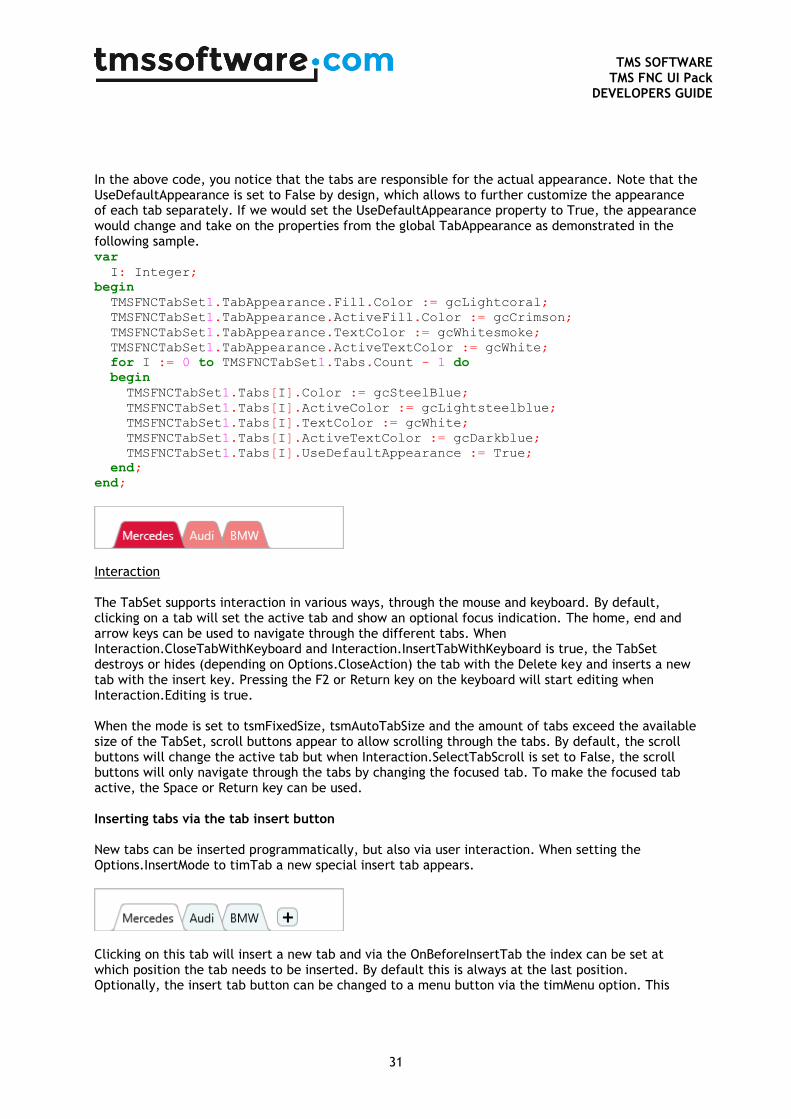
Appearance Each tab has different states (normal, hover, down active and disabled). Each state is represented with a fill and a stroke under TabAppearance. When the UseDefaultAppearance property is set to False, the properties under each tab are applied to allow changing the appearance of a single tab. Each tab has a color for the background and text for each state. By default the UseDefaultAppearance property is set to False. Below is a sample to indicate the difference between the states and the purpose of the UseDefaultAppearance property. var
I: Integer;
begin
TMSFNCTabSet1.TabAppearance.Fill.Color := gcLightcoral;
TMSFNCTabSet1.TabAppearance.ActiveFill.Color := gcCrimson;
TMSFNCTabSet1.TabAppearance.TextColor := gcWhitesmoke;
TMSFNCTabSet1.TabAppearance.ActiveTextColor := gcWhite;
for I := 0 to TMSFNCTabSet1.Tabs.Count - 1 do
begin
TMSFNCTabSet1.Tabs[I].Color := gcSteelBlue;
TMSFNCTabSet1.Tabs[I].ActiveColor := gcLightsteelblue;
TMSFNCTabSet1.Tabs[I].TextColor := gcWhite;
TMSFNCTabSet1.Tabs[I].ActiveTextColor := gcDarkblue;
end;
end;
TMS SOFTWARE
TMS FNC UI Pack DEVELOPERS GUIDE
31
In the above code, you notice that the tabs are responsible for the actual appearance. Note that the UseDefaultAppearance is set to False by design, which allows to further customize the appearance of each tab separately. If we would set the UseDefaultAppearance property to True, the appearance would change and take on the properties from the global TabAppearance as demonstrated in the following sample. var
I: Integer;
begin
TMSFNCTabSet1.TabAppearance.Fill.Color := gcLightcoral;
TMSFNCTabSet1.TabAppearance.ActiveFill.Color := gcCrimson;
TMSFNCTabSet1.TabAppearance.TextColor := gcWhitesmoke;
TMSFNCTabSet1.TabAppearance.ActiveTextColor := gcWhite;
for I := 0 to TMSFNCTabSet1.Tabs.Count - 1 do
begin
TMSFNCTabSet1.Tabs[I].Color := gcSteelBlue;
TMSFNCTabSet1.Tabs[I].ActiveColor := gcLightsteelblue;
TMSFNCTabSet1.Tabs[I].TextColor := gcWhite;
TMSFNCTabSet1.Tabs[I].ActiveTextColor := gcDarkblue;
TMSFNCTabSet1.Tabs[I].UseDefaultAppearance := True;
end;
end;
Interaction The TabSet supports interaction in various ways, through the mouse and keyboard. By default, clicking on a tab will set the active tab and show an optional focus indication. The home, end and arrow keys can be used to navigate through the different tabs. When Interaction.CloseTabWithKeyboard and Interaction.InsertTabWithKeyboard is true, the TabSet destroys or hides (depending on Options.CloseAction) the tab with the Delete key and inserts a new tab with the insert key. Pressing the F2 or Return key on the keyboard will start editing when Interaction.Editing is true. When the mode is set to tsmFixedSize, tsmAutoTabSize and the amount of tabs exceed the available size of the TabSet, scroll buttons appear to allow scrolling through the tabs. By default, the scroll buttons will change the active tab but when Interaction.SelectTabScroll is set to False, the scroll buttons will only navigate through the tabs by changing the focused tab. To make the focused tab active, the Space or Return key can be used. Inserting tabs via the tab insert button New tabs can be inserted programmatically, but also via user interaction. When setting the Options.InsertMode to timTab a new special insert tab appears.
Clicking on this tab will insert a new tab and via the OnBeforeInsertTab the index can be set at which position the tab needs to be inserted. By default this is always at the last position. Optionally, the insert tab button can be changed to a menu button via the timMenu option. This

TMS SOFTWARE
TMS FNC UI Pack DEVELOPERS GUIDE
32
button has the same purpose but it stays visible inside the menu instead of as an additional special tab. Closing tabs via the tab close button Tabs can be removed / closed programmatically via the free action or setting the visible property to false, but can also be closed via a tab or menu close button. Setting the Options.CloseMode to tcmTab will show an additional close button at each tab. Clicking the close button will destroy or hide the tab depending on the Options.CloseAction. In case the Options.CloseAction is ttcaFree the tab will be destroyed. In case the Options.CloseAction is ttcaHide, the tab visible propery will be set to False and the tab will be displayed in the separate invisible tab list, available when the Options.TabListButton is set to true.
Reorder Reordering can be enabled by setting the Interaction.Reorder property to true. When pressing the finger/left-mouse button on a tab and dragging left or right, up or down depending on the position, the tab will detach from its current position and will navigate the to where the finger/left-mouse button is currently located. When releasing the finger/left-mouse button the new tab position is detected and the tab will move to the new location. Events can determine if a tab can be moved or moved to (OnBeforeReorderTab & OnReorderTab). TMSFNCTabSet1.Interaction.Reorder := True;
Editing Editing can be enabled by setting the Interaction.Editing property to true. When selecting a tab, pressing the F2 or clicking on the text area will start editing and show the default inplace editor (TEdit). The event OnBeforeOpenInplaceEditor is called to determine if a tab can be edited. The editor class itself can be changed to support custom inplace editors (demonstrated in a separate sample) and the editor class is retrieved via the OnGetInplaceEditor event. Before the editing is shown, but after the event that is called to determine if a tab can be edited the editor is further customized via the optional OnCustomizeInplaceEditor event. By default, the text rectangle is used as coördinates for the inplace editor, but this can also be customized via the OnGetInplaceEditorRect. After the inplace editor is configured and approved, the OnAfterOpenInplaceEditor is called. In this event, the Parent of the inplace editor is already set. TMSFNCTabSet1.Interaction.Editing := True;
After editing is done, pressing the Return or F2 will apply changes in the inplace editor. The OnCloseInplaceEditor event is called which will contain parameters to control the text that is being applied to the tab. After optionally changing the value, the OnBeforeUpdateTab and OnUpdateTab event are called. The OnBeforeUpdateTab can be used to specify if a tab can be updated.

TMS SOFTWARE
TMS FNC UI Pack DEVELOPERS GUIDE
33
When pressing the Escape key, The OnCloseInplaceEditor is called with different parameters and the changes are cancelled. Custom inplace editor As mentioned, the TabSet supports editing via a custom inplace editor. In this sample, we create, customize and use a TComboBox as inplace editor. The code below demonstrates this behavior. procedure TForm1.FormCreate(Sender: TObject); begin TMSFNCTabSet1.Interaction.Editing := True; TMSFNCTabSet1.TabSize.Mode := tsmFixedSize; TMSFNCTabSet1.TabSize.Width := 120; TMSFNCTabSet1.Width := 400; end; procedure TForm1.TMSFNCTabSet1CustomizeInplaceEditor(Sender: TObject; ATabIndex: Integer; AInplaceEditor: TControl); var cbo: TComboBox; begin cbo := (AInplaceEditor as TComboBox); cbo.Items.Add('Audi'); cbo.Items.Add('BMW'); cbo.Items.Add('Mercedes'); cbo.ItemIndex := cbo.Items.IndexOf(TMSFNCTabSet1.Tabs[0].Text); end; procedure TForm1.TMSFNCTabSet1GetInplaceEditor(Sender: TObject; ATabIndex: Integer; var AInplaceEditorClass: TTMSFNCTabSetInplaceEditorClass); begin AInplaceEditorClass := TComboBox; end;
Progress indication Each tab has the ability to show progress, in the form of a rectangular or circular progress indicator. The Progress and ProgressMax properties determine the visual representation. By default, the ProgressMax property is 100. TMSFNCTabSet1.Tabs[0].ProgressKind := tpkRectangular; TMSFNCTabSet1.Tabs[0].Progress := 50;
TMSFNCTabSet1.Tabs[0].ProgressKind := tpkCircular;

TMS SOFTWARE
TMS FNC UI Pack DEVELOPERS GUIDE
34
TMSFNCTabSet1.Tabs[0].Progress := 50;
Optionally, the progress indicator can also be configured in marquee mode with the ProgressMode property. The progress indicator will, independent of the ProgressKind property setting, continuously indicate a busy operation. The ProgressColor property is used to further customize the appearance of the progress indicator for each tab separately. Badges Each tab can show a badge, which is placed in the upper right corner relative to its position. To show a badge, enter a value for the Badge property at a specific tab. TMSFNCTabSet1.Tabs[0].Badge := ‘Hello’;
Custom drawing Each element in the TabSet can be customized via the TabAppearance or ButtonAppearance properties. When the UseDefaultAppearance property on tab level is set to False, further customizations can be applied using the color and text color properties for each state. Even if these customizations are not sufficient, the TabSet exposes a set of events for custom drawing. Below is a sample that demonstrates this. In this sample we took the badge sample from the previous chapter, we draw a rectangle instead of a rounded rectangle, and change the font name and color. TMSFNCTabSet1.Tabs[0].Badge := ‘Hello’; procedure TForm1.TMSFNCTabSet1BeforeDrawTabBadge(Sender: TObject; AGraphics: TTMSFNCGraphics; ATabIndex: Integer; ARect: TRectF; AText: string; var ADefaultDraw: Boolean); begin ADefaultDraw := False; AGraphics.DrawRectangle(ARect); AGraphics.Font.Color := gcWhite; AGraphics.Font.Name := 'Comic Sans MS'; AGraphics.DrawText(ARect, AText, False, gtaCenter); end;
The next sample is customization of the close button. The close button is custom drawn, but it might be useful to show a close button icon instead. Implementing the OnBeforeDrawTabCloseButton will help you with this. procedure TForm1.FormCreate(Sender: TObject);
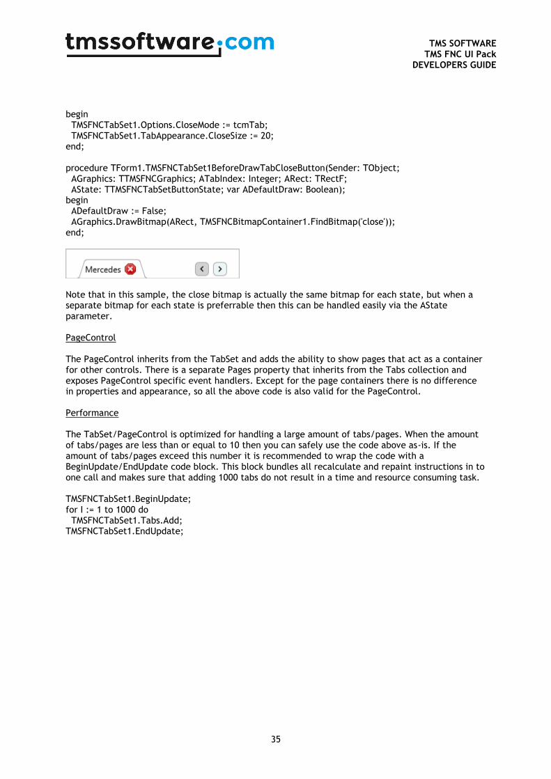
TMS SOFTWARE
TMS FNC UI Pack DEVELOPERS GUIDE
35
begin TMSFNCTabSet1.Options.CloseMode := tcmTab; TMSFNCTabSet1.TabAppearance.CloseSize := 20; end; procedure TForm1.TMSFNCTabSet1BeforeDrawTabCloseButton(Sender: TObject; AGraphics: TTMSFNCGraphics; ATabIndex: Integer; ARect: TRectF; AState: TTMSFNCTabSetButtonState; var ADefaultDraw: Boolean); begin ADefaultDraw := False; AGraphics.DrawBitmap(ARect, TMSFNCBitmapContainer1.FindBitmap('close')); end;
Note that in this sample, the close bitmap is actually the same bitmap for each state, but when a separate bitmap for each state is preferrable then this can be handled easily via the AState parameter. PageControl The PageControl inherits from the TabSet and adds the ability to show pages that act as a container for other controls. There is a separate Pages property that inherits from the Tabs collection and exposes PageControl specific event handlers. Except for the page containers there is no difference in properties and appearance, so all the above code is also valid for the PageControl. Performance The TabSet/PageControl is optimized for handling a large amount of tabs/pages. When the amount of tabs/pages are less than or equal to 10 then you can safely use the code above as-is. If the amount of tabs/pages exceed this number it is recommended to wrap the code with a BeginUpdate/EndUpdate code block. This block bundles all recalculate and repaint instructions in to one call and makes sure that adding 1000 tabs do not result in a time and resource consuming task. TMSFNCTabSet1.BeginUpdate; for I := 1 to 1000 do TMSFNCTabSet1.Tabs.Add; TMSFNCTabSet1.EndUpdate;
TMS SOFTWARE
TMS FNC UI Pack DEVELOPERS GUIDE
36
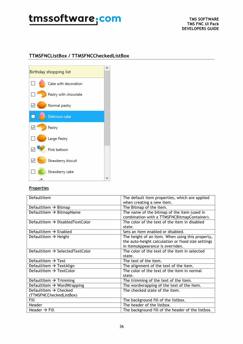
TTMSFNCListBox / TTMSFNCCheckedListBox
Properties
DefaultItem The default item properties, which are applied when creating a new item.
DefaultItem Bitmap The Bitmap of the item.
DefaultItem BitmapName The name of the bitmap of the item (used in combination with a TTMSFNCBitmapContainer).
DefaultItem DisabledTextColor The color of the text of the item in disabled state.
DefaultItem Enabled Sets an item enabled or disabled.
DefaultItem Height The height of an item. When using this property, the auto-height calculation or fixed size settings in ItemsAppearance is overriden.
DefaultItem SelectedTextColor The color of the text of the item in selected state.
DefaultItem Text The text of the item.
DefaultItem TextAlign The alignment of the text of the item.
DefaultItem TextColor The color of the text of the item in normal state.
DefaultItem Trimming The trimming of the text of the item.
DefaultItem WordWrapping The wordwrapping of the text of the item.
DefaultItem Checked (TTMSFNCCheckedListBox)
The checked state of the item.
Fill The background fill of the listbox.
Header The header of the listbox.
Header Fill The background fill of the header of the listbox.
TMS SOFTWARE
TMS FNC UI Pack DEVELOPERS GUIDE
37
Header Font The font of the header.
Header HorizontalTextAlign The horizontal text align of the header.
Header Size The size of the header.
Header Stroke The background stroke of the header.
Header Text The text of the header.
Header Trimming The trimming of the header.
Header VerticalTextAlign The vertical text align of the header.
Header Visible The visibility of the header.
Header WordWrapping The wordwrapping of the header.
Interaction The interaction properties of the listbox.
Interaction ClipboardMode The clipboard mode of the listbox.
Interaction DragDropMode The drag & drop mode of the listbox.
Interaction Filtering The filtering options of the listbox.
Interaction Lookup The lookup options of the listbox.
Interaction MultiSelect Enables multi-select on the listbox.
Interaction Reorder Enables reordering on the listbox.
Interaction Sorting Enables sorting on the listbox
Interaction TouchScrolling Allows touch scrolling.
ItemIndex The selected item index.
Items The collection of listbox items.
ItemsAppearance The general appearance of the listbox items.
ItemsAppearance DisabledFill The fill of an item in disabled state.
ItemsAppearance DisabledStroke The stroke of an item in disabled state.
ItemsAppearance Fill The fill of an item in normal state.
ItemsAppearance FixedHeight The fixed height of an item in case the HeightMode is set to lihmFixed.
ItemsAppearance Font The font of the items.
ItemsAppearance HeightMode The height mode of the items.
ItemsAppearance SelectedFill The fill of an item in selected state.
ItemsAppearance SelectedStroke The stroke of an item in selected state.
ItemsAppearance Stroke The stroke of an item in normal state.
Stroke The stroke of the background of the listbox.
VerticalScrollBarVisible Shows or hides the vertical scrollbar.
Methods / public properties
AddItem(AText: string = ’’): TTMSFNCListBoxItem
Adds a new item
ApplyFilter; Applies the filter, configured programmatically with the filter property.
Checked[AItemIndex: Integer]: Boolean; (TTMSFNCCheckedListBox)
Returns the checked state for an item based on the index.
CheckedItems: TTMSFNCListBoxCheckedItems; (TTMSFNCCheckedListBox)
Returns all the checked items in the listbox.
CheckedItems[AItem: TTMSFNCCheckedListboxItem]: Boolean; (TTMSFNCCheckedListBox)
Returns the checked state for an item.
ClearSorting; Clears all sorting applied to the listbox.
CopyToClipboard(ATextOnly: Boolean = False); Copies the selected items to the clipboard.
CutToClipboard(ATextOnly: Boolean = False); Cuts the selected items to the clipboard.
Filter: TTMSFNCListBoxFilter; The filter, used for programmatic filtering in the listbox.
GetItemsFromClipboard: TTMSFNCListBoxCopyItems
Gets the items from the clipboard.
TMS SOFTWARE
TMS FNC UI Pack DEVELOPERS GUIDE
38
IsItemSelectable(AItem: TTMSFNCListBoxItem): Boolean;
Returns a boolean whether an item is selectable or not.
LoadFromFile(AFileName: String); Loads the listbox items from a flie.
LoadFromStream(AStream: TStream); Loads the listbox items from a stream.
LoadFromStrings(AStrings: TStrings); Loads the listbox items from a TStrings instance.
LookupItem(ALookupString: String; ACaseSensitive: Boolean = False; AAutoSelect: Boolean = False): TTMSFNCListBoxItem;
Looks up an item, and optionally selects it.
PasteFromClipboard; Pastes items from the clipboard.
RemoveFilter; Removes the active filter.
RemoveFilters; Removes all filters from the listbox.
RemoveItem(AItem: TTMSFNCListBoxItem); Removes an item from the listbox.
SaveToFile(AFileName: String; ATextOnly: Boolean = True);
Saves the listbox to a file, optionally text-only to be compatible with other item loading components such as TTreeView / TListBox.
SaveToStream(AStream: TStream; ATextOnly: Boolean = True);
Saves the listbox to a stream, optionally text-only to be compatible with other item loading components such as TTreeView / TListBox.
SaveToStrings(AStrings: TStrings); Saves the listbox item to a TStrings instance.
ScrollToItem(AItemIndex: Integer); Scrolls to the itemindex.
SelectedItem: TTMSFNCListBoxItem; Returns the selected item.
SelectedItemCount: Integer Returns the selected item count.
SelectedItems[AIndex: Integer]: TTMSFNCListBoxItem;
Returns the selected item based on the index in the selected items collection.
SelectItem(AItemIndex: Integer); Selects an item.
SelectItems(AItemIndexes: TTMSFNCListBoxItemArray);
Selects an array of items.
Sort(ACaseSensitive: Boolean = True; ASortingMode: TTMSFNCListBoxItemsSortMode);
Sorts the items.
XYToItem(X, Y: Single): TTMSFNCListBoxItem; Returns the item under X and Y coordinate.
XYToItemIndex(X, Y: Single): Integer; Returns the item index under X and Y coordinate.
Events
OnAfterCopyToClipboard Event called after a clipboard copy operation is completed.
OnAfterCutToClipboard Event called after a clipboard cut operation is completed.
OnAfterDrawItem Event called after an item is drawn.
OnAfterDrawItemCheck (TTMSFNCCheckedListBox)
Event called after an item checkbox is drawn.
OnAfterDrawItemIcon Event called after an item icon is drawn.
OnAfterDrawItemText Event called after the text of an item is drawn.
OnAfterDropItem Event called after an item has been dropped by a drag & drop operation.
OnAfterPasteFromClipboard Event called after content has been pasted from the clipboard.
OnAfterReorderItem Event called after an item is reordered.
OnBeforeCopyToClipboard Event called before a clipboard copy operation is completed.
OnBeforeCutToClipboard Event called before a clipboard cut operation is completed.
OnBeforeDrawItem Event called before an item is drawn.
TMS SOFTWARE
TMS FNC UI Pack DEVELOPERS GUIDE
39
OnBeforeDrawItemCheck (TTMSFNCCheckedListBox)
Event called before an item checkbox is drawn.
OnBeforeDrawItemIcon Event called before an item icon is drawn.
OnBeforeDrawItemText Event called before the text of an item is drawn.
OnBeforeDropItem Event called before an item has been dropped by a drag & drop operation.
OnBeforePasteFromClipboard Event called before content has been pasted from the clipboard.
OnBeforeReorderItem Event called before an item is reordered.
OnFilterSelect Event called when a item from the filter listbox is clicked.
OnItemAnchorClick Event called when an anchor inside an item text is clicked.
OnItemCheckChanged (TTMSFNCCheckedListBox) Event called when an item check state has changed.
OnItemClick Event called when an item is clicked.
OnItemCompare Event called when an item is compared with another item when sorting is applied.
OnItemDblClick Event called when an item is double-clicked.
OnItemSelected Event called when an item is selected.
OnNeedFilterDropDownData Event called when the filter request the data that needs to be placed inside the filter box.
OnVScroll Event called when the listbox is scrolled.
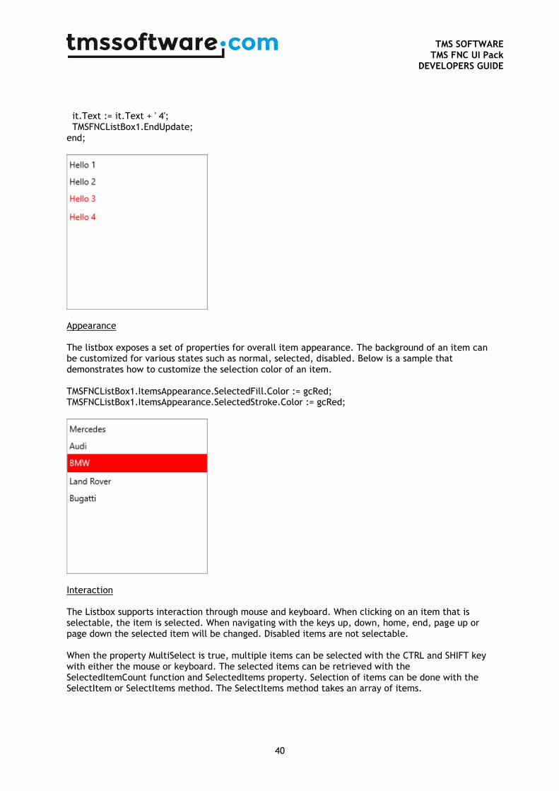
Adding new Items Items can be added at designtime through the items collection, but can also be added programmatically using the AddItem function. Below is a sample using both the collection and the helper function. TMSFNCListBox1.AddItem(‘Hello’); it := TMSFNCListBox1.Items.Add; it.Text := ‘Hello’; Default Item When adding new item, the values from the DefaultItem property are copied. This way, you can add a default icon, text, text color and many more. Below is a sample that demonstrates this. var it: TTMSFNCListBoxItem; begin TMSFNCListBox1.BeginUpdate; TMSFNCListBox1.Items.Clear; TMSFNCListBox1.DefaultItem.Text := 'Hello'; it := TMSFNCListBox1.Items.Add; it.Text := it.Text + ' 1'; it := TMSFNCListBox1.Items.Add; it.Text := it.Text + ' 2'; TMSFNCListBox1.DefaultItem.TextColor := gcRed; it := TMSFNCListBox1.Items.Add; it.Text := it.Text + ' 3'; it := TMSFNCListBox1.Items.Add;
TMS SOFTWARE
TMS FNC UI Pack DEVELOPERS GUIDE
40
it.Text := it.Text + ' 4'; TMSFNCListBox1.EndUpdate; end;
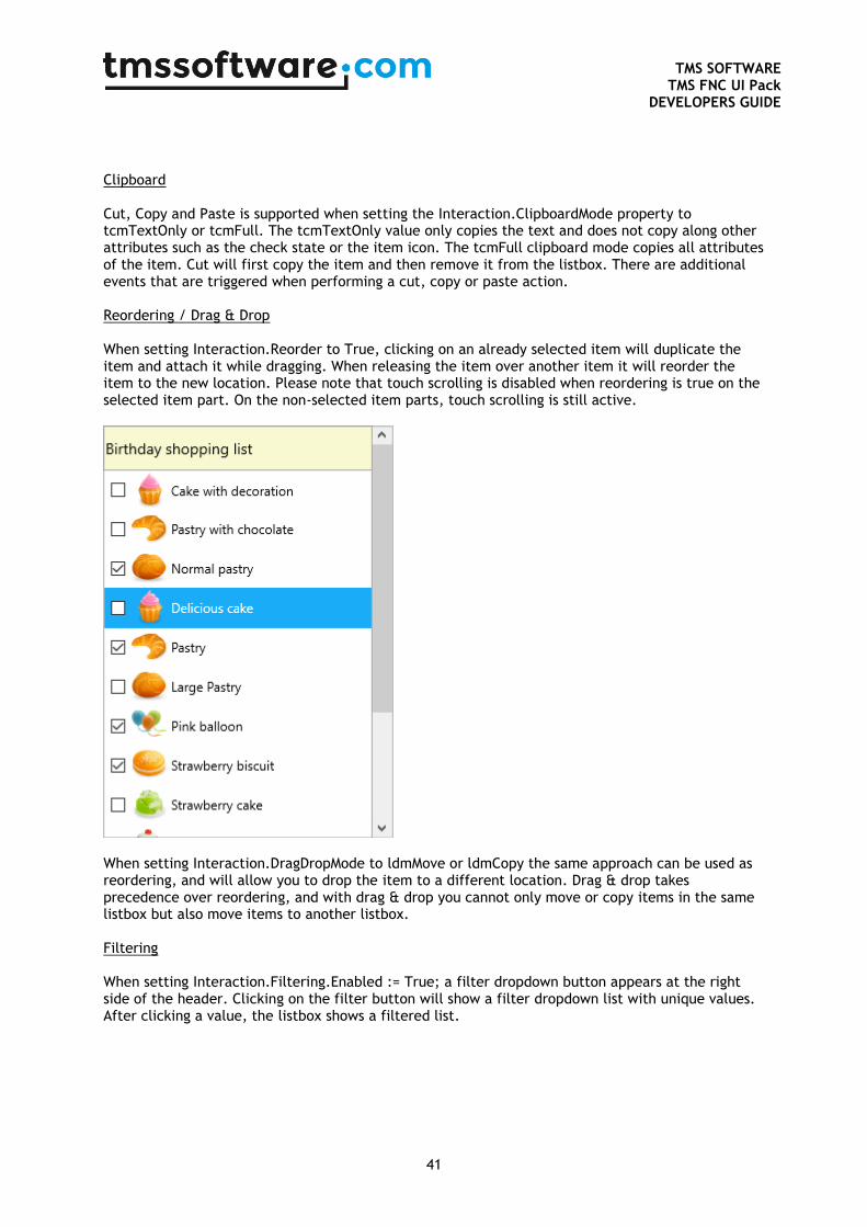
Appearance The listbox exposes a set of properties for overall item appearance. The background of an item can be customized for various states such as normal, selected, disabled. Below is a sample that demonstrates how to customize the selection color of an item. TMSFNCListBox1.ItemsAppearance.SelectedFill.Color := gcRed; TMSFNCListBox1.ItemsAppearance.SelectedStroke.Color := gcRed;
Interaction The Listbox supports interaction through mouse and keyboard. When clicking on an item that is selectable, the item is selected. When navigating with the keys up, down, home, end, page up or page down the selected item will be changed. Disabled items are not selectable. When the property MultiSelect is true, multiple items can be selected with the CTRL and SHIFT key with either the mouse or keyboard. The selected items can be retrieved with the SelectedItemCount function and SelectedItems property. Selection of items can be done with the SelectItem or SelectItems method. The SelectItems method takes an array of items.
TMS SOFTWARE
TMS FNC UI Pack DEVELOPERS GUIDE
41
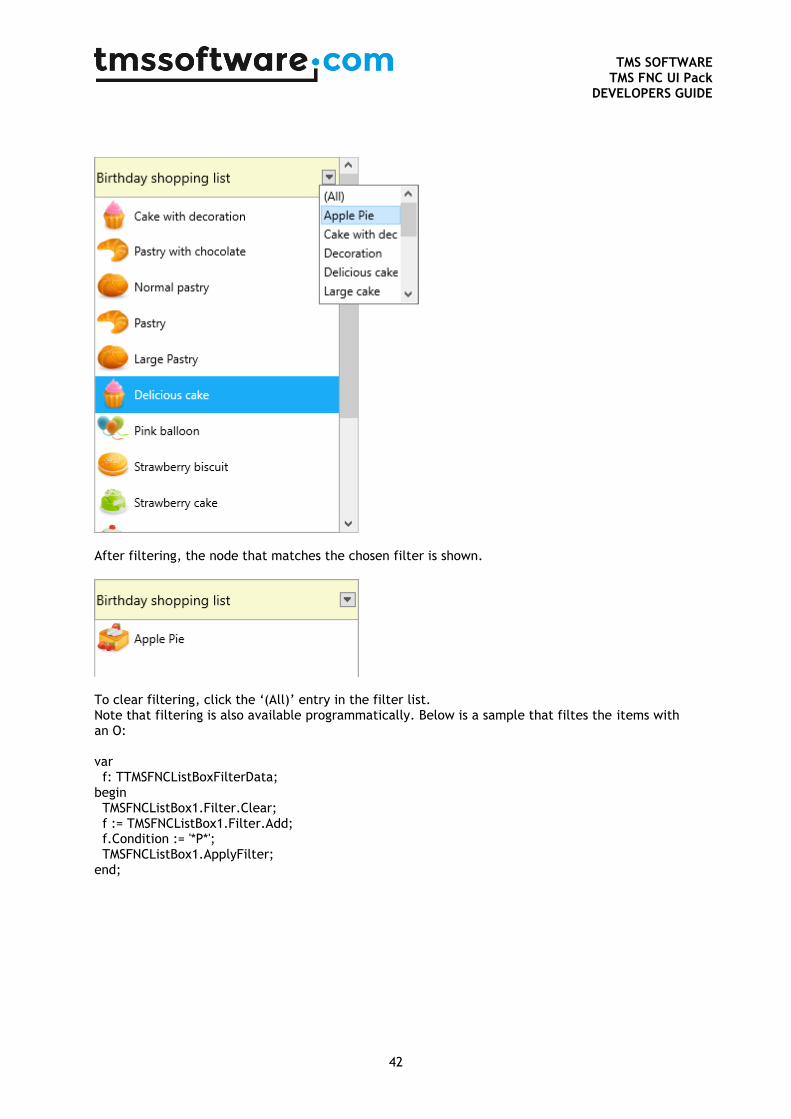
Clipboard Cut, Copy and Paste is supported when setting the Interaction.ClipboardMode property to tcmTextOnly or tcmFull. The tcmTextOnly value only copies the text and does not copy along other attributes such as the check state or the item icon. The tcmFull clipboard mode copies all attributes of the item. Cut will first copy the item and then remove it from the listbox. There are additional events that are triggered when performing a cut, copy or paste action. Reordering / Drag & Drop When setting Interaction.Reorder to True, clicking on an already selected item will duplicate the item and attach it while dragging. When releasing the item over another item it will reorder the item to the new location. Please note that touch scrolling is disabled when reordering is true on the selected item part. On the non-selected item parts, touch scrolling is still active.
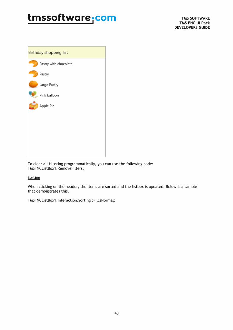
When setting Interaction.DragDropMode to ldmMove or ldmCopy the same approach can be used as reordering, and will allow you to drop the item to a different location. Drag & drop takes precedence over reordering, and with drag & drop you cannot only move or copy items in the same listbox but also move items to another listbox. Filtering When setting Interaction.Filtering.Enabled := True; a filter dropdown button appears at the right side of the header. Clicking on the filter button will show a filter dropdown list with unique values. After clicking a value, the listbox shows a filtered list.
TMS SOFTWARE
TMS FNC UI Pack DEVELOPERS GUIDE
42
After filtering, the node that matches the chosen filter is shown.
To clear filtering, click the ‘(All)’ entry in the filter list. Note that filtering is also available programmatically. Below is a sample that filtes the items with an O: var f: TTMSFNCListBoxFilterData; begin TMSFNCListBox1.Filter.Clear; f := TMSFNCListBox1.Filter.Add; f.Condition := '*P*'; TMSFNCListBox1.ApplyFilter; end;
TMS SOFTWARE
TMS FNC UI Pack DEVELOPERS GUIDE
43
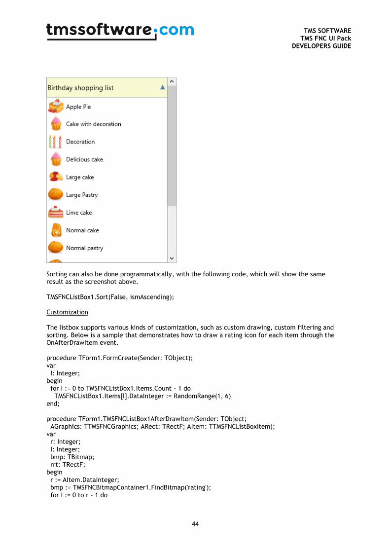
To clear all filtering programmatically, you can use the following code: TMSFNCListBox1.RemoveFilters; Sorting When clicking on the header, the items are sorted and the listbox is updated. Below is a sample that demonstrates this. TMSFNCListBox1.Interaction.Sorting := lcsNormal;
TMS SOFTWARE
TMS FNC UI Pack DEVELOPERS GUIDE
44
Sorting can also be done programmatically, with the following code, which will show the same result as the screenshot above. TMSFNCListBox1.Sort(False, ismAscending); Customization The listbox supports various kinds of customization, such as custom drawing, custom filtering and sorting. Below is a sample that demonstrates how to draw a rating icon for each item through the OnAfterDrawItem event. procedure TForm1.FormCreate(Sender: TObject); var I: Integer; begin for I := 0 to TMSFNCListBox1.Items.Count - 1 do TMSFNCListBox1.Items[I].DataInteger := RandomRange(1, 6) end; procedure TForm1.TMSFNCListBox1AfterDrawItem(Sender: TObject; AGraphics: TTMSFNCGraphics; ARect: TRectF; AItem: TTMSFNCListBoxItem); var r: Integer; I: Integer; bmp: TBitmap; rrt: TRectF; begin r := AItem.DataInteger; bmp := TMSFNCBitmapContainer1.FindBitmap('rating'); for I := 0 to r - 1 do

TMS SOFTWARE
TMS FNC UI Pack DEVELOPERS GUIDE
45
begin rrt := RectF(Round(ARect.Right - ((bmp.Width + 4) * (I + 1))), Round(ARect.Top + (ARect.Height - bmp.Height) / 2), Round(ARect.Right - ((bmp.Width + 4) * I)), Round(ARect.Top + (ARect.Height - bmp.Height) / 2 + bmp.Height)); AGraphics.DrawBitmap(rrt, bmp); end; end;

TMS SOFTWARE
TMS FNC UI Pack DEVELOPERS GUIDE
46
TTMSFNCRadioGroup / TTMSFNCRadioGroupPicker
The TTMSFNCRadioGroup and TTMSFNCRadioGroupPicker are components that display a group of radiobuttons. With the ItemIndex property you can set which value is selected. The OnRadioButtonClick event is triggered when a value is selected. Both components can display HTML.
TTMSFNCCheckGroup / TTMSFNCCheckGroupPicker
The TTMSFNCCheckGroup and TTMSFNCCheckGroupPicker are components that display a group of checkboxes. With the Value property you can set which checkes are checked. The OnCheckBoxClick event is triggered when a value is selected. Both components can display HTML.
TMS SOFTWARE
TMS FNC UI Pack DEVELOPERS GUIDE
47
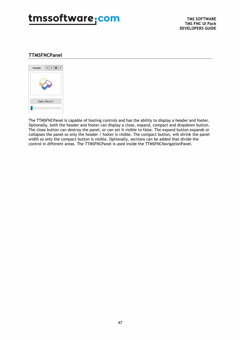
TTMSFNCPanel
The TTMSFNCPanel is capable of hosting controls and has the ability to display a header and footer. Optionally, both the header and footer can display a close, expand, compact and dropdown button. The close button can destroy the panel, or can set it visible to false. The expand button expands or collapses the panel so only the header / footer is visible. The compact button, will shrink the panel width so only the compact button is visible. Optionally, sections can be added that divide the control in different areas. The TTMSFNCPanel is used inside the TTMSFNCNavigationPanel.
TMS SOFTWARE
TMS FNC UI Pack DEVELOPERS GUIDE
48
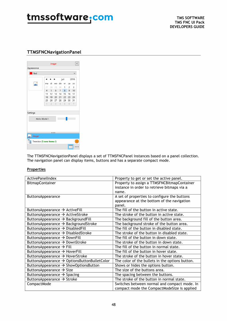
TTMSFNCNavigationPanel
The TTMSFNCNavigationPanel displays a set of TTMSFNCPanel instances based on a panel collection. The navigation panel can display items, buttons and has a separate compact mode. Properties
ActivePanelIndex Property to get or set the active panel.
BitmapContainer Property to assign a TTMSFNCBitmapContainer instance in order to retrieve bitmaps via a name.
ButtonsAppearance A set of properties to configure the buttons appearance at the bottom of the navigation panel.
ButtonsAppearance ActiveFill The fill of the button in active state.
ButtonsAppearance ActiveStroke The stroke of the button in active state.
ButtonsAppearance BackgroundFill The background fill of the button area.
ButtonsAppearance BackgroundStroke The background stroke of the button area.
ButtonsAppearance DisabledFill The fill of the button in disabled state.
ButtonsAppearance DisabledStroke The stroke of the button in disabled state.
ButtonsAppearance DownFill The fill of the button in down state.
ButtonsAppearance DownStroke The stroke of the button in down state.
ButtonsAppearance Fill The fill of the button in normal state.
ButtonsAppearance HoverFill The fill of the button in hover state.
ButtonsAppearance HoverStroke The stroke of the button in hover state.
ButtonsAppearance OptionsButtonBulletColor The color of the bullets in the options button.
ButtonsAppearance ShowOptionsButton Shows or hides the options button.
ButtonsAppearance Size The size of the buttons area.
ButtonsAppearance Spacing The spacing between the buttons.
ButtonsAppearance Stroke The stroke of the button in normal state.
CompactMode Switches between normal and compact mode. In compact mode the CompactModeSize is applied
TMS SOFTWARE
TMS FNC UI Pack DEVELOPERS GUIDE
49
to the width.
CompactModeSize The width of the navigation panel in compact mode.
ItemsAppearance A set of properties to configure the items appearance.
ItemsAppearance ActiveFill The fill of the item in active state.
ItemsAppearance ActiveFont The font of the item in active state.
ItemsAppearance ActiveStroke The stroke of the item in active state.
ItemsAppearance BadgeFill The fill of the badge of the item.
ItemsAppearance BadgeFont The font of the badge of the item.
ItemsAppearance BadgeStroke The stroke of the badge of the item.
ItemsAppearance CompactDisabledFill The fill of the compact item in disabled state.
ItemsAppearance CompactDisabledStroke The stroke of the compact item in disabled state.
ItemsAppearance CompactDownFill The fill of the compact item in down state.
ItemsAppearance CompactDownStroke The stroke of the compact item in down state.
ItemsAppearance CompactHoverFill The fill of the compact item in hover state.
ItemsAppearance CompactHoverStroke The stroke of the compact item in hover state.
ItemsAppearance DisabledFill The fill of the item in disabled state.
ItemsAppearance DisabledStroke The stroke of the item in disabled state.
ItemsAppearance DownFill The fill of the item in down state.
ItemsAppearance DownStroke The stroke of the item in down state.
ItemsAppearance Fill The fill of the item in normal state.
ItemsAppearance Font The font of the item in normal state.
ItemsAppearance HoverFill The fill of the item in hover state.
ItemsAppearance HoverFont The font of the item in hover state.
ItemsAppearance HoverStroke The stroke of the item in hover state.
ItemsAppearance Size The size of the items.
ItemsAppearance Spacing The spacing between the items.
ItemsAppearance Stroke The stroke of the items in normal state.
MaxButtonCount The maximum number of buttons shown in the buttons area. If the number of buttons exceed this number the buttons are automatically added to the context menu, shown with the options button.
MaxItemCount The maximum number of items shown in the items area. If the number of items exceed this number the items are automatically added to the context menu, shown with the options button.
Mode The mode of the navigation panel. The default mode is mixed, to show items and buttons. The other modes are configured to only display items, or only display buttons.
Panels The panel items collection.
Panels[Index] Badge The badge of an item.
Panels[Index] Bitmaps The bitmaps of an item.
Panels[Index] CompactText The text of a compact item.
Panels[Index] Enabled The enabled state of an item.
Panels[Index] Hint The hint of an item.
Panels[Index] Kind The kind of an item, to configure the item as a button or a normal item.
Panels[Index] Text The text of an item.
Panels[Index] Visible The visibility of an item. If an item is not
TMS SOFTWARE
TMS FNC UI Pack DEVELOPERS GUIDE
50
visible, the item is transferred to the context menu in the “Add or Remove items option.
ShowCompactModeButton Shows or hides the compact mode button in the header of the panel.
ShowFooter Shows or hides the footer of each panel inside the navigation panel.
ShowHeader Shows or hides the header of each panel inside the navigation panel.
Splitter The splitter of the navigation panel to show more or less items.
Splitter BulletColor The color of the bullets of the splitter.
Splitter Fill The fill of the splitter.
Splitter Size The size of the splitter.
Splitter Stroke The stroke of the splitter.
Splitter Visible The visibility of the splitter.
Methods
AddPanel Adds a new panel.
InsertPanel Inserts a new panel at a specific index.
MovePanel Moves an existing panel to a specific index.
RemovePanel Removes an existing panel.
SelectNextPanel Selects the next panel starting from the active panel index.
SelectPanel Selects a specific panel.
SelectPreviousPanel Selects the previous panel starting from the active panel index.
SplitItems Converts / splits a number of items in buttons.
Events
OnAfterDrawButton Event called after a button is drawn.
OnAfterDrawCompactItem Event called after a compact item is drawn.
OnAfterDrawItem Event called after an item is drawn.
OnAfterDrawItemBadge Event called after a badge is drawn.
OnAfterDrawOptionsButton Event called after the options button is drawn.
OnAfterDrawSplitter Event called after a splitter is drawn.
OnBeforeDrawButton Event called before a button is drawn.
OnBeforeDrawCompactItem Event called before a compact item is drawn.
OnBeforeDrawItem Event called before an item is drawn.
OnBeforeDrawItemBadge Event called before a badge is drawn.
OnBeforeDrawOptionsButton Event called before the options button is drawn.
OnBeforeDrawSplitter Event called before a splitter is drawn.
OnCompactItemClick Event called when an item in compact mode is clicked.
OnCustomizeContextMenu Event called to further customize the context menu shown from the options menu button.
OnItemAnchorClick Event called when an anchor is clicked at a specific item.
OnItemClick Event called when an item is clicked.
OnSplitterMove Event called when the splitter is moved.
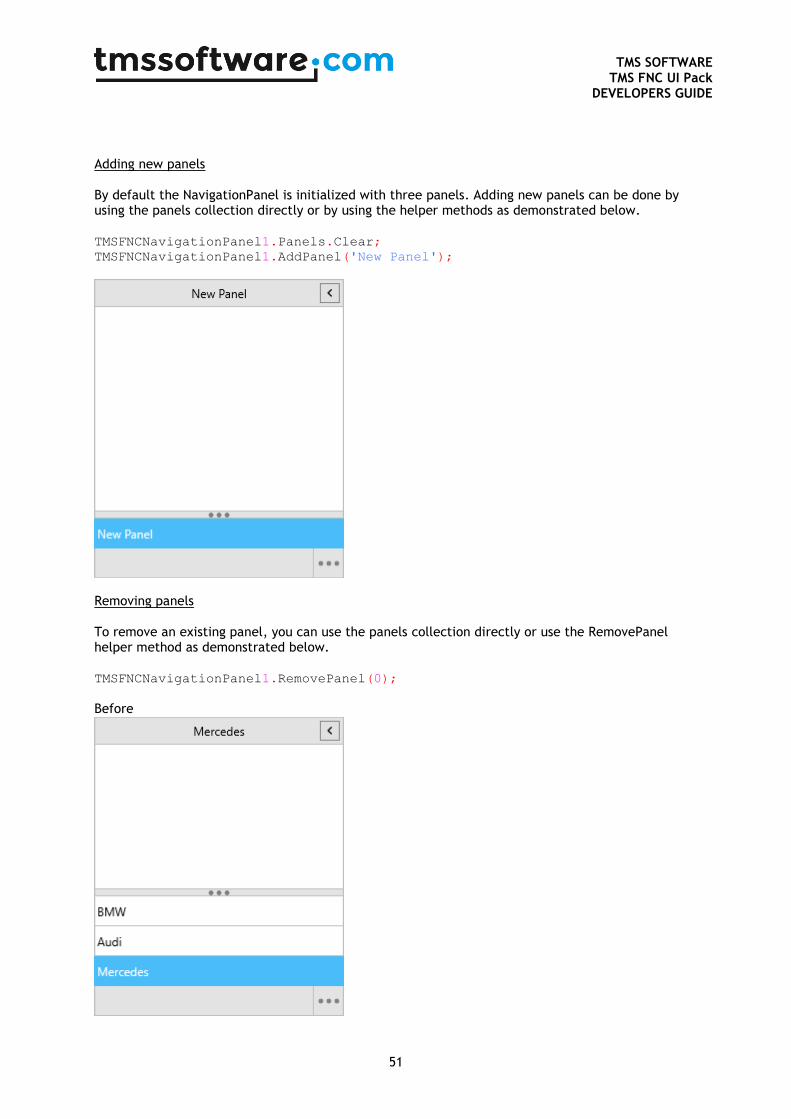
TMS SOFTWARE
TMS FNC UI Pack DEVELOPERS GUIDE
51
Adding new panels By default the NavigationPanel is initialized with three panels. Adding new panels can be done by using the panels collection directly or by using the helper methods as demonstrated below. TMSFNCNavigationPanel1.Panels.Clear;
TMSFNCNavigationPanel1.AddPanel('New Panel');
Removing panels To remove an existing panel, you can use the panels collection directly or use the RemovePanel helper method as demonstrated below. TMSFNCNavigationPanel1.RemovePanel(0);
Before
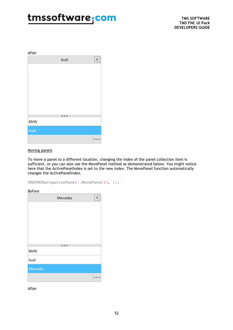
TMS SOFTWARE
TMS FNC UI Pack DEVELOPERS GUIDE
52
After
Moving panels To move a panel to a different location, changing the index of the panel collection item is sufficient, or you can also use the MovePanel method as demonstrated below. You might notice here that the ActivePanelIndex is set to the new index. The MovePanel function automatically changes the ActivePanelIndex. TMSFNCNavigationPanel1.MovePanel(0, 1);
Before
After
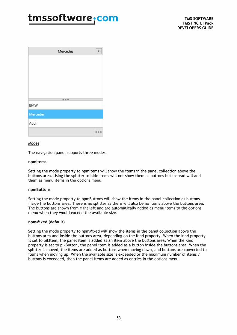
TMS SOFTWARE
TMS FNC UI Pack DEVELOPERS GUIDE
53
Modes The navigation panel supports three modes. npmItems Setting the mode property to npmItems will show the items in the panel collection above the buttons area. Using the splitter to hide items will not show them as buttons but instead will add them as menu items in the options menu. npmButtons Setting the mode property to npmButtons will show the items in the panel collection as buttons inside the buttons area. There is no splitter as there will also be no items above the buttons area. The buttons are shown from right left and are automatically added as menu items to the options menu when they would exceed the available size. npmMixed (default) Setting the mode property to npmMixed will show the items in the panel collection above the buttons area and inside the buttons area, depending on the Kind property. When the kind property is set to pikItem, the panel item is added as an item above the buttons area. When the kind property is set to pikButton, the panel item is added as a button inside the buttons area. When the splitter is moved, the items are added as buttons when moving down, and buttons are converted to items when moving up. When the available size is exceeded or the maximum number of items / buttons is exceeded, then the panel items are added as entries in the options menu.
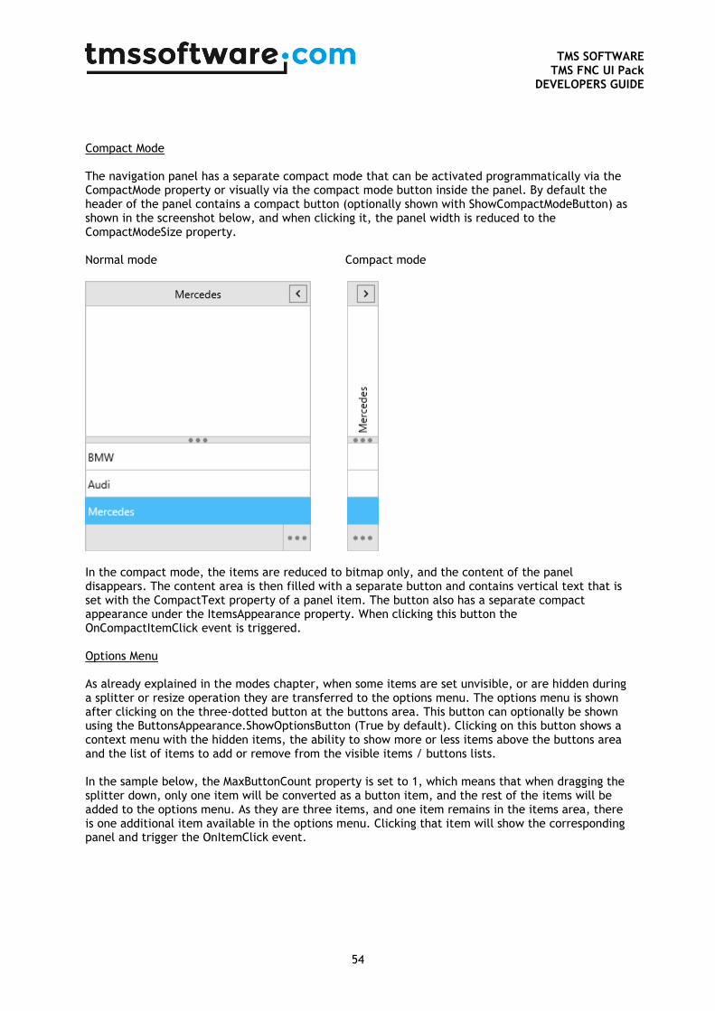
TMS SOFTWARE
TMS FNC UI Pack DEVELOPERS GUIDE
54
Compact Mode The navigation panel has a separate compact mode that can be activated programmatically via the CompactMode property or visually via the compact mode button inside the panel. By default the header of the panel contains a compact button (optionally shown with ShowCompactModeButton) as shown in the screenshot below, and when clicking it, the panel width is reduced to the CompactModeSize property. Normal mode Compact mode
In the compact mode, the items are reduced to bitmap only, and the content of the panel disappears. The content area is then filled with a separate button and contains vertical text that is set with the CompactText property of a panel item. The button also has a separate compact appearance under the ItemsAppearance property. When clicking this button the OnCompactItemClick event is triggered. Options Menu As already explained in the modes chapter, when some items are set unvisible, or are hidden during a splitter or resize operation they are transferred to the options menu. The options menu is shown after clicking on the three-dotted button at the buttons area. This button can optionally be shown using the ButtonsAppearance.ShowOptionsButton (True by default). Clicking on this button shows a context menu with the hidden items, the ability to show more or less items above the buttons area and the list of items to add or remove from the visible items / buttons lists. In the sample below, the MaxButtonCount property is set to 1, which means that when dragging the splitter down, only one item will be converted as a button item, and the rest of the items will be added to the options menu. As they are three items, and one item remains in the items area, there is one additional item available in the options menu. Clicking that item will show the corresponding panel and trigger the OnItemClick event.
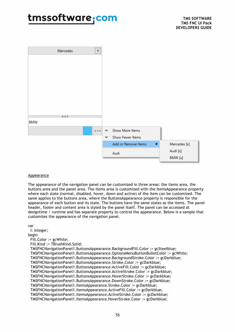
TMS SOFTWARE
TMS FNC UI Pack DEVELOPERS GUIDE
55
Appearance The appearance of the navigation panel can be customized in three areas: the items area, the buttons area and the panel area. The items area is customized with the ItemsAppearance property where each state (normal, disabled, hover, down and active) of the item can be customized. The same applies to the buttons area, where the ButtonsAppearance property is responsible for the appearance of each button and its state. The buttons have the same states as the items. The panel header, footer and content area is styled by the panel itself. The panel can be accessed at designtime / runtime and has separate property to control the appearance. Below is a sample that customizes the appearance of the navigation panel. var I: Integer; begin Fill.Color := gcWhite; Fill.Kind := TBrushKind.Solid; TMSFNCNavigationPanel1.ButtonsAppearance.BackgroundFill.Color := gcSteelblue; TMSFNCNavigationPanel1.ButtonsAppearance.OptionsMenuButtonBulletColor := gcWhite; TMSFNCNavigationPanel1.ButtonsAppearance.BackgroundStroke.Color := gcDarkblue; TMSFNCNavigationPanel1.ButtonsAppearance.Stroke.Color := gcDarkblue; TMSFNCNavigationPanel1.ButtonsAppearance.ActiveFill.Color := gcDarkblue; TMSFNCNavigationPanel1.ButtonsAppearance.ActiveStroke.Color := gcDarkblue; TMSFNCNavigationPanel1.ButtonsAppearance.HoverStroke.Color := gcDarkblue; TMSFNCNavigationPanel1.ButtonsAppearance.DownStroke.Color := gcDarkblue; TMSFNCNavigationPanel1.ItemsAppearance.Stroke.Color := gcDarkblue; TMSFNCNavigationPanel1.ItemsAppearance.ActiveFill.Color := gcDarkblue; TMSFNCNavigationPanel1.ItemsAppearance.ActiveStroke.Color := gcDarkblue; TMSFNCNavigationPanel1.ItemsAppearance.HoverStroke.Color := gcDarkblue;
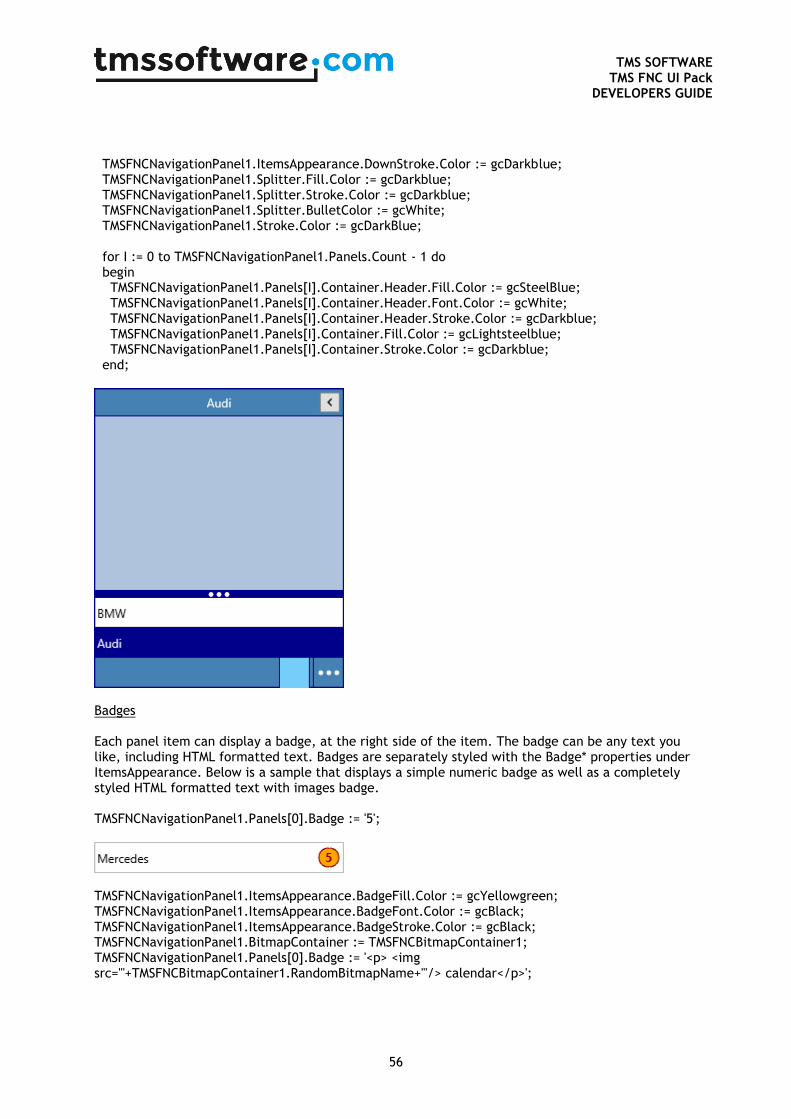
TMS SOFTWARE
TMS FNC UI Pack DEVELOPERS GUIDE
56
TMSFNCNavigationPanel1.ItemsAppearance.DownStroke.Color := gcDarkblue; TMSFNCNavigationPanel1.Splitter.Fill.Color := gcDarkblue; TMSFNCNavigationPanel1.Splitter.Stroke.Color := gcDarkblue; TMSFNCNavigationPanel1.Splitter.BulletColor := gcWhite; TMSFNCNavigationPanel1.Stroke.Color := gcDarkBlue; for I := 0 to TMSFNCNavigationPanel1.Panels.Count - 1 do begin TMSFNCNavigationPanel1.Panels[I].Container.Header.Fill.Color := gcSteelBlue; TMSFNCNavigationPanel1.Panels[I].Container.Header.Font.Color := gcWhite; TMSFNCNavigationPanel1.Panels[I].Container.Header.Stroke.Color := gcDarkblue; TMSFNCNavigationPanel1.Panels[I].Container.Fill.Color := gcLightsteelblue; TMSFNCNavigationPanel1.Panels[I].Container.Stroke.Color := gcDarkblue; end;
Badges Each panel item can display a badge, at the right side of the item. The badge can be any text you like, including HTML formatted text. Badges are separately styled with the Badge* properties under ItemsAppearance. Below is a sample that displays a simple numeric badge as well as a completely styled HTML formatted text with images badge. TMSFNCNavigationPanel1.Panels[0].Badge := '5';
TMSFNCNavigationPanel1.ItemsAppearance.BadgeFill.Color := gcYellowgreen; TMSFNCNavigationPanel1.ItemsAppearance.BadgeFont.Color := gcBlack; TMSFNCNavigationPanel1.ItemsAppearance.BadgeStroke.Color := gcBlack; TMSFNCNavigationPanel1.BitmapContainer := TMSFNCBitmapContainer1; TMSFNCNavigationPanel1.Panels[0].Badge := '<p> <img src="'+TMSFNCBitmapContainer1.RandomBitmapName+'"/> calendar</p>';
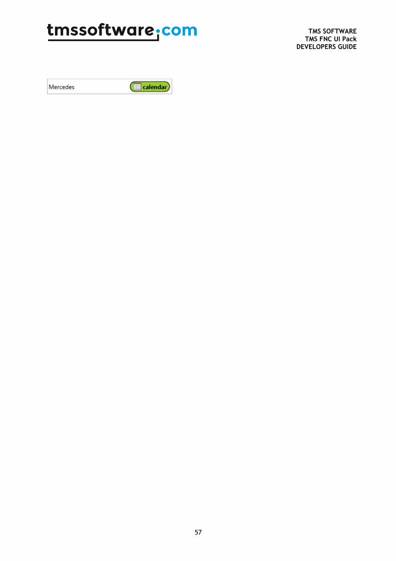
TMS SOFTWARE
TMS FNC UI Pack DEVELOPERS GUIDE
57
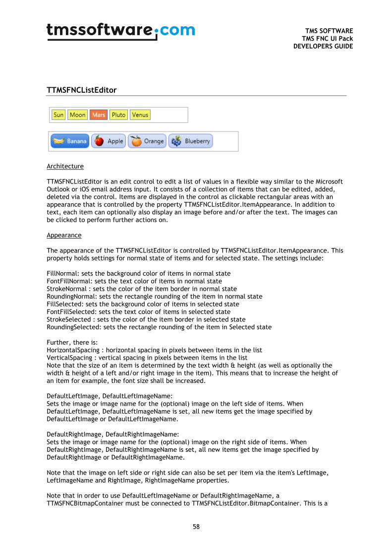
TMS SOFTWARE
TMS FNC UI Pack DEVELOPERS GUIDE
58
TTMSFNCListEditor
Architecture TTMSFNCListEditor is an edit control to edit a list of values in a flexible way similar to the Microsoft Outlook or iOS email address input. It consists of a collection of items that can be edited, added, deleted via the control. Items are displayed in the control as clickable rectangular areas with an appearance that is controlled by the property TTMSFNCListEditor.ItemAppearance. In addition to text, each item can optionally also display an image before and/or after the text. The images can be clicked to perform further actions on. Appearance The appearance of the TTMSFNCListEditor is controlled by TTMSFNCListEditor.ItemAppearance. This property holds settings for normal state of items and for selected state. The settings include: FillNormal: sets the background color of items in normal state FontFillNormal: sets the text color of items in normal state StrokeNormal : sets the color of the item border in normal state RoundingNormal: sets the rectangle rounding of the item in normal state FillSelected: sets the background color of items in selected state FontFillSelected: sets the text color of items in selected state StrokeSelected : sets the color of the item border in selected state RoundingSelected: sets the rectangle rounding of the item in Selected state Further, there is: HorizontalSpacing : horizontal spacing in pixels between items in the list VerticalSpacing : vertical spacing in pixels between items in the list Note that the size of an item is determined by the text width & height (as well as optionally the width & height of a left and/or right image in the item). This means that to increase the height of an item for example, the font size shall be increased. DefaultLeftImage, DefaultLeftImageName: Sets the image or image name for the (optional) image on the left side of items. When DefaultLeftImage, DefaultLeftImageName is set, all new items get the image specified by DefaultLeftImage or DefaultLeftImageName. DefaultRightImage, DefaultRightImageName: Sets the image or image name for the (optional) image on the right side of items. When DefaultRightImage, DefaultRightImageName is set, all new items get the image specified by DefaultRightImage or DefaultRightImageName. Note that the image on left side or right side can also be set per item via the item's LeftImage, LeftImageName and RightImage, RightImageName properties. Note that in order to use DefaultLeftImageName or DefaultRightImageName, a TTMSFNCBitmapContainer must be connected to TTMSFNCListEditor.BitmapContainer. This is a
TMS SOFTWARE
TMS FNC UI Pack DEVELOPERS GUIDE
59
container control that holds multiple images and these images can be accessed via a unique name identifier. Items TTMSFNCListEditor.Items is the collection that holds the items for the list. When the user adds or removes items, this is automatically reflected in the items collection. An item has following properties: LeftImage, LeftImageName : sets the image to appear on the left side of the item RightImage, RightImageName : sets the image to appear on the right side of the item Tag : general purpose integer property Text: holds the text of the item Value: additional text property per item, available for storing extra information such as a hyperlink etc... Adding items can be easily done via TTMSFNCListEditor.Items.Add.Text := 'New item' and deleting an item programmatically via TTMSFNCListEditor.Items.Delete(Index); Events In addition to the standard FireMonkey control events, TTMSFNCListEditor exposes some additional events relating to the process of editing items in the editor: OnEditorCreate: event triggered when the inplace editor is about to be created and allows to customize the editor class. The default editor class is TEdit OnEditorGetSize : event triggered just before the inplace editor will be displayed in the control and allows to customize the size of the editor in the control OnEditorGetText: allows to retrieve a text value for the value of the editor. When the inplace editor derives from TCustomEdit, the .Text property is automatically used but this event allows to use inplace editors that expose the value via another property than .Text for example. OnEditorHide : event triggered when the inplace editor will be hidden OnEditorShow : event triggered when the inplace editor will be displayed OnEditorUpdate : event triggered when the value of the inplace editor has changed OnItemCanDelete : event triggered when the user presses the DEL key for a selected item and allows to query for confirmation before the item is actually deleted OnItemClick : event triggered when an item is clicked OnItemDelete : event triggered when an item is deleted OnItemInsert : event triggered when a new item is inserted via inplace editing OnItemLeftImageClick : event triggered when the left image for an item is clicked OnItemRightImageClick :event triggered when the right image for an item is clicked OnItemUpdate : event triggered when the inplace editing stops and the value needs to be retrieved to update the item with.
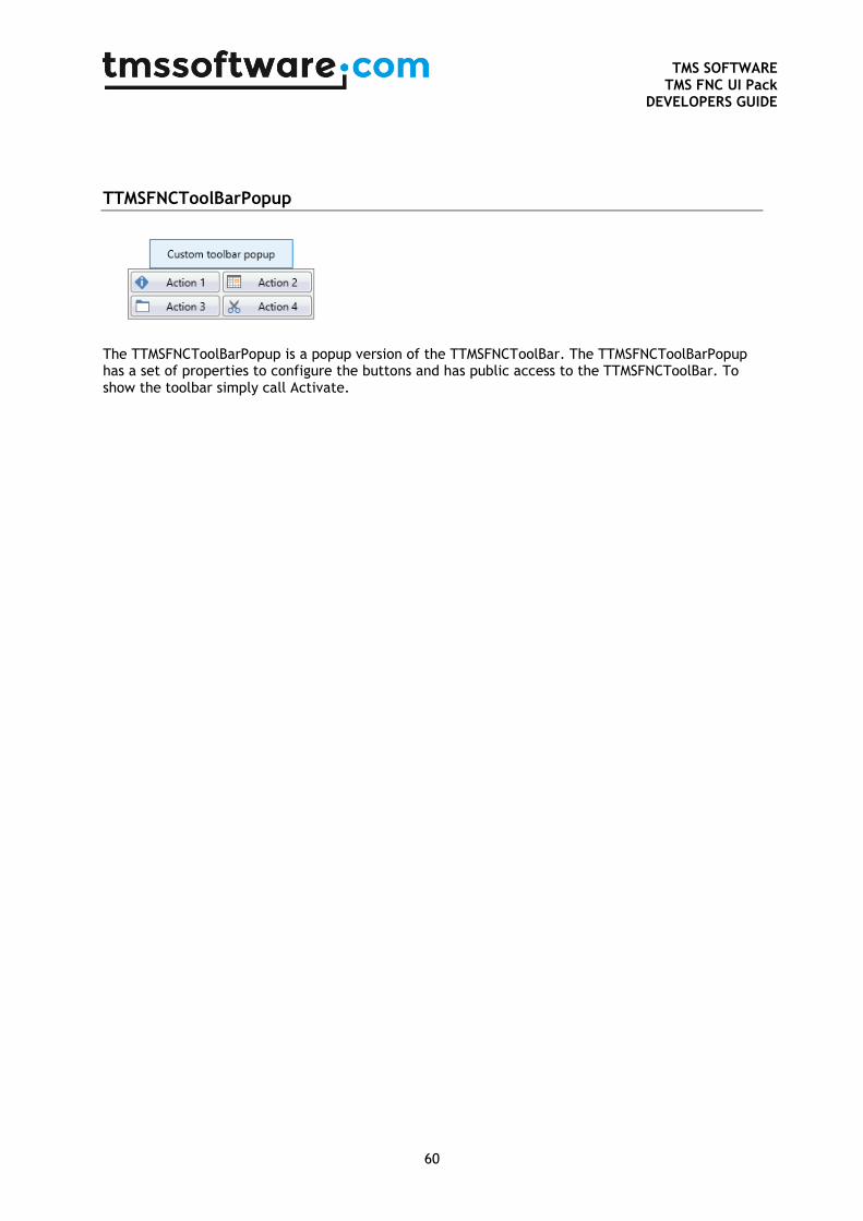
TMS SOFTWARE
TMS FNC UI Pack DEVELOPERS GUIDE
60
TTMSFNCToolBarPopup
The TTMSFNCToolBarPopup is a popup version of the TTMSFNCToolBar. The TTMSFNCToolBarPopup has a set of properties to configure the buttons and has public access to the TTMSFNCToolBar. To show the toolbar simply call Activate.
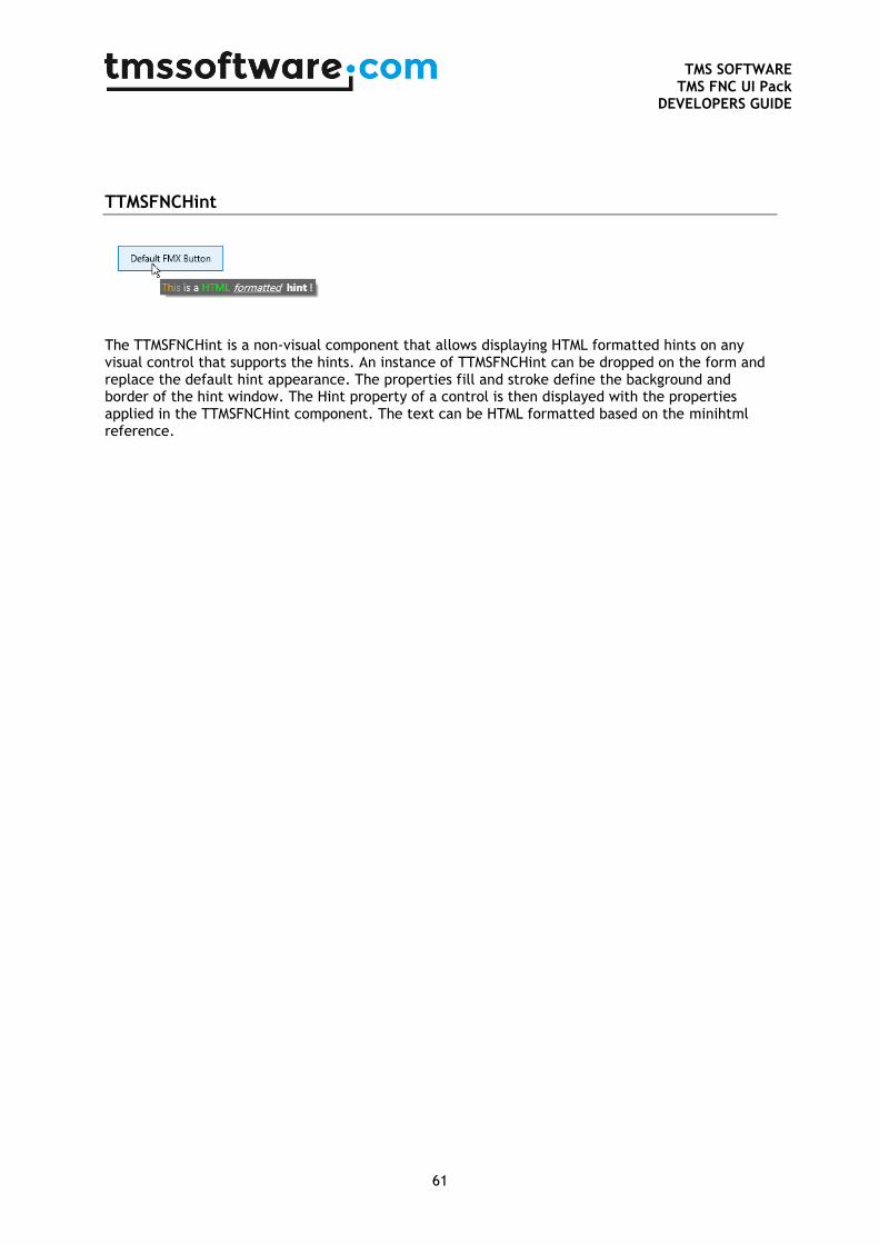
TMS SOFTWARE
TMS FNC UI Pack DEVELOPERS GUIDE
61
TTMSFNCHint
The TTMSFNCHint is a non-visual component that allows displaying HTML formatted hints on any visual control that supports the hints. An instance of TTMSFNCHint can be dropped on the form and replace the default hint appearance. The properties fill and stroke define the background and border of the hint window. The Hint property of a control is then displayed with the properties applied in the TTMSFNCHint component. The text can be HTML formatted based on the minihtml reference.
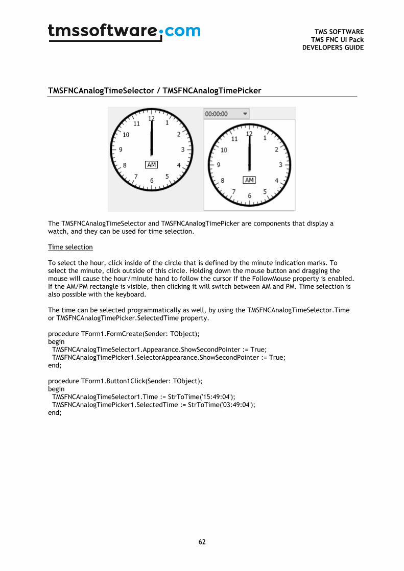
TMS SOFTWARE
TMS FNC UI Pack DEVELOPERS GUIDE
62
TMSFNCAnalogTimeSelector / TMSFNCAnalogTimePicker
The TMSFNCAnalogTimeSelector and TMSFNCAnalogTimePicker are components that display a watch, and they can be used for time selection. Time selection To select the hour, click inside of the circle that is defined by the minute indication marks. To select the minute, click outside of this circle. Holding down the mouse button and dragging the mouse will cause the hour/minute hand to follow the cursor if the FollowMouse property is enabled. If the AM/PM rectangle is visible, then clicking it will switch between AM and PM. Time selection is also possible with the keyboard. The time can be selected programmatically as well, by using the TMSFNCAnalogTimeSelector.Time or TMSFNCAnalogTimePicker.SelectedTime property. procedure TForm1.FormCreate(Sender: TObject); begin TMSFNCAnalogTimeSelector1.Appearance.ShowSecondPointer := True; TMSFNCAnalogTimePicker1.SelectorAppearance.ShowSecondPointer := True; end; procedure TForm1.Button1Click(Sender: TObject); begin TMSFNCAnalogTimeSelector1.Time := StrToTime('15:49:04'); TMSFNCAnalogTimePicker1.SelectedTime := StrToTime('03:49:04'); end;
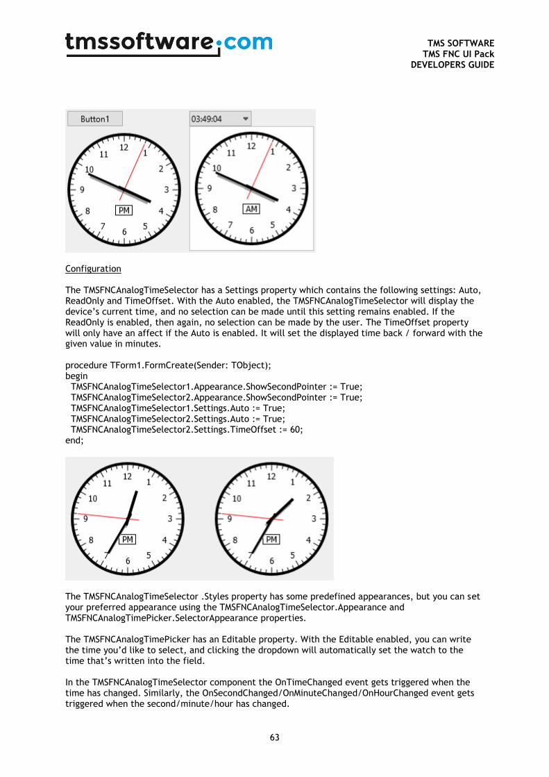
TMS SOFTWARE
TMS FNC UI Pack DEVELOPERS GUIDE
63
Configuration The TMSFNCAnalogTimeSelector has a Settings property which contains the following settings: Auto, ReadOnly and TimeOffset. With the Auto enabled, the TMSFNCAnalogTimeSelector will display the device’s current time, and no selection can be made until this setting remains enabled. If the ReadOnly is enabled, then again, no selection can be made by the user. The TimeOffset property will only have an affect if the Auto is enabled. It will set the displayed time back / forward with the given value in minutes. procedure TForm1.FormCreate(Sender: TObject); begin TMSFNCAnalogTimeSelector1.Appearance.ShowSecondPointer := True; TMSFNCAnalogTimeSelector2.Appearance.ShowSecondPointer := True; TMSFNCAnalogTimeSelector1.Settings.Auto := True; TMSFNCAnalogTimeSelector2.Settings.Auto := True; TMSFNCAnalogTimeSelector2.Settings.TimeOffset := 60; end;
The TMSFNCAnalogTimeSelector .Styles property has some predefined appearances, but you can set your preferred appearance using the TMSFNCAnalogTimeSelector.Appearance and TMSFNCAnalogTimePicker.SelectorAppearance properties. The TMSFNCAnalogTimePicker has an Editable property. With the Editable enabled, you can write the time you’d like to select, and clicking the dropdown will automatically set the watch to the time that’s written into the field. In the TMSFNCAnalogTimeSelector component the OnTimeChanged event gets triggered when the time has changed. Similarly, the OnSecondChanged/OnMinuteChanged/OnHourChanged event gets triggered when the second/minute/hour has changed.
TMS SOFTWARE
TMS FNC UI Pack DEVELOPERS GUIDE
64
In the TMSFNCAnalogTimePicker component the OnTimeSelected event gets triggered when a time is selected.
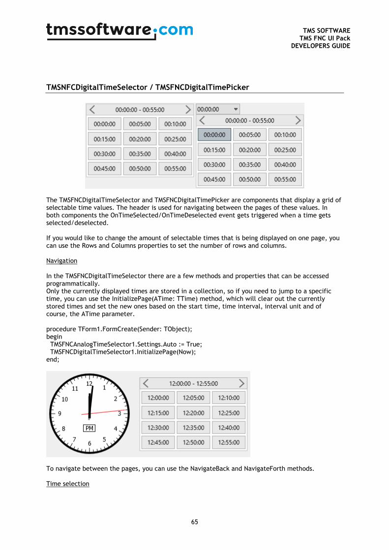
TMS SOFTWARE
TMS FNC UI Pack DEVELOPERS GUIDE
65
TMSNFCDigitalTimeSelector / TMSFNCDigitalTimePicker
The TMSFNCDigitalTimeSelector and TMSFNCDigitalTimePicker are components that display a grid of selectable time values. The header is used for navigating between the pages of these values. In both components the OnTimeSelected/OnTimeDeselected event gets triggered when a time gets selected/deselected. If you would like to change the amount of selectable times that is being displayed on one page, you can use the Rows and Columns properties to set the number of rows and columns. Navigation In the TMSFNCDigitalTimeSelector there are a few methods and properties that can be accessed programmatically. Only the currently displayed times are stored in a collection, so if you need to jump to a specific time, you can use the InitializePage(ATime: TTime) method, which will clear out the currently stored times and set the new ones based on the start time, time interval, interval unit and of course, the ATime parameter. procedure TForm1.FormCreate(Sender: TObject); begin TMSFNCAnalogTimeSelector1.Settings.Auto := True; TMSFNCDigitalTimeSelector1.InitializePage(Now); end;
To navigate between the pages, you can use the NavigateBack and NavigateForth methods. Time selection
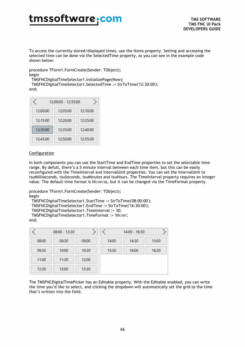
TMS SOFTWARE
TMS FNC UI Pack DEVELOPERS GUIDE
66
To access the currently stored/displayed times, use the Items property. Setting and accessing the selected time can be done via the SelectedTime property, as you can see in the example code shown below: procedure TForm1.FormCreate(Sender: TObject); begin TMSFNCDigitalTimeSelector1.InitializePage(Now); TMSFNCDigitalTimeSelector1.SelectedTime := StrToTime('12:30:00'); end;
Configuration In both components you can use the StartTime and EndTime properties to set the selectable time range. By defult, there’s a 5 minute interval between each time item, but this can be easily reconfigured with the TimeInterval and IntervalUnit properties. You can set the IntervalUnit to tsuMilliseconds, tsuSeconds, tsuMinutes and tsuHours. The TimeInterval property requires an Integer value. The default time format is hh:nn:ss, but it can be changed via the TimeFormat property. procedure TForm1.FormCreate(Sender: TObject); begin TMSFNCDigitalTimeSelector1.StartTime := StrToTime('08:00:00'); TMSFNCDigitalTimeSelector1.EndTime := StrToTime('16:30:00'); TMSFNCDigitalTimeSelector1.TimeInterval := 30; TMSFNCDigitalTimeSelector1.TimeFormat := 'hh:nn'; end;
The TMSFNCDigitalTimePicker has an Editable property. With the Editable enabled, you can write the time you’d like to select, and clicking the dropdown will automatically set the grid to the time that’s written into the field.
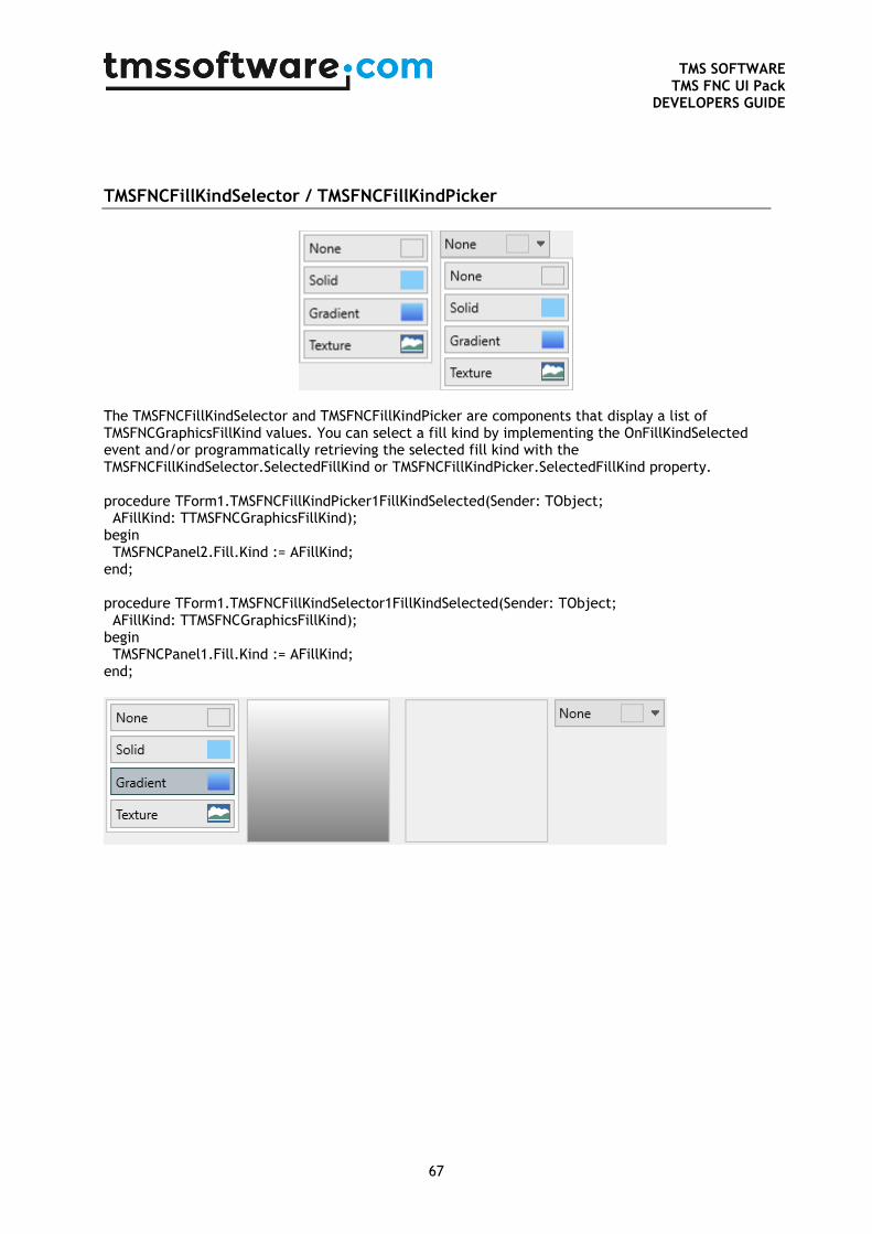
TMS SOFTWARE
TMS FNC UI Pack DEVELOPERS GUIDE
67
TMSFNCFillKindSelector / TMSFNCFillKindPicker
The TMSFNCFillKindSelector and TMSFNCFillKindPicker are components that display a list of TMSFNCGraphicsFillKind values. You can select a fill kind by implementing the OnFillKindSelected event and/or programmatically retrieving the selected fill kind with the TMSFNCFillKindSelector.SelectedFillKind or TMSFNCFillKindPicker.SelectedFillKind property. procedure TForm1.TMSFNCFillKindPicker1FillKindSelected(Sender: TObject; AFillKind: TTMSFNCGraphicsFillKind); begin TMSFNCPanel2.Fill.Kind := AFillKind; end; procedure TForm1.TMSFNCFillKindSelector1FillKindSelected(Sender: TObject; AFillKind: TTMSFNCGraphicsFillKind); begin TMSFNCPanel1.Fill.Kind := AFillKind; end;
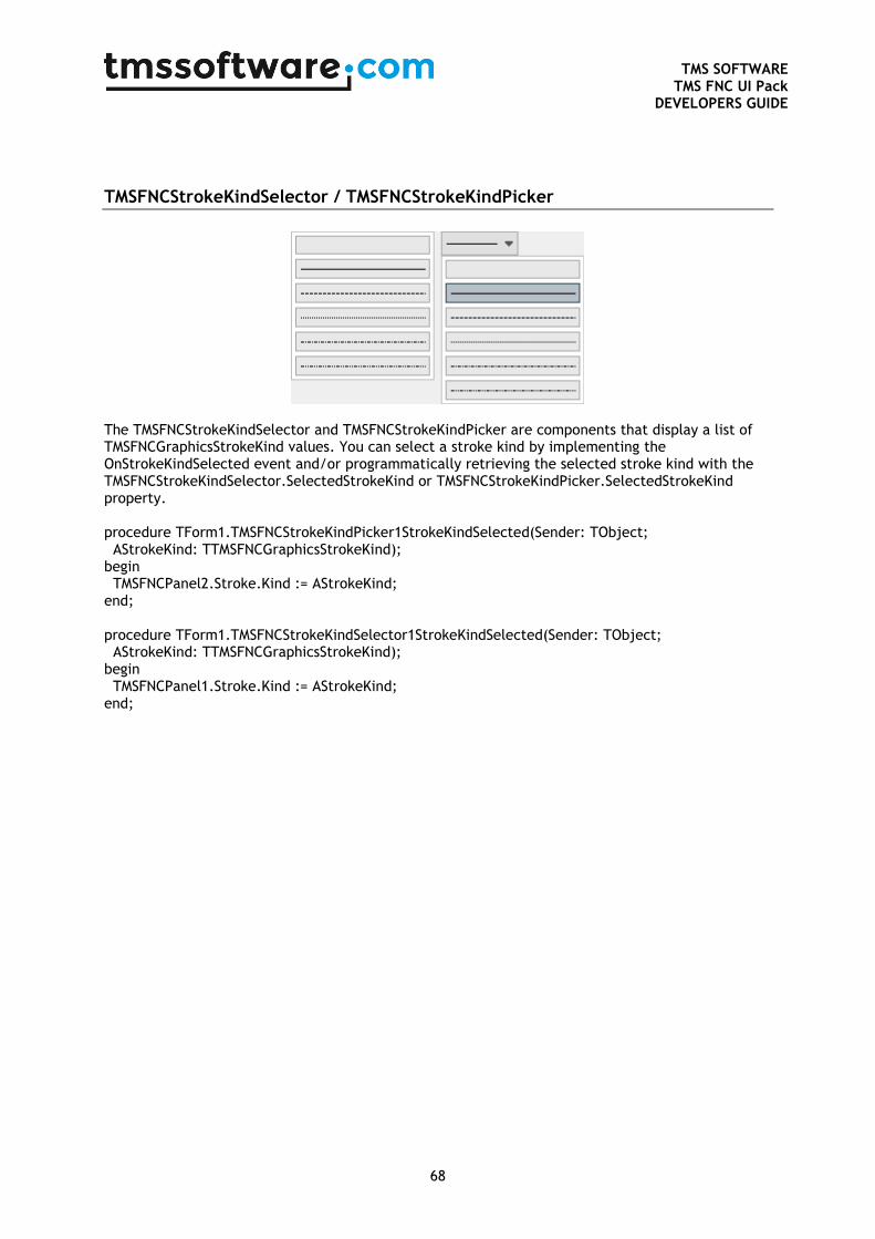
TMS SOFTWARE
TMS FNC UI Pack DEVELOPERS GUIDE
68
TMSFNCStrokeKindSelector / TMSFNCStrokeKindPicker
The TMSFNCStrokeKindSelector and TMSFNCStrokeKindPicker are components that display a list of TMSFNCGraphicsStrokeKind values. You can select a stroke kind by implementing the OnStrokeKindSelected event and/or programmatically retrieving the selected stroke kind with the TMSFNCStrokeKindSelector.SelectedStrokeKind or TMSFNCStrokeKindPicker.SelectedStrokeKind property. procedure TForm1.TMSFNCStrokeKindPicker1StrokeKindSelected(Sender: TObject; AStrokeKind: TTMSFNCGraphicsStrokeKind); begin TMSFNCPanel2.Stroke.Kind := AStrokeKind; end; procedure TForm1.TMSFNCStrokeKindSelector1StrokeKindSelected(Sender: TObject; AStrokeKind: TTMSFNCGraphicsStrokeKind); begin TMSFNCPanel1.Stroke.Kind := AStrokeKind; end;
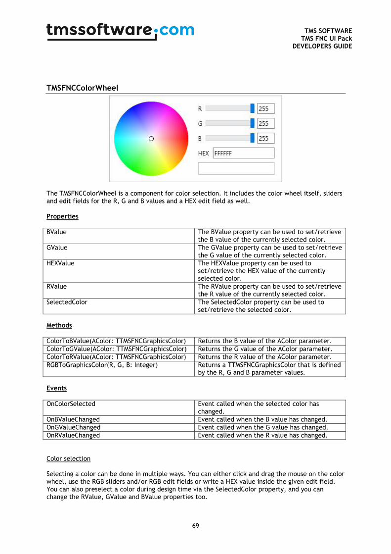
TMS SOFTWARE
TMS FNC UI Pack DEVELOPERS GUIDE
69
TMSFNCColorWheel
The TMSFNCColorWheel is a component for color selection. It includes the color wheel itself, sliders and edit fields for the R, G and B values and a HEX edit field as well. Properties
BValue The BValue property can be used to set/retrieve the B value of the currently selected color.
GValue The GValue property can be used to set/retrieve the G value of the currently selected color.
HEXValue The HEXValue property can be used to set/retrieve the HEX value of the currently selected color.
RValue The RValue property can be used to set/retrieve the R value of the currently selected color.
SelectedColor The SelectedColor property can be used to set/retrieve the selected color.
Methods
ColorToBValue(AColor: TTMSFNCGraphicsColor) Returns the B value of the AColor parameter.
ColorToGValue(AColor: TTMSFNCGraphicsColor) Returns the G value of the AColor parameter.
ColorToRValue(AColor: TTMSFNCGraphicsColor) Returns the R value of the AColor parameter.
RGBToGraphicsColor(R, G, B: Integer) Returns a TTMSFNCGraphicsColor that is defined by the R, G and B parameter values.
Events
OnColorSelected Event called when the selected color has changed.
OnBValueChanged Event called when the B value has changed.
OnGValueChanged Event called when the G value has changed.
OnRValueChanged Event called when the R value has changed.
Color selection Selecting a color can be done in multiple ways. You can either click and drag the mouse on the color wheel, use the RGB sliders and/or RGB edit fields or write a HEX value inside the given edit field. You can also preselect a color during design time via the SelectedColor property, and you can change the RValue, GValue and BValue properties too.
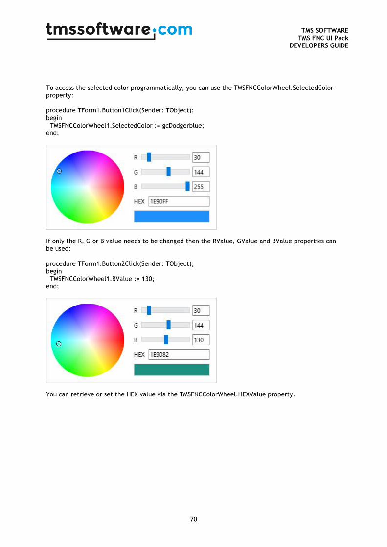
TMS SOFTWARE
TMS FNC UI Pack DEVELOPERS GUIDE
70
To access the selected color programmatically, you can use the TMSFNCColorWheel.SelectedColor property: procedure TForm1.Button1Click(Sender: TObject); begin TMSFNCColorWheel1.SelectedColor := gcDodgerblue; end;
If only the R, G or B value needs to be changed then the RValue, GValue and BValue properties can be used: procedure TForm1.Button2Click(Sender: TObject); begin TMSFNCColorWheel1.BValue := 130; end;
You can retrieve or set the HEX value via the TMSFNCColorWheel.HEXValue property.
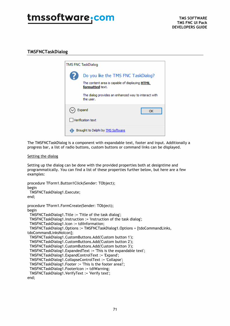
TMS SOFTWARE
TMS FNC UI Pack DEVELOPERS GUIDE
71
TMSFNCTaskDialog
The TMSFNCTaskDialog is a component with expandable text, footer and input. Additionally a progress bar, a list of radio buttons, custom buttons or command links can be displayed. Setting the dialog Setting up the dialog can be done with the provided properties both at designtime and programmatically. You can find a list of these properties further below, but here are a few examples: procedure TForm1.Button1Click(Sender: TObject); begin TMSFNCTaskDialog1.Execute; end; procedure TForm1.FormCreate(Sender: TObject); begin TMSFNCTaskDialog1.Title := 'Title of the task dialog'; TMSFNCTaskDialog1.Instruction := 'Instruction of the task dialog'; TMSFNCTaskDialog1.Icon := tdiInformation; TMSFNCTaskDialog1.Options := TMSFNCTaskDialog1.Options + [tdoCommandLinks, tdoCommandLinksNoIcon]; TMSFNCTaskDialog1.CustomButtons.Add('Custom button 1'); TMSFNCTaskDialog1.CustomButtons.Add('Custom button 2'); TMSFNCTaskDialog1.CustomButtons.Add('Custom button 3'); TMSFNCTaskDialog1.ExpandedText := 'This is the expandable text'; TMSFNCTaskDialog1.ExpandControlText := 'Expand'; TMSFNCTaskDialog1.CollapseControlText := 'Collapse'; TMSFNCTaskDialog1.Footer := 'This is the footer area!'; TMSFNCTaskDialog1.FooterIcon := tdiWarning; TMSFNCTaskDialog1.VerifyText := 'Verify text'; end;
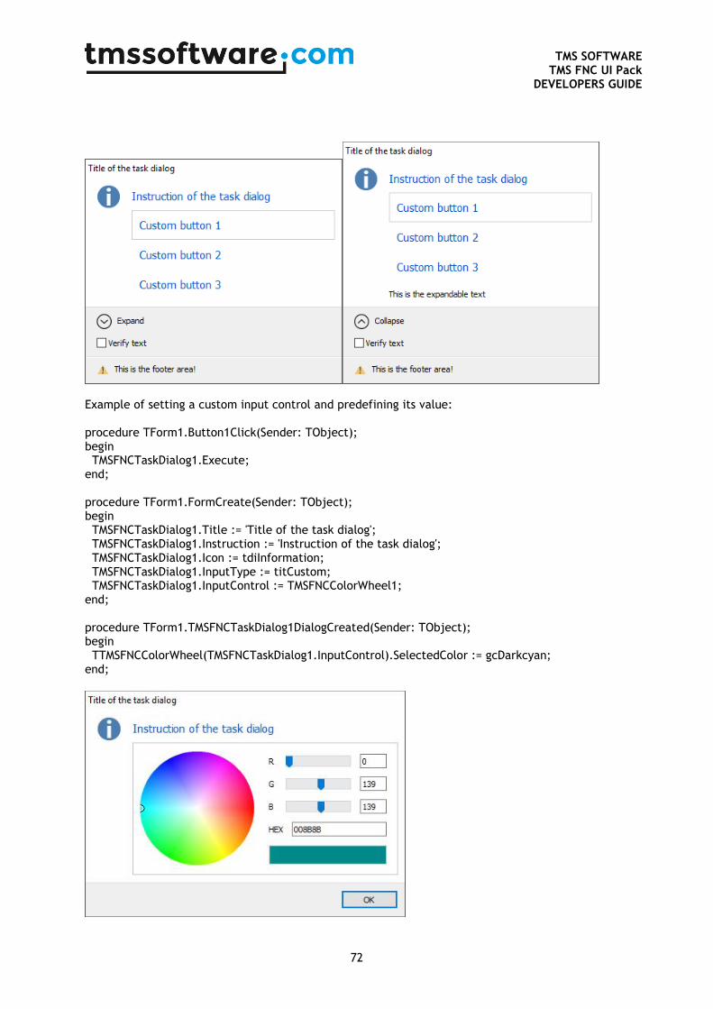
TMS SOFTWARE
TMS FNC UI Pack DEVELOPERS GUIDE
72
Example of setting a custom input control and predefining its value: procedure TForm1.Button1Click(Sender: TObject); begin TMSFNCTaskDialog1.Execute; end; procedure TForm1.FormCreate(Sender: TObject); begin TMSFNCTaskDialog1.Title := 'Title of the task dialog'; TMSFNCTaskDialog1.Instruction := 'Instruction of the task dialog'; TMSFNCTaskDialog1.Icon := tdiInformation; TMSFNCTaskDialog1.InputType := titCustom; TMSFNCTaskDialog1.InputControl := TMSFNCColorWheel1; end; procedure TForm1.TMSFNCTaskDialog1DialogCreated(Sender: TObject); begin TTMSFNCColorWheel(TMSFNCTaskDialog1.InputControl).SelectedColor := gcDarkcyan; end;
TMS SOFTWARE
TMS FNC UI Pack DEVELOPERS GUIDE
73
Executing the dialog and retrieving the results Executing the dialog can be done in multiple ways for each platform. Calling TMSFNCTaskDialog.Execute will show the dialog in every platform, but due to the differences in them, retrieveing the result may vary. However, you can retrieve the results with one code base everywhere with the use of the OnDialogResult event: procedure TForm1.Button1Click(Sender: TObject); begin TMSFNCTaskDialog1.Execute; end; procedure TForm1.TMSFNCTaskDialog1DialogResult(Sender: TObject; AModalResult: TModalResult); begin case AModalResult of mrOk: ShowMessage ('OK clicked'); mrYes: ShowMessage ('Yes clicked'); mrNo: ShowMessage ('No clicked'); mrCancel: ShowMessage('Cancel clicked'); else ShowMessage('Value returned: ' + IntToStr(mr)); end; end; There are properties such as VerifyChecked and RadioButtonResult to return the state of the verify box and the selected radio button. For a predefined input field the InputText property can be used to return the value after closing the dialog. In case of a custom input control you have to take care of the custom control’s results yourself via the TMSFNCTaskDialog.OnDialogClosed event and InputControl propery. procedure TForm1.TMSFNCTaskDialog1DialogClosed(Sender: TObject); begin Label1.Caption := TTMSFNCColorWheel(TMSFNCTaskDialog1.InputControl).HEXValue; end; If you are targeting one platform only, it’s nice to mention the following possibilities of the TMSFNCTaskDialog: In VCL, FMX non-mobile and LCL calling the TMSFNCTaskDialog.Execute function will stop the code from further processing until the dialog is closed. The Execute function will return with a TModalResult value. procedure TForm1.Button1Click(Sender: TObject); var mr: TModalResult; begin mr := TMSFNCTaskDialog1.Execute; case mr of mrOk: ShowMessage('OK Clicked'); mrYes: ShowMessage('Yes Clicked'); mrNo: ShowMessage('No Clicked'); mrCancel: ShowMessage('Cancel Clicked'); else
TMS SOFTWARE
TMS FNC UI Pack DEVELOPERS GUIDE
74
ShowMessage('Value returned: ' + IntToStr(mr)); end; end; In FMX mobile, the Execute method is a bit different because it cannot be a blocking call. Therefore it’s implemented as TMSFNCTaskDialog.Execute(const ResultProc: TProc<TModalResult>). It uses an anonymous method which will be executed after the TMSFNCTaskDialog gets closed. procedure TForm1.Button1Click(Sender: TObject); begin TMSFNCTaskDialog1.Execute( procedure(ModalResult: TModalResult) begin case ModalResult of mrOk: ShowMessage('OK Clicked'); mrYes: ShowMessage('Yes Clicked'); mrNo: ShowMessage('No Clicked'); mrCancel: ShowMessage('Cancel Clicked'); else ShowMessage('Value returned: ' + IntToStr(ModalResult)); end; end); end; Similarly to FMX mobile, in the WEB the Execute method is also a bit different. Due to the async nature of the web, the Execute method will not stop the code from further executing, so a TDialogResultProc parameter is needed where the given AProc procedure will execute after the dialog is closed. The results can be processed in this method, with a similar code that was used in the other frameworks: procedure TForm2.WebButton1Click(Sender: TObject); procedure DialogProc(AValue: TModalResult); begin case AValue of mrOK: ShowMessage('OK Clicked'); mrYes: ShowMessage('Yes Clicked'); mrNo: ShowMessage('No Clicked'); mrCancel: ShowMessage('Cancel Clicked'); else ShowMessage('Value returned: ' + IntToStr(AValue)); end; end; begin TMSFNCTaskDialog1.Execute(@DialogProc); end; Properties
AutoCloseTimeOut Sets the auto closing timeout of the dialog. 1000 = 1 second.
CollapseControlText Sets the collapse text that is being displayed next to the expand button.
Content Sets the content text of the dialog. It’s HTML formatting compatible.
CustomIcon Sets a custom icon to be displayed next to the

TMS SOFTWARE
TMS FNC UI Pack DEVELOPERS GUIDE
75
instruction.
DefaultRadioButton Sets the default selected radio button.
DialogPosition Sets the dialog’s position to the owner form’s center or the screen’s center.
ExpandControlText Sets the expand text that is being displayed next to the expand button.
ExpandedText Sets the expandable text of the dialog. It’s HTML formatting compatible.
Footer Sets the footer text of the dialog. It’s HTML formatting compatible.
FooterIcon Sets the footer icon type of the dialog.
Icon Sets the instruction icon type of the dialog.
InputControl Sets the custom input control of the dialog.
InputItems Sets the input items of the dialog (for titMemo and titComboList).
InputText Sets and return the input text of the dialog.
InputType Sets the input type of the dialog.
Instruction Sets the instruction text of the dialog.
RadioButtonResult Returns an integer which indicates the selected radio button. Index starts from 0.
Title Sets the title of the dialog. By default it’s the application’s name.
VerifyResult Returns the verify checkbox result of the dialog.
Methods
Execute Runs the modal and it’s accessible in every framework. Stops the code from further executing in VCL, FMX non-mobile and LCL, and returns a TModalResult value.
Execute(const ResultProc: TProc<TModalResult>)
Runs the modal, the result can be captured via an anonymous method. Accessible only in FMX mobile.
Execute(AProc: TDialogResultProc) Runs the modal, the result can be captured via the parameter method. Accessible only in the WEB.
Events
OnAutoClose Event called when the dialog closes automatically.
OnDialogButtonClick Event called when a button is clicked.
OnDialogClosed Event called after the dialog is closed.
OnDialogCreated Event called after the dialog is created.
OnDialogProgress Event called when the dialog’s OnTimer event is called. The position of the progress bar can be set via the event’s Pos property.
OnDialogRadioClick Event called when a radio button is clicked.
OnDialogResult Event called when the dialog gets its ModalResult set.
OnDialogTimer Event called when the dialog’s OnTimer event is called.
OnDialogVerifyClick Event called when the verify checkbox is clicked.
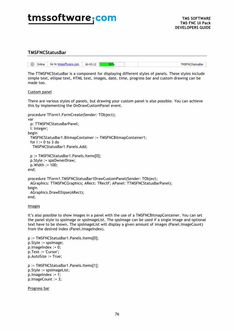
TMS SOFTWARE
TMS FNC UI Pack DEVELOPERS GUIDE
76
TMSFNCStatusBar
The TTMSFNCStatusBar is a component for displaying different styles of panels. These styles include simple text, ellipse text, HTML text, images, date, time, progress bar and custom drawing can be made too. Custom panel There are various styles of panels, but drawing your custom panel is also possible. You can achieve this by implementing the OnDrawCustomPanel event. procedure TForm1.FormCreate(Sender: TObject); var p: TTMSFNCStatusBarPanel; I: Integer; begin TMSFNCStatusBar1.BitmapContainer := TMSFNCBitmapContainer1; for I := 0 to 3 do TMSFNCStatusBar1.Panels.Add; p := TMSFNCStatusBar1.Panels.Items[0]; p.Style := spsOwnerDraw; p.Width := 100; end; procedure TForm1.TMSFNCStatusBar1DrawCustomPanel(Sender: TObject; AGraphics: TTMSFNCGraphics; ARect: TRectF; APanel: TTMSFNCStatusBarPanel); begin AGraphics.DrawEllipse(ARect); end; Images It’s also possible to show images in a panel with the use of a TMSFNCBitmapContainer. You can set the panel style to spsImage or spsImageList. The spsImage can be used if a single image and optional text have to be shown. The spsImageList will display a given amount of images (Panel.ImageCount) from the desired index (Panel.ImageIndex). p := TMSFNCStatusBar1.Panels.Items[0]; p.Style := spsImage; p.ImageIndex := 0; p.Text := 'Cursor'; p.AutoSize := True; p := TMSFNCStatusBar1.Panels.Items[1]; p.Style := spsImageList; p.ImageIndex := 1; p.ImageCount := 3; Progress bar
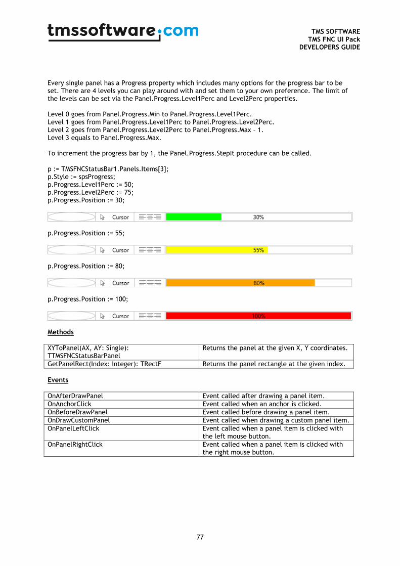
TMS SOFTWARE
TMS FNC UI Pack DEVELOPERS GUIDE
77
Every single panel has a Progress property which includes many options for the progress bar to be set. There are 4 levels you can play around with and set them to your own preference. The limit of the levels can be set via the Panel.Progress.Level1Perc and Level2Perc properties. Level 0 goes from Panel.Progress.Min to Panel.Progress.Level1Perc. Level 1 goes from Panel.Progress.Level1Perc to Panel.Progress.Level2Perc. Level 2 goes from Panel.Progress.Level2Perc to Panel.Progress.Max – 1. Level 3 equals to Panel.Progress.Max. To increment the progress bar by 1, the Panel.Progress.StepIt procedure can be called. p := TMSFNCStatusBar1.Panels.Items[3]; p.Style := spsProgress; p.Progress.Level1Perc := 50; p.Progress.Level2Perc := 75; p.Progress.Position := 30;
p.Progress.Position := 55;
p.Progress.Position := 80;
p.Progress.Position := 100;
Methods
XYToPanel(AX, AY: Single): TTMSFNCStatusBarPanel
Returns the panel at the given X, Y coordinates.
GetPanelRect(Index: Integer): TRectF Returns the panel rectangle at the given index.
Events
OnAfterDrawPanel Event called after drawing a panel item.
OnAnchorClick Event called when an anchor is clicked.
OnBeforeDrawPanel Event called before drawing a panel item.
OnDrawCustomPanel Event called when drawing a custom panel item.
OnPanelLeftClick Event called when a panel item is clicked with the left mouse button.
OnPanelRightClick Event called when a panel item is clicked with the right mouse button.
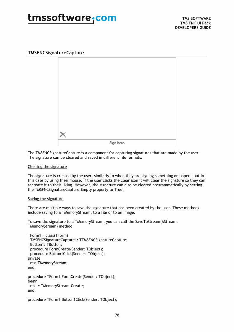
TMS SOFTWARE
TMS FNC UI Pack DEVELOPERS GUIDE
78
TMSFNCSignatureCapture
The TMSFNCSignatureCapture is a component for capturing signatures that are made by the user. The signature can be cleared and saved in different file formats. Clearing the signature The signature is created by the user, similarly to when they are signing something on paper – but in this case by using their mouse. If the user clicks the clear icon it will clear the signature so they can recreate it to their liking. However, the signature can also be cleared programmatically by setting the TMSFNCSignatureCapture.Empty property to True. Saving the signature There are multiple ways to save the signature that has been created by the user. These methods include saving to a TMemoryStream, to a file or to an image. To save the signature to a TMemoryStream, you can call the SaveToStream(AStream: TMemoryStream) method: TForm1 = class(TForm) TMSFNCSignatureCapture1: TTMSFNCSignatureCapture; Button1: TButton; procedure FormCreate(Sender: TObject); procedure Button1Click(Sender: TObject); private ms: TMemoryStream; end; procedure TForm1.FormCreate(Sender: TObject); begin ms := TMemoryStream.Create; end; procedure TForm1.Button1Click(Sender: TObject);
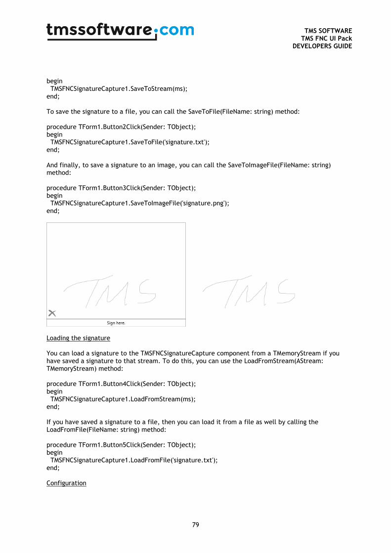
TMS SOFTWARE
TMS FNC UI Pack DEVELOPERS GUIDE
79
begin TMSFNCSignatureCapture1.SaveToStream(ms); end; To save the signature to a file, you can call the SaveToFile(FileName: string) method: procedure TForm1.Button2Click(Sender: TObject); begin TMSFNCSignatureCapture1.SaveToFile('signature.txt'); end; And finally, to save a signature to an image, you can call the SaveToImageFile(FileName: string) method: procedure TForm1.Button3Click(Sender: TObject); begin TMSFNCSignatureCapture1.SaveToImageFile('signature.png'); end;
Loading the signature You can load a signature to the TMSFNCSignatureCapture component from a TMemoryStream if you have saved a signature to that stream. To do this, you can use the LoadFromStream(AStream: TMemoryStream) method: procedure TForm1.Button4Click(Sender: TObject); begin TMSFNCSignatureCapture1.LoadFromStream(ms); end; If you have saved a signature to a file, then you can load it from a file as well by calling the LoadFromFile(FileName: string) method: procedure TForm1.Button5Click(Sender: TObject); begin TMSFNCSignatureCapture1.LoadFromFile('signature.txt'); end; Configuration
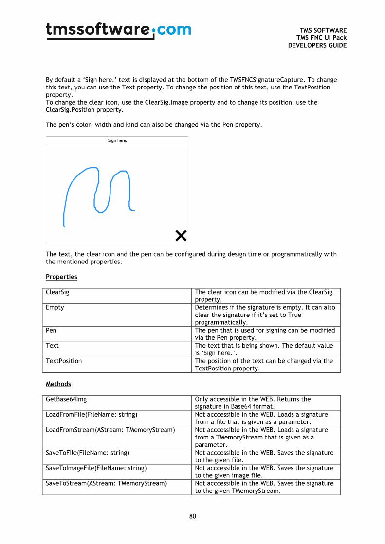
TMS SOFTWARE
TMS FNC UI Pack DEVELOPERS GUIDE
80
By default a ‘Sign here.’ text is displayed at the bottom of the TMSFNCSignatureCapture. To change this text, you can use the Text property. To change the position of this text, use the TextPosition property. To change the clear icon, use the ClearSig.Image property and to change its position, use the ClearSig.Position property. The pen’s color, width and kind can also be changed via the Pen property.
The text, the clear icon and the pen can be configured during design time or programmatically with the mentioned properties. Properties
ClearSig The clear icon can be modified via the ClearSig property.
Empty Determines if the signature is empty. It can also clear the signature if it’s set to True programmatically.
Pen The pen that is used for signing can be modified via the Pen property.
Text The text that is being shown. The default value is ‘Sign here.’.
TextPosition The position of the text can be changed via the TextPosition property.
Methods
GetBase64Img Only accessible in the WEB. Returns the signature in Base64 format.
LoadFromFile(FileName: string) Not acccessible in the WEB. Loads a signature from a file that is given as a parameter.
LoadFromStream(AStream: TMemoryStream) Not acccessible in the WEB. Loads a signature from a TMemoryStream that is given as a parameter.
SaveToFile(FileName: string) Not acccessible in the WEB. Saves the signature to the given file.
SaveToImageFile(FileName: string) Not acccessible in the WEB. Saves the signature to the given image file.
SaveToStream(AStream: TMemoryStream) Not acccessible in the WEB. Saves the signature to the given TMemoryStream.
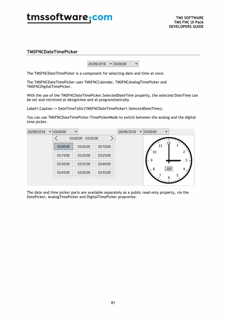
TMS SOFTWARE
TMS FNC UI Pack DEVELOPERS GUIDE
81
TMSFNCDateTimePicker
The TMSFNCDateTimePicker is a component for selecting date and time at once. The TMSFNCDateTimePicker uses TMSFNCCalendar, TMSFNCAnalogTimePicker and TMSFNCDigitalTimePicker. With the use of the TMSFNCDateTimePicker.SelectedDateTime property, the selected DateTime can be set and retrieved at designtime and at programmatically. Label1.Caption := DateTimeToStr(TMSFNCDateTimePicker1.SelectedDateTime); You can use TMSFNCDateTimePicker.TimePickerMode to switch between the analog and the digital time picker.
The date and time picker parts are available separately as a public read-only property, via the DatePicker, AnalogTimePicker and DigitalTimePicker propreties.
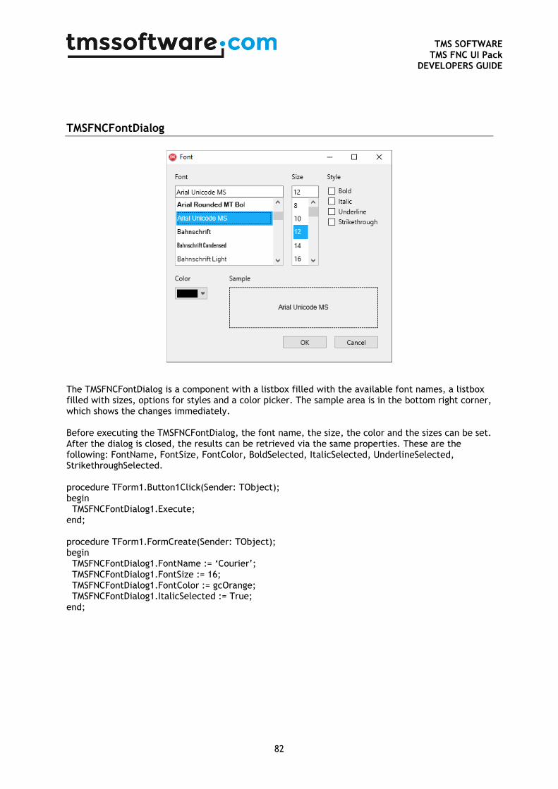
TMS SOFTWARE
TMS FNC UI Pack DEVELOPERS GUIDE
82
TMSFNCFontDialog
The TMSFNCFontDialog is a component with a listbox filled with the available font names, a listbox filled with sizes, options for styles and a color picker. The sample area is in the bottom right corner, which shows the changes immediately. Before executing the TMSFNCFontDialog, the font name, the size, the color and the sizes can be set. After the dialog is closed, the results can be retrieved via the same properties. These are the following: FontName, FontSize, FontColor, BoldSelected, ItalicSelected, UnderlineSelected, StrikethroughSelected. procedure TForm1.Button1Click(Sender: TObject); begin TMSFNCFontDialog1.Execute; end; procedure TForm1.FormCreate(Sender: TObject); begin TMSFNCFontDialog1.FontName := ‘Courier’; TMSFNCFontDialog1.FontSize := 16; TMSFNCFontDialog1.FontColor := gcOrange; TMSFNCFontDialog1.ItalicSelected := True; end;
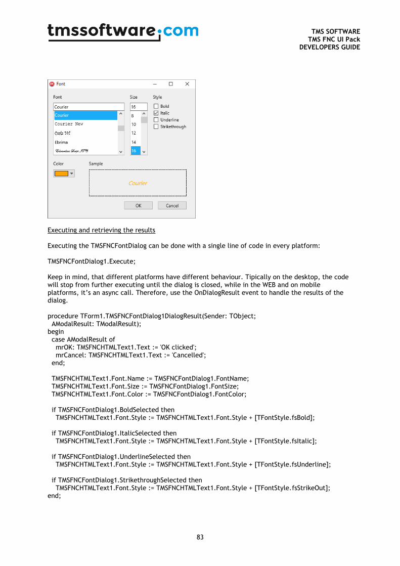
TMS SOFTWARE
TMS FNC UI Pack DEVELOPERS GUIDE
83
Executing and retrieving the results Executing the TMSFNCFontDialog can be done with a single line of code in every platform: TMSFNCFontDialog1.Execute; Keep in mind, that different platforms have different behaviour. Tipically on the desktop, the code will stop from further executing until the dialog is closed, while in the WEB and on mobile platforms, it’s an async call. Therefore, use the OnDialogResult event to handle the results of the dialog. procedure TForm1.TMSFNCFontDialog1DialogResult(Sender: TObject; AModalResult: TModalResult); begin case AModalResult of mrOK: TMSFNCHTMLText1.Text := 'OK clicked'; mrCancel: TMSFNCHTMLText1.Text := 'Cancelled'; end; TMSFNCHTMLText1.Font.Name := TMSFNCFontDialog1.FontName; TMSFNCHTMLText1.Font.Size := TMSFNCFontDialog1.FontSize; TMSFNCHTMLText1.Font.Color := TMSFNCFontDialog1.FontColor; if TMSFNCFontDialog1.BoldSelected then TMSFNCHTMLText1.Font.Style := TMSFNCHTMLText1.Font.Style + [TFontStyle.fsBold]; if TMSFNCFontDialog1.ItalicSelected then TMSFNCHTMLText1.Font.Style := TMSFNCHTMLText1.Font.Style + [TFontStyle.fsItalic]; if TMSFNCFontDialog1.UnderlineSelected then TMSFNCHTMLText1.Font.Style := TMSFNCHTMLText1.Font.Style + [TFontStyle.fsUnderline]; if TMSFNCFontDialog1.StrikethroughSelected then TMSFNCHTMLText1.Font.Style := TMSFNCHTMLText1.Font.Style + [TFontStyle.fsStrikeOut]; end;

TMS SOFTWARE
TMS FNC UI Pack DEVELOPERS GUIDE
84
TMSFNCIPEdit
The TMSFNCIPEdit is a component that consists of multiple TMSFNCEdit fields. Each octet has its own field. 3 address types are supported: IPv4, IPv6 and MAC. To configure this, use the TTMSFNCIPEdit.IPAddressType property.
You can retrieve the IP address as a string via the TMSFNCIPEdit.IPAddress property, or use the TMSFNCIPEdit.IPv4Address and TMSFNCIPEdit.IPv6Address public properties to retrieve the IP address as an integer value.
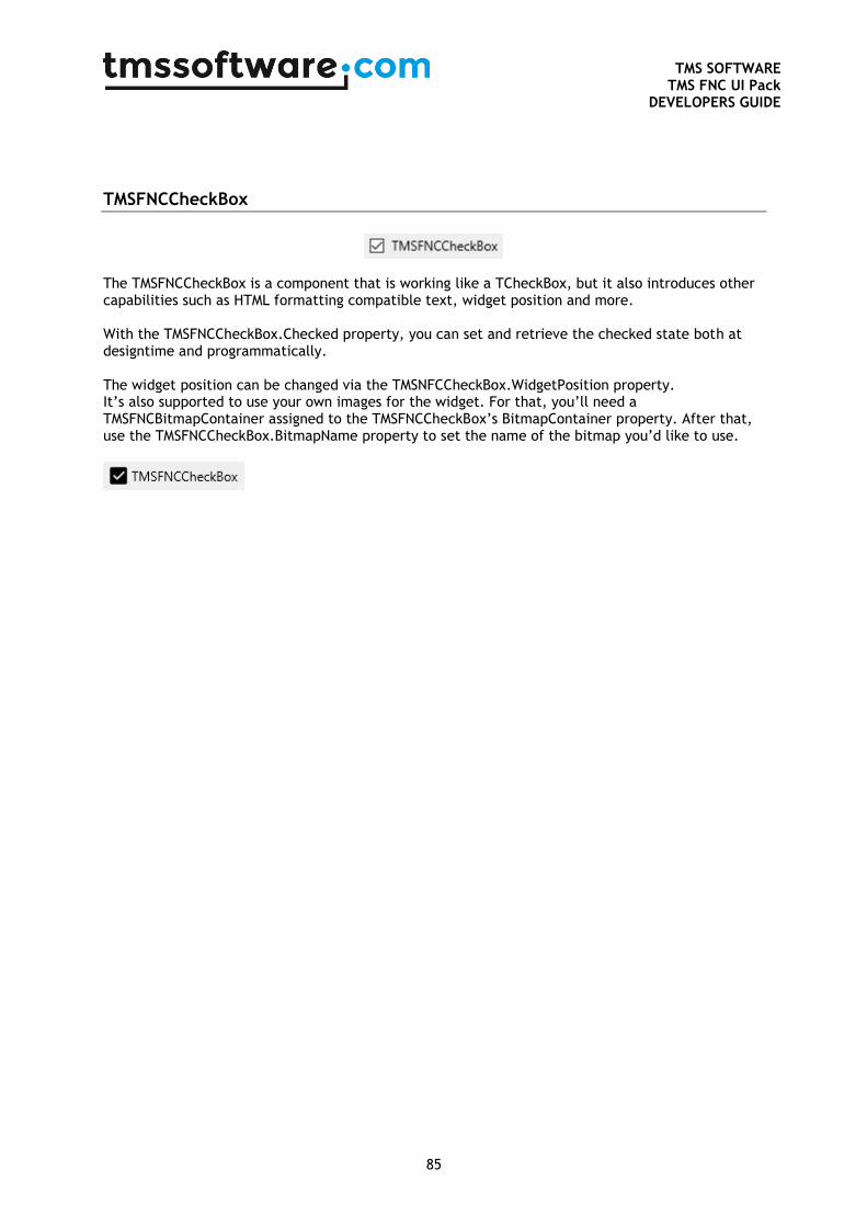
TMS SOFTWARE
TMS FNC UI Pack DEVELOPERS GUIDE
85
TMSFNCCheckBox
The TMSFNCCheckBox is a component that is working like a TCheckBox, but it also introduces other capabilities such as HTML formatting compatible text, widget position and more. With the TMSFNCCheckBox.Checked property, you can set and retrieve the checked state both at designtime and programmatically. The widget position can be changed via the TMSNFCCheckBox.WidgetPosition property. It’s also supported to use your own images for the widget. For that, you’ll need a TMSFNCBitmapContainer assigned to the TMSFNCCheckBox’s BitmapContainer property. After that, use the TMSFNCCheckBox.BitmapName property to set the name of the bitmap you’d like to use.
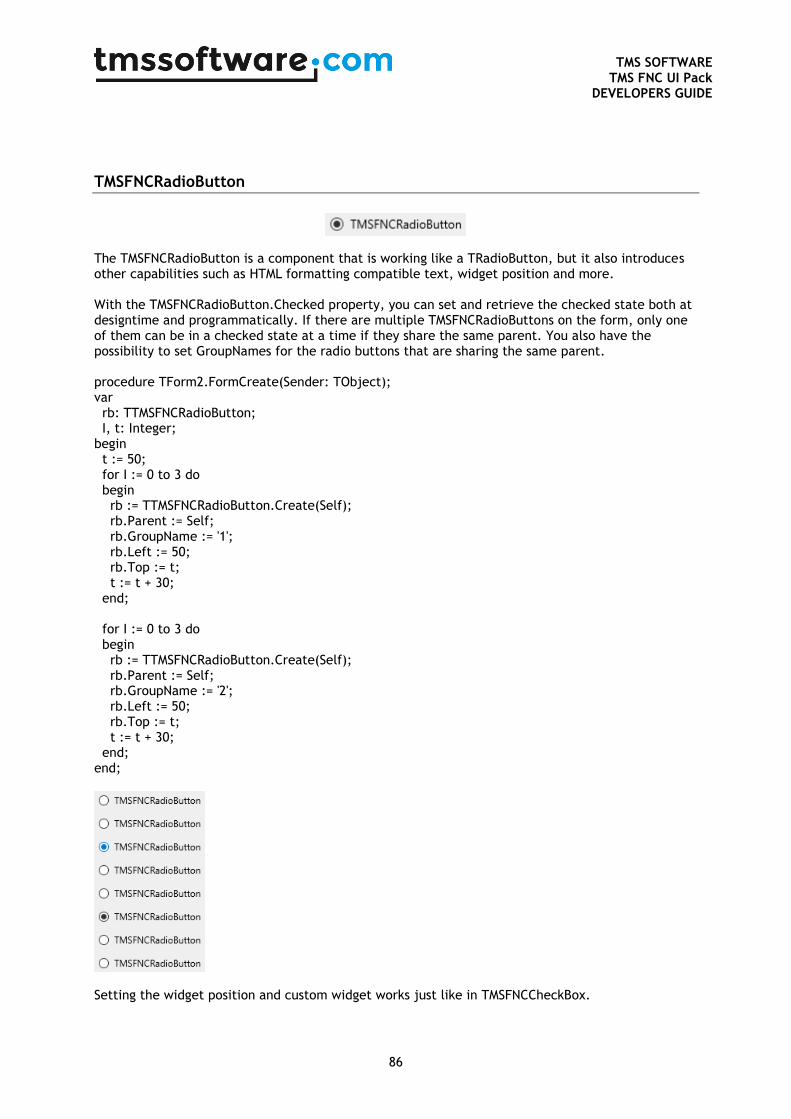
TMS SOFTWARE
TMS FNC UI Pack DEVELOPERS GUIDE
86
TMSFNCRadioButton
The TMSFNCRadioButton is a component that is working like a TRadioButton, but it also introduces other capabilities such as HTML formatting compatible text, widget position and more. With the TMSFNCRadioButton.Checked property, you can set and retrieve the checked state both at designtime and programmatically. If there are multiple TMSFNCRadioButtons on the form, only one of them can be in a checked state at a time if they share the same parent. You also have the possibility to set GroupNames for the radio buttons that are sharing the same parent. procedure TForm2.FormCreate(Sender: TObject); var rb: TTMSFNCRadioButton; I, t: Integer; begin t := 50; for I := 0 to 3 do begin rb := TTMSFNCRadioButton.Create(Self); rb.Parent := Self; rb.GroupName := '1'; rb.Left := 50; rb.Top := t; t := t + 30; end; for I := 0 to 3 do begin rb := TTMSFNCRadioButton.Create(Self); rb.Parent := Self; rb.GroupName := '2'; rb.Left := 50; rb.Top := t; t := t + 30; end; end;
Setting the widget position and custom widget works just like in TMSFNCCheckBox.
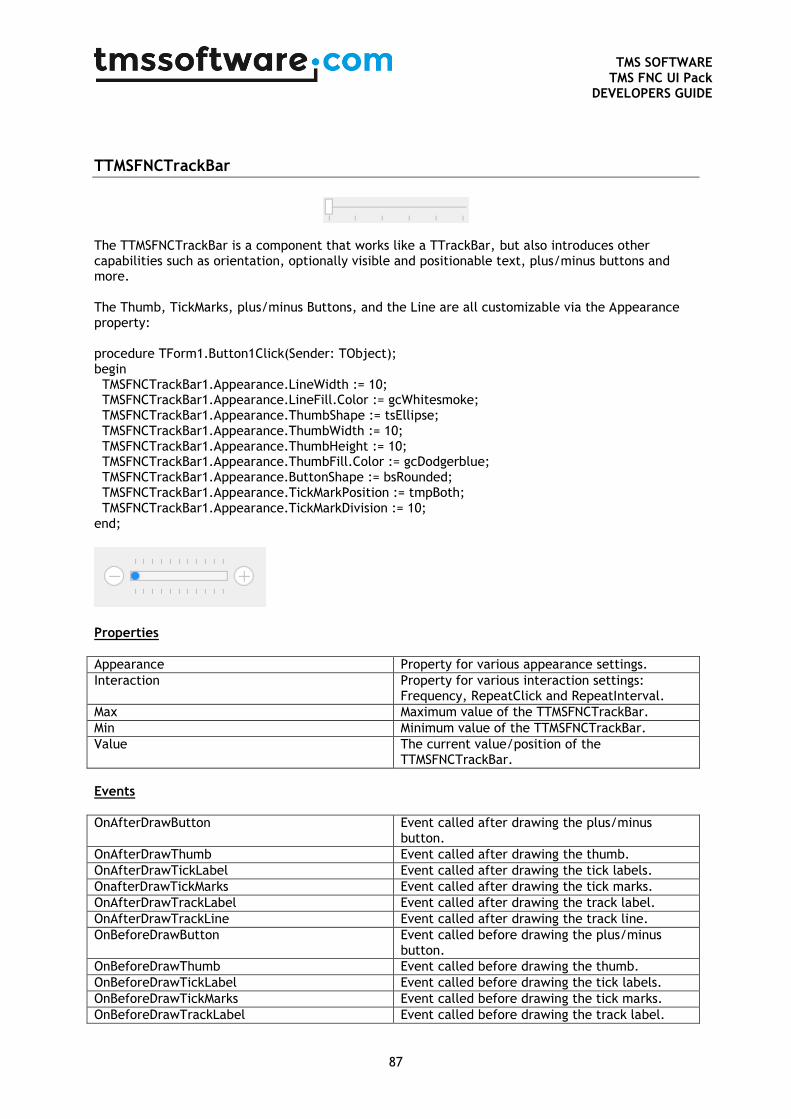
TMS SOFTWARE
TMS FNC UI Pack DEVELOPERS GUIDE
87
TTMSFNCTrackBar
The TTMSFNCTrackBar is a component that works like a TTrackBar, but also introduces other capabilities such as orientation, optionally visible and positionable text, plus/minus buttons and more. The Thumb, TickMarks, plus/minus Buttons, and the Line are all customizable via the Appearance property: procedure TForm1.Button1Click(Sender: TObject); begin TMSFNCTrackBar1.Appearance.LineWidth := 10; TMSFNCTrackBar1.Appearance.LineFill.Color := gcWhitesmoke; TMSFNCTrackBar1.Appearance.ThumbShape := tsEllipse; TMSFNCTrackBar1.Appearance.ThumbWidth := 10; TMSFNCTrackBar1.Appearance.ThumbHeight := 10; TMSFNCTrackBar1.Appearance.ThumbFill.Color := gcDodgerblue; TMSFNCTrackBar1.Appearance.ButtonShape := bsRounded; TMSFNCTrackBar1.Appearance.TickMarkPosition := tmpBoth; TMSFNCTrackBar1.Appearance.TickMarkDivision := 10; end;
Properties
Appearance Property for various appearance settings.
Interaction Property for various interaction settings: Frequency, RepeatClick and RepeatInterval.
Max Maximum value of the TTMSFNCTrackBar.
Min Minimum value of the TTMSFNCTrackBar.
Value The current value/position of the TTMSFNCTrackBar.
Events
OnAfterDrawButton Event called after drawing the plus/minus button.
OnAfterDrawThumb Event called after drawing the thumb.
OnAfterDrawTickLabel Event called after drawing the tick labels.
OnafterDrawTickMarks Event called after drawing the tick marks.
OnAfterDrawTrackLabel Event called after drawing the track label.
OnAfterDrawTrackLine Event called after drawing the track line.
OnBeforeDrawButton Event called before drawing the plus/minus button.
OnBeforeDrawThumb Event called before drawing the thumb.
OnBeforeDrawTickLabel Event called before drawing the tick labels.
OnBeforeDrawTickMarks Event called before drawing the tick marks.
OnBeforeDrawTrackLabel Event called before drawing the track label.
TMS SOFTWARE
TMS FNC UI Pack DEVELOPERS GUIDE
88
OnBeforeDrawTrackLine Event called before drawing the track line.
OnValueChanged Event called when the value has changed.
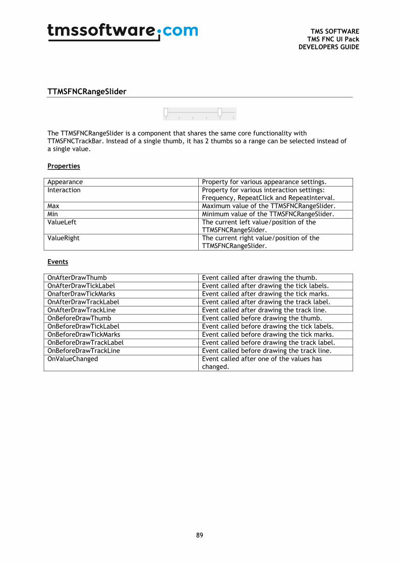
TMS SOFTWARE
TMS FNC UI Pack DEVELOPERS GUIDE
89
TTMSFNCRangeSlider
The TTMSFNCRangeSlider is a component that shares the same core functionality with TTMSFNCTrackBar. Instead of a single thumb, it has 2 thumbs so a range can be selected instead of a single value.
Properties
Appearance Property for various appearance settings.
Interaction Property for various interaction settings: Frequency, RepeatClick and RepeatInterval.
Max Maximum value of the TTMSFNCRangeSlider.
Min Minimum value of the TTMSFNCRangeSlider.
ValueLeft The current left value/position of the TTMSFNCRangeSlider.
ValueRight The current right value/position of the TTMSFNCRangeSlider.
Events
OnAfterDrawThumb Event called after drawing the thumb.
OnAfterDrawTickLabel Event called after drawing the tick labels.
OnafterDrawTickMarks Event called after drawing the tick marks.
OnAfterDrawTrackLabel Event called after drawing the track label.
OnAfterDrawTrackLine Event called after drawing the track line.
OnBeforeDrawThumb Event called before drawing the thumb.
OnBeforeDrawTickLabel Event called before drawing the tick labels.
OnBeforeDrawTickMarks Event called before drawing the tick marks.
OnBeforeDrawTrackLabel Event called before drawing the track label.
OnBeforeDrawTrackLine Event called before drawing the track line.
OnValueChanged Event called after one of the values has changed.
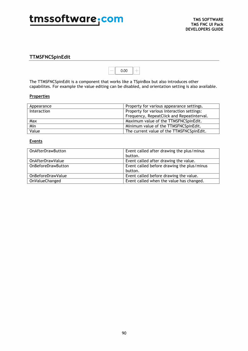
TMS SOFTWARE
TMS FNC UI Pack DEVELOPERS GUIDE
90
TTMSFNCSpinEdit
The TTMSFNCSpinEdit is a component that works like a TSpinBox but also introduces other capabilites. For example the value editing can be disabled, and orientation setting is also available. Properties
Appearance Property for various appearance settings.
Interaction Property for various interaction settings: Frequency, RepeatClick and RepeatInterval.
Max Maximum value of the TTMSFNCSpinEdit.
Min Minimum value of the TTMSFNCSpinEdit.
Value The current value of the TTMSFNCSpinEdit.
Events
OnAfterDrawButton Event called after drawing the plus/minus button.
OnAfterDrawValue Event called after drawing the value.
OnBeforeDrawButton Event called before drawing the plus/minus button.
OnBeforeDrawValue Event called before drawing the value.
OnValueChanged Event called when the value has changed.
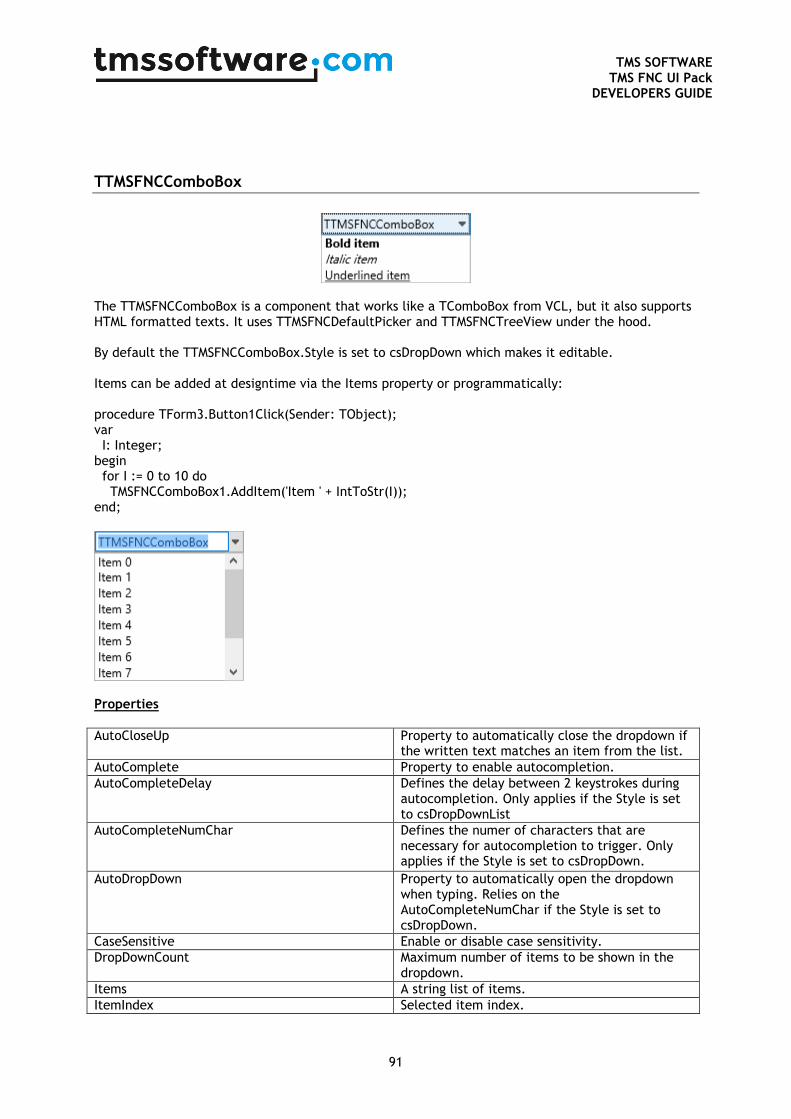
TMS SOFTWARE
TMS FNC UI Pack DEVELOPERS GUIDE
91
TTMSFNCComboBox
The TTMSFNCComboBox is a component that works like a TComboBox from VCL, but it also supports HTML formatted texts. It uses TTMSFNCDefaultPicker and TTMSFNCTreeView under the hood. By default the TTMSFNCComboBox.Style is set to csDropDown which makes it editable. Items can be added at designtime via the Items property or programmatically: procedure TForm3.Button1Click(Sender: TObject); var I: Integer; begin for I := 0 to 10 do TMSFNCComboBox1.AddItem('Item ' + IntToStr(I)); end;
Properties
AutoCloseUp Property to automatically close the dropdown if the written text matches an item from the list.
AutoComplete Property to enable autocompletion.
AutoCompleteDelay Defines the delay between 2 keystrokes during autocompletion. Only applies if the Style is set to csDropDownList
AutoCompleteNumChar Defines the numer of characters that are necessary for autocompletion to trigger. Only applies if the Style is set to csDropDown.
AutoDropDown Property to automatically open the dropdown when typing. Relies on the AutoCompleteNumChar if the Style is set to csDropDown.
CaseSensitive Enable or disable case sensitivity.
DropDownCount Maximum number of items to be shown in the dropdown.
Items A string list of items.
ItemIndex Selected item index.
TMS SOFTWARE
TMS FNC UI Pack DEVELOPERS GUIDE
92
Style The 2 possible values are csDropDown and csDropDownList. It’s affecting the editability of the combobox.
Text Returns the text that is displayed in the combobox.
Events
OnItemSelected Event called when an item is selected from the dropdown.
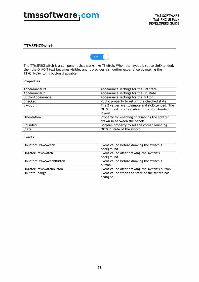
TMS SOFTWARE
TMS FNC UI Pack DEVELOPERS GUIDE
93
TTMSFNCSwitch
The TTMSFNCSwitch is a component that works like TSwitch. When the layout is set to sloExtended, then the On/Off text becomes visible, and it provides a smoother experience by making the TTMSFNCSwitch’s button draggable. Properties
AppearanceOff Appearance settings for the Off state.
AppearanceOn Appearance settings for the On state.
ButtonAppearance Appearance settings for the button.
Checked Public property to return the checked state.
Layout The 2 values are sloSimple and sloExtended. The Off/On text is only visible in the sloExtended layout.
Orientation Property for enabling or disabling the splitter drawn in between the panels.
Rounded Boolean property to set the corner rounding.
State Off/On state of the switch.
Events
OnBeforeDrawSwitch Event called before drawing the switch’s background.
OnAfterDrawSwitch Event called after drawing the switch’s background.
OnBeforeDrawSwitchButton Event called before drawing the switch’s button.
OnAfterDrawSwitchButton Event called after drawing the switch’s button.
OnStateChange Event called when the state of the switch has changed.
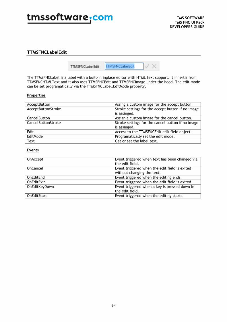
TMS SOFTWARE
TMS FNC UI Pack DEVELOPERS GUIDE
94
TTMSFNCLabelEdit
The TTMSFNCLabel is a label with a built-in inplace editor with HTML text support. It inhertis from TTMSFNCHTMLText and it also uses TTMSFNCEdit and TTMSFNCImage under the hood. The edit mode can be set programatically via the TTMSFNCLabel.EditMode property. Properties
AcceptButton Assing a custom image for the accept button.
AcceptButtonStroke Stroke settings for the accept button if no image is assinged.
CancelButton Assign a custom image for the cancel button.
CancelButtonStroke Stroke settings for the cancel button if no image is assinged.
Edit Access to the TTMSFNCEdit edit field object.
EditMode Programatically set the edit mode.
Text Get or set the label text.
Events
OnAccept Event triggered when text has been changed via the edit field.
OnCancel Event triggered when the edit field is exited without changing the text.
OnEditEnd Event triggered when the editing ends.
OnEditExit Event triggered when the edit field is exited.
OnEditKeyDown Event triggered when a key is pressed down in the edit field.
OnEditStart Event triggered when the editing starts.
TMS SOFTWARE
TMS FNC UI Pack DEVELOPERS GUIDE
95
Persistence
Each component in the TMS FNC UI Pack is capable of saving its published properties (settings), to a file or stream. The format that is being used is JSON. To save a specific component, use the code below. MyFNCComponent.SaveSettingsToFile(); MyFNCComponent.SaveSettingsToStream(); To load an existing settings stream/file use the following code. MyFNCComponent.LoadSettingsFromFile(); MyFNCComponent.LoadSettingsFromStream(); Each component additionally exposes events to control which properties need to be saved to the settings file. In some circumstances, it might be required to only save a specific set of properties. The OnCanLoadProperty and OnCanSaveProperty events are responsible for this. Below is a sample that excludes a property ‘Extra’ from the persistence list. procedure TForm1.MyFNCComponentCanLoadProperty(Sender, AObject: TObject; APropertyName: string; APropertyType: TTypeKind; var ACanLoad: Boolean); begin ACanLoad := ACanLoad and not (APropertyName = ‘Extra’); end; procedure TForm1.MyFNCComponentCanSaveProperty(Sender, AObject: TObject; APropertyName: string; APropertyType: TTypeKind; var ACanSave: Boolean); begin ACanSave := ACanSave and not (APropertyName = ‘Extra’); end; Please note that the above AND operation is crucial to maintain the existing exclusion list. Returning a true for each property will additionally save its default published properties such as Align, Position and many more.
TMS SOFTWARE
TMS FNC UI Pack DEVELOPERS GUIDE
96
Undo / Redo
Each component exposes a public UndoManager property that is capable of loading a previous state of the component. To push a state, use the following code: MyFNCComponent.UndoManager.PushState('default state'); MyFNCComponent.ChangeText; MyFNCComponent.UndoManager.PushState('text changed'); MyFNCComponent.UndoManager.Undo; This code will set a default state with the original text, and restore the text changed with the ChangeText method via the MyFNCComponent.UndoManager.Undo; to go forward in the stack list use MyFNCComponent.UndoManager.Redo; The default maximum amount of undo/redo operations is 20 ,which can be increased per component with the MaxStackCount property.
TMS SOFTWARE
TMS FNC UI Pack DEVELOPERS GUIDE
97
TMS Mini HTML rendering engine Another core technology used among many components is a small fast & lightweight HTML rendering engine. This engine implements a subset of the HTML standard to display formatted text. It supports following tags : B : Bold tag <B> : start bold text </B> : end bold text Example : This is a <B>test</B> U : Underline tag <U> : start underlined text </U> : end underlined text Example : This is a <U>test</U> I : Italic tag <I> : start italic text </I> : end italic text Example : This is a <I>test</I> S : Strikeout tag <S> : start strike-through text </S> : end strike-through text Example : This is a <S>test</S> A : anchor tag <A href="value"> : text after tag is an anchor. The 'value' after the href identifier is the anchor. This can be an URL (with ftp,http,mailto,file identifier) or any text. If the value is an URL, the shellexecute function is called, otherwise, the anchor value can be found in the OnAnchorClick event </A> : end of anchor Examples : This is a <A href= "mailto:[email protected] ">test</A> This is a <A href="http://www.tmssoftware.com">test</A> This is a <A href="somevalue">test</A> FONT : font specifier tag <FONT face='facevalue' size='sizevalue' color='colorvalue' bgcolor='colorvalue'> : specifies font of text after tag. with
face : name of the font
size : HTML style size if smaller than 5, otherwise pointsize of the font
color : font color with either hexidecimal color specification or color constant name, ie gcRed,gcYellow,gcWhite ... etc
bgcolor : background color with either hexidecimal color specification or color constant name </FONT> : ends font setting
Examples: This is a <FONT face="Arial" size="12" color="gcRed">test</FONT> This is a <FONT face="Arial" size="12" color="#FF0000">test</FONT>
TMS SOFTWARE
TMS FNC UI Pack DEVELOPERS GUIDE
98
P : paragraph <P align="alignvalue" [bgcolor="colorvalue"] [bgcolorto="colorvalue"]> : starts a new paragraph, with left, right or center alignment. The paragraph background color is set by the optional bgcolor parameter. If bgcolor and bgcolorto are specified, a gradient is displayed ranging from begin to end color. </P> : end of paragraph Example : <P align="right">This is a test</P> Example : <P align="center">This is a test</P> Example : <P align="left" bgcolor="#ff0000">This has a red background</P> Example : <P align="right" bgcolor="gcYellow">This has a yellow background</P> Example : <P align="right" bgcolor="gcYellow" bgcolorto="gcRed">This has a gradient background</P>* HR : horizontal line <HR> : inserts linebreak with horizontal line BR : linebreak <BR> : inserts a linebreak BODY : body color / background specifier <BODY bgcolor="colorvalue" [bgcolorto="colorvalue"] [dir="v|h"] background="imagefile specifier"> : sets the background color of the HTML text or the background bitmap file Example : <BODY bgcolor="gcYellow"> : sets background color to yellow <BODY background="file://c:\test.bmp"> : sets tiled background to file test.bmp <BODY bgcolor="gcYellow" bgcolorto="gcWhite" dir="v"> : sets a vertical gradient from yellow to white IND : indent tag This is not part of the standard HTML tags but can be used to easily create multicolumn text <IND x="indent"> : indents with "indent" pixels Example : This will be <IND x="75">indented 75 pixels. IMG : image tag <IMG src="specifier:name" [align="specifier"] [width="width"] [height="height"] [alt="specifier:name"] > : inserts an image at the location specifier can be: name of image in a BitmapContainer Optionally, an alignment tag can be included. If no alignment is included, the text alignment with respect to the image is bottom. Other possibilities are: align="top" and align="middle" The width & height to render the image can be specified as well. If the image is embedded in anchor tags, a different image can be displayed when the mouse is in the image area through the Alt attribute. Examples : This is an image <IMG src="name"> SUB : subscript tag <SUB> : start subscript text </SUB> : end subscript text
TMS SOFTWARE
TMS FNC UI Pack DEVELOPERS GUIDE
99
Example : This is <SUP>9</SUP>/<SUB>16</SUB> looks like 9/16 SUP : superscript tag <SUP> : start superscript text </SUP> : end superscript text UL : list tag <UL> : start unordered list tag </UL> : end unordered list Example : <UL> <LI>List item 1 <LI>List item 2 <UL> <LI> Sub list item A <LI> Sub list item B </UL> <LI>List item 3 </UL> LI : list item <LI [type="specifier"] [color="color"] [name="imagename"]>: new list item specifier can be "square", "circle" or "image" bullet. Color sets the color of the square or circle bullet. Imagename sets the PictureContainer image name for image to use as bullet SHAD : text with shadow <SHAD> : start text with shadow </SHAD> : end text with shadow Z : hidden text <Z> : start hidden text </Z> : end hidden text Special characters Following standard HTML special characters are supported : < : less than : < > : greater than : > & : & " : " : non breaking space ™ : trademark symbol € : euro symbol § : section symbol © : copyright symbol ¶ : paragraph symbol
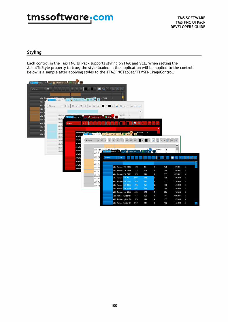
TMS SOFTWARE
TMS FNC UI Pack DEVELOPERS GUIDE
100
Styling
Each control in the TMS FNC UI Pack supports styling on FMX and VCL. When setting the AdaptToStyle property to true, the style loaded in the application will be applied to the control. Below is a sample after applying styles to the TTMSFNCTabSet/TTMSFNCPageControl.